downtown signage design guidelines - mt-pleasant.org€¦ · these signage design guidelines are...
TRANSCRIPT

Page 1
Downtown Signage Design Guidelines
Adopted by the
Mt. Pleasant Historic District Commission September 2015
Central Business District TIFA
October 2015
Downtown Development Board
October 2015
Planning Commission
June 2016
City Commission
August 2016

Page 2
INTENT AND CONTEXT OF DOWNTOWN SIGNAGE DESIGN GUIDELINES The intent of the Downtown Mt. Pleasant Signage Design Guidelines is to provide guidance for desirable and appropriate business signage in downtown Mt. Pleasant. These signage design guidelines are intended to be a tool for property owners, business owners, and City staff in planning, designing and reviewing proposed downtown signage. The design guidelines address general sign elements, including design, construction elements, placement, and lighting, as well as the most appropriate sign types. These design guidelines generally communicate what is desired and encouraged for downtown signage rather than what is not allowed. Unlike the City’s signage zoning regulations, the design guidelines are intended to focus on preferred signage techniques and examples in order to achieve high quality signage in downtown Mt. Pleasant. Design guidelines do not represent requirements; however, signage applicants should carefully consider each of the design guidelines relevant to their request and demonstrate their effort to achieve the design guideline. Mt. Pleasant’s Downtown Signage Design Guidelines have been developed as a collaborative effort between the City’s Historic District Commission and Downtown Development Board. OBJECTIVES The intent of the sign design guidelines is to accomplish the following:
• Establish reasonable and improved standards for business identification • Assist property owners and business owners in understanding city expectations • Encourage creative and innovative approaches to signage within an established framework • Promote economic vitality in the downtown • Enhance overall property values and the visual environment in the city by discouraging signs which contribute to the visual clutter of the
streetscape • Ensure that commercial signs are designed for the purpose of identifying a business in an attractive and functional manner. • To ensure signs on the façade of buildings reinforce the existing character and are integrated into the architectural scheme of the
building. • To promote a quality visual environment by allowing signs that are compatible with their surroundings and which effectively
communicate their message. APPLICABILITY These downtown signage design guidelines generally apply to all new and altered signs, including awnings, in the historic downtown area (see map below). All new and altered signs require the business and property owner to submit a sign permit application to the City’s Building Department.

Page 3
LOCATION The Downtown Signage Design Guidelines are for the Central Business District Tax Increment Finance Authority (CBD TIFA) or Principal Shopping District (PSD). See maps on the following two pages.

Page 4
Central Business District TIFA District

Page 5
Downtown Mt. Pleasant Historic Context The Mt. Pleasant Downtown Historic District encompasses eight blocks of the city’s historic commercial district, centered at the intersection of Broadway and Main Streets. Located in the valley of the Chippewa River, which borders the district on the west, the downtown follows a standard ordinal grid system. Close-set brick buildings line the streets on either side, flanked by wide sidewalks which contain a variety of street trees, planting beds, and other furnishings. The district contains buildings dating from the 1870s to the 1950s that range from one to three stories in height, but one and two story buildings predominate. The predominant styles are late nineteenth century Italianate and early twentieth century Commercial Brick, with a few other styles, including Art Deco and early mid-century Modern, included. Many of the building materials were locally sourced and manufactured, including Mt. Pleasant bricks, limestone from nearby quarries, and wood. The distinctive architectural quality of Mt. Pleasant’s historic downtown buildings, the significant number of them that still exist, and their concentration along key downtown streets provides a strong foundation for the appropriate character and design of signage in downtown Mt. Pleasant. The sign types common from the 1880s to the 1920s included wall signs, projecting/hanging signs, window signs, architectural signs, and awning signs. Like most buildings of that era, many of Mt. Pleasant’s building facades were designed with a sign board between the storefront and the second floor to accommodate a sign. Signs were generally designed to be read by pedestrians on sidewalks rather than by people driving by quickly in their cars. This pedestrian orientation meant that signs were sized smaller and placed closer to the sidewalk to be read from 15’ to 20’ away by people walking on sidewalks. It was common to identify the name of the business, as well as the building’s name and date of construction. The typefaces for signs were fairly limited and simple. In the early 20th century, following the invention of electricity, signs began to be illuminated with light fixtures, and eventually exposed neon signs began to appear in the 1920s. Awnings were typically used for functional purposes of protecting merchandise and operations inside the store from sunlight, as well as shelter from sunlight and rain outside the store. Consequently, awnings were typically mounted to fit the frame of a window or door, rather than extending across the entire storefront. They also provided a decorative feature that could brighten up a building’s façade with colors and patterns. Since awnings were often retractable, they also indicated that a store was open for business. Sometimes awnings were also used for signage with the lettering typically placed on the front valance, so that the signage was visible whether the awning was extended out or retracted. Historically, signs were typically an integral element of a building’s front façade and designed to complement a building’s architecture and scale. A good source of historic sign design is to consult historic photographs of downtown Mt. Pleasant’s buildings, as well as similar places. It is not necessarily the overriding goal of these design guidelines to recreate signage from the turn of the 20th century, but rather to encourage appropriate signage that positively contributes to downtown’s economic vitality.

Page 6
SIGNAGE PERMIT PROCESS All new and altered signs require the business and property owner to submit a sign permit application to the City’s Building Safety Department. Two sign permit applications are available: permanent sign permits and temporary sign permits. Permanent sign permits are for building signage, whereas, temporary sign permits are for signs that advertise special sales. The Downtown Mt. Pleasant Signage Design Guidelines only apply to permanent signs. Recommended steps for submitting a signage permit application:
1. Review the Downtown Mt. Pleasant Signage Design Guidelines as part of decision-making about what type of sign(s) you would like and are appropriate for downtown Mt. Pleasant and your building type.
2. Determine if your building is in the designated downtown historic district and/or an individually designated historic building. 3. Consult historic photographs of your building, if available, and downtown Mt. Pleasant. 4. Observe the types, placement, and designs of signs on surrounding buildings, particularly on your block. 5. Determine the type of sign that you would like to place on your building. 6. Review the City’s sign regulations (Section 154.135-154.150 of the Zoning Ordinance) for the regulations applicable to your desired sign.
HOW TO USE THE DESIGN GUIDELINES It is intended that these signage design guidelines will help business owners, property owners, and sign manufacturers plan and design signage that is desirable and appropriate for Mt. Pleasant’s historic downtown, both historic and non-historic buildings. A copy of the Mt. Pleasant National Register of Historic Places at http://www.mt-pleasant.org/departments/division_of_community_services/downtown_development/ There are two sets of design guidelines: 1. General design guidelines addressing each of the signage elements that relate to all types of downtown signs, including orientation & placement, scale & shape, materials, colors, content, lighting, and installation. 2. Specific design guidelines for each of the appropriate downtown sign types, including projecting signs, wall signs (including flat signs and flat individually mounted letters), awning/ canopy signs, window signs, sandwich board signs, architectural signs, freestanding signs, multi-tenant wall directory signs, and wayfinding signs.

Page 7
GENERAL DESIGN GUIDELINES SIGN ELEMENTS All sign types in downtown Mt. Pleasant have the potential for strengthening or detracting from its historic and unique character. This section addresses the general elements and design guidelines that apply to all sign types in downtown, including:
• Orientation & Placement • Scale & Shape • Materials • Colors • Content • Lighting • Installation
It is important to consider these general design guidelines with all new signs as well as replacement and improvement to existing signs.

Page 8
ORIENTATION AND PLACEMENT During the late 19th and early 20th centuries, downtown signs were designed to be read by pedestrians rather than drivers in cars. With its historic small blocks, street grid, buildings, and sidewalks still intact, downtown Mt. Pleasant has retained its pedestrian feel. Long-term, the community expects to build on downtown’s pedestrian-friendly character with additional improvements to streets, sidewalks, and landscaping. In general, downtown signs can complement and reinforce the historic and desired pedestrian-oriented character of the historic streets and buildings, while also meeting the visibility needs of people driving by in cars. DESIGN GUIDELINES:
1. In general, downtown building signs should be more oriented to visibility by pedestrians on the sidewalk than people driving by in cars. As pedestrian-oriented signs, they should be installed at a comfortable height and designed to be easily legible from the close range at which pedestrians will see and read the sign.
2. Two-sided projecting signs are strongly encouraged to maximize visibility of signs to both pedestrians on the sidewalk and people driving by in cars.
3. Placement of signs should not obscure a building’s architectural features and window and door openings. 4. Signs should be placed to fit in with the building’s overall architectural composition and not compete with its architectural features. 5. Signs should be placed where they were historically located, whenever feasible. 6. For multi-tenant buildings, placement of individual tenant signs should be coordinated to achieve a unified signage appearance.
This business’s placement of signage on the wall and under the awning enhances a downtown’s pedestrian environment.
This street includes a series of attractive and unique projecting signs that make the street more interesting

Page 9
SCALE & SHAPE In downtown Mt. Pleasant, the shape of signs was typically simple and straightforward reflecting the practical and modest architectural styles of downtown’s historic buildings. Historically, signs in downtown were usually simple rectangular wood signs that fit into the horizontal architectural features of the building. Reflecting the simple architectural styles of the buildings, signs were also simple in shape and without decorative ornamentation. Design Guidelines:
1. The scale of a sign should reflect the scale of the building’s façade in terms of width and height, as well as the rhythm and sizes of window and door openings.
2. Where a signboard space exists on a building façade, a wall sign should be scaled to proportionately fit this space. 3. Sign shapes should be relatively simple and understandable to complement the architecture of historic downtown buildings. 4. Symbol signs are encouraged as they are easy to recognize and contribute to the unique identity of businesses and downtown in
general.
The scale and shape of these signs reflect the scale of the individual storefronts.
Creative symbol signs are easy to recognize and add excitement to the downtown district.

Page 10
MATERIALS During the late 19th and early 20th centuries, the original signs in downtown Mt. Pleasant were typically constructed of wood, metal or stone. Wood and metal signs were painted, while architectural stone signs were integrated into the building’s architecture. Signs in windows typically were painted, etched, or gilded. A wider range of sign materials are available today with some able to simulate traditional materials, while others are generally not compatible with the character of downtown’s historic buildings. DESIGN GUIDELINES:
1. Signs should generally be constructed of materials traditionally used during the primary development period of downtown Mt. Pleasant buildings, such as wood and metal, and should be painted.
2. Modern materials such as acrylic, vinyl, and plastic, may be appropriate if they are able to simulate traditional materials. 3. Sign materials should be compatible with the materials and character of the building façade. 4. Sign materials should be durable and easy to maintain. 5. Highly reflective materials are often difficult to read and should be avoided.
Traditional sign materials, like wood and metal, are preferable for downtown Mt. Pleasant.
Creative design using simple, durable materials are appropriate for a historic downtown.

Page 11
COLORS The selection of colors is a critical aspect of creating a sign that catches people’s eyes, is clearly legible, complements the colors of the building façade, and is compatible with the historic character of downtown Mt. Pleasant buildings. The range of paint colors used for buildings and signs in the late-19th Century, when most of Mt. Pleasant’s historic downtown was built, was limited; subdued and darker colors were most common. It is important for colors to be selected thoughtfully and carefully in order to balance the needs for interesting and effective signs with preservation of the historic character of downtown Mt. Pleasant. Design Guidelines:
1. The color tones between a sign’s lettering/symbols and background should have sufficient contrast to make the sign clearly legible. Light letters on a dark background or dark letters on a light background have the highest legibility.
2. Sign colors should complement those of the building’s façade. For multi-tenant buildings, sign colors of individual tenant signs should be compatible with each other.
3. The number of colors used on a sign should generally be limited to no more than three; competition between too many colors often results in decreased legibility.
4. In general, subdued and darker colors are the most appropriate for signs while bright or primary colors should be limited to accent areas.
5. Mounting brackets for projecting and hanging signs should be darker colors and authentic to the material used to construct them.
Creative use of color in limited amounts can create an effective and interesting sign.
It is preferable to limit the number of colors used in a sign to prevent distraction and decreased legibility.

Page 12
CONTENT The primary function of a sign is to clearly identify the name of the business and its general type of products/services in a way that is easy-to-read and interesting for potential customers. DESIGN GUIDELINES:
1. Simple, bold lettering should be used to create signs that are easy to read for pedestrians on sidewalks as well as people driving in cars. 2. Overly-ornate and trendy typefaces that are hard-to-read should be avoided. 3. Three-dimensional letters/symbols, with at least one-half inch depth or reveal, are preferable. 4. Content should be minimal and avoid excessive lettering, such as lists of products/services, slogans, etc. 5. Use of symbols, logos, and other graphics as part of the sign content is encouraged to reduce the need for excessive lettering, make
signs quicker to read, and contribute to the unique identity of downtown businesses.
This sign’s overly ornate lettering, while attractive, is not legible.
This sign’s simple and bold lettering is very legible and effective.
The content of signs should be minimal to make them easier to read.

Page 13
LIGHTING Lighting is an important aspect for enabling visibility of signs beyond daylight hours and where streetlights may not provide adequate lighting for building signs. Historically, lighting of signs would have been oriented to pedestrian viewing of signs from the sidewalk and limited by lighting technology. Today, many signs are oriented to nighttime visibility by people driving in cars and use a wide array of contemporary lighting technologies. In downtown, it is important to balance the need for lighting of signs for easy visibility with the desire to light signs discreetly in order to fit the historic character of downtown buildings and create a pleasant pedestrian environment. DESIGN GUIDELINES:
1. Signage lighting should be provided by an external light source that is directed at the sign. 2. External lighting sources should be shielded so that the light source is not visible by pedestrians. 3. External lighting fixtures should be relatively simple and unobtrusive in appearance and size and should not obscure visibility of the sign. 4. Signs, including wall, projecting, awning and window, should not be internally illuminated, use LED’s or be an electronic reader board. 5. Reverse illuminated/halo effect channel letters is an appropriate sign. This type of lighting uses an external lighting source behind the
individual letters that is reversed (facing backwards toward the wall) resulting in the lighting flooding the wall and lighting up the edges of and outlining the channel letters.
6. Exposed neon lighting may be used selectively but should not be visually obtrusive or dominate the street frontage. Exposed LED lighting can be appropriate if it has the look of exposed neon lighting.
External lighting fixtures that direct light onto the face of the sign is the preferred type of signage lighting in downtown.
Reverse illuminated/halo effect signage lighting is appropriate in downtown Mt. Pleasant. This type of signage lighting is not preferred for designated historic buildings however.

Page 14
INSTALLATION Since business tenants within a building will change over time, it is important that the installation of signage be done in ways that minimize the physical impact to a building. DESIGN GUIDELINES:
1. Installation of a sign should avoid irreversible damage to a building façade, e.g. a sign should be mounted through the mortar joints rather than through the historic masonry itself.
2. Existing sign mounting brackets, studs, or holes should be reused for new signage, whenever feasible. 3. The number of anchor points should be minimized. 4. The method of sign installation should prevent a sign from obscuring a building’s architectural features and window and door openings.
Signs should be installed so that they do not obscure a building’s architectural features, windows, and door openings.
Brackets for projecting signs should be mounted in ways that avoid irreversible damage to the building facade.

Page 15
SPECIFIC DESIGN GUIDELINES APPROPRIATE DOWNTOWN SIGN TYPES This section provides guidance for the variety of sign types that are most appropriate for the unique historic character of downtown Mt. Pleasant, including:
• Projecting signs • Wall signs, including flat signs and flat individually mounted letters • Awning/canopy signs, including under-awning signs • Window signs • Sandwich board signs • Architectural signs • Freestanding signs, including post and monument signs • Wayfinding signs

Page 16
PROJECTING SIGNS Projecting signs are two-sided signs projecting from a building or hanging from an awning/canopy and are perpendicular to the building’s front façade. DESIGN GUIDELINES:
1. Projecting signs should usually be mounted near the storefront entrance, just above the door, or just to the side of it. 2. Projecting signs should be mounted below the sills of the second floor windows. 3. Projecting signs should generally be oriented to visibility by pedestrians and small in size so that they do not obscure other signs, both
projecting and wall signs. 4. The style, colors, and materials of a projecting sign should be complementary with the character of the building and other signage. 5. Projecting signs should have a visible mounting bracket that projects out from the building facade with the sign hanging below rather
than the projecting sign itself just being attached to the building. 6. The mounting bracket for a projecting sign should be designed as a decorative element of the sign that is complementary of the sign and
the building’s architectural style. 7. Projecting signs should have a minimum clearance height of eight (8) feet above the ground. 8. Internally illuminated/backlit signs (cabinet or canister signs) and internally illuminated/backlit channel letters are not appropriate sign
types.
RECOMMENDED Projecting signs can add creativity and interest to the street while also complementing the character of the building.
RECOMMENDED The design of mounting brackets can be creative and straightforward without being too ornate.

Page 17
WALL SIGNS Wall signs are signs or individually mounted letters that are attached flat against the wall of a building with the exposed face of the sign being generally parallel to the face of the wall. DESIGN GUIDELINES:
1. A wall sign should be located above the street-level windows/ door. For multi-story buildings, a wall sign should be located below the sills of second-story windows.
2. Many historic buildings built from the 1870s to 1900s have a traditional signboard area located above the transom windows. If a signboard area exists, a wall sign should fit within this space and not extend above, below, or beyond the edges of the signboard area.
3. A wall sign should be placed and sized so that it does not obscure building architectural features and fits the scale of the building. 4. A wall sign should usually be horizontally-oriented and centered. 5. The shape of a wall sign should reflect the architectural features of the building’s façade. A rectangular wall sign will often be the best fit
for downtown Mt. Pleasant buildings. Rounded signs or signs with rounded features typically work well for buildings with rounded architectural features on their facades.
6. Where feasible, a wall sign should be placed to align with other signs on that building and other buildings on the same block face. 7. Reverse illuminated/back lit/halo effect channel letters is an appropriate sign. 8. Internally illuminated cabinet/canister signs and internally illuminated/front lit channel letters are not appropriate sign types.
RECOMMENDED Wall sign is located between the street-level door and second-story window sills. Shape and size of sign reflects character of building.
RECOMMENDED Some historic storefronts have a signboard space above the transom windows, which should be used for wall signage.

Page 18
RECOMMENDED Wall signs can be creative with colors and patterns that complement the building’s facade and awning.
RECOMMENDED Individual flat letters are an appropriate type of wall sign.
NOT RECOMMENDED Internally lit cabinet box/letters are not an appropriate wall sign type.
RECOMMENDED Wall sign style, color, and placement fits the character of the building.
RECOMMENDED Creative wall sign plays off of rounded features of window hoods.

Page 19
AWNING / CANOPY SIGNS Awning/canopy/marquee signs are signs that are applied to the face of an awning or canopy that projects over a window or door opening. Design Guidelines:
1. Awnings should project over individual window and door openings but should not extend between window and door openings. 2. Awnings should be mounted on the frame of a window or door opening rather than the wall surrounding the opening. 3. Awnings should not obscure transom windows. Awnings should be mounted below the transom windows on the horizontal window
frame feature that separates the display window from the transom window. 4. Awnings/canopies should not be backlit or internally illuminated. 5. Retractable, open-ended shed awnings, with no side panels, are the preferred style for downtown Mt. Pleasant. Shed awnings are more
traditional in appearance than closed/box awnings and domed awnings. They are more transparent, allow increased views into storefront windows, don’t obscure building architectural features, and are visually lighter and simpler in appearance. Closed/box and domed awnings are usually not appropriate.
6. Canvas, canvas blend, and acrylics that resemble canvas are appropriate materials for awnings and canopies; vinyl, metal, glass and shiny materials are generally not appropriate.
7. The style and color of an awning should be complementary with awnings on buildings on the same block face. 8. Awning signs should generally be oriented to visibility by pedestrians on the opposite side of the street. 9. Awnings with a front valance or skirt, which hangs down from the awning’s front edge, are preferred. Awning signs should usually be
located on the front valance, so that the signage is visible whether the awning is extended out or retracted against the building’s façade. 10. Awnings with stripes or other patterns may be appropriate if there is not signage on the awning and the pattern is complementary with
surrounding awnings on the same block face. 11. Canopy signs should be flush-mounted on the canopy’s front face. 12. Awnings/canopies, including under-awning signage, should have a minimum clearance height of eight (8) feet above the ground. 13. Signage under an awning or canopy is appropriate as secondary signage if small in size, two-sided, and complementary with the awning’s
character and colors.

Page 20
RECOMMENDED Awning sign is still visible when the awning is retracted.
RECOMMENDED Awnings should project over individual window openings rather than covering the entire storefront facade.
NOT RECOMMENDED Awning’s modern design features are not preferable for a historic downtown.
RECOMMENDED This type of open-ended shed awning, with no side panels, is preferable for downtown buildings.
NOT RECOMMENDED Awning’s dome shape and vinyl materials are not appropriate in a historic downtown.
RECOMMENDED Awning’s striped pattern, colors, and scalloped valance add visual
interest to a street.

Page 21
WINDOW SIGNS Window signs are signs that are either applied to the surface (interior or exterior) of a storefront window or hung inside the window for viewing from the exterior of the building. Design Guidelines:
1. Window signs should consist predominately of lettering with a transparent background. 2. Signs should cover less than approximately one-third of the total window area to prevent obscuring visibility into storefront windows. 3. Sign lettering and images should be oriented to visibility by pedestrians. 4. Sign lettering and images should be created from high-quality materials such as paint, gold-leaf, etching, vinyl, or neon. 5. Exposed neon signs, either individual neon letters or neon tubing script, can be appropriate as window signs. 6. Neon cabinet/canister and flashing neon signs are not appropriate for downtown window signs.
RECOMMENDED Window signs above consist of lettering only with a transparent background.

Page 22
RECOMMENDED Simple, small window signs complement the wall sign.
RECOMMENDED Gold-leaf lettering provides a simple and elegant window sign.
NOT RECOMMENDED Signage limits the transparency between the street and interior.
NOT RECOMMENDED This small and tasteful window sign is difficult to read because it is semi-transparent.
RECOMMENDED Small exposed neon letter signs are an appropriate window sign.
RECOMMENDED This window sign is creative and easy to read.

Page 23
SANDWICH BOARD SIGNS Sandwich board signs are freestanding, self-supporting, A-shaped, temporary signs that are not permanently secured to a building or the ground. Sandwich board signs require a license from the city as part of the Downtown Sidewalk and Street Parking License Policy. A copy of the policy and application can be found at http://www.mt-pleasant.org/departments/division_of_community_services/downtown_development/ DESIGN GUIDELINES:
1. Sandwich board signs should be constructed of durable materials that present a finished appearance and reflect the character of the building and complement other signage. Wood signs are preferred.
2. Sandwich board signs should not be illuminated or contain moving parts. 3. Sandwich board signs should be placed next to the building, out of the walking path of pedestrians. 4. The graphics of sandwich board signs should be professionally painted or applied; however, chalkboard signs are permitted.
RECOMMENDED Sandwich board signs should be constructed of durable materials, preferably wood, and professionally designed.
Page 24
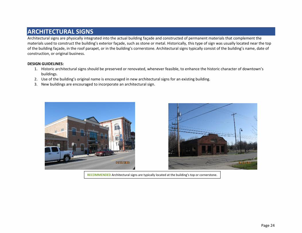
ARCHITECTURAL SIGNS Architectural signs are physically integrated into the actual building façade and constructed of permanent materials that complement the materials used to construct the building’s exterior façade, such as stone or metal. Historically, this type of sign was usually located near the top of the building façade, in the roof parapet, or in the building’s cornerstone. Architectural signs typically consist of the building’s name, date of construction, or original business. DESIGN GUIDELINES:
1. Historic architectural signs should be preserved or renovated, whenever feasible, to enhance the historic character of downtown’s buildings.
2. Use of the building’s original name is encouraged in new architectural signs for an existing building. 3. New buildings are encouraged to incorporate an architectural sign.
RECOMMENDED Architectural signs are typically located at the building’s top or cornerstone.

Page 25
RESTAURANT MENU SIGNS Signs that incorporate a menu containing a listing of products and prices offered by the business. Prominently displayed menus with prices and other important information can help the customer decide whether or not to patronize a restaurant. DESIGN GUIDELINES
1. Restaurant menu signs should be located in a permanently mounted display box on the surface of the building adjacent to the entry. 2. Restaurant menu signs are encouraged for all restaurants with table service. 3. High quality materials and artistic designs shall be used in the construction of menu signs. 4. Restaurant menu signs shall be appropriate in size, location, and design to the character and architectural detail of the building as well
as to the character of the restaurant.
RECOMMENDED Restaurant menu sign examples, typically located by the entrance door. Touch screen menus are appropriate provided they are within the design guidelines listed above.

Page 26
FREESTANDING SIGNS Freestanding signs could be a post sign that consists of a two-sided sign hanging from the extended arm/bracket of a single post anchored into the ground, a sign mounted between two posts anchored into the ground, or a monument sign. DESIGN GUIDELINES:
1. Freestanding signs should only be used for residential buildings that are converted to a commercial use or other buildings that are set back from the sidewalk to enable easier viewing of the sign by people walking on the sidewalk and drivers on the street.
2. Freestanding signs should be placed near the sidewalk. 3. Freestanding signs should be oriented perpendicular to the sidewalk so that they are easily viewed as people pass by the sign.
RECOMMENDED Freestanding signs with post examples.

Page 27
WAYFINDING SIGNS Wayfinding signage is a coordinated system of signs that provide visual identity, orientation, and information about a district or community. Mt. Pleasant’s downtown would benefit from a wayfinding signage system that visually announces the historic downtown district at gateway areas as people enter the downtown area - north, south, east, and west. Within the historic downtown district, wayfinding signage identifies destinations and guides people to them. DESIGN GUIDELINES:
1. Signage should be oriented to provide guidance for people walking, biking, and driving. 2. Locate signage at downtown gateways, along major streets, at major intersections, along trails, and at public plazas, parks and open
spaces. 3. A system of wayfinding signs should include gateway signs, historic downtown district boundary signs, directional, identification, and
informational signs. 4. Design of wayfinding signage should celebrate and reinforce the historic character of Mt. Pleasant’s historic downtown, its buildings, and
identity. 5. Wayfinding signs should have a unified appearance and be designed to complement and integrate with the character and color palette
of other downtown streetscape elements. 6. Use lettering typefaces and icons that are easy-to-read, easily recognizable, and understandable for many people.
RECOMMENDED Comprehensive wayfinding sign system including community identity design feature as part of bracket.
RECOMMENDED Historic district identification signage.
RECOMMENDED Downtown district gateway sign including community identity design feature as part of sign structure.