
Karl Schmedders
MANAGERIAL ECONOMICS & DECISION SCIENCES
Visiting Professor of Managerial Economics & Decision
Sciences
PhD, 1996, Operations Research, Stanford University
MS, 1992, Operations Research, Stanford University
Vordiplom, 1990, Business Engineering,
Universitat Karlsruhe, Highest Honors, Ranked first in a
class of 350
EMAIL: [email protected]
OFFICE: Jacobs Center Room 528
Karl Schmedders is Associate Professor in the Department of Managerial Economics and
Decision Sciences. He holds a PhD in Operations Research from Stanford University.
Professor Schmedders’ research interests include computational economics, general equilibrium
theory, asset pricing and portfolio selection. His work has been published in Econometrica, The
Review of Economic Studies, The Journal of Finance, and many other academic journals. He
teaches courses in decision science both in the MBA and the EMBA program at Kellogg.
Professor Schmedders has been named to the Faculty Honor Roll in every quarter he has taught
at Kellogg. He has received numerous teaching awards, including the 2002 Lawrence G.
Lavengood Outstanding Professor of the Year. Professor Schmedders is the only Kellogg
faculty member to receive the ‘Ehrenmedaille’ (Honorary Medal) of Kellogg’s partner school
WHU.
Research Interests
Mathematical economics, in particular general equilibrium models involving time and
uncertainty
Asset pricing
Mathematical programming

KH19, Course Description
1
Managerial Statistics
Course Description In this course we will cover the following topics:
Confidence Intervals Hypothesis Tests Regression Analysis
Our objective is to quickly cover the first two topics. While they are important by themselves many people describe them as rather “dry” course material. However, they will be of great help to us when we cover the main subject of the course, regression analysis. Regressions are extremely useful and can deliver eye-opening insights in many managerial situations. You will solve some entertaining case studies which show the power of regression analysis. We will cover the material in this case packet as well as the following chapters of the textbook:
Sections 13.1 and 13.2 of chapter 13; Section 14.1 of chapter 14; Chapter 15; Chapter 16; Chapter 19; Chapter 21; Chapter 23.
Time permitting, we will also cover parts of chapter 25. There will be several team assignments. After the conclusion of the course, there will be an in-class final exam on the first day of the following module, that is, on April 1, 2016. The final grades in this course will be determined as follows.
Team assignments: 40% Class participation: 10% Final Exam: 50%

KH19, Course Description
2
In case you would like to prepare for our course, you should start reading the relevant sections of Chapters 13 and 14 in our textbook. Before you do that, please also consider the following suggestions. 1) Review the material on the normal distribution from your probability course. In
particular, you should review the use of the functions NORMDIST, NORMSDIST, NORMINV and NORMSINV in Excel.
2) We will use the software KStat that was developed at Kellogg. Ideally you should install KStat on your laptop before our first class.
I realize that all of you are very busy and you may not have the time to prepare at length for our course. Please note, however, that the better you prepare the faster we can cover the early parts of the course material and the more time we have for the fun part, the coverage of regression analysis. Of course, I am happy to help you with your preparation. Please do not hesitate to contact me with any questions or concerns. My email address is [email protected].

September 29, 1998
When Scientific Predictions Are So Good They're Bad By WILLIAM K. STEVENS
NOAH had it easy. He got his prediction straight from the horse's mouth and was left in no doubt about what to do.
But when the Red River of the North was rising to record levels in the spring of 1997, the citizens and officials of Grand Forks, N.D., were not so privileged. They had to rely on scientists' predictions about how high the water would rise. And in this case, Federal experts say, the flood forecast may have been issued and used in a way that made things worse.
The problem, the experts said, was that more precision was assigned to the forecast than was warranted. Officials and citizens tended to take as gospel an oft-repeated National Weather Service prediction that the river would crest at a record 49 feet. Actually, there was a wider range of probabilities; the river ultimately crested at 54 feet, forcing 50,000 people to abandon their homes fast. The 49-foot forecast had lulled the town into a false sense of security, said Dr. Roger A. Pielke Jr. of the National Center for Atmospheric Research in Boulder, Colo., a consultant on a subsequent inquiry by the weather service.
In fixating on the single number of 49 feet, the people involved in the Grand Forks disaster made a common error in the use of predictions and forecasts, experts who have studied the case say. It was, they say, a case of what Alfred North Whitehead, the mathematician and philosopher, once termed ''misplaced concreteness.'' And whether the problem is climate change, earthquakes, droughts or floods, they say the tendency to overlook uncertainties, margins of error and ranges of probability can lead to damaging misjudgments.
The problem was the topic of a workshop this month at Estes Park, Colo. In part, participants said, the problem arises becausedecision makers sometimes want to avoid making hard choices in uncertain situations. They would rather place responsibility on the predictors.
Scientifically based predictions, typically using computerized mathematical models, have become pervasive in modern society. But only recently has much attention been paid to the proper use -- and misuse -- of predictions. The Estes Park workshop, of which Dr. Pielke was an organizer, was an attempt to come to grips with the question. The workshop was sponsored by the Geological Society of America and the National Center for Atmospheric Research.
People have predicted and prophesied for millenniums, of course, through means ranging from the visions of shamans and the warnings of biblical prophets to the examination of animal entrails. With the arrival of modern science, people teased out fundamental laws of physical and chemical behavior and used them to make better and better predictions.
But once science moves beyond the relatively deterministic processes of physics and chemistry, prediction gets more complicated and chancier. The earth's atmosphere, for instance, often frustrates efforts to predict the weather and long-term climatic changes because scientists have not nailed down all of its physical workings and because a substantial measure of chaotic unpredictability is inherent in the climate system. The result is a considerable range of uncertainty, much more so than is popularly associated with science. So while computer modeling has often made reasonable predictions possible, they are always uncertain; results are by definition a model of reality, not reality itself.
The accuracy of predictions varies widely. Some, like earthquake forecasts, have proved so disappointing that experts have turned instead to forecasting longer-term earthquake potential in a general sense and issuing last-second warnings to distant communities once a quake has begun.
In some cases, the success of a prediction is near impossible to judge. For instance, it will take thousands of years to know whether the environmental effects of buried radioactive waste will be as predicted.
On the other hand, daily weather forecasts are checked almost instantly and are used to improve the next day's forecast. But weather forecasting is also a success, the assembled experts agreed, because people know its shortcomings and take them into consideration. Weather forecasts ''are wrong a lot of the time, but people expect that and they use them accordingly,'' said
Page 1 of 3When Scientific Predictions Are So Good They're Bad - The New York Times
7/15/2009http://www.nytimes.com/1998/09/29/science/when-scientific-predictions-are-so-good-they...

Robert Ravenscroft, a Nebraska rancher who attended the workshop as a ''user'' of predictions.
A prediction is to be distrusted, workshop participants said, when it is made by the group that will use it as a basis for policy making -- especially when the prediction is made after the policy decision has been taken. In one example offered at the workshop, modeling studies purported to show no harmful environmental effects from a gold mine that a company had decided to dig.
Another type of prediction miscue emerged last March in connection with asteroids, the workshop participants were told by Dr. Clark R. Chapman, a planetary scientist at the Southwest Research Institute in Boulder. An astronomer erroneously calculated that there was a chance of one-tenth of 1 percent that a mile-wide asteroid would strike Earth in 30 years. The prediction created an international stir but was withdrawn a day later after further evidence turned up.
This ''uncharacteristically bad'' prediction, said Dr. Chapman, would not have been issued had it been subjected to normal review by the forecaster's scientific peers. But, he said, there was no peer-review apparatus set up to make sure that ''off-the-wall predictions don't get out.'' (Such a committee has since been established by NASA.)
Most sins committed in the name of prediction, however, appear to stem from the uncertainty inherent in almost all forecasts. ''People don't understand error bars,'' said one scientist, referring to margins of error. Global climate change and the Red River flood offer two cases in point.
Computer models of the climate system are the major instruments used by scientists to project changes in climate that might result from increasing atmospheric concentrations of heat-trapping gases, like carbon dioxide, emitted by the burning of fossilfuels.
Basing its forecast on the models, a panel of scientists set up by the United Nations has projected that the average surface temperature of the globe will rise by 2 to 6 degrees Fahrenheit, with a best estimate of 3.5 degrees, in the next century, and more after that. This compares with a rise of 5 to 9 degrees since the depths of the last ice age. The temperature has increased by about 1 degree over the last century.
But the magnitude and nature of any climate changes produced by any given amount of carbon dioxide are uncertain. Moreover, it is unclear how much of the gas will be emitted over the next few years, said Dr. Jerry D. Mahlman, a workshop participant who directs the National Oceanic and Atmospheric Administration's Geophysical Fluid Dynamics Laboratory at Princeton, N.J. The laboratory is one of the world's major climate modeling centers, and the oldest.
This uncertainty opens the way for two equal and opposite sins of misinterpretation. ''The uncertainty is used as a reason for governments not to act,'' in the words of Dr. Ronald D. Brunner, a political scientist at the University of Colorado at Boulder. On the other hand, people often put too much reliance on the precise numbers.
In the debate over climate change, the tendency is to state all the uncertainties and caveats associated with the climate model projections -- and then forget about them, said Dr. Steve Rayner, a specialist in global climate change in the District of Columbia office of the Pacific Northwest National Laboratory. This creates a ''fallacy of misplaced confidence,'' he said, explaining that the specific numbers in the model forecasts ''take on a validity not allowed by the caveats.'' This tendency to focus unwisely on specific numbers was termed ''fallacious quantification'' by Dr. Naomi Oreskes, a historian at the University of California at San Diego.
Where uncertainty rules, many at the workshop said, it might be better to stay away from specific numbers altogether and issue a more generalized forecast. In climate change, this might mean using the models as a general indication of the direction in which the climate is going (whether it is warming, for instance) and of the approximate magnitude of the change, while taking the numbers with a grain of salt.
None of which means that the models are not a helpful guide to public policy, said Dr. Mahlman and other experts. For example, the models say that a warming atmosphere, like today's, will produce heavier rains and snows, and some evidence suggests that this is already happening in the United States, possibly contributing to damaging floods. Local planners might be well advised to consider this, Dr. Mahlman said.
One problem in Grand Forks was that lack of experience with such a damaging flood aggravated the uncertainty of the flood forecast. Because the river had never before been observed at the 54-foot level, the models on which the prediction was based were ''flying blind,'' said Dr. Pielke; there was no historical basis on which to produce a reliable forecast.
But this was apparently lost on local officials and the public, who focused on the specific forecast of a 49-foot crest. This number was repeated so often, according to the report of an inquiry by the National Weather Service, that it ''contributed to an
Page 2 of 3When Scientific Predictions Are So Good They're Bad - The New York Times
7/15/2009http://www.nytimes.com/1998/09/29/science/when-scientific-predictions-are-so-good-they...

impression of certainty.'' Actually, the report said, the 49-foot figure ''created a sense of complacency,'' because it was only a fraction of a foot higher than the record flood of 1979, which the city had survived.
''They came down with this number and people fixated on it,'' Tom Mulhern, the Grand Forks communications officer, said in an interview. The dikes protecting the city had been built up with sandbags to contain a 52-foot crest, and everyone figured the town was safe, he said.
It is difficult to know what might have happened had the uncertainty of the forecast been better communicated. But it is possible, said Mr. Mulhern, that the dikes might have been sufficiently enlarged and people might have taken more steps to preserve their possessions. As it was, he said, ''some people didn't leave till the water was coming down the street.''
Photo: Petty Officer Tim Harris patroled an area of Grand Forks, N.D., in April 1997, where the Red River flooded the houses up to the second story. Residents, relying on the precision of forecasts, were forced to flee quickly. (Reuters)(pg. F6)
Copyright 2009 The New York Times Company Home Privacy Policy Search Corrections XML Help Contact Us Back to Top
Page 3 of 3When Scientific Predictions Are So Good They're Bad - The New York Times
7/15/2009http://www.nytimes.com/1998/09/29/science/when-scientific-predictions-are-so-good-they...

1 – Sampling
Managerial Statistics
KH 19
Course material adapted from Chapters 13.1, 13.2, and 14.1 of our textbookStatistics for Business, 2e © 2013 Pearson Education, Inc.
2
Learning Objectives
Describe why sampling is important
Understand the implications of sampling variation
Explain the flaw of averages
Define the concept of a sampling distribution
Determine the mean and standard deviation for the sampling distribution of the sample mean
Describe the Central Limit Theorem and its importance
Determine the mean and standard deviation for the sampling distribution of the sample proportion

3
Descriptive statistics
Collecting, presenting, and describing data
Inferential statistics
Drawing conclusions and/or making decisions concerning a population based only on sample data
Tools of Business Statistics
4
A Population is the set of all items or individuals of interest Examples: All likely voters in the next election
All parts produced todayAll sales receipts for March
A Sample is a subset of the population Examples: 1000 voters selected at random for interview
A few parts selected for destructive testingRandom receipts selected for audit
Populations and Samples

5
Properties of Samples
A representative sample is a sample that re-flects the composition of the entire population.
A sample is biased, if a systematic error occurs in the selection of the sample. For example, the sample may systematically omit a portion of the population.
6
Population vs. Sample
a b c d
ef gh i jk l m n
o p q rs t u v w
x y z
Population Sample
b c
g i n
o r u
y

7
Why Sample?
Less time consuming than a census
Less costly to administer than a census
It is possible to obtain statistical results of a sufficiently high precision based on samples
8
Two Surprising Properties
Surprise 1: The best way to obtain a repre-sentative sample is to pick members of the population at random.
Surprise 2: Larger populations do not require larger samples.

9
Randomization
A randomly selected sample is representative of the whole population (avoids bias).
Randomization ensures that on average a sample mimics the population.
Randomization enables us to infer character-istics of the population from a sample.
10
Comparison of Two Random Samples
Two large samples (each with 8,000 data points) drawn at random from a population of 3.5 million customers of a bank

11
(In)Famous Biased Sample
The Literary Digest predicted a landslide defeat for Franklin D. Roosevelt in the 1936 presiden-tial election. They selected their sample from, among others, a list of telephone numbers. The size of their sample was about 2.4 million!
Telephones were a luxury during and soon after the Great Depression. Roosevelt’s supporters tended to be poor and were grossly underrepre-sented in the sample.
12
Simple Random Sample (SRS)
A Simple Random Sample (SRS) is a sample of n data points chosen by a method that has an equal chance of picking any sample of size n from the population.
An SRS is the standard to which all other sampling methods are compared.
An SRS is the foundation for virtually all of the theory of statistics.

13
Making statements about a population by examining sample results
Sample statistics Population parameters
(known) Inference (unknown, but can
be estimated from
sample evidence)
Sample Population
Inferential Statistics
14
Tools of Inferential Statistics
Estimation Example: Estimate the population
mean age using the sample mean age.
Hypothesis Testing Example: Use sample evidence to
test the claim that the population mean age is 40.5 years.
Drawing conclusions and/or making decisions concerning a population based on sample results.
15
Estimating Parameters
Parameter: a characteristic of the population (e.g., mean µ)
Statistic: an observed characteristic of a sample (e.g., sample average )
Estimate: using a statistic to approximate a parameter
xy ,
16
Notation for Statistics and Parameters

17
Sampling Variation
Sampling Variation is the variability in the value of a statistic from sample to sample.
Two samples from the same population will rarely (if ever) yield the same estimate.
Sampling variation is the price we pay for working with a sample rather than the population.
18
The Flaw of Averages

19
The Flaw of Averages
Our culture encodes a strong bias either to neglect or ignore variation. We tend to focus instead on measures of central tendency, and as a result we make some terrible mistakes, often with considerable practical import.
Stephen Jay Gould, 1941 – 2002,
evolutionary biologist, historian of science
(continued)
20
Point Estimates
A sample statistics is a point estimate. It pro-vides a single number (e.g. the sample mean) for an unknown population parameter (e.g. the population mean).
A point estimate delivers no information on the possible sampling variation.
A key step in any careful statistical analysis is to quantify the effect of sampling variation.

21
Definitions
An estimator of a population parameter is a random variable that depends on sample
information . . .
whose value provides an approximation to this unknown parameter.
A specific value of that random variable is called an estimate.
22
Sampling Distributions
The sampling distribution is the proba-bility distribution that describes how a statistic, such as the mean, varies from sample to sample.

23
Testing of GPS Chips
A manufacturer of GPS chips selects samples for highly accelerated life testing (HALT).
HALT scores range from 1 (failure on first test) to 16 (chip endured all 15 tests without failure).
Even when the production process is functioning normally, there is variation among HALT scores.
24
Testing 400 Chips
Distribution of individual HALT scores

25
Distribution of Daily Average Scores
Distribution of average HALT scores
(54 samples, each with sample size n=20)
26
Benefits of Averaging
Averaging reduces variation: The sample-to-sample variance among average HALT scores is smaller than the variance among individual HALT scores.
The distribution of average HALT scores appears more “bell shaped” than the distribution of individual HALT scores.

27
Sampling Distributions
Sampling Distributions
Sampling Distribution of Sample Mean
Sampling Distribution of Sample Proportion
28
Expected Value of Sample Mean
Let x1, x2, . . . , xn represent a random sample from a population.
The sample mean value of these observations is defined as
The random variable “sample mean” is denoted by and its specific value in the sample by .
n
iixn
x1
1
X x

29
Standard Error of the Mean
Different samples from the same population will yield different sample means.
A measure of the variability in the mean from sample to sample is given by the Standard Error of the Mean:
The standard error of the mean decreases as the sample size increases.
n
σ)XSE(
30
Standard Error of the Mean
The standard error is proportional to σ. As population data become more variable, sample averages become more variable.
The standard error is inversely proportional to the square root of the sample size n. The larger the sample size, the smaller the sampling variation of the averages.
(continued)

31
If the Population is Normal
If a population is normally distributed with mean μ and standard deviation σ, then the sampling distribution of the sample mean is also normally distributed with
and
X
μ)XE( n
σ)XSE(
32
Normal Population Distribution
Normal Sampling Distribution (has the same mean)
Sampling Distribution Properties
( is unbiased )X x
x
μ)XE(
μ
)XE(
33
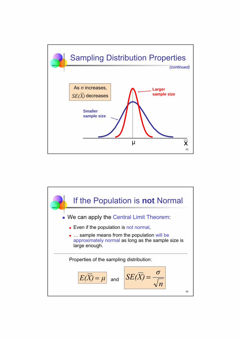
Sampling Distribution Properties
As n increases,
decreasesLarger sample size
Smaller sample size
x
(continued)
)XSE(
μ
34
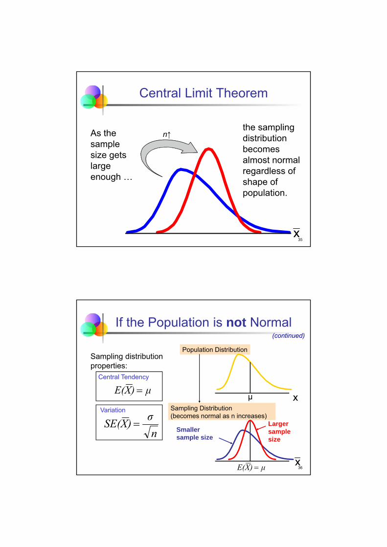
If the Population is not Normal
We can apply the Central Limit Theorem:
Even if the population is not normal,
… sample means from the population will beapproximately normal as long as the sample size is large enough.
Properties of the sampling distribution:
andμ)XE( n
σ)XSE(
35
n↑
Central Limit Theorem
As the sample size gets large enough …
the sampling distribution becomes almost normal regardless of shape of population.
x
36
Population Distribution
Sampling Distribution (becomes normal as n increases)
Central Tendency
Variation
x
x
Larger sample size
Smaller sample size
If the Population is not Normal(continued)
Sampling distribution properties:
μ)XE(
n
σ)XSE(
μ)XE(
μ
37
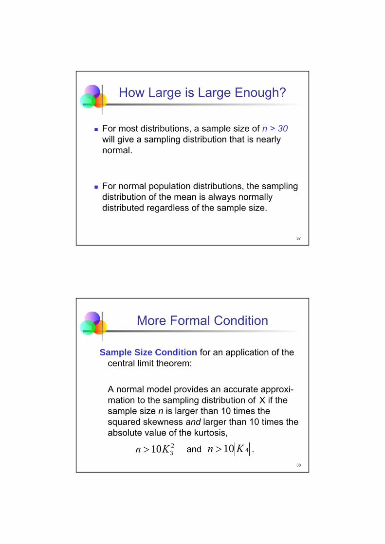
How Large is Large Enough?
For most distributions, a sample size of n > 30will give a sampling distribution that is nearly normal.
For normal population distributions, the sampling distribution of the mean is always normally distributed regardless of the sample size.
38
More Formal Condition
Sample Size Condition for an application of the central limit theorem:
A normal model provides an accurate approxi-mation to the sampling distribution of if the sample size n is larger than 10 times the squared skewness and larger than 10 times the absolute value of the kurtosis,
and .
X
2310Kn 410Kn

39
Average HALT Scores
Design of the chip-making process indicates that the HALT score of a chip has a mean µ = 7 with a standard deviation σ = 4.
Sampling distribution of average HALT scores
(n = 20)
2
22
8902047 .
n
σ,μ~NX
40
Average HALT Scores
The sampling distribution of average HALT scores is (approximately) a normal distribution with mean 7 and standard deviation 0.89.
(continued)

41
Sampling Distributions ofSample Proportions
Sampling Distributions
Sampling Distribution of Sample Mean
Sampling Distribution of Sample Proportion
42
Population Proportions p
p = the proportion of the population having some characteristic
Sample proportion ( ) provides an estimate of p:
0 ≤ ≤ 1
p has a binomial distribution, but can be approximated by a normal distribution when n is large enough
size sampleinterest of sticcharacteri with thesample in the items#ˆ p
p
p
43
Sampling Distribution
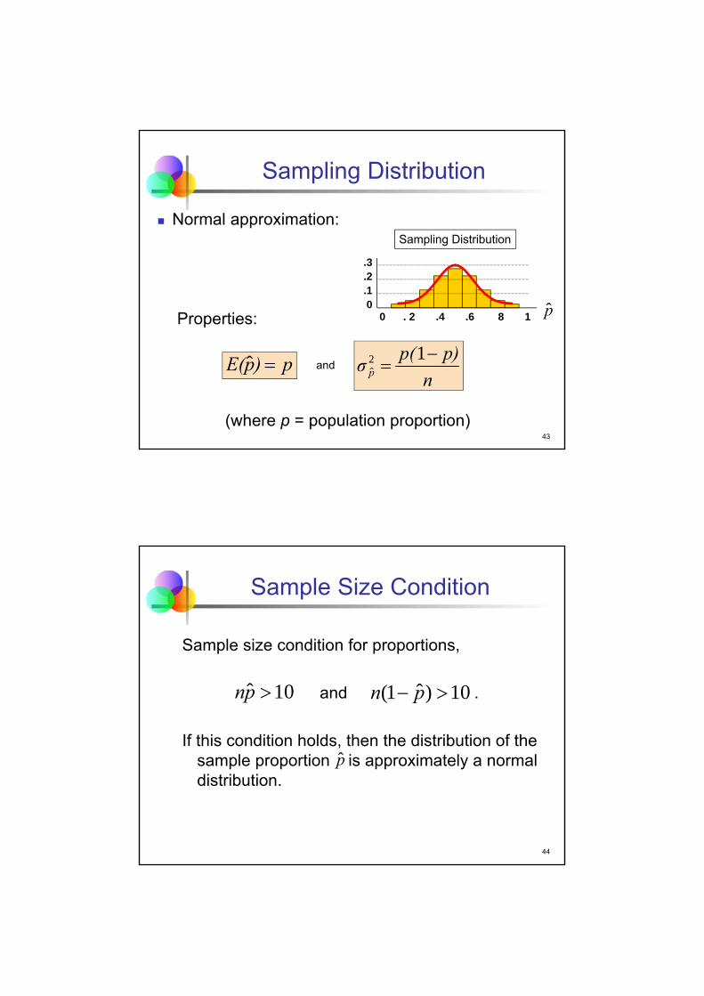
Normal approximation:
Properties:
and
(where p = population proportion)
Sampling Distribution
.3
.2
.10
0 . 2 .4 .6 8 1
p)pE( ˆn
p)p(σ p
12ˆ
p
44
Sample Size Condition
Sample size condition for proportions,
and .
If this condition holds, then the distribution of the sample proportion is approximately a normal distribution.
10ˆ pn 10)ˆ1( pn
p

45
Take Aways
Understand the notion of sampling variation.
Appreciate the dangers of the flaw of averages.
Grasp the concept of a sampling distribution.
Have an idea of the central limit theorem.
Know the sampling distributions of a sample mean and of a sample proportion.
46
Pitfalls
Do not confuse a sample statistic for the population parameter.
Do not fall for the flaw of averages.

2 – Confidence Intervals
Managerial Statistics
KH 19
Course material adapted from Chapter 15 of our textbookStatistics for Business, 2e © 2013 Pearson Education, Inc.
2
Learning Objectives
Distinguish between a point estimate and a confidence interval estimate
Construct and interpret a confidence interval of a population proportion
Construct and interpret a confidence interval of a population mean

3
Point and Interval Estimates
A point estimate is a single number.
A Confidence Interval provides additional information about variability.
Point Estimate
Lower
Confidence
Limit
Upper
Confidence
Limit
Width of confidence interval
4
We can estimate a population parameter …
Point Estimates
with a sample statistic(a point estimate)
mean
proportion p
xμ
p

5
Confidence Interval Estimate
An interval gives a range of values: Takes into consideration variation in sample
statistics from sample to sample
Based on observation from a single sample
Provides more information about a population characteristic than does a point estimate
Relies on the sampling distribution of the statistic.
Stated in terms of level of confidence Can never be 100% confident
6
Estimation Process
(mean, μ, is unknown)
Population
Random Sample
Mean = 50
Sample
I am 95% confident that μ is between 40 and 60.
x

7
General Formula
The general formula for all confidence intervals is:
The value of the reliability factor depends on the desired level of confidence.
Point Estimate (Reliability Factor)(Standard Error)
8
Confidence Intervals
Population Mean
ConfidenceIntervals
PopulationProportion

9
Confidence Interval for the Proportion
Recall that the Central Limit Theorem implies a normal model for the sampling distribution of .
E( ) = p and SE( ) =
SE( ) is called the Standard Error of the Proportion.
npp /)1(
p
p p
p
10
Interpretation
The sample statistic in 95% of samples lies within 1.96 standard errors of the population parameter.

11
Interpretation
Probability that sample proportion deviates by less than 1.96 standard errors of the proportion from the true (but unknown) population propor-tion p is 95%.
P( –1.96 SE( ) ≤ p – ≤ +1.96 SE( ) ) = 0.95.
(continued)
p
p pp
12
95% Confidence Interval for p
For 95% of samples, the interval formed by reaching 1.96 standard errors to the left and right of will contain p.
Problem: We do not know the value of the standard error of the proportion, SE( ), since it depends on the true (but unknown) parameter p.
We estimate this standard error using in place of p,
p
p
p
n
)p(p)pse(
ˆ1ˆˆ
13
Confidence Interval for p
The 100(1 – α)% confidence interval for p is
where z/2 is the standard normal value for the level of
confidence desired (“reliability factor”)
is the sample proportion
n is the sample size
n
)p(pzpp
n
)p(pzp α/α/
ˆ1ˆˆˆ1ˆˆ 22
p
14
Finding the Reliability Factor, z/2
Consider a 95% confidence interval:
z = -1.96 z = 1.96
.951
.0252
α .025
2
α
Point EstimateLower Confidence Limit
UpperConfidence Limit
z units:
p units: Point Estimate
0

15
Common Levels of Confidence
Most commonly used confidence level is 95%.
Confidence Level
Confidence Coefficient, Z/2 value
1.28
1.645
1.96
2.33
2.58
3.08
3.27
.80
.90
.95
.98
.99
.998
.999
80%
90%
95%
98%
99%
99.8%
99.9%
1
16
Affinity Credit Card
Before deciding to offer an affinity credit card to alumni of a university, the credit card company wants to know how many customers will accept the offer.
Population: Alumni of the university
Parameter of interest: Proportion p of alumni who will return the application for the credit card

17
SRS of Alumni
Question: What should we conclude about the proportion p in the population of 100,000 alumni who will accept the offer if the card is launched on a wider scale?
Method: Construct a confidence interval based on the results of a simple random sample.
18
SRS of Alumni
The credit card issuer sent preapproved applica-tions to a sample of 1000 alumni. Of these, 140 accepted the offer and received the card.
Summary Statistics:
(continued)

19
Checklist for Application of Normal
SRS condition. The sample is a simple random sample from the relevant population.
Sample size condition (for proportion). Bothand are larger than 10.
pnˆ)ˆ1( pn
20
Credit Card: Confidence Interval
The estimated standard error is
The 95% confidence interval is
0.14 ± 1.96 × 0.01097 ≈ [0.1185, 0.1615]
0109701000
1401140ˆ .).(.
)pse(

21
Credit Card: Conclusion
With 95% confidence, the population proportion that will accept the offer is between 11.85% and 16.15%.
If the bank decides to launch the credit card, might 20% of the alumni accept the offer? It’s not impossible but rather unlikely given the information in our sample; 20% is outside the 95% confidence interval for the unknown proportion p.
22
Margin of Error
The confidence interval,
can also be written as
where ME is called the Margin of Error,
n
)p(pzpp
n
)p(pzp α/α/
ˆ1ˆˆˆ1ˆˆ 22
MEp ˆ
n
)p(pzα/
ˆ1ˆME 2

23
Reducing the Margin of Error
The width of the confidence interval is equal to twice the margin of error.
The margin of error can be reduced if the sample size is increased (n↑), or
the confidence level is decreased, (1 – ) ↓ .
n
)p(pzα/
ˆ1ˆME 2
24
Margin of Error in the News
You often read in the news statements like the following:
The CNN/USA Today/Gallup poll taken March 7-10 showed that 52% of Americans say… . The poll had a margin of error of plus or minus four percentage points.
No confidence level is given!
The assumed confidence level is typically 95%. In addition, the 1.96 is rounded up to 2.

25
Margin of Error in the News
For an interpretation of this statement we use the confidence interval formula
where ME = 0.04 ≥ .
We can have (slightly more than) 95% confidence that the true proportion of Americans saying … is between 48% and 56%.
(continued)
MEp ˆ
n
)p(p ˆ1ˆ2
26
Confidence Intervals
Population Mean
ConfidenceIntervals
PopulationProportion
27
Sampling Distribution of the Mean
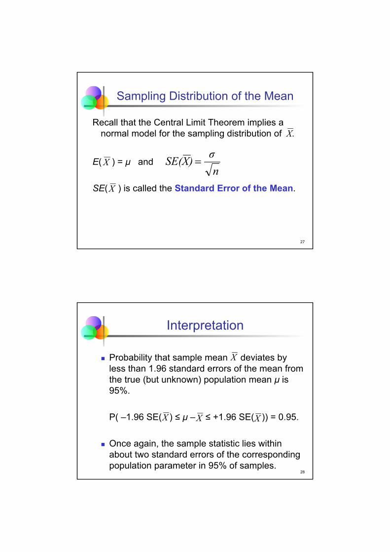
Recall that the Central Limit Theorem implies a normal model for the sampling distribution of .
E( ) = μ and
SE( ) is called the Standard Error of the Mean.
X
X
X
n
σ)XSE(
28
Interpretation
Probability that sample mean deviates by less than 1.96 standard errors of the mean from the true (but unknown) population mean μ is 95%.
P( –1.96 SE( ) ≤ μ – ≤ +1.96 SE( )) = 0.95.
Once again, the sample statistic lies within about two standard errors of the corresponding population parameter in 95% of samples.
X X
X
X

29
Since the population standard deviation σ is unknown, we estimate it using the sample standard deviation, s.
This step introduces extra uncertainty, since sis variable from sample to sample.
As an adjustment, we use the t-distributioninstead of the normal distribution.
Confidence Interval for μ
11
2
n-
)x(xs
n
ii
30
Student’s t-Distribution
Consider an SRS of n observations with mean and standard deviation s
from a normally distributed population with mean μ.
Then the variable
follows the Student’s t-distribution with (n - 1) degrees of freedom.
nS/
μXTn
1
x

31
Student’s t-Distribution
The t-distribution is a family of distributions.
The t-value depends on the degrees of freedom (df). Number of observations that are free to vary after
sample mean has been calculated
df = n – 1
32
Student’s t-Distribution
t0
t (df = 5)
t (df = 13)t-distributions are bell-shaped and symmetric, but have ‘fatter’ tails than the normal
Standard Normal(t with df = ∞)
Note: t Z as n increases(continued)

33
t distribution values
With comparison to the Z value
Confidence t t t ZLevel (df = 10) (df = 20) (df = 30) ____
.80 1.372 1.325 1.310 1.282
.90 1.812 1.725 1.697 1.645
.95 2.228 2.086 2.042 1.960
.99 3.169 2.845 2.750 2.576
Note: t Z as n increases
34
Assumptions Population is normally distributed.
If population is not normal, use “large” sample.
Use Student’s t-Distribution
100(1-α)% Confidence Interval for μ:
where t α/2,n-1 is the reliability factor from the t-distribution with n-1 degrees of freedom and an area of α/2 in each tail.
Confidence Interval for μ
n
stxμ
n
stx ,n-α/,n-α/ 1212

35
Affinity Credit Card
Before deciding to offer an affinity credit card to alumni of a university, the credit card company wants to know how large a balance those alumni will carry who accept the offer.
Population: (Future) credit card balances of (future) customers among the alumni of the university
Parameter of interest: Mean μ of (future) balances carried by alumni on their affinity credit card
36
SRS of Alumni
The 140 alumni who accepted the offer and received the affinity credit card have been carrying an aver-age monthly balance of = $1990.50 with a standard deviation of s = $2,833.33.
x

37
SRS of Alumni
Question: What should we conclude about the average future credit card balance μ on the new affinity credit card for this particular university?
Method: Construct confidence interval.
(continued)
38
Checklist for Application of Normal
SRS condition. The sample is a simple random sample from the relevant population.
Sample size condition (for mean). The sample size is larger than 10 times the squared skew-ness and 10 times the absolute value of the kurtosis.

39
Credit Card: Confidence Interval
The estimated standard error is
se ( ) = 2,833.33 / = 239.46.
The t-value for a 95% confidence interval with 139 degrees of freedom is
T.INV.2T(0.05,139) = 1.97718.
The 95% confidence interval is
1,990.50 ± 1.97718 × 239.46
= [1517.04, 2463.96].
X 140
40
Credit Card: Conclusion
We are 95% confident that the true but unknown µ lies between $1,517.04 and $2,463.96.
If the bank decides to launch the credit card, might the average balance be $1,250? It’s not impossible but based on the sample results it’s rather unlikely.
41
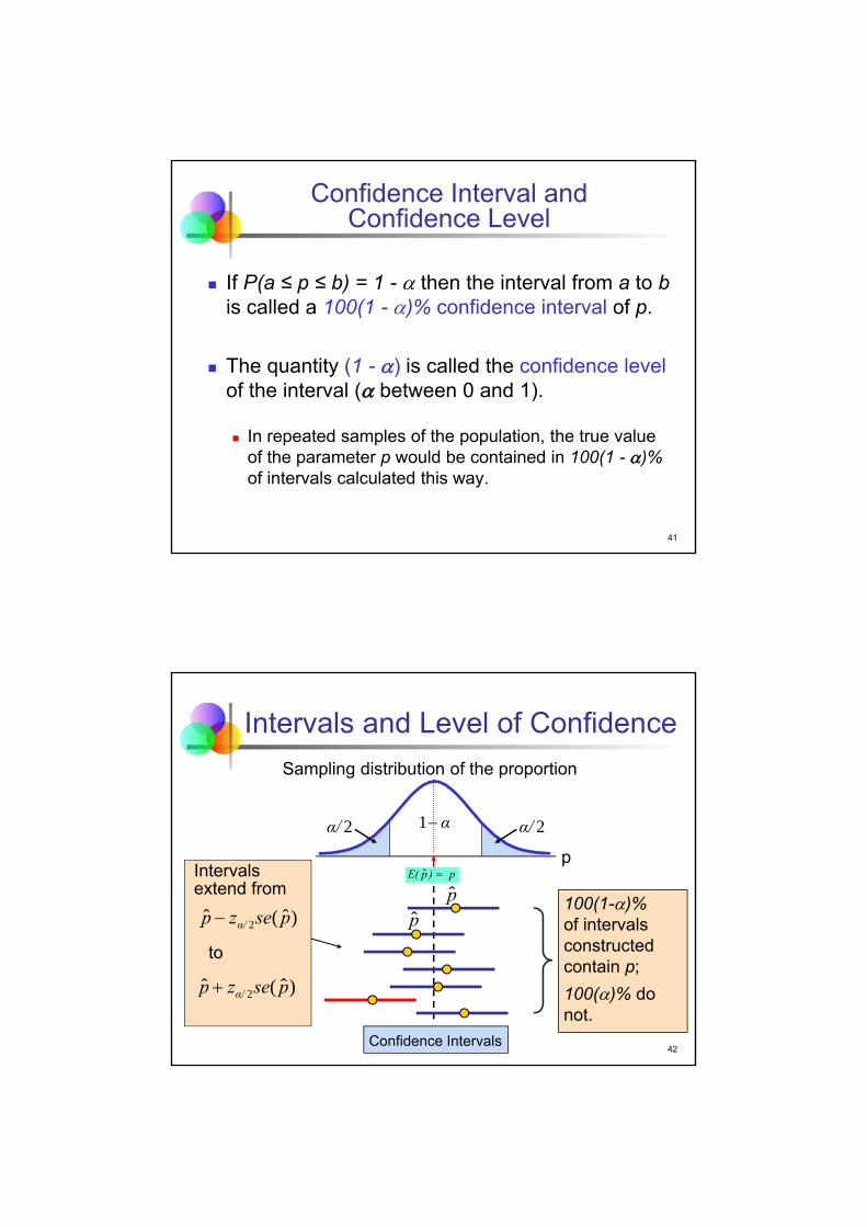
Confidence Interval and Confidence Level
If P(a ≤ p ≤ b) = 1 - then the interval from a to bis called a 100(1 - )% confidence interval of p.
The quantity (1 - ) is called the confidence levelof the interval ( between 0 and 1).
In repeated samples of the population, the true value of the parameter p would be contained in 100(1 - )% of intervals calculated this way.
42
p)pE( ˆ
Intervals and Level of Confidence
Confidence Intervals
Intervals extend from
to
100(1-)%of intervals constructed contain p;
100()% do not.
Sampling distribution of the proportion
p
2α/ 2α/α1
)ˆ(ˆ 2 psezp α/
)ˆ(ˆ 2 psezp α/
pp

43
Confidence Level, (1-)
Suppose confidence level = 95%
Also written (1 - ) = 0.95
A relative frequency interpretation: From repeated samples, 95% of all the
confidence intervals that can be constructed will contain the unknown true parameter.
44
Common Confusions:Wrong Interpretations
95% of all customers keep a balance of $1,517 to $2,464. The CI gives a range for the population mean µ, not
the balance of individual customers.
The mean balance of 95% of samples of 140 accounts will fall between $1,517 and $2,464. The CI provides a range for µ, not the means of other
samples.

45
Common Confusions:Wrong Interpretations
The mean balance is between $1,517 and $2,464. The average balance in the population may not fall
within the CI. The confidence level of the interval is 95%. It may not contain µ.
(continued)
46
Correct Interpretation
We are 95% confident that the mean monthly credit card balance for the population of customers who accept an application lies between $1,517 and $2,464.
The phrase “95% confident” is our way of saying that we are using a procedure that produces an interval containing the unknown mean in 95% of samples.

47
Transforming Confidence Intervals
Obtaining Ranges for Related Quantities
If [L,U] is a 100(1 – α)% confidence interval for µ, then [c×L,c×U] is a 100 (1 – α)% confidence interval for c×µ and [c+L,c+U] is a 100(1 – α)% confidence interval for c+µ.
48
Application: Property Taxes
Motivation
A mayor is considering a tax on business that is proportional to the amount spent to lease property in her city. How much revenue would a 1% tax generate?

49
Property Taxes
Method
Need a confidence interval for µ (average cost of a lease) to obtain a confidence interval for the amount raised by the tax. Check conditions (SRS and sample size) before proceeding.
50
Property Taxes
Mechanics
(continued)
Univariate statisticsTotal Lease Cost
mean 478,603.48standard deviation 535,342.56standard error of the mean 35,849.19
minimum 20,409.00median 290,559.00maximum 2,820,213.00range 2,799,804.00
skewness 1.953kurtosis 4.138
number of observations 223
t-statistic for computing95%-confidence intervals 1.9707

51
Property Taxes
Mechanics
95% confidence interval for average lease cost
478603 ± 1.9707 × 35849
= [407955, 549252]
95% confidence interval for average tax revenue per business
0.01 × [407955, 549252]
= [4079.55, 5492.52]
(continued)
52
Conclusion
Message
We are 95% confident that the average cost of a lease is between $407,955 and $549,252. The 95% confidence interval for tax raised per business is therefore [$4079, $5493]. Since the number of businesses leased in the city is 4,500, we are 95% confident that the amount raised will be between $18,358,000 and $24,716,000.

53
Best Practices
Be sure that the data are an SRS from the population.
Stick to 95% confidence intervals.
Round the endpoints of intervals when presenting the results.
Use full precision for intermediate calculations.
54
Pitfalls
Do not claim that a 95% confidence interval holds µ.
Do not use a confidence interval to describe other samples.
Do not manipulate the sampling to obtain a particular confidence interval.

3 – Hypothesis Tests
Managerial Statistics
KH 19
Course material adapted from Chapter 16 of our textbookStatistics for Business, 2e © 2013 Pearson Education, Inc.
2
Learning Objectives
Formulate null and alternative hypotheses for applications involving
a single population proportion
a single population mean
Execute the four steps of a hypothesis test
Know how to use and interpret p-values
Know what Type I and Type II errors are

3
Motivating Example
An office manager is evaluating software to filter SPAM e-mails (cost $15,000). To make it profitable, the software must reduce SPAM to less than 20%. Should the manager buy the software?
The manager wants to test the software.
4
Motivating Example
To demonstrate how well the software works, the software vendor applied its filtering system to email arriving at the office. After passing through the filter, a sample of 100 messages contained only 11% spam (and no valid messages were removed).
(continued)

5
Motivating Example
Question: Okay, 11% is better than 20%. But does that mean the manager should buy this software?
Method: Use a Hypothesis Test to answer this question.
Idea: Use the sample result, , to decide whether the software will be profitable, p < 0.2.
(continued)
110ˆ .p
6
What is a Hypothesis?
A hypothesis is a claim about the value of an unknown parameter:
population proportion
population mean
Example: The proportion of spam will be below 20%, that is, p < 0.2.
Example: The average monthly rent for all rent-al properties exceeds $500, that is, μ > 500.

7
The Null Hypothesis, H0
The Null Hypothesis, H0, states the claim to be tested; specifies a default course of action; preserves the status quo. Example: The proportion of spam that slips past the
filter is at least 20% (H0: p ≥ 0.2).
H0 is always about a population parameter, not about a sample statistic.
H0 : p ≥ 0.20 H0 : ≥ 0.20p
8
The Null Hypothesis, H0
We begin with the assumption that the null hypothesis is true.
Similar idea to the notion of innocent untilproven guilty
Always contains “=” , “≤”, or “” sign
May or may not be rejected
(continued)

9
The Alternative Hypothesis, Ha
The Alternative Hypothesis, Ha (H1), is the opposite of the null hypothesis. Example: The proportion of spam that slips past
the filter is less than 20% (Ha: p < 0.2).
Ha never contains the “=” , “≤”, or “” sign.
Ha may or may not be supported.
Ha is generally the hypothesis that the decision maker is trying to support.
10
Spam Filter: Hypotheses
Step 1 of a hypothesis test:
Define the hypotheses H0 and Ha.
H0: p ≥ p0 = 0.20
Ha: p < p0 = 0.20

11
Two Possible Options
We may decide to reject H0 (accept Ha).
Alternatively, we may decide not to reject H0 (we do not accept Ha).
There is no third option.
12
Sampling Distribution of p
p = 0.2If H0 is true
If it is unlikely that we would get a sample proportion of this value ...
... then we reject the null hypothesis that p ≥ 0.2.
Reason for Rejecting H0
0.11
... if in fact this were the population proportion…
X
13
Errors in Decision-Making
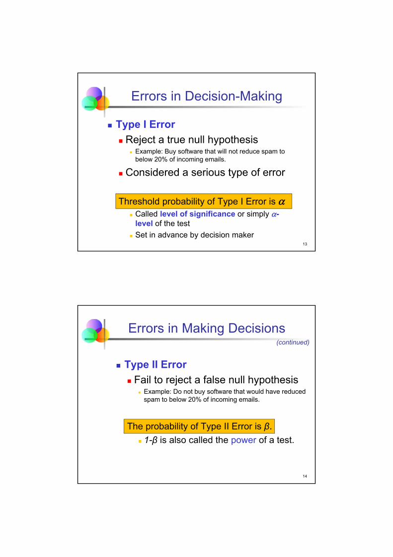
Type I Error
Reject a true null hypothesis Example: Buy software that will not reduce spam to
below 20% of incoming emails.
Considered a serious type of error
Threshold probability of Type I Error is Called level of significance or simply -
level of the test
Set in advance by decision maker
14
Errors in Making Decisions
Type II Error
Fail to reject a false null hypothesis Example: Do not buy software that would have reduced
spam to below 20% of incoming emails.
The probability of Type II Error is β. 1-β is also called the power of a test.
(continued)

15
Outcomes and Probabilities
Actual Situation
Decision
Do NotReject
H0
No error(1 - )
Type II Error( β )
RejectH0
Type I Error( )
Possible Hypothesis Test Outcomes
H0 FalseH0 True
Key:Outcome(Probability) No Error
( 1 - β )
16
Type I & II Errors
Type I and Type II errors cannot happen atthe same time.
Type I error can only occur if H0 is true.
Type II error can only occur if H0 is false.

17
Evaluation of Hypotheses
Sample proportion < 0.2. Is this
relationship sufficient to reject the null
hypothesis?
No! The claim is about the population
proportion p. Maybe we just have a lucky
(unlucky?) sample. That is, the test result
may be due to sampling error.
110ˆ .p
18
Evaluation of Hypotheses
Hypothesis tests rely on the sampling distribution of the statistic that estimates the parameter specified in the null and the alternative.
Key question: What is the chance of getting a sample that differs from H0 by as much as (or even more than) this one if H0 is true?
(continued)
19
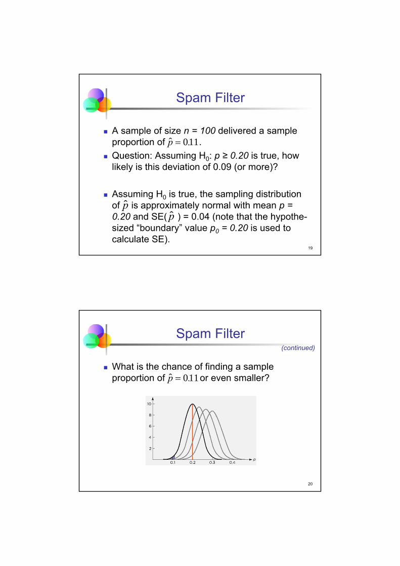
Spam Filter
A sample of size n = 100 delivered a sample proportion of .
Question: Assuming H0: p ≥ 0.20 is true, how likely is this deviation of 0.09 (or more)?
Assuming H0 is true, the sampling distribution of is approximately normal with mean p = 0.20 and SE( ) = 0.04 (note that the hypothe-sized “boundary” value p0 = 0.20 is used to calculate SE).
110ˆ .p
pp
20
Spam Filter
What is the chance of finding a sample proportion of or even smaller?
(continued)
110ˆ .p

21
Test Statistic
Step 2 of a hypothesis test:
Calculate the test statistic.
252
1002001200200110
1ˆ
00
0
.
)/.(.
..
)/np(p
ppz
22
Meaning of Test Statistic
The test statistic measures the difference between the sample outcome and the boundary value of the null hypothesis in multiples of the standard error.
Spam filter example: The sample proportion lies 2.25 standard errors of the proportion below the boundary value in the null hypothesis.
Since the sample distribution is assumed to be normal, the test statistic for proportions is also called z-statistic.

23
From Test Statistic to Probability
Since the sampling distribution of the sample proportion is (approximately) normal, we can calculate the probability of a sample outcome of at least 2.25 standard errors below the mean.
This probability is the famous p-value.
24
p-value
Step 3 of a hypothesis test:
Calculate the p-value.
p = NORM.S.DIST(-2.25,1) ≈ 0.012
p = NORM.DIST(0.11,0.2,0.04,1) ≈ 0.012

25
Calculating the p-value
)ˆ(ˆ 0
pSE
ppz
0-2.25
Under the null hypothesis (H0: p ≥ 0.2), our sample proportion is at least 2.25 standard errors below the population proportion. The probability of such a sample outcome is 1.2% (p-value).
p-value =
NORMSDIST(-2.25) = 0.012
26
Type I Error and p-value
Question: Suppose we decide to reject H0. What is the probability of a Type I error?
Answer: The p-value is the (maximal) chance of a Type I error if H0 is rejected based on the observed test statistic.

27
Level of Significance
Common practice is to reject H0 only if the p-value is less than a preset threshold.
This threshold that sets the maximum tolerance for a Type I error is called level of significance or α-level.
Statistically significant difference from the null hypothesis: Data contradicts H0 and leads us to reject H0 since p-value < α.
28
Decision
Step 4 of a hypothesis test:
Compare p-value to α and make a decision.
p-value = 0.012 < 0.05 = α
We reject H0 and accept the alternative hypothesis Ha. The spam software reduces the proportion of spam e-mails to less than 20%. The office manager should buy the software.

29
Summary
30
Take Aways I
The Four Steps of a Hypothesis Test:
1. Define H0 and Ha.
2. Calculate the test statistic.
3. Calculate the p-value.
4. Compare the p-value to the significance
level α. Make a decision. Accept Ha if p-
value < α.

31
Take Aways II
Hypothesis Testing: The Idea
We always try to prove the alternative hypo-thesis, Ha.
We then assume that its opposite (the null hypothesis) is true.
H0 and Ha must be totally exhaustive & mutually exclusive.
We can never possibly prove H0!
32
Take Aways III
We ask the question: how likely is to obtain our evidence, given that the null hypothesis is (supposedly) true?
This probability is called the p-value.
Not likely (small p) we have statistically “proven” the alternative hypothesis, so we reject the null.
Likely (not small p) we cannot reject the null.

33
Application: Burger King Ads
Motivation
The Burger King ad featuring Coq Roq won critical acclaim (and resulted in much controversy as well as several lawsuits). In a sample of 2,500 homes, MediaCheck found that only 6% saw the ad. An ad must be viewed by 5% or more of households to be effective. Based on these sample results, should the local sponsor run this ad?
34
Burger King Ads
Method
Perform a hypothesis test.
Set up the null and alternative hypotheses.H0: p ≤ 0.05Ha: p > 0.05
Use α = 0.05. Note that p is the population proportion who watches this ad. (Both SRS and sample size conditions are met.)

35
Burger King Ads
Mechanics
Perform the necessary calculations for an evaluation of the null hypothesis.
NORM.S.DIST(2.294,1) = 0.9891
p-value = 1 – 0.9891 = 0.0109 < 0.05 = α
Reject H0.
(continued)
294.2500,2/)05.01(05.0
05.006.0
z
36
Conclusion
Message
The hypothesis test shows a statistically significant result. We can conclude that more than 5% of households watch this ad. The Burger King Coq Roq ad is cost effective and should be run.

37
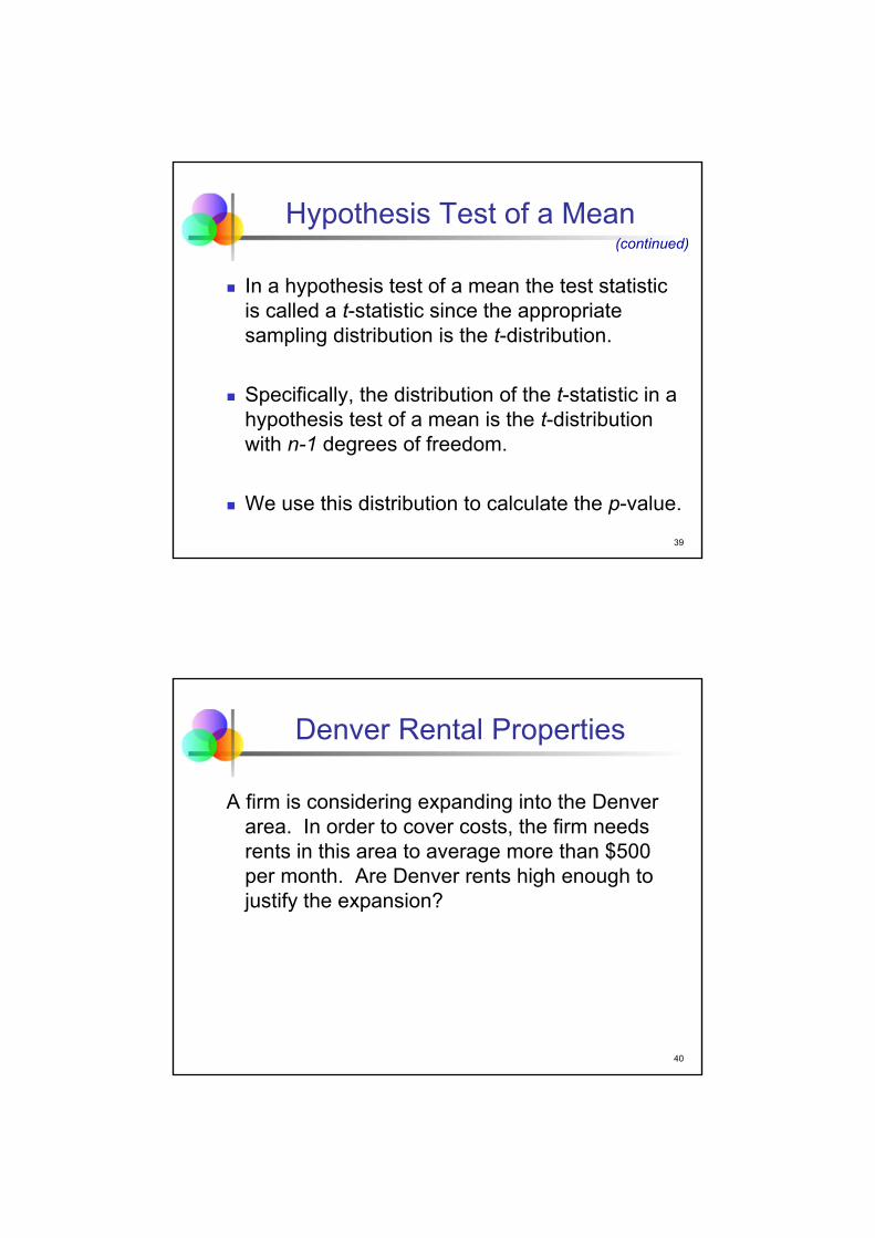
Hypothesis Test of a Mean
Hypothesis tests of the mean are similar to tests of proportions.
H0 and Ha are claims about the unknown population mean μ. For example,
H0: µ ≤ µ0 and Ha: µ > µ0 .
The test statistic uses the random variable , the sample mean.
Unlike in the test of proportions, the standard error is not specified since σ is unknown.
X
38
Hypothesis Test of a Mean
Just as in the calculation of a CI we estimate the unknown population standard deviation σwith the known sample standard deviation s.
The resulting test statistic is
(continued)
n
σ)XSE(
n
s)Xse(
ns
xt
/0
39
Hypothesis Test of a Mean
In a hypothesis test of a mean the test statistic is called a t-statistic since the appropriate sampling distribution is the t-distribution.
Specifically, the distribution of the t-statistic in a hypothesis test of a mean is the t-distribution with n-1 degrees of freedom.
We use this distribution to calculate the p-value.
(continued)
40
Denver Rental Properties
A firm is considering expanding into the Denver area. In order to cover costs, the firm needs rents in this area to average more than $500 per month. Are Denver rents high enough to justify the expansion?

41
Univariate Statistics
The firm obtained rents for a sample of size n = 45; the average rent was $647.33 with a sample std. dev. s = $298.77.
Univariate statisticsRent ($/Month)
mean 647.3333333standard deviation 298.7656424standard error of the mean 44.53735239
minimum 140median 610maximum 1600range 1460
skewness 0.617kurtosis 0.992
number of observations 45
t-statistic for computing95%-confidence intervals 2.0154
42
Hypotheses H0 and Ha
Let µ = mean monthly rent for all rental properties in the Denver area.
Step 1: Set up the hypotheses.
H0: µ ≤ µ0 = 500
Ha: µ > µ0 = 500

43
Test Statistic
Step 2: Compute the test statistic.
The average rent in the sample is 3.308 standard errors of the mean above the boundary value in the null hypothesis.
308.344.5374
50033.647/
0
ns
xt
44
p-value
Step 3: Calculate the p-value.
T.DIST.RT(3.308,44) = 0.0009394
The p-value is 0.09394% and thus below 0.1%.

45
Make a Decision
Step 4: Compare the p-value to α and make a decision.
p-value = 0.0009394 < 0.05 = α
We reject H0 and accept Ha. We conclude that the average rent in the Denver area exceeds the break-even value.
46
Summary: Tests of a Mean

47
Checklist
SRS condition: the sample is a simple random sample from the relevant population.
Sample size condition. Unless the population is normally distributed, a normal model can be used to approximate the sampling distribution of if the sample size n is larger than 10 times both the squared skewness and the absolute value of the kurtosis.
48
Application: Returns on IBM Stock
Motivation
Does stock in IBM return more, on average, than T-Bills? From 1980 through 2005, T-Bills returned 0.5% each month.
49
Returns on IBM Stock
Method
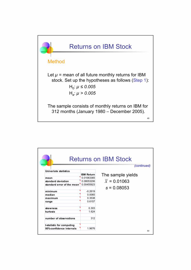
Let µ = mean of all future monthly returns for IBM stock. Set up the hypotheses as follows (Step 1):
H0: µ ≤ 0.005
Ha: µ > 0.005
The sample consists of monthly returns on IBM for 312 months (January 1980 – December 2005).
50
Returns on IBM Stock
The sample yields
= 0.01063
s = 0.08053
(continued)
x
Univariate statisticsIBM Return
mean 0.01063365standard deviation 0.08053206standard error of the mean 0.00455923
minimum -0.2619median 0.0065maximum 0.3538range 0.6157
skewness 0.303kurtosis 1.624
number of observations 312
t-statistic for computing95%-confidence intervals 1.9676

51
Returns on IBM Stock
MechanicsStep 2: Calculation of test statistic.
Step 3: Calculation of p-value.
T.DIST(1.236,311,1) ≈ 0.1088
Step 4: Compare p-value to α = 0.05.
p-value = 0.1088 > 0.05 = α. Do NOT reject H0.
(continued)
23610045590
0050010600 ..
..
ns/
μxt
52
Conclusion
Message
According to monthly IBM returns from 1980 through 2005, the IBM stock does not generate statistically significantly higher earnings than comparable investments in US Treasury Bills.

53
Failure to Reject H0
Our failure to reject H0 and to prove Ha does not mean the null is true. We did not prove the null hypothesis.
Our sample evidence is just too weak to prove Ha at a 5% or even 10% significance level. If we had rejected H0, then the chance of making a Type I error (p-value of about 11%) would have been too high for the given level of significance.
If the α-level had been 15% then we could have proven Ha.
54
Significance vs. Importance
Statistical significance does not mean that you have made a practically important or meaning-ful discovery.
The size of the sample affects the p-value of a test. With enough data, a trivial difference from H0 leads to a statistically significant outcome. Such a trivial difference may be practically un-important.

55
Confidence Interval vs. Test
Confidence intervals make positive statements about the population. A confidence interval provides a range of parameter
values that are compatible with the observed data.
Hypothesis tests provide negative statements. A test provides a precise analysis of specific
hypothesized values for a parameter.
A test attempts to reject a specific hypothesis for a parameter.
56
Two-tailed Hypothesis Test
Hypotheses in a Two-tailed Hypothesis Test are of the following form:
mean: H0: µ = 0.005 Ha: µ ≠ 0.005
proportion: H0: p = 0.2 Ha: p ≠ 0.2
The calculation of the test statistic is identical to the calculation in a One-tailed Hypothesis Test.
57
Two-Tailed Hypothesis Test
By convention, the p-value in a two-tailed test is defined as two times the p-value of the corresponding one-tailed test.
As a consequence, the two-tailed p-value does not have the intuitive interpretation along the lines
“The probability of the sample result assuming the null is true”.
This convention leads to a paradox.
(continued)
58
One-tailed Test on IBM Returns
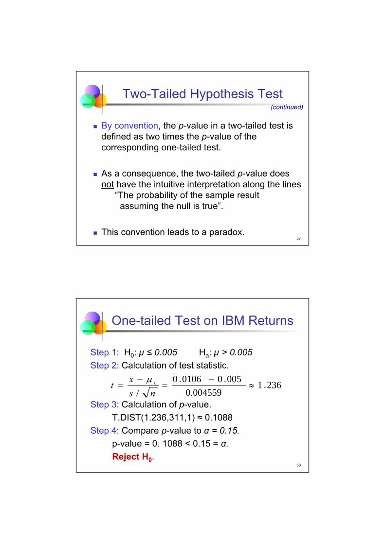
Step 1: H0: µ ≤ 0.005 Ha: µ > 0.005
Step 2: Calculation of test statistic.
Step 3: Calculation of p-value.
T.DIST(1.236,311,1) ≈ 0.1088
Step 4: Compare p-value to α = 0.15.
p-value = 0. 1088 < 0.15 = α.
Reject H0.
236.10.004559
005.00106.0/
0
ns
xt

59
Two-tailed Test on IBM Returns
Step 1: H0: µ = 0.005 Ha: µ ≠ 0.005
Step 2: Calculation of test statistic.
Step 3: Calculation of p-value.
T.DIST(1.236,311,2) ≈ 0.2175
Step 4: Compare p-value to α = 0.15.
p-value = 0. 2175 > 0.15 = α.
Do NOT reject H0.
236.10.004559
005.00106.0/
0
ns
xt
60
Paradox
According to the one-tailed hypothesis test we can prove that µ > 0.005. But according to the two-tailed test we cannot prove that µ ≠ 0.005.
That’s the paradox!
The reason for the convention leading to the paradox is to obtain a sensible relation between two-tailed hypothesis tests and confidence intervals.

61
Two-tailed Tests and Confidence Interval
The hypothesis Ha: µ ≠ 0.005 can be proved at the significance level α if and only if the (1- α)*100% confidence interval does not include 0.005.
62
Summary
Discussed hypothesis testing methodology
Introduced four-step process of hypothesis testing
Defined p-value
Performed z-test for the proportion
Performed t-test for the mean
Discussed two-tailed hypothesis test

63
Best Practices
Be sure that the data are an SRS from the population.
Pick the hypotheses before looking at the data.
Pick the α-level before you compute the test statistic and the p-value.
Think about whether α = 0.05 is appropriate for each test.
Report a p-value to summarize the outcome of a test.
64
Pitfalls
Do not confuse statistical significance with substantive importance.
Do not think that the p-value is the probability that the null hypothesis is true.
Avoid cluttering a test summary with jargon.

4 – Simple Linear Regression
Managerial Statistics
KH 19
Course material adapted from Chapter 19 of our textbookStatistics for Business, 2e © 2013 Pearson Education, Inc.
2
Learning Objectives
Calculate and interpret the simple linear regression equation for a set of data
Describe the meaning of the coefficients of the regression equation in the context of business applications
Examine and interpret the scatterplot and the residual plot as they relate to a regression
Understand the meaning (and limitation) of the R-squared statistic

3
Diamond Prices
Motivation: What is the relationship between the price and weight of diamonds?
Method: Using a sample of 320 emerald-cut diamonds of various weights, regression analysis produces an equation that relates price to weight.
Mechanics: Let y denote the response (“dependent”) variable (price) and let x denote the explanatory (“independent”) variable (weight).
4
Scatterplot of Price vs. Weight
$0.00
$200.00
$400.00
$600.00
$800.00
$1'000.00
$1'200.00
$1'400.00
$1'600.00
$1'800.00
$2'000.00
0.3 0.35 0.4 0.45 0.5 0.55
Pri
ce (
$)
Weight (carats)
Scatterplot

5
Linear Equation
There appears to be a linear trend.
We identify the trend line (“best-fit line” or “fitted line”) by an intercept b0 and a slope b1.
The equation of the fitted line is
Estimated Price = b0 + b1 × Weight .
In generic terms, = b0 + b1 x . y
6
Residuals
Not all data points will lie on the best-fit line.
The Residuals are the vertical deviations from the data points to the line (e=y- ).y

7
Method of Least Squares
The Method of Least Squares determines the best-fit line by minimizing the sum of squared residuals.
The method uses differential calculus to obtain the values of the coefficients b0 and b1 that minimize the sum of squared residuals, also called the sum of squared errors, SSE.
8
Minimizing SSE
Let the index i indicate the ith data point, (xi,yi).
210
2
2
min
ˆmin
min SSEmin
)]xb(b[y
)y(y
e
ii
ii
i

9
Least Square Regression
The method of least squares generates the following coefficient values:
X
Yn
ii
n
iii
s
sr
)x(x
)y)(yx(xb
1
2
11
xbyb 10
10
Diamonds: Fitted Line
The least squares regression equation relating diamond prices to weight is
Estimated Price =
43.5 + 2670 Weight
Regression: Price ($)constant Weight (carats)
coefficient 43.48910163 2669.745803std error of coef 71.90155144 172.4731816t-ratio 0.6048 15.4792p-value 54.5715% 0.0000%beta-weight 0.6555
standard error of regression 170.2149256R-squared 42.97%adjusted R-squared 42.79%
number of observations 320residual degrees of freedom 318
t-statistic for computing95%-confidence intervals 1.9675

11
Using the Fitted Line
The average price of a diamond that weighs 0.4 carat is
Estimated Price = 43.49 + 2669.75 × 0.4
≈ 1111.39,
that is, the estimated price is (about) $1,111.
A diamond that weighs 0.5 carat costs (about) $267 more, on average.
12
Illustration

13
Interpreting the Slope
The slope coefficient b1 describes how differences in the explanatory variable xassociate with differences in the response y.
In the diamond example, we can interpret the slope b1 as the marginal cost of an additional carat. (i.e., marginal cost is $2,670 per carat).
14
Interpreting the Intercept
The intercept b0 estimates the average response when x = 0 (where the line crosses the y axis).
The intercept is the portion of y that is present for all values of x.
In the diamond example we can interpret b0 as fixed cost, $43.49, per diamond.

15
Interpreting the Intercept
In many applications, the intercept coefficient does not have a useful interpretation.
Unless the range of x values includes zero, the value for b0 is the result of an extrapolation.
(continued)
16
Residual Plot
A Residual Plot shows the variation that remains in the data after accounting for the linear relationship defined by the fitted line. Put differently, the plot shows the variation of the data points around the fitted line.
The residuals should be plotted against the predicted values of y (or against x) to check for patterns.

17
Residual Plot
If the least squares line captures the association between x and y, then a plot of residuals should stretch out horizontally with consistent vertical scatter. No particular pattern should be visible.
Our task is to visually check for the absence of a pattern.
(continued)
18
Residuals vs. Predicted Values
-600
-400
-200
0
200
400
600
800 900 1000 1100 1200 1300 1400 1500
resi
du
als
predicted values of Price ($)
Residual Plot

19
Variation of Residuals
The standard deviation of the residuals measures how much the residuals vary around the fitted line.
This standard deviation is called the Standard Error of Regression or the Root Mean Squared Error (RMSE).
22
222
21
n
eee)SSE/(ns n
e
20
Diamonds
For the diamond example, se=170.21.
The standard error of regression is $170.21.
Regression: Price ($)constant Weight (carats)
coefficient 43.48910163 2669.745803std error of coef 71.90155144 172.4731816t-ratio 0.6048 15.4792p-value 54.5715% 0.0000%beta-weight 0.6555
standard error of regression 170.2149256R-squared 42.97%adjusted R-squared 42.79%
number of observations 320residual degrees of freedom 318
t-statistic for computing95%-confidence intervals 1.9675

21
Measures of Variation
xi
y
X
SST = (yi - y)2
SSE = (yi - yi )2
SSR = (yi - y)2 _
_
y
y
__y
Yyi
22
Measures of Variation
SST = total sum of squares
Variation of the yi values around their mean,
SSR = regression sum of squares
Explained variation attributable to the linear relationship between x and y
SSE = error sum of squares (sum of squared errors)
Variation attributable to factors other than the linear relationship between x and y
y
(continued)

23
Measures of Variation
Total variation is made up of two parts:
SSE SSR SST Total Sum of Squares
Regression Sum of Squares
Error Sum of Squares
2i )y(ySST 2
ii )y(ySSE ˆ 2i )yy(SSR ˆ
where:
= Average value of the dependent variable
yi = Observed values of the dependent variable
i = Predicted value of y for the given xi valuey
y
(continued)
24
The Coefficient of Determination is the portion of the total variation in the dependent variable that is explained by variation in the independent variable.
The coefficient of determination is also called R-squared and is denoted by r2 or R2.
Coefficient of Determination, R2
10 2 Rnote:
squares of sum total squares of sum regression
SSTSSR2 R

25
r2 = 1
Examples of R-squared Values
Y
X
Y
X
r2 = 1
r2 = 1
Perfect linear relationship between X and Y:
100% of the variation in Y is explained by variation in X.
26
Examples of R-squared Values
Y
X
Y
X
0 < r2 < 1
Weaker linear relationships between X and Y:
Some but not all of the variation in Y is explained by variation in X.
(continued)

27
Examples of R-squared Values
r2 = 0
No linear relationship between X and Y:
The value of Y does not depend on X. (None of the variation in Y is explained by variation in X).
Y
Xr2 = 0
(continued)
28
Diamonds
For the diamond example,
r2 = 0.4297.
The R-squared is 43%. That is, the regression explains 43% of the variation in price.
Regression: Price ($)constant Weight (carats)
coefficient 43.48910163 2669.745803std error of coef 71.90155144 172.4731816t-ratio 0.6048 15.4792p-value 54.5715% 0.0000%beta-weight 0.6555
standard error of regression 170.2149256R-squared 42.97%adjusted R-squared 42.79%
number of observations 320residual degrees of freedom 318
t-statistic for computing95%-confidence intervals 1.9675

29
Checklist for Simple Regression
Linear: Examine the scatterplot to see if pattern resembles a straight line.
Random residual variation: Examine the residual plot to make sure no pattern exists.
(No obvious lurking variable: Think about whether other explanatory variables may better explain the linear association
between x and y.)
30
Application: Lease Costs
Motivation
How can a dealer anticipate the effect of age on the value of a used car? The dealer estimates that $4,000 is enough to cover the depreciation per year.

31
Lease Costs
Method
Use regression analysis to find the equation that relates y (resale value in dollars) to x (age of the car in years). The car dealer has data on the prices and age of 218 used BMWs in the Philadelphia area.
32
Lease Costs
Mechanics
(Think about lurking variables)
Check scatterplot
Run regression
Check residual plot
(continued)

33
Lease Costs: Scatterplot
$10'000.00
$15'000.00
$20'000.00
$25'000.00
$30'000.00
$35'000.00
$40'000.00
$45'000.00
$50'000.00
0 1 2 3 4 5 6
Pri
ce
Age
Regression Equation: Price = 39851.7199 - 2905.5284 Age
Scatterplot
34
Lease Costs: Regression
MechanicsRegression: Price
constant Agecoefficient 39851.7199 -2905.5284std error of coef 758.460867 219.3264t-ratio 52.5429 -13.2475p-value 0.0000% 0.0000%beta-weight -0.6695
standard error of regression 3366.63713R-squared 44.83%adjusted R-squared 44.57%
number of observations 218residual degrees of freedom 216
t-statistic for computing95%-confidence intervals 1.9710

35
Lease Costs: Residual Plot
-10000
-5000
0
5000
10000
15000
20000 25000 30000 35000 40000 45000
resi
du
als
predicted values of Price
Residual Plot
36
Lease Costs: Regression
Mechanics
The linear regression equation is
Estimated Price = 39,851.72 – 2,905.53 Age
The R-squared is 0.4483, the standard error of regression is se = $3366.64.

37
Conclusion
Message
The results indicate that used BMWs decline in resale value by $2,900 per year. The current lease price of $4,000 per year appears profitable. However, the fitted line leaves more than half of the variation unexplained.
Leases longer than 5 years would require extrapolation.
38
Best Practices
Always look at the scatterplot.
Know the substantive context of the model.
Describe the intercept and slope using units of the data.
Limit predictions to the range of observed conditions.

39
Pitfalls
Do not assume that changing x causes changes in y.
Do not forget lurking variables.
Do not trust summaries like R-squared without looking at plots.
Do not call a regression with a high R-squared “good” or a regression with a low R-squared “bad”.
5 – Simple Regression Model
Managerial Statistics
KH 19
Course material adapted from Chapter 21 of our textbookStatistics for Business, 2e © 2013 Pearson Education, Inc.
2
Learning Objectives
Understand the framework of the simple linear regression model
Calculate and interpret confidence intervals for the regression coefficients
Perform hypothesis tests on the regression coefficients
Understand the difference between confidence and prediction intervals for the predicted value

3
Berkshire Hathaway
Motivation: How can we test the CAPM (Capital Asset Pricing Model) for Berkshire Hathaway stock?
Method: Formulate the simple regression with percentage excess return in Berkshire Hathaway stock as y and the percentage excess return in value of the whole stock market (“value-weighted stock market index) as x.
4
From Description to Inference
We do not only want to describe the historical relationship between x and y that is evident in the data. In addition, we now want to make inferences about the underlying population.
We have to think of our data as a sample from a population.

5
From Description to Inference
Naturally, the question arises, what conclusions can we derive from the sample about the population?
The central idea is to use inference related to regression: standard errors, confidence intervals and hypothesis tests.
(continued)
6
Model of the Population
The Simple Linear Regression Model (SRM) is a model for the association in the population between an explanatory variable x and a response variable y.
The SRM equation describes how the (conditional) mean of y depends on x.
The SRM assumes that these means lie on a straight line with intercept β0 and slope β1:
xxXYExy 10)(

7
Model of the Population
The response variable y is a random variable. The actual values vary around the mean. The deviations of responses around their (conditional) mean are called errors,
Errors ε can be positive or negative. They have zero mean, that is, the average deviation from the line is zero.
(continued)
xyy
8
εxββy 10linear component
Simple Linear Regression Model
The population regression model:
population Y intercept
population slopecoefficient
random error term
dependent variable
independent variable
random errorcomponent

9
(continued)
random error for this xi value
Y
X
observed value of y for xi
average value of y for xi
iii εxββy 10
xi
slope = β1
intercept = β0
εi
Simple Linear Regression Model
10
Data Generating Process
The “true regression line” is a characteristic of the population, not the observed data.
The true line’s parameters β0 and β1 are (and will remain) unknown!
The SRM is a model and offers a simplified view of the population.
The observed data points are a simple random sample from the population.
The fitted line provides an estimate of the population regression line.

11
ii xbby 10ˆ
The simple linear regression equation provides an estimate of the population regression line.
Simple Linear Regression Equation
estimate of the regression intercept
estimate of the regression slope
estimated (or predicted) yvalue for observation i
value of x for observation i
The individual random error terms ei are
)xb-(by)y-(ye iiiii 10ˆ value of y for observation i
12
Estimates vs. Parameters
13
From Description to Inference
We want to use the estimated regression line to make inferences about the true relationship between the explanatory and the response variable.
The central idea is to use the standard statistical tools: standard errors, confidence intervals and hypothesis tests.
The application of these tools requires us to make some assumptions.
14
SRM: Classical Assumptions
(1) The regression model is linear.
(2) The error term ε has zero mean, E(ε) = 0.
(3) The explanatory variable x and the error term εare uncorrelated.
(4) The error terms are uncorrelated with each other.

15
SRM: Classical Assumptions
(5) The error term has a constant variance, Var(ε) = σe
2 for any value of x. (homoskedasticity)
(6) The error terms are normally distributed.
(This assumption is optional but usually invoked.)
(continued)
16
Inference
If assumptions (1) – (6) hold, then we can easily compute confidence intervals for the unknown parameters β0 and β1. Similarly, we can perform hypothesis tests for these parameters.

17
Modeling Process: Practical Checklist
Before looking at plots or running a regression, ask the following questions: Does a linear relationship make sense to us?
What type of relationship (sign of coefficients) do we expect?
Could there be lurking variables?
Then begin working with data.
18
Modeling Process: Practical Checklist
Plot y versus x and verify a linear association in the scatterplot.
Compute the fitted line.
Plot the residuals versus the predicted values (or x) and inspect the residual plot. Do the … … residuals appear to be independent?
… residuals appear to have similar variances?
(… residuals appear to be nearly normal?)
(Time series require additional checks.)
(continued)

19
CAPM: Berkshire Hathaway
Check scatterplot: relationship appears linear
-30
-20
-10
0
10
20
30
40
-25 -20 -15 -10 -5 0 5 10 15
% C
han
ge
Ber
k-H
ath
% Change Market
Scatterplot
20
CAPM: Berkshire Hathaway
Run simple linear regression
(continued)
Regression: % Change Berk-Hath
constant % Change Market
coefficient 1.39620459 0.72234946
std error of coef 0.33968223 0.07776332
t-ratio 4.1103 9.2891
p-value 0.0049% 0.0000%
beta-weight 0.4334
standard error of regression 6.51740865
R-squared 18.79%
adjusted R-squared 18.57%
number of observations 375
residual degrees of freedom 373
t-statistic for computing
95%-confidence intervals 1.9663

21
CAPM: Berkshire Hathaway
Check residual plot: no pattern visible
(continued)
-30
-20
-10
0
10
20
30
40
-20 -15 -10 -5 0 5 10 15
resi
du
als
predicted values of % Change Berk-Hath
Residual Plot
22
Standard Errors of the Coefficients
The Standard Errors of the Coefficients describe the sample-to-sample variability of the coefficients b0 and b1.
The estimated standard error of b1, se(b1), is
x
e
sn
sbse
11
)( 1

23
Estimated Standard Error of b1
The estimated standard error of b1 depends on three factors: Standard deviation of the residuals se. As se
increases, the standard error se(b1) increases.
Sample size n. As n increases, the standard error se(b1) decreases.
Standard deviation sx of x. As sx increases, the standard error se(b1) decreases.
24
CAPM: Berkshire Hathaway
CAPM regression for Berkshire HathawayRegression: % Change Berk-Hath
constant % Change Market
coefficient 1.39620459 0.72234946
std error of coef 0.33968223 0.07776332
t-ratio 4.1103 9.2891
p-value 0.0049% 0.0000%
beta-weight 0.4334
standard error of regression 6.51740865
R-squared 18.79%
adjusted R-squared 18.57%
number of observations 375
residual degrees of freedom 373
t-statistic for computing
95%-confidence intervals 1.9663

25
Confidence Intervals
Confidence intervals for the coefficients
The 95% confidence interval for β1 is
The 95% confidence interval for β0 is
)( 02,025.00 bsetb n
)( 12,025.01 bsetb n
26
Confidence Intervals: CAPM
The 95% confidence interval for β1 is
0.72234 ± 1.9663×0.077763 = [0.5694, 0.8753].
The 95% confidence interval for β0 is
1.3962 ± 1.9663×0.33968 = [0.7283, 2.064].

27
Hypothesis Tests
Hypothesis tests on the coefficients
Test statistic for H0: β1 = 0:
Test statistic for H0: β0 = 0:
)se(b
bt
1
1
)se(b
bt
0
0
28
Hypothesis Tests: CAPM
Hypothesis test of statistical significance for β1: The t-statistic of 9.2891 with a p-value of less than 0.0001% indicates that the slope is significantly different from zero.
Hypothesis test of statistical significance for β0: The t-statistic of 4.1103 with a p-value of 0.0049% indicates that the intercept is significantly different from zero.

29
Application: Locating a Gas Station
Motivation
Does traffic volume affect gasoline sales? How much more gasoline can be expected to be sold at a gas station with an average of 40,000 drive-bys a day compared to one with an average of 32,000 drive-bys?
30
Gas Station
Method
Use sales data from a recent month obtained from 80 gas stations (from the same franchise).
Run a regression of sales against traffic volume.
The 95% confidence interval for 8,000 times the estimated slope will indicate how much more gas is expected to sell at the busier location.

31
Gas Station
Mechanics
(Think about lurking variables)
Check scatterplot
Run regression
Check residual plot
(continued)
32
Gas Station: Scatterplot
Mechanics
Check scatterplot: relationship appears linear
2
4
6
8
10
12
14
20 25 30 35 40 45 50 55
Sal
es (
000
gal
.)
Traffic Volume (000)
Scatterplot

33
Gas Station: Regression
Mechanics
Run a regression
Regression: Sales (000 gal.)
constant Traffic Volume (000)
coefficient -1.3380974 0.23672864
std error of coef 0.94584359 0.02431421
t-ratio -1.4147 9.7362
p-value 16.1132% 0.0000%
beta-weight 0.7407
standard error of regression 1.5054068
R-squared 54.86%
adjusted R-squared 54.28%
number of observations 80
residual degrees of freedom 78
t-statistic for computing
95%-confidence intervals 1.9908
34
Gas Station: Residual Plot
Mechanics
Check the residual plot: no pattern
-4
-3
-2
-1
0
1
2
3
4
5
4 5 6 7 8 9 10 11resi
du
als
predicted values of Sales (000 gal.)
Residual Plot

35
Gas Station: Regression
Mechanics
The linear regression equation is
Estimated Sales = -1.338 + 0.23673 Traffic Vol.
The 95% confidence interval for β1 is
0.23673 ± 1.9908×0.024314 = [0.1883, 0.2851].
The 95% confidence interval for 8000×β1 is
8000×[0.1883, 0.2851] ≈ [1507, 2281].
36
Conclusion
Message
Based on a sample of 80 gas stations, we expect that a station located at a site with 40,000 drive-bys will sell, on average, from 1,507 to 2,281 more gallons of gas daily than a location with 32,000 drive-bys.

37
Standard Errors of the Fitted Value
The fitted value, , for a given value of x is an estimator of two different unknown values: It is a point estimate for the average value of y for all
data points with the particular x value.
It is a point estimate for the y value of a single observation with this particular x value.
It is much more difficult to make a prediction about a single observation than to make a prediction about an average value.
y
38
SE Estimated Mean
ŷ = b0 + b1*x
x = 40
ŷ = 8.13
Std error of ŷ for estimating μy|x: SE of estimated mean.
Confidence Interval for average Sales at Traffic Volume = 40.
b0
y = Sales
x = Traffic Volume

39
SE Prediction
x = 40
Std error of ŷ for estimating avg y at x: SE of estimated mean.
Std error of ŷ for estimating individual y: SE of prediction.
(SE of prediction)2 = (SE of est. mean)2 + (SE of regression)2
x = Traffic Volume
y = Sales
b0
Prediction Interval for Sales at Traffic Volume = 40
ŷ = 8.13
ŷ = b0 + b1*x
40
Standard Errors of the Fitted Value
The Standard Error of the Estimated Meancaptures the variability of the estimated mean of y around μy|x, the (true but unknown) population average y at the given x.
The fitted ŷ = b0 + b1*x is our estimator for the average y at x. The SE of Estimated Mean is a measure for its sample-by-sample variation.
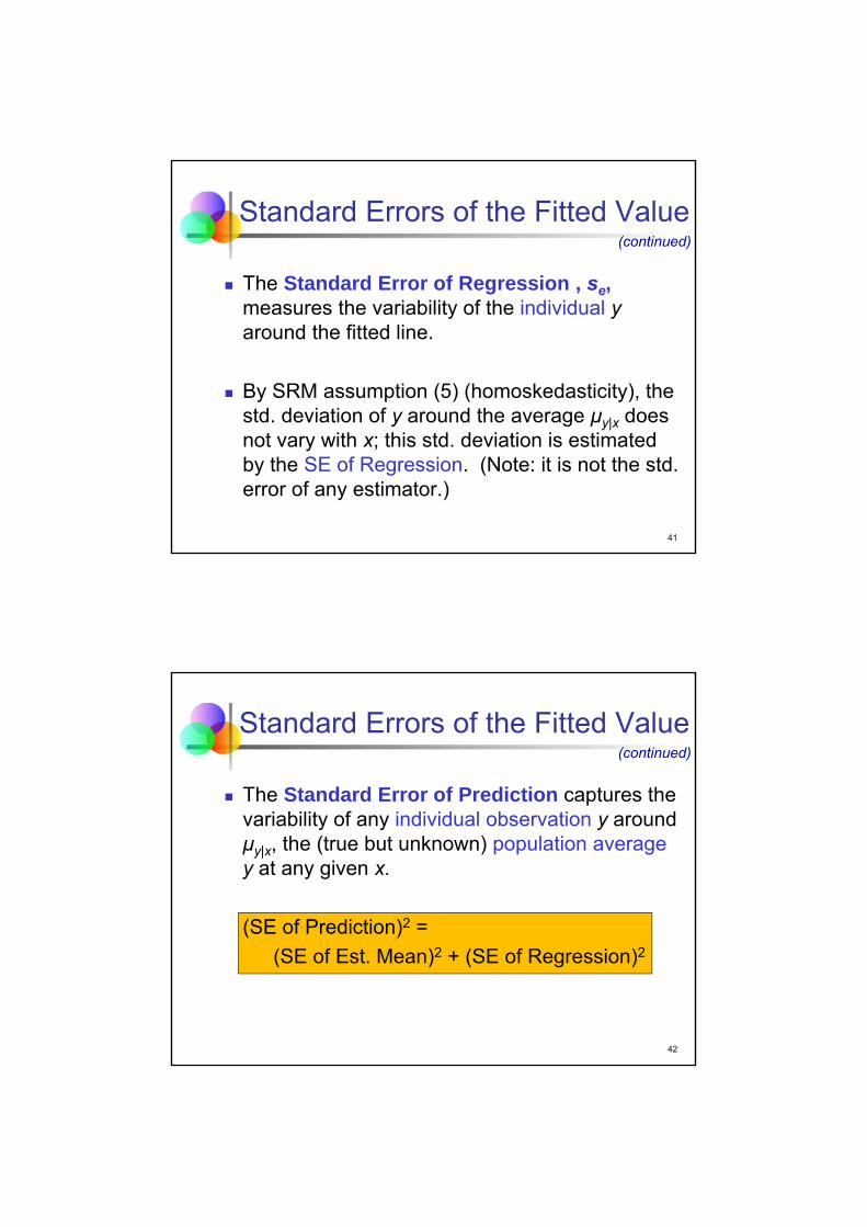
41
Standard Errors of the Fitted Value
The Standard Error of Regression , se, measures the variability of the individual yaround the fitted line.
By SRM assumption (5) (homoskedasticity), the std. deviation of y around the average μy|x does not vary with x; this std. deviation is estimated by the SE of Regression. (Note: it is not the std. error of any estimator.)
(continued)
42
The Standard Error of Prediction captures the variability of any individual observation y around μy|x, the (true but unknown) population averagey at any given x.
(SE of Prediction)2 =
(SE of Est. Mean)2 + (SE of Regression)2
Standard Errors of the Fitted Value(continued)

43
Two Different Intervals
Confidence Interval: An interval designed to hold an unknown population parameter with some level (often 95%) of confidence.
Prediction Interval: An interval designed to hold a fraction of the values of the variable y(for a given value of x).
A prediction interval differs from a confidence interval because it makes a statement about the location of a new observation rather than a parameter of a population.
44
CI vs. PI
(1- α) Confidence Interval for a mean
Predicted Value ± TINV(α,df)×SE Est. Mean
Prediction Interval for a single observation
Predicted Value ± TINV(α,df)×SE Prediction
Prediction intervals are sensitive to SRM assumptions (5), constant variance, and (6), normal errors.

45
Gas Station: CI and PI
Prediction, using most-recent regression
constantTraffic Volume
(000)
coefficients -1.3381 0.236729
values for prediction 40
predicted value of Sales (000 gal.) 8.131048
standard error of prediction 1.515364
standard error of regression 1.505407
standard error of estimated mean 0.173427
confidence level 95.00%
t-statistic 1.9908
residual degr. freedom 78
confidence limits lower 5.114191
for prediction upper 11.14791
confidence limits lower 7.785781
for estimated mean upper 8.476316
95% CI: [7.786, 8.476]
95% PI: [5.114, 11.148]
46
Interpretation of Intervals
We are 95% confident that average sales at gas stations with 40,000 drive-bys per day are between 7,786 gallons and 8,476 gallons.
We are 95% confident that sales at an individual gas station with 40,000 drive-bys per day are between 5,114 gallons and 11,148 gallons.

47
Best Practices
Verify that your model makes sense, both visually and substantively.
Consider other possible explanatory variables.
Check the conditions, in the listed order.
Use confidence intervals to express what you know about the slope and intercept.
Check the assumptions of the SRM carefully before using prediction intervals.
Be careful when extrapolating.
48
Pitfalls
Don’t overreact to residual plots.
Do not mistake varying amounts of data for unequal variances.
Do not confuse confidence intervals with prediction intervals.
Do not expect that r2 and se must improve with a larger sample.

6 – Multiple Regression
Managerial Statistics
KH 19
Course material adapted from Chapter 23 of our textbookStatistics for Business, 2e © 2013 Pearson Education, Inc.
2
Learning Objectives
Apply multiple regression analysis to decision-making situations in business
Analyze and interpret multiple regression models
Understand the difference between partial and marginal slopes
Decide when to exclude variables from a regression model
3
Chain of Women’s Apparel Stores
Motivation: How are sales at a chain of women’s apparel stores (annually in dollars per square foot of retail space) affected by competition (number of competing apparel stores in the same shopping mall)?
First approach: Formulate a simple regression with sales at stores of this chain as the response variable y and the number of competing stores as the explanatory variable x.
4
Scatterplot of Sales vs. Competitors
$300.00
$400.00
$500.00
$600.00
$700.00
$800.00
$900.00
0 1 2 3 4 5 6 7
Sal
es (
$/sq
ft)
Competitors
Scatterplot

5
Simple Linear Regression
Positive relationship: more competitors, higher sales!
Does this make sense?
Regression: Sales ($/sq ft)constant Competitors
coefficient 502.201557 4.63517778std error of coef 25.4436616 8.74691578t-ratio 19.7378 0.5299p-value 0.0000% 59.8029%beta-weight 0.0666
standard error of regression 105.778443R-squared 0.44%adjusted R-squared -1.14%
number of observations 65residual degrees of freedom 63
t-statistic for computing95%-confidence intervals 1.9983
6
Interpretation
A large number of competitors is indicative of a shopping mall in a location with a high median household income. Put differently, the number of competitors and the median household income are positively correlated.
The simple regression of Sales on Competitorsmixes the decrease in sales associated with increased competition with the increase in sales associated with higher income levels (that accompany a larger number of competitors).

7
Apparel Sales: Multiple Regression
Multiple regression with 2 explanatory variables Median household income in the area (in thousands
of dollars) Number of competing apparel stores in the same
mall Response variable as before
Sales at stores of the chain (annually in dollars per square foot of retail space)
8
Apparel Sales: Multiple Regression
Estimated Sales = 60.359 + 7.966 Income – 24.165 Competitors
Regression: Sales ($/sq ft)constant Income ($000) Competitors
coefficient 60.3586702 7.965979876 -24.16503223std error of coef 49.290165 0.838249629 6.38991396t-ratio 1.2246 9.5031 -3.7817p-value 22.5374% 0.0000% 0.0353%beta-weight 0.8727 -0.3473
standard error of regression 68.03062709R-squared 59.47%adjusted R-squared 58.17%
number of observations 65residual degrees of freedom 62
t-statistic for computing95%-confidence intervals 1.9990

9
Sales: Residual Plot
Check the residual plot: no pattern
-150
-100
-50
0
50
100
150
200
300 350 400 450 500 550 600 650 700 750 800
resi
du
als
predicted values of Sales ($/sq ft)
Residual Plot
10
Interpreting the Equation
The slope 7.966 for Income implies that a store in a location with a higher median household of $10,000 sells, on average, $79.66 more per square foot than a store in a less affluent loca-tion with the same number of competitors.
The slope -24.165 for Competitors implies that, among stores in equally affluent locations, each additional competitor lowers average sales by $24.165 per square foot.

11
Multiple Regression
The Multiple Regression Model (MRM) is a model for the association in the population between multiple explanatory variables x1, x2, …,xk and a response y.
While the SRM bundles all but one explanatory variable into the error term, multiple regression allows for the inclusion of several variables in the model.
Multiple regression separates the effects of each explanatory variable on the response and reveals which really matter.
12
Multiple Regression Model
Idea: Examine the linear relationship between a response (y) & 2 or more explanatory variables (xi)
εxβxβxββy kk 22110
Multiple regression model with k independent variables:
y intercept population slopes random error

13
Multiple Regression Equation
The coefficients of the multiple regression model are estimated using sample data
kk xbxbxbby 22110ˆ
estimated slope coefficients
Estimated multiple regression equation:
estimatedintercept
14
Graph for Two-Variable Model
y
x1
x2
22110ˆ xbxbby

15
Residuals in a Two-Variable Model
y
x2
22110ˆ xbxbby yi
yi
<
x2i
x1i
sample observation
residual = ei = (yi – yi)
<
16
MRM: Classical Assumptions
(1) The regression model is linear.
(2) The error term ε has zero mean, E(ε) = 0.
(3) All explanatory variables x1, x2, …,xk are uncorrelated with the error term ε.
(4) Observations of the error term are uncorre-lated with each other.

17
MRM: Classical Assumptions
(5) The error term has a constant variance, Var(ε) = σe
2 for any value of x. (homoskedasticity)
(6) No explanatory variable is a perfect linear function of any other explanatory variables.
(7) The error terms are normally distributed.(This assumption is optional but usually invoked.)
(continued)
18
Multiple vs. Simple Regressions
Partial slope: slope of an explanatory variable in a multiple regression that statistically exclu-des the effects of other explanatory variables.
Marginal slope: slope of the explanatory variable in a simple regression.
Partial and Marginal slopes only agree when the explanatory variables are uncorrelated.

19
Partial Slopes: Women’s Apparel
Competitors has a direct negative effect on Sales.Income has a positive effect on Sales.
Competitors and Income are positively correlated.
SalesCompetitors
Income
–
++
20
Marginal Slope: Women’s Apparel
The direct effect of Competitors on Sales is negative (–). The indirect effect (via Income) is positive (+ × +).
The marginal slope of Competitors in the simple regression is now the sum of these two effects.
SalesCompetitorsIncome
–++
– + (+ × +)

21
Partial vs. Marginal Slopes
The MRM separates the individual effects of all explanatory variables (into the partial slopes). Indirect effects (resulting from correlation among explanatory variables) are not present.
The SRM does not separate individual effects and so indirect effects are present. The marginal slope of the (single) explanatory variable reflects both the direct effect of this variable as well as the indirect effect(s) due to missing explanatory variable(s).
22
Apparel Sales: Multiple Regression
Estimated Sales = 60.359 + 7.966 Income – 24.165 Competitors
Regression: Sales ($/sq ft)constant Income ($000) Competitors
coefficient 60.3586702 7.965979876 -24.16503223std error of coef 49.290165 0.838249629 6.38991396t-ratio 1.2246 9.5031 -3.7817p-value 22.5374% 0.0000% 0.0353%beta-weight 0.8727 -0.3473
standard error of regression 68.03062709R-squared 59.47%adjusted R-squared 58.17%
number of observations 65residual degrees of freedom 62
t-statistic for computing95%-confidence intervals 1.9990

23
Inference in Multiple Regression
Hypothesis test of statistical significance for β1: The t-ratio of 9.5031 with a p-value of less than 0.0001% indicates that the partial slope of Income is significantly different from zero.
Hypothesis test of statistical significance for β2: The t-statistic of -3.7817 with a p-value of 0.0353% indicates that the partial slope of Competitors is significantly different from zero.
24
Inference in Multiple Regression
Both explanatory variables, Income and Competitors, have a statistically significant effect on the response, Sales.
Hypothesis test of statistical significance for β0: The t-statistic of 1.2246 with a p-value of 22.5374% indicates that the constant coefficient is not significantly different from zero.
(continued)

25
Prediction with a Multiple RegressionPrediction, using most-recent regression
constant Income ($000) Competitorscoefficients 60.35867 7.965979876 -24.16503223values for prediction 50 3
predicted value of Sales ($/sq ft) 386.1626standard error of prediction 69.9607standard error of regression 68.0306standard error of estimated mean 16.3198
confidence level 95.00% t-statistic 1.9990residual degr. freedom 62
confidence limits lower 246.3131for prediction upper 526.0120
confidence limits lower 353.5398for estimated mean upper 418.7853
26
Prediction with a Multiple Regression
The 95% prediction interval for annual sales per square foot at a location with median household income of $50,000 and 3 competitors is [$246.31, $526.01].
The 95% confidence interval for average annual sales per square foot at locations with median household income of $50,000 and 3 competi-tors is [$353.54, $418.79].
(continued)

27
Application: Subprime Mortgages
MotivationA banking regulator would like to verify how lenders use credit scores to determine the interest rate paid by subprime borrowers. The regulator would like to separate its effect from other variables such as loan-to-value (LTV) ratio, income of the borrower and value of the home.
28
Subprime Mortgages
MethodUse multiple regression on data obtained for 372 mortgages from a credit bureau. The explanatory variables are the LTV, credit score (FICO), income of the borrower, and home value. The response is the annual percentage rate of interest on the loan (APR).

29
Subprime Mortgages
MechanicsRun regressionCheck residual plot
(continued)
30
Subprime Mortgages: Regression
Regression: APRconstant LTV FICO Stated Income ($000) Home Value ($000)
coefficient 23.7253652 -1.588843 -0.0184318 0.000403212 -0.000752082std error of coef 0.6859028 0.51971233 0.00135016 0.003326563 0.000818648t-ratio 34.5900 -3.0572 -13.6515 0.1212 -0.9187p-value 0.0000% 0.2398% 0.0000% 90.3591% 35.8862%beta-weight -0.1339 -0.6008 0.0047 -0.0362
standard error of regression 1.24383566R-squared 46.31%adjusted R-squared 45.73%
number of observations 372residual degrees of freedom 367
t-statistic for computing95%-confidence intervals 1.9664

31
Subprime Mortgages: Residual Plot
MechanicsCheck the residual plot: no pattern
-4
-2
0
2
4
6
8
8 9 10 11 12 13 14 15 16 17
resi
du
als
predicted values of APR
Residual Plot
32
Subprime Mortgages: Regression
MechanicsThe linear regression equation isEstimated APR = 23.725 – 1.5888 LTV – 0.01843 FICO
+ 0.0004032 Stated Income – 0.000752 Home Value
The first two variables, LTV and Credit Score (FICO) have low p-values. The remaining two variables, Stated Income and Home Value, have high p-values.

33
Conclusion
MessageRegression analysis shows that the credit score (FICO) of the borrower and the loan LTV affect interest rates in the market. Neither income of the borrower nor the home value improves a model with these two variables.
34
Dropping Variables
Since the variables Stated Income and Home Value have no statistically significant effect on the response variable APR, we may decide to drop them from the regression.
We run a new regression with only two explanatory variables, LTV and Credit Score (FICO).

35
New Regression
Estimated APR = 23.691 – 1.5773 LTV – 0.018566 FICO
Regression: APRconstant LTV FICO
coefficient 23.6913824 -1.5773413 -0.0185656std error of coef 0.64984629 0.51842379 0.00134003t-ratio 36.4569 -3.0426 -13.8546p-value 0.0000% 0.2514% 0.0000%beta-weight -0.1329 -0.6051
standard error of regression 1.24189462R-squared 46.19%adjusted R-squared 45.90%
number of observations 372residual degrees of freedom 369
t-statistic for computing95%-confidence intervals 1.9664
36
Removing Variables
Multiple regressions may often indicate that some of the explanatory variables are not statistically significant.
Depending on the context of the analysis, we may decide to remove insignificant variables from the regression.
If we remove such variables then we should do so one at a time to make sure that we don’t omit a useful variable.
37
Best Practices
Know the business context of your model.
Distinguish marginal from partial slopes.
Check the assumptions of the model before interpreting the output.
38
Pitfalls
Don’t confuse a multiple regression with several simple regressions.
Don’t believe that you have all of the important variables. Do not think that you have found causal effects.
Do not interpret an insignificant t-ratio to mean that an explanatory variable has no effect.
Don’t think that the order of the explanatory variables in a regression matters.
Don’t remove several explanatory variables from your model at once.

7 – Dummy Variables
Managerial Statistics
KH 19
Course material adapted from Chapter 25 of our textbookStatistics for Business, 2e © 2013 Pearson Education, Inc.
2
Learning Objectives
Incorporate qualitative variables into regression models by using dummy variables
Interpret the effect of a dummy variable on the regression equation
Analyze interaction effects by introducing slope dummy variables
Apply and interpret regression models with slope dummy variables

3
Dummy Variable
A Dummy Variable is a variable that only takes values 0 or 1. It usually expresses a qualitative difference; e.g., whether the observation is for a man or a woman, or from customer A or B, etc.
For example, we can define a dummy variable Group as follows:
Group = 0, if the data point is for a womanGroup = 1, if the data point is for a man
4
Gender and Salaries
Motivation: How can we examine the impact of the variables ‘years of experience’ and ‘gender (male/female)’ on average salaries of managers?
Method: Represent the categorical variable gender by a dummy variable. Then run a regression with the response variable Salary and two explanatory variables, years of experience and the new dummy variable.

5
Regression with a Dummy
Estimated Salary = 133.47 + 0.8537 Years + 1.024 Group
Regression: Salary ($000)constant Years of Experience Group
coefficient 133.467579 0.853708343 1.024190096std error of coef 2.13151142 0.192481379 2.057626623t-ratio 62.6164 4.4353 0.4978p-value 0.0000% 0.0016% 61.9298%beta-weight 0.3449 0.0387
standard error of regression 11.77881458R-squared 13.11%adjusted R-squared 12.09%
number of observations 174residual degrees of freedom 171
t-statistic for computing95%-confidence intervals 1.9739
6
Substituting Values for the Dummy
Estimated Salary = 133.47 + 0.8537 Years + 1.024 Group
Equation for women (Group = 0)Estimated Salary = 133.47 + 0.8537 Years
Equation for men (Group = 1)Estimated Salary = 134.49 + 0.8537 Years

7
Effect of the Dummy Coefficient
After substituting the two values 0 and 1 for the dummy variable, we obtain two regression equations.
The equation for Group = 0 yields a relationship between Salary and Years for women.
The equation for Group = 1 yields a relationship between Salary and Years for men.
The two lines have different intercepts but identical slopes.
The coefficient of the dummy variable, bGroup=1.024, determines the difference between the intercepts of the two regression lines.
8
In General Terms
Regression with two variables, x1 and dum:
Substituting values for the dummy:
same slope
12010
1010
121
121
)()1(ˆ
)0(ˆ
xbbbbxbby
xbbbxbby
dum = 0
dum = 1
different intercept
dumbxbby 21 10ˆ

9
Illustration
x1
y
b0 + b2
b0 slope b1
If H0: β2 = 0 is rejected, then the dummy variable dum has a significant effect on the response y.
10
Dummy: Gender and Salaries
The coefficient of the dummy variable Group, bGroup, can be interpreted as the difference in starting salaries between men and women.
The coefficient is bGroup= 1.024. So, on average, men have higher starting salaries than women.
The p-value of this coefficient is 61.9298%. Therefore, the difference in starting salaries appears to be statistically insignificant.

11
Possible Interaction Effect
There is no significant difference between start-ing salaries of men and women. But, perhaps, a significant difference arises during the time of employment. Put differently, one group of em-ployees may see larger pay increases than the other one.
Such an effect is called an Interaction Effect. The variables Group and Years interact in their respective effects on the response variable Salary.
12
Slope Dummy Variable
How can we detect the presence of such an interaction effect?
We need to include an Interaction (Variable), also called, Slope Dummy Variable.
This new variable is the product of an explanatory variable and a dummy variable.

13
In General Terms
Regression with the variables, x1, dum and x1×dum:
Substituting values for the dummy:
)(ˆ 110 321 dumxbdumbxbby
13201310
101310
)()()1()1(ˆ
)0()0(ˆ
121
121
xbbbbxbbxbby
xbbxbbxbby
different intercept
different slope
14
Illustration
x1
y
b0 + b2
b0
slope b1
If H0: β2 = 0 is rejected, then the dummy variable dumhas a significant effect on the response y.If H0: β3 = 0 is rejected, then the slope dummy variable x1×dum has a significant effect on the response y.
slope b1+b3

15
Dummy and Slope Dummy
Regression: Salary ($000)constant Years of Experience Group Group x Years
coefficient 130.988793 1.175983272 4.61128123 -0.41492239std error of coef 3.49019381 0.407570912 4.497011759 0.462459128t-ratio 37.5305 2.8853 1.0254 -0.8972p-value 0.0000% 0.4417% 30.6627% 37.0876%beta-weight 0.4751 0.1743 -0.2314
standard error of regression 11.78553688R-squared 13.52%adjusted R-squared 11.99%
number of observations 174residual degrees of freedom 170
t-statistic for computing95%-confidence intervals 1.9740
16
Substituting Values for the Dummy
Estimated Salary = 130.99 + 1.176 Years + 4.611 Group – 0.4149 Group×Years
Equation for women (Group = 0)Estimated Salary = 130.99 + 1.176 Years
Equation for men (Group = 1)Estimated Salary = 135.60 + 0.7611 Years

17
Significance
Question: Is there a statistically significant difference between salaries paid to women and salaries paid to men?
Answer: The differences in salaries are statistically insignificant. The p-values of the dummy variable Group and the slope dummy variable Group×Years exceed 30%, respectively.
18
Principle of Marginality
Principle of Marginality: if the slope dummy is statistically significant, retain it as well as both of its components regardless of their level of significance.
If the interaction is not statistically significant, remove it from the regression and re-estimate the equation. A model without an interaction term is simpler to interpret since the lines fit to the groups are parallel.

19
Prediction with Slope DummyPredictions, using most-recent regression
coefficients values for predictionconstant 130.98879
Years of Experience 1.1759833 10 10Group 4.6112812 0 1
Group x Years -0.4149224 0 10
predicted value of Salary ($000) 142.7486 143.2107standard error of prediction 11.92218 11.84443standard error of regression 11.78554 11.78554standard error of estimated mean 1.799847 1.179728
confidence level 95.00% t-statistic 1.9740residual degr. freedom 170
confidence limits lower 119.214 119.8296for prediction upper 166.2832 166.5918
confidence limits lower 139.1957 140.8819for estimated mean upper 146.3016 145.5395
Predict
20
Best Practices
Be thorough in your search for confounding variables.
Consider interactions. Choose an appropriate baseline group. Write out the fits for separate groups. Be careful interpreting the coefficient of the
dummy variable. (Check for comparable variances in the groups.) (Use color-coding or different plot symbols to
identify subsets of observations in plots.)

21
Pitfalls
Don’t think that you have adjusted for all of the confounding factors.
Don’t confuse the different types of slopes.
Don’t forget to check the conditions of the MRM.

©2014 by the Kellogg School of Management at Northwestern University. This case was developed with support from the December 2009 graduates of the Executive MBA Program (EMP-76). This case was prepared by Professor Karl Schmedders with the assistance of Charlotte Snyder and Sophie Tinz. Cases are developed solely as the basis for class discussion. Cases are not intended to serve as endorsements, sources of primary data, or illustrations of effective or ineffective management. To order copies or request permission to reproduce materials, call 800-545-7685 (or 617-783-7600 outside the United States or Canada) or e-mail [email protected]. No part of this publication may be reproduced, stored in a retrieval system, used in a spreadsheet, or transmitted in any form or by any means�electronic, mechanical, photocopying, recording, or otherwise�without the permission of Kellogg Case Publishing.
REVISED MARCH 19, 2014
KARL SCHMEDDERS KEL754
Germany�s Bundesliga: Does Money Score Goals?
Some people believe football is a matter of life and death; I am very disappointed with that attitude. I can assure you it is much, much more important than that.
�William �Bill� Shankly (1913�1981), Scottish footballer and legendary Liverpool manager
�Tor! [Goal!]� yelled the jubilant announcer as 22-year-old midfielder Toni Kroos of FC Bayern München fired a blistering shot past Borussia Dortmund�s goalkeeper. After sixty-six minutes of scoreless football (�soccer� in the United States) on December 1, 2012, Bayern had pulled ahead of the reigning German champion and Cup winner.
A sigh escaped Franz Dully, a financial analyst who covered football clubs belonging to the Union of European Football Associations (UEFA). He was disappointed for two reasons: Not only had a bout with the flu kept him home, but as a staunch Dortmund fan he had a decidedly nonprofessional interest in the outcome. The day�s showdown between Germany�s top professional teams and archrivals would possibly be the deciding match for the remainder of the season; with only three more matches before the mid-season break, FC Bayern had already obtained the coveted title of Herbstmeister (winter champion).
History had shown that the league leader at the break often went on to win the coveted German Bundesliga Championship title. It was no guarantee, however, as Dortmund had demonstrated last season when the club had overcome Bayern�s mid-season lead to take the title in May. This year Bayern, the league�s traditional frontrunner, was determined to reclaim its glory (and trophy).
As the station cut to the delighted Bayern fans in the stands, the phone rang. Dully knew exactly who would be on the other end of the line.
�Tough break, comrade! Wish you were here!� yelled his friend Max Vogel. Dully could barely hear him over the Bayern fans celebrating at Allianz Arena.
�Let�s skip the schadenfreude, shall we? It�s most unbecoming.�

GERMANY�S BUNDESLIGA KEL754
2 KELLOGG SCHOOL OF MANAGEMENT
�Who, me?� Vogel asked. �Surely you jest. I would never take pleasure in my childhood friend�s suffering. But disappointment is inevitable when you root for the underdog.�
�That underdog, as you call it, has taken the title for the last two years and we�re going for three in a row.�
Vogel was undeterred. �Fortunately, I had the foresight to move to Munich, city of champions. Remember the old saying: Money scores goals. And Bayern has the most.�
�Money is no guarantee of success,� Dully countered.
�Really?� his friend shot back. �Haven�t billionaires from Russia, America, and Abu Dhabi bought the last three English Premier League titles for Chelsea, Manchester United, and Manchester City?�
�Well, money certainly helps,� Dully conceded. �But you�re using British examples, and German football is altogether different. To quote our mutual patron saint Sepp Herberger: �The ball is round� and football is anything but predictable. This match isn�t over until the whistle blows, and that�s true for the season, too.�
�Well, you�re the numbers wizard. If anyone can calculate whether money offers an advantage, it�s you. Your readers might find it interesting if you managed to prove what football fans think they already know.�
�I�ll see,� said Dully, without enthusiasm.
�I�ll drink a beer for you in the meantime! Feel better! Tschüss!�
Dully grunted and put the phone down, but his friend�s offhand remark stuck with him. With one eye on the game, he leaned over the side of his chair and felt around for his laptop. He dreaded Vogel�s gloating if Bayern held onto its lead to win the match; perhaps he could quiet him down if he met his friend�s challenge to show that money correlated with winning football matches as surely as a talented striker.
The Bundesliga
Football was widely recognized as one of Germany�s top pastimes. Since the German Football Association (DFB) was founded in 1900, it had grown to encompass nearly 27,000 clubs and 6.3 million people around the country.1 Initially the game was played only at an amateur level, although semi-professional teams emerged after World War II.
Professional football in Germany appeared later than in many of its international counterparts. The country�s top professional league, known as the Bundesliga, was formed on July 28, 1962, after Yugoslavia stunned the German national team with a quarter-final World Cup defeat. Sixteen clubs initially were granted admission to the new league based on athletic
1 Deutscher Fussball-Bund, �History,� http://www.dfb.de/index.php?id=311002 (accessed January 4, 2013).

KEL754 GERMANY�S BUNDESLIGA
KELLOGG SCHOOL OF MANAGEMENT 3
performance, economics, and infrastructural criteria. Enthusiasm developed quickly, and 327,000 people watched Germany�s first professional football matches on August 24, 1963.2
The Bundesliga was organized in two divisions, the 1 and 2 Bundesliga, with the former drawing far more fan attention than the latter. In 2001 the German Football League was formed to oversee all regular-season and playoff matches, licensing, and operations for both divisions. As of 2012, eighteen teams competed in each division.
The season ran from August to May, with most games played on weekends. Each team played every other team twice, once at home and once away. The winner of each match earned three points, the loser received no points, and a draw earned one point for each team. At the end of the season, the top team from the 1 Bundesliga was awarded the �Deutsche Meisterschaft� (German Championship, the Bundesliga title). (The fans jokingly referred to the cup given to the champion as the �Salad Bowl.�) In 2012 the top three teams of the 1 Bundesliga qualified for the prestigious European club championship known as the Champions League, and the fourth-place team was given the opportunity to compete in a playoff round for a Champions League spot. Within the league, the bottom two teams from the 1 Bundesliga were relegated to the 2 Bundesliga and the top two teams from the 2 Bundesliga were promoted. The team that came in third from the bottom in the 1 Bundesliga played the third-place team of the 2 Bundesliga for the final spot in the top league for the following season.
Based on the number of spectators, German football was the most popular sport in the world after the U.S. National Football League�it had higher attendance per game than Major League Baseball, the National Basketball Association, and the National Hockey League in the United States. More people attended football games in Germany than in any other country (see Exhibit 1). From a performance perspective, the UEFA ranked the Bundesliga as the third best league in Europe after Spain and England.3 Germany had also distinguished itself as one of the two most successful participants in World Cup history.4
* * *
Dully roared with glee a few minutes later as Dortmund midfielder Mario Götze evened the score with a shot that sliced through a pack of players before finding the bottom corner of the Bayern goal.
This is the magic of German football, he reflected. The neck-and-neck races between the top few teams, the surprises, the upsets, the legends like Franz Beckenbauer and Lothar Matthäus. And of course, there were the magical moments, perhaps none more so than that rainy 1954 day when Germany�s David defeated the Hungarian Goliath and stunned the world by winning the World Cup in what came to be called the Miracle of Berne.
�Call me mad, call me crazy!�5 the announcer had shrieked over the airwaves when Helmut Rahn nudged the ball past Hungarian goalkeeper Gyuli Grosics and gave Germany the lead over
2 Silvio Vella, �The Birth of Professional Football in Germany,� Malta Independent, July 28, 2012. 3 UEFA Rankings, http://www.uefa.com/memberassociations/uefarankings/country/index.html (accessed January 4, 2013). 4 FIFA, �All-Time FIFA World Cup Ranking 1930�2010,� http://www.fifa.com/aboutfifa/officialdocuments/doclists/matches.html (accessed January 4, 2013). 5 Ulrich Hesse-Lichtenberger, Tor!: The Story of German Football (London: WSC Ltd, 2003), 126.

GERMANY�S BUNDESLIGA KEL754
4 KELLOGG SCHOOL OF MANAGEMENT
the Hungarians, a team that had gone unbeaten for thirty-one straight games in the preceding four years and was considered the undisputed superpower of world football.6 Minutes later, the Germans raised the Jules Rimet World Cup trophy high for the first time.
Bundesliga Finances: The Envy of International Football
Most European football clubs wrestled with finances: In the 2010�2011 season, the twenty clubs in the English Premier League showed £2.4 billion in debt,7 a figure surpassed by the twenty Spanish La Liga clubs, which hit �3.53 billion (£2.9 billion).8 In contrast, the thirty-six Bundesliga clubs showed a net profit of �52.5 million in 2010�2011. The Bundesliga had the distinction of being the most profitable football league in the world.
In 2010�2011 the Bundesliga had revenues of �2.29 billion, more than half of which came from advertising and media management (see Exhibit 2).9 Television was one of the largest sources of income. This money was split between the football clubs according to their performance during the season.
Secrets of the Bundesliga�s success included club ownership policies, strict licensing rules, and low ticket costs. With a few notable exceptions, German football clubs were large membership associations with the same majority owner: their members. League regulations dictated a 50+1 rule, which meant that club members had to maintain control of 51 percent of shares. This left room for private investment without risking instability as a result of individual entrepreneurs with deep pockets taking over teams and jeopardizing long-term financial stability for short-term success on the field.
Bundesliga licensing procedures mandated that clubs had to open their books to league accountants and not spend more than they made in order to avoid fines and be granted a license to play the following year. Among a host of other stipulations, precise rules established liquidity and debt requirements; Teutonic efficiency had little patience for inflated transfer fees and spiraling wages that could send clubs into financial ruin.
Football player salaries were the highest of any sport in the world. A 2012 ESPN survey revealed that seven of the top ten highest-paying sports teams were football clubs, with U.S. major league baseball and basketball clubs rounding out the set. FC Barcelona�s players led the world�s professional athletes with an average salary of $8.68 million�a weekly salary of $166,934. Real Madrid players followed close behind with an average salary of $7.80 million per year.10
While the salaries were impressive, the cost of transferring players between countries and leagues could be even more so. A transfer fee was paid to a club for relinquishing a player (either still under contract or with an expired contract) to an international counterpart, and such transfers
6 FIFA, �1954 World Cup Switzerland,� http://www.fifa.com/worldcup/archive/edition=9/overview.html. 7 Deloitte Annual Review of Football Finance, May 31, 2012. 8 �La Liga Debt Crisis Casts a Shadow Over On-Pitch Domination,� Daily Mail, April 19, 2012. 9 Bundesliga Annual Report 2012, p. 50. 10 Jeff Gold, �Highest-Paying Teams in the World,� ESPN, May 2, 2012.

KEL754 GERMANY�S BUNDESLIGA
KELLOGG SCHOOL OF MANAGEMENT 5
were regulated by football�s world governing body, the Fédération Internationale de Football Association (FIFA). Historically, transfers were permitted twice a year�for a longer period during the summer between seasons, and for a shorter period during the winter partway through the season. FIFA reported that $3 billion was spent transferring players between teams in 2011 and that a transfer was conducted every 45 minutes.11 Although the average transfer fee was $1.5 million in 2011, clubs often paid top dollar to secure star power. In 2011 thirty-five players transferred at fees exceeding �15 million,12 including Javier Pastore, who transferred from Palermo to Paris Saint-Germain for �42 million.13 The highest transfer fee ever paid was �94 million by Real Madrid to Manchester United for Cristiano Ronaldo in 2009.
After financial crises in the business world demonstrated that no company was �too big to fail� and evidence to this effect began mounting in the football world, the UEFA approved fair play legislation in 2010 requiring teams to live within their means or face elimination from competition. The policies were designed to prevent football teams from crumpling under oppressive debt and to ensure a more stable economic future for the game.14 The legislation was to be phased in over several years, with some key components taking effect in the 2011�2012 season.
Because the Bundesliga already operated under a system that linked expenditure with revenue, wealth was relatively evenly distributed among the clubs, and teams could not vastly outspend one another as was frequently the case in the Spanish La Liga and the British Premier League. As a result, a greater degree of competitive parity made for exciting matches and competition for the Deutsche Meisterschaft.
The league�s reasonable ticket prices made Germany arguably one of the greatest places in the world to be a football fan. A BBC survey revealed that the average price of the cheapest match ticket in the Premier League was £28.30 ($46), but season tickets to Dortmund matches, for example, cost only �225 ($14 per game including three Champions League games) and included free rail travel. In comparison, season tickets to Arsenal matches (the most expensive in the Premier League) cost £1,955 ($3,154) for 2012�2013.15
Germany had some of the biggest and most modern stadiums in the world as the result of �1.4 billion spent by the government expanding and refurbishing them in preparation for hosting the 2006 World Cup.16 According to the London Times, two German stadiums made the list of the world�s ten best football venues�the Signal Iduna Park (formerly known as Westfalenstadion) in Dortmund (ranked number one) and the Allianz Arena in Munich (number five).
During the 2010�2011 season, more than 17 million people watched Bundesliga football matches live in stadiums, and the 1 Bundesliga attendance averaged a record-breaking 42,101 per game.17 The average attendance at Dortmund�s Signal Iduna Park in the first half of the 2012�
11 Tom McGowan, �A FIFA First: Football�s Transfer Figures Released,� CNN, March 6, 2012. 12 Mark Chaplin, �Financial Fair Play�s Positive Effects,� UEFA News, August 31, 2012. 13 �PSG Complete Record-Breaking Pastore Transfer,� UEFA News, August 6, 2011. 14 �Financial Fair Play Regulations Are Approved,� UEFA News, May 27, 2010. 15 �Ticket Prices: Arsenal Costliest,� ESPN News, October 18, 2012. 16 �German Football Success: A League Apart,� The Economist, May 16, 2012. 17 Bundesliga Annual Report 2012, p. 56.

GERMANY�S BUNDESLIGA KEL754
6 KELLOGG SCHOOL OF MANAGEMENT
2013 Bundesliga season was 80,577.18 In addition, around 18 million people�nearly a quarter of the country�tuned in to the Bundesliga matches on television each weekend.19 No other leisure time activity consistently generated that level of interest in Germany.
FC Bayern München
In the Bundesliga�s fifty-year history, FC Bayern München had been a perennial powerhouse; the club boasted twenty-one title victories and an aggregate advantage of nearly 500 points in the �eternal league table.�
Conventional wisdom held that clubs with a higher market value were more likely to win championships because they could afford to pay the highest wages and transfer fees to attract the best talent. FC Bayern was the eighth highest-paying sports team in the world, with an average salary of $5.9 million per player according to ESPN in 2012.20 The highest transfer fee ever paid in the Bundesliga occurred in the summer of 2012 when Bayern bought midfielder Javi Martinez from the Spanish team Athletic Bilbao for �40 million.21 Bayern�s appearance in the Champions League in eleven of the previous twelve years (including one first-place and two second-place finishes) raised the team to new heights on the international stage and increased its brand value; in 2012 it was the second most valuable football club brand in the world according to Brand Finance, a leading independent brand valuation consultancy (see Table 1).
Table 1: Bundesliga Club Brand Value and Average Player Salary
Club Number of Titles
2012 Rank
2012 Market Value ($ in millions)
Average Annual Salary per Player for the 2011�2012 Season ($ in millions)
FC Bayern München 21 2 786 5,907,652 FC Schalke 04 0 10 266 4,187,722 Borussia Dortmund 5 11 227 3,122,824 Hamburger SV 3 17 153 2,579,904 VfB Stuttgart 3 28 71 2,721,154 SV Werder Bremen 4 30 68 2,734,924
Source: Brand Finance Football Brands 2012 and Jeff Gold, �Highest-Paying Teams in the World,� ESPN, May 2, 2012.
Bayern was also the only Bundesliga club to appear on the Forbes magazine list of the fifty most valuable sports franchises worldwide. It was one of five football teams that consistently appeared alongside the National Football League teams that dominated the list�from 2010 to 2012, the club�s ranking climbed from 27 to 14. In 2012 the magazine estimated that Bayern had the fourth highest revenue of any football team in the world and valued the club at $1.23 billion.22
18 �Europe�s Getting to Know Dortmund,� Bundesliga News, December 26, 2012. 19 �Sky Strikes Bundesliga Deal with Deutsche Telekom,� Reuters, January 4, 2013. 20 Gold, �Highest-Paying Teams in the World.� 21 �Javi Martinez Joins Bayern Munich,� ESPN News, August 29, 2012. 22 Kurt Badenhausen, �Manchester United Tops the World�s 50 Most Valuable Sports Teams,� Forbes, July 16, 2012.

KEL754 GERMANY�S BUNDESLIGA
KELLOGG SCHOOL OF MANAGEMENT 7
Despite Bayern�s privileged position, competition in the league remained strong. All eighteen of the 1 Bundesliga teams ranked among the top 200 highest-paying sports teams in the world, with average salaries above $1.3 million per year for the 2011�2012 season.23 The Bundesliga�s depth kept seasons interesting: since 2000, five different teams had won the title and two more had been Herbstmeister (see Exhibit 3).
Seeking Correlation
Dully flipped off the television and went to the kitchen to get some food. The match had ended in a 1�1 draw, leaving the country in suspense over whether Bayern would run away from the pack in the league table or if Dortmund could catch up. The phone rang again.
�Have you proven me right yet?� Vogel asked above the din.
�No,� said Dully. �I�m averse to promoting �financial doping.��
�You always were an idealist,� Vogel observed. �Or a purist or something.�
�I�m the complement to your cynicism.�
�Ah yes, that must be why we get along so well. I�d like to see your analysis, though, when you actually come up with some.�
�Funny you should ask for that,� Dully said. �I�ll get back to you. Maybe.�
After a few more minutes of banter followed by well-intentioned plans for catching up someday soon, the friends hung up. Dully returned to the living room and flopped on the couch.
The analyst wondered about the future of a Bundesliga with one team that was much wealthier than the rest�would it remain competitive and exciting or, as Vogel said, would �money shoot goals� and give those rich Bayern the German Cup year after year?
Dully returned to the spreadsheet he had started during the match, looking for a statistical correlation between money and Bundesliga success.
23 Gold, �Highest-Paying Teams in the World.�

GERMANY�S BUNDESLIGA KEL754
8 KELLOGG SCHOOL OF MANAGEMENT
Exhibit 1: Comparison of Sporting League Attendance Worldwide, 2010�2011 Season League Average Attendance per Game U.S. National Football League 66,960 German Bundesliga 42,690 Australian A-League 38,243 British Premier League 35,283 U.S. Major League Baseball 30,066 Spanish La Liga 29,128 Mexican Liga MX 27,178 Italian Serie A 24,031 French Ligue 1 19,912 Dutch Eredivisie 19,116
Source: ESPN Soccer Zone, WorldFootball.net, and Bundesliga Annual Report 2012, p. 56.
Exhibit 2: Bundesliga Revenue
1 BUNDESLIGA REVENUE
Sector Revenue (� in thousands) % Revenue Match earnings 411,164 21.17 Advertisement 522,699 26.92 Media management 519,629 26.76 Transfers 195,498 10.07 Merchandising 79,326 4.08 Other 213,665 11.00
Total 1,941,980 100
Source: �Bundesliga Report 2012: The Economic State of German Professional Football,� January 23, 2012.
TOTAL REVENUE FOR 1 AND 2 BUNDESLIGA
Sector Revenue (� in thousands) % Revenue Match earnings 469,510 20.41 Advertisement 634,010 27.57 Media management 629,079 27.35 Transfers 215,110 9.35 Merchandising 89,493 3.89 Other 262,779 11.43
Total 2,299,980 100
Source: �Bundesliga Report 2012: The Economic State of German Professional Football,� January 23, 2012.

KEL754 GERMANY�S BUNDESLIGA
KELLOGG SCHOOL OF MANAGEMENT 9
Exhibit 3: Bundesliga Mid-Season Leaders and Champions Season Mid-Season Leader Champion 2012�2013 FC Bayern München 2011�2012 FC Bayern München Borussia Dortmund 2010�2011 Borussia Dortmund Borussia Dortmund 2009�2010 Bayer 04 Leverkusen FC Bayern München 2008�2009 1899 Hoffenheim VfL Wolfsburg 2007�2008 FC Bayern München FC Bayern München 2006�2007 SV Werder Bremen VfB Stuttgart 2005�2006 FC Bayern München FC Bayern München 2004�2005 FC Bayern München FC Bayern München 2003�2004 SV Werder Bremen SV Werder Bremen 2002�2003 FC Bayern München FC Bayern München 2001�2002 Bayer 04 Leverkusen Borussia Dortmund 2000�2001 FC Schalke 04 FC Bayern München 1999�2000 FC Bayern München FC Bayern München 1998�1999 FC Bayern München FC Bayern München 1997�1998 1.FC Kaiserslautern 1.FC Kaiserslautern 1996�1997 FC Bayern München FC Bayern München 1995�1996 Borussia Dortmund Borussia Dortmund 1994�1995 Borussia Dortmund Borussia Dortmund 1993�1994 Eintracht Frankfurt FC Bayern München 1992�1993 FC Bayern München SV Werder Bremen 1991�1992 Eintracht Frankfurt VfB Stuttgart 1990�1991 SV Werder Bremen 1.FC Kaiserslautern 1989�1990 FC Bayern München FC Bayern München 1988�1989 FC Bayern München FC Bayern München 1987�1988 SV Werder Bremen SV Werder Bremen 1986�1987 Hamburger SV FC Bayern München 1985�1986 SV Werder Bremen FC Bayern München 1984�1985 FC Bayern München FC Bayern München 1983�1984 VfB Stuttgart VfB Stuttgart 1982�1983 Hamburger SV Hamburger SV 1981�1982 1.FC Köln Hamburger SV 1980�1981 Hamburger SV FC Bayern München 1979�1980 FC Bayern München FC Bayern München 1978�1979 1.FC Kaiserslautern Hamburger SV 1977�1978 1.FC Köln 1.FC Köln 1976�1977 Borussia Mönchengladbach Borussia Mönchengladbach 1975�1976 Borussia Mönchengladbach Borussia Mönchengladbach 1974�1975 Borussia Mönchengladbach Borussia Mönchengladbach 1973�1974 FC Bayern München FC Bayern München 1972�1973 FC Bayern München FC Bayern München 1971�1972 FC Schalke 04 FC Bayern München 1970�1971 FC Bayern München Borussia Mönchengladbach 1969�1970 Borussia Mönchengladbach Borussia Mönchengladbach 1968�1969 FC Bayern München FC Bayern München 1967�1968 1.FC Nürnberg 1.FC Nürnberg 1966�1967 Eintracht Braunschweig Eintracht Braunschweig 1965�1966 TSV 1860 München TSV 1860 München 1964�1965 SV Werder Bremen SV Werder Bremen 1963�1964 1.FC Köln 1.FC Köln
Source: Bundesliga, �History Stats,� http://www.bundesliga.com/en/stats/history (accessed January 4, 2013).

GERMANY�S BUNDESLIGA KEL754
10 KELLOGG SCHOOL OF MANAGEMENT
Questions
PART I
1. What were the smallest, average, and largest market values of football teams in the Bundesliga in the 2011�2012 season?
2. Develop a regression model that predicts the number of points a team earns in a season based on its market value. Write down the estimated regression equation.
3. Are the regression coefficients statistically significant? Explain.
4. Carefully interpret the slope coefficient in your regression in the context of the case.
5. Conventional wisdom among football traditionalists states that the aggregate number of points at the end of a Bundesliga season closely correlates with the market value of a club. Simply put, �money scores goals,� which in turn lead to wins and points. Comment on this wisdom in light of your regression equation.
6. Some of the (estimated) market values at the beginning of the 2012�2013 season were as follows:
SC Freiburg �46,650,000
1.FSV Mainz 05 �46,000,000
Eintracht Frankfurt �49,400,000
Provide a point estimate for the difference between the number of points Eintracht Frankfurt and 1.FSV Mainz 05 will earn in the 2012�2013 season.
7. Provide a point estimate and a 95% interval for the number of points SC Freiburg will earn in the 2012�2013 season.
PART I I
The first half of a Bundesliga season ends in mid-December. After a break for the holiday season and potentially bad winter weather (which could lead to the cancellation of games) the league resumes play in late January.
8. Develop a regression model that predicts the number of points a team earns at the end of a season based on its market value and the number of points it earned during the first half of the season. Write down the estimated regression equation.
9. Carefully interpret the two slope coefficients in your regression in the context of the case.
10. Compare your regression equation to the simple linear regression you obtained in Part I. How did the coefficient of the variable Marketvalue_2011_Mio (� in millions) change? Provide an explanation for the difference.

KEL754 GERMANY�S BUNDESLIGA
KELLOGG SCHOOL OF MANAGEMENT 11
11. Drop all insignificant variables (use = 0.05). Write down the final regression equation.
12. At the beginning of the 2012�2013 season, the market value of Borussia Mönchengladbach was estimated to be �88,350,000; the market value of 1.FC Nürnberg was estimated at �41,500,000. During the first half of the 2012�2013 season, Borussia Mönchengladbach earned 25 points and 1.FC Nürnberg, 20 points.
Provide a point estimate and an 80% interval for the number of points Borussia Mönchengladbach will earn in the 2012�2013 season.
13. Provide a point estimate for the difference between the number of points Borussia Mönchengladbach and 1.FC Nürnberg will earn in the 2012�2013 season.
14. An intuitive claim may be that, on average, a team earns twice as many points in an entire season as it earns in the first half of the season. Put differently, on average, the total number of a team�s points should just be two times the number of points at mid-season. Can you reject this claim based on your regression model (at a significance level of = 0.05)?

©2015 by the Kellogg School of Management at Northwestern University. This case was prepared by Markus Schulze (Kellogg-WHU ’16) under the supervision of Professor Karl Schmedders. It is based on Markus Schulze’s EMBA master’s thesis. Cases are developed solely as the basis for class discussion. Cases are not intended to serve as endorsements, sources of primary data, or illustrations of effective or ineffective management. To order copies or request permission to reproduce materials, call 847.491.5400 or e-mail [email protected]. No part of this publication may be reproduced, stored in a retrieval system, used in a spreadsheet, or transmitted in any form or by any means—electronic, mechanical, photocopying, recording, or otherwise—without the permission of Kellogg Case Publishing.
KARL SCHMEDDERS AND MARKUS SCHULZE 5-215-250
Solid as Steel: Production Planning at ThyssenKrupp
On Monday, March 31, 2014, production manager Markus Schulze received a call from Reinhardt Täger, senior vice president of ThyssenKrupp Steel Europe’s production operations in Bochum, Germany. Täger was preparing to meet with the company’s chief operating officer and was eager to learn the reasons why the current figures of one of Bochum’s main production lines were far behind schedule. Schulze explained that the line had had three major breakdowns in early March and therefore would miss the planned utilization rate for that month. Consequently, the scheduled production volume could not be carried out. Schulze knew that a lack of production capacity utilization would lead to unfulfilled orders at the end of the planning period. In a rough steel market with fierce competition, however, delivery performance was an important differentiation factor for ThyssenKrupp.
Täger wanted a chance to review the historic data, so he and Schulze agreed to meet later that week to continue their discussion.
After looking over the production figures from the past ten years, Täger was shocked. When he met with Schulze later that week, he expressed his frustration. “Look at the historic data!” Täger said. “All but one of the annual deviations from planned production are negative. We never achieved the production volumes we promised in the planning meetings. We need to change that!”
“I agree,” Schulze replied. “Our capacity planning is based on forecast figures that are not met in reality, which means we can’t fulfill all customers’ orders in time. And the product cost calculations are affected, too.”
“You’re right,” Täger said. “We need appropriate planning figures to meet the agreed delivery time in the contracts with our customers. What do you think would be necessary for that?”
“Hm, I guess we need a broad analysis of data to identify the root causes.” Schulze answered. “It’ll take some time to build queries for the databases and aggregate data. And—”
“Stop!” Täger interrupted him. “We need data for the next planning period. The planning meeting for May is in two weeks.”

PRODUCTION PLANNING AT THYSSENKRUPP 5-215-250
2 KELLOGG SCHOOL OF MANAGEMENT
ThyssenKrupp Steel Europe
ThyssenKrupp Steel Europe, a major European steel company, was formed in a 1999 merger between historic German steel makers Thyssen and Krupp, both of which had been founded in the nineteenth century. ThyssenKrupp Steel Europe annually produced up to 12 million metric tons of steel with its 26,000 employees. In fiscal year 2013–2014, the company accounted for €9 billion of sales, roughly a quarter of the group sales of its parent company, ThyssenKrupp AG, which traded on the DAX 30 (an index of the top thirty blue-chip German companies). Its main drivers of success were customer orientation and reliability in terms of product quality and delivery time.
Bochum Production Lines
The production lines at ThyssenKrupp Steel’s Bochum site were supplied with interim products delivered from the steel mills in Duisburg, 40 kilometers west of Bochum. Usually, slabs1 were brought to Bochum by train and then processed in the hot rolling mill (see Figure 1). The outcome of this production step was coiled hot strip2 (see Figure 2) with mill scale3 on its surface. Whether the steel would undergo further processing in the cold rolling mill or would be sold directly as “pickled hot strip,” the mill scale needed to be removed from the surface.
The production line in which Täger and Schulze were interested, a so-called push pickling line (PPL), was designed to remove mill scale from the upstream hot rolling process. To remove the scale, the hot strip was uncoiled in the line and the head of the strip was pushed through the line. The processing part of the line held pickling containers filled with hot hydrochloric acid, which removed the scale from the surface. Following this pickling, the strip was pushed through a rinsing section to remove any residual acid from the surface. After oiling for corrosion protection, the strip was coiled again. The product of this step, pickled hot strip, could be sold to B2B customers, mainly in the automotive industry.
Other types of pickling lines were operated as continuous lines, in which the head of a new strip was welded to the tail of the one that preceded it. The differentiating factor of a PPL was its batching process, which involved pushing in each strip individually. Production downtimes due to push-in problems did not occur at continuous lines, but with PPLs this remained a concern.
1 Slabs are solid blocks of steel formed in a continuous casting process and then cut into lengths of about 20 meters. 2 A coiled hot strip is an intermediate product in steel production. Slabs are rolled at temperatures above 1,000°C. As they thin out they become longer; the result is a flat strip that needs to be coiled. 3 Mill scale is an iron oxide layer on the hot strip’s surface that is created just after hot rolling, when the steel is exposed to air (which contains oxygen). Mill scale protects the steel to a certain extent, but it is unwanted in further processes such as stamping or cold rolling.
Figure 1. Source: ThyssenKrupp AG, http://www.thyssenkrupp.com/en/presse/bilder.html&photo_id=898.
Figure 2. Source: ThyssenKrupp AG, http://www.thyssenkrupp.com/en/presse/bilder.html&photo_id=891.

5-215-250 PRODUCTION PLANNING AT THYSSENKRUPP
KELLOGG SCHOOL OF MANAGEMENT 3
Nevertheless, ThyssenKrupp chose to build a PPL in 2000 because increasing demand for high-strength steel made it profitable to invest in such a production line. At that time, high-strength steel grades could not be welded to one another with existing machines, and the dimensions (at a thickness of more than 7.0 millimeters) could not be processed in continuous lines.
The material produced on the PPL was not simply a commodity called steel. Rather, it was a portfolio of different steel grades—that is, different metallurgical compositions with specific mechanical properties. (For purposes of this case, the top five steel grades in terms of annual production volume have been randomly assigned numbers from 1 to 5.) Within these top five grades were two high-strength steel grades. These high-strength grades were rapidly cooled after the hot rolling process—from around 1,000°C down to below 100°C. Removing the mill scale generated during this rapid cooling process required a different process speed in the pickling line. Only one of the five grades could be processed without limitations in speed and without expected downtimes.
Performance Indicators
At ThyssenKrupp, managers responsible for production lines needed to report regularly on the performance of the lines and the fulfillment of individual objectives. The output, or throughput, of the production lines had always been an important metric. Even today, coping with overcapacities and customers’ increasing demands concerning product quality, the line throughput was part of the set of key performance indicators. These indicators were taken into account for internal benchmarking against comparable production lines at other sites. The line-specific variable production cost was calculated as cost over throughput and was expressed in euros per metric ton. Capacity planning was based on these figures, eventually resulting in delivery time performance. In the steel industry, production reports contained performance indicators at different levels of aggregation. A very important metric was throughput (tons4 produced) per time unit5; the performance indicator run time ratio6 (RTR) was the portion of time used for production (run time) compared to the operating time of a production line.
Operating time = Calendar time – (legal holidays, shortages,7 all scheduled maintenance)
Run Time = Operating time – (breakdowns, exceeding downtime for maintenance, set-up time)
Both figures were reported not only on a daily basis (i.e., a 24-hour production period) but also monthly and per fiscal year. Deviations from planned figures were typically noted in automated reports containing database queries. Thus, every plant manager received an overview of past periods. Comparable production lines of different sites were benchmarked internally.
4 Throughout this case, the term “ton” refers to a metric ton. 5 Tons produced are usually reported by shift (eight hours), by month, and eventually by fiscal year. 6 The metric run time ratio is calculated as run time over operating time (e.g., 8 hours of operating time, or 480 minutes, with 48 minutes of downtime yields a RTR of 90%). 7 Shortages can refer to material shortages, lack of orders, labor disputes, or energy/fuel shortages (external).

PRODUCTION PLANNING AT THYSSENKRUPP 5-215-250
4 KELLOGG SCHOOL OF MANAGEMENT
Deviation from Planned Throughput
Steel production lines had typical characteristics and an average performance calculated based on an average production portfolio, mostly determined empirically using historic figures. For planning purposes, a fixed number was usually used to place order volumes on the production lines and in this way “fill capacities.” On a monthly basis, real orders then were placed to a certain amount, which was capped by the line capacity. Each month’s production figures had three possible outcomes.
The first possibility was that the planned throughput would be reached and at the end of the month there would be extra capacity. In this case, the extra capacity would be filled with orders from the next month if the intermediate product already were available for processing. Otherwise, the line would stand still without fulfilling orders. This mode was very expensive because idle capacity would be wasted, and fixed costs occurred anyway.
The second possibility was that the planned throughput would not be reached. This would mean that at the end of the month, orders would be left that could not be fulfilled. This mode was also very expensive because the planned capacity could not be used, and real production costs were higher than pre-calculated. Product calculation would result in prices that were too low, so contribution margins would be much lower than expected—or even negative.
In the third scenario, the exact planned throughput would be met (+/- 100 tons per month, or +/- 1,200 tons per year, was set as accurate). This was the ideal case, but this had occurred only once in the first ten years of line history (see the annual figures in Table 1).
Table 1: Annual Deviation from Planned Production in the First Ten Years of Line Operation
Year of Operation Annual Deviation from Planned
Production (tons)
1 - 23,254
2 - 22,691
3 + 1,115
4 - 22,774
5 - 2,807
6 - 20,363
7 (financial crisis) - 66,810
8 - 21,081
9 - 4,972
10 - 9,486
Each month, production management had to explain the deviation from planned figures. Many reasonable explanations had been given in the past. Major breakdowns were a common explanation because downtimes directly influenced the RTR. The RTR theory—the lower the run time ratio, the higher the negative deviation from the plan—was often mentioned as the dominating force behind the PPL not achieving the planned throughput.
The production engineers’ gut feeling was that a straightforward reason would explain patterns that showed peaks “against the RTR theory,” namely the material structure: The resulting

5-215-250 PRODUCTION PLANNING AT THYSSENKRUPP
KELLOGG SCHOOL OF MANAGEMENT 5
throughput can be explained on the basis of whether the material structure is favorable or unfavorable. A specific metric of the structure was the ratio meters per ton (MPT), a dimension indicator. The MPT theory reflected the fact that material with a low thickness and/or a low width carried a lower weight per meter. In other words, it took longer to put one ton of material through the production line if the process speed remained constant. According to the MPT theory, negative deviations in months with average or above-average RTR could be explained by this metric.
Data
Schulze realized he had to compile data carefully in order to have any hope of finding possible explanations for the deviations from planned throughput. He decided to define aggregate clusters for material dimensions such as the width and the thickness of the strips.
The technical data of the Bochum PPL relevant to the data collection were:
Width: 800 to 1,650 mmThickness: 1.5 to 12.5 mmMaximum throughput: 80,000 tons per month
Then Schulze reviewed available past production data, beginning with the night shift on October 1, 2013, up until the early shift on April 4, 2014. Unfortunately, he had to omit a few shifts during this six-month period because of missing or obviously erroneous data. Schulze’s data set accompanies this case in a spreadsheet.
The explanation of the variables in the data set is as follows:
Shift: The day and time at the beginning of a shift.
Shift type: The production line operated 24/7 with three eight-hour shifts; the early shift (“E”) started at 6 a.m., the late (or Midday) shift (“M”) started at 2 p.m., and the night shift (“N”) started at 10 p.m.
Shift number: ThyssenKrupp Steel used a continuous rolling shift system with five different shift groups (shift group 1, shift group 2, etc.). The binary variables indicate whether the shift group i worked a particular shift.
Weekday: The line operated Monday through Sunday, but engineers usually workedMonday to Friday on a dayshift basis (usually starting at 7 a.m.).
Throughput: The throughput (in tons) during a shift.
Delta throughput: The deviation (in tons) of actual throughput from planned throughput.

PRODUCTION PLANNING AT THYSSENKRUPP 5-215-250
6 KELLOGG SCHOOL OF MANAGEMENT
MPT: A dimension indicator (meters per ton).
Thickness clusters: Each cluster represented a certain scope of material thickness in millimeters within the technical feasible range of the production line. Strips fell into one of three clusters. The variables “thickness 1,” “thickness 2,” and “thickness 3” denote the number of strips from the first, second, and third thickness clusters, respectively, that were processed during a shift.
Width clusters: Each cluster represented a certain scope of material width in millimeters within the technically feasible range of the production line. Strips fell into one of three width clusters. The variables “width 1,” “width 2,” and “width 3” denote the number of strips from the first, second, and third width clusters, respectively, that were processed during a shift.
Steel grades: Strips of many different steel grades were processed on the line. The steel grades 1 to 5 are the grades with the largest portion by volume. The variables “grade 1,” “grade 2,” “grade 3,” “grade 4,” and “grade 5” denote the proportion (in %) of steel of that grade that was processed during a given shift. The remaining strips were of other steel grades; their proportion is given by “grade rest.”
RTR: The run time ratio (in %), which is calculated as run time divided by operating time.
Schulze quickly realized he had data on more variables than he could employ for his analysis. Obviously, the total number of strips in the three width clusters had to be the same as the total number of strips in the three thickness clusters. Similarly, the proportions of the six different steel grades always added up to 100%. Schulze also decided to omit the dimension indicator (MPT) for his own analysis, as he now had much more detailed and reliable information about the size of the strips.
After the analysis of the aggregated and clustered data, Schulze looked at his prediction model for delta throughput. From his experience, he knew he had found the key drivers for deviations from the planned production volume. “Look at this equation,” he said to the production engineer in charge of the PPL. “The model coefficients determine the outcome, which is the deviation from planning. If we had the forecast figures for May, I could predict the deviation based on this model. Please get the numbers of coils from the different clusters and the proportions of the different steel grades. For the RTR, I’m guessing 86% is an appropriate figure.”

5-215-250 PRODUCTION PLANNING AT THYSSENKRUPP
KELLOGG SCHOOL OF MANAGEMENT 7
Assignment Questions
PART A: IN IT IAL ANALYSIS
First, obtain an initial overview of the data. Next, plan to examine the two theories proposed by the production engineers.
Questions:
1. Perform a univariate analysis and answer the following questions:
a. What is the average number of strips per shift?
b. Strips of which thickness cluster are the most common, and strips of which thickness cluster are the least common?
c. What are the minimum, average, and maximum values of delta throughput and RTR?
d. Are there shifts during which the PPL processes strips of only steel grade 1, or of only steel grade 2, etc.?
2. Can the RTR theory adequately explain the deviations from the planned production figures? Explain why or why not.
3. Is the MPT theory sufficient to explain the deviations? Explain why or why not.
PART B: SCHULZE’S MODEL
Now interpret Schulze’s model.
Questions:
4. Develop a sound regression model that can be used to predict delta throughput based on the characteristics of the strips scheduled for production. Include only explanatory variables that have a coefficient with a 10% level of significance.
5. Interpret the coefficient of RTR for the PPL and provide a 90% confidence interval for the value of the coefficient (in the population).
6. A strip of thickness 1 and width 1 is replaced by a strip of thickness 3 and width 3. This change does not affect any other aspect of the production. Provide an estimate for the change in delta throughput.
PART C: PREDICTION OF MAY THROUGHPUT
Two weeks after the first phone call about the deviations of production figures from planned volumes, Schulze was happy to have a sound prediction model on hand. Now he was looking forward to applying the model for future planning periods. The planning meeting for May was scheduled for the next day, and the production engineers have provided the requested material-structure data that would serve as input for the model.
“Let’s see what the prediction tells us,” Schulze said to Täger. As usual, the initial plan included an average capacity of 750 tons per shift. “I’m pretty sure the initial estimate will yield a

PRODUCTION PLANNING AT THYSSENKRUPP 5-215-250
8 KELLOGG SCHOOL OF MANAGEMENT
useful first benchmark, but we also need to look at the uncertainty in the forecast,” Schulze continued, and he entered the data.
“All right,” Täger replied. “I can see the predicted deviation from planned production for the next month in the model. We should show this in the planning meeting tomorrow and adjust the line capacity for May.”
The next day, the predicted outcome was included in the monthly planning for the very first time. A new era of production planning at ThyssenKrupp Steel Europe had begun.
Next, determine Schulze’s forecast.
Questions:
7. The table below shows the data provided by the production engineers. Because of major upcoming maintenance on the PPL, only 84 shifts were planned for the month of May. Provide an estimate for the average delta throughput per shift in May based on these estimated figures. (The actual figures are, of course, still unknown.)
Table 2: Planned Production in May (units of all forecasts: numbers of strips) Characteristic Forecast
Thickness 1 996
Thickness 2 1,884
Thickness 3 434
Width 1 1,242
Width 2 1,191
Grade 1 109
Grade 2 709
Grade 3 167
Grade 4 243
Grade 5 121
8. Provide a 90% confidence interval for the average delta throughput per shift in May.
9. An RTR of 86% for a production facility such as the Bochum PPL is considered a good value. A value of 90% would be considered world class. The effort to increase production performance measured in RTR by just one percentage point, from 86% to 87%, is assumed to be very costly. In light of your model, would you expect such a performance improvement to pay for itself?
PART D: ADDITIONAL ANALYSIS
Schulze’s prediction model led to an intensive discussion in the production-planning meeting that provided him with much food for thought. As a result, he decided to analyze whether the inclusion of some human or timing factors potentially could enhance his prediction model.
In the final part of the analysis, consider some enhancements to your model.

5-215-250 PRODUCTION PLANNING AT THYSSENKRUPP
KELLOGG SCHOOL OF MANAGEMENT 9
Questions:
10. Determine whether, for given production quantities, the performance of the PPL depends on the group working each shift. Can you detect any significantly over- or under-performing shift groups?
11. Tests and rework are regularly scheduled on early shifts during the week (but not on weekends). Both involve interruptions and slow process speed, which are not indicated as downtimes and are not included in the RTR. As a result, all else being equal, early shifts during the week should process less steel than the other shifts. Can you show the presence of this effect?
12. Provide a final critical evaluation of your prediction model. What are the key insights with respect to production planning at the Bochum PPL? What are the weaknesses of your model?

KH19, Exercises
1
Exercises
QUESTION 1
Unoccupied seats on flights cause airlines to lose revenues. A large airline wants to estimate its
average number of unoccupied seats per flight over the past year. To accomplish this, the records
of 225 flights are randomly selected, and the number of unoccupied seats is noted for each of the
flights in the sample. The sample mean is 14.5 seats and the sample standard deviation is s = 8.2
seats.
a) Provide a 95% confidence interval for the mean number of unoccupied seats per flight during
the past year.
b) Provide an 80% confidence interval for the mean number of unoccupied seats per flight
during the past year.
c) Can you prove, at a 2% level of significance, that the average number of unoccupied seats per
flight during the last year was smaller than 15.5?
QUESTION 2
During the National Football League (NFL) season, Las Vegas odds-makers establish a point
spread on each game for betting purposes. The final scores of NFL games were compared against
the final spreads established by the odds-makers ahead of the game. The difference between the
game outcome and point spread is called the point-spread error. For example, before the 2003
Super Bowl the Oakland Raiders were established as 3-point favorites over the Tampa Bay
Buccaneers. Tampa Bay won the game by 27 points and so the point-spread error was –30. (Had
the Oakland Raiders won the game by 10 points then the point-spread error would have been +7.)
In a sample of 240 NFL games the average point-spread error was – 1.6. The sample standard
deviation was s = 13.3.
Can you reject that the true mean point-spread error for all NFL games is zero? (significance level
α = 0.05)

KH19, Exercises
2
QUESTION 3
In a random sample of 95 manufacturing firms, 67 respondents have indicated that their company
attained ISO certification within the last two years. Find a 99% confidence interval for the
population proportion of companies that have been certified within the last two years.
QUESTION 4
Of a random sample of 361 owners of small businesses that had gone into bankruptcy, 105
reported conducting no marketing studies prior to opening the business. Can you reject the null
hypothesis that at most 25% of all members of this population conducted no marketing studies
before opening the business (significance level α = 0.05)?
QUESTION 5
Hertz contracts with Uniroyal to provide tires for Hertz’ rental car fleet. A clause in the contract
states that the tires must have a life expectancy of at least 28,000 miles. Of the 10,000 cars in the
Hertz’ fleet, 400 are based in Chicago. The Chicago garage tested the tires on 60 of their cars.
The life spans of the 60 tire sets are listed in the file tires.xls. If Hertz wants to use a 1% level of
significance, should Hertz seek relief from (i.e., sue) Uniroyal? That is, can Hertz prove that the
tires did not meet the contractually agreed (average) life expectancy?
QUESTION 6
Tyler Realty would like to be able to predict the selling price of new homes. They have collected
data on size (“sqfoot” in square feet) and selling price (“price” in thousands of dollars) which are
stored in the file tyler.xls. Download this file from the course homepage and answer the
following questions.
a) Develop a scatter diagram for these data with size on the horizontal axis using KStat. Display
the best fit line in the scatter diagram.
b) Develop an estimated regression equation. Report the KStat regression output.
c) Predict the selling price for a home that is 2,000 square feet.

KH19, Exercises
3
QUESTION 7
The time between eruptions of the Old Faithful geyser in Yellowstone National Park is
random but is related to the duration of the previous eruption. In order to investigate this
relationship you collect data on 21 eruptions. For each observed eruption, you write
down its duration (call it DUR) and the waiting time to the next eruption (call it TIME).
That is, your variables are:
DUR Duration of the previous eruption (in minutes)
TIME Time until the next eruption (in minutes)
You obtain the following regression output from KStat.
Regression: TIME Constant DUR Coefficient 31.01311 9.79006898 std error of coef 4.41658492 1.29990618 t-ratio 7.0220 7.5314 p-value 0.0001% 0.0000%
a) Write down the estimated regression equation, and verbally interpret the intercept and the
slope coefficients (in terms of geysers and eruption times).
b) The most recent eruption lasted 3 minutes. What is your best estimate for the time till
the next eruption?
c) Based on your regression, what is difference between the average time until the next
eruption after a 3.2-minute eruption and the average time until the next eruption after
a 3-minute eruption?


