Color Wheel Tool helps you to choose right color for matspicture frame
There are various techniques that are present today which professionals employ to shorten the
process of choosing the right color for frames, especially matting. A color wheel is great tool to
make correct decision about the right color to choose. With this color wheel artist and framer can
choose the correct color for their Mat or color for other components of the frame
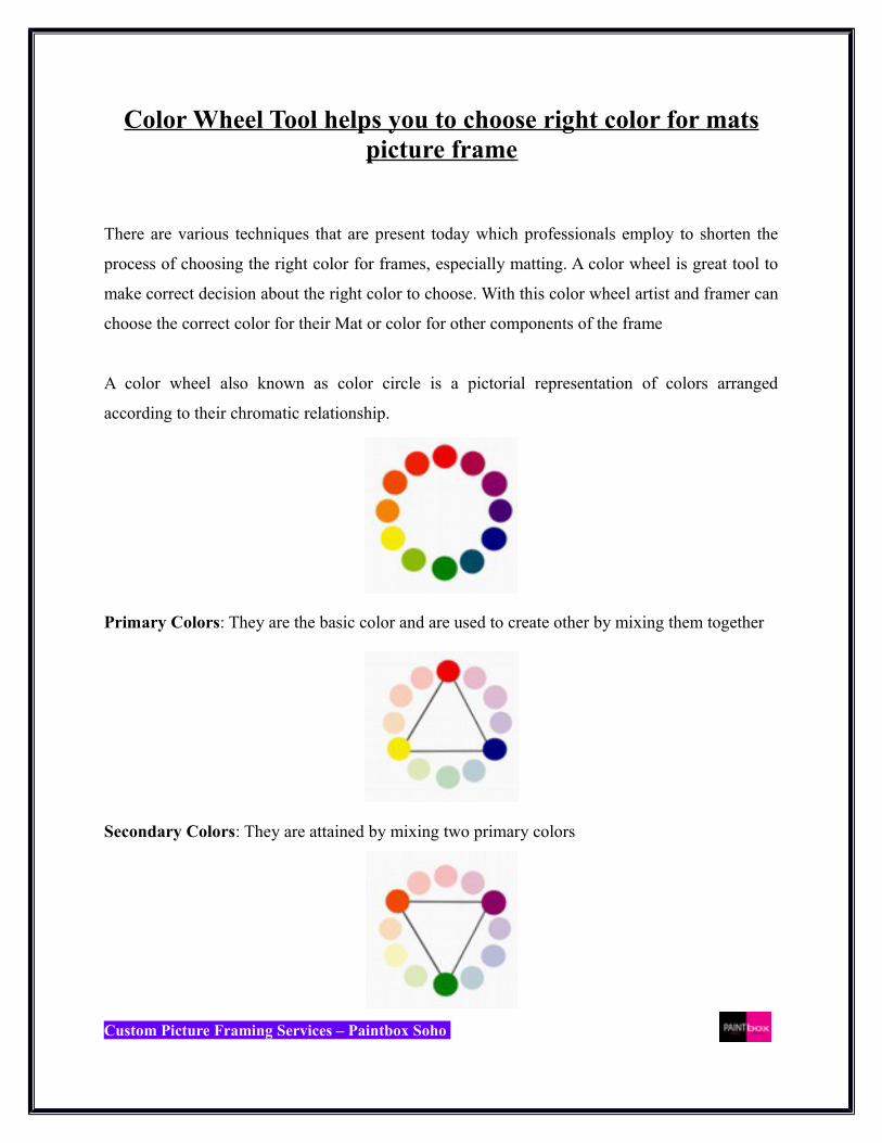
A color wheel also known as color circle is a pictorial representation of colors arranged
according to their chromatic relationship.
Primary Colors: They are the basic color and are used to create other by mixing them together
Secondary Colors: They are attained by mixing two primary colors
Custom Picture Framing Services – Paintbox Soho

Tertiary Colors: They are achieved by mixing primary and secondary hues.
Complementary Colors: As shown below they are located opposite to each other on a color
wheel.
Analogous Colors: Colors that are located close together on a color wheel are analogous colors.
Active & Passive colors
A color wheel can be further divided into ranges that represent active or passive color. When
passive color are placed against active colors they seem to advance and passive colors seem to
recede
Custom Picture Framing Services – Paintbox Soho
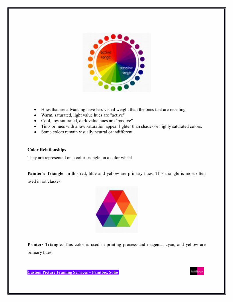
Hues that are advancing have less visual weight than the ones that are receding. Warm, saturated, light value hues are "active" Cool, low saturated, dark value hues are "passive" Tints or hues with a low saturation appear lighter than shades or highly saturated colors. Some colors remain visually neutral or indifferent.
Color Relationships
They are represented on a color triangle on a color wheel
Painter’s Triangle: In this red, blue and yellow are primary hues. This triangle is most often
used in art classes
Printers Triangle: This color is used in printing process and magenta, cyan, and yellow are
primary hues.
Custom Picture Framing Services – Paintbox Soho

Nine-part harmonic triangle of Goethe: They are basically printer's primaries; the secondaries
formed are the painter's primaries; and the resulting tertiaries formed are dark neutrals.
Complementary Colors
A color wheel is a great tool the see the relationship among colors. The colors that are opposite to
each other are complementary colors.
Custom Picture Framing Services – Paintbox Soho

Complementary colors when used are able to bring out the best in each other. When saturated
complements are used they create vibrant and interesting effects.
For framing use color wheels to choose the right color balance between the art and framing that
surrounds it. The best idea is to identify secondary color in the art and use it as the value and
temperature of the art as a whole.
Custom Picture Framing Services – Paintbox Soho


