double page spread textual
TRANSCRIPT

DOUBLE PAGE SPREAD TEXTUAL ANALYSIS

The Source
The main feature on the double page spread is the full-page picture on the right hand side of the two pages and overall this dominates the double page spread. The artist within the image is wearing a big ring and a big bracelet which connotes the rap genre within the magazine and this is further shown through the fact that the artist is wearing Adidas shoes, which are stereotypically associated with rappers/gangsters
The picture comes after the text and so it connotes that the magazine are sure the reader will read the text and also that the picture acts as a conclusion through the artists posture.
The image is a whole body shot and so includes absolutely everything about the artist. The way the artist is standing connotes that he is overly proud and almost arrogant about what he has achieved in his life.
The title of the article uses repetition to make the reader look closer into where he has come from and what he has achieved because it is known that Compton is one of the poorer areas of California, this makes the reader realise what a great achievement he has.
The article does use a pull quote at the top of the page and just like the page number on the contents it is a different colour to grab the reader’s attention, and also there is a lot of space around the quote and so this too will grab the reader’s attention as it makes the quote stand out, plus the quote is all in capital letters.
The size of the text of the main body is around 11 which also big enough for everyone to read but the fact that it isn’t large would connote that it is not a children’s magazine and that more able readers would be the buyers and readers.
The text is only used on the right hand page and this is probably because they want the reader to read the text before looking at the picture for a specific reason and this is done because generally people read from left to right and so for this reason they place the text on the left so it is read first.
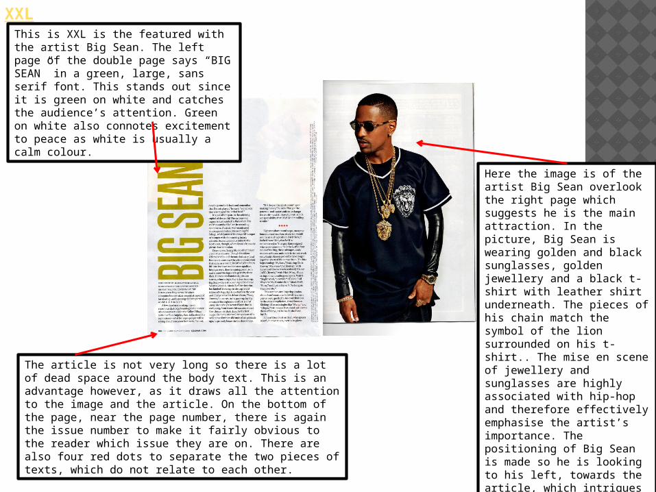
XXLThis is XXL is the featured with the artist Big Sean. The left page of the double page says “BIG SEAN” in a green, large, sans serif font. This stands out since it is green on white and catches the audience’s attention. Green on white also connotes excitement to peace as white is usually a calm colour.
Here the image is of the artist Big Sean overlook the right page which suggests he is the main attraction. In the picture, Big Sean is wearing golden and black sunglasses, golden jewellery and a black t-shirt with leather shirt underneath. The pieces of his chain match the symbol of the lion surrounded on his t-shirt.. The mise en scene of jewellery and sunglasses are highly associated with hip-hop and therefore effectively emphasise the artist’s importance. The positioning of Big Sean is made so he is looking to his left, towards the article, which intrigues the audience to read about him.
The article is not very long so there is a lot of dead space around the body text. This is an advantage however, as it draws all the attention to the image and the article. On the bottom of the page, near the page number, there is again the issue number to make it fairly obvious to the reader which issue they are on. There are also four red dots to separate the two pieces of texts, which do not relate to each other.

Hip Hop Weekly
This is Hip Hop Weekly is the featured with Chris Brown and Rihanna
The text is in white with a red outline that makes the names stand out and here the caption is “FRIENDS WITH BENEFITS?” underneath the names is a mode of address to the audience and this plotting them to read the article as it is a rhetorical question. The reader may look at image and continue reading as hip-hop fans commonly associate Chris Brown and Rihanna together. Hip-Hop Weekly has deliberately put the two separate images together in order to create a link.
The article also gives exclusive pictures such as a picture of Rihanna in a bikini. This picture is in the middle of the page which may attract the male target audience to read on. Also, all the pictures have a red outline that makes them stand out.
The size of the font is around 12pt which makes it readable . At the start of the article there’s a drop cap at the start in blue which allows the letter to stand out. It also attract the reader into reading the article. Finally, it may also help readers find where the start is.