working with charts and graphics - ct.gov
TRANSCRIPT

80004373524.INDD 607 Trim size: 7 .375 in × 9 .25 in May 17, 2019 9:22 AM
Working with Charts and Graphics

Contents at a GlanceCHAPTER 1: Creating a Chart . . . . . . . . . . . . . . . . . . . . . . . . . . . . . . . . . . . . 609
The Basics: Creating a Chart . . . . . . . . . . . . . . . . . . . . . . . . . . . . . . . 609Choosing the Right Chart . . . . . . . . . . . . . . . . . . . . . . . . . . . . . . . . . . 611Providing the Raw Data for Your Chart . . . . . . . . . . . . . . . . . . . . . . 613Positioning Your Chart in a Workbook, Page, or Slide . . . . . . . . . . 615Changing a Chart’s Appearance . . . . . . . . . . . . . . . . . . . . . . . . . . . . 616Saving a Chart as a Template So That You Can Use It Again . . . . . 622Chart Tricks for the Daring and Heroic . . . . . . . . . . . . . . . . . . . . . . . 623Troubleshooting a Chart . . . . . . . . . . . . . . . . . . . . . . . . . . . . . . . . . . . 626
CHAPTER 2: Making a SmartArt Diagram . . . . . . . . . . . . . . . . . . . . . . 629The Basics: Creating SmartArt Diagrams . . . . . . . . . . . . . . . . . . . . . 629Creating the Initial Diagram . . . . . . . . . . . . . . . . . . . . . . . . . . . . . . . . 632Changing the Size and Position of a Diagram . . . . . . . . . . . . . . . . . 634Laying Out the Diagram Shapes . . . . . . . . . . . . . . . . . . . . . . . . . . . . 634Handling the Text on Diagram Shapes . . . . . . . . . . . . . . . . . . . . . . . 640Changing a Diagram’s Direction . . . . . . . . . . . . . . . . . . . . . . . . . . . . 642Choosing a Look for Your Diagram . . . . . . . . . . . . . . . . . . . . . . . . . . 643Changing the Appearance of Diagram Shapes . . . . . . . . . . . . . . . . 644Creating a Diagram from Scratch . . . . . . . . . . . . . . . . . . . . . . . . . . . 647
CHAPTER 3: HandlingGraphicsand Photos . . . . . . . . . . . . . . . . . . . 649All about Picture File Formats . . . . . . . . . . . . . . . . . . . . . . . . . . . . . . 649Inserting a Picture in an Office File . . . . . . . . . . . . . . . . . . . . . . . . . . 653Touching Up a Picture . . . . . . . . . . . . . . . . . . . . . . . . . . . . . . . . . . . . . 656Compressing Pictures to Save Disk Space . . . . . . . . . . . . . . . . . . . . 663
CHAPTER 4: Drawing and Manipulating Lines, Shapes, and Other Objects . . . . . . . . . . . . . . . . . . . . . . . . 665The Basics: Making Lines, Arrows, and Shapes . . . . . . . . . . . . . . . . 666Handling Lines, Arrows, and Connectors . . . . . . . . . . . . . . . . . . . . . 668Handling Rectangles, Ovals, Stars, and Other Shapes . . . . . . . . . . 672Drawing by Freehand . . . . . . . . . . . . . . . . . . . . . . . . . . . . . . . . . . . . . 676Decorating Your Work with Icons . . . . . . . . . . . . . . . . . . . . . . . . . . . 679Inserting a 3-D Model . . . . . . . . . . . . . . . . . . . . . . . . . . . . . . . . . . . . . 680WordArt for Embellishing Letters and Words . . . . . . . . . . . . . . . . . 680Manipulating Lines, Shapes, Art, Text Boxes, and Other Objects . . . . . . . . . . . . . . . . . . . . . . . . . . . . . . . . . . . . . . . . 682Changing an Object’s Size and Shape . . . . . . . . . . . . . . . . . . . . . . . . 685Changing an Object’s Color, Outline Color, and Transparency . . . . . . . . . . . . . . . . . . . . . . . . . . . . . . . . . . . . . . . . 686Moving and Positioning Objects . . . . . . . . . . . . . . . . . . . . . . . . . . . . 691
0004373524.INDD 608 Trim size: 7 .375 in × 9 .25 in May 17, 2019 9:22 AM
CHAPTER 1 Creating a Chart 609
0004373573.INDD 609 Trim size: 7.375 in × 9.25 in May 17, 2019 9:24 AM
Creating a Chart
N othing is more persuasive than a chart. The bars, pie slices, lines, or col-umns show immediately whether production is up or down, cats are better than dogs or dogs better than cats, or catsup tastes better than ketchup.
Fans of charts and graphs will be glad to know that putting a chart in a Word doc-ument, Excel worksheet, or PowerPoint slide is fairly easy.
This chapter explains how to create a chart. It looks at which charts are best for presenting diff erent kinds of data, how to change a chart’s appearance, and how to save charts in a template that you can use again. You discover some nice chart tricks, including how to make a picture the backdrop for a chart and how to anno-tate a chart. This chapter also addresses common chart problems.
The Basics: Creating a Chart Throughout this chapter, I explain the whys, wherefores, and whatnots of creat-ing a chart. Before going into details, here are the basic steps that everyone needs to know to create a chart in Word, Excel, and PowerPoint:
1. Go to the Insert tab.
2. If you’re working in Excel, select the data you’ll use to generate the chart (in Word and PowerPoint, skip to Step 3).
Chapter 1
IN THIS CHAPTER
» Creating a chart
» Positioning a chart in Excel, Word, and PowerPoint
» Changing the appearance of a chart
» Exploring some fancy-schmancy chart tricks

0004373573.INDD 610 Trim size: 7.375 in × 9.25 in May 17, 2019 9:24 AM
610 BOOK 8 Working with Charts and Graphics
In Excel, you select the data on a worksheet before creating the chart, but in Word and PowerPoint, you enter the data for the chart after you create the chart.
3. Select the kind of chart you want.
How you select a chart type depends on which program you’re working in:
• Excel: On the Insert tab, open the drop-down list on one of the buttons in the Charts group (Column, Bar, and so on) and select a chart type; or click the Recommended Charts button or Charts group button to open the Insert Chart dialog box and select a chart there. As shown in Figure 1-1, the Insert Chart dialog box shows all the kinds of charts you can create. Go to the Recommended Charts tab to see which charts Excel recommends.
• Word and PowerPoint: Click the Chart button. You see the Insert Chart dialog box shown in Figure 1-1. Select a chart type, select a variation, and click OK. A data grid opens on your screen. (In PowerPoint, you can also click the Chart icon on a placeholder frame to open the Insert Chart dialog box.)
The next topic in this chapter, “Choosing the Right Chart,” describes all the charts types and advises you which to choose.
4. In Word and PowerPoint, replace the sample data in the data grid with the data you need for generating your chart.
Later in this chapter, “Providing the Raw Data for Your Chart” explains how to enter data in the data grid, and the sidebar “Getting chart data from a table (Word and PowerPoint)” explains how to copy the data from a table.
After you finish entering the data, click the Close button in the data grid.
5. Modify your chart, if you desire.
The Chart Tools tabs and buttons to the right of the chart offer commands for making a chart look just-so (see “Changing a Chart’s Appearance,” later in this chapter).
Click the Recent button in the Insert Chart dialog box to see all the charts you examined in your search for the right chart.
And if you decide to delete the chart you created? Click its perimeter to select it and then press the Delete key.

Crea
ting
a C
hart
0004373573.INDD 611 Trim size: 7.375 in × 9.25 in May 17, 2019 9:24 AM
CHAPTER 1 Creating a Chart 611
Choosing the Right ChartIf you’re a fan of charts, the huge selection of charts can make you feel like a kid in a candy store, but if charts aren’t your forté, the wealth of charts you can choose from can be daunting. You can choose among charts in 17 categories (refer to Figure 1-1). Which chart is best? The golden rule for choosing a chart type is to choose the one that presents information in the brightest possible light. The purpose of a chart is to compare information across different categories. Select a chart that draws out the comparison so that others can clearly make comparisons. Table 1-1 describes the 17 chart types and explains in brief when to use each type of chart.
FIGURE 1-1: Which chart do
you want?

0004373573.INDD 612 Trim size: 7.375 in × 9.25 in May 17, 2019 9:24 AM
612 BOOK 8 Working with Charts and Graphics
TABLE 1-1 Chart TypesChart Type Best Use/Description
Area Examine how values in different categories fluctuate over time, and see the cumulative change in values. (Same as a line chart except that the area between trend lines is colored in.)
Bar Compare values in different categories against one another, usually over time. Data is displayed in horizontal bars. (Same as a column chart except that the bars are horizontal.)
Box & Whisker Examine how data is distributed (the whiskers define the range of data and the boxes define the median).
Column Compare values in different categories against one another, usually over time. Data is displayed in vertical columns. (Same as a bar chart except that the bars are vertical.)
Combo Contrast two sets of data, with one chart overlying the other to draw out the contrast. Data is displayed in lines, bars, and stacks.
Funnel Compare data items as the proportion of a whole. Data is displayed in bars of progressively decreasing size. This chart is used to show data loss at each stage of a process.
Histogram Measure the frequency of data. Data is displayed in bars, with the width of each bar representing a data range and the height of each bar representing the frequency of data within the range.
Line Examine how values fluctuate over time. Data is displayed in a set of points connected by a line.
Map Compare data across geographical regions. One data axis must contain countries, regions, or postal codes that Office recognizes as geographical regions.
Pie See how values compare as percentages of a whole. Data from categories is displayed as a percentage of a whole.
Radar Examine data as it relates to one central point. Data is plotted on radial points from the central point. This kind of chart is used to make subjective performance analyses.
Stock See how the value of an item fluctuates as well as its daily, weekly, or yearly high, low, and closing price. This chart is used to track stock prices, but it can also be used to track air temperature and other variable quantities.
Surface Examine color-coded data on a 3-D surface to explore relationships between data values.
Sunburst Compare values at different levels of a hierarchy. This chart is a stacked, or multilevel, pie chart.
Treemap Evaluate data in nested rectangles that show the relative size of data and the relationship between data items.
Waterfall See how positive and negative values contribute to a cumulative value.
XY (Scatter) Compare different numeric data point sets in space to reveal patterns and trends in data. (Similar to a bubble chart except that the data appears as points instead of bubbles.)

Crea
ting
a C
hart
0004373573.INDD 613 Trim size: 7.375 in × 9.25 in May 17, 2019 9:24 AM
CHAPTER 1 Creating a Chart 613
Providing the Raw Data for Your ChartEvery chart is constructed from raw data — the numbers and labels you select in an Excel worksheet (in Excel) or enter in the data grid (in Word and PowerPoint). If you’re operating in Word or PowerPoint, you see, in the data grid, sample data in a data range, as shown in Figure 1-2. The information inside the data range is used to generate the chart. You can tell where the data range begins and ends because it is enclosed in a blue border. Your job is to replace the sample data in the data range with data of your own. As you enter your data, the chart on your slide or page takes shape.
As you enter numbers and labels in the data grid, watch your chart take shape. Here are the basics of entering data in the data grid:
» Entering the data in a cell: A cell is the box in a data grid where a column and row intersect; each cell can contain one data item. To enter data in a cell, click the cell and start typing. When you’re finished, press Enter, press Tab, or click a different cell.
» Deleting the data in a cell: To delete the data in a cell, including the sample data, click the cell and press Delete.
FIGURE 1-2: To create a
chart in Word or PowerPoint,
enter data in the data grid.

0004373573.INDD 614 Trim size: 7.375 in × 9.25 in May 17, 2019 9:24 AM
614 BOOK 8 Working with Charts and Graphics
» Displaying the numbers: When a number is too large to fit in a cell, the number is displayed in scientific notation (you can double-click the number to enlarge the cell in which it is located). Don’t worry — the number is still recorded and is used to generate your chart. You can display large numbers by widening the columns in which the numbers are found. Move the pointer between column letters (A, B, and so on at the top of the worksheet) and when you see the double-headed arrow, click and drag to the right.
GETTING CHART DATA FROM A TABLE (WORD AND POWERPOINT)Rather than painstakingly enter data in the data grid, you can get the data you need for a chart from a Word or PowerPoint table. In fact, entering the data in a Word or PowerPoint table and copying it to the data grid is easier than entering data in the nar-row confines of the data grid.
Follow these steps to generate a chart from data in a table you created in Word or PowerPoint:
1. Click the table to select it.
2. On the (Table Tools) Layout tab, click the Select button and choose Select Table on the drop-down list.
3. Press Ctrl+C to copy the table data to the Clipboard.
4. Click your chart to select it.
5. On the (Chart Tools) Design tab, click the Edit Data button to open the data grid.
6. Click the Select All button in the data grid (or press Ctrl+A). Clicking the Select All button selects all cells in the grid. The button is located above 1 in the first row and to the left of the A in the first column.
7. Press Delete to erase the data in the grid.
8. Press Ctrl+V to copy the data from the table into the data grid.
If the table you copied into the data grid is larger than the sample data that was there before, you’re done. You can breathe easy. But if the table is smaller than the sample data, you have to make the data range smaller so that it encompasses only the data you copied from your table. Move the pointer to the lower-right corner of the data range and then drag in a northwesternly direction until the blue box encloses the data from your Word or PowerPoint table.

Crea
ting
a C
hart
0004373573.INDD 615 Trim size: 7.375 in × 9.25 in May 17, 2019 9:24 AM
CHAPTER 1 Creating a Chart 615
» Changing the size of the data range: To enclose more or fewer cells in the data range, move the pointer to the lower-right corner of the data range, and when the pointer changes into a two-headed arrow, click and drag so that the blue box encloses only the data you want for your chart (refer to Figure 1-2).
The data grid offers the Edit Data in Microsoft Excel button in case you want to enter data for your chart in Excel. Click this button and enter data in Excel if you’re comfortable working there.
In Word and PowerPoint, click the Edit Data button on the (Chart Tools) Design tab at any time to open the data grid and fiddle with the numbers and data from which your chart is generated.
Positioning Your Chart in a Workbook, Page, or Slide
To change the position of a chart, click to select it, click its perimeter, and when you see the four-headed arrow, start dragging. Otherwise, follow these instruc-tions to land your chart where you want it to be:
» Excel: To move your chart to a different worksheet or create a new worksheet to hold your chart, go to the (Chart Tools) Design tab and click the Move Chart button. You see the Move Chart dialog box.
• To move your chart to a different worksheet, click the Object In option button, choose the worksheet in the drop-down list, and click OK.
• To create a new worksheet for a chart, click the New Sheet option button, enter a name for the new worksheet, and click OK.
» Word: Starting in Print Layout view, select your chart, and in the Layout or (Chart Tools) Format tab, click the Position button (you may have to click the Arrange button first, depending on the size of your screen). You see a drop-down list with text-wrapping options. Choose the option that describes how you want surrounding text to behave when it crashes into your chart. Book 2, Chapter 6 looks in detail at wrapping text around charts and other objects in Word.
You can also position a chart by selecting it, clicking the Layout Options button, and choosing an option on the Layout Options drop-down menu. The Layout Options button appears to the right of a chart after you select a chart.
» PowerPoint: Select the chart and drag it on the slide to the right position.

0004373573.INDD 616 Trim size: 7.375 in × 9.25 in May 17, 2019 9:24 AM
616 BOOK 8 Working with Charts and Graphics
Changing a Chart’s AppearanceCharts are awfully nice already, but perhaps you want to redesign one. Perhaps you’re an interior decorator type and you want to give charts your own personal touch. Office presents many different ways to refine a chart. As shown in Figure 1-3, you can click one of the three buttons — Chart Elements, Chart Styles, or Chart Filters — that appear beside a chart when you select it. You can also go to (Chart Tools) Design tab and the (Chart Tools) Format tab. Your opportunities for tinkering with a chart are many.
FIGURE 1-3: Click a button to the right of
a chart or go to the (Chart Tools)
Design or Format tab to change the
look of a chart.
Crea
ting
a C
hart
0004373573.INDD 617 Trim size: 7.375 in × 9.25 in May 17, 2019 9:24 AM
CHAPTER 1 Creating a Chart 617
These pages explain how to change a chart’s appearance and layout, starting with the biggest change you can make — exchanging one type of chart for another.
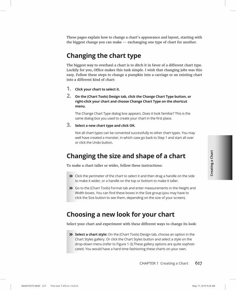
Changing the chart typeThe biggest way to overhaul a chart is to ditch it in favor of a different chart type. Luckily for you, Office makes this task simple. I wish that changing jobs was this easy. Follow these steps to change a pumpkin into a carriage or an existing chart into a different kind of chart:
1. Click your chart to select it.
2. On the (Chart Tools) Design tab, click the Change Chart Type button, or right-click your chart and choose Change Chart Type on the shortcut menu.
The Change Chart Type dialog box appears. Does it look familiar? This is the same dialog box you used to create your chart in the first place.
3. Select a new chart type and click OK.
Not all chart types can be converted successfully to other chart types. You may well have created a monster, in which case go back to Step 1 and start all over or click the Undo button.
Changing the size and shape of a chartTo make a chart taller or wider, follow these instructions:
» Click the perimeter of the chart to select it and then drag a handle on the side to make it wider, or a handle on the top or bottom to make it taller.
» Go to the (Chart Tools) Format tab and enter measurements in the Height and Width boxes. You can find these boxes in the Size group (you may have to click the Size button to see them, depending on the size of your screen).
Choosing a new look for your chartSelect your chart and experiment with these different ways to change its look:
» Select a chart style: On the (Chart Tools) Design tab, choose an option in the Chart Styles gallery. Or click the Chart Styles button and select a style on the drop-down menu (refer to Figure 1-3).These gallery options are quite sophisti-cated. You would have a hard time fashioning these charts on your own.

0004373573.INDD 618 Trim size: 7.375 in × 9.25 in May 17, 2019 9:24 AM
618 BOOK 8 Working with Charts and Graphics
» Change the color scheme: On the (Chart Tools) Design tab, click the Change Colors button and select a color on the drop-down list. Or click the Chart Styles button and select a color on the drop-down menu (refer to Figure 1-3).
Later in this chapter, “Changing a chart element’s color, font, or other particular” explains how to dig down deep and change one particular aspect of a chart — its legend, plot area, or vertical axis, for example.
If your file includes more than one chart, make the charts consistent with one another. Give them a similar appearance so that your file doesn’t turn into a chart fashion show. You can make charts consistent with one another by choosing sim-ilar options for charts in the Chart Styles gallery.
Changing the layout of a chartCharts are composed of different elements — the legend, the labels, and the titles. Figure 1-4 identifies chart elements. Where these elements appear is up to you. Whether to include them is up to you as well. You can, for example, place the legend on the right side of your chart or go without a legend. By choosing which elements to include and where to put elements, you fashion a layout for your chart.
FIGURE 1-4: The layout
elements of a chart.

Crea
ting
a C
hart
0004373573.INDD 619 Trim size: 7.375 in × 9.25 in May 17, 2019 9:24 AM
CHAPTER 1 Creating a Chart 619
Select your chart and experiment with these techniques to decide on a layout:
» On the (Chart Tools) Design tab, click the Quick Layout button and select an option in the gallery.
» On the (Chart Tools) Design tab, click the Add Chart Element button. Then choose an element on the drop-down list, and on the submenu, choose whether to place the element (the None option) or where to place it.
» Click the Chart Elements button, choose an element on the drop-down menu, and choose whether to place it (the None option) or where to place it. Figure 1-5, for example, shows how to choose where to place the legend.
Hover the pointer over the options on the Chart Elements menus and glance at your chart. You can see right away what each option does to your chart.
To remove series or category names from a chart, click the Chart Filters but-ton and, on the drop-down menu, deselect a column or row option button (see Figure 1-3).
Handling the gridlinesGridlines are lines that cross a chart and indicate value measurements. Most charts include major gridlines to show where bars or columns meet or surpass a major unit of measurement, and you can also include fainter, minor gridlines that mark less significant measurements.
FIGURE 1-5: Clicking the Chart Elements button
is one way to handle chart
layouts.

0004373573.INDD 620 Trim size: 7.375 in × 9.25 in May 17, 2019 9:24 AM
620 BOOK 8 Working with Charts and Graphics
Use these techniques to handle gridlines:
» On the (Chart Tools) Design tab, click the Add Chart Element button, choose Gridlines on the drop-down list, and select or deselect an option on the submenu.
» Click the Chart Elements button, choose Gridlines, and select or deselect a check box on the submenu, as shown in Figure 1-6.
Deselecting all the gridline options removes the gridlines from a chart. Choose More Options on the submenu to open the Format Major Gridlines task pane, where you can change the color of gridlines, make gridlines semitransparent, and make gridlines wider or narrower.
Gridlines are essential for helping read charts, but be very, very careful about displaying minor gridlines on charts. These lines can make your chart unreadable. They can turn a perfectly good chart into a gaudy pinstripe suit.
Changing a chart element’s color, font, or other particularThe (Chart Tools) Format tab is the place to go to change the color, line width, font, or font size of a chart element. Go to the (Chart Tools) Format tab, for exam-ple, to change the color of the bars in a bar chart, the color of text, or the chart background color.
Follow these basic steps to change a color, line width, font, or font size in part of a chart:
FIGURE 1-6: Choosing a
Gridlines option by way of the
Chart Elements button.

Crea
ting
a C
hart
0004373573.INDD 621 Trim size: 7.375 in × 9.25 in May 17, 2019 9:24 AM
CHAPTER 1 Creating a Chart 621
1. Go to the (Chart Tools) Format tab.
2. In the Chart Elements drop-down list, select the chart element that needs a facelift.
You can find this list in the upper-left corner of the screen, as shown in Figure 1-7.
3. Click the Format Selection button.
The Format task pane opens (see Figure 1-7).
4. Format the chart element you selected.
In the Format task pane, you can find all the tools you need to change the color, outline, and size of a chart element. These tools are explained in detail in Chapter 4 of this minibook.
If your experiments with retouching a chart go awry and you want to start over, click the Reset to Match Style button on the (Chart Tools) Format tab.
FIGURE 1-7: Choose what you
want to format on the Chart
Elements drop-down list.

0004373573.INDD 622 Trim size: 7.375 in × 9.25 in May 17, 2019 9:24 AM
622 BOOK 8 Working with Charts and Graphics
Saving a Chart as a Template So That You Can Use It Again
If you go to the significant trouble of redecorating a chart and you expect to do it again the same way in the future, save your chart as a template. This way, you can call on the template in the future to create the same chart and not have to decorate it again. Perhaps you’ve created charts with your company’s colors or you’ve cre-ated a chart that you’re especially proud of. Save it as a template to spare yourself the work of reconstructing it.
A chart template holds data series colors, gridline settings, plot area colors, font settings, and the like. It doesn’t hold data. These pages explain how to save a chart as a template and how to create a chart with a template you created.
Saving a chart as a templateFollow these steps to make a template out of a chart:
1. Save your file to make sure the chart settings are saved on your computer.
2. Select your chart.
3. Right-click your chart and choose Save As Template on the shortcut menu.
You see the Save Chart Template dialog box.
4. Enter a descriptive name for the template and click the Save button.
Include the type of chart you’re dealing with in the name. This will help you understand which template you’re selecting when the time comes to choose a chart template.
By default, chart templates are saved in this folder: C:\Users\Username\ AppData\Roaming\Microsoft\Templates\Charts. The templates have the .ctrx extension. If you want to delete or rename a template, open the Charts folder in File Explorer and do your deleting and renaming there. You can open the Charts folder very quickly by clicking the Manage Templates button in the Insert Chart dialog box (this button appears after you choose the Templates category).
Creating a chart from a templateTo create a chart from your own customized template, open the Create Chart dialog box (click the Chart button) and go to the Templates category. The dialog

Crea
ting
a C
hart
0004373573.INDD 623 Trim size: 7.375 in × 9.25 in May 17, 2019 9:24 AM
CHAPTER 1 Creating a Chart 623
box shows a list of templates you created. Move the pointer over a template to read its name in a pop-up box. Select a template and click OK.
Chart Tricks for the Daring and HeroicThis chapter wouldn’t be complete without a handful of chart tricks to impress your friends and intimidate your enemies. In the pages that follow, you discover how to make charts roll over and play dead. You also find out how to decorate a chart with a picture, annotate a chart, display worksheet data alongside a chart, and create a combo chart.
Decorating a chart with a pictureAs shown in Figure 1-8, a picture looks mighty nice on the plot area of a chart — especially a column chart. If you have a picture in your computer that would serve well to decorate a chart, you are hereby encouraged to start decorating. Follow these steps to place a picture in the plot area of a chart:
1. Select your chart.
2. On the (Chart Tools) Format tab, open the Chart Elements drop-down list and choose Plot Area.
3. Click the Format Selection button.
The Format Plot Area task pane opens.
FIGURE 1-8: Using a picture
as the backdrop of a chart.

0004373573.INDD 624 Trim size: 7.375 in × 9.25 in May 17, 2019 9:24 AM
624 BOOK 8 Working with Charts and Graphics
4. If necessary, click Fill & Line to display the Fill and Border options, and under Fill, click the Picture or Texture Fill option button.
5. Click the File button.
You see the Insert Picture dialog box.
6. Locate the picture you need and select it.
Try to select a light-colored picture that will serve as a background. Chapter 3 of this minibook explains how you can recolor a picture to make it lighter.
7. Click the Insert button.
The picture lands in your chart.
You may need to change the color of the data markers — the columns, bars, lines, or pie slices — on your chart to make them stand out against the picture. See “Changing a chart element’s color, font, or other particular,” earlier in this chapter.
Annotating a chartTo highlight part of a chart — an especially large pie slice, a tall column, or a bar showing miniscule sales figures — annotate it with a callout text box and place the text box beside the pie slice, column, or bar. Figure 1-9 shows an example of an annotated chart. The annotation tells you that one sector isn’t performing especially well and somebody ought to get on the ball.
To annotate a chart, select a callout shape, enter text in the callout shape, and connect the shape to part of your chart. Follow these steps to annotate a chart:
FIGURE 1-9: Annotations point
out a chart’s salient features.
Crea
ting
a C
hart
0004373573.INDD 625 Trim size: 7.375 in × 9.25 in May 17, 2019 9:24 AM
CHAPTER 1 Creating a Chart 625
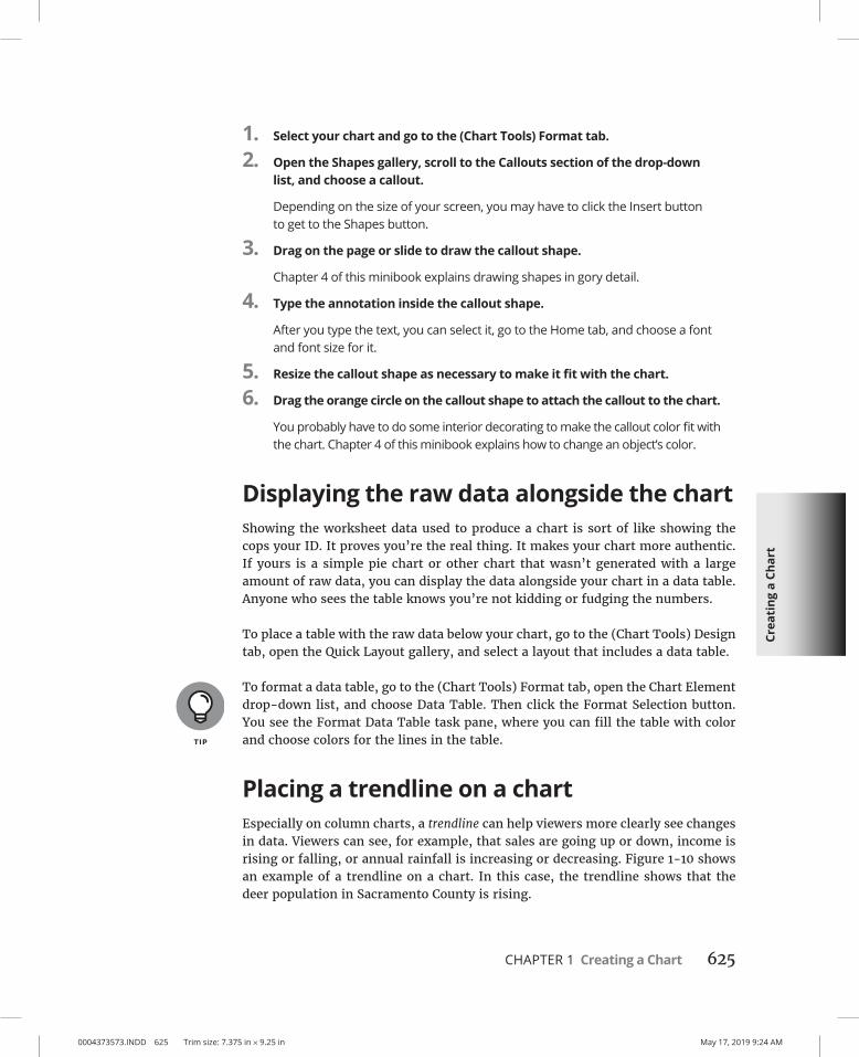
1. Select your chart and go to the (Chart Tools) Format tab.
2. Open the Shapes gallery, scroll to the Callouts section of the drop-down list, and choose a callout.
Depending on the size of your screen, you may have to click the Insert button to get to the Shapes button.
3. Drag on the page or slide to draw the callout shape.
Chapter 4 of this minibook explains drawing shapes in gory detail.
4. Type the annotation inside the callout shape.
After you type the text, you can select it, go to the Home tab, and choose a font and font size for it.
5. Resize the callout shape as necessary to make it fit with the chart.
6. Drag the orange circle on the callout shape to attach the callout to the chart.
You probably have to do some interior decorating to make the callout color fit with the chart. Chapter 4 of this minibook explains how to change an object’s color.
Displaying the raw data alongside the chartShowing the worksheet data used to produce a chart is sort of like showing the cops your ID. It proves you’re the real thing. It makes your chart more authentic. If yours is a simple pie chart or other chart that wasn’t generated with a large amount of raw data, you can display the data alongside your chart in a data table. Anyone who sees the table knows you’re not kidding or fudging the numbers.
To place a table with the raw data below your chart, go to the (Chart Tools) Design tab, open the Quick Layout gallery, and select a layout that includes a data table.
To format a data table, go to the (Chart Tools) Format tab, open the Chart Element drop-down list, and choose Data Table. Then click the Format Selection button. You see the Format Data Table task pane, where you can fill the table with color and choose colors for the lines in the table.
Placing a trendline on a chartEspecially on column charts, a trendline can help viewers more clearly see changes in data. Viewers can see, for example, that sales are going up or down, income is rising or falling, or annual rainfall is increasing or decreasing. Figure 1-10 shows an example of a trendline on a chart. In this case, the trendline shows that the deer population in Sacramento County is rising.

0004373573.INDD 626 Trim size: 7.375 in × 9.25 in May 17, 2019 9:24 AM
626 BOOK 8 Working with Charts and Graphics
Follow these steps to put a trendline on a chart:
1. On the (Chart Tools) Design tab, click the Add Chart Element button.
2. Choose Trendline on the drop-down list and select a trendline option on the submenu.
The Add Trendline dialog box appears.
3. Choose the data series that you want to highlight with a trendline and click OK.
To remove a trendline from a chart, go to the (Chart Tools) Design tab, click the Add Chart Element button, choose Trendline on the drop-down list, and choose None on the submenu.
Troubleshooting a ChartSometimes tinkering with a chart opens a Pandora’s Box of problems. You find yourself having to correct little errors that appear in charts. Here are some short-hand instructions for fixing common chart problems:
» The dates in the chart aren’t formatted right. To change the way in which dates are formatted on a chart, go to the (Chart Tools) Format tab, open the Chart Elements drop-down list, and choose Horizontal (Value) Axis or Vertical (Value) Axis. Then click the Format Selection button, and in the Format Axis task pane, go to the Number category, select Date in the Category menu, and choose a date format.
FIGURE 1-10: A trendline helps
viewers recognize changes in data.

Crea
ting
a C
hart
0004373573.INDD 627 Trim size: 7.375 in × 9.25 in May 17, 2019 9:24 AM
CHAPTER 1 Creating a Chart 627
» The numbers in the chart aren’t formatted right. To change the number of decimal places, include comma separators in numbers, display currency symbols, or do all else that pertains to numbers, go to the (Chart Tools) Format tab, open the Chart Elements drop-down list, and choose Horizontal (Value) Axis or Vertical (Value) Axis. Then click the Format Selection button. You see the Format Axis task pane. Visit the Number category and select options for displaying numbers.
» “Category 1” or “Series 1” appears in the chart legend. To direct you to the right place to enter data in the data grid, phantom names such as “Category 1” and “Series 1” appear in worksheets. Sometimes these phantoms wind up in chart legends as well. To remove them, go to the (Chart Tools) Design tab and click the Edit Data button. You see the data grid, where the data range used to generate the chart is enclosed in a blue box. Drag the lower-right corner of the box so that the box encloses only the data you want for your chart.
» In 3-D charts, small markers are obscured by large markers in the foreground. For all the data markers to be shown in a 3-D chart, the smaller ones have to be in the foreground. To rearrange data markers, go to the (Chart Tools) Design tab and click the Select Data button to open the Select Data Source dialog box. Then select a series and click the Up or Down button to rearrange the series in your chart. Series that are high on the list go to the back of the chart; series that are low on the list go to the front.
» The chart doesn’t gather all data from the worksheet. On the (Chart Tools) Design tab, click the Edit Data button, and in the data grid that stores data for your chart, enlarge the blue data-range box so that it encloses all your data. You can enlarge the box by dragging its lower-right corner.

0004373573.INDD 628 Trim size: 7.375 in × 9.25 in May 17, 2019 9:24 AM

CHAPTER 2 Making a SmartArt Diagram 629
0004373574.INDD 629 Trim size: 7.375 in × 9.25 in May 17, 2019 9:27 AM
Making a SmartArt Diagram
A long with charts and tables, diagrams are the best way to present your ideas. Diagrams clearly show, for example, employees’ relationships with one another, product cycles, workfl ow processes, and spheres of infl uence.
A diagram is an excellent marriage of images and words. Diagrams allow an audi-ence to literally visualize a concept, idea, or relationship.
This chapter explains how to construct diagrams from SmartArt graphics and how to create a diagram. It shows how to customize diagrams by changing the size of diagrams and diagram shapes, adding and removing shapes, and changing shapes’ colors. You also discover how to change the direction of a diagram and enter the text. Finally, this chapter demonstrates how to create a diagram from scratch with shapes and connectors.
The Basics: Creating SmartArt Diagrams In Word, PowerPoint, and Excel, diagrams are made from SmartArt graphics. These diagram graphics are “interactive” in the sense that you can move, alter, and write text on them. In other words, you can use them to construct diagrams. You can alter these diagrams to your liking. You can make a diagram portray precisely
Chapter 2
IN THIS CHAPTER
» Creating a diagram
» Entering text on a diagram shape
» Changing the appearance of a diagram
» Creating a diagram from shapes

0004373574.INDD 630 Trim size: 7.375 in × 9.25 in May 17, 2019 9:27 AM
630 BOOK 8 Working with Charts and Graphics
what you want it to portray, although you usually have to wrestle with the dia-gram a bit.
Choosing a diagramThe first step in creating a diagram is to select a layout in the Choose a SmartArt Graphic dialog box, shown in Figure 2-1. To open this dialog box, go to the Insert tab and click the SmartArt button. After you create the initial diagram, you cus-tomize it to create a diagram of your own. About 160 diagrams are in the dialog box. They fall into these nine categories:
Diagram Type Use
List For describing blocks of related information as well as sequential steps in a task, process, or workflow
Process For describing how a concept or physical process changes over time or is modified
Cycle For illustrating a circular progression without a beginning or end, or a relationship in which the components are in balance
Hierarchy For describing hierarchical relationships between people, departments, and other entities, as well as portraying branchlike relationships in which one decision or action leads to another
Relationship For describing the relationship between different components (but not hierarchical relationships)
Matrix For showing the relationship between quadrants
Pyramid For showing proportional or hierarchical relationships
Picture For creating diagrams that include photographs and pictures (This catch-all category presents picture diagrams from the other categories.)
Office.com For presenting data in tabbed arcs, radials, block processes, and other unusual ways
If you intend to construct a “flow chart type” diagram with many branches and levels, go to the Hierarchy category and select the Organization Chart or one of the hierarchy diagrams. As “Laying Out the Diagram Shapes” explains later in this chapter, only these choices permit you to make a diagram with many different branches and levels.

Mak
ing
a Sm
artA
rt
Dia
gram
0004373574.INDD 631 Trim size: 7.375 in × 9.25 in May 17, 2019 9:27 AM
CHAPTER 2 Making a SmartArt Diagram 631
Making the diagram your ownAfter you select a generic diagram in the Choose a SmartArt Graphic dialog box and click OK, the next step is to make the diagram your own by completing these tasks:
» Change the diagram’s size and position. Change the size and position of a diagram to make it fit squarely on your page or slide. See “Changing the Size and Position of a Diagram,” later in this chapter.
» Add shapes to (or remove shapes from) the diagram. Adding a shape involves declaring where to add the shape, promoting or demoting the shape with respect to other shapes, and declaring how the new shape connects to another shape. See “Laying Out the Diagram Shapes,” later in this chapter.
» Enter text. Enter text on each shape, or component, of the diagram. See “Handling the Text on Diagram Shapes,” later in this chapter.
If you so desire, you can also customize your diagram by taking on some or all of these tasks:
» Changing its overall appearance: Choose a different color scheme or 3-D variation for your diagram. See “Choosing a Look for Your Diagram,” later in this chapter.
» Changing shapes: Select a new shape for part of your diagram, change the size of a shape, or assign different colors to shapes to make shapes stand out. See “Changing the Appearance of Diagram Shapes,” later in this chapter.
FIGURE 2-1: To create a
diagram, start by selecting a
diagram in this dialog box.

0004373574.INDD 632 Trim size: 7.375 in × 9.25 in May 17, 2019 9:27 AM
632 BOOK 8 Working with Charts and Graphics
If you’re comfortable creating a diagram of your own by drawing shapes and lines, no law says you have to begin in the Choose a SmartArt Graphic dialog box. Later in this chapter, “Creating a Diagram from Scratch” looks into creating a diagram by making use of text boxes, lines, and shapes.
Creating the Initial DiagramThe first step in fashioning a diagram is to choose a SmartArt graphic in the Choose a SmartArt Graphic dialog box. After that, you roll up your sleeves, change the diagram’s size and shape, and enter the text. If you select the wrong diagram to start with, all is not lost. You can choose another diagram in its place, although how successful swapping one diagram for another is depends on how lucky you are and how far along you are in creating your diagram. These pages explain how to create an initial diagram and swap one diagram for another.
Creating a diagramFollow these steps to create a diagram:
1. On the Insert tab, click the SmartArt button.
You see the Choose a SmartArt Graphic dialog box (refer to Figure 2-1). In PowerPoint, you can also open the dialog box by clicking the SmartArt icon in a content placeholder frame.
STARTING FROM A SKETCHYou can spare yourself a lot of trouble by starting from a sketch when you create a diagram. Find a pencil with a good eraser, grab a blank piece of paper, and start draw-ing. Imagine what your ideal diagram looks like. Draw the arrows or lines connecting the different parts of the diagram. Write the text. Draw the diagram that best illustrates what you want to communicate.
Later, in the Choose a SmartArt Graphic dialog box (refer to Figure 2-1), you can select the diagram that most resembles the one you sketched. The dialog box offers more than 200 types of diagrams. Unless you start from a sketch and have a solid idea of the diagram you want, you can get lost in the dialog box. Also, if you don’t start from a sketch, adding shapes to the diagram and landing shapes in the right places can be a chore.

Mak
ing
a Sm
artA
rt
Dia
gram
0004373574.INDD 633 Trim size: 7.375 in × 9.25 in May 17, 2019 9:27 AM
CHAPTER 2 Making a SmartArt Diagram 633
2. Select a diagram in the Choose a SmartArt Graphic dialog box.
Diagrams are divided into nine categories, as I explain earlier in this chapter. The dialog box offers a description of each diagram. Either select a type on the left side of the dialog box or scroll the entire list to find the graphic that most resembles the diagram you want.
If you want to create a graph with many levels and branches, go to the Hierarchy category and select one of these charts: Organization Chart or Name and Title Organization Chart. These two diagrams are much more complex than the others and allow for branching. See “Laying Out the Diagram Shapes,” later in this chapter, for details.
3. Click OK.
The next topic in this chapter explains how to swap one diagram for another, in case you chose wrongly in the Choose a SmartArt Graphic dialog box.
Swapping one diagram for anotherIf the diagram you chose initially doesn’t do the job, you can swap it for a different diagram. How successful the swap is depends on how far along you are in creating your diagram and whether your diagram is simple or complex. Follow these steps to swap one diagram for another:
1. Click your diagram to select it.
2. Go to the (SmartArt Tools) Design tab.
3. Open the Layouts gallery (you may have to click the Change Layout button first).
You see a gallery with diagrams of the same type as the diagram you’re working with.
4. Select a new diagram or choose More Layouts to open the Choose a SmartArt Graphic dialog box and select a diagram there.
You may have to click the trusty Undo button and start all over if the diagram you selected for the swap didn’t do the job.
To break a diagram into its component parts, select the diagram, go to the Format tab, click the Group button, and choose Ungroup on the drop-down list. (Book 8, Chapter 4 describes grouping and ungrouping in detail.)

0004373574.INDD 634 Trim size: 7.375 in × 9.25 in May 17, 2019 9:27 AM
634 BOOK 8 Working with Charts and Graphics
Changing the Size and Position of a Diagram
To make a diagram fit squarely on a page or slide, you have to change its size and position. Resizing and positioning diagrams and other objects is the sub-ject of Chapter 4 of this minibook, but in case you don’t care to travel that far to get instructions, here are shorthand instructions for resizing and positioning diagrams:
» Resizing a diagram: Select the diagram, move the pointer over a selection handle on the corner or side, and start dragging after the pointer changes into a two-headed arrow. You can also go to the (SmartArt Tools) Format tab and enter new measurements in the Height and Width boxes. (You may have to click the Size button to see these text boxes, depending on the size of your screen.)
» Repositioning a diagram: Select the diagram, move the pointer over its perimeter, and when you see the four-headed arrow, click and start dragging.
Notice when you resize a diagram that the shapes in the diagram change size pro-portionally. Most diagrams are designed so that shapes fill out the diagram. When you change the size of a diagram, remove a shape from a diagram, or add a shape, shapes change size within the diagram.
Laying Out the Diagram ShapesAt the heart of every diagram are the rectangles, circles, arrows, and whatnots that make the diagram what it is. These shapes illustrate the concept or idea you want to express. Your biggest challenge when creating a diagram is laying out the diagram shapes.
The following pages explain how to select diagram shapes, add shapes, reposition shapes, and remove shapes from diagrams. They also offer instructions specific to working with hierarchy diagrams.
Selecting a diagram shapeBefore you can remove a shape from a diagram or indicate where you want to add a new shape, you have to select a diagram shape. To select a diagram shape, move the pointer over its perimeter and click when you see the four-headed arrow appear on your pointer.

Mak
ing
a Sm
artA
rt
Dia
gram
0004373574.INDD 635 Trim size: 7.375 in × 9.25 in May 17, 2019 9:27 AM
CHAPTER 2 Making a SmartArt Diagram 635
You can tell when a diagram shape is selected because a solid line, not a dotted line, appears around the shape, as shown in Figure 2-2. When you see dotted lines around a shape, you’re expected to enter text.
Removing a shape from a diagramRemoving a shape from a diagram is as easy as falling off a turnip truck as long as you correctly select the shape before you remove it. To remove a shape, select it and press Delete. Other shapes grow larger when you remove a shape, in keeping with the “fill out the diagram by any means necessary” philosophy.
Moving diagram shapes to different positionsIf a shape in a diagram isn’t in the right position, don’t fret because you can change the order of shapes very easily by going to the (SmartArt Tools) Design tab and clicking the Move Up or Move Down button.
Select the diagram shape that needs repositioning and click the Move Up or Move Down button as many times as necessary to land the shape in the right place.
Adding shapes to diagrams apart from hierarchy diagramsUnlike hierarchy diagrams, list, process, cycle, relationship, and matrix diagrams don’t have branches. They always travel in one direction only. This makes add-ing shapes to these diagrams fairly straightforward. To add a shape, you select a shape in the diagram and then add the new shape so that it appears before or after the shape you selected, as shown in Figure 2-3.
FIGURE 2-2: A selected
diagram shape is surrounded by
solid lines.

0004373574.INDD 636 Trim size: 7.375 in × 9.25 in May 17, 2019 9:27 AM
636 BOOK 8 Working with Charts and Graphics
Follow these steps to add a shape to a list, process, cycle, relationship, matrix, or pyramid diagram:
1. In your diagram, select the shape that your new shape will appear before or after.
Earlier in this chapter, “Selecting a diagram shape” explains how to select diagram shapes.
2. Choose the Add Shape After or Add Shape Before command.
To get to these commands, use one of these techniques:
• On the (SmartArt Tools) Design tab, open the drop-down list on the Add Shape button and choose Add Shape After or Add Shape Before, as shown in Figure 2-3.
• Right-click the shape you selected, choose Add Shape on the shortcut menu, and then choose Add Shape After or Add Shape Before on the submenu.
Adding shapes to hierarchy diagramsHierarchy diagrams are more complex than other diagrams because they branch out such that shapes are found on different levels. This branching out makes adding shapes to hierarchy diagrams problematic.
FIGURE 2-3: To add a shape,
start by selecting the shape that
your new shape will go before
or after.

Mak
ing
a Sm
artA
rt
Dia
gram
0004373574.INDD 637 Trim size: 7.375 in × 9.25 in May 17, 2019 9:27 AM
CHAPTER 2 Making a SmartArt Diagram 637
As shown in Figure 2-4, Office offers four Add Shape commands for adding shapes to hierarchy diagrams: Add Shape After, Add Shape Before, Add Shape Above, and Add Shape Below. What these commands do depends on whether the diagram is horizontally or vertically oriented, because what constitutes after, before, above, and below is different in vertical and horizontal diagrams. Suffice it to say that when you add shapes to hierarchy diagrams, you often have to try different com-mands, clicking the Undo button and starting all over until you get it right.
Follow these steps to add a shape to a hierarchy diagram:
1. In your diagram, select the shape to which your new shape will be connected.
Earlier in this chapter, “Selecting a diagram shape” describes how to select a shape.
2. Choose an Add Shape command.
Figure 2-4 shows what Add Shape commands do. You can choose Add Shape commands with one of these techniques:
• On the (SmartArt Tools) Design tab, open the drop-down list on the Add Shape button and choose an Add Shape command (refer to Figure 2-4).
• Right-click the shape you selected, choose Add Shape on the shortcut menu, and choose an Add Shape command on the submenu.
FIGURE 2-4: You can add
a shape after, before, above, or
below a shape in a hierarchy
diagram.

0004373574.INDD 638 Trim size: 7.375 in × 9.25 in May 17, 2019 9:27 AM
638 BOOK 8 Working with Charts and Graphics
Adding shapes to Organization chartsAn Organization chart diagram offers many opportunities for connecting shapes. The shapes can branch out from one another in four directions as well as appear to the side in the “assistant” position. When you place one shape below another shape, you can make the new shape hang so that it is joined to a line that drops, or hangs, from another shape. These pages explain how to add shapes and create hanging relationships between one shape and the shapes subordinate to it.
Adding an Organization Chart shapeBesides adding a shape after, before, above, or below a shape, you can add an assistant shape to an Organization Chart diagram, as shown in Figure 2-5. An assistant shape is an intermediary shape between two levels. Follow these steps to add a shape to an Organization Chart diagram:
1. Select the shape to which you will add a new shape.
Earlier in this chapter, “Selecting a diagram shape” explains how to select shapes. As shown in Figure 2-5, shapes are surrounded by solid lines, not dotted lines, when you select them properly.
2. Choose an Add Shape command.
You can choose Add Shape commands in two ways:
• On the (SmartArt Tools) Design tab, open the drop-down list on the Add Shape button and choose an Add Shape (or Add Assistant) command (see Figure 2-5).
• Right-click the shape you selected, choose Add Shape on the shortcut menu, and then choose an Add Shape (or Add Assistant) command on the submenu.
Figure 2-5 demonstrates what the Add Shape commands do to a vertically ori-ented diagram. Notice that Add Shape Before places a new shape to the left of the shape you selected; Add Shape After places a new shape to the right.
Be careful about choosing the Add Shape Above command. This command effec-tively bumps the shape you selected to a lower level in order to make room for the new shape. In effect, you demote one shape when you place a new shape above it.
Shapes created with the Add Assistant command land on the left side of the line to which they’re attached, but if you prefer the assistant shape to be on the right side of the line, you can drag it to the right.

Mak
ing
a Sm
artA
rt
Dia
gram
0004373574.INDD 639 Trim size: 7.375 in × 9.25 in May 17, 2019 9:27 AM
CHAPTER 2 Making a SmartArt Diagram 639
Hanging a shape below another shape in an Organization ChartBesides the standard relationship between shapes above and below one another, you can create a hanging relationship in an Organization Chart diagram. Figure 2-6 shows the four kinds of hanging relationships — Standard, Both, Left Hanging, and Right Hanging. In a hanging relationship, the line hangs from a shape, and subordinate shapes are connected to the line.
You can create a hanging relationship between shapes before or after you create the subordinate shapes. Follow these steps to create a hanging relationship:
1. Select the shape to which other shapes will hang or are hanging.
2. On the (SmartArt Tools) Design tab, click the Layout button.
3. On the drop-down list, choose Standard, Both, Left Hanging, or Right Hanging.
FIGURE 2-5: Adding a shape to
an Organization Chart diagram.
FIGURE 2-6: Ways that shapes
can hang in Organization
Chart diagrams.

0004373574.INDD 640 Trim size: 7.375 in × 9.25 in May 17, 2019 9:27 AM
640 BOOK 8 Working with Charts and Graphics
Promoting and demoting shapes in hierarchy diagramsShapes in hierarchy diagrams are ranked by level. If a shape is on the wrong level, you can move it higher or lower in the diagram by clicking the Promote or Demote button on the (SmartArt Tools) Design tab. Promoting and demoting shapes can turn into a donnybrook if you aren’t careful. If the shapes being promoted or demoted are attached to subordinate shapes, the subordinate shapes are pro-moted or demoted as well. This can have unforeseen and sometimes horrendous consequences.
Follow these steps to promote or demote a shape (and its subordinates) in a hier-archy diagram:
1. Select the shape that needs a change of rank.
You can select more than one shape by Ctrl+clicking.
2. Go to the (SmartArt Tools) Design tab.
3. Click the Promote or Demote button.
Do you like what you see? If not, you may have to click the Undo button and start all over.
Handling the Text on Diagram ShapesWhen you create a new diagram, “[Text]” (the word Text enclosed in brackets) appears on shapes. Your job is to replace this generic placeholder with something more meaningful and less bland. These sections explain how to enter text and bulleted lists on shapes.
Entering text on a diagram shapeUse one of these techniques to enter text on a diagram shape:
» Click in the shape and start typing. The words you type appear in the shape, as shown in Figure 2-7.

Mak
ing
a Sm
artA
rt
Dia
gram
0004373574.INDD 641 Trim size: 7.375 in × 9.25 in May 17, 2019 9:27 AM
CHAPTER 2 Making a SmartArt Diagram 641
» Enter text in the Text pane. Enter the text by typing it in the Text pane, as shown in Figure 2-7. The text pane opens to the left of the diagram. To open the text pane, go to the (SmartArt Tools) Design tab and click the Text Pane button or click the arrow button to the left of the diagram.
The text in diagrams shrinks as you enter more text so that all text is the same size. If you want to make the text larger or smaller in one shape, see “Changing fonts and font sizes on shapes,” later in this chapter.
Entering bulleted lists on diagram shapesSome diagram shapes have built-in bulleted lists, but no matter. Whether or not a shape is prepared to be bulleted, you can enter bullets in a diagram shape. Here are instructions for entering and removing bullets:
» Entering a bulleted list: Select the shape that needs bullets, and on the (SmartArt Tools) Design tab, click the Add Bullet button. Either enter the bulleted items directly into the shape (pressing Enter as you type each entry) or click the Text Pane button to open the Text pane (refer to Figure 2-7) and enter bullets there.
» Removing bulleted items: Click before the first bulleted entry and keep pressing the Delete key until you have removed all the bulleted items. You can also start in the Text pane (refer to Figure 2-7) and press the Delete key there until you’ve removed the bulleted items, or drag to select several bulleted items and then press Delete.
FIGURE 2-7: Type directly on diagram shapes or enter text on
the Text pane.

0004373574.INDD 642 Trim size: 7.375 in × 9.25 in May 17, 2019 9:27 AM
642 BOOK 8 Working with Charts and Graphics
Changing a Diagram’s DirectionAs long as your diagram is horizontally oriented, you can change its direction. As shown in Figure 2-8, you can flip it over such that the rightmost shape in your diagram becomes the leftmost shape, and what was the leftmost shape becomes the rightmost shape. If arrows are in your diagram, the arrows point the opposite direction after you flip the diagram. You can’t flip vertically oriented diagrams this way. Sorry, but diagrams that run north to south, not west to east, can’t be rolled over.
TURNING A BULLETED LIST INTO A DIAGRAM (POWERPOINT)Suppose you’re working along in PowerPoint when suddenly the realization strikes you that a bulleted list in a text frame or text box would work much better as a diagram. For those occasions, you can click the Convert to SmartArt button. By clicking this button, you can turn the text in a text frame or text box into a diagram. If the text frame or box contains a bulleted list, each bulleted item becomes a diagram shape.
Follow these steps to turn a text frame or text box into a diagram:
1. Select the text frame or text box.
2. On the Home tab, click the Convert to SmartArt Graphic button.
You see a drop-down list with basic diagram choices.
3. Either select a diagram on the list or choose More SmartArt Graphics to open the Choose a SmartArt Graphic dialog box and select a diagram there.

Mak
ing
a Sm
artA
rt
Dia
gram
0004373574.INDD 643 Trim size: 7.375 in × 9.25 in May 17, 2019 9:27 AM
CHAPTER 2 Making a SmartArt Diagram 643
Follow these steps to flip a horizontally oriented diagram:
1. Select the diagram.
2. On the (SmartArt Tools) Design tab, click the Right to Left button.
If you don’t like what you see, click the button again or click the Undo button.
Choosing a Look for Your DiagramDecide how a diagram looks by starting on the (SmartArt Tools) Design tab. Start-ing there, you can choose a color scheme for your diagram and a different style. Between the Change Colors drop-down list and the SmartArt Styles gallery, you can find a combination of options that presents your diagram in the best light:
» Change Colors button: Click the Change Colors button to see color schemes for your diagram on the drop-down list, as shown in Figure 2-9. Point at a few options to live-preview them.
» SmartArt Styles gallery: Open the SmartArt Styles gallery to choose simple and 3-D variations on the diagram.
If you experiment too freely and want to backpedal, click the Reset Graphic button on the (SmartArt Tools) Design tab. Clicking this button reverses all the format-ting changes you made to your diagram.
FIGURE 2-8: You can flip
horizontal diagrams so
that they run the opposite
direction.

0004373574.INDD 644 Trim size: 7.375 in × 9.25 in May 17, 2019 9:27 AM
644 BOOK 8 Working with Charts and Graphics
If your Word document, Excel worksheet, or PowerPoint presentation includes many diagrams, make sure your diagrams are consistent in appearance. Choose similar colors for diagrams. If you like 3-D diagrams, make the majority of your diagrams 3-D. Don’t let the diagrams overwhelm the ideas they are meant to express. The point is to present ideas in diagrams, not turn your work into a SmartArt diagram showcase.
Changing the Appearance of Diagram Shapes
To call attention to one part of a diagram, you can change the appearance of a shape and make it stand out. Any part of a diagram that is different from the other parts naturally gets more attention. To change the appearance of a shape, con-sider changing its size or color, exchanging one shape for another, or changing the font and font size of the text. These topics are covered in the following pages.
Changing the size of a diagram shapeA shape that is larger than other shapes in a diagram gets the attention of the audience. Select your shape and use one of these techniques to enlarge or shrink it:
FIGURE 2-9: Experiment freely
with the Change Colors and
SmartArt Styles gallery options.

Mak
ing
a Sm
artA
rt
Dia
gram
0004373574.INDD 645 Trim size: 7.375 in × 9.25 in May 17, 2019 9:27 AM
CHAPTER 2 Making a SmartArt Diagram 645
» On the (SmartArt Tools) Format tab, click the Larger or Smaller button as many times as necessary to make the shape the right size.
» Move the pointer over a corner selection handle, and when the pointer changes to a two-headed arrow, click and start dragging.
Notice that the text inside the shape remains the same size although the shape is larger. To change the size of the text in a shape, see “Changing fonts and font sizes on shapes,” later in this chapter.
To return a diagram shape to its original size after you’ve fooled with it, right-click the shape and choose Reset Shape.
Exchanging one shape for anotherAnother way to call attention to an important part of a diagram is to change shapes, as shown in Figure 2-10. Rather than a conventional shape, use an oval, block arrow, or star. You can substitute a shape in the Shapes gallery for any diagram shape (Chapter 4 of this minibook explores the Shapes gallery). To exchange one shape for another in a diagram, select the shape and use one of these techniques:
» On the (SmartArt Tools) Format tab, click the Change Shape button and select a shape in the Shapes gallery.
» Right-click the shape, choose Change Shape on the shortcut menu, and select a shape on the submenu.
Changing a shape’s color, fill, or outlineYet another way to call attention to a shape is to change its color, fill, or outline border, as shown in Figure 2-11. Select a shape and go to the (SmartArt Tools) Format tab to change a shape’s color, fill, or outline.
» Restyling a shape: Select an option in the Shape Styles gallery to give a shape a makeover.
FIGURE 2-10: Using different
shapes and different-sized
shapes in a diagram.

0004373574.INDD 646 Trim size: 7.375 in × 9.25 in May 17, 2019 9:27 AM
646 BOOK 8 Working with Charts and Graphics
» Filling a shape with a new color: Click the Shape Fill button and make a choice from the drop-down list to select a color, picture, two-color gradient, or texture for the shape.
» Changing the outline: Click the Shape Outline button and choose a color and weight for the shape’s border on the drop-down list.
» Applying a shape effect: Click the Shape Effects button to select a shape effect for your shape.
EDITING 3-D DIAGRAMS IN 2-DThree-dimensional diagrams are wonderful. You can impress your friends with a 3-D diagram. All you have to do to turn a mundane two-dimensional diagram into a three-dimensional showpiece is go to the (SmartArt Tools) Design tab, open the SmartArt Styles gallery, and select a 3-D option.
Unfortunately, editing a 3-D diagram can be difficult. The shapes and text are all aslant. It’s hard to tell where to click or what to drag when you’re editing a 3-D diagram.
Fortunately, you can get around the problem of editing a 3-D diagram by temporarily displaying it in two dimensions. On the (SmartArt Tools) Format tab, click the Edit in 2-D button to temporarily render a 3-D graphic in two dimensions. Click the button a second time to return to the third dimension.
FIGURE 2-11: Ways to make a diagram shape
stand out.

Mak
ing
a Sm
artA
rt
Dia
gram
0004373574.INDD 647 Trim size: 7.375 in × 9.25 in May 17, 2019 9:27 AM
CHAPTER 2 Making a SmartArt Diagram 647
Changing fonts and font sizes on shapesTo make a diagram shape stand out, try changing the font and font size of the text on the shape. Before you change fonts and font sizes, however, you should know that changing fonts in a shape effectively disconnects the shape from the other shapes in the diagram. Normally text changes size throughout a diagram when you add or remove shapes, but when you change the font or font size in one shape, it is no lon-ger associated with the other shapes; its letters don’t change their size or appearance when shapes are added or removed from the diagram of which it is a part.
To alter the text on a diagram shape, select the text, go to the Home tab, and choose a different font, font size, and font color, too, if you want.
Creating a Diagram from ScratchIf you have the skill and the wherewithal, you can create a diagram from scratch by piecing together shapes, arrows, and connectors. The diagram in Figure 2-12, for example, was made not from SmartArt graphics but from shapes, arrows, and connectors. Chapter 4 of this minibook explains how to draw shapes and lines between shapes. You can enter text on any shape merely by clicking inside it and wiggling your fingers over the keyboard.
Making a diagram from scratch has some advantages. You can draw the connectors any which way. Lines can cross the diagram chaotically. You can include text boxes as well as shapes (the diagram in Figure 2-12 has four text boxes). Don’t hesitate to fashion your own diagrams when a presentation or document calls for it.
FIGURE 2-12: A homegrown diagram made
without SmartArt graphics.

0004373574.INDD 648 Trim size: 7.375 in × 9.25 in May 17, 2019 9:27 AM

CHAPTER 3 Handling Graphics and Photos 649
0004373575.INDD 649 Trim size: 7.375 in × 9.25 in May 17, 2019 9:33 AM
Handling Graphics and Photos
A picture, so they say, is worth a thousand words. Whether it’s worth a thou-sand words or merely 950 is debatable. What is certain is that visuals help people remember things. A carefully chosen image in a PowerPoint pres-
entation, Word document, or Excel worksheet helps others understand you better. The image reinforces the ideas or information that you’re trying to put across.
This chapter explains how you can make pictures — photographs and graphics — part of your Word documents, PowerPoint presentations, and Excel worksheets. It looks into graphic fi le formats and other issues pertaining to graphics as well as how to touch up graphics in an Offi ce application.
All about Picture File Formats Graphics and photographs come in many diff erent fi le formats, and as far as Offi ce is concerned, some are better than others. These pages explain what you need to know about graphic fi les to use them wisely in Offi ce fi les. Here, you fi nd
Chapter 3
IN THIS CHAPTER
» Understanding the diff erent graphic fi le formats
» Placing a graphic in a Word document, PowerPoint slide, or Excel worksheet
» Recoloring, cropping, and otherwise altering a picture
» Compressing graphics

0004373575.INDD 650 Trim size: 7.375 in × 9.25 in May 17, 2019 9:33 AM
650 BOOK 8 Working with Charts and Graphics
out what bitmap and vector graphics are, what resolution and color depth are, and how graphic files are compressed.
Bitmap and vector graphicsAll graphic images fall into either the bitmap or vector category:
» A bitmap graphic is composed of many thousands of tiny dots called pixels that, taken together, form an image (the term “pixel” comes from “picture element”). A photograph is a bitmap graphic.
» A vector graphic is drawn with the aid of computer instructions that describe the shape and dimension of each line, curve, circle, and so on.
The difference between the two formats is that vector graphics do not distort when you enlarge or shrink them, whereas bitmap graphics lose resolution when their size is changed. Furthermore, vector images do not require nearly as much disk space as bitmap graphics. Drop a few bitmap graphics in a file and soon you’re dealing with a file that is close to 750K in size.
Table 3-1 describes popular bitmap graphic formats; Table 3-2 lists popular vector graphic formats.
TABLE 3-1 Popular Bitmap (Photograph) File FormatsExtension File Type Color Depth Compression
BMP, BMZ, DIB Microsoft Windows Bitmap To 24-bit None
GFA, GIF Graphics Interchange Format To 8-bit Lossy
JPEG, JPG, JFIF, JPE JPEG File Interchange Format 24-bit and above Lossy
PICT Macintosh PICT To 32-bit None
PNG Portable Network Graphics To 48-bit Lossless
RLE Bitmap File in RLE Compression Scheme
24-bit and above None
TIF, TIFF Tagged Image File Format 24-bit and above Lossless

Han
dlin
g G
raph
ics
and Ph
otos
0004373575.INDD 651 Trim size: 7.375 in × 9.25 in May 17, 2019 9:33 AM
CHAPTER 3 Handling Graphics and Photos 651
ResolutionResolution refers to how many pixels comprise a bitmap image. The higher the resolution, the clearer the image. Resolution is measured in dots per inch (dpi), sometimes called pixels per inch (ppi). Images with more dots — or pixels — per inch are clearer and display more fineness of detail. When you scan an image, the scanner permits you to choose a dots-per-inch setting.
High-resolution images look better but require more disk space than low- resolution images. Figure 3-1 illustrates the difference between a high-resolution and low-resolution photograph.
TABLE 3-2 Popular Vector File FormatsExtension File Type
CDR CorelDRAW
CGM Computer Graphics Metafile
EMF Enhanced Windows Metafile
EMZ Windows Enhanced Metafile
EPS Encapsulated PostScript
PCT Macintosh PICT
WMF Windows Metafile
WPG WordPerfect Graphics
FIGURE 3-1: A high-resolution
photo (left) and the same photo
at low resolution (right).

0004373575.INDD 652 Trim size: 7.375 in × 9.25 in May 17, 2019 9:33 AM
652 BOOK 8 Working with Charts and Graphics
CompressionCompression refers to an algorithm by which bitmap graphic files can be made smaller. In effect, compression enables your computer to store a bitmap graphic with less disk space. Some bitmap graphic types can’t be compressed; other bit-map graphic types are compressed using either lossless or lossy compression:
» Lossless compression: To maintain the picture’s integrity, the same number of pixels are stored in the compressed file as in the original. Because the pixels remain intact, you can change the size of a file that has undergone lossless compression without losing picture quality.
» Lossy compression: Without regard for the picture’s integrity, pixel data in the original picture is lost during compression. Therefore, if you try to enlarge a picture that has undergone lossy compression, the picture loses quality.
Color depthColor depth refers to the number of colors that can be displayed in a graphics file. The larger the color depth, the larger the number of colors that can be displayed, the richer the graphic looks, and the larger its file size is. Color depth is measured in bits. To get technical on you, color depth is measured in the number of bits that are needed to describe each pixel’s color in the image. A bit, or “binary digit,” is the smallest unit of data measurement in computing. These are the color-depth measurements:
Bit Size Color Depth
1-bit Black and white only
8-bit 256 colors
16-bit 65,536 colors
24-bit 16,777,216 colors
32-bit 4,294,967,296 colors
To look like photographs and not cartoons, photographs require a color depth of at least 16-bits. Sometimes color depth is described in terms of a color palette. For example, a graphic format with an 8-bit color depth is said to have a 256-color palette.

Han
dlin
g G
raph
ics
and Ph
otos
0004373575.INDD 653 Trim size: 7.375 in × 9.25 in May 17, 2019 9:33 AM
CHAPTER 3 Handling Graphics and Photos 653
Choosing file formats for graphicsOne of the challenges of using photographs and graphics in Office files is keeping file sizes to a minimum. A file that is loaded down with many photographs can take a long time to load and send over the Internet.
The trick is to find a balance between high-quality, high-resolution graphics and the need to keep file sizes low. Here are some tips for choosing graphic file formats:
» Consider sticking with vector graphics if you’re including graphics in your file strictly for decoration purposes. Vector images are easy to come by, don’t require very much disk space, and can be edited in Office.
» For photographs, make PNG your first choice for graphics. PNG images have a fairly high resolution and don’t require very much disk space.
» If you’re dealing with black-and-white photos or resolution doesn’t matter, use GIF files. These files eat up the least amount of disk space.
Inserting a Picture in an Office FileAfter you’ve weighed the merits of different kinds of graphics and decided which one is best for you, you can insert it. To insert a picture, either use one stored on your computer or get one from the Internet.
After a picture lands in a file, it becomes an object. Chapter 4 of this minibook explains how to manipulate objects — how to move them, change their size, and change their borders. Later in this chapter, “Touching Up a Picture” looks into various ways to change the appearance of graphics.
Inserting a picture of your ownInserting a picture stored on your computer (or computer network) is as simple as choosing it in the Insert Picture dialog box. Follow these steps to insert a picture on a PowerPoint slide, Word document, or Excel worksheet:
1. Go to the Insert tab.
2. Click the Pictures button.
You see the Insert Picture dialog box, as shown in Figure 3-2. In PowerPoint, you can also open this dialog box by clicking the Pictures icon in a content placeholder frame.

0004373575.INDD 654 Trim size: 7.375 in × 9.25 in May 17, 2019 9:33 AM
654 BOOK 8 Working with Charts and Graphics
3. Select a file in the Insert Picture dialog box.
As Figure 3-2 shows, you can choose a View option to see what a graphic looks like.
You can click the File Types button to open a drop-down list and choose a file type to locate files of a certain type in the dialog box. This button is located above the Insert and Cancel buttons.
4. Click the Insert button.
Go to the (Picture Tools) Format tab to see all the different ways you can manipulate a picture after you insert it.
If you chose the wrong picture, don’t fret because you can exchange one picture for another. On the (Picture Tools) Format tab, click the Change Picture button and select a different picture in the Insert Picture dialog box.
Obtaining a picture onlineDon’t have a suitable picture on your computer? You can obtain a picture online. As shown in Figure 3-3, the Online Pictures dialog box gives you the opportunity to obtain a picture from these places:
» The Internet: Search the Internet for pictures using the Bing search engine.
FIGURE 3-2: You can preview a picture file before
you insert it.

Han
dlin
g G
raph
ics
and Ph
otos
0004373575.INDD 655 Trim size: 7.375 in × 9.25 in May 17, 2019 9:33 AM
CHAPTER 3 Handling Graphics and Photos 655
» A OneDrive folder: Obtain a picture from a folder you maintain or share at OneDrive (Book 10 explains OneDrive).
Follow these steps to obtain a picture from the Internet:
1. Go to the Insert tab.
2. Click the Online Pictures button.
The Online Pictures dialog box opens (see Figure 3-3). In PowerPoint, you can also open this dialog box by clicking the Online Pictures icon in a content placeholder frame.
3. Direct your search to the Internet or a OneDrive folder.
You have come to a junction in the road:
• The Internet: Enter a search term in the Search box and press Enter. Next, scroll through the search results, select a picture, and click Insert.
• A OneDrive folder: Click the OneDrive to open your OneDrive folder and its subfolders. Then locate the picture you want and click Insert.
Your next task is to move the image into position and perhaps change its size. Chapter 4 of this minibook explains how to manipulate pictures and other objects.
FIGURE 3-3: A picture
search in the Online Pictures
dialog box.

0004373575.INDD 656 Trim size: 7.375 in × 9.25 in May 17, 2019 9:33 AM
656 BOOK 8 Working with Charts and Graphics
Touching Up a PictureEvery picture can be a collaboration. You can do the following to make a picture your own as well as the work of the original artist:
» Softening and sharpening: Mute or polish a picture. See “Softening and sharpening pictures,” later in this chapter.
» Changing the brightness and contrast: Adjust a picture’s tone. See “Correcting a picture’s brightness and contrast.”
» Recoloring: Give your picture a brand-new set of colors or gray shades. See “Recoloring a picture.”
» Choosing an artistic effect: Take your picture for a walk on the wild side. See “Choosing an artistic effect.”
SHOOTING A SCREENSHOTWord, PowerPoint, Excel, and Outlook make it easier than ever to take a picture of a screen on your computer and insert it in a document, slide, worksheet, or email mes-sage. Follow these steps to take a picture of a screen:
1. If you want to capture a portion of one screen, open the screen.
2. On the Insert tab, click the Screenshot button.
A drop-down list shows you thumbnail images of each screen that is open on your computer.
3. Choose a thumbnail image to shoot an entire screen, or choose Screen Clipping and drag onscreen to shoot a portion of a screen.
A picture of the screen or a portion of the screen lands in your document, slide, work-sheet, or email message.
Here are a couple of other tried-and-true techniques for capturing screens:
• Press PrtScn (the key to the right of F12) to capture an entire screen to the Clipboard.
• Press Alt+PrtScn to capture the active part of the screen to the Clipboard. For exam-ple, to capture a dialog box, select the dialog box and press Alt+PrtScn.
After the screen capture is on the Clipboard, you can paste it where you will.

Han
dlin
g G
raph
ics
and Ph
otos
0004373575.INDD 657 Trim size: 7.375 in × 9.25 in May 17, 2019 9:33 AM
CHAPTER 3 Handling Graphics and Photos 657
» Choosing a picture style: Present your picture in an oval fame, soft-edged frame, or other type of frame. See “Selecting a picture style.”
» Cropping: Cut out the parts of a picture that you don’t want. See “Cropping off part of a picture.”
» Removing picture areas: Keep the essentials of a picture and remove the rest. See “Removing the background.”
If you regret experimenting with your picture and you want to start all over, go to the (Picture Tools) Format tab and click the Reset Picture button. Then, on the drop-down list, choose Reset Picture to restore the picture to its original appearance, or choose Reset Picture & Size to restore the picture to its original appearance and size.
Softening and sharpening picturesFigure 3-4 shows the effects of the softening/sharpening settings. These settings mute a picture or make it look more succinct. To soften or sharpen a picture, select it and use one of these techniques:
» On the (Picture Tools) Format tab, click the Corrections button and choose a Sharpen and Soften option on the drop-down list.
» Open the Format Picture task pane and drag the Sharpness slider or enter a negative or positive number in the text box. Negative numbers soften the picture; positive numbers sharpen it. To open the Format Picture task pane, click the Corrections button and choose Picture Corrections Options on the drop-down list.
Correcting a picture’s brightness and contrastFigure 3-5 shows a picture that has been made over several times with the Bright-ness and Contrast settings. Brightness settings govern the overall brightness of a
FIGURE 3-4: Effects of the
Sharpen/Soften settings.

0004373575.INDD 658 Trim size: 7.375 in × 9.25 in May 17, 2019 9:33 AM
658 BOOK 8 Working with Charts and Graphics
picture; contrast settings determine how distinguishable the different parts of the picture are from one another. Change a picture’s brightness and contrast to make it fit better on a page or slide. Select your picture and use one of these techniques:
» On the (Picture Tools) Format tab, click the Corrections button and choose a Brightness and Contrast option on the drop-down list.
» Open the Format Picture task pane and change the Brightness and Contrast settings. Negative Brightness settings make a picture darker; positive settings make it brighter. Negative Contrast settings mute the differences between the parts of a picture; positive settings heighten the differences. To open the Format Picture task pane, click the Corrections button and choose Picture Corrections Options on the drop-down list.
Recoloring a pictureRecolor a picture to give it a makeover. Figure 3-6 shows examples of Recolor options. As well as recoloring a picture, you can change its color saturation and color tone settings. Color saturation refers to the purity and intensity of the colors; color tone determines the degree of lightness and darkness. Recoloring is useful for giving a picture a uniform appearance. Select your picture and use these tech-niques to recolor it:
» On the (Picture Tools) Format tab, click the Color button and choose a Color Saturation, Color Tone, or Recolor option on the drop-down list. You can choose More Variations at the bottom of the list and choose a color on the sublist.
» Open the Format Picture task pane and change the Color Saturation and Color Tone settings. Change the Saturation setting to mute or bring out the colors; change the Temperature setting to make the color tones darker or lighter. To open the Format Picture task pane, click the Color button and choose Picture Color Options.
FIGURE 3-5: Effects of the
Brightness and Contrast settings.

Han
dlin
g G
raph
ics
and Ph
otos
0004373575.INDD 659 Trim size: 7.375 in × 9.25 in May 17, 2019 9:33 AM
CHAPTER 3 Handling Graphics and Photos 659
Live-previewing really comes in handy when you’re recoloring a graphic. As you change Color Saturation and Color Tone settings, you can see the effect of your choices on the picture.
FIGURE 3-6: Examples of
Recolor options.
MAKING A COLOR TRANSPARENTThe (Picture Tools) Format tab offers the Set Transparent Color command for mak-ing one color in a picture transparent and thereby allowing the background to show through in certain parts of a picture. The Set Transparent Color command works by making all the pixels in a picture that are the same color transparent. In a picture in which one color predominates, you can make this color transparent and get some interesting effects.
To experiment with the Set Transparent Color command:
1. Select the picture.
2. On the (Picture Tools) Format tab, click the Color button and choose Set Transparent Color on the drop-down list.
3. Click in your picture on the color that you want to be transparent.
You can choose the Set Transparent Color command again and make another color in your picture transparent.

0004373575.INDD 660 Trim size: 7.375 in × 9.25 in May 17, 2019 9:33 AM
660 BOOK 8 Working with Charts and Graphics
Choosing an artistic effectFigure 3-7 demonstrates four of the 23 artistic effects that you can apply to a picture: Pencil Sketch, Glow Diffused, Glass, and Glow Edges. To experiment with the artistic effects and maybe find one to your liking, select your picture and use one of these techniques:
» Go to the (Picture Tools) Format tab, click the Artistic Effects button, and choose an effect on the drop-down list.
» Open the Format Picture task pane and choose an artistic effect. To open the Format Picture dialog box, click the Artistic Effects button and choose Artistic Effects Options.
Selecting a picture styleA picture style is way of presenting or framing a picture. Figure 3-8 shows exam-ples of picture styles. Picture styles include Simple Frame, Soft Edge Rectangle, Perspective Shadow, and Reflected Bevel. To choose a picture style for a picture, select it, go to the (Picture Tools) Format tab, open the Picture Styles gallery, and choose a style.
If you don’t like the picture style you chose (or you don’t care for any change you made to a picture), click the Reset Picture button to reverse all your format changes and start over.
If you like the picture styles, you may be enamored as well with the picture effects. On the (Picture Tools) Format tab, click the Picture Effects button and experiment with the options on the drop-down list and sublists.
FIGURE 3-7: Examples of
artistic effects.

Han
dlin
g G
raph
ics
and Ph
otos
0004373575.INDD 661 Trim size: 7.375 in × 9.25 in May 17, 2019 9:33 AM
CHAPTER 3 Handling Graphics and Photos 661
Cropping off part of a pictureCropping means to cut off part of a picture. I’m afraid you can’t use the Office cropping tool like a pair of scissors or an X-Acto knife to zigzag cut around the edges of a picture or cut a hole in the middle. You can, however, cut strips from the side, top, or bottom. In Figure 3-9, the cropping tool is being used to cut off extraneous parts of a picture.
Select your picture, go to the (Picture Tools) Format tab, and use one of these techniques to crop it:
» Crop manually. Crop the picture by dragging its cropping handles. Click the Crop button. Cropping handles appear around the picture, as in Figure 3-9. Drag cropping handles to lop off a part or parts of the picture. Click the Crop button again or press Esc after you finish cropping.
» Crop to a shape. Crop the picture to a rectangle, circle, or other shape. Open the drop-down list on the Crop button, choose Crop to Shape, and select a shape in the Shapes gallery.
FIGURE 3-8: Examples of
picture styles.
FIGURE 3-9: Cropping off
parts of a picture.

0004373575.INDD 662 Trim size: 7.375 in × 9.25 in May 17, 2019 9:33 AM
662 BOOK 8 Working with Charts and Graphics
» Crop to proportions. Crop the picture to a proportional size setting. Open the drop-down list on the Crop button, choose Aspect Ratio, and choose a ratio. For example, choose 1:1 to crop to a perfect square with the width and height the same size.
» Crop by filling. For placing an image in a picture placeholder, crop the image to make it fit in the placeholder box. Open the drop-down list on the Crop button and choose Fill.
» Crop by fitting. For placing an image in a picture placeholder, shrink the picture to make it fit. Open the drop-down list on the Crop button and choose Fit.
With the cropping handles showing, you can drag the picture left, right, up, or down to determine where it is cropped.
When you crop a picture, you don’t cut off a part of it — not as far as your com-puter is concerned. All you do is tell Office not to display part of a graphic. The graphic is still whole. You can, however, compress a graphic after you crop it, and in so doing truly shave off a part of the graphic and thereby decrease the size of the file you’re working with, as “Compressing Pictures to Save Disk Space” explains later in this chapter.
Removing the backgroundYet another way to diddle with pictures is to use the Remove Background com-mand. This command endeavors to locate the unessential parts of a picture so that you can remove them. In Figure 3-10, I removed the sky and then placed a rainbow image behind the skyline.
FIGURE 3-10: Removing
parts of a picture (in this case
the sky).

Han
dlin
g G
raph
ics
and Ph
otos
0004373575.INDD 663 Trim size: 7.375 in × 9.25 in May 17, 2019 9:33 AM
CHAPTER 3 Handling Graphics and Photos 663
Select a picture and follow these steps to test-drive the Remove Background command:
1. On the (Picture Tools) Format tab, click the Remove Background button.
The Background Removal tab opens and the parts of your picture that Office wants to remove turn a lurid shade of magenta, which you could see in Figure 3-10 if this book were in color.
2. On the Background Removal tab, indicate what you want to keep and remove.
Keep your eye on what’s magenta and what’s not as you use these techniques, and consider zooming to 200 percent or more so that you can get a good look at your picture:
• Changing the size of the box: Drag the side and corner handles of the box to capture what you want to keep or remove.
• Marking what you want to keep: Click the Mark Areas to Keep button. The pointer changes into a pencil. Click your picture to indicate what you want to keep. Each time you click, a keep mark (a plus sign icon) appears on your picture.
• Marking what you want to remove: Click the Mark Areas to Remove button. The pointer changes to a pencil. Click your picture to indicate what you want to remove. When you click, a remove mark (a minus sign) appears.
Of course, you can click the Undo button to backtrack as you work. If you get thoroughly lost on the Background Removal tab, click the Discard All Changes button and start all over.
3. Click the Keep Changes button when you finish marking what you want to keep and remove.
How do you like your picture now? If it needs more work, click the Remove Background button again and diddle some more on the Background Removal tab. Click the Discard All Changes button if you want your original picture without the background removed.
Compressing Pictures to Save Disk SpaceBy compressing pictures, you reduce their file size and consequently the size of the file you’re working on. Not all pictures can be compressed, as the “Com-pression” section explains, earlier in this chapter, and some types of graphics

0004373575.INDD 664 Trim size: 7.375 in × 9.25 in May 17, 2019 9:33 AM
664 BOOK 8 Working with Charts and Graphics
lose their integrity when they’re compressed. You can’t resize lossy-compressed graphics without their looking odd.
Compress pictures to make files load faster and make email messages with file attachments travel faster over the Internet. Compressing a picture file reduces its pixels per inch (ppi) setting. Follow these steps to compress pictures:
1. Optionally, select the picture or pictures you want to compress if you want to compress only one or two; otherwise, select any picture.
The Compress Pictures command compresses all the graphics in a file unless you select graphics first.
2. Go to the (Picture Tools) Format tab.
3. Click the Compress Pictures button.
You see the Compress Pictures dialog box, as shown in Figure 3-11.
4. Select the Apply Only to This Picture check box if you selected graphics in Step 1 that you want to compress.
5. Click the Delete Cropped Areas of Pictures check box if you want to delete the unused portions of pictures you cropped.
As “Cropping off part of a picture” explains, earlier in this chapter, Office crops graphics in name only. It retains the cropped part of the graphic in case you want it back, but you can remove the cropped part as well by selecting this check box.
6. Choose a target output for the pictures.
These options tell Office which pixels-per-inch (ppi) setting to use when compressing graphics. Which setting you choose depends on where you intend to show your graphics.
7. Click OK.
FIGURE 3-11: Compress
pictures to reduce file sizes.

CHAPTER 4 Drawing and Manipulating Lines, Shapes, and Other Objects 665
0004373576.INDD 665 Trim size: 7.375 in × 9.25 in May 17, 2019 9:35 AM
Drawing and Manipulating Lines, Shapes, and Other Objects
O ffi ce 365 comes with drawing commands for drawing lines, arrows, shapes, block arrows, stars, banners, and callout shapes. And Offi ce pro-vides numerous ways to manipulate these objects after you draw them.
The drawing commands are meant to bring out the artist in you. Use them to make diagrams, fashion your own ideagrams, and illustrate diffi cult concepts and ideas. Lines and shapes give you a wonderful opportunity to exercise your creativity. A picture is worth a thousand words, so they say, and the drawing commands give you a chance to express yourself without having to write a thousand words.
In this chapter, you discover the many ways to manipulate lines, shapes, text boxes, icons, 3-D model images, WordArt images, and graphics. You discover how
Chapter 4
IN THIS CHAPTER
» Drawing, modifying, and manipulating lines and shapes
» Creating WordArt images and 3-D models
» Changing the color and border around an object
» Selecting, resizing, moving, aligning, overlapping, rotating, and grouping objects

0004373576.INDD 666 Trim size: 7.375 in × 9.25 in May 17, 2019 9:35 AM
666 BOOK 8 Working with Charts and Graphics
to lay out these objects on a page or slide, flip them, change their colors, resize them, move them, and otherwise torture them until they look just right. You dis-cover how to make lines and arrows, draw by freehand, draw connections between shapes, and draw ovals, squares, other shapes, and WordArt images.
Use the techniques I describe in this chapter to bring something more to your Word documents, PowerPoint presentations, and Excel worksheets: originality. With the techniques I describe in this chapter, you can bring the visual ele-ment into your work. You can communicate with images as well as words and numbers.
The Basics: Making Lines, Arrows, and Shapes
Figure 4-1 demonstrates how you can use lines, arrows, and shapes (not to men-tion text boxes) to illustrate ideas and concepts. Sometimes, saying it with lines and shapes is easier and more informative than saying it with words. Even in Excel worksheets, you can find opportunities to use lines, arrows, and shapes. For example, draw arrows and lines on worksheets to illustrate which cells are used to compute formulas.
FIGURE 4-1: Exercise your
creativity by including
lines, arrows, and shapes in
your work.
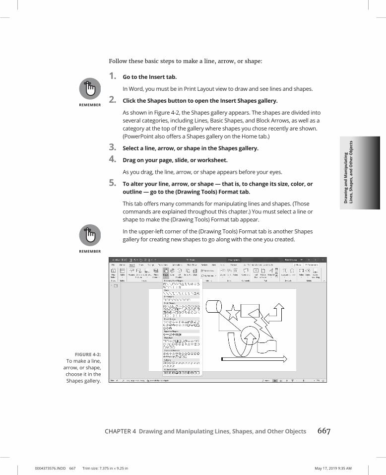
Dra
win
g an
d M
anip
ulat
ing
Line
s, S
hape
s, a
nd O
ther
Obj
ects
0004373576.INDD 667 Trim size: 7.375 in × 9.25 in May 17, 2019 9:35 AM
CHAPTER 4 Drawing and Manipulating Lines, Shapes, and Other Objects 667
Follow these basic steps to make a line, arrow, or shape:
1. Go to the Insert tab.
In Word, you must be in Print Layout view to draw and see lines and shapes.
2. Click the Shapes button to open the Insert Shapes gallery.
As shown in Figure 4-2, the Shapes gallery appears. The shapes are divided into several categories, including Lines, Basic Shapes, and Block Arrows, as well as a category at the top of the gallery where shapes you chose recently are shown. (PowerPoint also offers a Shapes gallery on the Home tab.)
3. Select a line, arrow, or shape in the Shapes gallery.
4. Drag on your page, slide, or worksheet.
As you drag, the line, arrow, or shape appears before your eyes.
5. To alter your line, arrow, or shape — that is, to change its size, color, or outline — go to the (Drawing Tools) Format tab.
This tab offers many commands for manipulating lines and shapes. (Those commands are explained throughout this chapter.) You must select a line or shape to make the (Drawing Tools) Format tab appear.
In the upper-left corner of the (Drawing Tools) Format tab is another Shapes gallery for creating new shapes to go along with the one you created.
FIGURE 4-2: To make a line,
arrow, or shape, choose it in the Shapes gallery.

0004373576.INDD 668 Trim size: 7.375 in × 9.25 in May 17, 2019 9:35 AM
668 BOOK 8 Working with Charts and Graphics
Handling Lines, Arrows, and ConnectorsEarlier in this chapter, Figure 4-1 shows examples of how you can use lines and arrows to present ideas. As well as lines and arrows, the Insert Shapes gallery offers connectors, the special lines that link shapes and can bend and stretch as you move shapes around. Use connectors along with lines and arrows to describe the relationships between the people or things in a diagram. These pages explain how to handle lines, arrows, and connectors.
Changing the length and position of a line or arrowTo change anything about a line or arrow, start by clicking to select it. You can tell when a line has been selected because round selection handles appear at either end. Follow these instructions to move a line or adjust its length or angle:
» Changing the angle of a line: Drag a selection handle up, down, or sideways. You can see where your line will be when you release the mouse button.
» Changing the length: Drag a selection handle away from or toward the opposite selection handle.
» Changing the position: Move the pointer over the line itself and click when you see the four-headed arrow. Then drag the line to a new location.
Changing the appearance of a line, arrow, or connectorWhat a line looks like is a matter of its color, its weight (how wide it is), its dash status (it can be filled out or dashed), and its cap (its ends can be rounded, square, or flat). To change the appearance of a line, start by selecting it, going to the (Drawing Tools) Format tab, and opening the drop-down list on the Shape Outline button (this button is in the Shape Styles group). As shown in Figure 4-3, you see a drop-down list with commands for handling the appearance of lines, arrows, and connectors:
» Color: Select a color on the drop-down list (refer to Figure 4-3).
» Width: Choose Weight on the drop-down list (refer to Figure 4-3) and then choose a line width on the submenu. You can also choose More Lines on the submenu to open the Format Shape task pane and change the width there. Enter a Width setting in points to make the line heavier or thinner.
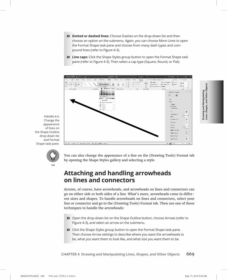
Dra
win
g an
d M
anip
ulat
ing
Line
s, S
hape
s, a
nd O
ther
Obj
ects
0004373576.INDD 669 Trim size: 7.375 in × 9.25 in May 17, 2019 9:35 AM
CHAPTER 4 Drawing and Manipulating Lines, Shapes, and Other Objects 669
» Dotted or dashed lines: Choose Dashes on the drop-down list and then choose an option on the submenu. Again, you can choose More Lines to open the Format Shape task pane and choose from many dash types and com-pound lines (refer to Figure 4-3).
» Line caps: Click the Shape Styles group button to open the Format Shape task pane (refer to Figure 4-3). Then select a cap type (Square, Round, or Flat).
You can also change the appearance of a line on the (Drawing Tools) Format tab by opening the Shape Styles gallery and selecting a style.
Attaching and handling arrowheads on lines and connectorsArrows, of course, have arrowheads, and arrowheads on lines and connectors can go on either side or both sides of a line. What’s more, arrowheads come in differ-ent sizes and shapes. To handle arrowheads on lines and connectors, select your line or connector and go to the (Drawing Tools) Format tab. Then use one of these techniques to handle the arrowheads:
» Open the drop-down list on the Shape Outline button, choose Arrows (refer to Figure 4-3), and select an arrow on the submenu.
» Click the Shape Styles group button to open the Format Shape task pane. Then choose Arrow settings to describe where you want the arrowheads to be, what you want them to look like, and what size you want them to be.
FIGURE 4-3: Change the appearance
of lines on the Shape Outline
drop-down list and Format
Shape task pane.

0004373576.INDD 670 Trim size: 7.375 in × 9.25 in May 17, 2019 9:35 AM
670 BOOK 8 Working with Charts and Graphics
To attach an arrowhead or arrowheads to a line or connector you’ve already drawn, select the line and proceed as though you were attaching arrowheads to a line that already has an arrow.
Connecting shapes by using connectorsUnder Lines, the Shapes gallery offers six different connectors. Use connectors to link shapes and text boxes to form a diagram. Connectors differ from conventional lines in an important way: After you attach one to a shape, it stays with the shape when you move the shape. You don’t have to worry about remaking all the con-nections after you move a shape. You can move shapes at will and let the connec-tors between shapes take care of themselves.
Figure 4-4 shows three types of connectors in action. (By the way, if you came here to explore how to make a diagram, be sure to check out Chapter 2 of this minibook as well. It explains Office SmartArt diagramming.)
CHOOSING A DEFAULT LINE STYLE FOR CONSISTENCY’S SAKEOne of the secrets to making an attractive drawing is to make the lines consistent with one another. Lines should be the same width and color. They should be the same style. Unless you observe this rule, your drawings will be infested with lines of varying width and different colors. They will look like a confetti parade in a windstorm.
You can get around the problem of making lines consistent with one another by creat-ing a model line and making it the default line style. After you declare a default style, all new lines you create are assigned the style. You don’t have to spend as much time mak-ing the lines look alike.
Give a line the style, weight, and color that you want for all (or most) lines and then fol-low these steps to make that line the default style:
1. Select and right-click the line.
2. Choose Set As Default Line on the shortcut menu.

Dra
win
g an
d M
anip
ulat
ing
Line
s, S
hape
s, a
nd O
ther
Obj
ects
0004373576.INDD 671 Trim size: 7.375 in × 9.25 in May 17, 2019 9:35 AM
CHAPTER 4 Drawing and Manipulating Lines, Shapes, and Other Objects 671
To connect shapes in Word, the shapes must be on the drawing canvas. Book 2, Chapter 6 describes the Word drawing canvas. (On the Insert tab, click the Shapes button and choose New Drawing Canvas to create one.)
Making the connectionBefore you draw the connections, draw the shapes and arrange them on the slide where you want them to be in your diagram. Then follow these steps to connect two shapes with a connector:
1. Select the two shapes that you want to connect.
To select the shapes, hold down the Ctrl key and click each one.
2. On the (Drawing Tools) Format tab, open the Shapes gallery.
3. Under Lines, select the connector that will best fit between the two shapes you want to link together.
4. Move the pointer over a selection handle on one of the shapes you want to connect.
5. Click and drag the pointer over a selection handle on the other shape, and when you see selection handles on that shape, release the mouse button.
When you click a connector, you see round, green selection handles on the shapes that are joined by the connector. These round handles tell you that the two shapes are connected and will remain connected when you move them.
To delete a connector, click to select it and press Delete.
FIGURE 4-4: The three types
of connectors (from top to
bottom): elbow, straight, and
curved.

0004373576.INDD 672 Trim size: 7.375 in × 9.25 in May 17, 2019 9:35 AM
672 BOOK 8 Working with Charts and Graphics
If your connector is attached to the wrong shape, don’t despair. Select the con-nector, and on the (Drawing Tools) Format tab, click the Edit Shape button and choose Reroute Connectors. Then move the pointer over the green handle on the side of the connector that needs to be attached elsewhere, click, drag the connec-tor elsewhere on the other shape, and release the mouse button when you see the green selection handles.
Adjusting a connectorChances are, your connector needs adjusting to make it fit correctly between the two shapes. Click to select your connector and follow these techniques to adjust it:
» Changing the shape of a connector: Drag the circle (or circles) on the connector. As you drag, the connector assumes different shapes.
» Changing the connector type: Right-click the connector, choose Connector Types, and choose Straight Connector, Elbow Connector, or Curved Connector on the submenu.
» Handling arrows on connectors: If the arrows on the connector aren’t there, are pointing in the wrong direction, or shouldn’t be there, change the arrowheads around using the same techniques you use with standard arrows. See “Attaching and handling arrowheads on lines and connectors,” earlier in this chapter.
Make sure that the connector lines in your diagram are consistent with one another. Give them the same style and appearance, or else it will be hard to make sense of your diagram.
Handling Rectangles, Ovals, Stars, and Other Shapes
Figure 4-5 illustrates how shapes can come in very handy for illustrating concepts and ideas. You can combine shapes to make your own illustrations. Apart from the standard rectangle and oval, you can draw octagons and various other “-agons,” arrows, stars, and banners. You are hereby encouraged to make shapes a part of your work, and you’ll be glad to know that drawing shapes is not difficult. These pages explain how to draw a shape, exchange one shape for another, change a shape’s symmetry, and enter words on a shape.

Dra
win
g an
d M
anip
ulat
ing
Line
s, S
hape
s, a
nd O
ther
Obj
ects
0004373576.INDD 673 Trim size: 7.375 in × 9.25 in May 17, 2019 9:35 AM
CHAPTER 4 Drawing and Manipulating Lines, Shapes, and Other Objects 673
In Word, you must be in Print Layout view to draw and handle shapes. If you intend to draw more than one shape in Word, create a drawing canvas to hold the shapes (on the Insert tab, click the Shapes button and choose New Drawing Can-vas). Book 2, Chapter 6 describes the drawing canvas in Word.
Drawing a shapeFollow these steps to draw a shape:
1. On the Insert tab, click the Shapes button to open the Shapes gallery.
You can also insert shapes from the Shapes gallery on the (Drawing Tools) Format tab.
2. Select a shape in the gallery.
If you’ve drawn the shape recently, you may be able to find it at the top of the gallery under Recently Used Shapes.
3. Click and drag slantwise to draw the shape, as shown at the top of Figure 4-6.
Hold down the Shift key as you drag if you want the shape to retain its proportions. For example, to draw a circle, select the Oval shape and hold down the Shift key as you draw.
Changing a shape’s size and shapeSelection handles appear on the corners and sides of a shape after you select it. With the selection handles showing, you can change a shape’s size and shape:
» Hold down the Shift key and drag a corner handle to change a shape’s size and retain its symmetry.
» Drag a side, top, or bottom handle to stretch or scrunch a shape.
FIGURE 4-5: An example of
using shapes (and connectors) to
convey an idea.

0004373576.INDD 674 Trim size: 7.375 in × 9.25 in May 17, 2019 9:35 AM
674 BOOK 8 Working with Charts and Graphics
Choosing a different shapeTo exchange one shape for another, select the shape and follow these steps:
1. On the (Drawing Tools) Format tab, click the Edit Shape button.
You can find this button in the Insert Shapes group.
2. Choose Change Shape on the drop-down list.
3. Select a new shape in the Shapes gallery.
Changing a shape’s symmetryA yellow circle, sometimes more than one, appears on some shapes. By dragging a circle, you can change a shape’s symmetry. Figure 4-6 (shown previously), for
FIGURE 4-6: Drag to draw a shape (top); drag a yellow
circle to change a shape’s symmetry
(bottom).

Dra
win
g an
d M
anip
ulat
ing
Line
s, S
hape
s, a
nd O
ther
Obj
ects
0004373576.INDD 675 Trim size: 7.375 in × 9.25 in May 17, 2019 9:35 AM
CHAPTER 4 Drawing and Manipulating Lines, Shapes, and Other Objects 675
example, shows the same shape (the Sun shape) altered to show different sym-metries. Notice where the yellow circles are. By dragging a yellow circle even a short distance, you can do a lot to change a shape’s symmetry.
Using a shape as a text boxHere’s a neat trick: Rather than use the conventional rectangle as a text box, you can use a shape. Figure 4-7 shows examples of shapes being used as text boxes. By placing words on shapes, you can make the shapes illustrate ideas and concepts.
Follow these instructions to handle text box shapes:
» Entering the text: Click in the shape and start typing. In Word, you can right-click and choose Add Text if you have trouble typing in the shape.
» Editing the text: Click in the text and start editing. That’s all there is to it. If you have trouble getting inside the shape to edit the text, select the shape, right-click it, and choose Edit Text on the shortcut menu.
» Changing the font, color, and size of text: Select the text, right-click the text, and choose Font. Then, in the Font dialog box, choose a font, font color, and a font size for the text.
» Allowing the shape to enlarge for text: You can allow the shape to enlarge and receive more text. On the (Drawing Tools) Format tab, click the Shape Styles group button, and in the Text Options/Text Box category of the Format Shape task pane, select the Resize Shape to Fit Text option button.
FIGURE 4-7: Shapes can do double duty as
text boxes.

0004373576.INDD 676 Trim size: 7.375 in × 9.25 in May 17, 2019 9:35 AM
676 BOOK 8 Working with Charts and Graphics
Drawing by FreehandVisit the Draw tab in Word, PowerPoint, or Excel to draw by freehand. If you have a steady hand, you can draw on a page, slide, or worksheet. These pages explain how to draw lines, erase lines, and otherwise fool with a drawing until it is just so. They also explain how to draw math equations. The Draw tools work much better on a touchscreen, but if yours isn’t a touchscreen, you can still draw by dragging the mouse.
To draw by freehand in Word, you must be in Print Layout view and you must draw on a drawing canvas. Click the Drawing Canvas button on the Draw tab to create a drawing canvas. Book 2, Chapter 6 describes the drawing canvas in Word.
Freehand drawing with a pen or highlighterFollow these steps to draw on a page, slide, or worksheet with a pen, pencil, or highlighter:
1. Go to the Draw tab.
2. In the Pens gallery, choose a pen, pencil, or highlighter.
As shown in Figure 4-8, use one of these techniques:
TURNING A TEXT BOX INTO A TEXT BOX SHAPETo turn a conventional text box into a text box shape, follow these instructions:
1. Select the text box by clicking its perimeter.
2. On the (Drawing Tools) Format tab, click the Edit Shape button, choose Change Shape, and then select a shape in the Shapes gallery.
After the conversion, you usually have to enlarge the shape to accommodate the text.

Dra
win
g an
d M
anip
ulat
ing
Line
s, S
hape
s, a
nd O
ther
Obj
ects
0004373576.INDD 677 Trim size: 7.375 in × 9.25 in May 17, 2019 9:35 AM
CHAPTER 4 Drawing and Manipulating Lines, Shapes, and Other Objects 677
• Tap or click the pen or highlighter you want.
• Tap or click the down-arrow on a pen or highlighter. From the menu that appears, choose a line thickness and line color.
3. Drag onscreen with your finger or the mouse.
As you make your drawing, you can return to the Pens gallery and choose different drawing tools, colors, and lines types.
4. Press Esc when you finish drawing by freehand.
To add a drawing tool to the Pens gallery, tap or click the Add Pen button. Then choose Pencil, Pen, or Highlighter on the drop-down menu and select a line thick-ness and color. To remove a drawing tool, open its drop-down menu and choose Delete.
Changing the look of freehand drawingsNot that you necessarily want to open this can of worms, but you can edit draw-ings. Starting on the Draw tab, here are instructions for changing the look and appearance of drawings:
» Selecting a line: Tap or click the line. Round selection handles appear to show the line is selected.
FIGURE 4-8: Visit the Draw tab to make freehand
drawings.

0004373576.INDD 678 Trim size: 7.375 in × 9.25 in May 17, 2019 9:35 AM
678 BOOK 8 Working with Charts and Graphics
» Selecting more than one line: Hold down the Ctrl key and tap or click lines. In PowerPoint and Excel, you can also tap or click the Lasso Select button and drag slantwise across the drawing.
» Erasing a line: Tap or click the Eraser button and then tap or click the line. When you finish erasing, tap or click the Eraser button again (or press Esc). In PowerPoint, you can open the drop-down list on the Eraser button to choose erasers of different sizes.
» Changing a line’s color and thickness: Select a line and then choose a different option in the Pens gallery.
» Resizing: After you select a line, use one of these techniques to resize it:
• Drag a corner handle to change a shape’s size and retain its symmetry.
• Drag a side, top, or bottom handle to stretch or scrunch it.
» Moving: After you select a line, move the pointer on top of it. When you see the four-headed arrow, start dragging.
» Rotating: Select a line and drag its Rotate button.
» Deleting: Select a line and press Delete.
Drawing a math expressionThe Insert tab offers the Equation Editor (click the Equation button) for writing mathematical equations, and you’re welcome to give it a spin, but much more use-ful than the Equation Editor is another tool on the Draw tab called Math Input Con-trol. As shown in Figure 4-9, you can use it to construct mathematical expressions.
FIGURE 4-9: Writing a math
expression.

Dra
win
g an
d M
anip
ulat
ing
Line
s, S
hape
s, a
nd O
ther
Obj
ects
0004373576.INDD 679 Trim size: 7.375 in × 9.25 in May 17, 2019 9:35 AM
CHAPTER 4 Drawing and Manipulating Lines, Shapes, and Other Objects 679
To write a math expression, go to the Draw tab and tap or click the Ink to Math button. The Math Input Control dialog box appears (refer to Figure 4-9). Keep your eye on the Preview area while you follow these instructions to construct your equation:
» Writing: Tap or click the Write button and drag onscreen to write your expression.
» Erasing numbers and symbols: Tap or the Erase button and drag to erase a number or symbol.
» Correcting errors: If the Ink Equation Editor enters the wrong number or symbol, tap or click the Select and Correct button and then tap or click the part of the expression that is incorrect. A drop-down menu appears. If the correct number or symbol is on the menu, select it.
» Erasing the expression: Tap or click the Clear button to wipe the slate clean and start anew.
Click the Insert button to land the equation on an Excel worksheet, Word page, or PowerPoint slide.
Decorating Your Work with IconsDoes your Word page, PowerPoint slide, or Excel worksheet need decorating? If it does, consider tossing in a decorative icon like the ones shown in Figure 4-10. Office offers dozens of them.
FIGURE 4-10: Icons aplenty in the Insert Icons
dialog box.

0004373576.INDD 680 Trim size: 7.375 in × 9.25 in May 17, 2019 9:35 AM
680 BOOK 8 Working with Charts and Graphics
To insert an icon, go to the Insert tab and click the Icons button. The Insert Icons dialog box appears (refer to Figure 4-10). Select an icon and click the Insert button.
Treat your icon as you would any other object — a shape, a photo, or a graphic. Later in this chapter, “Manipulating Lines, Shapes, Art, Text Boxes, and Other Objects” explains how to resize, reshape, and reposition objects, icons included.
Inserting a 3-D ModelIn Office lingo a 3-D model is a kind of graphic that you can rotate, turn, and present from different angles. Figure 4-11 shows an example of a 3-D model. By dragging the rotation icon, you can view the 3-D model in different ways.
If you want to experiment with 3-D models, go to the Insert tab, click the 3D Mod-els button, and choose From Online Sources on the drop-down list. The 3D Models dialog box appears. Select a 3-D model and click the Insert button.
WordArt for Embellishing Letters and WordsWordArt gives you the opportunity to decorate letters and words like letters and words on a birthday cake. Figure 4-12 shows the WordArt gallery, where Word-Art is made, and an example of WordArt in action. After you insert WordArt, you can fool with the WordArt Styles buttons on the (Drawing Tools) Format tab and embellish the word or phrase even further.
FIGURE 4-11: An example of
a 3-D model.
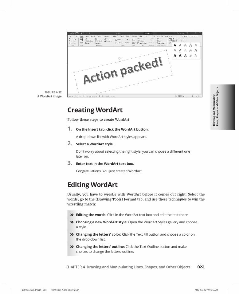
Dra
win
g an
d M
anip
ulat
ing
Line
s, S
hape
s, a
nd O
ther
Obj
ects
0004373576.INDD 681 Trim size: 7.375 in × 9.25 in May 17, 2019 9:35 AM
CHAPTER 4 Drawing and Manipulating Lines, Shapes, and Other Objects 681
Creating WordArtFollow these steps to create WordArt:
1. On the Insert tab, click the WordArt button.
A drop-down list with WordArt styles appears.
2. Select a WordArt style.
Don’t worry about selecting the right style; you can choose a different one later on.
3. Enter text in the WordArt text box.
Congratulations. You just created WordArt.
Editing WordArtUsually, you have to wrestle with WordArt before it comes out right. Select the words, go to the (Drawing Tools) Format tab, and use these techniques to win the wrestling match:
» Editing the words: Click in the WordArt text box and edit the text there.
» Choosing a new WordArt style: Open the WordArt Styles gallery and choose a style.
» Changing the letters’ color: Click the Text Fill button and choose a color on the drop-down list.
» Changing the letters’ outline: Click the Text Outline button and make choices to change the letters’ outline.
FIGURE 4-12: A WordArt image.

0004373576.INDD 682 Trim size: 7.375 in × 9.25 in May 17, 2019 9:35 AM
682 BOOK 8 Working with Charts and Graphics
To apply color or an outline to some of the letters or words, select the letters or words before choosing options on the (Drawing Tools) Format tab.
Manipulating Lines, Shapes, Art, Text Boxes, and Other Objects
After you insert a shape, line, text box, image, graphic, diagram, chart, or embed-ded object in a file, it ceases being what it was before and becomes an object. Figure 4-13 shows eight objects. I’m not sure whether these eight objects resent being objectified, but Office objectifies them. As far as manipulating these items in Office is concerned, these are just objects.
The techniques for manipulating objects are the same whether you’re dealing with a line, shape, graphic, diagram, or text box. The good news from your end is that you have to master only one set of techniques for handling these objects. Whether you want to move, change the size of, change the color of, or change the outline of a text box, graphic, or shape, the techniques are the same.
In the remainder of this chapter are instructions for doing these tasks with objects:
» Selecting: Before you can do anything to objects, you have to select them. See “Selecting objects so that you can manipulate them.”
» Making use of the rulers and grid: Rulers (in Word, PowerPoint, Excel, and Publisher) and the grid (in Word and PowerPoint) can be very helpful for aligning and placing objects. See “Hiding and displaying the rulers and grid.”
FIGURE 4-13: Examples of
objects.

Dra
win
g an
d M
anip
ulat
ing
Line
s, S
hape
s, a
nd O
ther
Obj
ects
0004373576.INDD 683 Trim size: 7.375 in × 9.25 in May 17, 2019 9:35 AM
CHAPTER 4 Drawing and Manipulating Lines, Shapes, and Other Objects 683
» Changing an object’s size and shape: You can enlarge, shrink, stretch, and scrunch objects to make them wider or taller. See “Changing an Object’s Size and Shape.”
» Applying color: Changing an object’s color makes it stand out. You can apply patterns to some objects. See “Changing an Object’s Color, Outline Color, and Transparency.”
» Moving and positioning: You can land objects with precision in a Word document, PowerPoint slide, or Excel worksheet. See “Moving and Positioning Objects.”
» Aligning and distributing: Another way to move and position objects is to realign or redistribute them across a page, slide, or worksheet. See “Tricks for aligning and distributing objects.”
» Overlapping: When you’re dealing with several objects, they’re bound to overlap — and sometimes overlapping objects make for an interesting effect. On the right side of Figure 4-13, for example, several objects overlap and give the impression that they were “dropped there.” See “When objects overlap: Choosing which appears above the other,” later in this chapter, to handle overlapping objects.
» Rotating and flipping: Viewers turn their heads when they see an object that has been flipped or rotated. You can rotate and flip shapes, lines, text boxes, graphics, and WordArt images. See “Rotating and flipping objects.”
» Grouping: To make working with several different objects easier, you can group them so that they become a single object. After objects have been grouped, manipulating them — manipulating it, I should say — is easier. See “Grouping objects to make working with them easier,” later in this chapter.
If you sighed after you finished reading this long list, I don’t blame you. But be of good cheer: Most of these commands are easy to pick up, and including lines, shapes, text boxes, WordArt images, and graphics in your work is a good way to impress your friends and intimidate your enemies.
Selecting objects so that you can manipulate themBefore you can move or change the border of a graphic, text box, or other object, you have to select it. To select an object, simply click it. Sometimes, to align or decorate several objects simultaneously, you have to select more than one object at the same time. To select more than one object:
» Ctrl+click them. In other words, hold down the Ctrl key as you click the objects.

0004373576.INDD 684 Trim size: 7.375 in × 9.25 in May 17, 2019 9:35 AM
684 BOOK 8 Working with Charts and Graphics
» On the Home tab, click the Select button and choose Select Objects on the drop-down list. Then click on one side of the objects you want to select and drag the pointer across the other objects.
» Display the Selection pane. It lists objects on the drawing canvas (Word), slide (PowerPoint), or worksheet (Excel). You can click or Ctrl+click object names in the pane to select objects. Figure 4-14 shows the Selection pane. Use these techniques to open it:
• On the (Drawing Tools) Format tab or (Picture Tools) Format tab, click the Selection Pane button.
• On the Home tab, click the Select button and choose Selection Pane on the drop-down list. (You may have to click the Editing button first, depending on the size of your screen.)
After you select an object, its selection handles appear. Objects have eight selec-tion handles, one at each corner and one at each side. To tell whether an object is selected, look for its selection handles.
Hiding and displaying the rulers and gridWord, PowerPoint, and Excel offer two rulers, one along the top of the window and one along the left side. Use the rulers to help place and align objects. To dis-play or hide these rulers, use one of these techniques:
FIGURE 4-14: Click an object
in the Selection pane to select it.

Dra
win
g an
d M
anip
ulat
ing
Line
s, S
hape
s, a
nd O
ther
Obj
ects
0004373576.INDD 685 Trim size: 7.375 in × 9.25 in May 17, 2019 9:35 AM
CHAPTER 4 Drawing and Manipulating Lines, Shapes, and Other Objects 685
» On the View tab, click the Ruler check box. (You may have to click the Show button first, depending on the size of your screen.) To see the rulers, you must be in Print Layout view In Word and Page Layout view in Excel.
» In PowerPoint, you can also hide or display rulers by right-clicking a slide (but not an object or frame) and choosing Ruler on the shortcut menu.
In Word and PowerPoint, the grid can come in very handy for aligning objects. On the View tab, click the Gridlines check box to see the grid. (You may have to click the Show button first.) The grid settings in PowerPoint are quite sophisticated (see Book 4, Chapter 4 for details).
By the way, fans of the metric system will be pleased to know that you can display centimeters (or millimeters, points, or picas) on the ruler instead of inches. On the File tab, choose Options. In the Options dialog box, go to the Advanced category, open the Show Measurements in Units Of drop-down list, and choose a unit of measurement.
Changing an Object’s Size and ShapeUsually when an object arrives onscreen, you have to wrestle with it. You have to change its size (and sometimes its shape as well). Figure 4-15 demonstrates how to resize an object. Select your object and use one of these methods to change its size and shape:
» “Eyeball it”: Hold down the Shift key and drag a corner selection handle to make the object larger or smaller but maintain its proportions. Drag a selection handle on the side to stretch or crimp an object and change its shape as well as its size.
» Enter height and width measurements: On the Format tab, enter measure-ments in the Height and Width boxes (see Figure 4-15). Depending on the size of your screen, you may have to click the Size button before you can see these boxes.
» Open the Format task pane or Layout dialog box: Click the Size group button on the Format tab to open the Format task pane (in PowerPoint and Excel) or the Layout dialog box (in Word). Then change the Height and Width settings (see Figure 4-15).

0004373576.INDD 686 Trim size: 7.375 in × 9.25 in May 17, 2019 9:35 AM
686 BOOK 8 Working with Charts and Graphics
Whether you can change an object’s shape as well as its size depends on whether the object’s aspect ratio is locked. If you’re wrestling with an object and it won’t do your bidding — if it refuses to change shape or it changes shape, and you don’t want it to do that — unlock its aspect ratio setting. Click the Size group button, and in the task pane or dialog box that appears, select or deselect the Lock Aspect Ratio check box. When an object’s aspect ratio is locked, it maintains its shape as you change its size, but when it’s unlocked, you can change its shape as well as its size.
You can change the size and shape of several objects at one time by selecting all the objects before giving a command to change sizes. Being able to change objects’ size this way is convenient when you want to change the size of many objects but maintain their relationships to one another.
Changing an Object’s Color, Outline Color, and Transparency
If an object’s color doesn’t suit you, you have the right to change colors. For that matter, you can opt for a “blank” object with no color or make the object semi-transparent. As the saying goes, “It’s a free country.”
Office has its own lingo when it comes to an object’s color. Remember these terms when you make like Picasso with your shapes, text boxes, and graphics:
FIGURE 4-15: Ways to resize
an object.

Dra
win
g an
d M
anip
ulat
ing
Line
s, S
hape
s, a
nd O
ther
Obj
ects
0004373576.INDD 687 Trim size: 7.375 in × 9.25 in May 17, 2019 9:35 AM
CHAPTER 4 Drawing and Manipulating Lines, Shapes, and Other Objects 687
» Fill colors: The color that fills in an object is called the fill. You can apply fill color to shapes, text boxes, and WordArt, but not pictures. Besides colors, you can use a picture, gradient, or texture as the fill. (See the next topic in this chapter, “Filling an object with color, a picture, or a texture.”)
» Outline colors: The line that goes around the perimeter of an object is called the outline. You can choose a color, style, and line width for outlines. (See “Putting the outline around an object,” later in this chapter.)
The easiest way to decorate a shape, text box, or WordArt image is to visit the Format tab and make a selection in the Styles gallery. These ready-made gal-lery selections can spare you the work of dealing with fill color and outlines. Just remember not to mix and match different Style options; use them with consistency.
Filling an object with color, a picture, or a textureShapes, text boxes, and WordArt images are empty when you first create them, but you can fill them with a color, picture, gradient, or texture by following these basic steps:
1. Select the object that needs a facelift.
2. Apply a color, picture, gradient, or texture to the object.
Use one of these application techniques:
• On the Format tab, click the Shape Fill button. Then, on the drop-down list, choose a color, picture, gradient, or texture.
• Click the Shape Styles group button to open the Format task pane, as shown in Figure 4-16. Then choose a color, picture, gradient, or texture.
Click the Shape Fill button and choose No Fill to remove the color, picture, gradient, or texture from an object.
Figure 4-16 shows the same object filled with a color, picture, gradient, and tex-ture. Which do you prefer? Your choices are as follows:
» Color: Applies a single color to the object.
» Picture: Places a picture in the object. You see the Insert Picture dialog box. Choose a picture and click the Insert button.
» Gradient (Word and PowerPoint only): Applies gradient color shading to the object. You can choose between various shading styles.

0004373576.INDD 688 Trim size: 7.375 in × 9.25 in May 17, 2019 9:35 AM
688 BOOK 8 Working with Charts and Graphics
» Texture: Offers 24 patterns meant to simulate various surfaces. The choices include Granite, Paper Bag, and Pink Tissue Paper. Be sure to use the scroll bar to see all the choices.
» Pattern: Applies a pattern to the object. Select Pattern Fill in the Format task pane and then choose a pattern.
FIGURE 4-16: Shape fills (from
left to right): color, picture, gradient, and
texture.
USING THE EYEDROPPER TO SELECT AN ONSCREEN COLOR (POWERPOINT ONLY)Suppose you become enamored of a color that you see on your screen and you want to apply this color to an object. For example, suppose you want to apply the particular shade of yellow in your company logo to a shape. Using the eyedropper, you can select the color you like so well and apply it to an object on a page or slide. Follow these steps:
1. Select the text box, shape, slide, WordArt image, or other object that needs recoloring.
2. On the Format tab, click the Shape Fill button and choose Eyedropper on the drop-down list.
The pointer changes to an eyedropper.

Dra
win
g an
d M
anip
ulat
ing
Line
s, S
hape
s, a
nd O
ther
Obj
ects
0004373576.INDD 689 Trim size: 7.375 in × 9.25 in May 17, 2019 9:35 AM
CHAPTER 4 Drawing and Manipulating Lines, Shapes, and Other Objects 689
Making a color transparentA transparent color is like gauze because instead of being solid, it shows what’s behind it. Transparent colors are especially useful in text boxes because the text shows through and can be read easily. Follow these steps to make the fill color in a text box, shape, or WordArt image transparent or semi-transparent:
1. Right-click the object and choose Format.
The Format task pane opens (see Figure 4-16).
3. Move the eyedropper over the onscreen color that you want for the object you selected in Step 1.
How you move the eyedropper depends on where the color you want is located on the screen.
If the onscreen color is on a PowerPoint slide, simply move the eyedropper over the color.
If the onscreen color is outside your PowerPoint application — if it’s on a web page, for example — hold down the left mouse button as you drag the eyedropper out-side the PowerPoint window. Drag the eyedropper until it is over the color you want.
A pop-up color box shows the color that the eyedropper is on, the name of the color, and the color’s RGB (red green blue) settings.
4. Click when the pop-up color box shows you the color you want for the object you selected in Step 1.
The object you selected in Step 1 gets the new color.

0004373576.INDD 690 Trim size: 7.375 in × 9.25 in May 17, 2019 9:35 AM
690 BOOK 8 Working with Charts and Graphics
2. In the Fill category, drag the Transparency slider to choose how transpar-ent a color you want.
At 100%, the color is completely transparent and, in fact, not there; at 1%, the color is hardly transparent at all.
You can also make a graphic transparent by recoloring it. See Chapter 3 of this minibook.
Putting the outline around an objectThe outline is the line that runs around the perimeter of an object. Put an outline color around an object to give it more definition or make it stand out. Figure 4-17 shows examples of outlines. What a shape outline looks like has to do with the color, width, and dash style you choose for it.
Follow these steps to change an object’s outline:
1. Select the object.
2. Change the outline.
Use one of these techniques to change the outline:
• On the Format tab, click the Shape Outline button. Then, on the drop-down list, choose a color, weight, and dash type.
• Click the Shape Styles group button to open the Format task pane (see Figure 4-17). Then, under Line, choose a color, width, and dash type.
To remove the outline from an object, click the Shape Outline button and choose No Outline or choose No Line in the Format task pane.
DESIGNATING A FILL AND OUTLINE COLOR FOR ALL YOUR OBJECTSRather than go to the significant trouble of giving all or most of your objects the same look, you can make one object the model for all others to follow and declare it the default style. After that, all new objects you insert appear in the same style, your objects have a uniform appearance, and you don’t have to spend as much time formatting objects.
Select an object with a fill and an outline color that you want as your model, right-click the object, and choose Set As Default Shape to make your object the default that all other objects start from.

Dra
win
g an
d M
anip
ulat
ing
Line
s, S
hape
s, a
nd O
ther
Obj
ects
0004373576.INDD 691 Trim size: 7.375 in × 9.25 in May 17, 2019 9:35 AM
CHAPTER 4 Drawing and Manipulating Lines, Shapes, and Other Objects 691
Moving and Positioning ObjectsMoving objects is considerably easier than moving furniture. Select the object you want to reposition and use one of these techniques to land it in the right place:
» Dragging: Move the pointer over the perimeter of the object, click when you see the four-headed arrow, and drag the object to a new location. Hold down the Shift key as you drag to move an object either horizontally or vertically in a straight line.
» Using a task pane or dialog box (in PowerPoint and Word): On the Format tab, click the Size group button. (Depending on the size of your screen, you may have to click the Size button first.) You see the Format task pane or Layout dialog box. On the Position category or tab, enter Horizontal and Vertical position measurements to place the object on the slide or page.
» Nudging: If you can’t quite fit an object in the right place, try using a Nudge command. Nudge commands move objects up, down, left, or right. Press one of the arrow keys (↑, ↓, ←, →) to move the object a little bit. Hold down the Ctrl key as you press an arrow key to make the object move by tiny increments.
Use the task pane or dialog box method of positioning objects when you want objects to be in the exact same position on different pages or slides.
Tricks for aligning and distributing objectsWhen several objects appear in the same place, use the Align and Distribute com-mands to give the objects an orderly appearance. You can make your Word page,
FIGURE 4-17: An object’s
outline has to do with its color, width, and dash
type.

0004373576.INDD 692 Trim size: 7.375 in × 9.25 in May 17, 2019 9:35 AM
692 BOOK 8 Working with Charts and Graphics
PowerPoint slide, or Excel worksheet look tidier by aligning the objects or by dis-tributing them so that they are equidistant from one another. Office offers special commands for doing these tasks.
Aligning objectsThe Align commands come in handy when you want objects to line up with one another. Suppose you need to align several shapes. As shown in Figure 4-18, you can use an Align command to line up the shapes with precision. You don’t have to tug and pull, tug and pull until the shapes are aligned with one another. In the figure, I used the Align Top command to line up the shapes along the top. In Word and PowerPoint, besides aligning objects with respect to one another, you can align objects or with respect to the page (in Word) or the slide (in PowerPoint). For example, you can line up objects along the top of a slide.
Follow these steps to line up objects:
1. Move the objects where you roughly want them to be, and if you want to align objects with respect to one another, move one object to a point that the others will align to.
When Office aligns objects with respect to one another, it aligns them to the object in the leftmost, centermost, rightmost, topmost, middlemost, or bottommost position, depending on which Align command you choose.
2. Select the objects you want to align.
Earlier in this chapter, “Selecting objects so that you can manipulate them” looks at selection techniques.
FIGURE 4-18: Use the Align
commands to align objects.
These objects are aligned along
the top.

Dra
win
g an
d M
anip
ulat
ing
Line
s, S
hape
s, a
nd O
ther
Obj
ects
0004373576.INDD 693 Trim size: 7.375 in × 9.25 in May 17, 2019 9:35 AM
CHAPTER 4 Drawing and Manipulating Lines, Shapes, and Other Objects 693
3. Go to the Format tab.
You can also go to the Layout tab in Word.
4. Click the Align button, and on the drop-down list, choose whether to align the objects with respect to one another or with respect to the page or page margin (in Word) or a slide (in PowerPoint).
Depending on the size of your screen, you may have to click the Arrange button to get to the Align button.
5. Click the Align button again and choose an Align command — Left, Center, Right, Top, Middle, or Bottom.
6. If necessary, drag the objects on the page.
That’s right — drag them. After you give an Align command, the objects are still selected, and you can drag to adjust their positions.
Distributing objects so that they are equidistantThe Distribute commands — Distribute Horizontally and Distribute Vertically — come in handy for laying out objects on a page or slide. These commands arrange objects so that the same amount of space appears between each one. Rather than go to the trouble of pushing and pulling objects until they are distributed evenly, you can simply select the objects and choose a Distribute command.
Figure 4-19 demonstrates how the Distribute commands work. In the figure, I chose the Distribute Horizontally command so that the same amount of horizon-tal (side-by-side) space appears between the objects. Distributing objects such as these on your own is a waste of time when you can use a Distribute command.
FIGURE 4-19: The Distribute
commands rearrange objects so that the same amount of space is between them.

0004373576.INDD 694 Trim size: 7.375 in × 9.25 in May 17, 2019 9:35 AM
694 BOOK 8 Working with Charts and Graphics
Follow these steps to distribute objects horizontally or vertically on a page or slide:
1. Arrange the objects so that the outermost objects — the ones that will go on the top and bottom or left side and right side — are where you want them to be.
In other words, if you want to distribute objects horizontally across a page, place the leftmost object and rightmost object where you want them to be. Office will distribute the other objects equally between the leftmost and rightmost object.
2. Select the objects.
3. Go to the Format tab.
You can also go to the Layout tab in Word.
4. Click the Align button and choose a Distribute option on the drop-down list.
To find the Align button, you may have to click the Arrange button first, depending on the size of your screen.
When objects overlap: Choosing which appears above the otherOn a page or slide that is crowded with text boxes, shapes, and graphics, objects inevitably overlap, and you have to decide which object goes on top of the stack and which on the bottom. In a Word document, you have to decide as well whether text appears above or below objects.
Objects that deliberately overlap can be interesting and attractive to look at. On the right side of Figure 4-20, for example, a graphic image and text box appear in front of a shape. Makes for a nice effect, no? These pages explain controlling how objects overlap with the Bring and Send commands and the Selection pane.
Controlling overlaps with the Bring and Send commandsWord, PowerPoint, and Excel offer these commands for handling objects in a stack:
» Bring Forward: Moves the object higher in the stack
» Bring to Front: Moves the object in front of all other objects in the stack
» Send Backward: Moves the object lower in the stack
» Send to Back: Moves the object behind all other objects
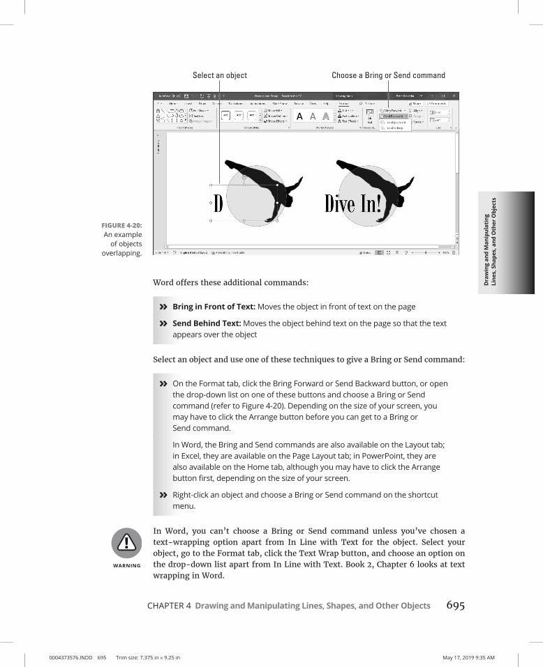
Dra
win
g an
d M
anip
ulat
ing
Line
s, S
hape
s, a
nd O
ther
Obj
ects
0004373576.INDD 695 Trim size: 7.375 in × 9.25 in May 17, 2019 9:35 AM
CHAPTER 4 Drawing and Manipulating Lines, Shapes, and Other Objects 695
Word offers these additional commands:
» Bring in Front of Text: Moves the object in front of text on the page
» Send Behind Text: Moves the object behind text on the page so that the text appears over the object
Select an object and use one of these techniques to give a Bring or Send command:
» On the Format tab, click the Bring Forward or Send Backward button, or open the drop-down list on one of these buttons and choose a Bring or Send command (refer to Figure 4-20). Depending on the size of your screen, you may have to click the Arrange button before you can get to a Bring or Send command.
In Word, the Bring and Send commands are also available on the Layout tab; in Excel, they are available on the Page Layout tab; in PowerPoint, they are also available on the Home tab, although you may have to click the Arrange button first, depending on the size of your screen.
» Right-click an object and choose a Bring or Send command on the shortcut menu.
In Word, you can’t choose a Bring or Send command unless you’ve chosen a text-wrapping option apart from In Line with Text for the object. Select your object, go to the Format tab, click the Text Wrap button, and choose an option on the drop-down list apart from In Line with Text. Book 2, Chapter 6 looks at text wrapping in Word.
FIGURE 4-20: An example
of objects overlapping.

0004373576.INDD 696 Trim size: 7.375 in × 9.25 in May 17, 2019 9:35 AM
696 BOOK 8 Working with Charts and Graphics
If an object on the bottom of the stack shows through after you place it on the bottom, the object on the top of the stack is transparent or semi-transparent. Transparent objects are like gauze curtains — they reveal what’s behind them. If you want to make the object on the top of the stack less transparent, see “Making a color transparent,” earlier in this chapter.
Controlling overlaps with the Selection paneAnother way to control how objects overlap is to open the Selection pane, select an object, and click the Bring Forward or Send Backward button as necessary to move the object up or down in the stack. Earlier in this chapter, “Selecting objects so that you can manipulate them” explains the Selection pane. (On the Format tab, click the Selection Pane button to open it.)
Rotating and flipping objectsRotating and flipping objects — that is, changing their orientation — is a neat way to spruce up a page or slide, as Figure 4-21 demonstrates. You can rotate and flip these kinds of objects: lines, shapes, text boxes, graphics, and WordArt images. To flip or rotate an object, select it and do one of the following:
» Roll your own: Drag the object’s rotation handle, the semicircle that appears after you select it. Hold down the Shift key as you drag to rotate the shape by 15-degree increments.
FIGURE 4-21: Members of an
audience turn their heads
when objects are rotated or
flipped.

Dra
win
g an
d M
anip
ulat
ing
Line
s, S
hape
s, a
nd O
ther
Obj
ects
0004373576.INDD 697 Trim size: 7.375 in × 9.25 in May 17, 2019 9:35 AM
CHAPTER 4 Drawing and Manipulating Lines, Shapes, and Other Objects 697
» Choose a Rotate or Flip command: On the Format tab, click the Rotate button and choose an option on the drop-down list (refer to Figure 4-21). The Rotate commands rotate objects by 90 degrees; the Flip commands flip objects over. The Rotate button is also found on the Layout tab (in Word), the Page Layout tab (in Excel), and the Home tab (in PowerPoint). You may have to click the Arrange button to see the Rotate button, depending on the size of your screen.
» Open the Format task pane or Layout dialog box: On the Rotate drop-down list, choose More Rotation Options to open the Format task pane or Layout dialog box. Enter a degree measurement in the Rotation text box.
To rotate several objects simultaneously, Ctrl+click to select each object and then give a rotation command.
Grouping objects to make working with them easierConsider the graphic image, shape, and text box in Figure 4-22. To move, resize, or reshape these objects, I would have to laboriously move them one at a time — that is, I would have to do that if it weren’t for the Group command.
The Group command assembles different objects into a single object to make moving, resizing, and reshaping objects easier. With the Group command, you select the objects that you want to “group” and then you wrap them into a bundle so that they become easier to work with.
FIGURE 4-22: You can move,
resize, and reshape grouped objects as though they were a single
object.

0004373576.INDD 698 Trim size: 7.375 in × 9.25 in May 17, 2019 9:35 AM
698 BOOK 8 Working with Charts and Graphics
Grouping objectsSelect the objects and do one of the following to group them into one happy family:
» On the Format tab (or the Layout tab in Word, the Page Layout tab in Excel, and the Home tab in PowerPoint), click the Group button and choose Group on the drop-down list. Depending on the size of your screen, you may have to click the Arrange button to get to the Group button.
» Right-click one of the objects you selected and choose Group➪ Group.
After objects are grouped, they form a single object with the eight selection handles.
To add an object to a group, select the object and the grouped objects by Ctrl+clicking and then choose the Group command.
Ungrouping objectsTo ungroup an object and break it into its components parts, perhaps to fiddle with one of the objects in the group, select the object, go to the Format tab, click the Group button, and choose Ungroup.