the use of colors in technical writing - hypotheses.org
TRANSCRIPT
The use of colors
in
Technical Writing
How to take advantage of it
Cristiane FREITAS
Viviana MACALUSO
2
Abstract We come from different cultural and educational backgrounds and decided to analyze and focus on
how colors may influence readability and, therefore, comprehension on technical documentation.
This matter came after we browsed a website from a marketplace corporation and we noticed that there
was a lack of harmony and synchronicity between its marketing and documentation website. We noticed
it mainly because the visual identity, particularly the use of colors and icons, was absolutely discordant.
It was remarkable that the two websites were developed by different teams, what could eventually
reveal an internal noise in communication, or even some problem in the enterprise architecture.
A simple misuse of colors can reveal much more than aesthetics, design or layout. And this seemed
quite impressive to us.
The color approach however can be very large, with multi-disciplinary, underestimated, usually treated
randomly and not too scientific under the gaze of the academic community. We want to show that it can
be theory-based and, by means of a user test, we intend to prove – practically – that colors should be
treated with the importance they deserve, far beyond aesthetics and layout.
After applying a user test, we noticed that users react differently face to face with a colored and a black
and white document.
Introduction
In the past decade, there has been increased interest in research on color and psychological
functioning. Although it is more commonly used in marketing materials than in technical writing, color
can be used to add emphasis to key points in technical documents. If color is used correctly, it can be
a powerful tool in online technical writing such as Web pages, Help files or printed technical documents.
3
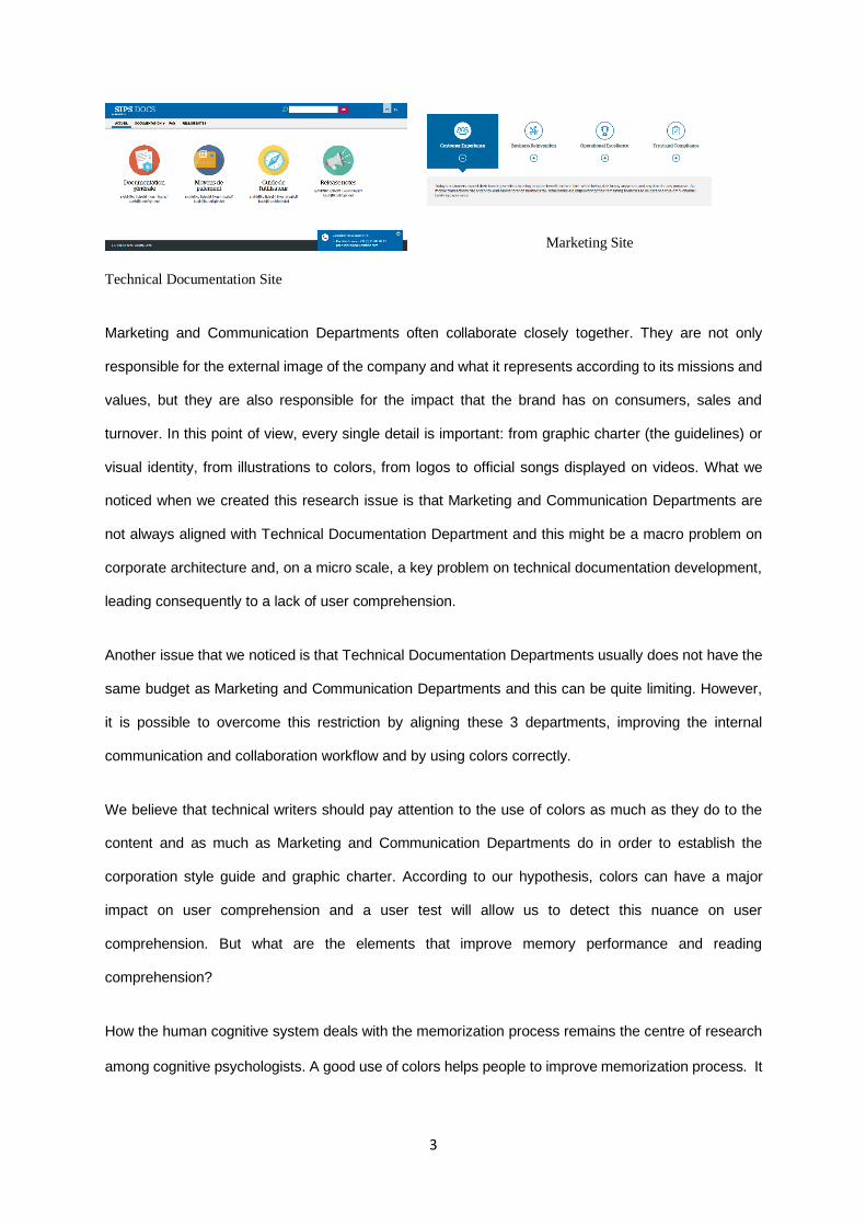
Marketing Site
Technical Documentation Site
Marketing and Communication Departments often collaborate closely together. They are not only
responsible for the external image of the company and what it represents according to its missions and
values, but they are also responsible for the impact that the brand has on consumers, sales and
turnover. In this point of view, every single detail is important: from graphic charter (the guidelines) or
visual identity, from illustrations to colors, from logos to official songs displayed on videos. What we
noticed when we created this research issue is that Marketing and Communication Departments are
not always aligned with Technical Documentation Department and this might be a macro problem on
corporate architecture and, on a micro scale, a key problem on technical documentation development,
leading consequently to a lack of user comprehension.
Another issue that we noticed is that Technical Documentation Departments usually does not have the
same budget as Marketing and Communication Departments and this can be quite limiting. However,
it is possible to overcome this restriction by aligning these 3 departments, improving the internal
communication and collaboration workflow and by using colors correctly.
We believe that technical writers should pay attention to the use of colors as much as they do to the
content and as much as Marketing and Communication Departments do in order to establish the
corporation style guide and graphic charter. According to our hypothesis, colors can have a major
impact on user comprehension and a user test will allow us to detect this nuance on user
comprehension. But what are the elements that improve memory performance and reading
comprehension?
How the human cognitive system deals with the memorization process remains the centre of research
among cognitive psychologists. A good use of colors helps people to improve memorization process. It
4
functions as a powerful information channel to the human cognitive system and has been found to play
a significant role in enhancing memory performance.
To prove and argue our hypothesis, we conducted a survey among 10 people. Our user test focus on
the effect of colors on comprehension and involves 2 different tests: a black and white and a colored
test.
Before discussing the results of our user test analytically, we are going to develop some multi-
disciplinary and theory-based arguments regarding the effect of colors on comprehension.
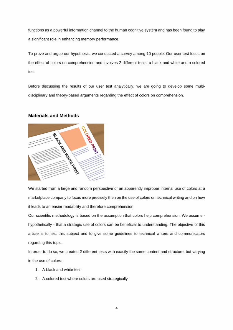
Materials and Methods
We started from a large and random perspective of an apparently improper internal use of colors at a
marketplace company to focus more precisely then on the use of colors on technical writing and on how
it leads to an easier readability and therefore comprehension.
Our scientific methodology is based on the assumption that colors help comprehension. We assume -
hypothetically - that a strategic use of colors can be beneficial to understanding. The objective of this
article is to test this subject and to give some guidelines to technical writers and communicators
regarding this topic.
In order to do so, we created 2 different tests with exactly the same content and structure, but varying
in the use of colors:
1. A black and white test
2. A colored test where colors are used strategically
5
These two tests were applied 5 times, that’s to say, to 10 different people in exactly the same conditions:
at the same time and with the same reading and answering time. Each person took only one test to
answer, which means that each test was answered 5 times, from 5 different people. These tests were
the basis of our statistical sampling that we are going to analyze and comment in this article.
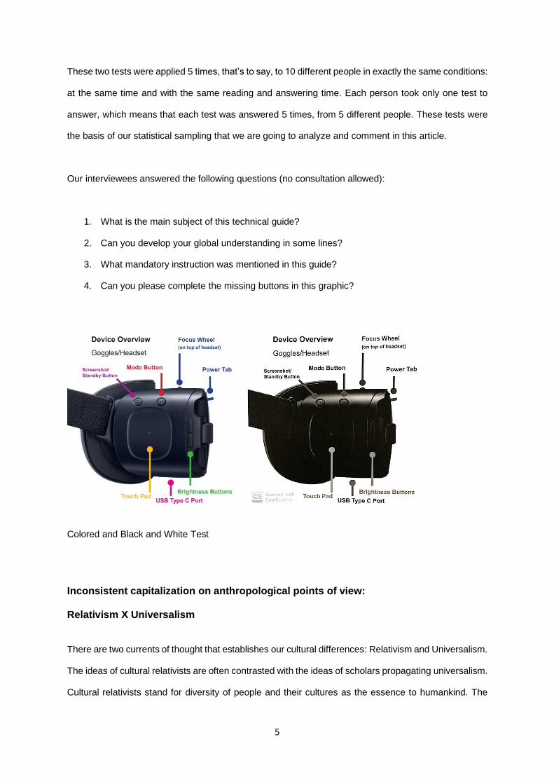
Our interviewees answered the following questions (no consultation allowed):
1. What is the main subject of this technical guide?
2. Can you develop your global understanding in some lines?
3. What mandatory instruction was mentioned in this guide?
4. Can you please complete the missing buttons in this graphic?
Colored and Black and White Test
Inconsistent capitalization on anthropological points of view: Relativism X Universalism There are two currents of thought that establishes our cultural differences: Relativism and Universalism.
The ideas of cultural relativists are often contrasted with the ideas of scholars propagating universalism.
Cultural relativists stand for diversity of people and their cultures as the essence to humankind. The
6
universalists are doing the opposite – they emphasize the similarities within the humankind (Eriksen
2001:8). They are stating that there are essential human values and patterns common to all existing
cultures. Out of those common patterns, they are making grand cross-cultural theories, which are
supposed to explain the nature of man.
One of the proponents of universalism in anthropology is Donald Brown. According to him, “universals
at the level of the individual are particularly likely to be close to human nature or to be actual elements
of human nature - at the core of which are the evolved problem-solving mechanisms that constitute the
human mind” (Brown 2004:48). Brown (1991) elaborates on already established distinction between
universal, the generalized, and the particular: “Certain biological, psychological, social, and cultural
features are universal – shared by all human populations. Others are merely generalized – common to
several but not all human groups. Still others are particular – not shared at all” (Kottak 2011:35;
emphases added). This statement is questionable, especially from the cultural relativist point of view:
we are not able to seize and completely understand psychological traits, social features and cultural
meanings in each particular culture that exists in this world. Because of that, it is very hard, if not
impossible, to list and compare them without imposing an ethnocentric perspective.1
Under the advent of Universalism, we created a hypothesis that the correct use of colors is useful and
advantageous for all cultures across the world in the comprehension of technical writing. In order to
analyse it, we not only proposed a user test, but we are also going to discuss some fundamental items
to this subject, such as: cognitive sciences, visual memory, form and color psychology, contrast and
neurosciences.
1 Ethnocentrism, usually contrasted with cultural relativism, represents belief that one’s culture is superior to other cultures (Kottak 2011:53).
7
Colors Psychology
Marketing already takes advantage of colors. And so does Design. Every single point of color influence
is thoroughly studied to achieve its goal. It is believed that colors play an essential role on people’s
emotions, cultural meanings and preferences, as well as on company’s image, mission and objective.
As a result, colors play a role on buyer emotions and preferences and – therefore - on turnover.
Colors are influential because of our conceptual knowledge. Hues are almost meaningless. Color
meanings (and their subsequent influence) depend on emotion and meaning we associate with a color.
Color is ubiquitous and is a source of information. People make up their minds within 90 seconds
of their initial interactions with either people or products. About 62 ‐90 percent of the assessment
is based on colors alone. So, prudent use of colors can contribute not only to differentiating
products from competitors, but also to influencing moods and feelings – positively or negatively –
and therefore, to attitude towards certain products.
Many people have speculated over the last 80 years or so about the possibilities of using colored paper
to boost response-rates to surveys and questionnaires, and several studies have been carried out. Most
of these enquiries report no significant effects from using colored paper, although there have been
some exceptions.
In one of the earliest studies, Gullahorn and Gullahorn (1963) tested green and white questionnaires in
a survey of former Fulbright and Smith-Mundt grantees (N=7,370). Green questionnaires were found to
increase response rate in a positive direction, 51 versus 49 percent, but the difference was not
statistically significant. Pucel and colleagues (1971) also tested the difference in response rates for
green and white questionnaires, along with several other "incentives." They surveyed students who
graduated from vocational programs (N=1,100). No incentive by itself, including color, was found to
significantly increase response rates, although color did increase response in a positive direction. The
number of incentives, however, did increase response rates significantly. Matteson (1974) mailed pink
and white survey questionnaires to members of a professional organization (N=2,040). Pink was chosen
because it was thought to have the highest intensity (brightness). Matteson also varied the solicitation
letter using a semi-personal and a form letter. Color did not significantly affect the response rate of
those receiving the semi-personal letter (semi-personal letter recipients had significantly higher
8
response rates than form letter recipients). But for those receiving the form letter and pink questionnaire,
there was a significant increase in the response rate at the five percent level (from 20 to 24 percent).
In a survey of university alumni of a student business honorary association (N=168), Crittenden,
Crittenden and Hawes (1985) tested the effect of yellow versus white questionnaires. They tested yellow
versus white because yellow was a psychological primary color, the brightness contrast between print
on white and yellow paper was minimal, and both white and yellow had traditionally yielded high returns.
The yellow questionnaire obtained a higher response rate than the white questionnaire (49 versus 37
percent).
Mike Brennan and Jan Charbonneau conducted a research and analyzed the various solutions to
increase the response rates of surveys, namely the effects of colors in questionnaires: they came to the
conclusion that colors were incentives to answer questionnaires and that using purple in mail surveys
increased the response rates (Brennan and Charbonneau, 2005). Colors also enhance memory
performance and influence users’ retention. Researcher Dae-Young Kim assessed the strategy used
by marketers and advertisers to attract consumers’ attention in the tourism and hospitality sectors: her
conclusion establishes a correlation between colors and memory (Dae-Young, 2010). Color pictures
generate more working memory and remain more significantly in the long-term memory.
However, color alone cannot significantly increase response rate, improve memory and
comprehension. We can use other elements to grab the attention of a reader and to improve readability
such as: contrast, infographics, and forms.
Infographics are also appropriate media to optimize the understanding in a concise manner. Besides,
technical communication is defined as “the discipline of transforming complex information into usable
content for products, processes, and services” (Bleil, 2013). Color infographics are more effective than
black and white ones. Colors are key elements for visual media as it partly drives users’ attention:
humans are more sensitive to chromatic variations than light changes; they focus more on contrasts
than on light when they see images (Vazquez et al., 2010).
Contrast is used to make elements stand out and grab attention. Contrast, like proximity, creates a focal
point in a visual design. A color contrast, for example, can redirect the attention of a reader to a more
important part or message of a presentation.
9
Gestalt principles of form perception.
In the 30s and 40s, Gestalt psychology was applied to visual perception, most notably by Max
Wertheimer, Wolfgang Köhler, and Kurt Koffka who founded the so-called gestalt approaches to form
perception. Their aim was to investigate the global and holistic processes involved in perceiving
structure in the environment. Some of these laws are as follows.
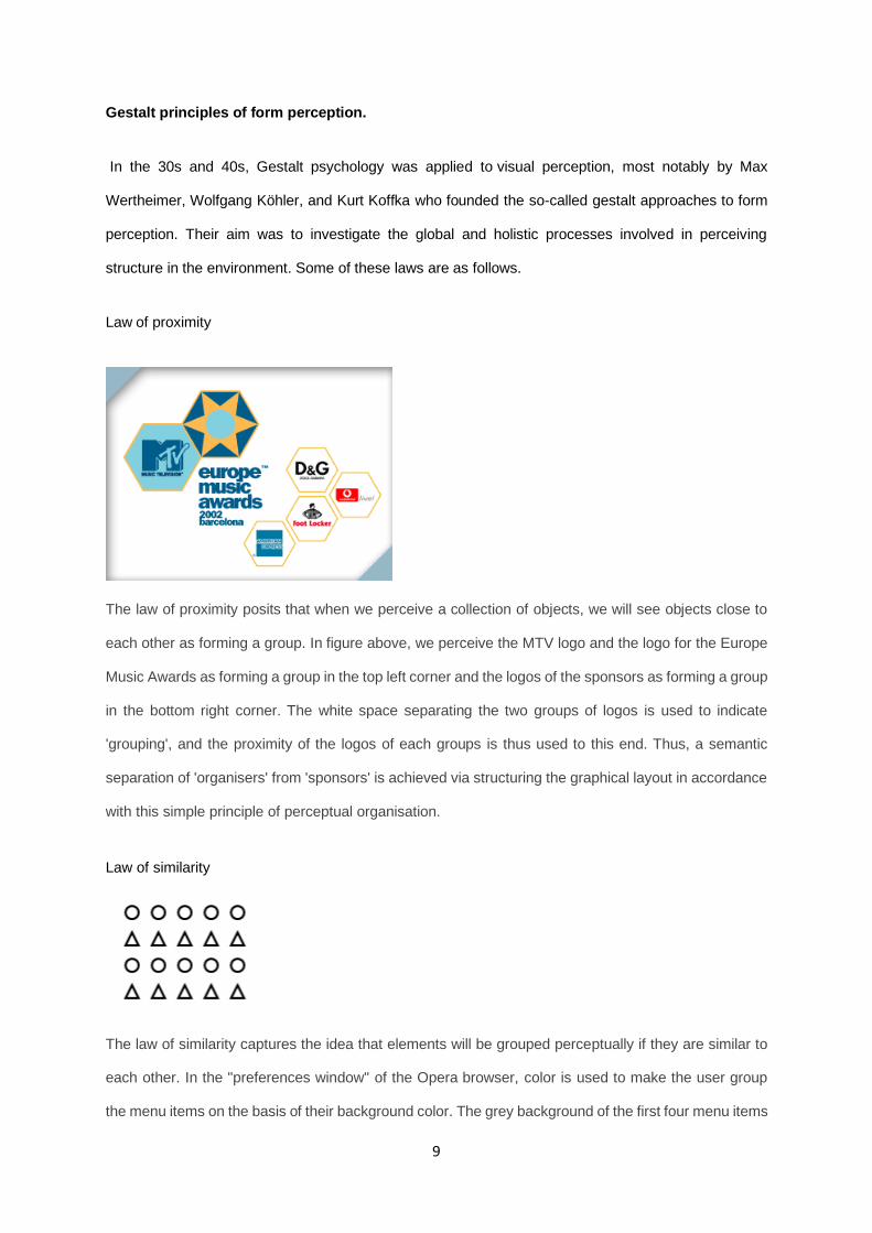
Law of proximity
The law of proximity posits that when we perceive a collection of objects, we will see objects close to
each other as forming a group. In figure above, we perceive the MTV logo and the logo for the Europe
Music Awards as forming a group in the top left corner and the logos of the sponsors as forming a group
in the bottom right corner. The white space separating the two groups of logos is used to indicate
'grouping', and the proximity of the logos of each groups is thus used to this end. Thus, a semantic
separation of 'organisers' from 'sponsors' is achieved via structuring the graphical layout in accordance
with this simple principle of perceptual organisation.
Law of similarity
The law of similarity captures the idea that elements will be grouped perceptually if they are similar to
each other. In the "preferences window" of the Opera browser, color is used to make the user group
the menu items on the basis of their background color. The grey background of the first four menu items
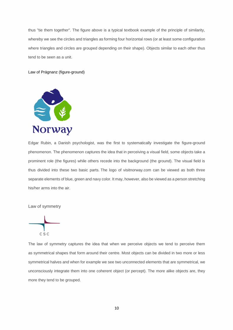
10
thus "tie them together". The figure above is a typical textbook example of the principle of similarity,
whereby we see the circles and triangles as forming four horizontal rows (or at least some configuration
where triangles and circles are grouped depending on their shape). Objects similar to each other thus
tend to be seen as a unit.
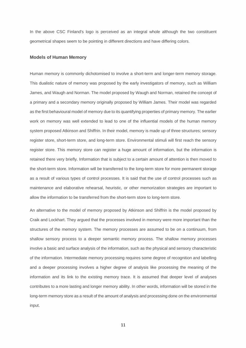
Law of Prägnanz (figure-ground)
Edgar Rubin, a Danish psychologist, was the first to systematically investigate the figure-ground
phenomenon. The phenomenon captures the idea that in perceiving a visual field, some objects take a
prominent role (the figures) while others recede into the background (the ground). The visual field is
thus divided into these two basic parts. The logo of visitnorway.com can be viewed as both three
separate elements of blue, green and navy color. It may, however, also be viewed as a person stretching
his/her arms into the air.
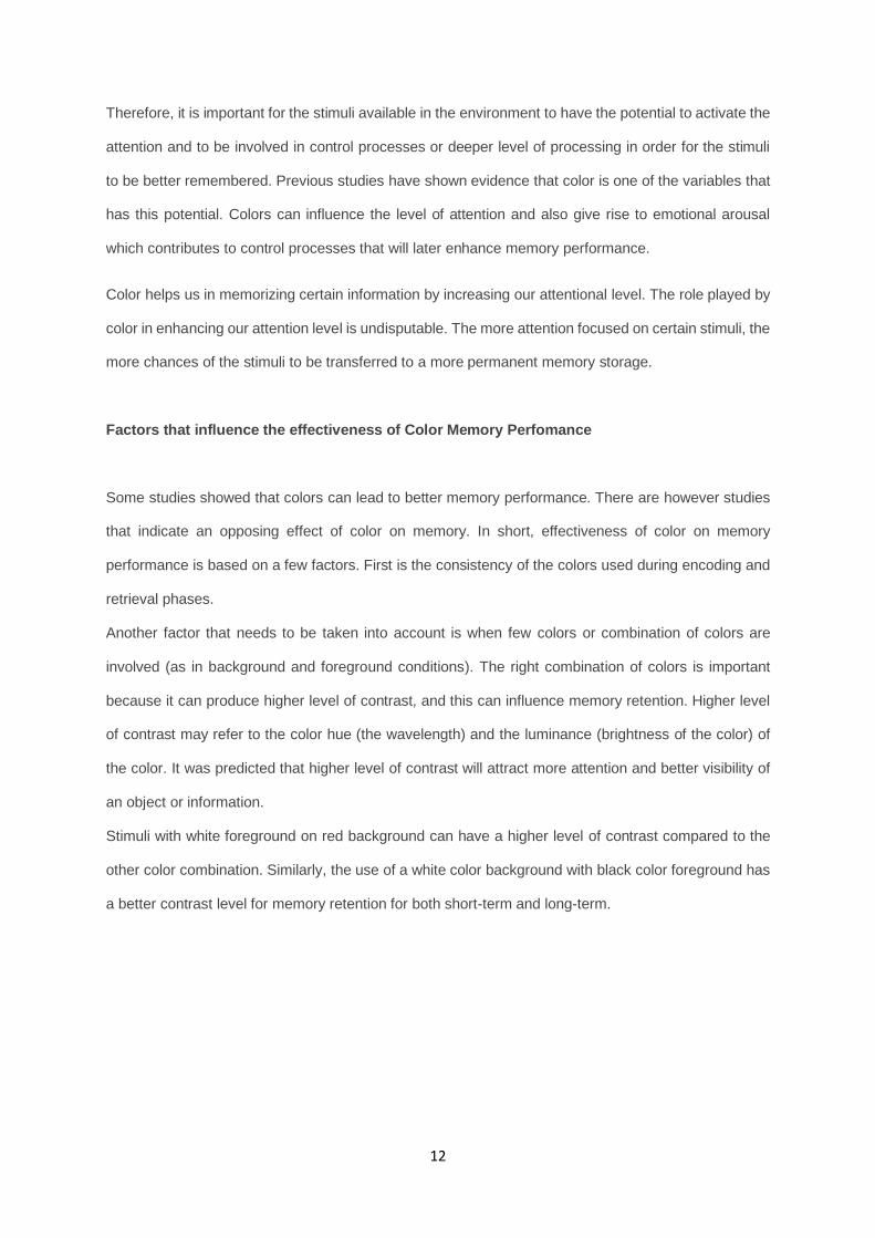
Law of symmetry
The law of symmetry captures the idea that when we perceive objects we tend to perceive them
as symmetrical shapes that form around their centre. Most objects can be divided in two more or less
symmetrical halves and when for example we see two unconnected elements that are symmetrical, we
unconsciously integrate them into one coherent object (or percept). The more alike objects are, they
more they tend to be grouped.
11
In the above CSC Finland's logo is perceived as an integral whole although the two constituent
geometrical shapes seem to be pointing in different directions and have differing colors.
Models of Human Memory
Human memory is commonly dichotomised to involve a short-term and longer-term memory storage.
This dualistic nature of memory was proposed by the early investigators of memory, such as William
James, and Waugh and Norman. The model proposed by Waugh and Norman, retained the concept of
a primary and a secondary memory originally proposed by William James. Their model was regarded
as the first behavioural model of memory due to its quantifying properties of primary memory. The earlier
work on memory was well extended to lead to one of the influential models of the human memory
system proposed Atkinson and Shiffrin. In their model, memory is made up of three structures; sensory
register store, short-term store, and long-term store. Environmental stimuli will first reach the sensory
register store. This memory store can register a huge amount of information, but the information is
retained there very briefly. Information that is subject to a certain amount of attention is then moved to
the short-term store. Information will be transferred to the long-term store for more permanent storage
as a result of various types of control processes. It is said that the use of control processes such as
maintenance and elaborative rehearsal, heuristic, or other memorization strategies are important to
allow the information to be transferred from the short-term store to long-term store.
An alternative to the model of memory proposed by Atkinson and Shiffrin is the model proposed by
Craik and Lockhart. They argued that the processes involved in memory were more important than the
structures of the memory system. The memory processes are assumed to be on a continuum, from
shallow sensory process to a deeper semantic memory process. The shallow memory processes
involve a basic and surface analysis of the information, such as the physical and sensory characteristic
of the information. Intermediate memory processing requires some degree of recognition and labelling
and a deeper processing involves a higher degree of analysis like processing the meaning of the
information and its link to the existing memory trace. It is assumed that deeper level of analyses
contributes to a more lasting and longer memory ability. In other words, information will be stored in the
long-term memory store as a result of the amount of analysis and processing done on the environmental
input.
12
Therefore, it is important for the stimuli available in the environment to have the potential to activate the
attention and to be involved in control processes or deeper level of processing in order for the stimuli
to be better remembered. Previous studies have shown evidence that color is one of the variables that
has this potential. Colors can influence the level of attention and also give rise to emotional arousal
which contributes to control processes that will later enhance memory performance.
Color helps us in memorizing certain information by increasing our attentional level. The role played by
color in enhancing our attention level is undisputable. The more attention focused on certain stimuli, the
more chances of the stimuli to be transferred to a more permanent memory storage.
Factors that influence the effectiveness of Color Memory Perfomance
Some studies showed that colors can lead to better memory performance. There are however studies
that indicate an opposing effect of color on memory. In short, effectiveness of color on memory
performance is based on a few factors. First is the consistency of the colors used during encoding and
retrieval phases.
Another factor that needs to be taken into account is when few colors or combination of colors are
involved (as in background and foreground conditions). The right combination of colors is important
because it can produce higher level of contrast, and this can influence memory retention. Higher level
of contrast may refer to the color hue (the wavelength) and the luminance (brightness of the color) of
the color. It was predicted that higher level of contrast will attract more attention and better visibility of
an object or information.
Stimuli with white foreground on red background can have a higher level of contrast compared to the
other color combination. Similarly, the use of a white color background with black color foreground has
a better contrast level for memory retention for both short-term and long-term.
13
Conclusion and Discussion
Our research started with the idea that the correct and strategic use of colors would help readability
and, consequently, comprehension. In order to analyze it, we proposed a user test with 2 open
questions regarding the content in general and other 2 questions regarding the use of colors and its
influence on memory and – therefore – assimilation and comprehension.
The two general questions were:
✓ What is the main subject of this technical guide?
✓ Can you develop your global understanding in some lines?
The two color-specific questions were:
✓ What mandatory instruction was mentioned in this guide?
✓ Can you please complete the missing buttons in this graphic?
Regarding the two general questions, there was not a huge difference in comprehension between the
two guides (black and white and colored ones). The global understanding was present and correct,
except from a major or minor development due mainly to the restricted reading time. But we noticed
that – globally - the use of colors or the lack of use of colors did not interfere with the comprehension.
However, when we focus on the color-specific questions, we noticed that the content assimilation is
significantly higher. For instance, 80% of people that read the colored guide answered the question
about the missing buttons correctly, while only 20% did it right after reading the black and white guide.
We believe that this difference presents strong evidence that the correct and strategic use of colors
helps content assimilation and – therefore – comprehension. So, the accurate use of colors should be
put forward and highlighted on technical writing, for the benefit of readers and users.
The other color-specific question result, concerning the mandatory instruction that was written in red in
the colored guide and in black and white in the other one, was not so striking. We believe that it’s due
14
mainly to a misunderstanding of the question. The question was not clear and direct enough, so
answers in both user tests did not match our hypothetical expectations; that’s to say, an equal
percentage in both guides answered it correctly.
We showed that research on memory has provided a vast strategy that can be used to ensure
successful retrieval. There appears to be a basis for associating color and its significant effect on
memory abilities. In other words, color has the potential to increase chances of environmental stimuli
to be encoded, stored, and retrieved successfully. The choice of colors and the manipulative aspects
can, however, influence the extent to which colors can influence human memory performance.
Incorporating symbols and shading add interest and make line types distinguishable by colorblind
viewers.
People suffering from color-blindness may encounter difficulties with certain documents containing
colors. Pie charts, histograms, maps, etc. can be unreadable for these people.
Being friendly to colorblind people does not necessarily mean that one should not use colors. Even for
colorblind viewers, colors are very useful cues to distinguish different objects easily and quickly. By
carefully selecting colors that are easily recognizable to people with all kinds of color vision, one can
maximize the effect of her/his presentations.
It’s also important to avoid the situation where texts and objects are obscured with the background. For
example, there should be enough contrasts in brightness and saturation between texts/objects and
backgrounds. Avoid the combination of colors that have the same brightness but different only in hue.
Red characters on green backgrounds is unreadable for colorblinds. Use either bright texts/objects over
dark backgrounds, or vice versa. For non-colorblind people, red is the bright and vivid color. But for
colorblinds, it is as dull as blue or dark green. Especially for protanopes, who cannot detect long
wavelength of red light, dark red appears almost as black.
Even for bright vivid colors, colorblind people cannot sometimes distinguish the name of colors. When
explaining figures, avoid using only color names and describe also shapes or positions. For example,
avoid saying "this red cell". Instead, say "this red, round cells on the top left", for example.

15
We believe that technical writers must structure and adapt contents to their users and use colors to
improve the understanding of every reader.
16
Bibliography
Morgan K. (2015), Technical Writing Process: The simple, five-step guide that anyone can use to
create technical documents such as user guides, manuals, and procedures, retrieved from
technicalwritingprocess.com
Heller E. (2012), A psicologia das cores: Como as cores afetam a emoção e a razão
Nick K. Color Psychology, retrieved from nickkolenda.com
Satyendra S. (2006), Impact of color on marketing, retrieved from emerald.com
James H., Andrew R. (2003), The effects of using colored paper to boost response-rates to surveys
and questionnaires, retrieved from journals.sagepub.com
Bureau of Labor Statistics (1991), Does questionnaire color affect survey response rate?,
retrieved from bls.gov
Amelle B., Aline EA., Romain G., Manoela S. (2016), Infographics : A toolbox for technical
writers?, retrieved from hypotheses.org
Interaction Design Foundation, The Glossary of human computer interaction, retrieved from
interaction-design.org
Mariam AD., Muhammad FM. (2013), The Influence of Colour on Memory Perfomance: A review,
retrieved from ncbi.nlm.nih.gov
17
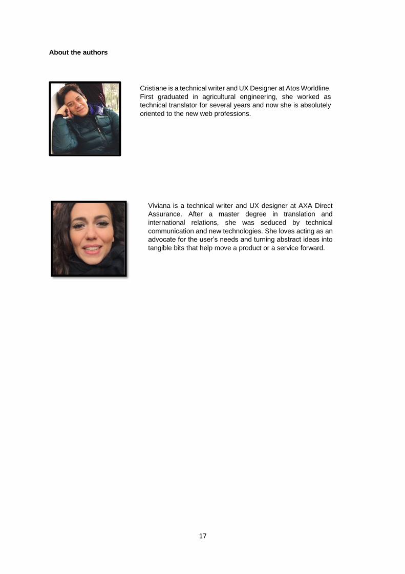
About the authors
Cristiane is a technical writer and UX Designer at Atos Worldline.
First graduated in agricultural engineering, she worked as
technical translator for several years and now she is absolutely
oriented to the new web professions.
Viviana is a technical writer and UX designer at AXA Direct
Assurance. After a master degree in translation and
international relations, she was seduced by technical
communication and new technologies. She loves acting as an
advocate for the user’s needs and turning abstract ideas into
tangible bits that help move a product or a service forward.