statistics for economics, accounting and business studies
TRANSCRIPT
Michael Barrow
Statistics for Economics, Accounting and Business StudiesSeventh edition

Pearson Education LimitedEdinburgh GateHarlow CM20 2JEUnited KingdomTel: +44 (0)1279 623623Web: www.pearson.com/uk
First published 1988 (print)Second edition published 1996 (print)Third edition published 2001 (print and electronic)Fourth edition published 2006 (print and electronic)Fifth edition published 2009 (print and electronic)Sixth edition published 2013 (print and electronic)Seventh edition published 2017 (print and electronic)
© Pearson Education Limited 1988, 1996 (print)© Pearson Education Limited 2001, 2006, 2009, 2013, 2017 (print and electronic)
Pearson Education is not responsible for the content of third-party internet sites.
ISBN: 978-1-292-11870-3 (Print) 978-1-292-11874-1 (PDF) 978-1-292-18249-0 (ePub)
British Library Cataloguing-in-Publication DataA catalogue record for the print edition is available from the British Library
Library of Congress Cataloging-in-Publication Data Names: Barrow, Michael, author.Title: Statistics for economics, accounting and business studies / Michael Barrow.Description: Seventh edition. | Harlow, United Kingdom : Pearson Education, [2017] | Includes bibliographical references and index.Identifiers: LCCN 2016049343 | ISBN 9781292118703 (Print) | ISBN 9781292118741 (PDF) | ISBN 9781292182490 (ePub)Subjects: LCSH: Economics--Statistical methods. | Commercial statistics.Classification: LCC HB137 .B37 2016 | DDC 519.5024/33--dc23LC record available at https://lccn.loc.gov/2016049343
Print edition typeset in 9/12pt StoneSerifITCPro-Medium by iEnergizer Aptara® LtdPrinted in Slovakia by Neografia
Contents
Guided tour of the book xiiPublisher’s acknowledgements xivPreface to the seventh edition xviCustom publishing xviiiIntroduction 1
1 Descriptive statistics 7
Learning outcomes 8Introduction 8Summarising data using graphical techniques 10Looking at cross-section data: wealth in the United Kingdom in 2005 16Summarising data using numerical techniques 27The box and whiskers diagram 47Time-series data: investment expenditures 1977–2009 48Graphing bivariate data: the scatter diagram 63Data transformations 67The information and data explosion 70Writing statistical reports 72Guidance to the student: how to measure your progress 74Summary 75Key terms and concepts 75Reference 76Formulae used in this chapter 77Problems 78Answers to exercises 84Appendix 1A: Σ notation 88Problems on Σ notation 89Appendix 1B: E and V operators 90Appendix 1C: Using logarithms 91Problems on logarithms 92
2 Probability 93
Learning outcomes 93Probability theory and statistical inference 94The definition of probability 94Probability theory: the building blocks 97Events 98Bayes’ theorem 110Decision analysis 112
Summary 116Key terms and concepts 117Formulae used in this chapter 118Problems 118Answers to exercises 124
3 Probability distributions 128
Learning outcomes 128Introduction 129Random variables and probability distributions 130The Binomial distribution 131The Normal distribution 137The distribution of the sample mean 145The relationship between the Binomial and Normal distributions 151The Poisson distribution 153Summary 156Key terms and concepts 156Formulae used in this chapter 157Problems 157Answers to exercises 162
4 Estimation and confidence intervals 164
Learning outcomes 164Introduction 165Point and interval estimation 165Rules and criteria for finding estimates 166Estimation with large samples 170Precisely what is a confidence interval? 173Estimation with small samples: the t distribution 181Summary 186Key terms and concepts 187Formulae used in this chapter 188Problems 188Answers to exercises 191Appendix: Derivations of sampling distributions 193
5 Hypothesis testing 195
Learning outcomes 195Introduction 196The concepts of hypothesis testing 196The Prob-value approach 203Significance, effect size and power 204Further hypothesis tests 207Hypothesis tests with small samples 211Are the test procedures valid? 213Hypothesis tests and confidence intervals 214

Independent and dependent samples 215Issues with hypothesis testing 218Summary 219Key terms and concepts 220Reference 220Formulae used in this chapter 221Problems 221Answers to exercises 226
6 The X2 and F distributions 230
Learning outcomes 230Introduction 231The x2 distribution 231The F distribution 245Analysis of variance 248Summary 255Key terms and concepts 255Formulae used in this chapter 256Problems 256Answers to exercises 259Appendix Use of x2 and F distribution tables 261
7 Correlation and regression 263
Learning outcomes 263Introduction 264What determines the birth rate in developing countries? 265Correlation 267Regression analysis 276Inference in the regression model 283Route map of calculations 291Some other issues in regression 293Gapminder again 297Summary 298Key terms and concepts 299References 299Formulae used in this chapter 300Problems 301Answers to exercises 304
8 Multiple regression 307
Learning outcomes 307Introduction 308Principles of multiple regression 309What determines imports into the United Kingdom? 310Finding the right model 330
Summary 338Key terms and concepts 339References 339Formulae used in this chapter 340Problems 340Answers to exercises 344
9 Data collection and sampling methods 349
Learning outcomes 349Introduction 350Using secondary data sources 351Collecting primary data 355Random sampling 356Calculating the required sample size 365Collecting the sample 367Case study: the UK Living Costs and Food Survey 370Summary 371Key terms and concepts 372References 372Formulae used in this chapter 373Problems 373
10 Index numbers 374
Learning outcomes 374Introduction 375A simple index number 376A price index with more than one commodity 377Using expenditures as weights 385Quantity and expenditure indices 387The Consumer Price Index 393Discounting and present values 394Inequality indices 399The Lorenz curve 399The Gini coefficient 402Concentration ratios 407Summary 409Key terms and concepts 409References 410Formulae used in this chapter 411Problems 411Answers to exercises 416Appendix: deriving the expenditure share form of the Laspeyres price index 419
11 Seasonal adjustment of time-series data 420
Learning outcomes 420Introduction 421The components of a time series 421Forecasting 432Further issues 433Summary 434Key terms and concepts 435Problems 436Answers to exercises 438
List of important formulae 442Appendix: Tables 448Table A1 Random number table 448Table A2 The standard Normal distribution 450Table A3 Percentage points of the t distribution 451Table A4 Critical values of the x2 distribution 452Table A5(a) Critical values of the F distribution (upper 5% points) 454Table A5(b) Critical values of the F distribution (upper 2.5% points) 456Table A5(c) Critical values of the F distribution (upper 1% points) 458Table A5(d) Critical values of the F distribution (upper 0.5% points) 460Table A6 Critical values of Spearman’s rank correlation coefficient 462Table A7 Critical values for the Durbin–Watson test at 5%
significance level 463
Answers and Commentary on Problems 464
Index 492

This text is aimed at students of economics and the closely related disciplines of accountancy, finance and business, and provides examples and problems relevant to those subjects, using real data where possible. The text is at a fairly elementary university level and requires no prior knowledge of statistics, nor advanced math-ematics. For those with a weak mathematical background and in need of some revision, some recommended texts are given at the end of this preface.
This is not a cookbook of statistical recipes: it covers all the relevant concepts so that an understanding of why a particular statistical technique should be used is gained. These concepts are introduced naturally in the course of the text as they are required, rather than having sections to themselves. The text can form the ba-sis of a one- or two-term course, depending upon the intensity of the teaching.
As well as explaining statistical concepts and methods, the different schools of thought about statistical methodology are discussed, giving the reader some insight into some of the debates that have taken place in the subject. The text uses the methods of classical statistical analysis, for which some justification is given in Chapter 5, as well as presenting criticisms that have been made of these methods.
Changes in this edition
There are limited changes in this edition, apart from a general updating of the examples used in the text. Other changes include:
A new section on how to write statistical reports (Chapter 1) Examples of good and bad graphs, and how to improve them Illustrations of graphing regression coefficients as a means of presentation Probability chapter expanded to improve exposition More discussion and critique of hypothesis testing New Companion Website for students including quizzes to test your knowledge
and Excel data files As before, there is an associated blog on statistics and the teaching of the
subject. This is where I can comment on interesting stories and statistical issues, relating them to topics covered in this text. You are welcome to comment on the posts and provide feedback on the text. The blog can be found at http://anecdotesandstatistics.blogspot.co.uk/.
For lecturers: As before, PowerPoint slides are available containing most of the key tables,
formulae and diagrams, which can be adapted for lecture use Answers to even-numbered problems (not included in the text itself) An Instructor’s Manual giving hints and guidance on some of the teaching
issues, including those that come up in response to some of the exercises and problems.
Preface to the seventh edition

For students: The associated website contains numerous exercises (with answers) for the
topics covered in this text. Many of these contained randomised values so that you can try out the tests several times and keep track of you progress and understanding.
Mathematics requirements and suggested texts
No more than elementary algebra is assumed in this text, any extensions being covered as they are needed in the text. It is helpful to be comfortable with manip-ulating equations, so if some revision is needed, I recommend one of the follow-ing books:
Jacques, I., Mathematics for Economics and Business , 8th edn, Pearson, 2015 Renshaw, G., Maths for Economists , 4th edn, Oxford University Press, 2016.

1
Statistics is a subject which can be (and is) applied to every aspect of our lives. The printed publication Guide to Official Statistics is, sadly, no longer produced but the UK Office for National Statistics website1 categorises data by ‘themes’, including education, unemployment, social cohesion, maternities and more. Many other agencies, both public and private, national and international, add to this ever-growing volume of data. It seems clear that whatever subject you wish to investi-gate, there are data available to illuminate your study. However, it is a sad fact that many people do not understand the use of statistics, do not know how to draw proper inferences (conclusions) from them, or misrepresent them. Even (espe-cially?) politicians are not immune from this. As I write the UK referendum cam-paign on continued EU membership is in full swing, with statistics being used for support rather than illumination. For example, the ‘Leave’ campaign claims the United Kingdom is more important to the European Union than the EU is to the UK, since the EU exports more to the UK than vice versa. But the correct statistic to use is the proportion of exports (relative to GDP). About 45% of UK exports go to the EU but only about 8% of EU exports come to the UK, so the UK is actually the more dependent one. Both sets of figures are factually correct but one side draws the wrong conclusion from them.
People’s intuition is often not very good when it comes to statistics – we did not need this ability to evolve, so it is not innate. A majority of people will still believe crime is on the increase even when statistics show unequivocally that it is decreas-ing. We often take more notice of the single, shocking story than of statistics which count all such events (and find them rare). People also have great difficulty with probability, which is the basis for statistical inference, and hence make erro-neous judgements (e.g. how much it is worth investing to improve safety). Once you have studied statistics, you should be less prone to this kind of error.
Two types of statistics
The subject of statistics can usefully be divided into two parts: descriptive statis-tics (covered in Chapters 1, 10 and 11 of this book) and inferential statistics (Chapters 4–8), which are based upon the theory of probability (Chapters 2 and 3). Descriptive statistics are used to summarise information which would otherwise be too complex to take in, by means of techniques such as averages and graphs. The graph shown in Figure 1.1 is an example, summarising drinking habits in the United Kingdom.
The graph reveals, for instance, that about 43% of men and 57% of women drink between 1 and 10 units of alcohol per week (a unit is roughly equivalent to one glass of wine or half a pint of beer). The graph also shows that men tend to
Introduction
1https://www.ons.gov.uk/
Introduction
2
drink more than women (this is probably no surprise to you), with higher pro-portions drinking 11 to 20 units and over 21 units per week. This simple graph has summarised a vast amount of information, the consumption levels of about 45 million adults.
Even so, it is not perfect and much information is hidden. It is not obvious from the graph that the average consumption of men is 16 units per week, of women only 6 units. From the graph, you would probably have expected the averages to be closer together. This shows that graphical and numerical summary measures can complement each other. Graphs can give a very useful visual summary of the information but are not very precise. For example, it is difficult to convey in words the content of a graph; you have to see it. Numerical measures such as the average are more precise and are easier to convey to others. Imagine you had data for stu-dent alcohol consumption; how do you think this would compare to the graph? It would be easy to tell someone whether the average is higher or lower, but compar-ing the graphs is difficult without actually viewing them.
Conversely, the average might not tell you important information. The prob-lem of ‘binge’ drinking is related not to the average (though it does influence the average) but to extremely high consumption by some individuals. Other numeri-cal measures (or an appropriate graph) are needed to address the issue.
Statistical inference, the second type of statistics covered, concerns the rela-tionship between a sample of data and the population (in the statistical sense, not necessarily human) from which it is drawn. In particular, it asks what inferences can be validly drawn about the population from the sample. Sometimes the sam-ple is not representative of the population (either due to bad sampling procedures or simply due to bad luck) and does not give us a true picture of reality.
The graph above was presented as fact but it is actually based on a sample of individuals, since it would obviously be impossible to ask everyone about their drinking habits. Does it therefore provide a true picture of drinking habits? We can be reasonably confident that it does, for two reasons. First, the government statisticians who collected the data designed the survey carefully, ensuring that all age groups are fairly represented and did not conduct all the interviews in pubs, for example. Second, the sample is a large one (about 10 000 households), so there is little possibility of getting an unrepresentative sample by chance. It would be very unlucky indeed if the sample consisted entirely of teetotallers, for example. We can be reasonably sure, therefore, that the graph is a fair reflection of reality and that the average woman drinks around 6 units of alcohol per week. However,
Units per week
00 1–10 11–21 >21
MalesFemales
10
20
30
40
50
60
70
% o
f pop
ulat
ion
Figure 1.1Alcohol consumption in the United Kingdom
Introduction
3
we must remember that there is some uncertainty about this estimate. Statistical inference provides the tools to measure that uncertainty.
The scatter diagram in Figure 1.2 (considered in more detail in Chapter 7) shows the relationship between economic growth and the birth rate in 12 devel-oping countries. It illustrates a negative relationship – higher economic growth appears to be associated with lower birth rates.
Once again we actually have a sample of data, drawn from the population of all countries. What can we infer from the sample? Is it likely that the ‘true’ relation-ship (what we would observe if we had all the data) is similar, or do we have an unrepresentative sample? In this case the sample size is quite small and the sam-pling method is not known, so we might be cautious in our conclusions.
Statistics and you
By the time you have finished this text you will have encountered and, I hope, mas-tered a range of statistical techniques. However, becoming a competent statistician is about more than learning the techniques, and comes with time and practice. You could go on to learn about the subject at a deeper level and discover some of the many other techniques that are available. However, I believe you can go a long way with the simple methods you learn here, and gain insight into a wide range of problems. A nice quotation relating to this is contained in the article ‘Error Correction Models: Specification, Interpretation, Estimation’, by G. Alogoskoufis and R. Smith in the Journal of Economic Surveys, 1991 (vol. 5, pages 27–128), examin-ing the relationship between wages, prices and other variables. After 19 pages analysing the data using techniques far more advanced than those presented in this book, they state ‘. . . the range of statistical techniques utilised have not pro-vided us with anything more than we would have got by taking the [. . .] variables and looking at their graphs’. Sometimes advanced techniques are needed, but never underestimate the power of the humble graph.
Beyond a technical mastery of the material, being a statistician encompasses a range of more informal skills which you should endeavour to acquire. I hope that you will learn some of these from reading this text. For example, you should be able to spot errors in analyses presented to you, because your statistical ‘intuition’ rings a warning bell telling you something is wrong. For example, the Guardian newspaper, on its front page, once provided a list of the ‘best’ schools in England,
21.0 0.00
10
20
30
40
50
60
Bir
th r
ate
(per
100
0 bi
rths
)
1.0 2.0 3.0 4.0 5.0Growth rate (% p.a.)
6.0 7.0 8.0
Figure 1.2Birth rate v. growth rate
Introduction
4
based on the fact that in each school, every one of its pupils passed a national exam – a 100% success rate. Curiously, all of the schools were relatively small, so perhaps this implies that small schools get better results than large ones? Once you can think statistically you can spot the fallacy in this argument. Try it. The answer is at the end of this introduction.
Here is another example. The UK Department of Health released the follow-ing figures about health spending, showing how planned expenditure (in £m) was to increase.
1998–99 1999–2000 2000–1 2001–2Total increase over three-year period
Health spending 37 169 40 228 43 129 45 985 17 835
The total increase in the final column seems implausibly large, especially when compared to the level of spending. The increase is about 45% of the level. This should set off the warning bell, once you have a ‘feel’ for statistics (and, per-haps, a certain degree of cynicism about politics). The ‘total increase’ is the result of counting the increase from 1998–99 to 1999–2000 three times, the increase from 1999–2000 to 2000–1 twice, plus the increase from 2000–1 to 2001–2. It therefore measures the cumulative extra resources to health care over the whole period, but not the year-on-year increase, which is what many people would interpret it to be.
You will also become aware that data cannot be examined without their con-text. The context might determine the methods you use to analyse the data, or influence the manner in which the data are collected. For example, the exchange rate and the unemployment rate are two economic variables which behave very differently. The former can change substantially, even on a daily basis, and its movements tend to be unpredictable. Unemployment changes only slowly and if the level is high this month, it is likely to be high again next month. There would be little point in calculating the unemployment rate on a daily basis, yet this makes some sense for the exchange rate. Economic theory tells us quite a lot about these variables even before we begin to look at the data. We should therefore learn to be guided by an appropriate theory when looking at the data – it will usually be a much more effective way to proceed.
Another useful skill is the ability to present and explain statistical concepts and results to others. If you really understand something, you should be able to explain it to someone else – this is often a good test of your own knowledge. Below are two examples of a verbal explanation of the variance (covered in Chapter 1) to illustrate.
Good explanation Bad explanationThe variance of a set of observations expresses how spread out are the data. A low value of the variance indicates that the observations are of similar magnitude, a high value indi-cates that they are widely spread around the average.
The variance is a formula for the deviations, which are squared and added up. The differ-ences are from the mean, and divided by n or sometimes by n − 1.
The bad explanation is a failed attempt to explain the formula for the variance and gives no insight into what it really is. The good explanation tries to convey the meaning of the variance without worrying about the formula (which is best
Introduction
5
written down). For a (statistically) unsophisticated audience the explanation is quite useful and might then be supplemented by a few examples.
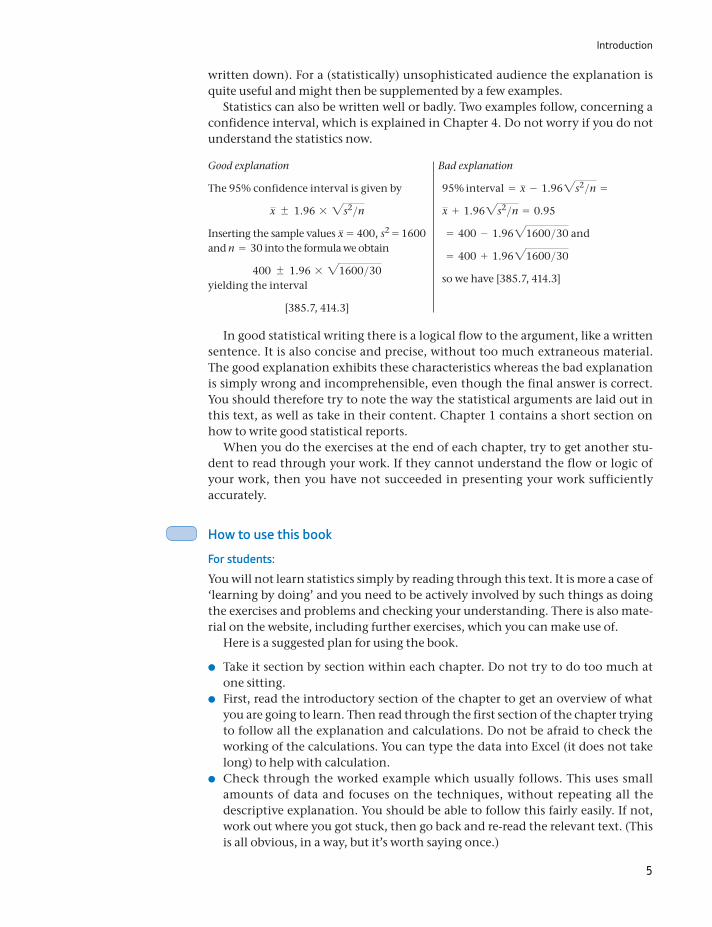
Statistics can also be written well or badly. Two examples follow, concerning a confidence interval, which is explained in Chapter 4. Do not worry if you do not understand the statistics now.
Good explanation Bad explanation
The 95% confidence interval is given by
x 1.96 * 2s2>nInserting the sample values x = 400, s2 = 1600 and n = 30 into the formula we obtain
400 1.96 * 21600>30yielding the interval
[385.7, 414.3]
95% interval = x - 1.962s2>n =
x + 1.962s2>n = 0.95
= 400 - 1.9621600>30 and
= 400 + 1.9621600>30
so we have [385.7, 414.3]
In good statistical writing there is a logical flow to the argument, like a written sentence. It is also concise and precise, without too much extraneous material. The good explanation exhibits these characteristics whereas the bad explanation is simply wrong and incomprehensible, even though the final answer is correct. You should therefore try to note the way the statistical arguments are laid out in this text, as well as take in their content. Chapter 1 contains a short section on how to write good statistical reports.
When you do the exercises at the end of each chapter, try to get another stu-dent to read through your work. If they cannot understand the flow or logic of your work, then you have not succeeded in presenting your work sufficiently accurately.
How to use this book
For students:
You will not learn statistics simply by reading through this text. It is more a case of ‘learning by doing’ and you need to be actively involved by such things as doing the exercises and problems and checking your understanding. There is also mate-rial on the website, including further exercises, which you can make use of.
Here is a suggested plan for using the book.
Take it section by section within each chapter. Do not try to do too much at one sitting.
First, read the introductory section of the chapter to get an overview of what you are going to learn. Then read through the first section of the chapter trying to follow all the explanation and calculations. Do not be afraid to check the working of the calculations. You can type the data into Excel (it does not take long) to help with calculation.
Check through the worked example which usually follows. This uses small amounts of data and focuses on the techniques, without repeating all the descriptive explanation. You should be able to follow this fairly easily. If not, work out where you got stuck, then go back and re-read the relevant text. (This is all obvious, in a way, but it’s worth saying once.)

Introduction
6
Now have a go at the exercise, to test your understanding. Try to complete the exercise before looking at the answer. It is tempting to peek at the answer and convince yourself that you did understand and could have done it correctly. This is not the same as actually doing the exercise – really it is not.
Next, have a go at the relevant problems at the end of the chapter. Answers to odd-numbered problems are at the back of the book. Your tutor will have answers to the even-numbered problems. Again, if you cannot do a problem, figure out what you are missing and check over it again in the text.
If you want more practice you can go online and try some of the additional exercises.
Then, refer back to the learning outcomes to see what you have learnt and what is still left to do.
Finally – finally – take a deserved break.
Remember – you will probably learn most when you attempt and solve (or fail to) the exercises and problems. That is the critical test. It is also helpful to work with other students rather than only on your own. It is best to attempt the exer-cises and problems on your own first, but then discuss them with colleagues. If you cannot solve it, someone else probably did. Note also that you can learn a lot from your (and others’) mistakes – seeing why a particular answer is wrong is often as informative as getting the right answer.
For lecturers and tutors:
You will obviously choose which chapters to use in your own course, it is not essential to use all of the material. Descriptive statistics material is covered in Chapters 1, 10 and 11; inferential statistics is covered in Chapters 4 to 8, building upon the material on probability in Chapters 2 and 3. Chapter 9 covers sampling methods and might be of interest to some but probably not all.
You can obtain PowerPoint slides to form the basis of you lectures if you wish, and you are free to customize them. The slides contain the main diagrams and charts, plus bullet points of the main features of each chapter.
Students can practise by doing the odd-numbered questions. The even- numbered questions can be set as assignments – the answers are available on request to adopters of the book.
Answer to the ‘best’ schools problem
A high proportion of small schools appear in the list simply because they are lucky. Consider one school of 20 pupils, another with 1000, where the average ability is similar in both. The large school is highly unlikely to obtain a 100% pass rate, simply because there are so many pupils and (at least) one of them will prob-ably perform badly. With 20 pupils, you have a much better chance of getting them all through. This is just a reflection of the fact that there tends to be greater variability in smaller samples. The schools themselves, and the pupils, are of similar quality.
1
Learning outcomes 8Introduction 8Summarising data using graphical techniques 10
Education and employment, or, after all this, will you get a job? 10The bar chart 11The pie chart 15
Looking at cross-section data: wealth in the United Kingdom in 2005 16Frequency tables and charts 16The histogram 18Relative frequency and cumulative frequency distributions 21
Summarising data using numerical techniques 27Measures of location: the mean 27The mean as the expected value 30The sample mean and the population mean 30The weighted average 30The median 32The mode 34Measures of dispersion 35The variance 37The standard deviation 38The variance and standard deviation of a sample 39Alternative formulae for calculating the variance and standard deviation 40The coefficient of variation 42Independence of units of measurement 42The standard deviation of the logarithm 43Measuring deviations from the mean: z scores 44Chebyshev’s inequality 44Measuring skewness 45Comparison of the 2005 and 1979 distributions of wealth 46
The box and whiskers diagram 47Time-series data: investment expenditures 1977–2009 48
Graphing multiple series 53Numerical summary statistics 58The mean of a time series 58The geometric mean 60The variance of a time series 62
Graphing bivariate data: the scatter diagram 63
7
Descriptive statistics

8
Introduction
The aim of descriptive statistical methods is simple: to present information in a clear, concise and accurate manner. The difficulty in analysing many phenom-ena, be they economic, social or otherwise, is that there is simply too much infor-mation for the mind to assimilate. The task of descriptive methods is therefore to summarise all this information and draw out the main features, without distort-ing the picture.
Data transformations 67Rounding 68Grouping 68Dividing/multiplying by a constant 69Differencing 69Taking logarithms 69Taking the reciprocal 69Deflating 70
The information and data explosion 70Writing statistical reports 72
Writing 73Tables 73Graphs 74
Guidance to the student: how to measure your progress 74Summary 75Key terms and concepts 75Reference 76Formulae used in this chapter 77Problems 78Answers to exercises 84
Appendix 1A: Σ notation 88Problems on Σ notation 89
Appendix 1B: E and V operators 90Appendix 1C: Using logarithms 91
Problems on logarithms 92
Chapter 1 • Descriptive statistics
By the end of this chapter you should be able to:
recognise different types of data and use appropriate methods to summarise and anal-yse them
use graphical techniques to provide a visual summary of one or more data series
use numerical techniques (such as an average) to summarise data series
recognise the strengths and limitations of such methods
recognise the usefulness of data transformations to gain additional insight into a set of data
be able to write a brief report summarising the data.

Introduction
9
Consider, for example, the problem of presenting information about the wealth of British citizens (which follows later in this chapter). There are about 18 million adults for whom data are available and to present the data in raw form (i.e. the wealth holdings of each and every person) would be neither useful nor informative (it would take about 30 000 pages of a book, for example). It would be more useful to have much less information, but information which is still repre-sentative of the original data. In doing this, much of the original information would be deliberately lost; in fact, descriptive statistics might be described as the art of constructively throwing away much of the data.
There are many ways of summarising data and there are few hard-and-fast rules about how you should proceed. Newspapers and magazines often pro-vide innovative (though not always successful) ways of presenting data. There are, however, a number of techniques which are tried and tested and these are the subject of this chapter. They are successful because: (a) they tell us some-thing useful about the underlying data; and (b) they are reasonably familiar to many people, so we can all talk in a common language. For example, the aver-age tells us about the location of the data and is a familiar concept to most people. For example, young children soon learn to describe their day at school as ‘average’.
The appropriate method of analysing the data will depend on a number of factors: the type of data under consideration, the sophistication of the audi-ence and the ‘message’ which it is intended to convey. One would use different methods to persuade academics of the validity of one’s theory about inflation than one would use to persuade consumers that Brand X powder washes whiter than Brand Y. To illustrate the use of the various methods, three different topics are covered in this chapter. First, we look at the relationship between educa-tional attainment and employment prospects. Do higher qualifications improve your employment chances? The data come from people surveyed in 2009, so we have a sample of cross-section data giving an illustration of the situ-ation at one point in time. We will look at the distribution of educational attainments amongst those surveyed, as well as the relationship to employ-ment outcomes. In this example, we simply count the numbers of people in different categories (e.g. the number of people with a degree qualification who are employed).
Second, we examine the distribution of wealth in the United Kingdom in 2005. The data are again cross-section, but this time we can use more sophisti-cated methods since wealth is measured on a ratio scale. Someone with £200 000 of wealth is twice as wealthy as someone with £100 000, for example, and there is a meaning to this ratio. In the case of education, one cannot say with any preci-sion that one person is twice as educated as another. The educational categories may be ordered (so one person can be more educated than another, although even that may be ambiguous) but we cannot measure the ‘distance’ between them. We therefore refer to educational attainment being measured on an ordi-nal scale. In contrast, there is not an obvious natural ordering to the three employment categories (employed, unemployed, inactive), so this is measured on a nominal scale.
Third, we look at national spending on investment over the period 1977–2009. This is time-series data since we have a number of observations on the variable measured at different points in time. Here it is important to take account of the
Chapter 1 • Descriptive statistics
10
time dimension of the data: things would look different if the observations were in the order 1977, 1989, 1982, . . . rather than in correct time order. We also look at the relationship between two variables, investment and output, over that period of time and find appropriate methods of presenting it.
In all three cases, we make use of both graphical and numerical methods of summarising the data. Although there are some differences between the methods used in the three cases, these are not watertight compartments: the methods used in one case might also be suitable in another, perhaps with slight modification. Part of the skill of the statistician is to know which methods of analysis and pre-sentation are best suited to each particular problem.
Summarising data using graphical techniques
Education and employment, or, after all this, will you get a job?
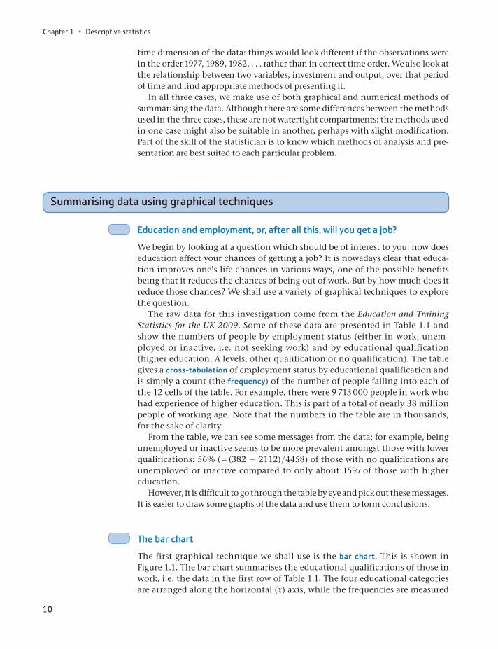
We begin by looking at a question which should be of interest to you: how does education affect your chances of getting a job? It is nowadays clear that educa-tion improves one’s life chances in various ways, one of the possible benefits being that it reduces the chances of being out of work. But by how much does it reduce those chances? We shall use a variety of graphical techniques to explore the question.
The raw data for this investigation come from the Education and Training Statistics for the UK 2009. Some of these data are presented in Table 1.1 and show the numbers of people by employment status (either in work, unem-ployed or inactive, i.e. not seeking work) and by educational qualification (higher education, A levels, other qualification or no qualification). The table gives a cross-tabulation of employment status by educational qualification and is simply a count (the frequency) of the number of people falling into each of the 12 cells of the table. For example, there were 9 713 000 people in work who had experience of higher education. This is part of a total of nearly 38 million people of working age. Note that the numbers in the table are in thousands, for the sake of clarity.
From the table, we can see some messages from the data; for example, being unemployed or inactive seems to be more prevalent amongst those with lower qualifications: 56% ( = (382 + 2112)>4458) of those with no qualifications are unemployed or inactive compared to only about 15% of those with higher education.
However, it is difficult to go through the table by eye and pick out these messages. It is easier to draw some graphs of the data and use them to form conclusions.
The bar chart
The first graphical technique we shall use is the bar chart. This is shown in Figure 1.1. The bar chart summarises the educational qualifications of those in work, i.e. the data in the first row of Table 1.1. The four educational categories are arranged along the horizontal (x) axis, while the frequencies are measured
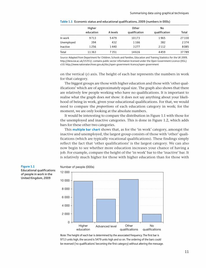
Summarising data using graphical techniques
11
on the vertical (y) axis. The height of each bar represents the numbers in work for that category.
The biggest groups are those with higher education and those with ‘other qual-ifications’ which are of approximately equal size. The graph also shows that there are relatively few people working who have no qualifications. It is important to realise what the graph does not show: it does not say anything about your likeli-hood of being in work, given your educational qualifications. For that, we would need to compare the proportions of each education category in work; for the moment, we are only looking at the absolute numbers.
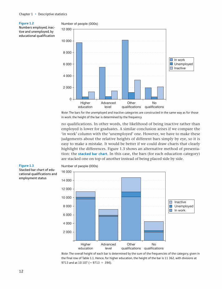
It would be interesting to compare the distribution in Figure 1.1 with those for the unemployed and inactive categories. This is done in Figure 1.2, which adds bars for these other two categories.
This multiple bar chart shows that, as for the ‘in work’ category, amongst the inactive and unemployed, the largest group consists of those with ‘other’ quali-fications (which are typically vocational qualifications). These findings simply reflect the fact that ‘other qualifications’ is the largest category. We can also now begin to see whether more education increases your chance of having a job. For example, compare the height of the ‘in work’ bar to the ‘inactive’ bar. It is relatively much higher for those with higher education than for those with
Table 1.1 Economic status and educational qualifications, 2009 (numbers in 000s)
Higher education A levels
Other qualification
No qualification Total
In work 9 713 5 479 10 173 1 965 27 330Unemployed 394 432 1 166 382 2 374Inactive 1 256 1 440 3 277 2 112 8 085
Total 11 363 7 351 14 616 4 459 37 789
Source: Adapted from Department for Children, Schools and Families, Education and Training Statistics for the UK 2009, http://dera.ioe.ac.uk/15353/, contains public sector information licensed under the Open Government Licence (OGL) v3.0. http://www.nationalarchives.gov.uk/doc/open-government-licence/open-government
2 000
0
4 000
6 000
8 000
10 000
12 000
Highereducation
Advanced level Otherqualifications
Noqualifications
Number of people (000s) Figure 1.1Educational qualifications of people in work in the United Kingdom, 2009
Note: The height of each bar is determined by the associated frequency. The first bar is 9713 units high, the second is 5479 units high and so on. The ordering of the bars could be reversed (‘no qualifications’ becoming the first category) without altering the message.
Chapter 1 • Descriptive statistics
12
no qualifications. In other words, the likelihood of being inactive rather than employed is lower for graduates. A similar conclusion arises if we compare the ‘in work’ column with the ‘unemployed’ one. However, we have to make these judgements about the relative heights of different bars simply by eye, so it is easy to make a mistake. It would be better if we could draw charts that clearly highlight the differences. Figure 1.3 shows an alternative method of presenta-tion: the stacked bar chart. In this case, the bars (for each education category) are stacked one on top of another instead of being placed side by side.
2 000
0
4 000
6 000
8 000
10 000
12 000
Highereducation
Advancedlevel
Otherqualifications
Noqualifications
Number of people (000s)
In workUnemployedInactive
Figure 1.2Numbers employed, inac-tive and unemployed, by educational qualification
Note: The bars for the unemployed and inactive categories are constructed in the same way as for those in work: the height of the bar is determined by the frequency.
2 000
4 000
6 000
8 000
10 000
12 000
14 000
16 000
Highereducation
Advancedlevel
Otherqualifications
Noqualifications
Number of people (000s)
InactiveUnemployedIn work
Figure 1.3Stacked bar chart of edu-cational qualifications and employment status
Note: The overall height of each bar is determined by the sum of the frequencies of the category, given in the final row of Table 1.1. Hence, for higher education, the height of the bar is 11 362, with divisions at 9713 and at 10 107 (= 9713 + 394).
Summarising data using graphical techniques
13
This is perhaps slightly better, and the different overall size of each category is clearly brought out. However, we still have to make tricky visual judgements about proportions. As you may be starting to realise, we can present the same data in dif-ferent ways depending upon our purpose. Here, we are going through different types of graph in turn and seeing what each can tell us. In practice, one would more likely identify the purpose first and then choose the type of graph most suited to it.
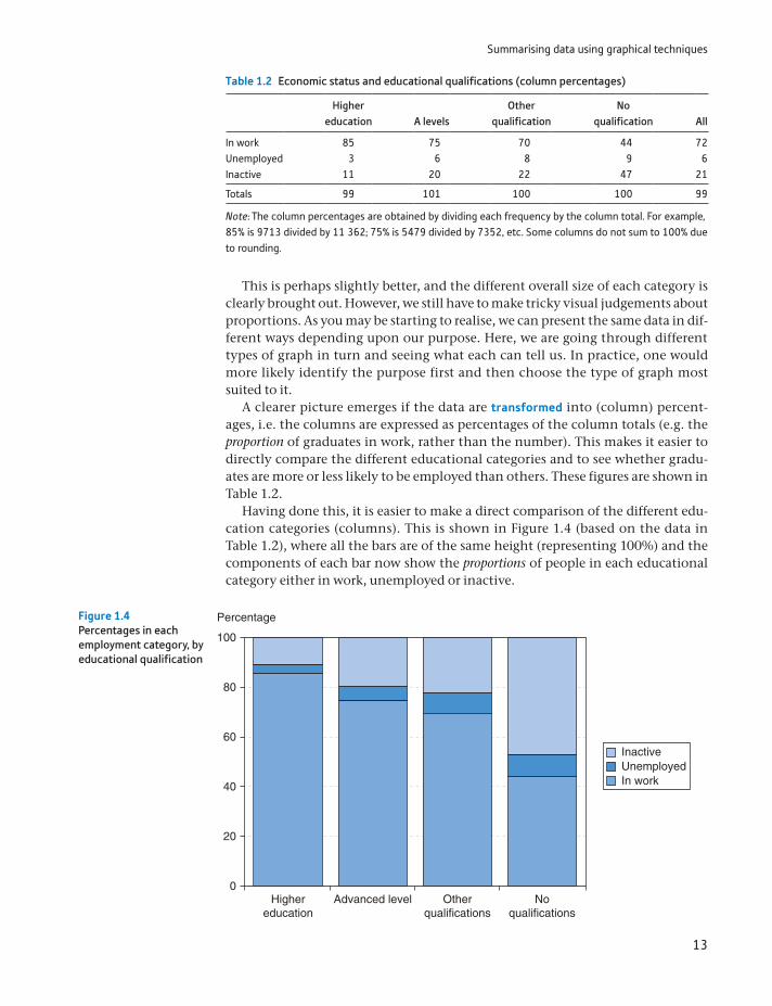
A clearer picture emerges if the data are transformed into (column) percent-ages, i.e. the columns are expressed as percentages of the column totals (e.g. the proportion of graduates in work, rather than the number). This makes it easier to directly compare the different educational categories and to see whether gradu-ates are more or less likely to be employed than others. These figures are shown in Table 1.2.
Having done this, it is easier to make a direct comparison of the different edu-cation categories (columns). This is shown in Figure 1.4 (based on the data in Table 1.2), where all the bars are of the same height (representing 100%) and the components of each bar now show the proportions of people in each educational category either in work, unemployed or inactive.
Table 1.2 Economic status and educational qualifications (column percentages)
Higher education A levels
Other qualification
No qualification All
In work 85 75 70 44 72Unemployed 3 6 8 9 6Inactive 11 20 22 47 21
Totals 99 101 100 100 99
Note: The column percentages are obtained by dividing each frequency by the column total. For example, 85% is 9713 divided by 11 362; 75% is 5479 divided by 7352, etc. Some columns do not sum to 100% due to rounding.
0
20
40
60
80
100
Highereducation
Advanced level
Percentage
Otherqualifications
Noqualifications
InactiveUnemployedIn work
Figure 1.4Percentages in each employment category, by educational qualification

Chapter 1 • Descriptive statistics
14
It is now clear how economic status differs according to education and the result is quite dramatic. In particular:
The proportion of people unemployed or inactive increases rapidly with lower educational attainment.
The biggest difference is between the no qualifications category and the other three, which have relatively smaller differences between them. In particular, A levels and other qualifications show a similar pattern.
Thus we have looked at the data in different ways, drawing different charts and seeing what they can tell us. You need to consider which type of chart is most suit-able for the data you have and the questions you want to ask. There is no one graph which is ideal for all circumstances.
Can we safely conclude therefore that the probability of your being unem-ployed is significantly reduced by education? Could we go further and argue that the route to lower unemployment generally is via investment in education? The answer may be ‘yes’ to both questions, but we have not proved it. Two important considerations are as follows:
Innate ability has been ignored. Those with higher ability are more likely to be employed and are more likely to receive more education. Ideally we would like to compare individuals of similar ability but with different amounts of education.
Even if additional education does reduce a person’s probability of becoming unemployed, this may be at the expense of someone else, who loses their job to the more educated individual. In other words, additional education does not reduce total unemployment but only shifts it around amongst the labour force. Of course, it is still rational for individuals to invest in education if they do not take account of this externality.
Producing charts using Microsoft Excel
You can draw charts by hand on graph paper, and this is still a very useful way of really learning about graphs. Nowadays, however, most charts are produced by computer soft-ware, notably Excel. Most of the charts in this text were produced using Excel’s charting facility. You should aim for a similar, uncluttered look. Some tips you might find useful are:
Make the grid lines dashed in a light grey colour (they are not actually part of the chart, and hence should be discrete) or eliminate them altogether.
Get rid of any background fill (grey by default; alter to ‘No fill’). It will look much better when printed.
On the x-axis, make the labels horizontal or vertical, not slanted – it is difficult to see which point they refer to.
On the y-axis, make the axis title horizontal and place it at the top of the axis. It is much easier for the reader to see.
Colour charts look great on-screen but unclear if printed in black and white. Change the style of the lines or markers (e.g. make some of them dashed) to distinguish them on paper.
Both axes start at zero by default. If all your observations are large numbers, then this may result in the data points being crowded into one corner of the graph. Alter the scale on the axes to fix this – set the minimum value on the axis to be slightly less than the minimum observation. Note, however, that this distorts the relative heights of the bars and could mislead. Use with caution.
ST
ATISTICS
IN
PRACTI
CE
· ·
Summarising data using graphical techniques
15
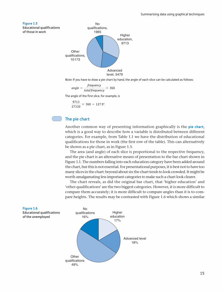
The pie chart
Another common way of presenting information graphically is the pie chart, which is a good way to describe how a variable is distributed between different categories. For example, from Table 1.1 we have the distribution of educational qualifications for those in work (the first row of the table). This can alternatively be shown as a pie chart, as in Figure 1.5.
The area (and angle) of each slice is proportional to the respective frequency, and the pie chart is an alternative means of presentation to the bar chart shown in Figure 1.1. The numbers falling into each education category have been added around the chart, but this is not essential. For presentational purposes, it is best not to have too many slices in the chart: beyond about six the chart tends to look crowded. It might be worth amalgamating less important categories to make such a chart look clearer.
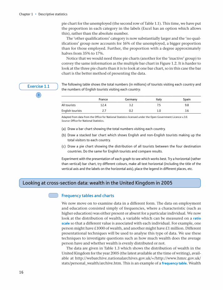
The chart reveals, as did the original bar chart, that ‘higher education’ and ‘other qualifications’ are the two biggest categories. However, it is more difficult to compare them accurately; it is more difficult to compare angles than it is to com-pare heights. The results may be contrasted with Figure 1.6 which shows a similar
Highereducation,
9713
Advancedlevel, 5479
Otherqualifications,
10173
Noqualifications,
1965
Figure 1.5Educational qualifications of those in work
Note: If you have to draw a pie chart by hand, the angle of each slice can be calculated as follows:
angle =frequency
total frequency* 360.
The angle of the first slice, for example, is
971327330
* 360 = 127.9°.
Highereducation
17%
Advanced level18%
Otherqualifications
49%
Noqualifications
16%
Figure 1.6Educational qualifications of the unemployed
Chapter 1 • Descriptive statistics
16
pie chart for the unemployed (the second row of Table 1.1). This time, we have put the proportion in each category in the labels (Excel has an option which allows this), rather than the absolute number.
The ‘other qualifications’ category is now substantially larger and the ‘no qual-ifications’ group now accounts for 16% of the unemployed, a bigger proportion than for those employed. Further, the proportion with a degree approximately halves from 35% to 17%.
Notice that we would need three pie charts (another for the ‘inactive’ group) to convey the same information as the multiple bar chart in Figure 1.2. It is harder to look at the three pie charts than it is to look at one bar chart, so in this case the bar chart is the better method of presenting the data.
The following table shows the total numbers (in millions) of tourists visiting each country and the numbers of English tourists visiting each country:
France Germany Italy Spain
All tourists 12.4 3.2 7.5 9.8
English tourists 2.7 0.2 1.0 3.6
Adapted from data from the Office for National Statistics licensed under the Open Government Licence v.3.0. Source: Office for National Statistics.
(a) Draw a bar chart showing the total numbers visiting each country.
(b) Draw a stacked bar chart which shows English and non-English tourists making up the total visitors to each country.
(c) Draw a pie chart showing the distribution of all tourists between the four destination countries. Do the same for English tourists and compare results.
Experiment with the presentation of each graph to see which works best. Try a horizontal (rather than vertical) bar chart, try different colours, make all text horizontal (including the title of the vertical axis and the labels on the horizontal axis), place the legend in different places, etc.
?
Exercise 1.1
Looking at cross-section data: wealth in the United Kingdom in 2005
Frequency tables and charts
We now move on to examine data in a different form. The data on employment and education consisted simply of frequencies, where a characteristic (such as higher education) was either present or absent for a particular individual. We now look at the distribution of wealth, a variable which can be measured on a ratio scale so that a different value is associated with each individual. For example, one person might have £1000 of wealth, and another might have £1 million. Different presentational techniques will be used to analyse this type of data. We use these techniques to investigate questions such as how much wealth does the average person have and whether wealth is evenly distributed or not.
The data are given in Table 1.3 which shows the distribution of wealth in the United Kingdom for the year 2005 (the latest available at the time of writing), avail-able at http://webarchive.nationalarchives.gov.uk/+/http://www.hmrc.gov.uk/stats/personal_wealth/archive.htm. This is an example of a frequency table. Wealth
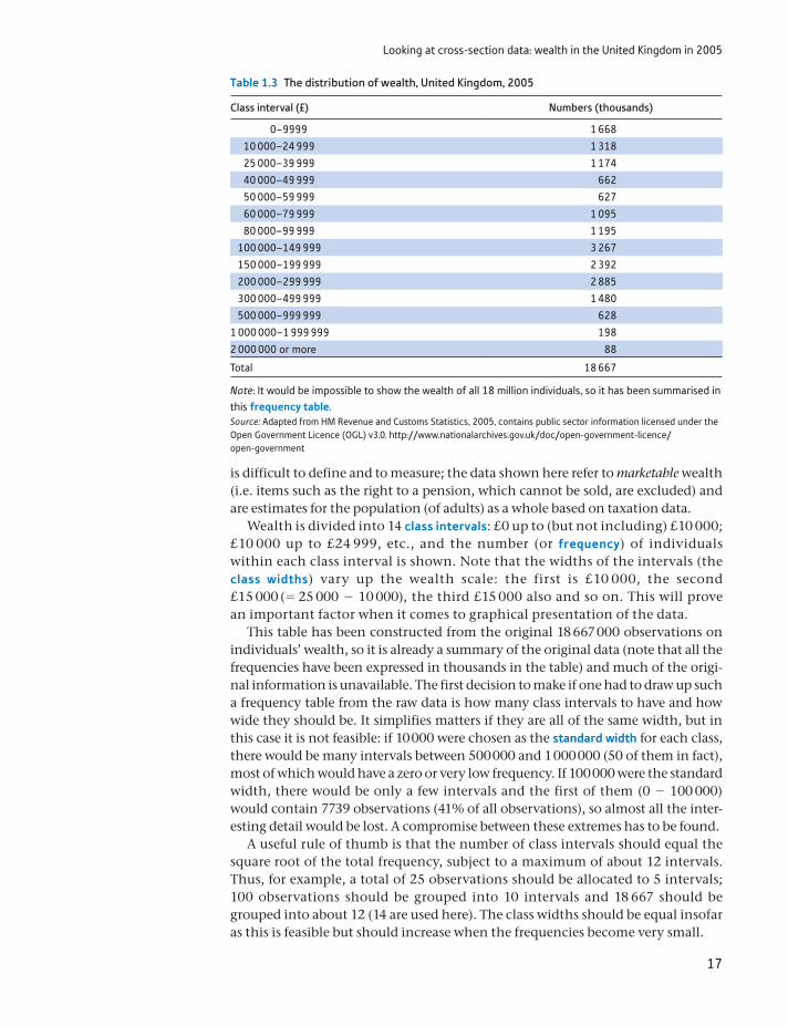
Looking at cross-section data: wealth in the United Kingdom in 2005
17
is difficult to define and to measure; the data shown here refer to marketable wealth (i.e. items such as the right to a pension, which cannot be sold, are excluded) and are estimates for the population (of adults) as a whole based on taxation data.
Wealth is divided into 14 class intervals: £0 up to (but not including) £10 000; £10 000 up to £24 999, etc., and the number (or frequency) of individuals within each class interval is shown. Note that the widths of the intervals (the class widths) vary up the wealth scale: the first is £10 000, the second £15 000 (= 25 000 - 10 000), the third £15 000 also and so on. This will prove an important factor when it comes to graphical presentation of the data.
This table has been constructed from the original 18 667 000 observations on individuals’ wealth, so it is already a summary of the original data (note that all the frequencies have been expressed in thousands in the table) and much of the origi-nal information is unavailable. The first decision to make if one had to draw up such a frequency table from the raw data is how many class intervals to have and how wide they should be. It simplifies matters if they are all of the same width, but in this case it is not feasible: if 10 000 were chosen as the standard width for each class, there would be many intervals between 500 000 and 1 000 000 (50 of them in fact), most of which would have a zero or very low frequency. If 100 000 were the standard width, there would be only a few intervals and the first of them (0 - 100 000) would contain 7739 observations (41% of all observations), so almost all the inter-esting detail would be lost. A compromise between these extremes has to be found.
A useful rule of thumb is that the number of class intervals should equal the square root of the total frequency, subject to a maximum of about 12 intervals. Thus, for example, a total of 25 observations should be allocated to 5 intervals; 100 observations should be grouped into 10 intervals and 18 667 should be grouped into about 12 (14 are used here). The class widths should be equal insofar as this is feasible but should increase when the frequencies become very small.
Table 1.3 The distribution of wealth, United Kingdom, 2005
Class interval (£) Numbers (thousands)
0–9999 1 668
10 000–24 999 1 318
25 000–39 999 1 174
40 000–49 999 662
50 000–59 999 627
60 000–79 999 1 095
80 000–99 999 1 195
100 000–149 999 3 267
150 000–199 999 2 392
200 000–299 999 2 885
300 000–499 999 1 480
500 000–999 999 628
1 000 000–1 999 999 198
2 000 000 or more 88
Total 18 667
Note: It would be impossible to show the wealth of all 18 million individuals, so it has been summarised in this frequency table.Source: Adapted from HM Revenue and Customs Statistics, 2005, contains public sector information licensed under the Open Government Licence (OGL) v3.0. http://www.nationalarchives.gov.uk/doc/open-government-licence/open-government
Chapter 1 • Descriptive statistics
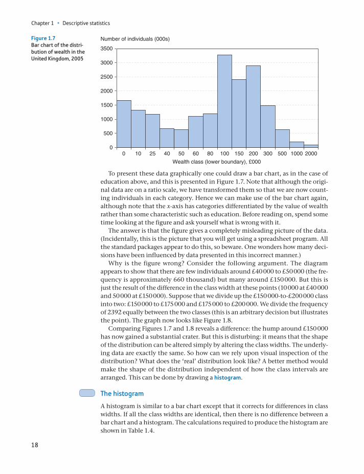
18
To present these data graphically one could draw a bar chart, as in the case of education above, and this is presented in Figure 1.7. Note that although the origi-nal data are on a ratio scale, we have transformed them so that we are now count-ing individuals in each category. Hence we can make use of the bar chart again, although note that the x-axis has categories differentiated by the value of wealth rather than some characteristic such as education. Before reading on, spend some time looking at the figure and ask yourself what is wrong with it.
The answer is that the figure gives a completely misleading picture of the data. (Incidentally, this is the picture that you will get using a spreadsheet program. All the standard packages appear to do this, so beware. One wonders how many deci-sions have been influenced by data presented in this incorrect manner.)
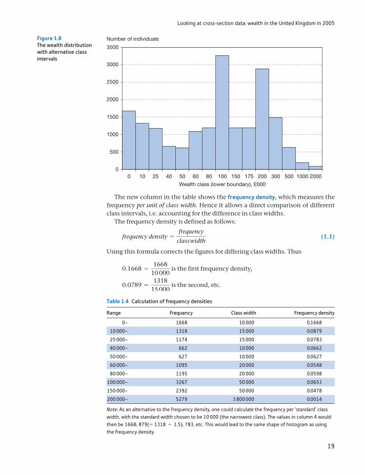
Why is the figure wrong? Consider the following argument. The diagram appears to show that there are few individuals around £40 000 to £50 000 (the fre-quency is approximately 660 thousand) but many around £150 000. But this is just the result of the difference in the class width at these points (10 000 at £40 000 and 50 000 at £150 000). Suppose that we divide up the £150 000-to-£200 000 class into two: £150 000 to £175 000 and £175 000 to £200 000. We divide the frequency of 2392 equally between the two classes (this is an arbitrary decision but illustrates the point). The graph now looks like Figure 1.8.
Comparing Figures 1.7 and 1.8 reveals a difference: the hump around £150 000 has now gained a substantial crater. But this is disturbing: it means that the shape of the distribution can be altered simply by altering the class widths. The underly-ing data are exactly the same. So how can we rely upon visual inspection of the distribution? What does the ‘real’ distribution look like? A better method would make the shape of the distribution independent of how the class intervals are arranged. This can be done by drawing a histogram.
The histogram
A histogram is similar to a bar chart except that it corrects for differences in class widths. If all the class widths are identical, then there is no difference between a bar chart and a histogram. The calculations required to produce the histogram are shown in Table 1.4.
0
500
1000
1500
2000
2500
3000
3500
0 10 25 40 50 60 80 100 150 200 300 500 1000 2000
Number of individuals (000s)
Wealth class (lower boundary), £000
Figure 1.7Bar chart of the distri-bution of wealth in the United Kingdom, 2005
Looking at cross-section data: wealth in the United Kingdom in 2005
19
The new column in the table shows the frequency density, which measures the frequency per unit of class width. Hence it allows a direct comparison of different class intervals, i.e. accounting for the difference in class widths.
The frequency density is defined as follows:
frequency density =frequency
class width (1.1)
Using this formula corrects the figures for differing class widths. Thus
0.1668 =1668
10 000 is the first frequency density,
0.0789 =1318
15 000 is the second, etc.
0
500
1000
1500
2000
2500
3000
3500
Number of individuals
Wealth class (lower boundary), £000
0 10 25 40 50 60 80 100 150 175 200 300 500 1000 2000
Figure 1.8The wealth distribution with alternative class intervals
Table 1.4 Calculation of frequency densities
Range Frequency Class width Frequency density
0– 1668 10 000 0.1668
10 000– 1318 15 000 0.0879
25 000– 1174 15 000 0.0783
40 000– 662 10 000 0.0662
50 000– 627 10 000 0.0627
60 000– 1095 20 000 0.0548
80 000– 1195 20 000 0.0598
100 000– 3267 50 000 0.0653
150 000– 2392 50 000 0.0478
200 000– 5279 3 800 000 0.0014
Note: As an alternative to the frequency density, one could calculate the frequency per ‘standard’ class width, with the standard width chosen to be 10 000 (the narrowest class). The values in column 4 would then be 1668; 879(= 1318 , 1.5); 783, etc. This would lead to the same shape of histogram as using the frequency density.
Chapter 1 • Descriptive statistics
20
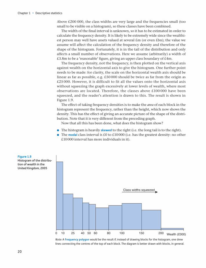
Above £200 000, the class widths are very large and the frequencies small (too small to be visible on a histogram), so these classes have been combined.
The width of the final interval is unknown, so it has to be estimated in order to calculate the frequency density. It is likely to be extremely wide since the wealthi-est person may well have assets valued at several £m (or even £bn); the value we assume will affect the calculation of the frequency density and therefore of the shape of the histogram. Fortunately, it is in the tail of the distribution and only affects a small number of observations. Here we assume (arbitrarily) a width of £3.8m to be a ‘reasonable’ figure, giving an upper class boundary of £4m.
The frequency density, not the frequency, is then plotted on the vertical axis against wealth on the horizontal axis to give the histogram. One further point needs to be made: for clarity, the scale on the horizontal wealth axis should be linear as far as possible, e.g. £50 000 should be twice as far from the origin as £25 000. However, it is difficult to fit all the values onto the horizontal axis without squeezing the graph excessively at lower levels of wealth, where most observations are located. Therefore, the classes above £100 000 have been squeezed, and the reader’s attention is drawn to this. The result is shown in Figure 1.9.
The effect of taking frequency densities is to make the area of each block in the histogram represent the frequency, rather than the height, which now shows the density. This has the effect of giving an accurate picture of the shape of the distri-bution. Note that it is very different from the preceding graph.
Now that all this has been done, what does the histogram show?
The histogram is heavily skewed to the right (i.e. the long tail is to the right). The modal class interval is £0 to £10 000 (i.e. has the greatest density: no other
£10 000 interval has more individuals in it).
0 5010 100806040 20015025
Class widths squeezed
Wealth (£000)
Figure 1.9Histogram of the distribu-tion of wealth in the United Kingdom, 2005
Note: A frequency polygon would be the result if, instead of drawing blocks for the histogram, one drew lines connecting the centres of the top of each block. The diagram is better drawn with blocks, in general.
Looking at cross-section data: wealth in the United Kingdom in 2005
21
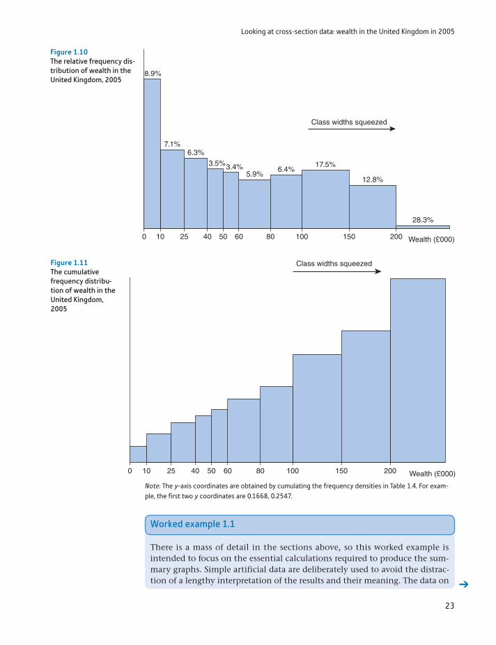
Looking at the graph, it appears that more than half of all people have wealth of less than £100 000. However, this is misleading as the graph is squeezed beyond £100 000. In fact, about 41% have wealth below this figure.
The figure shows quite a high degree of inequality in the wealth distribution. Whether this is acceptable or even desirable is a value judgement. It should be noted that part of the inequality is due to differences in age: younger people have not yet had enough time to acquire much wealth and therefore appear worse off, although in lifetime terms this may not be the case. To get a better picture of the distribution of wealth would require some analysis of the acquisition of wealth over the life-cycle (or comparison of individuals of a similar age). In fact, correcting for age differences does not make a big difference to the pattern of wealth distribution. On this point and on inequality in wealth in general, see Atkinson (1983), Chapters 7 and 8.
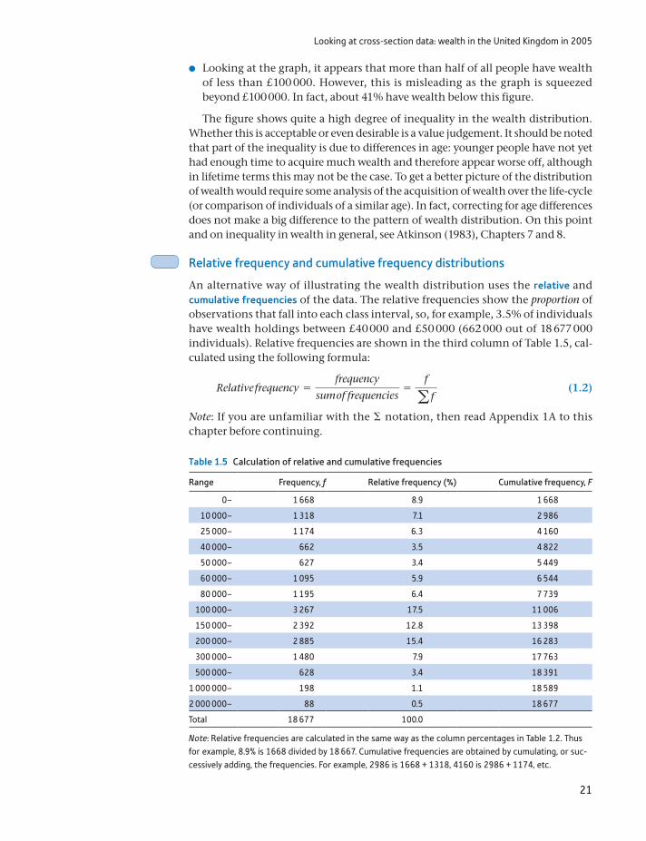
Relative frequency and cumulative frequency distributions
An alternative way of illustrating the wealth distribution uses the relative and cumulative frequencies of the data. The relative frequencies show the proportion of observations that fall into each class interval, so, for example, 3.5% of individuals have wealth holdings between £40 000 and £50 000 (662 000 out of 18 677 000 individuals). Relative frequencies are shown in the third column of Table 1.5, cal-culated using the following formula:
Relative frequency =frequency
sum of frequencies=
f
a f (1.2)
Note: If you are unfamiliar with the Σ notation, then read Appendix 1A to this chapter before continuing.
Table 1.5 Calculation of relative and cumulative frequencies
Range Frequency, f Relative frequency (%) Cumulative frequency, F
0– 1 668 8.9 1 668
10 000– 1 318 7.1 2 986
25 000– 1 174 6.3 4 160
40 000– 662 3.5 4 822
50 000– 627 3.4 5 449
60 000– 1 095 5.9 6 544
80 000– 1 195 6.4 7 739
100 000– 3 267 17.5 11 006
150 000– 2 392 12.8 13 398
200 000– 2 885 15.4 16 283
300 000– 1 480 7.9 17 763
500 000– 628 3.4 18 391
1 000 000– 198 1.1 18 589
2 000 000– 88 0.5 18 677
Total 18 677 100.0
Note: Relative frequencies are calculated in the same way as the column percentages in Table 1.2. Thus for example, 8.9% is 1668 divided by 18 667. Cumulative frequencies are obtained by cumulating, or suc-cessively adding, the frequencies. For example, 2986 is 1668 + 1318, 4160 is 2986 + 1174, etc.
Chapter 1 • Descriptive statistics
22
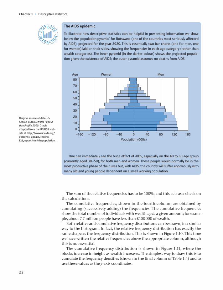
One can immediately see the huge effect of AIDS, especially on the 40 to 60 age group (currently aged 30–50), for both men and women. These people would normally be in the most productive phase of their lives but, with AIDS, the country will suffer enormously with many old and young people dependent on a small working population.
The AIDS epidemic
To illustrate how descriptive statistics can be helpful in presenting information we show below the ‘population pyramid’ for Botswana (one of the countries most seriously affected by AIDS), projected for the year 2020. This is essentially two bar charts (one for men, one for women) laid on their sides, showing the frequencies in each age category (rather than wealth categories). The inner pyramid (in the darker colour) shows the projected popula-tion given the existence of AIDS; the outer pyramid assumes no deaths from AIDS.
ST
ATISTICS
IN
PRACTI
CE
· ·
Original source of data: US Census Bureau, World Popula-tion Profile 2000. Graph adapted from the UNAIDS web-site at http://www.unaids.org/epidemic_update/report/ Epi_report.htm#thepopulation.
The sum of the relative frequencies has to be 100%, and this acts as a check on the calculations.
The cumulative frequencies, shown in the fourth column, are obtained by cumulating (successively adding) the frequencies. The cumulative frequencies show the total number of individuals with wealth up to a given amount; for exam-ple, about 7.7 million people have less than £100 000 of wealth.
Both relative and cumulative frequency distributions can be drawn, in a similar way to the histogram. In fact, the relative frequency distribution has exactly the same shape as the frequency distribution. This is shown in Figure 1.10. This time we have written the relative frequencies above the appropriate column, although this is not essential.
The cumulative frequency distribution is shown in Figure 1.11, where the blocks increase in height as wealth increases. The simplest way to draw this is to cumulate the frequency densities (shown in the final column of Table 1.4) and to use these values as the y-axis coordinates.
Looking at cross-section data: wealth in the United Kingdom in 2005
23
0 5010 100806040 20015025
Class widths squeezed
Wealth (£000)
8.9%
6.3%3.5%3.4%
5.9%6.4%
17.5%
12.8%
28.3%
7.1%
Figure 1.10The relative frequency dis-tribution of wealth in the United Kingdom, 2005
0 5010 100806040 20015025 Wealth (£000)
Class widths squeezed Figure 1.11The cumulative frequency distribu-tion of wealth in the United Kingdom, 2005
Note: The y-axis coordinates are obtained by cumulating the frequency densities in Table 1.4. For exam-ple, the first two y coordinates are 0.1668, 0.2547.
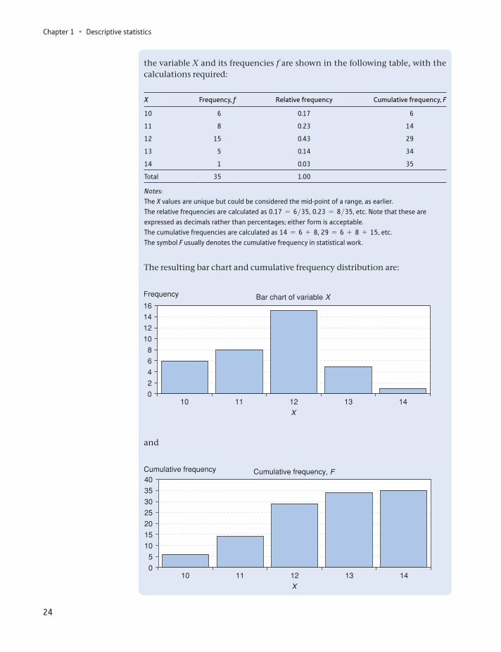
Worked example 1.1
There is a mass of detail in the sections above, so this worked example is intended to focus on the essential calculations required to produce the sum-mary graphs. Simple artificial data are deliberately used to avoid the distrac-tion of a lengthy interpretation of the results and their meaning. The data on
Chapter 1 • Descriptive statistics
24
the variable X and its frequencies f are shown in the following table, with the calculations required:
X Frequency, f Relative frequency Cumulative frequency, F
10 6 0.17 6
11 8 0.23 14
12 15 0.43 29
13 5 0.14 34
14 1 0.03 35
Total 35 1.00
Notes:The X values are unique but could be considered the mid-point of a range, as earlier.The relative frequencies are calculated as 0.17 = 6>35, 0.23 = 8>35, etc. Note that these are expressed as decimals rather than percentages; either form is acceptable.The cumulative frequencies are calculated as 14 = 6 + 8, 29 = 6 + 8 + 15, etc.The symbol F usually denotes the cumulative frequency in statistical work.
The resulting bar chart and cumulative frequency distribution are:
and
, F
Looking at cross-section data: wealth in the United Kingdom in 2005
25
Given the following data:
Range Frequency
0–10 20
11–30 40
31–60 30
61–100 20
(a) Draw both a bar chart and a histogram of the data and compare them.
(b) Calculate cumulative frequencies and draw a cumulative frequency diagram.
?
Exercise 1.2
Improving the presentation of graphs — an example
Today we are assailed with information presented in the form of graphs, sometimes done well but often badly. We give an example below of how presentation might be improved for one particular graph, showing employers’ perceptions of economics graduates’ skills. One can learn a lot from looking at examples of graphs in reports and academic papers and thinking how they might be improved. The original graph1 is not actually a bad one, but it could be better.
20
30
40
50
60
10
0
The
abi
lity
to c
omm
unic
ate
clea
rly in
spe
ech
The
abi
lity
to c
omm
unic
ate
clea
rly in
writ
ing
A fl
uenc
y in
usi
ngIT
/com
pute
rs
Ada
ptab
ility
The
abi
lity
to a
naly
se a
ndin
terp
ret q
uant
itativ
e da
ta
The
abi
lity
to a
pply
wha
t has
been
lear
ned
in a
wid
er c
onte
xt
Gen
eral
cre
ativ
e an
d im
agin
ativ
e po
wer
s
Inde
pend
ence
of v
iew
poin
tan
d ju
dgem
ent
Aw
aren
ess
of c
ross
-cu
ltura
l iss
ues
Crit
ical
sel
f-aw
aren
ess
Abi
lity
to w
ork
effe
ctiv
ely
with
oth
ers
Pro
blem
-sol
ving
stra
tegi
es a
nd s
kils
Num
ber
of r
espo
nses
Very highFairly highNot very high
How do you rate the general skills of economics graduates?
1See the original at http://www.economicsnetwork.ac.uk/projects/surveys/employers14-15. This is the author’s rendition, which tries to mimic the original as accurately as possible.
Chapter 1 • Descriptive statistics
26
Problems with this graph include:
1. The category labels are difficult to read, being small and wrap-around text.2. The vertical axis title is sideways, so difficult to read.3. It is difficult to compare across categories. For example, which skill has the most ‘very
high’ or ‘fairly high’ responses?4. A subjective judgement, but the colours are not particularly harmonious.
The version below takes the same data but presents it slightly differently:
App
ly to
wor
k ef
fect
ivel
yw
ith o
ther
s
7060
5040
3020
100
The
abi
lity
to c
omm
unic
ate
clea
rly in
spe
ech
The
abi
lity
to c
omm
unic
ate
clea
rly in
writ
ing
A fl
uenc
y in
usi
ngIT
/com
pute
rs
Ada
ptab
ility
The
abi
lity
to a
naly
se a
ndin
terp
ret q
uant
itativ
e da
ta
The
abi
lity
to a
pply
wha
t has
bee
nle
arne
d in
a w
ider
con
text
Gen
eral
cre
ativ
e an
dim
agin
ativ
e po
wer
s
Inde
pend
ence
of v
iew
poin
tan
d ju
dgem
ent
Aw
aren
ess
of c
ross
-cu
ltura
l iss
ues
Crit
ical
sel
f-aw
aren
ess
Pro
blem
-sol
ving
stra
tegi
es a
nd s
kilsHow
do
you
rate
the
gene
ral s
kills
of e
cono
mic
s gr
adua
tes?
Ver
y hi
ghF
airly
hig
hN
ot v
ery
high
Num
ber
of r
espo
nses
Turning the graph on its side makes the labels much easier to read, as is the horizontal axis label. Using a stacked bar saves space and makes it look less cluttered. It is fairly easy to see that ‘interpreting quantitative data’ scores the most ‘very high’ or ‘fairly high’ responses – hopefully this text makes some contribution towards that. Using different shades of the same colour makes for a better appearance (and probably works better if printed in greyscale too).
You might have noticed that the categories are now in a different order. This is a quirk of Excel; the same data table was used for both charts. Fortunately, the ordering does not matter. We shall give similar examples of good practice at other places in this text.
Summarising data using numerical techniques
27
Summarising data using numerical techniques
Graphical methods are an excellent means of obtaining a quick overview of the data, but they are not particularly precise, nor do they lend themselves to further analysis. For this, we must turn to numerical measures such as the average. There are a number of different ways in which we may describe a distribution such as that for wealth. If we think of trying to describe the histogram, it is useful to have:
A measure of location giving an idea of whether people own a lot of wealth or a little. An example is the average, which gives some idea of where the distribu-tion is located along the x-axis. In fact, we will encounter three different mea-sures of the ‘average’: The mean The median The mode
A measure of dispersion showing how wealth is dispersed around the average, whether it is concentrated close to the average or is generally far away from it. An example here is the standard deviation.
A measure of skewness showing how symmetric the distribution is, i.e. whether the left half of the distribution is a mirror image of the right half. This is obvi-ously not the case for the wealth distribution.
We consider each type of measure in turn.
Measures of location: the mean
The arithmetic mean, commonly called the average, is the most familiar measure of location and is obtained simply by adding all the wealth observations and divid-ing by the number of observations. If we denote the wealth of the ith household by xi (so that the index i runs from 1 to N, where N is the number of observations; as an example, x3 would be the wealth of the third household), then the mean is given by the following formula:
m =a
i = N
i = 1xi
N (1.3)
where m (the Greek letter mu, pronounced ‘myu’2) denotes the mean and ai = N
i = 1xi
(read ‘sigma x i, from i = 1 to N’, Σ being the Greek capital letter sigma) means the sum of the x values. We may simplify this to
m = ax
N (1.4)
when it is obvious which x values are being summed (usually all the available observations). This latter form is more easily readable, and we will generally use this.
2Mathematicians pronounce it like this, but modern Greeks do not. For them, it is ‘mi’.
Chapter 1 • Descriptive statistics
28
Worked example 1.2
We will find the mean of the values 17, 25, 28, 20, 35. The total of these five numbers is 125, so we have N = 5 and Σx = 125. Therefore the mean is
m = ax
N=
1255
= 25
Formula 1.3 can only be used when all the individual x values are known. The frequency table for wealth does not show all 18 million observations, however, but only the range of values for each class interval and the associated frequency. In the case of such grouped data the following equivalent formula may be used:
m =ai = C
i = 1fixi
ai = C
i = 1fi
(1.5)
or, more simply,
m = a fx
a f (1.6)
In this formula:
x denotes the mid-point of each class interval, since the individual x values are unknown. The mid-point is used as the representative x value for each class. In the first class interval, for example, we do not know precisely where each of the 1668 observations lies. Hence we assume they all lie at the mid-point, £5000. This will cause a slight inaccuracy – because the distribution is so skewed, there are likely more households below the mid-point than above it in every class interval except, perhaps, the first. We ignore this problem here, and it is less of a problem for most distributions which are less skewed than this one.
The summation runs from 1 to C, the number of class intervals, or mid-point x values. f times x gives the total wealth in each class interval. If we sum over the 14 class intervals, we get the total wealth of all individuals.
Σfi = N gives the total number of observations, the sum of the individual frequencies.
The calculation of the mean, m, for the wealth data is shown in Table 1.6.From this we obtain:
m =3 490 260
18 677= 186.875
Note that the x values are expressed in £000, so we must remember that the mean will also be in £000; the average wealth holding is therefore £186 875. Note that the frequencies have also been divided by 1000, but this has no effect upon the calculation of the mean since f appears in both numerator and denominator of the formula for the mean.
The mean tells us that if the total wealth were divided up equally between all individuals, each would have £186 875. This value may seem surprising, since the
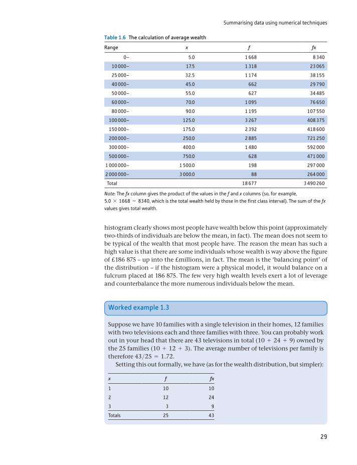
Summarising data using numerical techniques
29
histogram clearly shows most people have wealth below this point (approximately two-thirds of individuals are below the mean, in fact). The mean does not seem to be typical of the wealth that most people have. The reason the mean has such a high value is that there are some individuals whose wealth is way above the figure of £186 875 – up into the £millions, in fact. The mean is the ‘balancing point’ of the distribution – if the histogram were a physical model, it would balance on a fulcrum placed at 186 875. The few very high wealth levels exert a lot of leverage and counterbalance the more numerous individuals below the mean.
Table 1.6 The calculation of average wealth
Range x f fx
0– 5.0 1 668 8 340
10 000– 17.5 1 318 23 065
25 000– 32.5 1 174 38 155
40 000– 45.0 662 29 790
50 000– 55.0 627 34 485
60 000– 70.0 1 095 76 650
80 000– 90.0 1 195 107 550
100 000– 125.0 3 267 408 375
150 000– 175.0 2 392 418 600
200 000– 250.0 2 885 721 250
300 000– 400.0 1 480 592 000
500 000– 750.0 628 471 000
1 000 000– 1 500.0 198 297 000
2 000 000– 3 000.0 88 264 000
Total 18 677 3 490 260
Note: The fx column gives the product of the values in the f and x columns (so, for example, 5.0 * 1668 = 8340, which is the total wealth held by those in the first class interval). The sum of the fx values gives total wealth.
Worked example 1.3
Suppose we have 10 families with a single television in their homes, 12 families with two televisions each and three families with three. You can probably work out in your head that there are 43 televisions in total (10 + 24 + 9) owned by the 25 families (10 + 12 + 3). The average number of televisions per family is therefore 43>25 = 1.72.
Setting this out formally, we have (as for the wealth distribution, but simpler):
x f fx
1 10 10
2 12 24
3 3 9
Totals 25 43
Chapter 1 • Descriptive statistics
30
This gives our resulting mean as 1.72. The data are discrete values in this case and we have the actual values, not a broad class interval. Note that no single family could actually have 1.72 television sets; it is the average over all families.
The mean as the expected value
We also refer to the mean as the expected value of x and write:
E(x) = m = 186 875 (1.7)
E(x) is read ‘E of x’ or ‘the expected value of x’. The mean is the expected value in the sense that if we selected a household at random from the population, we would ‘expect’ its wealth to be £186 875. It is important to note that this is a statis-tical expectation, rather than the everyday use of the term. Most of the random individuals we encounter have wealth substantially below this value. Most people might therefore ‘expect’ a lower value because that is their everyday experience; but statisticians are different; they refer to the mean as the expected value.
The expected value notation is particularly useful in keeping track of the effects upon the mean of certain data transformations (e.g. dividing wealth by 1000 also divides the mean by 1000); Appendix 1B provides a detailed explanation. Use is also made of the E operator in inferential statistics, to describe the properties of estimators (see Chapter 4).
The sample mean and the population mean
Very often we have only a sample of data (as in worked example 1.3), and it is important to distinguish this case from the one where we have all the possible observations. For this reason, the sample mean is given by:
x = ax
n or x = a fx
a f for grouped data (1.8)
Note the distinctions between μ (the population mean) and x (the sample mean), and between N (the size of the population) and n (the sample size). Otherwise, the calculations are identical. It is a convention to use Greek letters, such as μ, to refer to the population and Roman letters, such as x, to refer to a sample.
The weighted average
Sometimes observations have to be given different weightings in calculating the average, as in the following example. Consider the problem of calculating the average spending per pupil by an education authority. Some figures for spend-ing on primary (ages 5–11), secondary (11–16) and post-16 pupils are given in Table 1.7.
Clearly, significantly more is spent on secondary and post-16 pupils (a general pattern throughout England and most other countries) and the overall average should lie somewhere between 1750 and 3820. However, taking a simple average of these three values would give the wrong answer, because there are different numbers of children in the three age ranges. The numbers and proportions of children in each age group are given in Table 1.8.
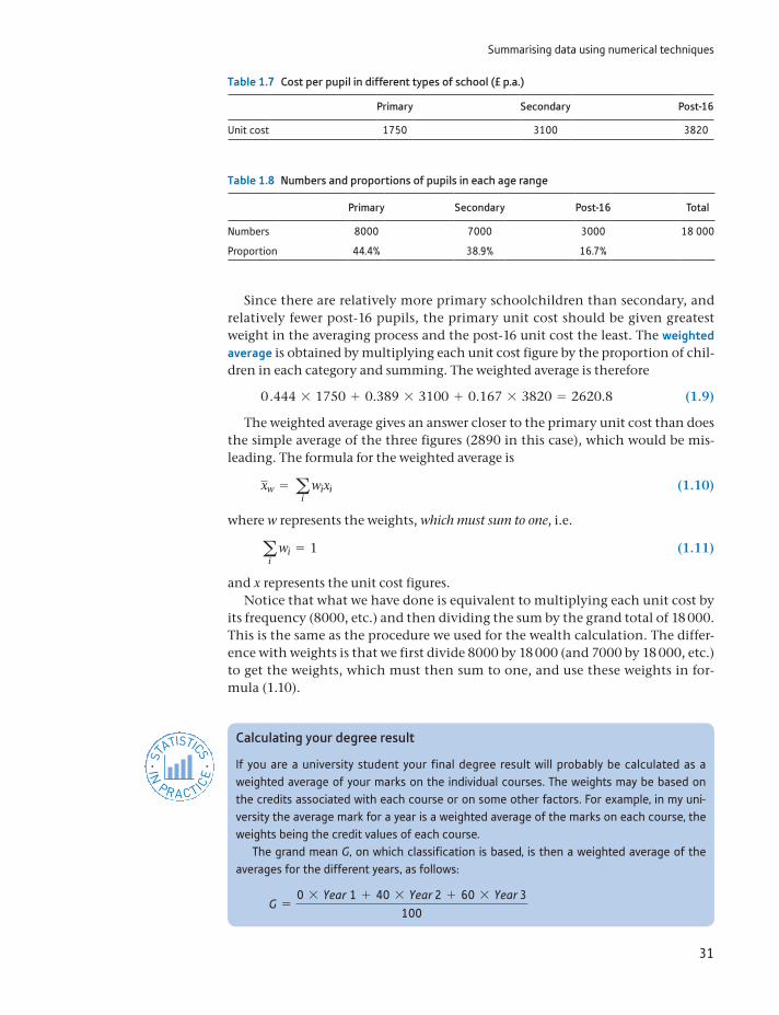
Summarising data using numerical techniques
31
Since there are relatively more primary schoolchildren than secondary, and relatively fewer post-16 pupils, the primary unit cost should be given greatest weight in the averaging process and the post-16 unit cost the least. The weighted average is obtained by multiplying each unit cost figure by the proportion of chil-dren in each category and summing. The weighted average is therefore
0.444 * 1750 + 0.389 * 3100 + 0.167 * 3820 = 2620.8 (1.9)
The weighted average gives an answer closer to the primary unit cost than does the simple average of the three figures (2890 in this case), which would be mis-leading. The formula for the weighted average is
xw = ai
wixi (1.10)
where w represents the weights, which must sum to one, i.e.
ai
wi = 1 (1.11)
and x represents the unit cost figures.Notice that what we have done is equivalent to multiplying each unit cost by
its frequency (8000, etc.) and then dividing the sum by the grand total of 18 000. This is the same as the procedure we used for the wealth calculation. The differ-ence with weights is that we first divide 8000 by 18 000 (and 7000 by 18 000, etc.) to get the weights, which must then sum to one, and use these weights in for-mula (1.10).
Table 1.7 Cost per pupil in different types of school (£ p.a.)
Primary Secondary Post-16
Unit cost 1750 3100 3820
Table 1.8 Numbers and proportions of pupils in each age range
Primary Secondary Post-16 Total
Numbers 8000 7000 3000 18 000
Proportion 44.4% 38.9% 16.7%
ST
ATISTICS
IN
PRACTI
CE
· ·
Calculating your degree result
If you are a university student your final degree result will probably be calculated as a weighted average of your marks on the individual courses. The weights may be based on the credits associated with each course or on some other factors. For example, in my uni-versity the average mark for a year is a weighted average of the marks on each course, the weights being the credit values of each course.
The grand mean G, on which classification is based, is then a weighted average of the averages for the different years, as follows:
G =0 * Year 1 + 40 * Year 2 + 60 * Year 3
100
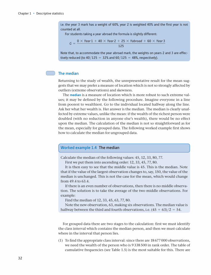
Chapter 1 • Descriptive statistics
32
i.e. the year 3 mark has a weight of 60%, year 2 is weighted 40% and the first year is not counted at all.
For students taking a year abroad the formula is slightly different:
G =0 * Year 1 + 40 * Year 2 + 25 * Yabroad + 60 * Year 3
125
Note that, to accommodate the year abroad mark, the weights on years 2 and 3 are effec-tively reduced (to 40>125 = 32% and 60>125 = 48%, respectively).
The median
Returning to the study of wealth, the unrepresentative result for the mean sug-gests that we may prefer a measure of location which is not so strongly affected by outliers (extreme observations) and skewness.
The median is a measure of location which is more robust to such extreme val-ues; it may be defined by the following procedure. Imagine everyone in a line from poorest to wealthiest. Go to the individual located halfway along the line. Ask her what her wealth is. Her answer is the median. The median is clearly unaf-fected by extreme values, unlike the mean: if the wealth of the richest person were doubled (with no reduction in anyone else’s wealth), there would be no effect upon the median. The calculation of the median is not so straightforward as for the mean, especially for grouped data. The following worked example first shows how to calculate the median for ungrouped data.
Worked example 1.4 The median
Calculate the median of the following values: 45, 12, 33, 80, 77.First we put them into ascending order: 12, 33, 45, 77, 80.It is then easy to see that the middle value is 45. This is the median. Note
that if the value of the largest observation changes to, say, 150, the value of the median is unchanged. This is not the case for the mean, which would change from 49.4 to 63.4.
If there is an even number of observations, then there is no middle observa-tion. The solution is to take the average of the two middle observations. For example:
Find the median of 12, 33, 45, 63, 77, 80.Note the new observation, 63, making six observations. The median value is
halfway between the third and fourth observations, i.e. (45 + 63)>2 = 54.
For grouped data there are two stages to the calculation: first we must identify the class interval which contains the median person, and then we must calculate where in the interval that person lies.
(1) To find the appropriate class interval: since there are 18 677 000 observations, we need the wealth of the person who is 9 338 500 in rank order. The table of cumulative frequencies (see Table 1.5) is the most suitable for this. There are
Summarising data using numerical techniques
33
7 739 000 individuals with wealth of less than £100 000 and 11 006 000 with wealth of less than £150 000. The middle person therefore falls into the £100 000–150 000 class. Furthermore, given that 9 338 500 falls roughly half-way between 7 739 000 and 11 006 000, it follows that the median should be close to the middle of the class interval. We now go on to make this state-ment more precise.
(2) To find the position in the class interval, we can now use formula (1.12):
median = xL + (xU - xL)eN + 1
2- F f
f (1.12)
where: xL = the lower limit of the class interval containing the median xU = the upper limit of this class interval N = the number of observations (using N + 1 rather than N in the formula is
only important when N is relatively small) F = the cumulative frequency of the class intervals up to (but not including) the
one containing the median f = the frequency for the class interval containing the median.
For the wealth distribution we have:
median = 100 000 + (150 000 - 100 000)•
18 677 0002
- 7 739 000
3 267 000
= £124 480
This alternative measure of location gives a very different impression: it is around two-thirds of the mean. Nevertheless, it is an equally valid statistic, despite having a different meaning. It demonstrates that the person ‘in the middle’ has wealth of £124 480 and in this sense is typical of the UK population. Before going on to compare these measures further we examine a third, the mode.
ST
ATISTICS
IN
PRACTI
CE
· ·
Generalising the median – quantiles
The idea of the median as the middle of the distribution can be extended: quartiles divide the distribution into 4 equal parts, quintiles into 4, deciles into 10, and finally percentiles divide the distribution into 100 equal parts. Generically they are known as quantiles. We shall illustrate the idea by examining deciles (quartiles are covered below).
The first decile occurs one-tenth of the way along the line of people ranked from poor-est to wealthiest. This means we require the wealth of the person ranked 1 867 700 (= N>10) in the distribution. From the table of cumulative frequencies, this person lies in the second class interval. Adapting formula (1.12), we obtain:
first decile = 10 000 + (25 000 - 10 000) * e 1 867 700 - 1 668 0001 318 000
f = £12 273
Thus we estimate that any household with less than £12 273 of wealth falls into the bot-tom 10% of the wealth distribution. In a similar fashion, the ninth decile can be found by cal-culating the wealth of the household ranked 16 809 300 (= N * 9>10) in the distribution.
Chapter 1 • Descriptive statistics
34
The mode
The mode is defined as that level of wealth which occurs with the greatest fre-quency, in other words the value that occurs most often. It is most useful and easi-est to calculate when one has all the data and there are relatively few distinct observations. This is the case in the simple example below.
Suppose we have the following data on sales of dresses by a shop, according to size:
Size Sales
8 7
10 25
12 36
14 11
16 3
18 1
The modal size is 12. There are more women buying dresses of this size than any other. This may be the most useful form of average as far as the shop is concerned. Although it needs to stock a range of sizes, it knows it needs to order more dresses in size 12 than any other size. The mean would not be so helpful in this case (it is x = 11.7), as it is not an actual dress size.
In the case of grouped data, matters are more complicated. The modal class interval is required, once the intervals have been corrected for width (otherwise a wider class interval is unfairly compared with a narrower one). For this, we can again make use of the frequency densities. From Table 1.4 it can be seen that it is the first interval, from £0 to £10 000, which has the highest frequency density. It is ‘typical’ of the distribution because it is the one which occurs most often (using the frequency densities, not frequencies). The wealth distribution is most con-centrated at this level, and more people are like this in terms of wealth than any-thing else. Once again, it is notable how different the mode is from both the median and the mean.
The three measures of location give different messages because of the skewness of the distribution: if it were symmetric, then they would all give approximately the same answer. Here we have a rather extreme case of skewness, but it serves to illustrate how the different measures of location compare. When the distribution is skewed to the right, as here, they will be in the order mode, median, mean; if skewed to the left, the order is reversed. If the distribution has more than one peak, then this rule for orderings may not apply.
Which of the measures is ‘correct’ or most useful? In this particular case the mean is not very useful: it is heavily influenced by extreme values. The median is therefore often used when discussing wealth (and income) distributions. Where inequality is even more pronounced, as in some less developed countries, the mean is even less informative. The mode is also quite useful in telling us about a large section of the population, although it can be sensitive to how the class inter-vals are arranged. If the data were arranged such that there was a class interval of £5000 to £15 000, then this might well be the modal class, conveying a slightly different impression.
Summarising data using numerical techniques
35
0 5010 100806040 20015025Wealth (£000)
Mode
Median Mean
Class widths squeezed
Figure 1.12The histogram with the mean, median and mode marked
(a) For the data in Exercise 1.2, calculate the mean, median and mode of the data.
(b) Mark these values on the histogram you drew for Exercise 1.2.?
Exercise 1.3
Measures of dispersion
Two different distributions (e.g. wealth in two different countries) might have the same mean yet look very different, as shown in Figure 1.13 (the distributions have
Figure 1.13Two distributions with different degrees of dispersion
Note: Distribution A has a greater degree of dispersion than B, where every-one has similar levels of wealth.
The three different measures of location are marked on the histogram in Figure 1.12. This brings out the substantial difference between the measures for a skewed distribution, such as for wealth.
Chapter 1 • Descriptive statistics
36
been drawn using smooth curves rather than bars to improve clarity). In one country, everyone might have a similar level of wealth (curve B). In another, although the average is the same, there might be extremes of great wealth and poverty (curve A). A measure of dispersion is a number which allows us to distin-guish between these two situations.
The simplest measure of dispersion is the range, which is the difference between the smallest and largest observations. It is impossible to calculate accu-rately from the table of wealth holdings since the largest observation is not available. In any case, it is not a very useful figure since it relies on two extreme values and ignores the rest of the distribution. In simpler cases, it might be more informative. For example, in an exam the marks may range from a low of 28% to a high of 74%. In this case the range is 74 - 28 = 46 and this tells us something useful.
An improvement is the inter-quartile range, which is the difference between the first and third quartiles. It therefore defines the limits of wealth of the middle half of the distribution and ignores the very extremes of the distribution. To calculate the first quartile (which we label Q 1) we have to go one-quarter of the way along the line of wealth holders (ranked from poorest to wealthiest) and ask the person in that position what their wealth is. Their answer is the first quartile. The calcula-tion is as follows:
one-quarter of 18 677 observations is 4669.25; the person ranked 4669.25 is in the £40 000–50 000 class; adapting formula (1.12):
Q 1 = 40 000 + (50 000 - 40 000)e 4669.25 - 4160662
f = 47 692.6 (1.13)
The third quartile is calculated in similar fashion:
three-quarters of 18 677 is 14 007.75; the person ranked 14 007.75 is in the £200 000 to 300 000 class; again using (1.12):
Q 3 = 200 000 + (300 000 - 200 000)e 14 007.75 - 13 3982885
f = 221 135.1
and therefore the inter-quartile range is Q 3 - Q 1 = 221 135 - 47 693 = 173 442. This might be reasonably rounded to £175 000 given the approximations in our calculation, and is a much more memorable figure. Thus, the 50% of people in the middle of the distribution have wealth between £48 000 and £221 000 of wealth, approximately.
This gives one summary measure of the dispersion of the distribution: the higher the value the more spread out is the distribution. Therefore, two different wealth distributions might be compared according to their inter-quartile ranges, with the country having the larger figure exhibiting greater inequality. Note that the figures would have to be expressed in a common unit of currency for this com-parison to be valid.
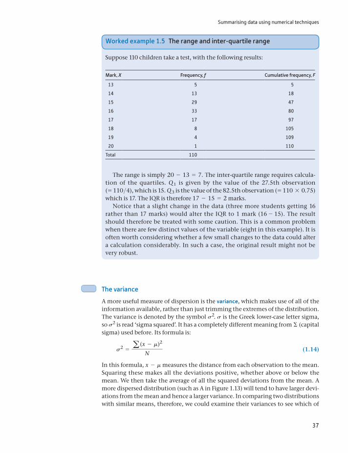
Summarising data using numerical techniques
37
The variance
A more useful measure of dispersion is the variance, which makes use of all of the information available, rather than just trimming the extremes of the distribution. The variance is denoted by the symbol s2. s is the Greek lower-case letter sigma, so s2 is read ‘sigma squared’. It has a completely different meaning from Σ (capital sigma) used before. Its formula is:
s2 = a (x - m)2
N (1.14)
In this formula, x - m measures the distance from each observation to the mean. Squaring these makes all the deviations positive, whether above or below the mean. We then take the average of all the squared deviations from the mean. A more dispersed distribution (such as A in Figure 1.13) will tend to have larger devi-ations from the mean and hence a larger variance. In comparing two distributions with similar means, therefore, we could examine their variances to see which of
Worked example 1.5 The range and inter-quartile range
Suppose 110 children take a test, with the following results:
Mark, X Frequency, f Cumulative frequency, F
13 5 5
14 13 18
15 29 47
16 33 80
17 17 97
18 8 105
19 4 109
20 1 110
Total 110
The range is simply 20 - 13 = 7. The inter-quartile range requires calcula-tion of the quartiles. Q 1 is given by the value of the 27.5th observation (= 110>4), which is 15. Q 3 is the value of the 82.5th observation (= 110 * 0.75) which is 17. The IQR is therefore 17 - 15 = 2 marks.
Notice that a slight change in the data (three more students getting 16 rather than 17 marks) would alter the IQR to 1 mark (16 - 15). The result should therefore be treated with some caution. This is a common problem when there are few distinct values of the variable (eight in this example). It is often worth considering whether a few small changes to the data could alter a calculation considerably. In such a case, the original result might not be very robust.
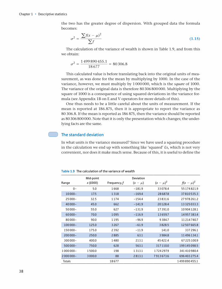
Chapter 1 • Descriptive statistics
38
the two has the greater degree of dispersion. With grouped data the formula becomes:
s2 = a f(x - m)2
a f (1.15)
The calculation of the variance of wealth is shown in Table 1.9, and from this we obtain:
s2 =1 499 890 455.1
18 677= 80 306.8
This calculated value is before translating back into the original units of mea-surement, as was done for the mean by multiplying by 1000. In the case of the variance, however, we must multiply by 1 000 000, which is the square of 1000. The variance of the original data is therefore 80 306 800 000. Multiplying by the square of 1000 is a consequence of using squared deviations in the variance for-mula (see Appendix 1B on E and V operators for more details of this).
One thus needs to be a little careful about the units of measurement. If the mean is reported at 186.875, then it is appropriate to report the variance as 80 306.8. If the mean is reported as 186 875, then the variance should be reported as 80 306 800 000. Note that it is only the presentation which changes; the under-lying facts are the same.
The standard deviation
In what units is the variance measured? Since we have used a squaring procedure in the calculation we end up with something like ‘squared’ £s, which is not very convenient, nor does it make much sense. Because of this, it is useful to define the
Table 1.9 The calculation of the variance of wealth
RangeMid-point x (£000) Frequency, f
Deviation (x - m) (x - m)2 f(x - m)2
0– 5.0 1 668 –181.9 33 078.4 55 174 821.9
10 000– 17.5 1 318 –169.4 28 687.8 37 810 535.3
25 000– 32.5 1 174 –154.4 23 831.6 27 978 261.2
40 000– 45.0 662 –141.9 20 128.4 13 325 033.3
50 000– 55.0 627 –131.9 17 391.0 10 904 128.1
60 000– 70.0 1 095 –116.9 13 659.7 14 957 383.4
80 000– 90.0 1 195 –96.9 9 384.7 11 214 740.7
100 000– 125.0 3 267 –61.9 3 828.5 12 507 665.8
150 000– 175.0 2 392 –11.9 141.0 337 296.1
200 000– 250.0 2 885 63.1 3 984.8 11 496 134.1
300 000– 400.0 1 480 213.1 45 422.4 67 225 100.9
500 000– 750.0 628 563.1 317 110.0 199 145 098.5
1 000 000– 1 500.0 198 1 313.1 1 724 297.9 341 410 980.4
2 000 000– 3 000.0 88 2 813.1 7 913 673.6 696 403 275.4
Totals 18 677 1 499 890 455.1
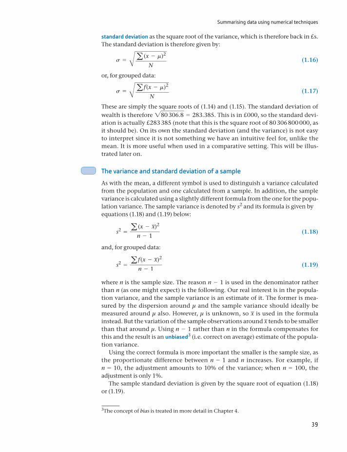
Summarising data using numerical techniques
39
standard deviation as the square root of the variance, which is therefore back in £s. The standard deviation is therefore given by:
s = Ba (x - m)2
N (1.16)
or, for grouped data:
s = Ba f (x - m)2
N (1.17)
These are simply the square roots of (1.14) and (1.15). The standard deviation of wealth is therefore 280 306.8 = 283.385. This is in £000, so the standard devi-ation is actually £283 385 (note that this is the square root of 80 306 800 000, as it should be). On its own the standard deviation (and the variance) is not easy to interpret since it is not something we have an intuitive feel for, unlike the mean. It is more useful when used in a comparative setting. This will be illus-trated later on.
The variance and standard deviation of a sample
As with the mean, a different symbol is used to distinguish a variance calculated from the population and one calculated from a sample. In addition, the sample variance is calculated using a slightly different formula from the one for the popu-lation variance. The sample variance is denoted by s2 and its formula is given byequations (1.18) and (1.19) below:
s2 = a (x - x)2
n - 1 (1.18)
and, for grouped data:
s2 = a f (x - x)2
n - 1 (1.19)
where n is the sample size. The reason n - 1 is used in the denominator rather than n (as one might expect) is the following. Our real interest is in the popula-tion variance, and the sample variance is an estimate of it. The former is mea-sured by the dispersion around μ and the sample variance should ideally be measured around μ also. However, μ is unknown, so x is used in the formula instead. But the variation of the sample observations around x tends to be smaller than that around μ. Using n - 1 rather than n in the formula compensates for this and the result is an unbiased3 (i.e. correct on average) estimate of the popula-tion variance.
Using the correct formula is more important the smaller is the sample size, as the proportionate difference between n - 1 and n increases. For example, if n = 10, the adjustment amounts to 10% of the variance; when n = 100, the adjustment is only 1%.
The sample standard deviation is given by the square root of equation (1.18) or (1.19).
3The concept of bias is treated in more detail in Chapter 4.
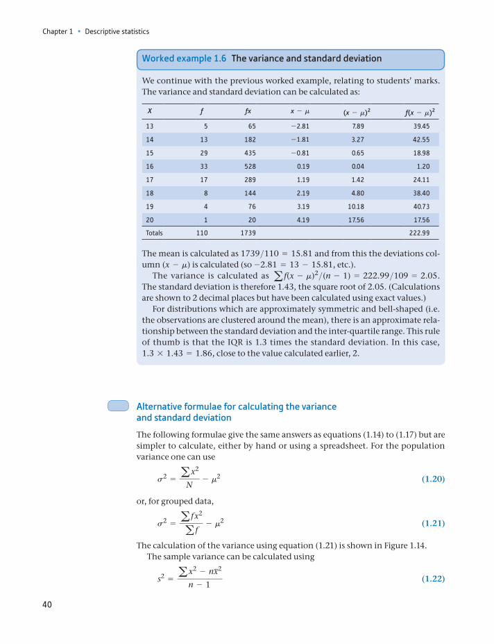
Chapter 1 • Descriptive statistics
40
Alternative formulae for calculating the variance and standard deviation
The following formulae give the same answers as equations (1.14) to (1.17) but are simpler to calculate, either by hand or using a spreadsheet. For the population variance one can use
s2 = ax2
N- m2 (1.20)
or, for grouped data,
s2 = a f x2
a f- m2 (1.21)
The calculation of the variance using equation (1.21) is shown in Figure 1.14.The sample variance can be calculated using
s2 = ax2 - nx2
n - 1 (1.22)
Worked example 1.6 The variance and standard deviation
We continue with the previous worked example, relating to students’ marks. The variance and standard deviation can be calculated as:
X f fx x - m (x - m)2 f(x - m)2
13 5 65 -2.81 7.89 39.45
14 13 182 -1.81 3.27 42.55
15 29 435 -0.81 0.65 18.98
16 33 528 0.19 0.04 1.20
17 17 289 1.19 1.42 24.11
18 8 144 2.19 4.80 38.40
19 4 76 3.19 10.18 40.73
20 1 20 4.19 17.56 17.56
Totals 110 1739 222.99
The mean is calculated as 1739>110 = 15.81 and from this the deviations col-umn (x - m) is calculated (so -2.81 = 13 - 15.81, etc.).
The variance is calculated as a f(x - m)2>(n - 1) = 222.99>109 = 2.05. The standard deviation is therefore 1.43, the square root of 2.05. (Calculations are shown to 2 decimal places but have been calculated using exact values.)
For distributions which are approximately symmetric and bell-shaped (i.e. the observations are clustered around the mean), there is an approximate rela-tionship between the standard deviation and the inter-quartile range. This rule of thumb is that the IQR is 1.3 times the standard deviation. In this case, 1.3 * 1.43 = 1.86, close to the value calculated earlier, 2.
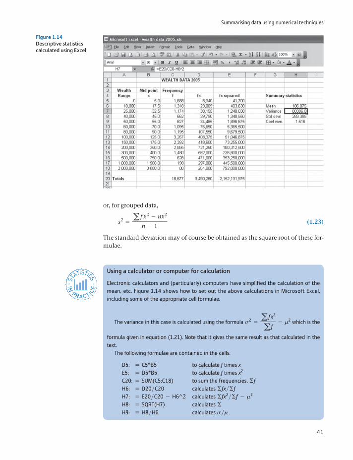
Summarising data using numerical techniques
41
or, for grouped data,
s2 = a f x2 - nx2
n - 1 (1.23)
The standard deviation may of course be obtained as the square root of these for-mulae.
Figure 1.14Descriptive statistics calculated using Excel
Using a calculator or computer for calculation
Electronic calculators and (particularly) computers have simplified the calculation of the mean, etc. Figure 1.14 shows how to set out the above calculations in Microsoft Excel, including some of the appropriate cell formulae.
The variance in this case is calculated using the formula s2 = a f x2
a f- m2 which is the
formula given in equation (1.21). Note that it gives the same result as that calculated in the text.
The following formulae are contained in the cells:
D5: = C5*B5 to calculate f times xE5: = D5*B5 to calculate f times x2
C20: = SUM(C5:C18) to sum the frequencies, ΣfH6: = D20>C20 calculates Σfx>ΣfH7: = E20>C20 - H6^2 calculates Σfx2>Σf - m2
H8: = SQRT(H7) calculates ΣH9: = H8>H6 calculates s>m
ST
ATISTICS
IN
PRACTI
CE
· ·
Chapter 1 • Descriptive statistics
42
The coefficient of variation
The measures of dispersion examined so far are all measures of absolute dispersion and, in particular, their values depend upon the units in which the variable is measured. It is therefore difficult to compare the degrees of dispersion of two vari-ables which are measured in different units. For example, one could not compare wealth in the United Kingdom with that in Germany if the former uses £s and the latter euros for measurement. Nor could one compare the wealth distribution in one country between two points in time because inflation alters the value of the currency over time. The solution is to use a measure of relative dispersion, which is independent of the units of measurement. One such measure is the coefficient of variation, defined as:
Coefficient of variation =s
m (1.24)
i.e. the standard deviation divided by the mean. Whenever the units of mea-surement are changed, the effect upon the mean and the standard deviation is the same; hence the coefficient of variation is unchanged. For the wealth distribution its value is 283.385>186.875 = 1.516, i.e. the standard deviation is 152% of the mean. This may be compared directly with the coefficient of varia-tion of a different wealth distribution to see which exhibits a greater relative degree of dispersion.
Independence of units of measurement
It is worth devoting a little attention to this idea, that some summary measures are independent of the units of measurement and some are not, as it occurs quite often in statistics and is not often appreciated at first. A statistic which is independent of the units of measurement is one which is unchanged, even when the units of measurement are changed. It is therefore more useful in general than a statistic which is not independent, since one can use it to make comparisons, or judgements, without worrying too much about how it was measured.
The mean is not independent of the units of measurement. If we are told the average income in the United Kingdom is 30 000, for example, we need to know whether it is measured in pounds sterling, euros or even dollars. The underlying level of income is the same, of course, but it is measured differ-ently. By contrast, the rate of growth (described in detail shortly) is indepen-dent of the units of measurement. If we are told it is 3% p.a., it would be the same whether the calculation was based on pound, euro or dollar figures. If told that the rate of growth in the United States is 2% p.a., we can immediately conclude that the United Kingdom is growing faster, and no further informa-tion is needed.
Most measures we have encountered so far, such as the mean and variance, do depend on units of measurement. The coefficient of variation is one that does not. We now go on to describe another means of measuring dispersion that avoids the units of measurement problem.
Summarising data using numerical techniques
43
The standard deviation of the logarithm
Another solution to the problem of different units of measurement is to use the logarithm4 of wealth rather than the actual value. The reason why this works can best be illustrated by an example. Suppose that between 1997 and 2005 each indi-vidual’s wealth doubled, so that
X2005i = 2X1997
i
where Xti indicates the wealth of individual i in year t. It follows that the standard
deviation of wealth in 2005 is exactly twice that of 1997 (and hence the coeffi-cient of variation is unchanged). Taking logs, we have ln X2005
i = ln 2 + ln X1997i ,
so it follows that the distribution of ln X2005 is the same as that of ln X1997 except that it is shifted to the right by ln 2 units. The variances (and hence standard devi-ations) of the two logarithmic distributions must therefore be the same, indicat-ing no change in the relative dispersion of the two wealth distributions.
The use of logarithms in data analysis is very common, so it is worth making sure you understand the principles and mechanics of using them.
The standard deviation of the logarithm of wealth is calculated from the data in Table 1.10. The variance turns out to be:
s2 = a f x2
a f- m2 =
417 772.518 677
- a848 40.918 677
b2
= 1.734
and the standard deviation s = 1.317. The larger this figure is, the greater the dispersion. On its own the number is difficult to interpret; it is only really useful when compared to another such figure.
4See Appendix 1C if you are unfamiliar with logarithms. Note that we use the natural loga-rithm here, but the effect would be the same using logs to base 10.
Table 1.10 The calculation of the standard deviation of the logarithm of wealth
Range Mid-point, x ln (x) Frequency, f fx fx squared
0– 5.0 1.609 1 668 2 684.5 4 320.610 000– 17.5 2.862 1 318 3 772.4 10 797.325 000– 32.5 3.481 1 174 4 087.0 14 227.740 000– 45.0 3.807 662 2 520.0 9 592.850 000– 55.0 4.007 627 2 512.6 10 068.860 000– 70.0 4.248 1 095 4 652.1 19 764.480 000– 90.0 4.500 1 195 5 377.3 24 196.7
100 000– 125.0 4.828 3 267 15 774.1 76 162.3150 000– 175.0 5.165 2 392 12 354.2 63 806.6200 000– 250.0 5.521 2 885 15 929.4 87 953.6300 000– 400.0 5.991 1 480 8 867.4 53 128.5500 000– 750.0 6.620 628 4 157.4 27 522.3
1 000 000– 1 500.0 7.313 198 1 448.0 10 589.72 000 000– 3 000.0 8.006 88 704.6 5 641.0
Totals 18 677 84 840.9 417 772.5
Notes: Use the ‘ln’ key on your calculator or the = LN() function in a spreadsheet to obtain natural logarithms of the data. You should obtain ln 5 = 1.609, ln 17.5 = 2.862, etc.The column headed ‘fx’ is the product of the f and ln(x) columns.
Chapter 1 • Descriptive statistics
44
For comparison, the standard deviation of log wealth in 1979 (discussed in more detail later on) is 1.310, so there appears to have been little change in relative dis-persion over this time period. Thus we have found two different ways of measuring relative dispersion. In a later chapter we will meet a third, the Gini coefficient.
Measuring deviations from the mean: z scores
Imagine the following problem. A man and a woman are arguing over their career records. The man says he earns more than she does, so he is more successful. The woman replies that women are discriminated against and that, relative to other women, she is doing better than the man is, relative to other men. Can the argu-ment be resolved?
Suppose the data are as follows: the average male salary is £19 500 and the aver-age female salary £16 800. The standard deviation of male salaries is £4750 and for women it is £3800. The man’s salary is £31 375, while the woman’s is £26 800. The man is therefore £11 875 above the mean, and the woman is £10 000 above. However, women’s salaries are less dispersed than men’s, so the woman has done well to get to £26 800.
One way to resolve the problem is to calculate the z score, which gives the sal-ary in terms of the number of standard deviations from the mean. Thus for the man, the z score is
z =X - m
s=
31 375 - 19 5004750
= 2.50 (1.25)
Thus the man is 2.5 standard deviations above the male mean salary, i.e. 31 375 = 19 500 + 2.5 * 4 750. For the woman the calculation is
z =268 00 - 16 800
3800= 2.632 (1.26)
The woman is 2.632 standard deviations above her mean and therefore wins the argument – she is nearer the top of her distribution than is the man and so is more of an outlier. Actually, this probably won’t end the argument, but is the best the statistician can do. The z score is an important concept which will be used again (see Chapter 5) when we cover hypothesis testing.
Chebyshev’s inequality
Use of the z score leads on naturally to Chebyshev’s inequality, which tells us about the proportion of observations that fall into the tails of any distribution, regard-less of its shape. The theorem is expressed as follows:
At least (1 - 1>k2) of the observation in any distributionlie within k standard deviations of the mean
(1.27)
If we take the female wage distribution given above, we can ask what propor-tion of women lie beyond 2.632 standard deviations from the mean (in both tails of the distribution). Setting k = 2.632, then
a1 -1
k2 b = a1 -1
2.6322 b = 0.8556.
Summarising data using numerical techniques
45
So at least 85% of women have salaries within 2.632 standard deviations of the mean, i.e. between £6800 and £26 800 (16 800 2.632 * 3800). Fifteen percent of women therefore lie outside this range.
Chebyshev’s inequality is a very conservative rule since it applies to any distri-bution; if we know more about the shape of a particular distribution (for example, men’s heights follow a Normal distribution – see Chapter 3), then we can make a more precise statement. In the case of the Normal distribution, over 99% of men are within 2.632 standard deviations of the average height because there is a con-centration of observations near the centre of the distribution.
We can also use Chebyshev’s inequality to investigate the inter-quartile range. The formula (1.27) implies that 50% of observations lie within 12 = 1.41 stan-dard deviations of the mean, a more conservative value than our previous 1.3.
(a) For the data in Exercise 1.2, calculate the inter-quartile range, the variance and the stan-dard deviation.
(b) Calculate the coefficient of variation.
(c) Check if the relationship between the IQR and the standard deviation stated in the text (worked example 1.6) is approximately true for this distribution.
(d) Approximately how much of the distribution lies within one standard deviation either side of the mean? How does this compare with the prediction from Chebyshev’s inequality?
?
Exercise 1.4
Measuring skewness
The skewness of a distribution is the third characteristic that was mentioned ear-lier, in addition to location and dispersion. The wealth distribution is heavily skewed to the right, or positively skewed; it has its long tail in the right-hand end of the distribution. A measure of skewness gives a numerical indication of how asymmetric is the distribution.
One measure of skewness, known as the coefficient of skewness, is
a f (x - m)3
Ns3 (1.28)
and it is based upon cubed deviations from the mean. The result of applying for-mula (1.28) is positive for a right-skewed distribution (such as wealth), zero for a symmetric one, and negative for a left-skewed one. Table 1.11 shows the calcula-tion for the wealth data (some rows are omitted for brevity).
Table 1.11 Calculation of the skewness of the wealth data
Range Mid-point x Frequency f x - m (x - m)3 f (x - m)3
0– 5.0 1 668 –181.9 –6 016 132 –10 034 907 81510 000– 17.5 1 318 –169.4 –4 858 991 –6 404 150 553
: : : : : :1 000 000– 1 500.0 198 1 313.1 2 264 219 059 448 315 373 6132 000 000– 3 000.0 88 2 813.1 22 262 154 853 1 959 069 627 104
Total 18 677 3 898.8 24 692 431 323 2 506 882 551 023
Chapter 1 • Descriptive statistics
46
From this we obtain:
a f (x - m)3
N=
2 506 882 551 02318 677
= 134 222 977.5
and dividing by Σ3 gives 134 222 977.5
22 757 714= 5.898 which is positive, as expected.
The measure of skewness is much less useful in practical work than measures of location and dispersion, and even knowing the value of the coefficient does not always give much idea of the shape of the distribution: two quite different distri-butions can share the same coefficient. In descriptive work, it is probably better to draw the histogram itself.
Comparison of the 2005 and 1979 distributions of wealth
Some useful lessons may be learned about these measures by comparing the 2005 distribution with its counterpart from 1979. This covers the period of Conservative government starting with Mrs Thatcher in 1979 and much of the following Labour administration. This shows how useful the various summary statistics are when it comes to comparing two different distributions. The wealth data for 1979 are given in Problem 1.5, where you are asked to confirm the following calculations.
Average wealth in 1979 was £16 399, about one-eleventh of its 2005 value. The average increased substantially therefore (at about 10% p.a., on average), but some of this was due to inflation rather than a real increase in the quantity of assets held. In fact, between 1979 and 2005 the retail price index rose from 52.0 to 217.9, i.e. it increased approximately four times. Thus the nominal5 increase (i.e. in cash terms, before any adjustment for rising prices) in wealth is made up of two parts: (a) an inflationary part which more than quadrupled measured wealth and (b) a real part, consisting of a 2.75-fold increase (thus 4 * 2.75 = 11, approximately). Price indexes are covered in Chapter 10 where it is shown more formally how to divide a nominal increase into price and real (quantity) components. It is likely that the extent of the real increase in wealth is overstated here due to the use of the retail price index rather than an index of asset prices. A substantial part of the increase in asset values over the period is probably due to the very rapid rise in house prices (houses form a significant part of the wealth of many households).
The standard deviation is similarly affected by inflation. The 1979 value is 25 552 compared to 2005’s 283 385, which is about 11 times larger (as was the mean). The spread of the distribution appears to be about the same therefore (even if we take account of the general price effect). Looking at the coefficient of variation reveals a similar finding: the value has changed from 1.56 to 1.52, which is a modest difference. The spread of the distribution relative to its mean has not changed by much. This is confirmed by calculating the standard deviation of the logarithm: for 1979 this gives a figure of 1.310, almost identical to the 2005 figure (1.317).
The measure of skewness for the 1979 data comes out as 5.723, only slightly smaller than the 2005 figure (5.898). This suggests that the 1979 distribution is similarly skewed to the 2005 one. Again, these two figures can be directly com-
5This is a different meaning of the term ‘nominal’ from that used earlier to denote data mea-sured on a nominal scale, i.e. data grouped into categories without an obvious ordering. Unfortunately, both meanings of the word are in common (statistical) usage, though it should be obvious from the context which use is meant.
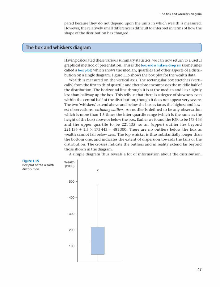
The box and whiskers diagram
47
pared because they do not depend upon the units in which wealth is measured. However, the relatively small difference is difficult to interpret in terms of how the shape of the distribution has changed.
The box and whiskers diagram
Having calculated these various summary statistics, we can now return to a useful graphical method of presentation. This is the box and whiskers diagram (sometimes called a box plot) which shows the median, quartiles and other aspects of a distri-bution on a single diagram. Figure 1.15 shows the box plot for the wealth data.
Wealth is measured on the vertical axis. The rectangular box stretches (verti-cally) from the first to third quartile and therefore encompasses the middle half of the distribution. The horizontal line through it is at the median and lies slightly less than halfway up the box. This tells us that there is a degree of skewness even within the central half of the distribution, though it does not appear very severe. The two ‘whiskers’ extend above and below the box as far as the highest and low-est observations, excluding outliers. An outlier is defined to be any observation which is more than 1.5 times the inter-quartile range (which is the same as the height of the box) above or below the box. Earlier we found the IQR to be 173 443 and the upper quartile to be 221 135, so an (upper) outlier lies beyond 221 135 + 1.5 * 173 443 = 481 300. There are no outliers below the box as wealth cannot fall below zero. The top whisker is thus substantially longer than the bottom one, and indicates the extent of dispersion towards the tails of the distribution. The crosses indicate the outliers and in reality extend far beyond those shown in the diagram.
A simple diagram thus reveals a lot of information about the distribution.
100
200
300
400
x
Wealth(£000)
500
Figure 1.15Box plot of the wealth distribution
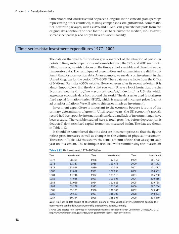
Chapter 1 • Descriptive statistics
48
Other boxes and whiskers could be placed alongside in the same diagram (perhaps representing other countries), making comparisons straightforward. Some statis-tical software packages, such as SPSS and STATA, can generate box plots from the original data, without the need for the user to calculate the median, etc. However, spreadsheet packages do not yet have this useful facility.
Time-series data: investment expenditures 1977–2009
The data on the wealth distribution give a snapshot of the situation at particular points in time, and comparisons can be made between the 1979 and 2005 snapshots. Often, however, we wish to focus on the time-path of a variable and therefore we use time-series data. The techniques of presentation and summarising are slightly dif-ferent than for cross-section data. As an example, we use data on investment in the United Kingdom for the period 1977–2009. These data are available from the Office of National Statistics (ONS) website. However, even after its recent redesign, it is almost impossible to find the data that you want. To save a lot of frustration, use the Econstats website (http://www.econstats.com/uk/index.htm), a U.S. site which aggregates economic data from around the world. The data series used is total gross fixed capital formation (series NPQX), which is measured in current prices (i.e. not adjusted for inflation). We will refer to this series simply as ‘investment’.
Investment expenditure is important to the economy because it is one of the primary determinants of growth. Until recent years, the UK economy’s growth record had been poor by international standards and lack of investment may have been a cause. The variable studied here is total gross (i.e. before depreciation is deducted) domestic fixed capital formation, measured in £m. The data are shown in Table 1.12.
It should be remembered that the data are in current prices so that the figures reflect price increases as well as changes in the volume of physical investment. The series in Table 1.12 thus shows the actual amount of cash that was spent each year on investment. The techniques used below for summarising the investment
Table 1.12 UK investment, 1977–2009 (£m)
Year Investment Year Investment Year Investment
1977 28 351 1988 97 956 1999 161 7221978 32 387 1989 113 478 2000 167 172
1979 38 548 1990 117 027 2001 171 7821980 43 612 1991 107 838 2002 180 551
1981 43 746 1992 103 913 2003 186 7001982 47 935 1993 103 997 2004 200 415
1983 52 099 1994 111 623 2005 209 7581984 59 278 1995 121 364 2006 227 234
1985 65 181 1996 130 346 2007 249 5171986 69 581 1997 138 307 2008 240 361
1987 80 344 1998 155 997 2009 204 270
Note: Time-series data consist of observations on one or more variables over several time periods. The observations can be daily, weekly, monthly, quarterly or, as here, annually.
Source: Data adapted from the Office for National Statistics licensed under the Open Government Licence(OGL) v.3.0. http://www.nationalarchives.gov.uk/doc/open-government-licence/open-government
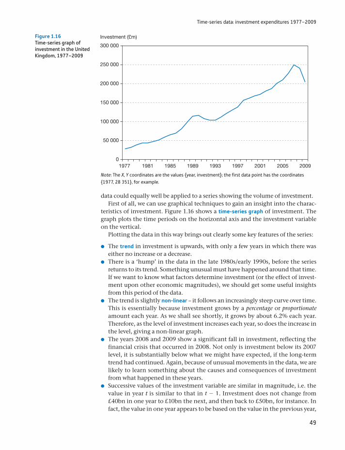
Time-series data: investment expenditures 1977–2009
49
data could equally well be applied to a series showing the volume of investment.First of all, we can use graphical techniques to gain an insight into the charac-
teristics of investment. Figure 1.16 shows a time-series graph of investment. The graph plots the time periods on the horizontal axis and the investment variable on the vertical.
Plotting the data in this way brings out clearly some key features of the series:
The trend in investment is upwards, with only a few years in which there was either no increase or a decrease.
There is a ‘hump’ in the data in the late 1980s/early 1990s, before the series returns to its trend. Something unusual must have happened around that time. If we want to know what factors determine investment (or the effect of invest-ment upon other economic magnitudes), we should get some useful insights from this period of the data.
The trend is slightly non-linear – it follows an increasingly steep curve over time. This is essentially because investment grows by a percentage or proportionate amount each year. As we shall see shortly, it grows by about 6.2% each year. Therefore, as the level of investment increases each year, so does the increase in the level, giving a non-linear graph.
The years 2008 and 2009 show a significant fall in investment, reflecting the financial crisis that occurred in 2008. Not only is investment below its 2007 level, it is substantially below what we might have expected, if the long-term trend had continued. Again, because of unusual movements in the data, we are likely to learn something about the causes and consequences of investment from what happened in these years.
Successive values of the investment variable are similar in magnitude, i.e. the value in year t is similar to that in t - 1. Investment does not change from £40bn in one year to £10bn the next, and then back to £50bn, for instance. In fact, the value in one year appears to be based on the value in the previous year,
0
50 000
100 000
150 000
200 000
250 000
300 000
1977 1981 1985 1989 1993 1997 2001 2005 2009
Investment (£m)Figure 1.16Time-series graph of investment in the United Kingdom, 1977–2009
Note: The X, Y coordinates are the values year, investment; the first data point has the coordinates 1977, 28 351, for example.
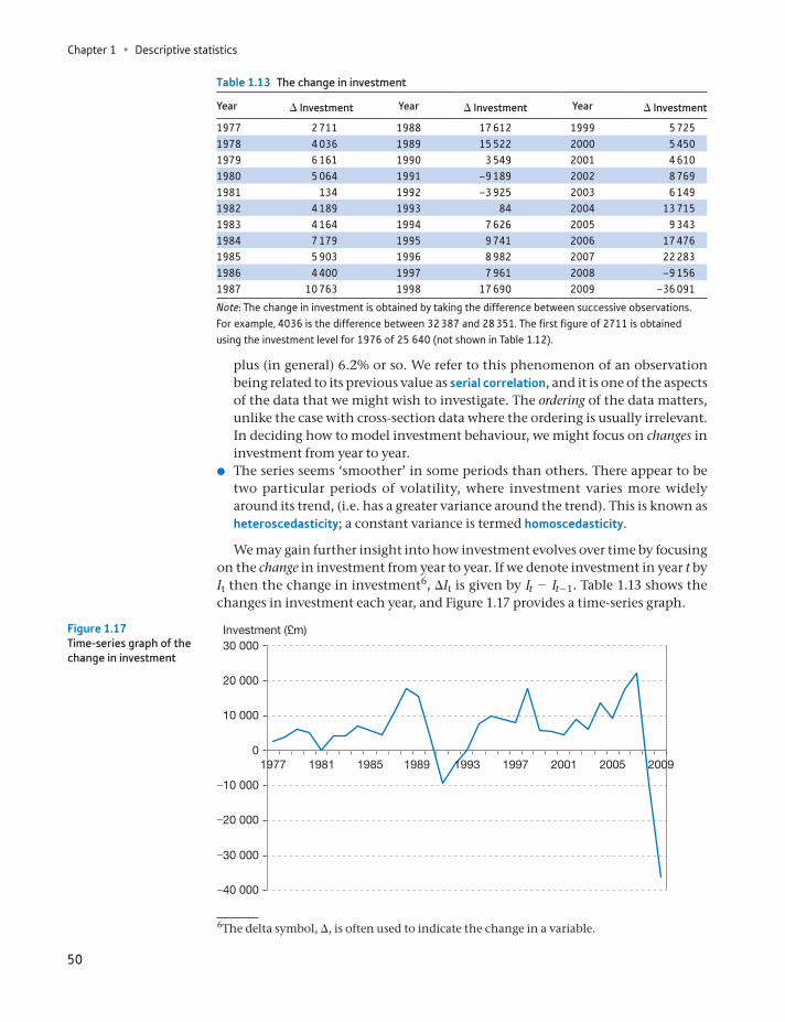
Chapter 1 • Descriptive statistics
50
plus (in general) 6.2% or so. We refer to this phenomenon of an observation being related to its previous value as serial correlation, and it is one of the aspects of the data that we might wish to investigate. The ordering of the data matters, unlike the case with cross-section data where the ordering is usually irrelevant. In deciding how to model investment behaviour, we might focus on changes in investment from year to year.
The series seems ‘smoother’ in some periods than others. There appear to be two particular periods of volatility, where investment varies more widely around its trend, (i.e. has a greater variance around the trend). This is known as heteroscedasticity; a constant variance is termed homoscedasticity.
We may gain further insight into how investment evolves over time by focusing on the change in investment from year to year. If we denote investment in year t by It then the change in investment6, ΔIt is given by It - It - 1. Table 1.13 shows the changes in investment each year, and Figure 1.17 provides a time-series graph.
Table 1.13 The change in investment
Year Δ Investment Year Δ Investment Year Δ Investment
1977 2 711 1988 17 612 1999 5 7251978 4 036 1989 15 522 2000 5 4501979 6 161 1990 3 549 2001 4 6101980 5 064 1991 –9 189 2002 8 7691981 134 1992 –3 925 2003 6 1491982 4 189 1993 84 2004 13 7151983 4 164 1994 7 626 2005 9 3431984 7 179 1995 9 741 2006 17 4761985 5 903 1996 8 982 2007 22 2831986 4 400 1997 7 961 2008 –9 1561987 10 763 1998 17 690 2009 –36 091
Note: The change in investment is obtained by taking the difference between successive observations. For example, 4036 is the difference between 32 387 and 28 351. The first figure of 2711 is obtained using the investment level for 1976 of 25 640 (not shown in Table 1.12).
6The delta symbol, Δ, is often used to indicate the change in a variable.
–40 000
–30 000
–20 000
0
10 000
–10 000
20 000
30 000
1977 1981 1985 1989 1993 1997 2001 2005 2009
Investment (£m)Figure 1.17Time-series graph of the change in investment
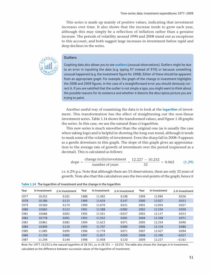
Time-series data: investment expenditures 1977–2009
51
Another useful way of examining the data is to look at the logarithm of invest-ment. This transformation has the effect of straightening out the non-linear investment series. Table 1.14 shows the transformed values, and Figure 1.18 graphs the series. In this case, we use the natural (base e) logarithm.
This new series is much smoother than the original one (as is usually the case when taking logs) and is helpful in showing the long-run trend, although it tends to mask some of the volatility of investment. Even the sharp fall in 2008–9 appears as a gentle downturn in this graph. The slope of this graph gives an approxima-tion to the average rate of growth of investment over the period (expressed as a decimal). This is calculated as follows:
slope =change in (ln) investment
number of years=
12.227 - 10.25232
= 0.062 (1.29)
i.e. 6.2% p.a. Note that although there are 33 observations, there are only 32 years of growth. Note also that this calculation uses the two end-points of the graph; hence it
Outliers
Graphing data also allows you to see outliers (unusual observations). Outliers might be due to an error in inputting the data (e.g. typing 97 instead of 970) or because something unusual happened (e.g. the investment figure for 2008). Either of these should be apparent from an appropriate graph. For example, the graph of the change in investment highlights the 2008 and 2009 figures. In the case of a straightforward error you should obviously cor-rect it. If you are satisfied that the outlier is not simply a typo, you might want to think about the possible reasons for its existence and whether it distorts the descriptive picture you are trying to paint.
ST
ATISTICS
IN
PRACTI
CE
· ·
This series is made up mainly of positive values, indicating that investment increases over time. It also shows that the increase tends to grow each year, although this may simply be a reflection of inflation rather than a genuine increase. The periods of volatility around 1990 and 2008 stand out as exceptions to this account, and both suggest large increases in investment before rapid and deep declines in the series.
Table 1.14 The logarithm of investment and the change in the logarithm
Year ln Investment Δ ln Investment Year ln Investment Δ ln Investment Year ln Investment Δ ln Investment
1977 10.252 0.101 1988 11.492 0.198 1999 11.994 0.0361978 10.386 0.133 1989 11.639 0.147 2000 12.027 0.0331979 10.560 0.174 1990 11.670 0.031 2001 12.054 0.0271980 10.683 0.123 1991 11.588 –0.082 2002 12.104 0.0501981 10.686 0.003 1992 11.551 –0.037 2003 12.137 0.0331982 10.778 0.091 1993 11.552 0.001 2004 12.208 0.0711983 10.861 0.083 1994 11.623 0.071 2005 12.254 0.0461984 10.990 0.129 1995 11.707 0.084 2006 12.334 0.0801985 11.085 0.095 1996 11.778 0.071 2007 12.427 0.0941986 11.150 0.065 1997 11.837 0.059 2008 12.390 –0.0371987 11.294 0.144 1998 11.958 0.120 2009 12.227 –0.163
Note: For 1977, 10.252 is the natural logarithm of 28 351, i.e. ln 28 351 = 10.252. The table also shows the changes in ln investment, calculated as the difference between successive values of the logarithm of investment.
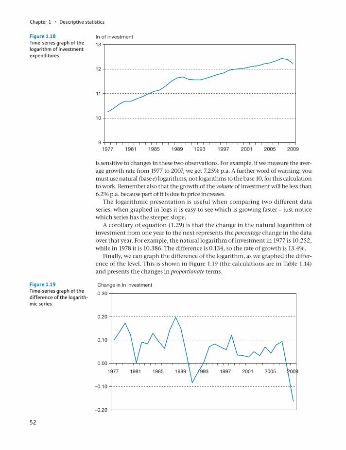
Chapter 1 • Descriptive statistics
52
is sensitive to changes in these two observations. For example, if we measure the aver-age growth rate from 1977 to 2007, we get 7.25% p.a. A further word of warning: you must use natural (base e) logarithms, not logarithms to the base 10, for this calculation to work. Remember also that the growth of the volume of investment will be less than 6.2% p.a. because part of it is due to price increases.
The logarithmic presentation is useful when comparing two different data series: when graphed in logs it is easy to see which is growing faster – just notice which series has the steeper slope.
A corollary of equation (1.29) is that the change in the natural logarithm of investment from one year to the next represents the percentage change in the data over that year. For example, the natural logarithm of investment in 1977 is 10.252, while in 1978 it is 10.386. The difference is 0.134, so the rate of growth is 13.4%.
Finally, we can graph the difference of the logarithm, as we graphed the differ-ence of the level. This is shown in Figure 1.19 (the calculations are in Table 1.14) and presents the changes in proportionate terms.
9
10
11
12
13
1977 1981 1985 1989 1993 1997 2001 2005 2009
In of investmentFigure 1.18Time-series graph of the logarithm of investment expenditures
–0.20
–0.10
0.00
0.10
0.20
0.30
1977 1981 1985 1989 1993 1997 2001 2005 2009
Change in In investment Figure 1.19Time-series graph of the difference of the logarith-mic series
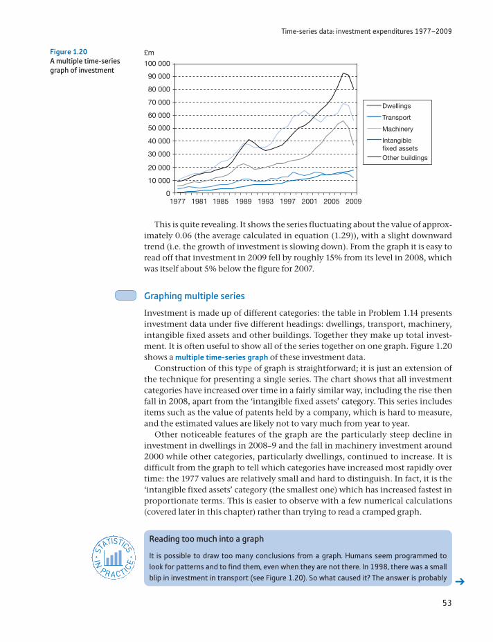
Time-series data: investment expenditures 1977–2009
53
This is quite revealing. It shows the series fluctuating about the value of approx-imately 0.06 (the average calculated in equation (1.29)), with a slight downward trend (i.e. the growth of investment is slowing down). From the graph it is easy to read off that investment in 2009 fell by roughly 15% from its level in 2008, which was itself about 5% below the figure for 2007.
Graphing multiple series
Investment is made up of different categories: the table in Problem 1.14 presents investment data under five different headings: dwellings, transport, machinery, intangible fixed assets and other buildings. Together they make up total invest-ment. It is often useful to show all of the series together on one graph. Figure 1.20 shows a multiple time-series graph of these investment data.
Construction of this type of graph is straightforward; it is just an extension of the technique for presenting a single series. The chart shows that all investment categories have increased over time in a fairly similar way, including the rise then fall in 2008, apart from the ‘intangible fixed assets’ category. This series includes items such as the value of patents held by a company, which is hard to measure, and the estimated values are likely not to vary much from year to year.
Other noticeable features of the graph are the particularly steep decline in investment in dwellings in 2008–9 and the fall in machinery investment around 2000 while other categories, particularly dwellings, continued to increase. It is difficult from the graph to tell which categories have increased most rapidly over time: the 1977 values are relatively small and hard to distinguish. In fact, it is the ‘intangible fixed assets’ category (the smallest one) which has increased fastest in proportionate terms. This is easier to observe with a few numerical calculations (covered later in this chapter) rather than trying to read a cramped graph.
0
10 000
20 000
30 000
40 000
50 000
60 000
70 000
80 000
90 000
100 000
1977 1981 1985 1989 1993 1997 2001 2005 2009
£m
Dwellings
Transport
Machinery
Intangiblefixed assetsOther buildings
Figure 1.20A multiple time-series graph of investment
Reading too much into a graph
It is possible to draw too many conclusions from a graph. Humans seem programmed to look for patterns and to find them, even when they are not there. In 1998, there was a small blip in investment in transport (see Figure 1.20). So what caused it? The answer is probably
ST
ATISTICS
IN
PRACTI
CE
· ·
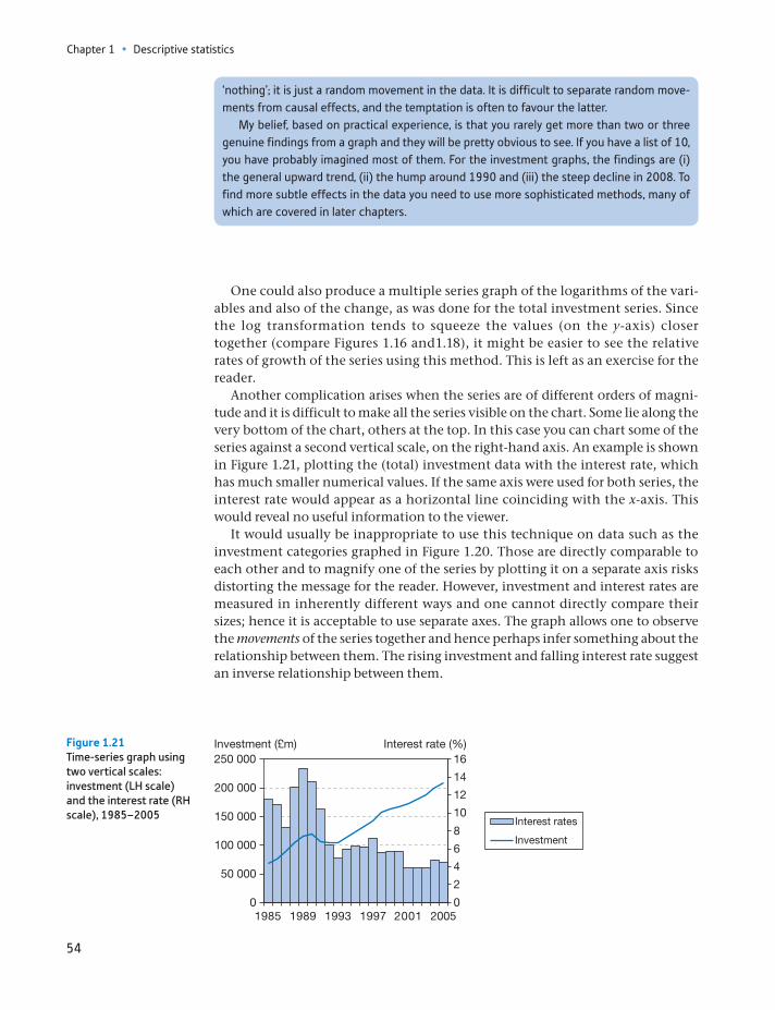
Chapter 1 • Descriptive statistics
54
One could also produce a multiple series graph of the logarithms of the vari-ables and also of the change, as was done for the total investment series. Since the log transformation tends to squeeze the values (on the y-axis) closer together (compare Figures 1.16 and1.18), it might be easier to see the relative rates of growth of the series using this method. This is left as an exercise for the reader.
Another complication arises when the series are of different orders of magni-tude and it is difficult to make all the series visible on the chart. Some lie along the very bottom of the chart, others at the top. In this case you can chart some of the series against a second vertical scale, on the right-hand axis. An example is shown in Figure 1.21, plotting the (total) investment data with the interest rate, which has much smaller numerical values. If the same axis were used for both series, the interest rate would appear as a horizontal line coinciding with the x-axis. This would reveal no useful information to the viewer.
It would usually be inappropriate to use this technique on data such as the investment categories graphed in Figure 1.20. Those are directly comparable to each other and to magnify one of the series by plotting it on a separate axis risks distorting the message for the reader. However, investment and interest rates are measured in inherently different ways and one cannot directly compare their sizes; hence it is acceptable to use separate axes. The graph allows one to observe the movements of the series together and hence perhaps infer something about the relationship between them. The rising investment and falling interest rate suggest an inverse relationship between them.
‘nothing’; it is just a random movement in the data. It is difficult to separate random move-ments from causal effects, and the temptation is often to favour the latter.
My belief, based on practical experience, is that you rarely get more than two or three genuine findings from a graph and they will be pretty obvious to see. If you have a list of 10, you have probably imagined most of them. For the investment graphs, the findings are (i) the general upward trend, (ii) the hump around 1990 and (iii) the steep decline in 2008. To find more subtle effects in the data you need to use more sophisticated methods, many of which are covered in later chapters.
0
2
4
6
8
10
12
14
16
0
50 000
100 000
150 000
200 000
250 000
1985 1989 1993 1997 2001 2005
Interest rate (%)Investment (£m)
Interest rates
Investment
Figure 1.21Time-series graph using two vertical scales: investment (LH scale) and the interest rate (RH scale), 1985–2005
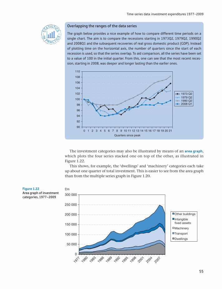
Time-series data: investment expenditures 1977–2009
55
The investment categories may also be illustrated by means of an area graph, which plots the four series stacked one on top of the other, as illustrated in Figure 1.22.
This shows, for example, the ‘dwellings’ and ‘machinery’ categories each take up about one quarter of total investment. This is easier to see from the area graph than from the multiple series graph in Figure 1.20.
0
50 000
1977
1980
1983
1986
1989
1992
1995
2001
1998
2004
2007
100 000
150 000
200 000
250 000
300 000
£m
Other buildings
Intangiblefixed assets
Machinery
Transport
Dwellings
Figure 1.22Area graph of investment categories, 1977–2009
Overlapping the ranges of the data series
The graph below provides a nice example of how to compare different time periods on a single chart. The aim is to compare the recessions starting in 1973Q2, 1979Q2, 1990Q2 and 2008Q1 and the subsequent recoveries of real gross domestic product (GDP). Instead of plotting time on the horizontal axis, the number of quarters since the start of each recession is used, so that the series overlap. To aid comparison, all the series have been set to a value of 100 in the initial quarter. From this, one can see that the most recent reces-sion, starting in 2008, was deeper and longer lasting than the earlier ones.
ST
ATISTICS
IN
PRACTI
CE
· ·
110
108
106
104
102
100
98
96
94
92
900 1 2 3 4 5 6 7 8 9 10
Quarters since peak
11 12 13 14 15 16 17 18 19 20 21
1973 Q21979 Q21990 Q22008 Q1
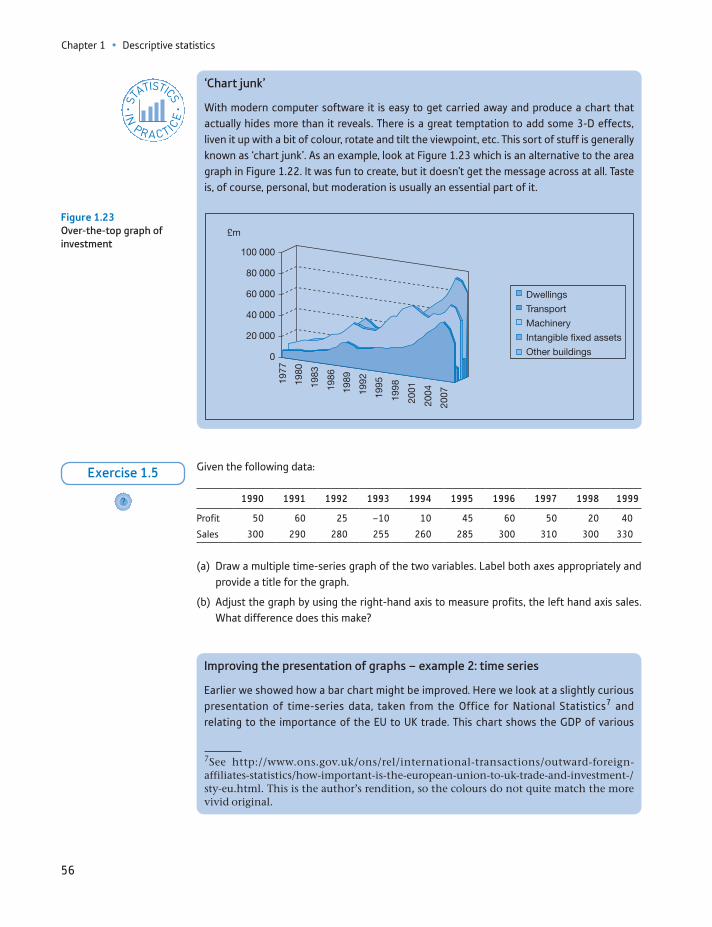
Chapter 1 • Descriptive statistics
56
Given the following data:
1990 1991 1992 1993 1994 1995 1996 1997 1998 1999
Profit 50 60 25 –10 10 45 60 50 20 40
Sales 300 290 280 255 260 285 300 310 300 330
(a) Draw a multiple time-series graph of the two variables. Label both axes appropriately and provide a title for the graph.
(b) Adjust the graph by using the right-hand axis to measure profits, the left hand axis sales. What difference does this make?
?
Exercise 1.5
‘Chart junk’
With modern computer software it is easy to get carried away and produce a chart that actually hides more than it reveals. There is a great temptation to add some 3-D effects, liven it up with a bit of colour, rotate and tilt the viewpoint, etc. This sort of stuff is generally known as ‘chart junk’. As an example, look at Figure 1.23 which is an alternative to the area graph in Figure 1.22. It was fun to create, but it doesn’t get the message across at all. Taste is, of course, personal, but moderation is usually an essential part of it.
ST
ATISTICS
IN
PRACTI
CE
· ·
100 000
80 000
60 000
40 000
20 000
0
1977
1980
1983
1986
1989
1992
1995
1998
2001
2004
2007
DwellingsTransportMachineryIntangible fixed assetsOther buildings
£m
Figure 1.23Over-the-top graph of investment
Improving the presentation of graphs – example 2: time series
Earlier we showed how a bar chart might be improved. Here we look at a slightly curious presentation of time-series data, taken from the Office for National Statistics7 and relating to the importance of the EU to UK trade. This chart shows the GDP of various
7See http://www.ons.gov.uk/ons/rel/international-transactions/outward-foreign- affiliates-statistics/how-important-is-the-european-union-to-uk-trade-and-investment-/sty-eu.html. This is the author’s rendition, so the colours do not quite match the more vivid original.
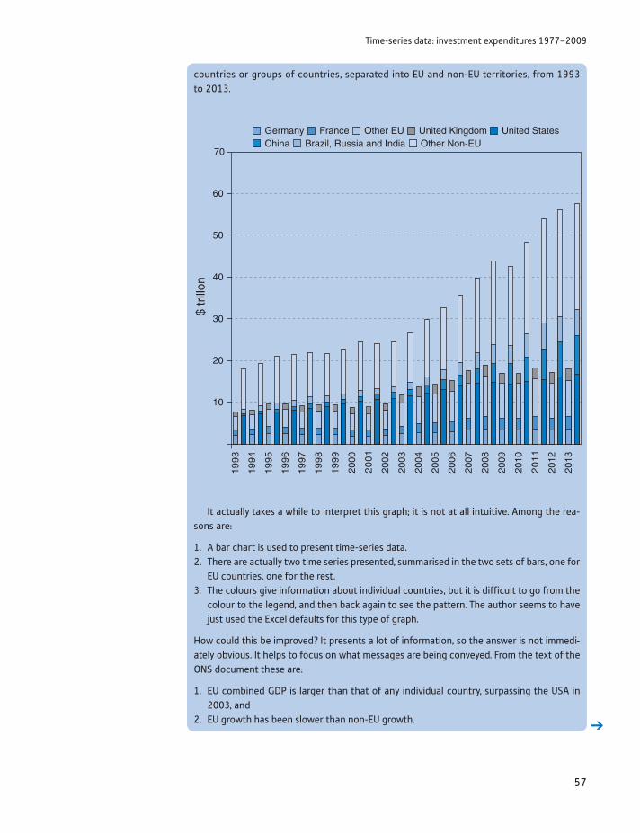
Time-series data: investment expenditures 1977–2009
57
It actually takes a while to interpret this graph; it is not at all intuitive. Among the rea-sons are:
1. A bar chart is used to present time-series data.2. There are actually two time series presented, summarised in the two sets of bars, one for
EU countries, one for the rest.3. The colours give information about individual countries, but it is difficult to go from the
colour to the legend, and then back again to see the pattern. The author seems to have just used the Excel defaults for this type of graph.
How could this be improved? It presents a lot of information, so the answer is not immedi-ately obvious. It helps to focus on what messages are being conveyed. From the text of the ONS document these are:
1. EU combined GDP is larger than that of any individual country, surpassing the USA in 2003, and
2. EU growth has been slower than non-EU growth.
20
30
40
50
60
70
10
19
93
19
94
19
95
19
96
19
97
19
98
19
99
2000
20
01
2002
2003
2004
2005
2006
2007
2008
2009
2010
20
11
2012
2013
$ tr
illon
Germany France Other EU United Kingdom United StatesChina Brazil, Russia and India Other Non-EU
countries or groups of countries, separated into EU and non-EU territories, from 1993 to 2013.
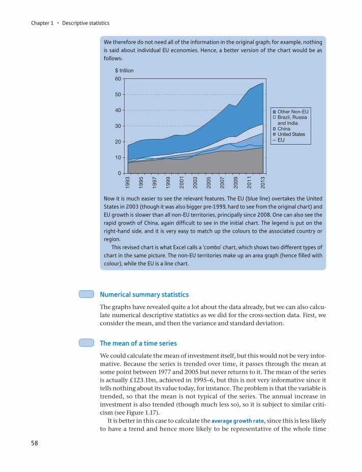
Chapter 1 • Descriptive statistics
58
We therefore do not need all of the information in the original graph; for example, nothing is said about individual EU economies. Hence, a better version of the chart would be as follows:
1993
1995
1997
1999
2001
2003
2005
2007
2009
2011
2013
20
10
0
30
40
50
60
$ trillion
Other Non-EUBrazil, Russiaand IndiaChinaUnited StatesEU
Now it is much easier to see the relevant features. The EU (blue line) overtakes the United States in 2003 (though it was also bigger pre-1999, hard to see from the original chart) and EU growth is slower than all non-EU territories, principally since 2008. One can also see the rapid growth of China, again difficult to see in the initial chart. The legend is put on the right-hand side, and it is very easy to match up the colours to the associated country or region.
This revised chart is what Excel calls a ‘combo’ chart, which shows two different types of chart in the same picture. The non-EU territories make up an area graph (hence filled with colour), while the EU is a line chart.
Numerical summary statistics
The graphs have revealed quite a lot about the data already, but we can also calcu-late numerical descriptive statistics as we did for the cross-section data. First, we consider the mean, and then the variance and standard deviation.
The mean of a time series
We could calculate the mean of investment itself, but this would not be very infor-mative. Because the series is trended over time, it passes through the mean at some point between 1977 and 2005 but never returns to it. The mean of the series is actually £123.1bn, achieved in 1995–6, but this is not very informative since it tells nothing about its value today, for instance. The problem is that the variable is trended, so that the mean is not typical of the series. The annual increase in investment is also trended (though much less so), so it is subject to similar criti-cism (see Figure 1.17).
It is better in this case to calculate the average growth rate, since this is less likely to have a trend and hence more likely to be representative of the whole time
Time-series data: investment expenditures 1977–2009
59
period. The average growth rate of investment spending was calculated in equation (1.29) as 6.2% p.a. by measuring the slope of the graph of the log invest-ment series, but this is only one way of measuring the growth rate. Furthermore, different methods give slightly different answers, although this is rarely impor-tant in practice.
The growth rate may be calculated based upon annual compounding or con-tinuous compounding principles. The former is probably the more common and simpler method, so we explain this first.
Calculating the growth rate based upon annual compounding
This method likens growth to the way money grows in a savings account as inter-est is added annually. We can calculate the growth rate in the following way:
(1) Calculate the overall growth factor of the series, i.e. xT>x1 where xT is the final observation and x1 is the initial observation. This is:
xT
x1=
204 27028 351
= 7.2050,
i.e. investment expenditure is 7.2 times larger in 2009 than in 1977.(2) To get the annual figure, take the T - 1 root of the growth factor, where T is the
number of observations. Since T = 33 we calculate
3227.205 = 1.0637 (This can be performed on a scientific calculator by raising 7.205 to the power 7.205(1>32) = 1.0637.)
(3) Subtract 1 from the result in the previous step, giving the growth rate as a dec-imal. In this case we have 1.0637 - 1 = 0.0637.
Thus the average growth rate of investment is 6.4% p.a., slightly different from the 6.2% calculated earlier (which, as we will see, is based on continuous com-pounding). The difference is small in practical terms, and neither is definitively the right answer. Both are estimates of the true growth rate. To emphasise this issue, note that since the calculated growth rate is based only upon the initial and final observations, it could be unreliable if either of these two values is an outlier (as in this case, the 2009 value). For example, if the growth rate is measured from 1977 to 2007, then the answer is 7.0%. With a sufficient span of time, however, such outliers are unlikely to be a serious problem.
ST
ATISTICS
IN
PRACTI
CE
· ·
The power of compound growth
The Economist provided some amusing and interesting examples of how a $1 investment can grow over time. They assumed that an investor (they named her Felicity Foresight, for reasons that become obvious) started with $1 in 1900 and had the foresight or luck to invest, each year, in the best performing asset of the year. Sometimes she invested in equi-ties, some years in gold and so on. By the end of the century she had amassed $9.6 quintil-lion (9.6 * 1018, more than world GDP, so impossible in practice). This is equivalent to an average annual growth rate of 55%. In contrast, Henry Hindsight did the same, but invested in the previous year’s best asset. This might be thought more realistic. Unfortunately, his $1 turned into only $783, a still respectable annual growth rate of 6.9%. This, however, is beaten by the strategy of investing in the previous year’s worst performing asset (what goes down must come up . . .). This turned $1 into $1730, a return of 7.7%. Food for thought!
Source: Based on The Economist, 12 February 2000, p. 111.
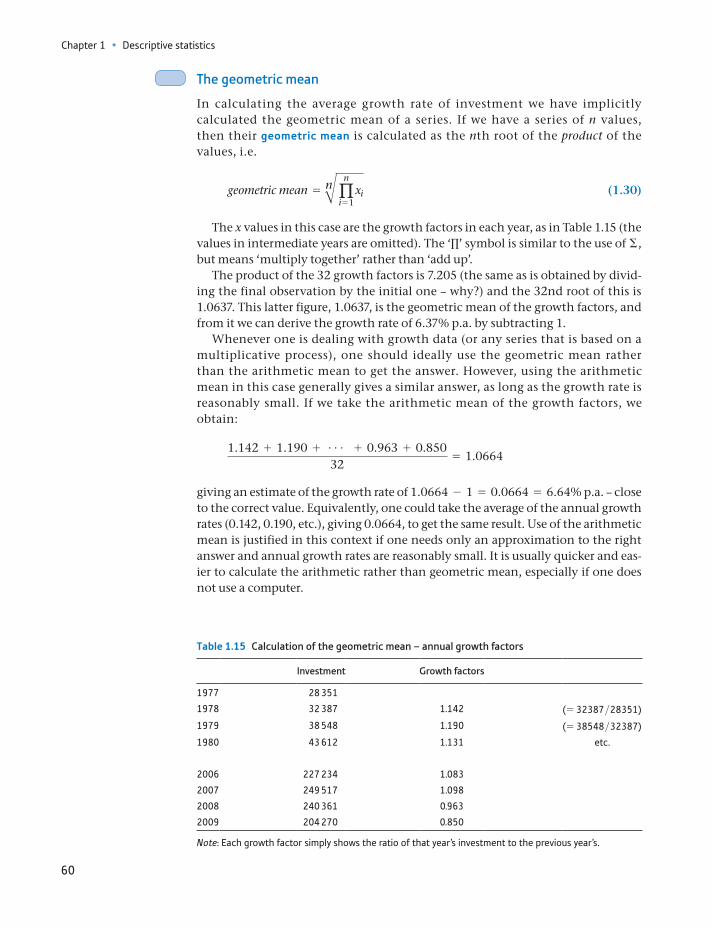
Chapter 1 • Descriptive statistics
60
The geometric mean
In calculating the average growth rate of investment we have implicitly calculated the geometric mean of a series. If we have a series of n values, then their geometric mean is calculated as the nth root of the product of the values, i.e.
geometric mean = nBqn
i = 1xi (1.30)
The x values in this case are the growth factors in each year, as in Table 1.15 (the values in intermediate years are omitted). The ‘Π’ symbol is similar to the use of Σ, but means ‘multiply together’ rather than ‘add up’.
The product of the 32 growth factors is 7.205 (the same as is obtained by divid-ing the final observation by the initial one – why?) and the 32nd root of this is 1.0637. This latter figure, 1.0637, is the geometric mean of the growth factors, and from it we can derive the growth rate of 6.37% p.a. by subtracting 1.
Whenever one is dealing with growth data (or any series that is based on a multiplicative process), one should ideally use the geometric mean rather than the arithmetic mean to get the answer. However, using the arithmetic mean in this case generally gives a similar answer, as long as the growth rate is reasonably small. If we take the arithmetic mean of the growth factors, we obtain:
1.142 + 1.190 + g + 0.963 + 0.85032
= 1.0664
giving an estimate of the growth rate of 1.0664 - 1 = 0.0664 = 6.64% p.a. – close to the correct value. Equivalently, one could take the average of the annual growth rates (0.142, 0.190, etc.), giving 0.0664, to get the same result. Use of the arithmetic mean is justified in this context if one needs only an approximation to the right answer and annual growth rates are reasonably small. It is usually quicker and eas-ier to calculate the arithmetic rather than geometric mean, especially if one does not use a computer.
Table 1.15 Calculation of the geometric mean – annual growth factors
Investment Growth factors
1977 28 351
1978 32 387 1.142 (= 32387>28351)
1979 38 548 1.190 (= 38548>32387)
1980 43 612 1.131 etc.
2006 227 234 1.083
2007 249 517 1.098
2008 240 361 0.963
2009 204 270 0.850
Note: Each growth factor simply shows the ratio of that year’s investment to the previous year’s.
Time-series data: investment expenditures 1977–2009
61
Calculating the growth rate based upon continuous compounding
This method is based upon the idea that growth is a continuous process, accord-ing to an equation such as
xT = x1eg(T- 1)
Obtaining the growth rate g as the subject of this equation requires a little math-ematics. Taking natural logs:
ln xT - ln x1 * g1T - 12and hence
g = ln xT - ln x1
T - 1
This is what was calculated earlier (equation 1.29) when we found the slope of the graph of the logarithm of investment. That calculation gave a result of 6.2% p.a. The continuous method will always provide a slightly smaller estimate of the growth rate than the annual compounding method.
To conclude this section we note that the two methods’ results are related and that one can be derived from the other. If we start with the continuous method estimate of 0.062 we can obtain:
e0.062 - 1 = 0.064
which gives the result calculated by the annual compounding method.
ST
ATISTICS
IN
PRACTI
CE
· ·
Compound interest
The calculations we have performed relating to growth rates are analogous to computing compound interest. If we invest £100 at a rate of interest of 10% p.a., then the investment will grow at 10% p.a. (assuming all the interest is reinvested). Thus after one year the total will have grown to £100 * 1.1(£110), after two years to £100 * 1.12(£121) and after t years to £100 * 1.1t. The general formula for the terminal value St of a sum S0 invested for t years at a rate of interest r is
St = S011 + r2 t (1.31)
where r is expressed as a decimal. Rearranging (1.31) to make r the subject yields
r = 2t St>S0- 1 (1.32)
which is precisely the formula for the average growth rate. To give a further example: sup-pose an investment fund turns an initial deposit of £8000 into £13 500 over 12 years. What is the average rate of return on the investment? Setting S0 = 8, St = 13.5, t = 12 and using (1.32), we obtain
r = 212 13.5>8 - 1 = 0.045
or 4.5% p.a.Formula (1.32) can also be used to calculate the depreciation rate and the amount of
annual depreciation on a firm’s assets. In this case, S0 represents the initial value of the asset, St represents the final or scrap value and the annual rate of depreciation (as a nega-tive number) is given by r from equation (1.32).
Chapter 1 • Descriptive statistics
62
The variance of a time series
How should we interpret the variance of a time series? For cross-section data (wealth), the variance measured the spread of the distribution, comparing richer with poorer. But the spread of investment values is conceptually different. The variance of the investment data can be calculated, but it would be uninformative in the same way as the mean. Since the series is trended, and this is likely to con-tinue in the longer run, the variance is in principle equal to infinity. The calcu-lated variance would be closely tied to the sample size: the larger it is, the larger the variance.
We can use the variance, however, to measure the volatility of a time series, how much it varies from year to year around the (growing) mean value. For this, it makes sense to calculate the variance of the growth rate, which has little trend in the long run.
This variance can be calculated from the formula:
s2 = a (x - x)2
n - 1= ax2 - nx2
n - 1 (1.33)
Where x is the rate of growth and x is its average value. The calculation is set out in Table 1.16 using the right-hand formula in (1.33).
The variance is therefore
s2 =0.3230 - 32 * 0.06642
31= 0.0059
and the standard deviation is 0.0766, the square root of the variance. The coeffi-cient of variation is
cv =0.07660.0664
= 1.15
i.e. the standard deviation of the growth rate is about 115% of the mean.Note three things about this calculation: first, we have used the arithmetic
mean (using the geometric mean makes very little difference); second, we have used the formula for the sample variance since the period 1977 to 2005 constitutes a sample of all the possible data we could collect and third, we could have equally used the growth factors for the calculation of the variance (why?).
Table 1.16 Calculation of the variance of the growth rate
Year Investment Growth rate, x x2
1978 32 387 0.142 0.0201979 38 548 0.190 0.0361980 43 612 0.131 0.017
: : : :2006 227 234 0.083 0.0072007 249 517 0.098 0.0102008 240 361 -0.037 0.0012009 204 270 -0.150 0.023
Totals 2.1253 0.3230
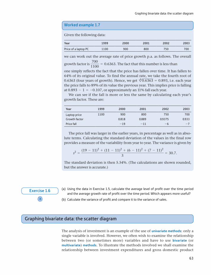
Graphing bivariate data: the scatter diagram
63
Worked example 1.7
Given the following data:
Year 1999 2000 2001 2002 2003
Price of a laptop PC 1100 900 800 750 700
we can work out the average rate of price growth p.a. as follows. The overall
growth factor is 700
1100= 0.6363. The fact that this number is less than
one simply reflects the fact that the price has fallen over time. It has fallen to 64% of its original value. To find the annual rate, we take the fourth root of 0.6363 (four years of growth). Hence, we get 14 0.6363 = 0.893, i.e. each year the price falls to 89% of its value the previous year. This implies price is falling at 0.893 - 1 = -0.107, or approximately an 11% fall each year.
We can see if the fall is more or less the same by calculating each year’s growth factor. These are:
Year 1999 2000 2001 2002 2003
Laptop price 1100 900 800 750 700
Growth factor 0.818 0.889 0.9375 0.933
Price fall -19 -11 -6 -7
The price fall was larger in the earlier years, in percentage as well as in abso-lute terms. Calculating the standard deviation of the values in the final row provides a measure of the variability from year to year. The variance is given by
s2 =(19 - 11)2 + (11 - 11)2 + (6 - 11)2 + (7 - 11)2
3= 30.7.
The standard deviation is then 5.54%. (The calculations are shown rounded, but the answer is accurate.)
(a) Using the data in Exercise 1.5, calculate the average level of profit over the time period and the average growth rate of profit over the time period. Which appears more useful?
(b) Calculate the variance of profit and compare it to the variance of sales.?
Exercise 1.6
Graphing bivariate data: the scatter diagram
The analysis of investment is an example of the use of univariate methods: only a single variable is involved. However, we often wish to examine the relationship between two (or sometimes more) variables and have to use bivariate (or multivariate) methods. To illustrate the methods involved we shall examine the relationship between investment expenditures and gross domestic product
Chapter 1 • Descriptive statistics
64
(GDP). Economics tells us to expect a positive relationship between these variables; higher GDP is usually associated with higher investment. Table 1.17 provides data on GDP for the United Kingdom.
A scatter diagram (also called an XY chart) plots one variable (in this case invest-ment) on the y-axis, the other (GDP) on the x-axis, and therefore shows the rela-tionship between them. For example, one can see whether high values of one variable tend to be associated with high values of the other. Figure 1.24 shows the relationship for investment and GDP.
The chart shows a strong linear relationship between the two variables, apart from a dip in the middle. This reflects the sharp fall in investment after 1990 which is not matched by a fall in GDP (if it were, the XY chart would show a linear relationship without the dip). It is important to recognise the difference between the time-series plot and the XY chart. The sharp fall in investment in 2008 which we noted earlier is matched by a similar fall in GDP; hence the XY chart does not reveal this.
Table 1.17 GDP data (£m)
Year GDP Year GDP Year GDP
1977 146 973 1988 478 510 1999 928 7301978 169 344 1989 525 274 2000 976 5331979 199 220 1990 570 283 2001 1 021 8281980 233 184 1991 598 664 2002 1 075 5641981 256 279 1992 622 080 2003 1 139 7461982 281 024 1993 654 196 2004 1 202 9561983 307 207 1994 692 987 2005 1 254 0581984 329 913 1995 733 266 2006 1 328 3631985 361 758 1996 781 726 2007 1 404 8451986 389 149 1997 830 094 2008 1 445 5801987 428 665 1998 879 102 2009 1 394 989
0
50 000
100 000
150 000
200 000
250 000
300 000
0 250 000 500 000 750 000 1 000 000 1 250 000 1 500 000
Investment (£m)
GDP (£m)
Figure 1.24Scatter diagram of invest-ment (vertical axis) against GDP (horizontal axis) (nominal values)
Note: The (x, y) coordinates of each point are given by the values of investment and GDP, respectively. Thus the first (1977) data point is drawn 28 351 units above the horizontal axis and 146 973 units from the vertical one.
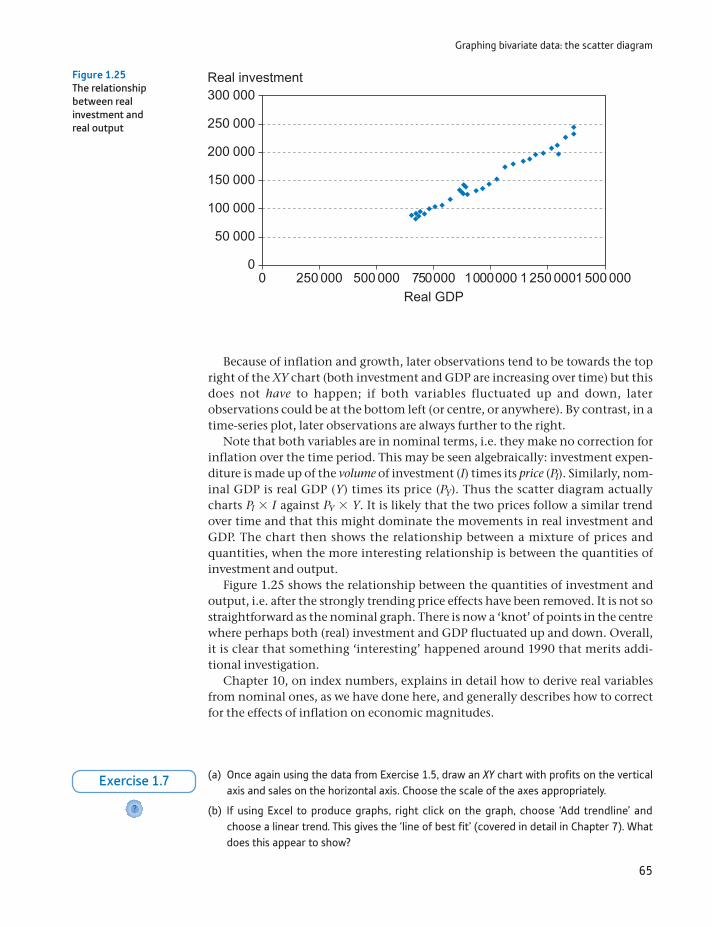
Graphing bivariate data: the scatter diagram
65
Because of inflation and growth, later observations tend to be towards the top right of the XY chart (both investment and GDP are increasing over time) but this does not have to happen; if both variables fluctuated up and down, later observations could be at the bottom left (or centre, or anywhere). By contrast, in a time-series plot, later observations are always further to the right.
Note that both variables are in nominal terms, i.e. they make no correction for inflation over the time period. This may be seen algebraically: investment expen-diture is made up of the volume of investment (I) times its price (PI). Similarly, nom-inal GDP is real GDP (Y) times its price (PY). Thus the scatter diagram actually charts PI * I against PY * Y. It is likely that the two prices follow a similar trend over time and that this might dominate the movements in real investment and GDP. The chart then shows the relationship between a mixture of prices and quantities, when the more interesting relationship is between the quantities of investment and output.
Figure 1.25 shows the relationship between the quantities of investment and output, i.e. after the strongly trending price effects have been removed. It is not so straightforward as the nominal graph. There is now a ‘knot’ of points in the centre where perhaps both (real) investment and GDP fluctuated up and down. Overall, it is clear that something ‘interesting’ happened around 1990 that merits addi-tional investigation.
Chapter 10, on index numbers, explains in detail how to derive real variables from nominal ones, as we have done here, and generally describes how to correct for the effects of inflation on economic magnitudes.
0
50 000
100 000
150 000
200 000
250 000
300 000
0 250 000 500 000 750000 1000000 1 250 0001 500 000
Real investment
Real GDP
Figure 1.25The relationship between real investment and real output
(a) Once again using the data from Exercise 1.5, draw an XY chart with profits on the vertical axis and sales on the horizontal axis. Choose the scale of the axes appropriately.
(b) If using Excel to produce graphs, right click on the graph, choose ‘Add trendline’ and choose a linear trend. This gives the ‘line of best fit’ (covered in detail in Chapter 7). What does this appear to show?
?
Exercise 1.7
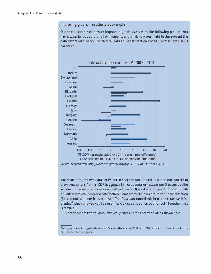
Chapter 1 • Descriptive statistics
66
Improving graphs – scatter plot example
Our third example of how to improve a graph starts with the following picture. You might want to look at it for a few moments and think how you might better present the data before reading on. The picture looks at life satisfaction and GDP across some OECD countries.
8http://www.theguardian.com/news/datablog/2015/jul/01/greece-life-satisfaction- rating-oecd-countries
UK
Life satisfaction and GDP, 2007–2014
–30 –20 –10 0 10 20 30 40 50
Turkey
Switzerland
Sweden
Spain
Slovakia
Portugal
Poland
Norway
Italy
Hungary
Greece
Germany
France
Denmark
Chile
Austria
GDP per capita 2007 to 2014 (percentage difference)Life satisfaction 2007 to 2014 (percentage difference)
Source: adapted from http://www.ons.gov.uk/ons/dcp171766_406995.pdf, Figure 2.
The chart presents two data series, for life satisfaction and for GDP, and one can try to draw conclusions from it. GDP has grown in most countries (exception: Greece), but life satisfaction more often goes down rather than up. It is difficult to see if or how growth of GDP relates to increased satisfaction. Sometimes the bars are in the same direction (for a country), sometimes opposed. The Guardian turned this into an interactive info-graphic8 which allowed you to see either GDP or satisfaction but not both together. This is terrible.
Since there are two variables, this really cries out for a scatter plot, as shown here.
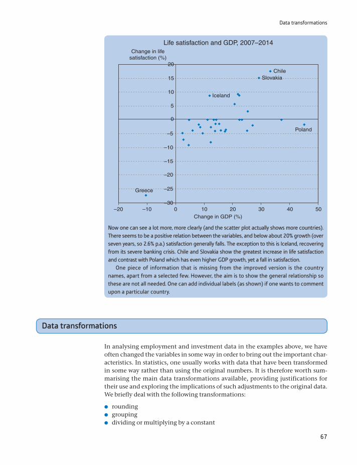
Data transformations
67
Data transformations
In analysing employment and investment data in the examples above, we have often changed the variables in some way in order to bring out the important char-acteristics. In statistics, one usually works with data that have been transformed in some way rather than using the original numbers. It is therefore worth sum-marising the main data transformations available, providing justifications for their use and exploring the implications of such adjustments to the original data. We briefly deal with the following transformations:
rounding grouping dividing or multiplying by a constant
–20 –10Change in GDP (%)
ChileSlovakia
Iceland
Poland
Greece
Change in lifesatisfaction (%)
0
0
–5
–10
–15
–20
–25
–30
5
10
15
20
10 20 30 40 50
Life satisfaction and GDP, 2007–2014
Now one can see a lot more, more clearly (and the scatter plot actually shows more countries). There seems to be a positive relation between the variables, and below about 20% growth (over seven years, so 2.6% p.a.) satisfaction generally falls. The exception to this is Iceland, recovering from its severe banking crisis. Chile and Slovakia show the greatest increase in life satisfaction and contrast with Poland which has even higher GDP growth, yet a fall in satisfaction.
One piece of information that is missing from the improved version is the country names, apart from a selected few. However, the aim is to show the general relationship so these are not all needed. One can add individual labels (as shown) if one wants to comment upon a particular country.

Chapter 1 • Descriptive statistics
68
Rounding is a ‘trapdoor’ function: you cannot obtain the original value from the transformed (rounded) value. Therefore, if you are going to need the original value in further calculations, you should not round your answer. Furthermore, small rounding errors can cumulate, leading to a large error in the final answer. Therefore, you should never round an intermediate answer, only the final one. Even if you only round the intermediate answer by a small amount, the final answer could be grossly inaccurate. Try the following: calculate 60.29 * 30.37 - 1831 both before and after rounding the first two numbers to integers. In the first case you get 0.0073, and in the second -31.
Grouping
When there is too much data to present easily, grouping solves the problem, although at the cost of hiding some of the information. The examples relating to
Inflation in Zimbabwe
‘Zimbabwe’s rate of inflation surged to 3731.9%, driven by higher energy and food costs, and ampli-fied by a drop in its currency, official figures show.’
BBC news online, 17 May 2007.
Whether official or not, it is impossible that the rate of inflation is known with such accu-racy (to one decimal place), especially when prices are rising so fast. It would be more rea-sonable to report a figure of 3700% in this case. Sad to say, inflation rose even further in subsequent months.
ST
ATISTICS
IN
PRACTI
CE
· ·
differencing taking logarithms taking the reciprocal deflating.
Rounding
Rounding improves readability. Too much detail can confuse the message, so rounding the answer makes it more memorable. To give an example, the average wealth holding calculated earlier in this chapter is actually £186 875.766 (to three decimal places). It would be absurd to present it in this form, however. We do not know for certain that this figure is accurate (in fact, it almost certainly is not). There is a spurious degree of precision which might mislead the reader. How much should this be rounded for presentational purposes? Remember that the figures have already been effectively rounded by allocation to classes of width 10 000 or more (all observations have been rounded to the mid-point of the inter-val). However, much of this rounding is offsetting, i.e. numbers rounded up offset those rounded down, so the class mean is reasonably accurate. Rounding to £187 000 makes the figure much easier to remember, and is only a change of 0.07% (187 000>186 874.766 = 1.00067), so is a reasonable compromise. In a report, it might be best to use the figure of £187 000 therefore. In the text above, the answer was not rounded to such an extent since the purpose was to highlight the meth-ods of calculation.
Data transformations
69
education and unemployment and to wealth used grouped data. Using the raw data would have given us far too much information, so grouping is a first stage in data analysis. Grouping is another trapdoor transformation: once it’s done you cannot recover the original information (unless you have access to the raw data, of course).
Dividing/multiplying by a constant
This transformation is carried out to make numbers more readable or to make cal-culation simpler by removing trailing zeros. The data on wealth were divided by 1000 to ease calculation; otherwise the fx2 column would have contained extremely large values. Some summary statistics (e.g. the mean) will be affected by the transformation, but not all (e.g. the coefficient of variation). Try to remember which are affected. E and V operators (see Appendix 1B) can help. The transforma-tion is easy to reverse.
Differencing
In time-series data there may be a trend, and it is better to describe the features of the data relative to the trend. The result may also be more economically meaning-ful, e.g. governments are often more concerned about the growth of output than about its level. Differencing is one way of eliminating the trend (see Chapter 11 for other methods of detrending data). Differencing was used for the investment data for both of these reasons. One of the implications of differencing is that informa-tion about the level of the variable is lost.
Taking logarithms
Taking logarithms is used to linearise a non-linear series, in particular one that is growing at a fairly constant rate. It is often easier to see the important features of such a series if the logarithm is graphed rather than the raw data. The logarithmic transformation is also useful in regression (see Chapter 9) because it yields esti-mates of elasticities (e.g. of demand). Taking the logarithm of the investment data linearised the series and tended to smooth it. The inverses of the logarithmic transformations are 10x (for common logarithms) and ex (for natural logarithms) so one can recover the original data.
Taking the reciprocal
The reciprocal of a variable might have a useful interpretation and provide a more intuitive explanation of a phenomenon. The reciprocal transformation will also turn a linear series into a non-linear one. The reciprocal of turnover in the labour market (i.e. the number leaving unemployment divided by the num-ber unemployed) gives an idea of the duration of unemployment. If one-half of those unemployed find work each year (turnover = 0.5), then the average dura-tion of unemployment is two years (=1>0.5). If a graph of turnover shows a linear decline over time, then the average duration of unemployment will be rising, at a faster and faster rate. Repeating the reciprocal transformation recovers the origi-nal data.
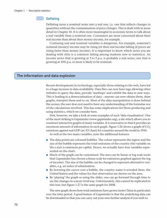
Chapter 1 • Descriptive statistics
70
Deflating
Deflating turns a nominal series into a real one, i.e. one that reflects changes in quantities without the contamination of price changes. This is dealt with in more detail in Chapter 10. It is often more meaningful in economic terms to talk about a real variable than a nominal one. Consumers are more concerned about their real income than about their money income, for example.
Confusing real and nominal variables is dangerous. For example, someone’s nominal (money) income may be rising yet their real income falling (if prices are rising faster than money income). It is important to know which series you are dealing with (this is a common failing among students new to statistics). An income series that is growing at 2 to 3 p.a. is probably a real series; one that is growing at 10% p.a. or more is likely to be nominal.
The information and data explosion
Recent developments in technology, especially those relating to the web, have led to a huge increase in data availability. Data files can now have tags allowing other websites to query the data, provide ‘mashups’ and exhibit the data in new ways. This is leading to a democratisation of data – anyone can now obtain them, draw graphs, interpret them and so on. Most of the data manipulation is done behind the scenes; the user does not need to have any understanding of the formulae nor of the calculations involved. This has some implications for those producing and using statistics, which we consider here.
First, however, we take a look at some examples of such ‘data visualisation’. One of the most striking is Gapminder (www.gapminder.org), a site which allows you to construct interactive graphs of many variables. It is innovative in that it provides an enormous amount of information in each graph. Figure 1.26 shows a graph of CO2 emissions against real GDP (an XY chart) for countries around the world in 1950.
As well as the two main variables, note the additional features:
The data points are coloured bubbles. The colour represents the region and the size of the bubble represents the total emissions of the country (the variable on the y-axis is emissions per capita). Hence, we actually have four variables repre-sented on the chart.
Much of the graph can be customised. The axes can be linear or log scale (note that Gapminder has chosen a linear scale for emissions graphed against the log of income). The size of the bubble can be changed to represent alternative vari-ables, e.g. an index of urbanisation.
By hovering the cursor over a bubble, the country name is revealed (here, the United States) and the values for that observation are shown on the axes.
By ‘playing’ the graph or using the slider, one can go forward through time to see the changes in a most vivid way. Unfortunately, this cannot be replicated in this text, but Figure 1.27 is the same graph for 2008.
The new graph shows how total emissions have grown (note China in particular) over the time period. A good feature of Gapminder is that the underlying data can be downloaded so that you can carry out your own further analysis if you wish to.
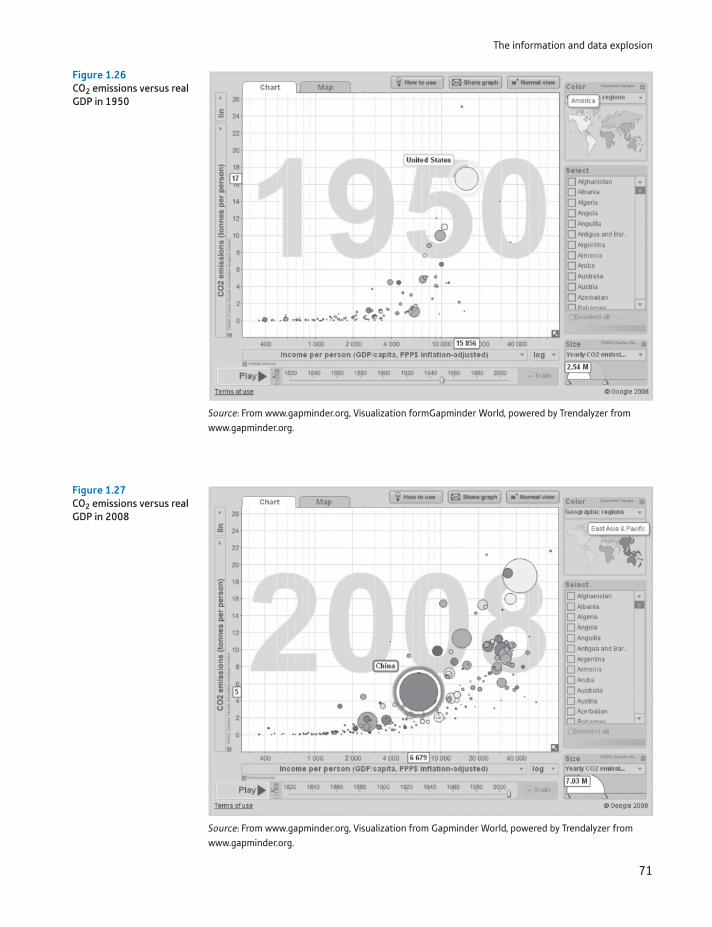
The information and data explosion
71
Figure 1.26CO2 emissions versus real GDP in 1950
Source: From www.gapminder.org, Visualization formGapminder World, powered by Trendalyzer from www.gapminder.org.
Figure 1.27CO2 emissions versus real GDP in 2008
Source: From www.gapminder.org, Visualization from Gapminder World, powered by Trendalyzer from www.gapminder.org.
Chapter 1 • Descriptive statistics
72
Google (of course) is another company developing such tools, such as Trends, Correlate and Fusion Tables. Some of these are still in beta, so will no doubt have developed by the time you read this. To locate them, use Google.
Another interesting example is the Mayor of London’s Datastore (data.london.gov.uk/) which aims to open up London’s data to the public, for free. It contains a multitude of data, some of it from other sites, and unlike Gapminder it only pro-vides the data, with the idea being that other companies will create websites, mobile apps, and so forth that will interpret the data for you.
Sites such as Yahoo Finance (http://uk.finance.yahoo.com/) or Google Finance (http://www.google.co.uk/finance) allow you to examine a large amount of finan-cial data and draw graphs of the data simply by selecting from a few menus.
Another development is ‘data mining’, which uses artificial intelligence tech-niques to ‘mine’ large databases of information, looking for trends and other fea-tures. For example, it is used by supermarkets to analyse their sales data with a view to spotting spending patterns and exploit them. Not only does one not need to perform calculations on the data, one does not even need to know what ques-tions to ask of it.
Do these developments mean that there is less need to study statistics? Obviously, I am unlikely to answer ‘yes’ to this! The interpretation of the results still requires human judgement, aided by statistical tests to ensure one is not just observing random variations. Furthermore, the use of pictures (which many of such sites rely on) can be highly informative but it is difficult to convey that to another person without the picture. One can look at a graph of CO2 emissions, but to convey the trend it is easier to pass on the average growth rate of those emissions. Looking at the Gapminder graphs above, how would you convey to another person (without showing them the graphs) how fast US emissions have risen? (The answer is only 0.2% p.a., somewhat surprisingly. China’s have risen by 6.4% p.a.)
Easy access to such data also means it will be used indiscriminately by those unaware of its shortcomings, unsure how to correctly interpret them and eager to use them for support rather than illumination. It is all the more important, there-fore, that more people are trained to understand and not be misled by statistics.
Writing statistical reports
This text presents most of the results of statistical analyses in a fairly formal way, since the aim is exposition and explanation of the methods. However, more often you might be writing or reading a short statistical report which requires a punch-ier and more concise presentation. This will attract attention, but it is important to maintain the accuracy of what is said.
Here is some advice on writing such a report, organised in sections on writing, graphs and tables. I have drawn on two excellent documents of the UN Economic Commission for Europe9 on ‘making data meaningful’, and I recommend that you go to those sources.
9UNECE, Making Data Meaningful, parts 1 and 2, available at http://www.unece.org/stats/documents/writing/.
Writing statistical reports
73
Writing
In a report, you should put the most important facts first, less important and supporting material afterwards. This is known as the ‘inverted pyramid’. The opening paragraph should be concise and tell the story, making little use of numbers if possible.
Each paragraph should focus on one or two main points, explained using short sentences. Aim to avoid jargon, so-called elevator statistics (“. . . this went up, that went down . . .”), acronyms and making the reader refer to tables in order to under-stand the point. The text should provide interpretation and context rather than repeating values which are in tables.
Break up the text with sub-headings, which should include a verb (to encourage you to make a point with the heading). For example, “More Britons finding work” is better than “Employment trends in Britain”. Once you have completed the story, write the headline with the aim of catching the reader’s attention.
As an example, consider the discussion earlier on the comparison of 1979 and 2005 wealth distributions in the United Kingdom. That was written in text-book style for the purpose of learning, but in a report might be better presented as follows.
Britons becoming wealthier but inequality persists
In 2005 the average Briton had wealth of around £187,000, about 11 times greater than in 1979. Adjusting for inflation, wealth has grown by nearly three times, or an average of 4% p.a. Despite this, the gap between rich and poor has remained much the same, with someone in the top 10% of the distribution owning 25 times more wealth than someone in the bottom 10%.
Tables
Tables in a report should be simple, sometimes called presentation tables, in contrast to reference tables which are best kept to an appendix. Many of the tables in this text are reference tables, such as the table calculating average wealth, Table 1.6. These are generally too complex to put into the text of a report and would have to be simplified in some way, according to the point that is being made.
Tables should be comprehensible in themselves, without the reader needing to look for further information. One way to ensure this is to ask if the table could be cut and pasted into another document and still make sense. Hence the table needs at least an informative title.
Another useful tip is to order the categories in a table according to frequency where this is appropriate. Consider the table used in Exercise 1.1(b) earlier, on tourist destinations. There is no natural ordering of the four countries, so why not order the countries by the number of tourists, as follows?
Tourists (millions) visiting European countries, 2013
France Spain Italy Germany
All tourists 12.4 9.8 7.5 3.2English tourists 2.7 3.6 1.0 0.2Non-English tourists 9.7 6.2 6.5 3.0

Chapter 1 • Descriptive statistics
74
Note the difference in presentation from the exercise and how this makes it easier to read the table. In presentation tables it is important to keep decimal places as small as possible (also aligning the numbers properly) to aid readability. In this text, we often use more decimal places so that you can follow calculation of vari-ous statistics. This is not necessary for presentation tables.
Graphs
Much advice has already been given about drawing graphs already, but there are some additional points relevant to a report. Make sure that each graph tells a sim-ple story with not more than one or two elements. An informative title helps with this, as shown below illustrating the tourism data.
France has the most tourists but the English prefer Spain14
France Germany
English tourists Non-English tourists
ItalySpain
12
10
8
6
4
2
0
Compare this chart with the answer to Exercise 1.1, where the countries are not ordered by frequency. This one is easier to read, and the title spells out the essen-tial messages.
Guidance to the student: how to measure your progress
Now you have reached the end of the chapter your work is not yet over. It is very unlikely that you have fully understood everything after one reading. What you should do now is:
Check back over the learning outcomes at the start of the chapter. Do you feel you have achieved them? For example, can you list the various different data types you should be able to recognise (the first learning outcome)?
Read the chapter summary below to help put things in context. You should recognise each topic and be aware of the main issues, techniques, etc., within them. There should be no surprises or gaps.
Read the list of key terms. You should be able to give a brief and precise definition or description of each one. Do not worry if you cannot remember all the formu-lae (though you should try to memorise simple ones, such as that for the mean).
Try out the problems (most important!). Answers to odd-numbered problems are at the back of the text, so you can check your answers. There is more detail for some of the answers on the text’s website.
Key terms and concepts
75
From all of this, you should be able to work out whether you have really mas-tered the chapter. Do not be surprised if you have not – it will take more than one reading. Go back over those parts where you feel unsure of your knowledge. Use these same learning techniques for each chapter.
Summary
Descriptive statistics are useful for summarising large amounts of information, highlighting the main features but omitting the detail.
Different techniques are suited to different types of data, e.g. bar charts for cross-section data and rates of growth for time series.
Graphical methods, such as the bar chart, provide a picture of the data. These give an informal summary, but they are unsuitable as a basis for further analysis.
Important graphical techniques include the bar chart, frequency distribution, relative and cumulative frequency distributions, histogram and pie chart. For time-series data, a time-series chart of the data is informative.
Numerical techniques are more precise as summaries. Measures of location (such as the mean), of dispersion (the variance) and of skewness form the basis of these techniques.
Important numerical summary statistics include the mean, median and mode; variance, standard deviation and coefficient of variation; coefficient of skewness.
For bivariate data, the scatter diagram (or XY graph) is a useful way of illustrat-ing the data.
Data are often transformed in some way before analysis, e.g. by taking logs. Transformations often make it easier to see key features of the data in graphs and sometimes make summary statistics easier to interpret. For example, with time-series data the average rate of growth may be more appropriate than the mean of the series.
absolute dispersionarea grapharithmetic meanaverage growth ratebar chartbivariate methodbox and whiskers plotChebyshev’s inequalityclass intervalclass widthcoefficient of skewnesscoefficient of variationcompound growth
compound interestcross-section datacross-tabulationdata transformationdeciledepreciation rateelasticityexpected valuefrequencyfrequency densityfrequency tablegeometric meangrowth factor
Key terms and concepts
Chapter 1 • Descriptive statistics
76
heteroscedasticityhistogramhomoscedasticityinter-quartile rangelogarithmmeanmeasure of dispersionmeasure of locationmeasure of skewnessmedianmid-pointmodemultiple bar chartmultiple time-series graphmultivariate methodnominal scalenon-linear trendordinal scaleoutlierspercentilepie chartpositively skewedpresentation tables
quantile solidus quantilesquartilequintilerangeratio scalereference tablesrelative and cumulative frequenciesrelative dispersionscatter diagram (XY chart)serial correlationskewnessstacked bar chartstandard deviationstandard widthtime-series datatime-series graphtransformed datatrendunbiasedunivariate methodvarianceweighted averagez score
Atkinson, A. B., The Economics of Inequality, 2nd edn, Oxford University Press, 1983.
Reference
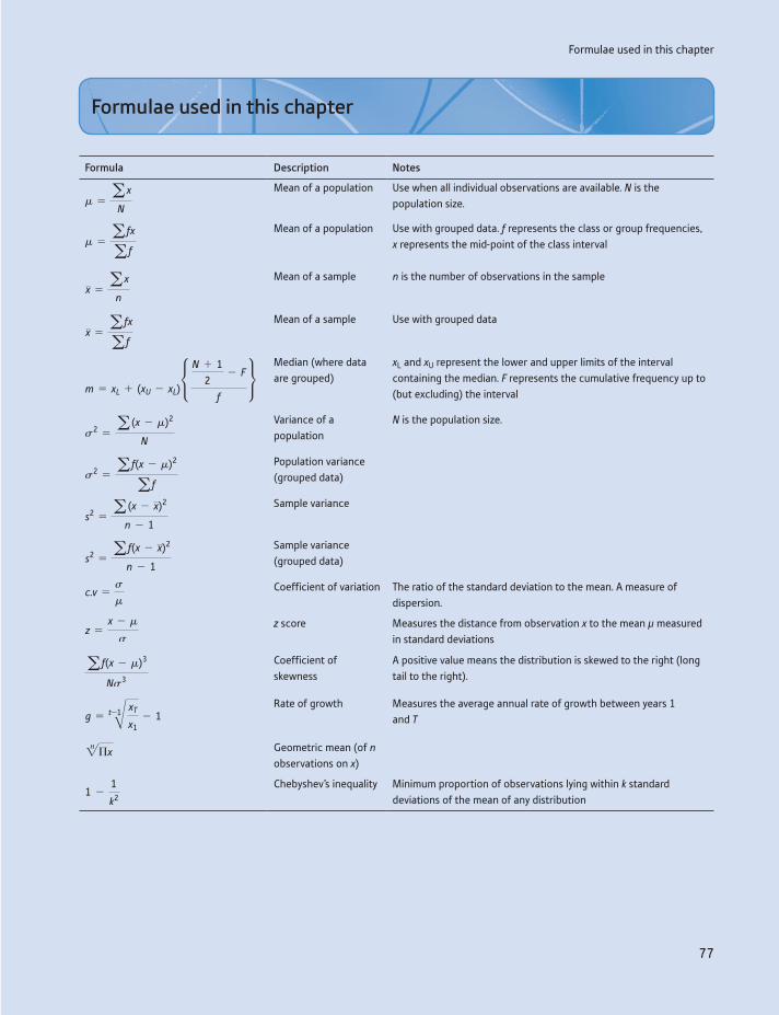
Formulae used in this chapter
77
Formula Description Notes
m = a x
N
Mean of a population Use when all individual observations are available. N is the population size.
m = a fx
a f
Mean of a population Use with grouped data. f represents the class or group frequencies, x represents the mid-point of the class interval
x = a x
n
Mean of a sample n is the number of observations in the sample
x = a fx
a f
Mean of a sample Use with grouped data
m = xL + (xU - xL)•
N + 12
- F
f
Median (where data are grouped)
xL and xU represent the lower and upper limits of the interval containing the median. F represents the cumulative frequency up to (but excluding) the interval
s2 = a (x - m)2
N
Variance of a population
N is the population size.
s2 = a f(x - m)2
a f
Population variance (grouped data)
s2 = a (x - x)2
n - 1
Sample variance
s2 = a f(x - x)2
n - 1
Sample variance (grouped data)
c.v =s
m
Coefficient of variation The ratio of the standard deviation to the mean. A measure of dispersion.
z =x - m
s
z score Measures the distance from observation x to the mean μ measured in standard deviations
a f(x - m)3
Ns3
Coefficient of skewness
A positive value means the distribution is skewed to the right (long tail to the right).
g = t-1B xT
x1- 1
Rate of growth Measures the average annual rate of growth between years 1 and T2n Πx Geometric mean (of n
observations on x)
1 -1
k2
Chebyshev’s inequality Minimum proportion of observations lying within k standard deviations of the mean of any distribution
Formulae used in this chapter
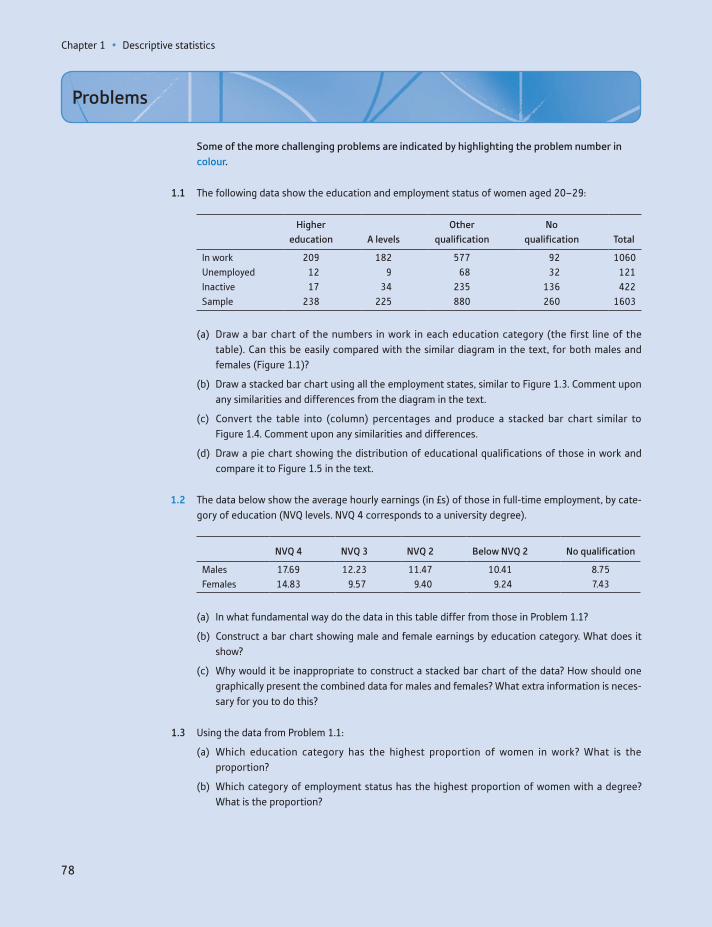
Chapter 1 • Descriptive statistics
78
Some of the more challenging problems are indicated by highlighting the problem number in colour.
1.1 The following data show the education and employment status of women aged 20–29:
Higher education A levels
Other qualification
No qualification Total
In work 209 182 577 92 1060Unemployed 12 9 68 32 121Inactive 17 34 235 136 422Sample 238 225 880 260 1603
(a) Draw a bar chart of the numbers in work in each education category (the first line of the table). Can this be easily compared with the similar diagram in the text, for both males and females (Figure 1.1)?
(b) Draw a stacked bar chart using all the employment states, similar to Figure 1.3. Comment upon any similarities and differences from the diagram in the text.
(c) Convert the table into (column) percentages and produce a stacked bar chart similar to Figure 1.4. Comment upon any similarities and differences.
(d) Draw a pie chart showing the distribution of educational qualifications of those in work and compare it to Figure 1.5 in the text.
1.2 The data below show the average hourly earnings (in £s) of those in full-time employment, by cate-gory of education (NVQ levels. NVQ 4 corresponds to a university degree).
NVQ 4 NVQ 3 NVQ 2 Below NVQ 2 No qualification
Males 17.69 12.23 11.47 10.41 8.75Females 14.83 9.57 9.40 9.24 7.43
(a) In what fundamental way do the data in this table differ from those in Problem 1.1?
(b) Construct a bar chart showing male and female earnings by education category. What does it show?
(c) Why would it be inappropriate to construct a stacked bar chart of the data? How should one graphically present the combined data for males and females? What extra information is neces-sary for you to do this?
1.3 Using the data from Problem 1.1:
(a) Which education category has the highest proportion of women in work? What is the proportion?
(b) Which category of employment status has the highest proportion of women with a degree? What is the proportion?
Problems
Problems
79
1.4 Using the data from Problem 1.2:
(a) What is the premium, in terms of average earnings, of a degree over A levels (NVQ 3)? Does this differ between men and women?
(b) Would you expect median earnings to show a similar picture? What differences, if any, might you expect?
1.5 The distribution of marketable wealth in 1979 in the United Kingdom is shown in the table below (adapted from Inland Revenue Statistics, 1981, contains public sector information licensed under the Open Government Licence (OGL) v3.0, http://www.nationalarchives.gov.uk/doc/open- government-licence/open-government:
Range Number 000s Amount £m
0– 1 606 1481 000– 2 927 5 9853 000– 2 562 10 0905 000– 3 483 25 464
10 000– 2 876 35 65615 000– 1 916 33 13420 000– 3 425 104 82950 000– 621 46 483
100 000– 170 25 763200 000– 59 30 581
Draw a bar chart and histogram of the data (assume the final class interval has a width of 200 000). Comment on the differences between the two types of chart. Comment on any differences between this histogram and the latest one for 2005 given in the text of this chapter.
1.6 The data below show the number of enterprises in the United Kingdom in 2010, arranged according to employment:
Number of employees Number of firms
1– 1 740 6855– 388 990
10– 215 37020– 141 92050– 49 505
100– 25 945250– 7 700500– 2 795
1 000– 1 320
Draw a bar chart and histogram of the data (assume the mid-point of the last class interval is 2000). What are the major features apparent in each and what are the differences?
1.7 Using the data from Problem 1.5:
(a) Calculate the mean, median and mode of the distribution. Why do they differ?
(b) Calculate the inter-quartile range, variance, standard deviation and coefficient of variation of the data.
Chapter 1 • Descriptive statistics
80
(c) Calculate the skewness of the distribution.
(d) From what you have calculated, and the data in the chapter, can you draw any conclusions about the degree of inequality in wealth holdings, and how this has changed?
(e) What would be the effect upon the mean of assuming the final class width to be £10m? What would be the effects upon the median and mode?
1.8 Using the data from Problem 1.6:
(a) Calculate the mean, median and mode of the distribution. Why do they differ?
(b) Calculate the inter-quartile range, variance, standard deviation and coefficient of variation of the data.
(c) Calculate the coefficient of skewness of the distribution.
1.9 A motorist keeps a record of petrol purchases on a long journey, as follows:
Petrol station 1 2 3
Litres purchased 33 40 25Price per litre (pence) 134 139 137
Calculate the average petrol price for the journey.
1.10 Demonstrate that the weighted average calculation given in equation (1.9) is equivalent to finding the total expenditure on education divided by the total number of pupils.
1.11 On a test taken by 100 students, the average mark is 65, with variance 144. Student A scores 83; student B scores 47.
(a) Calculate the z scores for these two students.
(b) What is the maximum number of students with a score either better than A’s or worse than B’s?
(c) What is the maximum number of students with a score better than A’s?
1.12 The average income of a group of people is £8000, and 80% of the group have incomes within the range £6000–10 000. What is the minimum value of the standard deviation of the distribution?
1.13 The following data show car registrations in the United Kingdom for 1987–2010:
Year Registrations Year Registrations Year Registrations
1987 2212.6 1995 2024.0 2003 2820.71988 2437.0 1996 2093.3 2004 2784.71989 2535.2 1997 2244.3 2005 2603.61990 2179.9 1998 2367.0 2006 2499.11991 1708.5 1999 2342.0 2007 2539.31992 1694.4 2000 2430.0 2008 2188.31993 1853.4 2001 2710.0 2009 1959.11994 1991.7 2002 2816.0 2010 1994.6
(a) Draw a time-series graph of car registrations. Comment upon the main features of the series. (It looks daunting, but it will take you less than 10 minutes to type in these data.)
(b) Draw time-series graphs of the change in registrations, the (natural) log of registrations and the change in the ln. Comment upon the results.
Problems
81
1.14 The table below shows the different categories of investment in the United Kingdom over a series of years:
Year Dwellings Transport MachineryIntangible
fixed assetsOther
buildings
1977 5 699 3 248 9 950 797 8 6571978 6 325 4 112 11 709 760 9 4811979 7 649 4 758 13 832 964 11 2891980 8 674 4 707 15 301 1 216 13 6801981 8 138 4 011 15 454 1 513 14 6031982 8 920 4 489 16 734 2 040 15 7301983 10 447 4 756 18 377 2 337 16 1571984 11 932 5 963 20 782 2 918 17 7081985 12 219 6 676 24 349 3 239 18 6481986 14 140 6 527 25 218 3 219 20 4771987 16 548 7 871 28 226 3 430 24 2691988 21 097 9 228 32 615 4 305 30 7131989 22 771 10 625 38 419 4 977 36 6891990 21 048 10 572 37 776 6 298 41 3341991 18 339 9 051 35 094 6 722 38 6321992 18 826 8 420 35 426 6 584 34 6571993 19 886 9 315 35 316 6 492 32 9881994 21 155 11 395 38 426 6 702 33 9451995 22 448 11 036 45 012 7 272 35 5961996 22 516 12 519 50 102 7 889 37 3201997 23 928 12 580 51 465 8 936 41 3981998 25 222 16 113 58 915 9 461 46 2861999 25 700 14 683 60 670 10 023 50 6462000 27 394 13 577 63 535 10 670 51 9962001 29 806 14 656 60 929 11 326 55 0652002 34 499 16 314 57 152 12 614 59 9722003 38 462 15 592 54 441 13 850 64 3552004 44 298 14 339 59 632 14 164 67 9822005 47 489 14 763 59 486 14 386 73 6342006 53 331 14 855 61 497 15 531 82 0202007 55 767 15 482 69 411 16 049 92 8082008 50 292 14 570 67 837 16 726 90 9362009 37 044 12 127 56 411 17 710 80 978
Use appropriate graphical techniques to analyse the properties of any one of the investment series. Comment upon the results. (Although this seems a lot of data, it shouldn’t take long to type in, even less time if two people collaborate and share their results.)
1.15 Using the data from Problem 1.13:
(a) Calculate the average rate of growth of the series.
(b) Calculate the standard deviation around the average growth rate.
(c) Does the series appear to be more or less volatile than the investment figures used in the chapter? Suggest reasons.
1.16 Using the data from Problem 1.14:
(a) Calculate the average rate of growth of the series for dwellings.
Chapter 1 • Descriptive statistics
82
(b) Calculate the standard deviation around the average growth rate.
(c) Does the series appear to be more or less volatile than the investment figures used in the chap-ter? Suggest reasons.
1.17 How would you expect the following time-series variables to look when graphed? (e.g. Trended? Linear trend? Trended up or down? Stationary? Homoscedastic? Autocorrelated? Cyclical? Anything else?)
(a) Nominal national income.
(b) Real national income.
(c) The nominal interest rate.
1.18 How would you expect the following time-series variables to look when graphed?
(a) The price level.
(b) The inflation rate.
(c) The £/$ exchange rate.
1.19 (a) A government bond is issued, promising to pay the bearer £1000 in five years’ time. The prevail-ing market rate of interest is 7%. What price would you expect to pay now for the bond? What would its price be after two years? If, after two years, the market interest rate jumped to 10%, what would the price of the bond be?
(b) A bond is issued which promises to pay £200 p.a. over the next five years. If the prevailing mar-ket interest rate is 7%, how much would you be prepared to pay for the bond? Why does the answer differ from the previous question? (Assume interest is paid at the end of each year.)
1.20 A firm purchases for £30 000 a machine which is expected to last for 10 years, after which it will be sold for its scrap value of £3000. Calculate the average rate of depreciation p.a., and calculate the written-down value of the machine after one, two and five years.
1.21 Depreciation of BMW and Mercedes cars is given in the following table of new and used car prices:
Age BMW 525i Mercedes 200E
Current 22 275 21 9001 year 18 600 19 7002 years 15 200 16 6253 years 12 600 13 9504 years 9 750 11 6005 years 8 300 10 300
(a) Calculate the average rate of depreciation of each type of car.
(b) Use the calculated depreciation rates to estimate the value of the car after 1, 2, etc., years of age. How does this match the actual values?
(c) Graph the values and estimated values for each car.
1.22 A bond is issued which promises to pay £400 p.a. in perpetuity. How much is the bond worth now, if the interest rate is 5%? (Hint: the sum of an infinite series of the form
11 + r
+1
(1 + r)2 +1
(1 + r)3 + g
is 1/r, as long as r 7 0.)

Problems
83
1.23 Demonstrate, using Σ notation, that E(x + k) = E(x) + k.
1.24 Demonstrate, using Σ notation, that V(kx) = k2V(x).
1.25 Criticise the following statistical reasoning. The average price of a dwelling is £54 150. The average mortgage advance is £32 760. So purchasers have to find £21 390, that is, about 40% of the pur-chase price. On any basis, that is an enormous outlay which young couples, in particular, who are buying a house for the first time would find incredibly difficult, if not impossible, to raise.
1.26 Criticise the following statistical reasoning. Amongst arts graduates, 10% fail to find employment. Amongst science graduates only 8% remain out of work. Therefore, science graduates are better than arts graduates. Hint: imagine there are two types of job: popular (hard to get, so with a low success rate) and unpopular (easy to get). Arts graduates tend to apply for the former, scientists for the latter. Try to show that arts graduates are more successful at applying for both types of job, yet overall they are less successful.
1.27 Project 1: Is it true that the Conservative government in the United Kingdom, 1979–1997, lowered taxes, while the Labour government 1997–2007 raised them?
You should gather data which you think appropriate to the task, summarise it as necessary and write a brief report of your findings. You might like to consider the following points:
Should one consider tax revenue, or revenue as a proportion of GNP?
Should one distinguish between tax rates and the tax base (i.e. what is taxed)?
Has the balance between direct and indirect taxation changed?
Have different sections of the population fared differently?
You might like to consider other points and do the problem for a different country. Suitable data sources for the United Kingdom are: Inland Revenue Statistics, UK National Accounts, Annual Abstract of Statistics or Financial Statistics. Useful websites are HMRC and the UK Treasury.
1.28 Project 2: Is the employment and unemployment experience of the UK economy worse than that of its competitors? Write a report on this topic in a similar manner to the project above. You might consider rates of unemployment in the United Kingdom and other countries, trends in unemploy-ment in each of the countries, the growth in employment in each country, the structure of employment (e.g. full-time/part-time) and unemployment (e.g. long-term/short-term).
You might use data for a number of countries, or concentrate on two in more depth. Suitable data sources are: OECD Main Economic Indicators; The Economic and Labour Market Review (http://www.ons.gov.uk/ons/rel/elmr/economic-and-labour-market-review/index.html).
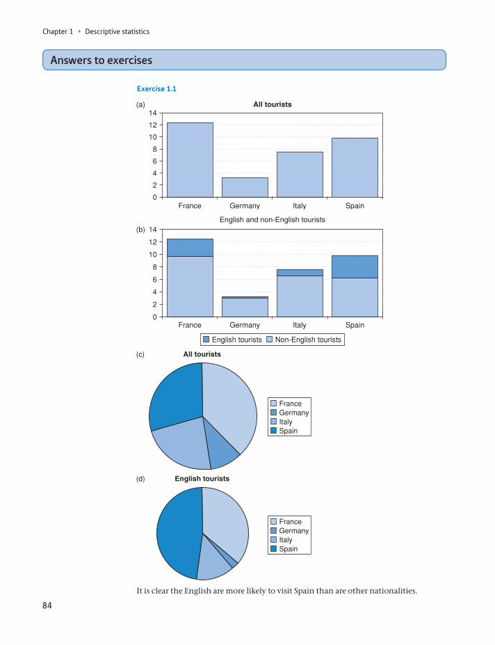
Chapter 1 • Descriptive statistics
84
English and non-English tourists
It is clear the English are more likely to visit Spain than are other nationalities.
Answers to exercises
Exercise 1.1
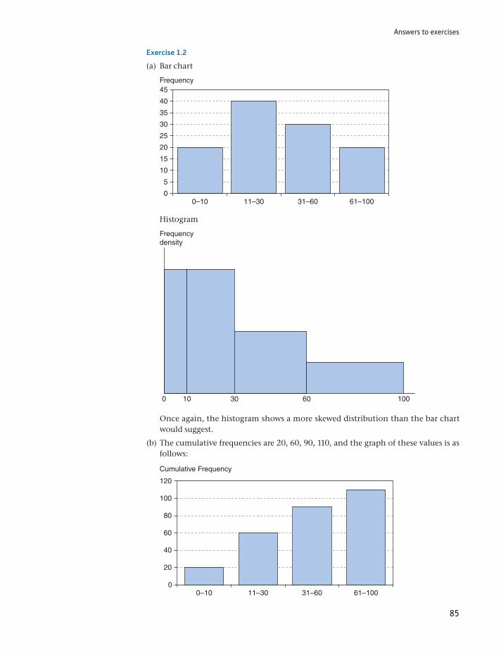
Answers to exercises
85
Exercise 1.2
(a) Bar chart
Frequency
0–10
45
40
35
30
25
20
15
10
5
011–30 31–60 61–100
Histogram
Frequencydensity
0 10 30 60 100
Once again, the histogram shows a more skewed distribution than the bar chart would suggest.
(b) The cumulative frequencies are 20, 60, 90, 110, and the graph of these values is as follows:
Cumulative Frequency
0–10
120
100
80
60
40
20
011–30 31–60 61–100
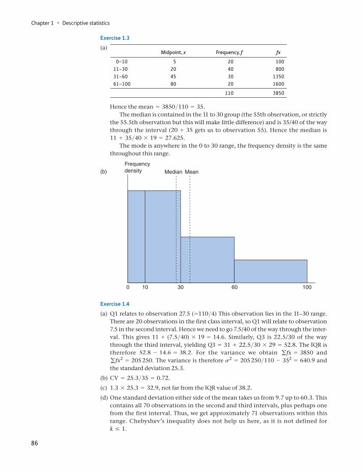
Chapter 1 • Descriptive statistics
86
Hence the mean = 3850>110 = 35.The median is contained in the 11 to 30 group (the 55th observation, or strictly
the 55.5th observation but this will make little difference) and is 35/40 of the way through the interval (20 + 35 gets us to observation 55). Hence the median is 11 + 35>40 * 19 = 27.625.
The mode is anywhere in the 0 to 30 range, the frequency density is the same throughout this range.
Frequencydensity Median Mean
0 10 30 60 100
(b)
Exercise 1.4
(a) Q1 relates to observation 27.5 (=110>4) This observation lies in the 11–30 range. There are 20 observations in the first class interval, so Q1 will relate to observation 7.5 in the second interval. Hence we need to go 7.5/40 of the way through the inter-val. This gives 11 + (7.5>40) * 19 = 14.6. Similarly, Q3 is 22.5/30 of the way through the third interval, yielding Q3 = 31 + 22.5>30 * 29 = 52.8. The IQR is therefore 52.8 - 14.6 = 38.2. For the variance we obtain gfx = 3850 and gfx2 = 205 250. The variance is therefore s2 = 205 250>110 - 352 = 640.9 and the standard deviation 25.3.
(b) CV = 25.3>35 = 0.72.
(c) 1.3 * 25.3 = 32.9, not far from the IQR value of 38.2.
(d) One standard deviation either side of the mean takes us from 9.7 up to 60.3. This contains all 70 observations in the second and third intervals, plus perhaps one from the first interval. Thus, we get approximately 71 observations within this range. Chebyshev’s inequality does not help us here, as it is not defined for k … 1.
Exercise 1.3
(a) Midpoint, x Frequency, f fx
0–10 5 20 10011–30 20 40 80031–60 45 30 135061–100 80 20 1600
110 3850
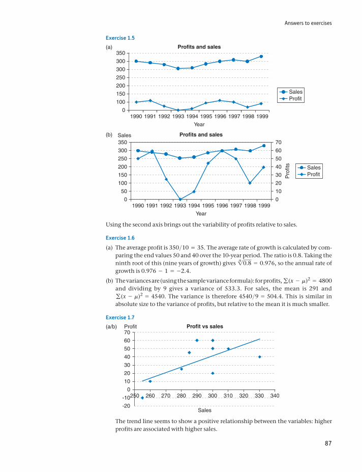
Answers to exercises
87
Exercise 1.5
Profits and sales
SalesProfit
Year
350
300
300
250
200
150
100
1990 1999199819971996199519941993199219910
(a)
Profits and sales
SalesProfitP
rofit
s
Year
Sales350
300
250
200
150
100
50
19900
10
20
30
40
50
60
70
1999199819971996199519941993199219910
(b)
Using the second axis brings out the variability of profits relative to sales.
Exercise 1.6
(a) The average profit is 350>10 = 35. The average rate of growth is calculated by com-paring the end values 50 and 40 over the 10-year period. The ratio is 0.8. Taking the ninth root of this (nine years of growth) gives 19 0.8 = 0.976, so the annual rate of growth is 0.976 - 1 = -2.4.
(b) The variances are (using the sample variance formula): for profits, g(x - m)2 = 4800 and dividing by 9 gives a variance of 533.3. For sales, the mean is 291 and g(x - m)2 = 4540. The variance is therefore 4540>9 = 504.4. This is similar in absolute size to the variance of profits, but relative to the mean it is much smaller.
Exercise 1.7
Profit vs sales
250 260 270 280 290
Sales
Profit
-20
-10
0
10
20
30
40
50
60
70
300 310 320 330 340
(a/b)
The trend line seems to show a positive relationship between the variables: higher profits are associated with higher sales.
Chapter 1 • Descriptive statistics
88
Appendix 1A 𝚺 notation
The Greek symbol Σ (capital sigma) means ‘add up’ and is a shorthand way of writing what would otherwise be long algebraic expressions. Instead of writing out each term in the series, we provide a template, or typical term of the series, with instructions about how many terms there are.
For example, given the following observations on x:
x1 x2 x3 x4 x5
3 5 6 4 8
then
a4
i = 1xi = x1 + x2 + x3 + x4 + x3 = 3 + 5 + 6 + 4 + 8 = 26
The template is simply x in this case, representing a number to be added in the series. To expand the sigma expression, the subscript i is replaced by succes-sive integers, beginning with the one below the Σ sign and ending with the one above it (1 to 5 in the example above). Hence the instruction is to add the terms x1 to x5 Similarly
a5
i = 1x1 = x2 + x3 + x4 = 5 + 6 + 4 = 15
The instruction tells us to add up only the second, third and fourth terms of the series. When it is clear what range of values i takes (usually when we are to add all available values), the formula can be simplified to a
ixi or Σxi or even Σx.
When frequencies are associated with each of the observations, as in the data below:
i 1 2 3 4 5
xi 3 5 6 4 8fi 2 2 4 3 1
then
ai = 5
i = 1fixi = f1x1 + g+ f5x5 = 2 * 3 + 2 * 5 + g+ 1 * 8 = 60
And also
a fi = 2 + 2 + 4 + 3 + 1 = 12
Thus the sum of the 12 observations is 60 and the mean is
a fx
a f=
6012
= 5
We are not limited just to adding the x values. For example, we might wish to square each observation before adding them together. This is expressed as:
Σx2 = x21 + x2
2 + g + x25 = 150
89
Appendix 1A: Σ notation
Note that this is different from:
(ax)2 = (x1 + x2 + g + x5)2 = 676
Part of the formula for the variance calls for the following calculation:
a fx2 = f1x21 + f2x2
2 + g + f5x25 = 2 * 32 + 2 * 52 + g + 1 * 82 = 324
Using Σ notation we can see the effect of transforming x by dividing by 1000, as was done in calculating the average level of wealth. Instead of working with x we used kx, where k = 1>1000. In finding the mean we calculated
akx
N=
kx1 + kx2 + gN
=k1x1 + x2 + g2
N= k ax
N (1.34)
So to find the mean of the original variable x we had to divide by k again, i.e. multiply by 1000. In general, whenever each observation in a sum is multiplied by a constant, the constant can be taken outside the summation operator, as in (1.34) above.
Problems on Σ notation
1A.1 Given the following data on xi : 4, 6, 3, 2, 5 evaluate:
Σxi, Σx2i ,1Σxi22, Σ 1xi - 32 , Σxi - 3,a
4
i = 2xi
1A.2 Given the following data on xi : 8, 12, 6, 4, 10 evaluate:
Σxi, Σx2i , 1Σxi2 2, Σ 1xi - 32 , Σxi - 3, a
4
i = 2xi
1A.3 Given the following frequencies, fi associated with the x values in Problem 1A.1: 5, 3, 3, 8, 5, evaluate:
Σfx, Σfx2, Σf(x - 3), Σfx - 3
1A.4 Given the following frequencies, fi associated with the x values in Problem 1A.2: 10, 6, 6, 16, 10, evaluate:
Σfx, Σfx2, Σf(x - 3), Σfx - 3
1A.5 Given the pairs of observations on x and y,
x 4 3 6 8 12
y 3 9 1 4 3
evaluateΣxy, Σx(y - 3), Σ(x + 2)(y - 1).
1A.6 Given the pairs of observations on x and y,
x 3 7 4 1 9
y 1 2 5 1 2
evaluate Σxy, Σx(y - 2), Σ(x - 2)(y + 1).
Chapter 1 • Descriptive statistics
90
1A.7 Demonstrate that
Σf (x - k)
Σf=
Σfx
Σf- k where k is a constant.
1A.8 Demonstrate that
Σf (x - m)2
Σf=
Σfx2
Σf- m2
Appendix 1B E and V operators
These operators are an extremely useful form of notation that we shall make use of later in the text. It is quite easy to keep track of the effects of data transformations using them. There are a few simple rules for manipulating them that allow some problems to be solved quickly and elegantly.
E(x) is the mean of a distribution and V(x) is its variance. We showed above in (1.34) that multiplying each observation by a constant k multiplies the mean by k. Thus we have:
E(kx) = kE(x) (1.35)
Similarly, if a constant is added to every observation, the effect is to add that constant to the mean (see Problem 1.23):
E(x + a) = E(x) + a (1.36)
(Graphically, the whole distribution is shifted a units to the right and hence so is the mean.) Combining (1.35) and (1.36):
E(kx + a) = kE(x) + a (1.37)
Similarly, for the variance operator it can be shown that:
V(x + k) = V(x) (1.38)
Proof:
V(x + k) = a((x - k) - (m + k))2
N= a((x - m) + (k - k))2
N= a(x - m)2
N= V(x)
(A shift of the whole distribution leaves the variance unchanged.) Also:
V(kx) = k2V(x) (1.39)
(See Problem 1.24.) This is why, when the wealth figures were divided by 1000, the variance became divided by 10002. Applying (1.38) and (1.39):
V(kx + a) = k2V(x) (1.40)
Finally, we should note that V itself can be expressed in terms of E:
V(x) = E(x - E(x))2 or E(x2) - E(x)2 (1.41)
Appendix 1C: Using logarithms
91
Appendix 1C Using logarithms
Logarithms are less often used now that cheap electronic calculators are available. Formerly, logarithms were an indispensable aid to calculation. However, the loga-rithmic transformation is useful in other contexts in statistics and economics, so its use is briefly set out here.
The logarithm (to the base 10) of a number x is defined as the power to which 10 must be raised to give x. For example, 102 = 100, so the log of 100 is 2 and we write log10 100 = 2 or simply log 100 = 2.
Similarly, the log of 1000 is 3 1100 = 1032 , of 10 000 it is 4, etc. We are not restricted to integer (whole number) powers of 10, so for example 102.5 = 316.227 766 (try this if you have a scientific calculator). So the log of 316.227 766 is 2.5. Every number x can therefore be represented by its logarithm.
Multiplication of two numbers
We can use logarithms to multiply two numbers x and y, based on the property10
log xy = log x + log y
For example, to multiply 316.227 766 by 10:
log1316.227 766 * 102 = log 316.227 766 + log 10 = 2.5 + 1 = 3.5
The anti-log of 3.5 is given by 103.5 = 3162.27 766 which is the answer.Taking the anti-log (i.e. 10 raised to a power) is the inverse of the log transfor-
mation. Schematically we have:
x S take logarithms S a(= log x) S raise 10 to the power a S x
Division
To divide one number by another we subtract the logs. For example, to divide 316.227 766 by 100:
log (316.227 7766>100) = log 316.227 766 - log 100 = 2.5 - 2 = 0.5
and 100.5 = 3.16 227 766.
Powers and roots
Logarithms simplify the process of raising a number to a power. To find the square of a number, multiply the logarithm by 2, e.g. to find 316.22 77662:
log (316.27 7662) = 2 log(316.227 766) = 5
and 105 = 100 000.
10This is equivalent to saying 10x * 10y = 10x +y.
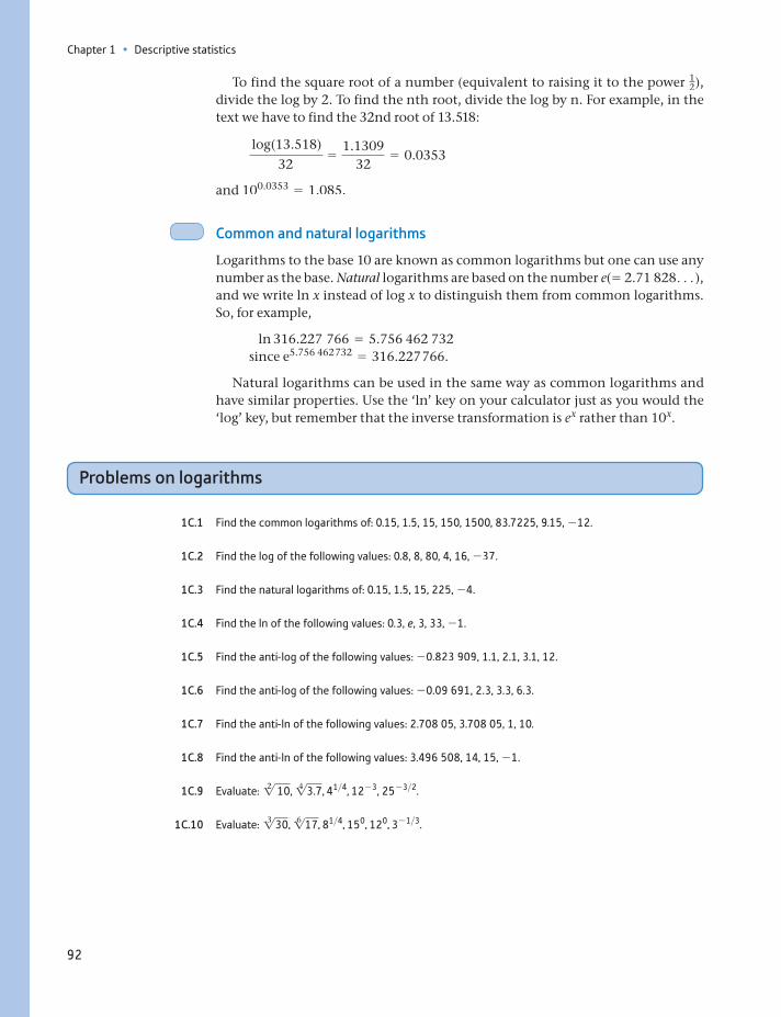
Chapter 1 • Descriptive statistics
92
To find the square root of a number (equivalent to raising it to the power 12),
divide the log by 2. To find the nth root, divide the log by n. For example, in the text we have to find the 32nd root of 13.518:
log(13.518)32
=1.1309
32= 0.0353
and 100.0353 = 1.085.
Common and natural logarithms
Logarithms to the base 10 are known as common logarithms but one can use any number as the base. Natural logarithms are based on the number e(= 2.71 828c), and we write ln x instead of log x to distinguish them from common logarithms. So, for example,
ln 316.227 766 = 5.756 462 732 since e5.756 462 732 = 316.227 766.
Natural logarithms can be used in the same way as common logarithms and have similar properties. Use the ‘ln’ key on your calculator just as you would the ‘log’ key, but remember that the inverse transformation is ex rather than 10x.
Problems on logarithms
1C.1 Find the common logarithms of: 0.15, 1.5, 15, 150, 1500, 83.7225, 9.15, -12.
1C.2 Find the log of the following values: 0.8, 8, 80, 4, 16, -37.
1C.3 Find the natural logarithms of: 0.15, 1.5, 15, 225, -4.
1C.4 Find the ln of the following values: 0.3, e, 3, 33, -1.
1C.5 Find the anti-log of the following values: -0.823 909, 1.1, 2.1, 3.1, 12.
1C.6 Find the anti-log of the following values: -0.09 691, 2.3, 3.3, 6.3.
1C.7 Find the anti-ln of the following values: 2.708 05, 3.708 05, 1, 10.
1C.8 Find the anti-ln of the following values: 3.496 508, 14, 15, -1.
1C.9 Evaluate: 12 10, 14 3.7, 41>4, 12- 3, 25- 3>2.
1C.10 Evaluate: 13 30, 16 17, 81>4, 150, 120, 3- 1>3.
93
2 Probability
Learning outcomes 93Probability theory and statistical inference 94The definition of probability 94
The frequentist view 95The subjective view 96
Probability theory: the building blocks 97An experiment 97A trial 97The sample space 97The probability of an outcome 97
Events 98Compound events 100The addition rule 100The multiplication rule 102Tree diagrams 103The multiplication rule and independence 104Combining the addition and multiplication rules 106Combinations and permutations 108
Bayes’ theorem 110Decision analysis 112
Decision criteria: maximising the expected value 113Maximin, maximax and minimax regret 114The expected value of perfect information 115
Summary 116Key terms and concepts 117Formulae used in this chapter 118Problems 118Answers to exercises 124
By the end of this chapter you should be able to:
understand the essential concept of the probability of an event occurring
appreciate that the probability of a combination of events occurring can be calculated using simple arithmetic rules (the addition and multiplication rules)
understand that the probability of an event occurring can depend upon the outcome of other events (conditional probability)
know how to make use of probability theory to help make decisions in situations of uncertainty
Chapter 2 • Probability
94
Probability theory and statistical inference
In October 1985 Mrs Evelyn Adams of New Jersey, USA, won $3.9 million in the State lottery at odds of 1 in 3 200 000. In February 1986 she again won, although this time only (!) $1.4 million at odds of 1 in 5 200 000. The odds against both these wins were calculated at about 1 in 17 300 billion. Mrs Adams is quoted as saying ‘They say good things come in threes, so . . .’.
The above story illustrates the principles of probability at work. The same prin-ciples underlie the theory of statistical inference, which is the task of drawing conclusions (inferences) about a population from a sample of data drawn from that population. For example, we might have a survey which shows that 30% of a sample of 100 families intend to take a holiday abroad next year. What can we conclude from this about all families? The techniques set out in this and subse-quent chapters show how to accomplish this.
Why is knowledge of probability necessary for the study of statistical infer-ence? In order to be able to draw inferences about a population from a sample, we must first understand how the sample was drawn from the population. The the-ory of probability helps with this and can tell us, for example, whether the sample is representative of the population or whether it might be biased in some way.
In many cases, the sample is a random one, i.e. the observations making up the sample are chosen at random from the population. If a second sample were selected, it would almost certainly be different from the first. Each member of the population has a particular probability of being in the sample (in simple random sampling the probability is the same for all members of the population). To under-stand sampling procedures, and the implications for statistical inference, we must therefore first examine the theory of probability.
As an illustration, consider estimating the wealth of a population from a sample, a subject covered in Chapter 1. As there is no annual wealth tax in the United Kingdom, there are no routine records of the wealth of all individuals, so estimates are based on tax records of wealth passed on by those who die in each year. This con-stitutes a random sample of all individuals but there is no guarantee it will be repre-sentative. Indeed, there are good reasons to believe it might not be, so various adjustments have to be made to obtain good estimates for the population as a whole. How to make these adjustments is partly based on probability considerations.
This chapter and the next therefore cover probability theory, dealing with the concepts and principles in a slightly abstract way before later chapters demon-strate how we then use these ideas to address more practical issues.
The definition of probability
The first task is to define precisely what is meant by probability. This is not as easy as one might imagine, and there are a number of different schools of thought on the subject. Consider the following questions:
What is the probability of ‘heads’ occurring on the toss of a coin? What is the probability of a driver having an accident in a year of driving?
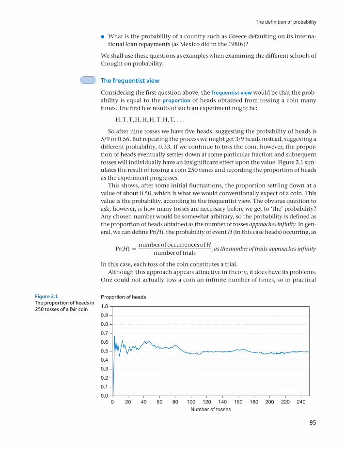
The definition of probability
95
What is the probability of a country such as Greece defaulting on its interna-tional loan repayments (as Mexico did in the 1980s)?
We shall use these questions as examples when examining the different schools of thought on probability.
The frequentist view
Considering the first question above, the frequentist view would be that the prob-ability is equal to the proportion of heads obtained from tossing a coin many times. The first few results of such an experiment might be:
H, T, T, H, H, H, T, H, T, c
So after nine tosses we have five heads, suggesting the probability of heads is 5/9 or 0.56. But repeating the process we might get 3/9 heads instead, suggesting a different probability, 0.33. If we continue to toss the coin, however, the propor-tion of heads eventually settles down at some particular fraction and subsequent tosses will individually have an insignificant effect upon the value. Figure 2.1 sim-ulates the result of tossing a coin 250 times and recording the proportion of heads as the experiment progresses.
This shows, after some initial fluctuations, the proportion settling down at a value of about 0.50, which is what we would conventionally expect of a coin. This value is the probability, according to the frequentist view. The obvious question to ask, however, is how many tosses are necessary before we get to ‘the’ probability? Any chosen number would be somewhat arbitrary, so the probability is defined as the proportion of heads obtained as the number of tosses approaches infinity. In gen-eral, we can define Pr(H), the probability of event H (in this case heads) occurring, as
Pr(H) =number of occurrences of H
number of trials, as the number of trails approaches infinity
In this case, each toss of the coin constitutes a trial.Although this approach appears attractive in theory, it does have its problems.
One could not actually toss a coin an infinite number of times, so in practical
1.0
0.9
0.8
0.7
0.6
0.5
0.4
0.3
0.2
0.1
0.00 20 40 60 80 100 120 140 160 180 200 220 240
Proportion of heads
Number of tosses
Figure 2.1The proportion of heads in 250 tosses of a fair coin
Chapter 2 • Probability
96
terms we cannot calculate the answer. Or, if one took a different coin, would the results from the first coin necessarily apply to the second?
Perhaps more seriously, the definition is of less use for the second and third questions posed above. Calculating the probability of an accident is not too prob-lematic: it may be defined as the proportion of all drivers having an accident dur-ing the year. However, this may be irrelevant for a particular driver, since drivers vary so much in their accident records. And how would you answer the third question? There is no long run to which we can appeal. We cannot rerun history over and over again to see in what proportion of cases the country defaults. Yet this probability (or risk) is what lenders want to know and credit-rating agencies have to assess. Maybe another approach is needed.
The subjective view
According to the subjective view, probability is a degree of belief that someone holds about the likelihood of an event occurring. It is inevitably subjective, and therefore some argue that it should be the degree of belief that it is rational to hold, but this just shifts the argument to what is meant by ‘rational’. Some prog-ress can be made by distinguishing between prior and posterior beliefs. The former are those held before any evidence is considered; the latter are the modified prob-abilities in the light of the evidence. For example, one might initially believe a coin to be fair (the prior probability of heads is one-half), but not after seeing only 5 heads in 50 tosses (the posterior probability would be less than a half).
Although it has its attractions, this approach (which is the basis of Bayesian statis-tics) also has its drawbacks. It is not always clear how one should arrive at the prior beliefs, particularly when one really has no prior information. Also, these methods often require the use of sophisticated mathematics, which may account for the less frequent use made of them. The development of more powerful computers and user-friendly software may increase the popularity of the Bayesian approach.
There is not universal agreement therefore as to the precise definition of prob-ability. We do not have space here to explore the issue further, so we will ignore the problem. The probability of an event occurring will be defined as a certain value, and we will not worry about the precise origin or meaning of that value. This is an axiomatic approach: we simply state what the probability is, without jus-tifying it, and then examine the consequences.
(a) Define the probability of an event according to the frequentist view.
(b) Define the probability of an event according to the subjective view.Exercise 2.1
For the following events, suggest how their probability might be calculated. In each case, consider whether you have used the frequentist or subjective view of probability (or possibly some mixture).
(a) The Republican Party winning the next US election.
(b) The number 5 being the first ball drawn in next week’s UK lottery. (Note that changes were made to the lottery rules in October 2015. You should use the new rules for the Lotto game.)
(c) A repetition of the 2004 Asian tsunami.
(d) Your train home being late.
Exercise 2.2
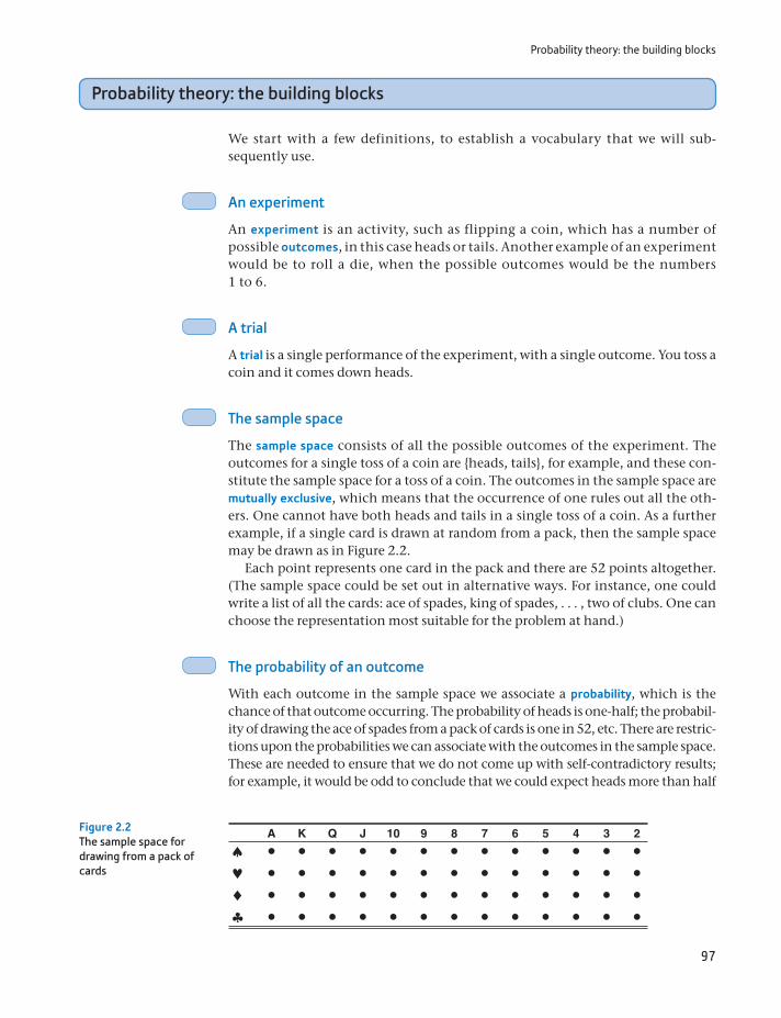
Probability theory: the building blocks
97
Probability theory: the building blocks
We start with a few definitions, to establish a vocabulary that we will subsequently use.
An experiment
An experiment is an activity, such as flipping a coin, which has a number of possible outcomes, in this case heads or tails. Another example of an experiment would be to roll a die, when the possible outcomes would be the numbers 1 to 6.
A trial
A trial is a single performance of the experiment, with a single outcome. You toss a coin and it comes down heads.
The sample space
The sample space consists of all the possible outcomes of the experiment. The outcomes for a single toss of a coin are heads, tails, for example, and these constitute the sample space for a toss of a coin. The outcomes in the sample space are mutually exclusive, which means that the occurrence of one rules out all the others. One cannot have both heads and tails in a single toss of a coin. As a further example, if a single card is drawn at random from a pack, then the sample space may be drawn as in Figure 2.2.
Each point represents one card in the pack and there are 52 points altogether. (The sample space could be set out in alternative ways. For instance, one could write a list of all the cards: ace of spades, king of spades, . . . , two of clubs. One can choose the representation most suitable for the problem at hand.)
The probability of an outcome
With each outcome in the sample space we associate a probability, which is the chance of that outcome occurring. The probability of heads is onehalf; the probability of drawing the ace of spades from a pack of cards is one in 52, etc. There are restrictions upon the probabilities we can associate with the outcomes in the sample space. These are needed to ensure that we do not come up with selfcontradictory results; for example, it would be odd to conclude that we could expect heads more than half
A K Q J 10 9 8 7 6 5 4 3 2Figure 2.2The sample space for drawing from a pack of cards
Chapter 2 • Probability
98
the time and tails more than half the time. To ensure our results are always consis-tent, the following rules apply to probabilities:
The probability of an outcome must lie between 0 and 1, i.e.
0 … Pr(A) … 1, for any outcome A (2.1)
The explanation is straightforward. If A is certain to occur, it occurs in 100% of all trials and so its probability is 1 (by the frequency definition of probability). Similarly, if A is certain not to occur, then its probability is 0, since it never happens however many trials there are. Since one cannot be more certain than certain, probabilities of less than 0 or more than 1 can never occur, and (2.1) follows.
The sum of the probabilities associated with all the outcomes in the sample space is 1. Formally
gPi = 1 (2.2)
where Pi is the probability of outcome i occurring. This follows from the fact that one, and only one, of the outcomes must occur, since they are mutually exclusive and also exhaustive, i.e. they define all the possibilities. The sum of the probabilities of heads and of tails is 1>2 + 1>2 = 1.
Following on from (2.2) we may define the complement of an outcome as every-thing in the sample space apart from that outcome. The complement of heads is tails, for example. If we write the complement of A as not-A, then it follows that Pr(A) + Pr(not-A) = 1 and hence
Pr(not-A) = 1 - Pr(A) (2.3)
On occasion it is easier to calculate the probability of the complement and then use equation (2.3) to get to the answer desired.
Events
An event is simply a collection of outcomes within the sample space. It is more common that we are interested in the probability of an event than of a single out-come. For example, the event ‘an odd number on the roll of a die’ consists of the outcomes 1, 3 and 5. The event ‘draw a queen from a pack of cards’ encompasses the four queens in the pack – spades, hearts, diamonds and clubs. The probability of the event can easily be calculated as the sum of the individual probabilities. The probability of an odd number on a roll of a die is 1>6 + 1>6 + 1>6 = 1>2, which seems intuitively obvious. Similarly, the probability of drawing a queen is 1/13.
Figure 2.3 gives an illustration of this latter example, where the four relevant outcomes are shaded in. Four of the 52 outcomes are shaded, giving the probabil-ity of 1/13 (as all outcomes are equally likely, 1/52).
A slightly more abstract way to illustrate an event will prove useful for our pre-sentation of principles of probability. Figure 2.4 shows the sample space as a rect-angle, with an event E represented by a circle within it.
The circle, event E, contains the four queens. The rest of the sample space consists of the other 48 cards in the pack. We can then define Pr(E) as the prob-ability that we get one of the outcomes contained in the set E, and it is obtained
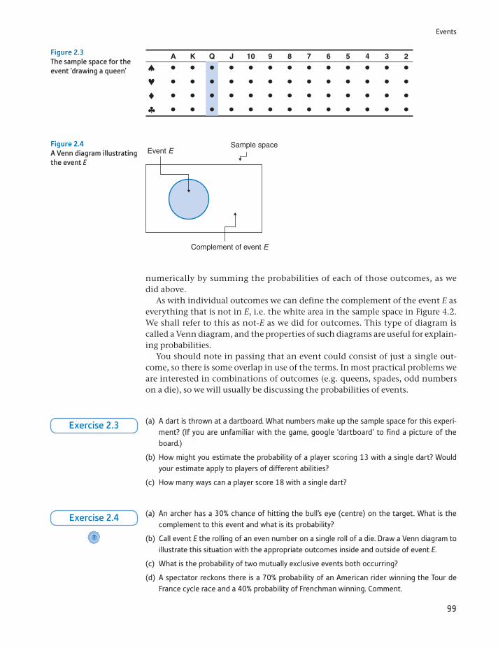
Events
99
numerically by summing the probabilities of each of those outcomes, as we did above.
As with individual outcomes we can define the complement of the event E as everything that is not in E, i.e. the white area in the sample space in Figure 4.2. We shall refer to this as not-E as we did for outcomes. This type of diagram is called a Venn diagram, and the properties of such diagrams are useful for explain-ing probabilities.
You should note in passing that an event could consist of just a single out-come, so there is some overlap in use of the terms. In most practical problems we are interested in combinations of outcomes (e.g. queens, spades, odd numbers on a die), so we will usually be discussing the probabilities of events.
A K Q J 10 9 8 7 6 5 4 3 2Figure 2.3The sample space for the event ‘drawing a queen’
Event ESample space
Complement of event E
Figure 2.4A Venn diagram illustrating the event E
(a) A dart is thrown at a dartboard. What numbers make up the sample space for this experi-ment? (If you are unfamiliar with the game, google ‘dartboard’ to find a picture of the board.)
(b) How might you estimate the probability of a player scoring 13 with a single dart? Would your estimate apply to players of different abilities?
(c) How many ways can a player score 18 with a single dart?
Exercise 2.3
(a) An archer has a 30% chance of hitting the bull’s eye (centre) on the target. What is the complement to this event and what is its probability?
(b) Call event E the rolling of an even number on a single roll of a die. Draw a Venn diagram to illustrate this situation with the appropriate outcomes inside and outside of event E.
(c) What is the probability of two mutually exclusive events both occurring?
(d) A spectator reckons there is a 70% probability of an American rider winning the Tour de France cycle race and a 40% probability of Frenchman winning. Comment.
?
Exercise 2.4
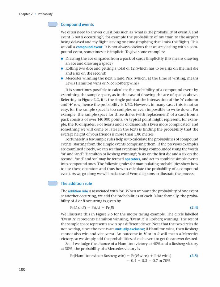
Chapter 2 • Probability
100
Compound events
We often need to answer questions such as ‘what is the probability of event A and event B both occurring?’, for example the probability of my train to the airport being delayed and my flight leaving on time (implying that I miss the flight). This we call a compound event. It is not always obvious that we are dealing with a com-pound event, sometimes it is implicit. To give some examples:
Drawing the ace of spades from a pack of cards (implicitly this means drawing an ace and drawing a spade)
Rolling two dice and getting a total of 12 (which has to be a six on the first die and a six on the second)
Mercedes winning the next Grand Prix (which, at the time of writing, means Lewis Hamilton wins or Nico Rosberg wins)
It is sometimes possible to calculate the probability of a compound event by examining the sample space, as in the case of drawing the ace of spades above. Referring to Figure 2.2, it is the single point at the intersection of the ‘A’ column and ‘♠’ row; hence the probability is 1/52. However, in many cases this is not so easy, for the sample space is too complex or even impossible to write down. For example, the sample space for three draws (with replacement) of a card from a pack consists of over 140 000 points. (A typical point might represent, for exam-ple, the 10 of spades, 8 of hearts and 3 of diamonds.) Even more complicated (and something we will come to later in the text) is finding the probability that the average height of your friends is more than 1.80 metres.
Fortunately, a few simple rules help us to calculate the probabilities of compound events, starting from the simple events comprising them. If the previous examples are examined closely, we can see that events are being compounded using the words ‘or’ and ‘and’: ‘Hamilton or Rosberg winning’; ‘a six on the first die and a six on the second’. ‘And’ and ‘or’ may be termed operators, and act to combine simple events into compound ones. The following rules for manipulating probabilities show how to use these operators and thus how to calculate the probability of a compound event. As we go along we will make use of Venn diagrams to illustrate the process.
The addition rule
The addition rule is associated with ‘or’. When we want the probability of one event or another occurring, we add the probabilities of each. More formally, the proba-bility of A or B occurring is given by
Pr(A or B) = Pr(A) + Pr(B) (2.4)
We illustrate this in Figure 2.5 for the motor racing example. The circle labelled ‘Event H’ represents Hamilton winning, ‘Event R’ is Rosberg winning. The rest of the sample space represents a win by a different driver. Note that the two circles do not overlap, since the events are mutually exclusive; if Hamilton wins, then Rosberg cannot also win and vice versa. An outcome in H or in R will mean a Mercedes victory, so we simply add the probabilities of each event to get the answer desired.
So, if we judge the chance of a Hamilton victory at 40% and a Rosberg victory at 30%, the probability of a Mercedes victory is
Pr(Hamilton win or Rosberg win) = Pr(H wins) + Pr(R wins) (2.5) = 0.4 + 0.3 = 0.7 or 70%
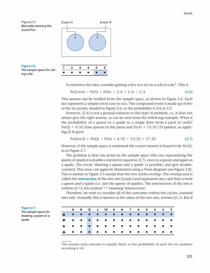
Events
101
To reinforce the idea, consider getting a five or a six on a roll of a die1. This is
Pr(5 or 6) = Pr(5) + Pr(6) = 1>6 + 1>6 = 1>3 (2.6)
This answer can be verified from the sample space, as shown in Figure 2.6. Each dot represents a simple event (one to six). The compound event is made up of two of the six points, shaded in Figure 2.6, so the probability is 2/6 or 1/3.
However, (2.4) is not a general solution to this type of problem, i.e. it does not always give the right answer, as can be seen from the following example. What is the probability of a queen or a spade in a single draw from a pack of cards? Pr(Q) = 4>52 (four queens in the pack) and Pr(A) = 13>52 (13 spades), so apply-ing (2.4) gives
Pr(Q or S) = Pr(Q) + Pr(S) = 4>52 + 13>52 = 17>52 (2.7)
However, if the sample space is examined the correct answer is found to be 16/52, as in Figure 2.7.
The problem is that one point in the sample space (the one representing the queen of spades) is double-counted in equation (2.7), once as a queen and again as a spade. The event ‘drawing a queen and a spade’ is possible, and gets double-counted. This issue can again be illustrated using a Venn diagram (see Figure 2.8). This is similar to Figure 2.5 except that the two circles overlap. The overlap area is called the intersection of the two sets Q and S and represents any card that is both a queen and a spade (i.e. just the queen of spades). The intersection of the sets is written Q yS, the symbol ‘y’ meaning ‘intersection’.
Therefore, we wish to consider all of the outcomes within the circles, counted once only. Formally this is known as the union of the two sets, written Q x S. But if
Event H Event RFigure 2.5Mercedes winning the Grand Prix
1We assume each outcome is equally likely so the probability of each the six numbers occurring is 1/6.
1 2 3 4 5 6Figure 2.6The sample space for roll-ing a die
A K Q J 10 9 8 7 6 5 4 3 2Figure 2.7The sample space for drawing a queen or a spade
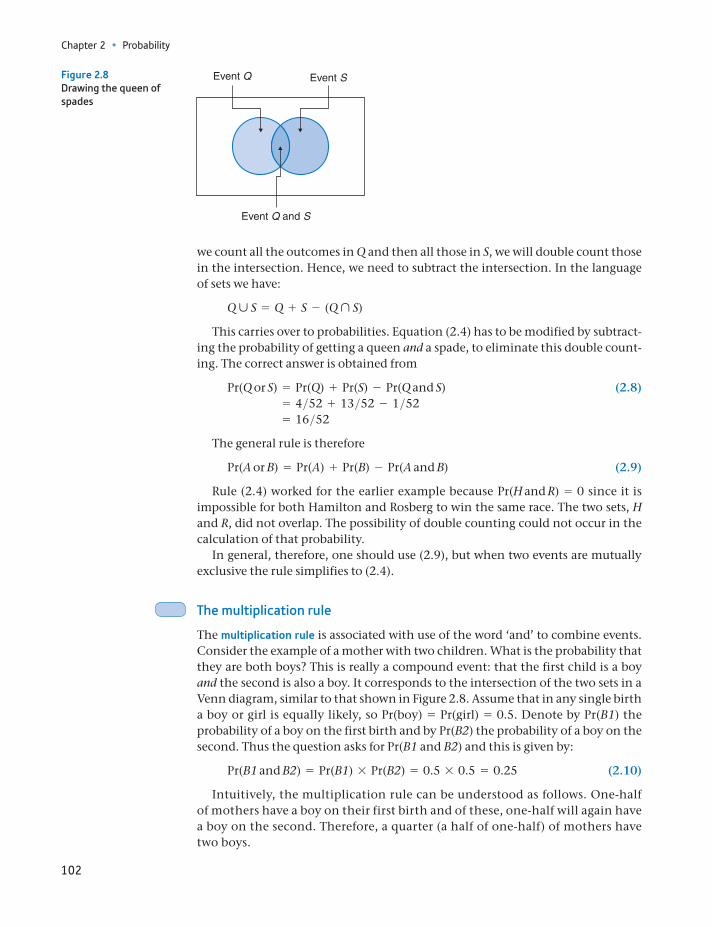
Chapter 2 • Probability
102
we count all the outcomes in Q and then all those in S, we will double count those in the intersection. Hence, we need to subtract the intersection. In the language of sets we have:
Q ´ S = Q + S - (Q ¨ S)
This carries over to probabilities. Equation (2.4) has to be modified by subtract-ing the probability of getting a queen and a spade, to eliminate this double count-ing. The correct answer is obtained from
Pr(Q or S) = Pr(Q) + Pr(S) - Pr(Q and S) (2.8) = 4>52 + 13>52 - 1>52 = 16>52
The general rule is therefore
Pr(A or B) = Pr(A) + Pr(B) - Pr(A and B) (2.9)
Rule (2.4) worked for the earlier example because Pr(H and R) = 0 since it is impossible for both Hamilton and Rosberg to win the same race. The two sets, H and R, did not overlap. The possibility of double counting could not occur in the calculation of that probability.
In general, therefore, one should use (2.9), but when two events are mutually exclusive the rule simplifies to (2.4).
The multiplication rule
The multiplication rule is associated with use of the word ‘and’ to combine events. Consider the example of a mother with two children. What is the probability that they are both boys? This is really a compound event: that the first child is a boy and the second is also a boy. It corresponds to the intersection of the two sets in a Venn diagram, similar to that shown in Figure 2.8. Assume that in any single birth a boy or girl is equally likely, so Pr(boy) = Pr(girl) = 0.5. Denote by Pr(B1) the probability of a boy on the first birth and by Pr(B2) the probability of a boy on the second. Thus the question asks for Pr(B1 and B2) and this is given by:
Pr(B1 and B2) = Pr(B1) * Pr(B2) = 0.5 * 0.5 = 0.25 (2.10)
Intuitively, the multiplication rule can be understood as follows. One-half of mothers have a boy on their first birth and of these, one-half will again have a boy on the second. Therefore, a quarter (a half of one-half) of mothers have two boys.
Event Q Event S
Event Q and S
Figure 2.8Drawing the queen of spades
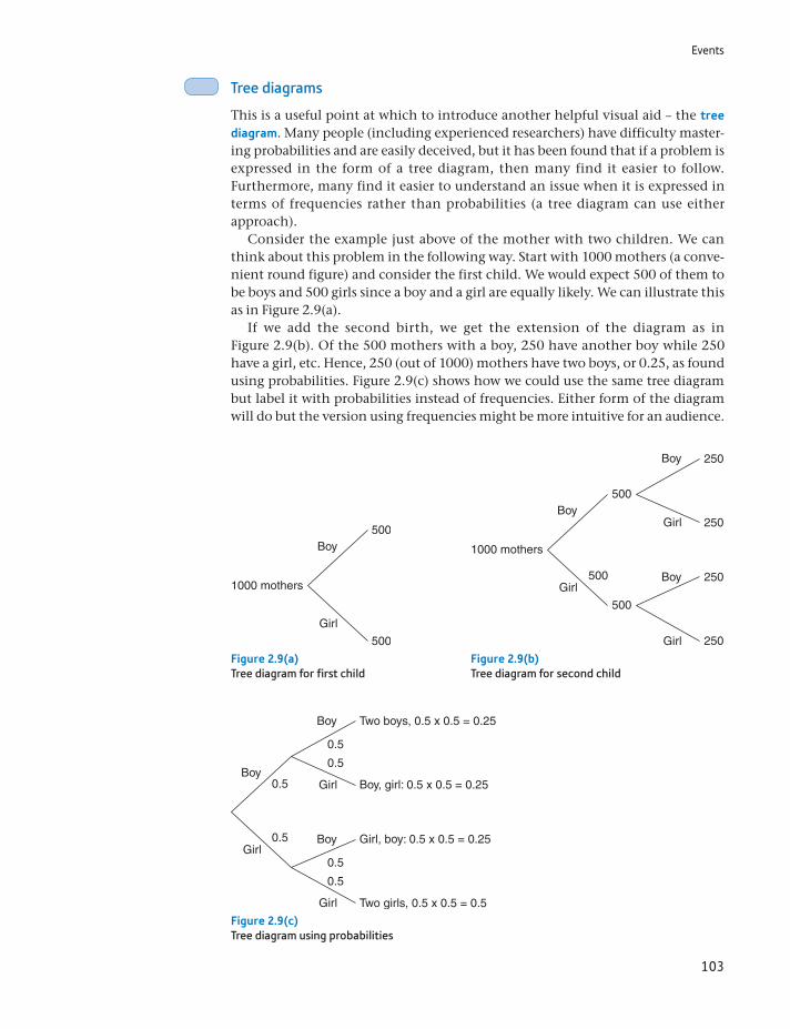
Events
103
Tree diagrams
This is a useful point at which to introduce another helpful visual aid – the tree diagram. Many people (including experienced researchers) have difficulty master-ing probabilities and are easily deceived, but it has been found that if a problem is expressed in the form of a tree diagram, then many find it easier to follow. Furthermore, many find it easier to understand an issue when it is expressed in terms of frequencies rather than probabilities (a tree diagram can use either approach).
Consider the example just above of the mother with two children. We can think about this problem in the following way. Start with 1000 mothers (a conve-nient round figure) and consider the first child. We would expect 500 of them to be boys and 500 girls since a boy and a girl are equally likely. We can illustrate this as in Figure 2.9(a).
If we add the second birth, we get the extension of the diagram as in Figure 2.9(b). Of the 500 mothers with a boy, 250 have another boy while 250 have a girl, etc. Hence, 250 (out of 1000) mothers have two boys, or 0.25, as found using probabilities. Figure 2.9(c) shows how we could use the same tree diagram but label it with probabilities instead of frequencies. Either form of the diagram will do but the version using frequencies might be more intuitive for an audience.
1000 mothers
Boy500
500
Girl
Figure 2.9(a)Tree diagram for first child
1000 mothers
Boy500
500
500Girl
Boy 250
250
250
250
Girl
Boy
Girl
Figure 2.9(b)Tree diagram for second child
Boy
Boy Two boys, 0.5 x 0.5 = 0.25
Two girls, 0.5 x 0.5 = 0.5
Boy, girl: 0.5 x 0.5 = 0.25
Girl, boy: 0.5 x 0.5 = 0.25Boy
0.5
0.5
0.5
0.5
0.5
0.5Girl
Girl
Girl
Figure 2.9(c)Tree diagram using probabilities
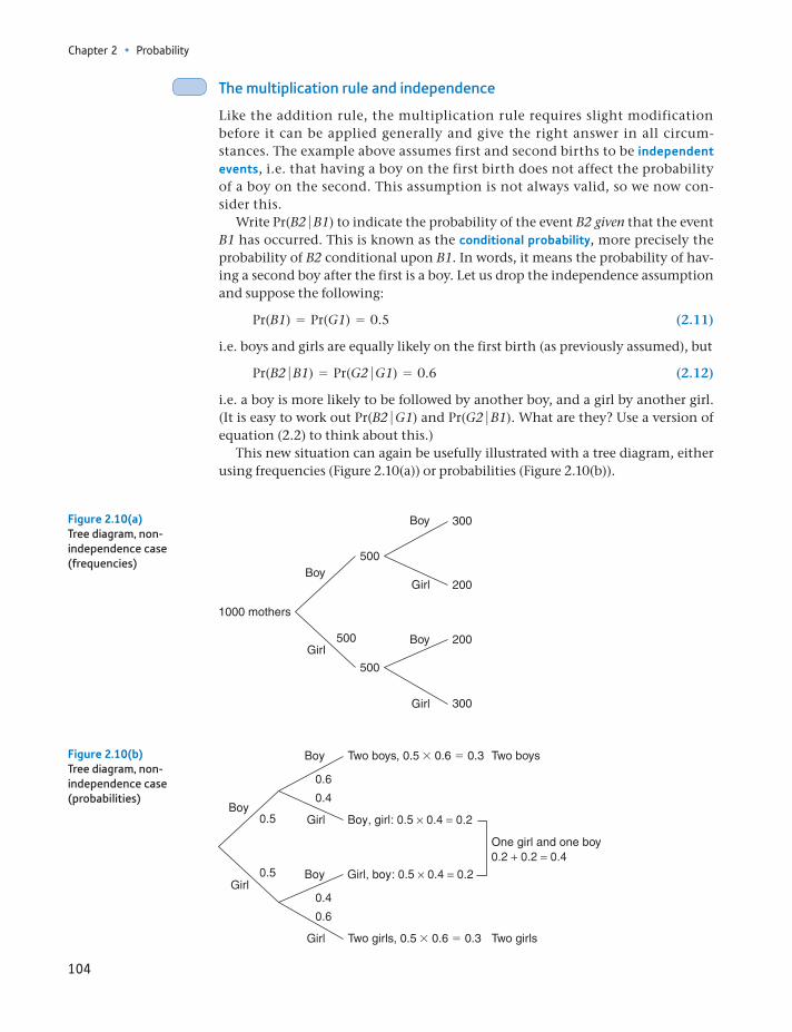
Chapter 2 • Probability
104
The multiplication rule and independence
Like the addition rule, the multiplication rule requires slight modification before it can be applied generally and give the right answer in all circum-stances. The example above assumes first and second births to be independent events, i.e. that having a boy on the first birth does not affect the probability of a boy on the second. This assumption is not always valid, so we now con-sider this.
Write Pr(B2 B1) to indicate the probability of the event B2 given that the event B1 has occurred. This is known as the conditional probability, more precisely the probability of B2 conditional upon B1. In words, it means the probability of hav-ing a second boy after the first is a boy. Let us drop the independence assumption and suppose the following:
Pr(B1) = Pr(G1) = 0.5 (2.11)
i.e. boys and girls are equally likely on the first birth (as previously assumed), but
Pr(B2 B1) = Pr(G2 G1) = 0.6 (2.12)
i.e. a boy is more likely to be followed by another boy, and a girl by another girl. (It is easy to work out Pr(B2 G1) and Pr(G2 B1). What are they? Use a version of equation (2.2) to think about this.)
This new situation can again be usefully illustrated with a tree diagram, either using frequencies (Figure 2.10(a)) or probabilities (Figure 2.10(b)).
1000 mothers
Boy500
500
500Girl
Boy 300
200
200
300
Girl
Boy
Girl
Figure 2.10(a)Tree diagram, non- independence case (frequencies)
Two boys, 0.5 3 0.6 5 0.3
Two girls, 0.5 3 0.6 5 0.3
One girl and one boy
Two boys
Two girls
Figure 2.10(b)Tree diagram, non- independence case (probabilities)
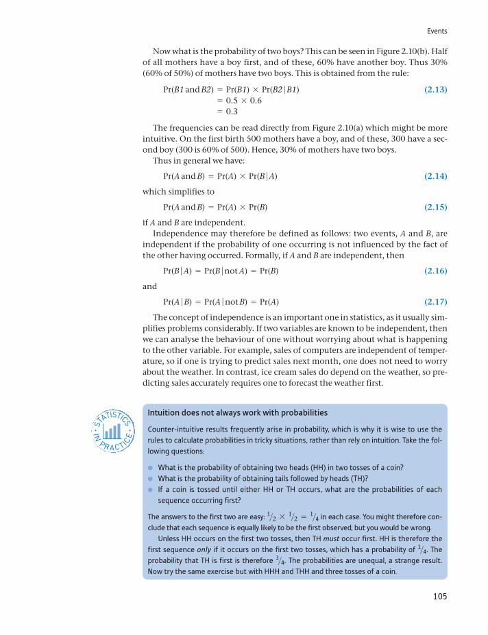
Events
105
Now what is the probability of two boys? This can be seen in Figure 2.10(b). Half of all mothers have a boy first, and of these, 60% have another boy. Thus 30% (60% of 50%) of mothers have two boys. This is obtained from the rule:
Pr(B1 and B2) = Pr(B1) * Pr(B2 B1) (2.13) = 0.5 * 0.6 = 0.3
The frequencies can be read directly from Figure 2.10(a) which might be more intuitive. On the first birth 500 mothers have a boy, and of these, 300 have a sec-ond boy (300 is 60% of 500). Hence, 30% of mothers have two boys.
Thus in general we have:
Pr(A and B) = Pr(A) * Pr(B A) (2.14)
which simplifies to
Pr(A and B) = Pr(A) * Pr(B) (2.15)
if A and B are independent.Independence may therefore be defined as follows: two events, A and B, are
independent if the probability of one occurring is not influenced by the fact of the other having occurred. Formally, if A and B are independent, then
Pr(B A) = Pr(B not A) = Pr(B) (2.16)
and
Pr(A B) = Pr(A not B) = Pr(A) (2.17)
The concept of independence is an important one in statistics, as it usually sim-plifies problems considerably. If two variables are known to be independent, then we can analyse the behaviour of one without worrying about what is happening to the other variable. For example, sales of computers are independent of temper-ature, so if one is trying to predict sales next month, one does not need to worry about the weather. In contrast, ice cream sales do depend on the weather, so pre-dicting sales accurately requires one to forecast the weather first.
Intuition does not always work with probabilities
Counter-intuitive results frequently arise in probability, which is why it is wise to use the rules to calculate probabilities in tricky situations, rather than rely on intuition. Take the fol-lowing questions:
What is the probability of obtaining two heads (HH) in two tosses of a coin? What is the probability of obtaining tails followed by heads (TH)? If a coin is tossed until either HH or TH occurs, what are the probabilities of each
sequence occurring first?
The answers to the first two are easy: 1>2 * 1>2 = 1>4 in each case. You might therefore con-clude that each sequence is equally likely to be the first observed, but you would be wrong.
Unless HH occurs on the first two tosses, then TH must occur first. HH is therefore the first sequence only if it occurs on the first two tosses, which has a probability of 1>4. The probability that TH is first is therefore 3>4. The probabilities are unequal, a strange result. Now try the same exercise but with HHH and THH and three tosses of a coin.
ST
ATISTICS
IN
PRACTI
CE
· ·
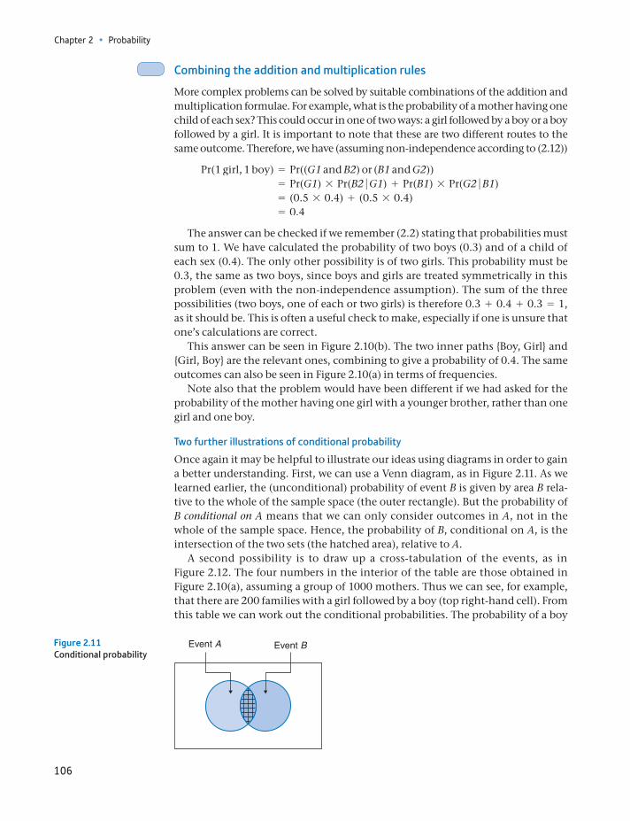
Chapter 2 • Probability
106
Combining the addition and multiplication rules
More complex problems can be solved by suitable combinations of the addition and multiplication formulae. For example, what is the probability of a mother having one child of each sex? This could occur in one of two ways: a girl followed by a boy or a boy followed by a girl. It is important to note that these are two different routes to the same outcome. Therefore, we have (assuming non-independence according to (2.12))
Pr(1 girl, 1 boy) = Pr((G1 and B2) or (B1 and G2)) = Pr(G1) * Pr(B2 G1) + Pr(B1) * Pr(G2 B1) = (0.5 * 0.4) + (0.5 * 0.4) = 0.4
The answer can be checked if we remember (2.2) stating that probabilities must sum to 1. We have calculated the probability of two boys (0.3) and of a child of each sex (0.4). The only other possibility is of two girls. This probability must be 0.3, the same as two boys, since boys and girls are treated symmetrically in this problem (even with the non-independence assumption). The sum of the three possibilities (two boys, one of each or two girls) is therefore 0.3 + 0.4 + 0.3 = 1, as it should be. This is often a useful check to make, especially if one is unsure that one’s calculations are correct.
This answer can be seen in Figure 2.10(b). The two inner paths Boy, Girl and Girl, Boy are the relevant ones, combining to give a probability of 0.4. The same outcomes can also be seen in Figure 2.10(a) in terms of frequencies.
Note also that the problem would have been different if we had asked for the probability of the mother having one girl with a younger brother, rather than one girl and one boy.
Two further illustrations of conditional probability
Once again it may be helpful to illustrate our ideas using diagrams in order to gain a better understanding. First, we can use a Venn diagram, as in Figure 2.11. As we learned earlier, the (unconditional) probability of event B is given by area B rela-tive to the whole of the sample space (the outer rectangle). But the probability of B conditional on A means that we can only consider outcomes in A, not in the whole of the sample space. Hence, the probability of B, conditional on A, is the intersection of the two sets (the hatched area), relative to A.
A second possibility is to draw up a cross-tabulation of the events, as in Figure 2.12. The four numbers in the interior of the table are those obtained in Figure 2.10(a), assuming a group of 1000 mothers. Thus we can see, for example, that there are 200 families with a girl followed by a boy (top right-hand cell). From this table we can work out the conditional probabilities. The probability of a boy
Event A Event BFigure 2.11Conditional probability
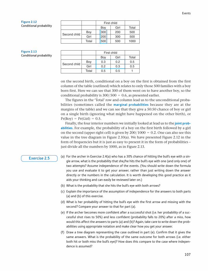
Events
107
on the second birth, conditional on a boy on the first is obtained from the first column of the table (outlined) which relates to only those 500 families with a boy born first. Here we can see that 300 of them went on to have another boy, so the conditional probability is 300>500 = 0.6, as presented earlier.
The figures in the ‘Total’ row and column lead us to the unconditional proba-bilities (sometimes called the marginal probabilities because they are at the margins of the table) and we can see that they give a 50:50 chance of boy or girl on a single birth (ignoring what might have happened on the other birth), or Pr(Boy) = Pr(Girl) = 0.5.
Finally, the four interior numbers we initially looked at lead us to the joint prob-abilities. For example, the probability of a boy on the first birth followed by a girl on the second (upper right cell) is given by 200>1000 = 0.2. One can also see this value in the tree diagram in Figure 2.10(a). We have presented Figure 2.12 in the form of frequencies but it is just as easy to present it in the form of probabilities – just divide all the numbers by 1000, as in Figure 2.13.
300
200500
200
300500
500Girl
Girl
Total
Total
BoyBoy
Second child
First child
5001000
Figure 2.12Conditional probability
0.3
0.20.5
0.2
0.30.5
0.5Girl
Girl
Total
Total
BoyBoy
Second child
First child
0.51
Figure 2.13Conditional probability
(a) For the archer in Exercise 2.4(a) who has a 30% chance of hitting the bull’s eye with a sin-gle arrow, what is the probability that she/he hits the bull’s eye with one (and only one) of two attempts? Assume independence of the events. (You should write down the formula you use and evaluate it to get your answer, rather than just writing down the answer directly or the numbers in the calculation. It is worth developing this good practice as it aids your thinking and can easily be reviewed later on.)
(b) What is the probability that she hits the bull’s eye with both arrows?
(c) Explain the importance of the assumption of independence for the answers to both parts (a) and (b) of this exercise.
(d) What is her probability of hitting the bull’s eye with the first arrow and missing with the second? Compare your answer to that for part (a).
(e) If the archer becomes more confident after a successful shot (i.e. her probability of a suc-cessful shot rises to 50%) and less confident (probability falls to 20%) after a miss, how would this affect the answers to parts (a) and (b)? Again, take care to write down the prob-abilities using appropriate notation and make clear how you get your answer.
(f) Draw a tree diagram representing the case outlined in part (e). Confirm that it gives the same answers. What is the probability of the same outcome for both arrows (i.e. either both hit or both miss the bull’s eye)? How does this compare to the case where indepen-dence is assumed?
Exercise 2.5
Chapter 2 • Probability
108
Combinations and permutations
The methods described above are adequate for solving fairly simple probability puzzles but fall short when more complex questions are asked. For example, what is the probability of three girls and two boys in a family of five children? The tree diagram can obviously be extended to cover third and subsequent chil-dren, but the number of branches rapidly increases (in geometric progression). It takes time to draw the diagram (it has 32 end points), and identify the rele-vant paths and associated probabilities, and it is easy to make an error. If you do this correctly, you will find that there are 10 relevant paths through the dia-gram (e.g. GGGBB or GGBBG) and each individual path has a probability of 1/32 (½ raised to the power 5), so the answer is 10/32. Note that we are once again assuming independent events here, so the probability of having a boy or a girl is always 0.5.
Far better would be to use a formula in a complex case like this. To develop this, we introduce the ideas of combinations and permutations. The strategy for finding the probability of three girls and two boys in five children is two-fold:
(1) Work out the probability of three girls and two boys in one particular order (e.g. GGGBB). This is 0.55 = 1>32.
(2) Use a formula to work out the number of different orderings, in this case 10.
It is this second point that we now focus on. How can we establish the number of ways of having three girls and two boys in a family of five children? One way would be to write down all the possible orderings:
GGGBB GGBGB GGBBG GBGGB GBGBGGBBGG BGGGB BGGBG BGBGG BBGGG
This shows that there are 10 such orderings, so the probability of three girls and two boys in a family of five children is 10/32. In more complex problems, this soon becomes difficult or impossible. The record number of children born to a British mother is 39 (!) of whom 32 were girls. The appropriate tree diagram has over five thousand billion paths through it, and drawing one line (i.e. for one child) per second would imply 17 433 years to complete the task.
Rather than do this, we use the combinatorial formula to find the answer. Suppose there are n children, r of them girls, then the number of orderings, denoted nCr, is obtained from2
nCr =n!
r!(n - r)!
=n * (n - 1) * c * 1
r * (r - 1) * c* 1 * (n - r) * (n - r - 1) * c* 1 (2.18)
In the above example n = 5, r = 3 so the number of orderings is
5C3 =5!
3! * 2!=
5 * 4 * 3 * 2 * 13 * 2 * 1 * 2 * 1
= 10 (2.19)
2n! is read ‘n factorial’ and is defined as the product of all the integers up to and including n. Thus, for example, 3! = 3 * 2 * 1 = 6.
Events
109
If there were four girls out of five children, then the number of orderings or com-binations would be
5C4 =5!
4! * 1!=
5 * 4 * 3 * 2 * 14 * 3 * 2 * 1 * 1
= 5 (2.20)
This gives five possible orderings, i.e. the single boy could be the first, second, third, fourth or fifth born.
Why does this formula work?
(If you are happy just to accept the combinatorial formula above, you can skip this section and go straight to the exercises below.) Consider five empty places to fill, corresponding to the five births in chronological order. Take the case of three girls (call them Amanda, Bridget and Caroline for convenience) who have to fill three of the five places. For Amanda there is a choice of five empty places. Having ‘cho-sen’ one, there remain four for Bridget, so there are 5 * 4 = 20 possibilities (i.e. ways in which these two could choose their places). Three remain for Caroline, so there are 60(=5 * 4 * 3) possible orderings in all (the two boys take the two remaining places). Sixty is the number of permutations of three named girls in five births. This is written as 5P3 or, in general, nPr. Hence
5P3 = 5 * 4 * 3
or, in general,
nPr = n * (n - 1) * g * (n - r + 1) (2.21)
A simpler formula is obtained by multiplying and dividing by (n − r)!
nPr =n * (n - 1) * g * (n - r + 1) * (n - r)!
(n - r)!=
n!(n - r)!
(2.22)
What is the difference between nPr and nCr? The latter does not distinguish between the girls; the two cases Amanda, Bridget, Caroline, boy, boy and Bridget, Amanda, Caroline, boy, boy are effectively the same (three girls followed by two boys). So nPr is larger by a factor representing the number of ways of ordering the three girls. This factor is given by r! = 3 * 2 * 1 = 6 (any of the three girls could be first, either of the other two second, and then the final one). Thus to obtain nCr one must divide nPr by r!, giving (2.18).
For this exercise we extend the analysis of Exercise 2.5 to a third shot by the archer.
(a) Extend the tree diagram (assuming independence, so Pr(H) = 0.3, Pr(M) = 0.7) to a third arrow. Use this to mark out the paths with two successful shots out of three. Calculate the probability of two hits out of three shots.
(b) Repeat part (a) for the case of non-independence. For this you may assume that a hit raises the problem of success with the next arrow to 50%. A miss lowers it to 20%.
?
Exercise 2.6
(a) Show how the answer to Exercise 2.6(a) may be arrived at using algebra, including the use of the combinatorial formula.
(b) Repeat part (a) for the non-independence case.?
Exercise 2.7
Chapter 2 • Probability
110
Bayes’ theorem
Bayes’ theorem is a factual statement about probabilities which in itself is uncon-troversial. However, the use and interpretation of the result is at the heart of the difference between classical and Bayesian statistics. The theorem itself is easily derived from first principles. Equation (2.23) is similar to equation equation (2.14) covered earlier when discussing the multiplication rule:
Pr(A and B) = Pr(A B) * Pr(B) (2.23)
hence,
Pr(A B) =Pr(A and B)
Pr(B) (2.24)
Expanding both top and bottom of the right-hand side,
Pr(A B) =Pr(B A) * Pr(A)
Pr(B A) * Pr(A) + Pr(B not A) * Pr(not A) (2.25)
Equation (2.25) is known as Bayes’ theorem and is a statement about the probabil-ity of the event A, conditional upon B having occurred. The following example demonstrates its use.
Two bags contain red and yellow balls. Bag A contains six red and four yellow balls, and bag B has three red and seven yellow balls. A ball is drawn at random from one bag and turns out to be red. What is the probability that it came from bag A? Since bag A has relatively more red balls to yellow balls than does bag B, it seems bag A ought to be favoured. The probability should be more than 0.5. We can check if this is correct.
Denoting:
Pr(A) = 0.5 (the probability of choosing bag A at random) = Pr(B)Pr(R A) = 0.6 (the probability of selecting a red ball from bag A), etc.
we have
Pr(A R) =Pr(R A) * Pr(A)
Pr(R A) * Pr(A) + Pr(R B) * Pr(B) (2.26)
using Bayes’ theorem. Evaluating this gives
Pr(A R) =0.6 * 0.5
0.6 * 0.5 + 0.3 * 0.5 (2.27)
= 2>3As expected, this result is greater than 0.5. (You can check that Pr(B R) = 1>3 so that the sum of the probabilities is 1.)
It may help us understand this if we draw another tree diagram, as Figure 2.14. Once again, this shows frequencies, 1000 trials of taking a ball from a bag. In 500 of the trials we would expect to select bag A, in the other 500 trials we select bag B(Pr(A) = Pr(B) = 0.5). This is the first stage of the diagram. Of the 500 occasions we select bag A, 300 times we get a red ball (Pr(R A) = 0.6) and 200 times we get yellow. From bag B we get 150 draws of a red ball (Pr(R B) = 0.3) and 350 yellows.
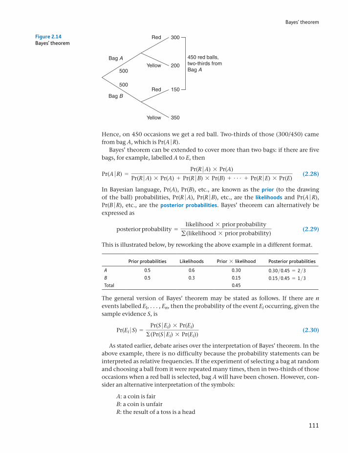
Bayes’ theorem
111
Hence, on 450 occasions we get a red ball. Two-thirds of those (300/450) came from bag A, which is Pr(A R).
Bayes’ theorem can be extended to cover more than two bags: if there are five bags, for example, labelled A to E, then
Pr(A R) =Pr(R A) * Pr(A)
Pr(R A) * Pr(A) + Pr(R B) * Pr(B) + g + Pr(R E) * Pr(E) (2.28)
In Bayesian language, Pr(A), Pr(B), etc., are known as the prior (to the drawing of the ball) probabilities, Pr(R A), Pr(R B), etc., are the likelihoods and Pr(A R), Pr(B R), etc., are the posterior probabilities. Bayes’ theorem can alternatively be expressed as
posterior probability =likelihood * prior probability
g(likelihood * prior probability) (2.29)
This is illustrated below, by reworking the above example in a different format.
Prior probabilities Likelihoods Prior * likelihood Posterior probabilities
A 0.5 0.6 0.30 0.30>0.45 = 2>3B 0.5 0.3 0.15 0.15>0.45 = 1>3Total 0.45
The general version of Bayes’ theorem may be stated as follows. If there are n events labelled El, . . . , En, then the probability of the event Ei occurring, given the sample evidence S, is
Pr(Ei S) =Pr(S Ei) * Pr(Ei)
Σ(Pr(S Ei) * Pr(Ei)) (2.30)
As stated earlier, debate arises over the interpretation of Bayes’ theorem. In the above example, there is no difficulty because the probability statements can be interpreted as relative frequencies. If the experiment of selecting a bag at random and choosing a ball from it were repeated many times, then in two-thirds of those occasions when a red ball is selected, bag A will have been chosen. However, con-sider an alternative interpretation of the symbols:
A: a coin is fairB: a coin is unfairR: the result of a toss is a head
Bag A
500
500
Bag B
Red
450 red balls,two-thirds fromBag A
300
200
150
350
Yellow
Red
Yellow
Figure 2.14Bayes’ theorem
Chapter 2 • Probability
112
Then, given a toss (or series of tosses) of a coin, this evidence can be used to calculate the probability of the coin being fair. But this makes no sense according to the frequentist school: either the coin is fair or not; it is not a question of prob-ability. The calculated value must be interpreted as a degree of belief and be given a subjective interpretation.
(a) Repeat the ‘balls in the bag’ exercise from the text, but with bag A containing five red and three yellow balls, bag B containing one red and two yellow balls. The single ball drawn is red. Before doing the calculation, predict which bag is more likely to be the source of the drawn ball. Explain why. Then compare your prediction with the calculated answer.
(b) Bag A now contains 10 red and 6 yellow balls (i.e. twice as many as before, but in the same proportion). Does this alter the answer you obtained in part (a)?
(c) Set out your answer to part (b) in the form of prior probabilities and likelihoods, in order to obtain the posterior probability.
?
Exercise 2.8
Decision analysis
The study of probability naturally leads to the analysis of decision-making where risk is involved. This is the realistic situation facing most firms, and the use of probability can help to illuminate the problem. To illustrate the topic, we use the example of a firm facing a choice of three different investment projects. The uncertainty which the firm faces concerns the interest rate at which to discount the future flows of income. If the interest/discount rate is high, then projects which have income far in the future become less attractive relative to projects with more immediate returns. A low rate reverses this conclusion. The question is: which project should the firm select? As we shall see, there is no unique, right answer to the question but, using probability theory, we can see why the answer might vary.
Table 2.1 provides the data required for the problem. The three projects are imaginatively labelled A, B and C. There are four possible states of the world, i.e. future scenarios, each with a different interest rate, as shown across the top of the table. This is the only source of uncertainty; otherwise the states of the world are identical. The figures in the body of the table show the present value of each income stream at the given discount rate.
Table 2.1 Data for decision analysis: present values of three investment projects at different interest rates (£000)
Project Future interest rate
4% 5% 6% 7%
A 1475 1363 1200 1115B 1500 1380 1148 1048C 1650 1440 1200 810
Probability 0.1 0.4 0.4 0.1
Decision analysis
113
Thus, for example, if the interest rate turns out to be 4%, then project A has a present value of £1 475 000 while B’s is £1 500 000. If the discount rate turns out to be 5%, the PV for A is £1 363 000 while for B it has changed to £1 380 000. Obviously, as the discount rate rises, the present value of the return falls. (Alternatively, we could assume that a higher interest rate increases the cost of borrowing to finance the project, which reduces its profitability.) We assume that each project requires a (certain) initial outlay of £1 100 000 with which the PV should be compared.
The final row of the table shows the probabilities which the firm attaches to each interest rate. These are obviously someone’s subjective probabilities and are symmetric around a central value of 5.5%.
Present value
The present value of future income is its value today and is obtained using the interest rate. For example, if the interest rate is 10%, the present value (i.e. today) of £110 received in one year’s time is £100. In other words, one could invest £100 today at 10% and have £110 in one year’s time. £100 today and £110 next year are equivalent.
The present value of £110 received in two years’ time is smaller since one has to wait longer to receive it. It is calculated as £110>1.12 = 90.91. Again, £90.91 invested at 10% p.a. will yield £110 in two years’ time. After one year it is worth £90.91 * 1.1 = 100 and after a second year that £100 becomes £110. Notice that, if the interest rate rises, the present value falls. For exam-ple, if the interest rate is 20%, £110 next year is worth only £110>1.2 = 91.67 today.
If we denote the interest rate by r, so r = 0.1 indicates an interest rate of 10%, the value now of £110 in two years’ time is £110>(1 + r)2 = £110>(1.1)2 = 90.91, as above. In gen-eral, the present value of a sum X in t years’ time is given by X>(1 + r)t.
The present value of £110 in one year’s time and another £110 in two years’ time is £110>1.1 + £110>1.12 = £190.91. The present value of more complicated streams of income can be calculated by extension of this principle. In the example used in the text, you do not need to worry about how we arrive at the present value. Before reading on you may wish to do Exercise 2.8 to practise calculation of present value.
ST
ATISTICS
IN
PRACTI
CE
· ·
(a) At an interest or discount rate of 10%, what is the present value of £1200 received in one year’s time?
(b) If the interest rate rises to 15%, how is the present value altered? The interest rate has risen by 50% (from 10% to 15%): how has the present value changed?
(c) At an interest rate of 10% what is the present value of £1200 received in (i) two years’ time and (ii) five years’ time?
(d) An income of £500 is received at the end of years one, two and three (i.e. £1500 in total). What is its present value? Assume the interest rate is 10%.
(e) Project A provides an income of £300 after one year and another £600 after two years. Project B provides £400 and £488 at the same times. At a discount rate of 10%, which proj-ect has the higher present value? What happens if the discount rate rises to 20%?
?
Exercise 2.9
Decision criteria: maximising the expected value
We need to decide how a decision is to be made on the basis of these data. The first criterion involves the expected value of each project. Because of the uncertainty about the interest rate, there is no certain present value for each project. We therefore
Chapter 2 • Probability
114
calculate the expected value, using the E operator which was introduced in Chapter 1. In other words, we find the expected present value of each project, by taking a weighted average of the PV figures, the weights being the probabilities. The project with the highest expected return is chosen.
The expected values are calculated in Table 2.2. The highest expected present value is £1 302 000, associated with project C. On this criterion, therefore, C is chosen. Is this a wise choice? If the business always uses this rule to evaluate many projects, then in the long run it will earn the maximum profits. However, you may notice that if the interest rate turns out to be 7%, then C would be the worst project to choose in this case and the firm would make a substantial loss in such circumstances. Project C is the most sensitive to the discount rate (it has the greatest variance of PV values of the three projects) and therefore the firm faces more risk by opting for C. There is a trade-off between risk and return. Perhaps some alternative criteria should be examined. These we look at next, in particular the maximin, maximax and minimax regret strategies.
Maximin, maximax and minimax regret
The maximin criterion looks at the worst-case scenario for each project and then selects the project which does best in these circumstances. It is inevitably a pessi-mistic or cautious view therefore. Table 2.3 illustrates the calculation. This time we observe that project A is preferred. In the worst case (which occurs when r = 7% for all projects), A does best, with a PV of £1 115 000 and therefore a slight profit. The maximin criterion may be a good one in business where managers tend towards over-optimism. Calculating the maximin may be a salutary exercise, even if it is not the ultimate deciding factor.
The opposite criterion is the optimistic one where the maximax criterion is used. In this case one looks at the best circumstances for each project and chooses the best-performing project. Each project does best when the interest rate is at its lowest level, 3%. Examining the first column of Table 2.1 shows that project C(PV = 1650) performs best and is therefore chosen. Given the earlier warning about over-optimistic managers, this may not be suitable as the sole criterion for making investment decisions.
Table 2.2 Expected values of the three projects
Project Expected value
A 1284.2B 1266.0C 1302.0
Note: 1284.2 is calculated as 1475 * 0.1 + 1363 * 0.4 + 12000.4 + 1115 * 0.1. This is the weighted average of the four PV values. A similar calculation is performed for the other projects.
Table 2.3 The maximin criterion
Project Minimum
A 1115B 1048C 810Maximum 1115
Decision analysis
115
A final criterion is that of minimax regret. If project B were chosen but the inter-est rate turns out to be 7%, then we would regret not having chosen A, the best project under these circumstances. Our regret would be the extent of the difference between the two, a matter of 1115 - 1048 = 67. Similarly, the regret if we had chosen C would be 1115 - 810 = 305. We can calculate these regrets at the other interest rates too, always comparing the PV of a project with the best PV given that interest rate. This gives us Table 2.4.
The final column of the table shows the maximum regret for each project. The minimax regret criterion is to choose the minimum of these figures. This is given at the bottom of the final column; it is 150 which is associated with proj-ect B. A justification for using this criterion might be that you don’t want to fall too far behind your competitors. If other firms are facing similar investment decisions, then the regret table shows the difference in PV (and hence profits) if they choose the best project while you do not. Choosing the minimax regret solution ensures that you won’t fall too far behind. During the internet bubble of the 1990s it was important to gain market share and keep up with, or surpass, your competitors. The minimax regret strategy might be a useful tool during such times.
You will probably have noticed that we have managed to find a justification for choosing all three projects. No one project comes out best on all criteria. Nevertheless, the analysis might be of some help: if the investment project is one of many small, independent investments the firm is making, then this would jus-tify use of the expected value criterion. On the other hand, if this is a big, one-off project which could possibly bankrupt the firm if it goes wrong, then the maxi-min criterion would be appropriate.
The expected value of perfect information
Often a firm can improve its knowledge about future possibilities via research, which costs money. This effectively means buying information about the future state of the world. The question arises: how much should a firm pay for such infor-mation? Perfect information would reveal the future state of the world with certainty – in this case, the future interest rate. In that case you could be sure of choosing the right project given each state of the world. If interest rates turn out to be 4%, the firm would invest in C, if 7% in A, and so on.
In such circumstances, the firm would expect to earn:
(0.1 * 1650) + (0.4 * 1440) + (0.4 * 1200) + (0.1 * 1115) = 1332.5
i.e. the probability of each state of the world is multiplied by the PV of the best project for that state. This gives a figure which is greater than the expected value
Table 2.4 The costs of taking the wrong decision
Project 4% 5% 6% 7% Maximum
A 175 77 0 0 175B 150 60 52 67 150C 0 0 0 305 305Minimum 150
Note: The first figure in the 4% discount rate column indicates that Project A’s payoff is 175(=1650 - 1475) worse than that of C, the best choice in this circumstance.
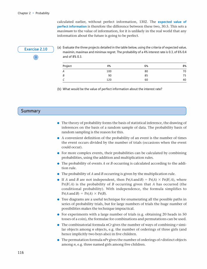
Chapter 2 • Probability
116
calculated earlier, without perfect information, 1302. The expected value of perfect information is therefore the difference between these two, 30.5. This sets a maximum to the value of information, for it is unlikely in the real world that any information about the future is going to be perfect.
(a) Evaluate the three projects detailed in the table below, using the criteria of expected value, maximin, maximax and minimax regret. The probability of a 4% interest rate is 0.3, of 6% 0.4 and of 8% 0.3.
Project 4% 6% 8%
A 100 80 70B 90 85 75C 120 60 40
(b) What would be the value of perfect information about the interest rate?
?
Exercise 2.10
Summary
The theory of probability forms the basis of statistical inference, the drawing of inferences on the basis of a random sample of data. The probability basis of random sampling is the reason for this.
A convenient definition of the probability of an event is the number of times the event occurs divided by the number of trials (occasions when the event could occur).
For more complex events, their probabilities can be calculated by combining probabilities, using the addition and multiplication rules.
The probability of events A or B occurring is calculated according to the addi-tion rule.
The probability of A and B occurring is given by the multiplication rule.
If A and B are not independent, then Pr(A and B) = Pr(A) * Pr(B A), where Pr(B A) is the probability of B occurring given that A has occurred (the conditional probability). With independence, the formula simplifies to Pr(A and B) = Pr(A) * Pr(B).
Tree diagrams are a useful technique for enumerating all the possible paths in series of probability trials, but for large numbers of trials the huge number of possibilities makes the technique impractical.
For experiments with a large number of trials (e.g. obtaining 20 heads in 50 tosses of a coin), the formulae for combinations and permutations can be used.
The combinatorial formula nCr gives the number of ways of combining r simi-lar objects among n objects, e.g. the number of orderings of three girls (and hence implicitly two boys also) in five children.
The permutation formula nPr gives the number of orderings of r distinct objects among n, e.g. three named girls among five children.
Key terms and concepts
117
Bayes’ theorem provides a formula for calculating a conditional probability, e.g. the probability of someone being a smoker, given they have been diag-nosed with cancer. It forms the basis of Bayesian statistics, allowing us to calcu-late the probability of a hypothesis being true, based on the sample evidence and prior beliefs. Classical statistics disputes this approach.
Probabilities can also be used as the basis for decision-making in conditions of uncertainty, using as decision criteria expected value maximisation, maximin, maximax or minimax regret.
addition ruleaxiomatic approachBayes’ theoremBayesian statisticsclassical statisticscombinationscombinatorial formulacomplementcompound eventconditional probabilitydegree of beliefeventexhaustiveexpected valueexpected value of perfect informationexperimentfrequentist viewindependent eventsintersectionjoint probabilitieslikelihoodsmarginal probabilities
maximaxmaximinminimaxminimax regretmultiplication rulemutually exclusiveoperatoroutcome or eventperfect informationpermutationsposterior probabilitiesprior beliefprior probabilitiesprobabilityproportionsample spacestates of the worldstatistical inferencesubjective viewtree diagramtrialunion
Key terms and concepts
Chapter 2 • Probability
118
Formula Description Note
nCr =n!
r!(n - r)!
Combinatorial formula n! = n * (n - 1) * g* 1
Formulae used in this chapter
Problems
Some of the more challenging problems are indicated by highlighting the problem number in colour.
2.1 Given a standard pack of cards, calculate the following probabilities:
(a) drawing an ace;
(b) drawing a court card (i.e. jack, queen or king);
(c) drawing a red card;
(d) drawing three aces without replacement;
(e) drawing three aces with replacement.
2.2 The following data give duration of unemployment by age.
Age Duration of unemployment (weeks) Total Economically active
"8 8–26 26–52 +52 (000s) (000s)(Percentage figures, rows sum to 100)
16–19 27.2 29.8 24.0 19.0 273.4 127020–24 24.2 20.7 18.3 36.8 442.5 200025–34 14.8 18.8 17.2 49.2 531.4 360035–49 12.2 16.6 15.1 56.2 521.2 490050–59 8.9 14.4 15.6 61.2 388.1 2560
Ú60 18.5 29.7 30.7 21.4 74.8 1110
The ‘economically active’ column gives the total of employed (not shown) plus unemployed in each age category.
(a) In what sense may these figures be regarded as probabilities? What does the figure 27.2 (top-left cell) mean following this interpretation?
(b) Assuming the validity of the probability interpretation, which of the following statements are true?
(i) The probability of an economically active adult aged 25–34, drawn at random, being unem-ployed is 531.4/3600.
(ii) If someone who has been unemployed for over one year is drawn at random, the probability that they are aged 16–19 is 19%.
(iii) For those aged 35–49 who became unemployed at least one year ago, the probability of their still being unemployed is 56.2%.
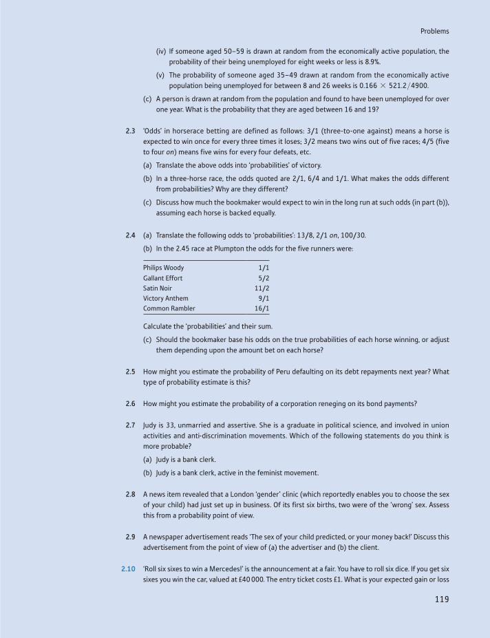
Problems
119
(iv) If someone aged 50–59 is drawn at random from the economically active population, the probability of their being unemployed for eight weeks or less is 8.9%.
(v) The probability of someone aged 35–49 drawn at random from the economically active population being unemployed for between 8 and 26 weeks is 0.166 * 521.2>4900.
(c) A person is drawn at random from the population and found to have been unemployed for over one year. What is the probability that they are aged between 16 and 19?
2.3 ‘Odds’ in horserace betting are defined as follows: 3/1 (three-to-one against) means a horse is expected to win once for every three times it loses; 3/2 means two wins out of five races; 4/5 (five to four on) means five wins for every four defeats, etc.
(a) Translate the above odds into ‘probabilities’ of victory.
(b) In a three-horse race, the odds quoted are 2/1, 6/4 and 1/1. What makes the odds different from probabilities? Why are they different?
(c) Discuss how much the bookmaker would expect to win in the long run at such odds (in part (b)), assuming each horse is backed equally.
2.4 (a) Translate the following odds to ‘probabilities’: 13/8, 2/1 on, 100/30.
(b) In the 2.45 race at Plumpton the odds for the five runners were:
Philips Woody 1/1
Gallant Effort 5/2Satin Noir 11/2Victory Anthem 9/1Common Rambler 16/1
Calculate the ‘probabilities’ and their sum.
(c) Should the bookmaker base his odds on the true probabilities of each horse winning, or adjust them depending upon the amount bet on each horse?
2.5 How might you estimate the probability of Peru defaulting on its debt repayments next year? What type of probability estimate is this?
2.6 How might you estimate the probability of a corporation reneging on its bond payments?
2.7 Judy is 33, unmarried and assertive. She is a graduate in political science, and involved in union activities and anti-discrimination movements. Which of the following statements do you think is more probable?
(a) Judy is a bank clerk.
(b) Judy is a bank clerk, active in the feminist movement.
2.8 A news item revealed that a London ‘gender’ clinic (which reportedly enables you to choose the sex of your child) had just set up in business. Of its first six births, two were of the ‘wrong’ sex. Assess this from a probability point of view.
2.9 A newspaper advertisement reads ‘The sex of your child predicted, or your money back!’ Discuss this advertisement from the point of view of (a) the advertiser and (b) the client.
2.10 ‘Roll six sixes to win a Mercedes!’ is the announcement at a fair. You have to roll six dice. If you get six sixes you win the car, valued at £40 000. The entry ticket costs £1. What is your expected gain or loss
Chapter 2 • Probability
120
on this game? If there are 400 people who try the game, what is the probability of the car being won? The organisers of the fair have to take out insurance against the car being won. This costs £400 for the day. Does this seem a fair premium? If not, why not?
2.11 At another stall, you have to toss a coin numerous times. If a head does not appear in 20 tosses you win £1 billion. The entry fee for the game is £100.
(a) What are your expected winnings?
(b) Would you play?
2.12 A four-engine plane can fly as long as at least two of its engines work. A two-engine plane flies as long as at least one engine works. The probability of an individual engine failure is 1 in 1000.
(a) Would you feel safer in a four- or two-engine plane, and why? Calculate the probabilities of an accident for each type.
(b) How much safer is one type than the other?
(c) What crucial assumption are you making in your calculation? Do you think it is valid?
2.13 Which of the following events are independent?
(a) Two flips of a fair coin.
(b) Two flips of a biased coin.
(c) Rainfall on two successive days.
(d) Rainfall on St Swithin’s Day and rain one month later.
2.14 Which of the following events are independent?
(a) A student getting the first two questions correct in a multiple-choice exam.
(b) A driver having an accident in successive years.
(c) IBM and Dell earning positive profits next year.
(d) Arsenal Football Club winning on successive weekends.
How is the answer to (b) reflected in car insurance premiums?
2.15 Manchester United beat Liverpool 4–2 at soccer, but you do not know the order in which the goals were scored. Draw a tree diagram to display all the possibilities and use it to find (a) the probability that the goals were scored in the order L, MU, MU, MU, L, MU and (b) the probability that the score was 2–2 at some stage.
2.16 An important numerical calculation on a spacecraft is carried out independently by three comput-ers. If all arrive at the same answer, it is deemed correct. If one disagrees, it is overruled. If there is no agreement, then a fourth computer does the calculation and, if its answer agrees with any of the others, it is deemed correct. The probability of an individual computer getting the answer right is 99%. Use a tree diagram to find:
(a) the probability that the first three computers get the right answer;
(b) the probability of getting the right answer;
(c) the probability of getting no answer;
(d) the probability of getting the wrong answer.
2.17 The French national lottery works as follows. Six numbers from the range 0 to 49 are chosen at random. If you have correctly guessed all six, you win the first prize. What are your chances of
Problems
121
winning if you are allowed to choose only six numbers? A single entry like this costs one euro. For 210 euros you can choose 10 numbers, and you win if the 6 selected numbers are among them. Is this better value than the single entry?
2.18 The UK national lottery originally worked as follows. You choose six (different) numbers in the range 1 to 49. If all six come up in the draw (in any order), you win the first prize, generally valued at around £2m (which could be shared if someone else chooses the six winning numbers).
(a) What is your chance of winning with a single ticket?
(b) You win a second prize if you get five out of six right and your final chosen number matches the ‘bonus’ number in the draw (also in the range 1–49). What is the probability of winning a sec-ond prize?
(c) Calculate the probabilities of winning a third, fourth or fifth prize, where a third prize is won by matching five out of the six numbers, a fourth prize by matching four out of six and a fifth prize by matching three out of six.
(d) What is the probability of winning a prize?
(e) The prizes are as follows:
Prize Value
First £2 million (expected, possibly shared)Second £100 000 (expected, for each winner)Third £1500 (expected, for each winner)Fourth £65 (expected, for each winner)Fifth £10 (guaranteed, for each winner)
Comment upon the distribution of the fund between first, second, etc., prizes.
(f) Why is the fifth prize guaranteed whereas the others are not?
(g) In the first week of the lottery, 49 million tickets were sold. There were 1 150 000 winners, of which 7 won (a share of) the jackpot, 39 won a second prize, 2139 won a third prize and 76 731 a fourth prize. Are you surprised by these results or are they as you would expect?
2.19 A coin is either fair or has two heads. You initially assign probabilities of 0.5 to each possibility. The coin is then tossed twice, with two heads appearing. Use Bayes’ theorem to work out the posterior probabilities of each possible outcome.
2.20 A test for AIDS is 99% successful, i.e. if you are HIV+ , it will be detected in 99% of all tests, and if you are not, it will again be right 99% of the time. Assume that about 1% of the population are HIV+ . You take part in a random testing procedure, which gives a positive result. What is the probability that you are HIV+? What implications does your result have for AIDS testing?
2.21 (a) Your initial belief is that a defendant in a court case is guilty with probability 0.5. A witness comes forward claiming he saw the defendant commit the crime. You know the witness is not totally reliable and tells the truth with probability p. Use Bayes’ theorem to calculate the poste-rior probability that the defendant is guilty, based on the witness’s evidence.
(b) A second witness, equally unreliable, comes forward and claims she/he saw the defendant commit the crime. Assuming the witnesses are not colluding, what is your posterior probability of guilt?
(c) If p 6 0.5, compare the answers to (a) and (b). How do you account for this curious result?
Chapter 2 • Probability
122
2.22 A man is mugged and claims that the mugger had red hair. In police investigations of such cases, the victim was able correctly to identify the assailant’s hair colour 80% of the time. Assuming that 10% of the population have red hair, what is the probability that the assailant in this case did, in fact, have red hair? Guess the answer first, and then find the right answer using Bayes’ theorem. What are the implications of your results for juries’ interpretation of evidence in court, particularly in relation to racial minorities?
2.23 A firm has a choice of three projects, with profits as indicated below, dependent upon the state of demand.
Project Demand
Low Middle High
A 100 140 180B 130 145 170C 110 130 200Probability 0.25 0.45 0.3
(a) Which project should be chosen on the expected value criterion?
(b) Which project should be chosen on the maximin and maximax criteria?
(c) Which project should be chosen on the minimax regret criterion?
(d) What is the expected value of perfect information to the firm?
2.24 A firm can build a small, medium or large factory, with anticipated profits from each dependent upon the state of demand, as in the table below.
Factory Demand
Low Middle High
Small 300 320 330Medium 270 400 420Large 50 250 600Probability 0.3 0.5 0.2
(a) Which project should be chosen on the expected value criterion?
(b) Which project should be chosen on the maximin and maximax criteria?
(c) Which project should be chosen on the minimax regret criterion?
(d) What is the expected value of perfect information to the firm?
2.25 There are 25 people at a party. What is the probability that there are at least two with a birthday in common? They do not need to have been born in the same year, just the same day and month of the year. Also, ignore leap year dates. (Hint: the complement is (much) easier to calculate.)
2.26 This problem is tricky, but amusing. Three gunmen, A, B and C, are shooting at each other. The prob-abilities that each will hit what they aim at are 1, 0.75 and 0.5, respectively. They take it in turns to shoot (in alphabetical order) and continue until only one is left alive. Calculate the probabilities of each winning the contest. (Assume they draw lots for the right to shoot first.)
Hint 1: Start with one-on-one gunfights, e.g. the probability of A beating B, or of B beating C. You need to solve this first, and then figure out the optimal strategies in the first stage when all three are alive.
Hint 2: You’ll need the formula for the sum of an infinite series, given in Chapter 1.
Hint 3: To solve this, you need to realize that it might be in a gunman’s best interest not to aim at one of his opponents . . .

Problems
123
2.27 The BMAT test (see http://www.ucl.ac.uk/lapt/bmat/) is an on-line test for prospective medical students. It uses ‘certainty based marking’. After choosing your answer from the alternatives avail-able, you then have to give your level of confidence that your answer is correct: low, medium or high confidence. If you choose low, you get one mark for the correct answer, zero if it is wrong. For medium confidence you get +2 or -2 marks for correct or incorrect answers. If you choose high, you get +3 or -6.
(a) If you are 60% confident your answer is correct (i.e. you think there is a 60% probability you are right), which certainty level should you choose?
(b) Over what range of probabilities is ‘medium’ the best choice?
(c) If you were 85% confident, how many marks would you expect to lose by opting for each of the wrong choices?
2.28 A multiple choice test involves 20 questions, with four choices for each answer.
(a) If you guessed the answers to all questions at random, what mark out of 20 would you expect to get?
(b) If you know the correct answer to eight of the questions, what is your expected score out of 20?
(c) The examiner wishes to correct the bias due to students guessing answers. He/she decides to award a negative mark for incorrect answers (with 1 for a correct answer and 0 for no answer given). What negative mark would ensure that the overall mark out of 20 is a true reflection of the student’s ability?
2.29 (Project) Problem 2.18 calculated the odds of winning the first, second, etc., prizes under the origi-nal national lottery rules, where there were 49 numbers.
(a) Recalculate these probabilities where there are 59 numbers. What do you conclude about the probability of winning a prize and about the distribution of prizes?
(b) The prizes have also changed under the new rules. Compare the old and new lotteries consider-ing both changes in probabilities and awards.
Chapter 2 • Probability
124
Answers to exercises
Exercise 2.1
Answer in text.
Exercise 2.2
(a) A subjective view would have to be taken, informed by such things as opinion polls, the state of the economy, etc. (i.e. events which are expected to influence the outcome of the election).
(b) 1/59, a frequentist view. Some people do add their own subjective evaluations (e.g. that 5 must come up as it has not been drawn for several weeks) but these are unwarranted according to the frequentist approach.
(c) A mixture of objective and subjective criteria might be used here. Historical data on the occurrence of tsunamis might give a (frequentist) baseline figure, to which might be added subjective considerations such as the amount of recent seismic activity and its likely effect on the probability of a tsunami occurring.
(d) A mixture again. Historical data give a benchmark (possibly of little relevance) while immediate factors such as the weather might alter one’s subjective judgement. (As I write, it is snowing outside, which seems to have a huge impact on British trains.)
Exercise 2.3
(a) 1, 2, 3, . . . , 20, 21 (a triple seven), 22 (double eleven), 24, 25 (outer bull), 26, 27, 28, 30, 32, 33, 34, 36, 38, 39, 40, 42, 45, 48, 50 (bull), 51, 54, 57, 60. Or it could miss altogether, it depends upon the player.
(b) For a low-ability player you could assume their chance of hitting the target number is proportional to its area on the board. The number 13 is one of 20, so 5% of the total. Actually it will be less than this, since the area includes the double-13 and triple-13 bands. If one also counts the black space around the perimeter of the board, this reduces the chances further, so 3% might be a reasonable estimate. This assumes the player is equally likely to hit any point on the board, i.e. has no real skill whatsoever. A good player should do much better than this, perhaps 50% or better. The probability for a particular player might be estimated by observing how often they hit their target number when aiming at the board.
(c) Three ways: hitting 18, a double-9 and a triple-6.
Exercise 2.4
(a) The complement is missing the bull’s eye, with a 70% probability (100% – 30%).
(b) Event E
24
1
3
56
Complement of event E
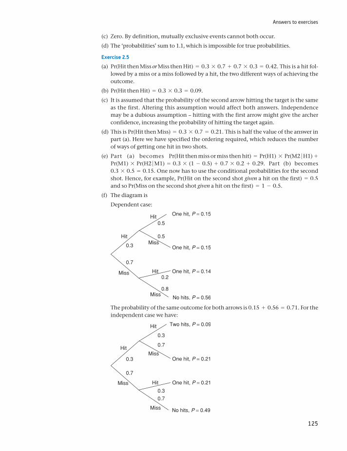
Answers to exercises
125
(c) Zero. By definition, mutually exclusive events cannot both occur.
(d) The ‘probabilities’ sum to 1.1, which is impossible for true probabilities.
Exercise 2.5
(a) Pr(Hit then Miss or Miss then Hit) = 0.3 * 0.7 + 0.7 * 0.3 = 0.42. This is a hit fol-lowed by a miss or a miss followed by a hit, the two different ways of achieving the outcome.
(b) Pr(Hit then Hit) = 0.3 * 0.3 = 0.09.
(c) It is assumed that the probability of the second arrow hitting the target is the same as the first. Altering this assumption would affect both answers. Independence may be a dubious assumption – hitting with the first arrow might give the archer confidence, increasing the probability of hitting the target again.
(d) This is Pr(Hit then Miss) = 0.3 * 0.7 = 0.21. This is half the value of the answer in part (a). Here we have specified the ordering required, which reduces the number of ways of getting one hit in two shots.
(e) Part (a) becomes Pr(Hit then miss or miss then hit) = Pr(H1) * Pr(M2 H1) + Pr(M1) * Pr(H2 M1) = 0.3 * (1 - 0.5) + 0.7 * 0.2 + 0.29. Part (b) becomes 0.3 * 0.5 = 0.15. One now has to use the conditional probabilities for the second shot. Hence, for example, Pr(Hit on the second shot given a hit on the first) = 0.5 and so Pr(Miss on the second shot given a hit on the first) = 1 - 0.5.
(f) The diagram is
Dependent case:
The probability of the same outcome for both arrows is 0.15 + 0.56 = 0.71. For the independent case we have:
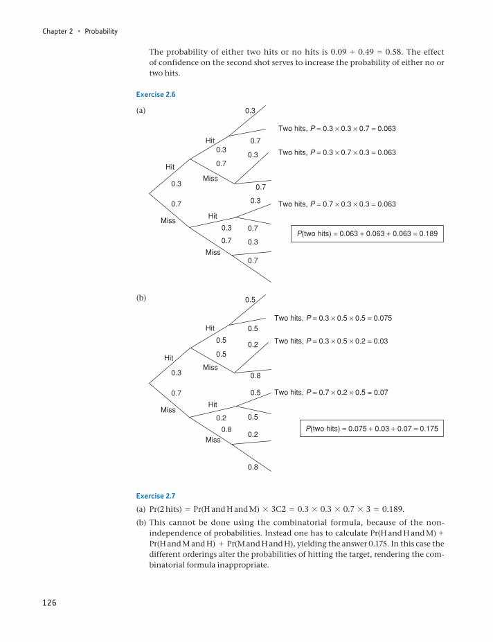
Chapter 2 • Probability
126
The probability of either two hits or no hits is 0.09 + 0.49 = 0.58. The effect of confidence on the second shot serves to increase the probability of either no or two hits.
Exercise 2.6
(a)
(b)
Exercise 2.7
(a) Pr(2 hits) = Pr(H and H and M) * 3C2 = 0.3 * 0.3 * 0.7 * 3 = 0.189.
(b) This cannot be done using the combinatorial formula, because of the non- independence of probabilities. Instead one has to calculate Pr(H and H and M) + Pr(H and M and H) + Pr(M and H and H), yielding the answer 0.175. In this case the different orderings alter the probabilities of hitting the target, rendering the com-binatorial formula inappropriate.
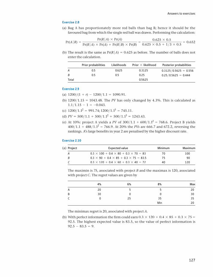
Answers to exercises
127
Exercise 2.8
(a) Bag A has proportionately more red balls than bag B; hence it should be the favoured bag from which the single red ball was drawn. Performing the calculation:
Pr(A R) =Pr(R A) * Pr(A)
Pr(R A) * Pr(A) + Pr(R B) * Pr(B)=
0.625 * 0.50.625 * 0.5 + 1>3 * 0.5
= 0.652
(b) The result is the same as Pr(R A) = 0.625 as before. The number of balls does not enter the calculation.
Prior probabilities Likelihoods Prior * likelihood Posterior probabilities
A 0.5 0.625 0.3125 0.3125>0.5625 = 0.556B 0.5 0.5 0.25 0.25>0.5625 = 0.444Total 0.5625
Exercise 2.9
(a) 1200>(1 + r) - 1200>1.1 = 1090.91.
(b) 1200>1.15 = 1043.48. The PV has only changed by 4.3%. This is calculated as 1.1>1.15 - 1 = -0.043.
(c) 1200>1.12 = 991.74; 1200>1.15 = 745.11.
(d) PV = 500>1.1 + 500>1.12 + 500>1.13 = 1243.43.
(e) At 10%: project A yields a PV of 300>1.1 + 600>1.12 = 768.6. Project B yields 400>1.1 + 488>1.12 = 766.9. At 20% the PVs are 666.7 and 672.2, reversing the rankings. A’s large benefits in year 2 are penalised by the higher discount rate.
Exercise 2.10
(a) Project Expected value Minimum Maximum
A 0.3 * 100 + 0.4 * 80 + 0.3 * 70 = 83 70 100B 0.3 * 90 + 0.4 * 85 + 0.3 * 75 = 83.5 75 90C 0.3 * 120 + 0.4 * 60 + 0.3 * 40 = 72 40 120
The maximin is 75, associated with project B and the maximax is 120, associated with project C. The regret values are given by
4% 6% 8% Max
A 20 5 5 20B 30 0 0 30C 0 25 35 35
Min 20
The minimax regret is 20, associated with project A.
(b) With perfect information the firm could earn 0.3 * 120 + 0.4 * 85 + 0.3 * 75 = 92.5. The highest expected value is 83.5, so the value of perfect information is 92.5 - 83.5 = 9.
128
By the end of this chapter you should be able to:
recognise that the result of most probability experiments (e.g. the score on a die) can be described as a random variable
appreciate how the behaviour of a random variable can often be summarised by a probability distribution (a mathematical formula)
recognise the most common probability distributions and be aware of their uses
solve a range of probability problems using the appropriate probability distribution.
Learning outcomes 128Introduction 129Random variables and probability distributions 130The Binomial distribution 131
The mean and variance of the Binomial distribution 135The Normal distribution 137The distribution of the sample mean 145
Sampling from a non-Normal population 149The relationship between the Binomial and Normal distributions 151
Binomial distribution method 152Normal distribution method 152
The Poisson distribution 153Summary 156
Key terms and concepts 156Formulae used in this chapter 157Problems 157Answers to exercises 162
Probability distributions3
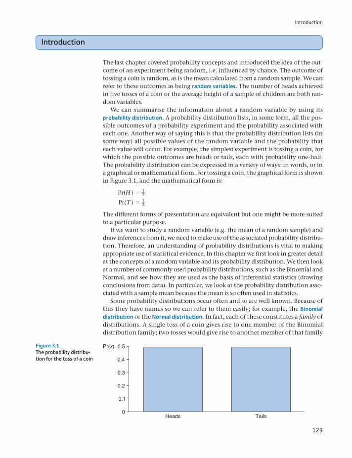
Introduction
129
Introduction
The last chapter covered probability concepts and introduced the idea of the out-come of an experiment being random, i.e. influenced by chance. The outcome of tossing a coin is random, as is the mean calculated from a random sample. We can refer to these outcomes as being random variables. The number of heads achieved in five tosses of a coin or the average height of a sample of children are both ran-dom variables.
We can summarise the information about a random variable by using its probability distribution. A probability distribution lists, in some form, all the pos-sible outcomes of a probability experiment and the probability associated with each one. Another way of saying this is that the probability distribution lists (in some way) all possible values of the random variable and the probability that each value will occur. For example, the simplest experiment is tossing a coin, for which the possible outcomes are heads or tails, each with probability one-half. The probability distribution can be expressed in a variety of ways: in words, or in a graphical or mathematical form. For tossing a coin, the graphical form is shown in Figure 3.1, and the mathematical form is:
Pr(H ) = 12
Pr(T ) = 12
The different forms of presentation are equivalent but one might be more suited to a particular purpose.
If we want to study a random variable (e.g. the mean of a random sample) and draw inferences from it, we need to make use of the associated probability distribu-tion. Therefore, an understanding of probability distributions is vital to making appropriate use of statistical evidence. In this chapter we first look in greater detail at the concepts of a random variable and its probability distribution. We then look at a number of commonly used probability distributions, such as the Binomial and Normal, and see how they are used as the basis of inferential statistics (drawing conclusions from data). In particular, we look at the probability distribution asso-ciated with a sample mean because the mean is so often used in statistics.
Some probability distributions occur often and so are well known. Because of this they have names so we can refer to them easily; for example, the Binomial distribution or the Normal distribution. In fact, each of these constitutes a family of distributions. A single toss of a coin gives rise to one member of the Binomial distribution family; two tosses would give rise to another member of that family
Pr(x)Figure 3.1The probability distribu-tion for the toss of a coin
Chapter 3 • Probability distributions
130
(where the possible outcomes are zero, one or two heads in two tosses). These two distributions differ in the number of tosses but are members of the same family. If a biased coin were tossed, this would lead to yet another Binomial dis-tribution, but it would differ from the previous two because of the different probability of heads.
Members of the Binomial family of distributions are distinguished by the num-ber of trials and by the probability of the outcome occurring. These are the two parameters of the distribution and tell us all we need to know about the distribution. Other distributions might have different numbers of parameters, with different meanings. Some distributions, for example, have only one parameter. We will come across examples of different types of distribution throughout the rest of this text.
In order to understand fully the idea of a probability distribution, we first intro-duce a new concept, that of a random variable. As will be seen later in the chapter, an important random variable is the sample mean, and to understand how to draw inferences from the sample mean, we must recognise it as a random variable.
Random variables and probability distributions
Examples of random variables have already been encountered in the previous chapter, for example, the result of the toss of a coin, or the number of boys in a family of five children. A random variable is one whose outcome or value is the result of chance and is therefore unpredictable, although the range of possible outcomes and the probability of each outcome may be known. It is impossible to know in advance the outcome of a toss of a coin, for example, but it must be either heads or tails, each with probability one-half. The number of heads in 250 tosses is another random variable, which can take any value between zero and 250, although values near 125 are the most likely. You are very unlikely to get 250 heads from tossing a fair coin.
Intuitively, most people would ‘expect’ to get 125 heads from 250 tosses of the coin, since heads comes up half the time on average. This suggests we could use the expected value notation introduced in Chapter 1 and write E(X ) = 125, where X represents the number of heads obtained from 250 tosses. This usage is indeed valid and we will explore this further below. It is a very convenient shorthand notation.
The time of departure of a train is another example of a random variable. It may be timetabled to depart at 11.15, but it probably (almost certainly) won’t leave at exactly that time. If a sample of 10 basketball players were taken, and their average height calculated, this would be a random variable. In this latter case, it is the pro-cess of taking a sample that introduces the variability which makes the resulting average a random variable. If the experiment were repeated, a different sample and a different value of the random variable would be obtained.
The above examples can be contrasted with some things which are not random variables. If one were to take all basketball players and calculate their average height, the result would not be a random variable. This time there is no sampling procedure to introduce variability into the result. If the experiment were repeated, the same result would be obtained, since the same people would be measured the second time (this assumes that the population does not change, of course). Just because the value of something is unknown does not mean it qualifies as a random
The Binomial distribution
131
variable. This is an important distinction to bear in mind, since it is legitimate to make probability statements about random variables (‘the probability that the average height of a sample of basketball players is over 195 cm is 60%’) but not about parameters (‘the probability that the Pope is over 180 cm tall is 60%’). Here again, there is a difference of opinion between frequentist and subjective schools of thought. The latter group would argue that it is possible to make probability statements about the Pope’s height. It is a way of expressing lack of knowledge about the true value. The frequentists would say the Pope’s height is a fact that we do not happen to know; that does not make it a random variable.
The Binomial distribution
One of the simplest distributions which a random variable can have is the Binomial. The Binomial distribution arises whenever the underlying probability experiment has just two possible outcomes, e.g. heads or tails from the toss of a coin. Even if the coin is tossed many times (so one could end up with one, two, three, etc., heads in total), the underlying experiment (sometimes called a Bernoulli trial) has only two outcomes, so the Binomial distribution should be used. A counter-example would be the rolling of a die, which has six possible outcomes (in this case the Multinomial distribution, not covered in this text, would be used). Note, however, that if we were interested only in rolling a six or not, we could use the Binomial by defining the two possible outcomes as ‘six’ and ‘not-six’. It is often the case in statistics that by suit-able transformation of the data, we can use different distributions to tackle the same problem. We will see more of this later in the chapter.
The Binomial distribution can therefore be applied to the type of problem encountered in the previous chapter, concerning the sex of children. It provides a convenient formula for calculating the probability of r boys in n births or, in more general terms, the probability of r ‘successes’ in n trials1. We shall use it to calcu-late the probabilities of 0, 1, . . . , 5 boys in five births.
For the Binomial distribution to apply, we first need to assume independence of successive events and we shall assume that, for any birth:
Pr(boy) = P = 12
It follows that
Pr(girl) = 1 - Pr(boy) = 1 - P = 12
Although we have P = 12 in this example, the Binomial distribution can be applied
for any value of P between 0 and 1.First we consider the case of r = 5, n = 5, i.e. five boys in five births. This prob-
ability is found using the multiplication rule:
Pr(r = 5) = P * P * P * P * P = P5 = (12 )5 = 1>32
The probability of four boys (and then implicitly one girl) is
Pr(r = 4) = P * P * P * P * (1 - P) = 1>32
1The identification of a boy with ‘success’ is a purely formal one and is not meant to be pejorative.
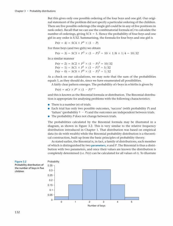
Chapter 3 • Probability distributions
132
But this gives only one possible ordering of the four boys and one girl. Our origi-nal statement of the problem did not specify a particular ordering of the children. There are five possible orderings (the single girl could be in any of five positions in rank order). Recall that we can use the combinatorial formula nCr to calculate the number of orderings, giving 5C4 = 5. Hence the probability of four boys and one girl in any order is 5/32. Summarising, the formula for four boys and one girl is
Pr(r = 4) = 5C4 * P 4 * (1 - P)
For three boys (and two girls) we obtain
Pr(r = 3) = 5C3 * P 3 * (1 - P )2 = 10 * 1>8 * 1>4 = 10>32
In a similar manner
Pr(r = 2) = 5C2 * P 2 * (1 - P )3 = 10>32 Pr(r = 1) = 5C1 * P1 * (1 - P )4 = 5>32 Pr(r = 0) = 5C0 * P 0 * (1 - P )5 = 1>32
As a check on our calculations, we may note that the sum of the probabilities equals 1, as they should do, since we have enumerated all possibilities.
A fairly clear pattern emerges. The probability of r boys in n births is given by
Pr(r) = nCr * P r * (1 - P )n - r
and this is known as the Binomial formula or distribution. The Binomial distribu-tion is appropriate for analysing problems with the following characteristics:
There is a number (n) of trials. Each trial has only two possible outcomes, ‘success’ (with probability P) and
‘failure’ (probability 1 - P) and the outcomes are independent between trials. The probability P does not change between trials.
The probabilities calculated by the Binomial formula may be illustrated in a diagram, as shown in Figure 3.2. This is very similar to the relative frequency distribution introduced in Chapter 1. That distribution was based on empirical data (to do with wealth) while the Binomial probability distribution is a theoreti-cal construction, built up from the basic principles of probability theory.
As stated earlier, the Binomial is, in fact, a family of distributions, each member of which is distinguished by two parameters, n and P. The Binomial is thus a distri-bution with two parameters, and once their values are known the distribution is completely determined (i.e. Pr(r) can be calculated for all values of r). To illustrate
Figure 3.2Probability distribution of the number of boys in five children
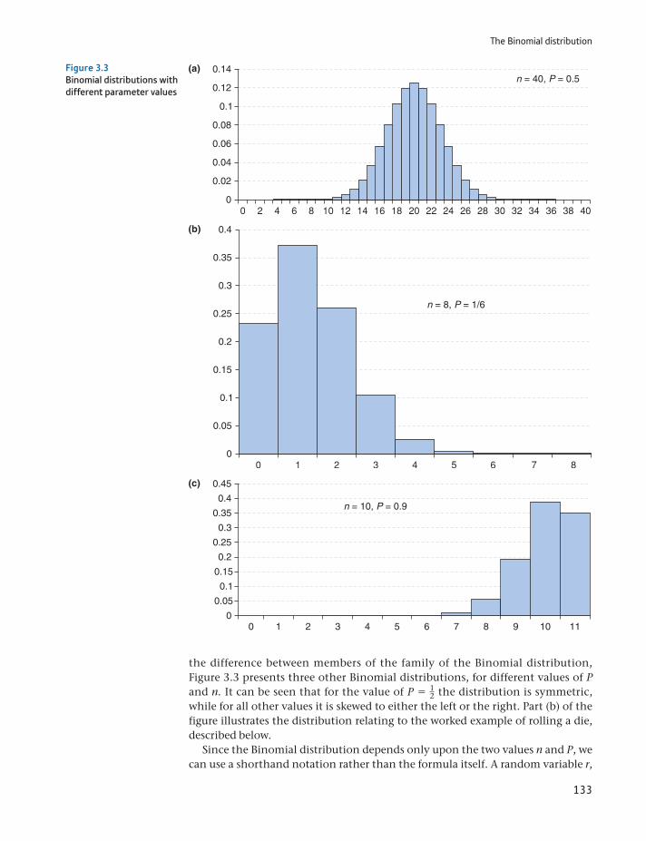
The Binomial distribution
133
the difference between members of the family of the Binomial distribution, Figure 3.3 presents three other Binomial distributions, for different values of P and n. It can be seen that for the value of P = 1
2 the distribution is symmetric, while for all other values it is skewed to either the left or the right. Part (b) of the figure illustrates the distribution relating to the worked example of rolling a die, described below.
Since the Binomial distribution depends only upon the two values n and P, we can use a shorthand notation rather than the formula itself. A random variable r,
n = 40, P = 0.5
0
0.04
0.02
0.06
0.08
0.1
0.14
0.12
n = 8, P = 1/6
0.4
0.3
0.35
0.2
0.25
0.1
0.15
0
0.05
0 1 2 3 4 5 6 7 8 9 10 11
0.4
0.45
0.3
0.35
0.2
0.25
0.1
0.15
0.05
0
n = 10, P = 0.9
Figure 3.3Binomial distributions with different parameter values
Chapter 3 • Probability distributions
134
which has a Binomial distribution with the parameters n and P, can be written in general terms as
r ∼ B(n, P) (3.1)
Thus for the previous example of children, where r represents the number of boys,
r ∼ B(5, 12)
This is simply a brief and convenient way of writing down the information avail-able; it involves no new problems of a conceptual nature. Writing
r ∼ B(n, P)
is just a shorthand for
Pr(r) = nCr * Pr * (1 - P)n - r
Teenage weapons
A story entitled ‘One in five teens carry weapon’ (link on main BBC news website 23/7/2007) provides a nice example of how knowledge of the binomial distribution can help our inter-pretation of events in the news. The headline is somewhat alarming but reading the story reveals that this is what young teenagers report of their friends. It then reveals that some are only ‘fairly sure’ and that it applies to boys, not girls. By now our suspicions should be aroused. What is the truth?
Notice, incidentally, how the story subtly changes. The headline suggests 20% of teenag-ers carry a weapon. The text then says this is what young teenagers report of their friends. It then reveals that some are only ‘fairly sure’ and that it applies to boys, not girls. By now our suspicions should be aroused. What is the truth?
Note that you are more likely to know someone who carries a weapon than to carry one yourself. Let p be the proportion who truly carry a weapon. Assume also that each person has 10 friends. What is the probability that a person, selected at random, has no friends who carry a weapon? Assuming independence, this is given by [1 - p]10. Hence the probability of at least one friend with a weapon is 1 - [1 - p]10. This is the proportion of people who will report having at least one friend with a weapon. How does this vary with p? This is set out in the table:
pp(# 1 friend with weapon)
1 − [1 − p]10
0.0% 0%0.5% 5%1.0% 10%1.5% 14%2.0% 18%2.5% 22%3.0% 26%3.5% 30%4.0% 34%
Thus, a true proportion of just over 2% carrying weapons will generate a report suggesting 20% know someone carrying a weapon! This is much less alarming (and newsworthy) than in the original story.
ST
ATISTICS
IN
PRACTI
CE
· ·
The Binomial distribution
135
The mean and variance of the Binomial distribution
In Chapter 1 we calculated the mean and variance of a set of data, of the distribu-tion of wealth. The picture of that distribution (Figure 1.9) looks not too dissimi-lar to one of the Binomial distributions shown in Figure 3.3. This suggests that we can calculate the mean and variance of a Binomial distribution, just as we did for the empirical distribution of wealth. Calculating the mean would provide the answer to a question such as ‘If we have a family with five children, how many do we expect to be boys?’ Intuitively the answer seems clear, 2.5 (even though such a family could not exist). The Binomial formula allows us to confirm this intuition.
The mean and variance are most easily calculated by drawing up a relative fre-quency table based on the Binomial frequencies. This is shown in Table 3.1 for the values n = 5 and P = 1
2. Note that r is equivalent to x in our usual notation and Pr(r), the relative frequency, is equivalent to f(x)>Σf(x). The mean of this distribu-tion is given by
E(r) = a r * Pr(r)
aPr(r)=
80>3232>32
= 2.5 (3.2)
and the variance is given by
V(r) = a r2 * Pr(r)
aPr(r)- m2 =
240>3232>32
- 2.52 = 1.25 (3.3)
The mean value tells us that in a family of five children we would expect, on aver-age, two and a half boys. Obviously no single family can be like this; it is the aver-age over all such families. The variance is more difficult to interpret intuitively, but it tells us something about how the number of boys in different families will be spread around the average of 2.5.
You might like to test the assumptions. What happens if there are more than 10 friends assumed? What happens if events are not independent, i.e. having one friend with a weapon increases the probability of another friend with a weapon?
Update: The 2009/10 British Crime Survey estimated that 1% of 13–15-year-olds car-ried a knife for their own protection. It also reported 13% reporting they knew someone who carried a knife for protection. These numbers seem entirely consistent with our calcu-lation above, carried out well before the 2009/10 survey.
Table 3.1 Calculating the mean and variance of the Binomial distribution
r Pr(r) r : Pr(r) r2 : Pr(r)
0 1/32 0 01 5/32 5/32 5/322 10/32 20/32 40/323 10/32 30/32 90/324 5/32 20/32 80/325 1/32 5/32 25/32Totals 32/32 80/32 240/32
Chapter 3 • Probability distributions
136
There is a quicker way to calculate the mean and variance of the Binomial dis-tribution. It can be shown that the mean can be calculated as nP, i.e. the number of trials times the probability of success. For example, in a family with five chil-dren and an equal probability that each child is a boy or a girl, we expect nP = 5 * 1>2 = 2.5 to be boys.
The variance can be calculated as nP(1 - P). This gives 5 * 1>2 * 1>2 = 1.25, as found above by extensive calculation.
Worked example 3.1 Rolling a die
If a die is thrown four times, what is the probability of getting two or more sixes? This is a problem involving repeated experiments (rolling the die) with but two types of outcome for each roll: success (a six) or failure (anything but a six). Note that we combine several possibilities (scores of 1, 2, 3, 4 or 5) together and represent them all as failure. The probability of success (one-sixth) does not vary from one experiment to another, and so use of the Binomial distribu-tion is appropriate. The values of the parameters are n = 4 and P = 1>6. Denot-ing by r the random variable ‘the number of sixes in four rolls of the die’, then
r ∼ B(4, 16 ) (3.4)
Hence
Pr(r) = nCr * Pr(1 - P)(n - r)
where P = 16 and n = 4. The probabilities of two, three and four sixes are then
given by
Pr(r = 2) = 4C2(16 )2(5
6 )2 = 0.116
Pr(r = 3) = 4C3(16 )3(5
6 )1 = 0.115
Pr(r = 4) = 4C4(16 )4(5
6 )0 = 0.00077
Since these events are mutually exclusive, the probabilities can simply be added together to get the desired result, which is 0.132, or 13.2%. This is the probability of two or more sixes in four rolls of a die.
This result can be illustrated diagrammatically as part of the area under the appropriate Binomial distribution, shown in Figure 3.4.
Pr(x) 0.5
0.4
0.3
0.2
0.1
0
Figure 3.4Probability of two or more sixes in four rolls of a die
The Normal distribution
137
The Normal distribution
The Binomial distribution applies when there are two possible outcomes to an experiment, but not all problems fall into this category. For instance, the (ran-dom) arrival time of a train is a continuous variable and cannot be analysed using the Binomial. There are many probability distributions in statistics, developed to analyse different types of problem. Several of them are covered in this text, and the most important of them is the Normal distribution, to which we now turn. It was discovered by the German mathematician Gauss in the nineteenth century (hence it is also known as the Gaussian distribution), in the course of his work on regression (see Chapter 7).
Many random variables turn out to be Normally distributed. Men’s (or wom-en’s) heights are Normally distributed. IQ (the measure of intelligence) is also Normally distributed. Another example is of a machine producing (say) bolts with a nominal length of 5 cm which will actually produce bolts of slightly varying length (these differences would probably be extremely small) due to factors such as wear in the machinery, slight variations in the pressure of the lubricant, etc. These would result in bolts whose length varies, in accordance with the Normal distribution. This sort of process is extremely common, with the result that the Normal distribution often occurs in everyday situations.
The Normal distribution tends to arise when a random variable is the result of many independent, random influences added together, none of which dominates the others. A man’s height is the result of many genetic influences, plus environ-mental factors such as diet, etc. As a result, height is Normally distributed. If one takes the height of men and women together, the result is not a Normal distribu-tion, however. This is because one influence dominates the others: gender. Men are, on average, taller than women. Many variables familiar in economics are not
The darker-shaded areas represent the probabilities of two or more sixes and together their area represents 13.2% of the whole distribution. This illustrates an important principle: that probabilities can be represented by areas under an appropriate probability distribution. We shall see more of this later.
(a) If the probability of a randomly drawn individual having blue eyes is 0.6, what is the prob-ability that four people drawn at random all have blue eyes?
(b) What is the probability that two of the sample of four have blue eyes?
(c) For this particular example, write down the Binomial formula for the probability of r blue-eyed individuals, r = 0 c4. Confirm that the calculated probabilities sum to one.
?
Exercise 3.1
(a) Calculate the mean and variance of the number of blue-eyed individuals in the previous exercise.
(b) Draw a graph of this Binomial distribution and on it mark the mean value and the mean value + >- one standard deviation.
Having introduced the concept of probability distributions using the Binomial, we now move on to the most important of all probability distributions, the Normal.
?
Exercise 3.2
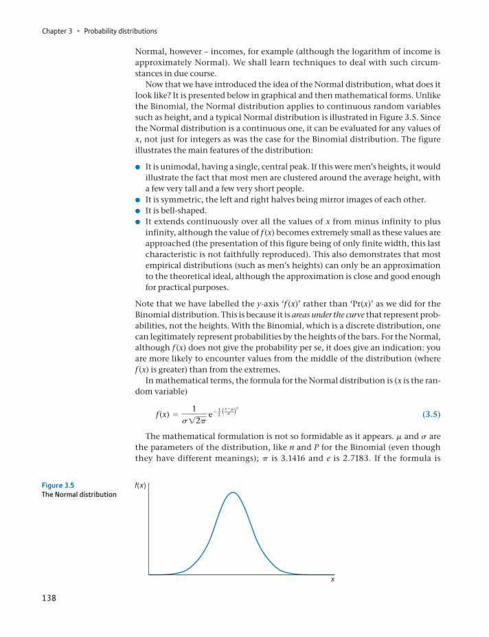
Chapter 3 • Probability distributions
138
Normal, however – incomes, for example (although the logarithm of income is approximately Normal). We shall learn techniques to deal with such circum-stances in due course.
Now that we have introduced the idea of the Normal distribution, what does it look like? It is presented below in graphical and then mathematical forms. Unlike the Binomial, the Normal distribution applies to continuous random variables such as height, and a typical Normal distribution is illustrated in Figure 3.5. Since the Normal distribution is a continuous one, it can be evaluated for any values of x, not just for integers as was the case for the Binomial distribution. The figure illustrates the main features of the distribution:
It is unimodal, having a single, central peak. If this were men’s heights, it would illustrate the fact that most men are clustered around the average height, with a few very tall and a few very short people.
It is symmetric, the left and right halves being mirror images of each other. It is bell-shaped. It extends continuously over all the values of x from minus infinity to plus
infinity, although the value of f (x) becomes extremely small as these values are approached (the presentation of this figure being of only finite width, this last characteristic is not faithfully reproduced). This also demonstrates that most empirical distributions (such as men’s heights) can only be an approximation to the theoretical ideal, although the approximation is close and good enough for practical purposes.
Note that we have labelled the y-axis ‘f (x)’ rather than ‘Pr(x)’ as we did for the Binomial distribution. This is because it is areas under the curve that represent prob-abilities, not the heights. With the Binomial, which is a discrete distribution, one can legitimately represent probabilities by the heights of the bars. For the Normal, although f (x) does not give the probability per se, it does give an indication: you are more likely to encounter values from the middle of the distribution (where f (x) is greater) than from the extremes.
In mathematical terms, the formula for the Normal distribution is (x is the ran-dom variable)
f (x) =1
s12p e- 1
2 (x -ms )2
(3.5)
The mathematical formulation is not so formidable as it appears. m and s are the parameters of the distribution, like n and P for the Binomial (even though they have different meanings); p is 3.1416 and e is 2.7183. If the formula is
Figure 3.5The Normal distribution
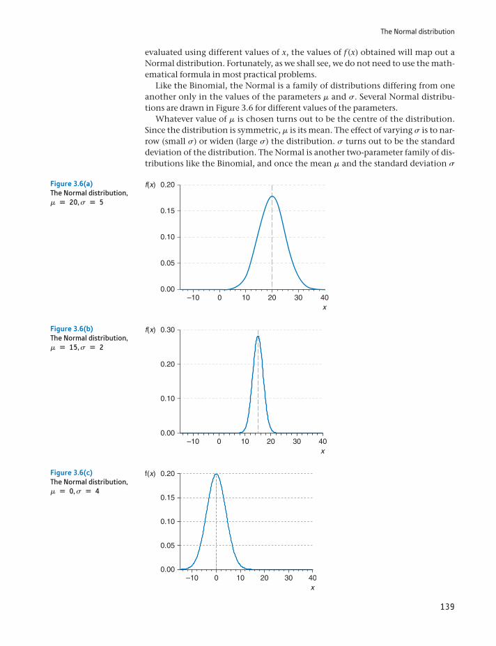
The Normal distribution
139
evaluated using different values of x, the values of f (x) obtained will map out a Normal distribution. Fortunately, as we shall see, we do not need to use the math-ematical formula in most practical problems.
Like the Binomial, the Normal is a family of distributions differing from one another only in the values of the parameters m and s. Several Normal distribu-tions are drawn in Figure 3.6 for different values of the parameters.
Whatever value of m is chosen turns out to be the centre of the distribution. Since the distribution is symmetric, m is its mean. The effect of varying s is to nar-row (small s) or widen (large s) the distribution. s turns out to be the standard deviation of the distribution. The Normal is another two-parameter family of dis-tributions like the Binomial, and once the mean m and the standard deviation s
0.00
0.05
0.10
0.15
0.20f(x)
–10 0 10 20 30 40x
Figure 3.6(a)The Normal distribution, m = 20, s = 5
0.00
0.10
0.20
0.30f(x)
–10 0 10 20 30 40x
Figure 3.6(b)The Normal distribution, m = 15, s = 2
0.00
0.05
0.10
0.15
0.20f(x)
–10 0 10 20 30 40x
Figure 3.6(c)The Normal distribution, m = 0, s = 4
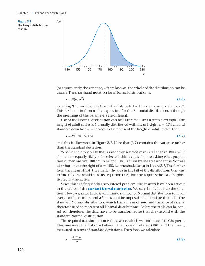
Chapter 3 • Probability distributions
140
(or equivalently the variance, s2) are known, the whole of the distribution can be drawn. The shorthand notation for a Normal distribution is
x ∼ N(m, s2) (3.6)
meaning ‘the variable x is Normally distributed with mean m and variance s2’. This is similar in form to the expression for the Binomial distribution, although the meanings of the parameters are different.
Use of the Normal distribution can be illustrated using a simple example. The height of adult males is Normally distributed with mean height m = 174 cm and standard deviation s = 9.6 cm. Let x represent the height of adult males; then
x ∼ N(174, 92.16) (3.7)
and this is illustrated in Figure 3.7. Note that (3.7) contains the variance rather than the standard deviation.
What is the probability that a randomly selected man is taller than 180 cm? If all men are equally likely to be selected, this is equivalent to asking what propor-tion of men are over 180 cm in height. This is given by the area under the Normal distribution, to the right of x = 180, i.e. the shaded area in Figure 3.7. The further from the mean of 174, the smaller the area in the tail of the distribution. One way to find this area would be to use equation (3.5), but this requires the use of sophis-ticated mathematics.
Since this is a frequently encountered problem, the answers have been set out in the tables of the standard Normal distribution. We can simply look up the solu-tion. However, since there is an infinite number of Normal distributions (one for every combination m and s2), it would be impossible to tabulate them all. The standard Normal distribution, which has a mean of zero and variance of one, is therefore used to represent all Normal distributions. Before the table can be con-sulted, therefore, the data have to be transformed so that they accord with the standard Normal distribution.
The required transformation is the z score, which was introduced in Chapter 1. This measures the distance between the value of interest (180) and the mean, measured in terms of standard deviations. Therefore, we calculate
z =x - m
s (3.8)
Figure 3.7The height distribution of men
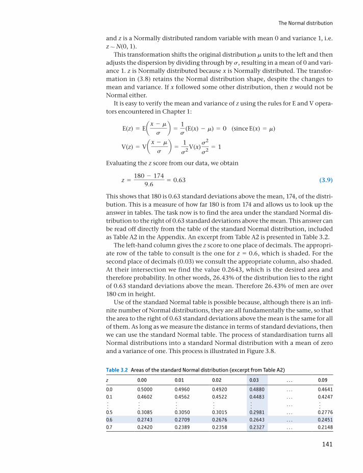
The Normal distribution
141
and z is a Normally distributed random variable with mean 0 and variance 1, i.e. z ∼ N(0, 1).
This transformation shifts the original distribution m units to the left and then adjusts the dispersion by dividing through by s, resulting in a mean of 0 and vari-ance 1. z is Normally distributed because x is Normally distributed. The transfor-mation in (3.8) retains the Normal distribution shape, despite the changes to mean and variance. If x followed some other distribution, then z would not be Normal either.
It is easy to verify the mean and variance of z using the rules for E and V opera-tors encountered in Chapter 1:
E(z) = Eax - m
sb =
1s
(E(x) - m) = 0 (since E(x) = m)
V(z) = Vax - m
sb =
1
s2 V(x) s2
s2 = 1
Evaluating the z score from our data, we obtain
z =180 - 174
9.6= 0.63 (3.9)
This shows that 180 is 0.63 standard deviations above the mean, 174, of the distri-bution. This is a measure of how far 180 is from 174 and allows us to look up the answer in tables. The task now is to find the area under the standard Normal dis-tribution to the right of 0.63 standard deviations above the mean. This answer can be read off directly from the table of the standard Normal distribution, included as Table A2 in the Appendix. An excerpt from Table A2 is presented in Table 3.2.
The left-hand column gives the z score to one place of decimals. The appropri-ate row of the table to consult is the one for z = 0.6, which is shaded. For the second place of decimals (0.03) we consult the appropriate column, also shaded. At their intersection we find the value 0.2643, which is the desired area and therefore probability. In other words, 26.43% of the distribution lies to the right of 0.63 standard deviations above the mean. Therefore 26.43% of men are over 180 cm in height.
Use of the standard Normal table is possible because, although there is an infi-nite number of Normal distributions, they are all fundamentally the same, so that the area to the right of 0.63 standard deviations above the mean is the same for all of them. As long as we measure the distance in terms of standard deviations, then we can use the standard Normal table. The process of standardisation turns all Normal distributions into a standard Normal distribution with a mean of zero and a variance of one. This process is illustrated in Figure 3.8.
Table 3.2 Areas of the standard Normal distribution (excerpt from Table A2)
z 0.00 0.01 0.02 0.03 . . . 0.09
0.0 0.5000 0.4960 0.4920 0.4880 . . . 0.46410.1 0.4602 0.4562 0.4522 0.4483 . . . 0.4247f f f f f . . . f0.5 0.3085 0.3050 0.3015 0.2981 . . . 0.27760.6 0.2743 0.2709 0.2676 0.2643 . . . 0.24510.7 0.2420 0.2389 0.2358 0.2327 . . . 0.2148
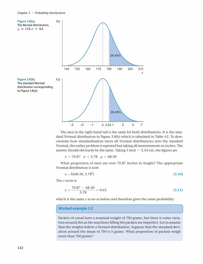
Chapter 3 • Probability distributions
142
The area in the right-hand tail is the same for both distributions. It is the stan-dard Normal distribution in Figure 3.8(b) which is tabulated in Table A2. To dem-onstrate how standardisation turns all Normal distributions into the standard Normal, the earlier problem is repeated but taking all measurements in inches. The answer should obviously be the same. Taking 1 inch = 2.54 cm, the figures are
x = 70.87 s = 3.78 m = 68.50
What proportion of men are over 70.87 inches in height? The appropriate Normal distribution is now
x ∼ N(68.50, 3.782) (3.10)
The z score is
z =70.87 - 68.50
3.78= 0.63 (3.11)
which is the same z score as before and therefore gives the same probability.
Figure 3.8(a)The Normal distribution, m = 174, s = 9.6
–3 –2 –1 1 2 3
Figure 3.8(b)The standard Normal distribution corresponding to Figure 3.8(a)
Worked example 3.2
Packets of cereal have a nominal weight of 750 grams, but there is some varia-tion around this as the machines filling the packets are imperfect. Let us assume that the weights follow a Normal distribution. Suppose that the standard devi-ation around the mean of 750 is 5 grams. What proportion of packets weigh more than 760 grams?
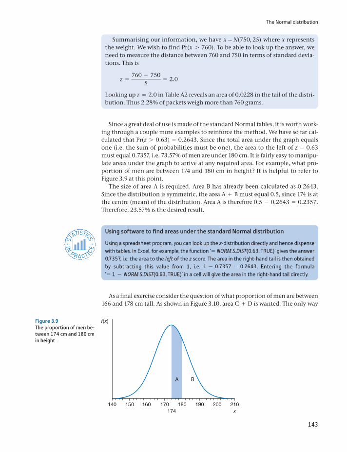
The Normal distribution
143
Since a great deal of use is made of the standard Normal tables, it is worth work-ing through a couple more examples to reinforce the method. We have so far cal-culated that Pr(z 7 0.63) = 0.2643. Since the total area under the graph equals one (i.e. the sum of probabilities must be one), the area to the left of z = 0.63 must equal 0.7357, i.e. 73.57% of men are under 180 cm. It is fairly easy to manipu-late areas under the graph to arrive at any required area. For example, what pro-portion of men are between 174 and 180 cm in height? It is helpful to refer to Figure 3.9 at this point.
The size of area A is required. Area B has already been calculated as 0.2643. Since the distribution is symmetric, the area A + B must equal 0.5, since 174 is at the centre (mean) of the distribution. Area A is therefore 0.5 - 0.2643 = 0.2357. Therefore, 23.57% is the desired result.
Summarising our information, we have x ∼ N(750, 25) where x represents the weight. We wish to find Pr(x 7 760). To be able to look up the answer, we need to measure the distance between 760 and 750 in terms of standard devia-tions. This is
z =760 - 750
5= 2.0
Looking up z = 2.0 in Table A2 reveals an area of 0.0228 in the tail of the distri-bution. Thus 2.28% of packets weigh more than 760 grams.
140 150 160 170174
180 190 200 210
Figure 3.9The proportion of men be-tween 174 cm and 180 cm in height
Using software to find areas under the standard Normal distribution
Using a spreadsheet program, you can look up the z-distribution directly and hence dispense with tables. In Excel, for example, the function ‘= NORM.S.DIST(0.63, TRUE)’ gives the answer 0.7357, i.e. the area to the left of the z score. The area in the right-hand tail is then obtained by subtracting this value from 1, i.e. 1 - 0.7357 = 0.2643. Entering the formula ‘= 1 - NORM.S.DIST(0.63, TRUE)’ in a cell will give the area in the right-hand tail directly.
ST
ATISTICS
IN
PRACTI
CE
· ·
As a final exercise consider the question of what proportion of men are between 166 and 178 cm tall. As shown in Figure 3.10, area C + D is wanted. The only way
Chapter 3 • Probability distributions
144
to find this is to calculate the two areas separately and then add them together. For area D the z score associated with 178 is:
zD =178 - 174
9.6= 0.42 (3.12)
Table A2 indicates that the area in the right-hand tail, beyond z = 0.42, is 0.3372, so area D = 0.5 - 0.3372 = 0.1628. For C, the z score is
zC =166 - 174
9.6= -0.83 (3.13)
The minus sign indicates that it is the left-hand tail of the distribution, below the mean, which is being considered. Since the distribution is symmetric, it is the same as if it were the right-hand tail, so the minus sign may be ignored when consulting the table. Looking up z = 0.83 in Table A2 gives an area of 0.2033 in the tail, so area C is therefore 0.5 - 0.2033 = 0.2967. Adding areas C and D gives 0.2967 + 0.1628 = 0.4595. So nearly half of all men are between 166 and 178 cm in height.
An alternative interpretation of the results obtained above is that if a man is drawn at random from the adult population, the probability that he is over 180 cm tall is 26.43%. This is in line with the frequentist school of thought. Since 26.43% of the population is over 180 cm in height, that is the probability of a man over 180 cm being drawn at random.
140 150 160 170 180 190 200 210
Figure 3.10The proportion of men between 166 and 178 cm in height
(a) The random variable x is distributed Normally, x ∼ N(40, 36). Find the probability that x 7 50.
(b) Find Pr(x 6 45).
(c) Find Pr(36 6 x 6 45).
?
Exercise 3.3
The mean + >-0.67 standard deviations cuts off 25% in each tail of the Normal distribu-tion. Hence, the middle 50% of the distribution lies within + >-0.67 standard deviations of the mean. Use this fact to calculate the inter-quartile range for the distribution x ∼ N(200, 256).
?
Exercise 3.4
The distribution of the sample mean
145
The distribution of the sample mean
One of the most important concepts in statistical inference is the probability dis-tribution of the mean of a random sample, since we often use the sample mean to tell us something about an associated population. Suppose that, from the popula-tion of adult males, a random sample of size n = 36 is taken, their heights mea-sured and the mean height of the sample calculated. What can we infer from this about the true average height of the population? To do this, we need to know about the statistical properties of the sample mean. The sample mean is a random variable because of the chance element of random sampling (different samples would yield different values of the sample mean). Since the sample mean is a ran-dom variable, it must have associated with it a probability distribution. We also refer to this as the sampling distribution of the sample mean, since the randomness is due to sampling.
We therefore need to know, first, what is the appropriate distribution and, sec-ond, what are its parameters. From the definition of the sample mean we have
x =1n
(x1 + x2 + g+ xn) (3.14)
where each observation, xi, is itself a Normally distributed random variable, with xi ∼ N(m, s2), because each comes from the parent distribution with such char-acteristics. (We stated earlier that men’s heights are Normally distributed.) We now make use of the following theorem to demonstrate first that x is Normally distributed:
As suggested in the text, the logarithm of income is approximately Normally distributed. Sup-pose the log (to the base 10) of income has the distribution x ∼ N(4.18, 256). Calculate the inter-quartile range for x and then take anti-logs to find the inter-quartile range of income.?
Exercise 3.5
Any linear combination of independent, Normally distributed random variables is itself Normally distributed.
Theorem
A linear combination of two variables x1 and x2 is of the form w1x1 + w2x2 where w1 and w2 are constants. This can be generalised to any number of x values. It is clear that the sample mean satisfies these conditions and is a linear combina-tion of the individual x values (with the weight on each observation equal to 1/n). As long as the observations are independently drawn, therefore, the sample mean is Normally distributed.
We now need the parameters (mean and variance) of the distribution. For this we use the E and V operators once again:
E(x) =1n
(E(x1) + E(x2) + g+ E(xn)) (3.15)
=1n
(m + m + g+ m)
=1n
nm
= m
Chapter 3 • Probability distributions
146
V(x) = Va1n
[x1 + x2 + g+ xn]b
=1
n2 (V(x1) + V(x2) + g+ V(xn))
=1
n2 (s2 + s2 + g+ s2)
=1
n2 ns2 =s2
n (3.16)
Putting all this together, we have2
x ∼ N am, s2
nb (3.17)
This we may summarise in the following theorem:
2Don’t worry if you didn’t follow the derivation of this formula, just accept that it is correct.
The mean, x of a random sample drawn from a population which has a Normal distribution with mean m and variance s2, has a sampling distribution which is Normal, with mean m and variance s2 /n, where n is the sample size.
Theorem
The meaning of this theorem is as follows. First, it is assumed that the popula-tion from which the samples are to be drawn is itself Normally distributed (this assumption will be relaxed in a moment), with mean m and variance s2. From this population many samples are drawn, each of sample size n, and the mean of each sample is calculated. The samples are independent, meaning that the observa-tions selected for one sample do not influence the selection of observations in the other samples. This gives many sample means, x1, x2, etc. If these sample means are treated as a new set of observations, then the probability distribution of these observations can be derived. The theorem states that this distribution is Normal, with the sample means centred around m, the population mean, and with vari-ance s2>n. The argument is set out diagrammatically in Figure 3.11.
Intuitively this theorem can be understood as follows. If the height of adult males is a Normally distributed random variable with mean m = 174 cm and vari-ance s2 = 92.16, then it would be expected that a random sample of (say) nine males would yield a sample mean height of around 174 cm, perhaps a little more, perhaps a little less. In other words, the sample mean is centred around 174 cm, or the mean of the distribution of sample means is 174 cm.
The larger is the size of the individual samples (i.e. the larger n), the closer the sample mean would tend to be to 174 cm. For example, if the sample size is only two, a sample of two very tall people is quite possible, with a high sample mean as a result, well over 174 cm, e.g. 182 cm. But if the sample size were 20, it is very unlikely that 20 very tall males would be selected and the sample mean is likely to be much closer to 174. This is why the sample size n appears in the formula for the variance of the distribution of the sample mean, s2>n.
Note that, once again, we have transformed one (or more) random variables, the xi’s, with a particular probability distribution into another random variable, x, with a (slightly) different distribution. This is common practice in statistics:
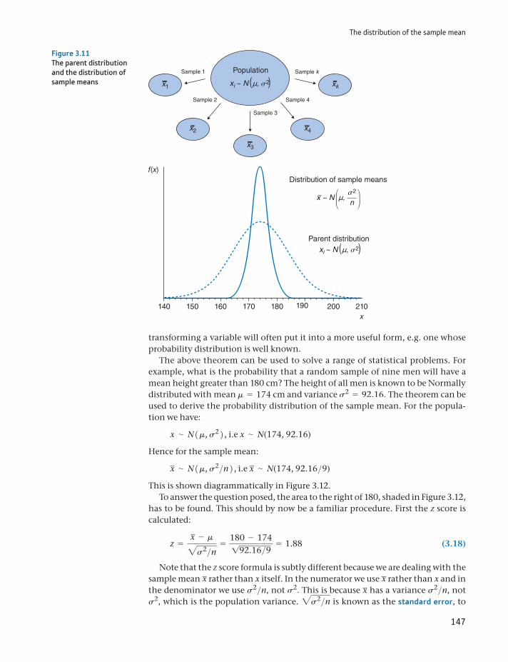
The distribution of the sample mean
147
transforming a variable will often put it into a more useful form, e.g. one whose probability distribution is well known.
The above theorem can be used to solve a range of statistical problems. For example, what is the probability that a random sample of nine men will have a mean height greater than 180 cm? The height of all men is known to be Normally distributed with mean m = 174 cm and variance s2 = 92.16. The theorem can be used to derive the probability distribution of the sample mean. For the popula-tion we have:
x ∼ N1m, s22 , i.e x ∼ N(174, 92.16)
Hence for the sample mean:
x ∼ N1m, s2>n2 , i.e x ∼ N(174, 92.16>9)
This is shown diagrammatically in Figure 3.12.To answer the question posed, the area to the right of 180, shaded in Figure 3.12,
has to be found. This should by now be a familiar procedure. First the z score is calculated:
z =x - m2s2>n
=180 - 174192.16>9 = 1.88 (3.18)
Note that the z score formula is subtly different because we are dealing with the sample mean x rather than x itself. In the numerator we use x rather than x and in the denominator we use s2>n, not s2. This is because x has a variance s2>n, not s2, which is the population variance. 2s2>n is known as the standard error, to
140 150 160 170 180 190 200 210
Distribution of sample means
Parent distribution
nx ~ N µ,
s2
( (xi ~ N µ, s2
Sample 2
Sample 3
Population
( (xi ~ N µ, s2
x2
x3
x4
Sample 4
Sample 1
x1
Sample k
xk
Figure 3.11The parent distribution and the distribution of sample means
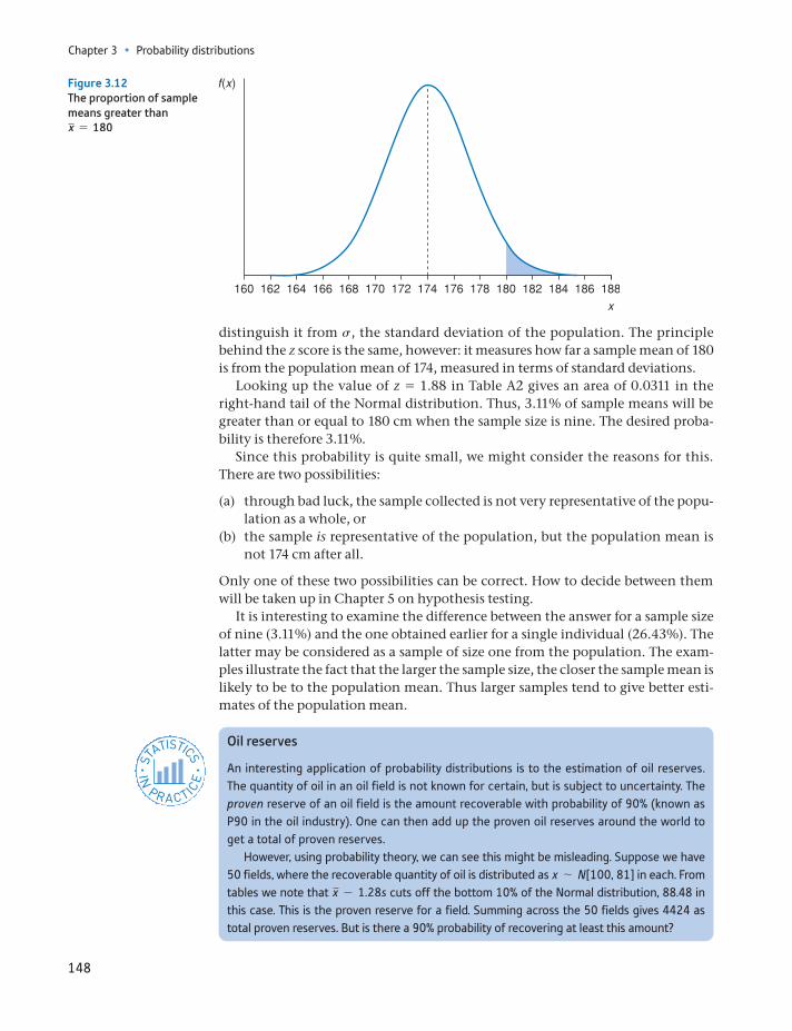
Chapter 3 • Probability distributions
148
distinguish it from s, the standard deviation of the population. The principle behind the z score is the same, however: it measures how far a sample mean of 180 is from the population mean of 174, measured in terms of standard deviations.
Looking up the value of z = 1.88 in Table A2 gives an area of 0.0311 in the right-hand tail of the Normal distribution. Thus, 3.11% of sample means will be greater than or equal to 180 cm when the sample size is nine. The desired proba-bility is therefore 3.11%.
Since this probability is quite small, we might consider the reasons for this. There are two possibilities:
(a) through bad luck, the sample collected is not very representative of the popu-lation as a whole, or
(b) the sample is representative of the population, but the population mean is not 174 cm after all.
Only one of these two possibilities can be correct. How to decide between them will be taken up in Chapter 5 on hypothesis testing.
It is interesting to examine the difference between the answer for a sample size of nine (3.11%) and the one obtained earlier for a single individual (26.43%). The latter may be considered as a sample of size one from the population. The exam-ples illustrate the fact that the larger the sample size, the closer the sample mean is likely to be to the population mean. Thus larger samples tend to give better esti-mates of the population mean.
Figure 3.12The proportion of sample means greater than x = 180
Oil reserves
An interesting application of probability distributions is to the estimation of oil reserves. The quantity of oil in an oil field is not known for certain, but is subject to uncertainty. The proven reserve of an oil field is the amount recoverable with probability of 90% (known as P90 in the oil industry). One can then add up the proven oil reserves around the world to get a total of proven reserves.
However, using probability theory, we can see this might be misleading. Suppose we have 50 fields, where the recoverable quantity of oil is distributed as x ∼ N[100, 81] in each. From tables we note that x - 1.28s cuts off the bottom 10% of the Normal distribution, 88.48 in this case. This is the proven reserve for a field. Summing across the 50 fields gives 4424 as total proven reserves. But is there a 90% probability of recovering at least this amount?
ST
ATISTICS
IN
PRACTI
CE
· ·
The distribution of the sample mean
149
Sampling from a non-Normal population
The previous theorem and examples relied upon the fact that the population fol-lowed a Normal distribution. But what happens if it is not Normal? After all, it is not known for certain that the heights of all adult males are exactly Normally dis-tributed, and there are many populations which are not Normal (e.g. wealth, as shown in Chapter 1). What can be done in these circumstances? The answer is to use another theorem about the distribution of sample means (presented without proof). This is known as the Central Limit Theorem:
The total quantity of oil y is distributed Normally, with mean E(y) = E(x1) + g+ E(x50) = 5000 and variance V(y) = V(x1) + g+ V(x50) = 4050, assuming independence of the oil fields. Hence we have. y ∼ N(5000, 4050). Again, the bottom 10% is cut off by y - 1.28s, which is 4919. This is 11% larger than the 4424 calculated above. Adding up the proven reserves of each field individually underestimates the true total proven reserves. In fact, the probability of total proven reserves being greater than 4424 is almost 100%. The reason the first calculation fails is that it effectively assumes the worst case in every oil field. But this is very unlikely – it is much more likely that some fields will yield plenty of oil, some will yield little.
Note that the numbers given here are for illustration purposes and do not reflect the actual state of affairs. The principle of the calculation is correct, however.
The mean, x, of a random sample drawn from a population with mean m and variance s2, has a sampling distribution which approaches a Normal distribution with mean m and variance s2>n, as the sample size n approaches infinity.
Theorem
This is very useful, since it drops the assumption that the population is Normally distributed. Note that, according to this theorem, the distribution of sample means is only Normal as long as the sample size is infinite; for any finite sample size the distribution is only approximately Normal. However, the approxi-mation is close enough for practical purposes if the sample size is larger than 25 or so observations. If the population distribution is itself nearly Normal, then a smaller sample size would suffice. If the population distribution is particularly skewed, then more than 25 observations might be desirable. Twenty-five observa-tions constitute a rule of thumb that is adequate in most circumstances. This is another illustration of statistics as an inexact science. It does not provide abso-lutely clear-cut answers to questions but, used carefully, helps us to arrive at sen-sible conclusions.
As an example of the use of the Central Limit Theorem, we return to the wealth data of Chapter 1. Recall that the mean level of wealth was 186.875 (measured in £000) and the variance 80 306. Suppose that a sample of n = 50 people were drawn from this population. What is the probability that the sample mean is greater than 200 (i.e. £200 000)?
On this occasion we know that the parent distribution is highly skewed, so it is fortunate that we have 50 observations. This should be ample for us to justify applying the Central Limit Theorem. The distribution of x is therefore
x ∼ N(m, s2>n) (3.19)
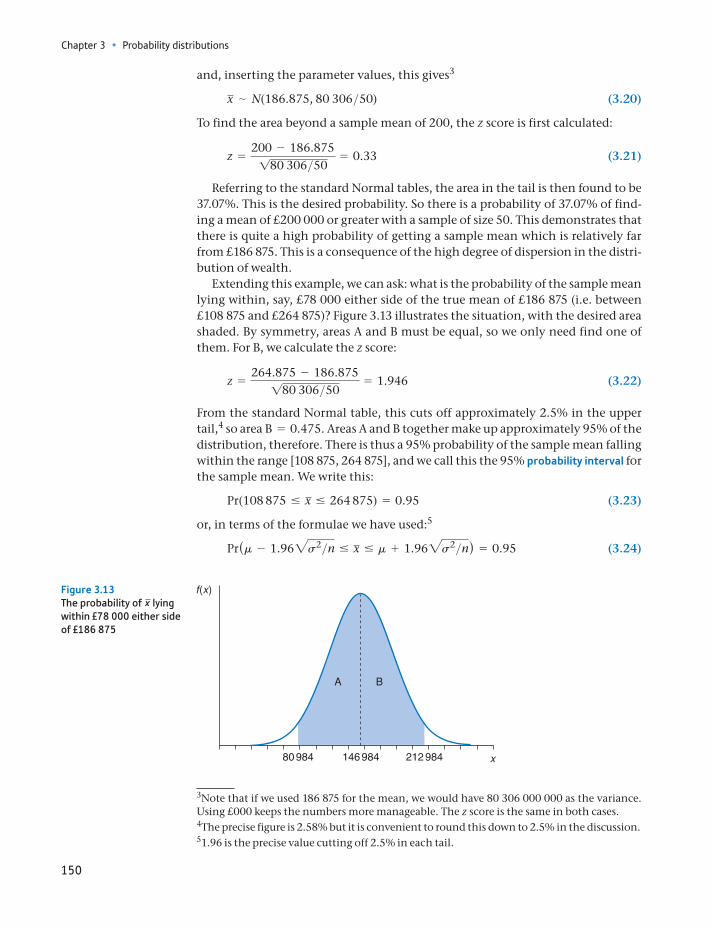
Chapter 3 • Probability distributions
150
and, inserting the parameter values, this gives3
x ∼ N(186.875, 80 306>50) (3.20)
To find the area beyond a sample mean of 200, the z score is first calculated:
z =200 - 186.875180 306>50
= 0.33 (3.21)
Referring to the standard Normal tables, the area in the tail is then found to be 37.07%. This is the desired probability. So there is a probability of 37.07% of find-ing a mean of £200 000 or greater with a sample of size 50. This demonstrates that there is quite a high probability of getting a sample mean which is relatively far from £186 875. This is a consequence of the high degree of dispersion in the distri-bution of wealth.
Extending this example, we can ask: what is the probability of the sample mean lying within, say, £78 000 either side of the true mean of £186 875 (i.e. between £108 875 and £264 875)? Figure 3.13 illustrates the situation, with the desired area shaded. By symmetry, areas A and B must be equal, so we only need find one of them. For B, we calculate the z score:
z =264.875 - 186.875180 306>50
= 1.946 (3.22)
From the standard Normal table, this cuts off approximately 2.5% in the upper tail,4 so area B = 0.475. Areas A and B together make up approximately 95% of the distribution, therefore. There is thus a 95% probability of the sample mean falling within the range [108 875, 264 875], and we call this the 95% probability interval for the sample mean. We write this:
Pr(108 875 … x … 264 875) = 0.95 (3.23)
or, in terms of the formulae we have used:5
Pr(m - 1.962s2>n … x … m + 1.962s2>n) = 0.95 (3.24)
3Note that if we used 186 875 for the mean, we would have 80 306 000 000 as the variance. Using £000 keeps the numbers more manageable. The z score is the same in both cases.
51.96 is the precise value cutting off 2.5% in each tail.
4The precise figure is 2.58% but it is convenient to round this down to 2.5% in the discussion.
80 984 146 984 212 984
Figure 3.13The probability of x lying within £78 000 either side of £186 875
The relationship between the Binomial and Normal distributions
151
The 95% probability interval and the related concept of the 95% confidence interval (introduced in Chapter 4) play important roles in statistical inference. We deliberately designed the example above to arrive at an answer of 95% for this reason.
(a) If x is distributed as x ∼ N(50, 64) and samples of size n = 25 are drawn, what is the dis-tribution of the sample mean x ?
(b) If the sample size doubles to 50, how is the standard error of x altered?
(c) Using the sample size of 25, (i) what is the probability that x 7 51? (ii) What is Pr(x 6 48)? (iii) What is Pr(49 6 x 6 50.5)?
?
Exercise 3.6
The relationship between the Binomial and Normal distributions
Many statistical distributions are related to one another in some way. This means that many problems can be solved by a variety of different methods (using differ-ent distributions), although usually one is more convenient or more accurate than the others. This point may be illustrated by looking at the relationship between the Binomial and Normal distributions.
Recall the experiment of tossing a coin repeatedly and noting the number of heads. We said earlier that this can be analysed via the Binomial distribution. But note that the number of heads, a random variable, is influenced by many inde-pendent random events (the individual tosses) added together. Furthermore, each toss counts equally, none dominates. These are just the conditions under which a Normal distribution arises, so it looks like there is a connection between the two distributions.
This idea is correct. Recall that if a random variable r follows a Binomial distri-bution, then
r ∼ B(n, P) (3.1)
and the mean of the distribution is nP and the variance nP(1 - P). It turns out that as n gets larger, the Binomial distribution takes on approximately the same shape as a Normal distribution with mean nP and variance nP(1 - P). This approximation is sufficiently accurate as long as nP 7 5 and n(1 - P) 7 5, so the approximation may not be very good (even for large values of n) if P is very close to zero or one. For the coin tossing experiment, where P = 0.5, 10 tosses should be sufficient. Note that this approximation is good enough with only 10 observations even though the underlying probability distribution is nothing like a Normal distribution.
To demonstrate, the following problem is solved using both the Binomial and Normal distributions. Forty students take an exam in statistics which is simply graded pass/fail. If the probability, P, of any individual student passing is 60%, what is the probability of at least 30 students passing the exam?
The sample data are:
P = 0.6 1 - P = 0.4
n = 40
Chapter 3 • Probability distributions
152
Binomial distribution method
To solve the problem using the Binomial distribution it is necessary to find the probability of exactly 30 students passing, plus the probability of 31 passing, plus the probability of 32 passing, etc., up to the probability of 40 passing (the fact that the events are mutually exclusive allows this). The probability of 30 passing is
Pr(r = 30) = nCr * Pr(1 - P)n - r
= 40C30 * 0.630 * 0.410
= 0.020
(Note: This calculation assumes that the probabilities are independent, i.e. no copying.) This by itself is quite a tedious calculation, but Pr(31), Pr(32), etc., still have to be calculated. Calculating these and summing them gives the result of 3.52% as the probability of at least 30 passing. (It would be a useful exercise for you to do, if only to appreciate how long it takes.)
Normal distribution method
As stated above, the Binomial distribution can be approximated by a Normal distri-bution with mean nP and variance. nP(1 - P). nP in this case is 24(=40 * 0.6) and n(1 - P) is 16, both greater than 5, so the approximation can be safely used. Thus
r ∼ N(nP, nP(1 - P))
and inserting the parameter values gives
r ∼ N(24, 9.6)
The usual methods are then used to find the appropriate area under the distribu-tion. However, before doing so, there is one adjustment to be made (this only applies when approximating the Binomial distribution by the Normal). The Normal distribution is a continuous one while the Binomial is discrete. Thus, 30 in the Binomial distribution is represented by the area under the Normal distribution between 29.5 and 30.5. The value 31 is represented by 30.5 to 31.5, etc. Thus, it is the area under the Normal distribution to the right of 29.5, not 30, which must be calculated. This is known as the continuity correction. Calculating the z score gives
z =29.5 - 2419.6
= 1.78 (3.25)
This gives an area of 3.75%, not far off the correct answer as calculated by the Binomial distribution. The time saved and ease of calculation would seem to be worth the slight loss in accuracy.
Other examples can be constructed to test this method, using different values of P and n. Small values of n, or values of nP or n(1 - P) less than 5, will give poor results, i.e. the Normal approximation to the Binomial will not be very good.
(a) A coin is tossed 20 times. What is the probability of more than 14 heads? Perform the cal-culation using both the Binomial and Normal distributions, and compare results.
(b) A biased coin, for which Pr(H) = 0.7, is tossed six times. What is the probability of more than four heads? Compare Binomial and Normal methods in this case. How accurate is the Normal approximation?
(c) Repeat part (b) but for the probability of more than five heads.
?
Exercise 3.7
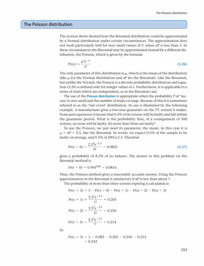
The Poisson distribution
153
The Poisson distribution
The section above showed how the Binomial distribution could be approximated by a Normal distribution under certain circumstances. The approximation does not work particularly well for very small values of P, when nP is less than 5. In these circumstances the Binomial may be approximated instead by a different dis-tribution, the Poisson, which is given by the formula
Pr(x) =mxe-m
x! (3.26)
The only parameter of this distribution is m, which is the mean of the distribution (like m for the Normal distribution and nP for the Binomial). Like the Binomial, but unlike the Normal, the Poisson is a discrete probability distribution and equa-tion (3.26) is defined only for integer values of x. Furthermore, it is applicable to a series of trials which are independent, as in the Binomial case.
The use of the Poisson distribution is appropriate when the probability P of ‘suc-cess’ is very small and the number of trials n is large. Because of this it is sometimes referred to as the ‘rare event’ distribution. Its use is illustrated by the following example. A manufacturer gives a two-year guarantee on the TV screens it makes. From past experience it knows that 0.5% of its screens will be faulty and fail within the guarantee period. What is the probability that, of a consignment of 500 screens, (a) none will be faulty, (b) more than three are faulty?
To use the Poisson, we just need its parameter, the mean. In this case it is m = nP = 2.5, like the Binomial. In words, we expect 0.5% of the sample to be faulty on average, and 0.5% of 500 is 2.5. Therefore
Pr(x = 0) =2.50e-2.5
0!= 0.0821 (3.27)
gives a probability of 8.2% of no failures. The answer to this problem via the Binomial method is
Pr(r = 0) = 0.995500 = 0.0816
Thus, the Poisson method gives a reasonably accurate answer. Using the Poisson approximation to the Binomial is satisfactory if nP is less than about 7.
The probability of more than three screens expiring is calculated as
Pr(x 7 3) = 1 - Pr(x = 0) - Pr(x = 1) - Pr(x = 2) - Pr(x = 3)
Pr(x = 1) =2.51e- 2.5
1!= 0.205
Pr(x = 2) =2.52e- 2.5
2!= 0.256
Pr(x = 3) =2.53e- 2.5
3!= 0.214
So
Pr(x 7 3) = 1 - 0.082 - 0.205 - 0.256 - 0.214 = 0.242
Chapter 3 • Probability distributions
154
Thus, there is a probability of about 24% of more than three failures. The Binomial calculation is much more tedious, but gives an answer of 24.2% also.
The Poisson distribution is also used in problems where events occur over time, such as goals scored in a football match (see Problem 3.25) or queuing-type problems (e.g. arrivals at a bank cash machine). In these problems, there is no natural ‘number’ of trials but it is clear that, if we take a short interval of time, the probability of an event occurring is small. We can then consider the number of trials to be the number of time intervals. In such problems we can-not identify n and P separately, and hence the Binomial distribution cannot be used. However, we might know the product nP, in which case the Poisson can be used.
This is illustrated by the following example. A football team scores, on average, two goals every game (you can vary the example by using your own favourite team plus their scoring record). We therefore have the value of m, although we do not know the separate values of n and P. Indeed, it is not clear to what n and P would refer in this context. How can we calculate the probability of the team scoring zero or one goal during a game?
The mean of the distribution is 2, so we have, using the Poisson distribution:
Pr(x = 0) =20e- 2
0!= 0.135
Pr(x = 0) =21e- 2
1!= 0.271
So Pr(x = 0 or 1) = 0.406. You should continue to calculate the probabilities of 2 or more goals and verify that the probabilities sum to 1. (In principle you have to calculate the probabilities of 2, 3, 4, . . . 100, . . . which is impossible, but you will find that the probabilities soon decline to very small values which can be ignored for practical purposes.)
Oops!
The formula1.com website reported that ‘The (Grand Prix motor) race in Singapore has seen a total of five safety car deployments in three races, and carries a 100% safety car probability based on historical data.’
That does not sound right, and indeed it is not. We can find the right answer via the Poisson distribution. In this case, m = 5>3 = 1.67 deployments per race, on average. Hence, the probability of no safety car deployment during a race is
Pr(x = 0) =1.670e-1.67
0!= 0.189 or about 19%.
The correct answer is an 81% chance of a safety car period during the race.
ST
ATISTICS
IN
PRACTI
CE
· ·
Another type of problem amenable to analysis via the Poisson distribution is queuing. For example, if a shop receives, on average, 20 customers per hour, what is the probability of no customers within a five-minute period while the owner takes a coffee break?
The Poisson distribution
155
The average number of customers per five-minute period is 20 * 5>60 = 1.67. The probability of a free five-minute spell is therefore
Pr(x = 0) =1.670e1.67
0!= 0.189
a probability of about 19%. Note again that this problem cannot be solved by the Binomial method since n and P are not known separately, only their product.
(a) The probability of winning a prize in a lottery is 1 in 50. If you buy 50 tickets, what is the probability that (i) 0 tickets win, (ii) 1 ticket wins, (iii) 2 tickets win. (iv) What is the proba-bility of winning at least one prize?
(b) On average, a person buys a lottery ticket in a supermarket every 5 minutes. What is the probability that 10 minutes will pass with no buyers?
?
Exercise 3.8
Railway accidents
Andrew Evans of University College London used the Poisson distribution to examine the numbers of fatal railway accidents in Britain between 1967 and 1997. Since railway acci-dents are, fortunately, rare, the probability of an accident in any time period is very small, and so use of the Poisson distribution is appropriate. He found that the average number of accidents has been falling over time and by 1997 had reached 1.25 p.a. This figure is there-fore used as the mean m of the Poisson distribution, and we can calculate the probabilities of 0, 1, 2, etc., accidents each year. Using m = 1.25 and inserting this into equation (3.26), we obtain the following table:
Number of accidents 0 1 2 3 4 5 6
Probability 0.287 0.358 0.224 0.093 0.029 0.007 0.002
and this distribution can be graphed:
0.4Pr(x)Poisson distribution of railway accidents
0.35
0.25
0.2
0.15
0.1
0.05
00 1 2 3 4 5 6
0.3
Thus the most likely outcome is one fatal accident per year, and anything over four is extremely unlikely. In fact, Evans found that the Poisson was not a perfect fit to the data: the actual variation was less than that predicted by the model.
Source: A. W. Evans, Fatal train accidents on Britain’s mainline railways, J. Royal Statistical Society, Series A, vol. 163 (1), 2000.
ST
ATISTICS
IN
PRACTI
CE
· ·
Chapter 3 • Probability distributions
156
Summary
The behaviour of many random variables (e.g. the result of the toss of a coin) can be described by a probability distribution (in this case, the Binomial distribution).
The Binomial distribution is appropriate for problems where there are only two possible outcomes of a chance event (e.g. heads/tails, success/failure) and the probability of success is the same each time the experiment is conducted.
The Normal distribution is appropriate for problems where the random vari-able has the familiar bell-shaped distribution. This often occurs when the vari-able is influenced by many, independent factors, none of which dominates the others. An example is men’s heights, which are Normally distributed.
The Poisson distribution is used in circumstances where there is a very low probability of ‘success’ and a high number of trials.
Each of these distributions is actually a family of distributions, differing in the parameters of the distribution. Both the Binomial and Normal distributions have two parameters: n and P in the former case, m and s2 in the latter. The Poisson distribution has one parameter, its mean m.
The mean of a random sample follows a Normal distribution, because it is influ-enced by many independent factors (the sample observations), none of which dominates in the calculation of the mean. This statement is always true if the population from which the sample is drawn follows a Normal distribution.
If the population is not Normally distributed, then the Central Limit Theorem states that the sample mean is Normally distributed in large samples. In this case ‘large’ means a sample of about 25 or more.
Binomial distributionCentral Limit Theoremcontinuity correctionNormal distributionparametersparameters of a distributionPoisson distribution
probability distributionprobability intervalrandom variablesampling distributionstandard errorstandard Normal distribution
Key terms and concepts
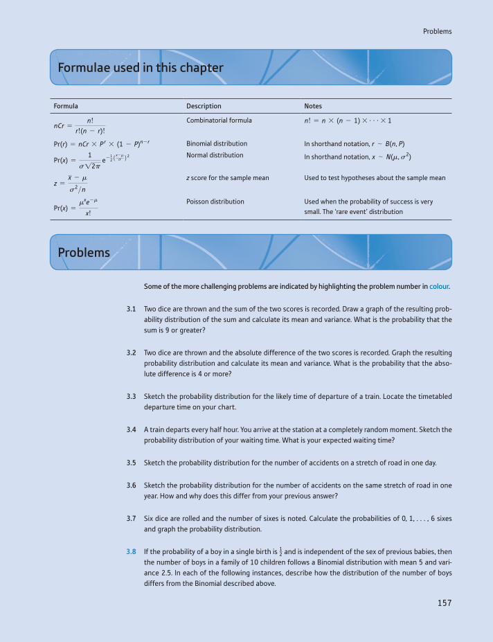
Problems
157
Formula Description Notes
nCr =n!
r!(n - r)!
Combinatorial formula n! = n * (n - 1) * g* 1
Pr(r) = nCr * P r * (1 - P)n - r Binomial distribution In shorthand notation, r ∼ B(n, P)
Pr(x) =1
s12p e- 1
25x -ms 62 Normal distribution In shorthand notation, x ∼ N(m, s2)
z =x - m
s2>nz score for the sample mean Used to test hypotheses about the sample mean
Pr(x) =mxe-m
x!
Poisson distribution Used when the probability of success is very small. The ‘rare event’ distribution
Formulae used in this chapter
Some of the more challenging problems are indicated by highlighting the problem number in colour.
3.1 Two dice are thrown and the sum of the two scores is recorded. Draw a graph of the resulting prob-ability distribution of the sum and calculate its mean and variance. What is the probability that the sum is 9 or greater?
3.2 Two dice are thrown and the absolute difference of the two scores is recorded. Graph the resulting probability distribution and calculate its mean and variance. What is the probability that the abso-lute difference is 4 or more?
3.3 Sketch the probability distribution for the likely time of departure of a train. Locate the timetabled departure time on your chart.
3.4 A train departs every half hour. You arrive at the station at a completely random moment. Sketch the probability distribution of your waiting time. What is your expected waiting time?
3.5 Sketch the probability distribution for the number of accidents on a stretch of road in one day.
3.6 Sketch the probability distribution for the number of accidents on the same stretch of road in one year. How and why does this differ from your previous answer?
3.7 Six dice are rolled and the number of sixes is noted. Calculate the probabilities of 0, 1, . . . , 6 sixes and graph the probability distribution.
3.8 If the probability of a boy in a single birth is 12 and is independent of the sex of previous babies, then the number of boys in a family of 10 children follows a Binomial distribution with mean 5 and vari-ance 2.5. In each of the following instances, describe how the distribution of the number of boys differs from the Binomial described above.
Problems
Chapter 3 • Probability distributions
158
(a) The probability of a boy is 6/10.
(b) The probability of a boy is 12 but births are not independent. The birth of a boy makes it more
than an even chance that the next child is a boy.
(c) As (b) above, except that the birth of a boy makes it less than an even chance that the next child will be a boy.
(d) The probability of a boy is 6/10 on the first birth. The birth of a boy makes it a more than even chance that the next baby will be a boy.
3.9 A firm receives components from a supplier in large batches, for use in its production process. Pro-duction is uneconomic if a batch containing 10% or more defective components is used. The firm checks the quality of each incoming batch by taking a sample of 15 and rejecting the whole batch if more than one defective component is found.
(a) If a batch containing 10% defectives is delivered, what is the probability of its being accepted?
(b) How could the firm reduce this probability of erroneously accepting bad batches?
(c) If the supplier produces a batch with 3% defective, what is the probability of the firm sending back the batch?
(d) What role does the assumption of a ‘large’ batch play in the calculation?
3.10 The UK record for the number of children born to a mother is 39, 32 of them girls. Assuming the probability of a girl in a single birth is 0.5 and that this probability is independent of previous births:
(a) Find the probability of 32 girls in 39 births (you’ll need a scientific calculator or a computer to help with this).
(b) Does this result cast doubt on the assumptions?
3.11 Using equation (3.5) describing the Normal distribution and setting m = 0 and s2 = 1, graph the distribution for the values x = -2, -1.5, -1, -0.5, 0, 0.5, 1, 1.5, 2.
3.12 Repeat the previous problem for the values m = 2 and s2 = 3, Use values of x from -2 in to +6 increments of 1.
3.13 For the standard Normal variable z, find
(a) Pr(z 7 1.64)
(b) Pr(z 7 0.5)
(c) Pr(z 7 -1.5)
(d) Pr(-2 6 z 6 1.5)
(e) Pr(z = -0.75).
For (a) and (d), shade in the relevant areas on the graph you drew for Problem 3.11.
3.14 Find the values of z which cut off
(a) the top 10%
(b) the bottom 15%
(c) the middle 50%
of the standard Normal distribution.
Problems
159
3.15 If x ∼ N(10, 9), find
(a) Pr(x 7 12)
(b) Pr(x 6 7)
(c) Pr(8 6 x 6 15)
(d) Pr(x = 10)
3.16 IQ (the intelligence quotient) is Normally distributed with mean 100 and standard deviation 16.
(a) What proportion of the population has an IQ above 120?
(b) What proportion of the population has an IQ between 90 and 110?
(c) In the past, about 10% of the population went to university. Now the proportion is about 30%. What was the IQ of the ‘marginal’ student in the past? What is it now?
3.17 Ten adults are selected at random from the population and their IQ measured. (Assume a population mean of 100 and standard deviation of 16 as in Problem 3.16.)
(a) What is the probability distribution of the sample average IQ?
(b) What is the probability that the average IQ of the sample is over 110?
(c) If many such samples were taken, in what proportion would you expect the average IQ to be over 110?
(d) What is the probability that the average IQ lies within the range 90 to 110? How does this answer compare to the answer to part (b) of Problem 3.16? Account for the difference.
(e) What is the probability that a random sample of 10 university students has an average IQ greater than 110?
(f) The first adult sampled has an IQ of 150. What do you expect the average IQ of the sample to be?
3.18 The average income of a country is known to be £10 000 with standard deviation £2500. A sample of 40 individuals is taken and their average income calculated.
(a) What is the probability distribution of this sample mean?
(b) What is the probability of the sample mean being over £10 500?
(c) What is the probability of the sample mean being below £8000?
(d) If the sample size were 10, why could you not use the same methods to find the answers to (a)–(c)?
3.19 A coin is tossed 10 times. Write down the distribution of the number of heads,
(a) exactly, using the Binomial distribution,
(b) approximately, using the Normal distribution.
(c) Find the probability of four or more heads, using both methods. How accurate is the Normal method, with and without the continuity correction?
3.20 A machine producing electronic circuits has an average failure rate of 15% (they are difficult to make). The cost of making a batch of 500 circuits is £8400 and the good ones sell for £20 each. What is the probability of the firm making a loss on any one batch?
3.21 An experienced invoice clerk makes an error once in every 100 invoices, on average.
(a) What is the probability of finding a batch of 100 invoices without error?
(b) What is the probability of finding such a batch with more than two errors?
Chapter 3 • Probability distributions
160
Calculate the answers using both the Binomial and Poisson distributions. If you try to solve the prob-lem using the Normal method, how accurate is your answer?
3.22 A firm employing 100 workers has an average absenteeism rate of 4%. On a given day, what is the probability of (a) no workers, (b) one worker, (c) more than six workers being absent?
3.23 (Computer project) This problem demonstrates the Central Limit Theorem at work. In your spread-sheet, use the = RAND( ) function to generate a random sample of 25 observations (I suggest entering this function in cells A4:A28, for example). Copy these cells across 100 columns, to gener-ate 100 samples. In row 29, calculate the mean of each sample. Now examine the distribution of these sample means. (Hint: you will find the RAND( ) function recalculates automatically every time you perform an operation in the spreadsheet. This makes it difficult to complete the analysis. The solution is to copy and then use ‘Edit, Paste Special, Values’ to create a copy of the values of the sample means. These will remain stable.)
(a) What distribution would you expect them to have?
(b) What is the parent distribution from which the samples are drawn?
(c) What are the parameters of the parent distribution and of the sample means?
(d) Do your results accord with what you would expect?
(e) Draw up a frequency table of the sample means and graph it. Does it look as you expected?
(f) Experiment with different sample sizes and with different parent distributions to see the effect that these have.
3.24 (Project) An extremely numerate newsagent (with a spreadsheet program, as you will need) is trying to work out how many copies of a newspaper he should order. The cost to him per copy is 40 pence, which he then sells at £1.20. Sales are distributed Normally with an average daily sale of 250 and vari-ance 625. Unsold copies cannot be returned for credit or refund; he has to throw them away.
(a) What do you think the seller’s objective should be?
(b) How many copies should he order?
(c) What happens to the variance of profit as he orders more copies?
(d) Calculate the probability of selling more than X copies. (Create an extra column in the spread-sheet for this.) What is the value of this probability at the optimum number of copies ordered?
(e) What would the price–cost ratio have to be to justify the seller ordering X copies?
(f) The wholesaler offers a sale or return deal, but the cost per copy is 45p. Should the seller take up this new offer?
(g) Are there other considerations which might influence the seller’s decision?
Hints:
Set up your spreadsheet as follows:
col. A: (cells A10:A160) 175, 176, . . . up to 325 in unit increments (to represent sales levels).
col. B: (cells B10:B160) the probability of sales falling between 175 and 176, between 176 and 177, etc., up to 325–326. (Excel has the ‘= NORMDIST()’ function to do this – see the help facility.)
col. C: (cells C10:C160) total cost (= 0.40 * number ordered. Put the latter in cell F3 so you can reference it and change its value).
col. D: (cells D10:D160) total revenue (‘= MIN(sales, number ordered) * 1.20’).
col. E: profit (revenue–cost).
col. F: Profit * probability (i.e. col. E * col. B).
cell F161: the sum of F10:F160 (this is the expected profit).

Problems
161
Now vary the number ordered (cell F3) to find the maximum value in F161. You can also calculate the variance of profit fairly simply, using an extra column.
3.25 (Project) Using a weekend’s football results from the Premier (or other) League, see if the number of goals per game can be adequately modelled by a Poisson process. First calculate the average number of goals per game for the whole league, and then derive the distribution of goals per game using the Poisson distribution. Do the actual numbers of goals per game follow this distribution? You might want to take several weeks’ results to obtain more reliable results.
3.26 (Project) A report in The Guardian newspaper (20 June 2010, http://www.guardian.co.uk/education/ 2010/jun/20/internet-plagiarism-rising-in-schools) reports ‘Half of university students also prepared to submit essays bought off the internet, according to research.’ According to the article, a survey (sam-ple size not specified) found that 45% of students were certain that a peer had cheated during an essay, report, test or exam in the past year. Evaluate this evidence from a statistical point of view. Find a for-mula to calculate the true proportion, given the reported proportion (adapting the formula in the exam-ple in this chapter) and use this to evaluate the claim in the article. Using your formula, what is the true proportion based on the reported figure? If the reported proportion is 100%, what is the estimated true figure? Does this seem right? If not, why not?
The article also reported that they (the students) ‘would be prepared to pay more than £300 for a first class essay’. Comment also upon this finding. What precisely does it mean?
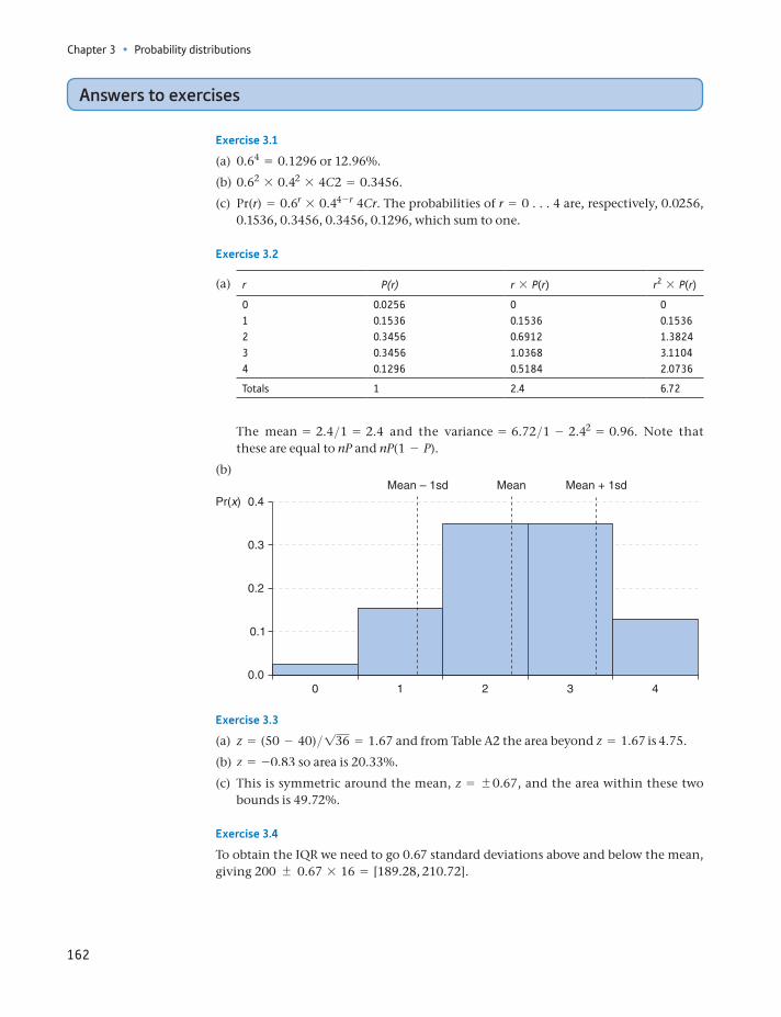
Chapter 3 • Probability distributions
162
Answers to exercises
Exercise 3.1
(a) 0.64 = 0.1296 or 12.96%.
(b) 0.62 * 0.42 * 4C2 = 0.3456.
(c) Pr(r) = 0.6r * 0.44 - r 4Cr. The probabilities of r = 0 . . . 4 are, respectively, 0.0256, 0.1536, 0.3456, 0.3456, 0.1296, which sum to one.
Exercise 3.2
(a) r P(r) r * P(r) r2 * P(r)
0 0.0256 0 01 0.1536 0.1536 0.15362 0.3456 0.6912 1.38243 0.3456 1.0368 3.11044 0.1296 0.5184 2.0736
Totals 1 2.4 6.72
The mean = 2.4>1 = 2.4 and the variance = 6.72>1 - 2.42 = 0.96. Note that these are equal to nP and nP(1 - P).
(b)
0.4Pr(x)
0.2
0.1
0.00 1
Mean – 1sd Mean + 1sdMean
2 3 4
0.3
Exercise 3.3
(a) z = (50 - 40)>136 = 1.67 and from Table A2 the area beyond z = 1.67 is 4.75.
(b) z = -0.83 so area is 20.33%.
(c) This is symmetric around the mean, z = 0.67, and the area within these two bounds is 49.72%.
Exercise 3.4
To obtain the IQR we need to go 0.67 standard deviations above and below the mean, giving 200 0.67 * 16 = [189.28, 210.72].
Answers to exercises
163
Exercise 3.5
The IQR (in logs) is within 4.18 0.67 * Î2.56 = [3.11,5.25]. Translated out of logs (using 10x) yields [1288.2, 177 827.9]. Thus, we would expect 50% of the population to have incomes within this range of values.
Exercise 3.6
(a) e ∼ N(50, 64>25).
(b) The standard error gets smaller. It is 1> 2 times its previous value.
(c) (i) z = (51 - 50)> 264>25 = 0.625. Hence area in tail = 26.5. (ii) z = -1.25, hence area = 10.56. (iii) z values are -0.625 and +0.3125, giving tail areas of 26.5% and 37.8%, totalling 64.3%. The area between the limits is therefore 35.7%.
Exercise 3.7
(a) For this problem we have p = 0.5 and n = 20. Binomial method: Pr(r) = 0.5r * 0.5(20 - r) * 20Cr. This gives the probabilities of 15, 16, etc., heads as 0.0148, 0.0046, etc., which total 0.0207 or 2.1%. By the Normal approximation, r ∼ N(nP, Np(1 - P)). = N(10, 5) and z = (14.5 - 10)> 5 = 2.01. The area in the tail is then 2.22%, not far off the correct value (a 10% error). Note that np = 10 = n(1 - p).
(b) We have P = 0.7, n = 6. Binomial method: Pr(5 or 6 heads) = 0.302 + 0.118 = 0.420 or 42%. By the Normal, r ∼ N(4.2, 1.26), z = 0.267 and the area is 39.36%, still reasonably close to the correct answer despite the fact that n(1 - P) = 1.8.
(c) By similar methods the answers are 11.8% (Binomial) and 12.3% (Normal).
Exercise 3.8
(a) (i) m = 1 in this case (1>50 * 50) so Pr(x = 0) = mxe -m>x! = 10e - 1>0! = 0.368. (ii) Pr(x = 1) = 11e - 1>1! = 0.368. (iii) 12e - 1>2! = 0.184. (iv) 1 - 0.368 = 0.632.
(b) The average number of customers per 10 minutes is 2 (=10>5). Hence, Pr(x = 0) = 20e - 2>0! = 0.135.
Î
Î
164
By the end of this chapter you should be able to:
recognise the importance of probability theory in drawing valid inferences (or deriving estimates) from a sample of data
understand the criteria for constructing a good estimate
construct estimates of parameters of interest from sample data, in a variety of different circumstances
appreciate that there is uncertainty about the accuracy of any such estimate
provide measures of the uncertainty associated with an estimate
recognise the relationship between the size of a sample and the precision of an estimate derived from it.
Learning outcomes 164Introduction 165Point and interval estimation 165Rules and criteria for finding estimates 166
Bias 166Precision 167Mean squared error 168The trade-off between bias and precision: the Bill Gates effect 169
Estimation with large samples 170Estimating a mean 170
Precisely what is a confidence interval? 173Estimating a proportion 175Estimating the difference between two means 177Estimating the difference between two proportions 180
Estimation with small samples: the t distribution 181Estimating a mean 183Estimating the difference between two means 184Estimating proportions 186
Summary 186Key terms and concepts 187Formulae used in this chapter 188Problems 188
Answers to exercises 191Appendix: Derivations of sampling distributions 193
Estimation and confidence intervals4
Introduction
165
Introduction
We now come to the heart of the subject of statistical inference. Up until now the following type of question has been examined: given the population parameters m and s2, what is the probability of the sample mean x, from a sample of size n, being greater than some specified value or within some range of values? The parameters m and s2 are assumed to be known and the objective is to try to form some conclusions about possible values of x. However, in practice it is usually the sample values x and s2 that are known, while the population parameters m and s2 are not. Thus a more interesting question to ask is: given the values of x and s2 from a sample of size n, what can be said about m and s2? For example, if a sample of 50 British families finds an average weekly expenditure on food (x) of £37.50 with a standard deviation (s) of £6.00, what can be said about the average expen-diture (m) of all British families?
Schematically these issues can be shown as follows:
Sample information Population parameters
x, s2, n Probability statements about —
m, s2
x, s2, n Inferences about ¡
m, s2
It is important to recognise the differences between making probability state-ments about sample statistics such as x, and making inferences about unknown parameters such as m. We will go into this in more detail in this chapter.
This chapter covers the estimation of population parameters such as m and s2, while Chapter 5 describes testing hypotheses about these parameters. The two pro-cedures are closely related, being two ways of drawing inferences about the param-eters, but there are important differences between them.
Point and interval estimation
There are basically two ways in which an estimate of a parameter can be presented. The first of these is a point estimate, i.e. a single value which is in some sense the best estimate of the parameter of interest. The point estimate is the one which is most prevalent in everyday usage; for example, men spend an average of 43 min-utes per day ogling women1. Although this is presented as a fact, it is actually an estimate, obtained from a survey. Since it is obtained from a sample, there must be some doubt about its accuracy – the sample will probably not exactly represent the whole population. For this reason, interval estimates are also used, giving a range of values which give an idea of the likely accuracy of the estimate. If the sample size is small, for example, then it is quite possible that the estimate is not very close to the
1Daily Telegraph, 4 August 2009. The survey was sponsored by an optician and was used to encourage people to get their eyesight checked. It also claimed that women spend an aver-age of 20 minutes per day ogling men.
Chapter 4 • Estimation and confidence intervals
166
true value and this would be reflected in a wide interval estimate, for example, that the average man spends between 33 and 53 minutes ogling women per day2. A larger sample, or a better method of estimation, would allow a narrower interval to be derived and thus a more precise estimate of the parameter to be obtained, such as an average ogling time of between 40 and 46 minutes. Interval estimates are bet-ter for the consumer of the statistics, since they not only show the estimate of the parameter but also give an idea of the confidence which the researcher has in that estimate. The following sections describe how to construct both types of estimate.
Rules and criteria for finding estimates
In order to estimate a parameter such as the population mean, a rule (or set of rules) is required which describes how to derive the estimate of the parameter from the sample data. Such a rule is known as an estimator. An example of an estimator for the population mean is ‘use the sample mean’. It is important to distinguish between an estimator, a rule, and an estimate, which is the value derived as a result of applying the rule to the data.
There are many possible estimators for any parameter, so it is important to be able to distinguish between good and bad estimators. The following examples provide some possible estimators of the population mean:
(1) the sample mean(2) the smallest sample observation(3) the first sample observation.
A set of criteria is needed for discriminating between good and bad estimators. Which of the above three estimators is ‘best’? Two important criteria by which to judge estimators are bias and precision.
Bias
It is impossible to know if a single estimate of a parameter, derived by applying a particular rule to the sample data, gives a correct estimate of the parameter or not. The estimate might be too low or too high and, since the parameter is unknown, it is impossible to check this. What is possible, however, is to say whether an estima-tor gives the correct answer on average. An estimator which gives the correct answer on average is said to be unbiased. Another way of expressing this is to say that an unbiased estimator does not systematically mislead the researcher away from the correct value of the parameter. It is important to remember, however, that even using an unbiased estimator does not guarantee that a single use of the estimator will yield a correct estimate of the parameter. Bias (or the lack of it) is a theoretical property.
Formally, an estimator is unbiased if its expected value is equal to the parame-ter being estimated. Consider trying to estimate the population mean using the
2The survey did not provide an interval estimate, so I have invented these figures to illus-trate. The figure of 43 minutes did come from the survey, although its reliability must be suspect.
Rules and criteria for finding estimates
167
three estimators suggested above. Taking the sample mean first, we have already learned (see equation (3.15)) that its expected value is m, i.e.
E(x) = m
which immediately shows that the sample mean is an unbiased estimator.The second estimator (the smallest observation in the sample) can easily be
shown to be biased, using the result derived above. Since the smallest sample observation must be less than the sample mean, its expected value must be less than m. Denote the smallest observation by xs, then
E(xs) 6 m
so this estimator is biased downwards. It underestimates the population mean. The size of the bias is simply the difference between the expected value of the estimator and the value of the parameter, so the bias in this case is
Bias = E(xs) - m (4.1)
For the sample mean x the bias is obviously zero.Turning to the third rule (the first sample observation), this can be shown to be
another unbiased estimator. Choosing the first observation from the sample is equivalent to taking a random sample of size one from the population in the first place. Thus, the single observation may be considered as the sample mean from a random sample of size one. Since it is a sample mean, it is unbiased, as demon-strated earlier.
Precision
Two of the estimators above were found to be unbiased, and, in fact, there are many unbiased estimators (the sample median is another, for example). Some way of choosing between the set of all unbiased estimators is therefore required, which is where the criterion of precision helps. Unlike bias, precision is a relative concept, comparing one estimator to another. Given two estimators A and B, A is more precise than B if the estimates A yields (from all possible samples) are less spread out than those of estimator B. A precise estimator will tend to give similar estimates for all possible samples.
Consider the two unbiased estimators found above: how do they compare on the criteria of precision? It turns out that the sample mean is the more precise of the two, and it is not difficult to understand why. Taking just a single sample observation means that it is quite likely to be unrepresentative of the population as a whole, and thus leads to a poor estimate of the population mean. The single observation might be an extreme value from the population, purely by chance. The sample mean, on the other hand, is based on all the sample observations, and it is unlikely that all of them are unrepresentative of the population. The sample mean is therefore a good estimator of the population mean, being more precise than the single observation estimator.
Just as bias was related to the expected value of the estimator, so precision can be defined in terms of the variance. One estimator is more precise than another if it has a smaller variance. Recall that the probability distribution of the sample mean is
x ∼ N(m, s2>n) (4.2)
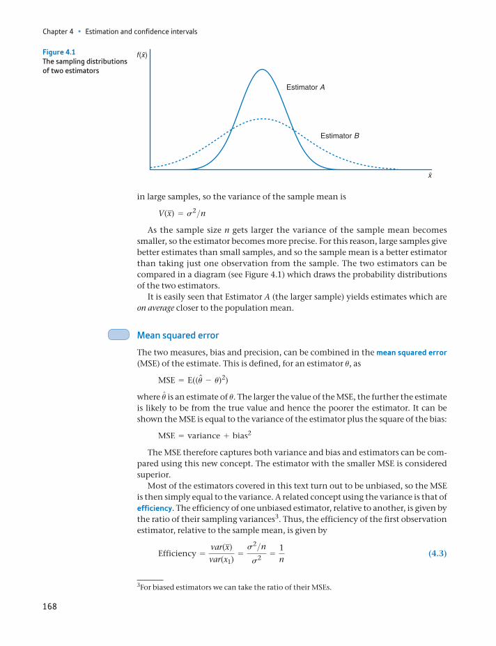
Chapter 4 • Estimation and confidence intervals
168
in large samples, so the variance of the sample mean is
V(x) = s2>nAs the sample size n gets larger the variance of the sample mean becomes
smaller, so the estimator becomes more precise. For this reason, large samples give better estimates than small samples, and so the sample mean is a better estimator than taking just one observation from the sample. The two estimators can be compared in a diagram (see Figure 4.1) which draws the probability distributions of the two estimators.
It is easily seen that Estimator A (the larger sample) yields estimates which are on average closer to the population mean.
Mean squared error
The two measures, bias and precision, can be combined in the mean squared error (MSE) of the estimate. This is defined, for an estimator u, as
MSE = E((un - u)2)
where un is an estimate of u. The larger the value of the MSE, the further the estimate is likely to be from the true value and hence the poorer the estimator. It can be shown the MSE is equal to the variance of the estimator plus the square of the bias:
MSE = variance + bias2
The MSE therefore captures both variance and bias and estimators can be com-pared using this new concept. The estimator with the smaller MSE is considered superior.
Most of the estimators covered in this text turn out to be unbiased, so the MSE is then simply equal to the variance. A related concept using the variance is that of efficiency. The efficiency of one unbiased estimator, relative to another, is given by the ratio of their sampling variances3. Thus, the efficiency of the first observation estimator, relative to the sample mean, is given by
Efficiency =var(x)var(x1)
=s2>ns2 =
1n
(4.3)
Estimator A
Estimator B
Figure 4.1The sampling distributions of two estimators
3For biased estimators we can take the ratio of their MSEs.
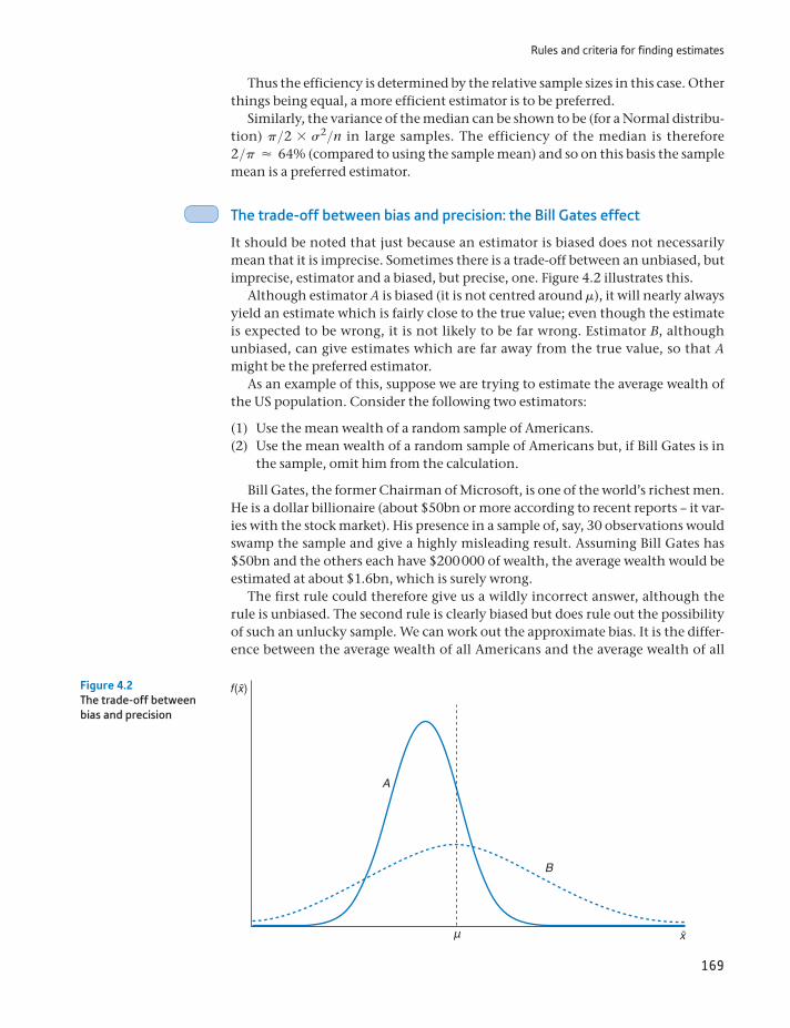
Rules and criteria for finding estimates
169
Thus the efficiency is determined by the relative sample sizes in this case. Other things being equal, a more efficient estimator is to be preferred.
Similarly, the variance of the median can be shown to be (for a Normal distribu-tion) p>2 * s2>n in large samples. The efficiency of the median is therefore 2>p ≈ 64% (compared to using the sample mean) and so on this basis the sample mean is a preferred estimator.
The trade-off between bias and precision: the Bill Gates effect
It should be noted that just because an estimator is biased does not necessarily mean that it is imprecise. Sometimes there is a trade-off between an unbiased, but imprecise, estimator and a biased, but precise, one. Figure 4.2 illustrates this.
Although estimator A is biased (it is not centred around m), it will nearly always yield an estimate which is fairly close to the true value; even though the estimate is expected to be wrong, it is not likely to be far wrong. Estimator B, although unbiased, can give estimates which are far away from the true value, so that A might be the preferred estimator.
As an example of this, suppose we are trying to estimate the average wealth of the US population. Consider the following two estimators:
(1) Use the mean wealth of a random sample of Americans.(2) Use the mean wealth of a random sample of Americans but, if Bill Gates is in
the sample, omit him from the calculation.
Bill Gates, the former Chairman of Microsoft, is one of the world’s richest men. He is a dollar billionaire (about $50bn or more according to recent reports – it var-ies with the stock market). His presence in a sample of, say, 30 observations would swamp the sample and give a highly misleading result. Assuming Bill Gates has $50bn and the others each have $200 000 of wealth, the average wealth would be estimated at about $1.6bn, which is surely wrong.
The first rule could therefore give us a wildly incorrect answer, although the rule is unbiased. The second rule is clearly biased but does rule out the possibility of such an unlucky sample. We can work out the approximate bias. It is the differ-ence between the average wealth of all Americans and the average wealth of all
B
A
μ
Figure 4.2The trade-off between bias and precision
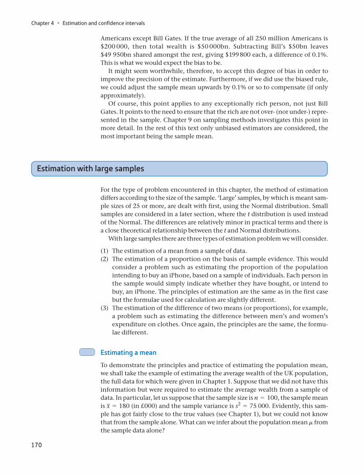
Chapter 4 • Estimation and confidence intervals
170
Americans except Bill Gates. If the true average of all 250 million Americans is $200 000, then total wealth is $50 000bn. Subtracting Bill’s $50bn leaves $49 950bn shared amongst the rest, giving $199 800 each, a difference of 0.1%. This is what we would expect the bias to be.
It might seem worthwhile, therefore, to accept this degree of bias in order to improve the precision of the estimate. Furthermore, if we did use the biased rule, we could adjust the sample mean upwards by 0.1% or so to compensate (if only approximately).
Of course, this point applies to any exceptionally rich person, not just Bill Gates. It points to the need to ensure that the rich are not over- (nor under-) repre-sented in the sample. Chapter 9 on sampling methods investigates this point in more detail. In the rest of this text only unbiased estimators are considered, the most important being the sample mean.
Estimation with large samples
For the type of problem encountered in this chapter, the method of estimation differs according to the size of the sample. ‘Large’ samples, by which is meant sam-ple sizes of 25 or more, are dealt with first, using the Normal distribution. Small samples are considered in a later section, where the t distribution is used instead of the Normal. The differences are relatively minor in practical terms and there is a close theoretical relationship between the t and Normal distributions.
With large samples there are three types of estimation problem we will consider.
(1) The estimation of a mean from a sample of data.(2) The estimation of a proportion on the basis of sample evidence. This would
consider a problem such as estimating the proportion of the population intending to buy an iPhone, based on a sample of individuals. Each person in the sample would simply indicate whether they have bought, or intend to buy, an iPhone. The principles of estimation are the same as in the first case but the formulae used for calculation are slightly different.
(3) The estimation of the difference of two means (or proportions), for example, a problem such as estimating the difference between men’s and women’s expenditure on clothes. Once again, the principles are the same, the formu-lae different.
Estimating a mean
To demonstrate the principles and practice of estimating the population mean, we shall take the example of estimating the average wealth of the UK population, the full data for which were given in Chapter 1. Suppose that we did not have this information but were required to estimate the average wealth from a sample of data. In particular, let us suppose that the sample size is n = 100, the sample mean is x = 180 (in £000) and the sample variance is s2 = 75 000. Evidently, this sam-ple has got fairly close to the true values (see Chapter 1), but we could not know that from the sample alone. What can we infer about the population mean m from the sample data alone?
Estimation with large samples
171
For the point estimate of m the sample mean is a good candidate since it is unbi-ased, and it is generally more precise than other sample statistics such as the median. The point estimate of m is simply £180 000, therefore.
The point estimate does not give an idea of the uncertainty associated with the estimate. We are not absolutely sure that the mean is £180 000 (in fact, it is not – it is £186 875). The interval estimate in contrast gives some idea of the uncer-tainty. It is centred on the sample mean, but gives a range of values to express the uncertainty.
To obtain the interval estimate we first require the probability distribution of x, first established in Chapter 3 (equation (3.17)):
x ∼ N(m, s2>n) (4.4)
From this, it was calculated that there is a 95% probability of the sample mean lying within 1.96 standard errors of m4, i.e.
Pr(m - 1.962s2>n … x … m + 1.962s2>n) = 0.95
We can manipulate each of the inequalities within the brackets to make m the subject of the expression:
m - 1.962s2>n … x implies m … x + 1.962s2>nSimilarly
x … m + 1.962s2>n implies x - 1.962s2>n … m
Combining these two new expressions, we obtain
3x - 1.962s2>n … m … x + 1.962s2>n4 (4.5)
We have transformed the probability interval. Instead of saying x lies within 1.96 standard errors of m, we now say m lies within 1.96 standard errors of x. Figure 4.3 illustrates this manipulation. Figure 4.3(a) shows m at the centre of a probability interval for x. Figure 4.3(b) shows a sample mean x at the centre of an interval relating to the possible positions of m.
The interval shown in equation (4.5) is called the 95% confidence interval, and this is the interval estimate for m. In this formula the value of s2 is unknown, but in large (n Ú 25) samples it can be replaced by s2 from the sample. s2 is here used as an estimate of s2 which is unbiased and sufficiently precise in large (n Ú 25 or so) samples. The 95% confidence interval is therefore
3x - 1.962s2>n … m … x + 1.962s2>n4 (4.6)= [180 - 1.96175 000>100, 180 + 1.96175 000>100]
= [126.3, 233.7]
Thus the 95% confidence interval estimate for the true average level of wealth ranges between £126 300 and £233 700. Note that £180 000 lies exactly at the centre of the interval5 (because of the symmetry of the Normal distribution).
4See equation (3.24) in Chapter 3 to remind yourself of this. Remember that ;1.96 is the z score which cuts off 2.5% in each tail of the Normal distribution.5The two values are the lower and upper limits of the interval, separated by a comma. This is the standard way of writing a confidence interval.
Chapter 4 • Estimation and confidence intervals
172
A more compact way of writing the confidence interval for m, instead of equa-tion (4.6), is
x 1.962s2>n (4.6b)
which highlights the interval lying between the sample mean plus and minus 1.96 standard errors. This is easy to remember and can be used for different types of problem, as we show below.
By examining equation (4.6) or equation (4.6b), one can see that the confi-dence interval is wider
(1) the smaller the sample size,(2) the greater the standard deviation of the sample.
The greater uncertainty which is associated with smaller sample sizes is mani-fested in a wider confidence interval estimate of the population mean. This occurs because a smaller sample has more chance of being unrepresentative (just because of an unlucky sample).
Greater variation in the sample data also leads to greater uncertainty about the population mean and a wider confidence interval. Greater sample variation suggests greater variation in the population so, again, a given sample could include observations which are a long way off the mean. Note that in this exam-ple there is great variation of wealth in the population and hence in the sample
μ
s21.96 s2
1.96
Figure 4.3(a)The 95% probability interval for x around the population mean m
s2s21.96 1.96
Figure 4.3(b)The 95% confidence interval for m around the sample mean x
Precisely what is a confidence interval
173
also. This means that a sample of 100 is not very informative (the confidence interval is quite wide). We would need a substantially larger sample to obtain a more precise estimate.
Note that the width of the confidence interval does not depend upon the popu-lation size – a sample of 100 observations reveals as much about a population of 10 000 as it does about a population of 10 000 000. In fact, this is not quite correct: if the sample were a large proportion of the population (of say 200 in this case), then the confidence interval should be narrower. However, in most cases this does not apply, and it is the sample size that really matters. This point will be discussed in more detail in Chapter 9 on sampling methods. This is a result that often sur-prises people, who generally believe that a larger sample is required if the popula-tion is larger.
Worked example 4.1
A sample of 50 school students found that they spent 45 minutes doing home-work each evening, with a standard deviation of 15 minutes. Estimate the aver-age time spent on homework by all students.
The sample data are x = 45, s = 15 and n = 50. If we can assume the sample is representative, we may use x as an unbiased estimate of m, the population mean. The point estimate is therefore 45 minutes.
The 95% confidence interval is given by equation (4.6b):
x 1.962s2>n= 45 1.962152>50
= 45 4.2 or [40.8, 49.2]
The 95% confidence interval lies between 40.8 and 49.2 minutes. This might then be reasonably expressed as ‘between 41 and 49 minutes’.
(a) A sample of 100 is drawn from a population. The sample mean is 25 and the sample stan-dard deviation is 50. Calculate the point and 95% confidence interval estimates for the population mean.
(b) If the sample size were 64, how would this alter the point and interval estimates?
?
Exercise 4.1
A sample of size 40 is drawn with sample mean 50 and standard deviation 30. Is it likely that the true population mean is 60?
?
Exercise 4.2
Precisely what is a confidence interval?
There is often confusion over what a 95% confidence interval actually means. This is not really surprising since the obvious interpretation turns out to be wrong. It does not mean that there is a 95% chance that the true mean lies within the interval. We cannot make such a probability statement because of our defini-tion of probability (based on the frequentist view of a probability). That view states that one can make a probability statement about a random variable (such
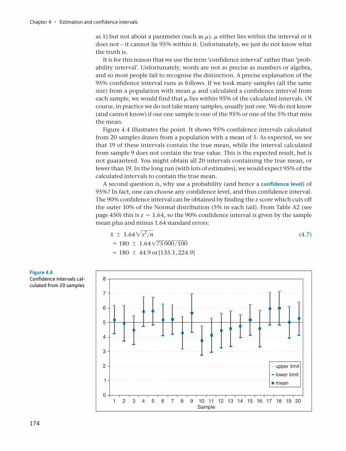
Chapter 4 • Estimation and confidence intervals
174
as x) but not about a parameter (such as m). m either lies within the interval or it does not – it cannot lie 95% within it. Unfortunately, we just do not know what the truth is.
It is for this reason that we use the term ‘confidence interval’ rather than ‘prob-ability interval’. Unfortunately, words are not as precise as numbers or algebra, and so most people fail to recognise the distinction. A precise explanation of the 95% confidence interval runs as follows. If we took many samples (all the same size) from a population with mean m and calculated a confidence interval from each sample, we would find that m lies within 95% of the calculated intervals. Of course, in practice we do not take many samples, usually just one. We do not know (and cannot know) if our one sample is one of the 95% or one of the 5% that miss the mean.
Figure 4.4 illustrates the point. It shows 95% confidence intervals calculated from 20 samples drawn from a population with a mean of 5. As expected, we see that 19 of these intervals contain the true mean, while the interval calculated from sample 9 does not contain the true value. This is the expected result, but is not guaranteed. You might obtain all 20 intervals containing the true mean, or fewer than 19. In the long run (with lots of estimates), we would expect 95% of the calculated intervals to contain the true mean.
A second question is, why use a probability (and hence a confidence level) of 95%? In fact, one can choose any confidence level, and thus confidence interval. The 90% confidence interval can be obtained by finding the z score which cuts off the outer 10% of the Normal distribution (5% in each tail). From Table A2 (see page 450) this is z = 1.64, so the 90% confidence interval is given by the sample mean plus and minus 1.64 standard errors:
x 1.642s2>n (4.7)= 180 1.64175 000>100
= 180 44.9 or [135.1, 224.9]
0
1
2
3
4
5
6
7
8
1 2 3 4 5 6 7 8 9 10 11 12 13 14 15 16 17 18 19 20
upper limit
lower limit
mean
Sample
Figure 4.4Confidence intervals cal-culated from 20 samples
Precisely what is a confidence interval
175
Notice that this is narrower than the 95% confidence level. The greater the degree of confidence desired, the wider the interval has to be. Any confidence level may be chosen, and by careful choice of this level the confidence interval can be made as wide or as narrow as wished. This would seem to undermine the purpose of calculating the confidence interval, which is to obtain some idea of the uncertainty attached to the estimate. This is not the case, however, because the reader of the results can interpret them appropriately, as long as the confi-dence level is made clear. To simplify matters, the 95% and 99% confidence levels are the most commonly used and serve as conventions. Beware of the researcher who calculates the 76% confidence interval – this may have been chosen in order to obtain the desired answer rather than in the spirit of scientific enquiry. The general formula for the (100 - a)% confidence interval is
x za2s2>n (4.8)
where za is the z score which cuts off the extreme a% (in both tails, hence a>2 in each tail) of the Normal distribution.
Exercise 4.3 will test your understanding of what a confidence interval really is.
A study finds that the 95% confidence interval estimate for the mean of a population ranges from 0.1 to 0.4. Which of the following statements are true and which false?
(a) The probability that the true mean is greater than 0 is at least 95%.
(b) The probability that the true mean is 0 is less than 5%.
(c) The hypothesis that the true mean is 0 is unlikely to be correct.
(d) There is a 95% probability that the true mean lies between 0.1 and 0.4.
(e) We can be 95% confident that the true mean lies between 0.1 and 0.4.
(f) If we were to repeat the experiment many times, then 95% of the time the true mean lies between 0.1 and 0.4.
?
Exercise 4.3
Estimating a proportion
It is often the case that we wish to estimate the proportion of the population that has a particular characteristic (e.g. is unemployed), rather than wanting an aver-age. Given what we have already learned, this is fairly straightforward and is based on similar principles. Suppose that, following Chapter 1, we wish to estimate the proportion of educated people who are unemployed. We have a random sample of 200 individuals, of whom 15 are unemployed. What can we infer?
The sample data are:
n = 200, and p = 0.075 (= 15>200)
where p is the (sample) proportion unemployed, 7.5% in this case. We denote the population proportion by the Greek letter p and it is this that we are trying to estimate using data from the sample.
The key to solving this problem is recognising p as a random variable just like the sample mean. This is because its value depends upon the sample drawn and will vary from sample to sample. Once the probability distribution of this random
Chapter 4 • Estimation and confidence intervals
176
variable is established, the problem is quite easy to solve, using the same methods as were used for the mean. The sampling distribution of p is6
p ∼ N ap, p(1 - p)
nb (4.9)
This tells us that the sample proportion is centred on the true value but will vary around it, varying from sample to sample. This variation is expressed by the vari-ance of p, whose formula is p(1 - p)>n. Having derived the probability distribu-tion of p, we can use the same methods of estimation as for the sample mean. Since the expected value of p is p, the sample proportion is an unbiased estimate of the population parameter. The point estimate of p is simply p, therefore. Thus, it is estimated that 7.5% of all educated people are unemployed.
Given the sampling distribution for p in equation (4.9), the formula for the 95% confidence interval for p can immediately be written down as:
p 1.96Bp(1 - p)n
(4.10)
or alternatively
cp - 1.96Bp(1 - p)n
, p + 1.96Bp(1 - p)n
d
As usual, the 95% confidence interval limits are given by the point estimate plus and minus 1.96 standard errors.
Since the value of p is unknown, the confidence interval cannot yet be calcu-lated, so the sample value of 0.075 has to be used instead of the unknown p. Like the substitution of s2 for s2 in the case of the sample mean above, this is accept-able in large samples. Thus, the 95% confidence interval becomes
0.075 1.96B0.075(1 - 0.075)200
(4.11)
= 0.075 0.037= [0.038, 0.112]
We say that the 95% confidence interval estimate for the true proportion of unemployed people lies between 3.8% and 11.2%.
It can be seen that these two cases apply a common method. The 95% confi-dence interval is given by the point estimate plus or minus 1.96 standard errors. For a different confidence level, 1.96 would be replaced by the appropriate value from the standard Normal distribution.
With this knowledge, two further cases can be swiftly dealt with.
6See the Appendix to this chapter (page 193) for the derivation of this formula.
Worked example 4.2 Music down the phone
Do you get angry when you try to phone an organisation and you get an auto-mated reply followed by music while you hang on? Well, you are not alone. Mintel (a consumer survey company) asked 1946 adults what they thought of
Precisely what is a confidence interval
177
Estimating the difference between two means
We now move on to estimating differences. In this case we have two samples and want to know whether there is a difference between their respective populations. One sample might be of men, the other of women, or we could be comparing two different countries, etc. A point estimate of the difference is easy to obtain, but once again there is some uncertainty around this figure, because it is based on samples. Hence, we measure that uncertainty via a confidence interval. All we require are the appropriate formulae. Consider the following example.
Thirty-five pupils from school 1 scored an average mark of 70% in an exam, with a standard deviation of 12%; 60 pupils from school 2 scored an average of 62% with standard deviation 18%. Estimate the true difference between the two schools in the average mark obtained.
This is a more complicated problem than those previously treated since it involves two samples rather than one. An estimate has to be found for m1 - m2 (the true difference in the mean marks of the schools), in the form of both point and interval estimates. The pupils taking the exams may be thought of as samples of all pupils in the schools who could potentially take the exams.
Notice that this is a problem about sample means, not proportions, even though the question deals in percentages. The point is that each observation in the sample (i.e. each student’s mark) can take a value between 0 and 100, and one can calculate the standard deviation of the marks. For this to be a problem of sam-ple proportions, the mark for each pupil would each have to be of the pass/fail type, so that one could only calculate the proportion who passed.
One might think that the way to approach this problem is to derive one confi-dence interval for each sample (along the lines set out above), and then to some-how combine them; for example, the degree of overlap of the two confidence intervals could be assessed. This is not the best approach, however. It is sometimes a good strategy, when faced with an unfamiliar problem to solve, to translate it into a more familiar problem and then solve it using known methods. This
music played to them while they were trying to get through on the phone; 36% reported feeling angered by the music played to them and more than one in four were annoyed by the automated voice response.
With these data we can calculate a confidence interval for the true propor-tion of people who dislike the music. First, we assume that the sample is a truly random one. This is probably not strictly true, so our calculated confidence interval will only be an approximate one. With p = 0.36 and n = 1946 we obtain the following 95% interval:
p 1.96 * Bp(1 - p)n
= 0.36 1.96 * B0.36(1 - 0.36)1946
= 0.36 0.021 = [0.339, 0.381]
Mintel further estimated that 2800 million calls were made by customers to call centres per year, so we can be (approximately) 95% confident that between 949 million and 1067 million of those calls have an unhappy customer on the line.
Source: The Times, 10 July 2000.
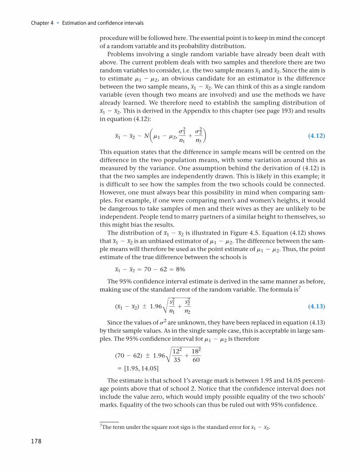
Chapter 4 • Estimation and confidence intervals
178
procedure will be followed here. The essential point is to keep in mind the concept of a random variable and its probability distribution.
Problems involving a single random variable have already been dealt with above. The current problem deals with two samples and therefore there are two random variables to consider, i.e. the two sample means x1 and x2. Since the aim is to estimate m1 - m2, an obvious candidate for an estimator is the difference between the two sample means, x1 - x2. We can think of this as a single random variable (even though two means are involved) and use the methods we have already learned. We therefore need to establish the sampling distribution of x1 - x2. This is derived in the Appendix to this chapter (see page 193) and results in equation (4.12):
x1 - x2 ∼ N am1 - m2, s2
1
n1+
s22
n2b (4.12)
This equation states that the difference in sample means will be centred on the difference in the two population means, with some variation around this as measured by the variance. One assumption behind the derivation of (4.12) is that the two samples are independently drawn. This is likely in this example; it is difficult to see how the samples from the two schools could be connected. However, one must always bear this possibility in mind when comparing sam-ples. For example, if one were comparing men’s and women’s heights, it would be dangerous to take samples of men and their wives as they are unlikely to be independent. People tend to marry partners of a similar height to themselves, so this might bias the results.
The distribution of x1 - x2 is illustrated in Figure 4.5. Equation (4.12) shows that x1 - x2 is an unbiased estimator of m1 - m2. The difference between the sam-ple means will therefore be used as the point estimate of m1 - m2. Thus, the point estimate of the true difference between the schools is
x1 - x2 = 70 - 62 = 8%
The 95% confidence interval estimate is derived in the same manner as before, making use of the standard error of the random variable. The formula is7
(x1 - x2) 1.96B s21
n1+
s22
n2 (4.13)
Since the values of s2 are unknown, they have been replaced in equation (4.13) by their sample values. As in the single sample case, this is acceptable in large sam-ples. The 95% confidence interval for m1 - m2 is therefore
(70 - 62) 1.96B122
35+
182
60= [1.95, 14.05]
The estimate is that school 1’s average mark is between 1.95 and 14.05 percent-age points above that of school 2. Notice that the confidence interval does not include the value zero, which would imply possible equality of the two schools’ marks. Equality of the two schools can thus be ruled out with 95% confidence.
7The term under the square root sign is the standard error for x1 - x2.
Precisely what is a confidence interval
179
Figure 4.5The distribution of x1 - x2
50 55 60 65 70 75 80 85 90x1
Variances1
2
n1
f(x1)
μ1
Distribution of x1
50 55 60 65 70 75 80 85 90x2
Variances2
2
n2
f(x2)
μ2
Distribution of x2
–10 –5 0 5 10 15 20 25 30μ1 – μ2
Distribution of x1 x2–
n2Variance
s12
n1
s22
+
f(x1 – x2)
x1 x2–
Worked example 4.3
A survey of holidaymakers found that on average women spent 3 hours per day sunbathing, men spent 2 hours. The sample sizes were 36 in each case and the standard deviations were 1.1 and 1.2 hours, respectively. Estimate the true dif-ference between men and women in sunbathing habits. Use the 99% confi-dence level.
The point estimate is simply one hour, the difference of sample means. For the confidence interval we have:
(x1 - x2) 2.57B s21
n1+
s22
n2
= (3 - 2) 2.57B1.12
36+
1.22
36= 1 0.70 = [0.30, 1.70]
Chapter 4 • Estimation and confidence intervals
180
Estimating the difference between two proportions
We move again from means to proportions. We use a simple example to illustrate the analysis of this type of problem. Suppose we wish to compare the market share of Apple Mac computers in the United States and the United Kingdom. A survey of 1000 American computer users shows that 160 use Macs while a similar survey of 500 Britons shows 65 using Macs. What is our estimate of the true difference between the two countries?
Here the aim is to estimate p1 - p2, the difference between the two population proportions, so the probability distribution of p1 - p2 is needed, the difference of the sample proportions. The derivation of this follows similar lines to those set out above for the difference of two sample means, so is not repeated. The probabil-ity distribution is
p1 - p2 ∼ N ap1 - p2, p1(1 - p1)
n1+
p2(1 - p2)n2
b (4.14)
Again, the two samples must be independently drawn for this to be correct.Since the difference between the sample proportions is an unbiased estimate of
the true difference, this will be used for the point estimate. The point estimate is therefore
p1 - p2 = 160>1000 - 65>500 = 0.16 - 0.13 = 0.03 or 3%.
Note that this means a three percentage point difference in market share, not that the US market is 3% bigger. The 95% confidence interval is given by
p1 - p2 1.96Bp1(1 - p1)n1
+p2(1 - p2)
n2 (4.15)
p1 and p2 are unknown so have to be replaced by p1 and p2 for purposes of calcula-tion, so the interval becomes
0.16 - 0.13 1.96B0.16 * 0.841000
+0.13 * 0.87
500 (4.16)
= 0.03 0.0372= [-0.0072, 0.0672]
The 95% confidence interval indicates that the US market share is between -0.7 and 6.7 percentage points larger than in the United Kingdom. Note that this interval includes the value of zero, so we cannot be 95% confident the US share is bigger.
These data are for the purpose of illustrating the methods and are not real. However, they are closely based on figures from StatCounter (http://gs. statcounter.com/)
This evidence suggests women do spend more time sunbathing than men (zero is not in the confidence interval). Note that we might worry the samples might not be independent here – it could represent 36 couples. If so, the evidence is likely to underestimate the true difference, if anything, as couples are likely to spend time sunbathing together.
181
Estimation with small samples: the t distribution
and are collected automatically based on visitor statistics to ‘more than three mil-lion web sites’. The market shares for December 2011 are reported as 16.5% and 13.3%. StatCounter does not give sample sizes, so what are we to make of these numbers?
The ‘three million’ might suggest a huge sample size and hence a much smaller confidence interval. (If there were one million in each country, then the width of the confidence interval would be 0.0005.) However, there are likely to be many multiple visits by the same user, so the number of users (as opposed to visits) could be much smaller, we simply do not know. Furthermore, we should think whether there might be any kind of bias to the figures, for example if more US websites were dedicated to Apple customers.
(a) Seven people out of a sample of 50 are left-handed. Estimate the true proportion of left-handed people in the population, finding both point and interval estimates.
(b) Repeat part (a) but find the 90% confidence interval. How does the 90% interval compare with the 95% interval?
(c) Calculate the 99% interval and compare to the others.
?
Exercise 4.4
Given the following data from two samples, estimate the true difference between the means. Use the 95% confidence level.
x1 = 25 x2 = 30 s1 = 18 s2 = 25 n1 = 36 n2 = 49
?
Exercise 4.5
A survey of 50 16-year-old girls revealed that 40% had a boyfriend. A survey of 100 16-year-old boys revealed 20% with a girlfriend. Estimate the true difference in proportions between the sexes.?
Exercise 4.6
Estimation with small samples: the t distribution
So far only large samples (defined as sample sizes in excess of 25) have been dealt with, which means that (by the Central Limit Theorem) the sampling distribu-tion of x follows a Normal distribution, whatever the distribution of the parent population. Remember, from the two theorems of Chapter 3, that
if the population follows a Normal distribution, x is also Normally distributed, and
if the population is not Normally distributed, x is approximately Normally dis-tributed in large samples (n Ú 25).
In both cases, confidence intervals can be constructed based on the fact that
x - m2s2>n∼ N(0, 1) (4.17)
and so the standard Normal distribution is used to find the values which cut off the extreme 5% of the distribution (z = 1.96). In practical examples, we
Chapter 4 • Estimation and confidence intervals
182
had to replace s by its estimate, s. Thus the confidence interval was based on the fact that
x - m2s2>n∼ N(0, 1) (4.18)
in large samples. For small sample sizes, equation (4.18) is no longer true. Instead, the relevant distribution is the t distribution, and we have8
x - m2s2>n∼ tn - 1 (4.19)
The random variable defined in equation (4.19) has a t distribution with n - 1 degrees of freedom. As the sample size gets larger, the t distribution approaches the standard Normal, so the latter can be used for large samples.
The t distribution was derived by W.S. Gossett in 1908 while conducting tests on the average strength of Guinness beer (who says statistics has no impact on the real world?). He published his work under the pseudonym ‘Student’, since the company did not allow its employees to publish under their own names, so the distribution is sometimes also known as the Student distribution.
The t distribution is in many ways similar to the standard Normal, insofar as it is
unimodal symmetric centred on zero bell-shaped extends from minus infinity to plus infinity.
The differences are that it is more spread out (has a larger variance) than the standard Normal distribution, and has only one parameter rather than two: the degrees of freedom, denoted by the Greek letter n (pronounced ‘nu’9). In problems involving the estimation of a sample mean, the degrees of freedom are given by the sample size minus one, i.e. n = n - 1.
The t distribution is drawn in Figure 4.6 for various values of the parameter n. Note that the fewer the degrees of freedom (smaller sample size), the more dis-persed is the distribution.
To summarise the argument so far, when
the sample size is small, and the sample variance is used to estimate the population variance,
then the t distribution should be used for constructing confidence intervals, not the standard Normal. This results in a slightly wider interval than would be obtained using the standard Normal distribution, which reflects the slightly greater uncertainty involved when s2 is used as an estimate of s2 when the sample size is small.
8We also require the assumption that the parent population is Normally distributed for (4.19) to be true.9Once again, the Greeks pronounce this differently, as ‘ni’. They also pronounce p ‘pee’ rather than ‘pie’ as in English. This makes statistics lectures in English hard for Greeks to understand.
183
Estimation with small samples: the t distribution
Apart from this, the methods are as before and are illustrated by the examples below. We look first at estimating a single mean, and then at estimating the differ-ence of two means. The t distribution cannot be used for small sample propor-tions (explained below), so these cases are not considered.
Estimating a mean
The following example would seem to be appropriate. A sample of 15 bottles of beer showed an average specific gravity (a measure of alcohol content) of 1035.6, with standard deviation 2.7. Estimate the true specific gravity of the brew.
The sample information may be summarised as
x = 1035.6 s = 2.7 n = 15
The sample mean is still an unbiased estimator of m (this is true regardless of the distribution of the population) and serves as point estimate of m. The point esti-mate of m is therefore 1035.6.
Since s is unknown, the sample size is small and it can be assumed that the specific gravity of all bottles of beer is Normally distributed (numerous small ran-dom factors affect the specific gravity), we should use the t distribution. Thus
x - m2s2>n∼ tn - 1 (4.20)
The 95% confidence interval estimate is given by
x tn - 12s2>n (4.21)
where tn - 1 is the value of the t distribution which cuts off the extreme 5% (2.5% in each tail) of the t distribution with n degrees of freedom. Table A3 (see page 451) gives percentage points of the t distribution, and part of it is reproduced in Table 4.1.
The structure of the t distribution table is different from that of the standard Normal table. The first column of the table gives the degrees of freedom. In this example we want the row corresponding to n = n - 1 = 14. The appropriate
n
n
n
Figure 4.6The t distribution drawn for different degrees of freedom
Chapter 4 • Estimation and confidence intervals
184
column of the table is the one headed ‘0.025’ which indicates the area cut off in each tail. At the intersection of this row and column we find the appropriate value, t14 = 2.145. Therefore, the confidence interval is given by
1035.6 2.14522.72>15= 1035.6 1.5= [1034.10, 1037.10]
We are 95% confident that the true specific gravity lies within this range. If the Normal distribution had (incorrectly) been used for this problem, then the t value of 2.145 would have been replaced by a z score of 1.96, giving a confidence interval of
[1034.23, 1036.97]
This underestimates the true confidence interval and gives the impression of a more precise estimate than is actually the case. Use of the Normal distribution leads to a confidence interval which is about 9% too narrow in this case.
Estimating the difference between two means
As in the case of a single mean, the t distribution needs to be used in small samples when the population variances are unknown. Again, both parent populations must be Normally distributed, and in addition it must be assumed that the popu-lation variances are equal, i.e. s2
1 = s22 (this is required in the mathematical deri-
vation of the t distribution). This latter assumption was not required in the large-sample case using the Normal distribution. Consider the following example as an illustration of the method.
A sample of 20 Labour-controlled local authorities shows that they spend an average of £175 per taxpayer on administration with a standard deviation of £25. A similar survey of 15 Conservative-controlled authorities finds an average figure of £158 with standard deviation of £30. Estimate the true difference in expendi-ture between Labour and Conservative authorities.
The sample information available is
x1 = 175 x2 = 158 s1 = 25 s2 = 30 n1 = 20 n2 = 15
Table 4.1 Percentage points of the t distribution (excerpt from Table A3)
Area in each tail
n 0.4 0.25 0.10 0.05 0.025 0.01 0.005
1 0.325 1.000 3.078 6.314 12.706 31.821 63.6562 0.289 0.816 1.886 2.920 4.303 6.965 9.925
o o o o o o o o13 0.259 0.694 1.350 1.771 2.160 2.650 3.01214 0.258 0.692 1.345 1.761 2.145 2.624 2.97715 0.258 0.691 1.341 1.753 2.131 2.602 2.947
Note: The appropriate t value for constructing the confidence interval is found at the intersection of the shaded row and column.
185
Estimation with small samples: the t distribution
We wish to estimate m1 - m2. The point estimate of this is x1 - x2 which is an unbiased estimate. This gives 175 - 158 = 17 as the expected difference between the two sets of authorities.
For the confidence interval, the t distribution has to be used since the sample sizes are small and the population variances unknown. It is assumed that the pop-ulations are Normally distributed and that the samples have been independently drawn. We also assume that the population variances are equal, which seems jus-tified since s1 and s2 do not differ by much (this kind of assumption is tested in Chapter 6). The confidence interval is given by the formula:
(x1 - x2) tnB S2
n1+
S2
n2 (4.22)
where
S2 =(n1 - 1)s2
1 + (n2 - 1)s22
n1 + n2 - 2 (4.23)
is known as the pooled variance and
n = n1 + n2 - 2
gives the degrees of freedom associated with the t distribution.S2 is an estimate of (common value of) the population variances. It would be
inappropriate to have the differing values s12 and s2
2 in the formula for this t distri-bution, for this would be contrary to the assumption that s2
1 = s22, which is essen-
tial for the use of the t distribution. The estimate of the common population variance is just the weighted average of the sample variances, using degrees of freedom as weights. Each sample has n - 1 degrees of freedom, and the total number of degrees of freedom for the problem is the sum of the degrees of free-dom in each sample. The degrees of freedom are thus 20 + 15 - 2 = 33 and hence the value t = 2.042 cuts off the extreme 5% of the distribution. The t table in the appendix does not give the value for n = 33 so instead we used n = 30 which will give a close approximation.
To evaluate the 95% confidence interval, we first calculate S2:
S2 =(20 - 1) * 252 + (15 - 1) * 302
20 + 15 - 2= 741.6
Inserting this into equation (4.22) gives
17 2.042B741.620
+741.6
15= [-1.99, 35.99]
Thus the true difference is quite uncertain and the evidence is even consistent with Conservative authorities spending more than Labour authorities. The large degree of uncertainty arises because of the small sample sizes and the quite wide variation within each sample.
One should be careful about the conclusions drawn from this test. The greater expenditure on administration could be either because of inefficiency or because of a higher level of services provided. To find out which is the case would require further investigation. The statistical test carried out here examines the levels of expenditure, but not whether they are productive or not.
Chapter 4 • Estimation and confidence intervals
186
Estimating proportions
Estimating proportions when the sample size is small cannot be done with the t distribution. Recall that the distribution of the sample proportion p was derived from the distribution of r (the number of successes in n trials), which followed a Binomial distribution (see the Appendix to this chapter (page 193)). In large sam-ples the distribution of r is approximately Normal, thus giving a Normally distrib-uted sample proportion. In small samples it is inappropriate to approximate the Binomial distribution with the t distribution, and indeed is unnecessary since the Binomial itself can be used. Small-sample methods for the sample proportion should be based on the Binomial distribution, therefore, as set out in Chapter 3. These methods are not discussed further here, therefore.
A sample of size n = 16 is drawn from a population which is known to be Normally distributed. The sample mean and variance are calculated as 74 and 121. Find the 99% confidence interval estimate for the true mean.?
Exercise 4.7
Samples are drawn from two populations to see if they share a common mean. The sample data are:
x1 = 45 x2 = 55 s1 = 18 s2 = 21 n1 = 15 n2 = 20
Find the 95% confidence interval estimate of the difference between the two population means.
?
Exercise 4.8
Summary
Estimation is the process of using sample information to make good estimates of the value of population parameters, e.g. using the sample mean to estimate the mean of a population.
There are several criteria for finding a good estimate. Two important ones are the (lack of) bias and precision of the estimator. Sometimes there is a trade-off between these two criteria – one estimator might have a smaller bias but be less precise than another.
An estimator is unbiased if it gives a correct estimate of the true value on aver-age. Its expected value is equal to the true value.
The precision of an estimator can be measured by its sampling variance (e.g. s2/n for the mean of a sample).
Estimates can be in the form of a single value (point estimate) or a range of val-ues (confidence interval estimate). A confidence interval estimate gives some idea of how reliable the estimate is likely to be.
For unbiased estimators, the value of the sample statistic (e.g. x) is used as the point estimate.
Key terms and concepts
187
In large samples the 95% confidence interval is given by the point estimate plus or minus 1.96 standard errors (e.g. x 1.962s2>n for the mean).
For small samples the t distribution should be used instead of the Normal (i.e. replace 1.96 by the critical value of the t distribution) to construct confidence intervals of the mean.
95% confidence intervalbiasconfidence intervalconfidence leveldegrees of freedomefficiencyestimationestimatorinference
interval estimatemean squared errorpoint estimatepooled varianceprecisionproportiontesting hypothesisunbiased
Key terms and concepts
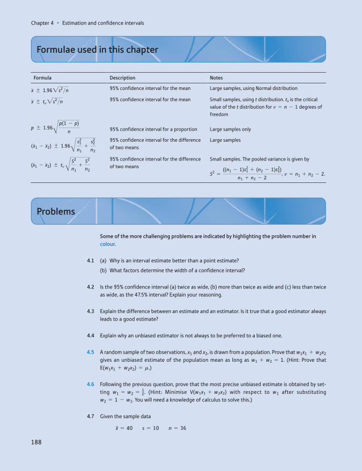
Chapter 4 • Estimation and confidence intervals
188
Formula Description Notes
x 1.962s2>n 95% confidence interval for the mean Large samples, using Normal distribution
x tn2s2>n 95% confidence interval for the mean Small samples, using t distribution. tv is the critical value of the t distribution for n = n - 1 degrees of freedom
p 1.96B p(1 - p)
n 95% confidence interval for a proportion Large samples only
(x1 - x2) 1.96B s21
n1+
s22
n2
95% confidence interval for the difference of two means
Large samples
(x1 - x2) tn B S2
n1+
S2
n2
95% confidence interval for the difference of two means
Small samples. The pooled variance is given by
S2 =((n1 - 1)s2
1 + (n2 - 1)s22)
n1 + n2 - 2, n = n1 + n2 - 2.
Formulae used in this chapter
Some of the more challenging problems are indicated by highlighting the problem number in colour.
4.1 (a) Why is an interval estimate better than a point estimate?
(b) What factors determine the width of a confidence interval?
4.2 Is the 95% confidence interval (a) twice as wide, (b) more than twice as wide and (c) less than twice as wide, as the 47.5% interval? Explain your reasoning.
4.3 Explain the difference between an estimate and an estimator. Is it true that a good estimator always leads to a good estimate?
4.4 Explain why an unbiased estimator is not always to be preferred to a biased one.
4.5 A random sample of two observations, x1 and x2, is drawn from a population. Prove that w1x1 + w2x2 gives an unbiased estimate of the population mean as long as w1 + w2 = 1. (Hint: Prove that E(w1x1 + w2x2) = m.)
4.6 Following the previous question, prove that the most precise unbiased estimate is obtained by set-ting w1 = w2 = 1
2. (Hint: Minimise V(w1x1 + w2x2) with respect to w1 after substituting w2 = 1 - w1. You will need a knowledge of calculus to solve this.)
4.7 Given the sample data
x = 40 s = 10 n = 36
Problems
Problems
189
calculate the 99% confidence interval estimate of the true mean. If the sample size were 20, how would the method of calculation and width of the interval be altered?
4.8 (a) A random sample of 100 record shops found that the average weekly sale of a particular CD was 260 copies, with standard deviation of 96. Find the 95% confidence interval to estimate the true average sale for all shops.
(b) To compile the CD chart it is necessary to know the correct average weekly sale to within 5% of its true value. How large a sample size is required?
4.9 Given the sample data p = 0.4, n = 50, calculate the 99% confidence interval estimate of the true proportion.
4.10 A political opinion poll questions 1000 people. Some 464 declare they will vote Conservative. Find the 95% confidence interval estimate for the Conservative share of the vote.
4.11 Given the sample data
x1 = 25 x2 = 22 s1 = 12 s2 = 18 n1 = 80 n2 = 100
estimate the true difference between the means with 95% confidence.
4.12 (a) A sample of 200 women from the labour force found an average wage of £26 000 p.a. with stan-dard deviation £3500. A sample of 100 men found an average wage of £28 000 with standard deviation £2500. Estimate the true difference in wages between men and women.
(b) A different survey, of men and women doing similar jobs, obtained the following results:
xW = £27 200 xM = £27 600 sW = £2225 sM = £1750 nW = 75 nM = 50
Estimate the difference between male and female wages using these new data. What can be con-cluded from the results of the two surveys?
4.13 Sixty-seven percent out of 150 pupils from school A passed an exam; 62% of 120 pupils at school B passed. Estimate the 99% confidence interval for the true difference between the proportions pass-ing the exam.
4.14 (a) A sample of 954 adults in early 1987 found that 23% of them held shares. Given a UK adult population of 41 million and assuming a proper random sample was taken, find the 95% confi-dence interval estimate for the number of shareholders in the United Kingdom.
(b) A ‘similar’ survey the previous year had found a total of 7 million shareholders. Assuming ‘simi-lar’ means the same sample size, find the 95% confidence interval estimate of the increase in shareholders between the two years.
4.15 A sample of 16 observations from a Normally distributed population yields a sample mean of 30 with standard deviation 5. Find the 95% confidence interval estimate of the population mean.
4.16 A sample of 12 families in a town reveals an average income of £25 000 with standard deviation £6000. Why might you be hesitant about constructing a 95% confidence interval for the average income in the town?
Chapter 4 • Estimation and confidence intervals
190
4.17 Two samples were drawn, each from a Normally distributed population, with the following results:
x1 = 45 s1 = 8 n1 = 12 x2 = 52 s2 = 5 n2 = 18
Estimate the difference between the population means, using the 95% confidence level.
4.18 The heights of 10 men and 15 women were recorded, with the following results:
Mean Variance
Men 173.5 80Women 162 65
Estimate the true difference between men’s and women’s heights. Use the 95% confidence level.
4.19 (Project) Estimate the average weekly expenditure upon alcohol by students. Ask a (reasonably) random sample of your fellow students for their weekly expenditure on alcohol. From this, calculate the 95% confidence interval estimate of such spending by all students.
Answers to exercises
191
Answers to exercises
Exercise 4.1
(a) The point estimate is 25 and the 95% confidence interval is 25 1.96 * 50>1100 = 25 9.8 = [15.2, 34.8].
(b) The CI becomes larger as the sample size reduces. In this case we would have 25 1.96 * 50>164 = 25 12.25 = [12.75, 37.25]. Note that the width of the CI is inversely proportional to the square root of the sample size.
Exercise 4.2
The 95% CI is 50 1.96 * 30>140 = 50 9.30 = [40.70, 59.30]. The value of 60 lies (just) outside this CI so is unlikely to be the true mean.
Exercise 4.3
All the statements are false. The first four all make probability statements about the population mean, so are invalid according to the classical view of probability. State-ment (e) sounds more plausible, but it refers to the CI for this specific sample and we simply do not know if the true mean lies inside or outside the CI for any individual sample. However, it is defensible to use this form of wording as long as we recognise the principles of constructing a CI. In (f), repeated experiments would have different CIs, so we cannot say anything about the range 0.1 to 0.4 in particular. This example comes from Hoekstra et al. (2014, DOI 10.3758/s13423-013-0572-3) who surveyed researchers and students. The respondents, on average, believed (erroneously) about 3.5 out of the 6 statements to be true. Interestingly, there was little difference between experienced researchers and novice students in the results.
Exercise 4.4
(a) The point estimate is 14% (7/50). The 95% CI is given by
0.14 1.96 * B0.14 * (1 - 0.14)50
= 0.14 0.096.
(b) Use 1.64 instead of 1.96, giving 0.14 0.080.
(c) 0.14 0.126.
Exercise 4.5
x1 - x2 = 25 - 30 = - 5 is the point estimate. The interval estimate is given by
(x1 - x2) 1.96B s21
n1+
s22
n2= -5 1.96B182
36+
252
49
= -5 9.14 = [-14.14, 4.14]
Exercise 4.6
The point estimate is 40 - 20 = 20% or 0.2. The interval estimate is
0.2 1.96 * B0.4 * 0.650
+0.2 * 0.8
100= 0.2 0.157 = [0.043, 0.357]
Chapter 4 • Estimation and confidence intervals
192
Exercise 4.7
The 99% CI is given by 74 t* * 1121>16 = 74 2.947 * 2.75 = 74 8.10 = [65.90, 82.10].
Exercise 4.8
The pooled variance is given by
S2 =(15 - 1) * 182 + (20 - 1) * 212
15 + 20 - 2= 391.36
The 95% CI is therefore
(45 - 55) 2.042 * B391.3615
+391.36
20= -10 13.80 = [-3.8, 23.8]
Appendix: Derivations of sampling distributions
193
Appendix Derivations of sampling distributions
Derivation of the sampling distribution of p
The sampling distribution of p is fairly straightforward to derive, given what we have already learned. The sampling distribution of p can be easily derived from the distribution of r, the number of successes in n trials of an experiment, since p = r>n. The distribution of r for large n is approximately Normal (from Chapter 3):
r ∼ N(nP, nP(1 - P)) (4.24)
Knowing the distribution of r, is it possible to find that of p? Since p is simply r multiplied by a constant, 1/n, it is also Normally distributed. The mean and vari-ance of the distribution can be derived using the E and V operators. The expected value of p is
E(p) = E(r>n) =1n
E(r) =1n
nP = P = p (4.25)
The expected value of the sample proportion is equal to the population propor-tion (note that the probability P and the population proportion p are the same thing and may be used interchangeably). The sample proportion therefore gives an unbiased estimate of the population proportion.
For the variance:
V(p) = V a rnb =
1
n2 V(r) =1
n2 nP(1 - P) =p(1 - p)
n (4.26)
Hence, the distribution of p is given by
p ∼ N ap, p(1 - p)
nb (4.27)
Derivation of the sampling distribution of x1 - x2
This is the difference between two random variables so is itself a random variable. Since any linear combination of Normally distributed, independent random vari-ables is itself Normally distributed, the difference of sample means follows a Nor-mal distribution. The mean and variance of the distribution can be found using the E and V operators. Letting
E(x1) = m1, V(x1) = s21>n1 and
E(x2) = m2, V(x2) = s22>n2
then
E(x1 - x2) = E(x1) - E(x2) = m1 - m2 (4.28)

Chapter 4 • Estimation and confidence intervals
194
And
V(x1 - x2) = V(x1) + V(x2) =s2
1
n1+
s22
n2 (4.29)
Equation (4.29) assumes x1 and x2 are independent random variables. The proba-bility distribution of x1 - x2 can therefore be summarised as:
x1 - x2 ∼ N am1 - m2, s2
1
n1+
s22
n2b (4.30)
This is equation (4.12) in the text.

195
Learning outcomes 195Introduction 196The concepts of hypothesis testing 196
One-tail and two-tail tests 199The choice of significance level 202
The Prob-value approach 203Significance, effect size and power 204Further hypothesis tests 207
Testing a proportion 208Testing the difference of two means 208Testing the difference of two proportions 209
Hypothesis tests with small samples 211Testing the sample mean 211Testing the difference of two means 212
Are the test procedures valid? 213Hypothesis tests and confidence intervals 214Independent and dependent samples 215
Two independent samples 215Paired samples 216
Issues with hypothesis testing 218Summary 219
Key terms and concepts 220References 220Formulae used in this chapter 221Problems 221Answers to exercises 226
Hypothesis testing5
By the end of this chapter you should be able to:
understand the philosophy and scientific principles underlying hypothesis testing
appreciate that hypothesis testing is about deciding whether a hypothesis is true or false on the basis of a sample of data
recognise the type of evidence which leads to a decision that the hypothesis is false
carry out hypothesis tests for a variety of statistical problems
recognise the relationship between hypothesis testing and a confidence interval
recognise the shortcomings of hypothesis testing.
Chapter 5 • Hypothesis testing
196
Introduction
This chapter deals with issues very similar to those of the previous chapter on estimation, but examines them in a different way. The estimation of population parameters and the testing of hypotheses about those parameters are similar techniques (indeed they are formally equivalent in a number of respects), but there are important differences in the interpretation of the results arising from each method. The process of estimation is appropriate when measurement is involved, such as measuring the true average expenditure on food; hypothesis testing is relevant when decision-making is involved, such as whether to accept that a supplier’s products are up to a specified standard. Hypothesis testing is also used to make decisions about the truth or otherwise of different theories, such as whether rising prices are caused by rising wages; and it is here that the issues become contentious. It is sometimes difficult to interpret correctly the results of hypothesis tests in these circumstances. This is discussed further later in this chapter.
The concepts of hypothesis testing
In many ways hypothesis testing is analogous to a criminal trial. In a trial there is a defendant who is initially presumed innocent. The evidence against the defendant is then presented and, if the jury finds this convincing beyond all reasonable doubt, he or she is found guilty; the presumption of innocence is overturned. Of course, mistakes are sometimes made: an innocent person is convicted or a guilty person set free. Both of these errors involve costs (not only in the monetary sense), either to the defendant or to society in general, and the errors should be avoided if at all possible. The laws under which the trial is held may help avoid such errors. The rule that the jury must be convinced ‘beyond all reasonable doubt’ helps to avoid convicting the innocent, for instance.
The situation in hypothesis testing is similar. First, there is a maintained or null hypothesis which is initially presumed to be true. The empirical evidence, usually data from a random sample, is then gathered and assessed. If the evidence seems inconsistent with the null hypothesis, i.e. it has a low probability of occurring if the hypothesis were true, then the null hypothesis is rejected in favour of an alter-native. Once again, there are two types of error one can make, either rejecting the null hypothesis when it is really true, or not rejecting it when in fact it is false. Ideally one would like to avoid both types of error.
An example helps to clarify the issues and the analogy. Suppose that you are thinking of taking over a small business franchise. The current owner claims the weekly turnover of each existing franchise averages £5000 and at this level you are willing to take on a franchise. You would be more cautious if the turnover is less than this figure. You examine the books of 26 franchises chosen at random and find that the average turnover was £4900 with standard deviation £280. What do you do?
The null hypothesis in this case is that average weekly turnover is £5000 (or more; that would be even more to your advantage). The alternative hypothesis is
The concepts of hypothesis testing
197
that turnover is strictly less than £5000 per week. We may write these more succinctly as follows:
H0: m = 5000H1: m 6 5000
H0 is conventionally used to denote the null hypothesis, H1 the alternative. Initially, H0 is presumed to be true and this presumption will be tested using the sample evidence. Note that the sample evidence is not used in forming the null or alternative hypotheses.
You have to decide whether the owner’s claim is correct (H0) or not (H1). The two types of error you could make are as follows:
Type I error – reject H0 when it is in fact true. This would mean missing a good business opportunity.
Type II error – not rejecting H0 when it is in fact false. You would go ahead and buy the business and then find out that it is not as attractive as claimed. You would have overpaid for the business.
The situation is set out in Figure 5.1.Obviously a good decision rule would give a good chance of making a correct
decision and rule out errors as far as possible. Unfortunately, it is impossible to completely eliminate the possibility of errors. As the decision rule is changed to reduce the probability of a Type I error, the probability of making a Type II error inevitably increases. The skill comes in balancing these two types of error.
Again a diagram is useful in illustrating this. Assuming that the null hypothesis is true, then the sample observations are drawn from a population with mean 5000 and some variance, which we shall assume is accurately measured by the sample variance. The distribution of x is then given by
x ∼ N(m, s2>n) or (5.1)x ∼ N(5000, 2802>26)
Under the alternative hypothesis the distribution of x would be the same except that it would be centred on a value less than 5000. These two situations are illustrated in Figure 5.2. The distribution of x under H1 is shown by a dashed curve to signify that its exact position is unknown, only that it lies to the left of the dis-tribution under H0.
A decision rule amounts to choosing a point or dividing line on the horizontal axis in Figure 5.2. If the sample mean lies to the left of this point, then H0 is rejected (the sample mean is too far away from H0 for it to be credible) in favour of H1 and you do not buy the franchise. If x lies above this decision point, then H0 is not rejected and you go ahead with the purchase. Such a decision point is shown
True situation
H0 true H0 false
Accept H0
Reject H0
DecisionCorrect decision
Correct decisionType I error
Type II error
Figure 5.1The two different types of error
Chapter 5 • Hypothesis testing
198
in Figure 5.2, denoted by xD. To the left of xD lies the rejection (of H0) region; to the right lies the non-rejection region.
Based on this point, we can see the probabilities of Type I and Type II errors. The area under the H0 distribution to the left of xD, labelled I, shows the probabil-ity of rejecting H0 given that it is in fact true: a Type I error. The area under the H1 distribution to the right of xD, labelled II, shows the probability of a Type II error: not rejecting H0 when it is in fact false (and H1 is true).
Shifting the decision line to the right or left alters the balance of these proba-bilities. Moving the line to the right increases the probability of a Type I error but reduces the probability of a Type II error. Moving the line to the left has the oppo-site effect.
The Type I error probability can be calculated for any value of xD. Suppose we set xD to a value of 4950. Using the distribution of x given in equation (5.1), the area under the distribution to the left of 4950 is obtained using the z score:
z =xD - m2s2>n
=4950 - 500022802>26
= -0.91 (5.2)
From the tables of the standard Normal distribution we find that the probabil-ity of a Type I error is 18.1%. Unfortunately, the Type II error probability cannot be established because the exact position of the distribution under H1 is unknown. Therefore, we cannot decide on the appropriate position of xD by some balance of the two error probabilities.
The convention therefore is to set the position of xD by using a Type I error probability of 5%, known as the significance level1 of the test. In other words, we are prepared to accept a 5% probability of rejecting H0 when it is, in fact, true. This allows us to establish the position of xD. From Table A2 (see page 450) we find that z = -1.64 cuts off the bottom 5% of the distribution, so the decision line should be 1.64 standard errors below 5000. The value -1.64 is known as the critical value of the test. We therefore obtain
xD = 5000 - 1.6422802>26 = 4910 (5.3)
Since the sample mean of 4900 lies below 4910, we reject H0 at the 5% signifi-cance level or equivalently we reject with 95% confidence. The significance level is
H1H0
I II
xD x
f(x )
Rejection region Non-rejection region
Figure 5.2The sampling distributions of x under H0 and H1
1The term size of the test is also used, not to be confused with the sample size. We use the term ‘significance level’ in this text.
The concepts of hypothesis testing
199
generally denoted by the symbol a and the complement of this, given by 1 - a, is known as the confidence level (as used in the confidence interval).
An equivalent procedure would be to calculate the z score associated with the sample mean, known as the test statistic, and then compare this to the critical value of the test. This allows the hypothesis testing procedure to be broken down into five neat steps:
(1) Write down the null and alternative hypotheses:
H0: m = 5000H1: m 6 5000
(2) Choose the significance level of the test, conventionally a = 0.05 or 5%.(3) Look up the critical value of the test from statistical tables, based on the cho-
sen significance level. z* = 1.64 is the critical value in this case.(4) Calculate the test statistic:
z =x - m2s2>n
=-10022802>26
= -1.82 (5.4)
(5) Decision rule. Compare the test statistic with the critical value: if z 6 -z* reject H0 in favour of H1. Since -1.82 6 -1.64, H0 is rejected with 95% confi-dence. Note that we use -z* here (rather than +z*) because we are dealing with the left-hand tail of the distribution.
Worked example 5.1
A sample of 100 workers found the average overtime hours worked in the previ-ous week was 7.8, with standard deviation 4.1 hours. Test the hypothesis that the average for all workers is 5 hours or less.
We can set out the five steps of the answer as follows:(1) H0: m = 5 H1: m 7 5(2) Significance level, a = 5%.(3) Critical value z* = 1.64.(4) Test statistic:
z =x - m2s2n
=7.8 - 524.12>100
= 6.8
(5) Decision rule: 6.8 7 1.64 so we reject H0 in favour of H1. Note that in this case we are dealing with the right-hand tail of the distribution (positive values of z and z*). Only high values of x reject H0.
One-tail and two-tail tests
In the above example the rejection region for the test consisted of one tail of the distribution of x, since the buyer was only concerned about turnover being less than claimed. For this reason, it is known as a one-tail test. Suppose now that an accountant is engaged to sell the franchise and wants to check the claim about
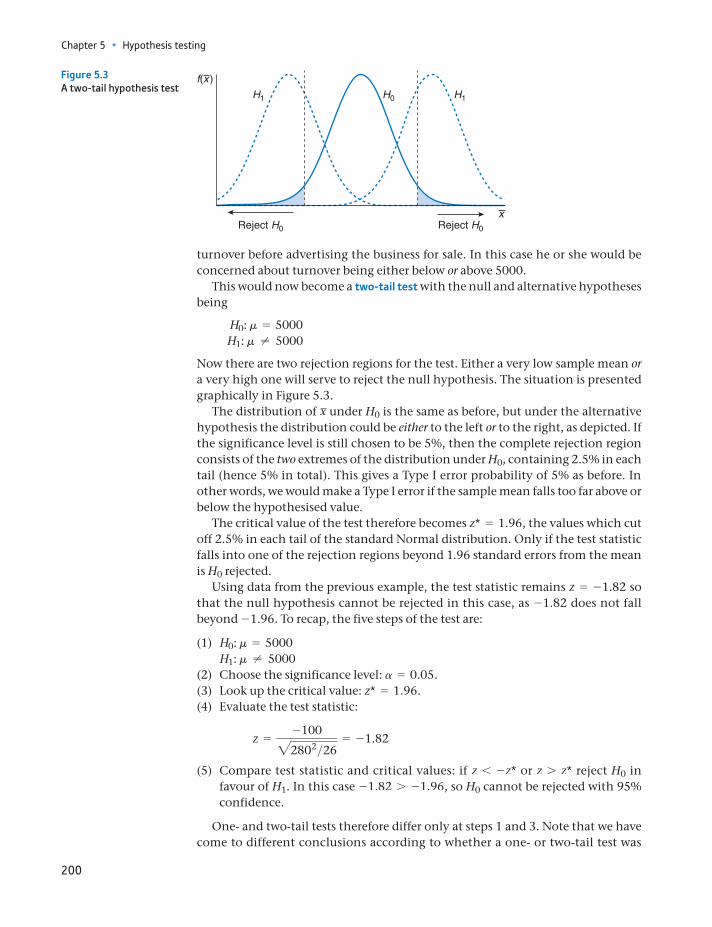
Chapter 5 • Hypothesis testing
200
turnover before advertising the business for sale. In this case he or she would be concerned about turnover being either below or above 5000.
This would now become a two-tail test with the null and alternative hypotheses being
H0: m = 5000H1: m ≠ 5000
Now there are two rejection regions for the test. Either a very low sample mean or a very high one will serve to reject the null hypothesis. The situation is presented graphically in Figure 5.3.
The distribution of x under H0 is the same as before, but under the alternative hypothesis the distribution could be either to the left or to the right, as depicted. If the significance level is still chosen to be 5%, then the complete rejection region consists of the two extremes of the distribution under H0, containing 2.5% in each tail (hence 5% in total). This gives a Type I error probability of 5% as before. In other words, we would make a Type I error if the sample mean falls too far above or below the hypothesised value.
The critical value of the test therefore becomes z* = 1.96, the values which cut off 2.5% in each tail of the standard Normal distribution. Only if the test statistic falls into one of the rejection regions beyond 1.96 standard errors from the mean is H0 rejected.
Using data from the previous example, the test statistic remains z = -1.82 so that the null hypothesis cannot be rejected in this case, as -1.82 does not fall beyond -1.96. To recap, the five steps of the test are:
(1) H0: m = 5000 H1: m ≠ 5000(2) Choose the significance level: a = 0.05.(3) Look up the critical value: z* = 1.96.(4) Evaluate the test statistic:
z =-10022802>26
= -1.82
(5) Compare test statistic and critical values: if z 6 -z* or z 7 z* reject H0 in favour of H1. In this case -1.82 7 -1.96, so H0 cannot be rejected with 95% confidence.
One- and two-tail tests therefore differ only at steps 1 and 3. Note that we have come to different conclusions according to whether a one- or two-tail test was
H1 H1H0
Reject H0 Reject H0
x
f(x )Figure 5.3A two-tail hypothesis test
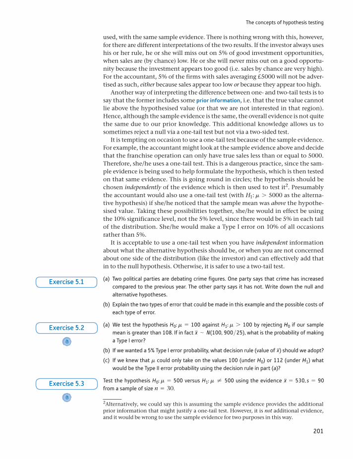
The concepts of hypothesis testing
201
used, with the same sample evidence. There is nothing wrong with this, however, for there are different interpretations of the two results. If the investor always uses his or her rule, he or she will miss out on 5% of good investment opportunities, when sales are (by chance) low. He or she will never miss out on a good opportu-nity because the investment appears too good (i.e. sales by chance are very high). For the accountant, 5% of the firms with sales averaging £5000 will not be adver-tised as such, either because sales appear too low or because they appear too high.
Another way of interpreting the difference between one- and two-tail tests is to say that the former includes some prior information, i.e. that the true value cannot lie above the hypothesised value (or that we are not interested in that region). Hence, although the sample evidence is the same, the overall evidence is not quite the same due to our prior knowledge. This additional knowledge allows us to sometimes reject a null via a one-tail test but not via a two-sided test.
It is tempting on occasion to use a one-tail test because of the sample evidence. For example, the accountant might look at the sample evidence above and decide that the franchise operation can only have true sales less than or equal to 5000. Therefore, she/he uses a one-tail test. This is a dangerous practice, since the sam-ple evidence is being used to help formulate the hypothesis, which is then tested on that same evidence. This is going round in circles; the hypothesis should be chosen independently of the evidence which is then used to test it2. Presumably the accountant would also use a one-tail test (with H1: m 7 5000 as the alterna-tive hypothesis) if she/he noticed that the sample mean was above the hypothe-sised value. Taking these possibilities together, she/he would in effect be using the 10% significance level, not the 5% level, since there would be 5% in each tail of the distribution. She/he would make a Type I error on 10% of all occasions rather than 5%.
It is acceptable to use a one-tail test when you have independent information about what the alternative hypothesis should be, or when you are not concerned about one side of the distribution (like the investor) and can effectively add that in to the null hypothesis. Otherwise, it is safer to use a two-tail test.
2Alternatively, we could say this is assuming the sample evidence provides the additional prior information that might justify a one-tail test. However, it is not additional evidence, and it would be wrong to use the sample evidence for two purposes in this way.
(a) Two political parties are debating crime figures. One party says that crime has increased compared to the previous year. The other party says it has not. Write down the null and alternative hypotheses.
(b) Explain the two types of error that could be made in this example and the possible costs of each type of error.
Exercise 5.1
(a) We test the hypothesis H0: m = 100 against H1: m 7 100 by rejecting H0 if our sample mean is greater than 108. If in fact x ∼ N(100, 900>25), what is the probability of making a Type I error?
(b) If we wanted a 5% Type I error probability, what decision rule (value of x) should we adopt?
(c) If we knew that m could only take on the values 100 (under H0) or 112 (under H1) what would be the Type II error probability using the decision rule in part (a)?
?
Exercise 5.2
Test the hypothesis H0: m = 500 versus H1: m ≠ 500 using the evidence x = 530, s = 90 from a sample of size n = 30.
?
Exercise 5.3
Chapter 5 • Hypothesis testing
202
The choice of significance level
The explanation above put hypothesis testing into a framework of decision-mak-ing between hypotheses, balancing Type I and Type II errors. This was first devel-oped by the statisticians Neyman and Pearson in the 1930s. It is fine for a situation where both null and alternative hypotheses are well defined (as, for example, in a court of law) but, as noted, is not helpful when the alternative hypothesis is only vaguely specified (‘H1: m ≠ 5000’, for instance) and we cannot calculate the Type II error probability.
In an ideal world we would have precisely specified null and alternative hypoth-eses (e.g. we would test H0: m = 5000 against H1: m = 4500, these being the only possibilities). Then we could calculate the probabilities of both Type I and Type II errors, for any given decision rule. We could then choose the optimal decision rule, which gives the best compromise between the two types of error. This is reflected in a court of law. In criminal cases, the jury must be convinced of the prosecution’s case beyond reasonable doubt, because of the cost of committing a Type I error. In a civil case (libel, for example) the jury need only be convinced on the balance of probabilities. In a civil case, the costs of Type I and Type II error are more evenly balanced and so the burden of proof is lessened.
However, in statistics we usually do not have the luxury of two well-specified hypotheses. As in the earlier worked example, the null hypothesis is precisely specified (it has to be or the test could not be carried out) but the alternative hypothesis is imprecise (sometimes called a composite hypothesis because it encompasses a range of values). Statistical inference is often used not so much as an aid to decision-making but to provide evidence for or against a particular the-ory, to alter one’s degree of belief in the truth of the theory. For example, a researcher might believe large firms are more profitable than small ones and wishes to test this. The null and alternative hypotheses would be:
H0: large and small firms are equally profitableH1: large firms are more profitable
(Note that the null has to be ‘equally profitable’, since this is a precise state-ment. ‘More profitable’ is too vague to be the null hypothesis.). Data could be gathered to test this hypothesis, but it is not possible to calculate the Type II error probability (because ‘more profitable’ is too vague). Hence we cannot find the optimal balance of Type I and Type II errors in order to make our decision to accept or reject H0. Another statistician, R.A. Fisher, proposed the use of the 5% signifi-cance level in this type of circumstance, arguing that a researcher could justifiably ignore any results that fail to reach this standard. Thus our procedures today are actually an uncomfortable mixture of two different approaches: Fisher did not agree with the decision-making framework; Neyman and Pearson did not propose a 5% convention for the Type I error probability.
The five sigma level of certainty
In particle physics the accepted level of certainty for the results of an experiment to be con-sidered a valid discovery is five sigma (i.e. five standard deviations). A distance of five standard deviations cuts off approximately 0.00003% in one tail of the Normal distribution and repre-sents an extremely low significance level. The reason for this is two-fold: (i) scientists are very
ST
ATISTICS
IN
PRACTI
CE
· ·
The Prob-value approach
203
The 5% significance level really does depend upon convention; therefore, it cannot be justified by reference to the relative costs of Type I and Type II errors. The 5% convention does impose some sort of discipline upon research; it sets some kind of standard which all theories (hypotheses) should be measured against. Beware the researcher who reports that a particular hypothesis is rejected at the 8% significance level; it is likely that the significance level was chosen so that the hypothesis could be rejected, which is what the researcher was hoping for in the first place. As we shall see later, however, this ‘discipline upon research’ is not a strong one.
The Prob-value approach
Fisher later changed his mind about the 5% significance level rule. He argued that this was too rigid to apply mechanically in all situations. Instead, one should pres-ent the Prob-value (also known as the P-value), which is the actual significance level of the test statistic. In this way one presents information (the likelihood of a false positive) rather than imposing a decision. The reader could then make their own judgement.
The Prob-value is calculated as follows. The test statistic calculated earlier for the investor problem was z = -1.82 and the associated Prob-value is obtained from Table A2 as 3.44%, i.e. -1.82 cuts off 3.44% in one tail of the standard Normal distribution. This means that the null hypothesis could be rejected at the 3.44% significance level or, alternatively expressed, with 96.56% confidence.
Notice that Table A2 gives the Prob-value for a one-tail test; for a two-tail test the Prob-value should be doubled. Thus for the accountant, using the two-tail test, the significance level is 6.88%, and this is the level at which the null hypoth-esis can be rejected. Alternatively, we could say we reject the null with 93.12% confidence. This does not meet the standard 5% criterion (for the significance level) which is most often used, so would result in non-rejection of the null. (Notice that, despite using P-values, we have slipped back into decision-making mode. It is difficult to avoid doing this.)
An advantage of using the Prob-value approach is that many statistical soft-ware programs routinely provide the Prob-value of a calculated test statistic3. If one understands the use of Prob-values, then one does not have to look up tables (this applies to any distribution, not just the Normal), which can save time.
reluctant to accept new hypotheses which may later turn out to be false, and (ii) there is a lot of random noise in the results of their experiments, so it would be easy to confuse noise with a valid finding unless a low significance level is chosen.
At the time of writing (February 2011), physicists are getting close to uncovering the existence of the Higgs boson but so far their results are only significant at about the three sigma level.
Update: The existence of the Higgs boson has been confirmed. More data (i.e. larger sample) allowed this conclusion to be reached.
3It is sometimes referred to as the ‘P-value’ in the statistical results. Excel uses this notation.
Chapter 5 • Hypothesis testing
204
To summarise, one rejects the null hypothesis if either:
(Method 1) the test statistic is greater than the critical value, i.e. z 7 z*, or (Method 2) the Prob-value associated with the test statistic is less than the sig-
nificance level, i.e. P 6 0.05 (if the 5% significance level is used).
I have found that many students initially find this confusing, because of the opposing inequality in the two versions (greater than and less than). For exam-ple, a program might calculate a hypothesis test and report the result as ‘z = 1.4 (P-value = 0.162)’. The first point to note is that most software pro-grams report the Prob-value for a two-tail test by default. Hence, assuming a 5% significance level, in this case we cannot reject H0 because z = 1.4 6 1.96 or equivalently because 0.162 7 0.05, against a two-tailed alternative (i.e. H1 contains ≠ ).
If you wish to conduct a one-tailed test, you have to halve the reported Prob-value, becoming 0.081 in this example. This is again greater than 5%, so the hypothesis is still accepted, even against a one-sided alternative (H1 contains 7 or 6). Equivalently, one could compare 1.4 with the one-tail critical value, 1.64, showing non-rejection of the null, but one has to look up the standard Normal table with this method. Computers cannot guess whether a one- or two-sided test is wanted, so take the conservative option and report the two-sided value. The correction for a one-sided test has to be done manually.
This is a useful exercise to test your understanding of hypothesis tests. You carry out a one-tail hypothesis test and obtain the result z = 2.3, P-value = 0.01. Which of the following state-ments are true?
(a) You have disproved the null hypothesis.
(b) You have found the probability that the null hypothesis is true.
(c) You have proved the alternative hypothesis to be true.
(d) You can calculate the probability of the alternative hypothesis being true.
(e) If you reject the null, you know the probability of having made the wrong decision.
(f) If this experiment were repeated many times, a statistically significant result would be obtained in 99% of trials.
These questions are adapted from an original questionnaire in Oakes (1986).
Exercise 5.4
Significance, effect size and power
Researchers usually look for ‘significant’ results; it is the way to get attention and to get published. Academic papers report that ‘the results are significant’ or that ‘the coefficient is significantly different from zero at the 5% significance level’. It is vital to realise that the word ‘significant’ is used here in the statistical sense and not in its everyday sense of being important. Something can be statistically signifi-cant yet still unimportant.
Suppose that we have some more data about the business examined earlier. Data for 100 franchises have been uncovered, revealing an average weekly turnover
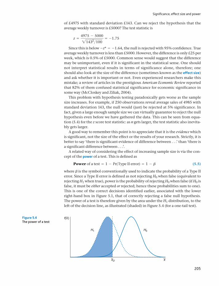
Significance, effect size and power
205
of £4975 with standard deviation £143. Can we reject the hypothesis that the average weekly turnover is £5000? The test statistic is
z =4975 - 500021432>100
= -1.75
Since this is below -z* = -1.64, the null is rejected with 95% confidence. True average weekly turnover is less than £5000. However, the difference is only £25 per week, which is 0.5% of £5000. Common sense would suggest that the difference may be unimportant, even if it is significant in the statistical sense. One should not interpret statistical results in terms of significance alone, therefore; one should also look at the size of the difference (sometimes known as the effect size) and ask whether it is important or not. Even experienced researchers make this mistake; a review of articles in the prestigious American Economic Review reported that 82% of them confused statistical significance for economic significance in some way (McCloskey and Ziliak, 2004).
This problem with hypothesis testing paradoxically gets worse as the sample size increases. For example, if 250 observations reveal average sales of 4985 with standard deviation 143, the null would (just) be rejected at 5% significance. In fact, given a large enough sample size we can virtually guarantee to reject the null hypothesis even before we have gathered the data. This can be seen from equa-tion (5.4) for the z score test statistic: as n gets larger, the test statistic also inevita-bly gets larger.
A good way to remember this point is to appreciate that it is the evidence which is significant, not the size of the effect or the results of your research. Strictly, it is better to say ‘there is significant evidence of difference between . . .’ than ‘there is a significant difference between . . .’.
A related way of considering the effect of increasing sample size is via the con-cept of the power of a test. This is defined as
Power of a test = 1 - Pr( Type II error) = 1 - b (5.5)
where b is the symbol conventionally used to indicate the probability of a Type II error. Since a Type II error is defined as not rejecting H0 when false (equivalent to rejecting H1 when true), power is the probability of rejecting H0 when false (if H0 is false, it must be either accepted or rejected; hence these probabilities sum to one). This is one of the correct decisions identified earlier, associated with the lower right-hand box in Figure 5.1, that of correctly rejecting a false null hypothesis. The power of a test is therefore given by the area under the H1 distribution, to the left of the decision line, as illustrated (shaded) in Figure 5.4 (for a one-tail test).
H1 H0
xxD
f(x )Figure 5.4The power of a test
Chapter 5 • Hypothesis testing
206
It is generally desirable to maximise the power of a test, as long as the probabil-ity of a Type I error is not raised in the process. There are essentially three ways of doing this:
Avoid situations where the null and alternative hypotheses are very similar, i.e. the hypothesised means are not far apart (a small effect size).
Use a large sample size. This reduces the sampling variance of x (under both H0 and H1) so the two distributions become more distinct.
Use good sampling methods which have small sampling variances. This has a similar effect to increasing the sample size.
Worked example 5.2
This example shows how a larger sample size increases the power of a test. Sup-pose we wish to test the hypothesis H0: m = 500 versus H0: m … 500. We have a choice of two methods to test the hypothesis: (a) use a sample size of 100, or (b) use a sample size of 49. Which will give us a better test? Let us use the 5% sig-nificance level and assume. s = 200 For test (a) we would then reject H0 if x 6 467.2, and for test (b) we would reject if x 6 453.1. (You can check that these would lead to a z score of -1.64 in both cases, which cuts of the bottom 5% of the Normal distribution.)
Now what is the probability in each case of rejecting the null if it were false, i.e. what is the power of each test? Suppose the true mean were 470 (so H0 above is false and should be rejected). For test (a) the probability of rejecting H0 (i.e. x 6 467.2) given that the true mean is 470 is obtained by calculating the z score:
z =467.2 - 470
200>2100= -0.14
From Table A2, this cuts off 44% in the lower tail, so this is the power of the test. For test (b) the z score is -0.59, which cuts off only 28%. Hence, test (a) is preferred, having the greater power. Note that the same significance level is required for both tests.
Unfortunately, in economics and business the data (including sample size) are very often given in advance and there is little or no control possible over the sam-pling procedures. This leads to a neglect of consideration of power, unlike in psy-chology or biology, for example, where the experiment can often be designed by the researcher. The gathering of sample data will be covered in detail in Chapter 9.
If a researcher believes the cost of making a Type I error is much greater than the cost of a Type II error, should they prefer a 5% or 1% significance level? Explain why.
Exercise 5.5
(a) A researcher uses Excel to analyse data and test a hypothesis. The program reports a test statistic of z = 1.77 (P-value = 0.077). Would you reject the null hypothesis if carrying out (i) a one-tailed test (ii) a two-tailed test? Use the 5% significance level.
(b) Repeat part (a) using a 1% significance level.
?
Exercise 5.6
Further hypothesis tests
207
Further hypothesis tests
We now consider a number of different types of hypothesis test, all involving the same principles but differing in details of their implementation. This is similar to the exposition in the last chapter covering, in turn, tests of a proportion, tests of the difference of two means and proportions, and finally problems involving small sample sizes.
Testing a proportion
A car manufacturer claims that no more than 10% of its cars should need repairs in the first three years of their life, the warranty period. A random sample of 50 three-year-old cars found that 8 had required attention. Does this contradict the maker’s claim?
This problem can be handled very similarly to the methods used for a mean. The key, once again, is to recognise the sample proportion as a random variable with an associated probability distribution. From Chapter 4 equation (4.9)), the sampling distribution of the sample proportion in large samples is given by
p ∼ N ap, p(1 - p)
nb (5.6)
In this case p = 0.10 (under the null hypothesis, the maker’s claim). The sample data are
p = 8>50 = 0.16 n = 50
Thus 16% of the sample required attention within the warranty period. This is substantially higher than the claimed 10%, but is this just because of a non- representative sample or does it reflect the reality that the cars are badly built? The hypothesis test is set out along the same lines as for a sample mean:
(1) Set out the null and alternative hypotheses:H0: p = 0.10H1: p 7 0.10
(The only concern is the manufacturer not matching its claim; hence a one-tail test is appropriate.)
(2) Significance level: a = 0.05.(3) The critical value of the one-tail test at the 5% significance level is z* = 1.64,
obtained from the standard Normal table.(4) The test statistic is
z =p - pBp(1 - p)
n
=0.16 - 0.10B0.1 * 0.9
50
= 1.41
A researcher wishes to test the hypothesis H0: m = 160 versus H0: m 7 160. If the sample size is to be 400 and s = 50 is assumed:
(a) What value of x should be used as the cutoff for rejecting H0 at the 5% significance level?
(b) What is the power of the test if the true mean is (i) 163, (ii) 166?
?
Exercise 5.7
Chapter 5 • Hypothesis testing
208
(5) Since the test statistic is less than the critical value, it falls into the non-rejection region. The null hypothesis is not rejected by the data. The manufacturer’s claim is not unreasonable.
Note that for this problem, the rejection region lies in the upper tail of the dis-tribution because of the ‘greater than’ inequality in the alternative hypothesis. The null hypothesis is therefore rejected in this case if z 7 z*.
Do children prefer branded goods only because of the name?
Researchers at Johns Hopkins Bloomberg School of Public Health in Maryland found young children were influenced by the packaging of foods. Sixty-three children were offered two identical meals, save that one was still in its original packaging (from McDonald’s). Seventy-six per cent of the children preferred the branded French fries.
Is this evidence significant? The null hypothesis is H0: p = 0.5 versus H1: p 7 0.5. The test statistic for this hypothesis test is
z =p - pBp(1 - p)
n
=0.76 - 0.50B0.5 * 0.5
63
= 4.12
which is greater than the critical value of z* = 1.64. Hence we conclude children are influ-enced by the packaging or brand name.
Source: New Scientist, 11 August 2007.
ST
ATISTICS
IN
PRACTI
CE
· ·
Testing the difference of two means
Suppose a car company wishes to compare the performance of its two factories pro-ducing an identical model of car. The factories are equipped with the same machin-ery but their outputs might differ due to managerial ability, labour relations, etc. Senior management wishes to know if there is any difference between the two facto-ries. Output is monitored for 30 days, chosen at random, with the following results:
Factory 1 Factory 2
Average daily output 420 408Standard deviation of daily output 25 20
Does this produce sufficient evidence of a real difference between the factories, or does the difference between the samples simply reflect random differences such as minor breakdowns of machinery? The information at our disposal may be summarised as
x1 = 420 x2 = 408 s1 = 25 s2 = 20 n1 = 30 n2 = 30
The hypothesis test to be conducted concerns the difference between the facto-ries’ outputs, so the appropriate random variable to examine is x1 - x2. From Chapter 4 (equation (4.12)), this has the following distribution, in large samples:
x1 - x2 ∼ N am1 - m2, s2
1
n1+
s22
n2b (5.7)
Further hypothesis tests
209
The population variances, s21 and s2
2, may be replaced by their sample estimates, s21
and s22, if the former are unknown, as here. The hypothesis test is therefore as follows.
(1) H0: m1 - m2 = 0 H1: m1 - m2 ≠ 0
The null hypothesis posits no real difference between the factories. This is a two-tail test since there is no a priori reason to believe one factory is better than the other, apart from the sample evidence.
(2) Significance level: a = 1%. This is chosen since the management does not want to interfere unless it is really confident of some difference between the factories. In order to favour the null hypothesis, a lower significance level than the conventional 5% is set.
(3) The critical value of the test is z* = 2.57. This cuts off 0.5% in each tail of the standard Normal distribution.
(4) The test statistic is
z =(x1 - x2) - (m1 - m2)B s2
1
n1+
s22
n2
=(420 - 408) - 0B252
30+
202
30
= 2.05
Note that this is of the same form as in the single-sample cases. The hypothe-sised value of the difference (zero in this case) is subtracted from the sample difference and this is divided by the standard error of the random variable.
(5) Decision rule: z 6 z* so the test statistic falls into the non-rejection region. There does not appear to be a significant difference between the two factories (or, better expressed, there is not significant evidence of a difference between factories).
A number of remarks about this example should be made. First, it is not neces-sary for the two sample sizes to be equal (although they are in the example); 45 days’ output from factory 1 and 35 days’ from factory 2, for example, could have been sampled. Second, the values of s2
1 and s22 do not have to be equal. They
are, respectively, estimates of s21 and s2
2, and although the null hypothesis asserts that m1 = m2 it does not assert that the variances are equal. Management wants to know if the average levels of output are the same; it is not concerned about daily fluctuations in output (although it might be). A test of the hypothesis of equal variances is set out in Chapter 6.
The final point to consider is whether all the necessary conditions for the cor-rect application of this test have been met. The example noted that the 30 days were chosen at random. If the 30 days sampled were consecutive, we might doubt whether the observations were truly independent. Low output on one day (due to a mechanical breakdown, for example) might influence the following day’s out-put (if a special effort were made to catch up on lost production, for example).
Testing the difference of two proportions
The general method should by now be familiar, so we will proceed by example for this case. Suppose that, in a comparison of two holiday companies’ customers, of the 75 who went with Happy Days Tours, 45 said they were satisfied, while 48 of the 90 who went with Fly by Night Holidays were satisfied. Is there a significant differ-ence between the companies?
Chapter 5 • Hypothesis testing
210
This problem can be handled by a hypothesis test on the difference of two sam-ple proportions. The procedure is as follows. The sample evidence is
p1 = 45>75 = 0.6 n1 = 75 p2 = 48>90 = 0.533 n2 = 90
The hypothesis test is carried out as follows
(1) H0: p1 - p2 = 0H1: p1 - p2 ≠ 0
(2) Significance level: a = 5%.(3) Critical value: z* = 1.96.(4) Test statistic: The distribution of p1 - p2 is
p1 - p2 ∼ N ap1 - p2, p1(1 - p1)
n1+
p2(1 - p2)n2
b
so the test statistic is
z =(p1 - p2) - (p1 - p2)Bp1(1 - p1)
n1+
p2(1 - p2)n2
(5.8)
However, p1 and p2 in the denominator of equation (5.8) have to be replaced by estimates from the samples. They cannot simply be replaced by p1 and p2 because these are unequal; to do so would contradict the null hypothesis that they are equal. Since the null hypothesis is assumed to be true (for the moment), it makes no sense to use a test statistic which explicitly supposes the null hypothesis to be false. Therefore, p1 and p2 are replaced by an esti-mate of their common value which is denoted pn and whose formula is
pn =n1p1 + n2p2
n1 + n2 (5.9)
i.e. a weighted average of the two sample proportions. This yields
pn =75 * 0.6 + 90 * 0.533
75 + 90= 0.564
This, in fact, is just the proportion of all customers who were satisfied, 93 out of 165. The test statistic therefore becomes
z =0.6 - 0.533 - 0B0.564 * (1 - 0.564)
75+
0.564 * (1 - 0.564)90
= 0.86
(5) The test statistic is less than the critical value so the null hypothesis cannot be rejected with 95% confidence. There is not sufficient evidence to demonstrate a difference between the two companies’ performance.
Are women better at multi-tasking?
The conventional wisdom is ‘yes’. However, the concept of multi-tasking originated in com-puting and, in that domain, it appears men are more likely to multi-task. Oxford Internet Surveys (http://www.oii.ox.ac.uk/microsites/oxis/) asked a sample of 1578 people if they
ST
ATISTICS
IN
PRACTI
CE
· ·
Hypothesis tests with small samples
211
Hypothesis tests with small samples
As with estimation, slightly different methods have to be employed when the sam-ple size is small (n 6 25) and the population variance is unknown. When both of these conditions are satisfied, the t distribution must be used rather than the Normal, so a t test is conducted rather than a z test. This means consulting tables of the t dis-tribution to obtain the critical value of a test, but otherwise the methods are similar. These methods will be applied to hypotheses about sample means only, since they are inappropriate for tests of a sample proportion, as was the case in estimation.
Testing the sample mean
A large chain of supermarkets sells 5000 packets of cereal in each of its stores each month. It decides to test-market a different brand of cereal in 15 of its stores. After a month the 15 stores have sold an average of 5200 packets each, with a standard deviation of 500 packets. Should all supermarkets switch to selling the new brand?
The sample information is
x = 5200, s = 500, n = 15
From Chapter 4 the distribution of the sample mean from a small sample when the population variance is unknown is based upon
x - m2s2>n∼ tn (5.10)
multi-tasked while on-line (e.g. listening to music, using the phone); 69% of men said they did, 57% of women did. Is this difference statistically significant?
The published survey does not give precise numbers of men and women respondents for this question, so we will assume equal numbers (the answer is not very sensitive to this assumption). We therefore have the test statistic:
z =0.69 - 0.57 - 0B0.63 * (1 - 0.63)
789+
0.63 * (1 - 0.63)
789
= 4.94
(0.63 is the overall proportion of multi-taskers). The evidence is significant and clearly sug-gests this is a genuine difference: men are the multi-taskers.
A survey of 80 voters finds that 65% are in favour of a particular policy. Test the hypothesis that the true proportion is 50%, against the alternative that a majority is in favour.
?
Exercise 5.8
A survey of 50 teenage girls found that on average they spent 3.6 hours per week chatting with friends over the internet. The standard deviation was 1.2 hours. A similar survey of 90 teenage boys found an average of 3.9 hours, with standard deviation 2.1 hours. Test if there is any difference between boys’ and girls’ behaviour.
?
Exercise 5.9
One gambler on horse racing won on 23 of his 75 bets. Another won on 34 out of 95. Is the second person a better judge of horses, or just luckier?
?
Exercise 5.10
Chapter 5 • Hypothesis testing
212
with n = n - 1 degrees of freedom. The hypothesis test is based on this formula and is conducted as follows:
(1) H0: m = 5000 H1: m 7 5000 (Only an improvement in sales is relevant.)(2) Significance level: a = 1% (chosen because the cost of changing brands is high).(3) The critical value of the t distribution for a one-tail test at the 1% significance
level with n = -1 = 14 degrees of freedom is t* = 2.62.(4) The test statistic is
t =x - m2s2>n
=5200 - 500025002>15
= 1.55
(5) The null hypothesis is not rejected since the test statistic, 1.55, is less than the critical value, 2.62. It would probably be unwise to switch over to the new brand of cereal.
Testing the difference of two means
A survey of 20 British companies found an average annual expenditure on research and development of £3.7m with a standard deviation of £0.6m. A survey of 15 similar German companies found an average expenditure on research and devel-opment of £4.2m with standard deviation £0.9m. Does this evidence lend sup-port to the view often expressed that Britain does not invest enough in research and development?
This is a hypothesis about the difference of two means, based on small sample sizes. The test statistic is again based on the t distribution, i.e.
(x1 - x2) - (m1 - m2)B S2
n1+
S2
n2
∼ tn (5.11)
where S2 is the pooled variance (as given in equation (4.23)) and the degrees of freedom are given by n = n1 + n2 - 2.
The hypothesis test procedure is as follows:
(1) H0: m1 - m2 = 0H1: m1 - m2 6 0(a one-tail test because the concern is with Britain spending less than Germany.)
(2) Significance level: a = 5%.(3) The critical value of the t distribution at the 5% significance level for a one-
tail test with n = n1 + n2 - 2 = 33 degrees of freedom is approximately t* = 1.70.
(4) The test statistic is based on equation (5.11):
t =(x1 - x2) - (m1 - m2)B S2
n1+
S2
n2
=3.7 - 4.2 - 0B0.55
20+
0.5515
= -1.97
where S2 is the pooled variance, calculated by
S2 =(n1 - 1)s2
1 + (n2 - 1)s22
n1 + n2 - 2=
19 * 0.62 + 14 * 0.92
33= 0.55
Are the test procedures valid?
213
(5) The test statistic falls in the rejection region, t 6 - t*, so the null hypothesis is rejected. The data do support the view that Britain spends less on R&D than Germany.
It is asserted that parents spend, on average, £540 p.a. on toys for each child. A survey of 24 parents finds expenditure of £490, with standard deviation £150. Does this evidence con-tradict the assertion?
Exercise 5.11
A sample of 15 final-year students were found to spend on average 15 hours per week in the university library, with standard deviation 3 hours. A sample of 20 freshers found they spend on average 9 hours per week in the library, with standard deviation 5 hours. Is this sufficient evidence to conclude that finalists spend more time in the library?
Exercise 5.12
Are the test procedures valid?
A variety of assumptions underlie each of the tests which we have applied above, and it is worth considering in a little more detail whether these assumptions are justified. This will demonstrate that one should not rely upon the statistical tests alone; it is important to retain one’s sense of judgement.
The first test concerned the weekly turnover of a series of franchise operations. To justify the use of the Normal distribution underlying the test, the sample observations must be independently drawn. If, for example, all the sample fran-chises were taken from vibrant and growing cities and avoided those in less fortu-nate parts of the country, then in some sense the observations would not be independent, and furthermore the sample would not be representative of the whole. The answer to this would be to ensure the sample was properly stratified, representing different parts of the country. This type of sampling issue is covered in Chapter 9.
If one were using time-series data, as in the car factory comparison, similar issues arise. Do the 30 days represent independent observations or might there be an auto-correlation problem (e.g. if the sample days were close together in time)? Suppose that factory 2 suffered a breakdown of some kind which took three days to fix. Output would be reduced on three successive days and factory 2 would almost inev-itably appear less efficient than factory 1. A look at the individual sample observa-tions might be worthwhile, therefore, to see if there are any irregular patterns. It would have been altogether better if the samples had been collected on randomly chosen days over a longer time period to reduce the danger of this type of problem.
If the two factories both obtain their supplies from a common, but limited, source, then the output of one factory might not be independent of the output of the other. A high output of one factory would tend to be associated with a low output from the other, which has little to do with their relative efficiencies. This might leave the average difference in output unchanged but might increase the variance substantially (either a very high positive value of x1 - x2 or a very high negative value is obtained). This would lead to a low value of the test statistic and the conclusion of no difference in output. Any real difference in efficiency is masked by the common supplier problem. If the two samples are not indepen-dent, then the distribution of x1 - x2 may not be Normal.
Chapter 5 • Hypothesis testing
214
Hypothesis tests and confidence intervals
Formally, two-tail hypothesis tests and confidence intervals are equivalent. Any value which lies within the 95% confidence interval around the sample mean cannot be rejected as the ‘true’ value using the 5% significance level in a hypothesis test using the same sample data. For example, our by now familiar accountant could construct a confidence interval for the firm’s sales. This yields the 95% confidence interval
[4792, 5008] (5.12)
Notice that the hypothesised value of 5000 is within this interval and that this value was not rejected by the hypothesis test carried out earlier. As long as the same confidence level is used for both procedures, they are equivalent.
Having said this, their interpretation is different. The hypothesis test forces us into the reject/do not reject dichotomy, which is rather a stark choice. We have already seen how it becomes more likely that a null hypothesis is rejected as the sample size increases. This problem does not occur with estimation. As the sample size increases the confidence interval gets narrower (around the unbiased point estimate) which is entirely beneficial. The estimation approach also tends to emphasise importance over significance in most people’s minds. With a hypoth-esis test one might know that turnover is significantly different from 5000 with-out knowing how far from 5000 it actually is.
On some occasions a confidence interval is inferior to a hypothesis test, how-ever. Consider the following case. In the United Kingdom only 72 out of 564 judges are women (12.8%). The Equal Opportunities Commission had earlier com-mented that since the appointment system is so secretive, it is impossible to tell if there is discrimination or not. What can the statistician say about this? No dis-crimination (in its broadest sense) would mean half of all judges would be women. Thus, the hypotheses are
H0: p = 0.5 (no discrimination)H1: p 6 0.5 (discrimination against women)
The sample data are p = 0.128, n = 564. The z score is
z =p - pBp(1 - p)
n
=0.128 - 0.5B0.5 * 0.5
564
= -17.7
This is clearly significant (and 12.8% is a long way from 50%) so the null hypoth-esis is rejected. There is some form of discrimination somewhere against women (unless women choose not to be judges). But a confidence interval estimate of the ‘true’ proportion of female judges would be meaningless. To what population is this ‘true’ proportion related?
The lesson from all this is that differences exist between confidence intervals and hypothesis tests, despite their formal similarity. Which technique is more appropri-ate is a matter of judgement for the researcher. With hypothesis testing, the rejec-tion of the null hypothesis at some significance level might actually mean a small (and unimportant) deviation from the hypothesised value. It should be remem-bered that the rejection of the null hypothesis based on a large sample of data is also consistent with the true value possibly being quite close to the hypothesised value.
Independent and dependent samples
215
Independent and dependent samples
The following example illustrates the differences between independent samples (as encountered so far) and dependent samples (also known as matched or paired samples) where slightly different methods of analysis are required. The example also illustrates how a particular problem can often be analysed by a variety of sta-tistical methods.
Dependent samples occur, for example, when the same individuals are sampled twice, at two points in time. Alternatively, the observations in a first sample might be matched to or related in some way with the observations in the second sample. To ignore these facts in our analysis would be to ignore some potentially valuable information and hence not obtain the optimum results from the data.
To proceed via an example, suppose a company introduces a training pro-gramme to raise the productivity of its clerical workers, which is measured by the number of invoices processed per day. The company wants to know if the training programme is effective. How should it evaluate the programme? There is a variety of ways of going about the task, as follows:
Take two (random) samples of workers, one trained and one not trained, and compare their productivity. This would comprise two independent samples.
Take a sample of workers and compare their productivity before and after train-ing. This would be a paired sample.
Take two samples of workers, one to be trained and the other not. Compare the improvement of the trained workers with any change in the other group’s per-formance over the same time period. This would consist of two independent samples but we are controlling for any time effects that are unrelated to the training.
We shall go through each method in turn, pointing out any possible difficulties.
Two independent samples
Suppose a group of 10 workers is trained and compared to a group of 10 non-trained workers, with the following data being relevant:
xT = 25.5 xN = 21.00 sT = 2.55 sN = 2.91 nT = 10 nN = 10
Thus, trained workers process 25.5 invoices per day compared to only 21 by non-trained workers. The question is whether this is significant, given that the sample sizes are quite small.
The appropriate test here is a t test of the difference of two sample means, as follows:
H0: mT - mN = 0H1: mT - mN 7 0
t =25.5 - 21.0B7.49
10+
7.4910
= 3.68
Chapter 5 • Hypothesis testing
216
(7.49 is S2, the pooled variance). The t statistic leads to rejection of the null hypothesis; the training programme does seem to be effective.
One problem with this test is that the two samples might have other differ-ences apart from the effect of the training programme. This could be due either to simple random variation or to some selection factor. Poor workers might have been reluctant to take part in training, departmental managers might have selected better workers for training as some kind of reward, or better workers may have volunteered. In a well-designed experiment this should not be allowed to happen, of course, but we do not rule out the possibility. Hence we should con-sider ways of conducting a fairer test.
Paired samples
If we compare the same workers before and after training, then we are controlling for the inherent quality of the workers. We hence rule out this form of random variation which might otherwise weaken our test. We should therefore obtain a better idea of the true effect of the training programme. This is an example of paired or matched samples, where we can match up and compare the individual observations to each other, rather than just the overall averages. Suppose the sam-ple data are as follows:
Worker 1 2 3 4 5 6 7 8 9 10
Before 21 24 23 25 28 17 24 22 24 27After 23 27 24 28 29 21 24 25 26 28
In this case, the observations in the two samples are paired, and this has impli-cations for the method of analysis. One could proceed by assuming these are two independent samples and conduct a t test. The summary data and results of such a test are:
xB = 23.50 xA = 25.5 sB = 3.10 sA = 2.55 nB = 10 nA = 10
The resulting test statistic is t18 = 1.58 which is not significant at the 5% level.There are two problems with this test and its result. First, the two samples
are not truly independent, since the before and after measurements refer to the same group of workers. Second, note that 9 out of 10 workers in the sample have shown an improvement, which is odd in view of the result found above, of no significant improvement. If the training programme really has no effect, then the probability of a single worker showing an improvement is 12. The probability of nine or more workers showing an improvement is, by the Binomial method, 112210 * 10C9 + 112210, which is about one in a hundred. A very unlikely event seems to have occurred. Furthermore, the improvement is better measured as a proportion, which is 8.5% (25.5 versus 23.5), and any company would be pleased at such an improvement in productivity. Despite the lack of signifi-cance, it is worth investigating further.
The t test used above is inappropriate because it does not make full use of the information in the sample. It does not reflect the fact, for example, that the before
Independent and dependent samples
217
and after scores, 21 and 23, relate to the same worker. The Binomial calculation above does reflect this matching. A re-ordering of the data would not affect the t test result, but would affect the Binomial, since a different number of workers would now show an improvement. Of course, the Binomial does not use all the sample information either – it dispenses with the actual productivity data for each worker and replaces it with ‘improvement’ or ‘no improvement’. It disregards the amount of improvement for each worker.
Better use of the sample data comes by measuring the improvement for each worker, as follows (if a worker had deteriorated, this would be reflected by a nega-tive number):
Worker 1 2 3 4 5 6 7 8 9 10
Improvement 2 3 1 3 1 4 0 3 2 1
These new data can be treated by single sample methods, and account is taken both of the actual data values and of the fact that the original samples were depen-dent (re-ordering of the data would produce different, and incorrect, improve-ment figures). The summary statistics of the new data are as follows:
x = 2.00, s = 1.247, n = 10
The null hypothesis of no improvement can now be tested as follows:
H0: m = 0H1: m 7 0
t =2.0 - 0B1.2472
10
= 5.07
This is significant at the 5% level, so the null hypothesis of no improvement is rejected. The correct analysis of the sample data has thus reversed the previous conclusion. It is perhaps surprising that treating the same data in different ways leads to such a difference in the results. It does illustrate the importance of using the appropriate method.
Matters do not end here, however. Although we have discovered an improve-ment, this might be due to other factors apart from the training programme. For example, if the before and after measurements were taken on different days of the week (that Monday morning feeling . . .), or if one of the days were sunnier, mak-ing people feel happier and therefore more productive, this might bias the results. These may seem trivial examples but these effects do exist, for example the ‘Friday afternoon car’, which has more faults than the average, constructed when workers are thinking ahead to the weekend.
The way to solve this problem is to use a control group, so called because extraneous factors are controlled for, in order to isolate the effects of the factor under investigation. In this case, the productivity of the control group would be measured (twice) at the same times as that of the training group, although no training would be given to them. Ideally, the control group would be matched on other factors (e.g. age) to the treatment group to avoid other factors influenc-ing the results. Suppose that the average improvement of the control group were 0.5 invoices per day with standard deviation 1.0 (again for a group of 10). This
Chapter 5 • Hypothesis testing
218
can be compared with the improvement of the training group via the two-sam-ple t test, giving
t =2.0 - 0.5B1.132
10+
1.132
10
= 2.97
(1.132 is the pooled variance). This adds more support to the finding that the training programme is of value.
A group of students’ marks on two tests, before and after instruction, were as follows:
Student 1 2 3 4 5 6 7 8 9 10 11 12
Before 14 16 11 8 20 19 6 11 13 16 9 13After 15 18 15 11 19 18 9 12 16 16 12 13
Test the hypothesis that the instruction had no effect, using both the independent sample and paired sample methods. Compare the two results.
Exercise 5.13
Issues with hypothesis testing
The above exposition has served to illustrate how to carry out a hypothesis test and the rationale behind it. However, the methodology has been subject to criti-cisms, some of which we have already discussed:
The decision-making paradigm is problematic since we are not sure what we are choosing between (the alternative hypothesis is vague).
The 5% significance level is just a convention. The focus on ‘significance’ leads to a neglect of the effect size. The experimental (i.e. alternative) hypothesis is never itself tested. This is a pity
as it is often the one favoured by the researcher. The process is easily and often misunderstood. People tend to confuse the prob-
ability of observing the sample data assuming that the null is true with the probability that the null is true given the data. More succinctly, Pr(data | H0) is confused with Pr(H0 | data). The significance level (P-value) relates to the for-mer, not the latter.
There are other problems too which we have not yet discussed. It is common in research to be looking at several hypothesis tests rather than just one. Suppose we are trying to improve teaching of statistics to a group of students. We try five alter-native approaches: smaller class sizes, regular assignments, online tests, etc. We test each of these with a conventional hypothesis test at the 5% significance level. What is our chance of a Type I error, assuming none of these innovations truly works? The chance that all five come up with ‘no effect’ is 0.955 = 0.77. Hence the overall Type I error probability is 1 - 0.77 = 0.23. There is a 23% chance that we (erroneously) find something significant. This reveals the danger of looking for things in the data – there is a good chance you will find something, but it will likely be a false positive.
Summary
219
This problem is pervasive, and even the researcher himself herself might be unaware of doing it. He/she investigates whether workers are less productive on a Friday but finds no significant effect. So he/she wonders whether there is a Monday effect and tests that. Or (even worse) he/she notices in the data that productivity looks low on a Wednesday, so he/she tests that. The results of these tests are largely meaningless and the true significance level (P-value) may be much higher than 5%.
Why is it, therefore, that hypothesis testing is so frequently used? One attrac-tion is that it provides clear guidance on what to do, which does not require too much thought to apply. Follow the procedures and you will obtain a result. Moreover, this method will be generally accepted by others and is needed if the researcher wishes to get published.
What can be done to avoid some of these pitfalls? Some suggestions are as follows.
If doing a hypothesis test, plan it in detail before obtaining the data, i.e. the null hypothesis (or hypotheses) to test, the significance level, how to measure the variables appropriately (e.g. look at wage rates or total earnings?), sample size and so on. Stick to these choices, do not alter them in the light of what you might observe in the data.
Do not be overawed by significance. Look at the effect size as well. In fact, look at the effect size first. Your significant result could be unimportant.
Calculating a confidence interval might be a better way of analysing your data than a hypothesis test. It gives more focus to the effect size while also telling you about the reliability of your finding.
Do not rely only on a hypothesis test, there are lots of ways of gaining insight into a problem. Look at the data using descriptive statistics and charts (and present these results to the reader). Perhaps your significant result occurs because of a few outliers in the data.
If possible, validate your findings on new data. If the effect you have found is genuine, it ought to occur in a new sample. If your original data suggest a new hypothesis to you, you must get new data to test it, you cannot use the same data to test the hypothesis suggested by those data.
Generally, to be published in an academic journal, a study needs to reject the null hypothesis at the 5% significance level. Of all studies published in journals, what proportion of them are likely to be Type I errors, i.e. false positives?
Exercise 5.14
Studies published in journals will usually have an effect size for the subject of study, e.g. smaller class sizes improve pupils’ maths skills by 10% points. Would you expect a published effect size to be an underestimate, an accurate (unbiased) estimate, or an overestimate of the true effect size? Note that only ‘significant’ results get published.
Exercise 5.15
Summary
Hypothesis testing is the set of procedures for deciding whether a hypothesis is true or false. When conducting the test, we presume the hypothesis, termed the null hypothesis, is true until it is proved false on the basis of some sample evidence.
Chapter 5 • Hypothesis testing
220
If the null is proved false, it is rejected in favour of the alternative hypothesis. The procedure is conceptually similar to a court case, where the defendant is presumed innocent until the evidence proves otherwise.
Not all decisions turn out to be correct, and there are two types of error that can be made. A Type I error is to reject the null hypothesis when it is in fact true. A Type II error is not to reject the null when it is false.
Choosing the appropriate decision rule (for rejecting the null hypothesis) is a question of trading off Type I and Type II errors. Because the alternative hypoth-esis is imprecisely specified, the probability of a Type II error usually cannot be specified.
The rejection region for a test is therefore chosen to give a 5% probability of making a Type I error (sometimes a 1% probability is chosen). The critical value of the test statistic (sometimes referred to as the critical value of the test) is the value which separates the acceptance and rejection regions.
The decision is based upon the value of a test statistic, which is calculated from the sample evidence and from information in the null hypothesis.
ae.g. z =x - m
s>1nb
The null hypothesis is rejected if the test statistic falls into the rejection region for the test (i.e. it exceeds the critical value).
For a two-tail test there are two rejection regions, corresponding to very high and very low values of the test statistic.
Instead of comparing the test statistic to the critical value, an equivalent proce-dure is to compare the Prob-value of the test statistic with the significance level. The null is rejected if the Prob-value is less than the significance level.
The power of a test is the probability of a test correctly rejecting the null hypothesis. Some tests have low power (e.g. when the sample size is small) and therefore are not very useful.
alternative hypothesiscomposite hypothesiscritical valuedecision ruledependent sampleseffect sizeindependent samplesmatched samplesnon-rejection regionnull or maintained hypothesis
one- and two-tail testspaired samplespowerprior informationProb-valuerejection regionsignificance leveltest statisticType I andType II errors
Key terms and concepts
Michael Oakes, Statistical Inference: A Commentary for the Social and Behavioural Sciences, Wiley, 1986.
McCloskey, D., and S. Ziliak, Size Matters: the Standard Error of Regressions in the American Economic Review, Journal of Socio-Economics, 33, 527–46, 2004.
References
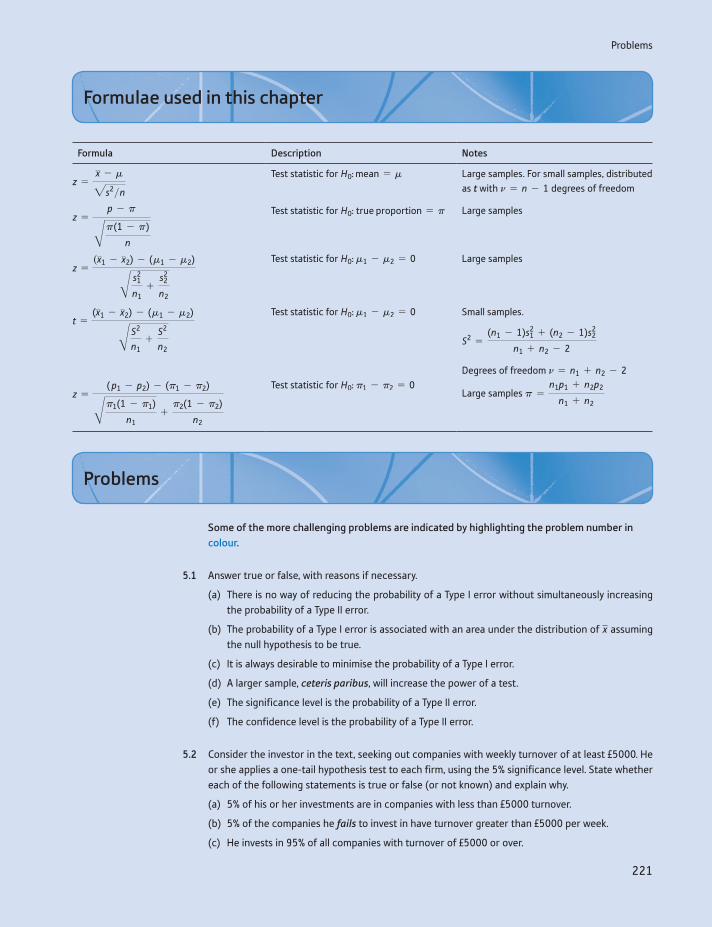
Problems
221
Formula Description Notes
z =x - m2s2>n
Test statistic for H0: mean = m Large samples. For small samples, distributed as t with n = n - 1 degrees of freedom
z =p - pBp(1 - p)
n
Test statistic for H0: true proportion = p Large samples
z =(x1 - x2) - (m1 - m2)B s2
1
n1+
s22
n2
Test statistic for H0: m1 - m2 = 0 Large samples
t =(x1 - x2) - (m1 - m2)B S2
n1+
S2
n2
Test statistic for H0: m1 - m2 = 0 Small samples.
S2 =(n1 - 1)s2
1 + (n2 - 1)s22
n1 + n2 - 2
Degrees of freedom n = n1 + n2 - 2
z =( p1 - p2) - (p1 - p2)Bp1(1 - p1)
n1+
p2(1 - p2)
n2
Test statistic for H0: p1 - p2 = 0Large samples p =
n1p1 + n2p2
n1 + n2
Formulae used in this chapter
Some of the more challenging problems are indicated by highlighting the problem number in colour.
5.1 Answer true or false, with reasons if necessary.
(a) There is no way of reducing the probability of a Type I error without simultaneously increasing the probability of a Type II error.
(b) The probability of a Type I error is associated with an area under the distribution of x assuming the null hypothesis to be true.
(c) It is always desirable to minimise the probability of a Type I error.
(d) A larger sample, ceteris paribus, will increase the power of a test.
(e) The significance level is the probability of a Type II error.
(f) The confidence level is the probability of a Type II error.
5.2 Consider the investor in the text, seeking out companies with weekly turnover of at least £5000. He or she applies a one-tail hypothesis test to each firm, using the 5% significance level. State whether each of the following statements is true or false (or not known) and explain why.
(a) 5% of his or her investments are in companies with less than £5000 turnover.
(b) 5% of the companies he fails to invest in have turnover greater than £5000 per week.
(c) He invests in 95% of all companies with turnover of £5000 or over.
Problems
Chapter 5 • Hypothesis testing
222
5.3 A coin which is either fair or has two heads is to be tossed twice. You decide on the following deci-sion rule: if two heads occur you will conclude it is a two-headed coin, otherwise you will presume it is fair. Write down the null and alternative hypotheses and calculate the probabilities of Type I and Type II errors.
5.4 In comparing two medical treatments for a disease, the null hypothesis is that the two treatments are equally effective. Why does making a Type I error not matter? What significance level for the test should be set as a result?
5.5 A firm receives components from a supplier, which it uses in its own production. The components are delivered in batches of 2000. The supplier claims that there are only 1% defective components on average from its production. However, production occasionally gets out of control and a batch is produced with 10% defective components. The firm wishes to intercept these low-quality batches, so a sample of size 50 is taken from each batch and tested. If two or more defectives are found in the sample, then the batch is rejected.
(a) Describe the two types of error the firm might make in assessing batches of components.
(b) Calculate the probability of each type of error given the data above.
(c) If, instead, samples of size 30 were taken and the batch rejected if one or more rejects were found, how would the error probabilities be altered?
(d) The firm can alter the two error probabilities by choice of sample size and rejection criteria. How should it set the relative sizes of the error probabilities
(i) if the product might affect consumer safety?
(ii) if there are many competitive suppliers of components?
(iii) if the costs of replacement under guarantee are high?
5.6 Computer diskettes (the precursor to USB drives) which do not meet the quality required for high-density diskettes are sold as low-density diskettes (storing less data) for 80 pence each. High-density diskettes are sold for £1.20 each. A firm samples 30 diskettes from each batch of 1000 and if any fail the quality test, the whole batch is sold as double-density diskettes. What are the types of error pos-sible and what is the cost to the firm of a Type I error?
5.7 Testing the null hypothesis that m = 10 against m 7 10, a researcher obtains a sample mean of 12 with standard deviation 6 from a sample of 30 observations. Calculate the z score and the associ-ated Prob-value for this test.
5.8 Given the sample data x = 45, s = 16, n = 50, at what level of confidence can you reject H0: m = 40 against a two-sided alternative?
5.9 What is the power of the test carried out in Problem 5.3?
5.10 Given the two hypotheses
H0: m = 400H1: m = 415
and s2 = 1000 (for both hypotheses):
(a) Draw the distribution of x under both hypotheses.
(b) If the decision rule is chosen to be: reject H0 if x Ú 410 from a sample of size 40, find the prob-ability of a Type II error and the power of the test.
(c) What happens to these answers as the sample size is increased? Draw a diagram to illustrate.
Problems
223
5.11 Given the following sample data:
x = 15 s2 = 270 n = 30
test the null hypothesis that the true mean is equal to 12, against a two-sided alternative hypothesis. Draw the distribution of x under the null hypothesis and indicate the rejection regions for this test.
5.12 From experience it is known that a certain brand of tyre lasts, on average, 15 000 miles with stan-dard deviation 1250. A new compound is tried and a sample of 120 tyres yields an average life of 15 150 miles, with the same standard deviation. Are the new tyres an improvement? Use the 5% significance level.
5.13 Test H0: p = 0.5 against H0: p ≠ 0.5 using p = 0.45 from a sample of size n = 35.
5.14 Test the hypothesis that 10% of your class or lecture group are left-handed.
5.15 Given the following data from two independent samples:
x1 = 115 x2 = 105 s1 = 21 s2 = 23 n1 = 49 n2 = 63
test the hypothesis of no difference between the population means against the alternative that the mean of population 1 is greater than the mean of population 2.
5.16 A transport company wants to compare the fuel efficiencies of the two types of lorry it operates. It obtains data from samples of the two types of lorry, with the following results:
Type Average mpg Std devn Sample size
A 31.0 7.6 33B 32.2 5.8 40
Test the hypothesis that there is no difference in fuel efficiency, using the 99% confidence level.
5.17 (a) A random sample of 180 men who took the driving test found that 103 passed. A similar sample of 225 women found that 105 passed. Test whether pass rates are the same for men and women.
(b) If you test whether the group of people who passed the driving test contained the same propor-tion of men as the group of people who failed, what result would you expect to find? Carry out the test to check.
(c) Is your finding in part (b) inevitable or one that just arises with these data? Try to support your response with a proof.
5.18 (a) A pharmaceutical company testing a new type of pain reliever administered the drug to 30 vol-unteers experiencing pain. Sixteen of them said that it eased their pain. Does this evidence support the claim that the drug is effective in combating pain?
(b) A second group of 40 volunteers were given a placebo instead of the drug. Thirteen of them reported a reduction in pain. Does this new evidence cast doubt upon your previous conclusion?
5.19 (a) A random sample of 20 observations yielded a mean of 40 and standard deviation 10. Test the hypothesis that m = 45 against the alternative that it is not. Use the 5% significance level.
(b) What assumption are you implicitly making in carrying out this test?
Chapter 5 • Hypothesis testing
224
5.20 A photo processing company sets a quality standard of no more than 10 complaints per week on average. A random sample of 8 weeks showed an average of 13.6 complaints, with standard devia-tion 5.3. Is the firm achieving its quality objective?
5.21 Two samples are drawn. The first has a mean of 150, variance 50 and sample size 12. The second has mean 130, variance 30 and sample size 15. Test the hypothesis that they are drawn from popula-tions with the same mean.
5.22 (a) A consumer organisation is testing two different brands of battery. A sample of 15 of brand A shows an average useful life of 410 hours with a standard deviation of 20 hours. For brand B, a sample of 20 gave an average useful life of 391 hours with standard deviation 26 hours. Test whether there is any significant difference in battery life.
(b) What assumptions are being made about the populations in carrying out this test?
5.23 The output of a group of 11 workers before and after an improvement in the lighting in their factory is as follows:
Before 52 60 58 58 53 51 52 59 60 53 55
After 56 62 63 50 55 56 55 59 61 58 56
Test whether there is a significant improvement in performance
(a) assuming these are independent samples,
(b) assuming they are dependent.
5.24 Another group of workers were tested at the same times as those in Problem 5.23, although their department also introduced rest breaks into the working day.
Before 51 59 51 53 58 58 52 55 61 54 55
After 54 63 55 57 63 63 58 60 66 57 59
Does the introduction of rest days alone appear to improve performance?
5.25 Discuss in general terms how you might ‘test’ the following:
(a) astrology
(b) extra-sensory perception
(c) the proposition that company takeovers increase profits.
5.26 (Project) Can your class tell the difference between tap water and bottled water? Set up an experi-ment as follows: fill r glasses with tap water and n - r glasses with bottled water. The subject has to guess which is which. If he or she gets more than p correct, you conclude he or she can tell the dif-ference. Write up a report of the experiment including:
(a) a description of the experimental procedure
(b) your choice of n, r and p, with reasons
(c) the power of your test
(d) your conclusions.

Problems
225
5.27 (Computer project) Use the = RAND( ) function in your spreadsheet to create 100 samples of size 25 (which are effectively all from the same population). Compute the mean and standard deviation of each sample. Calculate the z score for each sample, using a hypothesised mean of 0.5 (since the = RAND( ) function chooses a random number in the range 0–1).
(a) How many of the z scores would you expect to exceed 1.96 in absolute value? Explain why.
(b) How many do exceed this? Is this in line with your prediction?
(c) Graph the sample means and comment upon the shape of the distribution. Shade in the area of the graph beyond z = 1.96.
5.28 (Project) This is similar to Problem 5.26 but concerns digital music files. There is debate about whether listeners can tell the difference between high-quality WAV files and compressed MP3 files. Obtain the same song in both formats (most music players will convert a WAV file to MP3) and see if a listener can discern which is which. Some of your class colleagues might be better at this than others. You need to consider the same issues as in Problem 5.26.
The ABX comparison procedure would be interesting to follow (see http://wiki.hydrogenaudio.org/index.php?title=ABX) and you can download the WinABX program which automates much of the procedure (google ‘WinABX’ to find it).
Chapter 5 • Hypothesis testing
226
Answers to exercises
Exercise 5.1
(a) H0: crime is the same as last year, H1: crime has increased.
(b) Type I error – concluding crime has risen, when in fact it has not. Type II – conclud-ing it has not risen, when, in fact, it has. The cost of the former might be employing more police officers which are not in fact warranted; of the latter, not employing more police to counter the rising crime level. (The Economist (19 July 2003) reported that 33% of respondents to a survey in the United Kingdom felt that crime had risen in the previous two years, only 4% thought that it had fallen. In fact, crime had fallen slightly, by about 2%. A lot of people were making a Type I error, therefore.)
Exercise 5.2
(a) z = (108 - 100)>Î36 = 1.33. The area in the tail beyond 1.33 is 9.18%, which is the probability of a Type I error.
(b) z = 1.64 cuts off 5% in the upper tail of the distribution, hence we need the deci-sion rule to be at x + 1.64 * s>În = 100 + 1.64 * Î36 = 109.84.
(c) Under H1: m = 112, we can write x ∼ N(112, 900>25). (We assume the same vari-ance under both H0 and H1 in this case.) Hence z = (108 - 112)>Î36 = -0.67. This gives an area in the tail of 25.14%, which is the Type II error probability. Usually, however, we do not have a precise statement of the value of m under H1 so cannot do this kind of calculation.
Exercise 5.3
a = 0.05 (significance level chosen), hence the critical value is z* = 1.96 (two-tail test). The test statistic is z = (530 - 500)>(90>Î30) = 1.83 6 1.96 so H0 is not rejected at the 5% significance level.
Exercise 5.4
All of the statements are false. Any statement ‘proving’ or ‘disproving’ a hypothesis is wrong, as is one about the probability of a hypothesis being true. That deals with (a) to (d). (e) looks more plausible, but it asks the probability the hypothesis is true after you have rejected it. Again, this asks for a probability about a hypothesis. (f) is called the replication fallacy. It assumes the null is true but we do not know this from a sample.
It might help to recall that the P-value is the probability of obtaining such sample data, assuming the null is true. We may write this as Pr(data | H0), like a conditional probability. The questions ask, in different ways, for Pr(H0 | data) which is something quite different.
Exercise 5.5
One wants to avoid making a Type I error if possible, i.e. rejecting H0 when true. Hence, set a low significance level (1%) so that H0 is rejected only by very strong evidence.
Exercise 5.6
(a) (i) Reject. The Prob-value should be halved, to 0.0385, which is less than 5%. Alter-natively, think of comparing 1.77 7 1.64, the one-tail critical value. (ii) Do not reject, the Prob-value is greater than 5%; equivalently 1.77 6 1.96.
Answers to exercises
227
(b) In this case, the null is not rejected in both cases. In the one-tailed case, 0.0385 7 1%, so the null is not rejected.
Exercise 5.7
(a) We need to solve z* = 1.64 =x - 160
50>1400 which yields x = 164.1 as the cutoff point.
(b) (i) The power of the test is obtained from the new z score: z =164.1 - 163
50>1400= 0.44,
which cuts off 33% in the upper tail, and is the power of the test. (ii) The z score is
now z =164.1 - 166
50>1400= -0.76, which cuts off 78% in the upper tail (note we have
a negative z score yet want the right-hand tail, so need the complement of the value given in Table A2).
Exercise 5.8
z =0.65 - 0.5B0.5 * 0.5
80
= 2.68
hence the null is decisively rejected. z* = 1.64 (one-tailed test).
Exercise 5.9
We have the data: x1 = 3.6, s1 = 1.2, n1 = 50; x2 = 3.9, s2 = 2.1, n2 = 90. The null hypothesis is H0: m1 = m2 versus H1: m1 ≠ m2. The test statistic is
z =(x1 - x2) - (m1 - m2)B s2
1
n1+
s22
n2
=(3.6 - 3.9) - 0B1.22
50+
2.12
90
= -1.08
The test statistic (absolute value) does not exceed the critical value of 1.96 so the null is not rejected at the 5% significance level.
Exercise 5.10
The evidence is p1 = 23>75, n1 = 75, p2 = 34>95, n2 = 95. The hypothesis to be tested is H0: p1 - p2 = 0 versus H1: p1 - p2 6 0. Before calculating the test statistic, we must calculate the pooled variance as
pn =n1p1 + n2p2
n1 + n2=
75 * 0.3067 + 95 * 0.357975 + 95
= 0.3353
The test statistic is then
z =0.3067 - 0.3579 - 0B0.3353 * (1 - 0.3353)
75+
0.3353 * (1 - 0.3353)95
= -0.70
This is less in absolute magnitude than 1.64, the critical value of a one tailed test, so the null is not rejected. The second gambler is just luckier than the first, we conclude. We have to be careful about our interpretation, however: one of the gamblers might prefer
Chapter 5 • Hypothesis testing
228
longer-odds bets, so wins less often but gets more money each time. Hence, this may not be a fair comparison.
Exercise 5.11
We shall treat this as a two-tailed test, although a one-tailed test might be justified if there were other evidence that spending had fallen. The hypothesis is H0: m = 540 ver-sus H1: m ≠ 540. Given the sample evidence, the test statistic is
t =x - m2s2>n
=490 - 54021502>24
= -1.63
The critical value of the t distribution for 23 degrees of freedom is 2.069, so the null is not rejected.
Exercise 5.12
The hypothesis to test is H0: mF - mN = 0 versus H1: mF - mN 7 0 (F indexes finalists, N the new students). The pooled variance is calculated as
S2 =(n1 - 1)s2
1 + (n2 - 1)s22
n1 + n2 - 2=
14 * 32 + 19 * 52
33= 18.21
The test statistic is
t =(x1 - x2) - (m1 - m2)B S2
n1+
S2
n2
=(15 - 9) - 0B18.21
15+
18.2120
= 4.12
The critical value of the t distribution with 15 + 20 - 2 = 33 degrees of freedom is approximately 1.69 (5% significance level, for a one-tailed test). Thus the null is deci-sively rejected and we conclude finalists do spend more time in the library.
Exercise 5.13
For the case of independent samples, we obtain x1 = 13, x2 = 14.5, s1 = 4.29, s2 = 3.12, with n = 12 in both cases. The test statistic is therefore
t =(x1 - x2) - (m1 - m2)B S2
n1+
S2
n2
=13 - 14.5 - 0B14.05
12+
14.0512
= -0.98
with pooled variance
S2 =(n1 - 1)s2
1 + (n2 - 1)s22
n1 + n2 - 2=
11 * 4.292 + 11 * 3.122
22= 14.05
The null of no effect is therefore accepted. By the method of paired samples, we have a set of improvements as follows:
Student 1 2 3 4 5 6 7 8 9 10 11 12
Improvement 1 2 4 3 -1 -1 3 1 3 0 3 0
The mean of these is 1.5 and the variance is 3. The t statistic is therefore
t =1.5 - 013>12
= 3
Answers to exercises
229
This now conclusively rejects the null hypothesis (critical value 1.8), in stark contrast to the former method. The difference arises because 10 out of 12 students have improved or done as well as before, only two have fallen back (slightly). The gain in marks is modest but applies consistently to nearly all candidates.
Another way to look at this question would be to ask, what is the probability of 8 (or more) improvements out of 12 students? This is the basis of Wilcoxon’s Sign Test. For this we discard the two observations with zero improvement, leaving 10. If there were truly no improvement, we would expect 5 improvements out of 10, whereas we actually have 8. The probability of 8 or more improvements is given by the Binomial distribution with n = 10 and P = 0.5. Hence, Pr(8) + Pr(9) + Pr(10) = 0.510 * 10C8 + 0.510 * 10C9 + 0.510 * 10C10 = 0.055 or 5.5%. This does not quite meet the criterion of 5% significance so we cannot reject the null hypothesis of no improve-ment. This test fails to find improvement because it discards information about the extent of improvement and hence is not a very powerful test.
Exercise 5.14
You might be tempted to answer 5% to this. However, the question asks for Pr(H0 true | H0 rejected), or Pr(H0 | R) for short. H0 indicates there is truly no effect, R indicates that H0 is rejected and hence the study is published (with the wrong conclusion). Using Bayes’ theorem:
Pr(H0 R) =Pr(R H0) * Pr(H0)
Pr(R H0) * Pr(H0) + Pr(R H1) * Pr(H1)
We know that Pr(R H0) = 0.05 but we have to assume some values for Pr(H0) and Pr(R | H1). If we let Pr(H0) = 0.2 (20% of hypotheses tested are in fact ‘null’) and Pr(R H1) = 0.6 (this is the power of the test), then we obtain Pr(H0 R ) = 0.020, only 2% of published studies are Type I errors. However, if we set Pr(H0) = 0.8 (researchers test lots of crazy ideas) and have a low-powered test, Pr(R H1) = 0.4, then we find that one-third of all published studies are false positives.
Exercise 5.15
One would expect published studies to overestimate the effect size. This is because any study’s estimate of the effect is subject to random error. If the error is positive, the effect is still significant and so over-estimates will get published. If the error is negative, there will be an underestimate, and, if this means that the 5% significance threshold is not met, then the result is not published. Hence some under-estimates are not published, and published estimates will on average be an over-estimate of the true effect size.

230
By the end of this chapter you should be able to:
understand the uses of two new probability distributions: x2 and F
construct confidence interval estimates for a variance
perform hypothesis tests concerning variances
analyse and draw inferences from data contained in contingency tables
construct a simple analysis of variance table and interpret the results.
Learning outcomes 230Introduction 231The x2 distribution 231
Estimating a variance 232Comparing actual and expected values of a variable 234Combining classes 239Contingency tables 241
The F distribution 245Testing the equality of two variances 245
Analysis of variance 248The result of the hypothesis test 252The analysis of variance table 252
Summary 255Key terms and concepts 255Formulae used in this chapter 256Problems 256Answers to exercises 259
Appendix: Use of x2 and F distribution tables 261
The x2 and F distributions6
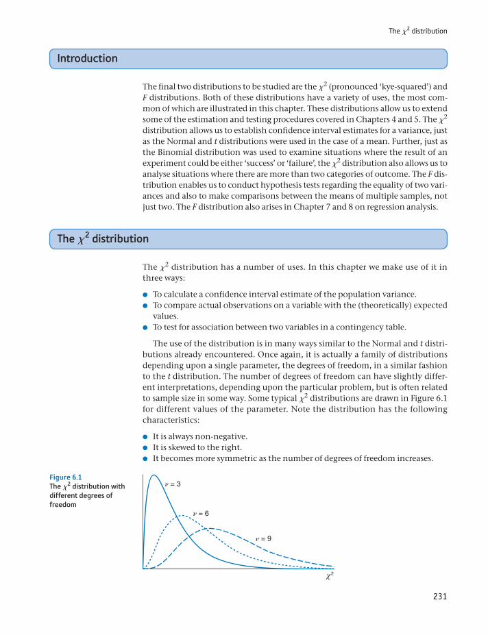
231
The x2 distribution
Introduction
The final two distributions to be studied are the x2 (pronounced ‘kye-squared’) and F distributions. Both of these distributions have a variety of uses, the most com-mon of which are illustrated in this chapter. These distributions allow us to extend some of the estimation and testing procedures covered in Chapters 4 and 5. The x2 distribution allows us to establish confidence interval estimates for a variance, just as the Normal and t distributions were used in the case of a mean. Further, just as the Binomial distribution was used to examine situations where the result of an experiment could be either ‘success’ or ‘failure’, the x2 distribution also allows us to analyse situations where there are more than two categories of outcome. The F dis-tribution enables us to conduct hypothesis tests regarding the equality of two vari-ances and also to make comparisons between the means of multiple samples, not just two. The F distribution also arises in Chapter 7 and 8 on regression analysis.
The x2 distribution
The x2 distribution has a number of uses. In this chapter we make use of it in three ways:
To calculate a confidence interval estimate of the population variance. To compare actual observations on a variable with the (theoretically) expected
values. To test for association between two variables in a contingency table.
The use of the distribution is in many ways similar to the Normal and t distri-butions already encountered. Once again, it is actually a family of distributions depending upon a single parameter, the degrees of freedom, in a similar fashion to the t distribution. The number of degrees of freedom can have slightly differ-ent interpretations, depending upon the particular problem, but is often related to sample size in some way. Some typical x2 distributions are drawn in Figure 6.1 for different values of the parameter. Note the distribution has the following characteristics:
It is always non-negative. It is skewed to the right. It becomes more symmetric as the number of degrees of freedom increases.
n = 3
n = 6
n = 9
Figure 6.1The x2 distribution with different degrees of freedom
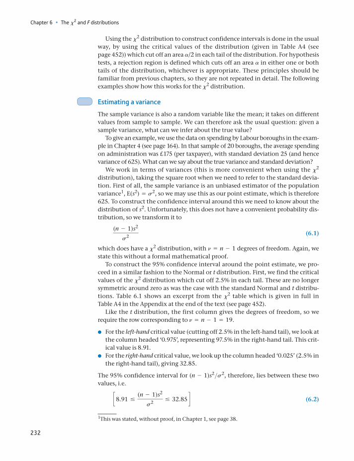
Chapter 6 • The x2 and F distributions
232
Using the x2 distribution to construct confidence intervals is done in the usual way, by using the critical values of the distribution (given in Table A4 (see page 452)) which cut off an area a/2 in each tail of the distribution. For hypothesis tests, a rejection region is defined which cuts off an area a in either one or both tails of the distribution, whichever is appropriate. These principles should be familiar from previous chapters, so they are not repeated in detail. The following examples show how this works for the x2 distribution.
Estimating a variance
The sample variance is also a random variable like the mean; it takes on different values from sample to sample. We can therefore ask the usual question: given a sample variance, what can we infer about the true value?
To give an example, we use the data on spending by Labour boroughs in the exam-ple in Chapter 4 (see page 164). In that sample of 20 boroughs, the average spending on administration was £175 (per taxpayer), with standard deviation 25 (and hence variance of 625). What can we say about the true variance and standard deviation?
We work in terms of variances (this is more convenient when using the x2 distribution), taking the square root when we need to refer to the standard devia-tion. First of all, the sample variance is an unbiased estimator of the population variance1, E(s2) = s2, so we may use this as our point estimate, which is therefore 625. To construct the confidence interval around this we need to know about the distribution of s2. Unfortunately, this does not have a convenient probability dis-tribution, so we transform it to
(n - 1)s2
s2 (6.1)
which does have a x2 distribution, with n = n - 1 degrees of freedom. Again, we state this without a formal mathematical proof.
To construct the 95% confidence interval around the point estimate, we pro-ceed in a similar fashion to the Normal or t distribution. First, we find the critical values of the x2 distribution which cut off 2.5% in each tail. These are no longer symmetric around zero as was the case with the standard Normal and t distribu-tions. Table 6.1 shows an excerpt from the x2 table which is given in full in Table A4 in the Appendix at the end of the text (see page 452).
Like the t distribution, the first column gives the degrees of freedom, so we require the row corresponding to n = n - 1 = 19.
For the left-hand critical value (cutting off 2.5% in the left-hand tail), we look at the column headed ‘0.975’, representing 97.5% in the right-hand tail. This crit-ical value is 8.91.
For the right-hand critical value, we look up the column headed ‘0.025’ (2.5% in the right-hand tail), giving 32.85.
The 95% confidence interval for (n - 1)s2>s2, therefore, lies between these two values, i.e.
c8.91 …(n - 1)s2
s2 … 32.85 d (6.2)
1This was stated, without proof, in Chapter 1, see page 38.
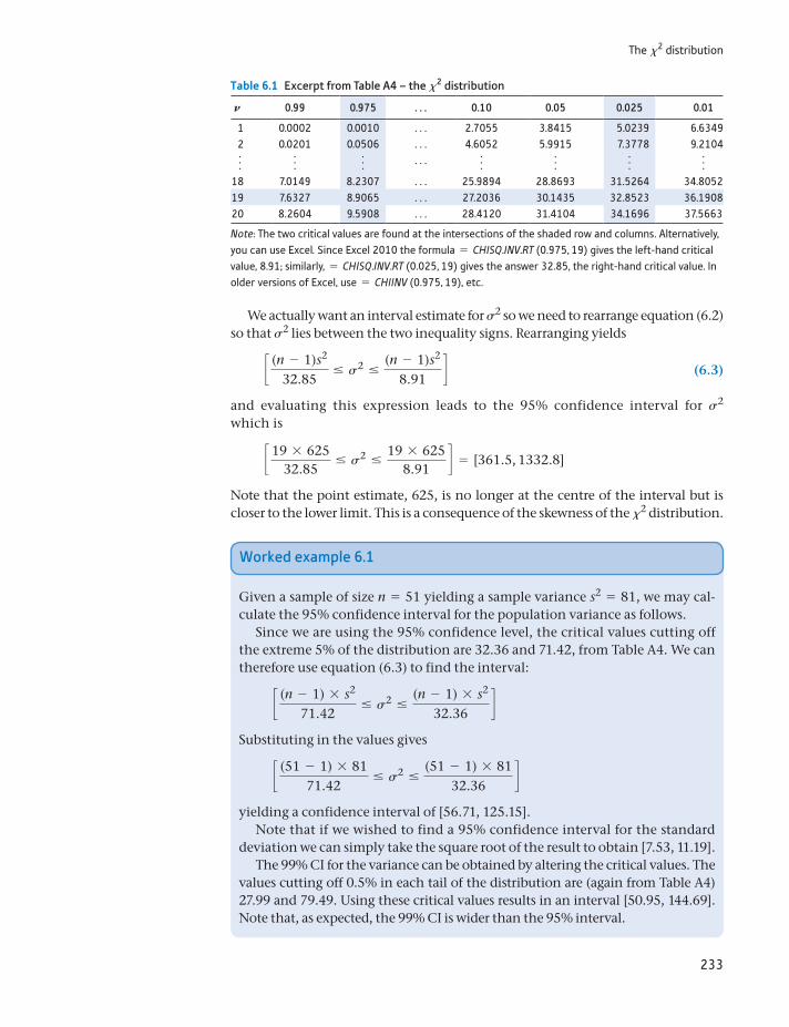
233
The x2 distribution
We actually want an interval estimate for s2 so we need to rearrange equation (6.2) so that s2 lies between the two inequality signs. Rearranging yields
c (n - 1)s2
32.85… s2 …
(n - 1)s2
8.91d (6.3)
and evaluating this expression leads to the 95% confidence interval for s2 which is
c 19 * 62532.85
… s2 …19 * 625
8.91d = [361.5, 1332.8]
Note that the point estimate, 625, is no longer at the centre of the interval but is closer to the lower limit. This is a consequence of the skewness of the x2 distribution.
Table 6.1 Excerpt from Table A4 – the x2 distribution
N 0.99 0.975 . . . 0.10 0.05 0.025 0.01
1 0.0002 0.0010 . . . 2.7055 3.8415 5.0239 6.63492 0.0201 0.0506 . . . 4.6052 5.9915 7.3778 9.2104f f f . . . f f f f
18 7.0149 8.2307 . . . 25.9894 28.8693 31.5264 34.805219 7.6327 8.9065 . . . 27.2036 30.1435 32.8523 36.190820 8.2604 9.5908 . . . 28.4120 31.4104 34.1696 37.5663
Note: The two critical values are found at the intersections of the shaded row and columns. Alternatively, you can use Excel. Since Excel 2010 the formula = CHISQ.INV.RT (0.975, 19) gives the left-hand critical value, 8.91; similarly, = CHISQ.INV.RT (0.025, 19) gives the answer 32.85, the right-hand critical value. In older versions of Excel, use = CHIINV (0.975, 19), etc.
Worked example 6.1
Given a sample of size n = 51 yielding a sample variance s2 = 81, we may cal-culate the 95% confidence interval for the population variance as follows.
Since we are using the 95% confidence level, the critical values cutting off the extreme 5% of the distribution are 32.36 and 71.42, from Table A4. We can therefore use equation (6.3) to find the interval:
c (n - 1) * s2
71.42… s2 …
(n - 1) * s2
32.36d
Substituting in the values gives
c (51 - 1) * 8171.42
… s2 …(51 - 1) * 81
32.36d
yielding a confidence interval of [56.71, 125.15].Note that if we wished to find a 95% confidence interval for the standard
deviation we can simply take the square root of the result to obtain [7.53, 11.19].The 99% CI for the variance can be obtained by altering the critical values. The
values cutting off 0.5% in each tail of the distribution are (again from Table A4) 27.99 and 79.49. Using these critical values results in an interval [50.95, 144.69]. Note that, as expected, the 99% CI is wider than the 95% interval.
Chapter 6 • The x2 and F distributions
234
Comparing actual and expected values of a variable
A second use of the x2 distribution provides a hypothesis test, allowing us to com-pare a set of observed values to expected values, the latter calculated on the basis of some null hypothesis to be tested. If the observed and expected values differ significantly, as judged by the x2 test (the test statistic falls into the rejection region of the x2 distribution), then the null hypothesis is rejected. Again, this is similar in principle to hypothesis testing using the Normal or t distributions, but allows a slightly different type of problem to be handled.
This can be illustrated with a very simple example. Suppose that throwing a die 72 times yields the following data:
Score on die 1 2 3 4 5 6
Frequency 6 15 15 7 15 14
Are these data consistent with the die being unbiased? Previously we might have investigated this problem by testing whether the proportion of (say) sixes is more or less than expected, using the Binomial distribution. One could still do this, but this does not make full use of the information in the sample, it only com-pares sixes against all other values together. The x2 test allows one to see if there is any bias in the die, for or against a particular number. It therefore answers a slightly different and more general question than if we made use of the Binomial distribution.A crude examination of the data suggests a slight bias against 1 and 4, but is this truly bias or just a random fluctuation quite common in this type of experiment? First the null and alternative hypotheses are set up:
H0: the die is unbiasedH1: the die is biased
Note that the null hypothesis should be constructed in such a way as to permit the calculation of the expected outcomes of the experiment. Thus the null and alternative hypotheses could not be reversed in this case, since ‘the die is biased’ is a vague statement (exactly how biased, for example?) and would not permit the calculation of the expected outcomes of the experiment.
On the basis of the null hypothesis, the expected values are based on the uniform distribution, i.e. each number should come up an equal number of times. The expected values are therefore 12 (= 72>6) for each number on the die.
This gives the data shown in Table 6.2 with observed and expected frequencies in columns 2 and 3, respectively (ignore columns 4–6 for the moment). These are now compared using the x2 test statistic, constructed using the formula
x2 = a (O - E)2
E (6.4)
(a) Given a sample variance of 65 from a sample of size n = 30, calculate the 95% confidence interval for the variance of the population from which the sample was drawn.
(b) Calculate the 95% CI for the standard deviation.
(c) Calculate the 99% interval estimate of the variance.
?
Exercise 6.1
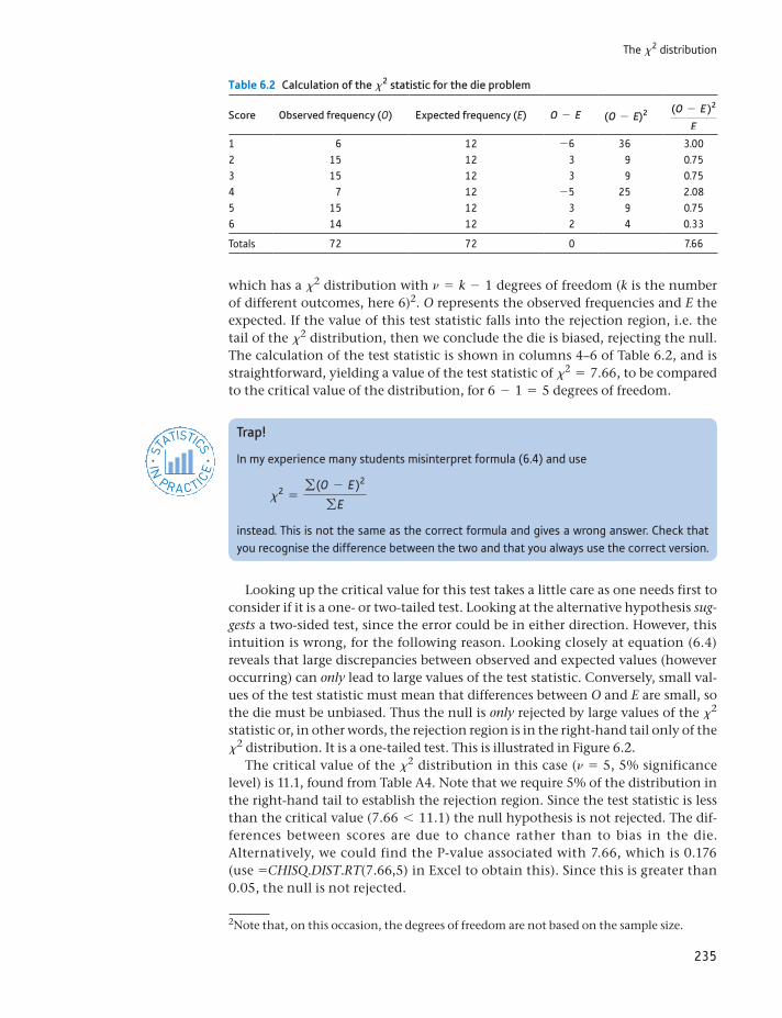
235
The x2 distribution
which has a x2 distribution with n = k - 1 degrees of freedom (k is the number of different outcomes, here 6)2. O represents the observed frequencies and E the expected. If the value of this test statistic falls into the rejection region, i.e. the tail of the x2 distribution, then we conclude the die is biased, rejecting the null. The calculation of the test statistic is shown in columns 4–6 of Table 6.2, and is straightforward, yielding a value of the test statistic of x2 = 7.66, to be compared to the critical value of the distribution, for 6 - 1 = 5 degrees of freedom.
Table 6.2 Calculation of the x2 statistic for the die problem
Score Observed frequency (O) Expected frequency (E) O - E (O - E)2 (O - E )2
E
1 6 12 -6 36 3.002 15 12 3 9 0.753 15 12 3 9 0.754 7 12 -5 25 2.085 15 12 3 9 0.756 14 12 2 4 0.33
Totals 72 72 0 7.66
2Note that, on this occasion, the degrees of freedom are not based on the sample size.
Trap!
In my experience many students misinterpret formula (6.4) and use
x2 =g (O - E )2
gE
instead. This is not the same as the correct formula and gives a wrong answer. Check that you recognise the difference between the two and that you always use the correct version.
ST
ATISTICS
IN
PRACTI
CE
· ·
Looking up the critical value for this test takes a little care as one needs first to consider if it is a one- or two-tailed test. Looking at the alternative hypothesis sug-gests a two-sided test, since the error could be in either direction. However, this intuition is wrong, for the following reason. Looking closely at equation (6.4) reveals that large discrepancies between observed and expected values (however occurring) can only lead to large values of the test statistic. Conversely, small val-ues of the test statistic must mean that differences between O and E are small, so the die must be unbiased. Thus the null is only rejected by large values of the x2 statistic or, in other words, the rejection region is in the right-hand tail only of the x2 distribution. It is a one-tailed test. This is illustrated in Figure 6.2.
The critical value of the x2 distribution in this case (n = 5, 5% significance level) is 11.1, found from Table A4. Note that we require 5% of the distribution in the right-hand tail to establish the rejection region. Since the test statistic is less than the critical value (7.66 6 11.1) the null hypothesis is not rejected. The dif-ferences between scores are due to chance rather than to bias in the die. Alternatively, we could find the P-value associated with 7.66, which is 0.176 (use =CHISQ.DIST.RT(7.66,5) in Excel to obtain this). Since this is greater than 0.05, the null is not rejected.
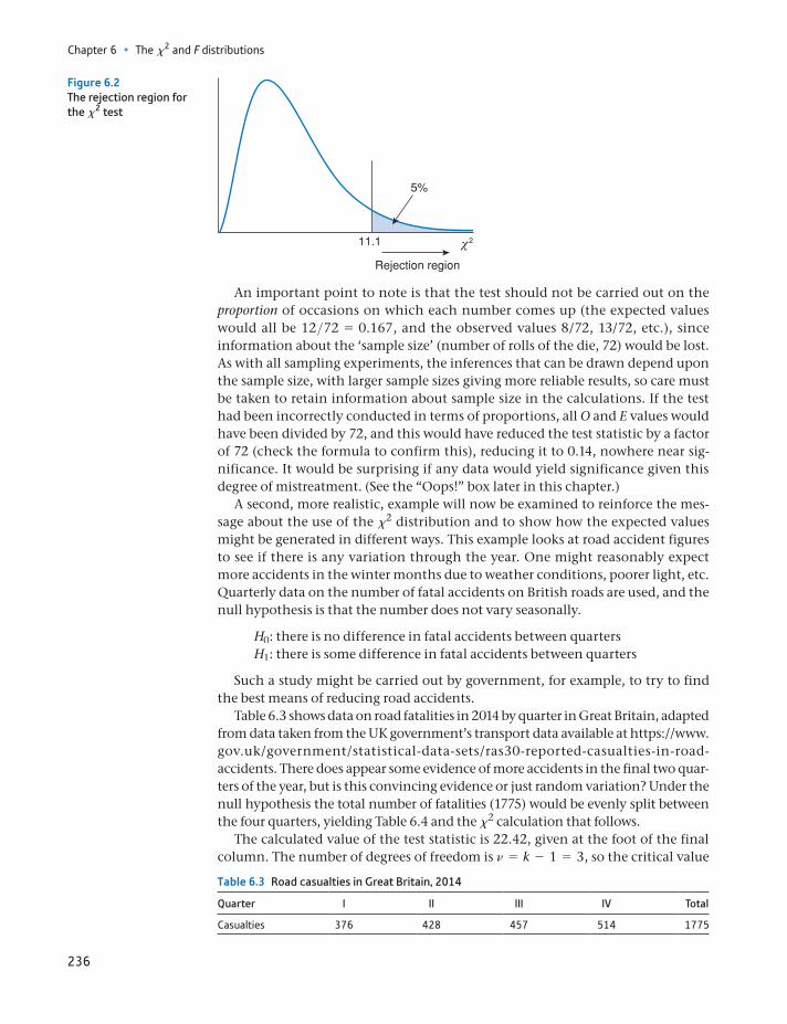
Chapter 6 • The x2 and F distributions
236
An important point to note is that the test should not be carried out on the proportion of occasions on which each number comes up (the expected values would all be 12>72 = 0.167, and the observed values 8/72, 13/72, etc.), since information about the ‘sample size’ (number of rolls of the die, 72) would be lost. As with all sampling experiments, the inferences that can be drawn depend upon the sample size, with larger sample sizes giving more reliable results, so care must be taken to retain information about sample size in the calculations. If the test had been incorrectly conducted in terms of proportions, all O and E values would have been divided by 72, and this would have reduced the test statistic by a factor of 72 (check the formula to confirm this), reducing it to 0.14, nowhere near sig-nificance. It would be surprising if any data would yield significance given this degree of mistreatment. (See the “Oops!” box later in this chapter.)
A second, more realistic, example will now be examined to reinforce the mes-sage about the use of the x2 distribution and to show how the expected values might be generated in different ways. This example looks at road accident figures to see if there is any variation through the year. One might reasonably expect more accidents in the winter months due to weather conditions, poorer light, etc. Quarterly data on the number of fatal accidents on British roads are used, and the null hypothesis is that the number does not vary seasonally.
H0: there is no difference in fatal accidents between quarters H1: there is some difference in fatal accidents between quarters
Such a study might be carried out by government, for example, to try to find the best means of reducing road accidents.
Table 6.3 shows data on road fatalities in 2014 by quarter in Great Britain, adapted from data taken from the UK government’s transport data available at https://www.gov.uk/government/statistical-data-sets/ras30-reported-casualties-in-road- accidents. There does appear some evidence of more accidents in the final two quar-ters of the year, but is this convincing evidence or just random variation? Under the null hypothesis the total number of fatalities (1775) would be evenly split between the four quarters, yielding Table 6.4 and the x2 calculation that follows.
The calculated value of the test statistic is 22.42, given at the foot of the final column. The number of degrees of freedom is n = k - 1 = 3, so the critical value
Figure 6.2The rejection region for the x2 test
Table 6.3 Road casualties in Great Britain, 2014
Quarter I II III IV Total
Casualties 376 428 457 514 1775
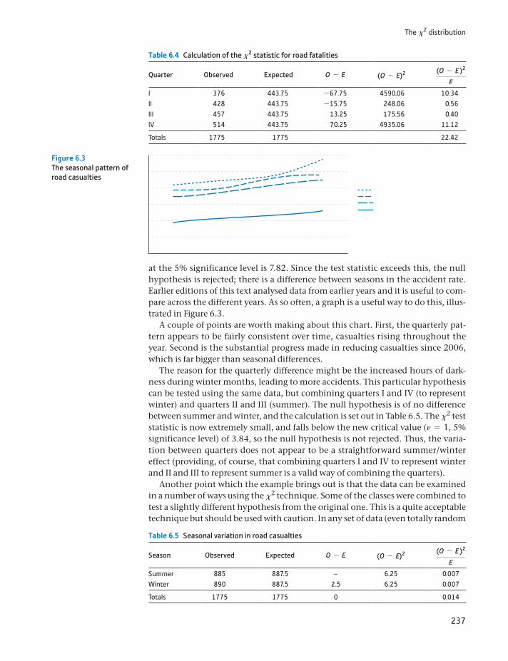
237
The x2 distribution
at the 5% significance level is 7.82. Since the test statistic exceeds this, the null hypothesis is rejected; there is a difference between seasons in the accident rate. Earlier editions of this text analysed data from earlier years and it is useful to com-pare across the different years. As so often, a graph is a useful way to do this, illus-trated in Figure 6.3.
A couple of points are worth making about this chart. First, the quarterly pat-tern appears to be fairly consistent over time, casualties rising throughout the year. Second is the substantial progress made in reducing casualties since 2006, which is far bigger than seasonal differences.
The reason for the quarterly difference might be the increased hours of dark-ness during winter months, leading to more accidents. This particular hypothesis can be tested using the same data, but combining quarters I and IV (to represent winter) and quarters II and III (summer). The null hypothesis is of no difference between summer and winter, and the calculation is set out in Table 6.5. The x2 test statistic is now extremely small, and falls below the new critical value (n = 1, 5% significance level) of 3.84, so the null hypothesis is not rejected. Thus, the varia-tion between quarters does not appear to be a straightforward summer/winter effect (providing, of course, that combining quarters I and IV to represent winter and II and III to represent summer is a valid way of combining the quarters).
Another point which the example brings out is that the data can be examined in a number of ways using the x2 technique. Some of the classes were combined to test a slightly different hypothesis from the original one. This is a quite acceptable technique but should be used with caution. In any set of data (even totally random
Table 6.4 Calculation of the x2 statistic for road fatalities
Quarter Observed Expected O - E (O - E)2 (O - E )2
E
I 376 443.75 -67.75 4590.06 10.34II 428 443.75 -15.75 248.06 0.56III 457 443.75 13.25 175.56 0.40IV 514 443.75 70.25 4935.06 11.12
Totals 1775 1775 22.42
Table 6.5 Seasonal variation in road casualties
Season Observed Expected O - E (O - E)2 (O - E )2
E
Summer 885 887.5 – 6.25 0.007Winter 890 887.5 2.5 6.25 0.007
Totals 1775 1775 0 0.014
Figure 6.3The seasonal pattern of road casualties
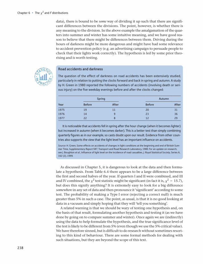
Chapter 6 • The x2 and F distributions
238
data), there is bound to be some way of dividing it up such that there are signifi-cant differences between the divisions. The point, however, is whether there is any meaning to the division. In the above example the amalgamation of the quar-ters into summer and winter has some intuitive meaning, and we have good rea-son to believe that there might be differences between them. Driving during the hours of darkness might be more dangerous and might have had some relevance to accident prevention policy (e.g. an advertising campaign to persuade people to check that their lights work correctly). The hypothesis is led by some prior theo-rising and is worth testing.
Road accidents and darkness
The question of the effect of darkness on road accidents has been extensively studied, particularly in relation to putting the clocks forward and back in spring and autumn. A study by H. Green in 1980 reported the following numbers of accidents (involving death or seri-ous injury) on the five weekday evenings before and after the clocks changed:
Spring Autumn
Year Before After Before After
1975 19 11 20 311976 14 9 23 361977 22 8 12 29
It is noticeable that accidents fell in spring after the hour change (when it becomes lighter) but increased in autumn (when it becomes darker). This is a better test than simply combining quarterly figures as in our example, so casts doubt upon our result. Evidence from other coun-tries also supports the view that the light level has an important influence on accidents.
Source: H. Green, Some effects on accidents of changes in light conditions at the beginning and end of British Sum-mer Time, Supplementary Report 587, Transport and Road Research Laboratory, 1980. For an update on research, see J. Boughton et al., Influence of light level on the incidence of road casualties, J. Royal Statistical Society, Series A, 162 (2), 1999.
ST
ATISTICS
IN
PRACTI
CE
· ·
As discussed in Chapter 5, it is dangerous to look at the data and then formu-late a hypothesis. From Table 6.4 there appears to be a large difference between the first and second halves of the year. If quarters I and II were combined, and III and IV combined, the x2 test statistic might be significant (in fact it is, x2 = 15.7), but does this signify anything? It is extremely easy to look for a big difference somewhere in any set of data and then pronounce it ‘significant’ according to some test. The probability of making a Type I error (rejecting a correct null) is much greater than 5% in such a case. The point, as usual, is that it is no good looking at data in a vacuum and simply hoping that they will ‘tell you something’.
A related warning is that we should be wary of testing one hypothesis and, on the basis of that result, formulating another hypothesis and testing it (as we have done by going on to compare summer and winter). Once again we are (indirectly) using the data to help formulate the hypothesis, and the true significance level of the test is likely to be different from 5% (even though we use the 5% critical value). We have therefore sinned, but is difficult to do research without sometimes resort-ing to this kind of behaviour. There are some formal methods for dealing with such situations, but they are beyond the scope of this text.
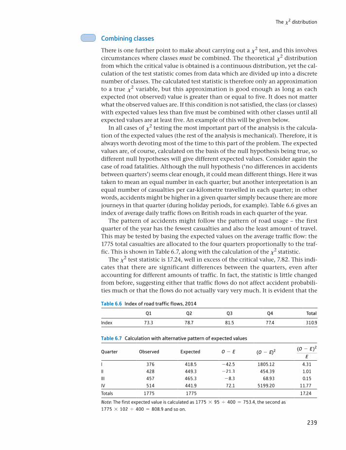
239
The x2 distribution
Combining classes
There is one further point to make about carrying out a x2 test, and this involves circumstances where classes must be combined. The theoretical x2 distribution from which the critical value is obtained is a continuous distribution, yet the cal-culation of the test statistic comes from data which are divided up into a discrete number of classes. The calculated test statistic is therefore only an approximation to a true x2 variable, but this approximation is good enough as long as each expected (not observed) value is greater than or equal to five. It does not matter what the observed values are. If this condition is not satisfied, the class (or classes) with expected values less than five must be combined with other classes until all expected values are at least five. An example of this will be given below.
In all cases of x2 testing the most important part of the analysis is the calcula-tion of the expected values (the rest of the analysis is mechanical). Therefore, it is always worth devoting most of the time to this part of the problem. The expected values are, of course, calculated on the basis of the null hypothesis being true, so different null hypotheses will give different expected values. Consider again the case of road fatalities. Although the null hypothesis (‘no differences in accidents between quarters’) seems clear enough, it could mean different things. Here it was taken to mean an equal number in each quarter; but another interpretation is an equal number of casualties per car-kilometre travelled in each quarter; in other words, accidents might be higher in a given quarter simply because there are more journeys in that quarter (during holiday periods, for example). Table 6.6 gives an index of average daily traffic flows on British roads in each quarter of the year.
The pattern of accidents might follow the pattern of road usage – the first quarter of the year has the fewest casualties and also the least amount of travel. This may be tested by basing the expected values on the average traffic flow: the 1775 total casualties are allocated to the four quarters proportionally to the traf-fic. This is shown in Table 6.7, along with the calculation of the x2 statistic.
The x2 test statistic is 17.24, well in excess of the critical value, 7.82. This indi-cates that there are significant differences between the quarters, even after accounting for different amounts of traffic. In fact, the statistic is little changed from before, suggesting either that traffic flows do not affect accident probabili-ties much or that the flows do not actually vary very much. It is evident that the
Table 6.6 Index of road traffic flows, 2014
Q1 Q2 Q3 Q4 Total
Index 73.3 78.7 81.5 77.4 310.9
Table 6.7 Calculation with alternative pattern of expected values
Quarter Observed Expected O - E (O - E)2 (O - E )2
E
I 376 418.5 -42.5 1805.12 4.31II 428 449.3 -21.3 454.39 1.01III 457 465.3 -8.3 68.93 0.15IV 514 441.9 72.1 5199.20 11.77
Totals 1775 1775 17.24
Note: The first expected value is calculated as 1775 * 95 , 400 = 753.4, the second as 1775 * 102 , 400 = 808.9 and so on.
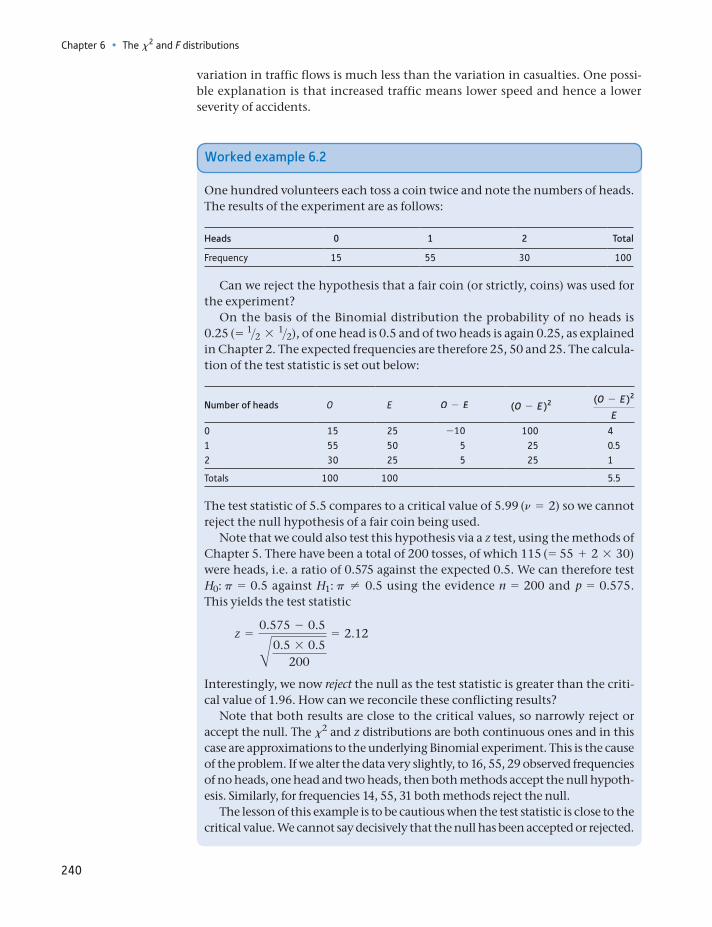
Chapter 6 • The x2 and F distributions
240
variation in traffic flows is much less than the variation in casualties. One possi-ble explanation is that increased traffic means lower speed and hence a lower severity of accidents.
Worked example 6.2
One hundred volunteers each toss a coin twice and note the numbers of heads. The results of the experiment are as follows:
Heads 0 1 2 Total
Frequency 15 55 30 100
Can we reject the hypothesis that a fair coin (or strictly, coins) was used for the experiment?
On the basis of the Binomial distribution the probability of no heads is 0.25 (= 1>2 * 1>2), of one head is 0.5 and of two heads is again 0.25, as explained in Chapter 2. The expected frequencies are therefore 25, 50 and 25. The calcula-tion of the test statistic is set out below:
Number of heads O E O - E (O - E )2 (O - E )2
E
0 15 25 -10 100 41 55 50 5 25 0.52 30 25 5 25 1
Totals 100 100 5.5
The test statistic of 5.5 compares to a critical value of 5.99 (n = 2) so we cannot reject the null hypothesis of a fair coin being used.
Note that we could also test this hypothesis via a z test, using the methods of Chapter 5. There have been a total of 200 tosses, of which 115 (= 55 + 2 * 30) were heads, i.e. a ratio of 0.575 against the expected 0.5. We can therefore test H0: p = 0.5 against H1: p ≠ 0.5 using the evidence n = 200 and p = 0.575. This yields the test statistic
z =0.575 - 0.5B0.5 * 0.5
200
= 2.12
Interestingly, we now reject the null as the test statistic is greater than the criti-cal value of 1.96. How can we reconcile these conflicting results?
Note that both results are close to the critical values, so narrowly reject or accept the null. The x2 and z distributions are both continuous ones and in this case are approximations to the underlying Binomial experiment. This is the cause of the problem. If we alter the data very slightly, to 16, 55, 29 observed frequencies of no heads, one head and two heads, then both methods accept the null hypoth-esis. Similarly, for frequencies 14, 55, 31 both methods reject the null.
The lesson of this example is to be cautious when the test statistic is close to the critical value. We cannot say decisively that the null has been accepted or rejected.
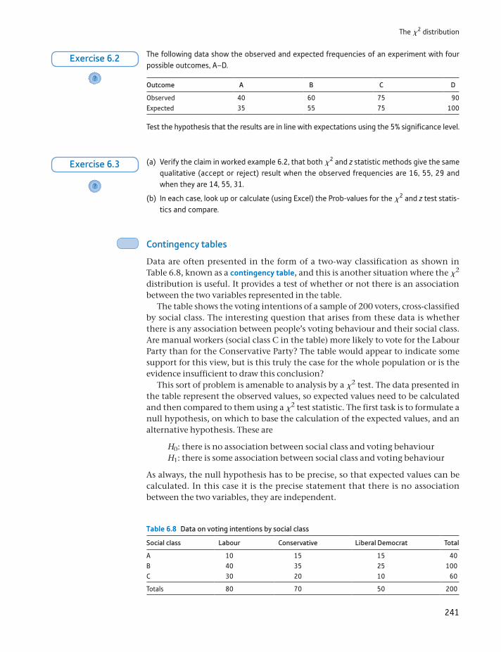
241
The x2 distribution
Contingency tables
Data are often presented in the form of a two-way classification as shown in Table 6.8, known as a contingency table, and this is another situation where the x2 distribution is useful. It provides a test of whether or not there is an association between the two variables represented in the table.
The table shows the voting intentions of a sample of 200 voters, cross-classified by social class. The interesting question that arises from these data is whether there is any association between people’s voting behaviour and their social class. Are manual workers (social class C in the table) more likely to vote for the Labour Party than for the Conservative Party? The table would appear to indicate some support for this view, but is this truly the case for the whole population or is the evidence insufficient to draw this conclusion?
This sort of problem is amenable to analysis by a x2 test. The data presented in the table represent the observed values, so expected values need to be calculated and then compared to them using a x2 test statistic. The first task is to formulate a null hypothesis, on which to base the calculation of the expected values, and an alternative hypothesis. These are
H0: there is no association between social class and voting behaviourH1: there is some association between social class and voting behaviour
As always, the null hypothesis has to be precise, so that expected values can be calculated. In this case it is the precise statement that there is no association between the two variables, they are independent.
The following data show the observed and expected frequencies of an experiment with four possible outcomes, A–D.
Outcome A B C D
Observed 40 60 75 90Expected 35 55 75 100
Test the hypothesis that the results are in line with expectations using the 5% significance level.
?
Exercise 6.2
(a) Verify the claim in worked example 6.2, that both x2 and z statistic methods give the same qualitative (accept or reject) result when the observed frequencies are 16, 55, 29 and when they are 14, 55, 31.
(b) In each case, look up or calculate (using Excel) the Prob-values for the x2 and z test statis-tics and compare.
?
Exercise 6.3
Table 6.8 Data on voting intentions by social class
Social class Labour Conservative Liberal Democrat Total
A 10 15 15 40B 40 35 25 100C 30 20 10 60
Totals 80 70 50 200
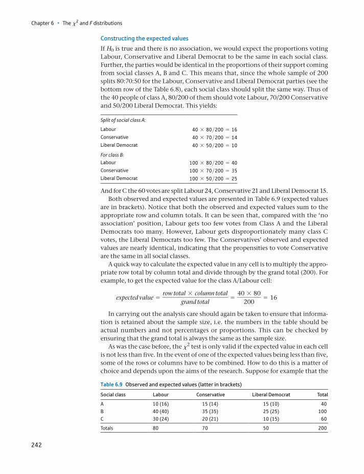
Chapter 6 • The x2 and F distributions
242
Constructing the expected values
If H0 is true and there is no association, we would expect the proportions voting Labour, Conservative and Liberal Democrat to be the same in each social class. Further, the parties would be identical in the proportions of their support coming from social classes A, B and C. This means that, since the whole sample of 200 splits 80:70:50 for the Labour, Conservative and Liberal Democrat parties (see the bottom row of the Table 6.8), each social class should split the same way. Thus of the 40 people of class A, 80/200 of them should vote Labour, 70/200 Conservative and 50/200 Liberal Democrat. This yields:
Split of social class A:
Labour 40 * 80>200 = 16Conservative 40 * 70>200 = 14Liberal Democrat 40 * 50>200 = 10
For class B:Labour 100 * 80>200 = 40Conservative 100 * 70>200 = 35Liberal Democrat 100 * 50>200 = 25
And for C the 60 votes are split Labour 24, Conservative 21 and Liberal Democrat 15.Both observed and expected values are presented in Table 6.9 (expected values
are in brackets). Notice that both the observed and expected values sum to the appropriate row and column totals. It can be seen that, compared with the ‘no association’ position, Labour gets too few votes from Class A and the Liberal Democrats too many. However, Labour gets disproportionately many class C votes, the Liberal Democrats too few. The Conservatives’ observed and expected values are nearly identical, indicating that the propensities to vote Conservative are the same in all social classes.
A quick way to calculate the expected value in any cell is to multiply the appro-priate row total by column total and divide through by the grand total (200). For example, to get the expected value for the class A/Labour cell:
expected value =row total * column total
grand total=
40 * 80200
= 16
In carrying out the analysis care should again be taken to ensure that informa-tion is retained about the sample size, i.e. the numbers in the table should be actual numbers and not percentages or proportions. This can be checked by ensuring that the grand total is always the same as the sample size.
As was the case before, the x2 test is only valid if the expected value in each cell is not less than five. In the event of one of the expected values being less than five, some of the rows or columns have to be combined. How to do this is a matter of choice and depends upon the aims of the research. Suppose for example that the
Table 6.9 Observed and expected values (latter in brackets)
Social class Labour Conservative Liberal Democrat Total
A 10 (16) 15 (14) 15 (10) 40B 40 (40) 35 (35) 25 (25) 100C 30 (24) 20 (21) 10 (15) 60
Totals 80 70 50 200
243
The x2 distribution
expected number of class C voting Liberal Democrat were less than five. There are four options open:
(1) Combine the Liberal Democrat column with the Labour column.(2) Combine the Liberal Democrat column with the Conservative column.(3) Combine the class C row with the class A row.(4) Combine the class C row with the class B row.
Whether rows or columns are combined depends upon whether interest cen-tres more upon differences between parties or differences between classes. If the main interest is the difference between class A and the others, option 4 should be chosen. If it is felt that the Liberal Democrat and Conservative parties are similar, option 2 would be preferred, and so on. If there are several expected values less than five, rows and columns must be combined until all are eliminated.
The x2 test on a contingency table is similar to the one carried out before, the formula being the same:
x2 = g (O - E)2
E (6.5)
with the number of degrees of freedom this time given by n = (r - 1) * (c - 1) where r is the number of rows in the table and c is the number of columns. In this case r = 3 and c = 3, so
n = (3 - 1) * (3 - 1) = 4
The reason why there are only four degrees of freedom is that once any four interior cells of the contingency table have been filled, the other five are con-strained by the row and column totals. The number of ‘free’ cells can always be calculated as the number of rows less one, times the number of columns less one, as given above.
Calculation of the test statistic
The evaluation of the test statistic then proceeds as follows, cell by cell:
(10 - 16)2
16+
(15 - 14)2
14+
(15 - 10)2
10
+(40 - 40)2
40+
(35 - 35)2
35+
(25 - 25)2
25
+(30 - 24)2
24+
(20 - 21)2
21+
(10 - 15)2
15= 2.25 + 0.07 + 2.50 + 0 + 0 + 0 + 1.5 + 0.05 + 1.67= 8.04
This must be compared with the critical value from the x2 distribution with four degrees of freedom. At the 5% significance level this is 9.50 (from Table A4).
Since 8.04 6 9.50 the test statistic is smaller than the critical value, so the null hypothesis cannot be rejected. The evidence is not strong enough to support an association between social class and voting intention. We cannot reject the null of the lack of any association with 95% confidence. Note, however, that the test statistic is fairly close to the critical value, so there is some weak evidence of an association, but not enough to satisfy conventional statistical criteria.
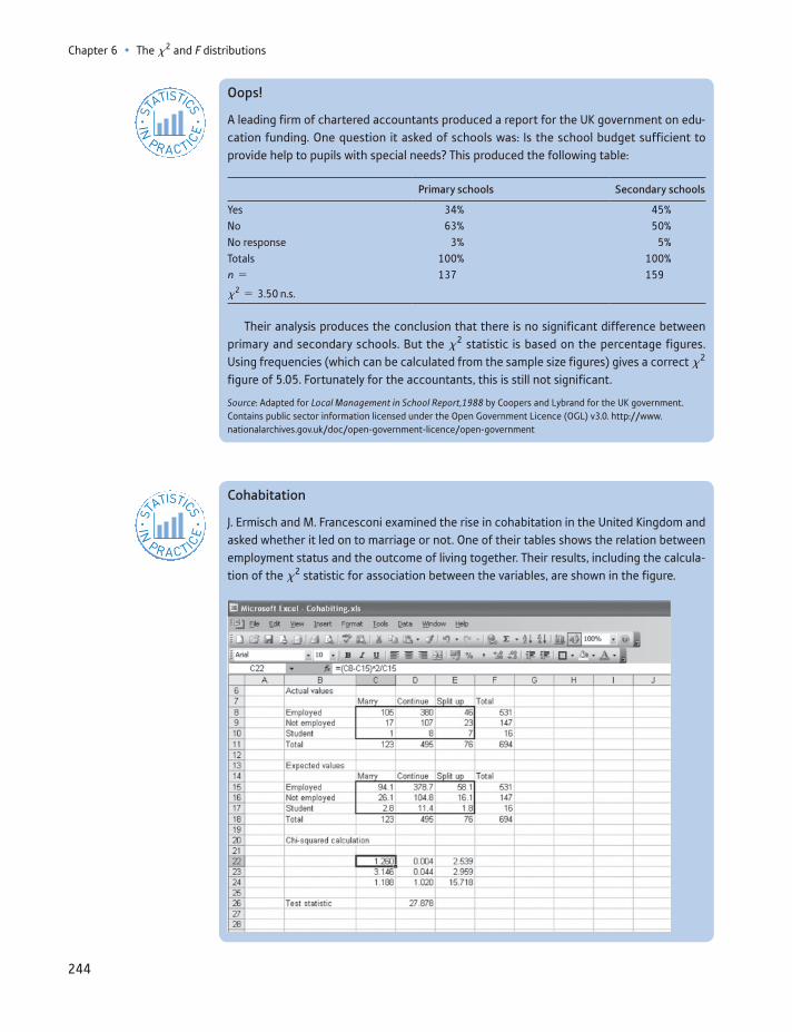
Chapter 6 • The x2 and F distributions
244
Oops!
A leading firm of chartered accountants produced a report for the UK government on edu-cation funding. One question it asked of schools was: Is the school budget sufficient to provide help to pupils with special needs? This produced the following table:
Primary schools Secondary schools
Yes 34% 45%No 63% 50%No response 3% 5%Totals 100% 100%n = 137 159
x2 = 3.50 n.s.
Their analysis produces the conclusion that there is no significant difference between primary and secondary schools. But the x2 statistic is based on the percentage figures. Using frequencies (which can be calculated from the sample size figures) gives a correct x2 figure of 5.05. Fortunately for the accountants, this is still not significant.
Source: Adapted for Local Management in School Report,1988 by Coopers and Lybrand for the UK government. Contains public sector information licensed under the Open Government Licence (OGL) v3.0. http://www. nationalarchives.gov.uk/doc/open-government-licence/open-government
ST
ATISTICS
IN
PRACTI
CE
· ·
Cohabitation
J. Ermisch and M. Francesconi examined the rise in cohabitation in the United Kingdom and asked whether it led on to marriage or not. One of their tables shows the relation between employment status and the outcome of living together. Their results, including the calcula-tion of the x2 statistic for association between the variables, are shown in the figure.
ST
ATISTICS
IN
PRACTI
CE
· ·
245
The F distribution
The F distribution
The second distribution we encounter in this chapter is the F distribution. It has a variety of uses in statistics; in this section we look at two of these: testing for the equality of two variances and conducting an analysis of variance (ANOVA) test. Both of these are variants on the hypothesis test procedures which should by now be familiar. The F distribution will also be encountered in later chapters on regres-sion analysis.
The F family of distributions resembles the x2 distribution in shape: it is always non-negative and is skewed to the right. It has two sets of degrees of freedom (these are its parameters, labelled n1 and n2) and these determine its precise shape. Typical F distributions are shown in Figure 6.4. As usual, for a hypothesis test we define an area in one or both tails of the distribution to be the rejection region. If a test statis-tic falls into the rejection region, then the null hypothesis upon which the test statistic was based is rejected. Once again, examples will clarify the principles.
Testing the equality of two variances
Just as one can conduct a hypothesis test on a mean, so it is possible to test the variance. It is unusual to want to conduct a test of a specific value of a variance, since we usually have little intuitive idea of what the variance should be in most
There were 694 cohabiting women in the sample. Of the 531 who were employed, 105 of them went on to marry their partner, 46 split up and 380 continued living together. Similar figures are shown for unemployed women and for students. The expected values for the contingency table then appear (based on the null hypothesis of no association), followed by the calculation of the x2 test statistic. You can see the formula for one of the elements of the calculation in the formula bar.
The test statistic is significant at the 5% level (critical value 9.49 for four degrees of free-dom), so there is an association. The biggest contribution to the test statistic comes from the bottom right-hand cell, where the actual value is much higher than the expected. It appears that, unfortunately, those student romances often do not turn out to be permanent.
However, a reader of an earlier edition of this text pointed out that two of the expected values are less than five, so use of the x2 statistic is strictly inappropriate in this context.
Source: J. Ermisch and M. Francesconi, Cohabitation: not for long but here to stay, J. Royal Statistical Society, Series A, 163 (2), 2000.
Suppose that the data on educational achievement and employment status in Chapter 1 were obtained from a sample of 999 people, as follows:
Higher education A-levels Other qualification No qualification Total
In work 257 145 269 52 723Unemployed 10 11 31 10 62Inactive 33 38 87 56 214
Total 300 194 387 118 999
(These values reflect the proportions in the population data.) Test whether there is an associa-tion between education and employment status, using the 5% significance level for the test.
Exercise 6.4
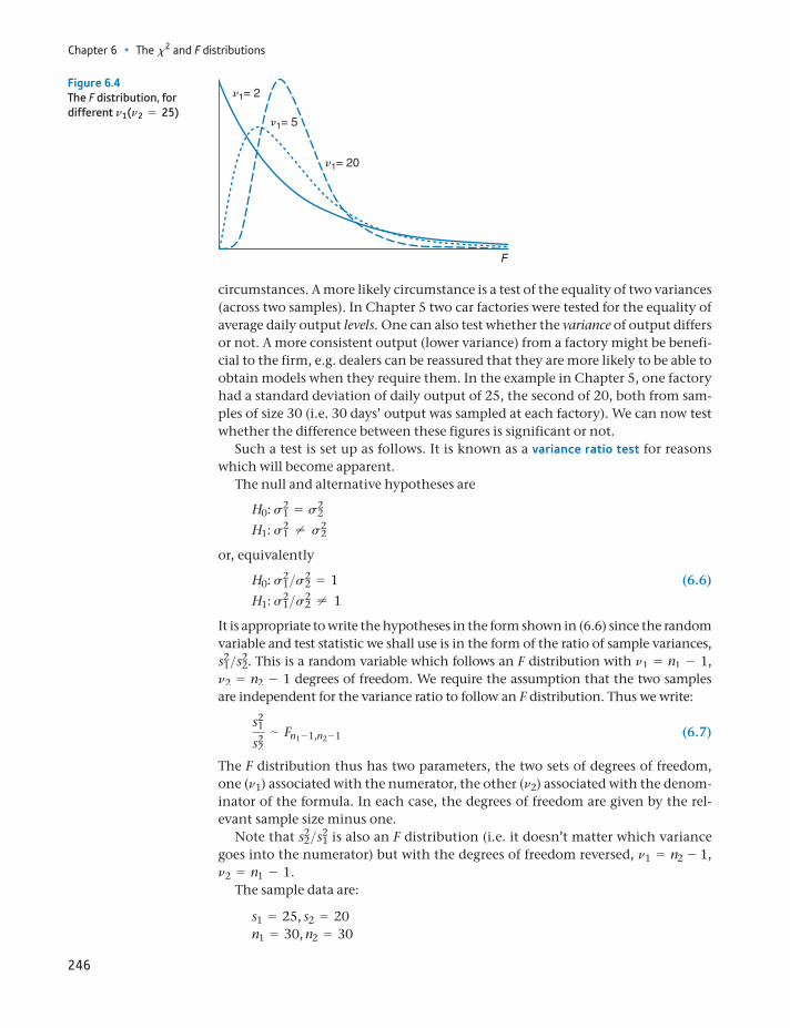
Chapter 6 • The x2 and F distributions
246
circumstances. A more likely circumstance is a test of the equality of two variances (across two samples). In Chapter 5 two car factories were tested for the equality of average daily output levels. One can also test whether the variance of output differs or not. A more consistent output (lower variance) from a factory might be benefi-cial to the firm, e.g. dealers can be reassured that they are more likely to be able to obtain models when they require them. In the example in Chapter 5, one factory had a standard deviation of daily output of 25, the second of 20, both from sam-ples of size 30 (i.e. 30 days’ output was sampled at each factory). We can now test whether the difference between these figures is significant or not.
Such a test is set up as follows. It is known as a variance ratio test for reasons which will become apparent.
The null and alternative hypotheses are
H0: s21 = s2
2
H1: s21 ≠ s2
2
or, equivalently
H0: s21>s2
2 = 1 (6.6)H1: s2
1>s22 ≠ 1
It is appropriate to write the hypotheses in the form shown in (6.6) since the random variable and test statistic we shall use is in the form of the ratio of sample variances, s2
1>s22. This is a random variable which follows an F distribution with n1 = n1 - 1,
n2 = n2 - 1 degrees of freedom. We require the assumption that the two samples are independent for the variance ratio to follow an F distribution. Thus we write:
s21
s22∼ Fn1 - 1,n2 - 1 (6.7)
The F distribution thus has two parameters, the two sets of degrees of freedom, one (n1) associated with the numerator, the other (n2) associated with the denom-inator of the formula. In each case, the degrees of freedom are given by the rel-evant sample size minus one.
Note that s22>s2
1 is also an F distribution (i.e. it doesn’t matter which variance goes into the numerator) but with the degrees of freedom reversed, n1 = n2 - 1, n2 = n1 - 1.
The sample data are:
s1 = 25, s2 = 20n1 = 30, n2 = 30
n1= 2
n1= 20
n1= 5
F
Figure 6.4The F distribution, for different n1(n2 = 25)
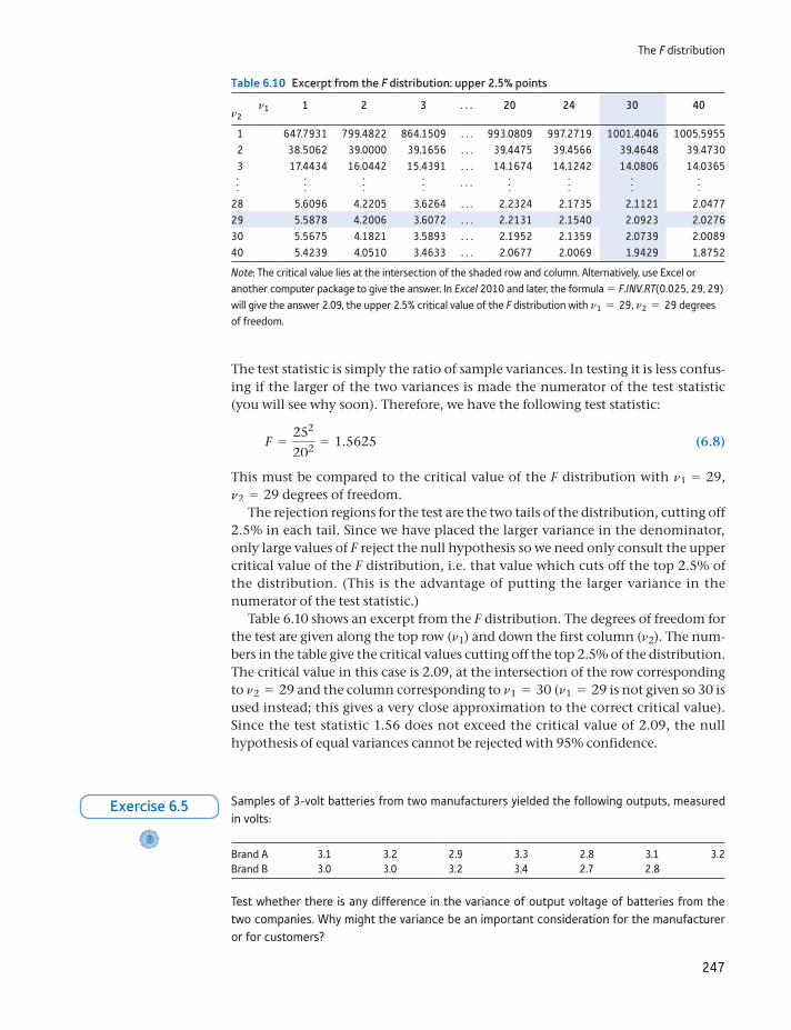
247
The F distribution
The test statistic is simply the ratio of sample variances. In testing it is less confus-ing if the larger of the two variances is made the numerator of the test statistic (you will see why soon). Therefore, we have the following test statistic:
F =252
202 = 1.5625 (6.8)
This must be compared to the critical value of the F distribution with n1 = 29, n2 = 29 degrees of freedom.
The rejection regions for the test are the two tails of the distribution, cutting off 2.5% in each tail. Since we have placed the larger variance in the denominator, only large values of F reject the null hypothesis so we need only consult the upper critical value of the F distribution, i.e. that value which cuts off the top 2.5% of the distribution. (This is the advantage of putting the larger variance in the numerator of the test statistic.)
Table 6.10 shows an excerpt from the F distribution. The degrees of freedom for the test are given along the top row (n1) and down the first column (n2). The num-bers in the table give the critical values cutting off the top 2.5% of the distribution. The critical value in this case is 2.09, at the intersection of the row corresponding to n2 = 29 and the column corresponding to n1 = 30 (n1 = 29 is not given so 30 is used instead; this gives a very close approximation to the correct critical value). Since the test statistic 1.56 does not exceed the critical value of 2.09, the null hypothesis of equal variances cannot be rejected with 95% confidence.
Table 6.10 Excerpt from the F distribution: upper 2.5% points
n1 1 2 3 . . . 20 24 30 40n2
1 647.7931 799.4822 864.1509 . . . 993.0809 997.2719 1001.4046 1005.5955 2 38.5062 39.0000 39.1656 . . . 39.4475 39.4566 39.4648 39.4730 3 17.4434 16.0442 15.4391 . . . 14.1674 14.1242 14.0806 14.0365
f f f f . . . f f f f
28 5.6096 4.2205 3.6264 . . . 2.2324 2.1735 2.1121 2.047729 5.5878 4.2006 3.6072 . . . 2.2131 2.1540 2.0923 2.027630 5.5675 4.1821 3.5893 . . . 2.1952 2.1359 2.0739 2.008940 5.4239 4.0510 3.4633 . . . 2.0677 2.0069 1.9429 1.8752
Note: The critical value lies at the intersection of the shaded row and column. Alternatively, use Excel or another computer package to give the answer. In Excel 2010 and later, the formula = F.INV.RT(0.025, 29, 29) will give the answer 2.09, the upper 2.5% critical value of the F distribution with n1 = 29, n2 = 29 degrees of freedom.
Samples of 3-volt batteries from two manufacturers yielded the following outputs, measured in volts:
Brand A 3.1 3.2 2.9 3.3 2.8 3.1 3.2Brand B 3.0 3.0 3.2 3.4 2.7 2.8
Test whether there is any difference in the variance of output voltage of batteries from the two companies. Why might the variance be an important consideration for the manufacturer or for customers?
?
Exercise 6.5
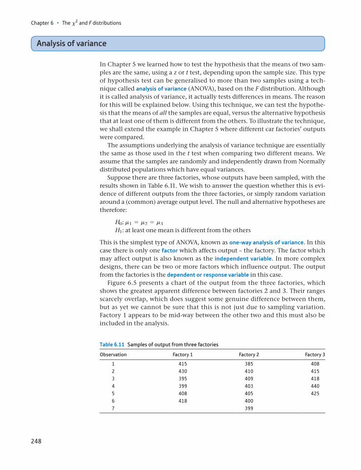
Chapter 6 • The x2 and F distributions
248
Analysis of variance
In Chapter 5 we learned how to test the hypothesis that the means of two sam-ples are the same, using a z or t test, depending upon the sample size. This type of hypothesis test can be generalised to more than two samples using a tech-nique called analysis of variance (ANOVA), based on the F distribution. Although it is called analysis of variance, it actually tests differences in means. The reason for this will be explained below. Using this technique, we can test the hypothe-sis that the means of all the samples are equal, versus the alternative hypothesis that at least one of them is different from the others. To illustrate the technique, we shall extend the example in Chapter 5 where different car factories’ outputs were compared.
The assumptions underlying the analysis of variance technique are essentially the same as those used in the t test when comparing two different means. We assume that the samples are randomly and independently drawn from Normally distributed populations which have equal variances.
Suppose there are three factories, whose outputs have been sampled, with the results shown in Table 6.11. We wish to answer the question whether this is evi-dence of different outputs from the three factories, or simply random variation around a (common) average output level. The null and alternative hypotheses are therefore:
H0: m1 = m2 = m3H1: at least one mean is different from the others
This is the simplest type of ANOVA, known as one-way analysis of variance. In this case there is only one factor which affects output – the factory. The factor which may affect output is also known as the independent variable. In more complex designs, there can be two or more factors which influence output. The output from the factories is the dependent or response variable in this case.
Figure 6.5 presents a chart of the output from the three factories, which shows the greatest apparent difference between factories 2 and 3. Their ranges scarcely overlap, which does suggest some genuine difference between them, but as yet we cannot be sure that this is not just due to sampling variation. Factory 1 appears to be mid-way between the other two and this must also be included in the analysis.
Table 6.11 Samples of output from three factories
Observation Factory 1 Factory 2 Factory 3
1 415 385 4082 430 410 4153 395 409 4184 399 403 4405 408 405 4256 418 4007 399
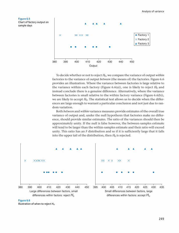
Analysis of variance
249
To decide whether or not to reject H0, we compare the variance of output within factories to the variance of output between (the means of) the factories. Figure 6.6 provides an illustration. Where the variance between factories is large relative to the variance within each factory (Figure 6.6(a)), one is likely to reject H0 and instead conclude there is a genuine difference. Alternatively, where the variance between factories is small relative to the within factory variance (Figure 6.6(b)), we are likely to accept H0. The statistical test allows us to decide when the differ-ences are large enough to warrant a particular conclusion and not just due to ran-dom variation.
Both between and within variance measures provide estimates of the overall true variance of output and, under the null hypothesis that factories make no differ-ence, should provide similar estimates. The ratio of the variances should then be approximately unity. If the null is false however, the between-samples estimate will tend to be larger than the within-samples estimate and their ratio will exceed unity. This ratio has an F distribution and so if it is sufficiently large that it falls into the upper tail of the distribution, then H0 is rejected.
380 390 400 410
Output
420 430 440 450
Factory 1
Factory 2
Factory 3
Figure 6.5Chart of factory output on sample days
Small differences between factors, large
differences within factors: accept H0
Large differences between factors, small
differences within factors: reject H0
395 400380 390 400 410 420 430 440 450 405 410 415 420 425 430 435
Figure 6.6Illustration of when to reject H0
Chapter 6 • The x2 and F distributions
250
To formally test the hypothesis, we break down the total variance of all the observations into
(1) the variance due to differences between factories, and(2) the variance due to differences within factories (also known as the error
variance).
Initially we work with sums of squares rather than variances. Recall from Chapter 1 that a sample variance is given by
s2 =g(x - x)2
n - 1 (6.9)
The numerator of the right-hand side of this expression, g(x - x)2, gives the sum of squares, i.e. the sum of squared deviations from the mean.
Accordingly, we work with three sums of squares:
The total sum of squares measures (squared) deviations from the overall or grand average using all the 18 observations. It ignores the existence of the different factors (factories).
The between sum of squares measures how the three individual factor means vary around the grand average.
The within sum of squares is based on squared deviations of observations from their own factor mean.
It can be shown that there is a relationship between these sums of squares, i.e.
Time sumof squares
=Between sumof squares
+Within sumof squares
(6.10)
The larger is the between sum of squares relative to the within sum of squares, the more likely it is that the null is false.
Because we have to sum over factors and over observations within those fac-tors, the formulae look somewhat complicated, involving double summation signs. It is therefore important to follow the example showing how the calcula-tions are actually done.
The total sum of squares is given by the formula:
Total sum of squares = ani
j= 1a
k
i = 1(xij - x)2 (6.11)
where xij is the output from factory i on day j and x is the grand average of all observations. The index i runs from 1 to 3 in this case (there are three classes or groups for this factor) and the index j (indexing the observations) goes from 1 to 6, 7, or 5 (for factories 1, 2 and 3, respectively). Note that we do not require the same number of observations from each factory.
Although this looks complex, it simply means that we calculate the sum of squared deviations from the overall mean. The overall mean of the 18 values is 410.11 and the total sum of squares may be calculated as:
Total sum of squares = (415 - 410.11)2 + (430 - 410.11)2
+ g+ (440 - 410.11)2 + (425 - 410.11)2 = 2977.778
An alternative formula for the total sum of squares is
Total sum of squares = ani
j= 1a
k
i = 1x2
ij - nx2 (6.12)
Analysis of variance
251
where n is the total number of observations. The sum of the squares of all the observations (gx2) is 4152 + 4302 + g+ 4252 = 3 030 418 and the total sum of squares is then given by
ani
j= 1a
k
i = 1x2
ij - nx2 = 3 030 418 - 18 * 410.112 = 2977.778 (6.13)
as before.The between sum of squares is calculated using the formula
Between sum of squares = aja
i(xi - x)2 (6.14)
where xi denotes the mean output of factor i. This part of the calculation effec-tively ignores the differences that exist within factors and compares the differ-ences between them. It does this by replacing the observations within each factor by the mean for that factor. Hence, all the factor 1 observations are replaced by 410.83, for factor 2 they are replaced by the mean 401.57 and for factor 3 by 421.23. We then calculate the sum of squared deviations of these values from the grand mean:
Between sum of squares = 6 * (410.83 - 410.11)2 + 7 * (401.57 - 410.11)2
+ 5 * (421.2 - 410.11)2 = 1128.43
Note that we take account of the number of observations within each factor in this calculation.
Once again there is an alternative formula which may be simpler for calcula-tion purposes:
Between sum of squares = ai
ni x2i - n x2 (6.15)
Evaluating this results in the same answer as above:
ai
ni x2i - n x2 = 6 * 410.832 + 7 * 401.572 + 5 * 421.22 - 18 * 410.102
= 1128.43 (6.16)
We have arrived at the result that 37% (= 1128.43>2977.78) of the total varia-tion (sum of squared deviations) is due to differences between factories and the remaining 63% is therefore due to variation (day to day) within factories. We can therefore immediately calculate the within sum of squares by straightforward sub-traction as:
Within sum of squares = Total sum of squares - Between sum of squares = 2977.778 - 1128.430 = 1849.348
For completeness, the formula for the within sum of squares is
Within sum of squares = aja
i(xij - xi)2 (6.17)
3Note that this is not the same as using the three factor means and calculating their variance.
Chapter 6 • The x2 and F distributions
252
The term xij - xi measures the deviations of the observations from the factor mean and so the within sum of squares gives a measure of dispersion within the classes. Hence, it can be calculated as:
Within sum of squares = (415 - 410.83)2 + g+ (418 - 410.83)2
+ (385 - 401.57)2 + g+ (399 - 401.57)2
+ (408 - 421.2)2 + g+ (425 - 421.2)2
= 1849.348
This is the same value as obtained by subtraction.
The result of the hypothesis test
The F statistic is based upon comparing between and within sums of squares (BSS and WSS) but we must also take account of the degrees of freedom for the test. The degrees of freedom adjust for the number of observations and for the number of factors. Formally, the test statistic is
F =BSS>(k - 1)
WSS>(n - k)
which has k - 1 and n - k degrees of freedom. k is the number of factors, 3 in this case, and n the overall number of observations, 18. We thus have
F =1128.43>(3 - 1)
1849.348>(18 - 3)= 4.576
The critical value of F for 2 and 15 degrees of freedom at the 5% significance level is 3.682. As the test statistic exceeds the critical value, we reject the null hypothesis of no difference between factories.
The analysis of variance table
ANOVA calculations are conventionally summarised in an analysis of variance table. Figure 6.7 shows such a table, as produced by Excel. Excel can produce the
Figure 6.7One-way analysis of variance: Excel output
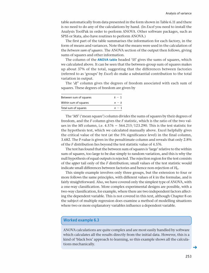
Analysis of variance
253
table automatically from data presented in the form shown in Table 6.11 and there is no need to do any of the calculations by hand. (In Excel you need to install the Analysis ToolPak in order to perform ANOVA. Other software packages, such as SPSS or Stata, also have routines to perform ANOVA.)
The first part of the table summarises the information for each factory, in the form of means and variances. Note that the means were used in the calculation of the between sum of squares. The ANOVA section of the output then follows, giving sums of squares and other information.
The column of the ANOVA table headed ‘SS’ gives the sums of squares, which we calculated above. It can be seen that the between-group sum of squares makes up about 37% of the total, suggesting that the differences between factories (referred to as ‘groups’ by Excel) do make a substantial contribution to the total variation in output.
The ‘df ’ column gives the degrees of freedom associated with each sum of squares. These degrees of freedom are given by
Between sum of squares k - 1
Within sum of squares n - k
Total sum of squares n - 1
The ‘MS’ (‘mean square’) column divides the sums of squares by their degrees of freedom, and the F column gives the F statistic, which is the ratio of the two val-ues in the MS column, i.e. 4.576 = 564.215>123.290. This is the test statistic for the hypothesis test, which we calculated manually above. Excel helpfully gives the critical value of the test (at the 5% significance level) in the final column, 3.682. The P-value is given in the penultimate column and reveals that only 2.8% of the F distribution lies beyond the test statistic value of 4.576.
The test has found that the between sum of squares is ‘large’ relative to the within sum of squares, too large to be due simply to random variation, and this is why the null hypothesis of equal outputs is rejected. The rejection region for the test consists of the upper tail only of the F distribution; small values of the test statistic would indicate small differences between factories and hence non-rejection of H0.
This simple example involves only three groups, but the extension to four or more follows the same principles, with different values of k in the formulae, and is fairly straightforward. Also, we have covered only the simplest type of ANOVA, with a one-way classification. More complex experimental designs are possible, with a two-way classification, for example, where there are two independent factors affect-ing the dependent variable. This is not covered in this text, although Chapter 8 on the subject of multiple regression does examine a method of modelling situations where two or more explanatory variables influence a dependent variable.
Worked example 6.3
ANOVA calculations are quite complex and are most easily handled by software which calculates all the results directly from the initial data. However, this is a kind of ‘black box’ approach to learning, so this example shows all the calcula-tions mechanically.
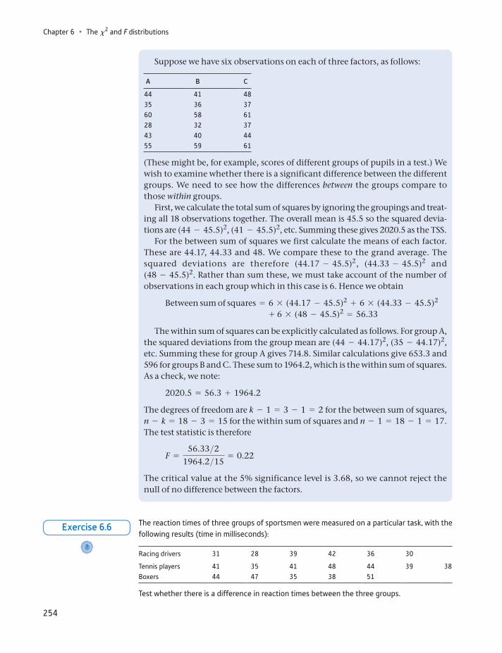
Chapter 6 • The x2 and F distributions
254
Suppose we have six observations on each of three factors, as follows:
A B C
44 41 4835 36 3760 58 6128 32 3743 40 4455 59 61
(These might be, for example, scores of different groups of pupils in a test.) We wish to examine whether there is a significant difference between the different groups. We need to see how the differences between the groups compare to those within groups.
First, we calculate the total sum of squares by ignoring the groupings and treat-ing all 18 observations together. The overall mean is 45.5 so the squared devia-tions are (44 - 45.5)2, (41 - 45.5)2, etc. Summing these gives 2020.5 as the TSS.
For the between sum of squares we first calculate the means of each factor. These are 44.17, 44.33 and 48. We compare these to the grand average. The squared deviations are therefore (44.17 - 45.5)2, (44.33 - 45.5)2 and (48 - 45.5)2. Rather than sum these, we must take account of the number of observations in each group which in this case is 6. Hence we obtain
Between sum of squares = 6 * (44.17 - 45.5)2 + 6 * (44.33 - 45.5)2
+ 6 * (48 - 45.5)2 = 56.33
The within sum of squares can be explicitly calculated as follows. For group A, the squared deviations from the group mean are (44 - 44.17)2, (35 - 44.17)2, etc. Summing these for group A gives 714.8. Similar calculations give 653.3 and 596 for groups B and C. These sum to 1964.2, which is the within sum of squares. As a check, we note:
2020.5 = 56.3 + 1964.2
The degrees of freedom are k - 1 = 3 - 1 = 2 for the between sum of squares, n - k = 18 - 3 = 15 for the within sum of squares and n - 1 = 18 - 1 = 17. The test statistic is therefore
F =56.33>2
1964.2>15= 0.22
The critical value at the 5% significance level is 3.68, so we cannot reject the null of no difference between the factors.
The reaction times of three groups of sportsmen were measured on a particular task, with the following results (time in milliseconds):
Racing drivers 31 28 39 42 36 30
Tennis players 41 35 41 48 44 39 38Boxers 44 47 35 38 51
Test whether there is a difference in reaction times between the three groups.
?
Exercise 6.6
Key terms and concepts
255
Summary
The x2 and F distributions play important roles in statistics, particularly in problems relating to the goodness of fit of the data to that predicted by a null hypothesis.
A random variable based on the sample variance, (n - 1)s2>s2, has a x2 distri-bution with n - 1 degrees of freedom. Based on this fact, the x2 distribution may be used to construct confidence interval estimates for the variance s2. Since the x2 is not a symmetric distribution, the confidence interval is not symmetric around the (unbiased) point estimate s2.
The x2 distribution may also be used to compare actual and expected values of a variable and hence to test the hypothesis upon which the expected values were constructed.
A two-way classification of observations is known as a contingency table. The independence or otherwise of the two variables may be tested using the x2 dis-tribution, by comparing observed values with those expected under the null hypothesis of independence.
The F distribution is used to test a hypothesis of the equality of two variances. The test statistic is the ratio of two sample variances which, under the null hypothesis, has an F distribution with n1 - 1, n2 - 1 degrees of freedom.
The F distribution may also be used in an analysis of variance, which tests for the equality of means across several samples. The results are set out in an analy-sis of variance table, which compares the variation of the observations within each sample to the variation between samples.
actual and expected valuesanalysis of varianceANOVA tablebetween sum of squaresclasses or groupscontingency tabledependent or response variableerror variancefactor
grand averageindependent variableone-way analysis of variancesums of squarestotal sum of squaresuniform distributionvariance ratio testwithin sum of squares
Key terms and concepts
Chapter 6 • The x2 and F distributions
256
Formula Description Notes
c (n - 1)s2
U… s2 …
(n - 1)s2
Ld
Confidence interval for the variance
U and L are the upper and lower limits of the x2 distribution for the chosen confidence level, with n - 1 degrees of freedom
x2 = a (O - E )2
E
Test statistic for independence in a contingency table
n = (r - 1) * (c - 1), where r is the number of rows, c the number of columns
F =s2
1
s22
Test statistic for H0: s21 = s2
2 n = n1 - 1, n2 - 1. Place larger sample variance in the numerator to ensure rejection region is in right-hand tail of the F distribution
ani
j =1a
k
i =1 x2
ij - nx2Total sum of squares (ANOVA) n is the total number of observations, k is the number of
groups
ai
ni x2i - nx2 Between sum of squares
(ANOVA)A ni represents the number of observations in group i and xi is the mean of the group
aja
i(xij - xi)
2 Within sum of squares (ANOVA)
Formulae used in this chapter
Some of the more challenging problems are indicated by highlighting the problem number in colour.
6.1 A sample of 40 observations has a standard deviation of 20. Estimate the 95% confidence interval for the standard deviation of the population.
6.2 Using the data n = 70, s = 15, construct a 99% confidence interval for the true standard deviation.
6.3 Use the data in Table 6.3 to see if there is a significant difference between road casualties in quar-ters I and III on the one hand and quarters II and IV on the other.
6.4 A survey of 64 families with five children found the following gender distribution:
Number of boys 0 1 2 3 4 5Number of families 1 8 28 19 4 4
Test whether the distribution can be adequately modelled by the Binomial distribution.
6.5 Four different holiday firms which all carried equal numbers of holidaymakers reported the follow-ing numbers who expressed satisfaction with their holiday:
Firm A B C D
Number satisfied 576 558 580 546
Problems
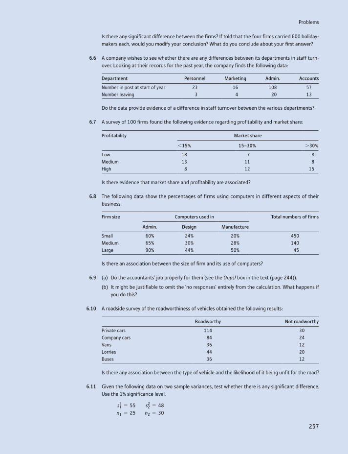
Problems
257
Is there any significant difference between the firms? If told that the four firms carried 600 holiday-makers each, would you modify your conclusion? What do you conclude about your first answer?
6.6 A company wishes to see whether there are any differences between its departments in staff turn-over. Looking at their records for the past year, the company finds the following data:
Department Personnel Marketing Admin. Accounts
Number in post at start of year 23 16 108 57Number leaving 3 4 20 13
Do the data provide evidence of a difference in staff turnover between the various departments?
6.7 A survey of 100 firms found the following evidence regarding profitability and market share:
Profitability Market share
615% 15–30% 730%
Low 18 7 8Medium 13 11 8High 8 12 15
Is there evidence that market share and profitability are associated?
6.8 The following data show the percentages of firms using computers in different aspects of their business:
Firm size Computers used in Total numbers of firms
Admin. Design Manufacture
Small 60% 24% 20% 450Medium 65% 30% 28% 140Large 90% 44% 50% 45
Is there an association between the size of firm and its use of computers?
6.9 (a) Do the accountants’ job properly for them (see the Oops! box in the text (page 244)).
(b) It might be justifiable to omit the ‘no responses’ entirely from the calculation. What happens if you do this?
6.10 A roadside survey of the roadworthiness of vehicles obtained the following results:
Roadworthy Not roadworthy
Private cars 114 30Company cars 84 24Vans 36 12Lorries 44 20Buses 36 12
Is there any association between the type of vehicle and the likelihood of it being unfit for the road?
6.11 Given the following data on two sample variances, test whether there is any significant difference. Use the 1% significance level.
s21 = 55 s2
2 = 48 n1 = 25 n2 = 30
Chapter 6 • The x2 and F distributions
258
6.12 An example in Chapter 5 compared R&D expenditure in Britain and Germany. The sample data were:
x1 = 3.7 x2 = 4.2 s1 = 0.6 s2 = 0.9 n1 = 20 n2 = 15
Is there evidence, at the 5% significance level, of difference in the variances of R&D expenditure between the two countries? What are the implications, if any, for the test carried out on the differ-ence of the two means, in Chapter 4?
6.13 Groups of children from four different classes in a school were randomly selected and sat a test, with the following test scores:
Class Pupil
1 2 3 4 5 6 7
A 42 63 73 55 66 48 59B 39 47 47 61 44 50 52C 71 65 33 49 61D 49 51 62 48 63 54
(a) Test whether there is any difference between the classes, using the 95% confidence level for the test.
(b) How would you interpret a ‘significant’ result from such a test?
6.14 Lottery tickets are sold in different outlets: supermarkets, smaller shops and outdoor kiosks. Sales were sampled from several of each of these, with the following results:
Supermarkets 355 251 408 302
Small shops 288 257 225 299Kiosks 155 352 240
Does the evidence indicate a significant difference in sales? Use the 5% significance level.
6.15 (Project) Conduct a survey among fellow students to examine whether there is any association between:
(a) gender and political preference, or
(b) subject studied and political preference, or
(c) star sign and personality (introvert/extrovert – self-assessed: I am told that Aries, Cancer, Capricorn, Gemini, Leo and Scorpio are associated with an extrovert personality), or
(d) any other two categories of interest.
6.16 (Computer project) Use your spreadsheet or other computer program to generate 100 random integers in the range 0 to 9. Draw up a frequency table and use a x2 test to examine whether there is any bias towards any particular integer. Compare your results with those of others in your class.
Answers to exercises
259
Answers to exercises
Exercise 6.1
(a) The values cutting off the outer 2.5% in each tail of the x2 distribution (df = 29) are 16.05 and 45.72 (see Appendix Table A4). Using
c (n - 1) * s2
45.72… s2 …
(n - 1) * 6516.05
d
we therefore obtain
c (30 - 1) * 6545.72
… s2 …(30 - 1) * 65
16.05d
which yields the interval [41.2, 117.4]
(b) [6.4, 10.8], by taking the square roots of the answer to part (a).
(c) [36.0, 143.7], by similar methods but using critical values of 13.12 and 52.34
Exercise 6.2
The calculation of the test statistic is:
Outcome Observed Expected O - E (O - E )2 (O - E )2
E
A 40 35 5 25 0.714B 60 55 5 25 0.455C 75 75 0 0 0D 90 100 -10 100 1Total 2.169
This is smaller than the critical value of 7.81 (for three degrees of freedom) so the null is not rejected.
Exercise 6.3
The test statistics are for (16, 55, 29) x2 = 4.38 (Prob-value = 0.112) and z = 1.84 (Prob-value = 0.066) and for (14, 55, 31) x2 = 6.78 (Prob-value = 0.038) and z = 2.40 (Prob-value = 0.016). The two methods agree on the results (whether or not to reject the hypothesis), although the Prob-values are different.
Exercise 6.4
The expected values are:
Higher education A levels Other qualifications No qualifications Total
In work 217 140 280 85 723Unemployed 19 12 24 7 62Inactive 64 42 83 25 214Totals 300 194 387 118 999
(These are calculated by multiplying row and column totals and dividing by the grand total, e.g. 217 = 723 * 3000>999.)
Chapter 6 • The x2 and F distributions
260
The test statistic is:
7.3 + 0.2 + 0.4 + 13.1 + 4.0 + 0.1 + 2.0 + 1.0 + 15.2 + 0.3 + 0.2 + 37.3 = 81.1
This should be compared to a critical value of 12.59 (n = (3 - 1) * (4 - 1) = 6), so the null is rejected.
Exercise 6.5
The two variances are s2A = 0.031 and s2
B = 0.066. We therefore form the ratio F = 0.066>0.031 = 2.09, which has an F distribution with 5 and 6 degrees of free-dom. The 5% critical value is therefore 4.39 and the null is not rejected. There appears no difference between manufacturers. The variance is important because consumers want a reliable product – they would not be happy if an incorrect voltage broke their MP3 player.
Exercise 6.6
The answer is summarised in this Excel table:
SUMMARY
Groups Count Sum Average Variance
Racing drivers 6 206 34.333 30.667Tennis players 7 286 40.857 17.810Boxers 5 215 43.000 42.500
ANOVA
Source of variation SS df MS F P-value F crit
Between groups 233.421 2 116.710 4.069 0.039 3.682Within groups 430.190 15 28.679
Totals 663.611 17
The result shows that there is a difference between the three groups, with an F statistic of 4.069 (P-value 3.9%). The difference appears to be largely between racing drivers and the other two types.
261
Appendix: Use of x2 and F distribution tables
Appendix Use of x2 and F distribution tables
Tables of the x2 distribution
Table A4 presents critical values of the x2 distribution for a selection of signifi-cance levels and for different degrees of freedom. As an example, to find the criti-cal value of the x2 distribution at the 5% significance level, for n = 20 degrees of freedom, the cell entry in the column labelled ‘0.05’ and the row labelled ‘20’ are consulted. The critical value is 31.4. A test statistic greater than this value implies rejection of the null hypothesis at the 5% significance level.
An Excel function can alternatively be used to find this value. The formula ‘=CHIISQ.INV.RT(0.05, 20)’ will give the result 31.4.
Tables of the F distribution
Table A5 (see page 454) presents critical values of the F distribution. Since there are two sets of degrees of freedom to be taken into account, a separate table is required for each significance level. Four sets of tables are provided, giving criti-cal values cutting off the top 5%, 2.5%, 1% and 0.5% of the distribution (Tables A5(a), A5(b), A5(c) and A5(d) respectively). These allow both one- and two-tail tests at the 5% and 1% significance levels to be conducted. Its use is illus-trated by example.
Two-tail test
To find the critical values of the F distribution at the 5% significance level for degrees of freedom n1 (numerator) = 10, n2 = 20. The critical values in this case cut off the extreme 2.5% of the distribution in each tail, and are found in Table A5(b):
Right-hand critical value: this is found from the cell of the table corresponding to the column n1 = 10 and row n2 = 20. Its value is 2.77.
Left-hand critical value: this cannot be obtained directly from the tables, which only give right-hand values. However, it is obtained indirectly as follows:(a) Find the right-hand critical value for n1 = 20, n2 = 10 (note reversal of
degrees of freedom). This gives 3.42.(b) Take the reciprocal to obtain the desired left-hand critical value. This gives
1>3.42 = 0.29.
The rejection region thus consists of values of the test statistic less than 0.29 and greater than 2.77.
An Excel function can alternatively be used to find these values. The formula ‘ =F.INV.RT(0.025, 10, 20)’ will give the result 2.77. The formula ‘=F.INV.RT(0.975, 10, 20)’ will give 0.29, the left hand value. Note that you do not need to reverse the degrees of freedom in the formula, Excel understands that the left-hand critical value is needed from the ‘0.975’ figure.

Chapter 6 • The x2 and F distributions
262
One-tail test
To find the critical value at the 5% significance level for n1 = 15, n2 = 25. As long as the test statistic has been calculated with the larger variance in the numerator, the critical value is in the right-hand tail of the distribution and can be obtained directly from Table A5(a). For n1 = 15, n2 = 25 the value is 2.09. The null hypoth-esis is rejected, therefore, if the test statistic is greater than 2.09. Once again, in Excel, ‘=F.INV.RT(0.05, 15, 25)’ = 2.09.
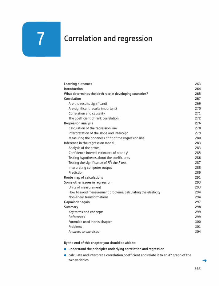
263
Learning outcomes 263Introduction 264What determines the birth rate in developing countries? 265Correlation 267
Are the results significant? 269Are significant results important? 270Correlation and causality 271The coefficient of rank correlation 272
Regression analysis 276Calculation of the regression line 278Interpretation of the slope and intercept 279Measuring the goodness of fit of the regression line 280
Inference in the regression model 283Analysis of the errors 283Confidence interval estimates of a and b 285Testing hypotheses about the coefficients 286Testing the significance of R2: the F test 287Interpreting computer output 288Prediction 289
Route map of calculations 291Some other issues in regression 293
Units of measurement 293How to avoid measurement problems: calculating the elasticity 294Non-linear transformations 294
Gapminder again 297Summary 298
Key terms and concepts 299References 299Formulae used in this chapter 300Problems 301Answers to exercises 304
Correlation and regression7
By the end of this chapter you should be able to:
understand the principles underlying correlation and regression
calculate and interpret a correlation coefficient and relate it to an XY graph of the two variables
264264
Introduction
Correlation and regression are techniques for investigating the statistical rela-tionship between two, or more, variables. In Chapter 1 we examined the rela-tionship between investment and GDP using graphical methods (the XY chart). Although visually helpful, this did not provide any precise measure-ment of the strength of the relationship. In Chapter 6 the x2 test did provide a test of the significance of the association between two category-based vari-ables, but this test cannot be applied to variables measured on a ratio scale. Correlation and regression fill in these gaps: the strength of the relationship between two (or more) ratio scale variables can be measured and the signifi-cance tested.
Correlation and regression are the techniques most often used by economists and forecasters. They can be used to answer such questions as
Is there a link between the money supply and the price level? Do bigger firms produce at lower cost than smaller firms? Does spending more on advertising increase sales?
Each of these questions is about economics or business as much as about sta-tistics. The statistical analysis is part of a wider investigation into the problem; it cannot provide a complete answer to the problem but, used sensibly, is a vital input. Correlation and regression techniques may be applied to time-series or cross-section data. The methods of analysis are similar in each case, although there are differences of approach and interpretation which are highlighted in this chapter and the next.
This chapter begins with the topic of correlation and simple (i.e. two variable) regression, using as an example the determinants of the birth rate in developing countries. In Chapter 8, multiple regression is examined, where a single depen-dent variable is explained by more than one explanatory variable. This is illus-trated using time-series data pertaining to imports into the United Kingdom. This shows how a small research project can be undertaken, avoiding the many possi-ble pitfalls along the way. Finally, a variety of useful additional techniques, tips and traps is set out, to help you understand and overcome a number of problems that can arise in regression analysis.
calculate the line of best fit (regression line) and interpret the result
recognise the statistical significance of the results, using confidence intervals and hypothesis tests
recognise the importance of the units in which the variables are measured and of trans-formations to the data
use computer software (Excel) to derive the regression line and interpret the computer output.
What determines the birth rate in developing countries?
265
What determines the birth rate in developing countries?
This example follows the analysis in Michael Todaro’s book, Economic Development in the Third World (3rd edn, pp. 197–200), where he tries to establish which of three variables (GNP per capita, the growth rate, or income inequality) is most important in determining a country’s birth rate. (This analysis has been dropped from later editions of Todaro’s book.)
The analysis is instructive as an example of correlation and regression tech-niques in a number of ways. First, the question is an important one; it was dis-cussed at the UN International Conference on Population and Development in Cairo in 1995. It is felt by many that reducing the birth rate is a vital factor in economic development (birth rates in developed countries average around 12 per 1000 population, in developing countries around 30). Second, Todaro uses the statistical analysis to arrive at a questionable conclusion.
The data used by Todaro are shown in Table 7.1 using a sample of 12 developing countries. Two points need to be made initially. First, this is a very small sample which only includes developing countries, so the results will not give an all- embracing explanation of the birth rate. Different factors might be relevant to developed countries, for example. Second, there is the important question of why these particular countries were chosen as the sample and others ignored. The choice of country was limited by data availability, and one should ask whether countries with data available are likely to be representative of all countries. Data were, in fact, available for more than 12 countries, so Todaro was selective. You are asked to explore the implications of this in some of the problems at the end of the chapter.
The variables are defined as follows:
Birth rate: the number of births per 1000 population in 1981.GNP per capita: 1981 gross national product p.c., in US dollars.Growth rate: the growth rate of GNP p.c. p.a., 1961–81.Income ratio: the ratio of the income share of the richest 20% to that of the
poorest 40%. A higher value of this ratio indicates greater inequality.
Table 7.1 Todaro’s data on birth rate, GNP, growth and inequality
Country Birth rate 1981 GNP p.c. GNP growth Income ratio
Brazil 30 2200 5.1 9.5Colombia 29 1380 3.2 6.8Costa Rica 30 1430 3.0 4.6India 35 260 1.4 3.1Mexico 36 2250 3.8 5.0Peru 36 1170 1.0 8.7Philippines 34 790 2.8 3.8Senegal 48 430 -0.3 6.4South Korea 24 1700 6.9 2.7Sri Lanka 27 300 2.5 2.3Taiwan 21 1170 6.2 3.8Thailand 30 770 4.6 3.3
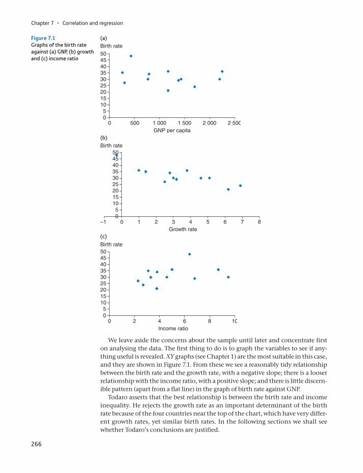
Chapter 7 • Correlation and regression
266
We leave aside the concerns about the sample until later and concentrate first on analysing the data. The first thing to do is to graph the variables to see if any-thing useful is revealed. XY graphs (see Chapter 1) are the most suitable in this case, and they are shown in Figure 7.1. From these we see a reasonably tidy relationship between the birth rate and the growth rate, with a negative slope; there is a looser relationship with the income ratio, with a positive slope; and there is little discern-ible pattern (apart from a flat line) in the graph of birth rate against GNP.
Todaro asserts that the best relationship is between the birth rate and income inequality. He rejects the growth rate as an important determinant of the birth rate because of the four countries near the top of the chart, which have very differ-ent growth rates, yet similar birth rates. In the following sections we shall see whether Todaro’s conclusions are justified.
Figure 7.1Graphs of the birth rate against (a) GNP, (b) growth and (c) income ratio
00 500 1 000
GNP per capita1 500 2 000 2 500
510152025
Birth rate
3035404550
0–1 1 2 3 4 5 6 7 8Growth rate
Birth rate
05
101520253035404550
0 2 4 6 8 10Income ratio
Birth rate
05
101520253035404550
(b)
(c)
(a)
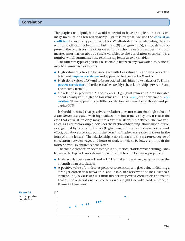
Correlation
267
Correlation
The graphs are helpful, but it would be useful to have a simple numerical sum-mary measure of each relationship. For this purpose, we use the correlation coefficient between any pair of variables. We illustrate this by calculating the cor-relation coefficient between the birth rate (B) and growth (G), although we also present the results for the other cases. Just as the mean is a number that sum-marises information about a single variable, so the correlation coefficient is a number which summarises the relationship between two variables.
The different types of possible relationship between any two variables, X and Y, may be summarised as follows:
High values of X tend to be associated with low values of Y and vice versa. This is termed negative correlation and appears to be the case for B and G.
High (low) values of X tend to be associated with high (low) values of Y. This is positive correlation and reflects (rather weakly) the relationship between B and the income ratio (IR).
No relationship between X and Y exists. High (low) values of X are associated about equally with high and low values of Y. This is zero, or the absence of, cor-relation. There appears to be little correlation between the birth rate and per capita GNP.
It should be noted that positive correlation does not mean that high values of X are always associated with high values of Y, but usually they are. It is also the case that correlation only measures a linear relationship between the two vari-ables. As a counter-example, consider the backward-bending labour supply curve, as suggested by economic theory (higher wages initially encourage extra work effort, but above a certain point the benefit of higher wage rates is taken in the form of more leisure). The relationship is non-linear and the measured degree of correlation between wages and hours of work is likely to be low, even though the former obviously influences the latter.
The sample correlation coefficient, r, is a numerical statistic which distinguishes between the types of cases shown in Figure 7.1. It has the following properties:
It always lies between -1 and +1. This makes it relatively easy to judge the strength of an association.
A positive value of r indicates positive correlation, a higher value indicating a stronger correlation between X and Y (i.e. the observations lie closer to a straight line). A value of r = 1 indicates perfect positive correlation and means that all the observations lie precisely on a straight line with positive slope, as Figure 7.2 illustrates.
Figure 7.2Perfect positive correlation
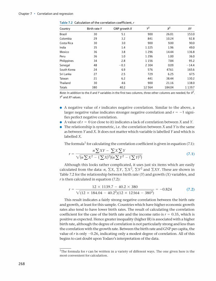
Chapter 7 • Correlation and regression
268
A negative value of r indicates negative correlation. Similar to the above, a larger negative value indicates stronger negative correlation and r = -1 signi-fies perfect negative correlation.
A value of r = 0 (or close to it) indicates a lack of correlation between X and Y. The relationship is symmetric, i.e. the correlation between X and Y is the same
as between Y and X. It does not matter which variable is labelled Y and which is labelled X.
The formula1 for calculating the correlation coefficient is given in equation (7.1):
r =naXY - aXaY2(naX2 - (aX)2)(naY 2 - (aY)2)
(7.1)
Although this looks rather complicated, it uses just six items which are easily calculated from the data: n, gX, gY, gX2, gY 2 and gXY. These are shown in Table 7.2 for the relationship between birth rate (Y) and growth (X) variables, and r is then calculated in equation (7.2):
r =12 * 1139.7 - 40.2 * 3802(12 * 184.04 - 40.22)(12 * 12 564 - 3802)
= -0.824 (7.2)
This result indicates a fairly strong negative correlation between the birth rate and growth, at least for this sample. Countries which have higher economic growth rates also tend to have lower birth rates. The result of calculating the correlation coefficient for the case of the birth rate and the income ratio is r = 0.35, which is positive as expected. Hence greater inequality (higher IR) is associated with a higher birth rate, although the degree of correlation is not particularly strong and less than the correlation with the growth rate. Between the birth rate and GNP per capita, the value of r is only -0.26, indicating only a modest degree of correlation. All of this begins to cast doubt upon Todaro’s interpretation of the data.
Table 7.2 Calculation of the correlation coefficient, r
Country Birth rate Y GNP growth X Y2 X2 XY
Brazil 30 5.1 900 26.01 153.0Colombia 29 3.2 841 10.24 92.8Costa Rica 30 3.0 900 9.00 90.0India 35 1.4 1 225 1.96 49.0Mexico 36 3.8 1 296 14.44 136.8Peru 36 1.0 1 296 1.00 36.0Philippines 34 2.8 1 156 7.84 95.2Senegal 48 -0.3 2 304 0.09 -14.4South Korea 24 6.9 576 47.61 165.6Sri Lanka 27 2.5 729 6.25 67.5Taiwan 21 6.2 441 38.44 130.2Thailand 30 4.6 900 21.16 138.0Totals 380 40.2 12 564 184.04 1 139.7
Note: In addition to the X and Y variables in the first two columns, three other columns are needed, for X2, Y2 and XY values.
1The formula for r can be written in a variety of different ways. The one given here is the most convenient for calculation.
Correlation
269
Are the results significant?
These results come from a (small) sample, one of many that could have been col-lected (either for different countries or different time periods). Once again we may ask the question, what can we infer about the population (of all developing coun-tries) from the sample? Assuming the sample was drawn at random (which may not be justified) we can use the principles of hypothesis testing introduced in Chapter 5. As usual, there are two possibilities:
(1) The truth is that there is no correlation (in the population) and that our sam-ple exhibits such a large (absolute) value by chance.
(2) There really is a correlation between the birth rate and the growth rate and the sample correctly reflects this.
By denoting the true but unknown population correlation coefficient by r (the Greek letter ‘rho’), the possibilities can be expressed in terms of a hypothesis test:
H0: r = 0H1: r ≠ 0
The test statistic in this case is not r itself but a transformation of it:
t =r 1n - 221 - r2
(7.3)
which has a t distribution with n - 2 degrees of freedom. The five steps of the test procedure are therefore:
(1) Write down the null and alternative hypotheses (shown above).(2) Choose the significance level of the test: 5% by convention.(3) Look up the critical value of the test for n - 2 = 10 degrees of freedom:
t*10 = 2.228 for a two-tail test.
(4) Calculate the test statistic using equation (7.3):
t =- 0.824112 - 221 - (-0.824)2
= -4.59
(5) Compare the test statistic with the critical value. In this case t 6 - t*10 so H0 is
rejected. There is a less than 5% chance of the sample evidence occurring if the null hypothesis were true, so the latter is rejected. There does appear to be a genuine association between the birth rate and the growth rate.
Performing similar calculations (see Exercise 7.2) for the income ratio and for GNP reveals that in both cases the null hypothesis cannot be rejected at the 5%
(a) Perform the required calculations to confirm that the correlation between the birth rate and the income ratio is 0.35.
(b) In Excel, use the =CORREL( ) function to confirm your calculations in part (a). (For exam-ple, the function =CORREL(A1:A12, B1:B12) would calculate the correlation between a variable X in cells A1:A12 and Y in cells B1:B12.)
(c) Calculate the correlation coefficient between the birth rate and the income ratio again, but expressing the birth rate per 100 population and dividing the income ratio by 100. Your calculation should confirm that changing the units of measurement leaves the cor-relation coefficient unchanged.
?
Exercise 7.1
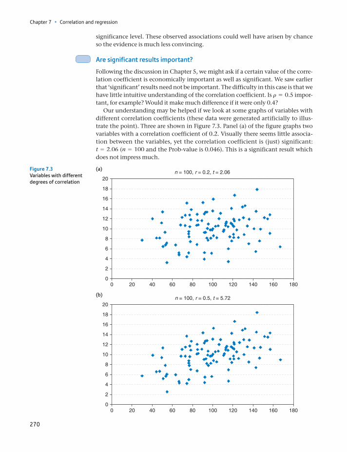
Chapter 7 • Correlation and regression
270
significance level. These observed associations could well have arisen by chance so the evidence is much less convincing.
Are significant results important?
Following the discussion in Chapter 5, we might ask if a certain value of the corre-lation coefficient is economically important as well as significant. We saw earlier that ‘significant’ results need not be important. The difficulty in this case is that we have little intuitive understanding of the correlation coefficient. Is r = 0.5 impor-tant, for example? Would it make much difference if it were only 0.4?
Our understanding may be helped if we look at some graphs of variables with different correlation coefficients (these data were generated artificially to illus-trate the point). Three are shown in Figure 7.3. Panel (a) of the figure graphs two variables with a correlation coefficient of 0.2. Visually there seems little associa-tion between the variables, yet the correlation coefficient is (just) significant: t = 2.06 (n = 100 and the Prob-value is 0.046). This is a significant result which does not impress much.
Figure 7.3Variables with different degrees of correlation
2
4
6
8
10
12
14
16
18
20n = 100, r = 0.2, t = 2.06
00 20 40 60 80 100 120 140 160 180
n = 100, r = 0.5, t = 5.72
2
4
6
8
10
12
14
16
18
20
00 20 40 60 80 100 120 140 160 180
(a)
(b)
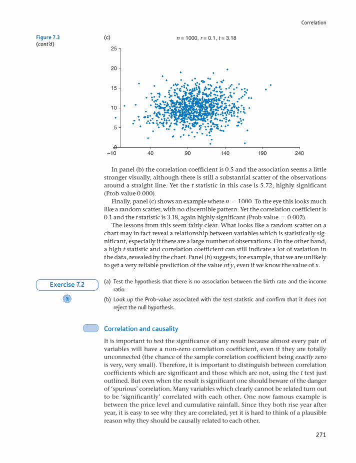
Correlation
271
In panel (b) the correlation coefficient is 0.5 and the association seems a little stronger visually, although there is still a substantial scatter of the observations around a straight line. Yet the t statistic in this case is 5.72, highly significant (Prob-value 0.000).
Finally, panel (c) shows an example where n = 1000. To the eye this looks much like a random scatter, with no discernible pattern. Yet the correlation coefficient is 0.1 and the t statistic is 3.18, again highly significant (Prob-value = 0.002).
The lessons from this seem fairly clear. What looks like a random scatter on a chart may in fact reveal a relationship between variables which is statistically sig-nificant, especially if there are a large number of observations. On the other hand, a high t statistic and correlation coefficient can still indicate a lot of variation in the data, revealed by the chart. Panel (b) suggests, for example, that we are unlikely to get a very reliable prediction of the value of y, even if we know the value of x.
n = 1000, r = 0.1, t = 3.18
5
0–10 40 90 140 190 240
10
15
20
25
(c)Figure 7.3(cont’d)
(a) Test the hypothesis that there is no association between the birth rate and the income ratio.
(b) Look up the Prob-value associated with the test statistic and confirm that it does not reject the null hypothesis.
?
Exercise 7.2
Correlation and causality
It is important to test the significance of any result because almost every pair of variables will have a non-zero correlation coefficient, even if they are totally unconnected (the chance of the sample correlation coefficient being exactly zero is very, very small). Therefore, it is important to distinguish between correlation coefficients which are significant and those which are not, using the t test just outlined. But even when the result is significant one should beware of the danger of ‘spurious’ correlation. Many variables which clearly cannot be related turn out to be ‘significantly’ correlated with each other. One now famous example is between the price level and cumulative rainfall. Since they both rise year after year, it is easy to see why they are correlated, yet it is hard to think of a plausible reason why they should be causally related to each other.
Chapter 7 • Correlation and regression
272
Apart from spurious correlation, there are four possible reasons for a non-zero value of r:
(1) X influences Y.(2) Y influences X.(3) X and Y jointly influence each other.(4) Another variable, Z, influences both X and Y.
Correlation alone does not allow us to distinguish between these alternatives. For example, wages (X) and prices (Y) are highly correlated. Some people believe this is due to cost–push inflation, i.e. that wage rises lead to price rises. This is case (1) above. Others believe that wages rise to keep up with the cost of living (i.e. rising prices), which is (2). Perhaps a more convincing explanation is (3), a wage–price spiral where each feeds upon the other. Others would suggest that it is the growth of the money supply, Z, which allows both wages and prices to rise. To distinguish between these alternatives is important for the control of inflation, but correlation alone does not allow that distinction to be made.
Correlation is best used therefore as a suggestive and descriptive piece of analy-sis, rather than a technique which gives definitive answers. It is often a prepara-tory piece of analysis, which gives some clues to what the data might yield, to be followed by more sophisticated techniques such as regression.
The coefficient of rank correlation
On occasion it is inappropriate or impossible to calculate the correlation coeffi-cient as described above and an alternative approach is helpful. Sometimes the original data are unavailable but the ranks are. For example, schools may be ranked in terms of their exam results, but the actual pass rates are not available. Similarly, they may be ranked in terms of spending per pupil, with actual spend-ing levels unavailable. Although the original data are missing, one can still test for an association between spending and exam success by calculating the correlation between the ranks. If extra spending improves exam performance, schools ranked higher on spending should also be ranked higher on exam success, leading to a positive correlation.
Second, even if the raw data are available, they may be highly skewed and hence the correlation coefficient may be influenced heavily by a few outliers. In this case the hypothesis test for correlation may be misleading as it is based on the assumption of underlying Normal distributions for the data. In this case we could transform the values to ranks, and calculate the correlation of the ranks. In a simi-lar manner to the median, described in Chapter 1, this can effectively deal with heavily skewed distributions.
Note the difference between the two cases. In the first, we would prefer to have the actual school pass rates and expenditures because our analysis would be bet-ter. We could actually see how much extra we have to spend in order to get better results. In the second case we actually prefer to use the ranks because the original data might mislead us, through the presence of outliers for example. Non-parametric statistics are those which are robust to the distribution of the data, such as the calculation of the median, rather than the mean which is a parametric measure. We do not cover many examples of the former in this text, but the rank correlation coefficient is one of them.
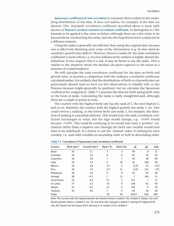
Correlation
273
Spearman’s coefficient of rank correlation is a measure that is robust to the under-lying distribution of the data. It does not matter, for example, if the data are skewed. (The ‘standard’ correlation coefficient described above is more fully known as Pearson’s product-moment correlation coefficient, to distinguish it.) The formula to be applied is the same as before, although there are a few tricks to be learned about constructing the ranks, and also the hypothesis test is conducted in a different manner.
Using the ranks is generally less efficient than using the original data, because one is effectively throwing away some of the information (e.g. by how much do countries’ growth rates differ?). However, there is a trade-off: the rank correlation coefficient is more robust, i.e. it is less influenced by outliers or highly skewed dis-tributions. If one suspects this is a risk, it may be better to use the ranks. This is similar to the situation where the median can prove superior to the mean as a measure of central tendency.
We will calculate the rank correlation coefficient for the data on birth and growth rates, to provide a comparison with the ordinary correlation coefficient calculated earlier. It is unlikely that the distributions of birth or of growth rates are particularly skewed (and we have too few observations to reliably tell), so the Pearson measure might generally be preferred, but we calculate the Spearman coefficient for comparison. Table 7.3 presents the data for birth and growth rates in the form of ranks. Calculating the ranks is fairly straightforward, although there are a couple of points to note.
The country with the highest birth rate has the rank of 1, the next highest 2, and so on. Similarly, the country with the highest growth rate ranks 1, etc. One could reverse a ranking, so the lowest birth rate ranks 1, for example; the direc-tion of ranking is somewhat arbitrary. This would leave the rank correlation coef-ficient unchanged in value, but the sign would change, e.g. -0.691 would become +0.691. This could be confusing as we would now have a ‘positive’ cor-relation rather than a negative one (though the birth rate variable would now have to be redefined). It is better to use the ‘natural’ order of ranking for each variable, i.e. rank both variables in ascending order or both in descending order.
Table 7.3 Calculation of Spearman’s rank correlation coefficient
Country Birth rate Y Growth rate X Rank Y RY Rank X RX R2Y R2
X RXRY
Brazil 30 5.1 7 3 49 9 21Colombia 29 3.2 9 6 81 36 54Costa Rica 30 3.0 7 7 49 49 49India 35 1.4 4 10 16 100 40Mexico 36 3.8 2.5 5 6.25 25 12.5Peru 36 1.0 2.5 11 6.25 121 27.5Philippines 34 2.8 5 8 25 64 40Senegal 48 -0.3 1 12 1 144 12South Korea 24 6.9 11 1 121 1 11Sri Lanka 27 2.5 10 9 100 81 90Taiwan 21 6.2 12 2 144 4 24Thailand 30 4.6 7 4 49 16 28Totals 78 78 647.5 650 409
Note: The country with the highest growth rate (South Korea) is ranked 1 for variable X; Taiwan, the next fastest growth nation, is ranked 2, etc. For the birth rate, Senegal is ranked 1, having the highest birth rate, 48. Taiwan has the lowest birth rate and so is ranked 12 for variable Y.
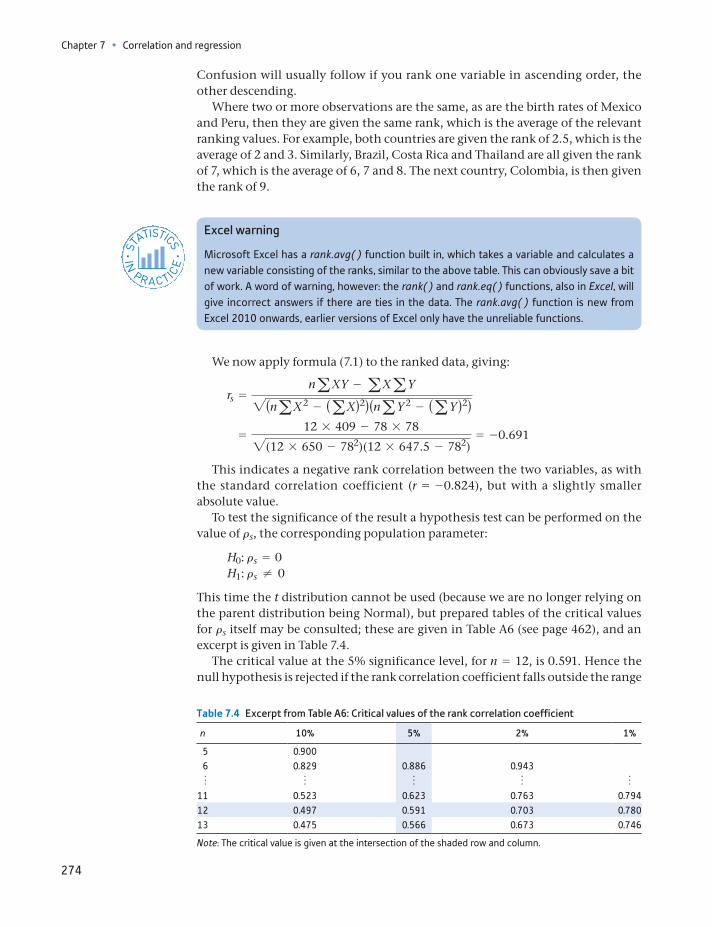
Chapter 7 • Correlation and regression
274
Confusion will usually follow if you rank one variable in ascending order, the other descending.
Where two or more observations are the same, as are the birth rates of Mexico and Peru, then they are given the same rank, which is the average of the relevant ranking values. For example, both countries are given the rank of 2.5, which is the average of 2 and 3. Similarly, Brazil, Costa Rica and Thailand are all given the rank of 7, which is the average of 6, 7 and 8. The next country, Colombia, is then given the rank of 9.
Excel warning
Microsoft Excel has a rank.avg( ) function built in, which takes a variable and calculates a new variable consisting of the ranks, similar to the above table. This can obviously save a bit of work. A word of warning, however: the rank( ) and rank.eq( ) functions, also in Excel, will give incorrect answers if there are ties in the data. The rank.avg( ) function is new from Excel 2010 onwards, earlier versions of Excel only have the unreliable functions.
ST
ATISTICS
IN
PRACTI
CE
· ·
We now apply formula (7.1) to the ranked data, giving:
rs =naXY - aXaY2(naX2 - (aX)2)(naY 2 - (aY )2)
=12 * 409 - 78 * 782(12 * 650 - 782)(12 * 647.5 - 782)
= -0.691
This indicates a negative rank correlation between the two variables, as with the standard correlation coefficient (r = -0.824), but with a slightly smaller absolute value.
To test the significance of the result a hypothesis test can be performed on the value of rs, the corresponding population parameter:
H0: rs = 0H1: rs ≠ 0
This time the t distribution cannot be used (because we are no longer relying on the parent distribution being Normal), but prepared tables of the critical values for rs itself may be consulted; these are given in Table A6 (see page 462), and an excerpt is given in Table 7.4.
The critical value at the 5% significance level, for n = 12, is 0.591. Hence the null hypothesis is rejected if the rank correlation coefficient falls outside the range
Table 7.4 Excerpt from Table A6: Critical values of the rank correlation coefficient
n 10% 5% 2% 1%
5 0.900 6 0.829 0.886 0.943 o o o o o11 0.523 0.623 0.763 0.79412 0.497 0.591 0.703 0.78013 0.475 0.566 0.673 0.746
Note: The critical value is given at the intersection of the shaded row and column.
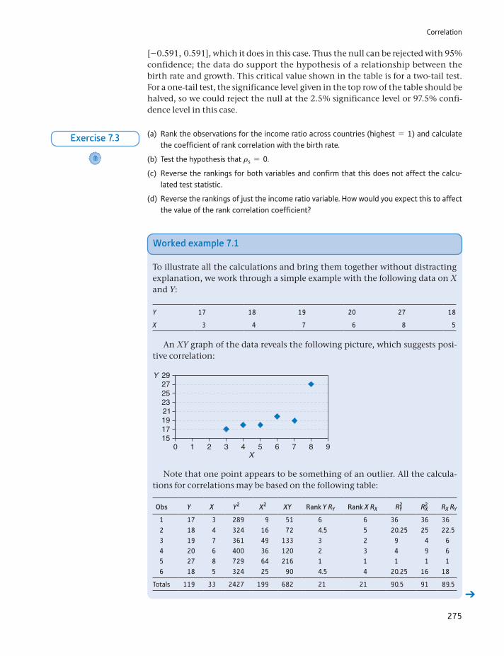
Correlation
275
[-0.591, 0.591], which it does in this case. Thus the null can be rejected with 95% confidence; the data do support the hypothesis of a relationship between the birth rate and growth. This critical value shown in the table is for a two-tail test. For a one-tail test, the significance level given in the top row of the table should be halved, so we could reject the null at the 2.5% significance level or 97.5% confi-dence level in this case.
(a) Rank the observations for the income ratio across countries (highest = 1) and calculate the coefficient of rank correlation with the birth rate.
(b) Test the hypothesis that rs = 0.
(c) Reverse the rankings for both variables and confirm that this does not affect the calcu-lated test statistic.
(d) Reverse the rankings of just the income ratio variable. How would you expect this to affect the value of the rank correlation coefficient?
?
Exercise 7.3
Worked example 7.1
To illustrate all the calculations and bring them together without distracting explanation, we work through a simple example with the following data on X and Y:
Y 17 18 19 20 27 18
X 3 4 7 6 8 5
An XY graph of the data reveals the following picture, which suggests posi-tive correlation:
29Y272523
191715
0 1 2 3 4 5X
6 7 8 9
21
Note that one point appears to be something of an outlier. All the calcula-tions for correlations may be based on the following table:
Obs Y X Y2 X2 XY Rank Y RY Rank X RX R2Y R2
X RX RY
1 17 3 289 9 51 6 6 36 36 362 18 4 324 16 72 4.5 5 20.25 25 22.53 19 7 361 49 133 3 2 9 4 64 20 6 400 36 120 2 3 4 9 65 27 8 729 64 216 1 1 1 1 16 18 5 324 25 90 4.5 4 20.25 16 18
Totals 119 33 2427 199 682 21 21 90.5 91 89.5
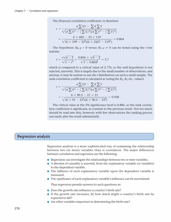
Chapter 7 • Correlation and regression
276
Regression analysis
Regression analysis is a more sophisticated way of examining the relationship between two (or more) variables than is correlation. The major differences between correlation and regression are the following:
Regression can investigate the relationships between two or more variables. A direction of causality is asserted, from the explanatory variable (or variables)
to the dependent variable. The influence of each explanatory variable upon the dependent variable is
measured. The significance of each explanatory variable’s influence can be ascertained.
Thus regression permits answers to such questions as:
Does the growth rate influence a country’s birth rate? If the growth rate increases, by how much might a country’s birth rate be
expected to fall? Are other variables important in determining the birth rate?
The (Pearson) correlation coefficient r is therefore:
r =naXY - aXaY21naX2 - 1aX2221naY 2 - 1aY222
=6 * 682 - 33 * 1192(6 * 199 - 332)(6 * 2427 - 1192 )
= 0.804
The hypothesis H0: r = 0 versus H1: r ≠ 0 can be tested using the t test statistic:
t =r1n - 221 - r2
=0.804 * 16 - 221 - 0.8042
= 2.7
which is compared to a critical value of 2.776, so the null hypothesis is not rejected, narrowly. This is largely due to the small number of observations, and anyway, it may be unwise to use the t distribution on such a small sample. The rank correlation coefficient is calculated as (using the RX, RY etc., values)
r =naXY - aXaY21naX2 - 1aX2221naY 2 - 1aY222
=6 * 89.5 - 21 * 212(6 * 91 - 212)(6 * 90.5 - 212)
= 0.928
The critical value at the 5% significance level is 0.886, so the rank correla-tion coefficient is significant, in contrast to the previous result. Not too much should be read into this, however; with few observations the ranking process can easily alter the result substantially.
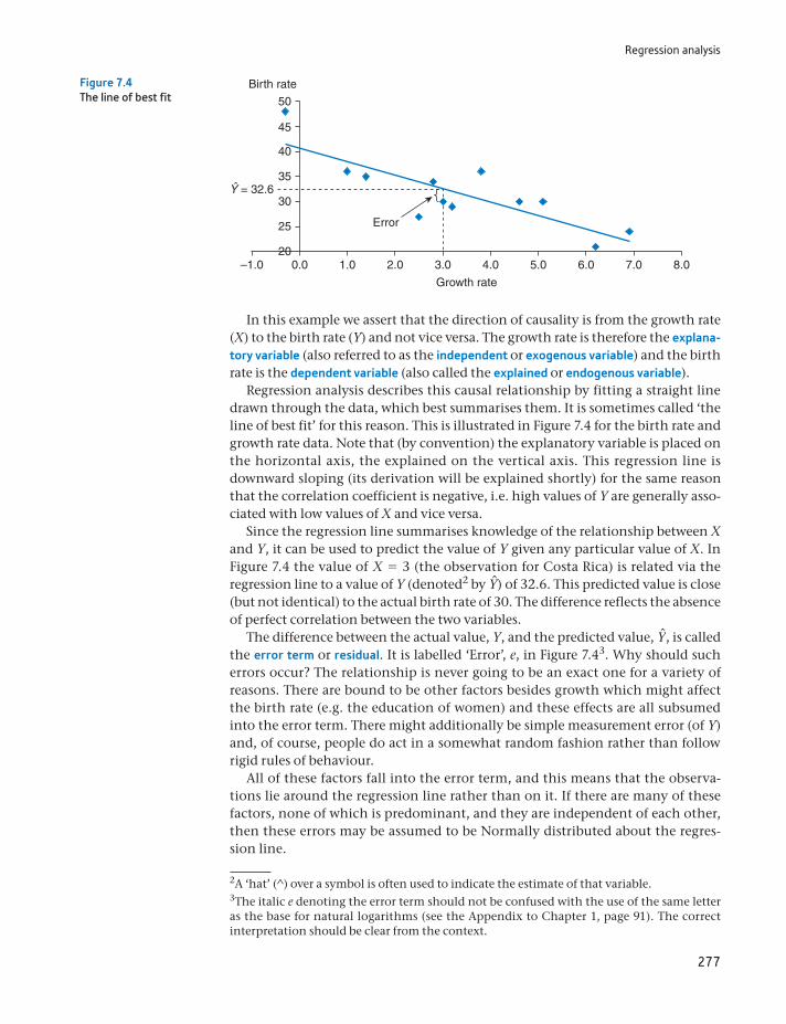
Regression analysis
277
In this example we assert that the direction of causality is from the growth rate (X) to the birth rate (Y) and not vice versa. The growth rate is therefore the explana-tory variable (also referred to as the independent or exogenous variable) and the birth rate is the dependent variable (also called the explained or endogenous variable).
Regression analysis describes this causal relationship by fitting a straight line drawn through the data, which best summarises them. It is sometimes called ‘the line of best fit’ for this reason. This is illustrated in Figure 7.4 for the birth rate and growth rate data. Note that (by convention) the explanatory variable is placed on the horizontal axis, the explained on the vertical axis. This regression line is downward sloping (its derivation will be explained shortly) for the same reason that the correlation coefficient is negative, i.e. high values of Y are generally asso-ciated with low values of X and vice versa.
Since the regression line summarises knowledge of the relationship between X and Y, it can be used to predict the value of Y given any particular value of X. In Figure 7.4 the value of X = 3 (the observation for Costa Rica) is related via the regression line to a value of Y (denoted2 by Yn) of 32.6. This predicted value is close (but not identical) to the actual birth rate of 30. The difference reflects the absence of perfect correlation between the two variables.
The difference between the actual value, Y, and the predicted value, Yn, is called the error term or residual. It is labelled ‘Error’, e, in Figure 7.43. Why should such errors occur? The relationship is never going to be an exact one for a variety of reasons. There are bound to be other factors besides growth which might affect the birth rate (e.g. the education of women) and these effects are all subsumed into the error term. There might additionally be simple measurement error (of Y) and, of course, people do act in a somewhat random fashion rather than follow rigid rules of behaviour.
All of these factors fall into the error term, and this means that the observa-tions lie around the regression line rather than on it. If there are many of these factors, none of which is predominant, and they are independent of each other, then these errors may be assumed to be Normally distributed about the regres-sion line.
Error
50
45
Birth rate
Growth rate
Ŷ = 32.6
40
35
30
25
200.0 1.0–1.0 2.0 3.0 4.0 5.0 6.0 7.0 8.0
Figure 7.4The line of best fit
2A ‘hat’ (^) over a symbol is often used to indicate the estimate of that variable.3The italic e denoting the error term should not be confused with the use of the same letter as the base for natural logarithms (see the Appendix to Chapter 1, page 91). The correct interpretation should be clear from the context.
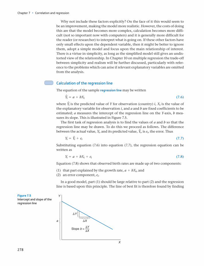
Chapter 7 • Correlation and regression
278
Why not include these factors explicitly? On the face of it this would seem to be an improvement, making the model more realistic. However, the costs of doing this are that the model becomes more complex, calculation becomes more diffi-cult (not so important now with computers) and it is generally more difficult for the reader (or researcher) to interpret what is going on. If these other factors have only small effects upon the dependent variable, then it might be better to ignore them, adopt a simple model and focus upon the main relationship of interest. There is a virtue in simplicity, as long as the simplified model still gives an undis-torted view of the relationship. In Chapter 10 on multiple regression the trade-off between simplicity and realism will be further discussed, particularly with refer-ence to the problems which can arise if relevant explanatory variables are omitted from the analysis.
Calculation of the regression line
The equation of the sample regression line may be written
Yni = a + bXi (7.6)
where Yni is the predicted value of Y for observation (country) i, Xi is the value of the explanatory variable for observation i, and a and b are fixed coefficients to be estimated; a measures the intercept of the regression line on the Y-axis, b mea-sures its slope. This is illustrated in Figure 7.5.
The first task of regression analysis is to find the values of a and b so that the regression line may be drawn. To do this we proceed as follows. The difference between the actual value, Yi, and its predicted value, Yni, is ei, the error. Thus
Yi = Yni + ei (7.7)
Substituting equation (7.6) into equation (7.7), the regression equation can be written as
Yi = a + bXi + ei (7.8)
Equation (7.8) shows that observed birth rates are made up of two components:
(1) that part explained by the growth rate, a + bXi, and(2) an error component, ei.
In a good model, part (1) should be large relative to part (2) and the regression line is based upon this principle. The line of best fit is therefore found by finding
DY
DX
DYDX
Slope b =
a
Y
X
Figure 7.5Intercept and slope of the regression line
Regression analysis
279
the values of a and b which minimise the sum of squared errors (ge2i ) from the regres-
sion line. For this reason, this method is known as ‘the method of least squares’ or simply ‘ordinary least squares’ (OLS). The use of this criterion will be justified later on, but it can be said in passing that the sum of the errors is not minimised because that would not lead to a unique answer for the values a and b. In fact, there is an infinite number of possible lines through the data which all yield a sum of errors equal to zero. Minimising the sum of squared errors does yield a unique answer.
The task is therefore to
minimise ge2i (7.9)
by choice of a and b.Rearranging equation (7.8), the error is given by
ei = Yi - a - bXi (7.10)
so equation (7.9) becomes
minimise g(Yi - a - bXi)2 (7.11)
by choice of a and b.Finding the solution to (7.11) requires the use of differential calculus, and is not
presented here. The resulting formulae for a and b are
b =naXY - aXaY
naX2 - 1aX22 (7.12)
and
a = Y - bX (7.13)
where X and Y are the mean values of X and Y, respectively. The values neces-sary to evaluate equations (7.12) and(7.13) can be obtained from Table 7.2 which was used to calculate the correlation coefficient. These values are repeated for convenience:
gY = 380 gY 2 = 12 564 gX = 40.2 gX2 = 184.04
gXY = 1139.70 n = 12
Using these values, we obtain
b =12 * 1139.70 - 40.2 * 380
12 * 184.04 - 40.22 = -2.700
and
a =38012
- (-2.700) *40.212
= 40.711
Thus the regression equation can be written, to two decimal places for clarity, as
Yi = 40.71 - 2.70Xi + ei
Interpretation of the slope and intercept
The most important part of the result is the slope coefficient b = -0.27 since it measures the effect of X upon Y. This result implies that a unit increase in the
Chapter 7 • Correlation and regression
280
growth rate (e.g. from 2% to 3% p.a.) would lower the birth rate by 2.7, e.g. from 30 births per 1000 population to 27.3. Given that the growth data refer to a 20-year period (1961–81), this increase in the growth rate might need to be sustained over such a time, not an easy task. It is unlikely that an increase in the growth rate in one year would have such an immediate effect on the birth rate. How big is the effect upon the birth rate? The average birth rate in the sample is 31.67, so a reduc-tion of 2.7 for an average country would be a fall of 8.5% (2.7>31.67 * 100). This is reasonably substantial (though not enough to bring the birth rate down to developed country levels) but would need a considerable, sustained increase in the growth rate to bring it about.
The value of a, the intercept, may be interpreted as the predicted birth rate of a country with zero growth (since Yni = a at X = 0). This value of 40.71 is fairly close to that of Senegal, which actually had negative growth over the period and whose birth rate was 48, a little higher than the intercept value. Although a has a sensible interpretation in this case, this is not always so. For example, in a regression of the demand for a good on its price, a would represent demand at zero price, which is unlikely ever to be observed.
(a) Calculate the regression line relating the birth rate to the income ratio.
(b) Interpret the coefficients of this equation.?
Exercise 7.4
Measuring the goodness of fit of the regression line
Having calculated the regression line, we now ask whether it provides a good fit for the data, i.e. do the observations tend to lie close to, or far away from, the line? Even though we have fitted a regression line, by itself this tells us nothing about the closeness of the fit. If the fit is poor, perhaps the effect of X upon Y is not so strong after all. Note that even if X has no true effect upon Y, we can still calculate a regression line and its slope coefficient b. Although b is likely to be small, it is unlikely to be exactly zero. Measuring the goodness of fit of the data to the line helps us to distinguish between good and bad regressions.
We proceed by comparing the three competing models explaining the birth rate. Which of them fits the data best? Using the income ratio and the GNP vari-able gives the following regressions (calculations not shown) to compare with our original model:
for the income ratio (IR): B = 26.44 + 1.045 * IR + efor GNP: B = 34.72 - 0.003 * GNP + efor growth: B = 40.71 - 2.70 * GROWTH + e
How can we decide which of these three is ‘best’ on the basis of the regression equations alone? From Figure 7.1 it is evident that some relationships appear stronger than others, yet this is not revealed by examining the regression equa-tion alone. More information is needed. (You cannot choose the best equation simply by looking at the size of the coefficients. Consider why that is so.)
The goodness of fit is calculated by comparing two lines: the regression line and the ‘mean line’ (i.e. a horizontal line drawn at the mean value of Y). The regression line must fit the data better (if the mean line were the best fit, that is
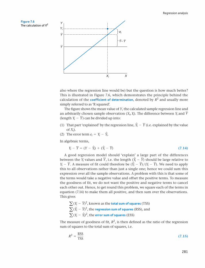
Regression analysis
281
also where the regression line would be) but the question is how much better? This is illustrated in Figure 7.6, which demonstrates the principle behind the calculation of the coefficient of determination, denoted by R2 and usually more simply referred to as ‘R squared’.
The figure shows the mean value of Y, the calculated sample regression line and an arbitrarily chosen sample observation (Xi, Yi). The difference between Yi and Y (length Yi - Y) can be divided up into:
(1) That part ‘explained’ by the regression line, Yni - Y (i.e. explained by the value of Xi).
(2) The error term ei = Yi - Yni.
In algebraic terms,
Yi - Y = (Y - Yni) + (Yni - Y) (7.14)
A good regression model should ‘explain’ a large part of the differences between the Yi values and Y , i.e. the length (Yni - Y) should be large relative to Yi - Y . A measure of fit could therefore be (Yni - Y)>(Yi - Y). We need to apply this to all observations rather than just a single one; hence we could sum this expression over all the sample observations. A problem with this is that some of the terms would take a negative value and offset the positive terms. To measure the goodness of fit, we do not want the positive and negative terms to cancel each other out. Hence, to get round this problem, we square each of the terms in equation (7.14) to make them all positive, and then sum over the observations. This gives
a (Yi - Y)2, known as the total sum of squares (TSS)
a (Yni - Y)2, the regression sum of squares (RSS), and
a (Yi - Yni)2, the error sum of squares (ESS)
The measure of goodness of fit, R2, is then defined as the ratio of the regression sum of squares to the total sum of squares, i.e.
R2 =RSSTSS
(7.15)
Y
ei
Yi
Xi X
Ŷ
Y
Ŷ– Y
Figure 7.6The calculation of R2
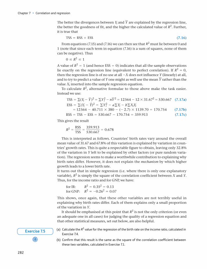
Chapter 7 • Correlation and regression
282
The better the divergences between Yi and Y are explained by the regression line, the better the goodness of fit, and the higher the calculated value of R2. Further, it is true that
TSS = RSS + ESS (7.16)
From equations (7.15) and (7.16) we can then see that R2 must lie between 0 and 1 (note that since each term in equation (7.16) is a sum of squares, none of them can be negative). Thus
0 … R2 … 1
A value of R2 = 1 (and hence ESS = 0) indicates that all the sample observations lie exactly on the regression line (equivalent to perfect correlation). If R2 = 0, then the regression line is of no use at all -X does not influence Y (linearly) at all, and to try to predict a value of Y one might as well use the mean Y rather than the value Xi inserted into the sample regression equation.
To calculate R2, alternative formulae to those above make the task easier. Instead we use:
TSS = g(Yi - Y )2 = gY 2i - nY 2 = 12 564 - 12 * 31.672 = 530.667 (7.17a)
ESS = g(Yi - Yn)2 = gY 2i - agYi - bgXiYi
= 12 564 - 40.711 * 380 - (- 2.7) * 1139.70 = 170.754 (7.17b) RSS = TSS - ESS = 530.667 - 170.754 = 359.913 (7.17c)
This gives the result
R2 =RSSTSS
=359.913530.667
= 0.678
This is interpreted as follows. Countries’ birth rates vary around the overall mean value of 31.67 and 67.8% of this variation is explained by variation in coun-tries’ growth rates. This is quite a respectable figure to obtain, leaving only 32.8% of the variation in Y left to be explained by other factors (or pure random varia-tion). The regression seems to make a worthwhile contribution to explaining why birth rates differ. However, it does not explain the mechanism by which higher growth leads to a lower birth rate.It turns out that in simple regression (i.e. where there is only one explanatory variable), R2 is simply the square of the correlation coefficient between X and Y. Thus, for the income ratio and for GNP, we have:
for IR: R2 = 0.352 = 0.13 for GNP: R2 = -0.262 = 0.07
This shows, once again, that these other variables are not terribly useful in explaining why birth rates differ. Each of them explains only a small proportion of the variation in Y.
It should be emphasised at this point that R2 is not the only criterion (or even an adequate one in all cases) for judging the quality of a regression equation and that other statistical measures, set out below, are also helpful.
(a) Calculate the R2 value for the regression of the birth rate on the income ratio, calculated in Exercise 7.4.
(b) Confirm that this result is the same as the square of the correlation coefficient between these two variables, calculated in Exercise 7.1.
?
Exercise 7.5
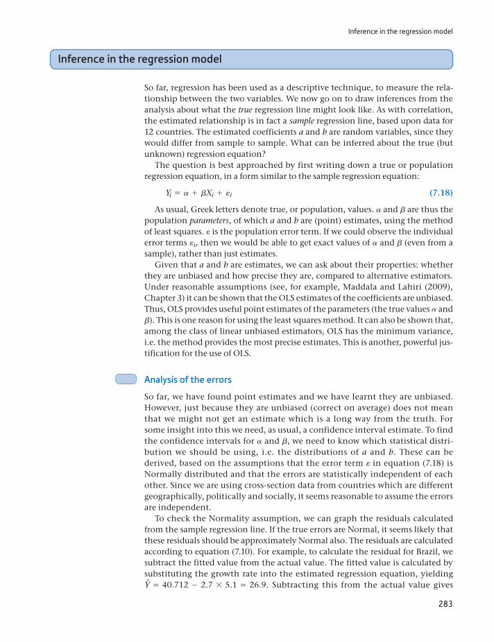
Inference in the regression model
283
Inference in the regression model
So far, regression has been used as a descriptive technique, to measure the rela-tionship between the two variables. We now go on to draw inferences from the analysis about what the true regression line might look like. As with correlation, the estimated relationship is in fact a sample regression line, based upon data for 12 countries. The estimated coefficients a and b are random variables, since they would differ from sample to sample. What can be inferred about the true (but unknown) regression equation?
The question is best approached by first writing down a true or population regression equation, in a form similar to the sample regression equation:
Yi = a + bXi + ei (7.18)
As usual, Greek letters denote true, or population, values. a and b are thus the population parameters, of which a and b are (point) estimates, using the method of least squares. e is the population error term. If we could observe the individual error terms ei, then we would be able to get exact values of a and b (even from a sample), rather than just estimates.
Given that a and b are estimates, we can ask about their properties: whether they are unbiased and how precise they are, compared to alternative estimators. Under reasonable assumptions (see, for example, Maddala and Lahiri (2009), Chapter 3) it can be shown that the OLS estimates of the coefficients are unbiased. Thus, OLS provides useful point estimates of the parameters (the true values a and b). This is one reason for using the least squares method. It can also be shown that, among the class of linear unbiased estimators, OLS has the minimum variance, i.e. the method provides the most precise estimates. This is another, powerful jus-tification for the use of OLS.
Analysis of the errors
So far, we have found point estimates and we have learnt they are unbiased. However, just because they are unbiased (correct on average) does not mean that we might not get an estimate which is a long way from the truth. For some insight into this we need, as usual, a confidence interval estimate. To find the confidence intervals for a and b, we need to know which statistical distri-bution we should be using, i.e. the distributions of a and b. These can be derived, based on the assumptions that the error term e in equation (7.18) is Normally distributed and that the errors are statistically independent of each other. Since we are using cross-section data from countries which are different geographically, politically and socially, it seems reasonable to assume the errors are independent.
To check the Normality assumption, we can graph the residuals calculated from the sample regression line. If the true errors are Normal, it seems likely that these residuals should be approximately Normal also. The residuals are calculated according to equation (7.10). For example, to calculate the residual for Brazil, we subtract the fitted value from the actual value. The fitted value is calculated by substituting the growth rate into the estimated regression equation, yielding Yn = 40.712 - 2.7 * 5.1 = 26.9. Subtracting this from the actual value gives
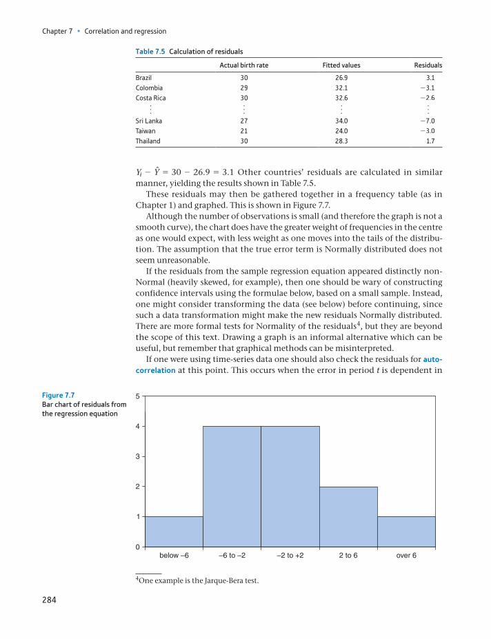
Chapter 7 • Correlation and regression
284
Yi - Yn = 30 - 26.9 = 3.1 Other countries’ residuals are calculated in similar manner, yielding the results shown in Table 7.5.
These residuals may then be gathered together in a frequency table (as in Chapter 1) and graphed. This is shown in Figure 7.7.
Although the number of observations is small (and therefore the graph is not a smooth curve), the chart does have the greater weight of frequencies in the centre as one would expect, with less weight as one moves into the tails of the distribu-tion. The assumption that the true error term is Normally distributed does not seem unreasonable.
If the residuals from the sample regression equation appeared distinctly non-Normal (heavily skewed, for example), then one should be wary of constructing confidence intervals using the formulae below, based on a small sample. Instead, one might consider transforming the data (see below) before continuing, since such a data transformation might make the new residuals Normally distributed. There are more formal tests for Normality of the residuals4, but they are beyond the scope of this text. Drawing a graph is an informal alternative which can be useful, but remember that graphical methods can be misinterpreted.
If one were using time-series data one should also check the residuals for auto-correlation at this point. This occurs when the error in period t is dependent in
Table 7.5 Calculation of residuals
Actual birth rate Fitted values Residuals
Brazil 30 26.9 3.1Colombia 29 32.1 -3.1Costa Rica 30 32.6 -2.6
f f f fSri Lanka 27 34.0 -7.0Taiwan 21 24.0 -3.0Thailand 30 28.3 1.7
5
4
3
2
1
0below –6 –6 to –2 2 to 6 over 6–2 to +2
Figure 7.7Bar chart of residuals from the regression equation
4One example is the Jarque-Bera test.
Inference in the regression model
285
some way on the error in the previous period(s) and implies that the method of least squares may not be the best way of estimating the relationship. In this exam-ple we have cross-section data, so it is not appropriate to check for autocorrela-tion, since the ordering of the data does not matter. The next chapter, on multiple regression, covers this topic.
Confidence interval estimates of a and b
Having checked that the residuals appear reasonably Normal, we can proceed with inference. This means finding interval estimates of the parameters a and b and, later on, conducting hypothesis tests. As usual, the 95% confidence interval is obtained by adding and subtracting approximately two standard errors from the point estimate. We therefore need to calculate the standard errors of a and of b and we also need to look up tables to find the precise number of standard errors to add and subtract. The principle is just the same as for the confidence interval esti-mate of the sample mean, covered in Chapter 4.
The estimated sampling variance of b, the slope coefficient, is given by
s2b =
s2e
a (Xi - X)2 (7.19)
where
s2e = a e2
i
n - 2=
ESSn - 2
(7.20)
is the estimated variance of the error term, e.The sampling variance of b measures the uncertainty associated with the esti-
mate. Note that the uncertainty is greater (i) the larger the error variance s2e (i.e.
the more scattered are the points around the regression line) and (ii) the lower the dispersion of the X observations. When X does not vary much (less spread out along the x-axis) it is then more difficult to measure the effect of changes in X upon Y, and this is reflected in the formula.
First we need to calculate s2e . The value of this is
s2e =
170.75410
= 17.0754 (7.21)
and so the estimated variance of b is
s2b =
17.075449.37
= 0.346 (7.22)
(Use a (Xi - X)2 = aX2i - nX2 in calculating (7.22) – it makes the calculation
easier.) The estimated standard error of b is the square root of (7.22),
sb = 10.346 = 0.588 (7.23)
To construct the confidence interval around the point estimate, b = -2.7, the t distribution is used (in regression this applies to all sample sizes, not just small ones). The 95% confidence interval is thus given by
b tnsb (7.24)
Chapter 7 • Correlation and regression
286
where tn is the (two-tail) critical value of the t distribution at the appropriate sig-nificance level (5% in this case), with n = n - 2 degrees of freedom. The critical value is 2.228. Thus the confidence interval evaluates to:
-2.7 2.228 * 0.588 = [-4.01, -1.39]
Thus we can be 95% confident that the true value of b lies within this range. Note that the interval only includes negative values: we can rule out an upward-sloping regression line.
For the intercept a, the estimate of the variance is given by
s2a = s2
e * a1n
+X2
a (Xi - X)2 b = 17.0754 * a 112
+3.352
49.37b = 5.304 (7.25)
and the estimated standard error of a is the square root of this, 2.303. The 95% confidence interval for a, again using the t distribution, is
40.71 2.228 * 2.303 = [35.57, 45.84]
The results so far can be summarised as follows:
Yi = 40.711 - 2.70Xi + eis.e. (2.30) (0.59)R2 = 0.678 n = 12
This conveys, at a glance, all the necessary information to the reader, who can then draw the inferences deemed appropriate. Any desired confidence interval (not just the 95% one) can be quickly calculated with the aid of a set of t tables.
Testing hypotheses about the coefficients
As well as calculating confidence intervals, one can use hypothesis tests as the basis for statistical inference in the regression model. These tests are quickly and easily explained given the information already assembled. Consider the following hypothesis:
H0: b = 0H1: b ≠ 0
This null hypothesis is interesting because it implies no influence of X upon Y at all (i.e. the slope of the true regression line is flat and Yi can be equally well predicted by Y). The alternative hypothesis asserts that X does in fact influence Y.
The procedure is in principle the same as in Chapter 5 on hypothesis testing. We measure how many standard errors separate the observed value of b from the hypothesised value. If this is greater than an appropriate critical value, we reject the null hypothesis. The test statistic is calculated using the formula:
t =b - b
sb=
- 2.7 - 00.588
= -4.59 (7.26)
Thus the sample slope coefficient b differs by 4.59 standard errors from its hypoth-esised value b = 0. This is compared to the critical value of the t distribution, using n - 2 degrees of freedom. Since t 6 - t*
10(= -2.228), in this case, the null hypothesis is rejected with 95% confidence. X does have some influence on Y. Similar tests using the income ratio and GDP to attempt to explain the birth rate
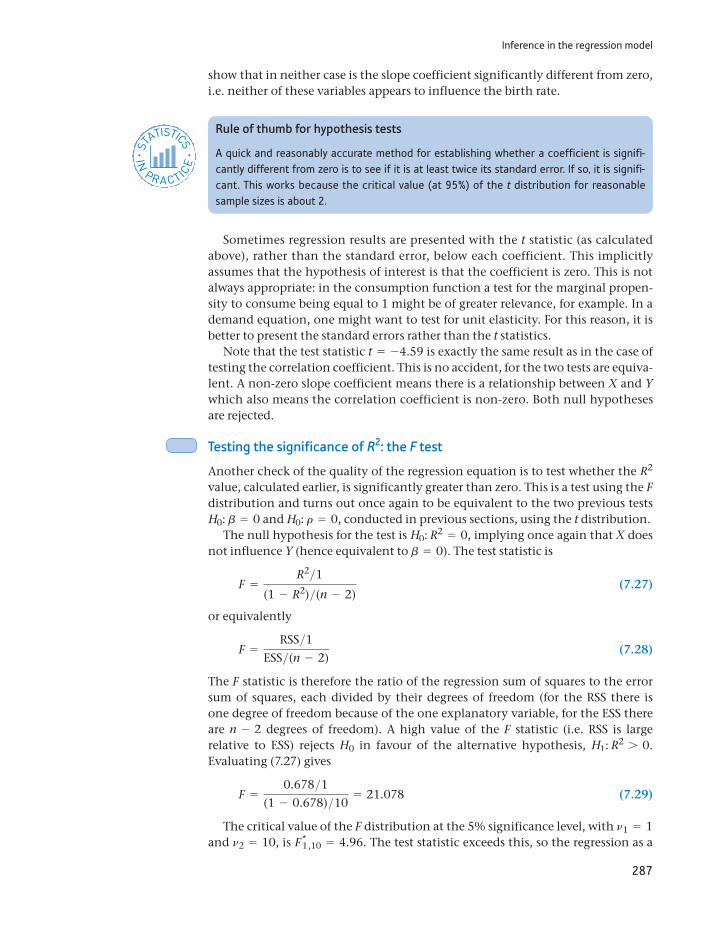
Inference in the regression model
287
show that in neither case is the slope coefficient significantly different from zero, i.e. neither of these variables appears to influence the birth rate.
Rule of thumb for hypothesis tests
A quick and reasonably accurate method for establishing whether a coefficient is signifi-cantly different from zero is to see if it is at least twice its standard error. If so, it is signifi-cant. This works because the critical value (at 95%) of the t distribution for reasonable sample sizes is about 2.
STATISTICS
IN
PRACTICE
· ·
Sometimes regression results are presented with the t statistic (as calculated above), rather than the standard error, below each coefficient. This implicitly assumes that the hypothesis of interest is that the coefficient is zero. This is not always appropriate: in the consumption function a test for the marginal propen-sity to consume being equal to 1 might be of greater relevance, for example. In a demand equation, one might want to test for unit elasticity. For this reason, it is better to present the standard errors rather than the t statistics.
Note that the test statistic t = -4.59 is exactly the same result as in the case of testing the correlation coefficient. This is no accident, for the two tests are equiva-lent. A non-zero slope coefficient means there is a relationship between X and Y which also means the correlation coefficient is non-zero. Both null hypotheses are rejected.
Testing the significance of R2: the F test
Another check of the quality of the regression equation is to test whether the R2 value, calculated earlier, is significantly greater than zero. This is a test using the F distribution and turns out once again to be equivalent to the two previous tests H0: b = 0 and H0: r = 0, conducted in previous sections, using the t distribution.
The null hypothesis for the test is H0: R2 = 0, implying once again that X does not influence Y (hence equivalent to b = 0). The test statistic is
F =R2>1
(1 - R2)>(n - 2) (7.27)
or equivalently
F =RSS>1
ESS>(n - 2) (7.28)
The F statistic is therefore the ratio of the regression sum of squares to the error sum of squares, each divided by their degrees of freedom (for the RSS there is one degree of freedom because of the one explanatory variable, for the ESS there are n - 2 degrees of freedom). A high value of the F statistic (i.e. RSS is large relative to ESS) rejects H0 in favour of the alternative hypothesis, H1: R2 7 0. Evaluating (7.27) gives
F =0.678>1
(1 - 0.678)>10= 21.078 (7.29)
The critical value of the F distribution at the 5% significance level, with n1 = 1 and n2 = 10, is F*
1 ,10 = 4.96. The test statistic exceeds this, so the regression as a
Chapter 7 • Correlation and regression
288
whole is significant. It is better to use the regression model to explain the birth rate than to use the simpler model which assumes all countries have the same birth rate (the sample average).
As stated before, this test is equivalent to those carried out before using the t distribution. The F statistic is, in fact, the square of the t statistic calculated earlier (-4.592 = 21.078) and reflects the fact that, in general,
F1, n - 2 = t2n - 2
The Prob-value associated with both statistics is the same (approximately 0.001 in this case), so both tests reject the null at the same level of significance. However, in multiple regression with more than one explanatory variable, the relationship no longer holds and the tests do fulfil different roles, as we shall see in the next chapter.
(a) For the regression of the birth rate on the income ratio, calculate the standard errors of the coefficients and hence construct 95% confidence intervals for both.
(b) Test the hypothesis that the slope coefficient is zero against the alternative that it is not zero.
(c) Test the hypothesis H0: R2 = 0.
?
Exercise 7.6
Interpreting computer output
Having shown how to use the appropriate formulae to derive estimates of the parameters, their standard errors and to test hypotheses, we now present all these results as they would be generated by a computer software package, in this case Excel. This removes all the effort of calculation and allows us to concentrate on more important issues such as the interpretation of the results. Table 7.6 shows the computer output.
The table presents all the results we have already derived, plus a few more.
The regression coefficients, standard errors and t ratios are given at the bottom of the table, suitably labelled. The column headed ‘P-value’ gives some addi-tional information – it shows the significance level of the t statistic. For exam-ple, the slope coefficient is significant at the level of 0.1%5, i.e. there is this probability of getting such a sample estimate by chance. This is much less than our usual 5% criterion, so we conclude that the sample evidence did not arise by chance.
The program helpfully calculates the 95% confidence interval for the coeffi-cients also, which were derived above in equation (7.24).
Moving up the table, there is a section headed ‘ANOVA’. This is similar to the ANOVA covered in Chapter 6. This table provides the sums of squares values (RSS, ESS and TSS, in that order) and their associated degrees of freedom in the ‘df’ column. The ‘MS’ (‘mean square’) column calculates the sums of squares each divided by their degrees of freedom, whose ratio gives the F statistic in the next column. This is the value calculated in equation (7.29). The ‘Significance F’ value is similar to the P-value discussed previously: it shows the level at which the F statistic is significant (0.1% in this case) and saves us looking up the F tables.
5This is the area in both tails, so it is for a two-tail test.
Inference in the regression model
289
At the top of the table is given the R2 value and the standard error of the error term, se, labelled ‘Standard Error’, which we have already come across. ‘Multi-ple R’ is simply the square root of R2; ‘Adjusted R2’ (sometimes called ‘R-bar squared’ and written R2) adjusts the R2 value for the degrees of freedom. This is an alternative measure of fit, which is not affected by the number of explana-tory variables, unlike R2. See Maddala and Lahiri (2009, Chapter 4) for a more detailed explanation.
Prediction
Earlier we showed that the regression line could be used for prediction, using the figures for Costa Rica. The point estimate of Costa Rica’s birth rate is calculated simply by putting its growth rate into the regression equation and assuming a zero value for the error, i.e.
Yn = a + bX + 0 = 40.711 - 2.7 * 3 + 0 = 32.6
This is a point estimate, which is unbiased, around which we can build a confi-dence interval. There are, in fact, two confidence intervals we can construct, the first for the position of the regression line at X = 3, the second for an individual observation (on Y) at X = 3. Using the 95% confidence level, the first interval is given by the formula
Yn tn - 2 * seB1n
+(XP - X)2
a (X - X)2 (7.30)
where XP is the value of X for which the prediction is made. tn - 2 denotes the criti-cal value of the t distribution at the 5% significance level (for a two-tail test) with n - 2 degrees of freedom. This evaluates to
32.6 2.228 * 4.132B 112
+(3 - 3.35)2
49.37= [29.90, 35.30]
Table 7.6 Regression output from Excel
Chapter 7 • Correlation and regression
290
This means that we predict with 95% confidence that the average birth rate of all countries growing at 3% p.a. is between 29.9 and 35.3.
The second type of interval, for the value of Y itself at XP = 3, is somewhat wider, because there is an additional element of uncertainty: individual countries do not lie on the regression line, but around it. This is referred to as the 95% pre-diction interval. The formula for this interval is
Yn tn - 2 * se B1 +1n
+(XP - X)2
a (X - X)2 (7.31)
Note the extra ‘1’ inside the square root sign. When evaluated, this gives a 95% prediction interval of [23.01, 42.19]. Thus we are 95% confident that an individ-ual country growing at 3% p.a. will have a birth rate within this range.
The two intervals are illustrated in Figure 7.8. The smaller confidence inter-val is shown in a darker shade, with the wider prediction interval being about twice as big. Note from the formulae that the prediction is more precise (the interval is smaller):
the closer the sample observations lie to the regression line (smaller se), the greater the spread of sample X values (larger g(X - X)2), the larger the sample size (larger n), the closer to the mean of X the prediction is made (smaller XP - X).
This last characteristic is evident in the diagram, where the intervals are narrower towards the centre of the diagram.
There is an additional danger of predicting far outside the range of sample X values, if the true regression line is not linear as we have assumed. The linear sam-ple regression line might be close to the true line within the range of sample X values but diverge substantially outside. Figure 7.9 illustrates this point.
In the birth rate sample, we have a fairly wide range of X values; few countries grow more slowly than Senegal or faster than Korea.
Growth rate
Prediction interval
Birth rate
Confidence interval
50
40
30
20
10
0 1 2 3 4 5 6 7
Figure 7.8Confidence and prediction intervals
Use Excel’s regression tool (or other software) to confirm your answers to Exercises 7.4 to 7.6.
Exercise 7.7
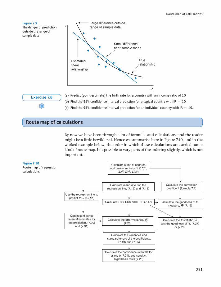
Route map of calculations
291
Route map of calculations
By now we have been through a lot of formulae and calculations, and the reader might be a little bewildered. Hence we summarise here in Figure 7.10, and in the worked example below, the order in which these calculations are carried out, a kind of route map. It is possible to vary parts of the ordering slightly, which is not important.
Figure 7.9The danger of prediction outside the range of sample data
(a) Predict (point estimate) the birth rate for a country with an income ratio of 10.
(b) Find the 95% confidence interval prediction for a typical country with IR = 10.
(c) Find the 95% confidence interval prediction for an individual country with IR = 10.?
Exercise 7.8
Calculate sums of squaresand cross-products (SX, SY,
SX2, SY2, SXY)
Calculate a and b to find theregression line, (7.12) and (7.13)
Calculate the correlationcoefficent (formula 7.1)
Calculate TSS, ESS and RSS (7.17) Calculate the goodness of fitmeasure, R2 (7.15)
Calculate the error variance, se2
(7.20)Calculate the F statistic, to
test the goodness of fit, (7.27)or (7.28)
Calculate the variances andstandard errors of the coefficients,
(7.19) and (7.25)
Calculate the confidence intervals fora and b (7.24), and conduct
hypothesis tests (7.26)
Use the regression line topredict Y (= a + bX)
Obtain confidenceinterval estimates forthe prediction, (7.30)
and (7.31)
Figure 7.10Route map of regression calculations
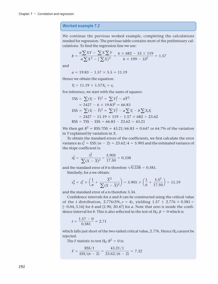
Chapter 7 • Correlation and regression
292
Worked example 7.2
We continue the previous worked example, completing the calculations needed for regression. The previous table contains most of the preliminary cal-culations. To find the regression line we use:
b =naXY - aXaY
naX2 - 1aX22 =6 * 682 - 33 * 119
6 * 199 - 332 = 1.57
and
a = 19.83 - 1.57 * 5.5 = 11.19
Hence we obtain the equation:
Yi = 11.19 + 1.57Xi + ei
For inference, we start with the sums of squares:
TSS = a (Yi - Y)2 = aY 2i - nY 2
= 2427 - 6 * 19.832 = 66.83
ESS = a (Yi - Yn)2 = aY 2i - aaYi - baXiYi
= 2427 - 11.19 * 119 - 1.57 * 682 = 23.62 RSS = TSS - ESS = 66.83 - 23.62 = 43.21
We then get R2 = RSS>TSS = 43.21>66.83 = 0.647 or 64.7% of the variation in Y explained by variation in X.
To obtain the standard errors of the coefficients, we first calculate the error variance as s2
e = ESS>(n - 2) = 23.62>4 = 5.905 and the estimated variance of the slope coefficient is:
s2b =
s2e
a (X - X)2 =5.90517.50
= 0.338
and the standard error of b is therefore 10.338 = 0.581.Similarly, for a we obtain:
s2a = s2
e * a1n
+X2
a (X - X)2 b = 5.905 * a16
+5.52
17.50b = 11.19
and the standard error of a is therefore 3.34.Confidence intervals for a and b can be constructed using the critical value
of the t distribution, 2.776 (5%, n = 4), yielding 1.57 2.776 * 0.581 = [-0.04, 3.16] for b and [1.90, 20.47] for a. Note that zero is inside the confi-dence interval for b. This is also reflected in the test of H0: b = 0 which is
t =1.57 - 0
0.581= 2.71
which falls just short of the two-tailed critical value, 2.776. Hence H0 cannot be rejected.
The F statistic to test H0: R2 = 0 is:
F =RSS>1
ESS>(n - 2)=
43.21>123.62>(6 - 2)
= 7.32
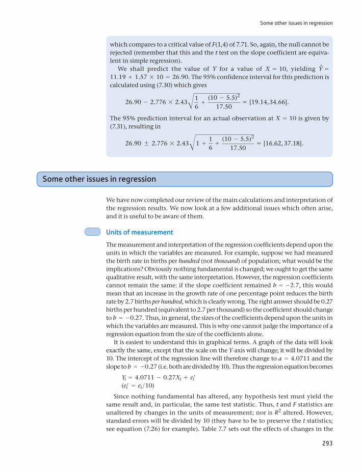
Some other issues in regression
293
Some other issues in regression
We have now completed our review of the main calculations and interpretation of the regression results. We now look at a few additional issues which often arise, and it is useful to be aware of them.
Units of measurement
The measurement and interpretation of the regression coefficients depend upon the units in which the variables are measured. For example, suppose we had measured the birth rate in births per hundred (not thousand) of population; what would be the implications? Obviously nothing fundamental is changed; we ought to get the same qualitative result, with the same interpretation. However, the regression coefficients cannot remain the same: if the slope coefficient remained b = -2.7, this would mean that an increase in the growth rate of one percentage point reduces the birth rate by 2.7 births per hundred, which is clearly wrong. The right answer should be 0.27 births per hundred (equivalent to 2.7 per thousand) so the coefficient should change to b = -0.27. Thus, in general, the sizes of the coefficients depend upon the units in which the variables are measured. This is why one cannot judge the importance of a regression equation from the size of the coefficients alone.
It is easiest to understand this in graphical terms. A graph of the data will look exactly the same, except that the scale on the Y-axis will change; it will be divided by 10. The intercept of the regression line will therefore change to a = 4.0711 and the slope to b = -0.27 (i.e. both are divided by 10). Thus the regression equation becomes
Yi = 4.0711 - 0.27Xi + ei′(ei′ = ei>10)
Since nothing fundamental has altered, any hypothesis test must yield the same result and, in particular, the same test statistic. Thus, t and F statistics are unaltered by changes in the units of measurement; nor is R2 altered. However, standard errors will be divided by 10 (they have to be to preserve the t statistics; see equation (7.26) for example). Table 7.7 sets out the effects of changes in the
which compares to a critical value of F(1,4) of 7.71. So, again, the null cannot be rejected (remember that this and the t test on the slope coefficient are equiva-lent in simple regression).
We shall predict the value of Y for a value of X = 10, yielding Yn = 11.19 + 1.57 * 10 = 26.90. The 95% confidence interval for this prediction is calculated using (7.30) which gives
26.90 - 2.776 * 2.43B16
+(10 - 5.5)2
17.50= [19.14, 34.66].
The 95% prediction interval for an actual observation at X = 10 is given by (7.31), resulting in
26.90 2.776 * 2.43B1 +16
+(10 - 5.5)2
17.50= [16.62, 37.18].
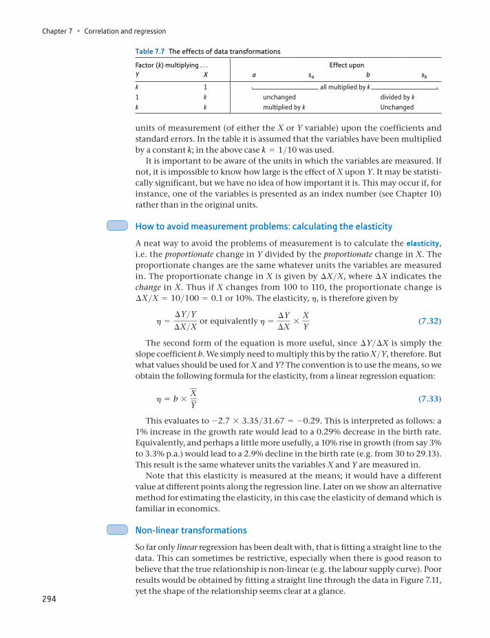
Chapter 7 • Correlation and regression
294
units of measurement (of either the X or Y variable) upon the coefficients and standard errors. In the table it is assumed that the variables have been multiplied by a constant k; in the above case k = 1>10 was used.
It is important to be aware of the units in which the variables are measured. If not, it is impossible to know how large is the effect of X upon Y. It may be statisti-cally significant, but we have no idea of how important it is. This may occur if, for instance, one of the variables is presented as an index number (see Chapter 10) rather than in the original units.
How to avoid measurement problems: calculating the elasticity
A neat way to avoid the problems of measurement is to calculate the elasticity, i.e. the proportionate change in Y divided by the proportionate change in X. The proportionate changes are the same whatever units the variables are measured in. The proportionate change in X is given by ∆X>X, where ∆X indicates the change in X. Thus if X changes from 100 to 110, the proportionate change is ∆X>X = 10>100 = 0.1 or 10%. The elasticity, h, is therefore given by
h =∆Y>Y∆X>X or equivalently h =
∆Y∆X
*XY
(7.32)
The second form of the equation is more useful, since ∆Y>∆X is simply the slope coefficient b. We simply need to multiply this by the ratio X>Y, therefore. But what values should be used for X and Y? The convention is to use the means, so we obtain the following formula for the elasticity, from a linear regression equation:
h = b *XY
(7.33)
This evaluates to -2.7 * 3.35>31.67 = -0.29. This is interpreted as follows: a 1% increase in the growth rate would lead to a 0.29% decrease in the birth rate. Equivalently, and perhaps a little more usefully, a 10% rise in growth (from say 3% to 3.3% p.a.) would lead to a 2.9% decline in the birth rate (e.g. from 30 to 29.13). This result is the same whatever units the variables X and Y are measured in.
Note that this elasticity is measured at the means; it would have a different value at different points along the regression line. Later on we show an alternative method for estimating the elasticity, in this case the elasticity of demand which is familiar in economics.
Non-linear transformations
So far only linear regression has been dealt with, that is fitting a straight line to the data. This can sometimes be restrictive, especially when there is good reason to believe that the true relationship is non-linear (e.g. the labour supply curve). Poor results would be obtained by fitting a straight line through the data in Figure 7.11, yet the shape of the relationship seems clear at a glance.
Table 7.7 The effects of data transformations
Factor (k) multiplying . . . Effect uponY X a sa b sb
k 1 all multiplied by k 1 k unchanged divided by kk k multiplied by k Unchanged
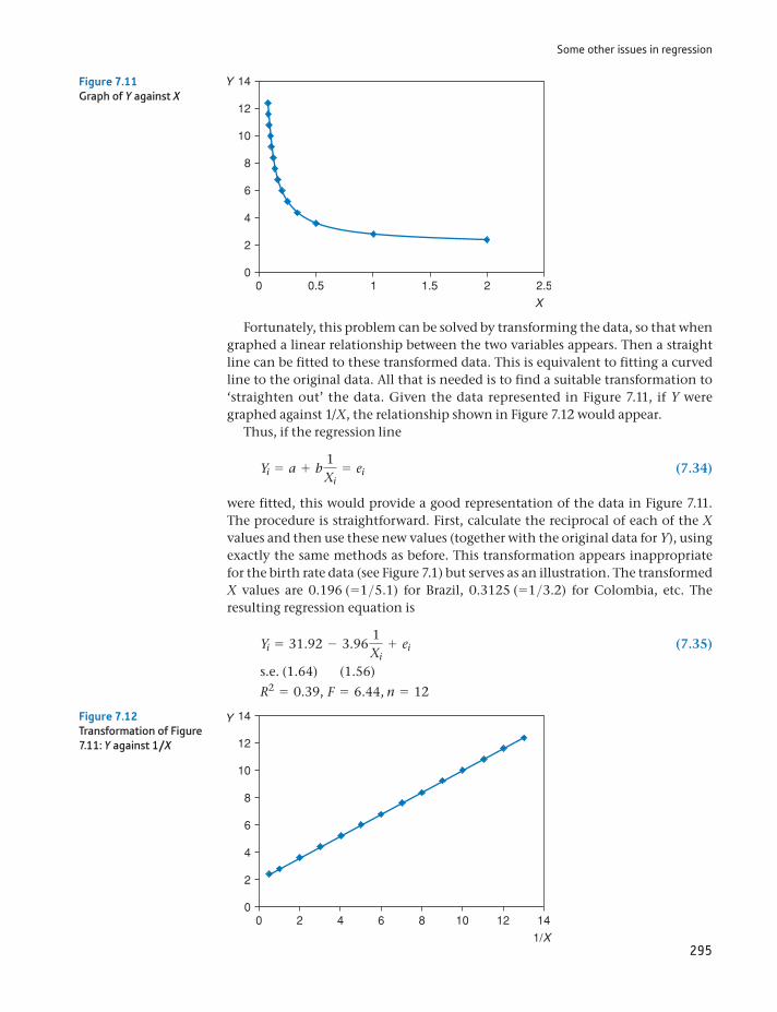
Some other issues in regression
295
Fortunately, this problem can be solved by transforming the data, so that when graphed a linear relationship between the two variables appears. Then a straight line can be fitted to these transformed data. This is equivalent to fitting a curved line to the original data. All that is needed is to find a suitable transformation to ‘straighten out’ the data. Given the data represented in Figure 7.11, if Y were graphed against 1/X, the relationship shown in Figure 7.12 would appear.
Thus, if the regression line
Yi = a + b 1Xi
= ei (7.34)
were fitted, this would provide a good representation of the data in Figure 7.11. The procedure is straightforward. First, calculate the reciprocal of each of the X values and then use these new values (together with the original data for Y), using exactly the same methods as before. This transformation appears inappropriate for the birth rate data (see Figure 7.1) but serves as an illustration. The transformed X values are 0.196 (=1>5.1) for Brazil, 0.3125 (=1>3.2) for Colombia, etc. The resulting regression equation is
Yi = 31.92 - 3.96 1Xi
+ ei (7.35)
s.e. (1.64) (1.56)
R2 = 0.39, F = 6.44, n = 12
Figure 7.11Graph of Y against X
Figure 7.12Transformation of Figure 7.11: Y against 1/X
Chapter 7 • Correlation and regression
296
This appears worse than the original specification (the R2 is low and the slope coefficient is not significantly different from zero), so the transformation does not appear to be a good one. Note also that it is difficult to calculate the effect of X upon Y in this equation. We can see that a unit increase in 1/X reduces the birth rate by 3.96, but we do not have an intuitive feel for the inverse of the growth rate. This latest result also implies that a fall in the growth rate (hence, 1/X rises) lowers the birth rate – the converse of our previous result. In the next chapter, we deal with a different example where a non-linear transformation does improve matters.
Table 7.8 presents a number of possible shapes for data, with suggested data transformations which will allow the relationship to be estimated using linear regression. In each case, once the data have been transformed, the methods and formulae used above can be applied.
It is sometimes difficult to know which transformation (if any) to apply. A graph of the data is unlikely to be as tidy as the diagrams in Table 7.8. Economic theory rarely suggests the form which a relationship should follow, and there are no simple statistical tests for choosing alternative formulations. The choice can sometimes be made after visual inspection of the data, or on the basis of conve-nience. The double log transformation is often used in economics as it has some very convenient properties. Unfortunately, it cannot be used with the growth rate data here because Senegal’s growth rate was negative. It is impossible to take the logarithm of a negative number. We therefore postpone the use of the log trans-formation in regression until the next chapter.
Table 7.8 Data transformations
Name Graph of relationship Original relationship Transformed relationship Regression
Double log
X
Y
b < 0b > 10 < b > 1
Y = aXbe ln Y - ln a + b ln X + ln e ln Y on ln X
Reciprocal
X
Y
a b < 0b > 0
Y = a + b>X + eY = a + b
1X
+ e Y on 1X
Semi-log eY = aXbe Y = ln a + b ln X + ln e Y on ln X
Exponential
b > 0b < 0
Y = ea + bX + e ln Y = a + bX + e ln Y on X
Gapminder again
297
Gapminder again
It is instructive to return to Gapminder again (encountered in Chapter 1) to see what it can reveal with similar data but using more countries, in this case 92. This is a mixture of developing (mainly) and developed countries. First, we note that (as is often the case) it is difficult to replicate our earlier relationship between the birth rate and growth because (i) Gapminder has birth rate data for 1983, not 1981, and (ii) Gapminder only has ‘Growth over the next 10 years’ readily pre-pared for graphing, i.e. we would have to use the birth rate in 1983 and the growth rate over 1983 to 1993. Fortunately, one can download the underlying data and do the analysis6. This reveals a regression equation:
BR = 41.8 - 4.08 growth rate + errors.e. (2.03) (0.66)R2 = 0.30, F1,90 = 38.4, n = 92.
The slope coefficient uncovered earlier, using just 12 countries, was -2.70 (s.e. 0.59). Thus, the larger sample has found a much steeper relationship between the variables. The Gapminder data are slightly different (even for the same countries) from Todaro’s, so we can also use the Gapminder data for the original 12 countries, revealing a slope coefficient of -3.24 (s.e. 0.38) which is not so different from Todaro.
It is easier to examine the birth rate/income relationship, since Gapminder can readily do this. It gives the following graph.
6Gapminder only produces graphs, it does not perform regression analysis. For this, you need to download the data and do it yourself.
Source: From www.gap-minder.org, Visualization from Gapminder World, pow-ered by Trendalyzer from www.gapminder.org.
Chapter 7 • Correlation and regression
298
Note that Gapminder, by default, uses the log of income, rather than income itself. This makes it a little difficult to compare with Figure 7.1(b), showing Todaro’s data, which used income. Is it better to use income or log income? From looking at the Gapminder data there appears to be a curvilinear relationship between the birth rate and income, and a linear regression would not fit well. Also, income is highly skewed with some very high values (e.g. Kuwait) which will tend to have a large influ-ence on the regression line’s position. Taking the log of income addresses this issue. The birth rate data are not so skewed so there is less need to transform them.
Comparing regression results, we have:
Income coefficient (s.e.) R2 N
Todaro -0.003 (0.003) 0.07 12Gapminder -0.0006 (0.0001) 0.26 155Gapminder (log income) -7.81 (0.56) 0.56 155
The results using log income appear best, with the highest R2 value (note the dependent variable is the same in all cases) and with a significant slope coefficient. The only tricky part is interpreting the coefficient – what does it mean? This is a use-ful exercise to work through. The initial interpretation is that a unit increase in log income leads to a 7.81 fall in the birth rate. But what is a unit increase in the (natu-ral) log? The answer is that it corresponds to a 172% increase in income (because ln(2.72) = 1). This is not the easiest of results to digest. Easier would be to ask, what is the effect of doubling a country’s income? In this case, ln(2) = 0.69, and this would be the increase in the log. This would imply a 0.69 * 7.81 = 5.4 fall in the birth rate. Thus, a doubling of a country’s income reduces the birth rate by about five births per 1000 population (approximately a 15% reduction at the mean).
(a) Calculate the elasticity of the birth rate with respect to the income ratio, using the results of previous exercises.
(b) Give a brief interpretation of the meaning of this figure.?
Exercise 7.9
Calculate a regression relating the birth rate to the inverse of the income ratio 1/IR.
?
Exercise 7.10
Summary
Correlation refers to the extent of association between two variables. The (sam-ple) correlation coefficient is a measure of this association, extending from r = -1 to r = +1.
Positive correlation (r 7 0) exists when high values of X tend to be associated with high values of Y and low X values with low Y values.
Negative correlation (r 6 0) exists when high values of X tend to be associated with low values of Y and vice versa.
Values of r around 0 indicate an absence of correlation.
As the sample correlation coefficient is a random variable, we can test for its significance, i.e. test whether the true value is zero or not. This test is based upon the t distribution.
References
299
The existence of correlation (even if ‘significant’) does not necessarily imply causality. There can be other reasons for the observed association.
Regression analysis extends correlation by asserting a causality from X to Y and then measuring the relationship between the variables via the regression line, the ‘line of best fit’.
The regression line Y = a + bX is defined by the intercept a and slope coeffi-cient b. Their values are found by minimising the sum of squared errors around the regression line.
The slope coefficient b measures the responsiveness of Y to changes in X.
A measure of how well the regression line fits the data is given by the coeffi-cient of determination, R2, varying between 0 (very poor fit) and 1 (perfect fit).
The coefficients a and b are unbiased point estimates of the true values of the parameters. Confidence interval estimates can be obtained, based on the t dis-tribution. Hypothesis tests on the parameters can also be carried out using the t distribution.
A test of the hypothesis R2 = 0 (implying the regression is no better at predicting Y than simply using the mean of Y) can be carried out using the F distribution.
The regression line may be used to predict Y for any value of X by assuming the residual to be zero for that observation.
The measured response of Y to X (given by b) depends upon the units of mea-surement of X and Y. A better measure is often the elasticity, which is the pro-portionate response of Y to a proportionate change in X.
Data are often transformed prior to regression (e.g. by taking logs) for a variety of reasons (e.g. to fit a curve to the original data).
autocorrelationcoefficient of determination (R2)correlation coefficientdependent (endogenous) variableelasticityerror sum of squareserror term (or residual)estimated variance of the error termexplained (endogenous) variableexplanatory variableindependent (exogenous) variableinterceptnegative correlationnon-parametric statistics
Pearson’s product-moment correlation coefficient
positive correlationpredictionprediction intervalrank correlation coefficientregression line or equationregression sum of squaresslopeSpearman’s coefficient of rank correlationstandard errort distributiontotal sum of squareszero correlation
Key terms and concepts
Maddala, G.S., and K. Lahiri, Introduction to Econometrics, 4th edn, Wiley, 2009.Todaro, M.P., Economic Development in the Third World, 3rd edn, Longman, 1985.
References

Chapter 7 • Correlation and regression
300
Formula Description Notes
r =na XY - a Xa Y21na X2 - 1a X2221na Y2 - 1a Y222
Correlation coefficient -1 … r … 1
t =r1n - 221 - r2
Test statistic for H0: r = 0 n = n - 2
rs = 1 -6a d2
n(n2 - 1)
Spearman’s rank correlation coefficient
-1 … rs … 1. d is the difference in ranks between the two variables. Only works if there are no tied ranks. Otherwise use stan-dard correlation formula.
b =na XY - a Xa Y
na X2 - 1a X22
Slope of the regression line (simple regression)
a = Y - bX Intercept (simple regression)
TSS = a Y2 - nY2 Total sum of squares
ESS = a Y2 - aa Y - ba XY Error sum of squares
RSS = TSS - ESS Regression sum of squares
R2 =RSSTSS
Coefficient of determination
s2e =
ESSn - 2
Variance of the error term in regression
Replace n - 2 by n - k - 1 in multiple regression
s2b =
s2e
a (X - X)2
Variance of the slope coefficient in simple regression
s2a = s2
e = B1n
+X2
a (X - X)2
Variance of the intercept in simple regression
b tn * sb Confidence interval estimate for b in simple regression
tv is the critical value of the t distribution with n = n - 2 degrees of freedom
t =b - b
sb
Test statistic for H0: b = 0 n = n - 2 in simple regression, n - k - 1 in multiple regression
F =RSS>1
ESS>(n - 2)Test statistic for H0: R2 = 0 n = k, n - k - 1 in multiple regression
Yn tn * se B1n
+(XP - X)2
a (X - X)2
Confidence interval for a predic-tion (simple regression) at X = XP
n = n - 2
Yn tn * se B1 +1n
+(XP - X)2
a (X - X)2
Confidence interval for an observation on Y at X = XP
n = n - 2
Formulae used in this chapter
Problems
301
Some of the more challenging problems are indicated by highlighting the problem number in colour.
7.1 The other data which Todaro might have used to analyse the birth rate were:
Country Birth rate GNP Growth Income ratio
Bangladesh 47 140 0.3 2.3Tanzania 47 280 1.9 3.2Sierra Leone 46 320 0.4 3.3Sudan 47 380 -1.3 3.9Kenya 55 420 2.9 6.8Indonesia 35 530 4.1 3.4Panama 30 1910 3.1 8.6Chile 25 2560 0.7 3.8Venezuela 35 4220 2.4 5.2Turkey 33 1540 3.5 4.9Malaysia 31 1840 4.3 5.0Nepal 44 150 0.0 4.7Malawi 56 200 2.7 2.4Argentina 20 2560 1.9 3.6
For one of the three possible explanatory variables (in class, different groups could examine each of the variables):
(a) Draw an XY chart of the data above and comment upon the result.
(b) Would you expect a line of best fit to have a positive or negative slope? Roughly, what would you expect the slope to be?
(c) What would you expect the correlation coefficient to be?
(d) Calculate the correlation coefficient, and comment.
(e) Test to see if the correlation coefficient is different from zero. Use the 95% confidence level.
(Analysis of this problem continues in Problem 7.5.)
7.2 The data below show alcohol expenditure and income (both in £s per week) for a sample of 17 families.
Family Alcohol expenditure Income Family Alcohol expenditure Income
1 26.17 487 10 13.32 3702 19.49 574 11 9.24 2993 17.87 439 12 47.35 5314 16.90 367 13 26.80 5065 4.21 299 14 33.44 6136 32.08 743 15 21.41 4727 30.19 433 16 16.06 2538 22.62 547 17 24.98 374
Problems
Chapter 7 • Correlation and regression
302
(a) Draw an XY plot of the data and comment.
(b) From the chart, would you expect the line of best fit to slope up or down? In theory, which way should it slope?
(c) What would you expect the correlation coefficient to be, approximately?
(d) Calculate the correlation coefficient between alcohol spending and income.
(e) Is the coefficient significantly different from zero? What is the implication of the result?
(The following totals will reduce the burden of calculation: gY = 137.990; gX = 7610; gY2 = 9 918.455; g X2 = 3 680 748; gXY = 181 911.250; Y is consumption, X is income. If you wish, you could calculate a logarithmic correlation. The relevant totals are: gy = 50.192; gx = 103.079; gy2 = 153.567; gx2 = 626.414; gxy = 306.339, where y = ln Y and x = ln X.)
(Analysis of this problem continues in Problem 7.6.)
7.3 What would you expect to be the correlation coefficient between the following variables? Should the variables be measured contemporaneously or might there be a lag in the effect of one upon the other?
(a) Nominal consumption and nominal income.
(b) GDP and the imports/GDP ratio.
(c) Investment and the interest rate.
7.4 As Problem 7.3, for
(a) real consumption and real income;
(b) individuals’ alcohol and cigarette consumption;
(c) UK and US interest rates.
7.5 Using the data from Problem 7.1, calculate the rank correlation coefficient between the variables and test its significance. How does it compare with the ordinary correlation coefficient?
7.6 (a) Calculate the rank correlation coefficient between income and quantity for the data in Problem 7.2. How does it compare to the ordinary correlation coefficient?
(b) Is there significant evidence that the ranks are correlated?
7.7 (a) For the data in Problem 7.1, find the estimated regression line and calculate the R2 statistic. Comment upon the result. How does it compare with Todaro’s findings?
(b) Calculate the standard error of the estimate and the standard errors of the coefficients. Is the slope coefficient significantly different from zero? Comment upon the result.
(c) Test the overall significance of the regression equation and comment.
(d) Taking your own results and Todaro’s, how confident do you feel that you understand the deter-minants of the birth rate?
(e) What do you think will be the result of estimating your equation using all 26 countries’ data? Try it. What do you conclude?
7.8 (a) For the data given in Problem 7.2, estimate the sample regression line and calculate the R2 sta-tistic. Comment upon the results.
(b) Calculate the standard error of the estimate and the standard errors of the coefficients. Is the slope coefficient significantly different from zero?
(c) Test the overall significance of the regression and comment upon your result.

Problems
303
7.9 From your results for the birth rate model, predict the birth rate for a country with either (a) GNP equal to $3000, (b) a growth rate of 3% p.a., or (c) an income ratio of 7. How does your prediction compare with one using Todaro’s results? Comment.
7.10 Predict alcohol consumption given an income of £700. Use the 99% confidence level for the interval estimate.
7.11 (Project) Update Todaro’s study using more recent data.
7.12 Try to build a model of the determinants of infant mortality. You should use cross-section data for 20 countries or more and should include both developing and developed countries in the sample.
Write up your findings in a report which includes the following sections: discussion of the prob-lem; data gathering and transformations; estimation of the model; interpretation of results. Useful data may be found in the Human Development Report (use Google to find it online) or on the World Bank website.
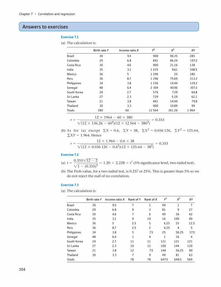
Chapter 7 • Correlation and regression
304
Answers to exercises
Exercise 7.1
(a) The calculation is:
Birth rate Y Income ratio X Y2 X2 XY
Brazil 30 9.5 900 90.25 285Colombia 29 6.8 841 46.24 197.2Costa Rica 30 4.6 900 21.16 138India 35 3.1 1 225 9.61 108.5Mexico 36 5 1 296 25 180Peru 36 8.7 1 296 75.69 313.2Philippines 34 3.8 1 156 14.44 129.2Senegal 48 6.4 2 304 40.96 307.2South Korea 24 2.7 576 7.29 64.8Sri Lanka 27 2.3 729 5.29 62.1Taiwan 21 3.8 441 14.44 79.8Thailand 30 3.3 900 10.89 99Totals 380 60 12 564 361.26 1 964
r =12 * 1964 - 60 * 3802(12 * 136.26 - 602)(12 * 12 564 - 3802)
= 0.355
(b) As for (a) except gX = 0.6, gY = 38, gX2 = 0.036 126, gY 2 = 125.64, gXY = 1.964. Hence
r =12 * 1.964 - 0.6 * 382(12 * 0.036 126 - 0.62)(12 * 125.64 - 382)
= 0.355
Exercise 7.2
(a) t =0.355112 - 221 - (0.355)2
= 1.20 6 2.228 = t* (5% significance level, two-tailed test).
(b) The Prob-value, for a two-tailed test, is 0.257 or 25%. This is greater than 5% so we do not reject the null of no correlation.
Exercise 7.3
(a) The calculation is:
Birth rate Y Income ratio X Rank of Y Rank of X Y2 X2 XY
Brazil 30 9.5 7 1 49 1 7Colombia 29 6.8 9 3 81 9 27Costa Rica 30 4.6 7 6 49 36 42India 35 3.1 4 10 16 100 40Mexico 36 5 2.5 5 6.25 25 12.5Peru 36 8.7 2.5 2 6.25 4 5Philippines 34 3.8 5 7.5 25 56.25 37.5Senegal 48 6.4 1 4 1 16 4South Korea 24 2.7 11 11 121 121 121Sri Lanka 27 2.3 10 12 100 144 120Taiwan 21 3.8 12 7.5 144 56.25 90Thailand 30 3.3 7 9 49 81 63Totals 78 78 647.5 649.5 569
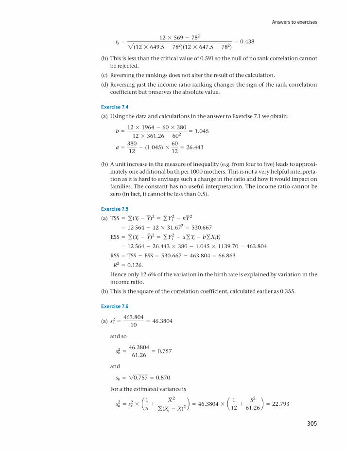
Answers to exercises
305
rs =12 * 569 - 7822(12 * 649.5 - 782)(12 * 647.5 - 782)
= 0.438
(b) This is less than the critical value of 0.591 so the null of no rank correlation cannot be rejected.
(c) Reversing the rankings does not alter the result of the calculation.
(d) Reversing just the income ratio ranking changes the sign of the rank correlation coefficient but preserves the absolute value.
Exercise 7.4
(a) Using the data and calculations in the answer to Exercise 7.1 we obtain:
b =12 * 1964 - 60 * 380
12 * 361.26 - 602 = 1.045
a =38012
- (1.045) *6012
= 26.443
(b) A unit increase in the measure of inequality (e.g. from four to five) leads to approxi-mately one additional birth per 1000 mothers. This is not a very helpful interpreta-tion as it is hard to envisage such a change in the ratio and how it would impact on families. The constant has no useful interpretation. The income ratio cannot be zero (in fact, it cannot be less than 0.5).
Exercise 7.5
(a) TSS = g(Yi - Y)2 = gY 2i - nY 2
= 12 564 - 12 * 31.672 = 530.667
ESS = g(Yi - Yn)2 = gY 2i - agYi - bgXiYi
= 12 564 - 26.443 * 380 - 1.045 * 1139.70 = 463.804
RSS = TSS - ESS = 530.667 - 463.804 = 66.863
R2 = 0.126.
Hence only 12.6% of the variation in the birth rate is explained by variation in the income ratio.
(b) This is the square of the correlation coefficient, calculated earlier as 0.355.
Exercise 7.6
(a) s2e =
463.80410
= 46.3804
and so
s2b =
46.380461.26
= 0.757
and
sb = 10.757 = 0.870
For a the estimated variance is
s2a = s2
e * a1n
+X2
g(Xi - X)2 b = 46.3804 * a 112
+52
61.26b = 22.793
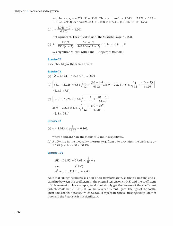
Chapter 7 • Correlation and regression
306
and hence sa = 4.774. The 95% CIs are therefore 1.045 2.228 * 0.87 = [-0.864, 2.983] for b and 26.443 2.228 * 4.774 = [15.806, 37.081] for a
(b) t =1.045 - 0
0.870= 1.201
Not significant. The critical value of the t statistic is again 2.228.
(c) F =RSS>1
ESS>(n - 2)=
66.863>1463.804>(12 - 2)
= 1.44 6 4.96 = F*
(5% significance level, with 1 and 10 degrees of freedom).
Exercise 7.7
Excel should give the same answers.
Exercise 7.8
(a) BR^ = 26.44 + 1.045 * 10 = 36.9.
(b) c36.9 - 2.228 * 6.81B 112
+(10 - 5)2
61.26, 36.9 + 2.228 * 6.81B 1
12+
(10 - 5)2
61.26d
= [26.3, 47.5]
(c) c36.9 - 2.228 * 6.81B1 +1
12+
(10 - 5)2
61.26,
36.9 + 2.228 * 6.81B11
12+
(10 - 5)2
61.26d
= [18.4, 55.4]
Exercise 7.9
(a) e = 1.045 *5
31.67= 0.165,
where 5 and 31.67 are the means of X and Y, respectively.
(b) A 10% rise in the inequality measure (e.g. from 4 to 4.4) raises the birth rate by 1.65% (e.g. from 30 to 30.49).
Exercise 7.10
BR = 38.82 - 29.61 *1IR
+ e
s.e. (19.0)
R2 = 0.19, F(1.10) = 2.43.
Note that taking the inverse is a non-linear transformation, so there is no simple rela-tionship between the coefficient in the original regression (1.045) and the coefficient of this regression. For example, we do not simply get the inverse of the coefficient (which would be 1>1.045 = 0.957) but a very different figure. The sign of the coeffi-cient does change however, which we would expect. In general, this regression is rather poor and the F statistic is not significant.

307
Learning outcomes 307Introduction 308Principles of multiple regression 309What determines imports into the United Kingdom? 310
Theoretical issues 310Data 311Data transformations 311Estimation 316The significance of the regression as a whole 318Are the results satisfactory? 319Improving the model – using logarithms 320Graphing the regression coefficients 322Comparison of models and predictions 323Testing the accuracy of the forecasts: the Chow test 325Analysis of the errors 327
Finding the right model 330Testing compound hypotheses 332Omitted variable bias 334Dummy variables and trends 335Multicollinearity 337Measurement error 337Some final advice on regression 338
Summary 338Key terms and concepts 339References 339Formulae used in this chapter 340Problems 340Answers to exercises 344
Multiple regression8
By the end of this chapter you should be able to:
understand the extension of simple regression to multiple regression, with more than one explanatory variable
use computer software to calculate a multiple regression equation and interpret its output
recognise the role of (economic) theory in deriving an appropriate regression equation
interpret the effect of each explanatory variable on the dependent variable
understand the statistical significance of the results
judge the adequacy of the model and know how to improve it.
Chapter 8 • Multiple regression
308
Introduction
In the previous chapter we analysed the ‘simple’ regression model with just one explanatory variable. However, simple regression is rather limited, as it assumes that there is only the one explanatory factor affecting the dependent variable, which is unlikely to be true in most situations. Price and income affect demand, for example. Multiple regression, the subject of this chapter, overcomes this prob-lem by allowing several explanatory variables (though still only one dependent variable) in a model. The techniques are an extension of those used in simple, or bivariate, regression. Multivariate regression allows more general and more help-ful models to be estimated, although this does involve new problems as well as advantages.
The regression relationship now becomes
Y = b0 + b1X1 + b2X2 + g + bkXk + e (8.1)
where there are now k explanatory variables. The principles used in multiple regres-sion are basically the same as in the two-variable case: the coefficients b0, . . . , bk are found by minimising the sum of squared errors; a standard error can be calculated for each coefficient; R2, t ratios, etc., can be calculated and hypothesis tests per-formed. However, there are a number of additional issues which arise, and these are dealt with in this chapter.
The formulae for calculating coefficients, standard errors, etc., become very complicated in multiple regression and are time-consuming (and error-prone) when done by hand. For this reason, these calculations are invariably done by computer nowadays. Therefore, the formulae are not given in this text: instead we present the results of computer calculations (which you can replicate) and con-centrate on understanding and interpreting the results. This is as it should be; the calculations themselves are the means to an end, not the end in itself.
Using spreadsheet packages
Standard spreadsheet packages such as Excel can perform multiple regression analysis and are sufficient for most straightforward tasks. A regression equation can be calculated via menus and dialogue boxes and no knowledge of the formulae is required. However, when problems such as autocorrelation (see below) are present, specialised packages such as Stata or EViews are much easier to use and provide more comprehensive results.
ST
ATISTICS
IN
PRACTI
CE
· ·
We also introduce a new example in this chapter, estimating a demand equa-tion for imports into the United Kingdom over the period 1973 to 2005. There are a number of reasons for this switch, for we could have continued with the birth rate example (you are asked to do this in the exercises). First, it allows us to work through a small ‘research project’ from beginning to end, including the gathering of data, data transformations, interpretation of results, etc. Second, the example uses time-series data, and this allows us to bring out some of the particular issues that arise in such cases, in contrast to the cross-section data used in the previous chapter. Time-series data do not generally constitute a random sample of observa-tions such as we have dealt with in the rest of this text. This is because the observa-tions are constrained to follow one another in time rather than being randomly
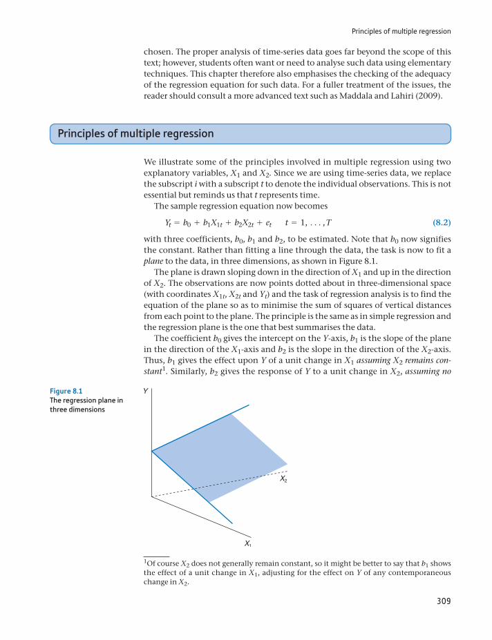
Principles of multiple regression
309
chosen. The proper analysis of time-series data goes far beyond the scope of this text; however, students often want or need to analyse such data using elementary techniques. This chapter therefore also emphasises the checking of the adequacy of the regression equation for such data. For a fuller treatment of the issues, the reader should consult a more advanced text such as Maddala and Lahiri (2009).
Principles of multiple regression
We illustrate some of the principles involved in multiple regression using two explanatory variables, X1 and X2. Since we are using time-series data, we replace the subscript i with a subscript t to denote the individual observations. This is not essential but reminds us that t represents time.
The sample regression equation now becomes
Yt = b0 + b1X1t + b2X2t + et t = 1, c, T (8.2)
with three coefficients, b0, b1 and b2, to be estimated. Note that b0 now signifies the constant. Rather than fitting a line through the data, the task is now to fit a plane to the data, in three dimensions, as shown in Figure 8.1.
The plane is drawn sloping down in the direction of X1 and up in the direction of X2. The observations are now points dotted about in three-dimensional space (with coordinates X1t, X2t and Yt) and the task of regression analysis is to find the equation of the plane so as to minimise the sum of squares of vertical distances from each point to the plane. The principle is the same as in simple regression and the regression plane is the one that best summarises the data.
The coefficient b0 gives the intercept on the Y-axis, b1 is the slope of the plane in the direction of the X1-axis and b2 is the slope in the direction of the X2-axis. Thus, b1 gives the effect upon Y of a unit change in X1 assuming X2 remains con-stant1. Similarly, b2 gives the response of Y to a unit change in X2, assuming no
Figure 8.1The regression plane in three dimensions
1Of course X2 does not generally remain constant, so it might be better to say that b1 shows the effect of a unit change in X1, adjusting for the effect on Y of any contemporaneous change in X2.
Chapter 8 • Multiple regression
310
change in X1. If X1 and X2 both change by 1, then the effect on Y is b1 + b2. Note that b1 and b2 are estimates of the (unknown) true parameters b1 and b2 and so standard errors and confidence intervals can be calculated, implying that we are not absolutely certain about the true position of the plane. In general, the smaller these standard errors, the better, since it implies less uncertainty about the true relationship between Y and the X variables.
When there are more than two explanatory variables, more than three dimen-sions are needed to draw a picture of the data. The reader will understand that this is a difficult (if not impossible) task; however, it is possible to estimate such a model and interpret the results in a similar manner to that set out below, for the two explanatory variable case.
What determines imports into the United Kingdom?
To illustrate multiple regression, we suppose that we have the job of finding out what determines the volume of imports into the United Kingdom and whether there are any policy implications of the result. We are given this very open-ended task, which we have to carry through from start to finish. We end up by estimating a demand equation for imports, so the analysis serves as a model for any demand estimation, for example, a firm trying to find out about the demand for its product.
How should we set about this task? The project can be broken down into the following steps:
(1) Theoretical considerations: what can economic theory tell us about the prob-lem and how will this affect our estimation procedures?
(2) Data gathering: what data do we need? Are there any definitional problems, for example?
(3) Data transformation: are the data suitable for the task? We might want to transform one or more variables before estimation.
(4) Estimation: this is mainly done automatically, by the computer, although sometimes we have to choose the method of estimation.
(5) Interpretation of the results: what do the results tell us? Do they appear satis-factory? Do we need to improve the model? Are there any policy conclusions?
Although this appears reasonably clear-cut, in practice these steps are often mixed up. A researcher might gather the data, estimate a model and then not be happy with the results, realising he has overlooked some factors. He therefore goes back and gets some different data, perhaps some new variables, or maybe tries a different method of investigation until ‘satisfactory’ results are obtained. There is usually some element of data ‘fishing’ involved. These methodological issues are examined in more detail later on.
Theoretical issues
What does economic theory tell us about imports? Like any market, the quantity transacted depends upon supply and demand. Strictly, therefore, we should esti-mate a simultaneous equation model of both the demand and supply equations. Since this is beyond the scope of this text (see Maddala and Lahiri (2009),
What determines imports into the united kingdom?
311
Chapter 9, for analyses of such models) we simplify by assuming that, as the United Kingdom is a small economy in the world market, we can buy any quantity of imports that we demand (at the prevailing price). In other words, foreign sup-ply is never a constraint, and the UK demand never influences the world price. This assumption, which seems reasonable, means that we can concentrate on esti-mating the demand equation alone.
Second, economic theory suggests that demand depends upon income and relative prices, particularly the prices of close substitutes and complements. Furthermore, rational consumers do not suffer from money illusion, so real vari-ables should be used throughout.
Economic theory does not tell us some things, however. It does not tell us whether the relationship is linear or not. Nor does it tell us whether demand responds immediately to price or income changes, or whether there is a lag. For these questions, the data are more likely to give us the answer.
Data
The raw data are presented in Table 8.1, obtained from official UK statistics. Note that there is some slight rounding of the figures: imports are measured to the nearest £0.1bn (£100m) so there is a possible (rounding) error of up to about 0.1%. This is unlikely to substantially affect our estimates.
The variables are defined as follows:
Imports (variable M): imports of goods and services into the United Kingdom, at current prices, in £bn.
Income (GDP): UK gross domestic product at factor cost, at current prices, in £bn.
The GDP deflator (PGDP): an index of the ratio of nominal to real GDP, 1985 = 100. This is an index of general prices and may be used to transform nominal GDP to real GDP.
The price of imports (PM): the unit value index of imports, 1990 = 100. The price of competing products (P): the retail price index (RPI), 1985 = 100.
These variables were chosen from a wide range of possibilities. To take income as an example, we could use personal disposable income or GDP. Since firms as well as consumers import goods, the wider measure is used here. Then there is the question of whether to use GDP or GNP, and whether to measure them at factor cost or market prices. Because there is little difference between these different magnitudes, this is not an important decision in this case. However, in a research project one might have to consider such issues in more detail.
Data transformations
Before calculating the regression equation, we must transform the data in Table 8.1. This is because the expenditures on imports and GDP have not been adjusted for price changes (inflation). Part of the observed increase in the imports series is due to prices increasing over time, not increased consumption of imported goods. It is the latter we are trying to explain.
Since expenditure on any good (including imports) can be expressed as the quantity purchased multiplied by the price, to obtain the quantity of imports
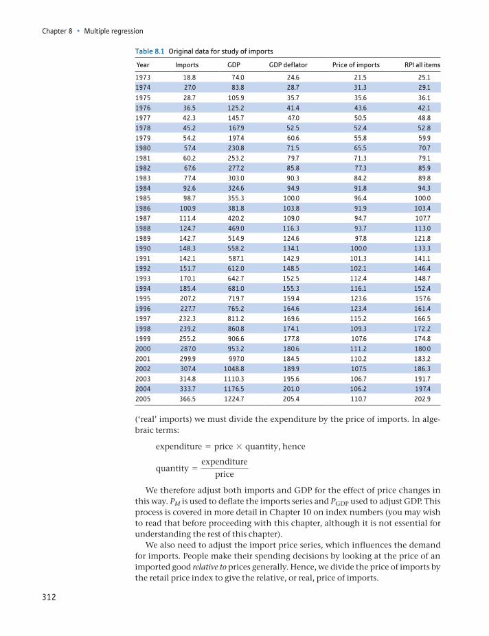
Chapter 8 • Multiple regression
312
(‘real’ imports) we must divide the expenditure by the price of imports. In alge-braic terms:
expenditure = price * quantity, hence
quantity =expenditure
price
We therefore adjust both imports and GDP for the effect of price changes in this way. PM is used to deflate the imports series and PGDP used to adjust GDP. This process is covered in more detail in Chapter 10 on index numbers (you may wish to read that before proceeding with this chapter, although it is not essential for understanding the rest of this chapter).
We also need to adjust the import price series, which influences the demand for imports. People make their spending decisions by looking at the price of an imported good relative to prices generally. Hence, we divide the price of imports by the retail price index to give the relative, or real, price of imports.
Table 8.1 Original data for study of imports
Year Imports GDP GDP deflator Price of imports RPI all items
1973 18.8 74.0 24.6 21.5 25.11974 27.0 83.8 28.7 31.3 29.1
1975 28.7 105.9 35.7 35.6 36.11976 36.5 125.2 41.4 43.6 42.11977 42.3 145.7 47.0 50.5 48.81978 45.2 167.9 52.5 52.4 52.81979 54.2 197.4 60.6 55.8 59.91980 57.4 230.8 71.5 65.5 70.71981 60.2 253.2 79.7 71.3 79.11982 67.6 277.2 85.8 77.3 85.91983 77.4 303.0 90.3 84.2 89.81984 92.6 324.6 94.9 91.8 94.31985 98.7 355.3 100.0 96.4 100.01986 100.9 381.8 103.8 91.9 103.41987 111.4 420.2 109.0 94.7 107.71988 124.7 469.0 116.3 93.7 113.01989 142.7 514.9 124.6 97.8 121.81990 148.3 558.2 134.1 100.0 133.31991 142.1 587.1 142.9 101.3 141.11992 151.7 612.0 148.5 102.1 146.41993 170.1 642.7 152.5 112.4 148.71994 185.4 681.0 155.3 116.1 152.41995 207.2 719.7 159.4 123.6 157.61996 227.7 765.2 164.6 123.4 161.41997 232.3 811.2 169.6 115.2 166.51998 239.2 860.8 174.1 109.3 172.21999 255.2 906.6 177.8 107.6 174.82000 287.0 953.2 180.6 111.2 180.02001 299.9 997.0 184.5 110.2 183.22002 307.4 1048.8 189.9 107.5 186.32003 314.8 1110.3 195.6 106.7 191.72004 333.7 1176.5 201.0 106.2 197.42005 366.5 1224.7 205.4 110.7 202.9
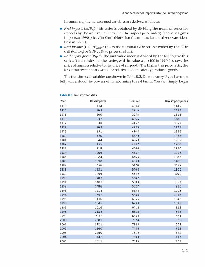
What determines imports into the united kingdom?
313
In summary, the transformed variables are derived as follows:
Real imports (M/PM): this series is obtained by dividing the nominal series for imports by the unit value index (i.e. the import price index). The series gives imports at 1990 prices (in £bn). (Note that the nominal and real series are iden-tical in 1990.)
Real income (GDP/PGDP): this is the nominal GDP series divided by the GDP deflator to give GDP at 1990 prices (in £bn).
Real import prices (PM/P): the unit value index is divided by the RPI to give this series. It is an index number series, with its value set to 100 in 1990. It shows the price of imports relative to the price of all goods. The higher this price ratio, the less attractive imports would be relative to domestically produced goods.
The transformed variables are shown in Table 8.2. Do not worry if you have not fully understood the process of transforming to real terms. You can simply begin
Table 8.2 Transformed data
Year Real imports Real GDP Real import prices
1973 87.4 403.4 114.21974 86.3 391.6 143.4
1975 80.6 397.8 131.51976 83.7 405.5 138.01977 83.8 415.7 137.91978 86.3 428.9 132.31979 97.1 436.8 124.21980 87.6 432.9 123.51981 84.4 426.0 120.21982 87.5 433.2 120.01983 91.9 450.0 125.01984 100.9 458.7 129.81985 102.4 476.5 128.51986 109.8 493.3 118.51987 117.6 517.0 117.21988 133.1 540.8 110.51989 145.9 554.2 107.01990 148.3 558.2 100.01991 140.3 550.9 95.71992 148.6 552.7 93.01993 151.3 565.2 100.81994 159.7 588.0 101.51995 167.6 605.5 104.51996 184.5 623.4 101.91997 201.6 641.4 92.21998 218.8 663.0 84.61999 237.2 683.8 82.12000 258.1 707.8 82.32001 272.1 724.6 80.22002 286.0 740.6 76.92003 295.0 761.2 74.22004 314.2 784.9 71.72005 331.1 799.6 72.7
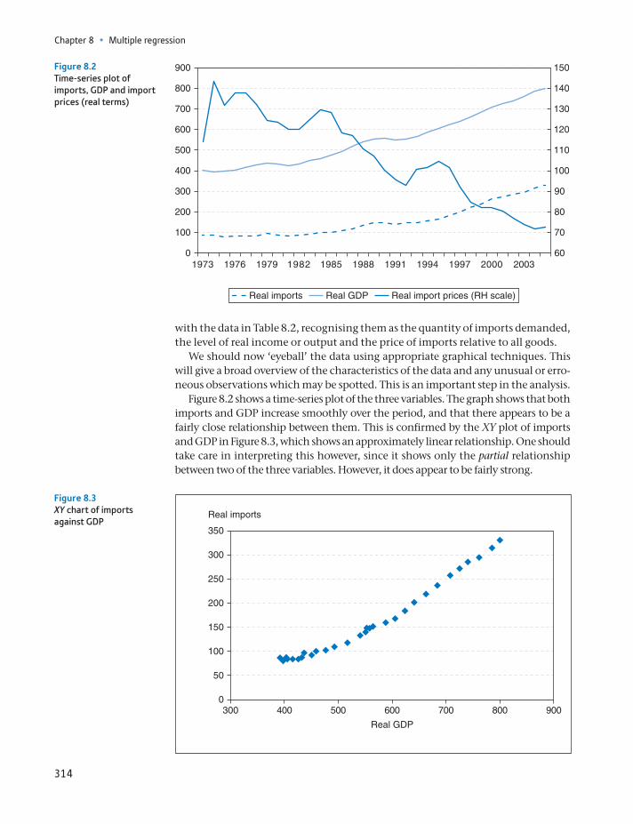
Chapter 8 • Multiple regression
314
with the data in Table 8.2, recognising them as the quantity of imports demanded, the level of real income or output and the price of imports relative to all goods.
We should now ‘eyeball’ the data using appropriate graphical techniques. This will give a broad overview of the characteristics of the data and any unusual or erro-neous observations which may be spotted. This is an important step in the analysis.
Figure 8.2 shows a time-series plot of the three variables. The graph shows that both imports and GDP increase smoothly over the period, and that there appears to be a fairly close relationship between them. This is confirmed by the XY plot of imports and GDP in Figure 8.3, which shows an approximately linear relationship. One should take care in interpreting this however, since it shows only the partial relationship between two of the three variables. However, it does appear to be fairly strong.
Real import prices (RH scale)Real GDPReal imports
19730
100
200
300
400
500
600
700
800
900 150
140
130
120
110
100
90
80
70
601976 1979 1982 1985 1988 1991 1994 1997 2000 2003
Figure 8.2Time-series plot of imports, GDP and import prices (real terms)
50
0
100
150
200
250
300
350
300 400 500 600 700 800 900
Real GDP
Real imports
Figure 8.3XY chart of imports against GDP
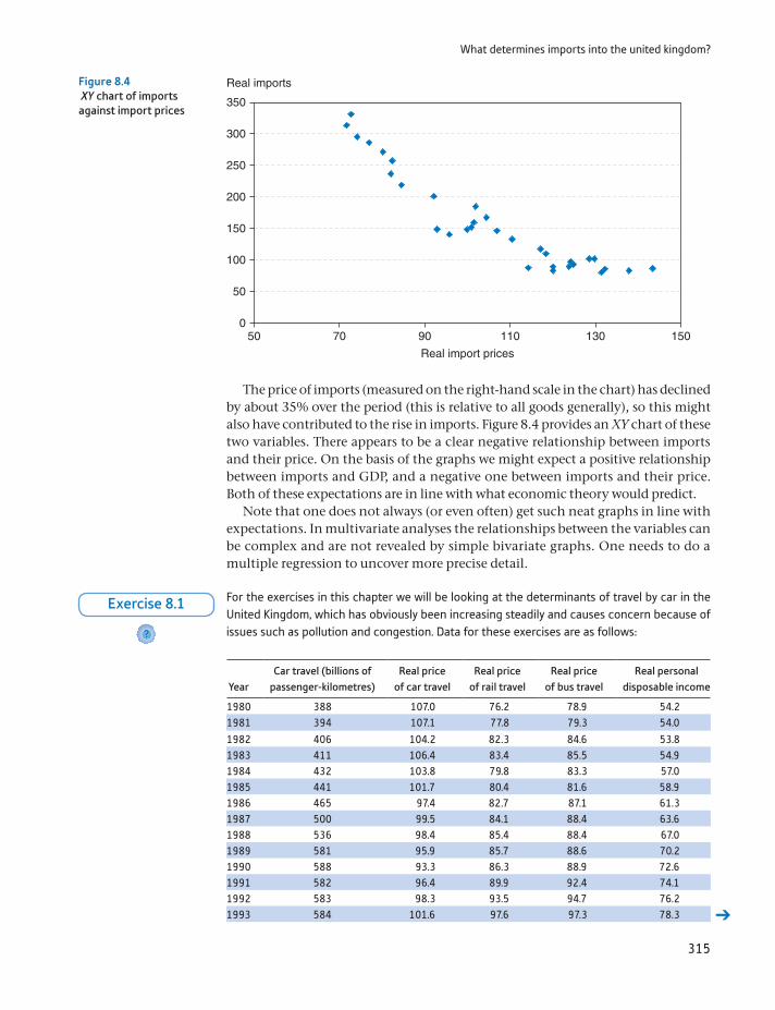
What determines imports into the united kingdom?
315
The price of imports (measured on the right-hand scale in the chart) has declined by about 35% over the period (this is relative to all goods generally), so this might also have contributed to the rise in imports. Figure 8.4 provides an XY chart of these two variables. There appears to be a clear negative relationship between imports and their price. On the basis of the graphs we might expect a positive relationship between imports and GDP, and a negative one between imports and their price. Both of these expectations are in line with what economic theory would predict.
Note that one does not always (or even often) get such neat graphs in line with expectations. In multivariate analyses the relationships between the variables can be complex and are not revealed by simple bivariate graphs. One needs to do a multiple regression to uncover more precise detail.
50
50 70 90 110 130 1500
100
150
200
250
300
350
Real imports
Real import prices
Figure 8.4 XY chart of imports against import prices
For the exercises in this chapter we will be looking at the determinants of travel by car in the United Kingdom, which has obviously been increasing steadily and causes concern because of issues such as pollution and congestion. Data for these exercises are as follows:
YearCar travel (billions of
passenger-kilometres)Real price
of car travelReal price
of rail travelReal price
of bus travelReal personal
disposable income
1980 388 107.0 76.2 78.9 54.21981 394 107.1 77.8 79.3 54.0
1982 406 104.2 82.3 84.6 53.81983 411 106.4 83.4 85.5 54.91984 432 103.8 79.8 83.3 57.01985 441 101.7 80.4 81.6 58.91986 465 97.4 82.7 87.1 61.31987 500 99.5 84.1 88.4 63.61988 536 98.4 85.4 88.4 67.01989 581 95.9 85.7 88.6 70.21990 588 93.3 86.3 88.9 72.61991 582 96.4 89.9 92.4 74.11992 583 98.3 93.5 94.7 76.21993 584 101.6 97.6 97.3 78.3
?
Exercise 8.1
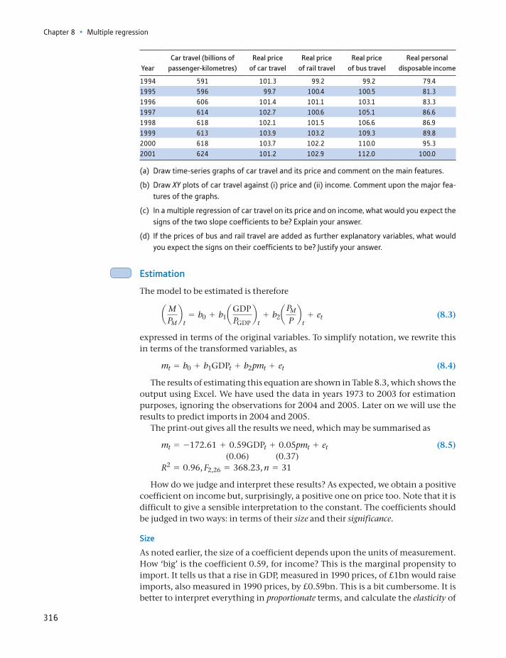
Chapter 8 • Multiple regression
316
YearCar travel (billions of
passenger-kilometres)Real price
of car travelReal price
of rail travelReal price
of bus travelReal personal
disposable income
1994 591 101.3 99.2 99.2 79.41995 596 99.7 100.4 100.5 81.31996 606 101.4 101.1 103.1 83.31997 614 102.7 100.6 105.1 86.61998 618 102.1 101.5 106.6 86.91999 613 103.9 103.2 109.3 89.82000 618 103.7 102.2 110.0 95.32001 624 101.2 102.9 112.0 100.0
(a) Draw time-series graphs of car travel and its price and comment on the main features.
(b) Draw XY plots of car travel against (i) price and (ii) income. Comment upon the major fea-tures of the graphs.
(c) In a multiple regression of car travel on its price and on income, what would you expect the signs of the two slope coefficients to be? Explain your answer.
(d) If the prices of bus and rail travel are added as further explanatory variables, what would you expect the signs on their coefficients to be? Justify your answer.
Estimation
The model to be estimated is therefore
aMPMb
t= b0 + b1aGDP
PGDPb
t+ b2a
PM
Pb
t+ et (8.3)
expressed in terms of the original variables. To simplify notation, we rewrite this in terms of the transformed variables, as
mt = b0 + b1GDPt + b2pmt + et (8.4)
The results of estimating this equation are shown in Table 8.3, which shows the output using Excel. We have used the data in years 1973 to 2003 for estimation purposes, ignoring the observations for 2004 and 2005. Later on we will use the results to predict imports in 2004 and 2005.
The print-out gives all the results we need, which may be summarised as
mt = -172.61 + 0.59GDPt + 0.05pmt + et (8.5) (0.06) (0.37)R2 = 0.96, F2,26 = 368.23, n = 31
How do we judge and interpret these results? As expected, we obtain a positive coefficient on income but, surprisingly, a positive one on price too. Note that it is difficult to give a sensible interpretation to the constant. The coefficients should be judged in two ways: in terms of their size and their significance.
Size
As noted earlier, the size of a coefficient depends upon the units of measurement. How ‘big’ is the coefficient 0.59, for income? This is the marginal propensity to import. It tells us that a rise in GDP, measured in 1990 prices, of £1bn would raise imports, also measured in 1990 prices, by £0.59bn. This is a bit cumbersome. It is better to interpret everything in proportionate terms, and calculate the elasticity of
What determines imports into the united kingdom?
317
imports with respect to income. This is the proportionate change in imports divided by the proportionate change in income:
hGDP =∆m>m
∆GDP>GDP (8.6)
which can be evaluated (see equation (7.33)) as:
hGDP = b1 * GDPm
= 0.59 *536.4146.3
= 2.16 (8.7)
which shows that imports are highly responsive to income. A 3% rise in real GDP (a fairly typical annual figure) leads to an approximate 6% rise in imports, as long as prices do not change at the same time. Thus as income rises, imports rise sub-stantially faster. More generally we would interpret the result as showing that a 1% rise in GDP leads to a 2.16% rise in imports.
This does seem a large response and we might consider whether this estimate could be true in the long run. If GDP rises by 3% p.a. while imports rise by 6% p.a., then this is not sustainable. Imports will grow and grow as a percentage of GDP and, unless exports grow similarly quickly, this is likely to lead to a balance of pay-ments crisis. Hence we might question our statistical finding because it is incon-sistent with long run equilibrium of the economy. We are beginning to see that good modelling should fit with theoretical insights as well as with the data.
A similar calculation for the price variable yields
hpm = 0.05 *109.4146.3
= 0.04 (8.8)
This yields the ‘wrong’ sign for the elasticity: a 10% price rise (relative to domestic prices) would raise import demand by 0.4%. This is an extremely small effect and for practical purposes can be regarded as zero.
Table 8.3 Regression results using Excel
SUMMARY OUTPUT
Regression Statistics
Multiple R 0.98R square 0.96Adjusted R square 0.96Standard error 13.24Observations 31
ANOVA
df SS MS F Significance F
Regression 2 129 031.05 64 515.52 368.23 7.82E–21Residual 28 4 905.70 175.20Total 30 133 936.75
Coefficients Standard Error t Stat P-value Lower 95% Upper 95%
Intercept -172.61 73.33 -2.35 0.03 -322.83 -22.39Real GDP 0.59 0.06 9.12 0.00 0.45 0.72Real import prices 0.05 0.37 0.13 0.90 -0.70 0.79
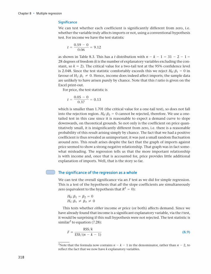
Chapter 8 • Multiple regression
318
Significance
We can test whether each coefficient is significantly different from zero, i.e. whether the variable truly affects imports or not, using a conventional hypothesis test. For income we have the test statistic
t =0.59 - 0
0.06= 9.12
as shown in Table 8.3. This has a t distribution with n - k - 1 = 31 - 2 - 1 = 28 degrees of freedom (k is the number of explanatory variables excluding the con-stant, so k = 2). The critical value for a two-tail test at the 95% confidence level is 2.048. Since the test statistic comfortably exceeds this we reject H0: b1 = 0 in favour of H1: b1 ≠ 0. Hence, income does indeed affect imports; the sample data are unlikely to have arisen purely by chance. Note that this t ratio is given on the Excel print-out.
For price, the test statistic is
t =0.05 - 0
0.37= 0.13
which is smaller than 1.701 (the critical value for a one-tail test), so does not fall into the rejection region. H0: b2 = 0 cannot be rejected, therefore. We use a one-tailed test in this case since it is reasonable to expect a demand curve to slope downwards, on theoretical grounds. So not only is the coefficient on price quan-titatively small, it is insignificantly different from zero, i.e. there is a reasonable probability of this result arising simply by chance. The fact that we had a positive coefficient is thus revealed as unimportant; it was just a small random fluctuation around zero. This result arises despite the fact that the graph of imports against price seemed to show a strong negative relationship. That graph was in fact some-what misleading. The regression tells us that the more important relationship is with income and, once that is accounted for, price provides little additional explanation of imports. Well, that is the story so far.
The significance of the regression as a whole
We can test the overall significance via an F test as we did for simple regression. This is a test of the hypothesis that all the slope coefficients are simultaneously zero (equivalent to the hypothesis that R2 = 0):
H0: b1 = b2 = 0H1: b1 ≠ b2 ≠ 0
This tests whether either income or price (or both) affects demand. Since we have already found that income is a significant explanatory variable, via the t test, it would be surprising if this null hypothesis were not rejected. The test statistic is similar2 to equation (7.28):
F =RSS>k
ESS>(n - k - 1) (8.9)
2Note that the formula now contains n - k - 1 in the denominator, rather than n - 2, to reflect the fact that we now have k explanatory variables.
What determines imports into the united kingdom?
319
which has an F distribution with k and n - k - 1 degrees of freedom. Substituting in the appropriate values gives
F =129 031.05>2
4905.70>(31 - 2 - 1)= 368.23
which is in excess of the critical value for the F2,28 distribution of 3.34 (at 5% significance), so the null hypothesis is rejected, as expected. The actual signifi-cance level is given by Excel as ‘7.82E−21’, i.e. 7.82 * 10 - 21, effectively zero and certainly less than 5%.
Does corruption harm investment?
The World Bank examined this question in its 1997 World Development Report, using regression methods. There is a concern that levels of corruption in many countries harm investment and hence also economic growth.
The study looked at the relationship between investment (measured as a percentage of GDP) and the following variables: the level of corruption, the predictability of corruption, the level of secondary school enrolment, GDP per capita and a measure of ‘policy distor-tion’. Both the level and predictability of corruption were based upon replies to surveys of businesses in the 39 countries studied, which asked questions such as ‘Do you have to make additional payments to get things done?’ The policy distortion variable measures how badly economic policy is run, based on openness to trade, the exchange rate, etc. Higher values of the index indicate poorer economic management.
The regression obtained was
InvGDP
= 19.5 - 5.8 CORR + 6.3 PRED_CORR + 2.0 SCHOOL - 1.1 GDP - 2.0 DISTORT
(s.e.) (13.5) (2.2) (2.6) (2.2) (1.9) (1.5)
R2 = 0.24
Thus only the corruption variables prove significant at the 5% level. A rise in the level of corruption lowers investment (note the negative coefficient, -5.8) as expected, but a rise in the predictability of corruption raises it. This is presumably because people learn how to live with corruption. Unfortunately, units of measurement are not given, so it is impossible to tell just how important are the sizes of the coefficients and, in particular, to find the trade-off between corruption and its predictability.
Adapted from: World Development Report, 1997.
ST
ATISTICS
IN
PRACTI
CE
· ·
(a) Using the data from Exercise 8.1, calculate a regression explaining the level of car travel, using price and income as explanatory variables. Use only the observations from 1980 to 1999. As well as calculating the coefficients you should calculate standard errors and t ratios, R2 and the F statistic.
(b) Interpret the results. You should evaluate the size of the effect of the explanatory variables as well as their significance and evaluate the goodness of fit of the model.
?
Exercise 8.2
Are the results satisfactory?
The results so far appear reasonably satisfactory: we have found one significant coefficient, the R2 value is quite high at 96% (although R2 values tend to be high
Chapter 8 • Multiple regression
320
in time-series regressions, sometimes artificially so) and the result of the F test proves the regression is worthwhile. Nevertheless, it is perhaps surprising to find no effect from the price variable; we might as well drop it from the equation and just regress imports on GDP.
A more stringent test is to use the equation for forecasting, since this uses out-of-sample information for the test. So far, the diagnostic tests such as the F test are based on the same data that were used for estimation. A more suitable test might be to see if the equation can forecast imports to within (say) 4% of the correct value. Since real imports increased by about 4.1% p.a. on average between 1973 and 2003, a simple forecasting rule would be to increase the current year’s figure by 4.1%. The regression model might be compared to this standard.
Forecasts for 2004 and 20053 are obtained by inserting the values of the explan-atory variables for these years into the regression equation, giving
2004: mn = -172.61 + 0.59 * 784.9 + 0.05 * 71.7 = 290.02005: mn = -172.61 + 0.59 * 799.6 + 0.05 * 72.7 = 298.6
Table 8.4 summarises the actual and forecast values, with the error between them. The percentage error is about 8% in 2004, 11% in 2005. This is not very good; both years are under-predicted by a large amount. The simple growth rule would have given predictions of 295.0 * 1.04 = 306.8 and 295.0 * 1.042 = 319.1 which are much closer. More work needs to be done.
Improving the model – using logarithms
There are various ways in which we might improve our model. We might try to find additional variables to improve the fit (although since we already have R2 = 0.96, this might be difficult), or we might try lagged variables (e.g. the previ-ous year’s price) as explanatory variables, on the grounds that the effects do not work through instantaneously. Alternatively, we might try a different functional form for the equation. We have presumed that the regression should be a straight line, although we made no justification for this. Indeed, the graph of imports against income showed some degree of curvature (see Figure 8.3). Hence, we might try a non-linear transformation of the data, as briefly discussed at the end of Chapter 7.
We shall re-estimate the regression equation, having transformed all the data using (natural) logarithms. Remember (from Chapter 1) that logarithms are useful for representing multiplicative processes, such as we have here (where one year’s figure tends to be a multiple of the previous year’s). Not only does this method fit a curve to the data but has the additional advantage of giving more direct esti-mates of the elasticities, as we shall see. Because of such advantages, estimating a
3Remember that data from 2004 and 2005 were not used to estimate the regression equation.
Table 8.4 Actual, forecast and error values
Year Actual Forecast Error
2004 314.2 290.0 24.22005 331.1 298.6 32.5
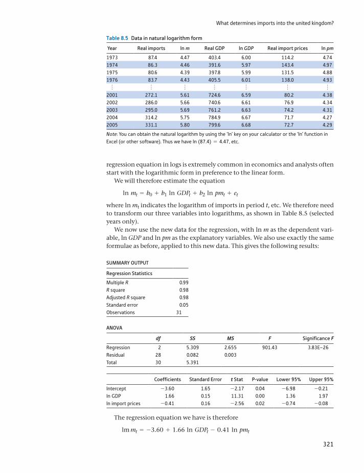
What determines imports into the united kingdom?
321
regression equation in logs is extremely common in economics and analysts often start with the logarithmic form in preference to the linear form.
We will therefore estimate the equation
ln mt = b0 + b1 ln GDPt + b2 ln pmt + et
where ln mt indicates the logarithm of imports in period t, etc. We therefore need to transform our three variables into logarithms, as shown in Table 8.5 (selected years only).
We now use the new data for the regression, with ln m as the dependent vari-able, ln GDP and ln pm as the explanatory variables. We also use exactly the same formulae as before, applied to this new data. This gives the following results:
SUMMARY OUTPUT
Regression Statistics
Multiple R 0.99R square 0.98Adjusted R square 0.98Standard error 0.05Observations 31
ANOVA
df SS MS F Significance F
Regression 2 5.309 2.655 901.43 3.83E–26Residual 28 0.082 0.003Total 30 5.391
Coefficients Standard Error t Stat P-value Lower 95% Upper 95%
Intercept -3.60 1.65 -2.17 0.04 -6.98 -0.21In GDP 1.66 0.15 11.31 0.00 1.36 1.97ln import prices -0.41 0.16 -2.56 0.02 -0.74 -0.08
The regression equation we have is therefore
lm mt = -3.60 + 1.66 ln GDPt - 0.41 ln pmt
Table 8.5 Data in natural logarithm form
Year Real imports ln m Real GDP ln GDP Real import prices ln pm
1973 87.4 4.47 403.4 6.00 114.2 4.741974 86.3 4.46 391.6 5.97 143.4 4.971975 80.6 4.39 397.8 5.99 131.5 4.881976 83.7 4.43 405.5 6.01 138.0 4.93
o o o o o o o2001 272.1 5.61 724.6 6.59 80.2 4.382002 286.0 5.66 740.6 6.61 76.9 4.342003 295.0 5.69 761.2 6.63 74.2 4.312004 314.2 5.75 784.9 6.67 71.7 4.272005 331.1 5.80 799.6 6.68 72.7 4.29
Note: You can obtain the natural logarithm by using the ‘ln’ key on your calculator or the ‘ln’ function in Excel (or other software). Thus we have ln (87.4) = 4.47, etc.
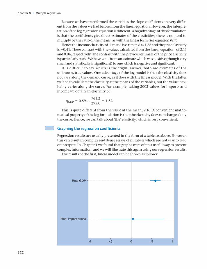
Chapter 8 • Multiple regression
322
Because we have transformed the variables the slope coefficients are very differ-ent from the values we had before, from the linear equation. However, the interpre-tation of the log regression equation is different. A big advantage of this formulation is that the coefficients give direct estimates of the elasticities; there is no need to multiply by the ratio of the means, as with the linear form (see equation (8.7).
Hence the income elasticity of demand is estimated as 1.66 and the price elasticity is -0.41. These contrast with the values calculated from the linear equation, of 2.16 and 0.04, respectively. The contrast with the previous estimate of the price elasticity is particularly stark. We have gone from an estimate which was positive (though very small and statistically insignificant) to one which is negative and significant.
It is difficult to say which is the ‘right’ answer, both are estimates of the unknown, true values. One advantage of the log model is that the elasticity does not vary along the demand curve, as it does with the linear model. With the latter we had to calculate the elasticity at the means of the variables, but the value inev-itably varies along the curve. For example, taking 2003 values for imports and income we obtain an elasticity of
hGDP = 0.59 *761.2295.0
= 1.52
This is quite different from the value at the mean, 2.16. A convenient mathe-matical property of the log formulation is that the elasticity does not change along the curve. Hence, we can talk about ‘the’ elasticity, which is very convenient.
Graphing the regression coefficients
Regression results are usually presented in the form of a table, as above. However, this can result in complex and dense arrays of numbers which are not easy to read or interpret. In Chapter 1 we found that graphs were often a useful way to present complex information, and we will illustrate this again using our regression results.
The results of the first, linear model can be shown as follows:
-1 -.5 0 .5 1
Real GDP
Real import prices
What determines imports into the united kingdom?
323
There is a horizontal line for each variable, showing the width of the confi-dence interval, with the point estimate of the coefficient marked at its centre. The vertical line is drawn at b = 0, indicating no effect of that variable.
The implications are immediately clear. The GDP coefficient is positive, mea-sured fairly precisely and is statistically significant (since zero is not in the confi-dence interval). By contrast, the price effect is unclear (wide CI) and the point estimate is close to zero.
If we draw a similar diagram for the model with variables in logs, we obtain
-1 0 1 2
Ipm
Iy
Qualitatively, little has changed for the income variable. It is still positive, sta-tistically significant and with a small confidence interval. The price effect is differ-ent, however. The confidence interval is smaller than before, the coefficient is negative and significant. The chart might still lead us to be cautious about the price effect, since zero is not far outside the confidence interval.
This type of chart can therefore be useful. If making several estimates of the same coefficient (e.g. using different models, functional forms, etc.), one could draw a bar for each estimate and it would be easy to compare them, much easier than comparing across different tables (or columns of a table), with each estimate having a different standard error needed for the confidence interval.
Comparison of models and predictions
We can compare the linear and log models further to judge which is preferable. The log model has a higher price elasticity and is ‘significant’ (t = -2.56), so we can now reject the hypothesis that price has no effect upon import demand. This is more in line with what economic theory would predict. The R2 value is also higher (0.98 versus 0.96), but this is a misleading comparison. R2 tells us how much of the variation in the dependent variable is explained by the explanatory variables. However, we have a different dependent variable now: the log of imports
Chapter 8 • Multiple regression
324
rather than imports. Although they are both measuring imports, they are differ-ent variables, making direct comparison of R2 invalid.
We can also compare the predictive abilities of the two models. For the log model we have the following predictions:
2004: ln mn = -3.60 + 1.66 * 6.67 - 0.41 * 4.27 = 5.732005: ln mn = -3.60 + 1.66 * 6.68 - 0.41 * 4.29 = 5.76
These are log values, so we need to take anti-logs to get back to the original units:
e5.73 = 308.2 and e5.76 = 316.0
These predictions are substantially better than from the linear equation, as we see below:
Year Actual Fitted Error % error
2004 314.2 308.2 6.0 1.92005 331.1 316.0 15.1 4.8
The errors are less than half the size they were in the linear formulation and, overall, the log regression is beginning to look the better. If we forecast further ahead, up to 2010, we get the results as illustrated in Figure 8.5.
The predictions track the actual values quite well, even up to seven years ahead. Note that this is not a true forecast – to obtain the prediction for 2010, for exam-ple, we have used the values of income and prices in 2010, which would not be known back in 2003. This picture shows that the relationship remains fairly stable over time even when imports turn down around 2006 and the economy is then hit by a severe financial crisis.
5.1
5.2
5.5
5.3
5.6
5.4
5.7
5.8
5.9
6.0
1998 1999 2000 2001 2002 2003 2004 2005 2006 2007 2008 2009 2010
Log im ports Fitted values
Prediction period
Figure 8.5Chart of predictions up to 2010
The log transformation: a subtle trap
By using the log regression, we find the expected value of ln Y for a given value of ln X, i.e. E(ln Y | ln X), by setting the error term to zero. For 2004 this prediction turned out to be 5.73. Of course, we really want the expected value of Y. How do we obtain E(Y) for a
ST
ATISTICS
IN
PRACTI
CE
· ·
What determines imports into the united kingdom?
325
Choosing between alternative models is a matter of judgement. The criteria are convenience, conformity with economic theory and the general statistical ‘fit’ of the model to the data. In this case the log model seems superior on all counts. It is more convenient as we get direct estimates of the elasticities. It is more in accord with economic theory as it suggests a significant price effect and also because the variables are growing over time, which is usually better represented by the log transformation. Finally, the model seems to fit the data better and, in particular, it gives better forecasts. There are more formal statistical methods for choosing between different models, but they are beyond the scope of this text.
The rest of this chapter looks at more advanced topics relating to the regression model. These are not essential as far as estimation of the regression model goes but are useful ‘diagnostic tools’ which allow us to check the quality of the esti-mates in more depth.
Testing the accuracy of the forecasts: the Chow test
There is a formal test for the accuracy of the forecasts (which can be applied to both linear and log forms of the equation), based on the F distribution. This is the Chow test (named after its inventor). The null hypothesis is that the true predic-tion errors are all equal to zero, so the errors we do observe are just random varia-tion from the regression line. Alternatively, we can interpret the hypothesis as asserting that the same regression line applies to both estimation and prediction periods. If the predictions lie too far from the estimated regression line, then the null is rejected. The alternative hypothesis is that the model has changed in some way and that a different regression line should be applied to the prediction period.
The test procedure is as follows:
(1) Use the first n1 observations for estimation, the last n2 observations for the forecast. In this case we have n1 = 31, n2 = 2.
given value of X? We simply raised e to the power ln Y: e5.73 = 308.2, but this is not strictly correct.
The problem lies in the fact that the logarithm is a non-linear transformation and hence eE(ln Y ) ≠ E(Y). The correct formula to use is:
E(Y) = eE(ln Y) + s2>2
where s2 is the error variance in the regression. In this example it makes very little differ-ence, since s = 0.05 and we obtain
E(Y) = e5.73+ 0.052>2 = 308.35
which is a trivial difference. The small difference is due the very small standard error of the regression or equivalently the very good fit. If the regression fits less well, with a standard error of, say, 0.5, the estimate of E(Y) would be underestimated by about 13%.
Matters do not end here. The transformation eE(ln Y) could be defended on the grounds that it provides an estimate of the median level of Y and this might give a better idea of a ‘typical’ value of Y if the original data are heavily skewed (refer back to the wealth data of Chapter 1). Fuller discussion is beyond our scope but does suggest that if your regression standard error is more than 0.5 or so, you should consider the implications of this when transforming back from logs.
Chapter 8 • Multiple regression
326
(2) Estimate the regression equation using the first n1 observations, as above, and obtain the error sum of squares, ESS1.
(3) Re-estimate the equation using all n1 + n2 observations, and obtain the pooled error sum of squares, ESSP.
(4) Calculate the F statistic:
F =(ESSP - ESS1)>n2
ESS1>(n1 - k - 1)
We then compare this test statistic with the critical value of the F distribution with n2, n1 - k - 1 degrees of freedom. If the test statistic exceeds the critical value, the model fails the prediction test. A large value of the test statistic indicates a large divergence between ESSP and ESS1 (adjusted for the different sample sizes), suggesting that the model does not fit the two periods equally well. The bigger the prediction errors, the more ESSP will exceed ESS1, leading to a large F statistic.
Evaluating the test (for the log regression), we have ESS1 = 0.08246 (the Excel printout rounded this to 0.08). Estimating over the whole sample, 1973 to 2005, gives:
ln mt = -3.54 + 1.67 ln GDPt - 0.42 ln pmtR2 = 0.99, F2,30 = 1202.52, ESSP = 0.08444
so the test statistic is
F =(0.08444 - 0.08246)>2
0.08246>28= 0.34
The critical value of the F distribution for 2, 28 degrees of freedom is 3.34, so the equation passes the test, i.e. the same regression line may be considered valid for both sub-periods and the errors in the forecasts are just random errors around the regression line. Repeating the calculation for the forecast period up till 2010 reveals a similar result with F = 0.43 (7 and 28 degrees of freedom).
It is noticeable that the predictions are always too low (for all the models); the errors in both years are positive. This suggests a slight ‘boom’ in imports relative to what one might expect (despite the result of the Chow test). Perhaps we have omitted an explanatory variable which has changed markedly in 2004 to 2005, or perhaps the errors are not truly random. Alternatively, we still could have the wrong functional form for the model. Since we already have an R2 value of 0.98, we are unlikely to find another variable which adds significantly to the explanatory power of the model. We have already tried two functional forms. Therefore, we shall examine the errors in the model to see if they appear random.
(a) Use the regression equation from Exercise 8.2 to forecast the level of car travel in 2000 and 2001. How accurate are your forecasts? Is this a satisfactory result?
(b) Convert the variables to (natural) logarithms and repeat the regression calculation. Inter-pret your result and compare to the linear equation.
(c) Calculate price and income elasticities from the linear model and compare to those obtained from the log model.
?
Exercise 8.3
What determines imports into the united kingdom?
327
(d) Forecast car travel in 2000 and 2001 using the log model and compare the results to those from the linear model. (Use the function ex to convert the forecasts in logs back to the original units.)
(e) Use a Chow test to test whether the forecasts are accurate. Is there any difference between linear and log models?
Analysis of the errors
Why analyse the errors, as surely they are just random? In setting out our model (equation 8.2) we asserted the error is random, but this does depend upon our formulating the correct model. Hence, if we study the errors and find they are not random, in some way, this suggests the model is not correct and hence could be improved. This is another important part of the checking procedure, to see if the model is adequate or whether it is mis-specified (e.g. has the wrong func-tional form, or a missing explanatory variable). If the model is a good one, then the error term should be random and ideally should be unpredictable. If there are any predictable elements to it, then we could use this information to improve our model and forecasts. Unlike forecasting, this is a within-sample procedure. Furthermore, we expect the observed errors to be approximately Normally dis-tributed, since this assumption underlies the t and F distributions used for inference. If the errors are not Normal, this would cast doubt on our use of t and F statistics for inference purposes.
A complete, formal, treatment of these issues is beyond the scope of this text (see, for example, Maddala and Lahiri (2009), Chapters 5, 6 and 12). Instead, we give an outline of how to detect the problems and some simple procedures which might overcome them. At least, if you are aware of the problem, you will know that you should consult a more advanced text.
First, we can quickly deal with the issue of Normality of the errors. In this example we have only 31 observations, which is not really sufficient to check for a Normal distribution. Drawing a histogram of the errors (left as an exercise) does not give a nice, smooth distribution because of the few observations and it is hard to tell if it looks Normal or not. More formal methods also require more observa-tions to be reliable, so we will have to take the assumption of Normality on trust in this case.
Second, we can examine the error term for evidence of autocorrelation. This was introduced briefly in Chapter 1. To recapitulate: autocorrelation occurs when one error observation is correlated with an earlier (often the previous) one. It only occurs with time-series data (in cross-section, the ordering of the observations does not matter, so there is not a natural ‘preceding’ observation). Autocorrelation often occurs in time-series data: if inflation is ‘high’ this month, it is likely to be high next month also; if low, it is likely to be low next month also. Many eco-nomic variables are ‘sticky’ in this way. Imports are likely to behave this way too, as the factors affecting imports (mainly GDP) change slowly.
This characteristic has not been incorporated into our model. If it were, we might improve our forecasts: noting that the actual value of imports in 2003 is above the predicted value (a positive error), we might expect another positive error in 2004. However, our forecast was made by setting the error for 2004 to zero (i.e. using the fitted value from the regression line). In light of this, perhaps we should not be surprised that the predicted value is below the actual value.
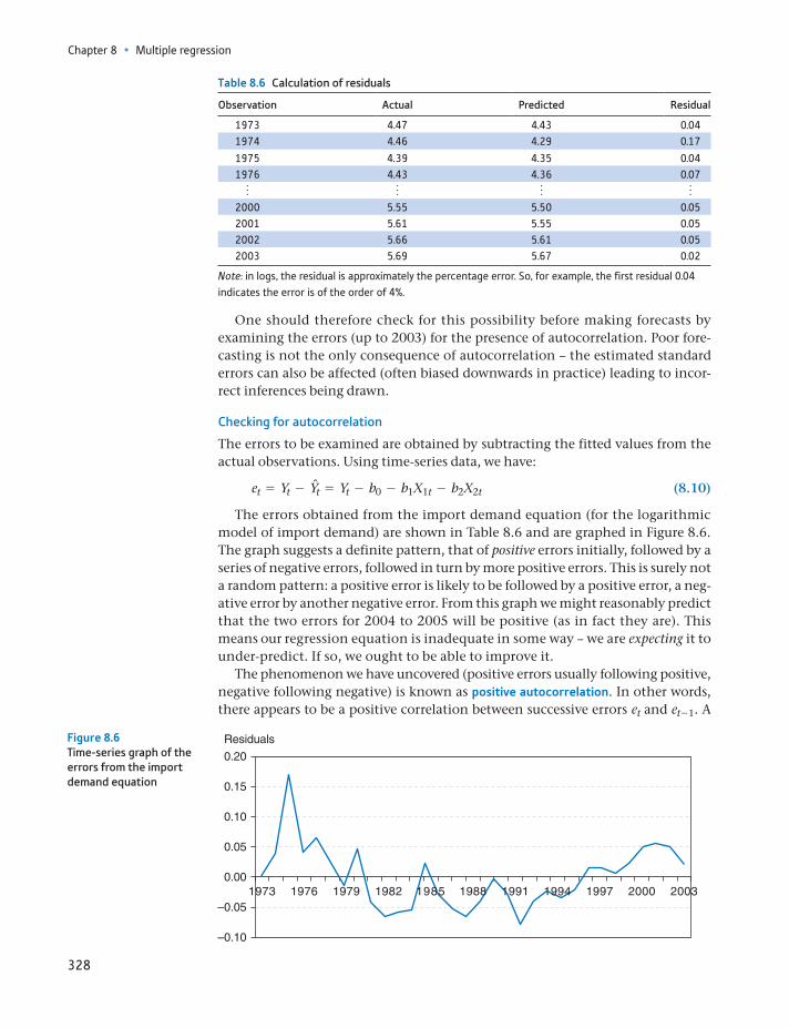
Chapter 8 • Multiple regression
328
One should therefore check for this possibility before making forecasts by examining the errors (up to 2003) for the presence of autocorrelation. Poor fore-casting is not the only consequence of autocorrelation – the estimated standard errors can also be affected (often biased downwards in practice) leading to incor-rect inferences being drawn.
Checking for autocorrelation
The errors to be examined are obtained by subtracting the fitted values from the actual observations. Using time-series data, we have:
et = Yt - Ynt = Yt - b0 - b1X1t - b2X2t (8.10)
The errors obtained from the import demand equation (for the logarithmic model of import demand) are shown in Table 8.6 and are graphed in Figure 8.6. The graph suggests a definite pattern, that of positive errors initially, followed by a series of negative errors, followed in turn by more positive errors. This is surely not a random pattern: a positive error is likely to be followed by a positive error, a neg-ative error by another negative error. From this graph we might reasonably predict that the two errors for 2004 to 2005 will be positive (as in fact they are). This means our regression equation is inadequate in some way – we are expecting it to under-predict. If so, we ought to be able to improve it.
The phenomenon we have uncovered (positive errors usually following positive, negative following negative) is known as positive autocorrelation. In other words, there appears to be a positive correlation between successive errors et and et - 1. A
Table 8.6 Calculation of residuals
Observation Actual Predicted Residual
1973 4.47 4.43 0.041974 4.46 4.29 0.17
1975 4.39 4.35 0.041976 4.43 4.36 0.07
o o o o2000 5.55 5.50 0.052001 5.61 5.55 0.052002 5.66 5.61 0.052003 5.69 5.67 0.02
Note: in logs, the residual is approximately the percentage error. So, for example, the first residual 0.04 indicates the error is of the order of 4%.
0.15
0.10
0.05
Residuals
0.00
–0.05
–0.10
0.20
1973 1976 1979 1982 1985 1988 1991 1994 1997 2000 2003
Figure 8.6Time-series graph of the errors from the import demand equation
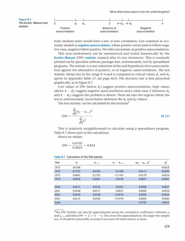
What determines imports into the united kingdom?
329
truly random series would have a low or zero correlation. Less common in eco-nomic models is negative autocorrelation, where positive errors tend to follow nega-tive ones, negative follow positive. We will concentrate on positive autocorrelation.
This non-randomness can be summarised and tested numerically by the Durbin–Watson (DW) statistic (named after its two inventors). This is routinely printed out by specialist software packages but, unfortunately, not by spreadsheet programs. The statistic is a one-tailed test of the null hypothesis of no autocorrela-tion against the alternative of positive, or of negative, autocorrelation. The test statistic always lies in the range 0–4 and is compared to critical values dL and dU (given in Appendix Table A7, see page 463). The decision rule is best presented graphically, as in Figure 8.7.
Low values of DW (below dL) suggest positive autocorrelation, high values (above 4 - dL) suggest negative autocorrelation and a value near 2 (between dU and 4 - dU) suggests the problem is absent. There are also two regions where the test is, unfortunately, inconclusive (between the dL and dU values).
The test statistic can be calculated by the formula4
DW =an
t = 2(et - et - 1)2
an
t = 1e2
t
(8.11)
This is relatively straightforward to calculate using a spreadsheet program. Table 8.7 shows part of the calculation.
Hence we obtain:
DW =0.07050.0825
= 0.855
4The DW statistic can also be approximated using the correlation coefficient r between et and et -1, and then DW ≈ 2 * (1 - r). The closer the approximation, the larger the sample size. It should be reasonably accurate if you have 20 observations or more.
4–dU 4–dL
Positiveautocorrelation
Absence ofautocorrelation
Negativeautocorrelation
Figure 8.7The Durbin–Watson test statistic
Table 8.7 Calculation of the DW statistic
Year et et - 1 et - et - 1 (et - et - 1)2 e2t
1973 0.0396 0.00161974 0.1703 0.0396 0.1308 0.0171 0.0290
1975 0.0401 0.1703 -0.1302 0.0170 0.00161976 0.0658 0.0401 0.0258 0.0007 0.0043
o o o o o o2000 0.0517 0.0236 0.0281 0.0008 0.0027
2001 0.0548 0.0517 0.0031 0.0000 0.00302002 0.0509 0.0548 -0.0039 0.0000 0.0026
2003 0.0215 0.0509 -0.0294 0.0009 0.0005Totals 0.0705 0.0825
Chapter 8 • Multiple regression
330
The result suggests positive autocorrelation5 of the errors. For n = 30 (close enough to n = 31) the critical values are dL = 1.284 and dU = 1.567 (using the 95% confidence level, see Table A7), so we clearly reject the null of no autocorrelation.
Consequences of autocorrelation
The presence of autocorrelation in this example causes our forecasts to be too low. If we took account of the pattern of errors over time, we could improve the fore-casting performance of the model. A second general consequence of autocorrela-tion is that the standard errors are often under-estimated, resulting in excessive t and F statistics. This leads us to think the estimates are ‘significant’ when they might not, in fact, be so. We may have what is sometimes known as a spurious regression – it looks good but is misleading. The bias in the standard errors and t statistics can be large, and this is potentially a serious problem.
This danger occurs particularly when the variables used in the analysis are trended (as many economic variables are) over time. Variables trending over time appear to be correlated with each other, but there may be no true underlying rela-tionship. The now-famous study by Hendry6 noted a strong correlation between cumulative rainfall and the price level (both increase over time but are unlikely to be related). It has been suggested that a low value of the DW statistic (typically, less than the R2 value) can be a symptom of such a problem. The fact that eco-nomic theory supports the idea of a causal relationship between demand, prices and income should make us a little more confident that we have found a valid economic relationship rather than a spurious one in this case.
This topic goes well beyond the scope of this text (once again), but it is raised because it is important to be aware of the potential shortcomings of simple mod-els. If you estimate a time-series regression equation, check the DW statistic to test for autocorrelation. If present, you may want to seek further advice rather than accept the results as they are, even if they appear to be good. The cause of the auto-correlation is often (though not always) the omission of lagged variables in the model, i.e. a failure to recognise that it may take time for the effect of the indepen-dent variables to work through to the dependent variable.
(a) Using the log model explaining car travel, calculate the residuals from the regression equation and draw a line graph of them. Do they appear to be random or is some time-dependence apparent?
(b) Calculate the Durbin–Watson statistic and interpret the result.
(c) If autocorrelation is present, what are the implications for your estimates?
?
Exercise 8.4
Finding the right model
How do you know that you have found the ‘right’ model for the data? Can you be confident that another researcher, using the same data, would arrive at the same results? How can you be sure there isn’t a relevant explanatory variable out there that you have omitted from your model? Without trying them all it is difficult to
6Hendry, D.F., Econometrics – Alchemy or Science? in Economica, 47 (1980), 387–406.
5The correlation between et and et -1 is, in fact, 0.494.
Finding the right model
331
be sure. Good modelling is based on theoretical considerations (e.g. models that are consistent with economic or business principles) and statistical ones (e.g. sig-nificant t ratios). One can identify two different approaches to modelling:
General to specific: this starts off with a comprehensive model, including all the likely explanatory variables, then simplifies it.
Specific to general: this begins with a simple model that is easy to understand, then explanatory variables are added to improve the model’s explanatory power.
There is something to be said for both approaches, but it is not guaranteed that the two will end up with the same model. The former approach is usually favoured nowadays; it suffers less from the problem of omitted variable bias (discussed below), and the simplifying procedure is usually less ad hoc than that of generalis-ing a simple model. A very general model will almost certainly initially contain a number of irrelevant explanatory variables. However, this is not much of a prob-lem (and less serious than omitted variable bias): standard errors on the coeffi-cients tend to be higher than otherwise, but this is remedied once the irrelevant variables are excluded.
It is rare for either of these approaches to be adopted in its pure, ideal form. For example, in the import demand equation we should have started out with several lags on the price variable, since we cannot be sure how long imports take to adjust to price changes. Therefore, we might have started with (assuming a maximum lag of one year is ‘reasonable’):
mt = b0 + b1GDPt + b2GDPt - 1 + b3pmt + b4pmt - 1 + b5mt - 1 + et (8.12)
If b4 proved to be not significantly different from zero, we would then re-estimate the equation without pmt - 1 and obtain new coefficient estimates. If the new b2 proved to be not significant, we would omit GDPt - 1 and re-estimate. This process would continue until all the remaining coefficients had signifi-cant t ratios. We would then have the final, simplified model. At each stage we would omit the variable with the least significant coefficient. Having found the right model, we could then test it on new data, to see if it can explain the new observations.
Uncertainty regarding the correct model
The remarks about finding the right model apply to many of the other techniques used in this text. For example, we might employ the Poisson distribution to model manufacturing faults in televisions, but we are assuming this is the correct distribution to use. In the example of rail-way accidents recounted in Chapter 4, it was found that the Poisson distribution did not fit the data precisely – the real world betrayed less variation than predicted by the model.
Our estimates of parameters, and the associated confidence intervals, are based on the assumption that we are using the correct model. To our uncertainty about the estimates we should ideally add the uncertainty about the correct model, but unfortunately this is diffi-cult to measure. It may be that if we used a different model we would obtain a different conclusion. If possible, therefore, it is a good idea to try out different models to see if the results are robust, and also to inform the reader about alternative methods that have been tried but not reported.
ST
ATISTICS
IN
PRACTI
CE
· ·
Chapter 8 • Multiple regression
332
In practice the procedure is not as mechanical (nor as pure) as this, and more judgement should be exercised. You may not want to exclude all the price vari-ables from a demand equation even though the t ratios are small. A coefficient may be large in size even though it is not significant. ‘Not significant’ does not mean the same as ‘not important’, rather that there is a lot of uncertainty about its true value. In modelling imports, we used the 2004 and 2005 observations to test the model’s forecasts. When it failed, we revised the model and applied the fore-cast test again. But this is no longer a strictly independent test, since we used the 2004 to 2005 observations to decide upon revision to the model.
Interpreting the R2 coefficient
Students often worry that their R2 value is not large enough, hence their regression is a poor one. However, interpretation of the statistic is tricky. It is easier to ‘explain’ aggregate data than it is to explain individual observations, hence a regression using country level data typically has a higher R2 value than a similar one using individual data (the values might vary between 0.6 for the former but 0.1 for the latter). Also, time-series data typically have much higher R2 values (e.g. 0.95) than cross-section data. Estimating a regression using first differences of the data (i.e. explaining the change in Y by changes in the X values) typically lowers the R2 value substantially, even though the underlying phenomena are the same. The size of the R2 statistic needs to be considered in the light of the type of data used in the model.
ST
ATISTICS
IN
PRACTI
CE
· ·
To briefly sum up a complex and contentious debate, a good model should be:
consistent with theory: an estimated demand curve should not slope upwards, for example.
statistically satisfactory: there should be good explanatory power (e.g. R2, F sta-tistics), the coefficients should be statistically significant (t ratios) and the errors should be random. It should also predict well, using new data (i.e. data not used in the estimation procedure).
simple: although a very complicated model predicts better, it might be difficult for the reader to understand and interpret.
Sometimes these criteria conflict and then the researcher must use his or her judgement and experience to decide between them.
Testing compound hypotheses
Simplifying a general model is largely based on hypothesis testing. Usually this means a hypothesis of the form H0: b = 0 using a t test. Accepting this hypothesis would mean we can simplify by dropping that variable from the equation. Sometimes, however, the hypothesis is more complex, as in the following examples:
You want to test the equality of two coefficients, H0: b1 = b2. You want to test if a group of coefficients are all zero, H0: b1 = b2 = 0.
A general method for testing these compound hypotheses is to use an F test, comparing the general (unrestricted) model with a more restricted version. An unrestricted model will always fit the data better (higher R2) than a restricted
Finding the right model
333
version. However, if the restricted version fits almost as well, we conclude that the restriction is valid and that the simpler restricted model is the more appropriate one to use.
We illustrate this by examining whether consumers suffer from money illusion in the import demand equation. We assumed, in line with economic theory, that only relative prices matter and used the real price of imports PM/P as an explana-tory variable. But suppose consumers actually respond differently to changes in PM and in P? In that case we should enter PM and P as separate explanatory vari-ables and they would have different coefficients. In other words, we should esti-mate (using the log form7):
ln mt = c0 + c1 ln GDPt + c2 ln PMt + c3 ln Pt + et (8.13)
rather than
ln mt = b0 + b1 ln GDPt + b2 ln pmt + et (8.14)
where PM is the nominal price of imports and P is the nominal price level. We would expect c2 6 0 and c3 7 0. Note that (8.14) is a restricted form of (8.13), with the restriction c2 = -c3 imposed. A lack of money illusion implies that this restriction should be valid and that (8.14) is the correct form of model. The hypothesis to test is therefore H0: c2 = -c3 (or alternatively H0: c2 + c3 = 0).
If the restriction is valid, (8.13) and (8.14) should fit equally well and thus have similar error sums of squares. Conversely, if they have very different ESS values, then we would reject the validity of the restriction. To carry out the test, we there-fore do the following:
Estimate the unrestricted model (8.13) and obtain the unrestricted ESS from it (ESSU).
Estimate the restricted model (8.14) and obtain the restricted ESS (ESSR). Note that by definition, ESSU … ESSR.
Compare the ESS values using the test statistic
F =(ESSR - ESSU)>q
ESSU>(n - k - 1) (8.15)
where q is the number of restrictions (1 in this case) and k is the number of explanatory variables in the unrestricted model.
Compare the test statistic with the critical value of the F distribution with q and n - k - 1 degrees of freedom. If the test statistic exceeds the critical value, reject the restricted model in favour of the unrestricted one.
We have already estimated the restricted model (equation (8.14)) and from that we obtain ESSR = 0.08246. Estimating the unrestricted model gives
ln mt = -8.77 + 2.31 ln GDPt - 0.20 ln PMt - 1 + 0.02 ln Pt - 1 + et (8.16)
with ESSU = 0.02720. The test statistic is therefore
F =(0.08246 - 0.02720)>10.02720>(31 - 3 - 1)
= 54.85 (8.17)
7Note that it is much easier to test the restriction in log form, since PM and P are entered additively. It would be much harder to do this in levels form.
Chapter 8 • Multiple regression
334
The critical value8 at the 95% confidence level is 4.21, so the restriction is rejected. Consumers do not use relative prices alone in making decisions, but are somehow influenced by the general rate of inflation as well. This is contrary to what one would expect from economic theory. Interestingly, the equation using nominal prices does not suffer from autocorrelation, so imposing the restriction (estimating with the real price of imports) induces autocorrelation, another indi-cation that the restriction might be inappropriate.
To our earlier finding we might therefore add that consumers appear to take account of nominal prices. We do not have space to investigate this issue in more detail, but further analysis of these nominal effects would be worthwhile. There may be a theoretical reason for nominal prices to have an influence. Alternatively, there could be measurement problems with the data or inadequacies in the model which mask the truth that it is, after all, relative prices that matter.
Whatever the results, this method of hypothesis testing is quite general: it is possible to test any number of (linear) restrictions by estimating the restricted and unrestricted forms of the equation and comparing how well they fit the data. The unrestricted will always fit the data better but if the restricted model fits almost as well, it is preferred on the grounds of simplicity. The F test is the criterion by which we compare the fit of the two models, using error sums of squares.
Omitted variable bias
Omitting a relevant explanatory variable from a regression equation can lead to serious problems. Not only is the model inadequate because there is no informa-tion about the effect of the omitted variable but, in addition, the coefficients on the variables which are included are usually biased. This is called omitted variable bias (OVB).
We encountered an example of this in the model of import demand. Notice how the coefficient on income changed from 1.66 to 2.31 when nominal prices were included. This is a substantial change and shows that the original equa-tion with only the real price of imports included may be misleading with respect to the effect of income upon imports. The coefficient on income was biased downwards.
The direction of OVB depends upon two things: the correlation between the omitted and included explanatory variables and the sign of the coefficient on the omitted variable. Thus, if you have to omit what you believe is a relevant explana-tory variable (because the observations are unavailable, for example) you might be able to infer the direction of bias on the included variable(s). Table 8.8 sum-marises the possibilities, where the true model is Y = b0 + b1X1 + b2X2 + e but the estimated model omits the X2 variable. Table 8.8 only applies to a single omit-ted variable; when there are several, matters are more complicated (see Maddala and Lahiri (2009), Chapter 4).
In addition to coefficients being biased, their standard errors are biased upwards as well, so that inferences and confidence intervals will be incorrect. The best advice, therefore, is to ensure you don’t omit a relevant variable.
8Because only large values of the F statistic reject H0, we use the critical value cutting off the upper tail of the distribution.
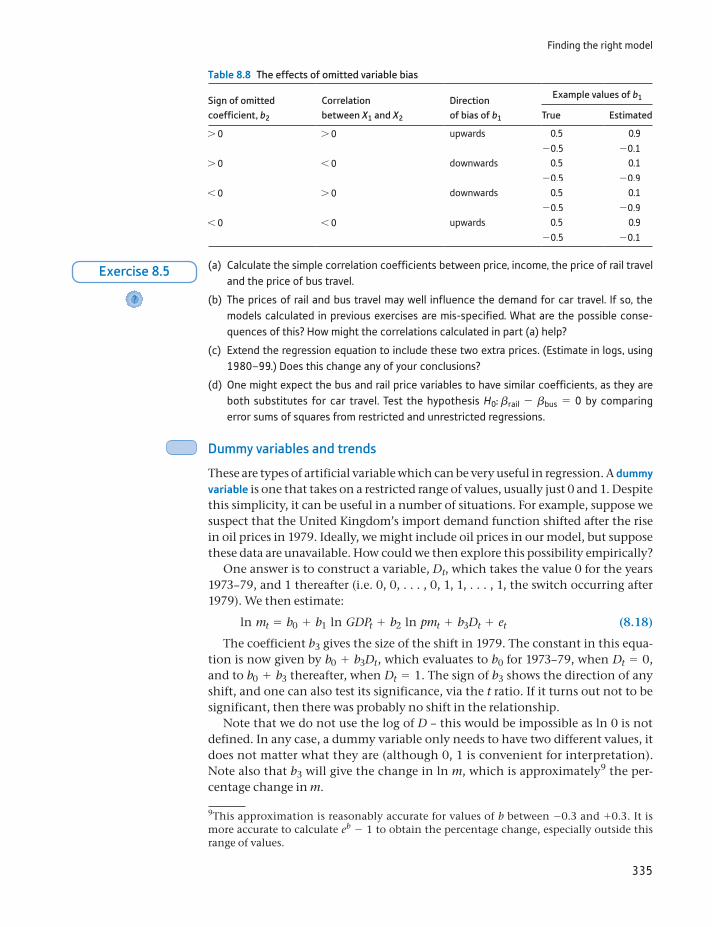
Finding the right model
335
Dummy variables and trends
These are types of artificial variable which can be very useful in regression. A dummy variable is one that takes on a restricted range of values, usually just 0 and 1. Despite this simplicity, it can be useful in a number of situations. For example, suppose we suspect that the United Kingdom’s import demand function shifted after the rise in oil prices in 1979. Ideally, we might include oil prices in our model, but suppose these data are unavailable. How could we then explore this possibility empirically?
One answer is to construct a variable, Dt, which takes the value 0 for the years 1973–79, and 1 thereafter (i.e. 0, 0, . . . , 0, 1, 1, . . . , 1, the switch occurring after 1979). We then estimate:
ln mt = b0 + b1 ln GDPt + b2 ln pmt + b3Dt + et (8.18)
The coefficient b3 gives the size of the shift in 1979. The constant in this equa-tion is now given by b0 + b3Dt, which evaluates to b0 for 1973–79, when Dt = 0, and to b0 + b3 thereafter, when Dt = 1. The sign of b3 shows the direction of any shift, and one can also test its significance, via the t ratio. If it turns out not to be significant, then there was probably no shift in the relationship.
Note that we do not use the log of D – this would be impossible as ln 0 is not defined. In any case, a dummy variable only needs to have two different values, it does not matter what they are (although 0, 1 is convenient for interpretation). Note also that b3 will give the change in ln m, which is approximately9 the per-centage change in m.
Table 8.8 The effects of omitted variable bias
Sign of omitted coefficient, b2
Correlation between X1 and X2
Direction of bias of b1
Example values of b1
True Estimated
7 0 7 0 upwards 0.5 0.9-0.5 -0.1
7 0 6 0 downwards 0.5 0.1-0.5 -0.9
6 0 7 0 downwards 0.5 0.1-0.5 -0.9
6 0 6 0 upwards 0.5 0.9-0.5 -0.1
(a) Calculate the simple correlation coefficients between price, income, the price of rail travel and the price of bus travel.
(b) The prices of rail and bus travel may well influence the demand for car travel. If so, the models calculated in previous exercises are mis-specified. What are the possible conse-quences of this? How might the correlations calculated in part (a) help?
(c) Extend the regression equation to include these two extra prices. (Estimate in logs, using 1980–99.) Does this change any of your conclusions?
(d) One might expect the bus and rail price variables to have similar coefficients, as they are both substitutes for car travel. Test the hypothesis H0: brail - bbus = 0 by comparing error sums of squares from restricted and unrestricted regressions.
?
Exercise 8.5
9This approximation is reasonably accurate for values of b between -0.3 and +0.3. It is more accurate to calculate eb - 1 to obtain the percentage change, especially outside this range of values.
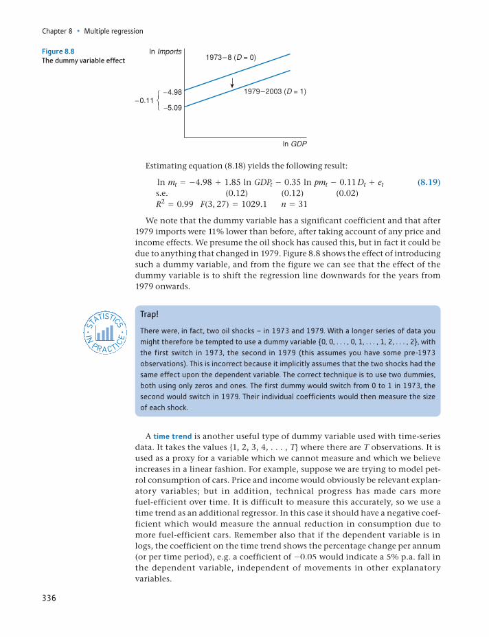
Chapter 8 • Multiple regression
336
Estimating equation (8.18) yields the following result:
ln mt = -4.98 + 1.85 ln GDPt - 0.35 ln pmt - 0.11 Dt + et (8.19)s.e. (0.12) (0.12) (0.02)R2 = 0.99 F(3, 27) = 1029.1 n = 31
We note that the dummy variable has a significant coefficient and that after 1979 imports were 11% lower than before, after taking account of any price and income effects. We presume the oil shock has caused this, but in fact it could be due to anything that changed in 1979. Figure 8.8 shows the effect of introducing such a dummy variable, and from the figure we can see that the effect of the dummy variable is to shift the regression line downwards for the years from 1979 onwards.
Figure 8.8The dummy variable effect
Trap!
There were, in fact, two oil shocks – in 1973 and 1979. With a longer series of data you might therefore be tempted to use a dummy variable 0, 0, . . . , 0, 1, . . . , 1, 2, . . . , 2, with the first switch in 1973, the second in 1979 (this assumes you have some pre-1973 observations). This is incorrect because it implicitly assumes that the two shocks had the same effect upon the dependent variable. The correct technique is to use two dummies, both using only zeros and ones. The first dummy would switch from 0 to 1 in 1973, the second would switch in 1979. Their individual coefficients would then measure the size of each shock.
ST
ATISTICS
IN
PRACTI
CE
· ·
A time trend is another useful type of dummy variable used with time-series data. It takes the values 1, 2, 3, 4, . . . , T where there are T observations. It is used as a proxy for a variable which we cannot measure and which we believe increases in a linear fashion. For example, suppose we are trying to model pet-rol consumption of cars. Price and income would obviously be relevant explan-atory variables; but in addition, technical progress has made cars more fuel-efficient over time. It is difficult to measure this accurately, so we use a time trend as an additional regressor. In this case it should have a negative coef-ficient which would measure the annual reduction in consumption due to more fuel-efficient cars. Remember also that if the dependent variable is in logs, the coefficient on the time trend shows the percentage change per annum (or per time period), e.g. a coefficient of -0.05 would indicate a 5% p.a. fall in the dependent variable, independent of movements in other explanatory variables.
Finding the right model
337
Multicollinearity
Sometimes some or all of the explanatory variables are highly correlated (in the sample data), which means that it is difficult to tell which of them is influencing the dependent variable. This is known as multicollinearity. Since all variables are correlated to some degree, multicollinearity is a problem of degree also. For exam-ple, if GDP and import prices both rise over time, it may be difficult to tell which of them influences imports. There has to be some independent movement of the explanatory variables for us to be able to disentangle their separate influences.
The symptoms of multicollinearity are:
high correlation between two or more of the explanatory variables high standard errors of the coefficients leading to low t ratios a high value of R2 (and significant F statistic) in spite of the insignificance of
the individual coefficients.
In this situation, one might conclude that a variable is insignificant because of a large standard error, when, in fact, multicollinearity is to blame. It may be use-ful, therefore, to examine the correlations between all the explanatory variables to see if such a problem is apparent. For example, the correlation between nomi-nal import prices and the retail price index is 0.97. Hence, it may be difficult to disentangle their individual effects.
The best cure is to obtain more data which might exhibit more independent variation of the explanatory variables. This is not always possible, however, for example if a sample survey has already been completed. An alternative is to drop one of the correlated variables from the regression equation, although the choice of which to exclude is somewhat arbitrary. Another procedure is to obtain alterna-tive estimates of the effects of one of the collinear variables (for example, from another study). These effects can then be allowed for when estimates of the remaining coefficients are made.
Measurement error
The variables in a regression equation are rarely measured without error. Chapter 9 has an example showing that the measured balance of payments (exports minus imports) for 1970 varied considerably as better information became available in later years. The question therefore arises whether measurement error in the data is a problem for our estimates.
Measurement error could either affect the standard errors of the regression coef-ficients or, worse, it could cause bias. If the measurement error is systematic rather than random, then biased estimates can arise. For example, if transport costs are left out of the measured price of imported goods, and these costs have declined over time, then there is systematic measurement error in the price variable. The actual
(a) The graph of car travel suggests a possible break in 1990. Test whether this break is sig-nificant or not using a dummy variable with a value of 0 up to (and including) 1990, 1 thereafter. (Estimate in logs using all three prices and income, 1980–99.)
(b) The quality of cars has improved steadily over time, perhaps leading to increased travel by car. Add a time trend to the regression equation in part (a) and re-estimate. Is there evi-dence to support this idea?
?
Exercise 8.6
Chapter 8 • Multiple regression
338
price fall (as experienced by the consumer) is less than the measured fall. The esti-mated price elasticity of imports might therefore have a bias away from zero (con-sumers have reacted to a price fall but we attribute this to a smaller price change, hence we estimate that price changes have a bigger effect than they really do).
Even when the measurement error is random, this can bias coefficient esti-mates. Such error in the explanatory variable generally biases the coefficient towards zero and lowers the t statistic. Hence, one might mistakenly conclude that X does not affect Y when in fact it does. The more severe the problem is, the greater is the variance of the measurement error relative to the variance of X. For example, if the variance of measurement error is 25% the size of the variance of X, then the coefficient of X will be biased downward by about 20%.
We noted in Exercise 8.5 that rail and bus prices were highly correlated. This may be why they both appear to be ‘insignificant’ in the regression equation. It could be the case that either of them could be influencing demand, but we cannot tell which. We can examine this by testing the hypothesis H0: brail = bbus = 0. The restricted regression therefore excludes these two variables, the unrestricted regression includes them. One can then use equation (8.15) with q = 2 restrictions to test the hypothesis. What is the result? (Do not include dummy or trend in the equation.)
?
Exercise 8.7
Some final advice on regression
As always, large samples are better than small. Reasonable results were obtained above with only 31 observations, but this is rather a small sample size on which to base solid conclusions.
Check the data carefully before calculation. This is especially true if a computer is used to analyse the data. If the data are entered incorrectly, every subsequent result will be wrong. A substantial part of any research project should be devoted to verifying the data, checking the definitions of variables, etc. The work is tedious, but important.
Do not go fishing. This is searching through the data hoping something will turn up. Some idea of what the data are expected to reveal, and why, allows the search to be conducted more effectively. It is easy to see imaginary patterns in data if an aimless search is being conducted. Try looking at the table of random numbers (Table A1, see page 448), which will probably soon reveal something ‘significant’, like your telephone number or your credit card number.
Do not be afraid to start with fairly simple techniques. Draw a graph of demand against price to see what it looks like, if it looks linear or log linear, if there are any outliers (a data error?), etc. This will give an overview of the problem which can be kept in mind when more refined techniques are used.
Summary
Multiple regression extends the principles of simple regression to models using several explanatory variables to explain variation in Y.
The multiple regression equation is derived by minimising the sum of squared residuals, as in simple regression. This principle leads to the formulae for slope coefficients, standard errors, etc.
Reference
339
The significance of the individual slope coefficients can be tested using the t dis-tribution and the overall significance of the model is based on the F distribution.
It is important to check the adequacy of the model. This can be done in various ways, including examining the accuracy of predictions and checking that the residuals appear random.
One important form of non-randomness is termed autocorrelation, where the error in one period is correlated with earlier errors (this can occur in time-series data). This can lead to incorrect inferences being drawn.
The Durbin–Watson statistic is one diagnostic test for autocorrelation. If there is a problem of autocorrelation, it can often be eliminated by including lagged regressors.
A good model should be (i) consistent with economic (or some other) theory, (ii) statistically satisfactory and (iii) simple. Sometimes there is a trade-off between these different criteria.
Complex hypothesis tests can often be performed by comparing restricted and unrestricted forms of the model. If the former fits the data almost as well as the latter, then the (simplifying) restrictions specified in the null hypothesis are accepted.
Omitting relevant explanatory variables from the model is likely to cause bias to the estimated coefficients. This suggests it is often best to start off with a fairly general model and simplify it.
Regression analysis can become very complicated (well beyond the scope of this text), involving issues such as multicollinearity and simultaneous equa-tions. However, the methods given in this chapter can provide helpful insights into a range of problems, especially if the potential shortcomings of the model are appreciated.
autocorrelationChow testdummy variablesDurbin–Watson statisticmeasurement errormulticollinearitynegative autocorrelation
omitted variable biaspositive autocorrelationregression coefficientssimultaneous equation modelspurious regressiontime trend
Key terms and concepts
Maddala, G.S., and K. Lahiri, Introduction to Econometrics, 4th edn, Wiley, 2009.Reference
Chapter 8 • Multiple regression
340
Formula Description Notes
F =(ESSP - ESS1)>n2
ESS1>(n1 - k - 1)
Chow test for a prediction First n1 observations used for estimation, last n2 for prediction
DW = a (et - et -1)2
a e2t
Durbin–Watson statistic for testing autocorrelation
F =(ESSR - ESSU)>q
ESSU>(n - k - 1)
Test statistic for testing q restrictions in the regression model
v = q, n - k - 1
Formulae used in this chapter
Some of the more challenging problems are indicated by highlighting the problem number in colour.
8.1 (a) Using the data in Problem 7.1 (page 301), estimate a multiple regression model of the birth rate explained by GNP, the growth rate and the income ratio. Comment upon:
(i) the sizes and signs of the coefficients,
(ii) the significance of the coefficients,
(iii) the overall significance of the regression.
(b) How would you simplify the model?
(c) Test for the joint significance of the coefficients on growth and the income ratio.
(d) Repeat the above steps for all 26 observations. Comment.
(e) Do you feel your understanding of the birth rate is improved after estimating the multiple regression equation?
(f) What other possible explanatory variables do you think it might be worth investigating?
8.2 The following data show the number of adults in each of 17 households and whether or not the family contains at least one person who smokes, to supplement the data in Problem 7.2 on alcohol spending (see page 301).
Family Adults Smoker Family Adults Smoker
1 2 0 10 2 12 2 0 11 1 13 1 1 12 4 14 2 0 13 2 15 1 0 14 2 06 2 1 15 3 07 2 0 16 1 18 2 0 17 2 09 1 0
Problems
Problems
341
(a) Estimate a multiple regression model of expenditure on alcohol, using income, the number of adults and whether there is a smoker in the household as the three explanatory variables. Do the coefficients have the expected signs? Interpret your results.
(b) Test the significance of the individual coefficients and of the regression as a whole.
(c) Should the model be simplified?
(d) Calculate the elasticity of alcohol expenditure with respect to income. Do this first using the linear model and then one based on logarithms of these two variables (but keep ‘Adults’ and ‘Smokers’ in linear form).
(e) Estimate the effect of one additional adult in the family on their spending on alcohol.
(f) To compare the alcohol expenditure of families with a smoker and families without, one could try two different methods:
(i) use a two sample t test to compare mean expenditures, or
(ii) run a regression of alcohol expenditure on the ‘Smoker’ variable, using all 17 observations.
Try both of these methods. What do you conclude?
8.3 Using the results from Problem 8.1, forecast the birth rate of a country with the following character-istics: GNP equal to $3000, a growth rate of 3% p.a. and an income ratio of 7. (Construct the point estimate only).
8.4 (This problem continues the analysis from Problem 8.2.) Given the following data for a family:
Family Income Adults Smoker
18 700 2 1
(a) Predict the level of alcohol expenditure for this family.
(b) If their actual expenditure turned out to be 32.50, how accurate would you judge the prediction?
8.5 How would you most appropriately measure the following variables?
(a) social class in a model of alcohol consumption
(b) crime
(c) central bank independence from political interference.
8.6 As Problem 8.5, for
(a) the output of a car firm, in a production function equation,
(b) potential trade union influence in wage bargaining,
(c) the performance of a school.
8.7 Would it be better to use time-series or cross-section data in the following models?
(a) the relationship between the exchange rate and the money supply
(b) the determinants of divorce
(c) the determinants of hospital costs.
Explain your reasoning.
8.8 As Problem 8.7, for
(a) measurement of economies of scale in the production of books,
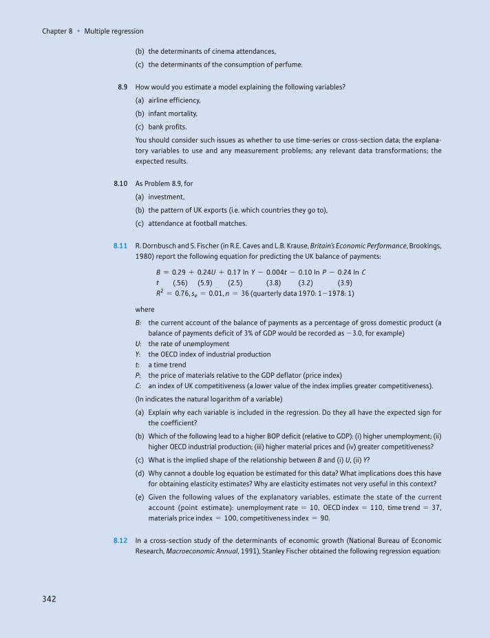
Chapter 8 • Multiple regression
342
(b) the determinants of cinema attendances,
(c) the determinants of the consumption of perfume.
8.9 How would you estimate a model explaining the following variables?
(a) airline efficiency,
(b) infant mortality,
(c) bank profits.
You should consider such issues as whether to use time-series or cross-section data; the explana-tory variables to use and any measurement problems; any relevant data transformations; the expected results.
8.10 As Problem 8.9, for
(a) investment,
(b) the pattern of UK exports (i.e. which countries they go to),
(c) attendance at football matches.
8.11 R. Dornbusch and S. Fischer (in R.E. Caves and L.B. Krause, Britain’s Economic Performance, Brookings, 1980) report the following equation for predicting the UK balance of payments:
B = 0.29 + 0.24U + 0.17 ln Y - 0.004t - 0.10 ln P - 0.24 ln Ct (.56) (5.9) (2.5) (3.8) (3.2) (3.9)R2 = 0.76, se = 0.01, n = 36 (quarterly data 1970: 1-1978: 1)
where
B: the current account of the balance of payments as a percentage of gross domestic product (a balance of payments deficit of 3% of GDP would be recorded as -3.0, for example)
U: the rate of unemploymentY: the OECD index of industrial productiont: a time trendP: the price of materials relative to the GDP deflator (price index)C: an index of UK competitiveness (a lower value of the index implies greater competitiveness).
(ln indicates the natural logarithm of a variable)
(a) Explain why each variable is included in the regression. Do they all have the expected sign for the coefficient?
(b) Which of the following lead to a higher BOP deficit (relative to GDP): (i) higher unemployment; (ii) higher OECD industrial production; (iii) higher material prices and (iv) greater competitiveness?
(c) What is the implied shape of the relationship between B and (i) U, (ii) Y?
(d) Why cannot a double log equation be estimated for this data? What implications does this have for obtaining elasticity estimates? Why are elasticity estimates not very useful in this context?
(e) Given the following values of the explanatory variables, estimate the state of the current account (point estimate): unemployment rate = 10, OECD index = 110, time trend = 37, materials price index = 100, competitiveness index = 90.
8.12 In a cross-section study of the determinants of economic growth (National Bureau of Economic Research, Macroeconomic Annual, 1991), Stanley Fischer obtained the following regression equation:

Problems
343
GY = 1.38 - 0.52RGDP70 + 2.51PRIM70 + 11.16INV - 4.75INF + 0.17SUR (-5.9) (2.69) (3.91) (2.7) (4.34)-0.33DEBT80 - 2.02SSA - 1.98LAC (-0.79) (-3.71) (-3.76)R2 = 0.60, n = 73
where
GY: growth per capita, 1970–85RGDP: real GDP per capita, 1970PRIM70: primary school enrolment rate, 1970INV: investment/GNP ratioINF: inflation rateSUR: budget surplus/GNP ratioDEBT80: foreign debt/GNP ratioSSA: dummy for sub-Saharan AfricaLAC: dummy for Latin America and the Caribbean.
(a) Explain why each variable is included. Does each have the expected sign on its coefficient? Are there any variables which are left out, in your view?
(b) If a country were to increase its investment ratio by 0.05, by how much would its estimated growth rate increase?
(c) Interpret the coefficient on the inflation variable.
(d) Calculate the F statistic for the overall significance of the regression equation. Is it significant?
(e) What do the SSA and LAC dummy variables tell us?
8.13 (Project) Build a suitable model to predict car sales in the United Kingdom. You should use time-series data (at least 20 annual observations). You should write a report in a similar manner to Problem 7.12.
Chapter 8 • Multiple regression
344
Answers to exercises
Exercise 8.1
(a) Demand rises rapidly until around 1990, then rises more slowly
Price falls quite quickly until 1990, then rises. This may relate to the pattern of travel demand, above.
(b) The cross-plot of travel (vertical axis) against price is not clear-cut. There may be a slight negative relationship.
Again, there is not an obvious bivariate relationship between travel and income. For both graphs it looks as if a single line might not represent all of the data and therefore it might be that both explanatory variables are needed. The bivariate graphs are not very informative.
Answers to exercises
345
(c) Economic theory would suggest a negative price coefficient and a positive income coefficient.
(d) If bus and rail are substitutes for car travel, one would expect positive coefficients on their prices. However, they might be complements – commuters may drive to the station to catch the train.
Exercise 8.2
(a) The regression is:10
Source | SS df MS Number of obs = 20
----------+------------------------------ F( 2, 17) = 483.10
Model | 138136.46 2 69068.23 Prob 7 F = 0.0000
Residual | 2430.48 17 142.96 R-squared = 0.9827
----------+------------------------------ Adj R-squared = 0.9807
Total | 140566.95 19 7398.26 Root MSE = 11.96
-----------------------------------------------------------------------
car | Coef. Std. Err. t P7|t| [95% Conf. Interval]
----------+------------------------------------------------------------
rpcar | -6.39 .76 -8.37 0.000 -8.00 -4.77
rpdi | 6.04 .23 25.85 0.000 5.55 6.54
_cons | 748.11 83.85 8.92 0.000 571.18 925.03
----------+------------------------------------------------------------
(b) The signs of the coefficients are as expected. A unit increase in price lowers demand by 6.4 units; a unit rise in income raises demand by about 6 units. Without knowl-edge of the units of measurement it is hard to give a more precise interpretation. Both coefficients are highly significant, as is the F statistic. Ninety-eight per cent of the variation of car travel demand is explained by these two variables, a high figure.
Exercise 8.3
(a) The forecast values are 661.9 and 706.3 in 2000 and 2001. These compare with actual values of 618 and 624, so the errors are -6.6% and -11.7%. Assuming 2000 and 2001 would be the same as 1999 would actually give better results.
(b) In logs the results are:
Source | SS df MS Number of obs = 20
----------+------------------------------ F( 2, 17) = 599.39
Model | .557417045 2 .278708523 Prob 7 F = 0.0000
Residual | .007904751 17 .000464985 R-squared = 0.9860
----------+------------------------------ Adj R-squared = 0.9844
Total | .565321796 19 .029753779 Root MSE = .02156
-----------------------------------------------------------------------
lcar | Coef. Std. Err. t P7|t| [95% Conf. Interval]
----------+------------------------------------------------------------
lrpcar | -1.19 .14 -8.45 0.000 -1.49 -.89
lrpdi | .84 .03 28.35 0.000 .78 .90
_cons | 8.19 .71 11.61 0.000 6.70 9.68
----------+------------------------------------------------------------
Demand is elastic with respect to price (e = -1.19) and slightly less than elastic for income (e = 0.84). The coefficients are again highly significant.
10These results were produced using Stata. The layout is similar to that of Excel. Prob-values are indicated by ‘Prob 7 F’ and ‘P 7 t ’. ‘rpcar’ indicates the real price of car travel, ‘rpdi’ indicates real personal disposable income. Later on, an ‘l’ in front of a variable name indi-cates it is in log form.
Chapter 8 • Multiple regression
346
(c) Price and income elasticities from the linear model are -6.4 * 101.1>526.5 = -1.23 and 6.0 * 70.2>526.5 = 0.8. These are very similar to the log coefficients.
(d) The forecasts in logs are 6.492 and 6.561 which translate into 659.8 and 706.8. The predictions (and errors) are similar to the linear model.
(e) For the linear model the Chow test is
F =(ESSP - ESS1)>n2
ESS1>(n1 - k - 1)=
(7672.6 - 2430.5)>22430.5>(20 - 2 - 1)
= 18.3
The critical value is F(2, 17) = 3.59, so there appears to be a change between esti-mation and forecast periods. A similar calculation for the log model yields an F sta-tistic of 13.9 (ESSP = 0.0208), also significant.
Exercise 8.4
(a) The residuals from the log regression are as follows:
There is some evidence of positive autocorrelation and, in particular, the last two residuals (from the forecast period) are substantially larger than the rest.
(b) The Durbin–Watson statistic is DW = 1.52, against an upper critical value of dU = 1.54. The test statistic (just) falls into the uncertainty region, but the evidence for autocorrelation is very mild.
(c) Autocorrelation would imply biased standard errors, so inference would be dubi-ous, but the coefficients themselves are still unbiased.
Exercise 8.5
(a) The correlations are:
| rpcar rpdi rprail rpbus
--------+------------------------------
rpcar | 1.0000
rpdi | -0.3112 1.0000
rprail | -0.1468 0.9593 1.0000
rpbus | -0.1421 0.9632 0.9827 1.0000
The price of car travel has a low correlation with the other variables, which are all highly correlated with each other (r 7 0.95).
(b) There may be omitted variable bias. Since the omitted variables are correlated with income, the income coefficient we have observed may be misleading. The car price
Answers to exercises
347
variable is unlikely to be affected much, as it has a low correlation with the omitted variables.
(c) The results are:
Source | SS df MS Number of obs = 20
----------+------------------------------ F( 4, 15) = 285.36
Model | .557989155 4 .139497289 Prob 7 F = 0.0000
Residual | .007332641 15 .000488843 R-squared = 0.9870
----------+------------------------------ Adj R-squared = 0.9836
Total | .565321796 19 .029753779 Root MSE = .02211
-----------------------------------------------------------------------
lcar | Coef. Std. Err. t P7|t| [95% Conf. Interval]
----------+------------------------------------------------------------
lrpcar | -1.195793 .1918915 -6.23 0.000 -1.6048 -.786786
lrpdi | .8379483 .1372577 6.10 0.000 .5453904 1.130506
lrprail | .3104458 .3019337 1.03 0.320 -.3331106 .9540023
lrpbus | -.3085937 .3166891 -0.97 0.345 -.9836004 .3664131
_cons | 8.22269 .7318088 11.24 0.000 6.662877 9.782503
----------+------------------------------------------------------------
The new price variables are not significant, so there is unlikely to have been a seri-ous OVB problem. Neither car price nor income coefficients have changed. The simpler model seems to be preferred.
(d) The restricted equation is y = b1 + b2Pcar + b3RPDI + b4(Prail + Pbus) + u (in logs) and estimating this yields ESSR = 0.007 901. The test statistic is therefore
F =(0.007 901 - 0.007 333)>1
0.007 333>(20 - 4 - 1)= 1.16
This is not significant, so the hypothesis of equal coefficients is accepted.
Exercise 8.6
(a) The result is:
Source | SS df MS Number of obs = 20
----------+------------------------------ F( 5, 14) = 232.28
Model | .558588344 5 .111717669 Prob 7 F = 0.0000
Residual | .006733452 14 .000480961 R-squared = 0.9881
----------+------------------------------ Adj R-squared = 0.9838
Total | .565321796 19 .029753779 Root MSE = .02193
-----------------------------------------------------------------------
lcar | Coef. Std. Err. t P7|t| [95% Conf. Interval]
----------+------------------------------------------------------------
lrpcar | -1.107049 .2062769 -5.37 0.000 -1.549469 -.6646293
lrpdi | .8898566 .1438706 6.19 0.000 .581285 1.198428
lrprail | .5466294 .3667016 1.49 0.158 -.2398673 1.333126
lrpbus | -.4867887 .3523676 -1.38 0.189 -1.242542 .2689648
d1990 | -.0314327 .0281614 -1.12 0.283 -.091833 .0289676
_cons | 7.352081 1.065511 6.90 0.000 5.066787 9.637375
----------+------------------------------------------------------------
The new coefficient, -0.03, suggests car travel is 3% lower after 1990 than before, ceteris paribus. However, the coefficient is not significantly different from zero, so there is little evidence of structural break. The change in car usage appears due to changes in prices and income.
Chapter 8 • Multiple regression
348
(b) The result is:
Source | SS df MS Number of obs = 20
----------+------------------------------ F( 6, 13) = 191.34
Model | .558991816 6 .093165303 Prob 7 F = 0.0000
Residual | .00632998 13 .000486922 R-squared = 0.9888
----------+------------------------------ Adj R-squared = 0.9836
Total | .565321796 19 .029753779 Root MSE = .02207
-----------------------------------------------------------------------
lcar | Coef. Std. Err. t P7|t| [95% Conf. Interval]
----------+------------------------------------------------------------
lrpcar | -1.116536 .2078126 -5.37 0.000 -1.565488 -.6675841
lrpdi | 1.107112 .2791366 3.97 0.002 .5040736 1.71015
lrprail | .558322 .3691905 1.51 0.154 -.2392655 1.355909
lrpbus | -.2707759 .4266312 -0.63 0.537 -1.192457 .6509048
d1990 | -.036812 .0289451 -1.27 0.226 -.099344 .02572
trend | -.0099434 .0109234 -0.91 0.379 -.033542 .0136552
_cons | 5.553859 2.247619 2.47 0.028 .6981737 10.40954
----------+------------------------------------------------------------
The trend is not significant. Note that the income coefficient has changed substan-tially. This is due to the high correlation between income and the trend (r = 0.99). It seems preferable to keep income and exclude the trend.
Exercise 8.7
The F statistic is
F =(0.007905 - 0.007333)>2
0.007333>(20 - 4 - 1)= 0.59
This is less than the critical value of F(2, 15) = 3.68, so the hypothesis that both coefficients are zero is accepted.
349
Learning outcomes 349Introduction 350Using secondary data sources 351
Make sure you collect the right data 351Get the most up-to-date figures 352Keep a record of your data sources 352Check your data 354
Collecting primary data 355Random sampling 356
Types of random sample 357Simple random sampling 358Stratified sampling 358Cluster sampling 362Multi-stage sampling 363Quota sampling 364
Calculating the required sample size 365Collecting the sample 367
The sampling frame 367Choosing from the sampling frame 368Interviewing techniques 368
Case study: the UK Living Costs and Food Survey 370Introduction 370Choosing the sample 370The sampling frame 370Collection of information 371Sampling errors 371
Summary 371Key terms and concepts 372References 372Formulae used in this chapter 373Problems 373
Data collection and sampling methods9
By the end of this chapter you should be able to:
recognise the distinction between primary and secondary data sources
avoid a variety of common pitfalls when using secondary data
make use of electronic sources to gather data
350350
Introduction
It may seem a little odd to look at data collection now, after several chapters cov-ering the analysis of data. Collection of data logically comes first, but the fact is that most people’s experience is as a user of data, which determines their priori-ties. Also, it is difficult to have the motivation for learning about data collection when one does not know what it is subsequently used for. Having spent consider-able time learning how to analyse data, it is now time to look at its collection and preparation.
There are two reasons why you might find this chapter useful. First, it will help if you have to carry out some kind of survey yourself. Second, it will help you in your data analysis, even if you are using someone else’s data. Knowing the issues involved in data collection can help your judgement of the quality of the data you are using. The material in this chapter has been reorganised a little for this edition to reflect the fact that most data are nowadays available in elec-tronic format and that collecting numbers from dusty tomes of statistics is now a rarity.
When conducting statistical research, there are two ways of obtaining data:
(1) use secondary data sources, such as from the World Bank, or(2) collect sample data personally, a primary data source.
Using secondary data sources sounds simple, but it is easy to waste valuable time by making elementary errors. The first part of this chapter provides some simple advice to help you avoid such mistakes.
Much of this text has been concerned with the analysis of sample evidence and the inferences that can be drawn from it. It has been stressed that this evidence must come from randomly drawn samples and, although the notion of random-ness was discussed in Chapter 2, the practical details of random sampling have not been set out.
The second part of this chapter is therefore concerned with the problems of collecting sample survey data prior to its analysis. The decision to collect the data personally depends upon the type of problem faced, the current availability of data relating to the problem and the time and cost needed to conduct a survey. It should not be forgotten that the first question that needs answering is whether the answer obtained is worth the cost of finding it. It is probably not worthwhile for the government to spend £50 000 to find out how many biscuits people eat, on average (though it may be worth biscuit manufacturers doing this). The sampling procedure is always subject to some limit on cost, therefore, and the researcher is trying to obtain the best value for money. The emergence of online surveys has greatly altered the cost of collecting data and allowed very large samples to be gathered. However, there are particular issues around such data.
recognise the main types of random sample and understand their relative merits
appreciate how such data are collected
conduct a small sample survey yourself.
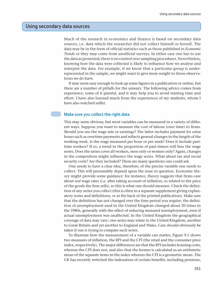
Using secondary data sources
351
Using secondary data sources
Much of the research in economics and finance is based on secondary data sources, i.e. data which the researcher did not collect himself or herself. The data may be in the form of official statistics such as those published in Economic Trends or they may come from unofficial surveys. In either case one has to use the data as presented; there is no control over sampling procedures. Nevertheless, knowing how the data were collected is likely to influence how we analyse and interpret the data. For example, if we know that a particular group is under- represented in the sample, we might want to give more weight to those observa-tions we do have.
It may seem easy enough to look up some figures in a publication or online, but there are a number of pitfalls for the unwary. The following advice comes from experience, some of it painful, and it may help you to avoid wasting time and effort. I have also learned much from the experiences of my students, whom I have also watched suffer.
Make sure you collect the right data
This may seem obvious, but most variables can be measured in a variety of differ-ent ways. Suppose you want to measure the cost of labour (over time) to firms. Should you use the wage rate or earnings? The latter includes payment for extra hours such as overtime payments and reflects general changes in the length of the working week. Is the wage measured per hour or per week? Does it include part-time workers? If so, a trend in the proportion of part-timers will bias the wage series. Does the series cover all workers, men only or women only? Again, changes in the composition might influence the wage series. What about tax and social security costs? Are they included? There are many questions one could ask.
One needs to have a clear idea, therefore, of the precise variable one needs to collect. This will presumably depend upon the issue in question. Economic the-ory might provide some guidance: for instance, theory suggests that firms care about real wage rates (i.e. after taking account of inflation, so related to the price of the goods the firm sells), so this is what one should measure. Check the defini-tion of any series you collect (this is often in a separate supplement giving explan-atory notes and definitions, or at the back of the printed publication). Make sure that the definition has not changed over the time period you require: the defini-tion of unemployment used in the United Kingdom changed about 20 times in the 1980s, generally with the effect of reducing measured unemployment, even if actual unemployment was unaffected. In the United Kingdom the geographical coverage of data may vary: one series may relate to the United Kingdom, another to Great Britain and yet another to England and Wales. Care should obviously be taken if one is trying to compare such series.
To illustrate how the measurement of a variable can matter, Figure 9.1 shows two measures of inflation, the RPI and the CPI (the retail and the consumer price index, respectively). The major differences are that the RPI includes housing costs, whereas the CPI does not, and also that the former is calculated as an arithmetic mean of the separate items in the index whereas the CPI is a geometric mean. The UK has recently switched the indexation of certain benefits, including pensions,
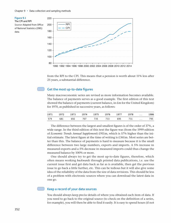
Chapter 9 • Data collection and sampling methods
352
from the RPI to the CPI. This means that a pension is worth about 11% less after 25 years, a substantial difference.
Get the most up-to-date figures
Many macroeconomic series are revised as more information becomes available. The balance of payments serves as a good example. The first edition of this text showed the balance of payments (current balance, in £m for the United Kingdom) for 1970, as published in successive years, as follows:
1971 1972 1973 1974 1975 1976 1977 1978 . . . 1986
579 681 692 707 735 733 695 731 . . . 795
The difference between the largest and smallest figures is of the order of 37%, a wide range. In the third edition of this text the figure was (from the 1999 edition of Economic Trends Annual Supplement) £911m, which is 57% higher than the ini-tial estimate. The latest figure at the time of writing is £361m. Most series are bet-ter than this. The balance of payments is hard to measure because it is the small difference between two large numbers, exports and imports. A 5% increase in measured exports and a 5% decrease in measured imports could thus change the measured balance by 100% or more.
One should always try to get the most up-to-date figures, therefore, which often means working backwards through printed data publications, i.e. use the current issue first and get data back as far as is available, then get the previous issue to go back a little further, etc. This can be tedious but it will also give some idea of the reliability of the data from the size of data revisions. This should be less of a problem with electronic sources where you can download the latest data in one go.
Keep a record of your data sources
You should always keep precise details of where you obtained each item of data. If you need to go back to the original source (to check on the definition of a series, for example), you will then be able to find it easily. It is easy to spend hours (if not
801990 1992 1994 1996 1998 2000 2002 2004 2006 2008 2010 2012 2014
100
120
140
160
180
200
220
RPICPI
Figure 9.1The CPI and RPISource: Adapted from Office of National Statistics (ONS) data.

Using secondary data sources
353
days) trying to find the source of some interesting numbers that you wish to update. For online data this means taking down the URL of the site you visit. Remember that some sites generate the page ‘on demand’, so the web address is not a permanent one and typing it in later on will not take you back to the same source. In these circumstances it may be better to note the ‘root’ part of the address (e.g. www.imf.org/data/) rather than the complete detail. You should also take a note of the date you accessed the site; this may be needed if you put the source into a bibliography.
Keeping data in Excel or another spreadsheet
Spreadsheets are ideal for keeping your data. It is often a good idea to keep the data all together in one worksheet and extract portions of them as necessary and analyse them in another worksheet. Alternatively, it is usually quite easy to transfer data from the spread-sheet to another program (e.g. SPSS or Stata) for more sophisticated analysis. In most spreadsheets you can attach a comment to any cell, so you can use this to keep a record of the source of each observation, changes of definition, etc. Thus you can retain all the infor-mation about your data together in one place.
ST
ATISTICS
IN
PRACTI
CE
· ·
Tips on downloading data
If you are downloading a spreadsheet, save it to your hard disk then include the URL of the source within the spreadsheet itself. You will always know where it came from. You can do the same with Word documents.
You often cannot do this with PDF files, which are read-only, but if the document is not protected you can add a comment, containing the source address. Alternatively, you could save the file to your disk, including the URL within the file name. (Avoid putting extra full stops in the file name, that confuses the operating system. Replace them with hyphens.)
You can use the ‘Text select tool’ within Acrobat to copy items of data from a PDF file and then paste them into a spreadsheet.
Often, when pasting several columns of such data into Excel, all the numbers go into a single column. You can fix this using the Data, Text to Columns menu. Experimentation is required, but it works well.
ST
ATISTICS
IN
PRACTI
CE
· ·
For printed sources you should retain the name of the publication, issue num-ber or date, and table or page number. It also helps to keep the library reference number of the publication if it is obscure. It is best to take a photocopy of the data (but check copyright restrictions) rather than just copy it down, if possible.
Since there are now so many online sources (and they are constantly chang-ing), a list of useful data sites rapidly becomes out of date. The following sites seem to have withstood the test of time so far and have a good chance of surviving throughout the life of this edition.
The UK Office for National Statistics is at http://www.ons.gov.uk/ons/index.html and is a source of all official statistics. However, it is hugely frustrating to use (even after a recent re-design) and very difficult to find what you want. The ‘Time series explorer’ section of the site is a little better.
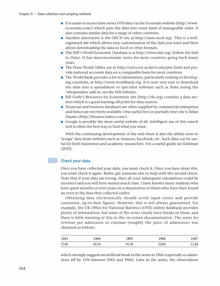
Chapter 9 • Data collection and sampling methods
354
It is easier to access time-series ONS data via the Econstats website (http://www.econstats.com/) which puts the data into some kind of manageable order. It also contains similar data for a range of other countries.
Another alternative is the OECD site at http://stats.oecd.org/. This is a well-organised site which allows easy customisation of the data you want and then allows downloading the data in Excel or other formats.
The IMF’s World Economic Database is at http://www.imf.org/ (follow the link to Data). It has macroeconomic series for most countries going back many years.
The Penn World Tables are at http://cid.econ.ucdavis.edu/pwt.html and pro-vide national accounts data on a comparable basis for most countries.
The World Bank provides a lot of information, particularly relating to develop-ing countries, at http://www.worldbank.org. It is now very easy to download the data into a spreadsheet or specialist software such as Stata (using the ‘ wbopendata’ add-in, see the WB website).
Bill Goffe’s Resources for Economists site (http://rfe.org) contains a data sec-tion which is a good starting-off point for data sources.
Financial and business databases are often supplied by commercial enterprises and hence are not freely available. One useful free (or partially free) site is Yahoo Finance (http://finance.yahoo.com/).
Google is possibly the most useful website of all. Intelligent use of this search tool is often the best way to find what you want.
With the continuing development of the web there is also the ability now to ‘scrape’ data from websites such as Amazon, Facebook, etc. Such data can be use-ful for both businesses and academic researchers. For a useful guide see Edelman (2012).
Check your data
Once you have collected your data, you must check it. Once you have done this, you must check it again. Better, get someone else to help with the second check. Note that if your data are wrong, then all your subsequent calculations could be incorrect and you will have wasted much time. I have known many students who have spent months or even years on a dissertation or thesis who have then found an error in the data they collected earlier.
Obtaining data electronically should avoid input errors and provide consistent, up-to-date figures. However, this is not always guaranteed. For example, the UK Office for National Statistics (ONS) online databank provides plenty of information, but some of the series clearly have breaks in them, and there is little warning of this in the on-screen documentation. The series for revenue per admission to cinemas (roughly the price of admission) was obtained as follows:
1963 1964 1965 1966 1967
37.00 40.30 45.30 20.60 21.80
which strongly suggests an artificial break in the series in 1966 (especially as admis-sions fell by 12% between 1965 and 1966). Later in the series, the observations
Collecting primary data
355
appear to be divided by 100. The lesson is that, even with electronic data, you should check the numbers to ensure they are correct1.
A useful first step to check the data is to graph it (e.g. a time-series plot). Obvious outliers or other unexpected features will show up and you can investi-gate them for possible errors. Do not just rely on the graphs, however, look through your data and check it against the original source. It can then be useful to calculate some summary descriptive statistics; for example, does the average level of the weekly earnings data you have downloaded look approximately cor-rect? Does the rate of growth of a time-series variable look reasonable? If not, go back and check. Better that you find an error in the data than someone else finds the error in your results.
Collecting primary data
Primary data are data that you have collected yourself from original sources, often by means of a sample survey. This has the advantage that you can design the ques-tionnaire to include the questions of interest to you and you have total control over all aspects of data collection. You can also choose the size of the sample (as long as you have sufficient funds available) so as to achieve the desired width of any confidence intervals.
Almost all surveys rely upon some method of sampling, whether random or not. The probability distributions and formulae which have been used in previous chapters as the basis of the techniques of estimation and hypothesis testing rely upon the samples having been drawn at random from the population. If this is not the case, then the formulae for confidence intervals, hypothesis tests, etc., are incorrect and not strictly applicable (they may be reasonable approximations, but it is difficult to know how reasonable). In addition, the results about the bias and precision of estimators will be incorrect. For example, suppose an estimate of the average expenditure on servicing by car owners were obtained from a sample sur-vey. A poor estimate would arise if only Rolls-Royce owners were sampled, since they are not representative of the population as a whole. These are expensive cars, with commensurately high servicing costs, not representative of the majority of cars on the road.
Thus, some form of random sampling method is needed to be able to use the theory of the probability distributions of random variables. Nor should it be believed that the theory of random sampling can be ignored if a very large sample is taken, as the following cautionary tale shows. In 1936 the Literary Digest tried to predict the result of the forthcoming US election by sending out 10 million mail questionnaires. Two million were returned, but even with this enormous sample size Roosevelt’s vote was incorrectly estimated by a margin of 19 percentage points, and the Digest predicted the wrong candidate winning the presidency. The problem here was two-fold: first, the questionnaires may have not been sent out to a representative sample of voters, and second, those who respond to question-naires are not necessarily a random sample of those who receive them.
1I wrote this for a previous edition of this text. I can no longer find the same data on the ONS site, it seems to have disappeared into the ether.
Chapter 9 • Data collection and sampling methods
356
Random sampling
The definition of random sampling is that every element of the population should have a known, non-zero probability of being included in the sample. The problem with the sample of cars used above was that Ford cars (for example) had a zero probability of being included. Many sampling procedures give an equal probabil-ity of being selected to each member of the population, but this is not an essential requirement. It is possible to adjust the sample data to take account of unequal probabilities of selection. If, for example, Rolls-Royce had a much greater chance of being included than Ford, then the estimate of the population mean (of servic-ing costs) would be calculated as a weighted average of the sample observations, with greater weight being given to the few ‘Ford’ observations than to relatively abundant ‘Rolls-Royce’ observations. A very simple illustration of this is given below. Suppose that for the population we have the following data:
Rolls-Royce Ford
Number in population 20 000 2 000 000Annual servicing cost £1000 £200
Then the true average repair bill is
m =20 000 * 1000 + 2 000 000 * 200
2 020 000= 207.92
Suppose the sample data are as follows:
Rolls-Royce Ford
Number in sample 20 40Probability of selection 1/1000 1/50 000Servicing cost £990 £205
To calculate the average cost from the sample data we use a weighted average, using the relative population sizes as weights, not the sample sizes:
x =20 000 * 990 + 2 000 000 * 205
2 020 000= 212.77
If the sample sizes were used as weights, the average would come out at £466.67, which is substantially incorrect.
As long as the probability of being in the sample is known (and hence the rela-tive population sizes must be known), the weight can be derived; but if the prob-ability is zero, this procedure breaks down.
Other theoretical assumptions necessary for deriving the probability distribu-tion of the sample mean or proportion are that the population is of infinite size and that each observation is independently drawn. In practice the former condi-tion is never satisfied, since no population is of infinite size, but most populations are large enough that it does not matter. For each observation to be independently drawn (i.e. the fact of one observation being drawn does not alter the probability of others in the sample being drawn) strictly requires that sampling be done with replacement, i.e. each observation drawn is returned to the population before the
Random sampling
357
next observation is drawn. Again in practice this is often not the case, sampling being done without replacement, but again this is of negligible practical impor-tance where the population is large relative to the sample.
On occasion, the population is quite small and the sample constitutes a sub-stantial fraction of it. In these circumstances the finite population correction (fpc) should be applied to the formula for the variance of x, the fpc being given by
fpc = (1 - n>N) (9.1)
where N is the population size and n the sample size. The table below illustrates its usage:
Variance of x from infinite population
Variance of x from finite population
Example values of fpc
n = 20 25 50 100
N = 50 100 1000 10 000
s2>n s2>n * (1 - n>N) 0.60 0.75 0.95 0.99
The finite population correction serves to narrow the confidence interval because a sample size of (say) 25 reveals more about a population of 100 than about a population of 100 000, so there is less uncertainty about population parameters. When the sample size constitutes only a small fraction of the popula-tion (e.g. 5% or less) the finite population correction can be ignored in practice. If the whole population is sampled (n = N) then the variance becomes zero and there is no uncertainty about the population mean.
A further important aspect of random sampling occurs when there are two samples to be analysed, when it is important that the two samples are indepen-dently drawn. This means that the drawing of the first sample does not influence the drawing of the second sample. This is a necessary condition for the derivation of the probability distribution of the difference between the sample means (or proportions).
Types of random sample
The meaning and importance of randomness in the context of sampling has been explained. However, there are various different types of sampling, all of them random, but which have different statistical properties. Some methods lead to greater precision of the estimates, while others can lead to considerable cost savings in the collection of the sample data, but at the cost of lower preci-sion. The aim of sampling is usually to obtain the most precise estimates of the parameter in question, but the best method of sampling will depend on the cir-cumstances of each case. If it is costly to sample individuals, a sampling method which lowers cost may allow a much larger sample size to be drawn and thus good (precise) estimates to be obtained, even if the method is inherently not very precise. These issues are investigated in more detail below, as we will look at a number of different methods:
simple random sampling – the simplest type, on which our earlier formulae for confidence intervals, etc., were based
stratified sampling – a method which ensures the sample is more representa-tive of the population (ruling out some forms of unrepresentative samples)
Chapter 9 • Data collection and sampling methods
358
cluster sampling (a relatively cheap method of sampling, allowing a larger sample size)
quota sampling (a non-random method, carried out because it is cheap) multi-stage sampling (a method which combines the advantages of some of
the above types).
Simple random sampling
This type of sampling has the property that every possible sample that could be obtained from the population has an equal chance of being selected. This implies that each element of the population has an equal probability of being included in the sample, but this is not the defining characteristic of simple random sampling. As will be shown below, there are sampling methods where every member of the popu-lation has an equal chance of being selected, but some samples (i.e. certain combi-nations of population members) can never be selected.
The statistical methods in this text are based upon the assumption of simple random sampling from the population. It leads to the most straightforward for-mulae for estimation of the population parameters. Although many statistical surveys are not based upon simple random sampling, the use of statistical tests based on simple random sampling is justified since the sampling process is often hypothetical. For example, if one were to compare annual growth rates of two countries over a 30-year period, a z test on the difference of two sample means (i.e. the average annual growth rate in each country) would be conducted. In a sense the data are not a sample since they are the only possible data for those two coun-tries over that time period. Why not just regard the data as constituting the whole population, therefore? Then it would just be a case of finding which country had the higher growth rate; there would be no uncertainty about it.
The alternative way of looking at the data would be to suppose that there exists some hypothetical population of annual growth rates and that the data for the two countries were drawn by (simple) random sampling from this population. Is this story consistent with the data available? In other words, could the data we have simply arise by chance? If the answer to this is no (i.e. the z score exceeds the critical value) then there is something causing a difference between the two coun-tries (it may not be clear what that something is). In this case it is reasonable to assume that all possible samples have an equal chance of selection, i.e. that simple random sampling takes place. Since the population is hypothetical, one might as well suppose it to have an infinite number of members, again required by sam-pling theory.
Stratified sampling
Returning to the practical business of sampling, one problem with simple random sampling is that it is possible to collect ‘bad’ samples, i.e. those which are unrepre-sentative of the population. Suppose that we are investigating how often people buy a daily newspaper, where it is the case that older people tend to buy one more frequently (with younger people more likely to use the internet as a news source, for example). The situation can be illustrated in Figure 9.2.
Now suppose that we take a random sample from this population which, by bad luck or bad design, contains exclusively or predominately the young. It is
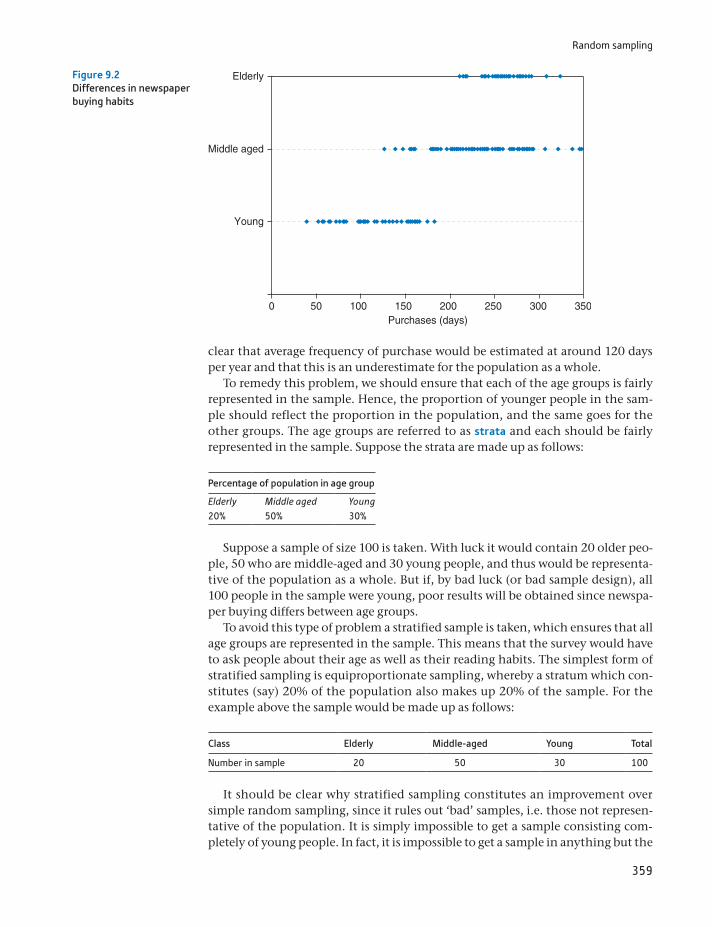
Random sampling
359
clear that average frequency of purchase would be estimated at around 120 days per year and that this is an underestimate for the population as a whole.
To remedy this problem, we should ensure that each of the age groups is fairly represented in the sample. Hence, the proportion of younger people in the sam-ple should reflect the proportion in the population, and the same goes for the other groups. The age groups are referred to as strata and each should be fairly represented in the sample. Suppose the strata are made up as follows:
Percentage of population in age group
Elderly Middle aged Young20% 50% 30%
Suppose a sample of size 100 is taken. With luck it would contain 20 older peo-ple, 50 who are middle-aged and 30 young people, and thus would be representa-tive of the population as a whole. But if, by bad luck (or bad sample design), all 100 people in the sample were young, poor results will be obtained since newspa-per buying differs between age groups.
To avoid this type of problem a stratified sample is taken, which ensures that all age groups are represented in the sample. This means that the survey would have to ask people about their age as well as their reading habits. The simplest form of stratified sampling is equiproportionate sampling, whereby a stratum which con-stitutes (say) 20% of the population also makes up 20% of the sample. For the example above the sample would be made up as follows:
Class Elderly Middle-aged Young Total
Number in sample 20 50 30 100
It should be clear why stratified sampling constitutes an improvement over simple random sampling, since it rules out ‘bad’ samples, i.e. those not represen-tative of the population. It is simply impossible to get a sample consisting com-pletely of young people. In fact, it is impossible to get a sample in anything but the
Young
Middle aged
Elderly
Purchases (days)0 50 100 150 200 250 300 350
Figure 9.2Differences in newspaper buying habits
Chapter 9 • Data collection and sampling methods
360
proportions 20:50:30, as in the population; this is ensured by the method of collecting the sample.
It is easy to see when stratification leads to large improvements over simple ran-dom sampling. If there were no difference between strata (age groups) in buying habits, then there would be no gain from stratification. If behaviour were the same regardless of age group, there would be no point in dividing up the popula-tion according to that factor. On the other hand, if there were large differences between strata, but within strata reading habits were similar, then the gains from stratification would be large. (The fact that newspaper habits are similar within strata means that even a small sample from a single stratum should give an accu-rate picture of that stratum.)
Stratification is beneficial, therefore, when
the between-strata differences are large, and the within-strata differences are small.
These benefits take the form of greater precision of the estimates, i.e. narrower confidence intervals2. The greater precision arises because stratified sampling makes use of supplementary information – i.e. the proportion of the population in each age group. Simple random sampling does not make use of this. Obviously, therefore, if those proportions of the population are unknown, stratified sam-pling cannot be carried out. However, even if the proportions are only known approximately, there could be a gain in precision.
In this example age is a stratification factor, i.e. a variable which is used to divide the population into strata. Other factors could, of course, be used, such as income or even height. A good stratification factor is one which is related to the subject of investigation. Income would probably be a good stratification factor, therefore, since it is likely to be related to reading habits, but height is not since there is probably little difference between tall and short people in newspaper purchases. What is a good stratification factor obviously depends upon the sub-ject of study. A bed manufacturer might well find height to be a good stratifica-tion factor if conducting an enquiry into preferences about the size of beds. Although good stratification factors improve the precision of estimates, bad fac-tors do not make them worse; there will simply be no gain over simple random sampling. It would be as if there were no differences between the age groups in reading habits, so that ensuring the right proportions in the sample is irrelevant, but it has no detrimental effects.
Proportional allocation of sample observations to the different strata (as done above) is the simplest method but is not necessarily the best. For the optimal allo-cation there should generally be a divergence from proportional allocation, and the sample should have more observations in a particular stratum (relative to pro-portional allocation):
the more diverse the stratum, and the cheaper it is to sample the stratum.
2The formulae for calculating confidence intervals with stratified sampling are not given here, since they merit a whole book to themselves. The classic reference is C.A. Moser and G. Kalton, Survey Methods in Social Investigation, Heinemann, 1971. A more recent text is Barnett, Sample Survey Principles and Methods, Wiley, 2002.

Random sampling
361
Starting from the 20:50:30 proportional allocation derived earlier, suppose that older people are all very similar in their buying habits but that youngsters vary considerably in their behaviour. Then the representation of youngsters in the sample should be increased and that of older people reduced. If it were true that every elderly person bought a newspaper every day, then a single observation from that class would be sufficient to yield all there is to know about it. Furthermore, if it is cheaper to sample younger readers, perhaps because they are easier to contact than older people, then again the representation of youngsters in the sample should be increased. This is because, for a given budget, it will allow a larger total sample size.
Stratified sampling is also useful when it is desired to look in detail at some or all of the strata. For example, if one wanted to look at the variation in buying behaviour by the young, it would be inconvenient if one’s sample contained (by chance) very few young people. Stratified sampling avoids this by ensuring that each stratum is adequately covered.
Surveying concert-goers
A colleague and I carried out a survey of people attending a concert in Brighton (by Jamiroquai – I hope they are still popular by the time you read this) to find out who they were, how much they spent in the town and how they travelled to the concert. The spread-sheet gives some of the results.
ST
ATISTICS
IN
PRACTI
CE
· ·
Chapter 9 • Data collection and sampling methods
362
Cluster sampling
A third form of sampling is cluster sampling which, although intrinsically ineffi-cient, can be much cheaper than other forms of sampling, allowing a larger sam-ple size to be collected. Drawing a simple or a stratified random sample of size 100 from the whole of Britain would be very expensive to collect since the sample observations would be geographically very spread out. Interviewers would have to make many long and expensive journeys simply to collect one or two observa-tions. To avoid this, the population can be divided into ‘clusters’ (for example, regions or local authorities), and one or more of these clusters are then randomly chosen. Sampling takes place only within the selected clusters, is therefore geo-graphically concentrated and the cost of sampling falls, allowing a larger sample to be collected for the same expenditure of money.
Within each cluster one can have either a 100% sample or a lower sampling fraction, which is called multi-stage sampling (this is explained further below). Cluster sampling gives unbiased estimates of population parameters but, for a given sample size, these are less precise than the results from simple or stratified sampling. This arises in particular when the clusters are very different from each other, but fairly homogeneous within themselves. In this case once a cluster is chosen, if it is unrepresentative of the population, a poor (inaccurate) estimate of the population parameter is inevitable. The ideal circumstances for cluster sam-pling are when all clusters are very similar, since in that case examining one clus-ter is almost as good as examining the whole population.
Dividing up the population into clusters and dividing it into strata are similar procedures, but the important difference is that sampling is from one or at most a few clusters, but from all strata. This is reflected in the characteristics which make for good sampling. In the case of stratified sampling, it is beneficial if the between-strata differences are large and the within-strata differences small. For cluster sam-pling this is reversed: it is desirable to have small between-cluster differences but heterogeneity within clusters. Cluster sampling is less efficient (precise) for a given sample size, but is cheaper and so can offset this disadvantage with a larger sample size. In general, cluster sampling needs a much larger sample to be effec-tive, so is only worthwhile where there are significant gains in cost.
The data were collected by face-to-face interviews before the concert. We did not have a sampling frame, so the (student) interviewers simply had to choose the sample them-selves on the night. The one important instruction about sampling we gave them was that they should not interview more than one person in any group. People in the same group are likely to be influenced by each other (e.g. travel together) so we would not get independent observations, reducing the effective sample size.
From the results you can see that 41.1% either worked or studied in Brighton and that only one person in the sample was neither working nor studying. The second half of the table shows that 64.4% travelled to the show in a car (obviously adding to congestion in the town), about half of whom shared a car ride. Perhaps surprisingly, Brighton residents were just as likely to use their car to travel as were those from out of town.
The average level of spending was £24.20, predominantly on food (£7.38), drink (£5.97) and shopping (£5.37). The last category had a high variance associated with it – many peo-ple spent nothing, one person spent £200 in the local shops.
Random sampling
363
Multi-stage sampling
Multi-stage sampling was briefly referred to in the previous section and is com-monly found in practice. It may consist of a mixture of simple, stratified and clus-ter sampling at the various stages of sampling. Consider the problem of selecting a random sample of 1000 people from a population of 25 million to find out about voting intentions. A nationwide simple random sample would be extremely expensive to collect, for the reasons given above, so an alternative method must be found. Suppose further that it is suspected that voting intentions differ accord-ing to whether one lives in the north or south of the country and whether one is a home owner or renter. How is the sample to be selected? The following would be one appropriate method.
First, the country is divided up into clusters of counties or regions, and a ran-dom sample of these taken, say one in five. This would be the first way of reducing the cost of selection, since only one-fifth of all counties now need to be visited. This one-in-five sample would be stratified to ensure that north and south were both appropriately represented. To ensure that each voter has an equal chance of being in the sample, the probability of a county being drawn should be propor-tional to its adult population. Thus, a county with twice the population of another should have twice the probability of being in the sample.
Having selected the counties, the second stage would be to select a random sample of local authorities within each selected county. This might be a 1-in-10 sample from each county and would be a simple random sample within each clus-ter. Finally, a selection of voters from within each local authority would be taken, stratified according to tenure. This might be a 1-in-500 sample. The sampling frac-tions would therefore be
15
*1
10*
1500
=1
25 000
So from the population of 25 million voters a sample of 1000 would be col-lected. For different population sizes the sampling fractions could be adjusted so as to achieve the goal of a sample size of 1000.
The sampling procedure is a mixture of simple, stratified and cluster sampling. The two stages of cluster sampling allow the selection of 50 local authorities for study and so costs are reduced. The north and south of the country are both ade-quately represented and housing tenures are also correctly represented in the sample by the stratification at the final stage. The resulting confidence intervals will be complicated to calculate and may in fact be wider than for a simple ran-dom sample of the same size (see the discussion of the UK Time Use Survey), but this more complicated procedure will be much less costly to implement.
The UK Time Use Survey
The UK Time Use Survey provides a useful example of the effects of multi-stage sampling. It uses a mixture of cluster and stratified sampling and the results are weighted to compen-sate for unequal probabilities of selection into the sample and for the effects of non-response. Together, these act to increase the size of standard errors, relative to those obtained from a simple random sample of the same size. This increase can be measured by
ST
ATISTICS
IN
PRACTI
CE
· ·
Chapter 9 • Data collection and sampling methods
364
Quota sampling
Quota sampling is a non-random method of sampling and therefore it is impossible to use sampling theory to calculate confidence intervals from the sample data, or to find whether or not the sample will give biased results. Quota sampling simply means obtaining the sample information as best one can, for example, by asking people in the street (hence it is sometimes called ‘convenience sampling’). However, it is by far the cheapest method of sampling and so allows much larger sample sizes and can be carried out quickly. As shown above, large sample sizes can still give biased results if sampling is non-random; but in some cases the bud-get is too small to afford even the smallest properly conducted random sample, so a quota sample is the only alternative.
Even with quota sampling, where the interviewer is simply told to go out and obtain (say) 1000 observations, it is worth making some crude attempt at stratifi-cation. The problem with human interviewers is that they are notoriously non-random, so that when they are instructed to interview every 10th person they see (a reasonably random method), if that person turns out to be a shabbily dressed tramp slightly the worse for drink, they are quite likely to select the 11th person instead. Shabbily dressed tramps, slightly the worse for drink, are therefore under-represented in the sample. To combat this sort of problem the interviewers are given quotas to fulfil, for example, 20 men and 20 women, 10 old-age pensioners,
the design factor, defined as the ratio of the true standard error to the one arising from a simple random sample of the same size. For the time use survey, the design factor is typi-cally 1.5 or more. Thus the standard errors are increased by 50% or more, but a simple ran-dom sample of the same size would be much more expensive to collect (for example, the clustering means that only a minority of geographical areas are sampled).
The following table shows the average amount of time spent sleeping by 16 to 24 year olds (in minutes per day):
Mean True s.e. 95% CIDesign factor n
Effective sample size
Male 544.6 6.5 [531.9, 557.3] 1.63 1090 412Female 545.7 4.2 [537.3, 554.0] 1.14 1371 1058
The true standard error, taking account of the sample design, is 6.5 minutes for men. The design factor is 1.63, meaning this standard error is 63% larger than for a similar sized (n = 1090) simple random sample. Equivalently, a simple random sample of size n = 412(= 1090>1.632) would achieve the same precision (but at greater cost).
How the design factor is made up is shown in the following table:
Design factor (deft)
Deft due to stratification
Deft due to clustering
Deft due to weighting
1.63 1.00 1.17 1.26
It can be seen that stratification has no effect on the standard error, but both clustering and the post-sample weighting serve to increase the standard errors.
Source: The UK 2000 Time Use Survey, Technical Report 2003, HMSO.
Calculating the required sample size
365
one shabbily dressed tramp, etc., so that the sample will at least broadly reflect the population under study and give reasonable results.
It is difficult to know how accurate quota samples are, since it is rare for their results to be checked against proper random samples or against the population itself. Probably the most common quota samples relate to voting intentions and so can be checked against actual election results. The 1992 UK general election provides an interesting illustration. The opinion polls predicted a fairly substan-tial Labour victory, but the outcome was a narrow Conservative majority. An enquiry concluded that the erroneous forecast occurred because a substantial number of voters changed their minds at the last moment and that there was ‘dif-ferential turn-out’, i.e. Conservative supporters were more likely to vote than Labour ones. Since then, pollsters have tried to take this factor into account when trying to predict election outcomes.
Unfortunately, the pollsters were caught out again in 2015, this time predicting a tie between the two major parties when the election resulted in a clear majority for the Conservative Party. This time the blame was put on unrepresentative sam-ples, with some groups under-represented (e.g. 45–64 year olds). Attempts to cor-rect this via weighting of the sample results proved ineffective. Interestingly, a proper random sample (the British Election Survey) did get the right result, but this was one carried out after the election and so is difficult to compare impar-tially with the quota samples.
Can you always believe surveys?
Many surveys are more interested in publicising something than in finding out the facts. One has to be wary of surveys finding that people enjoy high-rise living . . . when the survey is sponsored by an elevator company, for example. In July 2007 a survey of 1000 adults found that ‘the average person attends 3.4 weddings each year’. This sounds suspiciously high to me. I have never attended three or more weddings in a year, nor have friends I have asked. Let us do some calculations. There were 283 730 weddings in the United Kingdom in 2005. There are about 45m adults, so if they each attend 3.4 weddings, that makes 45 * 3.4 = 153 million attendees. This means 540 per wedding. That seems excessively high (remember this excludes children) and probably means the sample design was poor, obtaining an unrepresentative result.
A good way to make a preliminary judgement on the likely accuracy of a survey is to ask ‘who paid for this?’
ST
ATISTICS
IN
PRACTI
CE
· ·
Calculating the required sample size
Before collecting sample data, it is obviously necessary to know how large the sample size has to be. The required sample size will depend upon two factors:
the desired level of precision of the estimate, and the funds available to carry out the survey.
The greater the precision required, the larger the sample size needs to be, other things being equal. But a larger sample will obviously cost more to collect, and this might conflict with a limited amount of funds being available. There is a
Chapter 9 • Data collection and sampling methods
366
trade-off, therefore, between the two desirable objectives of high precision and low cost. The following example shows how these two objectives conflict.
A firm producing sweets wishes to find out the average amount of pocket money children receive per week. It wants to be 99% confident that the estimate is within 20 pence of the correct value. How large a sample is needed?
The problem is one of estimating a confidence interval, turned on its head. Instead of having the sample information x, s and n, and calculating the confi-dence interval for m, the desired width of the confidence interval is given and it is necessary to find the sample size n which will ensure this. The formula for the 99% confidence interval, assuming a Normal rather than t distribution (i.e. it is assumed that the required sample size will be large), is
x 2.58 * 2s2>n (9.2)
Diagrammatically this can be represented as in Figure 9.3.The firm wants the distance between x and m to be no more than 20 pence in
either direction, which means that the confidence interval must be 40 pence wide. The value of n which makes the confidence interval 40 pence wide has to be found. This can be done by solving the equation
20 = 2.58 * 2s2>nand hence, by rearranging:
n =2.582 * s2
202 (9.3)
All that is now required to solve the problem is the value of s2, the sample vari-ance; but since the sample has not yet been taken, this is not available. There are a number of ways of trying to get round this problem:
using the results of existing surveys if available, conducting a small, preliminary, survey, and guessing.
These may not seem very satisfactory (particularly the last), but something has to be done and some intelligent guesswork should give a reasonable estimate of s2. Suppose, for example, that a survey of children’s spending taken five years previ-ously showed a standard deviation of 30p. It might be reasonable to expect that the standard deviation of spending would be similar to the standard deviation of
Figure 9.3The desired width of the confidence interval
Collecting the sample
367
income, so 30p (updated for inflation) can be used as an estimate of the standard deviation. Suppose that five years’ inflation turns the 30p into 50p. Using s = 50, we obtain
n =2.582 * 502
202 = 41.6
giving a required sample size of 42 (the sample size has to be an integer). This is a large (n Ú 25) sample size, so the use of the Normal distribution was justified.
Is the firm willing to pay for such a large sample? Suppose it was willing to pay out £1000 in total for the survey, which costs £600 to set up and then £6 per per-son sampled. The total cost would be £600 + 42 * 6 = £852, which is within the firm’s budget. If the firm wished to spend less than this, it would have to accept a smaller sample size and thus a lower precision or a lower level of confidence. For example, if only a 95% confidence level were required, the appropriate z score would be 1.96, yielding
n =1.962 * 502
202 = 24.01
A sample size of 24 would only cost £600 + 6 * 24 = £804. (At this sample size the assumption that x follows a Normal distribution becomes less tenable, so the results should be treated with caution. Use of the t distribution is tricky, because the appropriate t value depends upon the number of degrees of freedom which in turn depends on sample size, which is what is being looked for.)
The general formula for finding the required sample size is
n =z2a * s2
p2 (9.4)
where za is the z score appropriate for the (100 - a)% confidence level and p is the desired accuracy (20 pence in this case).
Caution should be used with this type of calculation as the result is true for a simple random sample only. If a different type of sampling is used (e.g. cluster sampling) then the sample might need to be bigger, perhaps double the size for simple random sample.
Collecting the sample
The sampling frame
We now move on to the fine detail of how to select the individual observations which make up the sample. In order to do this, it is necessary to have some sort of sampling frame, i.e. a list of all the members of the population from which the sam-ple is to be drawn. This can be a problem if the population is extremely large, for example the population of a country, since it is difficult to manipulate so much information (cutting up 65 million pieces of paper to put into a hat for a random draw is a tedious business). Alternatively, the list might not even exist or, if it does, not be in one place convenient for consultation and use. In this case there is often an advantage to multi-stage sampling, for the selection of regions or even local
Chapter 9 • Data collection and sampling methods
368
authorities is fairly straightforward and not too time-consuming. Once at this lower level the sampling frame is more manageable (each local authority has an electoral register, for example) and individual observations can be relatively easily chosen. Thus it is not always necessary to have a complete sampling frame for the entire population in one place.
Choosing from the sampling frame
There is a variety of methods available for selecting a sample of (say) 1000 obser-vations from a sampling frame of 25 000 names, varying from the manual to the electronic. The oldest method is to cut up 25 000 pieces of paper, put them in a (large) hat, shake it (to randomise) and pick out 1000. This is fairly time-consum-ing, however, and has some pitfalls – if the pieces are not all cut to the same size, is the probability of selection the same? It is much better if the population in the sampling frame is numbered in some way, for then one only has to select random numbers. This can be done by using a table of random numbers (see Table A1 on page 448, for example), or a computer. The use of random number tables for such purposes is an important feature of statistics, and in 1955 the Rand Corporation produced a book entitled A Million Random Digits with 100 000 Normal Deviates. This book, as the title promises, contained nothing but pages of random num-bers which allowed researchers to collect random samples. Interestingly, the authors did not bother to fully proofread the text, since a few (random) errors here and there would not matter. These numbers were calculated electronically and nowadays every computer has a facility for rapidly choosing a set of random numbers. (It is an interesting question how a computer, which follows rigid rules of behaviour, can select random numbers which, by definition, are unpredict-able by any rule.)
A further alternative, if a 1-in-25 sample is required, is to select a random start-ing point between 1 and 25 and then select every subsequent 25th observation (e.g. the 3rd, 28th, 53rd, etc.). This is a satisfactory procedure if the sampling frame is randomly sorted to start with, but otherwise there can be problems. For example, if the list is sorted by income (poorest first), a low starting value will almost cer-tainly give an underestimate of the population mean. If all the numbers were ran-domly sorted, this ‘error’ in the starting value would not be important.
Interviewing techniques
Good training of interviewers is vitally important to the results of a survey. It is very easy to lead an interviewee into a particular answer to a question. Consider the following two sets of questions:
A(1) Do you know how many people were killed by the atomic bomb at Hiroshima?(2) Do you think nuclear weapons should be banned?
B(1) Do you believe in nuclear deterrence?(2) Do you think nuclear weapons should be banned?
A2 is almost certain to get a higher ‘yes’ response than B2. Even a different ordering of the questions can have an effect upon the answers (consider asking

Collecting the sample
369
A2 before A1). The construction of the questionnaire has to be done with care, therefore. The manner in which the questions are asked is also important, since it can often suggest the answer. Good interviewers are trained to avoid these prob-lems by sticking precisely to the wording of the question and not to suggest an expected answer.
Telephone surveys
An article by M. Collins in the Journal of the Royal Statistical Society reveals some of the difficulties in conducting surveys by telephone. First, the sampling frame is incomplete since, although most people have a telephone, some are not listed in the directory. In the late 1980s this was believed to be around 12% of all numbers, but it has been growing since, to around 40%. (Part of this trend, of course, may be due to people getting fed up with being pestered by salespersons and ‘market researchers’.) Researchers have responded with ‘random digit dialling’ which is made easier by modern computerised equipment.
Matters are unlikely to improve for researchers in the future. The answering machine is often used as a barrier to unwanted calls and some residential lines connect to fax machines. Increasing deregulation and mobile phone use mean it will probably become more and more difficult to obtain a decent sampling frame for a proper survey.
Source: M. Collins, Sampling for UK telephone surveys, J. Royal Statistical Society, Series A, 162 (1), 1999.
ST
ATISTICS
IN
PRACTI
CE
· ·
Even when these procedures are adhered to there can be various types of response bias. The first problem is of non-response, due to the subject not being at home when the interviewer calls. There might be a temptation to remove that person from the sample and call on someone else, but this should be resisted. There could well be important differences between those who are at home all day and those who are not, especially if the survey concerns employment or spending patterns, for example. Continued efforts should be made to contact the subject. One should be wary of surveys which have low response rates, particularly where it is suspected that the non-response is in some way systematic and related to the goal of the survey.
A second problem is that subjects may not answer the question truthfully for one reason or another, sometimes inadvertently. An interesting example of this occurred in the survey into sexual behaviour carried out in Britain in 1992 (see Nature, 3 December 1992). Amongst other things, this found the following:
The average number of heterosexual partners during a woman’s lifetime is 3.4. The average number of heterosexual partners during a man’s lifetime is 9.9.
This may be in line with one’s beliefs about behaviour, but, in fact, the figures must be wrong. The total number of partners of all women must by definition equal the total number for all men. Since there are approximately equal numbers of males and females in the United Kingdom, the averages must therefore be about the same. So how do the above figures come about?
It is too much to believe that international trade holds the answer. It seems unlikely that British men are so much more attractive to foreign women than British women are to foreign men. Nor is an unrepresentative sample likely. It was carefully chosen and quite large (around 20 000 respondents). The answer would appear to be that some people are lying. Either women are being excessively
Chapter 9 • Data collection and sampling methods
370
modest or (more likely?) men are boasting. Perhaps the answer is to divide by three whenever a man talks about his sexual exploits.
For an update on this story, see the article by J. Wadsworth et al., What is a mean? An examination of the inconsistency between men and women in report-ing sexual partnerships, J. Royal Statistical Society, 1996, Series A. 159 (1).
Case study: the UK Living Costs and Food Survey
Introduction
The Living Costs and Food Survey (LCF) is an example of a large government survey which examines households’ expenditure patterns (with a particular focus on food expenditures) and income receipts. It is worth having a brief look at it, therefore, to see how the principles of sampling techniques outlined in this chapter are put into practice. The LCF succeeded the Expenditure and Food Survey in 2008, which used a similar design. The LCF is used for many different purposes, including the calcula-tion of weights to be used in the UK Consumer Price Index and the assessment of the effects of changes in taxes and state benefits upon different households.
Choosing the sample
The sample design which follows is known as a multi-stage, stratified random sam-ple with clustering. This is obviously quite a complex design so will be examined in a little detail.
Stage 1
The primary sampling unit (PSU) is the Postcode Sector, a small geographical area. There are 638 of these selected at random each year (from a total of around 10,600 sectors in the country), stratified according to
region, socio-economic classification, and car ownership.
This ensures the chosen areas are representative of the country as a whole on these characteristics.
Stage 2
Eighteen households are drawn at random from each postcode sector, giving a prospective sample size of 638 * 18 = 11 484 households. To capture spending patterns throughout the year, interviewing takes place in approximately 53 sec-tors each month. The response rate to the survey is approximately 50%, having fallen in recent years, hence the number of households providing information is around 5700.
The sampling frame
The Postcode Address File, a list of all postal delivery addresses, is used as the sam-pling frame. Previously the register of electors in each ward had been used but had
Summary
371
some drawbacks: it was under-representative of those who have no permanent home or who move frequently (e.g. tramps, students, etc.). The fact that many people took themselves off the register in the early 1990s in order to avoid paying the Community Charge could also have affected the sample.
Collection of information
The data are collected by interview, and by asking participants to keep a diary in which they record everything they purchase over a two-week period. Highly skilled interviewers are required to ensure accuracy and compliance with the sur-vey, and each participating family is visited several times. As an inducement to cooperate, each member of the family is paid a small sum of money – it is to be hoped that the anticipation of this does not distort their expenditure patterns.
Sampling errors
Given the complicated survey design, it is difficult to calculate sampling errors exactly. The multi-stage design of the sample actually tends to increase the sam-pling error relative to a simple random sample, but, of course, this is offset by cost savings which allow a greatly increased sample size. Overall, the results of the sur-vey are of good quality and can be verified by comparison with other statistics, such as retail sales, for example.
Summary
A primary data source is one where you obtain the data yourself, designed the questions and have access to all the original observations.
A secondary data source is one collected by others, perhaps for a different pur-pose to your own. You may have access to all the original observations (typical with electronic sources) or a summary, usually in the form of tables.
When collecting data always keep detailed notes of the sources of all informa-tion, how it was collected, precise definitions of the variables, etc.
Most data can be obtained electronically, which saves having to type it into a computer, but the data still need to be checked for errors.
There are various types of random sample, including simple, stratified and clus-tered random samples. The methods are sometimes combined in multi-stage samples.
The type of sampling affects the size of the standard errors of the sample statis-tics. The most precise sampling method is not necessarily the best if it costs more to collect (since the overall sample size that can be afforded will be smaller).
Quota sampling is a non-random method of sampling which has the advan-tage of being extremely cheap. It is often used for opinion polls and surveys.
The sampling frame is the list (or lists) from which the sample is drawn. If it omits important elements of the population, its use could lead to biased results.
Careful interviewing techniques are needed to ensure reliable answers are obtained from participants in a survey.

Chapter 9 • Data collection and sampling methods
372
cluster samplingdesign factorfinite population correctionmulti-stage samplingonline dataprimary dataquota samplingrandom sample
sampling framesampling methodssecondary datasimple random samplingstratastratification factorstratified sampling
Key terms and concepts
Barnett, V., Sample Survey Principles and Methods, Wiley, 2002.Edelman, B., Using Internet Data for Economic Research, Journal of Economic
Perspectives, 26(2), 189–206, 2012.Moser, C.A., and G. Kalton, Survey Methods in Social Investigations, Heinemann,
1971.Rand Corporation, A Million Random Digits with 100 000 Normal Deviates, The
Glencoe Press, 1955.
References
Problems
373
Formula Description Note
fpc = 1 - n>N Finite population correction for the variance of x
n =z2a * s2
p2
Required sample size to obtain desired confidence interval
p is the desired accuracy (half the width of the CI), Za is the critical value from the Normal distribution (depends on confidence level specified).
Formulae used in this chapter
Some of the more challenging problems are indicated by highlighting the problem number in colour.
9.1 What issues of definition arise in trying to measure ‘output’?
9.2 What issues of definition arise in trying to measure ‘unemployment’?
9.3 Find the gross domestic product for both the United Kingdom and the United States for the period 1995 to 2003. Obtain both series in constant prices.
9.4 Find figures for the monetary aggregate M0 for the years 1995 to 2003 in the United Kingdom, in nominal terms.
9.5 A firm wishes to know the average weekly expenditure on food by households to within £2, with 95% confidence. If the variance of food expenditure is thought to be about 400, what sample size does the firm need to achieve its aim?
9.6 A firm has £10 000 to spend on a survey. It wishes to know the average expenditure on gas by busi-nesses to within £30 with 99% confidence. The variance of expenditure is believed to be about 40 000. The survey costs £7000 to set up and then £15 to survey each firm. Can the firm achieve its aim with the budget available?
9.7 (Project) Visit your college library or online sources to collect data to answer the following ques-tion. Have females’ earnings risen relative to men’s over the past 10 years? You should write a short report on your findings. This should include a section describing the data collection process, includ-ing any problems encountered and decisions you had to make. Compare your results with those of other students. It might be interesting to compare your experiences of using online and offline sources of data.
9.8 (Project) Do a survey to find the average age of cars parked on your college campus. (A letter or digit denoting the registration year can be found on the number plate (applies to the United Kingdom, other countries will differ) – precise details can be obtained in various guides to used- car prices.) You might need stratified sampling (e.g. if administrators have newer cars than faculty and students, for example). You could extend the analysis by comparing the results with a public car park. You should write a brief report outlining your survey methods and the results you obtain. If several students do such a survey you could compare results.
Problems
374
By the end of this chapter you should be able to:
represent a set of data in index number form
understand the role of index numbers in summarising or presenting data
Learning outcomes 374Introduction 375A simple index number 376A price index with more than one commodity 377
Using base-year weights: the Laspeyres index 378Using current-year weights: the Paasche index 382Units of measurement 383
Using expenditures as weights 385Comparison of the Laspeyres and Paasche indices 386The story so far – a brief summary 387
Quantity and expenditure indices 387The Laspeyres quantity index 387The Paasche quantity index 388Expenditure indices 389Relationships between price, quantity and expenditure indices 389Chain indices 392
The Consumer Price Index 393Discounting and present values 394
An alternative investment criterion: the internal rate of return 396Nominal and real interest rates 397
Inequality indices 399The Lorenz curve 399The Gini coefficient 402
Is inequality increasing? 404A simpler formula for the Gini coefficient 405
Concentration ratios 407Summary 409
Key terms and concepts 409Reference 410Formulae used in this chapter 411Problems 411Answers to exercises 416
Appendix: Deriving the expenditure share form of the Laspeyres price index 419
Index numbers10
375
recognise the relationship between price, quantity and expenditure index numbers
turn a series measured at current prices into one at constant prices (or in volume terms)
splice separate index number series together
measure inequality using index numbers.
Introduction
‘Consumer price index up 3.8%. Retail price index up 4.6%.’ (UK, June 2008)
‘Vietnam reports an inflation rate of 27.04%’ (July 2008)
‘Zimbabwe inflation at 2,200,000%’ (July 2008)
The above headlines reveal startling differences between the inflation rates of three different countries. This chapter is concerned with how such measures are constructed and then interpreted. Index numbers are not restricted to measuring inflation, although that is one of the most common uses. There are also indexes of national output, of political support, of corruption in different countries of the world, and even of happiness (Danes are the happiest, it seems).
An index number is a descriptive statistic, in the same sense as the mean or stan-dard deviation, which summarises a mass of information into some readily under-stood statistic. As such, it shares the advantages and disadvantages of other summary statistics: it provides a useful overview of the data but misses out the finer detail. The retail price index (RPI) referred to above is one example, which summarises information about the prices of different goods and services, aggre-gating them into a single number. We have used index numbers earlier in the text (for example, in the chapters on regression), without fully explaining their deriva-tion or use. This will now be remedied.
Index numbers are most commonly used for following trends in data over time, such as the consumer price index (CPI) measuring the price level or the index of industrial production (IIP) measuring the output of industry. The CPI (or the sim-ilar retail price index, RPI) also allows calculation of the rate of inflation, which is simply the rate of change of the price index; and from the IIP it is easy to measure the rate of growth of output. Index numbers are also used with cross-section data, for example, an index of regional house prices would summarise information about the different levels of house prices in different regions of the country at a particular point in time. There are many other examples of index numbers in use, common ones being the Financial Times All Share index, the trade weighted exchange rate index, and the index of the value of retail sales.
This chapter will explain how index numbers are constructed from original data and the problems which arise in doing this. There is also a brief discussion of the CPI to illustrate some of these problems and to show how they are resolved in practice. Finally, a different set of index numbers is examined, which are used to measure inequality, such as inequality in the distribution of income, or in the market shares held by different firms competing in a market. Constructing index numbers is not the most glamorous part of statistics but it is important for any applied researcher to understand them.
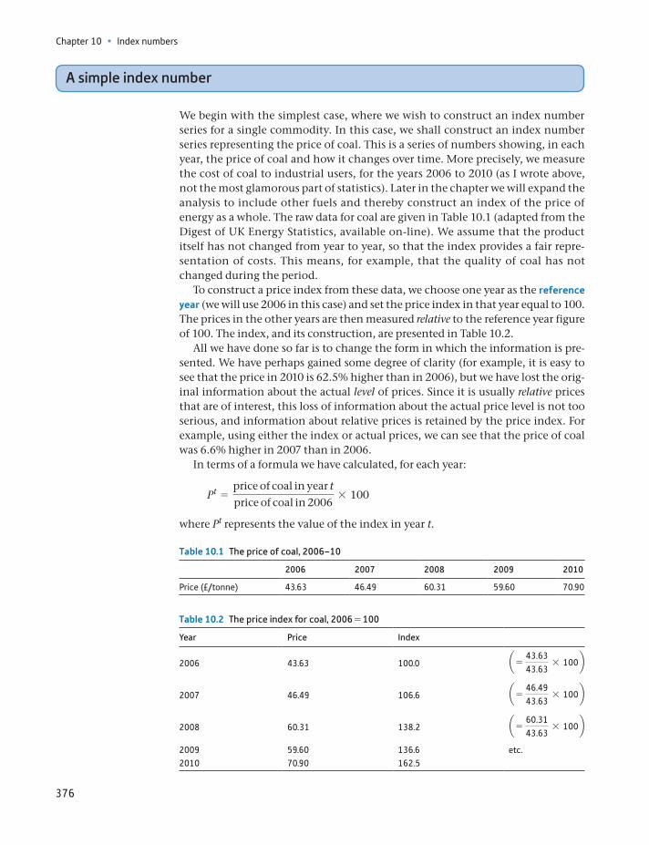
Chapter 10 • Index numbers
376
A simple index number
We begin with the simplest case, where we wish to construct an index number series for a single commodity. In this case, we shall construct an index number series representing the price of coal. This is a series of numbers showing, in each year, the price of coal and how it changes over time. More precisely, we measure the cost of coal to industrial users, for the years 2006 to 2010 (as I wrote above, not the most glamorous part of statistics). Later in the chapter we will expand the analysis to include other fuels and thereby construct an index of the price of energy as a whole. The raw data for coal are given in Table 10.1 (adapted from the Digest of UK Energy Statistics, available on-line). We assume that the product itself has not changed from year to year, so that the index provides a fair repre-sentation of costs. This means, for example, that the quality of coal has not changed during the period.
To construct a price index from these data, we choose one year as the reference year (we will use 2006 in this case) and set the price index in that year equal to 100. The prices in the other years are then measured relative to the reference year figure of 100. The index, and its construction, are presented in Table 10.2.
All we have done so far is to change the form in which the information is pre-sented. We have perhaps gained some degree of clarity (for example, it is easy to see that the price in 2010 is 62.5% higher than in 2006), but we have lost the orig-inal information about the actual level of prices. Since it is usually relative prices that are of interest, this loss of information about the actual price level is not too serious, and information about relative prices is retained by the price index. For example, using either the index or actual prices, we can see that the price of coal was 6.6% higher in 2007 than in 2006.
In terms of a formula we have calculated, for each year:
Pt =price of coal in year tprice of coal in 2006
* 100
where Pt represents the value of the index in year t.
Table 10.1 The price of coal, 2006–10
2006 2007 2008 2009 2010
Price (£/tonne) 43.63 46.49 60.31 59.60 70.90
Table 10.2 The price index for coal, 2006 = 100
Year Price Index
2006 43.63 100.0 a = 43.6343.63
* 100b
2007 46.49 106.6 a = 46.4943.63
* 100b
2008 60.31 138.2 a = 60.3143.63
* 100b
2009 59.60 136.6 etc.2010 70.90 162.5
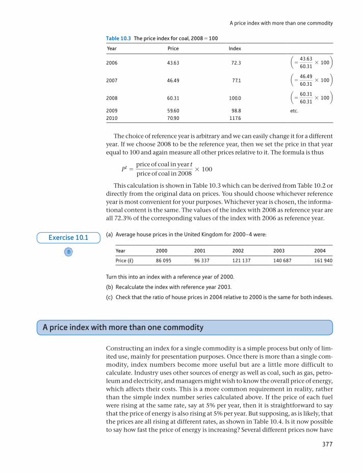
A price index with more than one commodity
377
The choice of reference year is arbitrary and we can easily change it for a different year. If we choose 2008 to be the reference year, then we set the price in that year equal to 100 and again measure all other prices relative to it. The formula is thus
Pt =price of coal in year tprice of coal in 2008
* 100
This calculation is shown in Table 10.3 which can be derived from Table 10.2 or directly from the original data on prices. You should choose whichever reference year is most convenient for your purposes. Whichever year is chosen, the informa-tional content is the same. The values of the index with 2008 as reference year are all 72.3% of the corresponding values of the index with 2006 as reference year.
Table 10.3 The price index for coal, 2008 = 100
Year Price Index
2006 43.63 72.3 a = 43.6360.31
* 100b
2007 46.49 77.1 a = 46.4960.31
* 100b
2008 60.31 100.0 a = 60.3160.31
* 100b
2009 59.60 98.8 etc.2010 70.90 117.6
(a) Average house prices in the United Kingdom for 2000–4 were:
Year 2000 2001 2002 2003 2004
Price (£) 86 095 96 337 121 137 140 687 161 940
Turn this into an index with a reference year of 2000.
(b) Recalculate the index with reference year 2003.
(c) Check that the ratio of house prices in 2004 relative to 2000 is the same for both indexes.
?
Exercise 10.1
A price index with more than one commodity
Constructing an index for a single commodity is a simple process but only of lim-ited use, mainly for presentation purposes. Once there is more than a single com-modity, index numbers become more useful but are a little more difficult to calculate. Industry uses other sources of energy as well as coal, such as gas, petro-leum and electricity, and managers might wish to know the overall price of energy, which affects their costs. This is a more common requirement in reality, rather than the simple index number series calculated above. If the price of each fuel were rising at the same rate, say at 5% per year, then it is straightforward to say that the price of energy is also rising at 5% per year. But supposing, as is likely, that the prices are all rising at different rates, as shown in Table 10.4. Is it now possible to say how fast the price of energy is increasing? Several different prices now have
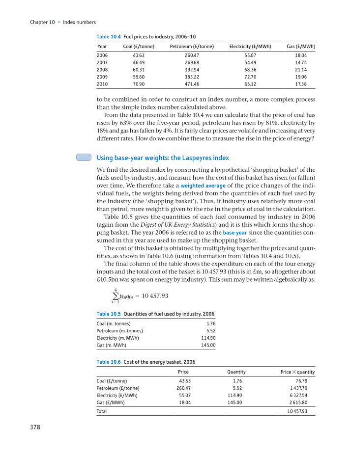
Chapter 10 • Index numbers
378
to be combined in order to construct an index number, a more complex process than the simple index number calculated above.
From the data presented in Table 10.4 we can calculate that the price of coal has risen by 63% over the five-year period, petroleum has risen by 81%, electricity by 18% and gas has fallen by 4%. It is fairly clear prices are volatile and increasing at very different rates. How do we combine these to measure the rise in the price of energy?
Using base-year weights: the Laspeyres index
We find the desired index by constructing a hypothetical ‘shopping basket’ of the fuels used by industry, and measure how the cost of this basket has risen (or fallen) over time. We therefore take a weighted average of the price changes of the indi-vidual fuels, the weights being derived from the quantities of each fuel used by the industry (the ‘shopping basket’). Thus, if industry uses relatively more coal than petrol, more weight is given to the rise in the price of coal in the calculation.
Table 10.5 gives the quantities of each fuel consumed by industry in 2006 (again from the Digest of UK Energy Statistics) and it is this which forms the shop-ping basket. The year 2006 is referred to as the base year since the quantities con-sumed in this year are used to make up the shopping basket.
The cost of this basket is obtained by multiplying together the prices and quan-tities, as shown in Table 10.6 (using information from Tables 10.4 and 10.5).
The final column of the table shows the expenditure on each of the four energy inputs and the total cost of the basket is 10 457.93 (this is in £m, so altogether about £10.5bn was spent on energy by industry). This sum may be written algebraically as:
a4
i = 1p0iq0i = 10 457.93
Table 10.4 Fuel prices to industry, 2006–10
Year Coal (£/tonne) Petroleum (£/tonne) Electricity (£/MWh) Gas (£/MWh)
2006 43.63 260.47 55.07 18.042007 46.49 269.68 54.49 14.742008 60.31 392.94 68.36 21.142009 59.60 383.22 72.70 19.062010 70.90 471.46 65.12 17.38
Table 10.5 Quantities of fuel used by industry, 2006
Coal (m. tonnes) 1.76Petroleum (m. tonnes) 5.52Electricity (m. MWh) 114.90Gas (m. MWh) 145.00
Table 10.6 Cost of the energy basket, 2006
Price Quantity Price * quantity
Coal (£/tonne) 43.63 1.76 76.79Petroleum (£/tonne) 260.47 5.52 1 437.79Electricity (£/MWh) 55.07 114.90 6 327.54Gas (£/MWh) 18.04 145.00 2 615.80
Total 10 457.93
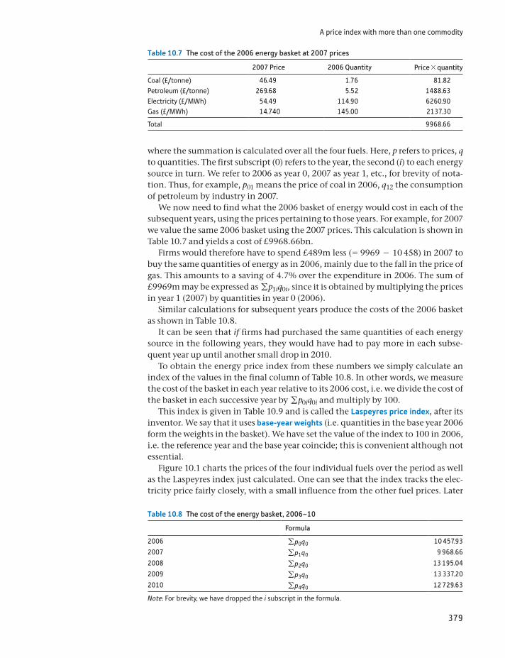
A price index with more than one commodity
379
where the summation is calculated over all the four fuels. Here, p refers to prices, q to quantities. The first subscript (0) refers to the year, the second (i) to each energy source in turn. We refer to 2006 as year 0, 2007 as year 1, etc., for brevity of nota-tion. Thus, for example, p01 means the price of coal in 2006, q12 the consumption of petroleum by industry in 2007.
We now need to find what the 2006 basket of energy would cost in each of the subsequent years, using the prices pertaining to those years. For example, for 2007 we value the same 2006 basket using the 2007 prices. This calculation is shown in Table 10.7 and yields a cost of £9968.66bn.
Firms would therefore have to spend £489m less (= 9969 - 10 458) in 2007 to buy the same quantities of energy as in 2006, mainly due to the fall in the price of gas. This amounts to a saving of 4.7% over the expenditure in 2006. The sum of £9969m may be expressed as gp1iq0i, since it is obtained by multiplying the prices in year 1 (2007) by quantities in year 0 (2006).
Similar calculations for subsequent years produce the costs of the 2006 basket as shown in Table 10.8.
It can be seen that if firms had purchased the same quantities of each energy source in the following years, they would have had to pay more in each subse-quent year up until another small drop in 2010.
To obtain the energy price index from these numbers we simply calculate an index of the values in the final column of Table 10.8. In other words, we measure the cost of the basket in each year relative to its 2006 cost, i.e. we divide the cost of the basket in each successive year by gp0iq0i and multiply by 100.
This index is given in Table 10.9 and is called the Laspeyres price index, after its inventor. We say that it uses base-year weights (i.e. quantities in the base year 2006 form the weights in the basket). We have set the value of the index to 100 in 2006, i.e. the reference year and the base year coincide; this is convenient although not essential.
Figure 10.1 charts the prices of the four individual fuels over the period as well as the Laspeyres index just calculated. One can see that the index tracks the elec-tricity price fairly closely, with a small influence from the other fuel prices. Later
Table 10.7 The cost of the 2006 energy basket at 2007 prices
2007 Price 2006 Quantity Price * quantity
Coal (£/tonne) 46.49 1.76 81.82Petroleum (£/tonne) 269.68 5.52 1488.63Electricity (£/MWh) 54.49 114.90 6260.90Gas (£/MWh) 14.740 145.00 2137.30
Total 9968.66
Table 10.8 The cost of the energy basket, 2006–10
Formula
2006 gp0q0 10 457.93
2007 gp1q0 9 968.66
2008 gp2q0 13 195.04
2009 gp3q0 13 337.20
2010 gp4q0 12 729.63
Note: For brevity, we have dropped the i subscript in the formula.
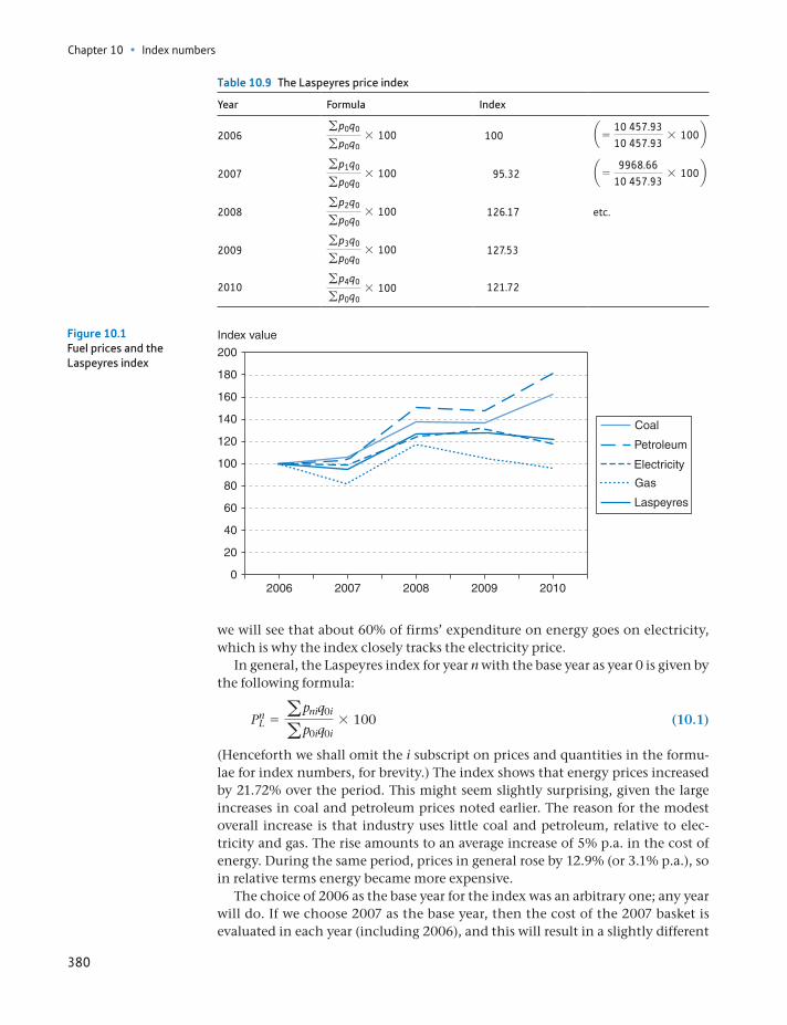
Chapter 10 • Index numbers
380
we will see that about 60% of firms’ expenditure on energy goes on electricity, which is why the index closely tracks the electricity price.
In general, the Laspeyres index for year n with the base year as year 0 is given by the following formula:
PnL = apniq0i
ap0iq0i* 100 (10.1)
(Henceforth we shall omit the i subscript on prices and quantities in the formu-lae for index numbers, for brevity.) The index shows that energy prices increased by 21.72% over the period. This might seem slightly surprising, given the large increases in coal and petroleum prices noted earlier. The reason for the modest overall increase is that industry uses little coal and petroleum, relative to elec-tricity and gas. The rise amounts to an average increase of 5% p.a. in the cost of energy. During the same period, prices in general rose by 12.9% (or 3.1% p.a.), so in relative terms energy became more expensive.
The choice of 2006 as the base year for the index was an arbitrary one; any year will do. If we choose 2007 as the base year, then the cost of the 2007 basket is evaluated in each year (including 2006), and this will result in a slightly different
Table 10.9 The Laspeyres price index
Year Formula Index
2006gp0q0gp0q0
* 100 100 a = 10 457.9310 457.93
* 100b
2007gp1q0gp0q0
* 100 95.32 a = 9968.66
10 457.93* 100b
2008gp2q0gp0q0
* 100 126.17 etc.
2009gp3q0gp0q0
* 100 127.53
2010gp4q0gp0q0
* 100 121.72
0
20
40
60
80
100
120
140
160
180
200
Index value
2006 2007 2008 2009 2010
Coal
Petroleum
Electricity
Gas
Laspeyres
Figure 10.1Fuel prices and the Laspeyres index
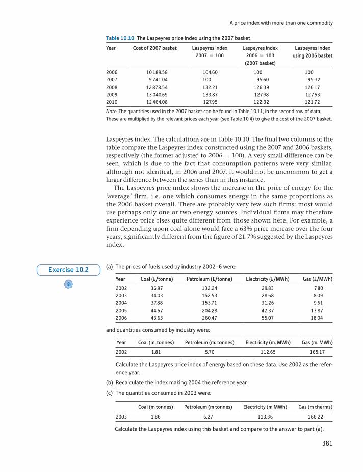
A price index with more than one commodity
381
Laspeyres index. The calculations are in Table 10.10. The final two columns of the table compare the Laspeyres index constructed using the 2007 and 2006 baskets, respectively (the former adjusted to 2006 = 100). A very small difference can be seen, which is due to the fact that consumption patterns were very similar, although not identical, in 2006 and 2007. It would not be uncommon to get a larger difference between the series than in this instance.
The Laspeyres price index shows the increase in the price of energy for the ‘average’ firm, i.e. one which consumes energy in the same proportions as the 2006 basket overall. There are probably very few such firms: most would use perhaps only one or two energy sources. Individual firms may therefore experience price rises quite different from those shown here. For example, a firm depending upon coal alone would face a 63% price increase over the four years, significantly different from the figure of 21.7% suggested by the Laspeyres index.
Table 10.10 The Laspeyres price index using the 2007 basket
Year Cost of 2007 basket Laspeyres index 2007 = 100
Laspeyres index 2006 = 100
(2007 basket)
Laspeyres index using 2006 basket
2006 10 189.58 104.60 100 1002007 9 741.04 100 95.60 95.322008 12 878.54 132.21 126.39 126.172009 13 040.69 133.87 127.98 127.532010 12 464.08 127.95 122.32 121.72
Note: The quantities used in the 2007 basket can be found in Table 10.11, in the second row of data. These are multiplied by the relevant prices each year (see Table 10.4) to give the cost of the 2007 basket.
(a) The prices of fuels used by industry 2002–6 were:
Year Coal (£/tonne) Petroleum (£/tonne) Electricity (£/MWh) Gas (£/MWh)
2002 36.97 132.24 29.83 7.802003 34.03 152.53 28.68 8.092004 37.88 153.71 31.26 9.612005 44.57 204.28 42.37 13.872006 43.63 260.47 55.07 18.04
and quantities consumed by industry were:
Year Coal (m. tonnes) Petroleum (m. tonnes) Electricity (m. MWh) Gas (m. MWh)
2002 1.81 5.70 112.65 165.17
Calculate the Laspeyres price index of energy based on these data. Use 2002 as the refer-ence year.
(b) Recalculate the index making 2004 the reference year.
(c) The quantities consumed in 2003 were:
Coal (m tonnes) Petroleum (m tonnes) Electricity (m MWh) Gas (m therms)
2003 1.86 6.27 113.36 166.22
Calculate the Laspeyres index using this basket and compare to the answer to part (a).
?
Exercise 10.2
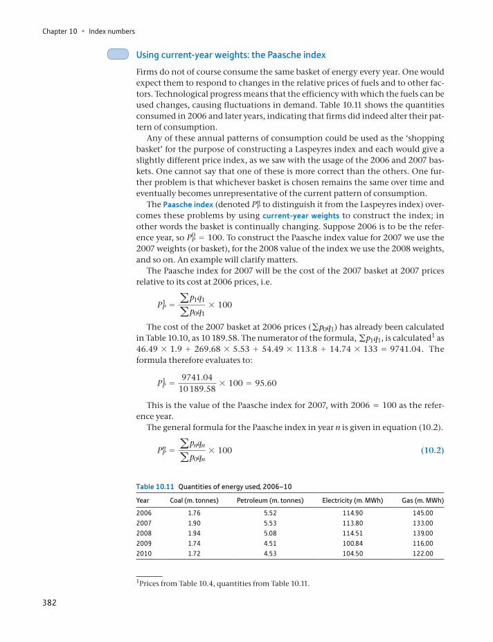
Chapter 10 • Index numbers
382
Using current-year weights: the Paasche index
Firms do not of course consume the same basket of energy every year. One would expect them to respond to changes in the relative prices of fuels and to other fac-tors. Technological progress means that the efficiency with which the fuels can be used changes, causing fluctuations in demand. Table 10.11 shows the quantities consumed in 2006 and later years, indicating that firms did indeed alter their pat-tern of consumption.
Any of these annual patterns of consumption could be used as the ‘shopping basket’ for the purpose of constructing a Laspeyres index and each would give a slightly different price index, as we saw with the usage of the 2006 and 2007 bas-kets. One cannot say that one of these is more correct than the others. One fur-ther problem is that whichever basket is chosen remains the same over time and eventually becomes unrepresentative of the current pattern of consumption.
The Paasche index (denoted PnP to distinguish it from the Laspeyres index) over-
comes these problems by using current-year weights to construct the index; in other words the basket is continually changing. Suppose 2006 is to be the refer-ence year, so P0
P = 100. To construct the Paasche index value for 2007 we use the 2007 weights (or basket), for the 2008 value of the index we use the 2008 weights, and so on. An example will clarify matters.
The Paasche index for 2007 will be the cost of the 2007 basket at 2007 prices relative to its cost at 2006 prices, i.e.
P1P = ap1q1
ap0q1* 100
The cost of the 2007 basket at 2006 prices (gp0q1) has already been calculated in Table 10.10, as 10 189.58. The numerator of the formula, gp1q1, is calculated1 as 46.49 * 1.9 + 269.68 * 5.53 + 54.49 * 113.8 + 14.74 * 133 = 9741.04. The formula therefore evaluates to:
P1P =
9741.0410 189.58
* 100 = 95.60
This is the value of the Paasche index for 2007, with 2006 = 100 as the refer-ence year.
The general formula for the Paasche index in year n is given in equation (10.2).
PnP = apnqn
ap0qn* 100 (10.2)
Table 10.11 Quantities of energy used, 2006–10
Year Coal (m. tonnes) Petroleum (m. tonnes) Electricity (m. MWh) Gas (m. MWh)
2006 1.76 5.52 114.90 145.002007 1.90 5.53 113.80 133.002008 1.94 5.08 114.51 139.002009 1.74 4.51 100.84 116.002010 1.72 4.53 104.50 122.00
1Prices from Table 10.4, quantities from Table 10.11.
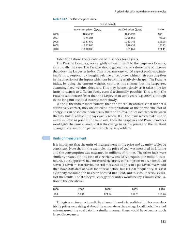
A price index with more than one commodity
383
Table 10.12 shows the calculation of this index for all years.The Paasche formula gives a slightly different result to the Laspeyres formula,
as is usually the case. The Paasche should generally give a slower rate of increase than does the Laspeyres index. This is because one would expect profit-maximis-ing firms to respond to changing relative prices by switching their consumption in the direction of the inputs which are becoming relatively cheaper. The Paasche index, by using the current weights, captures this change, but the Laspeyres, assuming fixed weights, does not. This may happen slowly, as it takes time for firms to switch to different fuels, even if technically possible. This is why the Paasche can increase faster than the Laspeyres in some years (e.g. 2007) although in the long run it should increase more slowly.
Is one of the indices more ‘correct’ than the other? The answer is that neither is definitively correct, they are different interpretations of the phrase ‘the cost of energy’. It can be shown theoretically that the ‘true’ value lies somewhere between the two, but it is difficult to say exactly where. If all the items which make up the index increase in price at the same rate, then the Laspeyres and Paasche indices would give the same answer, so it is the change in relative prices and the resultant change in consumption patterns which causes problems.
Units of measurement
It is important that the units of measurement in the price and quantity tables be consistent. Note that in the example, the price of coal was measured in £/tonne and the consumption was measured in millions of tonnes. The other fuels were similarly treated (in the case of electricity, one MWh equals one million watt-hours). But suppose we had measured electricity consumption in kWh instead of MWh (1 MWh = 1000 kWh), but still measured its price in £ per MWh? We would then have 2006 data of 55.07 for price as before, but 114 900 for quantity. It is as if electricity consumption has been boosted 1000-fold, and this would seriously dis-tort the results. The (Laspeyres) energy price index would be (by a similar calcula-tion to the one above):
2006 2007 2008 2009 2010
100 98.94 124.14 132.01 118.26
This gives an incorrect result. By chance it is not a large distortion because elec-tricity prices were rising at about the same rate as the average for all fuels. If we had mis-measured the coal data in a similar manner, there would have been a much larger discrepancy.
Table 10.12 The Paasche price index
Cost of basket:
At current prices: gpnqn At 2006 prices gp0qn Index
2006 10 457.93 10 457.93 1002007 9 741.04 10 189.58 95.602008 12 879.50 10 221.46 126.002009 11 374.05 8 896.53 127.852010 11 183.06 9 210.67 121.41
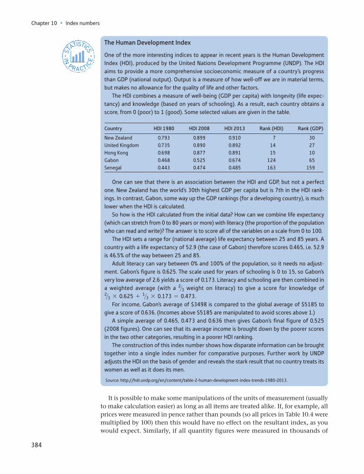
Chapter 10 • Index numbers
384
The Human Development Index
One of the more interesting indices to appear in recent years is the Human Development Index (HDI), produced by the United Nations Development Programme (UNDP). The HDI aims to provide a more comprehensive socioeconomic measure of a country’s progress than GDP (national output). Output is a measure of how well-off we are in material terms, but makes no allowance for the quality of life and other factors.
The HDI combines a measure of well-being (GDP per capita) with longevity (life expec-tancy) and knowledge (based on years of schooling). As a result, each country obtains a score, from 0 (poor) to 1 (good). Some selected values are given in the table.
Country HDI 1980 HDI 2008 HDI 2013 Rank (HDI) Rank (GDP)
New Zealand 0.793 0.899 0.910 7 30United Kingdom 0.735 0.890 0.892 14 27Hong Kong 0.698 0.877 0.891 15 10Gabon 0.468 0.525 0.674 124 65Senegal 0.443 0.474 0.485 163 159
One can see that there is an association between the HDI and GDP, but not a perfect one. New Zealand has the world’s 30th highest GDP per capita but is 7th in the HDI rank-ings. In contrast, Gabon, some way up the GDP rankings (for a developing country), is much lower when the HDI is calculated.
So how is the HDI calculated from the initial data? How can we combine life expectancy (which can stretch from 0 to 80 years or more) with literacy (the proportion of the population who can read and write)? The answer is to score all of the variables on a scale from 0 to 100.
The HDI sets a range for (national average) life expectancy between 25 and 85 years. A country with a life expectancy of 52.9 (the case of Gabon) therefore scores 0.465, i.e. 52.9 is 46.5% of the way between 25 and 85.
Adult literacy can vary between 0% and 100% of the population, so it needs no adjust-ment. Gabon’s figure is 0.625. The scale used for years of schooling is 0 to 15, so Gabon’s very low average of 2.6 yields a score of 0.173. Literacy and schooling are then combined in a weighted average (with a 2>3 weight on literacy) to give a score for knowledge of 2>3 * 0.625 + 1>3 * 0.173 = 0.473.
For income, Gabon’s average of $3498 is compared to the global average of $5185 to give a score of 0.636. (Incomes above $5185 are manipulated to avoid scores above 1.)
A simple average of 0.465, 0.473 and 0.636 then gives Gabon’s final figure of 0.525 (2008 figures). One can see that its average income is brought down by the poorer scores in the two other categories, resulting in a poorer HDI ranking.
The construction of this index number shows how disparate information can be brought together into a single index number for comparative purposes. Further work by UNDP adjusts the HDI on the basis of gender and reveals the stark result that no country treats its women as well as it does its men.
Source: http://hdr.undp.org/en/content/table-2-human-development-index-trends-1980-2013.
ST
ATISTICS
IN
PRACTI
CE
· ·
It is possible to make some manipulations of the units of measurement (usually to make calculation easier) as long as all items are treated alike. If, for example, all prices were measured in pence rather than pounds (so all prices in Table 10.4 were multiplied by 100) then this would have no effect on the resultant index, as you would expect. Similarly, if all quantity figures were measured in thousands of
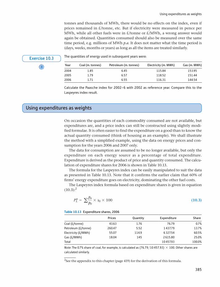
Using expenditures as weights
385
tonnes and thousands of MWh, there would be no effects on the index, even if prices remained in £/tonne, etc. But if electricity were measured in pence per MWh, while all other fuels were in £/tonne or £/MWh, a wrong answer would again be obtained. Quantities consumed should also be measured over the same time period, e.g. millions of MWh p.a. It does not matter what the time period is (days, weeks, months or years) as long as all the items are treated similarly.
Table 10.13 Expenditure shares, 2006
Prices Quantity Expenditure Share
Coal (£/tonne) 43.63 1.76 76.79 0.7%Petroleum (£/tonne) 260.47 5.52 1 437.79 13.7%Electricity (£/MWh) 55.07 114.9 6 327.54 60.5%Gas (£/MWh) 18.04 145 2 615.80 25.0%Total 10 457.93 100.0%
Note: The 0.7% share of coal, for example, is calculated as (76.79>10 457.93) * 100. Other shares are calculated similarly.
The quantities of energy used in subsequent years were:
Year Coal (m. tonnes) Petroleum (m. tonnes) Electricity (m. MWh) Gas (m. MWh)
2004 1.85 6.45 115.84 153.952005 1.79 6.57 118.52 151.442006 1.71 6.55 116.31 144.54
Calculate the Paasche index for 2002–6 with 2002 as reference year. Compare this to the Laspeyres index result.
?
Exercise 10.3
Using expenditures as weights
On occasion the quantities of each commodity consumed are not available, but expenditures are, and a price index can still be constructed using slightly modi-fied formulae. It is often easier to find the expenditure on a good than to know the actual quantity consumed (think of housing as an example). We shall illustrate the method with a simplified example, using the data on energy prices and con-sumption for the years 2006 and 2007 only.
The data for consumption are assumed to be no longer available, but only the expenditure on each energy source as a percentage of total expenditure. Expenditure is derived as the product of price and quantity consumed. The calcu-lation of expenditure shares for 2006 is shown in Table 10.13.
The formula for the Laspeyres index can be easily manipulated to suit the data as presented in Table 10.13. Note that it confirms the earlier claim that 60% of firms’ energy expenditure goes on electricity, dominating the other fuel costs.
The Laspeyres index formula based on expenditure shares is given in equation (10.3):2
PnL = a pn
p0* s0 * 100 (10.3)
2See the appendix to this chapter (page 419) for the derivation of this formula.
Chapter 10 • Index numbers
386
Equation (10.3) is made up of two component parts. The first, pn>p0, is sim-ply the price in year n relative to the base-year price for each energy source. The second component, s01= p0q0>gp0q02 , is the share or proportion of total expen-diture spent on each energy source in the base year, the data for which are in Table 10.13. It should be easy to see that the sum of the s0 values is 1, so that equation (10.3) calculates a weighted average of the individual price increases, the weights being the expenditure shares.
The calculation of the Laspeyres index for 2007 using 2006 as the base year is therefore:
PlL =
46.4943.63
* 0.007 +269.68260.47
* 0.137 +54.4955.07
* 0.605 +14.7418.04
* 0.250
= 0.9532
giving the value of the index as 0.9532 * 100 = 95.32, the same value as derived earlier using the more usual methods. Values of the index for subsequent years are calculated by appropriate application of equation (10.3). This is left as an exercise for the reader, who may use Table 10.9 to verify the answers.
The Paasche index may similarly be calculated from data on prices and expen-diture shares, as long as these are available for each year for which the index is required. The formula for the Paasche index is
PnP =
1
a p0
pn sn
* 100 (10.4)
The calculation of the Paasche index using this formula is also left as an exercise.
Comparison of the Laspeyres and Paasche indices
The advantages of the Laspeyres index are that it is easy to calculate and that it has a fairly clear intuitive meaning, i.e. the cost each year of a particular basket of goods. The Paasche index involves more computation, and it is less easy to envis-age what it refers to. As an example of this point, consider the following simple case. The Laspeyres index values for 2008 and 2009 are 126.17 and 127.53. The ratio of these two numbers, 1.011, would suggest that prices rose by 1.1% between these years. What does this figure actually represent? The 2009 Laspeyres index has been divided by the same index for 2008, i.e.
P3L
P2L
= ap3q0
ap0q0nap2q0
ap0q0= ap3q0
ap2q0
which is the ratio of the cost of the 2006 basket at 2009 prices to its cost at 2008 prices. This makes some intuitive sense. Note that it is not the same as the Laspeyres index for 2009 with 2008 as base year, which would require using q2 (2008 quantities) in the calculation.
If the same is done with the Paasche index numbers, a rise of 1.5% is obtained between 2008 and 2009, a similar result. But the meaning of this is not so clear, since the relevant formula is:
P3P
P2P
= ap3q3
ap0q3nap2q2
ap0q2

Quantity and expenditure indices
387
which does not simplify further. This is a curious mixture of 2008 and 2009 quan-tities, and 2006, 2008 and 2009 prices.
The major advantage of the Paasche index, however, is that the weights are con-tinuously updated, so that the basket of goods never becomes out of date. In the case of the Laspeyres index the basket remains unchanged over a period, becoming less and less representative of what is being bought by consumers. When revision is finally made (an updated shopping basket is used) there may therefore be a large change in the weighting scheme. The extra complexity of calculation involved in the Paasche index is less important now that computers do most of the work.
(a) Calculate the share of expenditure going to each of the four fuel types in the previous exercises and use this result to re-calculate the Laspeyres and Paasche indexes using equations (10.3) and(10.4).
(b) Check that the results are the same as calculated in previous exercises.
?
Exercise 10.4
The story so far – a brief summary
We have encountered quite a few different concepts and calculations thus far and it might be worthwhile to briefly summarise what we have covered before moving on. In order, we have examined:
A simple index for a single commodity A Laspeyres price index, which uses base year weights A Paasche price index, which uses current year weights and is an alternative to
the Laspeyres formulation The same Laspeyres and Paasche indices, but calculated using the data in a
slightly different form, using expenditure shares rather than quantities.
We now move on to examine quantity and expenditure indices, then look at the relationship between them all.
Quantity and expenditure indices
Just as one can calculate price indices, it is also possible to calculate quantity and value (or expenditure) indices. We first concentrate on quantity indices, which pro-vide a measure of the total quantity of energy consumed by industry each year. The problem again is that we cannot easily aggregate the different sources of energy. It makes no sense to add together tonnes of coal and petroleum, with megawatts of electricity and gas. Some means has to be found to put these different fuels on a comparable basis. To do this, we now reverse the roles of prices and quantities: the quantities of the different fuels are weighted by their different prices (prices repre-sent the value to the firm, at the margin, of each different fuel). As with price indi-ces, one can construct both Laspeyres and Paasche quantity indices.
The Laspeyres quantity index
The Laspeyres quantity index for year n is given by
Q nL = aqnp0
aq0p0* 100 (10.5)
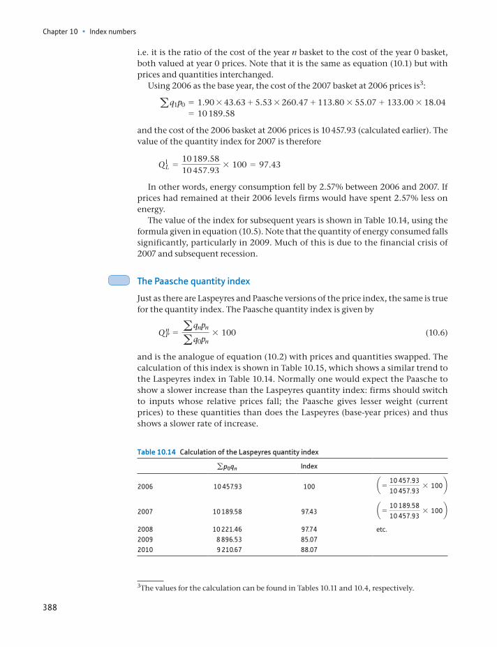
Chapter 10 • Index numbers
388
i.e. it is the ratio of the cost of the year n basket to the cost of the year 0 basket, both valued at year 0 prices. Note that it is the same as equation (10.1) but with prices and quantities interchanged.
Using 2006 as the base year, the cost of the 2007 basket at 2006 prices is3:
aq1p0 = 1.90 * 43.63 + 5.53 * 260.47 + 113.80 * 55.07 + 133.00 * 18.04 = 10 189.58
and the cost of the 2006 basket at 2006 prices is 10 457.93 (calculated earlier). The value of the quantity index for 2007 is therefore
Q lL =
10 189.5810 457.93
* 100 = 97.43
In other words, energy consumption fell by 2.57% between 2006 and 2007. If prices had remained at their 2006 levels firms would have spent 2.57% less on energy.
The value of the index for subsequent years is shown in Table 10.14, using the formula given in equation (10.5). Note that the quantity of energy consumed falls significantly, particularly in 2009. Much of this is due to the financial crisis of 2007 and subsequent recession.
The Paasche quantity index
Just as there are Laspeyres and Paasche versions of the price index, the same is true for the quantity index. The Paasche quantity index is given by
Q nP = aqnpn
aq0pn* 100 (10.6)
and is the analogue of equation (10.2) with prices and quantities swapped. The calculation of this index is shown in Table 10.15, which shows a similar trend to the Laspeyres index in Table 10.14. Normally one would expect the Paasche to show a slower increase than the Laspeyres quantity index: firms should switch to inputs whose relative prices fall; the Paasche gives lesser weight (current prices) to these quantities than does the Laspeyres (base-year prices) and thus shows a slower rate of increase.
3The values for the calculation can be found in Tables 10.11 and 10.4, respectively.
Table 10.14 Calculation of the Laspeyres quantity index
gp0qn Index
2006 10 457.93 100 a = 10 457.9310 457.93
* 100b
2007 10 189.58 97.43 a = 10 189.5810 457.93
* 100b
2008 10 221.46 97.74 etc.2009 8 896.53 85.072010 9 210.67 88.07
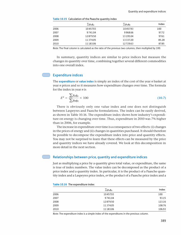
Quantity and expenditure indices
389
In summary, quantity indices are similar to price indices but measure the changes in quantity over time, combining together several different commodities into one overall index.
Expenditure indices
The expenditure or value index is simply an index of the cost of the year n basket at year n prices and so it measures how expenditure changes over time. The formula for the index in year n is
E n = apnqn
ap0q0* 100 (10.7)
There is obviously only one value index and one does not distinguish between Laspeyres and Paasche formulations. The index can be easily derived, as shown in Table 10.16. The expenditure index shows how industry’s expendi-ture on energy is changing over time. Thus, expenditure in 2010 was 7% higher than in 2006, for example.
The increase in expenditure over time is a consequence of two effects: (i) changes in the prices of energy and (ii) changes in quantities purchased. It should therefore be possible to decompose the expenditure index into price and quantity effects. You may not be surprised to learn that these effects can be measured by the price and quantity indices we have already covered. We look at this decomposition in more detail in the next section.
Relationships between price, quantity and expenditure indices
Just as multiplying a price by a quantity gives total value, or expenditure, the same is true of index numbers. The value index can be decomposed as the product of a price index and a quantity index. In particular, it is the product of a Paasche quan-tity index and a Laspeyres price index, or the product of a Paasche price index and a
Table 10.15 Calculation of the Paasche quantity index
gpnqn gpnq0 Index
2006 10 457.93 10 457.93 1002007 9 741.04 9 968.66 97.722008 12 879.50 13 195.04 97.612009 11 374.05 13 337.20 85.282010 11 183.06 12 729.63 87.85
Note: The final column is calculated as the ratio of the previous two columns, then multiplied by 100.
Table 10.16 The expenditure index
gpnqn Index
2006 10 457.93 1002007 9 741.04 93.152008 12 879.50 123.162009 11 374.05 108.762010 11 183.06 106.93
Note: The expenditure index is a simple index of the expenditures in the previous column.
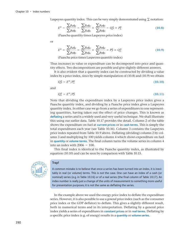
Chapter 10 • Index numbers
390
Laspeyres quantity index. This can be very simply demonstrated using g notation:
E n = apnqn
ap0q0= apnqn
apnq0* apnq0
ap0q0= Q n
P * PnL (10.8)
(Paasche quantity times Laspeyres price index)
or
E n = apnqn
ap0q0= apnqn
ap0qn* ap0qn
ap0q0= Pn
P * Q nL (10.9)
(Paasche price times Laspeyres quantity index)
Thus increases in value or expenditure can be decomposed into price and quan-tity effects. Two decompositions are possible and give slightly different answers.
It is also evident that a quantity index can be constructed by dividing a value index by a price index, since by simple manipulation of (10.8) and (10.9) we obtain
Q nP = E n>Pn
L (10.10)
and
Q nL = E n>Pn
P (10.11)
Note that dividing the expenditure index by a Laspeyres price index gives a Paasche quantity index, and dividing by a Paasche price index gives a Laspeyres quantity index. In either case we go from a series of expenditures to one represent-ing quantities, having taken out the effect of price changes. This is known as deflating a series and is a widely used and very useful technique. We shall illustrate this using our earlier data. Table 10.17 provides the detail. Column 2 of the table shows the expenditure on fuel at current prices or in cash terms. This is simply the total expenditures each year (see Table 10.16). Column 3 contains the Laspeyres price index repeated from Table 10.9 above. Deflating (dividing) column 2 by col-umn 3 and multiplying by 100 yields column 4 which shows expenditure on fuel in quantity or volume terms. The final column turns the volume series in column 4 into an index with 2006 = 100.
This final index is identical to the Paasche quantity index, as illustrated by equation (10.10) and can be seen by comparison with Table 10.15.
Trap!
A common mistake is to believe that once a series has been turned into an index, it is inevi-tably in real (or volume) terms. This is not the case. One can have an index of a cash (or nominal) series (e.g. in Table 10.16) or of a real series (the final column of Table 10.17). An index number is really just a change of the units of measurement to something more useful for presentation purposes; it is not the same as deflating the series.
ST
ATISTICS
IN
PRACTI
CE
· ·
In the example above we used the energy price index to deflate the expenditure series. However, it is also possible to use a general price index (such as the consumer price index or the GDP deflator) to deflate. This gives a slightly different result, both in numerical terms and in its interpretation. Deflating by a general price index yields a series of expenditures in constant prices or in real terms. Deflating by a specific price index (e.g. of energy) results in a quantity or volume series.
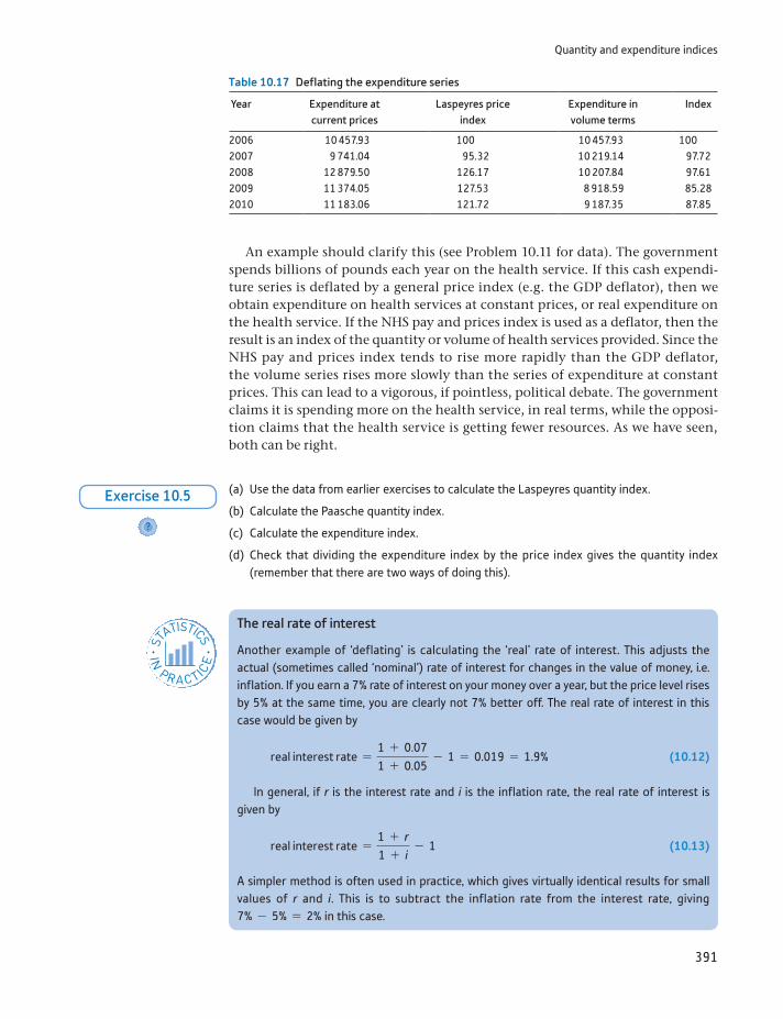
Quantity and expenditure indices
391
An example should clarify this (see Problem 10.11 for data). The government spends billions of pounds each year on the health service. If this cash expendi-ture series is deflated by a general price index (e.g. the GDP deflator), then we obtain expenditure on health services at constant prices, or real expenditure on the health service. If the NHS pay and prices index is used as a deflator, then the result is an index of the quantity or volume of health services provided. Since the NHS pay and prices index tends to rise more rapidly than the GDP deflator, the volume series rises more slowly than the series of expenditure at constant prices. This can lead to a vigorous, if pointless, political debate. The government claims it is spending more on the health service, in real terms, while the opposi-tion claims that the health service is getting fewer resources. As we have seen, both can be right.
Table 10.17 Deflating the expenditure series
Year Expenditure at current prices
Laspeyres price index
Expenditure in volume terms
Index
2006 10 457.93 100 10 457.93 1002007 9 741.04 95.32 10 219.14 97.722008 12 879.50 126.17 10 207.84 97.612009 11 374.05 127.53 8 918.59 85.282010 11 183.06 121.72 9 187.35 87.85
(a) Use the data from earlier exercises to calculate the Laspeyres quantity index.
(b) Calculate the Paasche quantity index.
(c) Calculate the expenditure index.
(d) Check that dividing the expenditure index by the price index gives the quantity index (remember that there are two ways of doing this).
?
Exercise 10.5
The real rate of interest
Another example of ‘deflating’ is calculating the ‘real’ rate of interest. This adjusts the actual (sometimes called ‘nominal’) rate of interest for changes in the value of money, i.e. inflation. If you earn a 7% rate of interest on your money over a year, but the price level rises by 5% at the same time, you are clearly not 7% better off. The real rate of interest in this case would be given by
real interest rate =1 + 0.071 + 0.05
- 1 = 0.019 = 1.9% (10.12)
In general, if r is the interest rate and i is the inflation rate, the real rate of interest is given by
real interest rate =1 + r1 + i
- 1 (10.13)
A simpler method is often used in practice, which gives virtually identical results for small values of r and i. This is to subtract the inflation rate from the interest rate, giving 7% - 5% = 2% in this case.
ST
ATISTICS
IN
PRACTI
CE
· ·
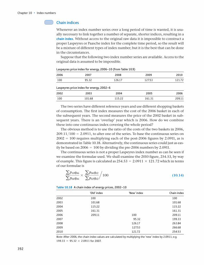
Chapter 10 • Index numbers
392
Chain indices
Whenever an index number series over a long period of time is wanted, it is usu-ally necessary to link together a number of separate, shorter indices, resulting in a chain index. Without access to the original raw data it is impossible to construct a proper Laspeyres or Paasche index for the complete time period, so the result will be a mixture of different types of index number; but it is the best that can be done in the circumstances.
Suppose that the following two index number series are available. Access to the original data is assumed to be impossible.
Laspeyres price index for energy, 2006–10 (from Table 10.9)
2006 2007 2008 2009 2010
100 95.32 126.17 127.53 121.72
Laspeyres price index for energy, 2002–6
2002 2003 2004 2005 2006
100 101.68 115.22 161.31 209.11
The two series have different reference years and use different shopping baskets of consumption. The first index measures the cost of the 2006 basket in each of the subsequent years. The second measures the price of the 2002 basket in sub-sequent years. There is an ‘overlap’ year which is 2006. How do we combine these into one continuous index covering the whole period?
The obvious method is to use the ratio of the costs of the two baskets in 2006, 209.11>100 = 2.0911, to alter one of the series. To base the continuous series on 2002 = 100 requires multiplying each of the post-2006 figures by 2.0911, as is demonstrated in Table 10.18. Alternatively, the continuous series could just as eas-ily be based on 2006 = 100 by dividing the pre-2006 numbers by 2.0911.
The continuous series is not a proper Laspeyres index number as can be seen if we examine the formulae used. We shall examine the 2010 figure, 254.53, by way of example. This figure is calculated as 254.53 = 2.0911 * 121.72 which in terms of our formulae is
ap10q06
ap06q06* ap06q02
ap02q02n100 (10.14)
Table 10.18 A chain index of energy prices, 2002–10
‘Old’ index ‘New’ index Chain index
2002 100 1002003 101.68 101.682004 115.22 115.222005 161.31 161.312006 209.11 100 209.112007 95.32 199.332008 126.17 263.842009 127.53 266.682010 121.72 254.53
Note: After 2006, the chain index values are calculated by multiplying the ‘new’ index by 2.0911; e.g. 199.33 = 95.32 * 2.0911 for 2007.
The Consumer Price Index
393
The proper Laspeyres index for 2010 using 2002 weights is
ap10q02
ap02q02* 100 (10.15)
There is no way that this latter equation can be derived from equation (10.14), proving that the former is not a properly constructed Laspeyres index number. Although it is not a proper Laspeyres index number series, it should be a reason-able approximation and it does have the advantage of the weights being revised (once, in 2006) and therefore more up-to-date.
Similar problems arise when deriving a chain index from two Paasche index number series. Investigation of this is left to the reader; the method follows that outlined above for the Laspeyres case.
The Consumer Price Index
To consider a real-world example, we examine the UK Consumer Price Index (CPI), which is one of the more sophisticated of index numbers, involving the recording of the prices of around 700 items each month and weighting them on the basis of households’ expenditure patterns (derived from the National Accounts and based on surveys such as the Living Costs and Food Survey, explained in more detail in Chapter 9 on sampling methods). The principles involved in the calculation are similar to those set out earlier, with a number of small complications which we shall discuss below.
The CPI is compiled in accordance with international standards and replaces the older Retail Prices Index (RPI). The CPI is the inflation measure that the UK government monitors and targets and is also the measure used to uprate pensions and benefits. There is a variant of the CPI (called CPIH) which includes some addi-tional measures of housing costs, which we won’t consider further. Both CPI mea-sures, and the older RPI, track each other closely over time; there is not a lot of difference between them, at least over a short time period.
The CPI is something of a compromise between a Laspeyres and a Paasche index. It is calculated monthly, and within each calendar year the weights used remain constant, so that it takes the form of a Laspeyres index. Each January, how-ever, the weights are updated on the basis of household spending patterns, so that the index is in fact a set of chain-linked Laspeyres indices, the chaining taking place in January each year. Despite the formal appearance as a Laspeyres index, the CPI measured over a period of years has the characteristics of a Paasche index, due to the annual change in the weights.
Some further adjustments need to be made for the index to be accurate. A change in the quality of goods purchased can be problematic, as alluded to ear-lier. If a manufacturer improves the quality of a product and charges more, is it fair to say that the price has gone up? Sometimes it is possible to measure improvement (if the power of a vacuum cleaner is increased, for example), but other cases are more difficult, such as if the punctuality of a train service is improved. By how much has quality improved? In many circumstances the stat-istician has to make a judgement about the best procedure to adopt. The ONS does make explicit allowance for the increase in quality of personal computers,
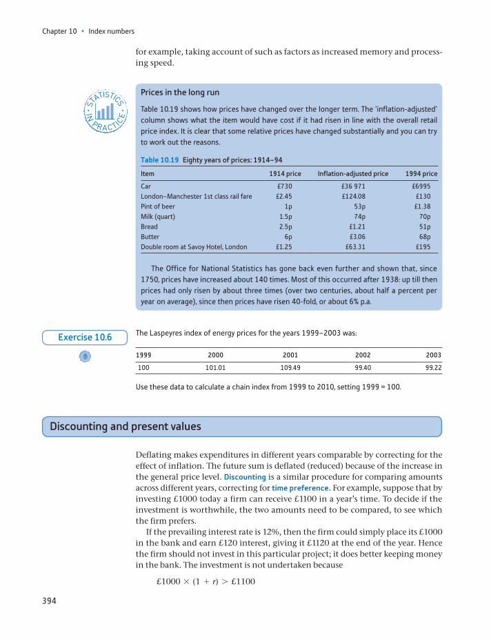
Chapter 10 • Index numbers
394
for example, taking account of such as factors as increased memory and process-ing speed.
Prices in the long run
Table 10.19 shows how prices have changed over the longer term. The ‘inflation-adjusted’ column shows what the item would have cost if it had risen in line with the overall retail price index. It is clear that some relative prices have changed substantially and you can try to work out the reasons.
STATISTICS
IN
PRACTICE
· ·
Table 10.19 Eighty years of prices: 1914–94
Item 1914 price Inflation-adjusted price 1994 price
Car £730 £36 971 £6995London–Manchester 1st class rail fare £2.45 £124.08 £130Pint of beer 1p 53p £1.38Milk (quart) 1.5p 74p 70pBread 2.5p £1.21 51pButter 6p £3.06 68pDouble room at Savoy Hotel, London £1.25 £63.31 £195
The Office for National Statistics has gone back even further and shown that, since 1750, prices have increased about 140 times. Most of this occurred after 1938: up till then prices had only risen by about three times (over two centuries, about half a percent per year on average), since then prices have risen 40-fold, or about 6% p.a.
The Laspeyres index of energy prices for the years 1999–2003 was:
1999 2000 2001 2002 2003
100 101.01 109.49 99.40 99.22
Use these data to calculate a chain index from 1999 to 2010, setting 1999 = 100.
?
Exercise 10.6
Discounting and present values
Deflating makes expenditures in different years comparable by correcting for the effect of inflation. The future sum is deflated (reduced) because of the increase in the general price level. Discounting is a similar procedure for comparing amounts across different years, correcting for time preference. For example, suppose that by investing £1000 today a firm can receive £1100 in a year’s time. To decide if the investment is worthwhile, the two amounts need to be compared, to see which the firm prefers.
If the prevailing interest rate is 12%, then the firm could simply place its £1000 in the bank and earn £120 interest, giving it £1120 at the end of the year. Hence the firm should not invest in this particular project; it does better keeping money in the bank. The investment is not undertaken because
£1000 * (1 + r) 7 £1100
Discounting and present values
395
where r is the interest rate, 12% or 0.12. Alternatively, this inequality may be expressed as
1000 71100
(1 + r)=
11001 + 0.12
= 982.14
The expression on the right-hand side of the inequality sign is the present value (PV) of £1100 received in one year’s time, £982.14. Here, r is the rate of discount and is equal to the rate of interest in this example because this is the rate at which the firm can transform present into future income, and vice versa. In what fol-lows, we use the terms interest rate and discount rate interchangeably. The term 1>(1 + r) is known as the discount factor. Multiplying an amount by the discount factor results in the present value of the sum.
We can also express the inequality as follows (by subtracting £1000 from each side):
0 7 -1000 +1100
(1 + r)= -17.86
The right-hand side of this expression is known as the net present value (NPV) of the project. It represents the difference between the initial outlay and the present value of the return generated by the investment. Since this is negative, the invest-ment is not worthwhile (the money would be better placed on deposit in a bank). The general rule is to invest if the NPV is positive.
Similarly, the present value of £1100 to be received in two years’ time is
PV =£1100
(1 + r)2 =£1100
(1 + 0.12)2 = £876.91
When r = 12%. In general, the PV of a sum S to be received in t years is
PV =S
(1 + r)t
The PV may be interpreted as the amount a firm would be prepared to pay today to receive an amount S in t years’ time. Thus a firm would not be prepared to make an outlay of more than £876.91 in order to receive £1100 in two years’ time. It would gain more by putting the money on deposit and earning 12% interest p.a.
Most investment projects involve an initial outlay followed by a series of receipts over the following years, as illustrated by the figures in Table 10.20. In order to decide if the investment is worthwhile, the present value of the income stream needs to be compared to the initial outlay. The PV of the income stream is obtained by adding together the present value of each year’s income. Thus we calculate4
PV =S1
(1 + r)+
S2
(1 + r)2 +S3
(1 + r)3 +S4
(1 + r)4 (10.16)
or more concisely, using g notation:
PV = a St
(1 + r)t (10.17)
4This present value example has only four terms, but in principle there can be any number of terms stretching into the future.
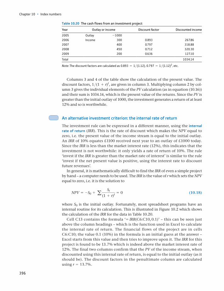
Chapter 10 • Index numbers
396
Columns 3 and 4 of the table show the calculation of the present value. The discount factors, 1>(1 + r)t, are given in column 3. Multiplying column 2 by col-umn 3 gives the individual elements of the PV calculation (as in equation (10.16)) and their sum is 1034.14, which is the present value of the returns. Since the PV is greater than the initial outlay of 1000, the investment generates a return of at least 12% and so is worthwhile.
An alternative investment criterion: the internal rate of return
The investment rule can be expressed in a different manner, using the internal rate of return (IRR). This is the rate of discount which makes the NPV equal to zero, i.e. the present value of the income stream is equal to the initial outlay. An IRR of 10% equates £1100 received next year to an outlay of £1000 today. Since the IRR is less than the market interest rate (12%), this indicates that the investment is not worthwhile: it only yields a rate of return of 10%. The rule ‘invest if the IRR is greater than the market rate of interest’ is similar to the rule ‘invest if the net present value is positive, using the interest rate to discount future revenues’.
In general, it is mathematically difficult to find the IRR of even a simple project by hand – a computer needs to be used. The IRR is the value of r which sets the NPV equal to zero, i.e. it is the solution to
NPV = -S0 + a St
(1 + r)t = 0 (10.18)
where S0 is the initial outlay. Fortunately, most spreadsheet programs have an internal routine for its calculation. This is illustrated in Figure 10.2 which shows the calculation of the IRR for the data in Table 10.20.
Cell C13 contains the formula ‘ = IRR(C6:C10, 0.1)’ – this can be seen just above the column headings – which is the function used in Excel to calculate the internal rate of return. The financial flows of the project are in cells C6:C10; the value 0.1 (10%) in the formula is an initial guess at the answer – Excel starts from this value and then tries to improve upon it. The IRR for this project is found to be 13.7% which is indeed above the market interest rate of 12%. The final two columns confirm that the PV of the income stream, when discounted using this internal rate of return, is equal to the initial outlay (as it should be). The discount factors in the penultimate column are calculated using r = 13.7%.
Table 10.20 The cash flows from an investment project
Year Outlay or income Discount factor Discounted income
2005 Outlay -10002006 Income 300 0.893 267.862007 400 0.797 318.882008 450 0.712 320.302009 200 0.636 127.10
Total 1034.14
Note: The discount factors are calculated as 0.893 = 1>(1.12), 0.797 = 1>(1.12)2, etc.
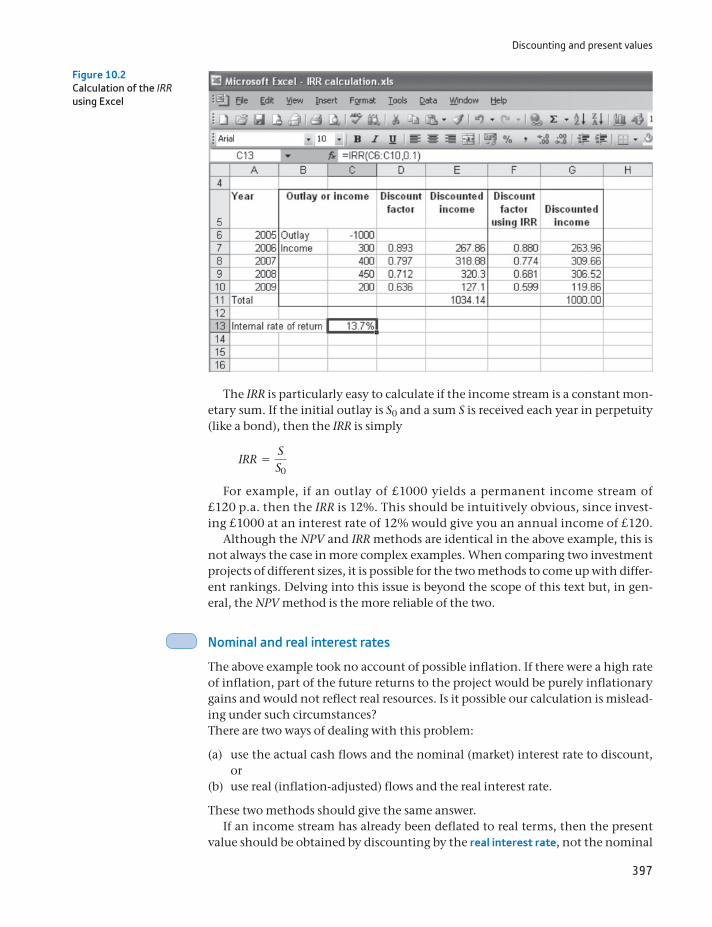
Discounting and present values
397
The IRR is particularly easy to calculate if the income stream is a constant mon-etary sum. If the initial outlay is S0 and a sum S is received each year in perpetuity (like a bond), then the IRR is simply
IRR =SS0
For example, if an outlay of £1000 yields a permanent income stream of £120 p.a. then the IRR is 12%. This should be intuitively obvious, since invest-ing £1000 at an interest rate of 12% would give you an annual income of £120.
Although the NPV and IRR methods are identical in the above example, this is not always the case in more complex examples. When comparing two investment projects of different sizes, it is possible for the two methods to come up with differ-ent rankings. Delving into this issue is beyond the scope of this text but, in gen-eral, the NPV method is the more reliable of the two.
Nominal and real interest rates
The above example took no account of possible inflation. If there were a high rate of inflation, part of the future returns to the project would be purely inflationary gains and would not reflect real resources. Is it possible our calculation is mislead-ing under such circumstances?There are two ways of dealing with this problem:
(a) use the actual cash flows and the nominal (market) interest rate to discount, or
(b) use real (inflation-adjusted) flows and the real interest rate.
These two methods should give the same answer.If an income stream has already been deflated to real terms, then the present
value should be obtained by discounting by the real interest rate, not the nominal
Figure 10.2Calculation of the IRR using Excel

Chapter 10 • Index numbers
398
(market) rate. Table 10.21 illustrates the principle. Column (1) repeats the income flows in cash terms from Table 10.20. Assuming an inflation rate of i = 7% p.a. gives the price index shown in column (2), based on 2005 = 100. This is used to deflate the cash series to real terms, shown in column (3). This is in constant (2005) prices. If we were presented only with the real income series and could not obtain the original cash flows we would have to discount the real series by the real interest rate rr, defined by
1 + rr =1 + r1 + i
(10.19)
With a (nominal) interest rate of 12% and an inflation rate of 7% this gives
1 + rr =1 + 0.121 + 0.07
= 1.0467 (10.20)
so that the real interest rate is 4.67% and in this example is the same every year. The one-year discount factor is therefore 1>1.0467 = 0.955, for two years it is 1>1.04672 = 0.913, etc. The discount factors used to discount the real income flows are shown in column (4) of the table, based on the real interest rate; the dis-counted sums are in column (5) and the present value of the real income series is £1034.14. This is the same as was found earlier, by discounting the cash figures by the nominal interest rate. Thus one can discount either the nominal (cash) values using the nominal discount rate, or the real flows by the real interest rate. Make sure you do not confuse the nominal and real interest rates.
The real interest rate can be approximated by subtracting the inflation rate from the nominal interest rate, i.e. 12% - 7% = 5%. This gives a reasonably accurate approximation for low values of the interest and inflation rates (below about 10% p.a.). Because of the simplicity of the calculation, this method is often preferred.
Table 10.21 Discounting a real income stream
Year Cash flows
(1)
Price index
(2)
Real income
(3)
Real discount factor
(4)
Discounted sums
(5)
2005 Outlay -1000 1002006 Income 300 107.0 280.37 0.955 267.862007 400 114.5 349.38 0.913 318.882008 450 122.5 367.33 0.872 320.302009 200 131.1 152.58 0.833 127.10
Total 1034.14
(a) An investment of £100 000 yields returns of £25 000, £35 000, £30 000 and £15 000 in each of the subsequent four years. Calculate the present value of the income stream and compare to the initial outlay, using an interest rate of 10% p.a.
(b) Calculate the internal rate of return on this investment.
?
Exercise 10.7
(a) An investment of £50 000 yields cash returns of £20 000, £25 000, £30 000 and £10 000 in each subsequent year. The rate of inflation is a constant 5% and the rate of interest is con-stant at 9%. Use the rate of inflation to construct a price index and discount the cash flows to real terms.
?
Exercise 10.8
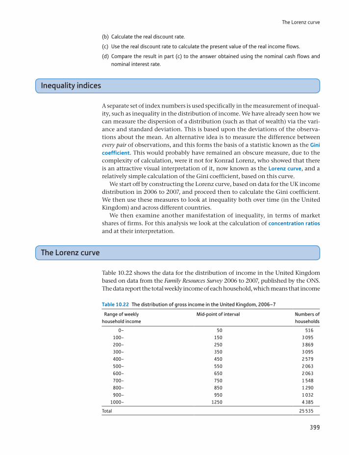
The Lorenz curve
399
(b) Calculate the real discount rate.
(c) Use the real discount rate to calculate the present value of the real income flows.
(d) Compare the result in part (c) to the answer obtained using the nominal cash flows and nominal interest rate.
Inequality indices
A separate set of index numbers is used specifically in the measurement of inequal-ity, such as inequality in the distribution of income. We have already seen how we can measure the dispersion of a distribution (such as that of wealth) via the vari-ance and standard deviation. This is based upon the deviations of the observa-tions about the mean. An alternative idea is to measure the difference between every pair of observations, and this forms the basis of a statistic known as the Gini coefficient. This would probably have remained an obscure measure, due to the complexity of calculation, were it not for Konrad Lorenz, who showed that there is an attractive visual interpretation of it, now known as the Lorenz curve, and a relatively simple calculation of the Gini coefficient, based on this curve.
We start off by constructing the Lorenz curve, based on data for the UK income distribution in 2006 to 2007, and proceed then to calculate the Gini coefficient. We then use these measures to look at inequality both over time (in the United Kingdom) and across different countries.
We then examine another manifestation of inequality, in terms of market shares of firms. For this analysis we look at the calculation of concentration ratios and at their interpretation.
The Lorenz curve
Table 10.22 shows the data for the distribution of income in the United Kingdom based on data from the Family Resources Survey 2006 to 2007, published by the ONS. The data report the total weekly income of each household, which means that income
Table 10.22 The distribution of gross income in the United Kingdom, 2006–7
Range of weekly household income
Mid-point of interval Numbers of households
0– 50 516100– 150 3 095200– 250 3 869300– 350 3 095400– 450 2 579500– 550 2 063600– 650 2 063700– 750 1 548800– 850 1 290900– 950 1 032
1000– 1250 4 385
Total 25 535
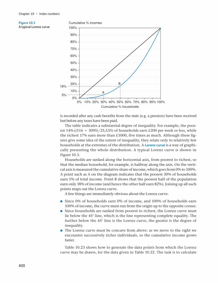
Chapter 10 • Index numbers
400
is recorded after any cash benefits from the state (e.g. a pension) have been received but before any taxes have been paid.
The table indicates a substantial degree of inequality. For example, the poor-est 14% ((516 + 3095)>25,535) of households earn £200 per week or less, while the richest 17% earn more than £1000, five times as much. Although these fig-ures give some idea of the extent of inequality, they relate only to relatively few households at the extremes of the distribution. A Lorenz curve is a way of graphi-cally presenting the whole distribution. A typical Lorenz curve is shown in Figure 10.3.
Households are ranked along the horizontal axis, from poorest to richest, so that the median household, for example, is halfway along the axis. On the verti-cal axis is measured the cumulative share of income, which goes from 0% to 100%. A point such as A on the diagram indicates that the poorest 30% of households earn 5% of total income. Point B shows that the poorest half of the population earn only 18% of income (and hence the other half earn 82%). Joining up all such points maps out the Lorenz curve.
A few things are immediately obvious about the Lorenz curve:
Since 0% of households earn 0% of income, and 100% of households earn 100% of income, the curve must run from the origin up to the opposite corner.
Since households are ranked from poorest to richest, the Lorenz curve must lie below the 45° line, which is the line representing complete equality. The further below the 45° line is the Lorenz curve, the greater is the degree of inequality.
The Lorenz curve must be concave from above: as we move to the right we encounter successively richer individuals, so the cumulative income grows faster.
Table 10.23 shows how to generate the data points from which the Lorenz curve may be drawn, for the data given in Table 10.22. The task is to calculate
Figure 10.3A typical Lorenz curve
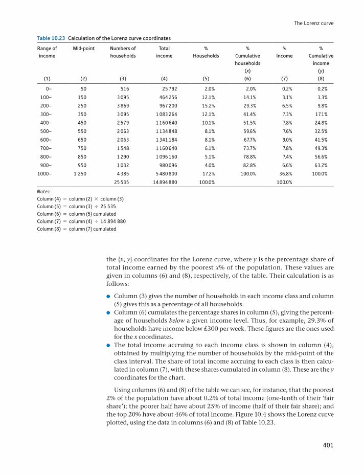
The Lorenz curve
401
the x, y coordinates for the Lorenz curve, where y is the percentage share of total income earned by the poorest x% of the population. These values are given in columns (6) and (8), respectively, of the table. Their calculation is as follows:
Column (3) gives the number of households in each income class and column (5) gives this as a percentage of all households.
Column (6) cumulates the percentage shares in column (5), giving the percent-age of households below a given income level. Thus, for example, 29.3% of households have income below £300 per week. These figures are the ones used for the x coordinates.
The total income accruing to each income class is shown in column (4), obtained by multiplying the number of households by the mid-point of the class interval. The share of total income accruing to each class is then calcu-lated in column (7), with these shares cumulated in column (8). These are the y coordinates for the chart.
Using columns (6) and (8) of the table we can see, for instance, that the poorest 2% of the population have about 0.2% of total income (one-tenth of their ‘fair share’); the poorer half have about 25% of income (half of their fair share); and the top 20% have about 46% of total income. Figure 10.4 shows the Lorenz curve plotted, using the data in columns (6) and (8) of Table 10.23.
Table 10.23 Calculation of the Lorenz curve coordinates
Range of income
Mid-point Numbers of households
Total income
% Households
% Cumulative households
(x)
% Income
% Cumulative
income (y)
(1) (2) (3) (4) (5) (6) (7) (8)
0– 50 516 25 792 2.0% 2.0% 0.2% 0.2%
100– 150 3 095 464 256 12.1% 14.1% 3.1% 3.3%
200– 250 3 869 967 200 15.2% 29.3% 6.5% 9.8%
300– 350 3 095 1 083 264 12.1% 41.4% 7.3% 17.1%
400– 450 2 579 1 160 640 10.1% 51.5% 7.8% 24.8%
500– 550 2 063 1 134 848 8.1% 59.6% 7.6% 32.5%
600– 650 2 063 1 341 184 8.1% 67.7% 9.0% 41.5%
700– 750 1 548 1 160 640 6.1% 73.7% 7.8% 49.3%
800– 850 1 290 1 096 160 5.1% 78.8% 7.4% 56.6%
900– 950 1 032 980 096 4.0% 82.8% 6.6% 63.2%
1000– 1 250 4 385 5 480 800 17.2% 100.0% 36.8% 100.0%
25 535 14 894 880 100.0% 100.0%
Notes:Column (4) = column (2) * column (3)Column (5) = column (3) , 25 535Column (6) = column (5) cumulatedColumn (7) = column (4) , 14 894 880Column (8) = column (7) cumulated
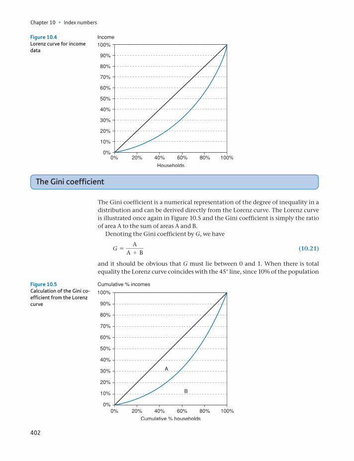
Chapter 10 • Index numbers
402
The Gini coefficient
The Gini coefficient is a numerical representation of the degree of inequality in a distribution and can be derived directly from the Lorenz curve. The Lorenz curve is illustrated once again in Figure 10.5 and the Gini coefficient is simply the ratio of area A to the sum of areas A and B.
Denoting the Gini coefficient by G, we have
G =A
A + B (10.21)
and it should be obvious that G must lie between 0 and 1. When there is total equality the Lorenz curve coincides with the 45° line, since 10% of the population
Figure 10.4Lorenz curve for income data
Figure 10.5Calculation of the Gini co-efficient from the Lorenz curve
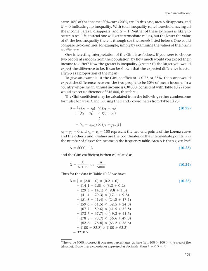
The Gini coefficient
403
earns 10% of the income, 20% earns 20%, etc. In this case, area A disappears, and G = 0 indicating no inequality. With total inequality (one household having all the income), area B disappears, and G = 1. Neither of these extremes is likely to occur in real life; instead one will get intermediate values, but the lower the value of G, the less inequality there is (though see the caveats listed below). One could compare two countries, for example, simply by examining the values of their Gini coefficients.
One interesting interpretation of the Gini is as follows. If you were to choose two people at random from the population, by how much would you expect their income to differ? Now the greater is inequality (greater G) the larger you would expect the difference to be. It can be shown that the expected difference is actu-ally 2G as a proportion of the mean.
To give an example, if the Gini coefficient is 0.25 or 25%, then one would expect the difference between the two people to be 50% of mean income. In a country whose mean annual income is £30 000 (consistent with Table 10.22) one would expect a difference of £15 000, therefore.
The Gini coefficient may be calculated from the following rather cumbersome formulae for areas A and B, using the x and y coordinates from Table 10.23:
B = 125(x1 - x0) * (y1 + y0) (10.22)
+ (x2 - x1) * (y2 + y1)
f
+ (xk - xk - 1) * (yk + yk - 1)6x0 = y0 = 0 and xk = yk = 100 represent the two end-points of the Lorenz curve and the other x and y values are the coordinates of the intermediate points. k is the number of classes for income in the frequency table. Area A is then given by:5
A = 5000 - B (10.23)
and the Gini coefficient is then calculated as:
G =A
A + B or
A5000
(10.24)
Thus for the data in Table 10.23 we have:
B = 12 * (2.0 - 0) * (0.2 + 0) (10.25)+ (14.1 - 2.0) * (3.3 + 0.2)+ (29.3 - 14.1) * (9.8 + 3.3)+ (41.4 - 29.3) * (17.1 + 9.8)+ (51.5 - 41.4) * (24.8 + 17.1)+ (59.6 - 51.5) * (32.5 + 24.8)+ (67.7 - 59.6) * (41.5 + 32.5)+ (73.7 - 67.7) * (49.3 + 41.5)+ (78.8 - 73.7) * (56.6 + 49.3)+ (82.8 - 78.8) * (63.2 + 56.6)+ (100 - 82.8) * (100 + 63.2)
= 3210.5
5The value 5000 is correct if one uses percentages, as here (it is 100 * 100 * the area of the triangle). If one uses percentages expressed as decimals, then A = 0.5 - B.
Chapter 10 • Index numbers
404
Therefore, area A = 5000 - 3210.5 = 1789.5 and we obtain
G =1789.55000
= 0.3579 (10.26)
or approximately 36%. Based on the earlier discussion, this means that the expected income difference between two randomly selected people is about 70% of the mean, which equates to £21 000 approximately.
This method implicitly assumes that the Lorenz curve is made up of straight line segments connecting the observed points, which is in fact not quite true – it should be a smooth curve. Since the straight lines will lie inside the true Lorenz curve, area B is over-estimated and so the calculated Gini coefficient is biased downwards. The true value of the Gini coefficient is slightly greater than 36%, therefore. The bias will be greater (a) the fewer the number of observations and (b) the more concave is the Lorenz curve (i.e. the greater is inequality). The bias is unlikely to be substantial, however, so is best left untreated.
Is inequality increasing?
The Gini coefficient is only useful as a comparative measure, for looking at trends in inequality over time or for comparing different countries or regions. Table 10.24 shows the value of the Gini coefficient for the United Kingdom over the past 20 years or so and shows how it was affected by the tax system. The results are based on equivalised income, i.e. after making a correction for differences in fam-ily size.6 For this reason there is a slight difference from the Gini coefficient calcu-lated above, which uses unadjusted data.
Using equivalised income appears to make little difference in this case (com-pare the ‘gross income’ column with the earlier calculation).
The table shows essentially two things:
(1) The Gini coefficient changes little over time, suggesting that inequality is per-sistent. This is in spite of other recent evidence which tends to show growing inequality at the top of the income distribution.
(2) The biggest reduction in inequality comes through cash benefits paid out by the state, rather than through taxes. In fact, the tax system appears to increase inequality rather than to reduce it, primarily because of the effects of taxes other than the income tax.
6This is because a larger family needs more income to have the same living standard as a smaller one.
Table 10.24 Gini coefficients for the United Kingdom, 1989–2009/10
Original income Gross income Disposable income Post-tax income
1989 49.7 36.3 34.4 37.81999/00 52.5 38.7 35.8 40.02009/10 52.0 37.2 33.5 37.1
Note: Gross income is original income plus certain state benefits, such as pensions. Taking off direct taxes gives disposable income and subtracting other taxes gives post-tax income.
Source: The effects of taxes and benefits on household income, 2009/10, Office of National Statistics, 2011.
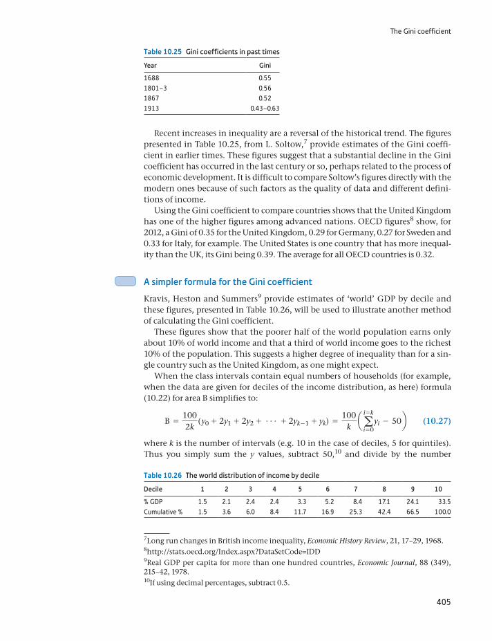
The Gini coefficient
405
Recent increases in inequality are a reversal of the historical trend. The figures presented in Table 10.25, from L. Soltow,7 provide estimates of the Gini coeffi-cient in earlier times. These figures suggest that a substantial decline in the Gini coefficient has occurred in the last century or so, perhaps related to the process of economic development. It is difficult to compare Soltow’s figures directly with the modern ones because of such factors as the quality of data and different defini-tions of income.
Using the Gini coefficient to compare countries shows that the United Kingdom has one of the higher figures among advanced nations. OECD figures8 show, for 2012, a Gini of 0.35 for the United Kingdom, 0.29 for Germany, 0.27 for Sweden and 0.33 for Italy, for example. The United States is one country that has more inequal-ity than the UK, its Gini being 0.39. The average for all OECD countries is 0.32.
A simpler formula for the Gini coefficient
Kravis, Heston and Summers9 provide estimates of ‘world’ GDP by decile and these figures, presented in Table 10.26, will be used to illustrate another method of calculating the Gini coefficient.
These figures show that the poorer half of the world population earns only about 10% of world income and that a third of world income goes to the richest 10% of the population. This suggests a higher degree of inequality than for a sin-gle country such as the United Kingdom, as one might expect.
When the class intervals contain equal numbers of households (for example, when the data are given for deciles of the income distribution, as here) formula (10.22) for area B simplifies to:
B =1002k
( y0 + 2y1 + 2y2 + g + 2yk - 1 + yk) =100
k aa
i = k
i = 0yi - 50b (10.27)
where k is the number of intervals (e.g. 10 in the case of deciles, 5 for quintiles). Thus you simply sum the y values, subtract 50,10 and divide by the number
Table 10.25 Gini coefficients in past times
Year Gini
1688 0.551801–3 0.561867 0.521913 0.43–0.63
Table 10.26 The world distribution of income by decile
Decile 1 2 3 4 5 6 7 8 9 10
% GDP 1.5 2.1 2.4 2.4 3.3 5.2 8.4 17.1 24.1 33.5Cumulative % 1.5 3.6 6.0 8.4 11.7 16.9 25.3 42.4 66.5 100.0
7Long run changes in British income inequality, Economic History Review, 21, 17–29, 1968.
9Real GDP per capita for more than one hundred countries, Economic Journal, 88 (349), 215–42, 1978.
8http://stats.oecd.org/Index.aspx?DataSetCode=IDD
10If using decimal percentages, subtract 0.5.
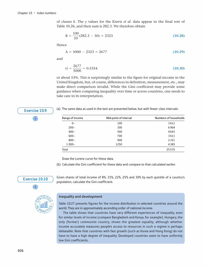
Chapter 10 • Index numbers
406
of classes k. The y values for the Kravis et al. data appear in the final row of Table 10.26, and their sum is 282.3. We therefore obtain
B =10010
(282.3 - 50) = 2323 (10.28)
Hence
A = 5000 - 2323 = 2677 (10.29)
and
G =26775000
= 0.5354 (10.30)
or about 53%. This is surprisingly similar to the figure for original income in the United Kingdom, but, of course, differences in definition, measurement, etc., may make direct comparison invalid. While the Gini coefficient may provide some guidance when comparing inequality over time or across countries, one needs to take care in its interpretation.
(a) The same data as used in the text are presented below, but with fewer class intervals:
Range of income Mid-point of interval Numbers of households
0– 100 3 611200– 300 6 964400– 500 4 643600– 700 3 611800– 900 2 321
1 000– 1250 4 385
Total 25 535
Draw the Lorenz curve for these data.
(b) Calculate the Gini coefficient for these data and compare to that calculated earlier.
?
Exercise 10.9
Given shares of total income of 8%, 15%, 22%, 25% and 30% by each quintile of a country’s population, calculate the Gini coefficient.
?
Exercise 10.10
Inequality and development
Table 10.27 presents figures for the income distribution in selected countries around the world. They are in approximately ascending order of national income.
The table shows that countries have very different experiences of inequality, even for similar levels of income (compare Bangladesh and Kenya, for example). Hungary, the only (former) communist country, shows the greatest equality, although whether income accurately measures people’s access to resources in such a regime is perhaps debatable. Note that countries with fast growth (such as Korea and Hong Kong) do not have to have a high degree of inequality. Developed countries seem to have uniformly low Gini coefficients.
ST
ATISTICS
IN
PRACTI
CE
· ·
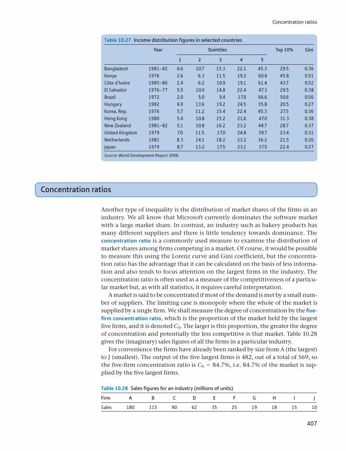
Concentration ratios
407
Concentration ratios
Another type of inequality is the distribution of market shares of the firms in an industry. We all know that Microsoft currently dominates the software market with a large market share. In contrast, an industry such as bakery products has many different suppliers and there is little tendency towards dominance. The concentration ratio is a commonly used measure to examine the distribution of market shares among firms competing in a market. Of course, it would be possible to measure this using the Lorenz curve and Gini coefficient, but the concentra-tion ratio has the advantage that it can be calculated on the basis of less informa-tion and also tends to focus attention on the largest firms in the industry. The concentration ratio is often used as a measure of the competitiveness of a particu-lar market but, as with all statistics, it requires careful interpretation.
A market is said to be concentrated if most of the demand is met by a small num-ber of suppliers. The limiting case is monopoly where the whole of the market is supplied by a single firm. We shall measure the degree of concentration by the five-firm concentration ratio, which is the proportion of the market held by the largest five firms, and it is denoted C5. The larger is this proportion, the greater the degree of concentration and potentially the less competitive is that market. Table 10.28 gives the (imaginary) sales figures of all the firms in a particular industry.
For convenience the firms have already been ranked by size from A (the largest) to J (smallest). The output of the five largest firms is 482, out of a total of 569, so the five-firm concentration ratio is C5 = 84.7%, i.e. 84.7% of the market is sup-plied by the five largest firms.
Table 10.27 Income distribution figures in selected countries
Year Quintiles Top 10% Gini
1 2 3 4 5
Bangladesh 1981–82 6.6 10.7 15.3 22.1 45.3 29.5 0.36Kenya 1976 2.6 6.3 11.5 19.2 60.4 45.8 0.51Côte d’Ivoire 1985–86 2.4 6.2 10.9 19.1 61.4 43.7 0.52El Salvador 1976–77 5.5 10.0 14.8 22.4 47.3 29.5 0.38Brazil 1972 2.0 5.0 9.4 17.0 66.6 50.6 0.56Hungary 1982 6.9 13.6 19.2 24.5 35.8 20.5 0.27Korea, Rep. 1976 5.7 11.2 15.4 22.4 45.3 27.5 0.36Hong Kong 1980 5.4 10.8 15.2 21.6 47.0 31.3 0.38New Zealand 1981–82 5.1 10.8 16.2 23.2 44.7 28.7 0.37United Kingdom 1979 7.0 11.5 17.0 24.8 39.7 23.4 0.31Netherlands 1981 8.3 14.1 18.2 23.2 36.2 21.5 0.26Japan 1979 8.7 13.2 17.5 23.1 37.5 22.4 0.27
Source: World Development Report 2006.
Table 10.28 Sales figures for an industry (millions of units)
Firm A B C D E F G H I J
Sales 180 115 90 62 35 25 19 18 15 10
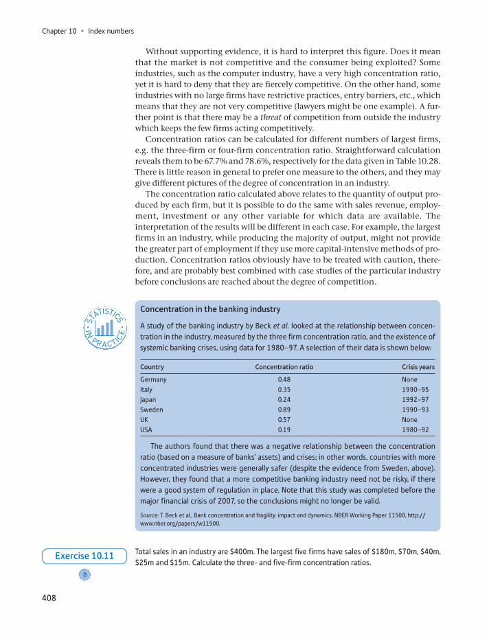
Chapter 10 • Index numbers
408
Without supporting evidence, it is hard to interpret this figure. Does it mean that the market is not competitive and the consumer being exploited? Some industries, such as the computer industry, have a very high concentration ratio, yet it is hard to deny that they are fiercely competitive. On the other hand, some industries with no large firms have restrictive practices, entry barriers, etc., which means that they are not very competitive (lawyers might be one example). A fur-ther point is that there may be a threat of competition from outside the industry which keeps the few firms acting competitively.
Concentration ratios can be calculated for different numbers of largest firms, e.g. the three-firm or four-firm concentration ratio. Straightforward calculation reveals them to be 67.7% and 78.6%, respectively for the data given in Table 10.28. There is little reason in general to prefer one measure to the others, and they may give different pictures of the degree of concentration in an industry.
The concentration ratio calculated above relates to the quantity of output pro-duced by each firm, but it is possible to do the same with sales revenue, employ-ment, investment or any other variable for which data are available. The interpretation of the results will be different in each case. For example, the largest firms in an industry, while producing the majority of output, might not provide the greater part of employment if they use more capital-intensive methods of pro-duction. Concentration ratios obviously have to be treated with caution, there-fore, and are probably best combined with case studies of the particular industry before conclusions are reached about the degree of competition.
Concentration in the banking industry
A study of the banking industry by Beck et al. looked at the relationship between concen-tration in the industry, measured by the three firm concentration ratio, and the existence of systemic banking crises, using data for 1980–97. A selection of their data is shown below:
Country Concentration ratio Crisis years
Germany 0.48 NoneItaly 0.35 1990–95Japan 0.24 1992–97Sweden 0.89 1990–93UK 0.57 NoneUSA 0.19 1980–92
The authors found that there was a negative relationship between the concentration ratio (based on a measure of banks’ assets) and crises; in other words, countries with more concentrated industries were generally safer (despite the evidence from Sweden, above). However, they found that a more competitive banking industry need not be risky, if there were a good system of regulation in place. Note that this study was completed before the major financial crisis of 2007, so the conclusions might no longer be valid.
Source: T. Beck et al., Bank concentration and fragility: impact and dynamics, NBER Working Paper 11500, http://www.nber.org/papers/w11500.
ST
ATISTICS
IN
PRACTI
CE
· ·
Total sales in an industry are $400m. The largest five firms have sales of $180m, $70m, $40m, $25m and $15m. Calculate the three- and five-firm concentration ratios.
?
Exercise 10.11
Key terms and concepts
409
Summary
An index number summarises the variation of a variable over time or across space in a convenient way.
Several variables can be combined into one index, providing an average mea-sure of their individual movements. The consumer price index is an example.
The Laspeyres price index combines the prices of many individual goods using base-year quantities as weights. The Paasche index is similar but uses current-year weights to construct the index.
Laspeyres and Paasche quantity indices can also be constructed, combining a number of individual quantity series using prices as weights. Base-year prices are used in the Laspeyres index, current-year prices in the Paasche.
A price index series multiplied by a quantity index series results in an index of expenditures. Rearranging this demonstrates that deflating (dividing) an expenditure series by a price series results in a volume (quantity) index. This is the basis of deflating a series in cash (or nominal) terms to one measured in real terms (i.e. adjusted for price changes).
Two series covering different time periods can be spliced together (as long as there is an overlapping year) to give one continuous chain index.
Discounting the future is similar to deflating but corrects for the rate of time preference rather than inflation. A stream of future income can thus be dis-counted and summarised in terms of its present value.
An investment can be evaluated by comparing the discounted present value of the future income stream to the initial outlay. The internal rate of return of an investment is a similar but alternative way of evaluating an investment project.
The Gini coefficient is a form of index number that is used to measure inequal-ity (e.g. of incomes). It can be given a visual representation using a Lorenz curve diagram.
For measuring the inequality of market shares in an industry, the concentra-tion ratio is commonly used.
base yearbase-year weightscash termschain indexconcentration ratioconstant pricesConsumer Price Index (CPI)current pricescurrent-year weightsdeflating a data seriesdiscount factor
discountingexpenditure or value indexfive-firm concentration ratioGini coefficientindex numberinternal rate of returnLaspeyres price indexLorenz curvenet present valuePaasche indexpresent value
Key terms and concepts

Chapter 10 • Index numbers
410
quantity indicesreal interest ratereal termsreference yearretail price index
time preferencevalue (or expenditure) indicesvolume seriesvolume termsweighted average
Soltow, L., Long Run Changes in British Income Inequality, Economic History Review, 21(1), 17–29, 1968.
Reference
Problems
411
Formula Description Notes
PnL = a pnq0
a p0q0* 100
Laspeyres price index for year n with base year 0
PnL = a pn
a p0* s0 * 100
Laspeyres price index using expenditure weights s in base year
PnP = a pnq0
a p0qn* 100
Paasche price index for year n
PnP =
1
a p0
pn* sn
* 100Paasche price index using expenditure weights s in current year
QnL = aqnp0
aq0p0* 100
Laspeyres quantity index
QnP = aqnpn
aq0pn* 100
Paasche quantity index
En = a pnqn
a p0q0* 100
Expenditure index
PV =S
(1 + r)t
Present value The value now of a sum S to be received in t years’ time, using discount rate r
NPV = -S0 + a St
(1 + r)t
Net present value The value of an investment S0 now, yielding St p.a., discounted at a constant rate r
Formulae used in this chapter
Some of the more challenging problems are indicated by highlighting the problem number in colour.
10.1 The data below show exports and imports for the United Kingdom, 2005–10, in £bn at current prices.
2005 2006 2007 2008 2009 2010
Exports 331.1 379.1 374.0 422.9 395.6 440.9Imports 373.8 419.8 416.7 462.0 421.2 477.6
(a) Construct index number series for exports and imports, setting the index equal to 100 in 2005 in each case.
(b) Is it possible, using only the two indices constructed in part (a), to construct an index number series for the balance of trade (exports minus imports)? If so, do so; if not, why not?
Problems
Chapter 10 • Index numbers
412
10.2 The following data show the gross operating surplus of companies, 2005–10, in the United King-dom, in £m.
2005 2006 2007 2008 2009 2010
224 811 244 309 257 995 255 260 233 436 243 036
(a) Turn the data into an index number series with 2005 as the reference year.
(b) Transform the series so that 2008 is the reference year.
(c) What increase has there been in profits between 2005 and 2010? Between 2008 and 2010?
10.3 The following tables show energy prices and consumption in 1999–2003 (analogous to the data in the chapter for the years 2006–10).
Coal (£/tonne) Petroleum (£/tonne) Electricity (£/MWh) Gas (£/MWh)
1999 34.77 104.93 36.23 5.462000 35.12 137.9 34.69 6.062001 38.07 148.1 31.35 8.162002 34.56 150.16 29.83 7.802003 34.5 140 28.44 8.07
Year Coal (m. tonnes) Petroleum (m. tonnes) Electricity (m. MWh) Gas (m. MWh)
1999 2.04 5.33 110.98 176.822000 0.72 5.52 114.11 183.442001 1.69 6.6 111.34 179.842002 1.1 5.81 112.37 165.422003 0.69 6.69 113.93 172.16
(a) Construct a Laspeyres price index using 1999 as the base year.
(b) Construct a Paasche price index. Compare this result with the Laspeyres index. Do they differ significantly?
(c) Construct Laspeyres and Paasche quantity indices. Check that they satisfy the conditions that En = PL * QP etc.
10.4 The prices of different house types in south-east England are given in the table below:
Year Terraced houses Semi-detached Detached Bungalows Flats
1991 59 844 77 791 142 630 89 100 47 6761992 55 769 73 839 137 053 82 109 43 6951993 55 571 71 208 129 414 82 734 42 7461994 57 296 71 850 130 159 83 471 44 092
(a) If the numbers of each type of house in 1991 were 1898, 1600, 1601, 499 and 1702, respec-tively, calculate the Laspeyres price index for 1991–94, based on 1991 = 100.
(b) Calculate the Paasche price index, based on the following numbers of dwellings:
Year Terraced houses Semi-detached Detached Bungalows Flats
1992 1903 1615 1615 505 17101993 1906 1638 1633 511 17141994 1911 1655 1640 525 1717
(c) Compare Paasche and Laspeyres price series.
Problems
413
10.5 (a) Using the data in Problem 10.3, calculate the expenditure shares on each fuel in 1999 and the individual price index number series for each fuel, with 1999 = 100.
(b) Use these data to construct the Laspeyres price index using the expenditures shares approach. Check that it gives the same answer as in Problem 10.3(a).
10.6 The following table shows the weights in the retail price index and the values of the index itself, for 1990 and 1994.
Food Alcohol and
tobacco
Housing Fuel and light
Household items
Clothing Personal goods
Travel Leisure
Weights1990 205 111 185 50 111 69 39 152 781994 187 111 158 45 123 58 37 162 119Prices1990 121.0 120.7 163.7 115.9 116.9 115.0 122.7 121.2 117.11994 139.5 162.1 156.8 133.9 132.4 116.0 152.4 150.7 145.7
(a) Calculate the Laspeyres price index for 1994, based on 1990 = 100.
(b) Draw a bar chart of the expenditure weights in 1990 and 1994 to show how spending patterns have changed. What major changes have occurred? Do individuals seem to be responding to changes in relative prices?
(c) The pensioner price index is similar to the general index calculated above, except that it excludes housing. What effect does this have on the index? What do you think is the justifica-tion for this omission?
(d) If consumers spent, on average, £188 per week in 1990 and £240 per week in 1994, calculate the real change in expenditure on food.
(e) Do consumers appear rational, i.e. do they respond as one would expect to relative price changes? If not, why not?
10.7 Construct a chain index from the following data series:
1998 2006 2000 2001 2006 2010 2008
Series 1 100 110 115 122 125Series 2 100 107 111 119 121
What problems arise in devising such an index and how do you deal with them?
10.8 Construct a chain index for 2001–10 using the following data, setting 2004 = 100.
2001 2002 2003 2004 2005 2006 2007 2008 2009 2010
87 95 100 10598 93 100 104 110
100 106 112
10.9 Industry is always concerned about the rising price of energy. It demands to be compensated for any rise over 5% in energy prices between 2007 and 2008. How much would this compensation cost? Which price index should be used to calculate the compensation and what difference would it make? (Use the energy price data in the chapter.)
10.10 Using the data in Problem 10.6, calculate how much the average consumer would need to be com-pensated for the rise in prices between 1990 and 1994.
Chapter 10 • Index numbers
414
10.11 The following data show expenditure on the National Health Service (in cash terms), the GDP defla-tor, the NHS pay and prices index, population and population of working age:
Year NHS expenditure
(£m) (1)
GDP Deflator
1973 = 100 (2)
NHS pay and price index
1973 = 100 (3)
Population (000)
(4)
Population of working age
(000) (5)
1987 21 495 442 573 56 930 34 9871988 23 601 473 633 57 065 35 1161989 25 906 504 678 57 236 35 2221990 28 534 546 728 57 411 35 3001991 32 321 585 792 57 801 35 467
(In all the following answers, set your index to 1987 = 100.)
(a) Turn the expenditure cash figures into an index number series.
(b) Calculate an index of ‘real’ NHS expenditure using the GDP deflator. How does this alter the expenditure series?
(c) Calculate an index of the volume of NHS expenditure using the NHS pay and prices index. How and why does this differ from the answer arrived at in (b)?
(d) Calculate indices of real and volume expenditure per capita. What difference does this make?
(e) Suppose that those not of working age cost twice as much to treat, on average, as those of working age. Construct an index of the need for health care and examine how health care expenditures have changed relative to need.
(f) How do you think the needs index calculated in (e) could be improved?
10.12 (a) If w represents the wage rate and p the price level, what is w/p?
(b) If ∆w represents the annual growth in wages and i is the inflation rate, what is ∆w - i ?
(c) What does ln (w) - ln (p) represent? (ln= natural logarithm.)
10.13 A firm is investing in a project and wishes to receive a rate of return of at least 15% on it. The stream of net income is:
Year 1 2 3 4
Income 600 650 700 400
(a) What is the present value of this income stream?
(b) If the investment costs £1600, should the firm invest? What is the net present value of the project?
10.14 A firm uses a discount rate of 12% for all its investment projects. Faced with the following choice of projects, which yields the higher NPV?
Project Outlay Income stream
1 2 3 4 5 6A 5600 1000 1400 1500 2100 1450 700B 6000 800 1400 1750 2500 1925 1200
10.15 Calculate the internal rate of return for the project in Problem 10.13. Use either trial and error meth-ods or a computer to solve.
Problems
415
10.16 Calculate the internal rates of return for the projects in Problem 10.14.
10.17 (a) Draw a Lorenz curve and calculate the Gini coefficient for the wealth data in Table 1.3 (Chapter 1).
(b) Why is the Gini coefficient typically larger for wealth distributions than for income distributions?
10.18 (a) Draw a Lorenz curve and calculate the Gini coefficient for the 1979 wealth data contained in Prob-lem 1.5 (Chapter 1). Draw the Lorenz curve on the same diagram as you used in Problem 10.17.
(b) How does the answer compare to 2005 wealth data?
10.19 The following table shows the income distribution by quintile for the United Kingdom in 2006–7, for various definitions of income:
Quintile Income measure
Original Gross Disposable Post-tax
1 (bottom) 3% 7% 7% 6%2 7% 10% 12% 11%3 15% 16% 16% 16%4 24% 23% 22% 22%5 (top) 51% 44% 42% 44%
(a) Use equation (10.27) to calculate the Gini coefficient for each of the four categories of income.
(b) For the ‘original income’ category, draw a smooth Lorenz curve on a piece of gridded paper and calculate the Gini coefficient using the method of counting squares. How does your answer compare to that for part (a)?
10.20 For the Kravis, Heston and Summers data (Table 10.26), combine the deciles into quintiles and cal-culate the Gini coefficient from the quintile data. How does your answer compare with the answer given in the text, based on deciles? What do you conclude about the degree of bias?
10.21 Calculate the three-firm concentration ratio for employment in the following industry:
Firm A B C D E F G H
Employees 3350 290 440 1345 821 112 244 352
10.22 Compare the degrees of concentration in the following two industries. Can you say which is likely to be more competitive?
Firm A B C D E F G H I J
Sales 337 384 696 321 769 265 358 521 880 334Sales 556 899 104 565 782 463 477 846 911 227
10.23 (Project) The World Development Report contains data on the income distributions of many coun-tries around the world (by quintile). Use these data to compare income distributions across coun-tries, focusing particularly on the differences between poor countries, middle-income and rich countries. Can you see any pattern emerging? Are there countries which do not fit into this pattern? Write a brief report summarising your findings.
Chapter 10 • Index numbers
416
Answers to exercises
Exercise 10.1
(a) 100, 111.9, 140.7, 163.4, 188.1.
(b) 61.2, 68.5, 86.1, 100, 115.1.
(c) 115.1>61.2 = 1.881.
Exercise 10.2
2002 2003 2004 2005 2006
(a) 2002 = 100 100 100.52 110.68 151.92 196.49(b) 2004 = 100 90.35 90.83 100 137.26 177.53(c) Using 2003 basket 100 100.71 110.75 151.94 196.48
Exercise 10.3
The Paasche index is:
2002 2003 2004 2005 2006
100 100.71 110.48 151.18 195.31
Exercise 10.4
(a) Expenditure shares in 2002 are:
Expenditure Share
Coal 66.92 1.2%Petroleum 753.77 13.8%Electricity 3360.35 61.4%Gas 1288.33 23.6%
giving the Laspeyres index for 2003 as
Pn1 =
34.0336.97
* 0.012 +152.53132.24
* 0.138 +28.6829.83
* 0.614 +8.097.80
* 0.236
= 1.0052 or 100.52.
The expenditure shares in 2003 are 0.3%, 8.9%, 46.3% and 44.4% which allows the 2003 Paasche index to be calculated as
Pn1 =
136.9734.03
* 0.012 +132.24152.53
* 0.149 +29.8328.68
* 0.606 +7.808.09
* 0.233* 100
= 1.0071 or 100.71.
Later years can be calculated in similar fashion.
Answers to exercises
417
Exercise 10.5
(a/b) The Laspeyres and Paasche quantity indexes are:
Laspeyres index Paasche index
2002 100 1002003 101.95 102.142004 101.98 101.802005 103.33 102.832006 101.04 100.43
(c) The expenditure index is 100, 102.67, 112.67, 156.22 and 197.34.
(d) The Paasche quantity index times Laspeyres price index (or vice versa) gives the expenditure index.
Exercise 10.6
The full index is (using Laspeyres indexes):
Chain index
1999 100 1002000 101.01 101.012001 109.49 109.492002 99.40 100 99.402003 99.22 100.52 99.222004 110.68 109.252005 151.92 149.952006 196.49 100 193.952007 95.32 184.882008 126.17 244.712009 127.53 247.352010 121.72 236.08
Exercise 10.7
(a) The discounted figures are:
Year Investment/yield Discount factor Discounted yield
0 -100 0001 25 000 0.9091 22 727.32 35 000 0.8264 28 925.63 30 000 0.7513 22 539.44 15 000 0.6830 10 245.2
Total 84 437.5
The present value is less than the initial outlay.
(b) The internal rate of return is 2.12%.
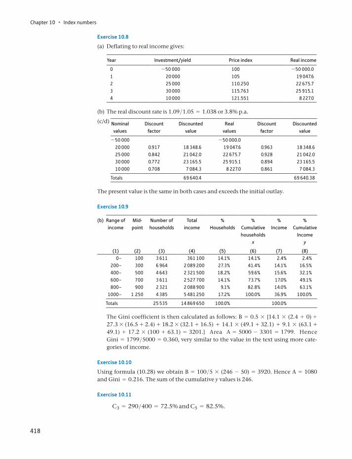
Chapter 10 • Index numbers
418
Exercise 10.8
(a) Deflating to real income gives:
Year Investment/yield Price index Real income
0 -50 000 100 -50 000.01 20 000 105 19 047.62 25 000 110.250 22 675.73 30 000 115.763 25 915.14 10 000 121.551 8 227.0
(b) The real discount rate is 1.09>1.05 = 1.038 or 3.8% p.a.
(c/d) Nominal values
Discount factor
Discounted value
Real values
Discount factor
Discounted value
-50 000 -50 000.020 000 0.917 18 348.6 19 047.6 0.963 18 348.625 000 0.842 21 042.0 22 675.7 0.928 21 042.030 000 0.772 23 165.5 25 915.1 0.894 23 165.510 000 0.708 7 084.3 8 227.0 0.861 7 084.3
Totals 69 640.4 69 640.38
The present value is the same in both cases and exceeds the initial outlay.
Exercise 10.9
(b) Range of income
Mid- point
Number of households
Total income
% Households
% Cumulative households
x
% Income
% Cumulative
Income y
(1) (2) (3) (4) (5) (6) (7) (8)0– 100 3 611 361 100 14.1% 14.1% 2.4% 2.4%
200– 300 6 964 2 089 200 27.3% 41.4% 14.1% 16.5%400– 500 4 643 2 321 500 18.2% 59.6% 15.6% 32.1%600– 700 3 611 2 527 700 14.1% 73.7% 17.0% 49.1%800– 900 2 321 2 088 900 9.1% 82.8% 14.0% 63.1%
1000– 1 250 4 385 5 481 250 17.2% 100.0% 36.9% 100.0%
Totals 25 535 14 869 650 100.0% 100.0%
The Gini coefficient is then calculated as follows: B = 0.5 * 14.1 * (2.4 + 0) + 27.3 * (16.5 + 2.4) + 18.2 * (32.1 + 16.5) + 14.1 * (49.1 + 32.1) + 9.1 * (63.1 + 49.1) + 17.2 * (100 + 63.1) = 3201. Area A = 5000 - 3301 = 1799. Hence Gini = 1799>5000 = 0.360, very similar to the value in the text using more cate-gories of income.
Exercise 10.10
Using formula (10.28) we obtain B = 100>5 * (246 - 50) = 3920. Hence A = 1080 and Gini = 0.216. The sum of the cumulative y values is 246.
Exercise 10.11
C3 = 290>400 = 72.5% and C5 = 82.5%.
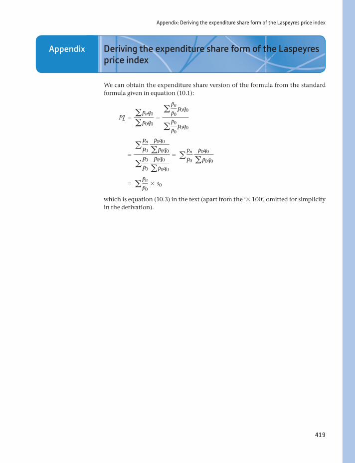
Appendix: Deriving the expenditure share form of the Laspeyres price index
419
Appendix Deriving the expenditure share form of the Laspeyres price index
We can obtain the expenditure share version of the formula from the standard formula given in equation (10.1):
PnL = apnq0
ap0q0=
a pn
p0 p0q0
a p0
p0 p0q0
=a pn
p0
p0q0
ap0q0
a p0
p0
p0q0
ap0q0
= a pn
p0
p0q0
ap0q0
= a pn
p0* s0
which is equation (10.3) in the text (apart from the ‘* 100’, omitted for simplicity in the derivation).

420
By the end of this chapter you should be able to:
recognise the different elements that make up a time series
isolate the trend from a series, by either the additive or multiplicative method, or by using linear regression
find the seasonal factors in a series
use the seasonal factors to seasonally adjust the data
forecast the series, taking account of seasonal factors
appreciate the issues involved in the process of seasonal adjustment.
Learning outcomes 420Introduction 421The components of a time series 421
Isolating the trend 424Isolating seasonal factors 427Seasonal adjustment 429An alternative method for finding the trend 431
Forecasting 432Further issues 433
Using adjusted or unadjusted data 434Summary 434
Key terms and concepts 435Problems 436Answers to exercises 438
Seasonal adjustment of time-series data11
The components of a time series
421
Introduction
‘Economists noticed some signs in the data that suggest a turning point may be in the offing. The claimant count, although down, also showed February’s figure had been revised to show a rise of 600 between January and February, the first occasion in 17 months that there had been an increase.’
The Guardian, 17 April 2008.
The quote above describes economists trying to spot a ‘turning point’ in the unemployment data, early in 2008. This is an extremely difficult task for several reasons:
By definition, a turning point is a point at which a previous trend changes. Data are ‘noisy’, containing a lot of random movements. There may be seasonal factors involved (e.g. perhaps February’s figures are usu-
ally considerably higher than January’s, so what are we to make of a small increase?).
This chapter is concerned with the interpretation of time-series data, such as unemployment, retail sales, stock prices, etc. Agencies such as government, busi-nesses and trade unions are interested in knowing how the economy is changing over time. Government may want to lower interest rates in response to an eco-nomic slowdown, businesses may want to know how much extra stock they need for Christmas, and trade unions will find pay bargaining more difficult if eco-nomic conditions worsen. For all of them, an accurate picture of the economy is important.
In this chapter we will show how to decompose a time series such as unemploy-ment into its component parts: trend, cycle, seasonal and random. We then use this breakdown to seasonally adjust the original data, i.e. to remove any variation due solely to time of year effects (a vivid example would be the Christmas season in the case of retail sales). This allows us to more easily see any changes to the underlying data. Knowing the seasonal pattern to data also helps with forecast-ing: knowing that unemployment tends to be above trend in September can aid us in forecasting future levels in that month.
The methods used in this chapter are relatively straightforward compared to other, more sophisticated, methods that are available. However, they do illustrate the essential principles and give similar answers to the more advanced methods. Later in the chapter we discuss some of the more complex issues that can arise.
The components of a time series
Unemployment data will be used to illustrate the methods involved in decompos-ing a time series into its component parts. A similar analysis could be carried out for other time-series data, common examples being monthly sales data for a firm or quarterly data on the money supply. As always, one should begin by looking at the raw data, and the best way of doing this is via a time-series chart.
Table 11.1 presents the monthly unemployment figures for the period January 2012 to December 2014, and Figure 11.1 shows a plot of the data. The chart shows
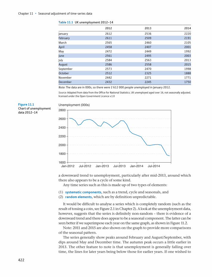
Chapter 11 • Seasonal adjustment of time-series data
422
a downward trend to unemployment, particularly after mid-2013, around which there also appears to be a cycle of some kind.
Any time series such as this is made up of two types of elements:
(1) systematic components, such as a trend, cycle and seasonals, and(2) random elements, which are by definition unpredictable.
It would be difficult to analyse a series which is completely random (such as the result of tossing a coin, see Figure 2.1 in Chapter 2). A look at the unemployment data, however, suggests that the series is definitely non-random – there is evidence of a downward trend and there does appear to be a seasonal component. The latter can be seen better if we superimpose each year on the same graph, as shown in Figure 11.2.
Note: 2011 and 2015 are also shown on the graph to provide more comparisons of the seasonal pattern.
The series generally show peaks around February and August/September, with dips around May and December time. The autumn peak occurs a little earlier in 2013. The other feature to note is that unemployment is generally falling over time, the lines for later years being below those for earlier years. If one wished to
Table 11.1 UK unemployment 2012–14
2012 2013 2014
January 2612 2536 2220February 2611 2509 2191
March 2565 2460 2105April 2458 2407 2001May 2472 2449 1992June 2561 2495 2003July 2584 2563 2013August 2586 2558 2015September 2573 2470 1998October 2512 2325 1888November 2442 2271 1771December 2432 2245 1750
Note: The data are in 000s, so there were 2 612 000 people unemployed in January 2012.
Source: Adapted from data from the Office for National Statistics, UK unemployed aged over 16, not seasonally adjusted, licensed under the Open Government Licence v.1.0
Jan-20121600
1800
2000
2200
2400
2600
2800
Unemployment (000s)
Jul-2012 Jan-2013 Jul-2013 Jan-2014 Jul-2014
Figure 11.1Chart of unemployment data 2012–14
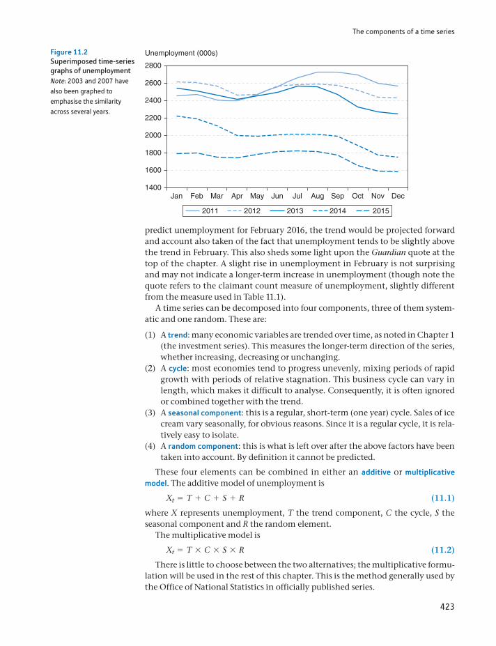
The components of a time series
423
predict unemployment for February 2016, the trend would be projected forward and account also taken of the fact that unemployment tends to be slightly above the trend in February. This also sheds some light upon the Guardian quote at the top of the chapter. A slight rise in unemployment in February is not surprising and may not indicate a longer-term increase in unemployment (though note the quote refers to the claimant count measure of unemployment, slightly different from the measure used in Table 11.1).
A time series can be decomposed into four components, three of them system-atic and one random. These are:
(1) A trend: many economic variables are trended over time, as noted in Chapter 1 (the investment series). This measures the longer-term direction of the series, whether increasing, decreasing or unchanging.
(2) A cycle: most economies tend to progress unevenly, mixing periods of rapid growth with periods of relative stagnation. This business cycle can vary in length, which makes it difficult to analyse. Consequently, it is often ignored or combined together with the trend.
(3) A seasonal component: this is a regular, short-term (one year) cycle. Sales of ice cream vary seasonally, for obvious reasons. Since it is a regular cycle, it is rela-tively easy to isolate.
(4) A random component: this is what is left over after the above factors have been taken into account. By definition it cannot be predicted.
These four elements can be combined in either an additive or multiplicative model. The additive model of unemployment is
Xt = T + C + S + R (11.1)
where X represents unemployment, T the trend component, C the cycle, S the seasonal component and R the random element.
The multiplicative model is
Xt = T * C * S * R (11.2)
There is little to choose between the two alternatives; the multiplicative formu-lation will be used in the rest of this chapter. This is the method generally used by the Office of National Statistics in officially published series.
Jan Feb Mar Apr May Jun Jul Aug Sep Oct Nov Dec1400
1600
1800
2000
2200
2400
2600
2800
Unemployment (000s)
2011 2012 2013 2014 2015
Figure 11.2Superimposed time-series graphs of unemploymentNote: 2003 and 2007 have also been graphed to emphasise the similarity across several years.
Chapter 11 • Seasonal adjustment of time-series data
424
The analysis of unemployment proceeds as follows:
(1) First the trend is isolated from the original data by the method of moving averages.
(2) Second, the actual employment figures are then compared to the trend to see which months tend to have unemployment above trend. This allows seasonal factors to be extracted from the data.
(3) Finally, the seasonal factors are used to seasonally adjust the data, so that the underlying movement in the figures can be observed.
Isolating the trend
There is a variety of methods for isolating the trend from time-series data. The method used here is that of moving averages, one of several methods of smoothing the data. These smoothing methods iron out the short-term fluctuations in the data by averaging successive observations. For example, to calculate the three-month moving average figure for the month of July, one would take the aver-age of the unemployment figures for June, July and August. The three-month moving average for August would be the average of the July, August and September figures. The figures are therefore as follows (for 2012):
July: 2561 + 2584 + 2586
3= 2577
August: 2584 + 2586 + 2573
3= 2581
Note that two values (2584 and 2586) are common to the two calculations, so that the two averages tend to be similar and the data series is smoothed out. Thus the moving average is calculated by moving month by month through the data series, taking successive three-month averages.
The choice of the three-month moving average was arbitrary, it could just as eas-ily have been a 4-, 5- or 12-month moving average process. How should the appro-priate length of the moving average process be chosen? This depends upon the degree of smoothing of the data which is desired, and upon the nature of the fluc-tuations. The longer the period of the moving average process, the greater the smoothing of the data, since the greater is the number of terms in the averaging process. In the case of unemployment data, the fluctuations are probably fairly con-sistent from year to year since, for example, school leavers arrive on the unemploy-ment register at the same time every year, causing a jump in the figures. A 12-month moving average process would therefore be appropriate to smooth this data series.
Table 11.2 shows how the 12-month moving average series is calculated. The calculation is the same in principle as the three-month moving average, but there is one slight complication, that of centring the data. The unemployment column (1) of the table repeats the raw data from Table 11.1. In column (2) is cal-culated the successive 12-month totals. Thus the total of the first 12 observations (Jan–Dec 2012) is 30 408 and this is placed in the middle of 2012, between the months of June and July. The sum of observations 2 to 13 is 30 332 and falls between July and August, and so on. Notice that it is impossible to calculate any total before June/July by the moving average process, using the data from the table. A similar effect occurs at the end of the series, in the second half of 2014. Values at the beginning and end of the period in question are always lost by this
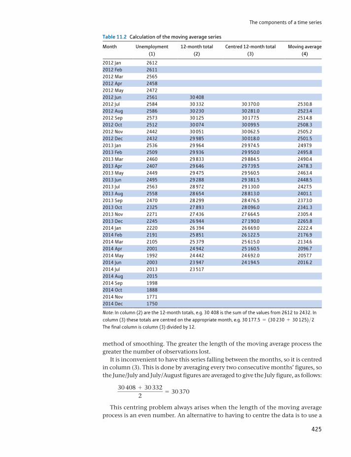
The components of a time series
425
Table 11.2 Calculation of the moving average series
Month Unemployment (1)
12-month total (2)
Centred 12-month total (3)
Moving average (4)
2012 Jan 26122012 Feb 26112012 Mar 25652012 Apr 24582012 May 24722012 Jun 2561 30 4082012 Jul 2584 30 332 30 370.0 2530.82012 Aug 2586 30 230 30 281.0 2523.42012 Sep 2573 30 125 30 177.5 2514.82012 Oct 2512 30 074 30 099.5 2508.32012 Nov 2442 30 051 30 062.5 2505.22012 Dec 2432 29 985 30 018.0 2501.52013 Jan 2536 29 964 29 974.5 2497.92013 Feb 2509 29 936 29 950.0 2495.82013 Mar 2460 29 833 29 884.5 2490.42013 Apr 2407 29 646 29 739.5 2478.32013 May 2449 29 475 29 560.5 2463.42013 Jun 2495 29 288 29 381.5 2448.52013 Jul 2563 28 972 29 130.0 2427.52013 Aug 2558 28 654 28 813.0 2401.12013 Sep 2470 28 299 28 476.5 2373.02013 Oct 2325 27 893 28 096.0 2341.32013 Nov 2271 27 436 27 664.5 2305.42013 Dec 2245 26 944 27 190.0 2265.82014 Jan 2220 26 394 26 669.0 2222.42014 Feb 2191 25 851 26 122.5 2176.92014 Mar 2105 25 379 25 615.0 2134.62014 Apr 2001 24 942 25 160.5 2096.72014 May 1992 24 442 24 692.0 2057.72014 Jun 2003 23 947 24 194.5 2016.22014 Jul 2013 23 5172014 Aug 20152014 Sep 19982014 Oct 18882014 Nov 17712014 Dec 1750
Note: In column (2) are the 12-month totals, e.g. 30 408 is the sum of the values from 2612 to 2432. In column (3) these totals are centred on the appropriate month, e.g. 30 177.5 = (30 230 + 30 125)>2 The final column is column (3) divided by 12.
method of smoothing. The greater the length of the moving average process the greater the number of observations lost.
It is inconvenient to have this series falling between the months, so it is centred in column (3). This is done by averaging every two consecutive months’ figures, so the June/July and July/August figures are averaged to give the July figure, as follows:
30 408 + 30 3322
= 30 370
This centring problem always arises when the length of the moving average process is an even number. An alternative to having to centre the data is to use a
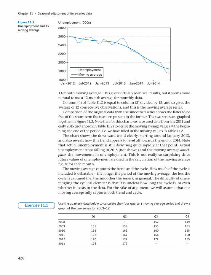
Chapter 11 • Seasonal adjustment of time-series data
426
13-month moving average. This gives virtually identical results, but it seems more natural to use a 12-month average for monthly data.
Column (4) of Table 11.2 is equal to column (3) divided by 12, and so gives the average of 12 consecutive observations, and this is the moving average series.
Comparison of the original data with the smoothed series shows the latter to be free of the short-term fluctuations present in the former. The two series are graphed together in Figure 11.3. Note that for this chart, we have used data from late 2011 and early 2015 (not shown in Table 11.2) to derive the moving average values at the begin-ning and end of the period, i.e. we have filled in the missing values in Table 11.2.
The chart shows the downward trend clearly, starting around January 2013, and also reveals how this trend appears to level off towards the end of 2014. Note that actual unemployment is still decreasing quite rapidly at that point. Actual unemployment stops falling in 2015 (not shown) and the moving average antici-pates the movements in unemployment. This is not really so surprising since future values of unemployment are used in the calculation of the moving average figure for each month.
The moving average captures the trend and the cycle. How much of the cycle is included is debatable – the longer the period of the moving average, the less the cycle is captured (i.e. the smoother the series), in general. The difficulty of disen-tangling the cyclical element is that it is unclear how long the cycle is, or even whether it exists in the data. For the sake of argument, we will assume that our moving average fully captures both trend and cycle.
1600
1800
2000
2200
2400
2600
2800
Unemployment (000s)
Jan-2012 Jul-2012 Jan-2013 Jul-2013 Jan-2014 Jul-2014
Unemployment
Moving average
Figure 11.3Unemployment and its moving average
Use the quarterly data below to calculate the (four quarter) moving average series and draw a graph of the two series for 2009–12:
Q1 Q2 Q3 Q4
2008 – – 152 1492009 155 158 155 1532010 159 166 160 1552011 162 167 164 1602012 170 172 172 1652013 175 179 — —
Exercise 11.1
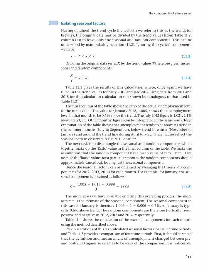
The components of a time series
427
Isolating seasonal factors
Having obtained the trend-cycle (henceforth we refer to this as the trend, for brevity), the original data may be divided by the trend values (from Table 11.2, column (4)) to leave only the seasonal and random components. This can be understood by manipulating equation (11.2). Ignoring the cyclical component, we have
X = T * S * R (11.3)
Dividing the original data series X by the trend values T therefore gives the sea-sonal and random components:
XT
= S * R (11.4)
Table 11.3 gives the results of this calculation where, once again, we have filled in the trend values for early 2012 and late 2014 using data from 2011 and 2015 for the calculation (calculation not shown but analogous to that used in Table 11.2).
The final column of the table shows the ratio of the actual unemployment level to the trend value. The value for January 2012, 1.005, shows the unemployment level in that month to be 0.5% above the trend. The July 2012 figure is 1.021, 2.1% above trend, etc. Other months’ figures can be interpreted in the same way. Closer examination of the table shows that unemployment tends to be above its trend in the summer months (July to September), below trend in winter (November to January) and around the trend line during April to May. These figures reflect the seasonal pattern observed in Figure 11.2 earlier.
The next task is to disentangle the seasonal and random components which together make up the ‘Ratio’ value in the final column of the table. We make the assumption that the random component has a mean value of zero. Then, if we average the ‘Ratio’ values for a particular month, the random components should approximately cancel out, leaving just the seasonal component.
Hence the seasonal factor S can be obtained by averaging the three S * R com-ponents (for 2012, 2013, 2014) for each month. For example, for January, the sea-sonal component is obtained as follows:
S =1.005 + 1.015 + 0.999
3= 1.006 (11.5)
The more years we have available entering this averaging process, the more accurate is the estimate of the seasonal component. The seasonal component in this case for January is therefore 1.006 - 1 = 0.006 = 0.6%, so January is typi-cally 0.6% above trend. The random components are therefore (virtually) zero, positive and negative in 2012, 2013 and 2014, respectively.
Table 11.4 shows the calculation of the seasonal components for each month using the method described above.
Previous editions of this text calculated seasonal factors for earlier time periods, and Table 11.5 provides a comparison of four time periods. First, it should be stated that the definition and measurement of unemployment changed between pre- and post-2000 figures so one has to be wary of the comparison. It is noticeable,
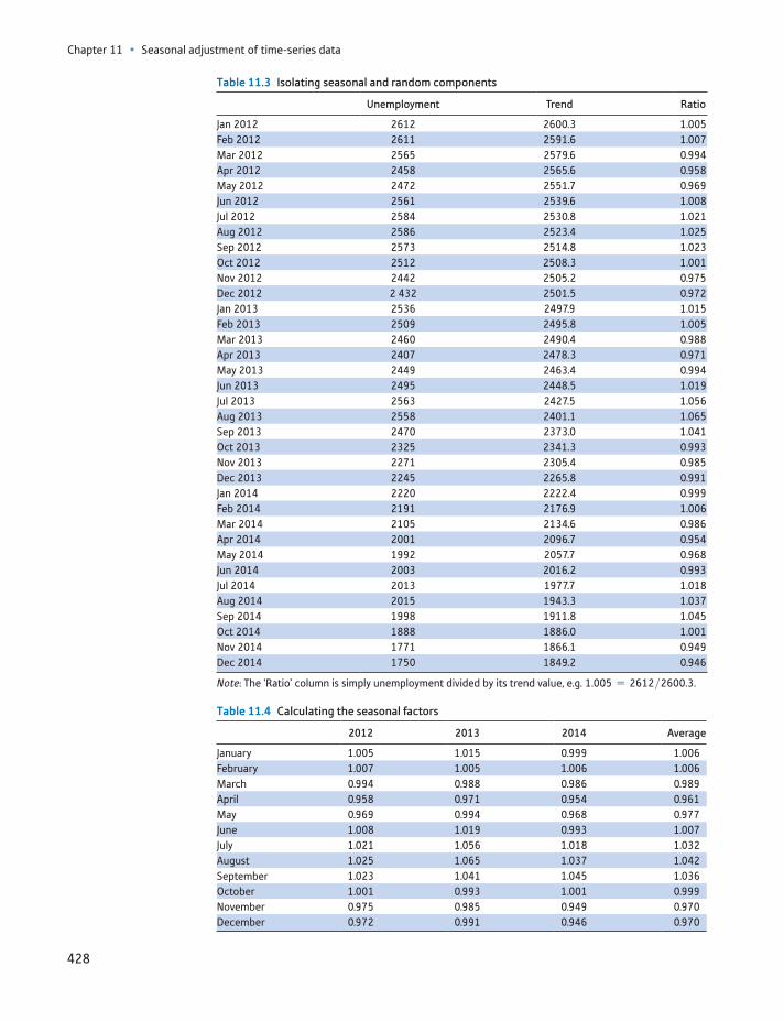
Chapter 11 • Seasonal adjustment of time-series data
428
Table 11.3 Isolating seasonal and random components
Unemployment Trend Ratio
Jan 2012 2612 2600.3 1.005Feb 2012 2611 2591.6 1.007Mar 2012 2565 2579.6 0.994Apr 2012 2458 2565.6 0.958May 2012 2472 2551.7 0.969Jun 2012 2561 2539.6 1.008Jul 2012 2584 2530.8 1.021Aug 2012 2586 2523.4 1.025Sep 2012 2573 2514.8 1.023Oct 2012 2512 2508.3 1.001Nov 2012 2442 2505.2 0.975Dec 2012 2 432 2501.5 0.972Jan 2013 2536 2497.9 1.015Feb 2013 2509 2495.8 1.005Mar 2013 2460 2490.4 0.988Apr 2013 2407 2478.3 0.971May 2013 2449 2463.4 0.994Jun 2013 2495 2448.5 1.019Jul 2013 2563 2427.5 1.056Aug 2013 2558 2401.1 1.065Sep 2013 2470 2373.0 1.041Oct 2013 2325 2341.3 0.993Nov 2013 2271 2305.4 0.985Dec 2013 2245 2265.8 0.991Jan 2014 2220 2222.4 0.999Feb 2014 2191 2176.9 1.006Mar 2014 2105 2134.6 0.986Apr 2014 2001 2096.7 0.954May 2014 1992 2057.7 0.968Jun 2014 2003 2016.2 0.993Jul 2014 2013 1977.7 1.018Aug 2014 2015 1943.3 1.037Sep 2014 1998 1911.8 1.045Oct 2014 1888 1886.0 1.001Nov 2014 1771 1866.1 0.949Dec 2014 1750 1849.2 0.946
Note: The ‘Ratio’ column is simply unemployment divided by its trend value, e.g. 1.005 = 2612>2600.3.
Table 11.4 Calculating the seasonal factors
2012 2013 2014 Average
January 1.005 1.015 0.999 1.006February 1.007 1.005 1.006 1.006March 0.994 0.988 0.986 0.989April 0.958 0.971 0.954 0.961May 0.969 0.994 0.968 0.977June 1.008 1.019 0.993 1.007July 1.021 1.056 1.018 1.032August 1.025 1.065 1.037 1.042September 1.023 1.041 1.045 1.036October 1.001 0.993 1.001 0.999November 0.975 0.985 0.949 0.970December 0.972 0.991 0.946 0.970
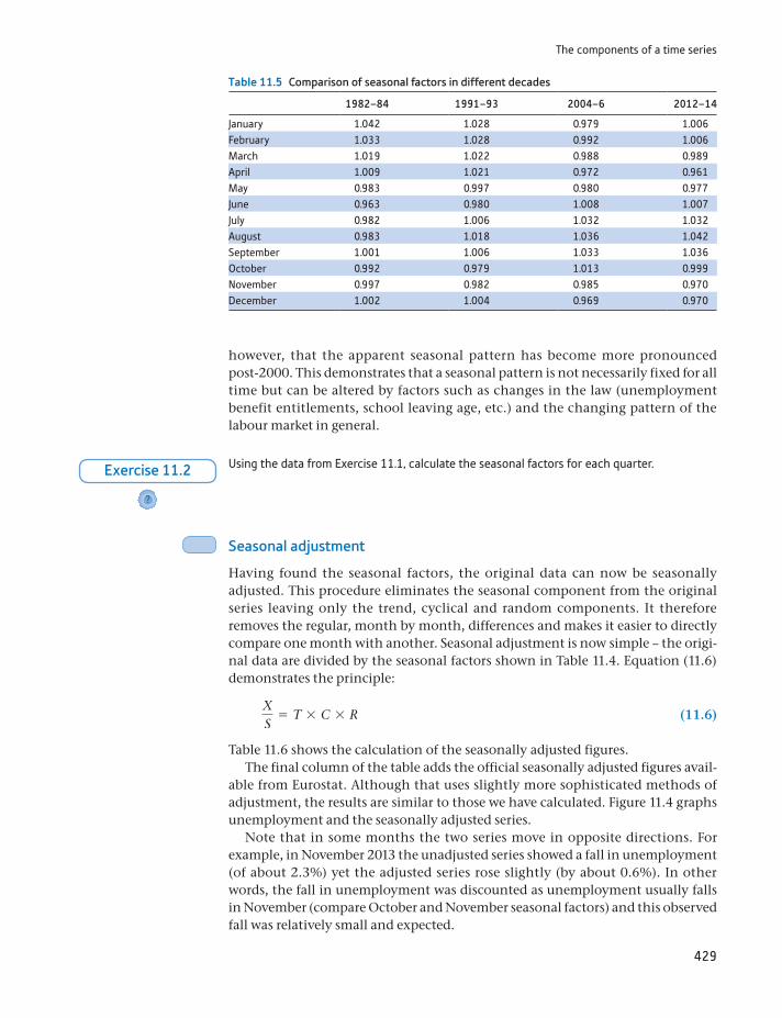
The components of a time series
429
however, that the apparent seasonal pattern has become more pronounced post-2000. This demonstrates that a seasonal pattern is not necessarily fixed for all time but can be altered by factors such as changes in the law (unemployment benefit entitlements, school leaving age, etc.) and the changing pattern of the labour market in general.
Table 11.5 Comparison of seasonal factors in different decades
1982–84 1991–93 2004–6 2012–14
January 1.042 1.028 0.979 1.006February 1.033 1.028 0.992 1.006March 1.019 1.022 0.988 0.989April 1.009 1.021 0.972 0.961May 0.983 0.997 0.980 0.977June 0.963 0.980 1.008 1.007July 0.982 1.006 1.032 1.032August 0.983 1.018 1.036 1.042September 1.001 1.006 1.033 1.036October 0.992 0.979 1.013 0.999November 0.997 0.982 0.985 0.970December 1.002 1.004 0.969 0.970
Using the data from Exercise 11.1, calculate the seasonal factors for each quarter.
?
Exercise 11.2
Seasonal adjustment
Having found the seasonal factors, the original data can now be seasonally adjusted. This procedure eliminates the seasonal component from the original series leaving only the trend, cyclical and random components. It therefore removes the regular, month by month, differences and makes it easier to directly compare one month with another. Seasonal adjustment is now simple – the origi-nal data are divided by the seasonal factors shown in Table 11.4. Equation (11.6) demonstrates the principle:
XS
= T * C * R (11.6)
Table 11.6 shows the calculation of the seasonally adjusted figures.The final column of the table adds the official seasonally adjusted figures avail-
able from Eurostat. Although that uses slightly more sophisticated methods of adjustment, the results are similar to those we have calculated. Figure 11.4 graphs unemployment and the seasonally adjusted series.
Note that in some months the two series move in opposite directions. For example, in November 2013 the unadjusted series showed a fall in unemployment (of about 2.3%) yet the adjusted series rose slightly (by about 0.6%). In other words, the fall in unemployment was discounted as unemployment usually falls in November (compare October and November seasonal factors) and this observed fall was relatively small and expected.

Chapter 11 • Seasonal adjustment of time-series data
430
Table 11.6 Seasonally adjusted unemployment
Unemployment Seasonal factorSeasonally
adjusted seriesS.A. series
from Eurostat
Jan 2012 2612 1.006 2596 2619Feb 2012 2611 1.006 2594 2596Mar 2012 2565 0.989 2592 2590Apr 2012 2458 0.961 2557 2535May 2012 2472 0.977 2530 2518Jun 2012 2561 1.007 2543 2548Jul 2012 2584 1.032 2505 2518Aug 2012 2586 1.042 2481 2499Sep 2012 2573 1.036 2483 2498Oct 2012 2512 0.999 2516 2499Nov 2012 2442 0.970 2518 2491Dec 2012 2432 0.970 2508 2488Jan 2013 2536 1.006 2520 2542Feb 2013 2509 1.006 2493 2494Mar 2013 2460 0.989 2486 2484Apr 2013 2407 0.961 2504 2481May 2013 2449 0.977 2507 2493Jun 2013 2495 1.007 2478 2482Jul 2013 2563 1.032 2485 2498Aug 2013 2558 1.042 2454 2468Sep 2013 2470 1.036 2383 2393Oct 2013 2325 0.999 2328 2315Nov 2013 2271 0.970 2342 2322Dec 2013 2245 0.970 2315 2299Jan 2014 2220 1.006 2206 2229Feb 2014 2191 1.006 2177 2182Mar 2014 2105 0.989 2127 2132Apr 2014 2001 0.961 2082 2073May 2014 1992 0.977 2039 2033Jun 2014 2003 1.007 1989 1989Jul 2014 2013 1.032 1951 1949Aug 2014 2015 1.042 1933 1926Sep 2014 1998 1.036 1928 1921Oct 2014 1888 0.999 1891 1877Nov 2014 1771 0.970 1826 1821Dec 2014 1750 0.970 1805 1805
Note: The adjusted series is obtained by dividing the ‘Unemployment’ column by the ‘Seasonal factor’ column.
1600
1800
2000
2200
2400
2600
2800
Unemployment (000s)
Jan-2012 Jul-2012 Jan-2013 Jul-2013 Jan-2014 Jul-2014
Unemployment
Seasonally adjusted
Figure 11.4Unemployment and seasonally adjusted unemployment
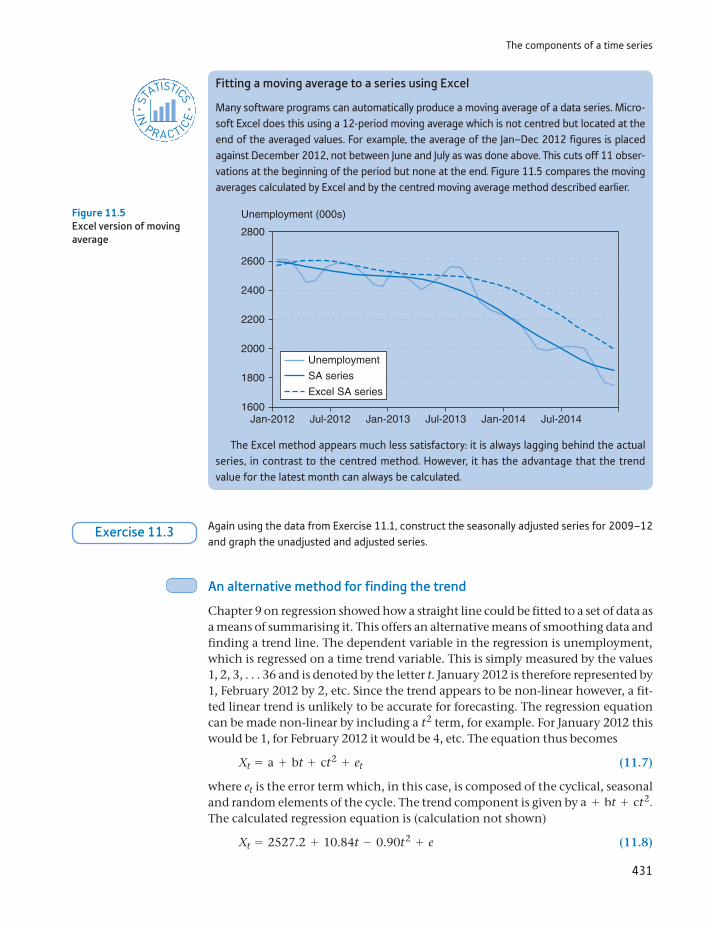
The components of a time series
431
The Excel method appears much less satisfactory: it is always lagging behind the actual series, in contrast to the centred method. However, it has the advantage that the trend value for the latest month can always be calculated.
Fitting a moving average to a series using Excel
Many software programs can automatically produce a moving average of a data series. Micro-soft Excel does this using a 12-period moving average which is not centred but located at the end of the averaged values. For example, the average of the Jan–Dec 2012 figures is placed against December 2012, not between June and July as was done above. This cuts off 11 obser-vations at the beginning of the period but none at the end. Figure 11.5 compares the moving averages calculated by Excel and by the centred moving average method described earlier.
ST
ATISTICS
IN
PRACTI
CE
· ·
Figure 11.5Excel version of moving average
1600
1800
2000
2200
2400
2600
2800
Unemployment (000s)
Jan-2012 Jul-2012 Jan-2013 Jul-2013 Jan-2014 Jul-2014
Unemployment
SA series
Excel SA series
Again using the data from Exercise 11.1, construct the seasonally adjusted series for 2009–12 and graph the unadjusted and adjusted series.
Exercise 11.3
An alternative method for finding the trend
Chapter 9 on regression showed how a straight line could be fitted to a set of data as a means of summarising it. This offers an alternative means of smoothing data and finding a trend line. The dependent variable in the regression is unemployment, which is regressed on a time trend variable. This is simply measured by the values 1, 2, 3, . . . 36 and is denoted by the letter t. January 2012 is therefore represented by 1, February 2012 by 2, etc. Since the trend appears to be non-linear however, a fit-ted linear trend is unlikely to be accurate for forecasting. The regression equation can be made non-linear by including a t2 term, for example. For January 2012 this would be 1, for February 2012 it would be 4, etc. The equation thus becomes
Xt = a + bt + ct2 + et (11.7)
where et is the error term which, in this case, is composed of the cyclical, seasonal and random elements of the cycle. The trend component is given by a + bt + ct2. The calculated regression equation is (calculation not shown)
Xt = 2527.2 + 10.84t - 0.90t2 + e (11.8)
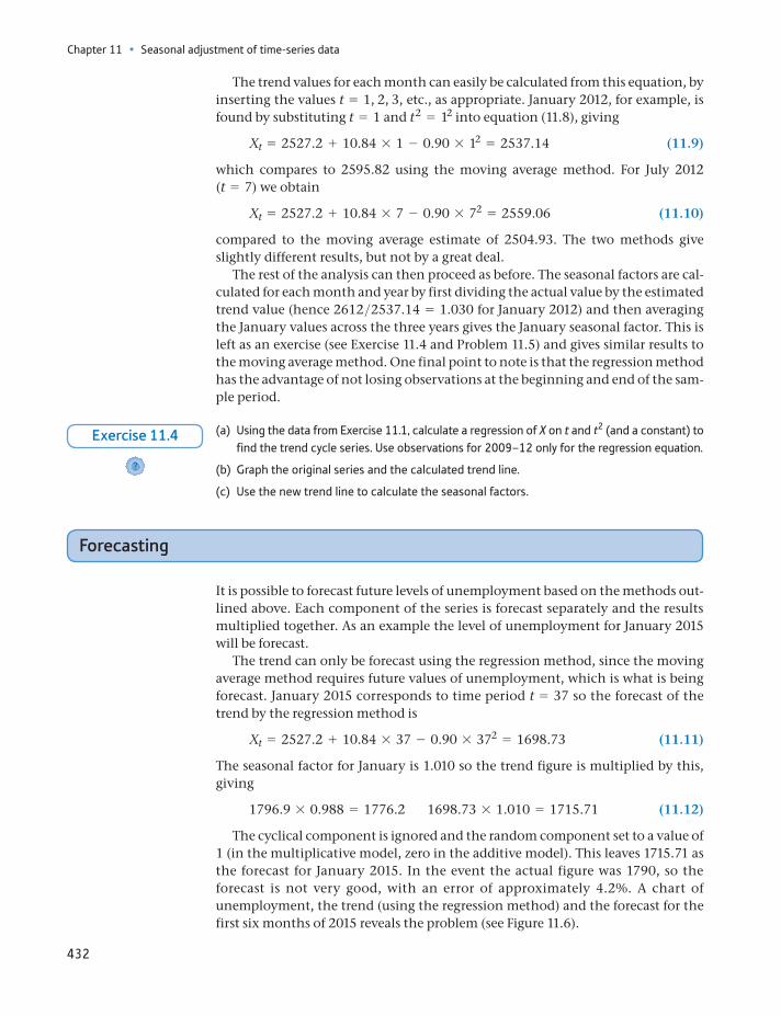
Chapter 11 • Seasonal adjustment of time-series data
432
The trend values for each month can easily be calculated from this equation, by inserting the values t = 1, 2, 3, etc., as appropriate. January 2012, for example, is found by substituting t = 1 and t2 = 12 into equation (11.8), giving
Xt = 2527.2 + 10.84 * 1 - 0.90 * 12 = 2537.14 (11.9)
which compares to 2595.82 using the moving average method. For July 2012 (t = 7) we obtain
Xt = 2527.2 + 10.84 * 7 - 0.90 * 72 = 2559.06 (11.10)
compared to the moving average estimate of 2504.93. The two methods give slightly different results, but not by a great deal.
The rest of the analysis can then proceed as before. The seasonal factors are cal-culated for each month and year by first dividing the actual value by the estimated trend value (hence 2612>2537.14 = 1.030 for January 2012) and then averaging the January values across the three years gives the January seasonal factor. This is left as an exercise (see Exercise 11.4 and Problem 11.5) and gives similar results to the moving average method. One final point to note is that the regression method has the advantage of not losing observations at the beginning and end of the sam-ple period.
(a) Using the data from Exercise 11.1, calculate a regression of X on t and t2 (and a constant) to find the trend cycle series. Use observations for 2009–12 only for the regression equation.
(b) Graph the original series and the calculated trend line.
(c) Use the new trend line to calculate the seasonal factors.
?
Exercise 11.4
Forecasting
It is possible to forecast future levels of unemployment based on the methods out-lined above. Each component of the series is forecast separately and the results multiplied together. As an example the level of unemployment for January 2015 will be forecast.
The trend can only be forecast using the regression method, since the moving average method requires future values of unemployment, which is what is being forecast. January 2015 corresponds to time period t = 37 so the forecast of the trend by the regression method is
Xt = 2527.2 + 10.84 * 37 - 0.90 * 372 = 1698.73 (11.11)
The seasonal factor for January is 1.010 so the trend figure is multiplied by this, giving
1796.9 * 0.988 = 1776.2 1698.73 * 1.010 = 1715.71 (11.12)
The cyclical component is ignored and the random component set to a value of 1 (in the multiplicative model, zero in the additive model). This leaves 1715.71 as the forecast for January 2015. In the event the actual figure was 1790, so the forecast is not very good, with an error of approximately 4.2%. A chart of unemployment, the trend (using the regression method) and the forecast for the first six months of 2015 reveals the problem (see Figure 11.6).
Further issues
433
The forecast relentlessly follows the trend line downwards. Because it is only a quadratic trend (i.e. involving terms up to t2) it cannot predict another turning point, which seems to have occurred around the end of 2014. Nevertheless, the error in the forecast for January 2015 would alert observers to the likelihood that some kind of change has occurred and that unemployment is no longer following its downward trend.
1000
1200
1400
1600
2000
2400
1800
2200
2600
2800
Unemployment (000s)
Jan-2012 Jul-2012 Jan-2013 Jul-2013 Jan-2014 Jul-2014 Jan-2015
Unemployment
Trend
Forecast
Figure 11.6Forecasting unemploy-ment
Use the results of Exercise 11.4 to forecast the values of X for 2013Q1 and 2013Q2. How do they compare to the actual values?
Exercise 11.5
Further issues
As stated earlier, official methods of seasonal adjustment are more sophisticated than those shown here, although with similar results. The main additional fea-tures that we have omitted are as follows:
Ad hoc adjustments – the original data may be ‘incorrect’ for an obvious reason. A strike, for example, might lower output in a particular month. This not only gives an atypical figure for the month but will also affect the calculation of the seasonal factors. Hence, such an observation might be corrected in some way before the seasonal factors are calculated.
Calendar effects – months are not all of the same length so retail sales, for exam-ple, might vary simply because there are more shopping days (especially if a month happens to have five weekends). Overseas trade statistics are routinely adjusted for the numbers of days in each month. Easter is another problem, because it is not on a regular date and so can affect monthly figures in different ways, depending where it falls.
Forecasting methods – the trend is calculated by a mixture of regression and moving average methods, avoiding some of the problems exhibited above when forecasting.
The above analysis has taken a fairly mechanical approach to the analysis of time series, and has not sought the reasons why the data might vary seasonally.
Chapter 11 • Seasonal adjustment of time-series data
434
The seasonal adjustment factors are simply used to adjust the original data for regular monthly effects, whatever the cause. Further investigation of the causes might be worthwhile as they might improve forecasting. For example, unem-ployment varies seasonally because of (among other things) greater employment opportunities in summer (e.g. deck chair attendants) and school leavers entering the unemployment register in September. The availability of summer jobs might be predictable (based on forecasts of the number of tourists, weather, etc.), and the number of school leavers next year can presumably be predicted by the num-ber of pupils at present in their final year. These sorts of considerations should provide better forecasts rather than slavishly following the rules set out above.
Using adjusted or unadjusted data
Seasonal adjustment can also introduce problems into data analysis as well as resolve them. Although seasonal adjustment can help in interpreting figures, if the adjusted data are then used in further statistical analysis, they can mislead. It is well known, for example, that seasonal adjustment can introduce a cyclical component into a data series which originally had no cyclical element to it. This occurs because a large (random) deviation from the trend will enter the moving average process for 12 different months (or whatever is the length of the moving average process), and this tends to turn occasional, random disturbances into a cycle. Note also that the adjusted series will start to rise before the random shock in these circumstances.
The question then arises as to whether adjusted or unadjusted data are best used in, say, regression analysis. Use of unadjusted data means that the coefficient estimates may be contaminated by the seasonal effects; using adjusted data runs into the kind of problems outlined above. A suitable compromise is to follow the method outlined in Chapter 10: use unadjusted data with seasonal dummy vari-ables. In this case the estimation of parameters and seasonal effects is dealt with simultaneously and generally gives the best results.
A further advantage of this regression method is that it allows the significance of the seasonal variations to be established. An F test for the joint significance of the seasonal coefficients will tell you whether any of the seasonal effects are sta-tistically significant. If not, seasonal dummies need not be included in the regres-sion equation.
Finally, it should be remembered that decomposing a time series is not a clear-cut procedure. It is often difficult to disentangle the separate effects, and different methods will give different results. The seasonally adjusted unemployment fig-ures given by Eurostat are slightly different from the series calculated here, due to slightly different techniques being applied. The differences are not great and the direction of the seasonal effects are the same even if the sizes are slightly different.
Summary
Seasonal adjustment of data allows us to see some of the underlying features, shorn of the distraction of seasonal effects (such as the Christmas effect on retail sales).
The four components of a time series are the trend, the cycle, the seasonal component and the random residual.

Key terms and concepts
435
These components may be thought of either as being multiplied together or added together to make up the series. The former method is more common.
The trend (possibly mixed with the cycle) can be identified by the method of moving averages or by the use of a regression equation.
Removing the trend cycle values from a series leaves only the seasonal and random components.
The residual component can then be eliminated by averaging the data over successive years (e.g. take the average of the January seasonal and random component over several years).
Having isolated the seasonal effect in such a manner, it can be eliminated from the original series, leaving the seasonally adjusted series.
Knowledge of the seasonal effects can be useful in forecasting future values of the series.
additive modelcalendar effectscycleforecastingmoving averagemultiplicative modelrandom componentrandom elements
random residualseasonal adjustmentseasonal componentseasonal factorsmoothingsystematic componentsthree-month moving averagetrend
Key terms and concepts
Chapter 11 • Seasonal adjustment of time-series data
436
Some of the more challenging problems are indicated by highlighting the problem number in colour.
11.1 The following table contains data for consumers’ non-durables expenditure in the United Kingdom, in constant 2003 prices.
(a) Graph the series and comment upon any apparent seasonal pattern. Why might it occur?
(b) Use the method of centred moving averages to find the trend values for 2000–14.
(c) Use the moving average figures to find the seasonal factors for each quarter (use the multipli-cative model).
(d) By approximately how much does expenditure normally increase in the fourth quarter?
(e) Use the seasonal factors to obtain the seasonally adjusted series for non-durable expenditure.
(f) Were retailers happy or unhappy at Christmas in 2000? How about 2014?
Q1 Q2 Q3 Q4
1999 — — 153 888 160 1872000 152 684 155 977 160 564 164 4372001 156 325 160 069 165 651 171 2812002 161 733 167 128 171 224 176 7482003 165 903 172 040 176 448 182 7692004 171 913 178 308 182 480 188 7332013 175 174 180 723 184 345 191 7632014 177 421 183 785 187 770 196 7612007 183 376 188 955 — —
Source: Data adapted from the Office for National Statistics licensed under the Open Government Licence v.1.0.
11.2 Repeat the exercise using the additive model. (In Problem 11.1(c), subtract the moving average fig-ures from the original series. In (e), subtract the seasonal factors from the original data to get the adjusted series.) Is there a big difference between this and the multiplicative model?
11.3 The following data relate to car production in the United Kingdom (not seasonally adjusted).
2003 2004 2005 2006 2007
January — 141.3 136 119.1 124.2February — 141.1 143.5 131.2 115.6March — 163 153.3 159 138April — 129.6 139.8 118.6 120.4May — 143.1 132 132.3 127.4June — 155.5 144.3 139.3 137.5July 146.3 140.5 130.2 117.8 129.7August 91.4 83.2 97.1 73 —September 153.5 155.3 149.9 122.3 —October 153.4 135.1 124.8 116.1 —November 142.9 149.3 149.7 128.6 —December 112.4 109.7 95.3 84.8 —
Source: Data adapted from the Office for National Statistics licensed under the Open Government Licence v.1.0.
(a) Graph the data for 2004–14 by overlapping the three years (as was done in Figure 11.2) and comment upon any seasonal pattern.
Problems
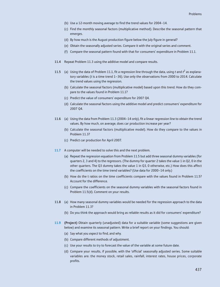
Problems
437
(b) Use a 12-month moving average to find the trend values for 2004–14.
(c) Find the monthly seasonal factors (multiplicative method). Describe the seasonal pattern that emerges.
(d) By how much is the August production figure below the July figure in general?
(e) Obtain the seasonally adjusted series. Compare it with the original series and comment.
(f) Compare the seasonal pattern found with that for consumers’ expenditure in Problem 11.1.
11.4 Repeat Problem 11.3 using the additive model and compare results.
11.5 (a) Using the data of Problem 11.1, fit a regression line through the data, using t and t2 as explana-tory variables (t is a time trend 1–36). Use only the observations from 2000 to 2014. Calculate the trend values using the regression.
(b) Calculate the seasonal factors (multiplicative model) based upon this trend. How do they com-pare to the values found in Problem 11.1?
(c) Predict the value of consumers’ expenditure for 2007 Q4.
(d) Calculate the seasonal factors using the additive model and predict consumers’ expenditure for 2007 Q4.
11.6 (a) Using the data from Problem 11.3 (2004–14 only), fit a linear regression line to obtain the trend values. By how much, on average, does car production increase per year?
(b) Calculate the seasonal factors (multiplicative model). How do they compare to the values in Problem 11.3?
(c) Predict car production for April 2007.
11.7 A computer will be needed to solve this and the next problem.
(a) Repeat the regression equation from Problem 11.5 but add three seasonal dummy variables (for quarters 2, 3 and 4) to the regressors. (The dummy for quarter 2 takes the value 1 in Q2, 0 in the other quarters. The Q3 dummy takes the value 1 in Q3, 0 otherwise, etc.) How does this affect the coefficients on the time trend variables? (Use data for 2000–14 only.)
(b) How do the t ratios on the time coefficients compare with the values found in Problem 11.5? Account for the difference.
(c) Compare the coefficients on the seasonal dummy variables with the seasonal factors found in Problem 11.5(d). Comment on your results.
11.8 (a) How many seasonal dummy variables would be needed for the regression approach to the data in Problem 11.3?
(b) Do you think the approach would bring as reliable results as it did for consumers’ expenditure?
11.9 (Project) Obtain quarterly (unadjusted) data for a suitable variable (some suggestions are given below) and examine its seasonal pattern. Write a brief report on your findings. You should:
(a) Say what you expect to find, and why.
(b) Compare different methods of adjustment.
(c) Use your results to try to forecast the value of the variable at some future date.
(d) Compare your results, if possible, with the ‘official’ seasonally adjusted series. Some suitable variables are: the money stock, retail sales, rainfall, interest rates, house prices, corporate profits.
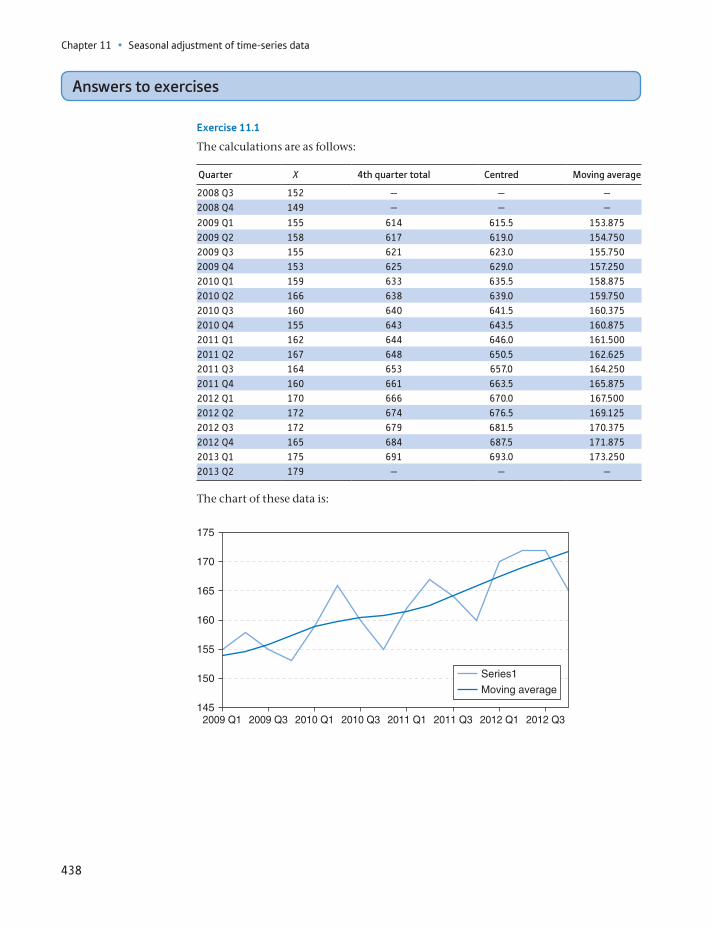
Chapter 11 • Seasonal adjustment of time-series data
438
Answers to exercises
Exercise 11.1
The calculations are as follows:
Quarter X 4th quarter total Centred Moving average
2008 Q3 152 — — —2008 Q4 149 — — —
2009 Q1 155 614 615.5 153.8752009 Q2 158 617 619.0 154.7502009 Q3 155 621 623.0 155.7502009 Q4 153 625 629.0 157.2502010 Q1 159 633 635.5 158.8752010 Q2 166 638 639.0 159.7502010 Q3 160 640 641.5 160.3752010 Q4 155 643 643.5 160.8752011 Q1 162 644 646.0 161.5002011 Q2 167 648 650.5 162.6252011 Q3 164 653 657.0 164.2502011 Q4 160 661 663.5 165.8752012 Q1 170 666 670.0 167.5002012 Q2 172 674 676.5 169.1252012 Q3 172 679 681.5 170.3752012 Q4 165 684 687.5 171.8752013 Q1 175 691 693.0 173.2502013 Q2 179 — — —
The chart of these data is:
145
150
155
160
165
170
175
2009 Q1 2009 Q3 2010 Q1 2010 Q3 2011 Q1 2011 Q3 2012 Q1 2012 Q3
Series1
Moving average
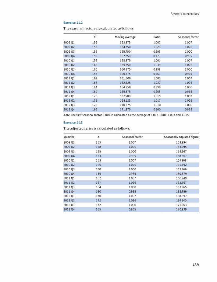
Answers to exercises
439
Exercise 11.2
The seasonal factors are calculated as follows:
X Moving average Ratio Seasonal factor
2009 Q1 155 153.875 1.007 1.0072009 Q2 158 154.750 1.021 1.026
2009 Q3 155 155.750 0.995 1.0002009 Q4 153 157.250 0.973 0.9652010 Q1 159 158.875 1.001 1.0072010 Q2 166 159.750 1.039 1.0262010 Q3 160 160.375 0.998 1.0002010 Q4 155 160.875 0.963 0.9652011 Q1 162 161.500 1.003 1.0072011 Q2 167 162.625 1.027 1.0262011 Q3 164 164.250 0.998 1.0002011 Q4 160 165.875 0.965 0.9652012 Q1 170 167.500 1.015 1.0072012 Q2 172 169.125 1.017 1.0262012 Q3 172 170.375 1.010 1.0002012 Q4 165 171.875 0.960 0.965
Note: The first seasonal factor, 1.007, is calculated as the average of 1.007, 1.001, 1.003 and 1.015.
Exercise 11.3
The adjusted series is calculated as follows:
Quarter X Seasonal factor Seasonally adjusted figure
2009 Q1 155 1.007 153.9942009 Q2 158 1.026 153.995
2009 Q3 155 1.000 154.9672009 Q4 153 0.965 158.5072010 Q1 159 1.007 157.9682010 Q2 166 1.026 161.7922010 Q3 160 1.000 159.9662010 Q4 155 0.965 160.5792011 Q1 162 1.007 160.9492011 Q2 167 1.026 162.7672011 Q3 164 1.000 163.9652011 Q4 160 0.965 165.7592012 Q1 170 1.007 168.8972012 Q2 172 1.026 167.6402012 Q3 172 1.000 171.9632012 Q4 165 0.965 170.939
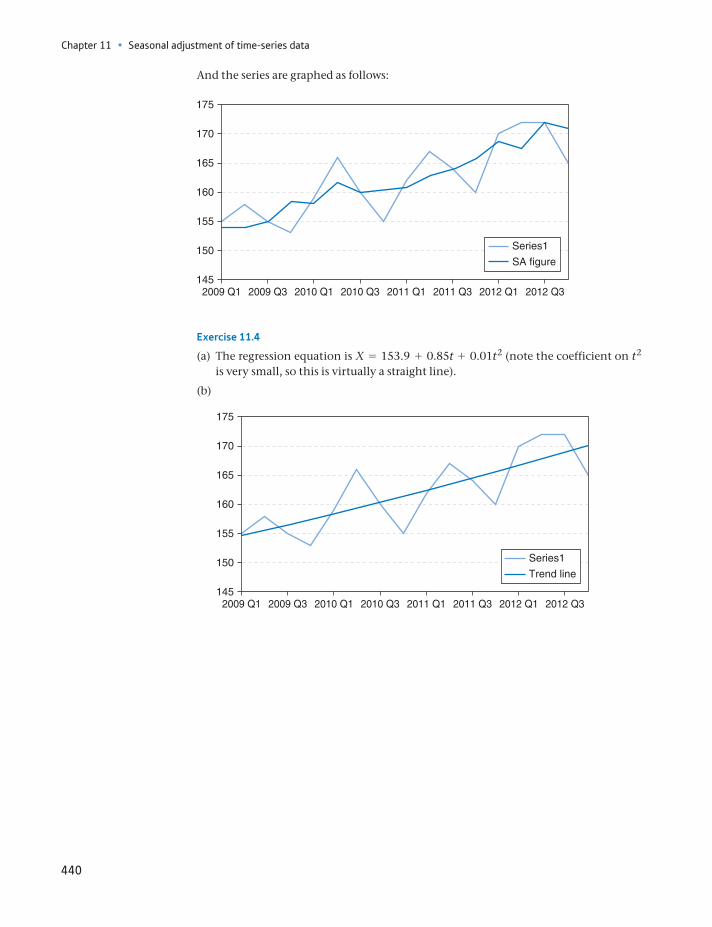
Chapter 11 • Seasonal adjustment of time-series data
440
Exercise 11.4
(a) The regression equation is X = 153.9 + 0.85t + 0.01t2 (note the coefficient on t2 is very small, so this is virtually a straight line).
(b)
And the series are graphed as follows:
145
150
155
160
165
170
175
2009 Q1 2009 Q3 2010 Q1 2010 Q3 2011 Q1 2011 Q3 2012 Q1 2012 Q3
Series1
SA figure
145
150
155
160
165
170
175
2009 Q1 2009 Q3 2010 Q1 2010 Q3 2011 Q1 2011 Q3 2012 Q1 2012 Q3
Series1
Trend line
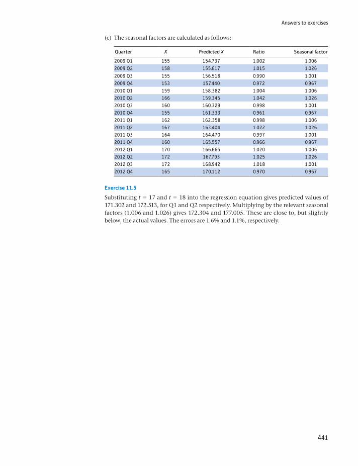
Answers to exercises
441
Exercise 11.5
Substituting t = 17 and t = 18 into the regression equation gives predicted values of 171.302 and 172.513, for Q1 and Q2 respectively. Multiplying by the relevant seasonal factors (1.006 and 1.026) gives 172.304 and 177.005. These are close to, but slightly below, the actual values. The errors are 1.6% and 1.1%, respectively.
(c) The seasonal factors are calculated as follows:
Quarter X Predicted X Ratio Seasonal factor
2009 Q1 155 154.737 1.002 1.0062009 Q2 158 155.617 1.015 1.026
2009 Q3 155 156.518 0.990 1.0012009 Q4 153 157.440 0.972 0.9672010 Q1 159 158.382 1.004 1.0062010 Q2 166 159.345 1.042 1.0262010 Q3 160 160.329 0.998 1.0012010 Q4 155 161.333 0.961 0.9672011 Q1 162 162.358 0.998 1.0062011 Q2 167 163.404 1.022 1.0262011 Q3 164 164.470 0.997 1.0012011 Q4 160 165.557 0.966 0.9672012 Q1 170 166.665 1.020 1.0062012 Q2 172 167.793 1.025 1.0262012 Q3 172 168.942 1.018 1.0012012 Q4 165 170.112 0.970 0.967
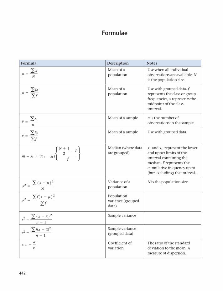
442
Formula Description Notes
m = ax
N
Mean of a population
Use when all individual observations are available. N is the population size.
m = a fx
a f
Mean of a population
Use with grouped data. f represents the class or group frequencies, x represents the midpoint of the class interval.
x = ax
n
Mean of a sample n is the number of observations in the sample.
x = a fx
a f
Mean of a sample Use with grouped data.
m = xL + (xU - xL)•
N + 12
- F
f
Median (where data are grouped)
xL and xU represent the lower and upper limits of the interval containing the median. F represents the cumulative frequency up to (but excluding) the interval.
s2 = a 1x - m2 2
N
Variance of a population
N is the population size.
s2 = a f1x - m2 2
a f
Population variance (grouped data)
s2 = a 1x - x2 2
n - 1
Sample variance
s2 = a f(x - x)2
n - 1
Sample variance (grouped data)
c.v. =s
mCoefficient of variation
The ratio of the standard deviation to the mean. A measure of dispersion.
Formulae
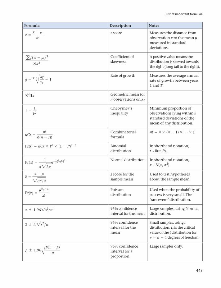
List of important formulae
443
Formula Description Notes
z =x - m
s
z score Measures the distance from observation x to the mean μ measured in standard deviations.
a f1x - m2 3
Ns3
Coefficient of skewness
A positive value means the distribution is skewed towards the right (long tail to the right).
g = T-1B xT
x1- 1
Rate of growth Measures the average annual rate of growth between years 1 and T.2n Πx Geometric mean (of
n observations on x)
1 -1
k2Chebyshev’s inequality
Minimum proportion of observations lying within k standard deviations of the mean of any distribution.
nCr =n!
r!(n - r)!Combinatorial formula
n! = n * (n - 1) * g* 1
Pr(r) = nCr * Pr * (1 - P)n - r Binomial distribution
In shorthand notation, r ~ B(n, P).
Pr(x) =1
s32pe- 1
25x -ms 62 Normal distribution In shorthand notation,
x ~ N(m, s2).
z =x - m3s2>n
z score for the sample mean
Used to test hypotheses about the sample mean.
Pr(x) =mxe -m
x!
Poisson distribution
Used when the probability of success is very small. The ‘rare event’ distribution.
x 1.962s2>n 95% confidence interval for the mean
Large samples, using Normal distribution.
x tn3s2>n 95% confidence interval for the mean
Small samples, using t distribution. tv is the critical value of the t distribution for n = n - 1 degrees of freedom.
p 1.96Bp(1 - p)n
95% confidence interval for a proportion
Large samples only.
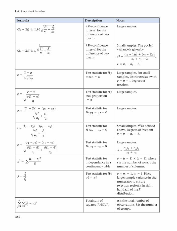
List of important formulae
444
Formula Description Notes
(x1 - x2) 1.96B s21
n1+
s22
n2
95% confidence interval for the difference of two means
Large samples.
(x1 - x2) tnB S2
n1+
S2
n2
95% confidence interval for the difference of two means
Small samples. The pooled variance is given by
S2 =(n1 - 1)s2
1 + (n2 - 1)s22
n1 + n2 - 2,
n = n1 + n2 - 2.
z =x - m3s2>n
Test statistic for H0: mean = m
Large samples. For small samples, distributed as t with n = n - 1 degrees of freedom.
z =p - pBp(1 - p)
n
Test statistic for H0: true proportion= p
Large samples.
z =1x1 - x22 - 1m1 - m22B s2
1
n1+
s22
n2
Test statistic for H0:m1 - m2 = 0
Large samples.
t =(x1 - x2) - (m1 - m2)B S2
n1+
S2
n2
Test statistic for H0:m1 - m2 = 0
Small samples. S2 as defined above. Degrees of freedom v = n1 + n2 - 2.
z =(p1 - p2) - (p1 - p2)Bpn(1 - pn)
n1+
pn(1 - pn)n2
Test statistic for H0:p1 - p2 = 0
Large samples.
pn =n1p1 + n2p2
n1 + n2
x2 = a (O - E)2
E
Test statistic for independence in a contingency table
n = (r - 1) * (c - 1), where r is the number of rows, c the number of columns.
F =s2
1
s22
Test statistic for H0: s2
1 = s22
n = n1 - 1, n2 - 1. Place larger sample variance in the numerator to ensure rejection region is in right-hand tail of the F distribution.
ani
j= 1a
k
i = 1x2
ij - nx2Total sum of squares (ANOVA)
n is the total number of observations, k is the number of groups.
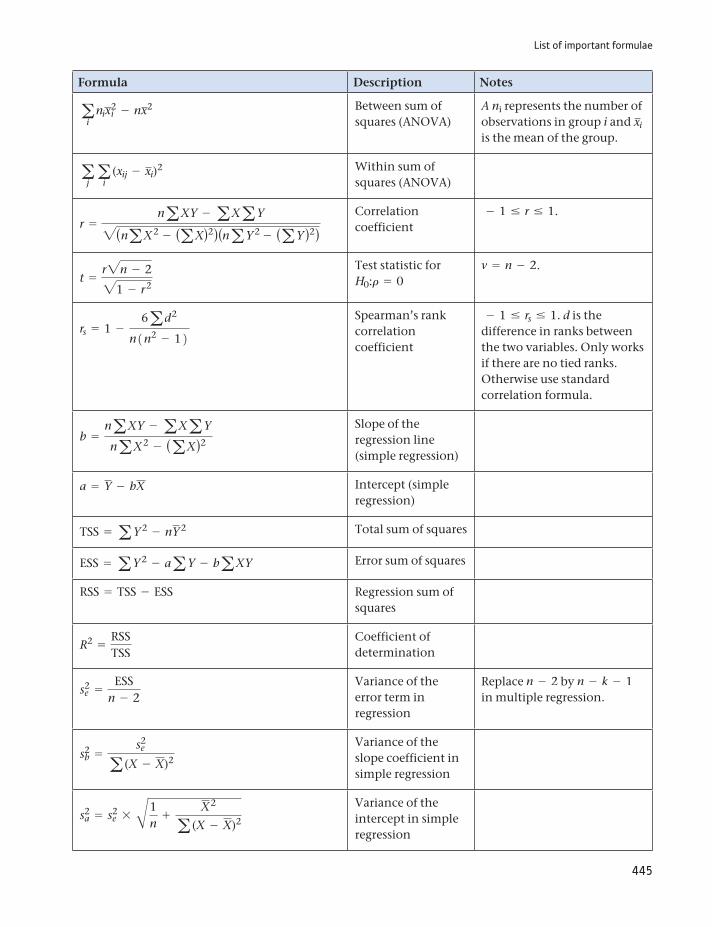
List of important formulae
445
Formula Description Notes
ai
nix2i - nx2 Between sum of
squares (ANOVA)A ni represents the number of observations in group i and xi is the mean of the group.
aja
i(xij - xi)2 Within sum of
squares (ANOVA)
r =naXY - aXaY2(naX2 - (aX)2)(naY 2 - (aY )2)
Correlation coefficient
- 1 … r … 1.
t =r2n - 221 - r2
Test statistic for H0:r = 0
v = n - 2.
rs = 1 -6ad2
n1n2 - 12Spearman’s rank correlation coefficient
- 1 … rs … 1. d is the difference in ranks between the two variables. Only works if there are no tied ranks. Otherwise use standard correlation formula.
b =naXY - aXaY
naX2 - (aX)2
Slope of the regression line (simple regression)
a = Y - bX Intercept (simple regression)
TSS = aY 2 - nY 2 Total sum of squares
ESS = aY 2 - aaY - baXY Error sum of squares
RSS = TSS - ESS Regression sum of squares
R2 =RSSTSS
Coefficient of determination
s2e =
ESSn - 2
Variance of the error term in regression
Replace n - 2 by n - k - 1 in multiple regression.
s2b =
s2e
a (X - X)2
Variance of the slope coefficient in simple regression
s2a = s2
e * B1n
+X2
a (X - X)2
Variance of the intercept in simple regression
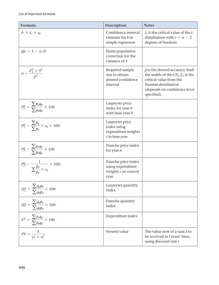
List of important formulae
446
Formula Description Notes
b tv * sb Confidence interval estimate for b in simple regression
tv is the critical value of the t distribution with v = n - 2 degrees of freedom.
fpc = 1 - n>N Finite population correction for the variance of x
n =Z2a * S2
p2
Required sample size to obtain desired confidence interval
p is the desired accuracy (half the width of the CI), Za is the critical value from the Normal distribution (depends on confidence level specified).
PnL = apnq0
ap0q0* 100
Laspeyres price index for year n with base year 0
PnL = apn
ap0* s0 * 100
Laspeyres price index using expenditure weights s in base year
PnP = apnqn
ap0qn* 100
Paasche price index for year n
PnP =
1
a p0
pn* sn
* 100Paasche price index using expenditure weights s in current year
Q nL = aqnp0
aq0p0* 100
Laspeyres quantity index
Q nP = aqnpn
aq0pn* 100
Paasche quantity index
E n = apnqn
ap0q0* 100
Expenditure index
PV =S
(1 + r)tPresent value The value now of a sum S to
be received in t years’ time, using discount rate r
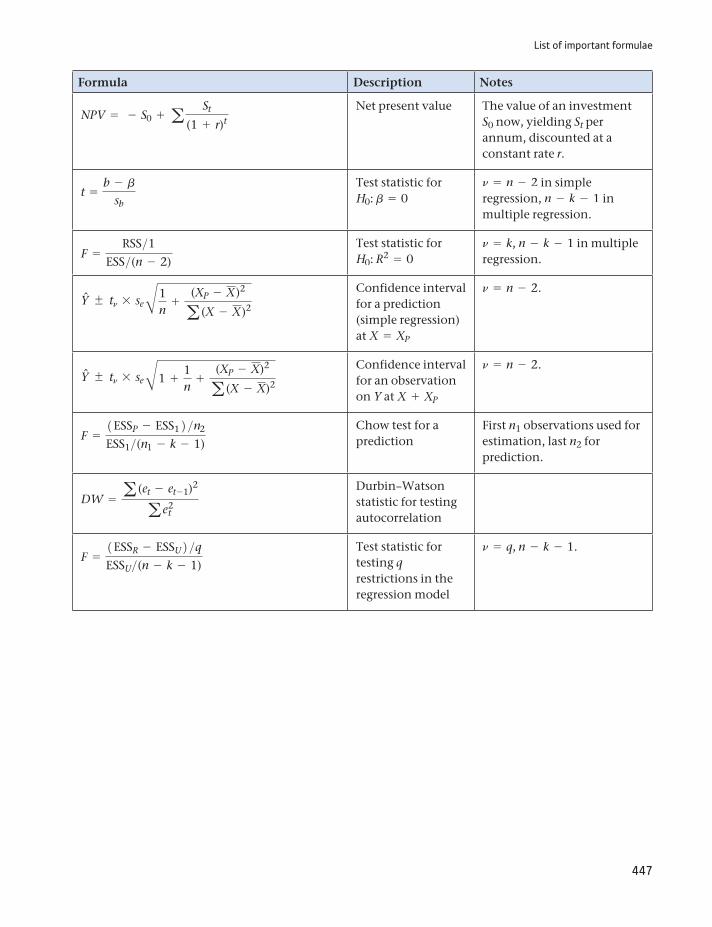
List of important formulae
447
Formula Description Notes
NPV = - S0 + a St
(1 + r)t
Net present value The value of an investment S0 now, yielding St per annum, discounted at a constant rate r.
t =b - b
sb
Test statistic for H0: b = 0
n = n - 2 in simple regression, n - k - 1 in multiple regression.
F =RSS>1
ESS>(n - 2)
Test statistic for H0: R2 = 0
n = k, n - k - 1 in multiple regression.
Yn tn * se B1n
+(XP - X)2
a (X - X)2
Confidence interval for a prediction (simple regression) at X = XP
n = n - 2.
Yn tn * se B1 +1n
+(XP - X)2
a (X - X)2
Confidence interval for an observation on Y at X + XP
n = n - 2.
F =1ESSP - ESS12 >n2
ESS1>(n1 - k - 1)
Chow test for a prediction
First n1 observations used for estimation, last n2 for prediction.
DW = a (et - et - 1)2
a e2t
Durbin–Watson statistic for testing autocorrelation
F =1ESSR - ESSU2 >qESSU>(n - k - 1)
Test statistic for testing q restrictions in the regression model
n = q, n - k - 1.
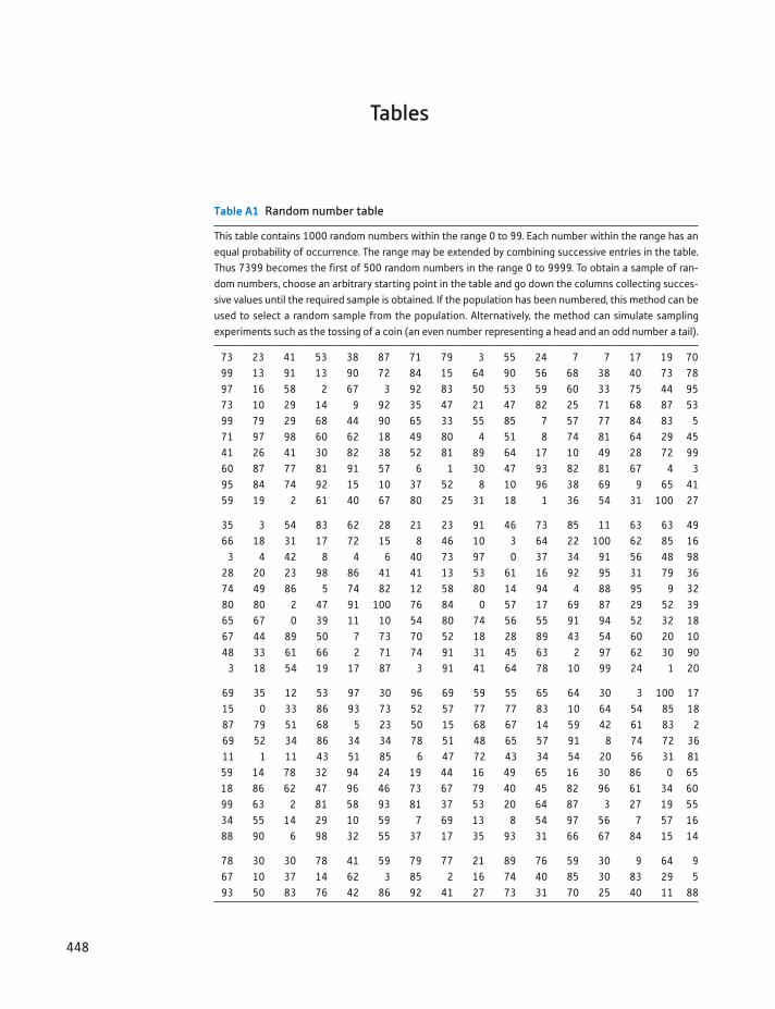
448
Table A1 Random number table
This table contains 1000 random numbers within the range 0 to 99. Each number within the range has an equal probability of occurrence. The range may be extended by combining successive entries in the table. Thus 7399 becomes the first of 500 random numbers in the range 0 to 9999. To obtain a sample of ran-dom numbers, choose an arbitrary starting point in the table and go down the columns collecting succes-sive values until the required sample is obtained. If the population has been numbered, this method can be used to select a random sample from the population. Alternatively, the method can simulate sampling experiments such as the tossing of a coin (an even number representing a head and an odd number a tail).
73 23 41 53 38 87 71 79 3 55 24 7 7 17 19 7099 13 91 13 90 72 84 15 64 90 56 68 38 40 73 7897 16 58 2 67 3 92 83 50 53 59 60 33 75 44 9573 10 29 14 9 92 35 47 21 47 82 25 71 68 87 5399 79 29 68 44 90 65 33 55 85 7 57 77 84 83 571 97 98 60 62 18 49 80 4 51 8 74 81 64 29 4541 26 41 30 82 38 52 81 89 64 17 10 49 28 72 9960 87 77 81 91 57 6 1 30 47 93 82 81 67 4 395 84 74 92 15 10 37 52 8 10 96 38 69 9 65 4159 19 2 61 40 67 80 25 31 18 1 36 54 31 100 27
35 3 54 83 62 28 21 23 91 46 73 85 11 63 63 4966 18 31 17 72 15 8 46 10 3 64 22 100 62 85 16
3 4 42 8 4 6 40 73 97 0 37 34 91 56 48 9828 20 23 98 86 41 41 13 53 61 16 92 95 31 79 3674 49 86 5 74 82 12 58 80 14 94 4 88 95 9 3280 80 2 47 91 100 76 84 0 57 17 69 87 29 52 3965 67 0 39 11 10 54 80 74 56 55 91 94 52 32 1867 44 89 50 7 73 70 52 18 28 89 43 54 60 20 1048 33 61 66 2 71 74 91 31 45 63 2 97 62 30 90
3 18 54 19 17 87 3 91 41 64 78 10 99 24 1 20
69 35 12 53 97 30 96 69 59 55 65 64 30 3 100 1715 0 33 86 93 73 52 57 77 77 83 10 64 54 85 1887 79 51 68 5 23 50 15 68 67 14 59 42 61 83 269 52 34 86 34 34 78 51 48 65 57 91 8 74 72 3611 1 11 43 51 85 6 47 72 43 34 54 20 56 31 8159 14 78 32 94 24 19 44 16 49 65 16 30 86 0 6518 86 62 47 96 46 73 67 79 40 45 82 96 61 34 6099 63 2 81 58 93 81 37 53 20 64 87 3 27 19 5534 55 14 29 10 59 7 69 13 8 54 97 56 7 57 1688 90 6 98 32 55 37 17 35 93 31 66 67 84 15 14
78 30 30 78 41 59 79 77 21 89 76 59 30 9 64 967 10 37 14 62 3 85 2 16 74 40 85 30 83 29 593 50 83 76 42 86 92 41 27 73 31 70 25 40 11 88
Tables
Appendix: Tables
449
35 68 98 18 67 22 95 34 19 27 21 90 66 20 32 4832 52 29 78 68 96 94 44 38 95 27 85 53 76 63 7892 100 75 77 26 39 61 33 88 66 77 76 25 67 90 140 73 28 5 50 73 92 32 82 23 78 30 26 52 28 9457 41 64 50 78 35 12 60 25 4 5 82 82 57 68 4382 41 67 79 30 43 15 72 98 48 6 22 46 92 43 41
100 11 21 44 43 51 76 89 4 90 48 31 19 89 97 45
94 8 20 67 32 42 39 6 38 25 97 10 18 85 9 6021 59 27 39 13 81 2 47 83 12 17 54 84 68 56 2963 62 36 6 57 96 6 36 24 13 70 32 90 92 81 8691 42 57 99 55 31 58 21 21 65 70 4 37 28 59 991 27 61 86 36 57 11 35 92 15 79 30 19 85 39 4997 39 12 28 35 37 90 93 88 20 99 76 81 61 95 7064 89 32 80 9 66 73 71 84 69 70 12 10 56 59 5645 34 1 32 80 99 39 52 25 87 76 91 22 26 46 6721 65 14 1 78 35 35 63 21 66 34 3 47 51 24 3785 64 69 93 47 82 55 87 22 56 53 85 43 66 23 66
21 37 62 29 44 39 4 4 99 3 6 82 67 53 14 023 8 62 9 19 31 81 92 63 10 65 78 79 96 65 3384 14 92 85 9 16 51 70 26 60 7 7 55 66 5 5170 37 11 7 93 63 48 12 35 95 32 5 64 5 63 2880 27 32 92 81 27 55 98 71 22 66 64 78 79 34 7366 13 16 48 74 51 78 83 42 31 97 72 25 75 34 40
1 51 47 84 82 27 77 40 99 13 66 52 56 27 2 1984 26 0 38 55 30 45 80 50 20 17 78 87 4 88 8695 28 57 33 51 39 18 12 37 100 89 63 22 50 10 2245 76 48 43 18 24 19 1 65 93 16 48 8 60 32 76
Table A1 Continued
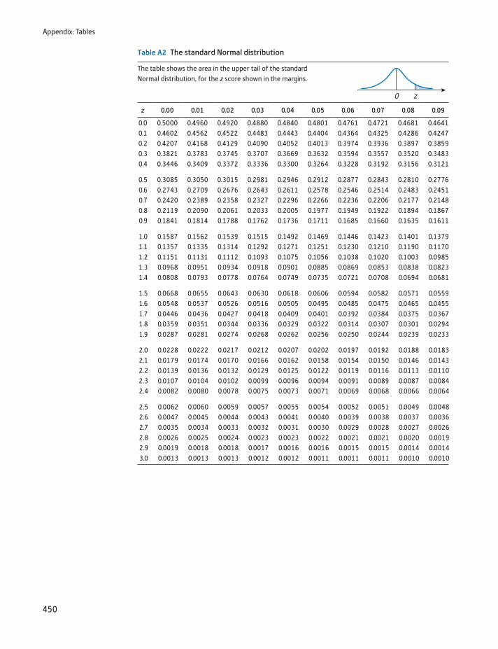
Appendix: Tables
450
Table A2 The standard Normal distribution
The table shows the area in the upper tail of the standard Normal distribution, for the z score shown in the margins.
z 0.00 0.01 0.02 0.03 0.04 0.05 0.06 0.07 0.08 0.09
0.0 0.5000 0.4960 0.4920 0.4880 0.4840 0.4801 0.4761 0.4721 0.4681 0.46410.1 0.4602 0.4562 0.4522 0.4483 0.4443 0.4404 0.4364 0.4325 0.4286 0.42470.2 0.4207 0.4168 0.4129 0.4090 0.4052 0.4013 0.3974 0.3936 0.3897 0.38590.3 0.3821 0.3783 0.3745 0.3707 0.3669 0.3632 0.3594 0.3557 0.3520 0.34830.4 0.3446 0.3409 0.3372 0.3336 0.3300 0.3264 0.3228 0.3192 0.3156 0.3121
0.5 0.3085 0.3050 0.3015 0.2981 0.2946 0.2912 0.2877 0.2843 0.2810 0.27760.6 0.2743 0.2709 0.2676 0.2643 0.2611 0.2578 0.2546 0.2514 0.2483 0.24510.7 0.2420 0.2389 0.2358 0.2327 0.2296 0.2266 0.2236 0.2206 0.2177 0.21480.8 0.2119 0.2090 0.2061 0.2033 0.2005 0.1977 0.1949 0.1922 0.1894 0.18670.9 0.1841 0.1814 0.1788 0.1762 0.1736 0.1711 0.1685 0.1660 0.1635 0.1611
1.0 0.1587 0.1562 0.1539 0.1515 0.1492 0.1469 0.1446 0.1423 0.1401 0.13791.1 0.1357 0.1335 0.1314 0.1292 0.1271 0.1251 0.1230 0.1210 0.1190 0.11701.2 0.1151 0.1131 0.1112 0.1093 0.1075 0.1056 0.1038 0.1020 0.1003 0.09851.3 0.0968 0.0951 0.0934 0.0918 0.0901 0.0885 0.0869 0.0853 0.0838 0.08231.4 0.0808 0.0793 0.0778 0.0764 0.0749 0.0735 0.0721 0.0708 0.0694 0.0681
1.5 0.0668 0.0655 0.0643 0.0630 0.0618 0.0606 0.0594 0.0582 0.0571 0.05591.6 0.0548 0.0537 0.0526 0.0516 0.0505 0.0495 0.0485 0.0475 0.0465 0.04551.7 0.0446 0.0436 0.0427 0.0418 0.0409 0.0401 0.0392 0.0384 0.0375 0.03671.8 0.0359 0.0351 0.0344 0.0336 0.0329 0.0322 0.0314 0.0307 0.0301 0.02941.9 0.0287 0.0281 0.0274 0.0268 0.0262 0.0256 0.0250 0.0244 0.0239 0.0233
2.0 0.0228 0.0222 0.0217 0.0212 0.0207 0.0202 0.0197 0.0192 0.0188 0.01832.1 0.0179 0.0174 0.0170 0.0166 0.0162 0.0158 0.0154 0.0150 0.0146 0.01432.2 0.0139 0.0136 0.0132 0.0129 0.0125 0.0122 0.0119 0.0116 0.0113 0.01102.3 0.0107 0.0104 0.0102 0.0099 0.0096 0.0094 0.0091 0.0089 0.0087 0.00842.4 0.0082 0.0080 0.0078 0.0075 0.0073 0.0071 0.0069 0.0068 0.0066 0.0064
2.5 0.0062 0.0060 0.0059 0.0057 0.0055 0.0054 0.0052 0.0051 0.0049 0.00482.6 0.0047 0.0045 0.0044 0.0043 0.0041 0.0040 0.0039 0.0038 0.0037 0.00362.7 0.0035 0.0034 0.0033 0.0032 0.0031 0.0030 0.0029 0.0028 0.0027 0.00262.8 0.0026 0.0025 0.0024 0.0023 0.0023 0.0022 0.0021 0.0021 0.0020 0.00192.9 0.0019 0.0018 0.0018 0.0017 0.0016 0.0016 0.0015 0.0015 0.0014 0.00143.0 0.0013 0.0013 0.0013 0.0012 0.0012 0.0011 0.0011 0.0011 0.0010 0.0010
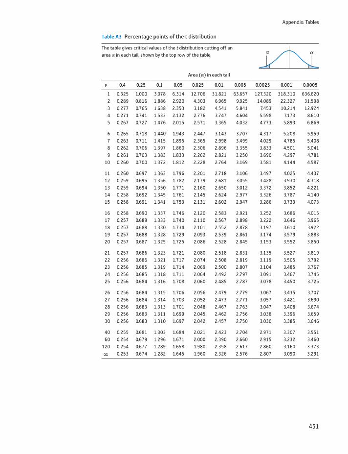
Appendix: Tables
451
Table A3 Percentage points of the t distribution
The table gives critical values of the t distribution cutting off an area a in each tail, shown by the top row of the table.
Area (A) in each tail
v 0.4 0.25 0.1 0.05 0.025 0.01 0.005 0.0025 0.001 0.0005
1 0.325 1.000 3.078 6.314 12.706 31.821 63.657 127.320 318.310 636.6202 0.289 0.816 1.886 2.920 4.303 6.965 9.925 14.089 22.327 31.5983 0.277 0.765 1.638 2.353 3.182 4.541 5.841 7.453 10.214 12.9244 0.271 0.741 1.533 2.132 2.776 3.747 4.604 5.598 7.173 8.6105 0.267 0.727 1.476 2.015 2.571 3.365 4.032 4.773 5.893 6.869
6 0.265 0.718 1.440 1.943 2.447 3.143 3.707 4.317 5.208 5.9597 0.263 0.711 1.415 1.895 2.365 2.998 3.499 4.029 4.785 5.4088 0.262 0.706 1.397 1.860 2.306 2.896 3.355 3.833 4.501 5.0419 0.261 0.703 1.383 1.833 2.262 2.821 3.250 3.690 4.297 4.781
10 0.260 0.700 1.372 1.812 2.228 2.764 3.169 3.581 4.144 4.587
11 0.260 0.697 1.363 1.796 2.201 2.718 3.106 3.497 4.025 4.43712 0.259 0.695 1.356 1.782 2.179 2.681 3.055 3.428 3.930 4.31813 0.259 0.694 1.350 1.771 2.160 2.650 3.012 3.372 3.852 4.22114 0.258 0.692 1.345 1.761 2.145 2.624 2.977 3.326 3.787 4.14015 0.258 0.691 1.341 1.753 2.131 2.602 2.947 3.286 3.733 4.073
16 0.258 0.690 1.337 1.746 2.120 2.583 2.921 3.252 3.686 4.01517 0.257 0.689 1.333 1.740 2.110 2.567 2.898 3.222 3.646 3.96518 0.257 0.688 1.330 1.734 2.101 2.552 2.878 3.197 3.610 3.92219 0.257 0.688 1.328 1.729 2.093 2.539 2.861 3.174 3.579 3.88320 0.257 0.687 1.325 1.725 2.086 2.528 2.845 3.153 3.552 3.850
21 0.257 0.686 1.323 1.721 2.080 2.518 2.831 3.135 3.527 3.81922 0.256 0.686 1.321 1.717 2.074 2.508 2.819 3.119 3.505 3.79223 0.256 0.685 1.319 1.714 2.069 2.500 2.807 3.104 3.485 3.76724 0.256 0.685 1.318 1.711 2.064 2.492 2.797 3.091 3.467 3.74525 0.256 0.684 1.316 1.708 2.060 2.485 2.787 3.078 3.450 3.725
26 0.256 0.684 1.315 1.706 2.056 2.479 2.779 3.067 3.435 3.70727 0.256 0.684 1.314 1.703 2.052 2.473 2.771 3.057 3.421 3.69028 0.256 0.683 1.313 1.701 2.048 2.467 2.763 3.047 3.408 3.67429 0.256 0.683 1.311 1.699 2.045 2.462 2.756 3.038 3.396 3.65930 0.256 0.683 1.310 1.697 2.042 2.457 2.750 3.030 3.385 3.646
40 0.255 0.681 1.303 1.684 2.021 2.423 2.704 2.971 3.307 3.55160 0.254 0.679 1.296 1.671 2.000 2.390 2.660 2.915 3.232 3.460
120 0.254 0.677 1.289 1.658 1.980 2.358 2.617 2.860 3.160 3.373ˆ 0.253 0.674 1.282 1.645 1.960 2.326 2.576 2.807 3.090 3.291
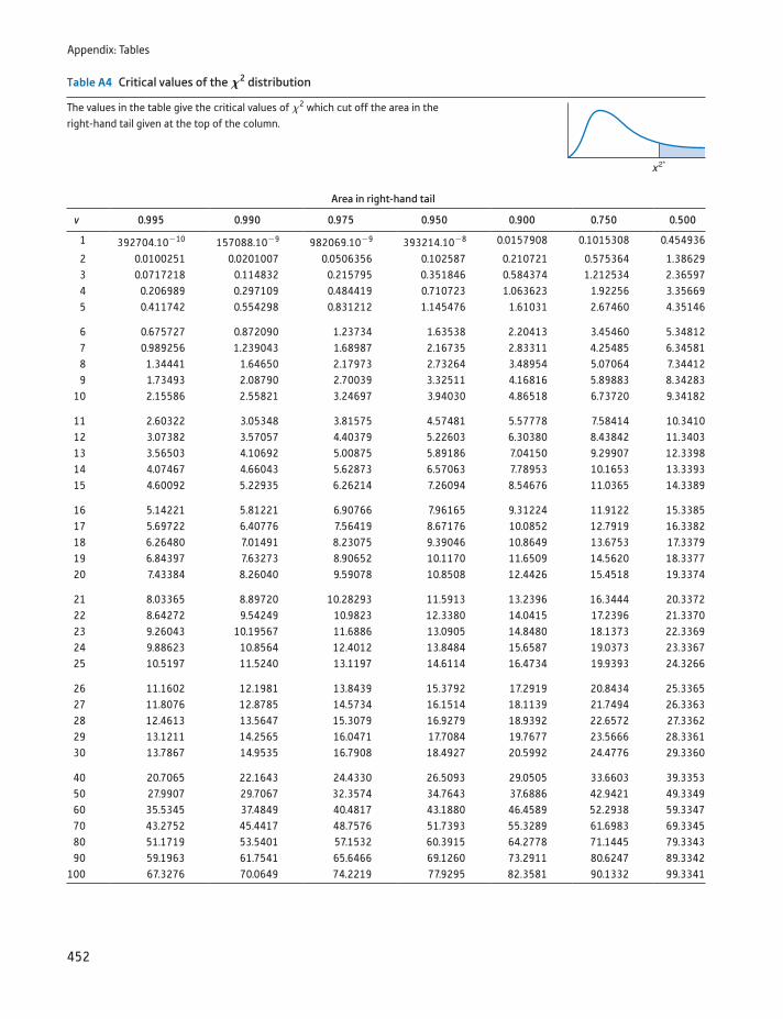
Appendix: Tables
452
Table A4 Critical values of the X2 distribution
The values in the table give the critical values of x2 which cut off the area in the right-hand tail given at the top of the column.
Area in right-hand tail
v 0.995 0.990 0.975 0.950 0.900 0.750 0.500
1 392704.10-10 157088.10-9 982069.10-9 393214.10-8 0.0157908 0.1015308 0.454936
2 0.0100251 0.0201007 0.0506356 0.102587 0.210721 0.575364 1.386293 0.0717218 0.114832 0.215795 0.351846 0.584374 1.212534 2.365974 0.206989 0.297109 0.484419 0.710723 1.063623 1.92256 3.356695 0.411742 0.554298 0.831212 1.145476 1.61031 2.67460 4.35146
6 0.675727 0.872090 1.23734 1.63538 2.20413 3.45460 5.348127 0.989256 1.239043 1.68987 2.16735 2.83311 4.25485 6.345818 1.34441 1.64650 2.17973 2.73264 3.48954 5.07064 7.344129 1.73493 2.08790 2.70039 3.32511 4.16816 5.89883 8.34283
10 2.15586 2.55821 3.24697 3.94030 4.86518 6.73720 9.34182
11 2.60322 3.05348 3.81575 4.57481 5.57778 7.58414 10.341012 3.07382 3.57057 4.40379 5.22603 6.30380 8.43842 11.340313 3.56503 4.10692 5.00875 5.89186 7.04150 9.29907 12.339814 4.07467 4.66043 5.62873 6.57063 7.78953 10.1653 13.339315 4.60092 5.22935 6.26214 7.26094 8.54676 11.0365 14.3389
16 5.14221 5.81221 6.90766 7.96165 9.31224 11.9122 15.338517 5.69722 6.40776 7.56419 8.67176 10.0852 12.7919 16.338218 6.26480 7.01491 8.23075 9.39046 10.8649 13.6753 17.337919 6.84397 7.63273 8.90652 10.1170 11.6509 14.5620 18.337720 7.43384 8.26040 9.59078 10.8508 12.4426 15.4518 19.3374
21 8.03365 8.89720 10.28293 11.5913 13.2396 16.3444 20.337222 8.64272 9.54249 10.9823 12.3380 14.0415 17.2396 21.337023 9.26043 10.19567 11.6886 13.0905 14.8480 18.1373 22.336924 9.88623 10.8564 12.4012 13.8484 15.6587 19.0373 23.336725 10.5197 11.5240 13.1197 14.6114 16.4734 19.9393 24.3266
26 11.1602 12.1981 13.8439 15.3792 17.2919 20.8434 25.336527 11.8076 12.8785 14.5734 16.1514 18.1139 21.7494 26.336328 12.4613 13.5647 15.3079 16.9279 18.9392 22.6572 27.336229 13.1211 14.2565 16.0471 17.7084 19.7677 23.5666 28.336130 13.7867 14.9535 16.7908 18.4927 20.5992 24.4776 29.3360
40 20.7065 22.1643 24.4330 26.5093 29.0505 33.6603 39.335350 27.9907 29.7067 32.3574 34.7643 37.6886 42.9421 49.334960 35.5345 37.4849 40.4817 43.1880 46.4589 52.2938 59.334770 43.2752 45.4417 48.7576 51.7393 55.3289 61.6983 69.334580 51.1719 53.5401 57.1532 60.3915 64.2778 71.1445 79.334390 59.1963 61.7541 65.6466 69.1260 73.2911 80.6247 89.3342
100 67.3276 70.0649 74.2219 77.9295 82.3581 90.1332 99.3341
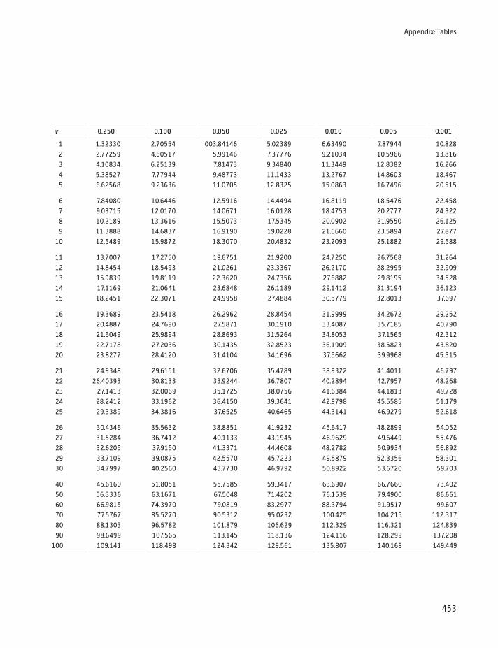
Appendix: Tables
453
v 0.250 0.100 0.050 0.025 0.010 0.005 0.001
1 1.32330 2.70554 003.84146 5.02389 6.63490 7.87944 10.8282 2.77259 4.60517 5.99146 7.37776 9.21034 10.5966 13.8163 4.10834 6.25139 7.81473 9.34840 11.3449 12.8382 16.2664 5.38527 7.77944 9.48773 11.1433 13.2767 14.8603 18.4675 6.62568 9.23636 11.0705 12.8325 15.0863 16.7496 20.515
6 7.84080 10.6446 12.5916 14.4494 16.8119 18.5476 22.4587 9.03715 12.0170 14.0671 16.0128 18.4753 20.2777 24.3228 10.2189 13.3616 15.5073 17.5345 20.0902 21.9550 26.1259 11.3888 14.6837 16.9190 19.0228 21.6660 23.5894 27.877
10 12.5489 15.9872 18.3070 20.4832 23.2093 25.1882 29.588
11 13.7007 17.2750 19.6751 21.9200 24.7250 26.7568 31.26412 14.8454 18.5493 21.0261 23.3367 26.2170 28.2995 32.90913 15.9839 19.8119 22.3620 24.7356 27.6882 29.8195 34.52814 17.1169 21.0641 23.6848 26.1189 29.1412 31.3194 36.12315 18.2451 22.3071 24.9958 27.4884 30.5779 32.8013 37.697
16 19.3689 23.5418 26.2962 28.8454 31.9999 34.2672 29.25217 20.4887 24.7690 27.5871 30.1910 33.4087 35.7185 40.79018 21.6049 25.9894 28.8693 31.5264 34.8053 37.1565 42.31219 22.7178 27.2036 30.1435 32.8523 36.1909 38.5823 43.82020 23.8277 28.4120 31.4104 34.1696 37.5662 39.9968 45.315
21 24.9348 29.6151 32.6706 35.4789 38.9322 41.4011 46.79722 26.40393 30.8133 33.9244 36.7807 40.2894 42.7957 48.26823 27.1413 32.0069 35.1725 38.0756 41.6384 44.1813 49.72824 28.2412 33.1962 36.4150 39.3641 42.9798 45.5585 51.17925 29.3389 34.3816 37.6525 40.6465 44.3141 46.9279 52.618
26 30.4346 35.5632 38.8851 41.9232 45.6417 48.2899 54.05227 31.5284 36.7412 40.1133 43.1945 46.9629 49.6449 55.47628 32.6205 37.9150 41.3371 44.4608 48.2782 50.9934 56.89229 33.7109 39.0875 42.5570 45.7223 49.5879 52.3356 58.30130 34.7997 40.2560 43.7730 46.9792 50.8922 53.6720 59.703
40 45.6160 51.8051 55.7585 59.3417 63.6907 66.7660 73.40250 56.3336 63.1671 67.5048 71.4202 76.1539 79.4900 86.66160 66.9815 74.3970 79.0819 83.2977 88.3794 91.9517 99.60770 77.5767 85.5270 90.5312 95.0232 100.425 104.215 112.31780 88.1303 96.5782 101.879 106.629 112.329 116.321 124.83990 98.6499 107.565 113.145 118.136 124.116 128.299 137.208
100 109.141 118.498 124.342 129.561 135.807 140.169 149.449
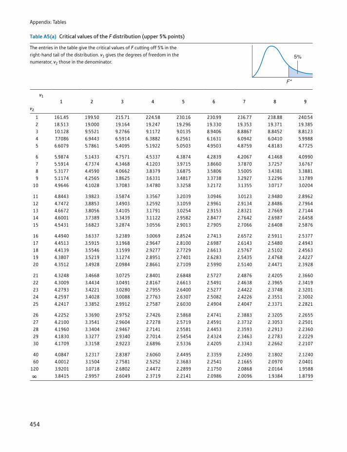
Appendix: Tables
454
Table A5(a) Critical values of the F distribution (upper 5% points)
The entries in the table give the critical values of F cutting off 5% in the right-hand tail of the distribution. v1 gives the degrees of freedom in the numerator, v2 those in the denominator.
v1
1 2 3 4 5 6 7 8 9v2
1 161.45 199.50 215.71 224.58 230.16 230.99 236.77 238.88 240.542 18.513 19.000 19.164 19.247 19.296 19.330 19.353 19.371 19.3853 10.128 9.5521 9.2766 9.1172 9.0135 8.9406 8.8867 8.8452 8.81234 7.7086 6.9443 6.5914 6.3882 6.2561 6.1631 6.0942 6.0410 5.99885 6.6079 5.7861 5.4095 5.1922 5.0503 4.9503 4.8759 4.8183 4.7725
6 5.9874 5.1433 4.7571 4.5337 4.3874 4.2839 4.2067 4.1468 4.09907 5.5914 4.7374 4.3468 4.1203 3.9715 3.8660 3.7870 3.7257 3.67678 5.3177 4.4590 4.0662 3.8379 3.6875 3.5806 3.5005 3.4381 3.38819 5.1174 4.2565 3.8625 3.6331 3.4817 3.3738 3.2927 3.2296 3.1789
10 4.9646 4.1028 3.7083 3.4780 3.3258 3.2172 3.1355 3.0717 3.0204
11 4.8443 3.9823 3.5874 3.3567 3.2039 3.0946 3.0123 2.9480 2.896212 4.7472 3.8853 3.4903 3.2592 3.1059 2.9961 2.9134 2.8486 2.796413 4.6672 3.8056 3.4105 3.1791 3.0254 2.9153 2.8321 2.7669 2.714414 4.6001 3.7389 3.3439 3.1122 2.9582 2.8477 2.7642 2.6987 2.645815 4.5431 3.6823 3.2874 3.0556 2.9013 2.7905 2.7066 2.6408 2.5876
16 4.4940 3.6337 3.2389 3.0069 2.8524 2.7413 2.6572 2.5911 2.537717 4.4513 3.5915 3.1968 2.9647 2.8100 2.6987 2.6143 2.5480 2.494318 4.4139 3.5546 3.1599 2.9277 2.7729 2.6613 2.5767 2.5102 2.456319 4.3807 3.5219 3.1274 2.8951 2.7401 2.6283 2.5435 2.4768 2.422720 4.3512 3.4928 2.0984 2.8661 2.7109 2.5990 2.5140 2.4471 2.3928
21 4.3248 3.4668 3.0725 2.8401 2.6848 2.5727 2.4876 2.4205 2.366022 4.3009 3.4434 3.0491 2.8167 2.6613 2.5491 2.4638 2.3965 2.341923 4.2793 3.4221 3.0280 2.7955 2.6400 2.5277 2.4422 2.3748 2.320124 4.2597 3.4028 3.0088 2.7763 2.6307 2.5082 2.4226 2.3551 2.300225 4.2417 3.3852 2.9912 2.7587 2.6030 2.4904 2.4047 2.3371 2.2821
26 4.2252 3.3690 2.9752 2.7426 2.5868 2.4741 2.3883 2.3205 2.265527 4.2100 3.3541 2.9604 2.7278 2.5719 2.4591 2.3732 2.3053 2.250128 4.1960 3.3404 2.9467 2.7141 2.5581 2.4453 2.3593 2.2913 2.236029 4.1830 3.3277 2.9340 2.7014 2.5454 2.4324 2.3463 2.2783 2.222930 4.1709 3.3158 2.9223 2.6896 2.5336 2.4205 2.3343 2.2662 2.2107
40 4.0847 3.2317 2.8387 2.6060 2.4495 2.3359 2.2490 2.1802 2.124060 4.0012 3.1504 2.7581 2.5252 2.3683 2.2541 2.1665 2.0970 2.0401
120 3.9201 3.0718 2.6802 2.4472 2.2899 2.1750 2.0868 2.0164 1.9588ˆ 3.8415 2.9957 2.6049 2.3719 2.2141 2.0986 2.0096 1.9384 1.8799
Appendix: Tables
455
v1
10 12 15 20 24 30 40 60 120 ˆv2
1 241.88 243.91 245.95 248.01 249.05 250.10 251.14 252.20 253.25 254.312 19.396 19.413 19.429 19.446 19.454 19.462 19.471 19.479 19.487 19.4963 8.7855 8.7446 8.7029 8.6602 8.6385 8.6166 8.5944 8.5720 8.5494 8.52644 5.9644 5.9117 5.8578 5.8025 5.7744 5.7459 5.7170 5.6877 5.6581 5.62815 4.7351 4.6777 4.6188 4.5581 4.5272 4.4957 4.4638 4.4314 4.3985 4.3650
6 4.0600 3.9999 3.9381 3.8742 3.8415 3.8082 3.7743 3.7398 3.7047 3.66897 3.6365 3.5747 3.5107 3.4445 3.4105 3.3758 3.3404 3.3043 3.2674 3.22988 3.3472 3.2839 3.2184 3.1503 3.1152 3.0794 3.0428 3.0053 2.9669 2.92769 3.1373 3.0729 3.0061 2.9365 2.9005 2.8637 2.8259 2.7872 2.7475 2.7067
10 2.9782 2.9130 2.8450 2.7740 2.7372 2.6996 2.6609 2.6211 2.5801 2.5379
11 2.8536 2.7876 2.7186 2.6464 2.6090 2.5705 2.5309 2.4901 2.4480 2.404512 2.7534 2.6866 2.6169 2.5436 2.5055 2.4663 2.4259 2.3842 2.3410 2.296213 2.6710 2.6037 2.5331 2.4589 2.4202 2.3803 2.3392 2.2966 2.2524 2.206414 2.6022 2.5342 2.4630 2.3879 2.3487 2.3082 2.2664 2.2229 2.1778 2.130715 2.5437 2.4753 2.4034 2.3275 2.2878 2.2468 2.2043 2.1601 2.1141 2.0658
16 2.4935 2.4247 2.3522 2.2756 2.2354 2.1938 2.1507 2.1058 2.0589 2.009617 2.4499 2.3807 2.3077 2.2304 2.1898 2.1477 2.1040 2.0584 2.0107 1.960418 2.4117 2.3421 2.2686 2.1906 2.1497 2.1071 2.0629 2.0166 1.9681 1.916819 2.3779 2.3080 2.2341 2.1555 2.1141 2.0712 2.0264 1.9795 1.9302 1.878020 2.3479 2.2776 2.2033 2.1242 2.0825 2.0391 1.9938 1.9464 1.8963 1.8432
21 2.3210 2.2504 2.1757 2.0960 2.0540 2.0102 1.9645 1.9165 1.8657 1.811722 2.2967 2.2258 2.1508 2.0707 2.0283 1.9842 1.9380 1.8894 1.8380 1.783123 2.2747 2.2036 2.1282 2.0476 2.0050 1.9605 1.9139 1.8648 1.8128 1.757024 2.2547 2.1834 2.1077 2.0267 1.9838 1.9390 1.8920 1.8424 1.7896 1.733025 2.2365 2.1649 2.0889 2.0075 1.9643 1.9192 1.8718 1.8217 1.7684 1.7110
26 2.2197 2.1479 2.0716 1.9898 1.9464 1.9010 1.8533 1.8027 1.7488 1.690627 2.2043 2.1323 2.0558 1.9736 1.9299 1.8842 1.8361 1.7851 1.7306 1.671728 2.1900 2.1179 2.0411 1.9586 1.9147 1.8687 1.8203 1.7689 1.7138 1.654129 2.1768 2.1045 2.0275 1.9446 1.9005 1.8543 1.8055 1.7537 1.6981 1.637630 2.1646 2.0921 2.0148 1.9317 1.8874 1.8409 1.7918 1.7396 1.6835 1.6223
40 2.0772 2.0035 1.9245 1.8389 1.7929 1.7444 1.6928 1.6373 1.5766 1.508960 1.9926 1.9174 1.8364 1.7480 1.7001 1.6491 1.5943 1.5343 1.4673 1.3893
120 1.9105 1.8337 1.7505 1.6587 1.6084 1.5543 1.4952 1.4290 1.3519 1.2539ˆ 1.8307 1.7522 1.6664 1.5705 1.5173 1.4591 1.3940 1.3180 1.2214 1.0000
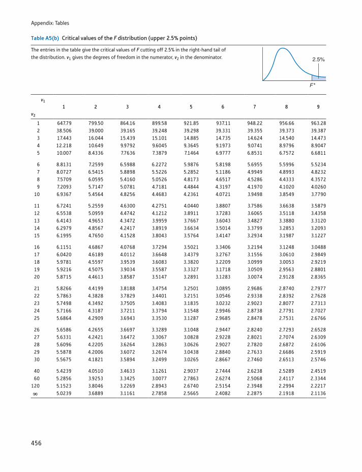
Appendix: Tables
456
Table A5(b) Critical values of the F distribution (upper 2.5% points)
The entries in the table give the critical values of F cutting off 2.5% in the right-hand tail of the distribution. v1 gives the degrees of freedom in the numerator, v2 in the denominator.
v1
1 2 3 4 5 6 7 8 9v2
1 647.79 799.50 864.16 899.58 921.85 937.11 948.22 956.66 963.282 38.506 39.000 39.165 39.248 39.298 39.331 39.355 39.373 39.3873 17.443 16.044 15.439 15.101 14.885 14.735 14.624 14.540 14.4734 12.218 10.649 9.9792 9.6045 9.3645 9.1973 9.0741 8.9796 8.90475 10.007 8.4336 7.7636 7.3879 7.1464 6.9777 6.8531 6.7572 6.6811
6 8.8131 7.2599 6.5988 6.2272 5.9876 5.8198 5.6955 5.5996 5.52347 8.0727 6.5415 5.8898 5.5226 5.2852 5.1186 4.9949 4.8993 4.82328 7.5709 6.0595 5.4160 5.0526 4.8173 4.6517 4.5286 4.4333 4.35729 7.2093 5.7147 5.0781 4.7181 4.4844 4.3197 4.1970 4.1020 4.0260
10 6.9367 5.4564 4.8256 4.4683 4.2361 4.0721 3.9498 3.8549 3.7790
11 6.7241 5.2559 4.6300 4.2751 4.0440 3.8807 3.7586 3.6638 3.587912 6.5538 5.0959 4.4742 4.1212 3.8911 3.7283 3.6065 3.5118 3.435813 6.4143 4.9653 4.3472 3.9959 3.7667 3.6043 3.4827 3.3880 3.312014 6.2979 4.8567 4.2417 3.8919 3.6634 3.5014 3.3799 3.2853 3.209315 6.1995 4.7650 4.1528 3.8043 3.5764 3.4147 3.2934 3.1987 3.1227
16 6.1151 4.6867 4.0768 3.7294 3.5021 3.3406 3.2194 3.1248 3.048817 6.0420 4.6189 4.0112 3.6648 3.4379 3.2767 3.1556 3.0610 2.984918 5.9781 4.5597 3.9539 3.6083 3.3820 3.2209 3.0999 3.0053 2.921919 5.9216 4.5075 3.9034 3.5587 3.3327 3.1718 3.0509 2.9563 2.880120 5.8715 4.4613 3.8587 3.5147 3.2891 3.1283 3.0074 2.9128 2.8365
21 5.8266 4.4199 3.8188 3.4754 3.2501 3.0895 2.9686 2.8740 2.797722 5.7863 4.3828 3.7829 3.4401 3.2151 3.0546 2.9338 2.8392 2.762823 5.7498 4.3492 3.7505 3.4083 3.1835 3.0232 2.9023 2.8077 2.731324 5.7166 4.3187 3.7211 3.3794 3.1548 2.9946 2.8738 2.7791 2.702725 5.6864 4.2909 3.6943 3.3530 3.1287 2.9685 2.8478 2.7531 2.6766
26 5.6586 4.2655 3.6697 3.3289 3.1048 2.9447 2.8240 2.7293 2.652827 5.6331 4.2421 3.6472 3.3067 3.0828 2.9228 2.8021 2.7074 2.630928 5.6096 4.2205 3.6264 3.2863 3.0626 2.9027 2.7820 2.6872 2.610629 5.5878 4.2006 3.6072 3.2674 3.0438 2.8840 2.7633 2.6686 2.591930 5.5675 4.1821 3.5894 3.2499 3.0265 2.8667 2.7460 2.6513 2.5746
40 5.4239 4.0510 3.4633 3.1261 2.9037 2.7444 2.6238 2.5289 2.451960 5.2856 3.9253 3.3425 3.0077 2.7863 2.6274 2.5068 2.4117 2.3344
120 5.1523 3.8046 3.2269 2.8943 2.6740 2.5154 2.3948 2.2994 2.2217ˆ 5.0239 3.6889 3.1161 2.7858 2.5665 2.4082 2.2875 2.1918 2.1136
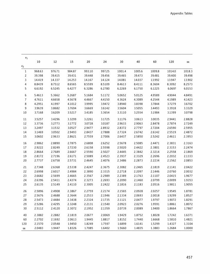
Appendix: Tables
457
v1
10 12 15 20 24 30 40 60 120 ˆv2
1 968.63 976.71 984.87 993.10 997.25 1001.4 1005.6 1009.8 1014.0 1018.32 39.398 39.415 39.431 39.448 39.456 39.465 39.473 39.481 39.400 39.4983 14.419 14.337 14.253 14.167 14.124 14.081 14.037 13.992 13.947 13.9024 8.8439 8.7512 8.6565 8.5599 8.5109 8.4613 8.4111 8.3604 8.3092 8.25735 6.6192 6.5245 6.4277 6.3286 6.2780 6.2269 6.1750 6.1225 6.069? 6.0153
6 5.4613 5.3662 5.2687 5.1684 5.1172 5.0652 5.0125 4.9589 4.9044 4.84917 4.7611 4.6658 4.5678 4.4667 4.4150 4.3624 4.3089 4.2544 4.1989 4.14238 4.2951 4.1997 4.1012 3.9995 3.9472 3.8940 3.8398 3.7844 3.7279 3.67029 3.9639 3.8682 3.7694 3.6669 3.6142 3.5604 3.5055 3.4493 3.3918 3.3329
10 3.7168 3.6209 3.5217 3.4185 3.3654 3.3110 3.2554 3.1984 3.1399 3.0798
11 3.5257 3.4296 3.3299 3.2261 3.1725 3.1176 3.0613 3.0035 2.9441 2.882812 3.3736 3.2773 3.1772 3.0728 3.0187 2.9633 2.9063 2.8478 2.7874 2.724913 3.2497 3.1532 3.0527 2.9477 2.8932 2.8372 2.7797 2.7204 2.6590 2.595514 3.1469 3.0502 2.9493 2.8437 2.7888 2.7324 2.6742 2.6142 2.5519 2.487215 3.0602 2.9633 2.8621 2.7559 2.7006 2.6437 2.5850 2.5242 2.4611 2.3953
16 2.9862 2.8890 2.7875 2.6808 2.6252 2.5678 2.5085 2.4471 2.3831 2.316317 2.9222 2.8249 2.7230 2.6158 2.5598 2.5020 2.4422 2.3801 2.3153 2.247418 2.8664 2.7689 2.6667 2.5590 2.5027 2.4445 2.3842 2.3214 2.2558 2.186919 2.8172 2.7196 2.6171 2.5089 2.4523 2.3937 2.3329 2.2696 2.2032 2.133320 2.7737 2.6758 2.5731 2.4645 2.4076 2.3486 2.2873 2.2234 2.1562 2.0853
21 2.7348 2.6368 2.5338 2.4247 2.3675 2.3082 2.2465 2.1819 2.1141 2.042222 2.6998 2.6017 2.4984 2.3890 2.3315 2.2718 2.2097 2.1446 2.0760 2.003223 2.6682 2.5699 2.4665 2.3567 2.2989 2.2389 2.1763 2.1107 2.0415 1.967724 2.6396 2.5411 2.4374 2.3273 2.2693 2.2090 2.1460 2.0799 2.0099 1.935325 2.6135 2.5149 2.4110 2.3005 2.2422 2.1816 2.1183 2.0516 1.9811 1.9055
26 2.5896 2.4908 2.3867 2.2759 2.2174 2.1565 2.0928 2.0257 1.9545 1.878127 2.5676 2.4688 2.3644 2.2533 2.1946 2.1334 2.0693 2.0018 1.9299 1.852728 2.5473 2.4484 2.3438 2.2324 2.1735 2.1121 2.0477 1.9797 1.9072 1.829129 2.5286 2.4295 2.3248 2.2131 2.1540 2.0923 2.0276 1.9591 1.8861 1.807230 2.5112 2.4120 2.3072 2.1952 2.1359 2.0739 2.0089 1.9400 1.8664 1.7867
40 2.3882 2.2882 2.1819 2.0677 2.0069 1.9429 1.8752 1.8028 1.7242 1.637160 2.2702 2.1692 2.0613 1.9445 1.8817 1.8152 1.7440 1.6668 1.5810 1.4821
120 2.1570 2.0548 1.9450 1.8249 1.7597 1.6899 1.6141 1.5299 1.4327 1.3104ˆ 2.0483 1.9447 1.8326 1.7085 1.6402 1.5660 1.4835 1.3883 1.2684 1.0000
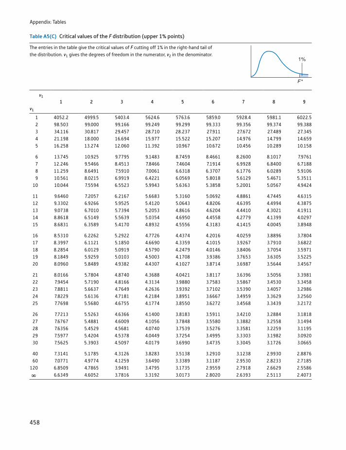
Appendix: Tables
458
Table A5(C) Critical values of the F distribution (upper 1% points)
The entries in the table give the critical values of F cutting off 1% in the right-hand tail of the distribution. v1 gives the degrees of freedom in the numerator, v2 in the denominator.
v1
1 2 3 4 5 6 7 8 9v1
1 4052.2 4999.5 5403.4 5624.6 5763.6 5859.0 5928.4 5981.1 6022.52 98.503 99.000 99.166 99.249 99.299 99.333 99.356 99.374 99.3883 34.116 30.817 29.457 28.710 28.237 27.911 27.672 27.489 27.3454 21.198 18.000 16.694 15.977 15.522 15.207 14.976 14.799 14.6595 16.258 13.274 12.060 11.392 10.967 10.672 10.456 10.289 10.158
6 13.745 10.925 9.7795 9.1483 8.7459 8.4661 8.2600 8.1017 7.97617 12.246 9.5466 8.4513 7.8466 7.4604 7.1914 6.9928 6.8400 6.71888 11.259 8.6491 7.5910 7.0061 6.6318 6.3707 6.1776 6.0289 5.91069 10.561 8.0215 6.9919 6.4221 6.0569 5.8018 5.6129 5.4671 5.3511
10 10.044 7.5594 6.5523 5.9943 5.6363 5.3858 5.2001 5.0567 4.9424
11 9.6460 7.2057 6.2167 5.6683 5.3160 5.0692 4.8861 4.7445 4.631512 9.3302 6.9266 5.9525 5.4120 5.0643 4.8206 4.6395 4.4994 4.387513 9.0738 6.7010 5.7394 5.2053 4.8616 4.6204 4.4410 4.3021 4.191114 8.8618 6.5149 5.5639 5.0354 4.6950 4.4558 4.2779 4.1399 4.029715 8.6831 6.3589 5.4170 4.8932 4.5556 4.3183 4.1415 4.0045 3.8948
16 8.5310 6.2262 5.2922 4.7726 4.4374 4.2016 4.0259 3.8896 3.780417 8.3997 6.1121 5.1850 4.6690 4.3359 4.1015 3.9267 3.7910 3.682218 8.2854 6.0129 5.0919 4.5790 4.2479 4.0146 3.8406 3.7054 3.597119 8.1849 5.9259 5.0103 4.5003 4.1708 3.9386 3.7653 3.6305 3.522520 8.0960 5.8489 4.9382 4.4307 4.1027 3.8714 3.6987 3.5644 3.4567
21 8.0166 5.7804 4.8740 4.3688 4.0421 3.8117 3.6396 3.5056 3.398122 7.9454 5.7190 4.8166 4.3134 3.9880 3.7583 3.5867 3.4530 3.345823 7.8811 5.6637 4.7649 4.2636 3.9392 3.7102 3.5390 3.4057 3.298624 7.8229 5.6136 4.7181 4.2184 3.8951 3.6667 3.4959 3.3629 3.256025 7.7698 5.5680 4.6755 4.1774 3.8550 3.6272 3.4568 3.3439 3.2172
26 7.7213 5.5263 4.6366 4.1400 3.8183 3.5911 3.4210 3.2884 3.181827 7.6767 5.4881 4.6009 4.1056 3.7848 3.5580 3.3882 3.2558 3.149428 7.6356 5.4529 4.5681 4.0740 3.7539 3.5276 3.3581 3.2259 3.119529 7.5977 5.4204 4.5378 4.0449 3.7254 3.4995 3.3303 3.1982 3.092030 7.5625 5.3903 4.5097 4.0179 3.6990 3.4735 3.3045 3.1726 3.0665
40 7.3141 5.1785 4.3126 3.8283 3.5138 3.2910 3.1238 2.9930 2.887660 7.0771 4.9774 4.1259 3.6490 3.3389 3.1187 2.9530 2.8233 2.7185
120 6.8509 4.7865 3.9491 3.4795 3.1735 2.9559 2.7918 2.6629 2.5586ˆ 6.6349 4.6052 3.7816 3.3192 3.0173 2.8020 2.6393 2.5113 2.4073
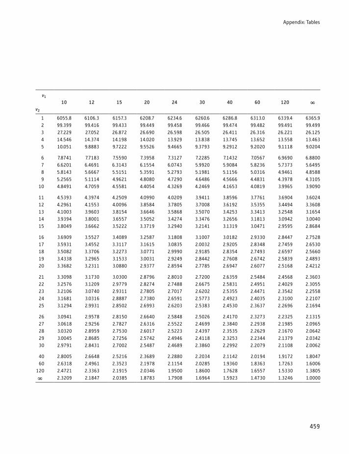
Appendix: Tables
459
v1
10 12 15 20 24 30 40 60 120 ˆv2
1 6055.8 6106.3 6157.3 6208.7 6234.6 6260.6 6286.8 6313.0 6339.4 6365.92 99.399 99.416 99.433 99.449 99.458 99.466 99.474 99.482 99.491 99.4993 27.229 27.052 26.872 26.690 26.598 26.505 26.411 26.316 26.221 26.1254 14.546 14.374 14.198 14.020 13.929 13.838 13.745 13.652 13.558 13.4635 10.051 9.8883 9.7222 9.5526 9.4665 9.3793 9.2912 9.2020 9.1118 9.0204
6 7.8741 7.7183 7.5590 7.3958 7.3127 7.2285 7.1432 7.0567 6.9690 6.88007 6.6201 6.4691 6.3143 6.1554 6.0743 5.9920 5.9084 5.8236 5.7373 5.64958 5.8143 5.6667 5.5151 5.3591 5.2793 5.1981 5.1156 5.0316 4.9461 4.85889 5.2565 5.1114 4.9621 4.8080 4.7290 4.6486 4.5666 4.4831 4.3978 4.3105
10 4.8491 4.7059 4.5581 4.4054 4.3269 4.2469 4.1653 4.0819 3.9965 3.9090
11 4.5393 4.3974 4.2509 4.0990 4.0209 3.9411 3.8596 3.7761 3.6904 3.602412 4.2961 4.1553 4.0096 3.8584 3.7805 3.7008 3.6192 3.5355 3.4494 3.360813 4.1003 3.9603 3.8154 3.6646 3.5868 3.5070 3.4253 3.3413 3.2548 3.165414 3.9394 3.8001 3.6557 3.5052 3.4274 3.3476 3.2656 3.1813 3.0942 3.004015 3.8049 3.6662 3.5222 3.3719 3.2940 3.2141 3.1319 3.0471 2.9595 2.8684
16 3.6909 3.5527 3.4089 3.2587 3.1808 3.1007 3.0182 2.9330 2.8447 2.752817 3.5931 3.4552 3.3117 3.1615 3.0835 2.0032 2.9205 2.8348 2.7459 2.653018 3.5082 3.3706 3.2273 3.0771 2.9990 2.9185 2.8354 2.7493 2.6597 2.566019 3.4338 3.2965 3.1533 3.0031 2.9249 2.8442 2.7608 2.6742 2.5839 2.489320 3.3682 3.2311 3.0880 2.9377 2.8594 2.7785 2.6947 2.6077 2.5168 2.4212
21 3.3098 3.1730 3.0300 2.8796 2.8010 2.7200 2.6359 2.5484 2.4568 2.360322 3.2576 3.1209 2.9779 2.8274 2.7488 2.6675 2.5831 2.4951 2.4029 2.305523 3.2106 3.0740 2.9311 2.7805 2.7017 2.6202 2.5355 2.4471 2.3542 2.255824 3.1681 3.0316 2.8887 2.7380 2.6591 2.5773 2.4923 2.4035 2.3100 2.210725 3.1294 2.9931 2.8502 2.6993 2.6203 2.5383 2.4530 2.3637 2.2696 2.1694
26 3.0941 2.9578 2.8150 2.6640 2.5848 2.5026 2.4170 2.3273 2.2325 2.131527 3.0618 2.9256 2.7827 2.6316 2.5522 2.4699 2.3840 2.2938 2.1985 2.096528 3.0320 2.8959 2.7530 2.6017 2.5223 2.4397 2.3535 2.2629 2.1670 2.064229 3.0045 2.8685 2.7256 2.5742 2.4946 2.4118 2.3253 2.2344 2.1379 2.034230 2.9791 2.8431 2.7002 2.5487 2.4689 2.3860 2.2992 2.2079 2.1108 2.0062
40 2.8005 2.6648 2.5216 2.3689 2.2880 2.2034 2.1142 2.0194 1.9172 1.804760 2.6318 2.4961 2.3523 2.1978 2.1154 2.0285 1.9360 1.8363 1.7263 1.6006
120 2.4721 2.3363 2.1915 2.0346 1.9500 1.8600 1.7628 1.6557 1.5330 1.3805ˆ 2.3209 2.1847 2.0385 1.8783 1.7908 1.6964 1.5923 1.4730 1.3246 1.0000
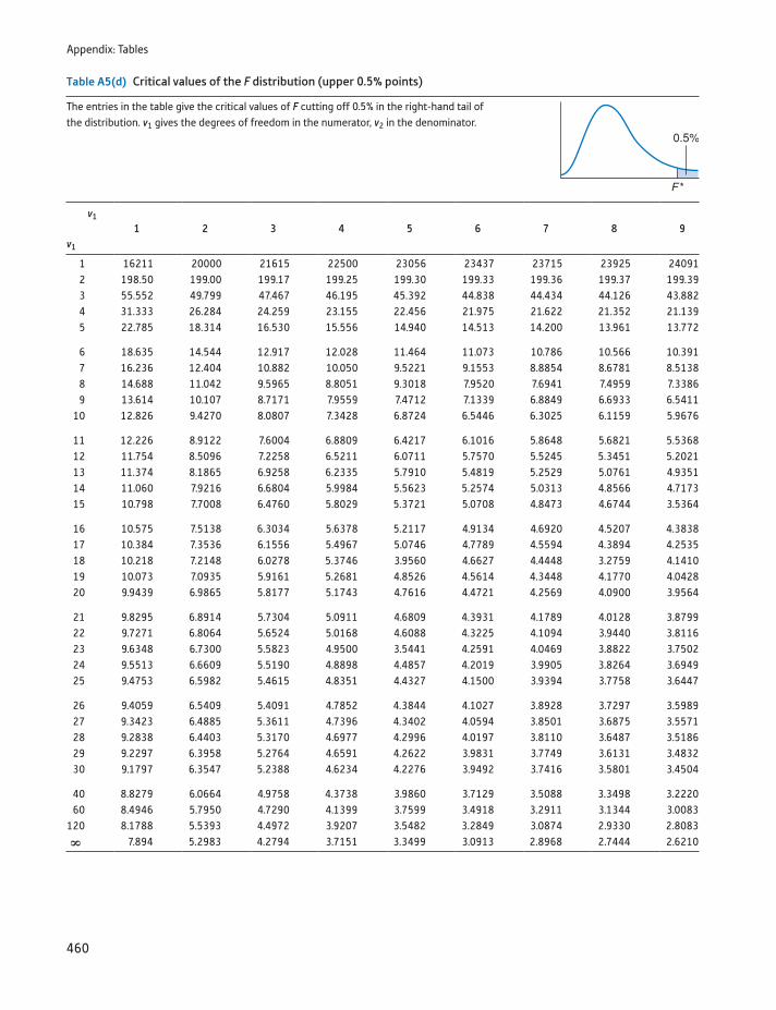
Appendix: Tables
460
Table A5(d) Critical values of the F distribution (upper 0.5% points)
The entries in the table give the critical values of F cutting off 0.5% in the right-hand tail of the distribution. v1 gives the degrees of freedom in the numerator, v2 in the denominator.
v1
1 2 3 4 5 6 7 8 9v1
1 16211 20000 21615 22500 23056 23437 23715 23925 240912 198.50 199.00 199.17 199.25 199.30 199.33 199.36 199.37 199.393 55.552 49.799 47.467 46.195 45.392 44.838 44.434 44.126 43.8824 31.333 26.284 24.259 23.155 22.456 21.975 21.622 21.352 21.1395 22.785 18.314 16.530 15.556 14.940 14.513 14.200 13.961 13.772
6 18.635 14.544 12.917 12.028 11.464 11.073 10.786 10.566 10.3917 16.236 12.404 10.882 10.050 9.5221 9.1553 8.8854 8.6781 8.51388 14.688 11.042 9.5965 8.8051 9.3018 7.9520 7.6941 7.4959 7.33869 13.614 10.107 8.7171 7.9559 7.4712 7.1339 6.8849 6.6933 6.5411
10 12.826 9.4270 8.0807 7.3428 6.8724 6.5446 6.3025 6.1159 5.9676
11 12.226 8.9122 7.6004 6.8809 6.4217 6.1016 5.8648 5.6821 5.536812 11.754 8.5096 7.2258 6.5211 6.0711 5.7570 5.5245 5.3451 5.202113 11.374 8.1865 6.9258 6.2335 5.7910 5.4819 5.2529 5.0761 4.935114 11.060 7.9216 6.6804 5.9984 5.5623 5.2574 5.0313 4.8566 4.717315 10.798 7.7008 6.4760 5.8029 5.3721 5.0708 4.8473 4.6744 3.5364
16 10.575 7.5138 6.3034 5.6378 5.2117 4.9134 4.6920 4.5207 4.383817 10.384 7.3536 6.1556 5.4967 5.0746 4.7789 4.5594 4.3894 4.253518 10.218 7.2148 6.0278 5.3746 3.9560 4.6627 4.4448 3.2759 4.141019 10.073 7.0935 5.9161 5.2681 4.8526 4.5614 4.3448 4.1770 4.042820 9.9439 6.9865 5.8177 5.1743 4.7616 4.4721 4.2569 4.0900 3.9564
21 9.8295 6.8914 5.7304 5.0911 4.6809 4.3931 4.1789 4.0128 3.879922 9.7271 6.8064 5.6524 5.0168 4.6088 4.3225 4.1094 3.9440 3.811623 9.6348 6.7300 5.5823 4.9500 3.5441 4.2591 4.0469 3.8822 3.750224 9.5513 6.6609 5.5190 4.8898 4.4857 4.2019 3.9905 3.8264 3.694925 9.4753 6.5982 5.4615 4.8351 4.4327 4.1500 3.9394 3.7758 3.6447
26 9.4059 6.5409 5.4091 4.7852 4.3844 4.1027 3.8928 3.7297 3.598927 9.3423 6.4885 5.3611 4.7396 4.3402 4.0594 3.8501 3.6875 3.557128 9.2838 6.4403 5.3170 4.6977 4.2996 4.0197 3.8110 3.6487 3.518629 9.2297 6.3958 5.2764 4.6591 4.2622 3.9831 3.7749 3.6131 3.483230 9.1797 6.3547 5.2388 4.6234 4.2276 3.9492 3.7416 3.5801 3.4504
40 8.8279 6.0664 4.9758 4.3738 3.9860 3.7129 3.5088 3.3498 3.222060 8.4946 5.7950 4.7290 4.1399 3.7599 3.4918 3.2911 3.1344 3.0083
120 8.1788 5.5393 4.4972 3.9207 3.5482 3.2849 3.0874 2.9330 2.8083ˆ 7.894 5.2983 4.2794 3.7151 3.3499 3.0913 2.8968 2.7444 2.6210
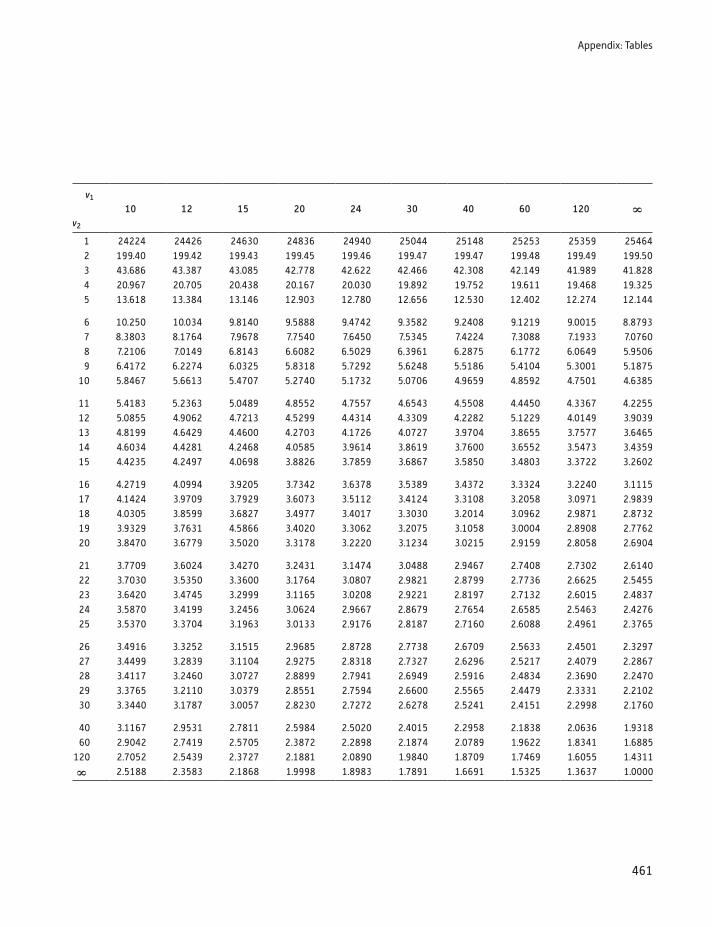
Appendix: Tables
461
v1
10 12 15 20 24 30 40 60 120 ˆv2
1 24224 24426 24630 24836 24940 25044 25148 25253 25359 254642 199.40 199.42 199.43 199.45 199.46 199.47 199.47 199.48 199.49 199.503 43.686 43.387 43.085 42.778 42.622 42.466 42.308 42.149 41.989 41.8284 20.967 20.705 20.438 20.167 20.030 19.892 19.752 19.611 19.468 19.3255 13.618 13.384 13.146 12.903 12.780 12.656 12.530 12.402 12.274 12.144
6 10.250 10.034 9.8140 9.5888 9.4742 9.3582 9.2408 9.1219 9.0015 8.87937 8.3803 8.1764 7.9678 7.7540 7.6450 7.5345 7.4224 7.3088 7.1933 7.07608 7.2106 7.0149 6.8143 6.6082 6.5029 6.3961 6.2875 6.1772 6.0649 5.95069 6.4172 6.2274 6.0325 5.8318 5.7292 5.6248 5.5186 5.4104 5.3001 5.1875
10 5.8467 5.6613 5.4707 5.2740 5.1732 5.0706 4.9659 4.8592 4.7501 4.6385
11 5.4183 5.2363 5.0489 4.8552 4.7557 4.6543 4.5508 4.4450 4.3367 4.225512 5.0855 4.9062 4.7213 4.5299 4.4314 4.3309 4.2282 5.1229 4.0149 3.903913 4.8199 4.6429 4.4600 4.2703 4.1726 4.0727 3.9704 3.8655 3.7577 3.646514 4.6034 4.4281 4.2468 4.0585 3.9614 3.8619 3.7600 3.6552 3.5473 3.435915 4.4235 4.2497 4.0698 3.8826 3.7859 3.6867 3.5850 3.4803 3.3722 3.2602
16 4.2719 4.0994 3.9205 3.7342 3.6378 3.5389 3.4372 3.3324 3.2240 3.111517 4.1424 3.9709 3.7929 3.6073 3.5112 3.4124 3.3108 3.2058 3.0971 2.983918 4.0305 3.8599 3.6827 3.4977 3.4017 3.3030 3.2014 3.0962 2.9871 2.873219 3.9329 3.7631 4.5866 3.4020 3.3062 3.2075 3.1058 3.0004 2.8908 2.776220 3.8470 3.6779 3.5020 3.3178 3.2220 3.1234 3.0215 2.9159 2.8058 2.6904
21 3.7709 3.6024 3.4270 3.2431 3.1474 3.0488 2.9467 2.7408 2.7302 2.614022 3.7030 3.5350 3.3600 3.1764 3.0807 2.9821 2.8799 2.7736 2.6625 2.545523 3.6420 3.4745 3.2999 3.1165 3.0208 2.9221 2.8197 2.7132 2.6015 2.483724 3.5870 3.4199 3.2456 3.0624 2.9667 2.8679 2.7654 2.6585 2.5463 2.427625 3.5370 3.3704 3.1963 3.0133 2.9176 2.8187 2.7160 2.6088 2.4961 2.3765
26 3.4916 3.3252 3.1515 2.9685 2.8728 2.7738 2.6709 2.5633 2.4501 2.329727 3.4499 3.2839 3.1104 2.9275 2.8318 2.7327 2.6296 2.5217 2.4079 2.286728 3.4117 3.2460 3.0727 2.8899 2.7941 2.6949 2.5916 2.4834 2.3690 2.247029 3.3765 3.2110 3.0379 2.8551 2.7594 2.6600 2.5565 2.4479 2.3331 2.210230 3.3440 3.1787 3.0057 2.8230 2.7272 2.6278 2.5241 2.4151 2.2998 2.1760
40 3.1167 2.9531 2.7811 2.5984 2.5020 2.4015 2.2958 2.1838 2.0636 1.931860 2.9042 2.7419 2.5705 2.3872 2.2898 2.1874 2.0789 1.9622 1.8341 1.6885
120 2.7052 2.5439 2.3727 2.1881 2.0890 1.9840 1.8709 1.7469 1.6055 1.4311ˆ 2.5188 2.3583 2.1868 1.9998 1.8983 1.7891 1.6691 1.5325 1.3637 1.0000
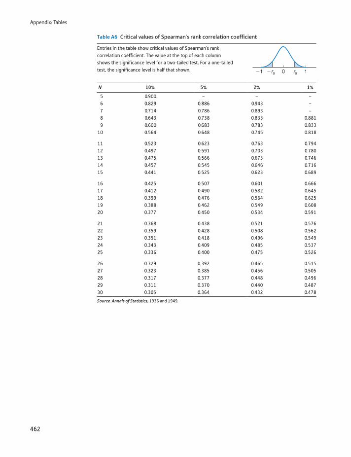
Appendix: Tables
462
Table A6 Critical values of Spearman's rank correlation coefficient
Entries in the table show critical values of Spearman's rank correlation coefficient. The value at the top of each column shows the significance level for a two-tailed test. For a one-tailed test, the significance level is half that shown.
N 10% 5% 2% 1%
5 0.900 – – –6 0.829 0.886 0.943 –7 0.714 0.786 0.893 –8 0.643 0.738 0.833 0.8819 0.600 0.683 0.783 0.833
10 0.564 0.648 0.745 0.818
11 0.523 0.623 0.763 0.79412 0.497 0.591 0.703 0.78013 0.475 0.566 0.673 0.74614 0.457 0.545 0.646 0.71615 0.441 0.525 0.623 0.689
16 0.425 0.507 0.601 0.66617 0.412 0.490 0.582 0.64518 0.399 0.476 0.564 0.62519 0.388 0.462 0.549 0.60820 0.377 0.450 0.534 0.591
21 0.368 0.438 0.521 0.57622 0.359 0.428 0.508 0.56223 0.351 0.418 0.496 0.54924 0.343 0.409 0.485 0.53725 0.336 0.400 0.475 0.526
26 0.329 0.392 0.465 0.51527 0.323 0.385 0.456 0.50528 0.317 0.377 0.448 0.49629 0.311 0.370 0.440 0.48730 0.305 0.364 0.432 0.478
Source: Annals of Statistics, 1936 and 1949.
rs rs
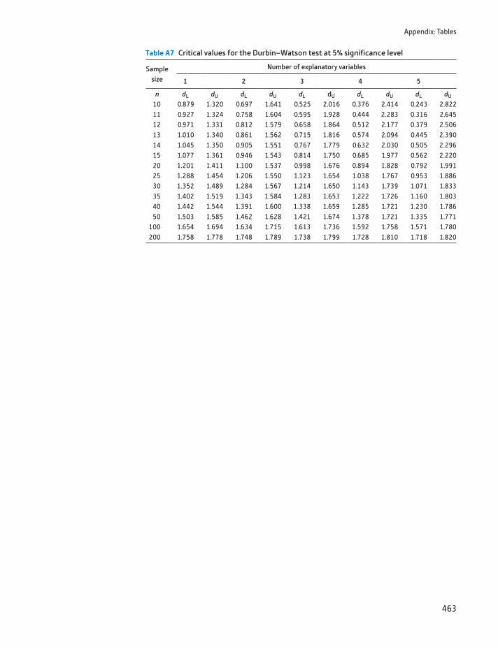
Appendix: Tables
463
Table A7 Critical values for the Durbin–Watson test at 5% significance level
Samplesize
Number of explanatory variables
1 2 3 4 5
n dL dU dL dU dL dU dL dU dL dU
10 0.879 1.320 0.697 1.641 0.525 2.016 0.376 2.414 0.243 2.82211 0.927 1.324 0.758 1.604 0.595 1.928 0.444 2.283 0.316 2.645
12 0.971 1.331 0.812 1.579 0.658 1.864 0.512 2.177 0.379 2.506 13 1.010 1.340 0.861 1.562 0.715 1.816 0.574 2.094 0.445 2.390 14 1.045 1.350 0.905 1.551 0.767 1.779 0.632 2.030 0.505 2.296 15 1.077 1.361 0.946 1.543 0.814 1.750 0.685 1.977 0.562 2.220 20 1.201 1.411 1.100 1.537 0.998 1.676 0.894 1.828 0.792 1.991 25 1.288 1.454 1.206 1.550 1.123 1.654 1.038 1.767 0.953 1.886 30 1.352 1.489 1.284 1.567 1.214 1.650 1.143 1.739 1.071 1.833 35 1.402 1.519 1.343 1.584 1.283 1.653 1.222 1.726 1.160 1.803 40 1.442 1.544 1.391 1.600 1.338 1.659 1.285 1.721 1.230 1.786 50 1.503 1.585 1.462 1.628 1.421 1.674 1.378 1.721 1.335 1.771100 1.654 1.694 1.634 1.715 1.613 1.736 1.592 1.758 1.571 1.780200 1.758 1.778 1.748 1.789 1.738 1.799 1.728 1.810 1.718 1.820
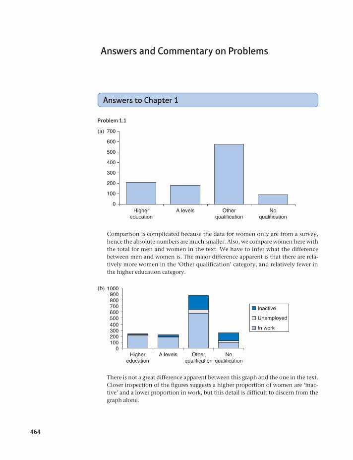
464
Answers and Commentary on Problems
Answers to Chapter 1
Problem 1.1
(a)
0
100
200
300
400
500
600
700
Highereducation
A levels Otherqualification
Noqualification
Comparison is complicated because the data for women only are from a survey, hence the absolute numbers are much smaller. Also, we compare women here with the total for men and women in the text. We have to infer what the difference between men and women is. The major difference apparent is that there are rela-tively more women in the ‘Other qualification’ category, and relatively fewer in the higher education category.
There is not a great difference apparent between this graph and the one in the text. Closer inspection of the figures suggests a higher proportion of women are ‘inac-tive’ and a lower proportion in work, but this detail is difficult to discern from the graph alone.
(b)
0100
Highereducation
A levels Otherqualification
Noqualification
200300400500600700800900
1000
Inactive
Unemployed
In work
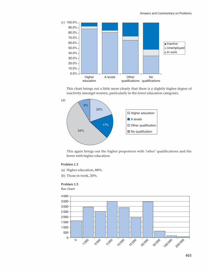
Answers and Commentary on Problems
465
(c)
0.0%
10.0%
20.0%
30.0%
40.0%
50.0%
60.0%
70.0%
80.0%
90.0%
100.0%
Highereducation
A levels Otherqualifications
Noqualifications
InactiveUnemployedIn work
This chart brings out a little more clearly that there is a slightly higher degree of inactivity amongst women, particularly in the lower education categories.
(d)
20%
17%
54%
9%
Higher education
A levels
Other qualification
No qualification
This again brings out the higher proportion with ‘other’ qualifications and the fewer with higher education.
Problem 1.3
(a) Higher education, 88%.
(b) Those in work, 20%.
Problem 1.5Bar chart
00
1 000
3 000
5 000
10 00
0
15 00
0
20 00
0
50 00
0
100 00
0
200 00
0
500
1 000
1 500
2 000
2 500
3 000
3 500
4 000
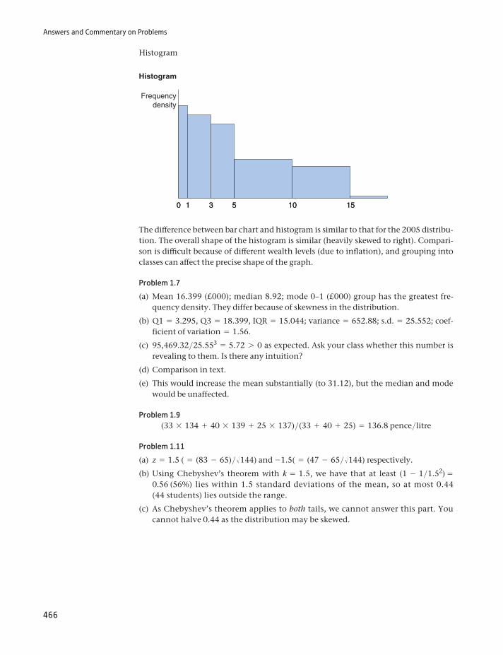
Answers and Commentary on Problems
466
Histogram
Histogram
0 53 10 15
Frequencydensity
10 53 10 151
The difference between bar chart and histogram is similar to that for the 2005 distribu-tion. The overall shape of the histogram is similar (heavily skewed to right). Compari-son is difficult because of different wealth levels (due to inflation), and grouping into classes can affect the precise shape of the graph.
Problem 1.7
(a) Mean 16.399 (£000); median 8.92; mode 0–1 (£000) group has the greatest fre-quency density. They differ because of skewness in the distribution.
(b) Q1 = 3.295, Q3 = 18.399, IQR = 15.044; variance = 652.88; s.d. = 25.552; coef-ficient of variation = 1.56.
(c) 95,469.32>25.553 = 5.72 7 0 as expected. Ask your class whether this number is revealing to them. Is there any intuition?
(d) Comparison in text.
(e) This would increase the mean substantially (to 31.12), but the median and mode would be unaffected.
Problem 1.9(33 * 134 + 40 * 139 + 25 * 137)>(33 + 40 + 25) = 136.8 pence>litre
Problem 1.11
(a) z = 1.5 ( = (83 - 65)>Î144) and -1.5( = (47 - 65>Î144) respectively.
(b) Using Chebyshev’s theorem with k = 1.5, we have that at least (1 - 1>1.52) = 0.56 (56%) lies within 1.5 standard deviations of the mean, so at most 0.44 (44 students) lies outside the range.
(c) As Chebyshev’s theorem applies to both tails, we cannot answer this part. You cannot halve 0.44 as the distribution may be skewed.
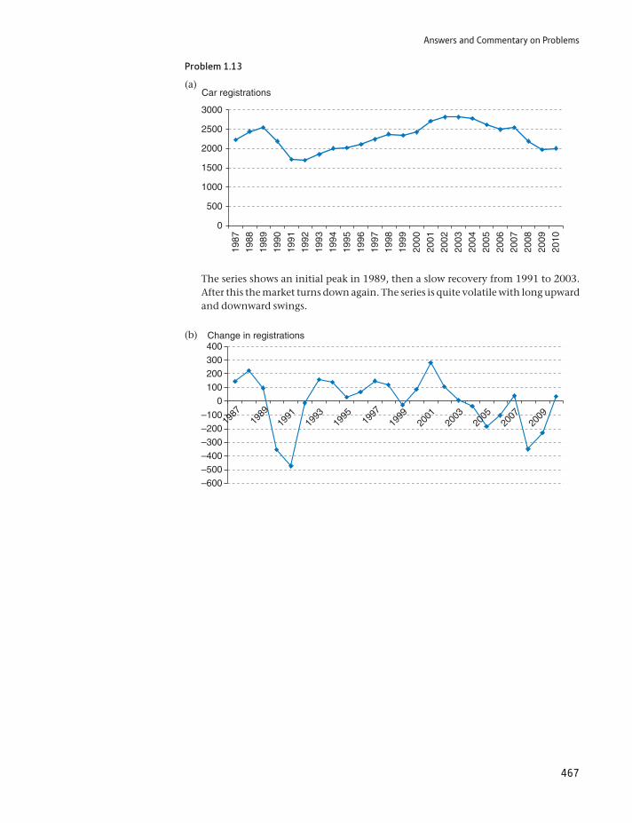
Answers and Commentary on Problems
467
Problem 1.13
(a) Car registrations
0
500
1000
1500
2000
2500
3000
1987
1988
1989
1990
1991
1992
1993
1994
1995
1996
1997
1998
1999
2000
2001
2002
2003
2004
2005
2006
2007
2008
2009
2010
The series shows an initial peak in 1989, then a slow recovery from 1991 to 2003. After this the market turns down again. The series is quite volatile with long upward and downward swings.
(b) Change in registrations
–600–500–400–300–200–100
0100200300400
1987
1989
1991
1993
1995
19
9719
99
2001
2003
2005
2007
2009
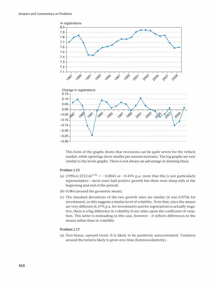
Answers and Commentary on Problems
468
Change in registrations
–0.30
–0.25
–0.20
–0.15
–0.10
–0.05
0.00
0.05
0.10
0.15
1987
1989
1991
1993
1995
1997
1999
2001
2003
2005
2007
2009
In registrations
7.1
7.2
7.3
7.4
7.5
7.7
7.6
7.9
7.8
8.0
1987
1989
1991
1993
1995
1997
1999
2001
2003
2005
2007
2009
This form of the graphs shows that recessions can be quite severe for the vehicle market, while upswings show smaller per annum increases. The log graphs are very similar to the levels graphs. There is not always an advantage in drawing these.
Problem 1.15
(a) (1994.6>2212.6)1>23 = -0.0045 or -0.45% p.a. (note that this is not particularly representative – most years had positive growth but there were sharp falls at the beginning and end of the period).
(b) 0.084 (around the geometric mean).
(c) The standard deviations of the two growth rates are similar (it was 0.0766 for investment), so this suggests a similar level of volatility. Note that, since the means are very different (6.37% p.a. for investment) and for registrations is actually nega-tive, there is a big difference in volatility if one relies upon the coefficient of varia-tion. This latter is misleading in this case, however – it reflects differences in the means rather than in volatility.
Problem 1.17
(a) Non-linear, upward trend. It is likely to be positively autocorrelated. Variation around the trend is likely to grow over time (heteroscedasticity).
Answers and Commentary on Problems
469
(b) Similar to (a), except that the trend would be shallower after deflation. Probably there will be less heteroscedasticity because price variability has been removed, which may also increase the autocorrelation of the series.
(c) Unlikely to show a trend in the very long run, but there might be one over, say, five years, if inflation is increasing. Likely to be homoscedastic, with some degree of autocorrelation.
Problem 1.19
(a) Rearranging St = S0(1 + r)t, we can obtain S0 = St>(1 + r)t. Setting St = 1000, r = 0.07, and t = 5 gives S0 = 712.99. Price after two years: 816.30 (use t = 3 to obtain this). If r rose after two years to 10%, the bond would fall to 1000>(1 + 0.10)3 = 751.31
(b) The income stream should be discounted to the present using
200
1 + r+
200
(1 + r)2 +200
(1 + r)3 +200
(1 + r)4 +200
(1 + r)5 = 820.04,
so the bond should sell for £820.04. It is worth more than the previous bond because the return is obtained earlier.
Problem 1.21
(a) 17.9% p.a. for BMW, 14% p.a. for Mercedes
(b) Depreciated values are as shown in this table,
BMW 525i 22 275 18 284 15 008 12 319 10 112 8 300
Merc 200E 21 900 18 833 16 196 13 928 11 977 10 300
which are close to actual values. Depreciation is initially slower than the average, then speeds up, for both cars.
Problem 1.23
E(x + k) = a (x + k)
n= ax + nk
n= ax
n+ k = E(x) + k
Problem 1.25The mistake is comparing non-comparable averages. A first-time buyer would have an above-average mortgage and purchase a below-average priced house, hence the amount of buyer’s equity would be small. The original argument came from the Morning Star newspaper many years ago. With reasoning like this, no wonder communism failed.
Answers to exercises on Σ notation
Problem 1A.120, 90, 400, 5, 17, 11.
Problem 1A.240, 360, 1600, 25, 37, 22.
Problem 1A.388, 372, 16, 85.
Problem 1A.4352, 2976, 208, 349.
Answers and Commentary on Problems
470
Problem 1A.5113, 14, 110.
Problem 1A.656, 8, 48.
Problem 1A.7
a f(x - k)
a f= a fx - ka f
a f= a fx
a f- k
Problem 1A.8
a f(x - m)2
a f= a f(x2 - 2mx + m2)
a f= a fx2 - 2ma fx + m2a f
a f
= a fx2
a f- 2m2 + m2 = a fx2
a f- m2
Answers to exercises on logarithms
Problem 1C.1-0.8239, 0.17609, 1.17609, 2.17609, 3.17609, 1.92284, 0.96142, impossible.
Problem 1C.2-0.09691, 0.90309, 1.90309, 0.60206, 1.20412, impossible.
Problem 1C.3-1.89712, 0.40547, 2.70705, 5.41610, impossible.
Problem 1C.401.20397, 1, 1.09861, 3.49651, impossible.
Problem 1C.50.15, 12.58925, 125.8925, 1258.925, 1012
Problem 1C.60.8, 199.5262, 1995.2623, 1995262.3
Problem 1C.715, 40.77422, 2.71828, 22026.4658
Problem 1C.833, 1,202,604.284, 3,269,017.372, 0.36788
Problem 1C.93.16228, 1.38692, 1.41421, 0.0005787, 0.008
Answers to Chapter 2
Problem 2.1
(a) 4/52 or 1/13. (There are four aces in a pack of 52 cards.)
Answers and Commentary on Problems
471
(b) 12>52 or 3>13. Again, this is calculated simply by counting the possibilities, 12 court cards (three in each suit)
(c) 1>2.
(d) 4>52 * 3>52 * 2>52 = 3>17576(0.017).
(e) (4>52)3 = 0.000455.
Problem 2.3
(a) 0.25 (three to one against means one win for every three losses, so one win in four races), 0.4, 5>9.
(b) ‘Probabilities’ are 0.33, 0.4, 0.5, which sum to 1.23. These cannot be real probabili-ties, therefore. The difference leads to a (expected) gain to the bookmaker.
(c) Suppose the true probabilities of winning are proportional to the odds, i.e. 0.33>1.23, 0.4>1.23,0.5>1.23, or 0.268, 0.325, 0.407. If £1 was bet on each horse, then the bookie would expect to pay out 0.268 * 3 + 0.325 * 1.5 + 0.407 * 0.8 = 1.6171, plus one of the £1 stakes i.e., £2.62 in total. He would thus gain 38 pence on every £3 bet, or about 12.7%.
Problem 2.5A number of factors might help: statistical ones such as the ratio of exports to debt interest, the ratio of GDP to external debt, the public sector deficit, etc., and political factors such as the policy stance of the government. More insight could be gained by looking at the current interest rate on the debt. A high interest rate suggests investors believe there is a greater chance of default, other things equal.
Problem 2.7
(a) Is the more probable, since it encompasses her being active or not active in the feminist movement. Many people get this wrong, which shows how one’s precon-ceptions can mislead. People tend to read part (a) as ‘Judy is a bank clerk, not active in the feminist movement’. A simple way of stating this mathematically is Pr(B) Ú Pr(B and A) where B indicates a bank clerk and A indicates and activist. It has to be true since Pr(A) … 1.
Problem 2.9The advertiser is a trickster and guesses at random. Every correct guess (P = 0.5) nets a fee, every wrong one costs nothing except reimbursing the fee. The trickster would thus keep half the money sent in. You should be wary of such advertisements!
Problem 2.11
(a) E(winning) = 0.520 * £1 billion + (1 - 0.520) * - £100 = £853.67
(b) Despite the positive expected value, most would not play because of their aversion to risk. Would you? The size of the prize is also not credible – would they actually pay up?
Problem 2.13(a), (b) and (d) are independent, though legend says that rain on St Swithin’s Day means rain for the next 40 days, so (d) is arguable according to legend.
Problem 2.15
(a) There are 15 ways where a 4–2 score could be arrived at, of which this is one. Hence the probability is 1>15.
Answers and Commentary on Problems
472
(b) Six of the routes through the tree diagram involve a 2–2 score at some stage, so the probability is 6>15.
Problem 2.17Pr(guessing all six) = 6>50 * 5>49 * g1>45 = 1>15 890 700.
Pr(six from 10 guesses) = 10>50 * 9>49 * g * 5>45 = 151 200>11 441 304 000. This is exactly 210 times the first answer, so there is no discount for bulk gambling.
Problem 2.19
Prior Likelihood Prior : likelihood Posterior
Fair coin 0.5 0.25 0.125 0.2Two heads 0.5 1.00 0.500 0.8
0.625
Problem 2.21
(a) Write the initial probability of guilt as Pr(G) = 1>2. The probability the witness says the defendant is guilty, given they are guilty, is Pr(W G) = p. Using Bayes’ theorem, the probability of guilt, given the witness’s statement, Pr(G W) is
Pr(W G) * Pr(G)
Pr(W G) * Pr(G) + Pr(W not-G) * Pr(not-G)=
p * 0.5p * 0.5 + (1 - p) * 0.5
= p
(b) Again using Bayes’ theorem, and writing Pr(2W G) for the probability that both witnesses claim the defendant is guilty, etc., we obtain Pr(G 2W) as
Pr(2W G) * Pr(G)
Pr(2W G) * Pr(G) + Pr(2W not-G) * Pr(not-G)
= p2 * 0.5
p2 * 0.5 + (1 - p)2 * 0.5=
p2
p2 + (1 - p)2
(c) If p 6 0.5, then the value in part (b) is less than the value in (a). The agreement of the second witness reduces the probability that the defendant is guilty. Intuitively, this seems unlikely. The fallacy is that they can lie in many different ways, so Bayes’ theorem is not applicable here.
Problem 2.23
(a) Expected Values are 142, 148.75 and 146, respectively. Hence B is chosen.
(b) The minima are 100, 130, 110, so B has the greatest minimum. The maxima are 180, 170, 200, so C is chosen.
(c) The regret table is
low middle high Max
A 30 5 20 30B 0 0 30 30C 20 15 0 20
so C has the minimax regret figure.
(d) The EV assuming perfect information is 157.75, against an EV of 148.75 for project B, so the value of information is 9.
Answers and Commentary on Problems
473
Problem 2.25The probability of no common birthday is 365>365 * 364>365 * 363>365 * g* 341>365 = 0.43. (This is obtained by noting that the probability of the second person having a birthday on a different day from the first is 364>365, the probability that the third has a birthday different from the first two is 363>365, etc.) Hence the probability of at least one birthday in common is 0.57, or greater than one-half. Most people under-estimate this probability by a large amount. (This result could form the basis of a useful source of income at parties.)
Problem 2.27
(a) Choose low confidence. The expected score is 0.6 * 1 + 0.4 * 0 = 0.6. For medium confidence the score would be 0.6 * 2 + 0.4 * -2 = 0.4, and for high confidence 0.6 * 3 + 0.4 * -6 = -0.6.
(b) Let p be the probability desired. We require E(score medium) = p * 2 + (1 - p) * - 2 7 p = E(score low)—the payoff to medium confidence should be greater than low confidence. Hence 4p - 2 7 p 1 p 7 2>3. Similarly, we also require p * 2 + (1 - p) * -2 7 p * 3 + (1 - p) * -6 (the payoff to medium has to exceed the payoff to high). This implies p 6 4>5. Hence 2>3 6 p 6 4>5.
(c) Given p = 0.85, the expected scores are p = 0.85 (low), 2p - 2(1 - p) = 1.4 (medium) and 3p - 6(1 - p) = 1.65. Hence the expected loss would by 1.65 - 1.4 = 0.25 if opting for medium confidence and 1.65 - 0.85 = 0.8 if opt-ing for low confidence.
Answers to Chapter 3
Problem 3.1The graph looks like a pyramid, centred on the value of 7, which is the mean of the distribution. The probabilities of scores of 2,3, c,12 are (out of 36): 1, 2, 3, 4, 5, 6, 5, 4, 3, 2, 1, respectively. The probability that the sum is nine or greater is therefore 10>36(4 + 3 + 2 + 1, divided by 36). The variance is 5.83.
Problem 3.3The distribution should be sharply peaked (at or just after the departure time as shown in the time table) and should be skewed to the right.
Problem 3.5Similar to the train departure time, except it is a discrete distribution. The mode would be zero accidents, and the probability above one accident per day very low indeed.
Problem 3.7The probabilities are 0.33, 0.40, 0.20, 0.05, 0.008, 0.000, 0.000 of 0–6 sixes, respec-tively, using the Binomial formula. For example, 0.33 is calculated as (5>6)6.
Problem 3.9
(a) Pr(0) = 0.915 = 0.21, Pr(1) = 15 * 0.914 * 0.1 = 0.34, hence Pr(0 or 1) = 0.55.
(b) By taking a larger sample or tightening the acceptance criteria, e.g. only accepting if the sample is defect free.
(c) Pr(0 or 1) = 0.9715 + 15 * 0.9714 * 0.03 = 0.927 so the probability of sending it back is 7.3%.
Answers and Commentary on Problems
474
(d) The assumption of a large batch means that the probability of a defective compo-nent being selected does not alter significantly as the sample is drawn.
Problem 3.11The y-axis coordinates are:
0.05 0.13 0.24 0.35 0.40 0.35 0.24 0.13 0.05
This gives the outline of the central part of the Normal distribution.
Problem 3.13
(a) 5%
(b) 30.85%
(c) 93.32%
(d) 91.04%
(e) Zero. (You must have an area for a probability.)
Problem 3.15
z =12 - 1019
= 0.67, area = 25%; z = -1, area = 15.87%, ZL = - 0.67, ZU = 1.67,
area = 70.11%, zero again.
Problem 3.17
(a) IQ ∼ N(100,162>10);
(b) z = 1.98, Pr = 2.39%.
(c) 2.39% (same as (b)).
(d) 95.22%. It is much greater than the previous answer. This question refers to the distribution of sample means, which is less dispersed than the population.
(e) Since the marginal student has an IQ of 108 (see previous question), nearly all uni-versity students will have an IQ above 110 and so, to an even greater extent, the sample mean will be above 110. Note that the distribution of students’ IQ is not Normal but skewed to the right, since it is taken from the upper tail of a Normal distribution. The small sample size means we cannot safely use the Central Limit Theorem here.
(f) 105, not 100. The expected value of the last nine is 100, so the average is 105.
Problem 3.19
(a) r ∼ B(10, 1>2).
(b) r ∼ N(5, 2.5).
(c) Binomial: Pr = 0.828; Normal: 73.57% (82.9% using the continuity correction).
Problem 3.21
(a) By the Binomial, Pr(no errors) = 0.99100 = 36.6%. By the Poisson, nP = 1, so
Pr(x = 0) =10e - 1
0!= 36.8%
(b) Pr(r = 1) = 100 * 0.9999 * 0.01 = 0.370; Pr(r = 2) = 100C2 * 0.9998 * 0.012 = 0.185. Hence Pr(r … 2) = 0.921. Poisson method: Pr(x = 1) = 11 * e - 1>1. = 0.368; Pr(x = 2) = 12 * e - 1>2. = 0.184. Hence Pr(x … 2) = 0.920. Hence the probability
Answers and Commentary on Problems
475
of more than two errors is about 8% using either method. Using the Normal method, we would have x ∼ N(1,0.99). So, the probability of x 7 2.5 (taking account of the continuity correction) is given by z = (2.5 - 1)>10.99 = 1.51, giv-ing an answer of 6.55%, a significant underestimate of the true value.
Problem 3.23
(a) Normal.
(b) Uniform distribution between zero and one (look up the = RAND() function in your software documentation).
(c) mean = 0.5, variance = 5>12 = 0.42 for parent, mean = 0.5, variance = 0.42>5 for sample means (Normal distribution)
Problem 3.25Looking at goals scored in the English Premier League 2010–11 (http://en.wikipedia.org/wiki/2010%E2%80%9311_Premier_League#Scoring) reveals the following fre-quency table:
Goals Actual Expected
0 25 23.171 54 64.812 95 90.653 93 84.534 61 59.115 26 33.076 19 15.427 4 6.168 3 2.159 0 0.67
Totals 380 379.75
Thus 25 games saw no goals, 54 had one goal, etc. The ‘Expected’ column gives the expected frequency based on the Poisson formula (3.26). The expected values reveal a close match to the actual numbers.
Answers to Chapter 4
Problem 4.1
(a) It gives the reader some idea of the reliability of an estimate, around the point value of the estimate.
(b) The population variance (or its sample estimate) and the sample size.
Problem 4.3An estimator is the rule used to find the estimate or a parameter. A good estimator does not guarantee a good estimate, only that it is correct on average (if the estimator is unbiased) and close to the true value (if precise).
Answers and Commentary on Problems
476
Problem 4.5E(w1x1 + w2x2) = w1E(x1) + w2E(x2) = w1m + w2m = m if w1 + w2 = 1.
Problem 4.740 2.57 * 2102>36 = [35.71, 44.28]. If n = 20, the t distribution should be used, giving 40 2.861 * 2102>20 = [33.60, 46.40]
Problem 4.90.4 2.57 * 10.4 * 0.6>50 = [0.22, 0.58]
Problem 4.11(25 - 22) 1.96 * 2122>80 + 182>100 = [-1.40, 7.40]
Problem 4.13
(0.67 - 0.62) 2.57 * A0.67 * 0.33150
+0.62 * 0.38
120= [-0.10, 0.20]
Problem 4.1530 2.131 * 252>16 = 327.34, 32.664 .
Problem 4.17(45 - 52) 2.048 * 140.32>12 + 40.32>18 = [-2.15, - 11.85].40.32 is the pooled variance.
Answers to Chapter 5
Problem 5.1
(a) False. You can alter the sample size. Increasing n will reduce the probability of both types of error by shrinking the width of the distributions under H0 and H1.
(b) True.
(c) False. You need to consider the Type II error probability also. Reducing the Type I error probability will increase the Type II probability (for a given sample size).
(d) True. The probability of a Type II error falls, therefore increasing power.
(e) False. The significance level is the probability of a Type I error.
(f) False. The confidence level is one – Pr(Type I error) or the probability of accepting H0 when true.
Problem 5.3H0: fair coin, (Pr(H) = 1>2), H1: two heads (Pr(H) = 1). A Type I error is two heads from a fair coin, so Pr(Type I error) = (1>2)2 = 1>4; A Type II error is less than two heads from a two-headed coin, which is impossible, so Pr(Type II error) = 0.
Problem 5.5
(a) Rejecting a good batch or accepting a bad batch.
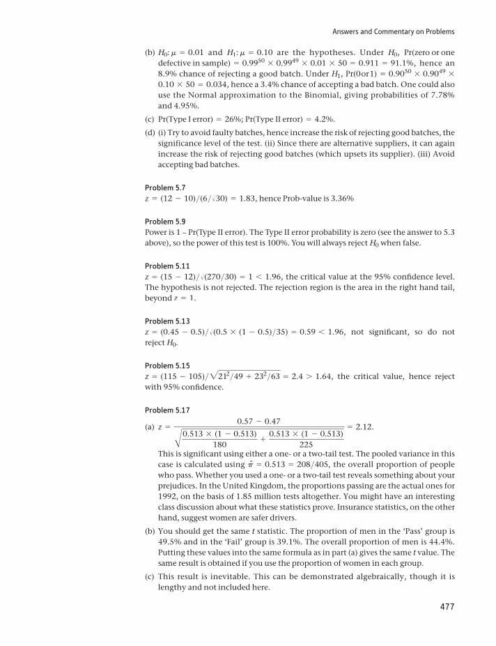
Answers and Commentary on Problems
477
(b) H0: m = 0.01 and H1: m = 0.10 are the hypotheses. Under H0, Pr(zero or one defective in sample) = 0.9950 * 0.9949 * 0.01 * 50 = 0.911 = 91.1%, hence an 8.9% chance of rejecting a good batch. Under H1, Pr(0 or 1) = 0.9050 * 0.9049 *0.10 * 50 = 0.034, hence a 3.4% chance of accepting a bad batch. One could also use the Normal approximation to the Binomial, giving probabilities of 7.78% and 4.95%.
(c) Pr(Type I error) = 26%; Pr(Type II error) = 4.2%.
(d) (i) Try to avoid faulty batches, hence increase the risk of rejecting good batches, the significance level of the test. (ii) Since there are alternative suppliers, it can again increase the risk of rejecting good batches (which upsets its supplier). (iii) Avoid accepting bad batches.
Problem 5.7z = (12 - 10)>(6>Î30) = 1.83, hence Prob-value is 3.36%
Problem 5.9Power is 1 – Pr(Type II error). The Type II error probability is zero (see the answer to 5.3 above), so the power of this test is 100%. You will always reject H0 when false.
Problem 5.11z = (15 - 12)>Î(270>30) = 1 6 1.96, the critical value at the 95% confidence level. The hypothesis is not rejected. The rejection region is the area in the right hand tail, beyond z = 1.
Problem 5.13z = (0.45 - 0.5)>Î(0.5 * (1 - 0.5)>35) = 0.59 6 1.96, not significant, so do not reject H0.
Problem 5.15z = (115 - 105)>2212>49 + 232>63 = 2.4 7 1.64, the critical value, hence reject with 95% confidence.
Problem 5.17
(a) z =0.57 - 0.47A0.513 * (1 - 0.513)
180+ 0.513 * (1 - 0.513)
225
= 2.12.
This is significant using either a one- or a two-tail test. The pooled variance in this case is calculated using pn = 0.513 = 208>405, the overall proportion of people who pass. Whether you used a one- or a two-tail test reveals something about your prejudices. In the United Kingdom, the proportions passing are the actual ones for 1992, on the basis of 1.85 million tests altogether. You might have an interesting class discussion about what these statistics prove. Insurance statistics, on the other hand, suggest women are safer drivers.
(b) You should get the same t statistic. The proportion of men in the ‘Pass’ group is 49.5% and in the ‘Fail’ group is 39.1%. The overall proportion of men is 44.4%. Putting these values into the same formula as in part (a) gives the same t value. The same result is obtained if you use the proportion of women in each group.
(c) This result is inevitable. This can be demonstrated algebraically, though it is lengthy and not included here.
Answers and Commentary on Problems
478
Problem 5.19
(a) t = -52102>20 = -2.24 6 -2.093, the critical value, hence reject H0.
(b) The parent distribution is Normal.
Problem 5.21
S2 =(12 - 1) * 50 + (15 - 1) * 30
12 + 15 - 2= 38.8, and t =
150 - 130A38.812
+38.815
= 8.29,
so H0 is rejected. The critical value is t* = 2.060 (95% confidence, 25 degrees of freedom).
Problem 5.23
(a) For the ‘Before’ sample, the mean is 55.5 and the variance 12.3. For the ‘After’ sam-ple, the mean is 57.5 with variance 14.1. Hence the pooled variance is 13.16 and the test statistic is t20 = 1.18.
(b) Measuring the differences between the before and after figures, the mean is 1.8 and the variance 13.8. This gives a test statistic of t10 = 1.63. Neither is signifi-cant at the 5% level, though the latter is closer. Note that only one worker performs worse, but this one does substantially worse, perhaps because of other factors.
Problem 5.25
(a) It would be important to check all the predictions of the astrologer. Too often, cor-rect predictions are highlighted ex-post and incorrect ones ignored.
(b) Like astrology, a fair test is important, in which it is possible to pass or fail, with known probabilities. Then performance can be judged.
(c) Samples of both taken-over companies and independent companies should be compared, with as little difference in other respects between samples as possible.
Problem 5.27
(a) The sample means should be Normally distributed so approximately 5% of the z scores should lie beyond 1.96.
(b) Your outcome should be similar to that described in part (a). You might get a slightly different result due the vagaries of random sampling.
(c) Your graph should look approximately like a Normal distribution.
Answers to Chapter 6
Problem 6.1
The 95% c.i. for the variance is 39 * 202
59.34… s2 …
39 * 202
24.43 in which 24.43 and 59.34
are the limits cutting off 2.5% in each tail of the x2 distribution with 40 degrees of free-dom (close to the correct 39), so the c.i. for s is [16.21, 25.29].
Answers and Commentary on Problems
479
Problem 6.3Observed values are 833 and 942 with expected values of 887.5 in each case. Hence we obtain x2 = 6.69 7 3.84, the 95% critical value, and there is an apparent difference between quarters I/III and II/IV. (Note that the previous edition of this book used data from 2006, which found a different result.)
Problem 6.5Using the data as presented, with expected values of 565 (the average of the four num-bers), yields x2(3) = 1.33, not significant. However, with the additional information, adding the dissatisfied customers (24, 42, 20, 54) and constructing a contingency table yields x2(3) = 22.94, highly significant. The differences between the small numbers of dissatisfied customers adds most to the test statistic. The former result should be treated with suspicion since it is fairly obvious that there would be small numbers of dissatis-fied customers.
Problem 6.7x2(4) = 8.12 which is not significant at the 5% significance level. There appears no relationship between size and profitability.
Problem 6.9
(a) The correct observed and expected values are
47.0 (54.9) 72.0 (64.1)86.0 (76.6) 80.0 (89.4)
4.0 (5.5) 8.0 (6.5)
and this yields a x2 value of 5.05 against a critical value of 5.99 (5% significance level, 2 degrees of freedom).
(b) Omitting the non-responses leads to a 2 * 2 contingency table with a test statistic of 4.22, against a critical value of 3.84, yielding a significant result. It is debatable whether it is better to omit the non-responses. The real problem here is that the test statistic is close to the critical value, so it is easy for our decision to change with small changes to the data.
Problem 6.11F = 55>48 = 1.15 6 2.76, the 1% critical value for 24 and 29 degrees of freedom. There is no significant difference, therefore.
Problem 6.13
(a) Between Sum of Squares = 335.8, Within Sum of Squares = 2088, Total Sum of Squares = 2424. F = (335.8>3)>(2088>21) = 1.126 6 3.07, the critical value for 3, 21 degrees of freedom. There appears to be no significant difference between classes.
(b) A significant result would indicate some difference between the classes, but this could be because of any number of factors which have not been controlled for, e.g. different teachers, different innate ability, different gender ratios and so on.
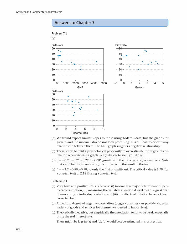
Answers and Commentary on Problems
480
Answers to Chapter 7
Problem 7.1
(a)
0
10
20
30
40
50
60
0
10
20
30
40
50
60
0
10
20
30
40
50
60
0 1000 2000 3000 4000 5000
0 2 4 6 10
GNP
Birth rate
Birth rate
Birth rate
–1 0 1 2 3 4 5
Growth
8Income ratio
(b) We would expect similar slopes to those using Todaro’s data, but the graphs for growth and the income ratio do not look promising. It is difficult to discern any relationship between them. The GNP graph suggests a negative relationship.
(c) There seems to exist a psychological propensity to overestimate the degree of cor-relation when viewing a graph. See (d) below to see if you did so.
(d) r = -0.73,-0.25,-0.22 for GNP, growth and the income ratio, respectively. Note that r 6 0 for the income ratio, in contrast with the result in the text.
(e) t = -3.7,-0.89,-0.78, so only the first is significant. The critical value is 1.78 (for a one-tail test) or 2.18 if using a two-tail test.
Problem 7.3
(a) Very high and positive. This is because (i) income is a major determinant of peo-ple’s consumption, (ii) measuring the variables at national level means a great deal of smoothing of individual variation and (iii) the effects of inflation have not been corrected for.
(b) A medium degree of negative correlation (bigger countries can provide a greater variety of goods and services for themselves so need to import less).
(c) Theoretically negative, but empirically the association tends to be weak, especially using the real interest rate.
There might be lags in (a) and (c). (b) would best be estimated in cross section.
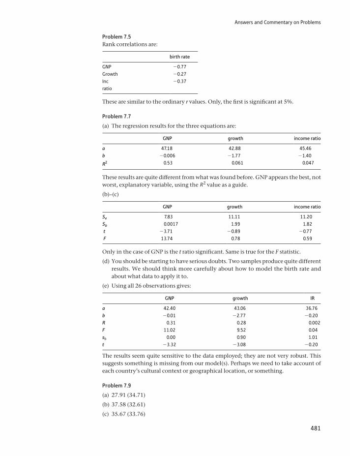
Answers and Commentary on Problems
481
Problem 7.5Rank correlations are:
birth rate
GNP -0.77Growth -0.27Inc ratio
-0.37
These are similar to the ordinary r values. Only, the first is significant at 5%.
Problem 7.7
(a) The regression results for the three equations are:
GNP growth income ratio
a 47.18 42.88 45.46b -0.006 -1.77 -1.40
R2 0.53 0.061 0.047
These results are quite different from what was found before. GNP appears the best, not worst, explanatory variable, using the R2 value as a guide.
(b)–(c)
GNP growth income ratio
Se 7.83 11.11 11.20Sb 0.0017 1.99 1.82 t -3.71 -0.89 -0.77 F 13.74 0.78 0.59
Only in the case of GNP is the t ratio significant. Same is true for the F statistic.
(d) You should be starting to have serious doubts. Two samples produce quite different results. We should think more carefully about how to model the birth rate and about what data to apply it to.
(e) Using all 26 observations gives:
GNP growth IR
a 42.40 43.06 36.76b -0.01 -2.77 -0.20R 0.31 0.28 0.002F 11.02 9.52 0.04sb 0.00 0.90 1.01t -3.32 -3.08 -0.20
The results seem quite sensitive to the data employed; they are not very robust. This suggests something is missing from our model(s). Perhaps we need to take account of each country’s cultural context or geographical location, or something.
Problem 7.9
(a) 27.91 (34.71)
(b) 37.58 (32.61)
(c) 35.67 (33.76)
Answers and Commentary on Problems
482
(predictions in brackets obtained from Todaro’s data). Again, different samples, differ-ent results, which does not inspire confidence. The predictions from this set of data are more diverse than from those using Todaro’s data.
Problem 7.11A good source of data for this project is the World Bank (http://data.worldbank.org/topic). From this, the following relationship between the birth rate and GDP per capita was found (data for 182 countries, for 2009):
50 0000–10
0
10
20
30
40
50
100 000 150 000
GDP pc
Birth rate
with regression
BR = 25.6 - 0.00027 GDPpc + e
t(31.5) (-7.78)
R2 = 0.25.
Although demonstrating a negative relationship and highly significant, it is evident from the graph that the wrong functional form has been used. Taking logs of both var-iables, we obtain:
2.0
2.5
3.0
3.5
4.0
4.0 6.0 8.0 10.0 12.0
ln GDP pc
ln BR
with regression
ln BR = 5.05 - 0.25 ln GDPpc + e
t(43.2) (-18.0)
R2 = 0.64.
This seems a better characterisation of the data. Analyses with the other explanatory variables should be done in similar manner and might yield better results, perhaps not.
Answers and Commentary on Problems
483
Answers to Chapter 8
Problem 8.1
(a) B = 46.77 - 0.0064 GNP - 0.55 GROWTH + 0.34 IR
s.e. (0.002) (1.66) (1.54)
R2 = 0.54, F = 3.91
(i) Calculating elasticities: GNP: - 0.0064 * 17050>551 = -0.19; growth: -0.55 * 27.9>551 = -0.03; IR -0.34 * 61.1>551 = 0.04. All seem quite small, although the first suggests a 10% rise in GNP should lower the birth rate by 2%.
(ii) Only GNP appears significant. Note that the R2 value is only just greater than in the simple regression on GNP.
(iii) The F statistic is just significant at the 5% level (3.71 is the critical value).
(b) It looks like the growth and income ratio variables should be dropped.
(c) We need to compare the regression in part (a) above with the restricted regres-sion B = b0 + b1GNP (i.e. the coefficients on GROWTH and IR are both equal to zero). From the former, we obtain error sum of squares of ESSU = 726.96; from the latter (equation estimated as part of problem 7.7), ESSR = 736.17. The restricted model seems to fit almost as well. To check this, we conduct an F test:
F =(736.17 - 726.96)>2
726.96>10= 0.063, less than the critical value (F*(2, 10) = 4.10) so
the variables can be omitted.
(d) B = 43.61 - 0.005 GNP - 2.026 GROWTH + 0.69 IR
(0.0017) (0.845) (0.81)
R2 = 0.48, F = 6.64, n = 26.
The GNP and IR coefficients are of similar orders of magnitude and significance levels. The GROWTH coefficient changes markedly and is now significant. The F–statistic for exclusion is 3.365, against a critical value of 3.44 at 5%, suggest-ing both could be excluded, in spite of the significant t-ratio on the growth variable.
(e) Not much progress has been made. More planning of the research is needed.
(f) Women’s education, religion and health expenditures are possibilities.
Problem 8.328.29 from 14 countries; 27.93 from all 26 countries.
Problem 8.5
(a) A set of dummy variables, one for each class.
(b) Difficult, because crime is so heterogeneous. One could use the number of recorded offences, but this would equate a murder with bicycle theft. It would be better to model the different types of crime separately.
(c) A proxy variable could be constructed, using such factors as the length of time for which the bank governor is appointed, whether appointed by the govern-ment, and so on. This would be somewhat arbitrary, but possibly better than nothing.
Answers and Commentary on Problems
484
Problem 8.7
(a) Time-series data, since the main interest is in movements of the exchange rate in response to changes in the money supply. The relative money stock movements in the two countries might be needed.
(b) Cross-section (cross-country) data would be affected by enormous cultural and social differences, which would be hard to measure. Regional (within country) data might not yield many observations and might simply vary randomly. Time series data might be better, but it would still be difficult to measure the gradual change in cultural and social influences. Best would be cross-section data on couples (both divorced and still married).
(c) Cross-section data would be of more interest. There would be many observations, with substantial variation across hospitals. This rich detail would not be so easily observable in time-series data.
Problem 8.9Suitable models would be:
(a) C = b0 + b1P + b2F + b3L + b4W where C: total costs, P: passenger miles flown; F: freight miles flown; L: % of long haul flights; W: wage rates faced by the firm. This would be estimated using cross-section data, each airline constituting an observa-tion. P2 and F2 terms could be added, to allow the cost function to be non-linear. Alternatively, it could be estimated in logs to get elasticity estimates. One would expect b1, b2, b4 7 0, b3 6 0.
(b) IM = b0 + b1 GNP + b2 FEMED + b3 HLTHEXP where IM: infant mortality (deaths per thousand births); FEMED: a measure of female education (e.g. the literacy rate); HLTHEXP: health expenditure (ideally on women, as % of GNP). One would expect b1, b2, b3 6 0. This would be a cross-country study. There is likely to be a ‘threshold’ effect of GNP, so a non-linear (e.g. log) form should be estimated.
(c) BP = b0 + b1 ∆GNP + b2 R where BP: profits; ∆GNP: growth; R: the interest rate. This would be estimated on time-series data. BP and growth should be measured in real terms, but the nominal interest rate might be appropriate. Bank profits depend upon the spread of interest rates, which tends to be greater when the rate is higher.
Problem 8.11
(a) Higher U reduces the demand for imports; higher OECD income raises the demand for UK exports; higher materials prices (the UK imports materials) lowers demand, but the effect on expenditure (and hence the BOP) depends upon the elasticity. Here, higher P leads to a greater BoP deficit, implying inelastic demand; higher C (lower competitiveness) worsens the BoP.
(b) (iii) higher material prices.
(c) U: linear, Y: non-linear
(d) Since B is sometimes negative, a log transformation cannot be performed. This means elasticity estimates cannot be obtained directly. Since B is some-times positive, sometimes negative, an elasticity estimate would be hard to interpret.
(e) 1.80, a surplus.
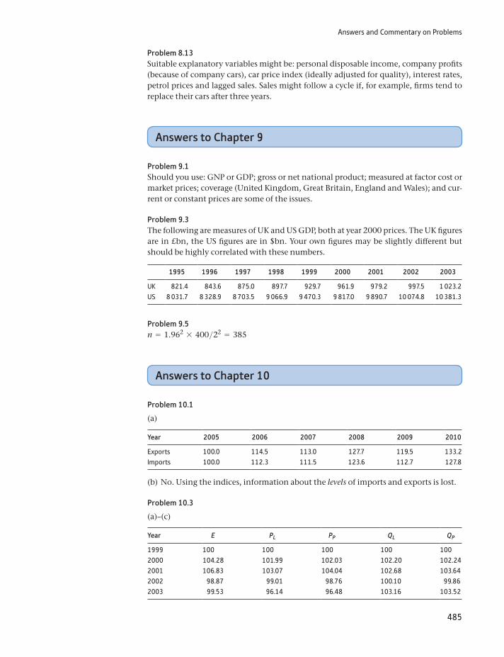
Answers and Commentary on Problems
485
Problem 8.13Suitable explanatory variables might be: personal disposable income, company profits (because of company cars), car price index (ideally adjusted for quality), interest rates, petrol prices and lagged sales. Sales might follow a cycle if, for example, firms tend to replace their cars after three years.
Answers to Chapter 9
Problem 9.1Should you use: GNP or GDP; gross or net national product; measured at factor cost or market prices; coverage (United Kingdom, Great Britain, England and Wales); and cur-rent or constant prices are some of the issues.
Problem 9.3The following are measures of UK and US GDP, both at year 2000 prices. The UK figures are in £bn, the US figures are in $bn. Your own figures may be slightly different but should be highly correlated with these numbers.
1995 1996 1997 1998 1999 2000 2001 2002 2003
UK 821.4 843.6 875.0 897.7 929.7 961.9 979.2 997.5 1 023.2US 8 031.7 8 328.9 8 703.5 9 066.9 9 470.3 9 817.0 9 890.7 10 074.8 10 381.3
Problem 9.5n = 1.962 * 400>22 = 385
Answers to Chapter 10
Problem 10.1
(a)
Year 2005 2006 2007 2008 2009 2010
Exports 100.0 114.5 113.0 127.7 119.5 133.2Imports 100.0 112.3 111.5 123.6 112.7 127.8
(b) No. Using the indices, information about the levels of imports and exports is lost.
Problem 10.3
(a)–(c)
Year E PL PP QL QP
1999 100 100 100 100 1002000 104.28 101.99 102.03 102.20 102.242001 106.83 103.07 104.04 102.68 103.642002 98.87 99.01 98.76 100.10 99.862003 99.53 96.14 96.48 103.16 103.52
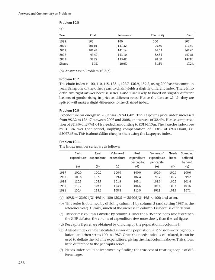
Answers and Commentary on Problems
486
Problem 10.5
(a)
Year Coal Petroleum Electricity Gas
1999 100 100 100 1002000 101.01 131.42 95.75 110.992001 109.49 141.14 86.53 149.452002 99.40 143.10 82.34 142.862003 99.22 133.42 78.50 147.80Shares 1.3% 10.0% 71.6% 17.2%
(b) Answer as in Problem 10.3(a).
Problem 10.7The chain index is 100, 110, 115, 123.1, 127.7, 136.9, 139.2, using 2000 as the common year. Using one of the other years to chain yields a slightly different index. There is no definitive right answer because series 1 and 2 are likely to based on slightly different baskets of goods, rising in price at different rates. Hence the date at which they are spliced will make a slight difference to the chained index.
Problem 10.9Expenditure on energy in 2007 was £9741.04m. The Laspeyres price index increased from 95.32 to 126.17 between 2007 and 2008, an increase of 32.4%. Hence compensa-tion of 32.4% of £9741.04 is needed, amounting to £3156.10m. The Paasche index rose by 31.8% over that period, implying compensation of 31.8% of £9741.04m, i.e. £3097.65m. This is about £58m cheaper than using the Laspeyres index.
Problem 10.11The index number series are as follows:
Cash expenditure
Real expenditure
Volume of expenditure
Real expenditure
per capita
Volume of expenditure
per capita
Needs index
Spending deflated by need.
(a) (b) (c) (d) (e) (f) (g)
1987 100.0 100.0 100.0 100.0 100.0 100.0 100.01988 109.8 102.6 99.4 102.4 99.2 100.2 99.21989 120.5 105.7 101.9 105.1 101.3 100.5 101.41990 132.7 107.5 104.5 106.6 103.6 100.8 103.61991 150.4 113.6 108.8 111.9 107.1 101.6 107.1
(a) 109.8 = 23 601>21 495 * 100; 120.5 = 25 906>21 495 * 100; and so on.
(b) This series is obtained by dividing column 1 by column 2 (and setting 1987 as the reference year). Clearly, much of the increase in column 1 is because of inflation.
(c) This series is column 1 divided by column 3. Since the NHS price index rose faster than the GDP deflator, the volume of expenditure rises more slowly than the real figure.
(d) Per capita figures are obtained by dividing by the population in column 4.
(e) A Needs index can be calculated as working population + 2 * non-working popu-lation, and then set to 100 in 1987. Once the needs index is calculated, it can be used to deflate the volume expenditure, giving the final column above. This shows little difference to the per capita series.
(f) Needs index could be improved by finding the true cost of treating people of dif-ferent ages.
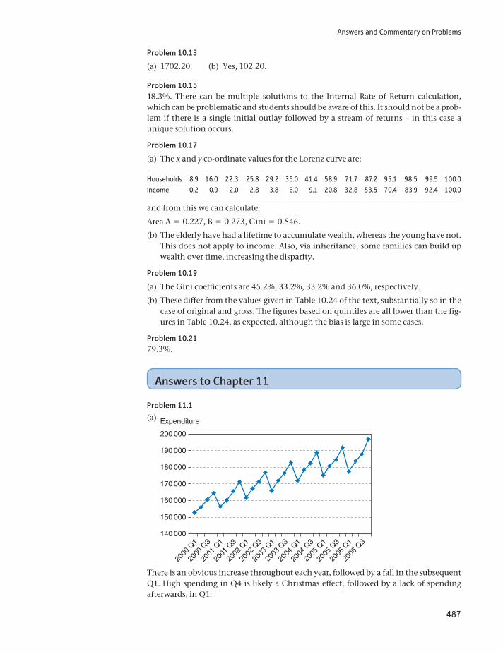
Answers and Commentary on Problems
487
Problem 10.13
(a) 1702.20. (b) Yes, 102.20.
Problem 10.1518.3%. There can be multiple solutions to the Internal Rate of Return calculation, which can be problematic and students should be aware of this. It should not be a prob-lem if there is a single initial outlay followed by a stream of returns – in this case a unique solution occurs.
Problem 10.17
(a) The x and y co-ordinate values for the Lorenz curve are:
Households 8.9 16.0 22.3 25.8 29.2 35.0 41.4 58.9 71.7 87.2 95.1 98.5 99.5 100.0
Income 0.2 0.9 2.0 2.8 3.8 6.0 9.1 20.8 32.8 53.5 70.4 83.9 92.4 100.0
and from this we can calculate:
Area A = 0.227, B = 0.273, Gini = 0.546.
(b) The elderly have had a lifetime to accumulate wealth, whereas the young have not. This does not apply to income. Also, via inheritance, some families can build up wealth over time, increasing the disparity.
Problem 10.19
(a) The Gini coefficients are 45.2%, 33.2%, 33.2% and 36.0%, respectively.
(b) These differ from the values given in Table 10.24 of the text, substantially so in the case of original and gross. The figures based on quintiles are all lower than the fig-ures in Table 10.24, as expected, although the bias is large in some cases.
Problem 10.2179.3%.
Answers to Chapter 11
Problem 11.1
(a)
140 000
2000
Q1
150 000
160 000
170 000
180 000
200 000
Expenditure
190 000
2000
Q3
2001
Q1
2001
Q3
2002
Q1
2002
Q3
2003
Q1
2003
Q3
2004
Q1
2004
Q3
2005
Q1
2005
Q3
2006
Q1
2006
Q3
There is an obvious increase throughout each year, followed by a fall in the subsequent Q1. High spending in Q4 is likely a Christmas effect, followed by a lack of spending afterwards, in Q1.
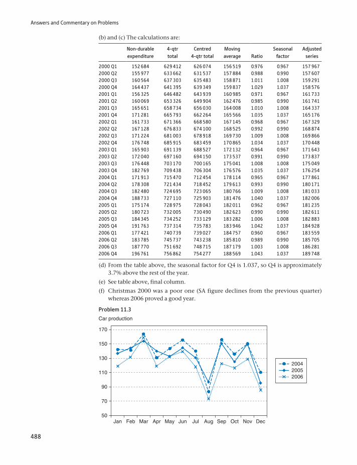
Answers and Commentary on Problems
488
(b) and (c) The calculations are:
Non-durable expenditure
4-qtr total
Centred 4-qtr total
Moving average
Ratio
Seasonal factor
Adjusted series
2000 Q1 152 684 629 412 626 074 156 519 0.976 0.967 157 9672000 Q2 155 977 633 662 631 537 157 884 0.988 0.990 157 6072000 Q3 160 564 637 303 635 483 158 871 1.011 1.008 159 2912000 Q4 164 437 641 395 639 349 159 837 1.029 1.037 158 5762001 Q1 156 325 646 482 643 939 160 985 0.971 0.967 161 7332001 Q2 160 069 653 326 649 904 162 476 0.985 0.990 161 7412001 Q3 165 651 658 734 656 030 164 008 1.010 1.008 164 3372001 Q4 171 281 665 793 662 264 165 566 1.035 1.037 165 1762002 Q1 161 733 671 366 668 580 167 145 0.968 0.967 167 3292002 Q2 167 128 676 833 674 100 168 525 0.992 0.990 168 8742002 Q3 171 224 681 003 678 918 169 730 1.009 1.008 169 8662002 Q4 176 748 685 915 683 459 170 865 1.034 1.037 170 4482003 Q1 165 903 691 139 688 527 172 132 0.964 0.967 171 6432003 Q2 172 040 697 160 694 150 173 537 0.991 0.990 173 8372003 Q3 176 448 703 170 700 165 175 041 1.008 1.008 175 0492003 Q4 182 769 709 438 706 304 176 576 1.035 1.037 176 2542004 Q1 171 913 715 470 712 454 178 114 0.965 0.967 177 8612004 Q2 178 308 721 434 718 452 179 613 0.993 0.990 180 1712004 Q3 182 480 724 695 723 065 180 766 1.009 1.008 181 0332004 Q4 188 733 727 110 725 903 181 476 1.040 1.037 182 0062005 Q1 175 174 728 975 728 043 182 011 0.962 0.967 181 2352005 Q2 180 723 732 005 730 490 182 623 0.990 0.990 182 6112005 Q3 184 345 734 252 733 129 183 282 1.006 1.008 182 8832005 Q4 191 763 737 314 735 783 183 946 1.042 1.037 184 9282006 Q1 177 421 740 739 739 027 184 757 0.960 0.967 183 5592006 Q2 183 785 745 737 743 238 185 810 0.989 0.990 185 7052006 Q3 187 770 751 692 748 715 187 179 1.003 1.008 186 2812006 Q4 196 761 756 862 754 277 188 569 1.043 1.037 189 748
(d) From the table above, the seasonal factor for Q4 is 1.037, so Q4 is approximately 3.7% above the rest of the year.
(e) See table above, final column.
(f) Christmas 2000 was a poor one (SA figure declines from the previous quarter) whereas 2006 proved a good year.
Problem 11.3
50Jan Feb Mar Apr May Jun Jul Aug Sep Oct Nov Dec
200420052006
70
90
Car production
110
130
150
170
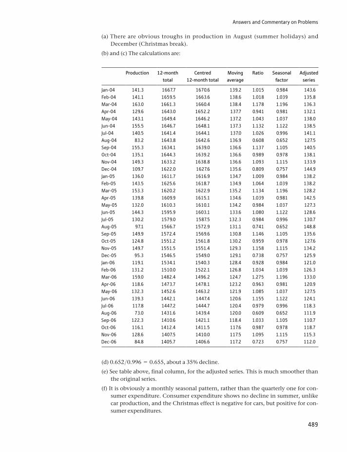
Answers and Commentary on Problems
489
(a) There are obvious troughs in production in August (summer holidays) and December (Christmas break).
(b) and (c) The calculations are:
Production 12-month total
Centred 12-month total
Moving average
Ratio Seasonal factor
Adjusted series
Jan-04 141.3 1667.7 1670.6 139.2 1.015 0.984 143.6Feb-04 141.1 1659.5 1663.6 138.6 1.018 1.039 135.8Mar-04 163.0 1661.3 1660.4 138.4 1.178 1.196 136.3Apr-04 129.6 1643.0 1652.2 137.7 0.941 0.981 132.1May-04 143.1 1649.4 1646.2 137.2 1.043 1.037 138.0Jun-04 155.5 1646.7 1648.1 137.3 1.132 1.122 138.5Jul-04 140.5 1641.4 1644.1 137.0 1.026 0.996 141.1Aug-04 83.2 1643.8 1642.6 136.9 0.608 0.652 127.5Sep-04 155.3 1634.1 1639.0 136.6 1.137 1.105 140.5Oct-04 135.1 1644.3 1639.2 136.6 0.989 0.978 138.1Nov-04 149.3 1633.2 1638.8 136.6 1.093 1.115 133.9Dec-04 109.7 1622.0 1627.6 135.6 0.809 0.757 144.9Jan-05 136.0 1611.7 1616.9 134.7 1.009 0.984 138.2Feb-05 143.5 1625.6 1618.7 134.9 1.064 1.039 138.2Mar-05 153.3 1620.2 1622.9 135.2 1.134 1.196 128.2Apr-05 139.8 1609.9 1615.1 134.6 1.039 0.981 142.5May-05 132.0 1610.3 1610.1 134.2 0.984 1.037 127.3Jun-05 144.3 1595.9 1603.1 133.6 1.080 1.122 128.6Jul-05 130.2 1579.0 1587.5 132.3 0.984 0.996 130.7Aug-05 97.1 1566.7 1572.9 131.1 0.741 0.652 148.8Sep-05 149.9 1572.4 1569.6 130.8 1.146 1.105 135.6Oct-05 124.8 1551.2 1561.8 130.2 0.959 0.978 127.6Nov-05 149.7 1551.5 1551.4 129.3 1.158 1.115 134.2Dec-05 95.3 1546.5 1549.0 129.1 0.738 0.757 125.9Jan-06 119.1 1534.1 1540.3 128.4 0.928 0.984 121.0Feb-06 131.2 1510.0 1522.1 126.8 1.034 1.039 126.3Mar-06 159.0 1482.4 1496.2 124.7 1.275 1.196 133.0Apr-06 118.6 1473.7 1478.1 123.2 0.963 0.981 120.9May-06 132.3 1452.6 1463.2 121.9 1.085 1.037 127.5Jun-06 139.3 1442.1 1447.4 120.6 1.155 1.122 124.1Jul-06 117.8 1447.2 1444.7 120.4 0.979 0.996 118.3Aug-06 73.0 1431.6 1439.4 120.0 0.609 0.652 111.9Sep-06 122.3 1410.6 1421.1 118.4 1.033 1.105 110.7Oct-06 116.1 1412.4 1411.5 117.6 0.987 0.978 118.7Nov-06 128.6 1407.5 1410.0 117.5 1.095 1.115 115.3Dec-06 84.8 1405.7 1406.6 117.2 0.723 0.757 112.0
(d) 0.652>0.996 = 0.655, about a 35% decline.
(e) See table above, final column, for the adjusted series. This is much smoother than the original series.
(f) It is obviously a monthly seasonal pattern, rather than the quarterly one for con-sumer expenditure. Consumer expenditure shows no decline in summer, unlike car production, and the Christmas effect is negative for cars, but positive for con-sumer expenditures.
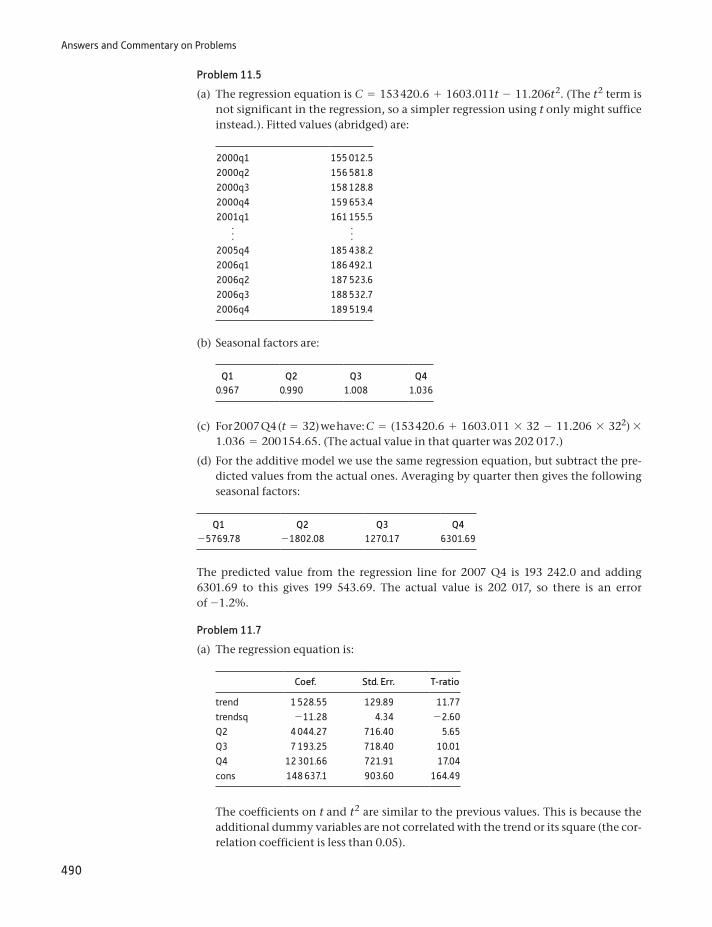
Answers and Commentary on Problems
490
Problem 11.5
(a) The regression equation is C = 153 420.6 + 1603.011t - 11.206t2. (The t2 term is not significant in the regression, so a simpler regression using t only might suffice instead.). Fitted values (abridged) are:
2000q1 155 012.52000q2 156 581.82000q3 158 128.82000q4 159 653.42001q1 161 155.5f f
2005q4 185 438.22006q1 186 492.12006q2 187 523.62006q3 188 532.72006q4 189 519.4
(b) Seasonal factors are:
Q1 Q2 Q3 Q40.967 0.990 1.008 1.036
(c) For 2007 Q4 (t = 32) we have: C = (153 420.6 + 1603.011 * 32 - 11.206 * 322) * 1.036 = 200 154.65. (The actual value in that quarter was 202 017.)
(d) For the additive model we use the same regression equation, but subtract the pre-dicted values from the actual ones. Averaging by quarter then gives the following seasonal factors:
Q1 Q2 Q3 Q4-5769.78 -1802.08 1270.17 6301.69
The predicted value from the regression line for 2007 Q4 is 193 242.0 and adding 6301.69 to this gives 199 543.69. The actual value is 202 017, so there is an error of -1.2%.
Problem 11.7
(a) The regression equation is:
Coef. Std. Err. T-ratio
trend 1 528.55 129.89 11.77trendsq -11.28 4.34 -2.60Q2 4 044.27 716.40 5.65Q3 7 193.25 718.40 10.01Q4 12 301.66 721.91 17.04cons 148 637.1 903.60 164.49
The coefficients on t and t2 are similar to the previous values. This is because the additional dummy variables are not correlated with the trend or its square (the cor-relation coefficient is less than 0.05).
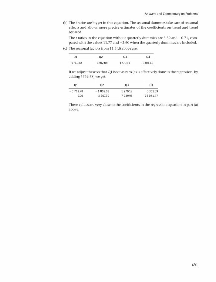
Answers and Commentary on Problems
491
(b) The t ratios are bigger in this equation. The seasonal dummies take care of seasonal effects and allows more precise estimates of the coefficients on trend and trend squared.
The t ratios in the equation without quarterly dummies are 3.39 and -0.71, com-pared with the values 11.77 and -2.60 when the quarterly dummies are included.
(c) The seasonal factors from 11.5(d) above are:
Q1 Q2 Q3 Q4
-5769.78 -1802.08 1270.17 6301.69
If we adjust these so that Q1 is set as zero (as is effectively done in the regression, by adding 5769.78) we get:
Q1 Q2 Q3 Q4
-5 769.78 -1 802.08 1 270.17 6 301.690.00 3 967.70 7 039.95 12 071.47
These values are very close to the coefficients in the regression equation in part (a) above.
492
Index
absolute dispersion 42actual values, expected values comparison with
234–8addition rule 100–2additive model 423adjusted R2 289AIDS 22alternative hypothesis 196–7, 200, 202analysis of variance (ANOVA) 245, 248–54
one-way 248analysis of variance table 252–4area graph 55arithmetic mean (average) 27–9, 35, 60autocorrelation 284–5, 327–30
checking 328–30consequences of 330negative 329positive 328
average (arithmetic mean) 27–9, 35, 60average growth rate 58–9, 61axiomatic approach 96
bar charts 10–14base year 378base-year weights 378–81Bayes’ theorem 110–12Bayesian statistics 96, 110between sum of squares 250, 251, 445bias 166–7
and precision, trade-off between 169–70Bill Gates effect 169–70Bill Goffe’s Resources for Economists 354Binomial distribution 129–30, 131–7, 444
mean and variance of 135–7and Normal distribution, relationship
between 151–2parameters 132–4
birth rate in developing countries 265–93correlation 267–76inference in regression model 283–93regression analysis 276–82
bivariate data, graphing 63–5box and whiskers diagram 47–8branded goods 208
calendar effects 433cash terms 390causality, correlation and 271–2Central Limit Theorem 149–50chain index 392–3‘chart junk’ 56Chebyshev’s inequality 44–5, 443checking data 354–5chi-squared (x2) distribution 231–45
actual values vs. expected values 234–8constructing expected values 242–3contingency tables 241tables of 261, 453–4test statistic, calculation of 243–5variance, estimation of 232–4
Chow test 325–7, 448class intervals 17class widths 17, 18–20classical statistics 110cluster sampling 358, 362coefficient of determination (R2)
281–2, 332, 446adjusted 289testing significance of 287–8
coefficient of rank correlation 272–6coefficient of skewness 45–6, 443coefficient of variation 42, 442cohabitation 244–5column percentages 13combinations 108–9combinatorial formula 108, 444common logarithms 92complement, of outcome 98composite hypothesis 202compound event 100compound growth 59compound hypotheses 332–4
492
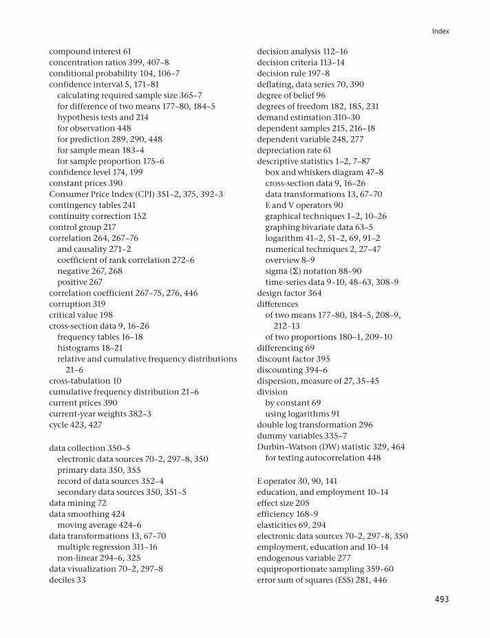
Index
493
decision analysis 112–16decision criteria 113–14decision rule 197–8deflating, data series 70, 390degree of belief 96degrees of freedom 182, 185, 231demand estimation 310–30dependent samples 215, 216–18dependent variable 248, 277depreciation rate 61descriptive statistics 1–2, 7–87
box and whiskers diagram 47–8cross-section data 9, 16–26data transformations 13, 67–70E and V operators 90graphical techniques 1–2, 10–26graphing bivariate data 63–5logarithm 41–2, 51–2, 69, 91–2numerical techniques 2, 27–47overview 8–9sigma (π) notation 88–90time-series data 9–10, 48–63, 308–9
design factor 364differences
of two means 177–80, 184–5, 208–9, 212–13
of two proportions 180–1, 209–10differencing 69discount factor 395discounting 394–6dispersion, measure of 27, 35–45division
by constant 69using logarithms 91
double log transformation 296dummy variables 335–7Durbin–Watson (DW) statistic 329, 464
for testing autocorrelation 448
E operator 30, 90, 141education, and employment 10–14effect size 205efficiency 168–9elasticities 69, 294electronic data sources 70–2, 297–8, 350employment, education and 10–14endogenous variable 277equiproportionate sampling 359–60error sum of squares (ESS) 281, 446
compound interest 61concentration ratios 399, 407–8conditional probability 104, 106–7confidence interval 5, 171–81
calculating required sample size 365–7for difference of two means 177–80, 184–5hypothesis tests and 214for observation 448for prediction 289, 290, 448for sample mean 183–4for sample proportion 175–6
confidence level 174, 199constant prices 390Consumer Price Index (CPI) 351–2, 375, 392–3contingency tables 241continuity correction 152control group 217correlation 264, 267–76
and causality 271–2coefficient of rank correlation 272–6negative 267, 268positive 267
correlation coefficient 267–75, 276, 446corruption 319critical value 198cross-section data 9, 16–26
frequency tables 16–18histograms 18–21relative and cumulative frequency distributions
21–6cross-tabulation 10cumulative frequency distribution 21–6current prices 390current-year weights 382–3cycle 423, 427
data collection 350–5electronic data sources 70–2, 297–8, 350primary data 350, 355record of data sources 352–4secondary data sources 350, 351–5
data mining 72data smoothing 424
moving average 424–6data transformations 13, 67–70
multiple regression 311–16non-linear 294–6, 325
data visualization 70–2, 297–8deciles 33
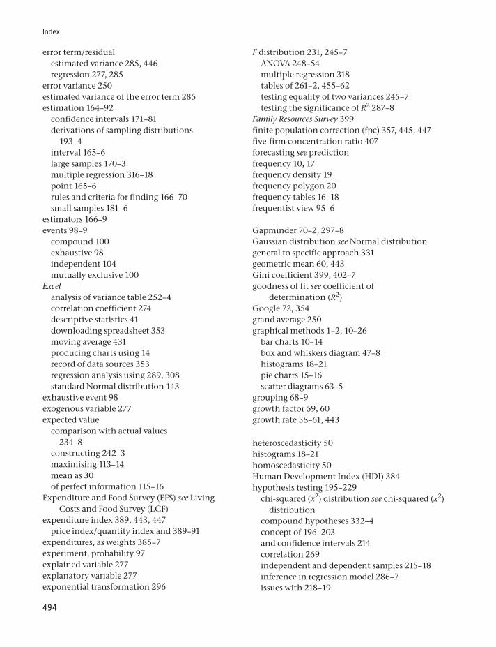
Index
494
F distribution 231, 245–7ANOVA 248–54multiple regression 318tables of 261–2, 455–62testing equality of two variances 245–7testing the significance of R2 287–8
Family Resources Survey 399finite population correction (fpc) 357, 445, 447five-firm concentration ratio 407forecasting see predictionfrequency 10, 17frequency density 19frequency polygon 20frequency tables 16–18frequentist view 95–6
Gapminder 70–2, 297–8Gaussian distribution see Normal distributiongeneral to specific approach 331geometric mean 60, 443Gini coefficient 399, 402–7goodness of fit see coefficient of
determination (R2)Google 72, 354grand average 250graphical methods 1–2, 10–26
bar charts 10–14box and whiskers diagram 47–8histograms 18–21pie charts 15–16scatter diagrams 63–5
grouping 68–9growth factor 59, 60growth rate 58–61, 443
heteroscedasticity 50histograms 18–21homoscedasticity 50Human Development Index (HDI) 384hypothesis testing 195–229
chi-squared (x2) distribution see chi-squared (x2) distribution
compound hypotheses 332–4concept of 196–203and confidence intervals 214correlation 269independent and dependent samples 215–18inference in regression model 286–7issues with 218–19
error term/residualestimated variance 285, 446regression 277, 285
error variance 250estimated variance of the error term 285estimation 164–92
confidence intervals 171–81derivations of sampling distributions
193–4interval 165–6large samples 170–3multiple regression 316–18point 165–6rules and criteria for finding 166–70small samples 181–6
estimators 166–9events 98–9
compound 100exhaustive 98independent 104mutually exclusive 100
Excelanalysis of variance table 252–4correlation coefficient 274descriptive statistics 41downloading spreadsheet 353moving average 431producing charts using 14record of data sources 353regression analysis using 289, 308standard Normal distribution 143
exhaustive event 98exogenous variable 277expected value
comparison with actual values 234–8
constructing 242–3maximising 113–14mean as 30of perfect information 115–16
Expenditure and Food Survey (EFS) see Living Costs and Food Survey (LCF)
expenditure index 389, 443, 447price index/quantity index and 389–91
expenditures, as weights 385–7experiment, probability 97explained variable 277explanatory variable 277exponential transformation 296
Index
495
intercept 278, 446interpretation of 280variance of 446
interest rate, real 397–8internal rate of return (IRR) 396–7intersection, of sets 101interval estimates 165–6interviewing techniques 355–6, 371investment, corruption and 319investment expenditures 9–10, 48–63
joint probabilities 107
large samples, estimation with 170–3Laspeyres price index 378–81, 443, 447
based on expenditure shares 385–6chain index 392–3expenditure share form of 419Paasche index vs. 383, 386–7
Laspeyres quantity index 387–8, 443, 447least squares method 279, 283likelihoods 111Living Costs and Food Survey (LCF) 370–1location, measure of 27–35logarithm 69, 91–2
investment expenditures 51–2multiple regression 320–2standard deviation of 43–4
Lorenz curve 399–402
maintained hypothesis see null hypothesismarginal probabilities 107matched samples see paired samplesmaximax criterion 114–15maximin criterion 114–15Mayor of London’s Datastore 72mean
arithmetic 27–9, 35, 60of Binomial distribution 135–7estimating difference between 177–80, 184–5,
208–9, 212–13as expected value 30geometric 60, 443population 30, 442sample 30, 145–51, 442of time series 58–9
mean squared error 168–9measurement error 337–8measurement problems 294
multiple regression 318Prob-value 203–4, 288proportion testing 207–8validity of test procedures 213result of 252significance, effect size and power 204–7with small samples 211–13testing difference of two means 208–9,
212–13testing difference of two proportions 209–10
IMF World Economic Database 354imports into United Kingdom 310–30
data 311data transformations 311–16errors, analysis of 327–30estimation 316–18forecasts, testing accuracy of 325–7satisfactory results 319–20significance of regression as whole 318–19theoretical issues 310–11
independencemultiplication rule and 104–5of units of measurement 42
independent events 104independent samples 215–16independent variable 248, 277index numbers
consumer price index 351–2, 375, 393–4
defined 375discounting 394–6expenditure index see expenditure indexexpenditure weights 385–7inequality indices 399–407price index 46, 377–85quantity index 387–9retail price index 351–2, 375simple 376–7
inequality indices 399–407concentration ratios 407–8Gini coefficient 399, 402–7Lorenz curve 399–402
inference 1, 2, 165probability theory and 94in regression model 283–93
inflation 46Zimbabwe 68
inter-quartile range 36–7

Index
496
Office of National Statistics (ONS) 48, 353, 354oil reserves 148–9omitted variable bias (OVB) 331, 334–5one-tail test 199–201, 204, 262one-way analysis of variance 248online data 353
sources of 70–2, 297–8, 350operators 100
E 30, 90, 141V 90, 141
ordinal scale 9ordinary least squares (OLS) 279, 283outcomes, of experiment 97outliers 47, 51
Paasche price index 382–3, 443, 447Laspeyres index vs. 383, 386–7
Paasche quantity index 388–9, 443, 447paired samples 215, 216–18parameters, of distribution 130
Binomial distribution 132–4Normal distribution 138–9
Pearson’s product-moment correlation coefficient 273
Penn World Tables 354percentage 13, 49percentiles 33perfect information
defined 115expected value of 116
permutations 108–9pie charts 15–16point estimate 165–6Poisson distribution 153–5pooled variance 185population mean 30, 442population variance 39, 40, 442positive autocorrelation 328positive correlation 267positively skewed 45posterior beliefs 96posterior probabilities 111power, of test 205powers 91–2precision 166, 167–8
bias and, trade-off between 169–70prediction 289–93prediction interval 290present value 113, 395, 444, 447
median 32–3, 34, 442Microsoft Excel see Excelmid-point 28minimax regret criterion 114–15modal class interval 20mode 34–5model selection 330–8moving averages 424–6multi-stage sampling 358, 363, 370multi-tasking 210–11multicollinearity 337multiple bar chart 11–12multiple regression 307–48
determinants of imports into United Kingdom 308, 310–30
finding right model 330–8principles of 309–10
multiple time-series graph 53–6multiplication
by constant 69using logarithms 91
multiplication rule 102combining addition rule and 106–7
multiplicative model 423mutually exclusive 97mutually exclusive events 100
natural logarithms 92negative autocorrelation 329negative correlation 267, 268net present value (NPV) 395, 444, 44795% confidence interval 171–81, 444nominal scale 9non-linear 49non-linear transformation 294–6, 325non-parametric statistics 272non-rejection region 198Normal distribution 129–30, 137–45, 444
and Binomial distribution, relationship between 151–2
parameters 138–9of sample mean 145–51standard 140, 451
null hypothesis 196, 200, 202, 204
numerical techniques 2, 27–47measure of dispersion 27, 35–45measure of location 27–35measure of skewness 27, 45–6
Index
497
R2 see coefficient of determinationrailway accidents 155random component 423random elements 422random number tables 368, 449–50random residual 434random sampling 356–65
cluster sampling 358, 362multi-stage sampling 358, 363, 370quota sampling 358, 364–5simple 357, 358stratified sampling 357, 358–61, 370
random variables 129, 130–1range 36–7rank correlation coefficient 272–6ratio scale 9, 16real interest rate 390, 397–8real terms 390
transforming to 313reciprocal transformation 69, 296record of data sources 353reference tables 73reference year 376regression analysis 264, 276–82
analysis of errors 283–5confidence interval estimates 285–6, 446F test 287–8hypothesis testing for coefficients 286–7inference in regression model 283–93interpreting computer output 288–9measurement problems 294multiple see multiple regressionnon-linear transformations 294–6prediction 289–93units of measurement 293–4
regression line 277–82calculation 278–9interpretation of slope and intercept
279–80measuring goodness of fit 280–2
regression plane 309–10regression sum of squares (RSS) 281, 446rejection region 198, 232, 234relative dispersion 42relative frequency distribution 21–6residual see error term/residualresponse variable 248retail price index (RPI) 351–2, 375road accidents 237–40
presentation tables 73price index 46, 377–85
CPI 351–2, 375, 393–4current-year weights 378–81expenditure weights 385–7Laspeyres index see Laspeyres price indexPaasche index 382–3, 386–7, 443, 447quantity index/expenditure index and 389–91RPI 351–2, 375units of measurement 383–5
primary data 350, 355prior beliefs 96prior information 201prior probability 111Prob-value 203–4, 288probability distributions 128–63
Binomial distribution 129–30, 131–7, 151–2defined 129Normal distribution 129–30, 137–45, 151–2Poisson distribution 153–5random variables 129, 130–1sample mean distribution 145–51
probability interval 150–1probability/probability theory 93–127
Bayes’ theorem 110–12building blocks 97–8conditional 104, 106–7decision analysis 112–16defined 94–6frequentist view 95–6joint 107marginal 107of outcome 97–8posterior 111prior 111statistical inference 94subjective view 96
proportion 13–14, 49, 95estimating 175–6, 180–1, 186,
209–10testing 207–8
quantiles 33quantity index 387–9
price index/expenditure indiex and 389–91quantity series 390quartiles 33quintiles 33quota sampling 358, 364–5

Index
498
estimation 181–6hypothesis testing with 211–13
smoothing data 424moving average 424–6
Spearman’s coefficient of rank correlation 273, 445, 462
specific to general approach 331spreadsheet packages 308
see also Excelspurious regression 330stacked bar chart 12standard deviation 38–9
alternative formulae for calculating 40–1of logarithm 43–4sample 39
standard errors 147, 285, 289standard Normal distribution 140, 451standard width 17states of the world 112statistical inference see inferencestatistical reports 72–5
graphs in 74tables in 73–4writing 73
statistical significance 204–5strata 359stratification factor 360stratified sampling 357, 358–61, 370student distribution see t distributionsubjective view 96sums of squares 250–2surveys
Family Resources Survey 399interviewing techniques 355–6Living Costs and Food Survey 370–1telephone 369UK Time Use Survey 363–4
systematic components 422
t distribution 285estimation with small samples 181–6percentage points of 452test for paired examples 216–18testing difference of two means 212–13
teenage weapons 134–5telephone surveys 369test statistic 445, 448
calculation of 243–5correlation 269
roots 91–2rounding 68
sample mean 30, 442estimating difference between 177–80, 184–5,
208–9, 212–13estimation for large sample 170–3estimation for small sample 183–5hypothesis testing 196–203, 211–13sampling distribution of 145–51
sample space 97, 101sample variance 39, 40, 442sampling 356–70
collecting sample 367–70methods 358–65from non-Normal population 149–51random 356–65sample size calculation 365–7
sampling distributions 145–51, 176, 178derivation of 193–4
sampling errors 371sampling frame 367, 368, 370–1scatter diagrams 2–3, 63–5, 314–15seasonal adjustment, time-series data 421–35
components of time series 421–32forecasting 432–3using adjusted or unadjusted data 434
seasonal component 423seasonal dummy variables 335–7seasonal factors 424seasonally adjust 424secondary data sources 350, 351–5
checking data 354–5collecting right data 351–2up-to-date figures 352
semi-log transformation 296serial correlation 50sigma (π) notation 88–90significance level 198
choice of 202–3simple random sampling 357, 358simultaneous equation model 310skewness 20
coefficient of 45–6, 443defined 45measures of 27, 45–6
slope of regression line 446interpretation of 279–80
small samples

Index
499
value index see expenditure indexvariance 4, 37–8, 90
alternative formulae for calculating 40–1of Binomial distribution 135–7error 250of error term 446estimation with x2 distribution 232–4of intercept 446pooled 185population 39, 40, 442sample 39, 40, 442of slope coefficient 446testing equality of two 245–7of time series 62–3
variance ratio test 246Venn diagram 101, 102volume series 390volume terms 390
wage-price spiral 272wealth distribution 9, 16–64
comparison of 2005 and 1979 distributions 46–7
frequency tables and charts 16–18histograms 18–21measure of dispersion 27measure of location 27–35measure of skewness 27, 45–6relative and cumulative frequency
distributions 21–6weighted average 30–1, 365Wilcoxon’s Sign Test 229within sum of squares 250, 251–2, 445World Bank 319, 354World Economic Database 354
XY charts (scatter diagrams) 2–3, 63–5, 314–15
Yahoo Finance 72
z score 44, 140–1, 443, 444zero correlation 267
difference of two means 209proportion testing 207–8sample mean 199, 212
testing hypotheses 165time preference 394time series, components of 421–32time-series data 9–10, 48–63, 308–9
geometric mean 60mean 58–9seasonal adjustment of see seasonal adjustment,
time-series datavariance 62–3
time-series graph 49, 50multiple 53–6
time trends 336Todaro, M. 265–6total sum of squares (TSS) 281, 446
ANOVA 250, 445tree diagrams 103trend 49, 336, 423
isolating 424–6trial 97two-tail tests 199–201, 204, 261Type I and Type II errors 197, 198, 202–3
UK Living Costs and Food Survey 370–1UK Time Use Survey 363–4unbiased estimate, of population variance 39unbiased estimator 166unemployment
forecasting 432–3seasonal adjustment of time-series
data 421–32uniform distribution 234union, of sets 101units of measurement
independence of 42price index 383–5regression coefficients 293–4
V operator 90, 141validity of test procedures 213