si basi s oke - laura worthington
TRANSCRIPT
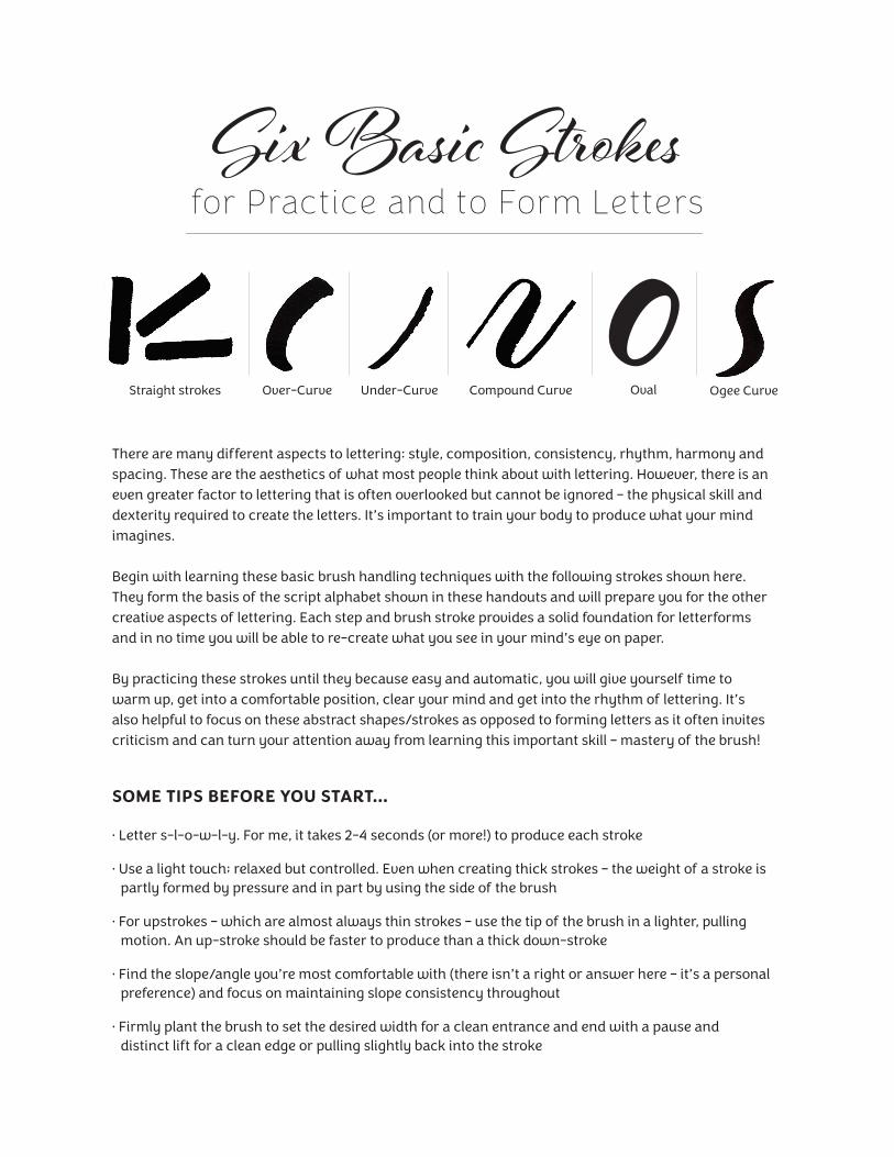
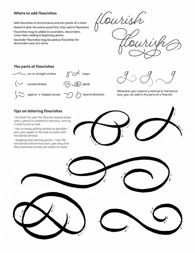
Six Basic S�okes for Practice and to Form Letters
There are many different aspects to lettering: style, composition, consistency, rhythm, harmony and spacing. These are the aesthetics of what most people think about with lettering. However, there is an even greater factor to lettering that is often overlooked but cannot be ignored – the physical skill and dexterity required to create the letters. It’s important to train your body to produce what your mind imagines.
Begin with learning these basic brush handling techniques with the following strokes shown here. They form the basis of the script alphabet shown in these handouts and will prepare you for the other creative aspects of lettering. Each step and brush stroke provides a solid foundation for letterforms and in no time you will be able to re-create what you see in your mind’s eye on paper.
By practicing these strokes until they because easy and automatic, you will give yourself time to warm up, get into a comfortable position, clear your mind and get into the rhythm of lettering. It’s also helpful to focus on these abstract shapes/strokes as opposed to forming letters as it often invites criticism and can turn your attention away from learning this important skill – mastery of the brush!
SOME TIPS BEFORE YOU START…
• Letter s-l-o-w-l-y. For me, it takes 2-4 seconds (or more!) to produce each stroke
• Use a light touch; relaxed but controlled. Even when creating thick strokes – the weight of a stroke is partly formed by pressure and in part by using the side of the brush
• For upstrokes – which are almost always thin strokes – use the tip of the brush in a lighter, pulling motion. An up-stroke should be faster to produce than a thick down-stroke
• Find the slope/angle you’re most comfortable with (there isn’t a right or answer here – it’s a personal preference) and focus on maintaining slope consistency throughout
• Firmly plant the brush to set the desired width for a clean entrance and end with a pause and distinct lift for a clean edge or pulling slightly back into the stroke
Straight strokes Over-Curve Under-Curve Compound Curve Ogee CurveOval
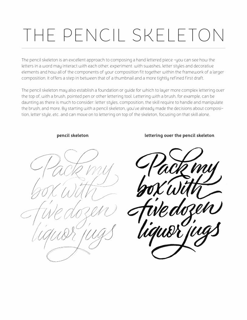
THE PENCIL SKELETONThe pencil skeleton is an excellent approach to composing a hand lettered piece –you can see how the letters in a word may interact with each other, experiment with swashes, letter styles and decorative elements and how all of the components of your composition fit together within the framework of a larger composition. It offers a step in between that of a thumbnail and a more tightly refined first draft.
The pencil skeleton may also establish a foundation or guide for which to layer more complex lettering over the top of, with a brush, pointed pen or other lettering tool. Lettering with a brush, for example, can be daunting as there is much to consider: letter styles, composition, the skill require to handle and manipulate the brush, and more. By starting with a pencil skeleton, you’ve already made the decisions about composi-tion, letter style, etc. and can move on to lettering on top of the skeleton, focusing on that skill alone.
pencil skeleton lettering over the pencil skeleton
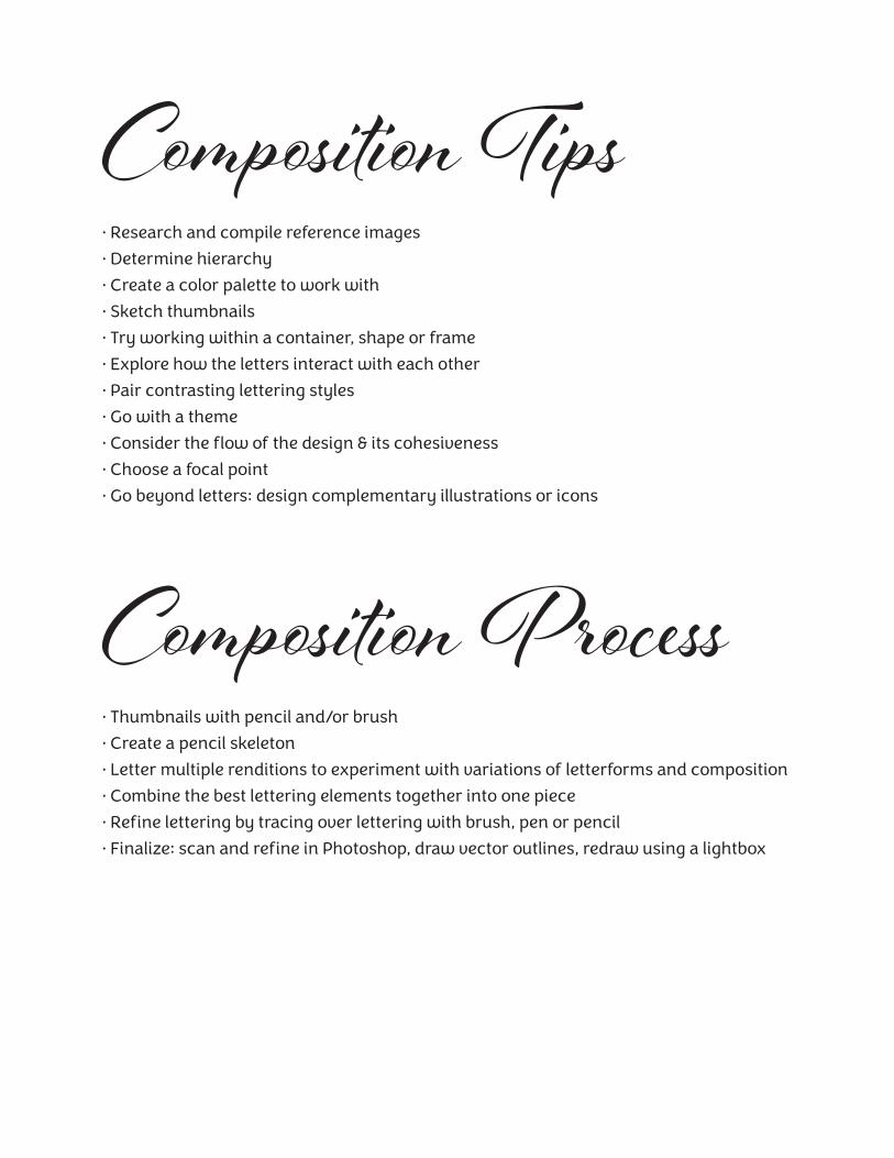
Composition Tips• Research and compile reference images
• Determine hierarchy
• Create a color palette to work with
• Sketch thumbnails
• Try working within a container, shape or frame
• Explore how the letters interact with each other
• Pair contrasting lettering styles
• Go with a theme
• Consider the flow of the design & its cohesiveness
• Choose a focal point
• Go beyond letters: design complementary illustrations or icons
Composition Process• Thumbnails with pencil and/or brush
• Create a pencil skeleton
• Letter multiple renditions to experiment with variations of letterforms and composition
• Combine the best lettering elements together into one piece
• Refine lettering by tracing over lettering with brush, pen or pencil
• Finalize: scan and refine in Photoshop, draw vector outlines, redraw using a lightbox
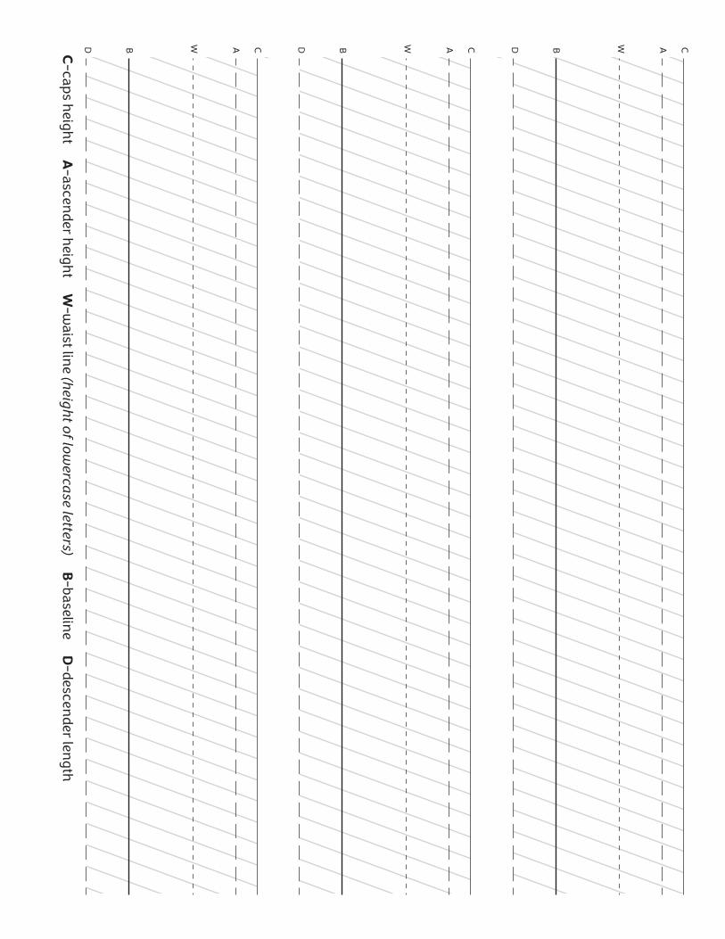
CB W ADCB W ADCB W ADC-caps height A
-ascender height W
-waist lin
e (height of lowercase letters) B
-baseline D
-descender len
gth