sensory experiences in typography
TRANSCRIPT
Typography Day 2014
Typography and Culture
Sensory Experiences in Typography
Meaghan Dee, Virginia Tech, Blacksburg, Virginia, United States,
Cassie Hester, University of West Georgia, Carrollton, Georgia, United States,
Abstract:
Typography does not exist in a vacuum. We are constantly surrounded by textures,
contours, smells, sights, sounds, all simultaneously. For a design to break through the din,
it must engage the senses.
Sight, sound, smell, taste, and touch are all connected. You cannot eat a potato
chip without touching it with your hands and your lips, tongue and teeth. You will also
smell the oil as you taste the salt and hear the crunch. While some examples may be less
multi-modal, your body is always experiencing the world through each of the five senses.
Key words: Typography, Graphic Design, Process, Senses, Touch, Smell, Sound, Taste,
Sight, Visual Communication, and Experimental Typography.
1. Introduction
In the words of Kenya Hara, “Since infancy, we have had a tremendous number of
sensory experiences which have built up interrelations. Our experiences and memories of
licking, touching, smelling the world, through which we have attached meaning to it,
have given us the background for our senses.”1
The five senses are strongly linked to memories. The scent of chalk can evoke
memories of grade school just as well as the sound of chalk rasping against a chalkboard.
As designers, we often neglect many of the senses. But typography is a sensational
experience. We should consider how users interact with designed objects and typographic
forms – and how these experiences relate to all of the senses. Not only is design felt more
deeply when it involves the use of multiple senses, but it also opens doorways to new
creative territories.

Typography is not meant to just been seen. It is meant to be heard, smelled,
tasted, and touched. Type being a visual representation of language makes it inseparable
from sound and verbal communication. Typographic designers also feel type – they create
and modify form as well as interact with both designs and installations. On rarer occasion,
type can be smelled and tasted. We eat type without thinking about it. For instance, when
we eat a candy bar. Does “Hershey’s” taste like chocolate? Can a brand have a flavor?
Does the taste change based on the culture in which it is experienced?
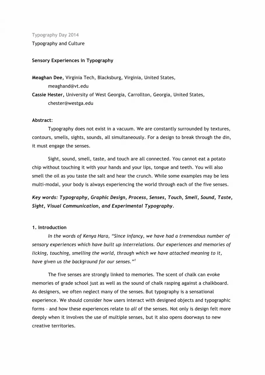
Even the origins of typography are tactile: letterforms being carved into stone and
pressed onto paper. (Figure 1) While the digital age might make us appear to be somewhat
removed from the physical relationships, we still have haptic relationships – they’ve just
evolved to smartphones and touchscreens. The user experience of design is a very personal
one. Typography is an expression of language – and a primary way in which people connect
to one another.
Type itself is very intimate. Text perhaps even more. I make the distinction of type
as “form” and text as the “selected words.” As Paula Scher puts it: “Words have meaning.
Type has spirit. The combination is spectacular.” Because of this deep tie to emotion and
communication, typography is, by definition, expressive. Sometimes type needs to remain
quiet, neutral – have the words spread a message and design be a crystal goblet. Other
times, type needs to communicate a greater meaning. It can scream at you from the page,
or whisper in your ear. And other times you need to find ways beyond visual
representation to reach your audience. Advancements in interactive printing and digital
technologies are giving designers more tools by the day.
2. Body
2.1 Sight
Simply viewing this paper, you are using sight. This is perhaps the most obvious
connection to typography and graphic design, but I would like to take a moment and
explore the other senses as they relate. Particularly because no sense can truly exist in
isolation from the rest – and because experience is heightened when multiple senses are
fully engaged.
When it comes to typography, sight and sound are incredibly closely linked. Type is
the visualization of language. In the words of Robert Bringhurst, “Writing is the solid form
of language, the precipitate. Speech comes out of our mouths, our hands, our eyes in
something like a liquid form and then evaporates at once. It appears to me that this is

part of a natural cycle: one of the ways the weather forms on the ocean of meaning. What
else are the words we drop like pebbles in that ocean if not condensing droplets of
evaporated speech, recycled bits of the ocean of meaning itself? Yet language can also
solidify – into iridescent, sharp, symmetrical crystals, or into structures more like
hailstones or shale beds or mud. In solid as in liquid form, the intersecting meanings may
reinforce each other or rub each other out.”2
2.2 Sound
Humans have found many ways of visually documenting sound. While this is
primarily done through the use of letterforms, much other visualization is also common.
For instance the musical score, perhaps the most literal visualization of sound – as it takes
into consideration the loudness, length, and tone of a sound. Additionally, the universality
of music is quite beautiful.
Yet, words and songs will never be heard the same way twice, because there is
never absolute silence in the background of a performance. In an interview, composer and
artist John cage once said, “Wherever we are, whatever we're doing, there are always
sounds to hear.” Even in recorded music, listeners' radios will be located in thousands of
different places so that, unlike the first performance, the sounds heard by the audience
will be made by many, many different sources.3
Many designers have also focused on the visualization of language. For instance,
Warren Lehrer, in pieces like “French Fries”4 where each character of the book is given an
individual typeface – and the layout of the book is based on dialogue and sound. When the
characters are in a space where there is much background noise and hearing would be
difficult, typographic design and legibility is compromised to reflect the chaos.
Another example of sound being incorporated into a visual design is Cassie Hester’s
installation piece, Dig Deep (Figure 2). You can actually hear the piece, because the
sequins will move in the wind.
While most designers might not take sound quite this literally in their works, they
still show volume through scale and weight. For instance, 72 point heavy Helvetica is much
louder than a quiet 8 point Mrs. Eaves.
Smell, taste, and touch may not connect as directly to typography as do sight and
sound, but I believe that when you engage multiple senses, you more deeply connect to
viewers.
2.3 Smell
Due to technological advancements, certain appliances can actually produce smells
and text simultaneously. For instance, Hammacher Schlemmer’s Armoatheraphy Clock
both displays the time while letting off lavender scents to help the user relax and fall
asleep. Another prototype for a clock had a similar idea, where the clock always emitted a
smell, and the scent changed throughout the day – so the user could tell just from smell,
what time of day it was.5
Printers have options such as scented varnishes that designers can use in mass-
production – although the use of scratch-and-sniff technology seems to be generally
limited to packaging for air fresheners or promotions for children. On my own, I have
played with incorporating smell into my designs. For my ‘wine and appetizers’ wedding
reception invitation, (Figure 3) I printed the information onto napkins and then hand-
stained each invite with wine. Not only did this allow each invitation to be unique, but the
design itself also tapped into the sense of smell.
However, designers are rarely afforded the luxury of having smell be a part of their
work, but they can still evoke emotion based on the memory. For instance, when shown
type that is rotting, viewers have a visceral reaction (Figure 4) – because of previous
experience.
Exhibition designers are fortunate, in that they have the ability to fully control the
environment in which their work is experienced. (Figure 5) This enables them to not only
set viewing height, size, etc – but it also allows the opportunity to control the smell of the
surroundings. While you can invite a viewer to touch or taste something, you cannot force
it. Whereas a smell cannot be avoided.
2.4 Taste
Food makes for a wonderful medium for typographic design. There is an excellent
sense of play, when you take something known (like a sushi roll) and turn it into something
new (like a typographic design). Additionally, American language also has many food
sayings that designers can play off of: easy as pie, eye candy, and piece of cake.
People also have many memories and associations made to food. If you see (or eat)
a certain kind of cookie, it can send you instantly back to a time in your childhood where
you were making cookies with your mother. Therefor, the use of food visuals with
typographic design can enhance meaning. For instance, if someone says “summer” I get a
few random samplings of various summer moments. But, if someone shows me “summer”
carved into a piece of watermelon, (Figure 6) I get specific memories – and I can nearly
taste a sweet, juicy watermelon.

And what’s more fun than playing with your food? Typographically speaking, that
is. The physical properties of food are varied and rich. Incredible textures, colors, and
forms make for an excellent working medium. Additionally, people are familiar with food.
So, when you have a picture of an R covered in a caramelized colorful sugar, (Figure 7)
most people can practically feel the stickiness. Or if you have type literally made from
dough, viewers can remember a taste. Another wonderful property for working with food
as a medium, is that, if cooked, the form can change over time: sugar can caramelize,
dough can turn into pretzels, popcorn kernels can become popped corn.
There is a temporary nature to using food as a medium (it spoils, disintegrates,
evaporates, melts, or is eaten). If you see a design made out of sugar, you do not expect it
to last forever (as you might if you saw a design carved into stone). This fleeting nature
also parallels memory.
2.5 Touch
Technological developments, such as tablets or motion sensors, engage viewers
with designs and are often more interactive. But beyond the delivery mechanisms, touch
(and associated memories) are important design factors.
At some point in their lives, nearly everyone knows what it is like to be cold or hot,
or to burn their hand, or to feel pain. So, if typographic designs incorporate the use of ice
and snow the user automatically thinks of the cold (even if the words do not say so).
(Figure 8) Or, if type appears to be burned, the user thinks of heat and flames. (Figure 9).
And, having all felt pain, when we see damaged skin, we remember those experiences.
Yet, associations to touch do not always have to be so extreme. Type can be rough
or soft and many other possibilities. (Figure 10).
The scale of a typographic design changes how we interact with it – and how we
touch it. For the most part, type is intimate. You rest a book in your lap, or you hold a
phone in your hand. But type can be monumental. A letter can be large enough to be
home to a bird or a miniature golf course (Figure 11).
I also believe that, in a way, all of the senses involve touch. We see because of the
way light hits our eyes. We smell and taste when particles enter our noses and rest on our
tongues. We hear because of the physical vibrations in our ears. In essence, all we
experience connects to how we touch the world and how it touches us.
6. Conclusion: Design for all five senses
As Diane Ackerman puts it, “The mind doesn’t really dwell in the brain but travels
the whole body on caravans of hormone and enzyme, busily making sense of the compound
wonders we catalogue as touch, taste, smell, hearing, vision.”6 As designers and
typographers, we must consider all of the senses.
In Jinsop Lee’s TED Talk: Design for all 5 senses, he examines how various
experiences relate to each of the senses. For instance, riding a motorcycle is a very
engaging activity in that you see many things, feel the bike and road, smell your
surroundings, and hear the roar of the bike. As designers, it should be a goal to consider
each sense in the products we produce.
We hope that when you create designs or typographic treatments, that you will not
just consider the visual – but that you will consider all of the senses as relevant to your
design. When a design engages the senses – it appeals to viewers from multiple angles.
Images
Figure 1: Scarab of Ikhnaton and Nefertiti, c. 1370
Meggs, Philip. (1983) A History of Graphic Design. Van Nostrand Reinhold, New York.

Figure 2: Cassie Hester – Dig Deep Installation
Figure 3: Meaghan Dee – Wedding Reception Invitation

Figure 4: Hara, Kenya. (2004) “Haptic” exhibition. Available at <http://www.ndc.co.jp/hara/works/en/2004/06/haptic.html>
Figure 5: A typographic installation made out of bananas that rotted over time.
Sagmeister, Stefan. (2008) “Deitch projects, banana wall.” Available at
<http://www.sagmeisterwalsh.com/work/project/deitch-projects-banana-wall>
Figure 6: Rambhia, Perin. “365+1 Calendar” Available at <http://www.perinrambhia.com>

Figure 7: The letter R covered in candy.
Dee, Meaghan and Cassie Hester. Typographic experiment.
Figure 8: Dee, Meaghan. Ice experiment.

Figure 9: Hester, Cassie. Branded “W.”
Figure 10: Hara, Kenya. (2004) “Haptic” exhibition. Available at
<http://www.ndc.co.jp/hara/works/en/2004/06/haptic.html>

Figure 11: Willis, Ollie. “Golf Type.” Available at <http://www.olliewillis.co.uk/Golf>
References
Meggs, Philip. (1983) A History of Graphic Design. Van Nostrand Reinhold, New York.
Hara, Kenya. (2004) “Haptic” exhibition. Available at <http://www.ndc.co.jp/hara/works/en/2004/06/haptic.html>
Sagmeister, Stefan. Various Projects. Available at <http://www.sagmeisterwalsh.com>
Rambhia, Perin. “365+1 Calendar” Available at <http://www.perinrambhia.com>
Willis, Ollie. “Golf Type.” Available at <http://www.olliewillis.co.uk/Golf>

1 Hara, Kenya. (2007) Designing Design. 1st edition. Lars Müller Publishers, Baden, Switzerland. p 2. 1 Hara, Kenya. (2007) Designing Design. 1st edition. Lars Müller Publishers, Baden, Switzerland. p 2. 2 Bringhurst, Robert. (2004) The solid form of language. 1st edition. Gaspereau Press, Printers & Publishers, Nova Scotia, Canada. p9.
3 Worby, Robert. (November 3, 2011) “433 words about John Cage's 4'33" - and the first ever radio realization” Available at <http://www.bbc.co.uk>
4 Bernstein, Dennis and Warren Lehrer. (1984) French Fries. Visual Studies Workshop Press and EarSay Books.
5 Lee, Jinsop. (August 2013) “TED Talk: Design for all 5 senses.” Available at <http://www.ted.com/talks/jinsop_lee_design_for_all_5_senses.html>
6 Ackerman, Diane. (1991) A Natural History of the Senses. Random House, New York.