responsive web design - canvas
TRANSCRIPT

Philipp Leitner
Lecture 8Responsive Web Design
1
• Responsive Web Design (RWD)• Techniques, design principles, accessibility, internationalization
• Bootstrap• BootstrapVue
This Lecture
9/23/20 Chalmers 3
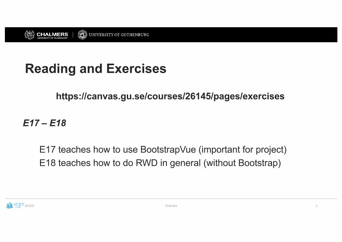
Reading and Exercises
https://canvas.gu.se/courses/26145/pages/exercises
E17 – E18
E17 teaches how to use BootstrapVue (important for project)E18 teaches how to do RWD in general (without Bootstrap)
9/23/20 Chalmers 4
Quick Recap – Frontend Development
9/23/20 Chalmers 5
9/23/20 Chalmers 6
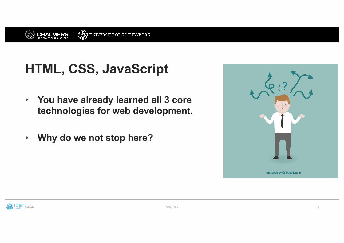
HTML, CSS, JavaScript
• You have already learned all 3 core technologies for web development.
• Why do we not stop here?
9/23/20 Chalmers 7
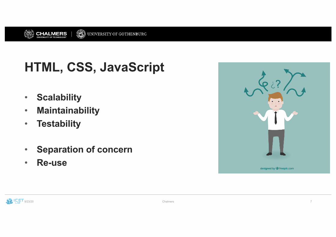
HTML, CSS, JavaScript
• Scalability• Maintainability• Testability
• Separation of concern• Re-use
9/23/20 Chalmers 8
Web (Frontend) Frameworks• Modularisation• Data binding/templates• Separation of concern (MVC, MVVM)
• Benefits:• + Maintainability• + Reusability• + Testability
9/23/20 Chalmers 9
How to build a single web frontend for?
• … different screen sizes (e.g., Web vs. mobile)• … different input methods (e.g., touch vs. mouse)• … different devices (e.g., browser vs. braille display)• … different international audiences
9/23/20 Chalmers 10
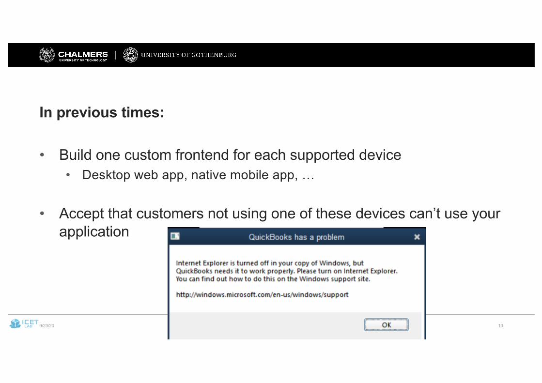
In previous times:
• Build one custom frontend for each supported device• Desktop web app, native mobile app, …
• Accept that customers not using one of these devices can’t use your application
9/23/20 Chalmers 11
This is not acceptable today for many apps:
• Invariably smaller groups of users get ignored• Maintaining multiple frontends is expensive• Locking out specific user groups (e.g., blind users) is seen as
discriminatory• E.g.:
• EU Web Accessibility Directive (2016)• US ”Americans with Disabilities Act” (ADA)
9/23/20 Chalmers 12
Responsive Web Design (RWD)One (Web) frontend which can adapt to different devices
Depending on screen size:• Different pictures• Different orientation (e.g., buttons next or under each other)• Hiding inessential information
… all in one code base
9/23/20 Chalmers 13
Basic RWD Principles
• Plan your UI layout using a grid• Provide different layouts for different groups of users• Use media queries to decide on a layout version
• Essentially: don’t ask what device a user is on, ask how much space there really is
• Use a combination of flexible boxes and breakpoints• Design for mobile first
9/23/20 Chalmers 14
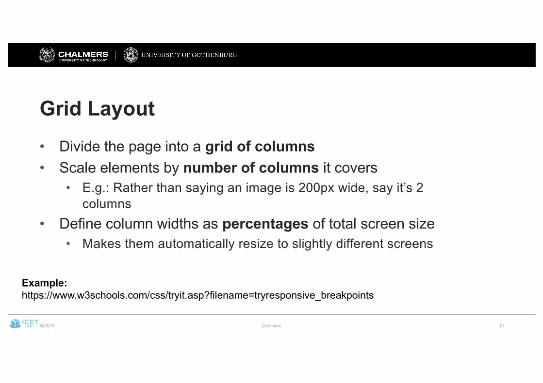
Grid Layout• Divide the page into a grid of columns• Scale elements by number of columns it covers
• E.g.: Rather than saying an image is 200px wide, say it’s 2 columns
• Define column widths as percentages of total screen size• Makes them automatically resize to slightly different screens
Example:https://www.w3schools.com/css/tryit.asp?filename=tryresponsive_breakpoints
9/23/20 Chalmers 15
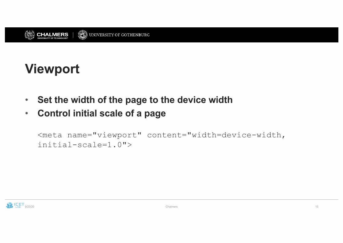
Viewport
• Set the width of the page to the device width• Control initial scale of a page
<meta name="viewport" content="width=device-width, initial-scale=1.0">
9/23/20 Chalmers 16
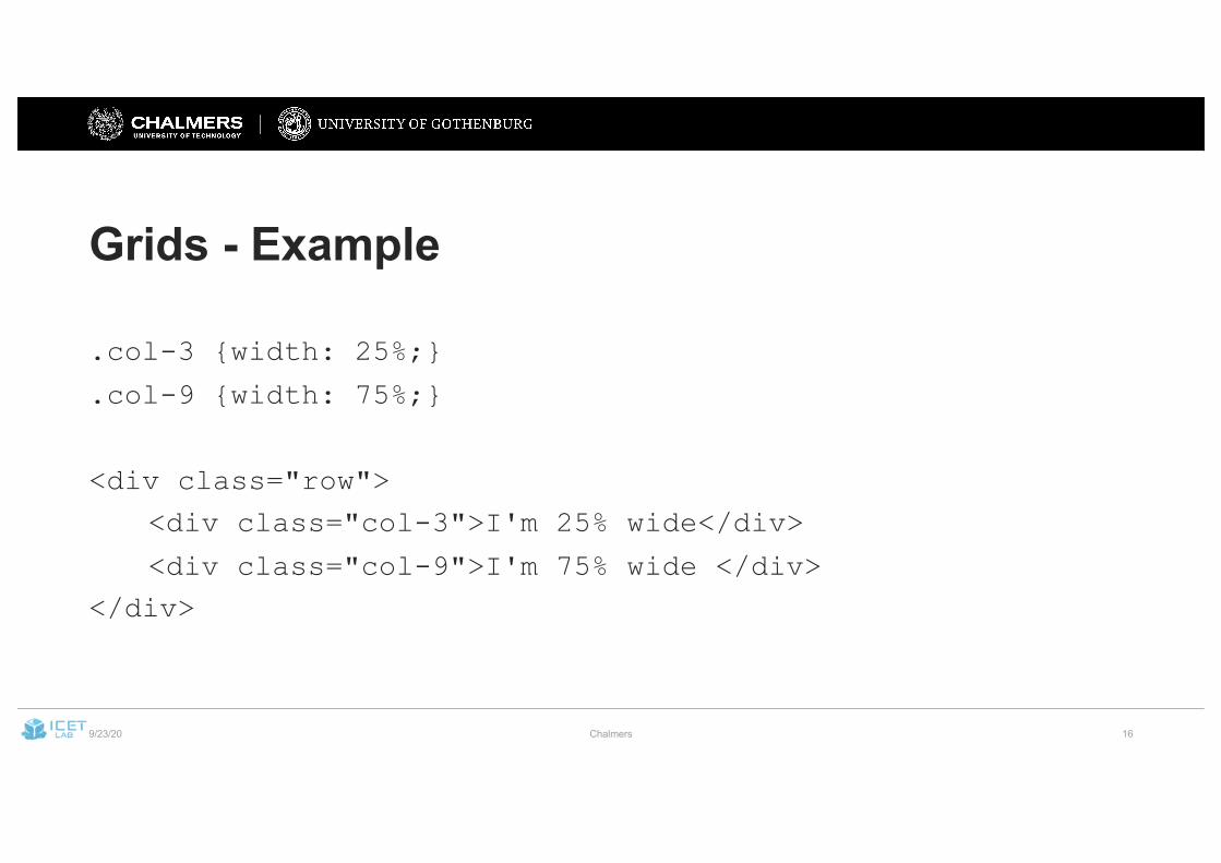
Grids - Example
.col-3 {width: 25%;}
.col-9 {width: 75%;}
<div class="row">
<div class="col-3">I'm 25% wide</div>
<div class="col-9">I'm 75% wide </div>
</div>
9/23/20 Chalmers 17
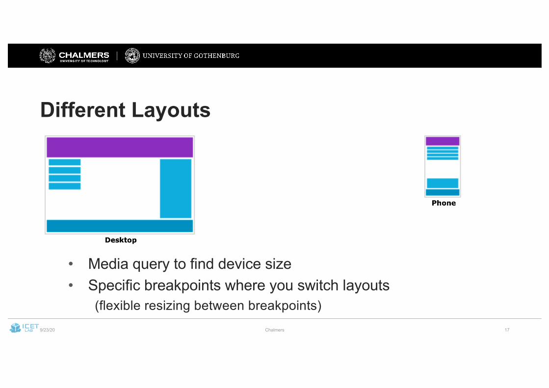
Different Layouts
• Media query to find device size• Specific breakpoints where you switch layouts
(flexible resizing between breakpoints)
9/23/20 Chalmers 18
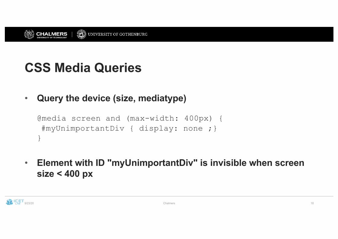
CSS Media Queries
• Query the device (size, mediatype)
@media screen and (max-width: 400px) {#myUnimportantDiv { display: none ;}}
• Element with ID "myUnimportantDiv" is invisible when screen size < 400 px
9/23/20 Chalmers 19
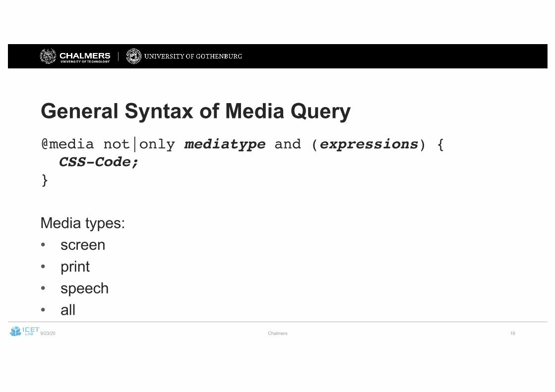
General Syntax of Media Query@media not|only mediatype and (expressions) {CSS-Code;
}
Media types:• screen• print• speech• all
9/23/20 Chalmers 20
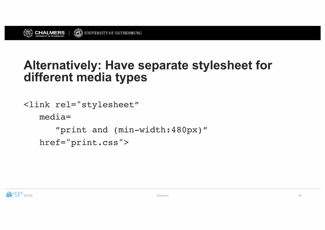
Alternatively: Have separate stylesheet for different media types
<link rel="stylesheet”media=
”print and (min-width:480px)”href="print.css">
9/23/20 Chalmers 21
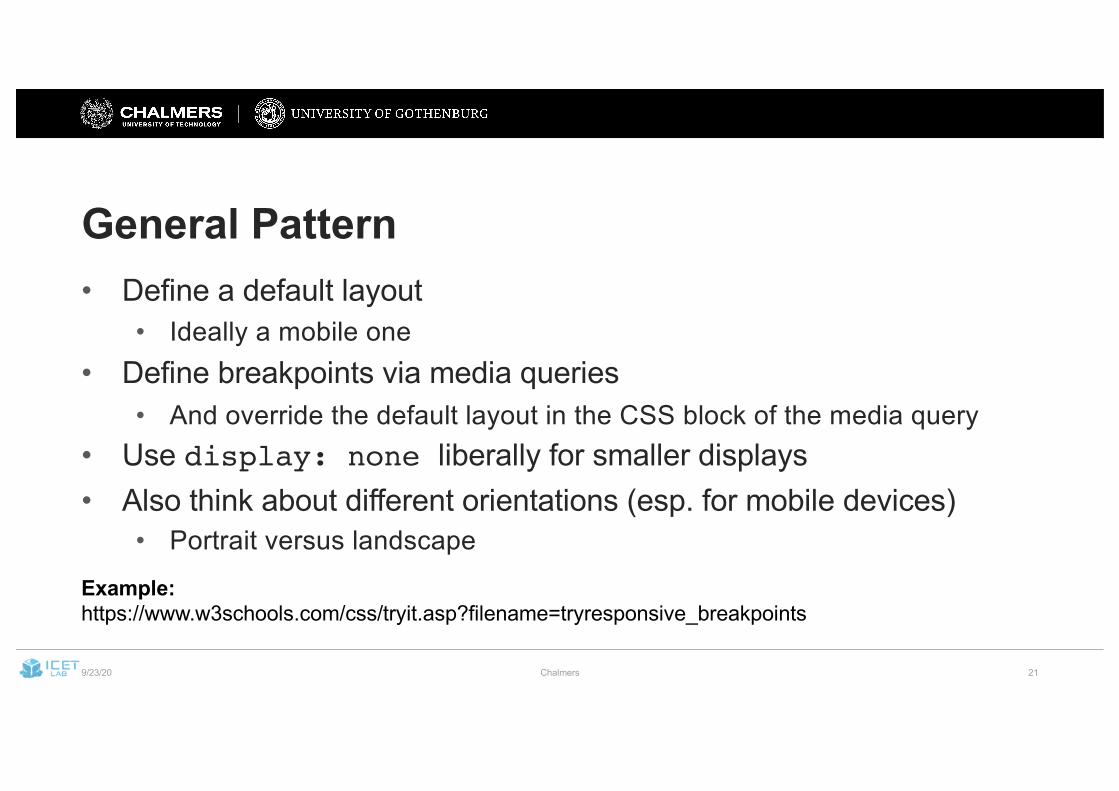
General Pattern• Define a default layout
• Ideally a mobile one• Define breakpoints via media queries
• And override the default layout in the CSS block of the media query• Use display: none liberally for smaller displays• Also think about different orientations (esp. for mobile devices)
• Portrait versus landscape
Example:https://www.w3schools.com/css/tryit.asp?filename=tryresponsive_breakpoints
9/23/20 Chalmers 22
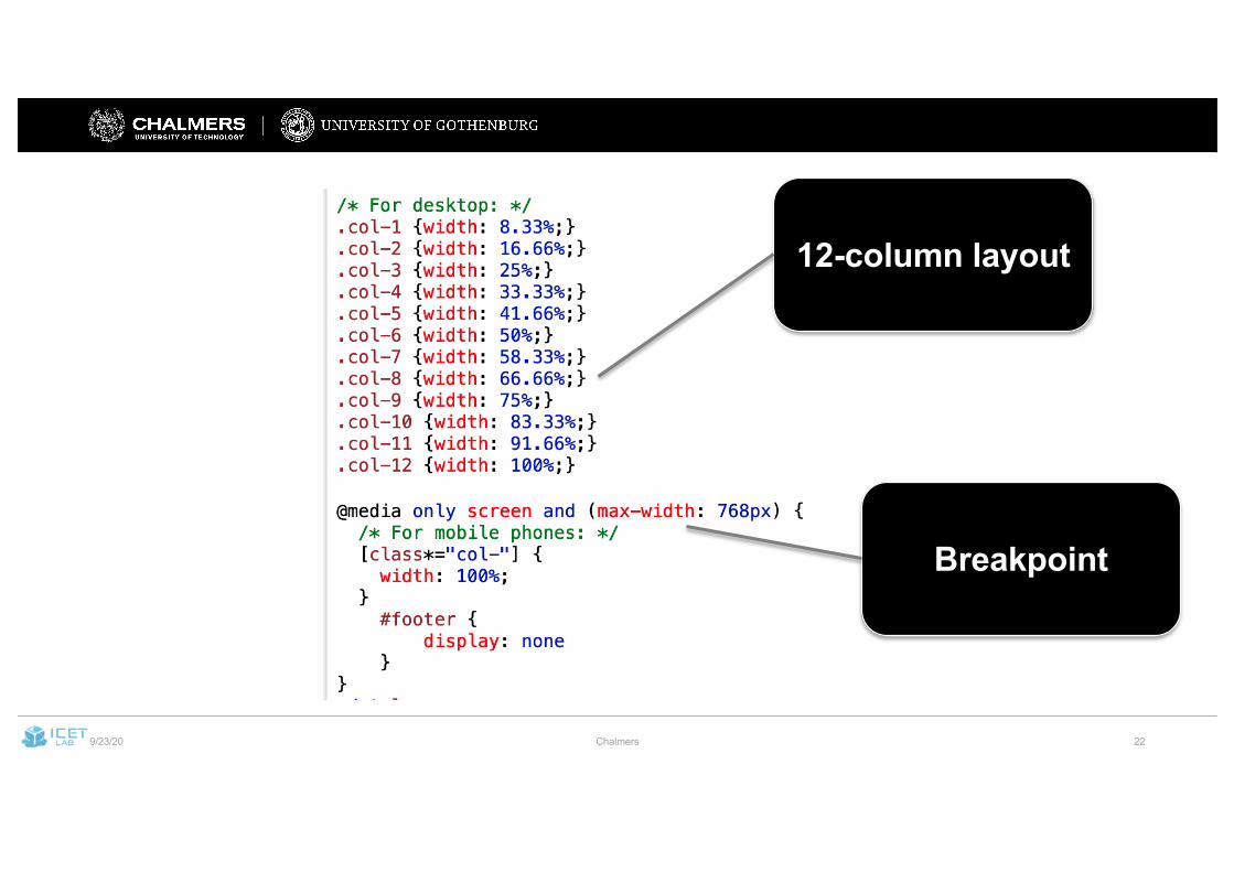
12-column layout
Breakpoint
9/23/20 Chalmers 23
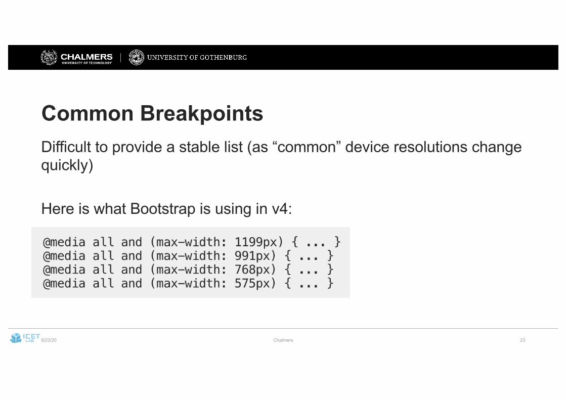
Common BreakpointsDifficult to provide a stable list (as “common” device resolutions change quickly)
Here is what Bootstrap is using in v4:
9/23/20 Chalmers 24
Bootstrap• A framework for RWD• Originally by Twitter
• Uses CSS and JS (for some animations, interactivity)• Defines lots of (combinable) CSS classes• Look & Feel is familiar (many websites use it)
• In the project: BootstrapVue• (don’t use regular Bootstrap components that require Javascript,
interferes with Vue.js virtual DOM)
9/23/20 Chalmers 25
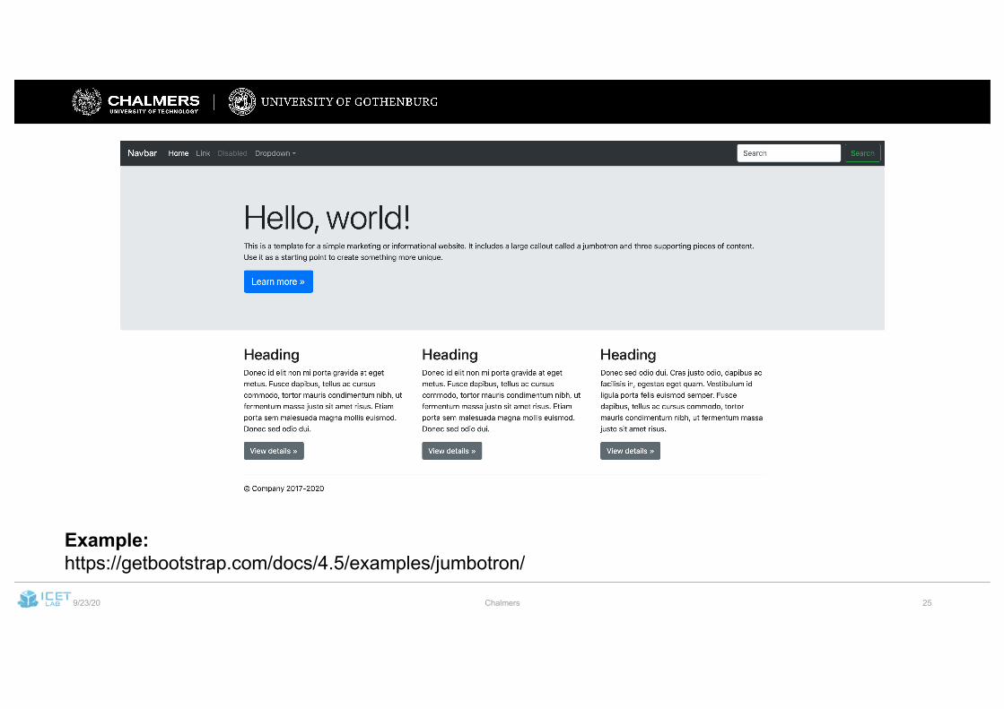
Example:https://getbootstrap.com/docs/4.5/examples/jumbotron/
9/23/20 Chalmers 26
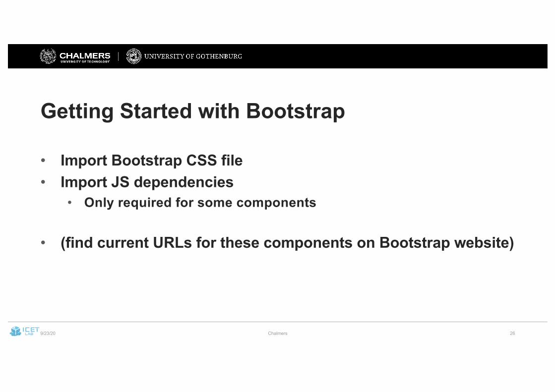
Getting Started with Bootstrap
• Import Bootstrap CSS file• Import JS dependencies
• Only required for some components
• (find current URLs for these components on Bootstrap website)
9/23/20 Chalmers
27
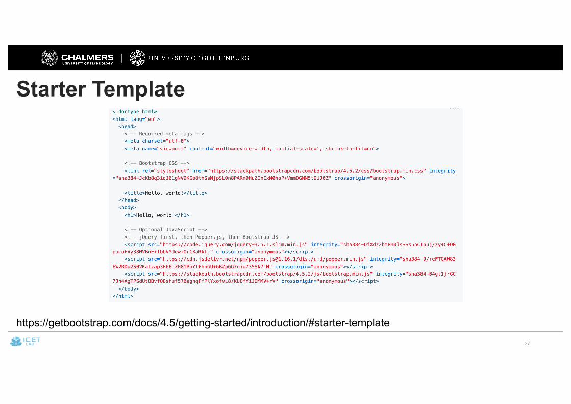
Starter Template
https://getbootstrap.com/docs/4.5/getting-started/introduction/#starter-template
9/23/20 Chalmers 28
Layouting Using Bootstrap
• Bootstrap uses a 12-column grid as basic layout
• Use containers, columns, and rows to define the size of elements
• Containers define max. width of content• Rows and columns are used to arrange content within a container
9/23/20 Chalmers 29
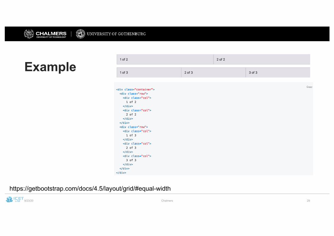
Example
https://getbootstrap.com/docs/4.5/layout/grid/#equal-width
9/23/20 Chalmers 30
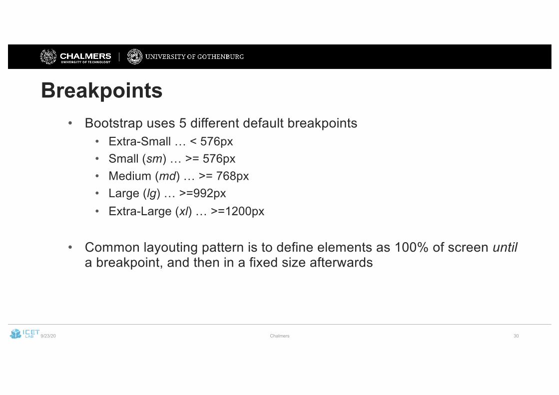
Breakpoints• Bootstrap uses 5 different default breakpoints
• Extra-Small … < 576px• Small (sm) … >= 576px• Medium (md) … >= 768px• Large (lg) … >=992px• Extra-Large (xl) … >=1200px
• Common layouting pattern is to define elements as 100% of screen untila breakpoint, and then in a fixed size afterwards
9/23/20 Chalmers 31
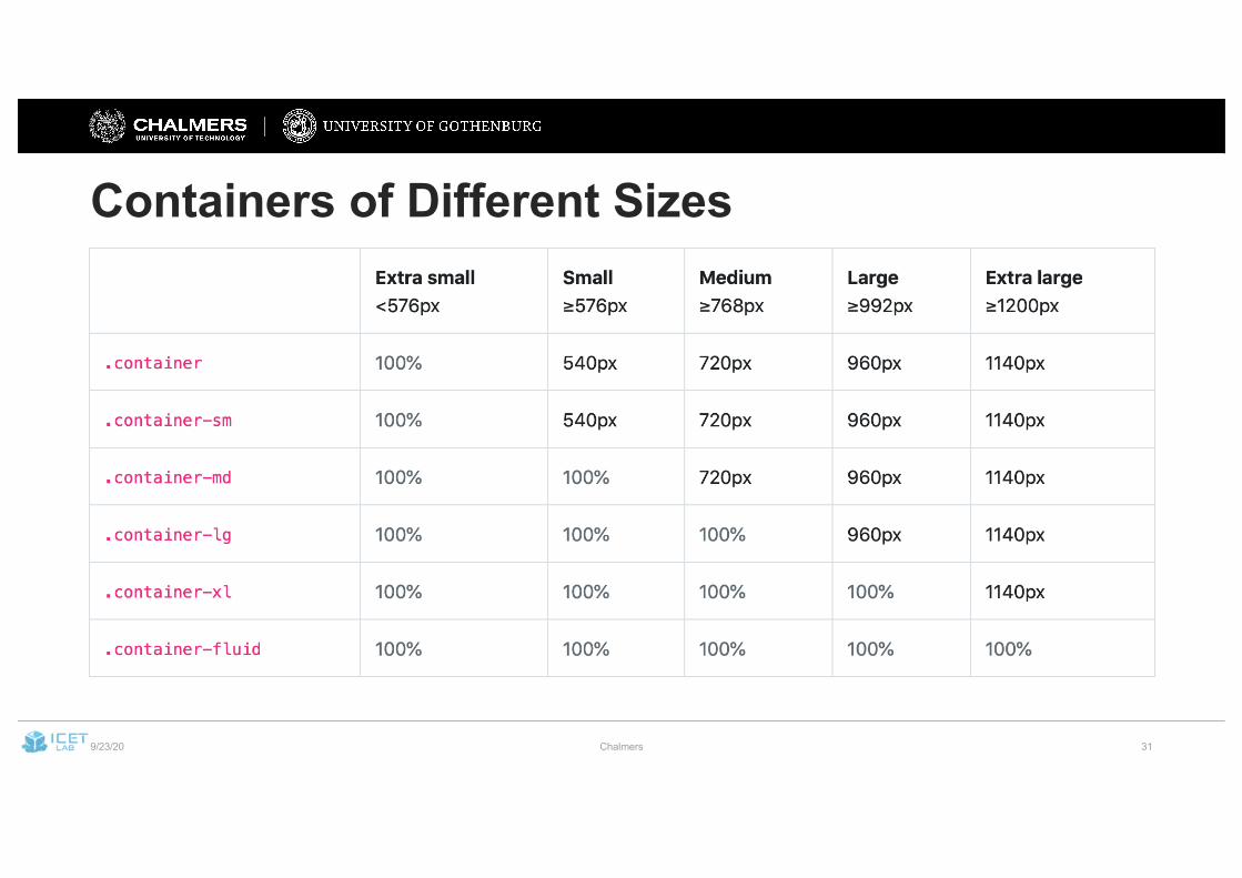
Containers of Different Sizes
9/23/20 Chalmers 32
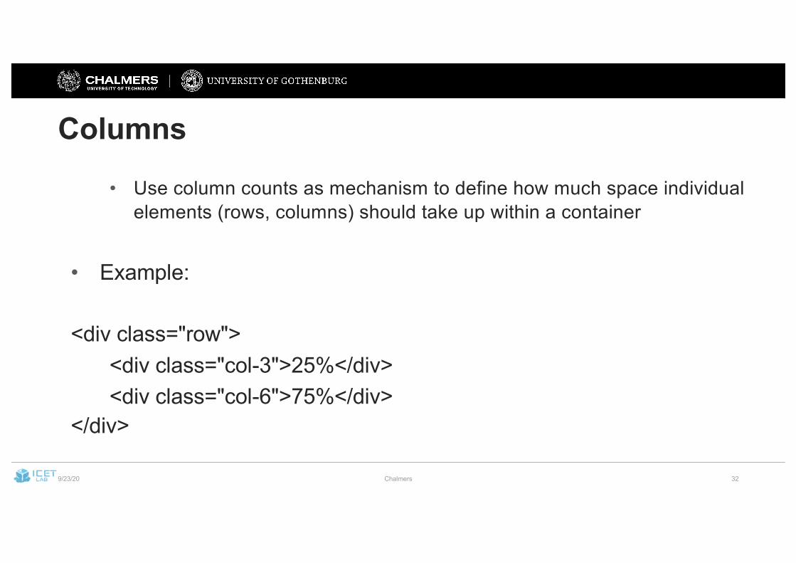
Columns
• Use column counts as mechanism to define how much space individual elements (rows, columns) should take up within a container
• Example:
<div class="row"><div class="col-3">25%</div><div class="col-6">75%</div>
</div>
9/23/20 Chalmers 33
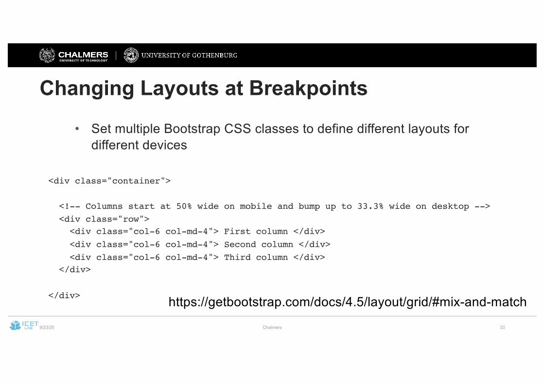
Changing Layouts at Breakpoints
• Set multiple Bootstrap CSS classes to define different layouts for different devices
<div class="container">
<!-- Columns start at 50% wide on mobile and bump up to 33.3% wide on desktop --><div class="row"><div class="col-6 col-md-4"> First column </div><div class="col-6 col-md-4"> Second column </div><div class="col-6 col-md-4"> Third column </div>
</div>
</div> https://getbootstrap.com/docs/4.5/layout/grid/#mix-and-match
9/23/20 Chalmers 34
More Info
• https://getbootstrap.com/docs/4.5/layout/grid/
9/23/20 Chalmers 35
Bootstrap Components
• In addition to providing a responsive Grid layout, Bootstrap also gives you a large collection of useful frontend components
• Predefined classes for common frontend tasks• E.g., alerts, navigation menus, forms, dropdown menus, tooltips, etc.
• Typically used through divs (or other HTML tags) with specific CSS classes
List and examples:https://getbootstrap.com/docs/4.0/components/buttons/
9/23/20 Chalmers 36
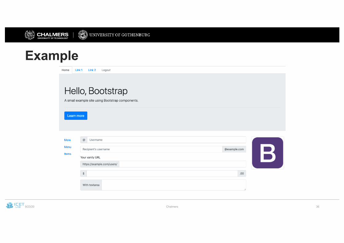
Example
9/23/20 Chalmers 37
BootstrapVue
• For Vue.js projects, use a custom version of Bootstrap• BootstrapVue (https://bootstrap-vue.org)
• Almost complete version of Bootstrap, but ported to not mess with Vue.js’ virtual DOM
9/23/20 Chalmers 38
BootstrapVue
• Layout styles and breakpoints:• Same as in vanilla Bootstrap
• Similar components:• Full list:
https://bootstrap-vue.org/docs/components
9/23/20 Chalmers 39
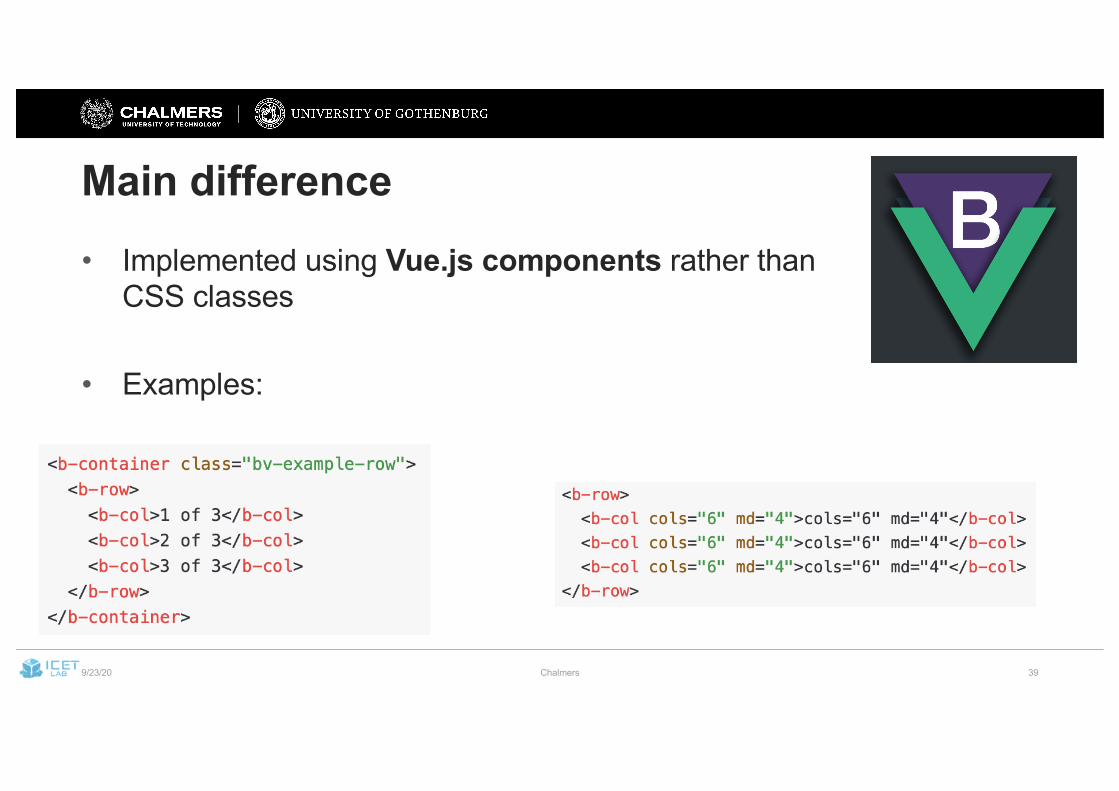
Main difference• Implemented using Vue.js components rather than
CSS classes
• Examples:
9/23/20 Chalmers 40
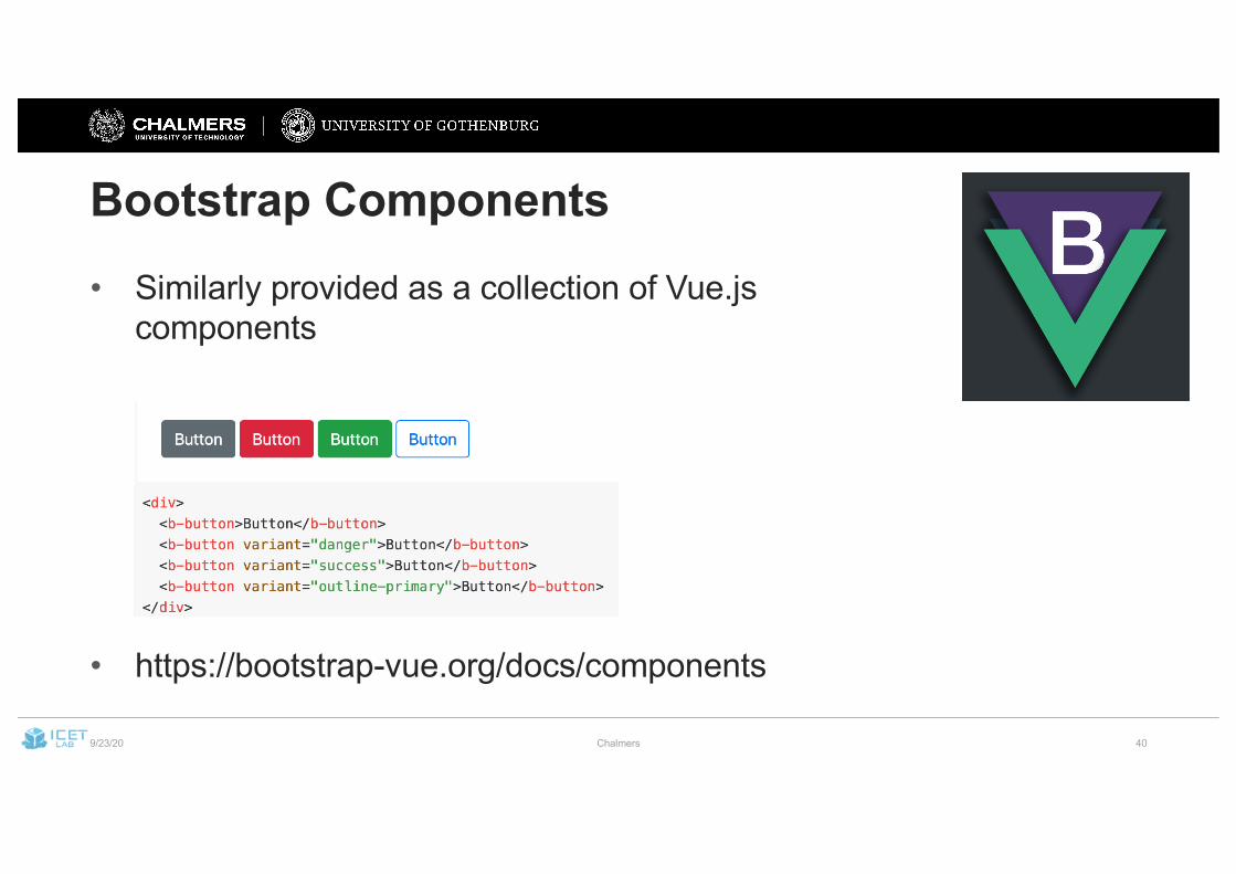
Bootstrap Components• Similarly provided as a collection of Vue.js
components
• https://bootstrap-vue.org/docs/components
9/23/20 Chalmers 41
Some Common Components• Feel free to use whatever feels useful in your project.• Common components that previous groups used:
• Buttons• Alerts• Calendar• Various form components• Nav and Navbar• Sidebar• Table• Tooltip• …
9/23/20 Chalmers 42
RWD helps us build one Web interface that adapts to desktop and mobile users …
… what about accessibility and internationalization?
9/23/20 Chalmers 43
Accessibility
“Web accessibility is the inclusive practice of ensuring there are no barriers that prevent interaction with, or access to, websites on the World Wide Web by people with physical disabilities, situational disabilities, and socio-economic restrictions on bandwidth and speed.”
Source: https://en.wikipedia.org/wiki/Web_accessibility
9/23/20 Chalmers 44
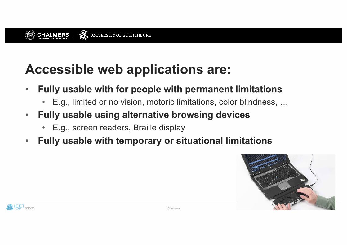
Accessible web applications are:• Fully usable with for people with permanent limitations
• E.g., limited or no vision, motoric limitations, color blindness, …• Fully usable using alternative browsing devices
• E.g., screen readers, Braille display• Fully usable with temporary or situational limitations
9/23/20 Chalmers 45
Main Accessibility Principles
• Follow web standards (HTML, CSS, …)• Make information accessible• Make navigation / operation accessible
Longer discussion:https://www.w3.org/WAI/fundamentals/accessibility-principles/
9/23/20 Chalmers 46
Making information accessible• Provide text alternatives and captions for essential images and
other multimedia• Explicitly demark purely aesthetic content
• So that screen readers can skip it• Provide ways to increase size or contrast
• Or at least ensure that the browser built-in methods work• Ensure your content does not trigger seizures
• No flashing effects or rapid color changes• Use color schemes designed for color-blindness
• https://davidmathlogic.com/colorblind/#%23D81B60-%231E88E5-%23FFC107-%23004D40
9/23/20 Chalmers 47
Making navigation accessible
• Provide ways to navigate your application outside of mouse / touch screen
• Particularly: ensure that your application can be navigated with a keyboard• (without going insane – good tab order is important)
• Avoid small clickable items• Avoid “time-sensitive” content
• E.g., important messages or links that disappear after a few seconds, etc.• Ensure that your application operates in a predictable manner
9/23/20 Chalmers 48
Accessibility using Bootstrap• Standard components support navigation with mouse, touch,
keyboard, and other devices• Look specifically at aria attributes to configure further• Use class sr-only to denote elements specifically for screen
readers
• However:• Many standard color schemes are not great w.r.t. contrast
9/23/20 Chalmers 49
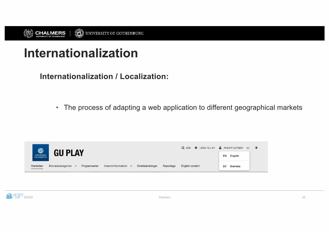
InternationalizationInternationalization / Localization:
• The process of adapting a web application to different geographical markets
9/23/20 Chalmers 50
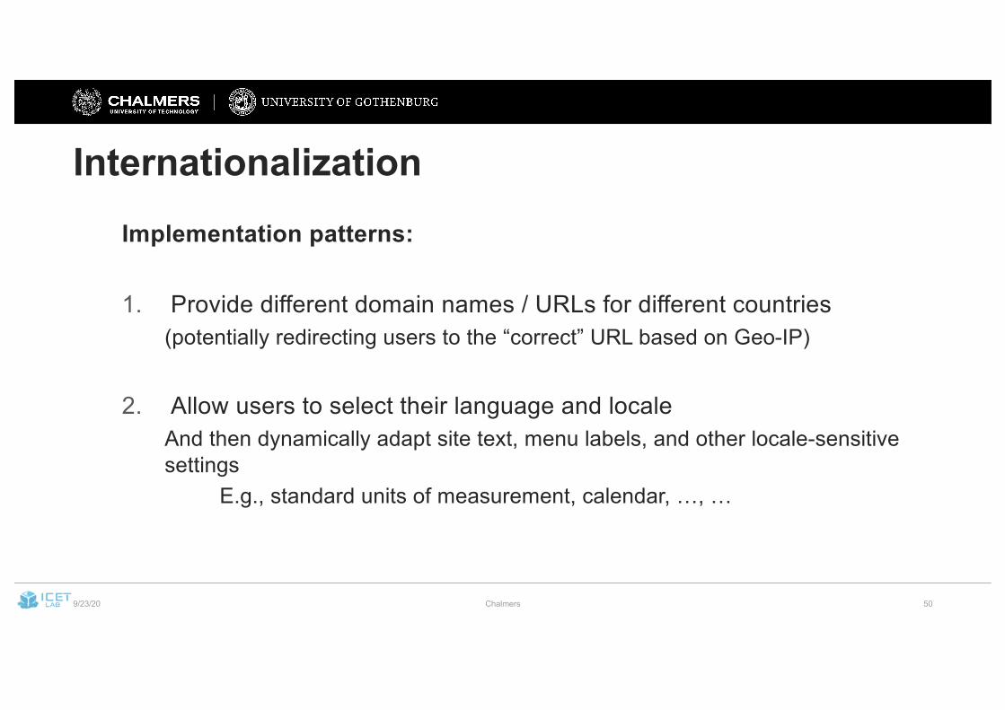
InternationalizationImplementation patterns:
1. Provide different domain names / URLs for different countries(potentially redirecting users to the “correct” URL based on Geo-IP)
2. Allow users to select their language and localeAnd then dynamically adapt site text, menu labels, and other locale-sensitive settings
E.g., standard units of measurement, calendar, …, …
9/23/20 Chalmers 51
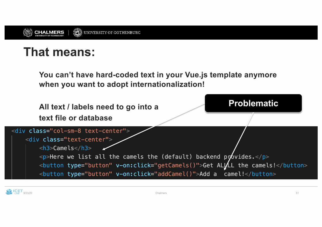
That means:You can’t have hard-coded text in your Vue.js template anymore when you want to adopt internationalization!
All text / labels need to go into atext file or database
Problematic
9/23/20 Chalmers 52
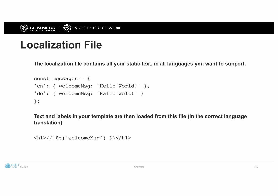
Localization FileThe localization file contains all your static text, in all languages you want to support.
const messages = {'en': { welcomeMsg: 'Hello World!' },'de': { welcomeMsg: 'Hallo Welt!' }};
Text and labels in your template are then loaded from this file (in the correct language translation).
<h1>{{ $t('welcomeMsg') }}</h1>
9/23/20 Chalmers 53
ToolsAs always, there are many good libraries and frameworks for internationalization of Web applications.
For Vue.js: look at the vue-i18n plugin.
Getting started:
https://www.freecodecamp.org/news/how-to-add-internationalization-to-a-vue-application-d9cfdcabb03b/
9/23/20 Chalmers 54
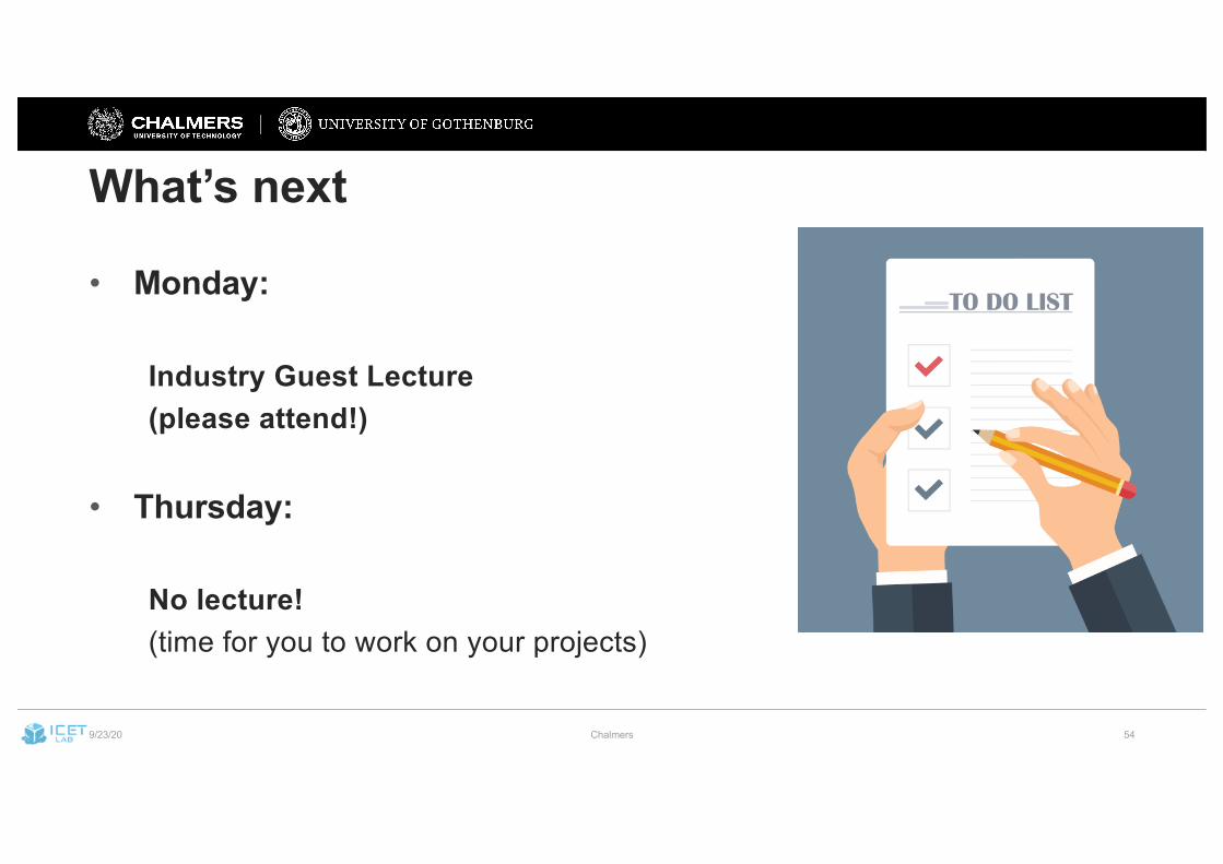
What’s next
• Monday:
Industry Guest Lecture(please attend!)
• Thursday:
No lecture!(time for you to work on your projects)