karelia university of applied sciences - core
TRANSCRIPT
KARELIA UNIVERSITY OF APPLIED SCIENCES Degree Programme in Design Sofia Tiyatyavyaynen 1201442 BROCHURE DESIGN FOR A HOME-BASED BAKERY Thesis November 2016
THESIS November 2016 Degree Programme in Design Tikkarinne 9 80200 JOENSUU FINLAND Tel. +358 13 260 600
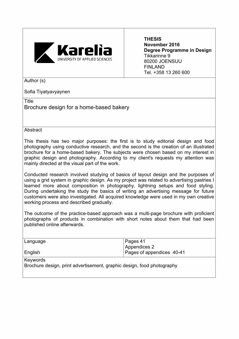
Author (s) Sofia Tiyatyavyaynen Title Brochure design for a home-based bakery
Abstract This thesis has two major purposes: the first is to study editorial design and food photography using conductive research, and the second is the creation of an illustrated brochure for a home-based bakery. The subjects were chosen based on my interest in graphic design and photography. According to my client's requests my attention was mainly directed at the visual part of the work. Conducted research involved studying of basics of layout design and the purposes of using a grid system in graphic design. As my project was related to advertising pastries I learned more about composition in photography, lightning setups and food styling. During undertaking the study the basics of writing an advertising message for future customers were also investigated. All acquired knowledge were used in my own creative working process and described gradually. The outcome of the practice-based approach was a multi-page brochure with proficient photographs of products in combination with short notes about them that had been published online afterwards.
Language English
Pages 41 Appendices 2 Pages of appendices 40-41
Keywords Brochure design, print advertisement, graphic design, food photography

CONTENTS 1 INTRODUCTION .............................................................................................. 4
1.1 Framework ................................................................................................ 5 2 COMMUNICATION WITH CUSTOMERS BY COPYWRITING ........................ 6 3 GENERAL CHARACTERISTICS OF A MULTIPAGE BROCHURE ................. 9 4 ONLINE PUBLICATION ................................................................................. 10 5 PRINCIPLES OF LAYOUT FOR BROCHURE DESIGN ................................ 12
5.1 Grid system ............................................................................................. 13 5.2 Layout design tips ................................................................................... 16 5.3 A software for layout design .................................................................... 19
6 FOOD PHOTOGRAPHY AS A PART OF ADVERTISEMENT ...................... 20 6.1 Food photography in practice .................................................................. 22
7 WORKIGN PROCESS ................................................................................... 26 7.1 Client's data ............................................................................................ 27 7.2 Photography ............................................................................................ 28 7.3 Design .................................................................................................... 30
8 Results ........................................................................................................... 35 9 Evaluation ....................................................................................................... 35 10 Conclusion .................................................................................................... 37 REFERENCES .................................................................................................. 39 APPENDICES Appendix 1 Moodboard for the client Appendix 2 Sources of inspiration
4
1 INTRODUCTION
“Doing business without advertising is like winking at a girl in the dark.
You know what you are doing, but nobody else does”
Steuart Henderson Britt (1907 -1979)
Marketing Management and Administrative Action
Advertising is information directed at (referred to/ aimed at) a certain group of people in
order to draw attention to a particular product or service. It gives an opportunity for
advertisers to present new products and point them out on the market. At the same time
it helps users to navigate in a huge flood of information and choose exactly what they
need. Products of high quality, decorated with superior and distinctive advertising may
doubtlessly contribute to the success of a company.
Printed advertisement for a business - is a part of an effective mechanism to promote
products and services. It is a viable version of promotion with effective results. A
demand for this type of promotion is appreciated even in the era of advanced digital
advertising as well as radio and television.
The best example of print advertising is a brochure. With the help of one, a potential
customer can find not only the list of goods or services, but also a brief story of the
company along with the advantages of cooperation.
The unique ability of a brochure to combine a large amount of information and the
multiplicity of illustrations has a propitious impact on the business image of company.
The purpose of this thesis is to undertake a study in the field of printed advertisement
and to create an illustrated brochure afterwards that may help to attract customers to a
small local bakery. A young pastry chef plans to run a home-based business as a small
bakery and to make sweet treats for holidays and special events. Every single cake or
pastry is unique and baked with passion and love. Fresh new taste solutions and
creativity in this industry should distinguish her business from other competitors.
5
The young entrepreneur has a very limited advertising budget, but she plans to do the
majority of promotion by herself: create a web page based on a free online portfolio
website and support it by social media marketing via Facebook, Instagram and vk.com.
Offline promotion will be presented in two formats of printed advertising: business card
and brochure. A brochure is the main source of information provided not only in text but
also with a colorful photo portfolio filled with pastry examples.
To create a truly attractive brochure I am going to do comprehensive research in the
basic rules of printed advertising, methods of designing layout and communication
between a customer and a seller through illustrations and copywriting.
1.1 Framework
Before starting the practice realization of personal project I have to define the aspects of
theoretical framework that support the process of creating an advertising brochure.
Researches in the field of print advertisement design, the basics of copywriting and
photography are enclosed in theoretical part. All this makes a strong base for creating
an original and successful product. Literature observation will gather the necessary
information and help to explore the concepts above. The found information will be
supported with pictures showing the idea of each stage if needed.
To establish a solid knowledge base, I am going to deeply learn the basic principles of
layout design, a baseline grid system and typography.
An important topic of study is food photography. I will get familiar with composition,
lightning setups and retouching tutorials that can help to achieve an optimal picture of a
further design process.
While doing work for real clients it is important to understand their points of view and to
implement these in the right way. For this goal I will go through the principals of
copywriting to analyze how to communicate via graphics and make a message reach
people’s minds.
6
2 COMMUNICATIONS WITH CUSTOMERS BY COPYWRITING
The concept of advertising conversations assigns an intonation and a system of
arguments an advertiser address to a consumer. This is the first thing that a potential
buyer will notice. Therefore, all benefits of the goods should be mentioned in this
appeal. The more useful information consumers find out from an advertisement, the
more likely a product attracts attention.
As Anastasia Mironenko (2014) states the goal of an entrepreneur and an advertiser –
is a sale. All words that the seller are willing to say must be subordinated to this goal.
To achieve it they must be familiar with selling goods and potential customers. The key
characteristics of a product of the advertisement must be identified, so they could
differentiate it from other competitors. The key characteristics of the goods are the basis
of the seller’s appeal to the consumer.
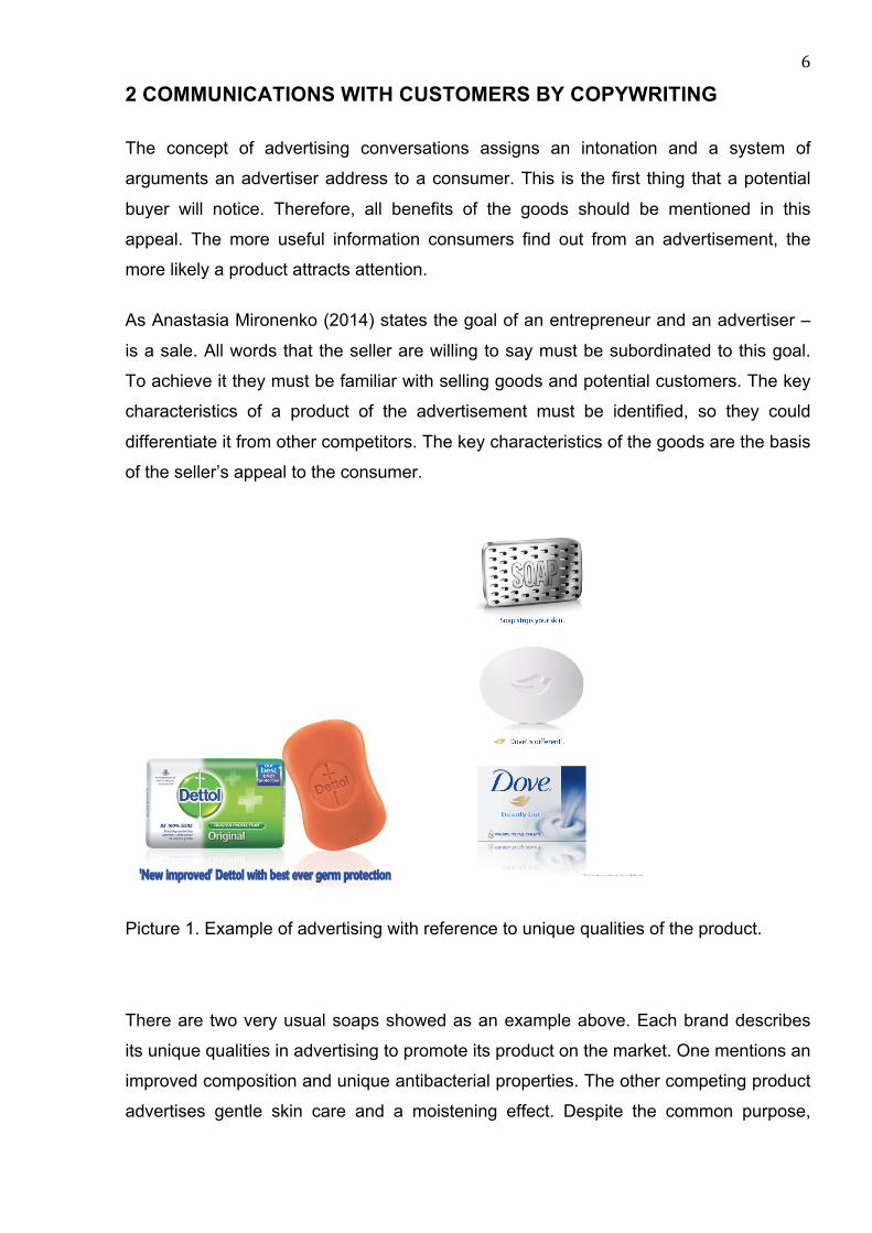
Picture 1. Example of advertising with reference to unique qualities of the product.
There are two very usual soaps showed as an example above. Each brand describes
its unique qualities in advertising to promote its product on the market. One mentions an
improved composition and unique antibacterial properties. The other competing product
advertises gentle skin care and a moistening effect. Despite the common purpose,
7
customers have to choose one of the brands based on the available information from
advertisements as well as on personal experience and advice.
According to Elena Zaretskaya (2002), the key features of a product should promise
customers exactly what they want, or they will never even be interested in new
products. Any advertising appeal is aimed at the satisfaction of the customer. Its
success depends directly on the preliminary analysis.
When one claims with certainty that they are competent to represent goods they sell,
they should know all about it in detail, not in general. They can get this information by
reading the relevant literature and comparing their products to similar ones available on
the market, observing its production. (Zaretskaya 2002.)
There is nothing more persuasive for people than comparison. If there are explanations
with examples and comparisons of the benefits of their product over others, the
campaign will fulfill its goal. The consumers will see with their own eyes the advantages
of the product and recommend it to their friends and relatives.
Professional copywriters advise following a bunch of important rules. Readers need to
visualize what it is written about. If they imagine how they use this product, then the
message is received correctly. Telling them only about the advantages of the product is
insufficient. It is necessary to explain the reason. However, if there is nothing to say, it is
better to use an outstanding picture with an original title. When choosing a photo or
drawing, keep in mind that they should fit the chosen advertising strategy. Along with
the text, they have to get the advertiser's idea across.
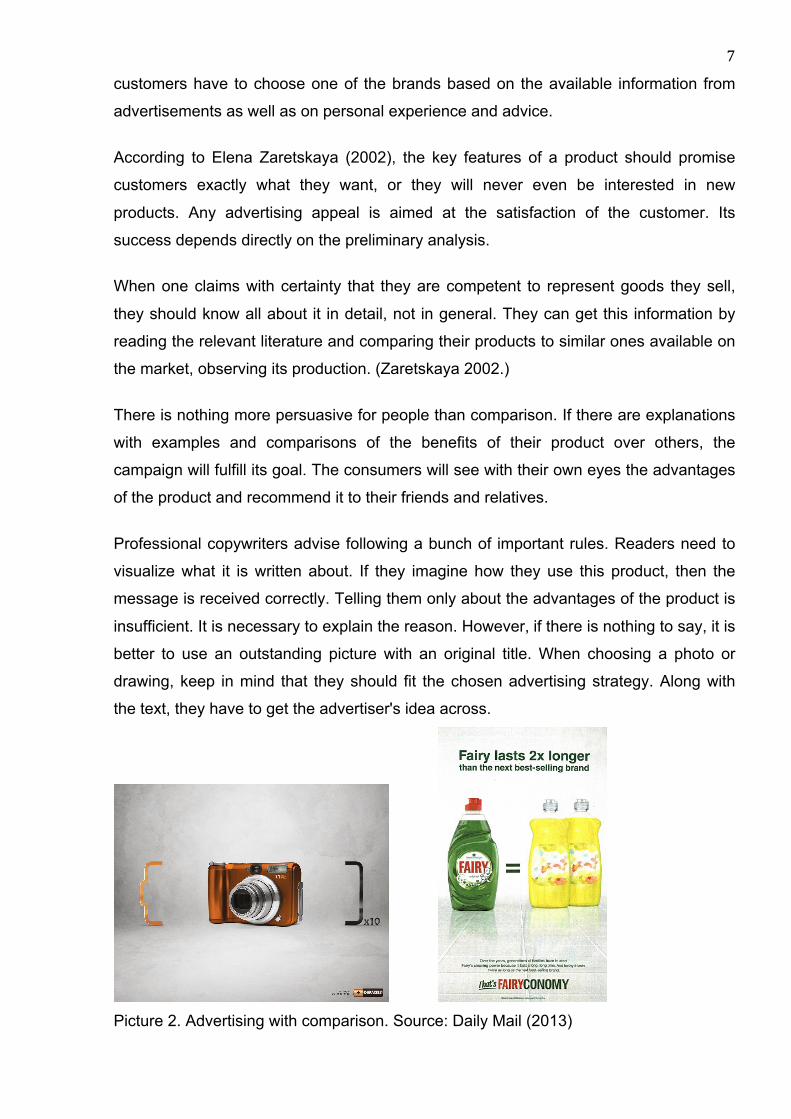
Picture 2. Advertising with comparison. Source: Daily Mail (2013)
8
Speaking of advertising, where comparison is used, as a main idea of advertisements
comes to mind two well-known brands, Duraсell and Fairy. These companies produce
different products, but their advertisement affects customers’ choices. They constantly
compare themselves with other products of the segment.
Duracell advertises up to ten times longer battery use. For a visual example, they
illustrate life examples when usual batteries die at an inconvenient time. They remind
customers how their product can be used and cause an associative array and
memories from personal experience. The detergent Fairy promises economical profit
thanks to its thick texture. They often mention that one drop is able to wash a vast
number of dirty dishes.
According to Elena Zaretskya in order to describe the advertised product efficiently, it
needs to answer the following questions:
- Why is this product useful for people?
- What is it made of?
- Does it have an advantage over other similar products?
- What is its price?
Advertiser should answer the same questions in relation to the competing products. The
most important question in this comparison is: what is the main difference between
them? An honest answer to these questions should be contained in the advertisement.
(Zaretskaya 2002, 79.)
9
3 GENERAL CHARACTERISTICS OF A MULTIPAGE BROCHURE
The opinion that the only difference between the magazines and brochures is their
periodicity is false. All existing catalogs, magazines and even some books (up to 48
pages) are considered as brochures as they have the same layout principles.
A magazine as well as a brochure is a multipage issue. In distinction from brochures,
magazines include in addition to advertising, illustrations, explanations and all kinds of
copyrighted works, notes and articles. (Nikulina 2010, 19-21.)
Irina Nikulina identifies several common formats of brochures, which are A4, A5 and A6.
In the context of layout design, an A4 brochure gives designer an increased capacity to
express more creative ideas than with A6 brochures. The popularity of A5 and A4
format brochures could be explained by several major factors. First, the brochure of this
format is more comfortable to hold and look through. Secondly, they can be sent via
post due to the fact that they perfectly fit envelopes of C5 and C4 formats.

10
4 ONLINE PUBLICATION
Nowadays, a vast number of publications turned into a digital format and became
available for reading from any part of the world. It is much easier to open a favorite
magazine on a laptop or download flyers with discounts and special offers on a smart
phone.
The choice of electronic format was not random for some companies. On the one hand,
it helps to minimize the costs of publishing and fully concentrate on magazine's content.
On the other hand, an electronic version is not only cheaper but also gives the
possibility to quickly search for a word or a phrase in one or a set of magazines and an
opportunity, if desired, to print some material or share a link with friends so they can
read the interesting article.
For advertisers there is an opportunity to put active links on websites, extra pictures and
even videos. Meanwhile, readers can customize the look of the magazine in the way
they want and get the most out of content. There are several online platforms for
publishing a magazine, brochure or book online. Each of them offers different types of
subscriptions for readers and publishers.
There are several online platforms for publishing a magazine, brochure or book online.
Each of them offers different types of subscription for readers and publishers. The
following are examples of how the two the most popular digital publishing platforms
work and the shortlist of their possibilities.
Issuu.com
Picture 3. Start page and publishing plans with features and tools. www.issuu.com
11
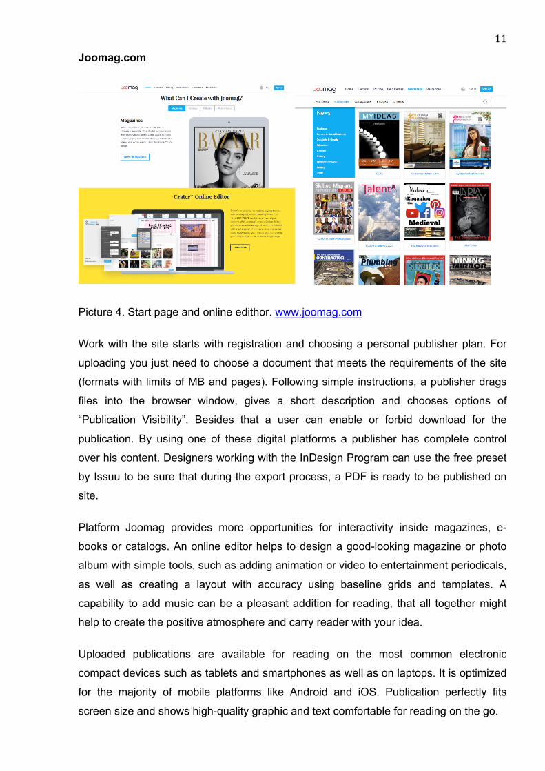
Joomag.com
Picture 4. Start page and online edithor. www.joomag.com
Work with the site starts with registration and choosing a personal publisher plan. For
uploading you just need to choose a document that meets the requirements of the site
(formats with limits of MB and pages). Following simple instructions, a publisher drags
files into the browser window, gives a short description and chooses options of
“Publication Visibility”. Besides that a user can enable or forbid download for the
publication. By using one of these digital platforms a publisher has complete control
over his content. Designers working with the InDesign Program can use the free preset
by Issuu to be sure that during the export process, a PDF is ready to be published on
site.
Platform Joomag provides more opportunities for interactivity inside magazines, e-
books or catalogs. An online editor helps to design a good-looking magazine or photo
album with simple tools, such as adding animation or video to entertainment periodicals,
as well as creating a layout with accuracy using baseline grids and templates. A
capability to add music can be a pleasant addition for reading, that all together might
help to create the positive atmosphere and carry reader with your idea.
Uploaded publications are available for reading on the most common electronic
compact devices such as tablets and smartphones as well as on laptops. It is optimized
for the majority of mobile platforms like Android and iOS. Publication perfectly fits
screen size and shows high-quality graphic and text comfortable for reading on the go.
12
5 PRINCIPLES OF LAYOUT FOR BROCHURE DESIGN
Until estimating special aspects of design and printing of the brochure, it is required to
make it clear how the brochure design should appear. The primary aim of designing any
promotional product is to convince the customer that this is exactly the right thing to get,
that it stands out because of its unique features. To develop the ideal long-lasting
design we need to achieve the right combination of the current key elements. Irina
Nikulina explains process reminds us that before the brochure became an advertising
medium, its main aim was and still is educative. Teach, educate, and hold activities at
schools, institutes, medical and social organizations, brochure helps none the worse.
(Nikulina 2010 11.)
Every visual message has its own ranking system according to the information it sends.
In other words the way one perceive the information depends on its importance. The
main goal of a designer's work is to organize a placement for text and visual parts
before moving on to designing. Content awareness is a high priority factor for this
process. If this content is well-organized, designers can make an efficient solution
regarding the visual dressing.
The majority of experts of print advertising agree that the heading is the most significant
part of the text. The heading, together with a key picture, attract attention and transfer a
creative concept. The main idea transfers much better with a combination of these two
elements of advertising. Heading is a core ingredient of printing advertisement, because
it mostly captures the essence of compellation and pitches the idea to consumers
(Wells, Burnett & Moriarty 2006, 64).
There is another reason why it is so important. People who rapidly looks through the
press read only headings; that is why the meaning of an advertisement has to be clear
for them in the heading itself or by the heading combined with picture. According to
Wells, Burnett and Moriarty "only 20 percent of people who read the heading pay
attention to the text of the advertisement" (2006, 69)
It is good to analyze specific requirements, lodged to printing advertising. There are two
categories of advertising text: highlighted and main text. Highlighting is a group of all
elements, that are first to be noticed by a viewer. These elements - headings,
13
secondary headlines, taglines are mainly written in large print to attract attention and
prevent people from reading only headings. The main text consists of elements, that
have to be read and understood.
Drawing the conclusion based on the facts mentioned above, I can say that all the
necessary information for publication can be divided into two categories and interact
with each other. Consequently, we have to produce all necessary arguments in the
highlighted text to keep readers attracted and to produce the phrase that will be clearly
connected to the main text of the brochure.
5.1 Grid system
Symmetry, proportions and other stable aspects of geometric law are still relevant even
today, just as at another point of time. They allow designers to create the most colorful,
distinct and impactful designer conceptions.
Steven Bradley is an author of several articles about the types and anatomy of a grid in
design. He emphasizes that the baseline grid approach is the basis of graphic design
and a must for each designer. The vast majority of outstanding design projects rely on
this approach, although some of them may break the established rules.
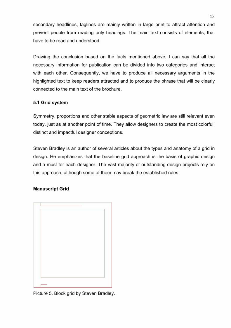
Manuscript Grid
Picture 5. Block grid by Steven Bradley.
14
Sometimes called a block grid or single column grid, the manuscript grid is the simplest
grid structure. It is mainly a large rectangular area taking up most of the space inside a
format.
Manuscript grids are good for extensive and continuous blocks of text. They are used in
books and long essays and perhaps lend themselves well to blog posts. They are not
limited to text though. Images can be used to fill the block. (Bradley 2011.)
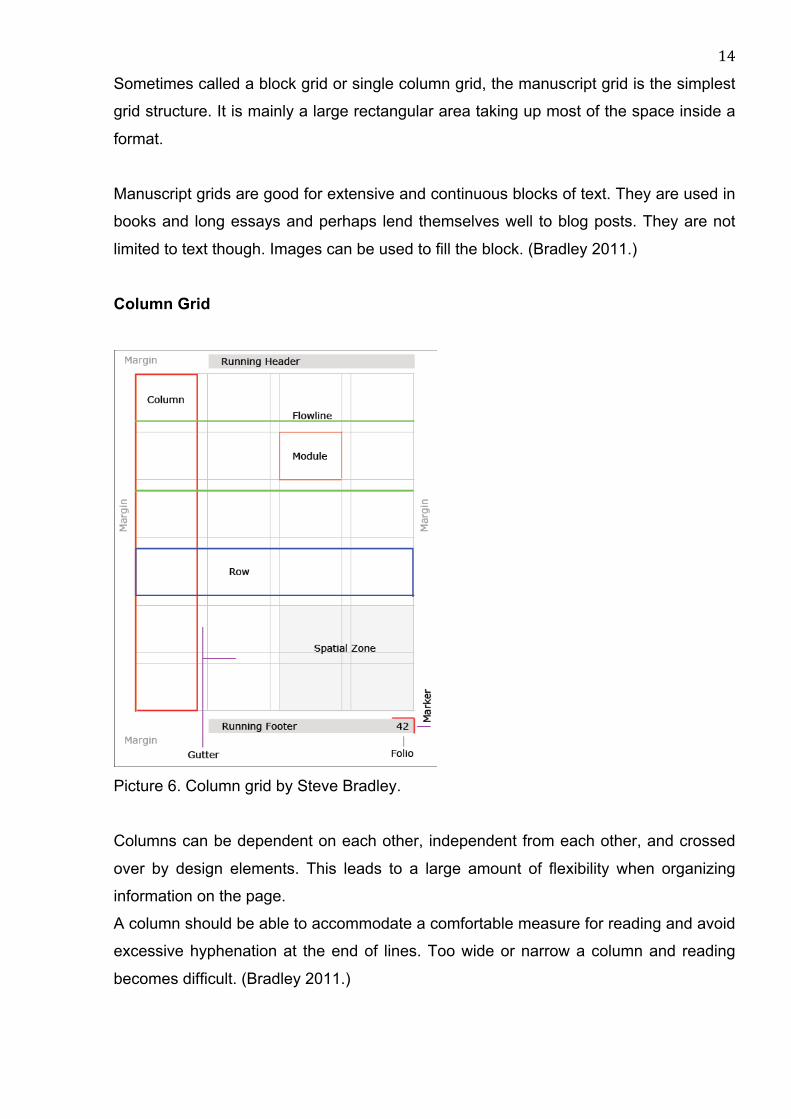
Column Grid
Picture 6. Column grid by Steve Bradley.
Columns can be dependent on each other, independent from each other, and crossed
over by design elements. This leads to a large amount of flexibility when organizing
information on the page.
A column should be able to accommodate a comfortable measure for reading and avoid
excessive hyphenation at the end of lines. Too wide or narrow a column and reading
becomes difficult. (Bradley 2011.)
15
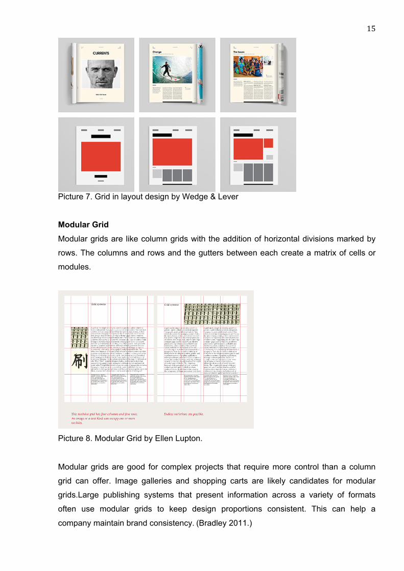
Picture 7. Grid in layout design by Wedge & Lever
Modular Grid Modular grids are like column grids with the addition of horizontal divisions marked by
rows. The columns and rows and the gutters between each create a matrix of cells or
modules.
Picture 8. Modular Grid by Ellen Lupton.
Modular grids are good for complex projects that require more control than a column
grid can offer. Image galleries and shopping carts are likely candidates for modular
grids.Large publishing systems that present information across a variety of formats
often use modular grids to keep design proportions consistent. This can help a
company maintain brand consistency. (Bradley 2011.)

16
5.2 Layout design tips
Layout design is a quite unregulated sphere. On one side, there is a set of rules
designers have to follow and that are being used to create a blueprint of printed
production. On the other hand, this set of rules is not strict enough, so they can be
broken to realize crazy ides. L. Voronetskaya shows several useful pieces of advice that
are doubtlessly able to improve very common design.
Photo on a photo The main thing here is to pick out the right shots. They have to be complete and at the
same time these pictures have to be a logical extension of each other.
A text block appears only on the one shot and this shot cannot be overwhelmed with
information, so it will not attract excessive attention from the text block.
by Fabian Fohrer.
Text box Different types of text boxes match well with ,text itself and designers may experiment
with them endlessly. They place focus on the text and hold a fair amount of information.
Colored text boxes can be both partly transparent and vivid in front of the picture.
17
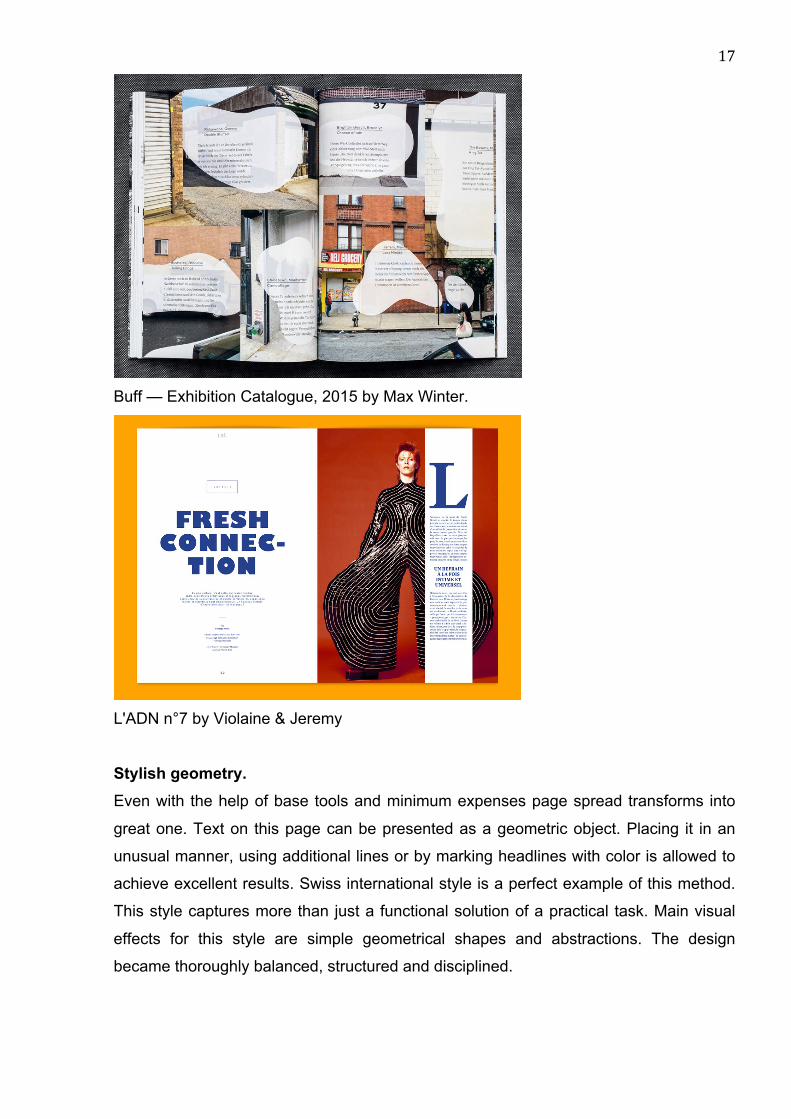
Buff — Exhibition Catalogue, 2015 by Max Winter.
L'ADN n°7 by Violaine & Jeremy
Stylish geometry. Even with the help of base tools and minimum expenses page spread transforms into
great one. Text on this page can be presented as a geometric object. Placing it in an
unusual manner, using additional lines or by marking headlines with color is allowed to
achieve excellent results. Swiss international style is a perfect example of this method.
This style captures more than just a functional solution of a practical task. Main visual
effects for this style are simple geometrical shapes and abstractions. The design
became thoroughly balanced, structured and disciplined.
18
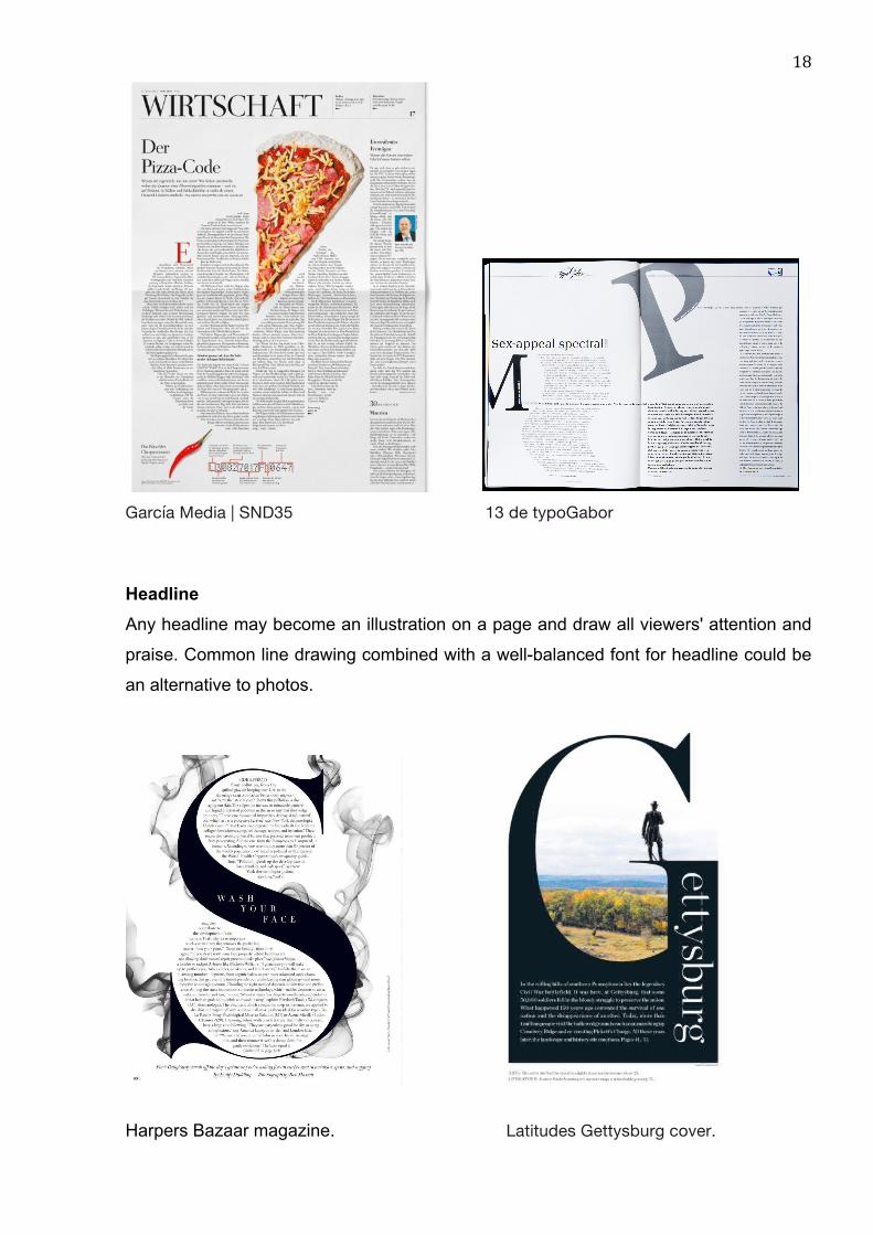
García Media | SND35 13 de typoGabor
Headline Any headline may become an illustration on a page and draw all viewers' attention and
praise. Common line drawing combined with a well-balanced font for headline could be
an alternative to photos.
Harpers Bazaar magazine. Latitudes Gettysburg cover.
19
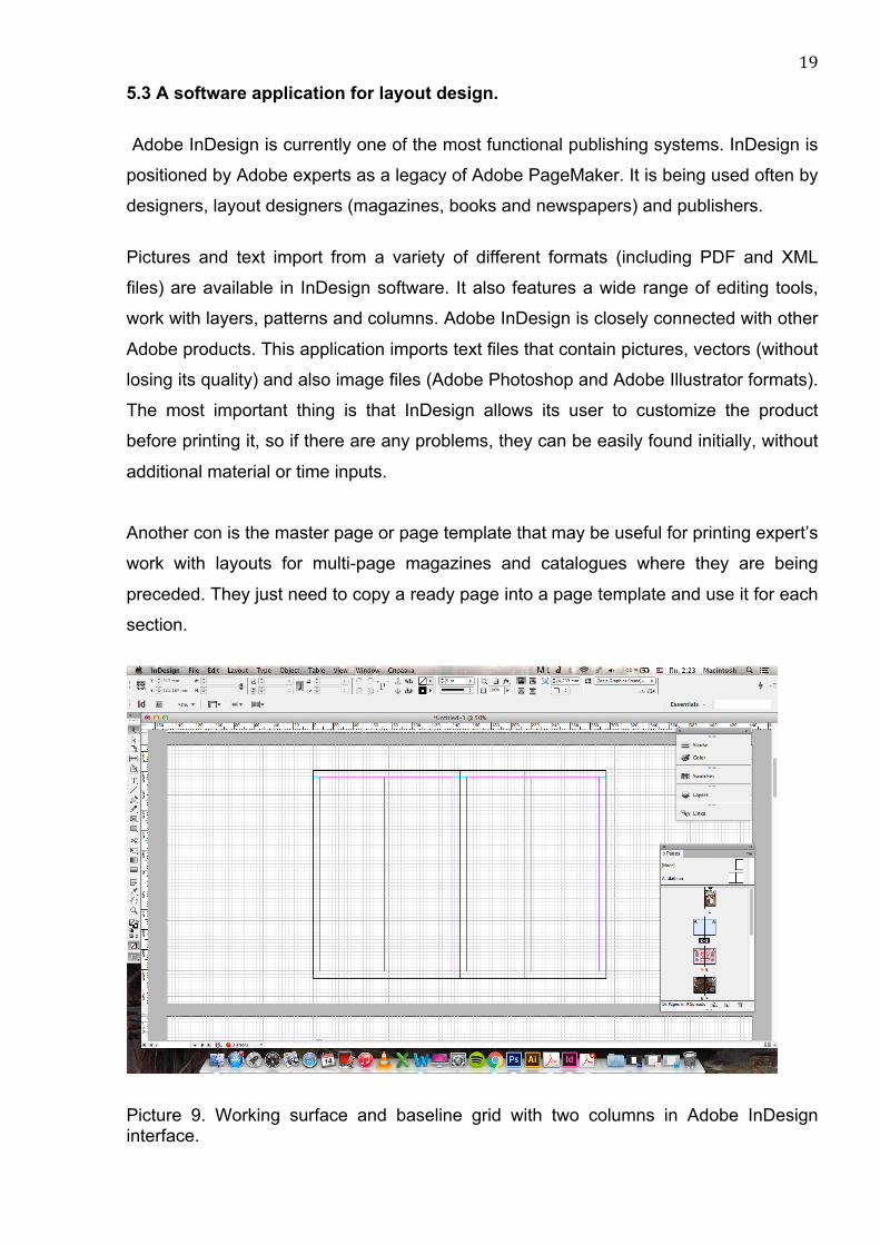
5.3 A software application for layout design.
Adobe InDesign is currently one of the most functional publishing systems. InDesign is
positioned by Adobe experts as a legacy of Adobe PageMaker. It is being used often by
designers, layout designers (magazines, books and newspapers) and publishers.
Pictures and text import from a variety of different formats (including PDF and XML
files) are available in InDesign software. It also features a wide range of editing tools,
work with layers, patterns and columns. Adobe InDesign is closely connected with other
Adobe products. This application imports text files that contain pictures, vectors (without
losing its quality) and also image files (Adobe Photoshop and Adobe Illustrator formats).
The most important thing is that InDesign allows its user to customize the product
before printing it, so if there are any problems, they can be easily found initially, without
additional material or time inputs.
Another con is the master page or page template that may be useful for printing expert’s
work with layouts for multi-page magazines and catalogues where they are being
preceded. They just need to copy a ready page into a page template and use it for each
section.
Picture 9. Working surface and baseline grid with two columns in Adobe InDesign interface.
20
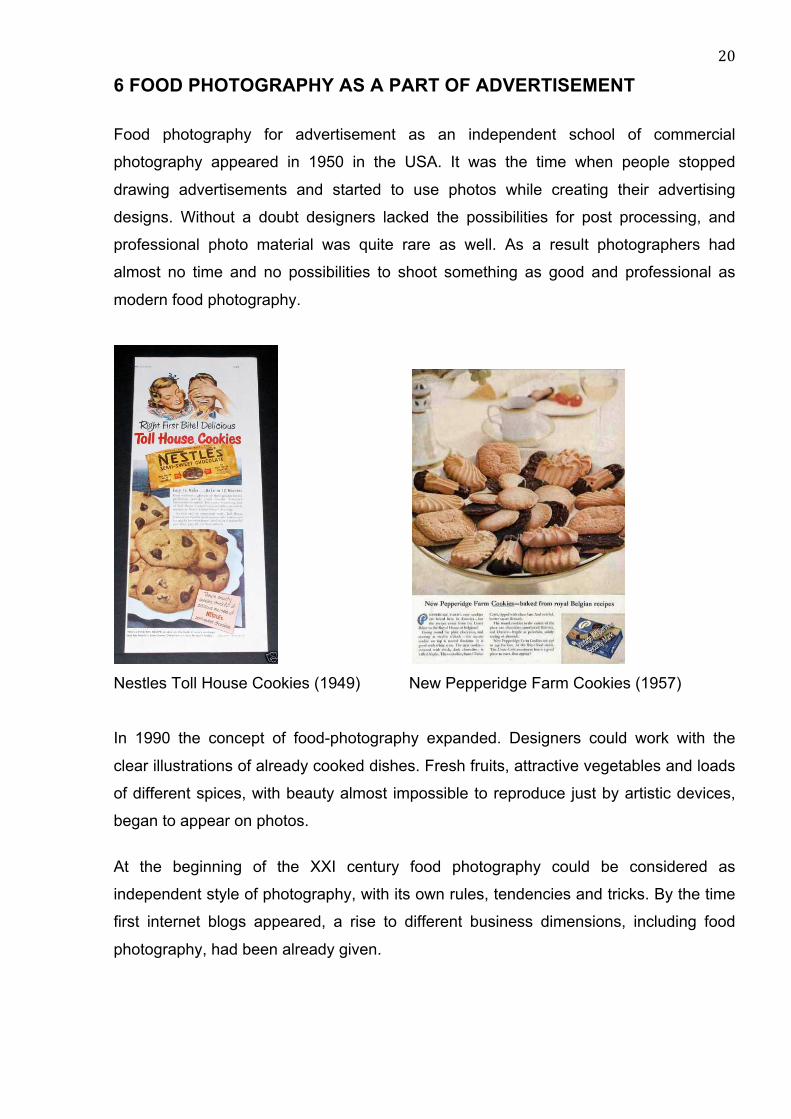
6 FOOD PHOTOGRAPHY AS A PART OF ADVERTISEMENT
Food photography for advertisement as an independent school of commercial
photography appeared in 1950 in the USA. It was the time when people stopped
drawing advertisements and started to use photos while creating their advertising
designs. Without a doubt designers lacked the possibilities for post processing, and
professional photo material was quite rare as well. As a result photographers had
almost no time and no possibilities to shoot something as good and professional as
modern food photography.
Nestles Toll House Cookies (1949) New Pepperidge Farm Cookies (1957)
In 1990 the concept of food-photography expanded. Designers could work with the
clear illustrations of already cooked dishes. Fresh fruits, attractive vegetables and loads
of different spices, with beauty almost impossible to reproduce just by artistic devices,
began to appear on photos.
At the beginning of the XXI century food photography could be considered as
independent style of photography, with its own rules, tendencies and tricks. By the time
first internet blogs appeared, a rise to different business dimensions, including food
photography, had been already given.

21
During several years digital inclusion has changed photography industry tremendously.
Now it is possible not only capture the moment instantly and make colors intense. High
quality equipment combined with modern imaging and photo editing software show
incredible results.
However composition principals remain constant. Main subjects of photo shootings are
people, food and bunch of other objects. It is still required to have certain abilities,
knowledge and skills to make a good photo, but the speed of releasing the product
increased dramatically. Thanks to digital technologies loads of high quality, picturesque
magazines appear on a daily basis.
What’s cooking magazine covers (2000 – 2014)
It is hard to combine all present food photography tendencies into a specific set of rules.
Commercial photo shootings for billboards or packages moved to a brand new level.
Most of the work fall on the shoulders of retouchers, who is able to create fantastic
objects, that sometimes may not even exist in real life. Real food can be replaced with
the fake one made of wax, silicone, plastic or some other inedible materials.
Such photography approach as usage of dark colors in decoration become very popular
nowadays. More specifically food is being shot as if it is surrounded with mystique and
melancholy. This way it looks very unusual and sightly. This style of photo shooting is
termed variously: Dark and Moody or Mystic Light. Such an individual style of light and
dark modeling, that was successfully being used in Rembrandt's, Correggio's and other
masters works, created an illusion of space and mysteriousness.
22
Classicism in photo by Olesya Kuprin (2016) Dark and Moody photo by Linda Lomelino
6.1 Food photography in practice
Lighting
The Russian Photo Foodie magazine reveals the secrets of food photography by
publishing interviews with professional photographers and bloggers. Author Alena
Veselova gives a clear explanation of lightning for shooting. Natural light is suitable for
menu and magazine photography. The main purpose of these images is to show not
only how appetizing the products are but also the atmosphere of the place. For a
catalog or large-format advertising print it is better to use studio lighting. In this case it is
important to remember that all products are being evenly lit. The photo should be made
in a specific way, so the viewer will not understand the time when the picture has been
taken - in the morning or in the evening. Well-lit objects are commonly being used in
design projects due to the fact that they are quite amenable to retouching. (Veselova
2016, 23.)
Natural light also needs to be controlled in order to make high-quality images. Using a
reflector can illuminate shadows, change the brightness and saturation by approaching
the subject from the window. In such manner a photographer can adjust the light
pattern, making it softer or harder. It is even possible to achieve a focused beam of light

23
- it is enough just to close the window with a lightproof material. Here it is possible to
use any materials on hand, such as a sheet of cardboard. (Veselova 2016 24.)
Picture 10. Lightning setup with natural light from Photo Foodie magazine 2016.
Working with artificial studio light is necessary for the right lighting setup. Pictures taken
from the Photo Foodie magazine show an excellent example of light placement for food
photography. Shooting with artificial light requires practice and basic technical
knowledge. (Veselova 2016, 30.)
Picture 11. Lightning setup with artificial studio light from Photo Foodie magazine 2016.
24
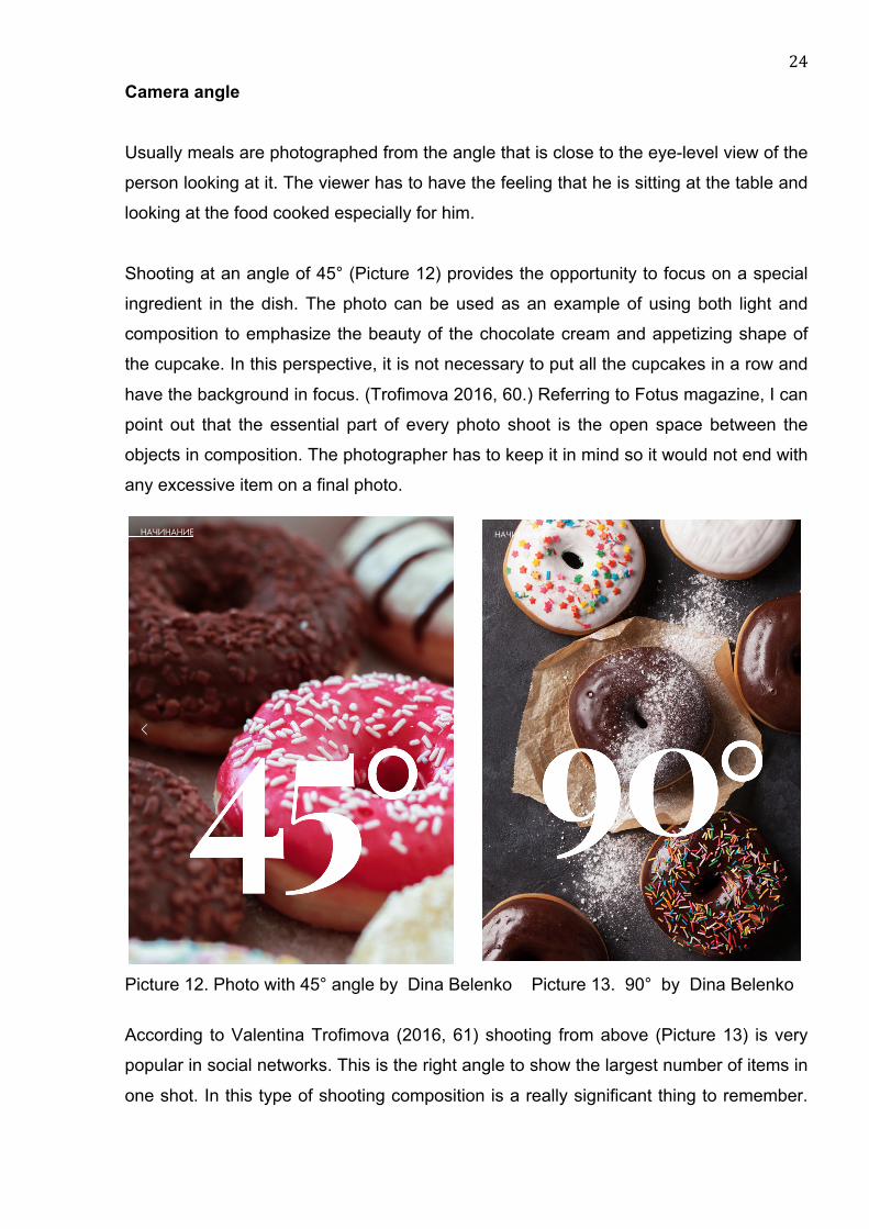
Camera angle Usually meals are photographed from the angle that is close to the eye-level view of the
person looking at it. The viewer has to have the feeling that he is sitting at the table and
looking at the food cooked especially for him.
Shooting at an angle of 45° (Picture 12) provides the opportunity to focus on a special
ingredient in the dish. The photo can be used as an example of using both light and
composition to emphasize the beauty of the chocolate cream and appetizing shape of
the cupcake. In this perspective, it is not necessary to put all the cupcakes in a row and
have the background in focus. (Trofimova 2016, 60.) Referring to Fotus magazine, I can
point out that the essential part of every photo shoot is the open space between the
objects in composition. The photographer has to keep it in mind so it would not end with
any excessive item on a final photo.
Picture 12. Photo with 45° angle by Dina Belenko Picture 13. 90° by Dina Belenko
According to Valentina Trofimova (2016, 61) shooting from above (Picture 13) is very
popular in social networks. This is the right angle to show the largest number of items in
one shot. In this type of shooting composition is a really significant thing to remember.
08.11.2016 Fotus Magazine 09/16
https://indd.adobe.com/view/73dcdffd-dead-462d-8c74-9f7175ff5283 1/1
� �� " # � �
08.11.2016 Fotus Magazine 09/16
https://indd.adobe.com/view/73dcdffd-dead-462d-8c74-9f7175ff5283 1/1
25
Every single centimeter of space is important, because any improper item in the shot,
such as a wrongly folded piece of cloth, can attract unwanted attention.
In this camera angle geometry is important due to the fact that the shapes of dishes,
products, and outlines of each subject are being shot from above. All these items have
to be in harmony with each other and create a united design. A 90o angle makes it
possible to shot loads of beautiful details and textures that can accent the dish. This
manner of shooting is suitable for soups, pizzas, flat cakes and cookies. (Trofimova
2016, 62.)
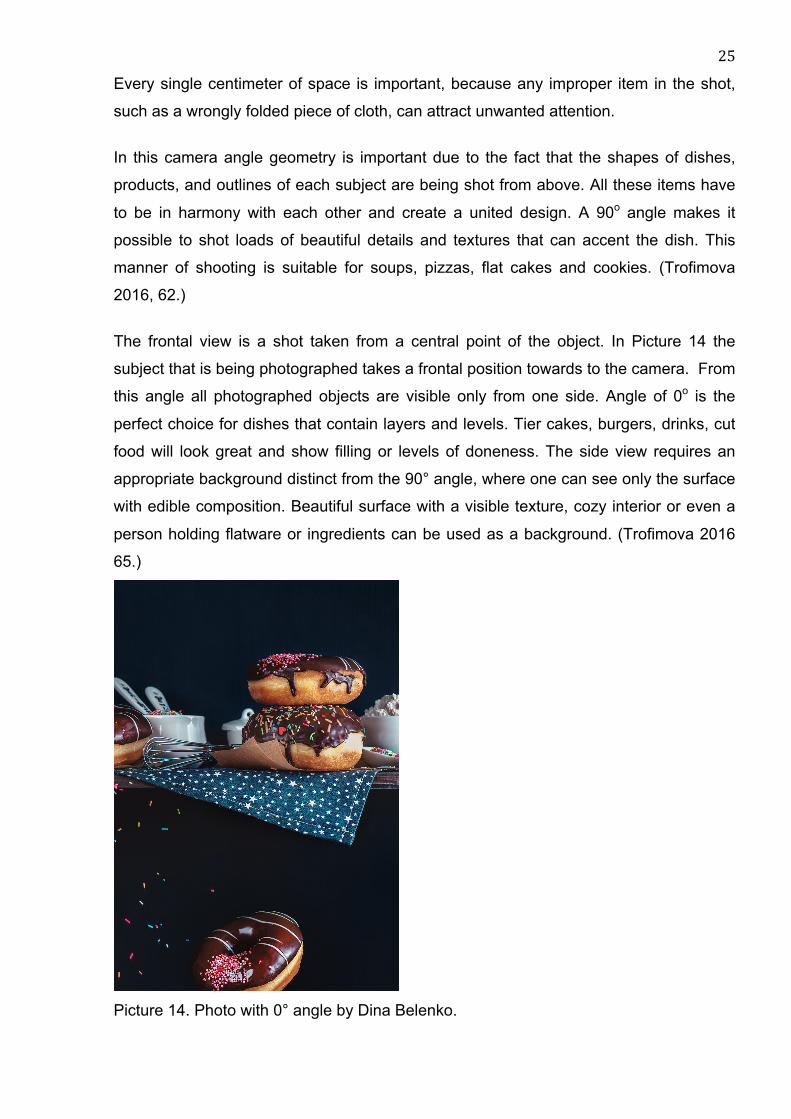
The frontal view is a shot taken from a central point of the object. In Picture 14 the
subject that is being photographed takes a frontal position towards to the camera. From
this angle all photographed objects are visible only from one side. Angle of 0o is the
perfect choice for dishes that contain layers and levels. Tier cakes, burgers, drinks, cut
food will look great and show filling or levels of doneness. The side view requires an
appropriate background distinct from the 90° angle, where one can see only the surface
with edible composition. Beautiful surface with a visible texture, cozy interior or even a
person holding flatware or ingredients can be used as a background. (Trofimova 2016
65.)
Picture 14. Photo with 0° angle by Dina Belenko.
26
7 WORKING PROCESS
In this chapter, I am going to describe my own design work that has been done during
the period of cooperation with Marysja Bakery. Step by step I will describe the whole
process using illustrated examples from my portfolio. This process can be divided into
photography, copywriting and design parts followed by an evaluation.
Food photographer Eduard Kraft gives advice that before starting to take pictures of
served dishes one should clearly imagine what should be shown on the final
shot. What kind of decorations utensils and appliances will be used. In case of a lack of
a design brief, the matter can be handled independently. This can be done by looking
through pictures made by professional photographers and finding among them works
that inspire and guide in personal work. This method also helps to avoid problems and
misunderstandings in communication with the client. Ask clients to show photos that
they like and the brief will be much better. By analyzing aspects such as lighting,
perspective, optics, composition, etc. one can easily make a list of what needs to be
done to achieve the goal. (Kraft 2011.)
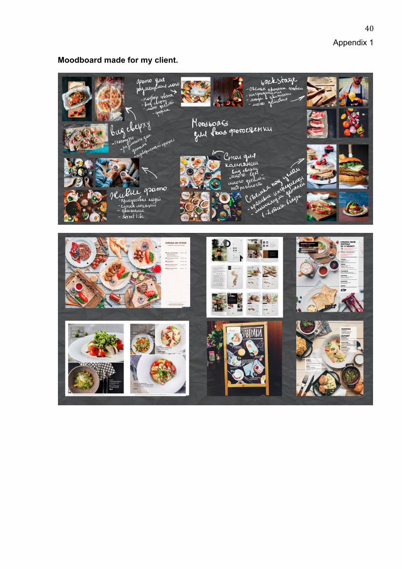
My working process started with collecting ideas for a moodboard (Appendix 1) about
brochure design and food photography style. There was a need for me to find a
competent combination of both themes to understand what kind of shooting style and
design owner of the bakery appreciates.
After analyzing the response I have determined the work direction. My client have
chosen bright and lovely pictures of food from magazines. Most of them were taken
using natural light and decorated in rustic style. Considering design she chose several
works done in minimalistic style. There were no big bright headlines, small amount of
text, light, tiny fonts and plenty of empty space. In addition she liked pages that
contained real stories and lifestyle pictures describing the daily life of bakery.
We have decided that the future brochure must include at least five examples of pastry
and desserts. They have to be photographed in a cozy atmosphere and exclude the use
of a boring white background. In this case, we tried to imitate rustic style. Each dessert
has to be photographed at such an angle that its texture and filling shows.
27
7.1 Client’s data
After meeting the client personally, I decided to find out more about the activity of the
prospective bakery. At the moment Marina does all the baking at her leisure. Quite often
she carries out cake or candy bars orders for her friends. Recently she has
concentrated on mastering new recipes and getting acquainted with new cake and
biscuit decoration techniques. Opening her own production is Marina's lifelong dream.
Several years ago she graduated from college, department of candy manufacture, and
since that moment her baking skills have been increasing continuously.
The name Marysja comes from Russian name Masha. This is how Marina had been
called during her childhood. That is the reason she decided to name her bakery this
way, to create an atmosphere in it as kind as her childhood was.
The mainstay of her future bakery will be delicate handmade sweets, cakes of diverse
complexity, mini cakes and chocolates.
Clients will be able to choose a base for their cake by themselves from a wide range of
options, add unique frosting and decorate their cake together with Marina. Loads of
handmade sweets, marshmallows, cookies and meringues will be always available for
purchase.
The main advantage of this bakery is using organic creams without any dry cake mixes
or vegetable oils. Besides that any kind of cake base or frostings will be available in
gluten and lactose free options.
Any kind of homemade pastry is varied depending on the season of the year. In
summer cakes and pies with fruits from a private garden can be ordered. In case a
customer has his own fruit harvest Marina can easily bake pie or cake using it. Kids
may enjoy cotton candies and ice cream made from natural juice or yoghurt.
From Marina’s point of view nowadays it is important to attract the attention of potential
customers through the Internet and additional resources. Photo shootings of products,
placing information and photos on website will be used to maintain this goal. The next
step is printing interesting advertising brochures.
28
It is very important to make the brochure stylish and attractive. It cannot be
overwhelmed with vast amounts of boring information. The brochure of this bakery has
to remind customers of some kind of personal letter. It is always a pleasure to open it,
look through it, enjoy the photos inside and become acquainted with all options that are
available in this bakery and with the person who is going to fulfill the order.
Target group
The association with the clients helped me to realize that majority of bakery customers
are young married women. Men place orders only before holidays or anniversaries,
relying on a baker's taste. Women in their turn make an informed choice of candy bar
for parties. In this particular case an advertisement has to attract customers and show
the basic range of products that can be adopted for a children's party or for any other
celebration. Desserts made by this bakery can always please, any day despite weather
or mood.
7.2 Photography Photo props To set the common goal I started collecting photo props for our shootings. It took time to
find an original old wooden background. To create it, I bought old floorboards and cut
them into smaller pieces for easy storage and use. The same thing happened with
pieces of laminate.
In the second hand store I found the metal tray and flatware with rust and patina. All
vintage items perfectly fit the popular rustic style. My client enjoyed the majority of
works of photographers working in this style. The essential decor items were borrowed
from friends and antique shop in Joensuu.
Shooting process The shooting process required baking and decorating a big number of cakes and
sweets. For this reason the shooting took place only on weekends at the client’s house
and lasted for several months.
29
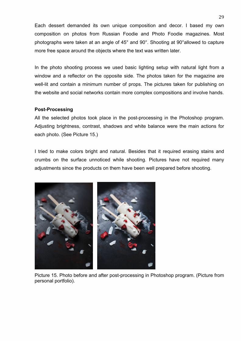
Each dessert demanded its own unique composition and decor. I based my own
composition on photos from Russian Foodie and Photo Foodie magazines. Most
photographs were taken at an angle of 45° and 90°. Shooting at 90°allowed to capture
more free space around the objects where the text was written later.
In the photo shooting process we used basic lighting setup with natural light from a
window and a reflector on the opposite side. The photos taken for the magazine are
well-lit and contain a minimum number of props. The pictures taken for publishing on
the website and social networks contain more complex compositions and involve hands.
Post-Processing All the selected photos took place in the post-processing in the Photoshop program.
Adjusting brightness, contrast, shadows and white balance were the main actions for
each photo. (See Picture 15.)
I tried to make colors bright and natural. Besides that it required erasing stains and
crumbs on the surface unnoticed while shooting. Pictures have not required many
adjustments since the products on them have been well prepared before shooting.
Picture 15. Photo before and after post-processing in Photoshop program. (Picture from personal portfolio).

30
7.3 Design
The brochure design began with a general discussion with the client. We decided to
have a maximum of 16 pages and use A5 format in our first brochure. The general style
of layout will be similar to the one used in food magazines. The object of attention is a
mouthwatering picture on each page. A photo of a delicious cake has been chosen for
the cover. I think this photo shows what is this brochure about. Cake is associated with
sweets and holiday celebrations, common to our themes. Regarding the font I have
chosen playful handwritten fonts that can attract attention and do not overlay the
picture.
Picture 16 .Cover page of brochure. Logo of the bakery and used fonts.
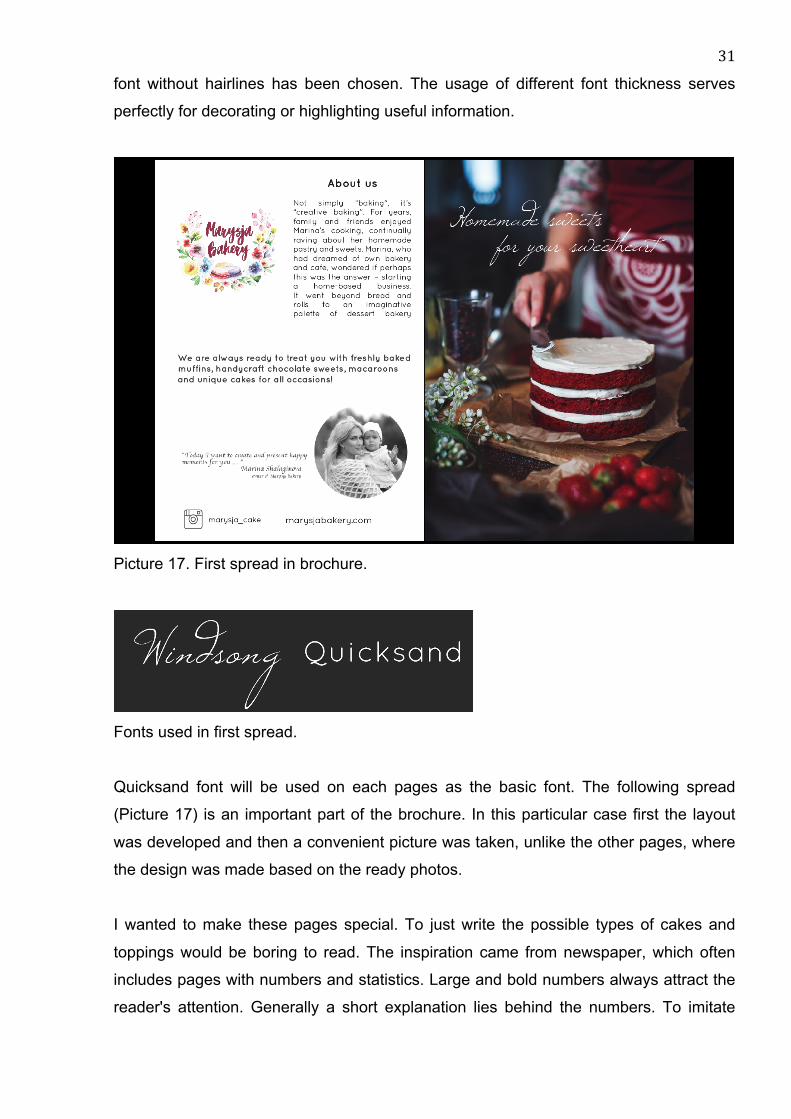
The first two-page opening (Picture 16) is the most informative one. While reading it,
people become acquainted with the bakery. That is why the photo that is used on this
page projects the process of creating a cake (baking the cake). There is a unique comfy
atmosphere and red color is well combined with the logo. In order to make it more
private and add an effect of personal "letter" that appeals to the reader, I added a quote
by the CEO and her informal photo.
The font that I have chosen was used as the main one for the brochure’s text. All the
client’s wishes have been taken into account and eventually round shaped Quicksand
31
font without hairlines has been chosen. The usage of different font thickness serves
perfectly for decorating or highlighting useful information.
Picture 17. First spread in brochure.
Fonts used in first spread.
Quicksand font will be used on each pages as the basic font. The following spread
(Picture 17) is an important part of the brochure. In this particular case first the layout
was developed and then a convenient picture was taken, unlike the other pages, where
the design was made based on the ready photos.
I wanted to make these pages special. To just write the possible types of cakes and
toppings would be boring to read. The inspiration came from newspaper, which often
includes pages with numbers and statistics. Large and bold numbers always attract the
reader's attention. Generally a short explanation lies behind the numbers. To imitate

32
newspaper style and add more importance to the text, I used the serif typeface. The
grid system was used for the symmetrical construction of the spread. This grid was
constructed manually due to the specified placement of text and the central use of
images.
Picture 18. Second spread in brochure.
Fonts used in second spread.
Picture 18 shows the third and fifth spreads. In these examples, I have used the photos
as a background. Each photo covers the entire surface of the page. Despite this, the
main objects are not placed in the center of the picture, and this left free space for
writing the text.
I highlighted the headlines using different fonts and font sizes. In the case of the page
about chocolate sweets I have used the larger letter C in the main word “chocolate”. A
large ornate letter framed the word and brought more elegance to it. Here three and two
column grid systems were used. The text about a variety of flavors has its own
unformatted text box.
33
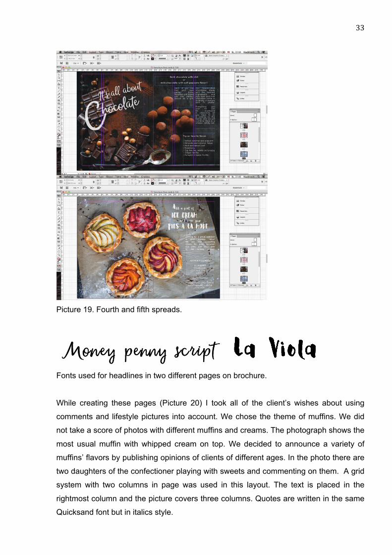
Picture 19. Fourth and fifth spreads.
Fonts used for headlines in two different pages on brochure.
While creating these pages (Picture 20) I took all of the client’s wishes about using
comments and lifestyle pictures into account. We chose the theme of muffins. We did
not take a score of photos with different muffins and creams. The photograph shows the
most usual muffin with whipped cream on top. We decided to announce a variety of
muffins’ flavors by publishing opinions of clients of different ages. In the photo there are
two daughters of the confectioner playing with sweets and commenting on them. A grid
system with two columns in page was used in this layout. The text is placed in the
rightmost column and the picture covers three columns. Quotes are written in the same
Quicksand font but in italics style.
34
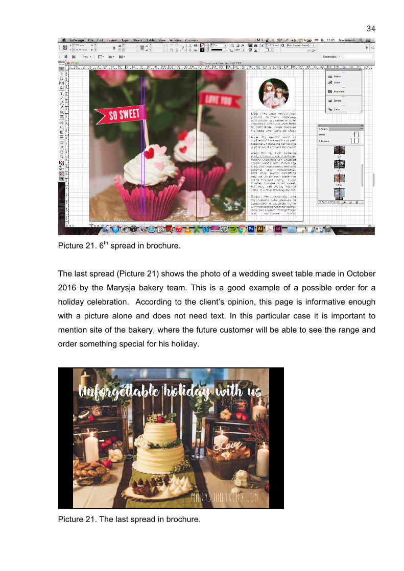
Picture 21. 6th spread in brochure.
The last spread (Picture 21) shows the photo of a wedding sweet table made in October
2016 by the Marysja bakery team. This is a good example of a possible order for a
holiday celebration. According to the client’s opinion, this page is informative enough
with a picture alone and does not need text. In this particular case it is important to
mention site of the bakery, where the future customer will be able to see the range and
order something special for his holiday.
Picture 21. The last spread in brochure.

35
8 RESULTS
The project resulted in 16 pages advertising brochure. It presents seven different types
of sweet products from the Marysja Bakery. This brochure advertises services available
in small bakery through delicious pictures and short but mouthwatering text.
Each spread has its own unique atmosphere and can be used separately from the
brochure. In the future my client can easily add the prices, update information and print
posters by herself.
In addition to brochure design we took hundreds of delicious photos of fresh pastry and
sweets. They will be used as media content for online marketing through Instagram and
other social networks.
This project is the result of the studied material about graphic design and photography
applied in practice. Learning the principals of the advertising text and illustrations gave
the basis for the idea of what should be advertised firstly in my brochure. The review
and analysis of successful brochures and booklets made by professional graphic
designers from the 20th and 21st centuries gave me an understanding of high-quality
and stylish layouts design.
The layout of this brochure is the concept of initial ideas and in the near future might be
corrected and extended to several pages with new products. At the moment the
brochure has been printed in several draft copies. Its electronic version is published on
the website issuu.com.
9 EVALUATION
Any completed work requires evaluation and feedback from a client and possible
readers. My client Marina discussed several important aspects of my work.
From her point of view everything has worked out well. A suitable amount of text on
each page and good visuals successfully work together. For her it was important to
show examples of some products and not to create a bulky product catalog. As she
36
expected the brochure resembles a culinary magazine. The main advantage is the fact
that each page or spread can be used separately from the brochure. This makes it
possible to print a page as posters or leaflets without changing a layout as well as
publishing on webpage and an Instagram profile.
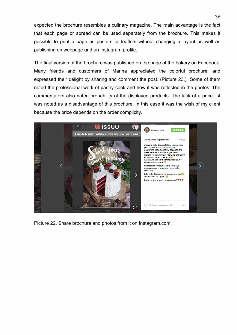
The final version of the brochure was published on the page of the bakery on Facebook.
Many friends and customers of Marina appreciated the colorful brochure, and
expressed their delight by sharing and comment the post. (Picture 23.) Some of them
noted the professional work of pastry cook and how it was reflected in the photos. The
commentators also noted probability of the displayed products. The lack of a price list
was noted as a disadvantage of this brochure. In this case it was the wish of my client
because the price depends on the order complicity.
Picture 22. Share brochure and photos from it on Instagram.com.
37
10 CONCLUSION
While working on the thesis I have not only increase knowledge and skills of graphic
design, photography and advertising, but also applied some of them in practice. I
learned more deeply the basics of print advertising and layout creation. In this work I
used knowledge of Photoshop and InDesign programs acquired at university courses.
Since photography is my hobby, getting acquainted with a new style of food
photography was exciting and useful for me. I will certainly continue practicing in this
genre of photography. I will try to use studio lighting and create more complex
composition solutions for other types of commercial product photography.
During the work process my client and I were publishing ready food photographs and
backstage videos in social networks. The results provide some support for new
partnership offers and I got acquainted with many interesting people. I was pleased by
the fact that Marina's and my work was appreciated by professionals of restaurant
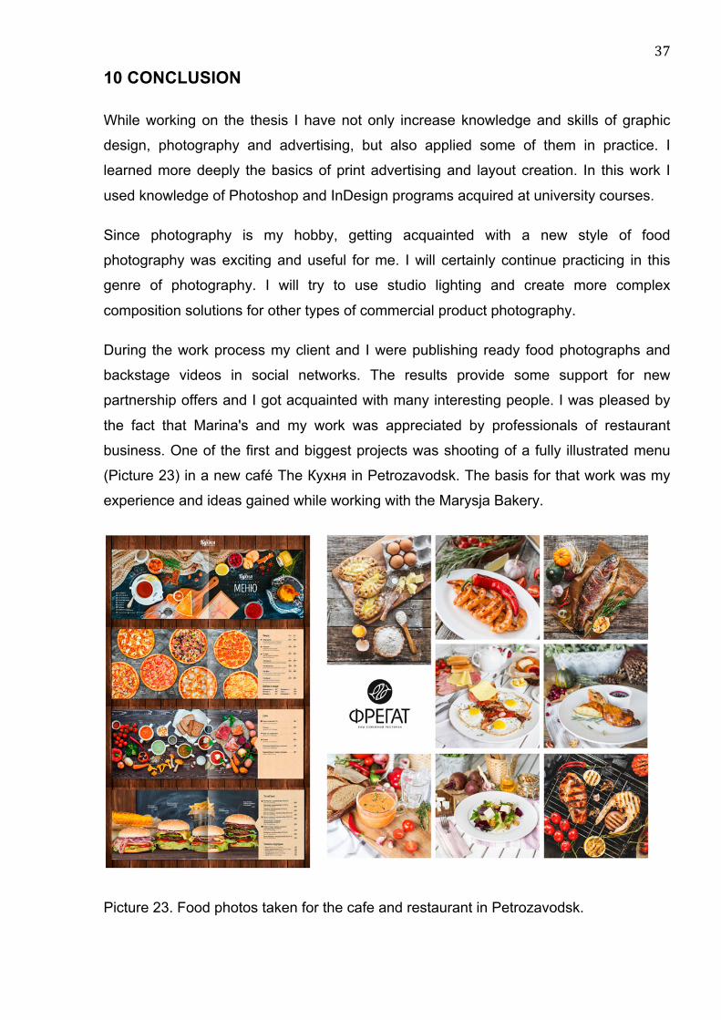
business. One of the first and biggest projects was shooting of a fully illustrated menu
(Picture 23) in a new café The Кухня in Petrozavodsk. The basis for that work was my
experience and ideas gained while working with the Marysja Bakery.
Picture 23. Food photos taken for the cafe and restaurant in Petrozavodsk.
38
After working with the brochure I started to understand how it is challenging for
designers to work with an existing photo, and how hard it might be to fit a text or make
an accent on an important information when the layout is a colorful photo. For future
projects I prefer to work as a photographer or graphic designer only, based on this
experience I realized how difficult is to be responsible for all parts of the project at once.
I am satisfied with completed work even though it is not perfect. For me positive
customer feedback and work experience that will be used in my future projects, are very
important.
39
REFERENCES
Bradley, S. 2011. 4 Types of Grids And When Each Works Best. http://vanseodesign.com/web-design/grid-types 12.08.2016
Craig, J. 2016. Designing With Type.The Essential Guide to Typography. 5th edition. St. Petesburg, Russia: Publishing house Piter.
Digital Print. 2013. A guide to paper weights for print brochures. https://www.digitalprinting.co.uk/blog/a-guide-to-paper-weights-for-your-printed-brochure/ 11.08.2016
Elam, K. 2004. Grid Systems: Principles of Organizing Type (Design Briefs). St. Petesburg, Russia: Publishing house Piter.
Frolov, P. 2016. Types of brochures. http://www.premierdesign.ru/broshiury 05.09.2016
Hansson, C. 2011. The Art of Choosing the Right Paper. https://tutsplus.com/authors/carolina-hansson 12.08.2016
Kidd, C. 2016. Judge This (TED Books). Publishing by AST. Lupton, E. 2004. Thinking with Type: A Critical Guide for Designers, Writers,
Editors, & Students. Publisher: Princeton Architectural Press Mironenko, A. 2014. Online-magazine Razvitie.
http://zhurnal-razvitie.ru/category/psihologiya-biznesa Nikulina, I. 2010. Layout design and preprint production in print advertisement.
http://imagika.ru/verstka.pdf 2.08.2016 Patel, N. 2014. The Complete Guide to Understanding Consumer Psychology.
https://www.quicksprout.com/2014/03/19/the-complete-guide-to-understanding-consumer-psychology/ 15.09.2016
Richardson, A. 2012. Advantages And Disadvantages Of Digital Printing. http://www.slideshare.net/Anita196Richardson/advantages-and-disadvantages-of-digital-printing 26.08.2016
Trofimova, V. 2016. Photo Foodie magazine. Spring 2016. http://russianfoodie.ru/photo/vesna-2016 17.07.2016
Voronetskaya, L. 2012. 5 tips for journal grid. 9.04.2012 https://tutdesign.ru/cats/tuts/indesign_tut
Wells, W., Burnett, J., Moriarty, S. 2008. Advertising: Principles And Practice. St. Petesburg, Russia: Publishing house Piter.
Zaretskaya, N. 2002. Delovoe obschenie.
40
Appendix 1
Moodboard made for my client.
41
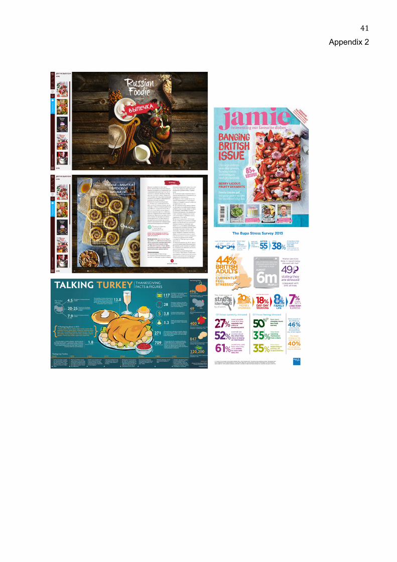
Appendix 2
42
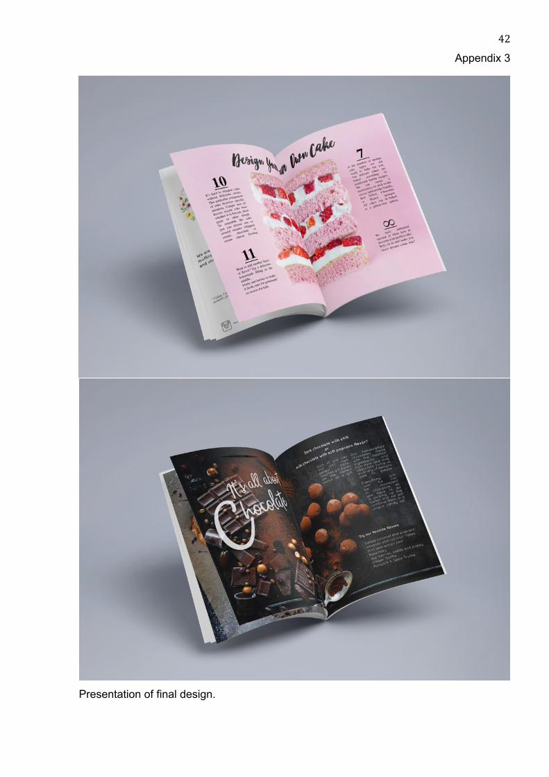
Appendix 3
Presentation of final design.