data handling - net
TRANSCRIPT

DATA HANDLING

What Is Data?
Data is information.
An example:
In my fifth grade class we took a pizza lovers survey.
We learned that ten kids liked pepperoni pizza best.
Nine kids liked sausage pizza best.
Seven kids liked cheese pizza best.
This information is called DATA.

What Is Data?
Your report card is another example of data.
Math: 88%
Reading: 94%
Science: 75%
Social Studies: 80%
Language Arts: 55%
My Language Arts
teacher may not like
me.

Data Is Everywhere.
TV
Books
Newspaper
There is way too
much data in
school!
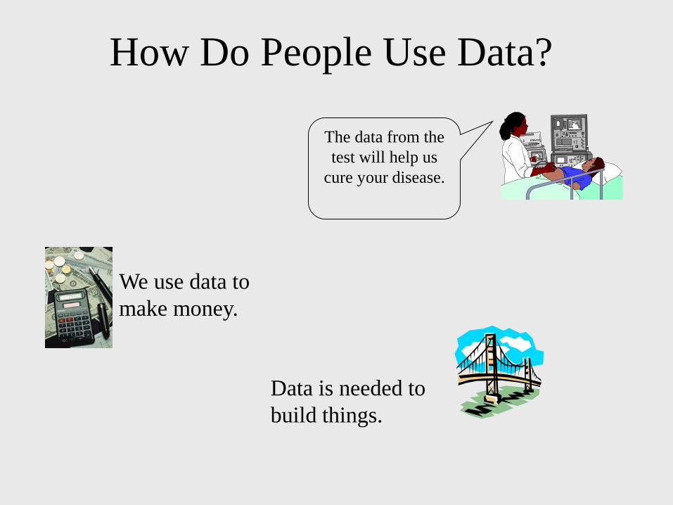
How Do People Use Data?
We use data to
make money.
The data from the
test will help us
cure your disease.
Data is needed to
build things.

We Use Graphs to Organize Data.
0
10
20
30
40
50
60
70
80
90
100
Math Reading Sci SS L. Arts
I know my parents will
want to talk to my
Language Arts teacher.

Let’s Learn About Graphs.
There are many different types of graphs.
Let’s learn about two kinds.
1. The bar graph
2. The line graph
0
10
20
30
40
50
60
70
80
90
100
Math Reading Sci SS L. Arts
0
10
20
30
40
50
60
70
80
90
100
Math Reading Sci SS L. Arts
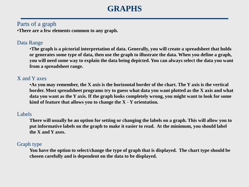
Parts of a graph•There are a few elements common to any graph.
Data Range•The graph is a pictorial interpretation of data. Generally, you will create a spreadsheet that holds
or generates some type of data, then use the graph to illustrate the data. When you define a graph,
you will need some way to explain the data being depicted. You can always select the data you want
from a spreadsheet range.
X and Y axes •As you may remember, the X axis is the horizontal border of the chart. The Y axis is the vertical
border. Most spreadsheet programs try to guess what data you want plotted as the X axis and what
data you want as the Y axis. If the graph looks completely wrong, you might want to look for some
kind of feature that allows you to change the X - Y orientation.
Labels There will usually be an option for setting or changing the labels on a graph. This will allow you to
put informative labels on the graph to make it easier to read. At the minimum, you should label
the X and Y axes.
Graph type You have the option to select/change the type of graph that is displayed. The chart type should be
chosen carefully and is dependent on the data to be displayed.
GRAPHS

•Charts•Used as a data analysis tool. Graphical representations of data are easier
to interpret than numbers.
•Used as a presentation tool for the same reason.
•Chart Types•Column/Bar
•Data represented as vertical columns or
horizontal bars that run from 0 to the
value of the datum.
• The height of a column corresponds to the
magnitude of the datum.
•Data values are on the y-axis for a column
chart and the x-axis in a bar chart.
Opposite axis contains data labels only.
•You may chart multiple data series in a
single chart for comparison purposes.
GRAPHS

•Chart Types
•Line•Data values are on the y-
axis. X-axis contains data
labels only.
•Best used for showing a
trend over a given period of
time.
Dow Jones Average
GRAPHS

•Chart Types•Pie
•Data represented as an area
in a circle expressed as a
percentage of a whole.
•Number of categories should
be kept to a minimum (<10).
•“Other” category should
represent a small percentage
(if used).
PERCENT DISTRIBUTION OF HOUSEHOLDS OWNING PETS
Under $12,500
$12,500 to $24,999
$25,000 to $39,999
$40,000 to $59,999
$60,000 and over
GRAPHS


Data Handling
(Graphs)
Pictograph
Histogram/Bar graph
Pie Chart
Probability
CONCEPT
MAP