bba - an introduction to business statistics - aws
TRANSCRIPT
COURSE CODE: MC-106
LESSON: 01
AUTHOR: SURINDER KUNDU VETTER: DR. B. S. BODLA
AN INTRODUCTION TO BUSINESS STATISTICS
OBJECTIVE: The aim of the present lesson is to enable the students to understand
the meaning, definition, nature, importance and limitations of statistics.
“A knowledge of statistics is like a knowledge of foreign
language of algebra; it may prove of use at any time under
any circumstance”… ................................................. Bowley.
STRUCTURE OF THE NOTE:
1.1 Introduction
1.2 Meaning and Definitions of Statistics
1.3 Types of Data and Data Sources
1.4 Types of Statistics
1.5 Scope of Statistics
1.6 Importance of Statistics in Business
1.7 Limitations of statistics
1.8 Summary
1.9 Self-Test Questions
1.10 Types of Data, Important Sources of Secondary Data; Collection and Presentation of
Data: Different Methods of collecting Primary Data: Text, Tabular and graphical
Methods of Data presentation; Frequency Distribution, Diagrammatic Presentation of
Frequency data.
1.1 INTRODUCTION
For a layman, ‘Statistics’ means numerical information expressed in quantitative
terms. This information may relate to objects, subjects, activities, phenomena, or
regions of space. As a matter of fact, data have no limits as to their reference,
coverage, and scope. At the macro level, these are data on gross national product and
shares of agriculture, manufacturing, and services in GDP (Gross Domestic Product).
1
SUBJECT: BUSINESS STATISTICS BBA – 2
nd Semester
BBAHC-3: BUSINESS STATISTICS & MATHEMATICS
Instructor: Madhabendra Sinha, Dept of MBA, Raiganj University
(The note is constructed on the basis of different collections from several sources including websites. In case of any difficulty to understand one may contact the instructor. Useful disclaimers apply)
Unit-I
Introduction: Definition of Statistics, Importance and scope of statistics, Limitations of Statistics,
Types of Data, Important Sources of Secondary Data; Collection and Presentation of Data:
Different Methods of collecting Primary Data: Text, Tabular and graphical Methods of Data
presentation; Frequency Distribution, Diagrammatic Presentation of Frequency data.

2
At the micro level, individual firms, howsoever small or large, produce extensive
statistics on their operations. The annual reports of companies contain variety of data
on sales, production, expenditure, inventories, capital employed, and other activities.
These data are often field data, collected by employing scientific survey techniques.
Unless regularly updated, such data are the product of a one-time effort and have
limited use beyond the situation that may have called for their collection. A student
knows statistics more intimately as a subject of study like economics, mathematics,
chemistry, physics, and others. It is a discipline, which scientifically deals with data,
and is often described as the science of data. In dealing with statistics as data,
statistics has developed appropriate methods of collecting, presenting, summarizing,
and analysing data, and thus consists of a body of these methods.
1.2 MEANING AND DEFINITIONS OF STATISTICS
In the beginning, it may be noted that the word ‘statistics’ is used rather curiously in
two senses plural and singular. In the plural sense, it refers to a set of figures or data.
In the singular sense, statistics refers to the whole body of tools that are used to
collect data, organise and interpret them and, finally, to draw conclusions from them.
It should be noted that both the aspects of statistics are important if the quantitative
data are to serve their purpose. If statistics, as a subject, is inadequate and consists of
poor methodology, we could not know the right procedure to extract from the data the
information they contain. Similarly, if our data are defective or that they are
inadequate or inaccurate, we could not reach the right conclusions even though our
subject is well developed.
A.L. Bowley has defined statistics as: (i) statistics is the science of counting, (ii)
Statistics may rightly be called the science of averages, and (iii) statistics is the
science of measurement of social organism regarded as a whole in all its mani-

3
festations. Boddington defined as: Statistics is the science of estimates and
probabilities. Further, W.I. King has defined Statistics in a wider context, the science
of Statistics is the method of judging collective, natural or social phenomena from the
results obtained by the analysis or enumeration or collection of estimates.
Seligman explored that statistics is a science that deals with the methods of collecting,
classifying, presenting, comparing and interpreting numerical data collected to throw
some light on any sphere of enquiry. Spiegal defines statistics highlighting its role in
decision-making particularly under uncertainty, as follows: statistics is concerned
with scientific method for collecting, organising, summa rising, presenting and
analyzing data as well as drawing valid conclusions and making reasonable decisions
on the basis of such analysis. According to Prof. Horace Secrist, Statistics is the
aggregate of facts, affected to a marked extent by multiplicity of causes, numerically
expressed, enumerated or estimated according to reasonable standards of accuracy,
collected in a systematic manner for a pre-determined purpose, and placed in relation
to each other.
From the above definitions, we can highlight the major characteristics of statistics as
follows:
(i) Statistics are the aggregates of facts. It means a single figure is not statistics.
For example, national income of a country for a single year is not statistics but
the same for two or more years is statistics.
(ii) Statistics are affected by a number of factors. For example, sale of a product
depends on a number of factors such as its price, quality, competition, the
income of the consumers, and so on.
4
(iii) Statistics must be reasonably accurate. Wrong figures, if analysed, will lead to
erroneous conclusions. Hence, it is necessary that conclusions must be based
on accurate figures.
(iv) Statistics must be collected in a systematic manner. If data are collected in a
haphazard manner, they will not be reliable and will lead to misleading
conclusions.
(v) Collected in a systematic manner for a pre-determined purpose
(vi) Lastly, Statistics should be placed in relation to each other. If one collects data
unrelated to each other, then such data will be confusing and will not lead to
any logical conclusions. Data should be comparable over time and over space.
1.3 TYPES OF DATA AND DATA SOURCES
Statistical data are the basic raw material of statistics. Data may relate to an activity of
our interest, a phenomenon, or a problem situation under study. They derive as a
result of the process of measuring, counting and/or observing. Statistical data,
therefore, refer to those aspects of a problem situation that can be measured,
quantified, counted, or classified. Any object subject phenomenon, or activity that
generates data through this process is termed as a variable. In other words, a variable
is one that shows a degree of variability when successive measurements are recorded.
In statistics, data are classified into two broad categories: quantitative data and
qualitative data. This classification is based on the kind of characteristics that are
measured.
Quantitative data are those that can be quantified in definite units of measurement.
These refer to characteristics whose successive measurements yield quantifiable
observations. Depending on the nature of the variable observed for measurement,
quantitative data can be further categorized as continuous and discrete data.

5
Obviously, a variable may be a continuous variable or a discrete variable.
(i) Continuous data represent the numerical values of a continuous variable. A
continuous variable is the one that can assume any value between any two
points on a line segment, thus representing an interval of values. The values
are quite precise and close to each other, yet distinguishably different. All
characteristics such as weight, length, height, thickness, velocity, temperature,
tensile strength, etc., represent continuous variables. Thus, the data recorded
on these and similar other characteristics are called continuous data. It may be
noted that a continuous variable assumes the finest unit of measurement.
Finest in the sense that it enables measurements to the maximum degree of
precision.
(ii) Discrete data are the values assumed by a discrete variable. A discrete
variable is the one whose outcomes are measured in fixed numbers. Such data
are essentially count data. These are derived from a process of counting, such
as the number of items possessing or not possessing a certain characteristic.
The number of customers visiting a departmental store everyday, the incoming
flights at an airport, and the defective items in a consignment received for sale,
are all examples of discrete data.
Qualitative data refer to qualitative characteristics of a subject or an object. A
characteristic is qualitative in nature when its observations are defined and noted in
terms of the presence or absence of a certain attribute in discrete numbers. These data
are further classified as nominal and rank data.
(i) Nominal data are the outcome of classification into two or more categories of
items or units comprising a sample or a population according to some quality
characteristic. Classification of students according to sex (as males and

6
females), of workers according to skill (as skilled, semi-skilled, and unskilled),
and of employees according to the level of education (as matriculates,
undergraduates, and post-graduates), all result into nominal data. Given any
such basis of classification, it is always possible to assign each item to a
particular class and make a summation of items belonging to each class. The
count data so obtained are called nominal data.
(ii) Rank data, on the other hand, are the result of assigning ranks to specify order
in terms of the integers 1,2,3, ..., n. Ranks may be assigned according to the
level of performance in a test. a contest, a competition, an interview, or a
show. The candidates appearing in an interview, for example, may be assigned
ranks in integers ranging from I to n, depending on their performance in the
interview. Ranks so assigned can be viewed as the continuous values of a
variable involving performance as the quality characteristic.
Data sources could be seen as of two types, viz., secondary and primary. The two can
be defined as under:
(i) Secondary data: They already exist in some form: published or unpublished -
in an identifiable secondary source. They are, generally, available from
published source(s), though not necessarily in the form actually required.
(ii) Primary data: Those data which do not already exist in any form, and thus
have to be collected for the first time from the primary source(s). By their very
nature, these data require fresh and first-time collection covering the whole
population or a sample drawn from it.
1.4 TYPES OF STATISTICS
There are two major divisions of statistics such as descriptive statistics and inferential
statistics. The term descriptive statistics deals with collecting, summarizing, and
7
simplifying data, which are otherwise quite unwieldy and voluminous. It seeks to
achieve this in a manner that meaningful conclusions can be readily drawn from the
data. Descriptive statistics may thus be seen as comprising methods of bringing out
and highlighting the latent characteristics present in a set of numerical data. It not
only facilitates an understanding of the data and systematic reporting thereof in a
manner; and also makes them amenable to further discussion, analysis, and
interpretations.
The first step in any scientific inquiry is to collect data relevant to the problem in
hand. When the inquiry relates to physical and/or biological sciences, data collection
is normally an integral part of the experiment itself. In fact, the very manner in which
an experiment is designed, determines the kind of data it would require and/or
generate. The problem of identifying the nature and the kind of the relevant data is
thus automatically resolved as soon as the design of experiment is finalized. It is
possible in the case of physical sciences. In the case of social sciences, where the
required data are often collected through a questionnaire from a number of carefully
selected respondents, the problem is not that simply resolved. For one thing,
designing the questionnaire itself is a critical initial problem. For another, the number
of respondents to be accessed for data collection and the criteria for selecting them
has their own implications and importance for the quality of results obtained. Further,
the data have been collected, these are assembled, organized, and presented in the
form of appropriate tables to make them readable. Wherever needed, figures,
diagrams, charts, and graphs are also used for better presentation of the data. A useful
tabular and graphic presentation of data will require that the raw data be properly
classified in accordance with the objectives of investigation and the relational analysis
to be carried out. .
8
A well thought-out and sharp data classification facilitates easy description of the
hidden data characteristics by means of a variety of summary measures. These include
measures of central tendency, dispersion, skewness, and kurtosis, which constitute the
essential scope of descriptive statistics. These form a large part of the subject matter
of any basic textbook on the subject, and thus they are being discussed in that order
here as well.
Inferential statistics, also known as inductive statistics, goes beyond describing a
given problem situation by means of collecting, summarizing, and meaningfully
presenting the related data. Instead, it consists of methods that are used for drawing
inferences, or making broad generalizations, about a totality of observations on the
basis of knowledge about a part of that totality. The totality of observations about
which an inference may be drawn, or a generalization made, is called a population or
a universe. The part of totality, which is observed for data collection and analysis to
gain knowledge about the population, is called a sample.
The desired information about a given population of our interest; may also be
collected even by observing all the units comprising the population. This total
coverage is called census. Getting the desired value for the population through census
is not always feasible and practical for various reasons. Apart from time and money
considerations making the census operations prohibitive, observing each individual
unit of the population with reference to any data characteristic may at times involve
even destructive testing. In such cases, obviously, the only recourse available is to
employ the partial or incomplete information gathered through a sample for the
purpose. This is precisely what inferential statistics does. Thus, obtaining a particular
value from the sample information and using it for drawing an inference about the
entire population underlies the subject matter of inferential statistics. Consider a
9
situation in which one is required to know the average body weight of all the college
students in a given cosmopolitan city during a certain year. A quick and easy way to
do this is to record the weight of only 500 students, from out of a total strength of,
say, 10000, or an unknown total strength, take the average, and use this average based
on incomplete weight data to represent the average body weight of all the college
students. In a different situation, one may have to repeat this exercise for some future
year and use the quick estimate of average body weight for a comparison. This may
be needed, for example, to decide whether the weight of the college students has
undergone a significant change over the years compared.
Inferential statistics helps to evaluate the risks involved in reaching inferences or
generalizations about an unknown population on the basis of sample information. for
example, an inspection of a sample of five battery cells drawn from a given lot may
reveal that all the five cells are in perfectly good condition. This information may be
used to conclude that the entire lot is good enough to buy or not.
Since this inference is based on the examination of a sample of limited number of
cells, it is equally likely that all the cells in the lot are not in order. It is also possible
that all the items that may be included in the sample are unsatisfactory. This may be
used to conclude that the entire lot is of unsatisfactory quality, whereas the fact may
indeed be otherwise. It may, thus, be noticed that there is always a risk of an inference
about a population being incorrect when based on the knowledge of a limited sample.
The rescue in such situations lies in evaluating such risks. For this, statistics provides
the necessary methods. These centres on quantifying in probabilistic term the chances
of decisions taken on the basis of sample information being incorrect. This requires an
understanding of the what, why, and how of probability and probability distributions
to equip ourselves with methods of drawing statistical inferences and estimating the

10
degree of reliability of these inferences.
1.5 SCOPE OF STATISTICS
Apart from the methods comprising the scope of descriptive and inferential branches
of statistics, statistics also consists of methods of dealing with a few other issues of
specific nature. Since these methods are essentially descriptive in nature, they have
been discussed here as part of the descriptive statistics. These are mainly concerned
with the following:
(i) It often becomes necessary to examine how two paired data sets are related.
For example, we may have data on the sales of a product and the expenditure
incurred on its advertisement for a specified number of years. Given that sales
and advertisement expenditure are related to each other, it is useful to examine
the nature of relationship between the two and quantify the degree of that
relationship. As this requires use of appropriate statistical methods, these falls
under the purview of what we call regression and correlation analysis.
(ii) Situations occur quite often when we require averaging (or totalling) of data
on prices and/or quantities expressed in different units of measurement. For
example, price of cloth may be quoted per meter of length and that of wheat
per kilogram of weight. Since ordinary methods of totalling and averaging do
not apply to such price/quantity data, special techniques needed for the
purpose are developed under index numbers.
(iii) Many a time, it becomes necessary to examine the past performance of an
activity with a view to determining its future behaviour. For example, when
engaged in the production of a commodity, monthly product sales are an
important measure of evaluating performance. This requires compilation and
analysis of relevant sales data over time. The more complex the activity, the

11
more varied the data requirements. For profit maximising and future sales
planning, forecast of likely sales growth rate is crucial. This needs careful
collection and analysis of past sales data. All such concerns are taken care of
under time series analysis.
(iv) Obtaining the most likely future estimates on any aspect(s) relating to a
business or economic activity has indeed been engaging the minds of all
concerned. This is particularly important when it relates to product sales and
demand, which serve the necessary basis of production scheduling and
planning. The regression, correlation, and time series analyses together help
develop the basic methodology to do the needful. Thus, the study of methods
and techniques of obtaining the likely estimates on business/economic
variables comprises the scope of what we do under business forecasting.
Keeping in view the importance of inferential statistics, the scope of statistics may
finally be restated as consisting of statistical methods which facilitate decision--
making under conditions of uncertainty. While the term statistical methods is often
used to cover the subject of statistics as a whole, in particular it refers to methods by
which statistical data are analysed, interpreted, and the inferences drawn for decision-
making.
Though generic in nature and versatile in their applications, statistical methods have
come to be widely used, especially in all matters concerning business and economics.
These are also being increasingly used in biology, medicine, agriculture, psychology,
and education. The scope of application of these methods has started opening and
expanding in a number of social science disciplines as well. Even a political scientist
finds them of increasing relevance for examining the political behaviour and it is, of
course, no surprise to find even historians statistical data, for history is essentially past

12
data presented in certain actual format.
1.6 IMPORTANCE OF STATISTICS IN BUSINESS
There are three major functions in any business enterprise in which the statistical
methods are useful. These are as follows:
(i) The planning of operations: This may relate to either special projects or to
the recurring activities of a firm over a specified period.
(ii) The setting up of standards: This may relate to the size of employment,
volume of sales, fixation of quality norms for the manufactured product,
norms for the daily output, and so forth.
(iii) The function of control: This involves comparison of actual production
achieved against the norm or target set earlier. In case the production has
fallen short of the target, it gives remedial measures so that such a deficiency
does not occur again.
A worth noting point is that although these three functions-planning of operations,
setting standards, and control-are separate, but in practice they are very much
interrelated.
Different authors have highlighted the importance of Statistics in business. For
instance, Croxton and Cowden give numerous uses of Statistics in business such as
project planning, budgetary planning and control, inventory planning and control,
quality control, marketing, production and personnel administration. Within these also
they have specified certain areas where Statistics is very relevant. Another author,
Irwing W. Burr, dealing with the place of statistics in an industrial organisation,
specifies a number of areas where statistics is extremely useful. These are: customer
wants and market research, development design and specification, purchasing,

13
production, inspection, packaging and shipping, sales and complaints, inventory and
maintenance, costs, management control, industrial engineering and research.
Statistical problems arising in the course of business operations are multitudinous. As
such, one may do no more than highlight some of the more important ones to
emphasis the relevance of statistics to the business world. In the sphere of production,
for example, statistics can be useful in various ways.
Statistical quality control methods are used to ensure the production of quality goods.
Identifying and rejecting defective or substandard goods achieve this. The sale targets
can be fixed on the basis of sale forecasts, which are done by using varying methods
of forecasting. Analysis of sales affected against the targets set earlier would indicate
the deficiency in achievement, which may be on account of several causes: (i) targets
were too high and unrealistic (ii) salesmen's performance has been poor (iii)
emergence of increase in competition (iv) poor quality of company's product, and so
on. These factors can be further investigated.
Another sphere in business where statistical methods can be used is personnel
management. Here, one is concerned with the fixation of wage rates, incentive norms
and performance appraisal of individual employee. The concept of productivity is
very relevant here. On the basis of measurement of productivity, the productivity
bonus is awarded to the workers. Comparisons of wages and productivity are
undertaken in order to ensure increases in industrial productivity.
Statistical methods could also be used to ascertain the efficacy of a certain product,
say, medicine. For example, a pharmaceutical company has developed a new
medicine in the treatment of bronchial asthma. Before launching it on commercial
basis, it wants to ascertain the effectiveness of this medicine. It undertakes an
experimentation involving the formation of two comparable groups of asthma
14
patients. One group is given this new medicine for a specified period and the other
one is treated with the usual medicines. Records are maintained for the two groups for
the specified period. This record is then analysed to ascertain if there is any
significant difference in the recovery of the two groups. If the difference is really
significant statistically, the new medicine is commercially launched.
1.7 LIMITATIONS OF STATISTICS
Statistics has a number of limitations, pertinent among them are as follows:
(i) There are certain phenomena or concepts where statistics cannot be used. This
is because these phenomena or concepts are not amenable to measurement.
For example, beauty, intelligence, courage cannot be quantified. Statistics has
no place in all such cases where quantification is not possible.
(ii) Statistics reveal the average behaviour, the normal or the general trend. An
application of the 'average' concept if applied to an individual or a particular
situation may lead to a wrong conclusion and sometimes may be disastrous.
For example, one may be misguided when told that the average depth of a
river from one bank to the other is four feet, when there may be some points in
between where its depth is far more than four feet. On this understanding, one
may enter those points having greater depth, which may be hazardous.
(iii) Since statistics are collected for a particular purpose, such data may not be
relevant or useful in other situations or cases. For example, secondary data
(i.e., data originally collected by someone else) may not be useful for the other
person.
(iv) Statistics are not 100 per cent precise as is Mathematics or Accountancy.
Those who use statistics should be aware of this limitation.
15
(v) In statistical surveys, sampling is generally used as it is not physically possible
to cover all the units or elements comprising the universe. The results may not
be appropriate as far as the universe is concerned. Moreover, different surveys
based on the same size of sample but different sample units may yield
different results.
(vi) At times, association or relationship between two or more variables is studied
in statistics, but such a relationship does not indicate cause and effect'
relationship. It simply shows the similarity or dissimilarity in the movement of
the two variables. In such cases, it is the user who has to interpret the results
carefully, pointing out the type of relationship obtained.
(vii) A major limitation of statistics is that it does not reveal all pertaining to a
certain phenomenon. There is some background information that statistics
does not cover. Similarly, there are some other aspects related to the problem
on hand, which are also not covered. The user of Statistics has to be well
informed and should interpret Statistics keeping in mind all other aspects
having relevance on the given problem.
Apart from the limitations of statistics mentioned above, there are misuses of it. Many
people, knowingly or unknowingly, use statistical data in wrong manner. Let us see
what the main misuses of statistics are so that the same could be avoided when one
has to use statistical data. The misuse of Statistics may take several forms some of
which are explained below.
(i) Sources of data not given: At times, the source of data is not given. In the
absence of the source, the reader does not know how far the data are reliable.
Further, if he wants to refer to the original source, he is unable to do so.
16
(ii) Defective data: Another misuse is that sometimes one gives defective data.
This may be done knowingly in order to defend one's position or to prove a
particular point. This apart, the definition used to denote a certain
phenomenon may be defective. For example, in case of data relating to unem-
ployed persons, the definition may include even those who are employed,
though partially. The question here is how far it is justified to include partially
employed persons amongst unemployed ones.
(iii) Unrepresentative sample: In statistics, several times one has to conduct a
survey, which necessitates to choose a sample from the given population or
universe. The sample may turn out to be unrepresentative of the universe. One
may choose a sample just on the basis of convenience. He may collect the
desired information from either his friends or nearby respondents in his
neighbourhood even though such respondents do not constitute a
representative sample.
(iv) Inadequate sample: Earlier, we have seen that a sample that is
unrepresentative of the universe is a major misuse of statistics. This apart, at
times one may conduct a survey based on an extremely inadequate sample.
For example, in a city we may find that there are 1, 00,000 households. When
we have to conduct a household survey, we may take a sample of merely 100
households comprising only 0.1 per cent of the universe. A survey based on
such a small sample may not yield right information.
(v) Unfair Comparisons: An important misuse of statistics is making unfair
comparisons from the data collected. For instance, one may construct an index
of production choosing the base year where the production was much less.
Then he may compare the subsequent year's production from this low base.

17
Such a comparison will undoubtedly give a rosy picture of the production
though in reality it is not so. Another source of unfair comparisons could be
when one makes absolute comparisons instead of relative ones. An absolute
comparison of two figures, say, of production or export, may show a good
increase, but in relative terms it may turnout to be very negligible. Another
example of unfair comparison is when the population in two cities is different,
but a comparison of overall death rates and deaths by a particular disease is
attempted. Such a comparison is wrong. Likewise, when data are not properly
classified or when changes in the composition of population in the two years
are not taken into consideration, comparisons of such data would be unfair as
they would lead to misleading conclusions.
(vi) Unwanted conclusions: Another misuse of statistics may be on account of
unwarranted conclusions. This may be as a result of making false assumptions.
For example, while making projections of population in the next five years,
one may assume a lower rate of growth though the past two years indicate
otherwise. Sometimes one may not be sure about the changes in business
environment in the near future. In such a case, one may use an assumption that
may turn out to be wrong. Another source of unwarranted conclusion may be
the use of wrong average. Suppose in a series there are extreme values, one is
too high while the other is too low, such as 800 and 50. The use of an
arithmetic average in such a case may give a wrong idea. Instead, harmonic
mean would be proper in such a case.
(vii) Confusion of correlation and causation: In statistics, several times one has
to examine the relationship between two variables. A close relationship between the
two variables may not establish a cause-and-effect-relationship in the sense that one

18
variable is the cause and the other is the effect. It should be taken as something that
measures degree of association rather than try to find out causal relationship..
1.8 SUMMARY
In a summarized manner, ‘Statistics’ means numerical information expressed in
quantitative terms. As a matter of fact, data have no limits as to their reference,
coverage, and scope. At the macro level, these are data on gross national product and
shares of agriculture, manufacturing, and services in GDP (Gross Domestic Product).
At the micro level, individual firms, howsoever small or large, produce extensive
statistics on their operations. The annual reports of companies contain variety of data
on sales, production, expenditure, inventories, capital employed, and other activities.
These data are often field data, collected by employing scientific survey techniques.
Unless regularly updated, such data are the product of a one-time effort and have
limited use beyond the situation that may have called for their collection. A student
knows statistics more intimately as a subject of study like economics, mathematics,
chemistry, physics, and others. It is a discipline, which scientifically deals with data,
and is often described as the science of data. In dealing with statistics as data,
statistics has developed appropriate methods of collecting, presenting, summarizing,
and analysing data, and thus consists of a body of these methods.
1.9 SELF-TEST QUESTIONS
1. Define Statistics. Explain its types, and importance to trade, commerce and
business.
2. “Statistics is all-pervading”. Elucidate this statement.
3. Write a note on the scope and limitations of Statistics.
4. What are the major limitations of Statistics? Explain with suitable examples.
5. Distinguish between descriptive Statistics and inferential Statistics.

1.10 Types of Data, Important Sources of Secondary Data; Collection and Presentation of Data:
Different Methods of collecting Primary Data: Text, Tabular and graphical Methods of Data
presentation; Frequency Distribution, Diagrammatic Presentation of Frequency data
1.10.a Types of Data, Important Sources of Secondary Data; Collection and
Presentation of Data: Different Methods of collecting Primary Data
Data can be defined as a collection of facts or information from which conclusions may be
drawn. Data may be qualitative or quantitative. Once we know the difference between them, we
can know how to use them.
Qualitative Data: They represent some characteristics or attributes. They depict descriptions
that may be observed but cannot be computed or calculated. For example, data on attributes
such as intelligence, honesty, wisdom, cleanliness, and creativity collected using the students
of your class a sample would be classified as qualitative. They are more exploratory than
conclusive in nature.
Quantitative Data: These can be measured and not simply observed. They can be
numerically represented and calculations can be performed on them. For example, data on the
number of students playing different sports from your class gives an estimate of how many of
the total students play which sport. This information is numerical and can be classified as
quantitative.
Discrete Data: These are data that can take only certain specific values rather than a range of
values. For example, data on the blood group of a certain population or on their genders is
termed as discrete data. A usual way to represent this is using bar charts.
Continuous Data: These are data that can take values between a certain range with the highest
and lowest values. The difference between the highest and lowest value is called the range of
data. For example, the age of persons can take values even in decimals or so is the case of the
height and weights of the students of your school. These are classified as continuous data.
Continuous data can be tabulated in what is called a frequency distribution. They can be
graphically represented using histograms.
Depending on the source, it can classify as primary data or secondary data. Let us take a look at
them both.
Primary Data: These are the data that are collected for the first time by an investigator for a
specific purpose. Primary data are ‘pure’ in the sense that no statistical operations have been
performed on them and they are original. An example of primary data is the Census of India.
Secondary Data: They are the data that are sourced from someplace that has originally
collected it. This means that this kind of data has already been collected by some researchers or
investigators in the past and is available either in published or unpublished form. This
information is impure as statistical operations may have been performed on them already. An
example is information available on the Government of India, Department of Finance’s website
or in other repositories, books, journals, etc.
Collection of Primary Data
Primary data is collected in the course of doing experimental or descriptive research by doing
experiments, performing surveys or by observation or direct communication with
respondents. Several methods for collecting primary data are given below:

1. Observation Method
It is commonly used in studies relating to behavioural science. Under this method observation
becomes a scientific tool and the method of data collection for the researcher, when it serves
a formulated research purpose and is systematically planned and subjected to checks and
controls.
(a) Structured (descriptive) and Unstructured (exploratory) observation: When a
observation is characterized by careful definition of units to be observed, style of observer,
conditions for observation and selection of pertinent data of observation it is a structured
observation. When there characteristics are not thought of in advance or not present it is a
unstructured observation.
(b) Participant, Non-participant and Disguised observation: When the observer observes
by making himself more or less, the member of the group he is observing, it is participant
observation but when the observer observes by detaching him from the group under
observation it is non participant observation. If the observer observes in such a manner that
his presence is unknown to the people he is observing it is disguised observation.
(c) Controlled (laboratory) and Uncontrolled (exploratory) observation: If the
observation takes place in the natural setting it is a uncontrolled observation but when
observer takes place according to some pre-arranged plans, involving experimental procedure
it is a controlled observation.
Advantages
Subjective bias is eliminated
Data is not affected by past behaviour or future intentions
Natural behaviour of the group can be recorded
Limitations
Expensive methodology
Information provided is limited
Unforeseen factors may interfere with the observational task
2. Interview Method
This method of collecting data involves presentation of oral verbal stimuli and reply in terms
of oral - verbal responses. It can be achieved by two ways:
(A) Personal Interview: It requires a person known as interviewer to ask questions generally
in a face to face contact to the other person. It can be:
Direct personal investigation: The interviewer has to collect the information personally
from the services concerned.
Indirect oral examination: The interviewer has to cross examine other persons who are
suppose to have a knowledge about the problem.
Structured Interviews: Interviews involving the use of pre- determined questions and of
highly standard techniques of recording.
Unstructured interviews: It does not follow a system of pre-determined questions and is
characterized by flexibility of approach to questioning.
Focused interview: It is meant to focus attention on the given experience of the respondent
and its effect. The interviewer may ask questions in any manner or sequence with the aim to
explore reasons and motives of the respondent.
Clinical interviews: It is concerned with broad underlying feeling and motives or
individual’s life experience which are used as method to elicit information under this method
at the interviewer direction.
Non directive interview: The interviewer’s function is to encourage the respondent to talk
about the given topic with a bare minimum of direct questioning.
Advantages:
More information and in depth can be obtained
Samples can be controlled
There is greater flexibility under this method
Personal information can as well be obtained
Mis-interpretation can be avoided by unstructured interview.
Limitations
It is an expensive method
Possibility of bias interviewer or respondent
More time consuming
Possibility of imaginary info and less frank responses
High skilled interviewer is required
(B) Telephonic Interviews: It requires the interviewer to collect information by contacting
respondents on telephone and asking questions or opinions orally.
Advantages:
It is flexible, fast and cheaper than other methods
Recall is easy and there is a higher rate of response
No field staff is required.
Limitations:
Interview period exceed five minutes maximum which is less
Restricted to people with telephone facilities
Questions have to be short and to the point
Less information can be collected.
3. Questionnaire
In this method a questionnaire is sent (mailed) to the concerned respondents who are
expected to read, understand and reply on their own and return the questionnaire. It consists
of a number of questions printed on typed in a definite order on a form on set of forms.
It is advisable to conduct a `Pilot study’ which is the rehearsal of the main survey by experts
for testing the questionnaire for weaknesses of the questions and techniques used.
Essentials of a good questionnaire:
It should be short and simple
Questions should proceed in a logical sequence
Technical terms and vague expressions must be avoided.
Control questions to check the reliability of the respondent must be present
Adequate space for answers must be provided

Brief directions with regard to filling up of questionnaire must be provided
The physical appearances – quality of paper, colour etc must be good to attract the
attention of the respondent
Advantages:
Free from bias of interviewer
Respondents have adequate time to give
Respondents have adequate time to give answers
Respondents are easily and conveniently approachable
Large samples can be used to be more reliable
Limitations:
Low rate of return of duly filled questionnaire
Control over questions is lost once it is sent
It is inflexible once sent
Possibility of ambiguous or omission of replies
Time taking and slow process
4. Schedules
This method of data collection is similar to questionnaire method with the difference that
schedules are being filled by the enumerations specially appointed for the purpose.
Enumerations explain the aims and objects of the investigation and may remove any
misunderstanding and help the respondents to record answer. Enumerations should be well
trained to perform their job; he/she should be honest hard working and patient. This type of
data is helpful in extensive enquiries however it is very expensive.
Collection of Secondary Data
A researcher can obtain secondary data from various sources. Secondary data may either be
published data or unpublished data. Published data are available in:
Publications of government
Technical and trade journals
Reports of various businesses, banks etc.
Public records
Statistical or historical documents.
Unpublished data may be found in letters, diaries, unpublished biographies or work. Before
using secondary data, it must be checked for the following characteristics:
Reliability of data: Who collected the data? From what source? Which methods? Time?
Possibility of bias? Accuracy?
Suitability of data: The object, scope and nature of the original enquiry must be studies and
then carefully scrutinize the data for suitability.
Adequacy: The data is considered inadequate if the level of accuracy achieved in data is
found inadequate or if they are related to an area which may be either narrower or wider than
the area of the present enquiry.
Census and Sample of Data

In Statistics, the basis of all statistical calculation or interpretation lies in the collection of
data. There are numerous methods of data collection. In this lesson, we shall focus on two
primary methods and understand the difference between them. Both are suitable in different
cases and the knowledge of these methods is important to understand when to apply which
method. These two methods are Census method and Sampling method.
Census Method:
Census method is that method of statistical enumeration where all members of the population
are studied. A population refers to the set of all observations under concern. For example, if
you want to carry out a survey to find out student’s feedback about the facilities of your
school, all the students of your school would form a part of the ‘population’ for your study.
At a more realistic level, a country wants to maintain information and records about all
households. It can collect this information by surveying all households in the country using
the census method.
In our country, the Government conducts the Census of India every ten years. The Census
appropriates information from households regarding their incomes, the earning members, the
total number of children, members of the family, etc. This method must take into account all
the units. It cannot leave out anyone in collecting data. Once collected, the Census of India
reveals demographic information such as birth rates, death rates, total population, population
growth rate of our country, etc. The last census was conducted in the year 2011.
Sampling Method:
Like we have studied, the population contains units with some similar characteristics on the
basis of which they are grouped together for the study. In case of the Census of India, for
example, the common characteristic was that all units are Indian nationals. But it is not
always practical to collect information from all the units of the population. It is a time-
consuming and costly method. Thus, an easy way out would be to collect information from
some representative group from the population and then make observations accordingly. This
representative group which contains some units from the whole population is called the
sample.
Sample Selection:
The first most important step in selecting a sample is to determine the population. Once the
population is identified, a sample must be selected. A good sample is one which is:
Small in size.
Provides adequate information about the whole population.
Takes less time to collect and is less costly.
In the case of our previous example, you could choose students from your class to be the
representative sample out of the population (all students in the school). However, there must
be some rationale behind choosing the sample. If you think your class comprises a set of
students who will give unbiased opinions/feedback or if you think your class contains
students from different backgrounds and their responses would be relevant to your student,
you must choose them as your sample. Otherwise, it is ideal to choose another sample which
might be more relevant.
Again, realistically, the government wants estimates on the average income of the Indian
household. It is difficult and time-consuming to study all households. The government can
simply choose, say, 50 households from each state of the country and calculate the average of

that to arrive at an estimate. This estimate is not necessarily the actual figure that would be
arrived at if all units of the population underwent study. But, it approximately gives an idea
of what the figure might look like.
Difference between Census and Sample Surveys
Parameter Census Sample Survey
Definition
A statistical method that studies
all the units or members of a
population.
A statistical method that studies only a
representative group of the population,
and not all its members.
Calculation Total/Complete Partial
Time
involved It is a time-consuming process. It is a quicker process.
Cost
involved It is a costly method. It is a relatively inexpensive method.
Accuracy
The results obtained are accurate
as each member is surveyed. So,
there is a negligible error.
The results are relatively inaccurate
due to leaving out of items from the
sample. The resulting error is large.
Reliability Highly reliable Low reliability
Error Not present The smaller the sample size, the larger
the error.
Relevance This method is suited for
heterogeneous data.
This method is suited for
homogeneous data.
Sampling Techniques
Sampling helps a lot in research. It is one of the most important factors which determine the
accuracy of your research/survey result. If anything goes wrong with your sample then it will
be directly reflected in the final result. There are lot of techniques which help us to gather
sample depending upon the need and situation. This blog post tries to explain some of those
techniques. To start with, let’s have a look on some basic terminology.
Population is the collection of the elements which has some or the other characteristic in
common. Number of elements in the population is the size of the population.
Sample is the subset of the population. The process of selecting a sample is known as
sampling. Number of elements in the sample is the sample size.
Sampling
There are lot of sampling techniques which are grouped into two categories as:
Probability Sampling
Non- Probability Sampling

The difference lies between the above two is weather the sample selection is based on
randomization or not. With randomization, every element gets equal chance to be picked up
and to be part of sample for study.
Probability Sampling This Sampling technique uses randomization to make sure that every element of the
population gets an equal chance to be part of the selected sample. It’s alternatively known as
random sampling.
Simple Random Sampling: Every element has an equal chance of getting selected to be the
part sample. It is used when we don’t have any kind of prior information about the target
population.
For example: Random selection of 20 students from class of 50 students. Each student has
equal chance of getting selected. Here probability of selection is 1/50
Single Random Sampling
Stratified Sampling This technique divides the elements of the population into small subgroups (strata) based on
the similarity in such a way that the elements within the group are homogeneous and
heterogeneous among the other subgroups formed. And then the elements are randomly
selected from each of these strata. We need to have prior information about the population to
create subgroups.
Stratified Sampling
Cluster Sampling Our entire population is divided into clusters or sections and then the clusters are randomly
selected. All the elements of the cluster are used for sampling. Clusters are identified using
details such as age, sex, location etc. Cluster sampling can be done in following ways:
Single Stage Cluster Sampling Entire cluster is selected randomly for sampling.
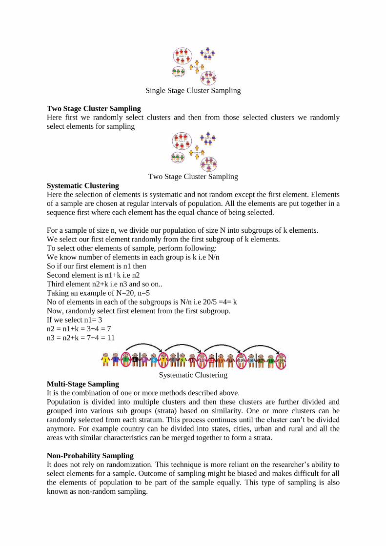
Single Stage Cluster Sampling
Two Stage Cluster Sampling Here first we randomly select clusters and then from those selected clusters we randomly
select elements for sampling
Two Stage Cluster Sampling
Systematic Clustering Here the selection of elements is systematic and not random except the first element. Elements
of a sample are chosen at regular intervals of population. All the elements are put together in a
sequence first where each element has the equal chance of being selected.
For a sample of size n, we divide our population of size N into subgroups of k elements.
We select our first element randomly from the first subgroup of k elements.
To select other elements of sample, perform following:
We know number of elements in each group is k i.e N/n
So if our first element is n1 then
Second element is n1+k i.e n2
Third element n2+k i.e n3 and so on..
Taking an example of N=20, n=5
No of elements in each of the subgroups is N/n i.e 20/5 =4= k
Now, randomly select first element from the first subgroup.
If we select n1= 3
n2 = n1+k = 3+4 = 7
n3 = n2+k = 7+4 = 11
Systematic Clustering
Multi-Stage Sampling It is the combination of one or more methods described above.
Population is divided into multiple clusters and then these clusters are further divided and
grouped into various sub groups (strata) based on similarity. One or more clusters can be
randomly selected from each stratum. This process continues until the cluster can’t be divided
anymore. For example country can be divided into states, cities, urban and rural and all the
areas with similar characteristics can be merged together to form a strata.
Non-Probability Sampling It does not rely on randomization. This technique is more reliant on the researcher’s ability to
select elements for a sample. Outcome of sampling might be biased and makes difficult for all
the elements of population to be part of the sample equally. This type of sampling is also
known as non-random sampling.

Multi-Stage Sampling
Convenience Sampling: Here the samples are selected based on the availability. This method
is used when the availability of sample is rare and also costly. So based on the convenience
samples are selected.
For example: Researchers prefer this during the initial stages of survey research, as it’s quick
and easy to deliver results.
Purposive Sampling: This is based on the intention or the purpose of study. Only those
elements will be selected from the population which suits the best for the purpose of our study.
For Example: If we want to understand the thought process of the people who are interested
in pursuing master’s degree then the selection criteria would be “Are you interested for
Masters in..?”
All the people who respond with a “No” will be excluded from our sample.
Quota Sampling: This type of sampling depends of some pre-set standard. It selects the
representative sample from the population. Proportion of characteristics/ trait in sample should
be same as population. Elements are selected until exact proportions of certain types of data is
obtained or sufficient data in different categories is collected.
For example: If our population has 45% females and 55% males then our sample should
reflect the same percentage of males and females.
Referral /Snowball Sampling: This technique is used in the situations where the population
is completely unknown and rare. Therefore we will take the help from the first element which
we select for the population and ask him to recommend other elements who will fit the
description of the sample needed. So this referral technique goes on, increasing the size of
population like a snowball.
Referral /Snowball Sampling
For example: It’s used in situations of highly sensitive topics like HIV Aids where people
will not openly discuss and participate in surveys to share information about HIV Aids. Not all
the victims will respond to the questions asked so researchers can contact people they know or
volunteers to get in touch with the victims and collect information Helps in situations where
we do not have the access to sufficient people with the characteristics we are seeking. It starts
with finding people to study.
1.10.b Text, Tabular and graphical Methods of Data presentation; Frequency
Distribution, Diagrammatic Presentation of Frequency data
Data are a set of facts, and provide a partial picture of reality. Whether data are being
collected with a certain purpose or collected data are being utilized, questions regarding what
information the data are conveying, how the data can be used, and what must be done to
include more useful information must constantly be kept in mind.
Since most data are available to researchers in a raw format, they must be summarized,
organized, and analyzed to usefully derive information from them. Furthermore, each data set
needs to be presented in a certain way depending on what it is used for. Planning how the
data will be presented is essential before appropriately processing raw data.
First, a question for which an answer is desired must be clearly defined. The more detailed
the question is, the more detailed and clearer the results are. A broad question results in vague
answers and results that are hard to interpret. In other words, a well-defined question is
crucial for the data to be well-understood later. Once a detailed question is ready, the raw
data must be prepared before processing. These days, data are often summarized, organized,
and analyzed with statistical packages or graphics software. Data must be prepared in such a
way they are properly recognized by the program being used. The present study does not
discuss this data preparation process, which involves creating a data frame, creating/changing
rows and columns, changing the level of a factor, categorical variable, coding, dummy
variables, variable transformation, data transformation, missing value, outlier treatment, and
noise removal.
We describe the roles and appropriate use of text, tables, and graphs (graphs, plots, or charts),
all of which are commonly used in reports, articles, posters, and presentations. Furthermore,
we discuss the issues that must be addressed when presenting various kinds of information,
and effective methods of presenting data, which are the end products of research, and of
emphasizing specific information.
Data Presentation
Data can be presented in one of the three ways:
–as text;
–in tabular form; or
–in graphical form.
Methods of presentation must be determined according to the data format, the method of
analysis to be used, and the information to be emphasized. Inappropriately presented data fail
to clearly convey information to readers and reviewers. Even when the same information is
being conveyed, different methods of presentation must be employed depending on what
specific information is going to be emphasized. A method of presentation must be chosen
after carefully weighing the advantages and disadvantages of different methods of
presentation. For easy comparison of different methods of presentation, let us look at a table
(Table 1) and a line graph (Fig. 1) that present the same information [1]. If one wishes to
compare or introduce two values at a certain time point, it is appropriate to use text or the
written language. However, a table is the most appropriate when all information requires
equal attention, and it allows readers to selectively look at information of their own interest.
Graphs allow readers to understand the overall trend in data, and intuitively understand the

comparison results between two groups. One thing to always bear in mind regardless of what
method is used, however, is the simplicity of presentation.
Fig. 1
Line graph with whiskers. Changes in systolic blood pressure (SBP) in the two groups. Group
C: normal saline, Group D: dexmedetomidine. *P < 0.05 indicates a significant increase in
each group, compared with the baseline values. †P < 0.05 indicates a significant decrease
noted in Group D, compared with the baseline values. ‡P < 0.05 indicates a significant
difference between the groups (Adapted from Korean J Anesthesiol 2017; 70: 39-45).
Table 1
Modified Table in Lee and Kim's Research (Adapted from Korean J Anesthesiol 2017; 70:
39-45)
Variable Group Baseline After
drug
1 min 3 min 5 min
SBP C 135.1 ±
13.4
139.2 ±
17.1
186.0 ±
26.6*
160.1 ±
23.2*
140.7 ±
18.3
D 135.4 ±
23.8
131.9 ±
13.5
165.2 ±
16.2*,‡
127.9 ±
17.5‡
108.4 ±
12.6†,‡
DBP C 79.7 ± 9.8 79.4 ±
15.8
104.8 ±
14.9*
87.9 ±
15.5*
78.9 ±
11.6
D 76.7 ± 8.3 78.4 ±
6.3
97.0 ±
14.5*
74.1 ±
8.3‡
66.5 ±
7.2†,‡
MBP C 100.3 ±
11.9
103.5 ±
16.8
137.2 ±
18.3*
116.9 ±
16.2*
103.9 ±
13.3
D 97.7 ±
14.9
98.1 ±
8.7
123.4 ±
13.8*,‡
95.4 ±
11.7‡
83.4 ±
8.4†,‡
Values are expressed as mean ± SD. Group C: normal saline, Group D: dexmedetomidine.
SBP: systolic blood pressure, DBP: diastolic blood pressure, MBP: mean blood pressure, HR:
heart rate. *P < 0.05 indicates a significant increase in each group, compared with the baseline

values. †P < 0.05 indicates a significant decrease noted in Group D, compared with the
baseline values. ‡P < 0.05 indicates a significant difference between the groups.
Text presentation
Text is the main method of conveying information as it is used to explain results and trends,
and provide contextual information. Data are fundamentally presented in paragraphs or
sentences. Text can be used to provide interpretation or emphasize certain data. If
quantitative information to be conveyed consists of one or two numbers, it is more
appropriate to use written language than tables or graphs. For instance, information about the
incidence rates of delirium following anesthesia in 2016–2017 can be presented with the use
of a few numbers: “The incidence rate of delirium following anesthesia was 11% in 2016 and
15% in 2017; no significant difference of incidence rates was found between the two years.”
If this information were to be presented in a graph or a table, it would occupy an
unnecessarily large space on the page, without enhancing the readers' understanding of the
data. If more data are to be presented, or other information such as that regarding data trends
are to be conveyed, a table or a graph would be more appropriate. By nature, data take longer
to read when presented as texts and when the main text includes a long list of information,
readers and reviewers may have difficulties in understanding the information.
Table presentation
Tables, which convey information that has been converted into words or numbers in rows and
columns, have been used for nearly 2,000 years. Anyone with a sufficient level of literacy can
easily understand the information presented in a table. Tables are the most appropriate for
presenting individual information, and can present both quantitative and qualitative
information. Examples of qualitative information are the level of sedation [2], statistical
methods/functions [3,4], and intubation conditions [5].
The strength of tables is that they can accurately present information that cannot be presented
with a graph. A number such as “132.145852” can be accurately expressed in a table.
Another strength is that information with different units can be presented together. For
instance, blood pressure, heart rate, number of drugs administered, and anesthesia time can be
presented together in one table. Finally, tables are useful for summarizing and comparing
quantitative information of different variables. However, the interpretation of information
takes longer in tables than in graphs, and tables are not appropriate for studying data trends.
Furthermore, since all data are of equal importance in a table, it is not easy to identify and
selectively choose the information required.
For a general guideline for creating tables, refer to the journal submission requirements 1)
.
Heat maps for better visualization of information than tables
Heat maps help to further visualize the information presented in a table by applying colors to
the background of cells. By adjusting the colors or color saturation, information is conveyed
in a more visible manner, and readers can quickly identify the information of interest (Table
2). Software such as Excel (in Microsoft Office, Microsoft, WA, USA) have features that
enable easy creation of heat maps through the options available on the “conditional
formatting” menu.

Table 2
Difference between a Regular Table and a Heat Map
Example of a regular table Example of a heat map
SBP DBP MBP HR SBP DBP MBP HR
128 66 87 87 128 66 87 87
125 43 70 85 125 43 70 85
114 52 68 103 114 52 68 103
111 44 66 79 111 44 66 79
139 61 81 90 139 61 81 90
103 44 61 96 103 44 61 96
94 47 61 83 94 47 61 83
All numbers were created by the author. SBP: systolic blood pressure, DBP: diastolic blood
pressure, MBP: mean blood pressure, HR: heart rate.
Graph presentation
Whereas tables can be used for presenting all the information, graphs simplify complex
information by using images and emphasizing data patterns or trends, and are useful for
summarizing, explaining, or exploring quantitative data. While graphs are effective for
presenting large amounts of data, they can be used in place of tables to present small sets of
data. A graph format that best presents information must be chosen so that readers and
reviewers can easily understand the information. In the following, we describe frequently
used graph formats and the types of data that are appropriately presented with each format
with examples.
Scatter plot
Scatter plots present data on the x- and y-axes and are used to investigate an association
between two variables. A point represents each individual or object, and an association
between two variables can be studied by analyzing patterns across multiple points. A
regression line is added to a graph to determine whether the association between two
variables can be explained or not. Fig. 2 illustrates correlations between pain scoring systems
that are currently used (PSQ, Pain Sensitivity Questionnaire; PASS, Pain Anxiety Symptoms
Scale; PCS, Pain Catastrophizing Scale) and Geop-Pain Questionnaire (GPQ) with the
correlation coefficient, R, and regression line indicated on the scatter plot [6]. If multiple
points exist at an identical location as in this example (Fig. 2), the correlation level may not
be clear. In this case, a correlation coefficient or regression line can be added to further
elucidate the correlation.
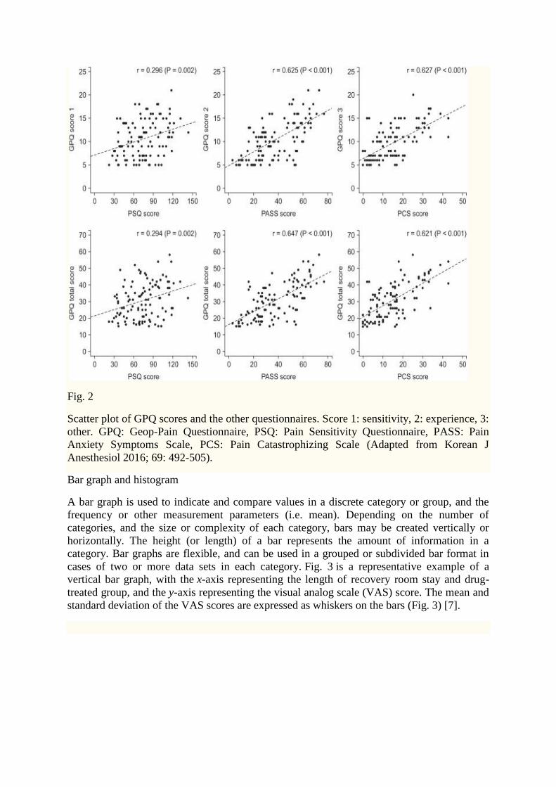
Fig. 2
Scatter plot of GPQ scores and the other questionnaires. Score 1: sensitivity, 2: experience, 3:
other. GPQ: Geop-Pain Questionnaire, PSQ: Pain Sensitivity Questionnaire, PASS: Pain
Anxiety Symptoms Scale, PCS: Pain Catastrophizing Scale (Adapted from Korean J
Anesthesiol 2016; 69: 492-505).
Bar graph and histogram
A bar graph is used to indicate and compare values in a discrete category or group, and the
frequency or other measurement parameters (i.e. mean). Depending on the number of
categories, and the size or complexity of each category, bars may be created vertically or
horizontally. The height (or length) of a bar represents the amount of information in a
category. Bar graphs are flexible, and can be used in a grouped or subdivided bar format in
cases of two or more data sets in each category. Fig. 3 is a representative example of a
vertical bar graph, with the x-axis representing the length of recovery room stay and drug-
treated group, and the y-axis representing the visual analog scale (VAS) score. The mean and
standard deviation of the VAS scores are expressed as whiskers on the bars (Fig. 3) [7].

Fig. 3
Multiple bar graph with whiskers. Pain scores in the recovery room. *P < 0.05 compared with
the control group. The nefopam group showed significant lower visual analogue scale (VAS)
score at 0, 5, 15, 30, 45 and 60 minutes on postanesthesia care unit compared with the control
group (Adapted from Korean J Anesthesiol 2016; 69: 480-6. Fig. 2).
By comparing the endpoints of bars, one can identify the largest and the smallest categories,
and understand gradual differences between each category. It is advised to start the x- and y-
axes from 0. Illustration of comparison results in the x- and y-axes that do not start from 0 can
deceive readers' eyes and lead to overrepresentation of the results.
One form of vertical bar graph is the stacked vertical bar graph. A stack vertical bar graph is
used to compare the sum of each category, and analyze parts of a category. While stacked
vertical bar graphs are excellent from the aspect of visualization, they do not have a reference
line, making comparison of parts of various categories challenging (Fig. 4) [8].
Fig. 4
Stacked bar graph. Compressed volume of each component from the three operations. We
checked the compressed volume of each component from the three operations; pelviscopy
(with radical vaginal hysterectomy), laparoscopic anterior resection of the colon, and TKRA.
TKRA: total knee replacement arthroplasty, RMW: regulated medical waste (Adapted from
Korean J Anesthesiol 2017; 70: 100-4).
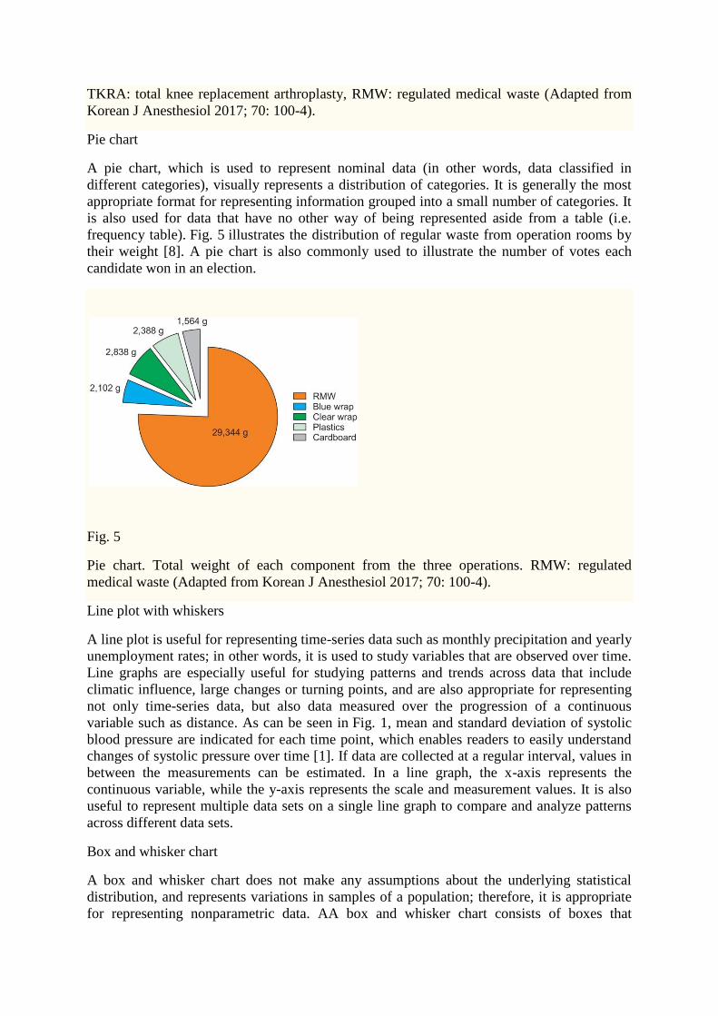
Pie chart
A pie chart, which is used to represent nominal data (in other words, data classified in
different categories), visually represents a distribution of categories. It is generally the most
appropriate format for representing information grouped into a small number of categories. It
is also used for data that have no other way of being represented aside from a table (i.e.
frequency table). Fig. 5 illustrates the distribution of regular waste from operation rooms by
their weight [8]. A pie chart is also commonly used to illustrate the number of votes each
candidate won in an election.
Fig. 5
Pie chart. Total weight of each component from the three operations. RMW: regulated
medical waste (Adapted from Korean J Anesthesiol 2017; 70: 100-4).
Line plot with whiskers
A line plot is useful for representing time-series data such as monthly precipitation and yearly
unemployment rates; in other words, it is used to study variables that are observed over time.
Line graphs are especially useful for studying patterns and trends across data that include
climatic influence, large changes or turning points, and are also appropriate for representing
not only time-series data, but also data measured over the progression of a continuous
variable such as distance. As can be seen in Fig. 1, mean and standard deviation of systolic
blood pressure are indicated for each time point, which enables readers to easily understand
changes of systolic pressure over time [1]. If data are collected at a regular interval, values in
between the measurements can be estimated. In a line graph, the x-axis represents the
continuous variable, while the y-axis represents the scale and measurement values. It is also
useful to represent multiple data sets on a single line graph to compare and analyze patterns
across different data sets.
Box and whisker chart
A box and whisker chart does not make any assumptions about the underlying statistical
distribution, and represents variations in samples of a population; therefore, it is appropriate
for representing nonparametric data. AA box and whisker chart consists of boxes that

represent interquartile range (one to three), the median and the mean of the data, and
whiskers presented as lines outside of the boxes. Whiskers can be used to present the largest
and smallest values in a set of data or only a part of the data (i.e. 95% of all the data). Data
that are excluded from the data set are presented as individual points and are called outliers.
The spacing at both ends of the box indicates dispersion in the data. The relative location of
the median demonstrated within the box indicates skewness (Fig. 6). The box and whisker
chart provided as an example represents calculated volumes of an anesthetic, desflurane,
consumed over the course of the observation period (Fig. 7) [9].
Open in a separate window
Fig. 6
Box graph with whiskers. This graph is a standardized way of displaying the distribution of
data based on the five-number summary; minimum, first quartile, median, third quartile, and
maximum. The central rectangle represents from the first quartile to the third quartile (the
interquartile range [IQR]). A segment inside the rectangle shows the median and “whiskers”
above and below the box show the locations of the minimum and maximum.
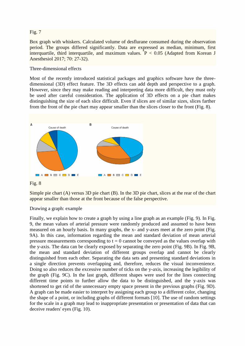
Fig. 7
Box graph with whiskers. Calculated volume of desflurane consumed during the observation
period. The groups differed significantly. Data are expressed as median, minimum, first
interquartile, third interquartile, and maximum values. *P < 0.05 (Adapted from Korean J
Anesthesiol 2017; 70: 27-32).
Three-dimensional effects
Most of the recently introduced statistical packages and graphics software have the three-
dimensional (3D) effect feature. The 3D effects can add depth and perspective to a graph.
However, since they may make reading and interpreting data more difficult, they must only
be used after careful consideration. The application of 3D effects on a pie chart makes
distinguishing the size of each slice difficult. Even if slices are of similar sizes, slices farther
from the front of the pie chart may appear smaller than the slices closer to the front (Fig. 8).
Fig. 8
Simple pie chart (A) versus 3D pie chart (B). In the 3D pie chart, slices at the rear of the chart
appear smaller than those at the front because of the false perspective.
Drawing a graph: example
Finally, we explain how to create a graph by using a line graph as an example (Fig. 9). In Fig.
9, the mean values of arterial pressure were randomly produced and assumed to have been
measured on an hourly basis. In many graphs, the x- and y-axes meet at the zero point (Fig.
9A). In this case, information regarding the mean and standard deviation of mean arterial
pressure measurements corresponding to t = 0 cannot be conveyed as the values overlap with
the y-axis. The data can be clearly exposed by separating the zero point (Fig. 9B). In Fig. 9B,
the mean and standard deviation of different groups overlap and cannot be clearly
distinguished from each other. Separating the data sets and presenting standard deviations in
a single direction prevents overlapping and, therefore, reduces the visual inconvenience.
Doing so also reduces the excessive number of ticks on the y-axis, increasing the legibility of
the graph (Fig. 9C). In the last graph, different shapes were used for the lines connecting
different time points to further allow the data to be distinguished, and the y-axis was
shortened to get rid of the unnecessary empty space present in the previous graphs (Fig. 9D).
A graph can be made easier to interpret by assigning each group to a different color, changing
the shape of a point, or including graphs of different formats [10]. The use of random settings
for the scale in a graph may lead to inappropriate presentation or presentation of data that can
deceive readers' eyes (Fig. 10).

Open in a separate window
Fig. 9
Clarification of a graph. Virtual data are presented as mean with standard deviations. (A) A
graph with default settings. (B) The axes are separated from each other. The data at 0 are
displayed clearly. (C) The points and whiskers are jittered to avoid overlapping. Although
one side of the whiskers are removed, it is still easy to understand. However, this graph still
has unnecessary blank space. (D) The lines are expressed in various ways. A break is put in
the y-axis. MBP: mean blood pressure.
Fig. 10
An example of misleading graphs. Both plots use the same data set. (A) The readers might be
thinking that the heart rates at 1 min are higher than others. (B) The heart rates are very stable
during the study. The readers should check the scale of the y-axis and baseline values when
they look at the graphs.

Owing to the lack of space, we could not discuss all types of graphs, but have focused on
describing graphs that are frequently used in scholarly articles. We have summarized the
commonly used types of graphs according to the method of data analysis in Table 3. For
general guidelines on graph designs, please refer to the journal submission requirements2)
.
Table 3
Types of Charts Depending on the Method of Analysis of the Data
Analysis Subgroup Number of variables Type
Comparison Among items Two per items Variable width column chart
One per item Bar/column chart
Over time Many periods Circular area/line chart
Few periods Column/line chart
Relationship Two Scatter chart
Three Bubble chart
Distribution Single Column/line histogram
Two Scatter chart
Three Three-dimensional area chart
Comparison Changing over
time
Only relative differences
matter
Stacked 100% column chart
Relative and absolute
differences matter
Stacked column chart
Static Simple share of total Pie chart
Accumulation Waterfall chart
Components of
components
Stacked 100% column chart
with subcomponents

COURSE: BUSINESS STATISTICS
AN OVERVIEW OF CENTRAL TENDENCY
COURSE CODE: MC-106 AUTHOR: SURINDER KUNDU
LESSON: 02 VETTER: PROF. M. S. TURAN
OBJECTIVE: The present lesson imparts understanding of the calculations and main
properties of measures of central tendency, including mean, mode,
STRUCTURE:
median, quartiles, percentiles, etc.
2.1 Introduction
2.2 Arithmetic Mean
2.3 Median
2.4 Mode
2.5 Relationships of the Mean, Median and Mode
2.6 The Best Measure of Central Tendency
2.7 Geometric Mean
2.8 Harmonic Mean
2.9 Quadratic Mean
2.10 Summary
2.11 Self-Test Questions
2.1 INTRODUCTION
The description of statistical data may be quite elaborate or quite brief depending on
two factors: the nature of data and the purpose for which the same data have been
collected. While describing data statistically or verbally, one must ensure that the
description is neither too brief nor too lengthy. The measures of central tendency
enable us to compare two or more distributions pertaining to the same time period or
within the same distribution over time. For example, the average consumption of tea
in two different territories for the same period or in a territory for two years, say, 2003
and 2004, can be attempted by means of an average.
20
Unit-II
Measures of Central Tendency: simple and Weighted Arithmetic Mean – Properties, Merits
and Demits; Geometric Mean and harmonic Mean – Algebraic Properties, Merits and
Demerits; Relationship among A.M., G.M. and H.M.; Median and Mode – Measures,
Properties, Merits and Demits.

21
2.2 ARITHMETIC MEAN
Adding all the observations and dividing the sum by the number of observations
results the arithmetic mean. Suppose we have the following observations:
10, 15,30, 7, 42, 79 and 83
These are seven observations. Symbolically, the arithmetic mean, also called simply
mean is
x = ∑x/n, where x is simple mean.
=7
83 79 42 7 30 15 10 ++++++
= 7
266 = 38
It may be noted that the Greek letter μ is used to denote the mean of the population
and n to denote the total number of observations in a population. Thus the population
mean μ = ∑x/n. The formula given above is the basic formula that forms the
definition of arithmetic mean and is used in case of ungrouped data where weights are
not involved.
2.2.1 UNGROUPED DATA-WEIGHTED AVERAGE
In case of ungrouped data where weights are involved, our approach for calculating
arithmetic mean will be different from the one used earlier.
Example 2.1: Suppose a student has secured the following marks in three tests:
Mid-term test 30
Laboratory 25
Final 20
The simple arithmetic mean will be 253
202530=
++
22
However, this will be wrong if the three tests carry different weights on the basis of
their relative importance. Assuming that the weights assigned to the three tests are:
Mid-term test 2 points
Laboratory 3 points
Final 5 points
Solution: On the basis of this information, we can now calculate a weighted mean as
shown below:
Table 2.1: Calculation of a Weighted Mean
Type of Test Relative Weight (w) Marks (x) (wx)
Mid-term 2 30 60
Laboratory 3 25 75
Final 5 20 100
Total ∑ w = 10 235
321
332211
wwwxwxwxw
wwxx
++++
=∑∑
=
= 5.235321007560
=++++ marks
It will be seen that weighted mean gives a more realistic picture than the simple or
unweighted mean.
Example 2.2: An investor is fond of investing in equity shares. During a period of
falling prices in the stock exchange, a stock is sold at Rs 120 per share on one day, Rs
105 on the next and Rs 90 on the third day. The investor has purchased 50 shares on
the first day, 80 shares on the second day and 100 shares on the third' day. What
average price per share did the investor pay?
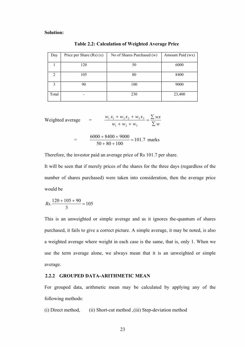
23
Solution:
Table 2.2: Calculation of Weighted Average Price
Day Price per Share (Rs) (x) No of Shares Purchased (w) Amount Paid (wx)
1 120 50 6000
2 105 80 8400
3 90 100 9000
Total - 230 23,400
Weighted average = wwx
wwwxwxwxw
∑∑
=++++
321
332211
= 7.1011008050
900084006000=
++++ marks
Therefore, the investor paid an average price of Rs 101.7 per share.
It will be seen that if merely prices of the shares for the three days (regardless of the
number of shares purchased) were taken into consideration, then the average price
would be
1053
90105120. =++Rs
This is an unweighted or simple average and as it ignores the-quantum of shares
purchased, it fails to give a correct picture. A simple average, it may be noted, is also
a weighted average where weight in each case is the same, that is, only 1. When we
use the term average alone, we always mean that it is an unweighted or simple
average.
2.2.2 GROUPED DATA-ARITHMETIC MEAN
For grouped data, arithmetic mean may be calculated by applying any of the
following methods:
(i) Direct method, (ii) Short-cut method , (iii) Step-deviation method

24
In the case of direct method, the formula x = ∑fm/n is used. Here m is mid-point of
various classes, f is the frequency of each class and n is the total number of
frequencies. The calculation of arithmetic mean by the direct method is shown below.
Example 2.3: The following table gives the marks of 58 students in Statistics.
Calculate the average marks of this group.
Marks No. of Students 0-10 4 10-20 8 20-30 11 30-40 15 40-50 12 50-60 6 60-70 2 Total 58
Solution:
Table 2.3: Calculation of Arithmetic Mean by Direct Method
Marks Mid-point m No. of Students f fm
0-10 5 4 20 10-20 15 8 120 20-30 25 11 275 30-40 35 15 525 40-50 45 12 540 50-60 55 6 330 60-70 65 2 130
∑fm = 1940 Where,
=== ∑58
1940nfm
x 33.45 marks or 33 marks approximately.
It may be noted that the mid-point of each class is taken as a good approximation of
the true mean of the class. This is based on the assumption that the values are
distributed fairly evenly throughout the interval. When large numbers of frequency
occur, this assumption is usually accepted.
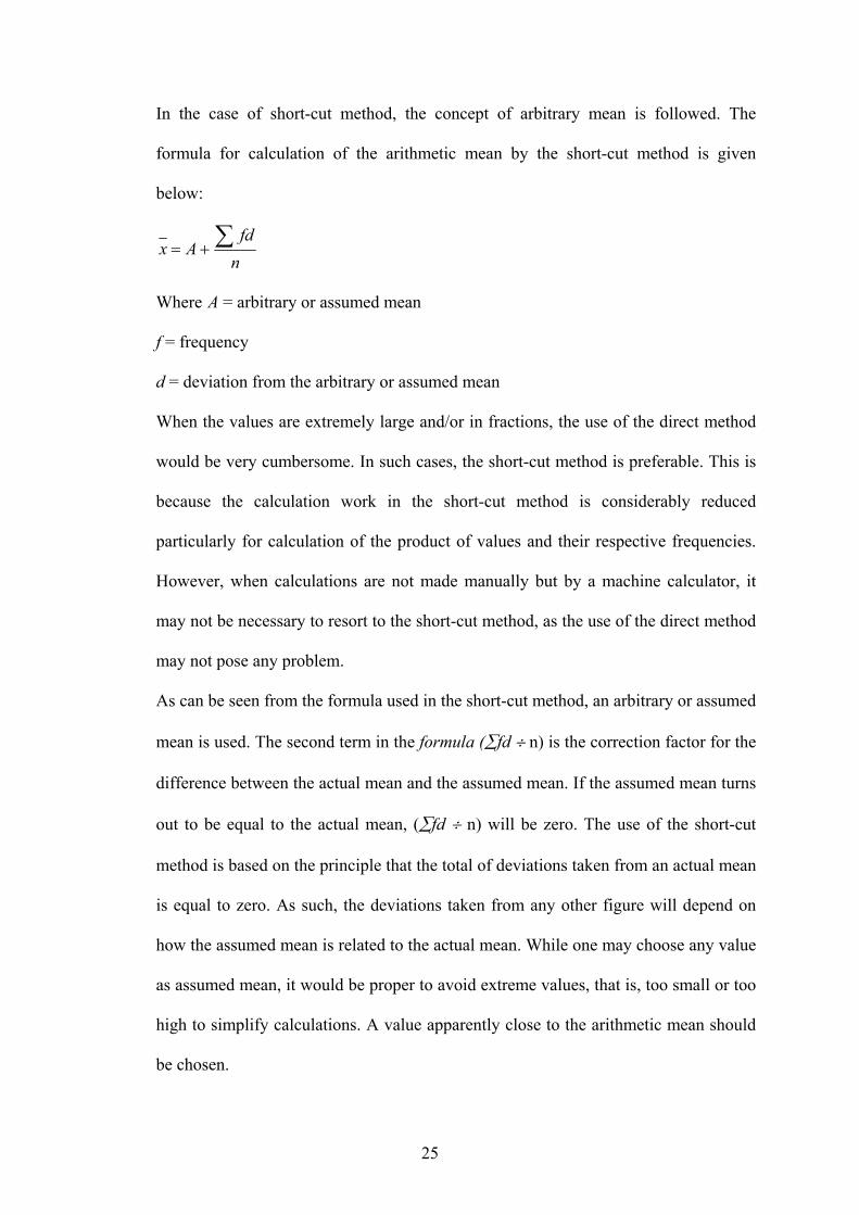
25
In the case of short-cut method, the concept of arbitrary mean is followed. The
formula for calculation of the arithmetic mean by the short-cut method is given
below:
nfd
Ax ∑+=
Where A = arbitrary or assumed mean
f = frequency
d = deviation from the arbitrary or assumed mean
When the values are extremely large and/or in fractions, the use of the direct method
would be very cumbersome. In such cases, the short-cut method is preferable. This is
because the calculation work in the short-cut method is considerably reduced
particularly for calculation of the product of values and their respective frequencies.
However, when calculations are not made manually but by a machine calculator, it
may not be necessary to resort to the short-cut method, as the use of the direct method
may not pose any problem.
As can be seen from the formula used in the short-cut method, an arbitrary or assumed
mean is used. The second term in the formula (∑fd ÷ n) is the correction factor for the
difference between the actual mean and the assumed mean. If the assumed mean turns
out to be equal to the actual mean, (∑fd ÷ n) will be zero. The use of the short-cut
method is based on the principle that the total of deviations taken from an actual mean
is equal to zero. As such, the deviations taken from any other figure will depend on
how the assumed mean is related to the actual mean. While one may choose any value
as assumed mean, it would be proper to avoid extreme values, that is, too small or too
high to simplify calculations. A value apparently close to the arithmetic mean should
be chosen.

26
For the figures given earlier pertaining to marks obtained by 58 students, we calculate
the average marks by using the short-cut method.
Example 2.4:
Table 2.4: Calculation of Arithmetic Mean by Short-cut Method
Marks Mid-point m f d fd
0-10 5 4 -30 -120 10-20 15 8 -20 -160 20-30 25 11 -10 -110 30-40 35 15 0 0 40-50 45 12 10 120 50-60 55 6 20 120 60-70 65 2 30 60
∑fd = -90
It may be noted that we have taken arbitrary mean as 35 and deviations from
midpoints. In other words, the arbitrary mean has been subtracted from each value of
mid-point and the resultant figure is shown in column d.
n
fdAx ∑+=
⎟⎠⎞
⎜⎝⎛ −
+=589035
= 35 - 1.55 = 33.45 or 33 marks approximately.
Now we take up the calculation of arithmetic mean for the same set of data using the
step-deviation method. This is shown in Table 2.5.
Table 2.5: Calculation of Arithmetic Mean by Step-deviation Method
Marks Mid-point f d d’= d/10 Fd’ 0-10 5 4 -30 -3 -12
10-20 15 8 -20 -2 -16 20-30 25 11 -10 -1 -11 30-40 35 15 0 0 0 40-50 45 12 10 1 12 50-60 55 6 20 2 12 60-70 65 2 30 3 6
∑fd’ =-9
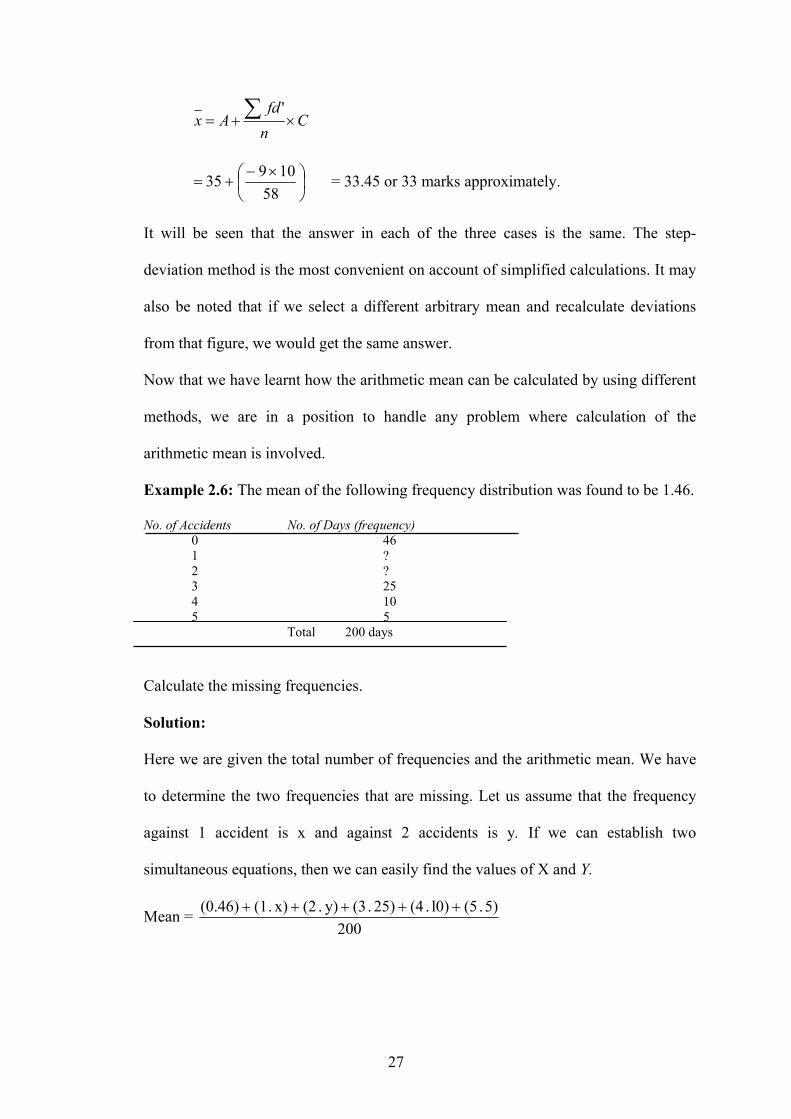
27
Cnfd
Ax ×+= ∑ '
⎟⎠⎞
⎜⎝⎛ ×−
+=58
10935 = 33.45 or 33 marks approximately.
It will be seen that the answer in each of the three cases is the same. The step-
deviation method is the most convenient on account of simplified calculations. It may
also be noted that if we select a different arbitrary mean and recalculate deviations
from that figure, we would get the same answer.
Now that we have learnt how the arithmetic mean can be calculated by using different
methods, we are in a position to handle any problem where calculation of the
arithmetic mean is involved.
Example 2.6: The mean of the following frequency distribution was found to be 1.46.
No. of Accidents No. of Days (frequency) 0 46 1 ? 2 ? 3 25 4 10 5 5
Total 200 days
Calculate the missing frequencies.
Solution:
Here we are given the total number of frequencies and the arithmetic mean. We have
to determine the two frequencies that are missing. Let us assume that the frequency
against 1 accident is x and against 2 accidents is y. If we can establish two
simultaneous equations, then we can easily find the values of X and Y.
Mean = 200
5) . (5l0) . (425) . (3y) . (2 x). (1(0.46) +++++

28
1.46 = 200
140 2y ++x
x + 2y + 140 = (200) (1.46)
x + 2y = 152
x + y=200- {46+25 + 1O+5}
x + y = 200 - 86
x + y = 114
Now subtracting equation (ii) from equation (i), we get
x + 2y = 152 x + y = 114 - - -
y = 38
Substituting the value of y = 38 in equation (ii) above, x + 38 = 114
Therefore, x = 114 - 38 = 76
Hence, the missing frequencies are:
Against accident 1 : 76
Against accident 2 : 38
2.2.3 CHARACTERISTICS OF THE ARITHMETIC MEAN
Some of the important characteristics of the arithmetic mean are:
1. The sum of the deviations of the individual items from the arithmetic mean is
always zero. This means I: (x - x ) = 0, where x is the value of an item and x is
the arithmetic mean. Since the sum of the deviations in the positive direction
is equal to the sum of the deviations in the negative direction, the arithmetic
mean is regarded as a measure of central tendency.
2. The sum of the squared deviations of the individual items from the arithmetic
mean is always minimum. In other words, the sum of the squared deviations
taken from any value other than the arithmetic mean will be higher.

29
3. As the arithmetic mean is based on all the items in a series, a change in the
value of any item will lead to a change in the value of the arithmetic mean.
4. In the case of highly skewed distribution, the arithmetic mean may get
distorted on account of a few items with extreme values. In such a case, it
may cease to be the representative characteristic of the distribution.
2.3 MEDIAN
Median is defined as the value of the middle item (or the mean of the values of the
two middle items) when the data are arranged in an ascending or descending order of
magnitude. Thus, in an ungrouped frequency distribution if the n values are arranged
in ascending or descending order of magnitude, the median is the middle value if n is
odd. When n is even, the median is the mean of the two middle values.
Suppose we have the following series:
15, 19,21,7, 10,33,25,18 and 5
We have to first arrange it in either ascending or descending order. These figures are
arranged in an ascending order as follows:
5,7,10,15,18,19,21,25,33
Now as the series consists of odd number of items, to find out the value of the middle
item, we use the formula
Where 2
1+n
Where n is the number of items. In this case, n is 9, as such 2
1+n = 5, that is, the size
of the 5th item is the median. This happens to be 18.
Suppose the series consists of one more items 23. We may, therefore, have to include
23 in the above series at an appropriate place, that is, between 21 and 25. Thus, the
series is now 5, 7, 10, 15, 18, 19, and 21,23,25,33. Applying the above formula, the
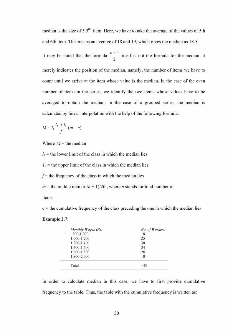
30
median is the size of 5.5th item. Here, we have to take the average of the values of 5th
and 6th item. This means an average of 18 and 19, which gives the median as 18.5.
It may be noted that the formula 2
1+n itself is not the formula for the median; it
merely indicates the position of the median, namely, the number of items we have to
count until we arrive at the item whose value is the median. In the case of the even
number of items in the series, we identify the two items whose values have to be
averaged to obtain the median. In the case of a grouped series, the median is
calculated by linear interpolation with the help of the following formula:
M = l1 )(12 cmf
ll−
+
Where M = the median
l1 = the lower limit of the class in which the median lies
12 = the upper limit of the class in which the median lies
f = the frequency of the class in which the median lies
m = the middle item or (n + 1)/2th, where n stands for total number of
items
c = the cumulative frequency of the class preceding the one in which the median lies
Example 2.7:
Monthly Wages (Rs) No. of Workers 800-1,000 18
1,000-1,200 25 1,200-1,400 30 1,400-1,600 34 1,600-1,800 26 1,800-2,000 10 Total 143
In order to calculate median in this case, we have to first provide cumulative
frequency to the table. Thus, the table with the cumulative frequency is written as:

31
Monthly Wages Frequency Cumulative Frequency
800 -1,000 18 18 1,000 -1,200 25 43 1,200 -1,400 30 73 1,400 -1,600 34 107 1,600 -1,800 26 133 1.800 -2,000 10 143
M = l1 )(12 cmf
ll−
+
M = 2
11432
1 +=
+n = 72
It means median lies in the class-interval Rs 1,200 - 1,400.
Now, M = 1200 + )4372(30
12001400−
−
)29(302001200 +=
= Rs 1393.3
At this stage, let us introduce two other concepts viz. quartile and decile. To
understand these, we should first know that the median belongs to a general class of
statistical descriptions called fractiles. A fractile is a value below that lays a given
fraction of a set of data. In the case of the median, this fraction is one-half (1/2).
Likewise, a quartile has a fraction one-fourth (1/4). The three quartiles Q1, Q2 and Q3
are such that 25 percent of the data fall below Q1, 25 percent fall between Q1 and Q2,
25 percent fall between Q2 and Q3 and 25 percent fall above Q3 It will be seen that Q2
is the median. We can use the above formula for the calculation of quartiles as well.
The only difference will be in the value of m. Let us calculate both Q1 and Q3 in
respect of the table given in Example 2.7.
Q1 = l1 )(12 cmf
ll−
−

32
Here, m will be = 4
1+n = 4
1143 + = 36
)1836(25
1000120010001 −−
+=Q
)18(25
2001000 +=
= Rs. 1,144
In the case of Q3, m will be 3 = 4
1+n = 41443× = 108
)107108(26
1600180016001 −−
+=Q
)1(262001600 +=
Rs. 1,607.7 approx
In the same manner, we can calculate deciles (where the series is divided into 10
parts) and percentiles (where the series is divided into 100 parts). It may be noted that
unlike arithmetic mean, median is not affected at all by extreme values, as it is a
positional average. As such, median is particularly very useful when a distribution
happens to be skewed. Another point that goes in favour of median is that it can be
computed when a distribution has open-end classes. Yet, another merit of median is
that when a distribution contains qualitative data, it is the only average that can be
used. No other average is suitable in case of such a distribution. Let us take a couple
of examples to illustrate what has been said in favour of median.
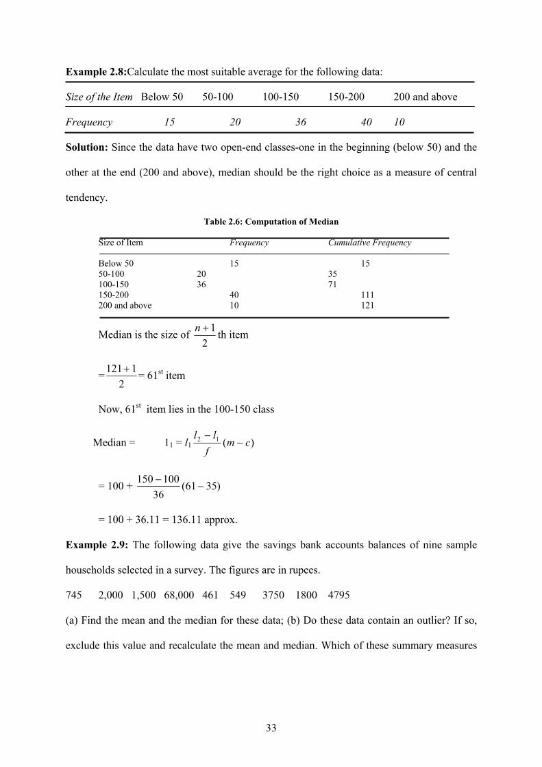
33
Example 2.8:Calculate the most suitable average for the following data:
Size of the Item Below 50 50-100 100-150 150-200 200 and above
Frequency 15 20 36 40 10
Solution: Since the data have two open-end classes-one in the beginning (below 50) and the
other at the end (200 and above), median should be the right choice as a measure of central
tendency.
Table 2.6: Computation of Median
Size of Item Frequency Cumulative Frequency
Below 50 15 15 50-100 20 35 100-150 36 71 150-200 40 111 200 and above 10 121
Median is the size of 2
1+n th item
=2
1121 + = 61st item
Now, 61st item lies in the 100-150 class
Median = 11 = l1 )(12 cmf
ll−
−
= 100 + )3561(36
100150−
−
= 100 + 36.11 = 136.11 approx.
Example 2.9: The following data give the savings bank accounts balances of nine sample
households selected in a survey. The figures are in rupees.
745 2,000 1,500 68,000 461 549 3750 1800 4795
(a) Find the mean and the median for these data; (b) Do these data contain an outlier? If so,
exclude this value and recalculate the mean and median. Which of these summary measures
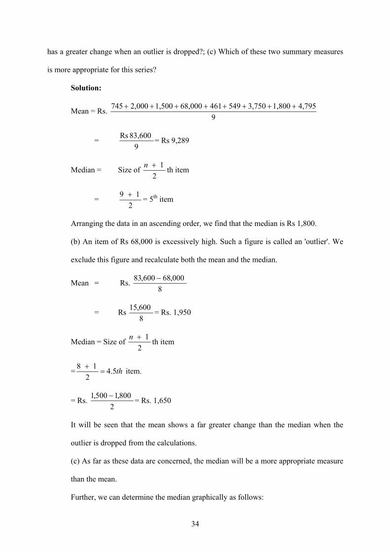
34
has a greater change when an outlier is dropped?; (c) Which of these two summary measures
is more appropriate for this series?
Solution:
Mean = Rs. 9
4,7951,800 3,750 549 46168,000 1,500 2,000 745 ++++++++
= 9
83,600 Rs = Rs 9,289
Median = Size of 2
1 n + th item
= 2
19 + = 5th item
Arranging the data in an ascending order, we find that the median is Rs 1,800.
(b) An item of Rs 68,000 is excessively high. Such a figure is called an 'outlier'. We
exclude this figure and recalculate both the mean and the median.
Mean = Rs. 8
000,68600,83 −
= Rs 8
600,15 = Rs. 1,950
Median = Size of 2
1 n + th item
= th 5.42
18=
+ item.
= Rs. 2
800,1500,1 − = Rs. 1,650
It will be seen that the mean shows a far greater change than the median when the
outlier is dropped from the calculations.
(c) As far as these data are concerned, the median will be a more appropriate measure
than the mean.
Further, we can determine the median graphically as follows:

35
Example 2.10: Suppose we are given the following series:
Class interval 0-10 10-20 20-30 30-40 40-50 50-60 60-70
Frequency 6 12 22 37 17 8 5
We are asked to draw both types of ogive from these data and to determine the
median.
Solution:
First of all, we transform the given data into two cumulative frequency distributions,
one based on ‘less than’ and another on ‘more than’ methods.
Table A Frequency
Less than 10 6 Less than 20 18 Less than 30 40 Less than 40 77 Less than 50 94 Less than 60 102 Less than 70 107
Table B
Frequency More than 0 107
More than 10 101 More than 20 89 More than 30 67 More than 40 30 More than 50 13
More than 60 5
It may be noted that the point of
intersection of the two ogives gives the
value of the median. From this point of
intersection A, we draw a straight line to
36
meet the X-axis at M. Thus, from the point of origin to the point at M gives the value
of the median, which comes to 34, approximately. If we calculate the median by
applying the formula, then the answer comes to 33.8, or 34, approximately. It may be
pointed out that even a single ogive can be used to determine the median. As we have
determined the median graphically, so also we can find the values of quartiles, deciles
or percentiles graphically. For example, to determine we have to take size of {3(n +
1)} /4 = 81st item. From this point on the Y-axis, we can draw a perpendicular to
meet the 'less than' ogive from which another straight line is to be drawn to meet the
X-axis. This point will give us the value of the upper quartile. In the same manner,
other values of Q1 and deciles and percentiles can be determined.
2.3.1 CHARACTERISTICS OF THE MEDIAN
1. Unlike the arithmetic mean, the median can be computed from open-ended
distributions. This is because it is located in the median class-interval, which
would not be an open-ended class.
2. The median can also be determined graphically whereas the arithmetic mean
cannot be ascertained in this manner.
3. As it is not influenced by the extreme values, it is preferred in case of a
distribution having extreme values.
4. In case of the qualitative data where the items are not counted or measured but
are scored or ranked, it is the most appropriate measure of central tendency.
2.4 MODE
The mode is another measure of central tendency. It is the value at the point around
which the items are most heavily concentrated. As an example, consider the following
series: 8,9, 11, 15, 16, 12, 15,3, 7, 15

37
There are ten observations in the series wherein the figure 15 occurs maximum
number of times three. The mode is therefore 15. The series given above is a discrete
series; as such, the variable cannot be in fraction. If the series were continuous, we
could say that the mode is approximately 15, without further computation.
In the case of grouped data, mode is determined by the following formula:
Mode= l1 iffff
ff×
−+−−
+)()( 2101
01
Where, l1 = the lower value of the class in which the mode lies
fl = the frequency of the class in which the mode lies
fo = the frequency of the class preceding the modal class
f2 = the frequency of the class succeeding the modal class
i = the class-interval of the modal class
While applying the above formula, we should ensure that the class-intervals are
uniform throughout. If the class-intervals are not uniform, then they should be made
uniform on the assumption that the frequencies are evenly distributed throughout the
class. In the case of inequal class-intervals, the application of the above formula will
give misleading results.
Example 2.11: Let us take the following frequency distribution:
Class intervals (1) Frequency (2) 30-40 4 40-50 6 50-60 8 60-70 12 70-80 9 80-90 7 90-100 4
We have to calculate the mode in respect of this series.
Solution: We can see from Column (2) of the table that the maximum frequency of
12 lies in the class-interval of 60-70. This suggests that the mode lies in this class-
interval. Applying the formula given earlier, we get:

38
Mode = 60 + 109)-(128)-(12 8-12
8-12×
+
= 60 + 1034
4×
+
= 65.7 approx.
In several cases, just by inspection one can identify the class-interval in which the
mode lies. One should see which the highest frequency is and then identify to which
class-interval this frequency belongs. Having done this, the formula given for
calculating the mode in a grouped frequency distribution can be applied.
At times, it is not possible to identify by inspection the class where the mode lies. In
such cases, it becomes necessary to use the method of grouping. This method consists
of two parts:
(i) Preparation of a grouping table: A grouping table has six columns, the first
column showing the frequencies as given in the problem. Column 2 shows
frequencies grouped in two's, starting from the top. Leaving the first
frequency, column 3 shows frequencies grouped in two's. Column 4 shows the
frequencies of the first three items, then second to fourth item and so on.
Column 5 leaves the first frequency and groups the remaining items in three's.
Column 6 leaves the first two frequencies and then groups the remaining in
three's. Now, the maximum total in each column is marked and shown either
in a circle or in a bold type.
(ii) Preparation of an analysis table: After having prepared a grouping table, an
analysis table is prepared. On the left-hand side, provide the first column for
column numbers and on the right-hand side the different possible values of
mode. The highest values marked in the grouping table are shown here by a
bar or by simply entering 1 in the relevant cell corresponding to the values

39
they represent. The last row of this table will show the number of times a
particular value has occurred in the grouping table. The highest value in the
analysis table will indicate the class-interval in which the mode lies. The
procedure of preparing both the grouping and analysis tables to locate the
modal class will be clear by taking an example.
Example 2.12: The following table gives some frequency data:
Size of Item Frequency 10-20 10 20-30 18 30-40 25 40-50 26 50-60 17 60-70 4
Solution:
Grouping Table Size of item 1 2 3 4 5 6
10-20 10
28 20-30 18 53 43
30-40 25 69 51
40-50 26 68 43 50-60 17 47 21
60-70 4
Analysis table
Size of item Col. No. 10-20 20-30 30-40 40-50 50-60
1 1 2 1 1 3 1 1 1 1 4 1 1 1 5 1 1 1
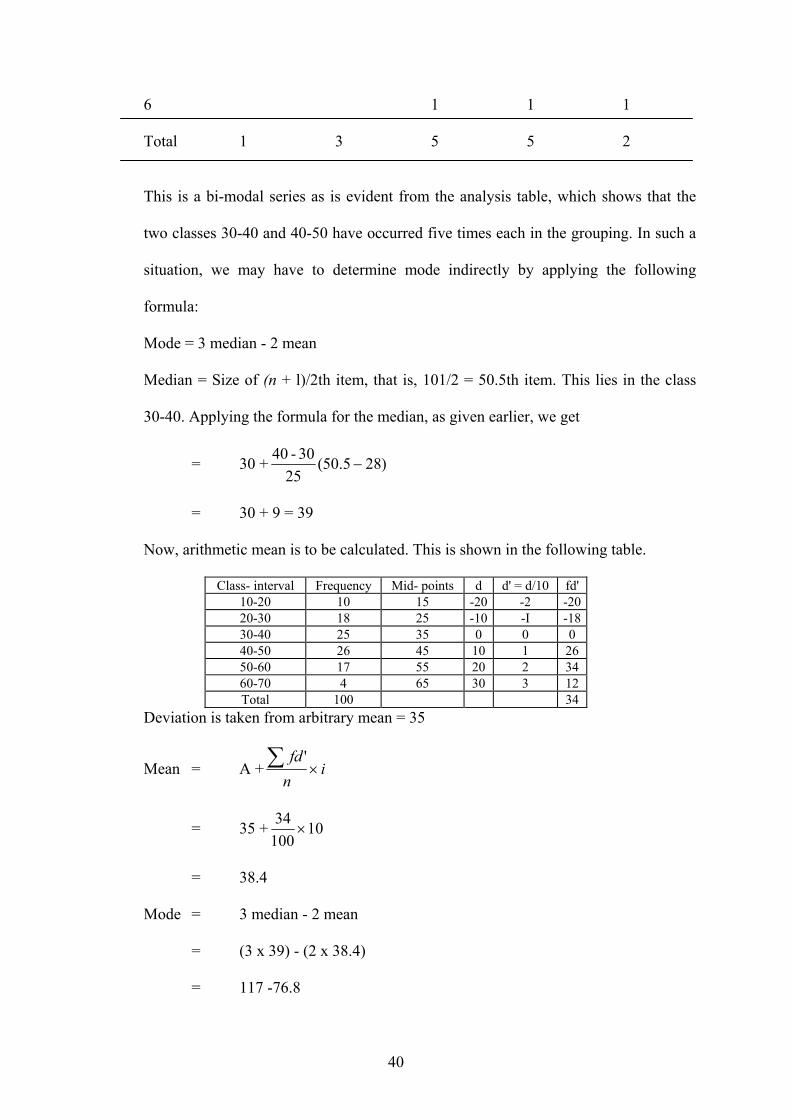
40
6 1 1 1
Total 1 3 5 5 2
This is a bi-modal series as is evident from the analysis table, which shows that the
two classes 30-40 and 40-50 have occurred five times each in the grouping. In such a
situation, we may have to determine mode indirectly by applying the following
formula:
Mode = 3 median - 2 mean
Median = Size of (n + l)/2th item, that is, 101/2 = 50.5th item. This lies in the class
30-40. Applying the formula for the median, as given earlier, we get
= 30 + )285.50(25
30-40−
= 30 + 9 = 39
Now, arithmetic mean is to be calculated. This is shown in the following table.
Class- interval Frequency Mid- points d d' = d/10 fd' 10-20 10 15 -20 -2 -20 20-30 18 25 -10 -I -18 30-40 25 35 0 0 0 40-50 26 45 10 1 26 50-60 17 55 20 2 34 60-70 4 65 30 3 12 Total 100 34
Deviation is taken from arbitrary mean = 35
Mean = A + infd
×∑ '
= 35 + 1010034
×
= 38.4
Mode = 3 median - 2 mean
= (3 x 39) - (2 x 38.4)
= 117 -76.8

41
= 40.2
This formula, Mode = 3 Median-2 Mean, is an empirical formula only. And it can
give only approximate results. As such, its frequent use should be avoided. However,
when mode is ill defined or the series is bimodal (as is the case in the present
example) it may be used.
2.5 RELATIONSHIPS OF THE MEAN, MEDIAN AND MODE
Having discussed mean, median and mode, we now turn to the relationship amongst
these three measures of central tendency. We shall discuss the relationship assuming
that there is a unimodal frequency distribution.
(i) When a distribution is symmetrical, the mean, median and mode are the same,
as is shown below in the following figure.
In case, a distribution is
skewed to the right, then
mean> median> mode.
Generally, income distri-
bution is skewed to the right where a large number of families have relatively
low income and a small number of families have extremely high income. In
such a case, the mean is pulled up by the extreme high incomes and the
relation among these three measures is as shown in Fig. 6.3. Here, we find that
mean> median> mode.
(ii) When a distribution is skewed to
the left, then mode> median>
mean. This is because here mean is
pulled down below the median
by extremely low values. This is
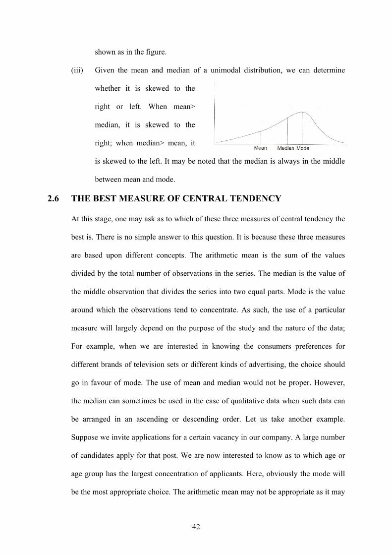
42
shown as in the figure.
(iii) Given the mean and median of a unimodal distribution, we can determine
whether it is skewed to the
right or left. When mean>
median, it is skewed to the
right; when median> mean, it
is skewed to the left. It may be noted that the median is always in the middle
between mean and mode.
2.6 THE BEST MEASURE OF CENTRAL TENDENCY
At this stage, one may ask as to which of these three measures of central tendency the
best is. There is no simple answer to this question. It is because these three measures
are based upon different concepts. The arithmetic mean is the sum of the values
divided by the total number of observations in the series. The median is the value of
the middle observation that divides the series into two equal parts. Mode is the value
around which the observations tend to concentrate. As such, the use of a particular
measure will largely depend on the purpose of the study and the nature of the data;
For example, when we are interested in knowing the consumers preferences for
different brands of television sets or different kinds of advertising, the choice should
go in favour of mode. The use of mean and median would not be proper. However,
the median can sometimes be used in the case of qualitative data when such data can
be arranged in an ascending or descending order. Let us take another example.
Suppose we invite applications for a certain vacancy in our company. A large number
of candidates apply for that post. We are now interested to know as to which age or
age group has the largest concentration of applicants. Here, obviously the mode will
be the most appropriate choice. The arithmetic mean may not be appropriate as it may

43
be influenced by some extreme values. However, the mean happens to be the most
commonly used measure of central tendency as will be evident from the discussion in
the subsequent chapters.
2.7 GEOMETRIC MEAN
Apart from the three measures of central tendency as discussed above, there are two
other means that are used sometimes in business and economics. These are the
geometric mean and the harmonic mean. The geometric mean is more important than
the harmonic mean. We discuss below both these means. First, we take up the
geometric mean. Geometric mean is defined at the nth root of the product of n
observations of a distribution.
Symbolically, GM = ............ 21 nxxxn If we have only two observations, say, 4 and
16 then GM = .864164 ==× Similarly, if there are three observations, then we
have to calculate the cube root of the product of these three observations; and so on.
When the number of items is large, it becomes extremely difficult to multiply the
numbers and to calculate the root. To simplify calculations, logarithms are used.
Example 2.13: If we have to find out the geometric mean of 2, 4 and 8, then we find
Log GM = n
xi∑ log
= 3
842 LogLogLog ++
= 3
9031.06021.03010.0 ++
= 60206.03
8062.1=
GM = Antilog 0.60206
= 4

44
When the data are given in the form of a frequency distribution, then the geometric
mean can be obtained by the formula:
Log GM =fnff
x . f ... x . f x .f nnl
..........logloglog
21
221
+++++
= fnff
xf..........log.
21 ++∑
Then, GM = Antilog n
The geometric mean is most suitable in the following three cases:
1. Averaging rates of change.
2. The compound interest formula.
3. Discounting, capitalization.
Example 2.14: A person has invested Rs 5,000 in the stock market. At the end of the
first year the amount has grown to Rs 6,250; he has had a 25 percent profit. If at the
end of the second year his principal has grown to Rs 8,750, the rate of increase is 40
percent for the year. What is the average rate of increase of his investment during the
two years?
Solution:
GM = .75.140.125.1 =× = 1.323
The average rate of increase in the value of investment is therefore 1.323 - 1 = 0.323,
which if multiplied by 100, gives the rate of increase as 32.3 percent.
Example 2.15: We can also derive a compound interest formula from the above set of
data. This is shown below:
Solution: Now, 1.25 x 1.40 = 1.75. This can be written as 1.75 = (1 + 0.323)2.
Let P2 = 1.75, P0 = 1, and r = 0.323, then the above equation can be written as P2 = (1
+ r)2 or P2 = P0 (1 + r)2.

45
Where P2 is the value of investment at the end of the second year, P0 is the initial
investment and r is the rate of increase in the two years. This, in fact, is the familiar
compound interest formula. This can be written in a generalised form as Pn = P0(1 +
r)n. In our case Po is Rs 5,000 and the rate of increase in investment is 32.3 percent.
Let us apply this formula to ascertain the value of Pn, that is, investment at the end of
the second year.
Pn = 5,000 (1 + 0.323)2
= 5,000 x 1.75
= Rs 8,750
It may be noted that in the above example, if the arithmetic mean is used, the resultant
figure will be wrong. In this case, the average rate for the two years is 2
40 25 + percent
per year, which comes to 32.5. Applying this rate, we get Pn = 100165 x 5,000
= Rs 8,250
This is obviously wrong, as the figure should have been Rs 8,750.
Example 2.16: An economy has grown at 5 percent in the first year, 6 percent in the
second year, 4.5 percent in the third year, 3 percent in the fourth year and 7.5 percent
in the fifth year. What is the average rate of growth of the economy during the five
years?
Solution:
Year Rate of Growth Value at the end of the Log x
( percent) Year x (in Rs) 1 5 105 2.02119 2 6 106 2.02531 3 4.5 104.5 2.01912 4 3 103 2.01284 5 7.5 107.5 2.03141
∑ log X = 10.10987

46
GM = Antilog ⎟⎟⎠
⎞⎜⎜⎝
⎛ ∑n
xlog
= Antilog ⎟⎠⎞
⎜⎝⎛
510987.10
= Antilog 2.021974
= 105.19
Hence, the average rate of growth during the five-year period is 105.19 - 100 = 5.19
percent per annum. In case of a simple arithmetic average, the corresponding rate of
growth would have been 5.2 percent per annum.
2.7.1 DISCOUNTING
The compound interest formula given above was
Pn=P0(1+r)n This can be written as P0 = nn
rP
)1( +
This may be expressed as follows:
If the future income is Pn rupees and the present rate of interest is 100 r percent, then
the present value of P n rupees will be P0 rupees. For example, if we have a machine
that has a life of 20 years and is expected to yield a net income of Rs 50,000 per year,
and at the end of 20 years it will be obsolete and cannot be used, then the machine's
present value is
nr)1(000,50
++ 2)1(
000,50r+
+ 3)1(000,50r+
+................. 20)1(000,50r+
This process of ascertaining the present value of future income by using the interest
rate is known as discounting.
In conclusion, it may be said that when there are extreme values in a series, geometric
mean should be used as it is much less affected by such values. The arithmetic mean
in such cases will give misleading results.

47
Before we close our discussion on the geometric mean, we should be aware of its
advantages and limitations.
2.7.2 ADVANTAGES OF G. M.
1. Geometric mean is based on each and every observation in the data set.
2. It is rigidly defined.
3. It is more suitable while averaging ratios and percentages as also in calculating
growth rates.
4. As compared to the arithmetic mean, it gives more weight to small values and
less weight to large values. As a result of this characteristic of the geometric
mean, it is generally less than the arithmetic mean. At times it may be equal to
the arithmetic mean.
5. It is capable of algebraic manipulation. If the geometric mean has two or more
series is known along with their respective frequencies. Then a combined
geometric mean can be calculated by using the logarithms.
2.7.3 LIMITATIONS OF G.M.
1. As compared to the arithmetic mean, geometric mean is difficult to
understand.
2. Both computation of the geometric mean and its interpretation are rather
difficult.
3. When there is a negative item in a series or one or more observations have
zero value, then the geometric mean cannot be calculated.
In view of the limitations mentioned above, the geometric mean is not frequently
used.
2.8 HARMONIC MEAN

48
The harmonic mean is defined as the reciprocal of the arithmetic mean of the
reciprocals of individual observations. Symbolically,
HM=n
xciprocaln ∑=
++++/1
Re1/ x .. . 1/ x 1/ x 1/ x n321
The calculation of harmonic mean becomes very tedious when a distribution has a
large number of observations. In the case of grouped data, the harmonic mean is
calculated by using the following formula:
HM = Reciprocal of ∑−
⎟⎟⎠
⎞⎜⎜⎝
⎛×
n
i ii x
f1
1
or
∑−
⎟⎟⎠
⎞⎜⎜⎝
⎛×
n
i ii x
f
n
1
1
Where n is the total number of observations.
Here, each reciprocal of the original figure is weighted by the corresponding
frequency (f).
The main advantage of the harmonic mean is that it is based on all observations in a
distribution and is amenable to further algebraic treatment. When we desire to give
greater weight to smaller observations and less weight to the larger observations, then
the use of harmonic mean will be more suitable. As against these advantages, there
are certain limitations of the harmonic mean. First, it is difficult to understand as well
as difficult to compute. Second, it cannot be calculated if any of the observations is
zero or negative. Third, it is only a summary figure, which may not be an actual
observation in the distribution.
It is worth noting that the harmonic mean is always lower than the geometric mean,
which is lower than the arithmetic mean. This is because the harmonic mean assigns

49
lesser importance to higher values. Since the harmonic mean is based on reciprocals,
it becomes clear that as reciprocals of higher values are lower than those of lower
values, it is a lower average than the arithmetic mean as well as the geometric mean.
Example 2.17: Suppose we have three observations 4, 8 and 16. We are required to
calculate the harmonic mean. Reciprocals of 4,8 and 16 are: 41 ,
81 ,
161 respectively
Since HM = 1/ x 1/ x 1/ x 321 ++
n
= 161/ 81/ 41/
3++
= 0.0625 0.125 0.25
3++
= 6.857 approx.
Example 2.18: Consider the following series:
Class-interval 2-4 4-6 6-8 8-10
Frequency 20 40 30 10
Solution:
Let us set up the table as follows:
Class-interval Mid-value Frequency Reciprocal of MV f x 1/x 2-4 3 20 0.3333 6.6660 4-6 5 40 0.2000 8.0000 6-8 7 30 0.1429 4.2870
8-10 9 10 0.1111 1.1111 Total 20.0641
= n
xf
n
i ii∑
−⎟⎟⎠
⎞⎜⎜⎝
⎛×
1
1
= 0641.20
100 = 4.984 approx.
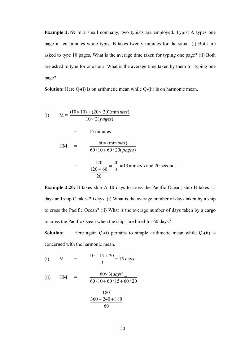
50
Example 2.19: In a small company, two typists are employed. Typist A types one
page in ten minutes while typist B takes twenty minutes for the same. (i) Both are
asked to type 10 pages. What is the average time taken for typing one page? (ii) Both
are asked to type for one hour. What is the average time taken by them for typing one
page?
Solution: Here Q-(i) is on arithmetic mean while Q-(ii) is on harmonic mean.
(i) M = )(210
))(min2020()1010(pages
utes×
×+×
= 15 minutes
HM = )(20/6010/60
)(min60pages
utes+×
= utesmin133
40
2060120
120==
+and 20 seconds.
Example 2.20: It takes ship A 10 days to cross the Pacific Ocean; ship B takes 15
days and ship C takes 20 days. (i) What is the average number of days taken by a ship
to cross the Pacific Ocean? (ii) What is the average number of days taken by a cargo
to cross the Pacific Ocean when the ships are hired for 60 days?
Solution: Here again Q-(i) pertains to simple arithmetic mean while Q-(ii) is
concerned with the harmonic mean.
(i) M = 3
201510 ++ = 15 days
(ii) HM = 20/6015/6010/60
_)(360++
× days
=
60180240360
180++
51
= 13.8 days approx.
2.9 QUADRATIC MEAN
We have seen earlier that the geometric mean is the antilogarithm of the arithmetic
mean of the logarithms, and the harmonic mean is the reciprocal of the arithmetic
mean of the reciprocals. Likewise, the quadratic mean (Q) is the square root of the
arithmetic mean of the squares. Symbolically,
Q = n
xx n22
221 ...... +++
Instead of using original values, the quadratic mean can be used while averaging
deviations when the standard deviation is to be calculated. This will be used in the
next chapter on dispersion.
2.9.1 Relative Position of Different Means
The relative position of different means will always be:
Q> x >G>H provided that all the individual observations in a series are positive and
all of them are not the same.
2.9.2 Composite Average or Average of Means
Sometimes, we may have to calculate an average of several averages. In such cases,
we should use the same method of averaging that was employed in calculating the
original averages. Thus, we should calculate the arithmetic mean of several values of
x, the geometric mean of several values of GM, and the harmonic mean of several
values of HM. It will be wrong if we use some other average in averaging of means.
2.10 SUMMARY
It is the most important objective of statistical analysis is to get one single value that
describes the characteristics of the entire mass of cumbersome data. Such a value is
finding out, which is known as central value to serve our purpose.

52
2.11 SELF-TEST QUESTIONS
1. What are the desiderata (requirements) of a good average? Compare the mean,
the median and the mode in the light of these desiderata? Why averages are
called measures of central tendency?
2. "Every average has its own peculiar characteristics. It is difficult to say which
average is the best." Explain with examples.
3. What do you understand .by 'Central Tendency'? Under what conditions is the
median more suitable than other measures of central tendency?
4. The average monthly salary paid to all employees in a company was Rs 8,000.
The average monthly salaries paid to male and female employees of the
company were Rs 10,600 and Rs 7,500 respectively. Find out the percentages
of males and females employed by the company.
5. Calculate the arithmetic mean from the following data:
Class 10-19 20-29 30-39 40-49 50-59 60-69 70-79 80-89
Frequency 2 4 9 11 12 6 4 2
6. Calculate the mean, median and mode from the following data:
Height in Inches Number of Persons 62-63 2 63-64 6 64-65 14 65-66 16 66-67 8 67-68 3 68-69 1 Total 50
7. A number of particular articles have been classified according to their weights.
After drying for two weeks, the same articles have again been weighed and
similarly classified. It is known that the median weight in the first weighing
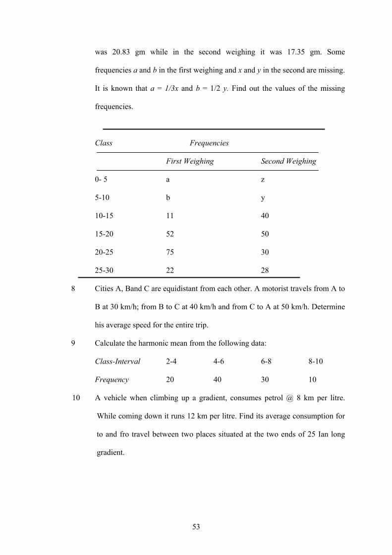
53
was 20.83 gm while in the second weighing it was 17.35 gm. Some
frequencies a and b in the first weighing and x and y in the second are missing.
It is known that a = 1/3x and b = 1/2 y. Find out the values of the missing
frequencies.
Class Frequencies
First Weighing Second Weighing
0- 5 a z
5-10 b y
10-15 11 40
15-20 52 50
20-25 75 30
25-30 22 28
8 Cities A, Band C are equidistant from each other. A motorist travels from A to
B at 30 km/h; from B to C at 40 km/h and from C to A at 50 km/h. Determine
his average speed for the entire trip.
9 Calculate the harmonic mean from the following data:
Class-Interval 2-4 4-6 6-8 8-10
Frequency 20 40 30 10
10 A vehicle when climbing up a gradient, consumes petrol @ 8 km per litre.
While coming down it runs 12 km per litre. Find its average consumption for
to and fro travel between two places situated at the two ends of 25 Ian long
gradient.