awesome android design
TRANSCRIPT
AWESOME
ANDROIDDESIGN
+Android Developers
—Nick Butcher

ANDROIDDEVELOPERRELATIONS
—Nick Butcher
google.com/+NickButcher | @crafty
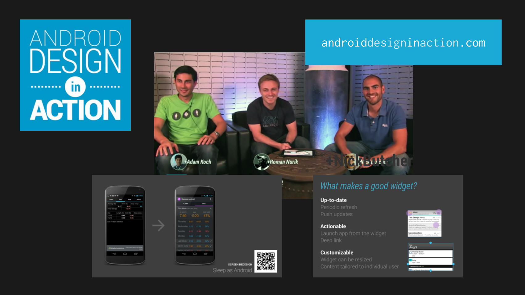
androiddesigninaction.com
+NickButcher

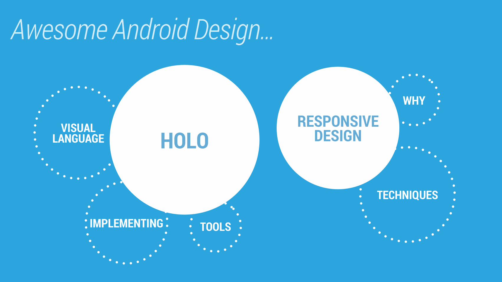
Awesome Android Design…
HOLOVISUAL
LANGUAGE
TECHNIQUES
RESPONSIVEDESIGN
TOOLS
WHY
IMPLEMENTING
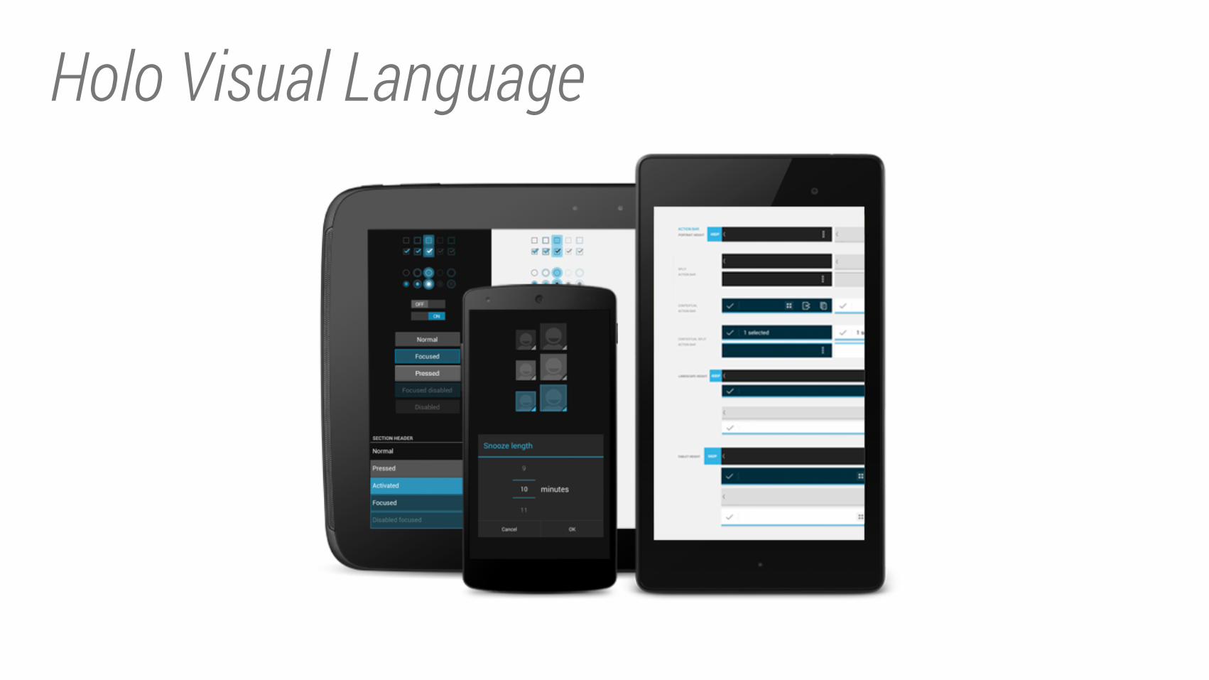
Holo Visual Language
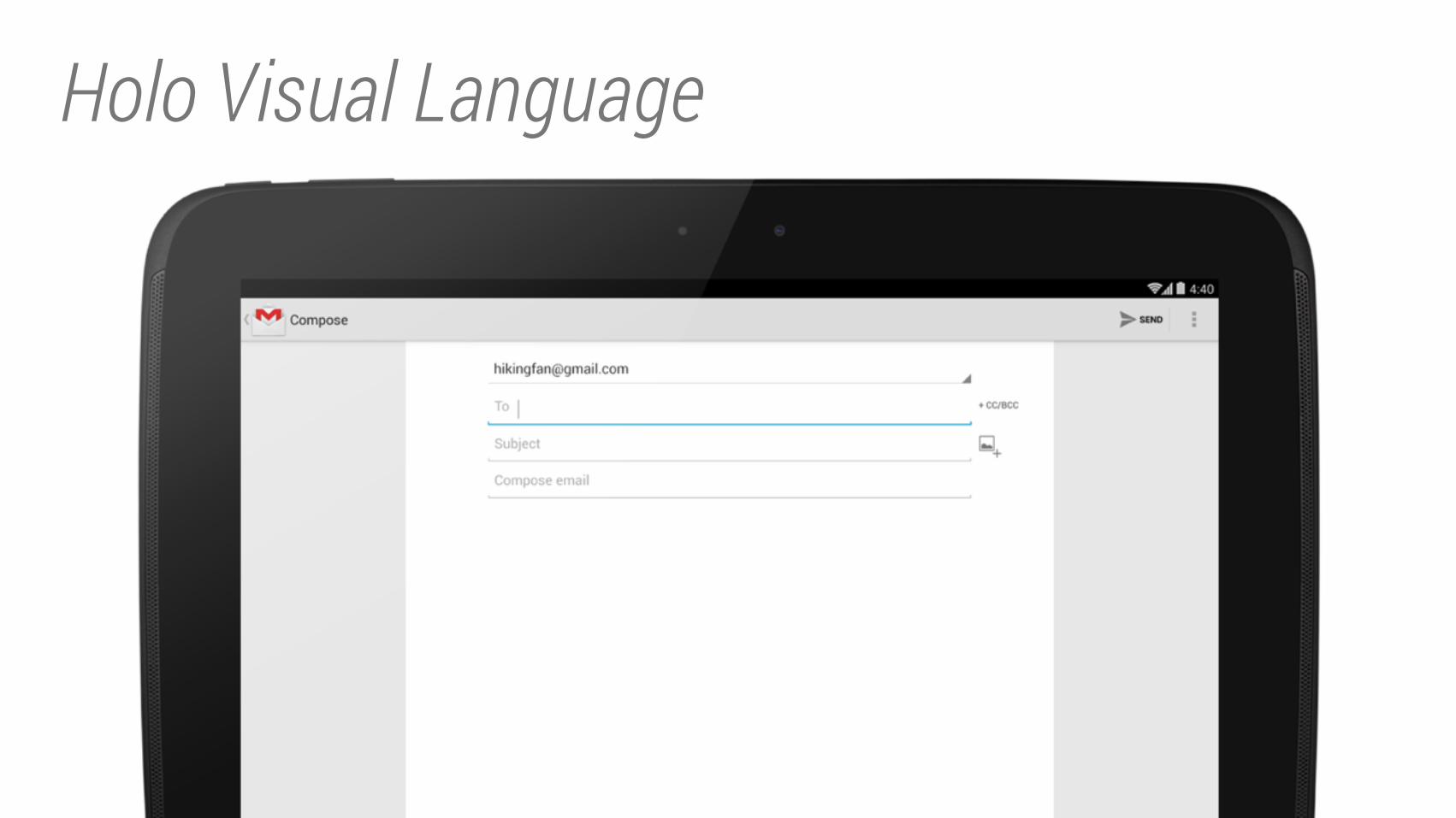
Holo Visual Language
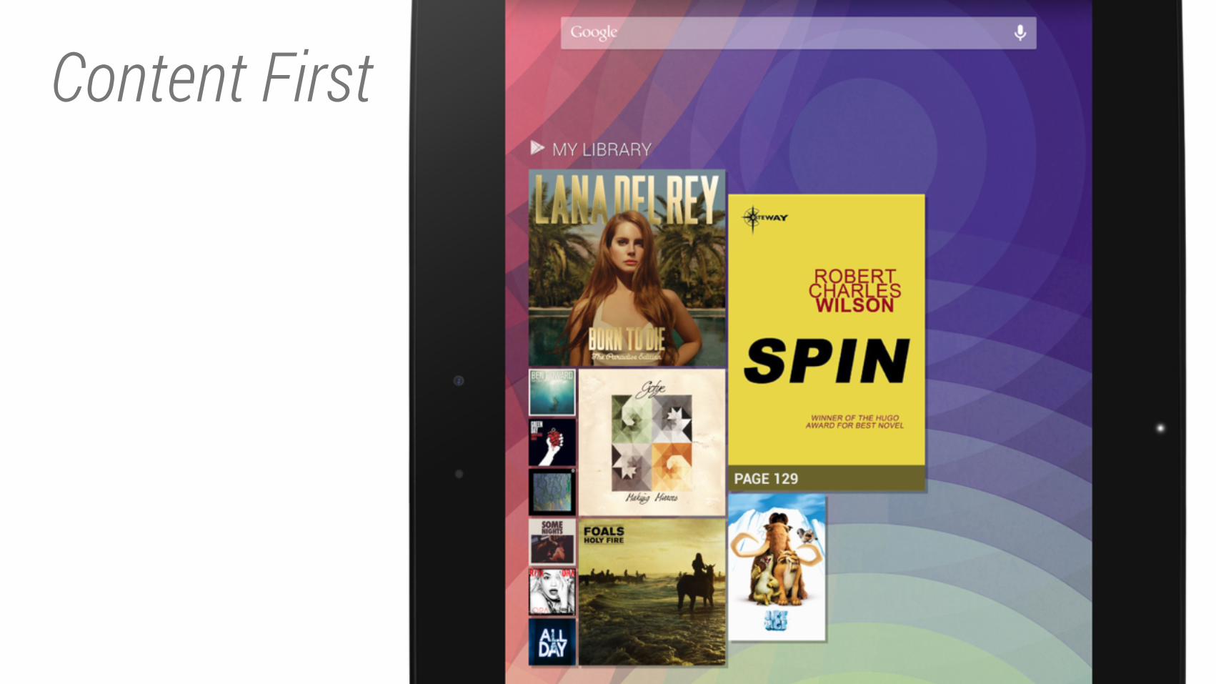
Content First
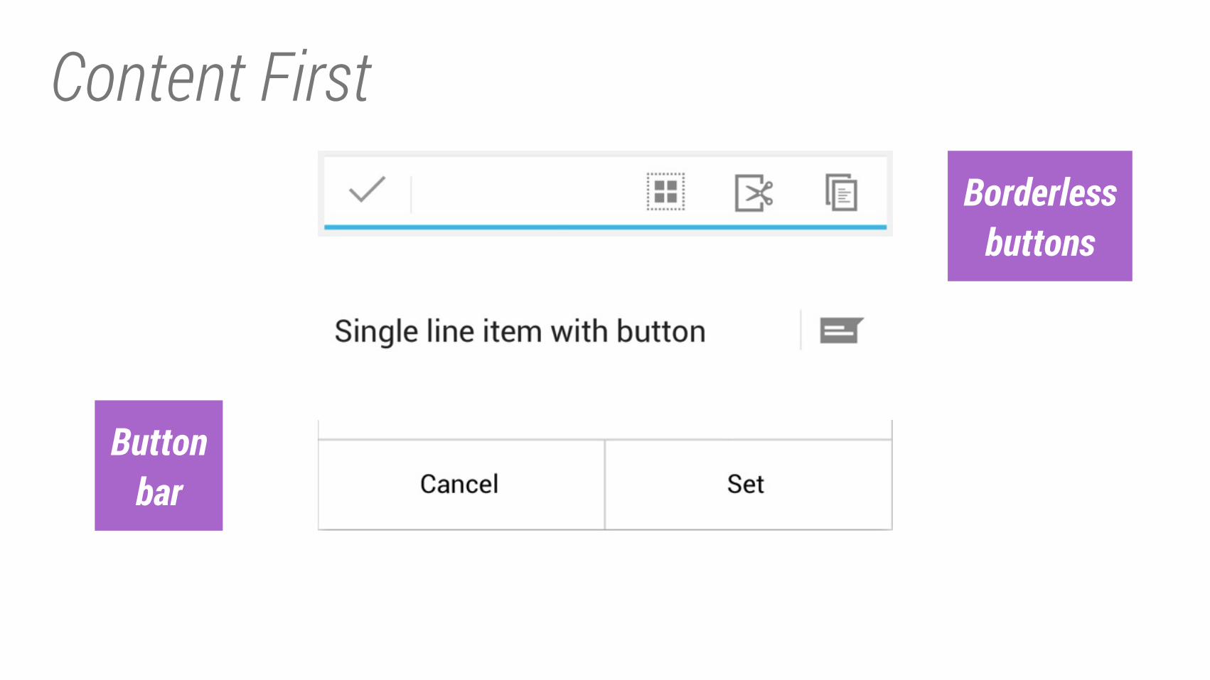
Content FirstBorderless
buttons
Button
bar
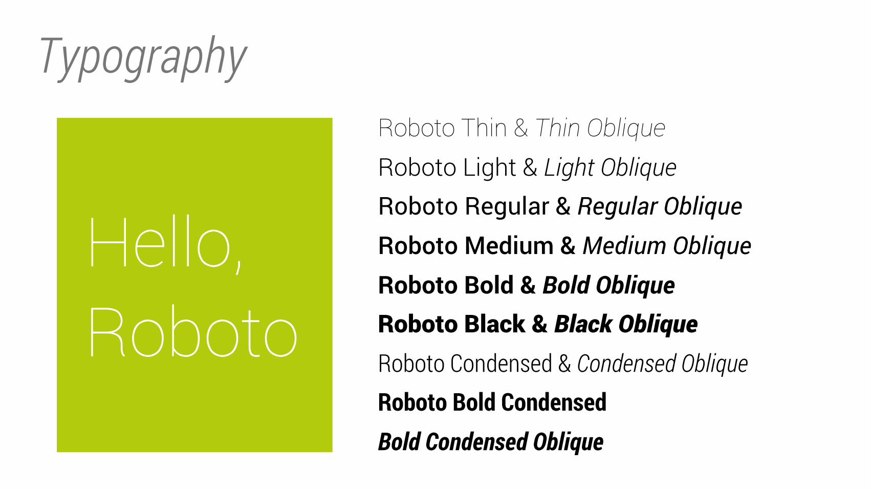
Typography
Hello, Roboto
Roboto Thin & Thin Oblique
Roboto Light & Light Oblique
Roboto Regular & Regular ObliqueRoboto Medium & Medium ObliqueRoboto Bold & Bold Oblique
Roboto Black & Black Oblique
Roboto Condensed & Condensed ObliqueRoboto Bold CondensedBold Condensed Oblique
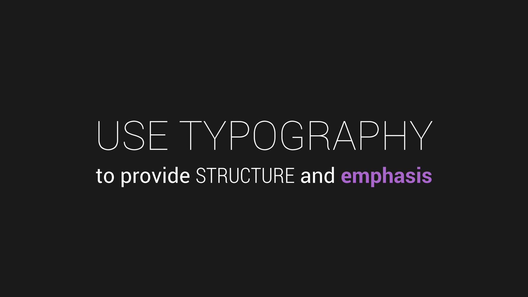
USE TYPOGRAPHYto provide STRUCTURE and emphasis
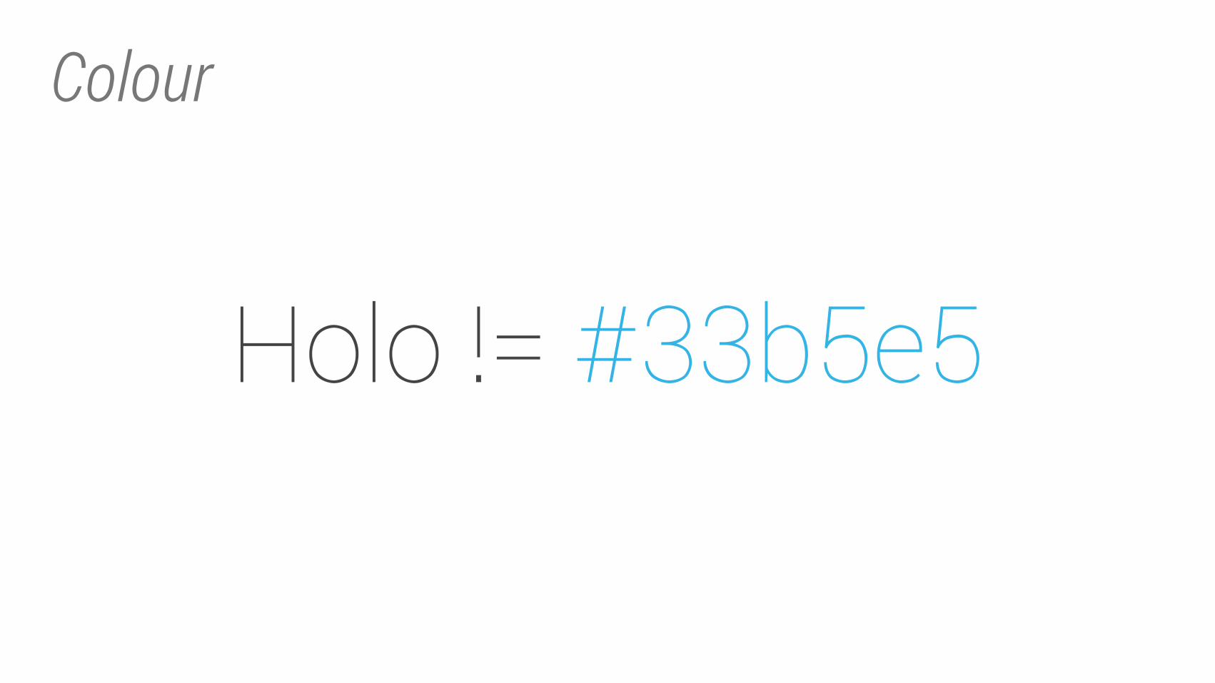
Colour
Holo != #33b5e5
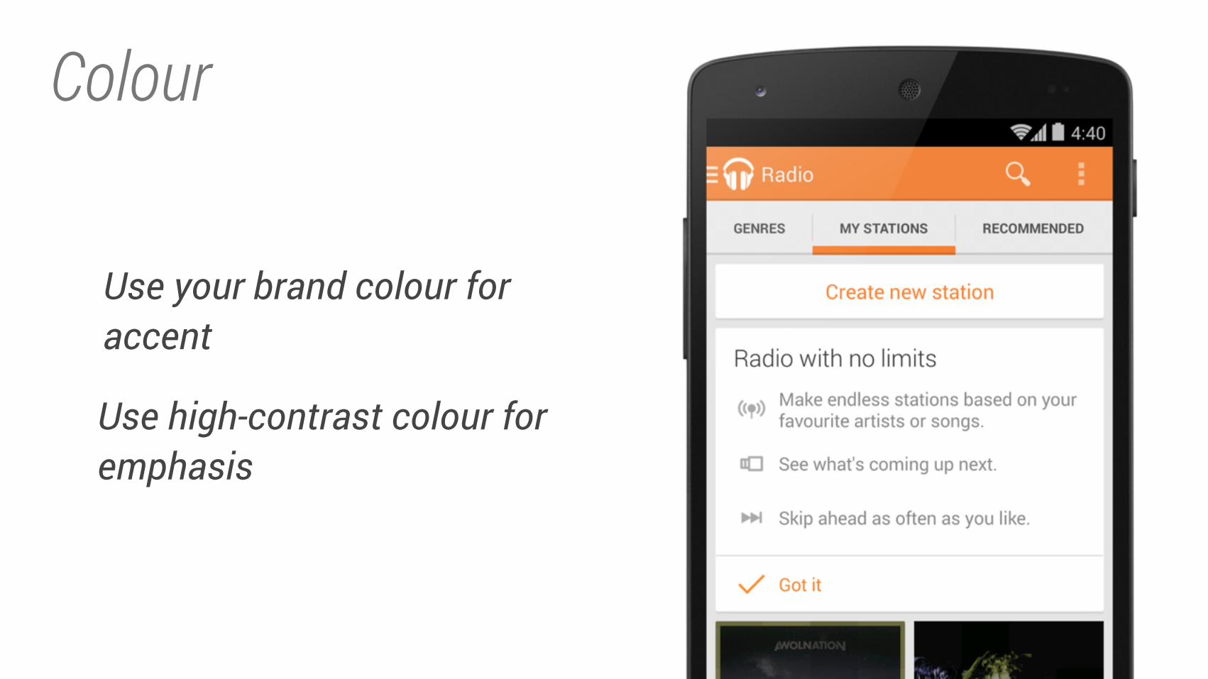
Colour
Use your brand colour for accent
Use high-contrast colour for emphasis
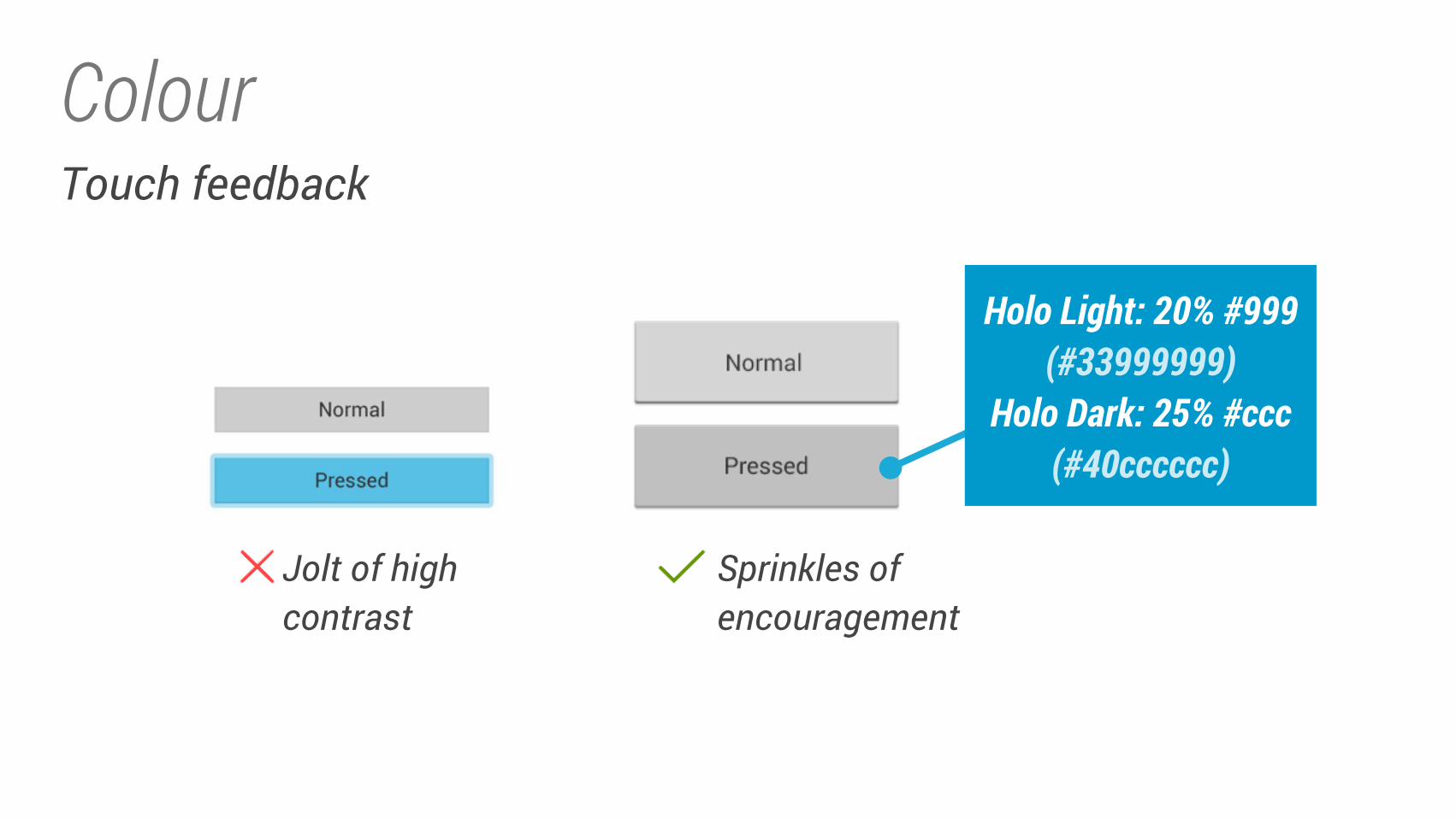
ColourTouch feedback
Jolt of highcontrast
Sprinkles ofencouragement
Holo Light: 20% #999
(#33999999)
Holo Dark: 25% #ccc
(#40cccccc)
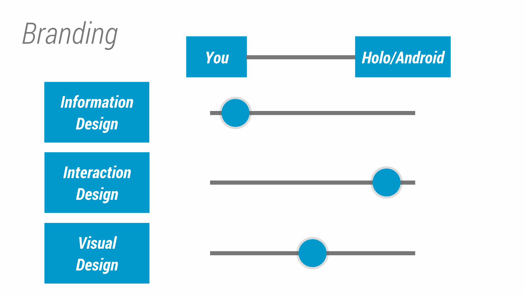
Branding
Information
Design
Interaction
Design
Visual
Design
Holo/AndroidYou
TOOLS
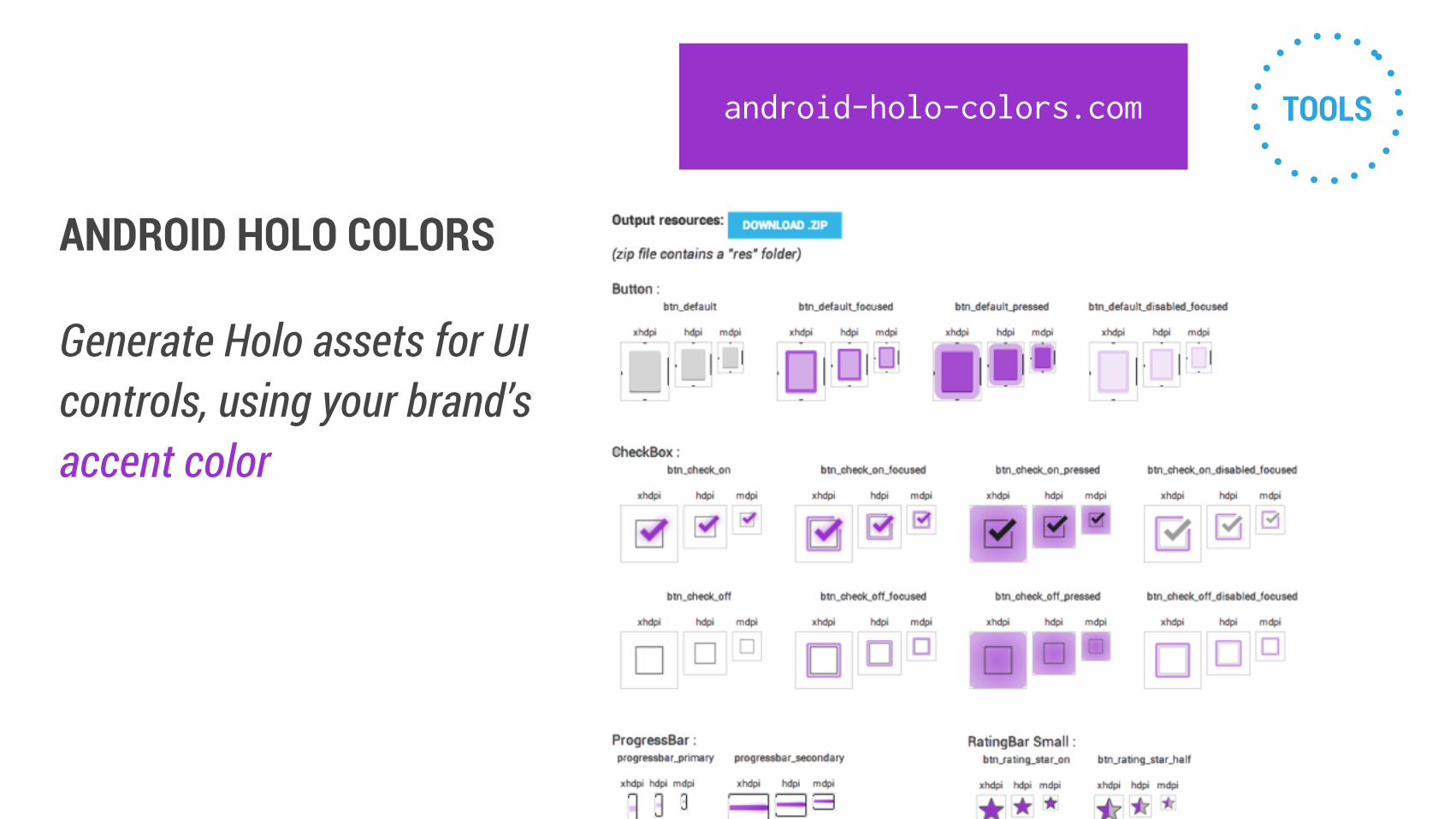
ANDROID HOLO COLORS
Generate Holo assets for UI
controls, using your brand’s
accent color
android-holo-colors.com
TOOLS
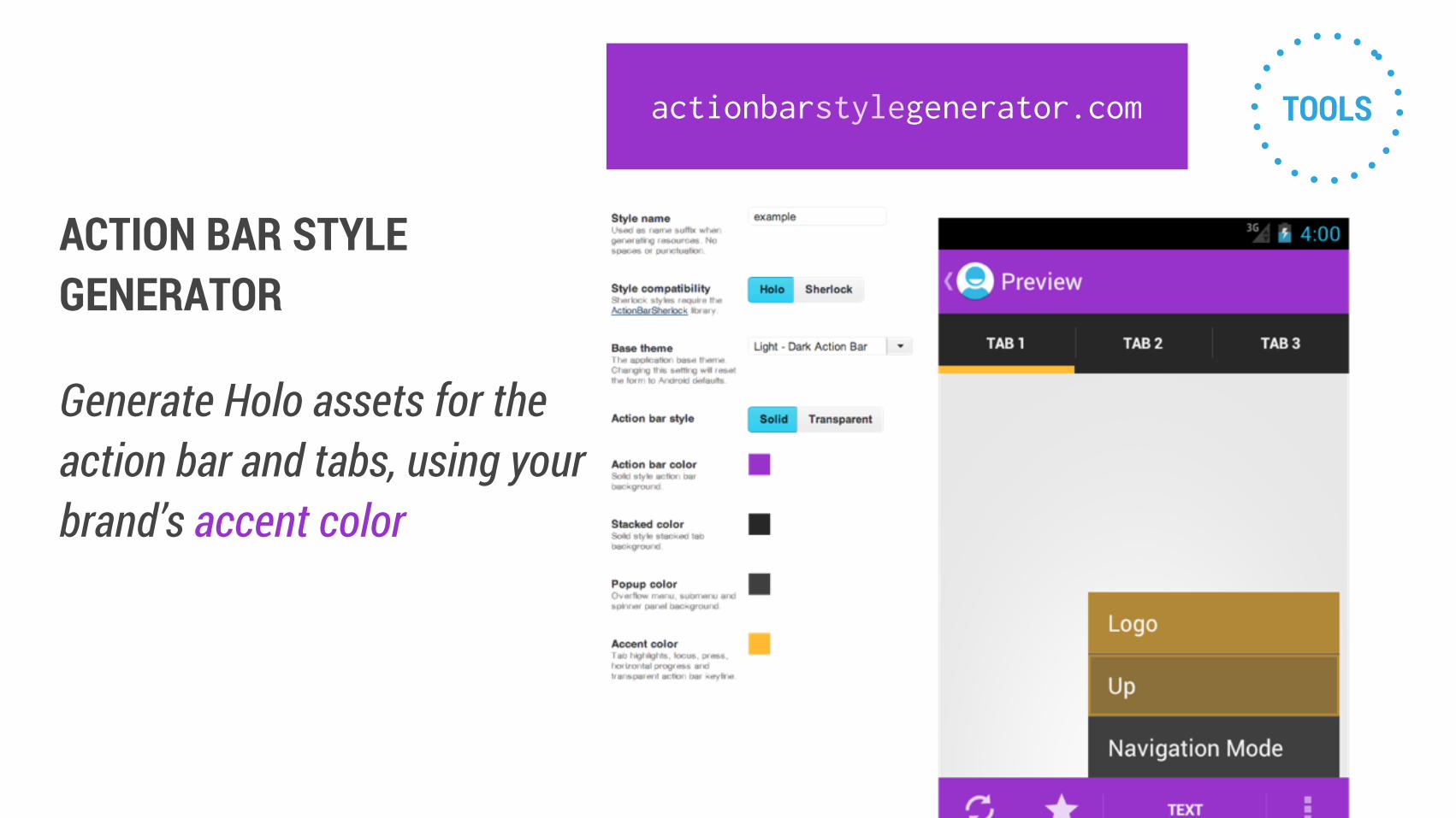
ACTION BAR STYLE GENERATOR
Generate Holo assets for the
action bar and tabs, using your
brand’s accent color
actionbarstylegenerator.com
Implementing Holo
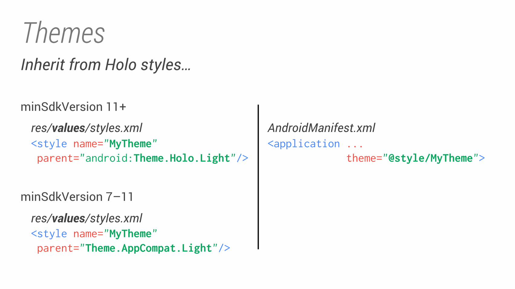
Themes
res/values/styles.xml<style name="MyTheme" parent="android:Theme.Holo.Light"/>
minSdkVersion 11+
<style name="MyTheme" parent="Theme.AppCompat.Light"/>
res/values/styles.xml
minSdkVersion 7–11
AndroidManifest.xml<application ...
theme="@style/MyTheme">
Inherit from Holo styles…
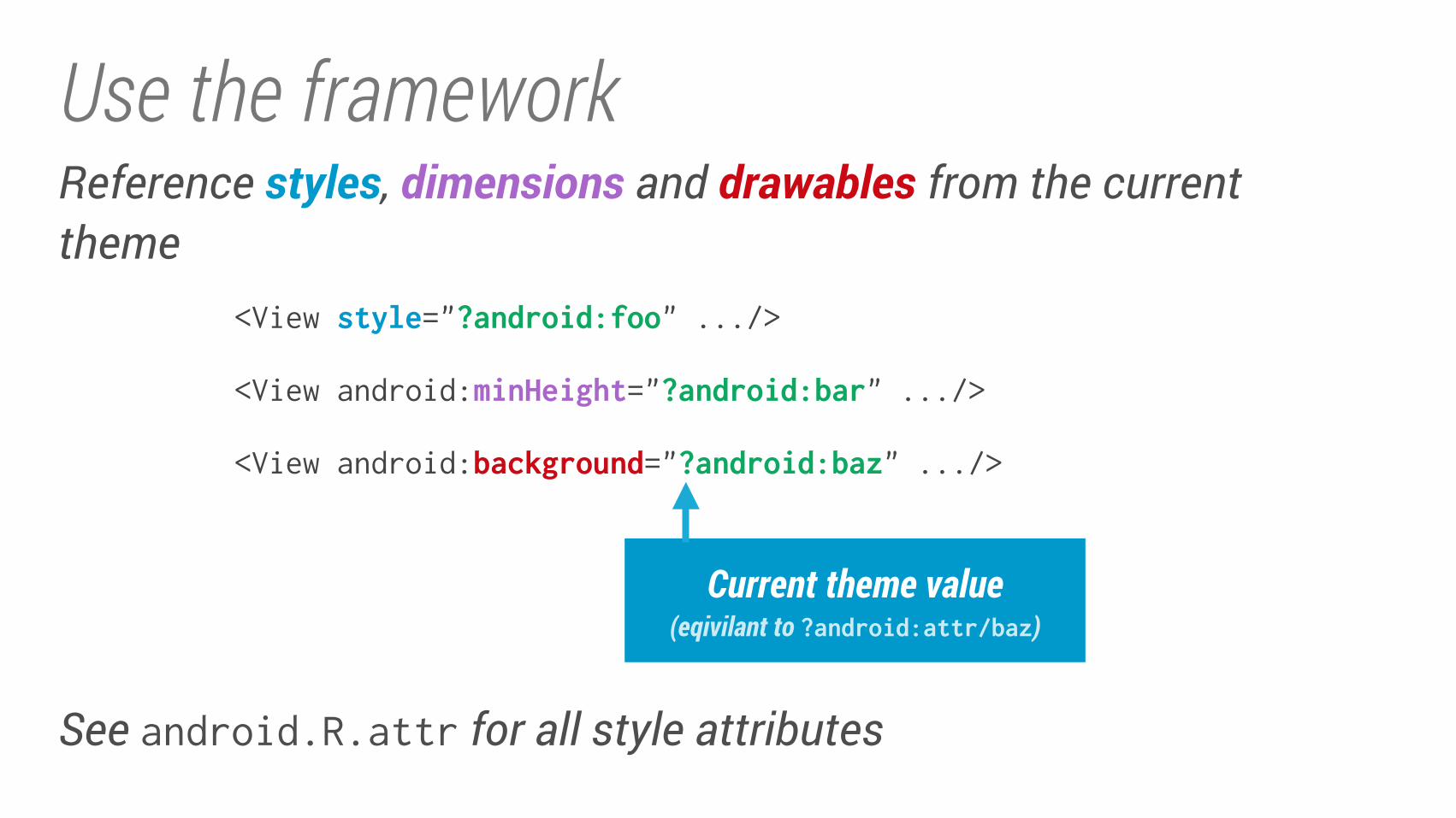
Use the frameworkReference styles, dimensions and drawables from the current theme
Current theme value
(eqivilant to ?android:attr/baz)
<View style="?android:foo" .../>
<View android:minHeight="?android:bar" .../>
<View android:background="?android:baz" .../>
See android.R.attr for all style attributes
Usetheframework
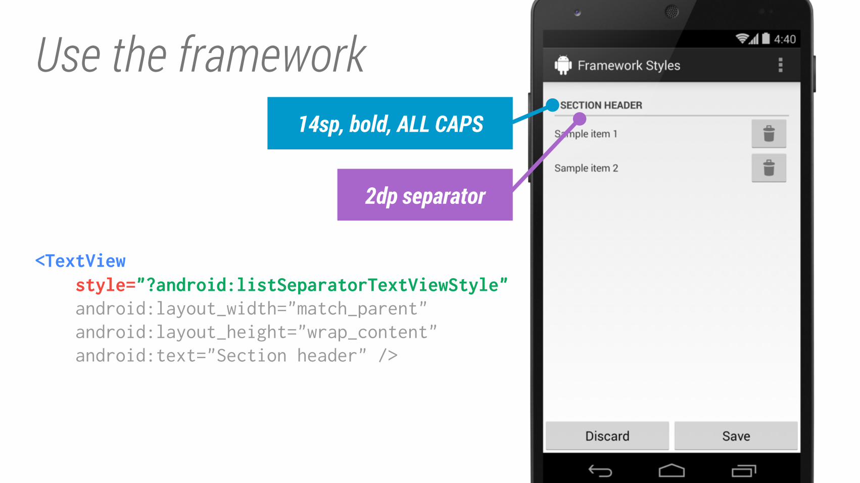
Use the framework
<TextView style="?android:listSeparatorTextViewStyle" android:layout_width="match_parent"
android:layout_height="wrap_content"
android:text="Section header" />
2dp separator
14sp, bold, ALL CAPS
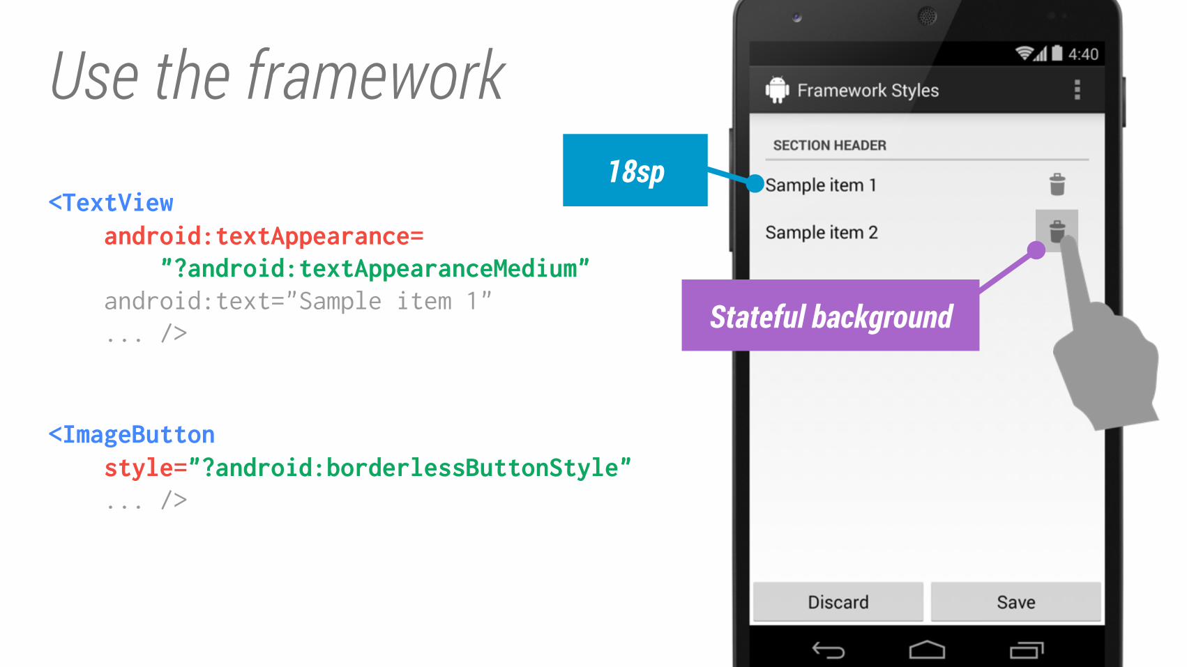
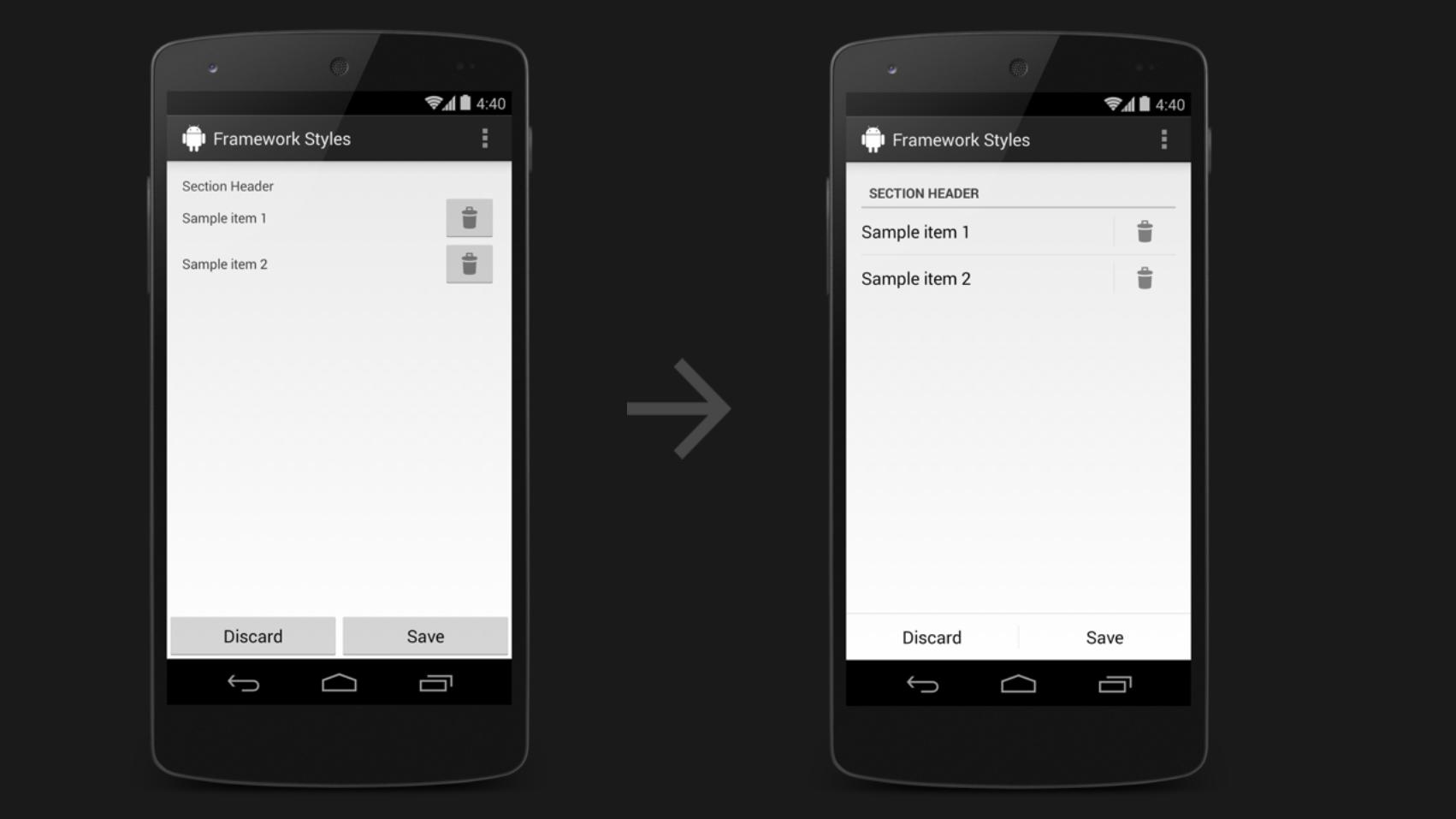
Use the framework
<TextView android:textAppearance= "?android:textAppearanceMedium" android:text="Sample item 1"
... />
<ImageButton style="?android:borderlessButtonStyle" ... />
18sp
Stateful background
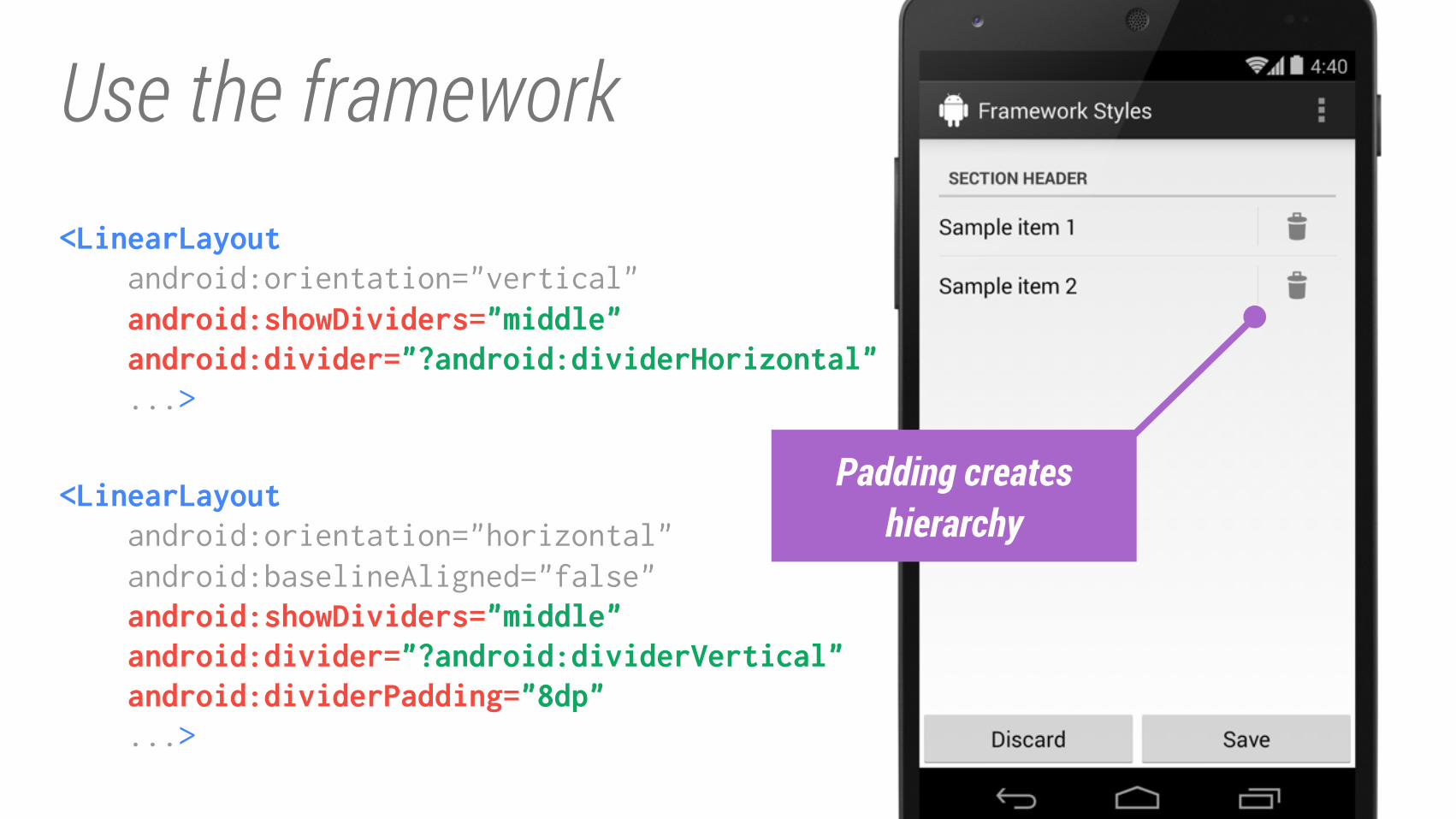
Use the framework<LinearLayout android:orientation="vertical"
android:showDividers="middle" android:divider="?android:dividerHorizontal" ...>
<LinearLayout android:orientation="horizontal"
android:baselineAligned="false"
android:showDividers="middle" android:divider="?android:dividerVertical" android:dividerPadding="8dp" ...>
Padding creates
hierarchy
Use the framework
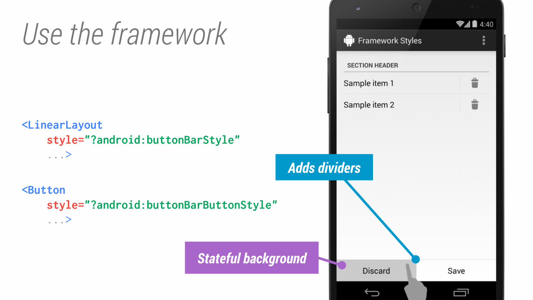
<LinearLayout style="?android:buttonBarStyle" ...>
<Button style="?android:buttonBarButtonStyle" ...>
Stateful background
Adds dividers
Style the framework
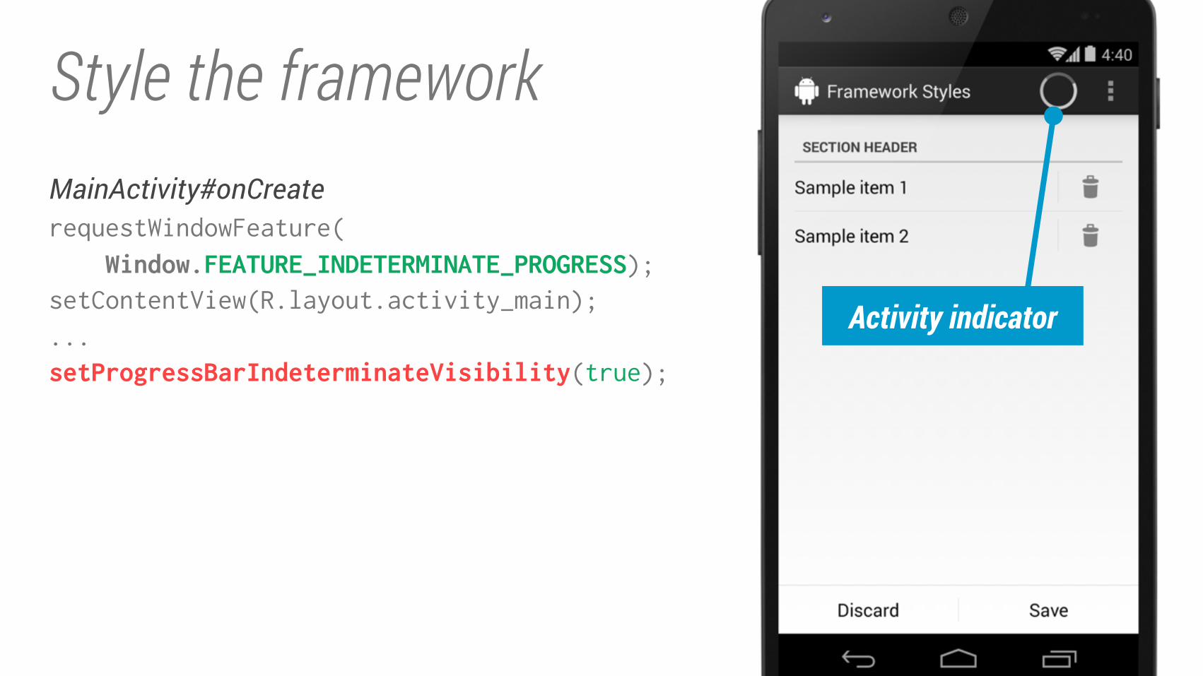
requestWindowFeature(
Window.FEATURE_INDETERMINATE_PROGRESS);setContentView(R.layout.activity_main);
...
setProgressBarIndeterminateVisibility(true);
MainActivity#onCreate
Activity indicator
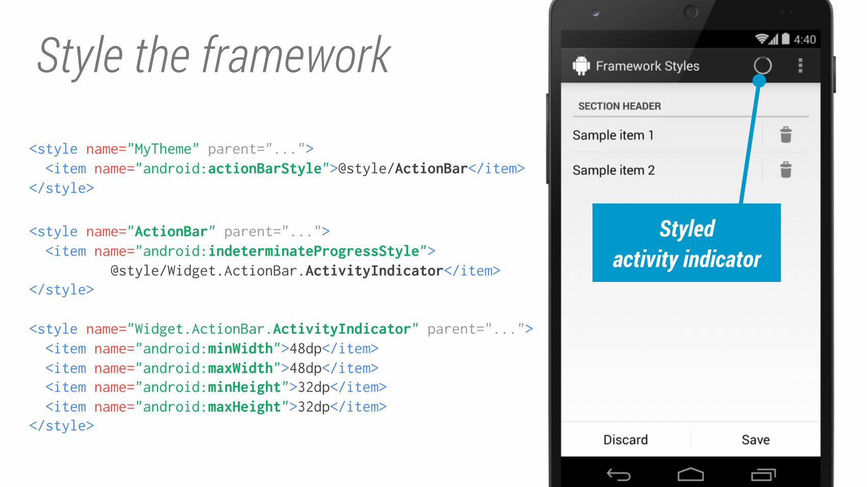
Style the framework
<style name="MyTheme" parent="...">
<item name="android:actionBarStyle">@style/ActionBar</item></style>
Styled
activity indicator
<style name="Widget.ActionBar.ActivityIndicator" parent="..."> <item name="android:minWidth">48dp</item> <item name="android:maxWidth">48dp</item> <item name="android:minHeight">32dp</item> <item name="android:maxHeight">32dp</item></style>
<style name="ActionBar" parent="..."> <item name="android:indeterminateProgressStyle"> @style/Widget.ActionBar.ActivityIndicator</item></style>
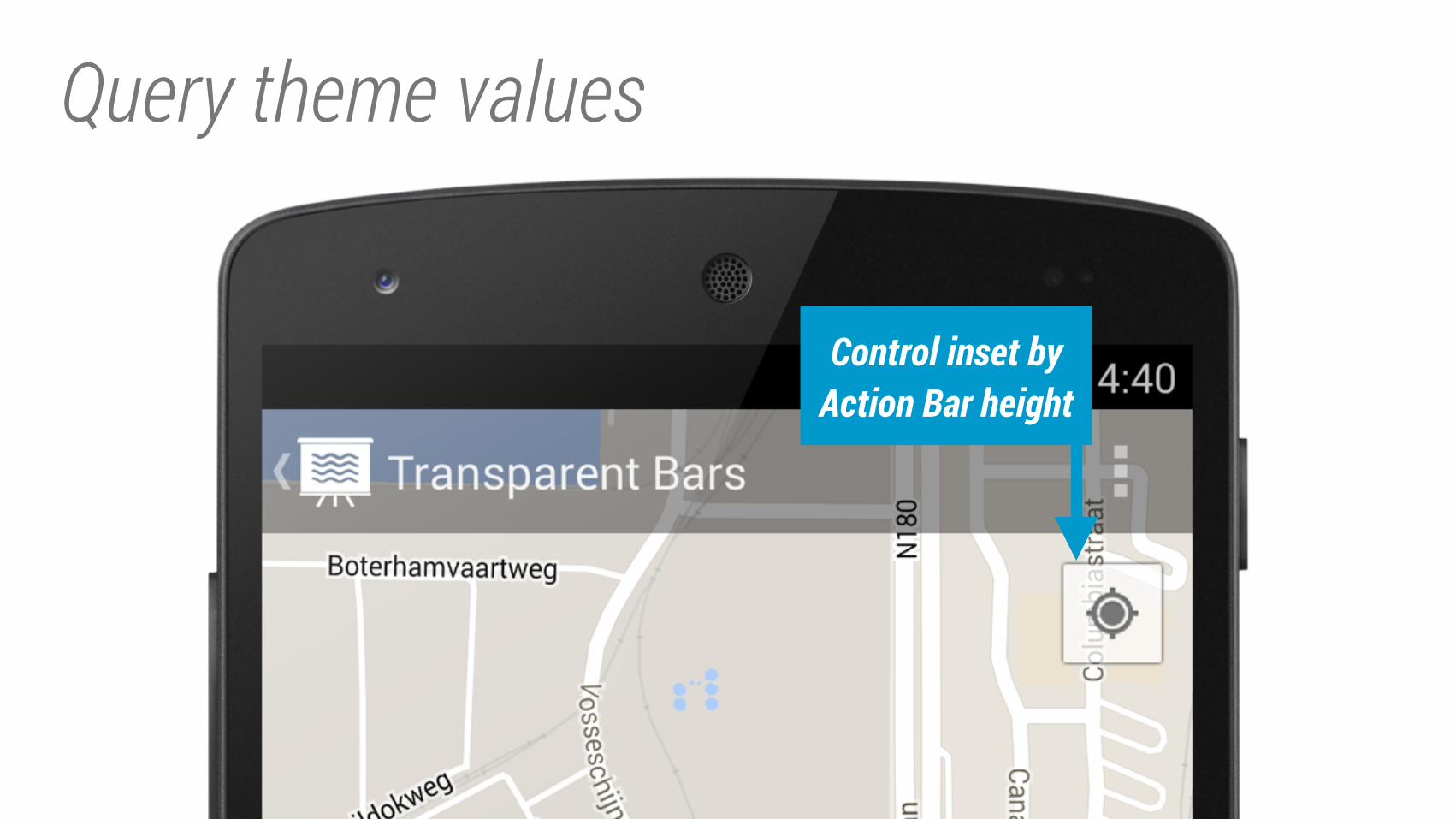
Query theme values
Control inset by
Action Bar height
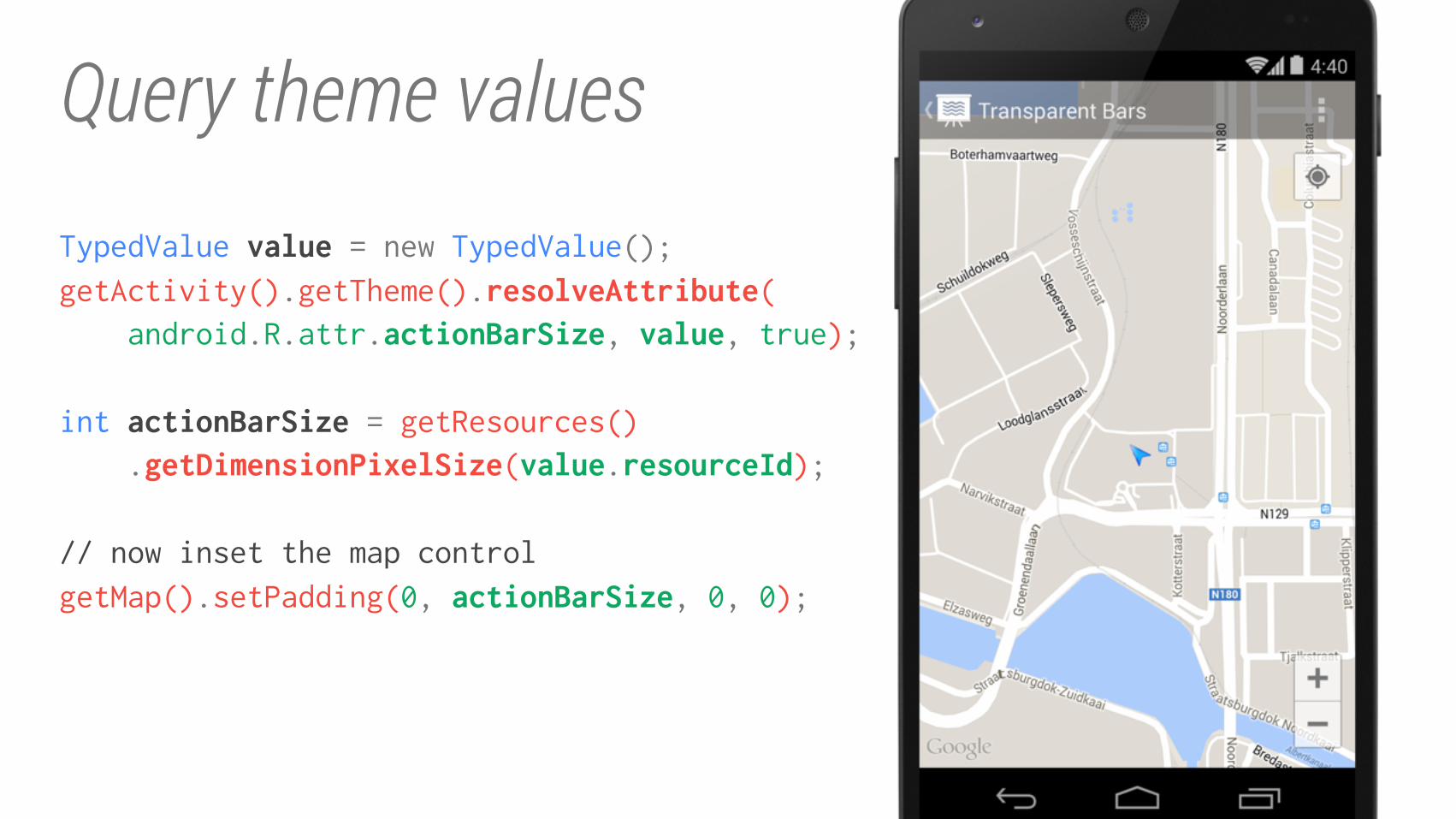
Query theme values
TypedValue value = new TypedValue(); getActivity().getTheme().resolveAttribute( android.R.attr.actionBarSize, value, true);
int actionBarSize = getResources() .getDimensionPixelSize(value.resourceId);
// now inset the map control
getMap().setPadding(0, actionBarSize, 0, 0);
Responsive Design
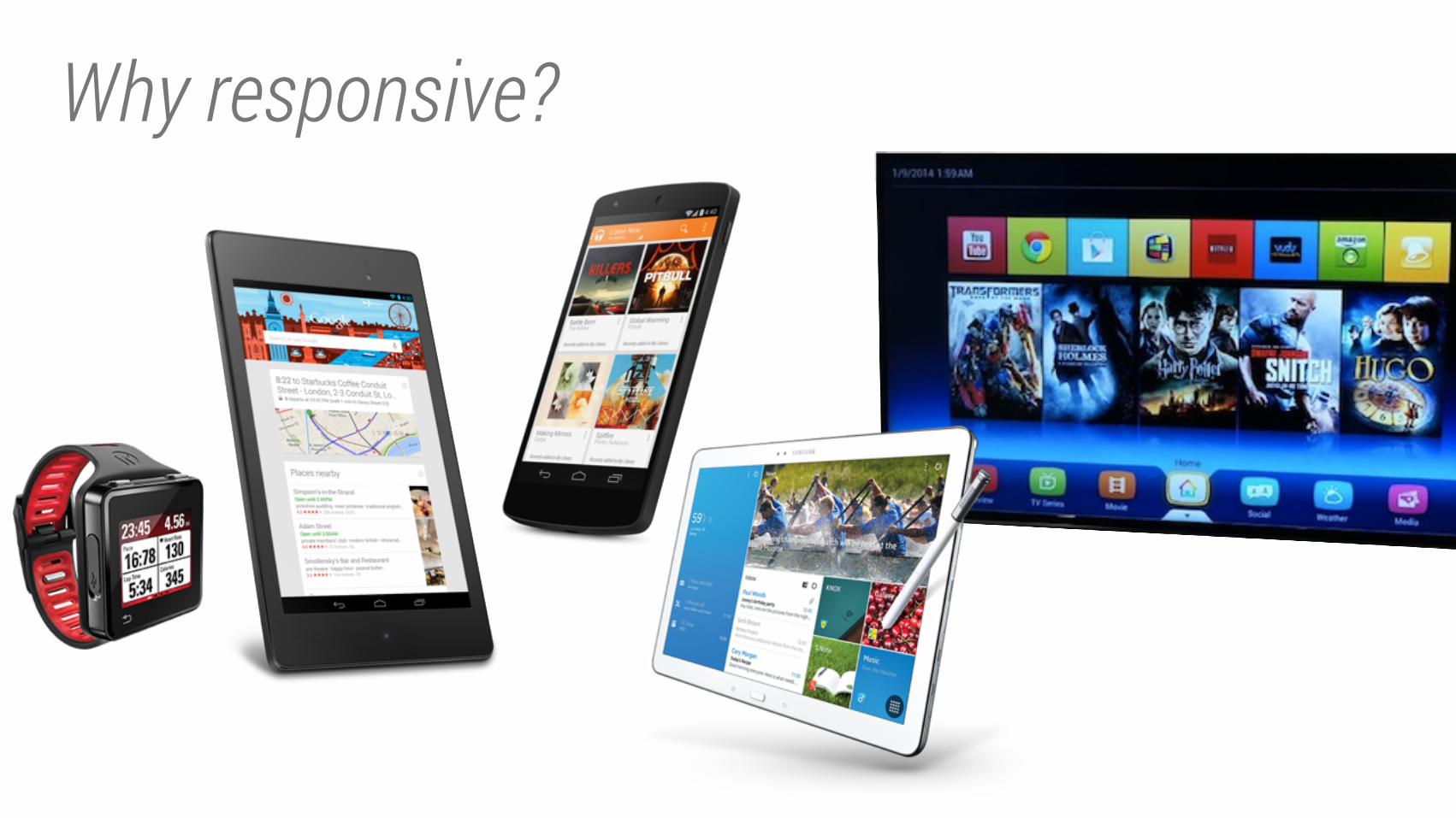
Why responsive?
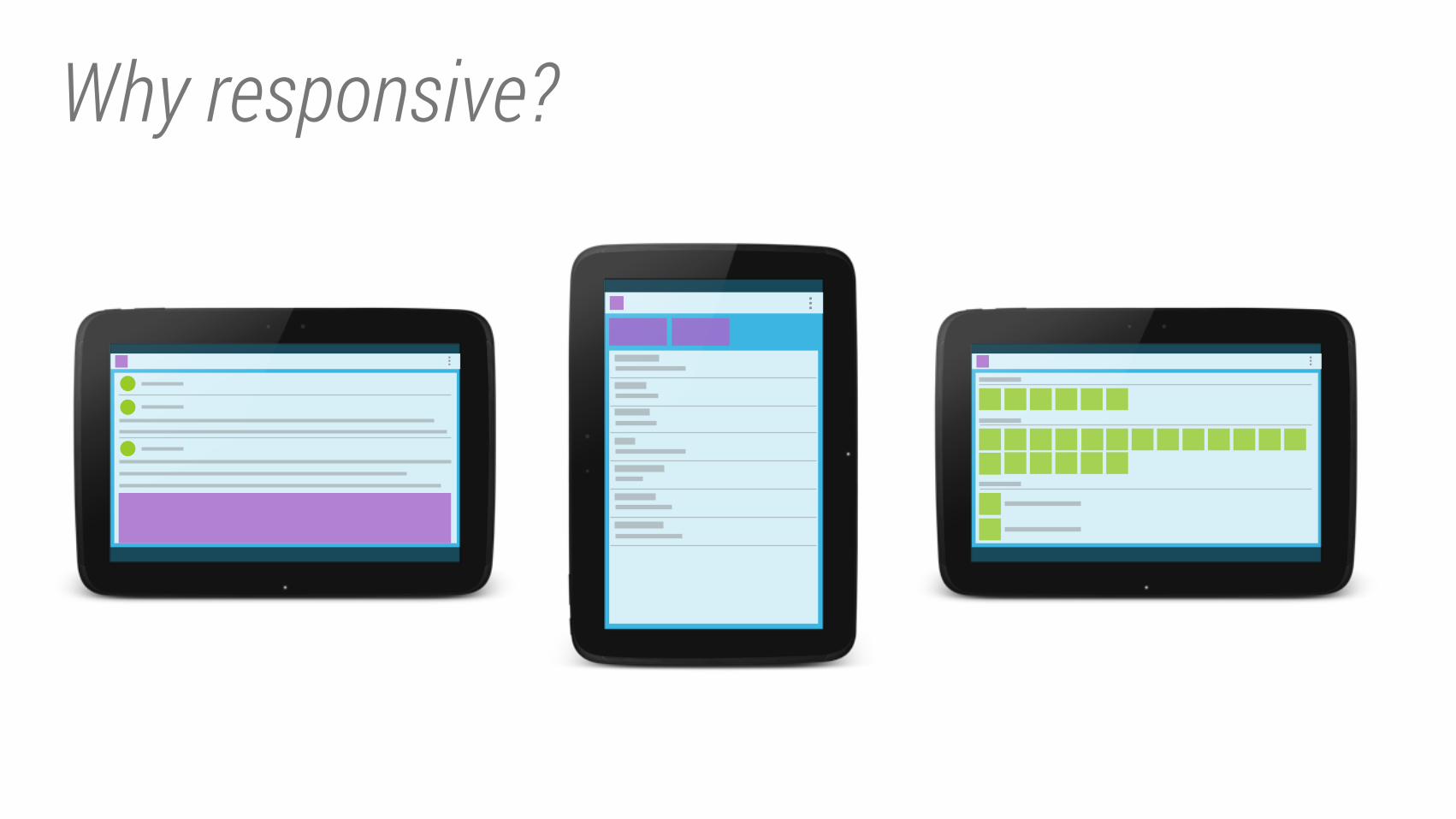
Why responsive?
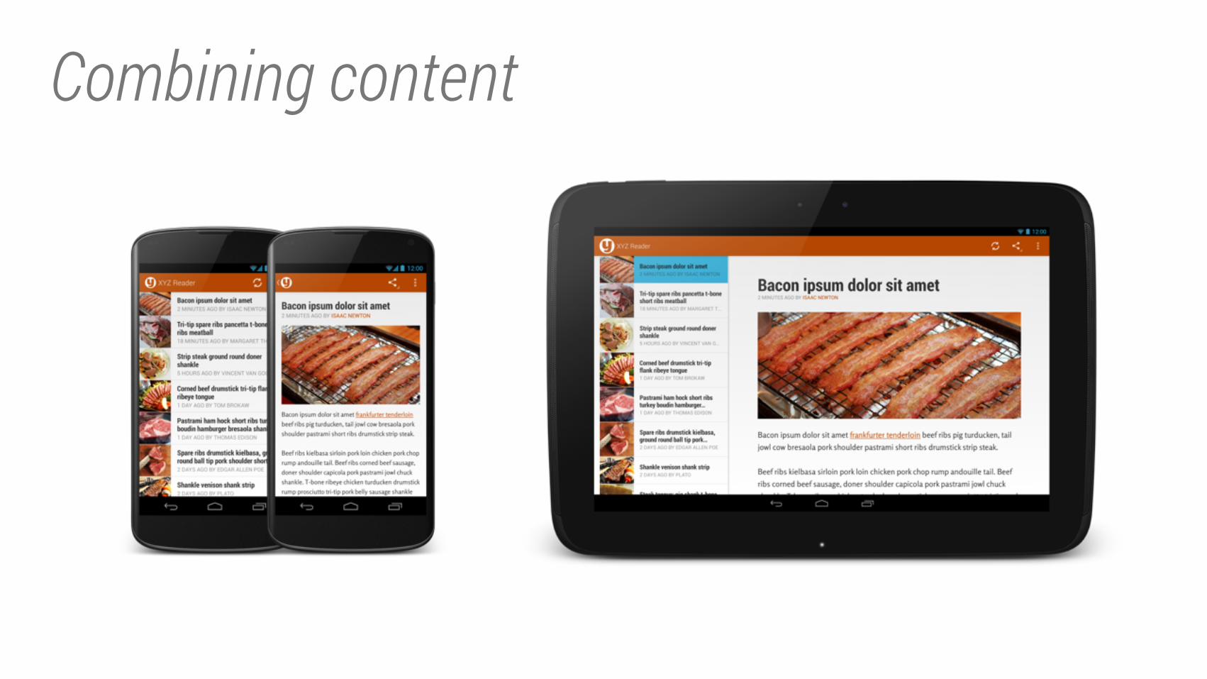
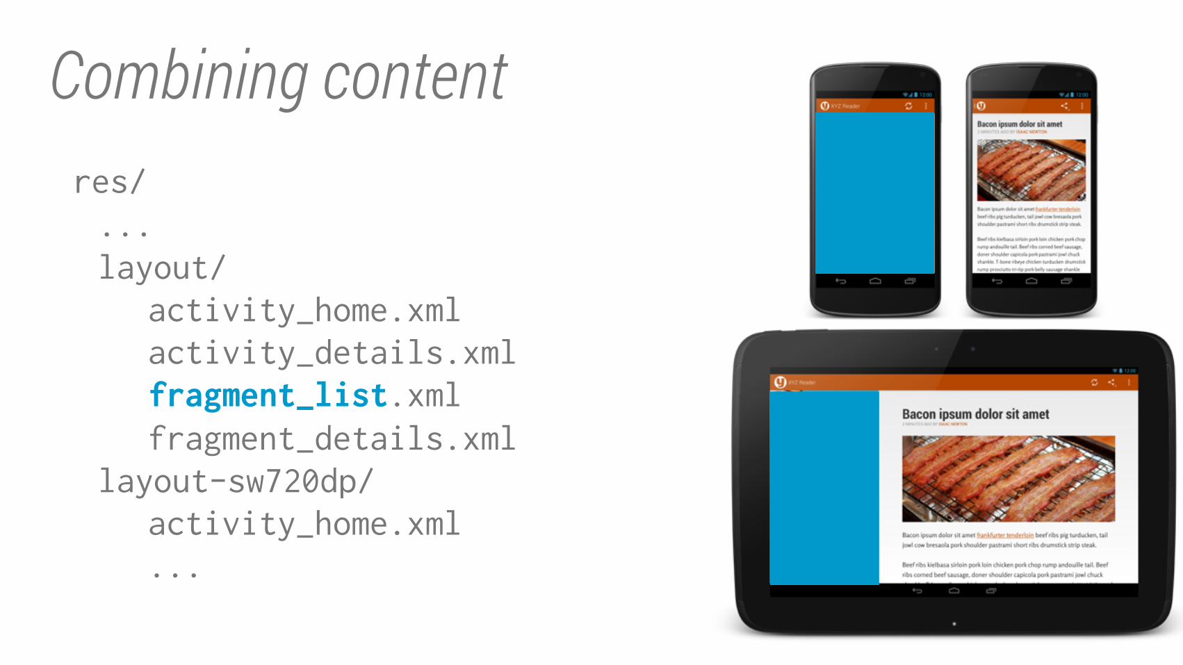
Combining content
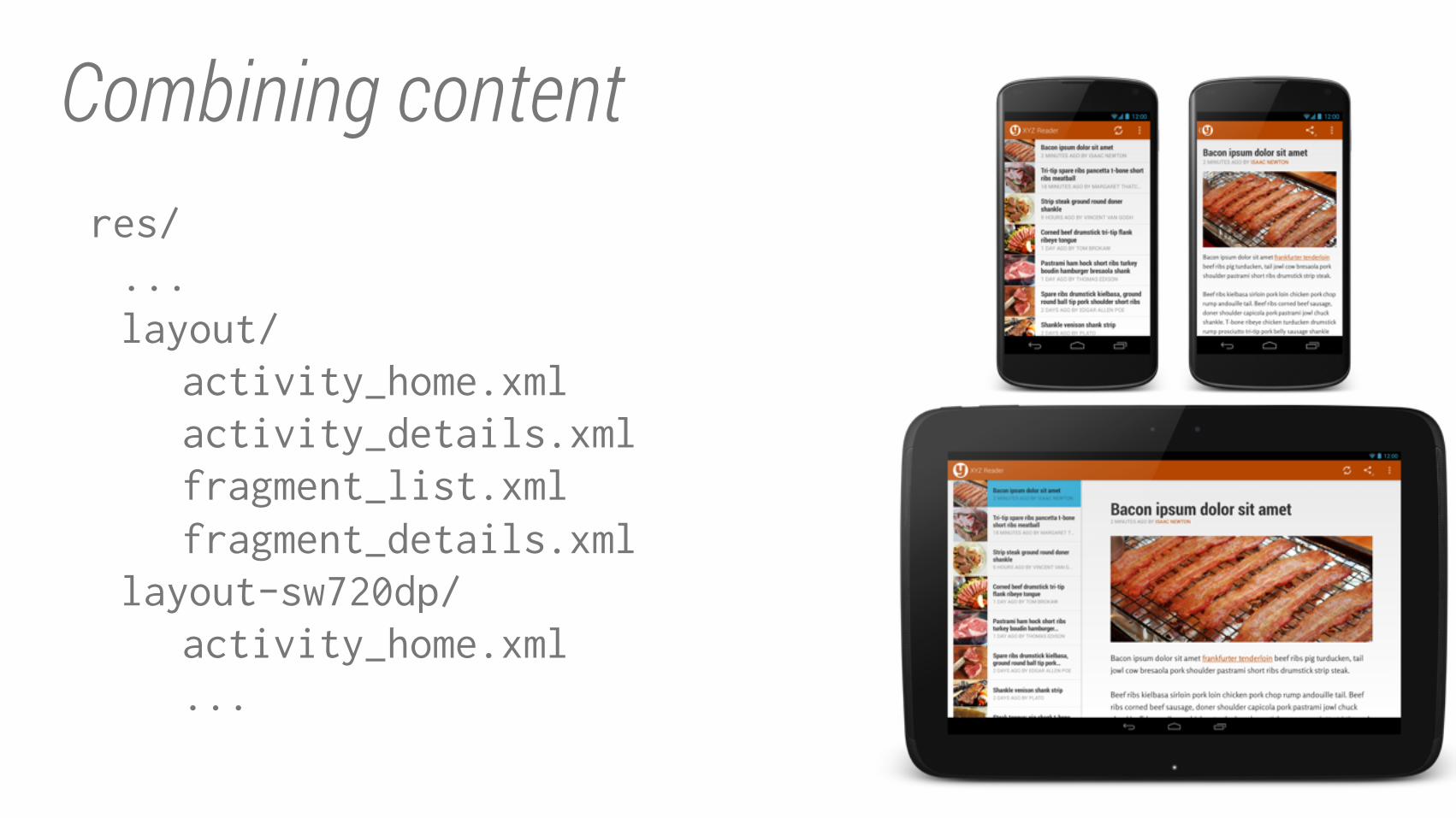
Combining contentres/
...
layout/
activity_home.xml
activity_details.xml
fragment_list.xml
fragment_details.xml
layout-sw720dp/
activity_home.xml
...
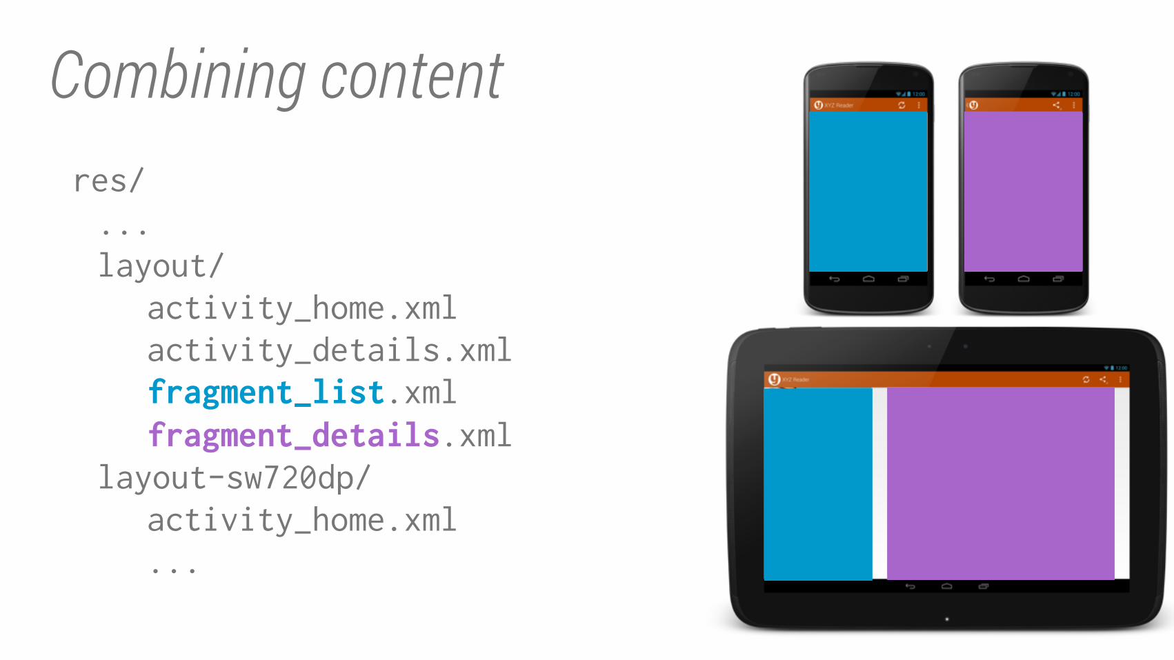
Combining contentres/
...
layout/
activity_home.xml
activity_details.xml
fragment_list.xmlfragment_details.xml
layout-sw720dp/
activity_home.xml
...
Combining contentres/
...
layout/
activity_home.xml
activity_details.xml
fragment_list.xmlfragment_details.xml
layout-sw720dp/
activity_home.xml
...
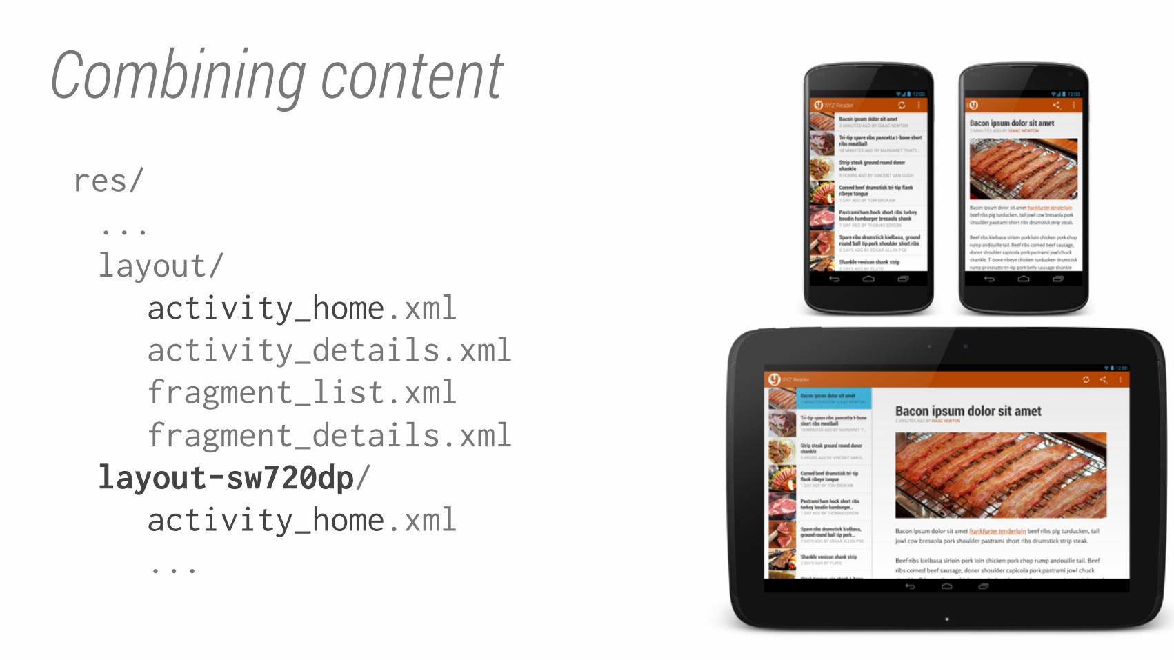
Combining contentres/
...
layout/
activity_home.xml
activity_details.xml
fragment_list.xml
fragment_details.xml
layout-sw720dp/activity_home.xml
...
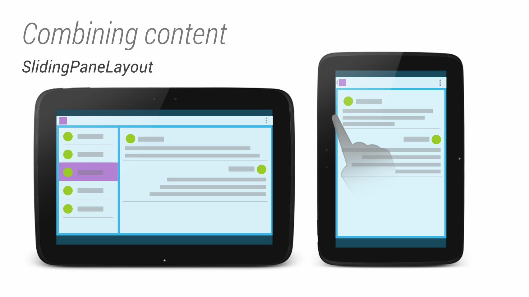
Combining contentSlidingPaneLayout
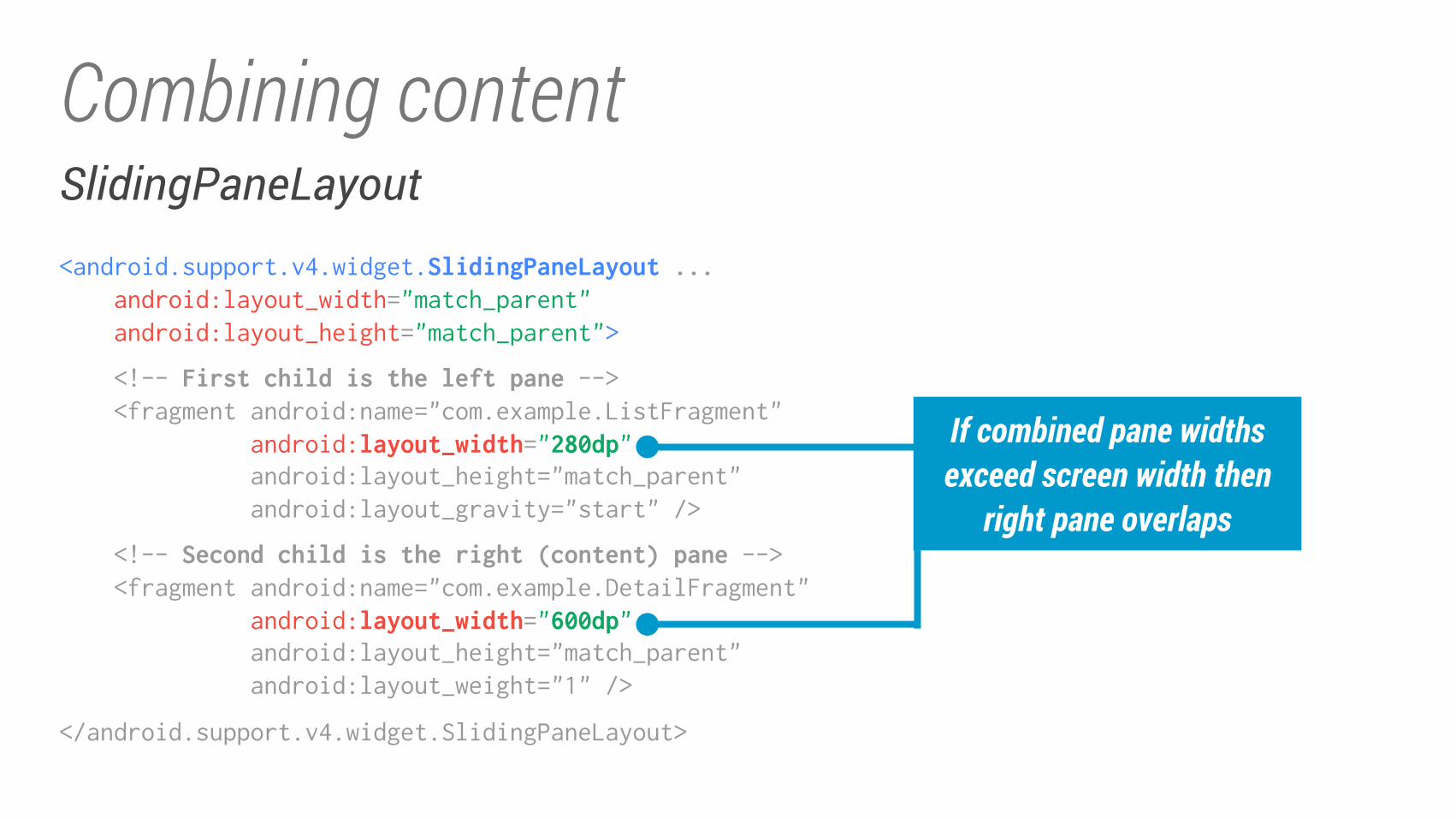
Combining contentSlidingPaneLayout<android.support.v4.widget.SlidingPaneLayout ... android:layout_width="match_parent"
android:layout_height="match_parent">
<!-- First child is the left pane --> <fragment android:name="com.example.ListFragment"
android:layout_width="280dp" android:layout_height="match_parent"
android:layout_gravity="start" />
<!-- Second child is the right (content) pane --> <fragment android:name="com.example.DetailFragment"
android:layout_width="600dp" android:layout_height="match_parent"
android:layout_weight="1" />
</android.support.v4.widget.SlidingPaneLayout>
If combined pane widths
exceed screen width then
right pane overlaps
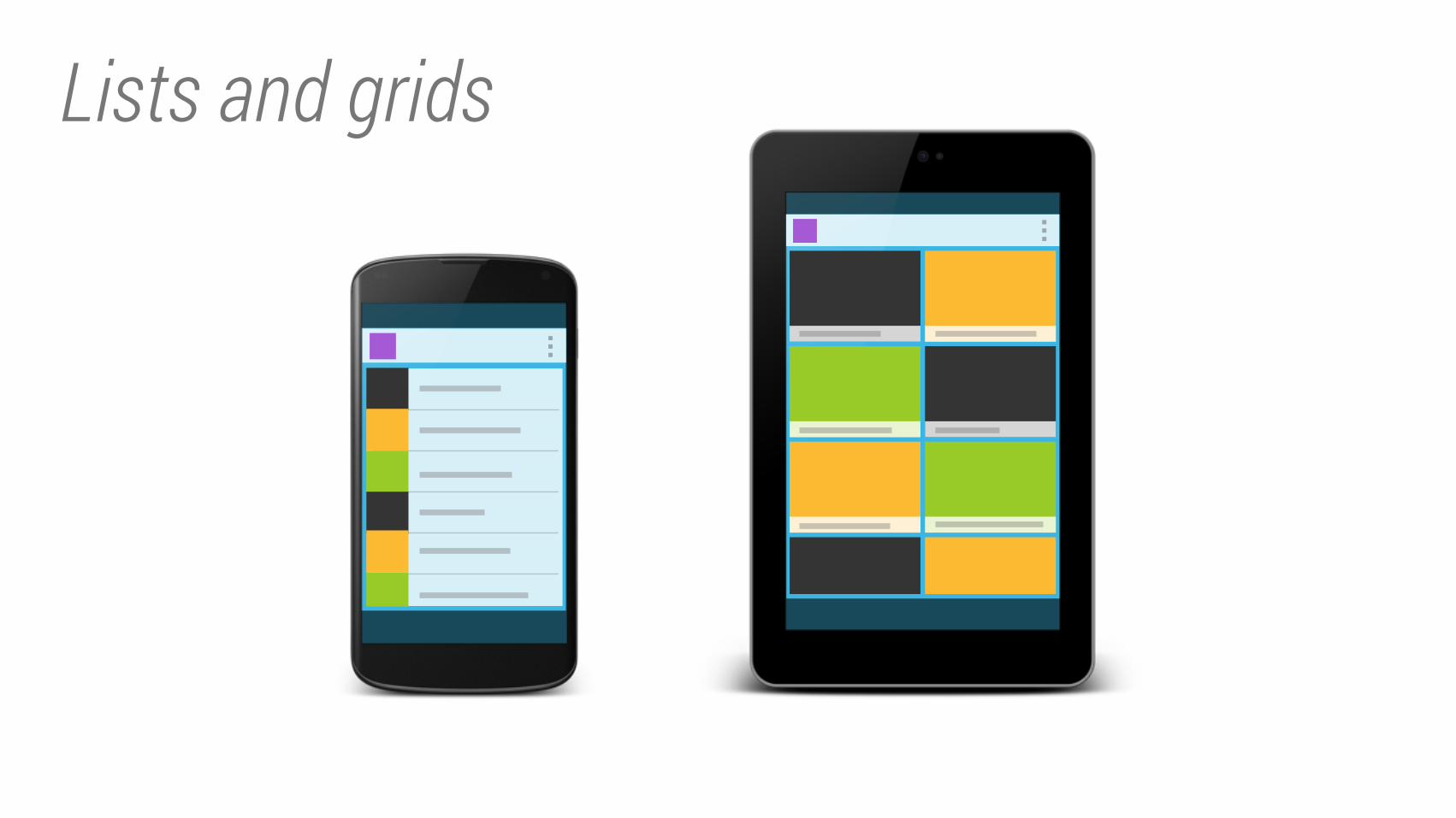
Lists and grids
Lists and grids
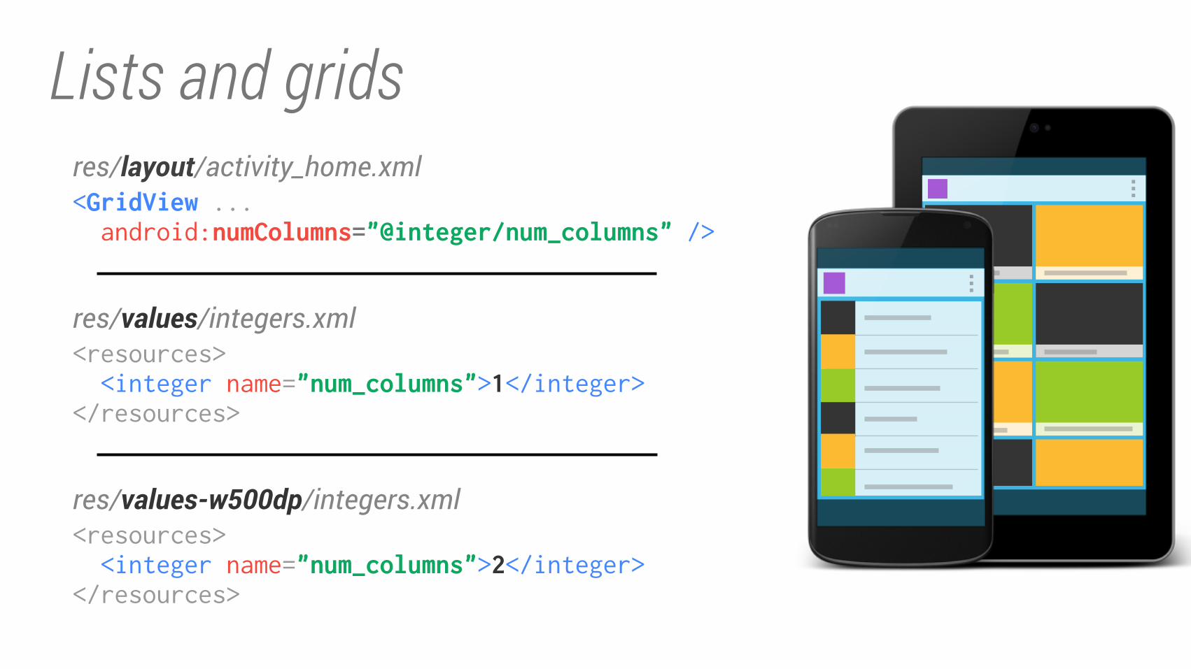
<GridView ... android:numColumns="@integer/num_columns" />
res/layout/activity_home.xml
<resources>
<integer name="num_columns">1</integer></resources>
res/values/integers.xml
<resources>
<integer name="num_columns">2</integer></resources>
res/values-w500dp/integers.xml
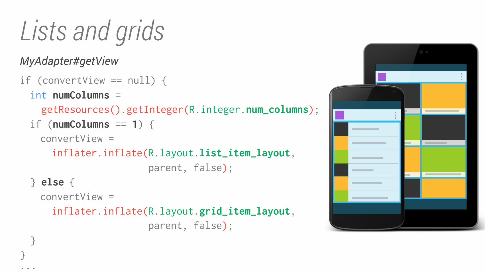
Lists and gridsMyAdapter#getView
if (convertView == null) {
int numColumns = getResources().getInteger(R.integer.num_columns);if (numColumns == 1) {convertView =
inflater.inflate(R.layout.list_item_layout, parent, false);
} else {convertView =
inflater.inflate(R.layout.grid_item_layout, parent, false);
}
}
...
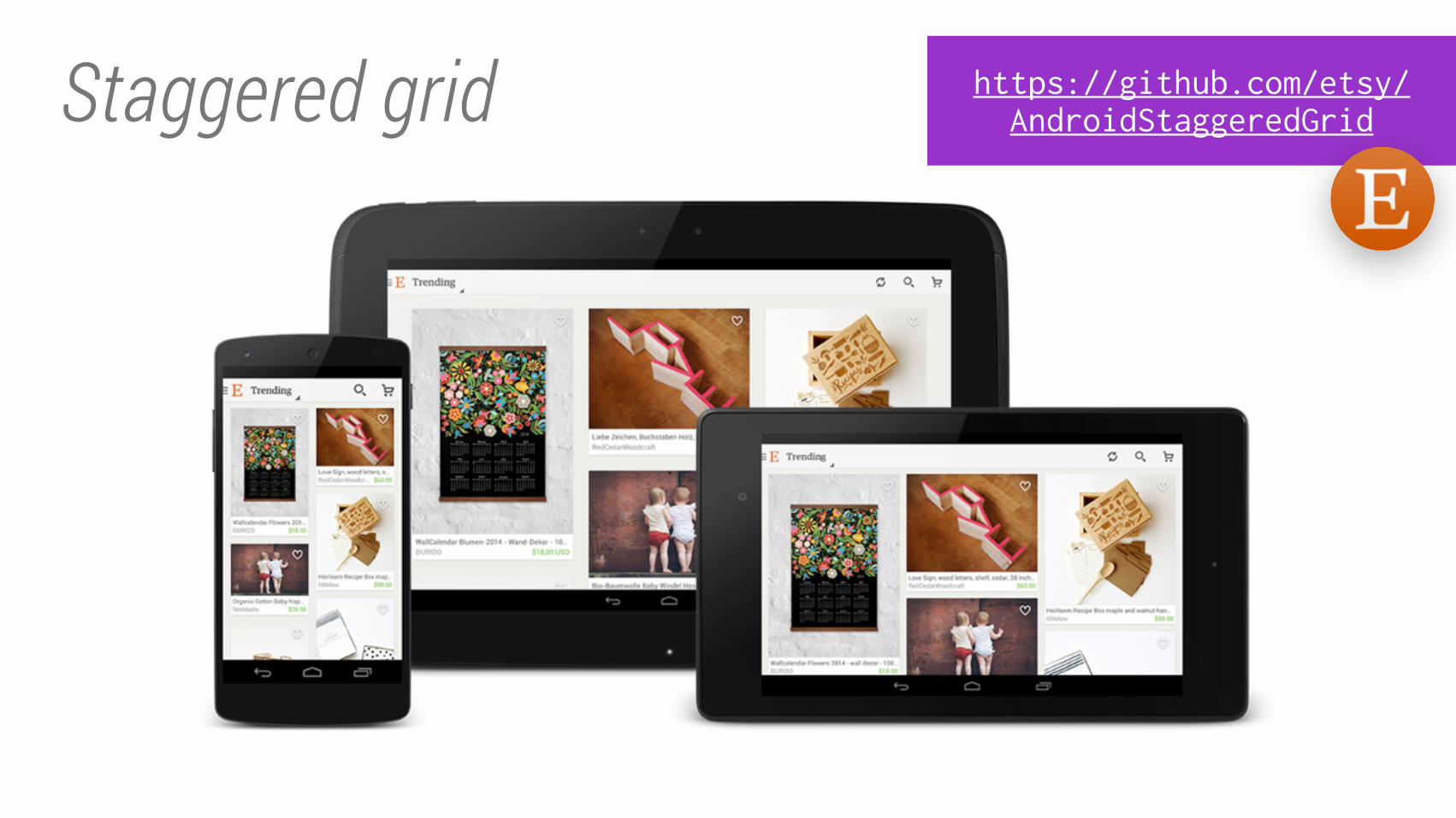
Staggered grid https://github.com/etsy/
AndroidStaggeredGrid
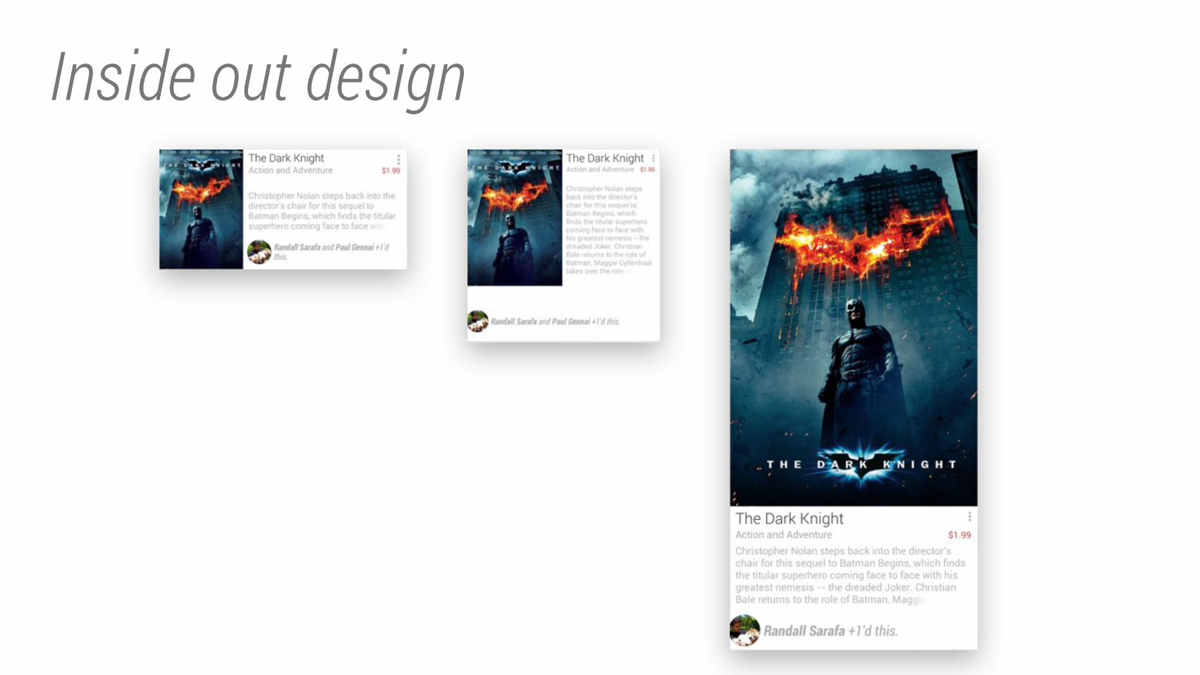
Inside out design
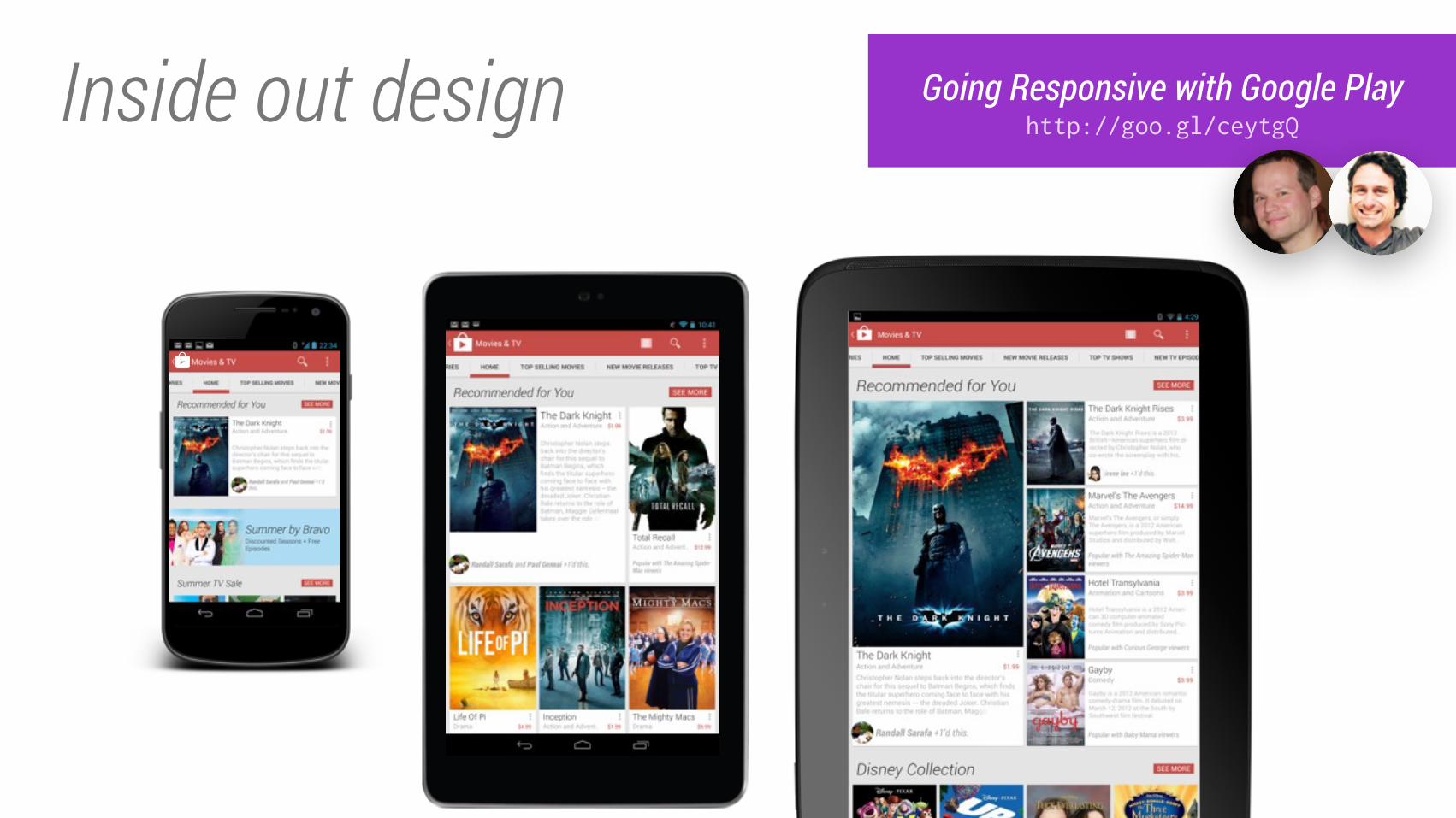
Inside out design Going Responsive with Google Play
http://goo.gl/ceytgQ
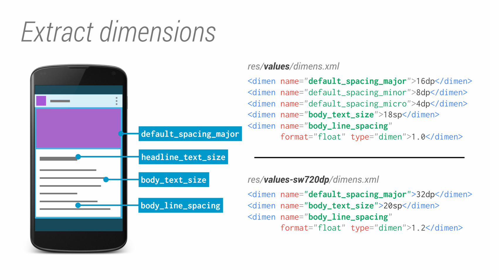
Extract dimensions
headline_text_size
body_text_size
default_spacing_major
body_line_spacing<dimen name="default_spacing_major">32dp</dimen><dimen name="body_text_size">20sp</dimen><dimen name="body_line_spacing" format="float" type="dimen">1.2</dimen>
res/values-sw720dp/dimens.xml
res/values/dimens.xml<dimen name="default_spacing_major">16dp</dimen><dimen name="default_spacing_minor">8dp</dimen>
<dimen name="default_spacing_micro">4dp</dimen>
<dimen name="body_text_size">18sp</dimen><dimen name="body_line_spacing" format="float" type="dimen">1.0</dimen>
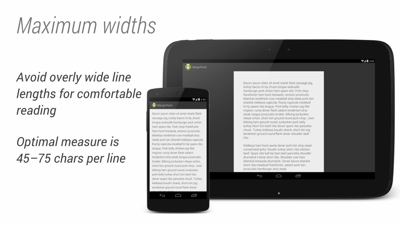
Maximum widths
Avoid overly wide line lengths for comfortable reading
Optimal measure is 45–75 chars per line
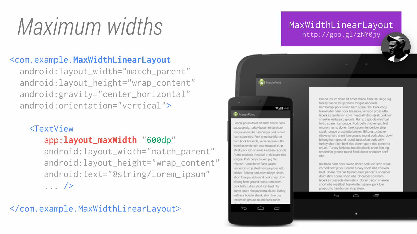
Maximum widths MaxWidthLinearLayout
http://goo.gl/zNY0jy
<com.example.MaxWidthLinearLayout android:layout_width="match_parent"
android:layout_height="wrap_content"
android:gravity="center_horizontal"
android:orientation="vertical">
<TextView
app:layout_maxWidth="600dp" android:layout_width="match_parent"
android:layout_height="wrap_content"
android:text="@string/lorem_ipsum"
... />
</com.example.MaxWidthLinearLayout>
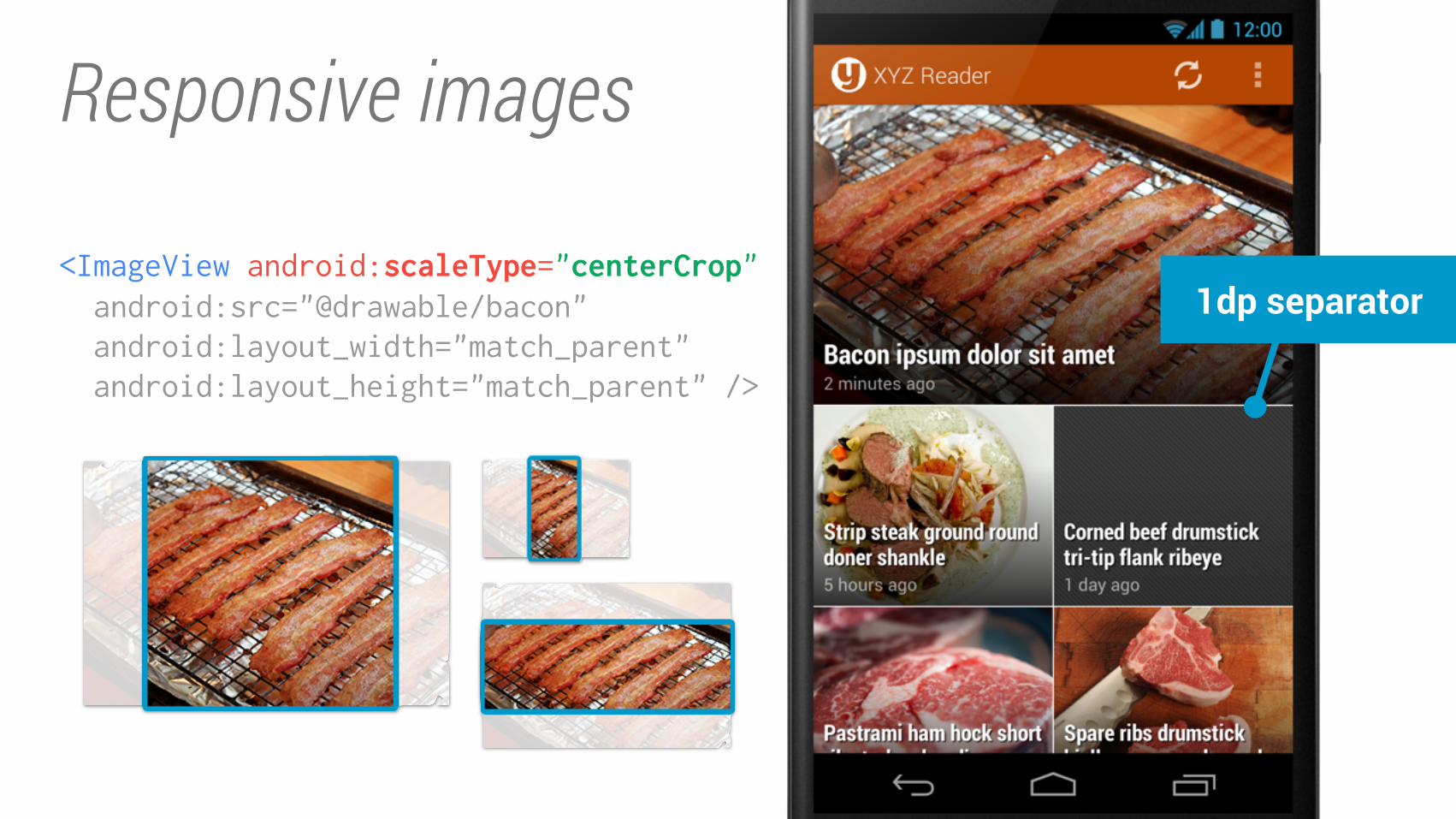
Responsive images
1dp separator<ImageView android:scaleType="centerCrop" android:src="@drawable/bacon"
android:layout_width="match_parent"
android:layout_height="match_parent" />
res/...
drawable/drawable-xhdpi/layout/layout-w600dp/layout-sw600dp-land/layout-sw720dp/values/values-sw600dp/values-sw720dp/...
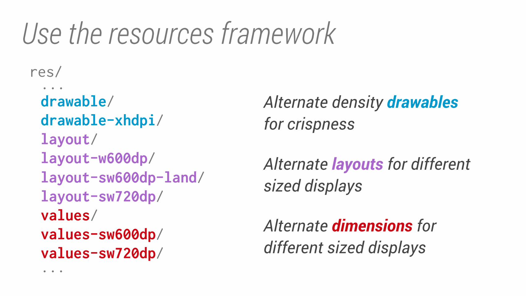
Alternate density drawables for crispness
Alternate layouts for different sized displays
Alternate dimensions for different sized displays
Use the resources framework
Tips for designers
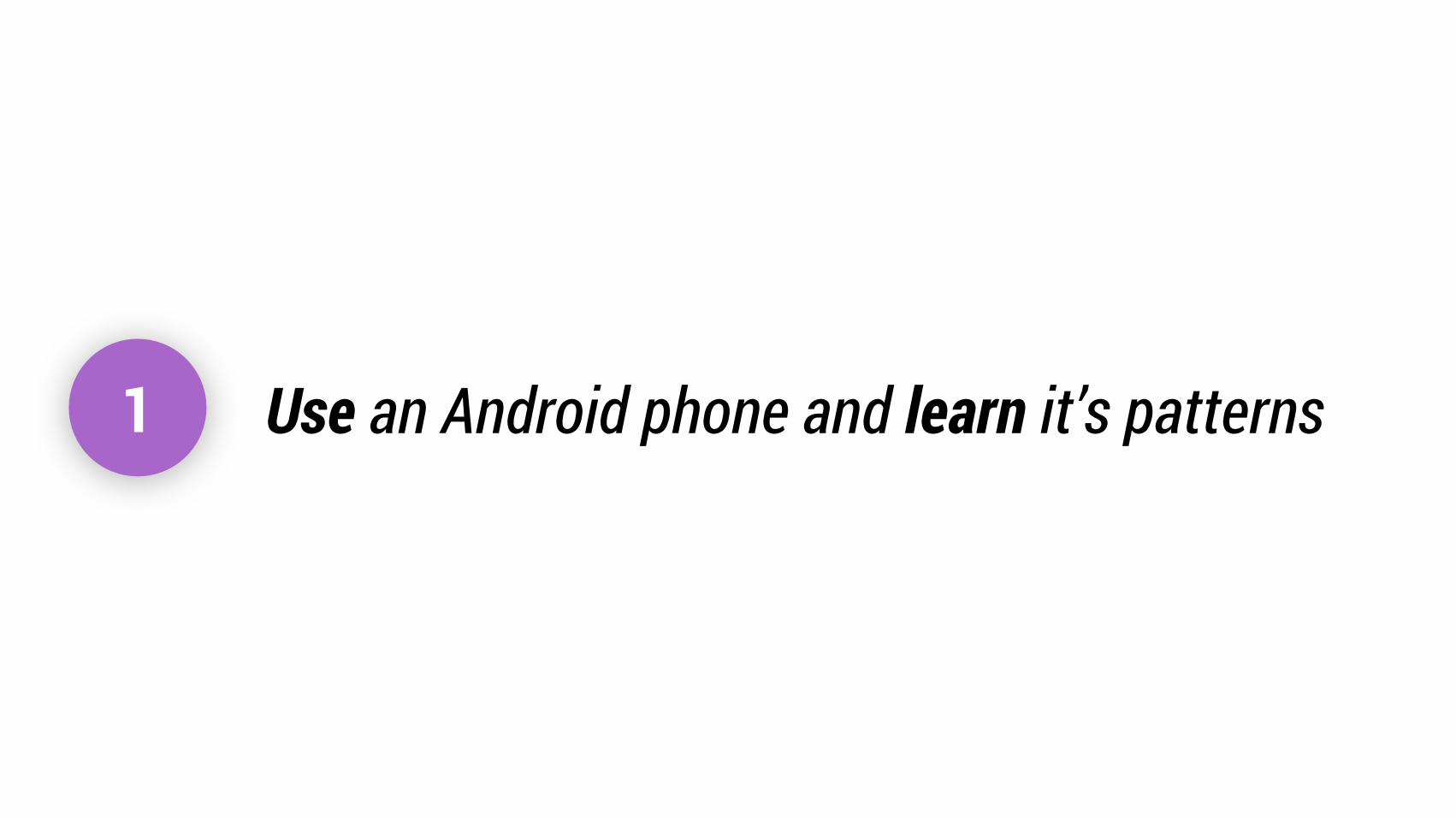
1 Use an Android phone and learn it’s patterns
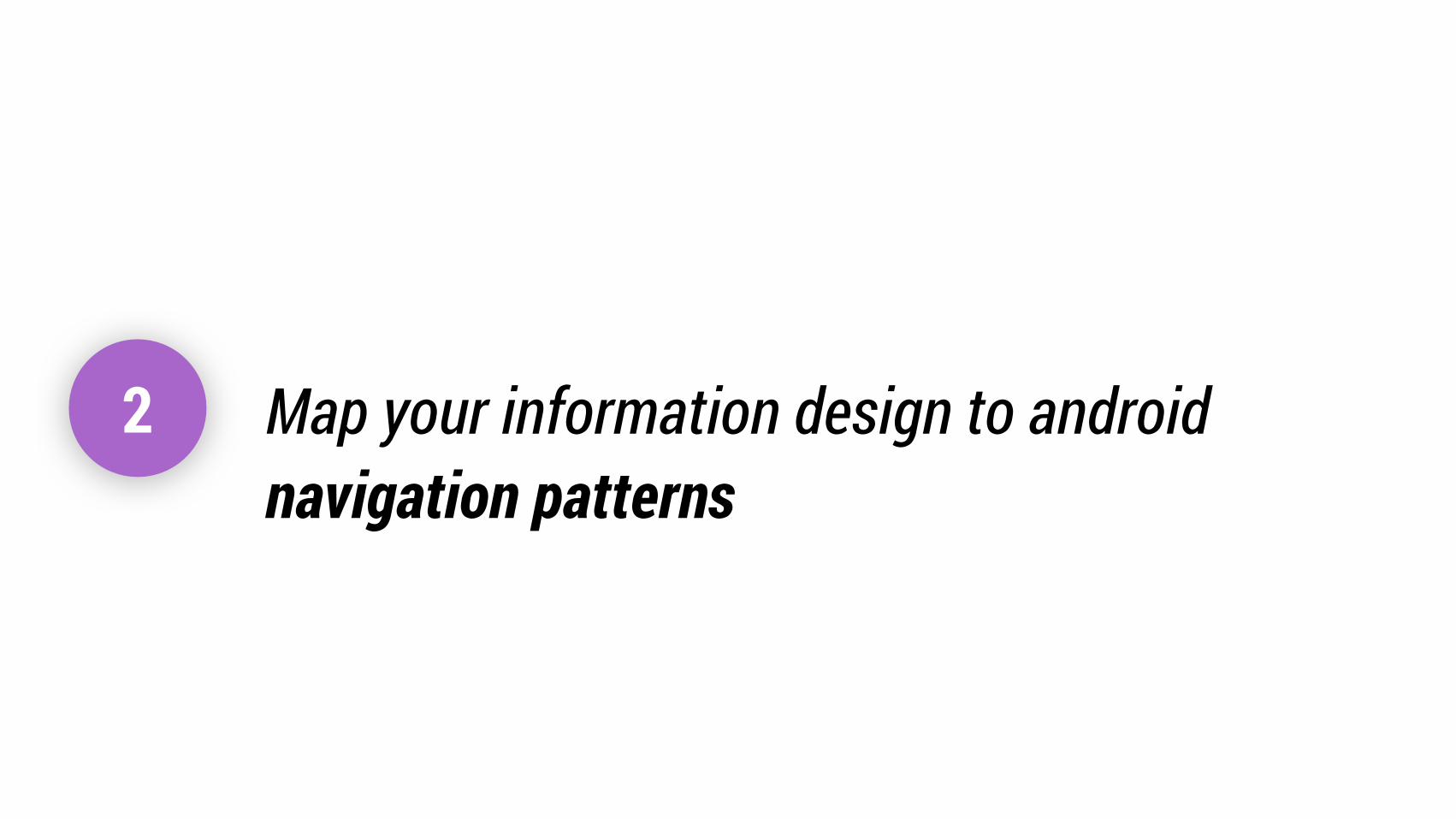
2 Map your information design to android
navigation patterns
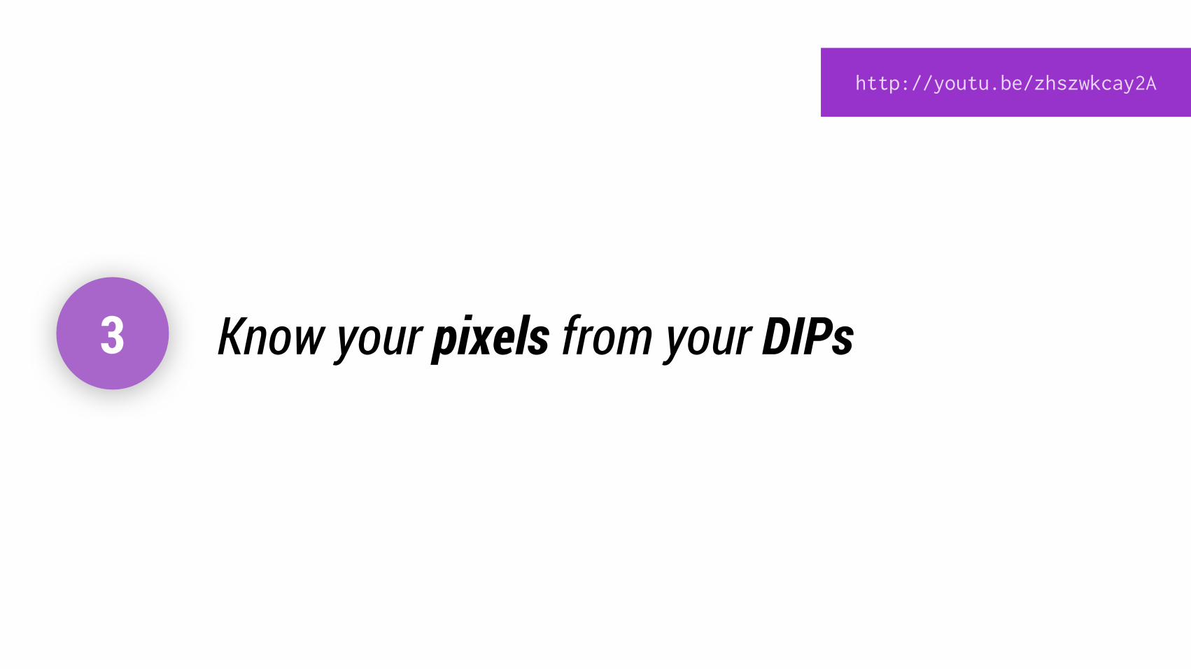
3 Know your pixels from your DIPs
http://youtu.be/zhszwkcay2A
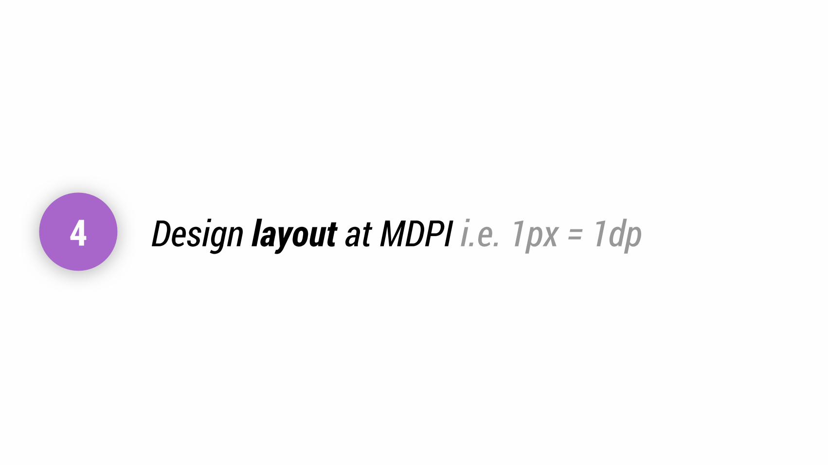
4 Design layout at MDPI i.e. 1px = 1dp

5 Consider scale from the start
Awesome Android Design…
HOLOVISUAL
LANGUAGE
TECHNIQUES
RESPONSIVEDESIGN
TOOLS
WHY
IMPLEMENTING
Thanks!
+Android Developers
—Nick Butcher