anatomy of bengali letterforms: a semiotic study
TRANSCRIPT

237
Anatomy of Bengali Letterforms:
A Semiotic Study
Subhajit Chandra, Prasad Bokil and Darmalingam Udaya Kumar
© Springer India 2015
A. Chakrabarti (ed.), ICoRD’15 – Research into Design Across Boundaries Volume 1,
Smart Innovation, Systems and Technologies 34, DOI 10.1007/978-81-322-2232-3_22
Abstract The anatomy of letterforms defines the structural formation of letters.
The study is based on semiotic approach. The methods used here are Syntagmatic
and Paradigmatic analysis. The anatomy is developed through analysis based on
the work on Latin letterforms from three different aspect which are structural grid
lines, anatomical features and parameters. This syntagmatic analysis is yielded
in identification of various structural features of letterforms like terminal, bowl,
blob, stem, dot or nukta, ascender and descender. The analysis has been carried
out using two techniques, repeated forms and unique forms of letters. The paradig-
matic analysis discusses the comparative study of structure and feature of letter-
forms across different typefaces such as Lohit Bengali, Vrinda, Solaimanlipi and
etc. The analysis offers distinct anatomical nomenclatures after analyzing paradig-
matic transformations. Further the study categorizes the letterforms according to
the appearance of common features.
Keywords Anatomy of letterforms · Bengali letterforms · Syntagmatic and
paradigmatic analysis · Typeface design
1 Introduction
Over the last century, the anatomy of Latin script has been extensively studied by
typographers and type researchers. Since the last two decades non-Latin scripts
are getting more attention from the research community. 60 % or more of global
population is dependent on non-Latin scripts including Indic scripts. It is globally
used in education, politics, economics and cultural purposes. There are several
print media like newspaper, hoarding, and poster are regularly getting printed using
non-Latin scripts. Even non-Latin internet users are increasing day by day [1].
S. Chandra (�) · P. Bokil · D. Udaya Kumar
Department of Design, Indian Institute of Technology, Guwahati, Assam, India
e-mail: [email protected]

238 S. Chandra et al.
India is a multilingual country with various scripts. There are twenty-two offi-
cial languages and eleven scripts in India [2, 3]. Bengali script is one of the most
prominent Indic scripts used by 84 million Bengali speakers in India and 15 mil-
lion in Bangladesh. The Bengali script is evolved from ‘Siddham’ script which is
an offspring of ‘Brahmi’, the origin of all Indic scripts [4]. The letterforms of Indic
scripts including Bengali are more structural and compositional complex [5, 6].
All Indic scripts are very different from each other with respect to their shape, pro-
portion, height, width, stroke ratio and path of the stroke [5].
It is through the means of typefaces that any script can be printed or displayed
for the purpose of communication. Bengali typeface design has elaborate history
in print and publication over last 200 years [7]. Typeface design in Indic scripts
involves knowledge of calligraphy and composition of the script. Understanding
of the ‘script composition grammar’ of letterforms can certainly assist the type
designer to design any typeface with better legibility and readability [4, 5]. The
composition of Bengali script is not fully defined [8]. There is a scope for further
investigation and design considerations. This paper focuses on grid and anatomical
features of Bengali letterforms.
The enquiries on Bengali typeface anatomy are prepared based on two semiotic
methods namely Syntagmatic and Paradigmatic analysis. The structural formation
of a typeface is investigated using Syntagmatic analysis. The distinct shape of let-
ter-parts are named by new terminologies or taken from Latin or non-Latin scripts
based on appearance of the stroke characteristics. Most of the terminologies in
Latin letterforms are based on animal anatomy like eye, ear, shoulder, leg, tail etc.
[9]. Here, both plant and animal anatomical nomenclatures are used to identify let-
ter-parts like stem, shoot, bud, knot, shoulder, leg, tail etc. The font used here for
syntagmatic analysis is ‘Lohit Bengali’.
The comparative study of anatomical features across various typefaces is con-
ducted by using Paradigmatic analysis. The study is focused on the arrangement
of structural features that vary in different typefaces. SolaimanLipi, Lohit Bengali,
Vrinda and Rupali typeface are used for paradigmatic analysis. Further, catego-
rization of letters is investigated according to common character and common
structure.
2 Anatomy of Letterforms: Literature Review
The structural formation of a script is reliant on the tools used during the initial
development of the script. The arrangement of letter-strokes reflect mediums
like stone engraving, calligraphic brushing or Palm leaf lettering used to develop
the particular typeface [4, 6, 10]. Many of Indic scripts share common mediums,
though the ‘script composition grammar’ is different for each Indic scripts [3]. A
grammar of anatomy formulates the structure of letterforms that assists type design-
ers to design typefaces from a conception to its final letterform [5, 8]. The anatomy
of Latin script and few of the non-Latin scripts is already well established [9].
239Anatomy of Bengali Letterforms: A Semiotic Study
The development of anatomy of letterforms is based on three distinct aspects.
These are (1) Structural Grid Lines, (2) Anatomical Features and (3) Anatomical
Parameters [2, 4–6, 9]. The structural grid lines, in practice, act as a ratio scale of
height and proportion of alphabets [9]. The height to width ratio has an important
role in designing of a typeface, targeting its use for a media [8]. Devanagari is the
only Indic script where the use of structural grid lines is evident during design
among the literature available on all Indic scripts, only Devanagari has a detailed
discussion on structural grid lines [6]. Bengali script does not have such grids fol-
lowed by practitioners; and it is sparsely discussed in literature [7].
Pelli et al. [11] assert that a letter identification is a recognition process of iden-
tifying its features. The Gestalt law of grouping plays a significant role in letter
recognition by identifying combination, position and size of features [12, 13]. The
letter-part that found in different letters repeatedly is the common feature and oth-
ers are unique feature. Unlike Latin script [9], the anatomical features of majority
of Indic scripts including Bengali are underdeveloped [8].
2.1 Latin Script
The research and development of Latin typeface suggest a well-defined anatomy
of Latin letterforms [9, 10]. Most of the letters are combination of linear and cur-
vilinear strokes. The structural complexities are fewer by using repeated compara-
ble strokes and unique structural arrangement [9]. However, within the established
forms there are still many possibilities for structural variation. The gridlines and
anatomical features like Ascender, Bowl, Counter, Descender, Dot, Leg, Link,
Loop, Shoulder, Spine, Spur, Stem, and Tail etc. (refer Fig. 1) are already defined,
based on visual appearance of the letter-parts [9, 10].
2.2 Non-Latin Scripts
The anatomical foundations of non-Latin scripts such as Arabic, Chinese and
Devanagari are already been developed [6, 14–17]. The significant works have
been done in Arabic type design. The script has historical background of using cal-
ligraphic tools and written from right to left in repeated forms [14]. Horizontal
toothy appearance is a specialty of this script [14, 15]. Similarly, Chinese let-
terforms are another example of calligraphic style of writing that successfully
reproduces from print to digital displays. The letterforms are ideographic visual
symbols that express emotion, narrative, motion and sentiment [16] and the central
point of grid holds the visual balance of the letter. Figure 1 shows the grid system
of Arabic and Chinese letterforms.
Devanagari script is used for writing Hindi, Marathi and other few languages
and one of most explored Indic script. S.V. Bhagwat explains the anatomical

240 S. Chandra et al.
aspect of Devanagari script [17]. The letters are grouped according to appearance
of common element of letterforms. Later, Naik [6] explains the grid system of
Devanagari script based on Bhagwat’s work [17].
2.2.1 The Bengali Script
The Bengali letterforms are sinuous. The positions of diacritics and juxtaposed let-
ters (also known as conjuncts) suggest that the structure of the letterforms is com-
plex. Ross [7] describes the basic grid lines and some of the anatomical features
such as bowl, kana, rounding or blob, stem, etc. of the Bengali script (refer Fig. 2).
Ross also identifies multi-tier grid system of the script in case of conjuncts.
2.3 Conclusion from Literature Study
The existing literature suggested that the structural grid lines are not fully defined
in Bengali. Only base character height is identified by Fiona Ross. There are pos-
sibilities to identify more grid lines that segregate a letter vertically for better
understanding.
Fig. 1 Anatomy of Latin, Arabic and Chinese letterforms
Fig. 2 Anatomy of Bengali. Source [7]

241Anatomy of Bengali Letterforms: A Semiotic Study
The complexities of type design process and existing literatures indicate that
there is a need of fine-tuning in the basic letter-parts of letterforms. Ross identi-
fies only five features from five letters (as shown in Fig. 2). The research gap leads
to an investigation on nomenclature of different letter-parts of all Bengali letters
[8]. A standard anatomy helps to identify individual parts that lead to better under-
standing and improvement in field of type design.
3 Defining Anatomy of Bengali Script
The Bengali script consists of twelve vowel, thirty five consonants, the numbers
and several punctuations. Apart from this, there are around five hundred con-
juncts and few ligatures which are used for writing the language. Bengali script
is an ‘Abugida’. Every consonant ends with syllable of an inherent vowel. There
is also a symbol ‘hasanta’ to quiet the sound of inherent vowel. Bengali is written
from left to right. There is no uppercase or lowercase. So, there is no reference
of x-height in Bengali script. There are four modifier signs such as Khanda-ta,
Anusvara, Visarga and Chandra-bindu, used for contextual purposes [7]. The basic
letterforms of Bengali are shown in Fig. 3.
Each vowel letter also has its own diacritic form and it is appeared with only
consonant to adapt new sound of inherent vowel. The appearance of diacritics
occur pre-glyph, post glyph, above-glyph and below-glyph with consonant. Some
diacritics appear in variant forms or as ligature with specific consonant and their
form is different than regular consonant-vowel forms [1, 7].
3.1 Grid
The grid system defines size and proportion of letters the grid model is an arrange-
ment of virtual lines that constructs a vertical proportion of the letterforms. The
grid model is prepared based on design practice to shape the Bengali letterforms
taking the reference of existing literature [4–7, 17]. As shown in Fig. 4 the grid is
mainly consists of 6 lines as
Fig. 3 Bengali Letterforms

242 S. Chandra et al.
1. Topmost Line/Ascender Line
2. Shiro-rekha/Headline
3. Initial Line/Shoulder Line/Upper Mean Line
4. Lower Mean Line
5. Lower Kana Line/Footline/Baseline
6. Extreme Bottom Line/Descender Line.
The distance between base line and headline is Base Character Height. Likewise,
the distance between Headline to Ascender line is Ascender Height and Baseline
to Descender Line is Descender Height. Headline is also known as Shiro-rekha,
one of basic element of most of all Indic scripts. There is also two Mean line
within Base Character Height, Upper Mean Line and Lower Mean Line. The iden-
tifiable body structure lies within the bound of upper to lower mean lines.
3.2 Anatomical Features
Syntagmatic analysis is a method to analyse the surface structure of any object.
This method is used here to identify different anatomical features of a single
typeface and to define its nomenclature. The analysis is carried out considering
two facts, first the repeated forms among all letters and second the unique form
of individual letter using prepared illustration as in Fig. 5. Then, a terminology
is provided to each common forms that come out from the analysis of repeated
form among letters. The process of feature analysis has done on vowels and con-
sonants only using repeated forms that provides seventeen different identified fea-
tures. Some of the similar features are segregated further like ‘Blob’ into ‘Bud’
and ‘Knot’ where Bud is connected at single end of a curve in letter but Knot is
positioned at the joinery of two curves in letters ‘A’, ‘E’ and ‘Ma’. Similarly, the
‘Delta’ feature is a combination or triangular formation of strokes in letterform as
a main body element of letters ‘Ka’, ‘Ba’, ‘Ra’ and etc. There is a ‘V’-like joinery
named as ‘Wedge’ which is combination of a ‘Stem’ and ‘Shoot’ that started from
the end of Stem in letters ‘Ka’, ‘Kha’, ‘Tha’ and etc.
The unique forms of individual letter are also identified and named accord-
ingly such as ‘Loop’, ‘Nose’ and etc. Figure 6 is the detail analysis of letter ‘A’,
‘Harsh-u’ and ‘Ka’. All letters are examined in same way and Table 1 is prepared
with all possible nomenclature of vowel and consonant letters.
Fig. 4 Grid system of
Bengali

243Anatomy of Bengali Letterforms: A Semiotic Study
Fig. 5 Bengali Letter analysis
Fig. 6 Letter anatomy of ‘A’, ‘Harsh-u’ and ‘Ka’
Table 1 Letter anatomy table
Terminology Borrowed from Description Letterforms
Arm Latin [9] A curvilinear stroke within bound
of 30 to 90 degree (approx.)
Lobe Latin [9] A curvilinear stroke within bound
of 90 to 180 degree (approx.)
Bowl Bengali [7] A curvilinear stroke about 360
degree round
Bud * A blob feature connected to Arm
or Bowl or Lobe
Knot Bengali [8] A blob feature connected to two
continuous Arm or Bowl or Lobe
Stem Arabic [14], Bengali [7],
Latin [9]
Vertical Bar
Half Stem * Short vertical Bar
Shoot * A stroke comes out from Stem or
Half Stem
Delta * Connected triangular stroke
Tail Arabic [14], Latin [9] A stroke comes out from main
letter part individually. Most of
the Ascender is Tail in Bengali.
(continued)

244 S. Chandra et al.
The paradigmatic analysis has been done on the chosen typefaces Lohit Bengali
from RedHat Project, SolaimanLipi from OmniLab, Vrinda from Microsoft and
Rupali from Ekushy Bangla. These typefaces are selected on the basis of variation
of application context. Lohit Bengali is used for androids, Vrinda is used in PCs,
Solaimanlipi and Rupali used for digital displays.
Figure 7 is the detailed study of letter ‘A’ and ‘Ka’ where letter ‘Ka’ (upper row)
consists of Bowl and Stem. Only ‘Ka’ of Lohit typeface has Knot feature and rest
of all have Bud due to absence of Shoot from the Headline. The Terminal cuts are
distinct in each typefaces. The Aperture is also varying for each typefaces. Similarly
the letter ‘Ka’ in Fig. 7 (lower row) of three typefaces Lohit, SolaimanLipi and
Vrinda have Bud at the end of Arm. But in case of Rupali typeface, there is no Bud
feature at the end of Arm. Here the Arm visually becomes like a ‘Lobe’.
Fig. 7 Paradigmatic analysis of letter ‘A’ and ‘Ka’
Terminology Borrowed from Description Letterforms
Wedge * A ‘V’ shaped angle at bottom
Loop Arabic [14], Latin [9] A round stroke with close counter
Nose * A junction of two curves
Dot or Bindu Latin [9], Devanagari [6] A Dot feature like in letter ‘j’
Terminal Latin [9] Stroke end of main letter part
Aperture Latin [9] Opening of Terminal
Leg Latin [9] A stroke balancing the main body
part
Table 1 (continued)
* This term is introduced first time

245Anatomy of Bengali Letterforms: A Semiotic Study
3.3 Anatomical Parameters
There are two anatomical parameters, stroke thickness and stress on stroke path
are observed during analysis. These characteristics adopt from calligraphic
style to typographic form. Most of the typefaces developed from manuscripts
are high contrast. The thin to thick stroke significantly varies due to dominance
of calligraphic tools. Here only SolaimanLipi typeface has the stress parameter.
The stroke thickness and stress have significant role in letter legibility and the
discussion is beyond the scope of this paper.
4 Categorization Based on Anatomy
The categorization has been done based on two parameters proposed by Mohanty
(1998)–(1) common character and (2) common structure [5]. The groups of letter are
prepared considering the appearance of common features or combination of features.
4.1 Common Character Parameter
Common character parameter identifies the groups of letter according to appear-
ance of single feature within a typeface. Vertical Stem and Bowl are most com-
mon features of Bengali typefaces, encountered during feature analysis. The letters
can be grouped based on these features in several ways—(1) Vertical stem at right
side, (2) Vertical stem at middle, (3) Vertical stem at left side, (4) Hanging Bowl
from top line/half stem, (5) Letters with leg and (6) Bowl at lower portion in
Fig. 8.
Fig. 8 Grouping using common character parameter
246 S. Chandra et al.
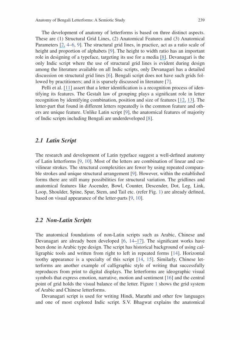
4.2 Common Structural Parameter
Common structural parameter similarly provides several groups of letters in com-
bination of strokes or features as a single unit. Figure 9 shows several groups con-
sists of common structure letters.
5 Conclusion
The study offers a grid system for Bengali and a range of nomenclatures to
identify different features that may help type designer to achieve rhythm and
unity during design of a typeface. The horizontal to vertical ratio of letters can
be achieved in practice by using the grid system [5]. The study proposes seven-
teen distinct features after analyzing only vowels and consonants over the five fea-
tures that identified by Fiona Ross. The features and their position and shape can
accompany to effective design of typeface that can solve the legibility and letter
confusion to recognition issues [15, 18]. The features can also be used in OCR
systems for detection of letters [19].
The study has been done only with vowels and consonants. The analysis of
diacritics and conjuncts may provide more insight of grid system and features.
The two semiotic analysis method have been used here to identify letter features.
Further, the role of syntagmatic and paradigmatic transformation (such as addi-
tion and deletion or substitution and transposition) and the affordance of the letter
shape can be discussed when a feature changes from one shape to another.
References
1. Ross, F., Shaw, G.: Non-Latin scripts: From Metal to Digital Type. St. Bride Foundation,
London (2012)
2. Ghosh, P.K.: An Approach to Type Design and Text Composition in Indian Scripts.
Department of Computer Science, Stanford University, Stanford (1983)
3. Sinha, R.M.K.: A Journey from Indian Scripts Processing to Indian Language Processing.
IEEE Ann. Hist. Comput. 31, 8–31 (2009)
4. Darmalingam, U.K.: Transformation of Tamil letterforms from Palm Leaf Manuscripts to
Early Letterpress Printing. Ph.D. thesis, IDC IIT, Bombay (2010)
Fig. 9 Grouping using common structure parameter

247Anatomy of Bengali Letterforms: A Semiotic Study
5. Mohanty, S.K.: The Formulation of Parameters for Type Design of Indian Scripts Based on
Calligraphic Studies. Artistic Imaging and Digital Typography Lecture Notes in Computer
Science, vol. 1375, pp. 157–166 (1998)
6. Naik, B.S.: Typography of Devanagari, vol. 1–3. Directorate of Language, Bombay (1971)
7. Ross, F.: The Printed Bengali Character and its Evolution. RoutledgeCurzon Publication,
London (1999)
8. Ross, F.: Digital typeface design and font development for twenty-first century bangla
language processing. In: Technical Challenges and Design Issues in Bangla Language
Processing, pp. 1–15. IGI Global, Hershey, PA (2013)
9. Cheng, K.: Designing Type. Laurence King Publishing, London (2005)
10. Pflughaupt, L.: Letter by Letter: An Alphabetical Miscellany. Princeton Architectural Press,
New York (2003)
11. Pelli, D.G., Burns, C.W., Farell, B., Moore-Page, D.C.: Feature detection and letter identifi-
cation. Vision. Res. 46(28), 4646–4674 (2006)
12. Sanocki, T.: Intra- and Interpattern Relations in Letter Recognition. J. Exp. Psychol. Hum.
Percept. Perform. 17(4), 924–941 (1991)
13. Pelli, D.G., Majaj, N.J., Raizman, N., Christian, C.J., Edward, K., Palomares, M.C.:
Grouping in object recognition: the role of a Gestalt law in letter identification. Cogn.
Neuropsychol. 26(1), 36–49 (2006)
14. Abulab, S.D.: Anatomy of an Arabetic Type Design. Visible Lang. 42(2), 189–200 (2008)
15. Chahine, N.:Reading Arabic: Legibility Studies for the Arabic Script. Ph.D. thesis, Leiden
University, Leiden (2012)
16. Jiantang, H.: Chinese Characters. Cambridge University Press, New York (2012)
17. Dalvi, G.: Anatomy of Devanagari Typefaces. Des. Thoughts 1(1), 30–36 (2009)
18. Fiset, D., Blais, C., Ethier-Majcher, C., Arguin, M., Bub, D., Gosselin, F.: Features for identi-
fication of uppercase and lowercase letters. Psychol. Sci. 19(11), 1167–1168 (2008)
19. Sarwar, H., Rahman, M., Akter, N., Hossain, S., Ahmed, S., Chowdhury, M.R.: Selection
of an optimal set of features for bengali character recognition. In: Technical Challenges and
Design Issues in Bangla Language Processing, pp. 96–116. IGI Global, Hershey, PA (2013)