distorture digipak
DESCRIPTION
TRANSCRIPT
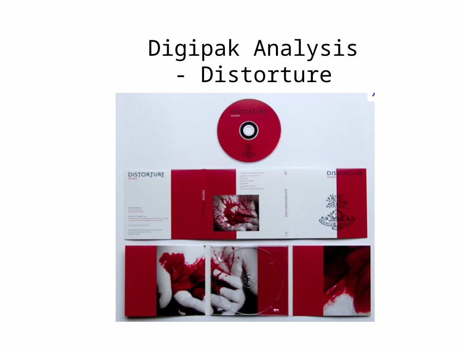
Digipak Analysis - Distorture

Front CoverHere they have the name of the artist, Distorture, and the name of the album, Revere, which is essential as people can easily recognize what it is.
Here is the logo of the band in which again fans can easily notice the band
On the front cover, as well as the rest of the digipak, the colour theme stays the same, which is white and red, with black text.

Back CoverThe list of song names are given in order of played to show customers what they are listening to
The name of the band and album are constantly given to the audience
The picture here may refer to the type of music in which ‘Distorture’ create in which I believe to be dark rock. Therefore this picture fits in well with the name of the band and the music. It also matches the colour theme of red, white and black.

Outside MiddleThe name of band and album is given again
Information is given here for the customers to see. This will include contact details, record company, and date published. As the artist website is given, it will encourage fans to listen to other music by them.
The colour theme is continuous which black red and white and therefore looks professional and attractive
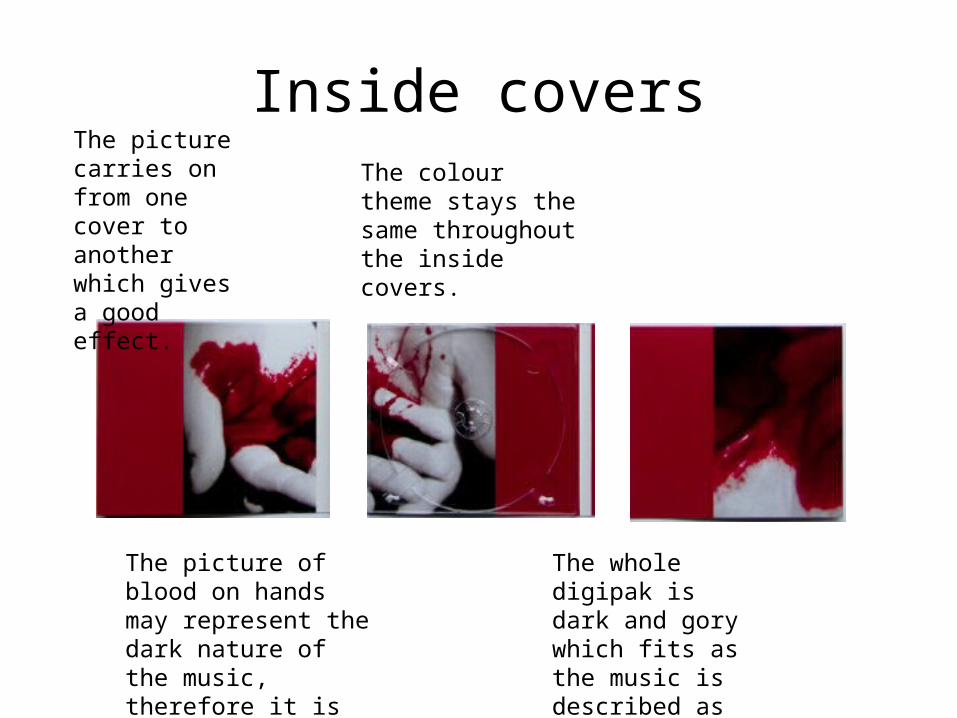
Inside coversThe colour theme stays the same throughout the inside covers.
The picture carries on from one cover to another which gives a good effect.
The picture of blood on hands may represent the dark nature of the music, therefore it is relevant.
The whole digipak is dark and gory which fits as the music is described as ‘dark folk’ and ‘industrial’.