discussion paper series - banca d'italia
TRANSCRIPT

DISCUSSION PAPER SERIES
DP12509
THE RATE OF RETURN ONEVERYTHING, 1870–2015
Óscar Jordá, Katharina Knoll, Dmitry Kuvshinov,Moritz Schularick and Alan M. Taylor
ECONOMIC HISTORY, FINANCIALECONOMICS, INTERNATIONAL
MACROECONOMICS AND FINANCE,MACROECONOMICS AND GROWTH and
MONETARY ECONOMICS ANDFLUCTUATIONS

ISSN 0265-8003
THE RATE OF RETURN ON EVERYTHING, 1870–2015
Óscar Jordá, Katharina Knoll, Dmitry Kuvshinov, Moritz Schularick and Alan M. Taylor
Discussion Paper DP12509 Published 14 December 2017 Submitted 14 December 2017
Centre for Economic Policy Research 33 Great Sutton Street, London EC1V 0DX, UK
Tel: +44 (0)20 7183 8801 www.cepr.org
This Discussion Paper is issued under the auspices of the Centre’s research programmein ECONOMIC HISTORY, FINANCIAL ECONOMICS, INTERNATIONALMACROECONOMICS AND FINANCE, MACROECONOMICS AND GROWTH andMONETARY ECONOMICS AND FLUCTUATIONS. Any opinions expressed here are those ofthe author(s) and not those of the Centre for Economic Policy Research. Researchdisseminated by CEPR may include views on policy, but the Centre itself takes no institutionalpolicy positions.
The Centre for Economic Policy Research was established in 1983 as an educational charity,to promote independent analysis and public discussion of open economies and the relationsamong them. It is pluralist and non-partisan, bringing economic research to bear on the analysisof medium- and long-run policy questions.
These Discussion Papers often represent preliminary or incomplete work, circulated toencourage discussion and comment. Citation and use of such a paper should take account ofits provisional character.
Copyright: Óscar Jordá, Katharina Knoll, Dmitry Kuvshinov, Moritz Schularick and Alan M.Taylor

THE RATE OF RETURN ON EVERYTHING, 1870–2015
Abstract
This paper answers fundamental questions that have preoccupied modern economic thoughtsince the 18th century. What is the aggregate real rate of return in the economy? Is it higherthan the growth rate of the economy and, if so, by how much? Is there a tendency for returns tofall in the long-run? Which particular assets have the highest long-run returns? We answerthese questions on the basis of a new and comprehensive dataset for all major asset classes,including—for the first time—total returns to the largest, but oft ignored, component of householdwealth, housing. The annual data on total returns for equity, housing, bonds, and bills cover 16advanced economies from 1870 to 2015, and our new evidence reveals many new insights andpuzzles.
JEL Classification: D31, E44, E10, G10, G12, N10
Keywords: return on capital, interest rates, yields, dividends, rents, capital gains, risk premiums,household wealth, housing markets
Óscar Jordá - [email protected] Reserve Bank of San Francisco and University of California, Davis
Katharina Knoll - [email protected] Bundesbank
Dmitry Kuvshinov - [email protected] of Bonn
Moritz Schularick - [email protected] of Bonn and CEPR
Alan M. Taylor - [email protected] of California, Davis and CEPR
AcknowledgementsThis work is part of a larger project kindly supported by research grants from the Bundesministerium für Bildung und Forschung(BMBF) and the Institute for New Economic Thinking. We are indebted to a large number of researchers who helped with dataon individual countries. We are especially grateful to Francisco Amaral for outstanding research assistance, and would also liketo thank Felix Rhiel, Mario Richarz, Thomas Schwarz and Lucie Stoppok for research assistance on large parts of the project.For their helpful comments we thank Roger Farmer, Philipp Hofflin, David Le Bris, Emi Nakamura, Thomas Piketty, MatthewRognlie, Jo ?n Steinsson, Clara Martínez-Toledano Toledano, Stijn Van Nieuwerburgh, and conference participants at theNBER Summer Institute EFG Program Meeting and the Bank of England. All errors are our own. The views expressed hereinare solely the responsibility of the authors and should not be interpreted as reflecting the views of the Federal Reserve Bank ofSan Francisco, the Board of Governors of the Federal Reserve System or the Deutsche Bundesbank.
Powered by TCPDF (www.tcpdf.org)

The Rate of Return on Everything, 1870–2015?
Oscar Jorda† Katharina Knoll ‡ Dmitry Kuvshinov §
Moritz Schularick ¶ Alan M. Taylorz
November 2017
Abstract
This paper answers fundamental questions that have preoccupied modern economicthought since the 18th century. What is the aggregate real rate of return in the economy?Is it higher than the growth rate of the economy and, if so, by how much? Is there atendency for returns to fall in the long-run? Which particular assets have the highestlong-run returns? We answer these questions on the basis of a new and comprehensivedataset for all major asset classes, including—for the first time—total returns to thelargest, but oft ignored, component of household wealth, housing. The annual data ontotal returns for equity, housing, bonds, and bills cover 16 advanced economies from1870 to 2015, and our new evidence reveals many new insights and puzzles.Keywords: return on capital, interest rates, yields, dividends, rents, capital gains, riskpremiums, household wealth, housing markets.JEL classification codes: D31, E44, E10, G10, G12, N10.
?This work is part of a larger project kindly supported by research grants from the Bundesministerium furBildung und Forschung (BMBF) and the Institute for New Economic Thinking. We are indebted to a largenumber of researchers who helped with data on individual countries. We are especially grateful to FranciscoAmaral for outstanding research assistance, and would also like to thank Felix Rhiel, Mario Richarz, ThomasSchwarz and Lucie Stoppok for research assistance on large parts of the project. For their helpful commentswe thank Roger Farmer, Philipp Hofflin, David Le Bris, Emi Nakamura, Thomas Piketty, Matthew Rognlie,Jon Steinsson, Clara Martınez-Toledano Toledano, Stijn Van Nieuwerburgh, and conference participants at theNBER Summer Institute EFG Program Meeting and the Bank of England. All errors are our own. The viewsexpressed herein are solely the responsibility of the authors and should not be interpreted as reflecting theviews of the Federal Reserve Bank of San Francisco, the Board of Governors of the Federal Reserve System orthe Deutsche Bundesbank.
†Federal Reserve Bank of San Francisco; and Department of Economics, University of California, Davis([email protected]; [email protected]).
‡Deutsche Bundesbank ([email protected]).§Department of Economics, University of Bonn ([email protected]).¶Department of Economics, University of Bonn; and CEPR ([email protected]).zDepartment of Economics and Graduate School of Management, University of California, Davis; NBER;
and CEPR ([email protected]).


1. Introduction
What is the rate of return in an economy? This important question is as old as the economics
profession itself. David Ricardo and John Stuart Mill devoted much of their time to the study of
interest and profits, while Karl Marx famously built his political economy in Das Kapital on the idea
that the profit rate tends to fall over time. Today, in our most fundamental economic theories, the
real risk-adjusted returns on different asset classes reflect equilibrium resource allocations given
society’s investment and consumption choices over time. Yet much more can be said beyond this
observation. Current debates on inequality, secular stagnation, risk premiums, and the natural rate,
to name a few, are all informed by conjectures about the trends and cycles in rates of return.
For all the abundance of theorizing, however, evidence has remained scant. Keen as we are to
empirically evaluate many of these theories and hypotheses, to do so with precision and reliability
obviously requires long spans of data. Our paper introduces, for the first time, a large annual dataset
on total rates of return on all major asset classes in the advanced economies since 1870—including
for the first-time total returns to the largest but oft ignored component of household wealth, housing.
Housing wealth is on average roughly one half of national wealth in a typical economy, and can
fluctuate significantly over time (Piketty, 2014) . But there is no previous rate of return database
which contains any information on housing returns. Here we build on prior work on house prices
(Knoll, Schularick, and Steger, 2017) and new data on rents (Knoll, 2016) to offer an augmented
database to track returns on this very important component of the national capital stock.
Thus, our first main contribution is to document our new and extensive data collection effort in
the main text and in far more detail in an extensive companion appendix.
We have painstakingly compiled annual asset return data for 16 advanced countries, over nearly
150 years. We construct three types of returns: investment income (i.e., yield), capital gains (i.e.,
price changes), and total returns (i.e., the sum of the two). These calculations were done for four
major asset classes, two of them risky—equities and housing—and two of them relatively safe—
government bonds and short-term bills. Along the way, we have also brought in auxiliary sources to
validate our data externally. Our data consist of actual asset returns taken from market data. In
that regard, our data are therefore more detailed than returns inferred from wealth estimates in
discrete benchmark years as in Piketty (2014). We also follow earlier work in documenting annual
equity, bond, and bill returns, but here again we have taken the project further. We re-compute all
these measures from original sources, improve the links across some important historical market
discontinuities (e.g., closures and other gaps associated with wars and political instability), and in a
number of cases we access new and previously unused raw data sources. Our work thus provides
researchers with the first non-commercial database of historical equity, bond, and bill returns, with
the most extensive coverage across both countries and years, and the evidence drawn from our data
will establish new foundations for long-run macro-financial research.
Indeed, our second main contribution is to uncover fresh and unexpected stylized facts which
bear on active research debates, showing how our data offer fertile ground for future enquiry.
1

In one contentious area of research, the accumulation of capital, the expansion of capital’s share
in income, and the growth rate of the economy relative to the rate of return on capital all feature
centrally in the current debate sparked by (Piketty, 2014) on the evolution of wealth, income, and
inequality. What do the long-run patterns on the rates of return on different asset classes have to
say about these possible drivers of inequality?
Another strand of research, triggered by the financial crisis and with roots in Alvin Hansen’s
(1939) AEA Presidential Address, seeks to revive the secular stagnation hypothesis (Summers, 2014).
Demographic trends are pushing the world’s economies into uncharted territory. We are living
longer and healthier lives and spending more time in retirement. The relative weight of borrowers
and savers is changing and with it the possibility increases that the interest rate will fall by an
insufficient amount to balance saving and investment at full employment. Are we now, or soon to
be, in the grip of another period of secular stagnation?
In a third major strand of financial research, preferences over current versus future consumption,
and attitudes toward risk, manifest themselves in the premiums that the rates of return on risky assets
carry over safe assets. A voluminous literature followed the seminal work of Mehra and Prescott
(1985). Returns on different asset classes, their volatilities, their correlations with consumption, and
with each other, sit at the core of the canonical consumption-Euler equation that underpins asset
pricing theories, and more broadly, the demand side of an aggregate economy in all standard macro
models. But tensions remain between theory and data, prompting further explorations of new asset
pricing paradigms including behavioral finance. Our new data adds another risky asset class to
the mix, housing. Along with equities, and when compared against the returns on bills and bonds,
can our new data provide new tests to compare and contrast alternative paradigms, some of which
depend on rarely observed events that require samples over long spans of time?
Lastly, in the sphere of monetary economics, Holston, Laubach, and Williams (2017) show that
estimates of the natural rate of interest in several advanced economies have gradually declined over
the past four decades and are now near zero. As a result, the probability that the nominal policy
interest rate may be constrained by the effective lower bound has increased, raising questions about
the prevailing policy framework. In this regard, how frequent and persistent are such downturns in
the natural rate and could there be a need for our monetary policy frameworks to be revised?
The common thread running through each of these broad research topics is the notion that the
rate of return is central to understanding long-, medium-, and short-run economic fluctuations. But
which rate of return? And how do we measure it? The risky rate is a measure of profitability of
private investment. The safe rate plays an important role in benchmarking compensation for risk,
and is often tied to discussions of monetary policy settings and the notion of the natural rate.
Our paper follows a long and venerable tradition of economic thinking about fundamental
returns on capital that includes, among others, Adam Smith, Knut Wicksell, and John Maynard
Keynes. More specifically, our paper is closely related, and effectively aims to bridge the gap,
between two literatures. The first is rooted in finance and is concerned with long-run returns on
different assets. The literature on historical asset price returns and financial markets is too large to
2

discuss in detail, but important contributions have been made with recent digitization of historical
financial time series, such as the project led by William Goetzmann and Geert Rouwenhorst at
Yale’s International Center for Finance. The book Triumph of the Optimists by Dimson, Marsh, and
Staunton (2009) probably marked the first comprehensive attempt to document and analyze long-run
returns on investment for a broad cross-section of countries. Another key contribution to note is the
pioneering and multi-decade project to document the history of interest rates by Homer and Sylla
(2005).
The second related strand of literature is the analysis of comparative national balance sheets over
time, as in Goldsmith (1985). More recently, Piketty and Zucman (2014) have brought together data
from national accounts and other sources tracking the development of national wealth over long
time periods. They also calculate rates of return on capital by dividing aggregate capital income the
national accounts by the aggregate value of capital, also from national accounts. Our work is both
complementary and supplementary to theirs. It is complementary as the asset price perspective
and the national accounts approach are ultimately tied together by accounting rules and identities.
Using market valuations, we are able to corroborate and improve the estimates of returns on capital
that matter for wealth inequality dynamics. Our long-run return data are also supplementary to
the work of Piketty and Zucman (2014) in the sense that we quadruple the number of countries for
which we can calculate real rates of return, enhancing the generality of our findings.
Major findings We summarize our four main findings as follows.
1. On risky returns, rrisky Until this paper, we have had no way to know rates of return on
all risky assets in the long run. Research could only focus on the available data on equity
markets (Campbell, 2003; Mehra and Prescott, 1985). We uncover several new stylized facts.
In terms of total returns, residential real estate and equities have shown very similar and
high real total gains, on average about 7% per year. Housing outperformed equity before
WW2. Since WW2, equities have outperformed housing on average, but only at the cost of
much higher volatility and higher synchronicity with the business cycle. The observation
that housing returns are similar to equity returns, yet considerably less volatile, is puzzling.
Diversification with real estate is admittedly harder than with equities. Aggregate numbers
do obscure this fact although accounting for variability in house prices at the local level still
appears to leave a great deal of this housing puzzle unresolved.
Before WW2, the real returns on housing and equities (and safe assets) followed remarkably
similar trajectories. After WW2 this was no longer the case, and across countries equities then
experienced more frequent and correlated booms and busts. The low covariance of equity and
housing returns reveals significant aggregate diversification gains (i.e., for a representative
agent) from holding the two asset classes. Absent the data introduced in this paper, economists
had been unable to quantify these gains.
3

One could add yet another layer to this discussion, this time by considering international
diversification. It is not just that housing returns seem to be higher on a rough, risk-adjusted
basis. It is that, while equity returns have become increasingly correlated across countries over
time (specially since WW2), housing returns have remained uncorrelated. Again, international
diversification may be even harder to achieve than at the national level. But the thought
experiment suggests that the ideal investor would like to hold an internationally diversified
portfolio of real estate holdings, even more so than equities.
2. On safe returns, rsa f e We find that the real safe asset return has been very volatile over
the long-run, more so than one might expect, and oftentimes even more volatile than real
risky returns. Each of the world wars was (unsurprisingly) a moment of very low safe rates,
well below zero. So was the 1970s inflation and growth crisis. The peaks in the real safe rate
took place at the start of our sample, in the interwar period, and during the mid-1980s fight
against inflation. In fact, the long decline observed in the past few decades is reminiscent of
the decline that took place from 1870 to WW1. Viewed from a long-run perspective, it may
be fair to characterize the real safe rate as normally fluctuating around the levels that we see
today, so that today’s level is not so unusual. Consequently, we think the puzzle may well be
why was the safe rate so high in the mid-1980s rather than why has it declined ever since.
Safe returns have been low on average, falling in the 1%–3% range for most countries and
peacetime periods. While this combination of low returns and high volatility has offered a
relatively poor risk-return trade-off to investors, the low returns have also eased the pressure
on government finances, in particular allowing for a rapid debt reduction in the aftermath of
WW2.
How do the trends we expose inform current debates on secular stagnation and economic
policy more generally? International evidence in Holston, Laubach, and Williams (2017) on
the decline of the natural rate of interest since the mid-1980s is consistent with our richer
cross-country sample. This observation is compatible with the secular stagnation hypothesis,
whereby the economy can fall into low investment traps (see, for example Summers, 2014) and
Eggertsson and Mehrotra (2014). More immediately, the possibility that advanced economies
are entering an era of low real rates calls into question standard monetary policy frameworks
based on an inflation target. Monetary policy based on inflation targeting had been credited
for the Great Moderation, until the Global Financial Crisis. Since that turbulent period,
the prospect of long stretches constrained by the effective lower bound have commentators
wondering whether inflation targeting regimes are the still the right approach for central
banks (Williams, 2016).
3. On the risk premium, rrisky − rsa f e Over the very long run, the risk premium has been
volatile. A vast literature in finance has typically focused on business-cycle comovements in
short span data (see, for example Cochrane, 2009, 2011). Yet our data uncover substantial
4

swings in the risk premium at lower frequencies that sometimes endured for decades, and
which far exceed the amplitudes of business-cycle swings.
In most peacetime eras this premium has been stable at about 4%–5%. But risk premiums
stayed curiously and persistently high from the 1950s to the 1970s, persisting long after the
conclusion of WW2. However, there is no visible long-run trend, and mean reversion appears
strong. Curiously, the bursts of the risk premium in the wartime and interwar years were
mostly a phenomenon of collapsing safe rates rather than dramatic spikes in risky rates.
In fact, the risky rate has often been smoother and more stable than safe rates, averaging
about 6%–8% across all eras. Recently, with safe rates low and falling, the risk premium has
widened due to a parallel but smaller decline in risky rates. But these shifts keep the two rates
of return close to their normal historical range. Whether due to shifts in risk aversion or other
phenomena, the fact that safe rates seem to absorb almost all of these adjustments seems like
a puzzle in need of further exploration and explanation.
4. On returns minus growth, rwealth− g Turning to real returns on all investable wealth, Piketty
(2014) argued that, if the return to capital exceeded the rate of economic growth, rentiers
would accumulate wealth at a faster rate and thus worsen wealth inequality. Comparing
returns to growth, or “r minus g” in Piketty’s notation, we uncover a striking finding. Even
calculated from more granular asset price returns data, the same fact reported in Piketty (2014)
holds true for more countries and more years, and more dramatically: namely “r � g.”
In fact, the only exceptions to that rule happen in very special periods: the years in or right
around wartime. In peacetime, r has always been much greater than g. In the pre-WW2
period, this gap was on average 5% per annum (excluding WW1). As of today, this gap is still
quite large, in the range of 3%–4%, and it narrowed to 2% during the 1970s oil crises before
widening in the years leading up to the Global Financial Crisis.
However, one puzzle that emerges from our analysis is that while “r minus g” fluctuates over
time, it does not seem to do so systematically with the growth rate of the economy. This
feature of the data poses a conundrum for the battling views of factor income, distribution,
and substitution in the ongoing debate (Rognlie, 2015). Further to this, the fact that returns to
wealth have remained fairly high and stable while aggregate wealth increased rapidly since
the 1970s, suggests that capital accumulation may have contributed to the decline in the labor
share of income over the recent decades (Karabarbounis and Neiman, 2014). In thinking about
inequality and several other characteristics of modern economies, the new data on the return
to capital that we present here should spur further research.
5

2. A new historical global returns database
The dataset unveiled in this study covers nominal and real returns on bills, bonds, equities, and
residential real estate in 16 countries from 1870 to 2015. The countries covered are Australia, Belgium,
Denmark, Finland, France, Germany, Italy, Japan, the Netherlands, Norway, Portugal, Spain, Sweden,
Switzerland, the United Kingdom, and the United States. Table 1 summarizes the data coverage by
country and asset class.
In this section, we will discuss the main sources and definitions for the calculation of long-run
returns. A major innovation is the inclusion of housing. Residential real estate is the main asset in
most household portfolios, as we shall see, but so far very little has been known about long-run
returns on housing.
Like most of the literature, we examine returns to national aggregate holdings of each asset
class. Theoretically, these are the returns that would accrue for the hypothetical representative-agent
investor holding each country’s portfolio. Within country heterogeneity is undoubtedly important,
but clearly beyond the scope of a study covering nearly 150 years of data and 16 advanced economies.
Table 1: Data coverage
Country Bills Bonds Equities HousingAustralia 1870–2015 1900–2015 1870–2015 1901–2015
Belgium 1870–2015 1870–2015 1870–2015 1890–2015
Denmark 1875–2015 1870–2015 1893–2015 1876–2015
Finland 1870–2015 1870–2015 1896–2015 1920–2015
France 1870–2015 1870–2015 1870–2015 1871–2015
Germany 1870–2015 1870–2015 1870–2015 1871–2015
Italy 1870–2015 1870–2015 1870–2015 1928–2015
Japan 1876–2015 1881–2015 1886–2015 1931–2015
Netherlands 1870–2015 1870–2015 1900–2015 1871–2015
Norway 1870–2015 1870–2015 1881–2015 1871–2015
Portugal 1880–2015 1871–2015 1871–2015 1948–2015
Spain 1870–2015 1900–2015 1900–2015 1901–2015
Sweden 1870–2015 1871–2015 1871–2015 1883–2015
Switzerland 1870–2015 1900–2015 1900–2015 1902–2015
UK 1870–2015 1870–2015 1871–2015 1900–2015
USA 1870–2015 1871–2015 1872–2015 1891–2015
6

2.1. The composition of wealth
Table 2 and Figure 1 show the decomposition of economy-wide investable asset holdings and capital
stock average shares across five major economies at the end of 2015: France, Germany, Japan, UK
and USA. Investable assets, displayed on the left panel of Figure 1, exclude assets that relate to
intra-financial holdings and cannot be held directly by investors, such as loans, derivatives (apart
from employee stock options), financial institutions’ deposits, insurance and pension claims.1 That
leaves housing, other non-financial assets—mainly other buildings, machinery, and equipment—
equity, bonds, bills, deposits and other financial assets, which mainly include private debt securities
(corporate bonds and asset-backed securities). The right panel of Figure 1 shows the decomposition
of the capital stock into housing and various other non-financial assets. The decomposition of
investable assets into individual classes for each country, is further shown in Table 2.
Housing, equity, bonds, and bills comprise over half of all investable assets in the advanced
economies today (nearly two-thirds whenever deposit rates are added). The housing returns data
also allow us to assess returns on around half of the outstanding total capital stock, using our new
total return series as a proxy for aggregate housing returns. Our improved and extended equity
return data for publicly-traded equities will then be used, as is standard, as a proxy for aggregate
business equity returns.2
2.2. Historical return data
Our measure of the bill return, the canonical risk-free rate, is taken to be the yield on Treasury bills,
i.e., short-term, fixed-income government securities. The yield data come from the latest vintage of
the long-run macrohistory database (Jorda, Schularick, and Taylor, 2016b).3 For periods when data
on Treasury bill returns were unavailable, we relied on either money market rates or deposit rates of
banks from Zimmermann (2017).
Our measure of the bond return is taken to be the the total return on long-term government
bonds. Unlike a number of preceding cross-country studies, we focus on the bonds listed and traded
on local exchanges, and denominated in local currency. The focus on local-exchange bonds makes
the bond return estimates more comparable to those of equities, housing and bills. Further, this
results in a larger sample of bonds, and focuses our attention on those bonds that are more likely to
be held by the representative household in the respective country. For some countries and periods
we have made use of listings on major global exchanges to fill gaps where domestic markets were
thin, or local exchange data were not available (for example, Australian bonds listed in New York or
1Both decompositions also exclude human capital, which cannot be bought or sold. Lustig, Van Nieuwer-burgh, and Verdelhan (2013) show that for a broader measure of aggregate wealth that includes humancapital, the size of human wealth is larger than of non-human wealth, and its return dynamics are similar tothose of a long-term bond.
2For example, to proxy the market value of unlisted equities, the US Financial Accounts apply industry-specific stock market valuations to the net worth and revenue of unlisted companies.
3www.macrohistory.net/data
7
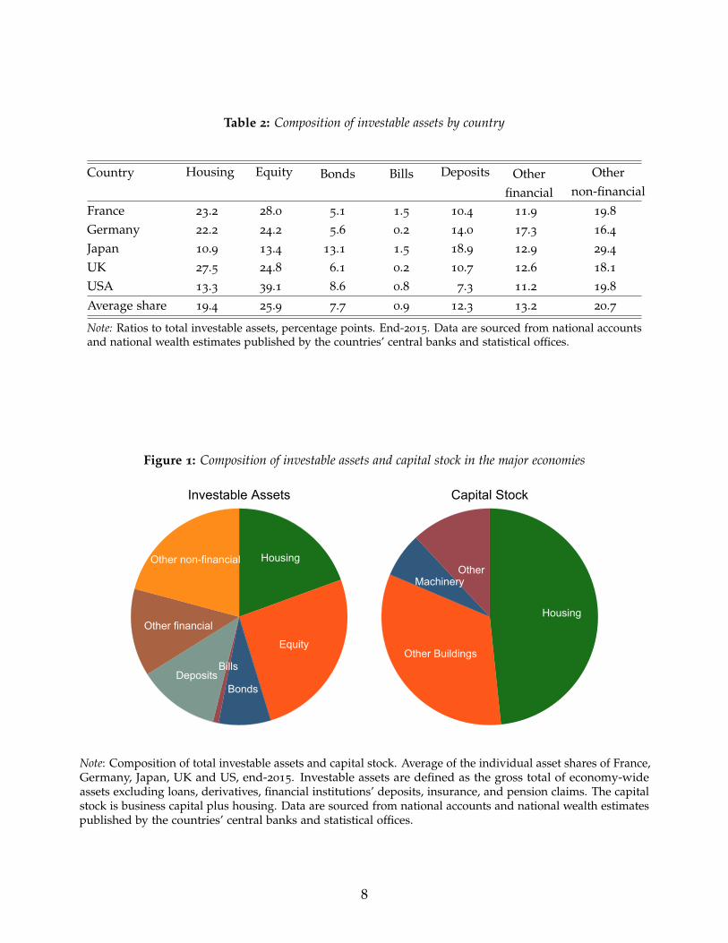
Table 2: Composition of investable assets by country
Country Housing Equity Bonds Bills Deposits Other Other
financial non-financialFrance 23.2 28.0 5.1 1.5 10.4 11.9 19.8Germany 22.2 24.2 5.6 0.2 14.0 17.3 16.4Japan 10.9 13.4 13.1 1.5 18.9 12.9 29.4UK 27.5 24.8 6.1 0.2 10.7 12.6 18.1USA 13.3 39.1 8.6 0.8 7.3 11.2 19.8Average share 19.4 25.9 7.7 0.9 12.3 13.2 20.7
Note: Ratios to total investable assets, percentage points. End-2015. Data are sourced from national accountsand national wealth estimates published by the countries’ central banks and statistical offices.
Figure 1: Composition of investable assets and capital stock in the major economies
Housing
Equity
Bonds
BillsDeposits
Other financial
Other non-financial
Investable Assets
Housing
Other Buildings
MachineryOther
Capital Stock
Note: Composition of total investable assets and capital stock. Average of the individual asset shares of France,Germany, Japan, UK and US, end-2015. Investable assets are defined as the gross total of economy-wideassets excluding loans, derivatives, financial institutions’ deposits, insurance, and pension claims. The capitalstock is business capital plus housing. Data are sourced from national accounts and national wealth estimatespublished by the countries’ central banks and statistical offices.
8
London). Throughout the sample we target a maturity of around 10 years. For the second half of the
20th century, the maturity of government bonds is generally accurately defined. For the pre-WW2
period we sometimes had to rely on data for perpetuals, i.e., very long-term government securities
(such as the British consol).
Our dataset also tracks the development of returns on equity and housing. The new data on
total returns on equity come from a broad range of sources, including articles in economic and
financial history journals, yearbooks of statistical offices and central banks, stock exchange listings,
newspapers, and company reports. Throughout most of the sample, we rely on indices weighted by
market capitalization of individual stocks, and a stock selection that is representative of the entire
stock market. For some historical time periods in individual countries, however, we also make use
of indices weighted by company book capital, stock market transactions, or weighted equally, due
to limited data availability.
To the best of the authors’ knowledge, this study is the first to present long-run returns on
residential real estate. We combine the long-run house price series presented by Knoll, Schularick,
and Steger (2017) with a novel dataset on rents from Knoll (2016). For most countries, the rent
series rely on the rent components of the cost of living of consumer price indices as constructed by
national statistical offices and combine them with information from other sources to create long-run
series reaching back to the late 19th century.
We also study a number of “composite” asset returns, as well as those on the individual asset
classes—bills, bonds, equities and housing—described above. More precisely, we compute the rate of
return on safe assets, risky assets, and aggregate wealth, as weighted averages of the individual asset
returns. To obtain a representative return from the investor’s perspective, we use the outstanding
stocks of the respective asset in a given country as weights. To this end, we make use of new data on
equity market capitalization (from Kuvshinov and Zimmermann, 2017) and housing wealth for each
country and period in our sample, and combine them with existing estimates of public debt stocks
to obtain the weights for the individual assets. A graphical representation of these asset portfolios,
and further description of their construction is provided in the Appendix Section E.
Tables A.14 and A.15 present an overview of our four asset return series by country, their main
characteristics and coverage. The paper comes with an extensive data appendix that specifies the
sources we consulted and discusses the construction of the series in greater detail (see the Data
Appendix, Section K for housing returns, and Section L for equity and bond returns).
2.3. Calculating returns
The total annual return on any financial asset can be divided into two components: the capital gain
from the change in the asset price P, and a yield component Y, that reflects the cash-flow return on
an investment. The total nominal return R for asset i in country j at time t is calculated as:
Total return: Ri,j,t =Pi,j,t − Pi,j,t−1
Pi,j,t−1+ Yi,j,t . (1)
9

Because of wide differences in inflation across time and countries, it is helpful to compare
returns in real terms. Let πj,t = (CPIi,j,t − CPIi,j,t−1)/CPIi,j,t−1 be the realized consumer price index
(CPI) inflation rate in a given country j and year t. We calculate inflation-adjusted real returns r for
each asset class as
Real return: ri,j,t = (1 + Ri,j,t)/(1 + πj,t)− 1 . (2)
These returns will be summarized in period average form, by country, or for all countries.4
Investors must be compensated for risk to invest in risky assets. A measure of this “excess
return” can be calculated by comparing the real total return on the risky asset with the return on a
risk-free benchmark—in our case, the government bill rate, rbill,j,t. We therefore calculate the excess
return ER for the risky asset i in country j as
Excess return: ERi,j,t = ri,j,t − rbill,j,t . (3)
In addition to individual asset returns, we also present a number of weighted “composite”
returns aimed at capturing broader trends in risky and safe investments, as well as the “overall
return” or “return on wealth.” Appendix E provides further details on the estimates of country
asset portfolios from which we derive country-year specific weights.
For safe assets, we assume that total public debt is divided equally into bonds and bills to proxy
the bond and bill stocks, since we have no data yet on the market weights (only total public debt
weight) over our full sample. The safe asset return is then computed as an average of the real returns
on bonds and bills as follows:
Safe return: rsa f e,j,t =rbill,j,t + rbond,j,t
2. (4)
For risky assets, the weights w here are the asset holdings of equity and housing stocks in the
respective country j and year t, scaled to add to 1. We use stock market capitalization and housing
wealth as weights for equity and housing. The risky asset return is a weighted average of returns on
equity and housing:
Risky return: rrisky,j,t = requity,j,t × wequity,j,t + rhousing,t × whousing,j,t. (5)
The difference between our risky and safe return measures then provides a proxy for the
aggregate risk premium in the economy:
Risk premium: RPj,t = rrisky,j,t − rsa f e,j,t . (6)
4In what follows we focus on conventional average annual real returns. In addition, we often report period-average geometric mean returns corresponding to the annualized return that would be achieved through
reinvestment or compounding. These are calculated as(∏i∈T(1 + ri,j,t)
) 1T − 1. Note that the arithmetic period-
average return is always larger than the geometric period-average return, with the difference increasing withthe volatility of the sequence of returns.
10

The “return on wealth” measure is a weighted average of returns on risky assets (equity and
housing) and safe assets (bonds and bills). The weights w here are the asset holdings of risky and
safe assets in the respective country j and year t, scaled to add to 1.
Return on wealth: rwealth,j,t = rrisky,j,t × wrisky,j,t + rsa f e,t × wsa f e,j,t. (7)
For comparison, Appendix Section F also provides information on the equally-weighted risky
return, and the equally-weighted rate of return on wealth, that are simple averages of housing and
equity, and housing, equity and bonds respectively.
Finally, we also consider returns from a global investor perspective in Appendix Section G.
These measure the returns from investing in local markets in US dollars. This measure effectively
subtracts the depreciation of the local exchange rate vis-a-vis the dollar from the nominal return:
USD return: RUSDi,j,t = Ri,j,t − ∆sj,t, (8)
where ∆sj,t is the depreciation of the local exchange rate vis-a-vis the US dollar in year tThe real USD returns are then computed net of US inflation πUSA,t:
Real USD return: rUSDi,j,t = (1 + RUSD
i,j,t )/(1 + πUSA,t)− 1, (9)
2.4. Constructing housing returns using the rent-price approach
This section briefly describes our methodology to calculate total housing returns, and we provide
further details as needed later in the paper (Section 6.2 and Appendix Section K).
We construct estimates for total returns on housing using the rent-price approach. This approach
starts from a benchmark rent-price ratio (RI0/HPI0) estimated in a baseline year (t = 0). For this
ratio we rely on net rental yields the Investment Property Database (IPD).56 We can then construct a
time series of returns by combining separate information from a country-specific house price index
series (HPIt/HPI0) and a country-specific rent index series (RIt/RI0). For these indices we rely on
prior work on housing prices (Knoll, Schularick, and Steger, 2017) and new data on rents (Knoll,
2016). This method assumes that the indices cover a representative portfolio of houses. If so, there is
no need to correct for changes in the housing stock, and only information about the growth rates in
prices and rents is necessary.
5Net rental yields use rental income net of maintenance costs, ground rent and other irrecoverableexpenditure. We use net rather than gross yields to improve comparability with other asset classes.
6For Australia, we use the net rent-price ratio from Fox and Tulip (2014). For Belgium, we construct a grossrent-price ratio using data from Numbeo.com, and scale it down to account for running costs and depreciation.Both of these measures are more conservative than IPD, and more in line with the alternative benchmarks forthese two countries.
11

Given the above, a time series of the rent-to-price ratio can be derived iteratively as
RIt+1
HPIt+1=
[(RIt+1/RIt)
(HPIt+1/HPIt)
]RIt
HPIt. (10)
In a second step, returns on housing can be computed as:
Rhouse,t+1 =RIt+1
HPIt+
HPIt+1 − HPIt
HPIt. (11)
As this approach is sensitive to the choice of rent-price-ratio at benchmark dates, we corroborate
the plausibility of the historical rent-price ratios with additional primary sources as well as economic
and financial history books and articles. Where the rent-price approach estimates diverge from
the alternative historical sources, we additionally benchmark the ratio to historical estimates of net
rental yields. We also examine the sensitivity of aggregate return estimates to varying benchmark
ratio assumptions. For further details, see Section 6.2 and Appendix Section K.
3. Rates of return: Aggregate trends
We begin with the first key finding—one that was completely unknown until now, due to lack of
evidence. The data summary in Table 3 and Figure 2 show that residential real estate, not equity,
has been the best long-run investment over the course of modern history. The full sample summary
return data are shown in the upper panel of Table 3, and the post-1950 sample in the bottom panel.
Data are pooled and equally-weighted, i.e., they are raw rather than portfolio returns. We include
wars so that results are not polluted by omitted disasters. We do, however, exclude hyperinflations
in order to focus on the underlying trends in returns, rather than inflation.
Although returns on housing and equities are similar, the volatility of housing returns is
substantially lower, as Table 3 shows. Returns on the two asset classes are in the same ballpark—
around 7%—but the standard deviation of housing returns is substantially smaller than that of
equities (10% for housing versus 22% for equities). Predictably, with thinner tails, the compounded
return (using the geometric average) is vastly better for housing than for equities—6.6% for housing
versus 4.6% for equities. This finding appears to contradict one of the basic assumptions of modern
valuation models: higher risks should come with higher rewards.
We can see that differences in asset returns are not driven by unusual events in the early pre-
WW2 part of our long historical sample. The bottom half of Table 3 makes this point. Compared to
the full sample period (1870–2015) reported in the upper half of the table, the same clear pattern
emerges: stocks and real estate dominate in terms of returns. Moreover, average returns post–1950
are similar to the full sample, even though the later period excludes the devastating effects of the
two world wars.
Other robustness checks are reported in the Appendix in Figures A.1, A.2, and A.3. Briefly, we
find that the observed patterns are not driven by the smaller European countries in our sample.
12

Table 3: Global real returns
Real returns Nominal Returns
Bills Bonds Equity Housing Bills Bonds Equity Housing
Full sample:
Mean return p.a. 0.98 2.50 6.89 7.05 4.60 6.10 10.75 11.06
Std.dev. 6.01 10.74 21.94 9.98 3.33 8.91 22.78 10.70
Geometric mean 0.78 1.94 4.64 6.61 4.55 5.74 8.55 10.59
Mean excess return p.a. . 1.53 5.91 6.07
Std.dev. . 8.38 21.43 9.86
Geometric mean . 1.19 3.81 5.64
Observations 1739 1739 1739 1739 1739 1739 1739 1739
Post-1950:
Mean return p.a. 0.87 2.77 8.28 7.44 5.40 7.31 12.99 12.31
Std.dev. 3.43 9.94 24.20 8.88 4.04 9.80 25.09 10.15
Geometric mean 0.81 2.30 5.54 7.10 5.33 6.89 10.28 11.90
Mean excess return p.a. . 1.91 7.41 6.57
Std.dev. . 9.20 23.77 9.19
Geometric mean . 1.51 4.79 6.21
Observations 1016 1016 1016 1016 1016 1016 1016 1016
Note: Annual global returns in 16 countries, equally weighted. Period coverage differs across countries.Consistent coverage within countries. Excess returns are computed relative to bills.
Figure 2: Global real rates of return
Bills
Bonds
Equity
Housing
0 2 4 6 8Mean annual return, per cent
Full sample
Bills
Bonds
Equity
Housing
0 2 4 6 8Mean annual return, per cent
Post-1950
Excess Return vs Bills Mean Annual Return
Notes: Arithmetic avg. real returns p.a., unweighted, 16 countries. Consistent coverage within each country.
13

Figure A.1 shows average real returns weighted by country-level real GDP, both for the full sample
and post–1950 period. Compared to the unweighted averages, equity performs slightly better, but
the returns on equity and housing remain very similar, and the returns and riskiness of all four
asset classes are very close to the unweighted series in Table 3.
The results could be biased because different countries enter the sample at different dates due to
data availability. Figure A.2 plots the average returns for sample-consistent country groups, starting
at benchmark years—the later the benchmark year, the more countries we can include. Again, the
broad patterns discussed above are largely unaffected.
We also investigate the possibility that the results are biased because of wartime experiences.
We recompute average returns, but now dropping the two world wars from the sample. Figure A.3
plots the average returns in this case, and alas the main result remains largely unchanged. Appendix
Table A.3 also considers the risky returns during wartime in more detail, to assess the evidence
for rare disasters in our sample. Returns during both wars were indeed low and often negative,
although returns during World War 2 in a number of countries were relatively robust.
Finally, our aggregate return data take the perspective of a domestic investor in a representative
country. Appendix Table A.9 instead takes the perspective of a global US-Dollar investor, and
assesses the US-Dollar value of the corresponding returns. The magnitude and ranking of returns
are similar to those in Table 3 above, although the volatilities are substantially higher, as expected
given that the underlying asset volatility is compounded by that in the exchange rate. This higher
volatility is also reflected in somewhat higher levels of US-Dollar returns, compared to those in local
currency.
4. Safe rates of return
Figure 3 shows the trends in real returns on government bonds (solid line) and bills (dashed
line) since 1870. The global returns are GDP-weighted averages of the 16 countries in our sample.
Although we do not show the unweighted data, the corresponding figure would look very similar.
We smooth the data using a decadal moving average—for example, the observation reported in 1900
is the average of data from 1895 to 1905.
Two striking features of Figure 3 deserve comment. First, we can see that low real rates, and
in fact negative real rates have been relatively common during modern financial history. Second,
for the most part returns to long-term and short-term safe assets have tracked each other very
closely—with a premium of about 1% that has widened considerably since the well-documented
decline of the mid-1980s (Holston, Laubach, and Williams, 2017).
Safe rates are far from stable in the medium-term. There is enormous time series, as well as
cross-country variability. In fact, real safe rates appear to be as volatile (or even more volatile)
than real risky rates, a topic we return to in the next subsection. Considerable variation in the risk
premium often comes from sharp changes in safe real rates, not from the real returns on risky assets.
Two four-decade-long declines in real rates stand out: (1) from 1870 to WW1 (with a subsequent
14

Figure 3: Trends in real returns on bonds and bills
-6-3
03
69
Per
cen
t
1870 1890 1910 1930 1950 1970 1990 2010
Real bill rate: decadal moving averageReal bond return: decadal moving average
Note: Mean returns for 16 countries, weighted by real GDP. Decadal moving averages.
further collapse during the war); and (2) the well-documented decline that started in the mid-1980s.
Add to this list the briefer, albeit more dramatic decline that followed the Great Depression into
WW2. Some observers have therefore interpreted the recent downward trend in safe rates as a sign
of “secular stagnation” (see, for example Summers, 2014).
However, in contrast to 1870 and the late 1930s, the more recent decline is characterized by a
much higher term premium—a feature with few precedents in our sample. There are other periods
in which real rates remained low, such as in the 1960s. They were pushed below zero, particularly
for the longer tenor bonds, during the 1970s inflation spike, although here too term premiums
remained relatively tight. Returns dip dramatically during both world wars. It is perhaps to be
expected: demand for safe assets spikes during disasters although the dip may also reflect periods
of financial repression that usually emerge during times of conflict, and which often persist into
peacetime. Thus, from a broad historical perspective, high rates of return on safe assets and high
term premiums are more the exception than the rule.
Summing up, during the late 19th and 20th century, real returns on safe assets have been
low—on average 1% for bills and 2.5% for bonds—relative to alternative investments. Although
the return volatility—measured as annual standard deviation—is lower than that of housing and
equities, these assets offered little protection during high-inflation eras and during the two world
wars, both periods of low consumption growth.
15

Figure 4: Correlations across safe asset returns0
.2.4
.6.8
1
1870 1890 1910 1930 1950 1970 1990 2010
Bonds vs Bills
-.50
.51
1870 1890 1910 1930 1950 1970 1990 2010
Bonds (nom.) Bills (nominal)
Comovement with inflation
0.2
.4.6
.8
1870 1890 1910 1930 1950 1970 1990 2010
Bonds (real) Bills (real)
Cross-country comovement
Note: Rolling decadal correlations. The global correlation coefficient is the average of individual countries forthe rolling window. Cross-country correlation coefficient is the average of all country pairs for a given assetclass. Country coverage differs across time periods.
Figure 4 explores additional key moments of the data. The top-left panel plots the correlation
between real bond and bill returns, again using decadal rolling windows and computed as the
cross-sectional average of correlations. In parallel to our discussion of the term premium, real
returns on bonds and bills have been highly correlated for most of the sample up until the 1960s.
From the 1970s onwards, the era of fiat money and higher average inflation, this correlation has
become much weaker, and near zero at times, coinciding with a widening term premium.
The top right panel of Figure 4 displays the correlation between nominal safe asset returns and
inflation. The figure shows that safe assets provided more of an inflation hedge starting in the
1970s, around the start of the era of modern central banking. However, as Figure 3 showed, both
16

Table 4: Real rates of return on bonds and bills
Country Full Sample Post 1950 Post 1980
Bills Bonds Bills Bonds Bills BondsAustralia 1.29 2.24 1.32 2.45 3.23 5.85
Belgium 1.16 3.01 1.50 3.86 2.30 6.24
Denmark 3.08 3.58 2.18 3.50 2.80 7.13
Finland 0.64 3.22 0.63 4.86 2.61 5.76
France -0.47 1.54 0.95 2.96 2.22 6.94
Germany 1.51 3.15 1.86 3.69 1.96 4.22
Italy 1.20 2.53 1.30 2.83 2.42 5.85
Japan 0.68 2.54 1.36 2.83 1.48 4.53
Netherlands 1.37 2.71 1.04 2.14 2.08 5.59
Norway 1.10 2.55 -0.26 1.94 1.50 5.62
Portugal -0.01 2.23 -0.65 1.59 0.65 6.25
Spain -0.04 1.41 -0.32 1.21 2.20 5.72
Sweden 1.77 3.25 0.82 2.70 1.51 6.59
Switzerland 0.89 2.41 0.12 2.33 0.33 3.35
UK 1.16 2.29 1.14 2.63 2.70 6.67
USA 2.17 2.79 1.30 2.64 1.71 5.71
Average, unweighted 1.13 2.61 0.89 2.76 1.98 5.75
Average, weighted 1.31 2.49 1.17 2.65 1.89 5.55
Note: Average annual real returns. Period coverage differs across countries. Consistent coverage withincountries. The average, unweighted and average, weighted figures are respectively the unweighted andreal-GDP-weighted arithmetic averages of individual country returns.
bonds and bills have experienced prolonged periods of negative real returns—both during wartime
inflation, and the high-inflation period of the late 1970s. Although safe asset rates usually comove
positively with inflation, they do not always compensate the investor fully.
The bottom panel of Figure 4 displays the cross correlation of safe returns over rolling decadal
windows to examine how much inflation risk can be diversified with debt instruments. This
correlation coefficient is the average of all country-pair combinations for a given window, and is
calculated as
Corri,t =∑j ∑k 6=j Corr(ri,j,t∈T, ri,k,t∈T)
∑j ∑k 6=j 1
for asset i (here: bonds or bills), and time window T = (t− 5, t + 5). Here j and k denote the country
pairs, and r denotes real returns, constructed as described in Section 2.3.
Cross-country real safe returns have exhibited positive comovement throughout history. The
degree of comovement shows a few marked increases associated with WW1 and the 1930s. The effect
of these major global shocks on individual countries seems to have resulted in a higher correlation
of cross-country asset returns. This was less true of WW2 and its aftermath, perhaps because the
evolving machinery of financial repression was better able to manage the yield curve.
Turning to cross-sectional features, Table 4 shows country-specific safe asset returns for three
17

Figure 5: Trends in real return on safe assets and GDP growth
-6-4
-20
24
68
Per
cen
t
1870 1890 1910 1930 1950 1970 1990 2010
Real safe return: decadal moving averageReal GDP growth: decadal moving average
Note: Mean returns and GDP growth for 16 countries, weighted by real GDP. Decadal moving averages. Thesafe rate of return is an arithmetic average of bonds and bills.
samples: all years, post–1950, and post–1980. Here the experiences of a few countries stand out.
In France, real bill returns have been negative when averaged over the full sample. In Portugal
and Spain, they have been approximately zero. In Norway, the average return on bills has been
negative for the post-1950 sample. However, most other countries have experienced reasonably
similar returns on safe assets, in the ballpark of 1%− 3%.
Aside from the investor perspective discussed above, safe rates of return have important
implications for government finances, as they measure the cost of raising and servicing government
debt. What matters for this is not the level of real return per se, but its comparison to real GDP
growth, or rsa f e− g. If the rate of return exceeds real GDP growth, rsa f e > g, reducing the debt/GDP
ratio requires continuous budget surpluses. When rsa f e is less than g, however, a reduction in
debt/GDP is possible even with the government running modest deficits.
Figure 5 plots the representative “safe rate of return”—the arithmetic average of bond and bill
returns (dashed line)—against real GDP growth (solid line), again as decadal moving averages.
Starting in the late 19th century, safe rates were higher than GDP growth, meaning that any
government wishing to reduce debt had to run persistent budget surpluses. Indeed, this was the
strategy adopted by Britain to pay off the debt incurred during the Napoleonic War (Crafts, 2016).
The two world wars saw low real returns, but nevertheless a large debt accumulation to finance the
wartime effort. The aftermath of these two wars, however, offered vastly different experiences for
18

public finances. After World War 1, safe returns were high and growth—low, requiring significant
budgetary efforts to repay the war debts. This was particularly difficult given the additional
reparations imposed by the Treaty of Versailles, and the turbulent macroeconomic environment at
the time. After World War 2, on the contrary, high growth and inflation helped greatly reduce the
value of national debt, creating rsa f e − g gaps as large as –10 percentage points.
More recently, the Great Moderation saw a reduction in inflation rates and a corresponding
increase in the debt financing burden, whereas the impact of rsa f e − g in the aftermath of the Global
Financial Crisis remains broadly neutral, with the two rates roughly equal. On average throughout
our sample, the real growth rate has been around 1 percentage point higher than the safe rate of
return (3% growth versus 2% safe rate), meaning that governments could run small deficits without
increasing the public debt burden.
In sum, real returns on safe assets, even adjusted for risk, have been quite low across the
advanced countries and throughout the last 150 years. In fact, for some countries, these returns have
been persistently negative. Periods of unexpected inflation, in war and peace, have often diluted
returns, and flights to safety have arguably depressed returns in the asset class even further in the
more turbulent periods of global financial history. The low return for investors has, on the flipside,
implied a low financing cost for governments, which was particularly important in reducing the
debts incurred during World War 2.
5. Risky rates of return
We next shift our focus to look at the risky assets in our portfolio, i.e., housing and equities. Figure
6 shows the trends in real returns on housing (solid line) and equity (dashed line) for our entire
sample, again presented as decadal moving averages. In addition, Figure 7 displays the correlation
of risky returns between asset classes, across countries, and with inflation, in a manner similar to
Figure 4.
A major stylized fact leaps out. Prior to WW2, real returns on housing, safe assets and equities
followed remarkably similar trajectories. After WW2 this was no longer the case. Risky returns were
high and stable in the 19th century, but fell sharply around WW1, with the decade-average real
equity returns turning negative. Returns recovered quickly during the 1920s, before experiencing a
reasonably modest drop in the aftermath the Great Depression. Most strikingly though, from the
onset of WW2 onwards the trajectories of the two risky asset classes diverged markedly from each
other, and also from those of safe assets.
Equity returns have experienced many pronounced global boom-bust cycles, much more so
than housing returns, with real returns as high as 16% and as low as −4% over the course of entire
decades. Equity returns fell in WW2, boomed sharply during the post-war reconstruction, and
fell off again in the climate of general macroeconomic instability in the late 1970s. Equity returns
bounced back following a wave of deregulation and privatization of the 1980s. The next major event
to consider was the Global Financial Crisis, which extracted its toll on equities and to some extent
19

Figure 6: Trends in real returns on equity and housing
-40
48
1216
Per
cen
t
1870 1890 1910 1930 1950 1970 1990 2010
Real equity return: decadal moving averageReal housing return: decadal moving average
Note: Mean returns for 16 countries, weighted by real GDP. Decadal moving averages.
housing, as we shall see.
Housing returns, on the other hand, have remained remarkably stable over the entire post-WW2
period. As a consequence, the correlation between equity and housing returns, depicted in the top
panel of Figure 7, was highly positive before WW2, but has all but disappeared over the past five
decades. The low covariance of equity and housing returns over the long run reveals attractive gains
from diversification across these two asset classes that economists, up to now, have been unable to
measure or analyze.
In terms of relative returns, housing persistently outperformed equity up until the end of WW1,
even though the returns followed a broadly similar temporal pattern. In recent decades, equities
have slightly outperformed housing on average, but only at the cost of much higher volatility and
cyclicality. Furthermore, the upswings in equity prices have generally not coincided with times
of low growth or high inflation, when standard theory would say high returns would have been
particularly valuable.
The top-right panel of Figure 7 shows that equity co-moved negatively with inflation in the
1970s, while housing provided a more robust hedge against rising consumer prices. In fact, apart
from the interwar period when the world was gripped by a general deflationary bias, equity returns
have co-moved negatively with inflation in almost all eras. Moreover, the big downswings in equity
returns in the two world wars and the 1970s coincided with periods of generally poor economic
20

Figure 7: Correlations across risky asset returns0
.2.4
.6
1870 1890 1910 1930 1950 1970 1990 2010
Equity vs Housing
-.4-.2
0.2
.4.6
1870 1890 1910 1930 1950 1970 1990 2010
Equity (nom.) Housing (nominal)
Comovement with inflation
-.20
.2.4
.6.8
1870 1890 1910 1930 1950 1970 1990 2010
Equity (real) Housing (real)
Cross-country comovement
Note: Rolling decadal correlations. The global correlation coefficient is the average of individual countries forthe rolling window. Cross-country correlation coefficient is the average of all country pairs for a given assetclass. Country coverage differs across time periods.
performance.
In the past two decades, equity returns have also become highly correlated across countries,
as shown by the sharp rise in the degree of comovement in the bottom-left panel of Figure 7. A
well-diversified global equity portfolio has become less of a hedge against country-specific risk
(Quinn and Voth, 2008). As is a matter of debate, this may reflect the greater trading across equity
markets globally, or an increase in the global shocks to which firms, especially those in the typical
equity index, are increasingly exposed. In contrast to equities, cross-country housing returns have
remained relatively uncorrelated, perhaps because housing assets remain less globally tradable than
equities or are exposed more to idiosyncratic country-level shocks.
21

Table 5: Real rates of return on equity and housing
Country Full Sample Post 1950 Post 1980
Equity Housing Equity Housing Equity HousingAustralia 7.81 6.37 7.57 8.29 8.78 7.16
Belgium 6.23 7.89 9.65 8.14 11.49 7.20
Denmark 7.22 8.10 9.33 7.04 12.57 5.14
Finland 9.98 9.58 12.81 11.18 16.17 9.47
France 3.25 6.54 6.38 10.38 11.07 6.39
Germany 6.85 7.82 7.52 5.29 10.06 4.12
Italy 7.32 4.77 6.18 5.55 9.45 4.57
Japan 6.09 6.54 6.32 6.74 5.79 3.58
Netherlands 7.09 7.28 9.41 8.53 11.90 6.41
Norway 5.95 8.03 7.08 9.10 11.76 9.81
Portugal 4.37 6.31 4.70 6.01 8.34 7.15
Spain 5.46 5.21 7.11 5.83 11.00 4.62
Sweden 7.98 8.30 11.30 8.94 15.74 9.00
Switzerland 6.71 5.63 8.73 5.64 10.06 6.19
UK 7.20 5.36 9.22 6.57 9.34 6.81
USA 8.39 6.03 8.75 5.62 9.09 5.66
Average, unweighted 6.60 7.25 8.24 7.46 10.68 6.42
Average, weighted 7.04 6.69 8.13 6.34 8.98 5.39
Note: Average annual real returns. Period coverage differs across countries. Consistent coverage withincountries. The average, unweighted and average, weighted figures are respectively the unweighted andreal-GDP-weighted arithmetic averages of individual country returns.
Next we explore long-run risky returns in individual countries. Table 5 shows the returns on
equities and housing by country for the full sample and for the post–1950 and post–1980 subsamples.
Long-run risky asset returns for most countries are close to 6%–8% per year, a figure which we think
represents a robust and strong real return to risky capital.
Still, the figures also show an important degree of heterogeneity among individual countries.
Many of the countries that have experienced large political shocks show lower equity returns. This
is the case for Portugal and Spain which both underwent prolonged civil strife, and France which
undertook a wave of nationalizations in the aftermath of WW2. French equity returns are also
negatively affected by the fallout from the world wars, and the fallout from an oil crisis in the 1960s
(for more detail, see Blancheton, Bonin, and Le Bris, 2014; Le Bris and Hautcoeur, 2010). In contrast,
real equity returns in Finland have been as high as 10%, on average throughout the sample. Housing
returns also show considerable heterogeneity. Returns on housing have been high on average in
the Nordic countries, but low in Italy and Spain. The US risky asset returns fall roughly in the
middle of the country-specific figures, with equity returns slightly above average, and housing
returns—slightly below. Our estimates of the US housing returns are in line with those in Favilukis,
Ludvigson, and Van Nieuwerburgh (2017).7 The degree of heterogeneity and the relative ranking of
7Favilukis, Ludvigson, and Van Nieuwerburgh (2017) estimate a gross nominal return on US housing of9%—11%, based on three data sources going back to 1950s and 1970s. This implies a net real return of around5—7% (once inflation, maintenance and running costs are subtracted), in line with our estimates in Table 5.
22

Figure 8: Risk and return of equity and housing
AUSAUSAUSAUSAUSAUSAUSAUSAUSAUSAUSAUSAUSAUSAUSAUSAUSAUSAUSAUSAUSAUSAUSAUSAUSAUSAUSAUSAUSAUSAUSAUSAUSAUSAUSAUSAUSAUSAUSAUSAUSAUSAUSAUSAUSAUSAUSAUSAUSAUSAUSAUSAUSAUSAUSAUSAUSAUSAUSAUSAUSAUSAUSAUSAUSAUSAUSAUSAUSAUSAUSAUSAUSAUSAUSAUSAUSAUSAUSAUSAUSAUSAUSAUSAUSAUSAUSAUSAUSAUSAUSAUSAUSAUSAUSAUSAUSAUSAUSAUSAUSAUSAUSAUSAUSAUSAUSAUSAUSAUSAUSAUSAUSAUSAUSAUSAUSAUSAUSAUSAUSAUSAUSAUSAUSAUSAUSAUSAUSAUSAUSAUSAUSAUSAUSAUSAUSAUSAUSAUSAUSAUSAUSAUSAUSAUS BELBELBELBELBELBELBELBELBELBELBELBELBELBELBELBELBELBELBELBELBELBELBELBELBELBELBELBELBELBELBELBELBELBELBELBELBELBELBELBELBELBELBELBELBELBELBELBELBELBELBELBELBELBELBELBELBELBELBELBELBELBELBELBELBELBELBELBELBELBELBELBELBELBELBELBELBELBELBELBELBELBELBELBELBELBELBELBELBELBELBELBELBELBELBELBELBELBELBELBELBELBELBELBELBELBELBELBELBELBELBELBELBELBELBELBELBELBELBELBELBELBELBELBELBELBELBELBELBELBELBELBELBELBELBELBELBELBELBELBELBELBELBELBELBELBELDNKDNKDNKDNKDNKDNKDNKDNKDNKDNKDNKDNKDNKDNKDNKDNKDNKDNKDNKDNKDNKDNKDNKDNKDNKDNKDNKDNKDNKDNKDNKDNKDNKDNKDNKDNKDNKDNKDNKDNKDNKDNKDNKDNKDNKDNKDNKDNKDNKDNKDNKDNKDNKDNKDNKDNKDNKDNKDNKDNKDNKDNKDNKDNKDNKDNKDNKDNKDNKDNKDNKDNKDNKDNKDNKDNKDNKDNKDNKDNKDNKDNKDNKDNKDNKDNKDNKDNKDNKDNKDNKDNKDNKDNKDNKDNKDNKDNKDNKDNKDNKDNKDNKDNKDNKDNKDNKDNKDNKDNKDNKDNKDNKDNKDNKDNKDNKDNKDNKDNKDNKDNKDNKDNKDNKDNKDNKDNKDNKDNKDNKDNKDNKDNKDNKDNKDNKDNKDNKDNKDNKDNKDNKDNKDNKDNK
FINFINFINFINFINFINFINFINFINFINFINFINFINFINFINFINFINFINFINFINFINFINFINFINFINFINFINFINFINFINFINFINFINFINFINFINFINFINFINFINFINFINFINFINFINFINFINFINFINFINFINFINFINFINFINFINFINFINFINFINFINFINFINFINFINFINFINFINFINFINFINFINFINFINFINFINFINFINFINFINFINFINFINFINFINFINFINFINFINFINFINFINFINFINFINFINFINFINFINFINFINFINFINFINFINFINFINFINFINFINFINFINFINFINFINFINFINFINFINFINFINFINFINFINFINFINFINFINFINFINFINFINFINFINFINFINFINFINFINFINFINFINFINFINFINFIN
FRAFRAFRAFRAFRAFRAFRAFRAFRAFRAFRAFRAFRAFRAFRAFRAFRAFRAFRAFRAFRAFRAFRAFRAFRAFRAFRAFRAFRAFRAFRAFRAFRAFRAFRAFRAFRAFRAFRAFRAFRAFRAFRAFRAFRAFRAFRAFRAFRAFRAFRAFRAFRAFRAFRAFRAFRAFRAFRAFRAFRAFRAFRAFRAFRAFRAFRAFRAFRAFRAFRAFRAFRAFRAFRAFRAFRAFRAFRAFRAFRAFRAFRAFRAFRAFRAFRAFRAFRAFRAFRAFRAFRAFRAFRAFRAFRAFRAFRAFRAFRAFRAFRAFRAFRAFRAFRAFRAFRAFRAFRAFRAFRAFRAFRAFRAFRAFRAFRAFRAFRAFRAFRAFRAFRAFRAFRAFRAFRAFRAFRAFRAFRAFRAFRAFRAFRAFRAFRAFRAFRAFRAFRAFRAFRAFRA
DEUDEUDEUDEUDEUDEUDEUDEUDEUDEUDEUDEUDEUDEUDEUDEUDEUDEUDEUDEUDEUDEUDEUDEUDEUDEUDEUDEUDEUDEUDEUDEUDEUDEUDEUDEUDEUDEUDEUDEUDEUDEUDEUDEUDEUDEUDEUDEUDEUDEUDEUDEUDEUDEUDEUDEUDEUDEUDEUDEUDEUDEUDEUDEUDEUDEUDEUDEUDEUDEUDEUDEUDEUDEUDEUDEUDEUDEUDEUDEUDEUDEUDEUDEUDEUDEUDEUDEUDEUDEUDEUDEUDEUDEUDEUDEUDEUDEUDEUDEUDEUDEUDEUDEUDEUDEUDEUDEUDEUDEUDEUDEUDEUDEUDEUDEUDEUDEUDEUDEUDEUDEUDEUDEUDEUDEUDEUDEUDEUDEUDEUDEUDEUDEUDEUDEUDEUDEUDEUDEUDEUDEUDEUDEUDEUDEUITAITAITAITAITAITAITAITAITAITAITAITAITAITAITAITAITAITAITAITAITAITAITAITAITAITAITAITAITAITAITAITAITAITAITAITAITAITAITAITAITAITAITAITAITAITAITAITAITAITAITAITAITAITAITAITAITAITAITAITAITAITAITAITAITAITAITAITAITAITAITAITAITAITAITAITAITAITAITAITAITAITAITAITAITAITAITAITAITAITAITAITAITAITAITAITAITAITAITAITAITAITAITAITAITAITAITAITAITAITAITAITAITAITAITAITAITAITAITAITAITAITAITAITAITAITAITAITAITAITAITAITAITAITAITAITAITAITAITAITAITAITAITAITAITAITA
JPNJPNJPNJPNJPNJPNJPNJPNJPNJPNJPNJPNJPNJPNJPNJPNJPNJPNJPNJPNJPNJPNJPNJPNJPNJPNJPNJPNJPNJPNJPNJPNJPNJPNJPNJPNJPNJPNJPNJPNJPNJPNJPNJPNJPNJPNJPNJPNJPNJPNJPNJPNJPNJPNJPNJPNJPNJPNJPNJPNJPNJPNJPNJPNJPNJPNJPNJPNJPNJPNJPNJPNJPNJPNJPNJPNJPNJPNJPNJPNJPNJPNJPNJPNJPNJPNJPNJPNJPNJPNJPNJPNJPNJPNJPNJPNJPNJPNJPNJPNJPNJPNJPNJPNJPNJPNJPNJPNJPNJPNJPNJPNJPNJPNJPNJPNJPNJPNJPNJPNJPNJPNJPNJPNJPNJPNJPNJPNJPNJPNJPNJPNJPNJPNJPNJPNJPNJPNJPNJPNJPNJPNJPNJPNJPNJPN
NLDNLDNLDNLDNLDNLDNLDNLDNLDNLDNLDNLDNLDNLDNLDNLDNLDNLDNLDNLDNLDNLDNLDNLDNLDNLDNLDNLDNLDNLDNLDNLDNLDNLDNLDNLDNLDNLDNLDNLDNLDNLDNLDNLDNLDNLDNLDNLDNLDNLDNLDNLDNLDNLDNLDNLDNLDNLDNLDNLDNLDNLDNLDNLDNLDNLDNLDNLDNLDNLDNLDNLDNLDNLDNLDNLDNLDNLDNLDNLDNLDNLDNLDNLDNLDNLDNLDNLDNLDNLDNLDNLDNLDNLDNLDNLDNLDNLDNLDNLDNLDNLDNLDNLDNLDNLDNLDNLDNLDNLDNLDNLDNLDNLDNLDNLDNLDNLDNLDNLDNLDNLDNLDNLDNLDNLDNLDNLDNLDNLDNLDNLDNLDNLDNLDNLDNLDNLDNLDNLDNLDNLDNLDNLDNLDNLD
NORNORNORNORNORNORNORNORNORNORNORNORNORNORNORNORNORNORNORNORNORNORNORNORNORNORNORNORNORNORNORNORNORNORNORNORNORNORNORNORNORNORNORNORNORNORNORNORNORNORNORNORNORNORNORNORNORNORNORNORNORNORNORNORNORNORNORNORNORNORNORNORNORNORNORNORNORNORNORNORNORNORNORNORNORNORNORNORNORNORNORNORNORNORNORNORNORNORNORNORNORNORNORNORNORNORNORNORNORNORNORNORNORNORNORNORNORNORNORNORNORNORNORNORNORNORNORNORNORNORNORNORNORNORNORNORNORNORNORNORNORNORNORNORNORNOR
PRTPRTPRTPRTPRTPRTPRTPRTPRTPRTPRTPRTPRTPRTPRTPRTPRTPRTPRTPRTPRTPRTPRTPRTPRTPRTPRTPRTPRTPRTPRTPRTPRTPRTPRTPRTPRTPRTPRTPRTPRTPRTPRTPRTPRTPRTPRTPRTPRTPRTPRTPRTPRTPRTPRTPRTPRTPRTPRTPRTPRTPRTPRTPRTPRTPRTPRTPRTPRTPRTPRTPRTPRTPRTPRTPRTPRTPRTPRTPRTPRTPRTPRTPRTPRTPRTPRTPRTPRTPRTPRTPRTPRTPRTPRTPRTPRTPRTPRTPRTPRTPRTPRTPRTPRTPRTPRTPRTPRTPRTPRTPRTPRTPRTPRTPRTPRTPRTPRTPRTPRTPRTPRTPRTPRTPRTPRTPRTPRTPRTPRTPRTPRTPRTPRTPRTPRTPRTPRTPRTPRTPRTPRTPRTPRTPRT
ESPESPESPESPESPESPESPESPESPESPESPESPESPESPESPESPESPESPESPESPESPESPESPESPESPESPESPESPESPESPESPESPESPESPESPESPESPESPESPESPESPESPESPESPESPESPESPESPESPESPESPESPESPESPESPESPESPESPESPESPESPESPESPESPESPESPESPESPESPESPESPESPESPESPESPESPESPESPESPESPESPESPESPESPESPESPESPESPESPESPESPESPESPESPESPESPESPESPESPESPESPESPESPESPESPESPESPESPESPESPESPESPESPESPESPESPESPESPESPESPESPESPESPESPESPESPESPESPESPESPESPESPESPESPESPESPESPESPESPESPESPESPESPESPESPESP
SWESWESWESWESWESWESWESWESWESWESWESWESWESWESWESWESWESWESWESWESWESWESWESWESWESWESWESWESWESWESWESWESWESWESWESWESWESWESWESWESWESWESWESWESWESWESWESWESWESWESWESWESWESWESWESWESWESWESWESWESWESWESWESWESWESWESWESWESWESWESWESWESWESWESWESWESWESWESWESWESWESWESWESWESWESWESWESWESWESWESWESWESWESWESWESWESWESWESWESWESWESWESWESWESWESWESWESWESWESWESWESWESWESWESWESWESWESWESWESWESWESWESWESWESWESWESWESWESWESWESWESWESWESWESWESWESWESWESWESWESWESWESWESWESWESWE
CHECHECHECHECHECHECHECHECHECHECHECHECHECHECHECHECHECHECHECHECHECHECHECHECHECHECHECHECHECHECHECHECHECHECHECHECHECHECHECHECHECHECHECHECHECHECHECHECHECHECHECHECHECHECHECHECHECHECHECHECHECHECHECHECHECHECHECHECHECHECHECHECHECHECHECHECHECHECHECHECHECHECHECHECHECHECHECHECHECHECHECHECHECHECHECHECHECHECHECHECHECHECHECHECHECHECHECHECHECHECHECHECHECHECHECHECHECHECHECHECHECHECHECHECHECHECHECHECHECHECHECHECHECHECHECHECHECHECHECHECHECHECHECHECHECHEGBRGBRGBRGBRGBRGBRGBRGBRGBRGBRGBRGBRGBRGBRGBRGBRGBRGBRGBRGBRGBRGBRGBRGBRGBRGBRGBRGBRGBRGBRGBRGBRGBRGBRGBRGBRGBRGBRGBRGBRGBRGBRGBRGBRGBRGBRGBRGBRGBRGBRGBRGBRGBRGBRGBRGBRGBRGBRGBRGBRGBRGBRGBRGBRGBRGBRGBRGBRGBRGBRGBRGBRGBRGBRGBRGBRGBRGBRGBRGBRGBRGBRGBRGBRGBRGBRGBRGBRGBRGBRGBRGBRGBRGBRGBRGBRGBRGBRGBRGBRGBRGBRGBRGBRGBRGBRGBRGBRGBRGBRGBRGBRGBRGBRGBRGBRGBRGBRGBRGBRGBRGBRGBRGBRGBRGBRGBRGBRGBRGBRGBRGBRGBRGBRGBRGBRGBRGBRGBRGBRGBRGBRGBRGBRGBRGBR
USAUSAUSAUSAUSAUSAUSAUSAUSAUSAUSAUSAUSAUSAUSAUSAUSAUSAUSAUSAUSAUSAUSAUSAUSAUSAUSAUSAUSAUSAUSAUSAUSAUSAUSAUSAUSAUSAUSAUSAUSAUSAUSAUSAUSAUSAUSAUSAUSAUSAUSAUSAUSAUSAUSAUSAUSAUSAUSAUSAUSAUSAUSAUSAUSAUSAUSAUSAUSAUSAUSAUSAUSAUSAUSAUSAUSAUSAUSAUSAUSAUSAUSAUSAUSAUSAUSAUSAUSAUSAUSAUSAUSAUSAUSAUSAUSAUSAUSAUSAUSAUSAUSAUSAUSAUSAUSAUSAUSAUSAUSAUSAUSAUSAUSAUSAUSAUSAUSAUSAUSAUSAUSAUSAUSAUSAUSAUSAUSAUSAUSAUSAUSAUSAUSAUSAUSAUSAUSAUSAUSAUSAUSAUSAUSAUSA
AUSAUSAUSAUSAUSAUSAUSAUSAUSAUSAUSAUSAUSAUSAUSAUSAUSAUSAUSAUSAUSAUSAUSAUSAUSAUSAUSAUSAUSAUSAUSAUSAUSAUSAUSAUSAUSAUSAUSAUSAUSAUSAUSAUSAUSAUSAUSAUSAUSAUSAUSAUSAUSAUSAUSAUSAUSAUSAUSAUSAUSAUSAUSAUSAUSAUSAUSAUSAUSAUSAUSAUSAUSAUSAUSAUSAUSAUSAUSAUSAUSAUSAUSAUSAUSAUSAUSAUSAUSAUSAUSAUSAUSAUSAUSAUSAUSAUSAUSAUSAUSAUSAUSAUSAUSAUSAUSAUSAUSAUSAUSAUSAUSAUSAUSAUSAUSAUSAUSAUSAUSAUSAUSAUSAUSAUSAUSAUSAUSAUSAUSAUSAUSAUSAUSAUSAUSAUSAUSAUSAUSAUSAUSAUSAUSAUS
BELBELBELBELBELBELBELBELBELBELBELBELBELBELBELBELBELBELBELBELBELBELBELBELBELBELBELBELBELBELBELBELBELBELBELBELBELBELBELBELBELBELBELBELBELBELBELBELBELBELBELBELBELBELBELBELBELBELBELBELBELBELBELBELBELBELBELBELBELBELBELBELBELBELBELBELBELBELBELBELBELBELBELBELBELBELBELBELBELBELBELBELBELBELBELBELBELBELBELBELBELBELBELBELBELBELBELBELBELBELBELBELBELBELBELBELBELBELBELBELBELBELBELBELBELBELBELBELBELBELBELBELBELBELBELBELBELBELBELBELBELBELBELBELBELBEL
DNKDNKDNKDNKDNKDNKDNKDNKDNKDNKDNKDNKDNKDNKDNKDNKDNKDNKDNKDNKDNKDNKDNKDNKDNKDNKDNKDNKDNKDNKDNKDNKDNKDNKDNKDNKDNKDNKDNKDNKDNKDNKDNKDNKDNKDNKDNKDNKDNKDNKDNKDNKDNKDNKDNKDNKDNKDNKDNKDNKDNKDNKDNKDNKDNKDNKDNKDNKDNKDNKDNKDNKDNKDNKDNKDNKDNKDNKDNKDNKDNKDNKDNKDNKDNKDNKDNKDNKDNKDNKDNKDNKDNKDNKDNKDNKDNKDNKDNKDNKDNKDNKDNKDNKDNKDNKDNKDNKDNKDNKDNKDNKDNKDNKDNKDNKDNKDNKDNKDNKDNKDNKDNKDNKDNKDNKDNKDNKDNKDNKDNKDNKDNKDNKDNKDNKDNKDNKDNKDNKDNKDNKDNKDNKDNKDNK
FINFINFINFINFINFINFINFINFINFINFINFINFINFINFINFINFINFINFINFINFINFINFINFINFINFINFINFINFINFINFINFINFINFINFINFINFINFINFINFINFINFINFINFINFINFINFINFINFINFINFINFINFINFINFINFINFINFINFINFINFINFINFINFINFINFINFINFINFINFINFINFINFINFINFINFINFINFINFINFINFINFINFINFINFINFINFINFINFINFINFINFINFINFINFINFINFINFINFINFINFINFINFINFINFINFINFINFINFINFINFINFINFINFINFINFINFINFINFINFINFINFINFINFINFINFINFINFINFINFINFINFINFINFINFINFINFINFINFINFINFINFINFINFINFINFIN
FRAFRAFRAFRAFRAFRAFRAFRAFRAFRAFRAFRAFRAFRAFRAFRAFRAFRAFRAFRAFRAFRAFRAFRAFRAFRAFRAFRAFRAFRAFRAFRAFRAFRAFRAFRAFRAFRAFRAFRAFRAFRAFRAFRAFRAFRAFRAFRAFRAFRAFRAFRAFRAFRAFRAFRAFRAFRAFRAFRAFRAFRAFRAFRAFRAFRAFRAFRAFRAFRAFRAFRAFRAFRAFRAFRAFRAFRAFRAFRAFRAFRAFRAFRAFRAFRAFRAFRAFRAFRAFRAFRAFRAFRAFRAFRAFRAFRAFRAFRAFRAFRAFRAFRAFRAFRAFRAFRAFRAFRAFRAFRAFRAFRAFRAFRAFRAFRAFRAFRAFRAFRAFRAFRAFRAFRAFRAFRAFRAFRAFRAFRAFRAFRAFRAFRAFRAFRAFRAFRAFRAFRAFRAFRAFRAFRADEUDEUDEUDEUDEUDEUDEUDEUDEUDEUDEUDEUDEUDEUDEUDEUDEUDEUDEUDEUDEUDEUDEUDEUDEUDEUDEUDEUDEUDEUDEUDEUDEUDEUDEUDEUDEUDEUDEUDEUDEUDEUDEUDEUDEUDEUDEUDEUDEUDEUDEUDEUDEUDEUDEUDEUDEUDEUDEUDEUDEUDEUDEUDEUDEUDEUDEUDEUDEUDEUDEUDEUDEUDEUDEUDEUDEUDEUDEUDEUDEUDEUDEUDEUDEUDEUDEUDEUDEUDEUDEUDEUDEUDEUDEUDEUDEUDEUDEUDEUDEUDEUDEUDEUDEUDEUDEUDEUDEUDEUDEUDEUDEUDEUDEUDEUDEUDEUDEUDEUDEUDEUDEUDEUDEUDEUDEUDEUDEUDEUDEUDEUDEUDEUDEUDEUDEUDEUDEUDEUDEUDEUDEUDEUDEUDEU
ITAITAITAITAITAITAITAITAITAITAITAITAITAITAITAITAITAITAITAITAITAITAITAITAITAITAITAITAITAITAITAITAITAITAITAITAITAITAITAITAITAITAITAITAITAITAITAITAITAITAITAITAITAITAITAITAITAITAITAITAITAITAITAITAITAITAITAITAITAITAITAITAITAITAITAITAITAITAITAITAITAITAITAITAITAITAITAITAITAITAITAITAITAITAITAITAITAITAITAITAITAITAITAITAITAITAITAITAITAITAITAITAITAITAITAITAITAITAITAITAITAITAITAITAITAITAITAITAITAITAITAITAITAITAITAITAITAITAITAITAITAITAITAITAITAITA
JPNJPNJPNJPNJPNJPNJPNJPNJPNJPNJPNJPNJPNJPNJPNJPNJPNJPNJPNJPNJPNJPNJPNJPNJPNJPNJPNJPNJPNJPNJPNJPNJPNJPNJPNJPNJPNJPNJPNJPNJPNJPNJPNJPNJPNJPNJPNJPNJPNJPNJPNJPNJPNJPNJPNJPNJPNJPNJPNJPNJPNJPNJPNJPNJPNJPNJPNJPNJPNJPNJPNJPNJPNJPNJPNJPNJPNJPNJPNJPNJPNJPNJPNJPNJPNJPNJPNJPNJPNJPNJPNJPNJPNJPNJPNJPNJPNJPNJPNJPNJPNJPNJPNJPNJPNJPNJPNJPNJPNJPNJPNJPNJPNJPNJPNJPNJPNJPNJPNJPNJPNJPNJPNJPNJPNJPNJPNJPNJPNJPNJPNJPNJPNJPNJPNJPNJPNJPNJPNJPNJPNJPNJPNJPNJPNJPNNLDNLDNLDNLDNLDNLDNLDNLDNLDNLDNLDNLDNLDNLDNLDNLDNLDNLDNLDNLDNLDNLDNLDNLDNLDNLDNLDNLDNLDNLDNLDNLDNLDNLDNLDNLDNLDNLDNLDNLDNLDNLDNLDNLDNLDNLDNLDNLDNLDNLDNLDNLDNLDNLDNLDNLDNLDNLDNLDNLDNLDNLDNLDNLDNLDNLDNLDNLDNLDNLDNLDNLDNLDNLDNLDNLDNLDNLDNLDNLDNLDNLDNLDNLDNLDNLDNLDNLDNLDNLDNLDNLDNLDNLDNLDNLDNLDNLDNLDNLDNLDNLDNLDNLDNLDNLDNLDNLDNLDNLDNLDNLDNLDNLDNLDNLDNLDNLDNLDNLDNLDNLDNLDNLDNLDNLDNLDNLDNLDNLDNLDNLDNLDNLDNLDNLDNLDNLDNLDNLDNLDNLDNLDNLDNLDNLD
NORNORNORNORNORNORNORNORNORNORNORNORNORNORNORNORNORNORNORNORNORNORNORNORNORNORNORNORNORNORNORNORNORNORNORNORNORNORNORNORNORNORNORNORNORNORNORNORNORNORNORNORNORNORNORNORNORNORNORNORNORNORNORNORNORNORNORNORNORNORNORNORNORNORNORNORNORNORNORNORNORNORNORNORNORNORNORNORNORNORNORNORNORNORNORNORNORNORNORNORNORNORNORNORNORNORNORNORNORNORNORNORNORNORNORNORNORNORNORNORNORNORNORNORNORNORNORNORNORNORNORNORNORNORNORNORNORNORNORNORNORNORNORNORNORNOR
PRTPRTPRTPRTPRTPRTPRTPRTPRTPRTPRTPRTPRTPRTPRTPRTPRTPRTPRTPRTPRTPRTPRTPRTPRTPRTPRTPRTPRTPRTPRTPRTPRTPRTPRTPRTPRTPRTPRTPRTPRTPRTPRTPRTPRTPRTPRTPRTPRTPRTPRTPRTPRTPRTPRTPRTPRTPRTPRTPRTPRTPRTPRTPRTPRTPRTPRTPRTPRTPRTPRTPRTPRTPRTPRTPRTPRTPRTPRTPRTPRTPRTPRTPRTPRTPRTPRTPRTPRTPRTPRTPRTPRTPRTPRTPRTPRTPRTPRTPRTPRTPRTPRTPRTPRTPRTPRTPRTPRTPRTPRTPRTPRTPRTPRTPRTPRTPRTPRTPRTPRTPRTPRTPRTPRTPRTPRTPRTPRTPRTPRTPRTPRTPRTPRTPRTPRTPRTPRTPRTPRTPRTPRTPRTPRTPRT
ESPESPESPESPESPESPESPESPESPESPESPESPESPESPESPESPESPESPESPESPESPESPESPESPESPESPESPESPESPESPESPESPESPESPESPESPESPESPESPESPESPESPESPESPESPESPESPESPESPESPESPESPESPESPESPESPESPESPESPESPESPESPESPESPESPESPESPESPESPESPESPESPESPESPESPESPESPESPESPESPESPESPESPESPESPESPESPESPESPESPESPESPESPESPESPESPESPESPESPESPESPESPESPESPESPESPESPESPESPESPESPESPESPESPESPESPESPESPESPESPESPESPESPESPESPESPESPESPESPESPESPESPESPESPESPESPESPESPESPESPESPESPESPESPESPESP
SWESWESWESWESWESWESWESWESWESWESWESWESWESWESWESWESWESWESWESWESWESWESWESWESWESWESWESWESWESWESWESWESWESWESWESWESWESWESWESWESWESWESWESWESWESWESWESWESWESWESWESWESWESWESWESWESWESWESWESWESWESWESWESWESWESWESWESWESWESWESWESWESWESWESWESWESWESWESWESWESWESWESWESWESWESWESWESWESWESWESWESWESWESWESWESWESWESWESWESWESWESWESWESWESWESWESWESWESWESWESWESWESWESWESWESWESWESWESWESWESWESWESWESWESWESWESWESWESWESWESWESWESWESWESWESWESWESWESWESWESWESWESWESWESWESWE
CHECHECHECHECHECHECHECHECHECHECHECHECHECHECHECHECHECHECHECHECHECHECHECHECHECHECHECHECHECHECHECHECHECHECHECHECHECHECHECHECHECHECHECHECHECHECHECHECHECHECHECHECHECHECHECHECHECHECHECHECHECHECHECHECHECHECHECHECHECHECHECHECHECHECHECHECHECHECHECHECHECHECHECHECHECHECHECHECHECHECHECHECHECHECHECHECHECHECHECHECHECHECHECHECHECHECHECHECHECHECHECHECHECHECHECHECHECHECHECHECHECHECHECHECHECHECHECHECHECHECHECHECHECHECHECHECHECHECHECHECHECHECHECHECHECHEGBRGBRGBRGBRGBRGBRGBRGBRGBRGBRGBRGBRGBRGBRGBRGBRGBRGBRGBRGBRGBRGBRGBRGBRGBRGBRGBRGBRGBRGBRGBRGBRGBRGBRGBRGBRGBRGBRGBRGBRGBRGBRGBRGBRGBRGBRGBRGBRGBRGBRGBRGBRGBRGBRGBRGBRGBRGBRGBRGBRGBRGBRGBRGBRGBRGBRGBRGBRGBRGBRGBRGBRGBRGBRGBRGBRGBRGBRGBRGBRGBRGBRGBRGBRGBRGBRGBRGBRGBRGBRGBRGBRGBRGBRGBRGBRGBRGBRGBRGBRGBRGBRGBRGBRGBRGBRGBRGBRGBRGBRGBRGBRGBRGBRGBRGBRGBRGBRGBRGBRGBRGBRGBRGBRGBRGBRGBRGBRGBRGBRGBRGBRGBRGBRGBRGBRGBRGBRGBRGBRGBRGBRGBRGBRGBRGBRUSAUSAUSAUSAUSAUSAUSAUSAUSAUSAUSAUSAUSAUSAUSAUSAUSAUSAUSAUSAUSAUSAUSAUSAUSAUSAUSAUSAUSAUSAUSAUSAUSAUSAUSAUSAUSAUSAUSAUSAUSAUSAUSAUSAUSAUSAUSAUSAUSAUSAUSAUSAUSAUSAUSAUSAUSAUSAUSAUSAUSAUSAUSAUSAUSAUSAUSAUSAUSAUSAUSAUSAUSAUSAUSAUSAUSAUSAUSAUSAUSAUSAUSAUSAUSAUSAUSAUSAUSAUSAUSAUSAUSAUSAUSAUSAUSAUSAUSAUSAUSAUSAUSAUSAUSAUSAUSAUSAUSAUSAUSAUSAUSAUSAUSAUSAUSAUSAUSAUSAUSAUSAUSAUSAUSAUSAUSAUSAUSAUSAUSAUSAUSAUSAUSAUSAUSAUSAUSAUSAUSAUSAUSAUSAUSAUSA
03
69
12M
ean
annu
al re
turn
, per
cen
t
0 10 20 30 40Standard Deviation
Equity Housing
Return and Risk
0 .25 .5 .75 1 1.25
AUSUSASWECHEFIN
JPNESPNLDBEL
GBRDNKNORFRAITA
DEUPRT
Sharpe ratios
EquityHousing
Note: Left panel: average real return p.a. and standard deviation. Right panel: Sharpe ratios, measuredas (ri − rbill)/σi, where i is the risky asset with ri mean return and σi standard deviation. 16 countries.Consistent coverage within each country.
returns is broadly similar when comparing the full sample to the post-1950 period.
This country-level evidence reinforces one of our main findings: housing has been as good a
long-run investment as equities, and possibly better. Housing has offered a similar return to equity
in the majority of countries and time periods. In the long-run, housing outperformed equities in
absolute terms in 6 countries, and equities outperformed housing in 5. Returns on the two assets
were about the same in the remaining 5 countries. After WW2, housing was the best-performing
asset class in 3 countries, and equities in 9.
However, although aggregate returns on equities exceed aggregate returns on housing for certain
countries and time periods, equities do not outperform housing in simple risk-adjusted terms.
Figure 8 compares the riskiness and returns of housing and equities for each country. The left panel
plots average annual real returns on housing (orange crosses) and equities (green circles) against
their standard deviation. The right panel shows the Sharpe ratios for equities (in dark green) and
housing (in orange) for each country in the sample.8 Housing provides a higher return per unit
of risk in each of the 16 countries in our sample, with Sharpe ratios on average more than double
those of equities.
8The Sharpe ratio is calculated as (ri − rbill)/σi, where i is the risky asset (housing or equity) with ri meanreturn and σi standard deviation.
23

5.1. Decomposition of returns
What explains the superior risk-adjusted performance of housing relative to equities? To gain
insights into this question, we separately analyze movements in capital gains and income yield as
shown in Tables 6 and 7. The table shows both arithmetic and geometric average world returns over
the entire sample and since 1950. Capital gain measures the return from price appreciation only.
Depending on the asset, other components of total returns measure income from either dividends
or rents received by the investor. Both capital gain and dividend or rental income are expressed as a
proportion of the previous period’s price. The small residual between combined capital gain and
dividend income, and the equity total return, accounts for gain and loss from capital operations
such as stock splits or share buybacks, and income from reinvestment of dividends.
Table 6 shows that the main reason risk-adjusted housing returns are higher is the lower
volatility of house prices. Both rental yields and dividend income are relatively stable for all years
and countries throughout the sample. However, the standard deviation of equity prices is double
that of house prices over the full sample, and around 2.5 times that of house prices after 1950.
Equity prices have experienced large swings and high-amplitude cycles throughout the course
of modern history. Moreover, capital gains—the more volatile component—are responsible for a
larger share of equity total returns than they are for housing. These two factors have become even
more relevant during the post-WW2 decades.
A similar pattern is visible at the country level, with the summary statistics shown in Table 7.
Table 6: Total nominal return components for equity and housing.
Full Sample Post 1950
Arithmetic Geometric Arithmetic GeometricHousing Capital gain 5.72 (10.42) 5.25 7.22 (9.82) 6.82
Rental income 5.49 (2.02) 5.47 5.26 (1.92) 5.24
Total return 11.22 (10.76) 10.73 12.47 (10.23) 12.05
Capital gain share 51% 49% 58% 57%
Equity Capital gain 6.62 (22.17) 4.46 9.17 (24.64) 6.47
Dividend income 4.18 (1.80) 4.16 3.81 (1.89) 3.79
Total return 10.81 (22.67) 8.63 13.00 (25.30) 10.24
Capital gain share 61% 52% 71% 63%
Observations 1675 1675 985 985
Note: Average annual nominal returns across 16 countries, unweighted. Standard deviation in parentheses.Period coverage differs across countries. Consistent coverage within countries.
24
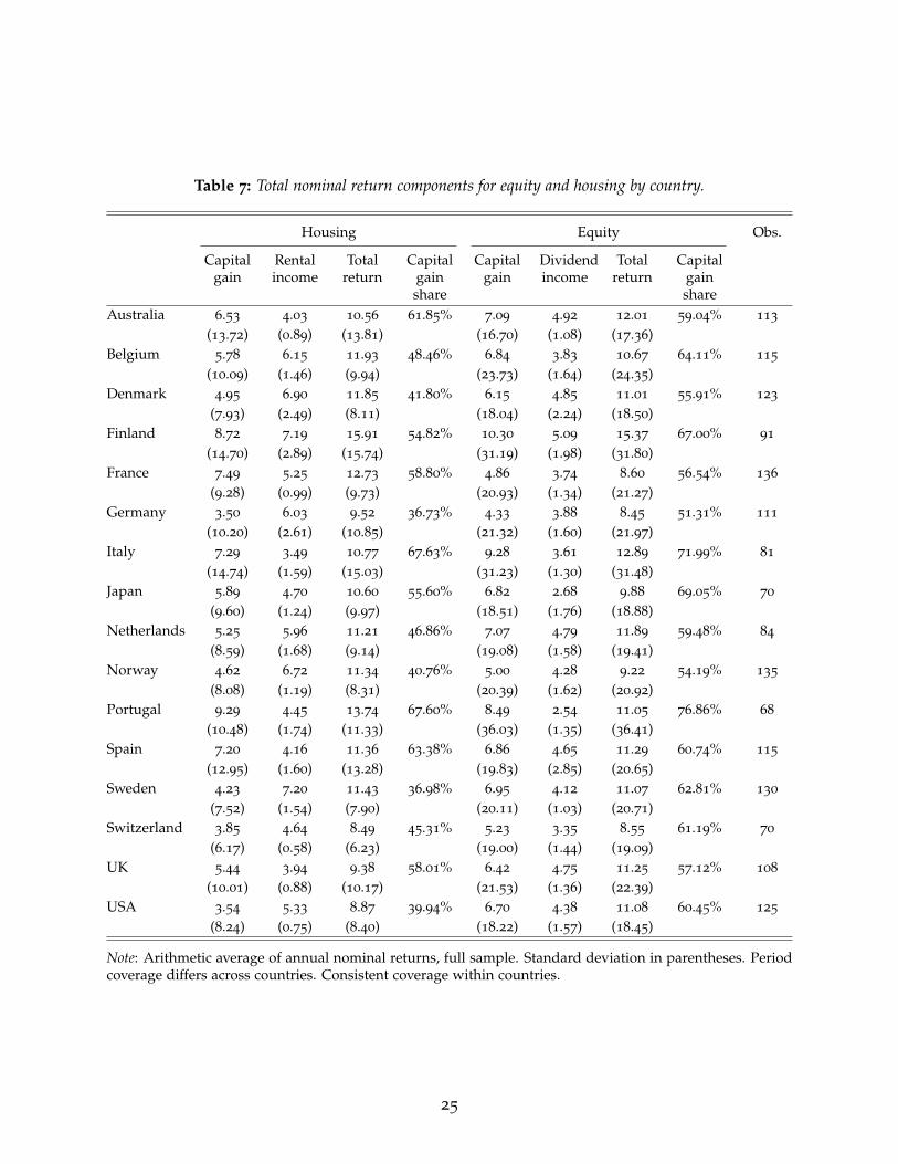
Table 7: Total nominal return components for equity and housing by country.
Housing Equity Obs.
Capitalgain
Rentalincome
Totalreturn
Capitalgainshare
Capitalgain
Dividendincome
Totalreturn
Capitalgainshare
Australia 6.53 4.03 10.56 61.85% 7.09 4.92 12.01 59.04% 113
(13.72) (0.89) (13.81) (16.70) (1.08) (17.36)Belgium 5.78 6.15 11.93 48.46% 6.84 3.83 10.67 64.11% 115
(10.09) (1.46) (9.94) (23.73) (1.64) (24.35)Denmark 4.95 6.90 11.85 41.80% 6.15 4.85 11.01 55.91% 123
(7.93) (2.49) (8.11) (18.04) (2.24) (18.50)Finland 8.72 7.19 15.91 54.82% 10.30 5.09 15.37 67.00% 91
(14.70) (2.89) (15.74) (31.19) (1.98) (31.80)France 7.49 5.25 12.73 58.80% 4.86 3.74 8.60 56.54% 136
(9.28) (0.99) (9.73) (20.93) (1.34) (21.27)Germany 3.50 6.03 9.52 36.73% 4.33 3.88 8.45 51.31% 111
(10.20) (2.61) (10.85) (21.32) (1.60) (21.97)Italy 7.29 3.49 10.77 67.63% 9.28 3.61 12.89 71.99% 81
(14.74) (1.59) (15.03) (31.23) (1.30) (31.48)Japan 5.89 4.70 10.60 55.60% 6.82 2.68 9.88 69.05% 70
(9.60) (1.24) (9.97) (18.51) (1.76) (18.88)Netherlands 5.25 5.96 11.21 46.86% 7.07 4.79 11.89 59.48% 84
(8.59) (1.68) (9.14) (19.08) (1.58) (19.41)Norway 4.62 6.72 11.34 40.76% 5.00 4.28 9.22 54.19% 135
(8.08) (1.19) (8.31) (20.39) (1.62) (20.92)Portugal 9.29 4.45 13.74 67.60% 8.49 2.54 11.05 76.86% 68
(10.48) (1.74) (11.33) (36.03) (1.35) (36.41)Spain 7.20 4.16 11.36 63.38% 6.86 4.65 11.29 60.74% 115
(12.95) (1.60) (13.28) (19.83) (2.85) (20.65)Sweden 4.23 7.20 11.43 36.98% 6.95 4.12 11.07 62.81% 130
(7.52) (1.54) (7.90) (20.11) (1.03) (20.71)Switzerland 3.85 4.64 8.49 45.31% 5.23 3.35 8.55 61.19% 70
(6.17) (0.58) (6.23) (19.00) (1.44) (19.09)UK 5.44 3.94 9.38 58.01% 6.42 4.75 11.25 57.12% 108
(10.01) (0.88) (10.17) (21.53) (1.36) (22.39)USA 3.54 5.33 8.87 39.94% 6.70 4.38 11.08 60.45% 125
(8.24) (0.75) (8.40) (18.22) (1.57) (18.45)
Note: Arithmetic average of annual nominal returns, full sample. Standard deviation in parentheses. Periodcoverage differs across countries. Consistent coverage within countries.
25

The higher volatility of equity prices is a persistent feature of all countries and all periods in our
sample. Capital gains account for a relatively larger share of equity returns, compared to housing
returns, in 11 countries, and a similar share in 5 countries.
Since aggregate equity prices are subject to large and prolonged swings, a representative investor
would have to hold on to his equity portfolio for longer in order to ensure a high real return.
Aggregate housing returns, on the contrary, are more stable because swings in national house prices
are generally less pronounced. National aggregate housing portfolios have had comparable real
returns to national aggregate equity portfolios, but with only half the volatility.
6. Accuracy and comparability of risky returns
This section provides consistency and robustness checks by examining (1) the accuracy of equity
returns, (2) the accuracy of housing returns, and (3) the comparability of housing and equity returns.
6.1. Accuracy of equity returns
The literature on returns in equity markets has highlighted two main sources of bias in the data:
weighting and sample selection. Weighting biases arise from the fact that the stock portfolio weights
for the index do not correspond to those of a representative investor, or a representative agent in the
economy. Selection biases arise from the fact that the selection of stocks does not correspond to the
portfolio of the representative investor or agent. This second category also includes the issues of
survivorship bias and missing data bias arising from stock exchange closures and restrictions. We
consider how each of these biases may, or may not affect our equity return estimates in this section.
An accompanying Appendix Table A.15 also details the construction of the equity index for each
country and time period.
Weighting bias The best practice in weighting equity indices is to use market capitalization
of individual stocks. This approach most closely mirrors the composition of a hypothetical rep-
resentative investor’s portfolio. Equally-weighted indices are likely to overweight smaller firms,
which tend to carry higher returns and a higher risk. The existing evidence from historical returns
on the Brussels and Paris stock exchanges suggests that using equally-weighted indices biases
returns up by around 0.5 percentage points, and standard deviation up by 2–3 percentage points
(Annaert, Buelens, Cuyvers, De Ceuster, Deloof, and De Schepper, 2011; Le Bris and Hautcoeur,
2010). The size of the bias, however, is likely to vary across across markets and time periods. For
example, Grossman (2017) shows that the market-weighted portfolio of UK stocks outperformed its
equally-weighted counterpart over the period 1869–1929.
To minimize this bias, we use market-capitalization-weighted indices for the vast majority of our
sample (see Appendix Table A.15 and Section L). Where market-capitalization weighting was not
available, we have generally used alternative weights such as book capital or transaction volumes,
26

rather than equally-weighted averages. For the few equally-weighted indices that remain in our
sample, the overall impact on aggregate return estimates ought to be negligible.
Selection and survivorship bias Relying on an index whose selection does not mirror the
representative investor’s portfolio carries two main dangers. First, a small sample may be unrepre-
sentative of overall stock market returns. And second, a sample that is selected ad-hoc, and especially
ex-post, is likely to focus on surviving firms, or successful firms, thus overstating investment returns.
This second bias extends not only to stock prices but also to dividend payments, as some historical
studies only consider dividend-paying firms.9 The magnitude of survivor bias has generally been
found to be around 0.5 to 1 percentage points (Annaert, Buelens, and De Ceuster, 2012; Nielsen and
Risager, 2001), but in some time periods and markets it could be larger (see Le Bris and Hautcoeur,
2010, for the case of France).
As a first best, we always strive to use all-share indices that avoid survivor and selection biases.
For some countries and time periods where no such indices were previously available, we have
constructed new weighted all-share indices from original historical sources (e.g., early historical data
for Norway and Spain). Where an all-share index was not available or newly constructed, we have
generally relied on “blue-chip” stock market indices. These are based on an ex-ante value-weighted
sample of the largest firms on the market, that is updated each year and tends to capture the lion’s
share of total market capitalization. Because the sample is selected ex-ante, it avoids ex-post selection
and survivorship biases. And because historical equity markets have tended to be quite concentrated,
“blue-chip” indices have been shown to be a good proxy for all-share returns (see Annaert, Buelens,
Cuyvers, De Ceuster, Deloof, and De Schepper, 2011). Finally, we include non-dividend-paying
firms in the dividend yield calculation.
Stock market closures and trading restrictions A more subtle form of the selection bias
arises when the stock market is closed and no market price data are available. One way of dealing
with stock market closures is to simply exclude them from the baseline return comparisons. But this
implicitly assumes that the data are “missing at random”—i.e., that the stock market closures are
unrelated to the underlying equity returns. Existing research on rare disasters and equity premiums
shows that this is unlikely to be true (Nakamura, Steinsson, Barro, and Ursua, 2013). Stock markets
tend to be closed precisely at times when we would expect returns to be low, such as periods of war
and civil unrest. Return estimates that exclude such rare disasters from the data will thus overstate
stock returns.
To guard against this bias, we include return estimates for the periods of stock market closure in
our sample. Where possible, we rely on alternative data sources, such as listings of other exchanges
and over-the-counter transactions, to fill the gap—for example, in the case of World War 1 Germany
9As highlighted by Brailsford, Handley, and Maheswaran (2012), this was the case with early Australiandata, and the index we use scales down the series for dividend-paying firms to proxy the dividends paid byall firms, as suggested by Brailsford, Handley, and Maheswaran (2012).
27

Table 8: Returns during periods of stock market closure.
Episode Real returns Nominal returns Real capitalization
Avg. Cum. Avg. Cum. Avg. Cum.Spanish Civil War, 1936–40 -4.01 -15.09 9.03 41.32 -10.22 -35.04
Portuguese Revolution, 1974–77 -54.98 -90.88 -44.23 -82.65 -75.29 -98.49
Germany WW1, 1914–18 -21.67 -62.35 3.49 14.72
Switzerland WW1, 1914–16 -7.53 -14.50 -0.84 -1.67 -8.54 -16.34
Netherlands WW2, 1944–46 -12.77 -20.39 -5.09 -8.36
Note: Cumulative and geometric average returns during periods of stock market closure. Estimated byinterpolating returns of shares listed both before an after the exchange was closed. The change in marketcapitalization compares the capitalization of all firms before the market was closed, and once it was opened,and thus includes the effect of any new listings, delistings and bankruptcies that occured during the closure.
(otc index from Ronge, 2002) and World War 2 France (newspaper index from Le Bris and Hautcoeur,
2010). In cases where alternative data are not available, we interpolate the prices of securities listed
both before and after the exchange was closed to estimate the return (if no dividend data are
available, we also assume no dividends were paid).10 Even though this only gives us a rough proxy
of returns, it is better than excluding these periods, which effectively assumes that the return during
stock market closures is the same as that when the stock markets are open. In the end, we only have
one instance of stock market closure for which we are unable to estimate returns—that of the Tokyo
stock exchange in 1946–1947.
Table 8 shows the estimated stock returns during the periods of stock exchange closure in our
sample. The first two columns show average and cumulative real returns, and the third and fourth
column—the nominal returns. Aside from the case of World War 1 Germany, returns are calculated
by comparing the prices of shares listed both before and after the market closure. Such a calculation
may, however, overstate returns because it selects only those companies that “survived” the closure.
As an additional check, the last two columns of Table 8 show the inflation-adjusted change in market
capitalization of stocks before and after the exchange was closed. This acts as a lower bound for
investor returns, because it effectively assumes that all delisted stocks went bankrupt during the
market closure.
We can see that, indeed, the hypothetical investor returns during the periods of market closure
are substantially below market averages. In line with the reasoning of Nakamura, Steinsson,
Barro, and Ursua (2013), we can label these periods as “rare disasters.” The average per-year
geometric mean return ranges from a modestly negative –4% p.a. during the Spanish Civil War,
to an astonishing –55% p.a. during the Portuguese Carnation Revolution. Accounting for returns
of delisted firms is likely to bring these estimates down even further, as evidenced by the virtual
10For example, the Swiss stock exchange was closed between July 1914 and July 1916. Our data for 1914
capture the December 1913–July 1914 return, for 1915 the July 1914–July 1916 return, and for 1916 the July1916–December 1916 return. For the Spanish Civil war, we take the prices of securities in end-1936 andend-1940, and apportion the price change in-between equally to years 1937–1939.
28

disappearance of the Portuguese stock market in the aftermath of the revolution. Having said
this, the impact of these rare events on the average cross-country returns (shown in Table 3) is
small, around –0.1 percentage points, precisely because protracted stock market closures are very
infrequent. The impact on country-level average returns is sizeable for Portugal and Germany
(around –1 percentage point), but small for the other countries (–0.1 to –0.4 percentage points).
Lastly, Nakamura, Steinsson, Barro, and Ursua (2013) also highlight a more subtle bias arising
from asset price controls. This generally involves measures by government to directly control
transaction prices, as in Germany during 1943–47, or influence the funds invested in the domestic
stock market (and hence the prices) via controls on spending and investment, as in France during
the Second World War (Le Bris, 2012). These measures are more likely to affect the timing of returns
rather than their long-run average level, and should thus have little impact on our headline estimates.
For example, Germany experienced negative nominal and real returns despite the WW2 stock price
controls, and even though the policies it enacted in occupied France succeeded in generating high
nominal stock returns, the real return on French stocks during years 1940–44 was close to zero. Both
of these instances were also followed by sharp drops in stock prices when the controls were lifted.11
6.2. Accuracy of housing returns
The biases that affect equity returns—weighting and selection—can also apply to returns on housing.
There are also other biases that are specific to the housing return estimates. These include the
costs of running a housing investment, and the benchmarking of rent-price ratios to construct the
historical rental yield series. We discuss each of these in turn in this section. Our focus throughout
is mainly on rental yield data, as the accuracy and robustness of the house price series has been
extensively discussed in Knoll, Schularick, and Steger (2017) (see also their Online Appendix).
Maintenance costs Any homeowner incurs costs for maintenance and repairs which lower the
rental yield and thus the effective return on housing. We deal with this issue by the choice of the
benchmark rent-price ratios. Specifically, the Investment Property Database (IPD) rental yields reflect
net income—net of property management costs, ground rent, and other irrecoverable expenditure—
as a percentage of the capital employed.12 The rental yields calculated using the rent-price approach
detailed in Section 2.4 are therefore net yields. To enable a like-for-like comparison, our historical
benchmark yields are calculated net of estimated running costs and depreciation.
Applying the rent-price approach to net yield benchmarks assumes that running costs remain
stable relative to gross rental income over time within each country. To check this, Figure 9 presents
11The losses in the German case are difficult to ascertain precisely, because the lifting of controls wasfollowed by a re-denomination that imposed a 90% haircut on all shares.
12For Australia, we start from the gross yield estimate and subtract running costs and depreciationexcluding taxes and utilities, calibrated at 2.2 percent of the house value, following Fox and Tulip (2014)(see in particular Appendix Table A1 in the paper). For Belgium, we construct a gross rent-price ratio usingdata from Numbeo.com, and scale it down, assuming one-third of gross rent goes towards running costs anddepreciation, in line with evidence for other countries.
29

Figure 9: Costs of running a housing investment.0
.51
1.5
22.
53
1910 1930 1950 1970 1990 2010
Australia FranceUK US
Proportion of Housing Value, per cent
010
2030
4050
1910 1930 1950 1970 1990 2010
Proportion of Gross Rent, per cent
Note: Costs include maintenance, depreciation, and other running expenses such as insurance. Taxes areexcluded. Costs are estimated as the household consumption of the relevant intermediate housing input, orfixed housing capital, in proportion to total housing wealth (left panel), or total gross rent (right panel).
historical estimates of running costs and depreciation for Australia, France, UK and USA, calculated
as the corresponding housing expenditures and fixed capital consumption in the National Accounts.
The left-hand panel presents these as a proportion of total housing value, and the right-hand panel
as a proportion of gross rent. We can see that relative to housing value, costs have been stable over
the last 40 years, but were somewhat higher in the early-to-mid 20th century. This is to be expected,
since these costs are largely related to structure, not land, and structure constituted a greater share
of the housing value in the early 20th century (Knoll, Schularick, and Steger, 2017). Additionally,
structures themselves may have been of poorer quality. When taken as a proportion of gross rent,
however, as shown in the right-hand panel of Figure 9, housing costs have been relatively stable, or
at least not higher historically than they are today. This is likely because both gross yields and costs
are low today, whereas historically both yields and costs were higher, with the two effects more or
less cancelling out. This suggests that the historical rental yields that we have calculated using the
rent-price approach are a good proxy for net yields.
Rental yield benchmarking To construct historical rental yield series using the rent-price
approach, we start with a benchmark rent-price ratio from the Investment Property Database (IPD),
and extend the series back using the historical rent and house price indices (see Section 2.4).13 This
naturally implies that the level of returns is sensitive to the choice of the benchmark ratio. Moreover,
13For Australia and Belgium, we instead rely on yield estimates from transaction-level data (Fox and Tulip(2014) and Numbeo.com, which are more in line with current-day and alternative historical estimates than IPD.
30
past errors in rent and house price indices can potentially accumulate over time and may cause one
to substantially over- or understate historical rental yields and housing returns.
To check the accuracy of our rental yield estimates, we corroborate them against a wide range of
alternative historical sources. These include primary sources in newspapers, as well as economic and
financial history books and articles. We also construct additional estimates of rent-price ratios using
a procedure related to the balance-sheet approach for calculating housing returns. Rather than use
directly observed rent-price ratios (in investor portfolios, advertisements, or housing transactions)
this approach uses aggregate national accounts data. More precisely, we calculate net rental yield as
total rental expenditure less running costs and depreciation, divided by total housing wealth.14
Historical sources offer point-in-time estimates which avoid the cumulation of errors, but can
nevertheless be imprecise. Primary sources such as advertisements are often tied to a very specific
location, and the balance sheet approach relies on a number of approximation and imputation
procedures for aggregate data.15 Because of these uncertainties, we use these alternative approaches
to confirm the general level of historical rent-price ratios, rather than their exact value.
In general, these alternative rental yield estimates are close to the values we obtain using the
rent-price approach. Figure 10 compares the rent-price approach net rental yield estimates (black
diamonds) with those using the balance sheet approach (brown triangles). The first three panels
show the time series of the two measures for France, Sweden, and US, and the bottom-right panel
shows the correlation between changes in rent-price and balance sheet yields in nine countries
(Australia, Denmark, France, Germany, Italy, Japan, Sweden, UK, and US).16 The level of the rent-
price ratio using the two approaches is similar, both in the modern day and historically.17 The two
yield measures also follow a very similar time series pattern, both in the three countries depicted in
panels 1–3, and the broader sample of countries summarized in the bottom-right panel.
How representative are the findings of Figure 10? Appendix K provides more detail by comparing
our rental yield estimates with alternative approaches for each country. In sum, for most countries
and time periods, the rent-price approach and its alternatives match up very well. For some countries
and time periods, however, the rent-price yields are somewhat out of line with other estimates. In
these cases, we adjust our rental yield series to either benchmark it to historical estimates, or try
to correct underlying biases in the rental index that are revealed by this comparison. The largest
14For reference, the balance-sheet approach to total housing returns estimates one-period gross return onhousing H as Ht+1 = HWt+1+REXt
HWt× St
St+1, where HW is housing wealth, REX is total rental expenditure, and
S is the value of the housing stock.15For example, rental expenditure of owner-occupiers has to be imputed using census data in benchmark
years, housing costs may have to be estimated from higher-level aggregates, and it is difficult to measurehousing wealth precisely since it depends on the exact value of all dwellings in the economy, including theunderlying land.
16We limit our analysis to those countries where balance sheet approach data going back at least severaldecades were available.
17For France, the historical data disagree somewhat, with balance sheet approach estimates both above andbelow the rent-price approach for some years. We further confirm the housing return series for France usingreturns on housing investment trusts, documented in the subsequent sections.
31

Figure 10: Comparison of the rent-price and balance-sheet approaches for historical rental yields.
02
46
8
1890 1910 1930 1950 1970 1990 2010
France
03
69
12
1930 1950 1970 1990 2010
Sweden
02
46
810
1930 1950 1970 1990 2010
USA
-2-1
01
2C
hang
e in
rent
-pric
e yi
eld
-2 -1 0 1 2Change in balance-sheet yield
Yield co-movement
Rent-price approach Balance sheet approach
Note: The rent-price approach uses the baseline estimates in this paper. The balance sheet approach estimatesthe net yield in each year as total rental expenditure less housing running costs and depreciation, in proportionto total housing wealth.
32

Table 9: Impact of using different rental yield benchmarks
Equity Housing
Baseline Low benchmark High benchmarkMean return p.a. 6.89 7.05 6.26 7.89
Std.dev. 21.94 9.98 9.95 10.09
Geometric mean 4.64 6.61 5.82 7.44
Observations 1739 1739 1739 1739
Note: Average global real returns in 16 countries, equally weighted.
adjustments are made for historical data in Spain and Finland, where statistical agencies seemingly
had difficulties computing the rental index during the time of rent controls. Smaller adjustments for
more limited time periods are also made for Australia, Denmark, Japan, Norway and Portugal. Each
case is explained and detailed in Appendix K. Finally, for two countries, Australia and Belgium,
the benchmark IPD yields appear out of line with several alternative estimates for the modern day,
leading us to switch to alternative modern-day benchmarks (Fox and Tulip (2014) for Australia and
Numbeo.com for Belgium).18 With these checks and adjustments being in place, we are confident that
our rental yields and housing returns are broadly reflective of the historical levels in the respective
countries over the past century and a half.
Finally, Table 9 evaluates by how much our housing return estimates are affected by the choice
of benchmark yield. For each country, we collect several yield benchmarks: the preferred IPD
yield, the balance-sheet approach yield, yields based on rental expenditure and house price data
from numbeo.com, and where available, yields computed using detailed transaction-level data (Fox
and Tulip, 2014; Giglio, Maggiori, and Stroebel, 2015). We then compute an alternative housing
return series using the highest and lowest available benchmark for each country, excluding extreme
benchmark yield outliers.19 For countries where we benchmark to historical rental yields, we use
the same historical benchmark for all three series.20 The first two columns of Table 9 present our
baseline real return estimates for equity and housing. The third column shows the average housing
return using the lowest benchmark for each country, and the fourth—the average housing return
using the highest benchmark. We can see that changing rental yield benchmarks has a small impact
on returns, moving them up or down by a little under 1 percentage point. For all benchmark values,
returns on housing are similar to those on equity, and housing outperforms equity in compounded
(geometric-mean) and risk-adjusted terms.
18For the US, an alternative benchmark based on the transaction-level data from Trulia is available, aspresented in Giglio, Maggiori, and Stroebel (2015). However we do not use it because it is out of line with boththe IPD and the balance sheet approach estimates, perhaps because the Trulia yields are not capitalizationweighted. For a further discussion, see Appendix K.
19The outliers are the numbeo.com yields in Finland, Japan and Sweden.20For example, for Australia, we use a historical benchmark yield in 1949. So the “high” housing return
series uses the high rental yield benchmark for 1950–2015, and the historical benchmark for 1900–1949.
33

Selection, survivorship, and weighting biases To minimise selection bias, we want our
house price and rent series to cover a broad geographical area, with the selection and weighting of
properties reflective of the portfolio of the representative agent. Knoll, Schularick, and Steger (2017)
discuss the selection issues related to the house price series used in this paper. They find that even
though some early-period data rely on prices in cities rather than country as a whole, the broad
historical house price trends are reflective of countries as a whole, and not just urban centers. For
rents, both the IPD benchmark yields, and the historical rental indices have a broad coverage. The
selection of properties in the IPD yields, however, may differ somewhat from a representative agent
portfolio. On one hand, they are more likely to be concentrated in cities, with the correspondingly
lower rental yields. On the other hand, investors may select those properties within a city that have
a higher rental yield. The similarity between the IPD yields and whole-country averages computed
using the balance sheet approach (see Figure 10 and Appendix K) suggests that these two factors
roughly balance out on average.
Next we seek to establish some reasonable bounds of how much the benchmark rent-price ratios
are likely to vary with the choice of location. Note that the inverse of the rent-price ratio intuitively
can be interpreted as the number of years of annual rent that would be required to purchase the
property. In 2013, according to data reported by Numbeo.com, the difference between price-rent
ratios in city centers and out of city centers for the countries in the sample in 2013 amounts to a
little less than 3 times the annual rent. This motivates us to construct a lower bound rent-price ratio
as RPlow = 1/(1/RPactual + 3) and an upper bound rent-price ratio as RPhigh = 1/(1/RPactual − 3)
for each country in 2013 to estimate upper and lower bounds of our housing returns depending on
the choice of location. Figure 11 shows that this approach results in only a small difference, of about
±1% relative to the baseline estimates.
When it comes to survivorship bias, our price and rental yield estimates aim to capture transac-
tion or appraisal values, and rental costs, on a broad and impartially selected portfolio of properties.
Some survivorship bias may, however, enter the series for the following reasons. First, indices that
rely on an ex-post selection of cities may inadvertently choose the more “successful” cities over
the less successful ones. Second, houses that decline in value are likely to lose liquidity and be
sold less frequently, hence carrying a lower weight in the index. And third, chain-linking historical
house price and rent indices to compute annual returns will generally ignore the impact of large
destructions of the housing stock, in particular those occurring around wartime.
Several factors suggest that the impact of survivorship bias on housing returns should not be
too large. First, Figure 11 and Knoll, Schularick, and Steger (2017) show that any location-specific
bias in our estimates is likely to be small. Second, if the magnitude of survivorship bias is similar to
that in equity markets (Section 6.1), the bias is also unlikely to be large. Third, the low liquidity and
weight of houses with declining prices is in some ways similar to the documented negative returns
on delisted equities (Shumway, 1997; Shumway and Warther, 1999), which in general cannot be
incorporated into the stock return series due to the lack of data. Therefore this bias should be less of
a concern when comparing housing and equity returns. Finally, similarly to stock market closures
34

Figure 11: Sensitivity of housing returns to the choice of location
02
46
8
Full sample Post-1950 Post-1980
Arithmetic mean Geometric mean
Note: Bars show the arithmetic- and geometric- average housing returns for selected sub-periods. Error barsshow the impact of increasing or reducing the benchmark price/rent ratio by ± 3 on historical returns, whichbroadly captures the difference between in- and out-of-city-center locations.
discussed in Section 6.1, even though capital stock destruction during wars can have a substantial
impact on returns in specific years, it is unlikely to profoundly affect cross-country long-run returns
due to the rarity of such events.21 And as Figure 8 shows, the main facts in the data are similar in
countries that experienced major war destruction on their own territory and countries that did not
(i.e., Australia, Canada, Denmark, and US). Further, Appendix Table A.5 shows that housing offers
a similar return relative to equity on average even after wars are excluded.
Returns on real estate investment trusts Having outlined a number of potential biases, we
can further check the plausibility of our housing returns by comparing them to historical returns on
housing investment trusts, which offer independent estimates of returns available to a historical
representative investor in real estate.
Real estate investment trusts, or REITs, are investment funds that specialize in the purchase and
management of residential and commercial real estate. Many of these funds list their shares on the
local stock exchange. The return on these shares should be closely related to the performance of the
21As a reasonable upper bound, existing estimates suggest that around 33–40% of German housing stockwas destroyed by Allied bombing during World War 2 (Akbulut-Yuksel, 2014; Diefendorf, 1993), which wouldlower the country-specific average annual return by around 0.3 percentage points.
35

Figure 12: Returns on housing compared to real estate investment funds
-10
010
2030
Per
cen
t
1910 1920 1930 1940 1950 1960 1970 1980
La Fourmi immobiliere: decadal moving averageFrench Housing: decadal moving average
France
05
1015
20P
er c
ent
1975 1985 1995 2005 2015
US REITs, unlevered: 5-year moving averageUS Housing: 5-year moving average
USA
Note: Total real return on housing, and shares of housing investment firms in France and USA. Movingaverages. Following Giacomini, Ling, and Naranjo (2015), we assume a 45% leverage ratio for US REITs.
fund’s portfolio, i.e., real estate. We would not expect the REIT returns to be exactly the same as
those of the representative housing investment. The REIT portfolio may be more geographically
concentrated, its assets may contain non-residential property, and share price fluctuations may reflect
expectations of future earnings and sentiment, as well as underlying portfolio returns. Further, the
REIT portfolio returns should be net of taxes and transaction costs as well as housing running costs,
and may therefore be somewhat lower than our housing series. Still, returns on the REIT portfolio
should be comparable to housing and can be used to check the general plausibility of our return
series.
Figure 12 compares our historical housing returns (dashed line) with those on investments in
REITs (solid line) in France and USA, two countries for which longer-run REIT return data are
available. For France, the REIT returns series refers to shares of the fund “La Fourmi Immobiliere”,
whose history is documented by Simonnet, Gallais-Hamonno, and Arbulu (1998). The fund acquired
a portfolio of 15 properties in Paris between 1900 and 1913, worth around 36 million euros at 2015
prices, and its shares were listed on the Paris stock exchange between 1904 and 1997. We exclude
the period after 1985, when “La Fourmi Immobiliere” was taken over by AGF. For the US, we use
the FTSE NAREIT residential total return index after 1994, and the general FTSE equity NAREIT
before. To capture the returns on the REIT housing portfolio, REIT returns have to be unlevered.
“La Fourmi Immobiliere” had an unlevered balance sheet structure, hence we do not adjust their
returns. For the US, we assume a REIT leverage of 45% following Giacomini, Ling, and Naranjo
(2015). Returns for France are presented as decadal moving averages, and for the US as five-year
36

moving averages, given the shorter span of the data.
Comparing the solid and dashed lines in Figure 12, the long-run levels of unlevered REIT and
housing returns are remarkably similar. The time trend also follows a similar pattern, especially
in France. The REIT returns, however, tend to be somewhat more volatile—most likely because
they reflect changes in valuation of future earnings, as well as the current portfolio performance.
The REIT returns also seem to be affected by the general ups and downs of the stock market: for
example, the 1987 “Black Monday” crash and dot-com bust in the US, as well as the 1930s Great
Depression and 1960s stock crises in France. This suggests that the valuations of the fund’s housing
portfolios may be affected by general stock market sentiment.
Overall, the returns on real estate investment funds serve to confirm the general housing return
level in our dataset. The comparison also suggests that returns in housing markets tend to be
smoother than those in stock markets.The next section examines various factors that can affect the
comparability of housing and equity returns more generally.
6.3. Comparability of housing and equity returns
Even if the performance of the fundamentals driving the housing and equity returns (expected
dividend/profit, and rental flows) is similar, investor returns on the two asset classes may differ
for a number of reasons. These include transaction costs and taxes, as well as differences in the
liquidity and financial structure of the investment claim.
Transaction costs The conventional wisdom is that while bonds and equities can be purchased
with low transaction costs and at short notice, the seller of a house typically incurs significant costs.
We provide a rough estimate of how transaction costs affect our return estimates for housing. To do
this, we perform a simple back of the envelope calculation using current data on average holding
periods of residential real estate and average transaction costs incurred by the buyer. According to
the (OECD, 2012), average round-trip transaction costs across 13 of the 16 countries in our sample
amount to about 7.7 percent of the property’s value.22 For the equity market, typical transaction cost
values applied to the U.S. are 1.5 bps and 75 bps for the Treasury bill and value-weighted equity
returns, respectively. Jones (2002) finds a one-way fee (half-spread) plus commission of 100 bps
from the 1930s to the 1970s, implying a round-trip or two-way transaction cost of 200 bps. For less
frequently traded stocks, the spreads could be as high or higher, and they could well be higher in
overseas markets and in more distant historical epochs.
However, these simple cost ratios need to be adjusted for the typical trading frequency of
each asset. According to the American Community Survey of 2007, more than 50 percent of U.S.
homeowners had lived in their current home for more than 10 years. Current average holding
22Data are available for Australia, Belgium, Switzerland, Germany, Denmark, Finland, France, U.K., Japan,the Netherlands, Norway, Sweden, and the U.S. Transaction costs are highest in Belgium amounting to nearly15 percent of the property value and lowest in Denmark amounting to only 1 percent of the property value.
37

periods are similar in, e.g., the U.K., Australia and the Netherlands. Accounting for transaction
costs would thus lower the average annual return to housing by less than 100 basis points (e.g., 77
basis points per year based on a 7.7% cost incurred every 10 years).
For equities, long-run data gathered by Jones (2002) shows that the turnover, at least post-WW2,
has been at a minimum of 25% annually on the NYSE, rising rapidly in recent years. Over a longer
horizon NYSE turnover has been at least 50% on average implying annualized round-trip transaction
costs of at least 100 bps (e.g., a 200 bps cost on 50% turnover per year) over a century or so. Thus,
based on observed average investor holding periods and average investor transaction costs it is clear
that the transaction costs on an annualized basis have been not all that different for equities and
housing over the long run.
Taxes When calculating equity and housing returns, we do not account for taxes. From an
investor’s perspective accounting for taxes is clearly important. Equity capital gains and, for some
countries and periods, dividend income, are typically subject to a capital gains tax. When dividends
are not taxed as capital gains, they tend to be taxed as income. In some countries, housing capital
gains are subject to capital gains taxes, but particularly owner-occupied houses have been granted
exemptions in many cases. Additionally, housing tends to be subject to further asset-specific levies in
the form of property taxes, documented extensively in Appendix M. For both equities and housing,
the level and applicability of taxes has varied over time. For housing, this variation in treatment
also extends to the assessment rules, valuations, and tax band specifications.
As a ballpark estimate, the impact of property taxes would lower the real estate returns by less
than one percentage point per year relative to equity (see Appendix M for further detail). The
various exemptions for homeowners make the impact of capital gains taxes on real estate returns
even harder to quantify but also imply that differential tax treatment is unlikely to play an important
role in explaining the return differentials between equities and housing. Since quantifying the time-
and country-varying effect of taxes on returns with precision is beyond the scope of this study, we
focus on pre-tax returns throughout the paper.
Temporal aggregation and return averaging Aside from the lower liquidity, the way house
price indices and equity price indices are constructed by national statistical agencies is likely
to influence the volatility of the return series. House price indices tend to be an average of all
transactions in a given year, or use a sample of transactions or appraisal values throughout the year.
Equity prices, on the contrary, compare end-of-year prices of shares. The use of end-of-year rather
than yearly-average prices mechanically makes equity returns more volatile.
We can assess the magnitude of this effect by constructing a smooth yearly-average equity return
series. To do this, we construct an equity return index based on averages of daily data, and compare
it to the same index that instead uses end-of-year values. We do this using daily MSCI equity returns
data for 1970–2015. Table 10 presents the end-of-year and yearly-average MSCI real equity returns
in the first two columns, and our yearly-average housing returns for the same time period in the
38
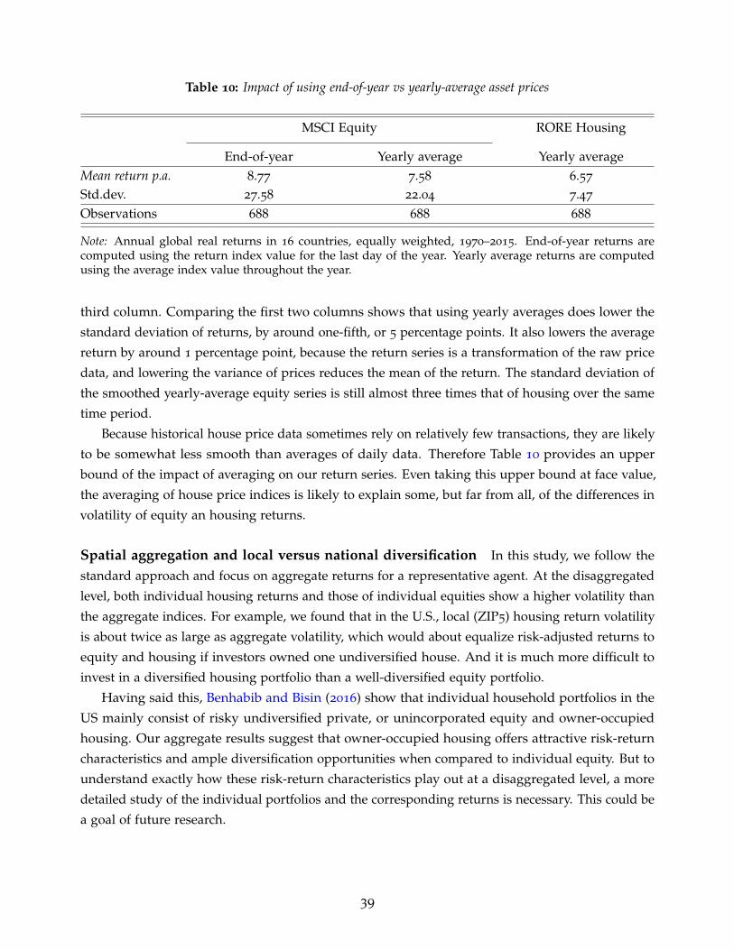
Table 10: Impact of using end-of-year vs yearly-average asset prices
MSCI Equity RORE Housing
End-of-year Yearly average Yearly averageMean return p.a. 8.77 7.58 6.57
Std.dev. 27.58 22.04 7.47
Observations 688 688 688
Note: Annual global real returns in 16 countries, equally weighted, 1970–2015. End-of-year returns arecomputed using the return index value for the last day of the year. Yearly average returns are computedusing the average index value throughout the year.
third column. Comparing the first two columns shows that using yearly averages does lower the
standard deviation of returns, by around one-fifth, or 5 percentage points. It also lowers the average
return by around 1 percentage point, because the return series is a transformation of the raw price
data, and lowering the variance of prices reduces the mean of the return. The standard deviation of
the smoothed yearly-average equity series is still almost three times that of housing over the same
time period.
Because historical house price data sometimes rely on relatively few transactions, they are likely
to be somewhat less smooth than averages of daily data. Therefore Table 10 provides an upper
bound of the impact of averaging on our return series. Even taking this upper bound at face value,
the averaging of house price indices is likely to explain some, but far from all, of the differences in
volatility of equity an housing returns.
Spatial aggregation and local versus national diversification In this study, we follow the
standard approach and focus on aggregate returns for a representative agent. At the disaggregated
level, both individual housing returns and those of individual equities show a higher volatility than
the aggregate indices. For example, we found that in the U.S., local (ZIP5) housing return volatility
is about twice as large as aggregate volatility, which would about equalize risk-adjusted returns to
equity and housing if investors owned one undiversified house. And it is much more difficult to
invest in a diversified housing portfolio than a well-diversified equity portfolio.
Having said this, Benhabib and Bisin (2016) show that individual household portfolios in the
US mainly consist of risky undiversified private, or unincorporated equity and owner-occupied
housing. Our aggregate results suggest that owner-occupied housing offers attractive risk-return
characteristics and ample diversification opportunities when compared to individual equity. But to
understand exactly how these risk-return characteristics play out at a disaggregated level, a more
detailed study of the individual portfolios and the corresponding returns is necessary. This could be
a goal of future research.
39

Leverage The volatility and returns on housing and equity for an individual investor will also be
affected by the structure of the investment portfolio, and the way this portfolio is financed. Jorda,
Schularick, and Taylor (2016a) show that advanced economies in the second half of the 20th century
experienced a boom in mortgage lending and borrowing. It is important to note that this surge
in household borrowing did not only reflect rising house prices, but also reflected substantially
increased household debt levels relative to asset values. Hence, the majority of households in
advanced economies today hold a leveraged portfolio in their local real estate market. As with
any leveraged portfolio, this significantly increases both the risk and return associated with the
investment. And today, unlike in the early 20th century, houses can be levered much more than
equities, in the U.S. and in most other countries. The benchmark rent-price ratios from the IPD
used to construct estimates of the return to housing, refer to rent-price ratios of unleveraged real
estate. Consequently, the estimates presented so far constitute only un-levered housing returns of a
hypothetical long-only investor, which is symmetric to the way we (and the literature) have treated
equities.
However, this approach is not truly symmetric for a simple fundamental reason. Computing
raw returns to housing and equity indices as above neglects the fact that an equity investment
contains embedded leverage since the underlying corporates will have balance sheets with both
debt and equity liabilities. Thus, reconciliation is needed, and two routes can be taken. First, for
truly comparable raw un-levered returns, the equity returns could be de-levered, to factor out the
embedded leverage seen on firm balance sheets. Second, alternatively, for truly comparable levered
returns, the housing returns would have to be levered up, to factor in the actual leverage (using
mortgages) seen on household balance sheets. Is this a big deal in practice? We argue that it does
not bias our conclusions significantly based on some back of the envelope calculations.
Consider, for example, the second reconciliation of levering up housing returns. Let the real long-
term safe borrowing rate be r0, let α be the leverage of the average house proxied by total mortgages
divided by the value of the housing stock. Then we can solve for levered real housing returns TR′
as a function of un-levered real housing returns TR using the formula TR′ = (TR− αr0))/(1− α).
In our data, representative long-run rounded average values we can use would be TR = 7.0% and
α = 0.2, and we can use a long bond return as a proxy for r0 of around 2.5% p.a. This would imply
TR′ = 8.1%. In other words, for the representative agent, the levered housing return is about 110
bps higher than the unlevered housing return (8.1% versus 7%), which is a small difference and
still leaves equity and housing returns roughly comparable. We conclude that this adjustment is
not consequential for the main conclusions we present in this paper. In fact, it would bolster one of
our central new claims which is that real housing returns at least match or even exceed real equity
returns in the long run when the two are compared on an equal footing.23
23For evidence on α, the average economy wide housing leverage measured by total mortgages divided bythe value of the housing stock, see Jorda, Schularick, and Taylor (2016a). If one preferred to use the mortgagerate rather than the long bond in this calculation, the evidence in Zimmermann (2017) points to an averagereal mortgage rate rm of around 3% p.a. This would imply TR′ = 8%, only slightly lower than the figurequoted in the main text.
40

7. Risky versus safe returns
Having established the general trends in each risky and safe asset class, we now turn to examine
broader patterns of returns across the different asset classes. We start by comparing returns on
risky and safe assets. Figure 13 depicts the trends in global safe and risky asset returns, again using
decadal moving averages of GDP-weighted global return series. The risky return in each country is
a weighted average of housing and equity returns, with weights corresponding to equity market
capitalization and housing wealth in each respective country. The safe return is a simple unweighted
average of bonds and bills.24 The left panel of Figure 13 shows the risky and safe asset returns, and
the right panel depicts the risk premium, calculated as the risky minus safe difference.
Both risky and safe rates were high during the 19th century but had been gradually declining
in the lead to WW1, after which they declined sharply, as is to be expected. After the war, returns
recovering during the 1920s. From 1930 onwards, the risky rate has stayed high and relatively stable,
whereas the safe rate dropped sharply and remained low until the late 1970s, before increasing
and falling back again during the past three decades. These findings have implications for current
debates around secular stagnation and the pricing, or mis-pricing, of risk.
Secular stagnation is associated with low rates of return, driven by an excess of savings or a
general unwillingness to borrow and invest. These in turn reflect a variety of potential factors,
including: (1) lower rates of productivity growth; (2) lower fertility and mortality rates; (3) a decline
in the relative price of investment goods; (4) greater firm level market power; and (5) higher income
inequality (Eggertsson, Mehrotra, and Robbins, 2017; Rachel and Smith, 2015; Thwaites, 2015).
Indeed, we can see that the safe rate fell sharply during the 1930s, when Hansen (1939) originally
proposed the secular stagnation hypothesis. That time also coincided with a demographic bust and
was preceded by a big rise in income inequality in the run-up to the Great Depression. The safe rate
has been falling again since the mid-1980s as many have noted. Understandably, this has led some
observers to suggest that advanced economies are again in danger of entering secular stagnation,
e.g., Summers (2014), and Eggertsson and Mehrotra (2014).
But the picture changes radically when we consider the trend in risky returns in addition to safe
returns. Unlike safe rates, risky rates have remained high and broadly stable through the best part
of the last 100 years, and show little sign of a secular decline. Turning back to the trend in safe asset
returns, even though the safe rate has declined recently, much as it did at the start of our sample, it
remains close to its historical average. These two observations call into question whether secular
stagnation is quite with us. The high and stable risky rate coupled with falling safe rates is also
consistent with the notion of a “safety trap” brought about by the shortage of safe assets (Caballero
and Farhi, 2017). However with risk risk premiums still not far off their historical averages, the
evidence for a safety trap is thus far also not clear-cut.
24For details on the construction of the weighted returns and the asset weights, see Section 2.3 and AppendixSection E. Appendix Section F further compares the portfolio-weighted returns to equally-weighted returns,i.e., a simple average of housing and equity.
41

Figure 13: Global real risky vs. real safe return.-6
-30
36
912
Per
cen
t
1870 1890 1910 1930 1950 1970 1990 2010
Real risky return: decadal moving averageReal safe return: decadal moving average
Risky and Safe returns
02
46
810
1214
Per
cen
t
1870 1890 1910 1930 1950 1970 1990 2010
Risk premium. Decadal moving average
Risk Premium
Note: Mean returns for 16 countries, weighted by real GDP. Decadal moving averages. Within each country,the real risky return is a weighted average of equities and housing, and safe return - of bonds and bills. Thewithin-country weights correspond to the shares of the respective asset in the country’s wealth portfolio. Riskpremium = risky return - safe return.
We now turn to examine the long-run developments in the risk premium, i.e. the spread between
safe and risky returns (right panel of Figure 13). This spread was low and stable at around 5
percentage points before WW1. It rose slightly after the WW1, before falling to an all-time low of
near zero by around 1930. The decades following the onset of the WW2 saw a dramatic widening in
the risk premium, with the spread reaching its historical high of around 14 percentage points in the
1950s, before falling back to around its historical average.
Interestingly, the period of high risk premiums coincided with a remarkably low frequency of
systemic banking crises. In fact, not a single such crisis occurred in our advanced-economy sample
between 1946 and 1973. By contrast, banking crises appear to be relatively more frequent when risk
premiums are low. This finding speaks to the recent literature on the mispricing of risk around
financial crises. Among others, Krishnamurthy and Muir (2017) argue that when risk is underpriced,
i.e. risk premiums are excessively low, severe financial crises become more likely. The long-run
trends in risk premiums presented here seem to confirm this hypothesis.
Table 11 zooms into the evolution of safe and risky asset returns across different countries and
time periods. To enable a comparison with the aggregate trends in Figure 13, we split the post–WW2
period into two subperiods: 1950–1980, when global risk premiums were high and global safe rates
low, and post-1980, which saw an initial recovery, and subsequent decline in global safe rates.
The vast majority of the countries in our sample follow similar patterns. The risky rate is largely
stable across time, even though it varies somewhat across countries: from just over 5% in Italy and
42
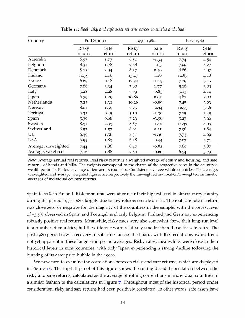
Table 11: Real risky and safe asset returns across countries and time
Country Full Sample 1950–1980 Post 1980
Riskyreturn
Safereturn
Riskyreturn
Safereturn
Riskyreturn
Safereturn
Australia 6.97 1.77 6.51 -1.34 7.74 4.54
Belgium 8.31 1.78 9.68 1.05 7.99 4.27
Denmark 8.15 2.94 8.57 0.49 6.86 4.97
Finland 10.79 2.16 13.47 1.28 12.87 4.18
France 6.69 0.48 12.33 -1.15 7.29 5.15
Germany 7.86 3.34 7.00 1.77 5.18 3.09
Italy 5.28 2.28 7.09 -0.83 5.13 4.14
Japan 6.79 1.29 10.86 0.05 4.81 3.00
Netherlands 7.23 1.31 10.26 -0.89 7.45 3.83
Norway 8.01 1.59 7.75 -2.34 10.53 3.56
Portugal 6.32 0.45 5.19 -3.30 7.15 3.45
Spain 5.30 0.68 7.23 -3.56 5.27 3.96
Sweden 8.51 2.35 8.67 -1.12 11.37 4.05
Switzerland 6.57 1.57 6.01 0.25 7.96 1.84
UK 6.39 1.56 8.31 -1.36 7.73 4.69
USA 6.99 1.85 6.28 -0.44 7.07 3.71
Average, unweighted 7.44 1.88 8.47 -0.82 7.60 3.87
Average, weighted 7.16 1.88 7.80 -0.60 6.54 3.73
Note: Average annual real returns. Real risky return is a weighted average of equity and housing, and safereturn - of bonds and bills. The weights correspond to the shares of the respective asset in the country’swealth portfolio. Period coverage differs across countries. Consistent coverage within countries. The average,unweighted and average, weighted figures are respectively the unweighted and real-GDP-weighted arithmeticaverages of individual country returns.
Spain to 11% in Finland. Risk premiums were at or near their highest level in almost every country
during the period 1950–1980, largely due to low returns on safe assets. The real safe rate of return
was close zero or negative for the majority of the countries in the sample, with the lowest level
of –3.5% observed in Spain and Portugal, and only Belgium, Finland and Germany experiencing
robustly positive real returns. Meanwhile, risky rates were also somewhat above their long-run level
in a number of countries, but the differences are relatively smaller than those for safe rates. The
post-1980 period saw a recovery in safe rates across the board, with the recent downward trend
not yet apparent in these longer-run period averages. Risky rates, meanwhile, were close to their
historical levels in most countries, with only Japan experiencing a strong decline following the
bursting of its asset price bubble in the 1990s.
We now turn to examine the correlations between risky and safe returns, which are displayed
in Figure 14. The top-left panel of this figure shows the rolling decadal correlation between the
risky and safe returns, calculated as the average of rolling correlations in individual countries in
a similar fashion to the calculations in Figure 7. Throughout most of the historical period under
consideration, risky and safe returns had been positively correlated. In other words, safe assets have
43

Figure 14: Correlations across risky asset returns-.4
-.20
.2.4
.6
1870 1890 1910 1930 1950 1970 1990 2010
Risky vs Safe
-.4-.2
0.2
.4.6
1870 1890 1910 1930 1950 1970 1990 2010
Risky r (nom.) Safe r (nom.)
Comovement with inflation
-.20
.2.4
.6.8
1870 1890 1910 1930 1950 1970 1990 2010
Risky r (real) Safe r (real)
Cross-country returns-.3
0.3
.6.9
1870 1890 1910 1930 1950 1970 1990 2010
Risk premium
Cross-country risk
Note: Rolling decadal correlations. The global correlation coefficient is the average of individual countries forthe rolling window. Cross-country correlation coefficient is the average of all country pairs for a given assetclass. Country coverage differs across time periods.
not generally provided a hedge against risk since safe returns were low when risky returns were
low—in particular during both world wars—and vice versa. This positive correlation has weakened
over the more recent decades, and turned negative from the 1990s onwards. This suggests that safe
assets have acted as a better hedge for risk during both the Great Moderation, and the recent Global
Financial Crisis.
The top-right panel of Figure 14 shows the comovement of risky and safe nominal returns
with inflation. Mirroring the findings presented in the preceding Sections, safe rates have tended
to comove more strongly with inflation, particularly during the post-WW2 period. Moving to
cross-country correlations depicted in the bottom two panels of Figure 14, historically safe rates in
44

different countries have been more correlated than risky returns. This has reversed over the past
decades, however, as cross-country risky returns have become substantially more correlated. This
seems to be mainly driven by a remarkable rise in the cross-country correlations in risk premiums,
depicted in the bottom-right panel of Figure 14. This increase in global risk comovement may pose
new challenges to the risk-bearing capacity of the global financial system, a trend consistent with
other macro indicators of risk-sharing (Jorda, Schularick, and Taylor, 2016b).
8. r versus g
Our analysis also provides insights into the debate on inequality. Piketty (2014) and Piketty and
Zucman (2014) argue that inequality and wealth-to-income ratios in advanced economies have
followed a U-shaped pattern over the past century and a half. They further hypothesize that wealth
inequality may continue to rise in the future, along with a predicted decline in the rate of economic
growth. The main theoretical argument for this comes about from a simple relation: r > g. In their
approach, a higher spread between the real rate of return on wealth, denoted r, and the rate of real
GDP growth, g, tends to magnify the steady-state level of wealth inequality.
Of course, this is not the only channel through which rates of return can impact the wealth
distribution. Rate of return differentials between asset classes can affect the wealth distribution if
there are systematic differences in the portfolio composition between rich and poor households as
Kuhn, Schularick, and Steins (2017) show, or if rates of returns vary with portfolio size as stressed
by Piketty (2014). Studying administrative Swedish data, Bach, Calvet, and Sodini (2016) find that
wealthy households earn higher returns on their portfolios, and Fagereng, Guiso, Malacrino, and
Pistaferri (2016) use Norwegian tax data to document substantial heterogeneity in wealth returns.
Rates of return on wealth are beginning to receive attention in the theoretical literature. For instance,
Benhabib and Bisin (2016) point to return differences of assets as one potential channel to explain
diverging trends between income and wealth inequality, and Garbinti, Goupille-Lebret, and Piketty
(2017) show that price effects played an important role in shaping the French wealth distribution
over the past 200 years.
To bring our data to bear on these debates, we construct a measure of the world’s real return on
wealth as a weighted average of real returns on bonds, equities and housing. We then compare this
measure to the rate of real GDP growth of economies over the long-run. Importantly, our approach
differs from Piketty (2014) in that we rely on annual returns from observed market prices for each
individual asset class, rather than implicit returns derived from aggregate balance sheet data at
selected benchmark dates.
Similarly to the risky returns in Section 7, we weigh the individual returns by the size of the
respective asset portfolio: stock market capitalization, housing wealth, and public debt (divided
equally between bonds and bills).25 Figure 15 displays the long-run trends in the global real rate of
25For details on the construction of the weighted returns and the asset weights, see Section 2.3 and AppendixSection E. Appendix Section F further compares the portfolio-weighted returns to equally-weighted returns,
45

Figure 15: Real return on wealth and real GDP growth.
-20
24
68
10P
er c
ent
1870 1890 1910 1930 1950 1970 1990 2010
Real return on wealth: decadal moving averageReal GDP growth: decadal moving average
Return on wealth and growth
-50
510
Per
cen
t
1870 1890 1910 1930 1950 1970 1990 2010
r - g gap. Decadal moving average
r minus g
Note: Mean returns and real GDP growth for 16 countries, weighted by real GDP. Decadal moving averages.Within each country, the real return on wealth is a weighted average of bonds, bills, equity and housing. Thewithin-country weights correspond to the shares of the respective asset in each country’s wealth portfolio.
return on wealth (dashed line) and the global real GDP growth rate (solid line) since the late 19th
century, again using decadal moving averages of GDP-weighted data.
Our data show that the trend long-run real rate of return on wealth has consistently been higher
than the real GDP growth rate. Over the past 150 years, the real return on wealth has substantially
exceeded real GDP growth in 13 decades, and has only been below GDP growth in the two decades
corresponding to the two world wars. That is, in peacetime, r has always exceeded g. The gap
between r and g has been persistently large. Since 1870, the weighted average return on wealth (r)
has been about 6.0%, compared to a weighted average real GDP growth rate (g) of 3.1%, with the
average r− g gap of 2.9 percentage points, which is about the same magnitude as the real GDP
growth rate itself. The peacetime gap between r and g has been around 3.6 percentage points.
The real return to wealth has varied over time, with the general long-run level of 6—7 per cent
punctuated by four major shocks: the two world wars, with WW2 also including the tail-end of the
fallout from the Great Depression; the oil shocks of the 1970s, and the recent Global Financial Crisis.
By contrast, real GDP growth rates have remained relatively stable throughout the 20th century,
with modest falls during wartime, and a reasonably prolonged elevated level during the post-WW2
reconstruction decades. Consequently, the initial difference between r and g of about 5–6 percentage
points disappeared around WW1, and after reappearing briefly in the late 1920s, remained modest
until the 1980s. After 1980, returns picked up again while growth slowed, and the gap between rand g widened, only to be moderated somewhat by the Global Financial crisis. The recent decades
with the equally-weighted return on wealth a simple average of equity, housing, and bonds.
46
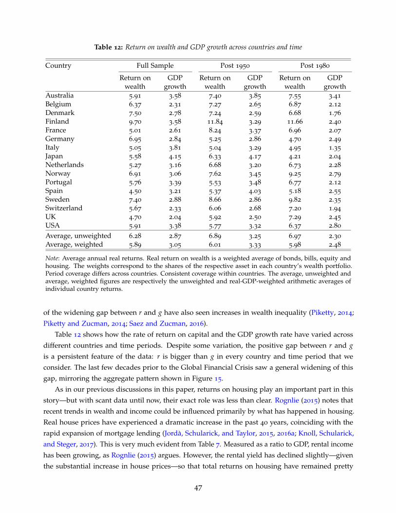
Table 12: Return on wealth and GDP growth across countries and time
Country Full Sample Post 1950 Post 1980
Return onwealth
GDPgrowth
Return onwealth
GDPgrowth
Return onwealth
GDPgrowth
Australia 5.91 3.58 7.40 3.85 7.55 3.41
Belgium 6.37 2.31 7.27 2.65 6.87 2.12
Denmark 7.50 2.78 7.24 2.59 6.68 1.76
Finland 9.70 3.58 11.84 3.29 11.66 2.40
France 5.01 2.61 8.24 3.37 6.96 2.07
Germany 6.95 2.84 5.25 2.86 4.70 2.49
Italy 5.05 3.81 5.04 3.29 4.95 1.35
Japan 5.58 4.15 6.33 4.17 4.21 2.04
Netherlands 5.27 3.16 6.68 3.20 6.73 2.28
Norway 6.91 3.06 7.62 3.45 9.25 2.79
Portugal 5.76 3.39 5.53 3.48 6.77 2.12
Spain 4.50 3.21 5.37 4.03 5.18 2.55
Sweden 7.40 2.88 8.66 2.86 9.82 2.35
Switzerland 5.67 2.33 6.06 2.68 7.20 1.94
UK 4.70 2.04 5.92 2.50 7.29 2.45
USA 5.91 3.38 5.77 3.32 6.37 2.80
Average, unweighted 6.28 2.87 6.89 3.25 6.97 2.30
Average, weighted 5.89 3.05 6.01 3.33 5.98 2.48
Note: Average annual real returns. Real return on wealth is a weighted average of bonds, bills, equity andhousing. The weights correspond to the shares of the respective asset in each country’s wealth portfolio.Period coverage differs across countries. Consistent coverage within countries. The average, unweighted andaverage, weighted figures are respectively the unweighted and real-GDP-weighted arithmetic averages ofindividual country returns.
of the widening gap between r and g have also seen increases in wealth inequality (Piketty, 2014;
Piketty and Zucman, 2014; Saez and Zucman, 2016).
Table 12 shows how the rate of return on capital and the GDP growth rate have varied across
different countries and time periods. Despite some variation, the positive gap between r and gis a persistent feature of the data: r is bigger than g in every country and time period that we
consider. The last few decades prior to the Global Financial Crisis saw a general widening of this
gap, mirroring the aggregate pattern shown in Figure 15.
As in our previous discussions in this paper, returns on housing play an important part in this
story—but with scant data until now, their exact role was less than clear. Rognlie (2015) notes that
recent trends in wealth and income could be influenced primarily by what has happened in housing.
Real house prices have experienced a dramatic increase in the past 40 years, coinciding with the
rapid expansion of mortgage lending (Jorda, Schularick, and Taylor, 2015, 2016a; Knoll, Schularick,
and Steger, 2017). This is very much evident from Table 7. Measured as a ratio to GDP, rental income
has been growing, as Rognlie (2015) argues. However, the rental yield has declined slightly—given
the substantial increase in house prices—so that total returns on housing have remained pretty
47

stable, as we have discussed. Equities display a similar pattern, with post-WW2 increases in total
returns coming from capital gains relative to dividends, but with total returns remaining pretty
stable. Much of the recent divergence between r and g seems to be coming from a prolonged period
of low productivity that started before the Global Financial Crisis (Fernald, Hall, Stock, and Watson,
2017).
Our findings also help shed light on the recent debate about the underlying causes of the
declining labor share of income, both in the US (Elsby, Hobijn, and Sahin, 2013) and globally
(Karabarbounis and Neiman, 2014) since the 1970s. According to Piketty (2014), the decline in the
labor share is simply the flip-side of the rise of capital: with the stock of wealth increasing relative
to income, so has the share of factor payments attributed to capital. But this argument hinges on a
high elasticity of substitution between capital and labor, such that the extra capital can be put to
use without a large decline in its relative price, or the rate of return. Rognlie (2015) has argued that
contrary to Piketty’s thesis, this elasticity of substitution is low once we account for net, rather than
gross income. Recent studies based on US micro-data also estimate a low substitution, including
Oberfield and Raval (2014) who use firm-level data, but also account for macroeconomic linkages
between firms.
Turning to our data, the first fact that stands out is that there is no clear and stable relationship
between r − g and g. The level of r − g was very high during the late 19th century, which was
historically a slower growth era in our sample. In the postwar period of fast growth r− g took on a
lower average value and remained fairly flat. Over these eras advanced economy growth trends gwere subject to a long rise and fall. We find that at an annual frequency correlation of r− g and g is
−0.5 in the pre-WW2 and the 1946–1970 peacetime years, but the correlation has fallen to zero in
the post-1970 era. Despite the historical negative correlation, the recent experience suggests that
falls in g might not substantially drive up the r− g gap. But equally, there is no evidence to suggest
that the gap between r and g narrows as the growth rate falls and diminishing returns kick in.
To understand the movements in the labor share, it may therefore be more informative to focus
on the return to wealth r itself, and the aggregate stock of wealth, rather than the r− g gap. On that,
the macro-historical evidence is somewhat more conclusive. As shown in Figures 15 and 13, the
returns to aggregate wealth, and to risky assets have remained relatively stable over recent decades.
But the stock of these assets has, on the contrary, increased sharply since the 1970s, as shown in
Appendix Figure A.4. The fact that this increase in the stock of wealth has not led to substantially
lower returns suggests that the elasticity of substitution between capital and labour may be high,
at least when looked at from a long-run macro-historical perspective. The precise reasons for the
differences between the macro-historical and micro-driven elasticity estimates, and the mechanisms
through which returns on wealth have remained stable while the stock of wealth has increased, all
remain fruitful avenues for further research.
48

9. Conclusion
This paper, perhaps for the first time, investigates the long history of asset returns for all the major
categories of an economy’s investable wealth portfolio. Our investigation has confirmed many of
the broad patterns that have occupied much research in economics and finance. The returns to
risky assets, and risk premiums, have been high and stable over the past 150 years, and substantial
diversification opportunities exist between risky asset classes, and across countries. Arguably the
most surprising result of our study is that long run returns on housing and equity look remarkably
similar. Yet while returns are comparable, residential real estate is less volatile on a national level,
opening up new and interesting risk premium puzzles.
Our research speaks directly to the relationship between r, the rate of return on wealth, and
g, the growth rate of the economy, that figure prominently in the current debate on inequality. A
robust finding in this paper is that r � g: globally, and across most countries, the weighted rate of
return on capital was twice as high as the growth rate in the past 150 years.
These and other discoveries set out a rich agenda for future research, by us and by others. Many
issues remain to be explored, among them determining the particular fundamentals that drive the
returns on each of the asset classes in typical economies. For now, we hope our introduction of this
new universe of asset return data can provide the evidentiary basis for new lines of exploration in
years to come.
References
Akbulut-Yuksel, Mevlude. 2014. Children of War. The Long-Run Effects of Large-Scale PhysicalDestruction and Warfare on Children. Journal of Human Resources 49(3): 634–662.
Annaert, Jan, Frans Buelens, Ludo Cuyvers, Marc De Ceuster, Marc Deloof, and Ann De Schepper.2011. Are Blue Chip Stock Market Indices Good Proxies for All-Shares Market Indices? The Caseof the Brussels Stock Exchange 1833–2005. Financial History Review 18(3): 277–308.
Annaert, Jan, Frans Buelens, and Marc De Ceuster. 2012. New Belgian Stock Market Returns:1832–1914. Explorations in Economic History 49(2): 189–204.
Bach, Laurent, Laurent E. Calvet, and Paolo Sodini. 2016. Rich Pickings? Risk, Return, and Skill inthe Portfolios of the Wealthy. CEPR Discussion Paper 11734.
Benhabib, Jess, and Alberto Bisin. 2016. Skewed Wealth Distributions: Theory and Empirics. NBERWorking Paper 21924.
Blancheton, Bertrand, Hubert Bonin, and David Le Bris. 2014. The French Paradox: A FinancialCrisis During the Golden Age of the 1960s. Business History 56(3): 391–413.
Brailsford, Tim, John C. Handley, and Krishnan Maheswaran. 2012. The Historical Equity RiskPremium in Australia: Post-GFC and 128 Years of Data. Accounting and Finance 52(1): 237–247.
Caballero, Ricardo J., and Emmanuel Farhi. 2017. The Safety Trap. Review of Economic Studies.Forthcoming.
49

Campbell, John Y. 2003. Consumption-Based Asset Pricing. In Handbook of the Economics of Finance,edited by Constantinides, G.M., M. Harris, and R. M. Stulz, volume 1, chapter 13, pp. 803–887.Cambridge, Mass.: Elsevier.
Cochrane, John H. 2009. Asset Pricing. Princeton, N.J.: Princeton University Press.
Cochrane, John H. 2011. Presidential Address: Discount Rates. Journal of Finance 66(4): 1047–1108.
Crafts, Nicholas. 2016. Reducing High Public Debt Ratios: Lessons from UK Experience. FiscalStudies 37(2): 201–223.
Diefendorf, Jeffry M. 1993. In the Wake of War: The Reconstruction of German Cities After World War II.Oxford: Oxford University Press.
Dimson, Elroy, Paul Marsh, and Mike Staunton. 2009. Triumph of the Optimists: 101 Years of GlobalInvestment Returns. Princeton, N.J.: Princeton University Press.
Eggertsson, Gauti B., and Neil R. Mehrotra. 2014. A Model of Secular Stagnation. NBER WorkingPaper 20574.
Eggertsson, Gauti B., Neil R. Mehrotra, and Jacob A. Robbins. 2017. A Model of Secular Stagnation:Theory and Quantitative Evaluation. NBER Working Paper 23093.
Elsby, Michael W. L., Bart Hobijn, and Aysegul Sahin. 2013. The Decline of the US Labor Share.Brookings Papers on Economic Activity 2013(2): 1–63.
Fagereng, Andreas, Luigi Guiso, Davide Malacrino, and Luigi Pistaferri. 2016. Heterogeneity andPersistence in Returns to Wealth. NBER Working Paper 22822.
Favilukis, Jack, Sydney C. Ludvigson, and Stijn Van Nieuwerburgh. 2017. The macroeconomiceffects of housing wealth, housing finance, and limited risk sharing in general equilibrium. Journalof Political Economy 125(1): 140–223.
Fernald, John G., Robert E. Hall, James H. Stock, and Mark W. Watson. 2017. The DisappointingRecovery of Output After 2009. NBER Working Paper 23543.
Fox, Ryan, and Peter Tulip. 2014. Is Housing Overvalued? RBA Research Discussion Paper 2014-06.
Garbinti, Bertrand, Jonathan Goupille-Lebret, and Thomas Piketty. 2017. Accounting for Wealth In-equality Dynamics: Methods, Estimates and Simulations for France (1800–2014). CEPR DiscussionPaper 11848.
Giacomini, Emanuela, David C. Ling, and Andy Naranjo. 2015. Leverage and Returns: A Cross-Country Analysis of Public Real Estate Markets. Journal of Real Estate Finance and Economics 51(2):125–159.
Giglio, Stefano, Matteo Maggiori, and Johannes Stroebel. 2015. Very Long-Run Discount Rates.Quarterly Journal of Economics 130(1): 1–53.
Goldsmith, Raymond W. 1985. Comparative National Balance Sheets: A Study of Twenty Countries,1688–1978. Chicago: University of Chicago Press.
Grossman, Richard S. 2017. Stocks for the Long Run: New Monthly Indices of British Equities,1869–1929. CEPR Discussion Paper 12042.
50

Hansen, Alvin H. 1939. Economic Progress and Declining Population Growth. American EconomicReview 29(1): 1–15.
Holston, Kathryn, Thomas Laubach, and John C. Williams. 2017. Measuring the Natural Rate ofInterest: International Trends and Determinants. Journal of International Economics 108(S1): 59–75.
Homer, Sidney, and Richard E. Sylla. 2005. A History of Interest Rates. Hoboken, N.J.: Wiley, 4thedition.
Jones, Charles M. 2002. A Century of Stock Market Liquidity and Trading Costs. Working paper,New York.
Jorda, Oscar, Moritz Schularick, and Alan M. Taylor. 2015. Betting the House. Journal of InternationalEconomics 96(S1): 2–18.
Jorda, Oscar, Moritz Schularick, and Alan M. Taylor. 2016a. The Great Mortgaging: Housing Finance,Crises and Business Cycles. Economic Policy 31(85): 107–152.
Jorda, Oscar, Moritz Schularick, and Alan M. Taylor. 2016b. Macrofinancial History and the NewBusiness Cycle Facts. In NBER Macroeconomics Annual 2016, Volume 31, edited by Martin Eichen-baum, Jonathan A. Parker, pp. 213–263. Chicago, Ill.: University of Chicago Press.
Karabarbounis, Loukas, and Brent Neiman. 2014. The Global Decline of the Labor Share. QuarterlyJournal of Economics 129(1): 61–103.
Knoll, Katharina. 2016. As Volatile As Houses: House Prices and Fundamentals in AdvancedEconomies. Unpublished.
Knoll, Katharina, Moritz Schularick, and Thomas M. Steger. 2017. No Price like Home: GlobalHouse Prices, 1870–2012. American Economic Review 107(2): 331–352.
Krishnamurthy, Arvind, and Tyler Muir. 2017. How Credit Cycles Across a Financial Crisis. NBERWorking Paper 23850.
Kuhn, Moritz, Moritz Schularick, and Ulrike I. Steins. 2017. Income and Wealth Inequality inAmerica , 1949–2013. CEPR Discussion Paper 20547.
Kuvshinov, Dmitry, and Kaspar Zimmermann. 2017. Going to the Market. Unpublished.
Le Bris, David. 2012. Wars, Inflation and Stock Market Returns in France, 1870–1945. FinancialHistory Review 19(3): 337–361.
Le Bris, David, and Pierre-Cyrille Hautcoeur. 2010. A Challenge to Triumphant Optimists? A BlueChips Index for the Paris Stock Exchange, 1854–2007. Financial History Review 17(2): 141–183.
Lustig, Hanno, Stijn Van Nieuwerburgh, and Adrien Verdelhan. 2013. The Wealth-ConsumptionRatio. Review of Asset Pricing Studies 3(1): 38–94.
Mehra, Rajnish, and Edward C. Prescott. 1985. The Equity Premium: A Puzzle. Journal of MonetaryEconomics 15(2): 145–161.
Nakamura, Emi, Jon Steinsson, Robert Barro, and Jose Ursua. 2013. Crises and Recoveries in anEmpirical Model of Consumption Disasters. American Economic Journal: Macroeconomics 5(3):35–74.
51

Nielsen, Steen, and Ole Risager. 2001. Stock Returns and Bond Yields in Denmark, 1922–1999.Scandinavian Economic History Review 49(1): 63–82.
Oberfield, Ezra, and Devesh Raval. 2014. Micro Data and Macro Technology. NBER Working Paper20452.
OECD. 2012. OECD Economic Surveys: European Union 2012. Paris: OECD Publishing.
Piketty, Thomas. 2014. Capital in the Twenty-First Century. Cambridge, Mass.: Harvard UniversityPress.
Piketty, Thomas, and Gabriel Zucman. 2014. Capital is Back: Wealth-Income Ratios in Rich Countries1700–2010. Quarterly Journal of Economics 129(3): 1255–1310.
Quinn, Dennis P., and Hans-Joachim Voth. 2008. A Century of Global Equity Market Correlations.American Economic Review 98(2): 535–540.
Rachel, Lukasz, and Thomas Smith. 2015. Secular Drivers of the Global Real Interest Rate. Bank ofEngland Working Paper 571.
Rognlie, Matthew. 2015. Deciphering the Fall and Rise in the Net Capital Share. Brookings Papers onEconomic Activity 46(1): 1–69.
Ronge, Ulrich. 2002. Die Langfristige Rendite Deutscher Standardaktien: Konstruktion eines HistorischenAktienindex ab Ultimo 1870 bis Ultimo 1959. Frankfurt am Main: Lang.
Saez, Emmanuel, and Gabriel Zucman. 2016. Wealth Inequality in the United States Since 1913:Evidence from Capitalized Income Tax Data. Quarterly Journal of Economics 131(2): 519–578.
Shumway, Tyler. 1997. The Delisting Bias in CRSP Data. Journal of Finance 52(1): 327–340.
Shumway, Tyler, and Vincent A. Warther. 1999. The Delisting Bias in CRSP’s Nasdaq Data and ItsImplications for the Size Effect. Journal of Finance 54(6): 2361–2379.
Simonnet, Francois, Georges Gallais-Hamonno, and Pedro Arbulu. 1998. Un Siecle de PlacementImmobilier. L’exemple de La Fourmi Immobiliere. Journal de la Societe Francaise de Statistique 139(2):95–135.
Summers, Lawrence H. 2014. US Economic Prospects: Secular Stagnation, Hysteresis, and the ZeroLower Bound. Business Economics 49(2): 65–73.
Thwaites, Gregory. 2015. Why are Real Interest Rates So Low? Secular Stagnation and the RelativePrice of Investment Goods. Bank of England Working Paper 564.
Williams, John C. 2016. Monetary Policy in a Low R-Star World. Federal Reserve Bank of SanFrancisco Economic Letter 2016-23.
Zimmermann, Kaspar. 2017. Breaking Banks? Bank Profitability and Monetary Policy. Unpublished.
52
Online Appendix
The Rate of Return on Everything, 1870–2015

Aggregate rates of return: Robustness checks
A. The effect of GDP weighting
Figure A.1: GDP-weighted returns
Bills
Bonds
Equity
Housing
0 2 4 6 8Mean annual return, per cent
Full sample
Bills
Bonds
Equity
Housing
0 2 4 6 8Mean annual return, per cent
Post-1950
Excess Return vs Bills Mean Annual Return
Notes: Arithmetic avg. real returns p.a., weighted by real GDP. Consistent coverage within each country.
This chart shows global average returns for the four asset classes weighted by country GDP,effectively giving greater weight to the largest economies in our sample, namely the U.S., Japan, andGermany. The overall effects are relatively minor. For the full sample, returns on equity and housingare similar at around 7% in real terms. For the post-1950 period, equities outperform housing byabout 2pp. on average. The post-1990 housing bust in Japan and the underperformance of theGerman housing market contribute to this result.
A54

B. More on sample consistencyThroughout the paper, we always use a sample that is consistent within each table and graph, thatis, for any table that shows returns on bills, bonds, equity, and housing, each yearly observation hasdata for all four asset returns. For tables showing bonds versus bills only, each yearly observationhas data on both bonds and bills, but may be missing data for equities or housing. At the sametime, returns for different countries generally cover different time periods.
Here we investigate whether adjusting for sample consistency affects our results. First, FigureA.2 plots returns for samples that are consistent both within and across countries, starting atbenchmark years. The later the benchmark year, the more countries we can include. The resultingreturn patterns confirm that the basic stylized facts reported earlier continue to hold even underthese more stringent sampling restrictions, and regardless of the time period under consideration.
Next, we consider whether going to a fully “inconsistent” sample —that is, taking the longesttime period available for each asset, without within-country consistency— would change the results.Table A.1 thus shows returns for the maximum possible sample for each asset. Table A.2, on thecontrary, shows returns for a sample that is consistent within each country, across all four assetclasses. The results in this table can be compared to Table 3 in the main text. On balance, the choiceof the sample makes almost no difference to our headline results.
Figure A.2: Consistent samples
Bills
Bonds
Equity
Housing
0 2 4 6 8Mean annual return, per cent
Post-1890 (7 countries)
Bills
Bonds
Equity
Housing
0 2 4 6 8Mean annual return, per cent
Post-1910 (12 countries)
Bills
Bonds
Equity
Housing
0 2 4 6 8Mean annual return, per cent
Post-1930 (15 countries)
Bills
Bonds
Equity
Housing
0 2 4 6 8Mean annual return, per cent
Post-1948 (16 countries)
Excess Return vs Bills Mean Annual Return
Note: Average real returns p.a. (unweighted). Consistent coverage across and within countries.
A55

Table A.1: Returns using longest possible sample for each asset
Country Bills Bonds Equity HousingAustralia 2.02 2.17 8.41 6.37
Belgium 1.62 3.01 5.89 7.89
Denmark 2.98 3.59 7.22 8.22
Finland 0.64 3.22 9.37 9.58
France -0.47 0.83 3.25 6.38
Germany 1.49 3.12 8.62 7.82
Italy 1.20 2.11 6.13 4.77
Japan 0.63 2.54 9.69 6.54
Netherlands 1.37 2.71 7.09 7.22
Norway 1.10 2.55 5.95 8.33
Portugal -0.01 2.76 3.98 6.31
Spain 0.70 1.34 5.41 5.21
Sweden 1.77 3.25 7.96 8.30
Switzerland 1.64 2.41 6.70 5.63
UK 1.16 2.29 7.10 5.36
USA 2.17 2.79 8.34 6.03
Average, unweighted 1.17 2.61 6.99 7.17
Average, weighted 1.32 2.46 7.36 6.66
Note: Average annual real returns. Longest possible sample used for each asset class, i.e. returns are notconsistent across assets or within countries. The average, unweighted and average, weighted figures arerespectively the unweighted and real-GDP-weighted arithmetic averages of individual country returns.
Table A.2: Returns using the full within-country-consistent sample
Country Bills Bonds Equity HousingAustralia 1.29 2.26 7.75 6.54
Belgium 0.70 2.87 6.78 8.64
Denmark 2.64 3.24 7.20 8.17
Finland 0.08 4.25 9.98 9.58
France -0.48 1.44 4.06 7.34
Germany 2.65 4.03 6.85 7.82
Italy 1.37 3.19 7.32 4.77
Japan 0.39 2.18 6.09 6.54
Netherlands 0.78 1.85 7.09 7.28
Norway 0.90 2.29 5.95 8.03
Portugal -0.48 1.37 4.37 6.31
Spain -0.03 1.39 5.93 5.09
Sweden 1.56 3.14 7.98 8.30
Switzerland 0.81 2.33 6.90 5.77
UK 1.15 1.96 7.20 5.36
USA 1.45 2.26 8.39 6.03
Average, unweighted 1.15 2.62 6.65 7.32
Average, weighted 1.26 2.49 7.11 6.75
Note: Average annual real returns. Returns consistent within countries, i.e. each yearly observation for acountry has data on each of the four asset classes. The average, unweighted and average, weighted figuresare respectively the unweighted and real-GDP-weighted arithmetic averages of individual country returns.
A56

C. Returns during world wars
Table A.3: Real returns on risky assets during world wars
Country World War 1 World War 2
Equity Housing Equity HousingAustralia 0.20 1.22 4.86 4.12
Belgium -3.75 -5.84 3.12 8.69
Denmark 4.98 4.35 2.85 11.75
Finland 4.68 0.55 -9.79
France -12.48 -9.37 -4.05 -1.51
Germany -12.37 -26.53 3.82
Italy -6.11
Japan 15.88
Netherlands -0.20 5.07 5.71 9.10
Norway 3.88 -1.38 0.62 2.54
Portugal -3.99 3.96
Spain -5.77 -0.71 -0.73 -4.56
Sweden -15.72 -3.93 5.56 7.89
Switzerland -11.19 -4.46 1.32 3.08
UK -4.04 -0.73 4.56
USA 0.96 0.06 4.90 8.47
Average, unweighted -3.03 -1.84 2.65 3.86
Average, weighted -3.26 -2.02 5.39 6.89
Note: Average annual real returns. We include one year from the immediate aftermath of the war, such thatWorld war 1 covers years 1914—1919, and World War 2 – 1939—1946. Period coverage differs across andwithin countries. We exclude World War 2 periods for Italy and Japan because of hyperinflation. The average,unweighted and average, weighted figures are respectively the unweighted and real-GDP-weighted arithmeticaverages of individual country returns.
The performance of different assets during the major wars is an important issue for asset pricingmodels that argue that high risk premiums on equities reflect the risk of economy-wide disasters.This argument rests on the work of Barro (2006), developed further in collaboration with EmiNakamura, John Steinsson and Jose Ursua (Barro and Ursua, 2008; Nakamura, Steinsson, Barro,and Ursua, 2013). Table A.3 shows the returns of housing and equity markets during World War 1
and World War 2. The data confirm large negative returns in different countries, especially duringWorld War 1. In both wars, housing markets tended to outperform equity, making it potentiallymore difficult to explain the large housing risk premium that we find. This being said, the positivereturns in various countries during World War 2 are in some cases influenced by price controlsaffecting our CPI measure and direct government interventions into asset markets that aimed atkeeping prices up (see Le Bris, 2012, for the case of France). Further, as we do not adjust our returnseries for changes in the housing stock, the series here underestimate the negative impact of wartimedestruction on housing investments. As a result, the war time returns shown here likely mark anupper bound, and wars can still be seen as periods with typically low returns on risky assets.
A57

D. Returns excluding world wars
Figure A.3: Returns excluding world wars, full sample
Bills
Bonds
Equity
Housing
0 2 4 6 8Mean annual return, per cent
Unweighted
Bills
Bonds
Equity
Housing
0 2 4 6 8Mean annual return, per cent
GDP-weighted
Excess Return vs Bills Mean Annual Return
Note: Average real returns p.a., excluding world wars. Consistent coverage within each country.
In Figure A.3 we exclude World War 1 and 2 from the calculation of aggregate returns, but maintainthe within country consistency of the sample, as before. As expected, excluding the wars pushes upaggregate returns somewhat, but overall risk premiums and the relative performance of the differentassets classes remain comparable.
A58

Table A.4: Real returns on bonds and bills, including and excluding world wars
Country Full Sample Excluding wars
Bills Bonds Bills BondsAustralia 1.29 2.24 1.73 2.65
Belgium 1.16 3.01 1.77 3.65
Denmark 3.08 3.58 3.80 4.39
Finland 0.64 3.22 2.17 5.34
France -0.47 1.54 0.89 3.11
Germany 1.51 3.15 2.46 4.06
Italy 1.20 2.53 2.63 4.23
Japan 0.68 2.54 1.85 3.80
Netherlands 1.37 2.71 2.22 3.70
Norway 1.10 2.55 1.91 3.56
Portugal -0.01 2.23 0.94 3.30
Spain -0.04 1.41 1.17 2.73
Sweden 1.77 3.25 2.59 4.39
Switzerland 0.89 2.41 1.67 3.47
UK 1.16 2.29 2.03 3.22
USA 2.17 2.79 2.93 3.54
Average, unweighted 1.13 2.61 2.18 3.83
Average, weighted 1.31 2.49 2.24 3.50
Note: Average annual real returns. Returns excluding wars omit periods 1914—1919 and 1939—1947. Periodcoverage differs across countries. Consistent coverage within countries. The average, unweighted and average,weighted figures are respectively the unweighted and real-GDP-weighted arithmetic averages of individualcountry returns.
Table A.4 displays country returns for bills and bonds including and excluding war periods. Theeffect on returns on bonds and bills, both weighted and unweighted, is substantial. The rate ofreturn on bills almost doubles in real terms when the two war windows are excluded, and returnson bonds jump by about 1 percentage point.
A59

Table A.5: Real returns on equity and housing, including and excluding world wars
Country Full Sample Excluding wars
Equity Housing Equity HousingAustralia 7.81 6.37 8.50 6.95
Belgium 6.23 7.89 7.47 8.73
Denmark 7.22 8.10 7.71 7.91
Finland 9.98 9.58 11.66 11.31
France 3.25 6.54 4.87 8.00
Germany 6.85 7.82 7.01 8.13
Italy 7.32 4.77 6.67 4.51
Japan 6.09 6.54 6.85 6.79
Netherlands 7.09 7.28 7.53 7.22
Norway 5.95 8.03 6.39 8.85
Portugal 4.37 6.31 4.37 6.31
Spain 5.46 5.21 6.49 6.41
Sweden 7.98 8.30 9.48 8.97
Switzerland 6.71 5.63 8.25 6.44
UK 7.20 5.36 8.03 5.57
USA 8.39 6.03 9.20 6.14
Average, unweighted 6.60 7.25 7.45 7.87
Average, weighted 7.04 6.69 7.75 7.06
Note: Average annual real returns. Returns excluding wars omit periods 1914—1919 and 1939—1947. Periodcoverage differs across countries. Consistent coverage within countries. The average, unweighted and average,weighted figures are respectively the unweighted and real-GDP-weighted arithmetic averages of individualcountry returns.
In Table A.5 we look at the performance of risky assets for the full sample and excluding warperiods. The effects are visible, but less strong than in the case of bonds and bills before. Excludingwar years pushes up returns on equity and housing by 50 to 80 basis points. These effects are largelyindependent of the GDP-weighting.
A60

Table A.6: Real risky and safe asset returns, including and excluding world wars
Country Full Sample Excluding wars
Risky return Safe return Risky return Safe returnAustralia 6.97 1.77 7.47 2.20
Belgium 8.31 1.78 8.53 2.58
Denmark 8.15 2.94 8.01 3.78
Finland 10.79 2.16 12.60 3.55
France 6.69 0.48 7.60 2.01
Germany 7.86 3.34 8.14 3.36
Italy 5.28 2.28 4.97 2.94
Japan 6.79 1.29 7.11 2.08
Netherlands 7.23 1.31 7.31 2.39
Norway 8.01 1.59 8.81 2.55
Portugal 6.32 0.45 6.32 0.45
Spain 5.30 0.68 6.18 1.96
Sweden 8.51 2.35 9.49 3.41
Switzerland 6.57 1.57 7.43 2.50
UK 6.39 1.56 6.84 2.44
USA 6.99 1.85 7.33 2.65
Average, unweighted 7.44 1.88 8.07 2.93
Average, weighted 7.16 1.88 7.59 2.79
Note: Average annual real returns. Returns excluding wars omit periods 1914—1919 and 1939—1947. Realrisky return is a weighted average of equity and housing, and safe return - of bonds and bills. The weightscorrespond to the shares of the respective asset in the country’s wealth portfolio. Period coverage differsacross countries. Consistent coverage within countries. The average, unweighted and average, weightedfigures are respectively the unweighted and real-GDP-weighted arithmetic averages of individual countryreturns.
Table A.6 underlines the outperformance of risky assets once we exclude the wars. Average safereturns are about 1 percentage point lower in the full sample, relative to the sample that excludewar years. By contrast, risky returns only rise by between 40 and 60 basis points when we excludewars. As discussed above the measurement of returns in wars is problematic and we are inclinednot to read too much into the relative outperformance of risky assets in war times.
A61
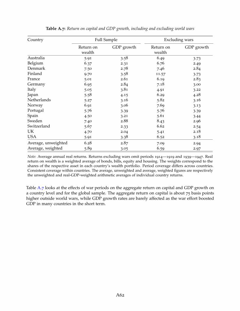
Table A.7: Return on capital and GDP growth, including and excluding world wars
Country Full Sample Excluding wars
Return onwealth
GDP growth Return onwealth
GDP growth
Australia 5.91 3.58 6.49 3.73
Belgium 6.37 2.31 6.76 2.49
Denmark 7.50 2.78 7.46 2.84
Finland 9.70 3.58 11.57 3.73
France 5.01 2.61 6.19 2.83
Germany 6.95 2.84 7.18 3.00
Italy 5.05 3.81 4.91 3.22
Japan 5.58 4.15 6.29 4.28
Netherlands 5.27 3.16 5.82 3.16
Norway 6.91 3.06 7.69 3.13
Portugal 5.76 3.39 5.76 3.39
Spain 4.50 3.21 5.61 3.44
Sweden 7.40 2.88 8.43 2.96
Switzerland 5.67 2.33 6.62 2.54
UK 4.70 2.04 5.41 2.18
USA 5.91 3.38 6.52 3.18
Average, unweighted 6.28 2.87 7.09 2.94
Average, weighted 5.89 3.05 6.59 2.97
Note: Average annual real returns. Returns excluding wars omit periods 1914—1919 and 1939—1947. Realreturn on wealth is a weighted average of bonds, bills, equity and housing. The weights correspond to theshares of the respective asset in each country’s wealth portfolio. Period coverage differs across countries.Consistent coverage within countries. The average, unweighted and average, weighted figures are respectivelythe unweighted and real-GDP-weighted arithmetic averages of individual country returns.
Table A.7 looks at the effects of war periods on the aggregate return on capital and GDP growth ona country level and for the global sample. The aggregate return on capital is about 75 basis pointshigher outside world wars, while GDP growth rates are barely affected as the war effort boostedGDP in many countries in the short term.
A62

E. The global asset portfolio
Figure A.4: Assets considered in this study as a share of GDP0
12
34
1870 1890 1910 1930 1950 1970 1990 2010Year
Bonds & Bills Housing Equity
Note: Average of asset-to-GDP shares in individual countries, weighted by real GDP. Equity is the total stockmarket capitalization. Housing is the stock of housing wealth. Bonds and bills are the stock of public debt.
This section briefly presents the asset portfolio data used to calculate the weighted risky and safeasset returns, and the overall rate of return on capital. As outlined in Section 2.3, we weight theindividual asset returns within each country according to the market-capitalization shares of therespective asset types in the country’s investible wealth portfolio, to arrive at these composite returnmeasures. (Thus, by this choice of method, significant non-market asset weights are not included,notably non-traded equity wealth.)
We measure equity wealth as the stock market capitalization of the specific country, using thenewly collected data from Kuvshinov and Zimmermann (2017). These data strive to measure thetotal size of the domestic stock market, excluding foreign-owned companies, and aggregating acrossmultiple stock exchanges within the country, excluding cross listings, at each year in the historicalsample. Due to data limitations we have had to rely on data for individual markets for a number ofcountries and historical periods (e.g., only counting the Lisbon listings, but not the Porto listingsfor Portugal), and rely on interpolation to construct some of the early annual estimates. The stockmarket capitalization data are sourced from a wide variety of publications in academic journals,historical statistical publications, and disaggregated data on stock listings and company reports oflisted firms.
To measure the value of housing wealth for each country, we went back to the historicalnational wealth data to trace the value of buildings and the underlying land over the past 150 years.
A63

We heavily relied on the national wealth estimates by Goldsmith (Garland and Goldsmith, 1959;Goldsmith, 1962, 1985) as well as the on the collection of national wealth estimates from Piketty andZucman (2014) for the pre-WW2 period. We also drew upon the work of economic and financialhistorians, using the national wealth estimates of Stapledon (2007) for Australia, Abildgren (2016) forDenmark, Artola Blanco, Bauluz, and Martınez-Toledano (2017) for Spain, Waldenstrom (2017) forSweden, and Saez and Zucman (2016) for the US. For the postwar decades, we turned to publishedand unpublished data from national statistical offices such as the U.K. Office of National Statisticsor Statistics Netherlands (1959). Particularly for the earlier periods, many of the sources providedestimates for benchmark years rather than consistent time series of housing wealth. In these cases,we had to use interpolation to arrive at annual estimates.
We use total public debt from the latest vintage of the long-run macrohistory database (Jorda,Schularick, and Taylor, 2016) as a proxy for the stock of bonds and bills, and divide public debtequally between these two financial instruments.
The broad patterns in the asset holdings show that housing has been the dominant asset inthe countries’ portfolios throughout the sample. Public debt, and returns on bonds and bills, havetended to increase in size after wars, and most recently after the Global Financial Crisis. The stockmarket has tended to be small relative to housing, but has increased in size during the last severaldecades. The last four decades have also seen a marked increase in the aggregate stock of assetspictured in Figure A.4, in line with the findings of Piketty and Zucman (2014), who cover a broaderselection of assets, but have fewer countries and observations in their sample.
A64

F. Equally-weighted portfolio returns
Table A.8: Equally-weighted portfolio returns
Country Portfolio weights Equal weights
Risky return Return onwealth
Risky return Return onwealth
Australia 6.97 5.91 7.14 5.51
Belgium 8.31 6.37 7.71 6.10
Denmark 8.15 7.50 7.69 6.21
Finland 10.79 9.70 9.78 7.94
France 6.69 5.01 5.70 4.28
Germany 7.86 6.95 7.33 6.23
Italy 5.28 5.05 6.04 5.09
Japan 6.79 5.58 6.31 4.94
Netherlands 7.23 5.27 7.18 5.40
Norway 8.01 6.91 6.99 5.42
Portugal 6.32 5.76 5.34 4.02
Spain 5.30 4.50 5.51 4.14
Sweden 8.51 7.40 8.14 6.48
Switzerland 6.57 5.67 6.33 5.00
UK 6.39 4.70 6.28 4.84
USA 6.99 5.91 7.21 5.56
Average, unweighted 7.44 6.28 6.99 5.53
Average, weighted 7.16 5.89 6.93 5.45
Note: Average annual real returns for the full sample. The portfolio-weighted averages use country-specificstocks of housing, equity, bonds and bills as weights for the individual asset returns. Portfolio-weighted riskyreturn is a weighted average of housing and equity, using stock market capitalization and hosuing wealth asweights. Portfolio-weighted real return on wealth is a weighted average of equity, housing, bonds and bills,using stock market capitalization, housing wealth and public debt stock as weights. Equally-weighted riskyreturn is an unweighted average of housing an equity. Equally-weighted return on wealth is an unweightedaverage of housing, equity and bonds. Period coverage differs across countries. Consistent coverage withincountries. The average, unweighted and average, weighted figures are respectively the unweighted andreal-GDP-weighted arithmetic averages of individual country returns.
Table A.8 assesses the impact of portfolio weighting on our return estimates. The weighting hasa relatively small impact on the risky rates, because returns on housing and equity are generallysimilar. It raises the return on capital by around one percentage point, because the outstanding stockof public debt is substantially smaller than that of risky assets. The basic stylized facts of r � g,and high long-run risky returns continue to hold regardless of the weighting, both on average andacross the individual countries in our sample.
A65

G. US Dollar returns
Table A.9: Global real returns for a US-Dollar investor
Real returns Nominal Returns
Bills Bonds Equity Housing Bills Bonds Equity Housing
Full sample:
Mean return p.a. 1.87 3.44 7.84 8.11 4.44 5.98 10.54 10.91
Std.dev. 12.12 15.60 25.08 15.83 11.70 14.91 25.35 16.19
Geometric mean 1.08 2.23 4.94 6.91 3.71 4.90 7.68 9.70
Mean excess return p.a. 0.23 1.80 6.20 6.47
Std.dev. 11.30 14.71 24.72 15.82
Geometric mean -0.46 0.73 3.37 5.28
Observations 1739 1739 1739 1739 1739 1739 1739 1739
Post-1950:
Mean return p.a. 2.13 3.99 9.45 8.91 5.74 7.61 13.20 12.75
Std.dev. 10.59 13.78 26.15 14.92 10.97 13.90 26.67 15.36
Geometric mean 1.59 3.10 6.36 7.93 5.18 6.74 10.13 11.74
Mean excess return p.a. 0.80 2.66 8.12 7.58
Std.dev. 10.58 13.82 25.91 15.03
Geometric mean 0.25 1.74 5.05 6.56
Observations 1016 1016 1016 1016 1016 1016 1016 1016
Note: Global average US-Dollar returns, equally weighted. Real returns subtract US inflation. Excess returnsare over US Treasury bills. Period coverage differs across countries. Consistent coverage within countries.
Table A.9 shows nominal and real returns from the perspective of a US-Dollar investor. The Tablecan be directly compared to Table 3 in the paper. Overall, calculating returns in dollars increasestheir volatility, since returns now also fluctuate with nominal exchange rate movements. It also addsup to 1 percentage point to the local currency returns reported in Table 3. The higher average returnis, for the most part, driven by the higher volatility—exchange rate movements amplify both positiveand negative returns, but because returns are on average positive, the average return increases. Theeffects are stronger after World War 2, going hand-in-hand with the greater exchange rate volatilityafter the collapse of the Bretton Woods system.
A66

Table A.10: USD returns by country
Country Bills Bonds Equity HousingAustralia 1.69 2.51 8.48 7.20
Belgium 0.81 3.19 7.29 8.83
Denmark 3.41 4.00 7.87 8.94
Finland 1.83 6.39 11.93 11.90
France 1.05 3.04 5.21 9.10
Germany 4.25 5.74 8.41 9.61
Italy 2.74 4.70 8.64 6.26
Japan 2.25 4.03 7.84 8.61
Netherlands 1.79 2.86 7.94 8.60
Norway 1.58 2.98 7.05 8.81
Portugal 0.10 1.98 5.71 6.96
Spain 0.85 2.28 6.87 6.30
Sweden 2.02 3.58 8.56 8.81
Switzerland 1.97 3.55 7.74 7.06
UK 1.87 2.72 8.02 6.15
USA 1.45 2.26 8.39 6.03
Average, unweighted 2.00 3.53 7.60 8.33
Average, weighted 1.98 3.25 7.84 7.57
Note: Average annual real US-Dollar returns. Calculated as nominal US-Dollar return minus US inflation.Period coverage differs across countries. Consistent coverage within countries. The average, unweighted andaverage, weighted figures are respectively the unweighted and real-GDP-weighted arithmetic averages ofindividual country returns.
In Table A.10 we display Dollar returns for individual asset classes and individual countries for thefull sample. For US-Dollar based fixed income investors, Germany and Finland offered the highestreturns. In housing markets, Germany and Finland again stand out, and high returns are seen inBelgium, France, Netherlands and the Scandinavian countries. In equity markets, Finland, Italy andSweden were the best performing markets.
A67

H. Risky returns ranked by country
Table A.11: Risky returns ranked by country
Country Full sample Post-1950 Post-1980
Finland 10.79 12.99 12.87
Sweden 8.51 10.21 11.37
Belgium 7.60 8.72 7.99
Denmark 8.09 7.86 6.86
Norway 8.01 9.26 10.53
Germany 7.86 5.81 5.18
Average, unweighted 7.44 8.07 7.60
Netherlands 7.23 8.79 7.45
USA 6.99 6.88 7.07
Australia 6.97 8.45 7.74
Japan 6.79 7.04 4.81
France 6.69 9.68 7.29
Switzerland 6.57 7.13 7.96
UK 6.39 7.88 7.73
Portugal 6.32 6.06 7.15
Spain 5.30 6.03 5.27
Italy 5.28 5.80 5.13
Note: Average annual real risky returns. Real risky return is a weighted average of equity and housing. Theweights correspond to the shares of the respective asset in the country’s wealth portfolio. Period coveragediffers across countries. Consistent coverage within countries. The figure is the unweighted arithmetic averageof individual country returns.
In Table A.11 we rank risky returns in the different countries. We calculate risky returns as acombination of equity and housing weighted by the share of each asset in the country’s totalwealth portfolio. North-western Europe—essentially the Scandinavian countries plus Germany andBelgium—stands out as the region with the highest aggregate returns on risky assets. The U.S.returns are about average, while the southern European countries have comparatively low long-runreturns.
A68

I. Returns before the Global Financial Crisis
Table A.12: Asset returns before the Global Financial Crisis
Country Bills Bonds Equity HousingAustralia 1.30 1.95 8.28 6.49
Belgium 1.32 2.86 6.07 8.22
Denmark 3.31 3.56 6.81 8.67
Finland 0.76 3.10 10.64 9.96
France -0.46 1.17 3.14 6.68
Germany 1.64 3.13 6.94 7.80
Italy 1.30 2.24 8.26 5.32
Japan 0.74 2.51 6.20 6.88
Netherlands 1.48 2.50 7.11 7.77
Norway 1.14 2.41 6.15 8.14
Portugal -0.00 1.64 5.71 7.19
Spain 0.01 0.95 5.84 5.89
Sweden 1.86 3.09 7.87 8.32
Switzerland 0.99 2.17 6.81 5.40
UK 1.32 2.16 7.52 5.67
USA 2.36 2.65 8.47 6.22
Average, unweighted 1.23 2.42 6.73 7.49
Average, weighted 1.43 2.34 7.14 6.90
Note: Average annual real returns excluding the Global Financial Crisis (i.e. sample ends in 2007). Periodcoverage differs across countries. Consistent coverage within countries. The average, unweighted and average,weighted figures are respectively the unweighted and real-GDP-weighted arithmetic averages of individualcountry returns.
This Table cuts the sample off in 2007, i.e., before the Global Financial Crisis. Comparing this tableto Tables 4 and 5 in the main text shows that the effects are relatively minor. The crisis only shavesoff about 10-20 basis points from equity and housing returns, and adds about 10 basis points to billsand bonds.
A69
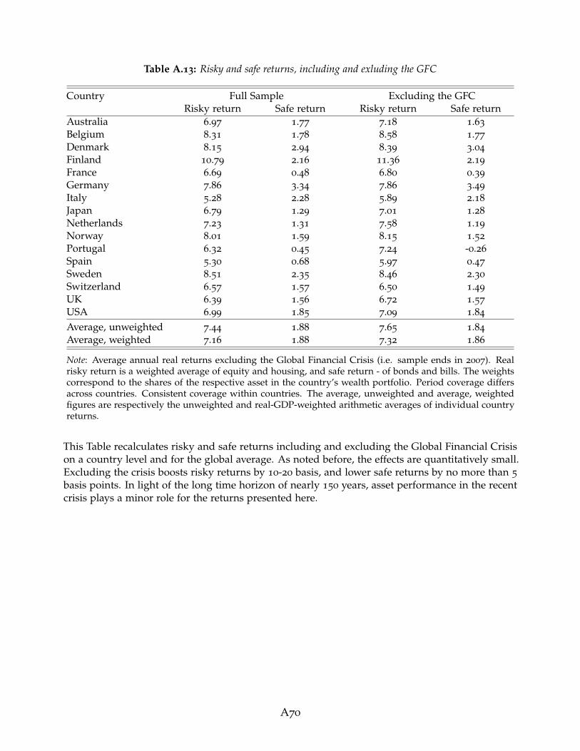
Table A.13: Risky and safe returns, including and exluding the GFC
Country Full Sample Excluding the GFCRisky return Safe return Risky return Safe return
Australia 6.97 1.77 7.18 1.63
Belgium 8.31 1.78 8.58 1.77
Denmark 8.15 2.94 8.39 3.04
Finland 10.79 2.16 11.36 2.19
France 6.69 0.48 6.80 0.39
Germany 7.86 3.34 7.86 3.49
Italy 5.28 2.28 5.89 2.18
Japan 6.79 1.29 7.01 1.28
Netherlands 7.23 1.31 7.58 1.19
Norway 8.01 1.59 8.15 1.52
Portugal 6.32 0.45 7.24 -0.26
Spain 5.30 0.68 5.97 0.47
Sweden 8.51 2.35 8.46 2.30
Switzerland 6.57 1.57 6.50 1.49
UK 6.39 1.56 6.72 1.57
USA 6.99 1.85 7.09 1.84
Average, unweighted 7.44 1.88 7.65 1.84
Average, weighted 7.16 1.88 7.32 1.86
Note: Average annual real returns excluding the Global Financial Crisis (i.e. sample ends in 2007). Realrisky return is a weighted average of equity and housing, and safe return - of bonds and bills. The weightscorrespond to the shares of the respective asset in the country’s wealth portfolio. Period coverage differsacross countries. Consistent coverage within countries. The average, unweighted and average, weightedfigures are respectively the unweighted and real-GDP-weighted arithmetic averages of individual countryreturns.
This Table recalculates risky and safe returns including and excluding the Global Financial Crisison a country level and for the global average. As noted before, the effects are quantitatively small.Excluding the crisis boosts risky returns by 10-20 basis, and lower safe returns by no more than 5
basis points. In light of the long time horizon of nearly 150 years, asset performance in the recentcrisis plays a minor role for the returns presented here.
A70

Data appendix
J. Data overview
Table A.14: Overview of bill and bond data
Country Bills Bonds
Period Type of rate Period Type of bond
Australia 1870–1928 Deposit rate 1900–1968 Long maturity, central gov’t1929–1944 Money market rate 1969–2015 Approx. 10y, central gov’t1948–2015 Government bill rate
Belgium 1870–1899 Central bank discount rate 1870–1913 Perpetual1900–1964 Deposit rate 1914–1940 Long maturity, central gov’t1965–2015 Government bill rate 1941–1953 Perpetual
1954–2015 Approx. 10y, central gov’t
Denmark 1875–2015 Money market rate 1870–1923 Perpetual1924–1979 Long maturity, central gov’t1980–2015 Approx. 10y, central gov’t
Finland 1870–1977 Money market rate 1870–1925 Long maturity, central gov’t1978–2015 Interbank rate 1926–1991 Approx. 5y, central gov’t
1992–2015 Approx. 10y, central gov’t
France 1870–1998 Money market rate 1870–1969 Perpetual1999–2015 Government bill rate 1970–2015 Long maturity, central gov’t
Germany 1870–1922 Money market rate 1870–1878 Long maturity, local gov’t1924–1944 Interbank rate 1879–1943 Long maturity, central gov’t1950–2015 Money market rate 1948–1955 Mortgage bond
1956–2015 Long maturity, central gov’t
Italy 1870–1977 Money market rate 1870–1913 Perpetual1978–2015 Government bill rate 1914–1954 Long maturity, central gov’t
1955–2015 Approx. 10y, central gov’t
Japan 1876–1956 Deposit rate 1881–1970 Long maturity, central gov’t1957–2015 Money market rate 1971–2015 Approx. 10y, central government
Netherlands 1870–1957 Money market rate 1870–1899 Perpetual1958–1964 Central bank discount rate 1900–1987 Long maturity, central gov’t1965–2015 Money market rate 1988–2015 Approx. 10y, central government
Norway 1870–2015 Deposit rate 1870–1919 Long maturity, central gov’t1920–2015 Approx. 10y, central gov’t
Portugal 1880–1914 Money market rate 1870–1974 Long maturity, central gov’t1915–1946 Central bank discount rate 1975–2015 Approx. 10y, central gov’t1947–1977 Deposit rate1978–2015 Money market rate
Spain 1870–1921 Money market rate 1900–1990 Long maturity, central gov’t1922–1974 Deposit rate 1991–2015 Approx. 10y, central government1975–2015 Money market rate
Sweden 1870–1998 Deposit rate 1874–1918 Long maturity, central gov’t1999–2015 Government bill rate 1919–1949 Perpetual
1950–2015 Approx. 10y, central gov’t
Switzerland 1870–1968 Deposit rate 1900–1984 Long maturity, central gov’t1969–2015 Money market rate 1985–2015 Approx. 10y, central gov’t
United Kingdom 1870–2015 Money market rate 1870–1901 Perpetual1902–1979 Long maturity, central gov’t1980–2015 Approx. 10y, central gov’t
United States 1870–2013 Deposit rate 1870–1926 Approx. 10y, central gov’t2014–2015 Money market rate 1927–2015 Long maturity, central gov’t
A71

Table A.15: Overview of equity and housing data
Country Equity Housing
Period Coverage Weighting Period Coverage
Australia 1870–1881 Listed abroad Market cap 1901–2015 Urban1882–2015 Broad Market cap
Belgium 1870–2015 All share Market cap 1890–1950 Urban1951–1961 Mixed1977–2015 Nationwide
Denmark 1893–1914 Broad Book cap 1876–1964 Mixed1915–1999 Broad Market cap 1965–2015 Nationwide2000–2015 Blue chip Market cap 1965–2015 Nationwide
Finland 1896–1911 Broad Book cap 1920–1964 Urban1912–1969 All share Market cap 1965–1969 Mixed1970–1990 Broad Market cap 1970–2015 Nationwide1991–2015 All share Market cap
France 1870–2015 Blue chip Market cap 1871–1935 Urban1936–1948 Mixed1949–2015 Nationwide
Germany 1870–1913 All share Market cap 1871–1912 Mixed1914–1959 Blue chip Market cap 1913–1938 Urban1960–2015 Broad Market cap 1939–1947 Mixed
1948–1970 Nationwide1971–2015 Mixed
Italy 1870–1887 Selected stocks Book cap 1928–1998 Urban1888–2015 Broad Market cap 1999–2015 Mixed
Japan 1882–1975 Broad Transaction volume 1931–1946 Urban1976–2004 All share Mix of equal and market cap 1947–2015 Mixed2005–2015 Broad Market cap
Netherlands 1900–2015 Broad Mostly market cap 1871–1969 Mixed
Norway 1881–1914 All share Market cap 1871–2015 Urban1915–1955 All share Mix of equal and book cap1956–2000 All share Mix of book cap and com-
pany turnover2001–2015 Blue chip Market cap
Portugal 1871–1987 All share Market cap 1948–2015 Mixed1988–2015 Blue chip Market cap
Spain 1900–1969 All share Market cap 1901–1957 Mixed1970–1987 Blue chip Market cap 1958–2015 Nationwide1988–2015 All share Market cap
Sweden 1871–2015 Broad Market cap 1883-1959 Urban1960–2015 Mixed
Switzerland 1900–1925 All share Market cap 1902–1930 Urban1926–1959 Broad Equally weighted 1931–1940 Mixed1960–2015 Broad Market cap 1941–2015 Nationwide
United Kingdom 1870–1928 All share Market cap 1900–1913 Mixed1929–1963 Blue chip Market cap 1914–1929 Urban1964–2015 All share Market cap 1930–1946 Mixed
1947–2015 Nationwide
United States 1872–2015 Broad Market cap 1891–1952 Urban1953–2015 Mixed
A72
K. Housing returnsThis section details construction of the rental yield series for each country. For details on the houseprice data, please see Knoll, Schularick, and Steger (2017).
As described in Section 2.3, the baseline housing return series is constructed using the rent-priceapproach. To do this, we take a benchmark net rent-price ratio—adjusted down for maintenance andother costs—in the year 2012, 2013 or 2014, and extrapolate it back using growth in the house priceand rent indices. For this purpose, we use the house price index presented by Knoll, Schularick,and Steger (2017) and the rent index introduced in Knoll (2016). We further check the rent-priceapproach estimates against various alternative historical benchmarks. These include the balancesheet approach constructed from National Accounts data (see Section 6.2 for more detail on thismethod), and independent estimates from books, journal articles and historical newspapers.
If the rent-price approach estimate differs substantially from those in the alternative sources, weadjust it so that the estimates are in line with each other. We do not adjust the series when thesedifferences are small, or we have good reasons to doubt the quality of the alternative estimates.When we do adjust, we either benchmark our series to historical net rent-price ratios from alternativesources, or adjust the growth in the rental index by a multiplicative factor, such that the differentestimates of historical rent-price ratios are broadly in line with each other.
In each of the Appendix Figures A.5—A.20, the series that we use in the paper are the “Rent-priceratio, final series” estimates denoted as green circles. These incorporate any adjustments made tobring the data into line with historical sources. Alongside these, we also present the raw unadjustedrent-price approach series—orange circles—and the alternative historical estimates themselves. Wealso show alternative benchmark estimates for the present day to help assess the reliability of ourbaseline IPD rent-price ratio. These are generally sourced from data on rental expenditure andproperty values on Numbeo.com, for one- and three-bedroom apartments i). within city-centres andii). in the rest of the country, and are adjusted down by us to proxy the impact of running costsand depreciation. For cases where data on running costs and depreciation were not available, weestimate these to be about one-third of gross rent, in line with the recent and historical experiencein most countries (see Figure 9). For Australia and USA, we additionally make use of benchmarkrent-price ratio estimates based on detailed transaction-level data. In two countries—Australia andBelgium—we judge one of these alternative modern-day benchmarks to be more reliable than theIPD ratio, and use it to construct our final baseline net rent-price ratio series.
A73

Australia
Figure A.5: Australia: plausibility of rent-price ratio
0.0
2.0
4.0
6.0
8.1
Ren
t-pric
e ra
tio
1900 1910 1920 1930 1940 1950 1960 1970 1980 1990 2000 2010 2020
Rent-price ratio, final series
Unadjusted estimates, rent-price approach
Numbeo (city centers)
Numbeo (rest of the country)
IPD
Balance sheet approach
For 2014, Fox and Tulip (2014) report a gross rental yield of 4.2 per cent, running costs excludingtaxes and utilities of 1.1 per cent, and depreciation rate of 1.1 per cent, using data covering almostall properties advertized for rent in major Australian cities. This gives us a benchmark net rent-priceratio of 0.02. Applying the rent-price approach to this benchmark gives us the unadjusted long-runnet rent-price ratio series depicted as orange circles in in Figure A.5. We make one adjustmentto these series to correct for possible mismeasurement of rental growth when lifting the wartimeprice controls in 1949/50 (see below for details). This gives us the adjusted final rent-price ratioseries—the green-circled line in Figure A.5—used in this paper.
We obtain several scattered independent estimates of rent-price ratios in Australia. First, theIPD database (MSCI, 2016) reports a net rent-price ratio of 0.032 for the Australian residential realestate in 2013 (black square in Figure A.5). Balance sheet approach estimates (brown triangles) areobtained using a variety of sources. OECD (2016b), Stapledon (2007), Australian Bureau of Statistics(2014) and Butlin (1985) provide estimates of gross rental expenditure and various maintenanceand running costs, as well as depreciation, for present-day and historical periods. As with thebenchmark yield calculation, we subtract all non-tax and non-utilities related running costs, plusdepreciation, to calculate total net rental expenditure. We then combine it with the housing wealthdata from Stapledon (2007) and Piketty and Zucman (2014) to calculate the net rental yield.
The historical balance-sheet approach estimates are broadly in line with the unadjusted rent-priceapproach series (orange circles) over recent decades, but below it for the earlier years. Note that thelong-run rent-price ratio shows a structural break in 1949/1950 stemming from a surge in houseprices after the lifting of wartime price controls in 1949 (price controls for houses and land wereintroduced in 1942). While the abandonment of price controls undoubtedly had an effect on house
A74

prices, it is unclear whether it also resulted in a single sudden shift in the relationship betweenhouse prices and rents. To guard against measurement uncertainty, we benchmark our historicalrent-price ratio to the balance sheet approach estimate in 1949. Figure A.5 shows that the adjustedlong-run rent price ratio—the green circle line—generally concords with the balance-sheet approachestimates, being on average slightly lower during 1900–1940, and higher during 1950–1980.
Finally, modern-day gross rental yield estimates are available from Numbeo.com for one- andthree-bedroom apartments i). within city-centres and ii). in the rest of the country. We adjust thesedown using the cost estimates from Fox and Tulip (2014) to obtain a proxy of net yield. The resultingestimates fall in-between those of the MSCI (2016), and the other approaches.
Belgium
Figure A.6: Belgium: plausibility of rent-price ratio
0.0
2.0
4.0
6.0
8.1
Ren
t-pric
e ra
tio
1890 1900 1910 1920 1930 1940 1950 1960 1970 1980 1990 2000 2010 2020
Rent-price ratio, final series
Numbeo (city centers)
Numbeo (rest of the country)
IPD
HBO and Statbel
Balance sheet approach
We construct the benchmark rent-price ratio using the rental yield data from Numbeo.com, takingthe average of in- and out-of-city-centre apartments, and adjusting down one-third to accountfor running costs and depreciation. This gives us a benchmark net rent-price ratio of 0.033 for2012. Applying the rent-price approach gives us the long-run net rent-price ratio series depictedas green circles in Figure A.6, which are the estimates used in this paper. Please note that thebenchmark rent-price ratio from the IPD (MSCI, 2016)—0.045 for 2012—is substantially higher thanthe alternative approaches, which is why we rely on estimates from Numbeo.com instead.
We construct four independent estimates of rent-price ratios. First, for 1978–2010, StatisticsBelgium publish estimates of average rental expenditure and house prices (Statistics Belgium,2013b, 2015). Assuming around one-third of gross rent is spent on maintenance, running costs anddepreciation, this gives us a series of net rent-price ratios, depicted as square dots in Figure A.6.
A75
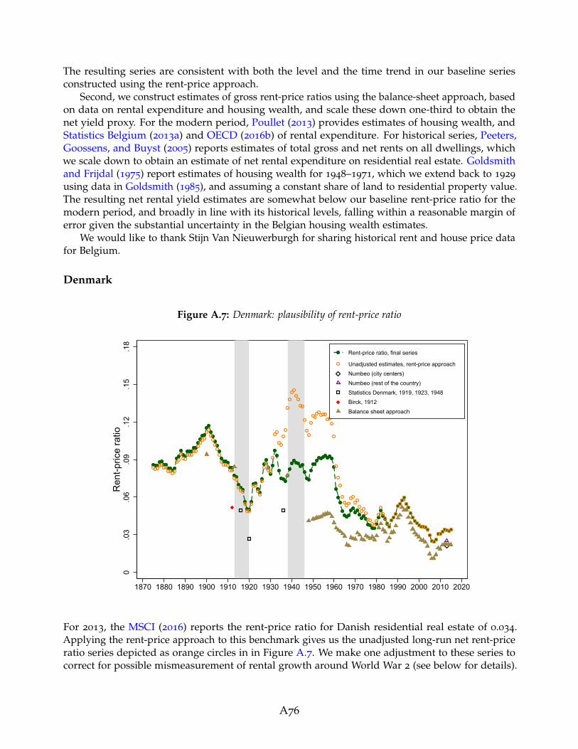
The resulting series are consistent with both the level and the time trend in our baseline seriesconstructed using the rent-price approach.
Second, we construct estimates of gross rent-price ratios using the balance-sheet approach, basedon data on rental expenditure and housing wealth, and scale these down one-third to obtain thenet yield proxy. For the modern period, Poullet (2013) provides estimates of housing wealth, andStatistics Belgium (2013a) and OECD (2016b) of rental expenditure. For historical series, Peeters,Goossens, and Buyst (2005) reports estimates of total gross and net rents on all dwellings, whichwe scale down to obtain an estimate of net rental expenditure on residential real estate. Goldsmithand Frijdal (1975) report estimates of housing wealth for 1948–1971, which we extend back to 1929
using data in Goldsmith (1985), and assuming a constant share of land to residential property value.The resulting net rental yield estimates are somewhat below our baseline rent-price ratio for themodern period, and broadly in line with its historical levels, falling within a reasonable margin oferror given the substantial uncertainty in the Belgian housing wealth estimates.
We would like to thank Stijn Van Nieuwerburgh for sharing historical rent and house price datafor Belgium.
Denmark
Figure A.7: Denmark: plausibility of rent-price ratio
0.0
3.0
6.0
9.1
2.1
5.1
8R
ent-p
rice
ratio
1870 1880 1890 1900 1910 1920 1930 1940 1950 1960 1970 1980 1990 2000 2010 2020
Rent-price ratio, final series
Unadjusted estimates, rent-price approach
Numbeo (city centers)
Numbeo (rest of the country)
Statistics Denmark, 1919, 1923, 1948
Birck, 1912
Balance sheet approach
For 2013, the MSCI (2016) reports the rent-price ratio for Danish residential real estate of 0.034.Applying the rent-price approach to this benchmark gives us the unadjusted long-run net rent-priceratio series depicted as orange circles in in Figure A.7. We make one adjustment to these series tocorrect for possible mismeasurement of rental growth around World War 2 (see below for details).
A76

This gives us the final adjusted rent-price ratio series—the green-circled line in Figure A.7—used inthis paper.
We obtain several additional estimates of rent-price ratios in Denmark throughout the pastcentury and a half. First, we construct estimates using the balance sheet approach using data ontotal rental expenditure (Hansen, 1976; OECD, 2016b; Statistics Denmark, 2017b) and housing wealth(Abildgren, 2016). We estimate housing running costs and depreciation as fixed proportions ofdwelling intermediate consumption, and depreciation of all buildings (Statistics Denmark, 2017a),and subtract these from gross rental expenditure to produce net rental yield estimates. The balancesheet approach yields are similar to the rent-price approach for the recent decades and in the early20th century, but diverge somewhat in the 1940s and 50s. Both estimates are subject to measurementerror, but the large difference suggests that some of the high levels of the rent-price approach ratiomay be a result of the rental index underestimating the rent growth during this period. To guardagainst accumulation of errors in the rent-price approach, we benchmark the historical yield tothe balance sheet approach estimates in 1938 and 1929, and adjust the rent-price ratio growth forthe in-between years, with the final series (green circles) being somewhere in-between the balance-sheet and rent-price approaches. For earlier the historical period, the rent-price and balance-sheetapproaches display similar levels and time trend.
Our baseline rent-price ratio estimates are also in line with two further historical sources. First,according to Birck (1912), at the time of his writing, housing values in Copenhagen typicallyamounted to 13 times the annual rental income. Second, in line with this estimate, StatisticsDenmark (1919) reports that housing values in urban areas in 1916 were about 13.5 times the annualrental income (note that housing values reported in Statistics Denmark (1919, 1923, 1948, 1954) relateto valuation for tax purposes). These data imply a gross rent-price ratio of about 0.06–0.07, and a netrent-price ratio of around 0.04–0.05. For 1920, Statistics Denmark (1923) states that housing valuesin urban areas were about 25 times the annual rental income implying a gross rent-price ratio ofroughly 0.04 (roughly 0.03 net). In 1936, rent-price ratios in urban areas had returned to pre-WorldWar 1 levels (Statistics Denmark, 1948). Finally, estimates of net rent-price ratios based on datafrom www.Numbeo.com are similar to the modern-day values for the balance-sheet and rent-priceapproaches.
A77

Finland
Figure A.8: Finland: plausibility of rent-price ratio
0.1
.2.3
.4.5
.6R
ent-p
rice
ratio
1920 1930 1940 1950 1960 1970 1980 1990 2000 2010 2020
Rent-price ratio, final series
Unadjusted estimates, rent-price approach
Numbeo (city centers)
Numbeo (rest of the country)
Balance sheet approach
For 2013, the MSCI (2016) reports the rent-price ratio for Finnish residential real estate of 0.054.Applying the rent-price approach to this benchmark gives us the unadjusted long-run net rent-priceratio series depicted as orange circles in in Figure A.8. We make one adjustment to these seriesto correct for possible mismeasurement of rental growth during the rent controls imposed in theearly-to-mid 20th century (see below for details). This gives us the final adjusted rent-price ratioseries—the green-circled line in Figure A.8—used in this paper.
We obtain two alternative estimates of the net rent-price ratio for the modern period. First, weconstruct proxies of gross rental expenditure, running costs and depreciation, and total housingwealth back to 1995 using data from Statistics Finland and OECD. These are roughly the same asour benchmark rent-price ratio for the benchmark year, but are slightly lower in the late 1990s. Note,however, that data from Statistics Finland imply a housing depreciation rate of 3.5%, and runningand maintenance costs of around 2%, which corresponds to an expected duration of the structure ofless than 20 years. Therefore, the cost estimates are almost certainly too high, and adjusting these tomore reasonable levels would leave the rent-price ratios on par, or above our baseline values. For2013, we also obtain estimates of rent-price ratios for one- and three-bedroom apartments i) withincity-centers and ii) in the rest of the country from www.Numbeo.com. Once adjusted for costs, theseare somewhat lower than both the estimates using the rent-price and balance sheet approach.
We also construct an independent estimate of the rent-price ratio in Finland in 1920 using dataon total housing value (Statistics Finland, 1920) and total expenditure on rents (Hjerppe, 1989),adjusted down by one-third to account for running costs and depreciation. Figure A.8 shows thatthis estimate is significantly below the long-run rent price ratio in 1920. Similarly to the case of Spain,the discrepancy between the rent-price approach and alternative estimates may reflect difficulties of
A78

the Finnish statistical office to construct a rent index after the introduction of wartime rent controls.Rent controls were introduced during WW2 and were only abolished under the Tenancy Act of 1961
(Whitehead, 2012). While this period of deregulation was rather short-lived—rent regulation wasre-introduced in 1968 and parts of the private rental market were subject to rent regulation until themid-1990s—the downward trend of the long-run rent-price ratio appears particularly remarkable.In other words, the data suggest that rents during the period of deregulation increased significantlyless than house prices. To the best of our knowledge, no quantitative or qualitative evidence existssupporting such a pronounced fall in the rent-price ratio during the first half of the 1960s. Wetherefore conjecture that the rent index suffers from a downward bias during the period of wartimerent regulation and immediately thereafter. To mitigate this bias, we adjust the gross growth ratein rents between WW2 and 1965 up by a constant factor calibrated so that the adjusted long-runrent-price ratio concords with the independent estimate in 1920, which is a factor of 1.1. Figure A.8displays the resulting adjusted long-run rent-price ratio.
France
Figure A.9: France: plausibility of rent-price ratio
0.0
2.0
4.0
6.0
8R
ent-p
rice
ratio
1870 1880 1890 1900 1910 1920 1930 1940 1950 1960 1970 1980 1990 2000 2010 2020
Rent-price ratio, final series
Numbeo (city centers)
Numbeo (rest of the country)
Balance sheet approach
Leroy-Beaulieu (1906)
For 2013, the MSCI (2016) reports the rent-price ratio for French residential real estate of 0.028.Applying the rent-price approach to this benchmark gives us the long-run net rent-price ratio seriesdepicted as green circles in in Figure A.9, which are the estimates used in this paper.
We obtain several scattered independent estimates of rent-price ratios in France since 1870. First,we calculate rent-price ratios using the balance-sheet approach, based on the data on total housingvalue (Piketty and Zucman, 2014) and total expenditure on rents (Statistics France, 2016b; Villa,1994) net of running costs and depreciation (Piketty and Zucman, 2014; Statistics France, 2016a,b).
A79

These estimates are in line with those using the rent-price approach, even though the balance-sheetapproach rental yield estimates for 1900–1920 are somewhat higher, and for 1920–1960 somewhatlower. Second, Numbeo.com estimates of modern-day rent-price ratios are in line with the IPDbenchmark.
A few additional scattered estimates on housing returns for the pre-WW2 period are available.For 1903, Haynie (1903) reports an average gross rental yield for Paris of about 4 percent. For1906, Leroy-Beaulieu (1906) estimates a gross rental yield for Paris of 6.36 percent, ranging from5.13 percent in the 16th arrondissement to 7.76 percent in the 20th arrondissement. Simonnet,Gallais-Hamonno, and Arbulu (1998) state that the gross rent of residential properties purchased bythe property investment fund La Fourmi Immobiliere amounted to about 6 to 7 percent of propertyvalue between 1899 and 1913. These estimates are generally comparable with an average annual netrental yield of about 5 percent for 1914–1938 for the final series used in this paper.
Germany
Figure A.10: Germany: plausibility of rent-price ratio
0.0
3.0
6.0
9.1
2.1
5R
ent-p
rice
ratio
1870 1880 1890 1900 1910 1920 1930 1940 1950 1960 1970 1980 1990 2000 2010 2020
Rent-price ratio, final series
Unadjusted estimates, rent-price approach
Numbeo (city centers)
Numbeo (rest of the country)
Balance sheet approach
For 2013, the MSCI (2016) reports the rent-price ratio for German residential real estate of 0.047.Applying the rent-price approach to this benchmark gives us the unadjusted long-run net rent-priceratio series depicted as orange circles in in Figure A.10. We make one adjustment to these series tocorrect for possible mismeasurement of rental growth in the early 1870s (see below for details). Thisgives us the final adjusted rent-price ratio series—the green-circled line in Figure A.10—used in thispaper.
We obtain three independent estimates of historical rent-price ratios in Germany. First, Numbeo.com estimates of modern-day rent-price ratios are broadly in line with the rent-price approach.
A80

Second, we calculate the balance sheet approach estimates for benchmark years based on data ontotal housing value and total expenditure on rents. The housing wealth series combines the data inPiketty and Zucman (2014), and various issues of Statistik der Einheitswerte. For the pre-WW1 period,we scale up the value of structures reported in Piketty and Zucman (2014) to obtain a proxy for totalhousing wealth. The rental expenditure data are from OECD (2016b) and Statistics Germany (2013)for the modern period, and (Hoffmann, 1965) for the period before WW2. Throughout we assumearound one-third of gross rent is spent on costs and depreciation to obtain a proxy for net rentalexpenditure.
Figure A.10 shows that the balance sheet approach estimates confirm the general level andhistorical time trend of the rent-price ratio: rents were high in the interwar period, and comparativelylower before WW1 and after WW2. The modern-day balance sheet approach estimates are somewhatbelow those in our final series, but within a reasonable margin of error, given the uncertainty inestimating housing wealth, imputed rents, running costs and depreciation. For the years 1870–1871,however, the balance sheet approach estimates of rental yield are relatively stable, whereas thoseusing the rent-price approach are markedly high. It is likely that the rental index underestimatedthe rental growth during years 1870–1871, when house prices grew sharply. However, the balancesheet approach net yield estimate is in itself highly uncertain, as housing wealth data may havebeen smoothed over time, and there is little data on the value of land underlying dwellings. Wetherefore adjust the rental yield down to the average of the rent-price figures, and an alternativerental yield series that extrapolates the growth of rents back using the balance sheet approach. Thisresults in the green dots, our final series for 1870–1871, that suggests that rental yields fell duringthose years, but probably by less than suggested by the raw unadjusted series.
Finally, one additional series on housing returns is available for the pre-WW2 period. For1870–1913, Tilly (1986) reports housing returns for Germany and Berlin. Average annual real netreturns according to Tilly (1986) amount to about 8 percent—a figure similar to the circa 10 percentp.a. average annual real return calculated using the adjusted rent and house price data.
A81

Italy
Figure A.11: Italy: plausibility of rent-price ratio
0.0
2.0
4.0
6R
ent-p
rice
ratio
1920 1930 1940 1950 1960 1970 1980 1990 2000 2010 2020
Rent-price ratio, final series
Numbeo (city centers)
Numbeo (rest of the country)
Balance sheet approach
For 2013, the MSCI (2016) reports the rent-price ratio for Italian residential real estate of 0.038.Applying the rent-price approach to this benchmark gives us the long-run net rent-price ratio seriesdepicted as green circles in in Figure A.11, which are the estimates used in this paper.
To gauge the plausibility of historical rent-price ratios, we construct the balance-sheet approachrental yields as total rental expenditure net or running costs and depreciation, in proportion tototal housing wealth (Istat, 2016; Piketty and Zucman, 2014). These are somewhat lower than therent-price approach estimate, but confirm the general trend in the rent-price ratio from the 1970sonwards. Finally, Numbeo.com estimates of modern-day rent-price ratios are similar to the rent-priceand balance sheet approach.
A82

Japan
Figure A.12: Japan: plausibility of rent-price ratio
0.0
5.1
.15
Ren
t-pric
e ra
tio
1930 1940 1950 1960 1970 1980 1990 2000 2010 2020
Rent-price ratio, final series
Unadjusted estimates, rent-price approach
Numbeo (city centers)
Numbeo (rest of the country)
Balance sheet approach
For 2013, the MSCI (2016) reports the rent-price ratio for Japanese residential real estate of 0.056.Applying the rent-price approach to this benchmark gives us the unadjusted long-run net rent-priceratio series depicted as orange circles in in Figure A.12. We make one adjustment to these seriesto correct for possible mismeasurement of rental growth in the 1960s (see below for details). Thisgives us the final adjusted rent-price ratio series—the green-circled line in Figure A.12—used in thispaper.
We obtain two independent estimates for rent-price ratios in Japan. First, we calculate rent-priceratios for benchmark years (1930, 1940, 1970–2011) based on data on total housing value (Goldsmith,1985; Piketty and Zucman, 2014) and total expenditure on rents (Cabinet Office. Government ofJapan, 2012; Shinohara, 1967). To proxy the net rent-price ratio, we assume around one-third of grossrent is spent on running costs and depreciation. The resulting estimates are consistent with thelong-run rent-price ratio for the period 1970–2011 (Figure A.12). Yet, for 1930 and 1940 the estimatesare much lower than those using the rent-price approach. This suggests that the rent index mayhave underestimated rent growth between 1940 and 1970, thus inflating the historical rental yieldestimates. Indeed, the unadjusted series imply that the rent-price ratio fell dramatically during the1970s, a trend not mirrored in any subsequent period, or in the balance-sheet approach data. To thisend, we conjecture that the rental index understated the growth in rents by a factor of two duringthe 1960s. The resulting adjusted rent-price ratio (green circles) is then consistent with the historicalestimates using the balance sheet approach.
Second, estimates of modern-day rent-price ratios from Numbeo.com are are somewhat belowboth the rent-price approach and balance-sheet approach estimates for the 2010s.
A83

Netherlands
Figure A.13: Netherlands: plausibility of rent-price ratio
0.0
3.0
6.0
9.1
2.1
5R
ent-p
rice
ratio
1870 1880 1890 1900 1910 1920 1930 1940 1950 1960 1970 1980 1990 2000 2010 2020
Rent-price ratio, final series
Numbeo (city centers)
Numbeo (rest of the country)
Newspapers
Balance sheet approach
For 2013, the MSCI (2016) reports the rent-price ratio for Dutch residential real estate of 0.044.Applying the rent-price approach to this benchmark gives us the long-run net rent-price ratio seriesdepicted as green circles in in Figure A.13, which are the estimates used in this paper.
We obtain two independent estimates for rent-price ratios in the Netherlands. First, we calculatethe rent-price ratio using the balance sheet approach, based on estimates of rental expenditure fromOECD (2016b), and housing wealth estimated from non-financial balance sheet data in OECD (2016c)and Groote, Albers, and De Jong (1996) (brown trianges in Figure A.13). We assume one-third ofgross rental is spent on running costs and depreciation. The yields confirm the general trend in ourbenchmark series, although their levels are somewhat lower. It is worth noting that the estimates ofhousing wealth and running costs for the Netherlands are highly uncertain, hence we do not puttoo much weight on the level of the balance-sheet approach yields.
Second, a number of newspaper advertisements and articles in the mid-1930s report rent-priceratio levels of 0.07-0.09, which we conjecture are around 0.05 - 0.06 in net terms, once running costsand depreciation are taken out (Limburgsch Dagblaad, 1935; Nieuwe Tilburgsche Courant, 1934,1936). These are somewhat lower than our baseline series, but similar to the levels observed inthe early 1930s, with the remaining margin of error easily attributed to location specificity (theadvertisements are for city-center properties, with the correspondingly lower yiedls). More generally,residential real estate was perceived as a highly profitable investment throughout the decade (DeTelegraaf, 1939). Finally, estimates of the rent-price ratio based on data from Numbeo.com are almostidentical to our baseline IPD benchmark (MSCI, 2016).
A84

Norway
Figure A.14: Norway: plausibility of rent-price ratio
0.0
3.0
6.0
9.1
2.1
5R
ent-p
rice
ratio
1870 1880 1890 1900 1910 1920 1930 1940 1950 1960 1970 1980 1990 2000 2010 2020
Rent-price ratio, final series
Unadjusted estimates, rent-price approach
Numbeo (city centers)
Numbeo (rest of the country)
Newspapers
Balance sheet approach
For 2013, the MSCI (2016) reports the rent-price ratio for Norwegian residential real estate of 0.037.Applying the rent-price approach to this benchmark gives us the unadjusted long-run net rent-priceratio series depicted as orange circles in in Figure A.14. We make one adjustment to these series tobring the estimates in line with alternative historical sources (see below for details). This gives usthe final adjusted rent-price ratio series—the green-circled line in Figure A.14—used in this paper.
We obtain several scattered independent estimates of rent-price ratios in Norway since 1871.First, we calculate rent-price ratios for benchmark years using the balance-sheet approach, basedon data on total housing value (Goldsmith, 1985; OECD, 2016c) and total expenditure on rents(OECD, 2016b; Statistics Norway, 1954, 2014), and assuming one-third of gross rent is consumed byrunning costs and depreciation expenses to estimate the net rental yield. Note that for the historicalexpenditure series, we estimate rents as 80% of total housing expenditure, a proportion consistentwith modern-day Norwegian data, and historical data for the US. We also collect scattered data fromadvertisements for Oslo residential real estate in Aftenposten, one of Norway’s largest newspapers,with the gross advertised yield again adjusted down by one-third to proxy the net figure.
Both these sets of estimates confirm the general long-run trend in the rent-price ratio. Thelong-run rent-price ratio was essentially stable up until the early 2000s, with increases in early20th century and late 1960s reversed by falls in World War 1 and the 1980s, and is currently at ahistorical low. However the long-run level of the ratio is generally lower than the estimates using therent-price approach (orange diamonds): around 6%–8% rather than 8%–12%, and this divergence isalready apparent in the late 1970s. Based on this, we stipulate that the rental index during late 1990sand early 2000s—a period when house prices increased substantially—understated the growth ofrents relative to prices, leading the rent-price approach to overstate the historical rental yields. To
A85

correct for this presumed bias, we adjust the growth in rents up by a factor of 1.5 for the years 1990
to 2005. The resulting adjusted rent-price ratio (green circles) is in line with the historical estimatesboth in terms of levels and trend.
Lastly, estimates of the rent-price ratio based on data from www.Numbeo.com are in line with ourbaseline IPD benchmark (MSCI, 2016).
Portugal
Figure A.15: Portugal: plausibility of rent-price ratio
0.0
3.0
6.0
9.1
2.1
5R
ent-p
rice
ratio
1945 1950 1955 1960 1965 1970 1975 1980 1985 1990 1995 2000 2005 2010 2015
Rent-price ratio, final series
Unadjusted estimates, rent-price approach
Numbeo (city centers)
Numbeo (rest of the country)
Balance sheet approach
For 2013, the MSCI (2016) reports the rent-price ratio for Portuguese residential real estate of 0.033.Applying the rent-price approach to this benchmark gives us the unadjusted long-run net rent-priceratio series depicted as orange circles in in Figure A.15. We make one adjustment to these seriesto correct for potential biases arising from rent mismeasurement during the prolonged period ofrent controls in the last quarter of the 20th century (see below for details). This gives us the finaladjusted rent-price ratio series—the green-circled line in Figure A.15—used in this paper.
We obtain several scattered independent estimates of rent-price ratios in Portugal. First, estimatesof the rent-price ratio based on data from www.Numbeo.com are slightly above, but broadly in linewith our baseline IPD benchmark (MSCI, 2016). Second, we compute the rental yield using thebalance-sheet approach, based on data on total rental expenditure (OECD, 2016b) and total housingwealth (Cardoso, Farinha, and Lameira, 2008), scaled down one-third to adjust for running costs anddepreciation. These are almost identical to the rent-price approach for the recent years, but divergesomewhat in the late 1990s. More generally, the historical growth in rents relative to house prices inPortugal may have been understated due to the imposition of rent controls in 1974, which remainedin place in various forms until well into the 2000s. This seems likely given the high levels of the
A86

unadjusted rent-price approach yields in the 1970s and early 1980s (orange circles in Figure A.15).Unfortunately, no alternative historical estimates of the rent-price ratio before 1995 are available forPortugal. Instead, we stipulate that the rent-price ratio in the 1940s and 50s, before the reported highrent inflation of the 1960s (Cardoso, 1983) and the subsequent rent controls, was at levels similarto the 1980s and 1990s. To achieve that, we adjust rental growth up by a factor of 1.2 for years1974–2005; the period for which rent controls were in place.
The resulting adjusted long-run rent-price ratio (green circles in Figure A.15) concords with thenarrative evidence on house prices and rent developments in Portugal. Real house prices in Portugalrose after the end of WW2 until the Carnation Revolution in 1974. After a brief but substantial houseprice recession after the revolution, real house prices embarked on a steep incline (Azevedo, 2016).By contrast, real rents remained broadly stable between 1948 and the mid-1960s as well as after1990 but exhibit a pronounced boom and bust pattern between the mid-1960s and the mid-1980s.According to Cardoso (1983), the rapid growth of inflation-adjusted rents between the mid-1960sand the mid-1970s was the result of both rising construction costs and high inflation expectations.In 1974, new rent legislation provided for a rent freeze on existing contracts. Rent increases werealso regulated between tenancies but unregulated for new construction. These regulations resultedin lower rent growth rates and rents considerably lagging behind inflation (Cardoso, 1983), and aconsequent fall in the rent-price ratio.
Spain
Figure A.16: Spain: plausibility of rent-price ratio
0.1
.2.3
.4R
ent-p
rice
ratio
1900 1910 1920 1930 1940 1950 1960 1970 1980 1990 2000 2010 2020
Rent-price ratio, final series
Unadjusted estimates, rent-price approach
Numbeo (city centers)
Numbeo (rest of the country)
La Vanguardia
Balance sheet approach
For 2013, the MSCI (2016) reports the rent-price ratio for Spanish residential real estate of 0.025.Applying the rent-price approach to this benchmark gives us the unadjusted long-run net rent-price
A87

ratio series depicted as orange circles in in Figure A.16. We make one adjustment to these seriesto correct for possible mismeasurement of rental growth during the rent controls imposed in theearly-to-mid 20th century (see below for details). This gives us the final adjusted rent-price ratioseries—the green-circled line in Figure A.16—used in this paper.
We obtain several scattered independent estimates of rent-price ratios in Spain. First, estimatesof the rent-price ratio based on data from www.Numbeo.com are almost identical to our baselineIPD benchmark (MSCI, 2016). Second, we construct net rent-price ratios using the balance sheetapproach, as total rental expenditure (OECD, 2016b) less running costs and depreciation (assumedto be one-third of gross rent), in relation to housing wealth (Artola Blanco, Bauluz, and Martınez-Toledano, 2017). These are slightly below but broadly in line with the rent-price approach for theoverlapping years.
Finally, we collected scattered data on rent-price ratios from advertisements for Barcelonaresidential real estate in La Vanguardia for benchmark years (1910, 1914, 1920, 1925, 1930, 1935, 1940,1950, 1960, 1970). For each of the benchmark years, we construct an average rent-price ratio basedon between 25 and 46 advertisements. The gross ratios in the advertisements are adjusted down toexclude running costs and depreciation, calibrated at 2% p.a., around one-third of the advertizedyields. Figure A.16 shows that the newspaper estimates are significantly below the rent-price ratiofor the benchmark years between 1910 and 1960. Yet it also suggests that rent-price ratios weregenerally higher before the mid-1950s. Similarly to Finland, this trajectory may reflect difficulties ofthe Spanish statistical office to construct a rent index after the introduction of rent freezes in the1930s and during the years of strong rent regulation after WW2. While the rent freeze was lifted in1945, these regulations remained effective until the mid-1960s. Specifically, the data suggest thatrents between the end of WW2 and the mid-1960s increased substantially less than house prices.To the best of our knowledge, no quantitative or qualitative evidence exists supporting such apronounced fall in the rent-price ratio in the immediate post-WW2 years or a generally higher levelof rental yields prior to the 1960s. To mitigate this bias, we adjust the growth rate in rents between1910 and 1960 so that the adjusted long-run rent-price ratio concords with the independent estimatesobtained from La Vanguardia. Figure A.16 displays the resulting adjusted long-run rent-price ratio(green circles), which is the final series we use in this paper.
A88

Sweden
Figure A.17: Sweden: plausibility of rent-price ratio
0.0
2.0
4.0
6.0
8.1
.12
Ren
t-pric
e ra
tio
1880 1890 1900 1910 1920 1930 1940 1950 1960 1970 1980 1990 2000 2010 2020
Rent-price ratio, final series
Numbeo (city centers)
Numbeo (rest of the country)
Newspapers
Balance sheet approach
For 2013, the MSCI (2016) reports the rent-price ratio for Swedish residential real estate of 0.036.Applying the rent-price approach to this benchmark gives us the long-run net rent-price ratio seriesdepicted as green circles in in Figure A.17, which are the estimates used in this paper.
We obtain three independent estimates of rent-price ratios for Sweden. First, we compute netrental yields based on the balance-sheet approach as total rental expenditure less running costs anddepreciation, as a share of housing wealth, drawing on a variety of sources. The modern-day rentalexpenditure data are obtained from OECD (2016b), and further data back to 1969 were provided byBirgitta Magnusson Warmark at Statistics Sweden. These are extrapolated back to 1931 using dataon total housing expenditure from Dahlman and Klevmarken (1971). The data on running costs area weighted average of total repairs of dwellings (data provided by Jonas Zeed at Statistics Sweden),and maintenance costs on rentals reported by (OECD, 2016b) scaled up to capture owner-occupieddwellings. Data on depreciation were provided by Jonas Zeed at Statistics Sweden, and wereextrapolated back using dwellings depreciation in Edvinsson (2016). Before 1995, running costs areassumed to have evolved in line with depreciation. The long-run housing wealth data are sourcedfrom Waldenstrom (2017). Both the level and the time trend in the resulting long-run rent-price ratioare in line with the historical balance-sheet approach estimates.
Second, the rent-price ratio in the late 19th / early 20th century is in line with those reportedin several newspaper advertisements and articles. According to these sources, gross rent-priceratios were in the range of 0.07 to 0.1, and residential real estate was perceived as highly profitableinvestment (Dagens Nyheter, 1892, 1897, 1899). Given that running costs and depreciation amountedto around 2% p.a. of property value in Sweden during the period 1930–2015, this leads us toconjecture that net rent-price ratios were around 0.05–0.08, in line with our estimates.
A89

Finally, estimates of modern-day rent-price ratios from Numbeo.com are somewhat below both ourbenchmark ratio and the balance sheet approach. However these are not based on a representative ormatched sample of properties for sale and for rent, and are therefore less reliable than the alternativeestimates.
Switzerland
Figure A.18: Switzerland: plausibility of rent-price ratio
0.0
2.0
4.0
6.0
8R
ent-p
rice
ratio
1900 1910 1920 1930 1940 1950 1960 1970 1980 1990 2000 2010 2020
Rent-price ratio, final series
Numbeo (city centers)
Numbeo (rest of the country)
Wüest & Partner, 2012 (decadal averages)
Balance sheet approach
For 2013, the MSCI (2016) reports the rent-price ratio for Swiss residential real estate of 0.040.Applying the rent-price approach to this benchmark gives us the long-run net rent-price ratio seriesdepicted as green circles in in Figure A.18, which are the estimates used in this paper.
To check the plausibility of the long-run rent-price ratio, we obtain four independent estimates.First, Real (1950) reports real returns on residential real estate in Zurich of 6 percent in 1927 and7.3 percent in 1933. These data are—by and large—in line with the estimates of housing returnsconstructed by merging the indices of house prices and rents. Second, West and Partner (2012)estimate 10-year averages of real rental yields in Switzerland for 1920–2000. Assuming aroundone-third of gross rent goes to running costs and depreciation, the resulting net rental yield estiamtesare broadly consistent with the long-run rent-price ratio (Figure A.18), taking into account thevarious estimation uncertainties. For the post-World War 2 period, we calculate rent-price ratiosusing the balance sheet approach for benchmark years (1948, 1965, 1973, 1978) drawing on data onhousing wealth from Goldsmith (1985), rental expenditure from Statistics Switzerland (2014), andassuming one-third of gross rent is taken up by runnign costs and depreciation. Again, the resultingestimates are broadly consistent with the long-run rent-price ratio (Figure A.18).
A90

Finally, estimates of rent-price ratios based on data from Numbeo.com are somewhat below, butwithin a reasonable error margin of the MSCI (2016) benchmark ratio.
United Kingdom
Figure A.19: United Kingdom: plausibility of rent-price ratio
0.0
3.0
6.0
9.1
2R
ent-p
rice
ratio
1900 1910 1920 1930 1940 1950 1960 1970 1980 1990 2000 2010 2020
Rent-price ratio, final series
Numbeo (city centers)
Numbeo (rest of the country)
Cairncross, 1953
Balance sheet approach
For 2013, the MSCI (2016) reports the rent-price ratio for U.K. residential real estate of 0.032.Applying the rent-price approach to this benchmark gives us the long-run net rent-price ratio seriesdepicted as green circles in in Figure A.19, which are the estimates used in this paper. Please notethat for years 1947–1955, no rental index data were available, and we extrapolated the rent-priceratio series using the growth in the “balance sheet approach” measure, benchmarking against rentalindex values in 1946 and 1956.26
We construct several alternative estimates of the rent-price ratio for the period going back to1900. First, we construct the net rental yield based on the balance-sheet approach using data ontotal rental expenditure less running costs and depreciation, in proportion to housing wealth, basedon a variety of sources. For rents, we rely on historical series of housing and rental expenditurefrom Mitchell (1988), Sefton and Weale (1995) and Piketty and Zucman (2014), combined withrecent Office for National Statistics (ONS) data, and historical data from the ONS shared with us byAmanda Bell. Estimates of costs and depreciation are available from the UK National Accounts, andhousing wealth is taken from Piketty and Zucman (2014). It is worth noting that the estimates ofrental expenditure for the UK are subject to large uncertainty: the ONS updated the methodology
26We assume that the 1956 index value is correct, but correct the 1946 rental index value for possible biasesarising from the wartime rent controls, such that the trend in the rent-price ratios matches that in the balancesheet approach measure, and the 1956 rent-price approach estimate.
A91

for rent imputation in 2016, resulting in large upward revisions to historical imputed rent estimates(by as large as a factor of three). It is possible that some of the historical data are subject to similaruncertainties, which helps explain why the rental yield levels using the balance sheet approach areso much higher than the extrapolated rent-price ratio, even though the time trend is similar.
Some additional scattered data on rent-price ratios are available for the pre-WW2 period. ForEngland, Cairncross (1975) reports an average gross rent-price ratio of 0.068 between 1895 and 1913,or around 0.05 in net terms. Offer (1981) estimates slightly higher rent-price ratios for selected yearsbetween 1892 and 1913 for occupied leasehold dwellings in London. As Figure A.19 shows, thesedata are slightly higher, but broadly consistent with the our long-run rent-price ratio estimates (anaverage of 0.037 during 1900–1913). Tarbuck (1938) states that high-quality freehold houses werevalued at 25 to 16 years purchase and lower quality freehold houses at 14 to 11 years purchase inthe 1930s, again broadly consistent with our estimates.
Overall, these estimates suggest that our rental yields for the UK are somewhat conservative,but fit the time pattern and broad levels found in the alternative historical sources.
Concerning the modern period, estimates of the rent-price ratio based on data from www.Numbeo.
com are very similar to the MSCI (2016) benchmark. Additionally, Bracke (2015) estimates a grossrental yield of 0.05 on central London properties over the period 2006–2012, based on a matchedmicro-level dataset of around 2000 properties. Again, these estimates are consistent with our data.
United States
Figure A.20: United States: plausibility of rent-price ratio
0.0
2.0
4.0
6.0
8.1
Ren
t-pric
e ra
tio
1890 1900 1910 1920 1930 1940 1950 1960 1970 1980 1990 2000 2010 2020
Rent-price ratio, final series
Numbeo (city centers)
Numbeo (rest of the country)
Giglio et al (2015)
Grebler et al (1956)
Balance sheet approach
Statistical abstract of the U.S.
Census of housing
For 2014, the MSCI (2016) reports the rent-price ratio for U.S. residential real estate of 0.049. Applyingthe rent-price approach to this benchmark gives us the long-run net rent-price ratio series depicted
A92
as green circles in in Figure A.20, which are the estimates used in this paper.We obtain independent estimates of U.S. rent-price ratios from five additional sources. First,
decadal averages of gross price-rent ratios are available for 1899–1938 from Grebler, Blank, andWinnick (1956) ranging between 10.4 and 12.6. Second, estimates of gross rents paid and homevalues are available from various issues of the U.S. Census and Statistical Abstract, published byU.S. Census Bureau (1942, 2013). Once adjusted for estimates of running costs and depreciation, theestimates from these sources are similar to the price-rent ratios resulting from merging the indicesof house prices and rents (see Figure A.20). Third, we calculate the rent-price ratio using the balancesheet approach, as total rental expenditure less housing running costs—estimated as 2/3 of totalhousing intermediate consumption—in proportion to total housing value, using expenditure datafrom Bureau of Economic Analysis (2014) and housing wealth estimates in Saez and Zucman (2016).Reassuringly, the resulting estimates are very close to the long-run rent-price ratio. Estimates ofthe rent-price ratio for 2012 are also available from the real estate portal Trulia, as used by Giglio,Maggiori, and Stroebel (2015). The resulting net rent-price ratio of 0.075 is higher than the figuresfrom MSCI (2016) and the balance sheet approach. This may be because the Trulia ratios are notmarket cap weighted, and may overweigh the high-yield low-housing-wealth areas outside of cities.Alternatively, the MSCI (2016) IPD ratio could understate the rental yield because investor portfoliostend to be concentrated in cities. To be consistent with the balance sheet approach and to remainconservative, we use the IPD ratio as our benchmark.
Finally, estimates of the rent-price ratio based on data from www.Numbeo.com are higher than ourbenchmark estimate and similar to the Trulia transaction-level data. As with the Trulia data, theseare not market-capitalization weighted, which may bias the rental yield estimates upwards. Giventhe similarity to the balance-sheet approach yields and the historical estimates from Grebler, Blank,and Winnick (1956), the rent-price approach estimates stemming from the MSCI (2016) benchmarkshould provide the most accurate picture of the historical rental returns on housing in the US.Still, given the higher alternative benchmark yield estimates of Trulia and Numbeo.com, our housingreturn series for the US should be viewed as conservative compared to other possible alternatives.
A93

L. Equity and bond returnsThis section details the sources used to construct the total equity and bond return series in thispaper.
Australia
Table A.16: Data sources: equity and bond returns, Australia
Year Data source
Equity returns:1870–1881 Sum of capital gains, dividends and gains or losses from stock operations for Aus-
tralian shares listed in London, weighted by market capitalization. Constructedfrom Investor Monthly Manual (IMM) data, various issues (http://som.yale.edu/imm-issues).
1882–2008 With-dividend return from Brailsford, Handley, and Maheswaran (2012). Note: weuse these series rather than the alternative from NERA Economic Consulting (2015)due to greater consistency with the IMM historical series.
2009–2013 Total equity return from NERA Economic Consulting (2015).2014–2015 MSCI total return index
Bond returns:1900–1925 Total return on Australian government bonds listed in Sydney from Moore (2010b).
Converted from pound sterling to Australian Dollar.1926–1968 Total return on Australian bonds listed in London. Data for 1926–1929 are from
Meyer, Reinhart, and Trebesch (2015), shared by Josefin Meyer. Data for 1930–1968
were constructed by the authors.1969–1987 Implied capital gain + yield from the 10-year government bond yield series pub-
lished by the Reserve Bank of Australia. Capital gain estimated from movements inyields, using monthly yield data. Spliced with London listings data over 1968–1969.
1988–2015 Total return on benchmark 10-year Australian government bond, Thomson ReutersDatastream.
We are grateful to Josefin Meyer and Christoph Trebesch for sharing historical bond return data forAustralia.
A94

Belgium
Table A.17: Data sources: equity and bond returns, Belgium
Year Data source
Equity returns:1870–2015 Total return on all common stocks of Belgian companies listed on the Brussels stock
exchange, provided by Frans Buelens. Market capitalization weighted. See Annaert,Buelens, Cuyvers, De Ceuster, Deloof, and De Schepper (2011) for further details.
Bond returns:1870–1913 Total return on the 3% rente; price and yield data from Drappier (1937), Table II.1914–1937 Data from the SCOB database shared by Frans Buelens; total return on long-term
government bonds, aggregated from individual bond data.1938–1995 Total return on long-term government bonds, from various issues of National Bank
of Belgium Economic Summaries and Ten-year Statistics, calculated from monthly data.1938–1953: 4% perpetual bonds. Spliced with the SCOB data over the period 1938–1940. 1954–1963: 5-20 year 4.5% bond issued before 1962; price changes estimatedusing movements in yields. 1963–1970: Weighted average of 5-20 year bonds issuedbefore 1962 and 5+ year bonds issued after 1962. 1971–1989: 5+ year maturity bonds,price changes estimated from movements in yields. 1989–1995: basket of 6+ matu-rity bonds, mean maturity approximately 10 years, price changes estimated frommovements in yields.
1996–2015 Total return on 10-year government bonds, National Bank of Belgium onlinedatabase, price changes estimated from movements in yields.
We are grateful to Frans Buelens for sharing the historical equity and bond return series from theSCOB database of the Brussels stock exchange.
A95

Denmark
Table A.18: Data sources: equity and bond returns, Denmark
Year Data source
Equity returns:1893–1922 Weighted average of returns on individual shares, computed from price and divi-
dend data in various issues of the statistical yearbooks (Statistisk aarbog, years 1896–1927). Weighted by 1926 share capital of the company where data are available, orby median share capital of the respective sector. From 1914 onwards, we use the of-ficial stock price index in the Statistisk aarbog, combined with dividend yields onindividual shares.
1923–1999 Combination of dividend yields from Nielsen and Risager (2001) (market-capweighted, circa 100 companies), and the share price index from Jorda, Schularick,and Taylor (2016), which is compiled from League of Nations, UN and IMF data.
2000–2015 Returns on the MSCI total return index, from Thomson Reuters Datastream.
Bond returns:1870–1990 Total return on long-term government bonds from Statistics Denmark (1969) and
various issues of the Danmarks Nationalbank’s Monetary Review. Perpetuals up to1923, 10-40 year bonds for 1924–1980, 10-year maturity bonds from 1980 onwards.
1991–2015 Statistics Denmark, total return on the 10-year bullet loan
We are grateful to Kim Abildgren for helpful advice about the historical Danish stock return series.
A96

Finland
Table A.19: Data sources: equity and bond returns, Finland
Year Data source
Equity returns:1895–1912 Total return index from Poutvaara (1996), based on several banks.1913–1990 Total return index from Nyberg and Vaihekoski (2014), from the data shared with us
by Mika Vaihekoski.1991–2015 HMX total return index
Bond returns:1870–1925 Total return on long-term Finnish government bonds listed abroad, constructed from
individual bond data in Arola (2006) (data from the online appendix of Nyberg andVaihekoski (2011)).
1926–1991 Total return on approximately 5-year maturity government bonds from Nyberg andVaihekoski (2011), using price movements implied by changes in market yield.
1992–2016 Total return on the 10-year benchmark local currency government bond, ThomsonReuters Datastream.
We are grateful to Mika Vaihekoski for sharing data and assisting with numerous queries regardingthe Finnish stock and bond return series.
A97

France
Table A.20: Data sources: equity and bond returns, France
Year Data source
Equity returns:1870–2010 Total return index from Le Bris and Hautcoeur (2010). Index constructed to mirror
the methodology of the CAC-40: returns on largest 40 listed French firms weightedby market cap, with a continuously updated sample, market cap weighted.
2011–2015 Total return on the CAC-40 index.
Bond returns:1870–1969 Total return on 4% and 5% rente (perpetual bonds). Data provided by David LeBris,
from Le Bris and Hautcoeur (2010).1970–2015 Total return on a representative basket of long-term government bonds. Assume 10-
year maturity before 1990 and 30-year after; as in Le Bris and Hautcoeur (2010). Pricemovements estimated from changes in yields at monthly frequency. Data providedby David LeBris, from Le Bris and Hautcoeur (2010).
We are grateful to David Le Bris for sharing data, assisting with numerous queries and providinghelpful comments on the paper.
A98

Germany
Table A.21: Data sources: equity and bond returns, Germany
Year Data source
Equity returns:1870–1913 All-share value-weighted performance index from Weigt (2005) and Eube (1998).1914–1959 Total return on the value-weighted top-30 blue-chip index from Ronge (2002).1960–1990 Total return index from Gielen (1994), value-weighted, broad coverage. We use the
“net” performance index, which excludes the adjustment for dividend income taxcredit.
1991–1995 Total return on the DAX index.1996–2016 Total return on the CDAX index.
Bond returns:1870–1903 Total return on listed long-term government bonds, arithmetic average of returns on
individual bonds, with price and yield data collected from Homburger (1905) Forearly years we use regional bonds to fill gaps.
1904–1930 Total return on listed government bonds from the Berliner Borsenzeitung. Arithmeticaverage of individual bond returns. Average maturity generally 5-15 years. No datafor the hyperinflation period of 1923–25.
1931–1943 total return on 4.5–6% government bonds (6% until 1935, then converted to 4.5%),aggregated using individual bond data from Papadia and Schioppa (2016), DeutscheBundesbank (1976) and Statistisches Jahrbuch fur das Deutsche Reich, various issues.Spliced with the Berliner Borsenzeitung series over 1928–1930.
1948–1955 Total return on mortgage bonds (Pfandbriefe, 4% and 5% coupons, from DeutscheBundesbank (1976) and Statistisches Jahrbuch fur die Bundesrepublik Deutschland, vari-ous issues.
1956–1967 Total return on public bonds from Deutsche Bundesbank (1976), using an averageof bond returns for different issue yields. For years where the sample compositionchanges we use the return implied by yield movements, otherwise we use actualprice changes.
1969–2015 REX government bond total return index, Bundesbank database seriesBBK01.WU046A.
We are grateful to Ulrich Ronge for sharing data and assisting with a number of queries, and toCarsten Burhop for helpful advice. We would also like to thank Andrea Papadia for sharing data.
A99

Italy
Table A.22: Data sources: equity and bond returns, Italy
Year Data source
Equity returns:1870–1887 Capital gain + dividend return on stocks listed on the Genova stock exchange. Caclu-
ated using indices in Da Pozzo and Felloni (1964), which are a book capital weightedaverage of returns on individual shares.
1888–1912 Total return on shares listed at the Milan Stock Exchange from Baia Curioni (2001).Market cap weighted.
1913–1954 Capital gain + dividend return on a broad index of Italian shares from Rosania(1954). Market cap weighted.
1955–1969 Capital gain on a broad index of Italian shares from Mondani (1978) (capitalization-weighted), plus dividend returns computed using total dividends paid and marketcapitalization data (as total dividends in lira / market cap), covering the vast major-ity Italian listed firms. Data sourced from Mediobanca: indici e dati, various years.
1970–2015 Returns on the MSCI total return index, from Thomson Reuters Datastream.
Bond returns:1870–1913 Sum of lagged current yield and capital gain on the 5% perpetual bond (Rendita),
computed from data in Bianchi (1979).1913–1954 Sum of lagged current yield and capital gain on a representative basket of long-term
government bonds, computed from data in Rosania (1954).1955–1987 Total return on listed government bonds using data in various years of Mediobanca:
indici e dati, targeting a maturity of 10 years. For the 1980s, only data on 3-5 yearmaturity bonds were used since longer dated government bonds were not typicallylisted on the stock exchange.
1988–2015 total return on Italian government bonds from a variety of Thomson Reuters Datas-tream indicies: Merrill Lynch Italian government, Datastream Italian government and7-10 year Italian bond indices, and the Datastream Italy benchmark 10-year govern-ment bond index.
We are grateful to Stefano Battilossi for helpful advice about the historical series. We are also gratefulto Massimo Caruso, Giuseppe Conte and Roberto Violi at Banca d’Italia for helpful advice and helpin accessing historical publications.
A100

Japan
Table A.23: Data sources: equity and bond returns, Japan
Year Data source
Equity returns:1882–1940 Sum of capital gain (Laspeyres index, base 1934–36), dividend return and gain/loss
from stock operations, weighted by clearing transaction volumes, from Fujino andAkiyama (1977).
1941–1945 Capital gain from Bank of Japan (1966) + dividend return estimated using 1940 divi-dend yield, growth in nominal dividends paid by Japanese businesses from Bank ofJapan (1966), and share price growth from Bank of Japan (1966) (chain linked).
1946–1947 Stock exchange closed; no data.1948 Capital gain from Unted Nations’ Monthly Bulletin of Statistics + dividend return
estimated using growth in nominal dividends paid by Japanese businesses, as above.1949–1951 Capital gain from Bureau of Statistics Japan, Table 14-25-a ”Transactions and Yields of
Listed Stocks, Tokyo Stock Exchange 1st Section” + dividend return from Fujino andAkiyama (1977) + gain/loss from stock operations from Fujino and Akiyama (1977).
1952–2004 Capital gain and dividend return from Bureau of Statistics Japan Tables 14-25-a andTable 14-25-b, covering Tokyo Stock Exchange 1st and 2nd section, + gain/loss fromstock operations from Fujino and Akiyama (1977) (note: the Fujino and Akiyama(1977) series stop in 1975).
2005–2015 Return on the MSCI total return index, from Thomson Reuters Datastream.
Bond returns:1880–1940 Lagged current yield + capital gain on central government bonds, from Fujino and
Akiyama (1977). Price index used: Laspeyres, base 1934–36.1941–1965 Secondary markets for government debt were shut down for a prolonged time after
World War 2, hence we use government bond yield data (not total returns) for thisperiod. Sources are Homer and Sylla (2005) for 1941–1963 (long-term governmentbond yield), and IMF’s IFS database for 1964–65 (Section ”Interest rates”, Series”Government Bonds”).
1966–1970 Lagged current yield + capital gain on central government bonds, from Fujino andAkiyama (1977). Price index used: Laspeyres, base 1969–71.
1971–1983 Total return on long-term government bonds; 9-10 year maturity, from Hamao (1991).1984–2015 Total return on the Japanese 10-year benchmark government bond total, calculated
from the index by Thomson Reuters Datastream.
We are grateful to Ryoji Koike for helpful advice, and to Yuzuru Kumon and Kaspar Zimmermannfor assisting with collecting and interpreting the data.
A101

Netherlands
Table A.24: Data sources: equity and bond returns, Netherlands
Year Data source
Equity returns:1900–1995 Total stock return index from Eichholtz, Koedijk, and Otten (2000), based on a selec-
tion of Dutch stocks, using data kindly shared with us by Roger Otten. The stockexchange was closed from from August 1944 to April 1946, so the 1945 return coversthe period August 1944–April 1946.
1996–2015 Return on the MSCI total return index, from Thomson Reuters Datastream.
Bond returns:1870–1900 Total return on the 2.5% perpetual bond, using data in Albers (2002).1901–1987 Total return on long-term government bonds from Eichholtz, Koedijk, and Otten
(2000), using data kindly shared with us by Roger Otten.1988–2015 Total return on benchmark 10-year government bond, Thomson Reuters Datastream.
We are grateful to Roger Otten for sharing the data on historical stock and bond returns in theNetherlands.
A102

Norway
Table A.25: Data sources: equity and bond returns, Norway
Year Data source
Equity returns:1881–1914 Total return on all stocks listed on the Oslo stock exchange, market cap weighted.
Constructed from share-level microdata collected from the following publications:Kurslisten over Vaerdipapier (the stock listing), Farmand magazine, and Kierulfs haandbokover aktier og obligationer, various years.
1915–2000 Capital gain from Klovland (2004b). Dividend return from various issues of Nor-way’s historical statistics and statistical yearbooks (Historisk Statistikk, Statistisk arbokbefore 1970, and constructed from MSCI indices on Thomson Reuters Datastream after1970, with the two series spliced over 1970–74. We compute the MSCI dividend re-turn as the difference between the accumulation gain on the total return and shareprice indices.
2001–2015 Return on the MSCI total return index, from Thomson Reuters Datastream.
Bond returns:1870–1919 Total return on long-term government bonds listed on the Oslo Stock Exchange and
major foreign exchanges. We use Oslo data unless there are few bonds being traded,in which case we rely on foreign exchanges. Oslo data come from Kurslisten overVaerdipapier, Farmand magazine, and Kierulfs haandbok over aktier og obligationer. Lon-don data are from the Investor Monthly Manual (http://som.yale.edu/imm-issues),various issues. Other major markets’ data are from Klovland (2004a), with pricemovements estimated from changes in yields.
1920–1992 Total return on 10-year government bonds, with price changes estimated from move-ments in monthly yields in Klovland (2004a).
1993–2015 Total return on benchmark 10-year government bond, Thomson Reuters Datastream.
We are grateful to Jan Tore Klovland for answering numerous queries and helpful advice, and to thestaff at the Oslo Nasjonalbiblioteket for help in locating the historical data sources.
A103

Portugal
Table A.26: Data sources: equity and bond returns, Portugal
Year Data source
Equity returns:1870–1987 Total return on all shares listed on the Lisbon stock exchange, market capitalization
weighted. Own calculations using share price, dividend and balance sheet infor-mation in the following publications: Diario do Governo, Boletim da Bolsa and annualreports of public companies, various years. For years 1900–1925, capital for a largenumber of companies had to be estimated using the trend in capital of a small num-ber of firms. For year 1975, the stock exchange was closed because of the CarnationRevolution. We assumed no dividends were paid, and interpolated the stock pricesof firms listed both before and after the closure to compute returns.
1988–2015 Return on the MSCI total return index, from Thomson Reuters Datastream.
Bond returns:1870–1993 Total return on central government bonds listed on the Lisbon stock exchange. Av-
erage maturity around 15–30 years. Computed from bond listings data in Diario doGoverno and Boletim da Bolsa. Weighted by the capitalization of individual bonds.During 1975 the stock exchange was closed, and we used yield data from the Bankof Portugal Statistics, series ”Yield on fixed rate treasury bonds—10 years (monthlyaverage)”, and estimated price movements from changes in yields.
1994–2015 Total return on benchmark 10-year government bond, Thomson Reuters Datastream.
We are grateful to Jose Rodrigues da Costa and Maria Eugenia Mata for help and advice in findingand interpreting the data sources for the historical Portuguese data. We are also grateful to staff atthe Banco do Portugal archive for helpful advice and sharing data.
A104

Spain
Table A.27: Data sources: equity and bond returns, Spain
Year Data source
Equity returns:1900–1940 Total return on all Spanish ordinary shares listed at the Madrid Stock Exchange,
weighted by market capitalization. Data for 1900–1926 were kindly shared with usby Lyndon Moore (see Moore, 2010a,b). Data for 1926–1936 were collected at thearchive of the Banco de Espana, using stock exchange listings in various issues ofthe Boletin de Cotization Oficial of the Madrid stock exchange. The stock exchangewas closed during the Spanish Civil war years 1937–1939. For these years, we calcu-lated the returns using the average return on shares listed both before and after theexchange was closed, and assumed no dividends were paid (this seems reasonablesince even in 1940, very few companies paid our dividends).
1940–1969 Historical IGBM total return index for the Madrid stock exchange from Lopez, Car-reras, and Tafunell (2005), Chapter 10, “Empresa y Bolsa”, Table 10.33. All shares,market capitalization weighted.
1970–1987 Return on the MSCI total return index, from Thomson Reuters Datastream.1988 - 2015 Return on the IGBM index from Thomson Reuters Datastream.
Bond returns:1900–1936 Total return on long-term government bonds listed on the Madrid Stock Exchange,
market capitalization weighted, average maturity around 25 years. Data for 1900–1926 were kindly shared with us by Lyndon Moore (see Moore, 2010a,b).
1940– 1972 Total return on long-term government bonds from various issues of statistical bul-letins, Anuario Estadıstico da Espana (http://www.ine.es/inebaseweb/25687.do).
1973–1990 Total return on government bonds traded on the Barcelona stock exchange, fromthe La Vanguardia newspaper, various issues. Spliced with the series from statisticalbulletins over years 1973–1975.
1989–2015 Total return on medium-term government bonds from various Thomson ReutersDatastream indices: medium-term government bonds, and benchmark 10-year gov-ernment bond.
We are grateful to Lyndon Moore for sharing data and providing helpful advice. We would also liketo thank Stefano Battilossi for help with locating the historical data sources, and staff at the Bancode Espana archive for assisting with our queries.
A105

Sweden
Table A.28: Data sources: equity and bond returns, Sweden
Year Data source
Equity returns:1871–2012 Total return index from Waldenstrom (2014).2013–2015 SIXGX total return index, capitalization-weighted.
Bond returns:1870–1874 Total return on 4% and 5% perpetuals, using individual bond data in the online
appendix of Waldenstrom (2014).1874–2014 Holding period return on long-term government bonds from Waldenstrom (2014),
generally targeting 10-year maturity.2015 Total return on benchmark 10-year government bond, Thomson Reuters Datastream.
We are grateful to Daniel Waldenstrom for helpful advice regarding the historical Swedish returnsdata.
A106

Switzerland
Table A.29: Data sources: equity and bond returns, Switzerland
Year Data source
Equity returns:1900–1925 Total return on all Swiss stocks listed in Zurich, capitalization-weighted. Calculated
using individual stock price and dividend data kindly shared with us by LyndonMoore (see Moore, 2010a,b). The stock exchange closed from mid-1914 to mid-1916,and the 1915 return covers the period July 1914 to July 1916.
1926–1969 Total return on Swiss equities from Pictet and Cie (1998).1970–2015 Return on the MSCI total return index, from Thomson Reuters Datastream.
Bond returns:1899–1926 Total return on all Swiss government bonds listed on the Zurich stock exchange,
capitalization-weighted. Calculated using individual bond price and yield datakindly shared with us by Lyndon Moore (see Moore, 2010a,b).
1927–1984 Total return on Swiss bonds from Pictet and Cie (1998).1985–2015 Total return on benchmark 10-year government bond, Thomson Reuters Datastream.
We are grateful to Lyndon Moore for sharing data and providing helpful advice, and to RebekkaSchefer for hepling us locate the historical sources.
A107

United Kingdom
Table A.30: Data sources: equity and bond returns, United Kingdom
Year Data source
Equity returns:1870–1928 Total return on all UK stocks listed on the London stock exchange, capitalization
weighted, from Grossman (2002, 2015).1929–1963 Blue-chip market capitalization weighted index based on the largest 30 stocks listed
on the London stock exchange, from Barclays (2016).1964–2015 FTSE all-share index, coving circa 98% of UK stocks’ capitalization. Market capitaliza-
tion weighted.
Bond returns:1870–1901 Total return on 3% and 2.75% consols from the Statistical abstract for the UK, various
issues.1902–1979 Total return on gilts (price change + lagged yield) from Barclays (2016).1980–2015 Total return on benchmark 10-year government bond, Thomson Reuters Datastream.
We are grateful to Richard Grossman and John Turner for helpful advice regarding historical UKstock and bond return data.
A108

United States
Table A.31: Data sources: equity and bond returns, United States
Year Data source
Equity returns:1870–2015 Capital gain + dividend return from Shiller (2000) (up-to-date data from http://www.
econ.yale.edu/~shiller/data.htm)
Bond returns:1870–1926 Total return on a basket of central government bonds around 10-year maturity. Cal-
culated from prices of individual bonds in the Commercial and Financial Chronicle,various issues.
1927–1928 Total return on 10-year government bonds, price changes imputed from yields.Source: Aswath Damodaran database (http://pages.stern.nyu.edu/~adamodar/New_Home_Page/datafile/histretSP.html).
1929–2015 Total return on US long-term government bonds, from Barclays (2016).
We are grateful to Josefin Meyer for helpful advice concerning the historical bond return data forthe US.
A109

M. Taxes on real estateAlthough the extent of real estate taxation varies widely across countries, real estate is taxed nearlyeverywhere in the developed world. International comparisons of housing taxation levels are,however, difficult since tax laws, tax rates, assessment rules vary over time and within countries.Typically, real estate is subject to four different kinds of taxes. First, in most countries, transfer taxesor stamp duties are levied when real estate is purchased. Second, in some cases capital gains fromproperty sales are taxed. Often, the tax rates depend on the holding period. Third, income taxestypically also apply to rental income. Fourth, owners’ of real estate may be subject to property taxesand/or wealth taxes where the tax is based upon the (assessed) value of the property.
This section briefly describes the current property tax regimes by country and provides estimatesof the tax impact on real estate returns. With few exceptions, the tax impact on real estate returnscan be considered to be less than 1 percentage point per annum.
Australia
Two kinds of property taxes exist. First, all but one Australian states/territories levy a land tax(no land tax is imposed in the Northern Territory). Typically, land tax is calculated by referenceto the site value of the land (i.e. excluding buildings). Tax rates vary depending on the propertyvalue between 0.1% and 3.7%. Yet, the land tax is a narrow-based tax, i.e. many states applysubstantial minimum thresholds and several land uses—such as owner-occupied housing—areexempt. Consequently, I will not consider any tax impact of land taxes on housing returns. Second,council rates are levied by local governments. Rates vary across localities rates and are set based onlocal budgetary requirements. Some councils base the tax on the assessed value of the land, othersbase it on the assessed value of the property as a whole (i.e. land and buildings) (Commonwealth ofAustralia, 2010). While all these specific make it difficult to determine an average or exemplary taximpact on returns, it can generally be considered to be well below 1%. Capital gains taxes applyonly to investment properties, not to primary residences. Rates are higher the shorter the holdingperiod. All Australian states levy stamp duties on property transfers. Rates vary across states anddifferent types of property and may amount up to 6% of the property value (Commonwealth ofAustralia, 2010).
Belgium
Property taxes (Onroerende voorheffing) are levied on the cadastral value, i.e. the notional rentalvalue, of the property. Rates range between 1.25% in Wallonia and Brussels and 2.5% in Flanders(Deloitte, 2016a). Using a tax rate 2.5% and a rent-price ratio of 0.045 (2012) the implied tax impact is0.025× 0.045× 100 = 0.11%. Capital gains taxes of 16.5% are levied if the property has been ownedfor less than five years. Property transfer taxes amount to 12.5% of the property value in Walloniaand Brussels and 10% in Flanders (Deloitte, 2016a).
Denmark
Two kinds of property taxes exist. First, the national property tax (Ejendomsvrdiskat). The tax rate is1% of the assessed property value if the property value is below DKK 3,040,000 and 3% above. Thetax is not based on current assessed property values but on 2002 values. Second, a municipal landtax (Grundskyld or Daekningsafgifter) is levied on the land value. Rates vary across municipalities andrange between 1.6% and 3.4% (Skatteministeriet, 2016). According to Pedersen and Isaksen (2015)the national property tax amounted to a little below 0.6% of property values in 2014 and municipal
A110

land taxes to about 0.07% giving us a combined tax impact of about 1.35% (Pedersen and Isaksen,2015). No capital gains tax is payable if the property was the owners’ principal residence. Stampduties are levied on property transfers and amount to 0.6% of the purchase prices plus DKK 1,660.
Finland
Property taxes (Kiinteistovero) are levied by municipalities. Tax rates for permanent residences rangebetween 0.37% and 0.8% of the taxable value where the taxable value is about 70% of the property’smarket value (KTI, 2015). The implied tax impact is therefore 0.8× 0.7 = 0.56%. Capital gains fromproperty sales are taxed at progressive rates, from 30% to 33%. There is a 4% property transfer taxfor property. First-time homebuyers are exempt from transfer taxes (KTI, 2015).
France
Property taxes (taxe fonciere sur les proprietes baties) are levied by municipalities. The tax baseis the cadastral income, equal to 50% of the notional rental value (Public Finances DirectorateGeneral, 2015). Tax rates in 2014 ranged between 0.84% and 3.34% (OECD, 2016a). Using therent-price ratio of 0.045 in 2012 and assuming a tax rate of 3.34%, the implied tax impact thereforeis 0.045× 0.5× 0.034× 100 = 0.08%. Capital gains from property sales are taxed at 19%. Propertytransfer taxes amount to about 5% of the property value (Deloitte, 2015a).
Germany
Property laxes (Grundsteuer) are levied by federal states. Tax rates vary between 0.26% and 0.1% ofthe assessed value (Einheitswert) of the property and are multiplied by a municipal factor (Hebesatz).Since assessed values are based on historic values, they are significantly below market values. In 2010,assessed values were about 5% of market values (Wissenschaftlicher Beirat beim Bundesministeriumder Finanzen, 2010). Municipal factors in 2015 ranged between 260% and 855% (median value of470%) (Deutscher Industrie- und Handelskammertag, 2016). Using a tax rate of 0.5%, the impliedtax impact is 0.05× 0.005× 4.7 = 0.12%. Capital gains from property sales are taxed if the propertyhas been owned for less than 10 years (Abgeltungssteuer). Property transfer taxes are levied on thestate level and range between 3.5% and 6.5% of the property value.
Japan
Two kinds of property taxes exist. First, a fixed assets tax is levied at the municipal level with ratesranging from 1.4 to 2.1 of the assessed taxable property value. The taxable property value is 33%of the total assessed property value for residential properties and 16% if the land plot is smallerthan 200 sqm. Second, the city planning tax amounts to 0.3% of the assessed taxable property value.The taxable property value is 66% of the total assessed property value for residential propertiesand 33% if the land plot is smaller than 200 sqm (Ministry of Land, Infrastructure, Transport, andTourism, 2016b). The implied tax impact is therefore 0.33× 2.1 + 0.66× 0.3 = 0.89%. Capital gainsfrom property sales are taxed at 20% if the property has been owned for more than five years and at39% if the property has been owned for less than five years. Owner-occupiers are given a deductionof JPY 30 mio. There is a national stamp duty (Registered Licence Tax) of 1% of the assessed propertyvalue and a prefectural real estate acquisition tax of 3% of the property value (Ministry of Land,Infrastructure, Transport, and Tourism, 2016a).
A111

Netherlands
Property taxes (Onroerendezaakbelasting) are levied at the municipal level. Tax rates range between0.0453% and 0.2636% (average of 0.1259%) of the assessed property value (Waardering OnroerendeZaak (WOZ) value) (Centrum voor Onderzoek van de Economie van de Lagere Overheden, 2016;Deloitte, 2016c). The tax impact on returns therefore ranges between about 0.05% and 0.26%. Nocapital gains tax is payable if the property was the owners’ principal residence. Property transfertaxes amount to 2% of the property value (Deloitte, 2016c).
Norway
Property taxes are levied at the municipal level. Tax rates range between 0.2% and 0.7% of the taxvalue of the property. Typically, the tax value of a dwelling is about 25% of its assessed marketvalue if the dwelling is the primary residence. Higher values apply for secondary residences. Inaddition, wealth taxes are levied at a rate of 0.85% (tax-free threshold is NOK 1.2 mio) on the taxvalue of the property (Norwegian Tax Administration, 2016). The implied tax impact therefore is0.25× 0.7 + 0.25× 0.85 = 0.39%. Capital gains from the sale of real estate property are taxed asordinary income at 27%. A stamp duty of 2.5% applies to the transfer of real property (Deloitte,2016b).
Sweden
Property taxes (kommunal fastighetsavgift) are levied at the municipal level. For residential properties,the tax rate is 0.75% of the taxable property value with taxable values amounting to about 75%of the property’s market value. Fees are reduced for newly built dwellings (Swedish Tax Agency,2012). The implied tax impact is therefore 0.75× 0.75 = 0.56%. Capital gains from sales of privatedwellings are taxed at a rate of 22%. Stamp duties amount to 1.5% of the property value (SwedishTax Agency, 2012).
Switzerland
Most Swiss municipalities and some cantons levy property taxes (Liegenschaftssteuer) with ratesvarying across cantons between 0.2% and 3% (property taxes are not levied in the cantons Zurich,Schwyz, Glarus, Zug, Solothurn, Basel-Landschaft, and Aargau). The tax is levied on the estimatedmarket value of the property (Deloitte, 2015b). The tax impact on returns therefore ranges between0.2% and 3%. Capital gains from property sales are taxed in all Swiss cantons (Grundstuckgewinns-teuer). Tax rates depend on the holding period and range from 30% (if the property is sold within1 year) and 1% (if the property has been owned for more than 25 years) of the property value.In addition, almost all cantons levy property transfer taxes (Handanderungssteuer). Tax rates varybetween 10% and 33% (ch.ch, 2016; Eidgenossische Steuerverwaltung, 2013).
United Kingdom
Property taxes (Council tax) are levied by local authorities. Each property is allocated to one of eightvaluation bands based on its assessed capital value (as of 1 April 1991 in England and Scotland, 1
April 2003 in Wales). Taxes on properties in Band D (properties valued between GBP 68,001 and GBP88,000 in 1991) amounted to GBP 1484 in 2015 (Department for Communities and Local Government,2016). Since 1991, nominal house prices have increased by a factor of about 2.5. The implied taximpact in 2015 for a property valued at GBP 68,001 in 1991 is 1484/(68, 001× 2.5)× 100 = 0.87%.
A112

No capital gains tax is payable if the property was the owners’ principal residence. Property transfertax rates (Stamp Duty Land Tax) depend on the value of the property sold and range between 0%(less than GBP 125,000) and 12.5% (more than GBP 1.5 m.) (Deloitte, 2016d).
United States
Property taxes in the U.S. are levied at the state level with rates varying across states and aredeductible from federal income taxes. Generally, tax rates are about 1% of real estate values. Sinceproperty taxes are deductible from : and, while there is variation across states. Giglio, Maggiori, andStroebel (2015) assume that the deductibility reflects a marginal U.S. federal income tax rate of 33%.The tax impact is therefore (1− 0.33)× 0.01 = 0.67%. Property transfer taxes are levied at the statelevel and range between 0.01% and 3% of the property value (Federation of Tax Administrators,2006).
References
Abildgren, Kim. 2016. The National Wealth of Denmark 1845–2013 in a European Perspective.Danish Journal of Economics 154(1): 1–19.
Albers, Ronald Martin. 2002. Machinery Investment and Economic Growth: The Dynamics of DutchDevelopment 1800–1913. Aksant Academic Publishers.
Annaert, Jan, Frans Buelens, Ludo Cuyvers, Marc De Ceuster, Marc Deloof, and Ann De Schepper.2011. Are Blue Chip Stock Market Indices Good Proxies for All-Shares Market Indices? The Caseof the Brussels Stock Exchange 1833–2005. Financial History Review 18(3): 277–308.
Arola, Mika. 2006. Foreign Capital and Finland: Central Government’s First Period of Reliance onInternational Financial Markets 1862–1938. Bank of Finland Scientific Monograph E:37–2006.
Artola Blanco, Miguel, Luis E. Bauluz, and Clara Martınez-Toledano. 2017. Wealth in Spain,1900–2014: A Country of Two Lands. Working paper.
Australian Bureau of Statistics. 2014. Australian National Accounts: National Income, Expenditureand Product. Table 8: Household Final Consumption Expenditure. http://www.abs.gov.au/
AUSSTATS/[email protected]/Lookup/5206.0Main+Features1Dec%202013?OpenDocument.
Azevedo, Joao. 2016. House Prices in Portugal, 1930 to 2015. Master’s thesis, University of Bonn.
Baia Curioni, Stefano. 2001. Modernizzazione e Mercato. La Borsa di Milano Nella ”Nuova Economia”Dell’et Giolittiana (1888–1914). Milan: EGEA.
Bank of Japan. 1966. Hundred-Year Statistics of the Japanese Economy .
Barclays. 2016. UK Equity and Gilt Study 2016.
Barro, Robert J. 2006. Rare Disasters and Asset Markets in the Twentieth Century. Quarterly Journalof Economics 121(3): 823–866.
Barro, Robert J., and Jose F. Ursua. 2008. Consumption Disasters in the Twentieth Century. AmericanEconomic Review 98(2): 58–63.
A113

Bianchi, Bruno. 1979. Appendice Statistica: Il Rendimento del Consolidato dal 1862 al 1946. InCapitale Industriale e Capitale Finanziaro: Il Caso Italiano. Bologna: Il Mulino.
Birck, Laurits Vilhelm. 1912. Ejendomsskatter Og Eijendomspriser: En Studie. Copenhagen: G.E.C. Gad.
Bracke, Philippe. 2015. House Prices and Rents: Microevidence from a Matched Data Set in CentralLondon. Real Estate Economics 43(2): 403–431.
Brailsford, Tim, John C. Handley, and Krishnan Maheswaran. 2012. The Historical Equity RiskPremium in Australia: Post-GFC and 128 Years of Data. Accounting and Finance 52(1): 237–247.
Bureau of Economic Analysis. 2014. Personal Consumption Expenditures by Major Type ofProduct. http://www.bea.gov/iTable/iTable.cfm?reqid=9&step=3&isuri=1&910=x&911=1&
903=65&904=2011&905=2013&906=areqid=9&step=3&isuri=1&910=x&911=1&903=65&904=2011&
905=2013&906=a.
Butlin, N. G. 1985. Australian National Accounts 1788–1983. Source Papers in Economic History 6,Australian National University.
Cabinet Office. Government of Japan. 2012. Composition of Final Consumption Expenditure ofHouseholds Classified by Purpose. http://www.esri.cao.go.jp/en/sna/data/kakuhou/files/2012/tables/24s13n_en.xls.
Cairncross, Alexander K. 1975. Home and Foreign Investment, 1870–1913: Studies in Capital Accumula-tion. Clifton, N.J.: Augustus M. Kelley Publishers.
Cardoso, Abilio. 1983. State Intervention in Housing in Portugal 1960–1980. Ph.D. thesis, University ofReading.
Cardoso, Fatima, Luısa Farinha, and Rita Lameira. 2008. Household Wealth in Portugal: RevisedSeries. Banco de Portugal Occasional Papers 1-2008.
Centrum voor Onderzoek van de Economie van de Lagere Overheden. 2016. Tarievenoverzicht 2016.http://www.coelo.nl/index.php/wat-betaal-ik-waar/tarievenoverzicht-2016.
ch.ch. 2016. Besteuerung Von Immobilien. https://www.ch.ch/de/besteuerung-immobilien/.
Commonwealth of Australia. 2010. Australia’s Future Tax System: Report to the Treasurer. http://taxreview.treasury.gov.au.
Da Pozzo, Mario, and Giuseppe Felloni. 1964. La Borsa Valori di Genova nel Secolo XIX. ILTE.
Dagens Nyheter. 1892. Annonsering: 2 Stenhus Till Salu. Dagens Nyheter November 5, 1892.
Dagens Nyheter. 1897. Annonsering: Hus. Dagens Nyheter September 3, 1897.
Dagens Nyheter. 1899. Anonsering: Hrr Kapitalister. Dagens Nyheter December, 20, 1899.
Dahlman, Carl Johan, and Anders Klevmarken. 1971. Private Consumption in Sweden, 1931–1975.
De Telegraaf. 1939. Stijgende Woningbouw in Ons Land. De Telegraaf (21): 47, January 21, 1939.
A114

Deloitte. 2015a. Taxation and Investment in France 2015: Reach, Relevance, andReliability. https://www2.deloitte.com/content/dam/Deloitte/global/Documents/Tax/
dttl-tax-franceguide-2016.pdf.
Deloitte. 2015b. Taxation and Investment in Switzerland: Reach, Relevance, and Re-liability. http://www2.deloitte.com/content/dam/Deloitte/global/Documents/Tax/
dttl-tax-switzerlandguide-2015.pdf.
Deloitte. 2016a. Taxation and Investment in Belgium 2015: Reach, Relevance and Re-liability. http://www2.deloitte.com/content/dam/Deloitte/global/Documents/Tax/
dttl-tax-belgiumguide-2015.pdf.
Deloitte. 2016b. Taxation and Investment in Norway 2015: Reach, Relevance,and Reliability. http://www2.deloitte.com/content/dam/Deloitte/global/Documents/Tax/
dttl-tax-norwayguide-2015.pdf.
Deloitte. 2016c. Taxation and Investment in the Netherlands: Reach, Relevance,and Reliability. https://www2.deloitte.com/content/dam/Deloitte/global/Documents/Tax/dttl-tax-netherlandsguide-2015.pdf.
Deloitte. 2016d. Taxation and Investment in United Kingdom 2015: Reach, Relevance,and Reliability. https://www2.deloitte.com/content/dam/Deloitte/global/Documents/Tax/dttl-tax-unitedkingdomguide-2015.pdf.
Department for Communities and Local Government. 2016. Council Tax Levels Set by LocalAuthorities in England 2015-16 (Revised). https://www.gov.uk/government/uploads/system/uploads/attachment_data/file/445085/150714_Revised_Council_Tax_Stats_Release_
July_2015.pdf.
Deutsche Bundesbank. 1976. Deutsches Geld-Und Bankwesen in Zahlen, 1876-1975. Knapp.
Deutscher Industrie- und Handelskammertag. 2016. Realsteuer-Hebesatze. http:
//www.dihk.de/themenfelder/recht-steuern/steuern/finanz-und-haushaltspolitik/
realsteuer-hebesaetze.
Drappier, Jean-Marie. 1937. La Conjoncture des Cours des Valeurs Mobilieres, de Leurs Dividendeset des Taux dInteret en Belgique de 1830 a 1913. Recherches Economiques de Louvain 8(4): 391–449.
Edvinsson, Rodney. 2016. Historical National Accounts for Sweden 1800–2000.
Eichholtz, Piet M. A., C. G. Koedijk, and Roger Otten. 2000. De Eeuw Van Het Aandeel. Economisch-statistische berichten 85.
Eidgenossische Steuerverwaltung. 2013. Die Handanderungssteuer. Bern: Eidgenossische Steuerver-waltung.
Eube, Steffen. 1998. Der Aktienmarkt in Deutschland vor dem Ersten Weltkrieg: Eine Indexanalyse.Frankfurt am Main: Knapp.
Federation of Tax Administrators. 2006. State Real Estate Transfer Taxes. http://statesbankruptcy.com/pdfs/State%20Real%20Estate%20Transfer%20Taxes.pdf.
Fox, Ryan, and Peter Tulip. 2014. Is Housing Overvalued? RBA Research Discussion Paper 2014-06.
A115

Fujino, Shozaburo, and Ryoko Akiyama. 1977. Security Prices and Rates of Interest in Japan: 1874–1975.Tokyo: Hitotsubashi University.
Garland, John. M., and Raymond W. Goldsmith. 1959. The National Wealth of Australia. In TheMeasurement of National Wealth, edited by Goldsmith, Raymond W., and Christopher Saunders,Income and Wealth Series VIII, pp. 323–364. Chicago, Ill.: Quadrangle Books.
Gielen, Gregor. 1994. Konnen Aktienkurse Noch Steigen?: Langfristige Trendanalyse Des DeutschenAktienmarktes. Wiesbaden: Gabler-Verlag.
Giglio, Stefano, Matteo Maggiori, and Johannes Stroebel. 2015. Very Long-Run Discount Rates.Quarterly Journal of Economics 130(1): 1–53.
Goldsmith, R. W. 1962. The National Wealth of the United States in the Postwar Period. Princeton, N.J.:Princeton University Press.
Goldsmith, Raymond W. 1985. Comparative National Balance Sheets: A Study of Twenty Countries,1688–1978. Chicago: University of Chicago Press.
Goldsmith, Raymond W., and A.C. Frijdal. 1975. Le Bilan National de la Belgique de 1948 a 1971.Cahiers Economiques de Bruxelles 66: 191–200.
Grebler, Leo, David M. Blank, and Louis Winnick. 1956. Capital Formation in Residential Real Estate:Trends and Prospects. Princeton, N.J.: Princeton University Press.
Groote, Peter, Ronald Albers, and Herman De Jong. 1996. A Standardised Time Series of the Stock ofFixed Capital in the Netherlands, 1900–1995. Groningen Growth and Development Centre, Facultyof Economics, University of Groningen.
Grossman, Richard S. 2002. New Indices of British Equity Prices, 1870–1913. Journal of EconomicHistory 62(1): 121–146.
Grossman, Richard S. 2015. Bloody Foreigners! Overseas Equity on the London Stock Exchange,1869–1929. Economic History Review 68(2): 471–521.
Hamao, Yasushi. 1991. A Standard Data Base for the Analysis of Japanese Security Markets. Journalof Business 64(1): 87–102.
Hansen, Svend Aage. 1976. Økonomisk Vækst I Danmark. 6. Akademisk forlag.
Haynie, Henry. 1903. Paris Past and Present. New York Times. January 10, 1903.
Hjerppe, Riitta. 1989. The Finnish Economy 1860–1985: Growth and Structural Change. Studies onFinland’s Economic Growth. Helsinki: Bank of Finland.
Hoffmann, Walther G. 1965. Das Wachstum der Deutschen Wirtschaft seit der Mitte des 19. Jahrhunderts.Berlin: Springer.
Homburger, Paul. 1905. Die Entwicklung Des Zinsfusses in Deutschland Von 1870–1903. Frankfurt amMain: Sauerlander.
Homer, Sidney, and Richard E. Sylla. 2005. A History of Interest Rates. Hoboken, N.J.: Wiley, 4thedition.
A116

Istat. 2016. National Accounts, Final Consumption Expenditure of Households; Consumption ofFixed Capital by Industry. https://www.istat.it/en/national-accounts.
Jorda, Oscar, Moritz Schularick, and Alan M. Taylor. 2016. Macrofinancial History and the New Busi-ness Cycle Facts. In NBER Macroeconomics Annual 2016, Volume 31, edited by Martin Eichenbaum,Jonathan A. Parker, pp. 213–263. Chicago, Ill.: University of Chicago Press.
Klovland, Jan Tore. 2004a. Bond Markets and Bond Yields in Norway 1820–2003. In Historical Mone-tary Statistics for Norway 1819–2003. Norges Bank Occasional Paper No. 35, edited by Øyvind Eitrheim,Jan T. Klovland, and Jan F. Qvigstad, chapter 4, pp. 99–181.
Klovland, Jan Tore. 2004b. Historical Stock Price Indices in Norway 1914–2003. In Historical MonetaryStatistics for Norway 1819–2003. Norges Bank Occasional Paper No. 35, edited by Øyvind Eitrheim,Jan T. Klovland, and Jan F. Qvigstad, chapter 8, pp. 329–349.
Knoll, Katharina. 2016. As Volatile As Houses: House Prices and Fundamentals in AdvancedEconomies. Unpublished.
Knoll, Katharina, Moritz Schularick, and Thomas M. Steger. 2017. No Price like Home: GlobalHouse Prices, 1870–2012. American Economic Review 107(2): 331–352.
KTI. 2015. The Finnish Property Market 2015. http://kti.fi/wp-content/uploads/KTI_FPM15_net1.pdf.
Kuvshinov, Dmitry, and Kaspar Zimmermann. 2017. Going to the Market. Unpublished.
Le Bris, David. 2012. Wars, Inflation and Stock Market Returns in France, 1870–1945. FinancialHistory Review 19(3): 337–361.
Le Bris, David, and Pierre-Cyrille Hautcoeur. 2010. A Challenge to Triumphant Optimists? A BlueChips Index for the Paris Stock Exchange, 1854–2007. Financial History Review 17(2): 141–183.
Leroy-Beaulieu, Paul. 1906. L’Art de Placer et Gerer sa Fortune. Paris: Libraire Ch. Delagrave.
Limburgsch Dagblaad. 1935. Advertentie: Steenen Devalueeren Niet. Limburgsch Dagblaad (222): 18,September 21, 1935.
Lopez, Carlos Barciela, Albert Carreras, and Xavier Tafunell. 2005. Estadısticas Historicas De Espana:Siglos XIX–XX. Madrid: Fundacion BBVA.
Meyer, Josefin, Carmen C. Reinhart, and Christoph Trebesch. 2015. 200 Years of Sovereign Haircutsand Bond Returns. Working paper.
Ministry of Land, Infrastructure, Transport, and Tourism. 2016a. Tax System on Acquisition of Land.http://tochi.mlit.go.jp/english/generalpage/4988.
Ministry of Land, Infrastructure, Transport, and Tourism. 2016b. Tax System on Possession of Land.http://tochi.mlit.go.jp/english/generalpage/4986.
Mitchell, B.R. 1988. British Historical Statistics. Cambridge: Cambridge University Press.
Mondani, A. 1978. Aspetti Metodologici dell’indagine Mediobanca Sullandamento dei Corsi e sulMovimento dei Capitali delle Societa Quotate in Borsa Dal 1928 al 1977. Risparmio 1566–84.
A117

Moore, Lyndon. 2010a. Financial Market Liquidity, Returns and Market Growth: Evidence fromBolsa and Borse, 1902–1925. Financial History Review 17(1): 73–98.
Moore, Lyndon. 2010b. World Financial Markets 1900–25. Working paper.
MSCI. 2016. Real Estate Analytics Portal. https://realestateportal.ipd.com/#/.
Nakamura, Emi, Jon Steinsson, Robert Barro, and Jose Ursua. 2013. Crises and Recoveries in anEmpirical Model of Consumption Disasters. American Economic Journal: Macroeconomics 5(3):35–74.
NERA Economic Consulting. 2015. Historical Estimates of the Market Risk Premium.
Nielsen, Steen, and Ole Risager. 2001. Stock Returns and Bond Yields in Denmark, 1922–1999.Scandinavian Economic History Review 49(1): 63–82.
Nieuwe Tilburgsche Courant. 1934. Advertentie: Geldbelegging. Nieuwe Tilburgsche Courant (11946):56, March 31, 1934.
Nieuwe Tilburgsche Courant. 1936. Advertentie: Geldbelegging. Nieuwe Tilburgsche Courant 58,August 14, 1936.
Norwegian Tax Administration. 2016. Municipal Property Tax. http://www.skatteetaten.no/en/Person/Tax-Return/Topic-and-deductions/Housing/Municipal-property-tax-/.
Nyberg, Peter M., and Mika Vaihekoski. 2011. Descriptive Analysis of Finnish Equity, Bond andMoney Market Returns. Bank of Finland Discussion Paper Series 14/2011.
Nyberg, Peter M., and Mika Vaihekoski. 2014. Equity Premium in Finland and Long-Term Perfor-mance of the Finnish Equity and Money Markets. Cliometrica 8(2): 241–269.
OECD. 2016a. OECD Fiscal Decentralization Database: Recurrent Tax on Immovable Property.http://www.oecd.org/tax/federalism/oecdfiscaldecentralisationdatabase.htm.
OECD. 2016b. OECD Statistics. 5. Final Consumption Expenditure of Households. https://stats.oecd.org/Index.aspx?DataSetCode=SNA_TABLE5.
OECD. 2016c. OECD Statistics. Table 9B. Balance-Sheets for Non-Financial Assets. http://stats.oecd.org/Index.aspx?DataSetCode=SNA_TABLE9B.
Offer, Avner. 1981. Property and Politics 1870–1914: Landownership, Law, Ideology, and Urban Developmentin England. Cambridge: Cambridge University Press.
Papadia, Andrea, and Claudio A. Schioppa. 2016. Foreign Debt and Secondary Markets: The Caseof Interwar Germany. Unpublished.
Pedersen, Erik, and Jacob Isaksen. 2015. Recent Housing Market Trends. Danmarks NationalbankMonetary Review (3): 51–62.
Peeters, Stef, Martine Goossens, and Erik Buyst. 2005. Belgian National Income During the InterwarPeriod: Reconstruction of the Database. Leuven: Leuven University Press.
Pictet and Cie. 1998. The Performance of Shares and Bonds in Switzerland: An Empirical StudyCovering the Years Since 1925.
A118

Piketty, Thomas, and Gabriel Zucman. 2014. Capital is Back: Wealth-Income Ratios in Rich Countries1700–2010. Quarterly Journal of Economics 129(3): 1255–1310.
Poullet, Gh. 2013. Real Estate Wealth by Institutional Sector. NBB Economic Review Spring 2013:79–93.
Poutvaara, Panu. 1996. Porssikurssien Kehitys Suomessa 1896–1929: Uudet Indeksisarjat Ja NiidenTulkinta. Bank of Finland Discussion Paper.
Public Finances Directorate General. 2015. Overview of the French Tax System. http://www.impots.gouv.fr/portal/deploiement/p1/fichedescriptive_1006/fichedescriptive_1006.pdf.
Real, Werner Hermann. 1950. Erfahrungen und Moglichkeiten bei der Aufstellung von Richtlinen furdie Stadtplanung: Unter Besonderer Berucksichtigung der Verhaltnisse in der Stadt Zurich. Zurich:Eidgenossische Technische Hochschule.
Ronge, Ulrich. 2002. Die Langfristige Rendite Deutscher Standardaktien: Konstruktion eines HistorischenAktienindex ab Ultimo 1870 bis Ultimo 1959. Frankfurt am Main: Lang.
Rosania, L. 1954. Indice del Corso Secco e Rendimento dei Titoli Quotati in Borsa. Banca d’Italia,Bollettino 9: 539–71.
Saez, Emmanuel, and Gabriel Zucman. 2016. Wealth Inequality in the United States Since 1913:Evidence from Capitalized Income Tax Data. Quarterly Journal of Economics 131(2): 519–578.
Sefton, James, and Martin Weale. 1995. Reconciliation of National Income and Expenditure: BalancedEstimates of National Income for the United Kingdom, 1920–1990, volume 7. Cambridge: CambridgeUniversity Press.
Shiller, Robert J. 2000. Irrational Exuberance. Princeton, N.J.: Princeton University Press.
Shinohara, Miyohei. 1967. Estimates of Long-Term Economic Statistics of Japan Since 1868. Volume 6:Personal Consumption Expenditure. Tokyo: Tokyo Keizai Shinposha.
Simonnet, Francois, Georges Gallais-Hamonno, and Pedro Arbulu. 1998. Un Siecle de PlacementImmobilier. L’exemple de La Fourmi Immobiliere. Journal de la Societe Francaise de Statistique 139(2):95–135.
Skatteministeriet. 2016. Ejendomsvaerdiskat og Ejendomsskat (grundskyld). http:
//www.skm.dk/aktuelt/temaer/boligskat-og-de-offentlige-ejendomsvurderinger/
ejendomsvaerdiskat-og-ejendomsskat-grundskyld.
Stapledon, Nigel David. 2007. Long Term Housing Prices in Australia and Some Economic Perspectives.Ph.D. thesis, Australian School of Business at the University of New South Wales.
Statistics Belgium. 2013a. Final Consumption Expenditure of Households (P.3), Estimatesat Current Prices. http://www.nbb.be/belgostat/PresentationLinker?Presentation=META&
TableId=558000001&Lang=E&prop=treeview.
Statistics Belgium. 2013b. Huishoudbudgetonderzoek. http://statbel.fgov.be/nl/binaries/
HBO%20uitgaven%20evolutie%201978-2010_nl_tcm325-167949.xls.
A119

Statistics Belgium. 2015. Bouw en Industrie - Verkoop van Onroerende Goederen.http://statbel.fgov.be/nl/modules/publications/statistiques/economie/downloads/
bouw_en_industrie_verkoop_onroerende_goederen.jsp.
Statistics Denmark. 1919. Vurderingen til Ejendomsskyld Pr. 1 Juli 1916. Number 10 in StatistiskTabelvaerk, 5. Raekke, Litra E. Copenhagen: Bianco Lunoc Bogtrykkeri.
Statistics Denmark. 1923. Vurderingen til Eijendomsskyld Pr. 1 Juli 1920. Number 12 in StatistiskTabelvaerk, 5. Raekke, Litra E. Copenhagen: Bianco Lunoc Bogtrykkeri.
Statistics Denmark. 1948. Vurderingen til Grundskyld Og Ejendomsskyld Pr. 1 Oktober 1945. Number 21
in Statistisk Tabelvaerk, 5. Raekke, Litra E. Copenhagen: Bianco Lunoc Bogtrykkeri.
Statistics Denmark. 1954. Vurderingen til Grundskyld Og Ejendomsskyld Pr. 1 Oktober 1950. Number 23
in Statistisk Tabelvaerk, 5. Raekke, Litra E. Copenhagen: Bianco Lunoc Bogtrykkeri.
Statistics Denmark. 1969. Kreditmarkedsstatistik. Statistiske undersøgelser 24.
Statistics Denmark. 2017a. Annual National Accounts. http://www.dst.dk/en/Statistik/emner/nationalregnskab-og-offentlige-finanser/aarligt-nationalregnskab.
Statistics Denmark. 2017b. Private Consumption (DKK Million) by Group of Consumption and PriceUnit. http://www.statbank.dk/NAT05.
Statistics Finland. 1920. The Republic of Finland: An Economic and Financial Survey. Helsinki: StatisticsFinland.
Statistics France. 2016a. National Accounts. 6.461 Consumption of Fixed Capital at Current Prices(Billions of Euros). https://www.insee.fr/en/statistiques/2839283?sommaire=2839395&q=
consumption+of+fixed+capital#titre-bloc-63.
Statistics France. 2016b. National Accounts. Actual Final Consumption of Households by Pur-pose at Current Prices (Billions of Euros). https://www.insee.fr/en/statistiques/2387892?sommaire=2387999.
Statistics Germany. 2013. Volkswirtschaftliche Gesamtrechnungen: Private Konsumausgaben UndVerfugbares Einkommen. Beiheft zur Fachserie 18, 3. Vierteljahr 2013. Wiesbaden: Statistics Germany.
Statistics Netherlands. 1959. The Preparation of a National Balance Sheet: Experience in theNetherlands. In The Measurement of National Wealth, edited by Goldsmith, Raymond W., andChristopher Saunders, Income and Wealth Series VIII, pp. 119–146. Chicago, Ill.: QuadrangleBooks.
Statistics Norway. 1954. Nasjonalregnskap 1938 Og 1948–1953. https://www.ssb.no/a/histstat/nos/nos_xi_185.pdf.
Statistics Norway. 2014. Annual National Accounts. https://www.ssb.no/statistikkbanken/
SelectVarVal/Define.asp?MainTable=NRKonsumHus&KortNavnWeb=nr&PLanguage=1&checked=
true.
Statistics Switzerland. 2014. Haushaltungsrechnungen von Unselbstndigerwerbenden: Ausgaben-struktur nach Sozialklassen 1912-1988 (ausgewhlte Erhebungen). http://www.bfs.admin.ch/
bfs/portal/de/index/dienstleistungen/history/01/00/20/01.html.
A120

Swedish Tax Agency. 2012. Taxes in Sweden: An English Summary of the Tax StatisticalYearbook of Sweden. https://www.skatteverket.se/download/18.3684199413c956649b57c0a/1361442608341/10413.pdf.
Tarbuck, Edward Lance. 1938. Handbook of House Property: A Popular and Practical Guide to the Purchase,Mortgage, Tenancy and Compulsory Sale of Houses and Land, Including Dilapidations and Fixtures; withExamples of All Kinds of Valuations, Information on Building and on the Right Use of Decorative Art.London: Technical Press.
Tilly, Richard H. 1986. Wohnungsbauinvestitionen whrend des Urbanisierungsprozesses imDeutschen Reich, 1870–1913. In Stadtwachstum, Industrialisierung, Sozialer Wandel: Beitrge zurErforschung der Urbanisierung im 19. und 20. Jahrhundert, edited by Teuteberg, H.-J., pp. 61–99.Berlin: Duncker and Humblot.
U.S. Census Bureau. 1942. Statistical Abstract of the United States. Washington, D.C.: US GovernmentPrinting Office.
U.S. Census Bureau. 2013. Census of Housing, Tables on Gross Rents and Home Values. https:
//www.census.gov/hhes/www/housing/census/histcensushsg.html.
Villa, Piere. 1994. Un Siecle de Donnees Macro-Economiques. Number 86-87 in INSEE resultats. Paris:INSEE.
Waldenstrom, Daniel. 2014. Swedish Stock and Bond Returns, 1856–2012. In Historical Monetaryand Financial Statistics for Sweden, Volume 2: House Prices, Stock Returns, National Accounts andthe Riksbank Balance Sheet, 1860-2012, edited by Rodney Edvinsson, Tor Jacobson, and DanielWaldenstrom, pp. 223–293. Stockholm: Sveriges Riksbank and Ekerlids forlag.
Waldenstrom, Daniel. 2017. Wealth-Income Ratios in a Small, Developing Economy: Sweden,1810-2014. Journal of Economic History 77: 285–313.
Weigt, Anja. 2005. Der Deutsche Kapitalmarkt Vor Dem Ersten Weltkrieg. Frankfurt am Main: Knapp.
Whitehead, Christine, editor. 2012. The Private Rented Sector in the New Century: A ComparativeApproach. Copenhagen: Boligokonimisk Videncenter.
Wissenschaftlicher Beirat beim Bundesministerium der Finanzen. 2010. Reform Der Grund-steuer: Stellungnahme Des Wissenschaftlichen Beirats Beim Bundesministerium DerFinanzen. https://www.bundesfinanzministerium.de/Content/DE/Standardartikel/
Ministerium/Geschaeftsbereich/Wissenschaftlicher_Beirat/Gutachten_und_
Stellungnahmen/Ausgewaehlte_Texte/2011-01-11-reform-der-grundsteuer-anl.pdf?__
blob=publicationFile&v=3$.
West, and Partner. 2012. Immo-Monitoring 2012-1.
A121
Powered by TCPDF (www.tcpdf.org)