data is your friend collecting, charting, analyzing, and ... · data is your friend collecting,...
TRANSCRIPT
www.ideasontario.ca
Data is your Friend Collecting, Charting, Analyzing, and Interpreting Data to Support Quality
Improvement Michael Campitelli and Ruth Croxford
QI Epidemiologists, Institute for Clinical Evaluative Sciences (ICES) Doug Mitchell Director Decision Support, Guelph General Hospital Susan Taylor Director, QI Program Delivery, Health Quality Ontario

www.ideasontario.ca 2
• Relationships with commercial interests: – Grants/Research Support: None
– Speakers Bureau/Honoraria: None
– Consulting Fees: None
– Other: None
Faculty: Ruth Croxford

www.ideasontario.ca 3
• Relationships with commercial interests: – Grants/Research Support: None
– Speakers Bureau/Honoraria: None
– Consulting Fees: None
– Other: None
Faculty: Michael Campitelli

www.ideasontario.ca 4
• Relationships with commercial interests: – Grants/Research Support: None
– Speakers Bureau/Honoraria: None
– Consulting Fees: None
– Other: None
Faculty: Susan Taylor

www.ideasontario.ca 5
• Relationships with commercial interests: – Grants/Research Support: None – Speakers Bureau/Honoraria: None – Consulting Fees: None – Other: None
Faculty: Doug Mitchell
www.ideasontario.ca 6
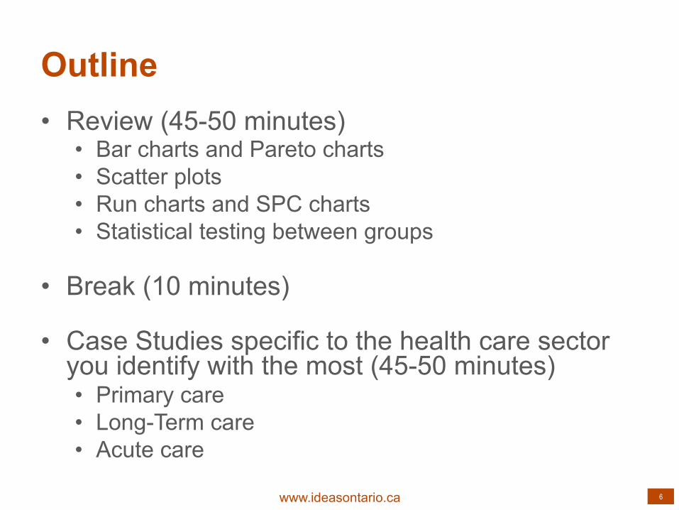
Outline • Review (45-50 minutes)
• Bar charts and Pareto charts • Scatter plots • Run charts and SPC charts • Statistical testing between groups
• Break (10 minutes)
• Case Studies specific to the health care sector you identify with the most (45-50 minutes) • Primary care • Long-Term care • Acute care

www.ideasontario.ca 7
GUELPH GENERAL HOSPITAL – HIP AND KNEE REPLACEMENT IMPROVEMENT INITIATIVE

www.ideasontario.ca 8
Abbreviated, anonymized version of the data
www.ideasontario.ca 9
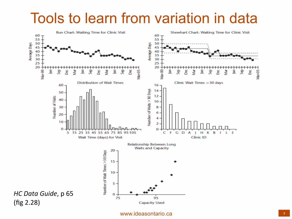
HC Data Guide, p 65 (fig 2.28)
Tools to learn from variation in data

www.ideasontario.ca 10
Bar Charts

www.ideasontario.ca 11
Bar Charts
0
10
20
30
40
50
60
70
80
90
100
A B C
% wait ;me 1 within target
% wait ;me 2 within target
www.ideasontario.ca 12
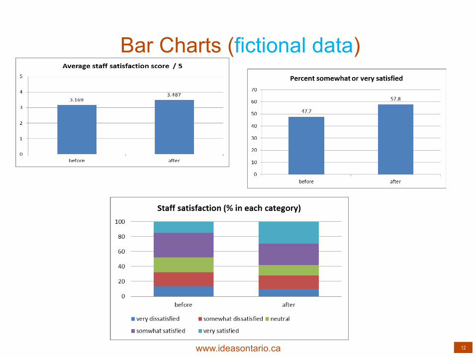
Bar Charts (fictional data)

www.ideasontario.ca 13
Statistics are like bikinis. What they reveal is suggestive, but what they conceal is vital. Aaron Levenstein, Professor of Business, Baruch College
www.ideasontario.ca 14
Pareto Charts
www.ideasontario.ca 15
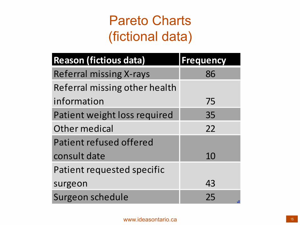
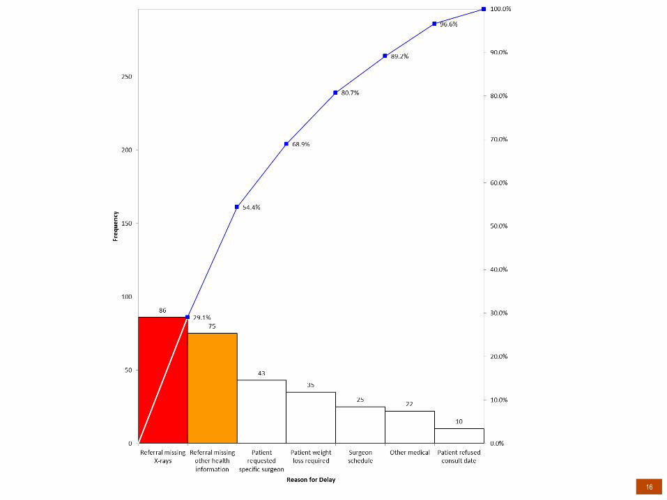
Pareto Charts (fictional data)
Reason (fictious data) FrequencyReferral missing X-‐rays 86Referral missing other health information 75Patient weight loss required 35Other medical 22Patient refused offered consult date 10Patient requested specific surgeon 43Surgeon schedule 25
www.ideasontario.ca 16

www.ideasontario.ca 17
Scatter Plots

www.ideasontario.ca 18
Scatter Plots

www.ideasontario.ca 19
Scatter Plots

www.ideasontario.ca 20
Histograms

www.ideasontario.ca 21
Bikini #1

www.ideasontario.ca 22
Histograms
Surgeon % within target
Mean Median
A 33% 176 163
B 24% 154 155
C 66% 68 71

www.ideasontario.ca 23
HC Data Guide, p 65 (fig 2.28)
Tools to learn from variation in data

www.ideasontario.ca 24
Run Charts

www.ideasontario.ca 25
Run Charts
www.ideasontario.ca 26
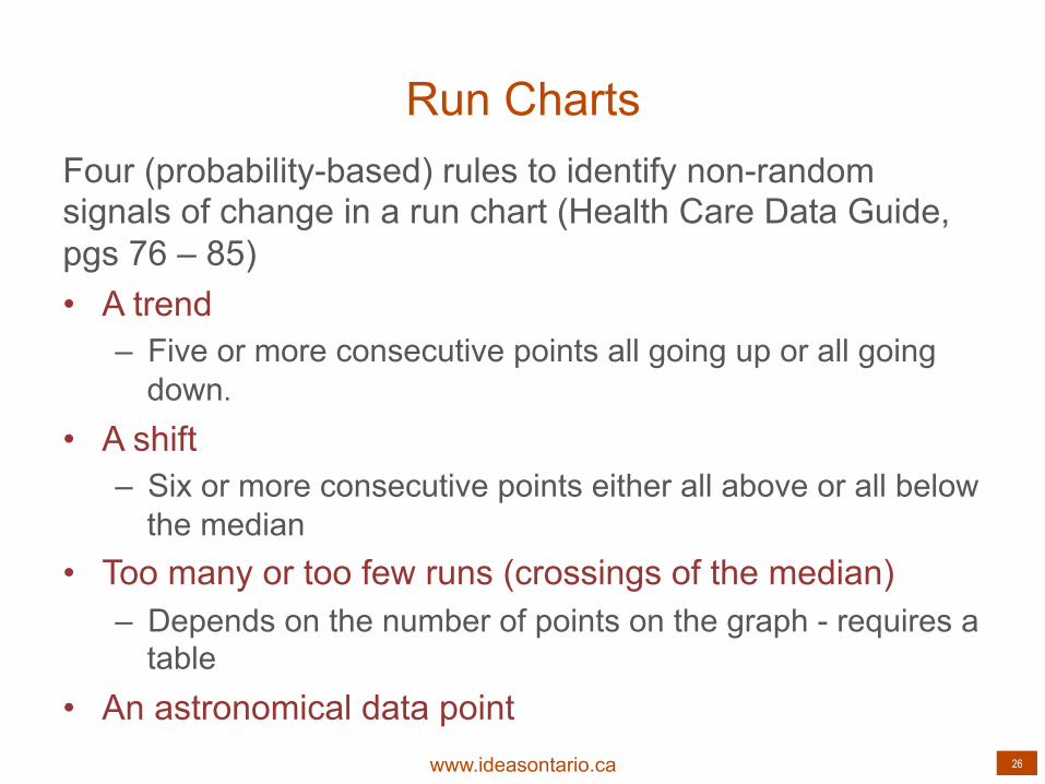
Run Charts Four (probability-based) rules to identify non-random signals of change in a run chart (Health Care Data Guide, pgs 76 – 85) • A trend
– Five or more consecutive points all going up or all going down.
• A shift – Six or more consecutive points either all above or all below
the median • Too many or too few runs (crossings of the median)
– Depends on the number of points on the graph - requires a table
• An astronomical data point

www.ideasontario.ca 27
hAp://www.qihub.scot.nhs.uk/knowledge-‐centre/quality-‐improvement-‐tools/run-‐chart.aspx

www.ideasontario.ca 28
Run Charts

www.ideasontario.ca 29
The Run Chart as a Bikini

www.ideasontario.ca 30
Corresponding Shewhart Chart

www.ideasontario.ca 31
Statistical Process Control (SPC) Charts

www.ideasontario.ca 32
Shewhart Chart Selection Guide
HC Data Guide p. 151 (fig 5.1)

www.ideasontario.ca 33
Types of Measures – Continuous Variables
Patient ID
Wait 2 (days) -‐ decision to procedure
1 3122 3493 4724 3155 2926 2867 2558 2659 29710 27211 1112 28613 12214 16215 24716 281
Month Case 1 Case 2 Case 3 Case 4 Case 5 Case 6May-‐11 312 349Jun-‐11 472 315 292Jul-‐11 286 255 265 297 272 11Aug-‐11 286 122 162 247 281 288Sep-‐11 211 289 391 226 272Oct-‐11 121 299 243 160 240 278Nov-‐11 122 129 164 110 110 138Dec-‐11 112 101 104 139 251 87Jan-‐12 70 73 79 154 178 173Feb-‐12 153 190 344 359 21 286Mar-‐12 85 272 202 206 210 182Apr-‐12 184 287 208 260 31 122
MonthAverage Wait 2
May-‐11 330.5Jun-‐11 359.7Jul-‐11 148.2Aug-‐11 153.4Sep-‐11 277.8Oct-‐11 147.9Nov-‐11 200.8Dec-‐11 155.8Jan-‐12 200.3Feb-‐12 186.3Mar-‐12 152.8Apr-‐12 152.7May-‐12 105.7Jun-‐12 115.3Jul-‐12 105.3
www.ideasontario.ca 34
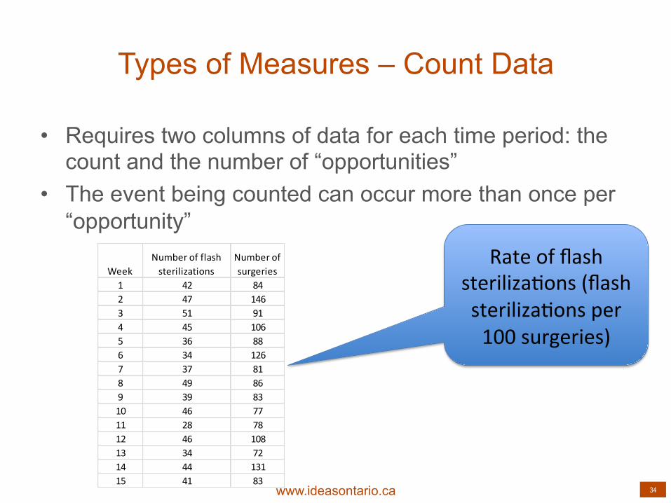
Types of Measures – Count Data
• Requires two columns of data for each time period: the count and the number of “opportunities”
• The event being counted can occur more than once per “opportunity”
WeekNumber of flash sterilizations
Number of surgeries
1 42 842 47 1463 51 914 45 1065 36 886 34 1267 37 818 49 869 39 8310 46 7711 28 7812 46 10813 34 7214 44 13115 41 83
Rate of flash steriliza;ons (flash steriliza;ons per 100 surgeries)
www.ideasontario.ca 35
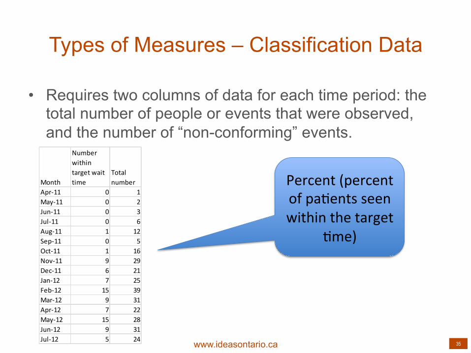
Types of Measures – Classification Data
• Requires two columns of data for each time period: the total number of people or events that were observed, and the number of “non-conforming” events.
Month
Number within target wait time
Total number
Apr-‐11 0 1May-‐11 0 2Jun-‐11 0 3Jul-‐11 0 6Aug-‐11 1 12Sep-‐11 0 5Oct-‐11 1 16Nov-‐11 9 29Dec-‐11 6 21Jan-‐12 7 25Feb-‐12 15 39Mar-‐12 9 31Apr-‐12 7 22May-‐12 15 28Jun-‐12 9 31Jul-‐12 5 24
Percent (percent of pa;ents seen within the target
;me)

www.ideasontario.ca 36
Learning from a Shewhart Chart
• Rules for detecting special cause variation. • Annotation • Setting and re-setting the baseline

www.ideasontario.ca 37
SPC Chart Rules

www.ideasontario.ca 38
Baseline Data

www.ideasontario.ca 39
First PDSA

www.ideasontario.ca 40
New Baseline

www.ideasontario.ca 41
PDSA 2

www.ideasontario.ca 42
Final Graph
www.ideasontario.ca 43
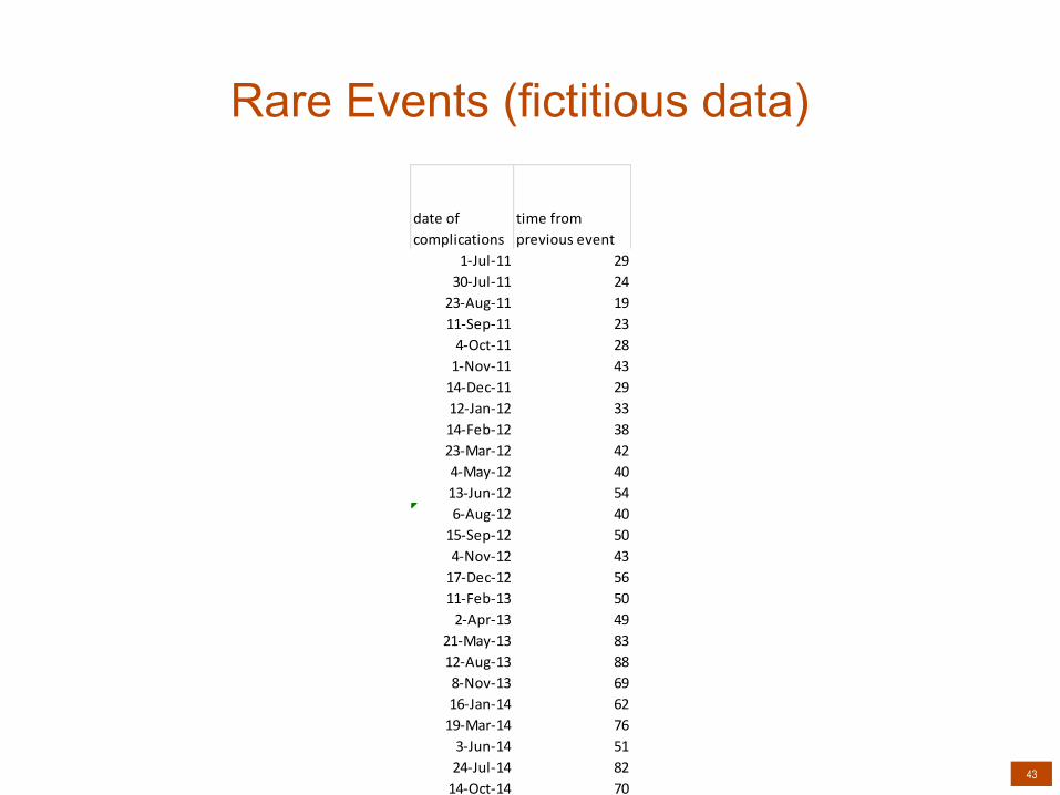
Rare Events (fictitious data)
date of complications
time from previous event
1-‐Jul-‐11 2930-‐Jul-‐11 2423-‐Aug-‐11 1911-‐Sep-‐11 234-‐Oct-‐11 281-‐Nov-‐11 4314-‐Dec-‐11 2912-‐Jan-‐12 3314-‐Feb-‐12 3823-‐Mar-‐12 424-‐May-‐12 4013-‐Jun-‐12 546-‐Aug-‐12 4015-‐Sep-‐12 504-‐Nov-‐12 4317-‐Dec-‐12 5611-‐Feb-‐13 502-‐Apr-‐13 49
21-‐May-‐13 8312-‐Aug-‐13 888-‐Nov-‐13 6916-‐Jan-‐14 6219-‐Mar-‐14 763-‐Jun-‐14 5124-‐Jul-‐14 8214-‐Oct-‐14 70

www.ideasontario.ca 44
Rare Events (fictitious data)

www.ideasontario.ca 45
Data for Judgement vs. Data for Improvement
• Measurements towards a target may hide or discourage authentic and sustainable improvement
• Targets for accountability may focus on what is easily measured rather than what has value (process rather than outcome)

www.ideasontario.ca 46
Data for Judgement vs. Data for Improvement
(fictitious data)

www.ideasontario.ca 47
Data for Judgement vs. Data for Improvement
(fictitious data)

www.ideasontario.ca 48
Statistical Testing

www.ideasontario.ca 49
Statistical testing
• Statistical testing is a common form of analysis used in clinical research and epidemiological studies
• Tests the hypothesis that the average/proportion/rate of some outcome in one group of patients is equal to the average/proportion/rate in another group of patients
• Statistical tests produce a P-value, which represents the likelihood that the observed difference in the outcome between the two groups is due to chance
• Studies often set the significance level at 0.05, meaning if there is less than 5% chance the observed results are due to chance, we deem the results `statistically significant`

www.ideasontario.ca 50
Statistical testing versus QI analysis
• While used heavily in clinical research and epidemiology, statistical testing is not the analytic method of choice (e.g., the `Gold Standard`) for quality improvement
• QI involves conducting sequential tests of change over time to some existing process; therefore, it is logical that tracking outcome and process measures over time in an SPC chart would be the preferred method of analysis
• Performing statistical tests, rather than tracking measures over time, may cause us to claim improvement when none has occurred, or miss improvement when some has occurred.
www.ideasontario.ca 51
A medical unit has 40 COPD discharges per month. On July 1, they implement a self-management training program prior to discharge for all patients. There is a statistically significant decrease (p=0.026) in COPD readmission rates after the implementation.
20,0%
12,5%
0,0%
5,0%
10,0%
15,0%
20,0%
25,0%
Pre (Jan -‐ Jun) Post (Jul -‐ Dec)
Readmissions
P = 0.026

www.ideasontario.ca 52
Here are the readmission rates plotted by month. There is an apparent decrease happening throughout the year, perhaps due to other quality improvement initiative. Difficult to tie decrease to the July 1 initiative
0
0,05
0,1
0,15
0,2
0,25
Jan Feb Mar Apr May Jun Jul Aug Sep Oct Nov Dec
Readmissions1
www.ideasontario.ca 53
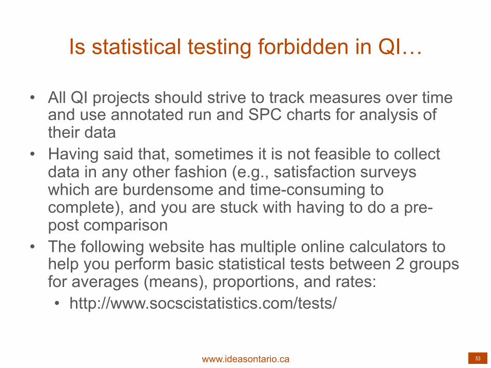
Is statistical testing forbidden in QI…
• All QI projects should strive to track measures over time and use annotated run and SPC charts for analysis of their data
• Having said that, sometimes it is not feasible to collect data in any other fashion (e.g., satisfaction surveys which are burdensome and time-consuming to complete), and you are stuck with having to do a pre-post comparison
• The following website has multiple online calculators to help you perform basic statistical tests between 2 groups for averages (means), proportions, and rates: • http://www.socscistatistics.com/tests/


www.ideasontario.ca 55
Delivered in partnership and collaboration with:
Funding provided by the Government of Ontario