charting basics
TRANSCRIPT

About Excel Charts
Building a Chart: Two Methods
A Gallery of Chart Types
Focus on the XY (Scatter) Chart Type
Customizing a Chart
Excel Charting Basics

About Excel Charts
An Excel chart provides a graphical view of worksheet data.
A chart is linked to the worksheet data from which it's
created. When the worksheet data changes, the chart
changes automatically.
Charts are almost infinitely customizable. For example:
Even after your chart is created, you can add data to it or
delete data from it.
Change the chart type at any time.
Right-click almost any element of a chart to see its
context menu; then modify the element.
Add your own text to a chart.
Use graphics (instead of geometric shapes) as data markers.
Etc.
A chart in a worksheet "floats" on the surface of the sheet. You
can move a chart "over" worksheet contents without disturbing them.

An Excel chart provides a graphical view of worksheet data.
A chart is linked to the worksheet data from which it's
created. When the worksheet data changes, the chart
Charts are almost infinitely customizable. For example:
Even after your chart is created, you can add data to it or
Right-click almost any element of a chart to see its
Use graphics (instead of geometric shapes) as data markers.
A chart in a worksheet "floats" on the surface of the sheet. You
can move a chart "over" worksheet contents without disturbing them.

Building an Excel Chart
Jan Feb Mar
Widget A 2,500 3,250 4,260
Widget B 1,100 980 1,289
Widget C 4,320 4,289 4,090
Method 1
Select the data to chart (B4:E7).
Hit the F11 key.
Excel creates the default column chart and
locates it on a new worksheet.
Method 2
Select the data to chart (B4:E7).
Go through the 4 Chart Wizard steps.
Excel creates the chart based on your
Wizard-prompt selections.
-
500
1,000
1,500
2,000
2,500
3,000
3,500
4,000
4,500
5,000
Jan

Jan Feb Mar
Widget A
Widget B
Widget C

Chart Types: A Gallery of Chart Examples
From: http://office.microsoft.com/assistance/2002/articles/ExamplesofChartTypes.aspx
Excel supports many kinds of charts to help you display data in ways that are most
meaningful to your audience. Here's a gallery of chart examples to help you
determine which kinds of charts are best for your data.
Contents:
XY Scatter Bubble
Radar Surface
Cone, Cylinder, Pyramid Area
Column Bar
Line Pie
Doughnut Stock
XY scatter
An xy (scatter) chart either shows the relationships among the numeric values in several data series, or plots two groups of numbers as one series of xy coordinates. This chart shows uneven intervals &151; or clusters &151; of data and is commonly used for scientific data.
When you arrange your data, place x values in one row or column, and then enter corresponding y values in the adjacent rows or columns.
Bubble

A bubble chart is a type of xy (scatter) chart. The size of the data marker indicates the value of a third variable.
To arrange your data, place the x values in one row or column, and enter corresponding y values and bubble sizes in the adjacent rows or columns.
The chart in this example shows that Company A has the most products and the greatest market share, but not the highest sales.
Radar
A radar chart compares the aggregate values of a number of data series.
In this chart, the data series that covers the most area, Brand A, represents the brand with the highest vitamin content.
Surface

A surface chart is useful when you want to find optimum combinations between two sets of data. As in a topographic map, colors and patterns indicate areas that are in the same range of values.
This chart shows the various combinations of temperature and time that result in the same measure of tensile strength.
Cone, Cylinder, Pyramid
The cone, cylinder, and pyramid data markers can lend a dramatic effect to 3-D column and bar charts.
Area
An area chart emphasizes the magnitude of change over time. By displaying the sum of the plotted values, an area chart also shows the relationship of parts to a whole.

In this example, an area chart emphasizes increased sales in Washington and illustrates the contribution of each state to total sales.
Column
A column chart shows data changes over a period of time or illustrates comparisons among items. Categories are organized horizontally, values vertically, to emphasize variation over time.
Stacked column charts show the relationship of individual items to the whole. The 3-D perspective column chart compares data points along two axes.
In this 3-D chart, you can compare four quarters of sales performance in Europe with the performance of two other divisions.
Bar
A bar chart illustrates comparisons among individual items. Categories are organized vertically, values horizontally, to focus on comparing values and to place less emphasis on time.

Stacked bar charts show the relationship of individual items to the whole.
Line
A line chart shows trends in data at equal intervals.
Pie
A pie chart shows the proportional size of items that make up a data series to the sum of the items. It always shows only one data series and is useful when you want to emphasize a significant element.
To make small slices easier to see, you can group them together as one item in a pie chart and then break down that item in a smaller pie or bar chart next to the main chart.

Doughnut
Like a pie chart, a doughnut chart shows the relationship of parts to a whole, but it can contain more than one data series. Each ring of the doughnut chart represents a data series.
Stock
The high-low-close chart is often used to illustrate stock prices. This chart can also be used for scientific data; for example, to indicate temperature changes. You must organize your data in the correct order to create this and other stock charts.
A stock chart that measures volume has two value axes: one for the columns that measure volume, and the other for the stock prices. You can include volume in a high-low-close or open-high-low-close chart.

http://office.microsoft.com/assistance/2002/articles/ExamplesofChartTypes.aspx
An xy (scatter) chart either shows the relationships among the numeric values in several data series, or plots two groups of numbers as one series of xy coordinates. This chart shows uneven intervals &151; or clusters &151; of data and is commonly used for scientific data.
When you arrange your data, place x values in one row or column, and then enter corresponding y values in the adjacent rows or columns.

A bubble chart is a type of xy (scatter) chart. The size of the data marker indicates the value of a third variable.
To arrange your data, place the x values in one row or column, and enter corresponding y values and bubble sizes in the adjacent rows or columns.
The chart in this example shows that Company A has the most products and the greatest market share, but not the highest sales.
In this chart, the data series that covers the most area, Brand A, represents the brand with the highest vitamin content.

A surface chart is useful when you want to find optimum combinations between two sets of data. As in a topographic map, colors and patterns indicate areas that are in the same range of values.
This chart shows the various combinations of temperature and time that result in the same measure of tensile strength.
The cone, cylinder, and pyramid data markers can lend a dramatic effect to 3-D column and bar charts.
An area chart emphasizes the magnitude of change over time. By displaying the sum of the plotted values, an area chart also shows the relationship of parts to a whole.

In this example, an area chart emphasizes increased sales in Washington and illustrates the contribution of each state to total sales.
A column chart shows data changes over a period of time or illustrates comparisons among items. Categories are organized horizontally, values vertically, to emphasize variation over time.
Stacked column charts show the relationship of individual items to the whole. The 3-D perspective column chart compares data points along two axes.
In this 3-D chart, you can compare four quarters of sales performance in Europe with the performance of two other divisions.
A bar chart illustrates comparisons among individual items. Categories are organized vertically, values horizontally, to focus on comparing values and to place less emphasis on time.

A pie chart shows the proportional size of items that make up a data series to the sum of the items. It always shows only one data series and is useful when you want to emphasize a significant element.
To make small slices easier to see, you can group them together as one item in a pie chart and then break down that item in a smaller pie or bar chart next to the main chart.

Like a pie chart, a doughnut chart shows the relationship of parts to a whole, but it can contain more than one data series. Each ring of the doughnut chart represents a data series.
The high-low-close chart is often used to illustrate stock prices. This chart can also be used for scientific data; for example, to indicate temperature changes. You must organize your data in the correct order to create this and other stock charts.
A stock chart that measures volume has two value axes: one for the columns that measure volume, and the other for the stock prices. You can include volume in a high-low-close or open-high-low-close chart.

An xy (scatter) chart either shows the relationships among the numeric values in several data series, or plots two groups of numbers as one series of xy coordinates. This chart shows uneven intervals &151; or clusters &151; of data and is commonly used for scientific data.


The high-low-close chart is often used to illustrate stock prices. This chart can also be used for scientific data; for example, to indicate temperature changes. You must organize your data in the correct order to create this and other stock charts.
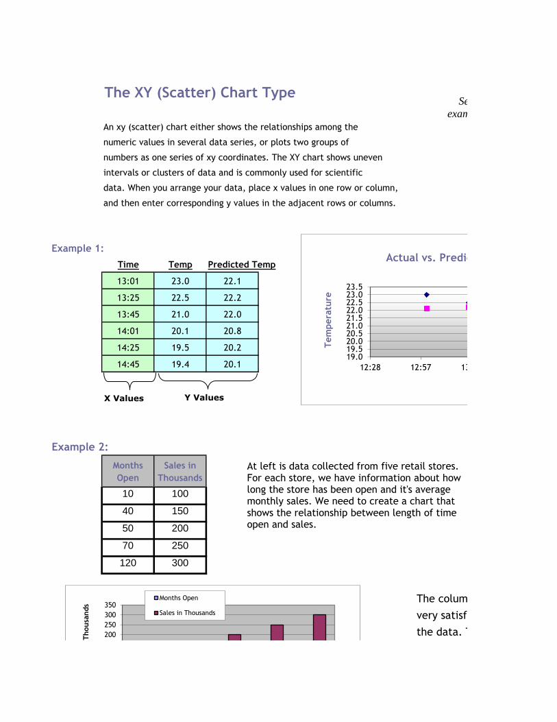
The XY (Scatter) Chart Type
An xy (scatter) chart either shows the relationships among the
numeric values in several data series, or plots two groups of
numbers as one series of xy coordinates. The XY chart shows uneven
intervals or clusters of data and is commonly used for scientific
data. When you arrange your data, place x values in one row or column,
and then enter corresponding y values in the adjacent rows or columns.
Example 1:
Time Temp Predicted Temp
13:01 23.0 22.1
13:25 22.5 22.2
13:45 21.0 22.0
14:01 20.1 20.8
14:25 19.5 20.2
14:45 19.4 20.1
Example 2:
Months
Open
Sales in
Thousands
10 100
40 150
50 200
70 250
120 300
The column chart at left isn't a
very satisfactory representation of
the data. The X axis doesn't represent
X Values Y Values
19.019.520.020.521.021.522.022.523.023.5
12:28 12:57 13:26
Actual vs. Predicted Temperature
Tem
pera
ture
At left is data collected from five retail stores. For each store, we have information about how long the store has been open and it's average monthly sales. We need to create a chart that shows the relationship between length of time open and sales.
150
200
250
300
350Months Open
Sales in Thousands
Sale
s in
Thousa
nds
See the two
examples below.

months open; months open shouldn't
be plotted as columns.
The scatter plot is best suited for this data.
With the data plotted as one series of XY coordinates
the relationship between open months and sales
amounts is much more evident.
0
50
100
150
200
1 2 3 4 5
Months Open
Sale
s in
Thousa
nds
0
50
100
150
200
250
300
350
0 20 40 60 80 100 120 140
Sale
s in
Thousa
nds
Months Open
An XY Plot of the Data

The column chart at left isn't a
very satisfactory representation of
the data. The X axis doesn't represent
13:26 13:55 14:24 14:52
Actual vs. Predicted Temperature
Temp
Predicted Temp
Time
At left is data collected from five retail stores. For each store, we have information about how
See the two
examples below.

months open; months open shouldn't
be plotted as columns.
The scatter plot is best suited for this data.
With the data plotted as one series of XY coordinates
the relationship between open months and sales
amounts is much more evident.

Customizing Charts
Jan Feb Mar
Widget A 2,500 3,250 4,260 The basic chart data.
Widget B 1,100 980 1,289
Widget C 4,320 4,289 4,090
Contents:
Display Data in Rows or Columns Add or Modify Labels
Change Data Markers Change Axis Scale
Add or Delete Data Location & Printing
1. Display data in ROWS or COLUMNS.
Make this choice in Step 2 of the Chart Wizard.
Do you want Months to display on the X axis and Widget items to display in the legend or the reverse?
2. Add or Modify Labels

3. Change Data Markers
-
500
1,000
1,500
2,000
2,500
3,000
3,500
Jan Feb
Widget A
Widget B
-
500
1,000
1,500
2,000
2,500
3,000
3,500
Jan Feb
Widget A
Widget B
-
500
1,000
1,500
2,000
2,500
3,000
3,500
Jan Feb
Widget A
Widget B
Format the data series and increase
gap width between bars.
Format the data series with different fill
colors (and gradients).
-
500
1,000
1,500
2,000
2,500
3,000
3,500
Jan Feb
Widget A
Widget B
Change one data marker fill to a picture
instead of solid fill.
The original, default chart.
2,500
3,250
1,100 980
-
500
1,000
1,500
2,000
2,500
3,000
3,500
Jan Feb
Widget A
Widget B
Values added to the top of each data
marker.

4. Change Axis Scale
5. Add or Delete Data
Change one data marker fill to a picture
instead of solid fill.
Values added to the top of each data
marker.
-
1,000
2,000
3,000
4,000
5,000
Jan Feb
Widget A
Widget B
Right-click the Y Axis, choose Format Axis
the "Scale" tab.
-
500
1,000
1,500
2,000
2,500
3,000
3,500
Jan Feb
Widget A
Widget B
-
500
1,000
1,500
2,000
2,500
3,000
3,500
4,000
4,500
Jan Feb Mar
Widget A
Widget B
1. Select the chart.
2. Re-open the Chart Wizard. 3. Go to the Wizard Step 2 and select the "Data Range" tab. 4. Redefine the data range to add or exclude data. 5. Click the Wizard's Finish button to return
to the modified chart.

6. Location & Printing
The last Chart Wizard step gives you the choice of
embedding your chart in the same worksheet with the data that Excel adds to the workbook. Whatever you decide in this step, you can always change your mind later.
To move a chart from its own sheet to another
worksheet, right click the chart and choose Locationdifferent worksheet. Use the same technique move a chart embedded on a sheet to its own worksheet.
To print a chart on its own worksheet choose File, Print from the menus.
Or, for more options in how the chart will display on the page, choose File, Page Setup and click the "Chart" tab. Select from the "Printed chart size" options. To print only the chart on a worksheet with data, click the chart to select it and then choose File, Print or File, Page Setup. The same print options described above apply.
To print a chart AND other data on the same worksheet, highlight the range that includes the data and the chart and choose File, Print and then "Selection". Then choose Preview mode to see what Excel will print.

Do you want Months to display on the X axis and Widget items to display in the legend or the reverse?
Step 3 of the Chart Wizard

gives you the chance to add
a chart title and axis labels.
Or , select the chart and start
typing. What you enter is stored
in a text box on the chart that
you can format, move, and size
as you please.
-
500
1,000
1,500
2,000
2,500
3,000
3,500
Jan Feb
Widget A
Widget B
Format the data series and reduce gap
width between bars.
The original, default chart.
Widget A
Widget B
Values added to the top of each data
Widget A Widget
A
Widget B
Widget B
-
500
1,000
1,500
2,000
2,500
3,000
3,500
Jan Feb
Series names added to the top of each
marker, replacing the legend.

Values added to the top of each data Series names added to the top of each
marker, replacing the legend.
click the Y Axis, choose Format Axis, then
the "Scale" tab.
3. Go to the Wizard Step 2 and select the
4. Redefine the data range to add or exclude
button to return

The last Chart Wizard step gives you the choice of
embedding your chart in the same worksheet with the data orputting the chart on a new worksheet that Excel adds to the workbook.
Whatever you decide in this step, you can always change your mind later.
To move a chart from its own sheet to another
worksheet, right click the chart and choose Location from the pop-up menu. Then choose a different worksheet.
Use the same technique move a chart embedded on a sheet to its own worksheet.