construction of double page spread
TRANSCRIPT

Development of Double Page Spread
www.KatieWootton95.wordpress.com

I found a picture of a red pattern/explosion on Google images for the background. It was originally purple but I edited it to red in order to ensure that it sticks to my
‘theme’ of red, white and black – this reiterates the fact that it’s a rock/alternative magazine. I then incorporated the ‘cut out’ image of my model, which I had previously edited in Photoshop. I had to get rid of the background to make sure that it fit in well
with this one.
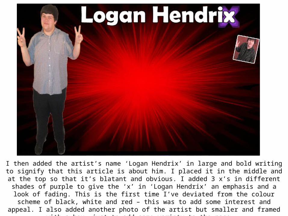
I then added the artist’s name ‘Logan Hendrix’ in large and bold writing to signify that this article is about him. I placed it in the middle and at the top so that it’s blatant and obvious. I added 3 x’s in different shades of purple to give the ‘x’ in ‘Logan Hendrix’ an emphasis and a look of fading. This is the first time I’ve deviated from the colour
scheme of black, white and red – this was to add some interest and appeal. I also added another photo of the artist but smaller and framed with a box, just to add some
variety to the page.

I then added a black box and lowered the opacity so it looked faded and like it isn’t too blunt. I also added a quote on top of it of what the artist said in the following
interview, hoping to attract people into reading the entire article. I then started adding my article text – to distinguish between the interviewer and the person being interviewed, I used a black outline for the interviewer. At this point, I attempted to
make everything look as realistic as possible and like magazine double page spreads really would look. I also added the ‘Page 4’ in the corner.

I then added the rest of the interview text and this is what my completed page looks like. I hoped to make it look as sophisticated as possible and realistic with the
placement and appearance. The interview has been placed in conventional layouts and follows a simple question and answer routine on the page – this makes it easy and
clear to read. The image of the model may appear slightly distorted due to the computer I was on whilst creating it, but those computers that have a wider screen, it
appears normal and undistorted.