communication study assessment task 2: creating an example of communication caradock gardens...
TRANSCRIPT

Communication StudyCommunication Study
Assessment Task 2: creating an Assessment Task 2: creating an example of communicationexample of communication
Caradock GardensMagazine advertisement Commentary
Word Count: 799By Latoya Hancock


ContextThis single page advertisement was created
for the state’s The Adelaide* Magazine. This
publication focuses on elements of the state
and highlights hotspots around the town.
This advertisement may be placed in a
special tourist issue of the magazine.

AudienceThe image of the people exploring the maze in my advertisement relates to
my audience of family. This image symbolises the place being fun and
appealing to families with children. It is idealised that the place is also
educational and free, so this would appeal greatly to my audience.

Product & Campaign DetailsCaradock Gardens is a 30 hectare fictional
garden which is now home to a large
amount of hedge mazes. This advertisement
focuses on them and promotes other
facilities in the garden in the copy at the
bottom of the advertisement. I wanted to
create a simple advertisement that
had deeper meanings to it and have a powerful image which would draw
people’s attention to it. The advertisement is not flashy and does not contain
a large amount of text. The logo I created carries images that are associated
with gardens and nature.

Overall ConceptThe overall concept for my advertisement was to create the idea that visitors to Caradock Gardens
would have a heightened experience when they visit as the advertisement illustrates it as being
this amazing mystical garden. I created both an ideal element (the top half) and a real or grounded
element (the bottom half) to the advertisement. The basic idea was to promote the new hedge
mazes at Caradock Gardens. The garden wants to draw in more families, so I used an image with
people in it and mentioned family related activities (and the fact that it is free to visit) in the copy.
“Take a magical trip through wonderland this summer by exploring our brand new hedge mazes. Fun for the whole family and it's free. Whilst visiting, don't forget to explore our wide range of colourful gardens or have a scrumptious meal in one of our many restaurants.”
– Copy on Advertisement

Central ImageThe central image is the perfect
visual representation of losing
yourself in this larger than life
location. The hazy top of the
central image creates a fantasy
ideal of the garden. The bottom
half of the image is darker and
creates a more realistic feel to the advertisement. The people in the centre
of the image pointing into the distance bring a personal feel of families into
the advertisement. The way the tones of the colours change (from the top
to the bottom) in the advertisement links to my colour scheme.
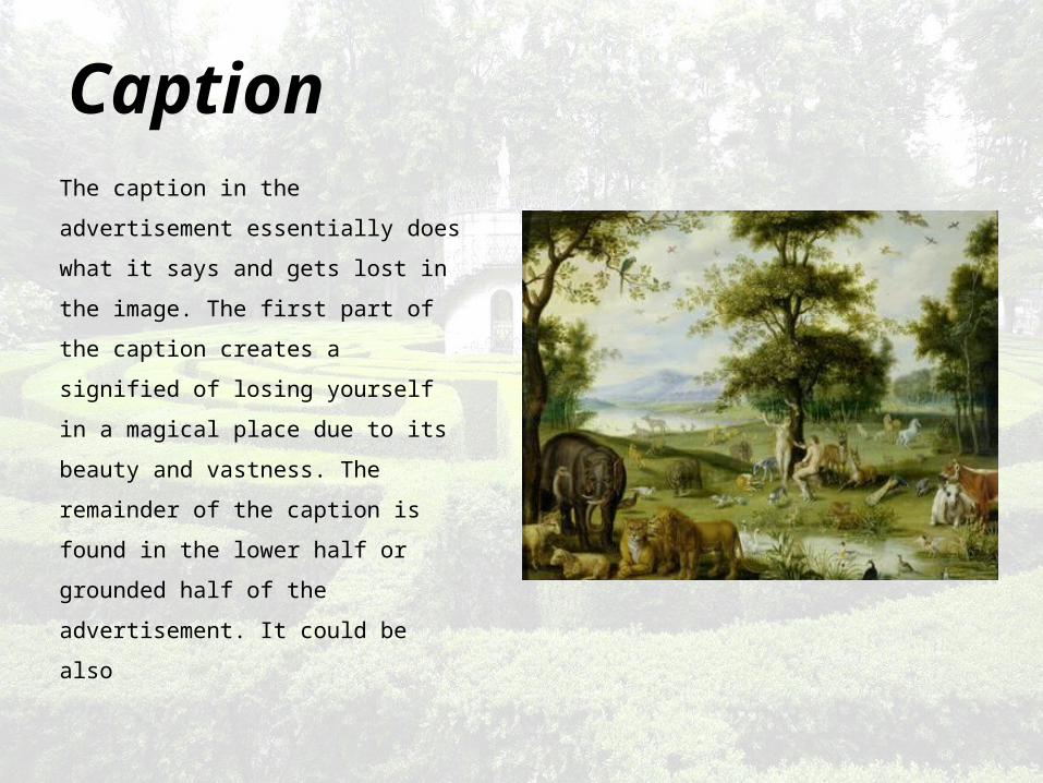
CaptionThe caption in the advertisement
essentially does what it says and
gets lost in the image. The first
part of the caption creates a
signified of losing yourself in a
magical place due to its beauty
and vastness. The remainder of
the caption is found in the lower
half or grounded half of the
advertisement. It could be also

known as the new idea being
introduced or in other words, the
product that is being advertised. It
mentions that this place is real
and the word ‘our’ invites people
in to visit. The garden statement
creates a signified of the Garden
of Eden which Adam and Eve lived
in. Using this signified gives the
viewer the impression that this
place is just like the mystical
Garden of Eden.

LayoutThe given and ideal is placed at the top of my advertisement. It is shown by
the words ‘Lose yourself’ and the hazy top of the skyline. An image of a
fantasy world and makes the viewer want to look for themselves at this
location. The real and grounded is placed in the lower, darker half of the
advertisement. The text ‘in our garden’ makes you realise that this place is
real and available to visit to discover its glory. The simple logo shows real
elements of nature and the gardens whilst the text explains facilities of the
park.

Logo & Address
Copy
Central Image
Beginning of caption
Ending of caption
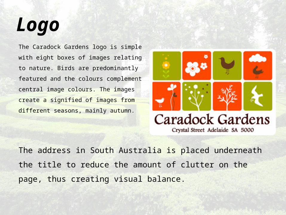
LogoThe Caradock Gardens logo is simple with
eight boxes of images relating to nature.
Birds are predominantly featured and the
colours complement central image colours.
The images create a signified of images
from different seasons, mainly autumn.
The address in South Australia is placed underneath the title to reduce the
amount of clutter on the page, thus creating visual balance.

Address
Images of Flora & Fauna
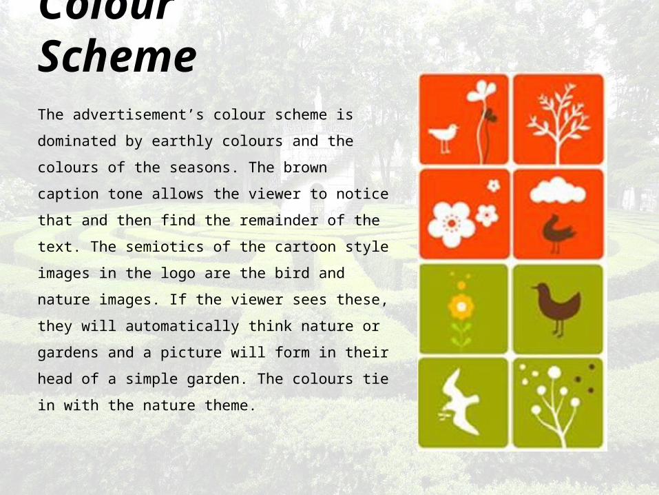
Colour SchemeThe advertisement’s colour scheme is dominated
by earthly colours and the colours of the
seasons. The brown caption tone allows the
viewer to notice that and then find the
remainder of the text. The semiotics of the
cartoon style images in the logo are the bird and
nature images. If the viewer sees these, they will
automatically think nature or gardens and a
picture will form in their head of a simple
garden. The colours tie in with the nature theme.