common use of powerpoint versus the a cognitive · pdf filecommon use of powerpoint versus the...
TRANSCRIPT
APPLIED THEORY SUMMARY� Finds that the common practice of PowerPoint
is heavily influenced by PowerPoint’s defaults� Finds that the common practice of PowerPoint
does not follow cognitive principles ofmultimedia learning
� Shows that the assertion–evidence slidestructure is much more in line with multimedialearning principles
Common Use of PowerPoint versus theAssertion–Evidence Structure:
A Cognitive PsychologyPerspectiveJOANNA K. GARNER, MICHAEL ALLEY, ALLEN F. GAUDELLI, AND SARAH E. ZAPPE
INTRODUCTION
Since 2001, harsh criticism of PowerPoint’s presen-tation slide structure has surfaced in several pop-ular publications: “Absolute PowerPoint,” TheNew Yorker (Parker 2001); “PowerPoint Is Evil,”
Wired (Tufte 2003b); “Is PowerPoint the Devil,” The Chi-cago Tribune (Keller 2003); and “Research Points the Fin-ger at PowerPoint,” The Sydney Morning Herald (Patty2007). Because Microsoft PowerPoint controls 95% of themarket for presentation slideware (Parker 2001), its defaultstructure certainly deserves scrutiny. However, what ismore important than analyzing the default structure ofPowerPoint is to analyze the slide structures that peopleactually use. For that reason, in technical communication,the key question is the following: what slide structures arecommonly used for presenting science and technology?
To answer this question fully, one would have toexamine representative samples of slides from the differenttypes of technical presentations: project, research, design,marketing, and so forth. One would also have to considerpresentation slides created in the major languages: Manda-rin Chinese, English, Spanish, and Arabic. Moreover, onewould to have to consider slides in each of these differentlanguages created by native speakers versus nonnativespeakers. In short, the challenge of determining the com-mon practice of slide design in technical communication isdaunting.
Nonetheless, in this paper, we attempt a “first-cut”estimate of what the common practice is for slides intechnical presentations. Having such an estimate, even ifrough, would be valuable because it would put into per-spective the criticism of PowerPoint published thus far. Forexample, if only a relatively small percentage of slides
follow PowerPoint’s defaults, questions about the efficacyof those defaults are moot.
In our first-cut estimation, we analyzed �2,000 slidesfrom project and research presentations given in English bythree different groups: professionals at North Americanlaboratories and companies; scholars at a North Americanengineering conference; and nonnative speakers of Englishattending graduate schools in Northern Europe. Why focuson project and research presentations? From a perspectiveof science and technology, these types of presentations areimportant, often occurring before large audiences. Fromthe perspective of data analysis, these types of presenta-tions include slides with a wide range of purposes—fromprimarily informative to primarily persuasive. From a logis-tical perspective, representative sets of these types of pre-sentations are accessible within the public domain and arenot as limited by proprietary restrictions as other presen-tation types are.
In our analysis, we looked for the frequency of specificslide features and the degree to which those features ad-hered to or broke away from PowerPoint’s default settingsfor placement and form of both the headline and the body.In our analysis, we did not specifically target slides createdby the readers of this journal: technical managers, technicaleditors, technical artists, technical writers, and technicalcommunication instructors. The reason is that Technicalcommunication has published several recent articles thatcritically analyze the default slide structure of PowerPoint(Doumont 2005; Farkas 2009; Manning and Amare 2006)
Manuscript received 9 January 2009; revised 3 July 2009;accepted 31 July 2009.
Volume 56, Number 4, November 2009 • TechnicalCOMMUNICATION 331

and support alternative structures (Alley and Neeley 2005;Jennings 2009; Markel 2009). For that reason, targeting thisjournal’s audience would likely not represent practices bythe average user in science and technology. Although someslides in our sample were possibly created or influenced byreaders of this journal, many more were not.
Once we have answered the question of what is thecommon practice of slides in technical communication, thenext logical question is whether that common practicemeets the established cognitive psychology principles forhow people learn. In other words, is the common practiceof slides in technical communication effective at helpingpeople understand and remember the information? To ad-dress this question, we use principles of multimedia learn-ing to interpret our analysis findings. These learning prin-ciples are from experimental research in cognitivepsychology.
After defining and assessing the common practice ofslides in technical communication, we consider an alterna-tive slide structure called the assertion–evidence (A–E)slide structure, which several technical communicators toutas being more effective for technical presentations (Alleyand Neeley 2005; Atkinson 2005; Doumont 2007; Jennings2009; Markel 2009). Granted, other interesting alternativesto PowerPoint’s structure exist that make the same claim—for example, the Presentation Zen approach of Reynolds(2008) and the slide:ology approach of Duarte (2008). How-ever, here we consider the A–E structure because the spec-ificity of its guidelines (Alley and Neeley 2005) are wellsuited for analysis. As with the common practice structure,we analyze this A–E structure in light of multimedia learn-ing principles and present recommendations for those whouse slides in technical presentations.
DEFAULT SETTINGS OF POWERPOINTFigure 1 shows PowerPoint’s default master slide, whichcontains the program’s key default settings. Except forchanges in the choice of typeface and the number of slidemasters, these settings have essentially remained the samesince the program’s creation in the mid-1980s by an entre-
preneur, Robert Gaskins, and a computer scientist, DennisAustin (Gomes 2007). The original typeface for PowerPointwas a version of Times New Roman. This default typefacechanged to Arial in the 1990s. In PowerPoint 2007, thetypeface changed again, this time to Calibri. For morediscussion about audience perceptions of typefaces inPowerPoint slides, see Mackiewicz (2007). In addition tochanges in typeface, later versions of PowerPoint includedadditional slide masters that the user can choose. However,because the user has to maneuver two levels into theprogram’s hierarchy to select these alternative slide mas-ters, we have focused on the default settings.
One of PowerPoint’s defaults calls for a centered head-line in a large typeface: 44 points. Because of the size andposition of the text block, our expectation is that thisdefault leads presenters to create short headlines—no morethan six words as in the instructional wording of this de-fault. Because the headline is so short, the headline wouldmost likely be a phrase, such as “Computational Results,”rather than a sentence: “Computational results show thatthe fillet eliminates the leading edge vortex” (Alley andNeeley 2005).
A second default concerns the way text is incorporatedinto the slide’s body. This default, which originated duringa time when images were difficult to incorporate into com-puter programs, calls for text to come in as a bulleted listthat automatically fills a large text box. Because of thisdefault, our expectation is that most slides contain suchlists, that the number of words in these lists is significant,and that such lists reduce the space available for graphics.
In essence, these default settings encourage presentersto create slides that have a topic–subtopic structure. That is,the phrase headline identifies the main topic or idea of theslide, and the bulleted list beneath the headline serves toidentify multiple subordinate ideas related to the overallheadline phrase. In the literature, this assumed structurehas received strong criticism. For an example of this criti-cism, see The Cognitive Style of PowerPoint by Tufte(2003a).
COMMON PRACTICE IN POWERPOINT SLIDE DESIGNAs mentioned, the defaults on the master slide might notnecessarily correlate with what occurs in common practice.Although these defaults would seem to lead presenters tocreate a topic–subtopic structure for slides, a more impor-tant question is as follows: what are the slide structures thatare used in common practice of technical presentations? Inother words, how much do the default features of Power-Point influence common practice in technical communica-tion?
To address this question, we examined slides fromthree distinctly different technical communication situa-tions to determine the influence of PowerPoint’s defaults.
Figure 1. Default settings of PowerPoint’s slide master.
APPLIED THEORYCognitive Psychology Perspective on PowerPoint Garner and colleagues
332 TechnicalCOMMUNICATION • Volume 56, Number 4, November 2009
The following situations were examined: (a) research andproject presentations created by professionals from gov-ernment, industry, and laboratories; (b) research presenta-tions created by scholars at a North American engineeringconference; and (c) research presentations created by en-gineering and science PhD students representing 16 differ-ent countries in which English is not the native language. Ineach case, we aimed for a quality of slides that would beabove average. The rationale here is that, if these above-average slides do not follow cognitive psychology princi-ples for communication, the typical slides in those situa-tions would not either.
For the first situation, we examined 501 slides from 36presentations given by technical professionals at six corpora-tions, laboratories, and agencies: the Army ResearchLaboratory, Brookhaven National Laboratory, the Environ-mental Protection Agency, the National Institute of Occupa-tional Safety and Health, Sandia National Laboratories, andUnited Technologies. The sampling consisted of 36 sets ofslides submitted to a presentations course by participatingprofessionals. The submission assignment called for a strongset of slides that the participant had recently created.
The second situation consisted of slides delivered at anengineering conference in North America. For this situa-tion, we considered 48 sets of PowerPoint slides that arosefrom presentations given at the 2008 American Society ofEngineering Education Conference. Of these presentations,3 were from plenary sessions, 31 received best paper nom-inations, and 14 came from the Educational Research Meth-ods Division, which is widely considered to be the mostselective division in the conference. Again, an implicitassumption is that significant effort went into these slides,making them appropriate representatives of this category.
Moreover, because of their interest in education, we as-sumed that the engineers at this conference were morelikely than engineers at typical technical conferences to besensitive to methods that promote audience comprehen-sion.
The final situation consisted of 33 presentations (for atotal of 515 slides) created by international PhD students inscience and engineering. These 33 students came from 16different countries in Europe, Asia, Africa, and South Amer-ica. None of these countries have English as their nativelanguage. Before a technical communication workshop(which was held in Northern Europe), each student wasasked to submit the slides from the best presentation thathe or she had given in the past year. Most slides came fromresearch seminars and thesis defenses.
Within each set of slides, we limited our analysis topresentation slides in which the purpose was to commu-nicate technical information for understanding and reten-tion. Not considered were title slides (which often includedmuch text to identify speakers and their institutions), slidesto give acknowledgments or disclaimers, or slides to serveas placeholders in a presentation (such as a Questions slideat the end).
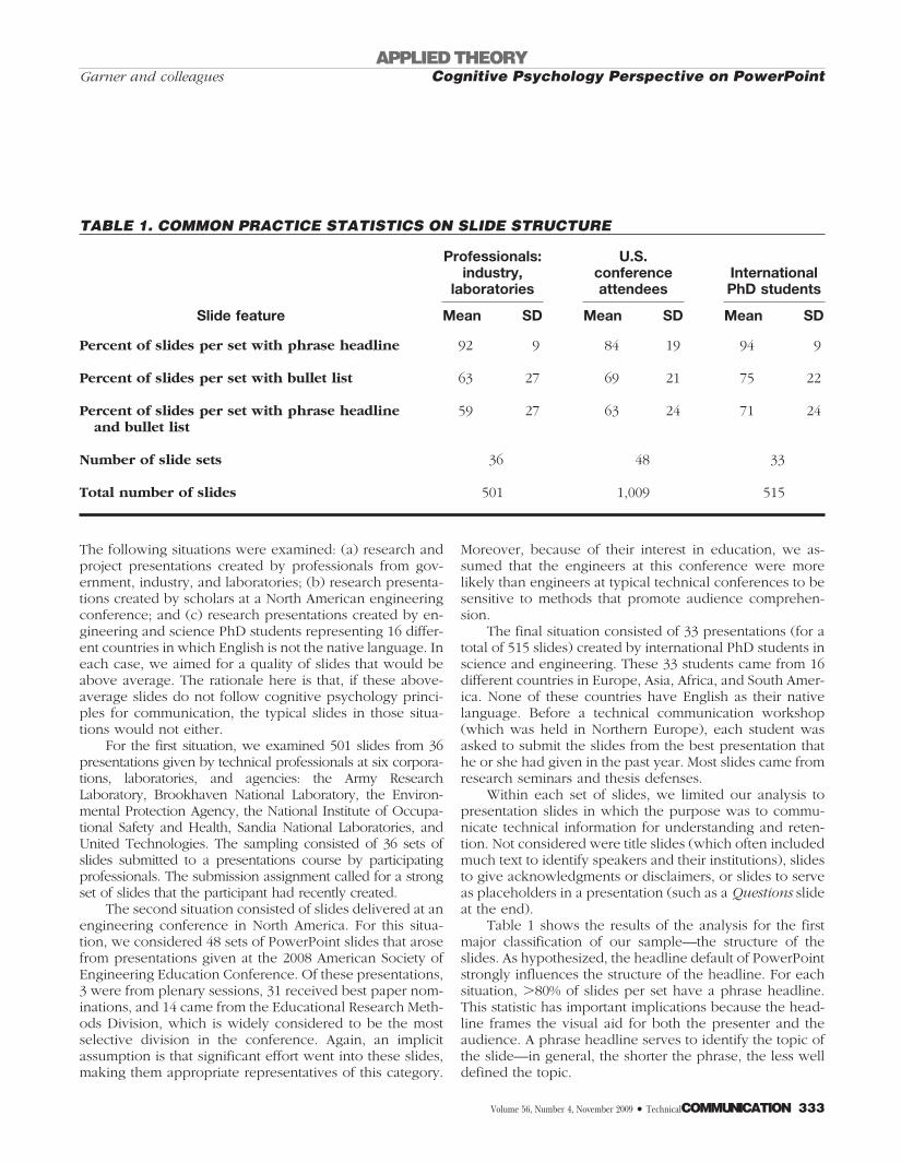
Table 1 shows the results of the analysis for the firstmajor classification of our sample—the structure of theslides. As hypothesized, the headline default of PowerPointstrongly influences the structure of the headline. For eachsituation, �80% of slides per set have a phrase headline.This statistic has important implications because the head-line frames the visual aid for both the presenter and theaudience. A phrase headline serves to identify the topic ofthe slide—in general, the shorter the phrase, the less welldefined the topic.
TABLE 1. COMMON PRACTICE STATISTICS ON SLIDE STRUCTURE
Slide feature
Professionals:industry,
laboratories
U.S.conferenceattendees
InternationalPhD students
Mean SD Mean SD Mean SD
Percent of slides per set with phrase headline 92 9 84 19 94 9
Percent of slides per set with bullet list 63 27 69 21 75 22
Percent of slides per set with phrase headlineand bullet list
59 27 63 24 71 24
Number of slide sets 36 48 33
Total number of slides 501 1,009 515
APPLIED THEORYCognitive Psychology Perspective on PowerPointGarner and colleagues
Volume 56, Number 4, November 2009 • TechnicalCOMMUNICATION 333
Second, as hypothesized, the body text default ofPowerPoint strongly influences the structure of the slide’sbody, with �60% of slides per set in each situation havinga bullet list. This statistic is an important finding. AlthoughManning and Amare (2006) point out that a bullet list oftwo to four items can be an effective strategy to provideemphasis, they also point out that using bullet lists toooften dilutes that effect of emphasis. Having bullet lists on�60% of the slides is much too often.
Another problem with having bullet lists so often onpresentation slides is that the practice increases the risk ofhaving too much text, thus reducing audience comprehen-sion (Tufte 2003a). When a presenter is talking, the projec-tion of a large amount of written text can overwhelm thelimited capacity attention and language-based resourceswithin working memory of the audience. Put another way,comprehension suffers when competing language-basedinformation is presented through visual and auditorymeans (Baddeley 2003).
A third problem with having bullet lists so often onpresentation slides is that the practice increases the risk ofthe presenter not communicating the connections betweenthe listed details. Using a bulleted list makes it more diffi-cult for the presenter to succinctly differentiate for theaudience the cyclical, sequential, causal, or other morecomplex relationship between details (Shaw and col-leagues 1998; Tufte 2003a). These connections are impor-tant, however, if audiences are to understand complextopics. Although the latest versions of PowerPoint offer“SmartArt Graphic” templates for flow charts, sequentiallists, and hierarchical arrangements, some of these provideautomated bullet lists inside them. As a result, audiencesmay still struggle to figure out the relationships betweenideas written on the slide while listening to the presenter atthe same time.
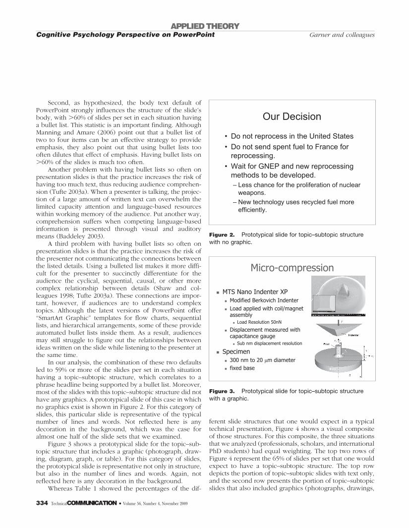
In our analysis, the combination of these two defaultsled to 59% or more of the slides per set in each situationhaving a topic–subtopic structure, which correlates to aphrase headline being supported by a bullet list. Moreover,most of the slides with this topic–subtopic structure did nothave any graphics. A prototypical slide of this case in whichno graphics exist is shown in Figure 2. For this category ofslides, this particular slide is representative of the typicalnumber of lines and words. Not reflected here is anydecoration in the background, which was the case foralmost one half of the slide sets that we examined.
Figure 3 shows a prototypical slide for the topic–sub-topic structure that includes a graphic (photograph, draw-ing, diagram, graph, or table). For this category of slides,the prototypical slide is representative not only in structure,but also in the number of lines and words. Again, notreflected here is any decoration in the background.
Whereas Table 1 showed the percentages of the dif-
ferent slide structures that one would expect in a typicaltechnical presentation, Figure 4 shows a visual compositeof those structures. For this composite, the three situationsthat we analyzed (professionals, scholars, and internationalPhD students) had equal weighting. The top two rows ofFigure 4 represent the 65% of slides per set that one wouldexpect to have a topic–subtopic structure. The top rowdepicts the portion of topic–subtopic slides with text only,and the second row presents the portion of topic–subtopicslides that also included graphics (photographs, drawings,
Our Decision
• Do not reprocess in the United States
• Do not send spent fuel to France for reprocessing.
• Wait for GNEP and new reprocessing methods to be developed.– Less chance for the proliferation of nuclear
weapons.
– New technology uses recycled fuel more efficiently.
Figure 2. Prototypical slide for topic–subtopic structurewith no graphic.
µ
Figure 3. Prototypical slide for topic–subtopic structurewith a graphic.
APPLIED THEORYCognitive Psychology Perspective on PowerPoint Garner and colleagues
334 TechnicalCOMMUNICATION • Volume 56, Number 4, November 2009

diagrams, films, graphs, or tables). As found in our sam-pling of slides, about one half of the slide sets had adecorative background. In each row of Figure 4, that per-centage of decorative backgrounds is reflected in theslide(s) on the right. Note that, in our analysis, no decora-tion included both dark type on light background and lighttype against a dark background. Also, in our analysis,institutional logos were not considered decoration. Thethird row of slides in Figure 4 represents the 23% of slidesthat have a topic phrase supported by a graphic. Finally,the bottom row represents the remaining 12% of slides thathave a variety of headlines (sentence, question, or noheadline) supported in different ways (graphic, single textblock, or listing of subtopics).
Overall, our results show the strong influence thatPowerPoint’s default settings have on the slides that tech-nical communicators in professional and academic settingscreate. Approximately 65% of slides per set conformed to
the topic–subtopic structure of PowerPoint’s default masterslide. Moreover, most of these topic–subtopic slides did nothave a graphic. In the next section, as we turn to thequestion of the effect of this influence of PowerPoint on thecomprehension and retention of information by audiences,we evoke principles of multimedia learning. In this nextsection, we also continue to present the results of ourcommon-practice analysis from the perspective of theamount of text on the slides, and, where relevant, the typeof images that were typically included.
APPLICABLE PRINCIPLES FROM COGNITIVE PSYCHOLOGYHigh-quality technical presentations call for visual aids thatsupport the audience’s comprehension of the presenter’sintended message. In designing these visual aids, care mustbe taken that the presenter avoids imposing too muchcognitive load on audience members. Cognitive load refersto the degree of effort, strategy, and processing capacity
Figure 4. Composite of slides representing the common practice in technical communication.
APPLIED THEORYCognitive Psychology Perspective on PowerPointGarner and colleagues
Volume 56, Number 4, November 2009 • TechnicalCOMMUNICATION 335

that an individual must exert to understand information.Two theories within cognitive psychology are important inassessing the cognitive load of a presentation slide: thetheory of cognitive load and dual code theory.
According to the theory of cognitive load (Paas andcolleagues 2003), information can be characterized on acontinuum from low to high element interactivity. Lowinteractivity implies that individual concepts can be under-stood without the need to reference other information;high interactivity implies the opposite. In fact, highly inter-active informational elements can only be partially under-stood if elements are not considered in relation to oneanother (Chandler and Sweller 1991). Understandinghighly interactive information, however, places a high cog-nitive load or demand on the audience member’s shortterm working memory system—the limited capacity mem-ory system that acts as a gateway to long-term memoryformation. For that reason, particular attention must bepaid to the way in which information is presented to avoidincreasing the difficulty level to the point where compre-hension breaks down.
Sweller (2005) differentiated between two types ofcognitive load: intrinsic and extraneous. Each has separatecauses, but each can tax our attentional and memory sys-tems to the point where learning breaks down. Intrinsiccognitive load is load that is inherent within the informa-tion being presented. Understanding highly interactive in-formation, such as the how the parts of a complex systemaffect one another, places a high intrinsic cognitive load onthe learner—particularly the novice learner. Keeping upwith a presentation of complex information requires a greatdeal of working memory capacity to process the informa-tion and manipulate it to understand the relationshipsamong its elements. To help make it easier for the audi-ence, a presenter can try to control intrinsic load by makingdecisions about the complexity of the content that he orshe will present and by reducing the number of elementsthat must be held in memory at the same time (Ayres andvan Gog 2008). Depending on the purpose of the presen-tation, however, simplification may not always be possibleor desirable. At times, a presenter simply must take on thechallenge of talking about complex and difficult content.
As a professional who plans to convey technical infor-mation, it can be helpful to consider the idea of intrinsiccognitive load. For example, it is often easier to simply listthe key concepts that a talk must cover than it is to explic-itly show the spatial, temporal, or causal relationships be-tween those concepts. However, pictorially showing rela-tionships will help the audience understand theconnections between those concepts. Using visual expla-nations also helps the presenter to convey the interactivityof the information, thereby reducing intrinsic cognitiveload for the audience.
Second, it is often helpful to make explicit for theaudience the assumptions or concepts that a presenter,who is often a content area expert, may take for granted. Inother words, the presenter may need to explain additionalconcepts to be fully understood. How does the need for anexplanation of additional concepts relate to the defaultstructure of PowerPoint slides? The need arises in partbecause the topic–subtopic structure does not easily ac-commodate the depiction of explicit connections betweenconcepts. In fact, we contend that honing the central mes-sage of each part of the presentation is easier if it is notdone in accordance with the default slide structure thatPowerPoint offers. Instead, by carefully anchoring eachslide with an assertion that is articulated with a sentenceheadline, the presenter becomes aware of both the rela-tionships between informational elements and whether ad-ditional supportive information is needed to lay the groundwork for the main concept.
Although intrinsic load can arise from the inherentcomplexity of the content, extraneous cognitive load canarise from the method by which information is presented(Sweller 2005). When translated into the realm of aPowerPoint presentation, extraneous load can be influ-enced by how information is presented on a slide, includ-ing the amount and format of the information. Dependingon the way that a presenter’s visual aids are structured,extraneous load may be increased or decreased and maytherefore impact audience members’ comprehension in anegative or positive way. In technical presentations, wherethe nature of the information may be complex, sensitive, orhigh stakes, it is important to think about the structure andcontent of slides to reduce any extraneous processing thataudience members have to do to grasp the key ideas at thatmoment in time. In summary, presentation slides need tobe sensitive both to the intrinsic load created by the pre-sentation of complex information to an audience who maybe unfamiliar with that information and to the extraneousload that can occur when the delivery format fails to sup-port the integration of concepts into a cohesive mentalmodel. The default settings of PowerPoint are unsympa-thetic to both of these needs.
Dual code theory (Paivio 1986) and principles of mul-timedia learning (Mayer 2005a, 2005b) offer some insightinto how text and images can be used to counter extrinsiccognitive load. Dual code theory states that information ismore easily learned when verbal and image-based formatsare meaningfully integrated together rather than when oneor the other format is used exclusively (Clark and Paivio1991; Paivio 1986). Put another way, every audience mem-ber has two cognitive pathways for understanding infor-mation: a verbal pathway, which processes words that areheard or read, and a pathway for images (Baddeley 2003).In a presentation, if the audience has to simultaneously
APPLIED THEORYCognitive Psychology Perspective on PowerPoint Garner and colleagues
336 TechnicalCOMMUNICATION • Volume 56, Number 4, November 2009
listen to words spoken by the presenter and read manywords on a projected slide, the verbal track can easilybecome overloaded. However, overload is less likely whenthose written words are replaced by images, which theaudience processes through the nonverbal track (Paivio1986). In fact, the integration of verbal and visual informa-tion can be beneficial for learning.
For that reason, helping individuals comprehend infor-mation that invokes high intrinsic load, while taking effortsto eliminate extraneous cognitive load results in superior-quality comprehension, retention, and transfer of informa-tion after learning has taken place (Sweller 2005). There-fore, logical questions for those interested in theeffectiveness of presentation slides are how do commonpractice slides increase or decrease audience comprehen-sion and how can presentation slides optimize intrinsicload while minimizing extrinsic load? Answers and solu-tions could more effectively allow presenters to reach theircommunication goals.
MULTIMEDIA PRINCIPLES APPLIED TO COMMON PRACTICESLIDESResearch in multimedia learning has generated a number ofprinciples of instructional design that are congruent withthe dual code and cognitive load perspectives. Accordingto Mayer (2005a, 2005b), learning from multimedia presen-tations—including PowerPoint presentations—is most suc-cessful when certain principles are followed. In effect,these principles reduce extraneous processing of informa-tion by the audience. One principle is that individuals learnbetter when words and pictures are presented, rather thanwhen words alone are presented. This principle is termedthe multimedia principle (Mayer 2001) and is in line withthe dual code theory.
A second principle is that audiences show superiorcomprehension and retention when extraneous informa-tion is removed from the presentation (Mayer 2005b;Sweller 2005). This principle is referred to as the principleof coherence in multimedia learning. For PowerPoint inparticular, this situation pertains to the amount and type ofthe information contained on the slide.
A third and critical principle is that of signaling (Mayer2005b). Learners benefit from presentations that highlightthe organization of essential material. This principle mirrorscognitive load theory in its emphasis on the need to clarifyrelationships that allow understanding of highly interactiveinformation.
A final principle to note relates to the manner in whichthe slides are presented. The principle of redundancy statesthat “people learn more deeply from graphics and narra-tion than from graphics, narration, and online text” (Mayer2005b, 183). Simply stated, reading and hearing identicalverbal information simultaneously can significantly reduce
the comprehension by audience members, particularlywhen individuals have to split their visual attention be-tween text and other elements presented on the screen(Mayer and colleagues 2001). Also, the more text that isplaced on the slide, the more tempting it is for the speakerto simply read from that slide. For these reasons, audiencescan learn more deeply when the speaker orally explains agraphical depiction.
In this section, we assert that the common practice ofthe PowerPoint slide—defined here as the pervasive topic–subtopic structure of the slides in our sample—is in conflictwith the above principles. This conflict leads to two pri-mary outcomes. First, the topic–subtopic structure, whichpresenters in our sample used for roughly two thirds of thePowerPoint slides they created, does not convey the inter-activity among informational elements. Put another way,the topic–subtopic structure of PowerPoint violates themultimedia principles of coherence and signaling and in-creases extraneous cognitive load by requiring audiencemembers to expend valuable working memory resourcesto comprehend relationships among concepts. Audiencemembers need to hold concepts in memory while consid-ering the relationship between them. The more elementsthat need to be held, the higher the level of cognitive load(Ayres and van Gog 2008). Second, the topic–subtopicstructure often leads the presenter to increase extraneousload by adding a great deal of nonvital information to theslide. Introducing nonessential information has beenshown to reduce learning from multimedia presentations(Mayer and colleagues 2001).
Common practice PowerPoint slides hide theconnections between informational elementsIn two thirds of the slides that we analyzed, the phraseheadline specifies a general topic, and each bulleted orsub-bulleted item seems as equally important and subordi-nate to that overall topic. At first glance, one would thinkthat such a short headline would benefit the learner. How-ever, a short headline instead leads authors to begin thecreation of the slide with a topic such as “U.S. Energy Use.”Such a headline neither signals the audience to the per-spective taken by the presenter on the topic nor highlightsthe organization of information. A phrase headline doesnot help the presenter to consider the appropriate conceptsthe audience will need to understand his or her perspectiveon the topic. A phrase headline also does not help thepresenter to minimize the number of informational ele-ments on the slide to manage the risk of high intrinsiccognitive load. In contrast, both signaling and highlightingwould occur with a headline such as “The U.S. has only 5%of the world’s population, but consumes 25% of the world’senergy.” This headline introduces U.S. energy use from theperspective of the proportion of the world’s total popula-
APPLIED THEORYCognitive Psychology Perspective on PowerPointGarner and colleagues
Volume 56, Number 4, November 2009 • TechnicalCOMMUNICATION 337

tion that resides there and immediately alerts the audienceto the presenter’s assertion that there is a discrepancy.
The topic–subtopic structure also leaves out the spe-cific connections between the headline and each of thebulleted items. Therefore, the relationships between thebulleted items themselves are not immediately apparent.This lack of connection violates the signaling principle asdescribed above. The structure may inadvertently promoteirrelevant processing of information by audience members,and therefore extraneous cognitive load, as they struggle toconnect the meaning of the phrase headline and the bodytext. This effect would be exacerbated if the information iscomplex or unfamiliar to the audience.
As an example of how the common practice ofPowerPoint slides reduces the ability of audience membersto detect informational interactivity, consider the slide inFigure 5. Without having a defined perspective on the topicof “synthesizing diamonds,” the slide wanders from theopinion of people on synthetic diamonds, to the closenessof synthetic diamonds to real diamonds, to the history ofsynthetic diamonds, and then to the detection of syntheticdiamonds by those who mine diamonds. In addition, thepresenter’s decision to fill the bulleted textbox with text hasled to the addition of redundant information. The slideviolates the multimedia principle, the principle of coher-ence, and the principle of signaling. Moreover, because theslide contains so much text, the presenter is likely to readaloud the text on this slide, especially if he or she is anovice in the field. This scenario would be a violation ofthe redundancy principle (Kalyuga and colleagues 1999).
Common practice PowerPoint slides contain toomuch textAs mentioned, since 2001, harsh criticism of PowerPoint’spresentation slide structure has surfaced in several popularpublications (Keller 2003; Parker 2001; Patty 2007; Tufte2003b). A common thread is that slides often overwhelmaudiences with information—a situation that John Swellerstates as arising from placing too many of the spokenwords on the slide (Patty 2007).
How does PowerPoint lead users to overwhelm slideswith too many words? As suggested earlier, the answer liesin the program’s defaults. One problematic default is thebullet text default for the body of slides. Covering themiddle and lower portions of the slide, as was shown inFigure 1, this text box default occupies 60% of the space onthe slide master. By displaying such a large box, this defaultleads users, especially novices, to fill the slide with text.Doing so thus introduces extraneous cognitive load andincreases the risk of violating the principle of redundancy.
As shown in Table 2, our analysis showed that theamount of text on common practice slides was high. Forinstance, the average number of words per slide at a U.S.technical conference was 33. In addition, because we knewhow long the speakers at this conference presented, we couldestimate the average amount of time spent on each slide. Thatamount of time was �1 min. Simply put, 1 min is not enoughtime for an audience to read and comprehend 33 words on aslide and to listen to and comprehend the speaker, who islikely speaking at a rate of 120 words/min.
Common practice PowerPoint slides do notcontain images that promote optimalcomprehension and retentionBecause text is the default for presenting information on aPowerPoint slide, the structure begins in violation of themultimedia principle. Granted, many presenters do makeefforts to include graphics on slides. In our survey ofcommon practice slides, we found graphics on 61% of theprofessional slides, 42% of the conference slides, and 61%of the graduate student slides.
At first glance, it may seem that the addition ofphotographs, drawings, diagrams, and graphs would al-low the topic–subtopic slide to accommodate dual codetheory and other research findings that favor the inclu-sion of images with text to bolster learning outcomes(Butcher 2006; Carney and Levin 2002; Hegarty andcolleagues 1991; Mayer and Anderson 1992; Mayer andGallini 1990; Paivio 1986). For instance, research hasshown that the use of relevant, labeled images can sup-port conceptual understanding of principle-driven infor-mation in novice learners (Mayer and Gallini 1990).
However, not all graphics are created equal, especiallywhen they detract attention from important information.
Figure 5. An example of a topic–subtopic slide thatviolates multimedia principles of learning.
APPLIED THEORYCognitive Psychology Perspective on PowerPoint Garner and colleagues
338 TechnicalCOMMUNICATION • Volume 56, Number 4, November 2009

We contend that the graphics typically selected for topic–subtopic slides do not contribute optimally to learning. Themost helpful types of graphics, in terms of promotingcomprehension and transfer of learning from text, eitherrepresent or explain concepts (Iding 2000; Ollerenshawand colleagues 1997). However, because a phrase headlineidentifies the topic, rather than makes an assertion aboutthe topic, presenters often do not select the graphic thatexplains the information on the slide. Rather, presenterstend to choose a graphic that, at best, replicates or depictsinformation already present on the slide.
To compound this problem, the large default text boxin the body restricts the space available for graphics. Pre-senters therefore often compromise on the quality and sizeof the graphic and select graphics that represent only aportion of the content. However, graphics can give morevaluable if they explain rather than just repeat content.Reiterating verbal information in graphic form may encour-age understanding of a concept also presented in text, butunless the graphic signals the connection between con-cepts and explains the assertion that the presenter is mak-ing, the graphic reinforces only one part of the whole ideathat is being conveyed. Although this reinforcement mayaid in understanding part of the slide’s information, it mayinhibit the understanding of the overall slide.
To assess the types of graphics in our analysis ofslides, we used a modified version of a classificationsystem that was designed to catalog pictures that accom-pany expository text (Levin and Mayer 1993). Our sys-tem identified four levels of purpose that an image couldfulfill: decorate, partially represent, represent, and ex-plain. Decorative graphics were those deemed to beirrelevant to the text, such as entertaining clip art ordecorative images on the slide background. Partially
representative graphics identified portions of the slide’scontent, such as a photograph mirroring one out of threebullet points on a slide. Representational graphics rep-resented or identified the main topic of the slide, suchthat the graphic pertained to the headline or to all of thetext on the slide. Explanative graphics showed how themain principle, process, or system of the slide works. Anexample of an explanative graphic would be a flowdiagram to show how energy moved through a system ora graph to show a key trend.
Only �60% of the slides in our sample contain graph-ics—the remaining 40% of the slides contain just text. Also, asshown in Table 3, a significant number of graphics in theseslides were partially representative, especially among the pro-fessionals and conference attendees. That is, these imagesmirrored only part of the text. These two findings run counterto the research on learning and multimedia presentation de-sign, which emphasizes the importance of providing imagesthat promote integration between concepts.
In summary, PowerPoint slides, as commonly de-signed, violate important learning principles including themultimedia, coherence, signaling, and redundancy princi-ples. These slides often create extraneous cognitive loadfor audience members and therefore lead to poor compre-hension and learning outcomes.
MULTIMEDIA PRINCIPLES APPLIED TO A–E SLIDESHaving its roots at Hughes Aircraft (Perry 1978) and LawrenceLivermore National Lab (Gottlieb 1984) and recently re-examined by independent researchers (Alley and Neeley2005; Atkinson 2005; Doumont 2007; Markel 2009), the A–Eslide structure addresses the mentioned failings of Power-Point’s default structure and in the process seeks to minimizethe risk of introducing unnecessary cognitive load. In this
TABLE 2. COMMON PRACTICE STATISTICS ON SLIDE TEXT
Slide feature
Professionals:industry,
laboratories
U.S.conferenceattendees
InternationalPhD students
Mean SD Mean SD Mean SD
Number of lines of text per slide 8 3 8 2 8 2
Number of words per slide 43 18 33 12 39 13
Percent of slides per set with graphics 61 29 42 26 61 25
Number of slide sets considered 36 48 33
Total number of slides considered 501 1,009 515
APPLIED THEORYCognitive Psychology Perspective on PowerPointGarner and colleagues
Volume 56, Number 4, November 2009 • TechnicalCOMMUNICATION 339

section, we describe the A–E structure in relation to the pre-viously discussed cognitive psychology principles, to makethe argument that a reduction in cognitive load would occurif this structure is adopted. In addition, we assert that thestructure is in agreement with cognitive load and dual codetheories, the multimedia learning principles outlined byMayer (2002, 2005b), and the research on learning from textthat includes visual supplements (Hegarty and colleagues1991). We then give recommendations for the design of slidesthat try to minimize cognitive load.
The A–E slide structure consists of a succinct sen-tence headline that states the main assertion, or thedeclaration, of the slide. That assertion is supported byvisual evidence that serves to explain, organize, andinterpret the content of the headline. Such visual evi-dence includes photographs, drawings, graphs, equa-tions, and words arranged visually. The slides in Figures6–9 depict how the A–E structure can be used to presentdifferent types of technical content. Figure 6 is our A–Eversion of the infamous Boeing slide that Tufte (2003a)excoriated in The Cognitive Style of PowerPoint. Figure 7shows our A�E version of a research slide presented ata technical conference (Settles and colleagues 2002).This research studied the reasons that dogs are so effec-tive at detecting scents, and this slide presents one ofthose reasons. Figure 8 is a slide from a research pre-sentation created by an international PhD student (Mar-thinsen and colleagues 2004). Note that the presentercould remove the text block in the body of the slide andcommunicate that portion of the message in the speech.Figure 9 is an A–E slide used to help teach a technicalsubject (Schreiber 2005).
A–E structure slides contain more images thatpromote optimal comprehension and retentionWhen used to convey technical information, the A–E struc-ture theoretically should be much more effective than the
traditional topic–subtopic structure at helping audiencemembers learn. This increase in effectiveness occurs forseveral reasons. One is the requirement of visual evidencein the body of the slide. Perhaps the most striking differ-ence between topic–subtopic and A–E structure slides isthe replacement of the text in the slide body with a graphicthat explains the assertion or main point of the slide.Therefore, not only does the A–E structure closely followboth the multimedia learning principle (Mayer 2005) andthe principles of dual code theory (Paivio 1986) in that textand images are presented together, but an explicit empha-sis is placed on the quality and purpose of the image(s) thatare chosen.
The type of image included when using the structureis fundamentally different from the type of image en-
TABLE 3. COMMON PRACTICE STATISTICS ON IMAGE LEVEL
Classification Definition ProfessionalsConferencepresenters
International PhDstudents
Decorates Not relevant to text 5% 5% 0%
Partially represents Represents only a portion of theslide’s content
12% 15% 5%
Represents Represents the main topic of the slide 53% 46% 57%
Explains Explains the slide’s main concept,process, or system
30% 35% 37%
Figure 6. An A–E version of the infamous Boeing slidecriticized by Tufte (2003).
APPLIED THEORYCognitive Psychology Perspective on PowerPoint Garner and colleagues
340 TechnicalCOMMUNICATION • Volume 56, Number 4, November 2009

couraged when using the topic–subtopic structure. Inthe A–E structure, because the required graphics are toserve as visual evidence to support the sentence head-line, the presenter is discouraged from using decorativeor partially representative images. Instead, this require-ment promotes the thoughtful insertion of representativeand explanative images into each and every slide used ina presentation. This requirement also contrasts with thelack of any graphic at all in �40% of the commonpractice slides in our sample.
A–E structure slides follow more closely themultimedia principle of signalingA frequent and significant criticism of the topic–subtopicslide structure is that it violates the principle of signaling byfailing to adequately convey relationships between thephrase headline and the slide body and between the itemslisted within the slide body (Mayer 2005b; Patty 2007). Thetwo hallmark features of the A–E slide structure—the sen-tence headline and the incorporation of supporting visualevidence—enhance signaling. Consider the difference inemphasis between the slide shown back in Figure 5 andthe slide in Figure 9. Whereas the headline in the slide ofFigure 5 identified only the topic (Synthesizing Diamonds),the headline in the A–E slide of Figure 9 used the sentenceheadline to establish both the topic and the perspective onthe respective topic: “The shape of a population pyramidreflects the growth rate.” Therefore, the audience receiveda cue to expect and attend to a specific perspective aboutthe topic “population pyramids.” In addition, the support-ing visual evidence in this slide presents two examplegraphs that readily inform the audience of the relationshipbetween shape of the pyramid and the growth of thecountry’s population.
A–E structure slides follow more closely themultimedia principle of coherenceA frequent casualty of the topic–subtopic structure is suc-cinctness, because presenters are often inclined—partlybecause of the generality of the phrase headline—to in-clude more than the key information alone. The coherenceprinciple requires that extraneous information be excluded
Figure 7. An A–E version of a research slide from atechnical conference (Settles and colleagues 2002).
Figure 8. An A–E slide created by an international graduatestudent (Marthinsen and colleagues 2004).
Figure 9. A classroom slide that follows the A–E structure(Schreiber 2005).
APPLIED THEORYCognitive Psychology Perspective on PowerPointGarner and colleagues
Volume 56, Number 4, November 2009 • TechnicalCOMMUNICATION 341

from multimedia messages (Mayer 2005b). When appliedto the A–E slide structure, the requirement of a sentenceheadline that states the slide’s main assertion leads the slidecreator to have more focus in designing the slide’s body. Inother words, the creator focuses on articulating and sup-porting an assertion rather than coming up with associatedsubtopics, which may very well be extraneous, and, if notextraneous, may not be clearly connected with one an-other.
Anecdotal evidence shows the importance of the sen-tence headline feature in teaching. In a personal commu-nication, Professor Stacy Gleixner (2006), who heads alarge NSF project (PRIME 2007) to teach principles of ma-terials science at five different institutions and who hasconverted the slides in that project to the A–E structure,said: “When I create a sentence headline, I think aboutwhat main assertion I want the students to remember fromthat slide. Just that act makes my lectures more focused.”This comment echoes the idea that the creation of thesentence headline forces the presenter to identify key con-cepts that relate to the topic and the presenter’s own per-spective on that topic and that such careful consideration ofwhich concepts to present should reduce intrinsic cogni-tive load. The A–E slide back in Figure 9 captures the focusthat slides following this structure have.
A–E structure slides follow more closely themultimedia principle of redundancyThe design principle of redundancy states that people learnmore deeply from pictures and narration than from pic-tures, narration, and written words (Mayer 2005a). Thisprinciple acknowledges that simultaneous processing ofnarration and written text overwhelms the verbal portion ofworking memory (Baddeley 2003; Thompson and Paivio1994). At first glance, the A–E design does not seem tofollow this principle, because the headline containing themain assertion of the slide would also be stated in someform by the presenter. Moreover, the topic–subtopic struc-ture’s simplified heading would seem to reduce extraneousload that may occur when visual and auditory input iscombined. However, we contend that the A–E headlinedoes not violate the principle of redundancy because of therelative priority given to text elsewhere on the slide. Thesentence assertion of the A–E headline is a brief summaryof the speech that the presenter delivers for the slide, ratherthan a repetition of the entire text (Atkinson 2005, 208–216,2006). Hearing and seeing a great deal of verbal informa-tion in a multimedia presentation can increase cognitiveload (Kalyuga and colleagues 1999).
In an A–E presentation, the presenter should spend atleast 1.5 min speaking about the typical slide (Alley 2003,116). For a typical presenter, that would mean �180 wordsof speech are to be summarized by a sentence headline
that is to be no more than two lines (Alley 2003; Atkinson2005; Doumont 2007). Clearly, when using the A–E struc-ture, the presenter cannot resort to simply reading from theslide. The risk of violating the principle of redundancy isthus minimized, even for the novice presenter.
FUTURE DIRECTIONS, RECOMMENDATIONS, AND CHALLENGESThe advantages inherent within the A–E structure have ledto a surge of interest in teaching and learning this struc-ture—see Neeley and colleagues (2009) in this issue ofTechnical communication. In addition, research is under-way to examine the specific effects of this structure on thecomprehension and retention of information by audiencemembers. Even though only a few formal experimentshave been published on this structure (for example, Alleyand colleagues 2006), confidence in the benefits of adopt-ing the structure is already growing. As just one example,institutions in Norway invested $110,000 in 2009 for apresentations workshop for �70 PhD students and post-docs in science and engineering. In this presentationsworkshop, the A–E slide structure was the cornerstone(Alley and colleagues 2009). For readers interested in moreinformation about the design principles of the A–E struc-ture, several publications exist (Alley 2004; Alley and Nee-ley 2005; Atkinson 2005; Doumont 2007; Jennings 2009;Markel 2009).
In this article, we drew attention to principles of mul-timedia learning and to the importance of consideringcognitive load when designing presentation slides. Severalrecommendations follow from our discussion. Presenterscan minimize intrinsic load if they articulate underlyingassumptions and connections between concepts. It is eas-ier for the presenter to do these things if the starting pointfor the slide is an assertion rather than a topic. Once thespeaker has articulated his or her assertion, he or she is ina position to craft a single sentence headline (taking up nomore than two lines when written in 28-point font) on theslide. The assertion quickly orients the audience to themost important information and sets up an expectation inaudience members that the body of the slide will supportthe assertion. A byproduct of this approach is that the slidehas a more targeted focus and specifies the nature ofconceptual relationships, thus addressing the coherenceand signaling principles, respectively.
Extraneous load will subsequently be minimized if thesentence headline is supported by visual evidence. Al-though visual evidence adheres to the multimedia princi-ple, when choosing graphics, the rubric that we used maybe usefully evoked to decide whether a choice truly ex-plains the assertion or whether it merely represents one ormore concepts. The rubric also serves as a reminder toexclude decorative images.
The principles also point to what not to do when
APPLIED THEORYCognitive Psychology Perspective on PowerPoint Garner and colleagues
342 TechnicalCOMMUNICATION • Volume 56, Number 4, November 2009

designing slides. In particular, we cautioned against the useof phrase headlines, bullet lists, and the use of a largeamount of text on slides because these violate the multi-media, coherence, and signaling principles. These Power-Point defaults (or minor variations of the defaults) increasethe risk of overwhelming attentional and memory-relatedcognitive resources and therefore increase the risk of re-duced comprehension. We do acknowledge, however, thatpresenters can create topic–subtopic slides more rapidlythan A–E slides and that it is easier from the presenter’sperspective to create and give talks using a topic–subtopicstructure that relies primarily on default settings for head-lines, body text, and images. In addition, as Neeley andcolleagues (2009) point out, using the A–E structure re-quires more preparation on the part of the presenter forwhat he or she is going to say. The reason for this addi-tional preparation is that the topics are no longer written innote form on the slides, as they commonly are on topic–subtopic slides. However, embracing this A–E approachrequires a shift away from what is easier for the presenterto generate and toward what is easier for the audience toconsume. TC
REFERENCESAlley, M. 2003. The craft of scientific presentations. New
York: Springer-Verlag.
———, ed. 2004. Rethinking the design of presentationslides. State College, PA: Penn State.
———, A. M. Bruaset, M. Sundet, M. Marshall, and S. Zappe.2009. Development of a national course to teach NorwegianPh.D. students how to communicate research. Proceedingsof the 2009 ASEE national conference. Austin, TX: ASEE.
———, and K. A. Neeley. 2005. Rethinking the design ofpresentation slides: A case for sentence headlines andvisual evidence. Technical communication 52:417–426.
———, M. M. Schreiber, K. Ramsdell, and J. Muffo. 2006.How the design of headlines in presentation slides affectsaudience retention. Technical communication 53:225–234.
Atkinson, C. 2005. Beyond bullet points: Using MicrosoftPowerPoint to create presentations that inform, motivate,and inspire. Redmond, WA: Microsoft Press.
Atkinson, C. 2006. Author of Beyond bullet points. Phoneinterview with M. Alley (December 6).
Ayres, P., and T. van Gog. 2008. State of the art researchinto Cognitive Load Theory. Computers in human behavior25:253–257.
Baddeley, A. 2003. Working memory: Looking back andlooking forward. Nature reviews: Neuroscience 4:829 –839.
Butcher, K. R. 2006. Learning from text with diagrams:Promoting mental model development and inferencegeneration. Journal of educational psychology 98:182–197.
Carney, R. N., and J. R. Levin. 2002. Pictorial illustrations stillimprove students’ learning from text. Educationalpsychology review 14:5–26.
Chandler, P., and J. Sweller. 1991. Cognitive load theory andthe format of instruction. Cognition and instruction 8:293–332.
Clark, J. M., and A. Paivio. 1991. Dual coding and education.Educational psychology review 3:149–210.
Doumont, J. L. 2005. The cognitive style of PowerPoint:Notall slides are evil. Technical communication 52:64–70.
———. 2007. Creating effective presentation slides.Piscataway, NJ: IEEE Professional Communication Society.
Duarte, N. 2008. Slide:ology. The art and science of creatinggreat presentations. Sebastopol, CA: O’Reilly Media.
Farkas, D. K. 2009. Managing three mediation effects thatinfluence PowerPoint deck authoring. Technicalcommunication 56:28–38.
Gleixner, S. 2006. Professor in Material Science andChemical Engineering at San Jose State University. Phoneinterview with M. Alley (March 22).
Gomes, L. 2007. PowerPoint turns 20, as its creators pondera dark side to success. Wall Street Journal June 20:B-1.
Gottlieb, L. 1984. New-breed presenters sometimes closelycollaborate on presentations. Proceedings of the 1984Professional Communication Society Conference of theIEEE. Atlantic City, NJ: IEEE.
Hegarty, M., P. A. Carpenter, and M. A. Just. 1991. Diagramsin the comprehension of scientific texts. In Handbook ofreading research: Volume 2, eds. R. Barr, M. Kamil, P. B.Mosenthal, and P. D. Pearson, 641–668. New York:Longman.
Iding, M. K. 2000. Can strategies facilitate learning fromillustrated science texts? International journal ofinstructional media 27:289–302.
APPLIED THEORYCognitive Psychology Perspective on PowerPointGarner and colleagues
Volume 56, Number 4, November 2009 • TechnicalCOMMUNICATION 343

Jennings, A. 2009. Creating marketing slides for engineeringpresentations. Technical communication 56:14–27.
Kalyuga, S., P. Chandler, and J. Sweller. 1999. Managingsplit-attention and redundancy in multi-media instruction.Applied cognitive psychology 13:351–371.
Keller, J. 2003. Is PowerPoint the devil? Chicago Tribune,posted January 23.
Levin, J. R., and R. C. Mayer. 1993. Understandingillustrations in text. In Learning from textbooks, eds. B. K.Britton, A. Woodward, and M. Binkley, 95–110. Hillsdale,NJ: Lawrence Erlbaum.
Mackiewicz, J. 2007. Audience perceptions of fonts inprojected PowerPoint text slides. Technical communication54:295–306.
Manning, A., and N. Amare. 2006. Visual-rhetoric ethics:Beyond accuracy and injury. Technical communication 53:195–211.
Markel, M. 2009. Exploiting verbal–visual synergy inpresentation slides. Technical communication 56:122–131.
Marthinsen, G., J. Lifjeld, and L. Wennerberg. 2004.Population differentiation in Dunlins Caladris alpine inNorthern Europe. Oslo, Norway: University of Oslo.
———. 2001. Multimedia learning. New York: CambridgePress.
———. 2002. Cognitive theory and the design of multimediainstruction: An example of the two-way street betweencognition and instruction. New directions for teaching andlearning 89:55–71.
———. 2005a. Introduction to multimedia learning. In TheCambridge handbook of multimedia learning, ed. R. E.Mayer, 1–16. Cambridge: Cambridge University Press.
———. 2005b. Principles for reducing extraneous processingin multimedia learning: Coherence, signaling, redundancy,spatial contiguity, and temporal contiguity principles. InThe Cambridge handbook of multimedia learning, ed. R. E.Mayer, 183–200. Cambridge: Cambridge University Press.
———, and R. B. Anderson. 1992. The instructive animation:Helping students build connections between words andpictures in multimedia learning. Journal of educationalpsychology 84:444–452.
———, and J. Gallini. 1990. When is an illustration worth tenthousand words?. Journal of educational psychology 93:715–726.
———, J. Heiser, and S. Lonn. 2001. Cognitive constraintson multimedia learning: When presenting more materialresults in less understanding. Journal of educationalpsychology 93:187–198.
Neeley, K. A., M. Alley, C. G. Nicometo, and L. C. Srajek.2009. Challenging the common practice of PowerPoint atan institution: Lessons from instructors. Technicalcommunication 56:346–360.
Ollerenshaw, A., E, Aidman, and G. Kidd. 1997. Is anillustration always worth ten thousand words? Internationaljournal of instructional media 24:227–238.
Paas, F., A. Renkl, and J. Sweller. 2003. Cognitive loadtheory and instructional design: Recent developments.Educational psychologist 38:1–4.
Paivio, A. 1986. Mental representations. New York: OxfordUniversity Press.
Parker, I. 2001. Absolute PowerPoint. The New Yorker May28, p. 76.
Patty, A. 2007. Research points the finger at PowerPoint.Available online at http://www.smh.com.au/articles/2007/04/03/1175366240499.html. Accessed 7 September 2009.
Perry, R. E. 1978. Audience requirements for technicalspeakers. IEEE tranactions on professional communication21:91–96.
PRIME. 2007. Project-based resources for introduction tomaterials engineering. San Jose, CA: San Jose StateUniversity.
Reynolds, G. 2008. Presentation zen. Berkley, CA: NewRiders.
Schreiber, M. M. 2005. Class period 2: Population andresources (August 31). Resources geology: geosciences.Blacksburg, VA: Virginia Tech.
Settles, G. S., D. A. Kester, and L. J. Dodson-Dreibelbis.2002. The external aerodynamics of canine olfaction. InSensors and sensing in biology and engineering, eds. F. G.Barth, J. A. C. Humphrey, and T. W. Secomb. New York:Springer, pp. 323–355.
APPLIED THEORYCognitive Psychology Perspective on PowerPoint Garner and colleagues
344 TechnicalCOMMUNICATION • Volume 56, Number 4, November 2009

Shaw, G., R. Brown, and P. Bromiley. 1998. Strategic stories:How 3M is rewriting business planning. Harvard businessreview 76(3):41–50.
Sweller, J. 2005. Implications of cognitive load theory formultimedia learning. In The Cambridge handbook ofmultimedia learning, ed. R. A. Mayer, 19–30. Cambridge:Cambridge University Press.
Thompson, V. A., and A. Paivio. 1994. Memory for picturesand sounds: Independence of auditory and visual codes.Canadian journal of experimental psychology 48:380–396.
Tufte, E. R. 2003a. The cognitive style of PowerPoint.Cheshire, CT: Graphics Press.
———. 2003b. PowerPoint is evil. Wired September 11, pp.11–13.
JOANNA K. GARNER is an Assistant Professor of Psychol-ogy at Pennsylvania State University, Berks Campus, where sheteaches primarily in the areas of cognitive psychology and psy-chological measurement. Her research interests include the ap-
plication of cognitive psychological principles to matters oflearning and instruction. Contact: [email protected].
MICHAEL ALLEY is an associate professor of engineeringcommunication at Pennsylvania State University. He is the au-thor of The Craft of Scientific Presentations (Springer Verlag2003). He teaches workshops on technical presentations tocompanies, laboratories, and universities in the United States,Europe, and the Middle East. Contact: [email protected].
ALLEN F. GAUDELLI is a student at Pennsylvania StateUniversity. He is currently pursuing a BS and MS Degree in In-dustrial Engineering as well as an MS in Operations Research.Contact: [email protected].
SARAH E. ZAPPE is a Research Associate and Director ofAssessment and Instructional Support for the Leonhard Centerfor the Enhancement of Engineering Education at PennsylvaniaState University. Her expertise and research interests relate tothe use of think-aloud methodologies to elicit cognitive pro-cesses and strategies in assessment and related tasks. Contact:[email protected].
APPLIED THEORYCognitive Psychology Perspective on PowerPointGarner and colleagues
Volume 56, Number 4, November 2009 • TechnicalCOMMUNICATION 345