climate change. agree or disagree? scientists predict that the entire globe will get hotter over the...
TRANSCRIPT

Climate Change
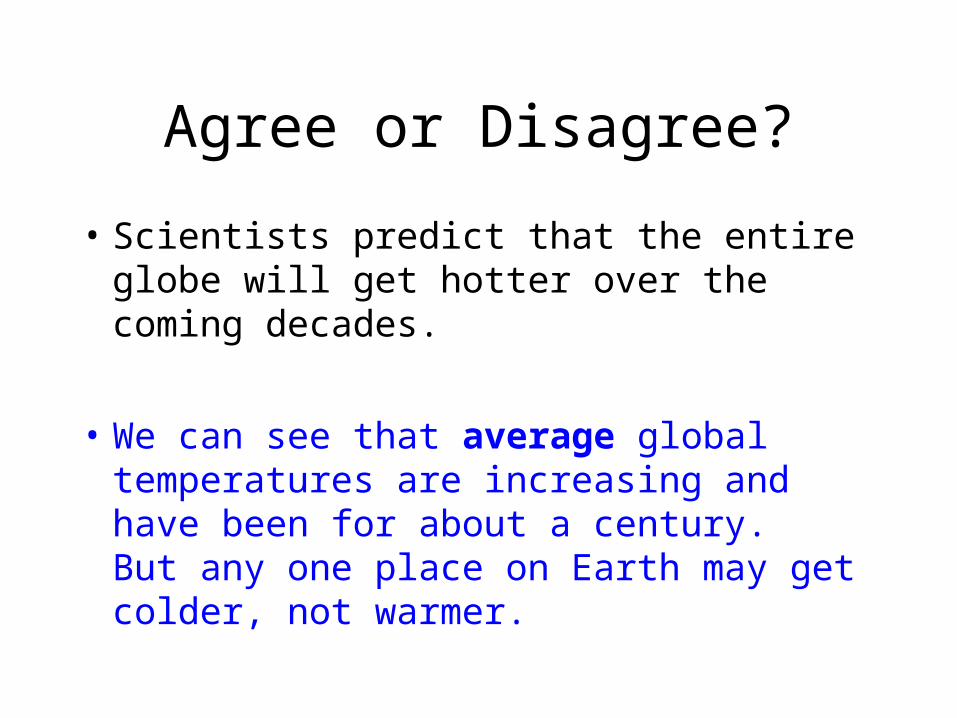
Agree or Disagree?
• Scientists predict that the entire globe will get hotter over the coming decades.
• We can see that average global temperatures are increasing and have been for about a century. But any one place on Earth may get colder, not warmer.

Agree or Disagree?
• This year’s scorching drought in much of the U.S. is unquestionably the result of climate change.
• Weather is what happens over a short time scale (hours, days, weeks, months).
• Climate is what happens over a long time scale (years, decades, centuries)
• So we can’t definitely say whether the weather in one year is due to a changing trend in climate, or is just a statistical blip.

Agree or Disagree?
• There is only one greenhouse gas, and that’s carbon dioxide.
• There are a number of gases that absorb infrared radiation. Carbon dioxide is the most abundant (besides water vapor). Methane absorbs even more energy, but is not as common.

Agree or Disagree?
• The Earth’s atmosphere contains only a tiny bit of CO2.
• Yes, that’s true. Gases in the atmosphere (not including water vapor)
• Nitrogen: 78%
• Oxygen: 21%
• Carbon dioxide: 400 ppm (0.0004 %)

Time out for the Greenhouse Effect
• Most of the light from the sun that arrives at the surface of the Earth is visible light.
• Oxygen, nitrogen and carbon dioxide are transparent to visible light – it travels through without being absorbed.
• Carbon dioxide is NOT transparent to infrared – it absorbs it.

Glass is transparent to visible light – sunlight travels through it and is absorbed
by the things in the greenhouse. Then they radiate infrared radiation. Glass is
NOT transparent to infrared, so the radiation is captured.
Sunlight is absorbed at the surface of the
Earth. Infrared radiation is radiated
from the ground. Greenhouse gases absorb the infrared radiation and the
particles move faster – are hotter.
http://www.columbia.edu/~vjd1/greenhouse.htm
http://climate.nasa.gov/kids/bigQuestions/greenhouseEffect/

So if water vapor absorbs infrared radiation, why are we so worried about
carbon dioxide?• Yes, water vapor is a greenhouse gas and it
captures much of the heat energy that is in the atmosphere.
• But water vapor is pretty constant in the atmosphere. It cycles around, but overall the amount of water on Earth stays the same.
• The amount of carbon dioxide, though, is changing because of human activities. So if we are looking at a change in temperature, we need to look for a potential cause that is also changing.

Climate v weather
• Weather is what happens over a short time scale – hours, days, weeks
• Climate is what happens over a long time scale – decades, centuries, millennia
• What happens in a single year is not an indicator of what is happening to climate – we need to look at averages over longer time periods.

The Data
• Now we’ll look at all the data that each group analyzed for us.

Temperature Data
• Where does the temperature data come from?– Modern data: weather stations - data to late
1800’s• Increasing urbanization will cause increase in
temperature independent of global temperature changes
• Correct for problem by comparing stations with nearest rural stations
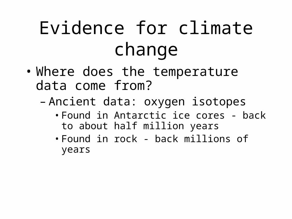
Evidence for climate change
• Where does the temperature data come from?– Ancient data: oxygen isotopes
• Found in Antarctic ice cores - back to about half million years
• Found in rock - back millions of years

Time out for Oxygen Isotopes
http://www.mhhe.com/biosci/pae/botany/uno/graphics/uno01pob/vrl/images/0041.gif
Because 18O has more mass than 16O, it is less
likely to evaporate. When it’s hotter, more 18O evaporates. So the ratio of 18O/16O tells us
about the temperature.
16O: “Normal” oxygen.
Over 99% of oxygen in the atmosphere is
16O
18O: Only a tiny bit of oxygen in the
atmosphere is the heavier form of
18O


What do we conclude?
1. Trends through time?
• Getting warmer, more recently it’s warming faster
1. Geographic patterns?
• N. Hemisphere is warming faster than southern hemisphere

Surface Temperature Data
• This data is from satellites directly measuring infrared radiation escaping from the Earth’s surface.
• Data is mapped as anomalies.• That means the temperature is compared to the
average from 1951-1980, and the difference from the average is mapped. Blue means colder than the comparison period, yellow to red means warmer

30 years of data

10 years of data

Last year’s data

Judi, play the movie

The Flat curve controversy• Some climate change skeptics point to a
flattening of the air temperature curve recently to suggest that the climate has stopped warming.
• The curve actually is still climbing – 14 of the past 15 years have been the hottest measured – but at a more gentle rate.
• It looks like the energy is there – but it’s going into the deep oceans right now

Air temperature curve

What do we conclude?
1. Patterns in the data?
• Temperature increasing over time, getting worse more recently
• N. Hemisphere warming faster
1. Which map gives us the best picture of climate change?
• 30 year map

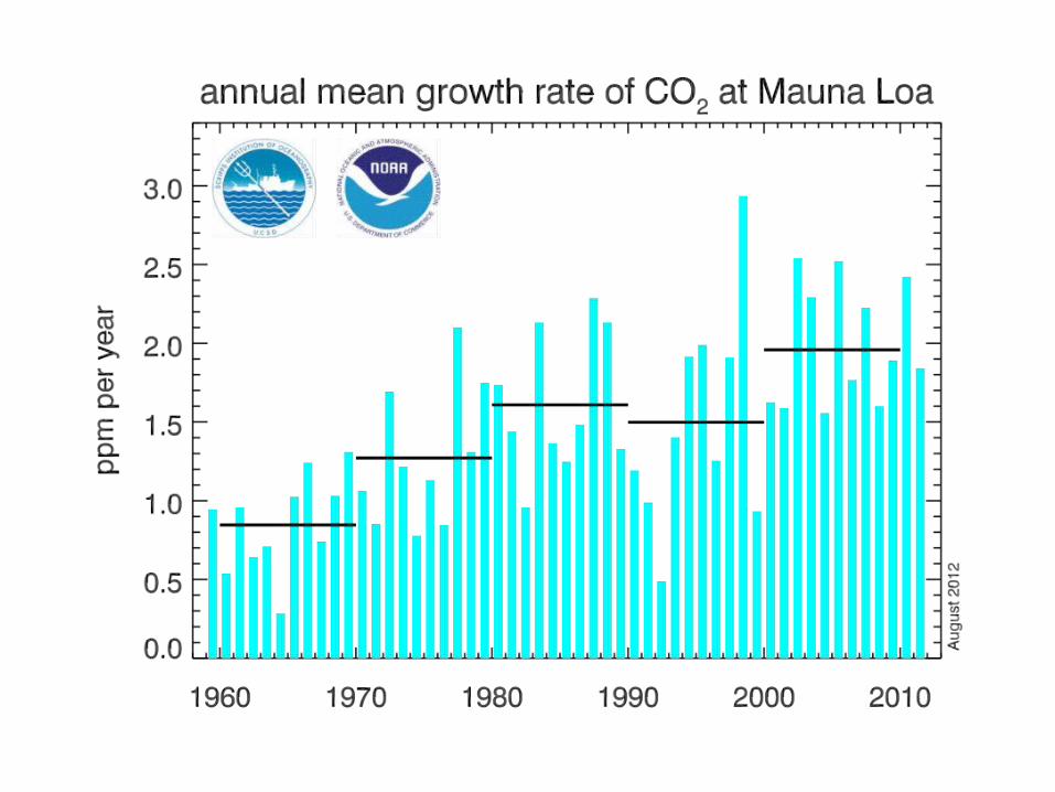
Greenhouse Gas Levels
• This data is measured (mostly) at the observatory on the top of Mauna Loa in Hawaii. The idea is to measure far away from industrial sources of gases so we can be confident we are measuring gas levels over much of the planet, not just next to a factory.


What do we conclude?
1. Patterns over time?
• CO2 increase over time, rate is getting faster
• Methane increasing
1. Geographic patterns?
• Lots of methane near north pole

Let’s look at the relationship between carbon dioxide and temperature

What do we conclude?
• Direct correlation between CO2 and temperature, and the CO2 is currently rising faster than the temperature can.

Where does the CO2 come from?
• Let’s look at the contribution of different countries
• Does increased CO2 correlate with more wealth?
• Does CO2 always correlate with higher temperature?

What do we conclude?
1. Patterns over time? Increasing at faster rate
2. What parts of the world produce the most CO2? US, China, Russia India
3. CO2 v GDP?
4. Wealthiest countries produce more CO2 per person

Glaciers
• This data shows either length of reference glaciers, or mass balance, which is the amount of ice gained minus the amount of ice lost. If mass balance is positive, glaciers are growing. If it is negative, glaciers are shrinking.


What do we conclude?
1. Patterns over time? Glaciers are shrinking, and the rate is increasing
1. Geographic patterns? East Antarctic gain, everywhere else in world is shrinking

Sea Level
• Sea level is largely measured by satellite these days using GPS technology.


What do we conclude?
1. Why a seasonal change? Glaciers grow in winter, keeping water out of the oceans
2. Pattern in time? Sea level rising
1. Geographic patterns? Sea level dropping in a few places – mostly near poles – and rising in most places

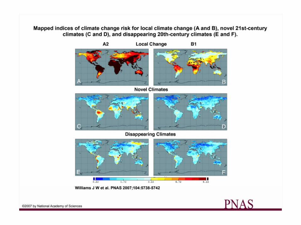
Climate belts
• USDA plant hardiness zones
• New and disappearing climate zones
• Mammal ranges


What do we conclude?
1. How have climate belts already changed?1. Climate zones in US are shifting north
2. Where are the most endangered climates?1. Near the equator, S. America, Africa.

Habitat disruptions
• High altitude – moving higher

Pika
http://upload.wikimedia.org/wikipedia/commons/3/3b/American_Pika_area.png
http://naturemappingfoundation.org/natmap/photos/mammals/pika_5946np.jpg
Pikas live at high altitude in the western mountains. As North American warms, their range is shrinking upward.

Habitat disruptions
• High altitude – moving higher
• High latitude – getting warmer
• Oceans – more CO2 in atmosphere makes surface waters
more acid – hard on critters with shells– Warmer water moves environmental zones and
kills tropical species such as coral

http:
//im
ages
.wri.
org/
futu
re_b
leac
hing
_web
_hig
h-re
s.jp
g

http:
//w
ww
.pbs
.org
/new
shou
r/ru
ndow
n/20
11/0
2/sc
ienti
sts-
fore
cast
-an-
alte
red-
ocea
n.ht
ml

Human Impacts
• Food supply – as climate belts move, food production belts move
• Water supply – greater water insecurity• Health – parasites and diseases follow
climate belts• Migration –
– People leaving very stressed climates– People leaving island nations and coastal cities

http:
//m
aple
croft
.com
/abo
ut/n
ews/
food
-sec
urity
.htm
l

Voro
smar
ty a
nd o
ther
s, 2
010,
Nat
ure
467(
7315
):555
-561

http://vepinet.biologija.unios.hr/goals.html

http://www.ciesin.columbia.edu/documents/clim-migr-report-june09_media.pdf

http://www.ciesin.columbia.edu/documents/clim-migr-report-june09_media.pdf
Maldives: an island nation in the Indian Ocean
Dark Blue: 1 m sea level riseLight Blue: 2 m sea level rise

Potential Conflicts from Climate-induced Migration
But I heard on the radio…
• Please do not get your science from talk show hosts, TV commentators or politicians.
• Get your science from credible news sources (this does not include editorials, opinion pieces or blogs), science magazines, and educational web sites (e.g., NOAA, USGS, California DWR)
But it’s snowing in Florida
• That’s weather, not climate
• 14 of the 15 hottest years on record globally were in the last 15 years (1998 is the odd one)
• 2014 is the hottest year on record, narrowly beating out 2010 and 2005
• Hotter planet = more weather instability

But Al Gore is a hypocrite – he has a big house and many cars
• So what? That has nothing to do with the data.
• Al Gore just made the movie – the data existed before that.
• This is a classic ad hominem attack – a logical fallacy. Just because the speaker is a (insert your favorite insult here) doesn’t automatically make what he says wrong.

But the scientists made it all up to keep the grant money flowing
• In all recent surveys of climate scientists, upwards of 95% agree that climate has changed due to human influence.
• Media climate skeptics are largely professional doubters who make a living appearing on news programs rather than by doing climate research.

But scientists falsified data – it was in the Climategate emails
• 2000 emails from 4 scientists were illegally hacked
• Multiple investigations by boards from scientists from both the US and UK found that while the language was intemperate and showed poor judgment, the data referred to was consistent with data from many other researchers

But..but..but
• There is no real controversy among scientists that climate is changing and that humans are responsible for at least part of the change
• The opposition is largely politically and financially driven, and much more intense in the US than in other industrial countries, including China.