chapter 6 : scatterplots, association and correlation p166 ...mahinda/stab22/wk4.pdf · chapter 6 :...
TRANSCRIPT

1
Chapter 6 : Scatterplots, association and correlation p166
− Previously, single variables on their own.
− Or one or more categorical variables.
− Now look at two quantitative
variables.
− First tool: scatterplot.
− Plot values of two quantitative
variables against each other (scatterplot).

2
− Sometimes one variable is an “outcome” or response, and the other explains the outcome, an
explanatory variable.
When examining the relationship
between two or more variables, first think about whether some variables response (dependent) variables and others explanatory
(independent) variables?
Sometimes called x and y-variables. P170

3
Example
Row Wine Heart disease
1 2.5 211
2 3.9 167
3 2.9 131
18 1.2 199
19 2.7 172
Explanatory variable?
Response variable?

4
Describing scatterplots p168
–Look for overall pattern and striking
deviations from that pattern.
–The overall pattern of a scatterplot can be
described by the form, direction and
strength of the relationship.
–An important kind of deviation is an
outlier, an individual value that falls outside
the overall pattern.

5
Interpretation (wine data)
–Pattern is fairly linear with a negative slope.
No outliers.
–The direction of the association is negative.
This means that higher levels of wine
consumption are associated with lower death
rates.
–This does not mean there is a causal effect.
There could be a lurking variable. Higher wine
consumption could be linked to higher income,
which would allow better medical care.
StatCrunch commands
•Graph > Scatter PlotCorrelation p170

6
•A sctterplot displays the form, direction
and strength of the relationship between
two quantitative variables.
•Correlation (denoted by r) measures the
direction and strength of the liner
relationship between two quantitative
variables.
•Suppose that we have data on variables x
and y for n individuals. The correlation r
between x and y is
2 2
x x y yr
x x y y
∑ ∑
− −∑=
− −
Properties of correlation p175
•Correlation requires both variables to be
quantitative.
7
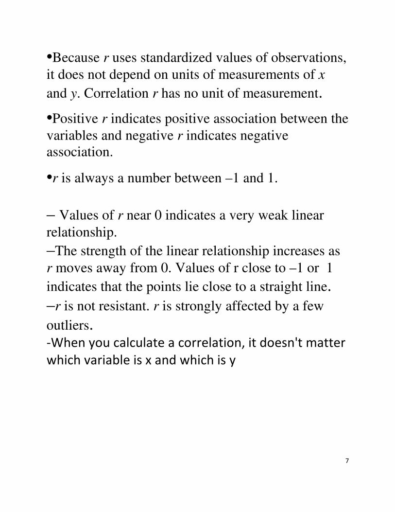
•Because r uses standardized values of observations,
it does not depend on units of measurements of x
and y. Correlation r has no unit of measurement.
•Positive r indicates positive association between the
variables and negative r indicates negative association.
•r is always a number between –1 and 1.
– Values of r near 0 indicates a very weak linear
relationship. –The strength of the linear relationship increases as
r moves away from 0. Values of r close to –1 or 1
indicates that the points lie close to a straight line. –r is not resistant. r is strongly affected by a few
outliers. -When you calculate a correlation, it doesn't matter
which variable is x and which is y

8

9
• StatCrunch command:
Stat > Summary Stats > Correlation
Correlation does not prove causation p177
− high correlation between #sodas sold
in year and #divorces, years 1950-
2010. Does that mean that having
more sodas makes you more likely to
divorce?
− high correlation between #teachers
and #bars for cities in California.
Teaching drives you to drink?
− high correlation between amount of
daily walking and quality of health for
men aged over 65. Explanation?

10
− In many studies of the relationship between two variables the goal is to establish that changes in the explanatory variable cause changes in response variable.
−
− Even a strong association between two variables, does not necessarily imply a causal link between the variables.
−
− Some explanations for an observed association.
−
−
− The dashed double arrow lines show an association. The solid arrows show a cause and effect link. The variable x is explanatory, y is response and z is a lurking variable.

11
Chapter 7: Linear regression – finding the
best line p 200
Least-Squares regression line � A regression line is a straight line that
describes how a response variable y changes as an explanatory variable x
changes. � A straight line relating a response variable
y to an explanatory variable x has an
equation of the of the form: 0 1
y b bx= +
1b is the slope and
0b is the intercept.
� Least-squares regression line of y on x is the line that makes the sum of squares of
errors (residuals) as small as possible. P113 � Equation of the least-squares regression line
of y on x is 0 1
y b bx= +
with slope
1
syb r sx= and intercept
0 1b y bx= − .

12
Example
A grocery store conducted a study to determine the relationship between the amount of money x, spent on advertising and the weekly volume y, of sales. Six different levels advertising expenditure were tried in a random order for a six-week period. The accompanying data were observed (in units of $100).
Weekly sales y 10.2 11.5 16.1 20.3 25.6 28.0
Amount spent
on advertising,
x
1.0 1.25 1.5 2.0 2.5 3.0
321
30
20
10
ad. cost
sa
les

13
Summary statistics:
Correlation of sales and ad.cost = 0.99
1
7.310.99 9.390.771
syb r sx= = × =
0 118.62 9.39 1.875 1.01b y bx= − = − × =
StatCrunch Commands:
Stat > Regression > Simple Linear
Simple linear regression results:
Dependent Variable: sales
Independent Variable: ad. cost
sales = 1.0035088 + 9.393684 ad. cost
Sample size: 6
R (correlation coefficient) = 0.9897
R-sq = 0.9794295
Column n Mean Variance Std. Dev. Min Max
ad. cost 6 1.875 0.59375 0.77055174 1 3
sales 6 18.616667 53.493668 7.313936 10.2 28

14
Estimate of error standard deviation: 1.1728134
Parameter estimates:
The output above gives the prediction equation:
sales = 1.00 + 9.39 ad. cost
This can be used (after some
diagnostic checks) for predicting
sales.
For example the predicted sales when
the amount spent on advertising is 15
is 1.00 9.39 15 141.85+ × = .
Parameter Estimate Std. Err. Alternative DF T-Stat P-Value
Intercept 1.0035088 1.3631287 ≠ 0 4 0.73618054 0.5025
Slope 9.393684 0.6806786 ≠ 0 4 13.800469 0.0002

15
StatCrunch Commands:
Stat > Regression > Simple Linear
and click “Predict Y for X” and type in
the value of X
Simple linear regression results:
Dependent Variable: sales
Independent Variable: ad. cost
sales = 1.0035088 + 9.393684 ad. cost
Sample size: 6
R (correlation coefficient) = 0.9897
R-sq = 0.9794295
Estimate of error standard deviation: 1.1728134
Predicted values:
X value Pred. Y s.e.(Pred. y) 95% C.I. for mean 95% P.I. for new
15 141.90877 8.946728 (117.06867, 166.74887) (116.856155, 166.9614)

16
� Extrapolation (p243 in Chap 8)
Extrapolation is the use of the regression line for prediction outside the rage of values of the
explanatory variable x. Such predictions are often not accurate.
17
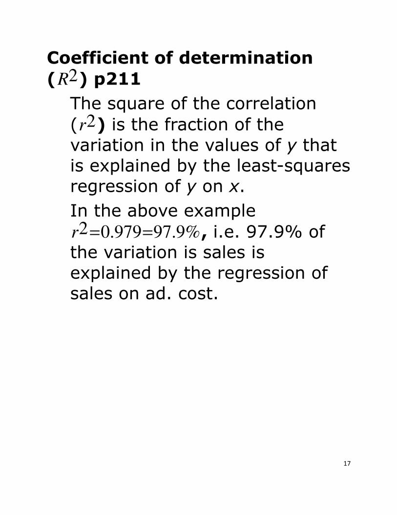
Coefficient of determination
( 2R ) p211
The square of the correlation
( 2r ) is the fraction of the
variation in the values of y that is explained by the least-squares regression of y on x.
In the above example 2 0.979 97.9%r = = , i.e. 97.9% of the variation is sales is
explained by the regression of sales on ad. cost.

18
Residuals p208
A residual is the difference between an observed value of the response variable and the vale predicted by the regression line. That is,
ˆresidual observed y predicted y y y= − = −
Example:
For the example on sales data above,
Weekly sales y 10.2 11.5 16.1 20.3 25.6 28.0
Amount spent on advertising, x
1.0 1.25 1.5 2.0 2.5 3.0
sales = 1.00 + 9.39 ad. cost
When x = 1.0 y = 10.2 and ˆ 1.00 9.39 1.0 10.39y= + × = and
ˆ 10.2 10.39 0.19residual y y= − = − =− .

19
StatCrunch commands:
Stat > Regression > Simple Linear and click “Save Residuals” and “Save fitted
values”.
ad. cost sales Residuals Fitted Values
1 10.2 -0.197192982456131 10.397192982456131
1.25 11.5 -1.245614035087712 12.745614035087712
1.5 16.1 1.0059649122807102 15.094035087719291
2 20.3 0.5091228070175475 19.790877192982453
2.5 25.6 1.1122807017543863 24.487719298245615
3 28 -1.184561403508773 29.184561403508773
� Note that the sum (and the mean) of least-square residuals is zero.

20
Residual plots p208
Residual plots help us assess the
model assumptions.
Plot residuals vs predictor or
fitted value.
Look for curvature suggesting the
need for higher order model or transformations.

21
Also look for trends in dispersion, e.g. an increasing dispersion as the
fitted values increase, in which case a transformation of the response may help. (e.g. log or
square root)

22
Doing regression
− start with a scatterplot
− if it does not look like a straight line relationship, stop
− otherwise, can calculate correlation and also intercept and slope of regression line
− check whether regression is OK by looking at plot of residuals against anything relevant
− if not OK, do not use r egression.
− Aim: want regression for which line is OK, confirmed by looking at scatterplot and residual plot(s). Otherwise, cannot say anything useful.