chapter 5: growth and recession in the us economy
TRANSCRIPT

1
Macroeconomics: an Introduction
Internet Edition as of April 7, 2005 Copyright © 2005 by Charles R. Nelson
All rights reserved. ********
Chapter 5 Growth and Recession in the U.S. Economy
Outline Preview 5.1 A Scorecard for the Economy Nominal GDP Real GDP Recession and Expansion Long Term Growth and Short Term Fluctuations How Long Does It Take To Double? The Implicit Price Deflator for GDP 5.2 The Anatomy of the "Business Cycle" The Unemployment Rate Inflation Interest Rates Real Disposable Income Expenditure Components of GDP The Investment Accelerator 5.3 The Economy and The Stock Market Corporate Profits Stock Prices and the Bull Market of the 1990s Understanding the Bull Market – A Simple Model

2
Preview
In this chapter we will learn why GDP has become one of the most familiar acronyms in the news. In what has become a familiar distinction, we will find that there are both real and nominal measures of GDP. Tracking GDP over time, we see that the economy experiences long periods of growth, interspersed with periods of decline or “recession.” Important economic indicators related to the “business cycle” are unemployment, inflation, interest rates, corporate profits, and stock market prices. We will examine the relation of each of these to fluctuations in the economy.
5.1 A Scorecard for the Economy
A few weeks after the end of each calendar quarter the U.S. Department of Commerce announces its estimate of Gross Domestic Product, GDP for short. That evening the national news will include an item like “GDP increased at a rate of 3% in the second quarter.” The wide coverage that announcement receives in the media makes GDP as well known an acronym as “NFL.” Why is all this attention given to GDP? Because, as the TV news anchor-person says, "GDP is the government's primary indicator for tracking the performance of the US economy.” Americans love to keep score and GDP is the closest thing we have to a scorecard for national economic success. It is the broadest possible indicator of economic activity simply because, as we learned in Chapter 2, it is the value of all the goods and services produced in the U.S. Since the announced GDP has been adjusted for inflation, 3% in this example reflects a real increase in economic activity. When GDP is rising briskly, incumbent politicians smile. But if GDP declines, shock waves reverberate though Washington DC because the electorate will be looking to make changes in the halls of Congress and even the Oval Office.
Does GDP deserve so much attention? While it is the single most important indicator of economic conditions, it is not the only one. The Federal Reserve Board’s Index of Industrial Production as well as retail sales, personal income, and several other broad indicators are recorded monthly and therefore much more current than is quarterly GDP. Further, the announced GDP number is necessarily a preliminary statistical estimate, since the economy far too complex for a complete accounting to be done. That estimate is revised in succeeding months, even years later, as more data become available, and those revisions often are large enough to change perceptions about the health of the economy.
We also know that GDP is not the only factor in determining our standard of living. The fact that GDP rose last year does not necessarily mean that the quality of life improved, or that income was distributed more justly, or that everyone was happier.

3
But it is also true that most of us would prefer to see GDP growing rapidly rather than slowly, because the capacity of society to provide a better standard of living for all is greater if growth is robust. And a falling GDP is almost certainly a sign that the standard of living is falling. Indeed, a prolonged decline in economic activity is almost always accompanied by social distress and political instability.
Nominal GDP
We know that if we want to measure real growth in the economy, we will have to adjust GDP for the effect of inflation. But let's start by taking a look at how GDP measured in current dollars, that is nominal GDP, has grown over time.
Figure 5.1 shows nominal GDP plotted quarterly since 1960, the year John Kennedy was elected President. We start with 1960 instead of earlier because that is the point from which we have consistent national income data. It is astonishing to see how much nominal GDP has increased since then, from about $500 billion to about $12,000 billion today! Surely the latter figure would have been unimaginable to people in JFK’s time, being more than twenty times what they regarded as an already very large sum. Actually, it is hard for us even today to comprehend an economy producing goods and services worth about $50 billion per work-day! Does it seem possible that in another 40 years GDP will again multiply 20 times? It will, if the next half-century is like the last. Notice, too, that nominal GDP almost always goes up, with only a few brief pauses along the way. Of course nominal GDP has been propelled upward both by growth in output, the quantity of items produced, and by rising prices.
Although GDP is measured for each calendar quarter, it is always expressed at an annual rate. That annual rate is what GDP would total if the economy kept up the pace of that quarter for a full year. For example, the current dollar GDP for the fourth quarter of 2001 was estimated to have been $10,153 billion. The actual amount produced during the quarter was roughly one fourth of that (not exactly due to seasonal adjustment), but that would be the annual total if the economy kept up the same pace for a full year. It is like saying "we drove 60 miles per hour during the last quarter hour" when you covered 15 miles in 15 minutes.
GDP is also adjusted for the seasonal variation that occurs regularly and predictably. During the autumn quarter of every year the economy experiences higher levels of production than the winter quarter that follows it. This is partly due to agricultural activity being hectic during the harvest in fall but relatively dormant during the winter. More important quantitatively is the run-up to the holiday season during which a disproportionate amount of retail trade occurs. This seasonal pattern is apparent in unadjusted figures for almost all measures of economic activity. Since we want to know how the economy is performing relative to a normal pattern, this regular, seasonal variation is removed
4
by sophisticated statistical methods. Thus, GDP for the fourth quarter will be adjusted downward relative to the first quarter, normally the slowest. GDP and almost all of the economic indicators announced to the public have been “seasonally adjusted.”
We know that part of the phenomenal increase in nominal GDP that we see in Figure 5.1 was due to inflation, and we are ultimately interested in measuring the real growth of the economy. Consequently, we have to come up with a way to measure real GDP.

5
Figure 5.1: Nominal Gross Domestic Product
0
2,000
4,000
6,000
8,000
10,000
12,000
60 64 68 72 76 80 84 88 92 96 00 04
Billio
ns o
f Dol
lars

6
Real GDP In Chapter 4 we discussed how to adjust a person’s change in income
for inflation, using the Consumer Price Index. We also talked about the shortcomings of using a price index with a fixed base period in an economy where the mix of goods is changing rapidly. It is not hard to imagine how these problems only multiply for an entire economy, particularly one as dynamic as that of the U.S. So the idea that we might approach the problem of adjusting GDP for inflation by developing a price index for GDP and then divide nominal GDP by that price index to get real GDP is fraught with difficulties. What the national income accountants at the U.S. Department of Commerce, Bureau of Economic Analysis (BEA), actually do is to value the detailed components of GDP individually in constant price, and then add up these real components to get real GDP. They have also recently changed the way in which they base “constant” prices.
The BEA’s solution to the base-period problem is to update the base period every year, and then “chain” together the resulting rates of change in real GDP to form a series over time. More concretely, to compare the real GDP of 2005 with that of 2004, the BEA accountants value the quantities produced in each year using the prices of 2004 and calculate the rate of change in the total. Then they value the output of each year using the prices of 2005 and again calculate the rate of growth. The BEA does it both ways and uses the geometric average as its rate of growth of real GDP from 2004 to 2005. To provide a total dollar value of real GDP one needs to pick a base year, currently2000, in which real GDP is equal to nominal GDP. To get the (constant) dollar value of GDP in 2005 they increment the 2000 value of real GDP by the successive rates of change from 2000 to the current quarter. Similarly, one can work backwards to calculate the level of real GDP before 2000. This approach is called chaining. The resulting series is known as “real GDP in chained 2000 dollars.” Fortunately, as users of these data we do not need to understand all the details, only the general principles.
When we plot nominal and real GDP together, the result is the chart shown in Figure 5.2. Of course, real and nominal GDP are the same in 2000 because that is the base year from which real GDP is chained forward and backward in time. It is not surprising that the growth of real GDP is more modest than that of nominal GDP since we have taken out the part of the increase in nominal GDP that was just due to inflation.
While nominal GDP increased almost every quarter since 1960, we notice that there are several periods in the last three decades when real GDP dipped. Most recently, real GDP fell in the first three quarters of 2001. These dips in economic activity are called recessions. and their causes, and possible cures, have been the focus of macroeconomic analysis since the Great Depression of the 1930s.

7
Figure 5.2: GDP - Nominal and Real
0
1,000
2,000
3,000
4,000
5,000
6,000
7,000
8,000
9,000
10,000
11,000
12,000
60 64 68 72 76 80 84 88 92 96 00 04
Bill
ions
of D
olla
rs
Real
Nominal

8
Recession and Expansion In Figure 5.3 we focus on real GDP by itself to see the recession
periods more clearly. As a rule of thumb, a recession occurs when real GDP declines for two or more consecutive quarters. The high point before the recession is called the peak and the low point at which Real GDP stops declining and starts to increase is called the trough. Economists date recessions from peak to trough, so the end of a recession does not mean that the economy has recovered and is back to normal, but only that it has stopped contracting. For example, a recession began following the peak of July 1990 and ended with the trough of March 1991, marked by down and up arrows, respectively, in Figure 5.3. While the recession ended in March 1991 - that is the date of the trough – the effects of the recession did not end there. It was not until 1992 that real GDP was significantly ahead of pre-recession levels, and other measures of economics health such as the unemployment rate – discussed shortly – did not recover until 1995.
Each recession is indicated in Figure 5.3 by a downward sloping row of triangles that starts with the first down quarter and continues until the trough. Thus number of triangles is the duration of the recession in calendar quarters, so the length of the diagonal gives a quick visual impression of how severe the recession was. (Note that the triangles only mark an event, they have no numerical value.) The lengthiest recessions since 1960 were in 1973-75 during the energy crisis, and 1981-82 when the Federal Reserve slammed the economy hard in an effort to halt run-away inflation. That recession came on the heels of a short recession in 1980, and together – a double dip - they resulted in a span of three years during which there was no economic growth.
The intervals between recessions are called expansions, and one of the longest on record began when the economy was at a trough in February 1961 and did not end until the peak of December 1969. The expansion following the 1969-70 recession was rapid but relatively brief; real GDP peaked again in the fourth quarter of 1973. Some expansions are even briefer; the shortest lasting only from July 1980 to the peak in July 1981 that marked the beginning of the very severe recession mentioned above. That one was so short as to be little more than a pause between recessions. The expansion that started at the trough in March 1991 set a record for durability. We will understand some of the reasons why it was so durable after our study of monetary policy in Chapter 9.
The official declaration and timing of recessions is made by the National Bureau of Economic Research, or “NBER,” a private organization. In considering whether a recession has started or ended, the NBER looks not only at real GDP but also at a wide range of other indicators. While real GDP is the most important single indicator, peaks and troughs in real GDP do not necessarily coincide exactly with the NBER's dating of recessions.

9
Figure 5.3: Real GDP with Peaks and Troughs in the Business Cycle
0
1000
2000
3000
4000
5000
6000
7000
8000
9000
10000
11000
60 64 68 72 76 80 84 88 92 96 00 04
Bill
ions
of C
onst
ant 2
000
Dol
lars

10
Long Term Growth and Short Term Fluctuations
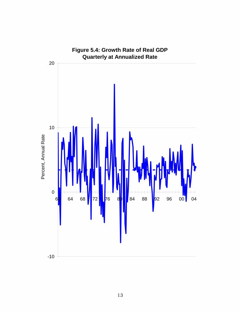
It is apparent from Figure 5.3 that in spite of recurring recessions the U.S. economy has enjoyed remarkable growth over the past half century. Real GDP is now four times as large as it was in 1960 and has doubled just since 1980. This tendency for output and real income to increase over time when it persists is called long term economic growth. Indeed, over the past four decades pictured here, the growth rate of real GDP has averaged 3.4% per year. If that rate is maintained, real GDP will double again in only 21 years!
Figure 5.4 is a chart of the growth rate of real GDP from quarter to quarter, expressed in percent at an annual rate. That is the growth rate which would be realized over four quarters if GDP continued to grow at the rate it did during a particular quarter. It is this annualized growth rate that is announced quarterly in the news, as we mentioned earlier.
The average growth rate of real GDP during the past three decades is shown in the chart as a line at 3.4% in Figure 5.4. Recessions are seen here as intervals of time during which the growth rate is below the zero line for two or more quarters. Notice that there have been a few instances of zero or negative growth in real GDP for only a single quarter, but they did not qualify as an official recession which requires two or more quarters of decline.
An important fact about real GDP, which is apparent from Figure 5.4, is that its growth rate is highly variable from quarter to quarter. The fact that real GDP may have increased rapidly last quarter clearly does not imply that the economy will continue to expand rapidly next quarter. In other words, there is not much momentum in the economy from quarter to quarter. This “noisiness” in quarter-to-quarter growth suggests that a just-announced quarterly growth rate tells us little about the future direction of the economy. In fact, economists have found it very difficult to predict the quarter-to-quarter growth rate in real GDP with any accuracy using computers and data on dozens of variables.
What is fairly predictable, however, is that over periods of several years real GDP will grow at over 3% per year on average, in spite of the erratic fluctuations around that average. This important fact is evident in Figure 5.4 where we see that the growth rate has not wandered far from the average for very long. Decade by decade, the average has been close to 3%. What is even more surprising is that estimates of growth rates back to 1870 (not shown here) show that there has been no appreciable change in the average over more than a century!
The fact that the economy seems to grow no more rapidly today in the era of microprocessors than it did in the era of steam engines presents a fascinating mystery for economists. Most students of economic growth have expected technological change to cause the growth rate to accelerate, and certainly the pace of technological change at a microeconomic level seems much more rapid today – technological

11
progress seems to beget even more rapid progress. Typewriters improved slowly until the PC ushered in word processing and the far more rapid gains in information processing we have seen recently. However, we do not yet have credible evidence that the pace of growth has accelerated at a macroeconomic level.
Many sages, mostly non-economists, have long predicted instead that economic growth would slow down over time. The arguments mustered in favor of this gloomy prognosis are mainly that natural resources are limited and will be exhausted in another decade or two, putting an end to the industrial growth era. That view has been heard since the beginning of the industrial revolution. Marxists expected the capitalist system to fail due to what they believed were its internal contradictions. What has actually happened is that growth has continued unabated in the market economies, while Marxist economies have largely disappeared. Natural resources have not become scarce, but relatively cheaper instead. Mining has been a poor investment. The pessimists failed to see the ability of technology to squeeze more and more output out of the same physical resources, land, labor and capital. The areas of greatest growth in the economy, and highest investment returns, have little to do with natural resources, instead they involve telecommunications and information on the Internet which travel over optical cables made of abundant, not scarce, raw materials.

12
How Long Does It Take To Double?
We learned above that at a growth rate of 3.4% per year it would take about 20 years for real GDP to double. Doubling is an increase of 100%, so it may seem surprising that it does not take 100%/3.4% or 29 years to double. The reason that the correct answer is much smaller is compounding; growth each year applies not only to the original amount but also the amounts that have been added since by earlier growth. A good rule of thumb for computing doubling time is the “Rule of 72” which says that 72 divided by the growth rate in % is approximately the number of years it takes to double. Thus, 72/3.4 = 21.4 years is how long it will take the economy to double again, if it maintains its historical average growth rate. The same algebra applies to growth of principal invested at interest; you earn interest on the interest. That is what Baron Rothschild, the great banker in the age of Napoleon, called “the miracle of compound interest.”
13
Figure 5.4: Growth Rate of Real GDPQuarterly at Annualized Rate
-10
0
10
20
60 64 68 72 76 80 84 88 92 96 00 04
Per
cent
, Ann
ual R
ate

14
The Implicit Price Deflator for GDP As discussed above, real GDP is calculated by valuing the quantities
produced by the economy at constant prices rather than by first computing a broad price index and using that price index to deflate nominal GDP. But we would still like to be able to see how much of the growth in nominal GDP was just due to inflation. We can easily compute a price index for the whole economy by taking nominal GDP and dividing it by real GDP for each quarter. The resulting index is that which would have produced exactly the real GDP numbers had it been used to deflate nominal GDP. That is why it is called Implicit Price Deflator for GDP.
To illustrate, nominal GDP for the fourth quarter of 2001 is estimated to have been $10,153 billion and real GDP $9,249 in 1996 dollars. Dividing nominal GDP by real GDP we get the ratio 1.098, and that is the Implicit Price Deflator for GDP in the fourth quarter of 2001. Of course, the “GDP deflator,” as it is often called, takes on the value 1.00 or 100% in 1996, the base year for real GDP. The GDP Deflator can be thought of as a price index much like the CPI except that it includes not only prices of consumer goods and services, but also prices of capital goods, items purchased by government, and exports and imports.
Figure 5.5 shows the rise in the GDP Deflator since 1960, expressed as a percent of the 1996 level. Confirming the pattern we saw in the CPI in Chapter 4, prices in the U.S. economy rose relatively slowly in the 1960s, picked up speed dramatically in the 1970s, and then slowed their ascent again in the 1980s. One can see from the chart that this broad measure of the price level has increased five-fold since 1960.
As we are well aware by now from our discussions of the CPI in Chapter 4, inflation is not measured precisely because of problems of adjusting for changes in quality, the introduction of new products, and changes in the composition of the market basket. While the BEA has addressed the last problem with its new chaining procedure, the remaining problems carry over to measuring the GDP deflator and are exacerbated by the fact that the BEA is trying to measure price changes of every good and service in the economy.
Bias in measuring inflation will impact our estimates of growth in real GDP. For example, if we overestimate inflation by 1% because of the difficulty in measuring improvements in quality, then we will correspondingly underestimate the growth rate of real GDP by the same amount.

15
Figure 5.5: The Implicit Price Deflator for GDPBase Year 2000 = 100
0
20
40
60
80
100
120
60 64 68 72 76 80 84 88 92 96 00 04
Per
cent
of 1
996
Pric
e Le
vel

16
Exercises 5.1
A. Which has grown more, nominal GDP or real GDP? Explain the difference.
B. When was the most recent recession in the U.S.? How severe was it compared to past recessions? Explain how you measure severity.
C. Calculate the average length of recessions and expansions in the U.S. economy since 1960. How long was the shortest recession? the longest? Do you feel that the average length of recession gives us a reliable forecast of how long the next recession will last? Would you conclude the same about expansions?
D. Was the decade of the 1990s one of unusually rapid growth? How was growth in that decade different from past decades?
E. During much of the period after WWII, Japan's real GDP grew at a rate of about 5% per year. How long did it take Japan’s economy to double at that rate? Can you give an exact as well as an approximate answer?
F. "The economy finished last year with a rapid 4.8% rate of expansion in real GDP during the fourth quarter giving it enough momentum to almost ensure another year of prosperity." What would be your reaction to that analysis if you heard it on the evening news? Explain.
G. If we have been overestimating inflation by 1% per year on average, because we have underestimated the rate of quality improvement, then by how much is our estimate of average economic growth off? What would be a corrected long term average? What effect would this adjustment have on the doubling time for real GDP?
17
5.2 The Anatomy of the "Business Cycle"
The recurrence of recession followed by expansion followed by recession, and so on, gave rise long ago to the idea that there is a cycle in economic activity much like the cycles in nature. Recessions and expansions were seen as the ups and downs in a regular ”business cycle.” As techniques of statistical analysis became more sophisticated and computers allowed economists to test their hypotheses more systematically, they realized that the so-called business cycle does not have a fixed frequency. Instead, the intervals between expansions and recessions are highly variable. Accordingly, most macroeconomists today use the term ”business fluctuations” rather than business cycle, although the earlier terminology is still in general use.
While business fluctuations are not mechanically predictable like the phases of the moon, we would still like to know whether there is a tendency for them to occur at a regular interval. Does the probability of a new recession increase as the time since the last one increases? Does it make sense to say: “We are about due for another recession”? Do expansions or recessions age? Recent research suggests that recessions are rather like the common cold; the fact that you have not had a cold for a certain number of months does not imply that you are about to get one. That is, healthiness does not age. On the other hand, colds do age; when you feel that sore throat coming on, you can expect a week of misery but followed by recovery in a predictable pattern. Similarly, economic expansions – periods of healthiness in the economy - do not age, but recessions – periods of sickness in the economy - do. While the average expansion lasts about seven years, the fact that it has been nine years since the last recession does not by itself imply that recession is more likely.
So though economic “cycles” are not as predictable as we might like, economists have come to recognize regular patterns in key variables in the economy which are useful in understanding the causes and consequences of business cycles. Some variables move in the same direction as output and are referred to as pro-cyclical. Other variables move in the opposite direction and are called counter-cyclical. In this section we look in turn at several key economic variables, including ones like inflation and interest rates that we have studied, to see how they move with the business cycle. Much of the rest of the book is concerned with understanding these relationships and the causal mechanisms underlying them.

18
The Unemployment Rate
Are you unemployed? You are, according to the definition, if you do not have a job but are looking for one. If you have a job and are looking around for a better one, you are not unemployed. People who do not have jobs but are not looking for work are not unemployed; for example retired persons are not unemployed since they do not seek employment. All of the people who are employed or looking for work make up the labor force. The labor force is roughly two thirds of the adult population, and that fraction is called the labor force participation rate.
We are interested in measuring unemployment because we are concerned about individuals who wish to work not finding employment. Unemployment suggests under-utilization of labor resources, a cost to society, and distress to the individual and their family. We would be concerned to see unemployment at an unusually high level, but recognize, for reasons discussed below, that unemployment will never be zero. It is also important to recognize that just because a person or group is not unemployed as defined does not mean that there is no cause for concern. The technical definition misses those “discouraged workers” who have been so disheartened by past attempts to find employment that they have given up. It also misses the roughly one and a half million people who are incarcerated in jail or prison; they are not job hunting for obvious reasons, but their lack of participation in economic and social life is symptomatic of very serious problems. Others are prevented from participating because of chronic health problems.
The unemployment rate is the percentage of the labor force that is unemployed. The unemployment rate is estimated monthly by the U.S. Bureau of Labor Statistics (BLS) based on a survey of 60,000 households. People are asked whether they are employed and if not whether they are seeking employment.
Figure 5.6 shows how the unemployment rate has fluctuated over the past. The recession marker introduced in Figure 5.3 is shown to indicate periods of decline in the economy. Not surprisingly, unemployment and recession go together. As the production of goods and services declines, employers lay off workers rather than continue to pay wages to people they do not need. When the expansion of the economy resumes, the unemployment rate declines. The twin recessions of 1980 and 1981-82 were so close together that the unemployment rate barely paused in between.
Recession is not the only determinant of the unemployment rate. Demographics, the age composition of the labor force, are also very important. More experienced workers are unemployed less frequently, so the large number of young workers entering the labor force in the 1970s contributed to a higher over-all unemployment rate. As those workers aged they experienced in the 1980s and so into the 1990s. In addition, the number of new workers entering the labor force was relatively low in

19
the 1990s. However, as we move through the 2000s there will be increasing numbers of young workers, the “echo of the baby boom,” and a tendency towards higher rates again.
How low does the unemployment rate have to be before we can say that there is full employment? It is clear that the unemployment rate will never be zero. Even in a robust economy some people will be searching for a new job. Good times have the effect of emboldening people to quit one job and look for a better one, hoping to improve their position. This kind of unemployment that is chosen by the worker is called voluntary unemployment. Some workers are pre-disposed by health or social problems to have less stable work histories. For all these reasons, economists do not expect that the measured unemployment rate could ever be zero, nor should we want it to be.
Considerable effort has gone into trying to measure a ”natural” rate of unemployment based on the demographic composition of the labor force. Estimates of this level of the unemployment rate are currently around 5%. An unemployment rate above 5% suggests that the economy is operating at too slow a rate to make use of the productive workers available to it. That does not mean of course that when the unemployment rate is 5% that everyone who is unemployed is happy about it.
But hold on, wasn’t the unemployment rate been well below 5% during the late 1990s? It was indeed, and experts are surprised, frustrated, and pleased. They are surprised because the prior estimate of the natural rate of unemployment was evidently too high. They are frustrated because it is not yet clear how they went wrong. And they are pleased because the robust labor market has succeeded in making job holders of many people previously mired in long-term unemployment. Hopefully we will be able to revise downward our estimate of the natural rate of unemployment based on this experience and not look back on it as a fluke. The next few years will tell.

20
Figure 5.6: Unemployment Rate %
0
2
4
6
8
10
12
60 64 68 72 76 80 84 88 92 96 00 04
Per
cent
of L
abor
For
ce

21
Inflation The rate of inflation declines during recessions and accelerates during
expansions. This is pattern is clear in Figure 5.7 where inflation is measured by the rate of change in the CPI and recessions are marked.
The pro-cyclical behavior of inflation suggests that business fluctuation reflect mainly corresponding fluctuations in demand. Thus, expansions are times of strong demand for goods and services, and the law of demand tells us that prices will tend to rise. Correspondingly, recessions are times of weak demand and prices rise less rapidly or even fall. Employees find themselves in a similar position during a recession, being willing to take pay cuts in order to get a job or to hold onto one. The resulting decline in their incomes exacerbates weak demand, and that process reverses during the subsequent expansion.
However, if the business cycle were due primarily to fluctuations in supply, then inflation would be counter-cyclical. For example, the U.S. experienced a sharp reduction in the supply of imported oil in 1974 during the OPEC oil embargo. The resulting rise in production costs simultaneously reduced output and pushed inflation higher. In energy consuming industries there was a shift in the supply curve upward, leading to higher market price and lower quantity. Indeed, there was a surge in inflation just as the recessions of 1973-75 worsened. But the fact that inflation is usually pro-cyclical suggests that business fluctuations are primarily due to shifts in demand.
While inflation is pro-cyclical, it is also clear from this chart that inflation almost always lags behind the business cycle, typically continuing to increase for several months after a recession begins. The business press then expresses surprise that inflation continues unabated, some asking whether conventional wisdom, even the hallowed laws of supply and demand, should be abandoned! Few people, even among journalists who cover the economy, are fully aware of the lag between the business cycle and inflation. Then, sure enough, inflation subsides as the recession wears on, usually continuing to decline well into the next expansion.
What is difficult for economists to understand, and still not well understood, is why inflation does not respond more quickly to recession. Why doesn't inflation respond immediately to diminished demand? Why doesn't inflation simply stop, instead of only diminishing, when factories and workers are idle?

22
Figure 5.7: The Rate of Inflation (CPI%)and Recessions
0
4
8
12
16
60 64 68 72 76 80 84 88 92 96 00 04
Per
cent
at A
nnua
l Rat
e
23
Part of the answer to this mystery certainly lies in the widespread use of contracts that commit parties to abide by a predetermined wage or price. Union contracts, for example, frequently cover a three-year period. Firms incur costs when they change prices. Some of these costs are easy to see, such as the printing new catalogues and menus. Economists refer to these direct costs of changing prices as "menu costs." Other costs are more subtle, involving a firm's unwritten understanding with its customers that it will supply its product or service at a price that the customer can rely on. This is a characteristic of "customer markets" where the good or service is not highly standardized so it is costly for both buyer and seller to shop around. We expect the price of a standard commodity, a bushel of wheat for example, to respond flexibly to a change in demand. In contrast, the price of more individualized items such as your lawyer's hourly fee, or a cat-scan, will change only after it is clear that the old price can no longer work in normal times.
We see too in Figure 5.7 that until the 1980s each expansion lead to a resurgence of inflation to even higher levels than the prior peak. The first exception to this pattern is the expansion following the 1981-82 recession during which the economy enjoyed a continued decline in inflation until a mild resurgence the end of that decade. Then, following the 1990-91 recession, we saw inflation subside to levels not seen since the 1960s in spite of a decade-long expansion. By the time you finish reading this book you will understand why all of the expansions before the 1980s were associated with rising inflation, why and how that pattern was broken, and what will determine whether we will experience another resurgence of inflation in the future.

24
Interest Rates
Interest rates play a critical role in the economy since they are the link between savings and investment. Figure 5.8 is a chart of the yield on the 90-day, plotted along with the recession marker. We see here that the T bill rate is pro-cyclical, falling during recessions and rising during expansions. Why are interest rates pro-cyclical?
We saw in Chapter 4 that inflation is an important determinant of the level of interest rates. When lenders perceive inflation to be increasing they demand a higher nominal interest rate to compensate them for loss of purchasing power. At the same time borrowers are willing and able to pay a higher nominal interest rate because they are paying back their loans in smaller dollars. This explains the rising level of the T bill rate in the 1970s as inflation accelerated, and the subsequent decline in the 1980s as inflation subsided. Shorter term movements in interest rates associated with the business cycle are also related to inflation as it responds to recession or expansion. Since inflation is pro-cyclical, the link between inflation and interest rates implies that interest rates will be pro-cyclical as well.
There are two other reasons why interest rates are pro-cyclical. Both relate to the real component of interest rates. One reason is the pro-cyclical fluctuation in the demand for loans by firms and households. During an expansion, firms go to the bond market seeking capital for investment in plant and equipment. Strong demand means that lenders can charge a higher real rate of interest. Likewise, optimistic households are investing in consumer durables and are willing to pay a higher real rate of interest. The other reason has to do with the operation of monetary policy by the Federal Reserve, which we will discuss in depth in Chapter 9. Briefly, when inflation rises in the later stages of an expansion the “Fed” raises interest rates even further to cool down demand for durable goods such as houses and office building with the objective of slowing down inflation. When this results in recession, as it often has in the past, the Fed then responds in the opposite direction, pushing interest rates down to stimulate the demand for interest rate sensitive goods in order to revive the economy. This sequence of events produces a peak in interest rates prior to a recession followed by a sharp fall in interest rates as the recession continues.
Thus, the forces operating on both the real interest rate and the inflation premium are all pro-cyclical, almost assuring that the nominal interest rates we observe will move in the same direction as economic activity.

25
Figure 5.8: Yield on Treasury Billsand Recessions
0
4
8
12
16
60 65 70 75 80 85 90 95 00
Per
cent
, Ann
ualiz
ed

26
Real Disposable Income As individuals we experience changes in our own income, the taxes we
pay, and the cost of our market basket. Real disposable income per capita summarizes the impact of these factors for the average American. It is widely followed as a barometer of demand for consumer goods by marketing analysts.
Recall that disposable income is personal income less taxes. Deflating by the CPI and then dividing by population, we obtain the average real disposable income of individual Americans, or real disposable income per capita. To make past income directly comparable to income today, it is expressed in constant dollars of 2002. Plotting this measure of individual purchasing power, we see in Figure 5.9 that disposable income is almost $30,000 per year per American. Further, it has more than doubled in the past 40 years. Notice that recessions correspond to dips in disposable income while expansions bring higher disposable income.
Not surprisingly, disposable income is a powerful predictor of elections. Jimmy Carter defeated incumbent President Ford in 1976 and then Ronald Reagan unseated President Carter in 1980. Both of those upset elections coincide with dips in real disposable income. The decline in real disposable income that developed in 1990 and continued into 1991 (see arrow) spelled trouble for President Bush and raised the possibility that a challenger could unseat him. Although disposable income was growing again by 1992, Bill Clinton did just that, under the mantra "It's the economy, stupid!" As incumbent in 1996, Bill Clinton benefited from subsequent growth, and appealed to voters to give him credit for it, and they did!

27
Figure 5.9: Disposable Real Income per Capitain 2002 Dollars and Recessions
0
5
10
15
20
25
30
60 64 68 72 76 80 84 88 92 96 00
Thou
sand
s of
200
2 $

28
Expenditure Components of GDP The expenditure components of GDP; consumption, government
purchases, investment, and net exports, vary considerably in their responsiveness to recession. Figure 5.10 tracks each of these back to 1960 along with the recession marker. Consumption, by far the largest component, is pro-cyclical. Households increase spending during expansions and cut back during recessions. Government purchases, in contrast, are not much affected by the business cycle much at all. The most cyclically sensitive component by far is investment expenditures on new plant and equipment, and it is pro-cyclical. Investment declines sharply in a recession, often showing weakness before the other components do, then bounces back strongly during expansion.
Net exports are mildly counter-cyclical, rising in recession periods, and we can easily understand why. Imports are directly affected by the business cycle because they reflect demand in the U.S. for foreign goods. When demand for goods is strong, the demand for imports follows along. Exports, though, are affected mainly by economic conditions abroad. Thus, net exports will tend to rise during a recession in the U.S., as imports fall, behaving counter-cyclically. Correspondingly, the trade deficit is pro-cyclical, being of opposite sign, worsening during expansions. Note the negative level of net exports during the strong expansion of the late 1990s.
As the economies of the major industrial nations have become more closely linked, business cycles have become more international. Periods of recession in the U.S. are often also periods of recession for our major trading partners. When that happens, declining demand abroad for U.S. goods results in lower US exports. This “coherence” among the major economies mitigates the impact of the business cycle on net exports. Another factor affecting exports is the value of the dollar on foreign exchange markets which is related to the business cycle, but that is a story for Chapter 12.

29
Figure 5.10: Components of Real GDP and Recessions
-1000
0
1000
2000
3000
4000
5000
6000
7000
8000
60 65 70 75 80 85 90 95 00
Bill
ions
of 1
996
$
Consum Invest Gov't Net Exports Recession

30
The Investment Accelerator The strongly pro-cyclical character of investment spending suggests
that the demand for capital goods plays an important role in the causation of recessions and expansions. In Chapters 8 and 9 we will be discussing why and how investment spending is a key variable in causing business fluctuations.
In addition to being a cause of business fluctuations, the demand for capital goods is also strongly affected by the business cycle. This is what economists call the investment accelerator. The idea is this: The number of machines that a firm needs, its desired capital stock, depends on its sales volume. As sales grow, the firm buys more machines in order to increase its output. Those new machines are the sales of the capital goods makers. Thus, growing airline travel causes airlines to order more planes to expand their fleets. This keeps Boeing busy building new planes. But when business is slow, firms find that they can get along just fine with the plant and equipment they already have. An airline that finds it is carrying no more passengers this year than it did last year may not need any new airplanes at all. Thus, although the sales of airplane tickets has only leveled off, the number of orders for new airplanes goes into a nose-dive. A slow down in the sales of a final good becomes accelerated in its effect on the sales of the capital good used to produce it. Firms specializing in producing capital goods are called "cyclical companies" because their sales are so sensitive to the business cycle. Exercises 5.2
A. Describe the employment status of: (1) a construction worker who has just been laid off, (2) a construction worker who just quit to move to Oregon and look for work, (3) a retired construction worker, (4) an adult who has never held a job and is not looking for one.
B. How did the aging of the “baby boomers” in the labor force in the 1990s affect the "natural" rate of unemployment? Explain.
C. The tendency of inflation to lag behind the business cycle helps us forecast inflation over the next year or so. In general terms, what is your forecast for inflation for next year; explain your answer.
D. How does the relationship between interest rates and inflation discussed in Chapter 4 help to explain why interest rates vary as they do with the business cycle?
E. News item on the financial page: “Survey of business executives shows greater confidence in strong economic growth next year. Bond prices fall.” Explain the connection.
F. During 1990 several articles in prominent business publications suggested that there was something unusual about inflation persisting in the face of an emerging recession. Comment.
G. How do the ups and downs of disposable income during election years seem to correlate with the outcomes of Presidential elections?

31
H. What are some of the limitations of average real disposable income per capital as a measure of the welfare of a population?
I. A trucking firm requires one truck for every million ton-miles of freight it hauls. Currently it is carrying 100 million ton-miles. How many trucks does it need in its fleet? One truck is scrapped each year. If volume grows by 2% this year, how many trucks will the firm buy? If volume does not grow at all, how many will it buy? What was the percentage change in its sales? The percentage change in its purchases from the truck industry? Which industry is more cyclical: the shipping industry or the truck manufacturing industry?
J. Identify a real company that produces primarily capital goods. Explain why the accelerator principle would lead you to expect the sales of that firm to be "cyclical."
K. Owners of small businesses tend to have incomes that vary more widely from year to year than do many salaried professionals such as teachers and accountants. Explain how the business cycle may be a factor in this difference.
L. Suppose you want to compare the level of disposable income today with what it was 10 years ago, and you would like to make this comparison in the dollars of the current year since those are the dollars we are familiar with. You find that the income data are in nominal dollars and the only cost of living index available is the CPI. How would you do the calculations so as to obtain the comparison you seek?

32
5.3 The Economy and The Stock Market The decade of the 1990s was one of remarkable prosperity in the U.S.
economy and an astounding “bull market” in stocks of a magnitude not seen before in our history. The first year of the 2000s was the peak of the stock market and the beginning of a wrenching downward adjustment that had trimmed off almost half of peak market value by summer of 2002. The reasons this roller coaster ride, and its implications for the future, are topics of hot debate and great controversy. Accusations fly as politicians, the media, and citizens try to decide who was responsible for this debacle and what should be done about it. We do know that there was fraud and illegal misconduct by the management of some of the highest flying companies of the 1990s, some of which have been declared bankrupt.
In this section we will try to put the recent stock market experience in historical perspective, and understand something of what happened. We look first at corporate profits. That is the income flow available to stockholders, even if not all or any is immediately paid in cash. As discussed in Chapter 3, when you buy a share of stock you are buying a share of the firms profit flow. How do profits respond to recession and expansion? Do strong profits account for the recent explosion of stock prices?
Corporate Profits
During a recession income falls, and this is felt by households, government, and firms. However, corporate profits are particularly sensitive to recession because many of the costs that a firm has are effectively fixed. As sales decline, overhead expenses such as depreciation, real estate taxes, heating, and many labor costs do not decline. On the other hand, during an expansion when sales rise, these costs do not rise appreciably, so profits increase sharply. That corporate profits are strongly pro-cyclical is clear in Figure 5.11 where corporate profits before tax are plotted in constant dollars. For example, during the twin recessions of the early 1980s, profits fell by about 45% while real GDP fell by only about 3%, illustrating the extraordinary sensitivity of profits to economic activity. On the other hand, when the economy recovers and goes into expansion, corporate profits rebound smartly.
While economic growth is usually associated with rising profits, it is also interesting to note that corporate profits showed no appreciable growth during the twenty-year period of the 1970s and 1980s. The reasons for this stagnation are not well understood, but a major factor is undoubtedly the increasing competitiveness of world markets as Europe and Japan recovered from WWII and developing economies entered markets previously dominated by US firms. In response to heightened competition and declining profitability, U.S. industry embarked on widespread downsizing, closing of losing operations, cost-cutting in

33
profitable ones, and exploitation of new computer technologies. The fact that profits did not plunge sharply in the 1990-91 recession and have grown strongly since suggests that these efforts paid off. During the 1990s, the U.S. emerged as the clear leader in major areas of electronics including computers, telecommunications, software, and the Internet.
With all of the attention being given to fraud and misrepresentation of profits by corporations during the 1990s, the reader might wonder how accurate the profit numbers are that we see plotted in Figure 5.11. This data is from the national income accounts that also give us GDP, and are developed by the Dept. of Commerce mainly from income tax returns. It is not a secret that corporations keep two sets of books that give two different profit numbers, nor is this illegal per se. One set of books is for income tax reporting to the Internal Revenue Service, and the accounting strategy that minimizes profits also minimizes tax paid. The other set of books is used for the numbers reported to the public and Wall Street. Here the preferred accounting strategy is the one that maximizes profits because that maximizes the market value of the firm’s stock. It may come as a surprise to some that there is more than one way to do the accounting, both legal, but in fact accounting rules are full of alternative interpretations that lead to very different results at the bottom line, net profit. For example, corporations may treat the value of stock options granted to executives as an expense, part of employee compensation, in computing taxable profit. At the same time, Generally Accepted Accounting Practices (GAAP) allow the same firm to defer this expense until the option is actually exercised. By taking advantage of the option to expense options for the IRS and defer them form Wall Street, some of the highest flying companies of the 1990s paid no income tax – having no taxable income - while reporting stratospheric profits to Wall Street.
It is interesting to note that although profits in national income terms were strong in the early 1990s, they had peaked out by 1996 when the excesses of the bull market had only begun. Oddly, Wall Street analysts chose to ignore the message that perhaps the best times were already past. Nor do politicians look very wise in retrospect, having rushed to take credit for the “New Economy.” The bull market frenzy worked for everyone as long as everyone believed in it. Like Peter Pan, remember? You can fly but only if you believe!

34
Figure 5.11: Real Profits Before Tax
0
200
400
600
800
1000
1200
60 64 68 72 76 80 84 88 92 96 00 04
Bill
ions
of 1
996$

35
Stock Prices and the Bull Market of the 1990s Just as the CPI is a useful summary measure of changes in the cost
of living, stock price indices are useful measures of moves in the stock market. A good index is one that is broadly representative of the investment portfolios of many shareholders. While the most famous and oldest index is the Dow Jones 30 Industrials, many professional feel that the Standard and Poor's Composite Index of 500 stocks or “S&P 500,” is more useful. As the name implies, the S&P 500 includes the 500 largest companies ranked by total market value of shares outstanding. It is therefore much broader than the widely quoted Dow Jones 30 Industrials and therefore more representative of the stock market as a whole. The stocks in the S&P 500 are weighted by market value, so a 5% change in the value of Microsoft, the largest company in market value, has a much larger impact arithmetically that a 5% change in a small firm in the index. This makes it fairly representative of changes in the value of actual diversified portfolios of stocks.
Keep in mind that the index numbers are meaningful only for measuring change over time. The fact that the S&P 500 is at 797 today does not of course tell us anything about the value of anyone’s portfolio. But if we learn that this represents a 9% rise from a year ago, then we have a good idea of how well investors have done. Recognizing the effect of inflation over long periods, we will also look at the real S&P 500 where we have deflated the nominal using the CPI. Changes in the real S&P shows us how the purchasing power of a diversified portfolio of stocks has changed over time, and that is what matters to investors.
In Figure 5.12 we plot the S&P 500 both in the usually presented nominal form and in real terms. There are two interesting observations to make here. One is the dramatic difference between the real and nominal growth of stock prices. From the peak of late 1968 to the low point of 1982, stocks lost 60% their value in real purchasing power terms, though they had risen in nominal terms. The 1968 peak was not exceeded again in real terms until 1992! Then, in just eight years, the real value of stocks nearly tripled!
Since the market price of a stock is simply what investors are willing to pay for the right to participate in future dividends, the stock market is a barometer of optimism or pessimism. Changes in stock prices reflect changes in investors' expectations about the future. The dramatic decline of stocks in the 1970s gives some indication of the negative impact that unprecedented inflation and severe recession had on Americans’ confidence about the future of their economy.
A second important observation from Figure 5.12 is that the stock market tends to reach a peak or trough well before the economy does. In the midst of a recession, the stock market starts to see the signs of recovery before it happens and responds accordingly. Similarly, the stock market seems to see coming recession before it happens. Research shows that the stock market is the best leading indicators of the economy,

36
anticipating both expansions and recessions by several months. How does it do that?
Think of the stock market as a device for processing information brought to it by millions of buyers and sellers. Favorable information causes buyers to bid prices up as they anticipate higher dividends in the future, and unfavorable information pushes prices down as investors revise down their expectations of future dividends. Individuals act on many sources of information: the salesperson who notices a pick up in showroom traffic over the weekend, or the lawyer who notices a lot more calls from clients concerned about bankruptcy, and so forth. The stock market receives all of these inputs in the form of orders to buy or sell shares, so the resulting stock prices reflect all of the information which participants bring to it.
The idea that market prices for stocks and other assets reflect all available information is called the rational expectations hypothesis or the efficient markets hypothesis. Clearly, optimism about the future of the U.S. economy, and corporate profits in particular, increased spectacularly in the 1990s. The S&P rose by about one third just in 1995, and then repeated similar feats year after year until the peak in 2000! Market observers related this optimism to the end of the Cold War, rapid developments in new technologies, the long and non-inflationary expansion of the economy, and the emergence of dynamic new trading partners for the U.S. in developing economies around the world. Indeed, the remaining 1990s were years of extraordinary prosperity.
Others argue that the late stages of the bull market were a “speculative bubble,” a surge in prices that is self-generating, propelled by the expectation of further gains. Did market participants, including professionals, ignore signs that the “New Economy” might not justify a tripling of stock prices? Why were they not better attuned to accounting policies and the discrepancy with national income accounts profits? A “rational” explanation of the late 1990s market represents a serious challenge to the efficient markets hypothesis.

37
0
200
400
600
800
1000
1200
1400
1600
60 64 68 72 76 80 84 88 92 96 00 04
S&
P In
dex
of 5
00 S
tock
s (1
941-
43 =
10)
Nominal
Real
Figure 5.12: Stock Prices, Nominal and Real

38
Understanding the Bull Market – A Simple Model We have all just lived through one of the most extraordinary periods of
U.S. history, the great bull market of the late 1990s when stocks tripled, even when adjusted for inflation. Popular books and talking heads confidently predicted another tripling in the next few years! Of course, this didn’t happen, stocks slumped instead. Whether people will look back on this remarkable era as reflecting of a truly New Economy or a triumph of optimism over realism, remains to be seen. What we can do is understand better what accounts for this extraordinary rise. Are there observed economic “fundamentals” that account for it, or was it the value people put on those fundamentals?
Here is a simple model for thinking about stock prices. Let P stand for the price of stocks and E corporate earnings or profits, both in real terms. GDP will also be real. Remember that any quantity divided by itself is equal to one, so
GDPGDP
EEP P
g,rearrangin then ,GDPGDP
EEP P
••=
••=
This formula says that the price of stocks is the product of three
factors. One factor is the ratio of price to earning, known as the PE ratio. Recall that when you buy a stock you are buying the stream of earnings it produces, so the PE ratio is how many dollars you pay to get one dollar of earnings per year. The next factor is the ratio of corporate earnings (profits) to GDP. We can think of that as the share of national income that is earned by the owners of corporate capital; their share of the GDP pie. The third factor is the size of the pie, GDP in real terms. Now for price P to rise, it has to be that the PE ratio has risen, or that corporations have become more profitable so that their share of GDP has increased, or GDP itself has risen, or some combination of those. The PE ratio is plotted in Figure 5.13 and it tells a very interesting story.

39
Figure 5.13: Price/Earnings Ratio of the S&P 500
0
5
10
15
20
25
30
35
40
45
50
60 64 68 72 76 80 84 88 92 96 00 04
PE
Rat
io

40
I We see in Figure 5.13 that immediately after WWII investors were
willing to pay less than $10 for $1 of corporate earnings. During the 1960s though, as we see in this chart, they were willing to pay between $15 and $20. Why were they willing to pay so much more? Pessimism was widespread after WWII, many people including economists fearing that the Depression would resume after war spending diminished. Thus, at that time they viewed the earnings stream as a stagnant or possibly diminishing one. By the 1960s Americans were much more confident, so they expected a growing earnings stream from stocks; $1 this year will become $1.10 next year, and so forth. That optimism caused them to be willing to pay far more for the earnings stream than before. But during the 1970s optimism faded, victim of falling profitability (Figure 5.11), and by 1982 investors were again only willing to pay less than $10 for a dollar of earnings. The last two decades have seen optimism surge again until in 2000 $1 of earning was priced at $45!
Did corporate profitability fully justify these swings of optimism and pessimism? Figure 5.14 shows that the corporate share of GDP deteriorated dramatically in the 1970s, so growing pessimism was based on actual experience. Improvement came only in the 1990s when corporations’ share of GDP rose from about 8% to about 10%, at least briefly. What is surprising is that profitability by this measure fell toward the end of the 1990s although you couldn’t have known it by listening to the way corporate profits were being hyped by Wall Street and the financial press. It is hard to see the basis for a tripling of the PE ratio from this chart.
But could variables other than expectations of future earnings growth affect the PE? Certainly, fluctuations in the real rate of interest would affect the valuation of corporate earnings just as it affects the valuation of coupon income in the bond market, low interest rates corresponding to higher valuation. But, as we have seen, real interest rates were quite low in the 1970s and have not been low in the 1990s. Since this does not go in the direction of helping explain the variation in PE, it would seem that swings from optimism to pessimism and back are the explanation.
Finally, has there been a dramatic change in real GDP, the third factor in the formula? We know from Figure 5.4 that the growth of real GDP has not varied greatly from decade to decade, and has not been unusually high recently. The 1990s are more notable for the stability of the growth rate, and that may well give investors a sense of lessened risk that makes them willing to pay more for less risky corporate earnings. But the recession of 2001 was a shock to that view.

41
Figure 5.14: Corporate Profitsas a Share of GDP
0
2
4
6
8
10
12
14
60 64 68 72 76 80 84 88 92 96 00 04
Per
cent
of G
DP

42
Exercises 5.3 A. Why does Wall Street seem to devote a lot of attention to taking the
pulse of the economy and trying to forecast the pace of GDP? B. The famous economist Paul Samuelson is said to have quipped
that the stock market had predicted seven of the last five recessions. How does Figure 5.12 show what he meant?
C. Rework the formula for P in the case of the usual nominal price index we see in the news. Which of the three factors changes?
D. What might you expect to happen to the PE ratio when an innovation of historical magnitude, such as the Internet, comes along? How might it affect the other two factors? END