cd advert analysis
TRANSCRIPT

CD ADVERT ANALYSIS

Text/Font : Pink is used to write the artists name on the cover . This connotes to listeners that the album has a girly tone to it yet this contradicts the albums name called “one of the boys” . However the colour of the name of the album is blue which implies masculine , although its light blue so it again finally goes back to a girly theme.
Layout : Her body position in this picture is used to manipulate audiences in buying into her album. One of her hands is hidden behind her back which could suggest she's trying to lure her target market into wondering what she's hiding . They may believe by buying the album they may buy into the secret and discover the unknown.
Colour :The main colours used in this CD advert are light pink and blue . Which again shows the constant conflict in gender themes the album is going to portray.
Target Market/Genre : Katy Perrys likely target audience will range from ages 13-24years and will be female . This CD advert markets well to this audience because its theme is promdominately a ‘girly’ one . The album is called ‘one of the boys’ which may attract the younger girls in her market segment to buy as at that age girls often have a desire to be involved with boyish activates and sometimes wish to seen by boys as one of them.

Layout : The this magazine advert shows of the singer posing from the waist up with a necklace which is hooked on to fake lungs which refers to the name of her album. The lungs are being held merely by a sting necklace which connotes the vulnerability the artist might be stating in her songs. The lungs also have been exposed and shown to be protected by a weak set of skeletons this reinforces her vulnerability. The fact she choose to convey her fragile state through showing weak lungs may show what ever heartache she's having is affecting her everyday. This is because lungs are used everyday to live this is a metaphor she has a hard time everyday with coping with what she's going though
Colour : The pink is enhanced by the green in the background which gives it a more fairytale tone to it. Contributing to the girly/sensitive theme of the album. However the black connotes some sort of dominance the artist may hold in the album.
Target market/Genre : ‘LUNGS’ genre is quiet evidently an indie one. The hippie styled top and forest background automatically allows audiences to know its marketed at people who listen to “indie” music and often enjoy festivals. Her target is likely to be women aged 15-25 years because of the amount of emotions expressed in the cover.
Text/Font : The album name ‘LUNGS’ colour is white contrasting the black background making it stand out . Also capital letters are used to continue to make the title stand out . By making it obvious suggests the artist wants to stand out from the crowd in life , as if she's waiting and longing to be heard.
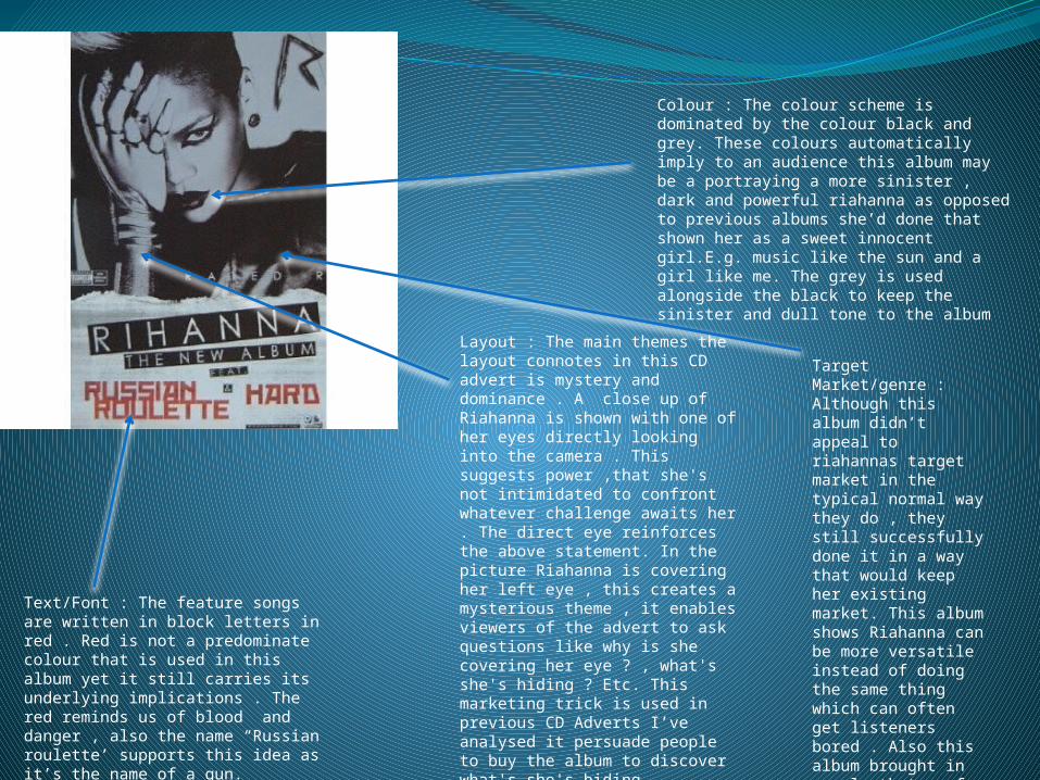
Layout : The main themes the layout connotes in this CD advert is mystery and dominance . A close up of Riahanna is shown with one of her eyes directly looking into the camera . This suggests power ,that she's not intimidated to confront whatever challenge awaits her . The direct eye reinforces the above statement. In the picture Riahanna is covering her left eye , this creates a mysterious theme , it enables viewers of the advert to ask questions like why is she covering her eye ? , what's she's hiding ? Etc. This marketing trick is used in previous CD Adverts I’ve analysed it persuade people to buy the album to discover what's she's hiding .
Colour : The colour scheme is dominated by the colour black and grey. These colours automatically imply to an audience this album may be a portraying a more sinister , dark and powerful riahanna as opposed to previous albums she’d done that shown her as a sweet innocent girl.E.g. music like the sun and a girl like me. The grey is used alongside the black to keep the sinister and dull tone to the album
Text/Font : The feature songs are written in block letters in red . Red is not a predominate colour that is used in this album yet it still carries its underlying implications . The red reminds us of blood and danger , also the name “Russian roulette’ supports this idea as it’s the name of a gun.
Target Market/genre : Although this album didn’t appeal to riahannas target market in the typical normal way they do , they still successfully done it in a way that would keep her existing market. This album shows Riahanna can be more versatile instead of doing the same thing which can often get listeners bored . Also this album brought in people that prefer more “hard-core’ music as oppose to her other very evidently “poppy and RNB’ music she was originally known for.