brian - unit 13 lo1 - understanding existing print media products
TRANSCRIPT
OCR - Level 3 Cambridge Introductory Diploma in Media - Unit 13:
Candidate Name: Brian Miguel Insua Candidate Number: 6055
Centre Name: St Andrews Catholic Secondary School Centre Number: 64135
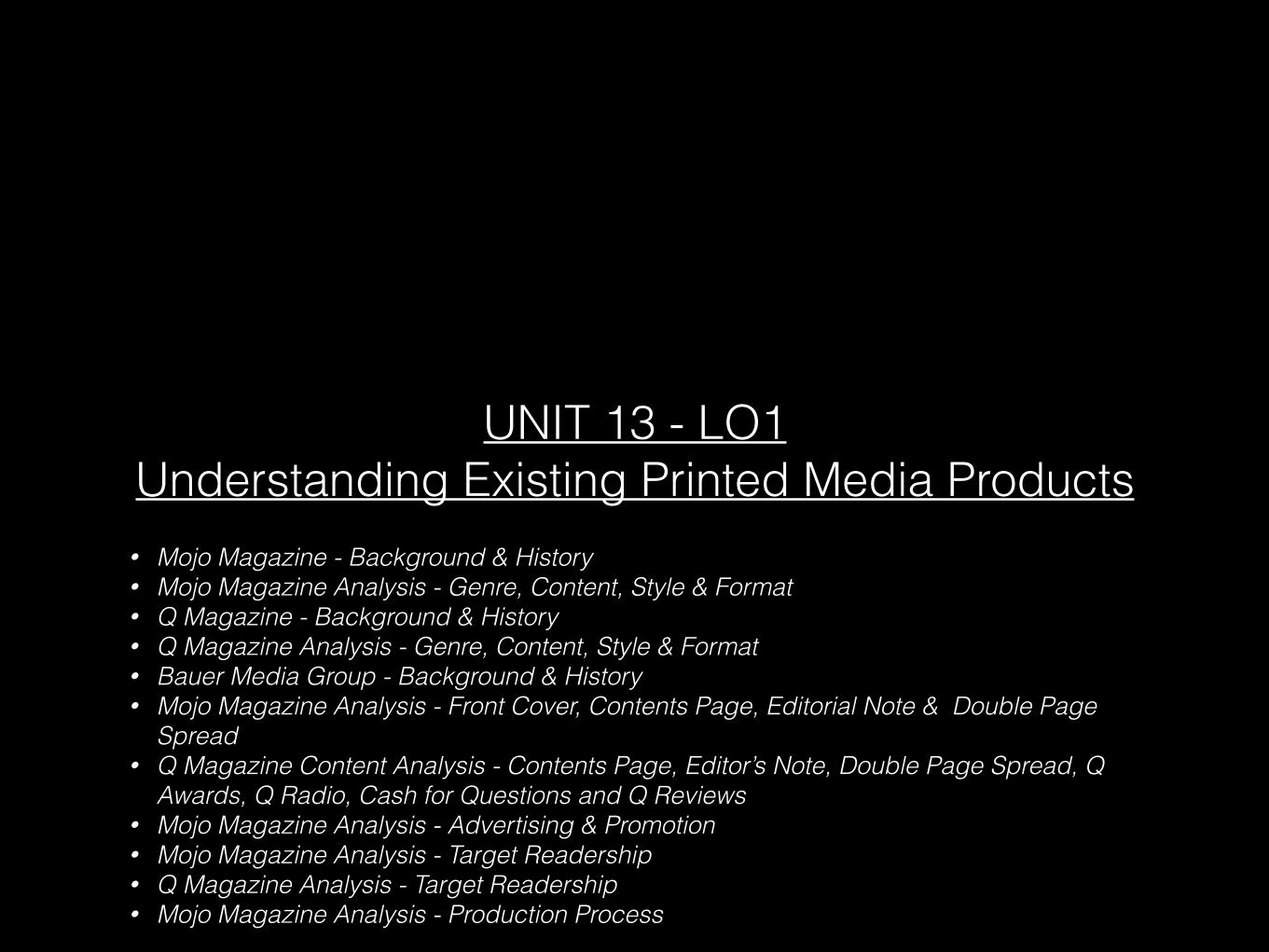
• Mojo Magazine - Background & History • Mojo Magazine Analysis - Genre, Content, Style & Format • Q Magazine - Background & History • Q Magazine Analysis - Genre, Content, Style & Format • Bauer Media Group - Background & History • Mojo Magazine Analysis - Front Cover, Contents Page, Editorial Note & Double Page
Spread • Q Magazine Content Analysis - Contents Page, Editor’s Note, Double Page Spread, Q
Awards, Q Radio, Cash for Questions and Q Reviews • Mojo Magazine Analysis - Advertising & Promotion • Mojo Magazine Analysis - Target Readership • Q Magazine Analysis - Target Readership • Mojo Magazine Analysis - Production Process
UNIT 13 - LO1 Understanding Existing Printed Media Products
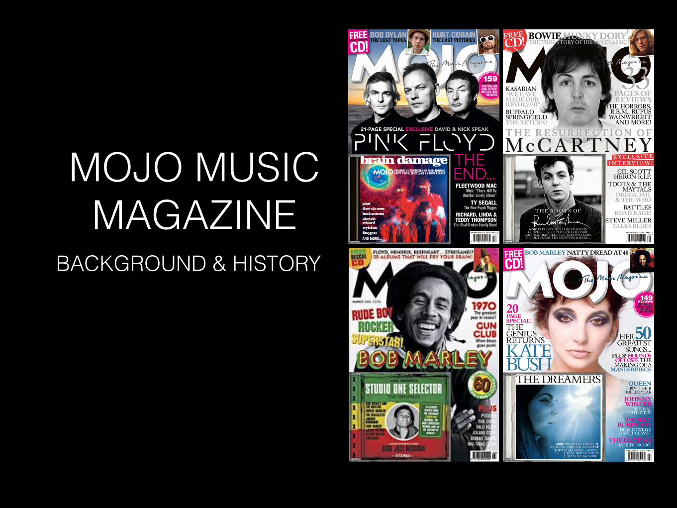
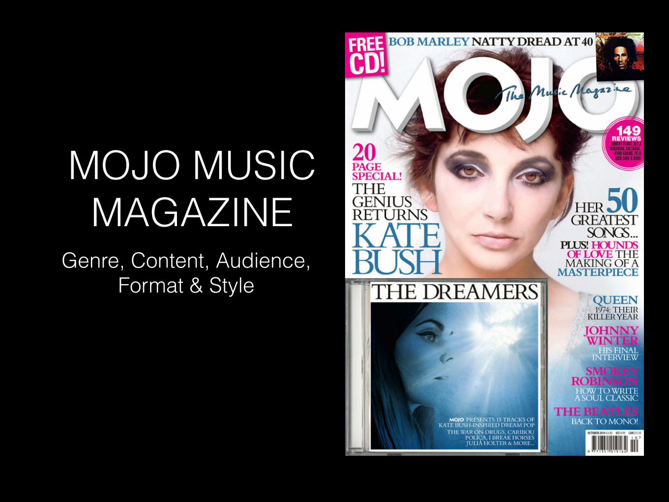
MOJO MUSIC MAGAZINE
BACKGROUND & HISTORY
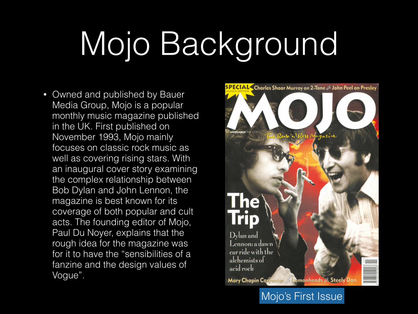
Mojo Background• Owned and published by Bauer
Media Group, Mojo is a popular monthly music magazine published in the UK. First published on November 1993, Mojo mainly focuses on classic rock music as well as covering rising stars. With an inaugural cover story examining the complex relationship between Bob Dylan and John Lennon, the magazine is best known for its coverage of both popular and cult acts. The founding editor of Mojo, Paul Du Noyer, explains that the rough idea for the magazine was for it to have the “sensibilities of a fanzine and the design values of Vogue”.
Mojo’s First Issue
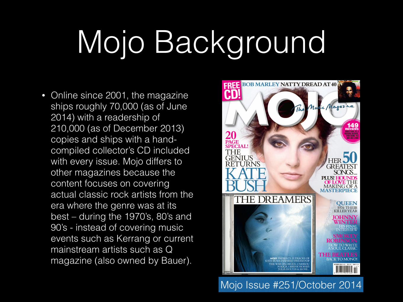
Mojo Background• Online since 2001, the magazine
ships roughly 70,000 (as of June 2014) with a readership of 210,000 (as of December 2013) copies and ships with a hand-compiled collector’s CD included with every issue. Mojo differs to other magazines because the content focuses on covering actual classic rock artists from the era where the genre was at its best – during the 1970’s, 80’s and 90’s - instead of covering music events such as Kerrang or current mainstream artists such as Q magazine (also owned by Bauer).
Mojo Issue #251/October 2014
MOJO MUSIC MAGAZINE
Genre, Content, Audience, Format & Style
Mojo Genre, Content, Style & Format
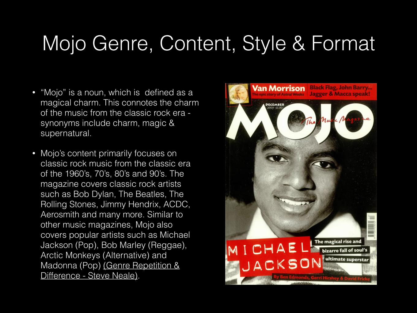
• “Mojo” is a noun, which is defined as a magical charm. This connotes the charm of the music from the classic rock era - synonyms include charm, magic & supernatural.
• Mojo’s content primarily focuses on classic rock music from the classic era of the 1960’s, 70’s, 80’s and 90’s. The magazine covers classic rock artists such as Bob Dylan, The Beatles, The Rolling Stones, Jimmy Hendrix, ACDC, Aerosmith and many more. Similar to other music magazines, Mojo also covers popular artists such as Michael Jackson (Pop), Bob Marley (Reggae), Arctic Monkeys (Alternative) and Madonna (Pop) (Genre Repetition & Difference - Steve Neale).
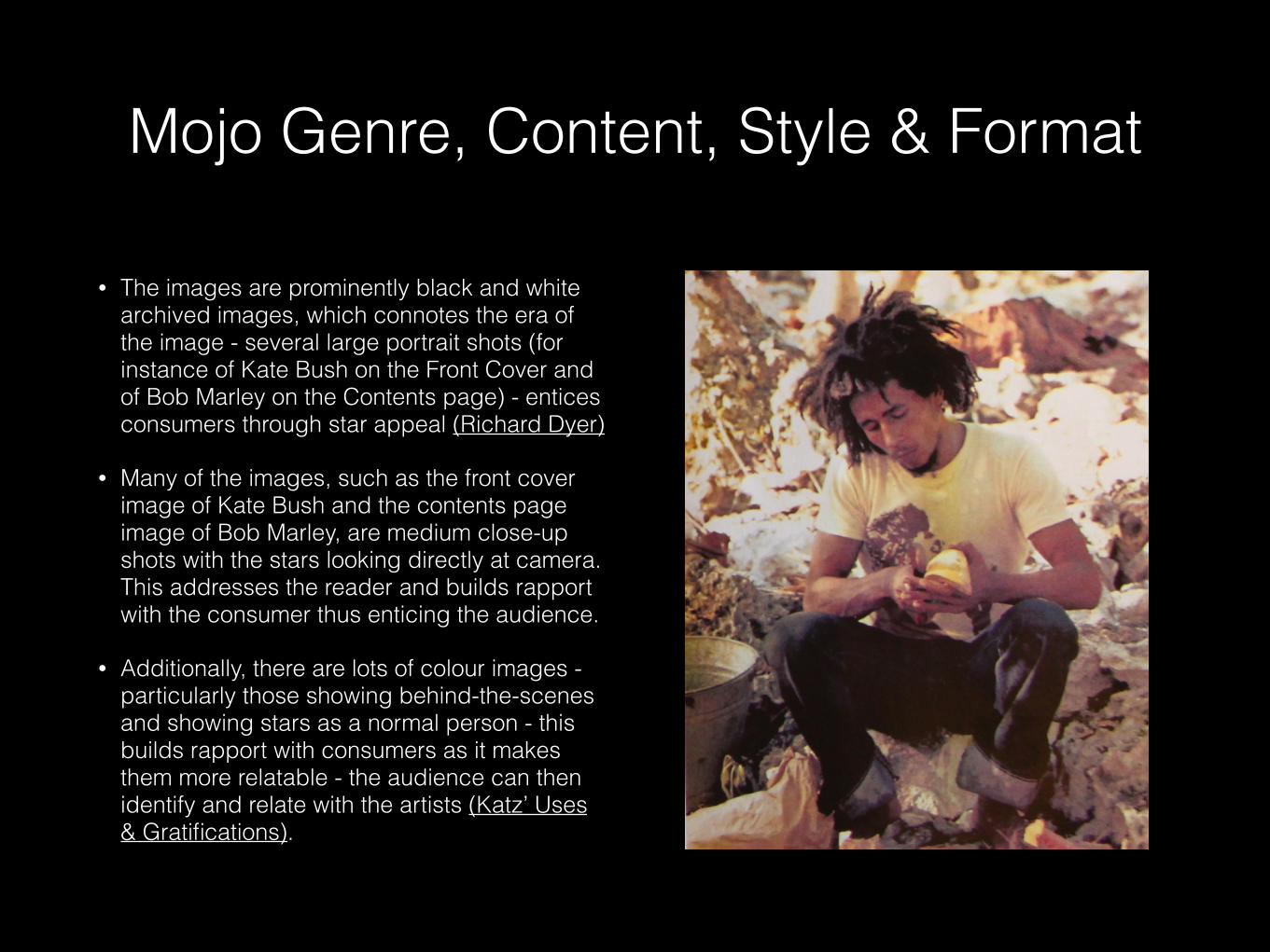
• The images are prominently black and white archived images, which connotes the era of the image - several large portrait shots (for instance of Kate Bush on the Front Cover and of Bob Marley on the Contents page) - entices consumers through star appeal (Richard Dyer)
• Many of the images, such as the front cover image of Kate Bush and the contents page image of Bob Marley, are medium close-up shots with the stars looking directly at camera. This addresses the reader and builds rapport with the consumer thus enticing the audience.
• Additionally, there are lots of colour images - particularly those showing behind-the-scenes and showing stars as a normal person - this builds rapport with consumers as it makes them more relatable - the audience can then identify and relate with the artists (Katz’ Uses & Gratifications).
Mojo Genre, Content, Style & Format
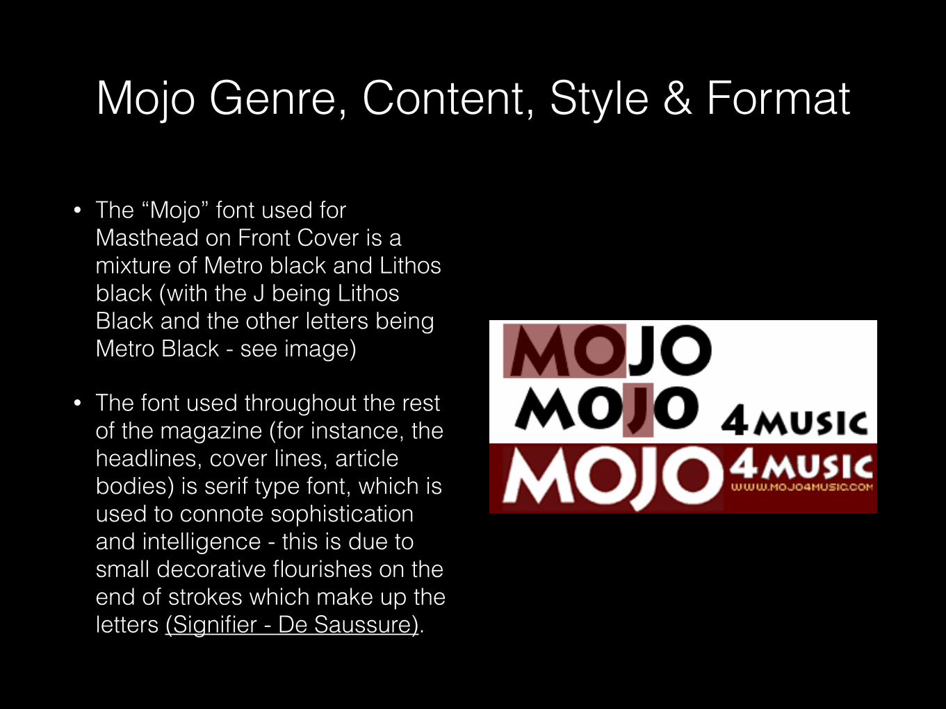
• The “Mojo” font used for Masthead on Front Cover is a mixture of Metro black and Lithos black (with the J being Lithos Black and the other letters being Metro Black - see image)
• The font used throughout the rest of the magazine (for instance, the headlines, cover lines, article bodies) is serif type font, which is used to connote sophistication and intelligence - this is due to small decorative flourishes on the end of strokes which make up the letters (Signifier - De Saussure).
Mojo Genre, Content, Style & Format
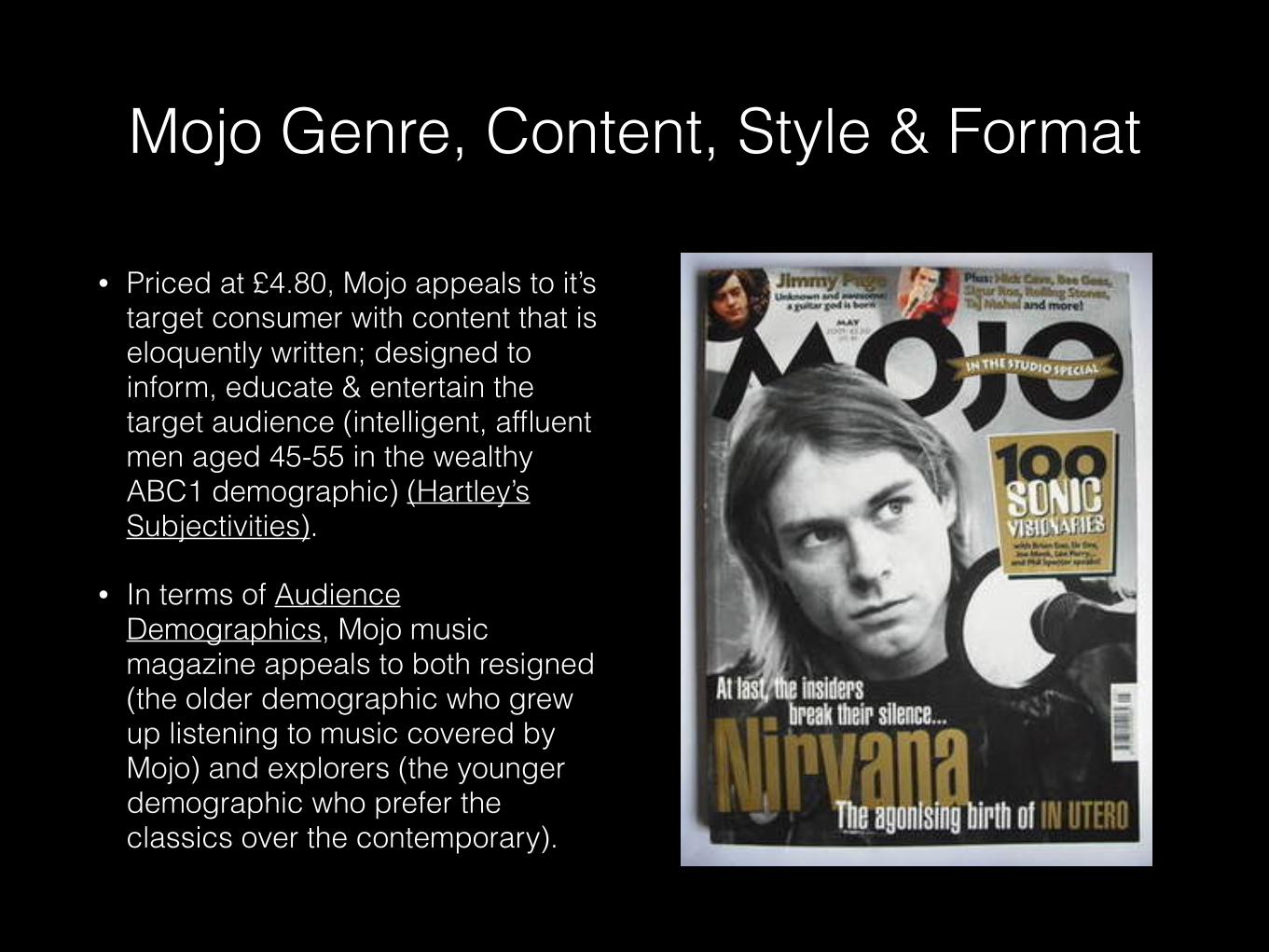
• Priced at £4.80, Mojo appeals to it’s target consumer with content that is eloquently written; designed to inform, educate & entertain the target audience (intelligent, affluent men aged 45-55 in the wealthy ABC1 demographic) (Hartley’s Subjectivities).
• In terms of Audience Demographics, Mojo music magazine appeals to both resigned (the older demographic who grew up listening to music covered by Mojo) and explorers (the younger demographic who prefer the classics over the contemporary).
Mojo Genre, Content, Style & Format
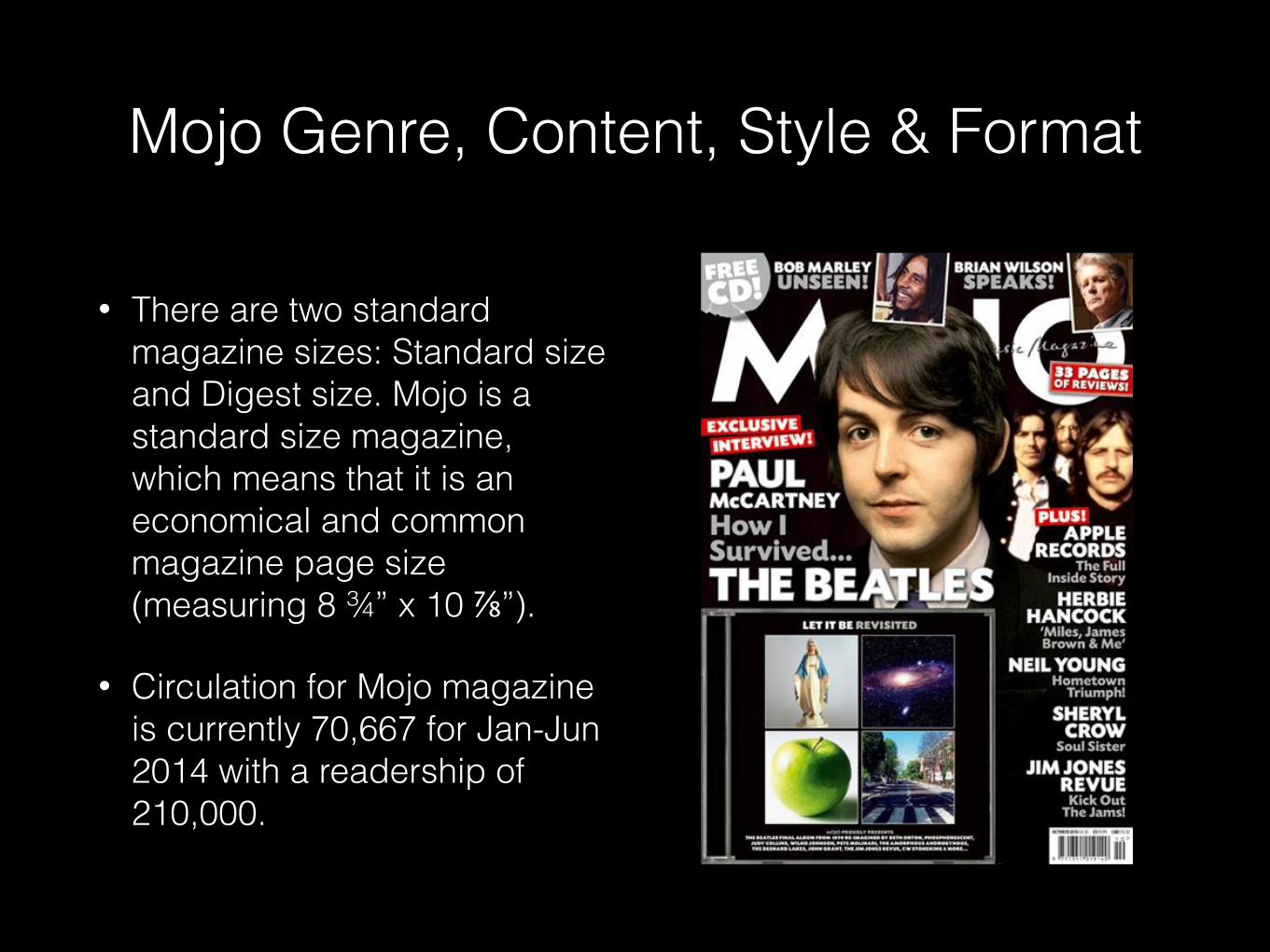
• There are two standard magazine sizes: Standard size and Digest size. Mojo is a standard size magazine, which means that it is an economical and common magazine page size (measuring 8 ¾” x 10 ⅞”).
• Circulation for Mojo magazine is currently 70,667 for Jan-Jun 2014 with a readership of 210,000.
Mojo Genre, Content, Style & Format
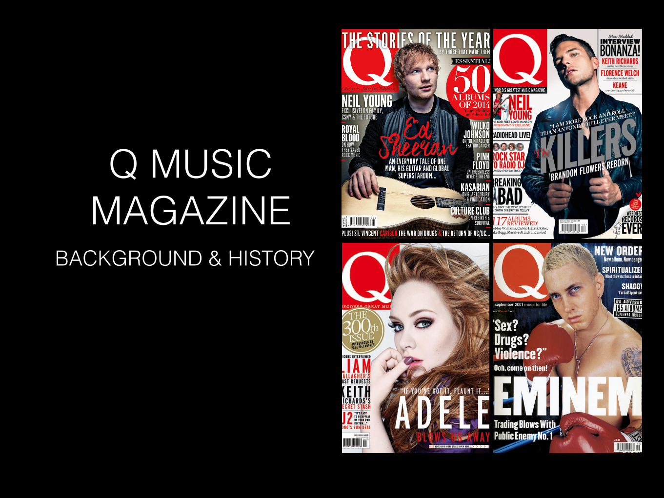
Q MUSIC MAGAZINE
BACKGROUND & HISTORY
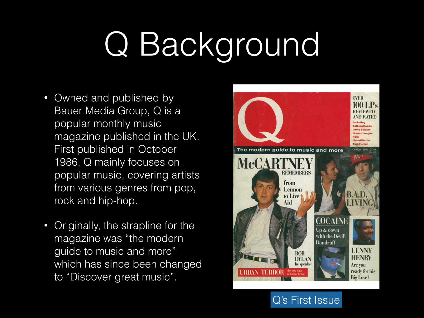
Q Background• Owned and published by
Bauer Media Group, Q is a popular monthly music magazine published in the UK. First published in October 1986, Q mainly focuses on popular music, covering artists from various genres from pop, rock and hip-hop.
• Originally, the strapline for the magazine was “the modern guide to music and more” which has since been changed to “Discover great music”.
Q’s First Issue
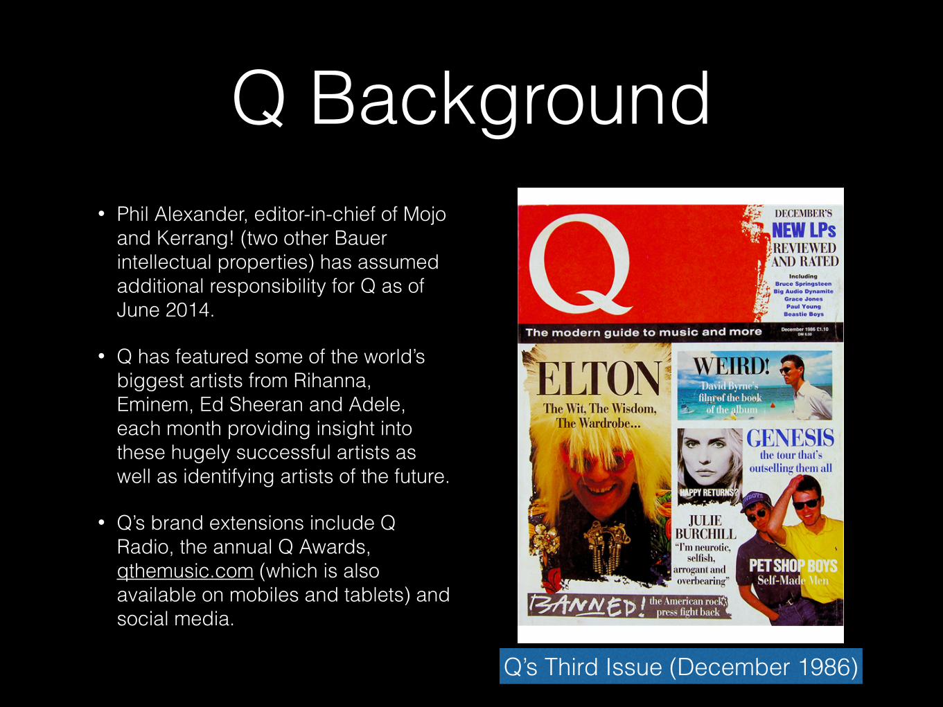
Q Background• Phil Alexander, editor-in-chief of Mojo
and Kerrang! (two other Bauer intellectual properties) has assumed additional responsibility for Q as of June 2014.
• Q has featured some of the world’s biggest artists from Rihanna, Eminem, Ed Sheeran and Adele, each month providing insight into these hugely successful artists as well as identifying artists of the future.
• Q’s brand extensions include Q Radio, the annual Q Awards, qthemusic.com (which is also available on mobiles and tablets) and social media.
Q’s Third Issue (December 1986)
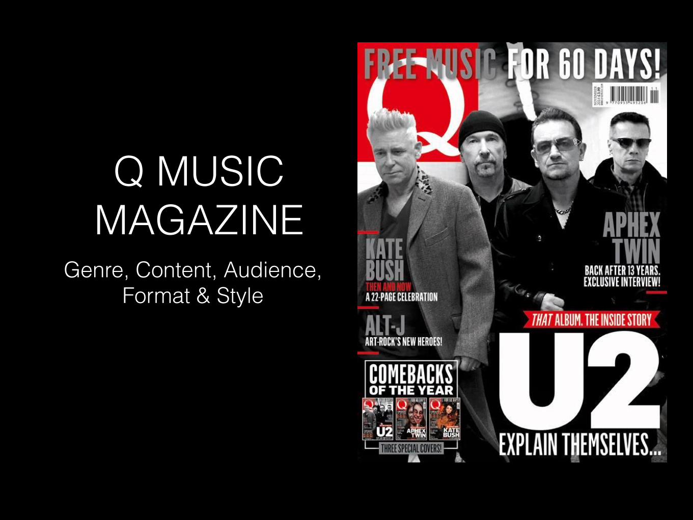
Q MUSIC MAGAZINE
Genre, Content, Audience, Format & Style
Q Genre, Content, Style & Format
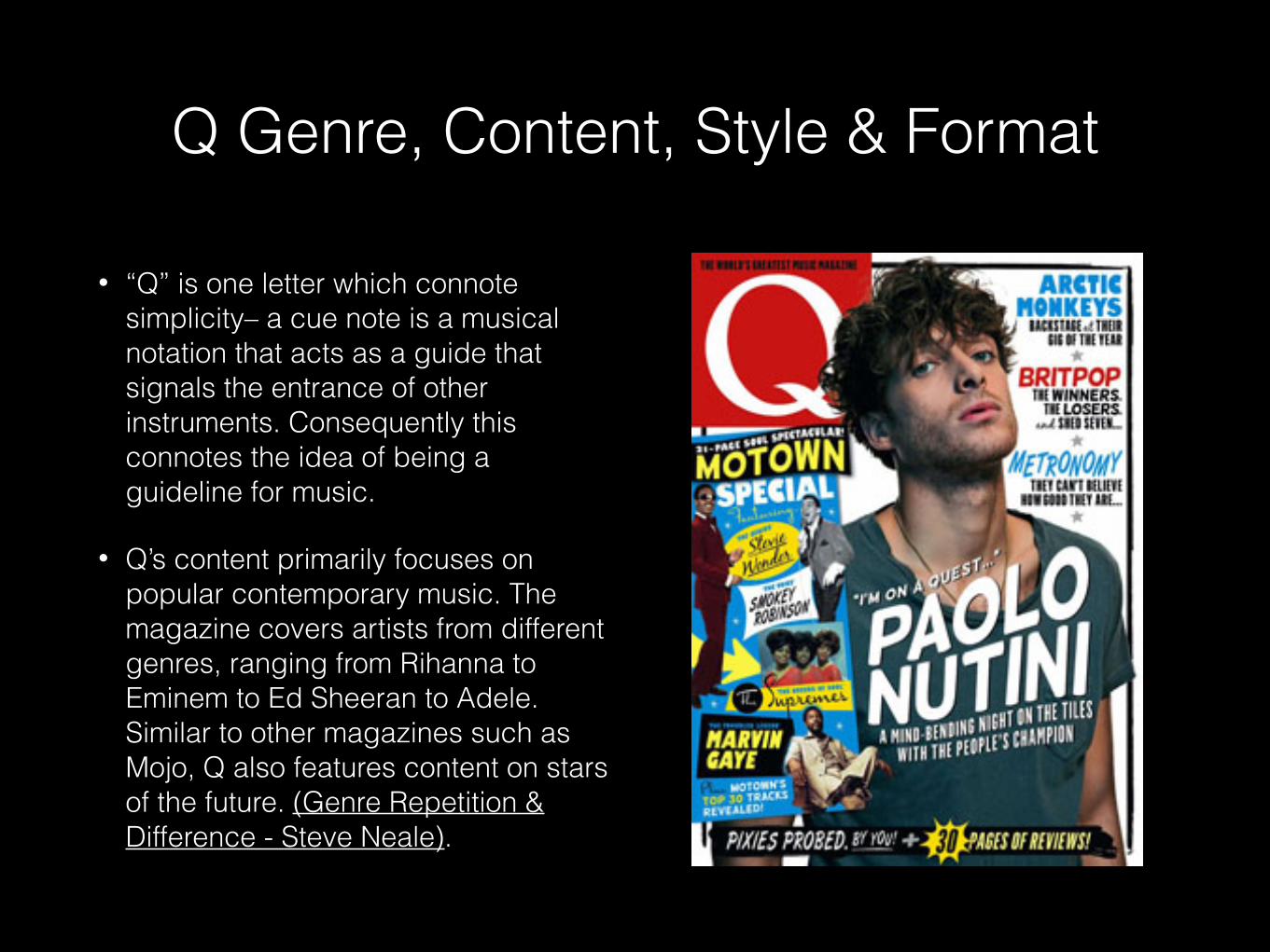
• “Q” is one letter which connote simplicity– a cue note is a musical notation that acts as a guide that signals the entrance of other instruments. Consequently this connotes the idea of being a guideline for music.
• Q’s content primarily focuses on popular contemporary music. The magazine covers artists from different genres, ranging from Rihanna to Eminem to Ed Sheeran to Adele. Similar to other magazines such as Mojo, Q also features content on stars of the future. (Genre Repetition & Difference - Steve Neale).
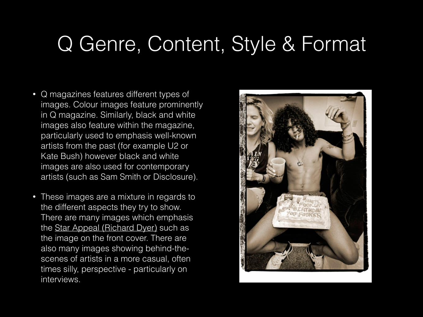
• Q magazines features different types of images. Colour images feature prominently in Q magazine. Similarly, black and white images also feature within the magazine, particularly used to emphasis well-known artists from the past (for example U2 or Kate Bush) however black and white images are also used for contemporary artists (such as Sam Smith or Disclosure).
• These images are a mixture in regards to the different aspects they try to show. There are many images which emphasis the Star Appeal (Richard Dyer) such as the image on the front cover. There are also many images showing behind-the-scenes of artists in a more casual, often times silly, perspective - particularly on interviews.
Q Genre, Content, Style & Format
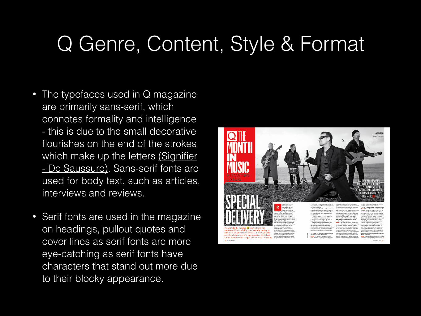
• The typefaces used in Q magazine are primarily sans-serif, which connotes formality and intelligence - this is due to the small decorative flourishes on the end of the strokes which make up the letters (Signifier - De Saussure). Sans-serif fonts are used for body text, such as articles, interviews and reviews.
• Serif fonts are used in the magazine on headings, pullout quotes and cover lines as serif fonts are more eye-catching as serif fonts have characters that stand out more due to their blocky appearance.
Q Genre, Content, Style & Format
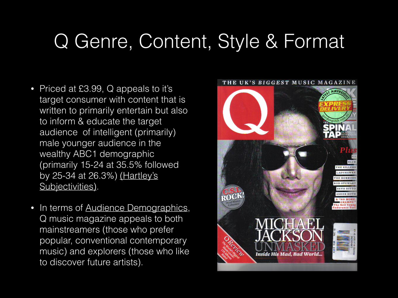
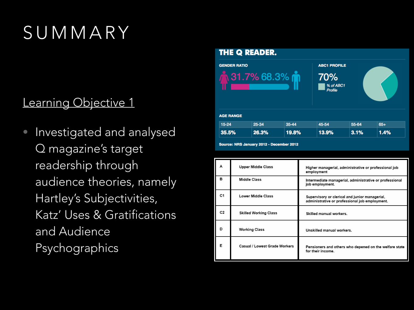
• Priced at £3.99, Q appeals to it’s target consumer with content that is written to primarily entertain but also to inform & educate the target audience of intelligent (primarily) male younger audience in the wealthy ABC1 demographic (primarily 15-24 at 35.5% followed by 25-34 at 26.3%) (Hartley’s Subjectivities).
• In terms of Audience Demographics, Q music magazine appeals to both mainstreamers (those who prefer popular, conventional contemporary music) and explorers (those who like to discover future artists).
Q Genre, Content, Style & Format
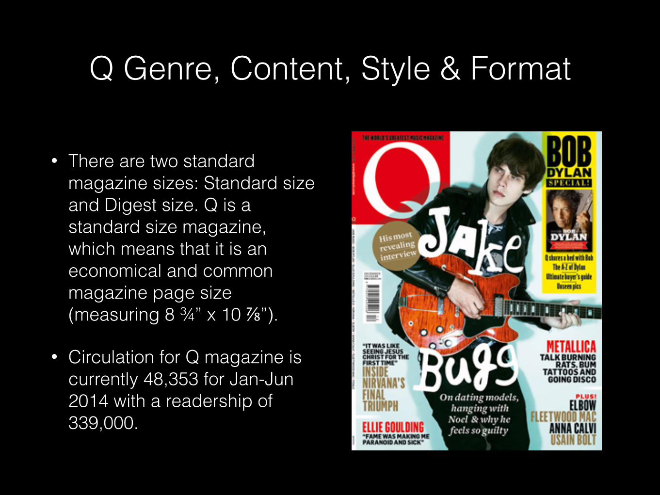
• There are two standard magazine sizes: Standard size and Digest size. Q is a standard size magazine, which means that it is an economical and common magazine page size (measuring 8 ¾” x 10 ⅞”).
• Circulation for Q magazine is currently 48,353 for Jan-Jun 2014 with a readership of 339,000.
Q Genre, Content, Style & Format
BAUER PUBLISHING
GROUPBACKGROUND & HISTORY
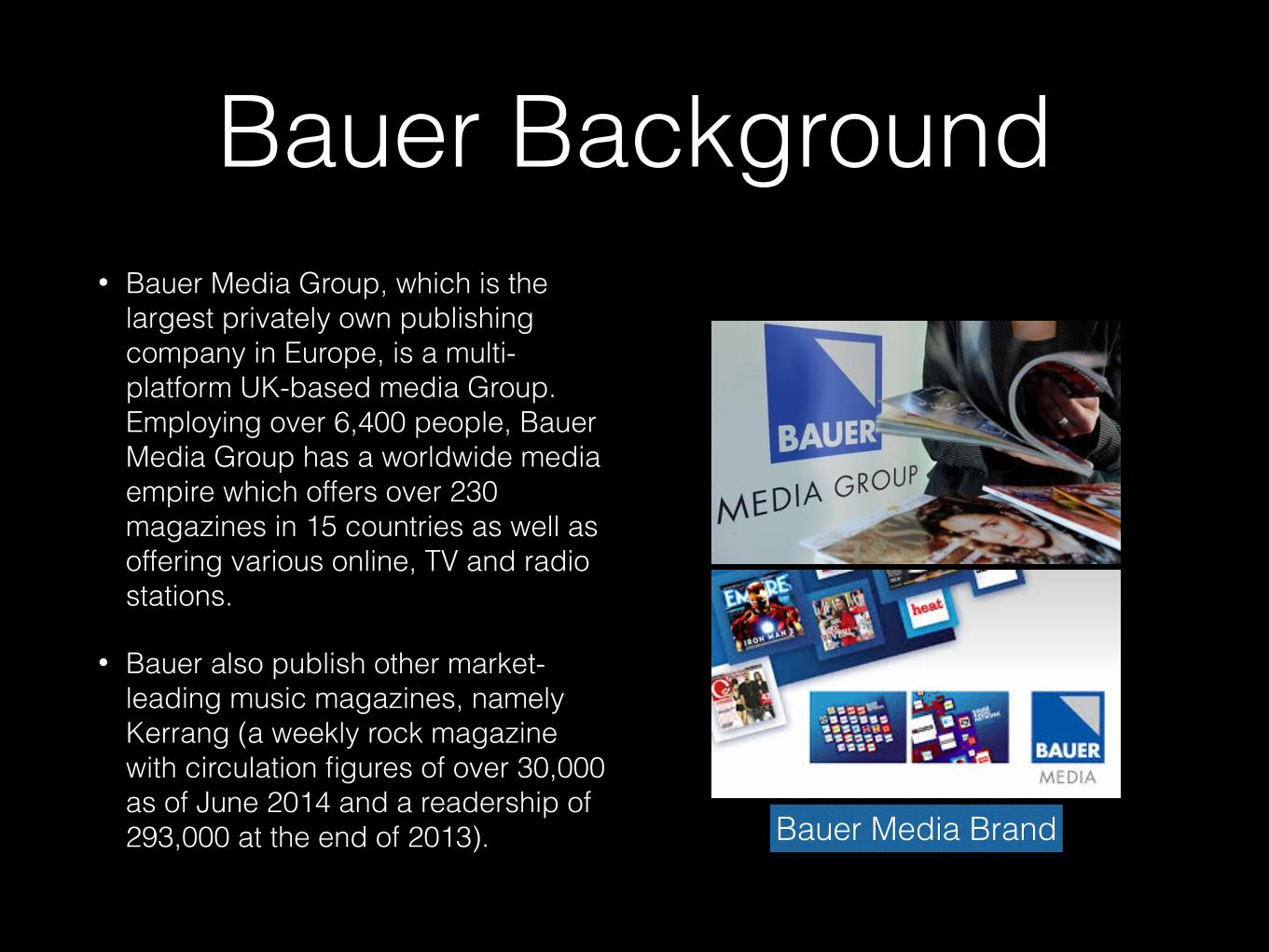
Bauer Background• Bauer Media Group, which is the
largest privately own publishing company in Europe, is a multi-platform UK-based media Group. Employing over 6,400 people, Bauer Media Group has a worldwide media empire which offers over 230 magazines in 15 countries as well as offering various online, TV and radio stations.
• Bauer also publish other market-leading music magazines, namely Kerrang (a weekly rock magazine with circulation figures of over 30,000 as of June 2014 and a readership of 293,000 at the end of 2013). Bauer Media Brand
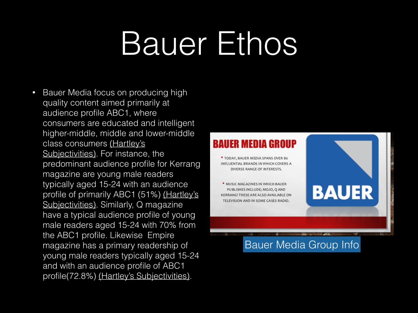
Bauer Ethos• Bauer Media focus on producing high
quality content aimed primarily at audience profile ABC1, where consumers are educated and intelligent higher-middle, middle and lower-middle class consumers (Hartley’s Subjectivities). For instance, the predominant audience profile for Kerrang magazine are young male readers typically aged 15-24 with an audience profile of primarily ABC1 (51%) (Hartley’s Subjectivities). Similarly, Q magazine have a typical audience profile of young male readers aged 15-24 with 70% from the ABC1 profile. Likewise Empire magazine has a primary readership of young male readers typically aged 15-24 and with an audience profile of ABC1 profile(72.8%) (Hartley’s Subjectivities).
Bauer Media Group Info

MOJO MUSIC MAGAZINE
Front Cover, Contents Page & Double Page Spread
Analysis
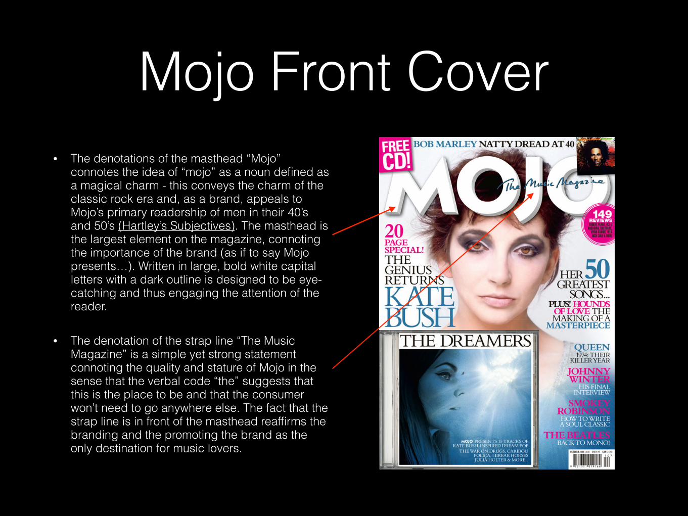
Mojo Front Cover• The denotations of the masthead “Mojo”
connotes the idea of “mojo” as a noun defined as a magical charm - this conveys the charm of the classic rock era and, as a brand, appeals to Mojo’s primary readership of men in their 40’s and 50’s (Hartley’s Subjectives). The masthead is the largest element on the magazine, connoting the importance of the brand (as if to say Mojo presents…). Written in large, bold white capital letters with a dark outline is designed to be eye-catching and thus engaging the attention of the reader.
• The denotation of the strap line “The Music Magazine” is a simple yet strong statement connoting the quality and stature of Mojo in the sense that the verbal code “the” suggests that this is the place to be and that the consumer won’t need to go anywhere else. The fact that the strap line is in front of the masthead reaffirms the branding and the promoting the brand as the only destination for music lovers.
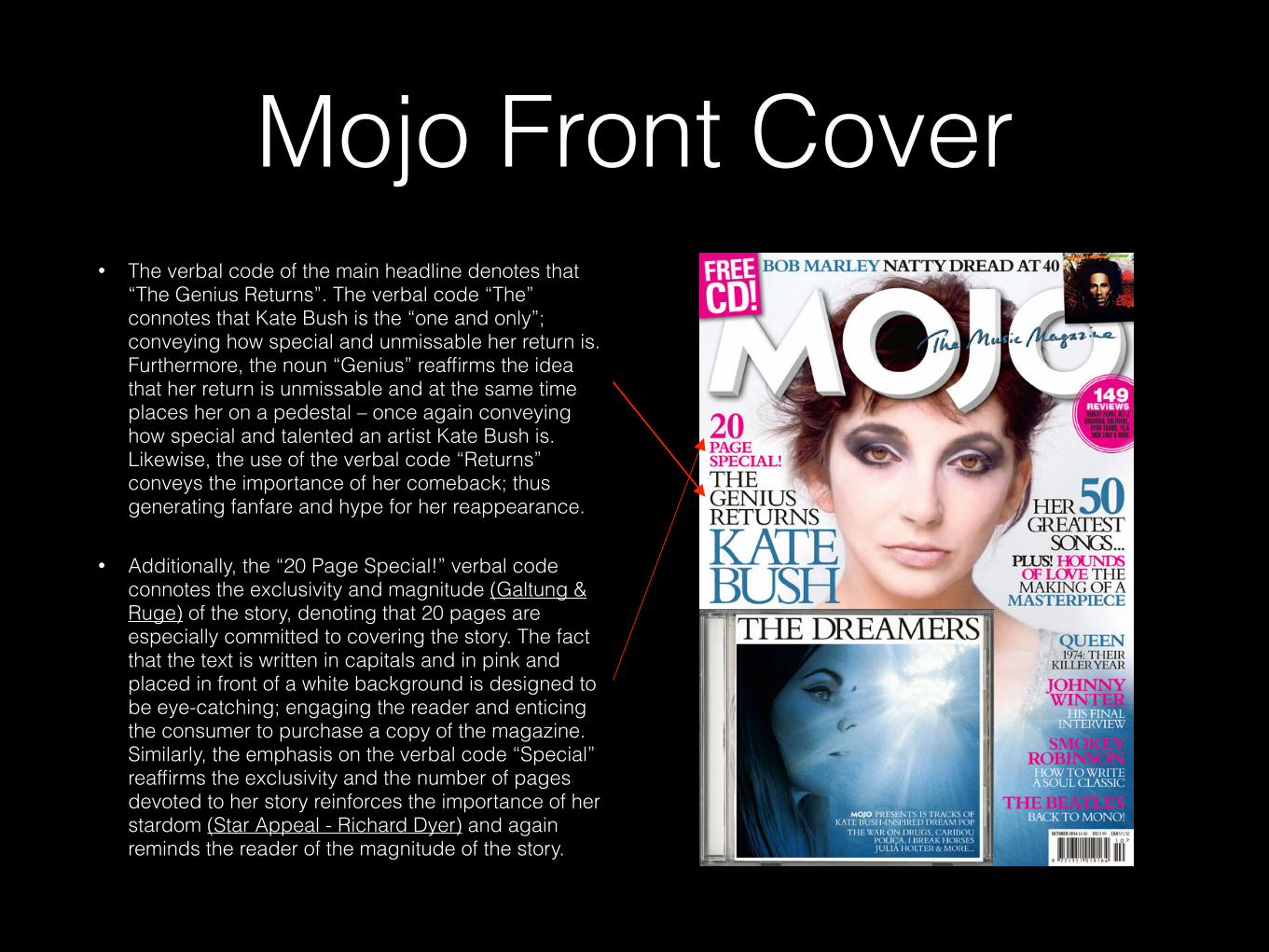
Mojo Front Cover• The verbal code of the main headline denotes that
“The Genius Returns”. The verbal code “The” connotes that Kate Bush is the “one and only”; conveying how special and unmissable her return is. Furthermore, the noun “Genius” reaffirms the idea that her return is unmissable and at the same time places her on a pedestal – once again conveying how special and talented an artist Kate Bush is. Likewise, the use of the verbal code “Returns” conveys the importance of her comeback; thus generating fanfare and hype for her reappearance.
• Additionally, the “20 Page Special!” verbal code connotes the exclusivity and magnitude (Galtung & Ruge) of the story, denoting that 20 pages are especially committed to covering the story. The fact that the text is written in capitals and in pink and placed in front of a white background is designed to be eye-catching; engaging the reader and enticing the consumer to purchase a copy of the magazine. Similarly, the emphasis on the verbal code “Special” reaffirms the exclusivity and the number of pages devoted to her story reinforces the importance of her stardom (Star Appeal - Richard Dyer) and again reminds the reader of the magnitude of the story.
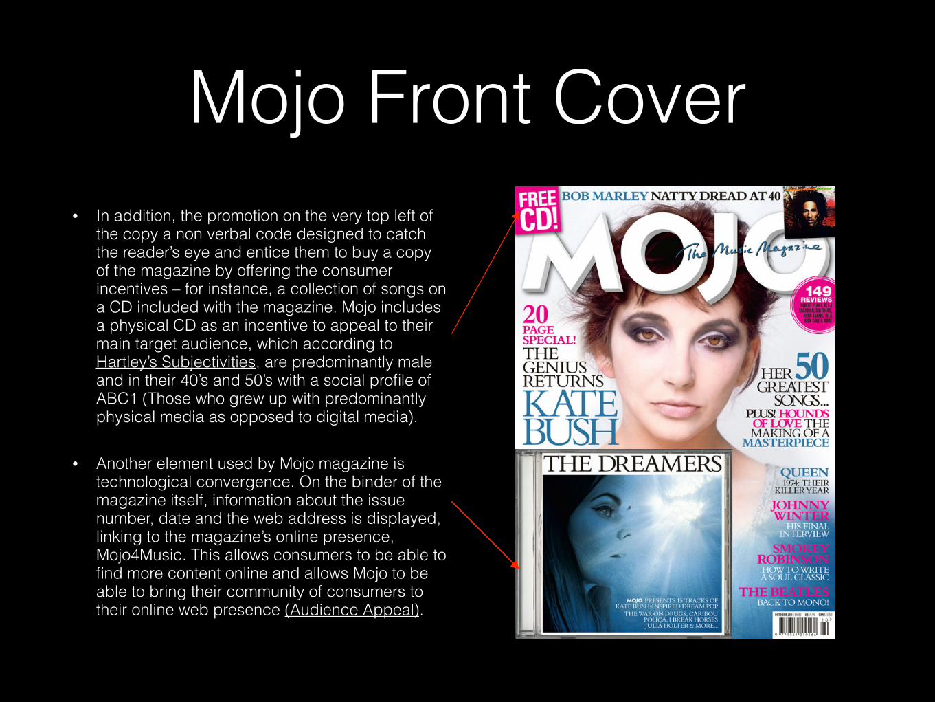
Mojo Front Cover• In addition, the promotion on the very top left of
the copy a non verbal code designed to catch the reader’s eye and entice them to buy a copy of the magazine by offering the consumer incentives – for instance, a collection of songs on a CD included with the magazine. Mojo includes a physical CD as an incentive to appeal to their main target audience, which according to Hartley’s Subjectivities, are predominantly male and in their 40’s and 50’s with a social profile of ABC1 (Those who grew up with predominantly physical media as opposed to digital media).
• Another element used by Mojo magazine is technological convergence. On the binder of the magazine itself, information about the issue number, date and the web address is displayed, linking to the magazine’s online presence, Mojo4Music. This allows consumers to be able to find more content online and allows Mojo to be able to bring their community of consumers to their online web presence (Audience Appeal).

Mojo Front Cover• The denotation of the main image is that of a
middle close-up of Kate Bush - a technical code that utilises the Star Appeal (Richard Dyer) of Kate Bush to entice consumer to purchase a copy of the magazine. The fact that she’s looking straight at the camera entices consumers to buy a copy as she is looking directly at the consumer - involving them and appearing to relate and empathise with them.
• The verbal code of the cover lines, which are found down the right hand side of the magazine, are secondary stories. The colours of the text as well as the size of the font to add emphasis to the bands. The captions underneath the artists are short and snappy statements designed to interest the reader and encourage consumers to purchase a copy of the magazine in order to satisfy the curiosity created by the cover lines (Audience Appeal).
Mojo Front Cover
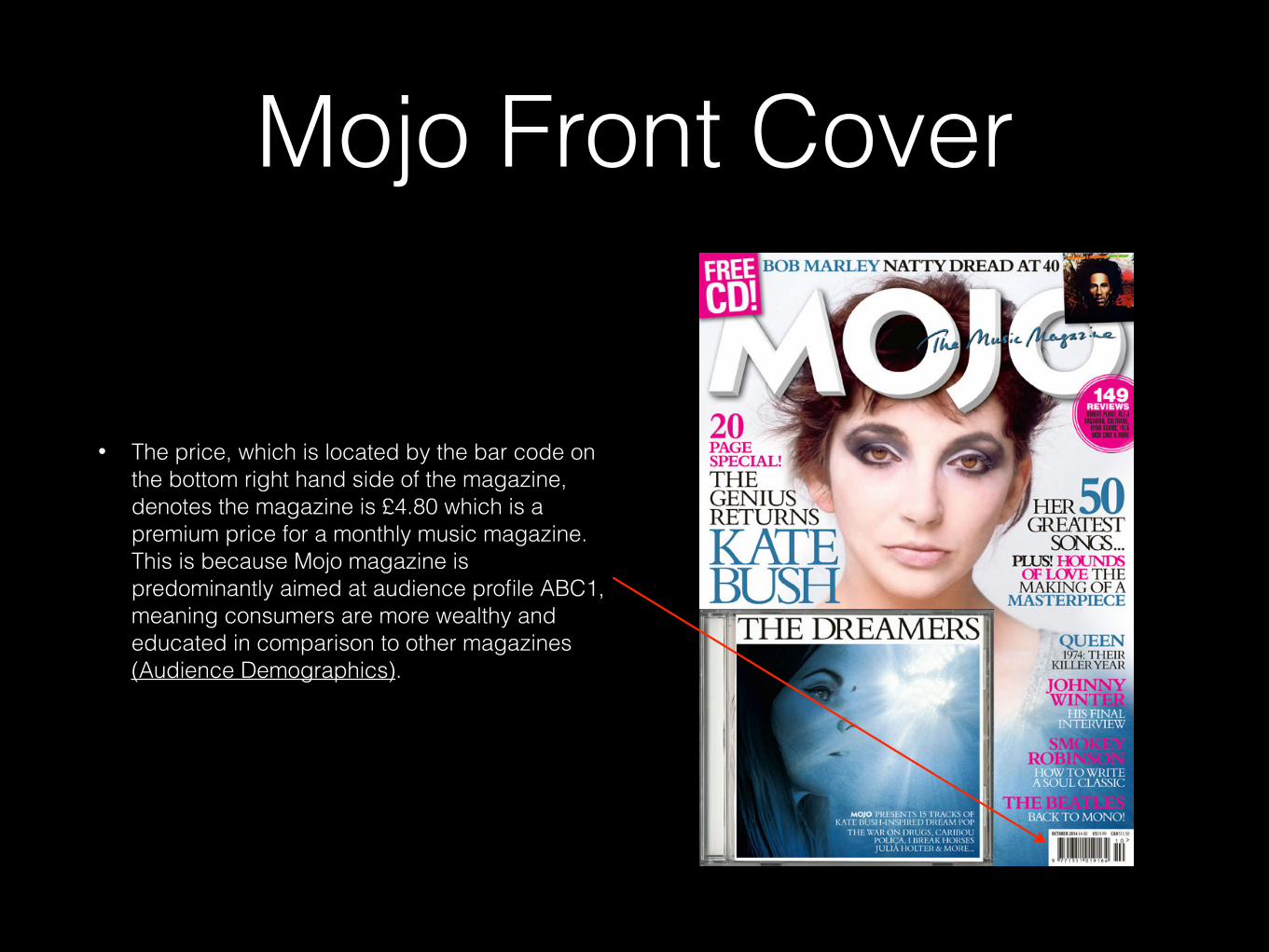
• The price, which is located by the bar code on the bottom right hand side of the magazine, denotes the magazine is £4.80 which is a premium price for a monthly music magazine. This is because Mojo magazine is predominantly aimed at audience profile ABC1, meaning consumers are more wealthy and educated in comparison to other magazines (Audience Demographics).
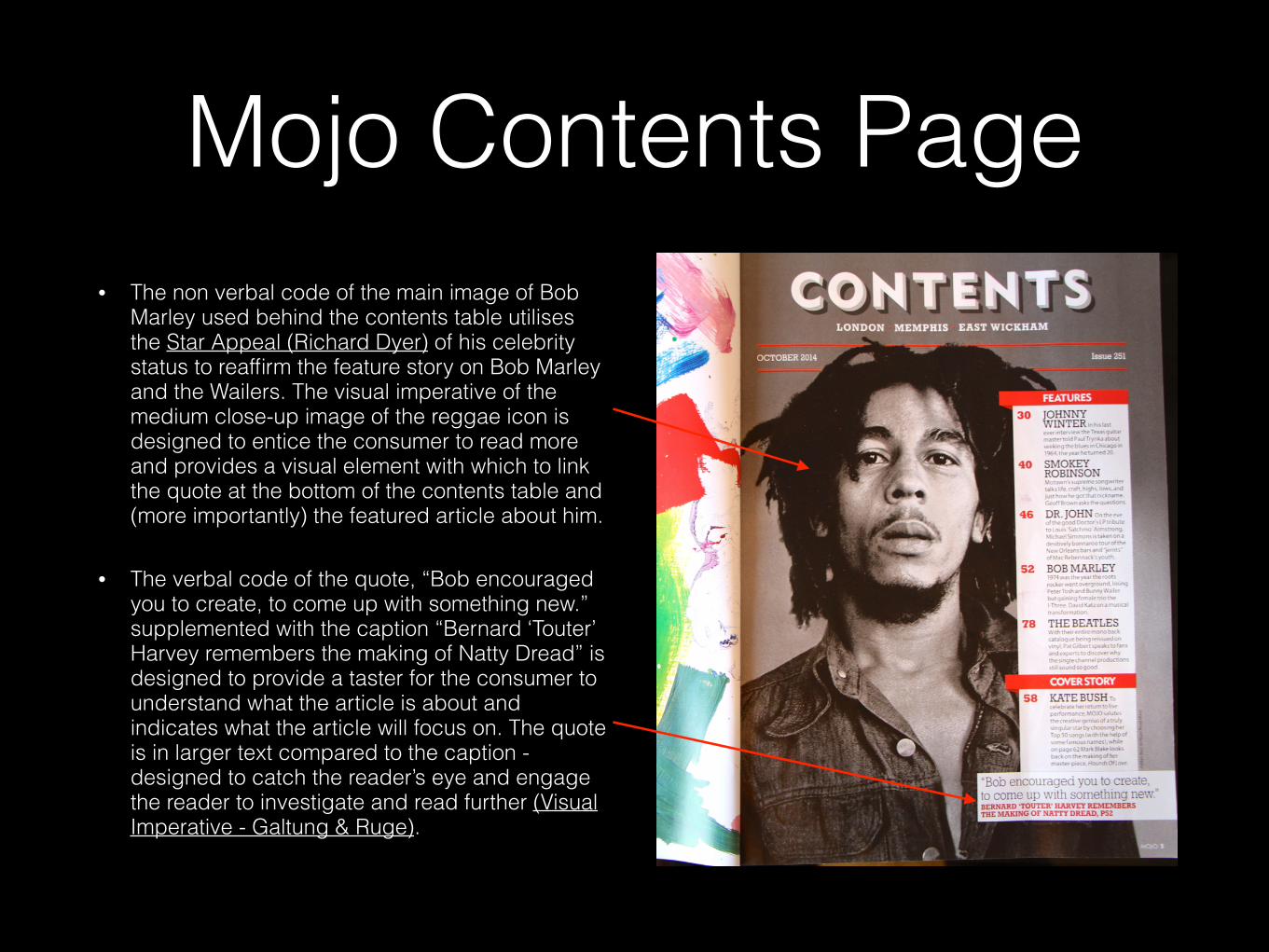
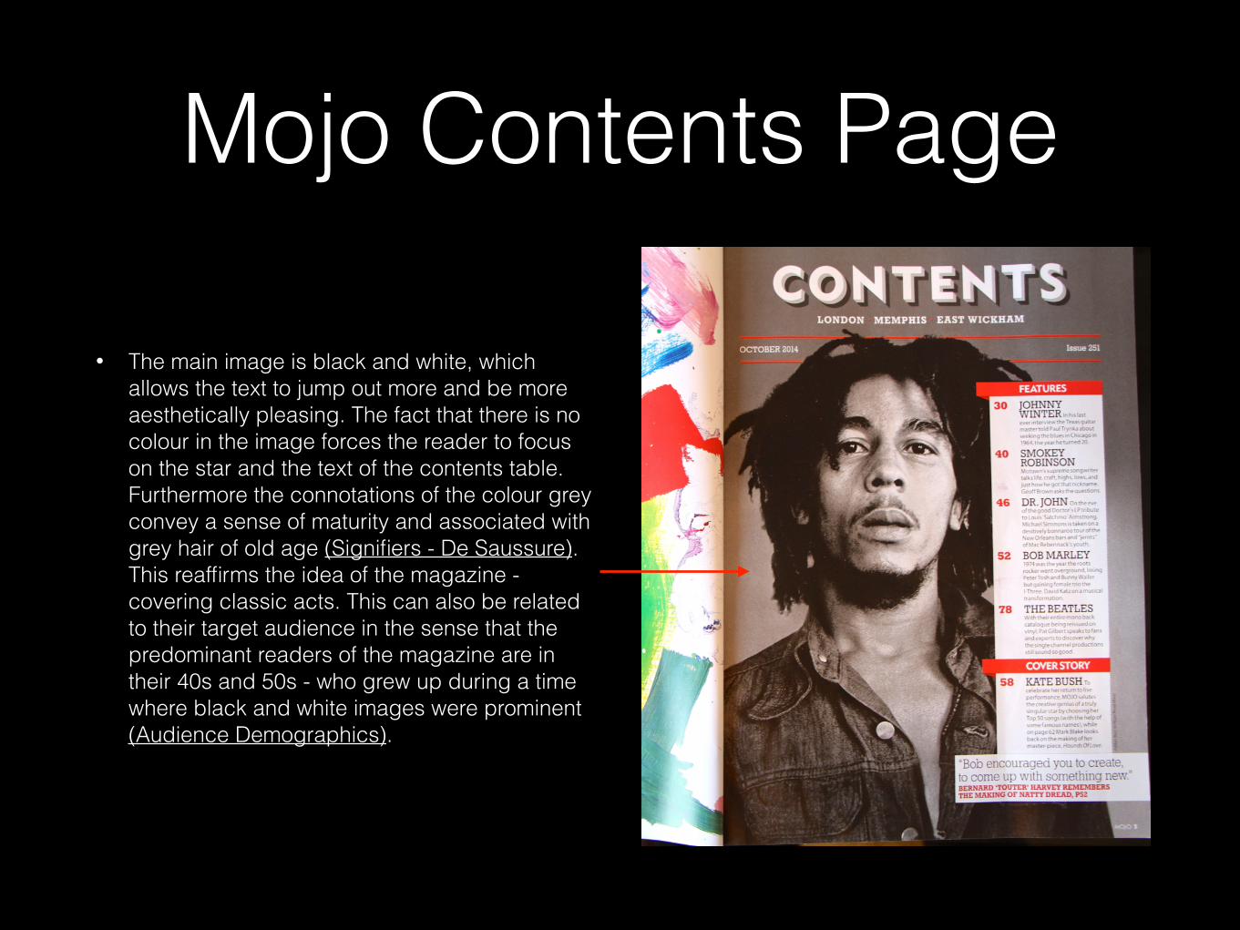
Mojo Contents Page• The non verbal code of the main image of Bob
Marley used behind the contents table utilises the Star Appeal (Richard Dyer) of his celebrity status to reaffirm the feature story on Bob Marley and the Wailers. The visual imperative of the medium close-up image of the reggae icon is designed to entice the consumer to read more and provides a visual element with which to link the quote at the bottom of the contents table and (more importantly) the featured article about him.
• The verbal code of the quote, “Bob encouraged you to create, to come up with something new.” supplemented with the caption “Bernard ‘Touter’ Harvey remembers the making of Natty Dread” is designed to provide a taster for the consumer to understand what the article is about and indicates what the article will focus on. The quote is in larger text compared to the caption - designed to catch the reader’s eye and engage the reader to investigate and read further (Visual Imperative - Galtung & Ruge).
Mojo Contents Page
• The main image is black and white, which allows the text to jump out more and be more aesthetically pleasing. The fact that there is no colour in the image forces the reader to focus on the star and the text of the contents table. Furthermore the connotations of the colour grey convey a sense of maturity and associated with grey hair of old age (Signifiers - De Saussure). This reaffirms the idea of the magazine - covering classic acts. This can also be related to their target audience in the sense that the predominant readers of the magazine are in their 40s and 50s - who grew up during a time where black and white images were prominent (Audience Demographics).
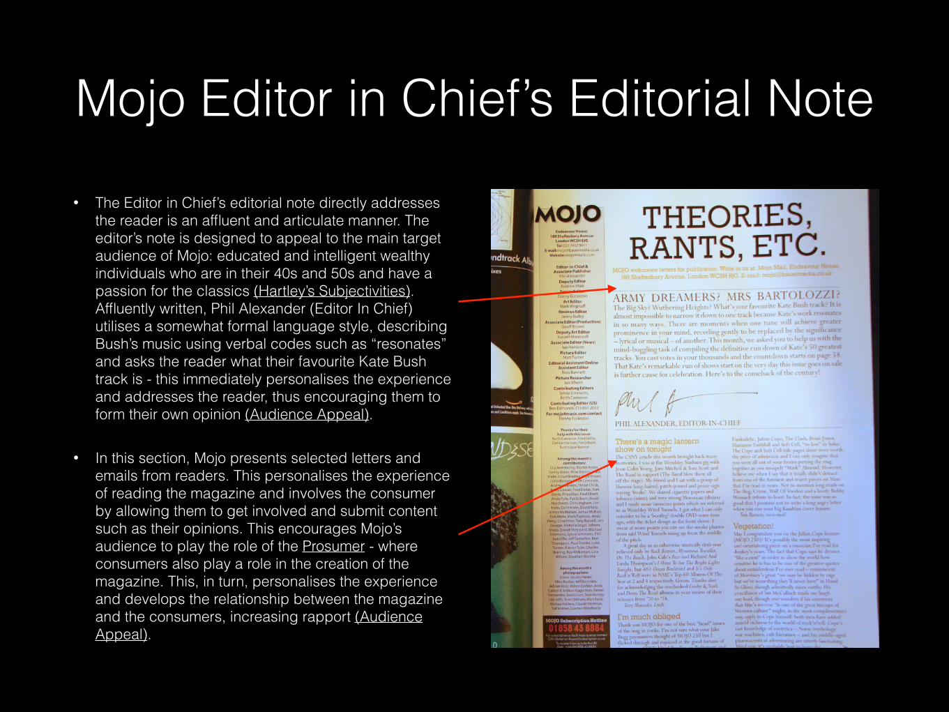
Mojo Editor in Chief’s Editorial Note• The Editor in Chief’s editorial note directly addresses
the reader is an affluent and articulate manner. The editor’s note is designed to appeal to the main target audience of Mojo: educated and intelligent wealthy individuals who are in their 40s and 50s and have a passion for the classics (Hartley’s Subjectivities). Affluently written, Phil Alexander (Editor In Chief) utilises a somewhat formal language style, describing Bush’s music using verbal codes such as “resonates” and asks the reader what their favourite Kate Bush track is - this immediately personalises the experience and addresses the reader, thus encouraging them to form their own opinion (Audience Appeal).
• In this section, Mojo presents selected letters and emails from readers. This personalises the experience of reading the magazine and involves the consumer by allowing them to get involved and submit content such as their opinions. This encourages Mojo’s audience to play the role of the Prosumer - where consumers also play a role in the creation of the magazine. This, in turn, personalises the experience and develops the relationship between the magazine and the consumers, increasing rapport (Audience Appeal).
Mojo Editor in Chief’s Editorial Note
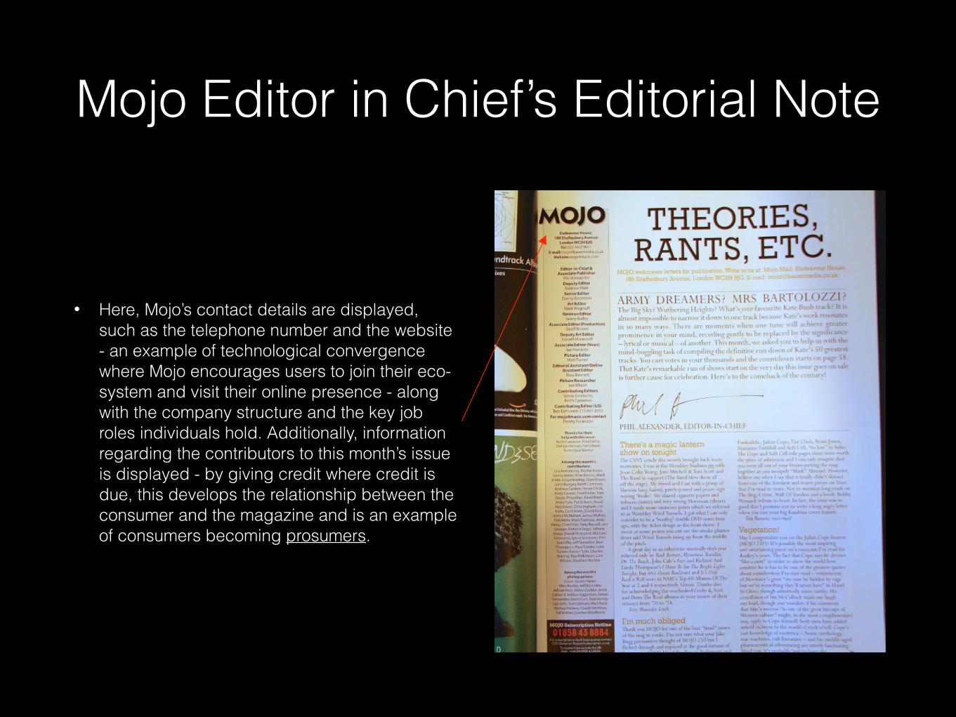
• Here, Mojo’s contact details are displayed, such as the telephone number and the website - an example of technological convergence where Mojo encourages users to join their eco-system and visit their online presence - along with the company structure and the key job roles individuals hold. Additionally, information regarding the contributors to this month’s issue is displayed - by giving credit where credit is due, this develops the relationship between the consumer and the magazine and is an example of consumers becoming prosumers.
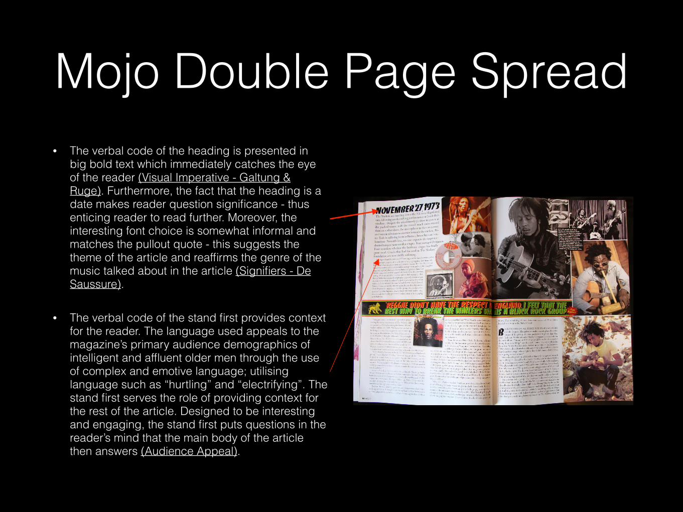
Mojo Double Page Spread• The verbal code of the heading is presented in
big bold text which immediately catches the eye of the reader (Visual Imperative - Galtung & Ruge). Furthermore, the fact that the heading is a date makes reader question significance - thus enticing reader to read further. Moreover, the interesting font choice is somewhat informal and matches the pullout quote - this suggests the theme of the article and reaffirms the genre of the music talked about in the article (Signifiers - De Saussure).
• The verbal code of the stand first provides context for the reader. The language used appeals to the magazine’s primary audience demographics of intelligent and affluent older men through the use of complex and emotive language; utilising language such as “hurtling” and “electrifying”. The stand first serves the role of providing context for the rest of the article. Designed to be interesting and engaging, the stand first puts questions in the reader’s mind that the main body of the article then answers (Audience Appeal).
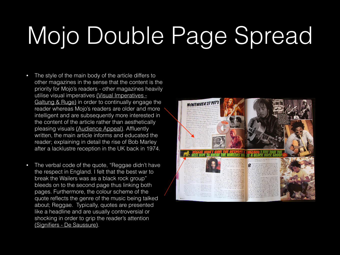
Mojo Double Page Spread• The style of the main body of the article differs to
other magazines in the sense that the content is the priority for Mojo’s readers - other magazines heavily utilise visual imperatives (Visual Imperatives - Galtung & Ruge) in order to continually engage the reader whereas Mojo’s readers are older and more intelligent and are subsequently more interested in the content of the article rather than aesthetically pleasing visuals (Audience Appeal). Affluently written, the main article informs and educated the reader; explaining in detail the rise of Bob Marley after a lacklustre reception in the UK back in 1974.
• The verbal code of the quote, “Reggae didn’t have the respect in England. I felt that the best war to break the Wailers was as a black rock group” bleeds on to the second page thus linking both pages. Furthermore, the colour scheme of the quote reflects the genre of the music being talked about; Reggae. Typically, quotes are presented like a headline and are usually controversial or shocking in order to grip the reader’s attention (Signifiers - De Saussure).
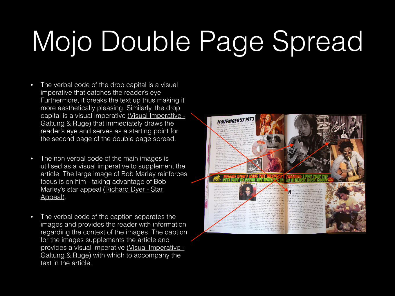
Mojo Double Page Spread• The verbal code of the drop capital is a visual
imperative that catches the reader’s eye. Furthermore, it breaks the text up thus making it more aesthetically pleasing. Similarly, the drop capital is a visual imperative (Visual Imperative - Galtung & Ruge) that immediately draws the reader’s eye and serves as a starting point for the second page of the double page spread.
• The non verbal code of the main images is utilised as a visual imperative to supplement the article. The large image of Bob Marley reinforces focus is on him - taking advantage of Bob Marley’s star appeal (Richard Dyer - Star Appeal).
• The verbal code of the caption separates the images and provides the reader with information regarding the context of the images. The caption for the images supplements the article and provides a visual imperative (Visual Imperative - Galtung & Ruge) with which to accompany the text in the article.
Q MUSIC MAGAZINE
Content Analysis
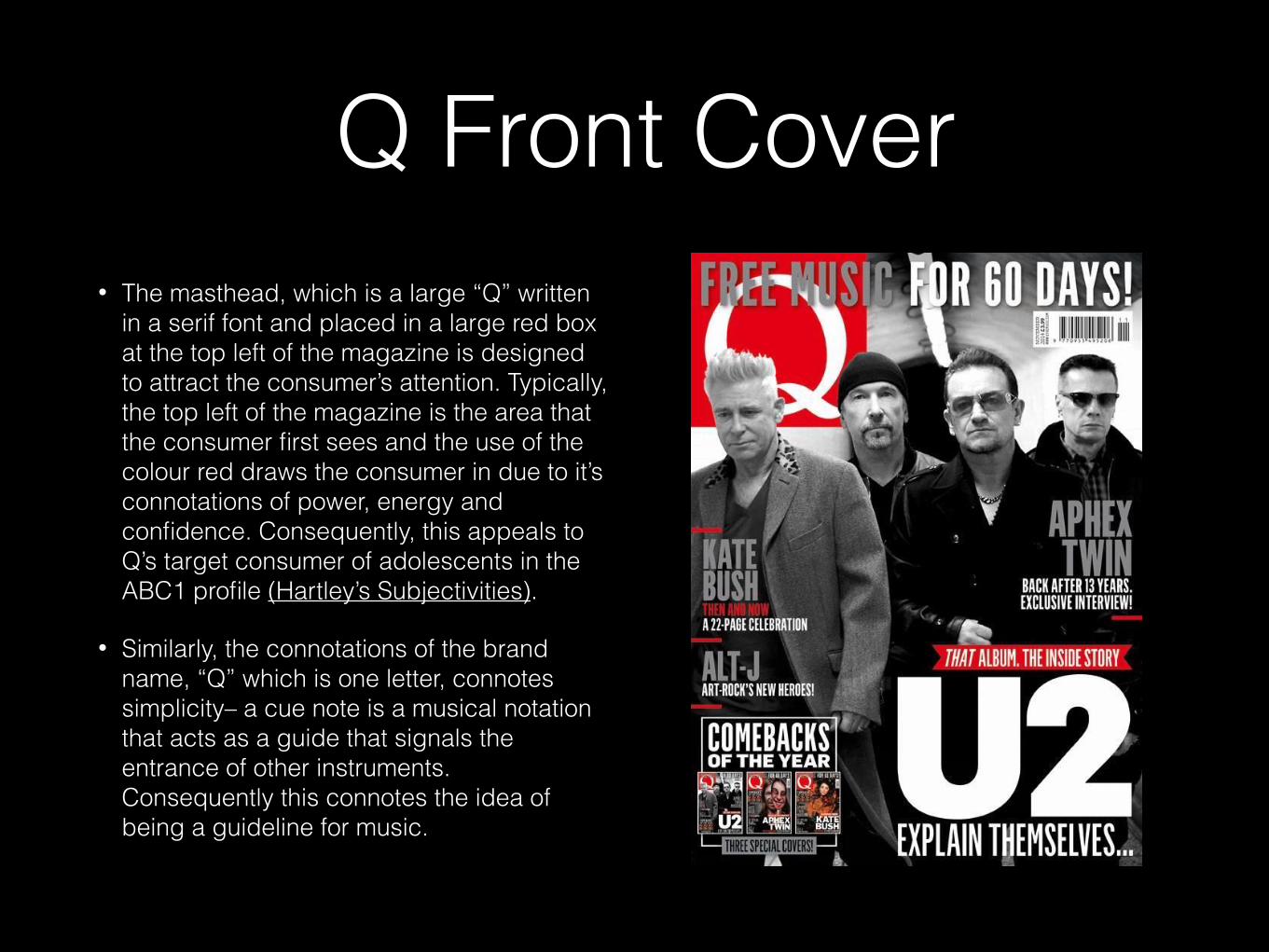
Q Front Cover• The masthead, which is a large “Q” written
in a serif font and placed in a large red box at the top left of the magazine is designed to attract the consumer’s attention. Typically, the top left of the magazine is the area that the consumer first sees and the use of the colour red draws the consumer in due to it’s connotations of power, energy and confidence. Consequently, this appeals to Q’s target consumer of adolescents in the ABC1 profile (Hartley’s Subjectivities).
• Similarly, the connotations of the brand name, “Q” which is one letter, connotes simplicity– a cue note is a musical notation that acts as a guide that signals the entrance of other instruments. Consequently this connotes the idea of being a guideline for music.
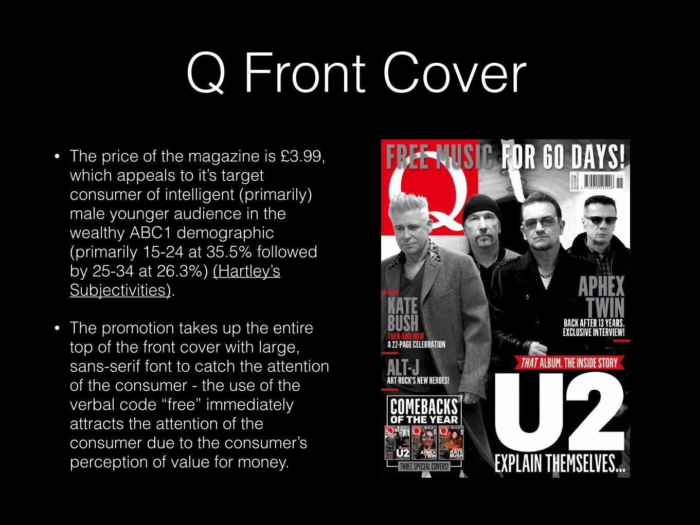
Q Front Cover• The price of the magazine is £3.99,
which appeals to it’s target consumer of intelligent (primarily) male younger audience in the wealthy ABC1 demographic (primarily 15-24 at 35.5% followed by 25-34 at 26.3%) (Hartley’s Subjectivities).
• The promotion takes up the entire top of the front cover with large, sans-serif font to catch the attention of the consumer - the use of the verbal code “free” immediately attracts the attention of the consumer due to the consumer’s perception of value for money.
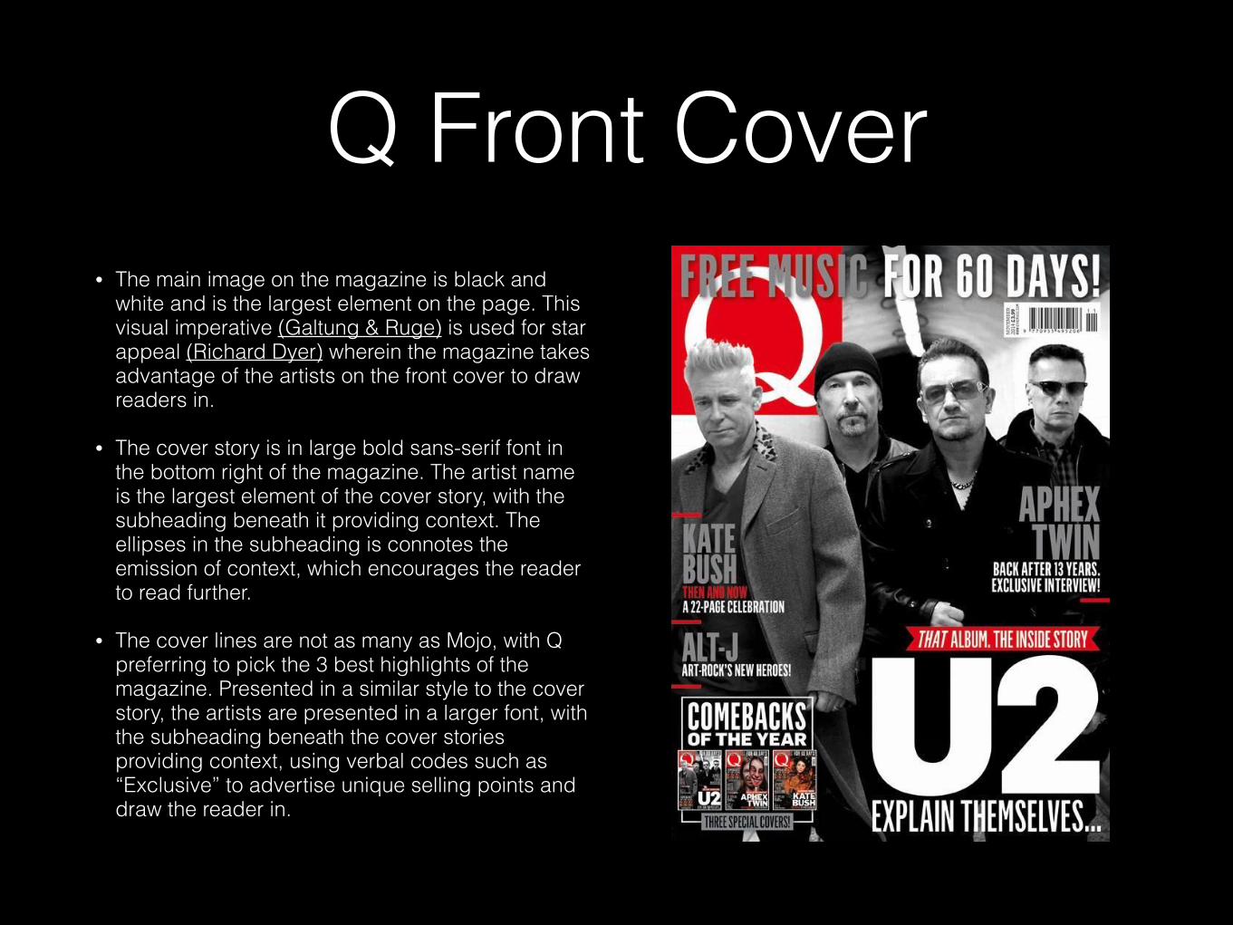
Q Front Cover• The main image on the magazine is black and
white and is the largest element on the page. This visual imperative (Galtung & Ruge) is used for star appeal (Richard Dyer) wherein the magazine takes advantage of the artists on the front cover to draw readers in.
• The cover story is in large bold sans-serif font in the bottom right of the magazine. The artist name is the largest element of the cover story, with the subheading beneath it providing context. The ellipses in the subheading is connotes the emission of context, which encourages the reader to read further.
• The cover lines are not as many as Mojo, with Q preferring to pick the 3 best highlights of the magazine. Presented in a similar style to the cover story, the artists are presented in a larger font, with the subheading beneath the cover stories providing context, using verbal codes such as “Exclusive” to advertise unique selling points and draw the reader in.
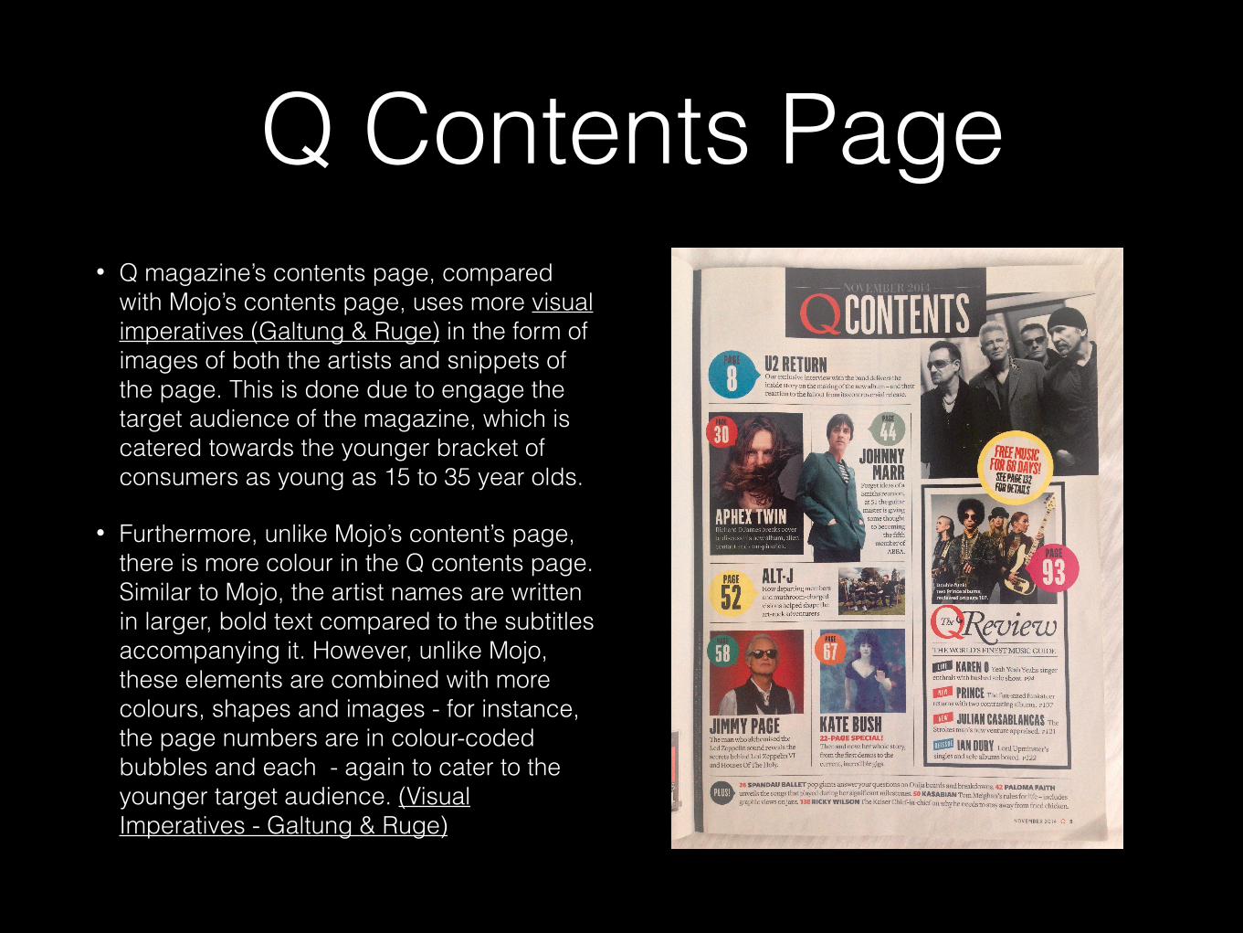
Q Contents Page• Q magazine’s contents page, compared
with Mojo’s contents page, uses more visual imperatives (Galtung & Ruge) in the form of images of both the artists and snippets of the page. This is done due to engage the target audience of the magazine, which is catered towards the younger bracket of consumers as young as 15 to 35 year olds.
• Furthermore, unlike Mojo’s content’s page, there is more colour in the Q contents page. Similar to Mojo, the artist names are written in larger, bold text compared to the subtitles accompanying it. However, unlike Mojo, these elements are combined with more colours, shapes and images - for instance, the page numbers are in colour-coded bubbles and each - again to cater to the younger target audience. (Visual Imperatives - Galtung & Ruge)
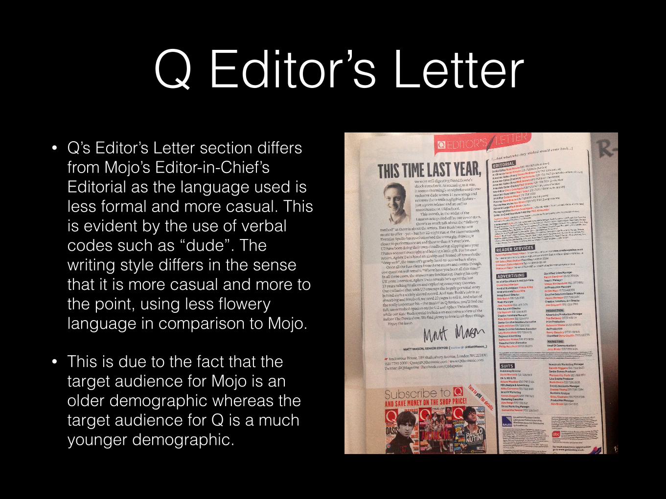
Q Editor’s Letter• Q’s Editor’s Letter section differs
from Mojo’s Editor-in-Chief’s Editorial as the language used is less formal and more casual. This is evident by the use of verbal codes such as “dude”. The writing style differs in the sense that it is more casual and more to the point, using less flowery language in comparison to Mojo.
• This is due to the fact that the target audience for Mojo is an older demographic whereas the target audience for Q is a much younger demographic.
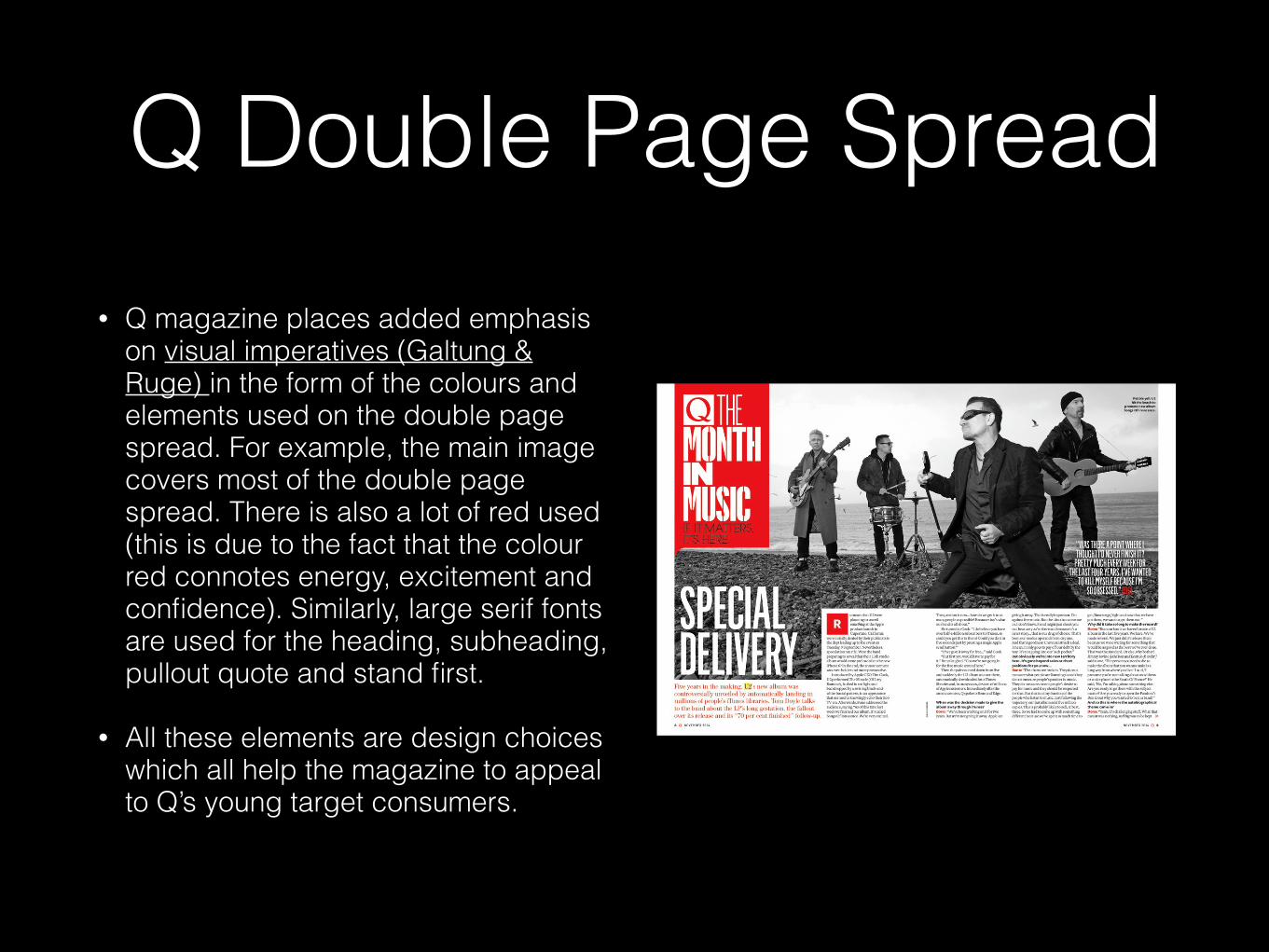
Q Double Page Spread• Q magazine places added emphasis
on visual imperatives (Galtung & Ruge) in the form of the colours and elements used on the double page spread. For example, the main image covers most of the double page spread. There is also a lot of red used (this is due to the fact that the colour red connotes energy, excitement and confidence). Similarly, large serif fonts are used for the heading, subheading, pullout quote and stand first.
• All these elements are design choices which all help the magazine to appeal to Q’s young target consumers.
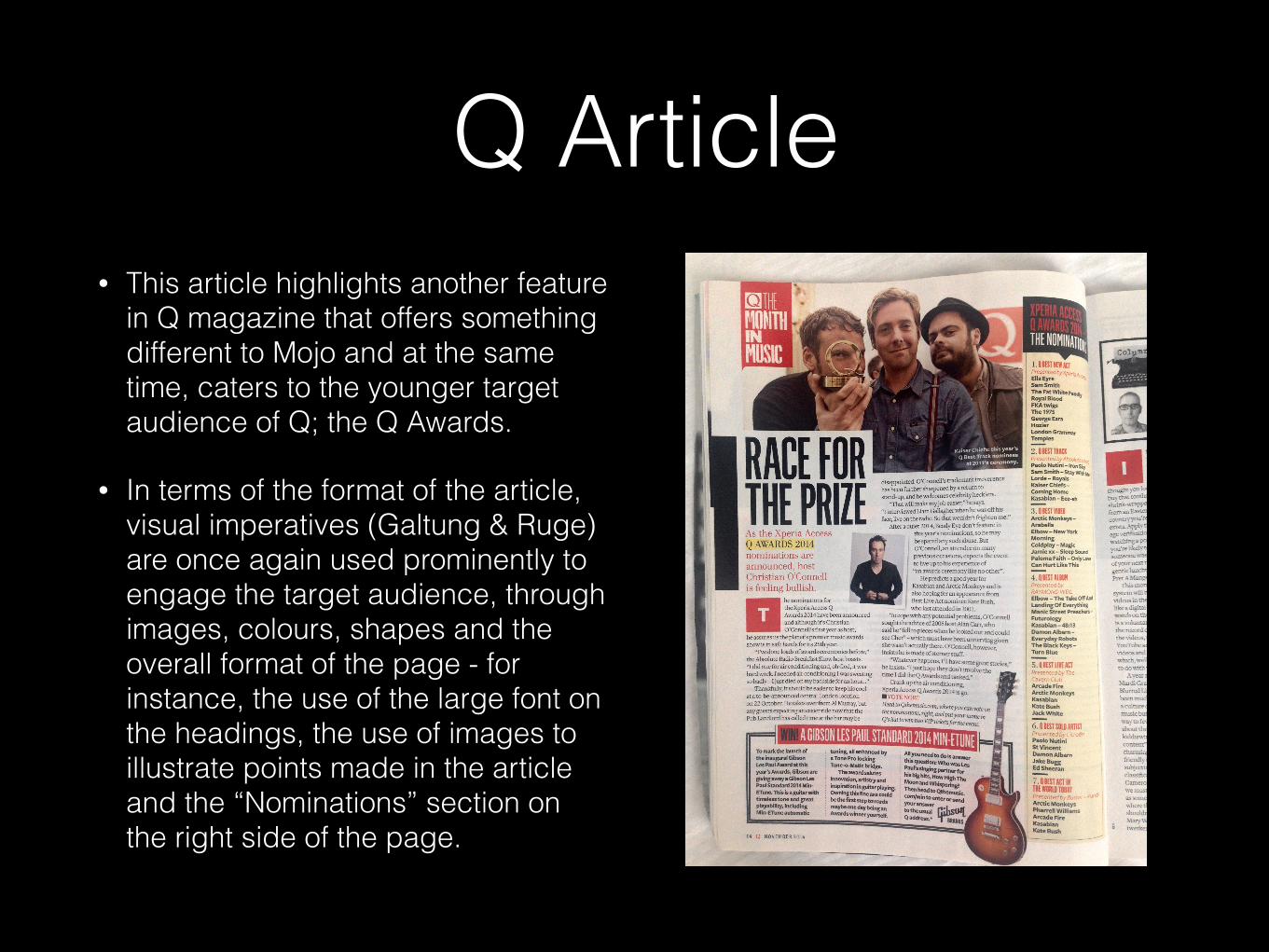
Q Article • This article highlights another feature
in Q magazine that offers something different to Mojo and at the same time, caters to the younger target audience of Q; the Q Awards.
• In terms of the format of the article, visual imperatives (Galtung & Ruge) are once again used prominently to engage the target audience, through images, colours, shapes and the overall format of the page - for instance, the use of the large font on the headings, the use of images to illustrate points made in the article and the “Nominations” section on the right side of the page.
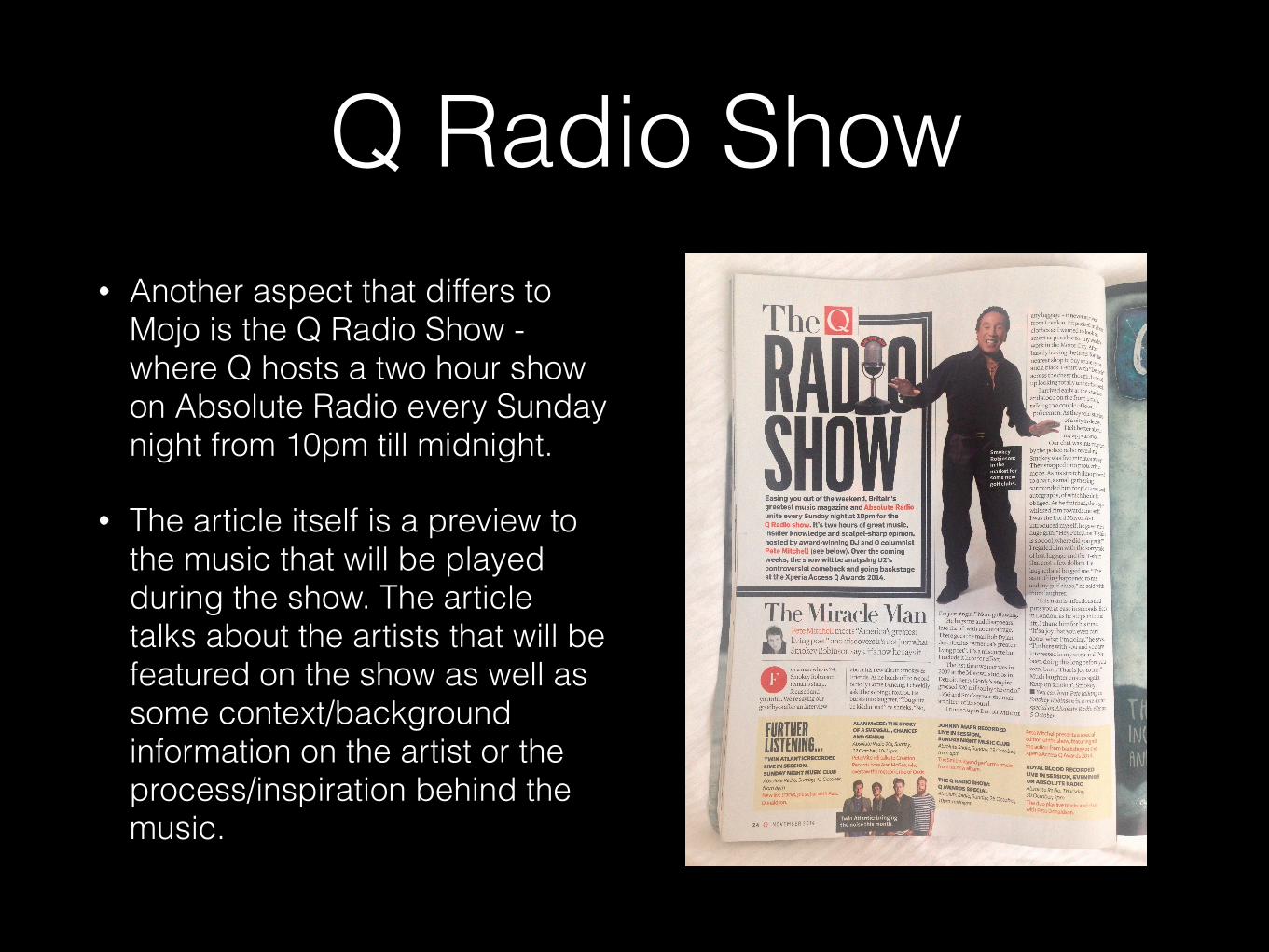
Q Radio Show• Another aspect that differs to
Mojo is the Q Radio Show - where Q hosts a two hour show on Absolute Radio every Sunday night from 10pm till midnight.
• The article itself is a preview to the music that will be played during the show. The article talks about the artists that will be featured on the show as well as some context/background information on the artist or the process/inspiration behind the music.
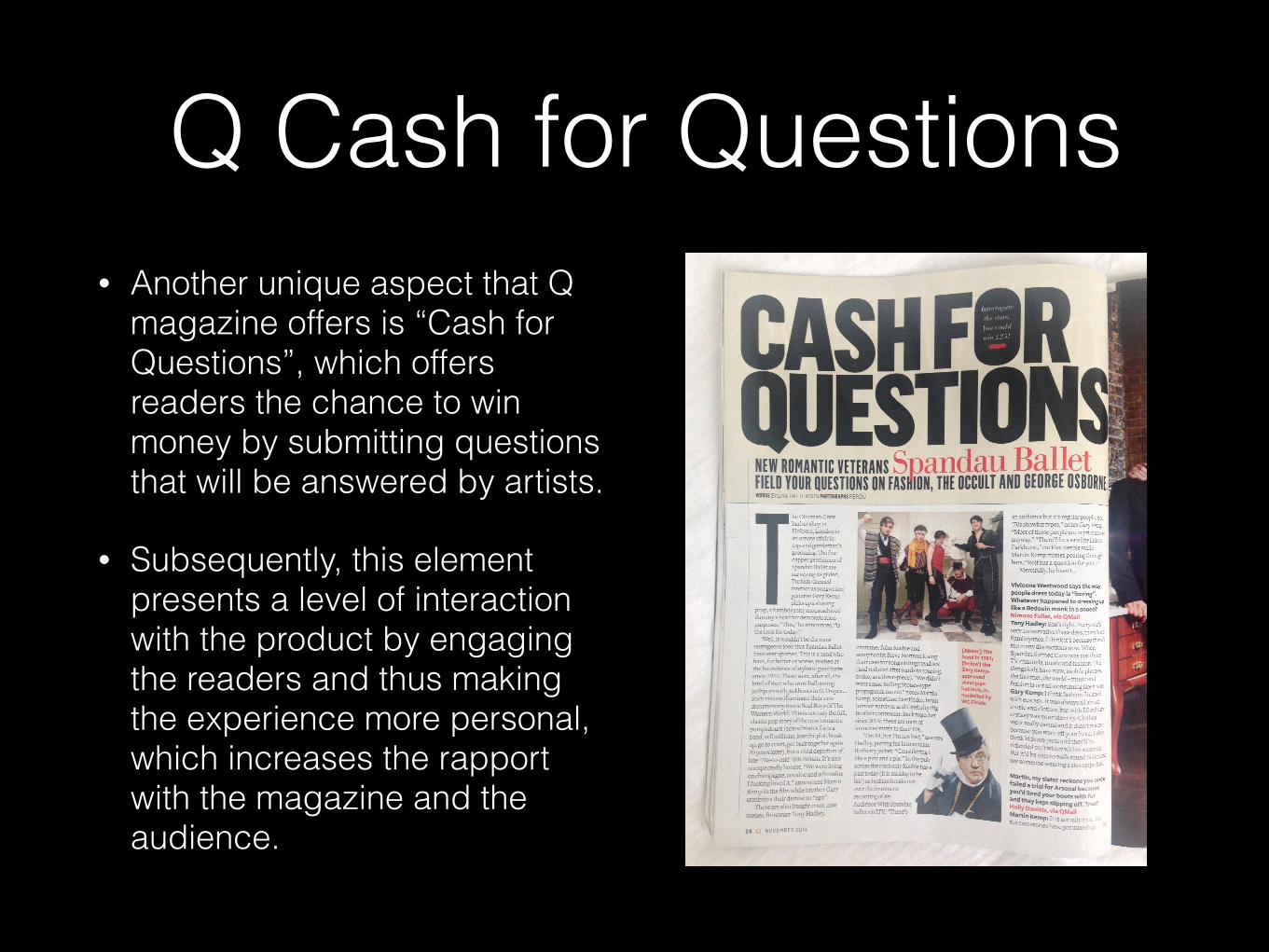
Q Cash for Questions• Another unique aspect that Q
magazine offers is “Cash for Questions”, which offers readers the chance to win money by submitting questions that will be answered by artists.
• Subsequently, this element presents a level of interaction with the product by engaging the readers and thus making the experience more personal, which increases the rapport with the magazine and the audience.
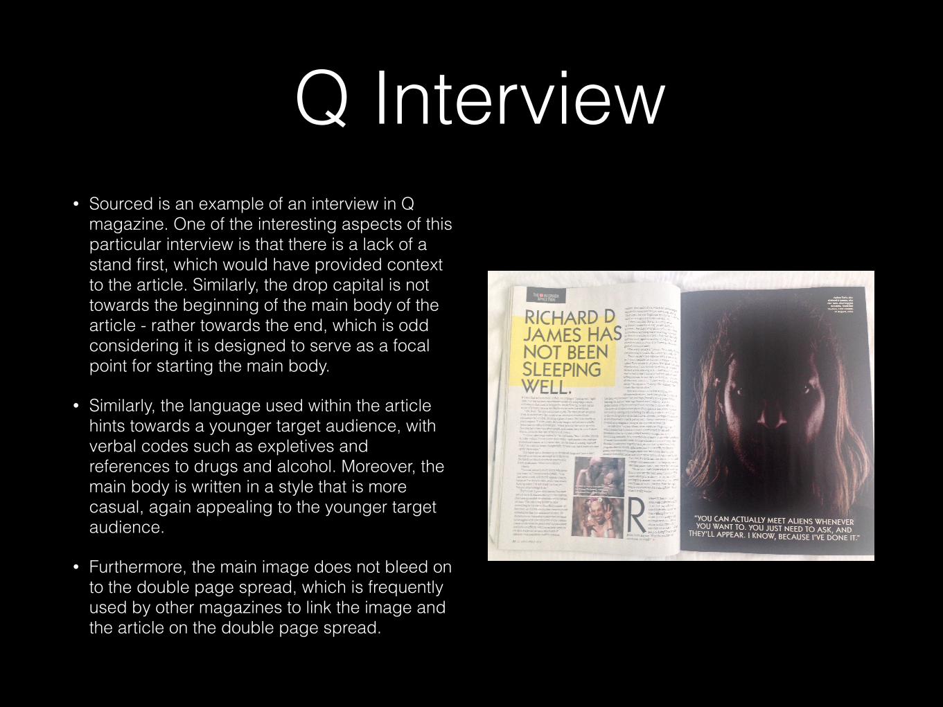
Q Interview• Sourced is an example of an interview in Q
magazine. One of the interesting aspects of this particular interview is that there is a lack of a stand first, which would have provided context to the article. Similarly, the drop capital is not towards the beginning of the main body of the article - rather towards the end, which is odd considering it is designed to serve as a focal point for starting the main body.
• Similarly, the language used within the article hints towards a younger target audience, with verbal codes such as expletives and references to drugs and alcohol. Moreover, the main body is written in a style that is more casual, again appealing to the younger target audience.
• Furthermore, the main image does not bleed on to the double page spread, which is frequently used by other magazines to link the image and the article on the double page spread.
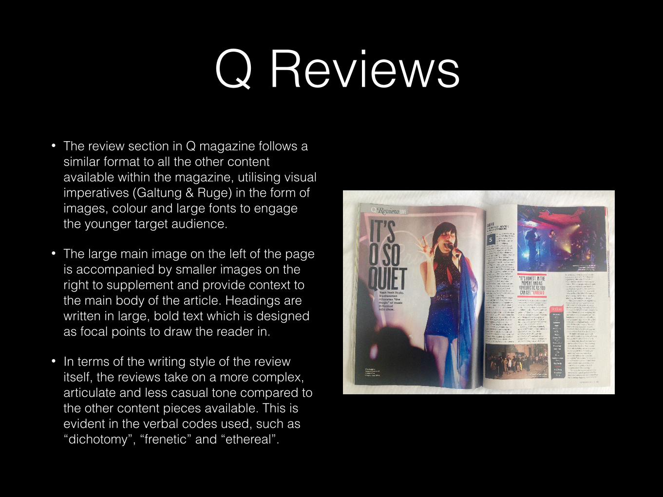
Q Reviews• The review section in Q magazine follows a
similar format to all the other content available within the magazine, utilising visual imperatives (Galtung & Ruge) in the form of images, colour and large fonts to engage the younger target audience.
• The large main image on the left of the page is accompanied by smaller images on the right to supplement and provide context to the main body of the article. Headings are written in large, bold text which is designed as focal points to draw the reader in.
• In terms of the writing style of the review itself, the reviews take on a more complex, articulate and less casual tone compared to the other content pieces available. This is evident in the verbal codes used, such as “dichotomy”, “frenetic” and “ethereal”.

MOJO MUSIC MAGAZINETarget Readership
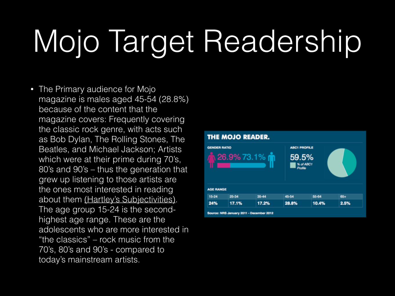
Mojo Target Readership• The Primary audience for Mojo
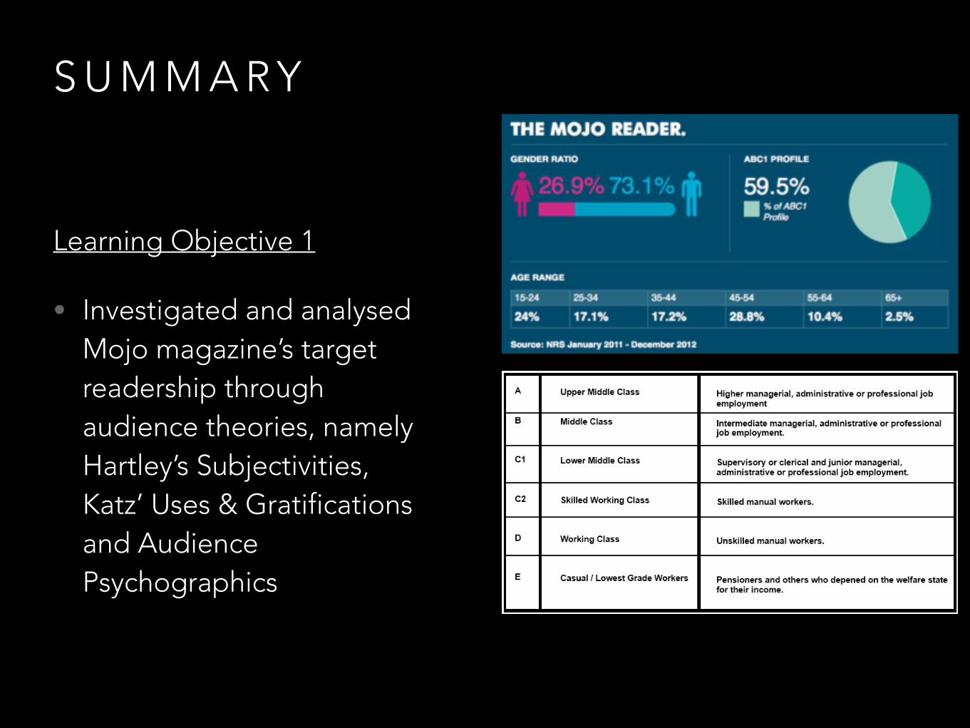
magazine is males aged 45-54 (28.8%) because of the content that the magazine covers: Frequently covering the classic rock genre, with acts such as Bob Dylan, The Rolling Stones, The Beatles, and Michael Jackson; Artists which were at their prime during 70’s, 80’s and 90’s – thus the generation that grew up listening to those artists are the ones most interested in reading about them (Hartley’s Subjectivities). The age group 15-24 is the second-highest age range. These are the adolescents who are more interested in “the classics” – rock music from the 70’s, 80’s and 90’s - compared to today’s mainstream artists.
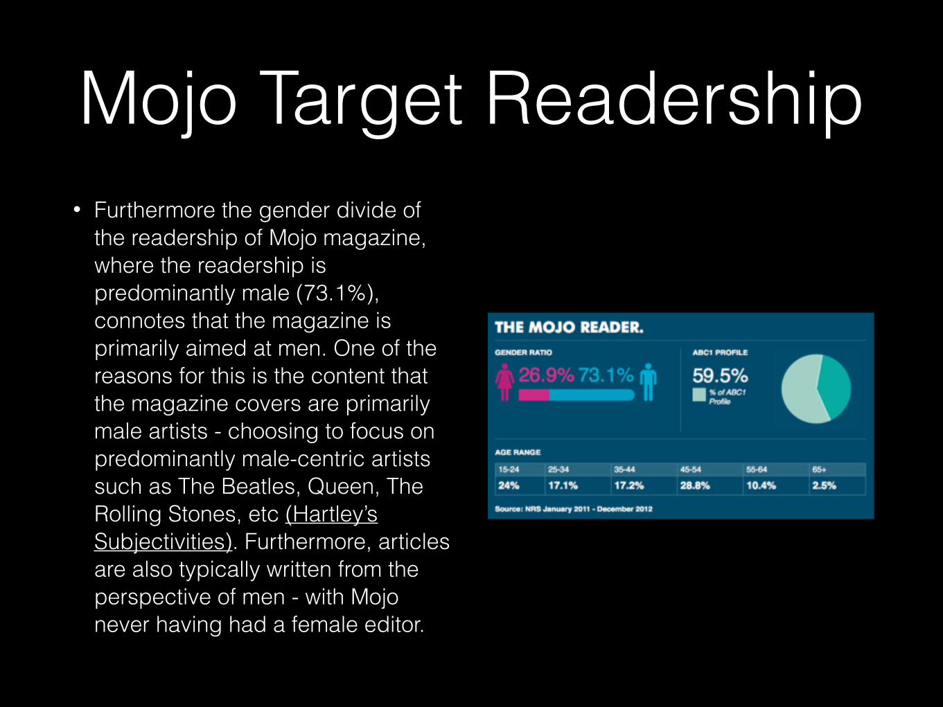
• Furthermore the gender divide of the readership of Mojo magazine, where the readership is predominantly male (73.1%), connotes that the magazine is primarily aimed at men. One of the reasons for this is the content that the magazine covers are primarily male artists - choosing to focus on predominantly male-centric artists such as The Beatles, Queen, The Rolling Stones, etc (Hartley’s Subjectivities). Furthermore, articles are also typically written from the perspective of men - with Mojo never having had a female editor.
Mojo Target Readership
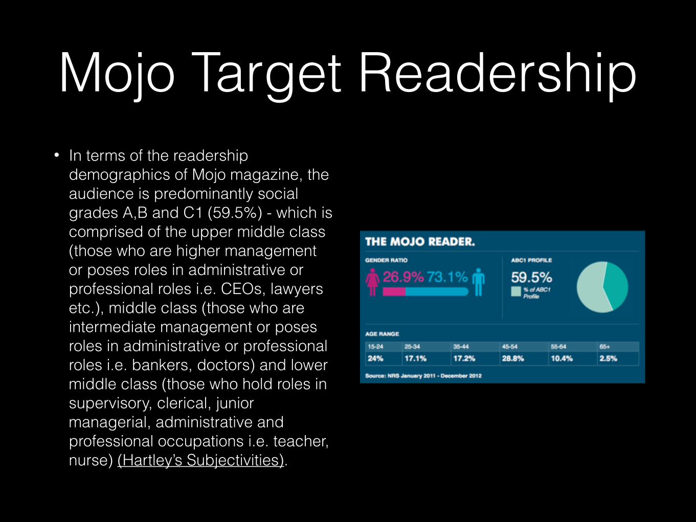
• In terms of the readership demographics of Mojo magazine, the audience is predominantly social grades A,B and C1 (59.5%) - which is comprised of the upper middle class (those who are higher management or poses roles in administrative or professional roles i.e. CEOs, lawyers etc.), middle class (those who are intermediate management or poses roles in administrative or professional roles i.e. bankers, doctors) and lower middle class (those who hold roles in supervisory, clerical, junior managerial, administrative and professional occupations i.e. teacher, nurse) (Hartley’s Subjectivities).
Mojo Target Readership

• The reason for this is that Mojo magazine prides itself with high quality content aimed at passionate and intelligent readers. Content which is intended to inform and educate (according to Katz’ Uses and Gratifications) but also appeal to their older readers by focusing on classic rock artists from the 1970’s, 80’s and 90’s - those who grew up listening to these acts are in their 40s and 50s and can relate those artists as they were around during the time they were growing up. The content in Mojo is written in a more formal style using a wide range of complex terms and language tools as it is aimed at intelligent consumers - those consumers (referred to by the magazine as being more like “investors”) are primarily found in the middle class scale - those who live comfortably with disposable income.
Mojo Target Readership
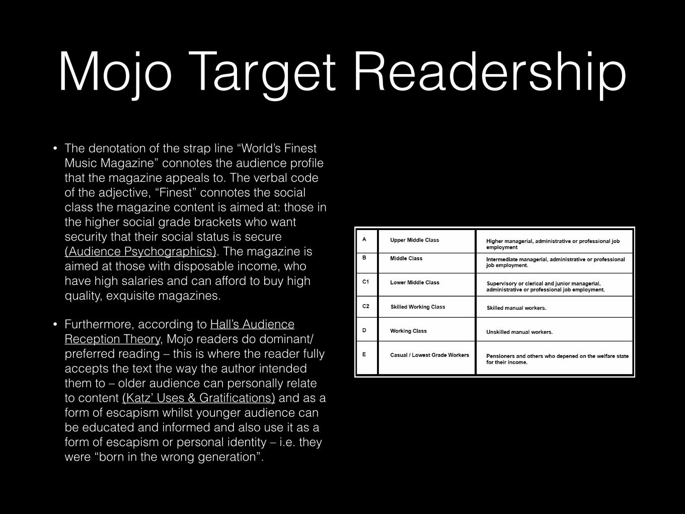
• The denotation of the strap line “World’s Finest Music Magazine” connotes the audience profile that the magazine appeals to. The verbal code of the adjective, “Finest” connotes the social class the magazine content is aimed at: those in the higher social grade brackets who want security that their social status is secure (Audience Psychographics). The magazine is aimed at those with disposable income, who have high salaries and can afford to buy high quality, exquisite magazines.
• Furthermore, according to Hall’s Audience Reception Theory, Mojo readers do dominant/preferred reading – this is where the reader fully accepts the text the way the author intended them to – older audience can personally relate to content (Katz’ Uses & Gratifications) and as a form of escapism whilst younger audience can be educated and informed and also use it as a form of escapism or personal identity – i.e. they were “born in the wrong generation”.
Mojo Target Readership
Q MUSIC MAGAZINETarget Readership
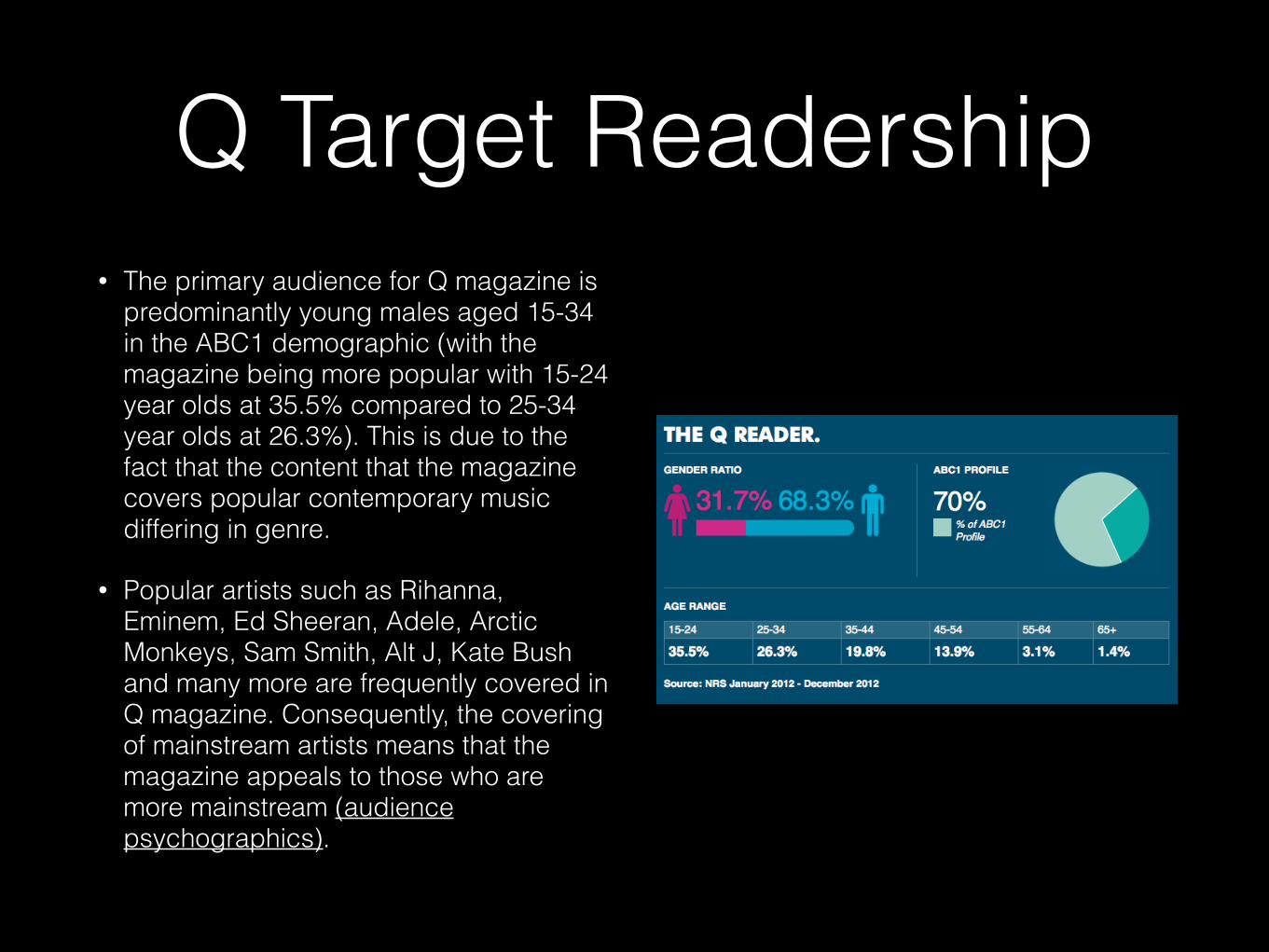
Q Target Readership• The primary audience for Q magazine is
predominantly young males aged 15-34 in the ABC1 demographic (with the magazine being more popular with 15-24 year olds at 35.5% compared to 25-34 year olds at 26.3%). This is due to the fact that the content that the magazine covers popular contemporary music differing in genre.
• Popular artists such as Rihanna, Eminem, Ed Sheeran, Adele, Arctic Monkeys, Sam Smith, Alt J, Kate Bush and many more are frequently covered in Q magazine. Consequently, the covering of mainstream artists means that the magazine appeals to those who are more mainstream (audience psychographics).
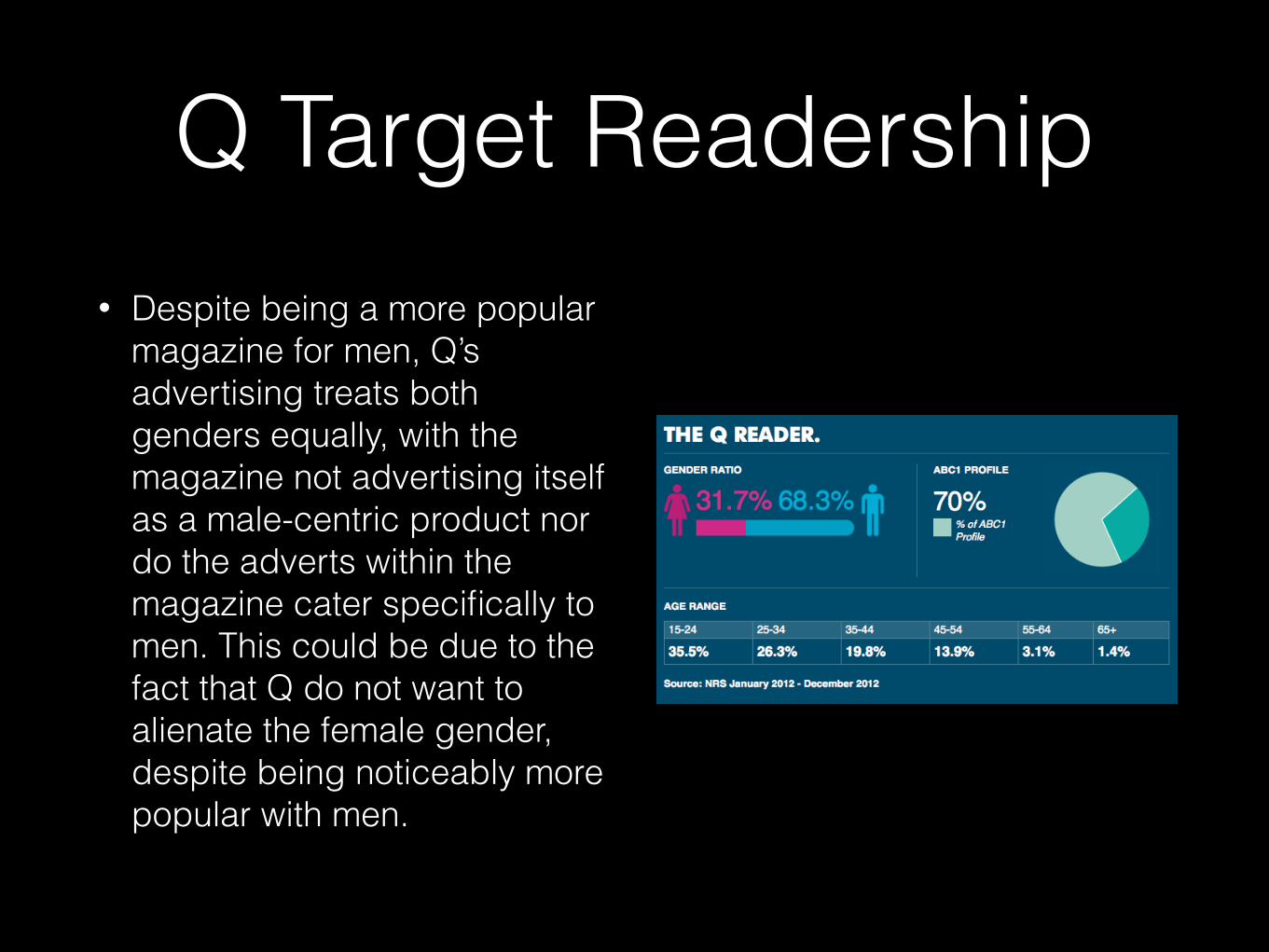
Q Target Readership• Despite being a more popular
magazine for men, Q’s advertising treats both genders equally, with the magazine not advertising itself as a male-centric product nor do the adverts within the magazine cater specifically to men. This could be due to the fact that Q do not want to alienate the female gender, despite being noticeably more popular with men.
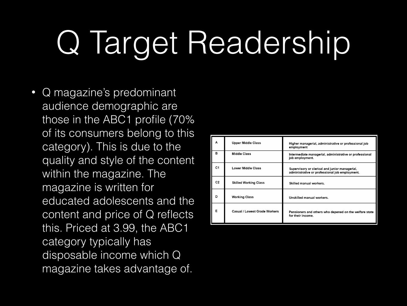
• Q magazine’s predominant audience demographic are those in the ABC1 profile (70% of its consumers belong to this category). This is due to the quality and style of the content within the magazine. The magazine is written for educated adolescents and the content and price of Q reflects this. Priced at 3.99, the ABC1 category typically has disposable income which Q magazine takes advantage of.
Q Target Readership
MOJO MUSIC MAGAZINE
Advertising & Promotion
Mojo Advertising & Promotion
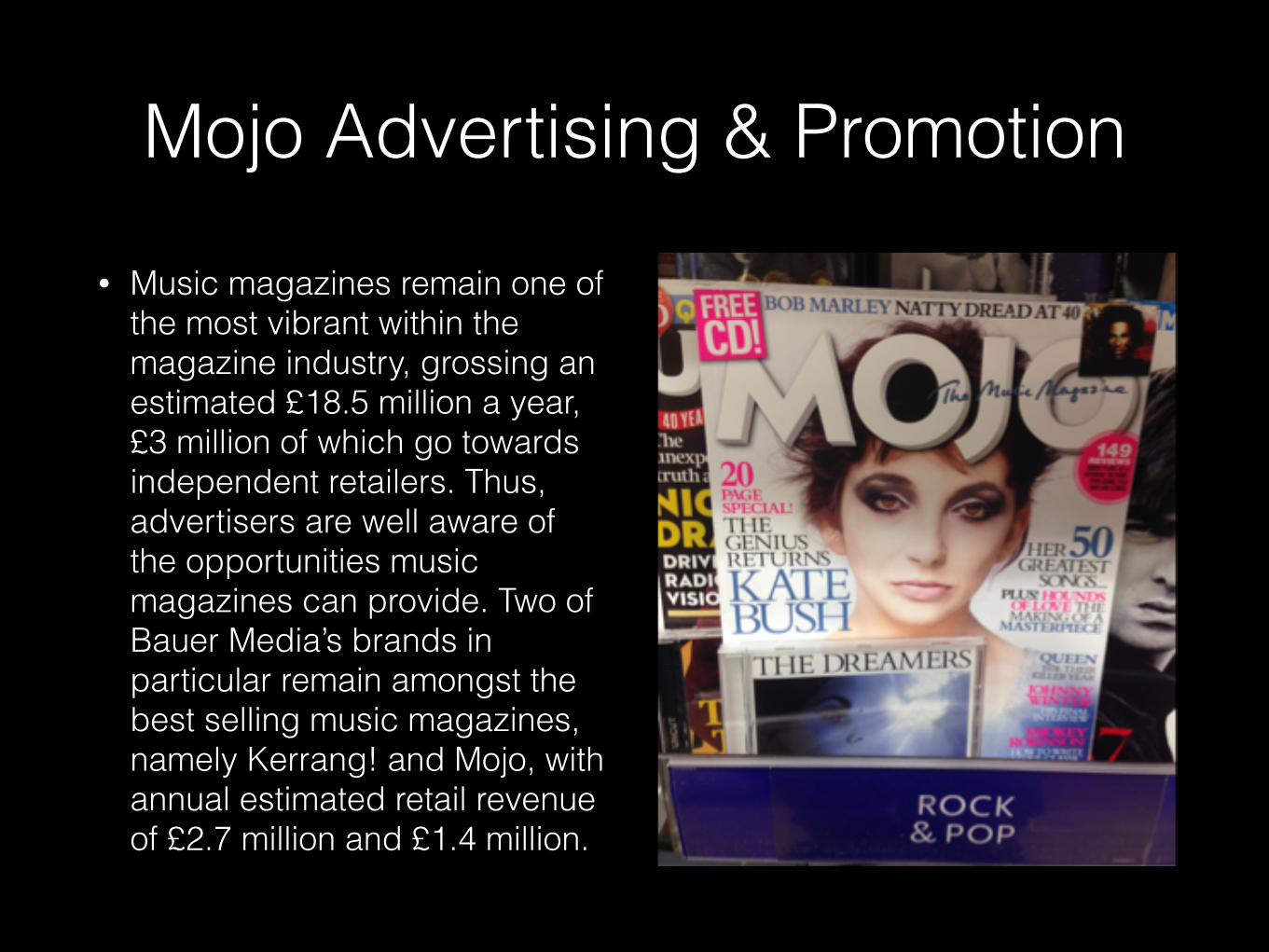
• Music magazines remain one of the most vibrant within the magazine industry, grossing an estimated £18.5 million a year, £3 million of which go towards independent retailers. Thus, advertisers are well aware of the opportunities music magazines can provide. Two of Bauer Media’s brands in particular remain amongst the best selling music magazines, namely Kerrang! and Mojo, with annual estimated retail revenue of £2.7 million and £1.4 million.
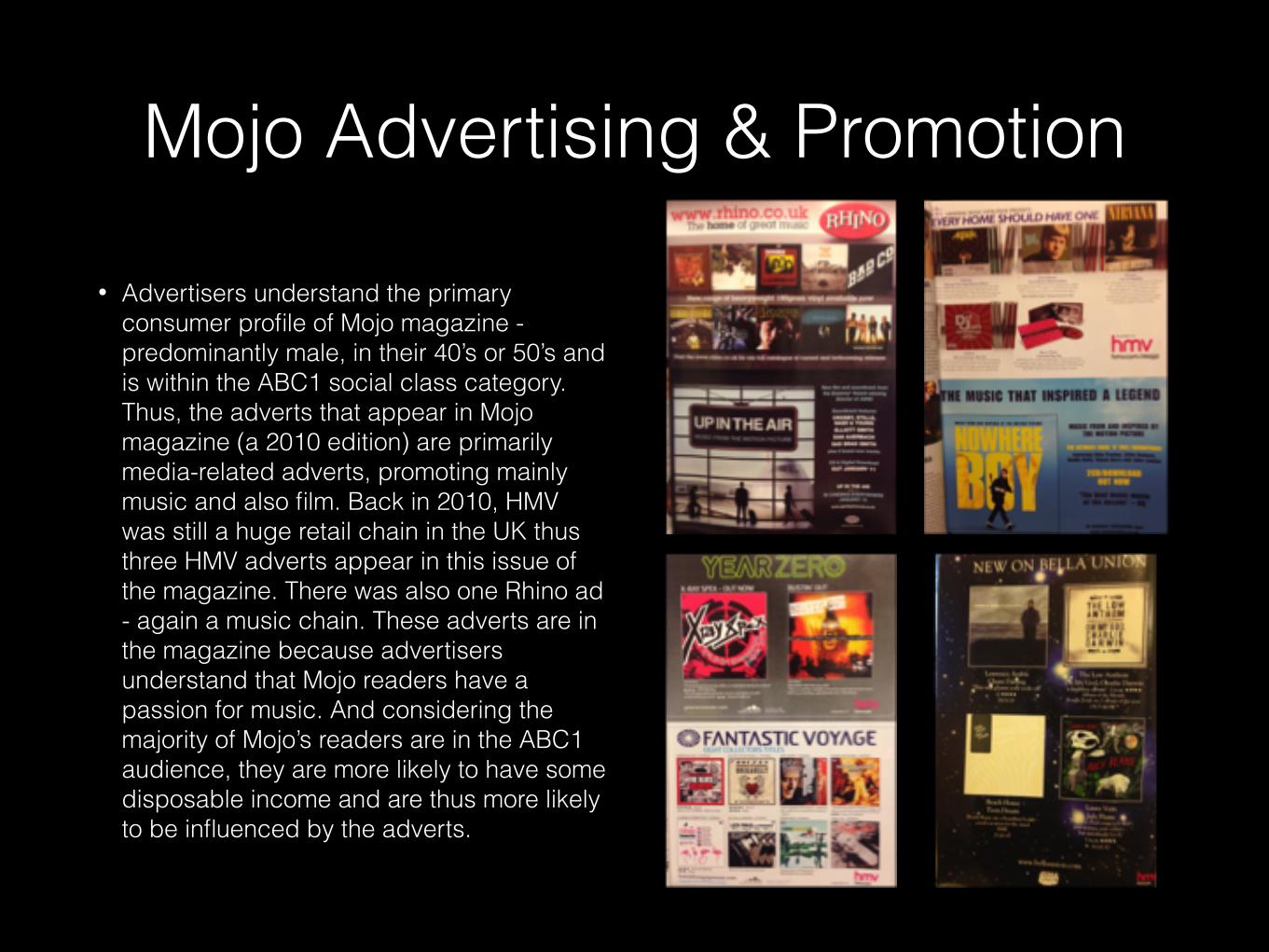
• Advertisers understand the primary consumer profile of Mojo magazine - predominantly male, in their 40’s or 50’s and is within the ABC1 social class category. Thus, the adverts that appear in Mojo magazine (a 2010 edition) are primarily media-related adverts, promoting mainly music and also film. Back in 2010, HMV was still a huge retail chain in the UK thus three HMV adverts appear in this issue of the magazine. There was also one Rhino ad - again a music chain. These adverts are in the magazine because advertisers understand that Mojo readers have a passion for music. And considering the majority of Mojo’s readers are in the ABC1 audience, they are more likely to have some disposable income and are thus more likely to be influenced by the adverts.
Mojo Advertising & Promotion
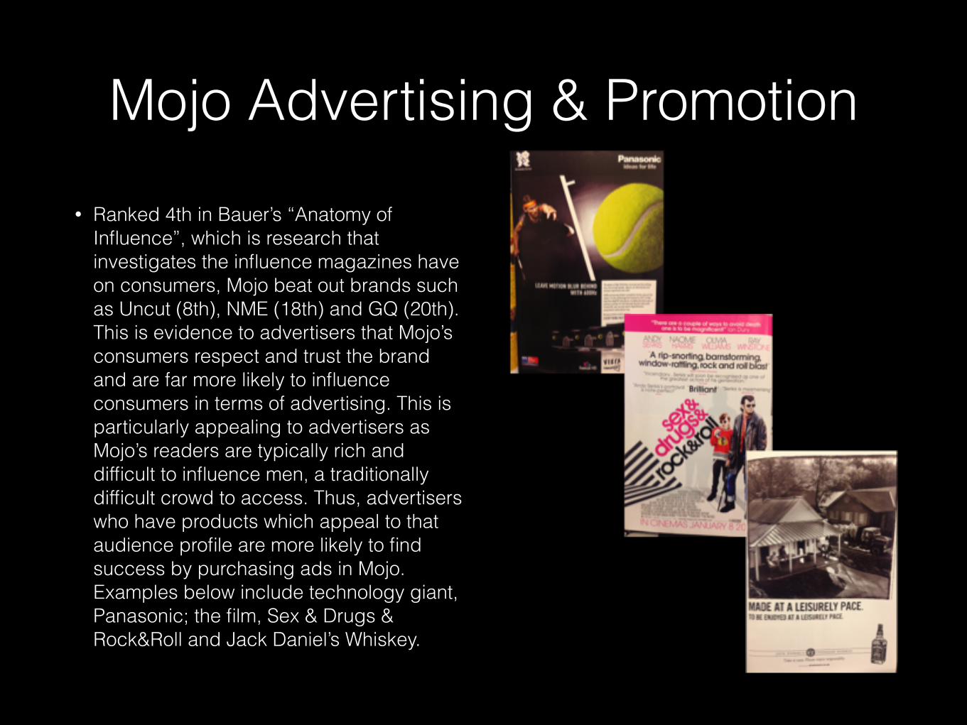
• Ranked 4th in Bauer’s “Anatomy of Influence”, which is research that investigates the influence magazines have on consumers, Mojo beat out brands such as Uncut (8th), NME (18th) and GQ (20th). This is evidence to advertisers that Mojo’s consumers respect and trust the brand and are far more likely to influence consumers in terms of advertising. This is particularly appealing to advertisers as Mojo’s readers are typically rich and difficult to influence men, a traditionally difficult crowd to access. Thus, advertisers who have products which appeal to that audience profile are more likely to find success by purchasing ads in Mojo. Examples below include technology giant, Panasonic; the film, Sex & Drugs & Rock&Roll and Jack Daniel’s Whiskey.
Mojo Advertising & Promotion
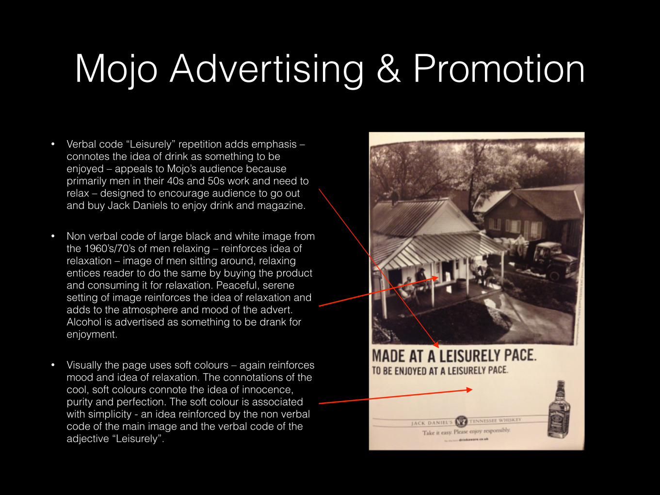
• Verbal code “Leisurely” repetition adds emphasis – connotes the idea of drink as something to be enjoyed – appeals to Mojo’s audience because primarily men in their 40s and 50s work and need to relax – designed to encourage audience to go out and buy Jack Daniels to enjoy drink and magazine.
• Non verbal code of large black and white image from the 1960’s/70’s of men relaxing – reinforces idea of relaxation – image of men sitting around, relaxing entices reader to do the same by buying the product and consuming it for relaxation. Peaceful, serene setting of image reinforces the idea of relaxation and adds to the atmosphere and mood of the advert. Alcohol is advertised as something to be drank for enjoyment.
• Visually the page uses soft colours – again reinforces mood and idea of relaxation. The connotations of the cool, soft colours connote the idea of innocence, purity and perfection. The soft colour is associated with simplicity - an idea reinforced by the non verbal code of the main image and the verbal code of the adjective “Leisurely”.
Mojo Advertising & Promotion
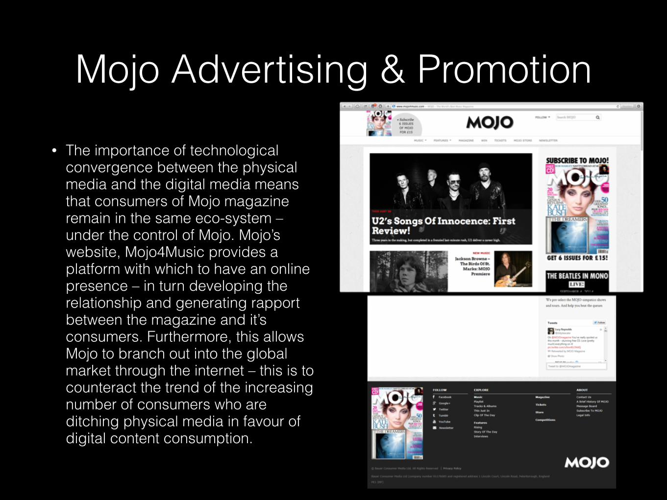
• The importance of technological convergence between the physical media and the digital media means that consumers of Mojo magazine remain in the same eco-system – under the control of Mojo. Mojo’s website, Mojo4Music provides a platform with which to have an online presence – in turn developing the relationship and generating rapport between the magazine and it’s consumers. Furthermore, this allows Mojo to branch out into the global market through the internet – this is to counteract the trend of the increasing number of consumers who are ditching physical media in favour of digital content consumption.
Mojo Advertising & Promotion
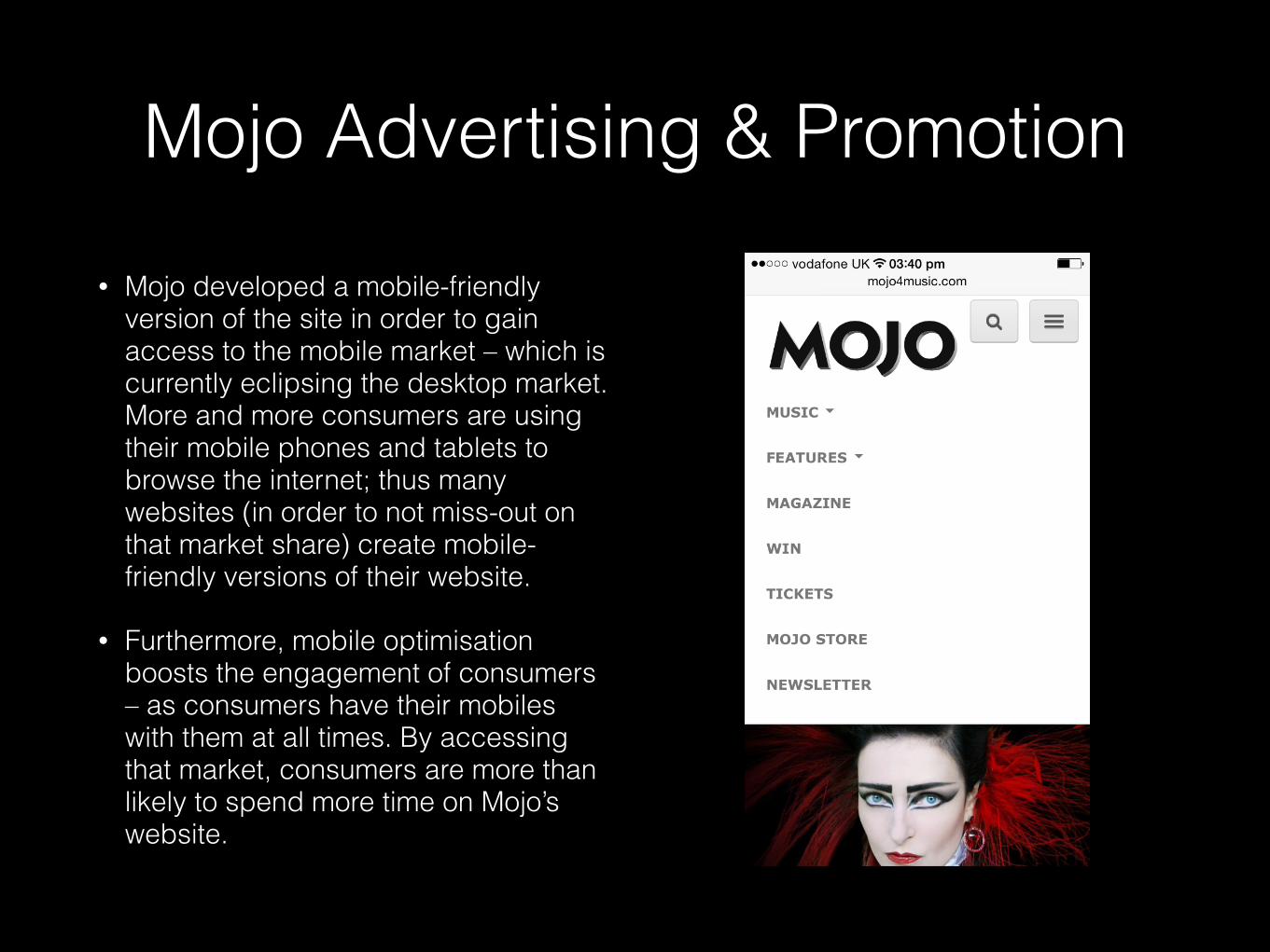
• Mojo developed a mobile-friendly version of the site in order to gain access to the mobile market – which is currently eclipsing the desktop market. More and more consumers are using their mobile phones and tablets to browse the internet; thus many websites (in order to not miss-out on that market share) create mobile-friendly versions of their website.
• Furthermore, mobile optimisation boosts the engagement of consumers – as consumers have their mobiles with them at all times. By accessing that market, consumers are more than likely to spend more time on Mojo’s website.
Mojo Advertising & Promotion
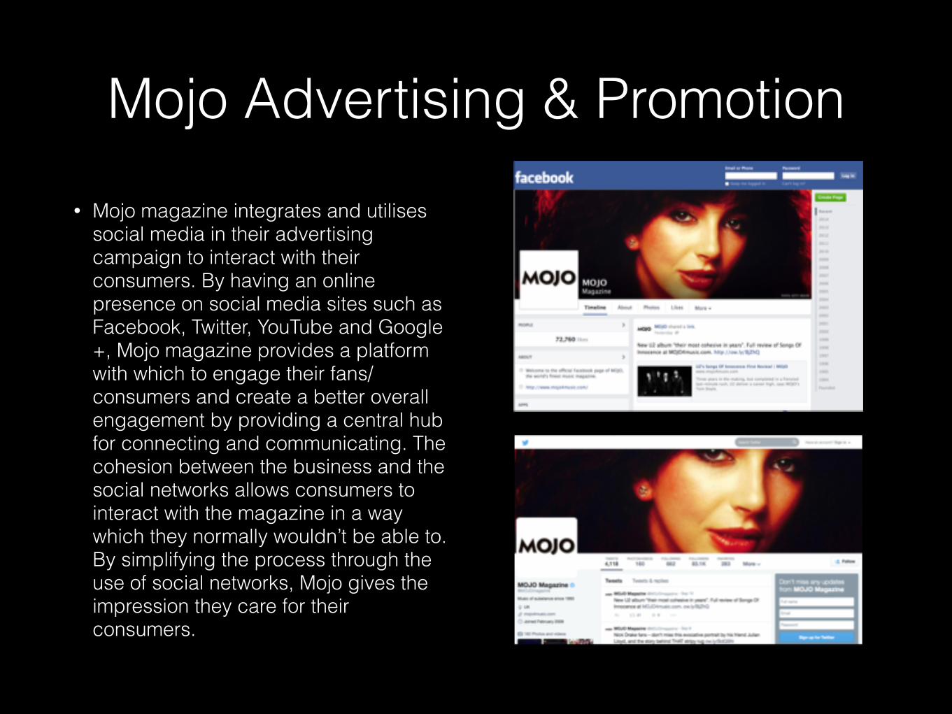
• Mojo magazine integrates and utilises social media in their advertising campaign to interact with their consumers. By having an online presence on social media sites such as Facebook, Twitter, YouTube and Google+, Mojo magazine provides a platform with which to engage their fans/consumers and create a better overall engagement by providing a central hub for connecting and communicating. The cohesion between the business and the social networks allows consumers to interact with the magazine in a way which they normally wouldn’t be able to. By simplifying the process through the use of social networks, Mojo gives the impression they care for their consumers.
Mojo Advertising & Promotion
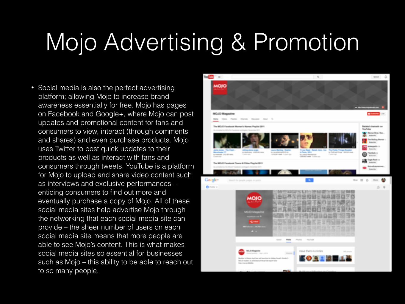
• Social media is also the perfect advertising platform; allowing Mojo to increase brand awareness essentially for free. Mojo has pages on Facebook and Google+, where Mojo can post updates and promotional content for fans and consumers to view, interact (through comments and shares) and even purchase products. Mojo uses Twitter to post quick updates to their products as well as interact with fans and consumers through tweets. YouTube is a platform for Mojo to upload and share video content such as interviews and exclusive performances – enticing consumers to find out more and eventually purchase a copy of Mojo. All of these social media sites help advertise Mojo through the networking that each social media site can provide – the sheer number of users on each social media site means that more people are able to see Mojo’s content. This is what makes social media sites so essential for businesses such as Mojo – this ability to be able to reach out to so many people.
Mojo Advertising & Promotion
MOJO & Q MUSIC
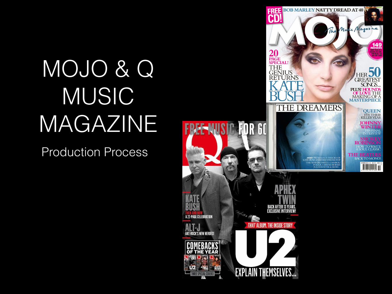
MAGAZINEProduction Process
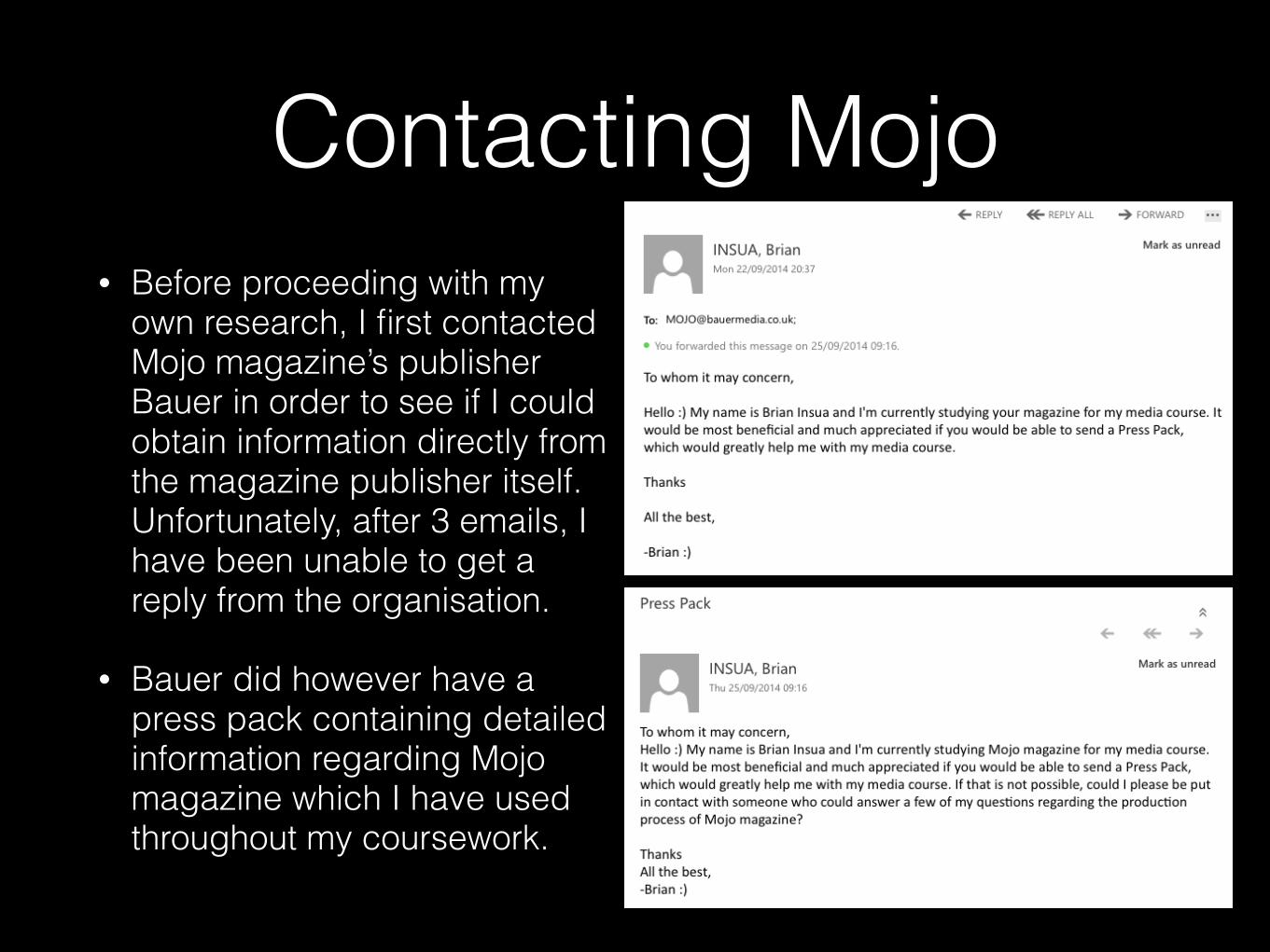
Contacting Mojo• Before proceeding with my
own research, I first contacted Mojo magazine’s publisher Bauer in order to see if I could obtain information directly from the magazine publisher itself. Unfortunately, after 3 emails, I have been unable to get a reply from the organisation.
• Bauer did however have a press pack containing detailed information regarding Mojo magazine which I have used throughout my coursework.
Mojo & Q Production Process
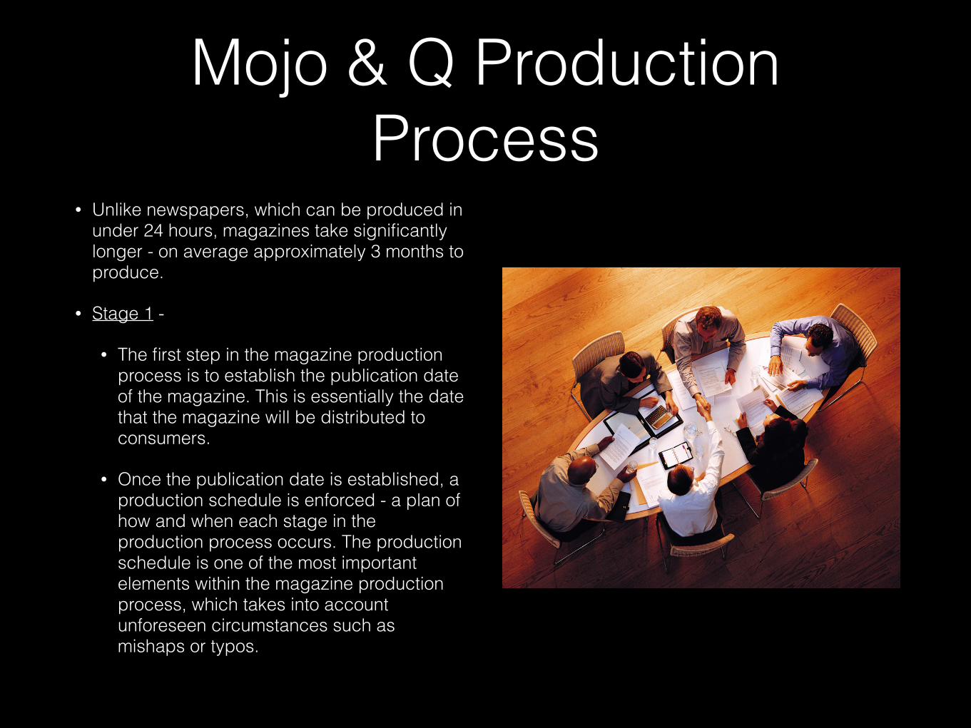
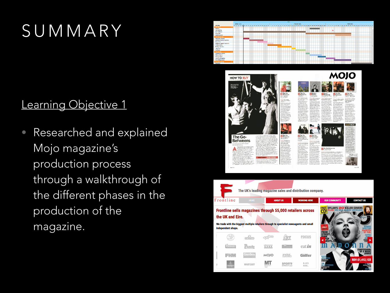
• Unlike newspapers, which can be produced in under 24 hours, magazines take significantly longer - on average approximately 3 months to produce.
• Stage 1 -
• The first step in the magazine production process is to establish the publication date of the magazine. This is essentially the date that the magazine will be distributed to consumers.
• Once the publication date is established, a production schedule is enforced - a plan of how and when each stage in the production process occurs. The production schedule is one of the most important elements within the magazine production process, which takes into account unforeseen circumstances such as mishaps or typos.
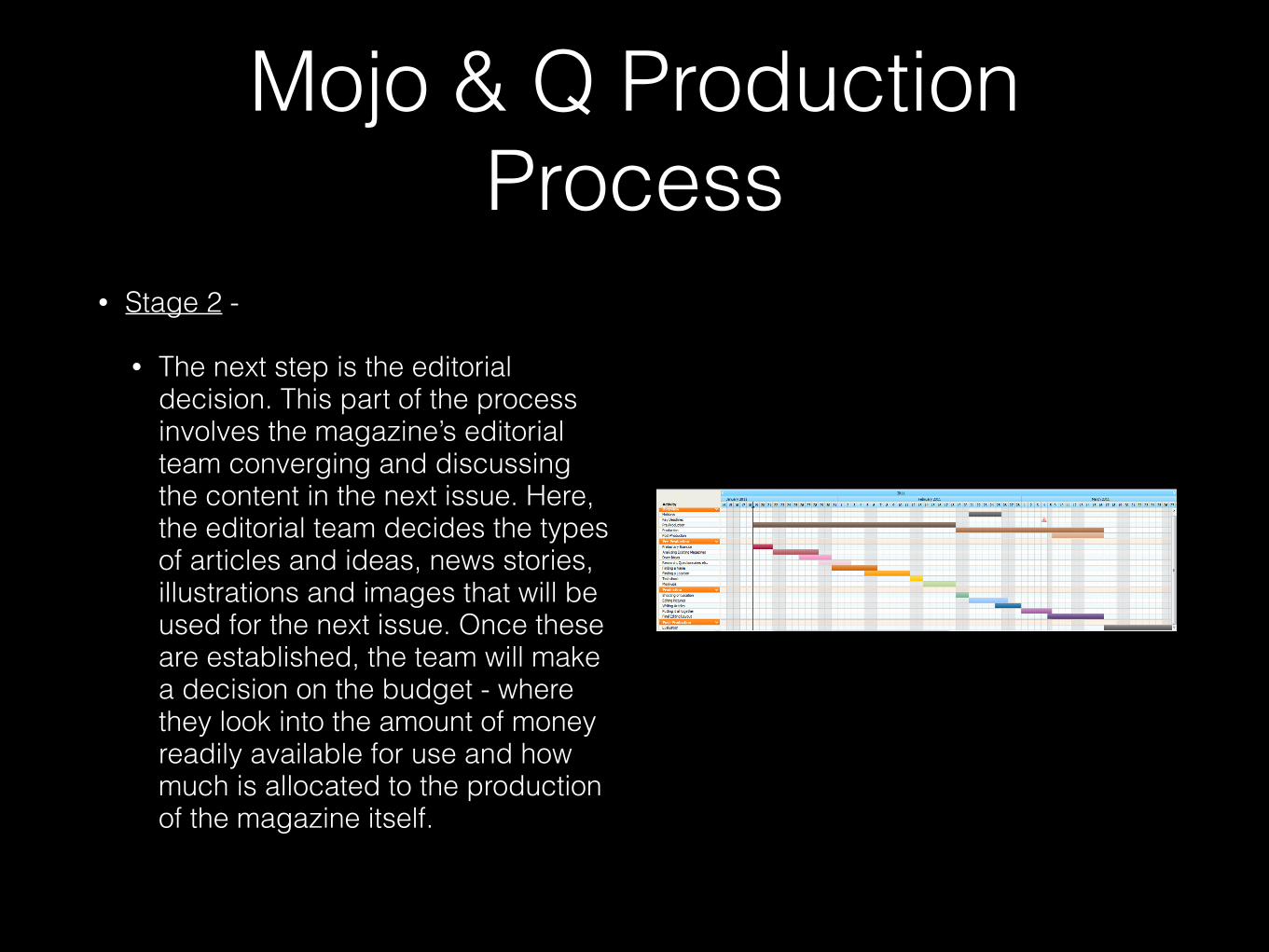
• Stage 2 -
• The next step is the editorial decision. This part of the process involves the magazine’s editorial team converging and discussing the content in the next issue. Here, the editorial team decides the types of articles and ideas, news stories, illustrations and images that will be used for the next issue. Once these are established, the team will make a decision on the budget - where they look into the amount of money readily available for use and how much is allocated to the production of the magazine itself.
Mojo & Q Production Process
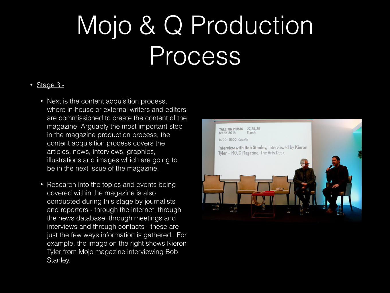
• Stage 3 -
• Next is the content acquisition process, where in-house or external writers and editors are commissioned to create the content of the magazine. Arguably the most important step in the magazine production process, the content acquisition process covers the articles, news, interviews, graphics, illustrations and images which are going to be in the next issue of the magazine.
• Research into the topics and events being covered within the magazine is also conducted during this stage by journalists and reporters - through the internet, through the news database, through meetings and interviews and through contacts - these are just the few ways information is gathered. For example, the image on the right shows Kieron Tyler from Mojo magazine interviewing Bob Stanley.
Mojo & Q Production Process
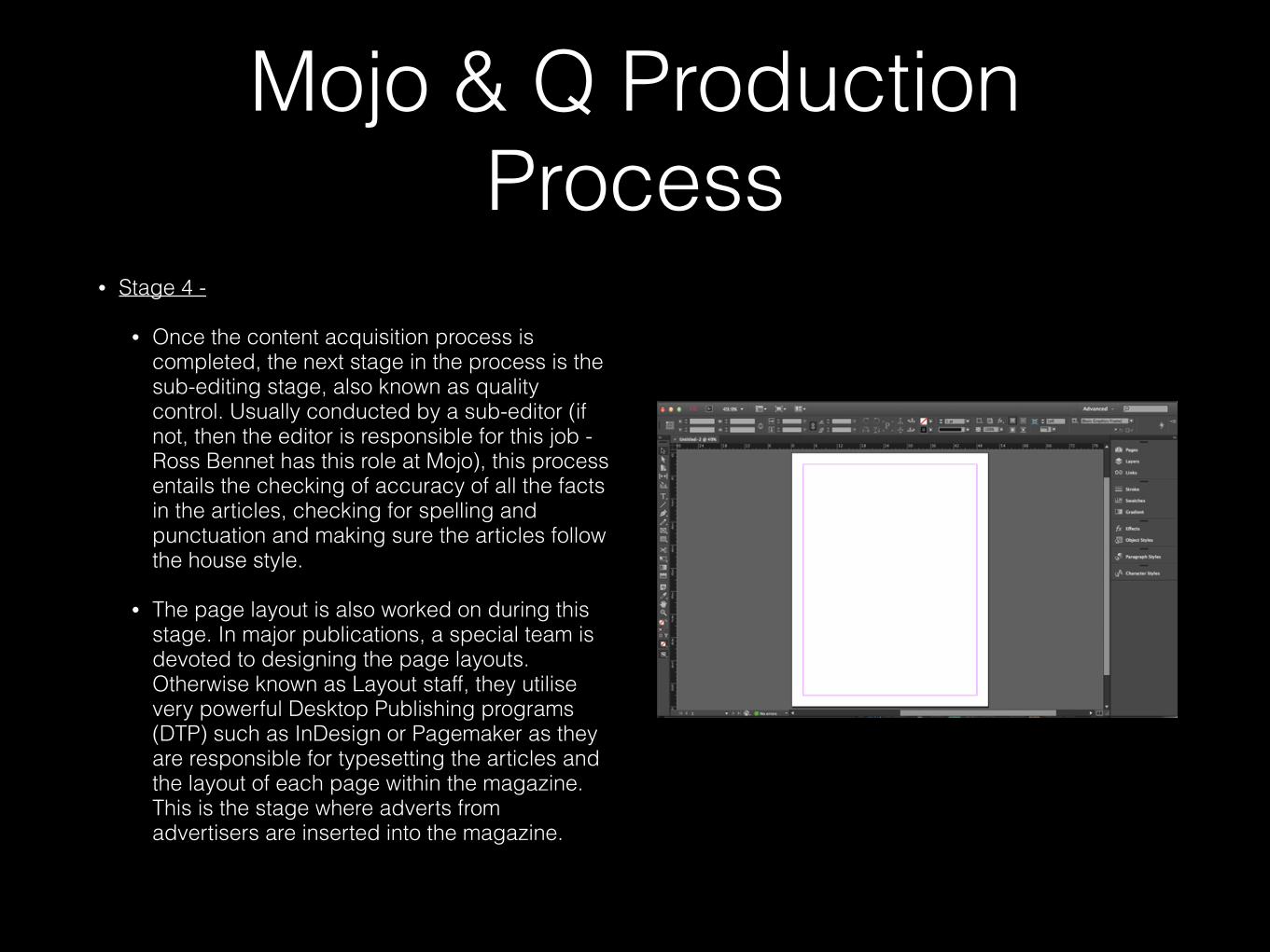
• Stage 4 -
• Once the content acquisition process is completed, the next stage in the process is the sub-editing stage, also known as quality control. Usually conducted by a sub-editor (if not, then the editor is responsible for this job - Ross Bennet has this role at Mojo), this process entails the checking of accuracy of all the facts in the articles, checking for spelling and punctuation and making sure the articles follow the house style.
• The page layout is also worked on during this stage. In major publications, a special team is devoted to designing the page layouts. Otherwise known as Layout staff, they utilise very powerful Desktop Publishing programs (DTP) such as InDesign or Pagemaker as they are responsible for typesetting the articles and the layout of each page within the magazine. This is the stage where adverts from advertisers are inserted into the magazine.
Mojo & Q Production Process
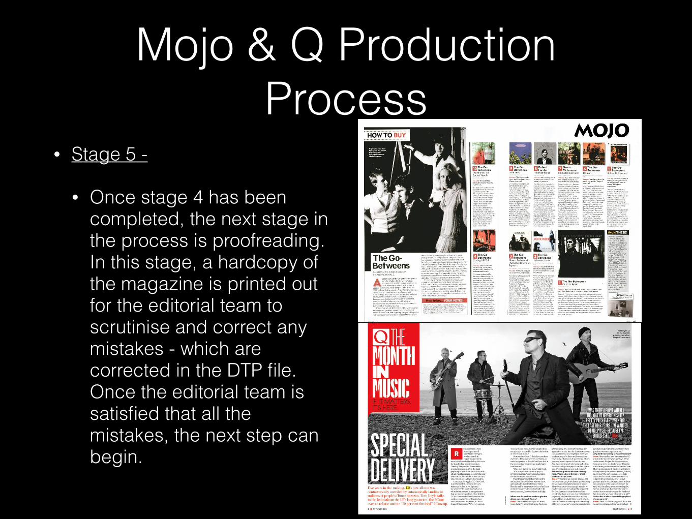
• Stage 5 -
• Once stage 4 has been completed, the next stage in the process is proofreading. In this stage, a hardcopy of the magazine is printed out for the editorial team to scrutinise and correct any mistakes - which are corrected in the DTP file. Once the editorial team is satisfied that all the mistakes, the next step can begin.
Mojo & Q Production Process
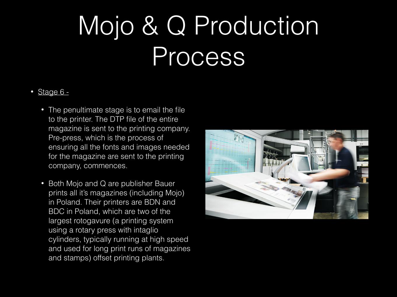
• Stage 6 -
• The penultimate stage is to email the file to the printer. The DTP file of the entire magazine is sent to the printing company. Pre-press, which is the process of ensuring all the fonts and images needed for the magazine are sent to the printing company, commences.
• Both Mojo and Q are publisher Bauer prints all it’s magazines (including Mojo) in Poland. Their printers are BDN and BDC in Poland, which are two of the largest rotogavure (a printing system using a rotary press with intaglio cylinders, typically running at high speed and used for long print runs of magazines and stamps) offset printing plants.
Mojo & Q Production Process
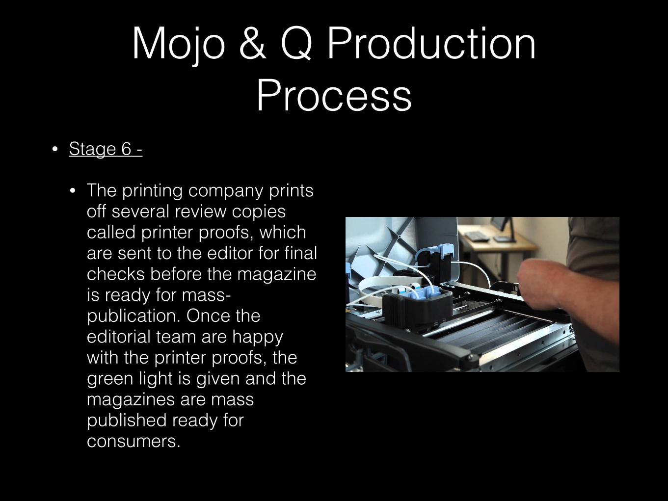
• Stage 6 -
• The printing company prints off several review copies called printer proofs, which are sent to the editor for final checks before the magazine is ready for mass-publication. Once the editorial team are happy with the printer proofs, the green light is given and the magazines are mass published ready for consumers.
Mojo & Q Production Process
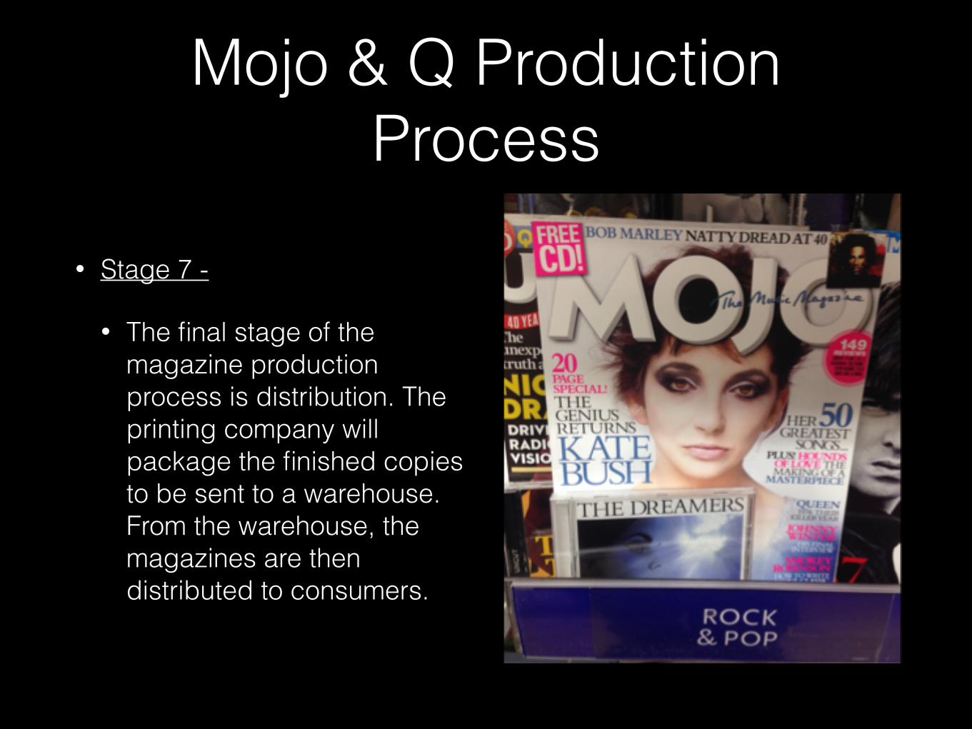
• Stage 7 -
• The final stage of the magazine production process is distribution. The printing company will package the finished copies to be sent to a warehouse. From the warehouse, the magazines are then distributed to consumers.
Mojo & Q Production Process
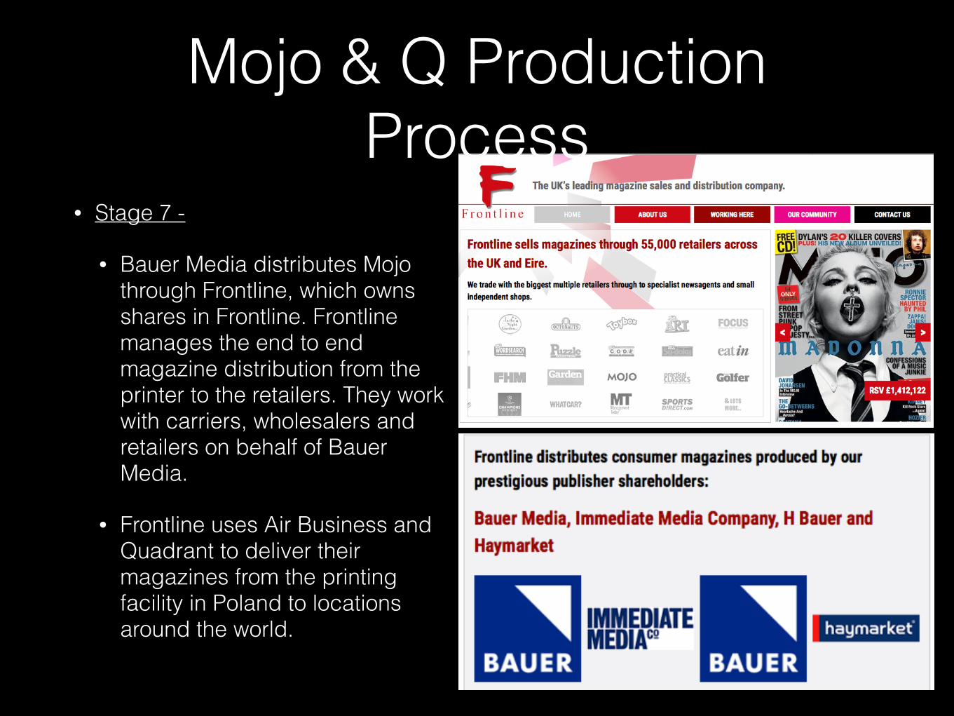
• Stage 7 -
• Bauer Media distributes Mojo through Frontline, which owns shares in Frontline. Frontline manages the end to end magazine distribution from the printer to the retailers. They work with carriers, wholesalers and retailers on behalf of Bauer Media.
• Frontline uses Air Business and Quadrant to deliver their magazines from the printing facility in Poland to locations around the world.
Mojo & Q Production Process
Mojo & Q Production Process
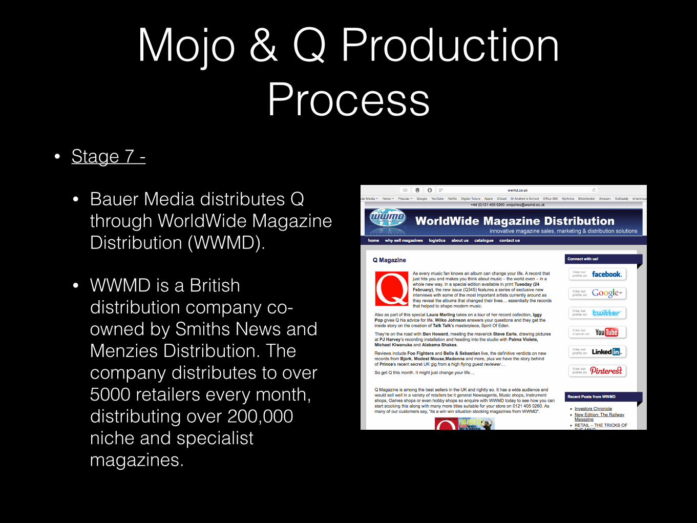
• Stage 7 -
• Bauer Media distributes Q through WorldWide Magazine Distribution (WWMD).
• WWMD is a British distribution company co-owned by Smiths News and Menzies Distribution. The company distributes to over 5000 retailers every month, distributing over 200,000 niche and specialist magazines.
S U M M A R Y
Learning Objective 1
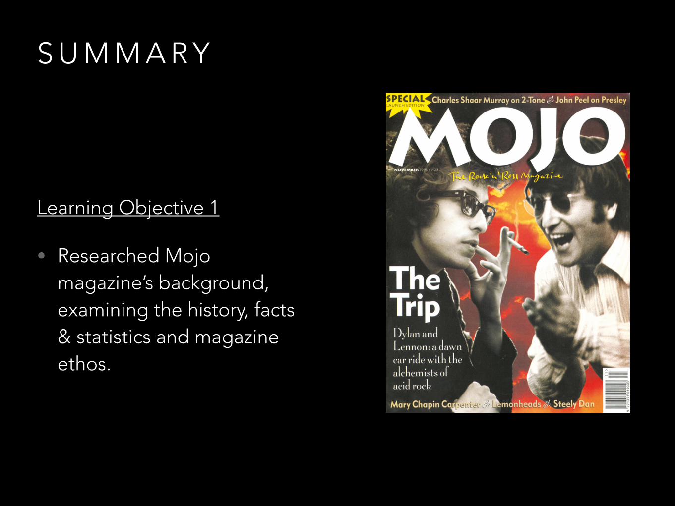
• Researched Mojo magazine’s background, examining the history, facts & statistics and magazine ethos.
S U M M A R Y
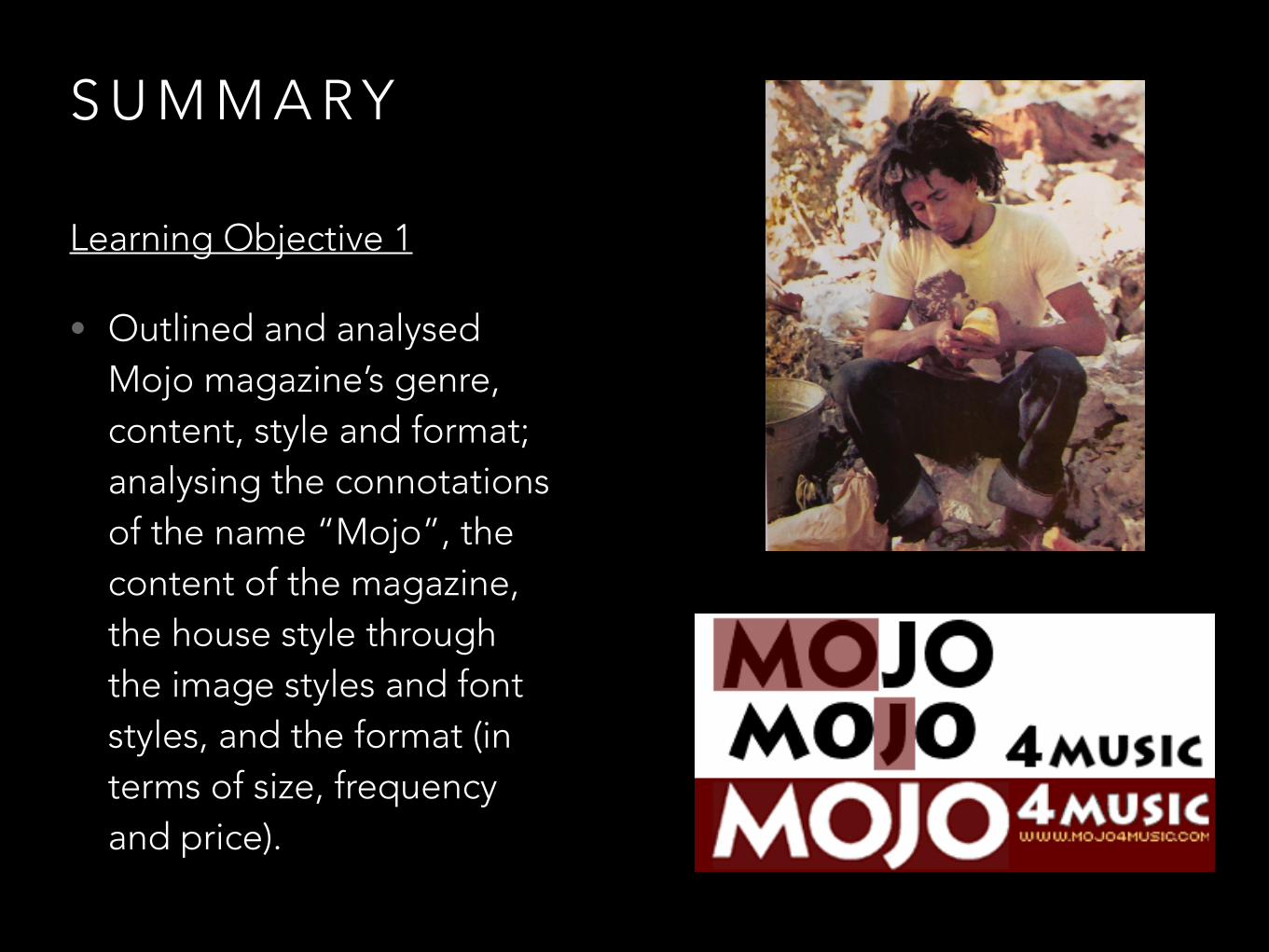
Learning Objective 1
• Outlined and analysed Mojo magazine’s genre, content, style and format; analysing the connotations of the name “Mojo”, the content of the magazine, the house style through the image styles and font styles, and the format (in terms of size, frequency and price).
S U M M A R Y
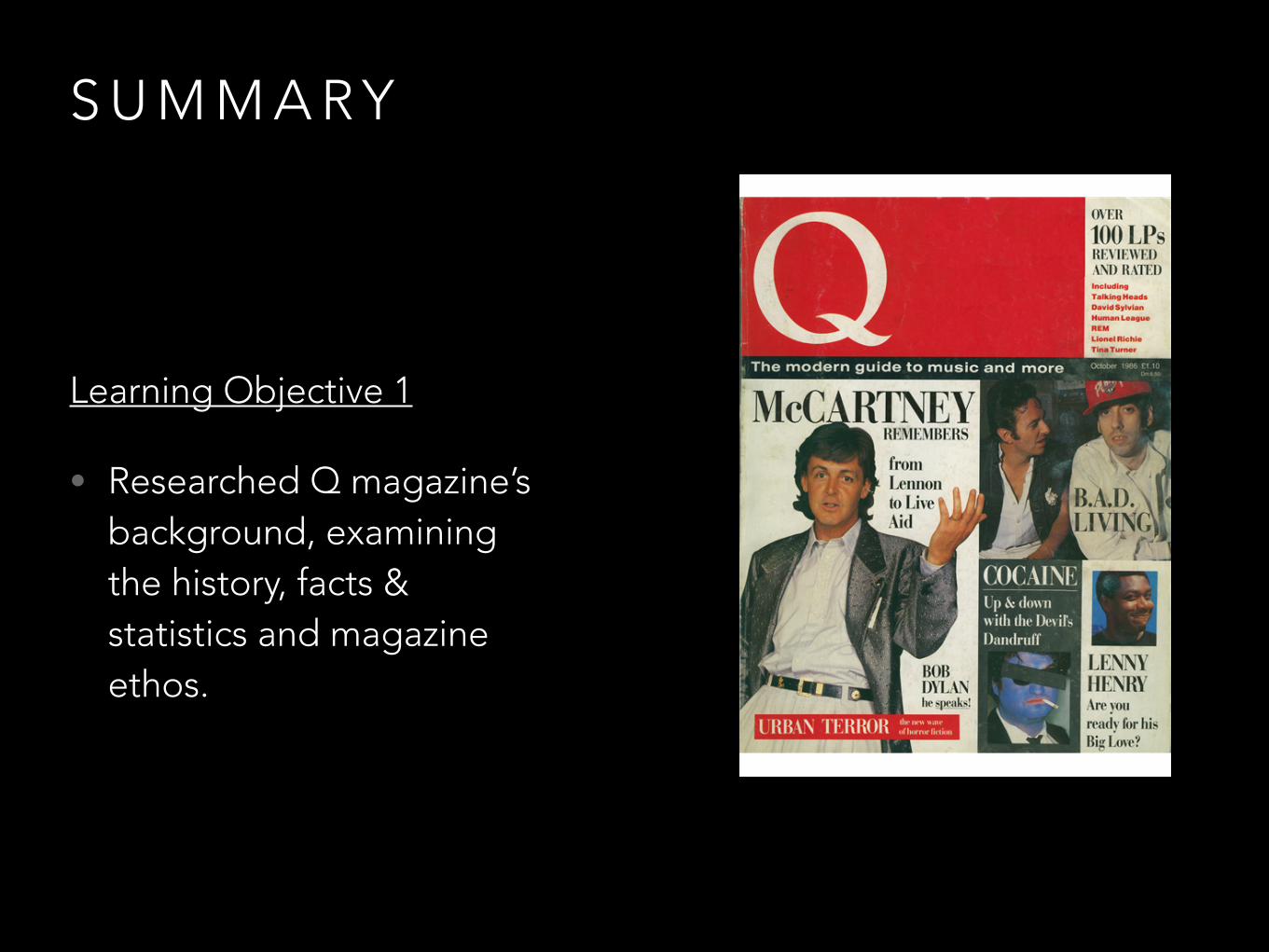
Learning Objective 1
• Researched Q magazine’s background, examining the history, facts & statistics and magazine ethos.
S U M M A R Y
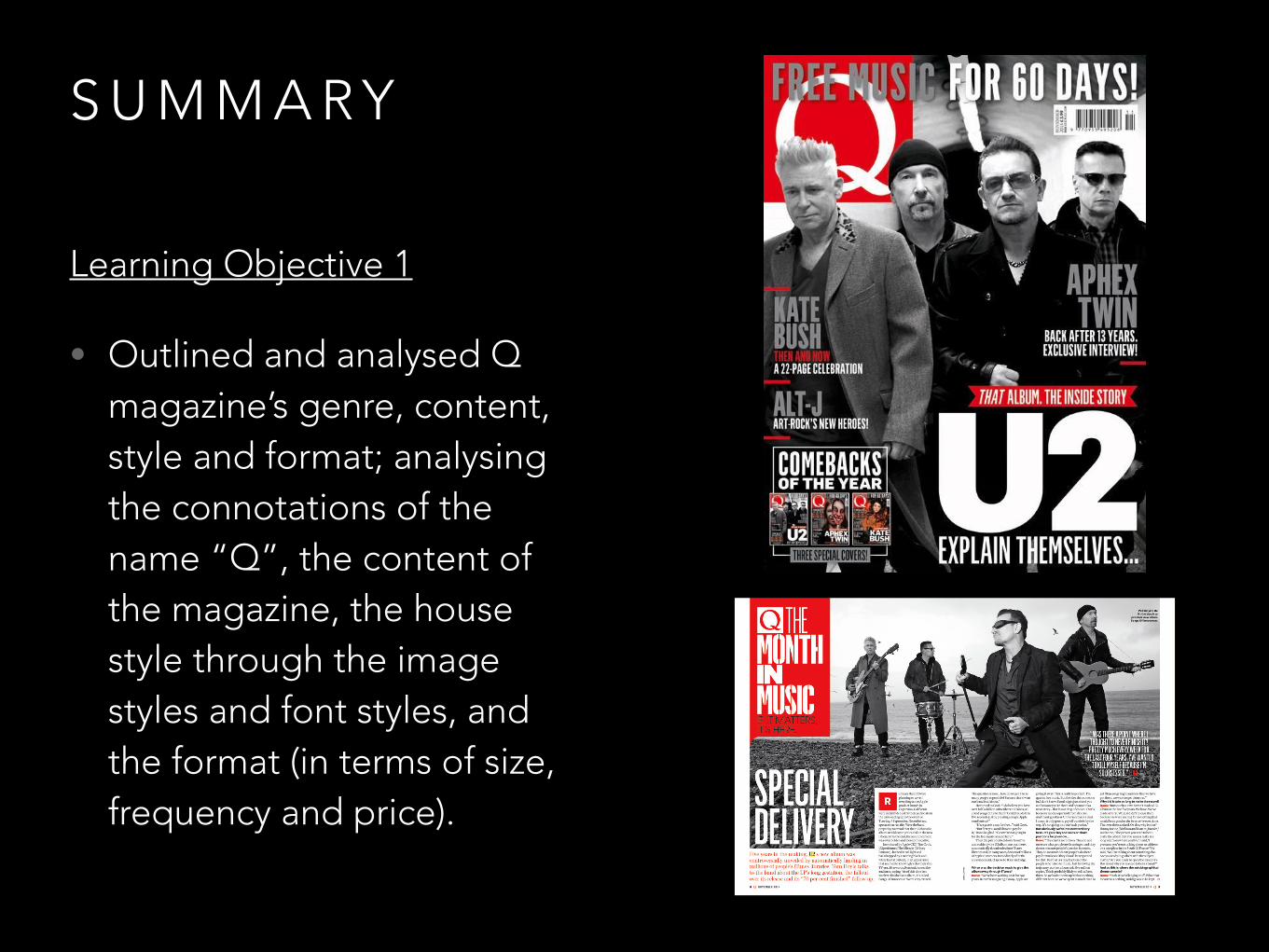
Learning Objective 1
• Outlined and analysed Q magazine’s genre, content, style and format; analysing the connotations of the name “Q”, the content of the magazine, the house style through the image styles and font styles, and the format (in terms of size, frequency and price).
S U M M A R Y
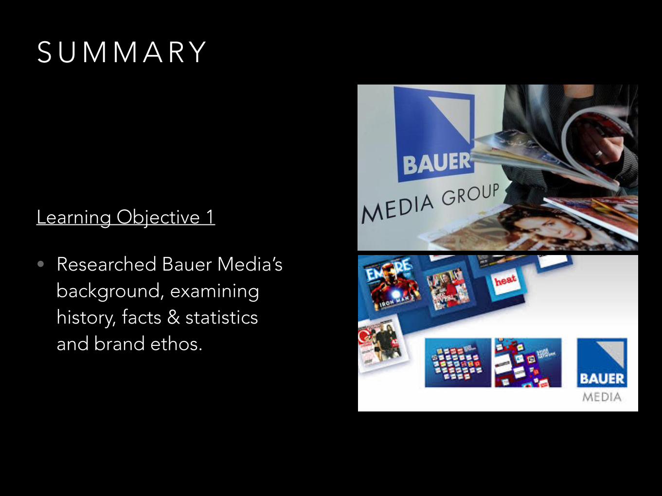
Learning Objective 1
• Researched Bauer Media’s background, examining history, facts & statistics and brand ethos.
S U M M A R Y
Learning Objective 1
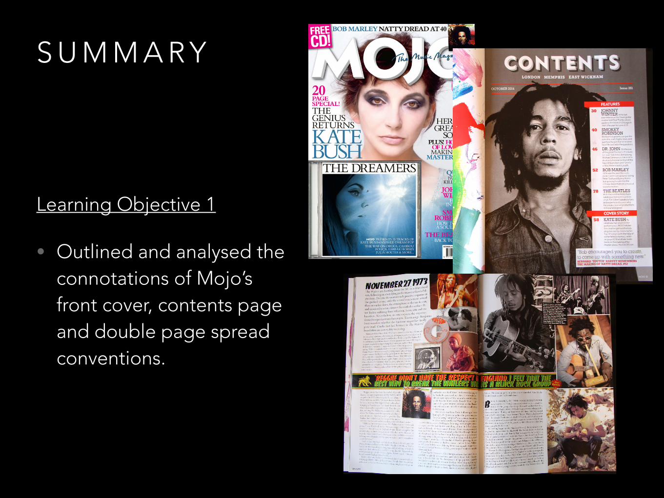
• Outlined and analysed the connotations of Mojo’s front cover, contents page and double page spread conventions.
S U M M A R Y
Learning Objective 1
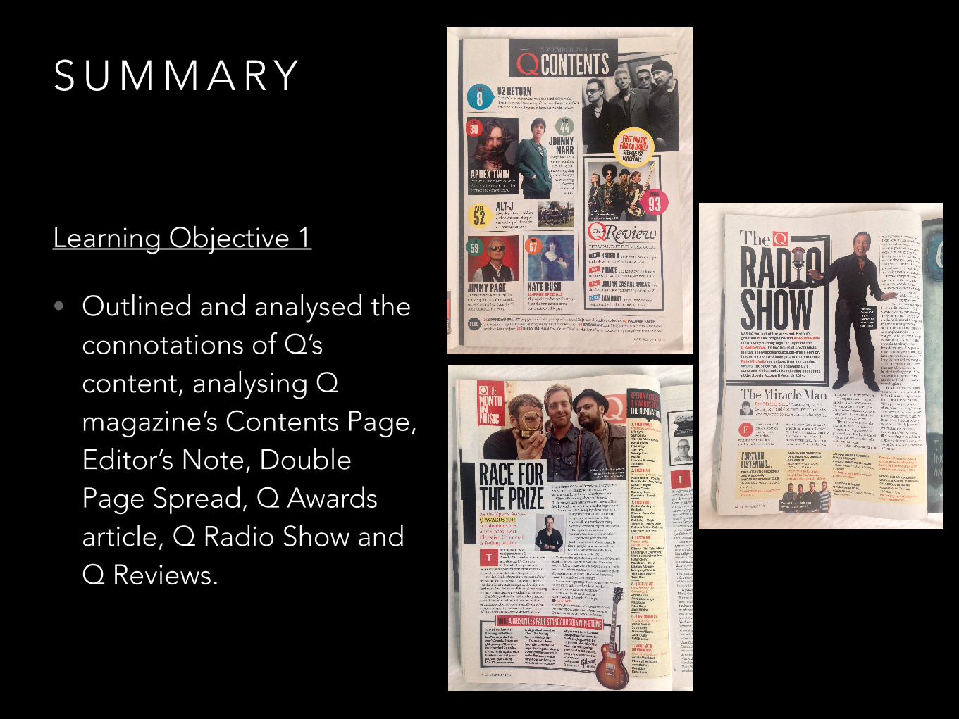
• Outlined and analysed the connotations of Q’s content, analysing Q magazine’s Contents Page, Editor’s Note, Double Page Spread, Q Awards article, Q Radio Show and Q Reviews.
S U M M A R Y
Learning Objective 1
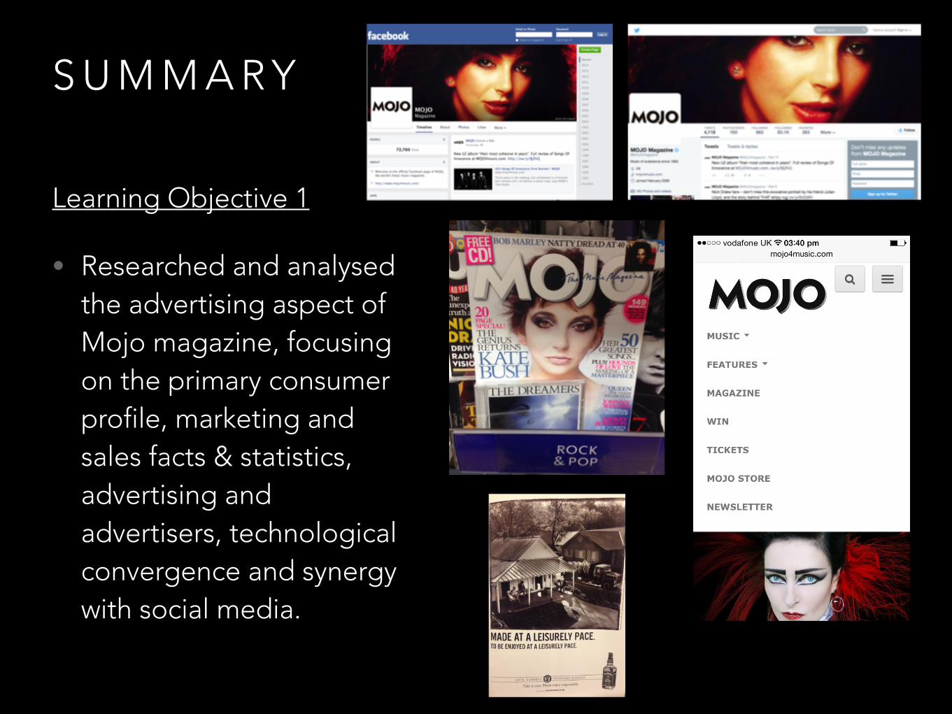
• Researched and analysed the advertising aspect of Mojo magazine, focusing on the primary consumer profile, marketing and sales facts & statistics, advertising and advertisers, technological convergence and synergy with social media.
S U M M A R Y
Learning Objective 1
• Investigated and analysed Mojo magazine’s target readership through audience theories, namely Hartley’s Subjectivities, Katz’ Uses & Gratifications and Audience Psychographics
S U M M A R Y
Learning Objective 1
• Investigated and analysed Q magazine’s target readership through audience theories, namely Hartley’s Subjectivities, Katz’ Uses & Gratifications and Audience Psychographics
S U M M A R Y
Learning Objective 1
• Researched and explained Mojo magazine’s production process through a walkthrough of the different phases in the production of the magazine.
Sources• http://www.bauermedia.co.uk/brands/mojo
• http://www.mojo4music.com/about-us/
• http://www.mojo4music.com/contact-us/
• http://www.greatmagazines.co.uk/music/mojo-magazine.html
• http://www.greatmagazines.co.uk/q-magazine
• http://www.bauermedia.co.uk/brands#
• http://magazines.bauermediaadvertising.com/magazines
• http://magazines.bauermediaadvertising.com/magazines/detail/mojo
• http://magazines.bauermediaadvertising.com/magazines/detail/kerrang
• http://magazines.bauermediaadvertising.com/magazines/detail/Q
• http://magazines.bauermediaadvertising.com/magazines/detail/empire