brand guidelines - pat tillman...
TRANSCRIPT

Brand Guidelines

2
01Brand Overview
3
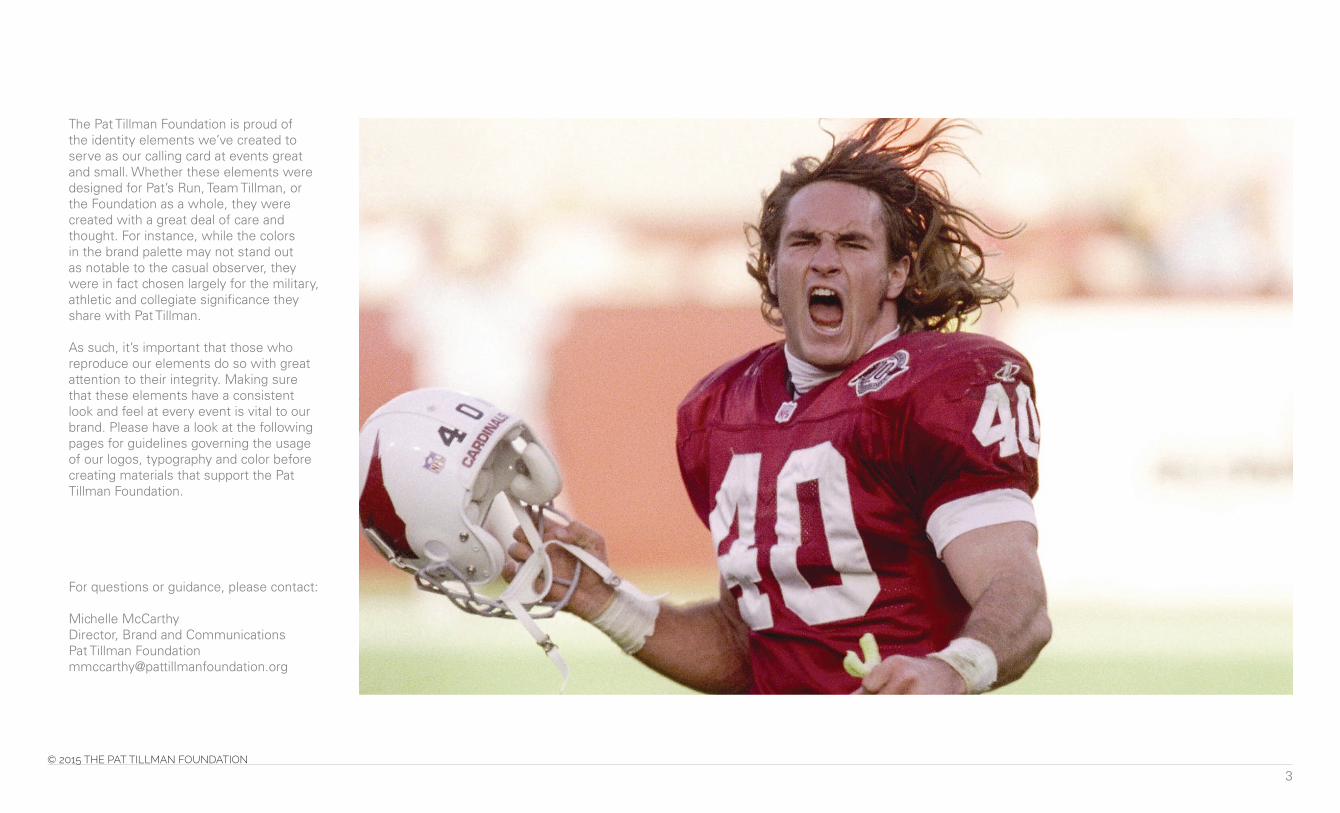
The Pat Tillman Foundation is proud of the identity elements we’ve created to serve as our calling card at events great and small. Whether these elements were designed for Pat’s Run, Team Tillman, or the Foundation as a whole, they were created with a great deal of care and thought. For instance, while the colors in the brand palette may not stand out as notable to the casual observer, they were in fact chosen largely for the military, athletic and collegiate significance they share with Pat Tillman.
As such, it’s important that those who reproduce our elements do so with great attention to their integrity. Making sure that these elements have a consistent look and feel at every event is vital to our brand. Please have a look at the following pages for guidelines governing the usage of our logos, typography and color before creating materials that support the Pat Tillman Foundation.
For questions or guidance, please contact:
Michelle McCarthyDirector, Brand and CommunicationsPat Tillman [email protected]

4
Mission Statement
Pat Tillman Foundation invests in military veterans and their spouses through academic scholarships–building a diverse community of leaders committed to service to others.
Boilerplate
In 2002, Pat Tillman proudly put his NFL career with the Arizona Cardinals on hold to serve his country. Family and friends established the Pat Tillman Foundation following Pat’s death in April 2004 while serving with the 75th Ranger Regiment in Afghanistan. Created to honor Pat’s legacy of leadership and service, the Pat Tillman Foundation invests in military veterans and their spouses through academic scholarships – building a diverse community of leaders committed to service to others. For more information on the Pat Tillman Foundation and the Tillman Scholars, visit PatTillmanFoundation.org.

5
02Logos

6
Logos
There are three versions of the Pat Tillman Foundation logo. The fi rst is “stacked,” with the foundation name consisting of two lines of text. The second is horizontal, with the name consisting of just one line. The third is a “bug,” a small graphic treatment that serves as a kind of shorthand for the foundation.
Stacked
Horizontal
Bug

7
Clear Space
To make sure the logo is readable, no content should breach the clear space as shown on the right.
The clear space is the X height of the letter N on all four sizes, for the stacked and horizontal logo.
The clear space for the bug is equal to the top half of the “T.”
Stacked
Horizontal
Bug

8
Incorrect logo useage
The Pat Tillman Foundation logo should not be any color other than black or white. Do not stretch or distort the logo in any way.
DO NOT outline the logo
DO NOT move the bug around
DO NOT add a color gradient DO NOT have any other color logo except for black or white
DO NOT add drop shadows
DO NOT stretch and distort
9
Logos
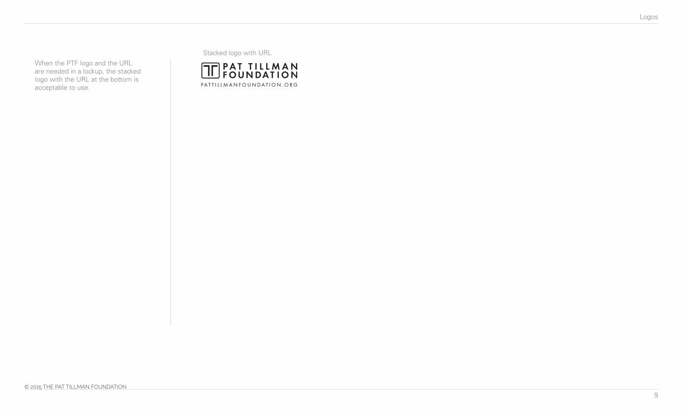
When the PTF logo and the URL are needed in a lockup, the stacked logo with the URL at the bottom is acceptable to use.
Stacked logo with URL

10
Logos
Option 1
Option 2
The tagline “writing the story of a better future” speaks to the promise that the Tillman Scholars hold, and how support from the public is helping them realize that promise. If you’d like to use this tagline, here are three ways you can display it.

11
Logos
The Tillman Scholar logo is a lockup with the Tillman “T”, can only be used in black, white or PTF blue.

12
03Typography

13
Typgography
All typography must be legible.
HeadlinesUse the typeface Passion One. Use all capital letters when writing headlines.
Sub-headlinesUse the typeface Raleway. You may use your discretion between bold, medium and light.
Body copyHeaders, or section headings, within the body copy should use Arial Bold, while the bulk of the copy should be in Arial Regular.
Leading/Letter-spacingTo maximize legibility, the leading should be neither tight nor airy between characters.
ABCDEFGHIJKLMNOPQRSTUVWXYZabcdefghijklmnopqrstuvwxyz1234567890!@$%^&*()
ABCDEFGHIJKLMNOPQRSTUVWXYZabcdefghijklmnopqrstuvwxyz1234567890!@$%^&*()
ABCDEFGHIJKLMNOPQRSTUVWXYZabcdefghijklmnopqrstuvwxyz
1234567890!@$%^&*()
ABCDEFGHIJKLMNOPQRSTUVWXYZabcdefghijklmnopqrstuvwxyz1234567890!@$%^&*()
ABCDEFGHIJKLMNOPQRSTUVWXYZabcdefghijklmnopqrstuvwxyz1234567890!@$%^&*()
ABCDEFGHIJKLMNOPQRSTUVWXYZabcdefghijklmnopqrstuvwxyz1234567890!@$%^&*()
Headline | Passion One Body Copy Header | Arial Bold
Body Copy | Arial RegularSub Headline | Raleway Bold
Sub Headline | Raleway Medium
Sub Headline | Raleway Light

14
04Color Palette

15
Color Palette
The primary colors used by the Pat Tillman Foundation are black, white and blue.
The secondary colors are grays and the “PTF yellow.”
Grays are used for creating boxes and for highlighting content. They can also be used for highlighting body copy when necessary.
The blue and green are tertiary colors, used mostly for infographics and other design content. The tertiary blue is commonly used for Team Tillman branding.
C0 M18 Y100 K0
R255 G210 B0
C81 M19 Y0 K6
R0 G150 B208
C75 M0 Y100 K0
R51 G182 B74
C0 M0 Y0 K85
R77 G77 B79
C86 M86 Y0 K0
R70 G68 B155
C0 M0 Y0 K60
R100 G100 B100
C0 M0 Y0 K100
R0 G0 B0
C0 M0 Y0 K30
R151 G153 B156

16
05Copy Tone

17
Copy Tone
How to talk about the Pat Tillman Foundation
The tone of the foundation is bold, no-nonsense, unapologetic. It is not humorous, sarcastic, or irreverent. It’s important to remember that although none of the Tillman Scholars – or even Pat himself – should be exalted or idolized, the foundation is very proud of their achievements and takes them very seriously.
More copy guidelines
• Use the article “the” to refer to the Pat Tillman Foundation (capitalized as shown).
• In limited instances, it may be acceptable to refer to the foundation as PTF.
• A scholar should be referred to as a Tillman Scholar (capitalized as shown).
• Team Tillman (capitalized as shown) is the name of the group of everyday athletes who raise scholarship funds via endurance events.

18
06Photo Usage

19
Photo Usage
There are 3 photos that are acceptable to use of Pat Tillman. Pat’s #40 image should only be used for select programs/events. Cannot be used for point of sale marketing by corporate partners. Fundraisers are acceptable.

Brand Guidelines