beyond histograms and box plots: some commands for
TRANSCRIPT
Beyond histograms and box plots: Some commands for univariate distribution graphics
Nicholas J. Cox
Department of Geography

Whatever we do in statistical science should be rooted in careful and comprehensive description and exploration of the data.
This presentation surveys various commands by the author for plotting univariate distributions, without neglecting the need for concise and informative numerical summaries.
SJ = Stata Journal; SSC = Statistical Software Components.
2

Rule 1!
I think that rule 1 for the statistician is examine the data.
Irving John Good
(1916—2009)
3

Graphical highlights include
qplot (SJ) and multqplot (SJ) for quantile plots
the complementary distplot (SJ) for (empirical [cumulative]) distribution plots
stripplot (SSC) for strip plots and much more
multidensity (SSC) for density function estimates
transplot (SSC) for trying out transformations
4
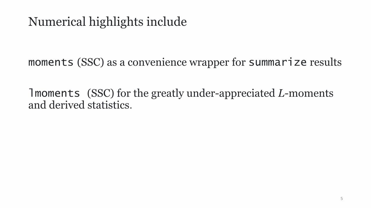
Numerical highlights include
moments (SSC) as a convenience wrapper for summarize results
lmoments (SSC) for the greatly under-appreciated L-moments and derived statistics.
5

Quantile plots
Quantile plots show
ordered values (raw data, estimates, residuals, whatever)
against
rank or cumulative probability or a one-to-one function of the same.
Tied values are assigned distinct ranks or probabilities.
6

quantile
In the official command quantile, ordered values are plotted on the y axis and the fraction of the data (cumulative probability) on the x axis.
More precisely, quantiles (meaning, order statistics) are plotted against plotting position (i − 0.5)/n for rank i and sample size n.
Syntax might be
sysuse auto, clear
quantile mpg, aspect(1)
7

Example with auto dataset
8
10
20
30
40
Qu
an
tile
s o
f M
ilea
ge
(m
pg
)
0 .25 .5 .75 1Fraction of the data
A little history
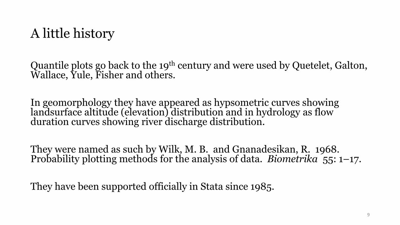
Quantile plots go back to the 19th century and were used by Quetelet, Galton, Wallace, Yule, Fisher and others.
In geomorphology they have appeared as hypsometric curves showing landsurface altitude (elevation) distribution and in hydrology as flow duration curves showing river discharge distribution.
They were named as such by Wilk, M. B. and Gnanadesikan, R. 1968. Probability plotting methods for the analysis of data. Biometrika 55: 1–17.
They have been supported officially in Stata since 1985.
9
The sales pitch
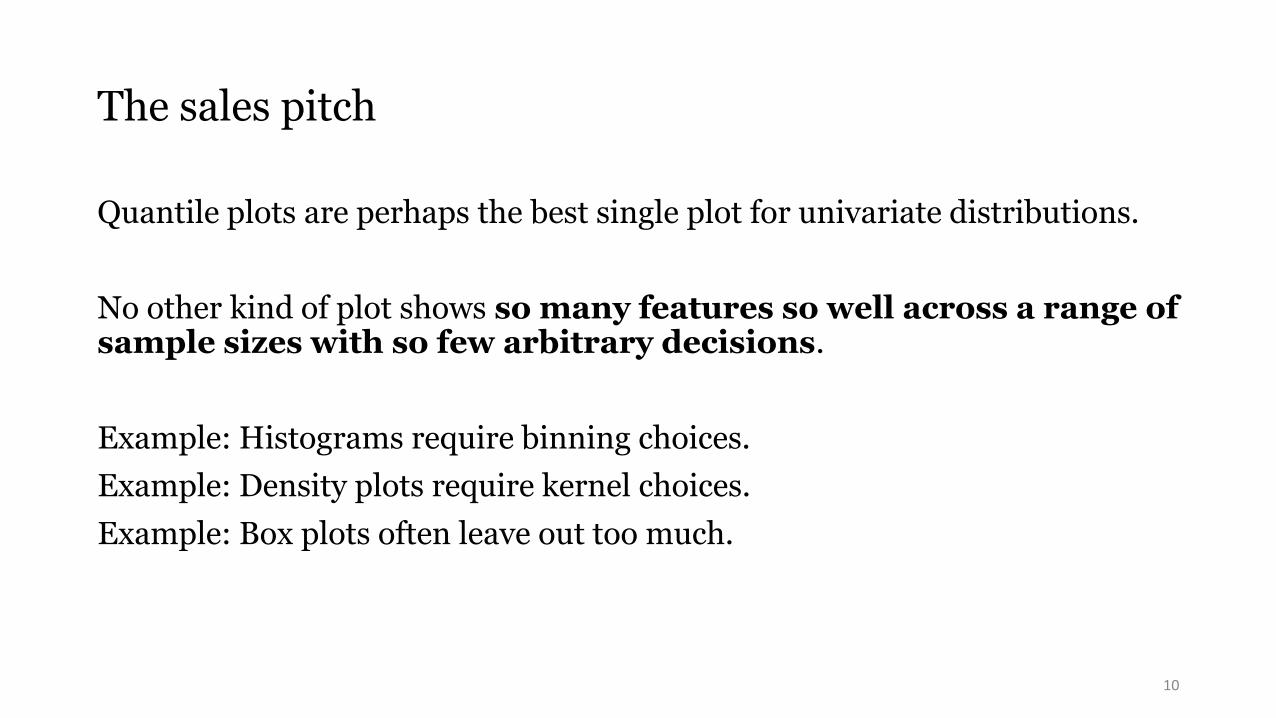
Quantile plots are perhaps the best single plot for univariate distributions.
No other kind of plot shows so many features so well across a range of sample sizes with so few arbitrary decisions.
Example: Histograms require binning choices.
Example: Density plots require kernel choices.
Example: Box plots often leave out too much.
10
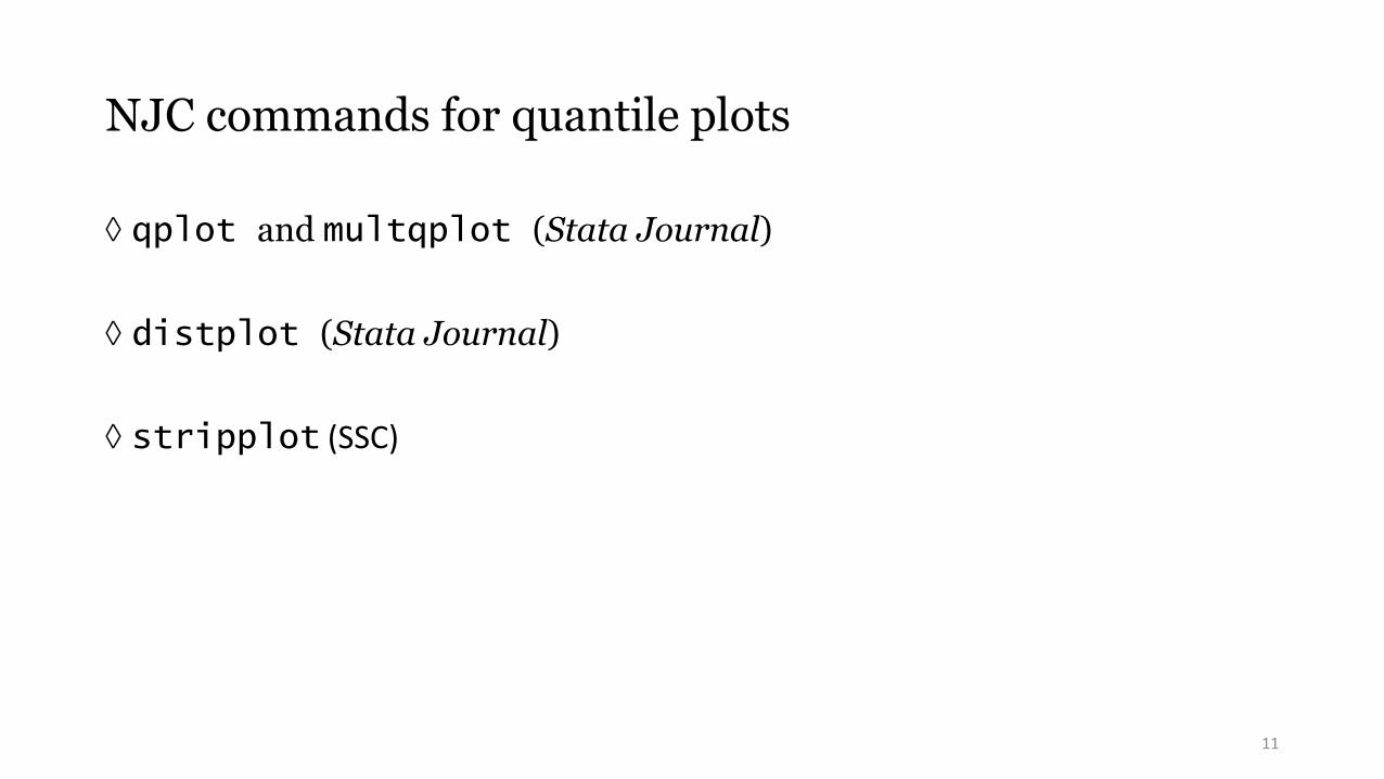
NJC commands for quantile plots
qplot and multqplot (Stata Journal)
distplot (Stata Journal)
stripplot (SSC)
11

Before qplot came quantil2
The quantil2 command published in Stata Technical Bulletin 51: 16–18 (1999)
generalized quantile:
One or more variables may be plotted.
Sort order may be reversed.
by() option is supported.
Plotting position is generalised to (i − a) /(n − 2a + 1):
compare a = 0.5 or (i − 0.5)/n wired into quantile.
12

Renamed qplot and revised
The command quantil2 was renamed qplot and revised in Stata Journal 4:97 (2004). See also 5: 442−460 (2005) and later updates to 2019.
over() option is also supported.
Ranks may be plotted as well as plotting positions.
The x axis scale may be transformed on the fly.
recast() to other twoway types is supported.
13
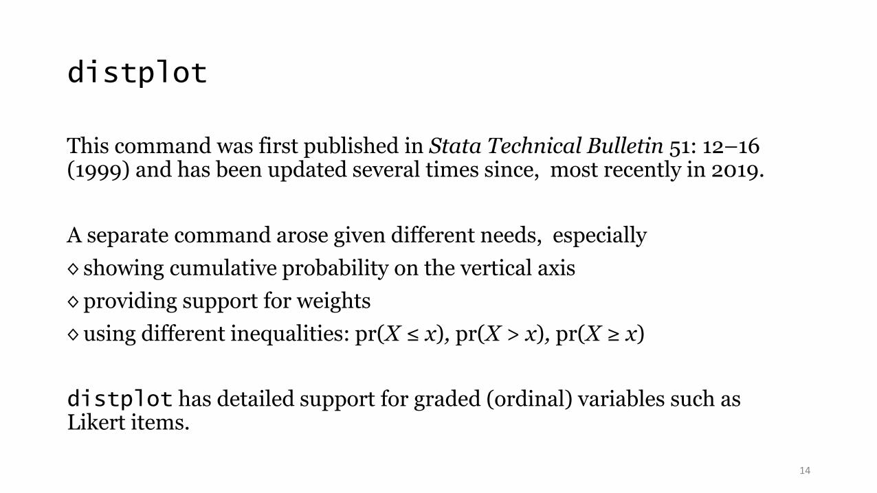
distplot
This command was first published in Stata Technical Bulletin 51: 12–16 (1999) and has been updated several times since, most recently in 2019.
A separate command arose given different needs, especially
◊ showing cumulative probability on the vertical axis
◊ providing support for weights
◊ using different inequalities: pr(X ≤ x), pr(X > x), pr(X ≥ x)
distplot has detailed support for graded (ordinal) variables such as Likert items.
14

What about sts graph?
Note also official support for specialised graphs for survival data.
15

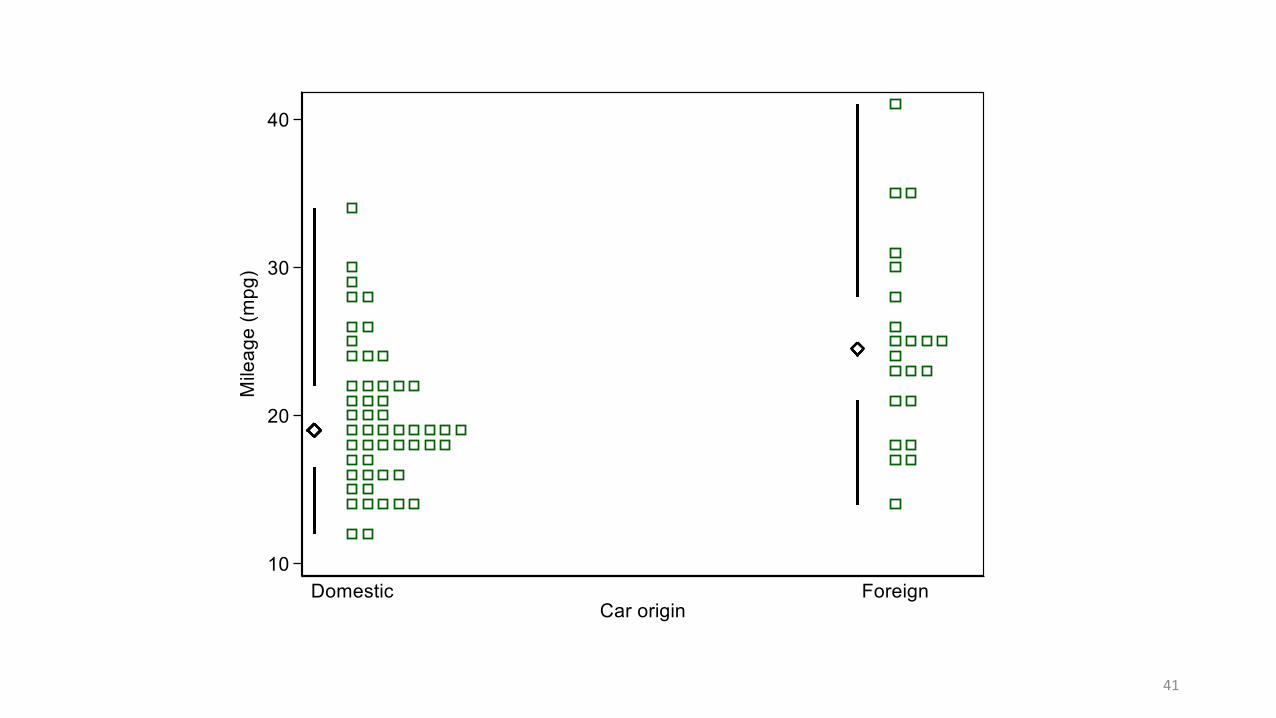
stripplot
The command stripplot on SSC started under Stata 6 as onewayplot
in 1999 as an alternative to graph, oneway and has morphed into
(roughly) a superset of the official command dotplot.
16

Simple example: Comparing two groups is basic
superimposed juxtaposed
17
10
20
30
40
qu
an
tile
s o
f M
ilea
ge
(m
pg
)
0 .2 .4 .6 .8 1fraction of the data
Domestic Foreign
10
20
30
40
Mile
age
(m
pg)
Domestic ForeignCar type

Syntax was
qplot mpg, over(foreign) aspect(1) legend(pos(11) ring(0) col(1) order(2 1))
stripplot mpg, over(foreign) cumulative cumprob vertical aspect(1) separate(foreign) ms(Oh +) centre legend(off) yla(, ang(h))
18

multqplot
multqplot is a convenience command to plot several quantile plots at once.
It has uses in data screening and reporting.
It might prove more illuminating than the tables of descriptive statistics ritual in various professions.
We use here the Chapman data from Dixon, W. J. and Massey, F.J. 1983. Introduction to Statistical Analysis. 4th ed. New York: McGraw–Hill.
19

23
33
42
52
70
0 .25 .5 .75 1
age (years)
90
110
120
130
190
0 .25 .5 .75 1
systolic blood pressure (mm Hg)
55
75
80
90
112
0 .25 .5 .75 1
diastolic blood pressure (mm Hg)
135
245.5276
331
520
0 .25 .5 .75 1
cholesterol (mg/dl)
62
6768
70
74
0 .25 .5 .75 1
height (in)
108
147
163
180
262
0 .25 .5 .75 1
weight (lb)
20

multqplot details
By default the minimum, lower quartile, median, upper quartile and maximum are labelled on the y axis
– so we are half-way to showing a box plot too.
By default also variable labels (or names) appear at the top.
More at Stata Journal 12:549–561 (2012) and 13:640–666 (2013).
21

Fitting or testing named distributions
Using quantile plots to compare data with named distributions is common.
The leading example is using the normal (Gaussian) as reference distribution.
Indeed, many statistical people first meet quantile plots as such normal probability plots.
Yudi Pawitan in his 2001 book In All Likelihood (Oxford University Press) advocates normal quantile plots as making sense even when comparison with normal distributions is not the goal.
22

qnorm is available but limited
qnorm is already available as an official command
— but it is limited to the plotting of just one set of values.
23

Named distributions with qplot
qplot has a general trscale() option to transform the x axis scale that otherwise would show plotting positions or ranks.
For normal distributions, the syntax is just to add
trscale(invnormal(@)) to scale plotting positions.
@ is a placeholder for what would otherwise be plotted.
invnormal() is Stata’s name for the normal quantile function (as an inverse cumulative distribution function).
24

25

A standard plot in support of t tests?
This plot is suggested as a standard for two-group comparisons:
We see all the data, including any outliers or other problems.
Use of a normal probability scale shows how far that assumption (read:ideal condition) is satisfied.
The vertical position of each group tells us about location, specifically means.
The slope or tilt of each group tells us about scale, specifically standard deviations.
It is helpful even if we eventually use Wilcoxon-Mann-Whitney or something else.
26

What if you had paired values?
Plot the differences, naturally.
Nothing stops you plotting the original values too,
but at some point the graphics should respect the pairing.
27

Different axis labelling?
The last plot used a scale of standard normal deviates or
z scores.
Some might prefer different labelling, e.g. % points.
mylabels (SSC) is a helper command, which puts the mapping in a local macro for your main command:
mylabels 1 2 5 10(20)90 95 98 99, myscale(invnormal(@/100)) local(plabels)
28

29

Quantile-box plots
Emanuel Parzen introduced quantile-box plots in 1979. Nonparametric statistical data modeling. Journal of the American Statistical Association 74: 105–131.
His original examples were not especially impressive, perhaps one reason they have not been more widely emulated.
Emanuel Parzen
1929–2016
30

Boston housing data
Here for quantile-box plots we use data from
Harrison, D. and Rubinfeld, D.L. 1978. Hedonic prices and the
demand for clean air. Journal of Environmental Economics and
Management 5: 81–102.
https:/archive.ics.uci.edu/ml/datasets/Housing
Number of Figures in original paper: 1
Number of Figures showing raw data: 0
31

Quantile-box plots show broad contrasts and fine structure
stripplot MEDV, over(CHAS) vertical cumulative centre box cumprob aspect(1)
32
010
20
30
40
50
Med
ian v
alu
e o
f ow
ner-
occup
ied h
om
es in
$1
00
0
0 1tract bounds Charles River

Some quirks are evident in that dataset
33
000
12.5
100
0 .25 .5 .75 1
% residential land zoned lots >25000 sq. ft
.46
5.19
9.69
18.1
27.74
0 .25 .5 .75 1
% non-retail business acres per town
1
45
2424
0 .25 .5 .75 1
accessibility to radial highways
187
279330
666711
0 .25 .5 .75 1
full-value property-tax rate per $10,000

stripplot has other applications beyond quantile plots
Strip or dot plots
◊ one-line
◊ stacked
◊ jittered
Confidence intervals
Box plots
34

35

36

37

38

39

40
41
Quartile plot or midgap plot
The last is the least standard and the latest to be implemented (stripplot2.9.0 NJC 10 July 2021):
Edward R. Tufte suggested quartile plots in which boxes are implied and the tails beyond the quartiles are shown by whiskers.
Others have called these midgap plots.
The box plot design perhaps over-emphasises the central half of the distribution.
The other half — the tails beyond the quartiles — can be as or more important scientifically or practically.
42

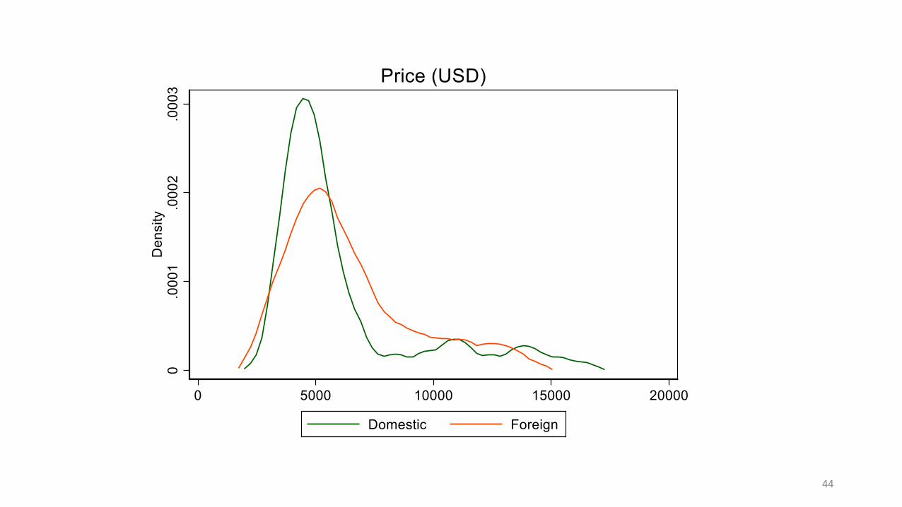
multidensity
multidensity from SSC is a convenience wrapper for multiple kernel density estimates.
Uses include comparing different
◊ variables
◊ subsets
◊ bandwidths
◊ kernels
◊ transformations |T′(x)| f(T(x)) for transformation T and estimate f
43
44

45

46

47

48

49

50

51
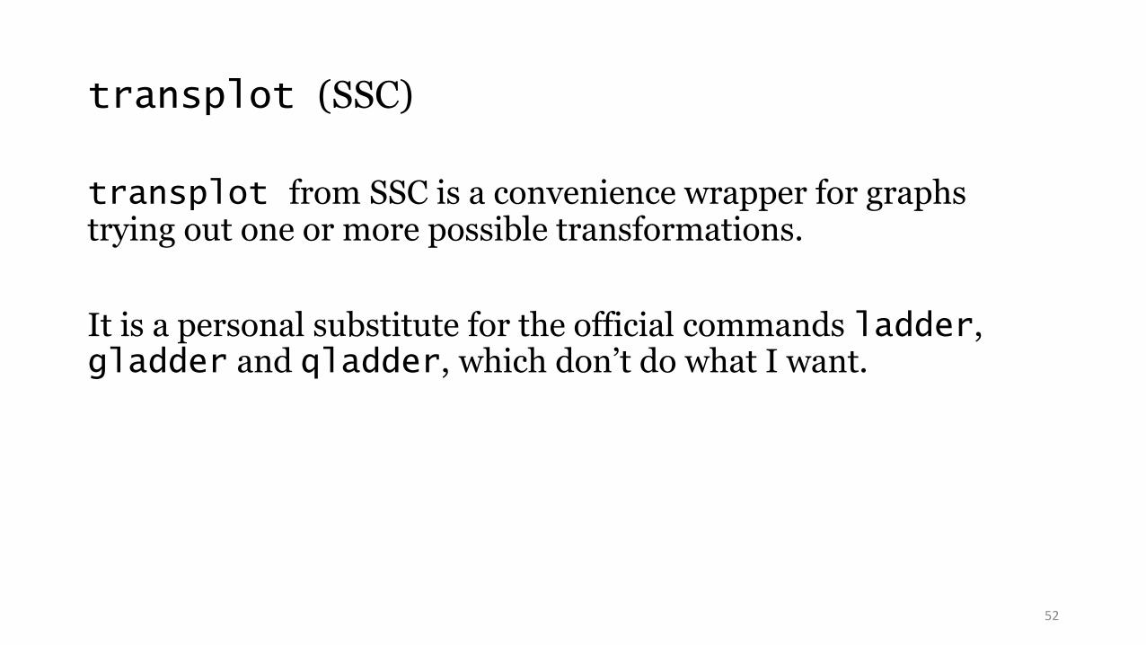
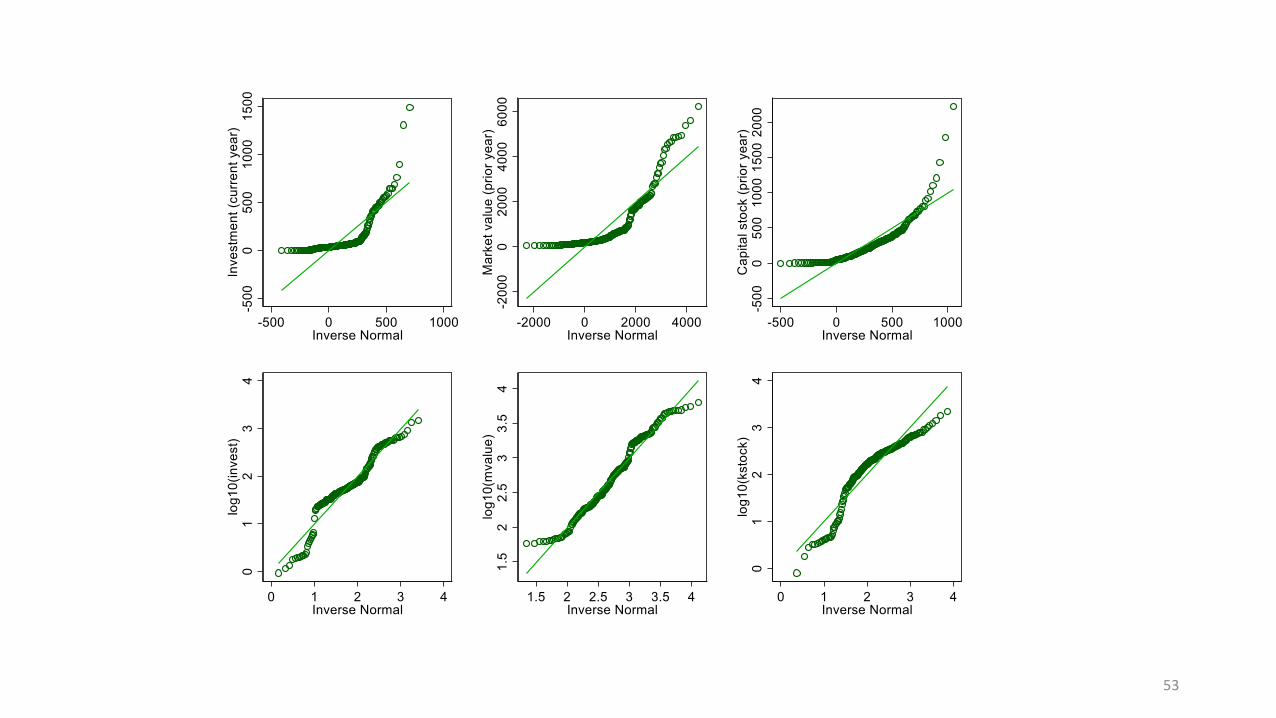
transplot (SSC)
transplot from SSC is a convenience wrapper for graphs trying out one or more possible transformations.
It is a personal substitute for the official commands ladder, gladder and qladder, which don’t do what I want.
52
53

54

55

56

57

moments (SSC)
moments is yet another wrapper for summarize yielding tables showing mean, standard deviation, skewness and kurtosis.
It has some small advantages over (e.g.) tabstat for this purpose, principally fine control over display format.
(It is rare that the same display format makes sense for all these measures, not least because skewness and kurtosis are dimensionless measures.)
58
lmoments (SSC)
lmoments is altogether more original. It calculates L-moments and associated statistics, which offer a different framework for univariate summary.
The L-moments are L-statistics and so depend on the order statistics x(1) ≤ x(2) ≤ ··· ≤ x(n−1) ≤ x(n) through various weights with the general flavour Σ wi x(i).
This is best shown by example. Let us look at the pattern of weights for a sample of size 19 and the first four sample L-moments.
59

60

Weights for sample L-moments
The weights for sample L-moment 1 are all 1/n, so that measure l1 is just the sample mean, a measure of level or location.
The weights for sample L-moment 2 give a measure l2 that quantifies spreador scale. It is half Gini’s mean difference, although the underlying idea long predates Gini.
The weights for sample L-moments 3 and 4 give measures l3 and l4 that quantify skewness and kurtosis (tail weight).
Higher L-moments are defined but we stop there.
It is customary to work with dimensionless ratios t3 = l3 / l2 and t4 = l4 / l2 .
61
Why?
L-moments offer a scheme for summarizing and comparing distributions with many nice properties.
They are less explosive than moment-based skewness and kurtosis and more systematic than ad hoc measures based on particular quantiles (e.g. IQR as a measure of spread).
Congratulations if you spotted that the weights arise from Legendre polynomials.
62

Graphs force us to note the unexpected; nothing could be more important.
John Wilder Tukey
1915–2000
Using the data to guide the data analysis is almost as dangerous as not doing so.
Frank E. Harrell Jr
1951-
63

64

All graphs use Stata scheme s1color, which I strongly recommend as a lazy but good default.
This font is Georgia.
This font is Lucida Console.
65

Sources of quotations
Williams, J.S. 1971. Two nonstandard methods of inference for single parameter distributions. In Godambe, V.P. and Sprott, D.A. (Eds) Foundations of Statistical Inference. Toronto: Holt, Rinehart and Winston, 314—329 [Comment by I.J. Good, 326—327; quotation is on 326]
Tukey, J.W. 1977. Exploratory Data Analysis. Reading, MA: Addison-Wesley. p.157.
Harrell, F.E. 2015. Regression Modeling Strategies: With Applications to Linear Models, Logistic and Ordinal Regression, and Survival Analysis. Cham: Springer. p.ix
66