barnes & noble brand guide
DESCRIPTION
A project for my ID2 class.TRANSCRIPT
Company Brand Guidelines2012

© Barnes & noBle Tm 2012. all righTs reserved.
Barnes & Noble Headquarters122 Fifth AvenueNew York, Ny 10011
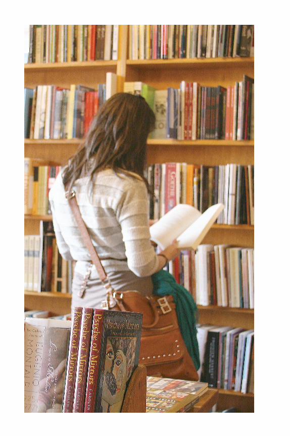
Dedicated to those who enjoy the feeling of holding a book , of smelling it and f l ipping through its pages. To those who f ind it more important to exper ience a book and the process of f inding the per fect book through a sea of shelves. To the readers who delve into the world of the book so completely that the real world stops to exist . And f inally, to those who know that no good book is ever complete without a warm and delic ious cup of cof fee or tea and a per fect snack .
2012 Company Brand guidelines
The Next Chapter
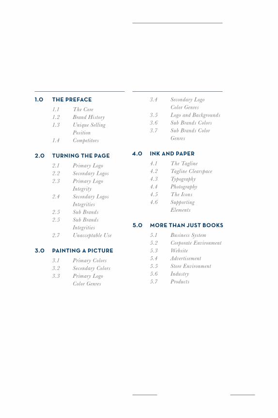
1.0 The prefaCe
1.1 The Core 1.2 Brand History 1.3 Unique Selling Position 1.4 Competitors
2.0 Turning The page
2.1 Primary Logo 2.2 Secondary Logos 2.3 Primary Logo Integrity 2.4 Secondary Logos Integrities 2.5 Sub Brands 2.5 Sub Brands Integrities 2.7 Unacceptable Use
3.0 painTing a piCTure
3.1 Primary Colors 3.2 Secondary Colors 3.3 Primary Logo Color Genres
3.4 Secondary Logo Color Genres 3.5 Logo and Backgrounds 3.6 Sub Brands Colors 3.7 Sub Brands Color Genres
4.0 ink and paper
4.1 The Tagline 4.2 Tagline Clearspace 4.3 Typography 4.4 Photography 4.5 The Icons 4.6 Supporting Elements
5.0 more Than JusT Books
5.1 Business System 5.2 Corporate Environment 5.3 Website 5.4 Advertisement 5.5 Store Environment 5.6 Industry 5.7 Products
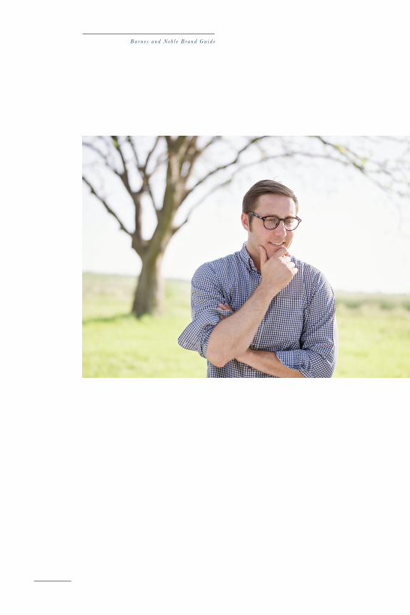
B a r n e s a n d N o b l e B r a n d G u i d e
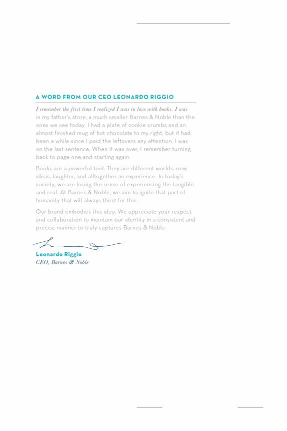
a Word from our Ceo leonardo riggio
I remember the f irst time I realized I was in love with books. I was in my father’s store, a much smaller Barnes & Noble than the ones we see today. I had a plate of cookie crumbs and an almost finished mug of hot chocolate to my right, but it had been a while since I paid the leftovers any attention. I was on the last sentence. When it was over, I remember turning back to page one and starting again.
Books are a powerful tool. They are different worlds, new ideas, laughter, and alltogether an experience. In today’s society, we are losing the sense of experiencing the tangible and real. At Barnes & Noble, we aim to ignite that part of humanity that will always thirst for this.
Our brand embodies this idea. We appreciate your respect and collaboration to maintain our identity in a consistent and precise manner to truly captures Barnes & Noble.
Leonardo RiggioCEO, Barnes & Noble
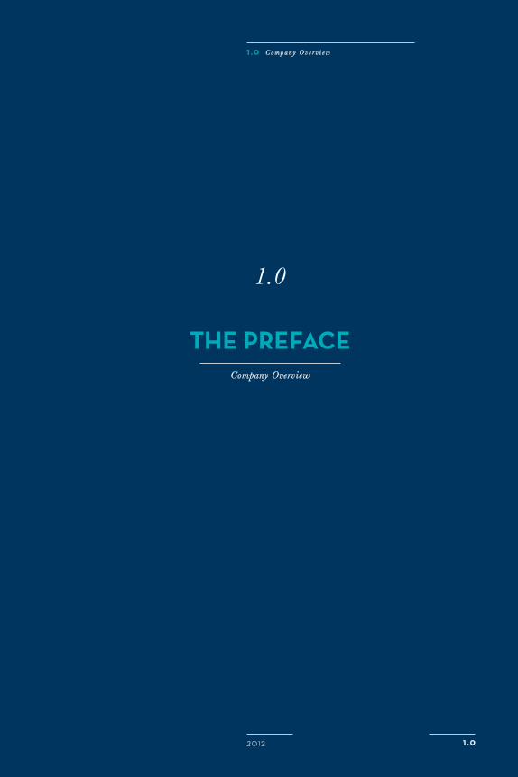
The PRefaceCompany Overview
1.0
1 . 0
1 . 0 C o m p a n y O v e r v i e w
20 12
B a r n e s a n d N o b l e B r a n d G u i d e
20 12 1 . 1
1 . 0 T h e C o m p a n y
aT Barnes & noBle
We are so much more than books.
We Are cozy chairs.
We are friends, family, company.
We are cookies.
We are discovery and adventure.
We are warm coffee.
We are a home away from home.
The Core of Barnes & noBle
B a r n e s a n d N o b l e B r a n d G u i d e
Company hisTory
Barnes & Noble originated in 1873 when Mr. Charles Barnes opened a book-printing business in Wheaton, Illinois. The first true bookstore was established by Charles’ son William Barnes and his partner G. Clifford Noble the year of 1917 in New York City; hence the name.
In the early 1960s, Leonard Riggio was a student at NYU. He worked as the clerk in the university bookstore. Convinced he could do better on his own, he opened a competing store called the Student Book Exchange. After only a few years in the business, it became known as one of New York’s finest bookstores, greatly due to its wide selection. This aspect of the bookstore would carry on into present day Barnes & Noble stores.
In the 1970s, Riggio acquired the then declining Barnes and Noble trade name and bookstore. Quickly, he transformedit into the world’s largest bookstore. This was the beginning of the modern Barnes and Noble.
even Though e-Books are BeComing suCh an imporTanT parT of our Business, aT Barnes & noBle We Will alWays foCus on The idea of offering an experienCe WiTh Books asWell as a plaCe Where Those Books Can Be shared, enJoyed, and loved.
The old logo was an update f rom the f irst logo, the s imple wordmark that the founder himself t yped up in 1978. It was s imple , not f ussy, and embodied the idea of hav ing a casual , book-f irst space .
1 . 0 C o m p a n y O v e r v i e w
20 12 1 . 2
1 . 3
B a r n e s a n d N o b l e B r a n d G u i d e
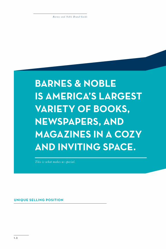
Barnes & noBle is ameriCa’s largesTvarieTy of Books, neWspapers, and magazines in a Cozy and inviTing spaCe.This is what makes us special.
unique selling posiTion
B a r n e s a n d N o b l e B r a n d G u i d e
1
2
4
3
1 . 0 C o m p a n y O v e r v i e w
20 12 1 . 4
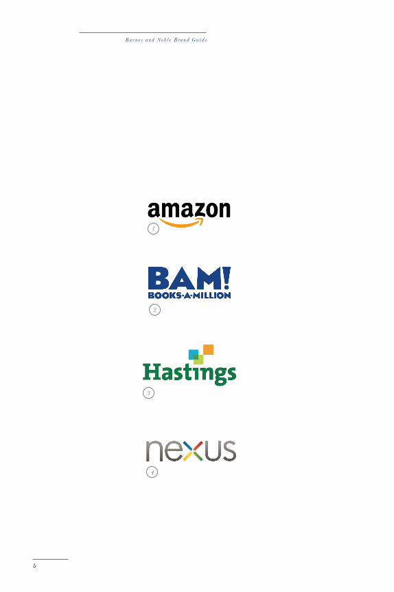
direCT and indireCT CompeTiTors
Even in the age of technology where people are much more likely to tap away at their phones than enjoy the sceneryright in front of them, bookstores remain loved and importantpart of the community. With a strong base of readers thatare here to stay, providing books remains a strong business.
What separates us from our competitors is the basis of ournew identity: at Barnes & Noble, you’re not just getting abook. You’re walking into a space, experiencing it with every one of your senses, and discovering things you probablyhadn’t even expected. So While the other guys sell bookswith a monitor in between them and you, we invite youin to share the book and your time with us.
1 Amazon2 Books-a-mill ion3 Hast ings Home Enter ta inment4 Googl e Nexus
2 . 0
2 . 0 T h e N e w B a r n e s & N o b l e
20 12
TuRning The PageThe New Barnes & Noble
2.0
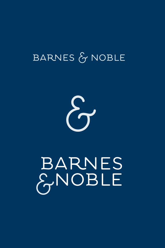
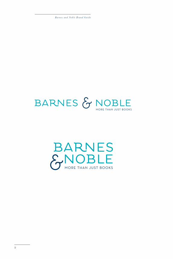
primary logo
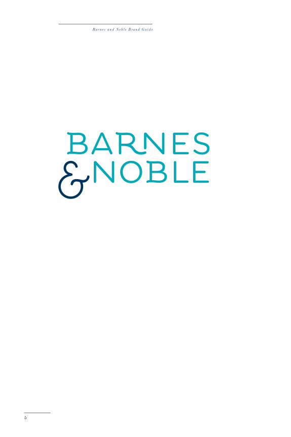
Say hello to the new Barnes & Noble! Fun, friendly, and fullof possibilities, the new logo speaks to the fact that whilewe may be keeping up with the times, we’re not risking ourvalues and standards. With a light, airiness to it ’s lettersand color, the logo invites our readers to spend their timeand experiences with us. It ’s our welcoming doormat.
The shining star of the logo is the ampersand. It completelyembodies the core value of the identity, the idea that weare more than just books: books and... The notion of possi-bilities not only captures the unique selling position butalso two of the key features of the store: the large selection of books and the large environment.
The neW Barnes & noBle logo isn’T really neW. We prefer To Think of iT as The idenTiTy ThaT has Been hiding WiTh There all along, a realizaTion of everyThing Barnes & noBle has alWays emBodied.
This i s the pr imary ve rs ion of the logo. It should be used in all cases poss ibl e , unl ess shape or l eng th creat e an i ssue .
B a r n e s a n d N o b l e B r a n d G u i d e
20 12
2 . 0 T h e N e w B a r n e s & N o b l e
2 . 1
B a r n e s a n d N o b l e B r a n d G u i d e
2 . 2
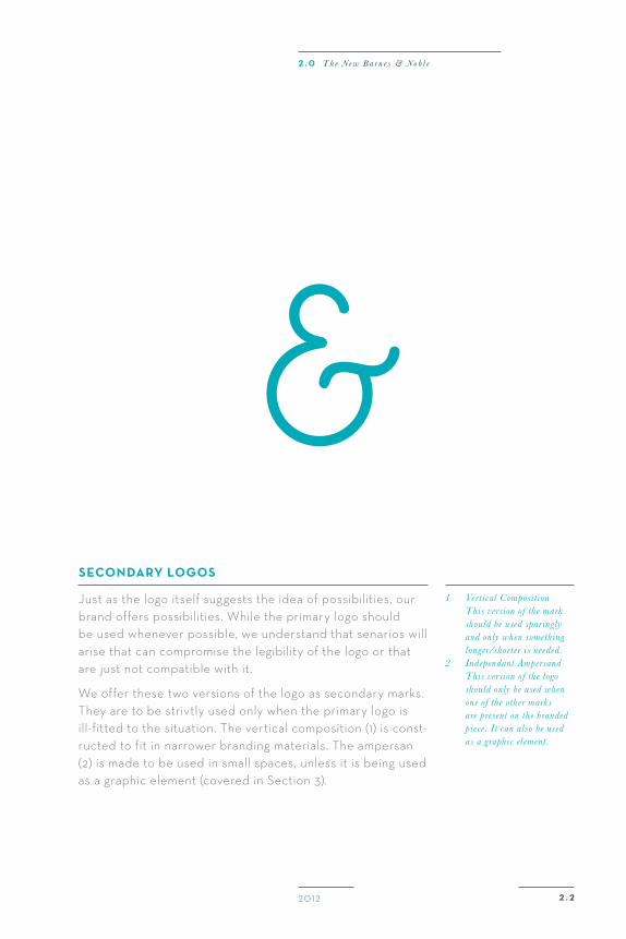
seCondary logos
Just as the logo itself suggests the idea of possibilities, ourbrand offers possibilities. While the primary logo shouldbe used whenever possible, we understand that senarios willarise that can compromise the legibility of the logo or thatare just not compatible with it.
We offer these two versions of the logo as secondary marks. They are to be strivtly used only when the primary logo is ill-fitted to the situation. The vertical composition (1) is const-ructed to fit in narrower branding materials. The ampersan(2) is made to be used in small spaces, unless it is being usedas a graphic element (covered in Section 3).
1 Vertical Composition This version of the mark should be used sparingly and only when something longer/shorter is needed.2 Independant Ampersand This version of the logo should only be used when one of the other marks are present on the branded piece. It can also be used as a graphic element .
2 . 0 T h e N e w B a r n e s & N o b l e
20 12
B a r n e s a n d N o b l e B r a n d G u i d e
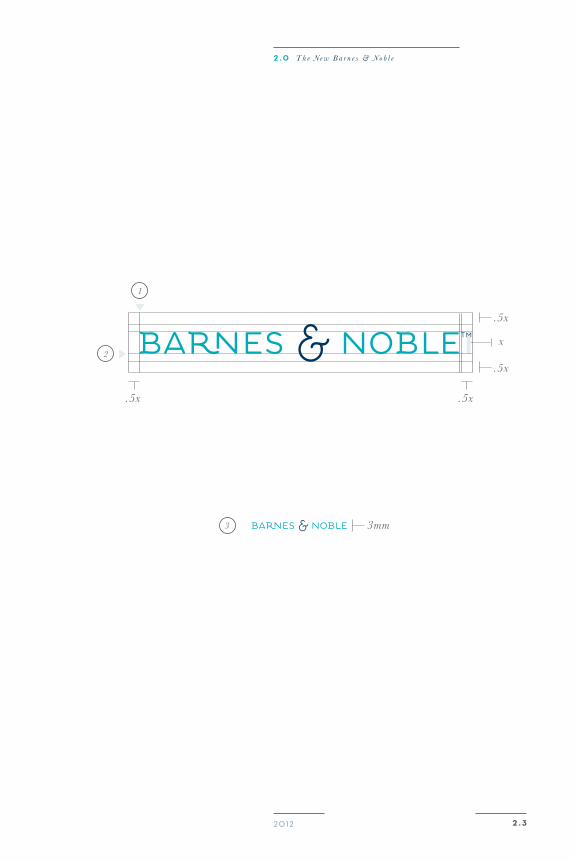
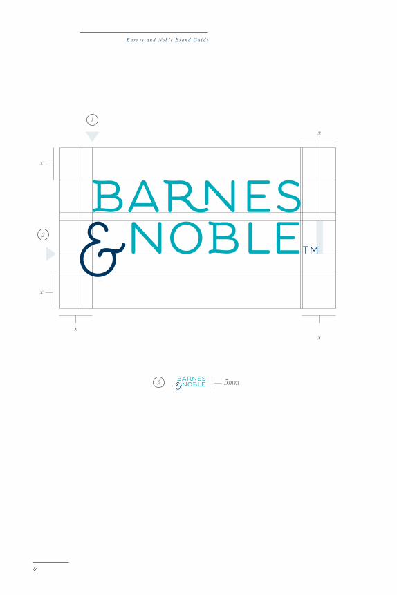
primary logo inTegriTy
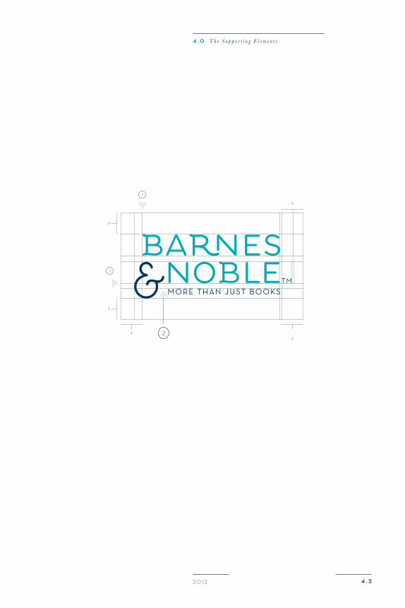
A logo is the embodiment of the brand. It is the brand simply summed up in one tiny, neat little package. Therefore, thelogo must at all times be perfectly legible and without obstr-uctions. For this reason, we ask that designers maintain aminumum area of breathing room around the logo that allows it to breathe and shine. The Barnes & Noble logo, and allof it ’s variations, must at all times have the clear space thatis specified on this and the following two pages.
These pages also outline the specific hangline, both vertical and horizontal, on which all three logo variations sit. Thisrule must be maintained as it best suits the design of theselogos. Also, be sure to notice the minimum sizes outlinedin this section. We ask that these sizes be strictly adhered to and only used when absolutely necessary.
1 Ver t i cal Hangl ine2 Hor izontal Hangl ine3 Minimun S ize
20 12 2 . 3
.5x.5x
.5x
3mm
.5x
x
1
2
3
2 . 0 T h e N e w B a r n e s & N o b l e
B a r n e s a n d N o b l e B r a n d G u i d e
xx
x
x
x
1
2
3 5mm
20 12 2 . 4
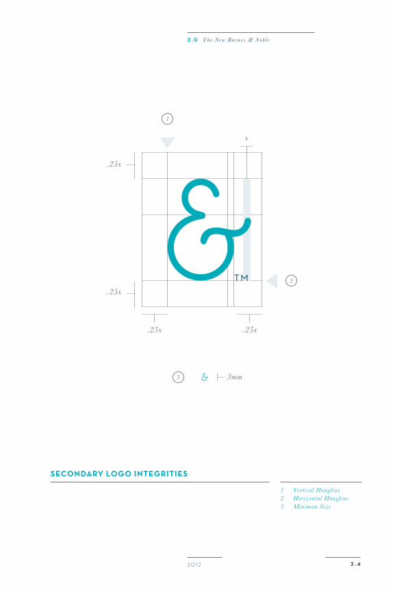
seCondary logo inTegriTies
x
.25x .25x
.25x
.25x
1 Ver t i cal Hangl ine2 Hor izontal Hangl ine3 Minimun S ize
1
2
3 3mm
2 . 0 T h e N e w B a r n e s & N o b l e
B a r n e s a n d N o b l e B r a n d G u i d e
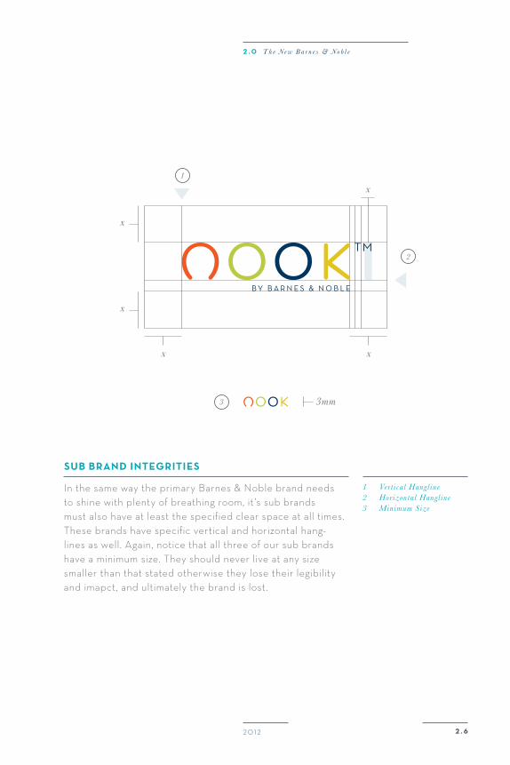
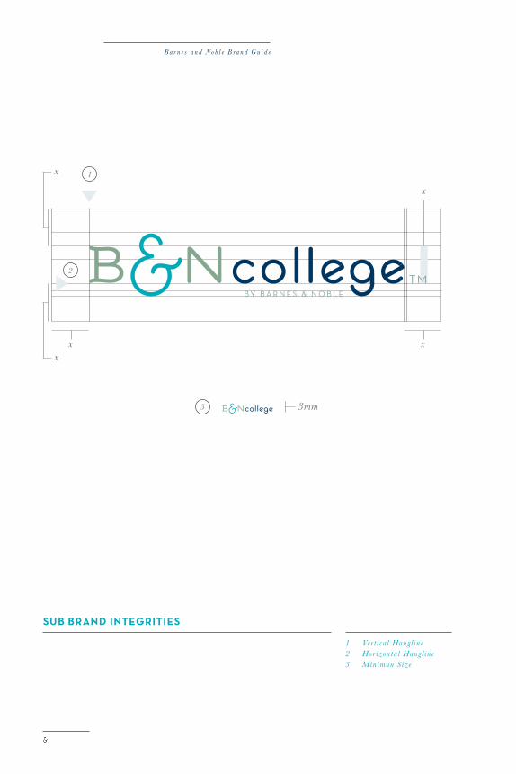
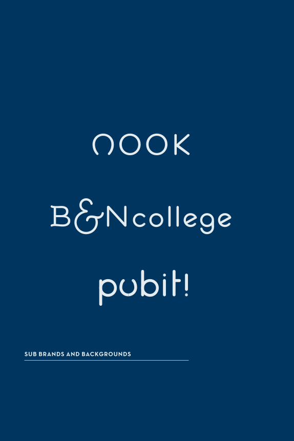
Barnes & noBle suB Brands
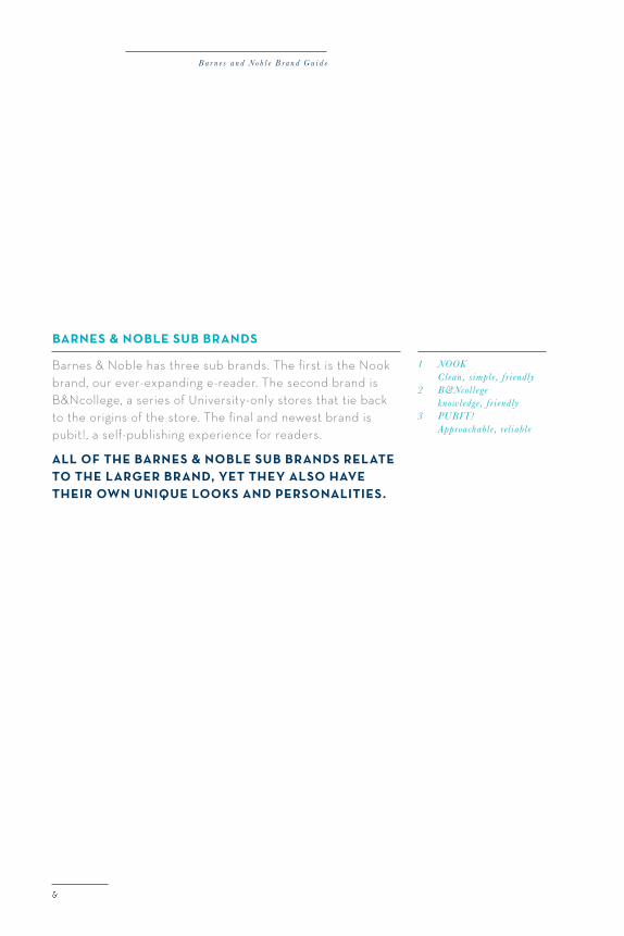
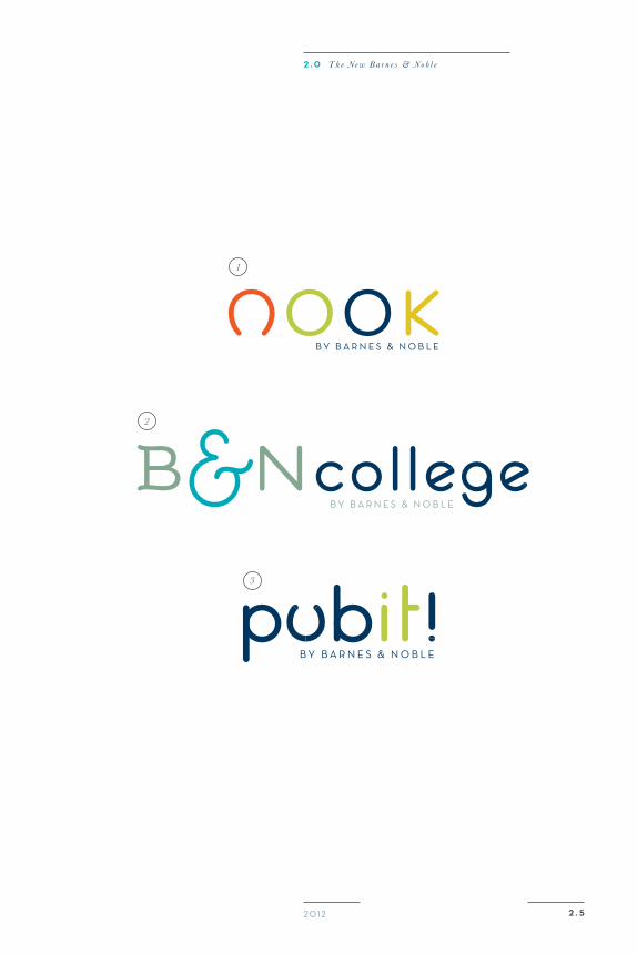
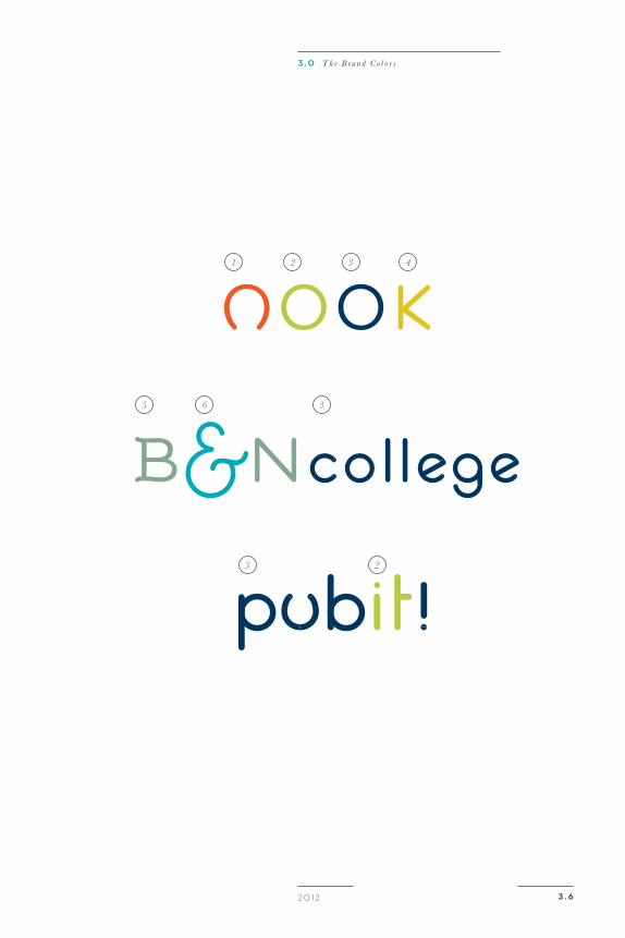
Barnes & Noble has three sub brands. The first is the Nook brand, our ever-expanding e-reader. The second brand isB&Ncollege, a series of University-only stores that tie backto the origins of the store. The final and newest brand ispubit!, a self-publishing experience for readers.
all of The Barnes & noBle suB Brands relaTe To The larger Brand, yeT They also have Their oWn unique looks and personaliTies.
1 NOOK Clean , s imple , f r i endly2 B&Ncoll ege knowledge , f r i endly3 PUBIT! Approachable , rel iabl e
20 12 2 . 5
1
2
3
2 . 0 T h e N e w B a r n e s & N o b l e
B a r n e s a n d N o b l e B r a n d G u i d e
20 12 2 . 6
suB Brand inTegriTies
In the same way the primary Barnes & Noble brand needsto shine with plenty of breathing room, it ’s sub brandsmust also have at least the specified clear space at all times.These brands have specific vertical and horizontal hang-lines as well. Again, notice that all three of our sub brandshave a minimum size. They should never live at any sizesmaller than that stated otherwise they lose their legibilityand imapct, and ultimately the brand is lost.
1 Ver t i cal Hangl ine2 Hor izontal Hangl ine3 Minimum S ize
xx
x
x
x1
2
3 3mm
2 . 0 T h e N e w B a r n e s & N o b l e
B a r n e s a n d N o b l e B r a n d G u i d e
suB Brand inTegriTies
1 Ver t i cal Hangl ine2 Hor izontal Hangl ine3 Minimun S ize
xx
x
x
x
1
2
3 3mm
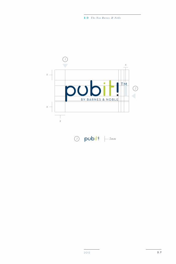
20 12 2 . 7
x
x
x
x
1
2
3 5mm
2 . 0 T h e N e w B a r n e s & N o b l e
B a r n e s a n d N o b l e B r a n d G u i d e
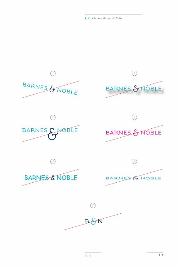
unaCCpeTaBle use
Our logo is very important to us, and we have spant much time and effort into carefully crafting it to be a perfect embodiment of our brand. We ask that designers and users respect the thought and craftmanship that has gone intothe logo by keeping it in it ’s pure form and within the rulesspecified in this guide book.
Be weary when using the logo not to alter, tweak, mutilate, or take any personal creative freedom that breaks thespecific rules set out in this book. The following are merelya few examples of practices that would violate the logoand ultimately the Barnes & Noble brand.
1 Do not at any t ime angl e the logo. It always s i t s on a 0 degree angl e .
2 Do not add any ef fect s to the logo, including drop shadow, g radi ents , e t c .
3 Do not in any way alt e r the propor t ions of the l e t t e rs or the ampersand.
5 Do not change the t ype- face or font st yl e of any par t of the logo.
6 Do not in any way di stor t the logo, e i the r by st re t ch- ing , squi shing , e t c .
7 Do not use the logo in any format that may be “nick named” or abbrev iat ed .
4 Do not alt e r the colors of the logo except when in accordance to color rul es .
2 . 820 12
1
3
5
2
4
6
7
2 . 0 T h e N e w B a r n e s & N o b l e
3 . 0
3 . 0 T h e B r a n d C o l o r s
20 12
PainTing a PicTuReThe Brand Colors
3.0
B a r n e s a n d N o b l e B r a n d G u i d e
2
1
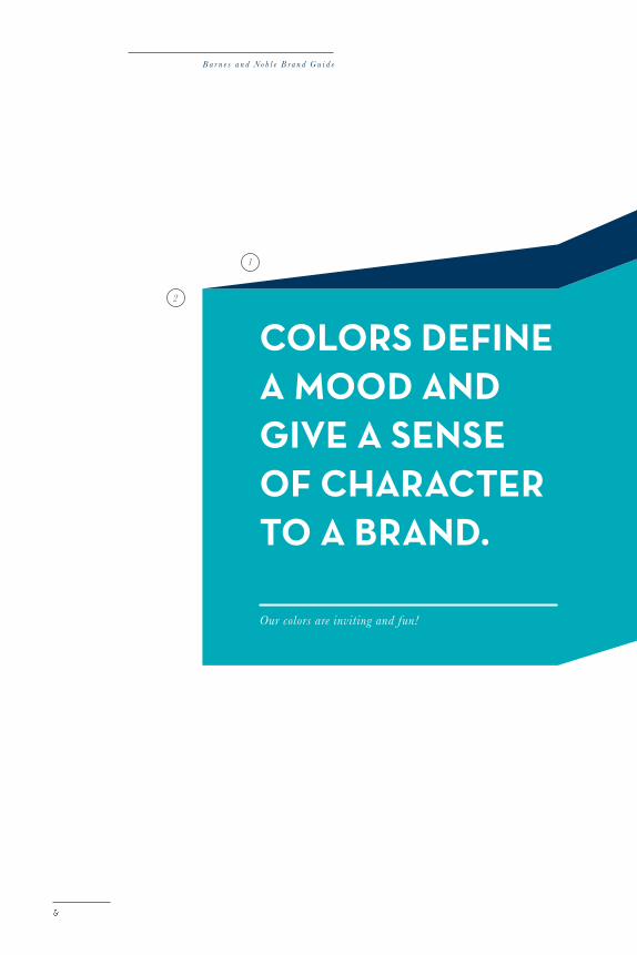
Colors define a mood and give a sense of CharaCTer To a Brand.
Our colors are inviting and fun!
20 12
3 . 0 T h e B r a n d C o l o r s
3 . 1
primary Colors
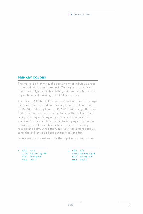
The world is a highly visual place, and most individuals read through sight first and foremost. One aspect of any brandthat is not only most highly visible, but also has a hefty dealof psychological meaning to individuals is color.
The Barnes & Noble colors are as important to us as the logo itself. We have created two primary colors, Brilliant Blue(PMS 632) and Cozy Navy (PMS 7463). Blue is a gentle color that invites our readers. The lightness of the Brilliant Blueis airy, creating a feeling of open space and relaxation.Our Cozy Navy compliments this by bringing in the notionof water, of coolness. This pushes the sense of feelingrelaxed and calm. While the Cozy Navy has a more serious tone, the Brilliant Blue keeps things fresh and fun!
Below are the breakdowns for these primary brand colors.
1 PMS 7463 CMYK 60c33m13y85k RGB 20r39g56b HEX 0f1a21
2 PMS 632 CMYK 100c0m32y0k RGB 0r171g185b HEX 00f fad
B a r n e s a n d N o b l e B r a n d G u i d e
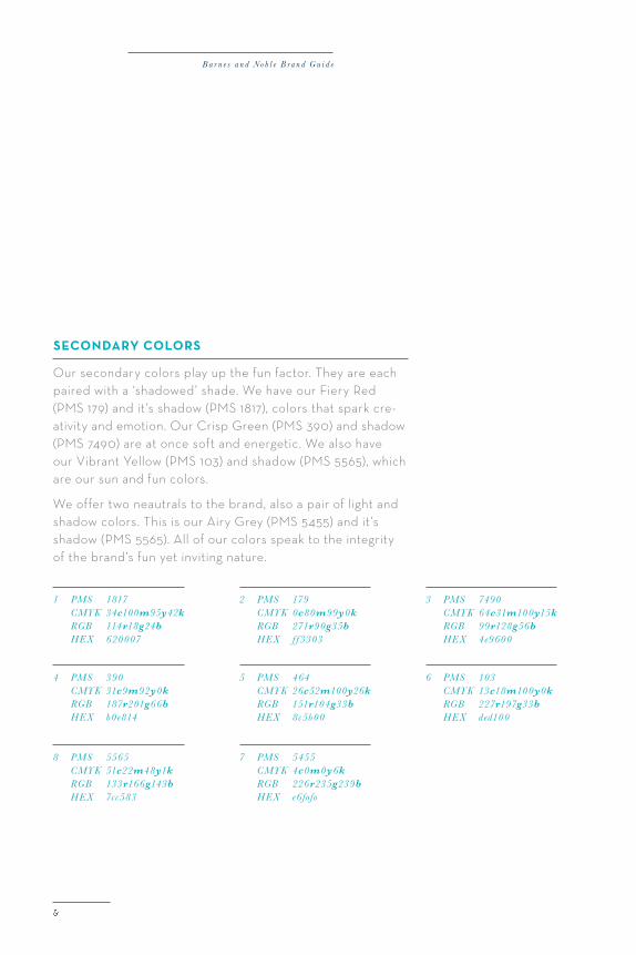
seCondary Colors
Our secondary colors play up the fun factor. They are eachpaired with a ‘shadowed’ shade. We have our Fiery Red(PMS 179) and it ’s shadow (PMS 1817), colors that spark cre-ativity and emotion. Our Crisp Green (PMS 390) and shadow (PMS 7490) are at once soft and energetic. We also haveour Vibrant Yellow (PMS 103) and shadow (PMS 5565), whichare our sun and fun colors.
We offer two neautrals to the brand, also a pair of light andshadow colors. This is our Airy Grey (PMS 5455) and it ’sshadow (PMS 5565). All of our colors speak to the integrityof the brand’s fun yet inviting nature.
1 PMS 1817 CMYK 34c100m95y42k RGB 114r18g24b HEX 620007
4 PMS 390 CMYK 31c9m92y0k RGB 187r201g66b HEX b0e814
7 PMS 5455 CMYK 4c0m0y6k RGB 226r235g239b HEX e6fofo
2 PMS 179 CMYK 0c80m99y0k RGB 271r90g35b HEX f f 3303
3 PMS 7490 CMYK 64c31m100y15k RGB 99r128g56b HEX 4e9600
5 PMS 464 CMYK 26c52m100y26k RGB 151r104g33b HEX 8c5b00
6 PMS 103 CMYK 13c18m100y0k RGB 227r197g33b HEX ded100
8 PMS 5565 CMYK 51c22m48y1k RGB 133r166g143b HEX 7cc583
20 12 3 . 2
2
1
3
5
7
4
6
8
3 . 0 T h e B r a n d C o l o r s
B a r n e s a n d N o b l e B r a n d G u i d e
1
1
1
1
3 . 320 12
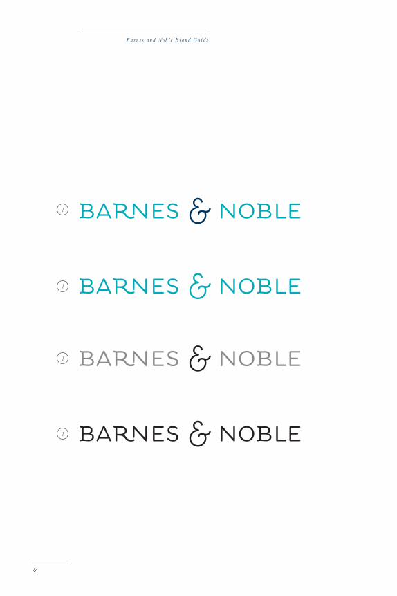
primary logo Color genres
We want to make sure that our Barnes & Noble logo can finda home on any surface. For this reason, we offer differentcolor genres to designers and users that include single color,grey scale, and one color. These genres should only beutilized when using the full color impairs the logo’s legibility.
Color may Be CruCial, BuT WiThouT proper legiBiliTy, iT’s noThing. please make sureThaT our preCious logo is alWays shining!
1 Full Color2 S ingl e Color PMS 632 4 Grey Scal e 100% Black 55% Black5 One Color Black
3 . 0 T h e B r a n d C o l o r s
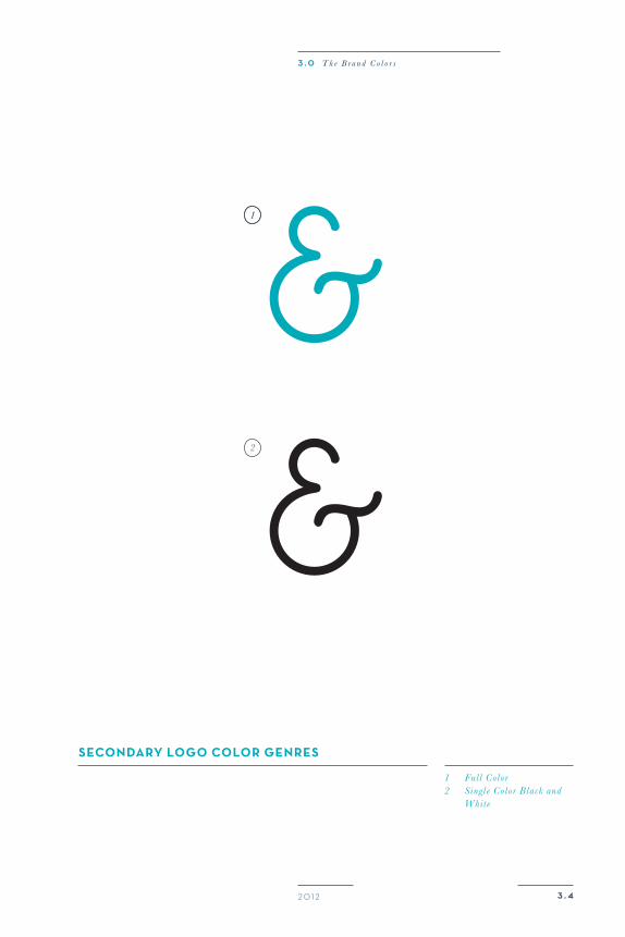
seCondary logo Color genres
1 Full Color2 S ingl e Color Black and Whit e
11
2
3 . 420 12
3 . 0 T h e B r a n d C o l o r s
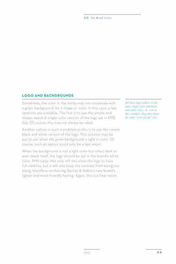
logo and BaCkgrounds
Sometimes, the color in the marks may not cooperate with a given background, be it image or color. In this case, a few opetions are available. The first is to use the simple and always neautral single color version of the logo set in PMS 632. Of course, this may not always be ideal.
Another option in such a problem as this is to use the simple black and white version of the logo. This solution may be put to use when the given background is light in color. Of course, such an option sould only be a last resort.
When the background is not a light color but infact dark or even black itself, the logo should be set in the brand’s white color, PMS 5455. Not only will this allow the logo to havefull visibility, but it will also keep the contrast from being too stong, therefore reinforcing Barnes & Noble’s new brand’s lighter and more friendly feeling. Again, this is a final resort.
All three logos adhere to the same s ingl e color and black and whit e rul es . As seen in thi s example , they al so share the same ‘ re ve rsed out ’ rul e .
3 . 520 12
3 . 0 T h e B r a n d C o l o r s
B a r n e s a n d N o b l e B r a n d G u i d e
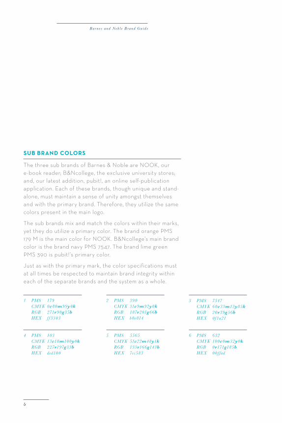
suB Brand Colors
The three sub brands of Barnes & Noble are NOOK, our e-book reader; B&Ncollege, the exclusive university stores; and, our latest addition, pubit!, an online self-publication application. Each of these brands, though unique and stand-alone, must maintain a sense of unity amongst themselves and with the primary brand. Therefore, they utilize the same colors present in the main logo.
The sub brands mix and match the colors within their marks, yet they do utilize a primary color. The brand orange PMS 179 M is the main color for NOOK. B&Ncollege’s main brand color is the brand navy PMS 7547. The brand lime green PMS 390 is pubit!’s primary color.
Just as with the primary mark, the color specifications must at all times be respected to maintain brand integrity within each of the separate brands and the system as a whole.
2 PMS 390 CMYK 31c9m92y0k RGB 187r201g66b HEX b0e814
1 PMS 179 CMYK 0c80m99y0k RGB 271r90g35b HEX f f 3303
4 PMS 103 CMYK 13c18m100y0k RGB 227r197g33b HEX ded100
5 PMS 5565 CMYK 51c22m48y1k RGB 133r166g143b HEX 7cc583
3 PMS 7547 CMYK 60c33m13y85k RGB 20r39g56b HEX 0f1a21
6 PMS 632 CMYK 100c0m32y0k RGB 0r171g185b HEX 00f fad
3 . 620 12
1 2 3 4
5 6 3
3 2
3 . 0 T h e B r a n d C o l o r s
suB Brands and BaCkgrounds
3 . 720 12
3 . 0 T h e B r a n d C o l o r s
4 . 0
4 . 0 T h e S u p p o r t i n g E l e m e n t s
20 12
ink and PaPeRThe Supporting Elements
4.0
B a r n e s a n d N o b l e B r a n d G u i d e
4 . 120 12
4 . 0 T h e S u p p o r t i n g E l e m e n t s
The Tagline
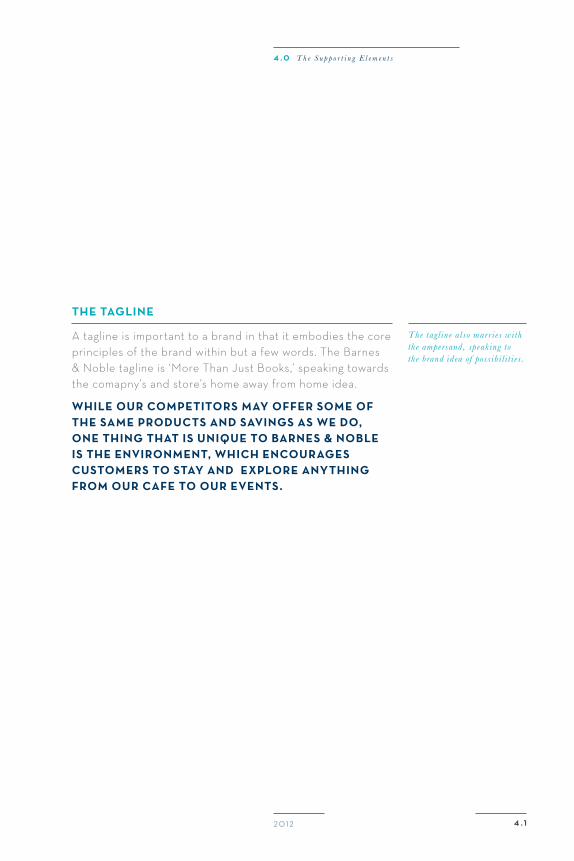
A tagline is important to a brand in that it embodies the core principles of the brand within but a few words. The Barnes& Noble tagline is ‘More Than Just Books,’ speaking towards the comapny’s and store’s home away from home idea.
While our CompeTiTors may offer some ofThe same produCTs and savings as We do,one Thing ThaT is unique To Barnes & noBle is The environmenT, WhiCh enCourages CusTomers To sTay and explore anyThingfrom our Cafe To our evenTs.
The tagl ine al so marr i es with the ampersand , speak ing to the brand idea of poss ibil i t i es .
B a r n e s a n d N o b l e B r a n d G u i d e
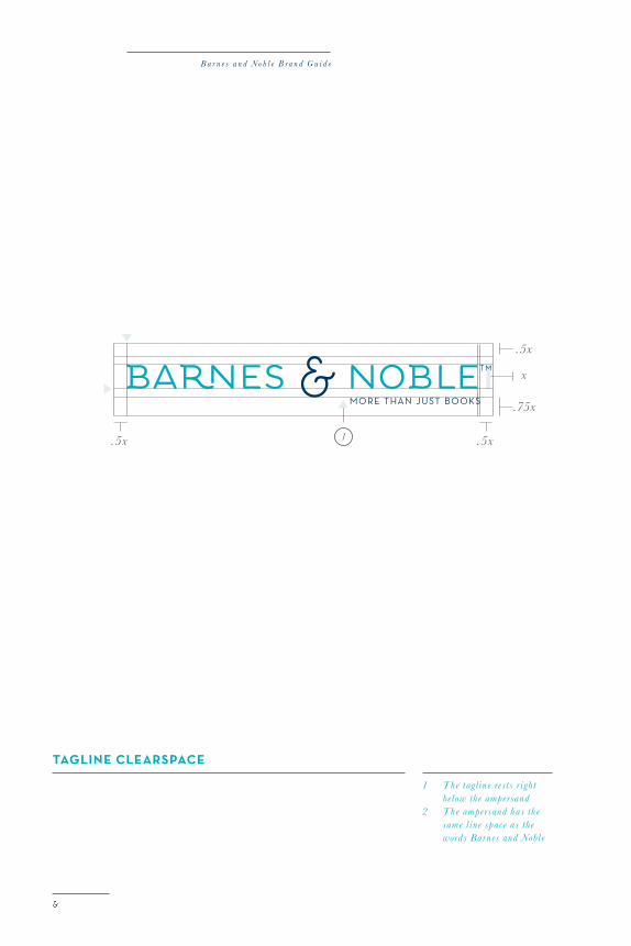
Tagline ClearspaCe
.5x.5x
.75x
.5x
x
1
1 The tagl ine rest s r ight below the ampersand2 The ampersand has the same l ine space as the words Barnes and Noble
4 . 220 12
xx
x
x
x
1
2
2
4 . 0 T h e S u p p o r t i n g E l e m e n t s
B a r n e s a n d N o b l e B r a n d G u i d e
Typography
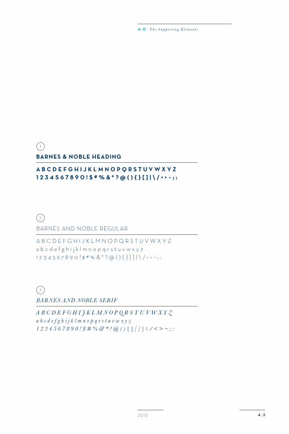
The Barnes & Noble brand utilizes three typefaces. The first is Barnes & Noble Heading, a bolder typeface that is used for headings in print work, on posters, billboards, and also on web applications. This typeface is always used in all caps.
The second Barnes & Noble typeface is Barnes & Noble Regular, a thinner version of the header. This typeface is used for larger bodies of type, such as in this paragraph. It can be used in larger scale and all caps, as well as small and in upper and lower case.
The final Barnes & Noble typeface is the Barnes & Noble Serif, an italic romantic typeface that softens the brand and creates a sense of class. This typeface is used for captions, like the one on this page. It is also used for smaller bodies of type that are usually inferior in heirarchy.
None of these typefaces are part of the logo, which in fact uses a custom made typeface that does not appear any-where else in the brand. This maintain’s the logo’s integrity.
All of these typefaces combine to enhance the Barnes & Noble brand image of friendliness, fun, and a sense of home.They should be combined carefully to maintain this concept.
1 9 point s ize 230 points t rack ing 12 point l eading2 9 point s ize 230 point t rack ing 12 point l eading3 9 point s ize 230 point l eading 12 point t rack ing
4 . 320 12
a B C d e f g h i J k l m n o p q r s T u v W x y z1 2 3 4 5 6 7 8 9 0 ! $ # % & * ? @ ( ) { } [ ] | \ / < > ~ ; :
A B C d E F G H I J K L M N O P Q R S T U V W x Y za b c d e f g h i j k l m n o p q r s t u v w x y z1 2 3 4 5 6 7 8 9 0 ! $ # % & * ? @ ( ) { } [ ] | \ / < > ~ ; :
A B C D E F G H I j K L M N O P q R S T U V W X Y za b c d e f g h i j k l m n o p q r s t u v w x y z1 2 3 4 5 6 7 8 9 0 ! $ # % & * ? @ ( ) { } [ ] |\ / < > ~ ; :
Barnes & noBle heading
BARNES ANd NOBLE REGULAR
BAR NES AND NOBLE SERIF
1
2
3
4 . 0 T h e S u p p o r t i n g E l e m e n t s
B a r n e s a n d N o b l e B r a n d G u i d e
4 . 420 12
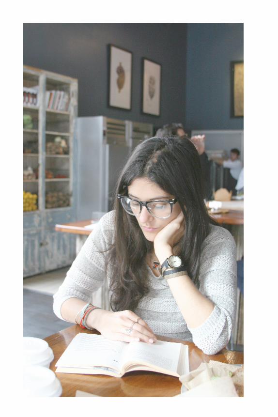
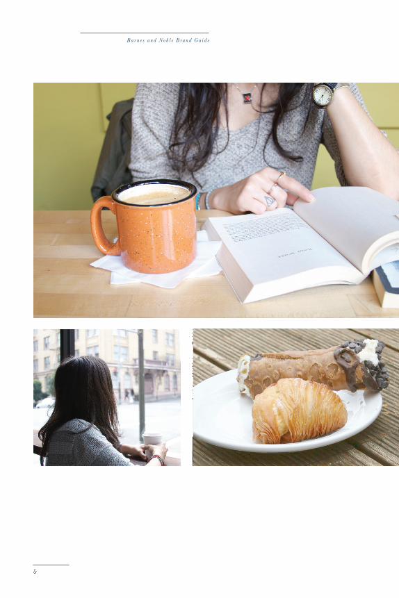
phoTography
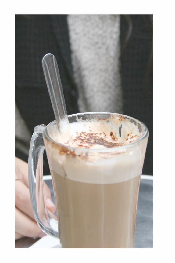
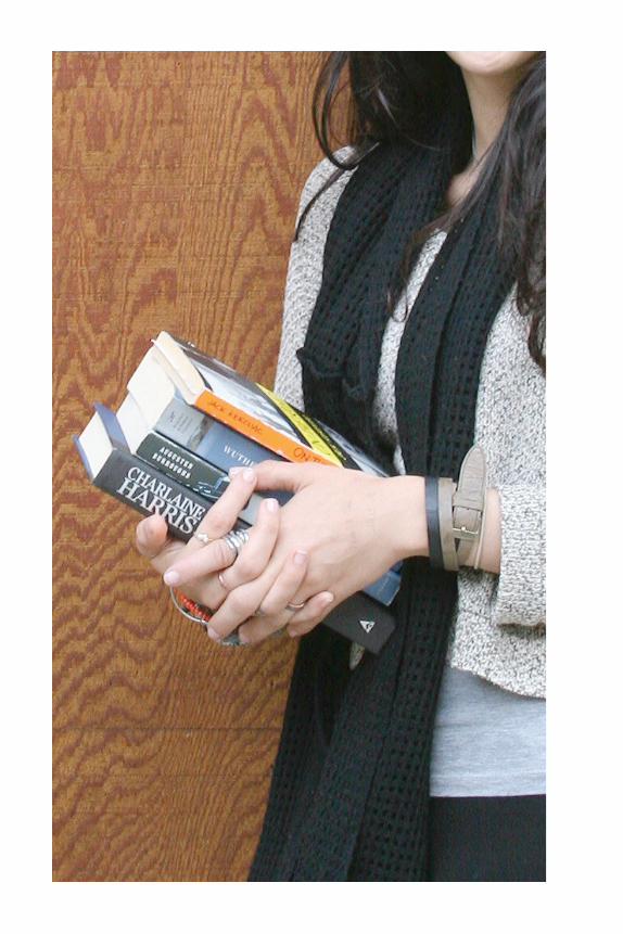
The photographic style of Barnes & Noble mirrors the senseof airiness and welcoming that the brand embodies. Abrighter atmosphere should be used, with minimal contrast.The photography should range from reading, music, food,and all other activities offered in the store.
Angles and shots in the brand photography should engageviewers and make them feel as if they were inside of thephotograph. Be sure to be careful and not make the photostoo dynamic so that they lose the sense of calm.
vieWers should engage WiTh Barnes & noBleThrough The phoTography, essenTially asif They Were in The phoTograph Themselves.
1 Cropped shot that makes the v i ewer feel l ik e he oe she i s in the p icture .2 Br ight photo with higher exposure but with lower contrast to creat e a sense of a ir iness and space .3 Showcase food , cof fee , and other aspect s of the brand. Products and backdrops should feel natural : wood , stuccos .
4 . 0 T h e S u p p o r t i n g E l e m e n t s
B a r n e s a n d N o b l e B r a n d G u i d e
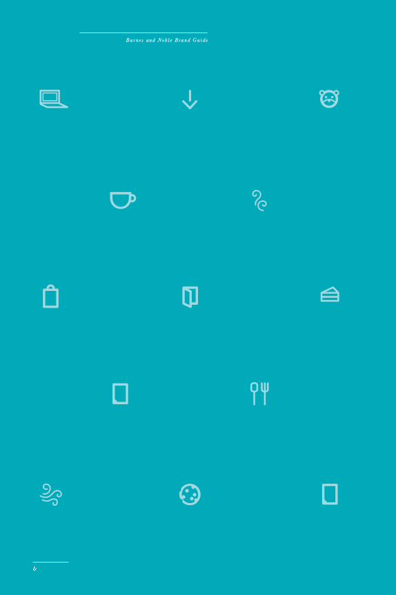
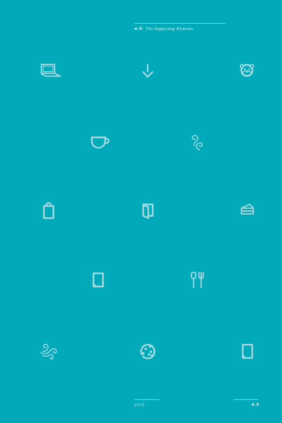
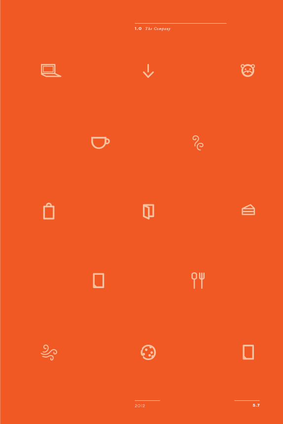
The iCons
The Barnes & Noble brand utilizes a series of airy and fun icons to add character. The icons are utilized on posters,web pages, packaging, and products. The icons can be used in full color or tone on tone. A single icon or small groupof icons can be used, or they can create a pattern.
Whenever there are multiple icons being used, be absolutelysure to include a variety. This means that there should bea balance between the types of icons used. There are book related icons, food, shopping, music, kids, and digital icons.The icons include ‘whimsies,’ the swirly icons that speakto the magic of books and reading.
The Whimsy iCons, or Curly ones, remind our CusTomers ThaT reading is a magiCal Thing.ThaT same magiC radiaTes aT Barnes & noBle.
Like eve r ything el se Barnes & Noble , our i cons re inforce the not ion that the re are more than just books at our stores .
4 . 520 12
4 . 0 T h e S u p p o r t i n g E l e m e n t s
B a r n e s a n d N o b l e B r a n d G u i d e
2
1
Be sure To use These pieCesWisely so ThaTThey do noT appear Bulky.
These rules should not overpower the design.
2
20 12 4 . 6
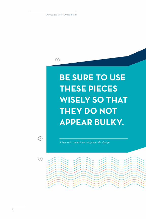
supporTing elemenTs
To fully create the Barnes & Noble identity, the brand usesthese simple graphics that support the principles alreadyestablished by the logo, color, typography, and photography.The first two elements can be used together, althoughthe rule can live on it ’s own accompanied with typography.The third element should never be used with the other two. If designing multiple pages or spreads, these and thefollowing graphics should be balanced throughout.
1 These wraparounds are l ik e open books with bold stat ements . They are made of the l ight color and i t ’s respect ive ‘shadow’.2 Rules are used to recall a more t radit ional senes of books and reading.3 Our whimsy l ines recall the a ir iness factor of the brand with a punch of color and fun !
4 . 0 T h e S u p p o r t i n g E l e m e n t s
5 . 0
5 . 0 T h e A p p l i c a t i o n s
20 12
moRe Than jusT booksThe Applications
5.0
5 . 1
B a r n e s a n d N o b l e B r a n d G u i d e
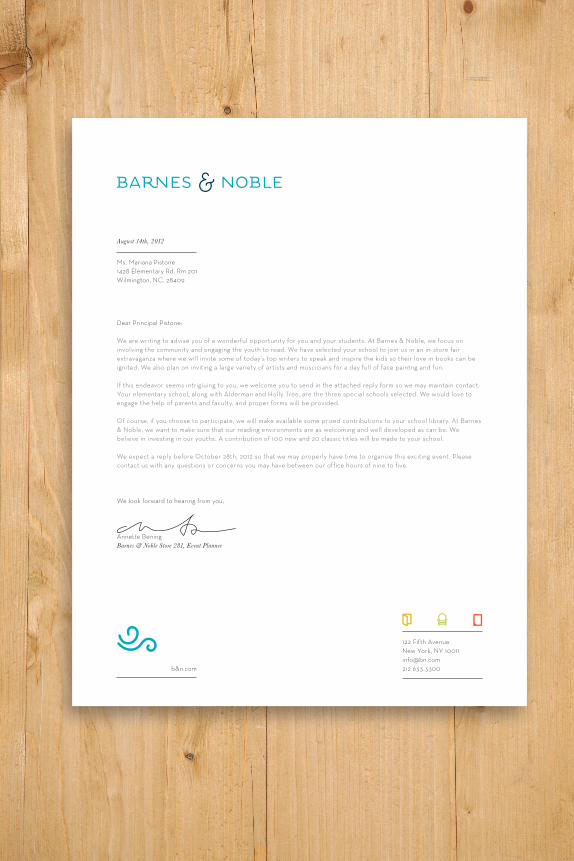
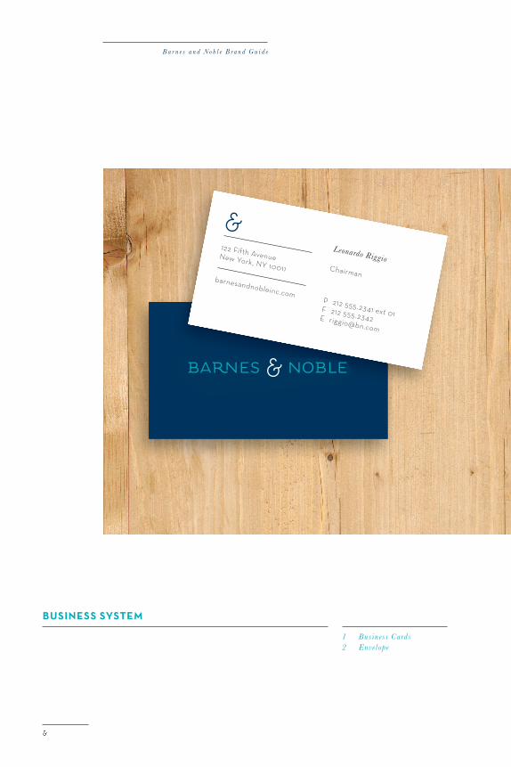
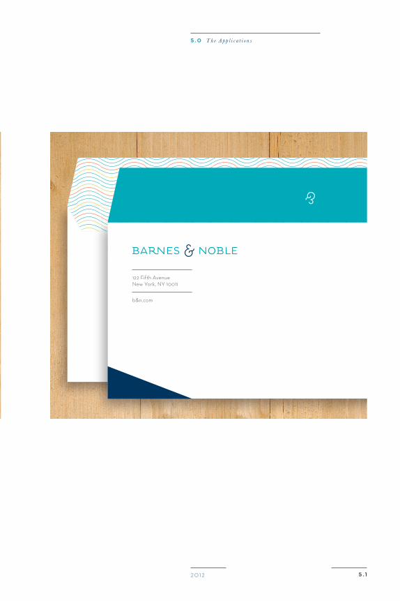
Business sysTem
1 Let t e rhead
B a r n e s a n d N o b l e B r a n d G u i d e
Business sysTem
1 Bus iness Cards2 Envelope
5 . 0 T h e A p p l i c a t i o n s
20 12 5 . 1
B a r n e s a n d N o b l e B r a n d G u i d e
5 . 220 12
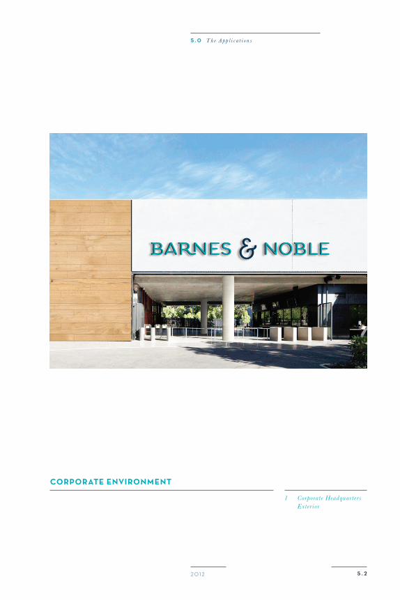
CorporaTe environmenT
1 Corporat e Headquar t e rs Exte r ior
5 . 0 T h e A p p l i c a t i o n s
5 . 220 12
CorporaTe environmenT
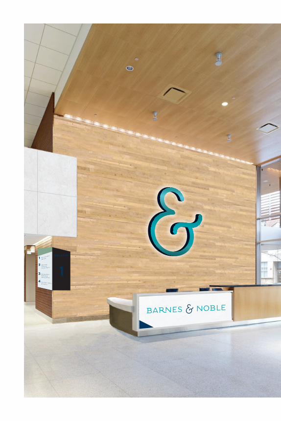
1 Headquar t e rs Recept ion
5 . 0 T h e A p p l i c a t i o n s
B a r n e s a n d N o b l e B r a n d G u i d e
5 . 220 12
CorporaTe environmenT
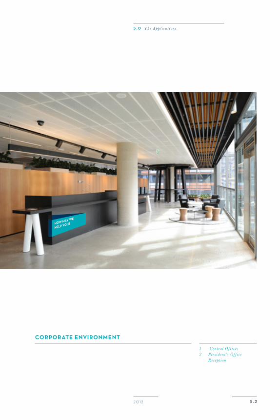
1 Central Of f i ces2 Pres ident ’s Of f i ce Recept ion
5 . 0 T h e A p p l i c a t i o n s
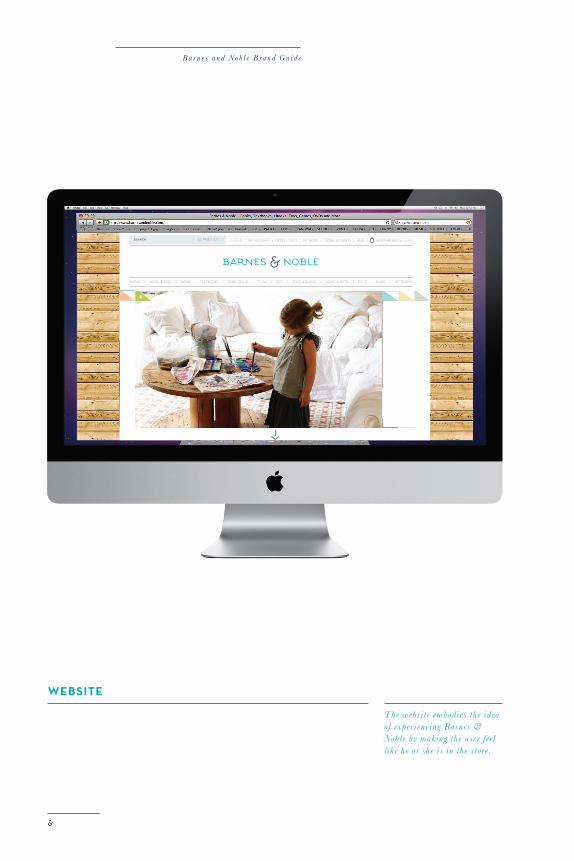
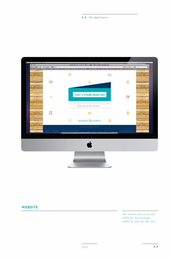
WeBsiTe
The webs it e embodies the ideaof exper i enc ing Barnes &Noble by making the use r feell ik e he or she i s in the store .
B a r n e s a n d N o b l e B r a n d G u i d e
5 . 320 12
-
5 . 0 T h e A p p l i c a t i o n s
B a r n e s a n d N o b l e B r a n d G u i d e
5 . 320 12
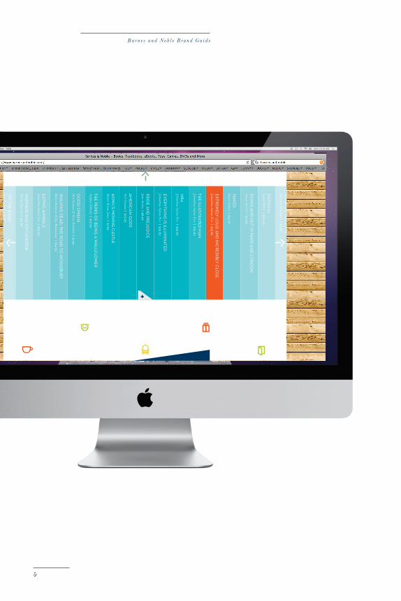
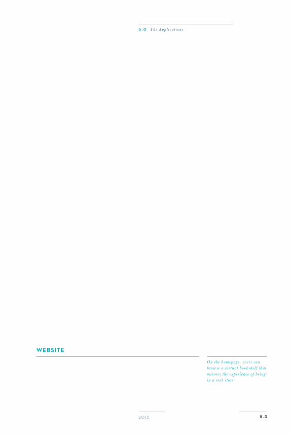
WeBsiTe
On the homepage , use rs can browse a v ir tual bookshelf that mir rors the exper i ence of be ingin a real store .
5 . 0 T h e A p p l i c a t i o n s

WeBsiTe
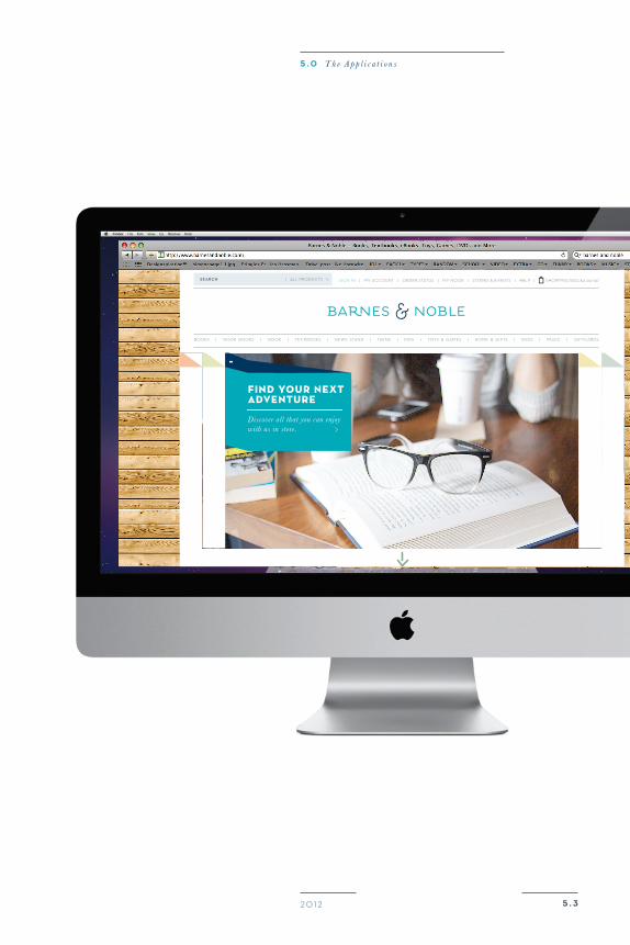
The webs it e a ims to not only sel l books , but encourage readers to come into the store .
5 . 320 12
5 . 0 T h e A p p l i c a t i o n s
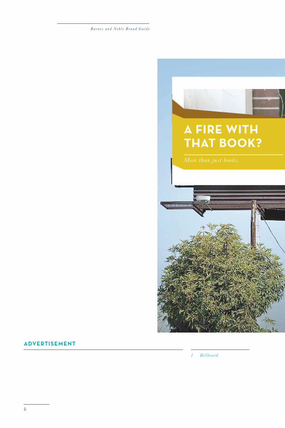
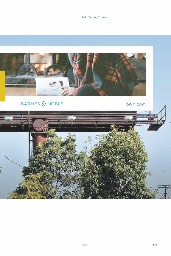
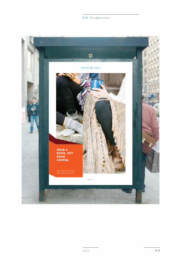
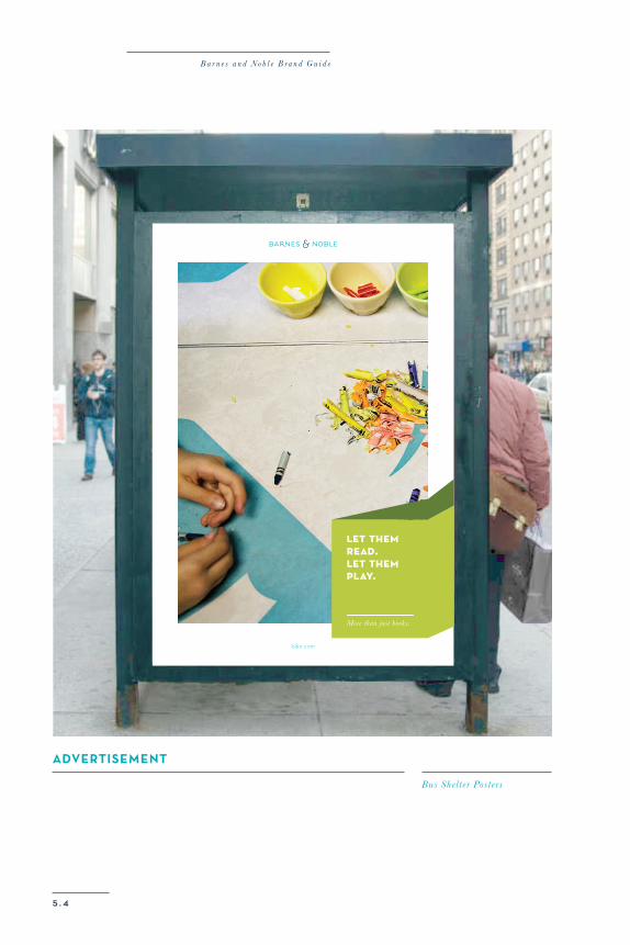
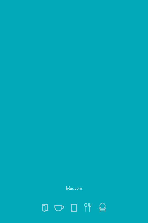
adverTisemenT
1 Billboard
B a r n e s a n d N o b l e B r a n d G u i d e
a fiRe WiThThaT book?More than just books .
5 . 420 12
a fiRe WiThThaT book?More than just books .
b&n.com
5 . 0 T h e A p p l i c a t i o n s
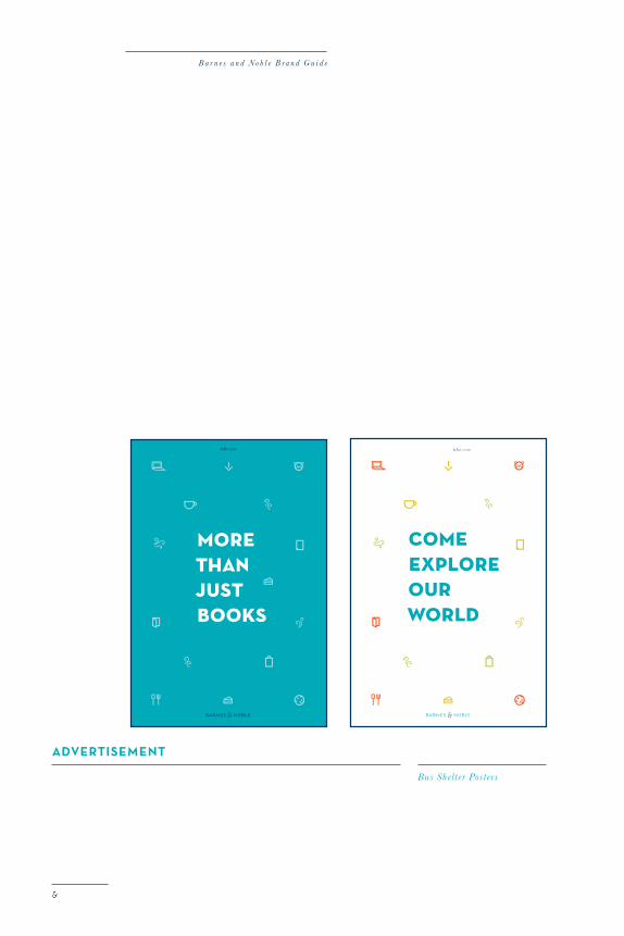
adverTisemenT
Bus Shelt e r Post e rs
B a r n e s a n d N o b l e B r a n d G u i d e
5 . 420 12
5 . 0 T h e A p p l i c a t i o n s
5 . 4
B a r n e s a n d N o b l e B r a n d G u i d e
adverTisemenT
Bus Shelt e r Post e rs
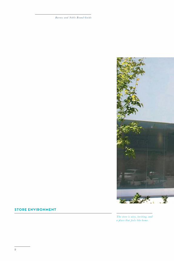
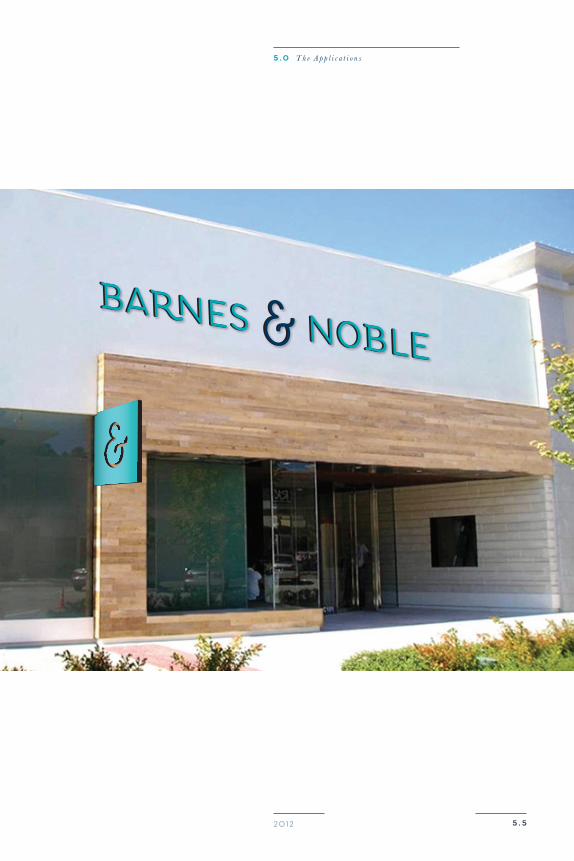
sTore environmenT
The store i s a ir y, inv it ing , and a place that feel s l ik e home .
B a r n e s a n d N o b l e B r a n d G u i d e
5 . 520 12
5 . 0 T h e A p p l i c a t i o n s
5 . 620 12
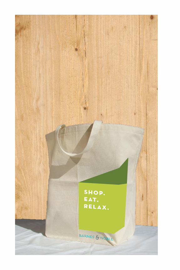
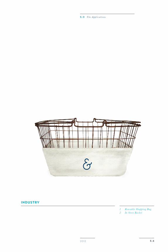
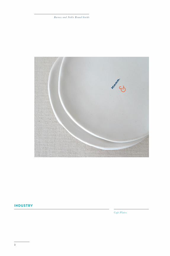
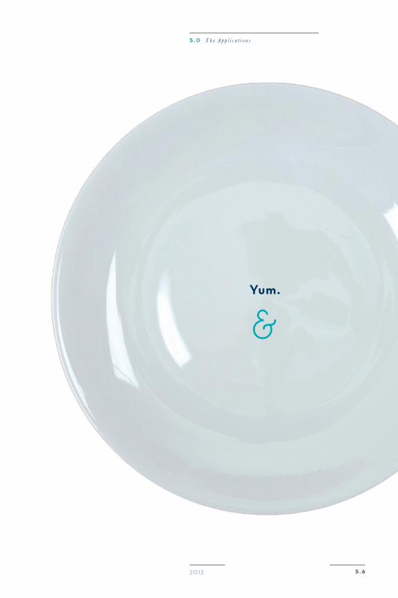
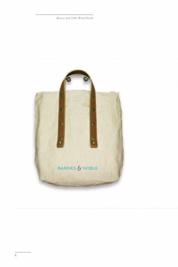
indusTry
1 Reusabl e Shopping Bag2 In Store Basket
5 . 0 T h e A p p l i c a t i o n s
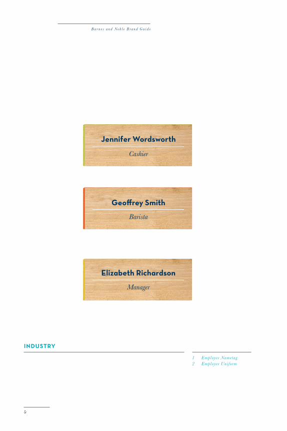
indusTry
1 Employee Nametag2 Employee Uniform
B a r n e s a n d N o b l e B r a n d G u i d e
5 . 620 12
5 . 0 T h e A p p l i c a t i o n s
B a r n e s a n d N o b l e B r a n d G u i d e
5 . 620 12
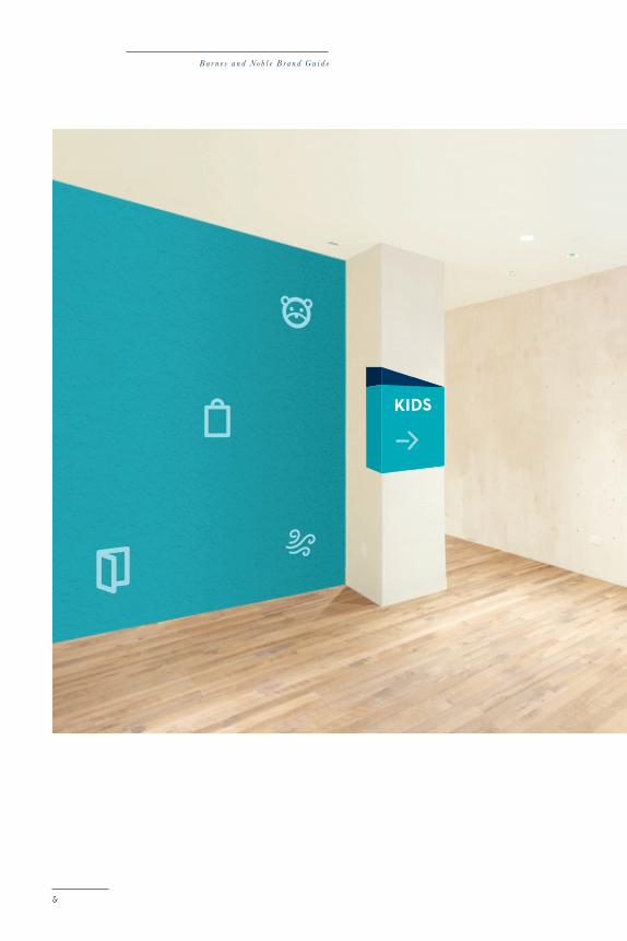
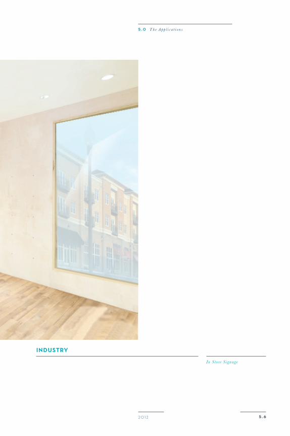
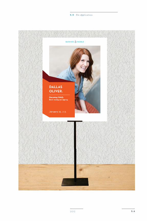
indusTry
In Store S ignage
5 . 0 T h e A p p l i c a t i o n s
indusTry
In Store S ignage
B a r n e s a n d N o b l e B r a n d G u i d e
5 . 620 12
daLLasoLiveR.
Enter taining Globally.
Book reading and signing.
January 25 . 2-3 .
5 . 0 T h e A p p l i c a t i o n s
come and explore our world
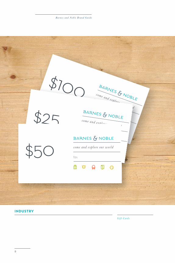
$100to:
come and explore our world$25
to:
indusTry
Gif t Cards
B a r n e s a n d N o b l e B r a n d G u i d e
come and explore our world$50 to:
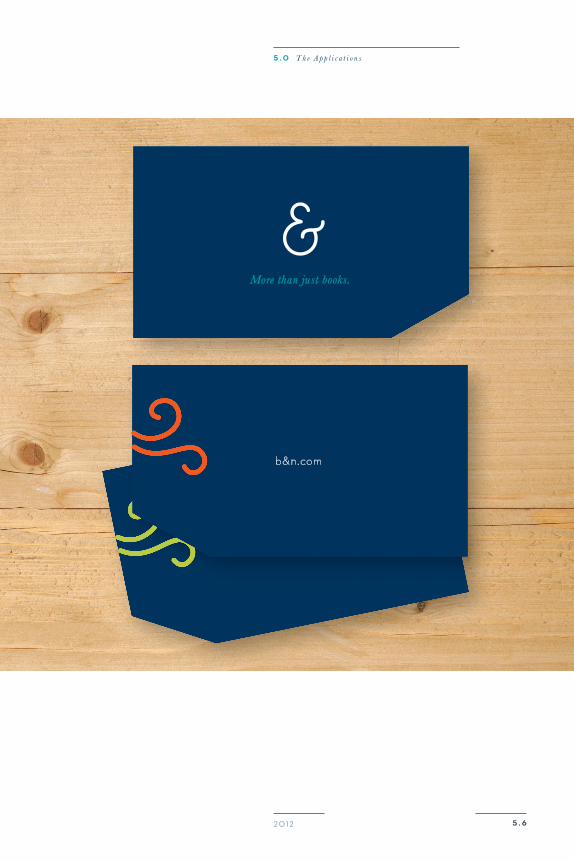
b&n.com
5 . 620 12
More than just books.
5 . 0 T h e A p p l i c a t i o n s
indusTry
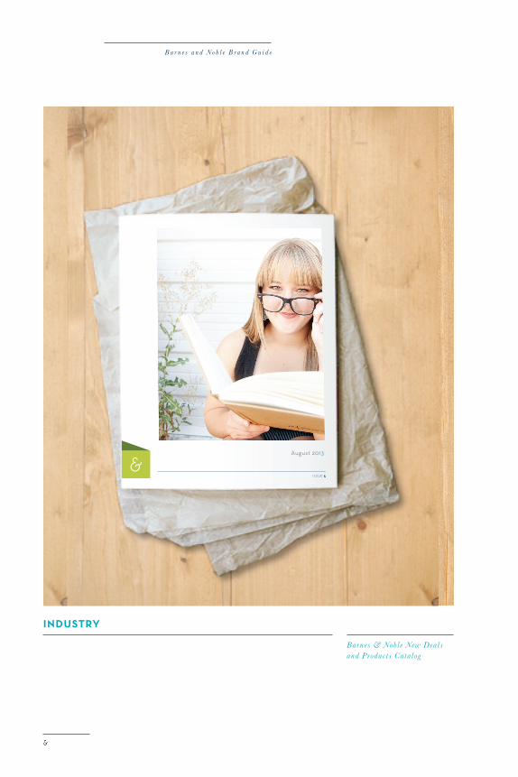
Barnes & Noble New Dealsand Products Catalog
B a r n e s a n d N o b l e B r a n d G u i d e
August 2013
ISSUE 5
5 . 620 12
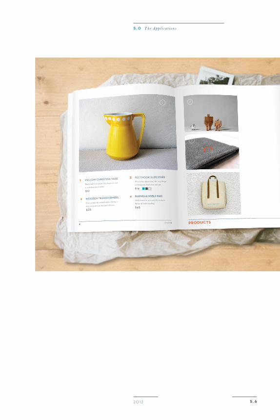
ISSUE 58 PRoducTs
1 Yellow Christina Vase
Handcrafted vase perfect for f lowers or even
as a desktop pencil holder.
$12
2 wooden transformers
From ecologically minded makers jeremy’s,
these are perfect for kids and collectors.
$28
3 felt nook slipCoVer
Woven from alpaca wool , this cozy design
will keep your Nook clean and safe.
$14
4 Barnes & noBle Bag
Walk around in style with this exclusive
Barnes & Noble handbag.
$45
1 2
3
4
5 . 0 T h e A p p l i c a t i o n s
indusTry
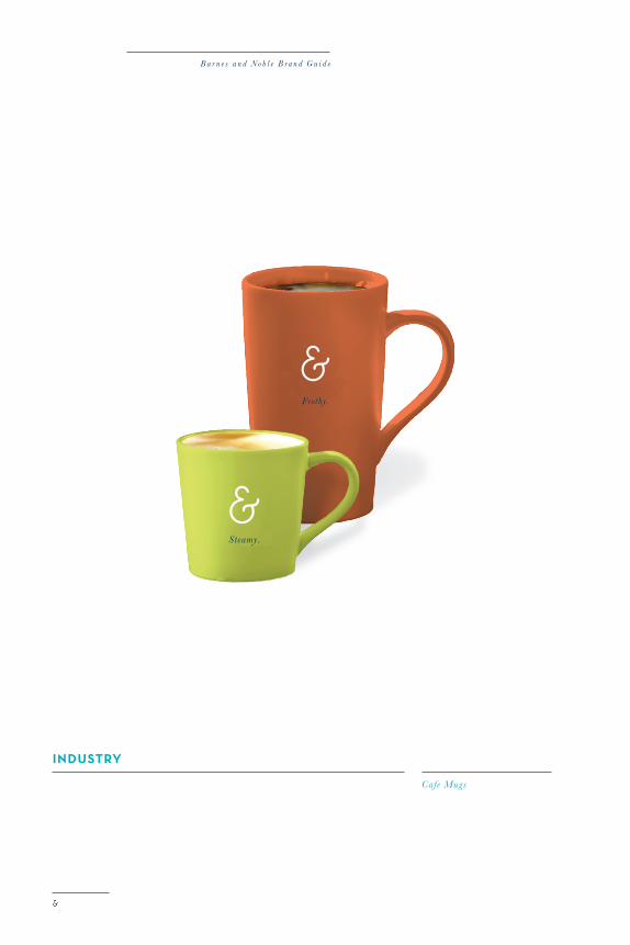
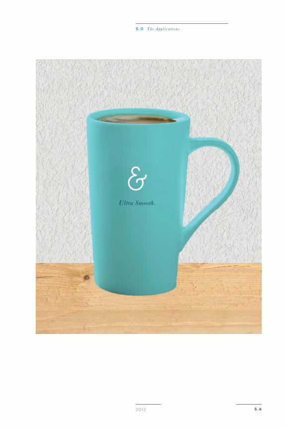
Cafe Mugs
B a r n e s a n d N o b l e B r a n d G u i d e
5 . 620 12
5 . 0 T h e A p p l i c a t i o n s
B a r n e s a n d N o b l e B r a n d G u i d e
enjoy.
5 . 620 12
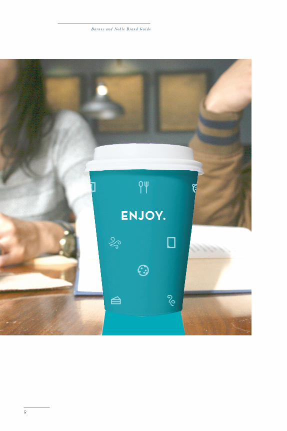
indusTry
To Go Cup
5 . 0 T h e A p p l i c a t i o n s
B a r n e s a n d N o b l e B r a n d G u i d e
indusTry
Cafe Plat es
yum.
5 . 620 12
5 . 0 T h e A p p l i c a t i o n s
B a r n e s a n d N o b l e B r a n d G u i d e
5 . 620 12
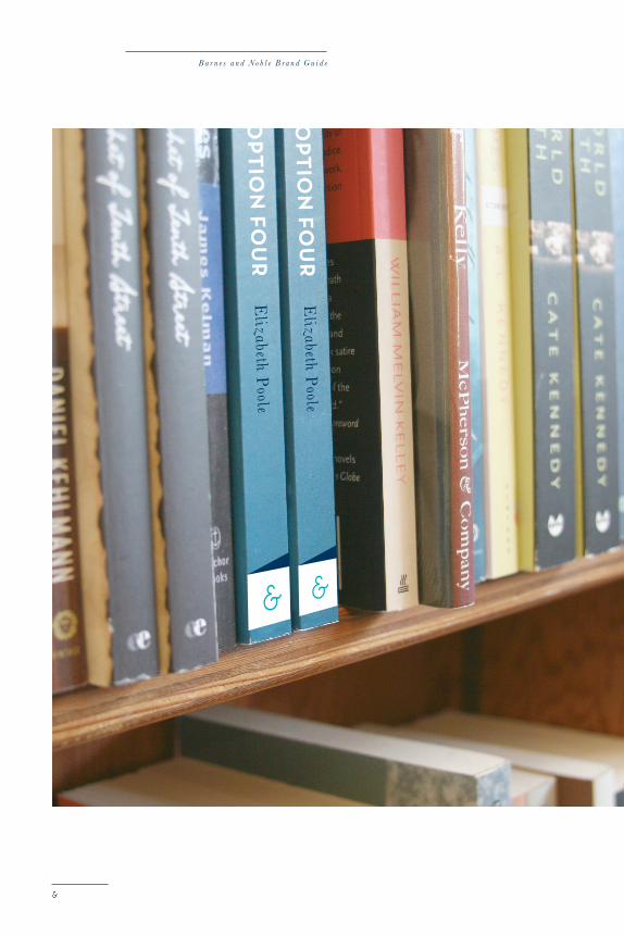
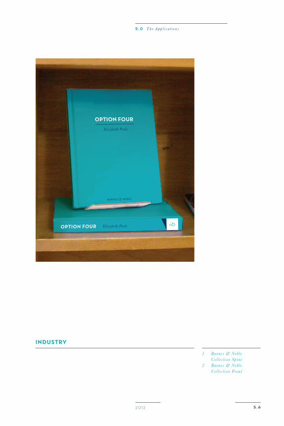
indusTry
1 Barnes & Noble Coll ect ion Spine2 Barnes & Noble Coll ect ion Front
5 . 0 T h e A p p l i c a t i o n s
B a r n e s a n d N o b l e B r a n d G u i d e
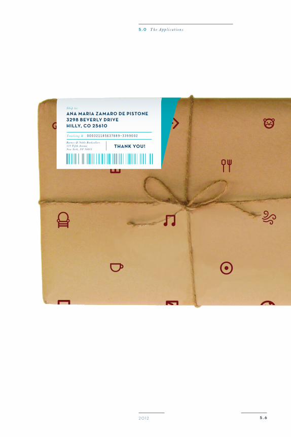
indusTry
1 Online Shipment Package
5 . 620 12
ana maria zamaro de pisTone3298 Beverly drivehilly, Co 25610
Thank you!
S h i p t o :
Ba r n e s & Nobl e B ook s e l l e r s122 F i f t h Av e nu eNe w Yo rk , N Y 10011
Tra ck i n g # 0 0 0321185637889-3399 0 02
5 . 0 T h e A p p l i c a t i o n s
B a r n e s a n d N o b l e B r a n d G u i d e
5 . 720 12
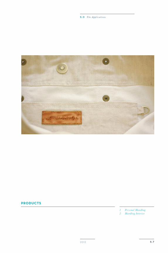
produCTs
1 Personal Handbag2 Handbag Int e r ior
5 . 0 T h e A p p l i c a t i o n s

5 . 720 12
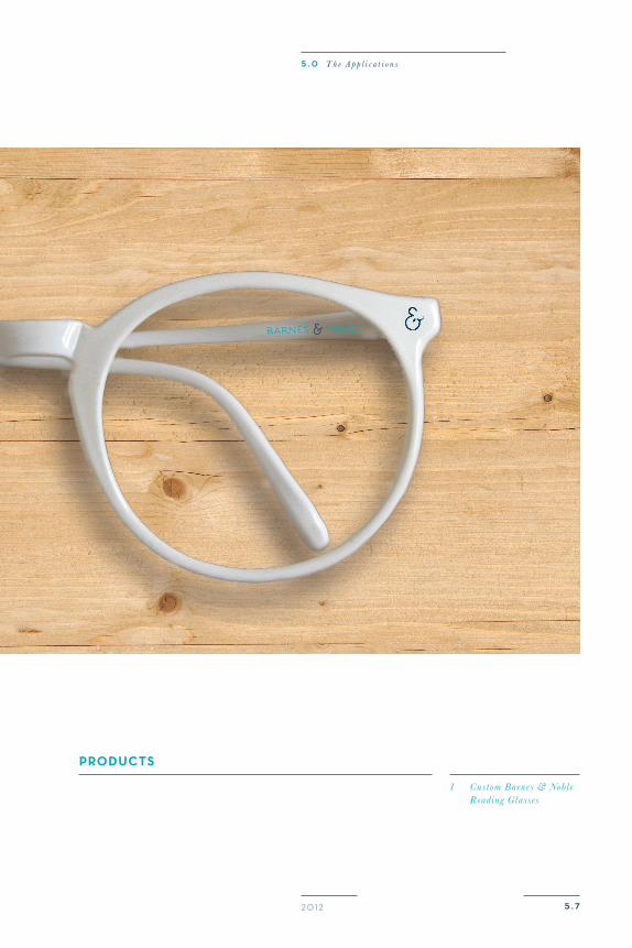
produCTs
1 Custom Barnes & Noble Reading Glasses
5 . 0 T h e A p p l i c a t i o n s
5 . 720 12
1 . 0 T h e C o m p a n y
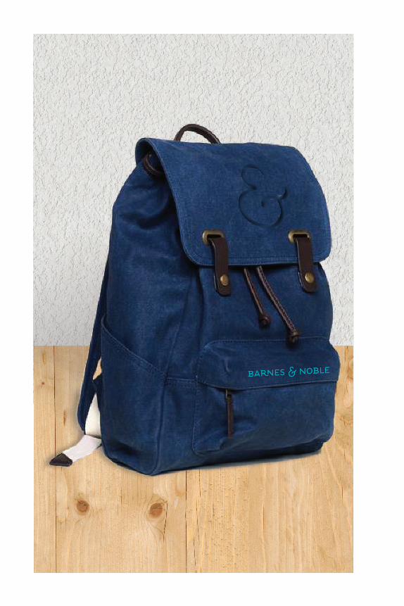
produCTs
Backpack

B a r n e s a n d N o b l e B r a n d G u i d e
5 . 720 12
1 . 0 T h e C o m p a n y
produCTs
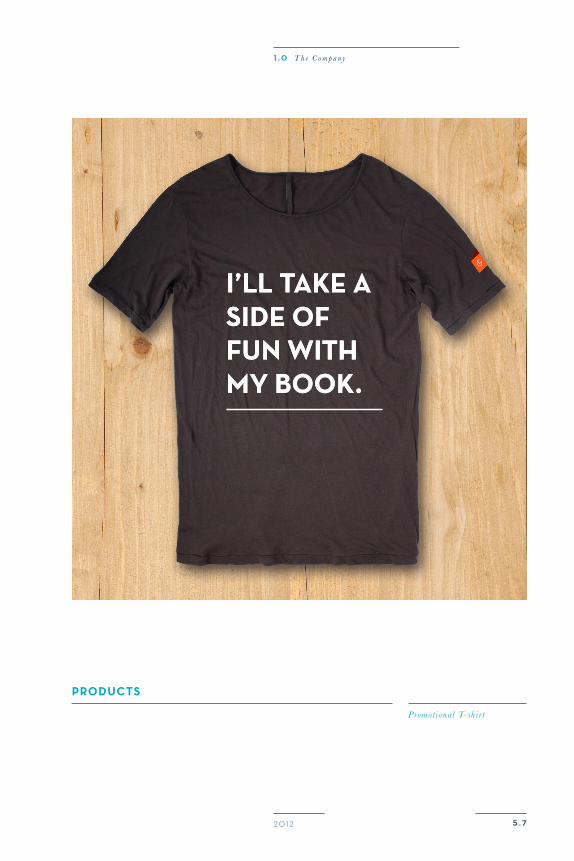
Promot ional T-shir t
i’ll take a side of fun with my book.
i’ll take a side of fun with my book.
B a r n e s a n d N o b l e B r a n d G u i d e
produCTs
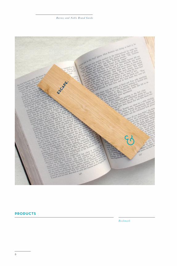
Bookmark
esCape.
5 . 720 12
1 . 0 T h e C o m p a n y
B a r n e s a n d N o b l e B r a n d G u i d e
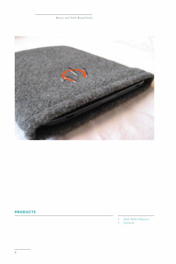
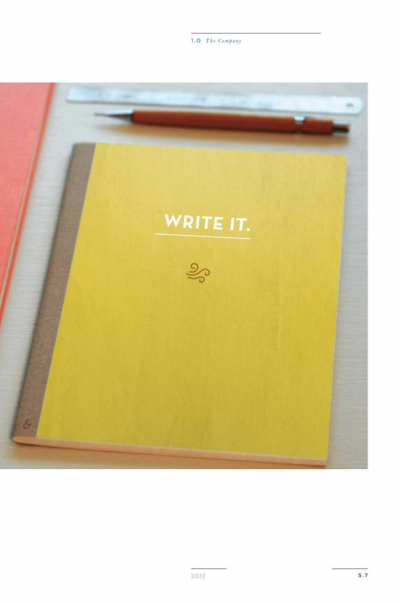
produCTs
1 Nook Tablet Sl ipcover2 Notebook
5 . 720 12
1 . 0 T h e C o m p a n y
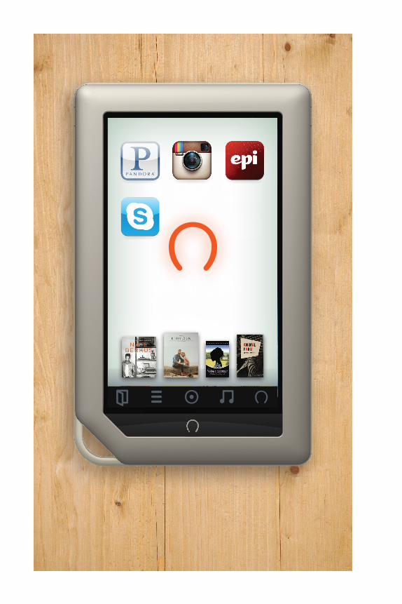
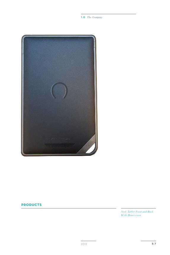
produCTs
Nook Tablet Front and Back With Homescreen
5 . 720 12
1 . 0 T h e C o m p a n y
B a r n e s a n d N o b l e B r a n d G u i d e
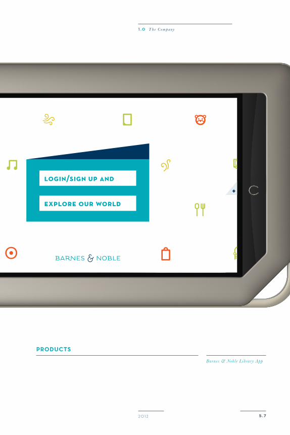
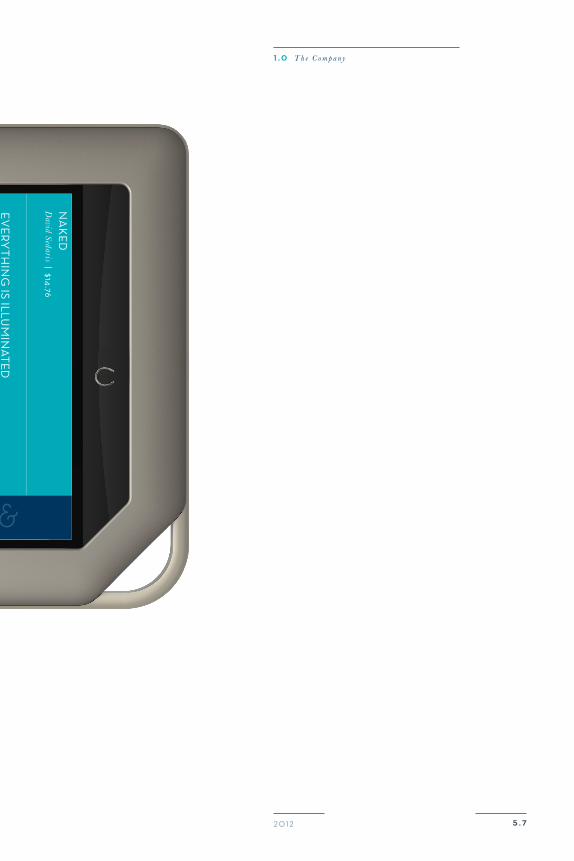
+
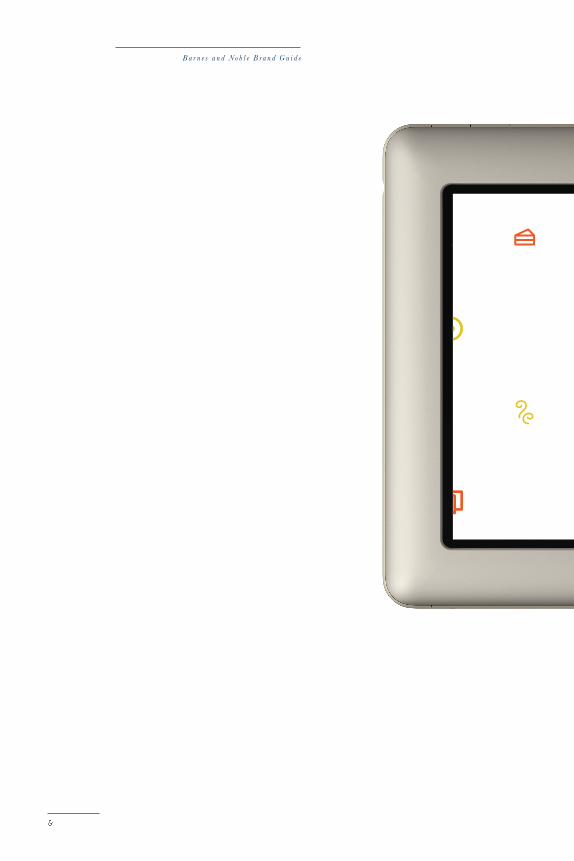
produCTs
Barnes & Noble Library App
5 . 720 12
1 . 0 T h e C o m p a n y
B a r n e s a n d N o b l e B r a n d G u i d e
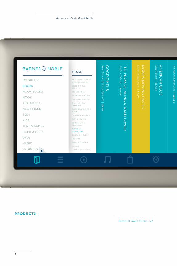
produCTs
Barnes & Noble Library App
mY Books
Books
nook Books
nook
teXtBooks
news stand
teen
kids
toYs & games
home & gifts
dVds
mUsiC
shopping Bag
mY settings
logoUt
a rt, a r C h i t eC t U r e
& p h oto g r a p h Y
B i B l e & B i B l e
s t U d i e s
B i o g r a p h i e s
B U s i n e s s & m o n e Y
C h i l d r en ’ s B o o k s
C o m p U t i n g &
i n t er n e t
C o o k B o o k s , f o o d
& w i n e
C r a f t s & h o B B i e s
d i e t & h e a lt h
ed U C at i o n &
t e aC h i n g
fi C t i o n &
l i t er at U r e
g r a p h i C n oV el s
h i s to rY
h o m e & g a r d en
h U m o r
l i B r o s en e s pa n o l
genre
+
5 . 720 12
1 . 0 T h e C o m p a n y

“Good f r iends, good books, and a sleepy conscience: this is the ideal l ife .”– Mark Twain
Thank you!
From Barnes & Noble.

b&n.com