atg service center ui programming guide - product version: 10
TRANSCRIPT

Service Center
Version 10.1
UI Programming Guide
Oracle ATG
One Main Street
Cambridge, MA 02142
USA

ATG Service Center UI Programming Guide
Product version: 10.1
Release date: 03-14-12
Document identifier: ServiceCenterProgrammingGuide1405051316
Copyright © 1997, 2012 Oracle and/or its affiliates. All rights reserved.
This software and related documentation are provided under a license agreement containing restrictions on use and disclosure and are
protected by intellectual property laws. Except as expressly permitted in your license agreement or allowed by law, you may not use, copy,
reproduce, translate, broadcast, modify, license, transmit, distribute, exhibit, perform, publish, or display any part, in any form, or by any
means. Reverse engineering, disassembly, or decompilation of this software, unless required by law for interoperability, is prohibited.
The information contained herein is subject to change without notice and is not warranted to be error-free. If you find any errors, please
report them to us in writing. If this software or related documentation is delivered to the U.S. Government or anyone licensing it on behalf of
the U.S. Government, the following notice is applicable:
U.S. GOVERNMENT RIGHTS
Programs, software, databases, and related documentation and technical data delivered to U.S. Government customers are "commercial
computer software" or "commercial technical data" pursuant to the applicable Federal Acquisition Regulation and agency-specific
supplemental regulations. As such, the use, duplication, disclosure, modification, and adaptation shall be subject to the restrictions and
license terms set forth in the applicable Government contract, and, to the extent applicable by the terms of the Government contract, the
additional rights set forth in FAR 52.227-19, Commercial Computer Software License (December 2007). Oracle America, Inc., 500 Oracle
Parkway, Redwood City, CA 94065.
This software or hardware is developed for general use in a variety of information management applications. It is not developed or intended
for use in any inherently dangerous applications, including applications that may create a risk of personal injury. If you use this software or
hardware in dangerous applications, then you shall be responsible to take all appropriate fail-safe, backup, redundancy, and other measures
to ensure its safe use. Oracle Corporation and its affiliates disclaim any liability for any damages caused by use of this software or hardware in
dangerous applications.
Oracle and Java are registered trademarks of Oracle and/or its affiliates. Other names may be trademarks of their respective owners.
Intel and Intel Xeon are trademarks or registered trademarks of Intel Corporation. All SPARC trademarks are used under license and are
trademarks or registered trademarks of SPARC International, Inc. AMD, Opteron, the AMD logo, and the AMD Opteron logo are trademarks or
registered trademarks of Advanced Micro Devices. UNIX is a registered trademark of The Open Group.
The software is based in part on the work of the Independent JPEG Group.
This software or hardware and documentation may provide access to or information on content, products, and services from third parties.
Oracle Corporation and its affiliates are not responsible for and expressly disclaim all warranties of any kind with respect to third-party
content, products, and services. Oracle Corporation and its affiliates will not be responsible for any loss, costs, or damages incurred due to
your access to or use of third-party content, products, or services.
For information about Oracle's commitment to accessibility, visit the Oracle Accessibility Program website at http://www.oracle.com/us/
corporate/accessibility/index.html.
Oracle customers have access to electronic support through My Oracle Support. For information, visit http://www.oracle.com/support/
contact.html or visit http://www.oracle.com/accessibility/support.html if you are hearing impaired.

ATG Service Center UI Programming Guide iii
Table of Contents
1. Introduction . . . . . . . . . . . . . . . . . . . . . . . . . . . . . . . . . . . . . . . . . . . . . . . . . . . . . . . . . . . . . . . . . . . . . . . . . . . . . . . . . . . . . . . . . . . . . . . . . . . . . . . . . . . . . . . . . . . . . 1
Audience . . . . . . . . . . . . . . . . . . . . . . . . . . . . . . . . . . . . . . . . . . . . . . . . . . . . . . . . . . . . . . . . . . . . . . . . . . . . . . . . . . . . . . . . . . . . . . . . . . . . . . . . . . . . . . . . . . . . 1
Documentation Conventions . . . . . . . . . . . . . . . . . . . . . . . . . . . . . . . . . . . . . . . . . . . . . . . . . . . . . . . . . . . . . . . . . . . . . . . . . . . . . . . . . . . . . . . . . . . . 1
Related Documents . . . . . . . . . . . . . . . . . . . . . . . . . . . . . . . . . . . . . . . . . . . . . . . . . . . . . . . . . . . . . . . . . . . . . . . . . . . . . . . . . . . . . . . . . . . . . . . . . . . . . . . 1
Framework Modules . . . . . . . . . . . . . . . . . . . . . . . . . . . . . . . . . . . . . . . . . . . . . . . . . . . . . . . . . . . . . . . . . . . . . . . . . . . . . . . . . . . . . . . . . . . . . . . . . . . . . . 2
2. Service Center User Interface Architecture . . . . . . . . . . . . . . . . . . . . . . . . . . . . . . . . . . . . . . . . . . . . . . . . . . . . . . . . . . . . . . . . . . . . . . . . . . . . . . . . . 3
Service Center Overview . . . . . . . . . . . . . . . . . . . . . . . . . . . . . . . . . . . . . . . . . . . . . . . . . . . . . . . . . . . . . . . . . . . . . . . . . . . . . . . . . . . . . . . . . . . . . . . . . 3
User Interface Modules and Files . . . . . . . . . . . . . . . . . . . . . . . . . . . . . . . . . . . . . . . . . . . . . . . . . . . . . . . . . . . . . . . . . . . . . . . . . . . . . . . 3
User Interface Objects . . . . . . . . . . . . . . . . . . . . . . . . . . . . . . . . . . . . . . . . . . . . . . . . . . . . . . . . . . . . . . . . . . . . . . . . . . . . . . . . . . . . . . . . . . . . 4
User Interface Sections . . . . . . . . . . . . . . . . . . . . . . . . . . . . . . . . . . . . . . . . . . . . . . . . . . . . . . . . . . . . . . . . . . . . . . . . . . . . . . . . . . . . . . . . . . . 5
Customizing Service Center . . . . . . . . . . . . . . . . . . . . . . . . . . . . . . . . . . . . . . . . . . . . . . . . . . . . . . . . . . . . . . . . . . . . . . . . . . . . . . . . . . . . . . . . . . . . . 5
I. Programming Service Center . . . . . . . . . . . . . . . . . . . . . . . . . . . . . . . . . . . . . . . . . . . . . . . . . . . . . . . . . . . . . . . . . . . . . . . . . . . . . . . . . . . . . . . . . . . . . . . . . . 7
3. Service Center User Interface Data Model . . . . . . . . . . . . . . . . . . . . . . . . . . . . . . . . . . . . . . . . . . . . . . . . . . . . . . . . . . . . . . . . . . . . . . . . . 9
Schema Elements . . . . . . . . . . . . . . . . . . . . . . . . . . . . . . . . . . . . . . . . . . . . . . . . . . . . . . . . . . . . . . . . . . . . . . . . . . . . . . . . . . . . . . . . . . . . . . . . . . 9
Initializing Framework Data . . . . . . . . . . . . . . . . . . . . . . . . . . . . . . . . . . . . . . . . . . . . . . . . . . . . . . . . . . . . . . . . . . . . . . . . . . . . . . . . . . . . 11
Data Combining . . . . . . . . . . . . . . . . . . . . . . . . . . . . . . . . . . . . . . . . . . . . . . . . . . . . . . . . . . . . . . . . . . . . . . . . . . . . . . . . . . . . . . . . . . 11
Framework Objects . . . . . . . . . . . . . . . . . . . . . . . . . . . . . . . . . . . . . . . . . . . . . . . . . . . . . . . . . . . . . . . . . . . . . . . . . . . . . . . . . . . . . . . . . . . . . . 12
Framework Definition Objects . . . . . . . . . . . . . . . . . . . . . . . . . . . . . . . . . . . . . . . . . . . . . . . . . . . . . . . . . . . . . . . . . . . . . . . . . . . . . . . . . 14
FrameworkDefinition . . . . . . . . . . . . . . . . . . . . . . . . . . . . . . . . . . . . . . . . . . . . . . . . . . . . . . . . . . . . . . . . . . . . . . . . . . . . . . . . . . . . 14
SkinDefinition . . . . . . . . . . . . . . . . . . . . . . . . . . . . . . . . . . . . . . . . . . . . . . . . . . . . . . . . . . . . . . . . . . . . . . . . . . . . . . . . . . . . . . . . . . . . . 15
TabDefinition . . . . . . . . . . . . . . . . . . . . . . . . . . . . . . . . . . . . . . . . . . . . . . . . . . . . . . . . . . . . . . . . . . . . . . . . . . . . . . . . . . . . . . . . . . . . . . 17
CellDefinition . . . . . . . . . . . . . . . . . . . . . . . . . . . . . . . . . . . . . . . . . . . . . . . . . . . . . . . . . . . . . . . . . . . . . . . . . . . . . . . . . . . . . . . . . . . . . . 18
PanelStackDefinition . . . . . . . . . . . . . . . . . . . . . . . . . . . . . . . . . . . . . . . . . . . . . . . . . . . . . . . . . . . . . . . . . . . . . . . . . . . . . . . . . . . . . 19
PanelDefinition . . . . . . . . . . . . . . . . . . . . . . . . . . . . . . . . . . . . . . . . . . . . . . . . . . . . . . . . . . . . . . . . . . . . . . . . . . . . . . . . . . . . . . . . . . . 21
Framework Supporting Object Definitions . . . . . . . . . . . . . . . . . . . . . . . . . . . . . . . . . . . . . . . . . . . . . . . . . . . . . . . . . . . . . . . . . . 23
ContentDefinition . . . . . . . . . . . . . . . . . . . . . . . . . . . . . . . . . . . . . . . . . . . . . . . . . . . . . . . . . . . . . . . . . . . . . . . . . . . . . . . . . . . . . . . . 23
TemplateDefinition . . . . . . . . . . . . . . . . . . . . . . . . . . . . . . . . . . . . . . . . . . . . . . . . . . . . . . . . . . . . . . . . . . . . . . . . . . . . . . . . . . . . . . . 24
Framework Configuration Objects . . . . . . . . . . . . . . . . . . . . . . . . . . . . . . . . . . . . . . . . . . . . . . . . . . . . . . . . . . . . . . . . . . . . . . . . . . . . 25
Configuration Object Inherited Attributes . . . . . . . . . . . . . . . . . . . . . . . . . . . . . . . . . . . . . . . . . . . . . . . . . . . . . . . . . . . 26
FrameworkConfig . . . . . . . . . . . . . . . . . . . . . . . . . . . . . . . . . . . . . . . . . . . . . . . . . . . . . . . . . . . . . . . . . . . . . . . . . . . . . . . . . . . . . . . . 26
ContentConfig . . . . . . . . . . . . . . . . . . . . . . . . . . . . . . . . . . . . . . . . . . . . . . . . . . . . . . . . . . . . . . . . . . . . . . . . . . . . . . . . . . . . . . . . . . . . 26
TemplateConfig . . . . . . . . . . . . . . . . . . . . . . . . . . . . . . . . . . . . . . . . . . . . . . . . . . . . . . . . . . . . . . . . . . . . . . . . . . . . . . . . . . . . . . . . . . . 26
SkinConfig . . . . . . . . . . . . . . . . . . . . . . . . . . . . . . . . . . . . . . . . . . . . . . . . . . . . . . . . . . . . . . . . . . . . . . . . . . . . . . . . . . . . . . . . . . . . . . . . . 26
TabConfig . . . . . . . . . . . . . . . . . . . . . . . . . . . . . . . . . . . . . . . . . . . . . . . . . . . . . . . . . . . . . . . . . . . . . . . . . . . . . . . . . . . . . . . . . . . . . . . . . . 27
CellConfig . . . . . . . . . . . . . . . . . . . . . . . . . . . . . . . . . . . . . . . . . . . . . . . . . . . . . . . . . . . . . . . . . . . . . . . . . . . . . . . . . . . . . . . . . . . . . . . . . . 27
PanelStackConfig . . . . . . . . . . . . . . . . . . . . . . . . . . . . . . . . . . . . . . . . . . . . . . . . . . . . . . . . . . . . . . . . . . . . . . . . . . . . . . . . . . . . . . . . . 27
PanelConfig . . . . . . . . . . . . . . . . . . . . . . . . . . . . . . . . . . . . . . . . . . . . . . . . . . . . . . . . . . . . . . . . . . . . . . . . . . . . . . . . . . . . . . . . . . . . . . . 27
Framework Instance Objects . . . . . . . . . . . . . . . . . . . . . . . . . . . . . . . . . . . . . . . . . . . . . . . . . . . . . . . . . . . . . . . . . . . . . . . . . . . . . . . . . . . 28
Instance Object Inherited Attributes . . . . . . . . . . . . . . . . . . . . . . . . . . . . . . . . . . . . . . . . . . . . . . . . . . . . . . . . . . . . . . . . . 28
ContentInstance . . . . . . . . . . . . . . . . . . . . . . . . . . . . . . . . . . . . . . . . . . . . . . . . . . . . . . . . . . . . . . . . . . . . . . . . . . . . . . . . . . . . . . . . . . 29
TemplateInstance . . . . . . . . . . . . . . . . . . . . . . . . . . . . . . . . . . . . . . . . . . . . . . . . . . . . . . . . . . . . . . . . . . . . . . . . . . . . . . . . . . . . . . . . . 29
FrameworkInstance . . . . . . . . . . . . . . . . . . . . . . . . . . . . . . . . . . . . . . . . . . . . . . . . . . . . . . . . . . . . . . . . . . . . . . . . . . . . . . . . . . . . . . 29
SkinInstance . . . . . . . . . . . . . . . . . . . . . . . . . . . . . . . . . . . . . . . . . . . . . . . . . . . . . . . . . . . . . . . . . . . . . . . . . . . . . . . . . . . . . . . . . . . . . . . 29
TabInstance . . . . . . . . . . . . . . . . . . . . . . . . . . . . . . . . . . . . . . . . . . . . . . . . . . . . . . . . . . . . . . . . . . . . . . . . . . . . . . . . . . . . . . . . . . . . . . . . 29
CellInstance . . . . . . . . . . . . . . . . . . . . . . . . . . . . . . . . . . . . . . . . . . . . . . . . . . . . . . . . . . . . . . . . . . . . . . . . . . . . . . . . . . . . . . . . . . . . . . . 30
PanelStackInstance . . . . . . . . . . . . . . . . . . . . . . . . . . . . . . . . . . . . . . . . . . . . . . . . . . . . . . . . . . . . . . . . . . . . . . . . . . . . . . . . . . . . . . . 30
PanelInstance . . . . . . . . . . . . . . . . . . . . . . . . . . . . . . . . . . . . . . . . . . . . . . . . . . . . . . . . . . . . . . . . . . . . . . . . . . . . . . . . . . . . . . . . . . . . . 31
PanelTarget . . . . . . . . . . . . . . . . . . . . . . . . . . . . . . . . . . . . . . . . . . . . . . . . . . . . . . . . . . . . . . . . . . . . . . . . . . . . . . . . . . . . . . . . . . . . . . . . 31
Modifying Framework Definitions . . . . . . . . . . . . . . . . . . . . . . . . . . . . . . . . . . . . . . . . . . . . . . . . . . . . . . . . . . . . . . . . . . . . . . . . . . . . . 32
Adding a Definition . . . . . . . . . . . . . . . . . . . . . . . . . . . . . . . . . . . . . . . . . . . . . . . . . . . . . . . . . . . . . . . . . . . . . . . . . . . . . . . . . . . . . . 32
Modifying a Definition . . . . . . . . . . . . . . . . . . . . . . . . . . . . . . . . . . . . . . . . . . . . . . . . . . . . . . . . . . . . . . . . . . . . . . . . . . . . . . . . . . 32

iv ATG Service Center UI Programming Guide
Deleting a Definition . . . . . . . . . . . . . . . . . . . . . . . . . . . . . . . . . . . . . . . . . . . . . . . . . . . . . . . . . . . . . . . . . . . . . . . . . . . . . . . . . . . . 32
4. Service Center Framework API . . . . . . . . . . . . . . . . . . . . . . . . . . . . . . . . . . . . . . . . . . . . . . . . . . . . . . . . . . . . . . . . . . . . . . . . . . . . . . . . . . . . . . 33
Changing Tabs . . . . . . . . . . . . . . . . . . . . . . . . . . . . . . . . . . . . . . . . . . . . . . . . . . . . . . . . . . . . . . . . . . . . . . . . . . . . . . . . . . . . . . . . . . . . . . . . . . . . 33
Submitting Actions . . . . . . . . . . . . . . . . . . . . . . . . . . . . . . . . . . . . . . . . . . . . . . . . . . . . . . . . . . . . . . . . . . . . . . . . . . . . . . . . . . . . . . . . . . . . . . 35
Forwarding and Redirecting URLs . . . . . . . . . . . . . . . . . . . . . . . . . . . . . . . . . . . . . . . . . . . . . . . . . . . . . . . . . . . . . . . . . . . . . . . . . . . . 36
II. Developing Pages in Service Center . . . . . . . . . . . . . . . . . . . . . . . . . . . . . . . . . . . . . . . . . . . . . . . . . . . . . . . . . . . . . . . . . . . . . . . . . . . . . . . . . . . . . . . 39
5. Service Center UI Components . . . . . . . . . . . . . . . . . . . . . . . . . . . . . . . . . . . . . . . . . . . . . . . . . . . . . . . . . . . . . . . . . . . . . . . . . . . . . . . . . . . . . 41
Working with JavaServer Pages . . . . . . . . . . . . . . . . . . . . . . . . . . . . . . . . . . . . . . . . . . . . . . . . . . . . . . . . . . . . . . . . . . . . . . . . . . . . . . . 41
Tag Libraries . . . . . . . . . . . . . . . . . . . . . . . . . . . . . . . . . . . . . . . . . . . . . . . . . . . . . . . . . . . . . . . . . . . . . . . . . . . . . . . . . . . . . . . . . . . . . . . 41
Servlet Beans . . . . . . . . . . . . . . . . . . . . . . . . . . . . . . . . . . . . . . . . . . . . . . . . . . . . . . . . . . . . . . . . . . . . . . . . . . . . . . . . . . . . . . . . . . . . . . 41
Component Locations . . . . . . . . . . . . . . . . . . . . . . . . . . . . . . . . . . . . . . . . . . . . . . . . . . . . . . . . . . . . . . . . . . . . . . . . . . . . . . . . . . . . . . . . . . . 42
Customization Best Practices . . . . . . . . . . . . . . . . . . . . . . . . . . . . . . . . . . . . . . . . . . . . . . . . . . . . . . . . . . . . . . . . . . . . . . . . . . . . . . . . . . . 42
Extending Configuration Files . . . . . . . . . . . . . . . . . . . . . . . . . . . . . . . . . . . . . . . . . . . . . . . . . . . . . . . . . . . . . . . . . . . . . . . . . 42
Adding JavaScript and CSS Files . . . . . . . . . . . . . . . . . . . . . . . . . . . . . . . . . . . . . . . . . . . . . . . . . . . . . . . . . . . . . . . . . . . . . . . 42
Using Service Center Debugging Modes . . . . . . . . . . . . . . . . . . . . . . . . . . . . . . . . . . . . . . . . . . . . . . . . . . . . . . . . . . . . . . . . . . . . 43
Service Center Debugging Mode . . . . . . . . . . . . . . . . . . . . . . . . . . . . . . . . . . . . . . . . . . . . . . . . . . . . . . . . . . . . . . . . . . . . . 43
Dojo Debugging Mode . . . . . . . . . . . . . . . . . . . . . . . . . . . . . . . . . . . . . . . . . . . . . . . . . . . . . . . . . . . . . . . . . . . . . . . . . . . . . . . . . 44
6. Working with the Global Context Area . . . . . . . . . . . . . . . . . . . . . . . . . . . . . . . . . . . . . . . . . . . . . . . . . . . . . . . . . . . . . . . . . . . . . . . . . . . . 45
Global Context Area Architecture . . . . . . . . . . . . . . . . . . . . . . . . . . . . . . . . . . . . . . . . . . . . . . . . . . . . . . . . . . . . . . . . . . . . . . . . . . . . . 45
NavContainers . . . . . . . . . . . . . . . . . . . . . . . . . . . . . . . . . . . . . . . . . . . . . . . . . . . . . . . . . . . . . . . . . . . . . . . . . . . . . . . . . . . . . . . . . . . . 46
NavItems . . . . . . . . . . . . . . . . . . . . . . . . . . . . . . . . . . . . . . . . . . . . . . . . . . . . . . . . . . . . . . . . . . . . . . . . . . . . . . . . . . . . . . . . . . . . . . . . . . . 47
NavSearch . . . . . . . . . . . . . . . . . . . . . . . . . . . . . . . . . . . . . . . . . . . . . . . . . . . . . . . . . . . . . . . . . . . . . . . . . . . . . . . . . . . . . . . . . . . . . . . . . 48
NavContext . . . . . . . . . . . . . . . . . . . . . . . . . . . . . . . . . . . . . . . . . . . . . . . . . . . . . . . . . . . . . . . . . . . . . . . . . . . . . . . . . . . . . . . . . . . . . . . . 48
NavActionContainers . . . . . . . . . . . . . . . . . . . . . . . . . . . . . . . . . . . . . . . . . . . . . . . . . . . . . . . . . . . . . . . . . . . . . . . . . . . . . . . . . . . . 49
NavActionFactory . . . . . . . . . . . . . . . . . . . . . . . . . . . . . . . . . . . . . . . . . . . . . . . . . . . . . . . . . . . . . . . . . . . . . . . . . . . . . . . . . . . . . . . . 50
NavAction . . . . . . . . . . . . . . . . . . . . . . . . . . . . . . . . . . . . . . . . . . . . . . . . . . . . . . . . . . . . . . . . . . . . . . . . . . . . . . . . . . . . . . . . . . . . . . . . . . 51
Rendering the Global Context Area . . . . . . . . . . . . . . . . . . . . . . . . . . . . . . . . . . . . . . . . . . . . . . . . . . . . . . . . . . . . . . . . . . . . . . . . . . 52
Rendering NavContainers . . . . . . . . . . . . . . . . . . . . . . . . . . . . . . . . . . . . . . . . . . . . . . . . . . . . . . . . . . . . . . . . . . . . . . . . . . . . . . . 52
Rendering NavSearch . . . . . . . . . . . . . . . . . . . . . . . . . . . . . . . . . . . . . . . . . . . . . . . . . . . . . . . . . . . . . . . . . . . . . . . . . . . . . . . . . . . . 53
Rendering NavContext . . . . . . . . . . . . . . . . . . . . . . . . . . . . . . . . . . . . . . . . . . . . . . . . . . . . . . . . . . . . . . . . . . . . . . . . . . . . . . . . . . 53
Rendering NavActions . . . . . . . . . . . . . . . . . . . . . . . . . . . . . . . . . . . . . . . . . . . . . . . . . . . . . . . . . . . . . . . . . . . . . . . . . . . . . . . . . . . 53
Creating a New NavAction . . . . . . . . . . . . . . . . . . . . . . . . . . . . . . . . . . . . . . . . . . . . . . . . . . . . . . . . . . . . . . . . . . . . . . . . . . . . . . . . . . . . . 54
Example: Creating a Options Policy Menu Item . . . . . . . . . . . . . . . . . . . . . . . . . . . . . . . . . . . . . . . . . . . . . . . . . . . . 54
7. Working with Pages . . . . . . . . . . . . . . . . . . . . . . . . . . . . . . . . . . . . . . . . . . . . . . . . . . . . . . . . . . . . . . . . . . . . . . . . . . . . . . . . . . . . . . . . . . . . . . . . . . 57
Creating a New Tab Definition . . . . . . . . . . . . . . . . . . . . . . . . . . . . . . . . . . . . . . . . . . . . . . . . . . . . . . . . . . . . . . . . . . . . . . . . . . . . . . . . . 57
Example: Creating a New Page . . . . . . . . . . . . . . . . . . . . . . . . . . . . . . . . . . . . . . . . . . . . . . . . . . . . . . . . . . . . . . . . . . . . . . . . 58
Modifying a Tab Action . . . . . . . . . . . . . . . . . . . . . . . . . . . . . . . . . . . . . . . . . . . . . . . . . . . . . . . . . . . . . . . . . . . . . . . . . . . . . . . . . . . . . . . . . 61
Deleting a Tab Definition . . . . . . . . . . . . . . . . . . . . . . . . . . . . . . . . . . . . . . . . . . . . . . . . . . . . . . . . . . . . . . . . . . . . . . . . . . . . . . . . . . . . . . . 62
Adding a New Panel Definition . . . . . . . . . . . . . . . . . . . . . . . . . . . . . . . . . . . . . . . . . . . . . . . . . . . . . . . . . . . . . . . . . . . . . . . . . . . . . . . . 62
Example: Adding Three New Panels . . . . . . . . . . . . . . . . . . . . . . . . . . . . . . . . . . . . . . . . . . . . . . . . . . . . . . . . . . . . . . . . . . 62
Customer Management Panel Configuration . . . . . . . . . . . . . . . . . . . . . . . . . . . . . . . . . . . . . . . . . . . . . . . . . . . . . . . 64
Troubleshooting Pages . . . . . . . . . . . . . . . . . . . . . . . . . . . . . . . . . . . . . . . . . . . . . . . . . . . . . . . . . . . . . . . . . . . . . . . . . . . . . . . . . . . . . . . . . . 65
8. Working with Forms . . . . . . . . . . . . . . . . . . . . . . . . . . . . . . . . . . . . . . . . . . . . . . . . . . . . . . . . . . . . . . . . . . . . . . . . . . . . . . . . . . . . . . . . . . . . . . . . . . 67
Modifying Existing Forms . . . . . . . . . . . . . . . . . . . . . . . . . . . . . . . . . . . . . . . . . . . . . . . . . . . . . . . . . . . . . . . . . . . . . . . . . . . . . . . . . . . . . . . 67
Working with Page Fragments . . . . . . . . . . . . . . . . . . . . . . . . . . . . . . . . . . . . . . . . . . . . . . . . . . . . . . . . . . . . . . . . . . . . . . . . . 68
Overriding the Default Page Fragment . . . . . . . . . . . . . . . . . . . . . . . . . . . . . . . . . . . . . . . . . . . . . . . . . . . . . . . . . . . . . . 69
Modifiable Form Configuration Files . . . . . . . . . . . . . . . . . . . . . . . . . . . . . . . . . . . . . . . . . . . . . . . . . . . . . . . . . . . . . . . . . . 69
Creating New Forms . . . . . . . . . . . . . . . . . . . . . . . . . . . . . . . . . . . . . . . . . . . . . . . . . . . . . . . . . . . . . . . . . . . . . . . . . . . . . . . . . . . . . . . . . . . . . 73
Creating a Pop-up Page . . . . . . . . . . . . . . . . . . . . . . . . . . . . . . . . . . . . . . . . . . . . . . . . . . . . . . . . . . . . . . . . . . . . . . . . . . . . . . . . . . . . . . . . . 75
Creating the Caller Page . . . . . . . . . . . . . . . . . . . . . . . . . . . . . . . . . . . . . . . . . . . . . . . . . . . . . . . . . . . . . . . . . . . . . . . . . . . . . . . . 76
Creating the JSP file . . . . . . . . . . . . . . . . . . . . . . . . . . . . . . . . . . . . . . . . . . . . . . . . . . . . . . . . . . . . . . . . . . . . . . . . . . . . . . . . . . . . . 77
Creating the JavaScript . . . . . . . . . . . . . . . . . . . . . . . . . . . . . . . . . . . . . . . . . . . . . . . . . . . . . . . . . . . . . . . . . . . . . . . . . . . . . . . . . . 80
9. Working With Grids and Tables . . . . . . . . . . . . . . . . . . . . . . . . . . . . . . . . . . . . . . . . . . . . . . . . . . . . . . . . . . . . . . . . . . . . . . . . . . . . . . . . . . . . . 81
ATG Service Center UI Programming Guide v
Modifiable Grids and Tables . . . . . . . . . . . . . . . . . . . . . . . . . . . . . . . . . . . . . . . . . . . . . . . . . . . . . . . . . . . . . . . . . . . . . . . . . . . . . . . . . . . . 81
Customer Information Page . . . . . . . . . . . . . . . . . . . . . . . . . . . . . . . . . . . . . . . . . . . . . . . . . . . . . . . . . . . . . . . . . . . . . . . . . . . . 81
Order View Page . . . . . . . . . . . . . . . . . . . . . . . . . . . . . . . . . . . . . . . . . . . . . . . . . . . . . . . . . . . . . . . . . . . . . . . . . . . . . . . . . . . . . . . . . 82
Scheduled Order Page . . . . . . . . . . . . . . . . . . . . . . . . . . . . . . . . . . . . . . . . . . . . . . . . . . . . . . . . . . . . . . . . . . . . . . . . . . . . . . . . . . 82
Gift/Wish List . . . . . . . . . . . . . . . . . . . . . . . . . . . . . . . . . . . . . . . . . . . . . . . . . . . . . . . . . . . . . . . . . . . . . . . . . . . . . . . . . . . . . . . . . . . . . . 83
Promotions . . . . . . . . . . . . . . . . . . . . . . . . . . . . . . . . . . . . . . . . . . . . . . . . . . . . . . . . . . . . . . . . . . . . . . . . . . . . . . . . . . . . . . . . . . . . . . . . 83
Extending Table Configurations . . . . . . . . . . . . . . . . . . . . . . . . . . . . . . . . . . . . . . . . . . . . . . . . . . . . . . . . . . . . . . . . . . . . . . . . . . . . . . . 84
Extending Grid Configuration . . . . . . . . . . . . . . . . . . . . . . . . . . . . . . . . . . . . . . . . . . . . . . . . . . . . . . . . . . . . . . . . . . . . . . . . . . . . . . . . . . 85
Working With Column Layout . . . . . . . . . . . . . . . . . . . . . . . . . . . . . . . . . . . . . . . . . . . . . . . . . . . . . . . . . . . . . . . . . . . . . . . . . . . . . . . . . 87
Customizing Column Attributes . . . . . . . . . . . . . . . . . . . . . . . . . . . . . . . . . . . . . . . . . . . . . . . . . . . . . . . . . . . . . . . . . . . . . . . 89
Modifying Column Widths . . . . . . . . . . . . . . . . . . . . . . . . . . . . . . . . . . . . . . . . . . . . . . . . . . . . . . . . . . . . . . . . . . . . . . . . . . . . . . 90
Configuring the PageFragment Component . . . . . . . . . . . . . . . . . . . . . . . . . . . . . . . . . . . . . . . . . . . . . . . . . . . . . . . . . . . . . . . . 90
Creating Column Content . . . . . . . . . . . . . . . . . . . . . . . . . . . . . . . . . . . . . . . . . . . . . . . . . . . . . . . . . . . . . . . . . . . . . . . . . . . . . . . . . . . . . . 91
Rendering Column Content . . . . . . . . . . . . . . . . . . . . . . . . . . . . . . . . . . . . . . . . . . . . . . . . . . . . . . . . . . . . . . . . . . . . . . . . . . . . 92
Modifying Columns . . . . . . . . . . . . . . . . . . . . . . . . . . . . . . . . . . . . . . . . . . . . . . . . . . . . . . . . . . . . . . . . . . . . . . . . . . . . . . . . . . . . . . . . . . . . . . 95
Adding a Column . . . . . . . . . . . . . . . . . . . . . . . . . . . . . . . . . . . . . . . . . . . . . . . . . . . . . . . . . . . . . . . . . . . . . . . . . . . . . . . . . . . . . . . . 95
Removing a Column . . . . . . . . . . . . . . . . . . . . . . . . . . . . . . . . . . . . . . . . . . . . . . . . . . . . . . . . . . . . . . . . . . . . . . . . . . . . . . . . . . . . . 95
Reordering Columns . . . . . . . . . . . . . . . . . . . . . . . . . . . . . . . . . . . . . . . . . . . . . . . . . . . . . . . . . . . . . . . . . . . . . . . . . . . . . . . . . . . . . 95
Changing the Item Detail (Hover) Page . . . . . . . . . . . . . . . . . . . . . . . . . . . . . . . . . . . . . . . . . . . . . . . . . . . . . . . . . . . . . . . . . . . . . . 97
10. Rendering Pages with Nucleus Components . . . . . . . . . . . . . . . . . . . . . . . . . . . . . . . . . . . . . . . . . . . . . . . . . . . . . . . . . . . . . . . . . . . 99
Customization Options . . . . . . . . . . . . . . . . . . . . . . . . . . . . . . . . . . . . . . . . . . . . . . . . . . . . . . . . . . . . . . . . . . . . . . . . . . . . . . . . . . . . . . . . 100
Simple Customization . . . . . . . . . . . . . . . . . . . . . . . . . . . . . . . . . . . . . . . . . . . . . . . . . . . . . . . . . . . . . . . . . . . . . . . . . . . . . . . . . . . . . . . . . . 100
Renderer Components . . . . . . . . . . . . . . . . . . . . . . . . . . . . . . . . . . . . . . . . . . . . . . . . . . . . . . . . . . . . . . . . . . . . . . . . . . . . . . . . . . . . . . . . . 101
Targeting Customization . . . . . . . . . . . . . . . . . . . . . . . . . . . . . . . . . . . . . . . . . . . . . . . . . . . . . . . . . . . . . . . . . . . . . . . . . . . . . . . . . . . . . . 103
Creating a ProductSkuRenderer . . . . . . . . . . . . . . . . . . . . . . . . . . . . . . . . . . . . . . . . . . . . . . . . . . . . . . . . . . . . . . . . . . . . . . . . . . . . . . 105
Available Renderers . . . . . . . . . . . . . . . . . . . . . . . . . . . . . . . . . . . . . . . . . . . . . . . . . . . . . . . . . . . . . . . . . . . . . . . . . . . . . . . . . . . . . . . . . . . . 106
Customizing the Order Summary Panel . . . . . . . . . . . . . . . . . . . . . . . . . . . . . . . . . . . . . . . . . . . . . . . . . . . . . . . . . . . . . . . . . . . . 107
Adding a New Order Summary Step . . . . . . . . . . . . . . . . . . . . . . . . . . . . . . . . . . . . . . . . . . . . . . . . . . . . . . . . . . . . . . . . 108
Editing an Existing Order Summary Step . . . . . . . . . . . . . . . . . . . . . . . . . . . . . . . . . . . . . . . . . . . . . . . . . . . . . . . . . . . 109
11. Modifying Keyboard Shortcuts . . . . . . . . . . . . . . . . . . . . . . . . . . . . . . . . . . . . . . . . . . . . . . . . . . . . . . . . . . . . . . . . . . . . . . . . . . . . . . . . . . 111
Modifying Shortcuts . . . . . . . . . . . . . . . . . . . . . . . . . . . . . . . . . . . . . . . . . . . . . . . . . . . . . . . . . . . . . . . . . . . . . . . . . . . . . . . . . . . . . . . . . . . 111
Defining Global Keyboard Shortcuts . . . . . . . . . . . . . . . . . . . . . . . . . . . . . . . . . . . . . . . . . . . . . . . . . . . . . . . . . . . . . . . . . . . . . . . . 112
12. Configuring Messaging . . . . . . . . . . . . . . . . . . . . . . . . . . . . . . . . . . . . . . . . . . . . . . . . . . . . . . . . . . . . . . . . . . . . . . . . . . . . . . . . . . . . . . . . . . . 113
Rendering Messages in the Message Bar . . . . . . . . . . . . . . . . . . . . . . . . . . . . . . . . . . . . . . . . . . . . . . . . . . . . . . . . . . . . . . . . . . . 113
Server-Side Configuration . . . . . . . . . . . . . . . . . . . . . . . . . . . . . . . . . . . . . . . . . . . . . . . . . . . . . . . . . . . . . . . . . . . . . . . . . . . . . 113
Adding Messages from a Form Handler . . . . . . . . . . . . . . . . . . . . . . . . . . . . . . . . . . . . . . . . . . . . . . . . . . . . . . . . . . . . 113
Message Properties . . . . . . . . . . . . . . . . . . . . . . . . . . . . . . . . . . . . . . . . . . . . . . . . . . . . . . . . . . . . . . . . . . . . . . . . . . . . . . . . . . . . 113
Specifying a Message Summary . . . . . . . . . . . . . . . . . . . . . . . . . . . . . . . . . . . . . . . . . . . . . . . . . . . . . . . . . . . . . . . . . . . . . 114
Adding Messages from JavaScript . . . . . . . . . . . . . . . . . . . . . . . . . . . . . . . . . . . . . . . . . . . . . . . . . . . . . . . . . . . . . . . . . . . 114
Implementing Client-Side Validation . . . . . . . . . . . . . . . . . . . . . . . . . . . . . . . . . . . . . . . . . . . . . . . . . . . . . . . . . . . . . . . . . . . . . . . . 115
Implementing Client-Side Validation with DSP Tags . . . . . . . . . . . . . . . . . . . . . . . . . . . . . . . . . . . . . . . . . . . . . 115
Available Client-Side Validation Widgets . . . . . . . . . . . . . . . . . . . . . . . . . . . . . . . . . . . . . . . . . . . . . . . . . . . . . . . . . . . 115
Preventing the Form from Submitting . . . . . . . . . . . . . . . . . . . . . . . . . . . . . . . . . . . . . . . . . . . . . . . . . . . . . . . . . . . . . . 116
Conditional Validation . . . . . . . . . . . . . . . . . . . . . . . . . . . . . . . . . . . . . . . . . . . . . . . . . . . . . . . . . . . . . . . . . . . . . . . . . . . . . . . . . 116
Conditional Requirements . . . . . . . . . . . . . . . . . . . . . . . . . . . . . . . . . . . . . . . . . . . . . . . . . . . . . . . . . . . . . . . . . . . . . . . . . . . . 117
Custom Validation Conditions . . . . . . . . . . . . . . . . . . . . . . . . . . . . . . . . . . . . . . . . . . . . . . . . . . . . . . . . . . . . . . . . . . . . . . . . 117
Additional Field Validation . . . . . . . . . . . . . . . . . . . . . . . . . . . . . . . . . . . . . . . . . . . . . . . . . . . . . . . . . . . . . . . . . . . . . . . . . . . . 117
A. The XML Combiner Script . . . . . . . . . . . . . . . . . . . . . . . . . . . . . . . . . . . . . . . . . . . . . . . . . . . . . . . . . . . . . . . . . . . . . . . . . . . . . . . . . . . . . . . . . 119
B. B: Tag Libraries . . . . . . . . . . . . . . . . . . . . . . . . . . . . . . . . . . . . . . . . . . . . . . . . . . . . . . . . . . . . . . . . . . . . . . . . . . . . . . . . . . . . . . . . . . . . . . . . . . . . . . . 121
ATG Service Common UI Tag Library . . . . . . . . . . . . . . . . . . . . . . . . . . . . . . . . . . . . . . . . . . . . . . . . . . . . . . . . . . . . . . . . . . . . . . . . 121
ATG Service Framework Bean Tag Library . . . . . . . . . . . . . . . . . . . . . . . . . . . . . . . . . . . . . . . . . . . . . . . . . . . . . . . . . . . . . . . . . . 125
ATG Service Framework UI Tag Library . . . . . . . . . . . . . . . . . . . . . . . . . . . . . . . . . . . . . . . . . . . . . . . . . . . . . . . . . . . . . . . . . . . . . 136
Knowledge Manager Tag Library . . . . . . . . . . . . . . . . . . . . . . . . . . . . . . . . . . . . . . . . . . . . . . . . . . . . . . . . . . . . . . . . . . . . . . . . . . . . 143

vi ATG Service Center UI Programming Guide
Commerce Service Center Tag Library . . . . . . . . . . . . . . . . . . . . . . . . . . . . . . . . . . . . . . . . . . . . . . . . . . . . . . . . . . . . . . . . . . . . . . 146
Index . . . . . . . . . . . . . . . . . . . . . . . . . . . . . . . . . . . . . . . . . . . . . . . . . . . . . . . . . . . . . . . . . . . . . . . . . . . . . . . . . . . . . . . . . . . . . . . . . . . . . . . . . . . . . . . . . . . . . . . . . . . . . . 149

1 Introduction 1
1 Introduction
Welcome to the Service Center UI Programming Guide. This document provides information on the
administration and customization of the Service Center UI.
Audience
This manual is intended for administrators, programmers and page developers who are responsible for the
customization and modification of the default Service Center UI. It assumes that you have a working knowledge
of programming techniques, as well as Java, XML and XSD.
Documentation Conventions
The following conventions are used in this manual:
• Installation Directory
<ATG10dir>—the directory where you installed ATG 10.1. For example, the default location for UNIX
installations is /ATG/ATG10.1.
• Menu Navigation
The “ > “ (greater than) symbol indicates menu choices. For example, “File > Save” means you should select
the Save option on the File menu.
Related Documents
Document Description
ATG Commerce Service Center Installation and
Programming Guide
Describes how to configure and administer the Commerce
Service Center application.

2 1 Introduction
Document Description
ATG Service Installation and Configuration
Guide
Describes concepts and tasks for application administrators,
such as installing Service Administration, configuring it to
work with Knowledge Manager and Self Service, and using
Service Administration to modify settings in Knowledge
Manager and Self Service.
The following manuals provide additional reference information:
Document Description
ATG Content Administration Programming
Guide
Describes how to set up and customize ATG Content
Administration and its browser-based user interface, the
Business Control Center Home page. Also describes how to
deploy content to a production Web site. Intended for system
administrators, developers, and page developers.
ATG Page Developer's Guide Describes how to customize and work with Nucleus
components and JSP pages.
ATG Platform Programming Guide Presents a detailed description of Nucleus programming
concepts for developers and other advanced users. Includes
examples and reference information about developing
applications
Framework Modules
The following modules exist for the Service Center UI:
<ATG10dir>/Service/Framework/Agent
<ATG10dir>/Service/Agent
<ATG10dir>/Service/SelfService
<ATG10dir>/DCS-CSR/DCS-CSR
<ATG10dir>/Service-UI/Framework/Agent
<ATG10dir>/Service-UI/Agent
<ATG10dir>/Service-UI/SelfService
<ATG10dir>/DCS-CSR-UI/DCS-CSR-UI

2 Service Center User Interface Architecture 3
2 Service Center User Interface
Architecture
ATG applications use Service Center to display a graphical interface that enables agents to provide customer
support. The following section provides an overview of the Service Center UI structures and architecture.
Service Center Overview
Service Center is a UI console that agents use when working with customers. The functionality of the console is
determined by the applications that are installed in your environment. The following applications use, work or
are displayed within Service Center:
• Oracle ATG Web Commerce Service Center – allows agents to assist customers with purchases from a
Commerce environment. Information is presented on both customers and orders, as well as catalogs, price
lists and promotions. For additional information, refer to the ATG Commerce Service Center Installation and
Programming Guide
• Oracle ATG Web Knowledge Manager and Oracle ATG Web Knowledge Manager Self Service – allows agents
to assist customers with knowledgebase solutions, as well as provide new content and modify existing
information. Customer information, as well as knowledgebase articles and communication methods, are
available to agents when working on customer calls. For additional information, refer to the ATG Service
Installation and Configuration Guide
• ATG Ticketing – allows agents to create, work with, and track work that is performed for both Commerce
Service Center and Knowledge Manager. Allows supervisors to monitor and manage escalations, as well as to
assign work. For additional information, refer to the ATG Ticketing User Guide
• Oracle ATG Web Commerce Search – allows agents to search for information in both Commerce Service
Center and Knowledge Manager. Search allows administrators to create projects that index, track and search
for specific data. While this application does not provide a specific UI, it integrates with Service Center’s core
code to provide customization of search criteria. For additional information, refer to the ATG Search Installation
and Configuration Guide
User Interface Modules and Files
The files for the Service Center UI are stored within application UI modules:
• DCS-CSR-UI – Oracle ATG Web Commerce Service Center

4 2 Service Center User Interface Architecture
• Service-UI – The Service-UI module contains three sub-modules:
• Service-UI.Agent – Contains the Oracle ATG Web Knowledge Manager Agent UI
• Service-UI.SelfService – Contains the Oracle ATG Web Knowledge Manager Self Service UI
• Service-UI.Framework.Agent – Contains the UI for the Service Center
These modules contain the JSPs, JavaScript, CSS, images, navigational configuration files, as well as framework
definition XML files.
The framework definition XML files, which exist in various configuration layers, are combined into a single XML
file. For information on data binding and xml-combine, refer to the ATG Platform Programming Guide. The
combined XML file is unmarshalled into atg.svc.framework.repository.
beans.FrameworkObject servlet beans. Detailed information on framework data and how to customize the
XML files can be found in the Service Center User Interface Data Model (page 9) section.
The navigational configuration files define the global context area, which provides the header navigation seen
on the top of the Service Center screen. Refer to the Working with the Global Context Area (page 45) section
for further information.
User Interface Objects
The Service Center UI is defined by specifying the following components:
• Framework – The master container for navigation, layout and look-and-feel
• Skin – Defines the look-and-feel
• Tab – Provides the top-level navigation
• Cell – A basic layout component
• Panel Stack – Defines an ordered content container
• Panel – A basic content component
The framework object is the container for everything in the UI and contains skin objects for defining look-and-
feel as well as layout templates and tab objects for top-level navigation. Each tab object defines the layout cell
objects that are required, for example, two cells arranged as vertical columns. Tab objects also define panel stack
objects that should be displayed with the navigational item assigned to specific cell objects, for example left-
column panels and right-column panels. The panel stack objects contain panel objects, which are the most basic
content unit.
Note: Tab objects do not implement a physical tab UI element.
The Service Framework data model also uses the following object types that can be referenced by other
framework objects:
• Content – Provides static content definition such as CSS, JavaScript, and HTML
• Template – Provides the JSP layout definition
The framework objects can be classified into three tiers:
• Definition Objects – Defines the initial or default state for the framework. Definition objects are defined with
an XML schema. Refer to the Framework Definition Objects (page 14) section

2 Service Center User Interface Architecture 5
• Configuration Objects – Defines the state of the framework for a particular user. Refer to the Framework
Configuration Objects (page 25) section
• Instance Objects – Holds the live or transient state of the framework for a browser window. Refer to the
Framework Instance Objects (page 28) section
User Interface Sections
The Service Center UI is partitioned by a movable divider into three separate sections:
• The global context area – A tab object that defines navigational items that organize application features. Refer
to the Working with the Global Context Area (page 45) section for further information
• The workspace area – This area is defined by a cell object that contains panel stacks and panel objects that
hold all of the rendered content.
• The utilities area – This section is also identified by a cell and contains utilities panel stacks and panels that
provide additional functionality or navigation, depending on the application context
Customizing Service Center
You can customize the UI for Service Center in a number of ways, including modifying UI components, changing
form and UI functions, and developing new pages. To that end, this document is divided into two parts:
• Part I, “Programming Service Center” (page 7) is designed for those who build and develop applications
for Service Center and the applications that use Service Center
• Part II, “Developing Pages in Service Center” (page 39) is a reference for those who create front-end UIs for
agents

6 2 Service Center User Interface Architecture

Part I. Programming Service CenterThe following section provides information to users who perform programming tasks such as building and deploying
dynamic, personalized applications for the Web. This section also discusses how to assemble applications out of component
beans (based on standard ATG classes or custom Java classes) and link them together through configuration files.
Service Center developers create servlets that extend Web applications using a component-based methodology.
Additionally, they create JSPs, which are an extension of the Java Servlet interface, and extend the standard JSP library using
either JSTL or DSP tags.
Using the framework components, schemas and XML configuration files, developers can modify the default Service Center
functionality.
This section contains the following:
Service Center User Interface Data Model (page 9)
Service Center Framework API (page 33)


3 Service Center User Interface Data Model 9
3 Service Center User Interface Data
Model
The framework data for Service Center is contained in XML files that are located in various configuration layers.
When an ATG server instance is started, the XML instance files associated with the modules or applications
installed in your environment are combined into a single XML file. Using XML data binding, the combined XML
file is converted into atg.svc.framework.repository.
beans.FrameworkObject servlet bean instances.
The /Service/Framework/lib/classes/atg/xsds/FrameworkDataSpecification.xsd file defines
the framework data structure. It is also used to validate and parse XML instance files. The rules that are used to
combine the XML instance files are defined in the FrameworkDataSpecification.xsd.
combinerCustomizer.xml file. Using these matching rules, the combiner reviews the XML files, locates
matches and then combines the matched elements. Refer to Appendix A, The XML Combiner Script (page 119)
for the framework definition object’s combiner customizer rules.
For detailed information on data binding through xml-combine, refer to the ATG Platform Programming Guide.
Schema Elements
The FrameworkDataSpecification.xsd XML schema, which defines the data structures within the UI,
contains the following objects:
• framework-template – Root element for all framework objects
• framework-object – Base class that contains attributes that are shared by all framework objects.
• framework-definition – Defines the initial state of the object
• skin-definition – Defines the look and feel of the application
• tab-definition – Defines navigation, page structure and panel stacks
• cell-definition – Represents the basic layout within a page
• panel-stack-definition – Contains an ordered collection of panel identifiers
• panel-definition – Defines a rectangular region of the page with content
• content-definition – A supporting object that allows you to link static content to framework objects

10 3 Service Center User Interface Data Model
• template-definition – A supporting object that defines templates for objects
For detailed information on each of these objects, refer to the Framework Definition Objects (page 14)
section.
Previous versions of Service Center stored framework data in a repository. Framework objects and data are now
stored in XML files. Because of this, the map and id entry data types are reformatted using an XML adapter:
• map-entry – Contains keys and value properties that are used for the map objects. The HashMapAdapter is
used to convert lists of map-entry objects from and into Map objects
• id-entry – Contains an ID and priority properties that are used for the ListString ID objects. The
IdEntryListAdapter is used to convert lists of id-entry objects from and into a ListString. The
priority property is used to hold the priority value of the id-entry objects. Based on this priority, the id-
entry objects are sorted in ascending order
The following diagram shows all of the framework-objects:
Framework Schema Diagram

3 Service Center User Interface Data Model 11
Initializing Framework Data
When an ATG server instance is started, the framework data that is stored in XML files is unmarshalled for
conversion. The unmarshalling process first combines the XML framework object definitions using the xml-
combine XML attribute. For detailed information on xml-combine and data binding, refer to the ATG Platform
Programming Guide.
Once the XML files are combined, the data is then unmarshalled. The unmarshalled data is available as a
framework-template, which is the root element for all framework objects and is used to access all framework
and other related elements.
When the data is unmarshalled, the ObjectFactory class creates various instances of framework objects. The
following components are used to catalog framework object servlet bean instances in a map, and provide a
finder method to obtain framework definition objects:
• The FrameworkHomeDefinitionXMLHome objects such as atg.svc.framework.
xml.CellDefinitionXMLHome or ContentDefintionXMLHome contain methods that find framework
objects based on application requirements. These are known as finder methods. In the following example,
framework object servlet bean instances are cataloged into a cacheMap property. The key value pairs are
created and initialized based upon the application’s requirements. The finder methods then access the data
from the cacheMap property:
public class FrameworkDefinitionXMLHome extends
_FrameworkDefinitionHome_BeanImpl
implements FrameworkObjectInitializer {
protected Map mCacheMap = new HashMap();
• ServiceFrameworkXMLHomes holds references to the FrameworkHomeDefinitionXMLHome objects home
definition. The FrameworkDefinitionHome.properties file contains the FrameworkDefintionXMLHome
instance. For example:
$class=atg.svc.framework.repository.beans.ServiceFrameworkXMLHomes
$scope=global
panelStackDefinitionHome=/atg/svc/framework/xml/PanelStackDefinitionHome
panelDefinitionHome=/atg/svc/framework/xml/PanelDefinitionHome
frameworkDefinitionHome=/atg/svc/framework/xml/FrameworkDefinitionHome
contentDefinitionHome=/atg/svc/framework/xml/ContentDefinitionHome
tabDefinitionHome=/atg/svc/framework/xml/TabDefinitionHome
cellDefinitionHome=/atg/svc/framework/xml/CellDefinitionHome
skinDefinitionHome=/atg/svc/framework/xml/SkinDefinitionHome
templateDefinitionHome=/atg/svc/framework/xml/TemplateDefinitionHome
frameworkXMLManager=/atg/svc/framework/xml/FrameworkXMLManager
• The FrameworkXMLManager contains code that handles framework objects, sets up cacheMap initializers,
sets up the JAXB context paths, initializes and adds base map keys for framework objects
Data Combining
The FrameworkDataSpecification.xsd.combinerCustomizer.xml file sets up rules to combine XML files.
The framework definition tags, such as framework-definition or template-definition, are matched
using the id sub-tag. The map-entry tag is matched using the key sub-tag.
Refer to the Appendix A, The XML Combiner Script (page 119) for details on the rules used for data combining.
12 3 Service Center User Interface Data Model
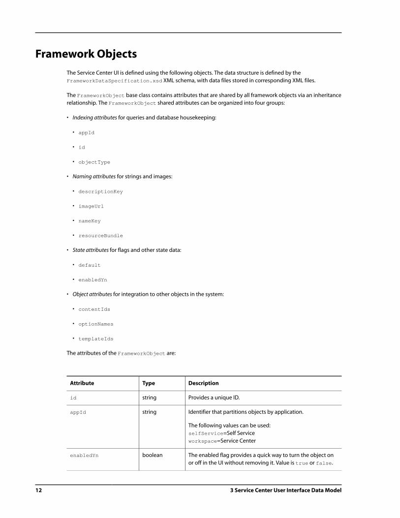
Framework Objects
The Service Center UI is defined using the following objects. The data structure is defined by the
FrameworkDataSpecification.xsd XML schema, with data files stored in corresponding XML files.
The FrameworkObject base class contains attributes that are shared by all framework objects via an inheritance
relationship. The FrameworkObject shared attributes can be organized into four groups:
• Indexing attributes for queries and database housekeeping:
• appId
• id
• objectType
• Naming attributes for strings and images:
• descriptionKey
• imageUrl
• nameKey
• resourceBundle
• State attributes for flags and other state data:
• default
• enabledYn
• Object attributes for integration to other objects in the system:
• contentIds
• optionNames
• templateIds
The attributes of the FrameworkObject are:
Attribute Type Description
id string Provides a unique ID.
appId string Identifier that partitions objects by application.
The following values can be used:
selfService=Self Service
workspace=Service Center
enabledYn boolean The enabled flag provides a quick way to turn the object on
or off in the UI without removing it. Value is true or false.

3 Service Center User Interface Data Model 13
Attribute Type Description
nameKey string Resource bundle key for providing an object name in
administration tools.
objectType string Object sub-class name for item-descriptor inheritance.
descriptionKey string Resource bundle key for providing an object description in
administration tools.
imageUrl string Path to object image graphic in administration tools. The
imageUrl allows a graphic to represent the object.
resourceBundle string Resource bundle identifier for object resources. The resource
bundle identifier allows any resource bundle on the class
path to be used for object string resources, if not using the
default resource bundle.
defaultFrameworkId string Second object that contains default values for the current
object. The default attribute defines a second object that
contains default values. This supports functionality to restore
defaults.
contentIds contains
mapEntry
elements
Identifies static content for the object, including JavaScript,
CSS or HTML, by a user-friendly local key.
templateIds contains
mapEntry
elements
Identifies JSP page layout templates for the object mapped
to a user-friendly local key.
optionNames contains
mapEntry
elements
Lists segmented option names for the object mapped to a
user-friendly local key.
The following extension methods are shared by all framework objects:
Returns Method Description
Map getContents Returns a map of all ContentDefinition objects assigned to
the framework object keyed to the logical content identifier.
Map getTemplates Returns a map of all TemplateDefinition objects assigned to
the framework object keyed to the logical template identifier.
Map getFrameworkObjects Utility method that returns a map of framework objects by item
type.
Arguments: int pItemType
14 3 Service Center User Interface Data Model
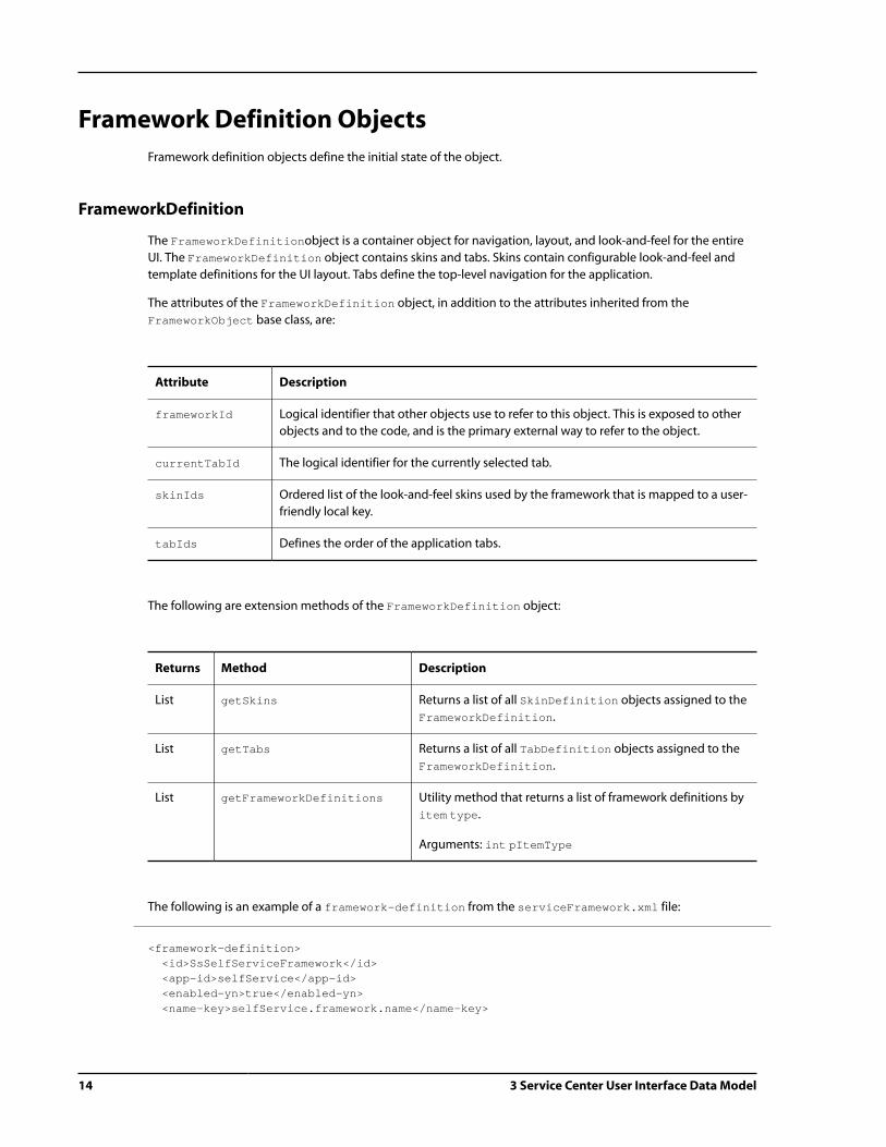
Framework Definition Objects
Framework definition objects define the initial state of the object.
FrameworkDefinition
The FrameworkDefinitionobject is a container object for navigation, layout, and look-and-feel for the entire
UI. The FrameworkDefinition object contains skins and tabs. Skins contain configurable look-and-feel and
template definitions for the UI layout. Tabs define the top-level navigation for the application.
The attributes of the FrameworkDefinition object, in addition to the attributes inherited from the
FrameworkObject base class, are:
Attribute Description
frameworkId Logical identifier that other objects use to refer to this object. This is exposed to other
objects and to the code, and is the primary external way to refer to the object.
currentTabId The logical identifier for the currently selected tab.
skinIds Ordered list of the look-and-feel skins used by the framework that is mapped to a user-
friendly local key.
tabIds Defines the order of the application tabs.
The following are extension methods of the FrameworkDefinition object:
Returns Method Description
List getSkins Returns a list of all SkinDefinition objects assigned to the
FrameworkDefinition.
List getTabs Returns a list of all TabDefinition objects assigned to the
FrameworkDefinition.
List getFrameworkDefinitions Utility method that returns a list of framework definitions by
item type.
Arguments: int pItemType
The following is an example of a framework-definition from the serviceFramework.xml file:
<framework-definition> <id>SsSelfServiceFramework</id> <app-id>selfService</app-id> <enabled-yn>true</enabled-yn> <name-key>selfService.framework.name</name-key>

3 Service Center User Interface Data Model 15
<object-type>FrameworkDefinition</object-type> <description-key>selfService.framework.description</description-key> <image-url>/image/default.gif</image-url> <framework-id>selfServiceFramework</framework-id>...
The framework-definition also identifies the skin IDs used within the framework. For example, the skins
used in this framework definition object are the htmlSkin and the originalSkin. The priority sets the skin
priority in the layout:
<skin-ids> <id-entry> <id>htmlSkin</id> <priority>100</priority> </id-entry> <id-entry> <id>originalSkin</id> <priority>200</priority> </id-entry></skin-ids>
The framework-definition identifies the tab IDs used within the framework. The priority property sets the
tab priority, for example:
<tab-ids> <id-entry> <id>browseTab</id> <priority>100</priority> </id-entry> <id-entry> <id>searchTab</id> <priority>200</priority> </id-entry><tab-ids>
SkinDefinition
The SkinDefinition object contains and provides a way to package the look-and-feel definitions available to
the application.
The SkinDefinition object, in addition to the attributes inherited from the FrameworkObject base class,
contains the following attribute:
Attribute Description
skinId Logical identifier that other objects use to refer to this object, which is exposed to other
objects and to the code. This is the primary external way to refer to the object.
The extension method of the SkinDefinitionHome interface is:

16 3 Service Center User Interface Data Model
Returns Method Description
SkinDefinition findByUserSegment
AndSkinId
Returns the SkinDefinition with the specified
identifier based on the segment of the current user. If
the current user does not have a segment or no object
is found for the current segment, a default object is
returned based on skin identifier only. The appId
indicates the framework application in which to look for
the object.
Arguments: String appId, String skinId
The following is an example of a simple tab skin-definition:
<skin-definition> <id>MySimpleTabsSkin</id> <app-id>selfService</app-id> <enabled-yn>true</enabled-yn> <name-key>mySimpleTabsSkin.name</name-key> <object-type>SkinDefinition</object-type> <description-key>mySimpleTabsSkin.description</description-key> <image-url>../../image/icons/my_skin_tabs.gif</image-url> <content-ids> <map-entry> <key>style</key> <value>MySkinSimpleTabsCSS</value> </map-entry> <map-entry> <key>javaScript</key> <value>MySkinSimpleTabsJS</value> </map-entry> </content-ids> <template-ids> <map-entry> <key>errorTemplate</key> <value>errorPanel</value> </map-entry> <map-entry> <key>panelTemplate</key> <value>simpleTabsPanel</value> </map-entry> <map-entry> <key>layoutTemplate</key> <value>simpleTabsLayout</value> </map-entry> </template-ids> <option-names> <map-entry> <key>myOption1</key> <value>SkinSimpleTabsShowLogo</value> </map-entry> </option-names> <skin-id>mySimpleTabsSkin</skin-id></skin-definition>

3 Service Center User Interface Data Model 17
TabDefinition
The TabDefinition object has multiple functions, which are related to the overall purpose of dividing the
application into large functional areas:
• Define top-level navigation between functional areas
• Specify page structure using layout cells and templates
• Define panel stacks containing related content groupings
The attributes of the TabDefinition object, in addition to the attributes inherited from the FrameworkObject
base class, are described below:
Attribute Description
tabId Logical identifier that other objects use to refer to this object, which is
exposed to other objects and to the code. This is the primary external way
to refer to the object.
titleKey Resource bundle key for the tab label.
actionId The application-interpreted action URL or JavaScript function that is
executed when the user selects an object on the tab.
nextStepsId The identifier of the default next steps menu that is displayed with the tab.
visibleYn The visibleYn flag determines whether an enabled tab is rendered or
hidden.
accessRight The access right that defines the security user role required to view the tab.
panelStackAssignments A map that assigns panelStackIds strings to cellId strings. The panel
stack assignments indicate the cells where each panel stack is displayed.
Contains the reverse mapping of the cellAssignments map.
currentPanelStacks The listing of the identifiers of the panel stacks currently being displayed on
the tab. The panelStackAssignments attribute indicates which cell the
panel stack populates within the page layout.
panelStackOrder The list of all panel stacks for the tab in rendering order. This supports panel
stacks that must be rendered in a specific order.
cellAssignments Indicates the initial panel stack that is displayed in each cell. Contains the
reverse mapping of the panelStackAssignments map.
The extension method of the TabDefinitionHome interface is:

18 3 Service Center User Interface Data Model
Returns Method Description
TabDefinition findByUserSegmentAndTabId Returns the TabDefinition with the specified
identifier based on the segment of the current
user. If the current user does not have a segment
or no object is found for the current segment, a
default object is returned based on tab identifier
only. The appId indicates the framework
application in which to look for the object.
Arguments: String appId, String tabId
The following is an example of an Self Service tab-definition that defines a document tab layout:
<tab-definition> <id>MySsDocumentTabDefinition</id> <app-id>selfService</app-id> <enabled-yn>true</enabled-yn> <name-key>myDocumentTab.name</name-key> <object-type>TabDefinition</object-type> <description-key>myDocumentTab.description</description-key> <image-url>/image/myDocumentTabdefault.gif</image-url> <tab-id>myDocumentTab</tab-id> <title-key>myDocumentTab.label</title-key> <action-id>/main.jsp?t=documentTab</action-id> <visible-yn>false</visible-yn> <access-right></access-right> <panel-stack-assignments> <map-entry> <key>documentPanels</key> <value>centerColumn</value> </map-entry> </panel-stack-assignments> <cell-assignments> <map-entry> <key>centerColumn</key> <value>documentPanels</value> </map-entry> </cell-assignments></tab-definition>
CellDefinition
The CellDefinition object represents the basic layout unit within the page structure. The CellDefinition
can refer to a DOM element or to another identifier on the page that contains a panel stack.
The attributes of the CellDefinition object, in addition to the attributes inherited from the
FrameworkObject base class, are:

3 Service Center User Interface Data Model 19
Attribute Description
cellId Logical identifier that other objects use to refer to this object that is exposed to other
objects and to the code. This is the primary external way to refer to the object.
cellOpenYn The cellOpenYn flag determines whether a cell is toggled open or closed. Used in Service
Center only.
accessRight The access right that defines the security user role required to view the cell.
The extension method of the CellDefinitionHome interface is:
Returns Method Description
CellDefinition findByUserSegment
AndCellId
Returns the CellDefinition with the specified identifier
based on the segment of the current user. If the current
user does not have a segment or no object is found for
the current segment, a default object is returned based
on cell identifier only. The appId indicates the framework
application in which to look for the object.
Arguments: String appId, String cellId
The following is an example of the Self Service cell-definition:
<cell-definition> <id>SsCenterCellDefinition</id> <app-id>selfService</app-id> <enabled-yn>true</enabled-yn> <name-key>centerColumn.name</name-key> <object-type>CellDefinition</object-type> <description-key>centerColumn.description</description-key> <image-url>/image/default.gif</image-url> <cell-id>centerColumn</cell-id> <cell-open-yn>true</cell-open-yn> <access-right></access-right></cell-definition>
PanelStackDefinition
The PanelStackDefinition object contains an ordered collection of panel identifiers. The
PanelStackDefinition object is assigned to a cell that corresponds to a DOM element on the page. The cell
defines the position of the PanelStackDefinition object on the page.
The attributes of the PanelStackDefinition object, in addition to the attributes inherited from the
FrameworkObject base class, are described below:

20 3 Service Center User Interface Data Model
Attribute Description
panelStackId Logical identifier that other objects use to refer to this object and is exposed to other
objects and code. This is the primary external way to refer to the object.
titleKey Resource bundle key for the label that is associated with the panel stack.
tabAffinityYn The tabAffinity flag indicates if the panel stack is associated with a particular tab
(true) or if it can be rendered under any tab, as in the case of user preferences (false).
If the tabAffinity flag is true and this was the last panelStack viewed under a tab,
when the user navigates back to that tab, the panel stack will be rendered.
panelIds The ordered collection of panel identifiers.
The extension method of the PanelStackDefinition object is:
Returns Method Description
List getPanels Returns a list of all PanelDefinition objects assigned to the
PanelStackDefinition.
The extension method of the PanelStackDefinitionHome interface is:
Returns Method Description
PanelStackDefinition findByUserSegment
AndPanelStackId
Returns the PanelStackDefinition with the
specified identifier based on the segment of the
current user. If the current user does not have
a segment or no object is found for the current
segment, a default object is returned based on
panel stack identifier only. The appId indicates
the framework application in which to look for
the object.
Arguments: String appId, String panelStackId
The following is an example of a PanelStackDefinition:
<panel-stack-definition> <id>SsHelpPanelStack</id> <app-id>selfService</app-id> <enabled-yn>true</enabled-yn> <name-key>helpPanels.name</name-key> <object-type>PanelStackDefinition</object-type> <description-key>helpPanels.description</description-key> <image-url>/image/default.gif</image-url>

3 Service Center User Interface Data Model 21
<panel-stack-id>helpPanels</panel-stack-id> <header>contentHeader</header> <error-panel-id>errorPanel</error-panel-id> <title-key>helpPanels.label</title-key> <tab-affinity-yn>true</tab-affinity-yn> <panel-ids> <id-entry> <id>SsErrorPanel</id> <priority>100</priority> </id-entry> </panel-ids></panel-stack-definition>
PanelDefinition
The PanelDefinition object is the basic content unit for the application. The PanelDefinition defines a
rectangular region of the page with related content referenced by an included JSP content template.
The attributes of the PanelDefinition object, in addition to the attributes inherited from the
FrameworkObject base class, are:
Attribute Description
panelId Logical identifier that other objects use to refer to this object, which is
exposed to other objects and to the code. It is the primary external way to
refer to the object.
contentUrl Use the templateIds mapping on the FrameworkObject to assign
arbitrary JSP pages to framework objects. Identifies the contents of the panel.
otherContext Contains a static context link or a context/URL link.
onload Contains the optional name of a JavaScript function to evaluate when the
panel is loaded by the framework.
onunload Contains the optional name of a JavaScript function to evaluate when the
panel is unloaded by the framework.
helpKey Provides a string for inline help accessible via a help icon located on the
panel title bar.
titleKey Resource bundle key for the label that is associated with the panel.
visibleYn Determines whether an enabled tab is rendered or hidden.
showTitleYn Indicates whether the panel has a visible title bar or only a content area with
no title bar.
panelOpenYn Indicates whether the entire panel is currently closed or minimized with a
placeholder displayed in the available panels.
allowPanelToggleYn Indicates whether the entire panel, including title bar, can be closed or
minimized and represented by a placeholder in the available panels.

22 3 Service Center User Interface Data Model
Attribute Description
allowContentToggleYn Indicates whether the panel contents can be closed or minimized, leaving
only the panel title bar visible.
tabHolderYn Determines whether the panel can hold other panels in a tabbed format.
alwaysTabbedYn Indicates whether the panel is forced to be tabbed in a row of panel tabs on a
tab-holder panel with no ability to be removed from the tabbed position.
tabbedYn Indicates whether the panel is currently a tabbed in a row of panel tabs on a
tab-holder panel.
allowTabbingYn Indicates whether the panel is allowed to be tabbed in a row of panel tabs on
a tab-holder panel.
currentPanelId Holds the identifier of the currently visible panel based on the selected tab
for tab-holder panels.
panelItemCount Provides a way for the panel label to contain a number representing the
number of items displayed in the panel. For example, a panel that displays 17
search results in its content area is able to display My Search Results (17) in
the title bar.
accessRight The access right that defines the security user role required to view the panel.
tabbedPanelIds Lists the identifiers of the other panels that are tabbed with the current tab-
holder panel. The tabs are rendered in the order that the corresponding
panels identifiers occur in the list.
The extension method of the PanelDefinitionHome interface is:
Returns Method Description
PanelDefinition findByUserSegment
AndPanelId
Returns the PanelDefinition with the specified
identifier based on the segment of the current user. If
the current user does not have a segment or no object
is found for the current segment, a default object is
returned based on panel identifier only. The appId
indicates the framework application in which to look for
the object.
Arguments: String appId, String panelId
The following is an example of a PanelDefinition:
<panel-definition> <id>SsContactUsPanel</id> <app-id>selfService</app-id>

3 Service Center User Interface Data Model 23
<enabled-yn>true</enabled-yn> <name-key>contactUsPanel.name</name-key> <object-type>PanelDefinition</object-type> <description-key>contactUsPanel.description</description-key> <image-url>/image/default.gif</image-url> <panel-id>contactUsPanel</panel-id> <content-url>/panels/contactUsPanel.jsp</content-url> <help-key>contactUsPanel.help</help-key> <title-key>contactUsPanel.label</title-key> <visible-yn>true</visible-yn> <show-title-yn>true</show-title-yn> <panel-open-yn>true</panel-open-yn> <allow-panel-toggle-yn>false</allow-panel-toggle-yn> <available-yn>false</available-yn> <content-open-yn>true</content-open-yn> <allow-content-toggle-yn>false</allow-content-toggle-yn> <tab-holder-yn>false</tab-holder-yn> <always-tabbed-yn>false</always-tabbed-yn> <tabbed-yn>false</tabbed-yn> <allow-tabbing-yn>false</allow-tabbing-yn> <allow-slots-yn>false</allow-slots-yn> <tab-scroll-index>0</tab-scroll-index> <panel-item-count>0</panel-item-count> <access-right>TBD</access-right></panel-definition>
Framework Supporting Object Definitions
A few supporting object definition types can be referenced by any other framework object. Content objects
define static content such as CSS, JavaScript, or HTML. Template objects define JSP layout templates.
ContentDefinition
The ContentDefinition object provides an extensible way to link static content, such as CSS, HTML or
JavaScript to framework objects. The MIME type of the content is specified with the ContentDefinition
object. Any framework object can define content definitions mapped by key. The following is an example of how
to import CSS contents into a JSP page:
<c:out value="${mySkin.contents.css.body}"/>
The attributes of the ContentDefinition object, in addition to the attributes inherited from the
FrameworkObject base class, are:
Attribute Description
body The text context that is defined as an alternative to referencing the content by a URL.

24 3 Service Center User Interface Data Model
Attribute Description
contentId Logical identifier that other objects use to refer to this object. This identifier is exposed
to other objects and to the code. and is the primary external way to refer to the object.
mimeType The type of content being defined. For example, content with a MIME type of text/css
would place CSS contents in the body. Content with a MIME type of text/javascript
would place JavaScript in the body. Other common content types in a Web application
might be text/html or text/xml.
otherContext The Web context for rendering content from other Web applications.
url A URL that references the static content.
urlYn Indicates whether the content is referenced externally by a URL. If the URL flag is false,
the body of the static content is contained internally in the body attribute of the content
definition.
The extension method of the ContentDefinitionHome interface is:
Returns Method Description
ContentDefinition findByUserSegment
AndContentId
Returns the ContentDefinition with the specified
identifier based on the segment of the current user. If
the current user does not have a segment or no object
is found for the current segment, a default object is
returned based on content identifier only. The appId
indicates the framework application in which to look for
the object.
Arguments: String appId, String contentId
TemplateDefinition
The TemplateDefinition object defines templates for objects in the framework. Templates are JSP pages that
define the page structure for a framework object. Any framework object has the ability to define its own layout
templates mapped by key. The following is an example of how to import a skin layout template:
<dspel:include page="${mySkin.templates.layoutTemplate.url}"/>
The attributes of the TemplateDefinition object, in addition to the attributes inherited from the
FrameworkObject base class, are:
Attribute Description
otherContext The Web context for rendering content from other Web applications.

3 Service Center User Interface Data Model 25
Attribute Description
templateId Logical identifier that other objects use to refer to this object, which is exposed to other
objects and to the code. It is the primary external way to refer to the object.
url A URL that references the JSP template.
The extension method of the TemplateDefinitionHome interface is:
Returns Method Description
TemplateDefinition findByUserSegment
AndTemplateId
Returns the TemplateDefinition with the
specified identifier based on the segment of the
current user. If the current user does not have
a segment or no object is found for the current
segment, a default object is returned based on
template identifier only. The appId indicates the
framework application in which to look for the
object.
Arguments: String appId, String templateId
The following is a TemplateDefinition:
<template-definition> <id>SsSimpleLinksEveryonePanelTemplate</id> <app-id>selfService</app-id> <enabled-yn>true</enabled-yn> <object-type>TemplateDefinition</object-type> <template-id>simpleLinksPanel</template-id> <url>/skins/templates/simpleLinksPanelTemplate.jsp</url></template-definition>
Framework Configuration Objects
In addition to the framework definition objects, which define default appearance and behavior, the
configuration objects store the current state of the framework objects for a particular user when the user logout.
The profile ID of the user is associated with the configuration. These configuration objects, which are defined in
the /Service/Framework/config/atg/svc/ui/framework /serviceFrameworkRepository.xml file, are
associated with the profile ID of the user.

26 3 Service Center User Interface Data Model
Configuration Object Inherited Attributes
The ConfigurationObject base class contains attributes that are shared by all framework configuration
objects via an inheritance relationship. The ConfigurationObject shared attributes are:
Attribute Description
configType Object sub-class name for item-descriptor inheritance.
enabledYn The enabled flag turns the object on or off in the UI via the object configuration. Value is
true or false.
id Repository identifier.
userId Repository ID of the user to whom the configuration belongs.
FrameworkConfig
The FrameworkConfig object manages user configuration for the FrameworkDefinition object.
The attributes of the FrameworkConfig object, in addition to the attributes inherited from the
ConfigurationObject base class, are:
Attribute Description
configType FrameworkConfig
currentTabId The identifier of the currently selected tab for the current user.
frameworkId Logical identifier for the corresponding FrameworkDefinition.
tabIds List of tabs visible for the current user.
ContentConfig
The ContentConfig object manages user configuration for the ContentDefinition object and has the same
attributes as the ContentDefinition object.
TemplateConfig
The TemplateConfig object manages user configuration for the TemplateDefinition object and has the
same attributes as the TemplateDefinition object.
SkinConfig
The SkinConfig object is a placeholder configuration object for the SkinDefinition object with no
significant attributes.

3 Service Center User Interface Data Model 27
TabConfig
The TabConfig object manages user configuration for the TabDefinition object. The attributes of the
TabConfig object, in addition to the attributes inherited from the ConfigurationObject base class, are:
Attribute Description
configType TabConfig
tabId Logical identifier for the corresponding TabDefinition.
visibleYn The visibleYn flag indicates whether the tab is visible for the current user.
CellConfig
The CellConfig object manages user configuration for the CellDefinition object. The attributes of the
CellConfig object, in addition to the attributes inherited from the ConfigurationObject base class, are:
Attribute Description
configType CellConfig
cellId Logical identifier for the corresponding CellDefinition.
cellOpenYn The cellOpen flag indicates whether the cell is open or closed for the current user.
PanelStackConfig
The PanelStackConfig object manages user configuration for the PanelStackDefinition object.
The attributes of the PanelStackConfig object, in addition to the attributes inherited from the
ConfigurationObject base class, are:
Attribute Description
configType PanelStackConfig
panelIds List of panels defined for the current user.
panelStackId Logical identifier for the corresponding PanelStackDefinition.
PanelConfig
The PanelConfig object manages user configuration for the PanelDefinition object. The attributes of the
PanelConfig object, in addition to the attributes inherited from the ConfigurationObject base class, are:

28 3 Service Center User Interface Data Model
Attribute Description
configType PanelConfig
availableYn The available flag indicates whether the panel is displayed in the available panels for
the current user.
contentOpenYn Indicates whether the panel content area is open or closed for the current user.
currentPanelId Holds the identifier of the initially visible panel tab for the current user. Applies to tab-
holder panels.
panelId Logical identifier for the corresponding PanelDefinition.
panelOpenYn The panel open flag indicates whether the entire panel is open or closed, including
the title bar, for the current user.
tabbedPanelIds Lists the identifiers of the other panels that are tabbed with the current tab-holder
panel for the current user. Applies to tab-holder panels.
tabbedYn The tabbed flag indicates whether the panel is initially tabbed on a tab-holder panel
for the current user. If set to false, the panel is not tabbed within the panel.
tabScrollIndex Supports the scrollable tabs feature configuration for horizontal tab scrolling.
visibleYn Indicates whether the panel is visible for the current user.
Framework Instance Objects
The framework definition and configuration objects both manage persistent aspects of the Service Center
framework. Framework instance objects manage the transient aspects of the Service Center framework by
holding the current in-memory state of a given framework object in a running Web application within a browser.
Below is a summary of the instance objects, which are defined in the /Service/Framework/
config/atg/svc/ui/framework/serviceFrameworkRepository.xml file.
Instance Object Inherited Attributes
The InstanceObject base class contains attributes that are shared by all framework instance objects via an
inheritance relationship. The InstanceObject shared attributes are:
Attribute Description
enabledYn The enabled flag turns the object on or off in the UI for the duration of the user’s
browser session. Value is true or false.
instanceType Object sub-class name for item-descriptor inheritance.

3 Service Center User Interface Data Model 29
ContentInstance
The ContentInstance object manages transient state for the ContentDefinition object and has attributes
similar to the ContentDefinition object.
TemplateInstance
The TemplateInstance object manages transient state for the TemplateDefinition object and has
attributes similar to the TemplateDefinition object.
FrameworkInstance
The FrameworkInstance object manages transient state for the FrameworkDefinition object. The attributes
of the FrameworkInstance object, in addition to the attributes inherited from the InstanceObject base
class, are:
Attribute Description
instanceType FrameworkInstance
currentTabId The identifier of the currently selected tab in the browser.
frameworkId Logical identifier for the corresponding FrameworkDefinition.
previousTabId The identifier of the last selected tab in the browser.
tabIds List of tabs currently visible in the browser.
SkinInstance
The SkinInstance object is a placeholder configuration object for the SkinDefinition object with no
attributes currently defined.
TabInstance
The TabInstance object manages transient state for the TabDefinition object. The attributes of the
TabInstance object, in addition to the attributes inherited from the InstanceObject base class, are:
Attribute Description
instanceType TabInstance
cellAssignments Map indicating the panel stacks that are currently assigned to each layout cell in
the browser.

30 3 Service Center User Interface Data Model
Attribute Description
currentPanelStacks Map indicating the cell to which each panel stack is currently assigned in the
browser.
nextStepsId Identifier indicating the current next steps menu for the tab in the browser.
tabId Logical identifier for the corresponding TabDefinition.
visibleYn Indicates whether the tab is visible in the browser.
CellInstance
The CellInstance object manages transient state for the CellDefinition object. The attributes of the
CellInstance object, in addition to the attributes inherited from the InstanceObject base class, are:
Attribute Description
instanceType CellInstance
cellId Logical identifier for the corresponding CellDefinition.
cellOpenYn Indicates whether the cell is open or closed in the browser. Tracks the open-
closed state of the columns.
currentPanelStackId Identifier that indicates the current panel stack displayed in the cell in the
browser.
PanelStackInstance
The PanelStackInstance object manages transient state for the PanelStackDefinition object.
The attributes of the PanelStackInstance object, in addition to the attributes inherited from the
InstanceObject base class, are:
Attribute Description
instanceType PanelStackInstance
panelStackId Logical identifier for the corresponding PanelStackDefinition.
panelTargetElements List of panel target elements in the panel stack, each representing a single
instance of a panel within the UI.
targetMap Maps a lists of panel target elements keyed by the logical panel identifier. Each
key in the map contains a list of all of the instances of a particular panel target
in the UI.

3 Service Center User Interface Data Model 31
PanelInstance
The PanelInstance object manages transient state for the PanelDefinition object. The attributes of the
PanelInstance object, which are in addition to the attributes inherited from the InstanceObject base class,
are:
Attribute Description
instanceType PanelInstance
availableYn Indicates whether the panel is listed in the available panels in the browser.
contentOpenYn Indicates whether the panel content area is open or closed in the browser.
currentPanelId Holds the identifier of the currently visible panel tab in the browser. Applies to tab-
holder panels.
panelId Logical identifier for the corresponding PanelDefinition.
panelOpenYn Indicates whether the entire panel is open or closed, including the title bar, in the
browser.
tabbedPanelIds Lists the identifiers of the other panels that are tabbed with the current tab-holder
panel in the browser. Applies to tab-holder panels.
tabbedYn Indicates whether the panel is currently tabbed on a tab-holder panel in the browser.
tabScrollIndex Supports the transient scrollable tabs feature for horizontal tab scrolling.
visibleYn Indicates whether the panel is visible in the browser.
PanelTarget
The PanelTarget object manages transient state for a single instance of a panel in the UI. By providing an auto-
generated unique identifier for each panel instance, the PanelTarget object allows multiple instances of the
same PanelDefinition to exist simultaneously on the page.
The attributes of the PanelInstance object, in addition to the attributes inherited from the InstanceObject
base class, are:
Attribute Description
instanceType PanelTargetElement
panelId Logical identifier for the corresponding PanelDefinition for the instance.
targetElementId Auto-generated unique identifier for the panel instance.

32 3 Service Center User Interface Data Model
Modifying Framework Definitions
You can modify the framework definition elements that are outlined in the Framework Objects (page 12)
section. Modifications should be made to the serviceFramework.xml file located in your customization
directory. Your modifications will be appended to the default serviceFramework.xml file. For detailed
information on xml-combine, or data binding, refer to the ATG Page Developer's Guide.
Adding a Definition
The following is an example of a new content definition named myexistingTabAction:
<content-definition> <id>myexistingTabAction</id> <app-id>workspace</app-id> <enabled-yn>true</enabled-yn> <object-type>ContentDefinition</object-type> <content-id>myexistingTabAction</content-id> <mime-type>text/javascript</mime-type> <body>atgChangeTab(atg.svc.framework.changeTab("DefaultTab"), null, null, null);</body> <url-yn>true</url-yn></content-definition>
Modifying a Definition
The following example shows a modification to an existing myexistingTabAction element that changes the
enabled-yn element from true to false. The myexistingTabAction element is matched on the content-
definition and id tags:
<content-definition> <id>myexistingTabAction</id> <enabled-yn>false</enabled-yn></content-definition>
Deleting a Definition
The following is an example of how to delete a definition named myexistingTabAction. Modifications should
be made to the serviceFramework.xml file located in your customization directory:
<content-definition xml-combine="remove"> <id>myexistingTabAction</id></content-definition>

4 Service Center Framework API 33
4 Service Center Framework API
Service Center provides an API that accesses various features of the UI framework. The following information is
discussed in this section:
• atgChangeTab – Provides code that allows you to change the tab in the framework while setting arguments
for atgSubmitAction
• atgSubmitAction – Provides code that submits information from a form
• frameworkUrl – Provides code that identifies forwarding and redirecting URLs
Changing Tabs
The atgChangeTab performs the necessary client and server side actions to change the current tab in the
framework using the following attributes that set arguments for atgSubmitAction.
• newTab
• nextSteps
• panelStack
• panels
• extraParams
The following functions are available in atg.svc.framework. Additional information is available in the ATG API
Reference for Knowledge Manager and Self Service:
Attribute Description
changeTab Change to the specified tab on the client-side only. Must be called in conjunction
with a server-side call to atgSubmitAction that specifies the ID of a valid tab
defined in the UI framework.
Arguments:
tabId – ID of the tab to make the current tab

34 4 Service Center Framework API
Attribute Description
toggleSidebar Changes and restores the state of the sidebar from the default expanded view
showing all of the helpful panels to a minimized view showing a vertical bar.
Arguments:
none
toggleResearch Knowledge Manager only. Changes and restores the state of the middle column
in Knowledge Manager from the expanded view showing all of the research
panels to a default minimized view showing a vertical bar.
Arguments:
none
selectTabbedPanel Selects the specified panel in a row of tabbed panels as the current panel.
Arguments:
panelId – ID of the panel to make the current panel
nextStepsId – ID of the next steps
nextStepsPanelId – optional ID of the next steps panel
togglePanel Removes or restores the specified side panel. Removed panels are taken out of
the display and moved to a link in the Available Panels panel. Clicking the link in
Available Panels restores the panel to its original position.
Arguments:
panelId – ID of the panel to toggle
togglePanelsToTabs Moves a panel to or from a row of tabbed panels.
Arguments:
panelId – ID of panel to move to tabs
panelStackId – ID of panel stack that contains the panel to move to tabs
togglePanelContent Shows and hides the content area of a panel. The title bar of the panel remains in
place.
Arguments:
panelId – ID of the panel to toggle
startCall Initiates a new agent session with a customer without ending the existing
session.
endCall Terminates the existing agent session with the customer.
endAndStartCall Initiates a new agent session with a customer and terminates the existing session.
Framework parameters are submitted to the server using the atgSubmitAction function or with form handlers
using a successURL formatted by the frameworkUrl tag library.

4 Service Center Framework API 35
Submitting Actions
The atgSubmitAction is used to submit a form. The JavaScript function atgSubmitAction has the following
signature, which accepts a single object argument:
atgSubmitAction = function(params) {};
The params argument is a JavaScript object that may contain any combination of the following properties that
are used to configure the framework request. Some properties are converted to request or query parameters
and submitted to the server. Others are assigned to the submitted form. Most of the properties are either
optional or have defaults, so they do not have to be specified with each request.
Property Description
url Optional target URL for submitting framework requests. Overrides the default
framework URL.
mimeType Optional. Sets the mime-type of the request.
handleAs Optional. Sets the expected response format for proper handling.
form Reference to the DOM form to submit the framework request. The form can be a
DSP form linked to a form handler. Either form or formId is required.
formId Looks up the form to submit with the framework request. Either form or formId
is required.
formInputValues Requires the form specified in the form property. Maps form element names to
values. Each value is bound to the corresponding form element for submission
as such: For each name in formInputValues, set form[name].value =
forminputValues[name]
tab Navigates to the specified tab by ID. Submits the request parameter t.
nextSteps String name of the next steps to render in the next steps panel. Submits the
request parameter ns.
panelStack Navigates to the specified panel stack under the current tab. Renders all of the
currently-enabled member panels of the panel stack in the cell for which the
panel stack is assigned under the tab definition. Submits the request parameter
ps.
panels Array of panel identifiers to refresh. The panel will remain in its current place but
the contents will be re-rendered. Submits the request parameter p. For example:
["panel1", "panel2"]
selectTabbedPanels Array of panel identifiers to set to the selected state. Applies to panels
that are in a row of tabbed panels. Submits the request parameter
selectTabbedPanelIds.

36 4 Service Center Framework API
Property Description
paramsMapName Optional. Fully qualified Nucleus path of the form-handler bean map property
that will receive the extraParams. Allows JavaScript data to be passed to a form
handler.
formHandler Optional. Fully qualified Nucleus path of a form handler with a property
named parameterMap. Note: The form handler must have a property named
parameterMap. If the form handler does not have a property with this name, use
the paramsMapName property.
extraParams Optional. Map of parameters to map to key-value pairs on the default
FrameworkBaseFormHandler parameterMap property or another property
specified in paramsMapName. The values are assigned into a comma-delimited
list as such: For each key in extraParams, append key = extraParams[key]
to list. The comma-delimited list is assigned to the form handler parameter map
property: key1=value1, key2=value2, etc. Allows JavaScript data to be passed
to a form handler map.
listParams Optional. Map of keys to arrays of values. Requires the form specified in the
form property and the form handler specified in the formHandler property.
The values contained in each array are submitted to the same array-based form
handler property. For example, {param1: [a,b,c], param2: [x,y,z]}.
mapParams Optional. Map of keys to other maps. Requires the form specified in the form
property and the form handler specified in the formHandler property. The outer
keys map to the corresponding property names on formHandler. The inner
keys are appended to a comma-delimited list of key-value pairs. For example,
{property1: {key1: value1, key2: value2}}.
queryParams Optional. Map of parameters that are added without modification to the request
URL as query parameters.
sync Flag indicating whether to submit the request synchronously or asynchronously.
If the request is synchronous, the atgSubmitFunction will wait until a response
is received from the server (or a timeout occurs) before continuing execution. The
default value is false for asynchronous requests.
showLoadingCurtain Flag indicating whether to display a loading curtain and progress indicator
during requests. The default value is true to show the loading curtain and
progress indicator.
Forwarding and Redirecting URLs
The frameworkUrl tag constructs a forwarding and redirection URL with framework parameters. The URL can
be assigned to a form handler sucessURL property, allowing the form handler to navigate to different locations
in the Service Center application based on the results of processing the form.
The following example navigates to the global panels and the shopping cart panel stacks. If these panel stacks
are already displayed, they will be refreshed. This example also contains the custom parameter contentHeader,

4 Service Center Framework API 37
which will be added to the query parameters as contentHeader=true. The result is stored in the successURL
page variable, which can be assigned to a form handler property.
<svc-ui:frameworkUrl var="successURL" panelStacks="globalPanels, cmcShoppingCartPS" contentHeader="true"/>
The following attributes can be assigned to the tag. Custom dynamic attributes are also allowed and will be
included to the redirection URL as query parameters.
Attribute Description
context Optional. Context of the framework request URL for forwarding or redirecting.
Requires that url is specified.
dynamicIncludes Sets the delimiters for setting dynamic includes.
Context Sets the values for the Context.
panels Delimited list of panel identifiers for the panels to refresh. The panels will
remain in their current place but the contents will be re-rendered. Includes the
request parameter p. The default delimiter is a comma. The default delimiter
can be overridden with the splitChar attribute.
panelStacks Delimited list of panel stack identifiers for the panel stacks to navigate to under
the current panel. Renders the currently-enabled member panels of the panel
stack in the cell for which the panel stack is assigned under the tab definition.
Includes the request parameter ps. The default delimiter is a comma. The
default delimiter can be overridden with the splitChar attribute.
selectTabbedPanels Delimited list of panel identifiers for the tabbed panels to set to the selected
state. Applies only to panels that are in a row of tabbed panels. The default
delimiter is a comma. The default delimiter can be overridden with the
splitChar attribute.
splitchar Sets the delimiter to the specified set of characters overriding the default
comma delimiter.
tab Navigates to the specified tab by ID. Includes the request parameter.
url Optional. Target URL for forwarding or redirecting the framework request.
Overrides the default framework URL.
var Page variable name to be assigned the framework URL.

38 4 Service Center Framework API

Part II. Developing Pages in Service CenterThe instructions in this section are intended for users who make changes to the user interface of Service Center. This section
provides information on components that are specific to Service Center and should be used in tandem with general page
development information, such as working with tags, forms and servlets, which can be found in the ATG Page Developer's
Guide.
This section contains the following:


5 Service Center UI Components 41
5 Service Center UI Components
This section discusses UI components that are specific to Service Center. General page development
information, such as working with tags, forms and servlets, can be found in the ATG Page Developer's Guide.
Working with JavaServer Pages
ATG applications provide an open, server-side environment for building and deploying dynamic, personalized
applications based on JavaBeans and JSP pages. Web application developers assemble applications out of
component servlet beans by linking them together through configuration files. For detailed information on
creating JavaBean components and JSPs, refer to the ATG Platform Programming Guide.
When a browser instance requests a JSP, all necessary documents are identified and located and then compiled
into Java code. The code is then converted into an HTML page and displayed. HTML can incorporate dynamic
elements that allow the page to be customized for each instance using JSP, which can pass information to
JavaBeans, servlets and other Java components. JSP-based applications can perform a number of capabilities,
including displaying property values or forms, invoke servlet beans or components and extract data stored in
XML.
For detailed information on creating JSPs, refer to the ATG Page Developer's Guide.
Tag Libraries
As a Web page designer, you build the front-end interface for the application out of JSPs that use the DSP tag
library. The DSP tag library used by Service Center are listed in Appendix B, B: Tag Libraries (page 121).
For additional information on working with tag libraries, refer to the ATG Page Developer's Guide.
Servlet Beans
Servlet beans are Java-based Web components that are managed by a container and generate dynamic content
from Java objects. They also transform data in XML documents. Detailed information on working with servlet
beans and integrating XML with servlet beans can be found in the ATG Page Developer's Guide.
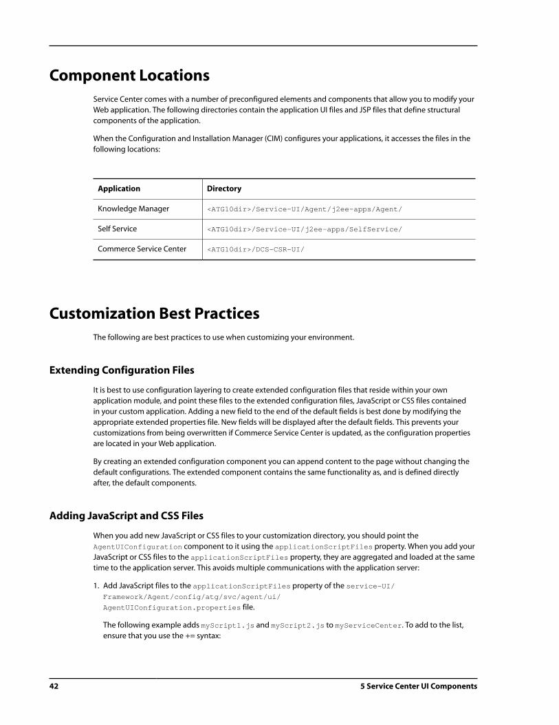
42 5 Service Center UI Components
Component Locations
Service Center comes with a number of preconfigured elements and components that allow you to modify your
Web application. The following directories contain the application UI files and JSP files that define structural
components of the application.
When the Configuration and Installation Manager (CIM) configures your applications, it accesses the files in the
following locations:
Application Directory
Knowledge Manager <ATG10dir>/Service-UI/Agent/j2ee-apps/Agent/
Self Service <ATG10dir>/Service-UI/j2ee-apps/SelfService/
Commerce Service Center <ATG10dir>/DCS-CSR-UI/
Customization Best Practices
The following are best practices to use when customizing your environment.
Extending Configuration Files
It is best to use configuration layering to create extended configuration files that reside within your own
application module, and point these files to the extended configuration files, JavaScript or CSS files contained
in your custom application. Adding a new field to the end of the default fields is best done by modifying the
appropriate extended properties file. New fields will be displayed after the default fields. This prevents your
customizations from being overwritten if Commerce Service Center is updated, as the configuration properties
are located in your Web application.
By creating an extended configuration component you can append content to the page without changing the
default configurations. The extended component contains the same functionality as, and is defined directly
after, the default components.
Adding JavaScript and CSS Files
When you add new JavaScript or CSS files to your customization directory, you should point the
AgentUIConfiguration component to it using the applicationScriptFiles property. When you add your
JavaScript or CSS files to the applicationScriptFiles property, they are aggregated and loaded at the same
time to the application server. This avoids multiple communications with the application server:
1. Add JavaScript files to the applicationScriptFiles property of the service-UI/
Framework/Agent/config/atg/svc/agent/ui/
AgentUIConfiguration.properties file.
The following example adds myScript1.js and myScript2.js to myServiceCenter. To add to the list,
ensure that you use the += syntax:

5 Service Center UI Components 43
applicationScriptFiles+=
/myServiceCenter/myScripts/myScript1.js,
/myServiceCenter/myScripts/myScript2.js
2. If dojoDebug is turned on, as discussed in Dojo Debugging Mode (page 44), you must add your custom
scripts to the debugScriptFiles list:
debugScriptFiles+=
/myServiceCenter/myScripts/myScript1.js,
/myServiceCenter/myScripts/myScript2.js
3. To add a new CSS file, add it to /atg/svc/agent/ui/AgentUIConfiguration using the
applicationStyleSheets property:
applicationStyleSheets+=
/myServiceCenter/myStyles/myStyles.css
Using Service Center Debugging Modes
When customizing Service Center, you may find it helpful to activate the following debugging modes.
Service Center Debugging Mode
Service Center debugging mode provides information on all of the components that comprise the panel. When
the cursor is placed over the icon, debug information displays for the panel, as shown below:
The pop-up window presents a table of the data IDs that drive the display of the panel, as well as the JSP that
renders the panel content and the Web application that contains the JSP. The table also displays the resource
bundle and the key that are used to display the panel content.

44 5 Service Center UI Components
Below the table is a list of the JSP sources, as well as a list of the included JSP files. This page is cross-linked to the
Dynamo Server Admin, which queries for the panel data, allowing real-time modification.
To turn on debug mode, set the useDebugPanelStackMode property of the /atg/svc/agent/ui/
AgentUIConfiguration to true.
Dojo Debugging Mode
Dojo debugging enables console logging in Firefox Firebug. To set Dojo debugging, set the dojoDebug
property of the /atg/svc/agent/ui/AgentUIConfiguration to true.

6 Working with the Global Context Area 45
6 Working with the Global Context
Area
The global context area is a UI located at the top of the page in Service Center. This JSP-based UI is produced
using a series of configuration files that define the contents of each navigational item. The following section
describes the components that make the global context area, as well as steps to modify the UI.
Global Context Area Architecture
The global context area allows users to see and access a variety of information quickly. The items that are
displayed on the global context area depend on the modules and applications that have been installed in your
environment.
The global context area is comprised of three separate navigation containers, the PrimaryNavContainer, the
SecondaryNavContainer and the OptionsNavContainer. Each navigation container is a component of type
NavContainer, which defines the navigational item components of type NavItem that will be displayed in the
UI. The following individual navigation classes make up the entire global context area architecture:
• NavItem – A NavItem component encapsulates the components that make up a single navigational element
within the UI. A NavItem is comprised of NavSearch, NavContent and NavAction elements
• NavSearch – A NavSearch component provides the display and control elements that are displayed and
executed when a user clicks the search option on the NavItem
• NavContent – This component provides the display and control elements that are displayed and executed
when a use clicks on the context area of the NavItem
• NavAction – A NavAction defines the display and control elements for a single action. NavActions can be
referenced by a NavActionFactory using static component references or, in some cases can be dynamically
generated by a NavActionFactory. Dynamic NavActions are those that can change in availability,
appearance or execution, depending on the current state of the agent’s environment
• NavActionContainer – This component defines one or more NavActions available to the NavItem

46 6 Working with the Global Context Area
• NavActionFactory – A NavActionFactory component provides one or more NavActions. These
components are referenced by the NavActionContainer to provide the available NavActions
Anatomy of a NavItem
Each NavItem has a property file that contains commonly used attributes and sub-components, which can be
found in:
ATG Product Location
Commerce Service Center /DCS-CSR-UI/src/config/atg/svc/agent/ui/
Knowledge Manager /service-UI/Agent/src/config/atg/svc/agent/ui/
Service Center Framework /service-UI/framework/Agent/src/config/atg/svc/
agent/ui/
The NavAction component contains properties for a resource bundle and a label, as well as a JavaScript
function call. These properties can be modified to customize the NavAction. The labels for the components are
all localized in a resource bundle, which is typically FrameworkResources. Note: There are separate bundles for
the Service Center Framework, Commerce Service Center, and Knowledge Manager.
NavContainers
NavContainers contain multiple NavItems, which are divided into search, context and action subcomponents.
There are three default NavContainers:
• PrimaryNavContainer – Holds information such as Customer, Order, Product and Ticket and is rendered on
the bottom row of the global context area
• SecondaryNavContainer – H olds information such as Store, Site, Catalog and Pricelists and is rendered on
the top row of the global context area
• OptionsNavContainer – This contains Log Out, Preferences and About information and is rendered to the
right of the SecondaryNavContainer
NavContainers set the following:

6 Working with the Global Context Area 47
Name Type Description
id string IDs are optional. If you use an ID, it must be unique to the IDs that are
specified by other navigational components within the global context
area.
The ID is included when rendering the NavContainer component
within the DOM to enable custom CSS files to target the styling of the
NavContainer without having to modify the JSP file directly.
environmentTools path References and identifies the EnvironmentTools component.
navItems path References all of the contained navItem components.
NavItems
A NavItem provides three optional subcomponents, as well as properties for controlling rendering priority
within the container, secured access and display of the item. The subcomponents are the search, context and
action container components.
Applications that use the global context area add their NavItems to the NavContainer’s NavItems list within
their own config layer using the += syntax.
NavItems contain the following configuration:
Name Type Description
id string IDs are optional. If you use an ID, it must be unique to the IDs
that are specified by other navigational components within the
global context area.
The ID is included when rendering the NavItem component
within the DOM to enable custom CSS files to target the styling
of the NavItem without having to modify the JSP file directly.
available Boolean Determines if the NavItem is available. If false, the NavItem
will not be displayed in the UI
sortPriority integer Determines the position of the NavItem relative to other
NavItems defined by the NavContainer. The NavContainer
sorts the NavItems by this property in ascending order. Lower
sort order numbers are rendered first.
accessRight string Defines the access right required to use the NavItem. If
the agent does not have this right, the NavItem will not be
included within the UI.
labelResourceKey string The resource key that identifies the label that appears under
the NavItem in the UI.
resourceBundleName string Identifies the name of the resource bundle used to look up all
resourced values.

48 6 Working with the Global Context Area
Name Type Description
navSearch path References the search subcomponent.
navContext path References the context subcomponent.
navActionContainer path References the navActionContainer subcomponent.
NavSearch
The NavSearch component defines the navigational elements for the search button that exists on the
navigation item, allowing the user to activate the search function. When a user clicks on the Search button, a
JavaScript code snippet is executed, performing the specific search action.
The NavSearch component has the following configuration:
Name Type Description
id string IDs are optional. If you use an ID, it must be unique to the IDs
that are specified by other navigational components within the
global context area.
The ID is included when rendering the NavSearch component
within the DOM to enable custom CSS files to target the
styling of the NavSearch without having to modify the JSP file
directly.
toolTipResourceKey string The resource key used to identify the tooltip text that appears
when hovering over the search element of the NavItem in the
UI.
resourceBundleName string Identifies the name of the resource bundle used to look up all
resourced values.
javaScriptFunctionCall path Defines the string that is rendered as the JavaScript function for
the search icons.
NavContext
This component represents the context area on a NavItem. It provides a descriptive label for the NavItem that is
relative to the current context. The base version of the NavContext component defines layout properties such
as width limits, display strings and the JavaScript code snippet to execute.
The NavContext can be a static label or a dynamic value or a customized combination of the two. Customized
label strings are generated using subclasses of NavContext.
The NavContext component contains the following configuration:

6 Working with the Global Context Area 49
Name Type Description
id string IDs are optional. However, when used, they must be unique to
the IDs that are specified by other navigational components
within the global context area.
The ID is included when rendering the NavContext
component within the DOM to enable custom CSS files to
target the styling of the NavContext without having to
modify the JSP file directly.
labelResourceKey string The resource key used to identify the text that appears as the
context element of the NavItem in the UI.
Note: Because NavContext displays contextual information,
it is common for this text value to be dynamic in nature,
depending on the current state of the agent’s environment.
As such, it is common for the getLabel() API to be
overridden to provide a dynamic value.
toolTipResourceKey string The resource key used to identify the tooltip text that appears
when hovering over the context element of the NavItem in
the UI.
minWidth integer Identifies the minimum width allowed. Defined in pixels.
maxWidth integer Identifies the maximum width allowed. Defined in pixels.
javaScriptFunctionCall string Defines the string that is rendered as the JavaScript function
for the context label. This function is executed when the user
clicks the context label.
resourceBundleName string Identifies the name of the resource bundle used to look up all
resourced values.
NavActionContainers
This component represents the action menu within a NavItem. The action menu contains a collection of links to
display within a pop-up window. The NavActionContainer references the NavActionFactory components
that provide the navigational display and control elements for the NavActions.
The NavContainer, which uses the NavActionFactory sortPriorty property to identify the priority of the
grouped NavActions defined within the NavActionFactory, has the following configuration:

50 6 Working with the Global Context Area
Name Type Description
id string IDs are optional. However, when used, they must be unique to the
IDs that are specified by other navigational components within the
global context area.
The ID is included when rendering the NavActionContainer
component within the DOM to enable custom CSS files to target the
styling of the NavActionContainer without having to modify the
JSP file directly.
resourceBundleName string Identifies the name of the resource bundle used to look up all
resourced values.
labelResourceKey string Identifies the resource key for the text that appears for the
NavActionContainer. This property, which is used only when a
NavActionContainer contains a single NavAction, will display the
text that appears for the action in the NavAction’s menu.
toolTipResourceKey string Identifies the resource key for the tooltip text that appears for the
NavAction’s menu.
navActionFactories path Reference to an array of NavActionFactory components.
NavActionFactory
The NavActionFactory component enables you to group and sort NavActions that are displayed in
the action menu of the NavItem. A NavActionContainer can reference multiple NavActionFactories
and uses their sortPriority property to set their sort order. In turn, NavActions that are referenced by
a NavActionFactory are grouped together within the NavAction menu and can be sorted using the
NavAction sortPriority property.
The NavActionFactory contains the following configurations:

6 Working with the Global Context Area 51
Name Type Description
sortPriority integer Identifies the sort order relative to other NavActionFactories
referenced by the NavActionContainer. The NavActionContainer
sorts the NavActionFactories by this value before producing the list of
NavActions provided by those factories.
available Boolean Determines if the NavActionFactory is available for use. If false, the
NavActionFactory will not be included by the NavActionContainer.
accessRight string Defines the access right required to use the actions generated by this
factory. If the agent does not have this right, the actions will not be
included in the UI.
navActions path References an array of NavActions provided by this factory.
NavAction
The NavAction component represents an individual option in an action menu. These components also contain
information on rendering priority and the properties that control the display. The navAction configures the
text label that is displayed in the menu, as well as the JavaScript snippet that executes when the menu option is
selected.
NavActions contain the following configurations:
Name Type Description
id string IDs are optional. However, when used, they must be
unique to the IDs that are specified by other navigational
components within the global context area.
The ID is included when rendering the NavAction
component within the DOM to enable custom CSS files
to target the styling of the NavAction without having to
modify the JSP file directly.
sortPriority integer Identifies the sort order relative to other NavActions
provided by the NavActionFactory. The
NavActionFactory sorts the NavActions by this value
before producing the list of NavActions it provides.
available Boolean Determines if the NavAction is available. If false, the
NavAction will not be included by the NavActionFactory.
accessRight string Defines the access rights required to use this action. If the
agent does not have this right, the action will be filtered out
by the NavActionFactory and will not be included within
the UI.
resourceBundleName string Identifies the name of the resource bundle used to look up
all resourced values.

52 6 Working with the Global Context Area
Name Type Description
enabled Boolean Determines whether the action is enabled or disabled in the
UI. Disabled actions are grayed out.
Note: This value is useful in cases where an action becomes
unavailable at certain times based on the agent’s working
environment. As such, it is more common to extend the
isEnabled() API to get the desired behavior than it is to
statically provide the value through the properties file.
labelResourceKey string The resource key used to identify the text that appears for
the action in the NavItem’s action menu.
javaScriptFunctionCall string Calls the JavaScript to execute.
Rendering the Global Context Area
The global context area is rendered using the /Service-UI/framework/Agent/j2ee-apps/Agent
/ServiceFramework/templates/globalContentArea.jsp file. The file renders the global context area
layout, including the call and messages buttons and placeholders for the NavContainer components. This
directory also contains the callButtons.jsp and messages.jsp files that render the call buttons and the
messages widgets respectively. The generic rendering pages are stored in the /Service-UI/framework/
Agent/j2ee-apps/Agent/ServiceFramework/include/navigation folder. The following diagram shows
the relationships between the JSP files:
Navigation items are rendered using a hierarchy of navigational objects and JSPs files. At the top level is the
NavContainer.jps, which is typically called from globalContentArea.jsp. The NavContainer object to be
rendered is imported and passed along to the navContainer.jsp file.
Rendering NavContainers
To render a NavContainer, the JSP references a NavContainer object that contains all of the NavItem
components to display. The JSP iterates over each NavItem, rendering the NavSearch, NavContext, and
NavAction subcomponents using navSearch.jsp, navContext.jsp and navActions.jsp respectively.
6 Working with the Global Context Area 53
The navContainer.jsp iterates over the collection of NavItems passing each NavItem component to the
navItem.jsp file to render them individually.
Rendering NavSearch
The NavSearch component is rendered by the navSearch.jsp file to provide a link to a search page. The
navSearch.jsp page renders a <div> tab containing the navSearch ID, as well as the icon and tooltip. For
example:
<dspel:getvalueof var="navSearch" param="navSearch"/>
<%-- Embed the JavaScript function call and tooltip into the search component --%><a href="#" onclick="<c:out value="${navSearch.javaScriptFunctionCall}"/>" class="gcn_btn_search" title="<c:out value="${navSearch.toolTipText}"/>"><span><c:out value="${navSearch.toolTipText}"/></span></a>
Rendering NavContext
The NavContext component is rendered by navContext.jsp to provide the context display information and
the context navigation link. The navContext.jsp file also renders a <div> tag with the NavContext ID. For
example:
<dspel:getvalueof var="navContext" param="navContext"/>
<%-- Embed the context label and tooltip into the context component --%><a href="#" onclick="<c:out value="${navContext.javaScriptFunctionCall}"/>" class="gcn_btn_context" title="<c:out value="${navContext.toolTipText}"/>"><c:out value="${navContext.label}"/></a>
Rendering NavActions
The navActionContainer.jsp and the navActionItems.jsp files render the NavActions. NavActions are
rendered in three different ways, depending on the number of actions provided by the NavActionContainer,
and if the NavActionContainer has provided a label value.
• Action pop-up menu with menu label – This rendering provides a label on the action menu, as well as a pop-
up menu with the available actions. There are two configurations that are rendered this way by default, the
Commerce Service Center Products NavItem and the Options menu in the OptionsNavContainer
• Action pop-up menu with no menu label – This rendering provides a pop-up menu with the available actions
and no label that has been identified in the NavContainer. This rendering includes multiple actions that
have no NavActionContainerLabel, such as the Customer NavItem, or a single NavActions with no
NavActionContainerLabel
• No Action pop-up menu with an action label – This rendering does not provide a pop-up menu for the
actions, rendering instead only a single action link. This single action provides the JavaScript function
that is executed when the action label is clicked. The rendered label and tooltip text is defined by the
NavActionConatinerLabel and NavActionConatinertoolTip properties. The configuration provides
only a single NavAction with a NavActionContainerLabel, such as the Respond NavItem

54 6 Working with the Global Context Area
Creating a New NavAction
When creating new menu items in the global context area, create your files in your custom application directory
and extend the existing configuration files. To create a new NavAction:
1. Create the NavAction that you want to add to the menu.
2. Extend the NavActionFactory file to include your new NavAction within the list.
3. Ensure that your resource bundle file contains the necessary references to your new action.
Example: Creating a Options Policy Menu Item
The following example demonstrates how to add a Corporate Policy action as the final menu selection in the
Options menu. This custom action navigates the agent to the corporate policy panel stack.
1. Create an OptionsPolicyNavAction. The following example creates an OptionsPolicyNavAction, in
the /atg/svc/agent/ui/directory of your custom application. Because there are already five menu items
that are identified with sort priorities of 100 to 500, setting the sortPriority of this new NavAction to
600 will identify it as the sixth menu item, or the last menu option in the list. This example also implements a
JavaScript function call to the policy.jsp file:
$class=atg.svc.agent.ui.NavAction
$scope=window
id=optionsPolicyNavAction
sortPriority=600
#controls if this action is available. If not, it will not be included in
#the UI.
available=true
#use this property to assign a specific security access right to this
#action. If the agent doesn't have this right, it will not be included in
#the UI.
#accessRight=
environmentTools=/atg/svc/agent/environment/EnvironmentTools
resourceBundleName=mycompany.myapp.ui.Resources
labelResourceKey=navitem.options.action.policy.label
javaScriptFunctionCallTemplate=atg.commerce.csr.openPanelStackWithTab
('myPolicyPanelStack','commerceTab')
2. Modify the OptionsNavActionFactory file to include your new NavAction within the list. The following
OptionsNavActionFactory example shows that an OptionsPolicyNavAction has been added to the list
of actions available. Add the following properties file to the configuration layer to append the new action to
the /atg/svc/agent/ui/OptionsNavActionFactory:
actions+=\
/atg/svc/agent/ui/OptionsPolicyNavAction
3. Ensure that your resource bundle file contains the necessary references to your new action. The following
example resource file, which we defined in Step 1 as mycompany.myapp.ui.Resources, defines the label
resources used by the new NavAction:
# options
navitem.options.item.label=Options
navitem.options.action.label=Options

6 Working with the Global Context Area 55
navitem.options.action.tooltip=Log Out, Preferences and Documentation
navitem.options.action.logout.label=Log Out
navitem.options.action.logoutagent.label=Log Out: {0}
navitem.options.action.preferences.label=Preferences
navitem.options.action.documentation.label=Documentation
navitem.options.action.about.label=About
navitem.options.action.shortcuts.label=Shortcuts
navitem.options.action.policy.label=Corporate Policies
This adds the Corporate Policies menu label to the Options menu. When the agent selects this menu option,
the myPolicyPanelStack will be displayed.

56 6 Working with the Global Context Area

7 Working with Pages 57
7 Working with Pages
Pages within the UI are defined with the following definitions:
• Tab definitions - Divide the application into functional areas by defining the top level navigation. They also
specify page structures using cell and template definitions and define the panels and panel stack definitions
that comprise the page
• Cell definitions - Define the basic layout of the page, including the position of panel stacks
• Panel stack definitions - Contains a collection of panels that will be displayed within the page
• Panel definitions - Defines a rectangular region of the page with related content referenced by an include JSP
content template
When you create a new page, you create a tab definition that contains the other definition objects, thus
defining page structure and layout. For detailed information on the definition object, refer to the Framework
Objects (page 12) section.
Creating a New Tab Definition
To changes the layout of an existing page or create a new page that is accessed by a navigational item from the
global context area, you need to create or modify a tab definition.
Note: Customizations should occur in your custom directory as outlined in Customization Best Practices (page
42).
To create a new tab definition:

58 7 Working with Pages
1. Create an /atg/svc/framework/serviceFramework.xml file in your new custom module and add the
ContentDefinition item for the new tab action. This defines the JavaScript action that will be attached to
the TabDefinition item for the new tab and then executed.
2. To create a new navigational item within the tab, modify the NavContainer and other NavItem components
as outlined in Creating a New NavAction (page 54) section.
3. Append your new tab definition information to the default tab definition.
4. Create the panel stack definition that will be used by your new tab definition.
5. Create the JSP files and resources that you identified in your definitions.
Note: You must ensure that the access rights for the tab and the panels are correct.
Example: Creating a New Page
The following example creates a new page by creating a myNewTab tab definition and then rendering a new
panel stack called MyNewPS, which then renders three additional panels: myNewPanel1, myNewPanel2, and
myNewPanel3.
In the following example, these properties will be changed for the new tab definition:
• The appId property must be set to workspace for the tab to be loaded in the Service Center UI
• The tabId property must correspond to the tab ID referenced in the ContentDefinition item defined for
the tab action
• The titleKey property references a resource defined in a resource bundle in the Commerce Service Center
class path
• The accessRight may remain the default GlobalPanel right or a specific right. If using a specific right, the
right must be defined and assigned to Service Center users. Note: The access right must be defined or the
page will not be rendered
• The panelStackAssignments property uses pre-existing column names defined in the Service Framework
Repository. This positions the panel stacks in the left column using contentColumn, the right column using
sidebarColumn or top area using globalCell. Note: Changing the top area in the globalCell is not
supported
• The currentPanelStacks property determines which panel stacks to show initially or by default
• The panelStackOrder property determines the sequence in which the panel stacks are rendered in case
there is cross-referencing JavaScript between panel stacks that creates dependencies in the rendering order
• The contentIds property points to the ContentDefinition item defined above so that the requested
JavaScript action is executed when the tab is selected
To create a new page:
1. Create an /atg/svc/framework/serviceFramework.xml file in your new custom module and add the
ContentDefinition item for the new tab action. This defines the JavaScript action that will be attached
to the TabDefinition item for the new tab (via the contentIds map, see below) and then executed. For
example:
<content-definition>
<id>WsMyNewTabAction</id>

7 Working with Pages 59
<app-id>workspace</app-id>
<enabled-yn>true</enabled-yn>
<object-type>ContentDefinition</object-type>
<content-id>myNewTabAction</content-id>
<mime-type>text/javascript</mime-type>
<body>atgChangeTab(atg.service.framework.changeTab('myNewTab'),
null,null,null);</body>
<url-yn>true</url-yn>
</content-definition>
2. To create a new navigational item, modify the NavContainer and other NavItem components as outlined in
Creating a New NavAction (page 54) section.
3. Append your new tab definition information to the existing tab definition. This example creates a tab
definition named WsMyNewTabDefinition. The tab definition identifies the my.company.ui.Resources
file that defines the myNewTab.resource key, which would be created in your custom application:
<tab-definition>
<id>WsMyNewTabDefinition</id>
<app-id>workspace</app-id>
<enabled-yn>true</enabled-yn>
<object-type>TabDefinition</object-type>
<resource-bundle>my.company.ui.Resources</resource-bundle>
<content-ids>
<map-entry>
<key>actionJavaScript</key>
<value>myTabAction</value>
</map-entry>
</content-ids>
<template-ids>
<map-entry>
<key>contentHeader</key>
<value>contentHeaderTemplate</value>
</map-entry>
</template-ids>
<tab-id>myNewTab</tab-id>
<title-key>myNewTab.resource</title-key>
<visible-yn>true</visible-yn>
<access-right>GlobalPanel</access-right>
<panel-stack-assignments>
<map-entry>
<key>preferencesPanel</key>
<value>contentColumn</value>
</map-entry>
<map-entry>
<key>helpfulPanels</key>
<value>sidebarColumn</value>
</map-entry>
<map-entry>
<key>MyNewPS</key>
<value>contentColumn</value>
</map-entry>
<map-entry>
<key>globalPanels</key>
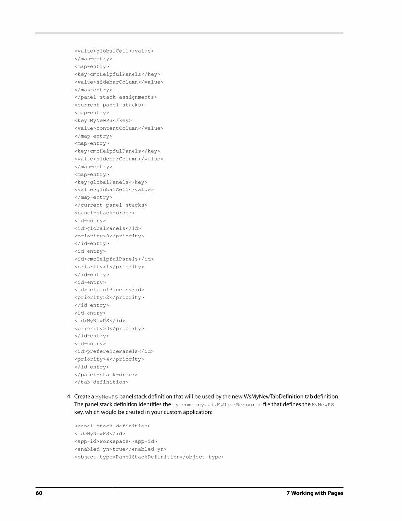
60 7 Working with Pages
<value>globalCell</value>
</map-entry>
<map-entry>
<key>cmcHelpfulPanels</key>
<value>sidebarColumn</value>
</map-entry>
</panel-stack-assignments>
<current-panel-stacks>
<map-entry>
<key>MyNewPS</key>
<value>contentColumn</value>
</map-entry>
<map-entry>
<key>cmcHelpfulPanels</key>
<value>sidebarColumn</value>
</map-entry>
<map-entry>
<key>globalPanels</key>
<value>globalCell</value>
</map-entry>
</current-panel-stacks>
<panel-stack-order>
<id-entry>
<id>globalPanels</id>
<priority>0</priority>
</id-entry>
<id-entry>
<id>cmcHelpfulPanels</id>
<priority>1</priority>
</id-entry>
<id-entry>
<id>helpfulPanels</id>
<priority>2</priority>
</id-entry>
<id-entry>
<id>MyNewPS</id>
<priority>3</priority>
</id-entry>
<id-entry>
<id>preferencePanels</id>
<priority>4</priority>
</id-entry>
</panel-stack-order>
</tab-definition>
4. Create a MyNewPS panel stack definition that will be used by the new WsMyNewTabDefinition tab definition.
The panel stack definition identifies the my.company.ui.MyUserResource file that defines the MyNewPS
key, which would be created in your custom application:
<panel-stack-definition>
<id>MyNewPS</id>
<app-id>workspace</app-id>
<enabled-yn>true</enabled-yn>
<object-type>PanelStackDefinition</object-type>

7 Working with Pages 61
<resource-bundle>my.company.ui.MyUserResource</resource-bundle>
<panel-stack-id>MyNewPS</panel-stack-id>
<header>contentHeader</header>
<error-panel-id>errorPanel</error-panel-id>
<title-key>MyNewPS</title-key>
<tab-affinity-yn>true</tab-affinity-yn>
<panel-ids>
<id-entry>
<id>errorPanel</id>
<priority>0</priority>
</id-entry>
<id-entry>
<id>myNewPanel1</id>
<priority>1</priority>
</id-entry>
<id-entry>
<id>myNewPanel2</id>
<priority>2</priority>
</id-entry>
<id-entry>
<id>myNewPanel3</id>
<priority>3</priority>
</id-entry>
</panel-ids>
</panel-stack-definition>
Modifying a Tab Action
You can modify the action that a tab performs by modifying the ContentDefinition for the action. Once you
have modified the item, you must define the JavaScript that will run when the tab is clicked.
Note: Refer to Customization Best Practices (page 42) before modifying definition files.
For example, you can modify the existing tab’s ContentDefinition to point to your new tab definitions. In this
example, the existing tab action is:
<content-definition> <id>existingTabAction</id> <app-id>workspace</app-id> <enabled-yn>true</enabled-yn> <object-type>ContentDefinition</object-type> <content-id>existingTabAction</content-id> <mime-type>text/javascript</mime-type> <body>atgChangeTab(atg.svc.framework.changeTab('DefaultTab"), null, null, null);</body> <url-yn>true</url-yn></content-definition>
Create or modify the /atg/svc/framework/serviceFramework.xml file in your new custom module and
add the ContentDefinition items for the tab action. Note that you must include the ID so that the object
definition can be found during the combiner process. When writing the definition, you override only the

62 7 Working with Pages
attributes that you want to modify. To change the atgChangeTab attribute to point to your myNewTab, you
would create the following:
<content-definition> <id>existingTabAction</id> <body>atgChangeTab(atg.svc.framework.changeTab('myNewTab'), null, null, null):</body></content-defintion>
Deleting a Tab Definition
The following is an example of how to delete a tab definition named myexistingTabAction. To delete a
definition from your UI, use the xml-combine="remove" command to the serviceFramework.xml file
located in your custom directory.
Note: Refer to Customization Best Practices (page 42) before modifying definition files.
The following example appends the removal of the definition to the default configuration:
<content-definition xml-combine="remove"> <id>myexistingTabAction</id></content-definition>
Adding a New Panel Definition
Add new panels to the /atg/svc/framework/serviceFramework.xml file in your custom application.
1. Create the panel JSP file.
2. Create the /atg/svc/framework/serviceFramework.xml file.
3. Add a panel stack definition that contains the new panel.
4. Add a panel definition for each new panel.
5. Add the panels to the existing panel stack by updating the panelIds property. Similarly, the panels may be
added to a new panel stack.
Note: The JSPs for new panels should be housed in a custom application. If the JSPs are housed in a custom Web
application, the otherContext property of the PanelDefinition should be set to the value of the context
root of the containing Web application. Refer to the Customization Best Practices (page 42) section.
Example: Adding Three New Panels
Continuing with the example of adding three panels to the Customer Management page, the following
properties will be changed for the panel definition. Please note that:

7 Working with Pages 63
• The appId property must be set to workspace for the panel to be loaded in Service Center
• The accessRight may remain the default GlobalPanel right or a specific right. If using a specific right, the
right must be defined and assigned to Service Center users. Note: The access right must be defined or the tab
will not be rendered
The following provides an example of code that adds three new panels, myNewPanel1, myNewPanel2 and
myNewPanel3, to the WsCustomerPanelStack panel stack definition:
1. Create the mypanel1.jsp, mypanel2.jsp and mypanel3.jsp files that will be called by the panel
definitions. Create these files in the /panels/order/ directory of your custom application.
2. Create the /atg/svc/framework/serviceFramework.xml file in your custom application directory.
3. To this file, add a panel stack definition that contains the three new panels and their priorities. This appends
your new panels to the existing information that creates the Customer Panel Stack. For example:
<panel-stack-definition>
<id>WsCustomerPanelStack</id>
<panel-ids>
<id-entry>
<id>myNewPanel1</id>
<priority>4</priority>
</id-entry>
<id-entry>
<id>myNewPanel2</id>
<priority>5</priority>
</id-entry>
<id-entry>
<id>myNewPanel3</id>
<priority>6</priority>
</id-entry>
</panel-ids>
</panel-stack-definition>
4. Add a panel definition for each of the new panels. The following example displays the code for one of the
three panels:
<panel-definition>
<id>myNewPanel1</id>
<app-id>workspace</app-id>
<enabled-yn>true</enabled-yn>
<object-type>PanelDefinition</object-type>
<resource-bundle>atg.commerce.csr.FrameworkResources</resource-bundle>
<template-ids>
<map-entry>
<key>panelTemplate</key>
<value>panelTemplate</value>
</map-entry>
</template-ids>
<panel-id>myNewPanel1</panel-id>
<content-url>/panels/order/mypanel1.jsp</content-url>
<other-context>MyWebApplication</other-context>
<title-key>myNewPanel1</title-key>
<visible-yn>true</visible-yn>
<show-title-yn>true</show-title-yn>

64 7 Working with Pages
<panel-open-yn>true</panel-open-yn>
<allow-panel-toggle-yn>false</allow-panel-toggle-yn>
<available-yn>false</available-yn>
<content-open-yn>true</content-open-yn>
<allow-content-toggle-yn>true</allow-content-toggle-yn>
<tab-holder-yn>true</tab-holder-yn>
<always-tabbed-yn>false</always-tabbed-yn>
<tabbed-yn>false</tabbed-yn>
<allow-tabbing-yn>true</allow-tabbing-yn>
<allow-slots-yn>false</allow-slots-yn>
<tab-scroll-index>0</tab-scroll-index>
<panel-item-count>0</panel-item-count>
<access-right>NewPanel2</access-right>
</panel-definition>
5. Repeat Step 3 for myNewPanel2 and myNewPanel3.
6. The new panels can be added to any existing panel stack by updating the panelIds property. Similarly, the
panels may be added to a new panel stack.
Note: The JSPs for the new panels should be housed in your custom application, so the otherContext
property of the PanelDefinition should be set to the value of the context root of the containing Web
application.
Customer Management Panel Configuration
You can customize the Customer Management Panel to display panels based upon your requirements by
adding or removing JSP files that display or manage customer specific data. Because the configuration is based
on components, you can perform module-specific customizations. For example, the DCS-CSR-UI module
extends the Customer Management Panel with Commerce Service Center-specific sections, such as Credit Cards,
Credits and Promotions. For additional information on Oracle ATG Web Commerce customer management
modifications, refer to the ATG Commerce Programming Guide.
To update the Customer Management Panel, modify the /atg/svc/agent/customer/
CustomerPanelConfig.properties file to identify the panels to display as well as the context where
the panel is displayed. The following example displays the Commerce Service Center extensions, the credit
card, credits and promotions panels, and adds three new custom panels named myCustomerPanel1.jsp,
myCustomerPanel2.jsp and myCustomerPanel3.jsp:
$class=atg.svc.agent.customer.CustomerPanelConfigsubSections+=\ /panels/customer/creditCards.jsp,\ /panels/customer/credits.jsp,\ /panels/customer/promotions.jsp,\ /panels/customer/myCustomerPanel1.jsp,\ /panels/customer/myCustomerPanel2.jsp,\ /panels/customer/myCustomerPanel3.jsp
contextRoots+=\ /DCS-CSR,\ /DCS-CSR,\ /DCS-CSR,\ /DCS-CSR,\ /DCS-CSR,\

7 Working with Pages 65
/DCS-CSR
Troubleshooting Pages
When the application has started but your new tab, panel stack or panel is not visible, check the following
common causes:
1. Verify that the enableYn property is set to true (the default value).
2. If you are using an access right other than GlobalPanels, verify that your access right has been created in
the appropriate repository. If unsure, set the accessRight to GlobalPanels, which is an access right with
no restrictions. The GlobalPanels access right can be used for both tabs and panels.
3. If a panel stack is not displaying, verify that the panelStackId for the panel stack is added to the
panelStackAssignments, currentPanelStacks and panelStackOrder properties of the
TabDefinition item as described above.
4. If a panel is not displaying, verify that the panelId for the panel is added to the panelIds property in the
PanelStackDefinition item as described above.
5. If the top panel in the panel stack is not displaying, verify that the tabHolderYn property is set to true.
6. If a panel other than the top panel is not displaying, verify that the tabHolderYn property is false.
7. If tabbed panels are not displaying, verify the following:
• The first panel is configured with tabHolderYn=true. The currentPanelId should be set to the same
value as the panelId. The tabbedPanelIds should be set to the list of panelId’s of panels in the row of
tabs excluding the first panel
• The panels after the first panel should be configured with tabHolderYn=false and currentPanelId
and tabbedPanelIds set to null
• All the tabbed panels should be configured to alwaysTabbedYn=true, tabbedYn=true and
allowTabbingYn=true

66 7 Working with Pages

8 Working with Forms 67
8 Working with Forms
Service Center obtains information by having users and agents complete forms. These forms are often required
to handle user information that come from a number of different formats. They also may require validation,
additional actions or the data acquired must be stored in specific repositories or databases. This section
identifies modifiable forms that are specific to Service Center, as well as information on creating new forms.
For information on working with forms, and detailed information on associating HTML form tags with Nucleus
components, refer to the ATG Page Developer's Guide. For information on creating forms for your application,
refer to the ATG Platform Programming Guide.
Modifying Existing Forms
Forms are customized using configuration layering. This extends the functionality of default forms within
Service Center by modifying the fields within the form. By extending configuration files, you can add or remove
fields or modify the behavior of fields. For example, you can identify required fields within a specific form by
mapping to your own JSP snippets that contain your customized layout. Once you have created your own
customized JSP snippets, you can modify the appropriate configuration property for that form to render your
customizations.
Using default or extended fragments, you can modify the default forms, and/or append your customizations. If
JSP snippets are not specified, the standard forms are rendered.
The following forms can be modified:
Page Form/Page Area
Customer Information Create New Customer
Customer Information Edit/View Customer
Customer Search Customer Search or the Select Customer pop-up in the shopping cart
Gift Lists Details, Search, Search Results and View Details
Order Search Order Search
Order View Display values

68 8 Working with Forms
Page Form/Page Area
Product Catalog Product Search
Forms are customized by modifying the associated configuration properties files that define the JSP fragments
that replace and/or append the field.
Note: Refer to the Customization Best Practices (page 42) section before modifying files.
The JSP fragment is integrated within your page layout to display the new or modified field. Service Center uses
a default JSP fragment that contains all of the standard fields displayed on a page, and an optional extended JSP
fragment used for creating additional fields.
The default page fragment component is mapped to the default JSP snippet in Service Center but may be
redirected with a configuration property to your own JSP page. The page contains a dsp: include tag that
reads the associated configuration file and then includes the page defined by the page fragment component.
For example, to change the default fragment to your own code, you would change the page fragment’s
servletContext and URL properties to point to your page.
The extended page fragment component allows you to append content to the page without changing the
default page fragment. The extended page fragment component contains the same functionality as, and is
defined directly after, the default page fragment component. By default, the extended properties files do not
contain a reference to a JSP file. You can define a JSP for the extended fragment to incorporate form properties
that are specific to your environment.
The default and extended page fragment components are instances of atg.web.PageFragment, which are
used to define the location of the JSP file. The configuration files that define the page fragment components
contain the following properties to identify the JSP:
• servletContext - Specifies the context root of the JSP fragment that will be incorporated into the page
• URL - Specifies the URL of the JSP fragment to be incorporated into the page
Both the default and extended property files are instances of PageFragment, allowing a servletContext and
URL to be specified for the JSP snippet. As such, the servletContext and URL property descriptions can be
applied for both fragment types.
For general information on working with forms, refer to the Forms section of the ATG Page Developer's Guide.
Working with Page Fragments
When working with page fragments, you should work within your customization directory and use
configuration layering to ensure that your customizations are not overwritten. Refer to the Customization Best
Practices (page 42) section.
1. Create a JSP fragment file that provides the new field information.
2. Add the path of the newly created JSP file to the appropriate extended properties file. Specify the URL and
ServletContext for the appended file.
3. Save the extended properties file.
4. Create a new fragment and place it in the location specified by the URL property of the extended properties
file. Optionally, you can edit an existing JSP fragment that has been specified in the extended properties file
to include the new field information.

8 Working with Forms 69
Note: The JSP fragments are dynamically included and the file will be compiled and executed before being
embedded into the form. As such, import any necessary components into your page to ensure successful
compiling.
Overriding the Default Page Fragment
You can make customizations to existing form fields such as adding a new field within or above the default field
layout. Refer to the Customization Best Practices (page 42) section before modifying files.
1. Make a copy the appropriate default fragment.
2. Make your customizations to the copy of the default fragment. Specify the URL and ServletContext for the
Web application file. Save your changes.
3. Update the appropriate version of the /localconfig configuration file to point to the new copy of the
default fragment.
Modifiable Form Configuration Files
The configuration property files for the modifiable forms are located below. Note that there are two properties
files, one for the default configuration and one for the extended configuration. By default, the extended
properties file does not contain a reference to a JSP file. You can define a JSP for the extended fragment to
incorporate form properties.
View Customer Form
The form that enables an agent to view customer profile information.
Default /Service-UI/Framework/Agent/config/atg/svc/agent/ui/fragments/
customer/CustomerViewDefault.properties
Extended /Service-UI/Framework/Agent/config/atg/svc/agent/ui/fragments/
customer/CustomerViewExtended.properties
URL /include/customer/ProfileViewUIFragment.jsp
Servlet Context agent
Create New Customer Form
The form that enables an agent to create a new customer profile.
Default /Service-UI/Framework/Agent/config/atg/svc/agent/ui/fragments/
customer/CustomerNewDefault.properties
Extended /Service-UI/Framework/Agent/config/atg/svc/agent/ui/fragments/
customer/CustomerNewExtended.properties

70 8 Working with Forms
URL /include/customer/ProfileNewUIFragment.jsp
Servlet Context agent
Edit Customer Form
The form that enables an agent to edit a customer profile.
Default /Service-UI/Framework/Agent/config/atg/svc/agent/ui/fragments/
customer/CustomerEditDefault.properties
Extended /Service-UI/Framework/Agent/config/atg/svc/agent/ui/fragments/
customer/CustomerEditExtended.properties
URL /include/customer/ProfileEditUIFragment.jsp
Servlet Context agent
Search Customer Form
The form that enables an agent to search for a customer profile. This also includes the Customer Select pop-up
screen in the Shopping Cart.
Default /Service-UI/Framework/Agent/config/atg/svc/agent/ui/fragments/
customer/CustomerSearchDefault.properties
Extended /Service-UI/Framework/Agent/config/atg/svc/agent/ui/fragments/
customer/CustomerSearchExtended.properties
URL /include/customer/ProfileSearchUIFragment.jsp
Servlet Context agent
Create Gift Lists Form
The form that enables an agent to create a gift list.
Default /DCS-CSR-UI/config/atg/commerce/custsvc/ui/fragments/
gift/GiftlistCreateDefault.properties
Extended /DCS-CSR-UI/config/atg/commerce/custsvc/ui/fragments/
gift/GiftlistCreateExtended.properties
URL /include/gift/giftlist/giftlistCreateUIFragment.jsp

8 Working with Forms 71
Servlet Context DCS-CSR
Gift Lists Purchase Details Form
The form that enables an agent to see the purchase details of a gift list.
Default /DCS-CSR-UI/config/atg/commerce/custsvc/ui/fragments/
gift/GiftlistDetailsPurchaseDefault.properties
Extended /DCS-CSR-UI/config/atg/commerce/custsvc/ui/fragments/
gift/GiftlistDetailsPurchaseExtended.properties
URL /include/gift/giftlist/giftlistDetailsPurchaseUIFragment.jsp
Servlet Context DCS-CSR
View Gift Lists Details Form
The form that enables an agent to see the purchase details of a gift list.
Default /DCS-CSR-UI/config/atg/commerce/custsvc/ui/fragments/
gift/GiftlistDetailsViewDefault.properties
Extended /DCS-CSR-UI/config/atg/commerce/custsvc/ui/fragments/
gift/GiftlistViewDetailsExtended.properties
URL /include/gift/giftlist/giftlistDetailsViewUIFragment.jsp
Servlet Context DCS-CSR
Search Gift Lists Form
The form that enables an agent to search for a gift list.
Default /DCS-CSR-UI/config/atg/commerce/custsvc/ui/fragments/
gift/GiftlistSearchDefault.properties
Extended /DCS-CSR-UI/config/atg/commerce/custsvc/ui/fragments/
gift/GiftlistSearchExtended.properties
URL /include/gift/search/giftlistSearchUIFragment.jsp
Servlet Context DCS-CSR

72 8 Working with Forms
Search Results Gift Lists Form
The form that enables an agent to see the results of a search for a gift list.
Default /DCS-CSR-UI/config/atg/commerce/custsvc/ui/fragments/
gift/GiftlistSearchResultsDefault.properties
Extended /DCS-CSR-UI/config/atg/commerce/custsvc/ui/fragments/
gift/GiftlistSearchResultsExtended.properties
URL /include/gift/search/giftlistSearchResultsUIFragment.jsp
Servlet Context DCS-CSR
Product Search Form
The form that enables an agent to search for a product.
Default /DCS-CSR-UI/config/atg/commerce/custsvc/ui/fragments/
catalog/ProductSearchDefault.properties
Extended /DCS-CSR-UI/config/atg/commerce/custsvc/ui/fragments/
catalog/ProductSearchExtended.properties
URL /include/catalog/productSearchUIFragment.jsp
Servlet Context DCS-CSR
Order Search Form
The form that enables an agent to search for an order.
Default /DCS-CSR-UI/config/atg/commerce/custsvc/ui/fragments/
order/OrderSearchDefault.properties
Extended /DCS-CSR-UI/config/atg/commerce/custsvc/ui/fragments/
order/OrderSearchExtended.properties
URL /include/order/orderSearchUIFragment.jsp
Servlet Context DCS-CSR
Order View Form
The form that enables an agent to view an order.

8 Working with Forms 73
Default /DCS-CSR-UI/config/atg/commerce/custsvc/ui/fragments/
order/OrderViewDefault.properties
Extended /DCS-CSR-UI/config/atg/commerce/custsvc/ui/fragments/
order/OrderViewExtended.properties
URL /include/order/orderViewUIFragment.jsp
Servlet Context DCS-CSR
Creating New Forms
When you create new forms, you must also create the appropriate files, including the form handler and JSP files.
The following example shows how to create an electronic shipping group in Commerce Service Center by:
• Creating a form that creates a new electronic shipping group
• Defining and identifying the form’s components
• Identifying the resource bundles
• Defining the submit button calls
• Configuring form validation
For general information on creating forms, form handlers and working with JSP files, refer to the ATG Page
Developer's Guide and the ATG Platform Programming Guide. For detailed information on all Service Center
form handlers, refer to the ATG API Reference for Knowledge Manager and Self Service and ATG API Reference for
Commerce Service Center :
1. Create a new JSP file in your customization directory. Define the components of the form. For example:
<%@ include file="/include/top.jspf" %>
<dsp:page xml="true">
<dsp:importbean bean="/atg/commerce/custsvc/order/
CreateElectronicShippingGroupFormHandler"/>
<dsp:importbean bean="/atg/dynamo/droplet/Switch"/>
<dsp:importbean var="addElectronicShippingGroup"
bean="/atg/commerce/custsvc/ui/fragments/order/
AddElectronicShippingGroup"/>
<dsp:importbean var="electronicShippingGroupConfig"
bean="/atg/commerce/custsvc/ui/
ElectronicShippingGroupConfiguration"/>
<c:set var="formId" value="mycsrAddElectronicAddress"/>
2. Define the URLs that are called on success and error conditions. For example:
<svc-ui:frameworkUrl var="successURL"
panelStacks="cmcShippingAddressPS"/>
<svc-ui:frameworkUrl var="errorURL" panelStacks="cmcShippingAddressPS"/>
3. Define the form and the elements used by the form. For example:

74 8 Working with Forms
<dsp:setLayeredBundle basename="atg.commerce.csr.order.WebAppResources"/>
<dsp:form id="${formId}" formid="${formId}">
<dsp:input type="hidden" priority="-10" value=""
bean="CreateElectronicShippingGroupFormHandler.
newElectronicShippingGroup"/>
<dsp:input type="hidden" value="${errorURL }" name="errorURL"
bean="CreateElectronicShippingGroupFormHandler.
newElectronicShippingGroupErrorURL"/>
<dsp:input type="hidden" value="${successURL }" name="successURL"
bean="CreateElectronicShippingGroupFormHandler.
newElectronicShippingGroupSuccessURL"/>
<ul class="atg_dataForm atg_commerce_csr_addressForm"
id="atg_commerce_csr_neworder_newShippingAddress">
<li class="atg_commerce_csr_address">
<span class="atg_commerce_csr_fieldTitle">
<label class="atg_messaging_requiredIndicator">
<span class="requiredStar">*</span>
<fmt:message key="newAddress.email" />
</label>
</span>
<dsp:input id="${formId}_emailAddress" type="text"
bean="/atg/commerce/custsvc/order/
CreateElectronicShippingGroupFormHandler.
electronicShippingGroup.emailAddress" size="25" maxlength="50">
<dsp:tagAttribute name="dojoType"
value="atg.widget.form.ValidationTextBox" />
<dsp:tagAttribute name="trim" value="true" />
<dsp:tagAttribute name="required" value="true" />
</dsp:input>
</li>
4. Provide the submit button call. For example,
<li class="atg_svc_formActions">
<div class="atg_commerce_csr_panelFooter">
<input type="button" name="myaddAddressButton"
id="myaddAddressButton"
class="atg_commerce_csr_activeButton"
onclick="custom.commerce.csr.order.shipping.addElectronicAddress();
return false;"
value="<fmt:message key="newOrderSingleShipping.addShippingAddress.
button.addAddress"/>
form="${formId}"
dojoType="atg.widget.validation.SubmitButton"
/>
</div>
</li>
....
</ul>
</dsp:form>
5. If you are using JSP validation, provide the validation function. When the form or page is loaded, the
validation routine tracks user input and validates each input field. If the validation is successful, the submit
button is enabled:

8 Working with Forms 75
<script type="text/javascript">
var ${formId}Validate = function () {
var disable = false;
<c:if test="${!empty isDisableSubmit}">disable =
${isDisableSubmit}();</c:if>
<c:if test="${!empty validateIf}">if (${validateIf}) {</c:if>
if (!dijit.byId("${formId}_emailAddress").isValid()) disable =
true;
<c:if test="${!empty validateIf}">}</c:if>
dojo.byId("${formId}").myaddAddressButton.disabled = disable;
};
_container_.onLoadDeferred.addCallback(function () {
${formId}Validate();
atg.service.form.watchInputs("${formId}", ${formId}Validate);
atg.keyboard.registerFormDefaultEnterKey("${formId}",
"addAddressButton", "buttonClick");
});
_container_.onUnloadDeferred.addCallback(function () {
atg.service.form.unWatchInputs('${formId}');
atg.keyboard.unRegisterFormDefaultEnterKey("${formId}");
});
</script>
</dsp:page>
6. Once you have created the form, create a customized JavaScript file to identify the submit action for your new
form. For example:
custom.commerce.csr.order.shipping.addElectronicAddress = function (){
atgSubmitAction({form:dojo.byId("mycsrAddElectronicAddress")});
};
This example creates a form similar to this:
Creating a Pop-up Page
A pop-up page presents a form within a new window. Pop-up pages are invoked from a parent, or caller page,
which defines the pop-up page and calls the JSP that displays the page.
To create a pop-up page, you must perform the following:
1. Create the parent or caller page, as outlined in Creating the Caller Page (page 76).
2. Create the JSP file that creates and displays the page, as outlined in Creating the JSP file (page 77).
3. Create the JavaScript file that performs the actions that occur when the submit button is selected. This is
outlined in Creating the JavaScript (page 80) section.

76 8 Working with Forms
Creating the Caller Page
In the following example, the caller page defines the pop-up window using Dojo, and then calls the
editElectronic.jsp file to display the pop-up page.
1. Create a caller page that defines the pop-up window. For example:
<script type="text/javascript">
if (!dijit.byId("mycsrEditAddressFloatingPane")) {
new dojox.Dialog({ id: "mycsrEditAddressFloatingPane",
cacheContent: "false",
executeScripts: "true",
scriptHasHooks: "true",
duration: 100,
"class": "atg_commerce_csr_popup"});
}
</script>
2. Define the pop-up window URL with the window parameters. For example:
<c:url var="editAddressURL" context="/MY-DCS-CSR}"
value="editElectronic.jsp">
<c:param name="nickname" value="${addressKey}"/>
<c:param name="${stateHolder.windowIdParameterName}"
value="${windowId}"/>
</c:url>
Pass in the windowId and any other parameters that are required by the new pop up page.
3. Define the link that loads the pop-up page. For example:
<li class="atg_commerce_csr_editAddress">
<span class="atg_svc_shipAddressControls">
<a class="atg_tableIcon atg_propertyEdit" style="min-width:100px"
title="<fmt:message key="common.address.edit.mouseover"/>" href="#"
onclick="atg.commerce.csr.common.showPopupWithReturn({
popupPaneId: 'mycsrEditAddressFloatingPane',
title: '<fmt:message key="common.edit"/>',
url: '${editAddressURL}',
onClose: function( args ) {
if ( args.result == 'ok' ) {
atgSubmitAction({
panelStack :[ 'cmcShippingAddressPS','globalPanels'],
form : document.getElementById('transformForm')
});
}
}});return false;">
<fmt:message key="common.edit"/>
</a>
</span>
</li>
The onClose function defines the actions that should occur when the pop-up window is closed. When
the pop-up window is closed automatically, the pop-up page passes back the args.result value as ok,
refreshing the shipping address panel stack and global panel stacks.

8 Working with Forms 77
4. Save the parent page.
Creating the JSP file
The following example creates the editElectronic.jsp that was created in the above example.
Note: When writing your JSP file, ensure that all tags are closed appropriately. The following example may be
missing end tags due to formatting.
The pop-up page is served on both the success and error conditions. If the success condition is met, the pop-up
page is closed automatically and the caller page determines the appropriate actions to take once the pop-up
page is closed.
1. Create the editElectronic.jsp page. For example:
<%-- This page is used to edit the electronic shipping group.
param - nickname
This parameter is used to initialize shipping group from the
ShippingGroupMapContainer.
param - success
This parameter is used to close the popup panel and refresh the parent
page. This parameter is added to the request on edit form submission.
--%>
<%@ include file="/include/top.jspf"%>
<dsp:page xml="true">
<dsp:importbean var="updateShippingGroupFormHandler"
bean="/atg/commerce/custsvc/order/
UpdateElectronicShippingGroupFormHandler"/>
<dsp:importbean var="sgConfig"
bean="/atg/commerce/custsvc/ui/
ElectronicShippingGroupConfiguration"/>
<dsp:importbean bean="/atg/dynamo/droplet/Switch"/>
<dsp:importbean bean="/atg/dynamo/droplet/ErrorMessageForEach"/>
<dsp:importbean var="electronicAddressForm"
bean="/atg/commerce/custsvc/ui/fragments/order/
ElectronicAddressForm"/>
<dsp:getvalueof var="nickname" param="nickname"/>
<dsp:getvalueof var="success" param="success"/>
2. Identify the success and error URLs for the form. For example:
<%-- forms success and error url --%>
<c:url var="successErrorURL"
context="/${sgConfig.editPageFragment.servletContext}"
value="${sgConfig.editPageFragment.URL}">
<c:param name="nickname" value="${nickname}"/>
<c:param name="${stateHolder.windowIdParameterName}"
value="${windowId}"/>
<c:param name="success" value="true"/>
</c:url>
3. Define the layered resource bundles used. For example:
<%-- Uses layered resource bundle --%>

78 8 Working with Forms
<dsp:layeredBundle basename="atg.commerce.csr.order.WebAppResources">
<div id="atg_commerce_csr_editShippingAddress"
class="atg_commerce_csr_popupPanel
atg_commerce_csr_addressFormPopup">
<dsp:layeredBundle basename="${sgConfig.resourceBundle}">
<fmt:message var="editPageFragmentTitle"
key="${sgConfig.editPageFragmentTitleKey}"/>
</dsp:layeredBundle>
<h2>
<c:out value="${editPageFragmentTitle}"/>
</h2>
<div class="atg_commerce_csr_popupPanelCloseButton"></div>
4. Within the <div class>, define what happens whether or not there is an error to display. For example:
<div>
<%--When there is an error, display the error on the page. --%>
<dsp:droplet name="Switch">
<dsp:param bean=
"UpdateElectronicShippingGroupFormHandler.formError"
name="value"/>
<dsp:oparam name="true">
<br/><br/>
<span class="atg_commerce_csr_common_content_alert">
<fmt:message key="common.error.header"/></span>
<br>
<span class="atg_commerce_csr_common_content_alert">
<UL>
<dsp:droplet name="ErrorMessageForEach">
<dsp:param bean=
"UpdateElectronicShippingGroupFormHandler.formExceptions"
name="exceptions"/>
<dsp:oparam name="output">
<LI>
<dsp:valueof param="message"/>
</dsp:oparam>
</dsp:droplet>
</UL>
</span>
</dsp:oparam>
<dsp:oparam name="false">
<c:if test="${success}">
<%--When there is no error on the page submission, close the
popup page and refresh the parent page. The parent page
only will refresh if the result parameter value is ok.
--%>
<script type="text/javascript">
hidePopupWithResults
('atg_commerce_csr_editShippingAddress',{result : 'ok'});
</script>
</c:if>
</dsp:oparam>
</dsp:droplet>
</div>

8 Working with Forms 79
5. Identify the form components to use. For example:
<c:set var="formId" value="mycsrEditShippingAddressForm"/>
<dsp:form id="${formId}"
formid="${formId}">
<dsp:input type="hidden" priority="-10" value=""
bean="UpdateElectronicShippingGroupFormHandler.
updateShippingGroup"/>
<dsp:input type="hidden" value="${successErrorURL }"
bean="UpdateElectronicShippingGroupFormHandler.
updateShippingGroupErrorURL"/>
<dsp:input type="hidden" value="${successErrorURL }"
bean="UpdateElectronicShippingGroupFormHandler.
updateShippingGroupSuccessURL"/>
<dsp:input type="hidden"
bean="UpdateElectronicShippingGroupFormHandler.
shippingGroupByNickname"
value="${fn:escapeXml(nickname) }" priority="5"/>
<c:if test="${empty updateShippingGroupFormHandler.shippingGroup }">
<dsp:setvalue bean="UpdateElectronicShippingGroupFormHandler.
shippingGroupByNickname"
value="${fn:escapeXml(nickname) }"/>
</c:if>
<ul class="atg_dataForm atg_commerce_csr_addressForm">
<li class="atg_commerce_csr_address">
<span class="atg_commerce_csr_fieldTitle">
<label class="atg_messaging_requiredIndicator">
<span class="requiredStar">*</span>
<fmt:message key="newAddress.email" />
</label>
</span>
<dsp:input id="${formId}_emailAddress" type="text"
bean="/atg/commerce/custsvc/order/
CreateElectronicShippingGroupFormHandler.workingShippingGroup.
emailAddress" size="25" maxlength="50">
<dsp:tagAttribute name="dojoType"
value="atg.widget.form.ValidationTextBox" />
<dsp:tagAttribute name="trim" value="true" />
<dsp:tagAttribute name="required" value="true" />
</dsp:input>
</li>
</ul>
<div class="atg_commerce_csr_panelFooter">
<input type="button"
name="${formId}SaveButton"
value="<fmt:message key='common.save' />"
onclick="custom.commerce.csr.order.shipping.editShippingAddress
('${successErrorURL}');return false;"
dojoType="atg.widget.validation.SubmitButton"/>
<%-- When the user clicks on the cancel button, hide the popup panel.
--%>
<input type="button"
value="<fmt:message key='common.cancel'/>"
onclick="hidePopupWithResults

80 8 Working with Forms
( 'atg_commerce_csr_editShippingAddress', {result :
'cancel'});return false;"/>
</div>
</dsp:form>
<%-- end of editShippingAddressForm --%>
6. If you are using JSP validation, provide the validation function. When the form or page is loaded, the
validation routine tracks user input and validates each input field. If the validation is successful, the submit
button is enabled:
<%--) The following code is for JS validation--%>
<script type="text/javascript">
var ${formId}Validate = function () {
var disable = false;
<c:if test="${!empty isDisableSubmit}">disable =
${isDisableSubmit}();</c:if>
<c:if test="${!empty validateIf}">if (${validateIf}) {</c:if>
if (!dijit.byId("${formId}_emailAddress").isValid())
disable = true;
<c:if test="${!empty validateIf}">}</c:if>
dojo.byId("${formId}").addAddressButton.disabled = disable;
};
_container_.onLoadDeferred.addCallback(function () {
${formId}Validate();
atg.service.form.watchInputs("${formId}", ${formId}Validate);
atg.keyboard.registerFormDefaultEnterKey("${formId}",
"addAddressButton", "buttonClick");
});
_container_.onUnloadDeferred.addCallback(function () {
atg.service.form.unWatchInputs('${formId}');
atg.keyboard.unRegisterFormDefaultEnterKey("${formId}");
});
</script>
7. Save the editElectronic.jsp file.
Creating the JavaScript
Once you have created the editElectronic.jsp file, add the following JS call to a new custom JS file:
custom.commerce.csr.order.shipping.editShippingAddress = function(pURL){ atg.commerce.csr.common.submitPopup(pURL, dojo.byId("mycsrEditShippingAddressForm"), dijit.byId("mycsrEditAddressFloatingPane"));};
This function submits a pop up page form.

9 Working With Grids and Tables 81
9 Working With Grids and Tables
Tables and grids are similar in that they provide structured layouts for data. Tables, which are created in HTML,
display standard data that is defined using configuration files. Grids extend standard tables by allowing paging
and by using Dojo components.
Using configuration layering, you can identify the location and file names of JSP snippets to be included inside
the default pages. If these JSP snippets are not specified, the default grid pages are displayed. However, you
can choose to specify these JSP snippets, and extend the grid components, by providing additional rendering
information and grid data that is integrated into the existing grids.
Grids or tables can be modified to add columns, reorder or remove columns, change column widths or sorting,
as well as to change hover information.
The components of a grid that can be modified are:
• Changing grid layouts
• Column width
• Number of rows displayed per page
• Number of rows displayed at a time per user scrolls
• Number of columns to display
• Adding or modifying hover information
The components of a table that can be modified are:
• Number of columns to display
• Changing table layouts
Note: All grid and table components are located in the application UI modules, for example Service-UI or
DCS-CSR-UI.
Modifiable Grids and Tables
The following grids and tables can be modified in Service Center.
Customer Information Page
The following grids and tables can be modified on the Customer Information page:

82 9 Working With Grids and Tables
Grid/Table Location
Order History /DCS-CSR-UI/config/atg/commerce/custsvc/ui/tables/order/
OrderHistoryGrid.properties
Scheduled Orders /DCS-CSR-UI/config/atg/commerce/custsvc/ui/tables/order/
ScheduledOrdersGrid.properties
Ticket History /Service-UI/Framework/Agent/config/atg/svc/agent/ui/
tables/ticket/CustomerTicketGrid.properties
Customer Search Results /Service-UI/Framework/Agent/config/atg/svc/agent/ui/
CustomerProfileSearchUIConfiguration.properties
Order View Page
The following grids and tables can be modified on the Order View page:
Grid/Table Location
Exchange History /DCS-CSR-UI/config/atg/commerce/custsvc/ui/tables/order/
ExchangeHistoryGrid.properties
Related Tickets /DCS-CSR-UI/config/atg/commerce/custsvc/ui/tables/
ticket/RelatedTicketGrid.properties
Order Search /DCS-CSR-UI/config/atg/commerce/custsvc/order/
OrderSearchUIConfiguration.properties
Order Search Results /DCS-CSR-UI/config/atg/commerce/custsvc/order/
OrderSearchResultsTable.properties
Approvals /DCS-CSR-UI/config/atg/commerce/custsvc/ui/tables/
approvals/ApprovalsGrid.properties
Purchased Items /DCS-CSR-UI/config/atg/commerce/custsvc/ui/tables/order/
PurchasedItemsGrid.properties
Scheduled Order Page
The following grids and tables can be modified on the Scheduled Order page:
Grid/Table Location
Submitted Orders /DCS-CSR-UI/config/atg/commerce/custsvc/ui/tables/order/
SubmittedOrdersGrid.properties

9 Working With Grids and Tables 83
Grid/Table Location
Related Tickets /DCS-CSR-UI/config/atg/commerce/custsvc/ui/tables/ticket/
RelatedTicketGrid.properties
Gift/Wish List
The following grids and tables can be modified on the Gift/Wish List panel of the Customer Profile:
Grid/Table Location
Edit Gift Lists Search
Results
/DCS-CSR-UI/src/config/atg/commerce/custsvc/ui/tables/gift/
giftlist/GiftlistEditResultsTable.properties
View Gift Lists
Purchased Items
/DCS-CSR-UI/main/src/config/atg/commerce/custsvc/ui/
tables/gift/giftlist/GiftlistPurchaseResultsTable.properties
View Gift Lists Search
Results
/DCS-CSR-UI/main/src/config/atg/commerce/custsvc/ui/tables/
gift/giftlist/GiftlistViewResultsTable.properties
Display Gift Lists /DCS-CSR-UI/main/src/config/atg/commerce/custsvc/ui/tables/
gift/customer/GiftlistGrid.properties
Search Gift Lists /DCS-CSR-UI/main/src/config/atg/commerce/custsvc/ui/tables/
gift/search/GiftlistGrid.properties
Edit Wish List Search
Results
/DCS-CSR-UI/main/src/config/atg/commerce/custsvc/ui/tables/
gift/wishlist/WishlistEditResultsTable.properties
View Wish List Search
Results
/DCS-CSR-UI/main/src/config/atg/commerce/custsvc/ui/tables/
gift/wishlist/WishlistViewResultsTable.properties
Promotions
The following grids and tables can be modified on the Available Promotions panel of the Order View page:
Grid/Table Location
Browse Available
Promotions
/DCS-CSR-UI/main/src/config/atg/commerce/custsvc/ui/tables/
promotion/AvailablePromotionsGrid.properties
Promotions Search /DCS-CSR-UI/main/src/config/atg/commerce/custsvc/ui/tables/
promotion/PromotionSearchGrid.properties

84 9 Working With Grids and Tables
Extending Table Configurations
Use configuration layering to extend the default table configuration. Refer to the Customization Best
Practices (page 42) section before modifying configuration files.
The TableConfiguration class is located in ATG Service Agent classes. The columns are defined in a list. The
properties for TableConfiguration are:
Property Description
columns List containing all columns in display order.
formHandlerPath The Nucleus path to the form hander that renders the results.
imageClosed The file name of the image to render when the table item detail is not visible
or is closed.
imageOpen The file name of the image to render when the table item detail is visible or is
open.
imagePath The URL path to the images.
tablePage The page fragment containing the table implementation.
tablePath The Nucleus path to the grid configuration component.
rowsPerPage The number of items to fetch per server request, usually extracted from the
results form handler.
defaultSortField The default sort column. This field should point to the configured values in
the particular column configuration to be sorted. The ViewLink.sortField
must match what is defined in indexing output file for the index being
searched.
defaultSortDirection The default sort direction, either ascending or descending. This field
should point to the configured values in the particular column configuration
to be sorted.
The following is an example of the /DCS-CSR-UI/atg/commerce/custsvc/order/
OrderSearchUIConfiguration.properties file that uses the TableConfiguration class:
$class=atg.svc.agent.ui.tables.TableConfiguration$scope=global
columns=\ /atg/commerce/custsvc/ui/tables/order/search/Toggle,\ /atg/commerce/custsvc/ui/tables/order/search/ViewLink,\ /atg/commerce/custsvc/ui/tables/order/search/LastName,\ /atg/commerce/custsvc/ui/tables/order/search/FirstName,\ /atg/commerce/custsvc/ui/tables/order/search/Total,\ /atg/commerce/custsvc/ui/tables/order/search/ItemsReturned,\ /atg/commerce/custsvc/ui/tables/order/search/DateSubmitted,\

9 Working With Grids and Tables 85
/atg/commerce/custsvc/ui/tables/order/search/Originator,\ /atg/commerce/custsvc/ui/tables/order/search/State,\ /atg/commerce/custsvc/ui/tables/order/search/WorkOn
imageClosed=icon_find.gifimageOpen=icon_find.gifimagePath=/images/icons/
rowsPerPage=10
defaultSortField^=/atg/commerce/custsvc/ui/tables/order/search/ViewLink.sortFielddefaultSortDirection^=/atg/commerce/custsvc/ui/tables/order/search /ViewLink.defaultSort
tablePath=/atg/commerce/custsvc/ui/tables/order/search/OrderSearchResultsTabletablePage=/atg/commerce/custsvc/ui/tables/order/search/OrderSearchTablePage
Extending Grid Configuration
The GridConfiguration object is located in ATG Service Agent classes and extends the
TableConfiguration class by allowing for additional customization using Dojo. The columns are defined in
order in an array of ColumnConfiguration components. Refer to the Customization Best Practices (page 42)
section before modifying configuration files.
The properties for GridConfiguration are:
Property Description
columns The array of ColumnConfiguration components that specify the columns
for the grid in display order.
dataModelPage The page fragment component that contains the data model (for example,
JSON). Include the full Nucleus path to the component.
detailFormId The DOM ID of the form node to submit to retrieve an item detail.
formHandlerPath The Nucleus path to the form handler that renders the results.
gridHeight The value assigned to the height CSS style for the table to determine its
visible height.
gridInstanceId The JavaScript variable name that should be unique for each instance of the
table in the application.
gridPage The page fragment containing the grid implementation.
gridPath The Nucleus path to the grid configuration component.
gridWidgetId The Dojo ID of the table widget that should be unique for each instance of
the grid in the application.

86 9 Working With Grids and Tables
Property Description
imageClosed The file name of image to render when the grid item detail is not visible or
closed.
imageOpen The file name of image to render when the grid item detail is visible or open.
imagePath The URL path to the images.
itemDetailPage The page fragment component containing the item details (currently
implemented as a hover pop-up).
pageBaseOffset The base of the paging: 0 for 0-based paging, 1 for 1-based paging, etc.
pageIndexElementName The element name of the page index form input.
progressNodeId The optional ID for a DOM node to render status messages, such as ‘search in
progress...’ or ‘No results found.’ etc.
rowsPerPage The size of the result to send back from the form handler in each page.
searchFormId The DOM ID of the form node to submit to retrieve orders.
selectLink An anchor tag template with pattern replacement for selecting the item in
the application.
viewLink An anchor tag template with pattern replacement for viewing the item in the
application.
The following is an example of the /atg/svc/agent/ui/tables/tables/ticket/
CustomerTicketGrid.properties file, which uses the GridConfiguration class:
$class=atg.svc.agent.ui.tables.GridConfiguration
columns=\/atg/svc/agent/ui/tables/ticket/ViewLink,\/atg/svc/agent/ui/tables/ticket/Description,\/atg/svc/agent/ui/tables/ticket/CreatedDate,\/atg/svc/agent/ui/tables/ticket/Age,\/atg/svc/agent/ui/tables/ticket/Status,\/atg/svc/agent/ui/tables/ticket/Id,\/atg/svc/agent/ui/tables/ticket/SelectLink
rowsPerPage=10
gridHeight=450pxgridInstanceId=atg.svc.agent.ticket.historyGridInstancegridPath=/atg/svc/agent/ui/tables/ticket/CustomerTicketGridgridWidgetId=atg_svc_agent_ticket_historyTableprogressNodeId=atg_svc_agent_ticket_historyGridStatussearchFormId=ticketHistoryListForm
dataModelPage=/atg/svc/agent/ui/tables/ticket/TicketDataPagegridPage=/atg/svc/agent/ui/tables/ticket/TicketGridPage

9 Working With Grids and Tables 87
Each of the columns is configured using a property file, which identifies column properties. For example, the
ViewLink.properties file that is referenced in the CustomerTicketGrid file:
$class=atg.svc.agent.ui.tables.ColumnConfiguration
defaultSort=ascendingfield=viewLinksortField=idwidth=6emresourceBundle=atg.svc.agent.ui.UserMessagesresourceKey=view-ticketisVisible=true
dataRendererPage=/atg/svc/agent/ui/tables/ticket/ColumnRendererPage
These configuration files allow you to make specific changes to individual columns within the grid.
Working With Column Layout
The ColumnConfiguration object is located in atg.svc.agent.ui.tables, and manages column
configuration for an instance of a UI grid.
Dojo Grid Column Configuration
The properties for ColumnConfiguration within Dojo are:
Property Description
cellRendererPage The page fragment component that can contain a client-side JavaScript function
to render the cell contents. Includes the full Nucleus path to the component.
dataRendererPage The page fragment component that returns server-side data in JSON that inserts a
cell. Includes the full Nucleus path to the component.
defaultSort Is set to either ascending or descending sorting or left blank for no sorting.
field The field name identifier for the data to render in the column from the data model.
UI-only columns without a backing data representation should leave the field
parameter undefined.
sortField The name of the data model field on which to sort, which is different than field.
If this property is undefined and sorting is enabled using defaultSort, the data
is sorted on the field property. If this property is defined and sorting is enabled
using defaultSort, the data is sorted on the sortField property. This property
allows a column to contain rendering and markup that does not interfere with the
sorting of the field. For example, the ViewLink column can have a link to view
an item where the column is not sorted on the link markup, but on a separate
corresponding data value.

88 9 Working With Grids and Tables
Property Description
isVisible Whether to display the column in the UI or only to send back the data for the
column. This is useful for JavaScript widgets that store invisible column data
for other columns. For example, an onClick function in the ID field can use an
invisible DBState field to identify what to do when an order is opened.
resourceBundle The resource bundle that contains the column display name.
resourceKey The key that references the column display name in the resource bundle.
width The extent of the column using the Dojo-grid syntax (e.g. ‘5em’ or ‘auto’).
styles The column CSS styles. Note: Styles are not modifiable for tables.
The following is an example of the /atg/commerce/custsvc/ui/tables/order/
ViewLink.properties column configuration:
$class=atg.svc.agent.ui.tables.ColumnConfiguration
defaultSort=ascendingfield=viewLinksortField=idwidth=4emresourceBundle=atg.commerce.csr.MessagesresourceKey=view-orderisVisible=true
dataRendererPage=/atg/commerce/custsvc/ui/tables/order/ColumnRendererPage
HTML Table Column Configuration
The properties for ColumnConfiguration using an HTML table are:
Property Description
dataRendererPage The page fragment component that returns server-side data in JSON that inserts a
cell. Includes the full Nucleus path to the component
field The field name identifier for the data to render in the column from the data model.
UI-only columns without a backing data representation should leave the field
parameter undefined.
isVisible Whether to display the column in the UI or only to send back the data for the
column. This is useful for JavaScript widgets that store invisible column data
for other columns. For example, an onClick function in the ID field can use an
invisible DBState field to identify what to do when an order is opened.
resourceBundle The resource bundle that contains the column display name
resourceKey The key that references the column display name in the resource bundle

9 Working With Grids and Tables 89
Property Description
width The extent of the column using the Dojo-grid syntax (e.g. ‘5em’ or ‘auto’)
The following is an example of the /atg/commerce/custsvc/ui/tables/ticket/
LastName.properties column configuration:
$class=atg.svc.agent.ui.tables.ColumnConfiguration
field=lastNamewidth=10%resourceBundle=atg.svc.agent.WebAppResourcesresourceKey=relatedTickets.lastNameisVisible=true
dataRendererPage=/atg/commerce/custsvc/ui/tables/ticket/ColumnRendererPage
Customizing Column Attributes
The steps for customizing column title, sorting and width are similar in that they update properties in the
column configuration component. Note: Do not use quotes when setting values in this map.
When customizing column attributes, use configuration layering as described in the Customization Best
Practices (page 42) section. To begin customization, override the column configuration by performing the
following:
1. Create a new application module for customizations. Include this module when starting your Web
application. Refer to the ATG Installation and Configuration Guide for information on creating new application
modules with your Web application.
2. Locate the properties file that defines the appropriate column configuration.
3. Inside the customization module, create a properties file at the corresponding path that contains no
properties.
Working with a Column Title
1. Create or edit a resource bundle for customized strings in your customization module.
2. In the properties file for the column, update the resourceBundle and resourceKey properties to point to
the corresponding resource bundle and key that contain the customized string. This overrides the default
values for these properties. For example:
defaultSort=ascending
field=viewLink
sortField=id
width=4em
resourceBundle=atg.commerce.csr.newMessages
resourceKey=new-view-order
isVisible=true

90 9 Working With Grids and Tables
Modifying Column Sorting
1. In the appropriate properties file for the column, set the defaultSort property to either ascending or
descending. Removing the property or setting the property to an empty string will remove sorting. For
example:
defaultSort=ascending
field=viewLink
sortField=id
width=4em
resourceBundle=atg.commerce.csr.newMessages
resourceKey=new-view-order
isVisible=true
2. To configure a Dojo-grid column to sort on a field other than the data field that is rendered in the column, set
the sortField to any field in the data model.
For example, your column might display a data field containing an HTML link or JavaScript, such as viewLink,
which is not appropriate for sorting. By setting the sortField property to ID, the column can still be sorted
by the corresponding ID property.
3. Configure an HTML-grid column by configuring the appropriate UI configuration file, such as the
CustomerProfileSearchUIConfiguration.properties or the
OrderSearchUIConfiguration.properties file.
Modifying Column Widths
Each grid contains a list of columns to display within the grid. These columns are configured using a property
file. You must modify these properties file to modify the column width.
1. In the properties file for the column, update the width property to the desired CSS width specification, for
example. 4em. For example:
defaultSort=ascending
field=viewLink
sortField=id
width=4em
resourceBundle=atg.commerce.csr.newMessages
resourceKey=new-view-order
isVisible=true
dataRendererPage=/atg/svc/agent/ui/tables/ticket/ColumnRendererPage
2. To set the column width to fill the remaining space on the screen, set the width to auto.
Configuring the PageFragment Component
The table and column configuration components use the PageFragment component in the Web UI to reference
JSP pages located in the /atg/web/PageFragment directory.
• URL – the URL of the page to include

9 Working With Grids and Tables 91
• servletContext – the context root of the application that contains the page
The following is an example of the /atg/commerce/custsvc/ui/tables/order
/ColumnRendererPage:
$class=atg.web.PageFragment
URL=/include/order/columnRenderer.jspservletContext=DCS-CSR
Creating Column Content
The data renderer page displays the content to render within the column.
Dojo-Grid Column Content
By default, the data renderer page is called for each column when the grid items are iterated. The following
parameters are passed to the data renderer page:
Parameter Description
field The string identifier of the column to render as defined in the ColumnConfiguration
object.
colIndex The zero-based index of the column.
[bean] The object(s) containing the data for the grid item. They will vary depending on the data
being rendered. For an order, the item is a single orderItemMap bean.
The following is an example from the /include/order/columnRenderer.jsp file:
<dsp: getvalueof var="field" param="field"/><dsp: getvalueof var="colIndex" param="colIndex"/><dsp: getvalueof var="orderItemMap" param="orderItemMap"/>
<c: choose><c: when test="${field == 'id'}"> "id": "${orderItemMap.id}",</c: when>
<c: when test="${field == 'viewLink'}"> <fmt: bundle basename="atg.commerce.csr.Messages"> "viewLink": "<a href=\"#\" class=\"blueU\" title=\" <fmt: message key="view-order"/>\" onclick=\"atg.commerce.csr.order.viewExistingOrder(\'${orderItemMap.id}\',\ '${orderItemMap.state}\');return false;\">${orderItemMap.id}</a>" </fmt: bundle>

92 9 Working With Grids and Tables
</c: when>
...
HTML Table Column Content
The data renderer page displays the content to render within the column. By default, the data renderer page is
called for each column heading and data cell. The following parameters are passed to the data renderer page:
Parameter Description
field The string identifier of the column to render as defined in the
ColumnConfiguration object
customerItemMap The current customer item being rendered
resourceBundle The resource bundle that defines the resource keys
resourceKey The key that maps to the resource string
isPopup Identifies if the search table is a pop up. For example, the customer search from the
Shopping Cart page is a pop up table
isHeading Identifies if a heading should be rendered
Rendering Column Content
The data renderer page displays the content to render within the column. By default, this page is called for each
column when the grid items are iterated. The following parameters are passed to the data renderer page each
time it is included:
• field - The string identifier of the column to render as defined in the ColumnConfiguration object
• colIndex - The zero-based index of the column
• [bean] - The object(s) containing the data for the grid item. This varies depending on the data being rendered.
For example, for an order, the item is a single orderItemMap bean
Before customizing the data renderer page, perform the following steps:
1. Refer to the Customization Best Practices (page 42) section.
2. Create a new application module for customizations. Include this module when starting JBoss. Refer to
the ATG Platform Programming Guide for information on creating new application modules and the ATG
Installation and Configuration Guide for information on starting JBoss.
3. Locate the properties file that defines the column configuration.
4. Inside the customization module, create an empty properties file at the corresponding path.
To configure the data render page with page fragments:
1. Create a new JSP file in the module that will render the customized data.

9 Working With Grids and Tables 93
2. In this module, create a new PageFragment properties file under /config/atg/commerce/custsvc/ui/
tables. For example, create a NewColumnRendererPage.properties file.
3. In the properties file for the page fragment, set the URL and servletContext to reference the JSP page
created in the customization module. For example:
# @version $Id: //application/DCS-CSR/atg/commerce/custsvc/ui/tables/
order/NewColumnRendererPage.properties
$class=atg.web.PageFragment
URL=/include/order/newColumnRenderer.jsp
servletContext=DCS-CSR
4. In the properties file for the column or grid, update the dataRendererPage property to point to the
PageFragment properties file. For example:
dataRendererPage=NewColumnRendererPage
Example: Customizing Column Content
This example replaces the Origin column in the default application with a Last Modified column in the Order
History grid.
1. In the resource bundle at /mycompany/resources/Resources.property, add a new key for the column
title.
lastModifiedDate=Last Modified
To avoid a recompile of the JAR, add both the new resource bundle and the new key into your <ATG10dir>/
locallib directory. You must restart your server once you have created the key.
2. In the sample application, create a grid properties file at /atg/commerce/custsvc/
ui/tables/order/OrderHistoryGrid.properties to override the default file. Override the columns
property with the new columns; however, ensure that the invisible columns are included so that the order
links work correctly:
invisible data columns: DBState
columns=\
/atg/commerce/custsvc/ui/tables/order/Toggle,\
/atg/commerce/custsvc/ui/tables/order/ViewLink,\
/atg/commerce/custsvc/ui/tables/order/Total,\
/atg/commerce/custsvc/ui/tables/order/ItemCount,\
/atg/commerce/custsvc/ui/tables/order/ItemSummary,\
/atg/commerce/custsvc/ui/tables/order/SubmittedDate,\
/atg/commerce/custsvc/ui/tables/order/LastModified,\
/atg/commerce/custsvc/ui/tables/order/State,\
/atg/commerce/custsvc/ui/tables/order/SelectLink,\
/atg/commerce/custsvc/ui/tables/order/DBState
3. In the sample application, create the properties file for the column at /atg/commerce/custsvc/ui/
tables/order/LastModified.properties that contains the configuration for the new column:
$class=atg.svc.agent.ui.tables.ColumnConfiguration
field=lastModified
width=5em
resourceBundle=mycompany.resources.Resources
resourceKey=lastModifiedDate
defaultSort=descending

94 9 Working With Grids and Tables
isVisible=true
dataRendererPage=/atg/commerce/custsvc/ui/tables/order/
LastModifiedRendererPage
4. In the sample application, create the properties file for the content page at /atg/commerce/custsvc/ui/
tables/order/
LastModifiedRendererPage.properties:
$class=atg.web.PageFragment
URL=/panels/order/lastModifiedRenderer.jsp
servletContext=/Sample-DCS-CSR-App
5. In the sample application, create a JSP page at the location referred to by the page configuration. The JSP
renders the last modified date property from the order:
<%@ include file="/include/top.jspf"%>
<dsp: page>
<fmt: bundle basename="acme.resources.Resources">
<dsp: getvalueof var="field" param="field"/>
<dsp: getvalueof var="colIndex" param="colIndex"/>
<dsp: getvalueof var="orderItemMap" param="orderItemMap"/>
<c: choose>
<c: when test="${field == 'lastModified'}">
"lastModified": "${orderItemMap.lastModifiedDate}"
</c: when>
<c: otherwise>
</c: otherwise>
</c: choose>
</fmt: bundle>
</dsp: page>
6. Test and verify that the last modified date column is rendered in the grid.
Note: Default date formats can be modified using the webAppResources.properties file in the /WEB-INF
directory.
Example: Creating Calculated Content
The following provides an example that returns calculated content.
1. Follow the steps for creating customized content, as outlined in the Creating Column Content (page 91)
section.
2. Create a JSP page that returns a calculation of one or more data items. For example:
<%@ include file="/include/top.jspf"%>
<dsp: page>
<fmt: bundle basename="acme.resources.Resources">
<dsp: getvalueof var="field" param="field"/>
<dsp: getvalueof var="colIndex" param="colIndex"/>
<dsp: getvalueof var="orderItemMap" param="orderItemMap"/>
<c: choose>
<c: when test="${field == 'totalNoTax'}">
<dsp: tomap var="priceInfo" value="${orderItemMap.priceInfo}"/>
<c: set var="totalValue"><dsp: valueof converter="currency"
value="${priceInfo.amount+priceInfo.shipping}"/></c: set>

9 Working With Grids and Tables 95
"totalNoTax": "${totalValue}",
</c: when>
...
3. Test and verify that the calculation is rendered in the grid.
Modifying Columns
The following steps provide information on how to add, delete or reorder columns. When working with columns,
ensure that you are performing the steps outline in the Customization Best Practices (page 42) section.
Adding a Column
1. Follow the steps above to customize column content to create the new column. However, instead of opening
an existing column configuration file, create a new properties file for the column.
2. Set the column properties as outlined above.
3. Open the properties file for the grid under /atg/commerce/custsvc/ui/tables and insert the column
using the full Nucleus path to the column configuration component in the desired location of the columns
list.
Removing a Column
1. Open the properties file for the grid under /atg/commerce/custsvc/ui/tables.
2. Delete the column identifier from the columns list.
Reordering Columns
1. Open the properties file for the grid under /atg/commerce/custsvc/ui/tables.
2. Reorder the column identifiers within the columns list.
Example: Adding a New Column to the Order Search Results
1. Create a new column as outlined above in the Adding a Column (page 95) section.
2. Add your new column to the order-output-config.xml file. Adding the store-as-meta-index
parameter allows your search engine to store the data within this column in a sort-enabled format. For
example, to add a Last Modified column, you would create the following:
<?xml version="1.0" encoding="UTF-8"?>
<!DOCTYPE item PUBLIC "-//Art Technology Group, Inc.//DTD Repository
Ouput Specifier 1.0//EN" "http: //www.atg.com/dtds/search/indexing-
dependency-schema.dtd">
<item item-descriptor-name="order">
<meta-properties>

96 9 Working With Grids and Tables
<property name="lastModifiedDate" type="date" store-as-meta-
index="false" />
</meta-properties>
</item>
3. Invoke the /dyn/admin/nucleus/atg/commerce/search/
OrderOutputConfig/bulkload method.
4. Create a property file for the new column in the /atg/commerce/custsvc/ui/
tables/order/search directory. Using the LastModifiedDate example, you would create an /atg/
commerce/custsvc/ui/tables/order/search/
LastModified.properties file. For example:
$class=atg.svc.agent.ui.tables.ColumnConfiguration
field=lastModified
sortField=lastModifiedDate
width=5em
resourceBundle=acme.resources.Resources
resourceKey=lastModifiedDate
defaultSort=descending
isVisible=true
dataRendererPage=/atg/commerce/custsvc/ui/tables/order/search/
LastModifiedRendererPage
5. Create a new dataRendererPage property file in the location indicated in the new column property file you
just created. This file will identify the URL page to use, as well as the context application.
Using the previous example, you would create a /atg/commerce/custsvc/ui/
tables/order/search/LastModifiedRendererPage.properties file that contained the following:
$class=atg.web.PageFragment
URL=/panels/order/search/lastModifiedRenderer.jsp
servletContext=/Sample-DCS-CSR-App
6. Create the new JSP file at the location identified above in the URL parameter.
When you create the JSP file use the isHeading parameter to determine whether to render a heading
or a data row. If rendering a heading you can display the heading title or information can be passed into
the orderSearchResultSortHeading.jsp file, which allows users to sort on this column. Note: The
sortField used must be the same as what is used in the XML file because this parameter is passed to the
search engine. For example:
<%--
Last modified date renderer example for order search table
@version $Id: //application/DCS-CSR/main/sample-app/src/web-apps/Sample-
DCS-CSR-App/panels/order/search/lastModifiedRenderer.jsp $
@updated $DateTime: 2009/04/01 11: 29: 04 $
--%>
<%@ include file="/include/top.jspf"%>
<dsp: page>
<fmt: bundle basename="acme.resources.Resources">
<dsp: getvalueof var="field" param="field"/>
<dsp: getvalueof var="sortField" param="sortField" />
<dsp: getvalueof var="orderItemMap" param="orderItemMap"/>
<dsp: getvalueof var="isHeading" param="isHeading" />
<dsp: getvalueof var="resourceBundle" param="resourceBundle" />

9 Working With Grids and Tables 97
<dsp: getvalueof var="resourceKey" param="resourceKey" />
<c: if test="${empty isHeading}">
<c: set var="isHeading" value="false" />
</c: if>
<c: choose>
<c: when test="${field == 'lastModified' and isHeading=='false'}">
<c: out value="${orderItemMap.lastModifiedDate}" />
</c: when>
<c: when test="${field == 'lastModified' and isHeading=='true'}">
<dsp: include src="/panels/order/orderSearchResultSortHeading.jsp"
otherContext="${CSRConfigurator.contextRoot}">
<dsp: param name="resourceBundle" value="${resourceBundle}"/>
<dsp: param name="resourceKey" value="${resourceKey}"/>
<dsp: param name="fieldName" value="${sortField}"/></dsp: include>
</c: when>
<c: otherwise>
</c: otherwise>
</c: choose>
</fmt: bundle>
</dsp: page>
7. Create the new table column configuration and add the new column information by creating a /atg/
commerce/custsvc/order/OrderSearchUIConfiguration.
properties file. The following example extends the default values by identifying the number of results per
page, as well as enabling search on the new column:
$class=atg.svc.agent.ui.tables.TableConfiguration
$scope=global
columns=\
/atg/commerce/custsvc/ui/tables/order/search/Toggle,\
/atg/commerce/custsvc/ui/tables/order/search/ViewLink,\
/atg/commerce/custsvc/ui/tables/order/search/LastName,\
/atg/commerce/custsvc/ui/tables/order/search/FirstName,\
/atg/commerce/custsvc/ui/tables/order/search/Total,\
/atg/commerce/custsvc/ui/tables/order/search/ItemsReturned,\
/atg/commerce/custsvc/ui/tables/order/search/DateSubmitted,\
/atg/commerce/custsvc/ui/tables/order/search/LastModified,\
/atg/commerce/custsvc/ui/tables/order/search/Originator,\
/atg/commerce/custsvc/ui/tables/order/search/State,\
/atg/commerce/custsvc/ui/tables/order/search/WorkOn
rowsPerPage=3
defaultSortField^=/atg/commerce/custsvc/ui/tables/order/search/
LastModified.sortField
defaultSortDirection^=/atg/commerce/custsvc/ui/tables/order/search/
LastModified.defaultSort
Changing the Item Detail (Hover) Page
The following provides information on changing the page that is displayed for the order detail, which is
configured as a hover object.

98 9 Working With Grids and Tables
1. Create a JSP page to render the order item detail in a new application module. If necessary, use the existing
item detail page located at /panels/order/
orderDetail.jsp as a template for the new file.
2. Open the properties file for the grid and find the itemDetailPage property. This component contains the
URL to the item detail page.
3. Create a new properties file for the item detail page component under /atg/commerce/custsvc/ui/
tables. Override the servletContext and URL properties to point to the new file.

10 Rendering Pages with Nucleus Components 99
10 Rendering Pages with Nucleus
Components
Some portions of the Service Center UI use a technique that makes the rendering of pages, or portions
of pages, configurable through Nucleus components. This feature allows you to customize page content
without unpacking the Web application, modifying its JSP, and then repackaging the modified application.
Customization in this context means the addition or replacement of JSP.
Examples of customizations with Nucleus components include the Products View panel, which is accessed in /
panels/catalog/productView.jsp. The Product View panel contains the ProductInformation panel, the
ProductSku panel and the CrossSellItems panels.
Another example of customization includes the SkuProductPopup, which is accessed using the
SkuChangePopup. When the SkuChangePopup is activated, the SkuChangePanel and SkuChangeTable, as
well as the ProductInformation panel, are displayed.
You can change the SKU of CommerceItem objects in an order. The CSRCartModifierFormHandler contains
the handle method handleChangeSKUs() that uses the changeSKUsSuccessURL and changeSKUsErrorURL
properties, as well as the pre/post handler methods.

100 10 Rendering Pages with Nucleus Components
Customization Options
You can use personalization to control who has access to specific content. When customizing your pages,
you work with personalization assets such as rules, targeters and segments. If you are working in a multisite
environment, personalization assets can be used between multiple sites. For example, ATG Personalization uses
a Rules tab that displays and manages multiple Site Override Rules and Site Filters. Site filters can be applied to
Content Groups and targeters, allowing site-filtered searches. ATG Personalization with Segments, Targeters and
Content Groups is defined per site. Scenarios are aware on which site the scenario event has occurred.
For detailed information on personalization and using ATG Personalization, refer to the ATG Personalization
Programming Guide.
There are two general options for customizing page content.
• Simple Customization – This customization requires the configuration of an alternate URL in a component
property. Depending upon requirements, this customization may be all that is required for most
customization needs
• Targeting Customization – Targeting customization is useful when one of a number of JSPs could be rendered
in a particular situation. In this situation, the decision of which JSP to render depends on complex rules,
rules that are expected to change often, or in instances where it is necessary to modify these rules without
restarting the application.
Targeting Customizations require writing targeting XML rules that contain information such as request
attributes, product and/or order information, the current customer and the current agent, or other
information relevant to the functional area in question. Targeting rules normally target repository items;
however, in this case targeting rules target Nucleus components that identify which JSPs to render
Simple Customization
Simple customization involves writing custom JSPs and configuring Nucleus components to refer to that JSP. For
example, to replace the area of the Product View panel that displays product SKUs and allows agents to enter
quantities for each SKU, you would modify the /atg/commerce/custsvc/ui/
renderers/ProductSkuRenderer component that are located in the DCS-CSR-UI directory.

10 Rendering Pages with Nucleus Components 101
Because renderer components are globally scoped, you can temporarily change the page though the Dynamo
Server Admin. All renderer components exist in the Nucleus configuration path at /atg/commerce/custsvc/
ui/renderers/. For example, the SKU rendering component may be located at:
http://localhost:8080/dyn/admin/nucleus/atg/commerce/custsvc/ui/renderers/ProductSkuRenderer/
Changing the url property of this component to point to the new JSP temporarily implements the
customization. This example points to a newProductSkus.jsp file:
# The JSP that renders the product view SKU browser areaurl=/renderers/order/newProductSkus.jsp
To make this configuration persistent, you must use a configuration file.
For detailed information on working with Nucleus components, refer to the Managing Nucleus Components
Appendix in the ATG Page Developer's Guide.
Renderer Components
All components live in the DCS-CSR-UI directory under the Nucleus path /atg/commerce/custsvc/
ui/renderers/. There are four components for each renderer:
• BaseNameRenderer
• BaseNamePageData
• BaseNameSourceMap
• BaseNameTargeter
The BaseNameRendereridentifies the renderer and the renderer information that is used by the targeter, the
data and the source map. The renderer contains the properties that are necessary to identify the JSP in particular
Web application. The RenderInfo class creates the render information:
package atg.commerce.csr.rendering;public class RenderInfo{// Some ID stringpublic String getId() {}// URL to JSPpublic String getUrl() {}// WebApp name which contains the JSP referenced// in the Url, or null for current web-apppublic String getWebAppName() {}// Values for use in constructing rulespublic Map getRuleOptions() {}// Options for use in customizing page renderingpublic Map getPageOptions() {}

102 10 Rendering Pages with Nucleus Components
}
The renderer uses properties files to represent both the default and a custom product rendering page. For
example, the default product renderer might be defined in the DefaultProductRenderer.properties file:
$class=atg.commerce.csr.rendering.RenderInfoid=defaulturl=/renderers/product/generic.jsp
And the custom product renderer may be defined the CustomProductRenderer.properties file:
$class=atg.commerce.csr.rendering.RenderInfoid=defaulturl=/renderers/product/custom.jspwebAppName=Custom App 2.0
The BaseNamePageData component is used by the page as a place to store parameters to the targeting rule.
For example, to use the product item that you are viewing in the rule that you are going to execute to determine
which page fragment to use for the product, you would store the product item in the PageData component.
The PageData component is a map whose keys can be referenced in the rule as pageData.key-name where
key_name is a key in the map.
The BaseNameSourceMap holds the container component of the associated targeter. For example, the source
map for a targeter may contain the following:
$class=atg.targeting.TargetingSourceMapsourceMap=\ RuleData=/atg/commerce/custsvc/ui/renderers/ProductViewRendererRuleData
The BaseNameTargeter component is configured to target the RenderInfo configurations, using the
ProductREnderer.rules. For example the ProductViewProductRendererTargeter.properties file
might contain the following:
$class=atg.targeting.RuleBasedCollectionTargetercollectionComponents=\DefaultProductRenderer,\CustomProductRenderer# The RuleSet configured aboveruleSetService=ProductViewProductRendererRuleSet
Pages that use renderers reference them using the path and the base name, for example:
<csr: renderer name="/atg/commerce/custsvc/renderers/BaseName"><csr: renderer name="/atg/commerce/custsvc/renderers/ProductInformation">
There are optional RenderInfo properties, which include:
• pageOptions (Map) - A placeholder for settings used by the page

10 Rendering Pages with Nucleus Components 103
• ruleOptions (Map) - A container for use in targeting rules
There is also a subclass RenderInfo for additional custom properties. A contextRoot property is available
in the atg.commerce.csr.rendering.RenderInfo class, allowing you to identify a Web application within
Commerce Service Center. The Web application is executed when a user’s Web browser references a URL that
contains the Web module’s context root.
Because the context root controls the location of all files mentioned in the BasenameRenderer.properties
file, whenever you modify a context root, you must ensure that any page that is referenced by the component is
also available in that context root.
For example, if you were to modify a renderer component such as /atg/commerce/custsvc/ui/
renderers/ProductInformationRenderer to identify the contextRoot property of:
contextRoot=/web-appurl=/web-app/test.html
You must ensure that all other pages referenced by this renderer can access the context root. This
replaces the contents of the product information panel with whatever would be rendered by visiting
http://machine:port/web-app/test.html.
Targeting Customization
To customize the UI using the JSP targeting rules, one or more renderer component configuration must be
added to in the Dynamo component path. Each renderer component represents one variation, or one JSP, of the
UI to display.
The following example describes the creation of a custom renderer for the SKU display and input area of the
Product View panel. The following /atg/commerce/custsvc/ui/renderers components are involved in this
example customization:
• ProductSkuRenderer: The default renderer for the product SKU area
• ProductSkuPageData: A component that will contain data from the enclosing page, such as product or
customer information
• ProductSkuSourceMap: The main component container used by the targeting rules. This component refers
to the PageData component above
• ProductSkuTargeter: The targeter configuration. This component refers to the SourceMap component
above, and one or more Renderer components
• To create a targeting customization:
• Create a new renderer component to represent the custom JSP. The basic properties of each renderer
component should be made in the /nucleus/
component/path/CustomRenderer.properties file:
# The base class for renderer components.

104 10 Rendering Pages with Nucleus Components
$class=atg.commerce.csr.rendering.RenderInfo
# An ID that uniquely identifies this renderer component in the
# domain in which it is used. All renderers currently shipped by
# ATG use the value "default" as their ID.
id=custom
# The custom JSP that performs the actual content rendering
url=/file/system/path/customSkuDisplay.jsp
• Create a default RuleSetService configuration. This component identifies the rules file and contains
settings for when that file is loaded. In the /nucleus/component/
path/RuleSetService.properties file, add the following:
$class=atg.targeting.RuleSetService
# Path to rules file
rulesFilePath=/file/system/path/sku.rules
# Settings that control when/if rules files are loaded:
updatesEnabled=true
rulesFileCheckSeconds=0
The values used for updatesEnabled and rulesFileCheckSeconds above are useful when testing
targeting rules because they cause the rule file to be reloaded for every request.
Note: If the default RuleSetService has been configured to always reload targeting rules, it is easier to
experiment with rules by changing the file and causing the page to be redisplayed.
• Create the rules file for the RuleSetService configured in Step 2. In the /file/system/path/sku.rules
file, add the following:
<ruleset>
<accepts>
<rule op="and">
<rule op="eq">
<!-- pageData is obtained from the SourceMap component -->
<valueof bean="pageData.product.id">
<valueof constant="prod10001">
</rule>
<rule op=eq>
<!-- target (display) the custom JSP -->
<valueof target="id">
<valueof constant="custom">
</rule>
</rule>
</accepts>
</ruleset>
In the example, the sku.rules file will target the custom renderer only when the product being
displayed has a value of “prod10001”. Only the first targeted component is displayed because the
TargetingFirstDroplet is used, so while multiple targets may match, only the first matching component’s
JSP will be rendered.
• Update the existing ProductSkuTargeter configuration to refer to the new Renderer component created in
Step 1, and to the RuleSetService configured in Step 2.
• You may need to restart the server for the settings to take effect.
For in-depth information on working with targeters, refer to the ATG Personalization Programming Guide.

10 Rendering Pages with Nucleus Components 105
Creating a ProductSkuRenderer
To create a ProductSkuRenderer, modify the DCS-CSR-UI/config/atg/commerce/custsvc/ui/
renderers/ProductSkuRenderer component path. The render components that should be extended are
atg.commerce.csr.rendering.RenderInfo with atg.commerce.csr.rendering.
SkuRenderInfo.
Create new properties that describe how to render each table column. Property names can be actual SKU
property names or symbolic names such as price and status. Symbolic properties, or property names that do
not represent actual properties of the SKU, specify a JSP in the renderer property.
The ProductSkuRenderer uses the standard pageOptions property to specify form handler, URL properties
and other information. The pageOptions properties include:
pageOptions=\ actionRenderer=/renderers/order/sku/skuBrowserAction.jsp,\ giftlistActionRenderer=/renderers/gift/skuGiftlistBrowserAction.jsp,\ formHandler=/atg/commerce/custsvc/order/CartModifierFormHandler,\ successPanelStacks=cmcCatalogPS,\ errorPanelStacks=cmcCatalogPS,\ successUrlProperty=addItemToOrderSuccessURL,\ errorUrlProperty=addItemToOrderErrorURL
The properties variable includes:
properties=viewItem,id,displayName,price,status,quantity
By default, the ProductSkuRenderer page uses skuItem.propertyName to display the SKU property.
The property renderer specifies optional JSP files that are used to render named cells:
renderer=\ viewItem=/renderers/order/sku/viewItem.jsp,\ price=/renderers/order/sku/skuPrice.jsp,\ status=/renderers/order/sku/inventoryStatus.jsp,\ quantity=/renderers/order/sku/quantityInput.jsp,\ id=/renderers/order/sku/sku.jsp,\ displayName=/renderers/order/sku/name.jsp
Each fragment renders its column header and column cell
<c: choose> <c: when test="${area == 'cell'}"> render cell content </c: when> <c: when test="${area == 'header'}"> render column header content </c: when></c: choose>

106 10 Rendering Pages with Nucleus Components
Available Renderers
All renderers listed contain the four component files, the *Renderer, *PageData, *SourceMap and
*Targeter properties files.
The following renderers are available in the DCS-CSR-UI module in the /atg/commerce/custsvc/
ui/renderers directory.
Renderer Rendering JSP Description
CrossSellItems /renderers/order/
crossSellItems.jsp
conetxtRoot=/DCS-CSR
A renderer for product information
cross-sells, a section of a page that
by default displays a product image,
ID, description and price range.
CustomerSearch /panels/customer/
customerSearch.jsp
contextRoot=/agent
A renderer for the Customer Search
page.
CustomerSearchResults /panels/customer/
customerSearchResults.jsp
contextRoot=/agent
A renderer for the Customer Search
Results page.
CustomerSelectionPopup /renderers/customer/
customerSelection.jsp
contextRoot=/DCS-CSR
A renderer for the Customer
Selection pop-up page.
ItemDescription /renderers/order/
itemDescription.jsp
contextRoot=/DCS-CSR
A renderer for the description of a
product in an order. It is used in the
existing order view and the order
confirmation panel.
ProductInformation /renderers/order/
productInformation.jsp
contextRoot=/DCS-CSR
A renderer for product information
that displays on the Product Quick
View panel, the SKU Change panel
and the Read-Only Product view.
ProductQuickViewPopup /renderers/order/
productQuickView.jsp
contextRoot=/DCS-CSR
A renderer for the Product Quick
View pop-up page.
ProductReadOnlyPopup /renderers/order/
productReadOnly.jsp
contextRoot=/DCS-CSR
A renderer for the product view
page, specifically the read-only
product information pop-up.
ProductSku /renderers/order/
productSkus.jsp
contextRoot=/DCS-CSR
A default renderer for SKU items in
the SKU browser.

10 Rendering Pages with Nucleus Components 107
Renderer Rendering JSP Description
ProductSkuReadOnly /renderers/order/
productSkus.jsp
contextRoot=/DCS-CSR
A renderer for read-only SKU items.
ProductViewPanel /renderers/order/
productView.jsp
contextRoot=/DCS-CSR
A default renderer for the product
view page.
QuickViewSkuTable /renderers/order/
productSkus.jsp
contextRoot=/DCS-CSR
A default renderer for SKU items
in the SKU browser that displays
an array of SKU properties to be
displayed in the SKU table.
ReturnShippingAddress /panels/order/returns/
returnShippingAddress.jsp
contextRoot=/DCS-CSR
A default renderer for the returns
line item page shipping address.
ReturnsLineItem /panels/order/returns/
returnItemsLineItem.jsp
contextRoot=/DCS-CSR
A default renderer for a line item on
the Returns Item page.
ShippingAddressTable /renderers/order/
shippingViewPanel.jsp
contextRoot=/DCS-CSR
A default renderer that displays the
shipping information contained on
the Order View page.
SkuChangePanel /include/order/product/
skuChangePanel.jsp
contextRoot=/DCS-CSR
A renderer used on the shopping
cart when a line item has been
edited to change the SKU.
SkuChangeTable /renderers/order/sku/
skuChangeAction.jsp
/renderers/order/
productSkus.jsp
contextRoot=/DCS-CSR
A default renderer for displaying
the SKU changes in the
SKUChangePanel.
Customizing the Order Summary Panel
The Order Summary panel, which is available to the agent when using the Commerce page, displays order status
information. It also presents links based on the state of the order and where the agent is in the order process.
The Order Summary display is triggered when the agent performs a specific action or navigates to a specific
page.

108 10 Rendering Pages with Nucleus Components
Note: Page navigation changes take precedence over action changes.
The following actions trigger an update of the Order Summary display:
• Select an order, which also changes the active order in the global context area
• Add a product to the shopping cart
• Cancel an exchange from within the exchange process
• Cancel a refund from within the refund process
The following processes trigger an update of the Order Summary display:
• Modification of an order on the Shopping Cart, Shipping Address, Shipping Method, Billing, Review Order and
Confirmation pages
• Scheduling a new or updating an existing schedule using the Schedule page
• A Return using Return Items, Return Type or the Return Confirmation pages
• Exchanges
To customize the Order Summary panel, override the Nucleus configuration files located in the config/atg/
commerce/custsvc/ordersummary directory. Then copy and modify the JSP files in DCS-CSR-UI.war/
panels/ordersummary.
Adding a New Order Summary Step
1. If the new step fits into one of the pre-existing paths, such as modify order or returns, add a new properties
file to the configuration. If necessary, create a new JSP file. Pre-existing paths are indicated by the use of a
task-based name, such as exchange, modify, return, template, complete and submitted.
The properties files have the following entries:
• page= indicates the JSP file to display when the agent is in the step. If necessary, add a new JSP file and add
it to the page entry
• content= indicates the Web application that contains your JSP files. If you do not indicate the Web
application, then the application server will try to find your new JSP in the DCS-CSR-UI Web application.
Placing your JSP in the DCS-CSR-UI Web application for testing is appropriate, but JSPs should be moved
into your own Web application for production. Additionally, this will prevent your JSPs from being
overwritten during any subsequent patch upgrades
• visibleWhenInSteps= is a comma separated list of the steps where the JSP should be displayed. The
panel stack’s ID is used to identify the step. Use this for paths where steps appear immediately after the
step on which the agent is working. Leave the list blank if the step should always remain visible
• completeWhenInSteps= is a comma separated list of the steps where the step should be in the complete
state. Completion is indicated when the step shifts from showing edit links to display the text “complete”.
These steps are performed after the step in which the agent is working. Leave the list empty if the step is
always complete
2. Edit the properties files of the other steps in the path to provide information on the new step. For example,
add the ID of the new step to the visibleWhenInSteps= list of the steps before this new step in the path
when the agent is in the new step.

10 Rendering Pages with Nucleus Components 109
3. Ensure that one of the panels in the new panel stack calls the JavaScript function
atg.progress.update('someIdStringHere'), passing the ID of the panel stack. This lets the progress
bar know it needs to update itself, and indicates where the agent is in the process.
4. To add the JSP into your Web applications, modify the Nucleus configuration properties files to identify which
Web-app contains the JSP file. For example:
path=/panels/ordersummary/specialOffers.jsp
context=/my-web-app
Editing an Existing Order Summary Step
1. Copy an existing JSP file and rename the file.
2. Modify the JSP. For example, to modify the template billing step so that it is visually different than the
modifiable order billing step, copy the existing billing JSP file and make the changes as needed.

110 10 Rendering Pages with Nucleus Components

11 Modifying Keyboard Shortcuts 111
11 Modifying Keyboard Shortcuts
You may modify the keyboard shortcuts that are used throughout the Service Center UI by modifying the
appropriate JavaScript files.
Modifying Shortcuts
Keyboard shortcuts are located in the following files:
• Service-UI/Framework/Agent/ServiceFramework/script
/keyboardShortcutsService.js
• Service-UI/Framework/Agent/ServiceFramework/script/
Agent/script/keyboardTopicsService.js
• Service-UI/Agent/script/keyboardShortcutsKnowledge.js
• Service-UI/Agent/script/keyboardTopicsKnowledge.js
• DCS-CSR-UI/script/keyboardShortcutsCSC.js
• DCS-CSR-UI/script/keyboardTopicsCSC.js
The keyboardShortcuts files are used to map keyboard shortcuts to published topics. The keyboardTopics
files are used to execute these topics and perform the specific functions.
The following is an example of a keyboard shortcut definition for the shortcut key ALT+6:
atg.keyboard.registerShortcut( "ALT+6", { shortcut: "ALT + 6", name: getResource("keyboard.service.customersTab.name"), description: getResource("keyboard.service.customersTab.description"), area: getResource("keyboard.area.workspace"), topic: "CustomersTab", notify: true });
Where:
• shortcut is the shortcut key that is shown in the help window

112 11 Modifying Keyboard Shortcuts
• name is the localized display name, shown in the help window
• description is the localized description, shown in the help window
• area is the localized functional area, shown in the help window
• topic is the name of the topic that is fired when this shortcut is pressed
• action is the optional JavaScript function that is called when the shortcut is pressed (used when a topic is
not available)
• notify is an attribute that determines whether the small pop-up window in the bottom right of the screen is
shown for the particular topic
Defining Global Keyboard Shortcuts
There are attributes that may be defined on a global basis for keyboard navigation. The
keyboardNavigation.js file is the main keyboard navigation file. In it, you can set the following variables:
var _showNotificationWindow = true;var _highlightAndFadePanels = true;var _highlightAndFadeNodes = true;
Where:
• showNotificationWindow determines whether the small notification window that pops up in the bottom
right part of the screen is shown when a shortcut is pressed. Each shortcut has an attribute called notify
that specifies the use of the notification window on a shortcut-by-shortcut basis. However, the use of the
notification window may be disabled if the showNotificationWindow is set to false
• highlightAndFadePanels provides a visual highlight as users jump from one panel to the next using the
panel shortcuts. When this attribute is set to false, the panel highlighting will not occur
• highlightAndFadePanels provides a visual highlight as users tab throughout the Service Center. When this
attribute is set to false, the screen elements will not be highlighted

12 Configuring Messaging 113
12 Configuring Messaging
This section provides an overview of configuring the messaging UI in Service Center.
Rendering Messages in the Message Bar
This section describes the requirements needed to display messages in the message bar that is used by both the
server-side code and client-side code.
Server-Side Configuration
Before configuring messages, ensure that the exception collector servlet has been activated in the application
by inserting it in the servlet pipeline and adding the following lines to the web.xml file:
<context-param> <param-name>exception-collecting-enabled</param-name> <param-value>true</param-value></context-param>
The exception collector servlet creates messages from DropletException and ServletException objects
that occur in the request.
Adding Messages from a Form Handler
There are two methods you can use to add messages to the messaging UI from a form handler:
• Add a servlet bean exception with a message to the form handler by invoking the addFormException()
method on the form handler. The message property on the added exception will be displayed by the UI
• Create a user message bean (atg.web.messaging.UserMessage) directly and add it to the messaging slot
using the MessageTools addMessage() method
The messaging UI will also display unhandled exceptions from the form handlers and server-side business logic.
Message Properties
Messages have the following properties:

114 12 Configuring Messaging
• type – can be error, confirmation, warning or information
• summary – contains the message title
• details– contains an array of exception or other messages
When one or more exceptions occur during either form handler exceptions or an unhandled servlet exception,
a single message is created with type = "error". Each exception is added as a detail within the message.
Exceptions that occur during a request are grouped inside a single container message. When no exceptions
occur during the request, and a success summary is specified via the request parameters, the messaging UI
creates a confirmation message.
Specifying a Message Summary
Success and failure summaries are specified using the atg.successMessage and atg.failureMessage
parameters. For example, to specify message summaries with a form you could add the following:
<input name="atg.successMessage" type="hidden" value="Updated info for John Doe."/><input name="atg.failureMessage" type="hidden" value="There was a problem updating John Doe's info."/>
If no failure summary is specified in the request, the messaging UI adds the default summary that is specified in
the message bar:
<div dojoType="messaging:MessageBar" errorMessage="There were errors with the request."/>
By default, no message is displayed for successful requests.
Adding Messages from JavaScript
Add messages from JavaScript code by using the message bar addMessage function:
dojo.widget.byId('messageBar').addMessage({type:"warning", summary:"Anerror has occurred."});
To add a message that contains bulleted details, write your JavaScript similar to the following:
dojo.widget.byId('messageBar').addMessage({type:"error", summary:"Anerror has occurred.", details:[{description: "First detail"},{description: "Second detail"}]});

12 Configuring Messaging 115
Implementing Client-Side Validation
Note: Tag converters should be used for server-side validation., as they use the mechanism for form handler
exceptions described above.
Implementing Client-Side Validation with DSP Tags
Applying client-side validation to dsp:input and dsp:select tags enable the following behaviors based on
the state of the validation in the input or select element:
• Allows an inline indicator graphic to show or hide
• Allows a client-side validation message to be added to the message bar when invalid contents are present
(optional)
• Causes the Dojo SubmitButton widget(s) (if present) to enable or disable
To enable client-side validation with a dsp:input or dsp:select tag, use the dsp:tagAttribute tag:
<dsp:input id="dateOfBirth" type="text" value="01/01/1980" size="30" converter="date" date="M/dd/yyyy" bean="/atg/web/messaging/test/UserInfoFormHandler.dateOfBirth"><dsp:tagAttribute name="dojoType" value="DateTextbox"/><dsp:tagAttribute name="lang" value="en-us"/><dsp:tagAttribute name="required" value="true"/><dsp:tagAttribute name="trim" value="true"/><dsp:tagAttribute name="invalidMessage" value="The date of birth is invalid."/><dsp:tagAttribute name="missingMessage" value="The date of birth is required."/><dsp:tagAttribute name="inlineIndicator" value="dateOfBirthAlert"/></dsp:input>
The dojoType attribute specifies the type of client-side widget to use for the input element.
Note: The dsp:input or equivalent tag must have an ID property defined for the SubmitButton auto-enabling
feature to work properly.
For detailed information on DSP tags, refer to the ATG Page Developer's Guide.
Available Client-Side Validation Widgets
The following client-side validation widgets are available from Dojo:
• ValidationTextbox – Provides basic validation functionality, such as required values
• IntegerTextbox – Tests for signed or unsigned integer input and ranges
• RealNumberTextbox – Tests for real number input and ranges
• CurrencyTextbox – Tests if input denotes a monetary value or range
• IpAddressTextbox – Tests for a valid IP address

116 12 Configuring Messaging
• UrlTextbox – Tests for a valid URL
• EmailTextbox – Tests for a valid email address
• EmailListTextbox – Tests for a list of valid email addresses
• DateTextbox – Tests for a valid date in specified locale
• TimeTextbox – Tests for a valid time
• UsStateTextbox – Tests for a United States state abbreviation
• UsZipTextbox – Tests if input is a US zip code: validates zip-5 and zip-5 plus 4
• UsSocialSecurityNumberTextbox – Tests for a United States Social Security number
• UsPhoneNumberTextbox – Tests for a United States 10-digit telephone number, extension is optional
• RegexpTextbox – Tests input based on conformity to a specified regular expression
Refer to the Dojo documentation for details on implementing specific widgets.
The following validation widgets are available:
• SimpleComboBox – forces a selection in a drop-down box (use dsp:select with SimpleComboBox)
• TextArea – performs range validation on the length of the textarea contents (use dsp:input instead of
dsp:textarea with TextArea, since dsp:textarea does not accept Dojo widgets)
Preventing the Form from Submitting
The SubmitButton widget prevents a form from being submit while there is invalid content in any of the
contained Dojo validation widgets:
<dsp:input id="updateUserInfo" type="Submit" value="Submit" bean="/atg/web/messaging/test/UserInfoFormHandler.updateUserInfo"> <dsp:tagAttribute name="dojoType" value="validation:SubmitButton"/></dsp:input>
When present in a form, the SubmitButton widget will automatically enable and disable to prevent form
submission while there are invalid contents in any of the Dojo validation widgets contained in the form. One or
more SubmitButton widgets may be used in the same form. If the SubmitButton must be placed outside of
the form that it validates, use the form attribute of the SubmitButton to specify the form to validate.
Conditional Validation
Validation may be made conditional based on the state of another element, such as a radio button.
1. Create a function to test the state of the radio button. The following example tests a Commerce Service
Center radio button:
atg.commerce.csr.rule0 = function () { return
document.getElementsByName('addressType')[0].checked; };
2. Reference the function from the validateIf attribute on the widget:

12 Configuring Messaging 117
<dsp:tagAttribute name="validateIf"
value="atg.commerce.csr.rule0.apply()"/>
Validation rules of the widget will be applied conditionally only when the referenced function returns true.
Conditional Requirements
A validation widget may be conditionally required based on the evaluation of an expression. As with conditional
validation, perform the following steps:
1. Create a function to test the condition.
2. Reference the function from the requiredIf attribute on the widget. The following example tests a
Commerce Service Center condition:
<dsp:tagAttribute name="requiredIf"
value="atg.commerce.csr.rule0.apply()"/>
This creates a widget that will perform required checks only when the condition applies, but will always perform
validation checks when the widget contains data.
Custom Validation Conditions
Custom validation conditions may be applied to any validation widget through the validIf and missingIf
attributes. The validIf attribute applies a custom validation condition to the widget:
<dsp:tagAttribute name="validIf" value="this.getValue() != 'blank'"/>
In the above example, the widget will be considered valid only when the expression in the validIf attribute
evaluates to true.
The missingIf attribute applies a custom condition to determine whether the widget is missing a required
value.
Additional Field Validation
You can use field validation to capture specific information. For example, to add an additional required field to
the billing addresses to capture an e-mail address, add code similar to the following on your billing page:
<span class="atg_messaging_requiredIndicator" id="emailValidatorAlert"> </span> <dsp:input type="text" name="emailAddress" bean="BillingFormHandler.emailAddress" required="<%=true%>" size="25" maxlength="25"> <dsp:tagAttribute name="dojoType" value="EmailTextbox" /> <dsp:tagAttribute name="required" value="true" /> <dsp:tagAttribute name="missingMessage" value="${emailMissing }" /> <dsp:tagAttribute name="invalidMessage" value="${emailInvalid}"/> <dsp:tagAttribute name="inlineIndicator"

118 12 Configuring Messaging
value="emailValidatorAlert" /> </dsp:input>
Additionally, you must have a form handler equivalent to BillingFormHandler in the example that accepts
the e-mail address as one of its inputs.

Appendix A. The XML Combiner Script 119
Appendix A. The XML Combiner Script
The xmlCombinerCustomizer script sets up the rules that combine the XML definition files. For information on
this script, refer to the Data Combining (page 11) section.
The following is an example of the xmlCombinerCustomizer file:
<?xml version="1.0"?>
<!DOCTYPE combiner-customizers PUBLIC "-//Art Technology Group, Inc.//DTD XML Combiner Customizer//EN" 'http://www.atg.com/dtds/xmlcombiner/xmlCombinerCustomizer_1.1.dtd'>
<combiner-customizers> <combiner-customizer> <tag-name>content-definition</tag-name> <match-subtag>id</match-subtag> </combiner-customizer>
<combiner-customizer> <tag-name>id-entry</tag-name> <match-subtag>id</match-subtag> </combiner-customizer>
<combiner-customizer> <tag-name>map-entry</tag-name> <match-subtag>key</match-subtag> </combiner-customizer>
<combiner-customizer> <tag-name>template-definition</tag-name> <match-subtag>id</match-subtag> </combiner-customizer> <combiner-customizer>
<tag-name>framework-definition</tag-name> <match-subtag>id</match-subtag> </combiner-customizer>
<combiner-customizer> <tag-name>skin-definition</tag-name> <match-subtag>id</match-subtag> </combiner-customizer>
<combiner-customizer> <tag-name>tab-definition</tag-name> <match-subtag>id</match-subtag> </combiner-customizer>
120 Appendix A. The XML Combiner Script
<combiner-customizer> <tag-name>cell-definition</tag-name> <match-subtag>id</match-subtag> </combiner-customizer>
<combiner-customizer> <tag-name>panel-stack-definition</tag-name> <match-subtag>id</match-subtag> </combiner-customizer>
<combiner-customizer> <tag-name>panel-definition</tag-name> <match-subtag>id</match-subtag> </combiner-customizer>
<combiner-customizer> <tag-name>id</tag-name> <match-text> <ignoring-outer-whitespace/> </match-text> </combiner-customizer>
<combiner-customizer> <tag-name>key</tag-name> <match-text> <ignoring-outer-whitespace/> </match-text> </combiner-customizer></combiner-customizers>

Appendix B. B: Tag Libraries 121
Appendix B. B: Tag Libraries
The following tag libraries, which are used in Service Center, provide specialized markup tags that render
content dynamically by linking Nucleus components directly to JSPs. ATG applications support both the
standard Java Server Pages Standard Tag Library (JSTL) and the DSP tag library and provides tag converter
classes that allow you to define the conversion of form data.
For detailed information on working with tag libraries, refer to the ATG Page Developer's Guide. For information
on developing tag libraries and customized tag converters, refer to the ATG Platform Programming Guide.
ATG Service Common UI Tag Library
The ATG Service Common UI tag library, in the atg.svc.taglib package, located in the /service/common-
ui/src/taglibs directory contains the following tags:
Tag Description
addAdHocFavQuery Sets the Ad Hoc Query Favorites view.
getChildFocusTopics Returns a list of child focus objects from a focus topic.
Attributes:
id
var
rootTopicId
results
focusChildren
getChildTopics Gets a collection of child topics under a topic.
Attributes:
id
var
topicId
labelInclude
labelExclude
countFilter

122 Appendix B. B: Tag Libraries
Tag Description
getLocale Gets the locale associated with a language code string.
Attributes:
id
var
languageCode
getLocaleFromSearchLanguage Gets the locale associated with the search language.
Attributes:
id
var
searchLanguage
getOrganizationPath Gets a collection of parent organizations for an organization.
Attributes:
id
var
organizationItem
labelInclude
getRankedSolutions Returns a list of hot solutions based upon the selected topics and
solution classes.
Attributes:
var
length
topics
solutionClasses
rankCategory
getSearchLanguage Gets the search language that is associated with the language of a
code string.
Attributes:
id
var
languageCode
getTopic Gets the collection of child topics under a topic.
Attributes:
id
var
primaryKey

Appendix B. B: Tag Libraries 123
Tag Description
getTopicPath Gets the collection of child topics under a topic.
Attributes:
id
var
topicId
labelInclude
fromSystemRoot
highlightFields Retrieves the fields to be highlighted.
Attributes:
id
var
highlightInfo
logicalPartitions Returns a list of logical partitions.
Attributes:
var
PDFHighlight Highlights PDFs.
Attributes:
highlightInfo
PDFUrl Generates the PDF URL with the highlighting file appended.
Attributes:
id
var
pdfUrl
highlightFileUrl
highlightInfo
property.isPropertyVisible Checks to see if the property is visible to the user.
Attributes:
id
var
propertyName
retrieveDocumentFromES Retrieves document or highlighting offsets from ES.
Attributes:
id
var
response
searchService
mode

124 Appendix B. B: Tag Libraries
Tag Description
search.queryTermSpelling Generates a “Did you mean” string for the search and query text
provided by the user.
Attributes:
markupAfter
markupBefore
scope
searchText
terms
textSeparator
varMarkup
var
varUnknownTerms
varUnsearchableTerms
varAlternateTermsUsed
varHasSuggestions
serialize Serializes and encodes objects.
Attributes:
object
solution.renderProperty Renders a property based upon the property value.
Attributes:
propertyName
propertyValue
solution.renderStatement Renders a statement based upon the statement text value.
Attributes:
id
var
text
solutionHighlight Highlights solution statements.
Attributes:
fields
fieldId
highlightInfo
fieldText
gotoLocation
highlightColor

Appendix B. B: Tag Libraries 125
Tag Description
SSUrl Gets the Self Service URL based upon the passed parameters.
Attributes:
siteId
toTab
panelStack
fromTab
brand
locale
otherParameters
isFullPath
var
ATG Service Framework Bean Tag Library
The ATG Service Framework bean tag library, atg.svc.framework.taglib.beans.
common, is used for finder methods and home definitions. This tag library is located in the /service/
framework/src/taglibs directory.
Tag Description
cellDefinitionFindByAppId Finds all cells by application.
Attributes:
id
var
appId
cellDefinitionFindByCellId Finds cell definitions by application and logical IDs.
Gets all skins by application and enabled status.
Attributes:
id
var
appId
cellId
cellDefinitionFindByPrimaryKey Finds cell definitions by repository ID.
Attributes:
id
var
cellDefinitionId

126 Appendix B. B: Tag Libraries
Tag Description
cellDefinitionFindBySiteId Gets cell definitions by application and site ID.
Attributes:
id
var
siteId
cellDefinitionFindBySiteIdAndCellId Finds cell definitions by application, site and logical
partition IDs.
Attributes:
id
var
appId
siteId
cellId
cellDefinitionFindByUserSiteIdAnd
CellId
Finds content definitions by user site and cell IDs.
Attributes:
id
var
appId
cellId
contentDefinitionFindByAppId Gets all content definitions by application.
Attributes:
id
var
appId
contentDefinitionFindByContentId Find content definitions by application and logical
IDs.
Attributes:
id
var
appId
contentId
contentDefinitionFindByPrimaryKey Finds content definitions by repository ID.
Attributes:
id
var
contentId

Appendix B. B: Tag Libraries 127
Tag Description
contentDefinitionFindBySiteId Find all content definitions by application and site
IDs.
Attributes:
id
var
appId
siteId
contentDefinitionFindBySiteIdAnd
ContentId
Finds content definitions by application, site and
logical partition IDs.
Attributes:
id
var
appId
siteId
contentId
contentDefinitionFindByUserSiteIdAnd
ContentId
Finds content definitions by user site and content IDs.
Attributes:
id
var
appId
contentId
frameworkDefinitionFindByFrameworkId Gets framework definitions by application and logical
IDs.
Attributes:
id
var
appId
frameworkId
frameworkDefinitionFindByPrimaryKey Gets the FrameworkDefinition by repository ID.
Attributes:
id
var
frameworkDefinitionId
frameworkDefinitionFindBySiteId Gets all framework definitions by application and site
IDs.
Attributes:
id
var
appId
siteId

128 Appendix B. B: Tag Libraries
Tag Description
frameworkDefinitionFindBySiteIdAnd
FrameworkId
Finds framework definitions by application, site and
logical IDs.
Attributes:
id
var
appId
siteId
frameworkId
frameworkDefinitionGetSkins Gets the skins associated with the framework
definition.
Attributes:
id
var
frameworkDefinitionId
frameworkDefinitionGetTabs Gets the tabs associated with the framework
definition.
Attributes:
id
var
frameworkDefinitionId
frameworkDefintionFindByAppId Gets the framework definition by its application
identifier.
Attributes:
id
var
appId
frameworkObjectFindByPrimaryKey Finds a FrameworkObject by its repository ID.
Attributes:
id
var
frameworkObjectId
frameworkObjectGetContents Retrieves content information.
Attributes:
id
var
frameworkObjectId

Appendix B. B: Tag Libraries 129
Tag Description
frameworkObjectGetTemplates Retrieves template information.
Attributes:
id
var
frameworkObjectId
getCellDefinitionHome Gets the home for the cellDefinition servlet
bean.
Attributes:
id
var
getContentDefinitionHome Gets the home for the contentDefinition servlet
bean.
Attributes:
id
var
getFrameworkDefinitionHome Gets the home for the FrameworkDefinition
servlet bean.
Attributes:
id
var
getFrameworkObjectHome Gets the home for the FrameworkObject servlet
bean.
Attributes:
id
var
getPanelDefinitionHome Gets the home for the panelDefinition servlet
bean.
Attributes:
id
var
getPanelStackDefinitionHome Gets the home for the panelStackDefinition
servlet bean.
Attributes:
id
var

130 Appendix B. B: Tag Libraries
Tag Description
getSkinDefinitionHome Gets the home for the SkinDefinition servlet
bean.
Attributes:
id
var
getTabDefinitionHome Gets the home for the TabDefinition servlet bean.
Attributes:
id
var
getTemplateDefinitionHome Gets the home for the TemplateDefinition servlet
bean.
Attributes:
id
var
panelDefinitionFindByPanelId Finds panel definitions by application and logical IDs.
Gets all skins by application and enabled status.
Attributes:
id
var
appId
panelId
panelDefinitionFindByPrimaryKey Finds skin definitions by repository ID.
Attributes:
id
var
panelDefinitionId
panelDefinitionFindBySiteId Gets panel definitions by application and site ID.
Attributes:
id
var
siteId
panelDefinitionFindBySiteIdAnd
PanelId
Finds panel definitions by application, site and logical
partition IDs.
Attributes:
id
var
appId
siteId
panelId
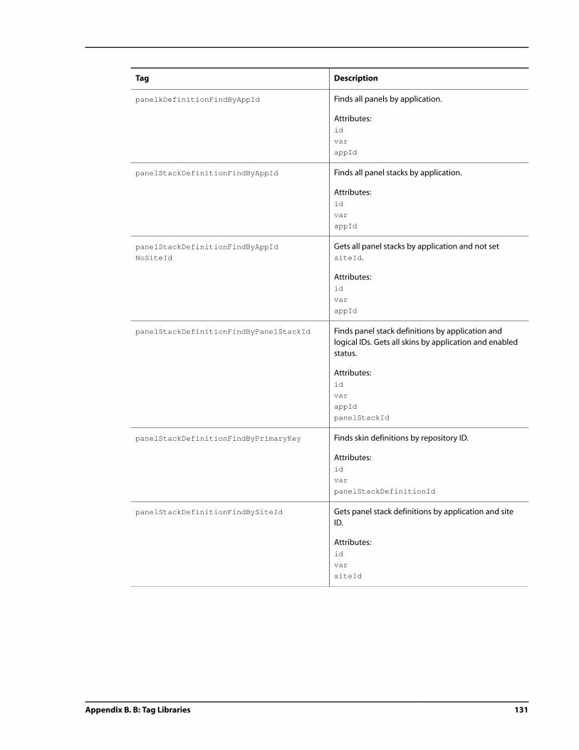
Appendix B. B: Tag Libraries 131
Tag Description
panelkDefinitionFindByAppId Finds all panels by application.
Attributes:
id
var
appId
panelStackDefinitionFindByAppId Finds all panel stacks by application.
Attributes:
id
var
appId
panelStackDefinitionFindByAppId
NoSiteId
Gets all panel stacks by application and not set
siteId.
Attributes:
id
var
appId
panelStackDefinitionFindByPanelStackId Finds panel stack definitions by application and
logical IDs. Gets all skins by application and enabled
status.
Attributes:
id
var
appId
panelStackId
panelStackDefinitionFindByPrimaryKey Finds skin definitions by repository ID.
Attributes:
id
var
panelStackDefinitionId
panelStackDefinitionFindBySiteId Gets panel stack definitions by application and site
ID.
Attributes:
id
var
siteId

132 Appendix B. B: Tag Libraries
Tag Description
panelStackDefinitionFindBySiteIdAnd
PanelStackId
Finds panel stack definitions by application, site and
logical partition IDs.
Attributes:
id
var
appId
siteId
panelStackId
panelStackDefinitionGetPanels Finds panel definitions associated with the panel
stack repository ID.
Attributes:
id
var
panelStackDefinitionId
skinDefinitionFindByAppId Finds all skins by application.
Attributes:
id
var
appId
skinDefinitionFindByAppIdAndEnabled Gets all skins by application and enabled status.
Attributes:
id
var
appId
enabledYn
skinDefinitionFindByPrimaryKey Finds skin definitions by repository ID.
Attributes:
id
var
skinDefinitionId
skinDefinitionFindBySiteId Gets skin definitions by application and site ID.
Attributes:
id
var
siteId

Appendix B. B: Tag Libraries 133
Tag Description
skinDefinitionFindBySiteIdAndSkinId Finds skin definitions by application, site and logical
partition IDs.
Attributes:
id
var
appId
siteId
skinId
skinDefinitionFindBySkinId Finds skin definitions by application and logical IDs.
Gets all skins by application and enabled status.
Attributes:
id
var
appId
skinId
skinDefinitionFindByUserSiteIdAnd
PanelId
Finds panel stack definitions by user site and skin IDs.
Attributes:
id
var
appId
panelId
skinDefinitionFindByUserSiteIdAnd
PanelStackId
Finds panel stack definitions by user site and skin IDs.
Attributes:
id
var
appId
panelStackId
skinDefinitionFindByUserSiteIdAnd
SkinId
Finds content definitions by user site and skin IDs.
Attributes:
id
var
appId
skinId
tabDefinitionFindByAppId Finds all tabs by application.
Attributes:
id
var
appId

134 Appendix B. B: Tag Libraries
Tag Description
tabDefinitionFindByPrimaryKey Finds tab definitions by repository ID.
Attributes:
id
var
tabDefinitionId
tabDefinitionFindBySiteId Gets tab definitions by application and site ID.
Attributes:
id
var
siteId
tabDefinitionFindBySiteIdAndTabId Finds tab definitions by application, site and logical
partition IDs.
Attributes:
id
var
appId
siteId
tabId
tabDefinitionFindByTabId Finds tab definitions by application and logical IDs.
Gets all skins by application and enabled status.
Attributes:
id
var
appId
tabId
tabDefinitionFindByUserSiteIdAnd
TabId
Finds content definitions by user site and tab IDs.
Attributes:
id
var
appId
tabId
templateDefinitionFindByAppId Gets all template definitions by application.
Attributes:
id
var
appId
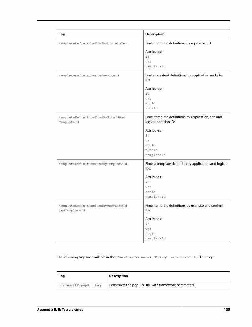
Appendix B. B: Tag Libraries 135
Tag Description
templateDefinitionFindByPrimaryKey Finds template definitions by repository ID.
Attributes:
id
var
templateId
templateDefinitionFindBySiteId Find all content definitions by application and site
IDs.
Attributes:
id
var
appId
siteId
templateDefinitionFindBySiteIdAnd
TemplateId
Finds template definitions by application, site and
logical partition IDs.
Attributes:
id
var
appId
siteId
templateId
templateDefinitionFindByTemplateId Finds a template definition by application and logical
IDs.
Attributes:
id
var
appId
templateId
templateDefinitionFindByUserSiteId
AndTemplateId
Finds template definitions by user site and content
IDs.
Attributes:
id
var
appId
templateId
The following tags are available in the /Service/framework/UI/taglibs/svc-ui/lib/ directory:
Tag Description
frameworkPopupUrl.tag Constructs the pop-up URL with framework parameters.

136 Appendix B. B: Tag Libraries
Tag Description
frameworkUrl.tag Constructs a forwarding and redirection URL with framework parameters.
ATG Service Framework UI Tag Library
The ATG Service Framework UI tag library atg.svc.taglib package, located in the /service/framework/
UI/src/taglibs directory, contains the following tags:
Tag Description
body Creates a scrollable body for a tree table item.
Attributes:
childItems
items
noItemsUrl
scope
varItem
varNode
varStatus
checkBox A sub-tag that defines the tree table checkbox components.
Attributes:
onCheck
column A sub-tag that defines the tree table column components.
Attributes:
defaultSortDirection
isSortable
key
onCheck
onSort
percentWidth
sortField
sortIgnoreCase
sortExpression
style
styleDown
styleHover
styleSorted
title

Appendix B. B: Tag Libraries 137
Tag Description
controlBar Creates a paging-enabled control bar for an expanding table.
Attributes:
controlBarId
scope
showAlways
style
treeTableBean
treeTableId
varHighIndex
varNode
varOffset
varTotal
width
deleteButton Creates a delete button.
Attributes:
disabledImage
image
link
linkPosition
onDelete
deleteOperation
style
styleDisabled
styleDown
styleHover
title
executeOperation Initiates an operation on a tree table.
Attributes:
operationName
treeTableId
expandButton A sub-tag that assigns a button to expand an item.
Attributes:
closedTitle
closedUrl
emptyUrl
onExpand
openTitle
openUrl
style
styleDown
styleHover

138 Appendix B. B: Tag Libraries
Tag Description
field A sub-tag that defines the tree table field components.
Attributes:
columnKey
isChecked
noWrap
onCheck
overflow
percentWidth
position
style
iclass
colspan
title
wordWrap
filterOption Creates a filter option within a filter selection drop down.
Attributes:
filterValue
filterSelect Creates a filter selection drop down element.
Attributes:
filterField
filterOperation
filterTestExpression
noFilteringValue
onFilter
style
varFilter
getDecimalFormatSymbols Gets the DecimalFormatSymbols for the locale or the current
user’s locale.
Attributes:
id
var
locale
getEncodedJavascriptString Gets an encoded truncation for special characters.
Attributes:
var
originalString

Appendix B. B: Tag Libraries 139
Tag Description
getOptionAsArray Gets an option by name and returns the value as an array.
Attributes:
id
var
optionName
segmentName
useVersionedRepository
getOptionAsBoolean Gets an option by name and returns the value as Boolean.
Attributes:
id
var
optionName
segmentName
useVersionedRepository
getOptionAsInteger Gets an option by name and returns the value as an integer.
Attributes:
id
var
optionName
segmentName
useVersionedRepository
getOptionAsString Gets an option by name and returns the value as a string.
Attributes:
id
var
optionName
segmentName
useVersionedRepository
head Creates a header for a tree table column.
Attributes:
showAlways
style
httpCacheHeader Sets the HTTP cache control headers.
initialSort Defines the sort for a tree table.
Attributes:
defaultSortDirection
sortIgnoreCase
sortEpxression
sortField

140 Appendix B. B: Tag Libraries
Tag Description
insertBody Inserts a body object for the tree table implementation.
Attributes:
childItems
isExpanding
isNavigating
itemKey
itemName
items
varItem
visibleLevels
insertControlBar Inserts an empty tree table control bar on the page.
Attributes:
controlBarId
treeTableId
insertTreeTable Inserts an empty tree table on the page, with the global attributes
already defined.
Attributes:
actionId
columns
hasHeader
hasPaging
height
initialUrl
overflow
pageSize
position
skipRestore
statSavingMethod
treeTableBean
treeTableId
width
itemStyle Defines a style for items within the tree table with the ability to have
alternating row styles.
Attributes:
styleName

Appendix B. B: Tag Libraries 141
Tag Description
itemTemplate Defines a template for items that are contained in the body of the
tree table.
Attributes:
isExpanded
key
noWrap
onDelete
onSelect
overflow
position
style
styleHover
styleSelected
moveButton Creates a move button.
Attributes:
disabledImage
image
link
linkPosition
onMove
moveOperation
style
styleDisabled
styleDown
styleHover
title
navigateButton Creates a navigate button.
Attributes:
disabledImage
image
key
link
linkPosition
onNavigate
style
styleDisabled
styleDown
styleHover
title
operationParameter Defines a tree table operation parameter in page elements.
Attributes:
elementId
elementProperty
name
value

142 Appendix B. B: Tag Libraries
Tag Description
pagingButton Creates a paging button within a paging component.
Attributes:
disabledImage
image
link
linkPosition
onPage
pagingOperation
style
styleDisabled
styleDown
styleHover
title
refreshButton Creates a refresh button.
Attributes:
disabledImage
image
link
linkPosition
onRefresh
pagingOperation
style
styleDisabled
styleDown
styleHover
title
restoreState Restores window-based state from the state holder to the attribute.
Attributes:
key
scope
var
saveState Saves the window-based state in the state holder.
Attributes:
key
value
serviceMethod Invokes methods on repository services, with arguments passed in
using child tags.
Attributes:
bean
method
scope
var

Appendix B. B: Tag Libraries 143
Tag Description
serviceMethodArgument Passes an argument to a service method tag.
Attributes:
value
sortOption Creates a sort option within a sort selection drop down.
Attributes:
defaultSortDirection
isInitiallySorted
sortExpression
sortField
sortIgnoreCase
sortSelect Creates a sort selection drop down.
Attributes:
onSort
style
Knowledge Manager Tag Library
The Knowledge Manager tag library in the atg.svc.knowledge.taglib package, located in the /service/
Agent/src/taglibs/ directory, contains the following tags:
Tag Description
canEditSolution Checks to see if the current user can edit this solution.
Attributes:
var
processId
projectId
solutionId
canViewSolution Checks to see if the current user can view this solution.
Attributes:
var
processId
projectId
solutionId

144 Appendix B. B: Tag Libraries
Tag Description
getAccessRight Retrieves an access right using a primary key or name.
Attributes:
var
accessRightPK
accessRightName
getAssignableUsers Returns a list of User objects for each user that can execute the
task.
Attributes:
id
var
solutionTask
processId
solutionId
getProcess Retrieves a process by ID.
Attributes:
var
primaryKey
getProject Retrieves a project by ID.
Attributes:
var
primaryKey
getProjectTasks Returns a list of SolutionTask objects for either the specified
solution, or all of the solutions within a project.
Attributes:
var
projectId
solutionId
getSolution Retrieves a solution by process, project, version or solution ID.
Attributes:
var
processId
projectId
solutionVersion
solutionId
editable

Appendix B. B: Tag Libraries 145
Tag Description
getSolutionByVersion Retrieves a solution by version. This tag also applies to security.
Attributes:
var
solutionId
versionId
editable
getSolutionHistory Returns a list of SolutionHistoryBean objects for the solution.
Attributes:
var
solutionId
projectId
getSolutionStatus Retrieves a status of a solution.
Attributes:
var
solutionId
processId
projectId
published
getSolutionTasks Returns a list of SolutionTask objects for the solution.
Attributes:
var
solutionId
unsecure
getUserOwningGroups Returns a list of OrganizationalValue objects for the user.
Attributes:
var
isFieldExternallyVisible Returns a true value if the segment can see the solution field.
Attributes:
id
var
solutionField
segment
isFieldValueExternallyVisible Returns a true value if the segment can see the solution field
value.
Attributes:
id
var
solutionFieldValue
segment

146 Appendix B. B: Tag Libraries
Tag Description
isSolutionExternallyVisible Returns a true value if the segment can see the solution.
Attributes:
id
var
solution
segment
OrganizationIsExists Checks to see if the current user can edit the solution.
Attributes:
var
organizationValueId
renderEmailStatement Renders a statement for email based upon the statement text
value.
Attributes:
id
var
text
Commerce Service Center Tag Library
The following tag files are located in the /DCS-CSR-UI/j2ee-apps/DCS-CSR-UI/WEB-INF/tags/ directory.
To use these tags, you must copy these tags into your customization library. For detailed information on working
with tag files, refer to the ATG Page Developer's Guide:
Tag Description
displayCreditCardType.tag Displays the credit card name and renders the last four digits of the
credit card number.
getCurrencyCode.tag Retrieves a currency code that is used by the order. If no currency code
is set, the default currency code is used.
getProduct.tag Obtains the product repository item from the order if the
commerceItemId has been set. If not, it runs a ProductLookup using
the ProductId.
inventoryStatus.tag Provides a string description of the inventory status.
priceRange.tag Sets the highPrice and lowPrice of the price range.
renderer.tag Adds renderer, targeter and rule data components to renderers.
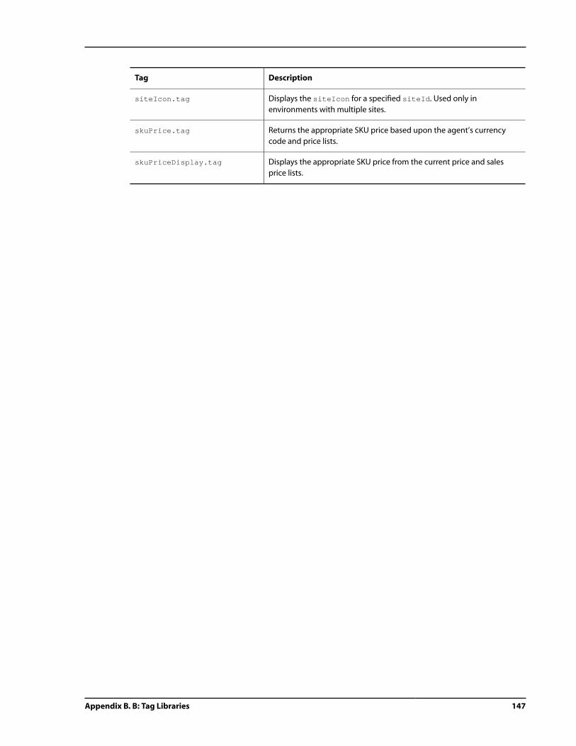
Appendix B. B: Tag Libraries 147
Tag Description
siteIcon.tag Displays the siteIcon for a specified siteId. Used only in
environments with multiple sites.
skuPrice.tag Returns the appropriate SKU price based upon the agent’s currency
code and price lists.
skuPriceDisplay.tag Displays the appropriate SKU price from the current price and sales
price lists.

148 Appendix B. B: Tag Libraries

Index 149
Index
Aaction menu, 49
creating, 54
navaction, 51
ATG Personalization, 100
ATG Ticketing, 3
Ccell, 4, 19
configuration object, 27
definition object, 18, 57
instance object, 30
object, 4, 5
columns, 87, 95
adding, 95
attributes, 89
content, 91
removing, 95
reordering, 95
width, 90
combiner script, 4, 4, 9, 11, 119
(see also data binding)
configuration layering, 42
and forms, 67
and grids, 85
and tables, 84
with tables and grids, 81
configuration object, 5, 25
cell, 27
content, 26
framework, 26
panel, 27
panel stack, 27
skin, 26
tab, 27
template, 26
content
configuration object, 26
definition object, 23
instance object, 29
static, 4, 9, 23
CSS, 4, 4
(see also static content)
adding, 42
Ddata binding, 4
deleting, 62
deleting definition objects, 32
modifying definition objects, 32
rules, 11
unmarshalling, 11
XML files and, 9
debugging mode, 43
Dojo, 44
definition homes, 11, 125
definition object, 4
adding, 32
cell, 18, 57
content, 23
deleting, 32, 62
framework, 14
modifying, 32
panel, 21, 57
panel stack, 19, 57
skin, 15
tab, 17, 57
template, 24
troubleshooting, 65
Ffinder method, 11, 125
forms, 67
creating, 73
modifying, 67
pop-up page, 75
submit, 35
validation, 67, 116
framework, 4
configuration object, 25
definition object, 14
instance object, 28
object, 4, 11, 12
object current state, 25
schema, 9
Gglobal context area, 5, 45
rendering, 52
grids, 81
column attributes, 89
column layout, 87
column width, 90

150 Index
columns, modifying, 95
extending configuration, 85
modifiable components, 81
IID object, 10
instance object, 5, 28
cell, 30
content, 29
framework, 29
panel, 31
panel stack, 30
panel target, 31
skin, 29
tab, 29
template, 29
JJavaScript, 4, 4, 61
(see also static content)
adding, 42
JSP, 4, 24, 41
layout definition, 4
targeting rules, 103
Kkeyboard shortcuts, 111
global, 112
Llayout, 4, 14
and navcontent, 48
basic structure, 18
create new, 57
global context area, 52
in cell definition, 57
of framework objects, 24
page, 57
with cells and templates, 17
look-and-feel, 4, 14, 15
Mmap object, 10
messages, 113
rendering, 113
modules, 3
Nnavigation, 4, 5, 14, 17
Oobjects, 4
cell, 4
cell configuration, 27
cell definition, 18, 57
cell instance, 30
configuration, 5, 25
content, 4
content configuration, 26
content definition, 23
content instance, 29
definition, 4
definition troubleshooting, 65
framework, 4, 11, 12
framework configuration, 26
framework definition, 14
framework instance, 29
hover, 97
ID entry, 10
instance, 5, 28
map entry, 10
panel, 4
panel configuration, 27
panel definition, 21
panel instance, 31
panel stack, 4
panel stack configuration, 27
panel stack definition, 19, 57, 57
panel stack instance, 30
panel target, 31
skin, 4
skin configuration, 26
skin definition, 15
skin instance, 29
tab, 4
tab configuration, 27
tab definition, 17, 57
tab instance, 29
template, 4
template configuration, 26
template definition, 24
template instance, 29
Oracle ATG Web Commerce Search, 3
Oracle ATG Web Commerce Service Center, 3
Oracle ATG Web Knowledge Manager, 3
Oracle ATG Web Knowledge Manager Self Service, 3
Ppage, 17
create new, 57
defining regions of
, 21
defining with templates, 24
pop-up, 75
rendering, 99

Index 151
page fragments, 68
extending default, 69
forms, 68
tables and grids, 90
panel, 4
adding, 62
configuration object, 27
definition object, 21, 57
instance object, 31
object, 4
panel stack, 4, 17, 18
configuration object, 27
definition object, 19, 57
instance object, 30
object, 4
panel target instance object, 31
personalization, 100
pop-up window, 49
priority property, 10
Rrenderers, 99, 106
column content, 91
components, 101
target, 100
rendering, 5
global context area, 52
rules, 100
target customization, 103
Sschema, 12
elements, 9
search function, 48
skin, 4, 14
configuration object, 26
definition object, 15
instance object, 29
object, 4
state, 12
default framework, 4
in-memory, 28
of a particular user, 5
transient, 5, 28
static content, 4, 9, 23
linking, 23
Ttab, 4, 14
action, 61
change current, 33
configuation object, 27
definition object, 17, 57, 57
instance object, 29
object, 4, 5
tables, 81
extending configuration, 84
modifiable components, 81
template, 4, 21, 24
configuration object, 26
instance object, 29
Uunmarshalling (see data binding)
URL, 33
alternate, 100
forwarding, 36
parameters, 36
utilities panel, 5
Vvalidation, 115
conditional, 116
field, 117
widgets, 115
with forms, 67, 73
with pop-up page, 75
Wworkspace, 5
Xxml-combine (see data binding)

152 Index