artist typeface
DESCRIPTION
My typogrpahy workTRANSCRIPT

Module TFD1064. Design for Communication DesignGraphic design group Project – “Artist typeface” Rob [email protected]
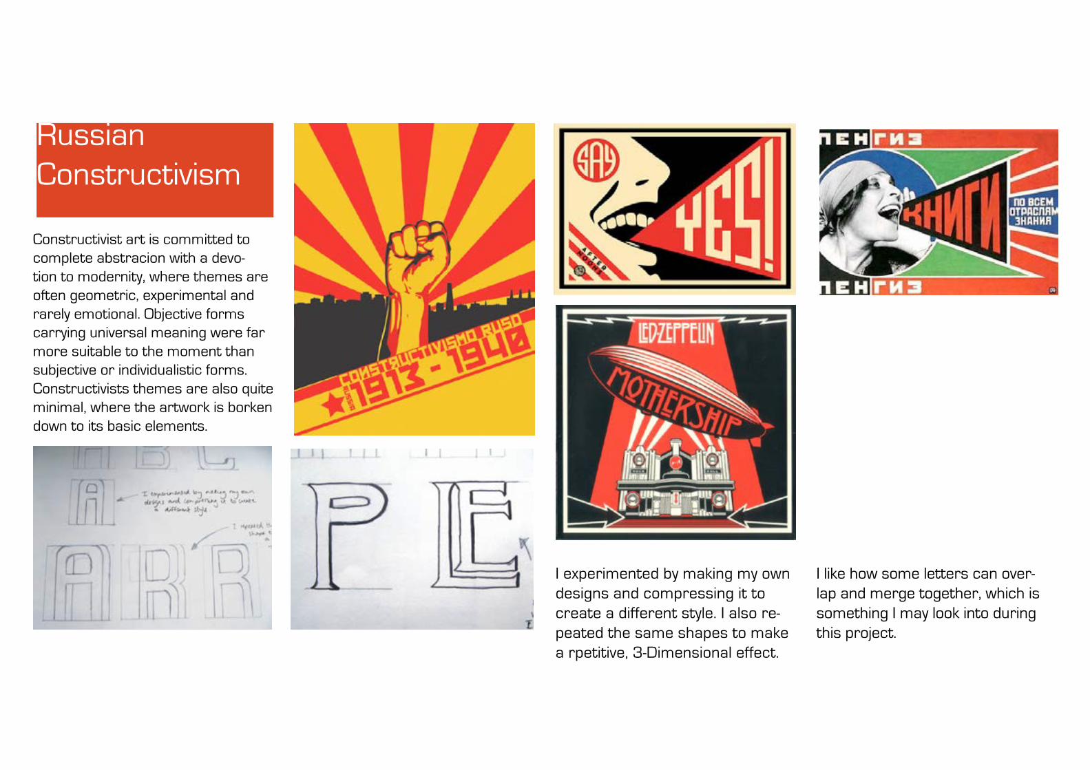
Russian Constructivism
Constructivist art is committed to complete abstracion with a devo-tion to modernity, where themes are often geometric, experimental and rarely emotional. Objective forms carrying universal meaning were far more suitable to the moment than subjective or individualistic forms. Constructivists themes are also quite minimal, where the artwork is borken down to its basic elements.
I experimented by making my own designs and compressing it to create a different style. I also re-peated the same shapes to make a rpetitive, 3-Dimensional effect.
I like how some letters can over-lap and merge together, which is something I may look into during this project.

Ben Eine
Ben Eine is one of London’s most prolific and original street artists who specialises in the central ele-ment of all graffiti – the form of letters. His singular letters are big, bright and colourful, and uses the street as his canvas. Many of his letters are on walls, doors and shutters. The letters are some-times made to look raised and 3D, as if they are escaping the canvas.
I like how Ben Eine creates lots of different fonts and styles. I think the letters are interesting cross sections, and the raised effects are stretched and bold, which helps emphasise and make the letter stand out in public.
I like the different patterns Ben Eine uses such as stripes and lines. What also intrigues me is the let-ters are asymmetrical and uneven, so I decided to create letters such as the letter A and exaggerate ar-eas of the letters.
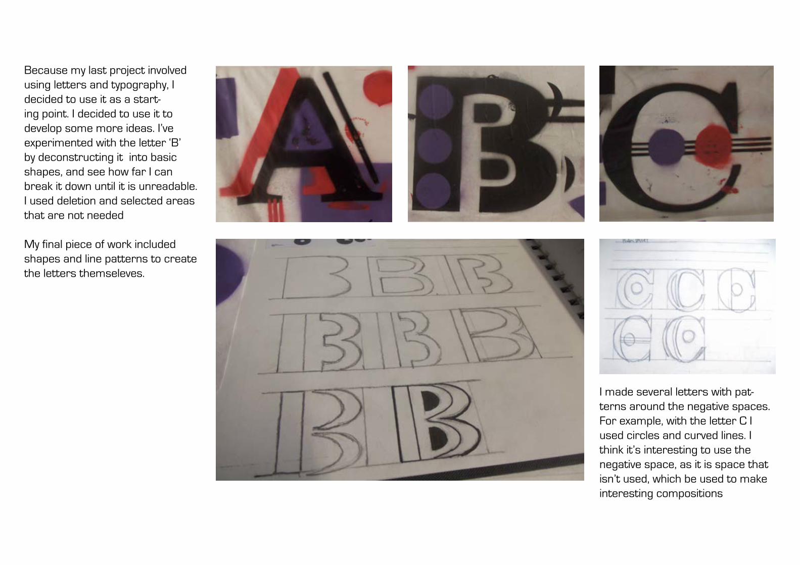
Because my last project involved using letters and typography, I decided to use it as a start-ing point. I decided to use it to develop some more ideas. I’ve experimented with the letter ‘B’ by deconstructing it into basic shapes, and see how far I can break it down until it is unreadable. I used deletion and selected areas that are not needed
My final piece of work included shapes and line patterns to create the letters themseleves.
I made several letters with pat-terns around the negative spaces. For example, with the letter C I used circles and curved lines. I think it’s interesting to use the negative space, as it is space that isn’t used, which be used to make interesting compositions

Armin Hofmann
Armin Hofmann has been de-scribed as one of the most out-standing personalities in Swiss Graphic design history. The read-ability and cleanlinessof the style as well as it’s asymmetric layouts, use of a grid and san-serif typefaces have helped define how we design today.
What really interests me is the rectangular counterforms made by deleting areas and parts of letters, yet the words are still readable. There’s evidence of Hofmann delet-ing areas of circles with rectangu-lar shapes, creating the rectangu-lar counterforms, then arranging the circles in different postions.

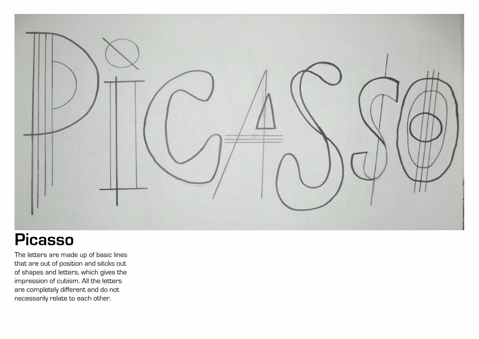
Cubism
Invented by Picasso and Braque in the first of the twentieth century. Although appearing abstract and geometrical, it depicts real objects. Cubists art define objects. Cubist art define objects in terms of the two-dimenionsal cancas.
Because Braque and Picasso used a lot of lines in different interesting juxtapositions, I decoded to create the letters using the lines in a simi-lar way. I tried to make discrete letters using simle shaes such as circles.

I also applied shapes in between the letters, where there are nega-tive spaces. I also experimented with splitting letters into quar-ter, then enlarging and changing parts of the letters. When I made the letters E and F, I orignally cre-ated long lines which ink together to create the letter. They are simply made out of square and rectangles.
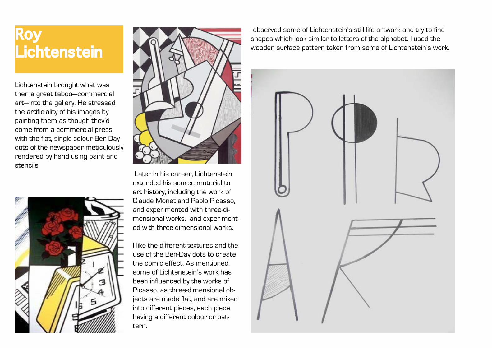
Roy Lichtenstein
Lichtenstein brought what was then a great taboo—commercial art—into the gallery. He stressed the artificiality of his images by painting them as though they’d come from a commercial press, with the flat, single-colour Ben-Day dots of the newspaper meticulously rendered by hand using paint and stencils.
Later in his career, Lichtenstein extended his source material to art history, including the work of Claude Monet and Pablo Picasso, and experimented with three-di-mensional works. and experiment-ed with three-dimensional works.
I like the different textures and the use of the Ben-Day dots to create the comic effect. As mentioned, some of Lichtenstein’s work has been influenced by the works of Picasso, as three-dimensional ob-jects are made flat, and are mixed into different pieces, each piece having a different colour or pat-tern.
I observed some of Lichtenstein’s still life artwork and try to find shapes which look similar to letters of the alphabet. I used the wooden surface pattern taken from some of Lichtenstein’s work.
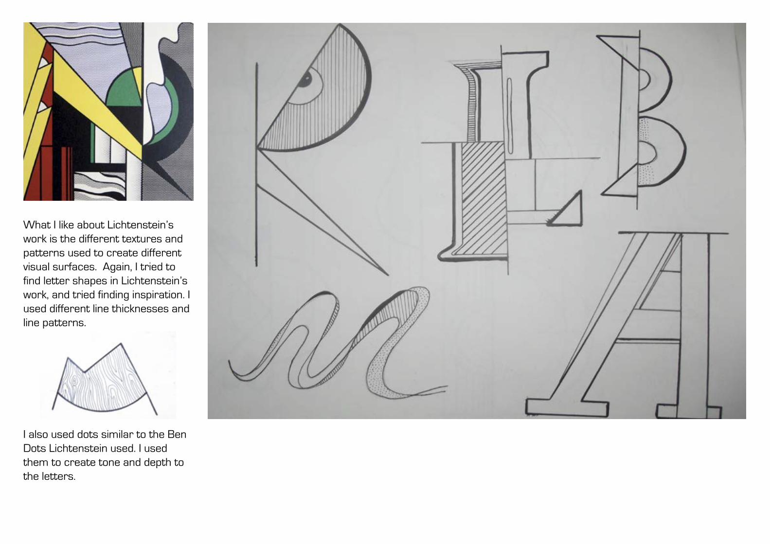
What I like about Lichtenstein’s work is the different textures and patterns used to create different visual surfaces. Again, I tried to find letter shapes in Lichtenstein’s work, and tried finding inspiration. I used different line thicknesses and line patterns.
I also used dots similar to the Ben Dots Lichtenstein used. I used them to create tone and depth to the letters.

Bridget Riley Riley is an expnonent of the Op Art Movement, which focuses on playing perceptual games with the viewer and creating the impression of movement on static canvas. She enjoys experimenting with varia-tions in tone and colour. She began by painting black and white stripe paintings, later introducing col-our to set up visual vibrations and rythms suggesting musical tonali-ties.
They present a great variety of ge-ometric forms that produce sensa-tions of movement or colour, which is what I like in Bridget Riley’s work. I used lines and changed the dis-tance of each line gradually to make tonal effect. I also used wavy lines to crate a sense of move-ment, or a liquid cellular form. Some of my letters are almost hid-den in the patterns I made.
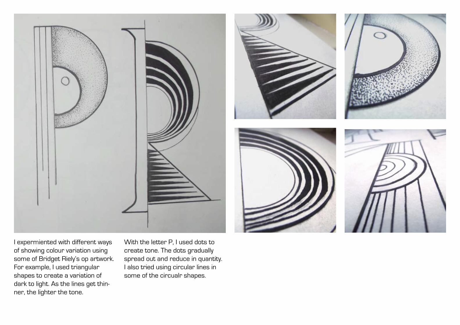
I expermiented with different ways of showing colour variation using some of Bridget Riely’s op artwork. For example, I used triangular shapes to create a variation of dark to light. As the lines get thin-ner, the lighter the tone.
With the letter P, I used dots to create tone. The dots gradually spread out and reduce in quantity. I also tried using circular lines in some of the circualr shapes.

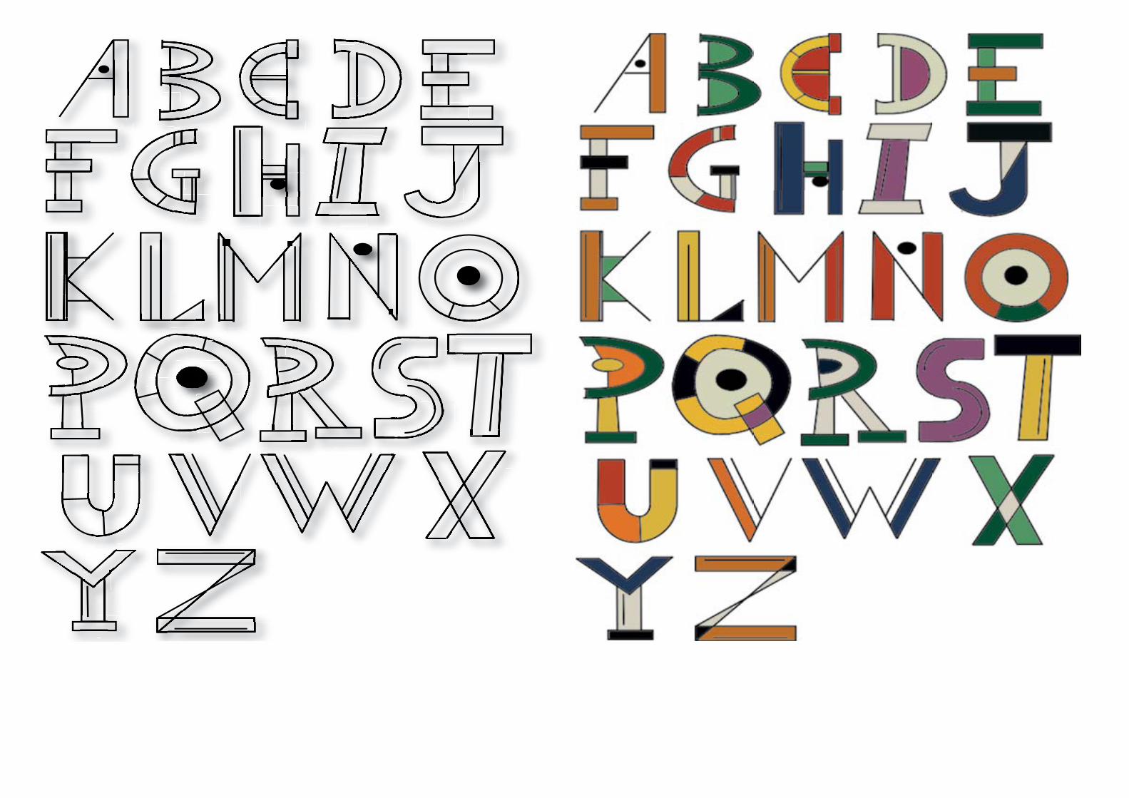
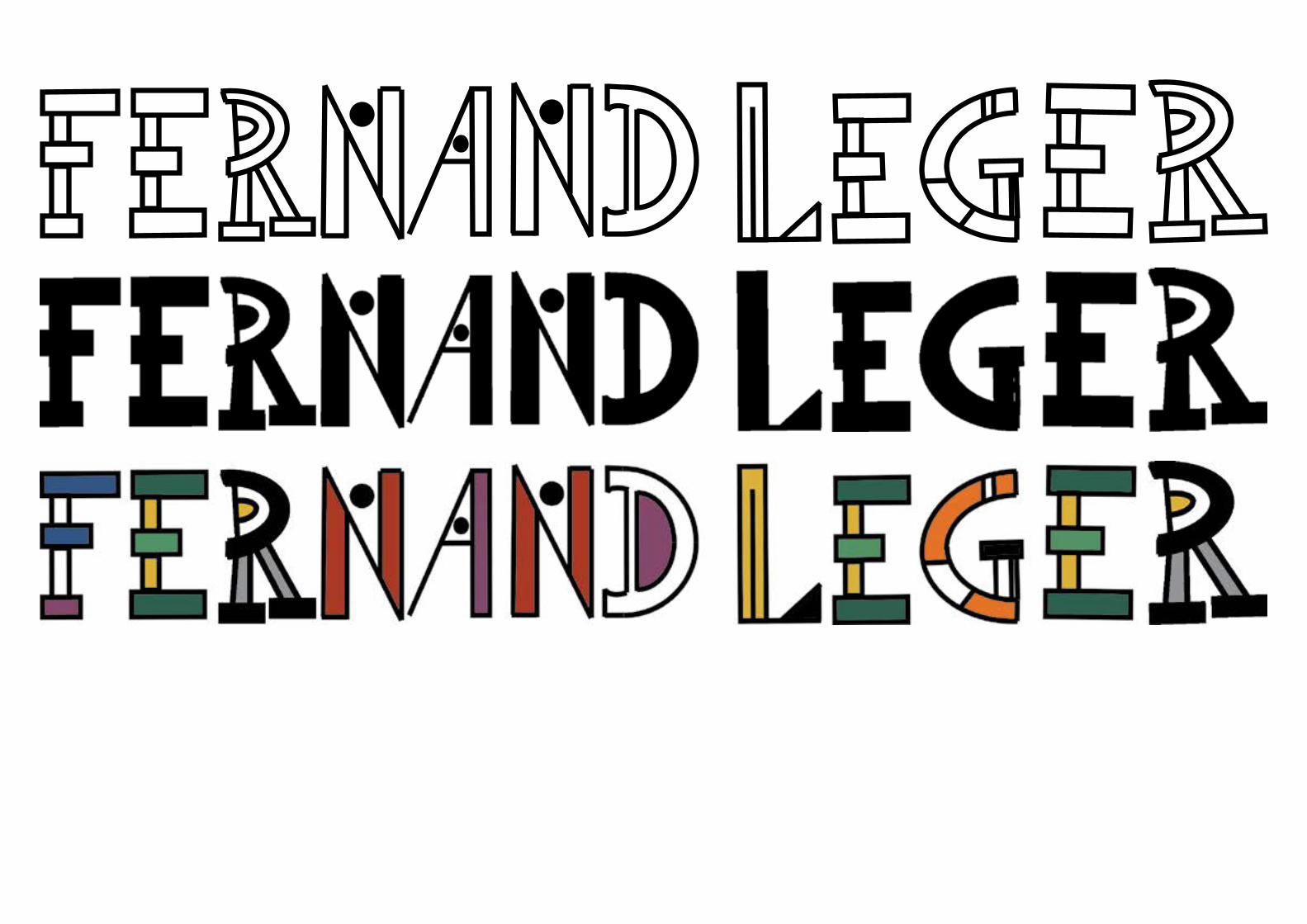
Fernand Leger
In his early works he created a personal form of Cubism which he gradually modified into a more figu-rative, populist style. His boldly sim-plified treatment of modern subject matter has caused him to be re-garded as a forerunner of Pop art. This work marked the beginning of his “mechanical period”, dur-ing which the figures and objects he painted were characterized by sleekly rendered tubular and ma-chine-like forms.
I looked at the mechanical shapes in Leger’s artwork that looked similar to letters. Many of Fernand Leger’s painting have circular and semi cricular forms based from mechanical parts such as bolts and screws. I like the dif-ferent black line thicknesses Fernand Leger applies to his work, which makes the paintings sharper. Many of his paintings have large amounts of colour and small amounts of detail.
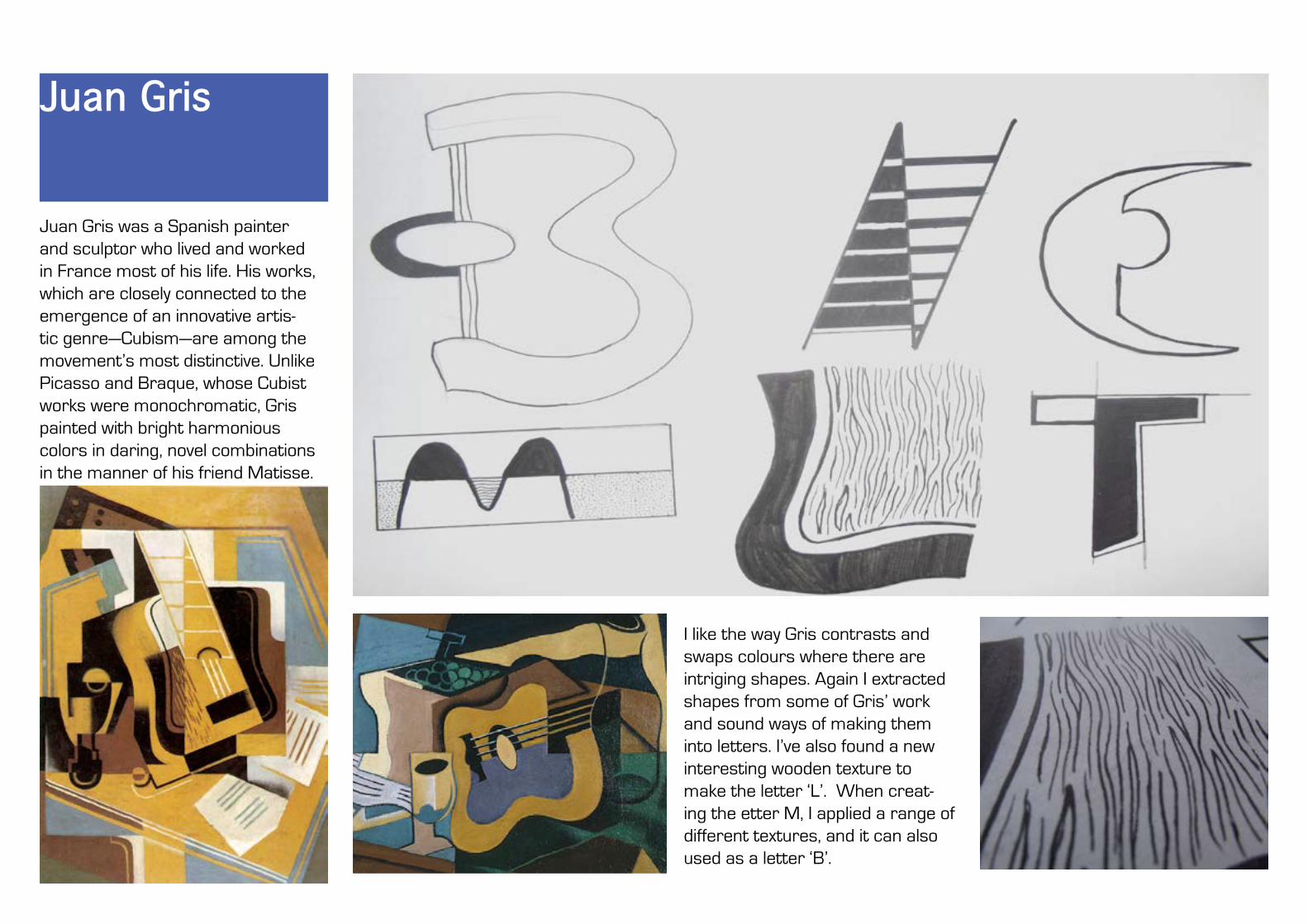
Juan Gris
Juan Gris was a Spanish painter and sculptor who lived and worked in France most of his life. His works, which are closely connected to the emergence of an innovative artis-tic genre—Cubism—are among the movement’s most distinctive. Unlike Picasso and Braque, whose Cubist works were monochromatic, Gris painted with bright harmonious colors in daring, novel combinations in the manner of his friend Matisse.
I like the way Gris contrasts and swaps colours where there are intriging shapes. Again I extracted shapes from some of Gris’ work and sound ways of making them into letters. I’ve also found a new interesting wooden texture to make the letter ‘L’. When creat-ing the etter M, I applied a range of different textures, and it can also used as a letter ‘B’.
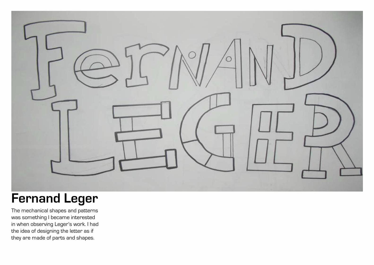
Fernand LegerThe mechanical shapes and patterns was something I became interested in when observing Leger’s work. I had the idea of designing the letter as if they are made of parts and shapes.
The letters are made up of basic lines that are out of position and sitcks out of shapes and letters, which gives the impression of cubism. All the letters are completely different and do not necessarily relate to each other.
Picasso

LichtensteinThese shapes are directly found from several pieces of work by Lichtenstein. It includes different variations of tones, including dots and lines. I like how I used random shapes such as lips to make the letter ‘I’ and hands for the letter ‘E’.


60 pt
72 pt
84 pt
