animation essentials-css animations and transitions.pdf · animation essentials css animations and...
TRANSCRIPT

Animation Essentials CSS Animations and Transitions
with @RachelNabors & Tuna P. Katz
Get started with “SMASHINGROCKS” at goo.gl/ZL0SVd


You will learn…
• CSS Transi+ons
• CSS Anima+ons
• Sequencing Anima+ons
• How to Design Performant Anima+ons
• And some handy browser tools for working with anima+ons
For your convenience…
All of the exercises use:
• jQuery
• and -‐prefix-‐free

Our Teacher’s Assistant Today
CSS Transitions

A transition describes how a property should
display change when given a different value.

transition: color 2s;
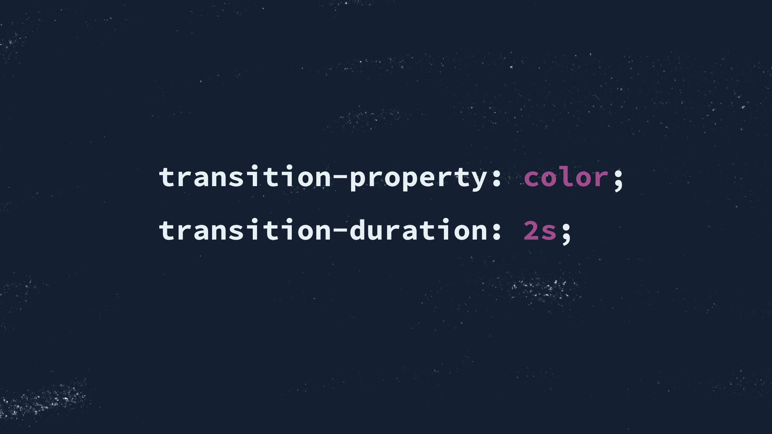
transition-property: color;
transition-duration: 2s;

Anatomy of a transition
• transition-property the property you want to transi+on. (Only some proper4es are transi4onable, see goo.gl/Ttk1S2)
• transition-duration in seconds or milliseconds: 4s or 4000ms
• transition-timing-function “cushioning” for the transi+on, op=onal: defaults to ease
• transition-delay the number of milli/seconds to delay the transi+on before firing it, op=onal

transition: color 2s 100ms;
so this must be the delay
duration always comes first

Transitioning Multiple Properties
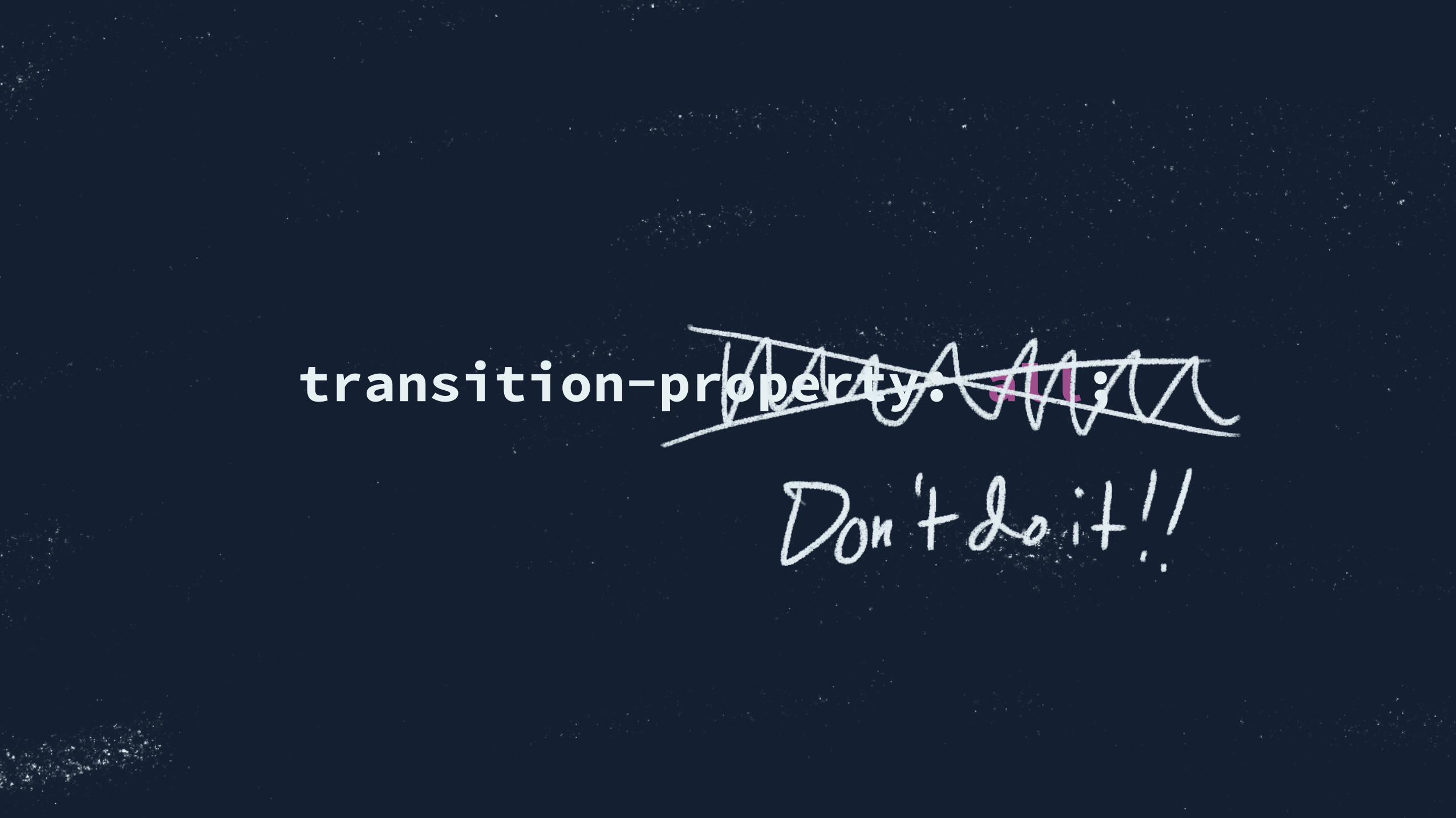
transition-property: all;
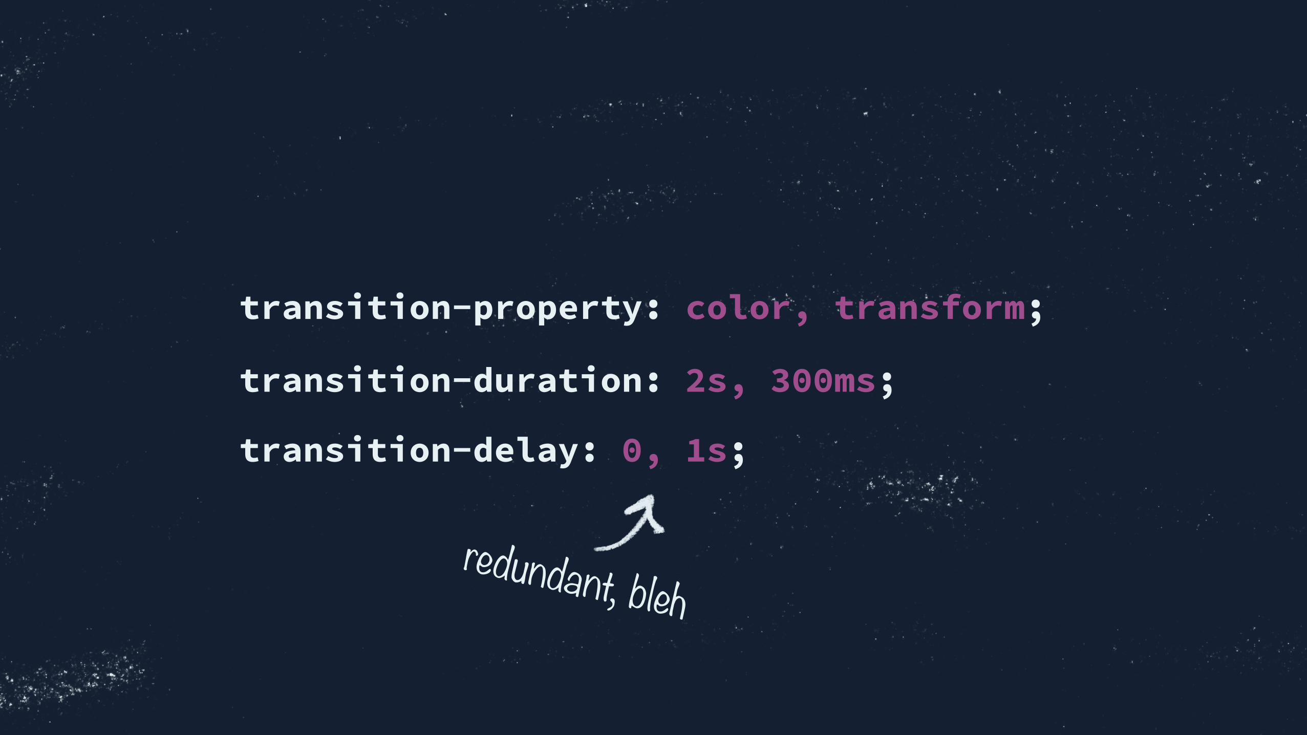
transition-property: color, transform;
transition-duration: 2s, 300ms;
transition-delay: 0, 1s;
redundant, bleh

transition:
color 2s,
transform 300ms 1s;
separate sets of values
with commas

exercise
Keep up at: Want to share? Save & tweet codepen link to @rachelnabors
Rolling a Ball
Start coding! cdpn.io/fGFDj Try transi=oning its color, too.
Duration
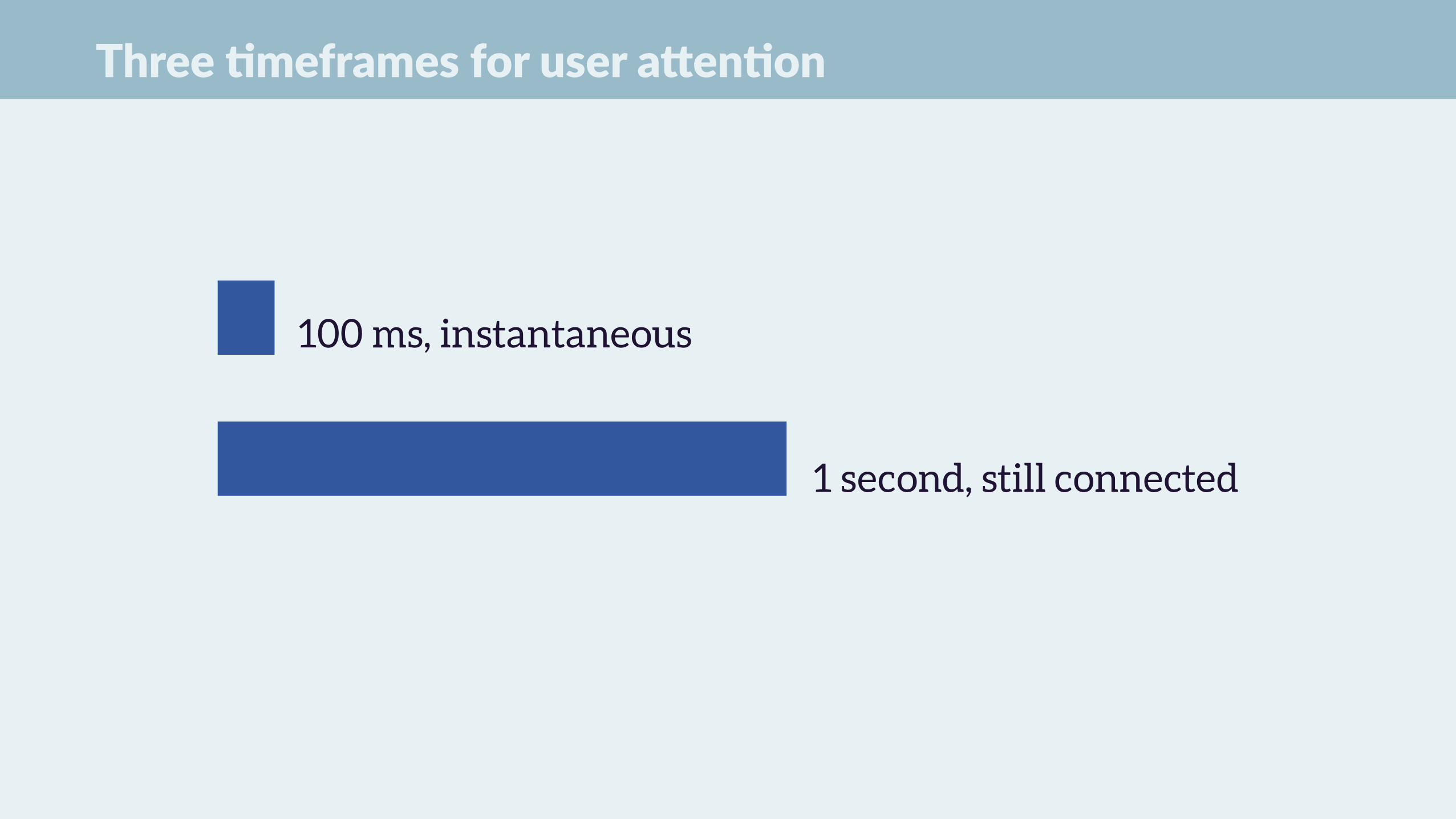
Three =meframes for user aKen=on
100 ms, instantaneous
1 second, still connected
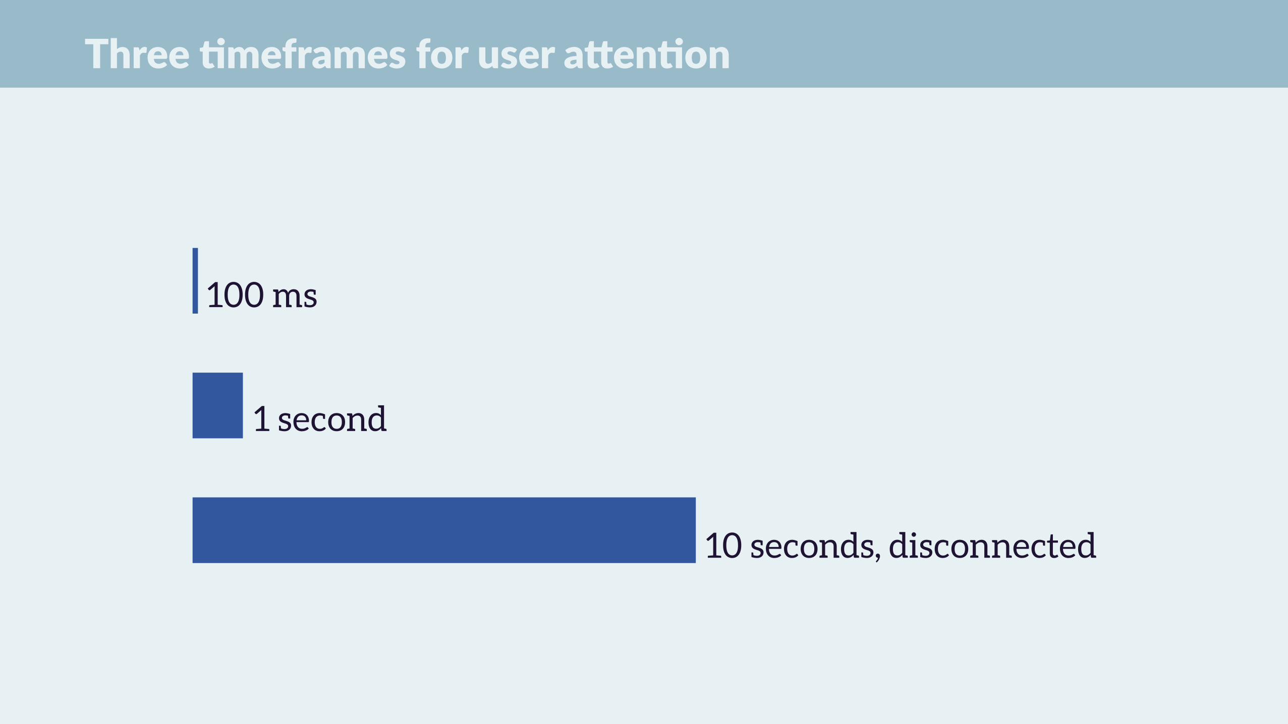
Three =meframes for user aKen=on
100 ms
1 second
10 seconds, disconnected


–Studio anima6on rule of thumb
“However long your pre-production animation, halve its duration…
then halve it again.”


250~300 ms: sweet spot for
many animations
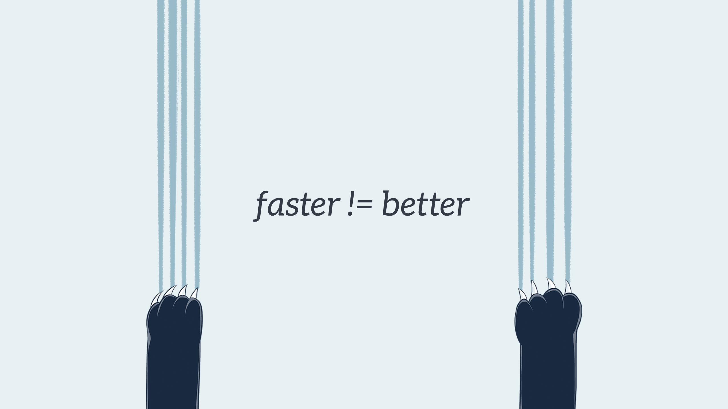
faster != better


You can slow down transitions with
Dev Tools to get a good look at ‘em.
Timing Functions
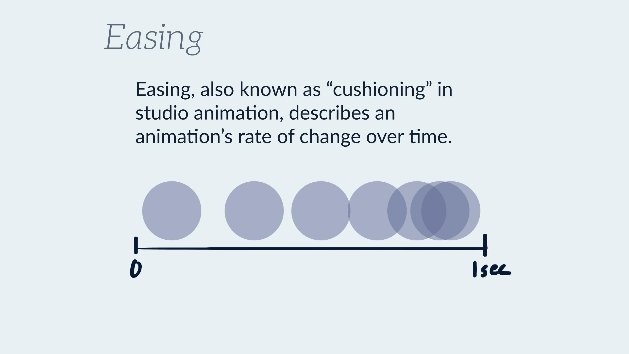
EasingEasing, also known as “cushioning” in studio anima+on, describes an anima+on’s rate of change over +me.

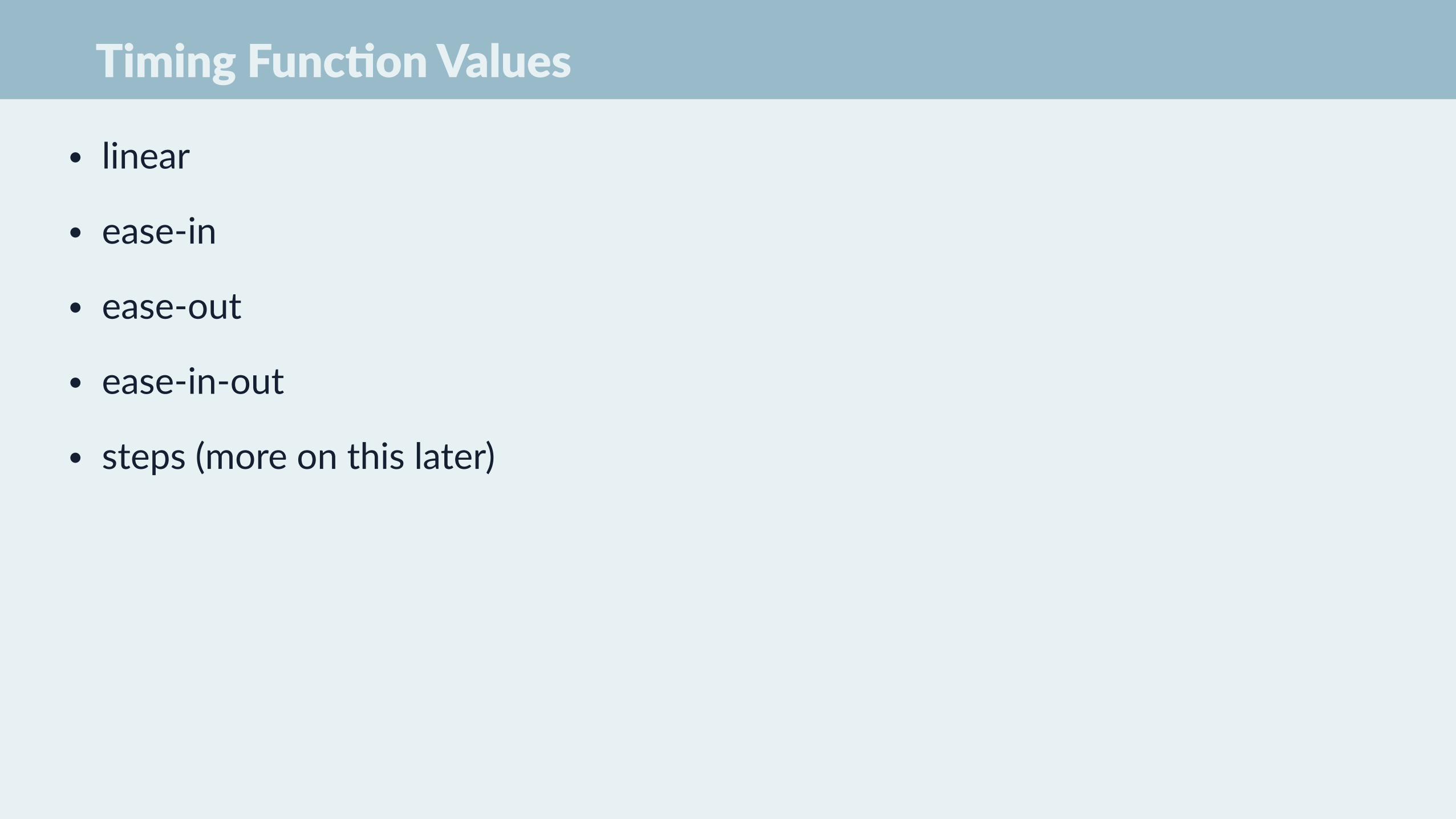
Timing Func=on Values
• linear
• ease-‐in
• ease-‐out
• ease-‐in-‐out
• steps (more on this later)

Replace “ease” with “slow” to better
remember the different timing effects.
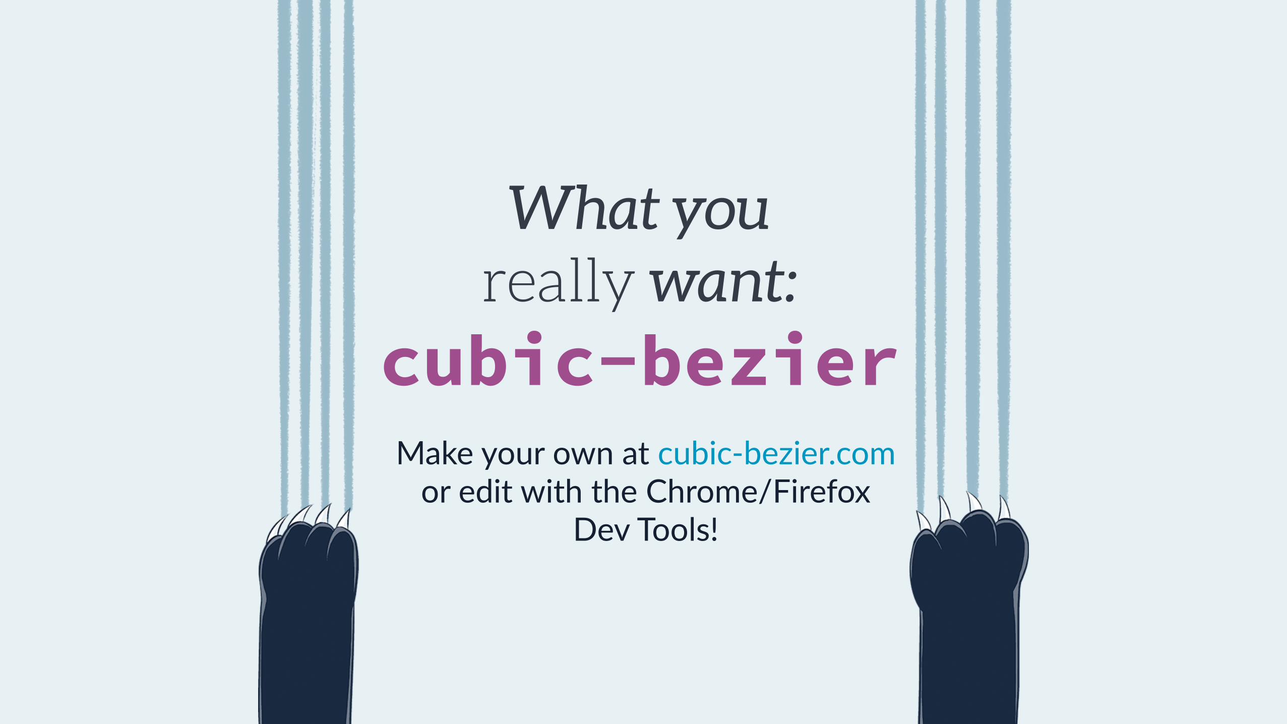
What you really want:
cubic-bezier Make your own at cubic-‐bezier.com or edit with the Chrome/Firefox
Dev Tools!

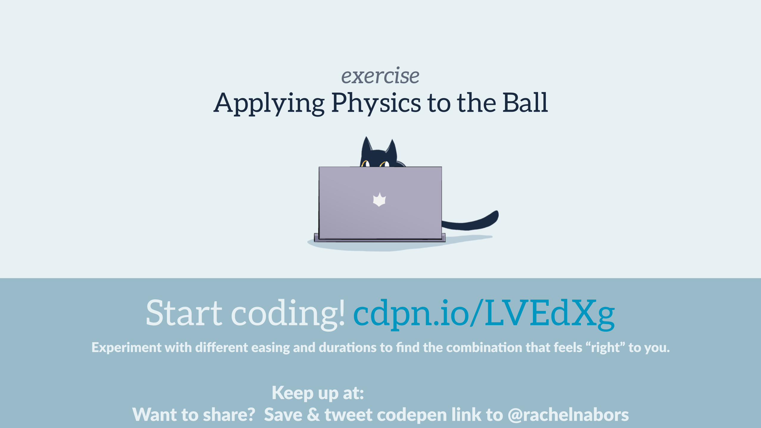
exercise
Keep up at: Want to share? Save & tweet codepen link to @rachelnabors
Applying Physics to the Ball
Start coding! cdpn.io/LVEdXgExperiment with different easing and dura=ons to find the combina=on that feels “right” to you.
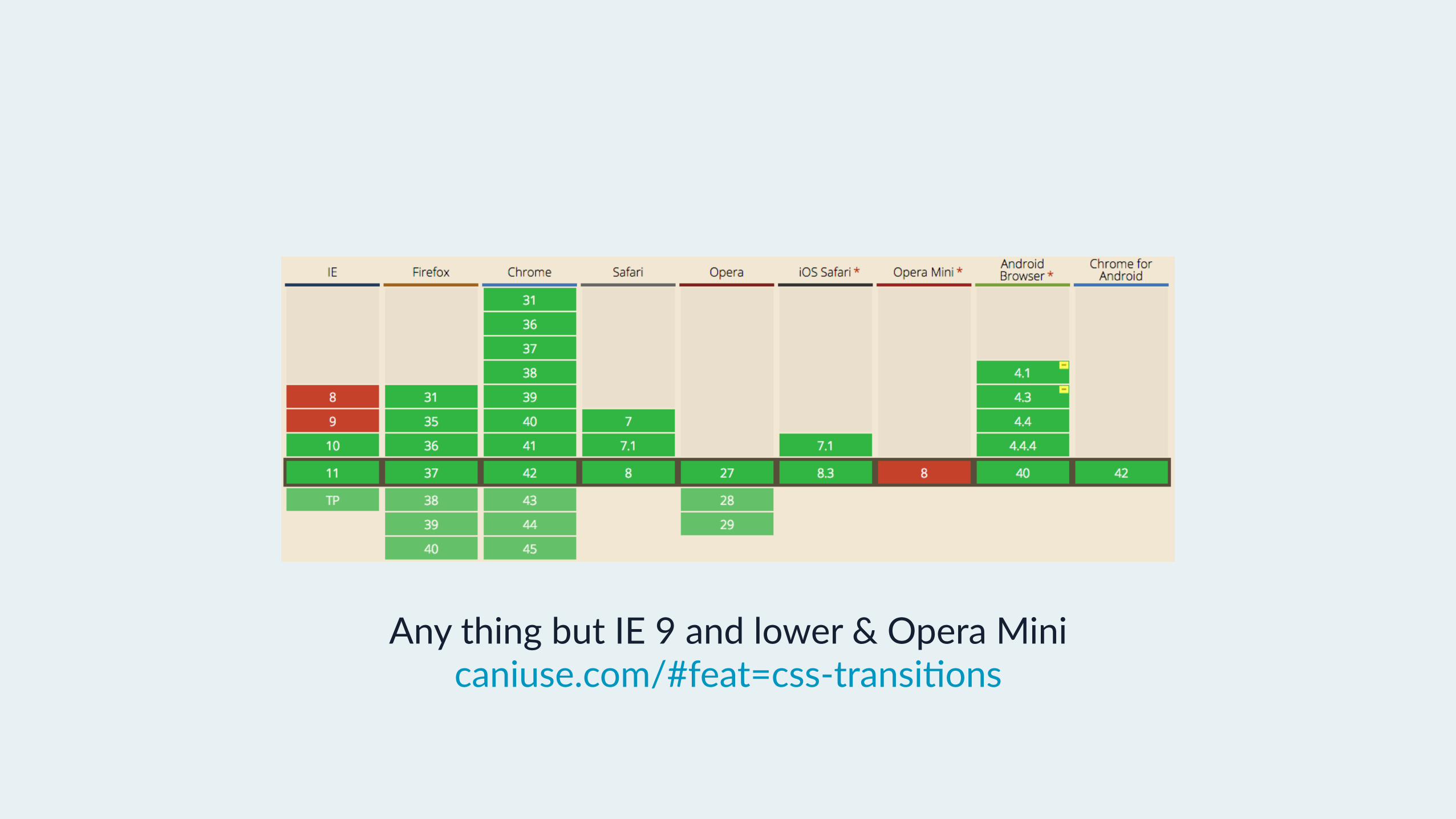
Browser Support for CSS Transi=ons
Any thing but IE 9 and lower & Opera Mini caniuse.com/#feat=css-‐transi+ons
CSS Transi=ons rock because…
• Single fire If you only want something to happen once.
• Granularity If you would only animate one or two proper+es in a given state

Questions?

CSS Animations
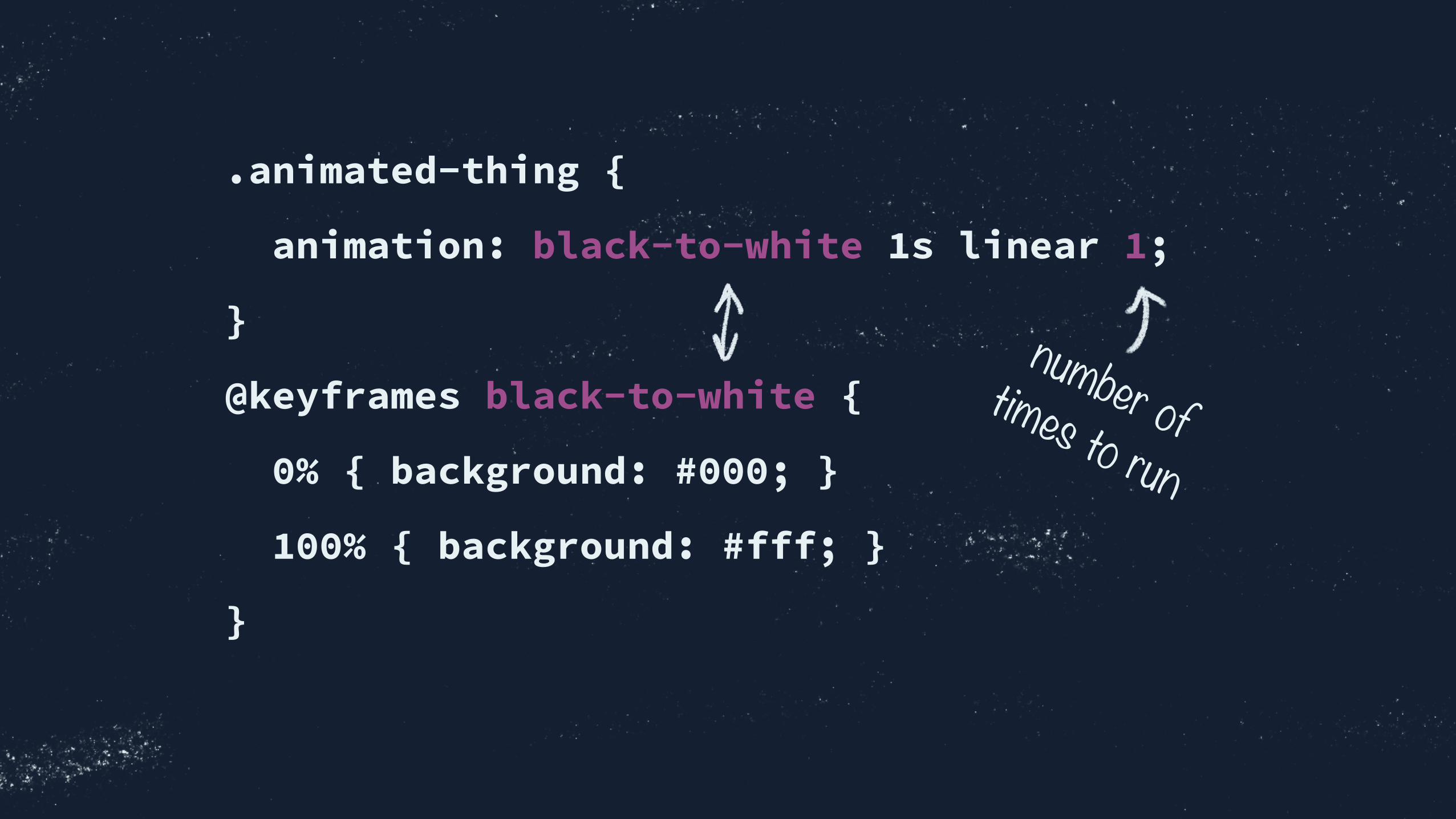
.animated-thing {
animation: black-to-white 1s linear 1;
}
@keyframes black-to-white {
0% { background: #000; }
100% { background: #fff; }
}
number of times to run

.animated-thing {
animation:
$name
$duration
$timing-function (optional)
$animation-delay (optional)
$iteration-count;
}
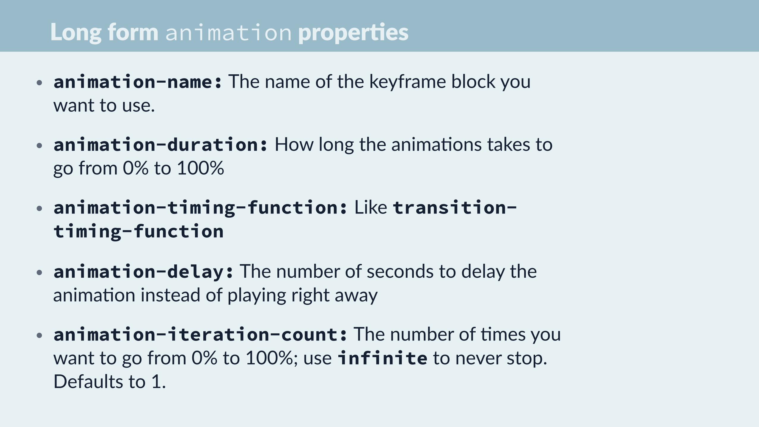
Long form animation proper=es
• animation-name: The name of the keyframe block you want to use.
• animation-duration: How long the anima+ons takes to go from 0% to 100%
• animation-timing-function: Like transition-timing-function
• animation-delay: The number of seconds to delay the anima+on instead of playing right away
• animation-iteration-count: The number of +mes you want to go from 0% to 100%; use infinite to never stop. Defaults to 1.

.animated-thing {
animation:
$name
$duration
$direction
$fill-mode
$play-state;}
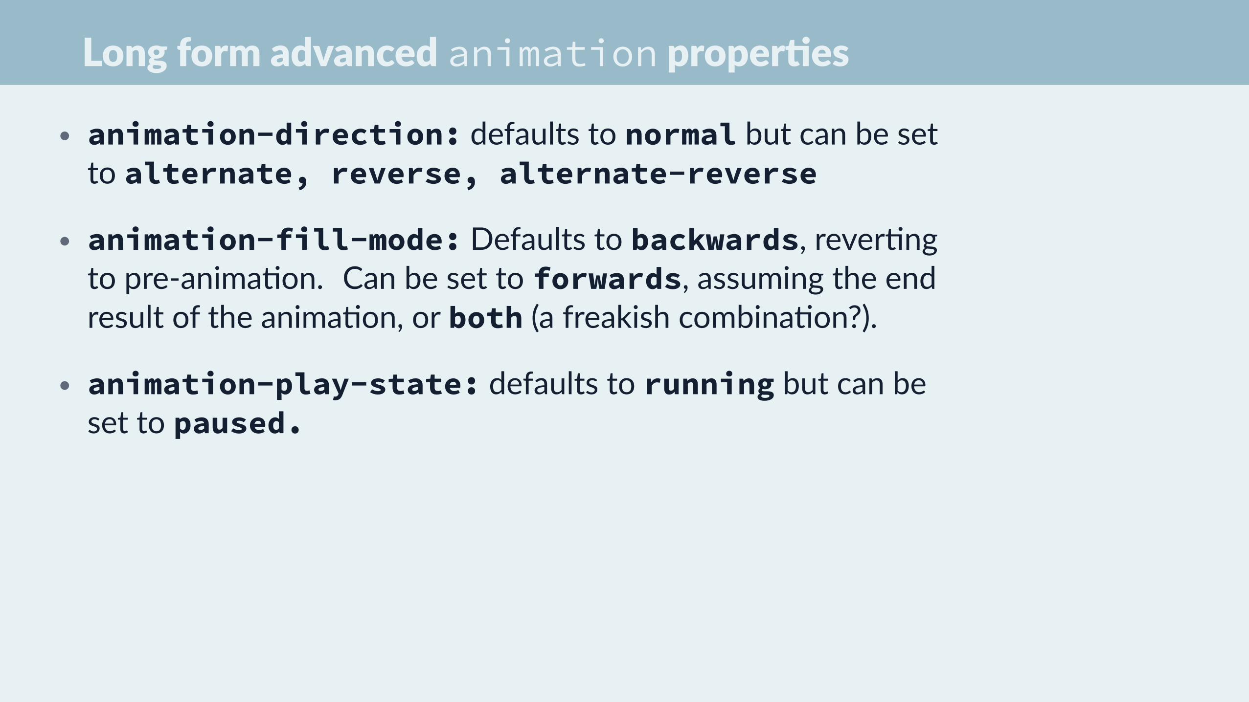
Long form advanced animation proper=es
• animation-direction: defaults to normal but can be set to alternate, reverse, alternate-reverse
• animation-fill-mode: Defaults to backwards, rever+ng to pre-‐anima+on. Can be set to forwards, assuming the end result of the anima+on, or both (a freakish combina+on?).
• animation-play-state: defaults to running but can be set to paused.
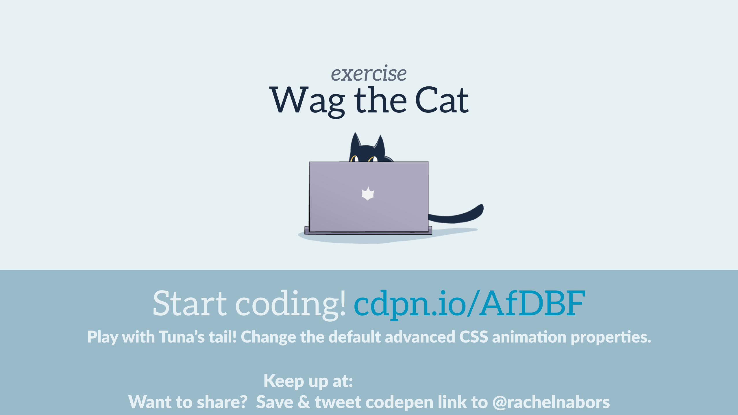
exercise
Keep up at: Want to share? Save & tweet codepen link to @rachelnabors
Play with Tuna’s tail! Change the default advanced CSS anima=on proper=es.
Wag the Cat
Start coding! cdpn.io/AfDBF
The @keyframes block

@keyframes black-to-white {
0% {
background: #000;
color: #fff;
}
100% {
background: #fff;
color: #000;
}
}

@keyframes black-to-white {
from {
background: #000;
color: #fff;
}
to {
background: #fff;
color: #000;
}
}
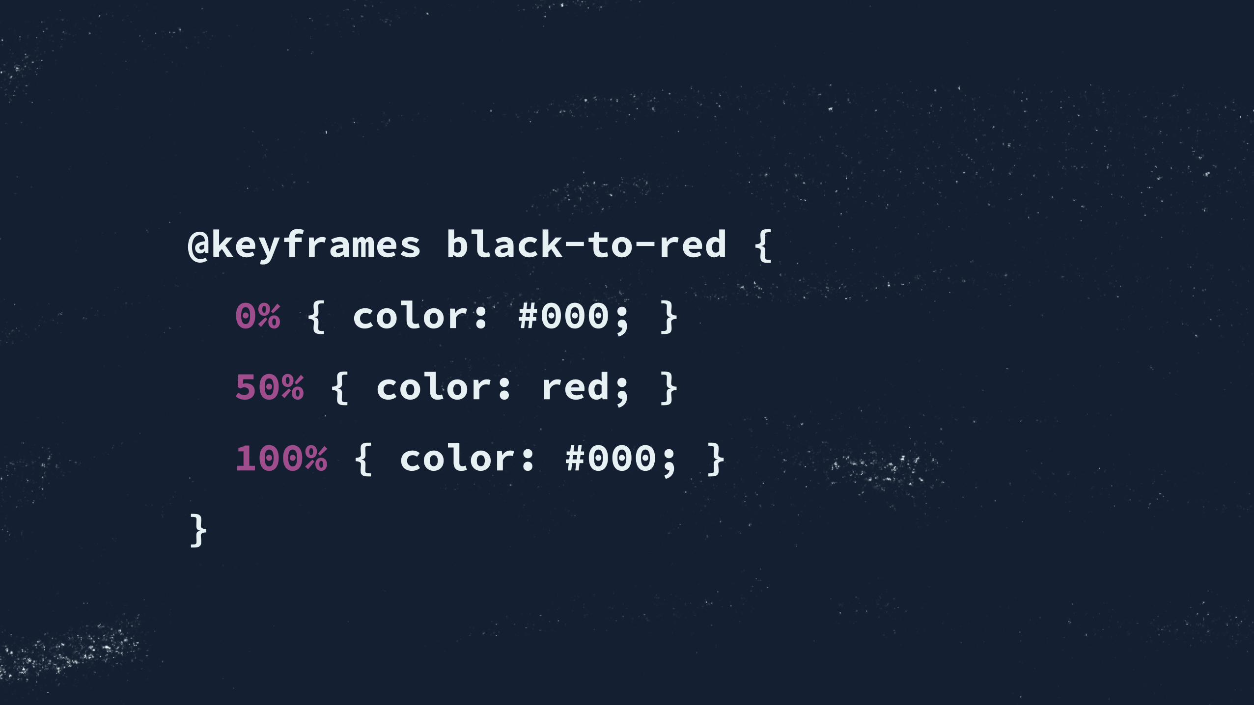
@keyframes black-to-red {
0% { color: #000; }
50% { color: red; }
100% { color: #000; }
}
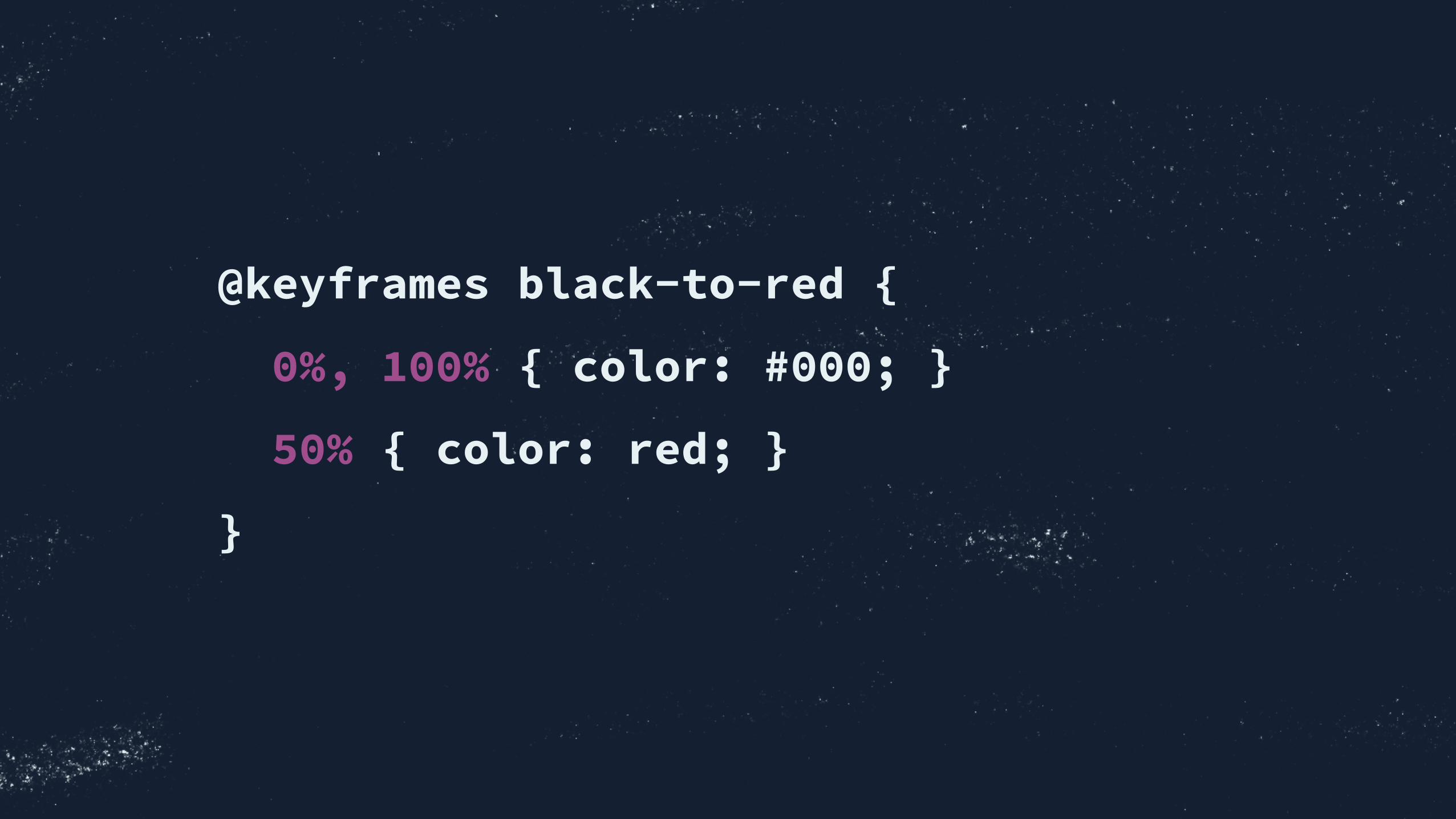
@keyframes black-to-red {
0%, 100% { color: #000; }
50% { color: red; }
}
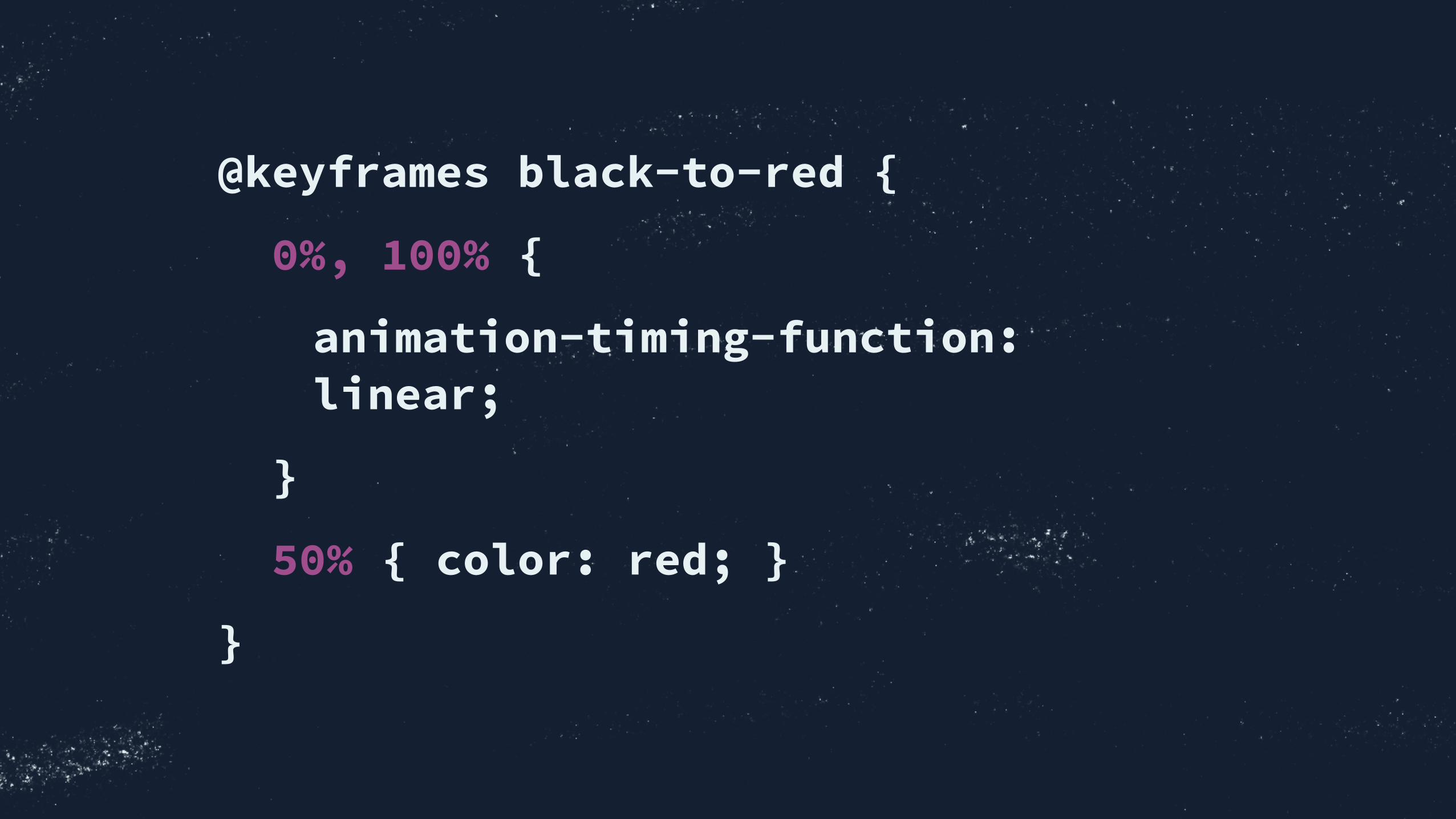
@keyframes black-to-red {
0%, 100% {
animation-timing-function: linear;
}
50% { color: red; }
}
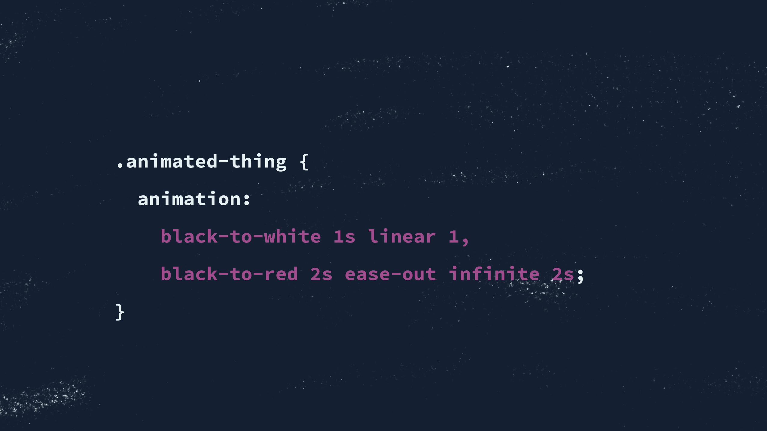
.animated-thing {
animation:
black-to-white 1s linear 1,
black-to-red 2s ease-out infinite 2s;
}

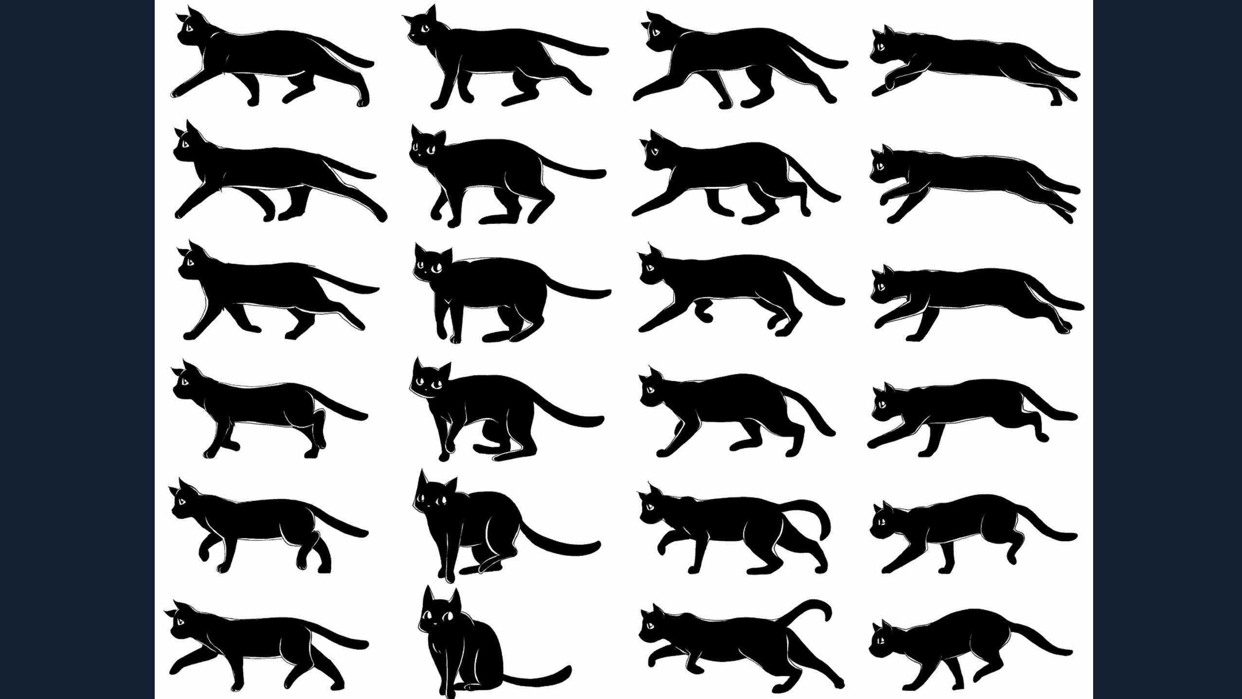
Sprite animation with CSS
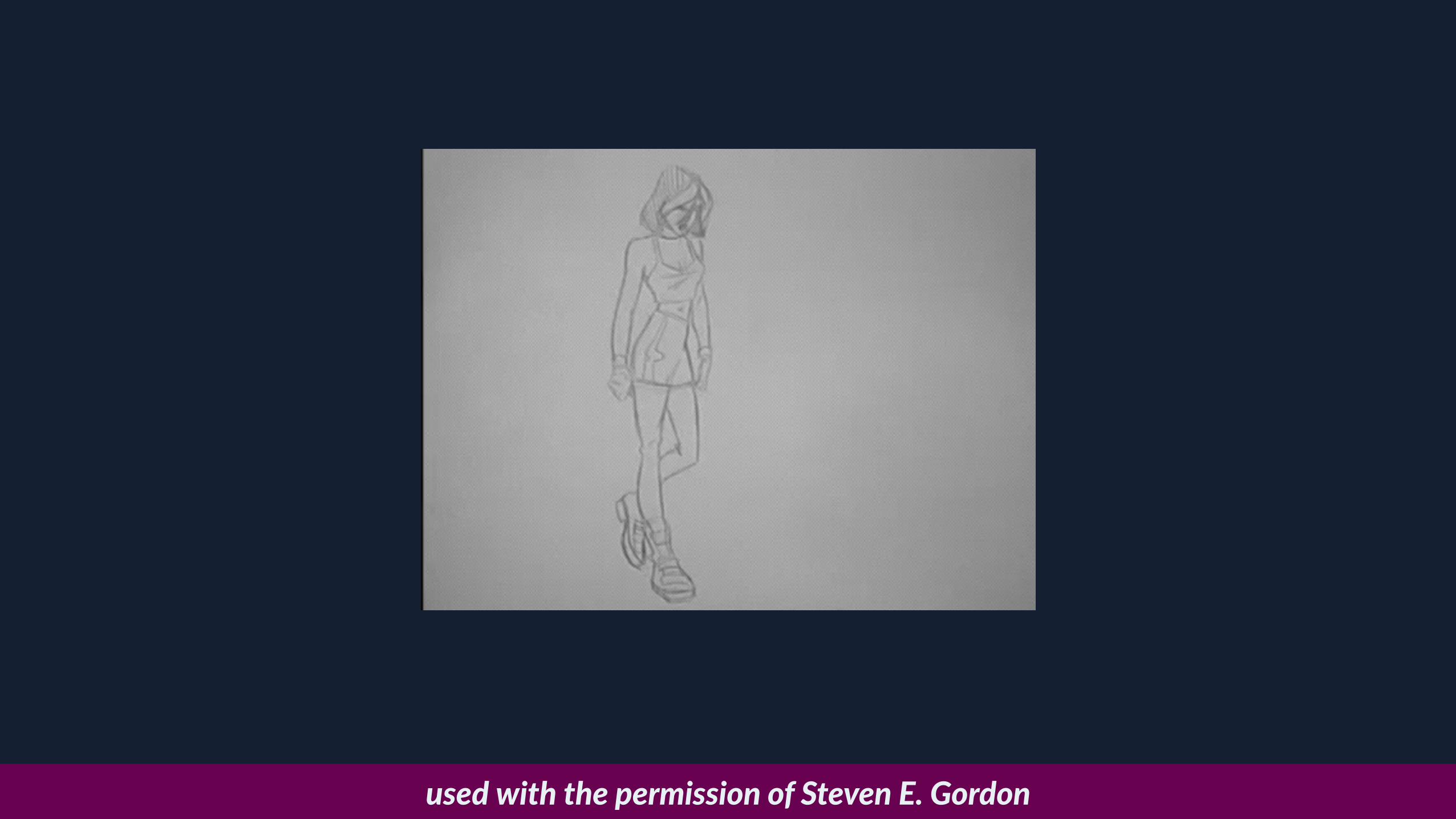
used with the permission of Steven E. Gordon
Meet steps()
• steps(x) is a +ming func+on…
• …splits a block of keyframes into x equal steps, then hops between them.
• The documenta+on by Tab Atkins
• How it works, plus gotchas: cdpn.io/zeFqy
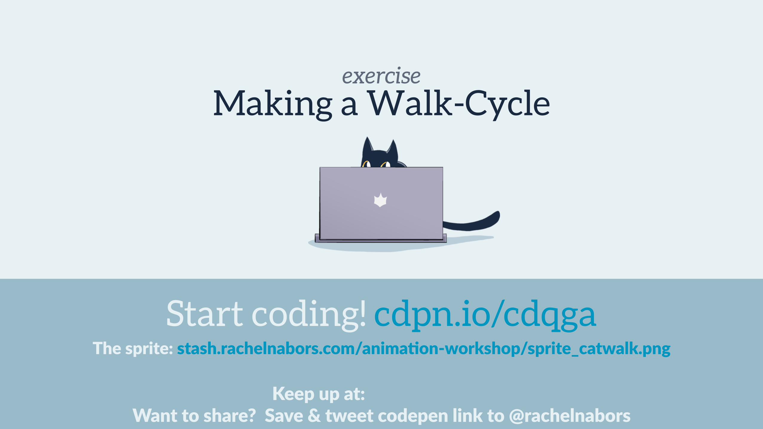
exercise
Keep up at: Want to share? Save & tweet codepen link to @rachelnabors
The sprite: stash.rachelnabors.com/anima=on-‐workshop/sprite_catwalk.png
Making a Walk-Cycle
Start coding! cdpn.io/cdqga
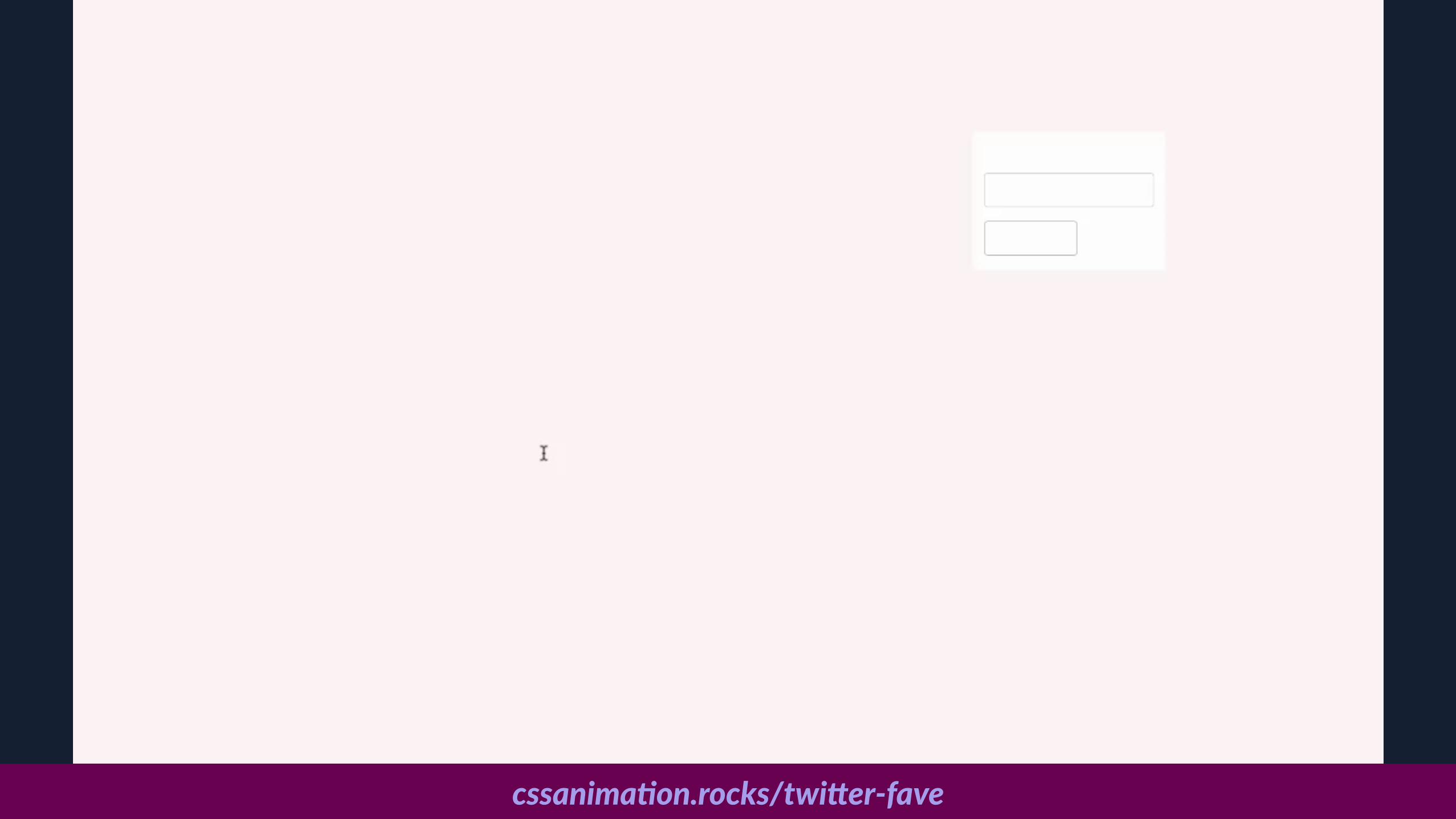
cssanima6on.rocks/twi>er-‐fave
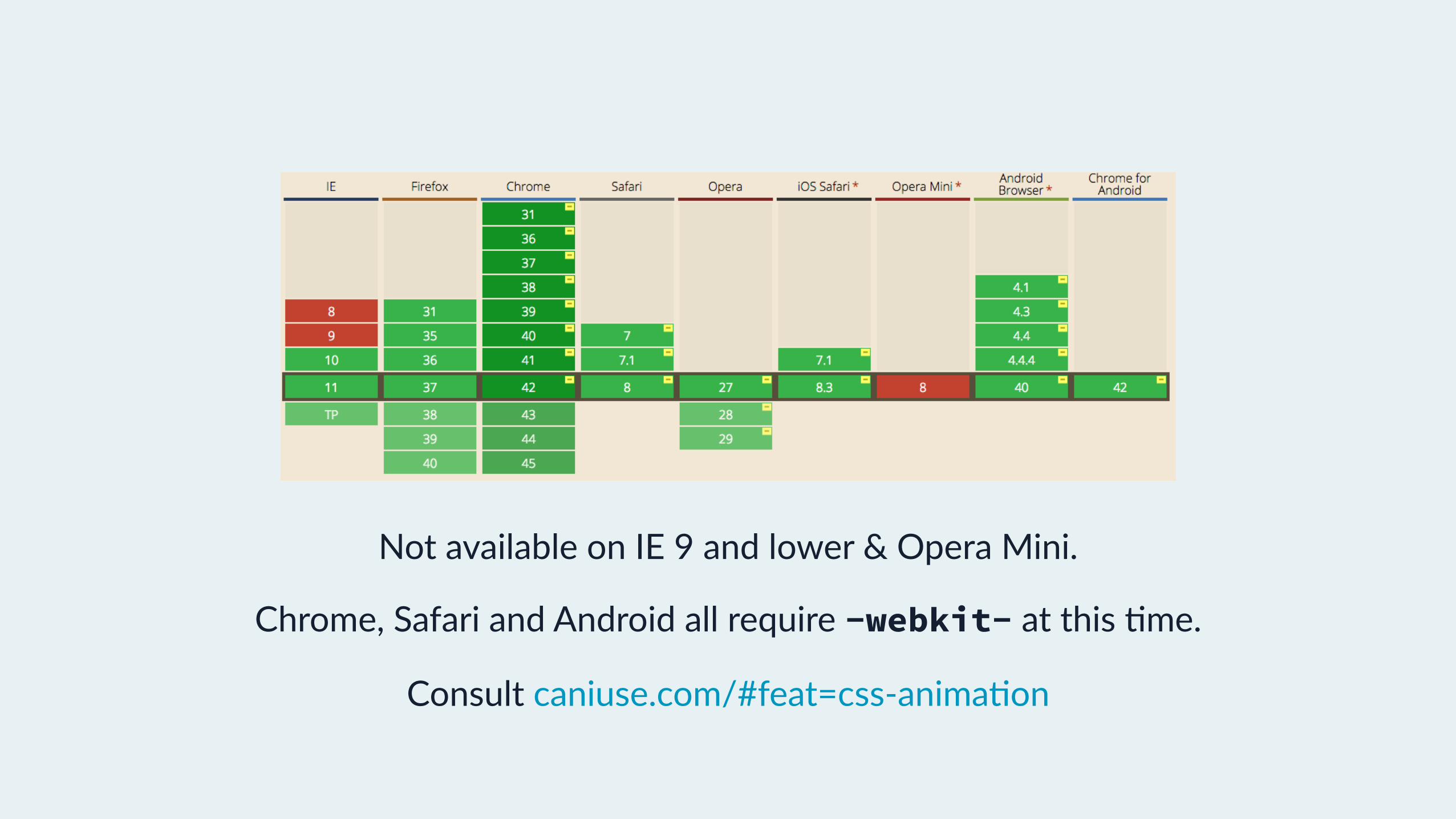
Browser Support for CSS Anima=onsNot available on IE 9 and lower & Opera Mini.
Chrome, Safari and Android all require -webkit- at this +me.
Consult caniuse.com/#feat=css-‐anima+on

CSS Anima=ons
• Looping Can loop infinitely
• Self star=ng Doesn’t require trigger like transition
• Repea=ng You can set how many +me it repeats
• Alterna=ng Can alternate between the end state and start state
• Grouping Each anima+on can change a number of proper+es

Questions?

Sequencing
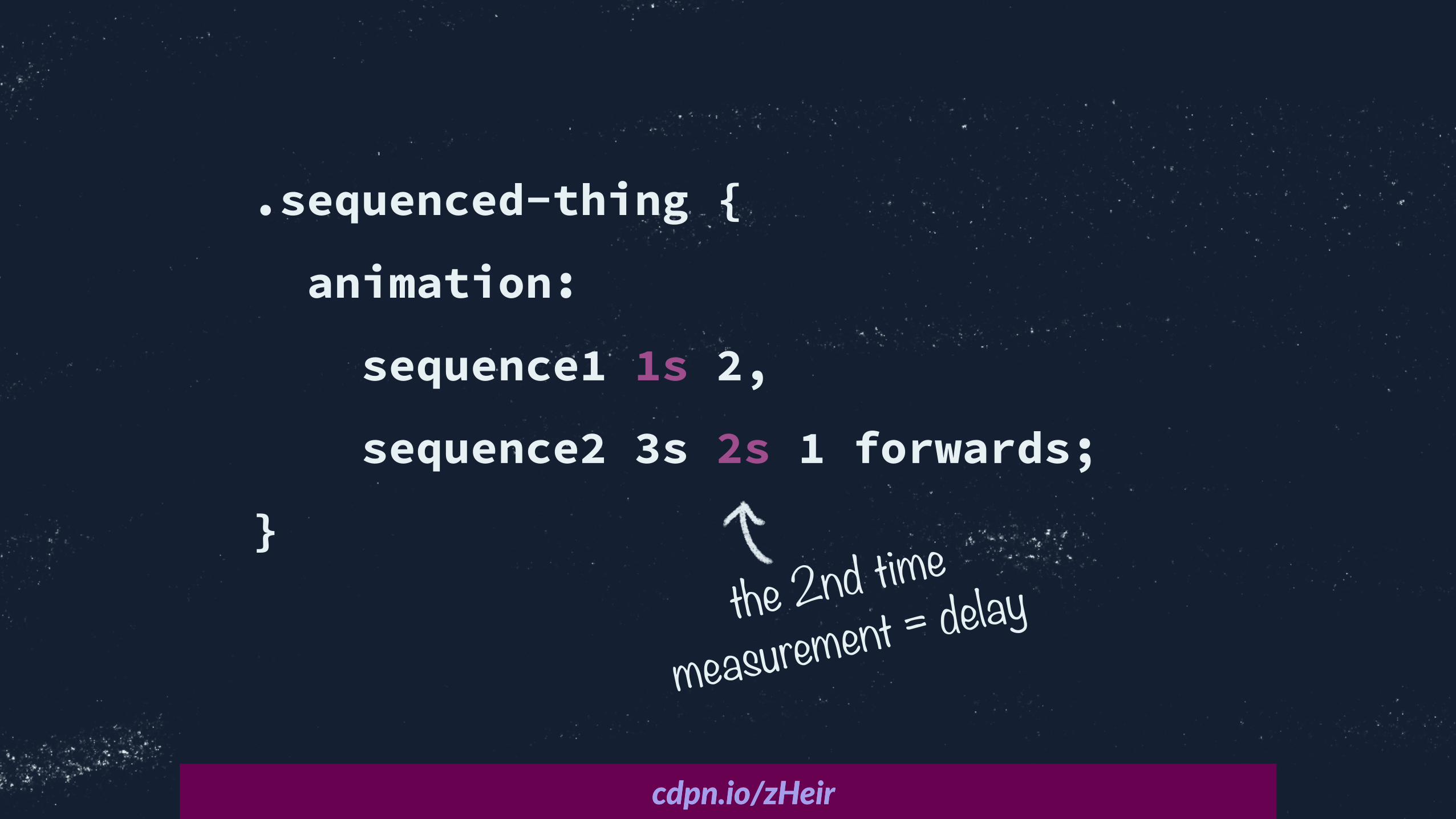
.sequenced-thing {
animation:
sequence1 1s 2,
sequence2 3s 2s 1 forwards;
}
Title Textcdpn.io/zHeircdpn.io/zHeir
the 2nd time
measurement = delay

exercise
Keep up at: Want to share? Save & tweet codepen link to @rachelnabors
Using animation-delay, start a si]ng anima=on a^er the walking anima=on.
Sitting Tuna Down
Start coding! cdpn.io/Djcya
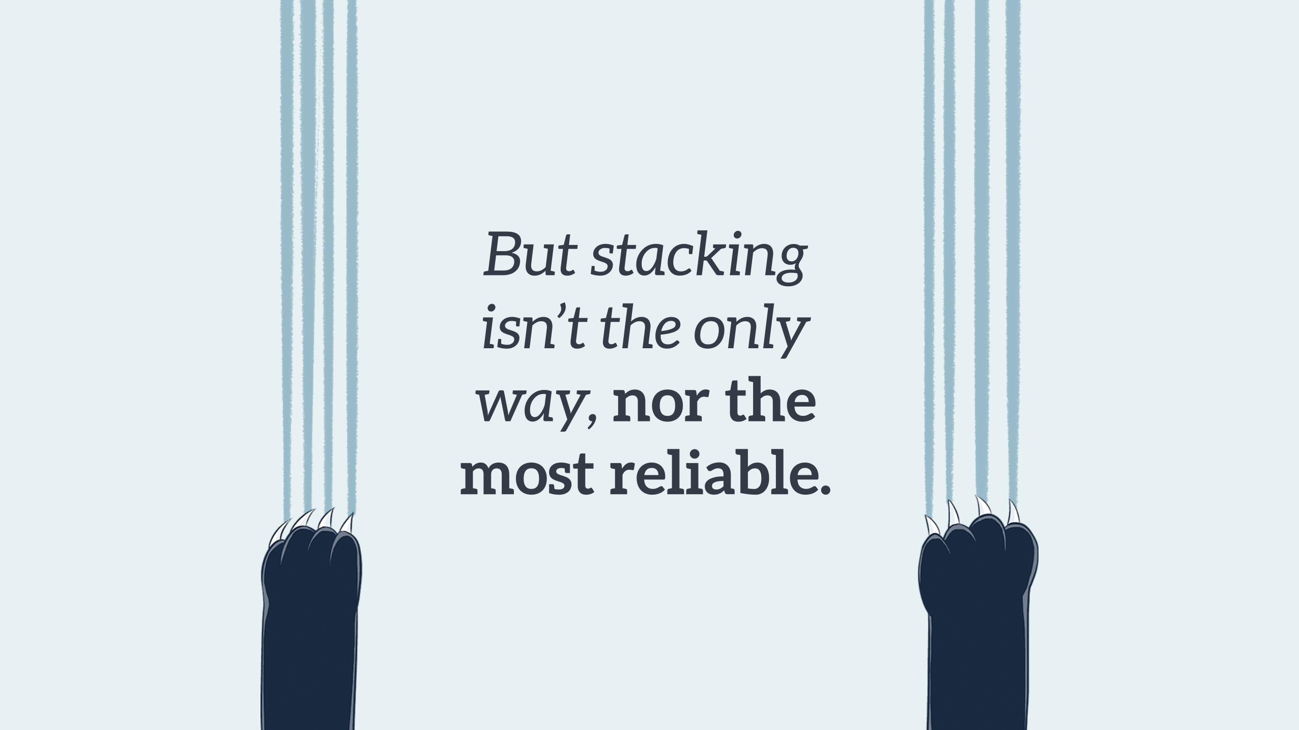
But stacking isn’t the only way, nor the
most reliable.


CSS animations and transitions run
on the system’s clock.
We’re gonna need a more
robust technique.
Chaining Animations with Event Listeners
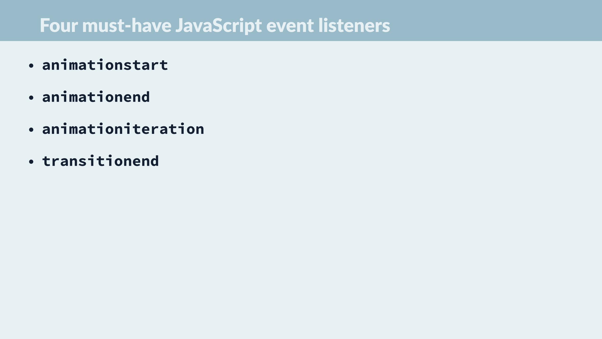
Four must-‐have JavaScript event listeners
• animationstart
• animationend
• animationiteration
• transitionend

They will fire for every animation/transition on the
element.
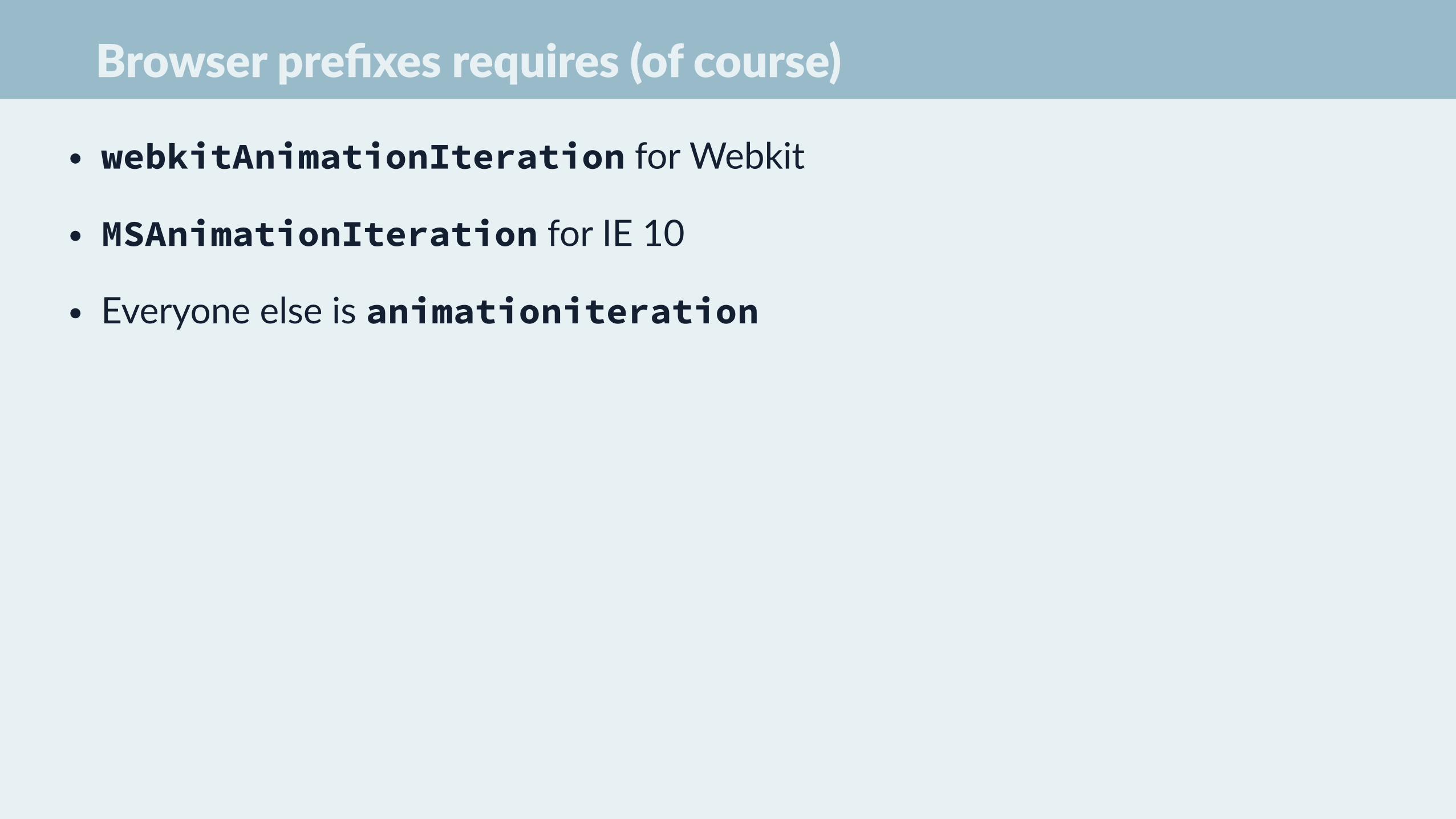
Browser prefixes requires (of course)
• webkitAnimationIteration for Webkit
• MSAnimationIteration for IE 10
• Everyone else is animationiteration
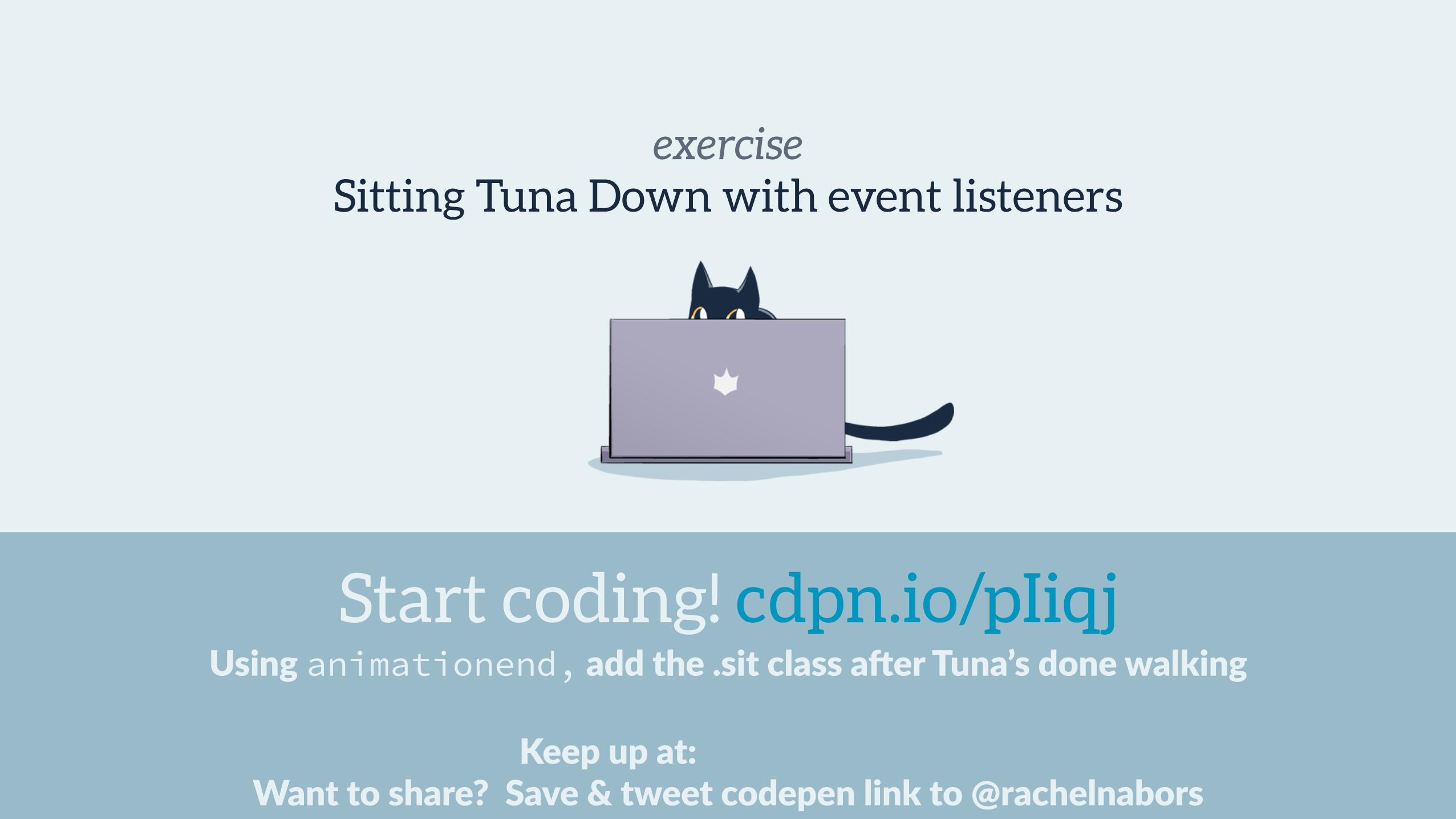
exercise
Keep up at: Want to share? Save & tweet codepen link to @rachelnabors
Using animationend, add the .sit class a^er Tuna’s done walking
Sitting Tuna Down with event listeners
Start coding! cdpn.io/pIiqj

Questions?

Performance


The two CSS properties that
don’t don’t trigger layout or repaints:
opacity transform
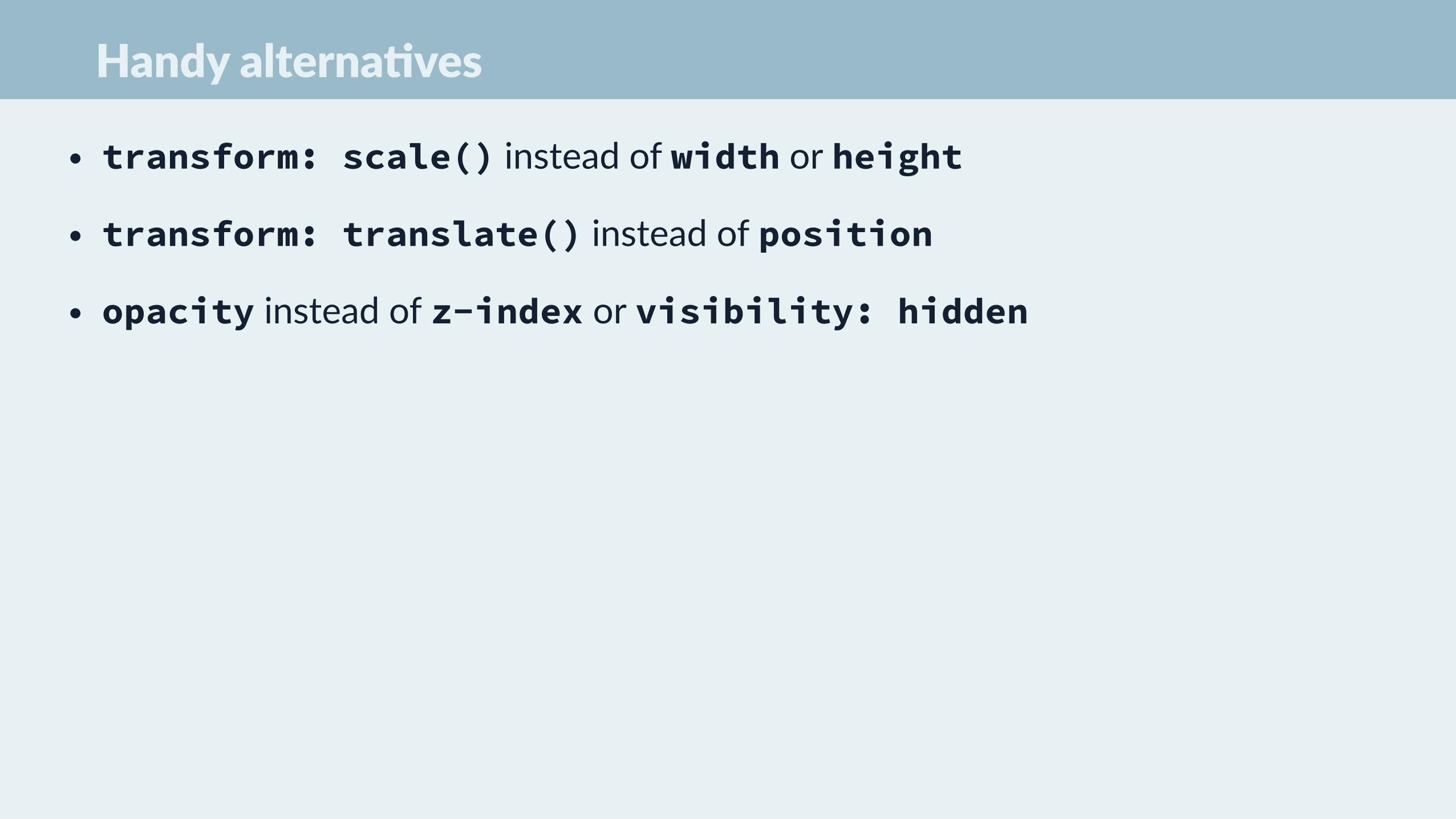
Handy alterna=ves
• transform: scale() instead of width or height
• transform: translate() instead of position
• opacity instead of z-index or visibility: hidden

exercise
Keep up at: Want to share? Save & tweet codepen link to @rachelnabors
Find a way to walk the cat without using expensive background posi=oning.
Walk the cat… again!
Start coding! cdpn.io/QbwXry
will-change
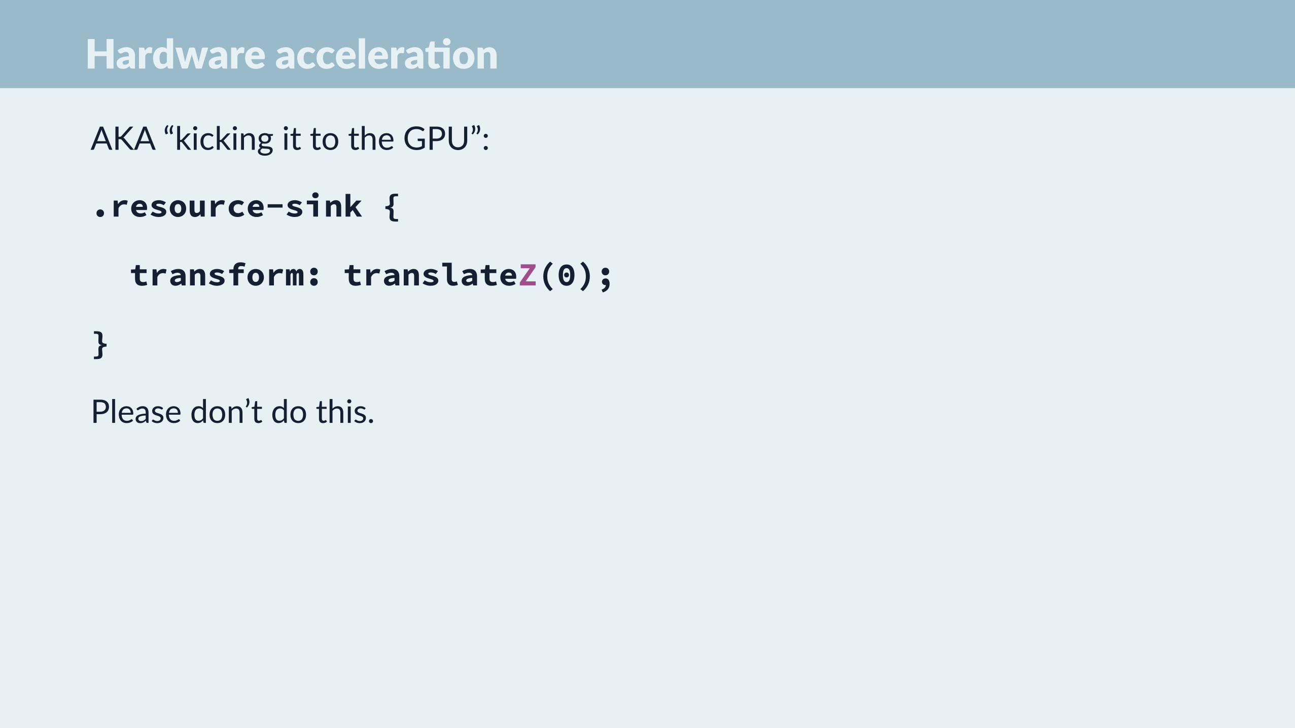
Hardware accelera=on
AKA “kicking it to the GPU”:
.resource-sink {
transform: translateZ(0);
}
Please don’t do this.
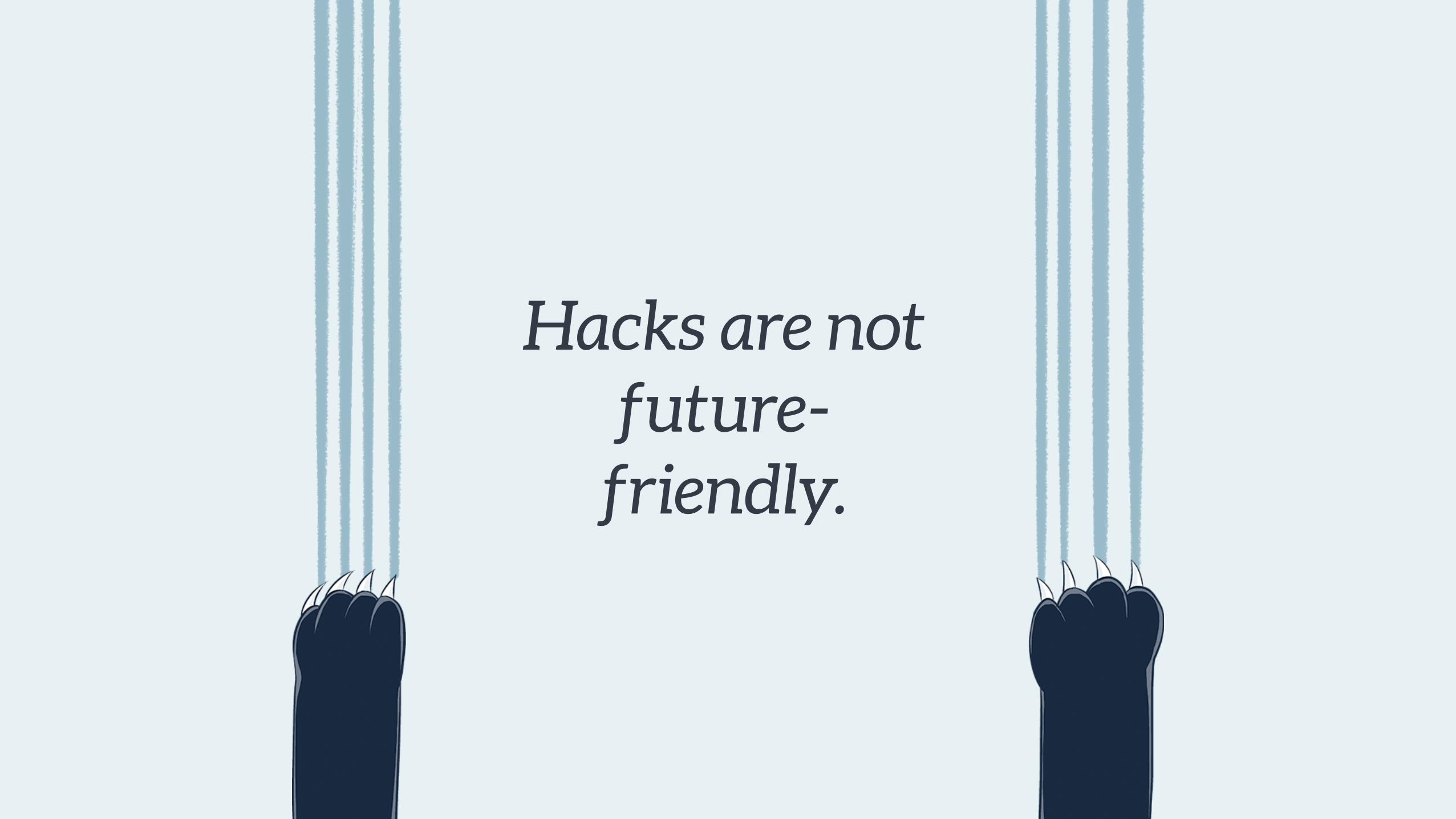
Hacks are not future-
friendly.

.in-view .animated-thing {
will-change: transform;
}
.in-view .animated-thing:hover {
transform: translateY(5%);
}
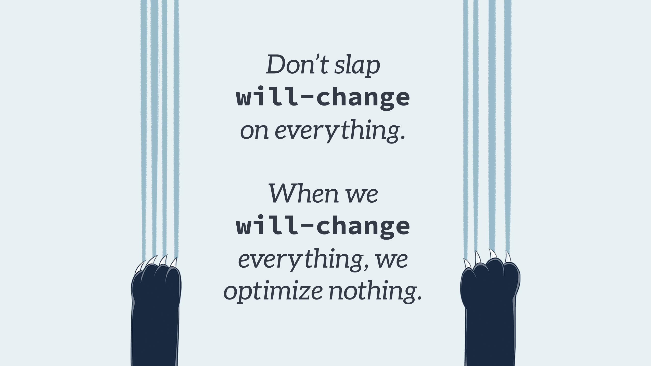
Don’t slap will-change on everything.
When we will-changeeverything, we
optimize nothing.

Browser Support for CSS Transi=ons
caniuse.com/#feat=will-‐change

Chrome Dev Tools
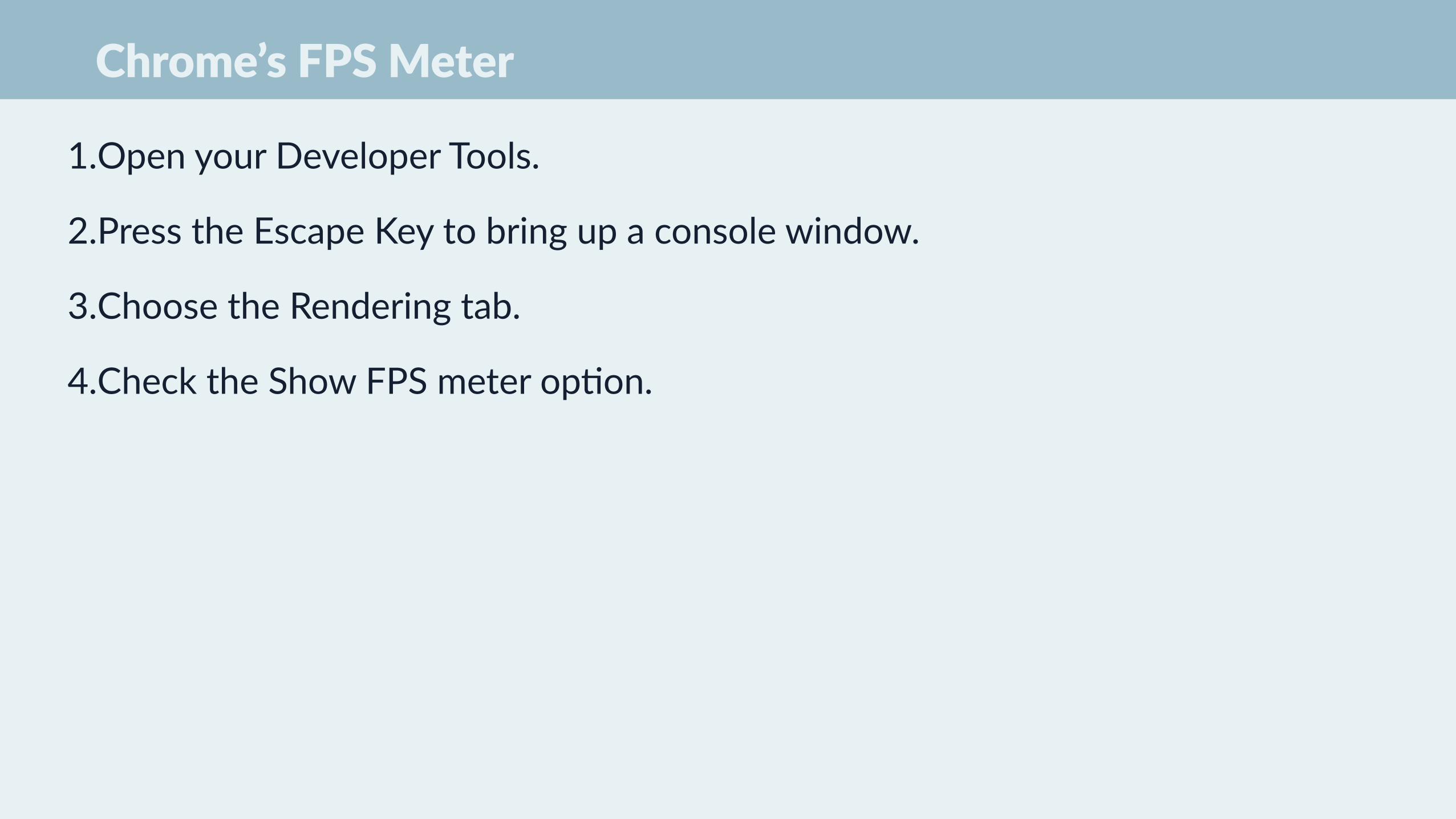
Chrome’s FPS Meter
1.Open your Developer Tools.
2.Press the Escape Key to bring up a console window.
3.Choose the Rendering tab.
4.Check the Show FPS meter op+on.

Paint Rectangles
To enable Chrome's paint rectangles:
1. Open your Developer Tools.
2. Press the Escape Key to bring up a console window.
3. Choose the Rendering tab.
4. Check show paint rectangles under Rendering
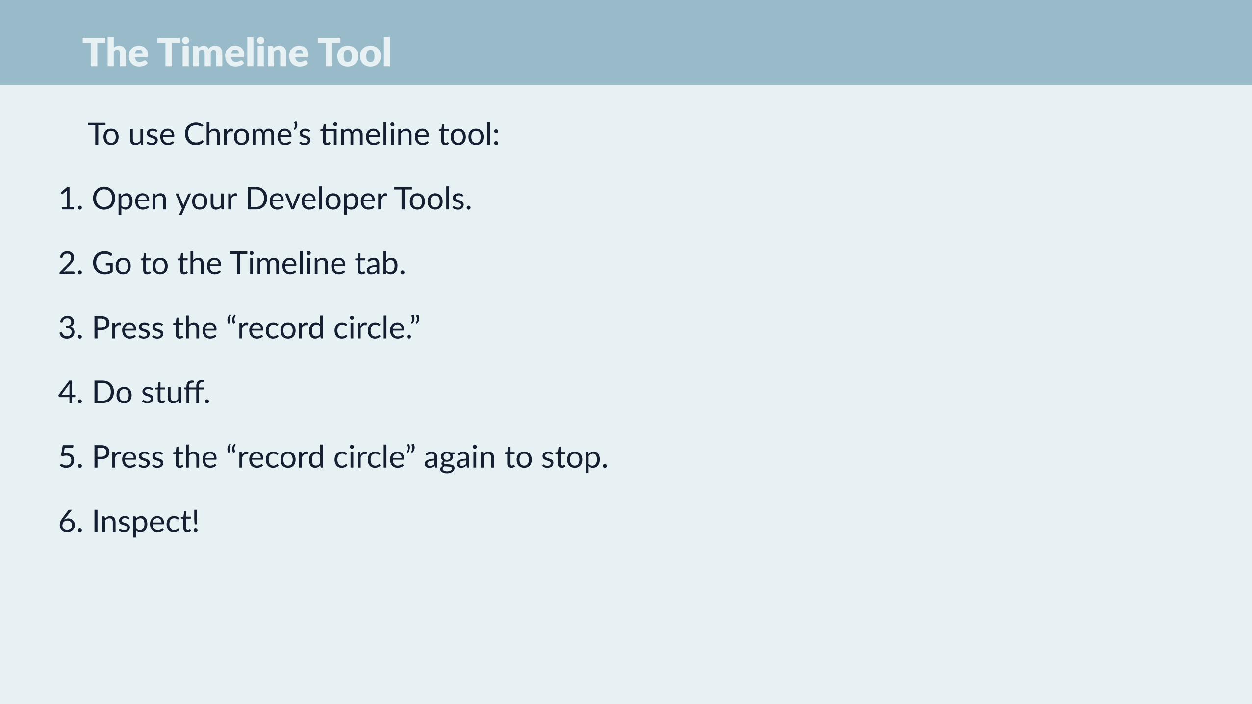
The Timeline Tool
To use Chrome’s +meline tool:
1. Open your Developer Tools.
2. Go to the Timeline tab.
3. Press the “record circle.”
4. Do stuff.
5. Press the “record circle” again to stop.
6. Inspect!
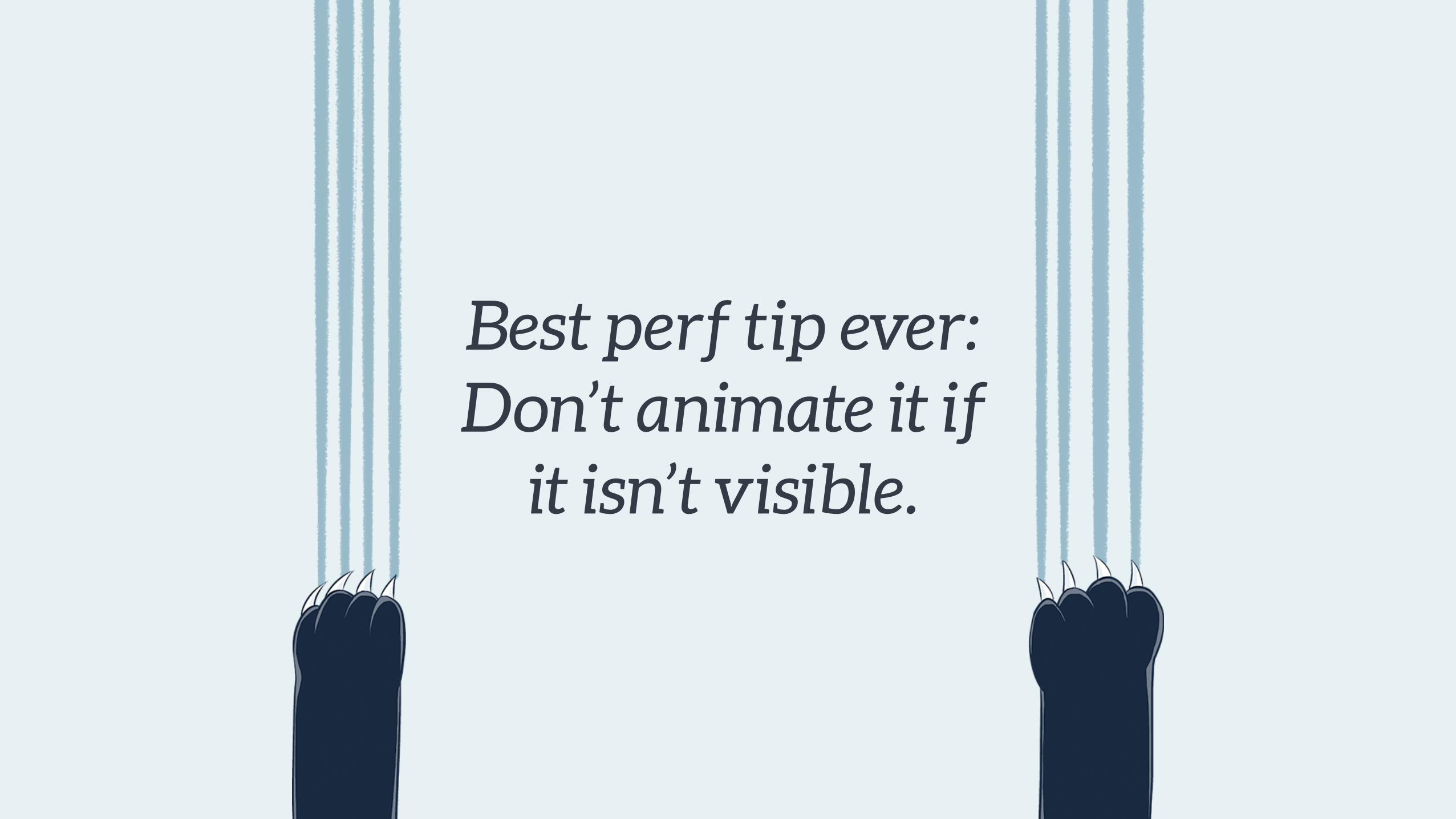
Best perf tip ever: Don’t animate it if
it isn’t visible.

Questions?
the endLet’s be animation friends!
@RachelNabors & RachelNabors.com WebAnimationWeekly.com