ancilary texts
TRANSCRIPT

How effective is the combination of your main product and ancillary texts?

The Start… Our main product was a music video with the ancillary tasks of a digipak and website. We sat down as a team and discussed what song we would choose, our audience and how we would portray our artists to our audiences. Our genre was hip hop and we decided to make the look of our artists more classical and vintage and the creation of the website and digipak helped with making this visual idea a success. What we felt would encourage the idea of a vintage classical look was the colour scheme for our digipak. Also the content within the website would help and we tried to link both the digipak and the website with our music video.
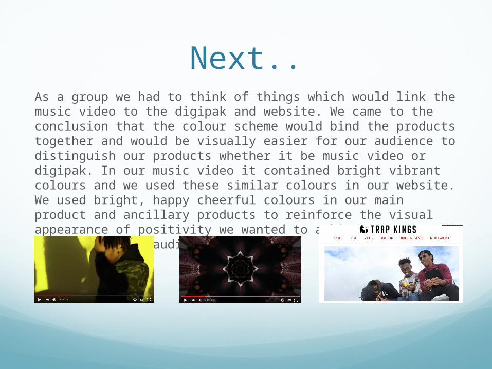
Next..As a group we had to think of things which would link the music video to the digipak and website. We came to the conclusion that the colour scheme would bind the products together and would be visually easier for our audience to distinguish our products whether it be music video or digipak. In our music video it contained bright vibrant colours and we used these similar colours in our website. We used bright, happy cheerful colours in our main product and ancillary products to reinforce the visual appearance of positivity we wanted to achieve to our artists and the audience.

FontsAs a group we also agreed that the font motif was essential in making that link between our main product and our ancillary products. We chose to make the font of our digipak the same font as on the website making it clear that these two ancillary texts were linked and was a form of synergy due to the promotion of each other. From my research I decided the font had to match the genre of the music we chose and the persona of our artist. The website we used to choose the font was ‘dafont.com’ and this helped us due to its many varieties of fonts available on the website. It took us around an hour or two to finally come to our conclusion because we felt the right font was key in making our digipak and website. We decided to use our own creativity with the font so on our website, the header ‘Trapkings’ is in fact 3D if you put 3D glasses on which just made our website more interactive to the audience and showed some uniqueness to our product.

Within this digipak we used the font we chose from dafont.com with the addition of the 3D font on the website.
We chose this Aztec type font because this font was unique and grabbed the attention of our whole group.
3D font which brings uniqueness to our website and makes the website interactive.

Font motif, we used the same 3D font throughout our website to keep the interactive side of the website going.

ColourWithin our colour scheme on our main product and ancillary products, we did not exactly stick to one colour, but allow the images to influence our products. In the beginning we decided as a group to have a colour motif but as we started to record and take pictures we gradually developed our colouring to not only one specific colour, but vibrant bright colours. These bright colours such as white, turquoise and maroon give off a positive feel to our artists and the audience instead of just black and white throughout which would be dull and boring. Conventionally the colouring of a hip hop video would be bright colours with colours such as golds and reds like ‘Freak of the Week’ by Krept and Konan feat Jeremiah. We decided we should follow these conventions but not include as much jewelry as it would not fit the style and persona of our artists.
We also used black and white colouring in our digipak to bring that classical look to our artists however we did not use it throughout the products because we wanted to keep to the conventions of a hip hop music video.

Within our website we used the natural colouring of the sky as the background which gave purity and a natural clean look to our website. We also used greens from trees and industrial colouring of metal poles to add to the urban look.
The colouring in our music video was influenced by the surrounding and what was around us for example this maroon colour on the wall in one of our shots during the music video. This maroon colour was also shown in the artists clothing and in the digipak creating a link from the main product to the ancillary product.
Within our digipak we used a variety of natural colours which were bright and black and white colouring to show the classical look. We added all these different colours to our digipak to show the style and nature of our artists all in one product as best we could.
Was it effective?Overall, I believe the links of font and colour from our main product to our ancillary texts was a successful link and helped us make that bond from all three products; music video, website and digipak. If we did not make this link between our products, they would have been fragmented and would not make that link to each other, making it harder for the audience to distinguish our music video from our website and digipak. Throughout our audience feedback we gained comments and one of them was that, ‘It’s easy to know these three products are under the same title, Trap Kings’
The link of the music video, website and digipak allowed our audience to properly know who are artists are and what they are about for example their style and background. This link of colour and font reminds our audience of what our style is and makes it easier for our audience to distinguish.