agency credentials 2014-home & building products case studies
TRANSCRIPT

CLIENTS
A COMMITMENT TO THE CATEGORY We commissioned Forrester Consulting to find out what 3,000 home and building products consumers thought about Native Advertising.
HOME & BUILDINGEXPERIENCE WITH CONSTRUCTION, ARCHITECTS, ENGINEERS, DEALERS AND CONSUMERS

CHALLENGEYou can’t get much more low interest than pressure treated lumber products. Category messaging tended toward the usual comparisons of undifferentiated features and benefits. Price dominated sales efforts. On top of this, YellaWood had to rethink everything about its brand after a major acquisition took it from 33 southern and Midwestern markets to over 100 markets nationwide.
INSIGHTOur research and deep dive into the category revealed two important insights. One obvious, one not so much. The first was that the brand, as well as the entire category, had absolutely no emotional connection with any of its target audiences. The second was that folks weren’t interested in the building process or the details of how the wood was treated. What they cared about was the fun family time, the nap, the relaxation that the swing set, chair or deck added to their backyard.
STRATEGIC PLATFORMOur insight led us to the development of a strategic platform called “An Anthem to Hard Work.” The platform enables a compelling tension between the overall theme of hard work juxtaposed with a campaign that focuses on the end result of relaxation and fun.
LAUNCHING A NEW BRAND, FOCUS ON CONSUMER EDUCATION VIA “PROJECTS”
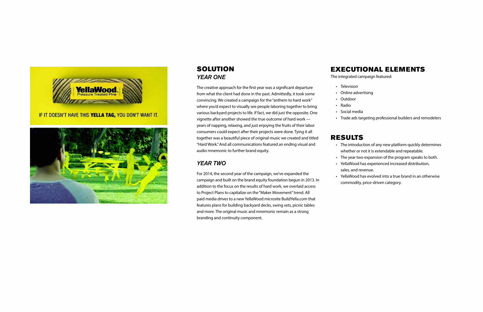
SOLUTIONYEAR ONE
The creative approach for the first year was a significant departure from what the client had done in the past. Admittedly, it took some convincing. We created a campaign for the “anthem to hard work” where you’d expect to visually see people laboring together to bring various backyard projects to life. If fact, we did just the opposite. One vignette after another showed the true outcome of hard work — years of napping, relaxing, and just enjoying the fruits of their labor consumers could expect after their projects were done. Tying it all together was a beautiful piece of original music we created and titled “Hard Work.” And all communications featured an ending visual and audio mnemonic to further brand equity.
YEAR TWO
For 2014, the second year of the campaign, we’ve expanded the campaign and built on the brand equity foundation begun in 2013. In addition to the focus on the results of hard work, we overlaid access to Project Plans to capitalize on the “Maker Movement” trend. All paid media drives to a new YellaWood microsite BuildYella.com that features plans for building backyard decks, swing sets, picnic tables and more. The original music and mnemonic remain as a strong branding and continuity component.
EXECUTIONAL ELEMENTSThe integrated campaign featured:
• Television • Online advertising • Outdoor • Radio • Social media • Trade ads targeting professional builders and remodelers
RESULTS • The introduction of any new platform quickly determines whether or not it is extendable and repeatable. • The year two expansion of the program speaks to both. • YellaWood has experienced increased distribution, sales, and revenue. • YellaWood has evolved into a true brand in an otherwise commodity, price-driven category.

BRAND HIERARCHY, GLOBAL WEB PRESENCE
CHALLENGEPPG challenged Brunner to establish a global, cross-industry position and web presence across seven strategic business units.
INSIGHTBrunner conducted dozens of in-depth interviews with PPG color experts, customers and PPG Industries leadership to understand:
• How color value was defined across the industry • What would make PPG’s color story relevant • How PPG could differentiate itself around color
Based on those criteria, we developed seven positioning statements, which were narrowed to four and tested against PPG’s key stakeholders.
The insight we uncovered was that the positioning should focus less on the customer’s customer, and more on how PPG can help its customers grow their business.

SOLUTIONWe developed a global positioning statement and supporting “proof points” that defined PPG as a color leader.
Color and how it’s delivered can give your business a competitive advantage and a unique market position. PPG’s broad, global industry experience and advanced color solutions not only deliver a comprehensive palette and unparalleled application capabilities, but empower you to pass down that value to your customers. Better your business with PPG as a color partner.
With the positioning firmly established, PPGcolorshare.com was designed, built and implemented on a global basis
RESULTSIn this case, the result is simple: success. Our goal was to help seven different business units to better capitalize on PPG’s color capacity, and that’s exactly what we accomplished.
• Successfully rebranded PPG ColorShare • Implemented internal training program • Launched PPGcolorshare.com
INSPIRING ARCHITECTS
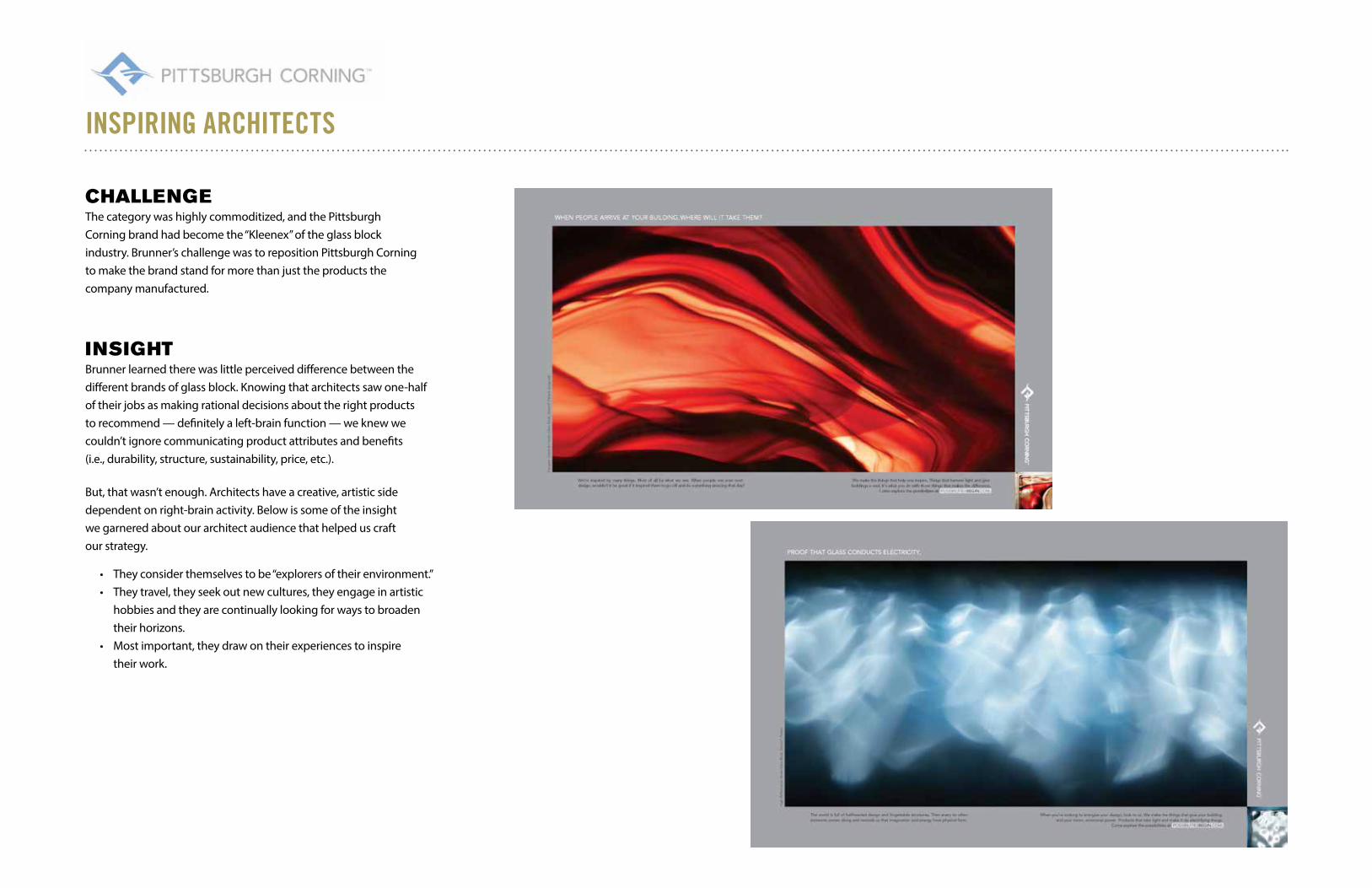
CHALLENGEThe category was highly commoditized, and the Pittsburgh Corning brand had become the “Kleenex” of the glass block industry. Brunner’s challenge was to reposition Pittsburgh Corning to make the brand stand for more than just the products the company manufactured.
INSIGHTBrunner learned there was little perceived difference between the different brands of glass block. Knowing that architects saw one-half of their jobs as making rational decisions about the right products to recommend — definitely a left-brain function — we knew we couldn’t ignore communicating product attributes and benefits (i.e., durability, structure, sustainability, price, etc.).
But, that wasn’t enough. Architects have a creative, artistic side dependent on right-brain activity. Below is some of the insight we garnered about our architect audience that helped us craft our strategy.
• They consider themselves to be “explorers of their environment.” • They travel, they seek out new cultures, they engage in artistic hobbies and they are continually looking for ways to broaden their horizons. • Most important, they draw on their experiences to inspire their work.
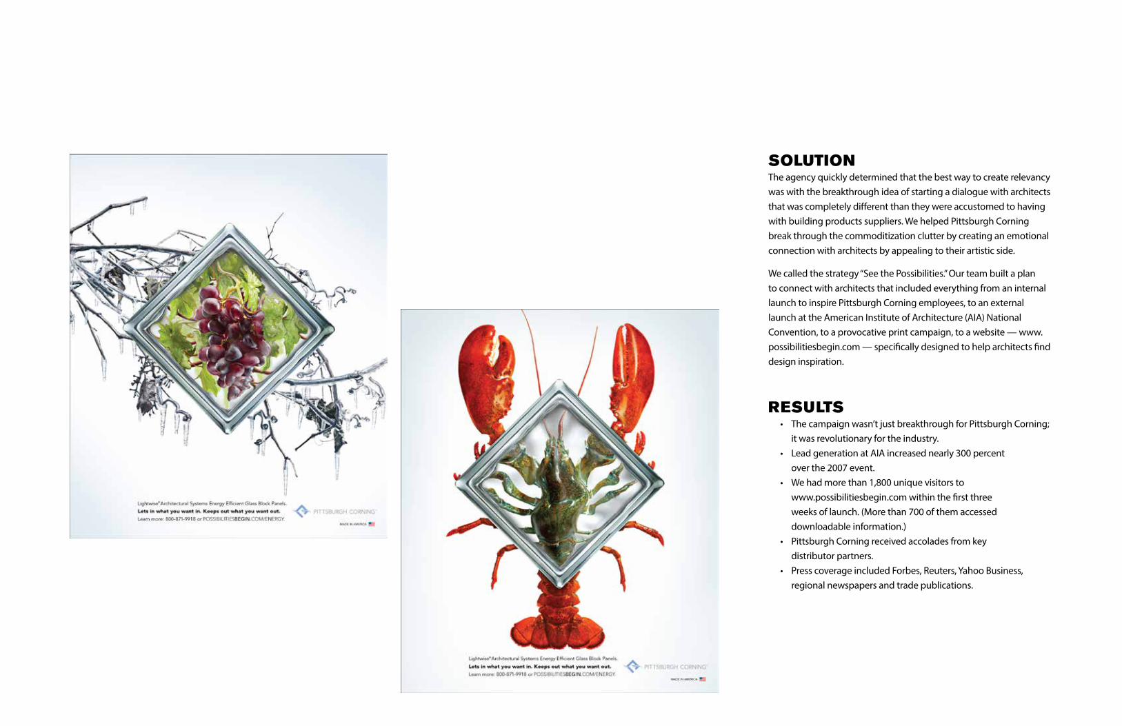
SOLUTIONThe agency quickly determined that the best way to create relevancy was with the breakthrough idea of starting a dialogue with architects that was completely different than they were accustomed to having with building products suppliers. We helped Pittsburgh Corning break through the commoditization clutter by creating an emotional connection with architects by appealing to their artistic side.
We called the strategy “See the Possibilities.” Our team built a plan to connect with architects that included everything from an internal launch to inspire Pittsburgh Corning employees, to an external launch at the American Institute of Architecture (AIA) National Convention, to a provocative print campaign, to a website — www.possibilitiesbegin.com — specifically designed to help architects find design inspiration.
RESULTS • The campaign wasn’t just breakthrough for Pittsburgh Corning; it was revolutionary for the industry. • Lead generation at AIA increased nearly 300 percent over the 2007 event. • We had more than 1,800 unique visitors to www.possibilitiesbegin.com within the first three weeks of launch. (More than 700 of them accessed downloadable information.) • Pittsburgh Corning received accolades from key distributor partners. • Press coverage included Forbes, Reuters, Yahoo Business, regional newspapers and trade publications.

UNCOVERING A NEW TYPE OF DIYer
CHALLENGEBrunner was charged with helping Dow double the sales of the mature Great Stuff product line in five years. The problem? They already led in market share (70 percent) and enjoyed exclusivity at the two key retail outlets for home improvement products, The Home Depot and Lowe’s.
In addition, we discovered many misconceptions about the brand. The price for the product was too low – hurting the perceived quality of the brand. Share was high but brand awareness was low – people knew the red and yellow can, not the name. Cross merchandising at the retail level was spotty at best – hurting the potential for consistent and predictable growth.
INSIGHTWhile the client had been marketing heavily to DIYers for many years, our research uncovered a segment of the DIY audience that we believed could be extremely lucrative. We called them “reluctant DIYers.” These were the guys who didn’t really get pleasure out of home repair and improvement. It wasn’t a hobby for them. In fact, it actually got in the way of them pursuing their real hobbies — things such as hunting, fishing, and following their favorite racecar drivers. They only did it themselves because they weren’t willing to pay anyone to do it for them.
The key to capturing this audience segment was capitalizing on how fast and easy it is to use Great Stuff to finish a job right.
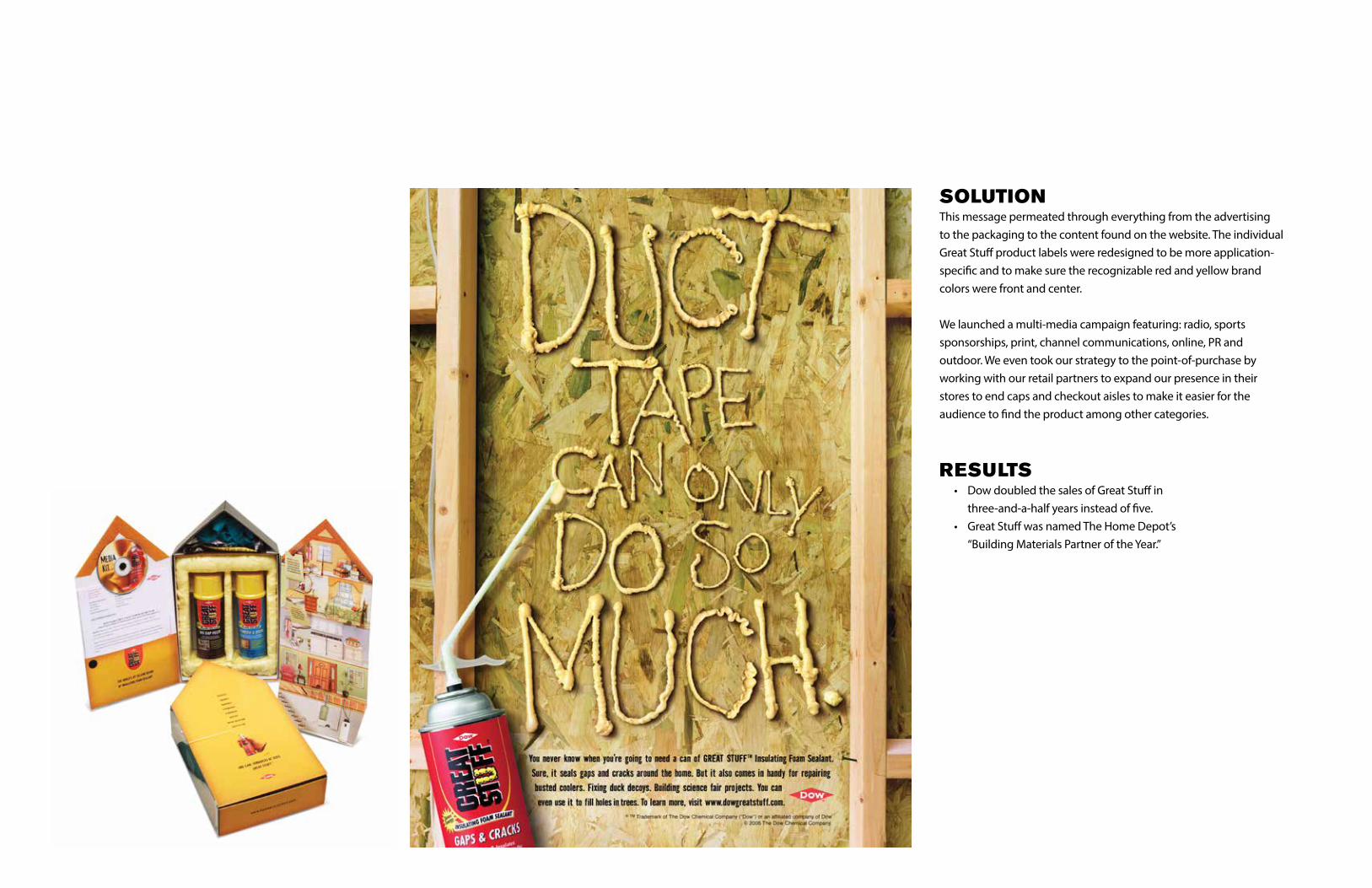
SOLUTIONThis message permeated through everything from the advertising to the packaging to the content found on the website. The individual Great Stuff product labels were redesigned to be more application-specific and to make sure the recognizable red and yellow brand colors were front and center.
We launched a multi-media campaign featuring: radio, sports sponsorships, print, channel communications, online, PR and outdoor. We even took our strategy to the point-of-purchase by working with our retail partners to expand our presence in their stores to end caps and checkout aisles to make it easier for the audience to find the product among other categories.
RESULTS • Dow doubled the sales of Great Stuff in three-and-a-half years instead of five. • Great Stuff was named The Home Depot’s “Building Materials Partner of the Year.”

GENERATING CONSUMER PULL
CHALLENGEBrunner was charged with creating a consumer brand in a distribution-driven category.
When James Hardie came to Brunner, they were a small, niche manufacturer who had been relegated to a commodity status. Builders traditionally make the decisions (77 percent of the time) regarding the materials used in home building and remodeling due primarily to consumer apathy. In this case, builders preferred vinyl and wood-based siding over James Hardie fiber cement siding because they were cheaper and easier to install. Knowing this, we knew there was only one real solution to this brand challenge. When homeowners started asking for James Hardie siding, builders would switch immediately. A pull strategy was executed and aimed at consumers. All trade advertising would be used to merchandise consumer efforts back to the builders.
INSIGHTWe uncovered a phenomenon called “Character Maintenance.” Consumers believed that their homes make a primary statement about them and keeping their homes beautiful contributes to a positive self-image. James Hardie siding was perfectly suited to best deliver long-term character maintenance.
We weren’t selling cold, gray fiber cement to male builders. We were selling access to the home consumers were dreaming of to a largely female-dominated audience.

SOLUTIONWe launched a national consumer advertising campaign that balanced aspirational brand benefits with rational product benefits, always balancing legendary durability with unprecedented beauty.
We partnered with the magazines that female consumers were escaping to when they were dreaming about their dream home. So not only did they see our advertising, but also both she and her husband saw the product at practically every idea home they visited. Couple that with an aggressive co-op advertising program that let builders join in on the momentum of the James Hardie brand, and we had the recipe for success.
RESULTS • James Hardie experienced annual growth of nearly 40 percent for five consecutive years. • James Hardie became the number-one brand of siding in America, selling more siding than any manufacturer of siding including brick, stone or stucco.

A N D E R S O N
A N D E R S O N
™
™
BRAND HIERARCHY
CHALLENGEAnderson hired Brunner to spearhead a complete repositioning of the master brand, including establishing a brand architecture for the company’s many sub-brands and product line extensions. Brunner was charged with finding ways to create a connection with the Anderson brand, accrue value to the master brand, simplify the consumption of Anderson products and maximize the brand presence at the retail level.
INSIGHTWe identified the consumer audience we labeled the “female artisan.” She is trend- and fashion-conscious, she views her home as an escape and a vehicle to entertain and she values style, beauty and creativity.
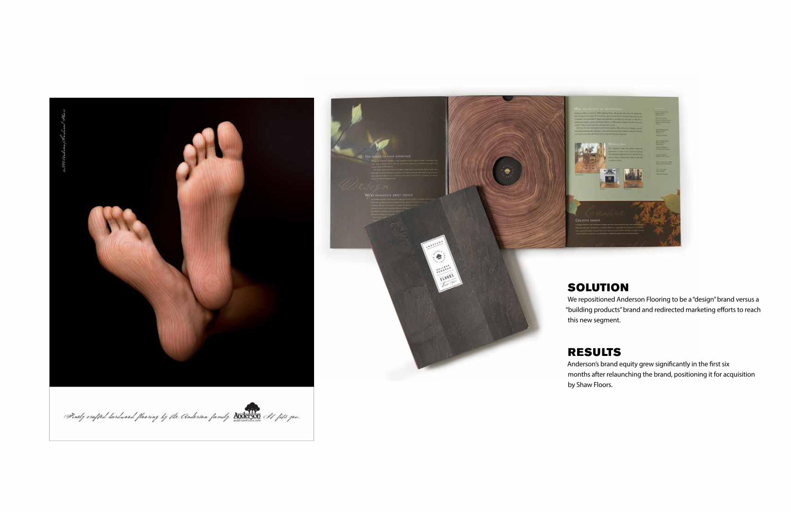
SOLUTIONWe repositioned Anderson Flooring to be a “design” brand versus a
“building products” brand and redirected marketing efforts to reach this new segment.
RESULTSAnderson’s brand equity grew significantly in the first six months after relaunching the brand, positioning it for acquisition by Shaw Floors.