academic libraries and the academy: strategies and
TRANSCRIPT

Fairfield University Fairfield University
DigitalCommons@Fairfield DigitalCommons@Fairfield
DiMenna-Nyselius Library Book Gallery DiMenna-Nyselius Library
2018
Academic Libraries and the Academy: Strategies and Approaches Academic Libraries and the Academy: Strategies and Approaches
to Demonstrate Your Value, Impact, and Return on Investment, to Demonstrate Your Value, Impact, and Return on Investment,
Volume 1 Volume 1
Jacalyn A. Kremer Fairfield University, [email protected]
Robert Hoyt Fairfield University, [email protected]
Follow this and additional works at: https://digitalcommons.fairfield.edu/library-books
Copyright 2018 The Association of College & Research Libraries
Recommended Citation Recommended Citation Kremer, Jacalyn A. and Hoyt, Robert, "Academic Libraries and the Academy: Strategies and Approaches to Demonstrate Your Value, Impact, and Return on Investment, Volume 1" (2018). DiMenna-Nyselius Library Book Gallery. 11. https://digitalcommons.fairfield.edu/library-books/11
This item has been accepted for inclusion in DigitalCommons@Fairfield by an authorized administrator of DigitalCommons@Fairfield. It is brought to you by DigitalCommons@Fairfield with permission from the rights-holder(s) and is protected by copyright and/or related rights. You are free to use this item in any way that is You are free to use this item in any way that is permitted by the copyright and related rights legislation that applies to your use. For other uses, you need to obtain permitted by the copyright and related rights legislation that applies to your use. For other uses, you need to obtain permission from the rights-holder(s) directly, unless additional rights are indicated by a Creative Commons license permission from the rights-holder(s) directly, unless additional rights are indicated by a Creative Commons license in the record and/or on the work itself.in the record and/or on the work itself. For more information, please contact [email protected].
Se
ctio
n 2
218
Title: Answering the Question before It’s Asked: Building a Library Impact Dashboard
Abstract: This chapter presents how DiMenna-Nyselius Library at Fairfield Univer-sity successfully created an impact dashboard that demonstrates the value of the library to its institutional stakeholders, including the CFO, provost, and faculty. It focuses on the creation process and advice for replication. Questions explored are Who is our audience? What story do we want to tell? What data is available? Practi-cal strategies on grouping pre-existing data to tell a story aligned with institutional goals are presented. Possible formats are offered, including simple static dashboards using LibGuides to more advanced real-time updating dashboards requiring pro-gramming knowledge to interface with systems.
Keywords: impact dashboard, value, data, marketing, strategic planning, academic library
Project focus: organizational practices (i.e., strategic planning); data use and tech-nology; assessment concepts and/or management
Results made or will make case for: proof of library impact and value, how money or resources may be directed
Data needed: Data displayed by the impact dashboard includes circulation statistics, faculty surveys, information literacy statistics, and database usage statistics.
Methodology: quantitative, dashboard; Focus is less on the methodology used to generate the data and instead on the development of an impact dashboard and its importance as an information management tool that is used to display metrics and other key data points to simplify complex data sets and communicate the library’s value.
Project duration: less than 3 months
Tool(s) utilized: Data source tools included digital gate counters, Google Analytics, instruction and reference analytics, MISO results, and COUNTER statistics. Tech-nology: web authoring content management system. Also PHP, SQL, and JavaScript language were employed for advanced real-time displays.
Cost estimate: < $100
Type of institution: university—private
Institution enrollment: 5,000–15,000
Highest level of education: master’s/professional degree

219
Se
ction
2
Chapter 14
Answering the Question before It’s AskedBuilding a Library Impact Dashboard
Jacalyn Kremer and Robert Hoyt
Imagine you have a new chief financial officer or president at your college or university who upon arriving on campus wonders aloud why a library is still needed in the twenty-first century. Are you prepared to answer the question, succinctly and efficiently? This was the situation confronted by DiMenna-Nyselius Library at Fairfield University in 2015.
ContextDiMenna-Nyselius Library serves the research needs of approximately 4,000 undergraduates and 1,000 graduate students at Fairfield University, a private Jesuit university in Fairfield, Connecticut. The library currently employs twenty-one full-time staff members, thirteen of whom are professional librarians. Prior to 2014, none of the staff was formally tasked with assessment. This changed in July 2014 when the new position of Assessment Librarian was created at the DiMenna-Nyselius Library. This change was in response to the national zeitgeist in higher education where there was an increased demand for developing and sustaining a culture of assessment. This

220 C h a p T E r 14S
ect
ion
2
demand was fueled by rising tuition prices, staggering student debt, and shrinking state budgets, all of which contributed to calls for financial accountability. At the same time, parents, students, federal and state governments, and accreditation agencies were calling for colleges and universities to prove their efforts resulted in student learning. At our own institution, Fairfield University was undergoing a strategic planning process in 2014 that focused, in part, on developing an economically sustainable business model incorporating outcomes-based decision-making and operational efficiencies as well as on assessing student learning outcomes.1 In response to demands for assessment and accountability on the local and national levels, the new assessment librarian was tasked with engaging in Fairfield University’s strategic plan process in order to align the library’s work with the university’s goals and develop a library culture of assessment.
Building a FoundationThe first task of the new assessment librarian was to institute an assessment team. In selecting who would be invited to participate, special emphasis was placed on including librarians from all areas of the library. Why was it important to have a diverse team composition? The objective of the Assessment Team was not in collecting the data per se, but to act on the data in a systematic way to improve services, enhance collections, develop the library’s human resources, and align library activities with the university’s strategic plan. The diverse composition of the Assessment Team provided the broad support and buy-in necessary for coordination of disparate assessment efforts and the opportunity to combine data, analyze it holistically, and, perhaps most importantly, act to produce systematic changes.
Led by the assessment librarian, the group convened with the aspirational goal of operating as a community of practice—a group of people “who share a concern or a passion for something they do and learn how to do it better as they interact regularly.”2 The first several meetings of the Assessment Team focused on establishing this community of practice through discussions based on shared readings about the status of assessment in academic libraries and higher education. The Assessment Team spent three months of intensive readings and discussions3 using the Process Learning Circle Format, wherein a meeting has four phases: ordered sharing, reflective study, commitment to action, and regrouping.4 These discussions allowed us to establish a shared baseline of assessment knowledge and to explore together these two fundamental questions:
• Why build a culture of assessment?• What value does the library bring to our university, and can this value be mea-
sured?
Turning Data into StoryLike most academic libraries, the DiMenna-Nyselius Library collected large amounts of data, but most of our data was neither publicly available nor easily shared. The library

answering the Q uest ion before I t ’s asked 221S
ectio
n 2
dean challenged the assessment team to develop a new outlook on data and requested that the assessment team create a public-facing data display to tell the DiMenna-Nyselius Library’s story and demonstrate its value to its stakeholders. What might that public-facing data display look like? To find out, the assessment team surveyed the academic library landscape to see how other academic libraries were presenting data to communicate their value. The Assessment Team selected and analyzed other libraries’ efforts at data displays, with open discussions guided by the following questions:
1. Who is the audience of the data display? 2. Does the data display communicate the library’s value? If so, what value is
highlighted? 3. Is there a central story line of the data display? 4. What key metrics do they focus on?Through our discussions and analysis of other data displays, the Assessment Team
decided the primary audience for our data display would be senior administrators and faculty. Next, we brainstormed what contributions the library made to our university community and what story these contributions tell about our library. Many on the Assessment Team were active participants in the university’s strategic planning process, and they embraced the idea of aligning the library’s work with the university’s strategic plan and using the data display to highlight this alignment. This focus on the university’s strategic plan drove the story we hoped to tell and the key metrics we selected. It also helped shape the data display format itself as we explored this question: What data display format is most effective in providing a high-level, strategic view of an organization?
In analyzing other libraries’ data displays, the team made sure to explore four formats: the balanced scorecard, return on investment (ROI), value calculators where dollar values are calculated for core library services, and digital dashboard.5 The first three approaches incorporate a financial component, quantifying in dollars the contributions of the academic library. Frank discussions occurred during team meetings on whether it was “possible to create an expression of the full worth of the academic research library based on the measurement of both tangible and intangible value.”6 Ultimately, the Assessment Team rejected the first three approaches, in part because we felt there were significant drawbacks in communicating the library’s value predominantly in economic terms.7 Instead, the Assessment Team envisioned an approach focused on the library’s contribution to the university’s core missions of student learning and faculty research, which does not always directly map to a dollar figure.
After eliminating the financial-related display formats, the Assessment Team decided to adopt a digital dashboard design. For our purposes, we define the term dashboard, using the definition of Stephen Few, an expert on dashboard design, as “a visual display of the most important information needed to achieve one or more objectives, consolidated and arranged on a single screen so the information can be monitored at a glance.”8 Dashboards can be categorized as analytical, operational or strategic.9 An analytical dashboard allows data interaction and offers context, such as past years’ data. An operational dashboard’s goal is to monitor operations, and its design

222 C h a p T E r 14S
ect
ion
2
is usually dynamic. A strategic dashboard focuses on high-level performance indicators that, when displayed, can be easily correlated to an organization’s strategic goals. Since the Assessment Team wanted to align the data display with the university strategic plan, we chose a public-facing strategic dashboard as the best approach in communicating library impact to senior administrators and faculty. We named our digital display the Library Impact Dashboard.
Creating the DashboardPrior to creating the dashboard, whenever we had to gather data for a larger purpose (e.g., the annual report), we utilized a kitchen sink approach—we provided everything we had, just because we had it. The process of creating the dashboard forced us to be discriminating with the data we selected to display. First, we reviewed the university’s six goals or “essential priorities” in the new strategic plan and identified the following essential priorities that aligned most closely with the library’s core services: “Student Learning,” “Innovations in Operations,” and “Renewing a Sense of Community.”10 We modified the titles of these three essential priorities to arrive at three categories of data to include in the Impact Dashboard: Student Learning, Organizational Responsiveness, and Research Central. We added a fourth category of Faculty Research and Teaching in order to speak to our faculty audience. The Assessment Team then began the collaborative process of looking at the large amount of data we generate and selecting the indicators that best fit in each category to prove our contributions to the larger institution, mindful that a common mistake is to include too many indicators that do not gauge strategic goals.11 The selection process for indicators greatly benefited from the varied viewpoints offered by the diverse team members, resulting in indicators that reflect the efforts of all staff.
Through our review of other libraries’ data displays, we found that the most effective displays tended to be the ones that were succinct and targeted for audiences outside of the library. This meant we had to avoid as much jargon as possible and include figures that could be easily interpreted at first glance. The Assessment Team concurred that the most effective displays reviewed were ones that attempted to directly relate library statistics to their impact on the university community. This led us away from our past practice of relying on a counting-stuff approach to one that attempts to get at what effect we have. For example, instead of showing how many books are in our collection and how many databases we have, we choose data that shows how many books were read and how many articles were downloaded. This new perspective of using data to show impact was critical in telling an effective story to senior administrators and was an important shift in perspective for the Assessment Team.
Whatever the goals of the dashboard project, the design of it had to be complementary to the content because a dashboard with no cohesive theme—a jumble of numbers and figures—cannot be persuasive. We decided to structure our Impact Dashboard into four sections, each representing one of the categories mentioned previously that were derived from the university strategic plan. Simple statements of facts acted as the building blocks

answering the Q uest ion before I t ’s asked 223S
ectio
n 2
of each section. Each fact was a single sentence expressing a statistic about the library, which we would date and link to the resource it was discussing (see figure 14.1). The links to the resource discussed in the statistic doubled as advertisement for our myriad services that the audience may not be aware of, thereby demonstrating our impact both through informing readers that a service exists and how much said service is utilized. This was determined to be necessary because, often, senior administrators are not fully cognizant of all the services provided by the library.
Throughout the conception of this Impact Dashboard, the currency of the information was always a concern. In reviewing other universities’ displays, we found that outdated information diminished the quality of many of the statistics present, especially when dealing with rapidly changing sectors like e-book usage. This led us to include dates for each fact on the Impact Dashboard. Inclusion of the dates provided the audience with a sense of currency, but it also provided the Assessment Team with a built-in deadline because we did not want any statistics to be more than one year old. Featuring the dates concurrently with the library facts forces us to revisit the page throughout the year to ensure that this snapshot of the library does not become outdated. Additionally, it embodies the spirit of transparency that the university’s strategic plan wishes to employ across the institution.
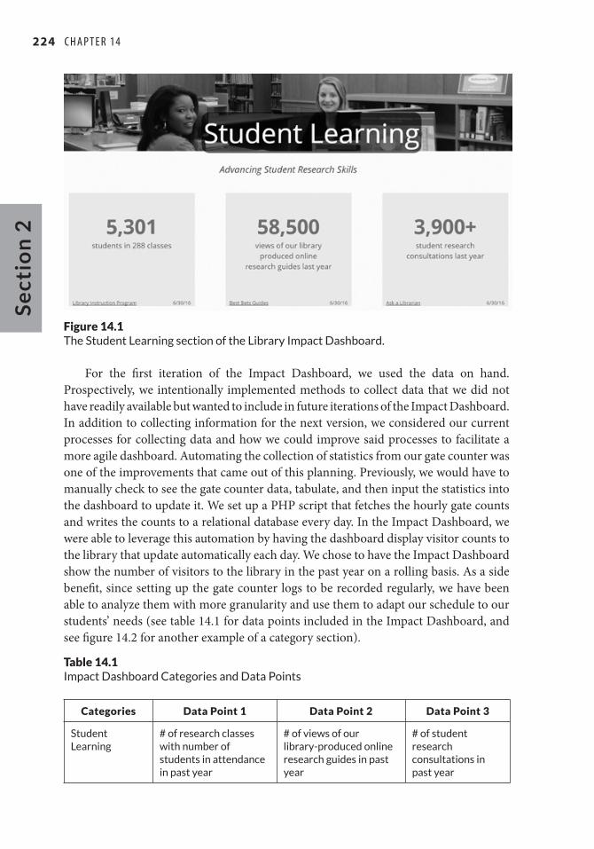
While investigating how to host the Impact Dashboard, we considered LibGuides and the university’s content management system, TERMINALFOUR. We chose TERMINALFOUR because it allowed more freedom in design and layout of the content and provided the ability to add automation in the future, and we had staff proficient with HTML and CSS. This freedom allowed us to lay out our four categories on one page with supporting statistics in a grid underneath each heading (see figure 14.1) and granted us the opportunity to pull some data in real time. The grid that this formed has plenty of white space and allowed readers to quickly and easily process the information without much cognitive load. The aesthetics of the Impact Dashboard were analogous to the style of the rest of the library website so that it would be representative of the organization. We conceived the design of each of the four category sections as a large header with a background photograph and the text of the essential priority overlaid. We chose each of the photographs because they related directly to the priority they were accompanying and they were readily available. For example, a picture of a student and a reference librarian at our reference desk represented our Student Learning category section. This image was chosen because the reference desk, along with our reference instruction, are the main points of contact between students and librarians, and these points reinforce, in a concrete way, the idea of library staff impacting students. Underneath each image, we decided to place a tagline or quote that links the university priority directly to the library. For example, the Student Learning priority tagline was “Advancing Student Research Skills.” The Assessment Team then mined the data collected from our information literacy classes and individual research appointments to select statistics that most clearly show this connection. The tagline acts as a bridge from the category to the statistics and helps the audience map our impact directly to the university’s stated priorities (see figure 14.1).
224 C h a p T E r 14S
ect
ion
2
Figure 14.1The Student Learning section of the Library Impact Dashboard.
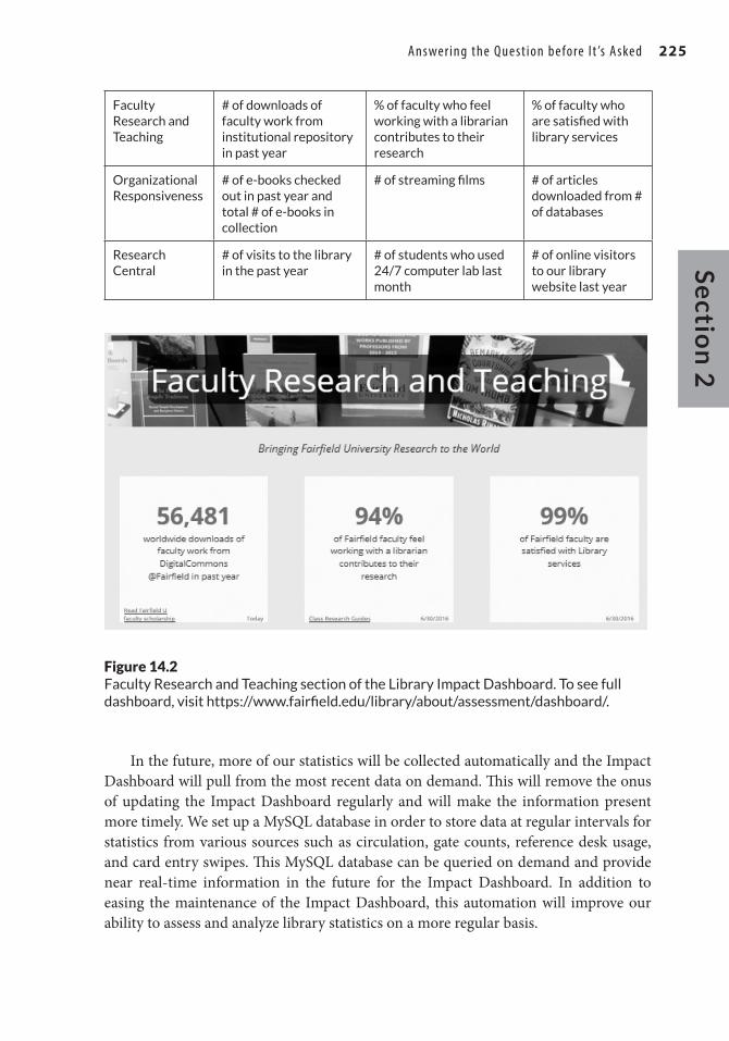
For the first iteration of the Impact Dashboard, we used the data on hand. Prospectively, we intentionally implemented methods to collect data that we did not have readily available but wanted to include in future iterations of the Impact Dashboard. In addition to collecting information for the next version, we considered our current processes for collecting data and how we could improve said processes to facilitate a more agile dashboard. Automating the collection of statistics from our gate counter was one of the improvements that came out of this planning. Previously, we would have to manually check to see the gate counter data, tabulate, and then input the statistics into the dashboard to update it. We set up a PHP script that fetches the hourly gate counts and writes the counts to a relational database every day. In the Impact Dashboard, we were able to leverage this automation by having the dashboard display visitor counts to the library that update automatically each day. We chose to have the Impact Dashboard show the number of visitors to the library in the past year on a rolling basis. As a side benefit, since setting up the gate counter logs to be recorded regularly, we have been able to analyze them with more granularity and use them to adapt our schedule to our students’ needs (see table 14.1 for data points included in the Impact Dashboard, and see figure 14.2 for another example of a category section).
Table 14.1Impact Dashboard Categories and Data Points
Categories Data Point 1 Data Point 2 Data Point 3
Student Learning
# of research classes with number of students in attendance in past year
# of views of our library-produced online research guides in past year
# of student research consultations in past year
answering the Q uest ion before I t ’s asked 225S
ectio
n 2
Faculty Research and Teaching
# of downloads of faculty work from institutional repository in past year
% of faculty who feel working with a librarian contributes to their research
% of faculty who are satisfied with library services
Organizational Responsiveness
# of e-books checked out in past year and total # of e-books in collection
# of streaming films # of articles downloaded from # of databases
Research Central
# of visits to the library in the past year
# of students who used 24/7 computer lab last month
# of online visitors to our library website last year
Figure 14.2Faculty Research and Teaching section of the Library Impact Dashboard. To see full dashboard, visit https://www.fairfield.edu/library/about/assessment/dashboard/.
In the future, more of our statistics will be collected automatically and the Impact Dashboard will pull from the most recent data on demand. This will remove the onus of updating the Impact Dashboard regularly and will make the information present more timely. We set up a MySQL database in order to store data at regular intervals for statistics from various sources such as circulation, gate counts, reference desk usage, and card entry swipes. This MySQL database can be queried on demand and provide near real-time information in the future for the Impact Dashboard. In addition to easing the maintenance of the Impact Dashboard, this automation will improve our ability to assess and analyze library statistics on a more regular basis.

226 C h a p T E r 14S
ect
ion
2
Communicating Results and ImpactIn late March 2015, as we put the final tweaks on the Impact Dashboard, the provost told our library dean that a senior administrator, new to education, was questioning the necessity of having an academic library in the digital age. Within twenty-four hours of hearing these concerns, we were able to publish the Library Impact Dashboard on the library website and send a link to the provost for her to share with the president’s office and senior administrators. The new senior administrator was impressed with the breadth of our work and the value we bring, as well as our ability to respond with relevant data so quickly. In this case, the single link to our Impact Dashboard told the new administrator more about our work and the role an academic library can play to advance the university mission than a multipage report. We were successful in designing a dashboard that communicated the library’s value to its audience using a careful balance of data, text, and images that engage and inform.The library homepage highlights and links to the Library Impact Dashboard, making it available to all who are interested. One by-product of creating the Impact Dashboard is that it gives library staff one place to see all of the important work of the library showcased; it tells the story of the whole library, reflecting the efforts of all staff. It is the “elevator speech” in dashboard form. It is a unifying document all library staff can point to and know their efforts contributed to the results.
The Assessment Team revisits the Impact Dashboard at annual report time each year and reviews it at regularly scheduled meetings. We look to see if there are any changes—positive or negative—in our major indicators. We close the assessment loop by asking if the data requires us to take actions for improvement. The Assessment Team continues to have a diverse makeup of committed library staff who have the agency to take action.
The Assessment Team annually considers whether it should add new indicators to the dashboard and whether old ones are no longer relevant. This annual process allows us to recraft the story as needed each year based on new scans of the university environment. As our own university’s priorities change, we modify the Impact Dashboard to align with those priorities, as well as with national higher education challenges. It is vital that the dashboard be flexible and easily changeable in order to continue to be tied into the university’s evolving strategic plan.
We are able to leverage the work we did in selecting the indicators to other areas. We reuse the indicators created for the dashboard by inserting them into communications with senior administrators and faculty. For example, we repackage the data displayed on the Impact Dashboard as an infographic for the annual report, and we feature the Impact Dashboard on our digital signage in the library lobby.
ReflectionThe Library Impact Dashboard was born from the Assessment Team, and our team approach was crucial in its creation. The diverse composition of the team allowed for

answering the Q uest ion before I t ’s asked 227S
ectio
n 2
various viewpoints, albeit with competing priorities at times. The competing priorities were actually a boon to the development of the library story because it aided in the establishment of a more complete narrative that touched on all aspects of the library, not just the ones most visible to patrons and administrators. The process itself of creating an impact dashboard can be positive, as the team members create and work towards a shared strategic goal bringing together disparate sections of the library that may not often interact.
It is critical to decide early in the process of creating a dashboard who the audience will be. If the audience is senior administrators outside the academic library, linking the library dashboard to the university’s strategic plan or goals is especially important. Language selection that mirrors the language used by the university administration becomes essential. A benefit of DiMenna-Nyselius Library aligning our Impact Dashboard with the university’s strategic plan is that it positions the library as a team player and one willing to engage with senior administrators on strategic direction initiatives.
In our daily work, it can be easy to not see the forest for the trees and be bogged down with massive data sets. Isolating, publishing, and reviewing major indicators helps us to stay focused on our primary initiatives that have the most impact on our community.
Notes 1. Fairfield University, Fairfield 2020, strategic plan (Fairfield, CT: Fairfield University, 2015), 15,
https://www.fairfield.edu/hostedfiles/documents/Fairfield2020_TheWayForward.pdf. 2. Etienne Wenger-Trayner and Beverly Wenger-Trayner, “Introduction to Communities of Practice,”
Wenger-Trayner.com, 2015, http://wenger-trayner.com/introduction-to-communities-of-practice/. 3. Important readings include the following: Association of College and Research Libraries, The
Value of Academic Libraries, researched by Megan Oakleaf (Chicago: Association of College and Research Libraries, 2010), http://www.ala.org/acrl/sites/ala.org.acrl/files/content/issues/value/val_report.pdf; Association of College and Research Libraries Connect, Collaborate, and Com-municate, prepared by Karen Brown and Kara J. Malenfant (Chicago: Association of College and Research Libraries, 2012), http://www.ala.org/acrl/sites/ala.org.acrl/files/content/issues/value/val_summit.pdf; and, Meredith Gorran Farkas, “Building and Sustaining a Culture of Assessment: Best Practices for Change Leadership,” Reference Services Review 41, no. 1 (2013): 13–31, https://doi.org/10.1108/00907321311300857.
4. Geoffrey Caine and Renate Nummela Caine, Strengthening and Enriching Your Professional Learn-ing Communit (Alexandria, VA: ASCD, 2010), 37–38.
5. For an example of the balanced scorecard approach, see Case Western Reserve University, “Bal-anced Score Card,” Kelvin Smith Library, accessed February 9, 2018, http://library.case.edu/ksl/aboutus/assessment/bsc/. To learn more about return on investment (ROI) approach, see Bruce Kingma and Kathleen McClure, “Lib-Value: Values, Outcomes, and Return on Investment of Aca-demic Libraries, Phase III: ROI of the Syracuse University Library,” College and Research Libraries 76, no. 1 (January 2015): 63–80, https://journals.acrl.org/index.php/crl/article/view/16402. To see an example of a value calculatorsee “Library Value Calculation Experiment 2009,” Cornell Uni-versity Library, Assessment and Communication, accessed February 15, 2018, https://ac.library.cornell.edu/value.
6. Stephen J. Town and Martha Kyrillidou, “Developing a Values Scorecard,” Performance Measure-ment and Metrics 14, no. 1 (2013): 11.
7. Association of College and Research Libraries, Value of Academic Libraries, 6–7.
228 C h a p T E r 14S
ect
ion
2
8. Stephen Few, “Dashboard Design: Taking a Metaphor Too Far,” DM Review 15, no. 3 (2005): 18, Academic OneFile.
9. Stephen Few, Information Dashboard Design (Sebastopol, CA: O’Reilly Media, 2006), 40–42. 10. Fairfield University, Fairfield 2020, 1. 11. Michael K. Allio, “Strategic Dashboards: Designing and Deploying Them to Improve Implementa-
tion,” Strategy and Leadership 40, no. 5 (2012): 26, https://doi.org/10.1108/10878571211257159.
BibliographyAllio, Michael K. “Strategic Dashboards: Designing and Deploying Them to Improve Implementation.”
Strategy and Leadership 40, no. 5 (2012): 24–31. https://doi.org/10.1108/10878571211257159.Association of College and Research Libraries. Connect, Collaborate, and Communicate: A Report from
the Value of Academic Libraries Summits. Prepared by Karen Brown and Kara J. Malenfant. Chicago: Association of College and Research Libraries, 2012. http://www.ala.org/acrl/sites/ala.org.acrl/files/content/issues/value/val_summit.pdf.
———. The Value of Academic Libraries: A Comprehensive Research Review and Report. Researched by Megan Oakleaf. Chicago: Association of College and Research Libraries, 2010. http://www.ala.org/acrl/sites/ala.org.acrl/files/content/issues/value/val_report.pdf.
Caine, Geoffrey, and Renate Nummela Caine. Strengthening and Enriching Your Professional Learning Community: The Art of Learning Together. Alexandria, VA: ASCD, 2010.
Case Western Reserve University. “Balanced Score Card.” Kelvin Smith Library. Accessed Feburary 8, 2018. http://library.case.edu/ksl/aboutus/assessment/bsc/.
Fairfield University. Fairfield 2020: The Way Forward. Strategic plan. Fairfield, CT: Fairfield University, 2015. https://www.fairfield.edu/hostedfiles/documents/Fairfield2020_TheWayForward.pdf.
Farkas, Meredith Gorran. “Building and Sustaining a Culture of Assessment: Best Practices for Change Leadership.” Reference Services Review 41, no. 1 (2013): 13–31. https://doi.org/10.1108/00907321311300857.
Few, Stephen. “Dashboard Design: Taking a Metaphor Too Far.” DM Review 15, no. 3 (2005): 18, 67. Gage Academic OneFile.
———. Information Dashboard Design. Sebastopol, CA: O’Reilly Media, 2006.Kingma, Bruce, and Kathleen McClure. “Lib-Value: Values, Outcomes, and Return on Investment of Aca-
demic Libraries, Phase III: ROI of the Syracuse University Library.” College and Research Librar-ies 76, no. 1 (January 2015): 63–80. https://journals.acrl.org/index.php/crl/article/view/16402.
Town, Stephen J., and Martha Kyrillidou. “Developing a Values Scorecard.” Performance Measurement and Metrics 14, no. 1 (2013): 7–16.
Wenger-Trayner, Etienne, and Beverly Wenger-Trayner. “Introduction to Communities of Practice.” Wenger-Trayner.com, 2015. http://wenger-trayner.com/introduction-to-communities-of-prac-tice/.