a universally designed and usable data visualization for a
TRANSCRIPT
(IJACSA) International Journal of Advanced Computer Science and Applications,
Vol. 7, No. 12, 2016
11 | P a g e
www.ijacsa.thesai.org
A Universally Designed and Usable Data
Visualization for A Mobile Application in the Context
of Rheumatoid Arthritis
Suraj Shrestha1
Department of Computer Science, The Universal Design of
ICT Research Group, Oslo and Akershus University College
of Applied Sciences
Oslo, Norway
Dr. Pietro Murano2
Department of Computer Science, The Universal Design of
ICT Research Group, Oslo and Akershus University College
of Applied Sciences
Oslo, Norway
Abstract—This paper discusses the design, development and
evaluation of a data visualization prototype for a mobile
application, for people with rheumatoid arthritis conditions. The
visualizations concern ways of displaying graphically data for
monitoring and evaluating the daily activities of rheumatoid
arthritis sufferers. An initial visualization was developed and then
a second was developed, aiming to be more usable and universally
designed than the first version. An empirical experiment was used
for evaluation and collection of quantitative data. Furthermore,
semi-structured interviews were used for eliciting more
qualitative data in terms of participant opinions. The overall
results suggest that the second visualization was more usable and
more universally designed than the first version. The paper
concludes with some recommendations for future improvements.
Keywords—universal design; usability; evaluation; data
visualization; mobile application; rheumatoid arthritis
I. INTRODUCTION
The use and interest in mobile apps has reached significant proportions in recent years. Statista [1] indicates that apps available from Google, Apple, Microsoft, Amazon and BlackBerry total approximately 5 700 000. Within these, there is also a group of apps developed for health related aspects such as monitoring certain body readings, e.g. heart rate etc.
Linked to this large increase in app availability, the use of mobile devices has steadily increased among all user groups. In 2016, it is estimated that there are about 4.61 billion mobile phone users around the world [2]. However, in 2014 there were only about 1.75 billion smartphone users globally [3]. Similarly, the use of mobile devices in the health sector is increasing sharply. This sharp increase is related to the affordability and availability of mobile devices and smartphones, which have higher processing capacities. Most healthcare information systems are designed for health professionals to enter, receive and exchange information about patients [4]. A term called mHealth [5] apps was coined, which is used to represent the increase of mobile health applications available on the market.
The research discussed in this paper is in the context of mobile health apps. The authors discuss designing and evaluating ways of displaying graphically data for monitoring
and evaluating daily activities of rheumatoid arthritis sufferers. The app‟s presentation of information is compared by means of an experiment and post-experiment interviews using two methods of visualization. The first method which lacked in universal design and usability was redesigned into a second version to be a more user friendly universally designed version.
In the first part of this paper, some relevant literature is discussed. In the second part, the two data visualizations are described in detail and linked with the principles of universal design. The third part describes the evaluation carried out for the two visualizations along with the results achieved. The fourth part consists of a discussion of the results in relation to the universal design principles. The paper then concludes with an overall conclusion and suggestions for improvement in this work.
Finally throughout this paper, the authors use the terms „visualization‟ and „prototype‟ interchangeably. The reason for this is that although the focus of the research is actually on the visualization aspects, in order to achieve these visualizations and subsequent evaluation, a working prototype had to be developed to facilitate these aspects.
II. RELEVANT LITERATURE
This literature review will indicate to readers what others have done in similar areas to the research presented later in this paper. It will also indicate by its absence that universal design is not mentioned or considered in these other works. Furthermore, it shows that the authors‟ research described later in this paper is original because of having considered more closely universal design and usability in a real world problem for visualizing several types of data together.
According to the World report on Disability, produced by WHO and World Bank, almost one billion people in the world are struggling with some form of disability [6]. Among these different disabilities, rheumatoid arthritis is the 31
st leading
cause of Years Lived with Disability (YLD) and almost one percent of the total population of the world suffers from rheumatoid arthritis [7]. Therefore techniques to visualize information such as data visualizations must be accessible in
(IJACSA) International Journal of Advanced Computer Science and Applications,
Vol. 7, No. 12, 2016
12 | P a g e
www.ijacsa.thesai.org
design to include different groups of users despite impairments [8].
Some of the common challenges regarding data visualization with all types of mobile devices are designing visualizations, which are aesthetically pleasing and convey the intended information in an accurate manner. Another common problem is the difficulty to use data visualizations with small screens of mobile devices [9]. There has been little or no research specifically targeted towards data visualization for mobile devices [9]. Therefore, there needs to be more focused research on how to use universal design principles and standards to create accessible data visualizations for mobile devices [9-10].
There are many apps available for download which aim to help with various conditions, e.g. arthritis etc. Some examples of these are My Pain Diary®[11], TRACK + REACT® [12],Learn Arthritis Prevention® [13], MyRA® [14], RheumaTrack® [15] and RHEUMATOID ARTHRITIS® [16]. However to our knowledge there is no published information regarding formal aspects of usability and universal design for these apps. However from an informal examination of these apps, the visualization of the data could be difficult to understand for users. Furthermore the RHEUMATOID ARTHRITIS® app has no visualization of data for the user. Therefore the remaining discussion in this brief literature review will concentrate on works that have been published.
Several mHealth apps have already been developed targeting arthritis patients; one such app is called “Pain Information on the Go (PInGO)” [17]. It was developed in order to examine and assess muscle improvement in juvenile arthritis patients who were undergoing a training program for a period of 6 weeks [17]. The app consisted of a questionnaire for before and after exercise, which had to be completed by the patients. This provided valuable assessment of the exercises and their effects on patients, which in turn helped the medical professionals to generate an effective fitness regimen for their patients. “PInGO” is available as an android mobile app as well as a web-based version available via Google Chrome.
In [18], “MyWalk, a mobile app for gait asymmetry rehabilitation in the community” is discussed. This is relevant in the context of this study as it records real time data and analyzes it to provide a visualization of the data. However, “MyWalk” has some issues related to accuracy of data and visualization. Unlike “PInGO”, “MyWalk” consists of a data visualization feature. However, “MyWalk” uses a line chart to visualize the data, which has several issues. One of the issues is related to the size of the line charts and its correlation with accuracy. In terms of normal line charts, the optimal chart height was found to be 24 pixels (6.8 mm on 14.1” 1024 X 768 pixel display) [19]. This suggests that line charts are not suitable for mobile devices with smaller screen sizes due to loss of accuracy of information and interaction capabilities.
In another research paper, by Pereira and Moreira [20], it was suggested that in real time monitoring systems, there are issues surrounding simultaneous monitoring of multiple patients and storage of data in the database. Their solution
included a network of wireless sensors, which can be used to monitor the vital signs of patients. Data from the sensors are stored in a central repository, which can be accessed locally using Ethernet or Wi-Fi connections, and remotely through the use of the Internet. However, sensor-based networks generate large amounts of data and the authors suggested that complex visualization is not the best solution because of the processing requirements of the client system. The application must also be made scalable to cope with the increase of users for the future.
In one article, [21], it is suggested that medical decision-making is a complicated process where a large amount of data is stored in Electronic Health Record (EHR) systems. In this article the authors have surveyed and reviewed the data visualization and interaction techniques found in 14 EHR systems. The authors have attempted to divide the data types into categorical and numerical data, where they suggest that the most common method to visualize categorical data is by placing icons (for point events), and line segments (for events with duration) on a horizontal time line. This can be further differentiated using color codes. While numerical data can be visualized using line plots, use of point plots or bar charts is also accepted. However, in systems which visualize both categorical and numerical data, the dual visualization technique, such as “Web Based Information Visualization System (WBIVS)” [21] is used. This uses line charts for numerical data and a matrix view for categorical data. The authors have concluded that medical information is complex and difficult to interpret. This problem can be solved by using appropriate data visualization techniques.
The “Spatial OLAP Visualization and Analysis Tool (SOVAT)” [22] is another tool used to make community health decisions. This tool can be used to handle large amounts of data and visualize the information in numerical and spatial views. It consists of two technologies: 1. “Online Analytical Processing (OLAP)” and a “Geospatial Information System (GIS)” [22]. This article suggested that there is a need for a powerful multidimensional data storage and manipulation system especially concerning spatial data. “SOVAT” is an example of an application which combines “OLAP” and “GIS” and consists of abilities such as: storage of data sets, statistical analysis, exploration of data, visualization of data using charts and spatial objects and can perform spatial analysis. However, the system still lacked ease of use and the complexity of usage makes it difficult to adopt technologies like “SOVAT”. Therefore, specific concerns regarding usefulness and ease of use of systems must also be addressed during the development of such systems.
“HealthMap” is an event based monitoring system for infectious diseases. Data from various sources is collected through Rich Site Summary (RSS) at the backend, whereas at the front end Google Maps public API is used to create mappings [23]. “HealthMap” organizes and visualizes data according to three categories: date, location and disease. The developers allowed the system to adapt to the needs of the users where customization options were created to adapt the system to expert users as well as novice ones. The data showed in the visualization changed according to the selection of categories by the user. Users had the ability to zoom into
(IJACSA) International Journal of Advanced Computer Science and Applications,
Vol. 7, No. 12, 2016
13 | P a g e
www.ijacsa.thesai.org
the specific maps of countries and track for any alerts for diseases that were ordered by reverse chronological order. Therefore, “HealthMap” allowed the users to visualize the data according to their selection of categories. However, due to the complexity of this application the front end still needs to improve to provide better user experience and automation capabilities.
More recently some other researchers have done work on a mobile app for rheumatoid arthritis [24, 25, 26]. In [24] the authors aimed to find out about requirements specifications for the app and the user group and desired features of the app. Then in [25] the researchers carried out an evaluation with the app and users. Overall they concluded from their data that the app was found to be „easy and fun to use, and as providing sufficient physical activity (PA) support and information [25].‟ Further, about 20% of the user group seemed to be unsure about the „feasibility of goal setting and PA planning‟. However although this work is related to our work, they did not seem to concentrate on the actual visualization issues that we have specifically been designing and evaluating. Therefore this suggests that the work discussed in this paper is both important and novel.
This literature review has shown that some research has been carried out in terms of health apps, but not specifically like the research described later in this paper. The literature has also given some indications on what could be done, what could be avoided and that with some apps/prototypes there is room for improvement, e.g. “PInGO” does not provide a data visualization [17].
Also in [18] real time data recording is indicated to be beneficial, but there were problems with accuracy and using a line chart for data representation on a small screen.
Having considered some relevant literature the next section will describe the first and second main attempts for visualizing activity data for rheumatoid arthritis sufferers.
III. DESCRIPTION OF THE TWO VISUALIZATIONS
The first visualization and its features are described below:
A. Overview of the First Visualization
The app is a mobile application for rheumatoid arthritis sufferers, which records activities performed by the user for a definite period of time. Each activity consists of three attributes as listed below:
a) Importance
b) Energy
c) Duty/Pleasure
Importance has two extremes (Important and Not Important). Energy has two extremes (Energy Giving or Energy Taking). Every activity must be categorized as Duty or Pleasure.
The user can select any of these two extremes by sliding a slider. The position of the slider before or after the middle point mark determines one of the two extremes. This information is then saved for review later on.
These categories are assessed using a continuous slider visualization, which allocates a decimal value between 0 and 1. This value is registered by the user of the application as per their experiences.
1) Explanation of Visualization The visualization consists of an X-axis and a Y-axis,
which intersect each other to form a cross section. The X and Y axes intersect to form four quadrants.
a) Quadrant I: Activities which were desired and
important
b) Quadrant II: Unimportant activities that are required
c) Quadrant III: Important required activities
d) Quadrant IV: Unimportant, desired activities
Each quadrant consists of two axes as described above. The attributes provided by the user within each category for every activity by using the slider determine the position of the activity within these four quadrants. The user can tap on each of these quadrants to get detailed information about activities, which lie within respective quadrants (The explanation above consists of no images due to copyright issues).
As mentioned in the Introduction section of this paper, the first main attempt for visualization lacked somewhat in universal design. Therefore, the next section will discuss how the first main attempt of the app visualization was lacking in universal design.
2) Universal Design Issues in the Old Prototype
Universal design consists of seven principles [27]. These seven principles are considered to be fundamental for developing artifacts for all users. They were developed in 1997 by a team led by the late Ronald Mace in North Carolina State University:
a) Principle 1: Equitable Use
b) Principle 2: Flexibility in Use
c) Principle 3: Simple and Intuitive Use
d) Principle 4: Perceptible Information
e) Principle 5: Tolerance for Error
f) Principle 6: Low Physical Effort
g) Principle 7: Size and Space for Approach and Use
Based on these principles the following principles and guidelines are specifically pertinent to the first visualization. (Note: The descriptors for each category and numbering scheme used below are directly extracted from the original universal design principles and guidelines as they appear in [27]).
Principle 2 - Flexibility in Use: This principle states that the design must accommodate a wide range of individual preferences and abilities, which are addressed through four guidelines [27]. However, for the purpose of our mobile application two particular guidelines are relevant:
2a. Provide choice in methods of use: The old data visualization prototype does not possess features to customize the data visualization according to the needs of the users. The data visualization as well as other features of the old prototype cannot be adjusted or changed.
(IJACSA) International Journal of Advanced Computer Science and Applications,
Vol. 7, No. 12, 2016
14 | P a g e
www.ijacsa.thesai.org
2b. Accommodate right or left-handed access and use: Similarly, the old data visualization prototype is not suited for single-handed use. Single-handed access becomes difficult, as the user cannot reach all the “User Interface (UI)” elements on the screen. The icons and other UI elements are placed in inappropriate positions causing difficulty in access and accuracy.
Principle 3: Simple and Intuitive Use: This principle states that the use of design must be easy to understand, regardless of the user‟s experience, knowledge, language skills, or current concentration level, which is addressed through four guidelines [27]. However, for the purpose of our mobile application two particular guidelines are relevant:
3a. Eliminate unnecessary complexity: The old data visualization prototype consists of four quadrants created by the intersection of X and Y axes. The activities are displayed in each of these four quadrants and are represented by small squares. It remains unclear as to how the activities are sorted within these four quadrants and the user needs to interact multiple times to get the details about each activity.
3c. Accommodate a wide range of literacy and language skills: The old data visualization does not consist of multiple language support.
Principle 4: Perceptible Information: The fourth principle states that the design must communicate necessary information effectively to the user, regardless of ambient conditions or the user‟s sensory abilities [27] which is addressed through four guidelines. However, for the purpose of our prototype, only one particular guideline is relevant:
4d. Provide compatibility with a variety of techniques or devices used by people with sensory limitations: The old data visualization prototype does not provide multimodal means of presentation of information. It does not support screen-readers or other assistive technologies, which makes it difficult for users of different abilities to access the data visualization.
Principle 5: Tolerance for Error: The fifth principle states that the design must minimize hazards and the adverse consequences of accidental or unintended actions [28], which is addressed through four guidelines. However, for the purpose of our prototype, only one particular guideline is relevant:
5a. Arrange elements to minimize hazards and errors: most used elements, most accessible; hazardous elements eliminated, isolated, or shielded: The activities are represented by small square objects, which are scattered throughout the graph in the old data visualization prototype, which does not convey much information to the user. In order to gain further insight about a certain desired activity the user must go through the entire list of activities, which makes it tedious.
Principle 6: Low Physical Effort: The sixth principle states that the design must be able to accommodate efficient and comfortable use and with a minimum of fatigue [27], which is addressed through four guidelines. However, for the purpose of our prototype, two particular guidelines are relevant.
6c. Minimize repetitive actions: The old data visualization consists of complex and repetitive actions, which increase task
time and complexity. An example of a repetitive action involved tapping a quadrant which expanded that area of the visualization. Then further selections down a fairly deep nesting of options was required to access a specific item of information involving a daily activity‟s details.
6d. Minimize sustained physical effort: As mentioned above the old data visualization prototype consists of complex and repetitive tasks which require a sequence of steps to complete simple tasks. This also causes fatigue more often and wears out the user faster. An example of a task was to find out the details of a particular activity such as gardening and/or work etc.
Having described the first main attempt for visualization along with its shortcomings in universal design, the next section will describe the second redesigned version for visualization.
B. Overview of the New Data Visualization
In this section an overview of the second visualization describing the new user interface and a new data visualization technique is presented. This overview will also show some of the steps users will use to interact with the prototype of the visualization.
The new data visualization was developed as a platform independent prototype, which could run on Apple and Android devices without change. Furthermore, the prototype was developed so as to be readable by screen readers.
The design of the new visualizations is shown graphically below. The reader will perceive that the use of axes and quadrants as described in Section III (A) above was replaced with a „bar graph‟ type representation. This choice was made to try and make understanding and comparison of the various data easier for the user. Bar graphs are specialized for focusing attention on individual values and support comparison of one to another. They also emphasize the individual values of the thing being measured per categorical subdivision. A bar graph might be one of the easiest methods of data visualization. According to Meyer [29], whenever there is uncertainty regarding which graph to use to represent a particular set of data, the easiest answer is to use a bar graph. However, there is a limit to what kind of data can be represented using such graphs and how to make the best application of such graphs. For example use of 3D bar graphs to represent data might give ineffective results and provide false information due to distortion of data, which can cause data ambiguity and distraction from what the data might try to convey through that graph. Such graphs can cause cognitive overload for the reader in order to separate each section of the bar and then compare it against other bars [30]. The choice of colors to represent data in these graphs can be crucial as well as the text alignment and location can also play a vital role to convey the message. A flat bar graph conveys more accuracy of information than a three dimensional bar graph.
Therefore, for a simple comparison of categorical subdivisions of one or more measures in no particular order, a bar graph is suggested [31].
(IJACSA) International Journal of Advanced Computer Science and Applications,
Vol. 7, No. 12, 2016
15 | P a g e
www.ijacsa.thesai.org
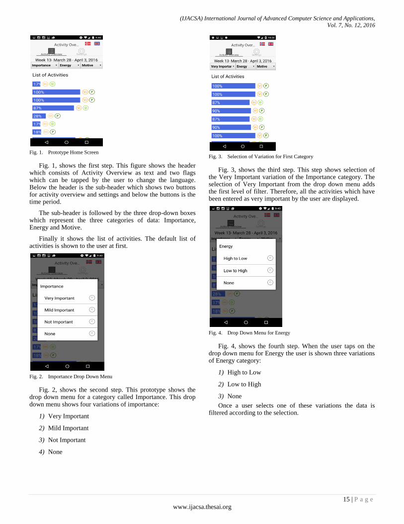
Fig. 1. Prototype Home Screen
Fig. 1, shows the first step. This figure shows the header which consists of Activity Overview as text and two flags which can be tapped by the user to change the language. Below the header is the sub-header which shows two buttons for activity overview and settings and below the buttons is the time period.
The sub-header is followed by the three drop-down boxes which represent the three categories of data: Importance, Energy and Motive.
Finally it shows the list of activities. The default list of activities is shown to the user at first.
Fig. 2. Importance Drop Down Menu
Fig. 2, shows the second step. This prototype shows the drop down menu for a category called Importance. This drop down menu shows four variations of importance:
1) Very Important
2) Mild Important
3) Not Important
4) None
Fig. 3. Selection of Variation for First Category
Fig. 3, shows the third step. This step shows selection of the Very Important variation of the Importance category. The selection of Very Important from the drop down menu adds the first level of filter. Therefore, all the activities which have been entered as very important by the user are displayed.
Fig. 4. Drop Down Menu for Energy
Fig. 4, shows the fourth step. When the user taps on the drop down menu for Energy the user is shown three variations of Energy category:
1) High to Low
2) Low to High
3) None
Once a user selects one of these variations the data is filtered according to the selection.
(IJACSA) International Journal of Advanced Computer Science and Applications,
Vol. 7, No. 12, 2016
16 | P a g e
www.ijacsa.thesai.org
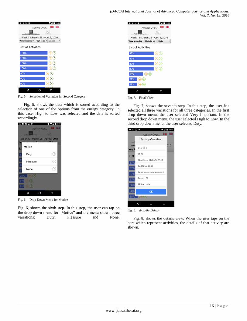
Fig. 5. Selection of Variation for Second Category
Fig. 5, shows the data which is sorted according to the selection of one of the options from the energy category. In this case, High to Low was selected and the data is sorted accordingly.
Fig. 6. Drop Down Menu for Motive
Fig. 6, shows the sixth step. In this step, the user can tap on
the drop down menu for “Motive” and the menu shows three
variations: Duty, Pleasure and None.
Fig. 7. Final View
Fig. 7, shows the seventh step. In this step, the user has selected all three variations for all three categories. In the first drop down menu, the user selected Very Important. In the second drop down menu, the user selected High to Low. In the third drop down menu, the user selected Duty.
Fig. 8. Activity Details
Fig. 8, shows the details view. When the user taps on the bars which represent activities, the details of that activity are shown.
(IJACSA) International Journal of Advanced Computer Science and Applications,
Vol. 7, No. 12, 2016
17 | P a g e
www.ijacsa.thesai.org
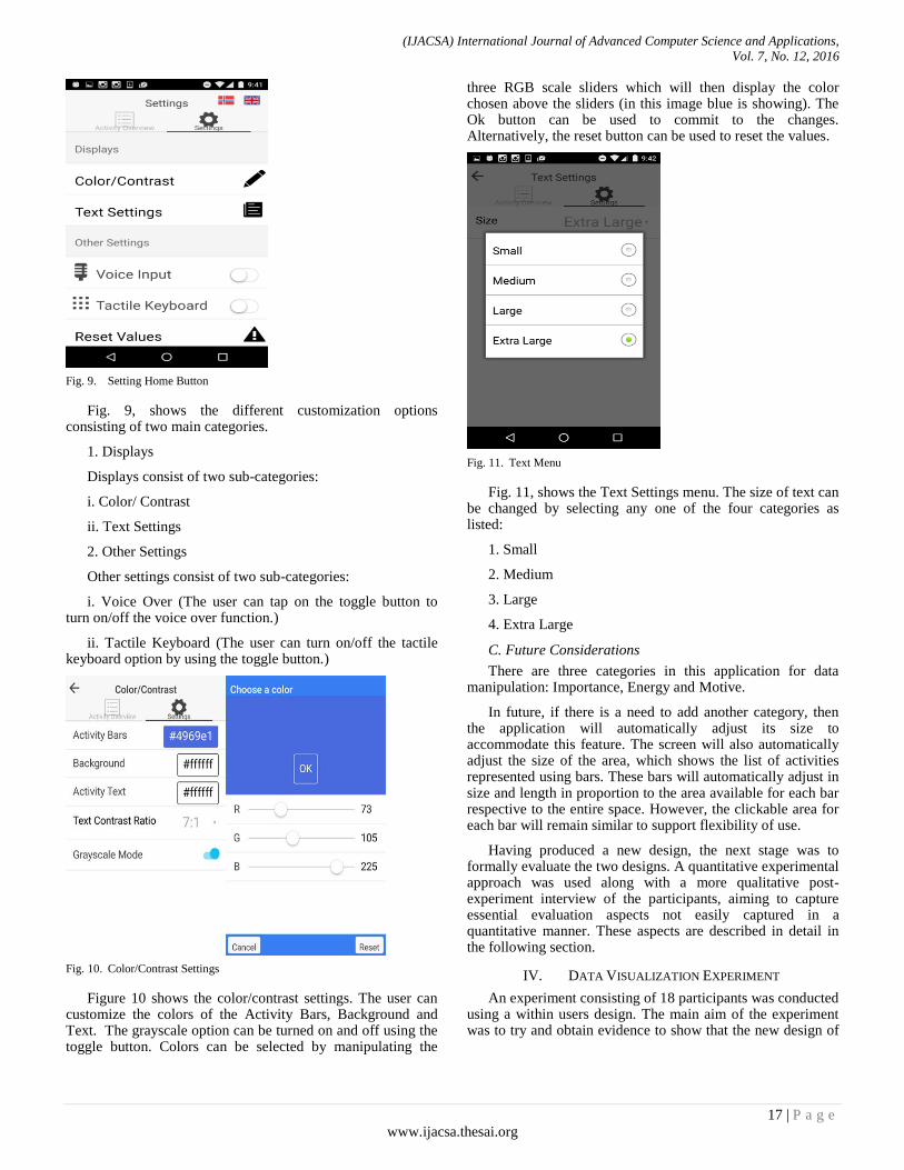
Fig. 9. Setting Home Button
Fig. 9, shows the different customization options consisting of two main categories.
1. Displays
Displays consist of two sub-categories:
i. Color/ Contrast
ii. Text Settings
2. Other Settings
Other settings consist of two sub-categories:
i. Voice Over (The user can tap on the toggle button to turn on/off the voice over function.)
ii. Tactile Keyboard (The user can turn on/off the tactile keyboard option by using the toggle button.)
Fig. 10. Color/Contrast Settings
Figure 10 shows the color/contrast settings. The user can customize the colors of the Activity Bars, Background and Text. The grayscale option can be turned on and off using the toggle button. Colors can be selected by manipulating the
three RGB scale sliders which will then display the color chosen above the sliders (in this image blue is showing). The Ok button can be used to commit to the changes. Alternatively, the reset button can be used to reset the values.
Fig. 11. Text Menu
Fig. 11, shows the Text Settings menu. The size of text can be changed by selecting any one of the four categories as listed:
1. Small
2. Medium
3. Large
4. Extra Large
C. Future Considerations
There are three categories in this application for data manipulation: Importance, Energy and Motive.
In future, if there is a need to add another category, then the application will automatically adjust its size to accommodate this feature. The screen will also automatically adjust the size of the area, which shows the list of activities represented using bars. These bars will automatically adjust in size and length in proportion to the area available for each bar respective to the entire space. However, the clickable area for each bar will remain similar to support flexibility of use.
Having produced a new design, the next stage was to formally evaluate the two designs. A quantitative experimental approach was used along with a more qualitative post-experiment interview of the participants, aiming to capture essential evaluation aspects not easily captured in a quantitative manner. These aspects are described in detail in the following section.
IV. DATA VISUALIZATION EXPERIMENT
An experiment consisting of 18 participants was conducted using a within users design. The main aim of the experiment was to try and obtain evidence to show that the new design of
(IJACSA) International Journal of Advanced Computer Science and Applications,
Vol. 7, No. 12, 2016
18 | P a g e
www.ijacsa.thesai.org
the visualization interfaces was more usable and universally designed than the first main version.
A. Hypotheses
Two hypotheses were created for this experiment. These are detailed as follows:
H1: The new visualization will be easier to use and more universally designed in terms of speed when compared with the old visualization.
H01: There will be no difference between the two visualization methods in terms of speed and universal design.
H2: Participants perceptions of the new visualization will be more positive than their perceptions for the old visualization.
H02: There will be no difference between the two visualization methods in terms of participant perceptions.
A total of six tasks were performed on each data visualization separately. Tasks 1 to 5 were similar in nature with some small disparities. The sixth task was completely different for the two data visualizations therefore findings from this last task were not included as a comparative analysis.
B. Tasks
1) Tasks for the New Data Visualization Task 1: Find out which activities are considered “Very
Important” by selecting it from the “Importance” category.
Task 2: Find out which activities are considered “Duty” by selecting it from the “Motive” category.
Task 3: Find out which activities gained energy from looking at the data visualization.
Task 4: Tap on the bars which represent activities and find out details about at least three activities.
Task 5: Use a screen reader to use the app.
2) Tasks for the Old and Present Data Visualization
Task 1: Find out which activities are considered important from looking at the data visualization.
Task 2: Find out which activities are considered duty from looking at the data visualization.
Task 3: Find out which activities gained energy from looking at the data visualization.
Task 4: Tap on the small green squares which represent activities and find details for at least three activities.
Task 5: Use a screen reader to use the app.
3) Tasks Specific to New Data Visualization
Task 6: Change the font-size and color of text.
4) Tasks Specific to Old Data Visualization
Task 6: Tap on each quadrant to discover any further information.
C. Participants
As stated above, 18 participants (16 males and 2 females) were recruited for this experiment. The participants were all students of various international backgrounds. For this experiment, participants were expected to be experienced with mobile phones especially smartphones as well as laptops.
In the recruitment survey a range of questions investigating the familiarity of prospective participants with smartphones were asked. The survey asked questions regarding their experiences using various mobile devices, familiarity with smartphones in terms of years etc. Based on this, the participants who spent more than a year using smartphones were selected as it indicated familiarity with smartphones and various mobile applications. Participants were also asked about their familiarities with different kinds of smartphones and operating platforms. The highest number of participants used Android devices followed by Apple‟s iPhone.
The authors had initially wanted to recruit participants with actual rheumatoid arthritis, for realism. However this was not pursued for two reasons. The first reason was that it was extremely difficult to obtain access to a good number of actual rheumatoid arthritis sufferers with specific problems in the hands and fingers (this experiment involved using a smartphone). The second reason was that arthritis is a condition that can affect different people in different ways and at different levels [32]. This could have made it difficult to control certain experimental variables. It was therefore decided that the use of simulation gloves (see Section IV(F) below) would provide a „standard‟ type of impairment and therefore a factor that could be controlled in the experiment.
D. Design
A within users design was chosen for this experiment. This design was chosen to expose the participants to both data visualizations. Therefore, each participant was asked to complete a set of tasks for both data visualizations. Half of the participants carried out the tasks with the new visualization followed by the old visualization. The remaining half carried out the tasks in the opposite order. Participants were randomly assigned to each ordering described here.
E. Variables
The independent variables were the two prototypes (i.e. the old and new visualizations) and the tasks which were performed on the two different data visualization prototypes.
The dependent variables were performance, attitude and experiences. The dependent measures were the completion of the tasks (success/failure), time taken for an overall task, errors in terms of incorrect option selections and participants‟ subjective opinions while interacting with the data visualizations and their features.
A semi-structured interview was conducted after the experiments for each participant. The interview consisted of questions relating to the comprehension of the data visualizations. The aim was to understand if the participants understood the information through the data visualizations and to ascertain their feelings and experiences.
(IJACSA) International Journal of Advanced Computer Science and Applications,
Vol. 7, No. 12, 2016
19 | P a g e
www.ijacsa.thesai.org
F. Apparatus and Materials
The following materials were used in the experiment:
Two smartphones: Android smart-phone running android version 6.0 (marshmallow) and Apple iPhone running iOS 9.3. For the experiment, Android was used for the new data visualization and iOS was used for the old data visualization. Both devices were approximately equivalent in terms of hardware specification and software sophistication.
The old data visualization and the new visualization.
A stopwatch to record the time for completion of tasks.
A recruitment questionnaire and a consent form for participants before conducting the experiments.
A sheet of instructions for participants to inform them about the details regarding the experiment in which they were involved.
A post experiment semi-structured interview guide.
One pair of Cambridge Simulation Gloves designed by the University of Cambridge [33], Engineering Design Center.
As the visualizations for the app were for use by rheumatoid arthritis sufferers, the Cambridge Simulation Gloves were used to simulate the obstruction of movement of hands and fingers. The main focus of the usage of the gloves in this experiment was to understand how reduction in mobility of hand and fingers affects the usage of the two prototypes for data visualizations. The usage of these gloves can simulate the affects arthritis might have on the hands and fingers of the participants, and the problems faced by them when using mobile devices and applications.
The Structural Design of the simulation gloves consisted of plastic strips, which limit the strength as well as the range of motion of the fingers and thumb [33]. Also the straps on the wrist can be adjusted according to need and the length of the straps can be adjusted for the plastic strips according to the size of the fingers of the participants.
Although the gloves help to simulate dexterity problems, they cannot help to simulate problems such as pain, tremors, problems of the wrist, loss of tactile sensitivity and deformities to the shape of the hand [33].
G. Procedure
Participant recruitment was first conducted through a survey via www.surveymonkey.com. The recruitment survey was used to understand the capabilities of the participants since participants were required to be familiar with smartphones. The recruitment survey lasted for three days. After the recruitment, the experiment was conducted for a period of one week. The experiments were conducted in a study room at the university. The participants and the experimenter were located in the same quiet room at the same time for the experiments. Overall each session with participants lasted for almost 30 minutes for the experiment
and the time varied from 10 to 15 minutes for the semi-structured interviews.
Each participant was allocated a time slot in advance. Social media such as Facebook and Messenger were used to keep in contact with the participants to confirm their schedules. Conventional communication mediums such as telephone calls and text messages were used for those participants who wished to share their contact details. However these details were not stored anywhere.
When the participant arrived he/she was greeted and asked to take a seat. They were introduced to the experiment and then the consent form was presented to them. The participants carefully read the consent form and signed it. The consent form informed the participants about the research and the ethical treatment of them and the data collected.
Participants were randomly assigned to use one of the two data visualizations. A brief explanation about both data visualizations was provided to familiarize participants. Participants were asked to complete a set of tasks for each data visualization in sequence. Each participant was asked to speak aloud while performing the tasks. Participants were specifically asked to say out loud what they intended to do next.
Further participants were observed for any effects that could arise concerning the use of the simulation gloves. Specifically aspects to do with interaction difficulties were observed.
At the end of the experiment, a semi-structured interview was conducted to gain further insight about their experiences, performance and features of data visualizations. The interview targeted the user experience, feature specific explanations, preference regarding the data visualizations and the comprehensibility of the data represented by the visualization models.
H. Results
The data that was collected from the experiment was explored through summary statistics. The data showed that for tasks 1, 2 and 3 in the new prototype, the values for skewness and kurtosis were high. However for the remaining tasks, the skewness and kurtosis values remained low. This suggested that a paired t-test could be used. This was also selected because of its robustness.
The overall mean time in seconds for the new visualization is 36.04 seconds (SD, 48.06) and the overall mean time for the old visualization is 51.88 seconds (SD, 40.30). The t-test result is t = -3.40, p < 0.019. This indicates an overall significant amount of difference in terms of time.
Paired t-tests were conducted individually for Tasks 1-5.
Task 1, asked participants to identify an activity or activities, which were considered as important. The means for time taken are 7.11 (SD, 6.69) seconds for the new data visualization and for the old data visualization 29.31 (SD, 26.63) seconds. The t-test result is t = -3.60, p < 0.001. Therefore, the new data visualization prototype was
(IJACSA) International Journal of Advanced Computer Science and Applications,
Vol. 7, No. 12, 2016
20 | P a g e
www.ijacsa.thesai.org
significantly faster than the old data visualization prototype in terms of time taken to complete the task.
Task 2, asked participants to identify activities, which were considered as duty. The means for time taken are, 7.35 (SD, 8.43) seconds to complete the task with the new data visualization and 20.48 (SD, 15.45) seconds for the old data visualization. The t-test result is t = -3.39, p <0.0006. Therefore, the new data visualization prototype was significantly faster than the old data visualization prototype in terms of time taken to complete the task.
Task 3, asked participants to identify activities, which were considered as less energy consuming, or giving energy. The means for time taken are 8.97 (SD, 9.96) seconds to complete the task with the new data visualization and for the old data visualization 35.25 (SD, 25.95) seconds. The t-test result is t = -4.91, p<0.00006. Therefore, the new data visualization prototype was significantly faster than the old data visualization prototype in terms of time taken to complete the task.
Task 4, asked participants to find out details of at least three activities. The means for time taken are, 27.59 (SD, 16.66) seconds to complete the task with the new data visualization and for the old data visualization 35.97 (SD, 21.73) seconds. The t-test result is t = -1.24, p <0.11. Therefore there is no significant difference between the two visualizations in terms of task time.
Task 5, asked participants to interact using a screen reader. The means for time taken are 131.34 (SD, 58.85) seconds to complete the task with the new data visualization and for the old data visualization 129.44 (SD, 59.21) seconds. The t-test result is t = 0.08, p <0.46.
Therefore there is no significant difference between the two visualizations in terms of task time. However, in the interviews the participants clarified that the new visualization was significantly better when used with screen readers than the old visualization. However, there were still serious issues with the new prototype because certain screen elements could not be selected and some of the sliders were difficult to operate.
Task 6 was specific to each data visualization prototype. These tasks were not considered as a part of the paired t–test because the data is statistically irrelevant since the two tasks are not similar to each other and measure different things. Task 6 for the new data visualization asked participants to change the color and size of the text, whereas Task 6 for the old data visualization asked participants to discover further information about each quadrant in the XY-axis plane. The participants were asked to think aloud when they were performing these tasks. The reactions thus obtained from the participants were used as suggestions for improvement.
All participants completed all the tasks under both conditions and so there were no incorrect option selection errors during the tasks.
The results from the “speak-aloud” process used in the experiment did not reveal any new information, which could provide help with the issues of improving universal design and
usability in the new visualization. The aim of the “speak-aloud” process was to see if this could provide the authors with more information regarding design issues of the user interface.
The results from observing the participants interacting with the prototypes using the impairment simulation gloves suggested that the gloves caused mobility problems when tapping the icons, which were small in size for both visualizations. The gloves also affected two-handed use of the applications, as some participants were accustomed to use a mobile device with both hands. Further, all participants used their index fingers to tap and scroll on the screen rather than using their thumbs, which may suggest difficulty in using the thumbs. Lastly it was also observed that the very action of grasping the smartphone was difficult when wearing the simulation gloves.
1) Results From the Semi-Structured Interview A semi-structured interview was conducted at the end of
every experiment for all 18 participants of the experiment. Each participant was asked a total of nine questions. This interview was conducted to get opinions and discover impressions of the participants concerning the two prototypes. For the first question, which asked the participants about their experiences using smartphones, all the participants answered that they were familiar with them and everyone had used such devices for more than 1 year, which was the mandatory minimum that was set in the recruitment survey. All the users used various features of smartphones and they were familiar with different mobile applications such as the organizer and games, etc. The main purpose of using smartphones for all the users in most cases was social media.
For the second question, which asked users about their preference between the two prototypes, all 18 of the participants suggested they would prefer the new visualization because it was easier and more convenient to use. They said it was more understandable and the visualized data was more legible.
For the third and fourth questions, which asked about the meaning of icons in each prototype, the opinions were almost similar for both prototypes. For the old prototype all 18 participants replied that none of them were able to understand the meanings of icons until they were explained. For the new prototype, the icons were not even perceived as important since the data was sorted according to their selection. Some participants never even realized that there were icons in the new visualization and they were familiar with icons such as the Settings Icon, icon used for voice input, text-size and language options.
The fifth question asked the participants about the customization settings available in the new prototype. Almost all the participants were satisfied with the base design of the prototype and they did not feel it necessary to change it. However, they tried changing the colors of the user interface elements for exploration purposes and discovered it to be very useful.
The sixth and seventh questions asked the participants about whether they were able to obtain details about desired
(IJACSA) International Journal of Advanced Computer Science and Applications,
Vol. 7, No. 12, 2016
21 | P a g e
www.ijacsa.thesai.org
activities for each prototype. For both of these questions, the answers were almost the same and they found it almost equally easy for both prototypes to navigate for finding the details of activities, since all 18 participants were able to complete the tasks. However, for the new data visualization the interaction time was found to be faster and easier as well as requiring less touch gestures for interaction.
The eighth and the ninth questions asked about their experiences while using the two prototypes with screen readers. For the old prototype, the participants were not satisfied since the data visualization lacked complete screen reader compatibility and therefore little could be read by the screen reader. However, for the new prototype there was a mixed reaction. Some users found it easy to use and understand with the screen reader while some wanted it to have further improvements. None of the participants were completely satisfied with the screen reader compatibility of the new prototype, but all of them appreciated that it was much more screen reader friendly than the old prototype.
Finally participants were asked about the use of the simulation gloves and their effects. The basic response from all participants was that they felt the new visualization was better.
V. DISCUSSION
The issues raised at the beginning of this paper and in Section III and their solutions provided in Section III including the new prototype developed are discussed further in this section.
Although the new prototype has not addressed all the issues raised at the beginning of this paper, it has tried to accommodate as many of them as possible.
Furthermore, the experiment was designed to provide evidence to support the solutions provided in the new data visualization that are actually effective in real-time use. The first issue that was raised in this paper was related to Principle 2, Guideline 2a, which was addressed in the new data visualization by providing customization options to customize user interface elements according to the needs of the users. The evidence suggested through the results of the semi-structured interviews that the customization settings were very useful. The new visualization also supports the increasing in size of on-screen icons and the font. This would appear to be useful as it was observed during the experiment that small icons were difficult to select with the simulation gloves.
The second issue was related to Principle 3, Guideline 3a, which was addressed in the new data visualization by providing drop-down lists of categories, which could be selected, and the data would automatically be sorted according to the selection. The experiment showed that the users took very little time to complete tasks 1, 2 and 3 in the new data visualization in comparison to the old data visualization. This evidence along with the results from the interviews suggests that the new data visualization prototype was easier to use and understand.
For Principle 3, Guideline 3c, the new data visualization consisted of dual language support for English and Norwegian, which could be selected as needed by the user.
For Principle 4, Guideline 4d, the new data visualization provided multi-modal communication through screen-readers. Also as stated above the prototype was developed to be platform independent and so could run on Apple and Android devices without change. The experiment showed that the old prototype did not support screen-reader interaction. The new prototype supported screen-reader interactions for Android and Apple devices. However, the participants were not completely satisfied with the performance. Therefore, there is still room for improvement in this context.
Principle 5, Guideline 5a was addressed in the new prototype by the use of drop-down categories. The users were allowed to select one item from each drop-down menu and each selection filtered the data. From the experiment, it was shown that the time taken to complete tasks 1, 2, 3 and 4 for the new data visualization prototype was significantly less than the time taken to complete the same tasks for the old data visualization prototype. The evidence from the experiment was strengthened by the results from the semi-structured interviews.
Principle 6, Guideline 6c and 6d were addressed in the new prototype by arranging user interface elements in drop-down menus using categories. Customization options were placed in appropriate categories for changing text, background and other user interface elements. The evidence from the experiment shows that the time taken to complete tasks for the new data visualization was shorter than the time taken to complete the same tasks for the old data visualization. In the semi-structured interviews the participants also stated that due to the short time taken to complete the tasks for the new prototype they felt less fatigue in their hands and arms in comparison to the old prototype.
Therefore as this discussion suggests that overall the new visualization was indeed more usable and universally designed, the authors accept both positive hypotheses stated earlier. These essentially postulated that the new visualization would be better in terms of usability, universal design and user preference.
VI. CONCLUSION
The main goal of this research was to design and develop a data visualization prototype adhering to the standards of Universal Design. Through a literature review it was discovered that there is a lack of use of Universal Design principles in design and development of “mHealth” applications. There are several national and international laws, which are created to enforce and encourage the use of Universal Design standards to provide equality for all. However, there seems to be a lack of strong motivation for adherence and enforcement of these laws.
The goal of designing a new prototype was to make it accessible for people with rheumatoid arthritis who had
(IJACSA) International Journal of Advanced Computer Science and Applications,
Vol. 7, No. 12, 2016
22 | P a g e
www.ijacsa.thesai.org
problems related to dexterity and movement of hands and fingers. Therefore, the new prototype consisted of various customization options, which could be used to customize it according to the needs of the users. Special considerations were also made for screen-reader users and the prototype was designed to be compliant with screen-reader technologies. Experiments were conducted with the built-in screen reader technologies in Android and Apple mobile phones to extract further information regarding improving the screen reader experiences. The findings suggested that although the new prototype had better screen reader support, it still needs further improvements.
Previous literature, as well as different Universal Design guidelines suggest that multi-modal means of communication should be established. Therefore, in future, the new prototype can consist of features containing multi-modal input like speech input and a tactile keyboard. These features can be beneficial for our user group. Another issue is related to the use of icons. Although this issue is not within the scope of this research, there are some issues regarding the usage of abbreviations in the place of icons in the new visualization. The icons used in the old data visualization model were discovered to be difficult to understand by the users; therefore these icons were replaced with new abbreviations of categories. Although this approach was found to be more relatable to categories when the English language was used for the prototype, it had no meaning when used with the Norwegian language. This suggests that abbreviations are language dependent and it becomes difficult to use abbreviations when multiple languages are used for mobile applications. Therefore, more research is required to understand the use of suitable icons, which can be universal in nature and translate across different languages. Furthermore, the new prototype used sliders with RGB values and displaying above the sliders the resulting selected color. While this option gives users more color choice, it may not be the best option. Therefore more research is needed on this aspect, but one option could be to use a color palette in place of manipulating sliders.
This evaluation could have been improved by having a larger sample of users. Another issue was regarding the use of an impairment simulation using the Cambridge Simulation gloves. A similar future experiment could be improved by perhaps using actual participants with rheumatoid arthritis in the hands/fingers to a certain level. The experiment has shown that the new prototype seems promising to solve some issues related to usability and universal design and with some improvements as mentioned above; it can be useful for different user groups besides the target population. A future experiment could also be expanded to include participants with cognitive impairments to test if the prototype is simple enough to be used by them.
ACKNOWLEDGMENTS
The authors would like to thank Kristin Skeide Fuglerud and Trenton Schulz at the Norwegian Computing Centre for their input, ideas and conception of the original (old) visualization method.
REFERENCES
[1] Statista,http://www.statista.com/statistics/276623/number -of-apps-available-in-leading-app-stores/Accessed August 2016, 2016.
[2] Statista,http://www.statista.com/statistics/274774/forecast-of-mobile-phone-users-worldwide/ Accessed September 2016, 2016.
[3] eMarketer, Smartphone Users Worldwide Will Total 1.75 Billion in 2014. from http://www.emarketer.com/Article/Smartphone-Users-Worldwide-Will-Total-175-Billion-2014/1010536, . 2014.
[4] A. Lorenz and R. Oppermann, “Mobile health monitoring for the elderly: Designing for diversity”, Pervasive and Mobile Computing, 5(5), 2009, pp.478-495.
[5] E. Jovanov, “Wireless technology and system integration in body area networks for m-health applications”, Paper presented at the Engineering in Medicine and Biology Society, IEEE-EMBS 2005, 2005 [27th Annual International Conference of the IEEE Engineering in Medicine and Biology Society, Shanghai, China, 2006].
[6] World Health Organization, “World report on disability 2011”, http://www.who.int/disabilities/world_report/2011/report.pdf, Accessed September 2016, 2011.
[7] D. Symmons, C. Mathers, and B. Pfleger, “The global burden of rheumatoid arthritis in the year 2000”, Geneva: World Health Organization, 2003.
[8] R. D. Jacobson, “Representing spatial information through multimodal interfaces. Paper presented at the Information Visualisation, 2002. Proceedings”, Sixth International Conference on IEEE, 2002, pp.730-734.
[9] L. Chittaro, “Visualizing information on mobile devices”, Computer, 39(3), 2006, pp.40-45.
[10] S. K. Kane, C. Jayant, J. O. Wobbrock, and R. E. Ladner, “Freedom to roam: a study of mobile device adoption and accessibility for people with visual and motor disabilities”, Paper presented at the Proceedings of the 11th international ACM SIGACCESS conference on Computers and accessibility, 2009.
[11] My Pain Diary, http://chronicpainapp.com/, Accessed October 2016, 2016.
[12] Track and React, http://www.arthritis.org/living-with-arthritis/tools-resources/track-and-react/, Accessed October 2016, 2016.
[13] Learn Arthritis Prevention, http://www2.selectsoft.com/, Accessed October 2016, 2016.
[14] MyRA, https://trackmyra.com/, Accessed October 2016, 2016.
[15] RheumaTrack, http://www.rheumatrack.com/, Accessed October 2016, 2016.
[16] Rheumatoid Arthritis, http://atpointofcare.com/, Accessed October 2016, 2016.
[17] R. Kazi and R. Deters, “A dissemination-based mobile web application framework for juvenile ideopathic arthritis patients”, Paper presented at the Proceedings of the 2013 IEEE/ACM International Conference on Advances in Social Networks Analysis and Mining, 2013.
[18] T.-V. How, J. Chee, E. Wan, and A. Mihailidis, “Mywalk: a mobile app for gait asymmetry rehabilitation in the community”, Paper presented at the Proceedings of the 7th International Conference on Pervasive Computing Technologies for Healthcare, 2013.
[19] J. Heer, N. Kong and M. Agrawala, “Sizing the horizon: the effects of chart size and layering on the graphical perception of time series visualizations”, Paper presented at the Proceedings of the SIGCHI Conference on Human Factors in Computing Systems, 2009.
[20] D. Pereira, A. Moreira and R. Simões, “Challenges on real-time monitoring of patients through the Internet”, Paper presented at the Information Systems and Technologies (CISTI), 2010 5th Iberian Conference on Information Systems and Technologies IEEE, 2010, pp.1-5.
[21] A. Rind, T. D. Wang, W. Aigner, S. Miksch, K. Wongsuphasawat, C. Plaisant and B. Shneiderman, “Interactive information visualization to explore and query electronic health records”, Foundations and Trends in Human-Computer Interaction, 5(3), 2011, pp.207-298.
[22] M. Scotch and B. Parmanto, “SOVAT: Spatial OLAP visualization and analysis tool”, Paper presented at the System Sciences, 2005. HICSS'05.
(IJACSA) International Journal of Advanced Computer Science and Applications,
Vol. 7, No. 12, 2016
23 | P a g e
www.ijacsa.thesai.org
Proceedings of the 38th Annual Hawaii International Conference on System Sciences IEEE, 2005, pp.142b-142b.
[23] C. C. Freifeld, K. D. Mandl, B. Y. Reis, and J. S. ”Brownstein. HealthMap: global infectious disease monitoring through automated classification and visualization of Internet media reports”, Journal of the American Medical Informatics Association, 15(2), 2008, pp.150-157.
[24] Å. Revenäs,C. H. Opava, C. Martin, I. Demmelmaier, C. Keller, and P. Åsenlöf , “Development of a web-based and mobile app to support physical activity in individuals with rheumatoid arthritis: results from the second step of a co-design process”, JMIR research protocols, 4(1), e22, 2015.
[25] Å. Revenäs, C. H. Opava, H. Ahlén, M. Brusewitz, S. Pettersson, and P. Åsenlöf, “Mobile internet service for self-management of physical activity in people with rheumatoid arthritis: evaluation of a test version”, RMD open, 2(1), e000214, 2016.
[26] Å. Revenäs, C. H. Opava, and P. Åsenlöf, “Lead users‟ ideas on core features to support physical activity in rheumatoid arthritis: a first step in the development of an internet service using participatory design”, BMC medical informatics and decision making, 14(1), 1, 2014.
[27] M. F. Story, J. L. Mueller, and R. L. Mace, “The universal design file: Designing for people of all ages and abilities”, 1998.
[28] M. F. Story, “Maximizing usability: the principles of universal design”, Assistive technology, 10(1), 4-12, 1998.
[29] E. K. Meyer, “Designing infographics”, Hayden Books, 1997.
[30] S. Few, “Show me the numbers: “Designing tables and graphs to enlighten (Vol. 1)”, Analytics Press Oakland, CA, 2004.
[31] S. Few, “Eenie, meenie, minie, Moe: selecting the right graph for your message”, https://www.perceptualedge.com/articles/ie/the_right_graph.pdf, Accessed October 2016, September 8, 2004.
[32] American College of Rheumatology, Rheumatoid Arthritis, http://www.rheumatology.org/I-Am-A/Patient-Caregiver/Diseases-Conditions/Rheumatoid-Arthritis, Accessed September 2016, 2016.
[33] University of Cambridge, Inclusive Design Toolkit, Retrieved April 22, 2016, from http://www.inclusivedesigntoolkit.com/betterdesign2/gloves/gloves.html#p20, Accessed September 2016, 2015.