3. linear modelling and residual analysis
TRANSCRIPT
3
Contents:
Linear modellingand residual analysis
Linear modellingand residual analysis
A
B
C
D
E
Slopes and equations of lines
Correlation
Measuring correlation
Line of best fit
Residual analysis
SA_12MET-2magentacyan yellow black
0 05 5
25
25
75
75
50
50
95
95
100
100 0 05 5
25
25
75
75
50
50
95
95
100
100
Y:\HAESE\SA_12MET-2nd\SA_12MET2_03\117SA12MET2_03.CDR Wednesday, 15 September 2010 10:31:27 AM PETER
In the next two chapters we will study mathematical modelling. This is the process of finding
an equation to describe the relationship between two variables using data obtained by observation
or experiment.
In this chapter we will be concerned with linear modelling. We will use linear equations to
describe the relationship between two variables. We will also consider how to determine whether
it is appropriate to use a linear equation to model the data.
We will begin by reviewing some important properties of lines.
In previous courses we establish that:
The slope of a straight line passing through the points
(x1, y1) and (x2, y2) is m =y-step
x-step=
y2 ¡ y1
x2 ¡ x1
.
If the graph of y against x is linear, then x and y are
connected by the rule y = mx+ c, where m and c are
constants.
y = mx+ c is the equation of the line with slope m and
y-intercept c.
Find the slope and y-intercept
of the illustrated line:
(0, 2) and (4, 3) lie on the line
) m =y-step
x-step=
3¡ 2
4¡ 0= 1
4
So, the slope is 1
4and the y-intercept is 2.
To find the equation of the line passing through two
points (x1, y1) and (x2, y2), we first find the slope m
of the line.
The equation of the line isy ¡ y1
x¡ x1
= m.
SLOPES AND EQUATIONS OF LINESA
Example 1
x
y
cslope = m
x
y
2(4, 3)
x
y
(x , y )1 1
(x , y )2 2P(x, y)
118 LINEAR MODELLING AND RESIDUAL ANALYSIS (Chapter 3)
SA_12MET-2magentacyan yellow black
0 05 5
25
25
75
75
50
50
95
95
100
100 0 05 5
25
25
75
75
50
50
95
95
100
100
Y:\HAESE\SA_12MET-2nd\SA_12MET2_03\118SA12MET2_03.CDR Wednesday, 15 September 2010 10:32:00 AM PETER

Suppose we are given or have determined the equation of a line. Given the value of one variable,
we can use substitution to find the value of the other.
For the line with equation y = 2x+ 5, find:
a y given that x = 6 b x given that y = 11.
a Substituting x = 6 into
y = 2x+ 5 gives y = 2(6) + 5
) y = 17
b Substituting y = 11 into
y = 2x+ 5 gives 11 = 2x+ 5
) 6 = 2x
) x = 3
EXERCISE 3A
1 Determine the slope and y-intercept of the line with equation:
a y = 2x+ 5 b y = 0:8x c y = 8 d y = 0:52x+ 10:3
2 Give the slope and y-intercept of the following lines:
a b c
3 Write down the equation of the line:
a with slope 0:75 and y-intercept 2:13 b with y-intercept 0:75 and slope 2:13 .
4 Find the equations of the illustrated lines:
a b c
Example 3
x
y
3
4
x
y
(4, 4)
(0, 2)
x
y
(6, 0)
4
x
y
(5, 5)3
x
y
(8, 2)
(20, 3)
x
y
3.1
(5.2, 2.9)
Find the equation of the line passing through (1, 4) and (3, ¡2).
The line has slope m =y-step
x-step=
¡2¡ 4
3¡ 1=
¡6
2= ¡3.
So, the equation of the line isy ¡ y1
x¡ x1
= m
)y ¡ 4
x¡ 1= ¡3
) y ¡ 4 = ¡3(x¡ 1)
) y = ¡3x+ 7
Example 2
119LINEAR MODELLING AND RESIDUAL ANALYSIS (Chapter 3)
SA_12MET-2magentacyan yellow black
0 05 5
25
25
75
75
50
50
95
95
100
100 0 05 5
25
25
75
75
50
50
95
95
100
100
Y:\HAESE\SA_12MET-2nd\SA_12MET2_03\119SA12MET2_03.CDR Wednesday, 15 September 2010 10:32:06 AM PETER

5 For the line with equation y = ¡5x+17, find: a y when x = 3 b x when y = 9:5 .
6 A TV repair business charges $40 for a call-out plus an hourly rate of $35.
a Copy and complete the table alongside:
b Graph y against x.
c Find and interpret the slope of the line.
d Find and interpret the y-intercept. e Find the equation of the line.
f What is the charge for a 21
4hour repair job?
7 Next month’s projected sales of toasters, y, can be modelled by the equation
y = 9250 + 8:2x, where x is the advertising expenditure in dollars.
a What increase in sales should result from each $1 of advertising?
b What increase in sales should result by increasing advertising by $2000?
8 When the price of an electric kettle is $x, the demand is modelled by y = 18000¡ 350xkettles.
a How will the demand change if the price per kettle is increased by $1?
b How will the demand be affected if:
i the price is increased by $8 ii the price is decreased by $4?
9 Which of the following statements are true concerning the straight line equation y = mx+c?
A The slope is m and the y-intercept is c.
B If an increase in x results in an increase in y, then m > 0.
C If m < 0, constant increases in x result in constant decreases in y.
D If c < 0, the graph of y = mx+ c cuts the horizontal axis to the left of the origin.
Often, we wish to know how two variables are associated or related.
To find such a relationship we construct and observe a scatter plot.
A scatter plot consists of points plotted on a set of axes.
The independent variable is placed on the horizontal axis.
The dependent variable is placed on the vertical axis.
Examples of typical plots are:
² ² ²
CORRELATIONB
height (cm)
weight (kg)
advertising ($)
profit ($)
weight (kg)
IQ
for a soccer team where
is dependent on .
weight
height
for a sports goods store where
is dependent on the
amount of done.
profit
advertising
for a study investigating
whether a person’s
has any effect on their .
weight
IQ
120 LINEAR MODELLING AND RESIDUAL ANALYSIS (Chapter 3)
Hours (x) 0 1 2 3
Total charge ($y)
SA_12MET-2magentacyan yellow black
0 05 5
25
25
75
75
50
50
95
95
100
100 0 05 5
25
25
75
75
50
50
95
95
100
100
Y:\HAESE\SA_12MET-2nd\SA_12MET2_03\120SA12MET2_03.CDR Wednesday, 15 September 2010 12:08:35 PM PETER

Consider the following experiment:
We wish to examine the relationship between the length of a
helical spring and the mass that is hung from the spring.
The force of gravity on the mass causes the spring to stretch.
As the length of the spring depends on the force applied, the
dependent variable is the length.
The following experimental results are obtained when objects
of varying mass are hung from the spring:
For each addition of 50 grams in
mass, the consecutive increases in
length are roughly constant.
The points are approximately
linear.
CORRELATION
Correlation refers to the relationship or association between two variables.
When looking at the correlation between two variables, we should follow these steps.
Step 1: Look at the scatter plot for any pattern.
For a generally upward shape we say that
the correlation is positive.
As the independent variable increases, the
dependent variable generally increases.
For a generally downward shape we say that
the correlation is negative.
As the independent variable increases, the
dependent variable generally decreases.
For randomly scattered points, with no
upward or downward trend, there is usually
no correlation.
15
20
25
30
0 50 100 150 200 250
length (cm)
mass (g)
L cm
w grams
121LINEAR MODELLING AND RESIDUAL ANALYSIS (Chapter 3)
Mass (w grams) 0 50 100 150 200 250
Length (L cm) 17:7 20:4 22:0 25:0 26:0 27:8
SA_12MET-2magentacyan yellow black
0 05 5
25
25
75
75
50
50
95
95
100
100 0 05 5
25
25
75
75
50
50
95
95
100
100
Y:\HAESE\SA_12MET-2nd\SA_12MET2_03\121SA12MET2_03.CDR Wednesday, 15 September 2010 12:09:29 PM PETER

Step 2: Look at the spread of points to make a judgement about the strength of the correlation.
This is a measure of how closely the data follows a pattern or trend.
For positive relationships we would classify the following scatter plots as:
Similarly there are strength classifications for negative relationships:
Step 4: Look for and investigate any outliers. These
appear as isolated points which do not fit in
with the general trend of the data.
Outliers should be investigated as they are
sometimes mistakes made in recording or
plotting the data.
Genuine extraordinary data should be
included.
EXERCISE 3B
1 Describe what is meant by:
a a scatter plot b correlation c positive correlation
d negative correlation e an outlier.
2 a What is meant by independent and dependent variables?
b When drawing a scatter plot, which variable is placed on the horizontal axis?
Step 3: Look at the pattern of points to see whether it is linear.
These points are roughly linear. These points do not appear to be linear.
Looking at the scatter plot for the spring data, we can say that there appears to be a strong positive
correlation between the mass of the object hung from the spring, and the length of the spring. The
relationship appears to be linear, with no obvious outliers.
outlier
not anoutlier
strong moderate weak
strong moderate weak
122 LINEAR MODELLING AND RESIDUAL ANALYSIS (Chapter 3)
SA_12MET-2magentacyan yellow black
0 05 5
25
25
75
75
50
50
95
95
100
100 0 05 5
25
25
75
75
50
50
95
95
100
100
Y:\HAESE\SA_12MET-2nd\SA_12MET2_03\122SA12MET2_03.CDR Wednesday, 15 September 2010 10:32:16 AM PETER

3 For the following scatter plots, comment on:
i the existence of any pattern (positive, negative or no association)
ii the relationship strength (zero, weak, moderate or strong)
iii whether the relationship is linear iv whether there are any outliers.
a b c
d e f
4 Ten students participated in a typing contest, where the students were given one minute to
type as many words as possible. The table below shows how many words each student typed,
and how many errors they made:
a Draw a scatter plot for this data.
b Name the student who is best described as:
i slow but accurate
ii fast but inaccurate
iii an outlier.
c Describe the direction and strength of
correlation between these variables.
d Is the data linear?
In order to measure more precisely the degree to which two variables are linearly related, we can
calculate Pearson’s correlation coefficient. We denote this coefficient r.
PEARSON’S CORRELATION COEFFICIENT r
For a set of n data given as ordered pairs (x1, y1), (x2, y2), (x3, y3), ...., (xn, yn),
Pearson’s correlation coefficient is r =
Pxy ¡ nxy
p(P
x2¡ nx
2)(P
y2¡ ny
2)
where x and y are the means of the x and y data respectively, andP
means the sum over all
the data values.
MEASURING CORRELATIONC
y
x
y
x
y
x
y
x
y
x
y
x
You can use technology to
construct scatter plots.
Consult the
at
the front of the book.
graphics
calculator instructions
You are not required to learn this formula.
123LINEAR MODELLING AND RESIDUAL ANALYSIS (Chapter 3)
Student A B C D E F G H I J
Number of words (x) 40 53 20 65 35 60 85 49 35 76
Number of errors (y) 11 15 2 20 4 22 30 16 27 25
SA_12MET-2magentacyan yellow black
0 05 5
25
25
75
75
50
50
95
95
100
100 0 05 5
25
25
75
75
50
50
95
95
100
100
Y:\HAESE\SA_12MET-2nd\SA_12MET2_03\123SA12MET2_03.CDR Wednesday, 15 September 2010 12:10:21 PM PETER

The values of r range from ¡1 to +1.
If r = +1, the data are perfectly positively correlated.
The data lie exactly on a straight line with positive slope.
If r = 0, the data show no correlation.
If r = ¡1, the data are perfectly negatively
correlated.
The data lie exactly on a straight line with
negative slope.
POSITIVE CORRELATION
A positive value for r indicates the variables are positively correlated.
The closer r is to +1, the stronger the correlation.
Here are some examples of scatter plots for positive correlation:
NEGATIVE CORRELATION
A negative value for r indicates the variables are negatively correlated.
The closer r is to ¡1, the stronger the correlation.
Here are some examples of scatter plots for negative correlation:
y
x
y
x
y
x
y
xr = +1
y
xr = +0.8
y
xr = +0.5
y
xr = +0.2
y
xr = -1
y
xr = -0.8
y
xr = -0.5
y
xr = -0.2
124 LINEAR MODELLING AND RESIDUAL ANALYSIS (Chapter 3)
SA_12MET-2magentacyan yellow black
0 05 5
25
25
75
75
50
50
95
95
100
100 0 05 5
25
25
75
75
50
50
95
95
100
100
Y:\HAESE\SA_12MET-2nd\SA_12MET2_03\124SA12MET2_03.CDR Wednesday, 15 September 2010 10:32:25 AM PETER
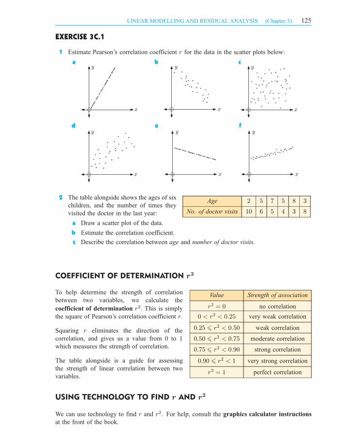
EXERCISE 3C.1
1 Estimate Pearson’s correlation coefficient r for the data in the scatter plots below:
a b c
d e f
Age 2 5 7 5 8 3
No. of doctor visits 10 6 5 4 3 8
2 The table alongside shows the ages of six
children, and the number of times they
visited the doctor in the last year:
a Draw a scatter plot of the data.
b Estimate the correlation coefficient.
c Describe the correlation between age and number of doctor visits.
COEFFICIENT OF DETERMINATION r2
Value Strength of association
r2 = 0 no correlation
0 < r2 < 0:25 very weak correlation
0:25 6 r2 < 0:50 weak correlation
0:50 6 r2 < 0:75 moderate correlation
0:75 6 r2 < 0:90 strong correlation
0:90 6 r2 < 1 very strong correlation
r2 = 1 perfect correlation
To help determine the strength of correlation
between two variables, we calculate the
coefficient of determination r2. This is simply
the square of Pearson’s correlation coefficient r.
Squaring r eliminates the direction of the
correlation, and gives us a value from 0 to 1which measures the strength of correlation.
The table alongside is a guide for assessing
the strength of linear correlation between two
variables.
USING TECHNOLOGY TO FIND r AND r2
We can use technology to find r and r2. For help, consult the graphics calculator instructions
at the front of the book.
y
x
y
x
y
x
y
x
y
x
y
x
125LINEAR MODELLING AND RESIDUAL ANALYSIS (Chapter 3)
SA_12MET-2magentacyan yellow black
0 05 5
25
25
75
75
50
50
95
95
100
100 0 05 5
25
25
75
75
50
50
95
95
100
100
Y:\HAESE\SA_12MET-2nd\SA_12MET2_03\125SA12MET2_03.CDR Wednesday, 15 September 2010 10:32:29 AM PETER
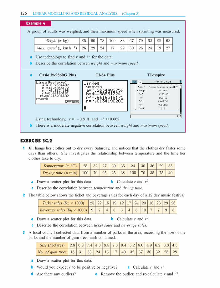
A group of adults was weighed, and their maximum speed when sprinting was measured:
Weight (x kg) 85 60 78 100 83 67 79 62 88 68
Max. speed (y km h¡1) 26 29 24 17 22 30 25 24 19 27
a Use technology to find r and r2 for the data.
b Describe the correlation betwen weight and maximum speed.
a
Using technology, r ¼ ¡0:813 and r2 ¼ 0:662.
b There is a moderate negative correlation between weight and maximum speed.
EXERCISE 3C.2
1 Jill hangs her clothes out to dry every Saturday, and notices that the clothes dry faster some
days than others. She investigates the relationship between temperature and the time her
clothes take to dry:
Temperature (x oC) 25 32 27 39 35 24 30 36 29 35
Drying time (y min) 100 70 95 25 38 105 70 35 75 40
a Draw a scatter plot for this data. b Calculate r and r2.
c Describe the correlation between temperature and drying time.
2 The table below shows the ticket and beverage sales for each day of a 12 day music festival:
Ticket sales ($x£ 1000) 25 22 15 19 12 17 24 20 18 23 29 26
Beverage sales ($y £ 1000) 9 7 4 8 3 4 8 10 7 7 9 8
a Draw a scatter plot for this data. b Calculate r and r2.
c Describe the correlation between ticket sales and beverage sales.
3 A local council collected data from a number of parks in the area, recording the size of the
parks and the number of gum trees each contained:
a Draw a scatter plot for this data.
b Would you expect r to be positive or negative? c Calculate r and r2.
d Are there any outliers? e Remove the outlier, and re-calculate r and r2.
Example 4
Casio fx-9860G Plus TI-84 Plus TI- spiren
126 LINEAR MODELLING AND RESIDUAL ANALYSIS (Chapter 3)
Size (hectares) 2:8 6:9 7:4 4:3 8:5 2:3 9:4 5:2 8:0 4:9 6:2 3:3 4:5
No. of gum trees 18 31 33 24 13 17 40 32 37 30 32 25 28
SA_12MET-2magentacyan yellow black
0 05 5
25
25
75
75
50
50
95
95
100
100 0 05 5
25
25
75
75
50
50
95
95
100
100
Y:\HAESE\SA_12MET-2nd\SA_12MET2_03\126SA12MET2_03.CDR Wednesday, 15 September 2010 12:11:09 PM PETER

² the line of best fit ‘by eye’
² the ‘least squares’ regression line.
LINE OF BEST FIT ‘BY EYE’
a draw the scatter plot, and draw a line of best fit through the data
b find the equation of the line you have drawn.
a
b The line of best fit above passes through (100, 22) and (200, 26).
So, the line has slope m =26¡ 22
200¡ 100= 0:04 and equation
y ¡ 22
x¡ 100= 0:04
) y ¡ 22 = 0:04x¡ 4
) y = 0:04x+ 18
or in this case L = 0:04w + 18
LINE OF BEST FITD
Example 5
15
20
25
30
0 50 100 150 200 250
length (cm)
mass (g)
Consider again the scatter plot of the spring data. Since the data is approximately linear, it is
reasonable to draw a through the data.line of best fit
This line can be used to predict the
value of one variable given the value
of the other.
There are several ways to fit a straight
line to a data set. We will examine two
of them:
15
20
25
30
0 50 100 150 200 250
length (cm)
mass (g)
Given a scatter plot for a data set, we can draw a line of best fit ‘by eye’, which should have
about the same number of points above as below it. Its direction should follow the general trend
of the data.
To find the equation of this line, we first select two points which lie on the line. We then find the
equation of the line passing through these points using the techniques revised in Section A.
127LINEAR MODELLING AND RESIDUAL ANALYSIS (Chapter 3)
For the spring data on page :121
SA_12MET-2magentacyan yellow black
0 05 5
25
25
75
75
50
50
95
95
100
100 0 05 5
25
25
75
75
50
50
95
95
100
100
Y:\HAESE\SA_12MET-2nd\SA_12MET2_03\127SA12MET2_03.CDR Wednesday, 15 September 2010 12:16:01 PM PETER

EXERCISE 3D.1
1 For the following data sets:
i draw the scatter plot
ii draw a line of best fit through the data
iii find the equation of the line you have drawn.
a x 11 7 16 4 8 10 17 5 12 2 8 13 9 18 5 12
y 16 12 32 5 7 19 30 14 19 6 17 24 15 34 6 26
b x 13 18 7 1 12 6 15 4 17 3 10 5
y 10 6 17 18 13 14 6 15 5 14 10 13
2 Over 10 days the maximum temperature and number of car break-ins was recorded for a city:
Max. temperature (x oC) 22 17 14 18 24 29 33 32 26 22
No. of car break-ins (y) 30 18 9 20 31 38 47 40 29 25
a Draw a scatter plot for the data.
b Describe the correlation between temperature and number of break-ins.
c Draw a line of best fit through the data.
d Find the equation of the line of best fit.
e Use your equation to estimate the number of car break-ins you would expect to occur
on a 25oC day.
THE LEAST SQUARES REGRESSION LINE
The problem with finding the line of best fit by eye is that the line drawn will vary from one
person to the next.
Instead, mathematicians use a method known as linear regression to find the equation of the line
which best fits the data.
Consider the set of points alongside.
For any line we draw to model the points, we can
find the vertical distances d1, d2, d3, .... between
each point and the line.
We can then square the distances and find their sum
d 2
1+ d 2
2+ d 2
3+ :::: : If all the points are close to
the line, this value will be small.
The least squares regression line is the line which
minimises this value.
This demonstration allows you to experiment with various data sets. Use trial and
error to find the least squares line of best fit for each set.
y
x
d1
d2 d3
d4
DEMO
128 LINEAR MODELLING AND RESIDUAL ANALYSIS (Chapter 3)
SA_12MET-2magentacyan yellow black
0 05 5
25
25
75
75
50
50
95
95
100
100 0 05 5
25
25
75
75
50
50
95
95
100
100
Y:\HAESE\SA_12MET-2nd\SA_12MET2_03\128SA12MET2_03.CDR Wednesday, 15 September 2010 12:11:41 PM PETER

In practice, rather than finding this line by experimentation, we use the following formula:
The least squares line has equation y = mx+ c where m =
Pxy ¡ nxy
(P
x2)¡ nx2
and c = y ¡mx
USING TECHNOLOGY TO FIND THE LINE OF BEST FIT
Instead of using the above formula, we can use technology to find the least squares line of best
fit. For help, consult the graphics calculator instructions at the start of the book.
Use technology to find the least squares line of best fit for the spring data.
INTERPOLATION AND EXTRAPOLATION
We use least squares regression to obtain
a line of best fit. We can use the line of
best fit to estimate values of one variable
given a value for the other.
If we use values of x in between the poles,
we say we are interpolating between the
poles.
If we use values of x outside the poles,
we say we are extrapolating outside the
poles.
Example 6
STATISTICS
PACKAGE
lowerpole
upper pole
line ofbest fit
y
x
interpolationextrapolation extrapolation
Casio fx-9860G Plus TI-84 Plus TI- spiren
So, the least squares line of best fit is
y ¼ 0:0402x+ 18:1,
or L ¼ 0:0402w + 18:1.
Compare this equation
with the one we obtained
when we found the line of
best fit by eye.
Suppose we have gathered data to investigate the association between
two variables. We obtain the scatter diagram shown below. The data
values with the lowest and highest values of are called the .x poles
129LINEAR MODELLING AND RESIDUAL ANALYSIS (Chapter 3)
SA_12MET-2magentacyan yellow black
0 05 5
25
25
75
75
50
50
95
95
100
100 0 05 5
25
25
75
75
50
50
95
95
100
100
Y:\HAESE\SA_12MET-2nd\SA_12MET2_03\129SA12MET2_03.CDR Wednesday, 15 September 2010 10:32:47 AM PETER
The accuracy of an interpolation depends on how linear the original data was. This can be gauged
by determining the correlation coefficient and ensuring that the data is randomly scattered around
the line of best fit.
The accuracy of an extrapolation depends not only on how linear the original data was, but also on
the assumption that the linear trend will continue past the poles. The validity of this assumption
depends greatly on the situation under investigation.
As a general rule, it is reasonable to interpolate between the poles, but unreliable to extrapolate
outside them.
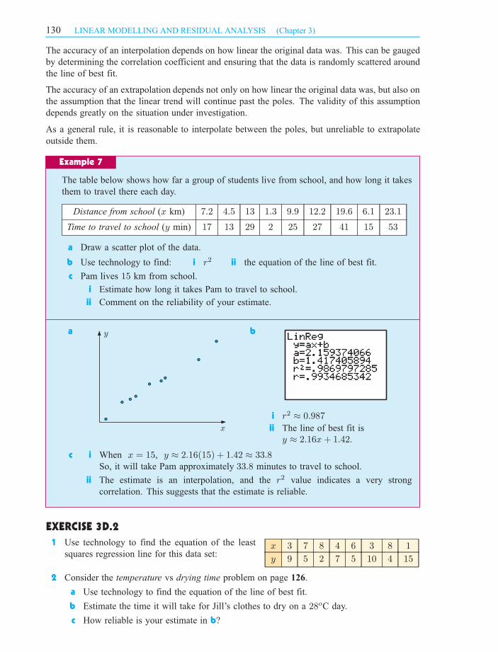
The table below shows how far a group of students live from school, and how long it takes
them to travel there each day.
Distance from school (x km) 7:2 4:5 13 1:3 9:9 12:2 19:6 6:1 23:1
Time to travel to school (y min) 17 13 29 2 25 27 41 15 53
a Draw a scatter plot of the data.
b Use technology to find: i r2 ii the equation of the line of best fit.
c Pam lives 15 km from school.
i Estimate how long it takes Pam to travel to school.
ii Comment on the reliability of your estimate.
a b
i r2 ¼ 0:987
ii The line of best fit is
y ¼ 2:16x+ 1:42.
c i When x = 15, y ¼ 2:16(15) + 1:42 ¼ 33:8So, it will take Pam approximately 33:8 minutes to travel to school.
ii The estimate is an interpolation, and the r2 value indicates a very strong
correlation. This suggests that the estimate is reliable.
EXERCISE 3D.2
x 3 7 8 4 6 3 8 1
y 9 5 2 7 5 10 4 15
1 Use technology to find the equation of the least
squares regression line for this data set:
2 Consider the temperature vs drying time problem on
a Use technology to find the equation of the line of best fit.
b Estimate the time it will take for Jill’s clothes to dry on a 28oC day.
c How reliable is your estimate in b?
Example 7
y
x
130 LINEAR MODELLING AND RESIDUAL ANALYSIS (Chapter 3)
page .126
SA_12MET-2magentacyan yellow black
0 05 5
25
25
75
75
50
50
95
95
100
100 0 05 5
25
25
75
75
50
50
95
95
100
100
Y:\HAESE\SA_12MET-2nd\SA_12MET2_03\130SA12MET2_03.CDR Wednesday, 15 September 2010 12:12:06 PM PETER

3 Consider the ticket sales vs beverage sales problem on
a Find the equation of the line of best fit.
b The music festival is extended by one day, and $35 000 worth of tickets are sold.
i Predict the beverage sales for this day.
ii Comment on the reliability of your prediction.
4 The table below shows the amount of time a collection of families spend preparing homemade
meals each week, and the amount of money they spend each week on fast food.
Time on homemade meals (x hours) 3:3 6:0 4:0 8:5 7:2 2:5 9:1 6:9 3:8 7:7
Money on fast food ($y) 85 0 60 0 27 100 15 40 59 29
a Draw a scatter plot of the data.
b Use technology to find the line of best fit.
c State the values of r and r2.
d Interpret the slope and y-intercept of the line of best fit.
e Another family spends 5 hours per week preparing homemade meals. Estimate how
much money they spend on fast food each week. Comment on the reliability of your
estimate.
5 The ages and heights of children at a playground are given below:
Age (x years) 3 9 7 4 4 12 8 6 5 10 13
Height (y cm) 94 132 123 102 109 150 127 110 115 145 157
a Draw a scatter plot of the data.
b Use technology to find the line of best fit.
c At what age would you expect children to reach a
height of 140 cm?
d Interpret the slope of the line of best fit.
e Use the line to predict the height of a 20 year old.
Do you think this prediction is reliable?
6 Once a balloon has been blown up, it slowly starts to deflate. A balloon’s diameter was
recorded at various times after it was blown up:
Time (t hours) 0 10 25 40 55 70 90 100 110
Diameter (D cm) 40:2 37:8 34:5 30:2 26:1 23:9 19:8 17:2 14:0
a Draw a scatter plot of the data.
b Describe the correlation between D and t.
c Find the equation of the least squares regression line.
d Use this equation to predict:
i the diameter of the balloon after 80 hours
ii the time it took for the balloon to completely
deflate.
e Which of your predictions in d is more likely to be
reliable?
131LINEAR MODELLING AND RESIDUAL ANALYSIS (Chapter 3)
page .126
SA_12MET-2magentacyan yellow black
0 05 5
25
25
75
75
50
50
95
95
100
100 0 05 5
25
25
75
75
50
50
95
95
100
100
Y:\HAESE\SA_12MET-2nd\SA_12MET2_03\131SA12MET2_03.CDR Wednesday, 15 September 2010 12:12:23 PM PETER
7 Each year in AFL football, the Brownlow medal is awarded to the ‘Fairest and Best’ player
in the competition.
Scott has a theory that he can predict the winner from the average number of disposals (kicks
and handballs) per game. He wants to test his theory on the results for the top 20 vote-getters
for the 2009 season.
a Construct a scatter plot for the data in the table above, using disposals per game as the
independent variable.
b Describe the correlation between disposals per game and Brownlow votes.
c Find Pearson’s correlation coefficient for the data.
d Find the equation of the least squares line of best fit.
e Use the line in d to predict the Brownlow votes for a player who averaged 25 disposals
per game.
f There are four players in the top 20 who averaged 25 disposals per game. Identify these
players and their actual Brownlow votes.
g How reliable is the variable disposals per game as a predictor of Brownlow votes?
Given a set of data, we have seen how we can draw a
scatter plot, then find the line of best fit to model it.
However, it is not always appropriate to model data
using a straight line. For example, the data alongside
exhibits strong positive correlation. However, it is
clearly not linear.
The values of r and r2 can be used to determine how
well the linear model fits the data. However, to further
assess the appropriateness of the linear model, we need
to analyse the residuals.
RESIDUAL ANALYSISE
Player A B C D E F G H I J
Disposals per game, x 34 27 28 25 16 28 21 27 27 25
Brownlow votes, y 30 22 20 19 19 17 17 16 15 15
Player K L M N O P Q R S T
Disposals per game, x 17 27 29 26 25 27 30 28 28 25
Brownlow votes, y 15 14 14 13 13 13 13 13 13 12
y
x
y
x
132 LINEAR MODELLING AND RESIDUAL ANALYSIS (Chapter 3)
SA_12MET-2magentacyan yellow black
0 05 5
25
25
75
75
50
50
95
95
100
100 0 05 5
25
25
75
75
50
50
95
95
100
100
Y:\HAESE\SA_12MET-2nd\SA_12MET2_03\132SA12MET2_03.CDR Wednesday, 15 September 2010 10:32:59 AM PETER

RESIDUALS
For each data point, the residual is given by
yobs ¡ ypred
where yobs is the observed y-value of the data point,
and ypred is the y-value predicted by the line of best
fit for the x-value of the data point.
A positive residual indicates that the data point is above
the line of best fit.
A negative residual indicates that the data point is below
the line of best fit.
We can then plot the residuals against the x-values to
form a residual plot. The residual plot shows how the
points vary about the line of best fit.
Here is the residual plot for the data points above:
Consider the data set: x 3 4 6 9 11
y 7 4 10 11 20
a Find the equation of the line of best fit.
b Calculate the residuals. c Draw the residual plot.
a Using technology, the line of best fit is
y ¼ 1:61x¡ 0:230 .
b We find ypred for each data point by
evaluating y = 1:61x ¡ 0:230 for each of
the x-values.
x yobs ypred residual = yobs ¡ ypred
3 7 4:60 2:40
4 4 6:21 ¡2:21
6 10 9:43 0:57
9 11 14:27 ¡3:27
11 20 17:49 2:51
c
Example 8
y
x
-4
-2
2
4residual
x
x
y
x
yobs
ypred
positiveresidual
negativeresidual
residual
133LINEAR MODELLING AND RESIDUAL ANALYSIS (Chapter 3)
SA_12MET-2magentacyan yellow black
0 05 5
25
25
75
75
50
50
95
95
100
100 0 05 5
25
25
75
75
50
50
95
95
100
100
Y:\HAESE\SA_12MET-2nd\SA_12MET2_03\133SA12MET2_03.cdr Wednesday, 15 September 2010 12:40:01 PM PETER

EXERCISE 3E.1
1 Match the following scatter plots with the correct residual plot:
a b c
2 A least squares regression line is shown on the
scatter plot alongside.
Which one of the following would be the
residual plot for the regression line?
3 For the following data sets:
i draw the scatter plot ii find the line of best fit
iii calculate the residuals iv draw the residual plot.
ax 2 5 7 10
y 3 9 13 16
bx 3 7 8 11 15
y 8 10 12 13 17
cx 1 9 6 15 4 12
y 18 14 12 2 10 6
AA BB CC
AA BB
CC DD
residual
x
residual
x
residual
x
y
x
y
x
y
x
y
x
20
15
10
5
1 2 3 4 5
5 10 15 20
x
1
0.5
0
-0.5
-1
residual
-2
-4
1 2 3 4 5
4
2
0x
residual
1 2 3 4 5
15
10
5
residual
x
residual
x
1 2 3 4 5
3210
-1-2
134 LINEAR MODELLING AND RESIDUAL ANALYSIS (Chapter 3)
SA_12MET-2magentacyan yellow black
0 05 5
25
25
75
75
50
50
95
95
100
100 0 05 5
25
25
75
75
50
50
95
95
100
100
Y:\HAESE\SA_12MET-2nd\SA_12MET2_03\134SA12MET2_03.CDR Wednesday, 15 September 2010 12:13:01 PM PETER

ANALYSING RESIDUAL PLOTS
We can use residual plots to determine whether it is appropriate to fit a linear model to a data set.
Consider the set of data points alongside, which appear
linear. The line of best fit is also shown.
Here is the residual plot for these data points. Notice
that the points are randomly scattered about the x-axis,
with no obvious pattern. This indicates that the data
varies randomly about the line of best fit, and so the
linear model is appropriate for the data.
Now consider this second set of points, which do not
appear to be linear. Again, the line of best fit is given.
residual
x
y
x
y
x
4
5 The equation of the least squares
regression line applied to the data
graphed alongside is
Diastolic blood pressure
= 68:5 + 0:2£ weight.
a Draw the least squares
regression line on the graph.
b Estimate the residual for the following points from the graph, then check the value using
the equation.
i (82, 87:5) ii (103:3, 81:4)
c Sketch the residual plot for this regression line.
60 70 80 90 100 110
100
95
90
85
80
75
70weight (kg)
diastolic blood pressure (mm Hg)
PRINTABLE
GRAPH
Check your residual plots from 3 using technology. For help, consult the graphics calculator
instructions at the front of the book.
135LINEAR MODELLING AND RESIDUAL ANALYSIS (Chapter 3)
SA_12MET-2magentacyan yellow black
0 05 5
25
25
75
75
50
50
95
95
100
100 0 05 5
25
25
75
75
50
50
95
95
100
100
Y:\HAESE\SA_12MET-2nd\SA_12MET2_03\135SA12MET2_03.CDR Wednesday, 15 September 2010 10:33:09 AM PETER
On the residual plot for these data points, we see the
points are not random, but show a clear pattern. This
indicates that the linear model is not appropriate for the
data.
In general, a residual plot with points randomly scattered about the x-axis indicates the linear
model is appropriate for the data. A residual plot which exhibits a clear pattern indicates the
linear model is not appropriate for the data.
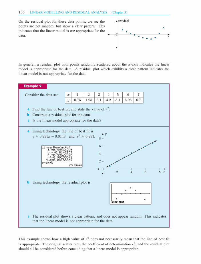
Consider the data set: x 1 2 3 4 5 6 7
y 0:75 1:95 3:1 4:2 5:1 5:95 6:7
a Find the line of best fit, and state the value of r2.
b Construct a residual plot for the data.
c Is the linear model appropriate for the data?
a Using technology, the line of best fit is
y ¼ 0:995x¡ 0:0143, and r2 ¼ 0:993.
b Using technology, the residual plot is:
c The residual plot shows a clear pattern, and does not appear random. This indicates
that the linear model is not appropriate for the data.
This example shows how a high value of r2 does not necessarily mean that the line of best fit
is appropriate. The original scatter plot, the coefficient of determination r2, and the residual plot
should all be considered before concluding that a linear model is appropriate.
Example 9
2
4
6
8
2 4 6 8
y
x
residual
x
136 LINEAR MODELLING AND RESIDUAL ANALYSIS (Chapter 3)
SA_12MET-2magentacyan yellow black
0 05 5
25
25
75
75
50
50
95
95
100
100 0 05 5
25
25
75
75
50
50
95
95
100
100
Y:\HAESE\SA_12MET-2nd\SA_12MET2_03\136SA12MET2_03.CDR Wednesday, 15 September 2010 10:33:12 AM PETER

EXERCISE 3E.2
1 Which one of the following residual plots shows a regression line that is not a good fit for
the data? Explain your answer.
A B
C D
2 For each of the following data sets:
i draw the scatter plot
ii use technology to find the line of best fit, and state the value of r2
iii use technology to construct the residual plot
iv determine whether the line of best fit is appropriate to model the data.
3
a Draw a scatter plot of the data.
b Use technology to find the line of best fit, and state the value of r2.
c Draw the line of best fit on your scatter diagram.
d Use technology to construct the residual plot.
e Is the line of best fit appropriate to model the data?
a x 1 2 3 4 5 6 7 8 9
y 33 29 25 24 20 18 13 9 8
b x 2:2 3:7 9:5 6:2 1:4 3:9 7:5 8 5:5
y 3:6 7:1 22:5 13:3 1:9 7:6 16:8 18:2 11:5
c x 5 9 1 12 6 5 9 7 2 10
y 13 1 6 14 2 9 10 8 4 11
Time taken (t min) 6 8:5 4 5 8 7:5 10 7
Cranes made (C) 10 7 15 12 7 8 6 8
residual
5
-5
x
1 2 3 4 5
10
5
-5
-10
1 2 3 4 5
residual
x
residual
21
-1-2-3
10 20 30 40
x
residual
5x
10 20 30 40
-5
137LINEAR MODELLING AND RESIDUAL ANALYSIS (Chapter 3)
In a 60 minute Art lesson, students had to make as
many paper cranes as possible. The table shows
how long it took each student to make a paper
crane, and how many cranes they made during the
lesson:
SA_12MET-2magentacyan yellow black
0 05 5
25
25
75
75
50
50
95
95
100
100 0 05 5
25
25
75
75
50
50
95
95
100
100
Y:\HAESE\SA_12MET-2nd\SA_12MET2_03\137SA12MET2_03.CDR Wednesday, 15 September 2010 12:14:02 PM PETER

REVIEW SET 3
4 Ten people were asked how many text messages they had sent and received in the last week:
a Draw a scatter plot for the data.
b Find the line of best fit, and state the value of r2.
c Describe the correlation between text messages sent and text messages received.
d Construct the residual plot.
e Is the line of best fit appropriate to model the data?
f Ted received 10 text messages in the last week.
i Estimate the number of text messages he sent.
ii How reliable is this estimate?
1 A storage bin for chicken food contains 1000 kg of food pellets.
Exactly 13 kg of food is removed each day for the chickens.
Days elapsed (t) 0 1 2 3 4
Pellets in bin (F kg) 1000 987
a Copy and complete
the following table:
b What is the dependent variable? What is the independent variable?
c If a graph was to be drawn, what axis should F be plotted on?
d Graph the relationship between F and t.
e What is the slope of the line through these points?
f Write down the function for F in terms of t.
g Interpret the slope and the vertical intercept of the function.
h Using the function from f, determine the amount of food left after a fortnight.
i Determine when the food supply will run out.
2 Temperatures can be expressed in a variety of units. Consider the following table,
which shows the relationship between the temperature Tc in degrees Celsius, and
the temperature TF in degrees Fahrenheit:
Temperature (TCoC) 10 20 30 40
Temperature (TFoF) 50 68 86 104
a Show that the relationship between TF and TC is linear.
b Find the change in TF per unit increase in TC .
c Write down the function for TF in terms of TC .
d Convert 100 oC to oF. e Convert 32 oF to oC.
3 Thomas rode for an hour each day for eleven days and recorded the number of kilometres
travelled against the temperature that day.
Temp. (T oC) 32:9 33:9 35:2 37:1 38:9 30:3 32:5 31:7 35:7 36:3 34:7
Distance (d km) 26:5 26:7 24:4 19:8 18:5 32:6 28:7 29:4 23:8 21:2 29:7
18 3 7 22 15 5 20 30 7 25
22 2 9 21 16 9 23 33 7 24
138 LINEAR MODELLING AND RESIDUAL ANALYSIS (Chapter 3)
Text messages sent (x)
Text messages received (y)
SA_12MET-2magentacyan yellow black
0 05 5
25
25
75
75
50
50
95
95
100
100 0 05 5
25
25
75
75
50
50
95
95
100
100
Y:\HAESE\SA_12MET-2nd\SA_12MET2_03\138SA12MET2_03.CDR Wednesday, 15 September 2010 12:14:50 PM PETER

a Draw a scatter plot for this data.
b Describe the association between the distance travelled and temperature.
c Determine the equation of the line of best fit.
d Interpret the slope and vertical intercept of this line.
e Determine the values of r and r2.
f Use your equation to predict how hot it must get before Thomas does not ride at
all. Comment on the reasonableness of this prediction.
4 Eight identical garden beds were watered a varying number of times each week, and the
number of flowers each bed produced is recorded in the table below:
Number of waterings (n) 0 1 2 3 4 5 6 7
Flowers produced (f ) 18 52 86 123 158 191 228 250
a Draw a scatter plot for this data.
b Describe the association between the number of waterings and the flowers produced.
c Find the equation of the least squares regression line, and state the values of r
and r2.
d Interpret the slope and vertical intercept of this line.
e Violet has two flower beds. She waters one five times a fortnight, and the other ten
times a week.
i How many flowers can she expect from each bed?
ii Which is the more reliable estimate?
5 After an outbreak of the flu at a school, medical authorities begin recording the number
of people diagnosed with the flu.
Days after outbreak (n) 2 3 4 5 6 7 8 9 10 11
People diagnosed (d) 8 14 33 47 80 97 118 123 105 83
a Draw a scatter plot for this data.
b Determine: i the least squares regression line ii the values of r and r2.
c Construct a residual plot for the linear relationship between d and n.
d Is the line of best fit an appropriate model for the data? Explain your answer.
6 Two supervillains, Silent Predator and the Furry Reaper, terrorise Metropolis by abducting
fair maidens. Superman believes that they are collaborating, alternately abducting fair
maidens so as not to compete with each other for ransom money. He records their
abduction rate below, in dozens of maidens.
Silent Predator (s) 4 6 5 9 3 5 8 11 3 7 7 4
Furry Reaper (f) 13 10 11 8 11 9 6 6 12 7 10 8
a Draw a scatter plot for this data. Plot s on the horizontal axis.
b Determine: i the least squares regression line ii the values of r and r2.
c Construct a residual plot for the data.
d Is the line of best fit an appropriate model for the data? Explain your answer.
139LINEAR MODELLING AND RESIDUAL ANALYSIS (Chapter 3)
SA_12MET-2magentacyan yellow black
0 05 5
25
25
75
75
50
50
95
95
100
100 0 05 5
25
25
75
75
50
50
95
95
100
100
Y:\HAESE\SA_12MET-2nd\SA_12MET2_03\139SA12MET2_03.CDR Wednesday, 15 September 2010 10:33:24 AM PETER

140 LINEAR MODELLING AND RESIDUAL ANALYSIS (Chapter 3)
SA_12MET-2magentacyan yellow black
0 05 5
25
25
75
75
50
50
95
95
100
100 0 05 5
25
25
75
75
50
50
95
95
100
100
Y:\HAESE\SA_12MET-2nd\SA_12MET2_03\140SA12MET2_03.CDR Wednesday, 15 September 2010 10:33:27 AM PETER