1e control charts - ihi home pageapp.ihi.org/.../presentation_1e_-_control_charts.pdf · ·...
TRANSCRIPT
1E – Control Charts
Advanced Measurement for
Improvement Seminar
March 20-21, 2017

Two Types of Variation
Common Cause
Is inherent in the design of the
process
Reflects the “business as
usual” state of the process
Is due to regular, natural or
ordinary causes
Affects all the outcomes of a
process
Results in a “stable”
distribution that is predictable
Also known as random or
unassignable variation
Special Cause
Due to irregular or unnatural
causes that are not inherent in
the design of the process
Reflects a “different mode” of
the process
Affects some, but not
necessarily all aspects of the
process
Results in an “unstable”
process that is not predictable
Also known as non-random or
assignable variation
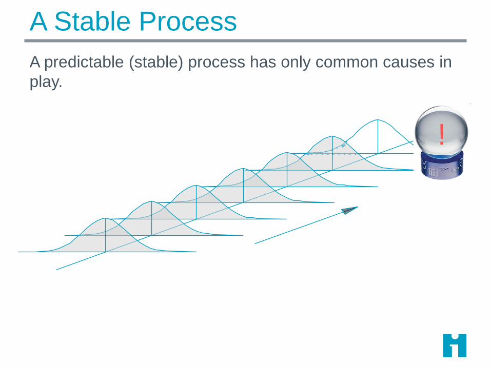
A Stable Process
A predictable (stable) process has only common causes in
play.
!
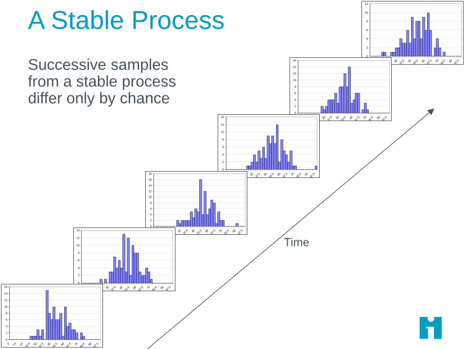
A Stable Process
© R. Scoville & IHI • 5
Successive samples from a stable process differ only by chance
0
2
4
6
8
10
12
07.
5 1522
.5 3037
.5 4552
.5 6067
.5 7582
.5 9097
.5
0
2
4
6
8
10
12
14
16
07.
5 1522
.5 3037
.5 4552
.5 6067
.5 7582
.5 9097
.5
0
2
4
6
8
10
12
14
07.
5 1522
.5 3037
.5 4552
.5 6067
.5 7582
.5 9097
.5
0
2
4
6
8
10
12
14
16
18
07.
5 1522
.5 3037
.5 4552
.5 6067
.5 7582
.5 9097
.5
0
2
4
6
8
10
12
14
07.
5 1522
.5 3037
.5 4552
.5 6067
.5 7582
.5 9097
.5
0
2
4
6
8
10
12
14
16
07.
5 1522
.5 3037
.5 4552
.5 6067
.5 7582
.5 9097
.5
Time

What Common Cause Variation Looks Like
Points equally likely above or below center line
No trends or shifts or other patterns
0
10
20
30
40
50
60
70
80
90
100
1/1/2
008
1/3/2
008
1/5/2
008
1/7/2
008
1/9/2
008
1/11/2
008
1/13/2
008
1/15/2
008
1/17/2
008
1/19/2
008
1/21/2
008
1/23/2
008
1/25/2
008
1/27/2
008
1/29/2
008
1/31/2
008
2/2/2
008
2/4/2
008
2/6/2
008
2/8/2
008
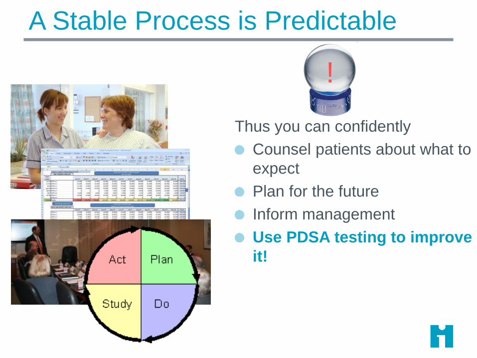
A Stable Process is Predictable
Thus you can confidently
Counsel patients about what to
expect
Plan for the future
Inform management
Use PDSA testing to improve
it!
!
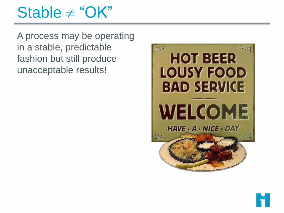
Stable “OK”
A process may be operating
in a stable, predictable
fashion but still produce
unacceptable results!
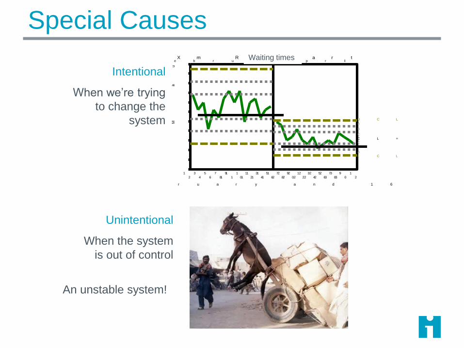
Special Causes
Unintentional
When the system
is out of control
F e b r u a r yA p r il
1
2
3
4
5
6
7
8
9
1 0
1 1
1 2
1 3
1 4
1 5
1 6
1 7
1 8
1 9
2 0
2 1
2 2
2 3
2 4
2 5
2 6
2 7
2 8
2 9
3 0
3 1
3 2
1 6 P a t ie n t s in F e b r u a r y a n d 1 6 P a t ie n t s in A p r il
Min
ut
es
2 . 5
5 . 0
7 . 5
1 0 . 0
1 2 . 5
1 5 . 0
1 7 . 5
2 0 . 0
2 2 . 5
2 5 . 0
2 7 . 5
3 0 . 0
A
B
C
C
B
A
U C L = 1 5 . 3
C L = 1 0 . 7
L C L = 6 . 1
X m R C h a r tWaiting times
Intentional
When we’re trying
to change the
system
An unstable system!
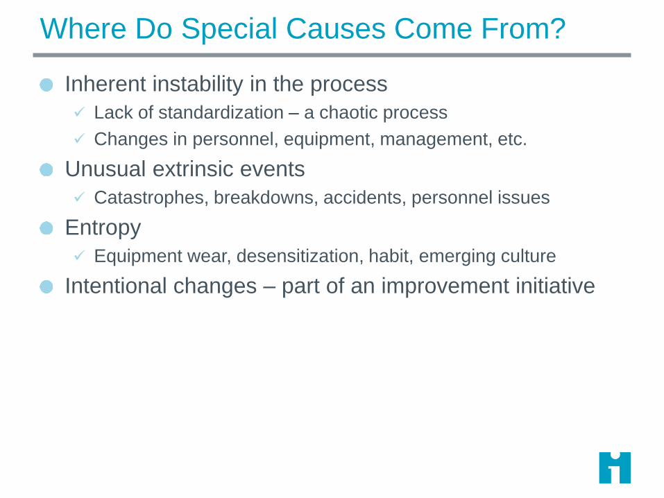
Where Do Special Causes Come From?
Inherent instability in the process
Lack of standardization – a chaotic process
Changes in personnel, equipment, management, etc.
Unusual extrinsic events
Catastrophes, breakdowns, accidents, personnel issues
Entropy
Equipment wear, desensitization, habit, emerging culture
Intentional changes – part of an improvement initiative

Unintended Special Causes
An unstable process is subject to special causes. These
represent fluctuations in underlying processes.
Process A(the one we think we’re measuring)
Process B
Process C
Time

Removing Special Causes
Standardize the process by
imposing a design & selectively
eliminating special causes.
Now your process changes can
have testable, repeatable impact.
Special causes present:CHAOS!
Special causes removed
!

Stabilize, Then Improve
Once the process is stable,
your changes can have a
predictable, repeatable impact.
HERDING
CATS MOVIE
HERE
If you can’t predict the
future behavior of the
process, you’re
improvements won’t stick!
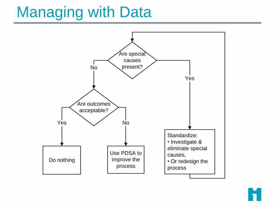
Managing with Data
Are special
causes
present?
Are outcomes
acceptable?
Do nothing
Use PDSA to
improve the
process
Standardize:
• Investigate &
eliminate special
causes,
• Or redesign the
process
No
Yes
Yes No
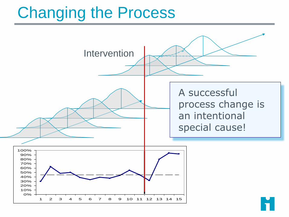
Changing the Process
Intervention
0%
10%
20%
30%
40%
50%
60%
70%
80%
90%
100%
1 2 3 4 5 6 7 8 9 10 11 12 13 14 15
A successful process change is an intentional special cause!
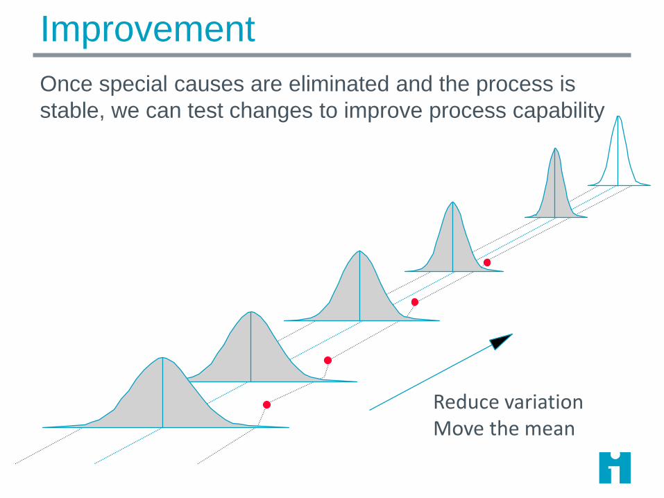
Improvement
Once special causes are eliminated and the process is
stable, we can test changes to improve process capability
Reduce variationMove the mean
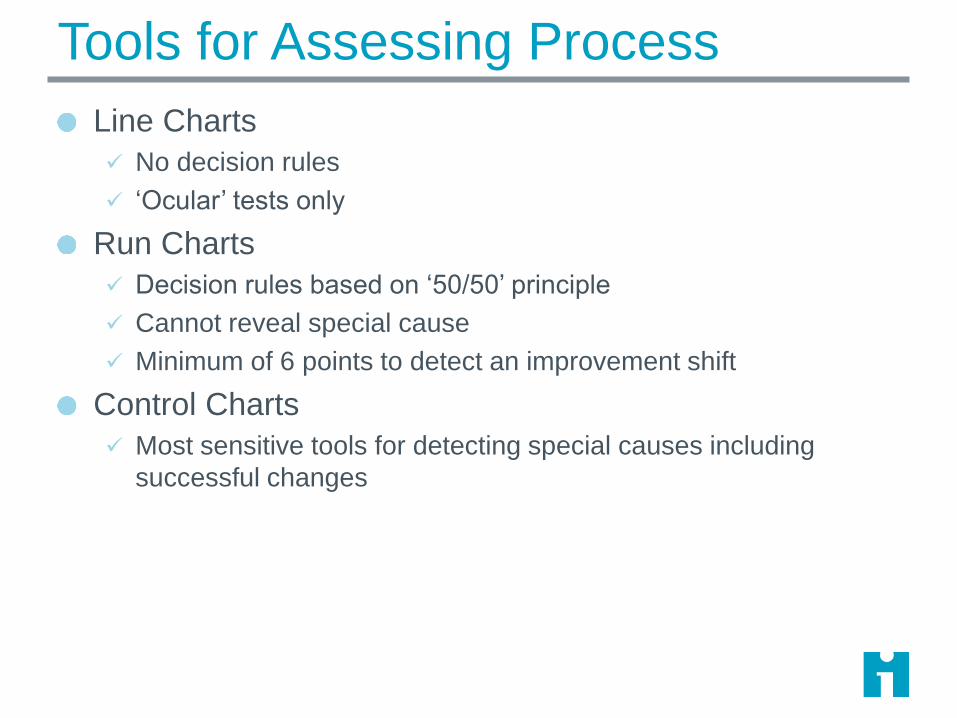
Tools for Assessing Process
Line Charts
No decision rules
‘Ocular’ tests only
Run Charts
Decision rules based on ‘50/50’ principle
Cannot reveal special cause
Minimum of 6 points to detect an improvement shift
Control Charts
Most sensitive tools for detecting special causes including
successful changes

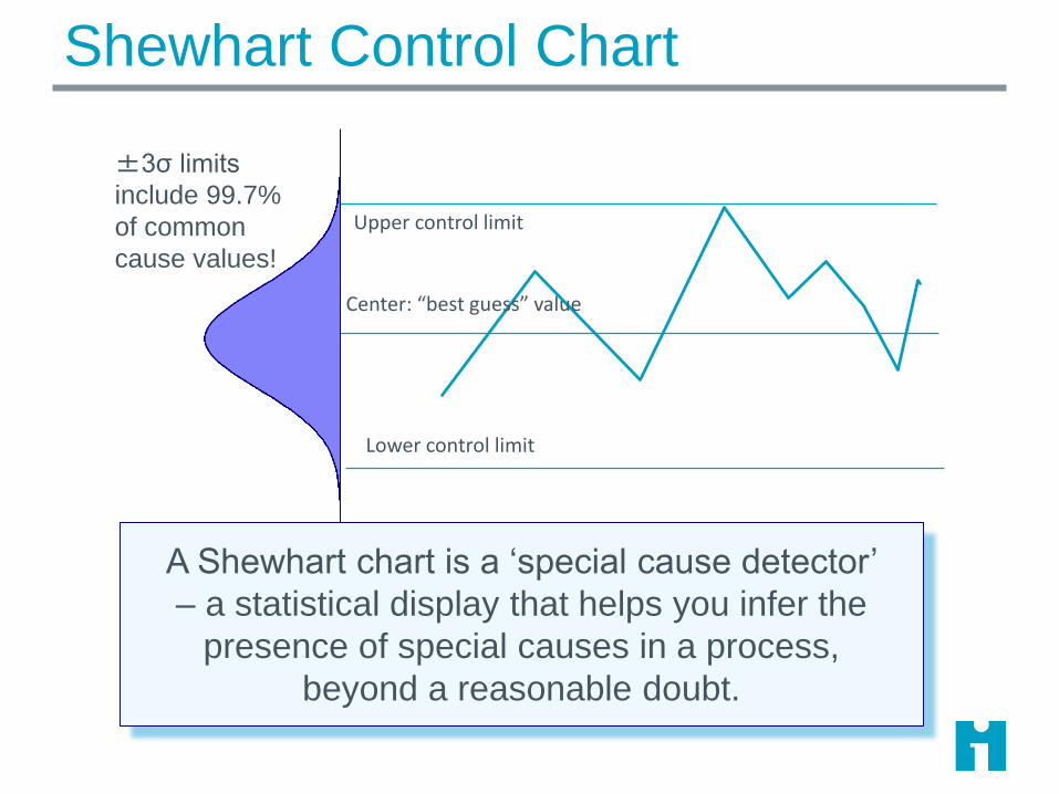
Shewhart Control Chart
0%
10%
20%
30%
40%
50%
60%
70%
80%
90%
100%
1 2 3 4 5 6 7 8 9 10 11 12 13 14 15 16 17 18 19 20 21 22 23 24 25 26 27 28
Week
Percent of Patients with Pressure Ulcers
3-sigma control
limitsMean
Subgroup

Normal Distribution (Xbar-S Charts)
95.46%
99.73%
68.26%
-3σ +3σ
-2σ +2σ
-1σ +1σ
Mean
For normally distributed data, +/- 3 sigma limits
include 99.7% of the common-cause values.

What’s a Subgroup?
A point on a Shewhart control chart
A set of observations taken from the process at a point in
time (area of opportunity)
Process should be stable inside the subgroup (maximize
variation between subgroups; minimize variation within
subgroups)
A subgroup is a ‘snapshot’ of the process at a particular
place and time

Subgroups
X X X
X XX
XX
Subgroup
Value
Subgroup
Value
Subgroup
Value
Observation
Area of
Opportunity X
Subgroup values combines 1
or more individual
observations:
• Count
• Percent
• Rate
• Average
• Single continuous value

Subgroup Example
Measure: time to process a new hospital admission
We suspect that admission staff on different shifts use
different procedures for processing patients.
We should choose a subgroup to minimize variation
within the subgroups
Subgroup = average time for 5 admissions randomly
selected within a shift on Unit X
What are possible subgroups for admission
process time?
Shewhart Control Chart
Upper control limit
Lower control limit
Center: “best guess” value
±3σ limits
include 99.7%
of common
cause values!
A Shewhart chart is a ‘special cause detector’
– a statistical display that helps you infer the
presence of special causes in a process,
beyond a reasonable doubt.

Special Cause
Upper control limit
Lower control limit
Center: “best guess” value
±3σ limits
include 99.7%
of common
cause values!
A single point outside the control limits is likely
NOT generated by a stable process, but by
some others set of causes.

A single point outside the control limits
Six consecutive points increasing (trend up) ordecreasing (trend down)
Two our of three consecutive points near a controllimit (outer one-third)
Eight or more consecutive points above or belowthe centerline
Fifteen consecutive points close to the centerline(inner one-third)
Rules for
Detecting
Special Cause

Tests for Special Cause
Outside of limits: A data point that falls outside the limits on the chart, either above the upper limit or below the lower limit.
Shift: Eight or more consecutive POINTS either all above or all below the mean. Skip values on the mean and continue counting points. Values on the mean DO NOT make or break a shift.
Trend: Six points all going up or all going down. If the value of two or more successive points is the same, ignore one of the points when counting; like values Do Not make or break a trend.
Two Out of Three: Two out of three consecutive points in the outer third of the chart. The two out of three consecutive points can be on the same side, or on either side of the center line.
15 points Hugging the Centerline: 15 consecutive points close to (within inner third of limits) centerline.
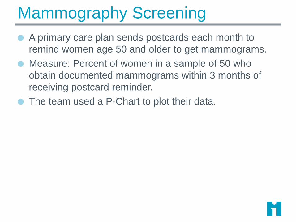
Mammography Screening
A primary care plan sends postcards each month to
remind women age 50 and older to get mammograms.
Measure: Percent of women in a sample of 50 who
obtain documented mammograms within 3 months of
receiving postcard reminder.
The team used a P-Chart to plot their data.
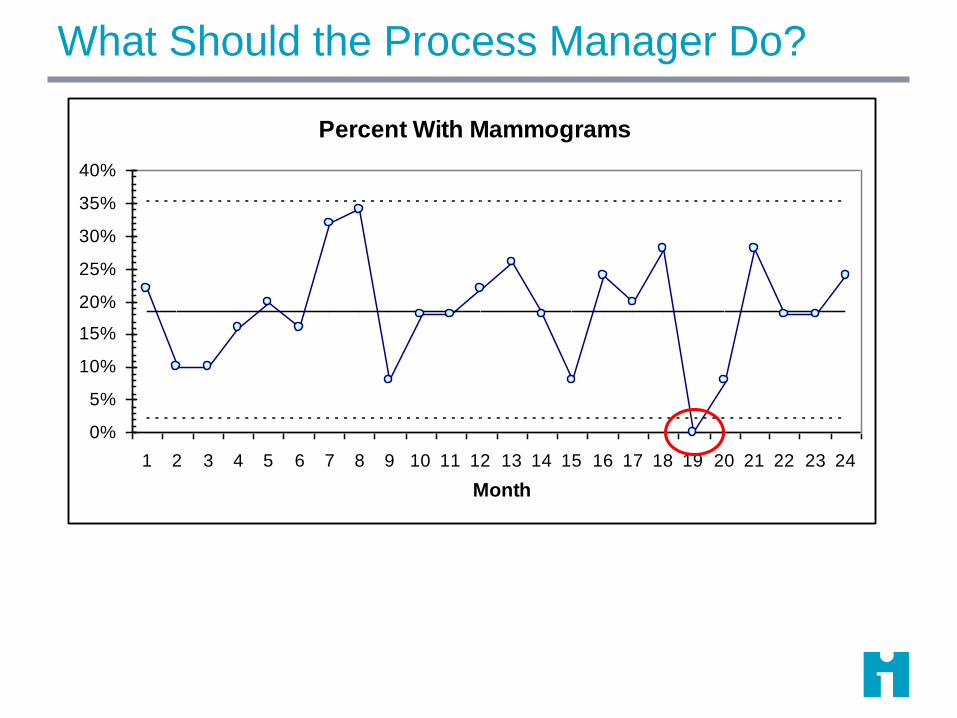
What Should the Process Manager Do?
Percent With Mammograms
0%
5%
10%
15%
20%
25%
30%
35%
40%
1 2 3 4 5 6 7 8 9 10 11 12 13 14 15 16 17 18 19 20 21 22 23 24
Month
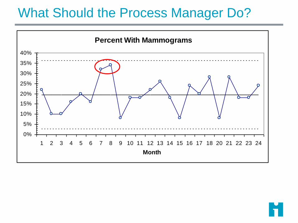
What Should the Process Manager Do?
Percent With Mammograms
0%
5%
10%
15%
20%
25%
30%
35%
40%
1 2 3 4 5 6 7 8 9 10 11 12 13 14 15 16 17 18 20 21 22 23 24
Month
Improvement Strategy: Special Cause Variation
When process exhibits unintended special cause, something
not typically part of the process design is affecting the
process:
Identify when and where the special cause occurred.
Learn from the special cause.
Take action based on the special cause – standardize.
Irrelevant special cause: remove from consideration
Undesirable special cause: remove it and make it difficult for it to
occur again.
Desirable special cause: make it a permanent part of the health
care process.
Adapted from Provost, L. P. and S. K. Murray (2011). The Health Care Data Guide: Learning from Data for Improvement. San Francisco, Josey-Bass.
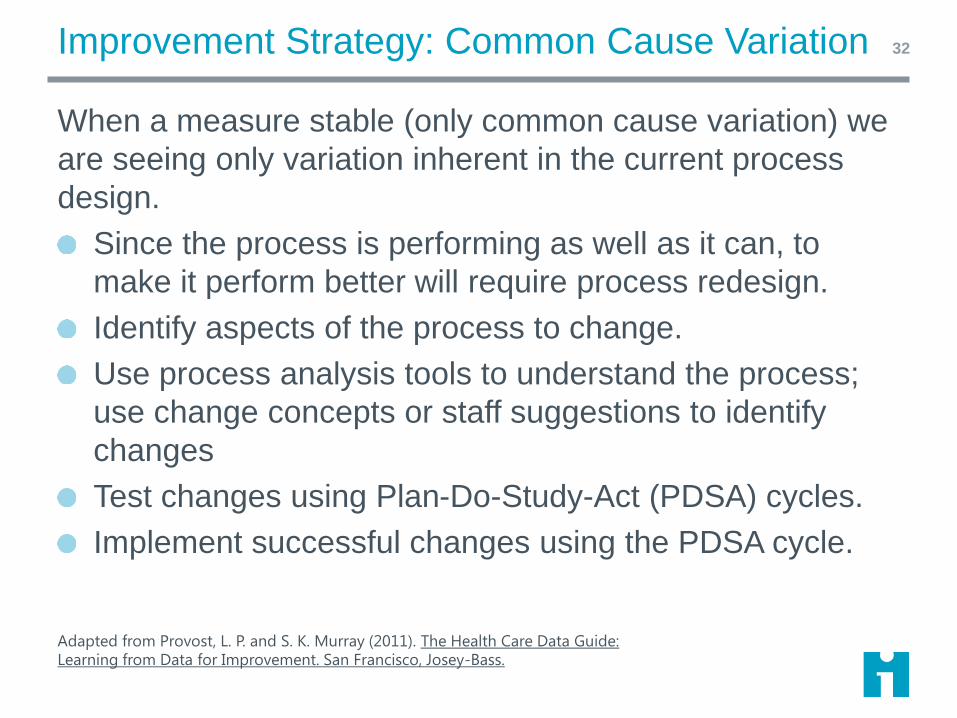
Improvement Strategy: Common Cause Variation
When a measure stable (only common cause variation) we
are seeing only variation inherent in the current process
design.
Since the process is performing as well as it can, to
make it perform better will require process redesign.
Identify aspects of the process to change.
Use process analysis tools to understand the process;
use change concepts or staff suggestions to identify
changes
Test changes using Plan-Do-Study-Act (PDSA) cycles.
Implement successful changes using the PDSA cycle.
HCDG Page 108
32
Adapted from Provost, L. P. and S. K. Murray (2011). The Health Care Data Guide: Learning from Data for Improvement. San Francisco, Josey-Bass.
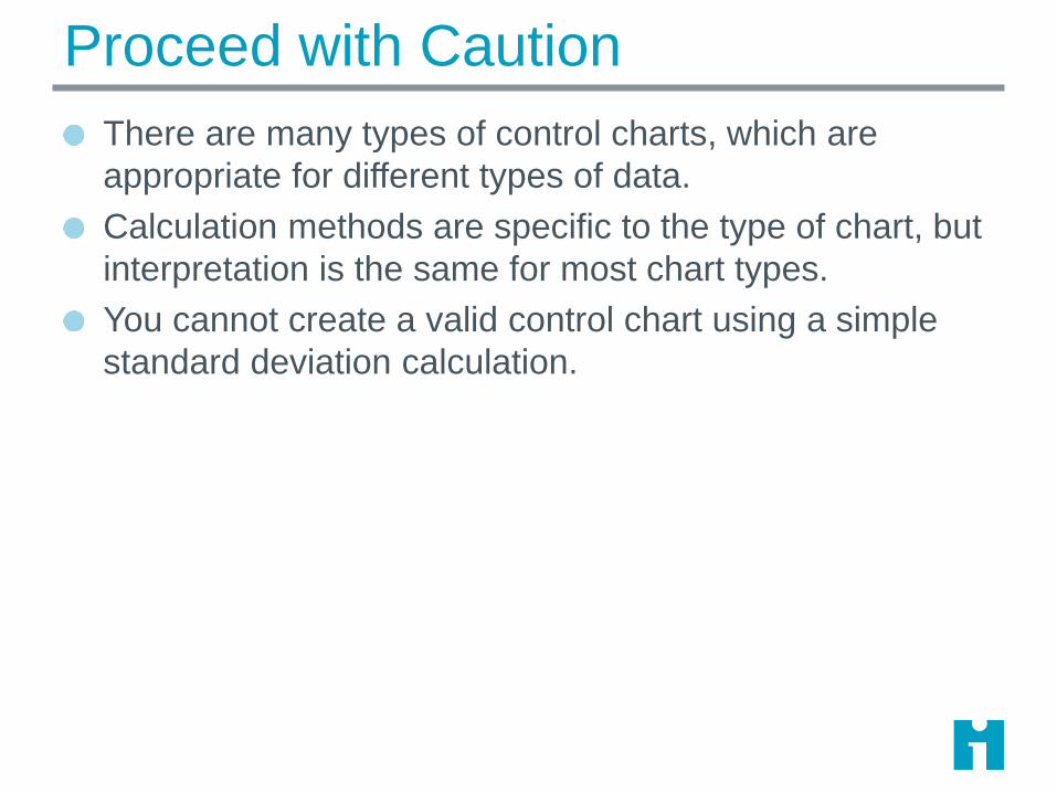
Proceed with Caution
There are many types of control charts, which are
appropriate for different types of data.
Calculation methods are specific to the type of chart, but
interpretation is the same for most chart types.
You cannot create a valid control chart using a simple
standard deviation calculation.

Geek Alert!ATTENTION!
The following material is intended
for geek audiences primarily.
To avoid disorientation,
statophobes and other normal
individuals should limit their
consumption of these details…

The X bar S Chart
For continuous data
Each dot on an 𝑋 chart is the average of multiple
measurement within the subgroup
A pair of charts: 𝑋 and S
𝑋 plots subgroup averages
S plots standard deviation within each subgroup
Subgroup size can be equal or unequal
Common cause variation is modeled by the normal
distribution

Xbar and S chart P36
Subgroup value is
average of
observations within
the subgroup
Limits depend on
variation within
subgroups
(that’s why they are
wavy)
S chart plots
subgroup standard
deviations

Xbar and S chart P37
Date
Setup
Case 1
Setup
Case 2
Setup
Case 3
Setup
Case 4
Setup
Case 5
Setup
Case 6 Count Average Std. Dev.
1/1/2016 20 30 36 21 33 5 28.0 7.2
1/2/2016 26 70 51 3 49.0 22.1
1/3/2016 25 11 22 3 19.3 7.4
1/4/2016 49 36 36 21 4 35.5 11.4
1/5/2016 53 23 25 3 33.7 16.8
1/6/2016 16 21 12 3 16.3 4.5
1/7/2016 36 60 44 27 51 17 6 39.2 15.8
1/8/2016 45 7 14 3 22.0 20.2
1/9/2016 8 32 12 3 17.3 12.9
1/10/2016 26 17 12 3 18.3 7.1
1/11/2016 18 14 56 22 26 29 6 27.5 15.0
1/12/2016 11 16 28 3 18.3 8.7
1/13/2016 10 27 33 19 4 22.3 10.0
1/14/2016 21 18 49 3 29.3 17.1
Average 26.9 12.6
• Xbar chart plots
subgroup
averages
• Center line is
average of
subgroup
averages
Xbar and S chart P38
Date
Setup
Case 1
Setup
Case 2
Setup
Case 3
Setup
Case 4
Setup
Case 5
Setup
Case 6 Count Average Std. Dev.
1/1/2016 20 30 36 21 33 5 28.0 7.2
1/2/2016 26 70 51 3 49.0 22.1
1/3/2016 25 11 22 3 19.3 7.4
1/4/2016 49 36 36 21 4 35.5 11.4
1/5/2016 53 23 25 3 33.7 16.8
1/6/2016 16 21 12 3 16.3 4.5
1/7/2016 36 60 44 27 51 17 6 39.2 15.8
1/8/2016 45 7 14 3 22.0 20.2
1/9/2016 8 32 12 3 17.3 12.9
1/10/2016 26 17 12 3 18.3 7.1
1/11/2016 18 14 56 22 26 29 6 27.5 15.0
1/12/2016 11 16 28 3 18.3 8.7
1/13/2016 10 27 33 19 4 22.3 10.0
1/14/2016 21 18 49 3 29.3 17.1
Average 26.9 12.6
• S chart plots
subgroup
standard
deviations
• Center line is
average of
subgroup
standard
deviations
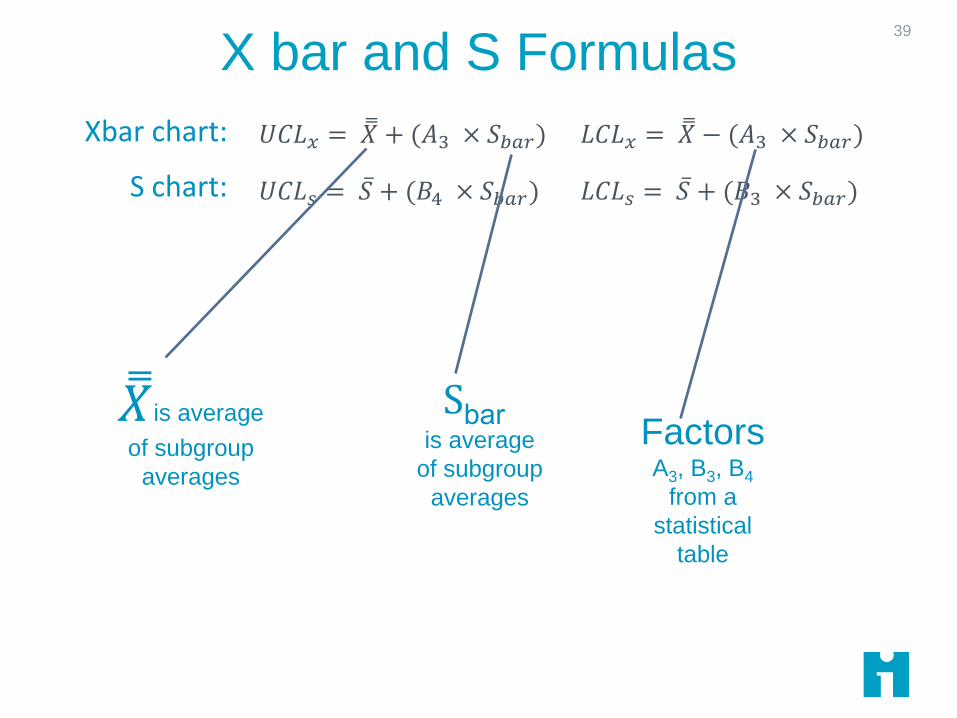
X bar and S Formulas
Pages 160 and appendix page 196
39
𝑈𝐶𝐿𝑥 = 𝑋 + (𝐴3 × 𝑆𝑏𝑎𝑟) 𝐿𝐶𝐿𝑥 = 𝑋 − (𝐴3 × 𝑆𝑏𝑎𝑟)
𝑈𝐶𝐿𝑠 = 𝑆 + (𝐵4 × 𝑆𝑏𝑎𝑟) 𝐿𝐶𝐿𝑠 = 𝑆 + (𝐵3 × 𝑆𝑏𝑎𝑟)
Xbar chart:
S chart:
𝑋is average
of subgroup
averages
Sbaris average
of subgroup
averages
Factors A3, B3, B4
from a
statistical
table
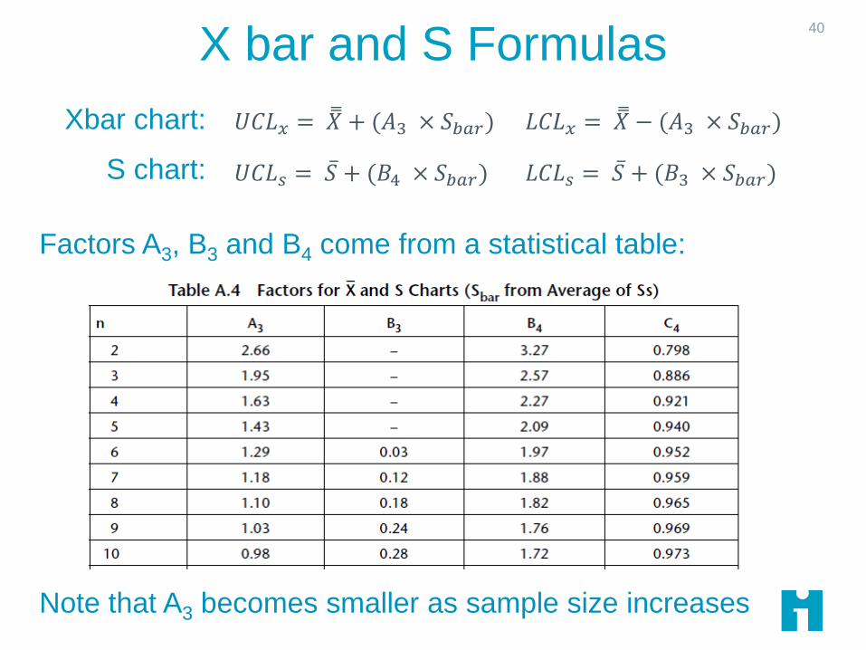
X bar and S Formulas
Pages 160 and appendix page 196
40
Factors A3, B3 and B4 come from a statistical table:
Note that A3 becomes smaller as sample size increases
𝑈𝐶𝐿𝑥 = 𝑋 + (𝐴3 × 𝑆𝑏𝑎𝑟) 𝐿𝐶𝐿𝑥 = 𝑋 − (𝐴3 × 𝑆𝑏𝑎𝑟)
𝑈𝐶𝐿𝑠 = 𝑆 + (𝐵4 × 𝑆𝑏𝑎𝑟) 𝐿𝐶𝐿𝑠 = 𝑆 + (𝐵3 × 𝑆𝑏𝑎𝑟)
Xbar chart:
S chart:
Xbar and S chart
P41
Date
Setup
Case 1
Setup
Case 2
Setup
Case 3
Setup
Case 4
Setup
Case 5
Setup
Case 6 Count Average Std. Dev.
1/1/2016 20 30 36 21 33 5 28.0 7.2
1/2/2016 26 70 51 3 49.0 22.1
1/3/2016 25 11 22 3 19.3 7.4
1/4/2016 49 36 36 21 4 35.5 11.4
1/5/2016 53 23 25 3 33.7 16.8
1/6/2016 16 21 12 3 16.3 4.5
1/7/2016 36 60 44 27 51 17 6 39.2 15.8
1/8/2016 45 7 14 3 22.0 20.2
1/9/2016 8 32 12 3 17.3 12.9
1/10/2016 26 17 12 3 18.3 7.1
1/11/2016 18 14 56 22 26 29 6 27.5 15.0
1/12/2016 11 16 28 3 18.3 8.7
1/13/2016 10 27 33 19 4 22.3 10.0
1/14/2016 21 18 49 3 29.3 17.1
Average 26.9 12.6
UCLx LCLx UCLS LCLS
44.72 9.00 26.10 0.00
51.22 2.51 32.10 0.00
51.22 2.51 32.10 0.00
47.22 6.50 28.35 0.00
51.22 2.51 32.10 0.00
51.22 2.51 32.10 0.00
42.98 10.75 24.61 0.37
51.22 2.51 32.10 0.00
51.22 2.51 32.10 0.00
51.22 2.51 32.10 0.00
42.98 10.75 24.61 0.37
51.22 2.51 32.10 0.00
47.22 6.50 28.35 0.00
51.22 2.51 32.10 0.00
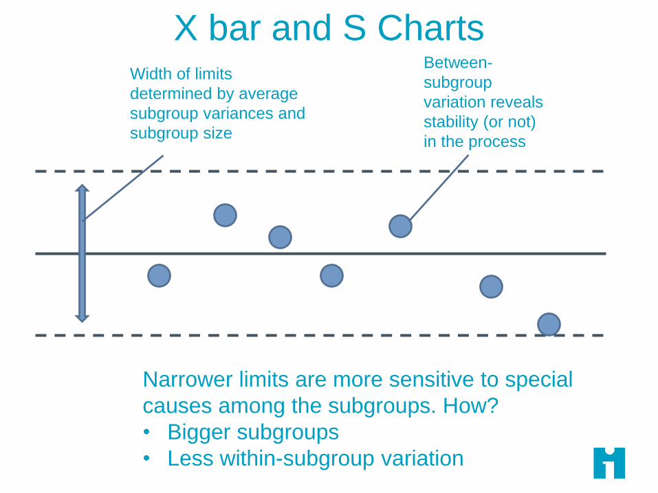
Width of limits
determined by average
subgroup variances and
subgroup size
Between-
subgroup
variation reveals
stability (or not)
in the process
Narrower limits are more sensitive to special
causes among the subgroups. How?
• Bigger subgroups
• Less within-subgroup variation
X bar and S Charts

Testing a Change43
Date
Setup
Case 1
Setup
Case 2
Setup
Case 3
Setup
Case 4
Setup
Case 5
Setup
Case 6
1/1/2016 20 30 36 21 33
1/2/2016 26 70 51
1/3/2016 25 11 22
1/4/2016 49 36 36 21
1/5/2016 53 23 25
1/6/2016 16 21 12
1/7/2016 36 60 44 27 51 17
1/8/2016 45 7 14
1/9/2016 8 32 12
1/10/2016 26 17 12
1/11/2016 18 14 56 22 26 29
1/12/2016 11 16 28
1/13/2016 10 27 33 19
1/14/2016 21 18 49
1/15/2016 15 12 7 18 6
1/16/2016 11 9 14 8 12
1/17/2016 12 13 16 11 14 9
New subgroups plotted
using baseline average
(26.9)
Change introduced here
Was the change effective?
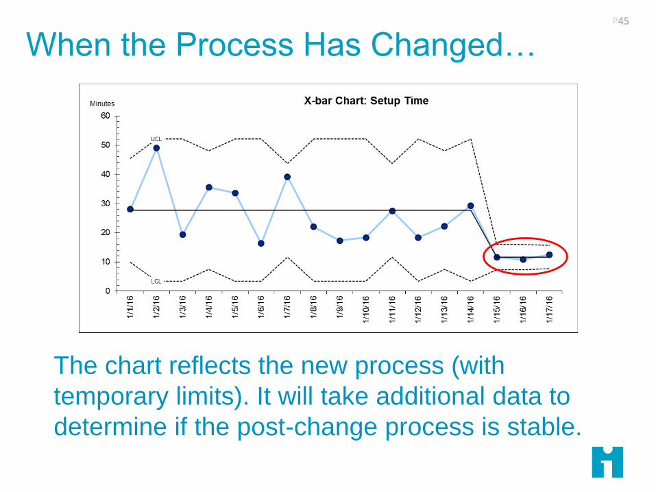
When the Process Has Changed…P45
The chart reflects the new process (with
temporary limits). It will take additional data to
determine if the post-change process is stable.

Two Mistakes to Avoid
Tampering (Type I Error or False Positive)
Responding to a data point as if it were a special cause when, in
fact, the system is stable
Failure to Detect (Type II Error or False Negative)
Ignoring a data point that indicates a special cause when, in fact,
the system of causes has changed
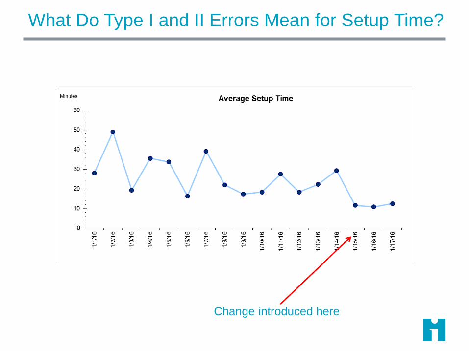
What Do Type I and II Errors Mean for Setup Time?
Change introduced here
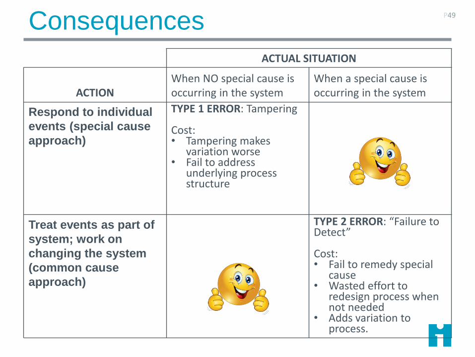
Consequences P49
ACTUAL SITUATION
ACTIONWhen NO special cause is occurring in the system
When a special cause is occurring in the system
Respond to individual
events (special cause
approach)
TYPE 1 ERROR: Tampering
Cost: • Tampering makes
variation worse• Fail to address
underlying process structure
Treat events as part of
system; work on
changing the system
(common cause
approach)
TYPE 2 ERROR: “Failure to Detect”
Cost:• Fail to remedy special
cause• Wasted effort to
redesign process when not needed
• Adds variation to process.

Why 3 Sigma Limits?
The limits have a basis in statistical theory
They have proven in practice to distinguish common and
special causes
3-sigma limits approximately minimize the risk of Type 1
(‘tampering’) and Type 2 (‘failure to detect/)
3-sigma limits protect the morale of workers by defining
the magnitude of variation built into the process: IT’S
THE SYSTEM: NO ONE’S FAULT
Provost, L. P. and S. K. Murray (2010). The Data Guide - Learning from data to improve health care. Austin TX, Associates in Process Improvement - www.pipproducts.com.
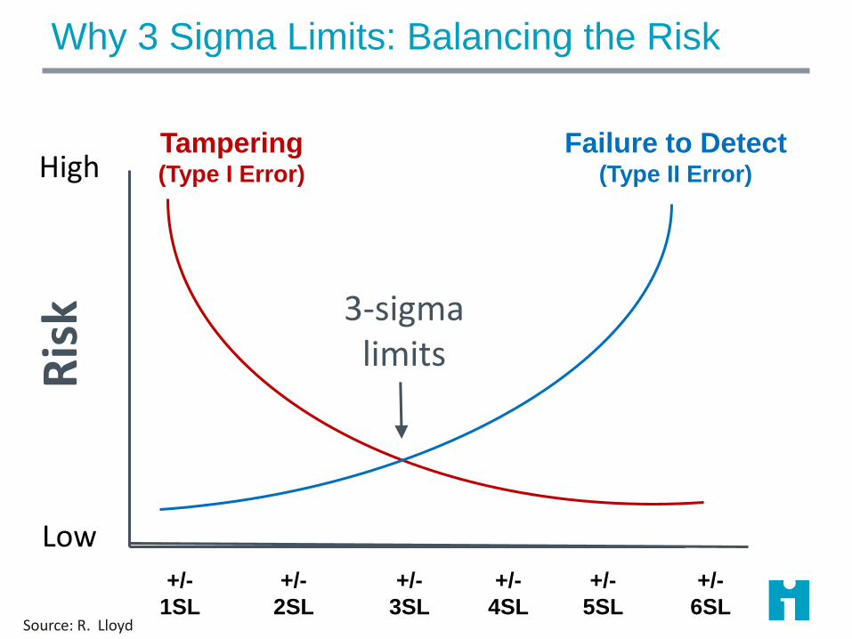
Why 3 Sigma Limits: Balancing the Risk
High
Low
Ris
k
+/-
3SL
+/-
1SL
+/-
2SL
+/-
4SL
+/-
5SL
+/-
6SL
Tampering(Type I Error)
Failure to Detect(Type II Error)
Source: R. Lloyd
3-sigma limits
Choosing and Using Control Charts
Which chart to use?
Data types; subgroups; rates
Practice with chart interpretation

Type of Data
Discrete
Count Classification
Equal area of opportunity
Unequal area of opportunity
Percent or proportion
Continuous
1 observation
per subgroup
C-Chart U-Chart P-Chart Individuals X-bar & S
>1 observation
per subgroup
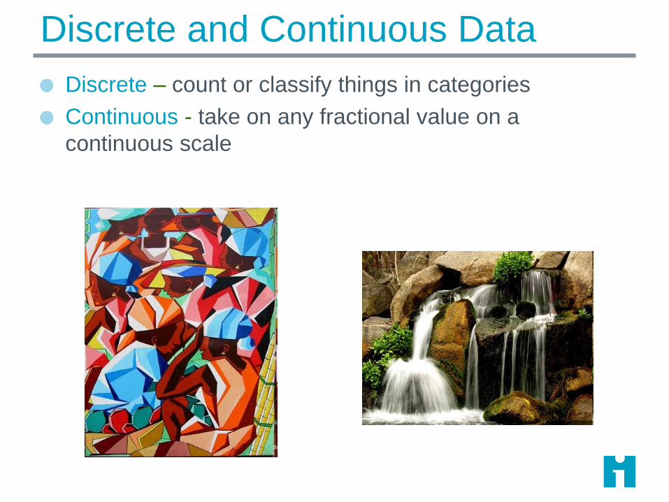
Discrete and Continuous Data
Discrete – count or classify things in categories
Continuous - take on any fractional value on a
continuous scale
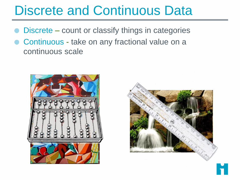
Discrete and Continuous Data
Discrete – count or classify things in categories
Continuous - take on any fractional value on a
continuous scale

Discrete and Continuous Data
Continuous
Time ThroughputMoney
Discrete
Classification Count
Scale
More Discrete and Continuous Data
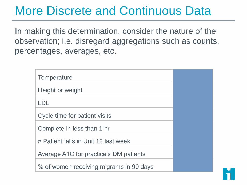
In making this determination, consider the nature of the
observation; i.e. disregard aggregations such as counts,
percentages, averages, etc.
Temperature Continuous
Height or weight Continuous
LDL Continuous
Cycle time for patient visits Continuous
Complete in less than 1 hr Discrete
# Patient falls in Unit 12 last week Discrete
Average A1C for practice’s DM patients Continuous
% of women receiving m’grams in 90 days Discrete

Discrete and Continuous Data
In making this determination, consider the nature of the
observation; i.e. disregard aggregations such as counts,
percentages, averages, etc.
Minutes waiting time Continuous
Number of needle sticks/1000 employee days Discrete
LDL Continuous
Length of Stay Continuous
Number errors per 5 insurance claims Discrete
Number of deaths per month Discrete
Percent mortality/month Discrete
Number of errors per 100 med orders Discrete

From Continuous to Discrete
You can always convert a
continuous measure into a
discrete measure by ‘slicing’ it
into categories.
You cannot go the other way:
Information is lost!
16
17
18
19
20
21
22
23
24
25
26
27
28
29
30
31
32
33
34
35
36
37
38
39
40
Severely underweight
Underweight
Normal
Overweight
Obese Class I
Obese Class II
Obese Class III
BMI
RULE OF THUMB: Store “unprocessed” data values in your database –you can always assign to categories later:• BMI• Blood pressure• Birth date
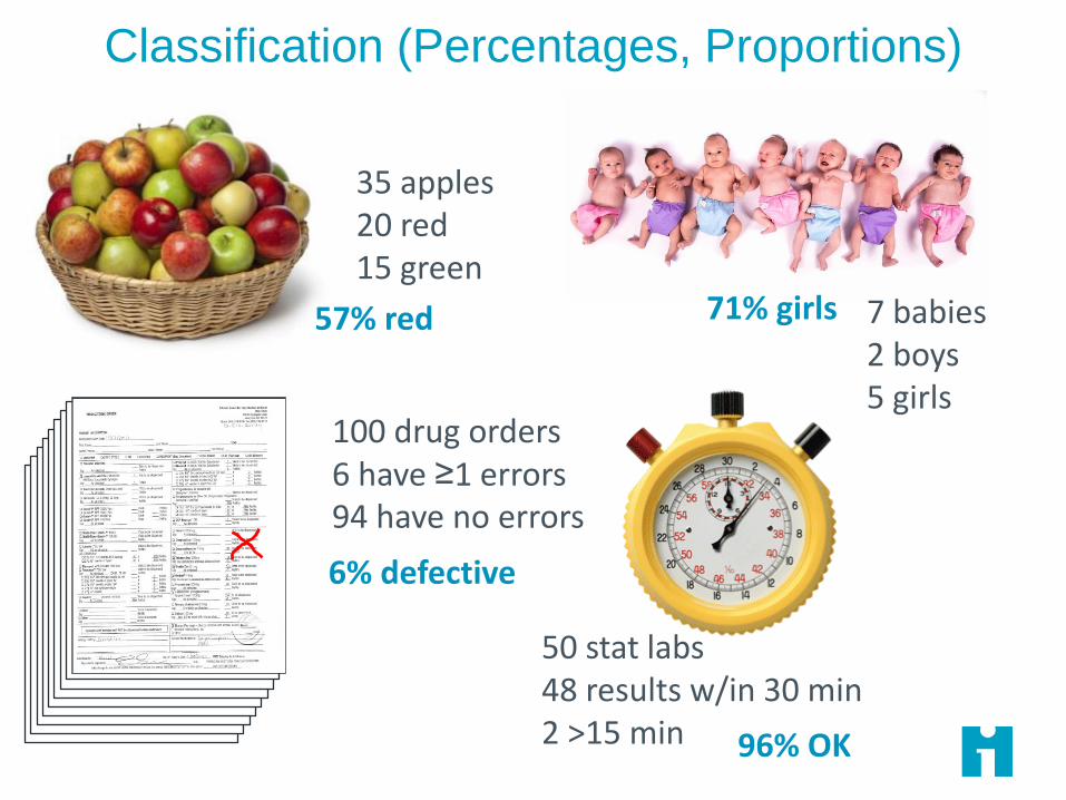
Classification (Percentages, Proportions)
35 apples20 red15 green
100 drug orders6 have ≥1 errors94 have no errors
7 babies2 boys5 girls
50 stat labs48 results w/in 30 min2 >15 min
57% red 71% girls
6% defective
96% OK
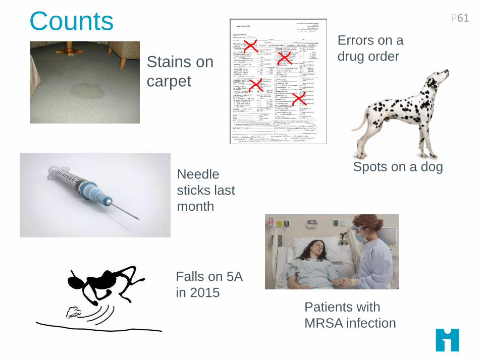
Counts P61
Stains on
carpet
Needle
sticks last
month
Falls on 5A
in 2015
Errors on a
drug order
Patients with
MRSA infection
Spots on a dog

Fixing Unequal Areas of Opportunity (Rates) P62
Stains per
square
meter
Errors per 100
drug orders last
month
Catheter infections
per 1000 catheter
daysFalls per 1000
patient days
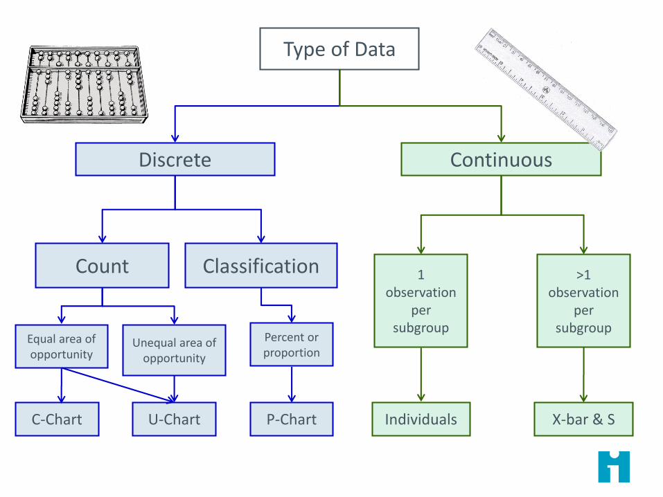
Type of Data
Discrete
Count Classification
Equal area of opportunity
Unequal area of opportunity
Percent or proportion
Continuous
1 observation
per subgroup
C-Chart U-Chart P-Chart Individuals X-bar & S
>1 observation
per subgroup
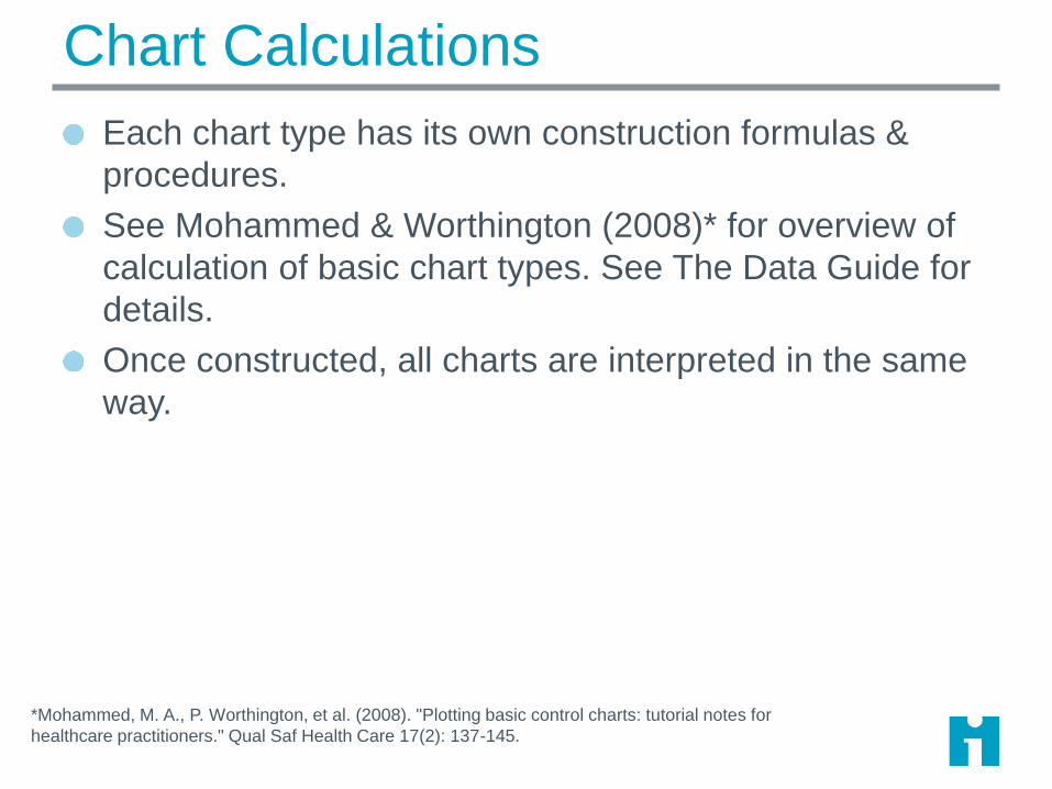
Chart Calculations
Each chart type has its own construction formulas &
procedures.
See Mohammed & Worthington (2008)* for overview of
calculation of basic chart types. See The Data Guide for
details.
Once constructed, all charts are interpreted in the same
way.
*Mohammed, M. A., P. Worthington, et al. (2008). "Plotting basic control charts: tutorial notes for
healthcare practitioners." Qual Saf Health Care 17(2): 137-145.
P Charts (for Proportions)
Underlying observations are binary classifications. For example, C-section or no Completed within 1 hour
Infected or not Risk assessed at current visit
Observations are randomly sampled from the process in each subgroup
The subgroups are independent
Each plotted data point is the percent (between 0 and 100%) of the classified observations in the subgroup
Common cause variation is modeled by the binomial distribution

When Do We Recalculate Limits?
You’re still gathering data to find a stable baseline: you
have “trial” limits with less than 20 subgroups
You have identified special causes and want to assess
stability with those subgroups removed
When improvements have been made and the
improvements result in special causes on the chart
When you have reason to believe that the process is
now operating in a new mode, and you want to assess
its stability

Operating Margins P67
You are a member of the board of trustees at two hospitals (Hospital A and
B). You have information that leads you to suspect that Hospital A is well-
managed and in solid financial condition, whereas Hospital B has shown
indications of being poorly managed and in unstable financial condition. In
September 2014, you received the first-quarter financial report for 2014
from hospital A. You are puzzled because the net operating margins
(NOMs) for 2013 and 2014 identical to the NOMs from hospital B, which
you suspect is financially unstable.
In an effort to resolve your puzzlement, you ask both hospital A and B to
provide you with a control chart displaying their NOM by month beginning
with January 2013. Hospital A sends you the actual monthly figures, as
well as the following control chart.
What kind of data are financial ratios?
What type of control chart should they select?

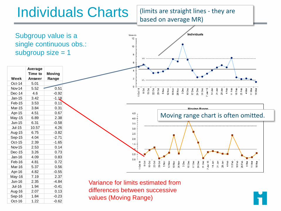
Individuals Charts
Continuous data. Each data point is a single observation
Cost for each hip replacement
Satisfaction score for each client
Total dollars income each month
Test score for each student
Total patients seen each week
Exceptions to the rules
Huge aggregated variables data
average length of stay for our 12,000 patients admitted each month
Averaged data for which we cannot get the numerator and
denominator
I chart is fallback for this….
Skewed data can create problems with limits
Individuals Charts
Week
Average
Time to
Answer
Moving
Range
Oct-14 5.01
Nov-14 5.52 0.51
Dec-14 4.6 -0.92
Jan-15 3.42 -1.18
Feb-15 3.53 0.11
Mar-15 3.84 0.31
Apr-15 4.51 0.67
May-15 6.89 2.38
Jun-15 6.31 -0.58
Jul-15 10.57 4.26
Aug-15 6.75 -3.82
Sep-15 4.04 -2.71
Oct-15 2.39 -1.65
Nov-15 2.53 0.14
Dec-15 3.26 0.73
Jan-16 4.09 0.83
Feb-16 4.81 0.72
Mar-16 5.37 0.56
Apr-16 4.82 -0.55
May-16 7.19 2.37
Jun-16 2.35 -4.84
Jul-16 1.94 -0.41
Aug-16 2.07 0.13
Sep-16 1.84 -0.23
Oct-16 1.22 -0.62
Variance for limits estimated from
differences between successive
values (Moving Range)
Subgroup value is a
single continuous obs.:
subgroup size = 1
(limits are straight lines - they are based on average MR)
Moving range chart is often omitted.
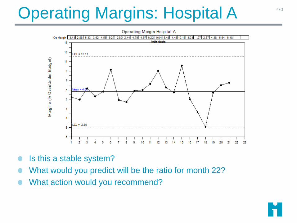
Operating Margins: Hospital A
Is this a stable system?
What would you predict will be the ratio for month 22?
What action would you recommend?
P70
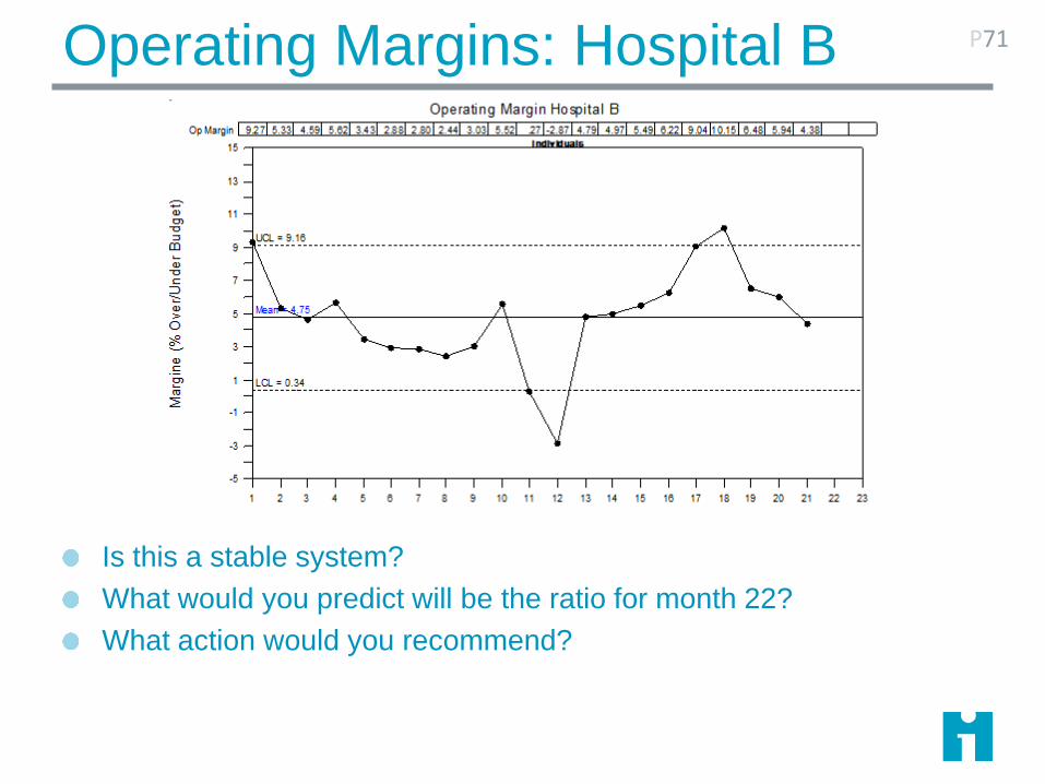
Operating Margins: Hospital B
Is this a stable system?
What would you predict will be the ratio for month 22?
What action would you recommend?
P71
Flash Sterilization P72
“Flash sterilization” refers to steam sterilization cycles where unwrapped medical
instruments are subjected to an abbreviated steam exposure time and then used
promptly after cycle completion without being stored.
The Centers for Disease Control and Prevention (CDC), the Joint Commission, and
AORN all state that flash sterilization should be kept to a minimum and should not be
used as an alternative to purchasing additional instruments, to save time, or for
convenience. AORN documents also state specifically that “flash sterilization may be
associated with increased risk of infection to patients because of pressure on
personnel to eliminate one or more steps in the cleaning and sterilization process.”
Inventory is a widely blamed culprit for the use of flash because it is said that flash
sterilization may be overused to “compensate for insufficient inventory of instruments.”
The Sunny Days Surgical Center has reviewed its logs for data on
its use of flash sterilization.
U Charts
Subgroup is a rate, based on a count and a defined area
of opportunity
Assumes subgroups counts are independent
The area of opportunity is well defined. It may vary in
size
The numerator is frequently larger than the denominator
The data are modeled by the Poisson distribution
73

C Charts
Subgroup is the number of observations in the area of
opportunity
Assumes the subgroup counts are independent
The area of opportunity is well defined and is nearly
constant for each subgroup.
The data are modeled by the Poisson distribution
74

Flash Sterilizations
What kind of data are these?
Is the area of opportunity the same
each week?
What is the appropriate type of control
chart?
P75
Sunny Days recognizes that flash sterilizations
are putting patients at risk.
They acquire additional instruments, and
deploy them beginning in week 20
Week Flashes Total Surgeries
1 35 84
2 43 80
3 38 79
4 39 81
5 42 83
6 47 85
7 46 79
8 39 75
9 37 83
10 43 80
11 25 80
12 46 80
13 49 87
14 43 72
15 50 86
16 52 79
17 44 80
18 47 89
19 51 81
20 41 72
Flash Sterilizations
Sunny Days recognizes that flash sterilizations are putting patients at risk.
They acquire additional instruments, and deploy them beginning in week 20
How should they plot the new data?
P76
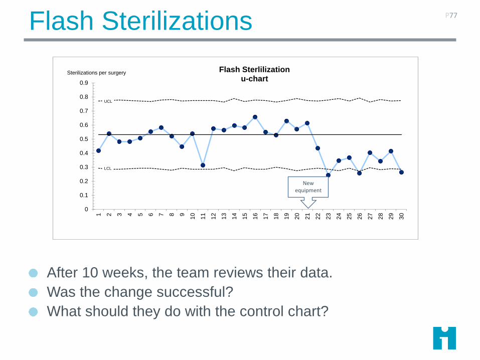
Flash Sterilizations
After 10 weeks, the team reviews their data.
Was the change successful?
What should they do with the control chart?
P77
UCL
LCL
0
0.1
0.2
0.3
0.4
0.5
0.6
0.7
0.8
0.9
1 2 3 4 5 6 7 8 9
10
11
12
13
14
15
16
17
18
19
20
21
22
23
24
25
26
27
28
29
30
Flash Sterlilizationu-chart
Sterilizations per surgery
New equipment
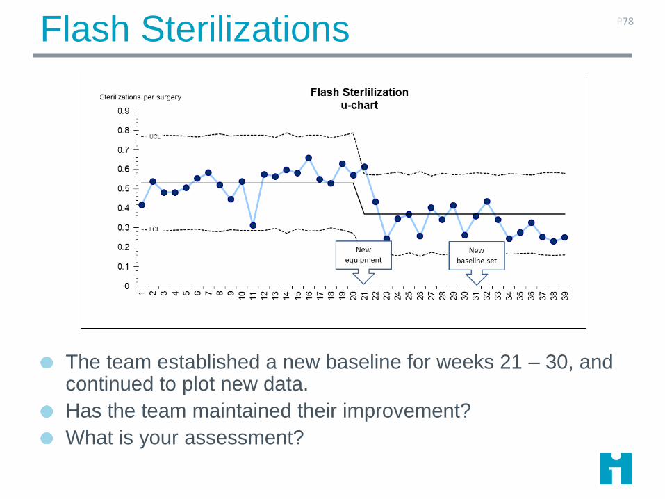
Flash Sterilizations
The team established a new baseline for weeks 21 – 30, and continued to plot new data.
Has the team maintained their improvement?
What is your assessment?
P78
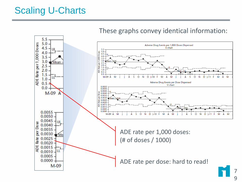
Scaling U-Charts
79
ADE rate per dose: hard to read!
These graphs convey identical information:
ADE rate per 1,000 doses:(# of doses / 1000)
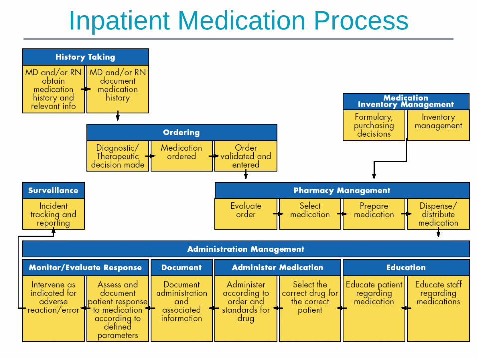
Inpatient Medication Process

Review: What Measure? What Chart? Why?
Errors per 100 orders
U-chart
Average timeXbar/S
Individuals
Percent orders with incorrect dose
P-chart
Percent with incorrect drug
P-chart
Count of orders Individuals
Average timePercent within limit
Xbar/SP-chart

Measuring Infrequent Events
Is this team improving its infection rate? What is the
problem? How could you fix it?
Holy Family HospitalRate of occurrence of hospital-acquired MRSA infections
If a P or U chart has more than 25% zeros, switch to a
time- or cases-between measure.

Measuring Infrequent Events
Rate of occurrentce of MRSA BSI and HAP per 1000 patient days
0.00
0.50
1.00
1.50
2.00
2.50
Sept Oct Nov Dec Jan
When events are infrequent, it’s hard to see whether our work is having the intended result.

Measuring Infrequent Events
Plotting the number of days since the prior event shows that infections are becoming steadily less frequent.
15 days since last event (today 1/31/2008)
Note – frequency of
cases should be
relatively constant!
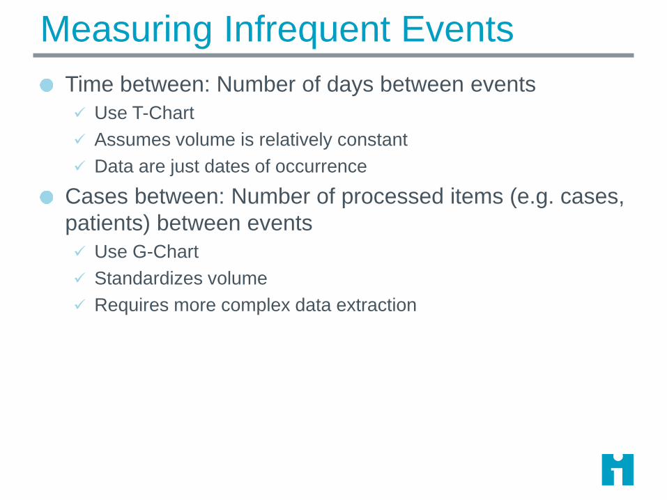
Measuring Infrequent Events
Time between: Number of days between events
Use T-Chart
Assumes volume is relatively constant
Data are just dates of occurrence
Cases between: Number of processed items (e.g. cases,
patients) between events
Use G-Chart
Standardizes volume
Requires more complex data extraction

G-Chart
for
Events-
Between

Rare Events: Joint Revisions*
Have we
improved?
*Simulated Data
T-Chart plots days
between events.
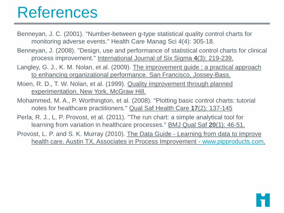
ReferencesBenneyan, J. C. (2001). "Number-between g-type statistical quality control charts for
monitoring adverse events." Health Care Manag Sci 4(4): 305-18.
Benneyan, J. (2008). "Design, use and performance of statistical control charts for clinical
process improvement." International Journal of Six Sigma 4(3): 219-239.
Langley, G. J., K. M. Nolan, et al. (2009). The improvement guide : a practical approach
to enhancing organizational performance. San Francisco, Jossey-Bass.
Moen, R. D., T. W. Nolan, et al. (1999). Quality improvement through planned
experimentation. New York, McGraw Hill.
Mohammed, M. A., P. Worthington, et al. (2008). "Plotting basic control charts: tutorial
notes for healthcare practitioners." Qual Saf Health Care 17(2): 137-145
Perla, R. J., L. P. Provost, et al. (2011). "The run chart: a simple analytical tool for
learning from variation in healthcare processes." BMJ Qual Saf 20(1): 46-51.
Provost, L. P. and S. K. Murray (2010). The Data Guide - Learning from data to improve
health care. Austin TX, Associates in Process Improvement - www.pipproducts.com.