1 starting minitab - newcastle universityndah6/teaching/mas1403/minitab-supplement.pdf · 1...
TRANSCRIPT

MAS1403: Quantitative Methods for Business Management Minitab supplement
This document contains supplementary information on usingMinitab to produce graphical andnumerical summaries from data. Also included is some guidance on usingMinitab to calculateprobabilities from the normal distribution.
1 Starting Minitab
Minitab is a computer package available on most university computers that allows you to analysedata both graphically and numercally.
Minitab is run by clicking on
Start > All Programs > Minitab > Minitab 16 Statistical Software
You will see two windows: a session window and a worksheet. Data are entered into columns labelledC1, C2, C3, etc in the worksheet.
2 Stem and leaf plots
SupposeC1 contains some data. To obtain a stem and leaf plot of these data you would need to dothe following:
Graph > Stem-and-Leaf...
This brings up the window below. You need to type inC1 underGraph variables and clickOK. If you want you can choose the stem unit by entering a value inIncrement first, otherwise theprogramme selects this for you.
1

MAS1403: Quantitative Methods for Business Management Minitab supplement
This creates a stem and leaf plot in the session window:
It is easy to see some of the advantages of graphically presenting data. For example, here you canclearly see that the data are centred around a value in the low20’s and fall away on either side.From stem and leaf plots we can quickly and easily tell if the distribution of the data is symmetric orasymmetric. We can see whether there are anyoutliers, that is, observations which are either muchlarger or much smaller than is typical of the data. We could perhaps even tell whether the data aremulti–modal, that is to say, whether there are two or more peaks on the graph with a gap betweenthem. If so, this could suggest that the sample contains datafrom two or more groups.
2

MAS1403: Quantitative Methods for Business Management Minitab supplement
3 Bar Charts
Bar charts are a commonly–used and clear way of presenting categoricaldata or any ungroupeddiscrete frequency observations. As with stem and leaf plots, various computer packages allow youto produce these with relative ease.
Bar charts are easily drawn usingMinitab:
1. First enter the data in the worksheet, either in summary format or as raw data, with columnC1containing the categories and the (raw or frequency) countsin columnC2.
2. Graph > Bar Chart...
3. Select the appropriate data format (raw data or tabulateddata), the columns containing the data,and the graph format.
3

MAS1403: Quantitative Methods for Business Management Minitab supplement
4. When ready clickOK.
This procedure produces the chart
This bar chart clearly shows that the most popular mode of transport is the car and that the metro,walking and cycling are all equally popular (in our small sample). Bar charts provide a simple methodof quickly spotting simple patterns of popularity within a discrete data set.
4

MAS1403: Quantitative Methods for Business Management Minitab supplement
3.1 Multiple Bar Charts
Consider the example presented in Section 2.8 of the notes ofdaily sales of CDs by music type at anindependent retailer.
Multiple bar charts can be produced inMinitab as follows:
1. Enter the data into the worksheet, the types of music in columns and the days as rows.
2. Graph > Bar Chart...
3. Select the appropriate data format and theStack graph format.
4. ClickOK.
5. Enter the column containing theSales data underGraph variables and theDay andMusic Type in the grouping dialogue box.
5

MAS1403: Quantitative Methods for Business Management Minitab supplement
6. ClickOK.
TheMinitab worksheet and chart this produces are as follows:
These types of charts are particularly good for presenting such financial information or illustratingany breakdown of data over time – for example, the number of new cars sold by month and model.
6
MAS1403: Quantitative Methods for Business Management Minitab supplement
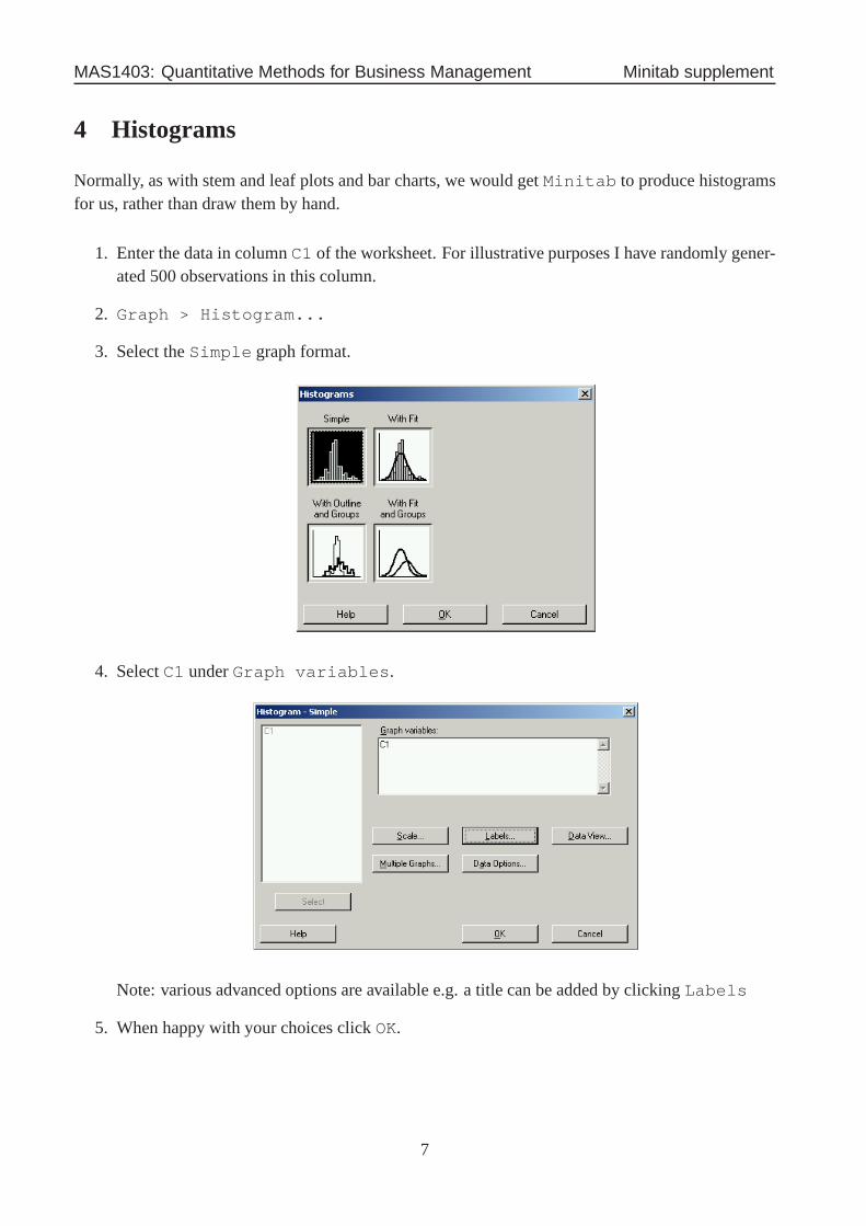
4 Histograms
Normally, as with stem and leaf plots and bar charts, we wouldgetMinitab to produce histogramsfor us, rather than draw them by hand.
1. Enter the data in columnC1 of the worksheet. For illustrative purposes I have randomlygener-ated 500 observations in this column.
2. Graph > Histogram...
3. Select theSimple graph format.
4. SelectC1 underGraph variables.
Note: various advanced options are available e.g. a title can be added by clickingLabels
5. When happy with your choices clickOK.
7

MAS1403: Quantitative Methods for Business Management Minitab supplement
These instructions produce the following histogram:
The histogram produced can be amended byright-clicking on the graph. For example, theintervals used in the histogram can be changed or, more simply, the number of intervals usingEditbars > Binning.
We can double the number of intervals (from 18 to 36 intervals) using theBinning dialogue box
8

MAS1403: Quantitative Methods for Business Management Minitab supplement
This changes the histogram to
9
MAS1403: Quantitative Methods for Business Management Minitab supplement
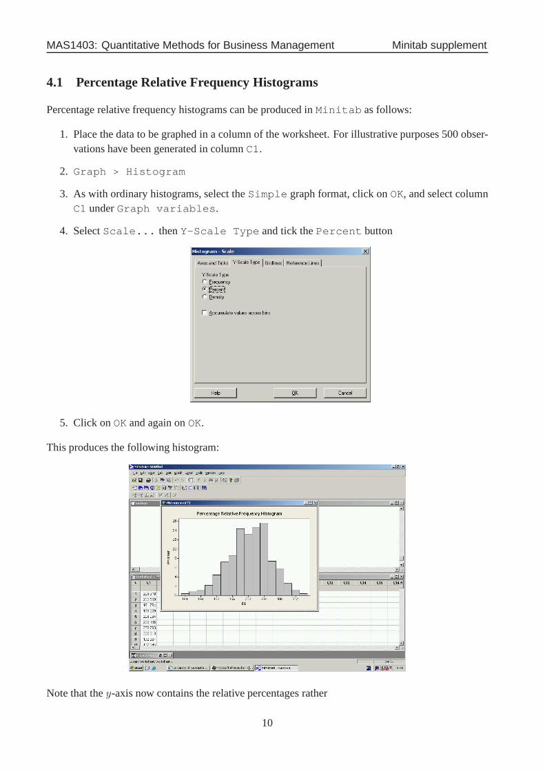
4.1 Percentage Relative Frequency Histograms
Percentage relative frequency histograms can be produced in Minitab as follows:
1. Place the data to be graphed in a column of the worksheet. For illustrative purposes 500 obser-vations have been generated in columnC1.
2. Graph > Histogram
3. As with ordinary histograms, select theSimple graph format, click onOK, and select columnC1 underGraph variables.
4. SelectScale... thenY-Scale Type and tick thePercent button
5. Click onOK and again onOK.
This produces the following histogram:
Note that they-axis now contains the relative percentages rather
10
MAS1403: Quantitative Methods for Business Management Minitab supplement
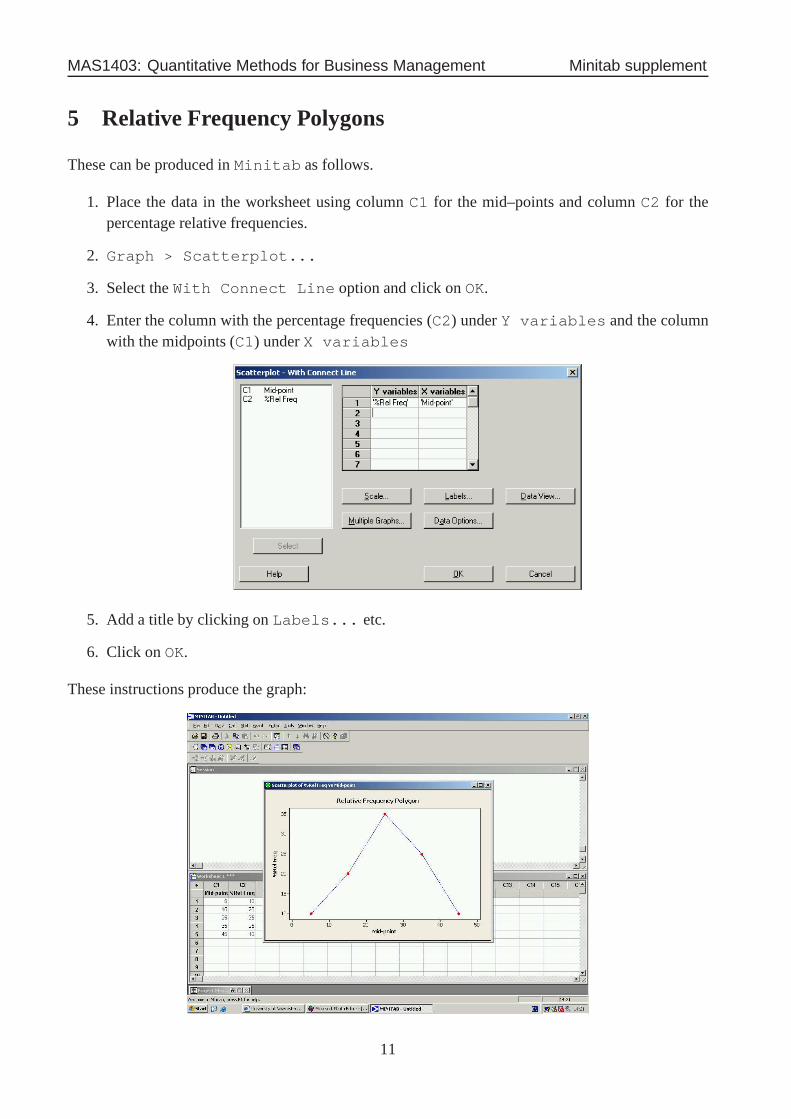
5 Relative Frequency Polygons
These can be produced inMinitab as follows.
1. Place the data in the worksheet using columnC1 for the mid–points and columnC2 for thepercentage relative frequencies.
2. Graph > Scatterplot...
3. Select theWith Connect Line option and click onOK.
4. Enter the column with the percentage frequencies (C2) underY variables and the columnwith the midpoints (C1) underX variables
5. Add a title by clicking onLabels... etc.
6. Click onOK.
These instructions produce the graph:
11

MAS1403: Quantitative Methods for Business Management Minitab supplement
These percentage relative frequency polygons are very useful for comparing two or more samples– we can easily “overlay” many relative frequency polygons,but overlaying the corresponding his-tograms could get really messy! Consider the data on gross weekly income (in£) collected from twosites in Newcastle; see page 24 of the notes.
We can produce a graph containing polygons for both locations usingMinitab instructions verysimilar to those above:
1. Place the data in the worksheet using columnC1 for the mid–points, columnC2 for the per-centage relative frequencies and columnC3 for the site where the data were taken.
2. Graph > Scatterplot...
3. Select theWith Connect and Groups option and click onOK.
4. Enter the column with the percentage frequencies (C2) underY variables and the columnwith the midpoints (C1) underX variables. Also enter theSite column (C3) in the boxfor Categorical variables for grouping.
5. Add a title by clicking onLabels... etc.
6. Click onOK.
The polygon produced looks like
12

MAS1403: Quantitative Methods for Business Management Minitab supplement
6 Cumulative Frequency Polygons (Ogive)
This graph can be produced using the followingMinitab instructions:
1. In columnC1, enter the end points of the class intervals, as well as the starting point of thesmallest class.
2. In columnC2, enter0 against the starting point and the cumulative percentage relative frequen-cies against the relevant end point.
3. Graph > Scatterplot...
4. Select theWith Connect Line option and click onOK
5. Enter the column with the percentage frequencies (C2) underY variables and the columnwith the midpoints (C1) underX variables
6. Add a title by clicking onLabels... etc.
7. Click onOK.
This produces the following graph:
13

MAS1403: Quantitative Methods for Business Management Minitab supplement
Applying this procedure to the income data from the West Roadsurvey gives the ogive:
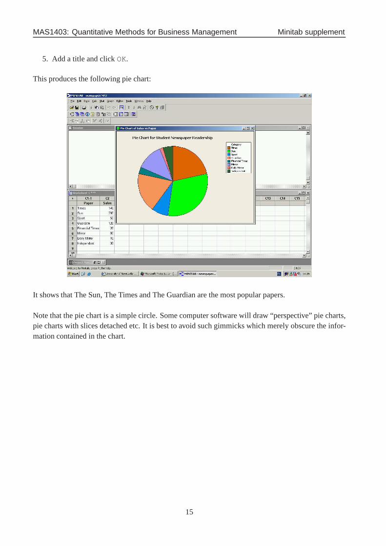
7 Pie Charts
Consider the data on newspaper sales to 650 students that were presented in Section 2.8.2 of the notes.
In Minitab, a pie chart for these data would be obtained as follows:
1. Enter the data into a worksheet, with category name in columnC1 and frequencies in columnC2.
2. Graph > Pie Chart...
3. Tick the button forChart values from a table
4. Enter theCategory column underCategorical variable: and theFrequency col-umn underSummary variables:
14
MAS1403: Quantitative Methods for Business Management Minitab supplement
5. Add a title and clickOK.
This produces the following pie chart:
It shows that The Sun, The Times and The Guardian are the most popular papers.
Note that the pie chart is a simple circle. Some computer software will draw “perspective” pie charts,pie charts with slices detached etc. It is best to avoid such gimmicks which merely obscure the infor-mation contained in the chart.
15

MAS1403: Quantitative Methods for Business Management Minitab supplement
8 Scatter Plots
Consider the data for monthly output and total costs at a factory that were given in Section 2.8.3 ofthe notes.
If you were interested in the relationship between the cost of production and the number of units thena scatter plot can be produced usingMinitab (SelectGraph thenScatterplot thenSimpleand insert the required variables).
16

MAS1403: Quantitative Methods for Business Management Minitab supplement
9 Time Series Plots
Consider the data on the number of computers sold (in thousands) by quarter (January-March, April-June, July-September, October-December) at a large warehouse outlet that were given in Section 2.8.4of the notes.
In Minitab a time series plot can be obtained using:
1. Enter the data into a worksheet, with theQuarter, Year andSales in columnsC1, C2andC3.
2. Click onGraph and selectTime Series Plot...
3. Select theSimple graph format and click onOK.
4. Enter theSales column in theSeries: box.
5. Now click onTime/Scale..., check theStamp button and enter theQuarter andYearcolumns underStamp columns
6. ClickOK.
7. Add a title etc.
8. ClickOK.
17

MAS1403: Quantitative Methods for Business Management Minitab supplement
The time series plot is:
10 Summary statistics inMinitab
Minitab can be used to calculate all of the basic numerical summary statistics covered in Chapter 3.These summaries for data in a selected column can be obtainedusing the commands
Stats > Basic Statistics > Display Descriptive Statistics
The results are output in the session window as follows:
18

MAS1403: Quantitative Methods for Business Management Minitab supplement
11 Box plots
Minitab will produce box plots using the following commands.
1. Enter the data into the worksheet, say column C1
2. Graph > Boxplot... and select theSimple graph format
3. Next enter the column containing the data underGraph variables:
4. Add a title usingLabels...
5. Click onOK.
If the data have subgroups, such as results from three different surveys, then box plots of the sampledata can be plotted by group by first entering the group variable into the worksheet, say as columnC2, and then selecting theWith Groups graph format. The group variable is then entered intothe subsequent dialogue box underCategorical variables for grouping. Displayinggroup structure is one of the main uses of box plots. For example:
clearly shows that although there is overlap between the three sets of data, the first and second datasetscontain roughly similar responses and that these are quite different from those in the third set. Notethat the asterisks (*) at the ends of the whiskers is the wayMinitab highlights outlying values.
19

MAS1403: Quantitative Methods for Business Management Minitab supplement
12 Calculating probabilities from the normal distribution
Minitab can be used to calculate normal probabilities. The following commands will calculateprobabilitiesP (X < x) and also values ofx that satisfyP (X < x) = p:
1. Calc > Probability Distributions > Normal
opens up dialogue box
2. SelectCumulative probability forP (X ≤ x) orInverse cumulative probability
for the value ofx satisfyingP (X ≤ x) = p
3. Enter theMean (µ) and theStandard Deviation (σ)
4. SelectInput Constant and enter the value forx or p (as appropriate)
5. ClickOK
6. The answer is displayed in the Session Window:
20