multiple choice questions…grab handout!. data analysis: displaying quantitative data
TRANSCRIPT

Multiple choice questions…grab handout!
Warm-Up

Homework Questions

Section 1.2Data Analysis: Displaying Quantitative Data

In any graph, we look for the overall pattern and for striking departures from that pattern. We describe the overall pattern with shape, center, and spread.
We describe departures from the pattern with outliers, individuals that fall outside of the overall pattern.
As a mnemonic device we sometime call describing a distribution “checking our SOCS,” or “remembering our SOCS.”
Patterns

A distribution is roughly symmetric if the right and left sides of the graph are approximately mirror images of each other.
A distribution is skewed to the right if the right side of the graph (containing half of the observations with larger values) is much longer than the left side.
Similarly to skewed to the right, a distribution is skewed to the left if the left side of the graph (containing half the observations with smaller values) is much longer than the right side.
Shape

Other common types of shape are: unimodal or having a single peak, bimodal or having two peaks, multimodal or having many peaks, moundlike or resembling a single mound or hill, and normal which we will define and cover in detail later.
Other shapes

The common measures of center we use are mean, median, and mode. ◦ Mean is the average of a data set◦ Median is the middle value of the data set ◦ Mode is the value that appears most often.
Range is the numerical representation of the distance between the largest and smallest value in a data set.
Standard Deviation and Variance are also measures of spread, these will be covered in detail in the next section
Measures of Center

Shape?
Center?
Spread?
Potential Outliers?
Let’s look at our graph

How many pairs of shoes does a typical teenager have? Here are the results from a random sample:50, 26, 26, 31, 57, 19, 24, 22, 23, 38, 13, 50, 13, 34, 23, 30, 49, 13, 15, 51
Stemplot

Quantitative Variables!
A bar graph with no gaps in between.
The frequencies are the heights of the bars.
The x-axis is divided into “classes” or intervals.
Histograms

The difference…

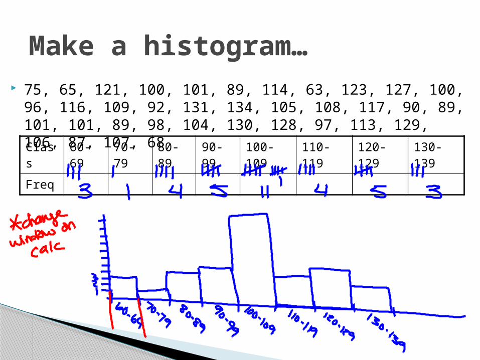
Class 60-69 70-79 80-89 90-99 100-109 110-119 120-129 130-139
Freq
Make a histogram… 75, 65, 121, 100, 101, 89, 114, 63, 123, 127, 100, 96, 116,
109, 92, 131, 134, 105, 108, 117, 90, 89, 101, 101, 89, 98, 104, 130, 128, 97, 113, 129, 106, 87, 107, 68

Shape determines the measure of center, and center determines the measure of spread.
Outliers will always be calculated the same way, independent of shape.
When graphing, don’t confuse histograms (quantitative data) and bar graphs (categorical data).
Things to note!

Pg 42 (37, 39, 41-47, 50-52, 58-62, 64, 66-68)
Homework