year 2 - semester 1 - interrogation
DESCRIPTION
Year 2 - Semester 1 - InterrogationTRANSCRIPT

Tristan Gatcum1007521
InterrogationYear 2 Semester 1EGRD2010


GradientGrayscale
Black / White

Cool ColoursMono
Blue
Gray
Green
#2A4B9B #3E519F #273582 #646CB0
#60B22F #70B62C #0A9D39 #88C05D
#999999 #CDCCCC #633232 #737373

Warm ColoursMono
Red
Brown
Yellow

ColoursComplimentary
Red / Green Yellow / Purple Blue / Orange Brown / Green

Recommended SchemesWeb Colours
EBCA97 E49D67 A3481B EFA685 C46B29 B7C68B F4F0CB DED29E B3A580 685642 94715B 70822E C29B72 DAC0AF 8F3D15 D4A539 D5AD6F 7A4012 C09372 481706
CEAC41 DAC27C D7AF72 EFDEC2 A8651E 5A6B34 F0D64E D7B740 AB8024 925818 AEB05D DCD191 D3A46E E39871 DF7D60 85622A E6A644 E18339 B6571D 8C3313
AD9D2C 6C6030 B2AC4E 8E822C C7B98A EFD13B E9AF32 CF7F26 CC5B23 2C0402 129793 505050 FFF5C3 9BD7D5 FF7260 7C786A 8DCDC1 D3E397 FFF5C3 EB6E44

See The World Through My Eyes
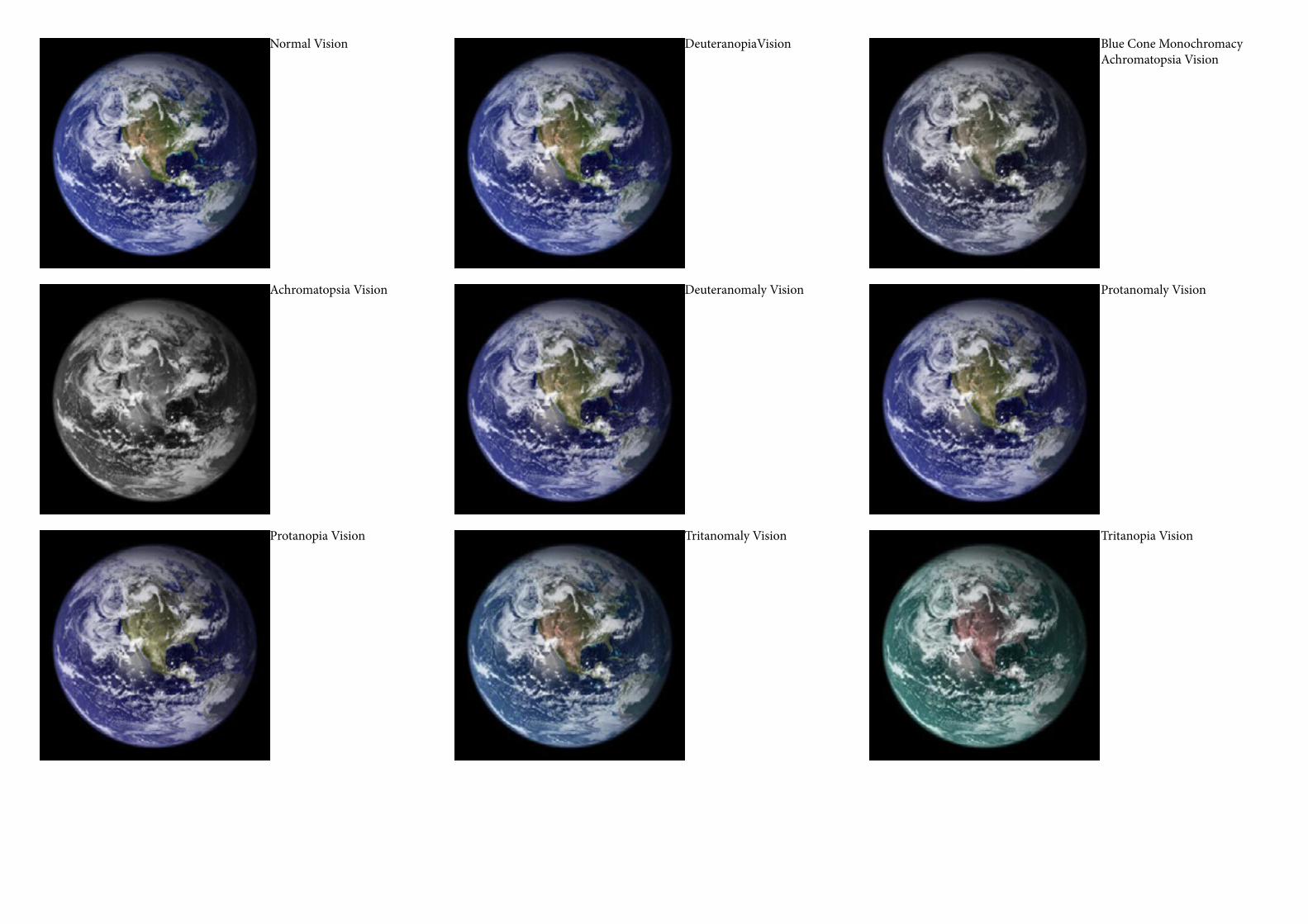
Normal Vision DeuteranopiaVision Blue Cone Monochromacy Achromatopsia Vision
Achromatopsia Vision Deuteranomaly Vision Protanomaly Vision
Protanopia Vision Tritanomaly Vision Tritanopia Vision

Normal Vision
Tritanopia Vision
Tritanomaly Vision
Protanomaly Vision
Achromatopsia Vision
Deuteranomaly Vision
Blue Cone MonochromacyVision
Protanopia Vision Deuteranopia Vision

Your Design In Our Eyes

Normal Vision Protanopia Vision DeuteranopiaVision
Tritanopia Vision Protanomaly Vision DeuteranomalyVision
Tritanomaly Vision Achromatopsia Vision
Blue Cone MonochromacyVision

Normal Vision Protanopia Vision DeuteranopiaVision
Tritanopia Vision Protanomaly Vision DeuteranomalyVision
Tritanomaly Vision Achromatopsia Vision
Blue Cone MonochromacyVision

Are You Colour Blind?

EVERYONE should be able to see a
Circle - Star - Square

Colour Normal Should See
Yellow Square - Faint Brown Circle
Colour Blind Could See
Yellow Sqaure only

Colour Normal Should See
Faint Brown Boat
Colour Blind Could See
Nothing

Evaluation – Interrogation
EGRD2010This semester has proved challenging for independent practice work. I felt as though there was so much studio work to do that finding the time do it was a challenge in itself. I did however have a lot of fun whilst doing it and put a lot of myself in to it. I decided to focus on colour blindness and therefore colour theory and the effects that it can have on us and on design.
I started off looking at basic colour theory such as complimentary colours, monochromatic, warm, cold, gray scales etc. I thought it was important to do this to lay a foundation before delving any deeper. I then moved on to looking at web safe colour themes. By doing this I was attempting to find a pattern and understanding of what colours worked and why using the different colour matching methods on the colour wheels.
After extensive research in to the history of colour theory, looking at people such as Isaac Newton, Leonardo Di Vinci and Leone Battista Alberti I was starting to grasp its history and how it has changed so much over time. I looked in to how colour was produced using pig-ments and over time developing technology to create more and more diverse ranges of colour.
I then wanted to try and demonstrate the differences between normal colour vision and colour blind vision. While researching this I discovered that there were multiple types of colour deficiencies. After realising this I wanted to cover them all, in this way I feel as if I am truly hitting home the complexity and importance of colour and personal perceptions of colour.
I started by using a picture of Earth and converting the colours in to what someone with each deficiency would see. I did the same with a colourful and “beautiful” landscape. I feel that this is a really effective way of demonstrating the condition. No matter how you try to explain colour blindness you will never be able to fully understand it without experiencing it. Using these images you can begin to bring someone with normal colour vision to the world of someone who is colour blind.
I then pushed this further by demonstrating it on something more applicable to design and used the same effect on two popular web-sites; YouTube and eBay. By doing this I have put it in to a daily context that is not often considered.
I finished my portfolio with an interactive element by implementing a standard colour blind test. This could not only help someone self diagnose them (although it is not 100% accurate due to colour setting on monitors etc) but it can then motivate them to request a profes-sional diagnosis but it gets the viewer thinking “How can they not see that?”
Overall I feel as though I have delved deep in to the topic and will have managed to get people thinking about a topic that is not often considered in general let alone the world of design.

BibliographyINTERROGATION
EARTH
http://eoimages.gsfc.nasa.gov/images/imagerecords/57000/57723/globe_west_2048.jpg
LANDSCAPE
http://www.windows-7-wallpapers.org/fullview.php?id=260
YOUTUBE
http://www.youtube.com
EBAY
http://www.ebay.co.uk
COLOUR BLIND CARDS
http://colorvisiontesting.com/online%20test.htm