xcelsius -
TRANSCRIPT
Xcelsius® 2008 Dashboard Best PracticesCopyright „ 2009 by Pearson Education, Inc.All rights reserved. No part of this book shall be reproduced, stored in a retrievalsystem, or transmitted by any means, electronic, mechanical, photocopying,recording, or otherwise, without written permission from the publisher. Nopatent liability is assumed with respect to the use of the information containedherein. Although every precaution has been taken in the preparation of this book,the publisher and author assume no responsibility for errors or omissions. Nor isany liability assumed for damages resulting from the use of the information con-tained herein.
ISBN-13: 978-0-672-32995-1ISBN-10: 0-672-32995-6
Library of Congress Cataloging-in-Publication Data
Abdulezer, Loren.Xcelsius 2008 dashboard best practices / Loren Abdulezer.
p. cm.ISBN 978-0-672-32995-1
1. Xcelsius (Computer file) 2. Dashboards (Management information systems)3. Business—Computer programs. I. Title.
HD30.213.A23 2009005.5’8—dc22
2008046377
Printed in the United States of America
First Printing December 2008
TrademarksAll terms mentioned in this book that are known to be trademarks or servicemarks have been appropriately capitalized. Sams Publishing cannot attest to theaccuracy of this information. Use of a term in this book should not be regarded asaffecting the validity of any trademark or service mark.
Warning and DisclaimerEvery effort has been made to make this book as complete and as accurate as pos-sible, but no warranty or fitness is implied. The information provided is on an “asis” basis. The author and the publisher shall have neither liability nor responsibil-ity to any person or entity with respect to any loss or damages arising from theinformation contained in this book.
Bulk SalesSams Publishing offers excellent discounts on this book when ordered in quantityfor bulk purchases or special sales. For more information, please contact
U.S. Corporate and Government Sales
1-800-382-3419
For sales outside of the U.S., please contact
International Sales
Sams PublishingAssociate Publisher
Greg Wiegand
Acquisitions EditorMichelle Newcomb
Development EditorTodd Brakke
Managing EditorKristy Hart
Project EditorBetsy Harris
Copy EditorKitty Wilson
IndexerErika Millen
ProofreaderDan Knott
Publishing CoordinatorCindy Teeters
Book DesignerAnne Jones
CompositorsNonie RatcliffBronkella Publishing LLC
Business ObjectsBusiness Objects PressEditorial Board
Paul ClarkJohn McNaughton
Technical EditorJavier Jimenez
ForewordHave you ever experienced how data can change the world? How compelling presentationscan get CEOs out of their seats? How a business dashboard can turn a regular businessmanager into an invaluable hero to a company? Or how a tool that simplifies data andmakes information informative, useful, and actually fun can transform a career?
I have. It happened for me a couple years ago. My team at Business Objects was looking fora way to present a new business opportunity with key metrics, business drivers, and trendsto our CEO. We had about an hour to present everything and help make a key businessdecision.
We had a lot of slides and spreadsheets and the usual information you’d expect. But then wesummarized the entire business opportunity and how we wanted to look at the opportunityinto a single dashboard. We combined all the key data that we were using to look at thebusiness decision. Within a few hours, we turned mountains of tabular, virtually incompre-hensible data into a powerful business tool. And we added the key element that every CEOwants: the power of “what-if.” What if sales didn’t meet expectations? What if we couldn’tmeet our cost-cutting objectives? And more importantly, what if it really worked!
As we were presenting, our CEO jumped out of his chair and started to “drive” the dash-board: He put his own experience and assumptions to the model. What we showed was thatit was actually a bad idea to make the investment that many were asking for. The numbersdidn’t add up. By not making the decision, we saved the company potentially millions ofdollars, countless resources, and a lot of churn trying to make something work that justdidn’t make sense to us or the CEO.
On the bright side, by taking advantage of the power of Xcelsius to build the dashboard, myteam gained broad recognition for providing something that was simple enough, com-pelling enough, and actually fun enough to change the course of the business, and in theprocess, our careers. Having the right skills to build a business dashboard without over-whelming the audience made all the difference.
Sure, we could have shown some data in a spreadsheet, but the only reason CEOs get outof their chairs to look at a spreadsheet is because the font is too small to read. Put that datainto Xcelsius and you will quickly change the way you see and monitor your business andcompletely change the decision-making experience.
Our challenge to you, the reader, is to go beyond the creation of a simple chart or graphicyou’ve built in a presentation or spreadsheet tool to a real business dashboard that can havea major impact on your most important business aspects. Model your business. See howdecisions impact the environment. See how pricing, promotions, and marketing impactconsumer behavior. Liven up your dashboards by connecting your dashboard to real-time,live data from within your company or any web service to get up-to-the-second monitoring.Use your business data anywhere, and take your proposal from the shop floor all the way tothe board room.
In my experience, the key elements that you need to effectively build business dashboardsthat will make a difference include the following:
■ Designing a spreadsheet that clearly identifies the inputs and results for use by thedashboard. Of course, let the spreadsheet do the hard work of crunching the complexcalculations!
■ Mapping visual components on the dashboard to drive the inputs on the spreadsheet.You have a wealth of components to choose from—everything from sliders to dials andlist boxes, and then some. You can also manage their properties so that they are trulyinteractive.
■ Adding visual components to display spreadsheet results. Again, you have a wealth ofcomponents to choose from. Every dial, gauge, chart, map, and table can be imbuedwith complex properties and alerts.
■ Building dashboard interactivity and managing visibility of the various components sothat your dashboard keeps toe to toe with its embedded spreadsheet.
Loren’s book shows how to take advantage of these features in Xcelsius 2008 to buildastounding dashboards. Make sure you take some time to learn some best practices laid outin this book. Try out the samples to get you started. And make sure you share your greatwork with others.
Every day we see more great dashboards that are changing the world, one dashboard at atime. And remember, just as a good dashboard can improve you and your company’s per-formance, bad data, poor layout, excessive use of unnecessary bells and whistles, and irrele-vant data and information can have the opposite effect.
Good luck. Have fun. And don’t be surprised when you get a welcome, yet unexpected,reaction when you share your dashboards. Done right, you’ve truly never seen a spread-sheet do this before!
James Thomas
Vice President, Product Management
Business Objects, an SAP company
Xcelsius® 2008 Dashboard Best Practicesxii
PrefaceA broad and growing community of professionals regularly prepares or needs to preparedashboards and interactive visualizations and reports. Like many of those other profession-als, I have used Excel to create useful reports and dashboards. The problem is that unless Iincorporated extensive amounts of one-off code, Excel lacked some essential features that Iwas looking for:
■ The ability to design a dashboard interface by dragging and dropping components on acanvas
■ The ability to map visual components to a “live” spreadsheet built using my Excelmodels
■ The ability to deploy simple, self-contained dashboards that are suited for visual dataanalysis by ordinary users
Those capabilities existed in Xcelsius 3.0. Two product generations later, Xcelsius 2008 hasundergone a metamorphosis; Xcelsius now includes a well-honed and highly integratedspreadsheet and dashboard design environment, significantly greater spreadsheet functional-ity, more visual components and interface options, a revamped and expanded framework fordata connectivity, and the ability to create entirely new custom-designed components onequal footing with built-in components.
This is great stuff. It sounds like everybody ought to be using Xcelsius 2008, for anythingand everything. But Xcelsius 2008 isn’t intended to be a jack-of-all-trades. First and fore-most, Xcelsius 2008 is a serious tool for building interactive dashboards and intelligent visu-alizations. The secret to its power is how it is joined at the hip with spreadsheets.
Xcelsius 2008 is remarkably easy to use. From a dashboard layout perspective, everything ispoint and click. You don’t need much in the way of spreadsheet prowess to start doing inter-esting and useful things with Xcelsius. This quick bang for the buck is like kindling wood ina furnace: It’s enough to get a flame started, but it won’t heat up the room. To get a roaringand self-sustaining fire, you need to take things to the next level.
So what is stopping you from building better dashboards? The biggest challenge holdingmost people back is lack of time. If you are busy worrying about monitoring and meetingproduction quotas, or allocating budgets among competing projects, you are probably notgoing to spend a lot of time improving on a dashboard design once you get it working.Maybe for an occasional dashboard, that’s smart thinking. If your dashboard serves you well,you will no doubt use it to do more things. Who knows? Maybe you need to enable weeklyor daily analysis in addition to monthly analysis.
Say that you want to add a second product line, monitored by a dashboard. You start withyour already working dashboard design as your template and add more features. As youkeep cloning, you are stepping up your maintenance responsibilities and possibly bloatingyour dashboard. At some point not far down the road, the dashboard capabilities plateau. Itis not nearly agile enough to keep up with changing requirements or expectations. This is
where best practices come into play. I know that time is premium for you. It is for every-one. To save you valuable time, I have worked out a wealth of best practices and techniquesso that you don’t need to reinvent the wheel.
In this book, I do a few other things:
■ Introduce you to the features you need to know. I get you started with setting up yourXcelsius workspace. I introduce you to essential components and show you how to usethem. I help you build up your spreadsheet skills in an Xcelsius-centric way.
■ Show you how to use the new and important features of Xcelsius 2008 so that you canquickly transition to this newer technology.
■ Cover the essential components you will regularly be using in dashboards, from chartsto dials, gauges, sliders, and maps. I cover the standard features such as drill down andalerts.
■ Show how to turbo-charge the various dashboard components so that they do thingsyou wouldn’t ordinarily expect. For instance, you’ll learn how to use a single dial on adashboard to set the values of dozens or hundreds of variables.
■ Show how to design simple and effective dashboard interfaces. When these need to bescaled up to do complex things, the designs don’t change, and they don’t break down.
■ Describe how the preparation and processing of data, including techniques for validat-ing and structuring of data, play a central role in dashboard best practices.
■ Devote whole chapters to constructing spreadsheet formulas embedded in dashboards,statistical analysis, financial analysis, and working with less–than-optimal data.
■ Show how to utilize features of Xcelsius 2008 for remote data connectivity, such asXML maps and Web Services.
■ Explain how to construct custom components.
The undercurrent that runs through this book is empowerment. Every step of the way, Ishow how you can work smarter by using best practices.
Loren Abdulezer
December 2008

In this introduction
Getting What You Need from This Book 3
What This Book Covers 5
Conventions Used in This Book 7
INTRODUCTION
2 Introduction
One of the first things that caught my attention about Xcelsius is that it is fundamentally aparadigm-shifting technology. Xcelsius intentionally blurs the distinction between spread-sheets and presentation-layer dashboards.
Back in 2005, when the product first started getting traction, it was ahead of its time. Most ofall, Xcelsius needed to catch up to its own revolutionary ideas. Back then, the spreadsheetportion and the canvas lived in parallel but disjointed universes. They could be tethered bystatically linking component properties to fixed cell coordinates. This was a great proof ofconcept and prototype but wasn’t always practical.
From time to time, spreadsheet models do need to get updated. With early versions ofXcelsius, if you inserted or deleted a row or column, it sometimes completely derailed theXcelsius component-to-spreadsheet-cell mapping. At the cost of increased spreadsheet designcomplexity, I developed a solution to this problem. This opened the floodgates so that Icould redesign imported spreadsheets with impunity and not have to worry about upsettingthe mapping between components and spreadsheets. In effect, it gave me a three-year headstart in developing effective techniques and best practices that are applicable to Xcelsius2008.
Xcelsius 2008 supports some new spreadsheet functions. One of them is an amazing andoften-overlooked function called OFFSET. In earlier versions of Xcelsius, you could use INDEXto redirect data from any column or row of your choosing and pipe it into a chart or othervisual component in your dashboards—a technique I call context switching. Thanks to OFFSET,this functionality can now be truly turbocharged using Xcelsius 2008.
Over the years I developed a wealth of techniques and best practices so that the data andcomputational side of the Xcelsius dashboards could be on par with the stunning visualiza-tions so often associated with Xcelsius.
As Xcelsius 2008 moved past the drawing board, I reworked and substantially extended thosetechniques for the new Xcelsius. I often found myself more on the bleeding edge than cut-ting edge of this new technology.
After Service Pack 1 for Xcelsius 2008 solidified, the techniques, methodologies, andapproaches to dashboard design with Xcelsius 2008 all fell into place rather naturally.
Xcelsius 2008 as a product and technology has caught up with its revolutionary ideas and isready for primetime. That is half the battle. The task ahead of you is to use Xcelsius 2008 tocatapult your dashboards and visualizations beyond toy demonstrations.
Using Xcelsius is easy when you understand the ins and outs of building and designing dash-boards.
The first lesson you are going to learn in this book is that if you really want your Xcelsiusdashboard to shine, you have to take responsibility for managing the data that feeds into yourvisualizations. This means you have to control the data, juggle it with formulas, and do whatis necessary so that it is on rock-solid footing by the time it appears visually.
3Getting What You Need from This Book
Why is all this really necessary? Dashboards are interactive, and Xcelsius dashboards per-form live computations. The data in a dashboard is generally not static and is subject toongoing updates and revisions. To complicate matters, the drivers and inputs in visualiza-tions are subject to the whims of your dashboard users.
There are things you can do to keep your dashboards out of hot water. For example, say thatyou have three companies vying for market share—your company and two competitors. Youknow that 100% of the market share will never be exceeded. How can you build a dashboardto assess your competitive positioning, assign market share, and never have to worry aboutoverallocating percentages? Best practices provide a structured methodology for dealingwith issues of this kind and for taking what might be inefficient or unmanageable and keep-ing the process sane and contained.
N O T EYou can find a dashboard of this kind in Chapter 2, “Showcase of Xcelsius 2008Dashboards,” and its implementation is covered in Chapter 12, “Smart Data and Alerts.”
Getting What You Need from This BookMy goal in this book is to help you quickly learn specific techniques and practices, provideinformation in a sensible order, and help you understand some practical matters about work-ing with examples and your own files.
Locating Specific Techniques QuicklyThis book covers a broad range of topics in 16 chapters. The chapters are chock full of valu-able techniques, tips, and strategies. The chapters are organized by subject matter rather thanby best practice. To help you locate best practices, I’ve cataloged more than 100 best practicetechniques and tips in Appendix C, “Xcelsius Best Practice Techniques and Hip PocketTips,” which lists topics and where to find them in the book. To help you locate the detailswithin the chapters, a best practices icon appears in the margin next to each best practice.
N O T EYou can find the dashboard files that accompany this book on www.XcelsiusBestPractices.com.
How to Read This BookThis book will be valuable to you whether you are new to Xcelsius or already have someexperience under your belt. You may want to approach the text differently, depending onyour familiarity with creating dashboards and using Xcelsius.
4 Introduction
For New Xcelsius Users
If you are entirely new to Xcelsius, first skim Chapter 2, which quickly introduces you tovarious kinds of Xcelsius dashboards. Then read through Chapter 1, “Motivation for UsingXcelsius 2008,” so that you have an idea of how your spreadsheets and dashboards worktogether in Xcelsius. Move on to Chapter 3, “Getting Familiar with Xcelsius 2008,” to get afoundation for working with Xcelsius. Think of Chapter 3 as your first day of on-the-jobtraining.
If you want, you can skim through Chapter 4, “Embedded Spreadsheets: The Secret Sauceof Xcelsius 2008,” but you may be better off immediately jumping to Chapters 5, “UsingCharts and Graphs to Represent Data,” and 6, “Single Value Components: Dials, Gauges,Speedometers, and the Like.” Don’t worry about the details; concentrate on the basics. Nowyou can jump to pretty much any other chapter in the book. As you need, refer to Chapter 4when the spreadsheet stuff gets too heady.
For Veteran Dashboard Designers with Prior Xcelsius Experience
If you are a veteran user of Crystal Xcelsius, you can initially concentrate on Chapter 3 to setup your Xcelsius 2008 environment. The Xcelsius 2008 workspace may take some gettingused to, but you will definitely find the tight Xcelsius/Excel integration to be liberating.
Then spend some time reading through Chapter 4 but don’t worry about reading it frombeginning to end. Instead, pick a spreadsheet topic of interest to you—the text functions ordate and time functions, for example. Read through that section thoroughly to learn how toset up and use those functions in a dashboard setting.
Make sure you go through Chapters 5 and 6, which describe valuable dashboard designs andconstructions. They may give you ideas on how to redesign some of your own. From thereon, feel free to read any of the chapters in any order you please.
Accessing Legacy Xcelsius FilesXcelsius 2008 can read and convert Crystal Xcelsius files (that is, Xcelsius version 4.5). If youhave files built with Xcelsius 4.0 or earlier, you will first need to open them by using CrystalXcelsius and save them as Xcelsius 4.5 files. Then you may be able to open them by usingXcelsius 2008.
The process of converting legacy files to Xcelsius 2008 may not be so easy. Instead of tryingto retrofit a legacy Xcelsius file, you may be better off building a new dashboard fromscratch, using the best practices described in this book.
Best Practices Versus ShortcutsSome quick solutions to vexing problems cut corners and work, and some are hacks. Forexample, the common practice of overlaying charts one on top of another can work and canbe effective, and with the previous versions of Xcelsius, it may have been the only way to docertain things. I do not view such strategies as best practices, so I generally steer away from
5What This Book Covers
talking about practices of this kind. However, I do make some exceptions, discussing suchtechniques and explicitly citing them as not being best practices but being practical short-cuts. For example, Chapter 14, “Other Dashboard Techniques and Practices,” discusses afilled radar chart with alerts. I point out in the chapter that this is not a best practice. I alsolist this as an item in Appendix C.
In summary, while I try to keep the discussions pure and focused on best practices, I balancethis with practical techniques.
What This Book CoversThe purpose of Part I, “Xcelsius 2008 Fundamentals,” is to color your impressions aboutXcelsius 2008 and Xcelsius dashboards and lay a foundation for how to approach the use ofXcelsius 2008.
Chapter 1, “Motivation for Using Xcelsius 2008,” gives you a backdrop for Xcelsius andspreadsheets and reveals how the two are heavily intertwined.
Chapter 2, “Showcase of Xcelsius 2008 Dashboards,” is like a wine tasting party. You’ll get asampling of different kinds of dashboards and have a chance to think about what’s importantfor you and what might be interesting to pursue when you start building dashboards. In thischapter, I point out where you can find more about specific dashboards or dashboard fea-tures.
Chapter 3, “Getting Familiar with Xcelsius 2008,” helps you set up your Xcelsius workspaceso you can quickly begin to build rudimentary dashboards. It also sets the stage for buildingfull-featured dashboards. It’s important that you think clearly about using the features of theDesigner environment and tapping into the unique dashboard capabilities for which Xcelsiusis known.
The powerhouse behind Xcelsius is the underlying spreadsheet. If you want to do reallypowerful and astounding things with Xcelsius, you need to know how to use spreadsheet for-mulas and functions. Chapter 4, “Embedded Spreadsheets: The Secret Sauce of Xcelsius2008,” is a skill-building chapter that works from the ground up on how to construct spread-sheet formulas in Xcelsius. This chapter is a comprehensive reference guide that coversessential spreadsheet functions, replete with examples and pragmatic constructions, andidentifies some important differences between Excel functions and their handling withinXcelsius.
Chapter 5, “Using Charts and Graphs to Represent Data,” introduces you to charting com-ponents and how to use them. You’ll learn about the major kinds of charts and how to workwith them; you’ll end up with a better understanding of practical matters such as chart scal-ing. You’ll learn about some new kinds of components introduced in Xcelsius 2008, such asTree Map components. I also show some techniques for handling known charting problems,such as displaying negative values in bubble charts.
6 Introduction
Chapter 6, “Single Value Components: Dials, Gauges, Speedometers, and the Like,” pro-vides information on sliders, dials, and gauges. In this chapter, I cover Xcelsius themes toshow how you can alter the appearance of your dashboards. A common criticism of dash-board dials and gauges is that they consume large swaths of screen space. I show a techniquethat allows you to share a single component, such as a dial, with a virtually limitless numberof dashboard variables.
Part II, “Xcelsius 2008 Best Practices and Techniques,” is a comprehensive guide to Xcelsiuscomponents and best practice techniques.
When you discover that you can pack a lot of punch in your dashboards with the wide arrayof components, you’ll find your visualizations becoming quickly crowded. Chapter 7, “UsingMulti-Layer Visibility in Your Dashboards and Visualizations,” shows you how to avoidneedless complexity by using best practice techniques for managing visibility.
Chapter 8, “Managing Interactivity,” gives you more control in managing interactivity. You’lllearn about putting to use drill down features and interacting with various kinds of inter-faces.
Chapter 9, “Xcelsius and Statistics,” is an Xcelsius-centric foray into statistics and statisticalanalysis. This chapter shows how to meaningfully integrate statistical techniques withXcelsius. For example, histograms are commonplace, but is it commonplace to have a his-togram where you can use a slider to set the boundaries between categories appearing in thehistogram?
Chapter 10, “Financial Analysis,” shows how you can use the power of an underlying spread-sheet to build dashboards for converting between accrual and cash accounting, Value at Riskdashboards, and ratio analysis.
Chapter 11, “Maps in Xcelsius,” shows you best practices on using Xcelsius Map compo-nents for traditional and nontraditional applications, including augmented maps, colorizedmaps, multi-selection maps, international maps, and connected maps.
Chapter 12, “Smart Data and Alerts,” shows you how to utilize alerts in Xcelsius and how tocreate smart data.
Chapter 13, “Working with Less-Than-Optimal Data,” shows practical spreadsheet tech-niques for detecting the presence of transposed digits, dealing with raw and unclean data,working with rounding and truncation errors, fixing faulty formulas, and dealing with scalingissues.
Chapter 14, “Other Dashboard Techniques and Practices,” addresses a variety of dashboarddesign solutions, including filled radar charts with alerts and avoiding occlusion with areachars. This chapter introduces a dashboard technique I call an “ABC” chart that flows twodata sources into a combined chart. This chapter also addresses an interesting techniqueinvolving box plots.
7Conventions Used in This Book
Part III, “Advanced Features,” introduces advanced features of Xcelsius 2008.
Chapter 15, “XML and Data Connectivity,” explains how the Xcelsius Data Manager unifiesdata connectivity and outlines basic techniques for defining data connections and managingdata refreshing. These principles are illustrated with XML Map components and WebServices.
Chapter 16, “Creating Custom Components for Fun and Profit,” opens the door to doingsomething with Xcelsius not previously possible—constructing custom components. In thischapter, I spell out the essential setup needed for designing custom components, outline theworkflow involved in building components, illustrate how to build a component, and outlineimportant and expanded next steps.
This book includes three helpful appendixes.
Appendix A, “Supported Spreadsheet Functions in Xcelsius 2008,” outlines the full range of Excel spreadsheet functions that are supported in Xcelsius 2008. This complementsChapter 4.
Appendix B, “Xcelsius Product Family Comparison,” outlines the differences among the var-ious editions of Xcelsius 2008: Xcelsius Present, Engage, Engage Server, and Enterprise.This appendix describes each edition’s general features, built-in assistance, font support, dataconnectivity support, export and snapshot options, themes and styles, and back-end serversupport. I also run through a comprehensive list of component types, organized by Chartcomponents, Contain components, Single Value components, Selector components, Mapcomponents, Art & Background components, Text components, Web Connectivity compo-nents, and Other components (such as the Interactive Calendar, Trend Analyzer, and othermiscellaneous components).
Appendix C, “Xcelsius Best Practice Techniques and Hip Pocket Tips,” is a guide that helpsyou immediately locate specific best practice techniques. It identifies valuable techniques andwhere to find each in the book.
Conventions Used in This BookThis book uses several special elements:
T I PTips provide advice or describe a different way of accomplishing a task.
N O T ENotes present extra information about a topic.
C A U T I O NCautions pull out critical information about fixing or avoiding problems.

8 Introduction
Code-continuation arrows are used when a line of code won’t fit on one printed line. Thecode is wrapped to the next line and the continuation is preceded with a code-continuationarrow, like this:
-(B7*(EXP(B8*C12*(-1)))*(NORMDIST(((LN(B6/B7))+((B8+(B13*B13/2))*C12))/(B13➥*(SQRT(C12)))-(B13*SQRT(C12)),0,1,TRUE)))
5CHAPTER
In this chapter
Using Charts and Graphs toRepresent Data
In this chapter
Choosing the Right Components for a Dashboard 128
Building on Your Visualizations 132
Viewing Grouped Data with Stacked Charts 135
Working with XY and Bubble Charts 141
Working with Tree Maps 148
Issues and Techniques Related to Scaling 150
Putting Visual Data Analysis into Focus 154
Closing Thoughts 154
128 Chapter 5 Using Charts and Graphs to Represent Data
5
One of the reasons dashboards are popular and successful is that they help you show infor-mation and relationships that would otherwise be difficult to see. It should come as nosurprise that charts and graphs play a key—or even central—role in the preparation ofdashboards.
The goal of this chapter is to introduce you to using charting components in Xcelsius 2008.While many of the features of charting or graphing components are outlined, the emphasisis on how to use charting and graphing components to better convey information.Sometimes, important information is buried in the rows and columns of data. Visualizingdata the right way can help to reveal insights.
Choosing the Right Components for aDashboard
Every dashboard has a story to tell. As you create a dashboard, your choice of componentsand the way you set your chart attributes can either bring out that story or bury it.
Say that you want to incorporate the following snippet of data, which represents the numberof daily visitors to a website, in your dashboard:
Date Visitors Date Visitors
1/1/2009 4667 1/12/2009 46481/2/2009 4349 1/13/2009 51541/3/2009 3678 1/14/2009 52811/4/2009 3094 1/15/2009 50881/5/2009 4326 1/16/2009 47091/6/2009 4627 1/17/2009 34771/7/2009 4615 1/18/2009 30781/8/2009 4743 1/19/2009 46171/9/2009 4888 1/20/2009 53571/10/2009 3321 1/21/2009 54211/11/2009 2955 1/22/2009 4902
What is printed here is just a snippet. The full data can easily span a year or more. You canfind the full spreadsheet for this example in the file ch05_SampleData.xls.
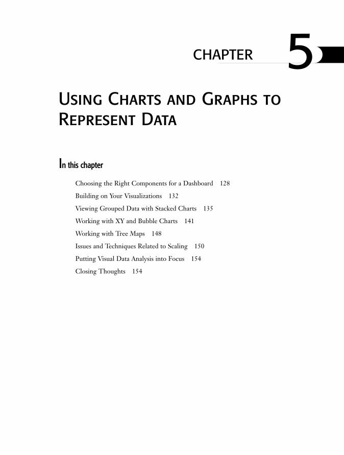
Your first hurdle is to determine how much data you want to display. Figure 5.1 shows twoalternative views of the data. The top-left graph represents a 22-day snippet of data. Thelower-right graph represents data over the full range of dates, roughly spanning a full year.
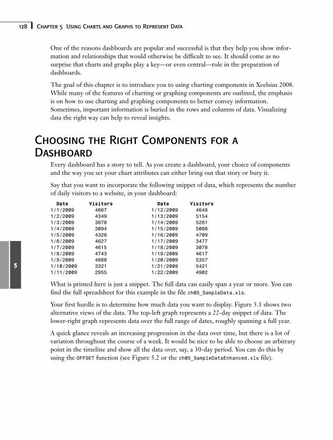
A quick glance reveals an increasing progression in the data over time, but there is a lot ofvariation throughout the course of a week. It would be nice to be able to choose an arbitrarypoint in the timeline and show all the data over, say, a 30-day period. You can do this byusing the OFFSET function (see Figure 5.2 or the ch05_SampleDataEnhanced.xls file).
129Choosing the Right Components for a Dashboard
5
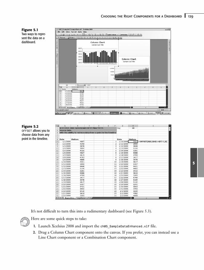
It’s not difficult to turn this into a rudimentary dashboard (see Figure 5.3).
Here are some quick steps to take:
1. Launch Xcelsius 2008 and import the ch05_SampleDataEnhanced.xlf file.
2. Drag a Column Chart component onto the canvas. If you prefer, you can instead use aLine Chart component or a Combination Chart component.
Figure 5.1Two ways to repre-sent the data on adashboard.
Figure 5.2OFFSET allows you tochoose data from anypoint in the timeline.
130 Chapter 5 Using Charts and Graphs to Represent Data
5
3. Map the component to the underlying spreadsheet data.
Click the chart and in the General tab of the chart’s properties panel, click the By Seriesradio button and then click the + button to add a data series.
Within the added data series, link the Y values to the data to be displayed. If you arefollowing this example, this would be cells H7:H37 of the SourceData worksheet.
If for some reason you want the Y-axis to appear on the right side of the chart, chooseSecondary Axis instead of Primary Axis.
Link the category labels to the cells G7:G37.
4. Drag a Spinner component onto the canvas and link the data field to the day number(in this example, it is cell H1).
Figure 5.3A very basic timelinedashboard.
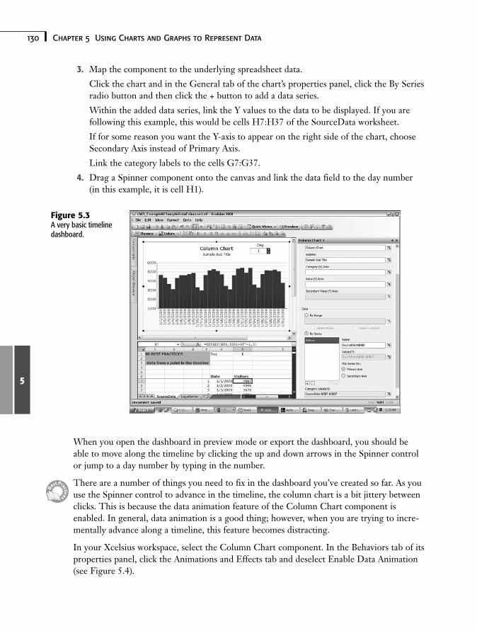
When you open the dashboard in preview mode or export the dashboard, you should beable to move along the timeline by clicking the up and down arrows in the Spinner controlor jump to a day number by typing in the number.
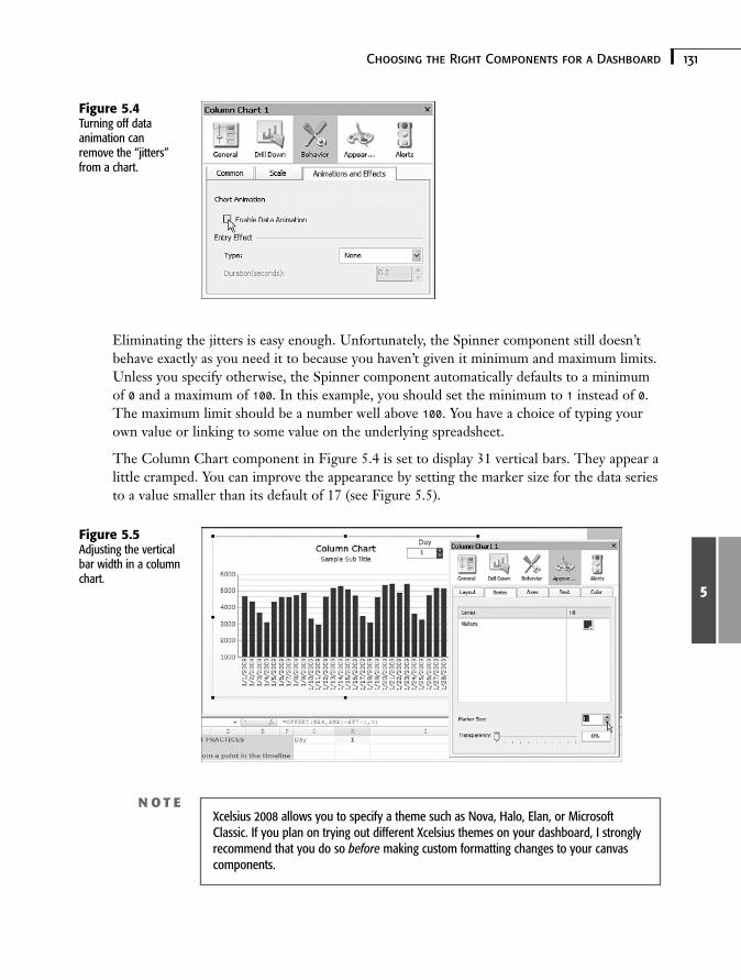
There are a number of things you need to fix in the dashboard you’ve created so far. As youuse the Spinner control to advance in the timeline, the column chart is a bit jittery betweenclicks. This is because the data animation feature of the Column Chart component isenabled. In general, data animation is a good thing; however, when you are trying to incre-mentally advance along a timeline, this feature becomes distracting.
In your Xcelsius workspace, select the Column Chart component. In the Behaviors tab of itsproperties panel, click the Animations and Effects tab and deselect Enable Data Animation(see Figure 5.4).
131Choosing the Right Components for a Dashboard
5
Eliminating the jitters is easy enough. Unfortunately, the Spinner component still doesn’tbehave exactly as you need it to because you haven’t given it minimum and maximum limits.Unless you specify otherwise, the Spinner component automatically defaults to a minimumof 0 and a maximum of 100. In this example, you should set the minimum to 1 instead of 0.The maximum limit should be a number well above 100. You have a choice of typing yourown value or linking to some value on the underlying spreadsheet.
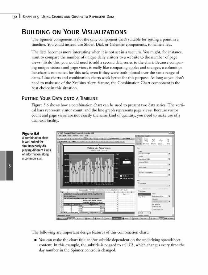
The Column Chart component in Figure 5.4 is set to display 31 vertical bars. They appear alittle cramped. You can improve the appearance by setting the marker size for the data seriesto a value smaller than its default of 17 (see Figure 5.5).
Figure 5.4Turning off dataanimation canremove the “jitters”from a chart.
Figure 5.5Adjusting the verticalbar width in a columnchart.
N O T EXcelsius 2008 allows you to specify a theme such as Nova, Halo, Elan, or MicrosoftClassic. If you plan on trying out different Xcelsius themes on your dashboard, I stronglyrecommend that you do so before making custom formatting changes to your canvascomponents.
132 Chapter 5 Using Charts and Graphs to Represent Data
5
Building on Your VisualizationsThe Spinner component is not the only component that’s suitable for setting a point in atimeline. You could instead use Slider, Dial, or Calendar components, to name a few.
The data becomes more interesting when it is not set in a vacuum. You might, for instance,want to compare the number of unique daily visitors to a website to the number of pageviews. To do this, you would need to add a second data series to the chart. Because compar-ing unique visitors and page views is really like comparing apples and oranges, a column orbar chart is not suited for this task, even if they were both plotted over the same range ofdates. Line charts and combination charts work better for this purpose. As long as you don’tneed to make use of the Xcelsius Alerts feature, the Combination Chart component is thebest choice in this situation.
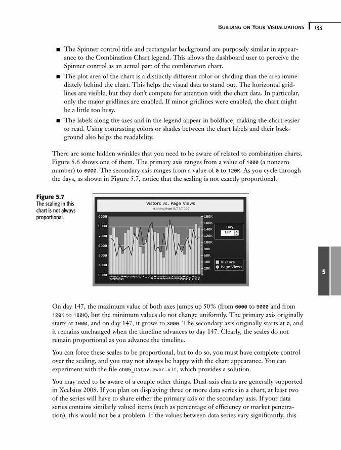
Putting Your Data onto a TimelineFigure 5.6 shows how a combination chart can be used to present two data series: The verti-cal bars represent visitor count, and the line graph represents page views. Because visitorcount and page views are not exactly the same kind of quantity, you need to make use of adual-axis facility.
Figure 5.6A combination chartis well suited forsimultaneously dis-playing different kindsof information alonga common axis.
The following are important design features of this combination chart:
■ You can make the chart title and/or subtitle dependent on the underlying spreadsheetcontent. In this example, the subtitle is pegged to cell C5, which changes every time theday number in the Spinner control is changed.
133Building on Your Visualizations
5
■ The Spinner control title and rectangular background are purposely similar in appear-ance to the Combination Chart legend. This allows the dashboard user to perceive theSpinner control as an actual part of the combination chart.
■ The plot area of the chart is a distinctly different color or shading than the area imme-diately behind the chart. This helps the visual data to stand out. The horizontal grid-lines are visible, but they don’t compete for attention with the chart data. In particular,only the major gridlines are enabled. If minor gridlines were enabled, the chart mightbe a little too busy.
■ The labels along the axes and in the legend appear in boldface, making the chart easierto read. Using contrasting colors or shades between the chart labels and their back-ground also helps the readability.
There are some hidden wrinkles that you need to be aware of related to combination charts.Figure 5.6 shows one of them. The primary axis ranges from a value of 1000 (a nonzeronumber) to 6000. The secondary axis ranges from a value of 0 to 120K. As you cycle throughthe days, as shown in Figure 5.7, notice that the scaling is not exactly proportional.
Figure 5.7The scaling in thischart is not alwaysproportional.
On day 147, the maximum value of both axes jumps up 50% (from 6000 to 9000 and from120K to 180K), but the minimum values do not change uniformly. The primary axis originallystarts at 1000, and on day 147, it grows to 3000. The secondary axis originally starts at 0, andit remains unchanged when the timeline advances to day 147. Clearly, the scales do notremain proportional as you advance the timeline.
You can force these scales to be proportional, but to do so, you must have complete controlover the scaling, and you may not always be happy with the chart appearance. You canexperiment with the file ch05_DataViewer.xlf, which provides a solution.
You may need to be aware of a couple other things. Dual-axis charts are generally supportedin Xcelsius 2008. If you plan on displaying three or more data series in a chart, at least twoof the series will have to share either the primary axis or the secondary axis. If your dataseries contains similarly valued items (such as percentage of efficiency or market penetra-tion), this would not be a problem. If the values between data series vary significantly, this
134 Chapter 5 Using Charts and Graphs to Represent Data
5
could be problematic. Consider the example of unique visitor counts and total page views. Ifyou want to plot the ratio of page views per visitor, you might find numbers typically varyingbetween 10 and 25. When you try including these as an additional data series in the combi-nation chart, the data becomes flatlined, as the numbers are too small for either of the pri-mary or secondary scales. To cope with this issue, you have several strategies available.
■ You could put the page views on the same axis as the visitors and place the page viewsper visitor on the other axis. Unless the data series sharing a common axis have similarvalues, this is not going to be a very effective solution. In this particular case, the pageviews dominate. The visitor count is visible but too small, resulting in loss of meaning-ful information.
A common technique for dealing with quantities that are vastly different in order ofmagnitude is to apply logarithmic scaling instead of linear scaling.
■ You could apply context switching so that only one data series is displayed at any time,but the user would have complete freedom to choose which two data series you wantto view.
■ You could overlay a line chart on top of the combination chart. The line chart wouldneed to be precisely positioned. Its background would have to be disabled so it is fullytransparent. You would not display the line chart axis labels. The line chart axes couldbe hidden as well.
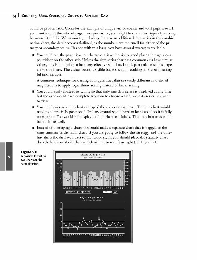
■ Instead of overlaying a chart, you could make a separate chart that is pegged to thesame timeline as the main chart. If you are going to follow this strategy, and the time-line shifts the displayed data to the left or right, you should place the separate chartdirectly below or above the main chart, not to its left or right (see Figure 5.8).
Figure 5.8A possible layout fortwo charts on thesame timeline.
135Viewing Grouped Data with Stacked Charts
5
Viewing Grouped Data with Stacked ChartsStacked charts—whether column, bar, or area charts—have features similar to theirunstacked counterparts. An obvious difference is that the data displayed in a stacked chart isshown cumulatively.
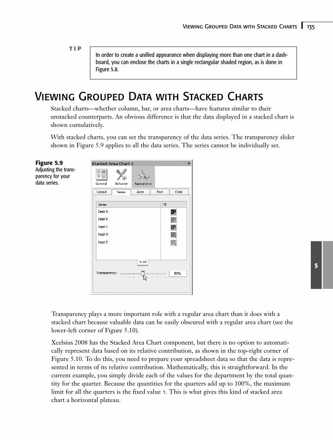
With stacked charts, you can set the transparency of the data series. The transparency slidershown in Figure 5.9 applies to all the data series. The series cannot be individually set.
T I PIn order to create a unified appearance when displaying more than one chart in a dash-board, you can enclose the charts in a single rectangular shaded region, as is done inFigure 5.8.
Figure 5.9Adjusting the trans-parency for yourdata series.
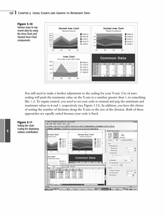
Transparency plays a more important role with a regular area chart than it does with astacked chart because valuable data can be easily obscured with a regular area chart (see thelower-left corner of Figure 5.10).
Xcelsius 2008 has the Stacked Area Chart component, but there is no option to automati-cally represent data based on its relative contribution, as shown in the top-right corner ofFigure 5.10. To do this, you need to prepare your spreadsheet data so that the data is repre-sented in terms of its relative contribution. Mathematically, this is straightforward. In thecurrent example, you simply divide each of the values for the department by the total quan-tity for the quarter. Because the quantities for the quarters add up to 100%, the maximumlimit for all the quarters is the fixed value 1. This is what gives this kind of stacked areachart a horizontal plateau.
136 Chapter 5 Using Charts and Graphs to Represent Data
5
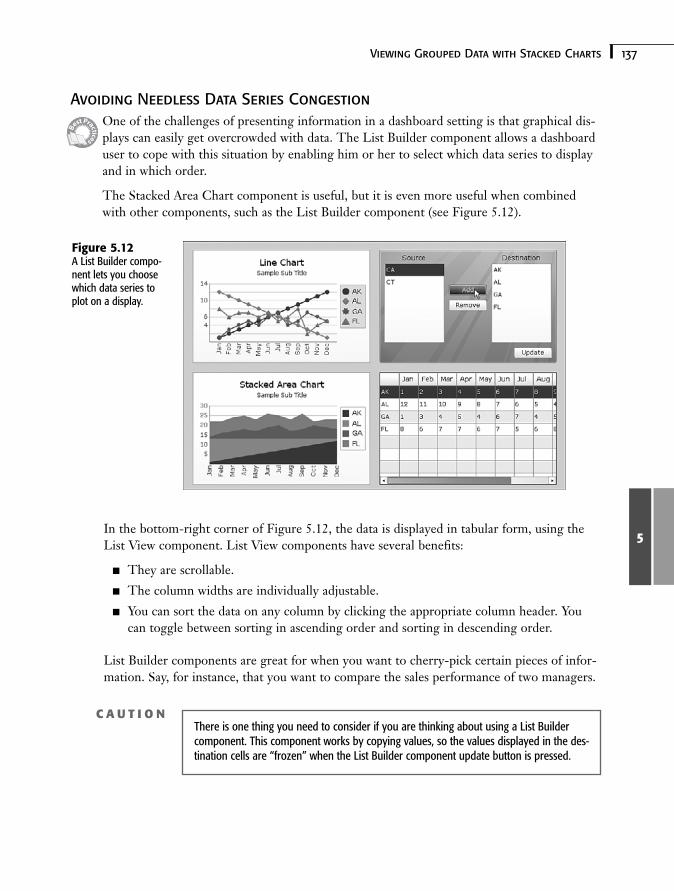
You still need to make a further adjustment to the scaling for your Y-axis. Use of auto-scaling will push the maximum value on the Y-axis to a number greater than 1, to somethinglike 1.2. To regain control, you need to set your scale to manual and peg the minimum andmaximum values to 0 and 1, respectively (see Figure 5.11). In addition, you have the choiceof setting the number of divisions along the Y-axis or the size of the division. Both of theseapproaches are equally suited because your scale is fixed.
Figure 5.10Various ways to rep-resent data by usingthe Area Chart andStacked Area Chartcomponents.
Figure 5.11Setting the chartscaling for displayingrelative contribution.
137Viewing Grouped Data with Stacked Charts
5
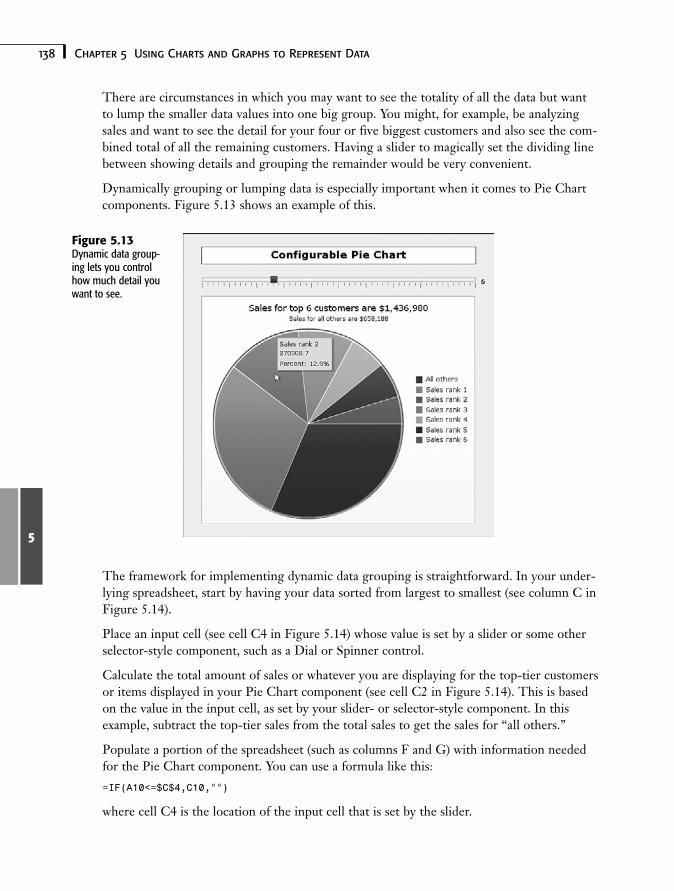
Avoiding Needless Data Series CongestionOne of the challenges of presenting information in a dashboard setting is that graphical dis-plays can easily get overcrowded with data. The List Builder component allows a dashboarduser to cope with this situation by enabling him or her to select which data series to displayand in which order.
The Stacked Area Chart component is useful, but it is even more useful when combinedwith other components, such as the List Builder component (see Figure 5.12).
Figure 5.12A List Builder compo-nent lets you choosewhich data series toplot on a display.
In the bottom-right corner of Figure 5.12, the data is displayed in tabular form, using theList View component. List View components have several benefits:
■ They are scrollable.
■ The column widths are individually adjustable.
■ You can sort the data on any column by clicking the appropriate column header. Youcan toggle between sorting in ascending order and sorting in descending order.
List Builder components are great for when you want to cherry-pick certain pieces of infor-mation. Say, for instance, that you want to compare the sales performance of two managers.
C A U T I O NThere is one thing you need to consider if you are thinking about using a List Buildercomponent. This component works by copying values, so the values displayed in the des-tination cells are “frozen” when the List Builder component update button is pressed.
138 Chapter 5 Using Charts and Graphs to Represent Data
5
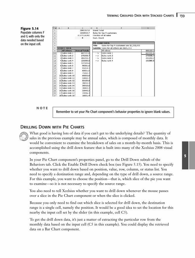
There are circumstances in which you may want to see the totality of all the data but wantto lump the smaller data values into one big group. You might, for example, be analyzingsales and want to see the detail for your four or five biggest customers and also see the com-bined total of all the remaining customers. Having a slider to magically set the dividing linebetween showing details and grouping the remainder would be very convenient.
Dynamically grouping or lumping data is especially important when it comes to Pie Chartcomponents. Figure 5.13 shows an example of this.
Figure 5.13Dynamic data group-ing lets you controlhow much detail youwant to see.
The framework for implementing dynamic data grouping is straightforward. In your under-lying spreadsheet, start by having your data sorted from largest to smallest (see column C inFigure 5.14).
Place an input cell (see cell C4 in Figure 5.14) whose value is set by a slider or some otherselector-style component, such as a Dial or Spinner control.
Calculate the total amount of sales or whatever you are displaying for the top-tier customersor items displayed in your Pie Chart component (see cell C2 in Figure 5.14). This is basedon the value in the input cell, as set by your slider- or selector-style component. In thisexample, subtract the top-tier sales from the total sales to get the sales for “all others.”
Populate a portion of the spreadsheet (such as columns F and G) with information neededfor the Pie Chart component. You can use a formula like this:
=IF(A10<=$C$4,C10,””)
where cell C4 is the location of the input cell that is set by the slider.
139Viewing Grouped Data with Stacked Charts
5
Drilling Down with Pie ChartsWhat good is having lots of data if you can’t get to the underlying details? The quantity ofsales in the previous example may be annual sales, which is composed of monthly data. Itwould be convenient to examine the breakdown of sales on a month-by-month basis. This isaccomplished using the drill down feature that is built into many of the Xcelsius 2008 visualcomponents.
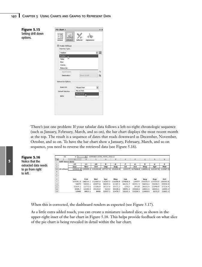
In your Pie Chart component’s properties panel, go to the Drill Down subtab of theBehaviors tab. Click the Enable Drill Down check box (see Figure 5.15). You need to specifywhether you want to drill down based on position, value, row, column, or status list. Youneed to specify a destination range and, depending on the type of drill down, a source range.For this example, you want to choose the position—that is, which slice of the pie you wantto examine—so it is not necessary to specify the source range.
You also need to tell Xcelsius whether you want to drill down whenever the mouse passesover a slice in the Pie Chart component or when the slice is clicked.
Because you only need to find out which slice is selected for drill down, the destinationrange is a single cell, namely the position. It would be a good idea to set the location for thisnearby the input cell set by the slider (in this example, cell C5).
To get the drill down data, it’s just a matter of extracting the particular row from themonthly data based on the input cell (C5 in this example). You could display the retrieveddata on a Bar Chart component.
Figure 5.14Populate columns Fand G with only thedata needed basedon the input cell.
N O T ERemember to set your Pie Chart component’s behavior properties to ignore blank values.
140 Chapter 5 Using Charts and Graphs to Represent Data
5
There’s just one problem: If your tabular data follows a left-to-right chronologic sequence(such as January, February, March, and so on), the bar chart displays the most recent monthat the top. The result is a sequence of dates that reads downward as December, November,October, and so on. To have the bar chart show a January, February, March, and so onsequence, you need to reverse the retrieved data (see Figure 5.16).
Figure 5.15Setting drill downoptions.
Figure 5.16Notice that theextracted data needsto go from rightto left.
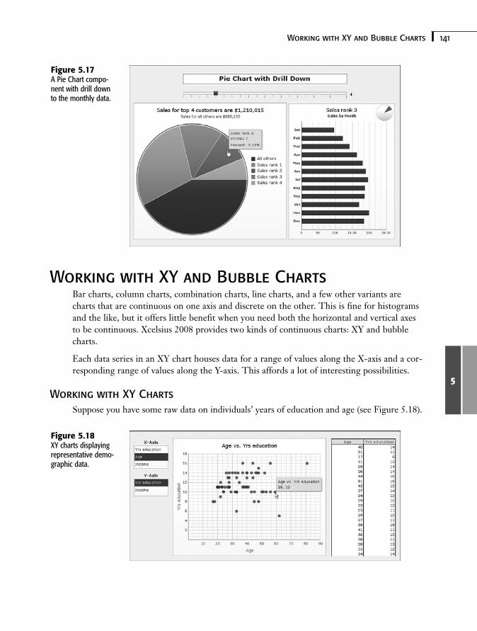
When this is corrected, the dashboard renders as expected (see Figure 5.17).
As a little extra added touch, you can create a miniature isolated slice, as shown in theupper-right inset of the bar chart in Figure 5.18. This helps provide feedback on what sliceof the pie chart is being revealed in detail within the bar chart.
141Working with XY and Bubble Charts
5
Working with XY and Bubble ChartsBar charts, column charts, combination charts, line charts, and a few other variants arecharts that are continuous on one axis and discrete on the other. This is fine for histogramsand the like, but it offers little benefit when you need both the horizontal and vertical axesto be continuous. Xcelsius 2008 provides two kinds of continuous charts: XY and bubblecharts.
Each data series in an XY chart houses data for a range of values along the X-axis and a cor-responding range of values along the Y-axis. This affords a lot of interesting possibilities.
Working with XY ChartsSuppose you have some raw data on individuals’ years of education and age (see Figure 5.18).
Figure 5.17A Pie Chart compo-nent with drill downto the monthly data.
Figure 5.18XY charts displayingrepresentative demo-graphic data.
142 Chapter 5 Using Charts and Graphs to Represent Data
5
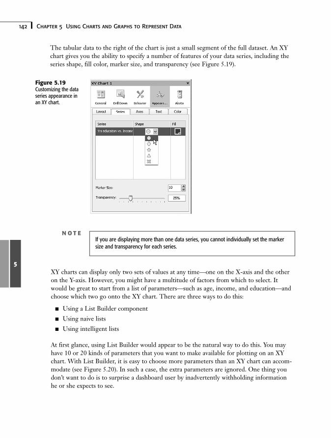
The tabular data to the right of the chart is just a small segment of the full dataset. An XYchart gives you the ability to specify a number of features of your data series, including theseries shape, fill color, marker size, and transparency (see Figure 5.19).
Figure 5.19Customizing the dataseries appearance inan XY chart.
XY charts can display only two sets of values at any time—one on the X-axis and the otheron the Y-axis. However, you might have a multitude of factors from which to select. Itwould be great to start from a list of parameters—such as age, income, and education—andchoose which two go onto the XY chart. There are three ways to do this:
■ Using a List Builder component
■ Using naive lists
■ Using intelligent lists
At first glance, using List Builder would appear to be the natural way to do this. You mayhave 10 or 20 kinds of parameters that you want to make available for plotting on an XYchart. With List Builder, it is easy to choose more parameters than an XY chart can accom-modate (see Figure 5.20). In such a case, the extra parameters are ignored. One thing youdon’t want to do is to surprise a dashboard user by inadvertently withholding informationhe or she expects to see.
N O T EIf you are displaying more than one data series, you cannot individually set the markersize and transparency for each series.
143Working with XY and Bubble Charts
5
There are a couple other reasons to avoid using List Builder to create an XY chart. ListBuilder copies data to a location. If the original data changes, the changes are not reflectedin the chart until the List Builder is updated. In addition, any time the user wants to switchwhich items appear in a chart, he or she must go back to the List Builder chart and recon-struct the list. List Builder may be indispensable for constructing reports, but it does notalways provide the fluid interactivity needed for dashboards.
Another approach would be to supply for each axis a list-like selector such as a List Box orRadio Button component and, based on the parameter selected, look up the respectivedataset. This technique overcomes the primary challenges of using List Builder: It is notpossible to oversaturate the XY chart with too many parameters, and there is no wait time;as soon as an item is selected from the list, the data appears on the plot. There is onewrinkle with using a List Box or Radio Button component, though: It is possible to selectthe same item in each of the independent lists. For instance, it is possible to plot income onboth the X-axis and Y-axis. Although this is not problematic, it isn’t very elegant.
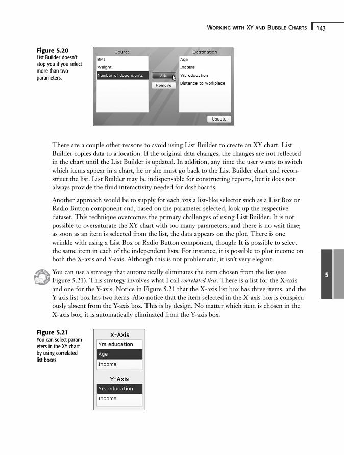
You can use a strategy that automatically eliminates the item chosen from the list (seeFigure 5.21). This strategy involves what I call correlated lists. There is a list for the X-axisand one for the Y-axis. Notice in Figure 5.21 that the X-axis list box has three items, and theY-axis list box has two items. Also notice that the item selected in the X-axis box is conspicu-ously absent from the Y-axis box. This is by design. No matter which item is chosen in theX-axis box, it is automatically eliminated from the Y-axis box.
Figure 5.20List Builder doesn’tstop you if you selectmore than twoparameters.
Figure 5.21You can select param-eters in the XY chartby using correlatedlist boxes.
144 Chapter 5 Using Charts and Graphs to Represent Data
5
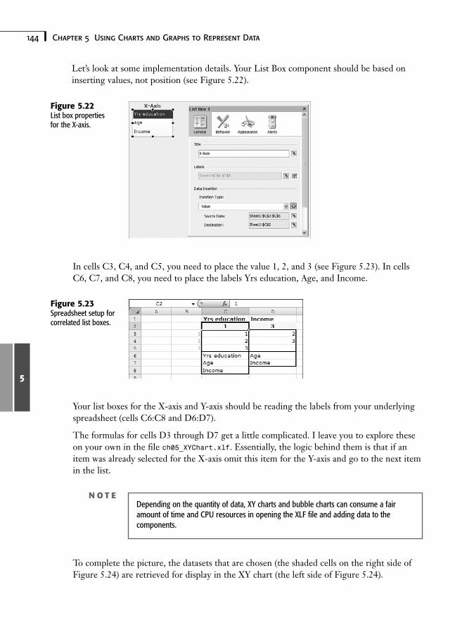
Let’s look at some implementation details. Your List Box component should be based oninserting values, not position (see Figure 5.22).
Figure 5.22List box propertiesfor the X-axis.
In cells C3, C4, and C5, you need to place the value 1, 2, and 3 (see Figure 5.23). In cellsC6, C7, and C8, you need to place the labels Yrs education, Age, and Income.
Figure 5.23Spreadsheet setup forcorrelated list boxes.
Your list boxes for the X-axis and Y-axis should be reading the labels from your underlyingspreadsheet (cells C6:C8 and D6:D7).
The formulas for cells D3 through D7 get a little complicated. I leave you to explore theseon your own in the file ch05_XYChart.xlf. Essentially, the logic behind them is that if anitem was already selected for the X-axis omit this item for the Y-axis and go to the next itemin the list.
N O T EDepending on the quantity of data, XY charts and bubble charts can consume a fairamount of time and CPU resources in opening the XLF file and adding data to thecomponents.
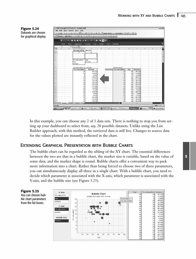
To complete the picture, the datasets that are chosen (the shaded cells on the right side ofFigure 5.24) are retrieved for display in the XY chart (the left side of Figure 5.24).
145Working with XY and Bubble Charts
5
In this example, you can choose any 2 of 3 data sets. There is nothing to stop you from set-ting up your dashboard to select from, say, 20 possible datasets. Unlike using the ListBuilder approach, with this method, the retrieved data is still live. Changes to source datafor the values plotted are instantly reflected in the chart.
Extending Graphical Presentation with Bubble ChartsThe bubble chart can be regarded as the sibling of the XY chart. The essential differencesbetween the two are that in a bubble chart, the marker size is variable, based on the value ofsome data, and the marker shape is round. Bubble charts offer a convenient way to packmore information into a chart. Rather than being forced to choose two of three parameters,you can simultaneously display all three in a single chart. With a bubble chart, you need todecide which parameter is associated with the X-axis, which parameter is associated with theY-axis, and the bubble size (see Figure 5.25).
Figure 5.24Datasets are chosenfor graphical display.
Figure 5.25You can choose bub-ble chart parametersfrom the list boxes.
146 Chapter 5 Using Charts and Graphs to Represent Data
5
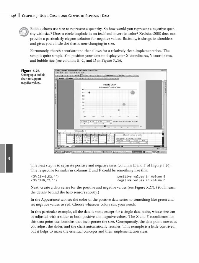
Bubble charts use size to represent a quantity. So how would you represent a negative quan-tity with size? Does a circle implode in on itself and invert its color? Xcelsius 2008 does notprovide a particularly elegant solution for negative values. Basically, it shrugs its shouldersand gives you a little dot that is non-changing in size.
Fortunately, there’s a workaround that allows for a relatively clean implementation. Thesetup is quite simple. You position your data to display your X coordinates, Y coordinates,and bubble size (see columns B, C, and D in Figure 5.26).
Figure 5.26Setting up a bubblechart to supportnegative values.
The next step is to separate positive and negative sizes (columns E and F of Figure 5.26).The respective formulas in columns E and F could be something like this:
=IF(D2>=0,D2,””) positive values in column E=IF(D2<0,D2,””) negative values in column F
Next, create a data series for the positive and negative values (see Figure 5.27). (You’ll learnthe details behind the halo sensors shortly.)
In the Appearance tab, set the color of the positive data series to something like green andset negative values to red. Choose whatever colors suit your needs.
In this particular example, all the data is static except for a single data point, whose size canbe adjusted with a slider to both positive and negative values. The X and Y coordinates forthis data point use formulas that incorporate the size. Consequently, the data point moves asyou adjust the slider, and the chart automatically rescales. This example is a little contrived,but it helps to make the essential concepts and their implementation clear.
147Working with XY and Bubble Charts
5
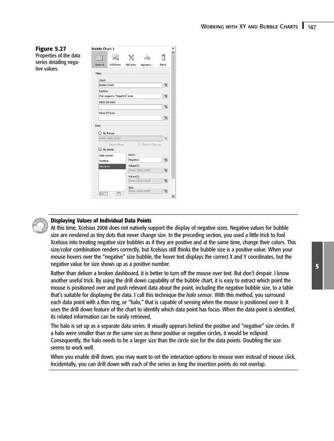
Displaying Values of Individual Data PointsAt this time, Xcelsius 2008 does not natively support the display of negative sizes. Negative values for bubblesize are rendered as tiny dots that never change size. In the preceding section, you used a little trick to foolXcelsius into treating negative size bubbles as if they are positive and at the same time, change their colors. Thissize/color combination renders correctly, but Xcelsius still thinks the bubble size is a positive value. When yourmouse hovers over the “negative” size bubble, the hover text displays the correct X and Y coordinates, but thenegative value for size shows up as a positive number.
Rather than deliver a broken dashboard, it is better to turn off the mouse over text. But don’t despair. I knowanother useful trick. By using the drill down capability of the bubble chart, it is easy to extract which point themouse is positioned over and push relevant data about the point, including the negative bubble size, to a tablethat’s suitable for displaying the data. I call this technique the halo sensor. With this method, you surroundeach data point with a thin ring, or “halo,” that is capable of sensing when the mouse is positioned over it. Ituses the drill down feature of the chart to identify which data point has focus. When the data point is identified,its related information can be easily retrieved.
The halo is set up as a separate data series. It visually appears behind the positive and “negative” size circles. Ifa halo were smaller than or the same size as these positive or negative circles, it would be eclipsed.Consequently, the halo needs to be a larger size than the circle size for the data points. Doubling the sizeseems to work well.
When you enable drill down, you may want to set the interaction options to mouse over instead of mouse click.Incidentally, you can drill down with each of the series as long the insertion points do not overlap.
Figure 5.27Properties of the dataseries detailing nega-tive values.
148 Chapter 5 Using Charts and Graphs to Represent Data
5
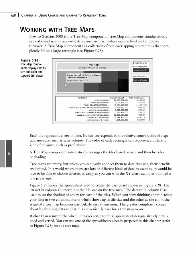
Working with Tree MapsNew to Xcelsius 2008 is the Tree Map component. Tree Map components simultaneouslyuse color and size to represent data pairs, such as median income level and employeeturnover. A Tree Map component is a collection of non-overlapping colored tiles that com-pletely fill up a large rectangle (see Figure 5.28).
Figure 5.28Tree Map compo-nents display data bysize and color andsupport drill down.
Each tile represents a row of data. Its size corresponds to the relative contribution of a spe-cific measure, such as sales volume. The color of each rectangle can represent a differentkind of measure, such as profitability.
A Tree Map component automatically arranges the tiles based on size and then by coloror shading.
Tree maps are pretty, but unless you can easily connect them to data they use, their benefitsare limited. In a world where there are lots of different kinds of data to examine, it would benice to be able to choose datasets as easily as you can with the XY chart examples outlined afew pages ago.
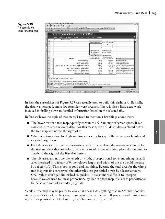
Figure 5.29 shows the spreadsheet used to create the dashboard shown in Figure 5.28. Thedataset in column C determines the tile size on the tree map. The dataset in column C isused to set the shading of colors for each of the tiles. When you start thinking about placingyour data in two columns, one of which shows up as tile size and the other as tile color, thesetup of a tree map becomes particularly easy to envision. The greater complexity comesabout by shuttling data so that it is conveniently easy for a tree map to use.
Rather than reinvent the wheel, it makes sense to reuse spreadsheet designs already devel-oped and vetted. You can use one of the spreadsheets already prepared in this chapter (referto Figure 5.23) for the tree map.
149Working with Tree Maps
5
In fact, the spreadsheet of Figure 5.25 was actually used to build this dashboard. Basically,the data was swapped, and a few formulas were tweaked. There is also a little extra workinvolved in drilling down to detailed information based on the selected tile.
Before we leave the topic of tree maps, I need to mention a few things about them:
■ The hover text in a tree map typically consumes a fair amount of screen space. It caneasily obscure other relevant data. For this reason, the drill down data is placed belowthe tree map and not to the right of it.
■ When selecting colors for high and low values, try to stay in the same color family andvary the brightness.
■ Each data series in a tree map consists of a pair of correlated datasets—one column forthe size and the other for color. If you want to add a second series, place the data imme-diately to the right of the first data series.
■ The tile area, and not the tile length or width, is proportional to its underlying data. Ifsales increased by a factor of 9, the relative length and width of the tile would increaseby a factor of 3. This is both a good and bad thing. Because the total area for the wholetree map remains conserved, the other tile sizes get scaled down by a lesser amount.Small values don’t get diminished so quickly. It is also more difficult to interpretbecause we are used to linear proportionality, but in a tree map, tile size is proportionalto the square root of its underlying data.
While a tree map may be pretty to look at, it doesn’t do anything that an XY chart doesn’t.Actually, an XY chart can be easier to interpret than a tree map. If you stop and think aboutit, the data points in an XY chart are, by definition, already sorted.
Figure 5.29The spreadsheetsetup for a tree map.
150 Chapter 5 Using Charts and Graphs to Represent Data
5
Issues and Techniques Related to ScalingXcelsius 2008 provides for auto-scaling of charts. This relieves you of the burden and drudg-ery of manually setting a chart scale. Most of the time, auto-scaling works well, but if yourliving is based on presentations and dashboards, you might want more fine-tuned controlthan auto-scaling allows.
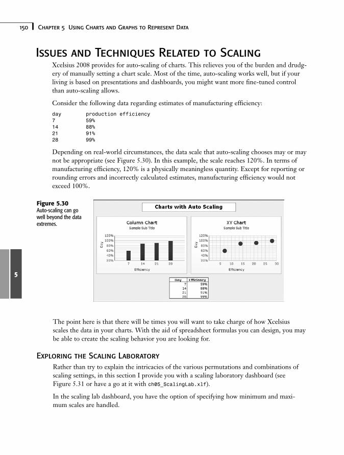
Consider the following data regarding estimates of manufacturing efficiency:
day production efficiency7 59%14 88%21 91%28 99%
Depending on real-world circumstances, the data scale that auto-scaling chooses may or maynot be appropriate (see Figure 5.30). In this example, the scale reaches 120%. In terms ofmanufacturing efficiency, 120% is a physically meaningless quantity. Except for reporting orrounding errors and incorrectly calculated estimates, manufacturing efficiency would notexceed 100%.
Figure 5.30Auto-scaling can gowell beyond the dataextremes.
The point here is that there will be times you will want to take charge of how Xcelsiusscales the data in your charts. With the aid of spreadsheet formulas you can design, you maybe able to create the scaling behavior you are looking for.
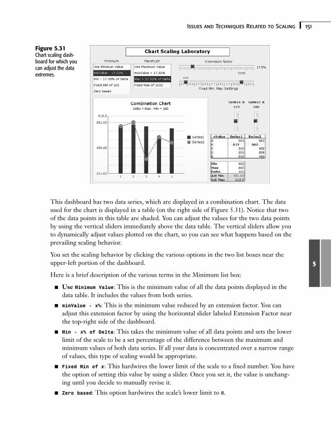
Exploring the Scaling LaboratoryRather than try to explain the intricacies of the various permutations and combinations ofscaling settings, in this section I provide you with a scaling laboratory dashboard (seeFigure 5.31 or have a go at it with ch05_ScalingLab.xlf).
In the scaling lab dashboard, you have the option of specifying how minimum and maxi-mum scales are handled.
151Issues and Techniques Related to Scaling
5
This dashboard has two data series, which are displayed in a combination chart. The dataused for the chart is displayed in a table (on the right side of Figure 5.31). Notice that twoof the data points in this table are shaded. You can adjust the values for the two data pointsby using the vertical sliders immediately above the data table. The vertical sliders allow youto dynamically adjust values plotted on the chart, so you can see what happens based on theprevailing scaling behavior.
You set the scaling behavior by clicking the various options in the two list boxes near theupper-left portion of the dashboard.
Here is a brief description of the various terms in the Minimum list box:
■ Use Minimum Value: This is the minimum value of all the data points displayed in thedata table. It includes the values from both series.
■ minValue - x%: This is the minimum value reduced by an extension factor. You canadjust this extension factor by using the horizontal slider labeled Extension Factor nearthe top-right side of the dashboard.
■ Min - x% of Delta: This takes the minimum value of all data points and sets the lowerlimit of the scale to be a set percentage of the difference between the maximum andminimum values of both data series. If all your data is concentrated over a narrow rangeof values, this type of scaling would be appropriate.
■ Fixed Min of x: This hardwires the lower limit of the scale to a fixed number. You havethe option of setting this value by using a slider. Once you set it, the value is unchang-ing until you decide to manually revise it.
■ Zero based: This option hardwires the scale’s lower limit to 0.
Figure 5.31Chart scaling dash-board for which youcan adjust the dataextremes.
152 Chapter 5 Using Charts and Graphs to Represent Data
5
The Maximum list box options are largely the equivalent of those in the Minimum list box,except that they apply to the scale’s upper limit and tend to add rather than subtract values.In addition, there is no zero-based equivalent for the Maximum list box.
N O T EKeep in mind that if you don’t like the way Xcelsius is handling scaling—for example, if itis creating scaling limits clearly beyond 100%—you need to be able to handle both theupper and lower limits of the scale. You can’t get away with addressing only one side ofthe spectrum.
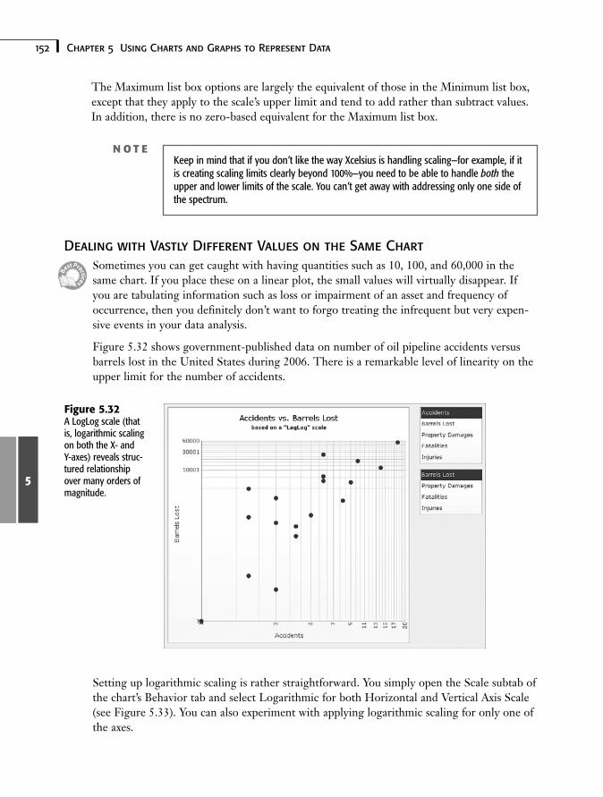
Dealing with Vastly Different Values on the Same ChartSometimes you can get caught with having quantities such as 10, 100, and 60,000 in thesame chart. If you place these on a linear plot, the small values will virtually disappear. Ifyou are tabulating information such as loss or impairment of an asset and frequency ofoccurrence, then you definitely don’t want to forgo treating the infrequent but very expen-sive events in your data analysis.
Figure 5.32 shows government-published data on number of oil pipeline accidents versusbarrels lost in the United States during 2006. There is a remarkable level of linearity on theupper limit for the number of accidents.
Figure 5.32A LogLog scale (thatis, logarithmic scalingon both the X- andY-axes) reveals struc-tured relationshipover many orders ofmagnitude.
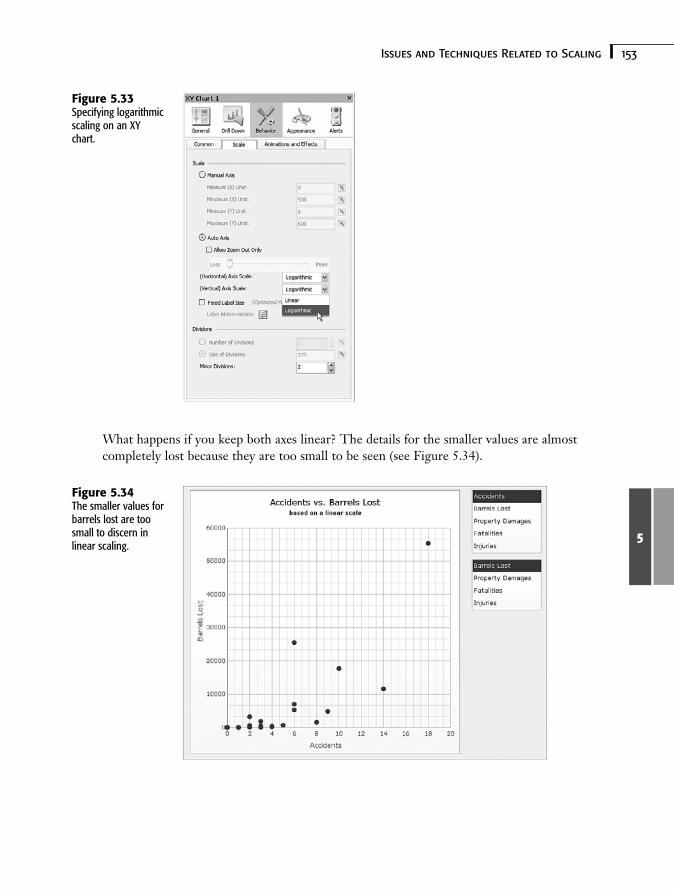
Setting up logarithmic scaling is rather straightforward. You simply open the Scale subtab ofthe chart’s Behavior tab and select Logarithmic for both Horizontal and Vertical Axis Scale(see Figure 5.33). You can also experiment with applying logarithmic scaling for only one ofthe axes.
153Issues and Techniques Related to Scaling
5
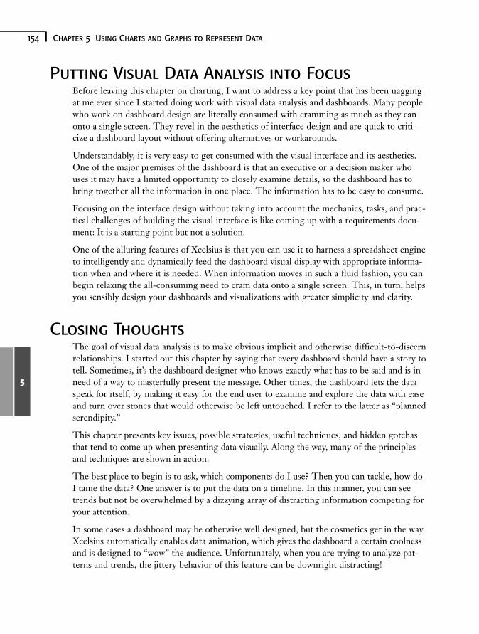
What happens if you keep both axes linear? The details for the smaller values are almostcompletely lost because they are too small to be seen (see Figure 5.34).
Figure 5.33Specifying logarithmicscaling on an XYchart.
Figure 5.34The smaller values forbarrels lost are toosmall to discern inlinear scaling.
154 Chapter 5 Using Charts and Graphs to Represent Data
5
Putting Visual Data Analysis into FocusBefore leaving this chapter on charting, I want to address a key point that has been naggingat me ever since I started doing work with visual data analysis and dashboards. Many peoplewho work on dashboard design are literally consumed with cramming as much as they canonto a single screen. They revel in the aesthetics of interface design and are quick to criti-cize a dashboard layout without offering alternatives or workarounds.
Understandably, it is very easy to get consumed with the visual interface and its aesthetics.One of the major premises of the dashboard is that an executive or a decision maker whouses it may have a limited opportunity to closely examine details, so the dashboard has tobring together all the information in one place. The information has to be easy to consume.
Focusing on the interface design without taking into account the mechanics, tasks, and prac-tical challenges of building the visual interface is like coming up with a requirements docu-ment: It is a starting point but not a solution.
One of the alluring features of Xcelsius is that you can use it to harness a spreadsheet engineto intelligently and dynamically feed the dashboard visual display with appropriate informa-tion when and where it is needed. When information moves in such a fluid fashion, you canbegin relaxing the all-consuming need to cram data onto a single screen. This, in turn, helpsyou sensibly design your dashboards and visualizations with greater simplicity and clarity.
Closing ThoughtsThe goal of visual data analysis is to make obvious implicit and otherwise difficult-to-discernrelationships. I started out this chapter by saying that every dashboard should have a story totell. Sometimes, it’s the dashboard designer who knows exactly what has to be said and is inneed of a way to masterfully present the message. Other times, the dashboard lets the dataspeak for itself, by making it easy for the end user to examine and explore the data with easeand turn over stones that would otherwise be left untouched. I refer to the latter as “plannedserendipity.”
This chapter presents key issues, possible strategies, useful techniques, and hidden gotchasthat tend to come up when presenting data visually. Along the way, many of the principlesand techniques are shown in action.
The best place to begin is to ask, which components do I use? Then you can tackle, how doI tame the data? One answer is to put the data on a timeline. In this manner, you can seetrends but not be overwhelmed by a dizzying array of distracting information competing foryour attention.
In some cases a dashboard may be otherwise well designed, but the cosmetics get in the way.Xcelsius automatically enables data animation, which gives the dashboard a certain coolnessand is designed to “wow” the audience. Unfortunately, when you are trying to analyze pat-terns and trends, the jittery behavior of this feature can be downright distracting!
155Closing Thoughts
5
As you get more sophisticated in your dashboard skills, you are bound to combine severalcomponents so they work as one. People often forget to make components visually blendtogether as if they are one larger component. Sometimes all it takes to glue them together isa single visual background. Sometimes it makes sense to stack data together so you can seeall the data together at one time. Stacked data and its components become further empow-ered when you can drill down to get at the underlying details.
A common perceived limitation of pie charts is that they are only well suited to situations inwhich the various slices of the pie are roughly similar in size, and there are not too many ofthem. However, by dynamically grouping the smallest slices, you can use pie charts in manyother situations as well.
Many of the Xcelsius charting components, such as column charts, are designed to handlehistogram-like data where one of the axes is continuous, and the other varies in discretemeasures or categories. There are times when it is necessary to get more quantitative anddisplay two or more measures. This is where XY charts, bubble charts, and tree maps comeinto play. Standing behind these charts can be a variety of different kinds of datasets, waitingto be visually mixed and matched. I introduce a technique of using correlated list boxes toseamlessly select the datasets to be displayed. This technique takes context switching to anextreme.
In this chapter, you saw a solution for rendering bubble charts when the bubble sizes havenegative values. You also learned how to set up tree maps. In addition, you learned aboutchart scaling because it is important to be able to fully control a dashboard’s visual elements.
The theme of visual elements continues into Chapter 6, “Single Value Components: Dials,Gauges, Speedometers, and the Like.”
Symbols
+ (addition operator), 414
<> (angle brackets), 303
= (assignment operator), 412
’ (comment operator), 413
& (concatenation operator), 414
/ (division operator), 412
$ (dollar symbol), 74
= (equal symbol), 71
^ (exponentiation operator), 413
> (greater-than operator), 413
>= (greater-than-or-equal-tooperator), 413
< (less-than operator), 413
<= (less-than-or-equal-tooperator), 413
= (logical equality operator), 412
- (minus operator), 413
m (mu), 243
* (multiplication operator), 414
- (negation operator), 81
<> (not-equal operator), 414
: (range operator), 80, 414
∑ (sigma), 235
- (subtraction operator), 414
, (union operator), 80
A
abbreviations for chartlabels, 206-207
ABC (Actual BudgetComparison) charts, 344-346
ABS function, 96-97, 405
absolute numbers, 96
absolute references, 73-74
Accordion Menu component, 209
Accordion view, 20-21, 47
accounting. See also financial analysis
accrual-basis accounting, 262
balance sheets, 262cash-basis accounting, 262costs, 262
generally accepted accounting principles(GAAP), 261
income statements, 262matching, 262statement of cash, 262
accrual-basis accounting, 262
ACOS function, 97-98, 405
ACOSH function, 405
activating visibility patternswith switch circuit, 197
Actual Budget Comparison(ABC) charts, 344-346
Add-On Packager, 387-388,390-391
adding in quadrature (uncertainty analysis), 39
addition operator (+), 414
aggregation functions, 82-84AVERAGE, 83AVERAGEA, 83COUNT, 84COUNTA, 84COUNTIF, 84-85LARGE, 89MAX, 82MEDIAN, 83MIN, 82
index
432 aggregation functions
MODE, 83RANK, 89SMALL, 89SUM, 85SUMIF, 87-88SUMPRODUCT, 86-87SUMSQ, 88
aging reports, 264-266
alerts. See also smart textadvantages of, 312built-in alerts, 298colorized alerts, 34-35colorizing, 301-302components with built-in
alerts, 298components without built-in
alerts, 299enabling, 300with filled radar charts,
341-342inline alerts, 309-310multiple data series and, 301overview, 298value-based alerts, 300
Alerts tab (Properties panel), 24
Altman, Ed, 271
ampersand (&), 414
analysisfinancial analysis
accrual-basis accounting, 262
aging reports, 264-266balance sheets, 262cash-basis
accounting, 262
costs, 262financial ratio analysis,
266-272generally accepted
accounting principles(GAAP), 261
income statements, 262matching, 262overview, 258real-world judgments
and, 272-273statement of cash, 262time, accounting for,
263-264Value at Risk (VaR),
258-261statistical analysis.
See statistics
AND function, 107, 404
angle brackets, 303
animation, enabling/disabling, 206
apostrophe (‘), 413
Appearance tab (Propertiespanel), 24
art components, 61-62, 418-419, 422
ASIN function, 97, 405
ASINH function, 405
assignment operator (=), 412
asterisk (*), 414
ATAN function, 97, 405
ATAN2 function, 99, 405
ATANH function, 405
attributes, binding to underlying spreadsheet, 24-26
Augmented Map Framework,280-283
Auto option (chart scaling), 206
auto-scaling, 150
AVEDEV function, 408
AVERAGE function, 83, 90, 408
AVERAGEA function, 83, 408
averages, calculating, 83, 235
avoidingdata series congestion,
137-138occlusion, 342-343
B
Background component, 61-62, 220-222
background groups, 194
balance sheets, 262
BasicHorizontalSliderconnecting ActionScript and
MXML code, 385creating ActionScript code
for, 378-384generating SWF files for,
385-386

433CHOOSE function
Bayes’ Theorem, 241-242
Behavior tab (Propertiespanel), 24
BETADIST function, 408
binding attributes to underlying spreadsheet, 24-26
binomial distributions, 244-246
branding visual elements, 194
bubble charts, 145-146
budgets, ABC (ActualBudget Comparison)charts, 344-346
built-in alerts, 298-299
buttons, toggle buttons, 190
C
calendar arithmeticat dashboard level, 114-115setting up on spreadsheets,
113-114
Calendar component, 223
Candlestick components,347-350
canvasadding components to,
19-21definition of, 46resizing, 48
capabilities of Xcelsius, 16-17
caret (^), 413
cash, statement of, 262
cash-basis accounting, 262
Category I digitizationerrors, 317
Category II digitizationerrors, 317
Category III digitizationerrors, 318
CDF (cumulative distributions function), 246
CEILING function, 100, 405
cellsevaluating, 79-80formatting in Spreadsheet
Table component, 224-225named ranges, 77-79references, 73
absolute references, 73-74
in complex tables, 327example, 75-76hybrid cell references,
74-75isolating hardwired
values, 76-77in multiplication
tables, 327percentage symbols
in, 76relative references, 74in VLOOKUP formula,
326-327
chaining formulas, 72
chartsABC (Actual Budget
Comparison) charts, 344-346
avoiding occlusion, 342-343bubble charts, 145-146Candlestick components,
347-350charting multiple data
series with similar values,339-341
choosing for dashboards,128-131
column charts, 56-57, 129-131
combination charts, 132-134dynamic data grouping,
137-138filled radar charts, 341-342interface design, 154label abbreviations, 206-207line charts, 343-344pie charts, 54-56, 139-140scaling, 204-206
auto-scaling, 150logarithmic scaling,
152-153scaling laboratory
dashboard, 150-152stacked charts, 135-136tree maps, 148-149Xcelsius product family
comparison, 419XY charts, 141-145
Check Box component, 189,209-210
CHOOSE function, 123, 407
How can we make this index more useful? Email us at [email protected]
434 client portals
client portals, 37
colon (:), 80, 414
coloradding to alerts, 301-302adding to maps, 283-286specifying in HTML, 220
colorized alerts, 34-35
Column Chart component,56-57, 129-131
COMBIN function, 408
Combination Chart component, 132-134
Combo Box component,traffic light alerts in, 210-211
comma (,), 80
comment operator (‘), 413
Compatibility Mode, 52
complex tables, cell references in, 327
complexitycontainment through tab
sets, 182-184managing with context
switching, 184-188
Component pane, positioning, 51
component visibility, managing, 38
components. See alsospecific components
adding to canvas, 19-21adding to dashboards,
128-131
attributes, binding to underlying spreadsheet,24-26
choosing for dashboards,128-131
connection components, 395
context switching, 62-63custom components
connecting ActionScriptand MXML code, 385
construction workflow, 373
creating ActionScriptcode for, 378-385
enhancing, 393-394Flex Builder
environment, 373-375generating SWF files for,
385-386installing, 372-373loading, 391-393overview, 372packaging, 387-391potential problems,
395-396relationship with
property sheets, 386-387
software requirements,375-376
testing, 391-393function components, 395grouping, 50hidden components, 50invisible components, 50list of new components, 40
pasting between XLF files, 63
visibilitydynamic visibility,
188-189multi-layer visibility,
192-200mutually exclusive
visibility, 190-191overview, 188toggling, 189-190
Web connectivity, 62, 422
Components command(View menu), 19
Components pane, 19definition of, 46views, 20, 47
CONCATENATE function, 119, 411
concatenation operator (&), 414
conditional formulas, 107-108
conditional operators, 106
conditional probability, 239-242
configuring Flex Builder, 377
connected map dashboards, 35
Connected Maps referenceimplementation, 291-294
connection components, 395
connectivity. Seedata connectivity
435dashboards
constructing dates, 110-111
containerspanel containers, 58tab sets, 58Xcelsius product family
comparison, 420
context switcher (Shared ComponentFramework), 170
context switching, 2, 41, 62-63, 184-188
continuous probability distributions, 246-250
converting text to numberedequivalent, 105
correlated lists, 143
COS function, 97-98, 405
COSH function, 405
costs, 262
COUNT function, 84, 409
COUNTA function, 84, 409
COUNTIF function, 84-85, 409
counting functions, 84-85
cross-domain policy files,368-369
cumulative distributionsfunction (CDF), 246
custom componentsCheck Box component,
209-210connecting ActionScript and
MXML code, 385
construction workflow, 373creating ActionScript code
for, 378-385enhancing, 393-394Fisheye component,
211-212Flex Builder environment,
373-375generating SWF files for,
385-386installing, 372-373loading, 391-393overview, 372packaging, 387-391potential problems, 395-396relationship with property
sheets, 386-387Sliding Picture Menu
component, 211-212software requirements,
375-376testing, 391-393Ticker component, 211
customizingcomponents. See
custom componentsdashboard appearance,
27-29workspace layout, 47
canvas size, 48Components Pane
views, 47Object Browser, 48-50pane layout, 51
D
dashboards. See also specific components
building, 44-45, 52colorized alerts, 34-35complexity
containment through tabsets, 182-184
managing with contextswitching, 184-188
component visibility, managing, 38
connecting to Web Services,365-368
customizing appearance of,27-29
desktop client portals, 37embedded formulas in, 34exporting, 26financial analysis in, 38-39graphical viewers in, 36limits, 29-30making date and time aware
calendar arithmetic, 113-115
DATE function, 110DATEVALUE
function, 110DAY function, 111DAYS360 function, 112EDATE function, 112EOMONTH
function, 112HOUR function, 111MINUTE function, 111MONTH function, 111
How can we make this index more useful? Email us at [email protected]
436 dashboards
NETWORKDAYSfunction, 111-112
NOW function, 110overview, 110SECOND function, 111TIME function, 110TIMEVALUE
function, 111TODAY function, 110WEEKDAY
function, 113WEEKNUM
function, 113YEAR function, 111YEARFRAC
function, 113multiple information
sources in single view, 37open-ended dashboards, 355open-source dashboards,
spreadsheets as, 13-16packaging, 354ratio analysis in, 39scaling laboratory
dashboard, 150-152sensitivity analysis in, 38Shared Component
Framework, 36statistical analysis in, 38timeline viewers in, 37uncertainty analysis in, 39uniform look and feel,
designingcontext switching, 62-63fonts, 66-67pasting components
between XLF files, 63
templates, 63-64themes, 64-65
data animation, enabling/disabling, 206
data bank (SharedComponentFramework), 170
data connectivitycross-domain policy files,
368-369open-ended dashboards, 355packaging dashboard
information, 354Web Services, 365-368Xcelsius Data Manager, 355XML
Excel XML maps, 359-364
overview, 356setting up for Xcelsius,
357-359
data digitizationCategory I digitization
errors, 317Category II digitization
errors, 317Category III digitization
errors, 318overview, 316-317
Data Insertion feature(maps), 278
Data Manager, 355
data seriescongestion, avoiding,
137-138drilling down, 207-208multiple data series, 301
data updates, Xcelsius product family comparison, 417
data visualizationavoiding occlusion, 342-343filled radar charts with
alerts, 341-342line chart data, 343-344multiple data series with
similar values, 339-341overview, 339
date and time awareness,adding to dashboards
calendar arithmeticat dashboard level,
114-115setting up on
spreadsheets, 113-114DATE function, 110DATEVALUE
function, 110DAY function, 111DAYS360 function, 112EDATE function, 112EOMONTH function, 112HOUR function, 111MINUTE function, 111MONTH function, 111NETWORKDAYS
function, 111-112NOW function, 110overview, 110SECOND function, 111TIME function, 110TIMEVALUE
function, 111TODAY function, 110WEEKDAY function, 113
437enabling
WEEKNUM function, 113YEAR function, 111YEARFRAC function, 113
DATE function, 110, 402
date/time functions, 402-403
DATEVALUE function, 110, 402
DAVERAGE function, 402
DAY function, 111, 402
DAYS360 function, 112, 402
DB function, 92, 403
DCOUNT function, 409
DCOUNTA function, 409
DDB function, 92, 403
decimal numbers, 219
defining named ranges, 78
DEGREES function, 97-99, 405
depreciation methods, 93-94
designuniform look and feel
context switching, 62-63fonts, 66-67pasting components
between XLF files, 63templates, 63-64themes, 64-65
visual data analysis, 154
desktop client portals, 37
Details tab (Add-OnPackager), 388
DEVSQ function, 409
DGET function, 407
dialog boxes. See specific dialog boxes
dialsenhancing, 168-169overview, 166-167scaling, 167-168Shared Component
Framework, 169-171sharing, 169
digitization of dataCategory I digitization
errors, 317Category II digitization
errors, 317Category III digitization
errors, 318overview, 316-317
disabling data animation, 206
discrete probability distributions, 242-246
display data (in maps), 277-278
displaying negative values, 147
distribution (probability)binomial distributions,
244-246continuous probability
distributions, 246discrete probability
distributions, 242-244normal distribution,
247-250uniform distribution, 92
division operator (/), 412
DMAX function, 409
DMIN function, 409
dollar ($) symbol, 74
DOLLAR function, 101, 406
DPRODUCT function, 406
drilling downin data series, 207-208with pie charts, 139-140
DSTDEV function, 409
DSTDEVP function, 409
DSUM function, 409
dual sliders, 164-166
DVAR function, 409
DVARP function, 409
dynamic data grouping, 137-138
dynamic visibility, 50, 188-189
E
EDATE function, 112, 402
efficiency features, Xcelsius product familycomparison, 417
embedded alerts, 309-310
embedded formulas, 34
embedded spreadsheets. See spreadsheets
enablingalerts, 300data animation, 206
How can we make this index more useful? Email us at [email protected]
438 enhancing
enhancingcustom components,
393-394dials, 168-169
EOMONTH function, 112, 402
equal sign (=), 71, 412
errors. See troubleshooting
Escape from Excel Hell(Abdulezer), 71, 310
ETC (Evolving TechnologiesCorporation) SharedComponent Framework,169-171
evaluating spreadsheet cells, 79-80
EVEN function, 100, 406
Evolving TechnologiesCorporation (ETC) SharedComponent Framework,169-171
EXACT function, 119, 411
Excelinstalling, 18spreadsheets.
See spreadsheetstrialware package, 18XML
setting up for Xcelsius,357-359
XML maps, 359-364
Excel Best Practices forBusiness (Abdulezer), 310
EXP function, 103, 406
EXPONDIST function, 409
exponentiation operator (^), 413
exponents, calculating, 102-103
exporting datadashboards, 26Xcelsius product family
comparison, 418
Extensible MarkupLanguage. See XML
F
FACT function, 409
FALSE function, 106
FALSE value, 412
filescross-domain policy files,
368-369MapRegions.xls, 290SWF files, generating
for custom components,385-386
XLF files, pasting components between, 63
filled radar charts, 341-342
Filter component, 214-216
financial analysis, 38-39accrual-basis
accounting, 262aging reports, 264-266balance sheets, 262cash-basis accounting, 262costs, 262
financial ratio analysis, 266-267
ratio analyzer dashboard,267-270
Z score, 271-272generally accepted
accounting principles(GAAP), 261
income statements, 262matching, 262overview, 258real-world judgments and,
272-273statement of cash, 262time, accounting for,
263-264Value at Risk (VaR),
258-261
financial functions, 92, 403-404
depreciation methods, 93-94net present value, 94-95
FIND function, 118, 411
FISHER function, 409
FISHERINV function, 409
Fisheye component, customizing, 211-212
FIXED function, 406
Flash Player, 17
Flex Builder, 373-377
FLOOR function, 100, 406
Focus Chart Data option(chart scaling), 206
Folder view, 47
439functions
font supportoverview, 66-67Xcelsius product family
comparison, 417
FORECAST function, 104-105, 252, 406
forecasting trends, 104-105
formattingcell formatting in
Spreadsheet Table component, 224-225
HTML formattingin Input Text Area
component, 218-220in Label component,
218-220text formatting
LOWER function, 116new features, 40TEXT function, 116-117UPPER function, 116
formulasadding to spreadsheets,
29-30chaining, 72conditional formulas,
107-108embedded formulas, 34simple formulas, 71-72structure of, 71troubleshooting, 325-327
functions, 395ABS, 96-97, 405ACOS, 97-98, 405ACOSH, 405AND, 107, 404
ASIN, 97, 405ASINH, 405ATAN, 97, 405ATAN2, 99, 405ATANH, 405AVEDEV, 408AVERAGE, 83, 90, 408AVERAGEA, 83, 408BETADIST, 408CEILING, 100, 405CHOOSE, 123, 407COMBIN, 408CONCATENATE,
119, 411COS, 97-98, 405COSH, 405COUNT, 84, 409COUNTA, 84, 409COUNTIF, 84-85, 409DATE, 110, 402DATEVALUE, 110, 402DAVERAGE, 402DAY, 111, 402DAYS360, 112, 402DB, 92, 403DCOUNT, 409DCOUNTA, 409DDB, 92, 403DEGREES, 97-99, 405DEVSQ, 409DGET, 407DMAX, 409DMIN, 409DOLLAR, 101, 406DPRODUCT, 406DSTDEV, 409DSTDEVP, 409
DSUM, 409DVAR, 409DVARP, 409EDATE, 112, 402EOMONTH, 112, 402evaluating spreadsheet cells
with, 79-80EVEN, 100, 406EXACT, 119, 411EXP, 103, 406EXPONDIST, 409FACT, 409FALSE, 106FIND, 118, 411FISHER, 409FISHERINV, 409FIXED, 406FLOOR, 100, 406FORECAST, 104-105,
252, 406FV, 94, 404GEOMEAN, 409HARMEAN, 409HLOOKUP, 124-125, 407HOUR, 111IF, 107, 404INDEX, 122-123, 270, 407INT, 100, 406INTERCEPT, 105,
252, 406IPMT, 94, 404IRR, 94, 404ISBLANK, 107, 404ISERR, 108, 404ISERROR, 108, 405ISEVEN, 109, 405ISLOGICAL, 109, 405
How can we make this index more useful? Email us at [email protected]
440 functions
ISNA, 108, 405ISNONTEXT, 109, 405ISNUMBER, 108, 405ISODD, 109, 405ISTEXT, 109, 405KURT, 410LARGE, 89, 410LEFT, 117, 411LEN, 118, 411LN, 103, 406LOG, 103, 406LOG10, 103, 406LOOKUP, 408LOWER, 116, 411MATCH, 123, 408MAX, 82, 410MEDIAN, 83, 410MID, 118, 411MIN, 82, 410MINUTE, 111MIRR, 94, 404MOD, 101, 406MODE, 83, 410MONTH, 111, 403N, 105, 406NETWORKDAYS,
111-112, 403NORMDIST, 92, 410NORMINV, 92, 410NORMSINV, 410NOT, 107, 405NOW, 110, 403NPER, 94, 404NPV, 94, 404OFFSET, 2, 119-122,
269-270, 309, 408
operators, 80-81OR, 107, 405overview, 79PI, 97-98, 406PMT, 94, 404POWER, 102, 406PPMT, 94, 404PRODUCT, 105, 406PV, 94, 404QUOTIENT, 101, 406RADIANS, 97-98, 406RAND, 91-92, 410RANDBETWEEN, 92RANK, 89, 410RATE, 94, 404REPLACE, 118REPT, 118, 411RIGHT, 411ROUND, 100, 406ROUNDDOWN, 100, 407ROUNDUP, 100, 407SECOND, 111, 403SIGN, 96, 407SIN, 97-98, 407SINH, 407SLN, 92, 404SMALL, 89, 410SQRT, 80, 407STANDARDIZE, 410STDEV, 90-91, 410SUM, 85, 410SUMIF, 87-88, 410SUMPRODUCT,
86-87, 411SUMSQ, 88, 411SUMX2MY2, 411SUMX2PY2, 411
SUMXMY2, 411SYD, 92, 404TAN, 97-98, 407TANH, 407TEXT, 116-117, 411TIME, 110, 403TIMEVALUE, 111, 403TODAY, 110, 403TRUE, 106TRUNC, 101, 407TYPE, 109, 408UPPER, 116, 411VALUE, 105, 407VAR, 90-91, 411VDB, 92, 404VLOOKUP, 124-125, 305,
326-327, 408WEEKDAY, 113, 403WEEKNUM, 113, 403WORKDAY, 403Xcelsius support for, 22YEAR, 111, 403YEARFRAC, 113, 403
FV function, 94, 404
G
GAAP (generally acceptedaccounting principles ), 261
gaugesexample, 171-173overview, 171wraparound gauges,
174-175
General tab (Propertiespanel), 24
441Interactive Calendar component
generally accepted accounting principles(GAAP), 261
GEOMEAN function, 409
goals of Xcelsius, 16-17
gradients in Rectangle component, 221
graphical viewers, 36
greater-than operator (>), 413
greater-than-or-equal-tooperator (>=), 413
Grid component, 225-226
grouped databackground groups, 194components, 50dynamic data grouping,
137-138multi-layer invisibility,
198-199viewing with stacked charts,
135-136
Grow option (chart scaling), 206
H
halo sensor technique, 147
hardwired values, isolating,76-77
hardwired values, troubleshooting, 325-326
HARMEAN function, 409
hexadecimal numbers, 219
hidden components, 50
histograms, 231-234
History component, 226
history of spreadsheets, 12-13
HLOOKUP function, 124-125, 407
Horizontal Line component, 222
horizontal lines, 62
horizontal sliders, 160-161
hotspots for Icon component, 213-214
HOUR function, 111
HTML (Hypertext MarkupLanguage)
formattingin Input Text Area
component, 218-220in Label component,
218-220overview, 303rendering in Xcelsius,
302-305smart text, 304-305text color, 305-306
hybrid cell references, 74-75
Hypertext MarkupLanguage. See HTML
hyphen (-)minus operator, 413subtraction operator, 414
I
Icon component, hotspotsfor, 213-214
IF function, 107, 404
if-then-else logic, 107
Image component, 40, 222
importing spreadsheets intoXcelsius, 30
improperly structured data,troubleshooting, 331-333
income statements, 262
INDEX function, 122-123,270, 407
individual data points, dis-playing values of, 147
infix operators, 81
inline alerts, 309-310
Input Text Area component, 218-220
Input Text component, 216-218
installingcustom components,
372-373Excel, 18Flex Builder, 377Xcelsius 2008, 18Xcelsius SDK, 376
INT function, 100, 406
Interactive Calendar component, 40
How can we make this index more useful? Email us at [email protected]

442 interactivity
interactivityAccordion Menu
component, 209Background component,
220-222Calendar component, 223chart label abbreviations,
206-207chart scaling, 204-206Check Box component,
209-210Combo Box component,
210-211data animation, 206drilling down in data series,
207-208Filter component, 214-216Fisheye component,
211-212Grid component, 225-226History component, 226Horizontal Line
component, 222Icon component, 213-214Image component, 222Input Text Area
component, 218-220Label component, 218-220List Box component,
210-211Local Scenario Button
component, 223Print Button
component, 222Rectangle component,
220-222Reset Button
component, 223
Sliding Picture Menu component, 211-212
Spreadsheet Table component, 224-225
text components, 216-218Ticker component, 211Trend Icon component, 224Vertical Line
component, 222
INTERCEPT function, 105,252, 406
interface design, 154
international mapsConnected Maps reference
implementation, 291-294overview, 289World by Continent Map
component, 290
invisible components, 50
IPMT function, 94, 404
IRR function, 94, 404
ISBLANK function, 107, 404
ISERR function, 108, 404
ISERROR function, 108, 405
ISEVEN function, 109, 405
ISLOGICAL function, 109, 405
ISNA function, 108, 405
ISNONTEXT function, 109, 405
ISNUMBER function, 108, 405
ISODD function, 405
isolating hardwired values, 76-77
ISSODD function, 109
ISTEXT function, 109, 405
K-L
KURT function, 410
Label component, 53-54,218-220
label-based menus, controlling multiple screenswith, 192-193
labels, 53-54
LARGE function, 89, 410
largest values in dataset,returning, 89
learning curves, 103
LEFT function, 117, 411
LEN function, 118, 411
less-than operator (<), 413
less-than-or-equal-to operator (<=), 413
limits on dashboards, 29-30
line charts, viewing data in,343-344
lines, 62
List Box component, 210-211, 309-310
List view, 20, 47, 137
lists, correlated, 143
LN function, 103, 406
loading custom components,391-393
443MONTH function
Local Scenario Button component, 223
LOG function, 103, 406
LOG10 function, 103, 406
logarithmic scaling, 152-153
logarithms, calculating, 102-103
logic functions, 404-405
logic operators, 107
logic switches, 107
logical equality operator (=), 412
logical values, 411-412
LOOKUP function, 408
LOWER function, 116, 411
M
Macintosh platforms, 17
macros, Xcelsius support for, 22
Map components, 35-36Augmented Map
Framework, 280-283colorizing, 283-286Connected Maps reference
implementation, 291-294Data Insertion feature, 278display data, 277-278Excel XML maps, 359-364multi-selection maps,
287-288new features, 40obtaining further
information with, 278-279
overview, 61, 276region keys, 277regions, 276-277tally maps, 288-289World by Continent Map
component, 290Xcelsius product family
comparison, 421
MapRegions.xls file, 290
maps. See Map components
MATCH function, 123, 408
matching, 262
mathematical functions, 95,405-407. See alsoaggregation functions; financial functions; statistical functions
ABS, 96-97ACOS, 97-98ASIN, 97ATAN, 97ATAN2, 99CEILING, 100COS, 97-98DEGREES, 97, 99DOLLAR, 101EVEN, 100EXP, 103FALSE, 106financial functions, 92FLOOR, 100FORECAST, 104-105INT, 100INTERCEPT, 105LN, 103LOG, 103LOG10, 103
MOD, 101N, 105PI, 97-98POWER, 102PRODUCT, 105QUOTIENT, 101RADIANS, 97-98ROUND, 100ROUNDDOWN, 100ROUNDUP, 100SIGN, 96SIN, 97-98TAN, 97-98TRUE, 106TRUNC, 101VALUE, 105
MAX function, 82, 410
maximum value, returning, 82
mean values, 235
MEDIAN function, 83, 410
median, calculating, 83
method of least squares, 255
Microsoft Excel. See Excel
MID function, 118, 411
MIN function, 82, 410
minimum value, returning, 82
minus operator (-), 413
MINUTE function, 111
MIRR function, 94, 404
MOD function, 101, 406
MODE function, 83, 410
MONTH function, 111, 403
How can we make this index more useful? Email us at [email protected]
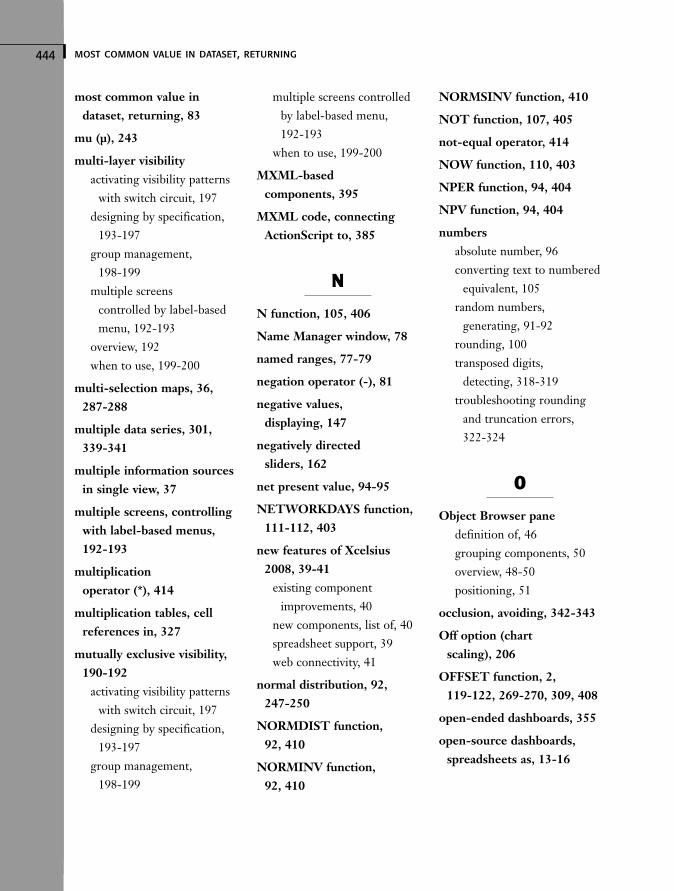
444 most common value in dataset, returning
most common value indataset, returning, 83
mu (μ), 243
multi-layer visibilityactivating visibility patterns
with switch circuit, 197designing by specification,
193-197group management,
198-199multiple screens
controlled by label-basedmenu, 192-193
overview, 192when to use, 199-200
multi-selection maps, 36,287-288
multiple data series, 301,339-341
multiple information sourcesin single view, 37
multiple screens, controllingwith label-based menus,192-193
multiplicationoperator (*), 414
multiplication tables, cellreferences in, 327
mutually exclusive visibility,190-192
activating visibility patternswith switch circuit, 197
designing by specification,193-197
group management, 198-199
multiple screens controlledby label-based menu, 192-193
when to use, 199-200
MXML-basedcomponents, 395
MXML code, connectingActionScript to, 385
N
N function, 105, 406
Name Manager window, 78
named ranges, 77-79
negation operator (-), 81
negative values, displaying, 147
negatively directed sliders, 162
net present value, 94-95
NETWORKDAYS function,111-112, 403
new features of Xcelsius2008, 39-41
existing componentimprovements, 40
new components, list of, 40spreadsheet support, 39web connectivity, 41
normal distribution, 92, 247-250
NORMDIST function, 92, 410
NORMINV function, 92, 410
NORMSINV function, 410
NOT function, 107, 405
not-equal operator, 414
NOW function, 110, 403
NPER function, 94, 404
NPV function, 94, 404
numbersabsolute number, 96converting text to numbered
equivalent, 105random numbers,
generating, 91-92rounding, 100transposed digits,
detecting, 318-319troubleshooting rounding
and truncation errors, 322-324
O
Object Browser panedefinition of, 46grouping components, 50overview, 48-50positioning, 51
occlusion, avoiding, 342-343
Off option (chart scaling), 206
OFFSET function, 2, 119-122, 269-270, 309, 408
open-ended dashboards, 355
open-source dashboards,spreadsheets as, 13-16
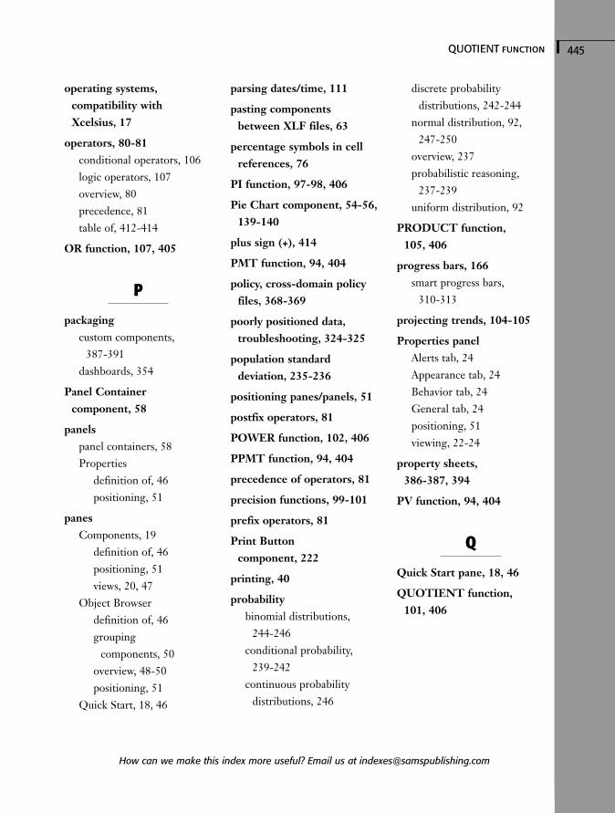
445QUOTIENT function
operating systems, compatibility with Xcelsius, 17
operators, 80-81conditional operators, 106logic operators, 107overview, 80precedence, 81table of, 412-414
OR function, 107, 405
P
packagingcustom components,
387-391dashboards, 354
Panel Container component, 58
panelspanel containers, 58Properties
definition of, 46positioning, 51
panesComponents, 19
definition of, 46positioning, 51views, 20, 47
Object Browserdefinition of, 46grouping
components, 50overview, 48-50positioning, 51
Quick Start, 18, 46
parsing dates/time, 111
pasting components between XLF files, 63
percentage symbols in cellreferences, 76
PI function, 97-98, 406
Pie Chart component, 54-56,139-140
plus sign (+), 414
PMT function, 94, 404
policy, cross-domain policyfiles, 368-369
poorly positioned data, troubleshooting, 324-325
population standard deviation, 235-236
positioning panes/panels, 51
postfix operators, 81
POWER function, 102, 406
PPMT function, 94, 404
precedence of operators, 81
precision functions, 99-101
prefix operators, 81
Print Button component, 222
printing, 40
probabilitybinomial distributions,
244-246conditional probability,
239-242continuous probability
distributions, 246
discrete probability distributions, 242-244
normal distribution, 92,247-250
overview, 237probabilistic reasoning,
237-239uniform distribution, 92
PRODUCT function, 105, 406
progress bars, 166smart progress bars,
310-313
projecting trends, 104-105
Properties panelAlerts tab, 24Appearance tab, 24Behavior tab, 24General tab, 24positioning, 51viewing, 22-24
property sheets, 386-387, 394
PV function, 94, 404
Q
Quick Start pane, 18, 46
QUOTIENT function, 101, 406
How can we make this index more useful? Email us at [email protected]
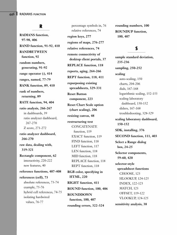
446 RADIANS function
R
RADIANS function, 97-98, 406
RAND function, 91-92, 410
RANDBETWEENfunction, 92
random numbers, generating, 91-92
range operator (:), 414
ranges, named, 77-79
RANK function, 89, 410
rank of numbers, returning, 89
RATE function, 94, 404
ratio analysis, 266-267in dashboards, 39ratio analyzer dashboard,
267-270Z score, 271-272
ratio analyzer dashboard,266-270
raw data, dealing with, 319-321
Rectangle component, 62interactivity, 220-222new features, 40
reference functions, 407-408
references (cell), 73absolute references, 73-74example, 75-76hybrid cell references, 74-75isolating hardwired
values, 76-77
percentage symbols in, 76relative references, 74
region keys, 277
regions of maps, 276-277
relative references, 74
remote connectivity of desktop client portals, 37
REPLACE function, 118
reports, aging, 264-266
REPT function, 118, 411
repurposing existing spreadsheets, 329-331
Reset Button component, 223
Reset Chart Scale option(chart scaling), 206
resizing canvas, 48
restructuring textCONCATENATE
function, 119EXACT function, 119FIND function, 118LEFT function, 117LEN function, 118MID function, 118REPLACE function, 118REPT function, 118
RGB color, specifying inHTML, 220
RIGHT function, 411
ROUND function, 100, 406
ROUNDDOWNfunction, 100, 407
rounding errors, 322-324
rounding numbers, 100
ROUNDUP function, 100, 407
S
sample standard deviation,235-236
sampling, 250-252
scalingauto-scaling, 150charts, 204-206dials, 167-168logarithmic scaling, 152-153scaling laboratory
dashboard, 150-152sliders, 167-168troubleshooting, 328-329
scaling laboratory dashboard,150-152
SDK, installing, 376
SECOND function, 111, 403
Select a Range dialog box, 24-25
Selector components, 59-60, 420
selector-style spreadsheet functions
CHOOSE, 123HLOOKUP, 124-125INDEX, 122-123MATCH, 123OFFSET, 119-122VLOOKUP, 124-125
sensitivity analysis, 38
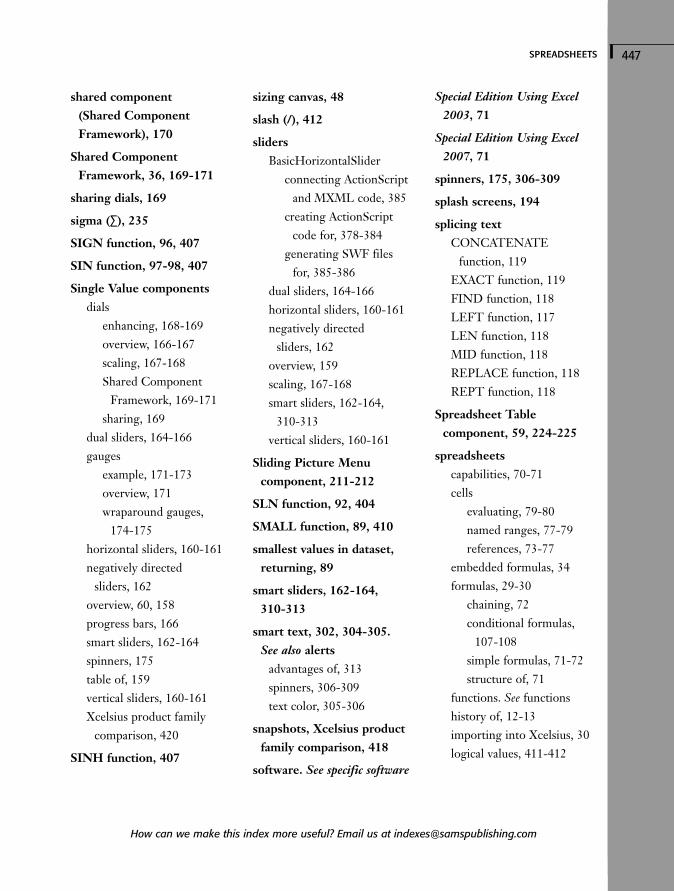
447spreadsheets
shared component (Shared ComponentFramework), 170
Shared ComponentFramework, 36, 169-171
sharing dials, 169
sigma (∑), 235
SIGN function, 96, 407
SIN function, 97-98, 407
Single Value componentsdials
enhancing, 168-169overview, 166-167scaling, 167-168Shared Component
Framework, 169-171sharing, 169
dual sliders, 164-166gauges
example, 171-173overview, 171wraparound gauges,
174-175horizontal sliders, 160-161negatively directed
sliders, 162overview, 60, 158progress bars, 166smart sliders, 162-164spinners, 175table of, 159vertical sliders, 160-161Xcelsius product family
comparison, 420
SINH function, 407
sizing canvas, 48
slash (/), 412
slidersBasicHorizontalSlider
connecting ActionScriptand MXML code, 385
creating ActionScriptcode for, 378-384
generating SWF files for, 385-386
dual sliders, 164-166horizontal sliders, 160-161negatively directed
sliders, 162overview, 159scaling, 167-168smart sliders, 162-164,
310-313vertical sliders, 160-161
Sliding Picture Menu component, 211-212
SLN function, 92, 404
SMALL function, 89, 410
smallest values in dataset,returning, 89
smart sliders, 162-164, 310-313
smart text, 302, 304-305. See also alerts
advantages of, 313spinners, 306-309text color, 305-306
snapshots, Xcelsius productfamily comparison, 418
software. See specific software
Special Edition Using Excel2003, 71
Special Edition Using Excel2007, 71
spinners, 175, 306-309
splash screens, 194
splicing textCONCATENATE
function, 119EXACT function, 119FIND function, 118LEFT function, 117LEN function, 118MID function, 118REPLACE function, 118REPT function, 118
Spreadsheet Table component, 59, 224-225
spreadsheetscapabilities, 70-71cells
evaluating, 79-80named ranges, 77-79references, 73-77
embedded formulas, 34formulas, 29-30
chaining, 72conditional formulas,
107-108simple formulas, 71-72structure of, 71
functions. See functionshistory of, 12-13importing into Xcelsius, 30logical values, 411-412
How can we make this index more useful? Email us at [email protected]
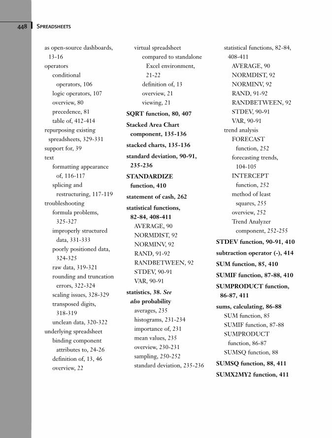
448 Spreadsheets
as open-source dashboards,13-16
operatorsconditional
operators, 106logic operators, 107overview, 80precedence, 81table of, 412-414
repurposing existing spreadsheets, 329-331
support for, 39text
formatting appearanceof, 116-117
splicing and restructuring, 117-119
troubleshootingformula problems,
325-327improperly structured
data, 331-333poorly positioned data,
324-325raw data, 319-321rounding and truncation
errors, 322-324scaling issues, 328-329transposed digits,
318-319unclean data, 320-322
underlying spreadsheetbinding component
attributes to, 24-26definition of, 13, 46overview, 22
virtual spreadsheetcompared to standalone
Excel environment, 21-22
definition of, 13overview, 21viewing, 21
SQRT function, 80, 407
Stacked Area Chart component, 135-136
stacked charts, 135-136
standard deviation, 90-91,235-236
STANDARDIZE function, 410
statement of cash, 262
statistical functions, 82-84, 408-411
AVERAGE, 90NORMDIST, 92NORMINV, 92RAND, 91-92RANDBETWEEN, 92STDEV, 90-91VAR, 90-91
statistics, 38. Seealso probability
averages, 235histograms, 231-234importance of, 231mean values, 235overview, 230-231sampling, 250-252standard deviation, 235-236
statistical functions, 82-84,408-411
AVERAGE, 90NORMDIST, 92NORMINV, 92RAND, 91-92RANDBETWEEN, 92STDEV, 90-91VAR, 90-91
trend analysisFORECAST
function, 252forecasting trends,
104-105INTERCEPT
function, 252method of least
squares, 255overview, 252Trend Analyzer
component, 252-255
STDEV function, 90-91, 410
subtraction operator (-), 414
SUM function, 85, 410
SUMIF function, 87-88, 410
SUMPRODUCT function,86-87, 411
sums, calculating, 86-88SUM function, 85SUMIF function, 87-88SUMPRODUCT
function, 86-87SUMSQ function, 88
SUMSQ function, 88, 411
SUMX2MY2 function, 411
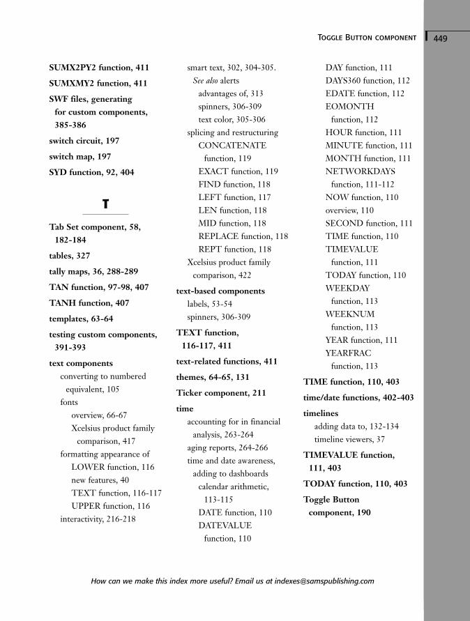
449Toggle Button component
SUMX2PY2 function, 411
SUMXMY2 function, 411
SWF files, generating for custom components,385-386
switch circuit, 197
switch map, 197
SYD function, 92, 404
T
Tab Set component, 58, 182-184
tables, 327
tally maps, 36, 288-289
TAN function, 97-98, 407
TANH function, 407
templates, 63-64
testing custom components,391-393
text componentsconverting to numbered
equivalent, 105fonts
overview, 66-67Xcelsius product family
comparison, 417formatting appearance of
LOWER function, 116new features, 40TEXT function, 116-117UPPER function, 116
interactivity, 216-218
smart text, 302, 304-305. See also alerts
advantages of, 313spinners, 306-309text color, 305-306
splicing and restructuringCONCATENATE
function, 119EXACT function, 119FIND function, 118LEFT function, 117LEN function, 118MID function, 118REPLACE function, 118REPT function, 118
Xcelsius product familycomparison, 422
text-based componentslabels, 53-54spinners, 306-309
TEXT function, 116-117, 411
text-related functions, 411
themes, 64-65, 131
Ticker component, 211
timeaccounting for in financial
analysis, 263-264aging reports, 264-266time and date awareness,
adding to dashboardscalendar arithmetic,
113-115DATE function, 110DATEVALUE
function, 110
DAY function, 111DAYS360 function, 112EDATE function, 112EOMONTH
function, 112HOUR function, 111MINUTE function, 111MONTH function, 111NETWORKDAYS
function, 111-112NOW function, 110overview, 110SECOND function, 111TIME function, 110TIMEVALUE
function, 111TODAY function, 110WEEKDAY
function, 113WEEKNUM
function, 113YEAR function, 111YEARFRAC
function, 113
TIME function, 110, 403
time/date functions, 402-403
timelinesadding data to, 132-134timeline viewers, 37
TIMEVALUE function, 111, 403
TODAY function, 110, 403
Toggle Button component, 190
How can we make this index more useful? Email us at [email protected]
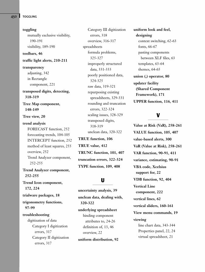
450 toggling
togglingmutually exclusive visibility,
190-191visibility, 189-190
toolbars, 46
traffic light alerts, 210-211
transparencyadjusting, 342in Rectangle
component, 221
transposed digits, detecting,318-319
Tree Map component, 148-149
Tree view, 20
trend analysisFORECAST function, 252forecasting trends, 104-105INTERCEPT function, 252method of least squares, 255overview, 252Trend Analyzer component,
252-255
Trend Analyzer component,252-255
Trend Icon component, 172, 224
trialware packages, 18
trigonometry functions, 97-99
troubleshootingdigitization of data
Category I digitizationerrors, 317
Category II digitizationerrors, 317
Category III digitizationerrors, 318
overview, 316-317spreadsheets
formula problems, 325-327
improperly structureddata, 331-333
poorly positioned data,324-325
raw data, 319-321repurposing existing
spreadsheets, 329-331rounding and truncation
errors, 322-324scaling issues, 328-329transposed digits,
318-319unclean data, 320-322
TRUE function, 106
TRUE value, 412
TRUNC function, 101, 407
truncation errors, 322-324
TYPE function, 109, 408
U
uncertainty analysis, 39
unclean data, dealing with,320-322
underlying spreadsheetbinding component
attributes to, 24-26definition of, 13, 46overview, 22
uniform distribution, 92
uniform look and feel,designing
context switching, 62-63fonts, 66-67pasting components
between XLF files, 63templates, 63-64themes, 64-65
union (,) operator, 80
updater facility (Shared ComponentFramework), 171
UPPER function, 116, 411
V
Value at Risk (VaR), 258-261
VALUE function, 105, 407
value-based alerts, 300
VaR (Value at Risk), 258-261
VAR function, 90-91, 411
variance, estimating, 90-91
VBA code, Xcelsius support for, 22
VDB function, 92, 404
Vertical Line component, 222
vertical lines, 62
vertical sliders, 160-161
View menu commands, 19
viewingline chart data, 343-344Properties panel, 22, 24virtual spreadsheet, 21
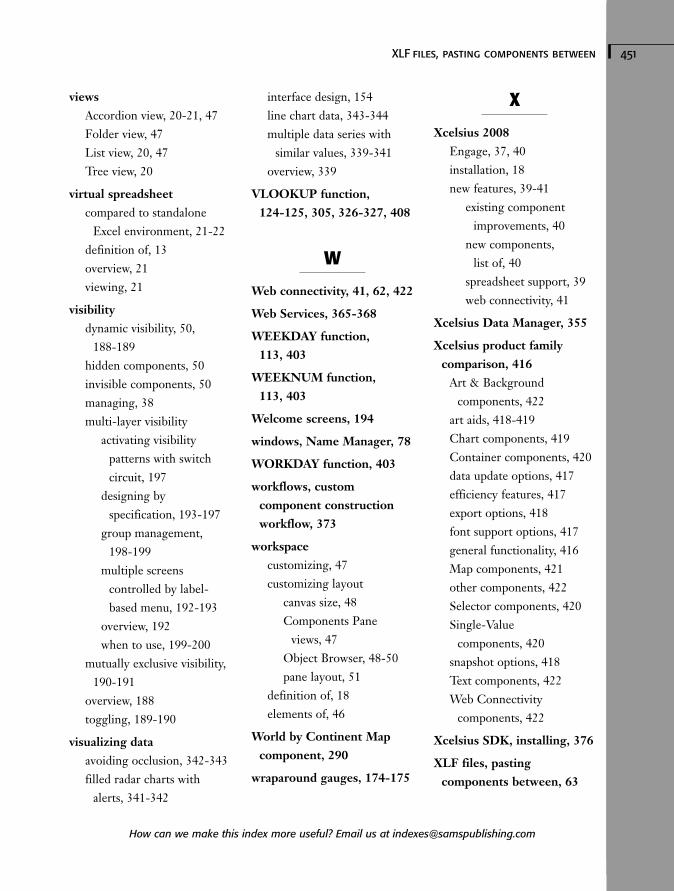
451XLF files, pasting components between
viewsAccordion view, 20-21, 47Folder view, 47List view, 20, 47Tree view, 20
virtual spreadsheetcompared to standalone
Excel environment, 21-22definition of, 13overview, 21viewing, 21
visibilitydynamic visibility, 50,
188-189hidden components, 50invisible components, 50managing, 38multi-layer visibility
activating visibility patterns with switchcircuit, 197
designing by specification, 193-197
group management, 198-199
multiple screens controlled by label-based menu, 192-193
overview, 192when to use, 199-200
mutually exclusive visibility,190-191
overview, 188toggling, 189-190
visualizing dataavoiding occlusion, 342-343filled radar charts with
alerts, 341-342
interface design, 154line chart data, 343-344multiple data series with
similar values, 339-341overview, 339
VLOOKUP function, 124-125, 305, 326-327, 408
W
Web connectivity, 41, 62, 422
Web Services, 365-368
WEEKDAY function, 113, 403
WEEKNUM function, 113, 403
Welcome screens, 194
windows, Name Manager, 78
WORKDAY function, 403
workflows, custom component constructionworkflow, 373
workspacecustomizing, 47customizing layout
canvas size, 48Components Pane
views, 47Object Browser, 48-50pane layout, 51
definition of, 18elements of, 46
World by Continent Mapcomponent, 290
wraparound gauges, 174-175
X
Xcelsius 2008Engage, 37, 40installation, 18new features, 39-41
existing componentimprovements, 40
new components, list of, 40
spreadsheet support, 39web connectivity, 41
Xcelsius Data Manager, 355
Xcelsius product family comparison, 416
Art & Background components, 422
art aids, 418-419Chart components, 419Container components, 420data update options, 417efficiency features, 417export options, 418font support options, 417general functionality, 416Map components, 421other components, 422Selector components, 420Single-Value
components, 420snapshot options, 418Text components, 422Web Connectivity
components, 422
Xcelsius SDK, installing, 376
XLF files, pasting components between, 63
How can we make this index more useful? Email us at [email protected]
452 XML
XMLExcel XML maps, 359-364overview, 356setting up for Xcelsius
with Excel 2003, 357-359with Excel 2007, 357
XY charts, 141-145
Y-Z
YEAR function, 111, 403
YEARFRAC function, 113, 403
Z score, 271-272