words of art
DESCRIPTION
This is my portfolio of new and old artworks.TRANSCRIPT
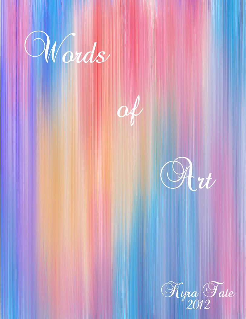


Table of Contents
MUSIC...........................................2-3
LOVE.............................................4-5
ANGEL..........................................6-7
HOPE.............................................8-9
AARON.........................................10-11
MUSICIAN....................................12-13
PATIENCE.....................................14-15
DEATH..........................................16-17
TOGETHER..................................18-19
EYE SEE TRUST..........................20-21
Words of Art
STENCIL......................................22-23
SMOKE.........................................24-25 SEDUCTION................................26-27
PAPER BAG.................................28-29
STILL LIFE................................. 30-31
NEGATIVE SPACE.....................32-33
LINE STILL LIFE........................34-35
ONE-POINT PERSPECTIVE......36-37
TWO-POINT PERSPECTIVE.....38-39
New Portfolio Old Portfolio


Music
I made this painting by first thinking of what could actually represent each letter of the word Music. As you can see here, I used piano keys to represent the letter ‘M’, drew different musi-cal notes and symbols in the letter ‘U’, used a treble clef to rep-resent the letter ‘S’, an iPod to represent the letter ‘I’, and a harp to represent the letter ‘C’. I used the colors seen here to actually make the word stand out and make it seem as if the word ‘Music’ is sitting on the ground. I arranged this piece in this way because I want ‘Music’ to stand out and to be seen first. I want the viewer to realize that mu-sic has a very important meaning to me and is something I truly care for. To me, this painting means relaxation, a stress reliever, and something that I can just express myself through.


Love
I made this drawing by first thinking of what word I could draw that would actually look cute to fill the whole page. As you can see here, I drew the word Love in a “balloon” font. I also added the cloud to make it seem as though the word is floating in the air. I arranged this piece in this way because I want ‘Love’ to stand out and to be seen first. I want the viewer to realize that love is a beautiful thing just like this drawing. People will view this picture in different ways and relate it to their personal lives. To me, this drawing represents “Love on cloud 9”. Being on cloud 9 means that you are so in love that you feel as though you are floating on air.This is why I drew this word on a cloud.


Angel
As you can see here, I drew out the word an-gel using pencil and outlining it in black sharpie. After drawing this piece, I then scanned it and opened it up in photoshop and added color to brighten it up a little bit. I arranged this piece in this way because I want to draw your attention toward the word “angel”. Hav-ing the word be a pinkish purple, on a blue background makes it pop and standout. Having painted this in photo-shop made this stronger than just having an outline.


Hope
To make this piece I thought about a word that everyone can relate to an always has that feeling at some point in their lives. After thinking of the word “hope”, I wanted to change it up a little by adding in the hands so that it won’t look as boring with just the letter “o“ in there. I drew out everything and outlined it in black sharpie as well. after outlining it, I scanned it and painted it in photoshop. After painting it, I thing put a background and added a watercolor background to it so that you will have a different experience.


AaronI made this piece by first thinking of who inspires me. As I sat there thinking I looked over at my phone and seen a picture of my son, Aaron, and said to myself that he is the one who inspires me to keep going on toward my goals and have confidence. I wanted this piece to be some-thing that both he and I both likes. since he likes Mickey Mouse, I thought I should incorporate Mickey Mouse into his name. As you can see here, I drew out the eye using pencil first, and I outlined it with black sharpie. I arranged this piece in this way because I want to draw your attention toward his name. Having the Mickey Mouse head as the “O” give this piece more meaning. I believe, the mickey mouse ears and the head makes it stronger than just having having drawn his name with no feeling. I want you to experience, that when you look at this you will understand that it has a deeper meaning to me than you would think.
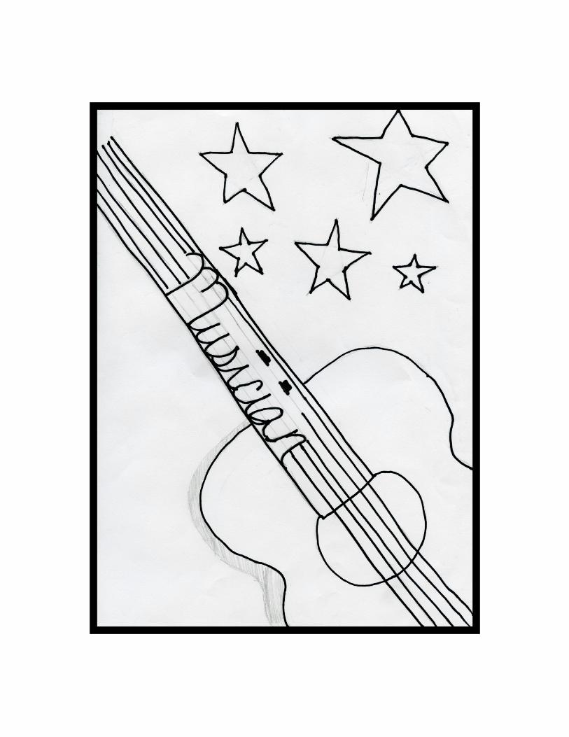

MusicianI made this piece by first thinking of what could represent the piece made by Pablo Picasso. The piece made by him , called The Old Guitarist, inspired me from my museum tour at the Art Institute of Chicago. I didn't want the piece to be obvious but still not to complex. As you can see here, I drew out the guitar using pencil first, then I outlined it with black sharpie, and I then added in the star to add a little more flavor. I arranged this piece in this way because I want to draw your attention toward the guitar. Having the stars doesn't re-ally allow you to focus on the word that is written in the guitar strings. I believe, that having the word incorporated into the strings of the guitar. The stars make it a little more stronger than just having the guitar in the center of the page. When you look at this I want you to experience, that not only can a lonely old man be inspired to play a guitar but so can you.

Patience
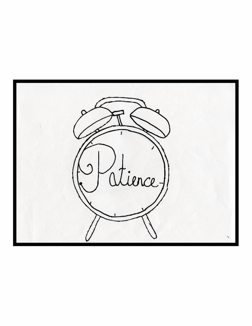
When I thought of the word patience, I wanted something that has a relation to go along with it. I thought of a clock because when you are waiting for something you are always going to look at the clock when something is taking a long time. when having this experience you are most of the time always told to have patience.

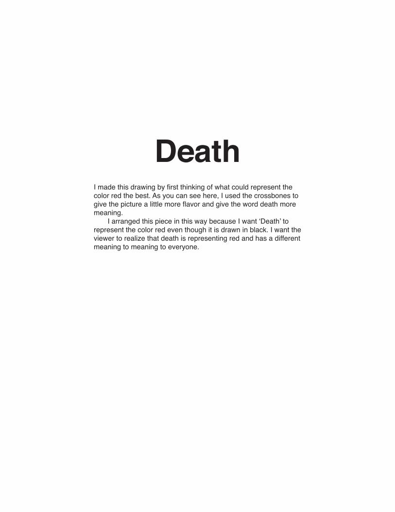
DeathI made this drawing by first thinking of what could represent the color red the best. As you can see here, I used the crossbones to give the picture a little more flavor and give the word death more meaning. I arranged this piece in this way because I want ‘Death’ to represent the color red even though it is drawn in black. I want the viewer to realize that death is representing red and has a different meaning to meaning to everyone.

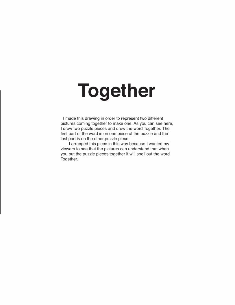
Together I made this drawing in order to represent two different pictures coming together to make one. As you can see here, I drew two puzzle pieces and drew the word Together. The first part of the word is on one piece of the puzzle and the last part is on the other puzzle piece. I arranged this piece in this way because I wanted my viewers to see that the pictures can understand that when you put the puzzle pieces together it will spell out the word Together.

Eye See Trust
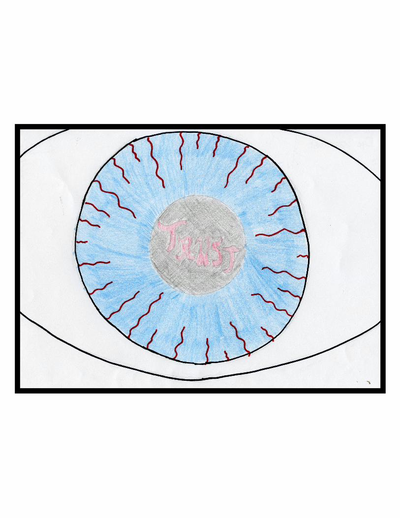
I made this piece by first thinking of what could actually represent the color blue. Instead of being obvious and just writing the word “blue”, I drew an eye with the color blue. As you can see here, I drew out the eye using pen-cil first, then I outlined it with black sharpie, and I colored in the pupil colored pencil and colored in the word trust withered color pencil. I arranged this piece in this way because I want to draw your attention toward the word “trust”. having the red veins pull you into the eye, I believe, makes it a little more stronger than just having a regular eye with noth-ing inside. When you look at this I want you to experi-ence, that when you look at someone you have known for a while you are able to see trust in them and that you are not afraid to trust them at all. I want the viewer to realize that being able to trust someone take a lot of courage and understanding.

Stencil I made this piece by first thinking of how could i make this picture look like actual graffiti and what color would look right against a stone background. As you can see here, I put a picture of myself on this back-ground using some kind of spray paint effect. using the brush tool i drew the outline, with a soft edge brush. I arranged this piece in this way because I want to draw your attention toward the picture and how it has that effect of being painted or even sprayed upon the wall behind it. I believe, the color of the picture makes it a little more stronger because it makes it stand out and draws you in toward my eyes rather than just the figure on a wall.

Smoke
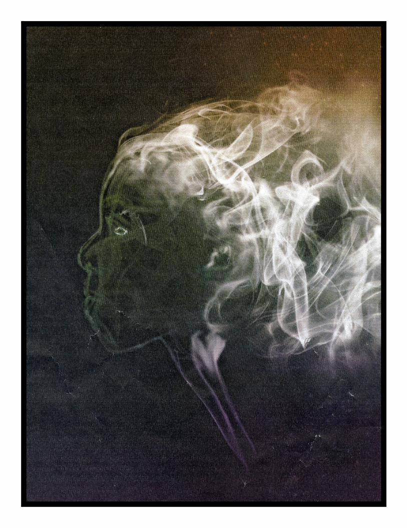
I made this picture by first thinking of how could I really make this look as though my profile is just a puff of smoke. The first thing I did was put the picture of my profile onto a black background. Using the smoke brushes, I outlined my face and then began to add details into my face and hair. i then aded the little stem of smoke at the bottom to give it that real smokey look with a slight rainbow color on top. I arranged this piece in this way because I want the audience to see that my profile is ment to stand out and be the most important thing on the page.


SeductionThis piece, Seduction, was thought of when I was going for something a little different rather than just a regular pose. I wanted to model this clay into some-thing sexy. The first thing I did for this piece was model the clay into this sexy position. I then took it’s picture on a black backdrop so that i would be able to then edit the background into something different. Before putting on the background, I added hair, lips, and eyes to her face to give it that seductive look. I then added the watercolor background to make her stand out. having her become watercolor as well made it blend even more. Lastly, I used a scratching tool to add the scratches to make appear older. I arranged this piece in this way because I want to draw your attention towardher face so that you get that seductive feel.
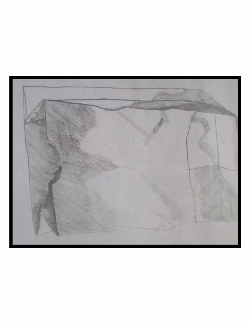
Paper Bag I made this piece from an assignment was given in class one day. The assignment was to draw this paper bag and shade it based on our light source. The first thing i did was make on outline of the bag and then I began to add the detail of shading.


Still Life This was another assignment given in class based on our still life unit we were working on. The objective of this assignment was to show our ability to use construction paper, instead of drawing it out and shading it. The first thing I did was make the background. I wanted it to be bright so that the darker construction paper would stand out more. I then cut the light grey paper as the object, then the darker grey as the light shade and the darkest paper as the dark shades.

Negative Space This is another piece based on the assignment given. The objective was to draw the two objects using negative space. In the background we were to draw dif-ferent patterns to make the objects stand out more then just with a plain background. I arranged this piece in this way because I want to draw your attention toward the chair and the stool to show that negative space.

Line Still Life Our assignment was to draw still life using only lines to show the object and the shading. The first thing that I did was outline the objects. Then I drew the lines inside the outline to make it appear to have definition. For the shading, I drew the lines darker to have the shading based on the light source.


One Point Perspective This project was to draw different shapes based one the one point perspective. This was so the it would make it seem as though the shapes were coming at you. The first thing I did was find the middle of the page and have that as my point of reference. I then began to draw the shapes.


Two Point Perspective I made this piece by first thinking of what could i draw that had two point perspective. The first thing I did was draw the side walk so that I would have a boundary to draw the buildings. After drawing the buildings, I then added the detail such as windows and doors. Finally, based off of the light sorce, I shaded in the buildings.

My rules for my new portfolio are that my pictures have to be 8.5 by 11 inches in size. They have to be drawn by hand and outlined in sharpie. And designed in photo-shop.
RULES