word as art
TRANSCRIPT
UCL LIBRARY SERVICES
An exhibition of material from UCL Special Collections and work by students of the Slade School of Fine Art
October 2021 – July 2022
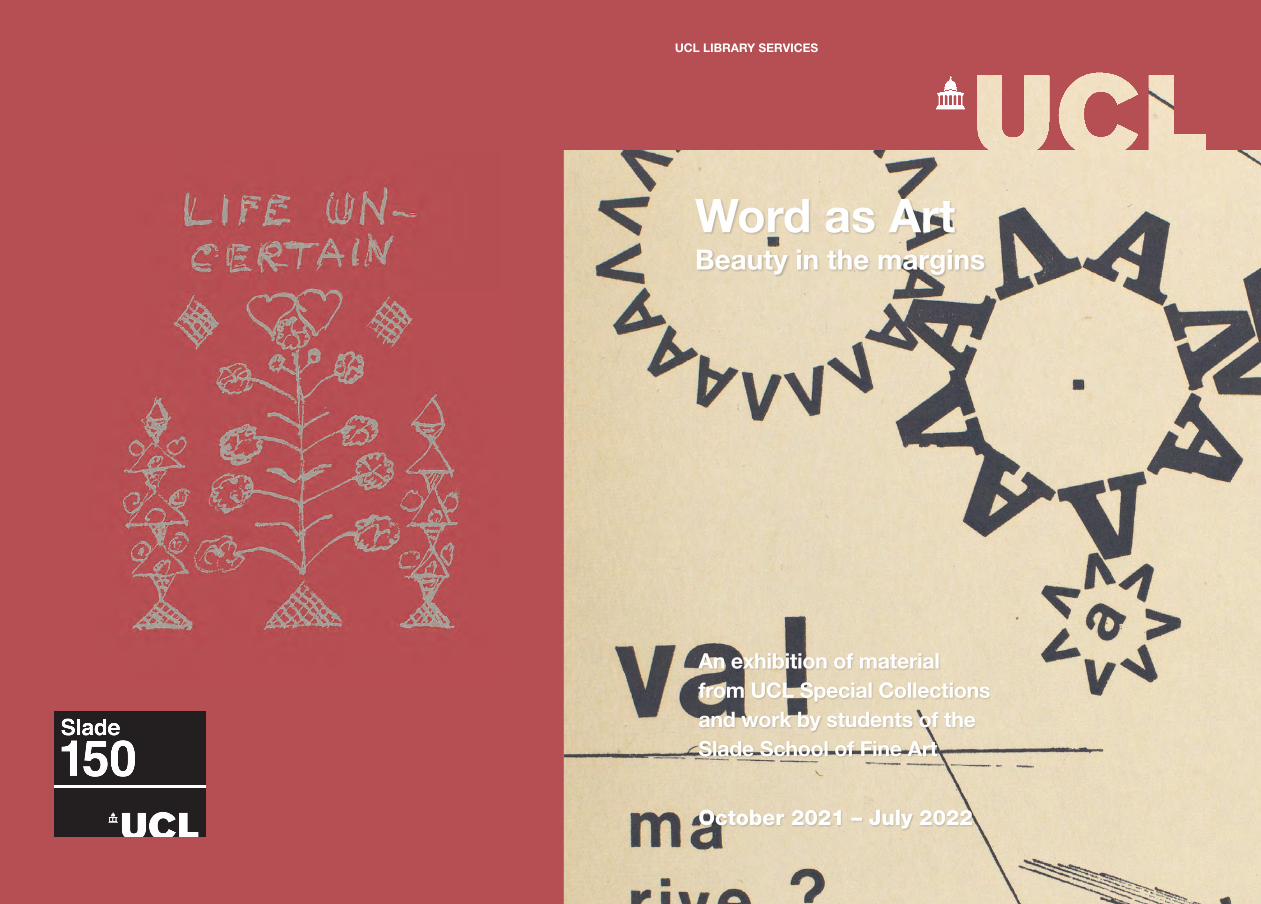
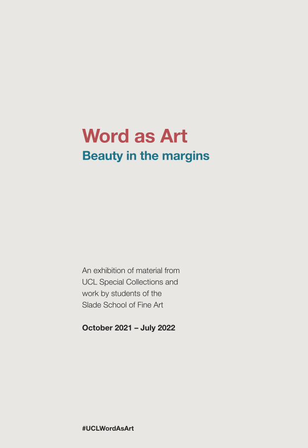
Word as Art Beauty in the margins
Section name here.... | 1
Word as ArtBeauty in the margins
An exhibition of material from UCL Special Collections and work by students of the Slade School of Fine Art
October 2021 – July 2022
#UCLWordAsArt
Preface | 3
Preface
Writing is an essential part of everyday communication. It permeates every element of our society so that it is easy to forget its prevalence. Yet every time we put words down on a page or type them on a screen, we are creating a piece of art unique to us. In this exhibition we will explore the permeable borders between art and writing. We examine manuscripts, printing, textiles and objects that celebrate the way in which we have embellished the word, making it far more than just a means of communication.
In addition to items from the Library collections, the exhibition includes three pieces of art by students from the Slade School of Fine Art at UCL. Their interpretations of writing and communication demonstrate that the books, manuscripts and letters of the past continue to inform and inspire creative practices of the present.
The inspiration for the exhibition is the Slade 150 anniversary year, celebrating fine art teaching and research since 1871.
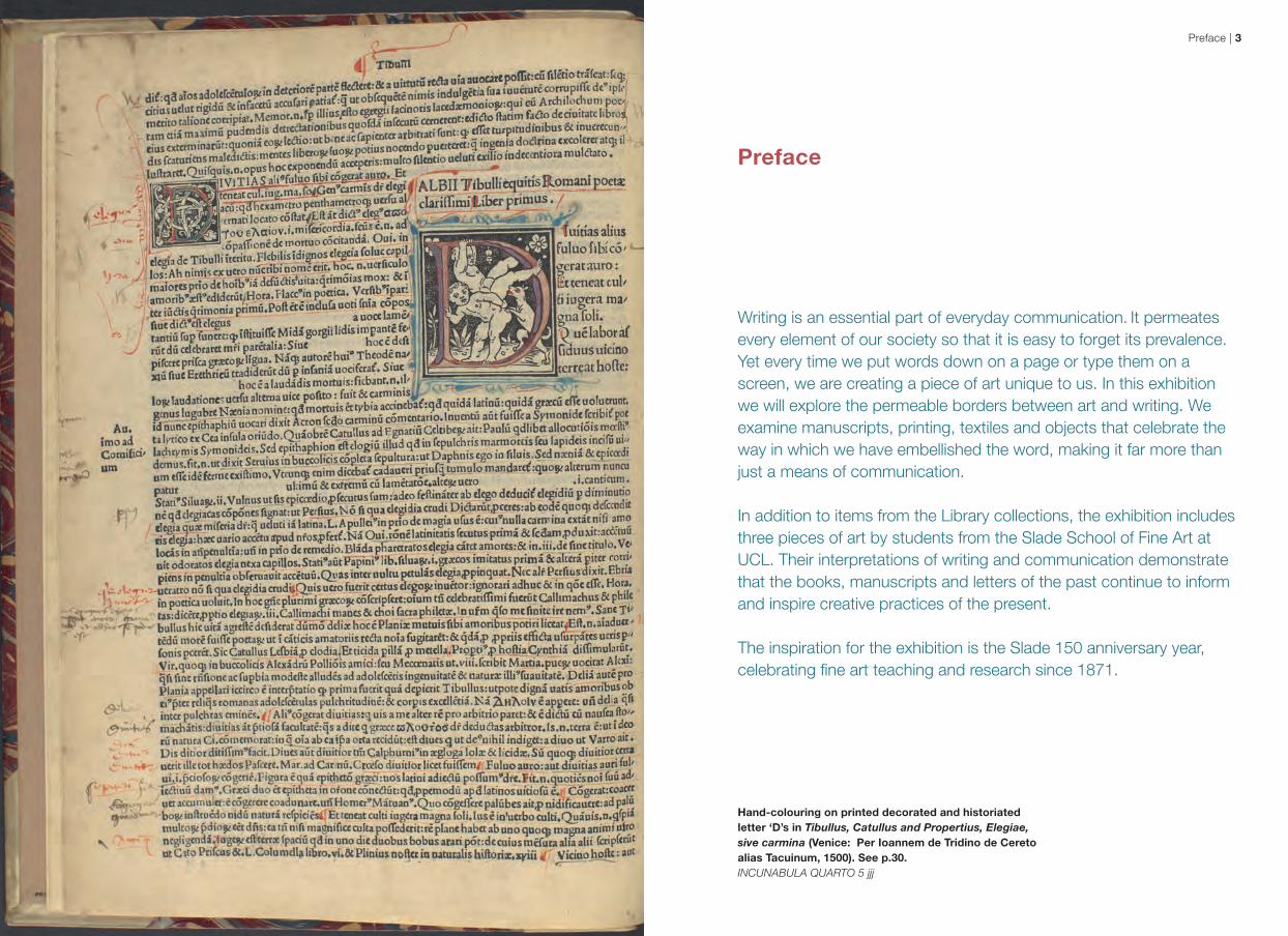
Hand-colouring on printed decorated and historiated letter ‘D’s in Tibullus, Catullus and Propertius, Elegiae, sive carmina (Venice: Per Ioannem de Tridino de Cereto alias Tacuinum, 1500). See p.30.INCUNABULA QUARTO 5 jjj
Introduction | 54 | Word as Art
Writing is an act of giving shape to thoughts. It is telling of the world – first to oneself and then to others. But writing is also an act of drawing. Culture has developed various forms of writing, from pictograms through ideograms, to analytical and phonetic records. The most elegant examples of written text are those integrated with images in mediaeval manuscripts. The Middle Ages provided our imagination with a figure of a scribe bent over a volume copied by hand as the most precious commodity – the knowledge about the world.
In reaction to the Covid-19 lockdown, Dawidek transformed her bedroom into the Scriptorium, a work featured in Word as Art (p.32). In this she created a sequestered place for reflection, study and writing. Scriptorium is a micro-environment and a time capsule embedded in the context of the global experience of isolation and vulnerability, suspended in time.
The next part of the exhibition focuses on how the context of words can determine meaning, especially in letter writing and poetry. Yifan He’s a love letter that must have been mistranslated in parts is a video work, based on a collaboration with Lahore-based printmaker Murtaza Zaidi. Through months of exchanges the pair crafted a love letter shaped by mistranslation, to be featured in the upcoming Print Pals: Then and Now exhibition at the Slade School of Fine Art. Inspired by their collaboration, the video work a love letter that must have been mistranslated in parts is 3 hours, 27 minutes and 8 seconds in length, created by collected and collaged Sufi poetry in Urdu and diary entries in Mandarin, Urdu and English. He’s video presents the awkwardly translated text and confusingly communicated emotions as it seeks to unravel the delicacy of miscommunicating intimacy.
When I approached the Special Collections team, I was eager to showcase how crucial research and third-party references are to contemporary art making The Special Collections team was excited to include new voices and see their works reinterpreted through the work of current students. The exhibition closes with work that can express where words fail. Throughout Word as Art you will see a juxtaposition of scale, materiality and formality. Storytelling through formatting showcases the way words surround us and impact us, not only in our daily lives but throughout our cultural consciousness.
Megan Klosterman, 2021 Masters of Fine Art graduate, Slade School of Fine Art
Megan Klosterman was born in the USA in 1996 and is now a visual artist and writer based in London. She is a 2021 Masters of Fine Arts graduate from the Slade and also holds a dual BA in Art Studio and Arts Administration from the University of Kentucky. Her work stems from a romantic yearning to find stability and refuge from past traumas in the hold of people and places. In May 2021 she assisted the Special Collections Out-reach and Exhibitions Coordinator with the Word as Art open art call. To view her work please visit www.megklosterman.com.
Introduction Ever since the Renaissance and the shift that gave art a purpose beyond a religious context, the question of what exactly dictates ‘art’ has been debated. Scholars, patrons, community leaders, scientists and inventors all challenge the concept of a finite definition. No one has yet found a single definition with which everyone can agree.
Some twentieth-century post-war surrealists such as Man Ray or Marcel Duchamp have declared that ‘art’ is whatever an artist claims to be art. However, for many people a definition of ‘what art is’ depends upon the form they gravitate towards the most. For some, art may be centrally linked to painting, to others literature, to others music, dancing, opera or theatre.
In the spring of 2021 library and archives staff began to ponder the role that art plays in their collections. This inevitably led to Special Collections asking our central question: What is art? They came to the conclusion that text, typology and bookmaking were their art forms. The excitement this generated led to a mission to share the art of their collections by curating the exhibition Word as Art.
In the virtual exhibition Special Collections has collaborated with students from UCL’s Slade School of Fine Art to present their case. The curated items from the libraries’ permanent collections are shown alongside three individual artists, chosen following an open call for art from students at the Slade. The selected artists, Yifan He (MA Fine Art Media, 2022), Abi Ola (MA Fine Arts, 2021) and Małgorzata Dawidek (PhD, 2022), have displayed innovative approaches to words in their own artistic practices.
The exhibition begins much like the timeline of our central question, with themes of religious words from Jewish, Christian and Islamic sources. It then considers themes of artistry in communication and learning, particularly musical scores, textiles and educational practices. In Patterns in My Bedroom, Abi Ola uses symbols inspired by old family clothing, African and British textiles, as well as her imagination. Her writing is intended to be read differently by everyone. The symbols become a pattern of memory, of family and of the colonial history associated with African textiles. When speaking about her work, Abi explains:
I use Dutch wax textiles, which design originated in Indonesia, and was machine mass-produced by the Dutch, and then sold in West Africa, where it is now a very popular fabric. Despite these materials being foreign the local people have made their own symbols and stories within the designs, to make it relevant to their culture.
The next step in the exhibition is towards ‘the aesthetics of the word’, showcasing alternative artistry through text. The display charts the evolution of the capital letter, from a heavily decorated artwork created in a scriptorium to a printed design. It circles back to modern reflections of medieval practices, such as the adoption of decorated letters in the 1920s and modern reflections on writing. The Polish artist and art historian Małgorzata Dawidek, for example, observes:
Religion and the art of the written word | 76 | Word as Art
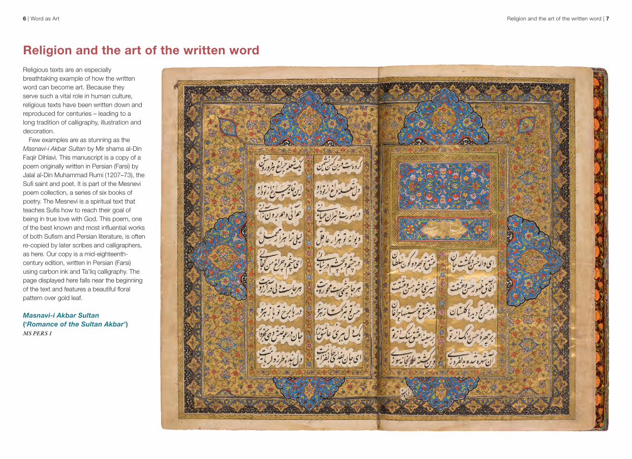
Religion and the art of the written wordReligious texts are an especially breathtaking example of how the written word can become art. Because they serve such a vital role in human culture, religious texts have been written down and reproduced for centuries – leading to a long tradition of calligraphy, illustration and decoration.
Few examples are as stunning as the Masnavi-i Akbar Sultan by Mír shams al-Dín Faqír Dihlavi. This manuscript is a copy of a poem originally written in Persian (Farsi) by Jalal al-Din Muhammad Rumi (1207–73), the Sufi saint and poet. It is part of the Mesnevi poem collection, a series of six books of poetry. The Mesnevi is a spiritual text that teaches Sufis how to reach their goal of being in true love with God. This poem, one of the best known and most influential works of both Sufism and Persian literature, is often re-copied by later scribes and calligraphers, as here. Our copy is a mid-eighteenth-century edition, written in Persian (Farsi) using carbon ink and Ta’liq calligraphy. The page displayed here falls near the beginning of the text and features a beautiful floral pattern over gold leaf.
Masnavi-i Akbar Sultan (‘Romance of the Sultan Akbar’) MS PERS 1
Religion and the art of the written word | 98 | Word as Art
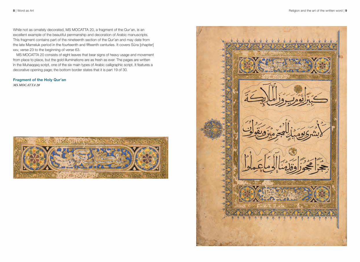
While not as ornately decorated, MS MOCATTA 20, a fragment of the Qur’an, is an excellent example of the beautiful penmanship and decoration of Arabic manuscripts. This fragment contains part of the nineteenth section of the Qur’an and may date from the late Mameluk period in the fourteenth and fifteenth centuries. It covers Sura [chapter] xxv, verse 23 to the beginning of verse 63.
MS MOCATTA 20 consists of eight leaves that bear signs of heavy usage and movement from place to place, but the gold illuminations are as fresh as ever. The pages are written in the Muhaqqaq script, one of the six main types of Arabic calligraphic script. It features a decorative opening page; the bottom border states that it is part 19 of 30.
Fragment of the Holy Qur’anMS MOCATTA 20
Religion and the art of the written word | 1110 | Word as Art
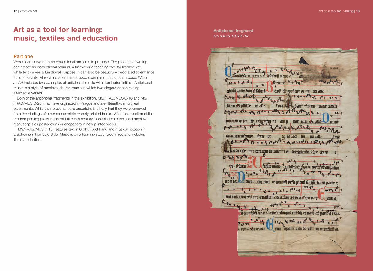
Throughout Europe there are manuscript examples of Christian calligraphy and art. One such example is a fifteenth-century German Book of Prayers [Gebetbuch]. It appears to be the work of a single scribe; in her 1935 list of UCL’s manuscripts, Dorothy Coveney suggests that the script’s style and quality indicate that it was written by a nun. She also identifies the German dialect as Alsatian. The text is ornamented throughout with coloured initials of various sizes, generally worked in red and/or blue; some have gold leaf.
At the base of some of the folios are sketches worked in very light ink. They depict an intricately drawn landscape of towns, rivers, bridges and countryside, including a shepherd with his sheep. It is not clear whether the towns and features are real or imaginary, but Coveney suggests that they may have been intended to form a continuous panorama. Other folios have drawings of trees and shrubs in the same hand.
Prayer book [Gebetbuch] MS GERM/4
This text is partially adapted from:Furlong, Gillian. Treasures from UCL (London: UCL Press, 2015), pp. 60–1 and 124–7.
Sarah Pipkin, Outreach and Exhibitions CoordinatorVanessa Freeman, Subject Liaison Librarian: Hebrew & Jewish StudiesKaty Makin, UCL Archivist
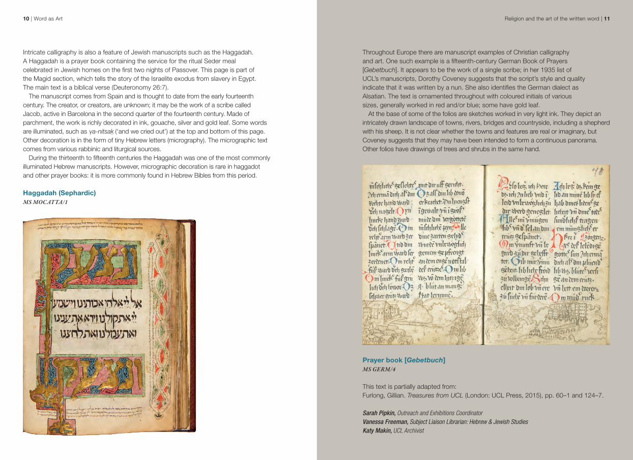
Intricate calligraphy is also a feature of Jewish manuscripts such as the Haggadah. A Haggadah is a prayer book containing the service for the ritual Seder meal celebrated in Jewish homes on the first two nights of Passover. This page is part of the Magid section, which tells the story of the Israelite exodus from slavery in Egypt. The main text is a biblical verse (Deuteronomy 26:7).
The manuscript comes from Spain and is thought to date from the early fourteenth century. The creator, or creators, are unknown; it may be the work of a scribe called Jacob, active in Barcelona in the second quarter of the fourteenth century. Made of parchment, the work is richly decorated in ink, gouache, silver and gold leaf. Some words are illuminated, such as ṿa-nitsaḳ (‘and we cried out’) at the top and bottom of this page. Other decoration is in the form of tiny Hebrew letters (micrography). The micrographic text comes from various rabbinic and liturgical sources.
During the thirteenth to fifteenth centuries the Haggadah was one of the most commonly illuminated Hebrew manuscripts. However, micrographic decoration is rare in haggadot and other prayer books: it is more commonly found in Hebrew Bibles from this period.
Haggadah (Sephardic) MS MOCATTA/1
12 | Word as Art Art as a tool for learning | 13
Antiphonal fragmentMS /FRAG/MUSIC/16
Art as a tool for learning: music, textiles and education
Part oneWords can serve both an educational and artistic purpose. The process of writing can create an instructional manual, a history or a teaching tool for literacy. Yet while text serves a functional purpose, it can also be beautifully decorated to enhance its functionality. Musical notations are a good example of this dual purpose. Word as Art includes two examples of antiphonal music with illuminated initials. Antiphonal music is a style of medieval church music in which two singers or choirs sing alternative verses.
Both of the antiphonal fragments in the exhibition, MS/FRAG/MUSIC/16 and MS/FRAG/MUSIC/20, may have originated in Prague and are fifteenth-century leaf parchments. While their provenance is uncertain, it is likely that they were removed from the bindings of other manuscripts or early printed books. After the invention of the modern printing press in the mid-fifteenth century, bookbinders often used medieval manuscripts as pastedowns or endpapers in new printed works.
MS/FRAG/MUSIC/16, features text in Gothic bookhand and musical notation in a Bohemian rhomboid style. Music is on a four-line stave ruled in red and includes illuminated initials.
Art as a tool for learning | 1514 | Word as Art
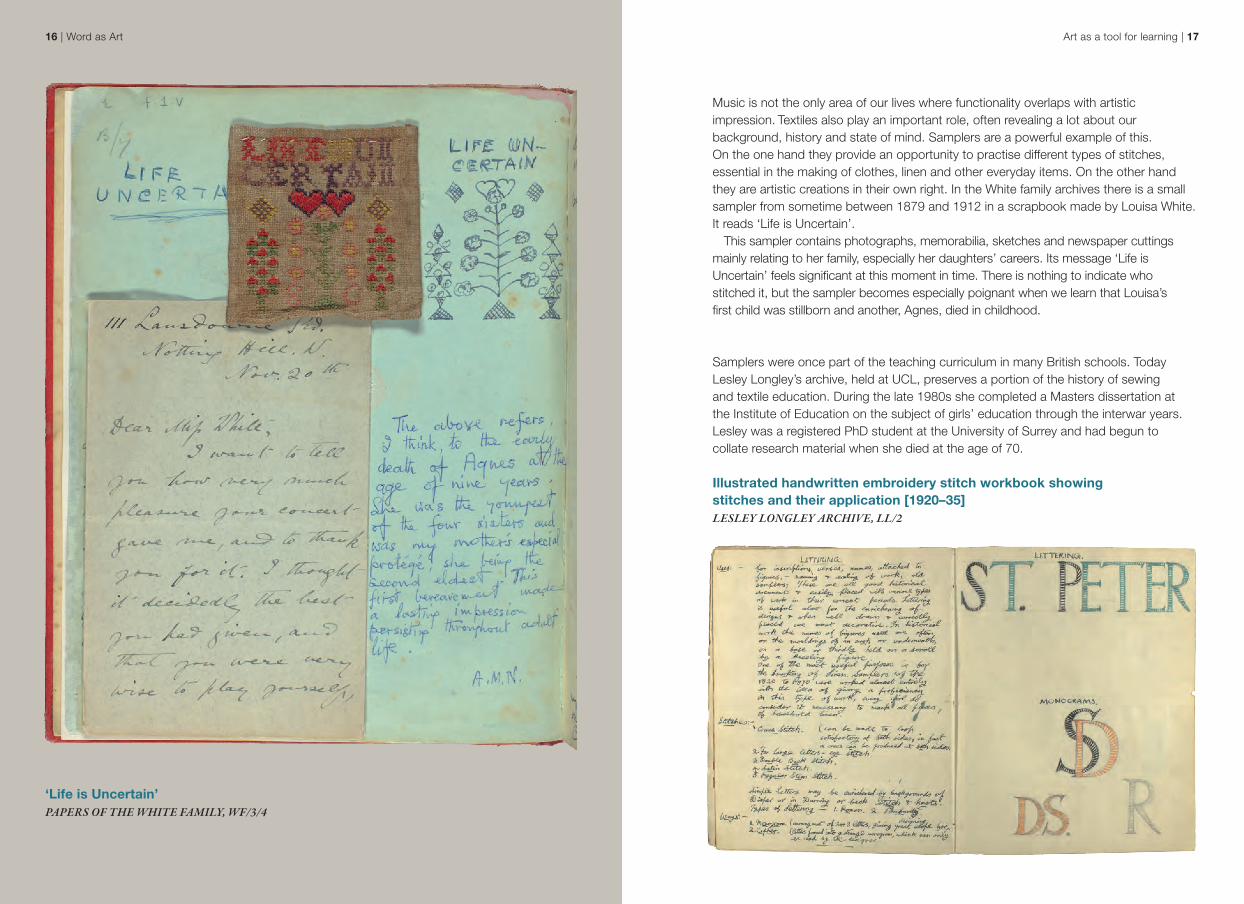
Musical notation often exists simultaneously as utility and decoration, a balance best exemplified by Christian Marclay’s 2007 work Shuffle. A multimedia artist, Marclay blurs the boundaries of fine art and audio culture, transforming sound and music into the physical forms of film, performance, sculpture and photography. His innovative works examine how music and sound impact on our experience of the world.
Shuffle, an artist’s book in the form of a deck of 75 cards, is a visual score made up of photographs of found musical notation, taken variously from food packaging, restaurant menus, graffiti, tattoos and other everyday sources. The cards are designed to be shuffled and drawn at random to create a spontaneous musical score, consisting of as few or as many cards as the player desires. The resulting sounds may be generated by any number of musicians and instruments or ‘simply imagined’.
No two scores produced by Shuffle will be the same: the work is created purely by chance. As such, its lineage can be traced to the indeterminacy and chance notation in the work of composer John Cage, developed throughout the 1950s and 1960s, as well as to the ‘chance operations’ favoured by the experimental Fluxus group of artists in the 1960s.
Selection of six cards from Shuffle by Christian Marclay (New York: Aperture Foundation, 2007)ART RARE MU 19 MAR
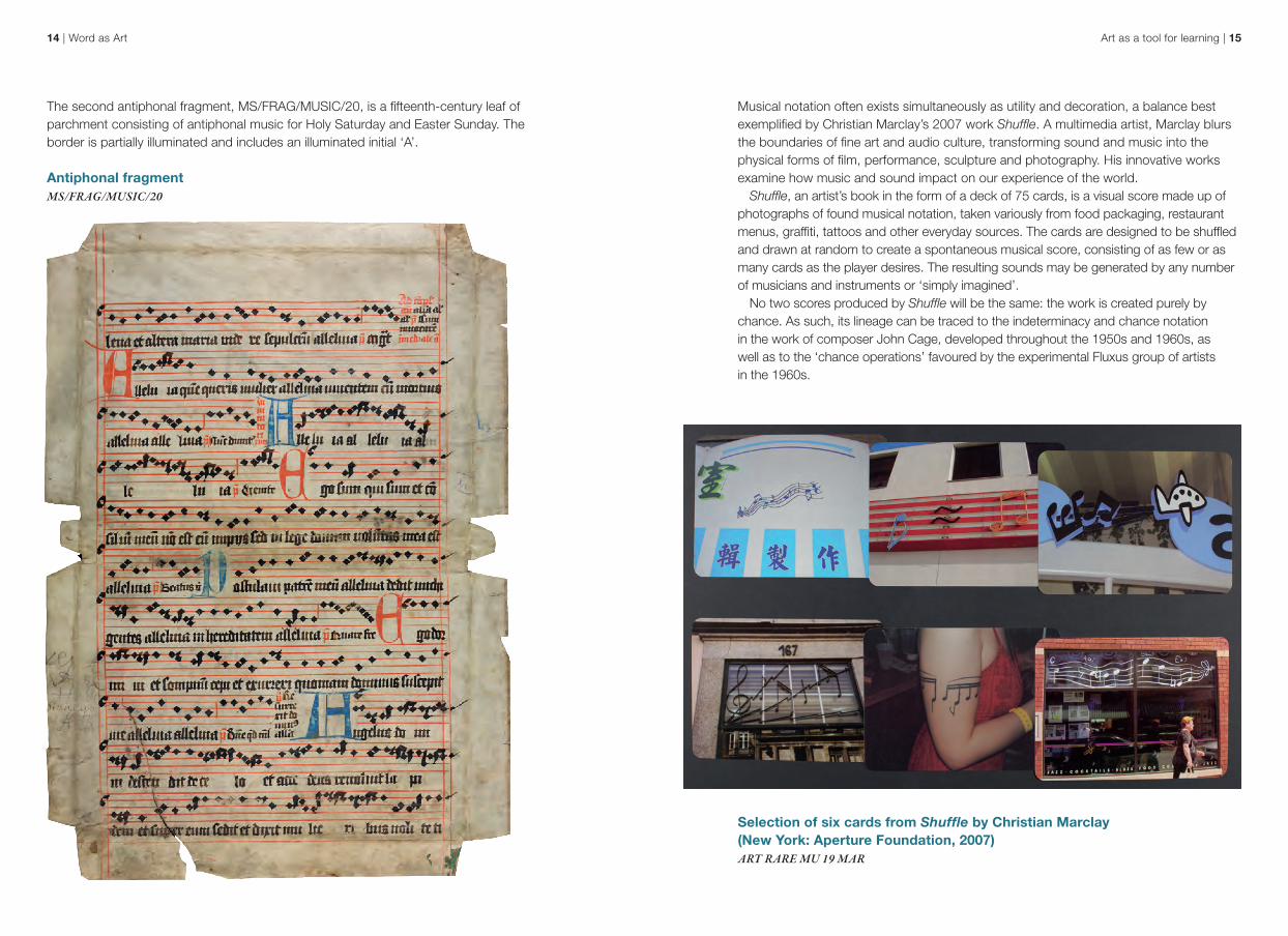
The second antiphonal fragment, MS/FRAG/MUSIC/20, is a fifteenth-century leaf of parchment consisting of antiphonal music for Holy Saturday and Easter Sunday. The border is partially illuminated and includes an illuminated initial ‘A’.
Antiphonal fragment MS/FRAG/MUSIC/20
Art as a tool for learning | 1716 | Word as Art
‘Life is Uncertain’ PAPERS OF THE WHITE FAMILY, WF/3/4
Music is not the only area of our lives where functionality overlaps with artistic impression. Textiles also play an important role, often revealing a lot about our background, history and state of mind. Samplers are a powerful example of this. On the one hand they provide an opportunity to practise different types of stitches, essential in the making of clothes, linen and other everyday items. On the other hand they are artistic creations in their own right. In the White family archives there is a small sampler from sometime between 1879 and 1912 in a scrapbook made by Louisa White. It reads ‘Life is Uncertain’.
This sampler contains photographs, memorabilia, sketches and newspaper cuttings mainly relating to her family, especially her daughters’ careers. Its message ‘Life is Uncertain’ feels significant at this moment in time. There is nothing to indicate who stitched it, but the sampler becomes especially poignant when we learn that Louisa’s first child was stillborn and another, Agnes, died in childhood.
Samplers were once part of the teaching curriculum in many British schools. Today Lesley Longley’s archive, held at UCL, preserves a portion of the history of sewing and textile education. During the late 1980s she completed a Masters dissertation at the Institute of Education on the subject of girls’ education through the interwar years. Lesley was a registered PhD student at the University of Surrey and had begun to collate research material when she died at the age of 70.
Illustrated handwritten embroidery stitch workbook showing stitches and their application [1920–35]LESLEY LONGLEY ARCHIVE, LL/2
Patterns in My Bedroom | 1918 | Word as Art
In response to an advertisement placed in The Guardian newspaper and Yours Magazine requesting information to inform her research, Lesley compiled a set of questionnaires. She also received original school workbooks on all aspects of domestic science: needlework, housewifery and homecraft, cookery and recipes.
Lesley Longley’s archive includes a handwritten workbook on embroidery. Word as Art features a page from it that covers the uses of lettering in embroidery and the different stiches required, along with examples of lettering design.
Leah Johnston, Head of ArchivesElizabeth Lawes, Subject Liaison Librarian: Fine Art, History of Art, Film Studies, Small Press CollectionsJessica Womack, Institute of Education ArchivistSarah Aitchison, Head of Special Collections
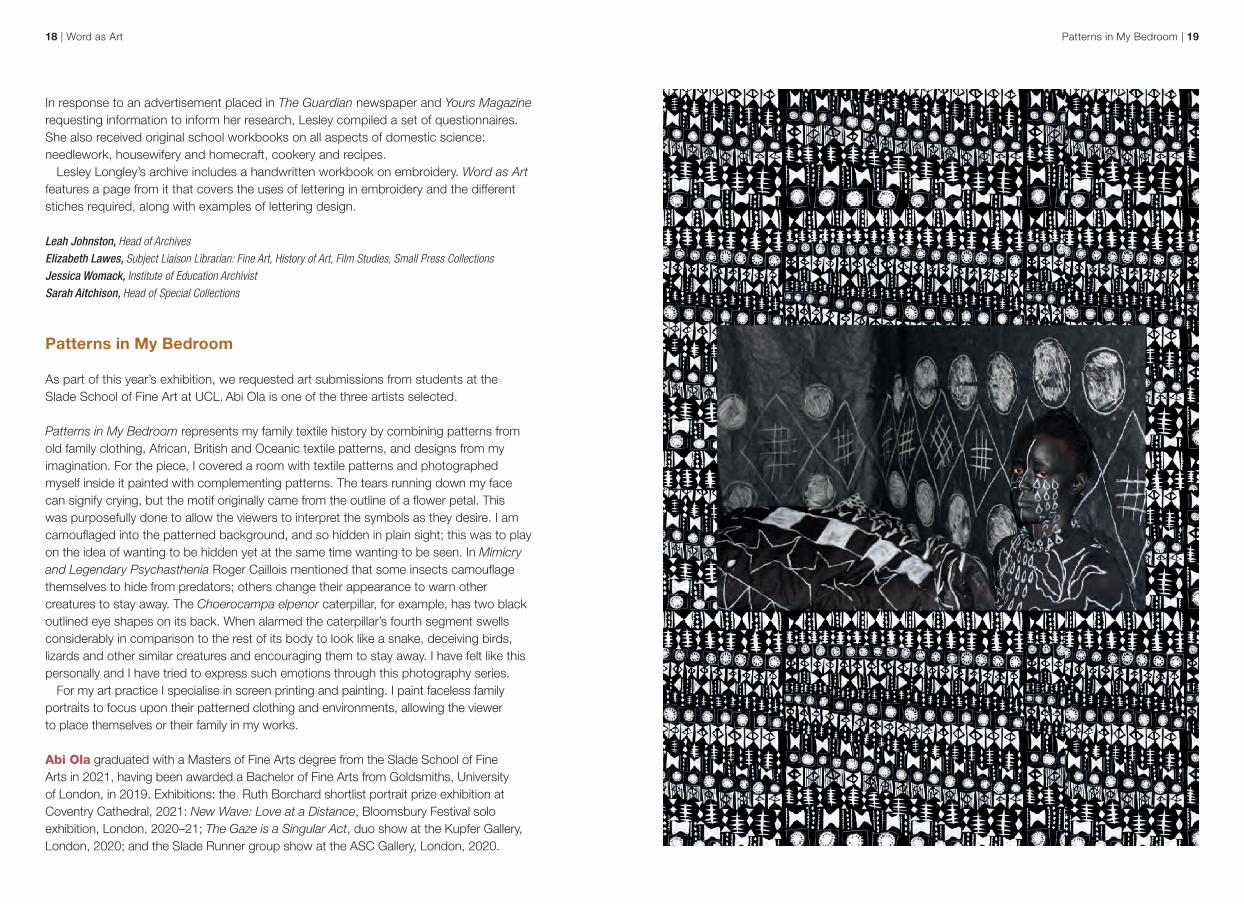
Patterns in My Bedroom As part of this year’s exhibition, we requested art submissions from students at the Slade School of Fine Art at UCL. Abi Ola is one of the three artists selected.
Patterns in My Bedroom represents my family textile history by combining patterns from old family clothing, African, British and Oceanic textile patterns, and designs from my imagination. For the piece, I covered a room with textile patterns and photographed myself inside it painted with complementing patterns. The tears running down my face can signify crying, but the motif originally came from the outline of a flower petal. This was purposefully done to allow the viewers to interpret the symbols as they desire. I am camouflaged into the patterned background, and so hidden in plain sight; this was to play on the idea of wanting to be hidden yet at the same time wanting to be seen. In Mimicry and Legendary Psychasthenia Roger Caillois mentioned that some insects camouflage themselves to hide from predators; others change their appearance to warn other creatures to stay away. The Choerocampa elpenor caterpillar, for example, has two black outlined eye shapes on its back. When alarmed the caterpillar’s fourth segment swells considerably in comparison to the rest of its body to look like a snake, deceiving birds, lizards and other similar creatures and encouraging them to stay away. I have felt like this personally and I have tried to express such emotions through this photography series.
For my art practice I specialise in screen printing and painting. I paint faceless family portraits to focus upon their patterned clothing and environments, allowing the viewer to place themselves or their family in my works.
Abi Ola graduated with a Masters of Fine Arts degree from the Slade School of Fine Arts in 2021, having been awarded a Bachelor of Fine Arts from Goldsmiths, University of London, in 2019. Exhibitions: the Ruth Borchard shortlist portrait prize exhibition at Coventry Cathedral, 2021: New Wave: Love at a Distance, Bloomsbury Festival solo exhibition, London, 2020–21; The Gaze is a Singular Act, duo show at the Kupfer Gallery, London, 2020; and the Slade Runner group show at the ASC Gallery, London, 2020.
Art as a tool for learning | 2120 | Word as Art
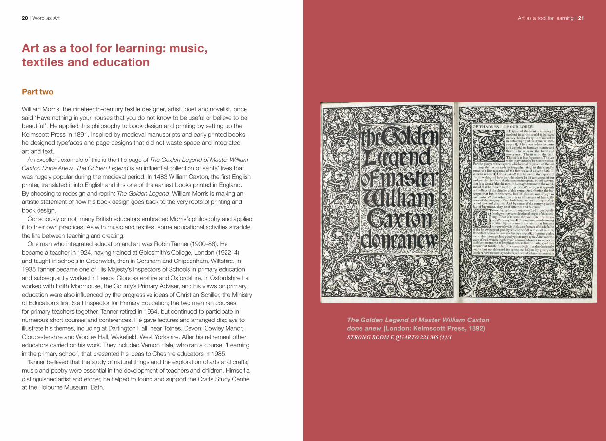
The Golden Legend of Master William Caxton done anew (London: Kelmscott Press, 1892)STRONG ROOM E QUARTO 221 M6 (1)/1
Art as a tool for learning: music, textiles and education
Part two
William Morris, the nineteenth-century textile designer, artist, poet and novelist, once said ‘Have nothing in your houses that you do not know to be useful or believe to be beautiful’. He applied this philosophy to book design and printing by setting up the Kelmscott Press in 1891. Inspired by medieval manuscripts and early printed books, he designed typefaces and page designs that did not waste space and integrated art and text.
An excellent example of this is the title page of The Golden Legend of Master William Caxton Done Anew. The Golden Legend is an influential collection of saints’ lives that was hugely popular during the medieval period. In 1483 William Caxton, the first English printer, translated it into English and it is one of the earliest books printed in England. By choosing to redesign and reprint The Golden Legend, William Morris is making an artistic statement of how his book design goes back to the very roots of printing and book design.
Consciously or not, many British educators embraced Morris’s philosophy and applied it to their own practices. As with music and textiles, some educational activities straddle the line between teaching and creating.
One man who integrated education and art was Robin Tanner (1900–88). He became a teacher in 1924, having trained at Goldsmith’s College, London (1922–4) and taught in schools in Greenwich, then in Corsham and Chippenham, Wiltshire. In 1935 Tanner became one of His Majesty’s Inspectors of Schools in primary education and subsequently worked in Leeds, Gloucestershire and Oxfordshire. In Oxfordshire he worked with Edith Moorhouse, the County’s Primary Adviser, and his views on primary education were also influenced by the progressive ideas of Christian Schiller, the Ministry of Education’s first Staff Inspector for Primary Education; the two men ran courses for primary teachers together. Tanner retired in 1964, but continued to participate in numerous short courses and conferences. He gave lectures and arranged displays to illustrate his themes, including at Dartington Hall, near Totnes, Devon; Cowley Manor, Gloucestershire and Woolley Hall, Wakefield, West Yorkshire. After his retirement other educators carried on his work. They included Vernon Hale, who ran a course, ‘Learning in the primary school’, that presented his ideas to Cheshire educators in 1985.
Tanner believed that the study of natural things and the exploration of arts and crafts, music and poetry were essential in the development of teachers and children. Himself a distinguished artist and etcher, he helped to found and support the Crafts Study Centre at the Holburne Museum, Bath.
Art as a tool for learning | 2322 | Word as Art
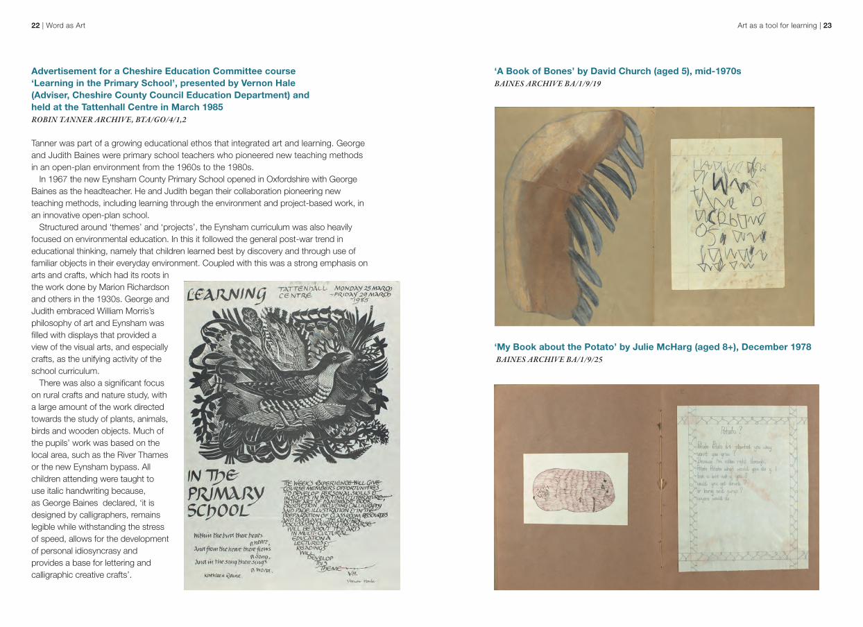
‘A Book of Bones’ by David Church (aged 5), mid-1970sBAINES ARCHIVE BA/1/9/19
‘My Book about the Potato’ by Julie McHarg (aged 8+), December 1978 BAINES ARCHIVE BA/1/9/25
Advertisement for a Cheshire Education Committee course ‘Learning in the Primary School’, presented by Vernon Hale (Adviser, Cheshire County Council Education Department) and held at the Tattenhall Centre in March 1985ROBIN TANNER ARCHIVE, BTA/GO/4/1,2
Tanner was part of a growing educational ethos that integrated art and learning. George and Judith Baines were primary school teachers who pioneered new teaching methods in an open-plan environment from the 1960s to the 1980s.
In 1967 the new Eynsham County Primary School opened in Oxfordshire with George Baines as the headteacher. He and Judith began their collaboration pioneering new teaching methods, including learning through the environment and project-based work, in an innovative open-plan school.
Structured around ‘themes’ and ‘projects’, the Eynsham curriculum was also heavily focused on environmental education. In this it followed the general post-war trend in educational thinking, namely that children learned best by discovery and through use of familiar objects in their everyday environment. Coupled with this was a strong emphasis on arts and crafts, which had its roots in the work done by Marion Richardson and others in the 1930s. George and Judith embraced William Morris’s philosophy of art and Eynsham was filled with displays that provided a view of the visual arts, and especially crafts, as the unifying activity of the school curriculum.
There was also a significant focus on rural crafts and nature study, with a large amount of the work directed towards the study of plants, animals, birds and wooden objects. Much of the pupils’ work was based on the local area, such as the River Thames or the new Eynsham bypass. All children attending were taught to use italic handwriting because, as George Baines declared, ‘it is designed by calligraphers, remains legible while withstanding the stress of speed, allows for the development of personal idiosyncrasy and provides a base for lettering and calligraphic creative crafts’.
Art as a tool for learning | 2524 | Word as Art
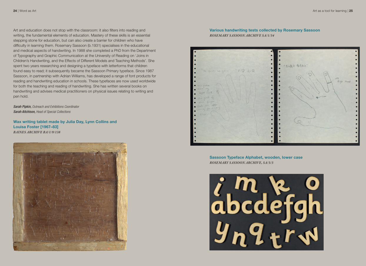
Various handwriting tests collected by Rosemary SassoonROSEMARY SASSOON ARCHIVE SA/1/34
Sassoon Typeface Alphabet, wooden, lower caseROSEMARY SASSOON ARCHIVE, SA/3/3
Art and education does not stop with the classroom: it also filters into reading and writing, the fundamental elements of education. Mastery of these skills is an essential stepping stone for education, but can also create a barrier for children who have difficulty in learning them. Rosemary Sassoon (b.1931) specialises in the educational and medical aspects of handwriting. In 1988 she completed a PhD from the Department of Typography and Graphic Communication at the University of Reading on ‘Joins in Children’s Handwriting, and the Effects of Different Models and Teaching Methods’. She spent two years researching and designing a typeface with letterforms that children found easy to read; it subsequently became the Sassoon Primary typeface. Since 1987 Sassoon, in partnership with Adrian Williams, has developed a range of font products for reading and handwriting education in schools. These typefaces are now used worldwide for both the teaching and reading of handwriting. She has written several books on handwriting and advises medical practitioners on physical issues relating to writing and pen hold.
Sarah Pipkin, Outreach and Exhibitions CoordinatorSarah Aitchison, Head of Special Collections
Wax writing tablet made by Julia Day, Lynn Collins and Louisa Foster [1967–83]BAINES ARCHIVE BA/1/9/138
Artistic interpretations of initials | 2726 | Word as Art
Development of initials in European books
Initials were used in medieval manuscripts to mark the start of a new section. These letters were visually distinct from the rest of the text, enabling readers to use them to navigate the page. The letters were often decorated with pen flourishes, colour and, in more lavishly produced manuscripts, painted scenes and gold leaf.
The practice of supplying initials by hand continued after the introduction of printing in Western Europe in c.1450. Because colour printing was a complex and expensive process, printers in these early years usually left an empty space, often with a printed guide letter. An illuminator would then add the initials by hand after the book had been printed.
Towards the end of the fifteenth century this practice gradually fell out of use, with printers starting to use decorative woodcut initials instead. Only a limited number of pages were being printed at any one time, so printers required only a limited supply of initials, to be reused within and across different books. The practice of using woodcut initials fell out of use in turn, around the start of the nineteenth century
Erika Delbecque, Head of Rare Books
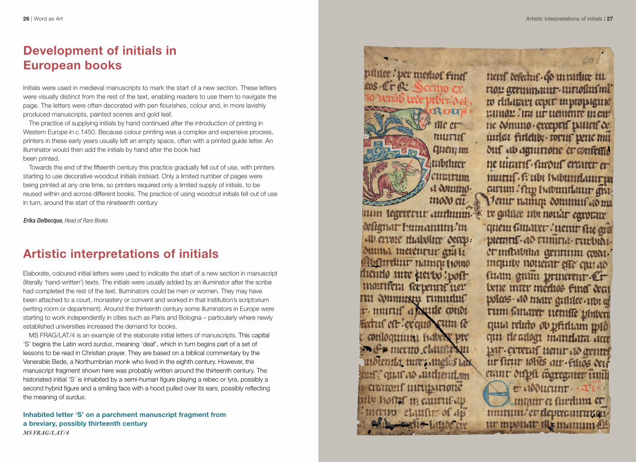
Artistic interpretations of initials Elaborate, coloured initial letters were used to indicate the start of a new section in manuscript (literally ‘hand-written’) texts. The initials were usually added by an illuminator after the scribe had completed the rest of the text. Illuminators could be men or women. They may have been attached to a court, monastery or convent and worked in that institution’s scriptorium (writing room or department). Around the thirteenth century some illuminators in Europe were starting to work independently in cities such as Paris and Bologna – particularly where newly established universities increased the demand for books.
MS FRAG/LAT/4 is an example of the elaborate initial letters of manuscripts. This capital ‘S’ begins the Latin word surdus, meaning ‘deaf’, which in turn begins part of a set of lessons to be read in Christian prayer. They are based on a biblical commentary by the Venerable Bede, a Northumbrian monk who lived in the eighth century. However, the manuscript fragment shown here was probably written around the thirteenth century. The historiated initial ‘S’ is inhabited by a semi-human figure playing a rebec or lyra, possibly a second hybrid figure and a smiling face with a hood pulled over its ears, possibly reflecting the meaning of surdus.
Inhabited letter ‘S’ on a parchment manuscript fragment from a breviary, possibly thirteenth century MS FRAG/LAT/4
Artistic interpretations of initials | 2928 | Word as Art
Another example of an incunable is the 1481 edition of Dante’s Comedia, written in the early fourteenth century and first printed in 1472. As with the legal textbook, the layout of the book was intended to resemble a handwritten manuscript, with Dante’s poem in the centre of the left-hand column and Landino’s commentary surrounding it in a smaller font. Space was left for an illuminator to add a decorated initial ‘N’ by hand for the very start of the poem, as would have been the practice for a manuscript, but here that letter was never added. This enables us to see the inked guide-letter underneath, telling the illuminator which letter should be added.
The title of this book highlights the commentary on Dante’s poem rather than the poem itself. To reflect that, space has also been left for a smaller, hand-coloured initial letter at the start of the commentary in the top right-hand column. In our copy that was never added either, but the guide-letter has been included in the printing.
Empty space left for illuminated letter ‘N’ in Dante, Commento di Christophoro Landino fiorentino sopra La commedia di Dante Alighieri poeta fiorentino (Florence: per Nicolaus Laurentii, Alamanus, 1481)INCUNABULA FOLIO 6 B
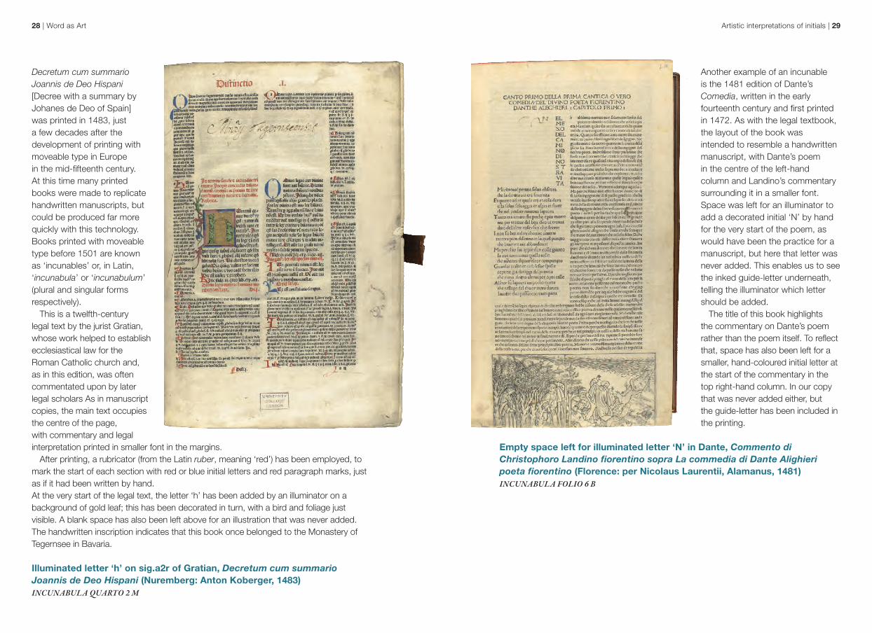
Decretum cum summario Joannis de Deo Hispani [Decree with a summary by Johanes de Deo of Spain] was printed in 1483, just a few decades after the development of printing with moveable type in Europe in the mid-fifteenth century. At this time many printed books were made to replicate handwritten manuscripts, but could be produced far more quickly with this technology. Books printed with moveable type before 1501 are known as ‘incunables’ or, in Latin, ‘incunabula’ or ‘incunabulum’ (plural and singular forms respectively).
This is a twelfth-century legal text by the jurist Gratian, whose work helped to establish ecclesiastical law for the Roman Catholic church and, as in this edition, was often commentated upon by later legal scholars As in manuscript copies, the main text occupies the centre of the page, with commentary and legal interpretation printed in smaller font in the margins.
After printing, a rubricator (from the Latin ruber, meaning ‘red’) has been employed, to mark the start of each section with red or blue initial letters and red paragraph marks, just as if it had been written by hand. At the very start of the legal text, the letter ‘h’ has been added by an illuminator on a background of gold leaf; this has been decorated in turn, with a bird and foliage just visible. A blank space has also been left above for an illustration that was never added. The handwritten inscription indicates that this book once belonged to the Monastery of Tegernsee in Bavaria.
Illuminated letter ‘h’ on sig.a2r of Gratian, Decretum cum summario Joannis de Deo Hispani (Nuremberg: Anton Koberger, 1483) INCUNABULA QUARTO 2 M
30 | Word as Art
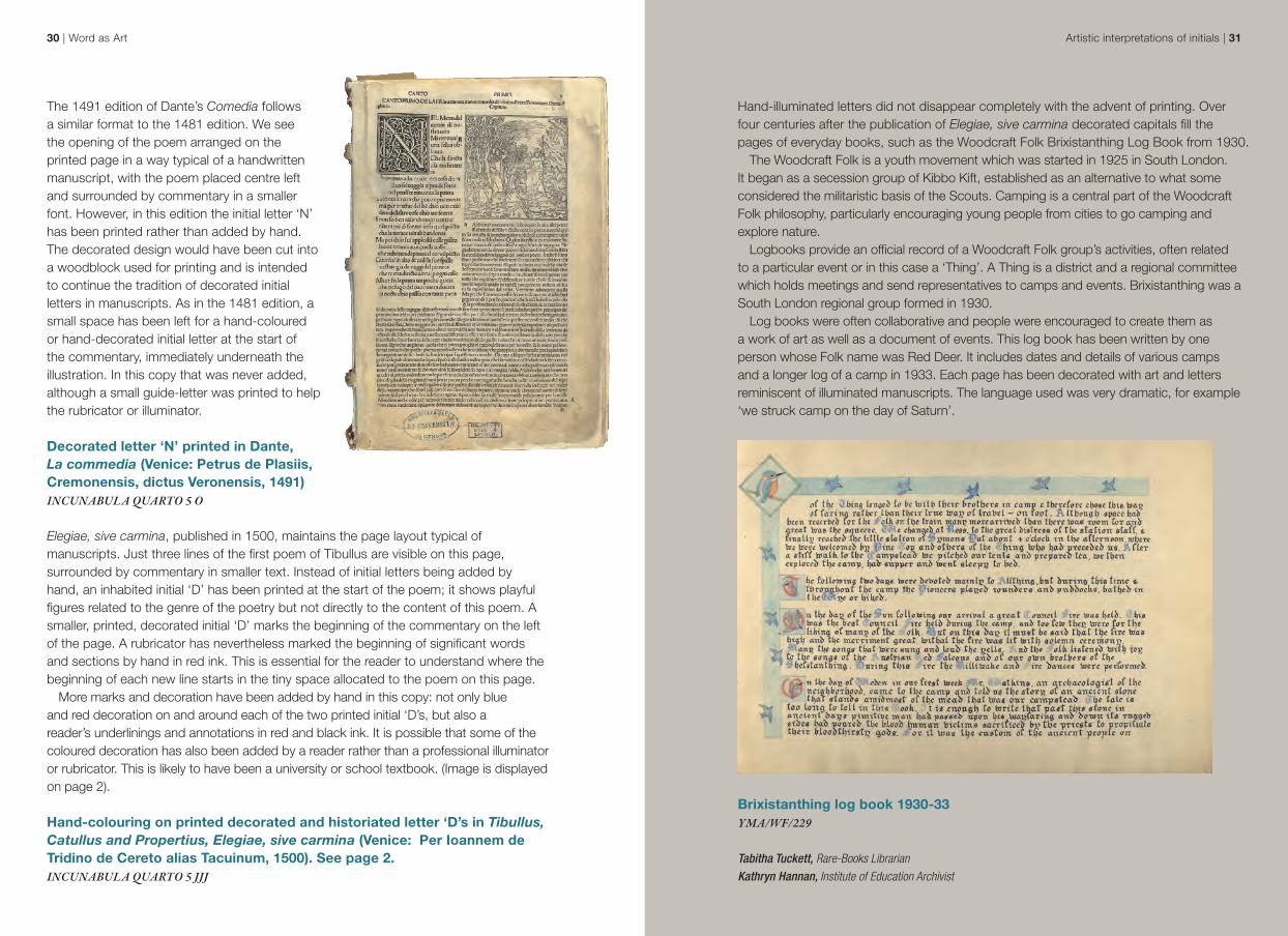
The 1491 edition of Dante’s Comedia follows a similar format to the 1481 edition. We see the opening of the poem arranged on the printed page in a way typical of a handwritten manuscript, with the poem placed centre left and surrounded by commentary in a smaller font. However, in this edition the initial letter ‘N’ has been printed rather than added by hand. The decorated design would have been cut into a woodblock used for printing and is intended to continue the tradition of decorated initial letters in manuscripts. As in the 1481 edition, a small space has been left for a hand-coloured or hand-decorated initial letter at the start of the commentary, immediately underneath the illustration. In this copy that was never added, although a small guide-letter was printed to help the rubricator or illuminator.
Decorated letter ‘N’ printed in Dante, La commedia (Venice: Petrus de Plasiis, Cremonensis, dictus Veronensis, 1491)INCUNABULA QUARTO 5 O
Elegiae, sive carmina, published in 1500, maintains the page layout typical of manuscripts. Just three lines of the first poem of Tibullus are visible on this page, surrounded by commentary in smaller text. Instead of initial letters being added by hand, an inhabited initial ‘D’ has been printed at the start of the poem; it shows playful figures related to the genre of the poetry but not directly to the content of this poem. A smaller, printed, decorated initial ‘D’ marks the beginning of the commentary on the left of the page. A rubricator has nevertheless marked the beginning of significant words and sections by hand in red ink. This is essential for the reader to understand where the beginning of each new line starts in the tiny space allocated to the poem on this page.
More marks and decoration have been added by hand in this copy: not only blue and red decoration on and around each of the two printed initial ‘D’s, but also a reader’s underlinings and annotations in red and black ink. It is possible that some of the coloured decoration has also been added by a reader rather than a professional illuminator or rubricator. This is likely to have been a university or school textbook. (Image is displayed on page 2).
Hand-colouring on printed decorated and historiated letter ‘D’s in Tibullus, Catullus and Propertius, Elegiae, sive carmina (Venice: Per Ioannem de Tridino de Cereto alias Tacuinum, 1500). See page 2.INCUNABULA QUARTO 5 JJJ
Hand-illuminated letters did not disappear completely with the advent of printing. Over four centuries after the publication of Elegiae, sive carmina decorated capitals fill the pages of everyday books, such as the Woodcraft Folk Brixistanthing Log Book from 1930.
The Woodcraft Folk is a youth movement which was started in 1925 in South London. It began as a secession group of Kibbo Kift, established as an alternative to what some considered the militaristic basis of the Scouts. Camping is a central part of the Woodcraft Folk philosophy, particularly encouraging young people from cities to go camping and explore nature.
Logbooks provide an official record of a Woodcraft Folk group’s activities, often related to a particular event or in this case a ‘Thing’. A Thing is a district and a regional committee which holds meetings and send representatives to camps and events. Brixistanthing was a South London regional group formed in 1930.
Log books were often collaborative and people were encouraged to create them as a work of art as well as a document of events. This log book has been written by one person whose Folk name was Red Deer. It includes dates and details of various camps and a longer log of a camp in 1933. Each page has been decorated with art and letters reminiscent of illuminated manuscripts. The language used was very dramatic, for example ‘we struck camp on the day of Saturn’.
Brixistanthing log book 1930-33YMA/WF/229
Tabitha Tuckett, Rare-Books LibrarianKathryn Hannan, Institute of Education Archivist
Artistic interpretations of initials | 31
Scriptorium | 3332 | Word as Art
Scriptorium
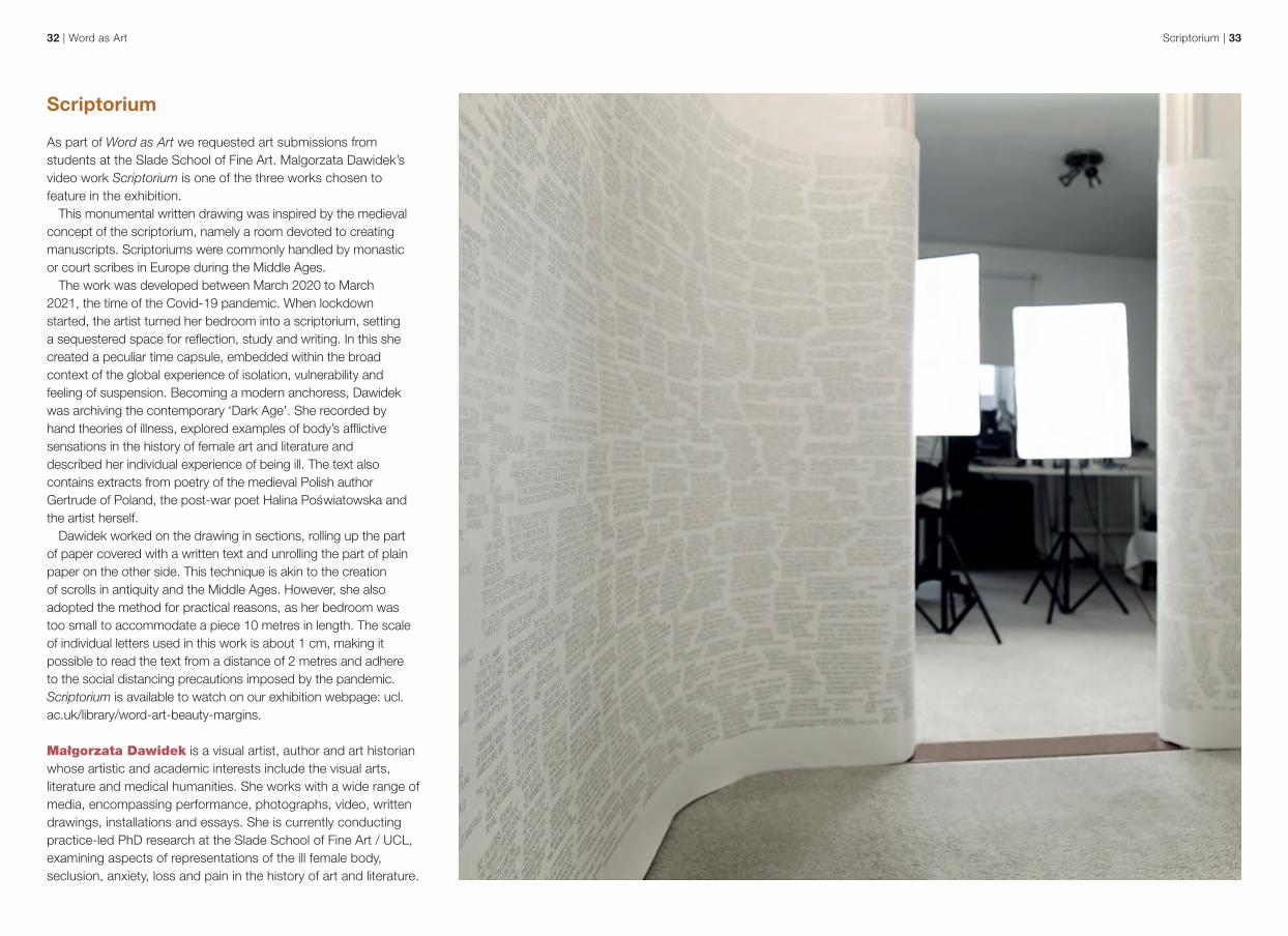
As part of Word as Art we requested art submissions from students at the Slade School of Fine Art. Malgorzata Dawidek’s video work Scriptorium is one of the three works chosen to feature in the exhibition.
This monumental written drawing was inspired by the medieval concept of the scriptorium, namely a room devoted to creating manuscripts. Scriptoriums were commonly handled by monastic or court scribes in Europe during the Middle Ages.
The work was developed between March 2020 to March 2021, the time of the Covid-19 pandemic. When lockdown started, the artist turned her bedroom into a scriptorium, setting a sequestered space for reflection, study and writing. In this she created a peculiar time capsule, embedded within the broad context of the global experience of isolation, vulnerability and feeling of suspension. Becoming a modern anchoress, Dawidek was archiving the contemporary ‘Dark Age’. She recorded by hand theories of illness, explored examples of body’s afflictive sensations in the history of female art and literature and described her individual experience of being ill. The text also contains extracts from poetry of the medieval Polish author Gertrude of Poland, the post-war poet Halina Poswiatowska and the artist herself.
Dawidek worked on the drawing in sections, rolling up the part of paper covered with a written text and unrolling the part of plain paper on the other side. This technique is akin to the creation of scrolls in antiquity and the Middle Ages. However, she also adopted the method for practical reasons, as her bedroom was too small to accommodate a piece 10 metres in length. The scale of individual letters used in this work is about 1 cm, making it possible to read the text from a distance of 2 metres and adhere to the social distancing precautions imposed by the pandemic. Scriptorium is available to watch on our exhibition webpage: ucl.ac.uk/library/word-art-beauty-margins.
Małgorzata Dawidek is a visual artist, author and art historian whose artistic and academic interests include the visual arts, literature and medical humanities. She works with a wide range of media, encompassing performance, photographs, video, written drawings, installations and essays. She is currently conducting practice-led PhD research at the Slade School of Fine Art / UCL, examining aspects of representations of the ill female body, seclusion, anxiety, loss and pain in the history of art and literature.

Art and formatting | 3534 | Word as Art
Art and formatting
Part one
While there is an artistry in the simple act of writing, words do not exist in a vacuum, nor is our understanding of what they say limited to dictionary definitions. The way in which we format a page can transform the meaning of a text, giving it additional layers beyond literal meaning. The choices that we make on how to use a page or a chart can similarly create stunning examples of accidental art.
An early example of artistic decisions in formatting can be found in Samuel Richardson’s Clarissa. The novel is epistolary in form, with the narrative unfolding through a series of letters. Interestingly Richardson was a printer as well as an author. In the 1747 first edition he used printing devices and formatting choices to reflect in print various features of the manuscript experience of his characters, including a passage in which the letter in question has been torn into pieces. Various lines of text were printed at different angles in the margins to create the same reading experience of the scattered pieces of a torn letter. This formatting decision was preserved in the 1810 edition featured here, even though Richardson was no longer alive.
Towards the end of his life Richardson was unhappy with suggestions that his own correspondence appear in print. Yet he places the reader of Clarissa in the uncomfortable or privileged position of consuming the private correspondence of his characters, laid out on the page as closely as possible to handwritten letters, in order to follow the narrative.
Innovative printing to imitate a handwritten letter in Paper X, vol. 5 of Samuel Richardson, Clarissa, or, the History of a Young Lady (London: Printed for F C and J Rivington, 1810) ROTTON 22.C.12
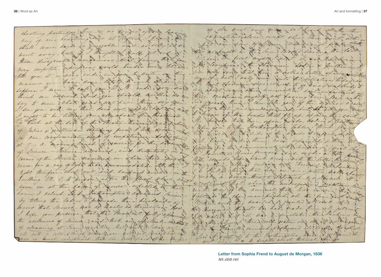
Necessity can determine how we format a written text. An excellent example, shown overleaf, is a letter from Sophia Frend to her future husband, Augustus De Morgan, dated 6 September 1836. This letter is an example of cross-writing, a very common practice in the nineteenth century. Before the use of envelopes became widespread, letters were folded in on themselves and sealed with wax to form a packet. The letter writer had to leave much of the reverse blank because it became the outside of the packet. Writing a long letter first horizontally, then turning the paper through 90 degrees and continuing across the text already written was an economical way to keep the letter to a single sheet of paper, and so save on postage costs.
Tabitha Tuckett, Rare-Books LibrarianKaty Makin, UCL Archivist
Art and formatting | 3736 | Word as Art
Letter from Sophia Frend to August de Morgan, 1836 MS ADD 163
Art and formatting | 3938 | Word as Art
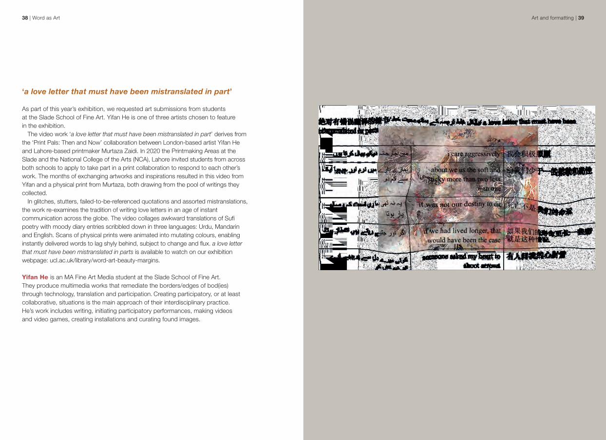
‘a love letter that must have been mistranslated in part’ As part of this year’s exhibition, we requested art submissions from students at the Slade School of Fine Art. Yifan He is one of three artists chosen to feature in the exhibition.
The video work ‘a love letter that must have been mistranslated in part’ derives from the ‘Print Pals: Then and Now’ collaboration between London-based artist Yifan He and Lahore-based printmaker Murtaza Zaidi. In 2020 the Printmaking Areas at the Slade and the National College of the Arts (NCA), Lahore invited students from across both schools to apply to take part in a print collaboration to respond to each other’s work. The months of exchanging artworks and inspirations resulted in this video from Yifan and a physical print from Murtaza, both drawing from the pool of writings they collected.
In glitches, stutters, failed-to-be-referenced quotations and assorted mistranslations, the work re-examines the tradition of writing love letters in an age of instant communication across the globe. The video collages awkward translations of Sufi poetry with moody diary entries scribbled down in three languages: Urdu, Mandarin and English. Scans of physical prints were animated into mutating colours, enabling instantly delivered words to lag shyly behind, subject to change and flux. a love letter that must have been mistranslated in parts is available to watch on our exhibition webpage: ucl.ac.uk/library/word-art-beauty-margins.
Yifan He is an MA Fine Art Media student at the Slade School of Fine Art. They produce multimedia works that remediate the borders/edges of bod(ies) through technology, translation and participation. Creating participatory, or at least collaborative, situations is the main approach of their interdisciplinary practice. He’s work includes writing, initiating participatory performances, making videos and video games, creating installations and curating found images.
Art and formatting | 4140 | Word as Art
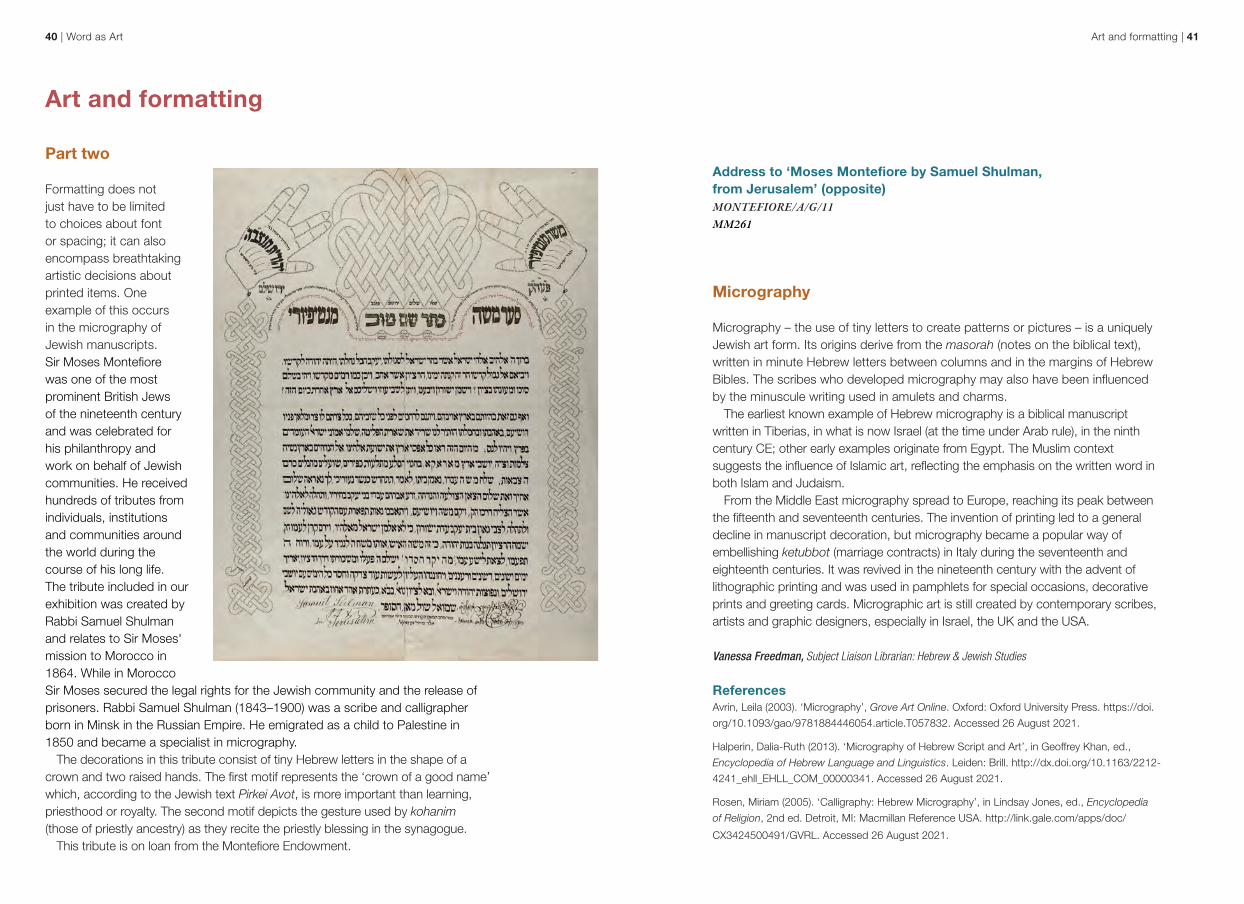
Address to ‘Moses Montefiore by Samuel Shulman, from Jerusalem’ (opposite) MONTEFIORE/A/G/11 MM261
Micrography
Micrography – the use of tiny letters to create patterns or pictures – is a uniquely Jewish art form. Its origins derive from the masorah (notes on the biblical text), written in minute Hebrew letters between columns and in the margins of Hebrew Bibles. The scribes who developed micrography may also have been influenced by the minuscule writing used in amulets and charms.
The earliest known example of Hebrew micrography is a biblical manuscript written in Tiberias, in what is now Israel (at the time under Arab rule), in the ninth century CE; other early examples originate from Egypt. The Muslim context suggests the influence of Islamic art, reflecting the emphasis on the written word in both Islam and Judaism.
From the Middle East micrography spread to Europe, reaching its peak between the fifteenth and seventeenth centuries. The invention of printing led to a general decline in manuscript decoration, but micrography became a popular way of embellishing ketubbot (marriage contracts) in Italy during the seventeenth and eighteenth centuries. It was revived in the nineteenth century with the advent of lithographic printing and was used in pamphlets for special occasions, decorative prints and greeting cards. Micrographic art is still created by contemporary scribes, artists and graphic designers, especially in Israel, the UK and the USA.
Vanessa Freedman, Subject Liaison Librarian: Hebrew & Jewish Studies
ReferencesAvrin, Leila (2003). ‘Micrography’, Grove Art Online. Oxford: Oxford University Press. https://doi.
org/10.1093/gao/9781884446054.article.T057832. Accessed 26 August 2021.
Halperin, Dalia-Ruth (2013). ‘Micrography of Hebrew Script and Art’, in Geoffrey Khan, ed.,
Encyclopedia of Hebrew Language and Linguistics. Leiden: Brill. http://dx.doi.org/10.1163/2212-
4241_ehll_EHLL_COM_00000341. Accessed 26 August 2021.
Rosen, Miriam (2005). ‘Calligraphy: Hebrew Micrography’, in Lindsay Jones, ed., Encyclopedia
of Religion, 2nd ed. Detroit, MI: Macmillan Reference USA. http://link.gale.com/apps/doc/
CX3424500491/GVRL. Accessed 26 August 2021.
Art and formatting
Part two
Formatting does not just have to be limited to choices about font or spacing; it can also encompass breathtaking artistic decisions about printed items. One example of this occurs in the micrography of Jewish manuscripts. Sir Moses Montefiore was one of the most prominent British Jews of the nineteenth century and was celebrated for his philanthropy and work on behalf of Jewish communities. He received hundreds of tributes from individuals, institutions and communities around the world during the course of his long life. The tribute included in our exhibition was created by Rabbi Samuel Shulman and relates to Sir Moses' mission to Morocco in 1864. While in Morocco Sir Moses secured the legal rights for the Jewish community and the release of prisoners. Rabbi Samuel Shulman (1843–1900) was a scribe and calligrapher born in Minsk in the Russian Empire. He emigrated as a child to Palestine in 1850 and became a specialist in micrography.
The decorations in this tribute consist of tiny Hebrew letters in the shape of a crown and two raised hands. The first motif represents the ‘crown of a good name’ which, according to the Jewish text Pirkei Avot, is more important than learning, priesthood or royalty. The second motif depicts the gesture used by kohanim (those of priestly ancestry) as they recite the priestly blessing in the synagogue.
This tribute is on loan from the Montefiore Endowment.
Art and formatting | 4342 | Word as Art
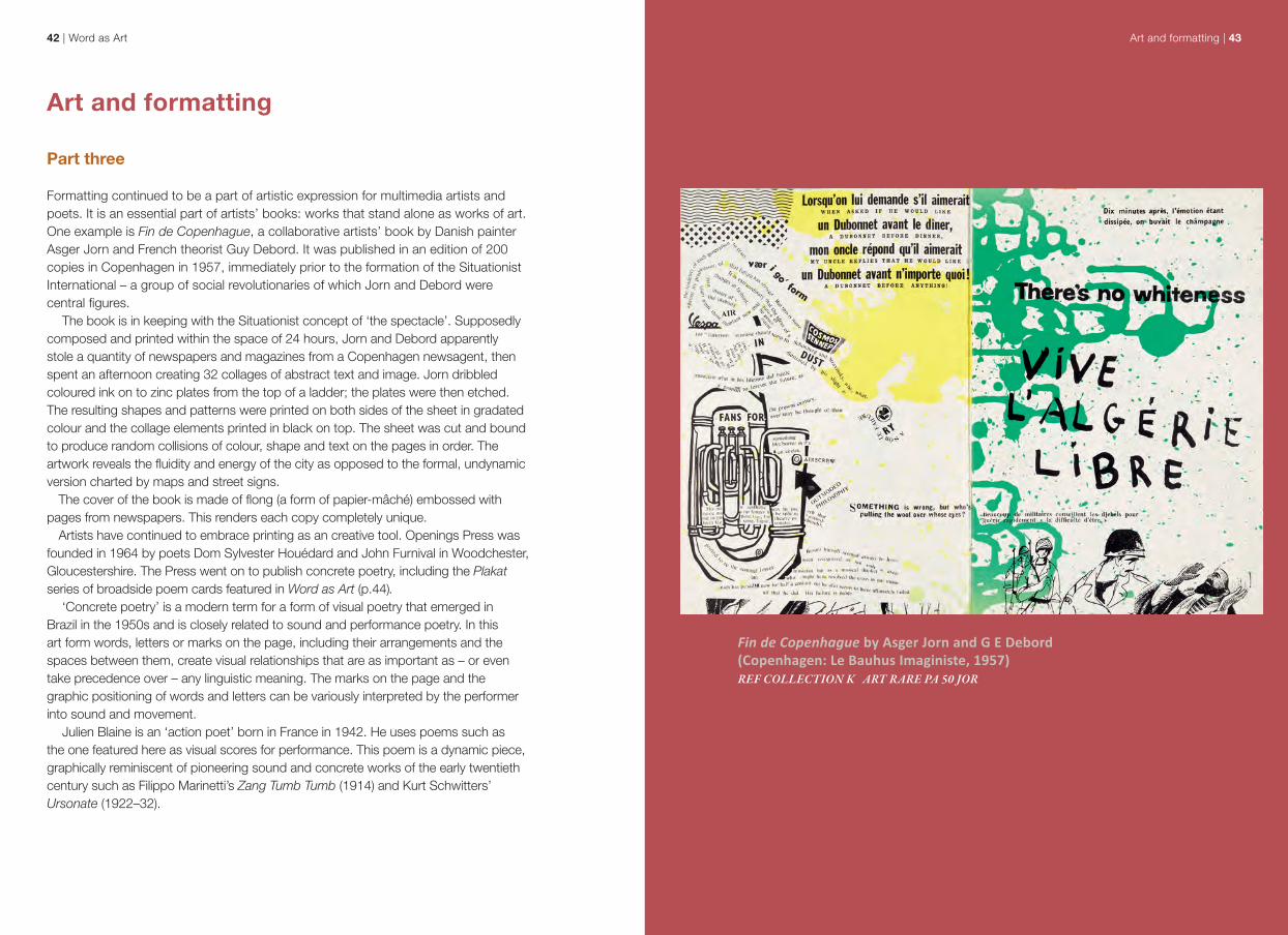
Fin de Copenhague by Asger Jorn and G E Debord (Copenhagen: Le Bauhus Imaginiste, 1957)REF COLLECTION K ART RARE PA 50 JOR
Art and formatting
Part three
Formatting continued to be a part of artistic expression for multimedia artists and poets. It is an essential part of artists’ books: works that stand alone as works of art. One example is Fin de Copenhague, a collaborative artists’ book by Danish painter Asger Jorn and French theorist Guy Debord. It was published in an edition of 200 copies in Copenhagen in 1957, immediately prior to the formation of the Situationist International – a group of social revolutionaries of which Jorn and Debord were central figures.
The book is in keeping with the Situationist concept of ‘the spectacle’. Supposedly composed and printed within the space of 24 hours, Jorn and Debord apparently stole a quantity of newspapers and magazines from a Copenhagen newsagent, then spent an afternoon creating 32 collages of abstract text and image. Jorn dribbled coloured ink on to zinc plates from the top of a ladder; the plates were then etched. The resulting shapes and patterns were printed on both sides of the sheet in gradated colour and the collage elements printed in black on top. The sheet was cut and bound to produce random collisions of colour, shape and text on the pages in order. The artwork reveals the fluidity and energy of the city as opposed to the formal, undynamic version charted by maps and street signs.
The cover of the book is made of flong (a form of papier-mâché) embossed with pages from newspapers. This renders each copy completely unique.
Artists have continued to embrace printing as an creative tool. Openings Press was founded in 1964 by poets Dom Sylvester Houédard and John Furnival in Woodchester, Gloucestershire. The Press went on to publish concrete poetry, including the Plakat series of broadside poem cards featured in Word as Art (p.44).
‘Concrete poetry’ is a modern term for a form of visual poetry that emerged in Brazil in the 1950s and is closely related to sound and performance poetry. In this art form words, letters or marks on the page, including their arrangements and the spaces between them, create visual relationships that are as important as – or even take precedence over – any linguistic meaning. The marks on the page and the graphic positioning of words and letters can be variously interpreted by the performer into sound and movement.
Julien Blaine is an ‘action poet’ born in France in 1942. He uses poems such as the one featured here as visual scores for performance. This poem is a dynamic piece, graphically reminiscent of pioneering sound and concrete works of the early twentieth century such as Filippo Marinetti’s Zang Tumb Tumb (1914) and Kurt Schwitters’ Ursonate (1922–32).

When words fail | 4544 | Word as Art
When words failAt a certain point words are not enough to express ideas or meaning: something else must step in to fill the gap in communication. The obvious move is to traditional paintings or book illustrations. However, there is a space between writing and pictures that can also be used. Such graphic devices are neither paintings nor illustrations, but they are not writing either, not as we traditionally understand it.
One example of this is the famous black page that appears in The Life and Opinions of Tristram Shandy, Gentleman. Originally published in 1759, this is a remarkable parodic novel by Laurence Sterne. In this experimental work Sterne exploits the possibilities offered by the book’s physical make-up and typography to enhance the narrative. The nine-volume book relishes the power of punctuation, visual jokes and textual references to add elements of absurdism to the novel. Sterne was heavily involved with the publication of Tristram Shandy, frequently writing to the publisher to ensure his vision for the book was followed. This famous black page, included halfway through volume one, comes after the death of the character Yorick. Following the description of Yorick’s tomb, the page is a visual representation of the mourning that Tristram experiences.
The Life and Opinions of Tristram Shandy, Gentleman by Laurence Sterne (London: Everyman’s Library, 1912)REF COLLECTION K ORWELL N 10 STE
Plakat 7 by Julien Blaine (Woodchester: Openings Press, December 1966) POETRY STORE (X) OPE:BLA
Elizabeth Lawes, Subject Liaison Librarian: Fine Art, History of Art, Film Studies, Small Press Collections
When words fail | 4746 | Word as Art
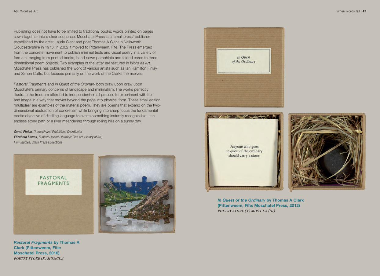
In Quest of the Ordinary by Thomas A Clark (Pittenweem, Fife: Moschatel Press, 2012) POETRY STORE (X) MOS:CLA (OI)
Publishing does not have to be limited to traditional books: words printed on pages sewn together into a clear sequence. Moschatel Press is a ‘small press’ publisher established by the artist Laurie Clark and poet Thomas A Clark in Nailsworth, Gloucestershire in 1973; in 2002 it moved to Pittenweem, Fife. The Press emerged from the concrete movement to publish minimal texts and visual poetry in a variety of formats, ranging from printed books, hand-sewn pamphlets and folded cards to three-dimensional poem objects. Two examples of the latter are featured in Word as Art. Moschatel Press has published the work of various artists such as Ian Hamilton Finlay and Simon Cutts, but focuses primarily on the work of the Clarks themselves. Pastoral Fragments and In Quest of the Ordinary both draw upon draw upon Moschatel’s primary concerns of landscape and minimalism. The works perfectly illustrate the freedom afforded to independent small presses to experiment with text and image in a way that moves beyond the page into physical form. These small edition ‘multiples’ are examples of the material poem. They are poems that expand on the two-dimensional abstraction of concretism while bringing into sharp focus the fundamental poetic objective of distilling language to evoke something instantly recognisable – an endless stony path or a river meandering through rolling hills on a sunny day.
Sarah Pipkin, Outreach and Exhibitions CoordinatorElizabeth Lawes, Subject Liaison Librarian: Fine Art, History of Art, Film Studies, Small Press Collections
Pastoral Fragments by Thomas A Clark (Pittenweem, Fife: Moschatel Press, 2016) POETRY STORE (X) MOS:CLA

Acknowledgements
The Library Services Exhibitions Group arranges themed exhibitions drawing on highlights from UCL Special Collections. This exhibition has been curated by Sarah Pipkin with Sarah Aitchison and Kate Cheney, and with the assistance of Erika Delbecque, Vanessa Freedman, Kathryn Hannan, Kurt Jameson, Elizabeth Lawes, Katy Makin, Tabitha Tuckett and Jessica Womack.
Exhibition items were prepared by Angela Warren-Thomas. Photography for the exhibition was by Amy Howe and Steven Wright.The exhibition webpage was prepared by Stephen James.Student submissions from the Slade School of Fine Art were selected by Megan Klosterman, Elizabeth Lawes, Sarah Pipkin and Lesley Sharpe.
Thanks to Aperture Press, Julien Blaine, Thomas A Clark and Museum Jorn for permission to include their publications in this exhibition. The catalogue has been prepared by Sarah Pipkin and written by Sarah Aitchison, Małgorzata Dawidek, Erika Delbecque, Vanessa Freedman, Kathryn Hannan, Yifan He, Leah Johnston, Megan Klosterman, Elizabeth Lawes, Katy Makin, Abi Ola, Sarah Pipkin, Tabitha Tuckett and Jessica Womack. Text and photography © copyright UCL Library Services, 2021 Front cover: Plakat 7. Copyright © Julien BlaineBack cover: Detail of ‘Life is Uncertain’ from the papers of the White familyDesign and layout by Bobby Birchall © 2021Edited by Catherine Bradley
Exhibition Location
This is an ‘online first’ exhibition. A physical exhibition will be opening at the end of 2021 in the Main Library staircase and first floor.
https://www.ucl.ac.uk/library/word-art-beauty-margins or search: UCL Library exhibitionUCL Library Services Gower Street London WC1E 6BT