white mountain nature preserve style guide
DESCRIPTION
A style guide for the logo I designed for White Mountain Nature Preserve.TRANSCRIPT

STYLE GUIDE

2

3
CONTENTS
2
3
4
5
6
7
8
11
12
Company Statement
Logo Statement
Color Palette
Typography
Stationery
Business Letter
Applications
Size & Margins
Inappropriate Use

4
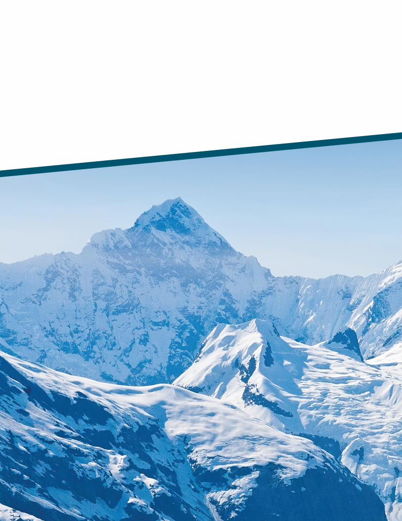
WHITE MOUNTAIN
White Mountain is a nature preserve in central Alaska. When
a visitor comes to our preserve they will get to see stunning
scenery. Depending on the season they can see beautiful grass
or snow covered forests, tremendous mountains, and majestic
wildlife. Take a camping trip and a guided tour in order to see
all that White Mountain has to offer. We also offer canoe tours
down the river as well as mountain climbing expeditions.
Here at White Mountain our aim is to protect the environment
to keep the scenery as pristine as possible. We take pride in
the beauty of Alaska and want to make sure it stays that way.
All wildlife is protected so no hunting is allowed in the nature
preserve. The safety of our visitors is of upmost importance to
us. In our guided tours we ensure that no harm comes to our
visitors. If visitors go on camping trips, we keep contact with
them to make sure everything is going well.
Customer satisfaction is important to the success of White
Mountain. We aim to attract a variety of different people to visit
our nature preserve. We welcome everyone who has an interest
in nature and wildlife, whether they be experienced and new
comers. Our goal is to educate all visitors on how to preserve the
wildlife. All visitors must leave the nature preserve in the same
state they found it in.

5
LOGO STATEMENT
White Mountain Nature Preserve wanted a logo that would
stand out. We wanted a bold mark that would catch peoples
attention driving down the highway if they saw it on a street
sign or a billboard. The mark needed to be effective both in
black and white as well as full color. The full color version of
the logo is a blue monochromatic color scheme. The nature
preserve is a clean environment, so we wanted the colors of
the logo to portray the same clean feeling.
When put together, the initials of White Mountain come
together to form a range of mountains. Since the sights
of beautiful mountains are a main attraction of the nature
preserve, we thought it important to utilize this element in
the logo. The mountains in the background form a W.
With the White Mountain type, we wanted to contrast the
delicateness of snow by using a light weight font with the
strength and sturdiness of a mountain by using a bolder weight.
6
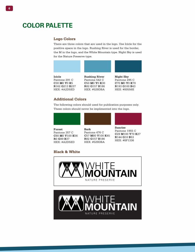
COLOR PALETTE
Logo Colors
Additional Colors
Black & White
There are three colors that are used in the logo. Use Icicle for the
positive space in the logo. Rushing River is used for the border,
the M in the logo, and the White Mountain type. Night Sky is used
for the Nature Preserve type.
The following colors should used for publication purposes only.
These colors should never be implimented into the logo.
Icicle Pantone 291 C C30 M0 Y0 K5 R162 G213 B237 HEX: #A2D5ED
Forest Pantone 357 C C80 M0 Y100 K56 R0 G99 B37 HEX: #A2D5ED
Rushing River Pantone 542 C C50 M0 Y0 K30 R82 G157 B186 HEX: #529DBA
Bark Pantone 476 C C57 M80 Y100 K45 R82 G157 B186 HEX: #529DBA
Sunrise Pantone 1955 C C29 M100 Y70 K27 R144 G18 B53 HEX: #8F1336
Night Sky Pantone 295 C C70 M0 Y0 K70 R193 G100 B43 HEX: #00556E

7
TYPOGRAPHY
Serifa Bold
Serifa
Univers Bold
A B C D E F G H I J K L M N O P Q R S T U V W X Y Z a b c d e f g h i j k l m n o p q r s t u v w x y z 1 2 3 4 5 6 7 8 9 0 ! @ # $ % ^ & * ( )Univers Bold is used for headers. Headers should be no larger
than 25 pt. It is not acceptable to use the oblique version of
the font.
Serifa is used for body copy. You can use any weight of the font.
Body copy should be 9 pt. Can also be used for captions as small
as 7 pt. For body copy, leading should be 13 pt.
Serifa Bold is used for sub headers. They should be no larger
than 14 pt.
A B C D E F G H I J K L M N O P Q R S T U V W X Y Z a b c d e f g h i j k l m n o p q r s t u v w x y z 1 2 3 4 5 6 7 8 9 0 ! @ # $ % ^ & * ( )
A B C D E F G H I J K L M N O P Q R S T U V W X Y Z a b c d e f g h i j k l m n o p q r s t u v w x y z 1 2 3 4 5 6 7 8 9 0 ! @ # $ % ^ & * ( )
8
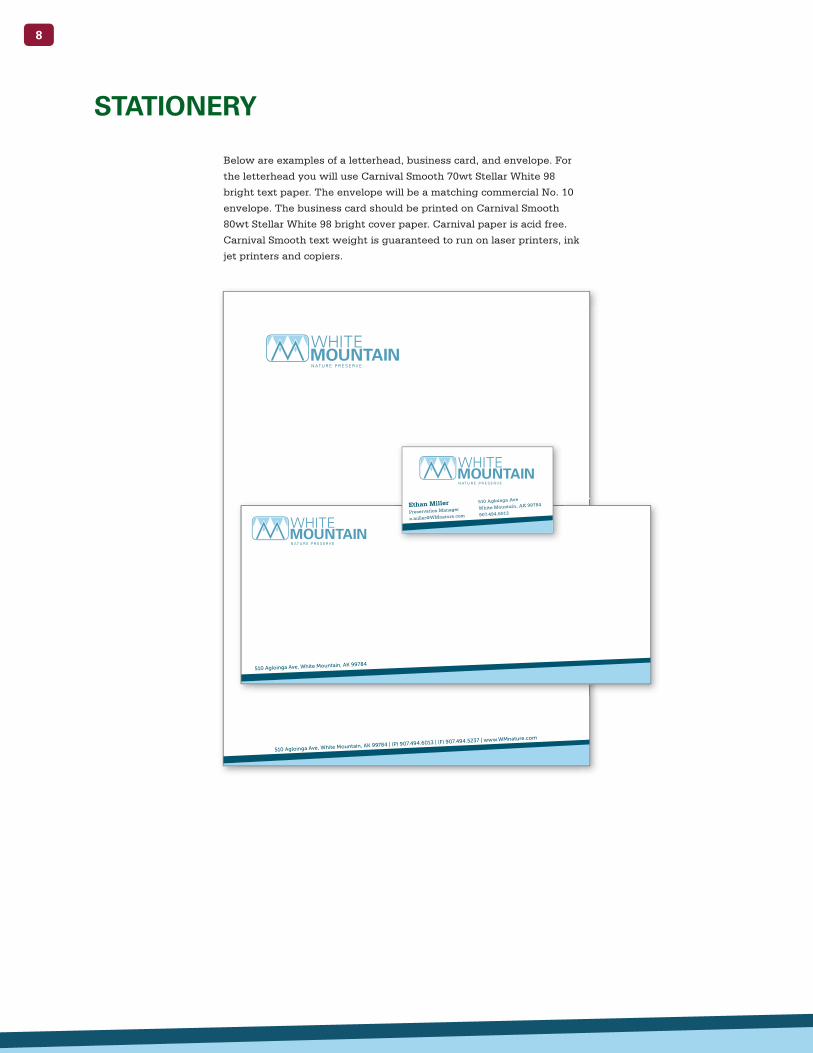
STATIONERY
Below are examples of a letterhead, business card, and envelope. For
the letterhead you will use Carnival Smooth 70wt Stellar White 98
bright text paper. The envelope will be a matching commercial No. 10
envelope. The business card should be printed on Carnival Smooth
80wt Stellar White 98 bright cover paper. Carnival paper is acid free.
Carnival Smooth text weight is guaranteed to run on laser printers, ink
jet printers and copiers.
510 Agloinga Ave, White Mountain, AK 99784 | (P) 907.494.6013 | (F) 907.494.5237 | www.WMnature.com
510 Agloinga Ave, White Mountain, AK 99784
Ethan MillerPreservation Manager
510 Agloinga Ave
White Mountain, AK 99784
907.494.6013

9
October 29, 2015
Johnathon Stevens
62 Tudor Road
Anchorage, AK 99530
Dear Mr. Stevens:
Maecenas diam tellus, varius porta hendrerit sed, iaculis et nibh. Nam lorem est, dictum at
consectetur egestas, ultrices vel purus. Praesent et eros lectus, eu pretium massa. Aenean vitae
vestibulum augue. Cras sapien ligula, tristique vitae molestie eget, ultrices in tellus. Phasellus a
nibh quis ante iaculis ornare. Aliquam vel nibh ante, nec euismod lectus.
Fusce fringilla hendrerit massa, nec adipiscing quam cursus sed. Aliquam auctor nunc vehicula
mauris euismod tincidunt. Etiam porttitor urna ut lorem varius pellentesque. Vivamus consequat
dui quis massa posuere fermentum. Quisque id justo nisi, a pharetra nisl. Phasellus sit amet diam
eros. Quisque non nulla nulla. Pellentesque tincidunt felis eu mi fermentum lobortis. Mauris
imperdiet, mauris at cursus cursus, dolor velit euismod purus, sit amet cursus nibh purus non velit.
In eget ultrices libero. Quisque tempus pretium ullamcorper. Vestibulum tempor tortor eu elit
convallis gravida a eu dolor. Phasellus non purus sed nunc imperdiet sagittis non vitae est.
Nulla pellentesque adipiscing gravida. Sed condimentum ornare augue, ut laoreet enim euismod
et. Quisque mattis nunc sed lorem semper non laoreet ipsum adipiscing. Aliquam interdum lectus
vitae lacus volutpat eu aliquet urna vestibulum. Morbi eu lacus nisi. Pellentesque suscipit ante eu
nisi fringilla sollicitudin. Donec vel cursus ante. Maecenas euismod lacus ac odio feugiat cursus.
Suspendisse pretium purus eros, sit amet commodo arcu. In dictum viverra nisi non luctus. Fusce
tincidunt ullamcorper lectus vel pharetra. Proin tincidunt viverra tempus. Morbi eu lacus nisi.
Pellentesque suscipit ante eu nisi fringilla sollicitudin. Donec vel cursus ante. Phasellus sit amet
diam eros. Quisque non nulla nulla. Pellentesque tincidunt felis eu mi fermentum lobortis.
Sincerely,
Ethan Miller
Preservation Manager
510 Agloinga Ave, White Mountain, AK 99784 | (P) 907.494.6013 | (F) 907.494.5237 | www.WMnature.com
1”
1”
2”
2 ½”
BUSINESS LETTER
Below displays the margins for a business letter. There are
1 inch margins are either side. The top has a 2.5 inch margin.
The bottom has a 2 inch margin. If you need a second page,
use the same stationary and format.

10
CLOTHING APPLICATIONS
A.
B.
C.
A. Tour Guide Polo B. Hat C. Sweatshirt
Below are white versions of clothing that you maybe apply the logo to.
The full color logo should only be used on white clothing. On other light
clothing use the all black logo and on dark clothing use the all white logo.

11
CAMPING APPLICATIONS
A.
C.
A. Tent B. Backpack C. Water Bottle
When using the logo on camping equipment let the merchaindise
determine the color of the logo. Unless using on a white product,
use only the one color logo.
B.
12
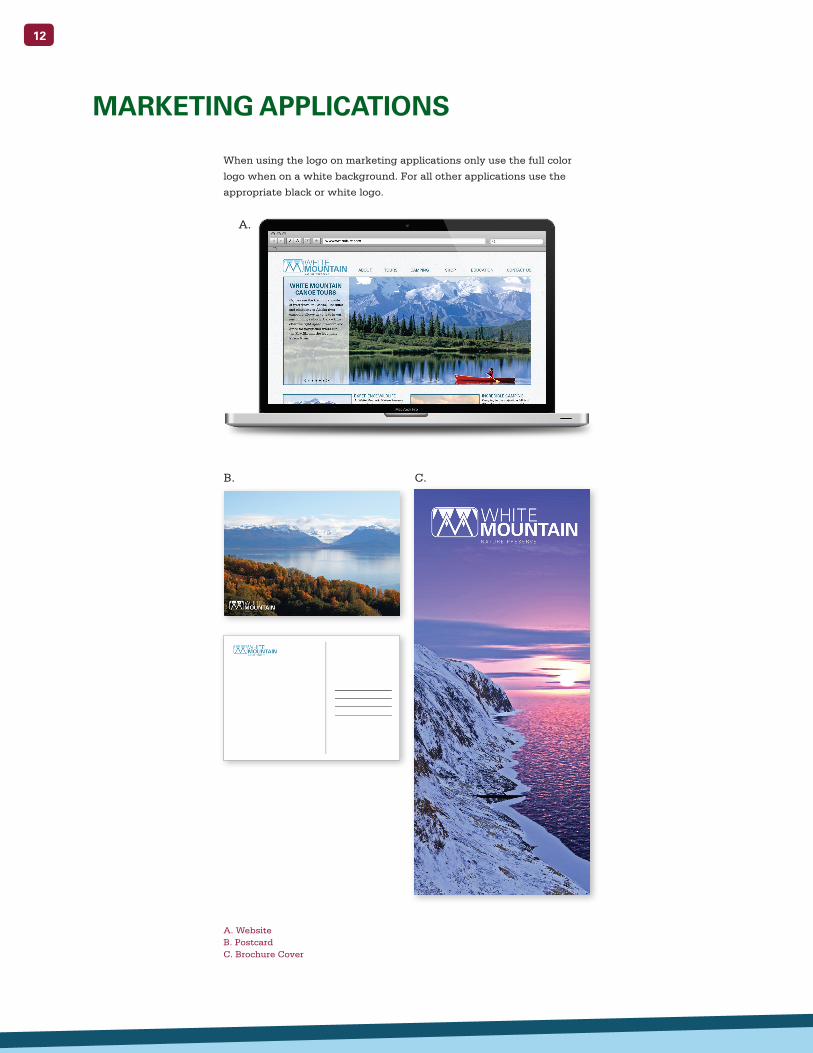
MARKETING APPLICATIONS
A. Website B. Postcard C. Brochure Cover
B. C.
A.
When using the logo on marketing applications only use the full color
logo when on a white background. For all other applications use the
appropriate black or white logo.
13
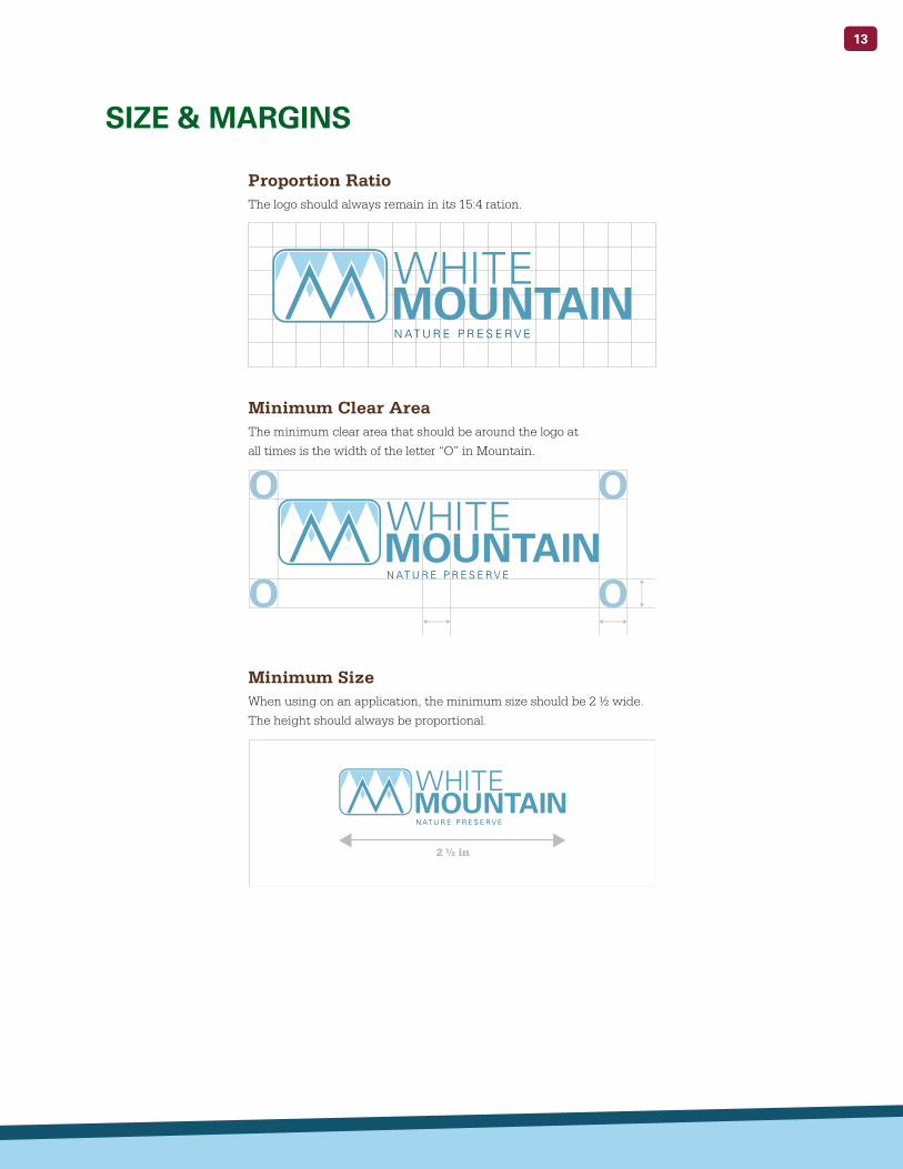
SIZE & MARGINS
2 ½ in
Proportion Ratio
Minimum Clear Area
Minimum Size
The logo should always remain in its 15:4 ration.
The minimum clear area that should be around the logo at
all times is the width of the letter “O” in Mountain.
When using on an application, the minimum size should be 2 ½ wide.
The height should always be proportional.

14
DO NOT take away the logo.
DO NOT distort the logo.
DO NOT stack the logo.
DO NOT leave out elements.
DO NOT put the logo between
the type.
DO NOT add elements.
DO NOT rotate the logo.
DO NOT flip the logo.
DO NOT change the proportions.
DO NOT use unapproved colors.
Below are ten examples of inappropriate uses for our logo. We are
unable to cover all of them in this manual but if you have any questions
please contact our publication office.
INAPPROPRIATE USES

15
16