d32ogoqmya1dw8.cloudfront.net · web viewother skills goals for this activity include graphing...
TRANSCRIPT

Working with State, National, and Global Petroleum DataPart I: Illinois and United States Oil Production
Part II: US Oil Consumption and ImportsPart III: World Oil Production
An original laboratory exercise byEileen Herrstrom
University of Illinois at [email protected]
2018
Context
The audience for this activity is an undergraduate class on introductory physical geology or quantitative reasoning.
Students must know how This activity is a laboratory exercise that follows lectures on relative and isotopic dating and
falls near the middle of the course.
Goals
The content and concept goals for this activity include examining and graphing the historical data for oil production in Illinois and in the entire US and explaining the 1956 prediction by M. King Hubbert and the concept of Hubbert’s peak.
Higher order thinking skills goals for this activity involve analyzing a graph of US oil consumption and import data, comparing changes in domestic consumption and foreign imports for the US, and relating these changes to historical events.
Other skills goals for this activity include graphing and interpreting the oil production curve for the world as a whole, comparing and contrasting various predictions for a peak in world oil production, and explaining the difference between conventional and unconventional oil resources.

Working with State, National, and Global Petroleum DataPart I: Illinois and United States Oil Production
Overview
In the first part of this exercise, you learn about the units used for referring to oil and study production data for the state of Illinois from the viewpoint of peak production.
Learning Objectives
Examine the historical data for oil production in Illinois Graph the historical data for oil production in the US Explain the 1956 prediction by M. King Hubbert and the concept of Hubbert’s peak
Hydrogen + Carbon = Hydrocarbons
Humans have known and used various hydrocarbons for millennia: tar for waterproofing, petroleum for lubrication, and natural gas for medicine. The first recorded use of natural gas in what is now the United States occurred in 1626, when French explorers observed Native Americans burning gas that seeped naturally to the surface in and around Lake Erie. American settlers in the Midwest occasionally found gas, as recounted in this newspaper note from 1838: “Mr. Daniel Foster of Findlay, Ohio, inverted an iron salt-kettle over one of his unsuccessful water wells and conveyed gas from it by a wooden pipe to his house a few feet away, burning the gas as it issued in a small and steady flame from a perforated gun-barrel, which he had built into a fireplace.” Natural gas provided fuel for manufacturing blocks of salt from the brine often found in the same wells.
Figure 1.1. Oil and natural gas seep in the McKittrick oil field, California.https://commons.wikimedia.org/wiki/File:McKittrick_Tar_Seep_North_of_Highway_58.jpg
Units for Discussing Petroleum
Oil is traded on the international market (and prices are quoted) in terms of barrels, abbreviated “bbl.” One barrel contains 159 liters (42 US gallons; see the figure in the spreadsheet associated with this activity). The amount of energy produced by burning one barrel of oil is expressed by a unit of measurement named a barrel of oil equivalent. One bbl oil-eq equals 5.8 million British thermal units (Btu), or 6.1 gigajoules (GJ), or 1.7 megawatt-hours (MWh). Don’t worry about these variations! They are presented for information only, as you may encounter them in other places. We use barrels or bbl oil-eq in this activity.
Oil Production in Illinois
One of the earliest mentions of hydrocarbons in Illinois records two wells in Champaign County that were drilled in 1853 to look for water. These wells turned out to be contaminated by “swamp gas” or “drift gas” from glacial sediments.
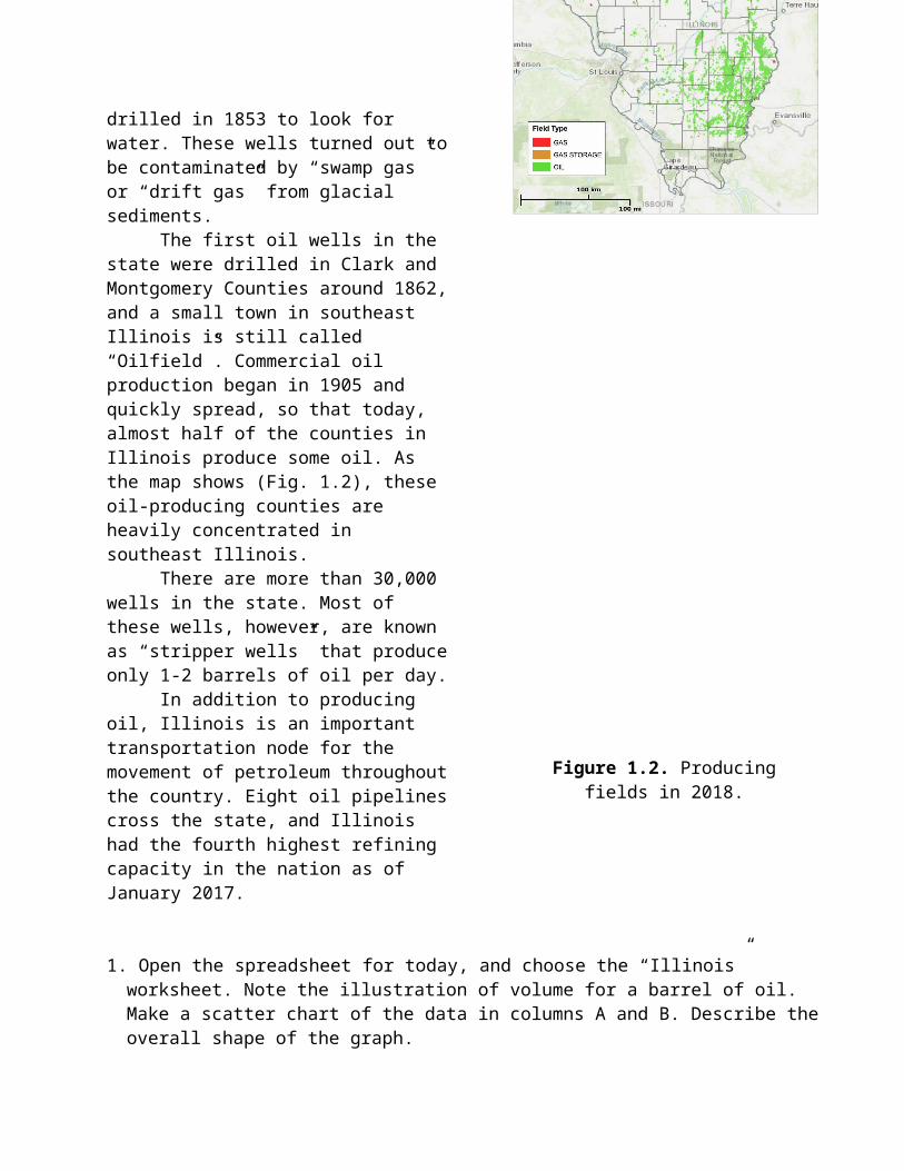
The first oil wells in the state were drilled in Clark and Montgomery Counties around 1862, and a small town in southeast Illinois is still called “Oilfield”. Commercial oil production began in 1905 and quickly spread, so that today, almost half of the counties in Illinois produce some oil. As the map shows (Fig. 1.2), these oil-producing counties are heavily concentrated in southeast Illinois.
There are more than 30,000 wells in the state. Most of these wells, however, are known as “stripper wells” that produce only 1-2 barrels of oil per day.
In addition to producing oil, Illinois is an important transportation node for the movement of petroleum throughout the country. Eight oil pipelines cross the state, and Illinois had the fourth highest refining capacity in the nation as of January 2017.
1. Open the spreadsheet for today, and choose the “Illinois” worksheet. Note the illustration of volume for a barrel of oil. Make a scatter chart of the data in columns A and B. Describe the overall shape of the graph.
2. In what did the maximum annual production occur?
Figure 1.2. Producing fields in 2018.http://maps.isgs.illinois.edu/iloil/

3. What was the amount of maximum annual oil production?
4. What historical event probably contributed to the highest peak?
5. How much oil was produced in Illinois in the most recent year for which data are given?
United States Oil Production
The first commercial oil well in the US was drilled in 1859 in Titusville, PA, and the oil came gushing out under its own pressure. It was a curiosity in the beginning; the amount of oil extracted was small and its uses were limited. Later, great quantities of oil were discovered in Texas and along the Gulf of Mexico coastline, then around the world. Use of oil increased rapidly, especially with the mass production of automobiles beginning in the early 1900s. Fig. 1.3 shows demand for three types of energy usage, projected out to 2040. Most of the anticipated increase in demand is expected to come from use for transportation, as people in the developing world become more affluent and buy cars.
Figure 1.3. Historical and projected energy usage by sector based on 2015 data. The Y-axis shows trillion barrels of oil-equivalent.
https://www.eia.gov/outlooks/archive/ieo17/pdf/0484(2017).pdf
Discovery and Production Patterns
For many years, the United States was the world’s leading oil producer and a major exporter. In the mid-1900s, a petroleum geologist named M. King Hubbert who worked for Shell Oil Company studied production data from a number of wells and oil fields and saw that they all
followed the same pattern: production was slow at first, then increased rapidly, next leveled off, and finally began to decline. He also observed that for an individual oil field, the rate of discovery of new wells followed a similar pattern and that the decline in discovery was inevitably followed a few years later by a decline in production. Hubbert predicted in 1956 that the same general pattern would hold for the United States as a whole and that domestic oil production in the country would reach a maximum in 1970 and thereafter would gradually but steadily decrease. Shell asked him not to publish his study, but Hubbert was a determined man and publicized his results at a meeting of the American Petroleum Institute. Most petroleum engineers disagreed with Hubbert’s prediction, and his work was largely ignored. Yet by the mid-1970s, as production data came in, it became evident that Hubbert had been correct.
6. Go to the “US Discovery & Production” worksheet to see annual US oil production figures from 1859 through the most recent available. Highlight all data plus column labels (rows 3-4), and make a scatter chart. In what year did the maximum number of discoveries occur?
7. In what year did the maximum production occur?
8. Approximately how many years passed between the maximum in discoveries and the maximum in production?
9. A graph of production data through time is now referred to as “Hubbert’s peak.” Describe the shape of Hubbert’s peak for the U.S., i.e., is it a straight line, a sharp point, a gentle arc, a flat top, etc.?
10. How has US production changed since approximately 2007?

Working with State, National, and Global Petroleum DataPart II: US Oil Consumption and Imports
Overview
In this part of the exercise, you study 60+ years of data on the consumption of oil in the US and oil imports into this country to see how the two factors are related and how they are affected by world affairs.
Learning Objectives
Analyze a graph of US oil consumption and import data Compare changes in domestic consumption and foreign imports for the US Relate these changes to historical events
Oil as a Commodity
Nowhere in this exercise do we directly consider the role of prices, although the price of a barrel of oil affects decisions all the way through American society, from the large oil companies to the individual consumer. As individuals, we notice the workings of the petroleum market primarily in the price of gasoline for our vehicles. There are, however, many factors in play here: domestic production and refining of oil, overall consumption for the country, imports of foreign oil and oil products, and exports from the US to other countries. In fact, oil is constantly being transported around the world, primarily by tanker (Fig. 3.1) and pipeline. In the following questions, we apply the ideas of supply and demand from economics to the history of petroleum in the United States.
Figure 2.1. Oil tankers are some of the largest ships on the oceans (see people on deck for scale).https://commons.wikimedia.org/wiki/File:ELBE_Calandkanaal_(32834124393).jpg

Energy Use in the United States
Fig. 2.2 shows the sources of energy used by this country in 2017 on the left; fossil fuels account for approximately 80% of the total. The right side of the figure illustrates how these energy sources are used by different parts of our economy. The lines that diverge from each source show how much of the energy from that source is used by each economic sector. The lines that converge on each sector indicate how much of the energy that powers that sector comes from each source.
Figure 2.2. US primary energy consumption for 2017. Total = 16.8 trillion barrels of oil-equivalent.https://www.eia.gov/totalenergy/data/monthly/pdf/flow/css_2017_energy.pdf
1. According to Fig. 2.2, what percentage of all transportation in the US depends on petroleum? Hint: Read the labels on lines that point to the transportation sector.
2. Which energy source produced the most electricity used in the US in 2017?

How Have US Oil Imports Changed Over Time?
Consider the graph of imports to the US from other countries (Fig. 2.3). This graph includes both crude oil and products made from it, such as gasoline and diesel fuel, so the numbers do not correspond exactly to the ones in your Excel file.
What causes the variations in oil imports? The total amount depends on how much is produced every year within the land and territorial waters of the US, how much Americans use all together, and how much we export to world markets. If production minus exports is greater than demand, then imports decrease. If production minus exports is less than demand, then imports increase. Thus, changing any one of the parts of the supply-and-demand equation affects the total amount imported.
Figure 2.3. US imports of crude oil and petroleum products, 1981-2017. Y-values are in units of thousand barrels (i.e., 2,000,000 on the graph = 2,000,000,000 barrels).
https://www.eia.gov/dnav/pet/hist/LeafHandler.ashx?n=PET&s=MTTIMUS1&f=A
We will consider the implications of Hubbert’s peak for US imports. Open the “US Consumption and Imports” worksheet of the spreadsheet. Here, the data have already been plotted on a scatter chart. The two data sets have similar shapes, but they are not exactly alike.
To help you compare shapes, three curves have been drawn over the consumption data points – red, orange, and purple. Each curve is grouped with two short line segments of the same color, which mark the vertical gridlines of the graph. You can drag the curves from consumption data points to import data points, in order to compare the changing behavior of the two factors. The short vertical line segments will help you keep each curve in its proper time on the graph.
Note: Excel calls these curves “Freeform” shapes. Each curve plus its associated line segments is a group of separate objects on the graph. It is possible to move pieces of the group individually, but try not to do this, because then you will not be able to use the group as intended. If you do so accidentally, you can always close the file without saving and re-open it.
3. The red curve follows data from 1950-1970. Drag this curve down to the import data points and line up the line segments with the years. During these two decades, was US oil consumption rising more or less rapidly than imports? In other words, which data set is sloping more steeply?

4. What does the answer to question #3 imply about the source of most of the oil that allowed consumption to increase during the period from 1950-1970?
A Timeline of the Oil Age
The image in Fig. 2.4 chronicles significant events related to the global history of petroleum. A high-resolution version of the image may be found in the “US Consumption & Imports” worksheet. Zoom in to read the figure, and keep it available to help you answer the next several questions.
Figure 2.4. A summary of oil and gas in society from prehistoric times to the 21st century.https://www.forbes.com/sites/statoil/2015/02/13/the-age-of-oil-and-gas-and-how-we-got-here/ -
7aaf944190b5
5. Look at the consumption data for the decade of the 1970s. What historical event caused US consumption to decrease in 1973-4? In 1979-1980?
6. Note that imports continued to rise during the early 1970s. What does this fact imply about the source of these imports?
7. The purple curve on the graph traces consumption data from 1970-1980. Drag the curve to the import data. Do changes in imports match changes in consumption during this time period? Why or why not?

8. The orange curve traces consumption data from 1980-2011. Drag the curve to the import data and match up the lines for years. Position the orange curve vertically so that it covers as many import data points as possible. Did changes in imports match changes in consumption during the ten years from 1980 to 1990? Why or why not?
9. Did changes in imports match changes in consumption during the years from 2006 to 2009? Why or why not?
10. Describe the trend in US imports from 2010-2014. We address the causes of this trend in Part III of the activity.

Working with State, National, and Global Petroleum DataPart III: World Oil Production
Overview
In this final part of the exercise, you study projected worldwide demand for petroleum, global production data, and changes in the oil resources being exploited.
Learning Objectives
Graph and interpret the oil production curve for the world as a whole Compare and contrast various predictions for a peak in world oil production Explain the difference between conventional and unconventional oil resources
Predicting a World Peak for Oil Production
Many people have predicted diverse dates for the time of maximum oil production worldwide. Some say it has occurred, back in 2005, while others expect that it will come during the next decade. A smaller group consists of those who maintain that the world can sustain a high output of oil for up to a century. Finally, there is a minority view that the world will never run out of oil, because hydrocarbons are continually forming in the mantle and rising into the crust.
Part of the reason that estimates for the year of peak world production vary so widely is that different people count different types of hydrocarbons. Some consider only the best grades of oil, and others include forms of petroleum that are harder to extract or need extra refining before use. Further, petroleum geologists find new deposits every year, and society uses up some of Earth’s total supply every year. So the numbers themselves are constantly changing, and it is not surprising that predictions of a possible peak oil date also change.
Figure 3.1. Thirty-six predictions for the timing of a global oil production peak (there are others!).https://commons.wikimedia.org/wiki/File:Estimates_of_Peak_World_Oil_Production.jpg

Worldwide Demand for Energy
Fig. 3.2 illustrates the anticipated increase in demand from various regions of the world. Although all areas show higher demand, this is particularly true for the nations of Asia, with their burgeoning populations, and for North America, especially the United States, where per capita consumption is the highest in the world. In this context, a possible decline in world oil production could have disastrous effects.
To address the growing demand for energy, especially petroleum, oil companies explore new areas such as the Arctic or deep in the Gulf of Mexico. As new technology is developed, resources that were once inaccessible can be exploited. However, drilling for oil in frigid or very deep ocean water is more difficult than drilling on land and requires larger investments.
Figure 3.2. Projected petroleum demand in 2040 by region. Data from 2017 are historical; values after 2017 are projections.
Data from https://www.iea.org/weo2018/fuels/
1. According to Fig. 3.2, which geographical region is predicted to contribute about half of the increase in world demand by 2040?
2. In the Excel file that accompanies this exercise, the “World Production” worksheet contains annual production data for the world as a whole. Insert a scatter chart, and describe the shape of the world curve, i.e., is world oil production still increasing, flat, or beginning to decline?

3. The “Figures” worksheet contains a number of graphs. Look at Fig. A showing production curves for fifteen deepwater oil fields in the Gulf of Mexico. Approximately how long do most sites maintain high production rates?
Predicting a World Peak
Fig. B in the “Figures” worksheet combines Hubbert’s predicted oil production curve for the US and actual production data from 1900-2004. The blue curve prediction was based on data for many individual wells and fields such as the graphs in Fig. 3.3. In 1974, Hubbert further predicted that world oil production would also reach a peak, in 1995, but as events unfolded, production continued to increase beyond that point. Hubbert could not anticipate the oil crises triggered by the 1973 Arab oil embargo and the 1979 Iranian hostage crisis. These shocks to the oil market stimulated a renewed rush of exploration, culminating in the discovery of the oil fields on the North Slope of Alaska and in the North Sea between Britain and Norway. These discoveries pushed a possible world peak farther into the future than Hubbert expected.
4. Compare Fig. B and the graph of US oil production that you created in the “US Discovery and Production” worksheet in Part II of this exercise. How do they differ?
5. The caption for Fig. C calls the projected production numbers on the right side of the graph pessimistic. Explain this word choice. Why is this graph a pessimistic forecast?
6. Study Fig. D in the “Figures” worksheet, which shows production data for individual countries. List the countries that had not passed their peak production at the time this graph was made.
7. Compare Figs. C and D in the “Figures” worksheet. The two graphs are similar, but Fig. D includes more recent data than Fig. C. Did oil production follow the prediction in Fig. C?
8. Based on the graph that you made and Figs. A-D in the last worksheet, explain the following statement: “A world production peak would be recognized only in the rear-view mirror.”

Conventional and Unconventional Oil
Why was Hubbert wrong about a peak in world oil production? Why have other people found it difficult to make better predictions? Part of the reason is that different sources of oil continue to be found, and another part of the reason is that new technology can extract more oil from established sources.
Our modern industrial economy runs on so-called conventional oil, also known as light sweet crude: it is near the surface in accessible areas on land and so is easy and inexpensive to extract, and it requires minimal refining before use. The vast majority (95%) of all oil produced so far has been conventional. The world will never “run out” of oil, if this means pumping the very last drop out of the ground. Even the declining fields of today still contain large quantities of oil, but already, we are moving to sources that are harder to reach – deep under the oceans or far to the north.
In other words, conventional oil is running out. What oil is left will be increasingly hard to pump out, located in remote areas and deeper water, poorer quality, and more expensive to refine. Unconventional sources of oil include petroleum that contains impurities (heavy sour crude), tar sands, oil shales, and any oil that is not recoverable with today’s technology.
Figure 3.3. Regions around the world where unconventional hydrocarbons have been found. http://carnegieendowment.org/files/unconventional_oil.pdf

9. It takes 3 tons of tar sands to produce 1 barrel of oil. If the US uses 19.88 million barrels of petroleum per day, how many tons of tar sands would be needed to supply the country for one day?
10. Considering all you have learned from this exercise, what steps, if any, should society take today with respect to future oil supplies? If the prediction of an absolute global peak is accurate and oil production begins a slow but inexorable decline in the future, what changes might you be compelled to make in your own energy consumption? Explain your reasoning.