levinl611019676.files.wordpress.com€¦ · web viewalgebra nation section 9 review answer key ....
TRANSCRIPT

ALGEBRA NATION SECTION 9 REVIEW ANSWER KEY
9.1—Dot Plots
1. Classify the following variables as C – categorical, DQ – discrete quantitative, or CQ – continuous quantitative.
i___ Distance that a golf ball was hit DQ ii___ Size of shoe DQ iii___ Favorite ice cream Civ___ Favorite number CQ v___ Number of homework problems DQ
2. Students in Ms. Multifry’s class were surveyed about the number of pets they
have. Their responses were recorded below: 0, 0, 0, 0, 1, 1, 1, 1, 1, 1, 2, 2, 2, 2, 3, 3, 8 Part A: Construct a dot plot of the data.
Part B: What observations can you make about the shape of the distribution?
Answers Vary. Skewed to the right
Part C: Are there any values that seem to not fit? The data value of 8 is really far out, an outlier

3. The track team groups students based on times for a 100-meter dash, rounded to the nearest tenth of a second. The groups are as follows:
Team A: 15 seconds or higher Team B: 11 − 14.9 seconds Team C: 10.9 seconds or lower Each track member’s time has been recorded below: 16.0, 14.9, 13.2, 12.5, 9.1, 8.1, 10.4, 10.8,8.4, 9.5, 9.5, 11.5, 15, 8.0, 9.7, 13.2, 12.1, 11.2Explain why a dot plot is not the best option to represent the data. Answers Vary. The numbers are scattered and are far apart (8.4 to 16). It would be better to use a range of values instead of specific values
9.2—Histograms
4. The track team groups students based on times for a 100-meter dash, rounded to the nearest tenth of a second. The groups are as follows:
Team A: 0-4.9seconds Team B: 5-9.9seconds Team C: 10-14.9 seconds Team D: 15-19.9 seconds
Each track member’s time has been recorded below: 16.0, 14.9, 13.2, 12.5, 9.1, 8.1, 10.4, 10.8, 8.4, 9.5, 9.5, 11.5, 15, 8.0, 9.7, 13.2, 12.1, 11.2 Part A: Explain why a histogram would be a better representation model of the data. Histogram – the data is spread out. Finite number of outcomes.
Part B: Complete the frequency table below: Time (in seconds) Frequency Team A: 0-4.9 seconds 0 Team B: 5-9.9 seconds 7 Team C: 10-14.9 seconds 9 Team D: 15-19.9 seconds 2

Part C: Construct a histogram of the data
Time (in seconds)
9.3—Box Plots – Part 1
5. Match the following elements of the 5 −number survey to their corresponding descriptions.
6. Jason plays basketball for the Tigers, his high school basketball team. He played in 9 games during the season before he was hurt. The data set below represents the number of baskets he earned in each game. 16, 18, 20, 14, 17, 27, 33, 9, 12
Part A: Order the data from least to greatest. 𝟗, 𝟏𝟐, 𝟏𝟒, 𝟏𝟔, 𝟏𝟕, 𝟏𝟖, 𝟐𝟎, 𝟐𝟕, 𝟑𝟑
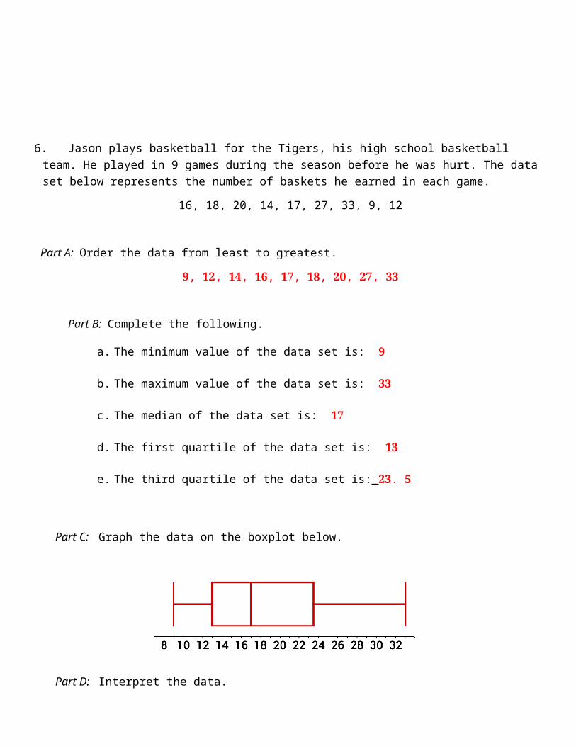
Part B: Complete the following.
a. The minimum value of the data set is: 𝟗
b. The maximum value of the data set is: 𝟑𝟑
c. The median of the data set is: 𝟏𝟕
d. The first quartile of the data set is: 𝟏𝟑
e. The third quartile of the data set is: 𝟐𝟑. 𝟓
Part C: Graph the data on the boxplot below.
Part D: Interpret the data.
a. What does the first quartile represent? The lowest 𝟐𝟓% of Jason’s scores
b. What does the third quartile represent? The lowest 𝟕𝟓% of Jason’s scores
9.4—Box Plots – Part 2
7. The number of boots that 25 students had in their homes in Florida were recorded below: 0, 0, 0, 0, 0, 0, 0, 1, 1, 1, 1, 2, 2, 2, 2, 2, 2, 2, 3, 3, 3, 3, 4, 5, 6
Create a box plot of the data above. Label the minimum, maximum, first quartile, third quartiles and median

8. One of the students was removed from the survey and replaced with a different student’s data.
0, 0, 0, 0, 0, 0, 0, 1, 1, 1, 1, 2, 2, 2, 2, 2, 2, 2, 3, 3, 3, 3, 4, 5, 9
Create a box plot of the data above. Label the minimum, maximum, first quartile, third quartiles and median
9. Compare the five-number summaries in Questions 7 and 8. Which of the five-number summaries changed?
The maximum value
10. When the maximum value in a data set is exchanged for a higher number, does it change any of the other numbers in the five-number summary? No. The right tail will just go to a farther out number.
11. The boxplot below represents the number of texts sent in two minutes by 11 different freshmen.
Part A: The 75𝑡ℎ percentile of the data set is 𝟗.
Part B: The middle half of the data values are between 𝟓 and 𝟗.
Part C: The lower 25% of the students sent 𝟓 or fewer texts in two minutes.

12. Add dots to the number line below to complete the dot plot so that it could represent the data in the boxplot in Question 5.
Add one dot on top of 2, one on top of 5, one on top of 6 and one on top of 9.
13. Determine whether the following statements are always, sometimes, or never true.
Give examples to support your claim. Part A: Replacing only the minimum value in a data to a smaller number will also
change the median. Never. Answers vary. Sample answer: 𝟓, 𝟔, 𝟕, 𝟖, 𝟗, 𝟏𝟎, 𝟏𝟏. Replacing 𝟓 with a smaller number will never change the median of 𝟖. Part B: Replacing only the minimum value in a data to a smaller number will also
change the mean. Always. Answers vary. Sample answer: 𝟓, 𝟔, 𝟕, 𝟖, 𝟗, 𝟏𝟎, 𝟏𝟏. The mean is 𝟖. Replacing 𝟓 with a smaller number will always change the mean. If you replaced it with a 𝟐, the new mean would be approximately 𝟕. 𝟔. Part C: Replacing the maximum value of the data set with a smaller number will also
change the median. Sometimes. Answers vary. Sample answer: 𝟓, 𝟔, 𝟕, 𝟖, 𝟗, 𝟏𝟎, 𝟏𝟏. Replacing 𝟏𝟏 with a smaller number such as 𝟓 would change the median. The new median would be 𝟕. Replacing 𝟏𝟏 with a smaller number such as 𝟏𝟎 would not change the median.
Part D: Replacing the maximum value of the data set with a smaller number will also change the mean.
Always. Answers vary. Sample answer: 𝟓, 𝟔, 𝟕, 𝟖, 𝟗, 𝟏𝟎, 𝟏𝟏. Replacing 𝟏𝟏 with a smaller number such as 𝟗 would change the mean to approximately 𝟕. 𝟕.

9.5—Measures of Center and Shapes of Distribution
Median = 22 Mean = 22.5 14. Below is a dot plot of the number of snapchats sent per day in Mr. Elkins’ class.
Part A: Which value is smaller, the mean or the median? Median Part B: Which measure of center is more appropriate, the mean or the median? Median Part C: The shape of the distributions is ________skewed left______________________.
15. Below is a dot plot of the number of concerts students in class have seen.
Part A: Which value is smaller, the mean or the median? Median.
Part B: Which measure of center is more appropriate, the mean or the median? Why?
Median, it is closer to the peak.
Part C: The shape of the distributions is ______skewed right____________________.

16. Consider the dot plot below.
Part A: Which value is smaller, the mean or the median?
Median Part B: Which measure of center is more appropriate, the mean or the median?
Median Part C: The shape of the distribution is _______skewed
right________________________.
17. Below are two dot plots on students’ moods during recess inside and outside. There mood was recorded on a score of 0-10, 0 being depressed and 10 being excited.
Outdoor Group Indoor Group
Part A: The value of the larger median for the two groups is the
______7________.
Part B: The value of the larger mean for the two groups is the ______6.9________.
Part C: Describe the difference between the moods of the two groups by comparing their center and shapes for their groups. The indoor group followed a more normal distribution, while the outdoor group are skewed left. Mean and median were larger for the outdoor
group.

9.6—Measures of Spread - Part 1
18. Consider the two box plots.
Which as the largest IQR? Justify your answer. Data B. 𝟒 – 𝟏 = 𝟑.
19. Consider the following three dot plots.
Part A: Which has the largest median? C
𝐵 ��
�� 𝐵 ��

Part B: Which has the largest IQR? C
20. Below are the most recent quiz scores from Ms. Dillon’s algebra class.
Part A: What is the median of the algebra class? 𝟏𝟐 Part B: Determine the interquartile range. 𝟏𝟔 − 𝟔 = 𝟏𝟎
21. Consider the box plot below.
Part A: What is the median of the box plot? 𝟓. 𝟓 Part B: Determine the interquartile range. 𝟔 − 𝟒. 𝟓 = 𝟏. 𝟓
9.7—Measures of Spread - Part 2
22. Consider the two box plots to the right.
Part A: Describe the shape of each distribution. Group A: Normally distributed Group B: Skewed right
�� ��

Part B: Which has the largest median? The groups have the same median.
23. Below are the most recent quiz scores from Ms. Dillon’s algebra class.
Part A: For the above box plot, would the appropriate measure of center to describe the data distribution be the mean or median? Why?
Median because the data is skewed slightly to the right. Part B: Would the interquartile range or the standard deviation be the most appropriate measure of spread? Why?
IQR, because the data is skewed slightly to the right. Part C: Calculate the measure of spread.
10 9.8—The Empirical Rule
24. Kellogg’s in Kalamazoo, Michigan has a machine that fills the Fruit Loop cereal boxes with cereal. It dispenses cereal with a normal distribution and has a mean of 24.0 and a standard deviation of .1 ounces.
Part A: The middle 95% of cereal boxes contain between ______23.8_______ and ____24.2________ ounces of cereal.
Part B: Approximately 68% of cereal boxes have between ___23.9_________ and __24.1__________ ounces of cereal.
Part C: What percentage of cereal boxes contain more than 24.2 ounces of cereal? 2.5%
Part D: What is the probability that a randomly selected bottle of cereal contains less than 24.1 ounces of cereal?

84% or 0.84
25. ACT mathematics score for a particular year are normally distributed with a mean of 27 and a standard deviation of 2 points. Part A: What is the probability that a randomly selected score is greater than 29
points? 16% or 0.16
Part B: What percentage of students scores are between 31 and 23? 95%
Part C: A student who scores a 31 is in the ____97.5 th __________ percentile.
26. Mr. Barnett’s test is normally distributed with a mean of 65 and a standard deviation of 5 points.
Part A: What is the probability that a randomly selected score is greater than 75 points?
2.5% or 0.025Part B: What percentage of students scores are between 60 and 70?
68% Part C: A student who scores an 80 is in the ___99.85 th ___________ percentile.
9.9—Outliers in Data Sets
27. The number of boots that 25 students had in their homes in Florida were recorded below:
0, 0, 0, 0, 0, 0, 0, 1, 1, 1, 1, 2, 2, 2, 2, 2, 2, 2, 3, 3, 3, 3, 4, 5, 9
Part A: What value would you predict to be an outlier? 𝟗
Part B: How does the outlier affect the mean? Pulls the mean higher, makes it bigger.
Part C: How does the outlier affect the median?

Not at all. Part D: Which measure of center would best describe the data- the mean or the median? Median. Part E: How does the outlier affect the standard deviation? Makes the data values more spread out. Makes the standard deviation larger. Part F: How does the outlier affect the interquartile range? It doesn’t affect the IQR Part G: Which measure of spread would best describe the data-the standard deviation or the interquartile range? IQR
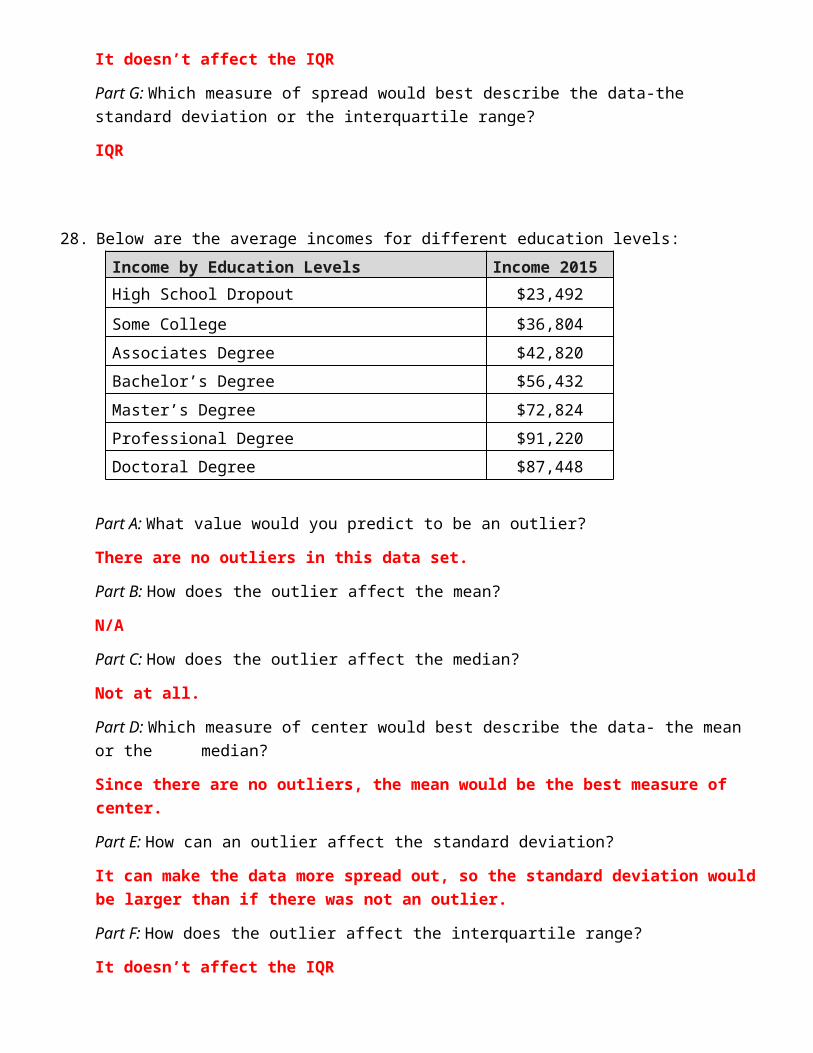
28. Below are the average incomes for different education levels:
Income by Education Levels Income 2015
High School Dropout $23,492 Some College $36,804 Associates Degree $42,820 Bachelor’s Degree $56,432 Master’s Degree $72,824 Professional Degree $91,220 Doctoral Degree $87,448
Part A: What value would you predict to be an outlier? There are no outliers in this data set. Part B: How does the outlier affect the mean? N/A
Part C: How does the outlier affect the median? Not at all. Part D: Which measure of center would best describe the data- the mean or the median? Since there are no outliers, the mean would be the best measure of center.

Part E: How can an outlier affect the standard deviation? It can make the data more spread out, so the standard deviation would be larger than if there was not an outlier. Part F: How does the outlier affect the interquartile range? It doesn’t affect the IQR Part G: Which measure of spread would best describe the data-the standard deviation or the interquartile range if there is an outlier? IQR
29. The table below lists the top ten most populated cities in 2014.
Rank City*
Population 2014
1 Tokyo, Japan 37,833,000 2 Delhi, India 24,953,000 3 Shanghai, China 22,991,000 4 Mexico City, Mexico 20,843,000 5 São Paulo, Brazil 20,831,000 6 Mumbai, India 20,741,000 7 Osaka, Japan 20,123,000 8 Beijing, China 19,520,000 9 New York/Newark, United
States 18,591,000
10 Cairo, Egypt 18,419,000
Part A: What value would you predict to be an outlier?
𝟑𝟕, 𝟖𝟑𝟑, 𝟎𝟎𝟎
Part B: How does the outlier affect the mean? Pulls the mean higher.
Part C: How does the outlier affect the median? Not at all.
Part D: Which measure of center would best describe the data- the mean or the median? The median
Part E: How does the outlier affect the standard deviation? Makes the data values more spread out. Makes the standard deviation larger.
Part F: How does the outlier affect the interquartile range? Doesn’t affect the IQR
Part G: Which measure of spread would best describe the data-the standard
deviation or the interquartile range? IQR