wanderlust pilot field study presented by brandon bond
TRANSCRIPT

Wanderlust Pilot Field Study
Presented by Brandon Bond

• Collaborative exploration. Discover what is going on around you right now.
• Team Members:o Ari Ashkenazio Brandon Bondo Carolyn Scovilleo Sheena Kapuro Vince Blas
Wanderlust App for Android

Experiment
Field Study using Droid Razr M Android phone
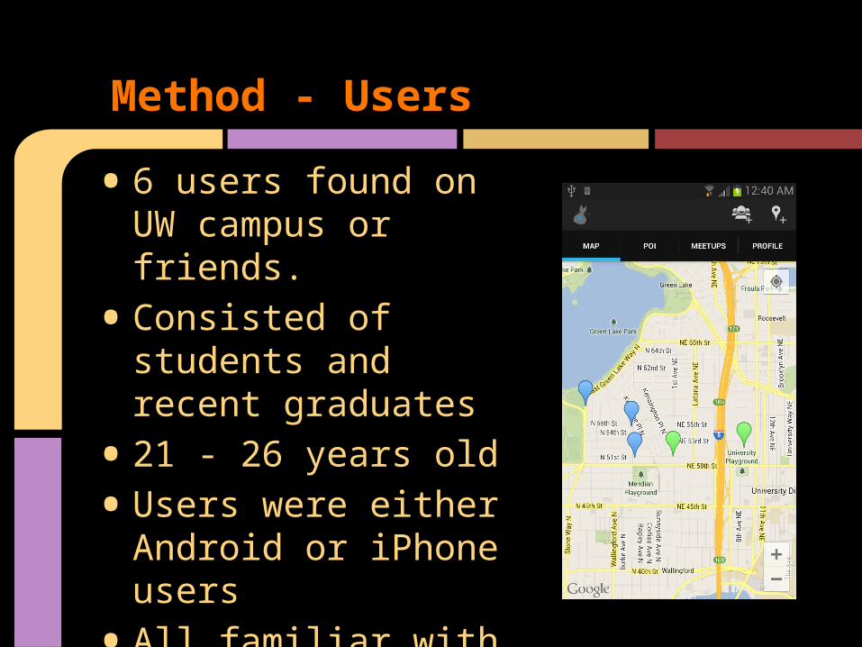
Method - Users
• 6 users found on UW campus or friends.
• Consisted of students and recent graduates
• 21 - 26 years old
• Users were either Android or iPhone users
• All familiar with Seattle area

Method - Environment
• More realistic environment
• Tested in several spots around campus, on the ave, and in users home
• Only had facilitator, note taker and timer

Method - Procedure
• Explain application to user and give consent form
• Have user perform each task
• Observe and record clicks/reactions
• Ask questions about individual tasks after each one is completed
• Conduct post interview to ask for most difficult/easiest tasks, overall impression, suggestions and demographics

Test Measures
• Errors - Clicking on button that didn't help complete task
• Task Completion Time
• Rating of each task and entire application
• Focused on qualitative observations including points of confusion, suggestions, and there thoughts when thinking aloud

Task 1: Browse Points of Interest
• Browse a point of interest and view its’ description

• Arrange to hang out with Friends at the “Diner” at 7:00pm
Task 2: Create a MeetUp
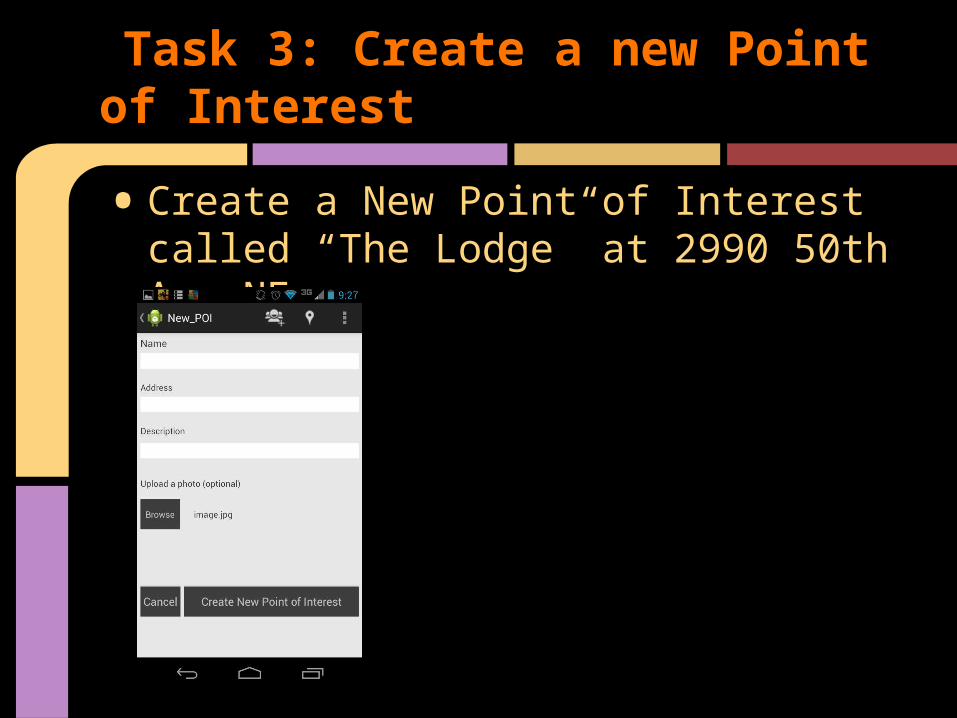
• Create a New Point of Interest called “The Lodge” at 2990 50th Ave NE
Task 3: Create a new Point of Interest

Experimental Results

• Very few errors, at most 1 per task
• 10/18 tasks had no errors
Errors include:
• not being able to see New Meetup/ New POI buttons
• Mixing up New Meetup/New POI buttons
• Trying to create POI from map
Experimental Results - Errors

(1-10, 10 being most usable/likeable)
• Task 1 Usability: 7, 7, 8, 8.5, 9, 9
• Task 2 Usability: 5, 5, 5, 6, 7, 7 (caused by broken button)
• Task 3 Usability: 6, 8, 8, 10, 10, 10
• Overall Usability: 7, 7, 7 ,7, 7, 8
• Overall Likeability: 7, 7, 8, 8, 9, 9
Experimental Results - Ratings

• No context to color to distinguish Meetups/POIs
• Data entry slow when creating items
• Detail screen more visually appealing
Experimental Results: Comments

• Users overall thought the idea had potential and would use especially if friends also used
• UI was rough in spots and more difficult to use than other applications
• Buttons and tabs were intuitive or quickly learned after a few clicks around the application
Experimental Results - Summary

UI Changes
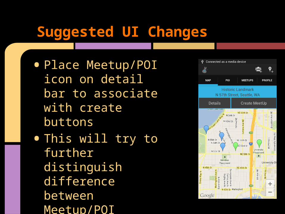
• Place Meetup/POI icon on detail bar to associate with create buttons
• This will try to further distinguish difference between Meetup/POI
Suggested UI Changes
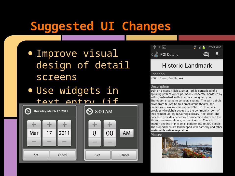
• Improve visual design of detail screens
• Use widgets in text entry (if time permits)
Suggested UI Changes

• POI on tab will stay due to room, Points of Interest label added to actual page
• Automation (future)• Meetup pin will be shifted slightly when
overlapping with POI pin to see both• Broken New Meetup and back buttons
will all be fixed
Suggested UI Changes

• Users generally completed all tasks very easy
• Testing on real phone exposed new issues including data entry
• Plan to clean up as much of ui as possible and continue to give it realistic Android feel
Summary

Questions?