volume 46 number 2 fall 2010 acknowledgements -...
TRANSCRIPT

FALL 2010AcknowledgementsEditor
Daniel Wilson, Illinois State University
Editorial Review Board Cynthia Carlton-Thompson, North Carolina A&T State University James Tenorio, University of Wisconsin–Stout Zeke Prust, Arizona State University (emeritus) Bob Chung, Rochester Institute of Technology Christopher Lantz, Western Illinois University Malcolm Keif, California Polytechnic State University Mark Snyder, Millersville University Gary Field, California Polytechnic State University
Cover Design James C. Yankee, College of the Ozarks, Point Lookout, Missouri Instructor, Michael Williams
Page Design and LayoutJanet Oglesby
Printing, Bindery, and DistributionHarold Halliday, University of Houston University of Houston Printing and Postal Services
About the JournalThe Visual Communications Journal serves as the official journal of the International Graphic Arts Education Association, Inc., and provides a profes-sional communicative link for educators and industry personnel associated with design, presentation, management, and reproduction of graphic forms of com-munication. Manuscripts submitted for publication are subject to peer review by the Association and the views and opinions expressed herein are those of authors and do not necessarily reflect the policy or the views of the IGAEA.
Article SubmissionPlease follow the guidelines provided at the back of this Journal.
Membership and Subscription InformationInformation about membership in the Association or subscription to the Journal should be directed to the IGAEA Second Vice-President.
Reference SourcesThe Visual Communications Journal can be found on EBSCO host databases.ISSN: Print: 0507-1658 Web: 2155-2428
President Charles Weiss
Western Illinois University1 University Circle, B37 Knoblauch Hall
Macomb, IL 61455 (309) 298-1488
President-Elect Hans Kellogg
Department of Technology Ball State University Muncie, IN 47306
(765) 285-5663 [email protected]
First Vice-President (Publications)Monika Zarzycka
Digital Media, ILT Dept. University of Houston 312 Technology Bldg Houston, TX 77204
(713) 743-4077 [email protected]
Second Vice-President (Membership) Dennis B. Dougherty
Thaddeus Stevens College of Tech. 750 E. King Street
Lancaster, PA 17602 (717) 299-7767
Secretary Kelly Smith
Stevenson HS District 125 One Stevenson Dr.
Lincolnshire, IL 60069 (847) 415-4178
Treasurer Jerry Waite
College of Technology University of Houston 312 Technology Bldg.
Houston, TX 77204-4023 (713) 743-4089
Immediate Past President Shaun Dudek
Graphic Arts Technology College of DuPage
425 Fawell Blvd. Glen Ellyn, IL 60137
(630) 942-2040 [email protected]
Volume 46 Number 2

2 Fall 2010 Visual Communications Journal
Table of ContentsEditor’s Note. . . . . . . . . . . . . . . . . . . . . . . . . . . . . . . . . . . . . . . . . . . . . . . . . . . . . . . . . . . . . . . . . . . . . . . . . . . . . . . . . 3
Refereed ArticlesA Study on the Recognition Performances of Graphical Symbols Based on Information Load and Combination Mode . . . . . . . . . . . . . . . . . . . . . . . . . . . . . . . . . . . . . . . . . . . . . . 5
Teaching Personal Branding Through Social Networking Sites . . . . . . . . . . . . . . . . . . . . . . . . . . . . . . . . . . . . . . 15
Print Quality Comparison Between a Dry-Toner Production Electrophotographic Press and an Offset Press . . . . . . . . . . . . . . . . . . . . . . . . . . . . . . . . . . . . . . . . . . . . . . . . . . . 23
Juried ArticlesRevising a Basic Technical Photo Course: A Back to Basics Approach . . . . . . . . . . . . . . . . . . . . . . . . . . . . . . . 29
Manuscript Guidelines . . . . . . . . . . . . . . . . . . . . . . . . . . . . . . . . . . . . . . . . . . . . . . . . . . . . . . . . . . . . . . . . . . . . . 39

3
Editor’s Note
Editor’s Note
by Daniel Wilson, D.I.T., Illinois State University
The Visual Communications Journal is the only academic journal of its kind. No other academic publishing venue is dedicated to peer-reviewed research on topics of importance within graphic communications education and its allied fields of study. This journal is very impor-tant as a means to promote this academic discipline and to provide teachers and researchers within the visual communications education community a source of important, original curricular and technical information found no where else.Dr. Jerry Waite, who has ably edited this journal for over a decade is now stepping aside for two years to serve in other professional roles. In the interim, I will serve as editor of the journal and will strive to maintain the out-standing level of editorship that Dr. Waite has set as a standard for the journal’s authors, reviewers, and readers.Before stepping aside this year, Dr. Waite secured an International Standard Serial Number (ISSN) for the VCJ (an ISSN is an eight-digit number which identifies peri-odical publications). He also applied to EBSCO Information Services, the company serving the network of library databases, which will enable the VCJ content to be available in the electronic library searches of millions of end users. To say the least, Dr. Waite has positioned the VCJ to be a world class publication as we move into the future.
Those of us who understand graphic production know the complexity and level of work required to produce a journal of this kind. Janet Oglesby has done a tremendous job with the design and layout of the journal and Harold Halliday, a master printer, has carried out the print pro-duction. Thank you to these two individuals for “making” this journal.As with any academic journal, it is the review board that serves as the independent, unbiased gatekeeper to the publication. Each submitted paper is made anonymous and then carefully scrutinized by members of the edito-rial board to assure quality, timeliness and relevance to our readership. The Journal’s Editorial Review Board (in alphabetical order) is Bob Chung, Gary Field, Malcolm Keif, Chris Lantz, Zeke Prust, Mark Snyder, James Tenorio, and Cynthia Carlton-Thompson. Much gratitude is due these individuals for their excellent work and ser-vice to our profession.

4 Fall 2010 Visual Communications Journal

5
by Tzu Fan Hsu, Ph.D. candidate, Chung Yuan Christian University & Pin Chang Lin, Ming Chuan University
A Study on the Recognition Performances of Graphical Symbols based on Information Load and Combination Mode
A Study on the Recognition Performances of Graphical Symbols based on Information Load and Combination Mode
IntroductionVisualization is an effective method for information com-munication and has been widely applied in the field of design, such as with sign systems or graphical user inter-faces. In consideration of usability (i.e. easy to use), rec-ognition performance plays an important role in visual communication design. Because it can be rapidly received and deciphered through peoples’ instinct and inference, the graphical symbol is utilized as a main carrier of visual communication. For instance, the pictograms created by the US Department of Transportation (DOT) and the American Institute of Graphic Arts are widely used to convey information in public spaces and in many coun-tries. Moreover, the set is also frequently utilized as a source template for research in the exploration of cogni-tive behaviors and performance evaluation. Thus, Cairney & Sless (1982, pp. 91–97) stated that people of different cultural backgrounds can correctly interpret the informa-tion of graphical symbols through learning. The commu-nication advantages of graphical symbols have also been addressed in other research. In the study of traffic signs (Li et al., 1986, pp.111–126), graphical signs produced better recognition performance than text signs under both driving and still conditions. However, there is a limitation on peoples’ ability to han-dle information. Plethoric information serves to hinder reception and decision-making, causing information overload. Conversely, insufficient information results in fragmentary messages, lessening the functionality. The quantity and quality of information have considerable influence on the ability of people to receive information and make decisions. To analyze and evaluate the informa-tion, the concept of information load has been explored in many studies. Therefore, to build an executive founda-tion for information load, this study conducted literature reviews within design studies to integrate relevant opera-tion and evaluation methods, and then statistically ana-lyzed the recognition performance of graphical symbols.
Research on information load within the design fieldIn design studies, information load is typically regarded as the amount of information cues presented to a decision maker, and the manipulation might be different depend-
ing on the property of stimulus. For instance, in Gordon’s (1981, pp. 453–466) study of highway guide signs, the information load was categorized into “common,” “ficti-tious,” and “no destination” according to the displayed content. Response times and errors were utilized to examine driving performance under various information loads. The results showed no significant differences in response time between the “common” and “fictitious” categories of signs. However, the response time for the “no destination” category was significantly longer.In addition, Liu (2005, pp.1147–1158) conducted an investigation into the relationship between traffic signs and driving performance from the perspective of infor-mation load level. Based on information theory, he divided the information load of the stimuli into five lev-els, then evaluated the performance using data, such as search time and accuracy ratio. The results indicated that as the information load increased, the accuracy ratio dropped, while the search time increased. Furthermore, compared with text signs of equivalent information load levels, graphical signs returned a better accuracy ratio but required longer search time.Also based on the concept of information theory, Katov et al. (2003, pp. 144–145) utilized environmental pictures as stimuli to examine emotional response under different information loads. The information load was calculated on the proportion of recognizable color patches in each picture, and the values were measured as 4%, 6%, 11%, 16%, and 18%. The results showed that the highest posi-tive emotion occurred at the value of 6%. An information overload would lead to an increase in negative emotions. Therefore, information load was suggested as a variable for the emotional response to environment.
Evaluation of information loadFrom the previously described literature, there were two performance issues: “the number of errors users made” and “the speed of task performance.” The corresponding variables were “accuracy ratio” and “response time” in information load studies as well as in graphic design studies. For example, Biederman (1998, pp. 38–64) took the accuracy ratio as a dependent variable in a recogni-tion study; and Helbing et al. (1993) used response time as a variable in evaluating the performances of recogni-tion and search. Thus, this study utilized these two vari-

6 Fall 2010 Visual Communications Journal6
ables for performance evaluation on the information load of graphical symbols.
Operational methods of information loadSumming up the aforementioned studies, the methodolo-gies regarding the classification of information load could be divided into the two operational methods: classifica-tion by level and classification by category. The operation concepts were briefly described as follows:1. Classification by level: The information loads of
stimuli were quantified by specific rules, and then divided into different levels. For instance, in Liu’s (2005, pp. 1147–1158) study on the traffic signs, the levels of information load were defined by informa-tion theory and evaluated by the participants’ performances.
2. Classification by category: Through composition analysis of stimuli, the categories were determined to be the classification basis. For example, the stimuli were classified into three categories of information load according to the displayed content in Gordon’s (1981, pp. 453–466) study of highway guide signs.
Each method had its own advantage in terms of operation and application. The former provided an objective founda-tion for quantification, while the latter was more intuitive and less complex in classifying the categories of informa-tion load. Therefore, this study separately utilized the two operational methods: classification by level and classifica-tion by category, and employed the DOT pictograms as the stimuli source to evaluate and compare the recognition performance of information load. Both sets of procedures were described in the following methodology section.
MethodologyClassification by level of information loadInformation theory is the foundation of information engineering, but it is also widely applied in fields other than computer science, such as behavior analysis in psy-chology and evaluation of news information in mass communication. According to classical information the-ory, the information load, symbolized by H, is measured by a mathematical formula, the unit being bits. In this approach, information refers to “the reduction of uncer-tainty” (Kantowitz & Sorkin, 1996). Considering the factors of frequency, probability, and order, the calcula-tion of information load is H=−ΣPi log2 Pi, where Pi is the relative probability as event i occurs. However, it is difficult to contains all factors under practical execution.
Thus, the calculation is simplified as: H =log2M (Namba, 1983), with the assumption of equal probability for alter-native events in population M, i.e. Pi=1⁄M. After reliability and validity tests, the formula becomes an acceptable calculation of information load, and has been applied in many studies, such as a study on the complexity and difficulty of Chinese characters (Huang & Ma, 2007, pp. 8–25) and a study on visual feature information (Chen & Guan, 2007, pp. 53–70). Hence, this study employed the formula, H=log2M, as the calculation basis for the infor-mation load of graphical symbols. A graphical symbol consists of symbol objects. Prior to measuring the information load of a graphical symbol by the formula, H=log2M, it was necessary to categorize the types of symbol objects, as well as to count the number of symbol objects in each type. Thus, Hsu et al. (2008, pp. 365–374), in using the DOT pictograms as stimuli, pro-vided six classification categories for the symbol objects: human, general, transportation, geometric shape, sign, and direction. There are, respectively 12, 22, 7, 11, 16, and
Table 1 : Characteristics, number, information load value, and sample images of symbol objects
Type Description of characteristics
Num. (M)
Info. (H) Sample
Human
The character symbol in a graphical symbol, proportioned to other elements in line with experience.
12 3.58
General
The iconic symbol with figural presentation in a graphical symbol, usually associated with handheld objects.
22 4.39
Transportation
The iconic symbol with figural presentation in a graphical symbol, addressing a specific purpose related to transportation.
7 2.81
Geometric shape
The iconic symbol with abstract presentation in a graphical symbol.
11 3.46
SignThe sign symbol in a graphical symbol, acquiring a conventional significance.
16 4
DirectionThe direction symbol in a graphical symbol, with the message of direction.
8 3

77A study of the accuracy ratio and response time related to the recognition of graphical symbols based on information load and combination mode
8 of each symbol object. Hence, the information load of each symbol object was generated via the formula. For example, the information load value for human was log212 = 3.58. The characteristics, number, information load value, and sample image of each type of symbol object were presented in Table 1.Subsequently, in order to calculate the overall informa-tion load of a graphical symbol, it required to count the numbers of each type of symbol object within a stimulus, individually multiply by the corresponding value of infor-mation load, and then determine the total. For example, the bottommost graphical symbol in Figure 1 currency exchange (for a larger image, see the sample for “sign + icon” in Table 2) consists of four signs and one geometric shape, so the corresponding values are 4 and 3.46, respec-tively, resulting in an information load of: 4×4+1×3.46 =19.46 bits. After completion of the calculations, a cluster analysis was conducted to determine the number of groups into which the stimuli were to be divided based on informa-tion load. Next, a dendrogram (the left side in Figure 1), which is a tree structure that enables visualizing of the clustering process, was generated. The rescaled distance, the length of horizontal line segment in the dendrogram, measured the difference between clustering stages. The longest distance was commonly taken as an indicator to stop clustering. In Figure 1, the dendrogram displayed that as two clusters formed, the longest distance was reached. Thus, it was determined that the information load should be classified into two clusters, termed “Level A” and “Level B.” For convenience, a vertical dashed-line was added to visually distinguish the classification to which each stimulus belonged. Additionally, the stimuli with lower clustering priority (the gray area in Figure 1) were removed to emphasize the difference between the two levels.
Classification by category of combination modeThe recognition of graphical symbols is influenced by various contexts, resulting in different interpretations. Employing the DOT pictograms as a sample source, Zender (2006, pp. 177–206) analyzed the context influ-ences. He found that among those contexts, there existed a combination mode of symbol objects within a graphical symbol, termed as “proximate context.” This is a key ele-ment as to why people follow and interpret the meaning of a graphical symbol adapting the same combination mode. Extending this viewpoint, Hsu et al. (2009, pp.187–196) conducted a card sorting to further classify seven
types, sorted into two categories, within the combination mode. The first category, single mode, consists of “icon,” “sign,” and “direction.” The second category, multiple mode, consists of “icon + icon”, “sign + icon,” “direction + icon,” and “human + icon.” These seven types provide a reference for classification by categories in this study. Characteristics and sample images for the combination mode are listed in Table 2.The classified results were shown on the right side of Figure 1. Again, a vertical dashed-line was added to visu-ally distinguish the classification each stimulus belonged to. Thus, Figure 1 clearly depicted how the graphical symbols were selected and classified in each aspect of the operational methods.
Figure 1.
The stimuli classification by level of information load and category of combination mode.

8 Fall 2010 Visual Communications Journal8
ExperimentThe recognition performances of graphical symbols were explored through the two operational modes, the classifi-cation of level and the classification of category. The inde-pendent variables were the “information load” and “combination mode,” respectively, with the “accuracy ratio” and “response time” being the dependent variables. Thus, the framework of this experiment is displayed in Figure 2.The definition and operation of variables were as follows:1. Independent variable:
a. Information load: Refers to the information amount in a graphical symbol. It was calculated by information theory, and was classified into “Level A” or “Level B” in this study. A total of 50 stimuli were sourced from the DOT pictograms, and were listed in Table 3.
b. Combination mode: Refers to the composition of a graphical symbol. This study utilized the seven types of combination modes (Hsu et al, 2009, pp.187–196): “icon,” “sign,” “direction,” “icon + icon,” “human + icon,” “sign + icon,” and “direc-tion + icon.”
2. Dependent variable: a. Accuracy ratio: Refers to the ratio of accurate
recognition. The participant’s answers were reviewed by three professionals, each of whom had more than six years’ experience in graphic design, and assigned one of five options: “unanswered,” “incorrect,” “partially correct,” “nearly correct,” or “correct.” For an answer to be classified as accu-rate, it required a “correct” or “nearly correct” review from at least two professionals. Thus, the number of accurate answers divided by the total number of questions generated the accuracy ratio.
b. Response time: Refers to the time taken by a par-ticipant in a recognition task. The stimulus and the question session for testing were on the two sepa-rate pages within the questionnaire. The time amount of viewing the stimulus page was mea-sured as the response time.
The framework of the experiment.
Figure 2
Table 2: Characteristics and sample image of combination modes
Combination mode Description of Characteristics Sample
Single mode
Icon
The graphical symbol is comprised of a single iconic symbol, a simple graphic that physically represented something.
Sign
The graphical symbol is comprised of a single sign symbol, an arbitrary graphic that acquired a conventional significance.
Direction
The graphical symbol is comprised of a single direction symbol, an arrow graphic with the purpose to indicate direction.
Multiple mode
Icon + iconThe graphical symbol is comprised of iconic symbols other than human icon.
Sign + icon The graphical symbol is comprised of iconic symbol and sign symbol.
Direction + icon
The graphical symbol is comprised of iconic symbol and direction symbol.
Human + icon
The graphical symbol is comprised of iconic symbol and human symbol, which was proportioned to other iconic symbols in line with experience.

99A study of the accuracy ratio and response time related to the recognition of graphical symbols based on information load and combination mode
ProcedureThe experiment followed a three-step procedure:1. Arrangement of question materials: The question-
naire contained 50 questions, and each question was divided into two pages. The graphical symbol for testing was on the first page, and the second page contained two sections: (1) the meaning of the graphic symbol and (2) the reasons for recognition results. In order to reduce the influence of variability, the questions were arranged in random order.
2. Participants: A total of 60 senior graduate students (average age 22), gender balanced and equally divided from National Chiao Tung University, Chung Yuan Christian University and Ming Chi University of Technology, took part in the experiment.
3. Proceeding of questionnaire: Before the experiment, the researcher explained the focal point in filling out the questionnaire. When the participants were certain that they had no further questions, the test began. If the reason stated for recognition results was ambigu-ous, the researcher would clarify the matter with the participants after the experiment.
AnalysisFollowing these procedures, 60 valid questionnaires were obtained. According to the operational methods, t-test and one-way ANOVA were used to analyze the recogni-tion performances in classification by level and classifica-tion by category respectively. Furthermore, the data regarding the meaning and reasons for the recognition were noted in an Excel file as reference for error analysis.
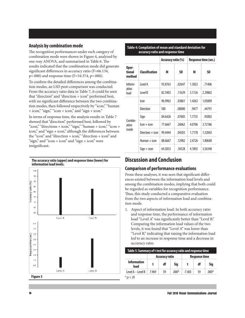
ResultThe mean and standard deviation of the accuracy ratio and response time, under each level of the independent variables, were compiled in Table 4. A higher accuracy ratio represents a greater effectiveness and a lower response time points to a better efficiency.Analysis by information loadThe recognition performances under each level of infor-mation load were shown in Figure 3. The difference was analyzed by means of t-test, and the relevant data were summarized in Table 5. The results showed that informa-tion “Level A” performed significantly better than “Level B” in terms of accuracy ratio (t=7.969, p=.000) and response time (t=-7.405, p=.000).
Table 3: The stimuli of information load and combination mode
Info. load Combination mode Stimuli
Level A
Icon
Sign
Direction
Level B
Icon + icon
Sign + icon
Direction + icon
Human + icon
10 Fall 2010 Visual Communications Journal10
Analysis by combination modeThe recognition performances under each category of combination mode were shown in Figure 4, analyzed by one-way ANOVA, and summarized in Table 6. The results indicated that the combination mode did generate significant differences in accuracy ratio (F=66.134, p=.000) and response time (F=34.374, p=.000). To confirm the detailed differences among the combina-tion modes, an LSD post-comparison was conducted. From the accuracy ratio data in Table 7, it could be seen that “direction” and “direction + icon” performed best, with no significant difference between the two combina-tion modes, then followed respectively by “icon,” “human + icon,” “sign,” “icon + icon,” and “sign + icon.” In terms of response time, the analysis results in Table 7 showed that “direction” performed best, followed by “icon,” “directions + icon,” “sign,” “human + icon,” “icon + icon,” and “sign + icon,” although the differences between the “icon” and “direction + icon,” “direction + icon” and “sign,” and “icon + icon” and “sign + icon” were insignificant.
Discussion and ConclusionComparison of performance evaluationsFrom these analyses, it was seen that significant differ-ences existed between the information load levels and among the combination modes, implying that both could be regarded as variables for recognition performance. Thus, this study conducted a comparative evaluation from the two aspects of information load and combina-tion mode.1. Aspect of information load: In both accuracy ratio
and response time, the performance of information load “Level A” was significantly better than “Level B.” Comparing the information load values of the two levels, it was found that “Level A” was lower than “Level B,” indicating that raising the information load led to an increase in response time and a decrease in accuracy ratio.
Table 4: Compilation of mean and standard deviation for accuracy ratio and response time
Accuracy ratio (%) Response time (sec.)
Oper- tional method
Classification M SD M SD
Inform-ation load
Level A 93.8763 .02647 1.3832 .71406
Level B 82.5903 .11639 3.1126 2.29802
Combin-ation mode
Icon 96.9963 .03861 1.4263 1.05009
Direction 100 .00000 .9477 .44791
Sign 84.6426 .07605 1.7755 .95002
Icon + icon 77.6667 .26062 4.0706 3.72186
Direction + icon 99.4444 .04303 1.7178 1.52043
Human + icon 88.6667 .12982 2.4726 1.80640
Sign + icon 64.5833 .18528 4.1892 3.56348
Figure 3
The accuracy ratio (upper) and response time (lower) for information load levels.
Table 5: Summary of t-test for accuracy ratio and response timeAccuracy ratio Response time
Information load t df Sig t df Sig
Level A – Level B 7.969 59 .000* -7.405 59 .000** p < .05

1111A study of the accuracy ratio and response time related to the recognition of graphical symbols based on information load and combination mode
2. Aspect of combination mode: By surveying the com-bination modes within the same level, it was found that “Level A” was comprised of “icon,” “sign,” and “direction.” Of the three, “direction” produced the best performance, followed by “icon,” and “sign” perform-ing worst. Additionally, “Level B” was comprised of “icon + icon,” “sign + icon,” “direction + icon,” and “human + icon.” Of these, “direction + icon” per-formed the best, followed by “human + icon,” and lastly “icon + icon” and “sign + icon” with no signifi-cant differences in response time between the two. By comparison of combination modes under equivalent information load levels, graphical symbols with direc-
Table 6: Summary of one-way ANOVA for accuracy ratio and response time
Accuracy ratio Response time
Source SS df MS F Sig SS df MS F Sig
Between groups 6.101 6 1.017 55.472 .000* 594.510 6 99.085 20.200 .000*
Within groups 7.571 413 .018 2025.802 413 4.905
Total 13.672 419 2620.312 419* p < .05
Figure 4
The accuracy ratio (upper) and response time (lower) for combination modes.
tion symbols usually performed best, followed by those with iconic symbols, in which human symbols performed better than others, while the lowest rank-ing performances were those with sign symbols.
Analysis of erroneous recognitionsA 67% accuracy ratio has been suggested for graphical symbols for public usage (Zwaga & Easterby, 1984, pp. 277–297). The stimuli failing to reach the reference value were listed in Figure 5. With the inferences from the participants’ descriptions about meaning and reasons, the errors were analyzed and compiled under each level of information load in order to clarify the causes resulting in erroneous recognition. 1. Level A: Figure 5(a) “exit,” the only stimulus below
67% accuracy ratio in this level, was made up of a single sign symbol, but which was seldom seen in Taiwan. Consequently, the recognition descriptions indicated that 50% of participants considered it as two half-circles, while 23.3% of answers were wooden divination blocks, a Taiwanese fortune-telling tool of a similar shape, providing explanations for the errors.
2. Level B: There were five graphical symbols failing to reach a 67% accuracy ratio. Among these, Figure 5(b) “shops” belonged to “icon + icon,” Figure 5(c) “ticket purchase” belonged to “human + icon,” while Figure 5(d) “hotel information,” Figure 5(e) “currency exchange,” and Figure 5(f) “lost and found” were cat-egorized into “sign + icon.” The error analyses followed.a. Mistaken icon identity: This error resulted from
the failure of object recognition. For example, 33.3% of participants mistook the glove icon in Figure 5(f) “lost and found” as a hand; while for Figure 5(d) “hotel information,” 30% of partici-pants mistook the sign of information service as the sign of question mark. Regarding Figure 5(e) “currency exchange,” the recognition failure of 31.7% of participants resulted from unfamiliarity
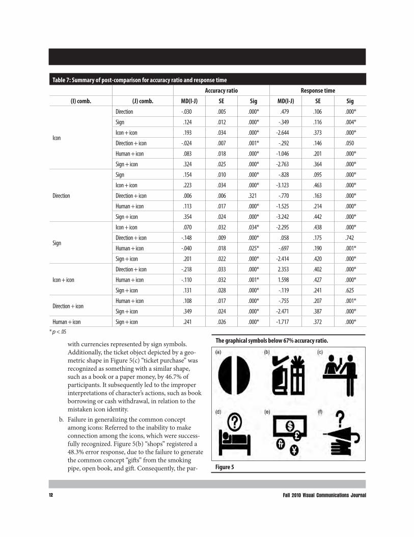
12 Fall 2010 Visual Communications Journal12
Table 7: Summary of post-comparison for accuracy ratio and response time
Accuracy ratio Response time
(I) comb. (J) comb. MD(I-J) SE Sig MD(I-J) SE Sig
Icon
Direction -.030 .005 .000* .479 .106 .000*
Sign .124 .012 .000* -.349 .116 .004*
Icon + icon .193 .034 .000* -2.644 .373 .000*
Direction + icon -.024 .007 .001* -.292 .146 .050
Human + icon .083 .018 .000* -1.046 .201 .000*
Sign + icon .324 .025 .000* -2.763 .364 .000*
Direction
Sign .154 .010 .000* -.828 .095 .000*
Icon + icon .223 .034 .000* -3.123 .463 .000*
Direction + icon .006 .006 .321 -.770 .163 .000*
Human + icon .113 .017 .000* -1.525 .214 .000*
Sign + icon .354 .024 .000* -3.242 .442 .000*
Sign
Icon + icon .070 .032 .034* -2.295 .438 .000*
Direction + icon -.148 .009 .000* .058 .175 .742
Human + icon -.040 .018 .025* -.697 .190 .001*
Sign + icon .201 .022 .000* -2.414 .420 .000*
Icon + icon
Direction + icon -.218 .033 .000* 2.353 .402 .000*
Human + icon -.110 .032 .001* 1.598 .427 .000*
Sign + icon .131 .028 .000* -.119 .241 .625
Direction + icon Human + icon .108 .017 .000* -.755 .207 .001*
Sign + icon .349 .024 .000* -2.471 .387 .000*
Human + icon Sign + icon .241 .026 .000* -1.717 .372 .000** p < .05
with currencies represented by sign symbols. Additionally, the ticket object depicted by a geo-metric shape in Figure 5(c) “ticket purchase” was recognized as something with a similar shape, such as a book or a paper money, by 46.7% of participants. It subsequently led to the improper interpretations of character’s actions, such as book borrowing or cash withdrawal, in relation to the mistaken icon identity.
b. Failure in generalizing the common concept among icons: Referred to the inability to make connection among the icons, which were success-fully recognized. Figure 5(b) “shops” registered a 48.3% error response, due to the failure to generate the common concept “gifts” from the smoking pipe, open book, and gift. Consequently, the par- Figure 5
The graphical symbols below 67% accuracy ratio.
1313A study of the accuracy ratio and response time related to the recognition of graphical symbols based on information load and combination mode
ticipants only wrote the names of icons recognized successfully. Furthermore, the same error occurred for 28.3% of participants for Figure 5(f) “lost and found,” which signified the relatively low usage of gloves in Taiwan, resulting in difficulty associating the icon with the concept of a lost item.
c. Deviation of inference from multiple icons: Referred to forming a different concept, rather than the intended message from the relationship of icons. For instance, in the inference of the rela-tionship between various currencies and the trad-ing area within Figure 5(e) “currency exchange,” 43.3% of participants deviated from the intended suggestion of currency exchange, resulting in the erroneous recognition such as cash withdrawal or safety deposit box.
ConclusionsBased on performance evaluation and error analysis, this study compared the differences in recognition accuracy and response time of graphic symbols from the aspects of information load and combination mode. The findings could provide references for designers to improve user performance and experience in visual communication. Summarizing these discussions leads to several conclusions:1. The information load generated significant differences
in the recognition performances of graphical symbols, revealing that raising the information load level leads to an increase in response time and a decrease in accuracy ratio.
2. Under equivalent levels of information load, graphical symbols with direction symbols perform best, fol-lowed by those with iconic symbols, where human symbols perform better than others, while the lowest ranking performances are those with sign symbols.
3. The accuracy ratio and response time of recognizing graphical symbols is influenced by information load and combination mode. Three types of recognition errors are found: (1) mistaken icon identity; (2) failure in generalizing the common concept; and (3) devia-tion of inference.
ReferencesBiederman, I., & Ju, G. (1998). Surface versus edge-based
determinants of visual recognition. Cognitive Psychology, 20, 38–64.
Cairney, P., & Sless, D. (1982). Communication effective-ness of symbolic safety signs with different user groups. Applied Ergonomics, 13 (2), 91–97.
Chen, H. K., & Guan, S. S. (2007). Influences of visual feature information on aesthetics & attention by applying information entropy theory- a case study of poster design. Design Journal, 12 (2), 53–70.
Gordon, D. A. (1981). Assessment of guide sign informa-tional load. Human Factors, 23 (4), 453–466.
Helbing, K. G., Jenkins, J., Kim, Y. S., & Miller, M. E. (1993). Influence of icon detail, color, and perspec-tive on preference, recognition time, and search time. Retrieved from http://www.frontiernet.net/~mkmiller/Prof/Icons/icon.htm.
Hsu, T. F., Lin, P. C., & Yang, C. M. (2008). Classification Analysis on Graphic Elements: a study of AIGA/DOT Symbols. In: Proceedings of the 2008 international symposium on Cultural innovation and design devel-opment, pp. 365–374, Taipei, Taiwan. Chung Yuan Christian University.
Hsu, T. F., Lin, P. C., & Hou, C. C. (2009). Classification of Cognition Mode on Graphical Symbols. In: Proceeding of International Seminar of Typeface, Image, and Communicating Design, pp.187–196, Taipei, Taiwan. Asia University.
Huang, J. S., & Ma, M. Y. (2007). A study on the cognition of complexity and difficulty of Chinese characters when reading and recognizing. Displays, 28, 8–25.
Kantowitz, B. H., & Sorkin, R. D. (1996). Human Factors: Understanding People–System Relationship. New York: Wiley.
Katov, M., Nomura N., & Ito, K. (2003). The visual infor-mation load as a parameter for designing pleasurable environment. In: Proceedings of the 2003 interna-tional conference on Designing pleasurable products and interfaces, pp. 144–145, New York, NY. ACM Press.
Li, J. S., Cao, S. M., & Jhang, S. J. (1986). Study on the visual image of traffic signs in the form of computer graphics. In: Proceedings of the Symposium on Computer Aided Design, pp.111–126, Taipei, Taiwan. Taiwan University.

14 Fall 2010 Visual Communications Journal14
Liu, Y. C. (2005). A simulated study on the effects of information volume on traffic signs, viewing strate-gies and sign familiarity upon driver’s visual search performance. International Journal of Industrial Ergonomics, 35, 1147–1158.
Namba, S. (1983). Study on the amount of information in a still-picture and the display time required. NHK Technical Journal, 33 (163), NHK Technical Research Lab, Tokyo.
Zwaga, H. J. G., & Easterby, R. S. (1984). Developing effective symbols for public information. Information Design, pp.277–297. John Wiley and Sons: New York.
Zender, M. (2006). Advancing Icon Design for Global Non verbal Communication: or What does the word Bow mean? Visible Language, 40 (2), 177–206.
This is a referred article
Tzu Fan Hsu Department of Commercial Design Chung Yuan Christian University Jhungli, 32023, Taiwan Pin Chang Lin Graduate School of Design Ming Chuan University Taoyuan, 33348, Taiwan 886-3-968800439 [email protected]

15
Teaching Personal Branding Through Social Networking Sites
by Monika Zarzycka, M.S., & Jerry J. Waite, Ed.D., University of Houston
Teaching Personal Branding Through Social Networking Sites
IntroductionDuring 2009, the authors attended numerous meetings, conference sessions and seminars that, on the surface, dealt with such dissimilar topics as “Branding and Marketing through PRINT,” “Social Networking in Today’s Print World,” and “The Marketing of YOU: Job Seeking in a Down Economy and How to Stand Out From the Crowd.” In each of these sessions, a common theme emerged: Internet social networking sites are key to developing a professional brand, whether it be for a firm or for an individual. Speaker after speaker empha-sized how social networking sites can polish one’s per-sonal or business reputation and, as a result, bolster a firm’s sales or an individual’s career. On the other hand, an inappropriate presence on social networking sites can seriously damage a person’s or firm’s reputation and even prevent one from obtaining a job interview or employ-ment. Some firms have been known to fire employees who use social networking sites to cast a less-than-stellar light on their employers.Prior to attending these meetings, the authors’ experi-ences with social networking sites were spotty and were directly related to each person’s age: the younger authors used social networking sites extensively and primarily to keep in touch with friends and family. The older author, who joined Facebook only as a favor to his students so that they could use his site as a way to organize a term project, found social networking sites unpleasant since his “friends” (i.e., students) shared way too much per-sonal—and oftentimes inappropriate—information for his taste. Interestingly, none of the authors had used social networking sites as described by the speakers we heard: that is, to develop his or her own personal brand or reputation. Nor did the authors use networking sites for business purposes.Given the emphasis conference speakers had placed on the potential benefits of social networking sites for indi-viduals—as well as the dire consequences that may accrue to people who do not put their best foot forward on the Web—we decided to investigate several social networking sites and discovered that there is, indeed, much validity to the these claims. We learned quickly that MySpace seems to be geared more toward music, Facebook is for friends and family to keep connected, and LinkedIn seems to be
dedicated toward professional contacts. Twitter is a way to let one’s “followers” know about his of her activities. Twitter can also be used to inform followers about the content of other sites and to direct people to those sites. Since we want our graduates to have every conceivable advantage in the workplace upon graduation, we decided, during winter break 2009–10, to develop a strategy for using LinkedIn, the most “professional” of the sites, to help our graphic communications students to develop a positive personal “brand” on the Web. Students need to learn both what to do and what to avoid on social net-working sites. In addition, students need to learn how to create, maintain, and polish their own personal brands. Profiles, posts, inquiries, and discussions carried on in a professional, well written, and intelligent way will help our students stand out in a crowd of online job seekers. For that very reason, we developed a single assignment that would be required in all courses in our curriculum. The assignment is simple: each instructor creates a “group” for each class taught, students are asked to join the appropriate group(s), the instructor or students post discussions, and all group members are encouraged to respond to the discussions. Students are given course credit for joining the group (1%) and then one additional percent (up to a total of 4%) for each well written, articu-late, and thoughtful discussion or response they write. Faculty automatically receive notice of posts through e-mail and may choose to assign credit to a student if the discussion or response reflects well on the student’s professionalism.To keep the project grounded in reality, we invited alumni, human resource specialists, printing company executives, and printing industry trade association repre-sentatives to join the groups and monitor their progress.
Review of the LiteraturePersonal BrandingPersonal branding is a fairly new phenomenon, as com-pared to product or corporate branding. For example, in 2007 Scott Karp was named by Folio magazine as one of the 40 most influential people in publishing. Karp was not honored for his work as a media director of digital strategy, but he was recognized for his personal blog,

16 Fall 2010 Visual Communications Journal16
Publishing 2.0, which covers how technology is changing the publishing business (Glaser, 2009).By definition, personal branding is “the process by which we market ourselves to others” (Schawbel, 2009a). Personal branding also means how others perceive some-one, including his or her values, work ethic, and profes-sionalism (Kistler, 2008a). As such, personal branding involves effectively managing and influencing peoples’ perceptions in order to successfully promote oneself (Goldsmith, 2009). Goldsmith claims, “Everyone has a personal brand, but most people don’t manage it strategi-cally, consistently, and effectively” (2009). Goldsmith finds it important to take control of one’s personal brand and the message it sends in order to distinguish oneself from others and market oneself as an extraordinary pro-fessional (2009). Personal branding is an important tool in helping indi-viduals obtain a job, clients, or various opportunities. In particular, one’s personal brand should communicate the possession of specific qualifications that pertain to the desired job. According to Pete Kistler, “The goal of devel-oping your personal brand is to differentiate yourself from the competition, and to attract ideal opportunities that put your abilities to work in a way that gives you meaning. It is the best way to manage your career today because it makes you irreplaceable to a particular audi-ence” (2008a).
Social NetworkingAlthough the phrase “social networking” seems to be a new and exciting development, it has arguably existed since humans first started to communicate (Social Networking, 2010). The term was first coined by profes-sor J. A. Barnes in the 1950s, who defined the size of a social network as a group of about 100 to 150 people” (Social Network, 2010b). More specifically, BusinessDictionary.com defines “social networking” as “Family, and friends and their families, that together create an interconnected system through which alliances are formed, help is obtained, information is transmitted, and strings are pulled” (Social Network, 2010a). Although social networks have existed almost as long as society itself, several popular Internet websites have pro-moted networking connections to an extent never before possible. Those sites include LinkedIn, Facebook, MySpace, and Twitter. From the business perspective, social networking sites offer publicity and marketing opportunities, serve as powerful recruitment tools, and
are used to screen potential applicants. Harpe (2009) identifies several ways that employers advance their human resources (HR) goals through social networking sites. At the most basic level, employers can post openings on popular sites. In addition, employers can create their own profiles and potential job seekers can become a friend, or connection, of the employer. Once an individ-ual is connected to a potential employer, the firm can often access the individual’s friends or contacts to expand the pool of potential employees. A report by Microsoft states,“64% of HR managers think it is appropriate to look at online profiles of candidates and 41% has rejected people as a result” (Finders, 2010). Also, companies can screen the profiles of their current employees for content that could potentially affect the employer’s brand.
Personal Branding and Social Networking Social networking is crucial for personal branding. Dan Schawbel wrote, “There is no hiding anymore and trans-parency and authenticity are the only means to survive and thrive in this new digital kingdom” (2009). People should search about themselves on a search engine to find out what information is posted about them online. Interestingly, a survey conducted by Marketing Pilgrim reveals that only 42 percent of individuals search them-selves (Reed, 2010). People should also establish their own personal brand through the use of LinkedIn, Facebook, Twitter, or even MySpace. Individuals should continually screen and monitor their sites for content, eliminating anything that would hinder their image. One inappropriate comment or a picture might cost someone a job or a client (Schawbel, 2010). With this in mind, it is absolutely essen-tial that students, who may not have enough discretion to limit the personal content on their sites, learn to leave potentially recriminating content off of their pages. In addition, since opinions, complaints, and derogatory remarks from customers or peers can be posted and viewed online, it is important to teach students to moni-tor their site’s content.
MethodPrior to the Spring 2010 semester, faculty members in the Digital Media program created LinkedIn groups for GRTC 3352, 3353, and 4373. Then, on the first day of class, students were given instruction about the impor-tance of social networking in creating their own personal brands in today’s environment. In addition, they were given the following written instructions:

1717Teaching Personal Branding through Social Networking Sites
Social Networking:Social Networking is becoming an integral part of Digital Media. The proper use of Social Networking is also becoming extremely important in developing your own personal “brand” as well as achieving success in your career.There are some Social Networking sites that are primar-ily “personal” in nature. Your faculty suggest that you appear on such sites using a pseudonym or be extremely cautious in what you post on them. Employers are known to seek out applicants’ pages and gather not-too-flattering information prior to job interviews. Employers are also known to monitor employees’ pages looking for content that portrays the company in a negative light.You also need a “professional” brand on a “professional” Social Networking site. On such a site, you must strive to paint an extremely proficient portrait of yourself. Spelling, grammar, photographic content and quality, and substance of your posts and responses all count. These all make an indelible impression on the outside world.In this class, we will use “LinkedIn” as a “professional” networking site. You will be graded on whether or not you belong to the course’s group, whether you post discussion topics and respond to others, and the quality of your English usage (including proper spelling and punctuation).If you are concerned about Internet security and/or privacy, please join LinkedIn under a pseudonym and simply let your professor know your nom de plume.Social Networking is worth 5% of your grade: one point for joining and one point for each professional post and response. Additionally, LinkedIn profiles are worth another 5% in the GRTC 3353 course.
Students were then asked to become a member of LinkedIn, create a professional profile, and join the LinkedIn group related to their course. No student was registered in more than one affected course; thus, stu-dents participated in only one group.Throughout the semester, faculty members created and/or followed the LinkedIn discussions related to their courses. Faculty also commented on the students’ thoughts as well as how well the students expressed their thoughts. In addition, faculty tabulated the number of discussions in which each student participated. Faculty
often mentioned the more thought-provoking discussions during scheduled lecture and lab sessions.Faculty invited several working professionals to join the LinkedIn groups, too. These individuals, described below under “Post Semester Survey,” also monitored and par-ticipated in the LinkedIn discussions. Several very ani-mated discussions arose between the students and the working professionals.
Participation by Students in the StudyGiven the popularity of social networking sites and the amount of time that students confess to spending on those sites, it is interesting to note that not all students in the affected classes joined or participated in the LinkedIn groups.Of a total of 15 students enrolled in GRTC 3352, two never joined the course’s LinkedIn group. Ten of the remaining students not only joined the group, but also participated in at least four discussions. Two students participated in fewer than four discussions while one student joined the group but never participated. The average grade for participating in the LinkedIn discus-sions was 80%.A total of 82 students enrolled in GRTC 3353 joined the LinkedIn discussion group. However, four students never participated in any of the discussions. Over a half of all the students (49) participated in all five discussions, 13 students participated in four discussions, seven students participated in three discussions, two students partici-pated in two discussions, and seven students participated in one discussion. The average grade for LinkedIn discus-sions and profiles was 75%.In GRTC 4373, a senior class populated by students who have had numerous graphic communications courses, all 16 students joined their LinkedIn group. However, not all participated in discussions: nine participated in at least four discussions, three students participated in three discussions, two students participated in two discussions, and two students never participated at all. This means that 95% of students participated in at least one discus-sion. The average grade for LinkedIn discussions was 81.3%.Group participation data are displayed in Table 1. “Percent of students participating” refers to the percent of the enrolled students who at least joined their LinkedIn group. The “Average grade” is a measure of the total par-ticipation rate by the entire class. One hundred percent

18 Fall 2010 Visual Communications Journal18
participation means that all students joined and partici-pated in at least four discussions.
Table 1: Group participation data
Course Students in class
Percent of students
participatingAverage
grade
GRTC 3352 15 87% 80%
GRTC 3353 82 95% 75%
GRTC 4373 16 88% 81.3%
Post Semester Observations by FacultyDuring the semester, several observations were made by faculty as the discussions were monitored:
■ The spelling and grammar used by the students were much better than expected. In this era of texting and instant messaging, we were surprised to generally see correct spelling, complete sentences, and subject/verb agreement.
■ The most interesting discussions were controversial ones. For example, one student posted a discussion related to a story he read in which Steve Jobs was hailed “the new Gutenberg” because of the invention of the iPad. Several very thought provoking conversa-tions took place as a result of that student’s post. This discussion resulted in the most comments of any topic in the GRTC 4373 group.
■ The most interesting discussions were started by students. For example, one student asked the follow-ing question: “In the face of newer digital technology, what are some added value services printers can employ?” This query caught the eye of one of the industry professionals who participated in the group and a lively conversation ensued.
■ A lot of “parroting” took place, especially if a post was interesting, insightful, or thought provoking. Many, “I agree with…” comments were posted. The students might as well have said “dittos.”
■ In the GRTC 3353 group, students often restated some of the same answers provided by their peers.
■ Some of the hands-on discussions in GRTC 3353 group, such as finding and analyzing various adver-tisements, had fewer responses than those discussions that asked students to research a specific topic.
Post Semester Survey of Industry ProfessionalsThis descriptive study used a questionnaire used by industry professionals to evaluate the quality of students’ discussions and profiles on LinkedIn. Over 100 students enrolled in three Digital Media courses (GRTC 3352, GRTC 3353, and GRTC 4373) were given an assignment to answer questions posted by their professors on LinkedIn and to comment on each other’s posts. Students were also asked to set up their LinkedIn profiles and to focus on the professional appearance of those profiles.
At the end of the semester, six experts in the field of graphic arts were asked to evaluate students’ discussions and profiles and to provide their general and specific impressions of the students’ posts. Five of the experts were based in Texas and one expert resided in California. The experts include:
– A male president of a Printing Industries of America (PIA) affilitate with over 25 years of experience.
– A male Executive Director for Technology Support Services at the University of Houston with over 20 years of experience.
– A male Executive of Color/Monochrome Solutions for Xerox with over 10 years of experience.
– A male Premedia Technology II-Digital Retoucher for Iridio/RR Donnelley and owner of a photographic studio with over 10 years of experience.
– A female Director of the Houston Independent School District printing facility with more than 10 years of experience.
– The director of Recruiting, Training & Development at Consolidated Graphics with 10 years of experience.
A brief questionnaire was emailed to six experts. In the email, the experts were reminded about the assignment and were asked to respond to the survey within two weeks. The questionnaire included six general and five specific questions. Most of the questions were open-ended, which allowed the experts to provide a more in-depth perspective and to present plentiful and detailed information based on their actual experience. The experts were asked to provide their overall impression about Digital Media students’ LinkedIn discussions and profiles. In addition, they were also asked to identify if any stu-dent’s responses stood out to them. Figure 1 depicts the questionnaire.

1919Teaching Personal Branding through Social Networking Sites
Questionnaire In General
1. How well were the students able to express themselves in their LinkedIn discussions?
2. How well were the students able to utilize writ-ten—and business-appropriate—English?
3. What did you think of the overall quality of the students’ ideas expressed in their posts or responses?
4. What do the students’ posts and responses tell you about the quality of students in the Digital Media Program at University of Houston?
5. What do the students’ posts and responses tell you about the quality of the Digital Media Program at University of Houston?
6. Do you have any other overall impressions of the LinkedIn assignment?
In Specific1. Is there any particular student whose ideas or
written fluency stand out the most to you? If so, who is it and why?
2. Is there any student whose posts or responses convinced you to view that student’s LinkedIn profile? Is so, who is it and why?
3. If you viewed the students’ profiles, what was your impression of those profiles?
4. Is there any specific student whose posts or responses would make you more interested in interviewing that student? If so, who is it and why?
5. Is there any student whose posts or responses would make you less interested in interviewing that student? If so, who is it and why?
ResultsThe results for this study were collected from the responses that were completed by four experts. Six experts in the field of graphic arts were asked to partici-pate in this study, and four of them answered the ques-tionnaire and emailed their responses. After the experts provided their responses, each question was analyzed individually. A comparison between responses was con-ducted by examining all of the experts’ answers. Similarities and differences between responses were
drawn. To eliminate bias, the researchers did not partici-pate in judging.
Summary of Research QuestionsGeneral Question 1: How well were the students able to express themselves in their LinkedIn discussions? Experts agreed that students expressed themselves very well and exhibited good communication skills. Students showed understanding of various topics and were able to articu-late their thoughts and ideas well. Experts also found students’ responses to be insightful and cohesive. One expert pointed out that students provided excellent dis-cussion of various topics. Also, the respondents noted that students’ comments were well organized.
General Question 2: How well were the students able to utilize written—and business-appropriate—English? The experts’ opinion was divided. Some experts believed that students writing abilities were good and discussions were enlightening. One expert believed that students were well versed in discussing technical aspects of printing. Other experts claimed that the written language was more infor-mal than the one used in a standard business. Also, there were spelling errors and grammatical problems, which made students’ posts look less professional.
General Question 3: What did you think of the overall quality of the students’ ideas expressed in their posts or responses? Experts agreed that the overall quality of the students’ responses was good. In particular, they noted that the students’ thoughts were original. One expert pointed out that students knew what they were talking about and were definitely more advanced than most professionals he knew. Two experts noted that students’ posts were repetitive and some students merely agreed with other comments. One of the experts added that although many comments were agreements with what was said prior by others, several students went on to the express other ideas or to expand on the topic in general.
General Question 4: What do the students’ posts and responses tell you about the quality of students in the Digital Media Program at University of Houston? Experts were impressed with the quality of students in the pro-gram. They found Digital Media students to be intelligent and mature individuals. One expert pointed out that the program is drawing students outside of the traditional “printing” background, bringing new perspective to dis-cussions about the industry.

20 Fall 2010 Visual Communications Journal20
General Question 5: What do the students’ posts and responses tell you about the quality of the Digital Media Program at University of Houston? Experts were impressed with the quality of the Digital Media Program. One expert wrote that the program seems to attract good quality students. Another expert claimed that students were getting a comprehensive overview of the printing industry, which would help them build a solid foundation and allow them to grow their skills. Still another expert found it important that in the Digital Media Program students learn not only the history of printing, but also the future of printing. General Question 6: Do you have any other overall impressions of the LinkedIn assignment? Experts believed that the assignment was great, because it forced students to think like professionals and help them better brand themselves. One expert wrote that questions were intrigu-ing and comments were insightful. Another expert claimed that if he were a HR recruiter he would view LinkedIn pages of potential job candidates. Still another expert remarked that some students should clean up their spelling and grammar in order to make their discussions appear more professional. Also, students should not merely provide “me too” responses. Specific Question 1: Is there any particular student whose ideas or written fluency stand out the most to you? If so, who is it and why? All of the experts selected at least one student who stood out to them. Students who were cho-sen had several well written, interesting, and concise discussions. Three of the experts selected the same stu-dent. One expert believed that the chosen student seemed passionate and knowledgeable about the printing indus-try and could do well in the field of graphic arts.Specific Question 2: Is there any student whose posts or responses convinced you to view that student’s LinkedIn profile? If so, who is it and why? Two experts viewed stu-dents’ profiles. One expert chose to view a particular student’s profile because that student had a better grasp of the topic and provided good examples. Another expert chose to look at a student’s profile, because he found that student’s title eye-catching. Specific Question 3: If you viewed the students’ profiles, what was your impression of those profiles? Two experts who viewed students’ profiles had a mixed reaction to this question. One expert was very impressed with a student’s profile, because it mentioned the student’s accomplish-ments. Still, that expert pointed out that the same student should find his or her niche and concentrate on one area
of graphic arts without trying to do everything. Another expert was not impressed with students’ LinkedIn profiles because they were not comprehensive enough. The pro-files did not allow that expert to discern students’ unique talents and make them stand out even more from others.Specific Question 4: Is there any specific student whose posts or responses would make you more interested in interviewing that student? If so, who is it and why? Two experts answered this question. The experts selected the same students who stood out to them (Specific Question 1) and whose profiles they viewed (Specific Question 2). One expert remarked that he would hire a particular student on the spot. Specific Question 5: Is there any student whose posts or responses would make you less interested in interviewing that student? If so, who is it and why? None of the experts chose a particular student who they would be less inter-ested in interviewing. Rather, the experts provided their opinions on what would help or hinder students’ chances for an interview. One expert wrote that he would look at the job candidates’ profiles, focusing on their accomplish-ments and work experience. That expert suggested that profiles should be tailored to a specific job. Another expert claimed that he would not interview those indi-viduals who could not spell correctly or had poor gram-mar. That expert pointed out that many business professionals screen job applicants using Social Networking sites, thus correct spelling and good gram-mar are extremely important. The final expert did not have anything negative to say. That expert believed that students were excellent representatives of University of Houston.
Conclusions and RecommendationsAs the use of social media continues to grow, educational institutions will need to place more emphasis on teaching students how to market themselves online as a brand. This study shows that students can learn to use social media effectively and will participate in discussion topics. Most student discussions were well thought out and grammatically correct. But, avoidable grammatical mis-takes still occurred. A quick proofreading before submit-ting would eliminate most of these errors. In the future, students should be specifically taught about the potential damage to their professional image that may be caused by grammar and spelling errors.During the study, students learned that discussion boards serve as a means for showcasing their knowledge, pas-

2121Teaching Personal Branding through Social Networking Sites
sion, and expertise in a subject area. By responding to discussions that are relevant to their field and experience, their names become associated with the topic. This inter-action becomes a tool that drives traffic to their profiles and potentially increases their professional brand. Social media sites provide a means for original thought, which is usually welcomed and valued on discussion boards. However, students need to learn the difference between adding value to the discussion and just agreeing with previous statements in the thread. Explaining this to students will help increase the quality of responses on a thread and assist with personal branding.A LinkedIn profile gives insight to a potential contact’s interest, skills, knowledge, and experience. In essence, it serves as a virtual resume. Students, for the most part, did not create intriguing profiles during this study. Further work will be necessary in the future to better inform students about the parts of the profile, the importance of a professional profile picture, and how to effectively com-municate their experience, interests, and skills so that they can develop and maintain a positive personal online brand. Additional work with students is also necessary to help them determine the purpose and content that will best indicate their career interests and accomplishments. This will provide clarity to potential employers. The study conducted shows that students understand the value of social media. The use of social media will con-tinue to evolve and impact the graphic communications industry. As educators, it is our mission to help students understand the strengths and challenges of using social media in their job searches and in their professional careers.
References Facebook. (2010, February 16). Facebook Advertising:
Reach your exact audience and connect real customers to your business. Retrieved from http://www.facebook.com/advertising/.
Finders, K. (2010). HR managers are looking at your online profile. Retrieved 2/16/2010 from http://www.computerweekly.com/Articles/2010/01/28/240105/hr-managers-are-looking-at-your-online-profile.htm.
Glaser, Mark. (2009). Personal Branding Becomes a Necessity in Digital Age. PBS.org. Retrieved from http://www.pbs.org/mediashift/2009/07/personal-branding-becomes-a-necessity-in-digital-age197.html on January 12, 2010.
Goldsmith, Marshall. (2009). Authentic Personal Branding. Business Week. Retrieved from http://www.businessweek.com/managing/content/sep2009/ca20090929_228578.htm on January 12, 2010.
Harpe, L. (2009). Social Networking and Employment Law. Retrieved from http://www.iowaabi.org/docu-ments/filelibrary/events/social_media/Social_Networks_Employment_Law_eBoo_C3A386C1048E1.pdf on December 30, 2009.
Kistler, Pete. (2008a)/ Everything You Need to Start Building Your Personal Brand Right Now. Brand-Yourself. Retrieved from http://blog.brand-yourself.com/2008/11/05/everything-you-need-to-start-build-ing-on-your-personal-brand/ on January 12, 2010.
Kistler, Pete. (2008b). 7 Benefits of Personal Branding. Brand-Yourself. Retrieved from http://blog.brand-yourself.com/2008/09/29/7-benefits-of-personal-branding/ on January 12, 2010.
LinkedIn. (2010, February 16). Over 60 million profes-sional use LinkedIn to exchange information, ideas and opportunities. Retrieved from http://www.linke-din.com/.
MySpace. (2010, February 16). Banner Advertising on MySpace: Reach over 70 million. Retrieved from https://advertise.myspace.com/.
Reed, Frank. (2010). 42% of Americans Have Googled Themselves; None Have Gone Blind. Marketing Pilgrim. Retrieved from http://www.marketingpilgrim.com/2010/01/42-of-americans-have-googled-them-sleves-none-have-gone-blind.html on February 11, 2010.
Schawbel. Dan. (2009). Personal Branding 101: How to Discover and Create Your Brand. Mashable: The Social Media Group. Retrieved from http://mashable.com/2009/02/05/personal-branding-101/ on January 12, 2010.
Schawbel, Dan. (2010). 5 Ways to Avoid Sabotaging Your Personal Brand Online. Mashable: The Social Media Group Retrieved from http://mashable.com/2010/02/11/avoid-sabotage-personal-brand/ on February 15, 2010.
Social Network. (2010a). In PC Magazine Encyclopedia online. Retrieved from http:// www.businessdiction-ary.com/definition/social-network.html on February 16, 2010

22 Fall 2010 Visual Communications Journal22
Social Network. (2010b). In Business Dictionary online. Retrieved from http://www.pcmag.com/encyclope-dia_term/0,2542,t=social+network&i=55313,00.asp on February 16, 2010
Social Networking. (2010). In Whatis.com online. Retrieved from http://whatis.techtarget.com/definition/0,,sid9_gci942884,00.html on February 16, 2010.
Twitter. (2010, February 16). Twitter 101 for business: A special guide. Retrieved from http://business.twitter.com/twitter101/.
This is a refereed article Monika Zarzycka Instructional Assistant Professor Digital Media, ILT Dept. University of Houston 713-743-4077 [email protected] Dr. Jerry WaiteProfessor of Technology College of Technology University of Houston 713-743-4089 [email protected]

23
by Renmei Xu Ph.D., & Hans P. Kellogg. M.A., Ball State University
23Print Quality Comparison Between a Dry-Toner Production Electrophotographic Press and an Offset Press
Print Quality Comparison Between a Dry-Toner Production Electrophotographic Press and an Offset Press
IntroductionThe printing industry has seen rapid growth in applica-tions of digital printing presses due to higher demand for print-on-demand and variable data printing jobs (Loutfy, 2002, and Cleary, 2006). One of the major digital printing technologies used for production printing is dry-toner electrophotography (Tolliver-Nigro, 2006). The main technical challenge is print quality, and engineering has been done to improve it in the recent years, such as the image-on-image (IOI) architecture introduced by Xerox (Lux and Yuh, 2004, and Mestha, 2004). The print quality of color electrophotography has been previously com-pared with conventional printing technologies in a study by Perales et al., 2008. In that study, a comparison of electrophotography, inkjet, offset, and gravure, it was found that electrophotography was better than inkjet and offset. However, a desktop laser printer was used in the study, which is not a production press.In this study, an electrophotographic press for production printing was used and print quality on different substrates was compared with that of an offset printing press to find out the differences.
MethodsSubstratesFour commercial paper substrates were selected: uncoated 28# envelope grade and 90# index grade, coated 80# text gloss grade and 80# cover grade.The surface roughness was measured using a Mitutoyo Surface Roughness Tester Model 211. The arithmetic mean deviation of the roughness file, Ra, was measured with evaluation length of 2.5 mm. Brightness and cast values were measured using X-Rite SpectroDensitometer 528.
Printing ProcessThe GATF 11×17 Four-Color Test Form, as shown in Figure 1, was printed on the paper substrates by a dry-toner color electrophotographic press and by an offset printing press.The dry-toner color electrophotographic press used was a Xerox iGen3TM 110, with EFI Fiery® Color Server as its raster image processor (RIP), located at Muncie Novelty, Muncie, Indiana. Dry Inks from Xerox were used. The
printing sequence was magenta, yellow, cyan, and black. The line screen was set at 175 lpi. The printing was done at a speed of 2400 sheets/hour. The offset printing press used was a sheetfed Heidelberg SpeedmasterTM SM74, also located at Muncie Novelty. Digital thermal Pro-T® plates from Fujifilm were used and processed by a Fujifilm 4300E platesetter, with Trueflow® system from Screen Media Technology as its RIP. The line screen was set at 150 lpi. The inks were K&E Inks from ESI Manufacturing. The printing sequence was black, cyan, magenta, and yellow. The printing was done at a speed of 13,500 sheets/hour. The ink feeding amounts were kept the same for all the papers for comparison reason.
Figure 1
GATF 11×17 Four-Color Test Form

24 Fall 2010 Visual Communications Journal
Print Quality EvaluationThe reflective density of CMYK solids, print contrast of CMYK, and ink trapping were measured using an X-Rite SpectroDensitometer Model 528. The test form included tone scales for each color, which were used to measure the dot areas and calculate the dot gain values.The test form included a standard color field, the IT8.7/3 Basic Data Set. The L*a*b* values of the patches were measured with a GretagMacbeth Eye-One® iO, and GretagMacbeth ProfileMaker® Pro 5.0.8 software was used to create a profile. Using CHROMiX ColorThink® Pro 3.0, the profile gamuts were plotted and compared.
Results and DiscussionPaper PropertiesThe results of measured paper properties are listed in Table 1. Coated text gloss and cover papers are much smoother than uncoated envelope and index papers. The envelope paper has lower brightness than the other three.The reflection densities of CMYK solids of different sub-strates are compared in Table 2. It is very clear that reflec-tion density was affected by paper surface roughness in both printing methods. Uncoated papers have very rough surface, which results in uneven ink film thickness, thus very low reflection density.The dot gain curves were obtained by plotting dot gain values against the original tone values. The dot gain curves for envelope paper are shown in Figure 2. In offset printing, the dot gain curves of four colors are similar in shape, and slightly different in magnitude. The highest values were found at the 40% or 50% tint level. The curves are skewed towards the lower values with the 25% tint level showing more gain than the 75% tint. In electro-graphic printing, the dot gain curves of four colors do not have similar shape and the magnitudes are very different. The dot gain curve of black has a peak of 40% at the 40% tint level. The dot gain curves of the other three colors are somewhat flat, and sometimes have two peaks.The dot gain curves of the Speedmaster and the iGen3 are compared in Figure 3.
Higher dot gains were found on the Speedmaster than on the iGen3 except for black. Dot gain is made up of two components: optical gain and mechanical gain. Mechanical gain, or physical dot gain, is the dot spread-ing that occurs during photomechanical operations, like platemaking, or during the printing process as the ink is transferred from plate to blanket to paper in offset print-ing or from photoreceptor to paper in electrophotogra-
Table 1: Paper PropertiesPaper Ra (μm) Brightness (%) Cast (%)
Envelope 1.42 77 3
Index 1.38 91 4
Text Gloss 0.38 91 5
Cover 0.19 94 5
Table 2: Reflection Density Values
Speedmaster
Black Cyan Magenta Yellow
Envelope 0.88 0.72 0.81 0.72
Index 0.91 0.74 0.87 0.70
Text Gloss 1.45 1.16 1.30 0.98
Cover 1.40 1.26 1.30 0.96
iGen3
Black Cyan Magenta Yellow
Envelope 1.55 1.31 1.21 0.98
Index 1.60 1.38 1.23 0.94
Text Gloss 1.90 1.76 1.62 1.06
Cover 1.86 1.76 1.64 1.08
Figure 2
Dot gain curves of CMYK colors on envelope paper.

Print Quality Comparison between a Dry-Toner Production Electrophotographic Press and an Offset Press 25
phy. Optical gain is strongly influenced by the surface characteristics of the paper. Uncoated papers, for instance, have more optical gain than coated papers. Figure 4 shows that uncoated envelope and index papers exhibit more dot gain than coated text gloss and cover
papers for both printing methods. However, the differ-ences in electrophotography are smaller than in offset printing.The print contrast values are listed in Table 3. Higher print contrast values were found for the iGen3 than for the Speedmaster except for black. Print contrast is influ-enced by dot gain. Excess dot gain of black ink on the iGen3 contributes to low print contrast values.The ink trapping values are listed in Table 4. Opposite phenomena were observed for the Speedmaster and the iGen3. The Speedmaster exhibited higher trapping values on coated text gloss and cover papers than on uncoated envelope and index papers. Contrarily the iGen3 exhib-ited higher trapping values on uncoated papers than on coated papers. In lithography, trapping is affected by ink tack and the ink tack sequence during printing. Sheetfed offset inks are viscous inks with high tack and most often dry by oxidative polymerization. By contrast, the iGen3 utilizes dry toners that dry by fusing. The color image, either spot color or process color, is built on the photore-ceptor in a single pass. IOI process places toners of differ-ent colors on top of, as well as adjacent to, each other (Lux and Yuh, 2004).
Figure 3
Dot gain curves of the Speedmaster and the iGen3 on cover paper.
Figure 4
Dot gain curves of four papers for black on both presses.
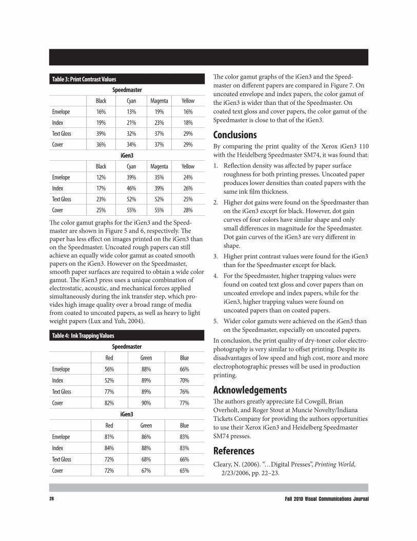
26 Fall 2010 Visual Communications Journal
Table 3: Print Contrast Values
Speedmaster
Black Cyan Magenta Yellow
Envelope 16% 13% 19% 16%
Index 19% 21% 23% 18%
Text Gloss 39% 32% 37% 29%
Cover 36% 34% 37% 29%
iGen3
Black Cyan Magenta Yellow
Envelope 12% 39% 35% 24%
Index 17% 46% 39% 26%
Text Gloss 23% 52% 52% 25%
Cover 25% 55% 55% 28%
Table 4: Ink Trapping Values
Speedmaster
Red Green Blue
Envelope 56% 88% 66%
Index 52% 89% 70%
Text Gloss 77% 89% 76%
Cover 82% 90% 77%
iGen3
Red Green Blue
Envelope 81% 86% 83%
Index 84% 88% 83%
Text Gloss 72% 68% 66%
Cover 72% 67% 65%
The color gamut graphs for the iGen3 and the Speed-master are shown in Figure 5 and 6, respectively. The paper has less effect on images printed on the iGen3 than on the Speedmaster. Uncoated rough papers can still achieve an equally wide color gamut as coated smooth papers on the iGen3. However on the Speedmaster, smooth paper surfaces are required to obtain a wide color gamut. The iGen3 press uses a unique combination of electrostatic, acoustic, and mechanical forces applied simultaneously during the ink transfer step, which pro-vides high image quality over a broad range of media from coated to uncoated papers, as well as heavy to light weight papers (Lux and Yuh, 2004).
The color gamut graphs of the iGen3 and the Speed-master on different papers are compared in Figure 7. On uncoated envelope and index papers, the color gamut of the iGen3 is wider than that of the Speedmaster. On coated text gloss and cover papers, the color gamut of the Speedmaster is close to that of the iGen3.
ConclusionsBy comparing the print quality of the Xerox iGen3 110 with the Heidelberg Speedmaster SM74, it was found that:1. Reflection density was affected by paper surface
roughness for both printing presses. Uncoated paper produces lower densities than coated papers with the same ink film thickness.
2. Higher dot gains were found on the Speedmaster than on the iGen3 except for black. However, dot gain curves of four colors have similar shape and only small differences in magnitude for the Speedmaster. Dot gain curves of the iGen3 are very different in shape.
3. Higher print contrast values were found for the iGen3 than for the Speedmaster except for black.
4. For the Speedmaster, higher trapping values were found on coated text gloss and cover papers than on uncoated envelope and index papers, while for the iGen3, higher trapping values were found on uncoated papers than on coated papers.
5. Wider color gamuts were achieved on the iGen3 than on the Speedmaster, especially on uncoated papers.
In conclusion, the print quality of dry-toner color electro-photography is very similar to offset printing. Despite its disadvantages of low speed and high cost, more and more electrophotographic presses will be used in production printing.
AcknowledgementsThe authors greatly appreciate Ed Cowgill, Brian Overholt, and Roger Stout at Muncie Novelty/Indiana Tickets Company for providing the authors opportunities to use their Xerox iGen3 and Heidelberg Speedmaster SM74 presses.
ReferencesCleary, N. (2006). “…Digital Presses”, Printing World,
2/23/2006, pp. 22–23.

Print Quality Comparison between a Dry-Toner Production Electrophotographic Press and an Offset Press 27
Figure 5
Color gamut graphs of different papers printed on the iGen3 (from inside to outside: black–envelope, red–index, green–text gloss, and blue–cover).
Figure 6
Color gamut graphs of different papers printed on the Speedmaster (from inside to outside: black–envelope, red–index, green–text gloss, and blue–cover).
Color gamut graphs of the Speedmaster (flat) and the iGen3 (wire frame) on four papers.
Figure 7

28
Loutfy, R. (2002). “Digital Color Printing: The New Business of Printing”, Proceedings of NIP 18, IS&T, Springfield, VA, p. 5.
Lux, R. and Yuh, H.-J. (2004). “Is Image-on-Image Color Printing a Privileged Printing Architecture for Production Digital Printing Application?”, Proceedings of NIP 20, IS&T, Springfield, VA, pp. 323–327.
Mestha, L.K. (2004). “Control Advances in Production Printing and Publishing Systems”, Proceedings of NIP 20, IS&T, Springfield, VA, pp. 578–585.
Perales, E., Chorro, E., Viqueira, V., Martínez-Verdú, F., Otero, S., and de Gracia, V. (2008). “New Method for Comparing Colour Gamuts among Printing Technologies”, The Imaging Science Journal, 56(3):145–152.
Tolliver-Nigro, H. (2006). “Is the Future of Ink Making…Toner?”, Ink Maker, September, p. 35.
This is a refereed article Dr. Renmei Xu Assistant Professor of Technology Ball State University 765-285-5657 [email protected] Hans Kellogg, M.A Assistant Professor of Technology Ball State University 765-285-5663 [email protected]

2929
Revising a Basic Technical Photo Course: A Back to Basics Approach
by Chris Lantz, Ph.D, Western Illinois University
Revising a Basic Technical Photo Course: A Back to Basics Approach 29
IntroductionImage processing and post production can be introduced too early in an introductory photo curriculum, taking time away from basics such as camera controls, lighting and composition. The basics approach as detailed in this paper favors demonstrations aided by instructional soft-ware. Adobe Photoshop concepts and image optimization are important and fundamental but image capture should have priority in a basic photo class. This paper does not present an exhaustive list of image capture basics but prioritizes ten of the most important for a basic photo class in a technical photo program. Image ethics and design are most important, with eight other technical fundamental sections serving as support. Also provided here are teaching suggestions on delivering the ten basics.
Two Visual Communication Basics1. Image EthicsIs it ethical to modify the optical image in-camera or with post-production software? Certain types of photography curriculum such as photojournalism, some types of advertising, law enforcement, and science must concen-trate on photo ethics as a result of legal concerns and to maintain a good reputation for the photographer, media source and publication venue. Developing fundamental image capture skills is even more important in these fields because post-processing is not permitted but in-camera corrections and optimizations are allowed in many cases
(Figure 1). For some applications, if the photographer does not capture the needed image detail at the time of exposure it can’t be put back later due to image ethics issues. Such image ethics topics are also important for prepress personnel who process images for publication because they also have legal exposure. Cameras of the future will have more built in image processing functions than today and these will also need to be disabled for some applications such as law enforcement photography.In scientific photography meant to support published research, retouching has been interpreted as falsifying data by peer review (Kennedy, 2006). Blending or com-
Figure 1
Many composite images can be achieved in-camera simply with shadow, framing and reflection. On the left is a film image scanned with the default scanner software settings. For the center cropped image, overall optimization was applied using the curves function. Local density changes were made to the reflection in the puddle on the right image. Perhaps all the images could be considered manipulated in some way.
Figure 2
With truth in advertising guidelines, it can be considered deceptive to photograph items different than what is sold in the advertisement. Since these food advertising photos are for the cereal and not the milk, many clients would not consider it deceptive to substitute white school glue for the milk. White glue reproduces better than milk in the advertisement and does not make the cereal go soggy quickly in the studio.

30 Fall 2010 Visual Communications Journal30
positing image elements or subjects together into one photo that did not exist together at the time of exposure are not permitted in news reporting and photojournal-ism. Most large newspapers and news agencies have a policy on image manipulation. Compositing components or ingredients (Figure 2) together in ways that do not represent the actual characteristics of a product can be deceptive in advertising photography (Federal Trade Commission, 2010). Retouched photos also have a long history of use as propaganda (Brugioni, 1999). Removing people from photos can alter the historical record of events. Removing an exploded missile from the sky could misrepresent the success of a multiple missile launch test. While such cases may seem to be obvious examples of breach of image ethics, students are often not aware of the importance of ethical issues to future employers and their reputations.
2. DesignVisual design principles are influenced by specialized pattern receptors in the visual cortex of the brain. They are also influenced by cultural factors and the past visual experience of the targeted audience. Design principles such as the attraction and eye movement are encouraged
by lines (Figure 3) or points (Figure 4) in a composition, and are universal and have associated cortical receptors. Conceptual design concepts such as the perceived pres-tige of owning a certain type of product are cultural in nature (Figure 5). Other basic design principles include contrasting densities, colors and textures, the grouping of points into other forms, and cropped regular or geomet-ric forms. Realistic compositions can be active and encourage eye movement and recognition of image detail or static and encourage less attention to collecting a large quantity of visual information. Assign ments that require students to communicate with the basic design principles as abstractly as possible can help them discover their later use in more complex compositions.
Figure 3
Strong lines can lead the eye to important detail in a scene.
Figure 4
Points provide a sense of depth and group to form other shapes in this nighttime composition.
Figure 5
Jewelry and watches are symbols of prestige in most cultures around the world with some forms such as mechanical watches unique to targeted marketing campaigns in specific publications.

31Revising a Basic Technical Photo Course: A Back to Basics Approach 31
Eight Technique Basics1. F-Stops and Depth of FieldSome Digital Single Lens Reflex (DSLR) cameras can preview depth of field with a live-view capability on the camera display. This is not yet a common feature for most entry-level DSLR cameras. Setting up live-view to pre-view depth of field on compatible cameras such as the Nikon D300 can take longer than just taking some test shots or previsualization. Previsualization of focus depth is especially important for fast moving subjects such as news gathering and sports in low light where time for test shots are not available. A depth of field stop down or preview function through the optical viewfinder can also have limited use because the viewfinder can dim consid-erably, thus slowing down the photographer while the eye adapts to the lower light level.While viewing through a DSLR optical viewfinder, the lens is at a wide-open f-stop to provide the most amount of light to focus with. It is not set to the taking aperture on the camera f-stop ring or control until the moment of exposure. The effect of the taking aperture can be previ-sualized with the aid of prior experience, a depth of field scale on the lens, depth of field table for the specific lens or computer program. Students can often get more depth of field than intended or viewed though the optical view-finder especially in bright sunlight. This unintended depth of field can be a problem in a composition with unwanted or distracting elements appearing in final images.
Short or shallow depth of field is important in isolating the subject from a distracting background in the camera at the time of exposure (Figure 6). The f-stop and distance to subject affect the depth of sharp focus in a scene. Manually placing the point of focus on an area of the subject that could then be covered by the area of sharp or critical focus upon stopping down the f-stop can help optimize a large area of sharpness in low light. The depth of field of a DSLR is less than that of a point a shoot cam-era with a smaller CCD or CMOS image sensor. Taking advantage of shallow or selective focus is not a concept familiar to many students because this was not possible with their point and shoot camera in many bright lighting situations such as flash or outdoors. Optimizing maxi-mum depth of field in low light is also not a familiar concept due to frequent use of flash photography.
2. Motion Control and Shutter SpeedsVibration reduction systems in lenses and camera bodies have made the effective shutter speeds slower for a variety of lenses and subjects. The effective shutter speed is the lowest shutter speed number that will produce a sharp image of a given subject and camera support technique. In the past a skilled photographer shooting a stationary subject could perhaps use 1⁄30th and get a sharp photo with a normal lens by hand holding the camera (if they released the shutter smoothly, stopped breathing during the exposure as well as brace themselves against a sturdy surface). Today with the aid of vibration reduction it is possible for some subjects to use 1⁄15th depending on lens focal length and camera hand-holding technique used. There is still no substitute for using a sturdy tripod. Tripods are mandatory for very low light levels such as
Figure 6
Large (left) and shallow (right) depth of focus examples of the same scene shot in a class demonstration. The props and camera were kept in the same position for both shots.
Figure 7
Dragging the shutter or using a slow or low number shutter speed while tracking subject motion with the camera is the panning technique.

32 Fall 2010 Visual Communications Journal32
for timed exposures at night and for using cameras designed only for tripod mounting. Tripods are the least expensive vibration reduction systems. Blurring of subject movement can also be desirable as an effect. One example is the panning technique where sub-ject movement is tracked with the camera on a slow shut-ter speed, resulting in a motion-blurred background and a relatively sharp subject (Figure 7). The panned shot gives a better sense that the subject is in motion. Another example is where a stationary subject is contrasted against a moving subject which is motion blurred (Figure 8). In both cases vibration reduction must be disabled and tripod use is advised.
3. Lighting Specular light emanates from a small point such as direct sunlight and can produce a harsh shadow with little or no detail. Diffused light emanates from a large area such as an overcast day. Specular light is useful for emphasizing the texture of subjects and is high in contrast. Diffused light is lower in contrast and does not produce a sharp edged shadow that is often distracting in a portrait (Figure 9). Fill in flash can be used to fill in the dark shadows cast by the sun. Flash lighting is also useful in stopping subject movement in a portrait or for high-speed photography. Most of the lighting techniques used in the studio are a simulation of the characteristics of natural light outdoors.
Figure 8
Two interpretations of the flow of water with a fast high number shutter speed (top) and a slow low number shutter speed bottom.
Figure 9
Flat diffused lighting was used for the top Polaroid and a spotlight was used for the bottom Polaroid. Both photos were created as part of an in-class lighting demo.
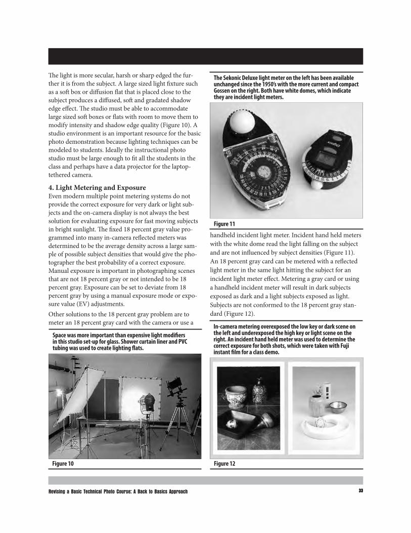
33Revising a Basic Technical Photo Course: A Back to Basics Approach 33
The light is more secular, harsh or sharp edged the fur-ther it is from the subject. A large sized light fixture such as a soft box or diffusion flat that is placed close to the subject produces a diffused, soft and gradated shadow edge effect. The studio must be able to accommodate large sized soft boxes or flats with room to move them to modify intensity and shadow edge quality (Figure 10). A studio environment is an important resource for the basic photo demonstration because lighting techniques can be modeled to students. Ideally the instructional photo studio must be large enough to fit all the students in the class and perhaps have a data projector for the laptop-tethered camera.
4. Light Metering and ExposureEven modern multiple point metering systems do not provide the correct exposure for very dark or light sub-jects and the on-camera display is not always the best solution for evaluating exposure for fast moving subjects in bright sunlight. The fixed 18 percent gray value pro-grammed into many in-camera reflected meters was determined to be the average density across a large sam-ple of possible subject densities that would give the pho-tographer the best probability of a correct exposure. Manual exposure is important in photographing scenes that are not 18 percent gray or not intended to be 18 percent gray. Exposure can be set to deviate from 18 percent gray by using a manual exposure mode or expo-sure value (EV) adjustments. Other solutions to the 18 percent gray problem are to meter an 18 percent gray card with the camera or use a
Figure 10
Space was more important than expensive light modifiers in this studio set-up for glass. Shower curtain liner and PVC tubing was used to create lighting flats.
Figure 11
The Sekonic Deluxe light meter on the left has been available unchanged since the 1950’s with the more current and compact Gossen on the right. Both have white domes, which indicate they are incident light meters.
Figure 12
In-camera metering overexposed the low key or dark scene on the left and underexposed the high key or light scene on the right. An incident hand held meter was used to determine the correct exposure for both shots, which were taken with Fuji instant film for a class demo.
handheld incident light meter. Incident hand held meters with the white dome read the light falling on the subject and are not influenced by subject densities (Figure 11). An 18 percent gray card can be metered with a reflected light meter in the same light hitting the subject for an incident light meter effect. Metering a gray card or using a handheld incident meter will result in dark subjects exposed as dark and a light subjects exposed as light. Subjects are not conformed to the 18 percent gray stan-dard (Figure 12).

34 Fall 2010 Visual Communications Journal34
5. White BalanceSometimes the camera’s default auto white balance func-tion fails to correctly identify the intended subject in a scene. This is an auto white balance “subject failure.” Manual white balance is important for many interior mixed lighting situations. One example is a mixture of daylight, incandescent and fluorescent light where the dominant color temperature identified by the camera auto white balance function is not lighting the subject (Figure 13). Manual white balance is also important for panoramic and stitched images made from multiple exposures. The color balance setting must stay at a consis-tent manually set white balance between shots. This is especially important for subjects that include a white wall because color shifted banding will occur for the overlap-ping areas that are stitched together with auto white bal-ance settings and a mixed light influence (Figure 14).
6. Lenses and PerspectiveAngle of view differences between lenses (Figure 15) are easily understood by students but perspective effects are not (Figure 16 and Figure 17). Exaggerated, elongated or
distorted subject depth or distance between subjects is possible with a wide-angle lens or zoom setting. The wide-angle effect is more noticeable at a close focus dis-tance for forced perspective. Compressed subject depth or distance between subjects is possible with a telephoto lens or zoom setting. With a telephoto lens it is necessary to be at a much greater distance from the subject to main-tain the same cropping as the wide-angle lens for forced compressed perspective. A large set-back space in front of the shooting table is necessary for many compressed perspective telephoto effects in a studio. A normal lens maintains approximately the same distance and perspec-tive between subjects that is perceived in human vision. The normal prime focal length is typically 35-50mm (depending on DSLR sensor size) and is the most impor-tant for realistic subject depiction, such as for law enforcement photos.
7. Available Low Light PhotographyDSLR’s are far more capable in low available light than they were just a few years ago, especially for mid to high-end cameras. Entry level DSLR’s can still have quite a bit of noise beyond ISO 1000. Available light photography of people and moving subjects can still be challenging with these cameras. In most cases available light it is more desirable than the alternative of using on-camera elec-tronic flash lighting which can be harsh, unnatural or not permitted for some locations (Figure 18).
8. Manual FocusMany students have never used a manual focus camera without a focus assist feature. Manual focus is important in situations where autofocus fails such as in dark envi-ronments, shooting through glass and when using some professional cameras which do not have autofocus such as large format cameras. Many students have trouble manu-ally focusing for the first time. This may be due to a needed eyesight adjustment or eyesight impairment, which can be accommodated for.
Figure 13
Auto white balance determined that incandescent light was the dominant light source but the daylight lit walls and columns were the intended subjects of this photo.
Figure 14
The white walls in this panorama would show color banding with an auto white balance setting.

35Revising a Basic Technical Photo Course: A Back to Basics Approach 35
Teaching MethodsThe ten basics presented herein need not be taught in order of priority. The eight technical basics can be taught as exercises with teacher selected subjects at the begin-ning of the class, followed by ethics and design taught
Figure 15
Circular fisheye (8mm), full frame fisheye (17mm) and normal lens (50mm) views taken from the same camera position with no DSLR crop factor.
Perspective differences between wide angle (left), normal (middle) and telephoto lenses (right). The camera to the first highway reflector distance was changed with each lens to make the first reflector the same size in all three photos. Wide angle perspective (left photo) makes the highway reflectors appear to be further apart than they actually were as depicted in the normal lens shot (middle photo). For the telephoto lens the reflectors appear to be closer together than reality (right).
Figure 16
with student-selected subjects at the end of class. Students are often better at expressing themselves at the end of an introductory course, after they have the proper technique gained in teacher controlled learning experiences. It is perhaps more important to address both meaning and technique at the same time in more advanced classes where teacher selected exercises have less priority. What are the best teaching methods for communicating the ten basic photo fundamentals to students? Assignments, demonstrations, instructional software and books are the prioritized teaching methods explored in the following sections. In-class photo critiques of student photos are useful but some teachers are no longer using this teaching technique because of Family Privacy Act restrictions.
AssignmentsEach of the photo fundamentals could have one assign-ment dedicated to it with at least one printed photo as a deliverable. Image ethics could be taught with a basic Adobe Photoshop compositing assignment with a follow-ing class discussion.
Photo DemonstrationPerhaps the most important method to teach image cap-ture in a basic photo curriculum is the demonstration. Here, the photo teacher shoots demonstration photos in class and on location, modeling class assignments. A tethered camera where the instructor controls the func-tions of the DSLR camera remotely via USB or wireless connection to a laptop is often the most effective demo equipment because students can see the camera control

36 Fall 2010 Visual Communications Journal36
Using forced perspective changes in the studio with wide angle, (top) normal (middle) and telephoto lenses (bottom) provides a different interpretation of depth for this table top shot and necessitates different camera angles because of a limited background length. The props were kept in the same positions for all three shots but the camera to subject distance was changed.
Figure 17
menu on the projector in a classroom or studio. If pos-sible the camera type used by the majority of students should be used for modeling assignments during demos. The instructor should not use “better” equipment than the student. The demo can be a challenging way to teach photography because the teacher’s mistakes are displayed for all to see, but it can also make the teacher a better photographer because shooting skills are practiced and improved.
SoftwareCamera Control Pro 2 software for Nikon cameras allows tethered or remote shooting via USB connection to a laptop ($150). Typically all the functions and controls available on the camera are available with camera control software. Images are downloaded from a USB cable con-nection to the laptop and widowed version of the camera viewfinder is on the laptop screen (Figure 19). Remote
On-camera direct flash often reveals a great level of detail as in this photo of a computer system build, but it can also be a harsh light with a dark distracting shadow on the background for other subjects.
Figure 18
Nikon Camera Control Pro camera tethering software.
Figure 19
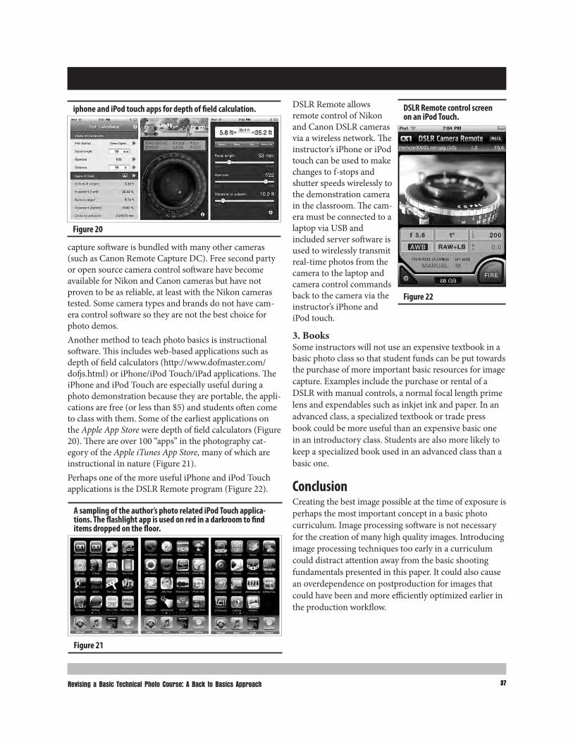
37Revising a Basic Technical Photo Course: A Back to Basics Approach 37
capture software is bundled with many other cameras (such as Canon Remote Capture DC). Free second party or open source camera control software have become available for Nikon and Canon cameras but have not proven to be as reliable, at least with the Nikon cameras tested. Some camera types and brands do not have cam-era control software so they are not the best choice for photo demos.Another method to teach photo basics is instructional software. This includes web-based applications such as depth of field calculators (http://www.dofmaster.com/dofjs.html) or iPhone/iPod Touch/iPad applications. The iPhone and iPod Touch are especially useful during a photo demonstration because they are portable, the appli-cations are free (or less than $5) and students often come to class with them. Some of the earliest applications on the Apple App Store were depth of field calculators (Figure 20). There are over 100 “apps” in the photography cat-egory of the Apple iTunes App Store, many of which are instructional in nature (Figure 21).Perhaps one of the more useful iPhone and iPod Touch applications is the DSLR Remote program (Figure 22).
iphone and iPod touch apps for depth of field calculation.
Figure 20
A sampling of the author’s photo related iPod Touch applica-tions. The flashlight app is used on red in a darkroom to find items dropped on the floor.
Figure 21
DSLR Remote allows remote control of Nikon and Canon DSLR cameras via a wireless network. The instructor’s iPhone or iPod touch can be used to make changes to f-stops and shutter speeds wirelessly to the demonstration camera in the classroom. The cam-era must be connected to a laptop via USB and included server software is used to wirelessly transmit real-time photos from the camera to the laptop and camera control commands back to the camera via the instructor’s iPhone and iPod touch.
3. BooksSome instructors will not use an expensive textbook in a basic photo class so that student funds can be put towards the purchase of more important basic resources for image capture. Examples include the purchase or rental of a DSLR with manual controls, a normal focal length prime lens and expendables such as inkjet ink and paper. In an advanced class, a specialized textbook or trade press book could be more useful than an expensive basic one in an introductory class. Students are also more likely to keep a specialized book used in an advanced class than a basic one.
ConclusionCreating the best image possible at the time of exposure is perhaps the most important concept in a basic photo curriculum. Image processing software is not necessary for the creation of many high quality images. Introducing image processing techniques too early in a curriculum could distract attention away from the basic shooting fundamentals presented in this paper. It could also cause an overdependence on postproduction for images that could have been and more efficiently optimized earlier in the production workflow.
DSLR Remote control screen on an iPod Touch.
Figure 22

38 Fall 2010 Visual Communications Journal38
ReferencesBrugioni. D. A. (1999). Photo fakery: The history and
techniques of photographic deception and manipulation. Dulles: Brassely’s.
Federal Trade Commission. (2010), Frequently asked advertising questions: A guide for small business. Washington, DC: FTC.
Kennedy, D. (2006). Responding to fraud. Science. 314, 1353.
This is a juried articleChris Lantz Instructional Design and Technology Department Western Illinois University 309-298-1744 [email protected]

39Manuscript Guidelines
Manuscript GuidelinesEligibility for PublicationMembers of the International Graphic Arts Education Association, or students of IGAEA members, may pub-lish in the Visual Communications Journal.
AudienceWrite articles for educators, students, graduates, industry representatives, and others interested in graphic arts, graphic communications, graphic design, commercial art, communications technology, visual communications, printing, photography, journalism, desktop publishing, drafting, telecommunications, or multi-media. Present implications for the audience in the article.
Types of ArticlesThe Visual Communications Journal accepts four levels of articles for publication:1. Edited articles are accepted or rejected by the editor. The
editor makes changes to the article as necessary to improve readability and/or grammar. These articles are not submitted to a panel of jurors. The decision of the editor is final.
2. Juried articles are submitted to the editor and are distrib-uted to jurors for acceptance/rejection. Juried articles are typically reviews of the literature, state-of-the-art techni-cal articles, and other nonempirical papers. Jurors make comments to the author, and the author makes required changes. The decision of the jurors is final.
3. Refereed articles are submitted to the editor and are distributed to jurors for acceptance/rejection. Refereed articles are original empirical research. Jurors make comments to the author and the author makes required changes. The decision of the jurors is final.
4. Student articles are submitted by IGAEA members and are accepted/rejected by the editor. These articles are not submitted to a panel of jurors. The editor’s decision is final.
Submittal of ManuscriptsAll manuscripts must be received by the editor no later than December 15th to be considered for the spring Journal or by June 15th to be considered for the fall Journal. Include digital copies of all text and figures. Prepare text and artwork according to the instructions given in these guidelines. Be sure to include your name, mailing address, e-mail address, and daytime phone number with your materials. E-mail all materials to the editor (address shown below).
Acceptance and PublicationIf your article is accepted for publication, you will be notified by e-mail. The Visual Communications Journal is published and distributed twice a year, in the spring and in the fall. Printed copies are mailed to IGAEA members. A PDF version of the Journal is published online at www.igaea.org.
NoticeArticles submitted to the Journal cannot be submitted to other publications while under review. Articles published in other copyrighted publications may not be submitted to the Journal, and articles published by the Journal may not be published in other publications without written permission of the Journal.
Submit All Articles and Correspondence to: Dan Wilson, [email protected]
or check www.igaea.org for contact information for the IGAEA First Vice-President.
See following page for style guidelines

40 Fall 2010 Visual Communications Journal
Manuscript Form and StylePrepare manuscripts according to the APA style, including the reference list. List your name and address on the first page only. Article text should begin on the second page.Provide a short biography for yourself that can be used if the article is accepted for publication. All articles must be submitted in electronic form on a CD-ROM or as an email attachment. Submit a Microsoft Word document, maximum of 10 pages (excluding figures, tables, illustrations, and photos). Do not submit documents created in page-layout programs.Word documents must have been proofread and be correct.Call out the approximate location of all tables and figures in the text. Use the default style “Normal” on these callouts. The call-outs will be removed by the designer. Use the default Word styles only. Our designer has set up the page layout program styles to correspond to those style names.
■ Heading 1 ■ Heading 2 ■ Heading 3 ■ Normal
GraphicsBe sure that submitted tables and other artwork are absolutely necessary for the article. Write a caption for each graphic, include captions in a list at the end of your Word document. Electronic artwork is preferred and should be in PDF or TIFF format. Send all artwork files and hard copies of these files with your submission.
TablesSet up tables in separate documents, one document for each table.Do not attempt to make it “pretty.” Use the default Word style “Normal” for all table text. Do not use any other formatting.
Do not use hard returns inside the table (“enter” or “return”).Get the correct information into the correct cell and leave the formatting to the designer.Tables will be formatted by the designer to fit in one column (3.1667" wide) or across two columns (6.5" wide).
ArtworkScan photographs at 300 ppi resolution. Scan line drawings at 800 ppi resolution. Screen captures should be as large as possible.Graphics should be sized to fit in either one column or across two columns.
■ One column is 3.1667" wide, two columns are 6.5" wide.
■ Graphics may be larger than these dimensions, but must not be smaller.

“
“A p
enny
save
d is
a p
enny
ear
ned.
” ~
“A p
enny
save
d is
a p
enny
ear
ned.
” ~
Fran
kFr
ankl
in “
A pe
nny
save
d is
a p
enny
ear
ned.
”
~Ben
jam
in F
rank
lin “
A pe
nny
save
d is
a p
enny
earn
ed.”
~Ben
jam
in F
rank
lin
a pe
nny
earn
ed.”
“A p
enny
save
d is
a p
enny
earn
ed.”
~Ben
jam
in F
rank
lin
is a
pen
ny e
arne
d.” ~
Benj
amin
Fra
nklin
penn
y sa
ved
is a
pen
ny e
arne
d.” ~
min
Fra
nklin
“A
penn
y sa
ved
is a
pen
ny
earn
ed.”
“A p
enny
save
d is
a p
enny
earn
ed.”
~Ben
jam
in F
rank
lin
save
d is
a p
enny
ear
ned.
” ~
Fran
klin
“A
penn
y sa
ved
is a
pen
ny
earn
ed.”
~Ben
jam
in F
rank
lin
penn
y sa
ved
is a
pen
ny e
arne
d.”
“A p
enny
save
d is
a p
enny
earn
ed.”
~Ben
jam
in F
rank
lin
penn
y sa
ved
is a
pen
ny
earn
ed.”
~pe
nny
save
d is
a p
enny
earn
ed.”
~
min Franklin
early to rise makes a man
early to rise makes a man
healthy, wealthy, and wise.”
healthy, wealthy, and wise.”
~Benjamin Franklin
~Benjamin Franklin
early to rise makes a man healthy,
early to rise makes a man healthy,
wealthy, and wise.”
wealthy, and wise.” ~Benjamin Frank
lin lin “Early to bed, early to rise makes
a man healthy, wealthy, and wise.”
a man healthy, wealthy, and wise.”
~Benjamin Franklin
~Benjamin Franklin “Early to bed, early to
rise makes a man healthy, wealthy, and
wise.” ~Benjamin Franklin “Early to bed,
early to rise makes a man healthy, wealthy,
and wise.” ~Benjamin Franklin
early to rise makes a man healthy, wealthy,
and wise.” ~Benjamin Franklin
early to rise makes a man healthy, wealthy, and
wise.” ~Benjamin Franklin
makes a man healthy, wealthy, and wise.”
min Franklin “Early to bed, early to rise makes a man
healthy, wealthy, and wise.”
healthy, wealthy, and wise.”
to bed, early to rise makes a man healthy, wealthy, and
to bed, early to rise makes a man healthy, wealthy, and
wise.”
wise.” ~Benjamin Franklin
makes a man healthy, wealthy, and wise.”
makes a man healthy, wealthy, and wise.”
min Franklin
min Franklin
man healthy, wealthy, and wise.”
man healthy, wealthy, and wise.”
Franklin
Franklin “Early to bed, early to rise makes
a man healthy, wealthy, and wise.”
a man healthy, wealthy, and wise.”
~Benjamin Franklin
to rise makes a man healthy,
wealthy, and wise.”
Franklin “Early to bed, early to
rise makes a man healthy,
wealthy, and wise.” ~
Benjamin Franklin
“Early to bed, early
to rise makes a
that’s the stuff life is made
“Does thou
love life? Then do not squander
time, for that’s the stuff life is m
ade
“Does thou love
life? Then do not squander time, for
that’s the stuff life is made of.”~B
enjamin
“Does thou love life? Then do not
squander time, for that’s the stuff life is
made of.”
“Does thou love
life? Then do not squander time, for that’s
the stuff life is made of.”~B
enjamin Franklin
“Does thou love life? Then do not squander
time, for that’s the stuff life is m
ade of.”~Benjam
in
Franklin “Does thou love life? Then do not squander
time, for that’s the stuff life is m
ade of.”~Benjam
in
Franklin “Does thou love life? Then do not squander
time, for that’s the stuff life is m
ade of.”~Benjam
in
Franklin Franklin “D
oes thou love life? Then do not squander
“Does thou love life? Then do not squander
time, for that’s the stuff life is m
ade of.”
time, for that’s the stuff life is m
ade of.”~Benjam
in Franklin
~Benjam
in Franklin
“Does thou love life? Then do not squander tim
e, for th
“Does thou love life? Then do not squander tim
e, for th
that’s the stuff life is made
“Does thou
love life? Then do not squander
time, for that’s the stuff life is m
ade
“Does thou love
life? Then do not squander time, for
that’s the stuff life is made of.”
“Does thou love life? Then do not
squander time, for that’s the stuff life is
~Benjam
in Franklin “Does thou love
life? Then do not squander time, for that’s
~Benjam
in Franklin
“Does thou love life? Then do not squander
time, for that’s the stuff life is m
ade of.”
“Does thou love life? Then do not squander
squander time, for that’s the stuff life is
made of.”~B
enjamin Franklin
life? Then do not squander time, for that’s
squander time, for that’s the stuff life is
made of.”
life? Then do not squander time, for that’s
the stuff life is made of.”
“Does thou love life? Then do not squander
time, for that’s the stuff life is m
ade of.”
“Does thou love life? Then do not squander
Then do not squander time, for
that’s the stuff life is made
of.”~Benjam
in Franklin “Does thou
love life? Then do not squander
time, for that’s the stuff life is m
ade
of.”~Benjam
in Franklin “Does thou love
life? Then do not squander time, for
that’s the stuff life is made of.”
Franklin “Does thou love life? Then do not
squander time, for that’s the stuff life is
made of.”~B
enjamin Franklin
life? Then do not squander time, for that’s
the stuff life is made of.”~B
enjamin Franklin
“Does thou love life? Then do not squander
time, for that’s the stuff life is m
ade of.”
“Does thou love life? Then do not squander
“Does thou love life? Then do not squander
time, for that’s the stuff life is m
ade of.”
“Does thou love life? Then do not squander
“Does thou love life? Then do not squander
“Does thou love life? Then do not squander
life? Then do not squander time, for
that’s the stuff life is made of.”
Franklin “Does thou love life? Then do not
squander time, for that’s the stuff life is
made of.”~B
enjamin Franklin
life? Then do not squander time, for that’s
the stuff life is made of.”~B
enjamin Franklin
“Does thou love life? Then do not squander
time, for that’s the stuff life is m
ade of.”
“Does thou love life? Then do not squander
that’s the stuff life is made
~Benjam
in Franklin
love life? Then do not squander
time, for that’s the stuff life is m
ade
~Benjam
in Franklin “Does thou love
life? Then do not squander time, for
that’s the stuff life is made of.”
that’s the stuff life is made
~Benjamin Franklin
jamin Franklin
Franklin
“Haste makes waste.”
makes waste.”
waste.”
der time, for that’s the stuff
penn
y
thou
save
d is
a
earn
ed.
s
d lu
“A
penn
y sa
ved
is a
pe
nny
earn
ed.
” ~Ben
jam
in
Fran“D
oe
penn
y sa
ved
is a
pen
ny e
arne
d.”
“A p
enny
save
d is
a p
enny
Benj
amin
Fra
nklin
“A
penn
y sa
ved
is a
pen
ny
earn
ed.”
~Ben
jam
in F
rank
lin “
A
penn
y sa
ved
is a
pen
ny
earn
ed.”
~Ben
jam
in F
rank
lin
“A p
enny
save
d is
a p
enny
earn
ed.”
“A p
enny
save
d is
a pe
nny
earn
ed.”
~Ben
ja-
min
Fra
nklin
“A
penn
y
save
d is
a p
enny
earn
ed.”
~Ben
jam
in
Fran
klin
“A
penn
y
save
d is
a p
enny
earn
ed.”
~Ben
jam
in
Fran
klin
“A
penn
y
save
d is
a p
enny
“A
pe
nny
save
d is
ea
rned
.” “A
earn
ed.”
“A
penn
y sa
ved
is
earn
ed.”
“A p
enny
save
d is
a pe
nny
earn
ed.”
~Ben
ja
heals,
and
the doctors
Benjamin Franklin
He that falls in
love with himself
has no rivals.”
~Benjamin Franklin He
that falls in love with
himself has no rivals.”
rivals.”
rival~Benja-min Frankthe
Frankthe
lin doc
lin docHe tor
He torths ths
Franklin “Diligence is the mother of good luck.” ~Benjamin Franklin
“Diligence is the mother of good lu
save
d is
a
earn
ed.
-ja
min
Fr
an
Franklin
persistence conquer all
things.” ~
Franklin “E
nergy and
persistence conquer
all things.”
~Benja-
min Franklin
“Energy and
persistence
conquer all
things.” ~Ben-
jamin Franklin
“Energy and
persistence
conquer
all things.”
~Benja-
min
Frankl
in “En
er
Fran
er
Fran
k“Enk“En
Ben-
jam
in
Fran
~Benjamin Franklin
~Benjamin “There never was a good war or a
There never ~Benjamin
“There never was a good war or a bad There never was a good
“There ~Benjamin
There never was a good war or a bad peace.” “There never was a good war or a
“There never was a good “There never was a
~Benjamin Franklin There never ~Benjamin Franklin “There
~Benjamin Franklin There never was a good war or a bad peace.” ~Benjamin Franklin “There never was a good war or a bad peace.” ~Benjamin Franklin There never was a good war or a bad peace.” ~ Benjamin Franklin “There never was a good war or a bad peace.” ~Benjamin Franklin
~Benjamin Franklin “There “There ~Benjamin Franklin There never There never
~Benjamin Franklin “There never was a “There never was a There never was a good war There never was a good war
“There never was a good war or a bad “There never was a good war or a bad ever was a good war or a bad peace.” ~Benjamin ~Benjamin
“There never was a good war or a bad peace.” ~Benjamin FranklinFranklin~ Benjamin Franklin “There never “There never
ever was a good war or a bad ever was a good war or a bad “There never was a good war or a bad peace.” ~Benjamin
~Benjamin Frankliln “There never “There never
or a bad peace.” ~Benjamin Franklin “There never was a good war or a bad peace.” ~Benja-min Franklin There never was a good war or a bad peace.” ~Benjamin Franklin “There never was a good war or a bad peace.” ~Benjamin Franklin There was never was a good war ~Benjamin Franklinwas never was a good war
“There never was a good war or a bad
g
“
“Early
to bed,
early to
a man
healthy,
wealthy, and
wise.” ~Benjamin
Franklin “Early to
bed, early to rise
makes a man
healthy, wealthy, and
wise.” ~Benjamin Franklin
~Benjamin Franklin
“Early to bed, early to
“Early to bed, early to
rise makes a man healthy,
rise makes a man healthy,
wealthy, and wise.”
wealthy, and wise.” ~Benja
~Benja-
min Franklin
min Franklin “Early to bed,
early to rise makes a man
early to rise makes a man
healthy, wealthy, and wise.”
~Benjamin Franklin “Early to bed,
early to rise makes a man healthy,
~Benjamin Frank-
“Early to bed, early to rise makes
a man healthy, wealthy, and wise.” “Early to bed, early to
“Early to bed, early to
rise makes a man healthy,
rise makes a man healthy,
wealthy, and wise.”
wise.” ~Benjamin Franklin
~Benjamin Franklin
“Early to bed, early to
“Early to bed, early to
rise makes a man healthy,
rise makes a man healthy,
wealthy, and wise.”
wealthy, and wise.” ~Benja
min Franklin “Early to bed,
early to rise makes a man bed, early to rise
makes a man
healthy, wealthy, and
~Benjamin Franklinwise.” ~Benjamin
Franklin “Early to
bed, early to rise
wise.”
Franklin
early to
rise makes
a man
healthy,
wealthy, and
“Early
to bed,
asha
med
of i
t
is.”
~Benj
amin
Fran
klin
“H
avin
g be
en
poor
is n
o sh
ame,
but
bei
ng
asha
med
of i
t is.”
~Benj
amin
Fra
nklin
“Hav
ing
been
poo
r is
“Hav
ing
been
poo
r is
no sh
ame,
but
bei
ng
no sh
ame,
but
bei
ng
asha
med
of i
t is.”
~
asha
med
of i
t is.”
~Be
nBe
n
jam
in F
rank
lin
jam
in F
rank
lin
jam
in F
rank
lin “H
avin
g
“Hav
ing
been
poo
r is n
o sh
ame,
been
poo
r is n
o sh
ame,
but
bein
g as
ham
ed o
f it
but
bein
g as
ham
ed o
f it
is.”
~is
.” ~
Hav
ing
been
poo
r is n
o
at’s
“Hav
ing
been
po
or is
no
sham
e, b
ut
bein
g as
ham
ed o
f it
a
min
Frankl
“En
s s ths ths lu
sundial in the shade.” ~
Benjam
in Franklin B
enjamin Franklin
Benjam
in Franklin “H
ide not your “H
ide not your talents. They for talents. They for use w
ere made .
use were m
ade . W
hat’s a sundial W
hat’s a sundial in the shade.” in the shade.” ~
Benjam
in Franklin “H
ide not your talents. They for use w
ere m
ade . W
h
asha
med
of i
t
They for
were
made
Wh
at’s a
“Hav
ing
made
“Hav
ing
made
poor
is n
o sh
ame,
but
They for
sham
e, b
ut
They for
a
heals, and the doctors take
the fee.” ~Benjam
in Franklin
Benjamin Franklin
“God heals, and the
doctors take the fee.”
Benjamin Franklin “G
od
heals, and the doctors
take the fee.” ~
take the fee.” ~BenjaBenja--
min Franklin “G
od
heals, and the
heals, and the
doctors take the
doctors take the
fee.”~Benjam
in
Franklin “God
heals, and the
doctors take
the fee.”
Benjamin
Franklin
“God
heals,
and
the doc-
“God
heals,
and
the doctor
Frankthe
Frankthe He tor
He torth
torth
tortorth
makes
waste.”
~Benjamin
Franklin
“Haste
makes
waste.” ~Ben-
jamin Franklin
“Haste makes
waste.” ~Benja-
min Franklin “Haste
makes waste.”
~Benjamin Franklin
“Haste makes waste.”
~Benjamin Franklin
“Haste makes waste.”
~Benjamin Franklin “Haste
makes waste.” ~Benjamin
Franklin “Haste makes
waste.” ~Benjamin Franklin
“Haste makes waste.” ~Benja~Benja-
min Franklin “Haste makes
waste.” ~Benjamin Franklin
~Benjamin Franklin “Haste “Haste
makes waste.” ~Benjamin Franklin
~Benjamin Franklin
“Haste makes waste.” ~Benjamin
~Benjamin
Franklin “Haste makes waste.”
“Haste makes waste.”
jamin Franklin “Haste makes waste.”
“Haste makes waste.”
~Benjamin Franklin “Haste makes waste.”
“Haste makes waste.”
~Benjamin Franklin “Haste makes waste.”
“Haste makes waste.”
~Benjamin Franklin
~Benjamin Franklin “Haste makes waste.”
~Benjamin Franklin
~Benjamin Franklin
~Benjamin Franklin
~Benjamin Franklin
~Benjamin Franklin
~Benjamin Franklin
jamin Franklin
jamin Franklin “Haste makes waste.”
Franklin “Haste makes waste.”
“Haste makes waste.”
“Haste makes waste.”
“Haste makes waste.”
makes waste.”
makes waste.”
waste.” waste.” ~Benjamin Franklin
“Haste makes
waste.” ~Benjamin Franklin
“Haste makes waste.”
ta
“Ener
k“Enk“En
There
“There
makes
g
luluFrankl
“Hav
ing
been
po
or is
no
makes
~Benjamin
luctactac sta sta sssta s
luctactac
“En
ta sta sssta sssta sta sta ssta sta sta sta sta sssta ss
jam
in
Fran“D
oes
thou
love
life? Then
jam
in
Fran“D
oe ““““
s
life? Then
“Does thou love
life? Then do not squan-
der time, for that’s the stuff
~Benjam
in
“Does thou love life?
Then do not squander time, for
that’s the stuff life is made
to bed,
early to
rise makes
a man
healthy,
“Early
early to
rise makes “Early
to bed,
early to
Fran
klin
“A
penn
y sa
ved
is a
that’s the stuff
life is made of.”
~Benjam
in Franklin
life? Then do not
squander time, for
that’s the stuff life is
~Benjam
in
“Does thou love
life? Then do not squan
der time, for that’s the stuff
~Benjam
in
“Does thou love life?
Then do not squander time, for
that’s the stuff life is made
life? Then
do not life? Then
“Early
life? Then
a pe
nny
earn
ed.”
~
min
Fra
nklin
sa
ved
is a
pen
ny
earn
ed.”
~Fr
ankl
in
save
d is
a p
enny
earn
ed.”
~Fr
ankl
in
save
d is
a p
enny
pe
nny
save
d is
ea
rned
.”
early to to bed,
early to to bed,
early to
a pe
nny
earn
ed.”
~Ben
jam
in
Fran
klin
min
Fra
nklin
sa
ved
is a
pen
ny
earn
ed.”
~Fr
ankl
in
save
d is
a p
enny
earn
ed.”
~Fr
ankl
in
save
d is
a p
enny
earn
ed.”
penn
y sa
ved
is
a pe
nny
earn
ed.”
~
that’s the stuff
life is made of.”
~Benjam
in Franklin
“Does thou love
life? Then do not
squander time, for
that’s the stuff life is
made of.”~B
enjamin
Franklin “Does thou love
life? Then do not squan
der time, for that’s the stuff
life is made of.” ~B
enjamin
Franklin “Does thou love life?
Then do not squander time, for
that’s the stuff life is made
do not
squander
time, for
squander
der time, for that’s the stuff
life is made of.” ~B
enjamin
Franklin “Does thou love life?
Then do not squander time, for
that’s the stuff life is made
a pe
nny
earn
ed.”
~Ben
jam
in
Fran
klin
time, for
that’s the stuff
life is made of.”
“Does thou love
life? Then do not
squander time, for
that’s the stuff life is
made of.”~B
enjamin
Franklin “Does thou love
life? Then do not squan
der time, for that’s the stuff
Franklin
begun in anger ends
in shame.” ~Benjamin Franklin “Whatever is begun in anger ends in shame.” ~Benjamin Franklin “Whatever is begun in anger ends in shame.” ~Benjamin Frank-lin “Whatever is begun in anger ends in shame.” ~Benjamin Franklin Whatever is begun in anger ends in
“Whatever is begun in anger ends in shame.” ~Benjamin Franklin
“What-ever is
Fran
klin
kl
in
klin
g
klin
g
klin
kl
in
klin
g
klin
kl
in
Fran
klin
kl
in g
klin
g
klin
kl
in g
klin
kl
in
klin
g
klin
g
klin
kl
in g
klin
g
klin
g
s
Fran
Fran
klin
“kl
in
klin
“Early to bed, early
to rise makes a
man healthy,
wealthy, and
wise.” ~
Benjamin Fra
peace.” Franklin
“There never was a good war or a bad peace.” was a good war or a bad peace.”
peace.” Franklin
was a good war or a bad peace.”
peace.” ~Benjamin Franklin ever was a good war or a bad peace.” Franklin “There never was a good war or a bad peace.”
“There never was a good war or a bad peace.” ~ Benjamin Franklinwas a good war or a bad peace.” ~Benjamin Franklin ever was a good war or a bad
peace.” ~Benjamin Franklin “There never was a good war or a bad peace.” Franklin There never was a good war or a bad peace.” ~Benjamin Frankliln
was a good war or a bad peace.” ~Benjamin Franklin
a man healthy, wealthy, and wise.”
“Early to bed, early to
rise makes a man healthy, wealthy, and
“Early to bed,
early to rise makes a man healthy, wealthy,
~Benjamin Franklin “Early to bed,
early to rise makes a man healthy, wealthy,
~Benjamin Franklin “Early to bed,
early to rise makes a man healthy, wealthy, and
~Benjamin Franklin “Early to bed, early to rise
makes a man healthy, wealthy, and wise.” ~ Benja-
“Early to bed, early to rise makes a man
healthy, wealthy, and wise.” ~Benjamin Franklin “Early
to bed, early to rise makes a man healthy, wealthy, and
~Benjamin Franklin “Early to bed, early to rise
makes a man healthy, wealthy, and wise.” ~Benja-
min Franklin “Early to bed, early to rise makes a
man healthy, wealthy, and wise.” ~Benjamin
Franklin “Early to bed, early to rise makes
a man healthy, wealthy, and wise.”
~Benjamin Franklin
~Benjamin Franklin “Early to bed, early
to rise makes a man healthy,
to rise makes a man healthy,
wealthy, and wise.”
wealthy, and wise.” ~Benjamin
Franklin “Early to bed, early to
“Early to bed, early to
rise makes a man healthy,
rise makes a man healthy,
wealthy, and wise.” ~
wealthy, and wise.” ~
Benjamin Franklin
begun in anger ends in shame.” min Franklin ends in shame.” ever is begun in anger ends in shame.” ~Benjamin Franklin anger ends in shame.” ever is begun in anger ends in shame.” Franklin
shame.”
was never was a good war or a bad peace.” ~Benjamin Franklin “There never was a good war or a bad peace.” ~Benjamin Franklin There never was a good war or a bad peace.” ~Benjamin Franklin “There never was a good war or a bad peace.” ~Benja-min Franklin There never was a good war or a bad peace.” ~Benjamin Franklin“There never was a good war or a bad
~Benjamin Franklin There never was a good war or a bad peace.” ~Benjamin
“There never was a good war or a ~Benjamin Franklin There never
was a good war or a bad peace.” ~Benjamin “There never was a good war or a bad
There never was a good ~Benjamin Franklin “There
never was a good war or a bad peace.” ~Benjamin There never was a good war or a bad peace.”
“There never was a good war or a “There never was a good
~Benjamin Franklin “There never was a ~Benjamin Franklin
~Benjamin Franklinnever was a good war or a bad peace.” ~Benjamin FranklinThere never was a good war or a bad peace.” “There never was a good war or a bad peace.” There never was a good war or a bad peace.” “There never was a good war or a bad peace.” There never was a good war or a bad peace.” ~Benjamin Franklin
~Benjamin Franklin~Benjamin Franklin
There never was a good war “There never was a good war or a bad
ever was a good war or a bad peace.”
was never was a good war or a bad peace.” waste.”
makes waste.”
~Benjamin Frank-
“Early to bed, early to rise makes
a man healthy, wealthy, and wise.”
“Early to bed, early to
is begun in anger ends in shame.” shame.” ~Benjamin Franklin “Whatever is begun in anger “Whatever is begun in anger ends in shame.”
ends in shame.” ~Benjamin Franklin “Whatever is begun in anger ends “Whatever is begun in anger ends in shame.” in shame.” ~Benjamin Franklin “What-ever is begun in anger ends in
ever is begun in anger ends in shame.” ~Benjamin Franklin ~Benjamin Franklin Whatever is begun in anger ends in shame.”
begun in anger ends in shame.” ~Benja-min Franklin “Whatever is begun in anger “Whatever is begun in anger ends in shame.” ~Benjamin Franklin
~Benjamin Franklin “Whatever is begun in anger ends in shame.”
ever is begun in anger ends in shame.” ~Benjamin Franklin “Whatever is begun in “Whatever is begun in anger ends in shame.”
“Early to bed, early
~Benjamin
“Early to bed, early to
rise makes a man healthy,
wealthy, and wise.” ~
Benjamin Franklin
Benjamin Franklin
“Early to bed, early
“Early to bed, early
to rise makes a
to rise makes a
man healthy,
man healthy,
wealthy, and
wise.” ~
Benja-
ever is begun in anger ends in shame.” Franklin “Whatever is begun in anger ends in shame.” ~Benjamin Franklin anger ends in shame.” is begun in anger ends in shame.” Whatever is begun in anger ends in shame.”
Franklin “Whatever is begun in anger ends in shame.” ~Benjamin Franklin “Whatever is begun in anger ends in
“Whatever is begun in anger ends in shame.” ~Benjamin Franklin
~Benjamin Franklin “Whatever is begun in anger “Whatever is begun in anger
ends in shame.” ends in shame.” ~Benjamin Franklin
~Benjamin Franklin anger ends in shame.” anger ends in shame.” ~Benjamin Franklin
in anger ends in shame.” ~Benjamin Franklin in anger ends in shame.” ~Benjamin Franklin
in anger ends in shame.” ~Benjamin Franklin
was a good war or a bad peace.” good war or a bad peace.”
or a bad peace.” peace.”
a good war or a bad peace.” min Franklin There never was a good war or a bad peace.” “There never was a good war or a bad peace.” ~Benjamin Franklinwas a good war or a bad peace.” Franklin “There never was a good war or a bad peace.” ~Benjamin Franklinwas a good war or a bad peace.” Franklin “There never was a good war or a bad peace.” ~Benjamin Franklin There never was a good war or a bad peace.” ~Benjamin Franklinnever was a good war or a bad peace.” Franklin There never was a good war or a bad peace.” ~Benjamin Franklin “There never was a good war or a bad peace.” ~Benjamin Franklin “There never was a good war or a bad peace.” ~Benjamin Franklingood war or a bad peace.” ~Benjamin Franklinwas a good war or a bad peace.” ~Benjamin Franklinnever was a good war or a bad peace.” There never was a good war or a bad peace.” “There never was a good war or a bad peace.” There never was a good war or a bad peace.” “There never was a good war or a bad peace.” There never was a good war or a bad peace.” never was a good war or a bad peace.” ~Benjamin Franklinwas a good war or a bad peace.” ~Benjamin Franklin
good war or a bad peace.” ~ Benjamin Franklin There never was a good war or a bad peace.” ~Benjamin Frankliln “There never was a good war or a bad
peace.” ~Benjamin Franklin ever was a good war or a bad peace.”
“Whatever is begun in anger ~Benjamin Franklin “What-ever is begun in anger ends in shame.” “Whatever is begun in “Whatever is begun in anger ends in shame.” ~Benjamin Franklin
~Benjamin Franklin What-ever is begun in anger ends in shame.”
ever is begun in anger ends in shame.” ~Benjamin “Whatever is begun in anger ends in “Whatever is begun in anger ends in ~Benjamin Franklin “Whatever is begun in
“Whatever is begun in anger ends in shame.” ~Benjamin Franklin
~Benjamin Franklin “Whatever is begun in anger ends in shame.” ~Benjamin Franklin
~Benjamin Franklin Whatever is begun in anger ends in shame.”
Whatever is begun in anger ends in shame.” ~Benjamin “Whatever is begun in anger ends in shame.”
“Whatever is begun in anger ends in shame.” “Whatever is begun in anger ends in “Whatever is begun in anger ends in “Whatever is begun in anger Whatever is begun in ~Benjamin Franklin “Whatever is begun ~Benjamin Franklin “Whatever is begun ~Benjamin Franklin “Whatever is begun ~Benjamin Franklin
Enlightens the World
Visual Communications JournalSpring 2010 — Volume 46, Number 1
007301026International Graphic Arts Education Associationcare ofUniversity of Houston Information & Logistics Technology Department312 Technology BuildingHouston, TX 77204-4023
NONPROFITORGANIZATIONU.S. POSTAGE
PAIDHOUSTON
TEXASNO. 5910